Magix Xara Web Designer Premium 7.0 Owners Manual 7
User Manual: magix Xara Web Designer Premium - 7.0 - Owners Manual Free User Guide for Magix Xara Web Designer Software, Manual
Open the PDF directly: View PDF  .
.
Page Count: 1438 [warning: Documents this large are best viewed by clicking the View PDF Link!]
- Purchasing and unlocking Xara Web Designer 7 Premium
- Support
- What is new in Xara Web Designer 7 Premium?
- Introduction
- Getting Help
- Getting Started
- Program Layout
- Objects On The Page
- Object Based Web Design
- The Selector Tool
- Website Toolbar
- Creating a website
- Previewing Your Website
- Using Templates, Clipart & Widgets
- Website Colors
- Photos
- Text
- Page Size
- Saving Your Work. Creating A Website
- Stretchy Objects
- Groups
- Repeating Objects
- Links, Buttons & Navigation Bars
- Drawing Tools
- Right-click menus
- Layers, Mouseover (Rollover) & Pop-ups
- Creating Buttons, Banners And Other Web Graphics
- Publishing Your Website
- Document handling
- Starting Xara Web Designer 7 Premium
- Starting a new document
- Opening an existing document
- The Xara Web Designer 7 Premium window
- Opening a second window
- Changing the zoom value
- Sliding the document within the window
- Changing the page size
- Multiple pages in the document
- Saving the document
- Support folders
- Closing the document
- Automatic Backups
- On-screen grid
- Rulers
- View quality
- Galleries
- Displaying a gallery
- Moving and docking a gallery
- Grouping galleries
- Using galleries
- Selecting items
- Re-ordering items in the gallery
- Searching for an item name
- Adding to a gallery
- Deleting sections from a gallery
- Closing a gallery
- Removing a gallery from the workspace
- Restoring the default control bars/galleries
- Undo and Redo
- Object Handling
- The Selector Tool
- Moving objects
- Removing objects from the document
- Duplicating and cloning
- Moving objects forward and backwards
- Rotating objects
- Scaling (resizing) objects
- Flipping objects
- Stretching and squashing objects
- Skewing objects
- The Mold tool
- Snapping
- Guide Objects and Guidelines
- Summary of shortcuts on the numeric keypad
- Grouping and ungrouping objects
- Soft Groups
- Alignment
- Copying Styles: Paste Attributes
- Naming objects
- Repeating Objects
- Drawing Lines and Shapes
- Drawing a line or shape
- The Freehand & Brush Tool
- Editing lines/shapes with the Freehand & Brush Tool
- The Straight Line & Arrow tool
- The Shape Editor tool
- Extending the line
- Finishing the line
- Adding a new point handle
- Selecting multiple point handles
- Deleting points
- Moving point handles—Shape Editor Tool
- Smoothing a line
- Constraining the line
- Changing curves
- Changing a straight line to a curve (and vice versa)
- Joining lines
- Splitting a shape
- Changing the line width (thickness)
- Line Gallery
- Shape Handling
- Color Handling
- The color line
- Applying fill & line colors by drag & drop
- Editing an object’s color
- The Color Editor
- Local colors and Theme colors
- Theme color schemes
- Creating your own color schemes
- Creating new named colors
- Editing named colors
- Normal colors, Tints, Shades and Linked colors
- Creating a Tint, Shade or Linked color
- Text Handling
- Introduction
- Terminology
- The Text Tool
- The Font Menu
- Simple text
- Text in a column
- Text areas
- Text along a curve
- Editing text
- Spell checker
- Find & Replace
- Synchronising Text using Soft Groups
- Tabs, Margins and Indents
- Repelling text objects
- Anchored Graphics
- Applying text styles
- Text links
- Text inside groups for websites
- Copying text styles
- Copying/Pasting formatted text (RTF)
- Seeing fonts in use
- Font embedding
- Browser text compatibility
- The Fill Tool
- Shadows
- Transparency
- Bevels
- Masks
- Web Properties Dialog
- Photo Handling
- Introduction
- Photo Objects
- Photo Groups
- Importing Photos
- Photo resolution
- Zero-memory Copies
- The Bitmap Gallery
- Embedded JPEG files
- Lossless vs. Lossy
- Blending & Merging photos
- Photo display quality
- Saving & Exporting Photos
- Photo Edit Attributes
- Editing the outline of Photos
- Cropping photos
- Cropping photos with a mask
- Cutting objects out of photos
- Screen capture utility
- Coloring photos
- Integration with external Photo Editors
- Resize, rotate and position a photo within its frame
- Horizon Straighten
- Viewing a scaled photo at its full size
- Making a photo its full size
- Optimizing Photos and Bitmaps
- Photo Documents
- Editing Photo Files
- The Photo Tools
- 3D Extrude Tool
- Navigation Bars
- Using template Navbars
- Navigation bar properties dialog
- Site navigation bar
- Buttons & Menus
- Updating your Navbar across all pages
- On canvas editing
- Changing the font on Navbar buttons
- Importing & pasting Navbars
- Creating your own Navigation Bars
- Button margins
- Advanced - Editing a Navbar button design
- Navbars with different first or last buttons
- Website Presentations
- The Presentation toolbar
- Creating a presentation
- Managing presentation steps
- Adding new presentation pages
- Deleting presentation pages
- Linking to next/previous step
- Applying transitions to presentation step links
- Applying presentation step transitions
- Applying presentation page transitions
- Advanced presentation information
- Hosting remote presentation sessions
- Website Widgets
- Page & Layer Gallery
- Animations
- Introduction
- Core Principles
- Your First Animation
- Exporting a Flash File
- Exporting animations as AVI
- The Animation Frame Gallery
- Photos
- Animation Frame Rate and Tween Steps
- Cropping, Clipping and Animation Size
- Animation Speed
- Animation smoothness
- Rotation
- Groups
- What Xara Web Designer 7 Premium features does Flash support?
- Color Transforms—Animating Color Changes
- Transparency
- URLs in Flash
- Advanced Flash Commands
- Xara Web Designer 7 Premium Flash Animation Summary
- Creating animated GIFs
- Animation properties
- Printing
- Importing and Exporting
- Customizing Web Designer Premium
- Changing the blank template document
- Displaying your own icons in browser tabs: favicons
- Options in the Utilities menu
- General tab
- Recent file list size
- Current layer always visible and editable
- Ask before setting current attribute
- Make groups be transparent as a whole.
- Maintain imported layer names
- Marquee Object Selection
- Angle constraint
- Document is intended to be a website
- Show Windows compatible text lengths
- Nudge size
- Duplication distance
- Grid and Ruler tab
- Mouse tab
- Page Size tab
- Backups Tab
- Control bars
- Menus and Keyboard Shortcuts
- Introduction
- File menu
- New (Standard control bar or Ctrl+N)
- New from Designs Gallery
- Open (Standard control bar or Ctrl+O)
- Open recent
- Close (Ctrl+W)
- Save (Standard control bar or Ctrl+S)
- Save As
- Save All
- Save Template
- Import (Ctrl+Alt+I)
- Export (Ctrl+Shift+E)
- Export JPEG
- Export PNG
- Preview web page (F12)
- Preview Website
- Export Website
- Publish Website
- Preview Flash
- Export Animation
- Document Info
- Page Options
- Printer Setup
- Print Options
- Print (Ctrl+P)
- Exit
- Edit menu
- Undo (Standard control bar or Ctrl+Z)
- Redo (Standard control bar or Ctrl+Y)
- Cut (Edit control bar or Ctrl+X)
- Copy (Edit control bar or Ctrl+C)
- Paste (Edit control bar or Ctrl+V)
- Delete (Edit & Standard control bars or Delete)
- Select All (Ctrl+A)
- Clear Selection / Reset current attributes (Esc)
- Duplicate (Edit control bar or Ctrl+Alt+D)
- Clone (Ctrl+K)
- Pages
- Arrange menu
- Move to Layer in Front (Arrange control bar or Ctrl+Shift+U)
- Bring to Front (Arrange control bar or Ctrl+F)
- Move Forwards (Arrange control bar or Ctrl+Shift+F)
- Move Backwards (Arrange control bar or Ctrl+Shift+B)
- Put to Back (Arrange control bar or Ctrl+B)
- Move To Layer Behind (Arrange control bar or Ctrl+Shift+D)
- Group (Arrange control bar or Ctrl+G)
- Ungroup (Arrange control bar or Ctrl+U)
- Apply soft group (Ctrl+Alt+G)
- Remove soft group (Ctrl+Alt+U)
- Alignment (Ctrl+Shift+L)
- Fit Text to Curve/Remove Text From Curve
- Repelling and Anchoring
- Create Navigation Bar
- Repeat on all pages (Shift+Ctrl+Alt+R)
- Stop updating (Shift+Ctrl+Alt+O)
- Utilities menu
- Window menu
- Clear Selection / Reset current attributes (Esc)
- Multiple Page View
- New View
- Arrange Views
- Animation
- Show Scrollbars
- Show Rulers (Ctrl + L)
- Control Bars
- Quality (Standard control bar)
- Show Document Tabs
- Full Screen (8 on numeric keypad)
- Show Grid (#)
- Show Guides (1 on numeric keypad)
- Show Print Borders
- Snap to Grid (. on numeric keypad)
- More about Xara Group
- Legal

Purchasing and unlocking
Xara Web Designer 7
Premium
When you run the downloaded trial version of Xara Web Designer 7 Premium, the start screen will
present you with three options. Check the option you require and you will be presented with further
instructions.
Activate with serial number
Select this option if you have already purchased your copy of Web Designer Premium and enter the
serial number that you were given in the email confirming your purchase. Enter your email address so
your copy can be registered (if you have already registered this will be ignored). Then click Register
Online and Activate
.
Purchase online.
Select this option if you would like to purchase a copy of Web Designer Premium. You will be given an
serial number when you purchase.
Continue using trial
Select this option if you would like to continue using the free trial. To the right of this option it will tell you
how many days of the trial you have left. Then click Continue trial
.
Important note
: Please keep a record of the email address and password you used when purchasing Xara Web
Designer 7 Premium since you may need them in the future, for example if you wish to upgrade.
Other ways to purchase
If you do not have the trial you can order directly on our website www.xara.com/store
and you will be given a serial number that can be used to unlock the trial later.
Xara titles are great value for the money, but we offer further generous discounts to academic
establishments on all our products. You can find details on our website.
Affiliate Program
Xara Web Designer 7 Premium page templates include a small 'Made with Xara' link at the bottom. You
can easily delete this link if you don't want it, but if you leave it on your published website you can earn
commission from customers introduced to Xara through your links, or you can have that commission
donated to charity. Select "Help" > "Affiliate Program"
to find out more or, if you are already an affiliate, to change your commission settings.
Page 1
Support
If you purchased Xara Web Designer 7 Premium from Xara you can contact Xara support and if you
purchased from MAGIX you can contact MAGIX support, full details are given below.
Xara Support
http://support.xara .com
Our own support site offers comprehensive FAQ page (frequently asked questions) which is
constantly updated and available 24 hours, 7 days a week; always the best source for instant
answers. You can also contact our technical support staff using the form on this page, if you
cannot find the answer to your question!
If you are an owner of a Xara product you can also submit a ticket to our support staff via the
support site above, but please remember we can only respond during office hours! Please note
TalkGraphics members cannot help with Xara account issues.
If you can't find the answer in this manual, we highly recommend viewing the Web Designer movie
tutorials
. It is the ideal way to get to know Xara Web Designer 7 Premium and get an overview of its features,
allowing you to make the most of the program.
If you need some help using this program, here are some sources of information that may be of use:
Program help - Choose "Xara Web Designer 7 Premium Help" from the "Help" menu to
open Xara Web Designer 7 Premium Help (containing hundreds of pages of information).
Status bar - Try reading the text on the status bar at the bottom of the main Xara Web Designer
7 Premium window. It always describes what actions are currently possible and what they will do
(even during drags), and helps you learn to use the Xara Web Designer 7 Premium tools. It also
gives details of what buttons and controls do as you move the pointer over them. See Status Bar
for more details.
ToolTips - If you hold the mouse pointer over a button or control for a short while, then small
message appears telling you what it does.
Menus - If you want to know what a menu item does, highlight it and press "F1".
Dialog boxes - If you want to know what a dialog box does or how to use it, click Help.
Movies - Use the menu option "Help" > "Movies" or click here to view a list of available
movies.
The TalkGraphics forums - Post your question in the popular, dedicated Xara forums at
TalkGraphics.com (www.talkgraphics.com), where you can ask other Xara Web Designer 7
Premium users for advice or suggestions ? available 24x7. You can share tips and ideas, ask
questions or offer solutions to other users.
Xara Xone - Visit the Xara Xone (www.xaraxone.com) for a host of excellent Xara support
resources.
"The Outsider" newsletter (www.xara.com/outsider) Subscribe to our monthly newsletter "The
Outsider" (with monthly tutorials and tips, offers, inspirational art, and more).
Join the Xara community on Facebook or follow our news on Twitter.
MAGIX Support
Dear MAGIX customer,
Our aim is to provide convenient, fast and solution-focused support at all times. To this end, we offer a
wide range of services:
Unlimited web support:
Page 2

As a registered MAGIX customer, you have unlimited access to web support offered via the
convenient MAGIX service portal on http://support.magix.net, including an intelligent help
assistant, high-quality FAQs, patches and user reports that are constantly updated.
The only requirement for use is product registration on www.xara.com
The online community - on-the-spot support and a platform for exchange:
MAGIX customers have free and unlimited access to the online community at www.magix.info,
which includes approx. 120,000 members and offers the opportunity to ask members questions
concerning MAGIX products as well as use the search function to search for specific topics or
answers. In addition to questions & answers, the knowledge pool includes a glossary, video
tutorials and a discussion forum. The multiple experts, found round-the-clock on www.magix.info
guarantee quick answers, which sometimes come within minutes of a question being posted.
Email support for MAGIX products:
For every new MAGIX product you will receive, as of date purchase, 12 months of email based
customer service.
Premium email support:
For priority support, or if you want the MAGIX support team to help with non-MAGIX related
harware problems you can purchase an Premium email support ticket for USD 12.99 | CAD
13.99 | GBP 9.99 | AUD 18.99 | ZAR 120.00 | EUR 12.99 | SEK 119.00 | NOK 99.00 |
DKK 99.00. Log in at http://support.magix.net and click on "Purchase access code", the ticket
isfor a specific problem, and is valid until it is solved, it is not restricted to an email.
Please note
: To be able to use the Premium email support and free product email support via the Internet, you have
to register your MAGIX product using the serial number provided. This can be found on the CD case of
your installation CD or on the inside of the DVD box.
Additional telephone service:
Besides the large number of free customer service offers, we also offer a fee-based telephone
customer service.
Here you can find a summary of our technical support telephone numbers:
http://support.magix.net
/
Mail (Europe):
MAGIX Development Support, P.O. Box 20 09 14, 01194 Dresden, Germany
Mail (North America):
MAGIX Customer Service, 1105 Terminal Way #302, Reno, NV 89502, USA
Please make sure you have the following information at hand:
Program version
Configuration details (operating system, processor, memory, hard drive, etc.), sound card
configuration (type, driver)
Information regarding other audio software installed
MAGIX Sales Department
You can reach the MAGIX Sales Department workdays for help with the following questions and
problems:
Orders
Product consulting (pre-purchase)
Upgrade requests
Returns
Europe
Monday - Friday, 09:00-16:00 GMT
Page 3

U.K.:
0203 3189218
Denmark:
699 18149
Sweden:
0852500858
Finland:
09 31581630
Norway:
0210 30665
North America
9 am to 4 pm EST Mon-Fri
Phone:
1-305-722-5810
Page 4

What is new in Xara Web
Designer 7 Premium?
Web Authoring/Web Publishing
New widgets. Make your websites eye-catching and dynamic with our new smart widgets that
enable you to add an advanced selection of slick photo and text animations to your web pages
without the need for coding knowledge. More widgets will be automatically downloaded and
added to your gallery over time.
Presentation websites. Create web-based 'slide-show' style presentations that your website
visitors can step through using the keyboard arrow keys. Apply animated transition effects as
each step and page is displayed. You can also easily remotely host a web meeting (a Webinar) to
showcase your presentation, step by step and page by page, to a group of invited participants.
New animated transition effects for layers and page links. Xara Web Designer 7 Premium
makes it easy to add a wide range of animated effects to the layers and page links in your
website. You can add animated transitions to any page link or pop-up layer in your web pages.
Intelligent repeating headers / footers / watermarks. Xara Web Designer 7 Premium now
automatically updates all occurrences of a repeating object when you edit it, so you don't have to
manually update when you make a change. When one instance of a repeating object is edited, the
updates appear instantly on all other instances of that object on other pages of the document.
What's more, Xara Web Designer 7 Premium is smart about positioning, so objects in the top
half of the page are positioned on other pages relative to the top of the page, and objects near
the bottom are positioned relative to the bottom of the page, irrespective of page sizes.
Add individuality to your web page browser tabs using 'favicons'. Xara Web Designer 7
Premium now supports the addition of favicons, allowing you to customize the tabs of your web
pages by displaying a custom graphic, such as a logo, on the document browser tab.
Sitemap support. You can now automatically generate a sitemap for submission to search
engines to assist them with the crawling of your website when you publish it.
Built-in preview window now includes navigation buttons. The navigation buttons in the top
bar of the preview window allow you to move back or forward, just like in a web browser, and
the Home button returns you to the page you started the preview on.
Quickly preview your pages in the most popular web browsers. If you have Firefox,
Internet Explorer, Opera, Safari or Chrome installed, you can preview exactly how your page
will appear in each of these popular web browsers with one click.
Preview your web page in full screen by clicking the new View Full Screen button in
Xara Web Designer 7 Premium's built-in Preview window. When you next use preview,
Xara Web Designer 7 Premium remembers the last used mode (normal, maximized or full
screen). and displays subsequent previews in the same way.
Explore your FTP web space from within Xara Web Designer 7 Premium. You can
browse through and delete files and folders on your FTP server using Xara Web Designer 7
Premium's built-in Web Space Explorer.
A new range of templates gives you a greater design choice when creating your websites in
Xara Web Designer 7 Premium.
Page 5

General Tools and Usability Enhancements
Web Designer includes many customizable graphic templates, of course, and a good set of basic
drawing tools, but Xara Web Designer 7 Premium now includes a range of additional graphic
creation tools for those who wish to create their own graphics from scratch. These include the
Freehand and Quickshape drawing tools, Shadow, Bevel and Mold tools, 3D extrude and
feathering. Plus additional photo features such as red-eye removal and masking.
Brand new 'magic snap' for object alignment. Xara Web Designer 7 Premium now provides
'magic' magnetic object snapping. As you drag an object, it 'snaps' to points and lines of interest
nearby and indicates what it has snapped to by displaying dynamic snap lines and points. This
makes it easy to align objects with each other, or with guidelines or the page center or edges.
Enhanced ease of use. Xara Web Designer 7 Premium galleries now give faster access to the
information you need:
oA new default Page & Layer Gallery 'pages' mode displays a narrow list of page
thumbnails ? for easy page selection and access.
oXara Web Designer 7 Premium initially displays an uncluttered single page view.
Use the Page & Layer Gallery to quickly move to different pages, or switch to multi-page
view by right clicking on the page and selecting the multi-page view option on the menu.
A hierarchical arrangement of the Designs Gallery makes it far easier to find the template
you're looking for at a glance.
Improved embedding of graphics into flowing text. Creating anchored objects is now a
one-click action and objects that you anchor in text can now also repel text, helping you create a
wrap-around effect easily. Repel margins can also now be defined separately for the margin
width and height. And anchored objects can be constrained to move vertically only, which is very
useful where you have objects to the right or left of the text that need to move only up and down.
New paste operations bring much more flexibility to pasting operations, allowing Paste
position, Paste size, Paste replacing selection, Paste in current layer and Paste in place in current
layer.
A new straight line / arrowhead tool. This provides a really simple way to draw
single-segment straight lines and a new way to control the arrow head and tail on any line.
Tabbed document windows. Tabs at the top of the Xara Web Designer 7 Premium window
show clearly which document you are currently viewing, the document type and whether there
are unsaved changes. See at a glance which documents you have currently open and gain access
to them by just clicking on the document tab.
New gallery system supports fly-out galleries for instant viewing and flexible docking
options. A new gallery bar gives instant access to all galleries, which now fly out as you hover
the mouse pointer over a new gallery bar. It's easy to move galleries around the workspace, and
you can pin and dock them wherever you want, either individually or in groups or 'stacks' on top
of each other.
Quick alignment of selected objects is made possible by the new right click menu option
'Align'. This enables you to directly align multiple objects horizontally and vertically, without
having to open the alignment dialog.
Solid, live shape drawing. When creating new shapes such as rectangles, ellipses and
quickshapes you'll now see a solid filled shape as you drag across the page (instead of an
outline). It's far more WYSIWYG, you'll see the correct fill and line color as you drag. This
works even if you have a fat line.
Easier control of graphic styles (attribute rules). There is a major change in the way that
attributes (the appearance or 'style' of an object) are applied to a newly drawn object or line.
Now a new object can take on the style of the last selected object, rather than the last drawn. It
sounds like a small change, but is more intuitive and more powerful - for example you can copy
Page 6

the style of any object by just selecting it then drawing a new object.
Export animation documents as AVI files. Xara Web Designer 7 Premium now allows you
to export any animation document as an AVI file, helping you create your own web-ready movie
content.
HTML 5 video. MP4 movie files added to your website will now play without Flash installed if
the browser supports HTML5 video, so movies play on iOS devices such as iPhones and iPads.
Other minor enhancements
Greater control over clipping objects. A new option in the Website tab of the Website
Properties dialog allows you to choose whether or not to clip objects to web page edges. If you
do not clip, then any objects overlapping your page on to the pasteboard will be displayed in full,
rather than cropped to the page border. In addition, any animated transitions you apply will now
start from the browser window edge rather than the page border.
Improved context sensitive menus offer direct access to useful actions. Right-click on
objects, page or pasteboard for instant access to many useful operations relevant to the object.
Clearer Infobar text rendering brings greater screen display quality and clarity to all Xara
Web Designer 7 Premium toolbars, if ClearType text is enabled in your Windows' control panel.
Add your website to Xara/MAGIX user galleries. When you publish your website, you can
now choose to include a thumbnail of your site in existing user website galleries hosted by
Xara/MAGIX.
The Optimize photo dialog now includes the option to maintain the photo's current resolution.
Prevent objects on the current layer from repelling text on other layers using the new
'Text repelling within layer' option in the Layer Properties dialog. This option also stops text on
the current layer being repelled by objects on higher layers. This is useful for (and is set by default
on) popup layers in web documents.
Easily add header code to a page or website. Xara Web Designer 7 Premium now allows
you to enter HTML code into the head of your web pages, as well as the body, giving you
greater versatility to customize your website. You can easily add your own code (or code from a
widget provider) into individual pages or all pages in your website. Also code entry for either the
head or body is easier with a new larger pop-up code editing dialog.
Page 7
Introduction
It's evident that the vast majority of websites are of a graphical nature. The presentation of your website
matters a great deal. You want a competent, professional looking website. We believe you should not
have to use multiple different tools - graphics and HTML editing - to create your website. We believe
you should have complete freedom to include any text, graphics, photos anywhere on the page.
Creating websites should be like creating PDF files - you should not need to know anything about what
happens 'under the hood'. You would not expect to edit the PDF file data directly. You should not need
to know, or even see, the HTML that goes into creating your website.
Getting started with Xara Web Designer 7
Premium
If you click on the contents tab of this help guide, you will find a detailed description of each of the tools,
galleries, menus, and control bars. You can also click on the index tab to search for a particular
keyword.
Getting started with Xara Web Designer 7 Premium
Watch the demo movies
Getting more help
Program designed and developed by Xara Group Ltd. For more information about Xara and its
products, click here. Alternatively, visit our web site:
www.xara.com
©1995-2011 Xara Group Ltd.
The Geotype font is provided by kind permission of Gary Bouton and remains © Gary Bouton. Take a
look at www.theboutons.com
Other fonts are provided by third parties who retain the copyright. In all cases, copyright is reserved by
Xara or its licensors and is protected by international copyright law.
The contents of this documentation and the associated Xara Web Designer 7 Premium software are the
property of Xara Group Ltd and are copyrighted. Any reproduction in whole or in part is strictly
prohibited. For additional copies of the software, please contact Xara Group Ltd. Xara Web Designer 7
Premium license terms
.
Xara is a trademark of Xara Group Ltd.
Read all acknowledgements
Last changed: 13/09/2011 14:35
Page 8
Getting started with Xara Web Designer 7
Premium
If you click on the contents tab of this help guide, you will find a detailed description of each of the tools,
galleries, menus, and control bars. You can also click on the index tab to search for a particular
keyword.
Getting started with Xara Web Designer 7 Premium
Watch the demo movies
Getting more help
Program designed and developed by Xara Group Ltd. For more information about Xara and its
products, click here. Alternatively, visit our web site:
www.xara.com
©1995-2011 Xara Group Ltd.
The Geotype font is provided by kind permission of Gary Bouton and remains © Gary Bouton. Take a
look at www.theboutons.com
Other fonts are provided by third parties who retain the copyright. In all cases, copyright is reserved by
Xara or its licensors and is protected by international copyright law.
The contents of this documentation and the associated Xara Web Designer 7 Premium software are the
property of Xara Group Ltd and are copyrighted. Any reproduction in whole or in part is strictly
prohibited. For additional copies of the software, please contact Xara Group Ltd. Xara Web Designer 7
Premium license terms
.
Xara is a trademark of Xara Group Ltd.
Read all acknowledgements
Last changed: 13/09/2011 14:35
Page 9

What makes Web Designer Premium so
special?
Web Designer Premium is unique in that it's the only truly free-form web design tool, that allows true
freedom of web page design, with 'anything anywhere' yet produces completely accurate WYSIWYG
results. In other words you can position text, graphics, photos anywhere on the page, any size, any angle,
overlaid, with transparency...and Web Designer Premium will produce a pixel accurate perfect working
HTML page.
Web Designer Premium can do things that are regarded as near impossible with other web-authoring
software, such as repel text around irregular shapes and photos. It includes advanced vector graphics
tools to draw anything from simple shapes to complex company logos and graphics. It includes automatic
optimisation of graphics (not only producing optimized resolution images, but automatically detecting
repeating elements across the website so producing faster, more optimized websites).
It supports CSS layers with advanced features such as transparency, even graduated transparency,
mouse-over effects and more. It creates cross-browser, cross-platform totally XHTML compatible
HTML websites.
On top of all this Web Designer Premium is perhaps the easiest, simplest to learn web authoring tool
available.
Web Designer Premium is aimed at graphic designers who do not want to learn HTML or scripting
languages. For graphics designers it's the perfect 'rapid website prototyping' tool.
It's also aimed at beginners who just want the easiest possible way of create professional looking
websites.
Web Designer Premium provides no programming tools, no script editing and doesn't even provide an
'HTML view'. Our design philosophy is this: You do not need to know the PDF programming language
in order to produce PDF files. So neither should you have to know anything about HTML or Javascript
in order to create great websites.
Page 10
A Website In 6 Steps
For those with short attention spans (that's most of us), you can discover the main benefits of Web
Designer Premium by just following the instructions in the initial opening document when you start Web
Designer Premium. This is both a basic introduction and an actual website you can experiment with. You
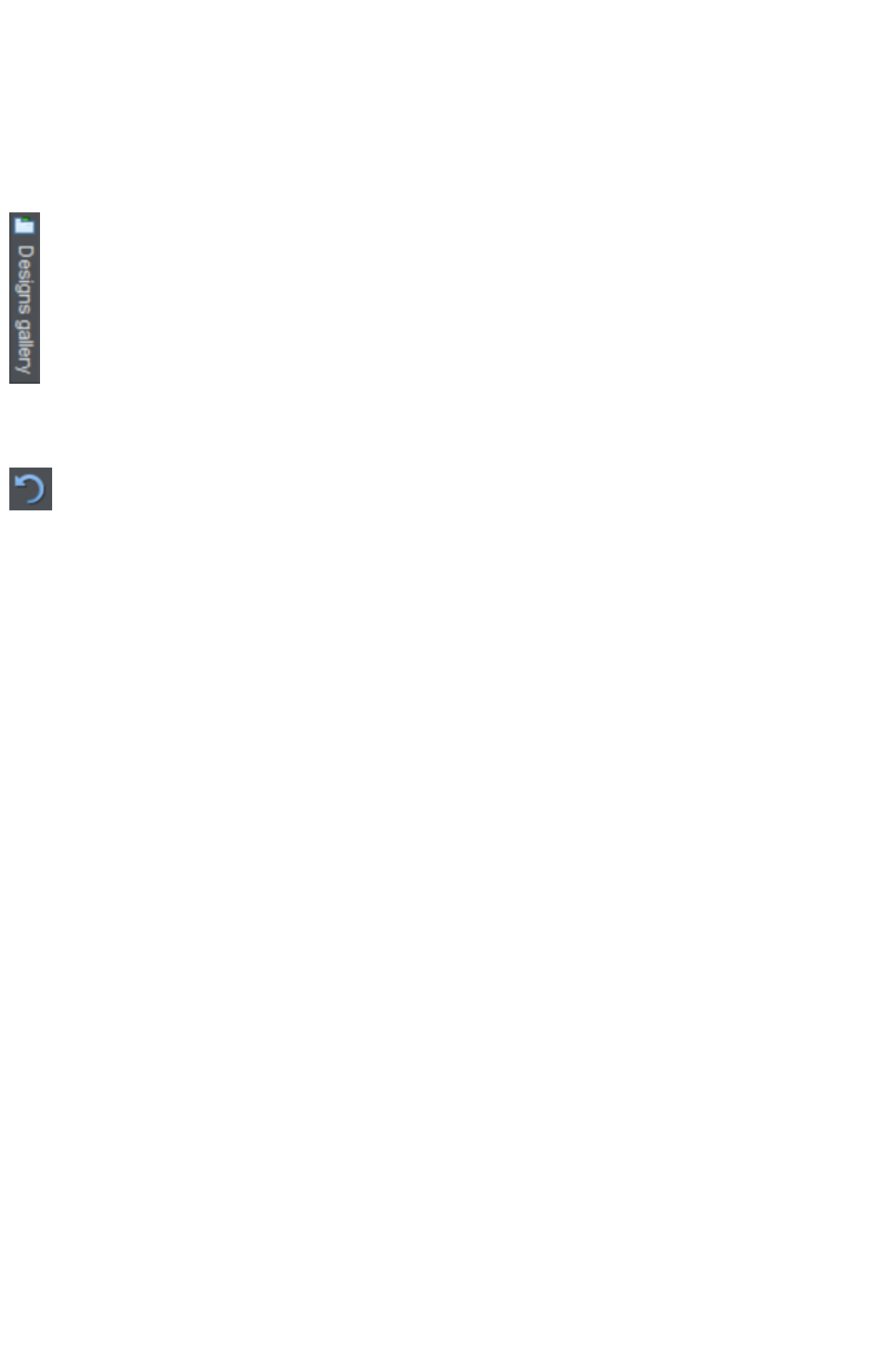
can also find this example document in the Designs Gallery
.
Click the Designs Gallery tab, open the Introduction
category and just double click on the first document.
Here you can find out how to change your website colors, edit your text, drag and drop photos, move
objects around the page and more.
Undo
Remember you can undo any change you make using the Undo
button or "Ctrl + Z". If you hold the button down you can race back
through all your actions, right back to the beginning.
Page 11

Getting Help
If you need some help using this program, see Support
.
Document info
"File" > "Document info"
displays information about the selected document such as its size and any fonts used. This is a good way
to find out if you are missing a required font that could prevent the document from displaying correctly.
Anything you type into the comment field is stored as part of the file. This comment is displayed
whenever you display the document info dialog box.
Page 12

Document info
"File" > "Document info"
displays information about the selected document such as its size and any fonts used. This is a good way
to find out if you are missing a required font that could prevent the document from displaying correctly.
Anything you type into the comment field is stored as part of the file. This comment is displayed
whenever you display the document info dialog box.
Page 13
ToolTips
When you move over a button, the toolTip tells
you the function of the button.
About Xara Web Designer 7 Premium
Choose "Help" > "About Xara Web Designer 7 Premium"
. This displays general information about the program. If you contact Xara support, you may be asked
for this information.
Page 14

About Xara Web Designer 7 Premium
Choose "Help" > "About Xara Web Designer 7 Premium"
. This displays general information about the program. If you contact Xara support, you may be asked
for this information.
Page 15
Getting Started
This section gives an overview of the main functionality of Web Designer Premium. Later sections go
into more detail about each tool.
In this chapter
Program Layout
Objects On The Page
Object Based Web Design
The Selector Tool
Website Toolbar
Creating a website
Previewing Your Website
Using Templates, Clipart & Widgets
Website Colors
Photos
Text
Page Size
Saving Your Work. Creating A Website
Stretchy Objects
Groups
Repeating Objects
Links, Buttons & Navigation Bars
Drawing Tools
Right-click menus
Layers, Mouseover (Rollover) & Pop-ups
Creating Buttons, Banners And Other Web Graphics
Publishing Your Website
Page 16
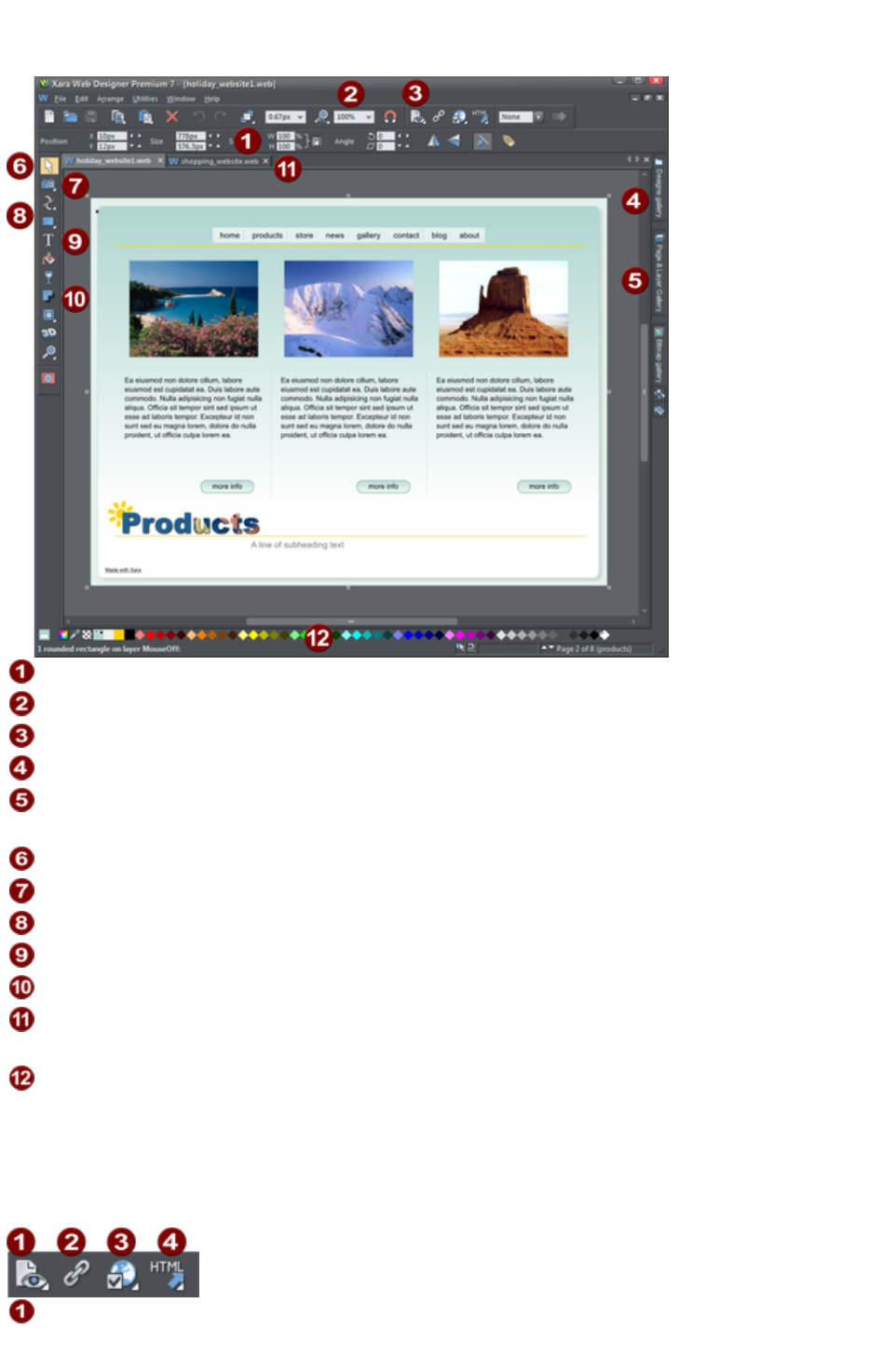
Program Layout
Info Bar - changes with each tool
Zoom
Preview Website
Designs Gallery (Galleries bar)
Page & Layer Gallery (Galleries
bar)
Selector Tool
Photo Editing Tool
Drawing Tools
Text Tool
Shadow Tool
Tabs for all open documents - icon
identifies document type.
Color Line
Note
: All Web Designer Premium infobars now have improved text rendering for easier viewing, if you have
ClearType text enabled in your Windows Control Panel.
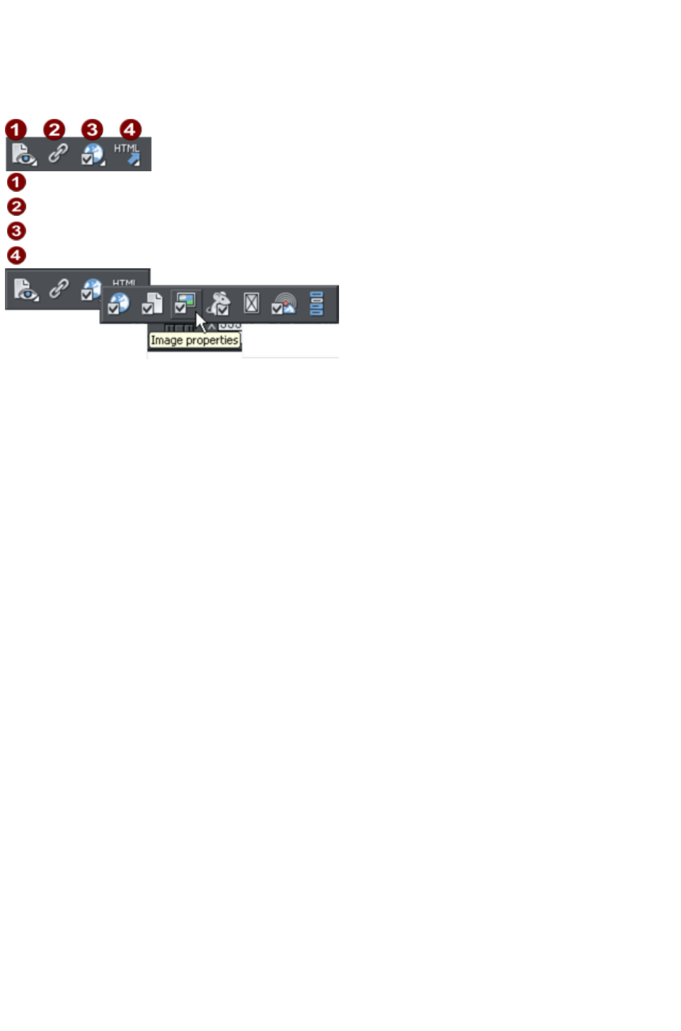
There are four buttons in the top bar that relate to website functions. Three of these have flyout bars
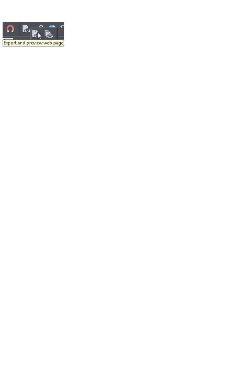
which are shown when you move the mouse pointer over them, revealing more web function buttons.
Export and preview web
page/website
Page 17
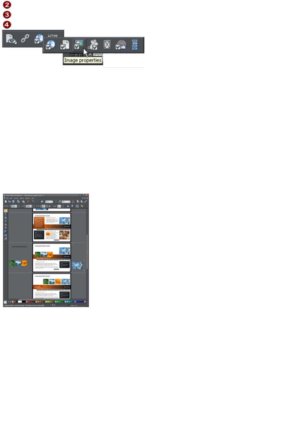
Link properties
Website options
Export
Move your mouse pointer over each button in the flyout bar to see a tooltip describing the button.
There are two ways to create a new website. Either by starting with a pre-designed template and then
customizing this with your own text, photos and color scheme. Or by creating a website from scratch,
placing all the required elements, text, graphics and photos on the page where you require.
Note: By default Web Designer Premium opens a new document showing just one page. To view all the
pages in your website document, right click a page and choose Multiple Page View
. You can now scroll the Web Designer Premium window up and down to view all the pages in the
document.
Zooming / Scrolling / Pushing your page
These common operations are made very easy:
To Zoom in or out, hold "Ctrl" and use the mouse-wheel
To push the page, press your mouse-wheel and push (yes it's a button as well)
To scroll use the mouse-wheel (or the scroll bars of course)
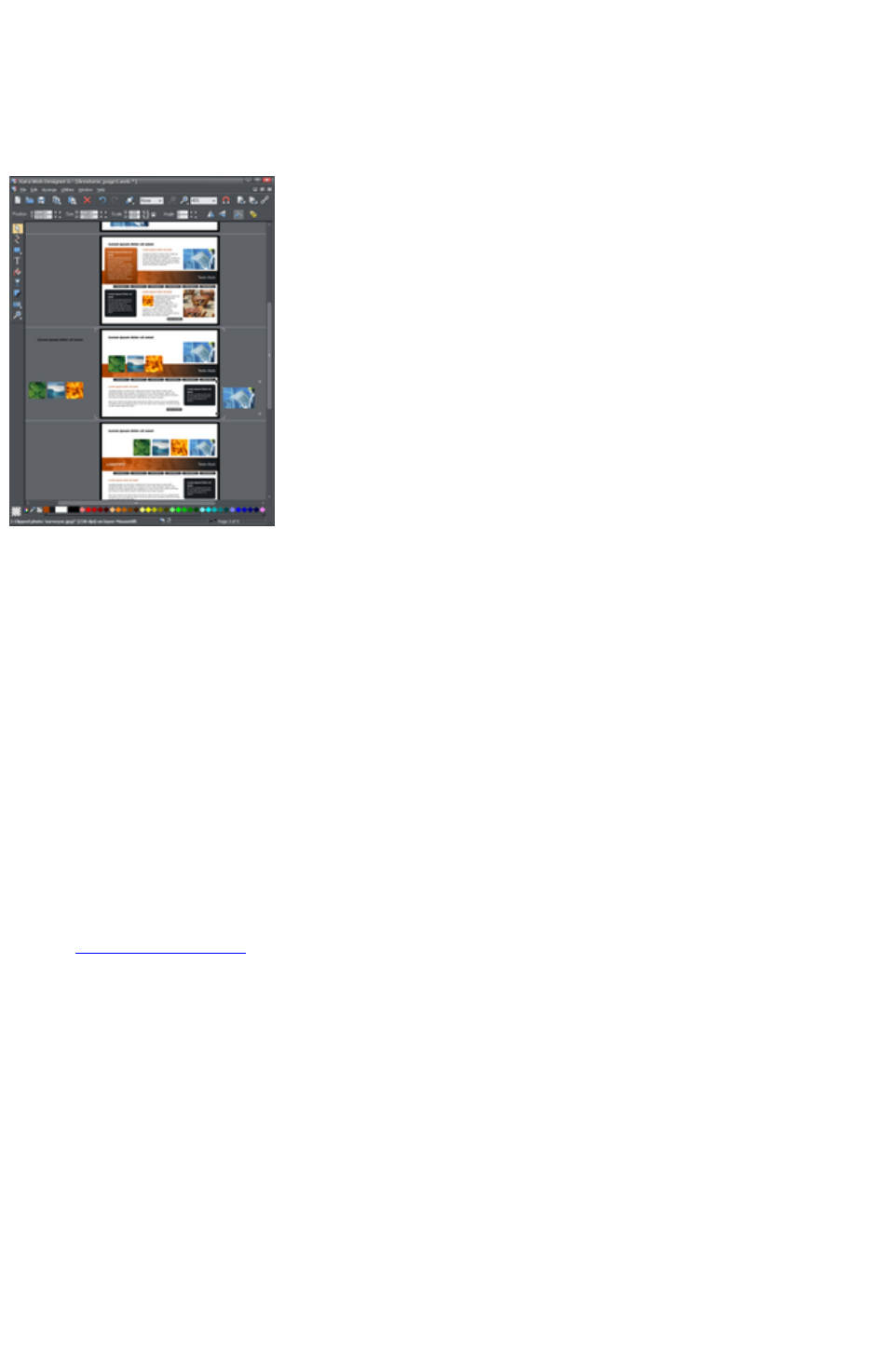
Web documents are displayed in single page
mode by default and print documents in
multi-page view mode. Switch between
display modes by right clicking on the page or
pasteboard and selecting or deselecting
Multiple Page View
from the drop-down menu. An example of
multiple page view is shown to the left.
You can drag and drop items between pages.
When you make document-wide Theme color
changes, you can see how the changes affect
all pages.
The current page is marked with 4 corner
brackets.
In this example you can see some items have been placed on the pasteboard area beside the pages.
These are not exported as part of your website. The pasteboard area is useful as a place to keep
temporary or working graphics, photos or other objects.
Flyout Bars
Some tools on the main toolbar are grouped together under a single icon. These icons have a small
triangle indicator in the bottom right corner and when you move the mouse pointer over one of these
icons a flyout bar appears. The bar holds the other tool icons that are in this group. Simply move the
mouse pointer over each one to see a tooltip, and click to select the tool you want.
If you select a modal tool from a flyout bar, that tool becomes the primary tool for that group. So you'll
then see its icon highlighted on the main toolbar.
There are also some flyout bars on the toolbar at the top of the window. Again these are used to group
together closely related operations under a single icon. This makes them conveniently accessible while not
taking up too much space on the bar.
Page 18

Zooming / Scrolling / Pushing your page
These common operations are made very easy:
To Zoom in or out, hold "Ctrl" and use the mouse-wheel
To push the page, press your mouse-wheel and push (yes it's a button as well)
To scroll use the mouse-wheel (or the scroll bars of course)
Web documents are displayed in single page
mode by default and print documents in
multi-page view mode. Switch between
display modes by right clicking on the page or
pasteboard and selecting or deselecting
Multiple Page View
from the drop-down menu. An example of
multiple page view is shown to the left.
You can drag and drop items between pages.
When you make document-wide Theme color
changes, you can see how the changes affect
all pages.
The current page is marked with 4 corner
brackets.
In this example you can see some items have been placed on the pasteboard area beside the pages.
These are not exported as part of your website. The pasteboard area is useful as a place to keep
temporary or working graphics, photos or other objects.
Flyout Bars
Some tools on the main toolbar are grouped together under a single icon. These icons have a small
triangle indicator in the bottom right corner and when you move the mouse pointer over one of these
icons a flyout bar appears. The bar holds the other tool icons that are in this group. Simply move the
mouse pointer over each one to see a tooltip, and click to select the tool you want.
If you select a modal tool from a flyout bar, that tool becomes the primary tool for that group. So you'll
then see its icon highlighted on the main toolbar.
There are also some flyout bars on the toolbar at the top of the window. Again these are used to group
together closely related operations under a single icon. This makes them conveniently accessible while not
taking up too much space on the bar.
See the Customizing chapter
in the pdf manual for more information on flyout bars.
Page 20

Flyout Bars
Some tools on the main toolbar are grouped together under a single icon. These icons have a small
triangle indicator in the bottom right corner and when you move the mouse pointer over one of these
icons a flyout bar appears. The bar holds the other tool icons that are in this group. Simply move the
mouse pointer over each one to see a tooltip, and click to select the tool you want.
If you select a modal tool from a flyout bar, that tool becomes the primary tool for that group. So you'll
then see its icon highlighted on the main toolbar.
There are also some flyout bars on the toolbar at the top of the window. Again these are used to group
together closely related operations under a single icon. This makes them conveniently accessible while not
taking up too much space on the bar.
See the Customizing chapter
in the pdf manual for more information on flyout bars.
Page 21

Objects On The Page
Whether you customize a template or create your own graphics from scratch, you can rotate, resize and
position anything on the page, anywhere you like. You can easily resize the page to be any required size
and add new web pages as required. Certain features, such as changing color schemes, work across all
pages simultaneously.
These are the basic types of page element:
Text: Using the Text Tool you can create anything from single word headings to columns of
text or even blocks of text that flow from one block into another. You can also create bulleted or
numbered lists. The Text Tool InfoBar provides controls over the font, size, line spacing and
more. You can resize text either by using the Selector Tool or by selecting the text in the usual
fashion and choosing alternative point or pixel sizes. Perhaps surprisingly you can even rotate text
by any angle, and by using Repel text under (right click an object to see this option) you can
automatically flow text around objects on the page, such as photos.
Graphics: Any type of logo, heading and most buttons that appear on your website are
graphics. Web Designer Premium is a vector graphics program which means you can edit the
shape, rotate and resize your graphic objects with no loss of quality (unlike pixel photo editing
tools such as Photoshop). And although there is no vector graphics standard for web pages (for
websites all graphics have to be either JPG, GIF or PNG formats) Web Designer Premium
creates the correct format and resolution automatically. For example, if you want to create a
colored panel to place behind your text, you'd do this by drawing a rectangle or rounded
rectangle object on the page, and placing this behind your text. When you save your website, this
is automatically converted into a PNG graphic image of the correct resolution.
Photos: There are few websites that do not contain photos of some sort. Xara Web Designer 7
Premium has a great range of photo editing tools. You can drag and drop photos directly from
your camera or File Explorer window onto the page, rotate, enhance, crop, and Web Designer
Premium automatically generates the correct resolution JPG image. Replacing existing photos in
templates is as easy as drag and drop - and you can alter the size and angle of photos 'inside'
their frame very easily. You can easily create clickable photo thumbnails that pop-up an enlarged
version and optionally include gallery controls that allow your visitors to browse your photos or
view an automatic slideshow.
Placeholders: These are graphic objects on the page which represent the size and position of
dynamic "widgets" such as a Flash animations, movies, or forms. When your site is exported the
placeholder graphic is replaced by the code required to make the widget work and so the
working widget appears at the same position on your page. See the Website Widgets chapter in
the pdf manual for details.
Page 22
Object Based Web Design
All the types of elements described above are collectively referred to as objects.
One of the unique benefits of Web Designer Premium is that you have complete freedom to place any
object anywhere on the page, and your website will faithfully reproduce this.
The Selector Tool
can be used to select any object on the page, and to move (just drag
it), resize and rotate the objects.
You can adjust the stacking order (that is whether an object appears in front or behind others on the
page) by right clicking and choosing Arrange or using the Arrange menu options. With the Selector
Tool
you can resize objects by dragging on the corner resize handles. You can rotate any object by dragging
just inside the corner selection handles. And although websites do not support rotated text, Web
Designer Premium knows to automatically create the appropriate graphic image so the resulting page will
always look exactly right.
To add some text to your website, select the Text Tool
and click anywhere on the page and start typing.
You can also create text columns, by clicking and dragging horizontally in the Text Tool, or text areas by
dragging diagonally. See the Text section in the pdf manual for more details and the Chapter Text
Handling
for a complete reference of text functions of Xara Web Designer 7 Premium.
You can use the drawing tools to create rectangles, rounded
rectangles, circles and ellipses, and just about any shape you
like using the Shape Editor Tool. See the Drawing tools
section in the pdf manual for more detail.
Stacking Order
All objects on the page are placed one on top of another. The most recently drawn or created object is
always on top, that is, in front of any others. You can adjust the stacking position by right clicking and
choosing Arrange or using the Arrange
menu options.
For example, when you draw a new rectangle it always appears to cover all the objects behind it. By
right clicking and choosing Arrange or pressing "Ctrl + B" (or the menu "Arrange" > "Put to Back
") the object is moved behind everything else. Similarly "Ctrl + F" brings any selected object to the top,
that is, in front of everything else.
There is an added complication: layers. All objects are collected into named layers, and each layer can
be turned on or off to show or hide everything on that layer. See the Layers section
in the pdf manual for more detail.
The Page & Layer Gallery allows you to easily see and adjust the stacking order of objects and layers.
Objects are listed in order from front to back in the gallery. See the Page & Layer Gallery
chapter in the pdf manual for details.
Page 23

Stacking Order
All objects on the page are placed one on top of another. The most recently drawn or created object is
always on top, that is, in front of any others. You can adjust the stacking position by right clicking and
choosing Arrange or using the Arrange
menu options.
For example, when you draw a new rectangle it always appears to cover all the objects behind it. By
right clicking and choosing Arrange or pressing "Ctrl + B" (or the menu "Arrange" > "Put to Back
") the object is moved behind everything else. Similarly "Ctrl + F" brings any selected object to the top,
that is, in front of everything else.
There is an added complication: layers. All objects are collected into named layers, and each layer can
be turned on or off to show or hide everything on that layer. See the Layers section
in the pdf manual for more detail.
The Page & Layer Gallery allows you to easily see and adjust the stacking order of objects and layers.
Objects are listed in order from front to back in the gallery. See the Page & Layer Gallery
chapter in the pdf manual for details.
Page 24
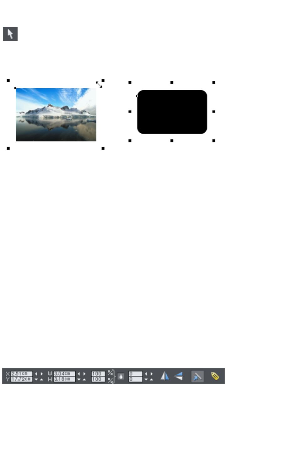
The Selector Tool
This tool is a general purpose tool that allows you to select, move,
resize and rotate all objects on your web page.
You can do all these things by just dragging on the objects on the page, or on the selection handles
around the object, or you can enter precise numeric values. The selected object is shown with 4 or 8
handles around the outside, and the status line at the bottom of the screen also tells you what is selected.
Drag on any corner handle to resize an object. Drag just inside the corner handles (shown left) to rotate.
Rectangles and rounded rectangles have eight handles so you can stretch them as well as resize. Other
objects, such as groups, blocks of text, photos show only 4 handles and can't be stretched (because they
would distort).
Nudging Objects
The arrow keys can be used to nudge the selected object, one pixel at a time. If you hold "Shift", it
nudges objects 10 pixels at a time.
Rotating Objects
There are two ways to rotate an object. Either click on the object a second time, so the selection
handles change to show rotation handles, which you can then drag on to rotate the object. Or, when it's
showing the square selection handles, move the mouse pointer just inside the corner handles until you see
the mouse pointer change to a rotation indicator - you can then also drag to rotate the selected object.
Unusually you can rotate just about anything in Web Designer Premium, including photos, headings, even
blocks of text. Since web browsers can't display text at an angle, Web Designer Premium will
automatically convert any rotated text into graphics when exporting as a website.
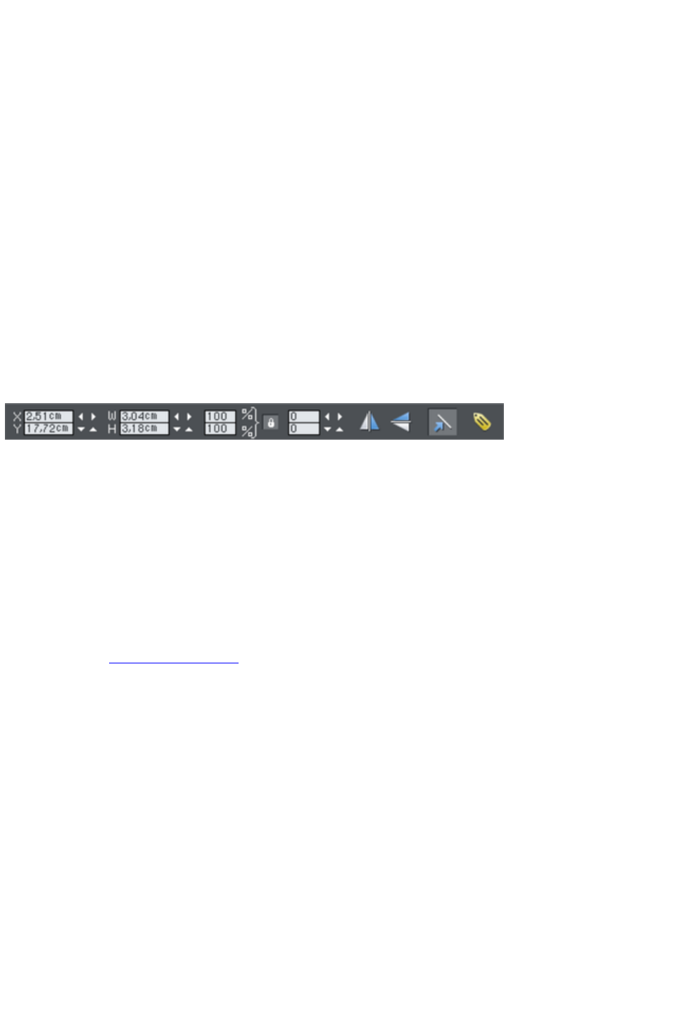
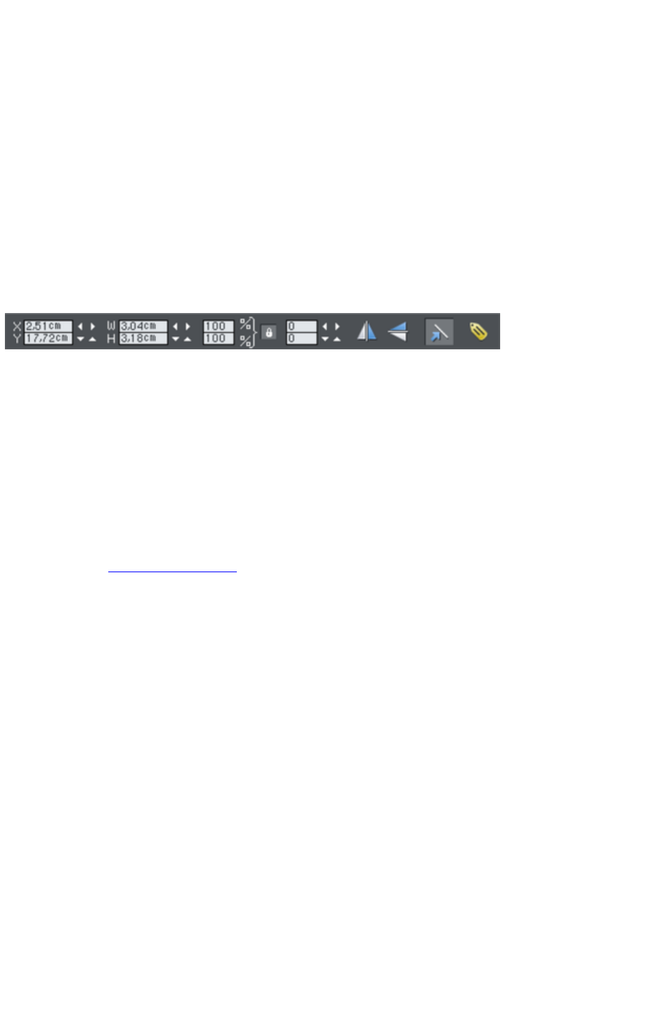
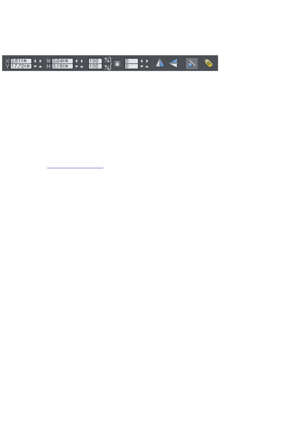
InfoBar
When an object is selected, the InfoBar - just above your document - shows all the relevant controls for
the current tool. This bar changes depending on which tool is selected. This is the InfoBar in the
Selector Tool
:
The InfoBar, just above your document, shows controls for the selected tool.
You can enter numeric values into any field. e.g. to reduce the size of an object by 20% you can enter
80% into the W field (which is a % size). The little padlock selects whether both the width and height
change together.
Copying Objects
You can use the usual "Edit" > "Copy" ("Ctrl + C") and "Edit" > "Paste" ("Ctrl + V") options or
Page 25

Nudging Objects
The arrow keys can be used to nudge the selected object, one pixel at a time. If you hold "Shift", it
nudges objects 10 pixels at a time.
Rotating Objects
There are two ways to rotate an object. Either click on the object a second time, so the selection
handles change to show rotation handles, which you can then drag on to rotate the object. Or, when it's
showing the square selection handles, move the mouse pointer just inside the corner handles until you see
the mouse pointer change to a rotation indicator - you can then also drag to rotate the selected object.
Unusually you can rotate just about anything in Web Designer Premium, including photos, headings, even
blocks of text. Since web browsers can't display text at an angle, Web Designer Premium will
automatically convert any rotated text into graphics when exporting as a website.
InfoBar
When an object is selected, the InfoBar - just above your document - shows all the relevant controls for
the current tool. This bar changes depending on which tool is selected. This is the InfoBar in the
Selector Tool
:
The InfoBar, just above your document, shows controls for the selected tool.
You can enter numeric values into any field. e.g. to reduce the size of an object by 20% you can enter
80% into the W field (which is a % size). The little padlock selects whether both the width and height
change together.
Copying Objects
You can use the usual "Edit" > "Copy" ("Ctrl + C") and "Edit" > "Paste" ("Ctrl + V") options or
right click an object and choose Copy
, but a really quick way to copy any item is drag on it with the right mouse button.
You can also copy and paste a page anywhere in your document from the current document or another
document ? see Copying and pasting
pages.
Page 27
Rotating Objects
There are two ways to rotate an object. Either click on the object a second time, so the selection
handles change to show rotation handles, which you can then drag on to rotate the object. Or, when it's
showing the square selection handles, move the mouse pointer just inside the corner handles until you see
the mouse pointer change to a rotation indicator - you can then also drag to rotate the selected object.
Unusually you can rotate just about anything in Web Designer Premium, including photos, headings, even
blocks of text. Since web browsers can't display text at an angle, Web Designer Premium will
automatically convert any rotated text into graphics when exporting as a website.
InfoBar
When an object is selected, the InfoBar - just above your document - shows all the relevant controls for
the current tool. This bar changes depending on which tool is selected. This is the InfoBar in the
Selector Tool
:
The InfoBar, just above your document, shows controls for the selected tool.
You can enter numeric values into any field. e.g. to reduce the size of an object by 20% you can enter
80% into the W field (which is a % size). The little padlock selects whether both the width and height
change together.
Copying Objects
You can use the usual "Edit" > "Copy" ("Ctrl + C") and "Edit" > "Paste" ("Ctrl + V") options or
right click an object and choose Copy
, but a really quick way to copy any item is drag on it with the right mouse button.
You can also copy and paste a page anywhere in your document from the current document or another
document ? see Copying and pasting
pages.
Page 28
InfoBar
When an object is selected, the InfoBar - just above your document - shows all the relevant controls for
the current tool. This bar changes depending on which tool is selected. This is the InfoBar in the
Selector Tool
:
The InfoBar, just above your document, shows controls for the selected tool.
You can enter numeric values into any field. e.g. to reduce the size of an object by 20% you can enter
80% into the W field (which is a % size). The little padlock selects whether both the width and height
change together.
Copying Objects
You can use the usual "Edit" > "Copy" ("Ctrl + C") and "Edit" > "Paste" ("Ctrl + V") options or
right click an object and choose Copy
, but a really quick way to copy any item is drag on it with the right mouse button.
You can also copy and paste a page anywhere in your document from the current document or another
document ? see Copying and pasting
pages.
Page 29

Copying Objects
You can use the usual "Edit" > "Copy" ("Ctrl + C") and "Edit" > "Paste" ("Ctrl + V") options or
right click an object and choose Copy
, but a really quick way to copy any item is drag on it with the right mouse button.
You can also copy and paste a page anywhere in your document from the current document or another
document ? see Copying and pasting
pages.
Page 30
Website Toolbar
The Website Toolbar
at the top of the Xara Web Designer 7 Premium provides convenient access to the main web functions
you'll use regularly.
Preview
Link
Website Options
Export
Move your mouse pointer over each button in the flyout bar to see a tooltip describing the button.
Page 31

Creating a website
There are two ways to create a new website. Either by starting with a pre-designed template and then
customizing this with your own text, photos and color scheme. Or by creating a website from scratch,
placing all the required elements, text, graphics, photos and placeholders on the page as you require.
Placeholders are graphic objects on the page which are substituted in the final website for elements such
as Flash animations, YouTube videos, Interactive Maps, HTML snippets and 'widgets' of all kinds. See
later sections in the correspondending chapter of the pdf manual for more information on placeholders.
Page 32
Previewing Your Website
When creating your website in Web Designer Premium, your working document shows an accurate
static preview, but to check the behavior of pop-ups, mouseover effects and Flash and other widgets it's
necessary to use true Browser Preview.
There are two preview options, in the flyout bar on the web toolbar.
Preview website
exports all the pages of your site and then brings up the preview window. So all the pages and links in
your site should be working.
The navigation buttons in the top bar of the preview window allow you move back or forward, just like in
a web browser, and the Home button returns you to the page you started the preview on.
Preview page
exports and previews only the current page. So it's useful if you have a large site which takes some time
to export as a whole. You can just quickly preview the page you are working on, without exporting the
rest of the site.
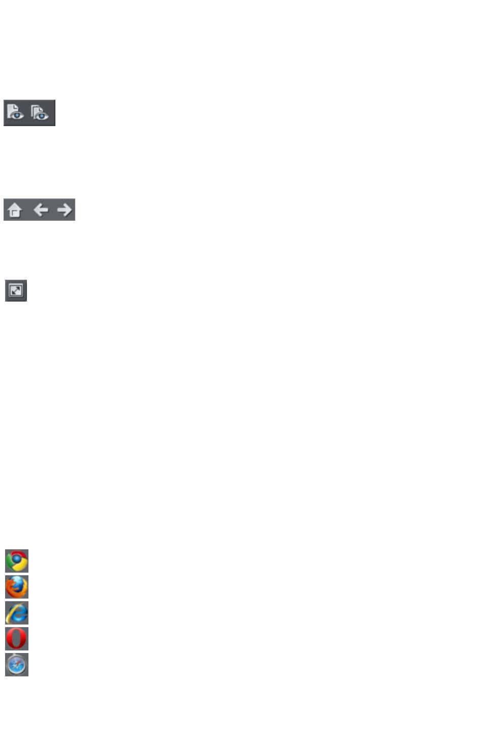
You can preview your website or web page in full screen mode by
clicking the View Full Screen
button at the top right of the preview window (press "Esc" to exit or
"F11" to enter and exit full screen mode). When you close the preview
window and next reopen it, Web Designer Premium displays the last
mode you chose for the window, i.e., normal, maximised or full screen.
If you've not yet exported your site, these previews export to a temporary folder on your computer.
Once you've exported, the same export location is used each time you preview, so your exported site is
continually updated as you preview.
Choose your preview browser
Although this internal preview uses a simplified version of the Internet Explorer browser by default, you
can choose one of the five most popular browser types to view your page or website from the preview
window.
To preview your website in your favorite web browser, click one of the following from the bar at the top
of the preview window:
Note
: These buttons are only enabled if you have installed the browsers on your PC.
Previews your page or website in Google Chrome
Previews your page or website in Mozilla Firefox
Previews your page or website in Internet Explorer
Previews your page or website in Opera
Previews your page or website in Safari
When you click on one of the above buttons, the browser opens in the page that you are currently
viewing in the preview window.
If you want to preview your pages in a browser other than these types, you can right click on the
exported .htm file and select Open With...
Page 33

, or you can just drag and drop the file onto an open browser window. Once you have exported then
each time you click the Preview buttons, the export is updated as well, and so it's just necessary to click
the Reload button in your browser (or press "F5").
Page 34
Using Templates, Clipart & Widgets
Open the Designs Gallery by clicking the Designs Gallery tab in the
Galleries bar (or use "File" > "New from Designs Gallery
").
This shows folders containing collections of website designs and associated graphic files that each follow
a specific theme. There are also folders of widgets, like forms, e-commerce facilities, web gadgets, and
many other features. Browse through the folders and double click to open any file as a new document.
Each theme section has a collection of alternative page layouts and some other useful page elements such
as buttons or expanding text panels. Each theme generally also contains a complete website template and
several 'color schemes'. You can change your entire site to a different color scheme by just dragging and
dropping the scheme from the gallery onto your page, or by just double-clicking on it.
Some of the folders in the gallery (most notably the widget folders) are downloaded automatically from
Xara's servers when you are online and you open the gallery. Therefore the selection of folders and the
items available in the folders will change periodically. Check back regularly to see the latest updates.
Adding New Pages To Your Website
You can drag any template design from the Designs Gallery
onto your page. If this is a page template, it will add a new page to your website, after first asking if you
want to match any color changes. If you drag a clipart item such as a button, heading or photo object,
this gets added onto the page where you dropped it, and again you will be asked if you want to match
any color changes you've made.
In addition to themed web page sections, the Designs Gallery
also has folders containing additional button designs, banners, headings, photo objects and more. Just
drag the required design from the gallery onto your page. You will be asked whether you want the
graphic to match the colors of your website or not. If you choose not to you can still edit the colors of the
imported graphic - see below.
Your imported graphic is just another object on the page, and can be re-positioned, resized and rotated
using the Selector Tool
as usual.
To add a new page of the same design, the easiest way is to right click
the page and choose Duplicate current page or use the Duplicate
current page
button on the standard toolbar.
This replicates the current page below. You can then just delete or edit the elements as required. This has
the advantage of keeping the same navigation structure.
Or you can copy and paste an existing page in the same or another document. Right-click an empty part
of a page and choose Copy Page. In the destination document right-click a page and choose Paste >
Page
(or press "Ctrl + V").
The page on the clipboard is added as a new page immediately following the current page. The pasted
page adopts the page size of the document it's pasted into (as long as the All pages in document the
same checkbox is enabled in File > Page Options
). Page layers and attributes and all the objects on the page are also pasted.
You can add a new blank page by right clicking and choosing New
Page 35

Page or use the Insert blank page
button in the 'page' flyout menu bar.
You can delete pages by right clicking and choosing Delete current
page or click the Delete current page button
in the 'page' flyout menu bar.
Page 36
Adding New Pages To Your Website
You can drag any template design from the Designs Gallery
onto your page. If this is a page template, it will add a new page to your website, after first asking if you
want to match any color changes. If you drag a clipart item such as a button, heading or photo object,
this gets added onto the page where you dropped it, and again you will be asked if you want to match
any color changes you've made.
In addition to themed web page sections, the Designs Gallery
also has folders containing additional button designs, banners, headings, photo objects and more. Just
drag the required design from the gallery onto your page. You will be asked whether you want the
graphic to match the colors of your website or not. If you choose not to you can still edit the colors of the
imported graphic - see below.
Your imported graphic is just another object on the page, and can be re-positioned, resized and rotated
using the Selector Tool
as usual.
To add a new page of the same design, the easiest way is to right click
the page and choose Duplicate current page or use the Duplicate
current page
button on the standard toolbar.
This replicates the current page below. You can then just delete or edit the elements as required. This has
the advantage of keeping the same navigation structure.
Or you can copy and paste an existing page in the same or another document. Right-click an empty part
of a page and choose Copy Page. In the destination document right-click a page and choose Paste >
Page
(or press "Ctrl + V").
The page on the clipboard is added as a new page immediately following the current page. The pasted
page adopts the page size of the document it's pasted into (as long as the All pages in document the
same checkbox is enabled in File > Page Options
). Page layers and attributes and all the objects on the page are also pasted.
You can add a new blank page by right clicking and choosing New
Page or use the Insert blank page
button in the 'page' flyout menu bar.
You can delete pages by right clicking and choosing Delete current
page or click the Delete current page button
in the 'page' flyout menu bar.
Page 37
Embedding Movies, Flash And Other Widgets
You can embed a wide variety of interactive widgets easily; YouTube™ videos, Google Maps, Flash
files or any HTML snippet. This is done using placeholders, which are objects (simple rectangles or
photos) that have an associated piece of HTML or Flash file that is substituted for the placeholder when
saving your website. For full details on widgets and placeholders, see the Website Widgets Chapter
in the pdf manual.
The Designs Gallery contains a frequently updated selection of widgets from a variety of providers.
Simply drag and drop these onto your web page. A web browser window appears which takes you to
the widget providers site, where you can choose and customize the widget. When you're done you click
the Insert
button at the bottom of the browser window and the widget is inserted into your page with an
automatically generated preview image. It's that easy!
Or you can find widget sites yourself and just as easily add the code to your site.
Flash Clipart
Xara Web Designer 7 Premium includes the ability to create Flash animations from scratch (see the
Flash Animations section in the pdf manual), but also includes a range of Flash templates you can
customize. Flash templates cannot be dragged onto the page directly, but have to be opened as a
separate animation document, where you can customize it as required, and then save the Flash (.swf) file
to your local disk. Then use "File" > "Import"
or drag and drop the .swf file onto your web page.
A placeholder image is automatically rendered for you and this will appear on your page. Preview your
page to see your working Flash animation. Alternatively you can create your own placeholder object
(e.g., a rectangle) and use the Placeholder tab of the Web Properties
dialog to associate it with your Flash file.
Widgets
Some of the items in the Designs Gallery
are dynamic widgets that you can add to your website quickly and easily. When you drag one of these
onto your page, a browser window opens onto a widget website which allows you to configure the
widget. Therefore you must be online to use widgets.
Once you've finished configuring your widget click the Insert
button at the bottom of the browser window. A placeholder image is automatically generated which is a
static snapshot of what your widget will look like when it's viewed in your website. The widget won't
work on the page in Xara Web Designer 7 Premium - you just see the preview image. Simply preview
your page to see the widget in action!
If you find other interesting widgets out there on the Internet, normally the widget provider will give you a
piece of HTML code to copy and paste into your website. With Xara Web Designer 7 Premium this is
very easy. All you need to do is go into the Selector Tool
and then paste the code into your page. Xara Web Designer 7 Premium will detect that you've pasted
HTML code and will render a placeholder image for you automatically, which will appear on your page
after a few seconds. The code is already attached to the placeholder, so just preview your page to see
your widget working!
Alternatively you can paste widget code directly into the head of your page if necessary. Click the
Placeholder tab in the Web Properties dialog and click the HTML code (head)
button, then paste your code into the HTML code (head) dialog.
For more information see the Widgets Chapter
in the pdf manual.
Page 38
Flash Clipart
Xara Web Designer 7 Premium includes the ability to create Flash animations from scratch (see the
Flash Animations section in the pdf manual), but also includes a range of Flash templates you can
customize. Flash templates cannot be dragged onto the page directly, but have to be opened as a
separate animation document, where you can customize it as required, and then save the Flash (.swf) file
to your local disk. Then use "File" > "Import"
or drag and drop the .swf file onto your web page.
A placeholder image is automatically rendered for you and this will appear on your page. Preview your
page to see your working Flash animation. Alternatively you can create your own placeholder object
(e.g., a rectangle) and use the Placeholder tab of the Web Properties
dialog to associate it with your Flash file.
Widgets
Some of the items in the Designs Gallery
are dynamic widgets that you can add to your website quickly and easily. When you drag one of these
onto your page, a browser window opens onto a widget website which allows you to configure the
widget. Therefore you must be online to use widgets.
Once you've finished configuring your widget click the Insert
button at the bottom of the browser window. A placeholder image is automatically generated which is a
static snapshot of what your widget will look like when it's viewed in your website. The widget won't
work on the page in Xara Web Designer 7 Premium - you just see the preview image. Simply preview
your page to see the widget in action!
If you find other interesting widgets out there on the Internet, normally the widget provider will give you a
piece of HTML code to copy and paste into your website. With Xara Web Designer 7 Premium this is
very easy. All you need to do is go into the Selector Tool
and then paste the code into your page. Xara Web Designer 7 Premium will detect that you've pasted
HTML code and will render a placeholder image for you automatically, which will appear on your page
after a few seconds. The code is already attached to the placeholder, so just preview your page to see
your widget working!
Alternatively you can paste widget code directly into the head of your page if necessary. Click the
Placeholder tab in the Web Properties dialog and click the HTML code (head)
button, then paste your code into the HTML code (head) dialog.
For more information see the Widgets Chapter
in the pdf manual.
Page 39

Widgets
Some of the items in the Designs Gallery
are dynamic widgets that you can add to your website quickly and easily. When you drag one of these
onto your page, a browser window opens onto a widget website which allows you to configure the
widget. Therefore you must be online to use widgets.
Once you've finished configuring your widget click the Insert
button at the bottom of the browser window. A placeholder image is automatically generated which is a
static snapshot of what your widget will look like when it's viewed in your website. The widget won't
work on the page in Xara Web Designer 7 Premium - you just see the preview image. Simply preview
your page to see the widget in action!
If you find other interesting widgets out there on the Internet, normally the widget provider will give you a
piece of HTML code to copy and paste into your website. With Xara Web Designer 7 Premium this is
very easy. All you need to do is go into the Selector Tool
and then paste the code into your page. Xara Web Designer 7 Premium will detect that you've pasted
HTML code and will render a placeholder image for you automatically, which will appear on your page
after a few seconds. The code is already attached to the placeholder, so just preview your page to see
your widget working!
Alternatively you can paste widget code directly into the head of your page if necessary. Click the
Placeholder tab in the Web Properties dialog and click the HTML code (head)
button, then paste your code into the HTML code (head) dialog.
For more information see the Widgets Chapter
in the pdf manual.
Page 40
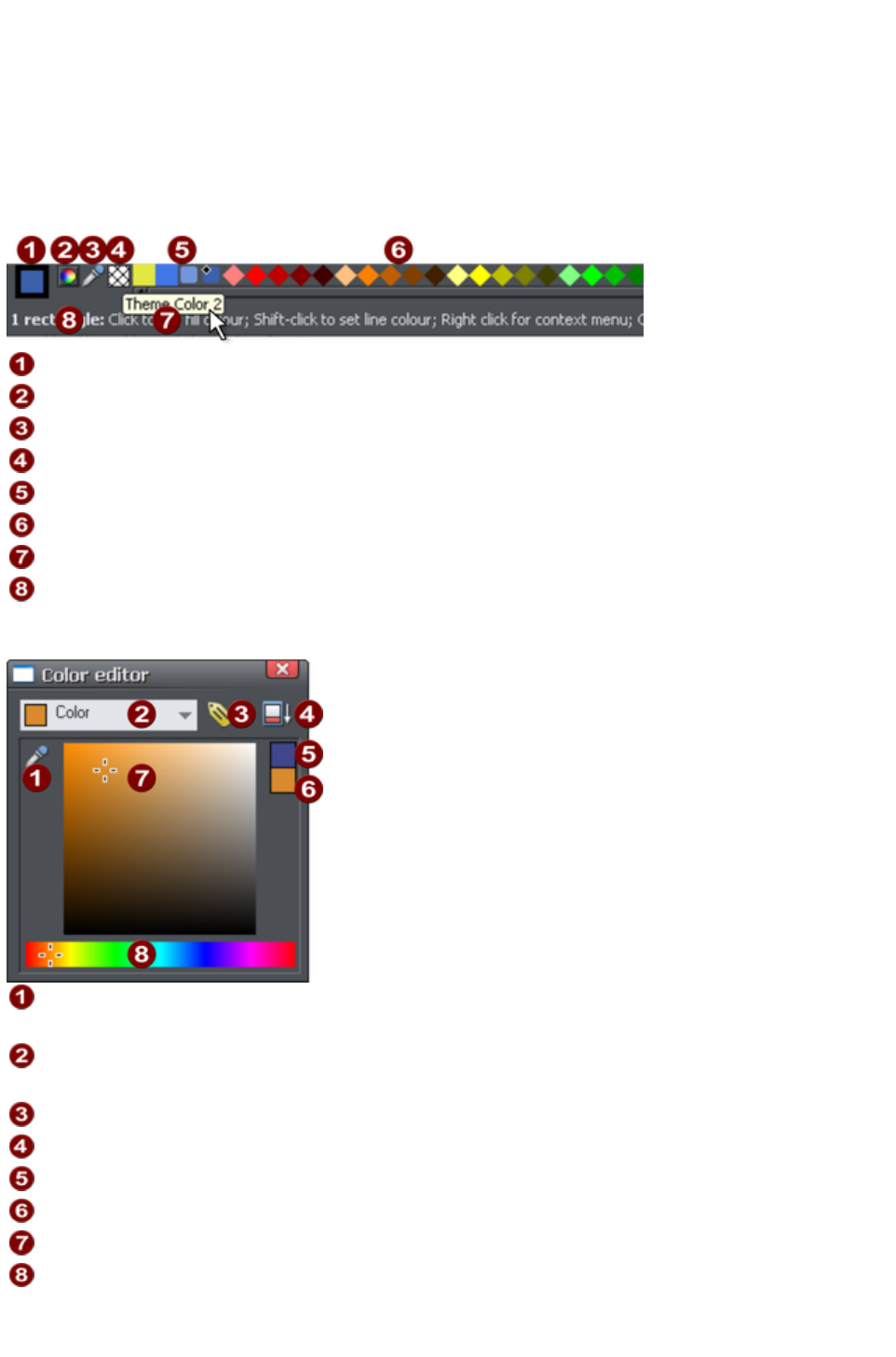
Website Colors
All the templates use a small set of theme colors, and various shades of those theme colors. The easiest
way to re-color your site is to use one of the alternative color schemes provided with each web theme
in the Designs Gallery
. Just drop a scheme onto your page to change the color of the whole site, or double-click on it.
Or you can edit each of the theme colors individually yourself. These are called 'Named Colors' and
appear on the left side of the Color Line along the bottom of the window.
Current Outline and Fill Color
Color Editor
Eye dropper color picker
'No color' patch.
Named 'Theme' Colors and Linked Colors
Fixed palette of standard colors
Hold pointer over a color to see its name
Status line. Shows what is selected, and provides hints
Simply click on any of the Named Colors and select the Edit
option (if you hover the mouse pointer over the color you will see a tooltip name).
When editing a color you can drag the eye dropper to pick colors off
screen, even from other open windows
Select the color to edit: Fill color/Line color of the selected object or any
of the named theme colors
Click the label icon to create a Named Color
Click to show extended color controls
Previous color
Actual color
Drag here to select any shade of the selected hue
Drag here to select any hue
The Color Editor provides an easy way of choosing any color. Click the Extended Controls to enter
RGB values.
Page 41

Note that when you change a Theme Color in this way, all the related shades used throughout the
document will change as well.
Coloring Shapes
You can fill any drawn shape with a color, either by dragging the color from the Color Line and
dropping it on to the shape, or by first selecting the object and then clicking on the Color Line.
Alternatively right click the shape and choose Fill Color
or click the small Color Editor icon (or press "Ctrl + E") to display the
Color Editor, where you can set any color you like.
You can give drawn objects a graduated color fill using the Fill Tool.
Coloring Photos
If you try to color a photo it turns it into a 'contoned' photo. For example, to make any photo black and
white, right click and choose "Contone" > "Make black and white" or select it and click on the white
color patch on the end of the Color Line. You can set the light or dark color to be any two colors, not
just white and black - right click, choose "Contone" > "Light
" and click a color in the Color Editor.
Note: If the photo is inside a group, as many of the photo objects in the templates or clipart are, then
you will have to select the photo inside the group first. You can do this by holding "Ctrl" down when
clicking on the object in the Selector Tool. Another way of directly selecting the photo is to click on it in
the Photo Tool
.
Coloring Imported Clipart
When you import a clipart graphic by dragging from the Design Gallery, using the "File" > "Import"
option, or dragging a .web or .xar file onto your page, you will usually be asked whether you want to
match the colors. If you select not to, then any named colors used in this graphic will be added to the
Color Line. Clicking on any color on the Color Line will give you the option to edit the color.
Page Background Color
Most of the page designs in the Design Gallery
have two types of background. A wide page background that extends across the background of the
whole browser window. And on top of this is drawn the web page elements, that usually consists of
various colored panels.
On the Color Line there is usually one color named 'Background Color', another 'Panel Color', and by
editing these you can control the various background colors. The other colors used are typically Theme
Color 1, 2 etc
Page 42

Background Color
Panel Color
Theme 1 & 2 colors
Setting the page background color
When you open a new blank page ("File" > "New
" >) the page defaults to being white. This is the background on which you place all the elements of your
website.
If you drag a color from the Color Line over the page, and drop it, it will set the page background to that
color. In the Web Browser this background color is shown over the whole area of the window
background.
However you can also make the page background one color, as described above, and then set the area
around the page to a different color. This area around the page is referred to as the pasteboard. Just
drop a color onto the pasteboard to set its color and set the page color as described above. Now when
you preview your page you'll see the browser window background color is set to the pasteboard color
Page 43

and you can see the page rectangle with its own color.
You can use the color editor to edit these colors. Right click on the page and choose Change page
background to bring up the color editor, then you can edit the page color. To edit the pasteboard
background color, right click on the pasteboard and choose Change background color
.
To set a repeating background texture, drag the photo or bitmap onto
your document. Open the Bitmap Gallery, scroll to the photo you just
loaded, click on it to select it, and then click the Background
button on the gallery.
Page Background Layer
When you set the page background color by dropping a color onto the page as described above, this
actually adds another layer to your document, which you can see if you open the Page & Layer
Gallery. It's called the Page background layer
.
This layer is normally locked, so you can't select and edit its contents. But you can unlock it in the Page
& Layer Gallery
in order to perform some limited editing of it, to customize your page background. Just click on the lock
symbol next to the "Page background" layer to unlock it.
Now if you click on the page background, you'll see a rectangle becomes selected (see status bar). This
rectangle covers your whole page - it's used to set the page color. You can now do some limited editing
of this rectangle, such as give it a graduated fill using the Fill Tool, or give it rounded corners using the
Rectangle Tool
.
Note
: You must also set the pasteboard color too, before you can give your page anything other than a flat
color.
Offsetting the top of your page
Normally if you just set the page and pasteboard to different colors, when you preview you'll see that the
page extends right to the top of the browser window. You can't see any of the pasteboard color above
Page 44

your page. However you can add an offset so that there is some space above your page in the web
browser.
To add an offset, you change the page origin. Normally the page origin is set to be the top left corner of
your page. By moving the origin up 20 pixels, for example, you add a 20 pixel margin to the top of your
page when it's viewed in a web browser.
You can change the origin in two ways. The easiest way is to open the "Utilities" > "Options" dialog
(or right click a page and choose Page Options), go to the Grid & Ruler
tab and increase the value of the Y coordinate of the origin point. This is normally set to the vertical size
of your page, so just increase it by the margin size you would like. So for example if your page is 700
pixels tall, change the Y value of the origin coordinate from 700 to 720, in order to add a 20 pixel offset.
Alternatively you can set the origin point interactively. Turn rulers on by right clicking and choosing "
Show Grid/Guides" > "Show Rulers" or by choosing Show rulers from the Window
menu ("Ctrl + L"). Then click and drag on the crosshairs button, which is located where the horizontal
and vertical rulers join, at the top left of the canvas. Now you are dragging around the origin position, so
position it the appropriate distance vertically above the top left corner of your page.
Changing the horizontal position of the origin has no effect on the horizontal positioning of your page, so
this should be left unchanged.
Advanced backgrounds
Web browsers do not allow a graduated color background over the whole visible window (i.e. as a real
HTML background), but they do support repeating, tiled, bitmaps as backgrounds. So you can use this
to create a full-window graduated background, by creating a bitmap, which is then tiled (repeated)
across the page.
By creating a long thin strip as on the left, when set as a background,you get a graduated color
background across the whole page.
To create this effect, follow these steps;
1. Draw a tall thin rectangle. This needs to be as tall as any user is likely to make their browser
window so it doesn't repeat vertically. A value of 1000 pixels or more is recommended, which is
much taller than your page. You may need to zoom out to draw one large enough. It should be
very narrow.
2. Make sure your rectangle has no outline: Click it in the Selector Tool and set it to have no
outline. Click on the 'no color' cross-hatch patch on the Color Line (or select 'none' from the
Line Width drop down menu on the top button bar).
3. Ensure the rectangle is a few whole pixels wide, and then ensure it is on exact whole pixel X and
Page 45
Y coordinates: In the Selector Tool select the rectangle, edit the Width (W) value, press
"Enter", then edit the X and Y positions to be whole numbers.
4. Using the Fill Tool, give it a graduated color fill as required: Just drag on the rectangle. Make
sure it's graduated top to bottom by adjusting the fill arrow if necessarily.
5. Export the rectangle as a PNG image. Click the Export as PNG icon .Once exported drag
it back onto the page from your File Explorer.
6. Open the Bitmap Gallery, scroll down to see the graphic you just loaded (it will be a very thin,
almost invisible thumbnail in the gallery), and select it (click on it in the gallery) and then click the
Background button on the Bitmap Gallery. You can now delete the original rectangle from the
page.
Note
: This will only work across the whole browser window background if you haven't given the pasteboard
background its own color. If you have set the pasteboard background, then the graduated fill will only be
applied to the background of the page area.
Linked shades
You can create colors that are lighter or darker shades of another color, so that when you alter the
'parent' color, all the lighter and darker shades change to match the new hue. For example a graduated
color shade on a button, such as this:
This is a simple rounded rectangle with a graduated
color fill created with the Fill Tool. In the Fill Tool
you can click on the either end of the arrow to set the
color.
If you create the main green color as a named color, and then make a lighter or darker shade of the
color, as a linked shade, when you now edit the named color the shades change as well, so you get
simple re-coloring of complex shaded objects.
To create a linked shade, open the extra controls in the Color Editor and select the 'Normal Color'
drop-down menu and choose 'Shade of another color
'.
Page 46
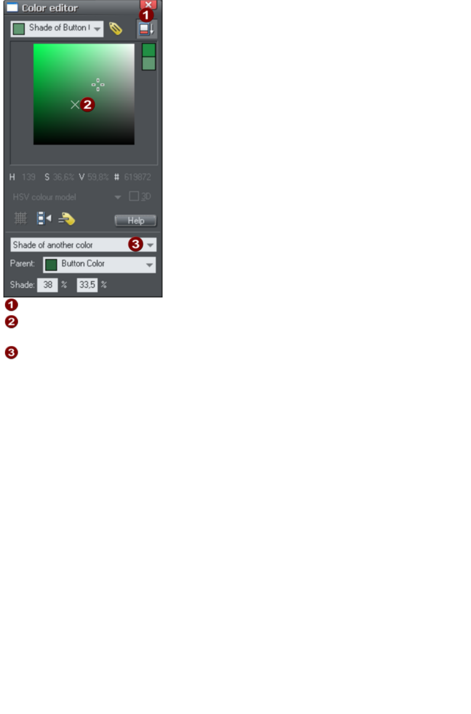
Click this button to reveal the extra controls.
You can now select any light or darker shade of the parent color. The
cross marks the parent color.
Select Shade
from this drop-down list and then the parent color.
You can also create a Linked Shade that appears on the Color Line (so you can easily apply it to other
objects). When you select to create a new Named Color you can choose to make this a linked 'Shade of
another color'.
Page 47

Coloring Shapes
You can fill any drawn shape with a color, either by dragging the color from the Color Line and
dropping it on to the shape, or by first selecting the object and then clicking on the Color Line.
Alternatively right click the shape and choose Fill Color
or click the small Color Editor icon (or press "Ctrl + E") to display the
Color Editor, where you can set any color you like.
You can give drawn objects a graduated color fill using the Fill Tool.
Coloring Photos
If you try to color a photo it turns it into a 'contoned' photo. For example, to make any photo black and
white, right click and choose "Contone" > "Make black and white" or select it and click on the white
color patch on the end of the Color Line. You can set the light or dark color to be any two colors, not
just white and black - right click, choose "Contone" > "Light
" and click a color in the Color Editor.
Note: If the photo is inside a group, as many of the photo objects in the templates or clipart are, then
you will have to select the photo inside the group first. You can do this by holding "Ctrl" down when
clicking on the object in the Selector Tool. Another way of directly selecting the photo is to click on it in
the Photo Tool
.
Coloring Imported Clipart
When you import a clipart graphic by dragging from the Design Gallery, using the "File" > "Import"
option, or dragging a .web or .xar file onto your page, you will usually be asked whether you want to
match the colors. If you select not to, then any named colors used in this graphic will be added to the
Color Line. Clicking on any color on the Color Line will give you the option to edit the color.
Page Background Color
Most of the page designs in the Design Gallery
have two types of background. A wide page background that extends across the background of the
whole browser window. And on top of this is drawn the web page elements, that usually consists of
various colored panels.
On the Color Line there is usually one color named 'Background Color', another 'Panel Color', and by
editing these you can control the various background colors. The other colors used are typically Theme
Color 1, 2 etc
Page 48
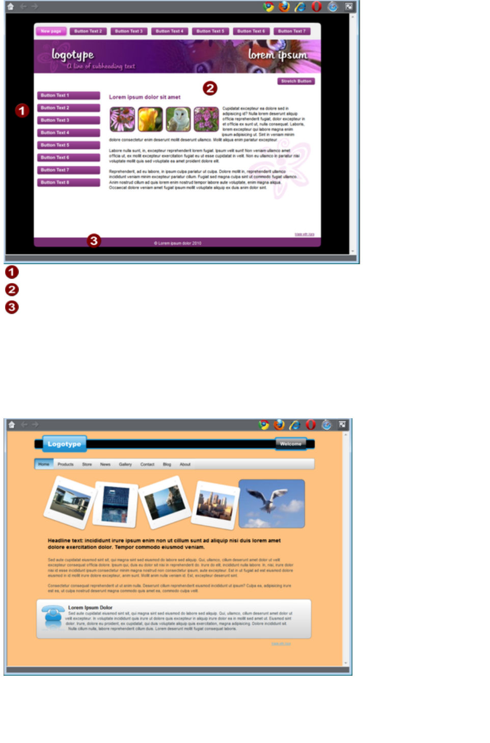
Background Color
Panel Color
Theme 1 & 2 colors
Setting the page background color
When you open a new blank page ("File" > "New
" >) the page defaults to being white. This is the background on which you place all the elements of your
website.
If you drag a color from the Color Line over the page, and drop it, it will set the page background to that
color. In the Web Browser this background color is shown over the whole area of the window
background.
However you can also make the page background one color, as described above, and then set the area
around the page to a different color. This area around the page is referred to as the pasteboard. Just
drop a color onto the pasteboard to set its color and set the page color as described above. Now when
you preview your page you'll see the browser window background color is set to the pasteboard color
Page 49
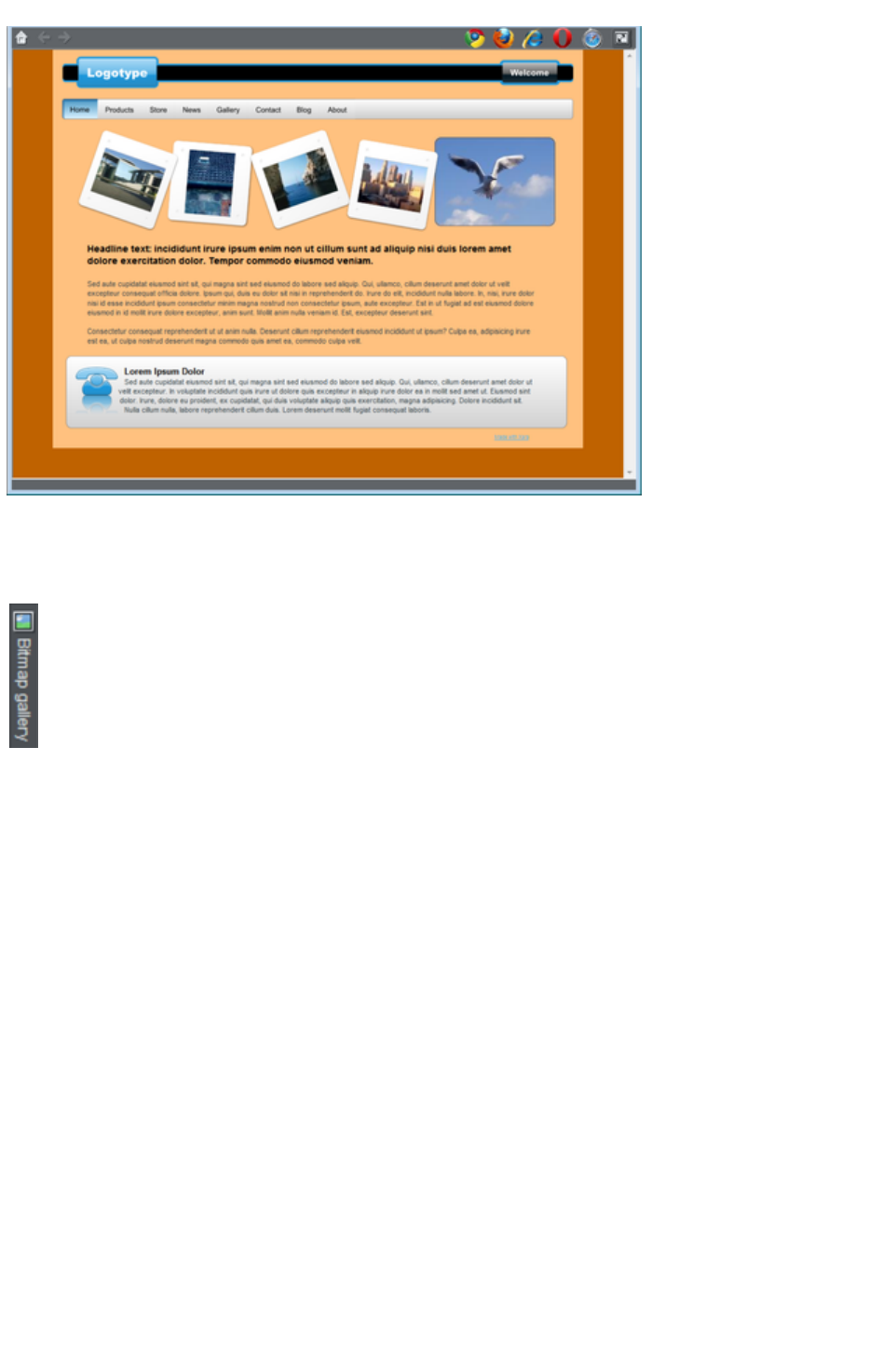
and you can see the page rectangle with its own color.
You can use the color editor to edit these colors. Right click on the page and choose Change page
background to bring up the color editor, then you can edit the page color. To edit the pasteboard
background color, right click on the pasteboard and choose Change background color
.
To set a repeating background texture, drag the photo or bitmap onto
your document. Open the Bitmap Gallery, scroll to the photo you just
loaded, click on it to select it, and then click the Background
button on the gallery.
Page Background Layer
When you set the page background color by dropping a color onto the page as described above, this
actually adds another layer to your document, which you can see if you open the Page & Layer
Gallery. It's called the Page background layer
.
This layer is normally locked, so you can't select and edit its contents. But you can unlock it in the Page
& Layer Gallery
in order to perform some limited editing of it, to customize your page background. Just click on the lock
symbol next to the "Page background" layer to unlock it.
Now if you click on the page background, you'll see a rectangle becomes selected (see status bar). This
rectangle covers your whole page - it's used to set the page color. You can now do some limited editing
of this rectangle, such as give it a graduated fill using the Fill Tool, or give it rounded corners using the
Rectangle Tool
.
Note
: You must also set the pasteboard color too, before you can give your page anything other than a flat
color.
Offsetting the top of your page
Normally if you just set the page and pasteboard to different colors, when you preview you'll see that the
page extends right to the top of the browser window. You can't see any of the pasteboard color above
Page 50
your page. However you can add an offset so that there is some space above your page in the web
browser.
To add an offset, you change the page origin. Normally the page origin is set to be the top left corner of
your page. By moving the origin up 20 pixels, for example, you add a 20 pixel margin to the top of your
page when it's viewed in a web browser.
You can change the origin in two ways. The easiest way is to open the "Utilities" > "Options" dialog
(or right click a page and choose Page Options), go to the Grid & Ruler
tab and increase the value of the Y coordinate of the origin point. This is normally set to the vertical size
of your page, so just increase it by the margin size you would like. So for example if your page is 700
pixels tall, change the Y value of the origin coordinate from 700 to 720, in order to add a 20 pixel offset.
Alternatively you can set the origin point interactively. Turn rulers on by right clicking and choosing "
Show Grid/Guides" > "Show Rulers" or by choosing Show rulers from the Window
menu ("Ctrl + L"). Then click and drag on the crosshairs button, which is located where the horizontal
and vertical rulers join, at the top left of the canvas. Now you are dragging around the origin position, so
position it the appropriate distance vertically above the top left corner of your page.
Changing the horizontal position of the origin has no effect on the horizontal positioning of your page, so
this should be left unchanged.
Advanced backgrounds
Web browsers do not allow a graduated color background over the whole visible window (i.e. as a real
HTML background), but they do support repeating, tiled, bitmaps as backgrounds. So you can use this
to create a full-window graduated background, by creating a bitmap, which is then tiled (repeated)
across the page.
By creating a long thin strip as on the left, when set as a background,you get a graduated color
background across the whole page.
To create this effect, follow these steps;
1. Draw a tall thin rectangle. This needs to be as tall as any user is likely to make their browser
window so it doesn't repeat vertically. A value of 1000 pixels or more is recommended, which is
much taller than your page. You may need to zoom out to draw one large enough. It should be
very narrow.
2. Make sure your rectangle has no outline: Click it in the Selector Tool and set it to have no
outline. Click on the 'no color' cross-hatch patch on the Color Line (or select 'none' from the
Line Width drop down menu on the top button bar).
3. Ensure the rectangle is a few whole pixels wide, and then ensure it is on exact whole pixel X and
Page 51
Y coordinates: In the Selector Tool select the rectangle, edit the Width (W) value, press
"Enter", then edit the X and Y positions to be whole numbers.
4. Using the Fill Tool, give it a graduated color fill as required: Just drag on the rectangle. Make
sure it's graduated top to bottom by adjusting the fill arrow if necessarily.
5. Export the rectangle as a PNG image. Click the Export as PNG icon .Once exported drag
it back onto the page from your File Explorer.
6. Open the Bitmap Gallery, scroll down to see the graphic you just loaded (it will be a very thin,
almost invisible thumbnail in the gallery), and select it (click on it in the gallery) and then click the
Background button on the Bitmap Gallery. You can now delete the original rectangle from the
page.
Note
: This will only work across the whole browser window background if you haven't given the pasteboard
background its own color. If you have set the pasteboard background, then the graduated fill will only be
applied to the background of the page area.
Linked shades
You can create colors that are lighter or darker shades of another color, so that when you alter the
'parent' color, all the lighter and darker shades change to match the new hue. For example a graduated
color shade on a button, such as this:
This is a simple rounded rectangle with a graduated
color fill created with the Fill Tool. In the Fill Tool
you can click on the either end of the arrow to set the
color.
If you create the main green color as a named color, and then make a lighter or darker shade of the
color, as a linked shade, when you now edit the named color the shades change as well, so you get
simple re-coloring of complex shaded objects.
To create a linked shade, open the extra controls in the Color Editor and select the 'Normal Color'
drop-down menu and choose 'Shade of another color
'.
Page 52

Click this button to reveal the extra controls.
You can now select any light or darker shade of the parent color. The
cross marks the parent color.
Select Shade
from this drop-down list and then the parent color.
You can also create a Linked Shade that appears on the Color Line (so you can easily apply it to other
objects). When you select to create a new Named Color you can choose to make this a linked 'Shade of
another color'.
Page 53
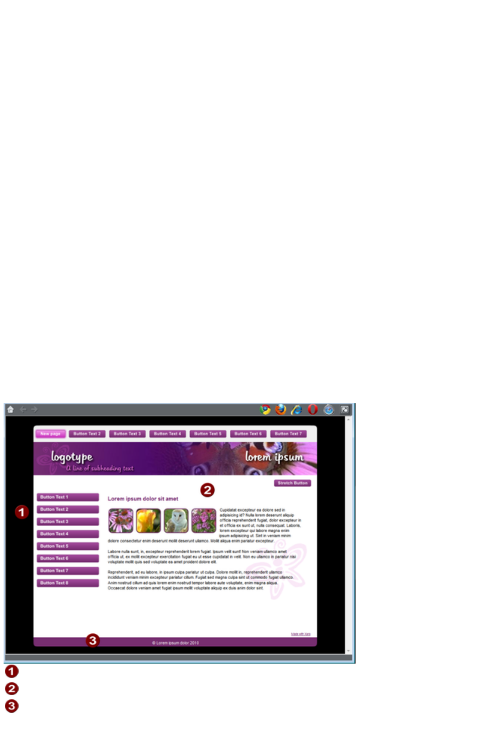
Coloring Photos
If you try to color a photo it turns it into a 'contoned' photo. For example, to make any photo black and
white, right click and choose "Contone" > "Make black and white" or select it and click on the white
color patch on the end of the Color Line. You can set the light or dark color to be any two colors, not
just white and black - right click, choose "Contone" > "Light
" and click a color in the Color Editor.
Note: If the photo is inside a group, as many of the photo objects in the templates or clipart are, then
you will have to select the photo inside the group first. You can do this by holding "Ctrl" down when
clicking on the object in the Selector Tool. Another way of directly selecting the photo is to click on it in
the Photo Tool
.
Coloring Imported Clipart
When you import a clipart graphic by dragging from the Design Gallery, using the "File" > "Import"
option, or dragging a .web or .xar file onto your page, you will usually be asked whether you want to
match the colors. If you select not to, then any named colors used in this graphic will be added to the
Color Line. Clicking on any color on the Color Line will give you the option to edit the color.
Page Background Color
Most of the page designs in the Design Gallery
have two types of background. A wide page background that extends across the background of the
whole browser window. And on top of this is drawn the web page elements, that usually consists of
various colored panels.
On the Color Line there is usually one color named 'Background Color', another 'Panel Color', and by
editing these you can control the various background colors. The other colors used are typically Theme
Color 1, 2 etc
Background Color
Panel Color
Theme 1 & 2 colors
Setting the page background color
Page 54
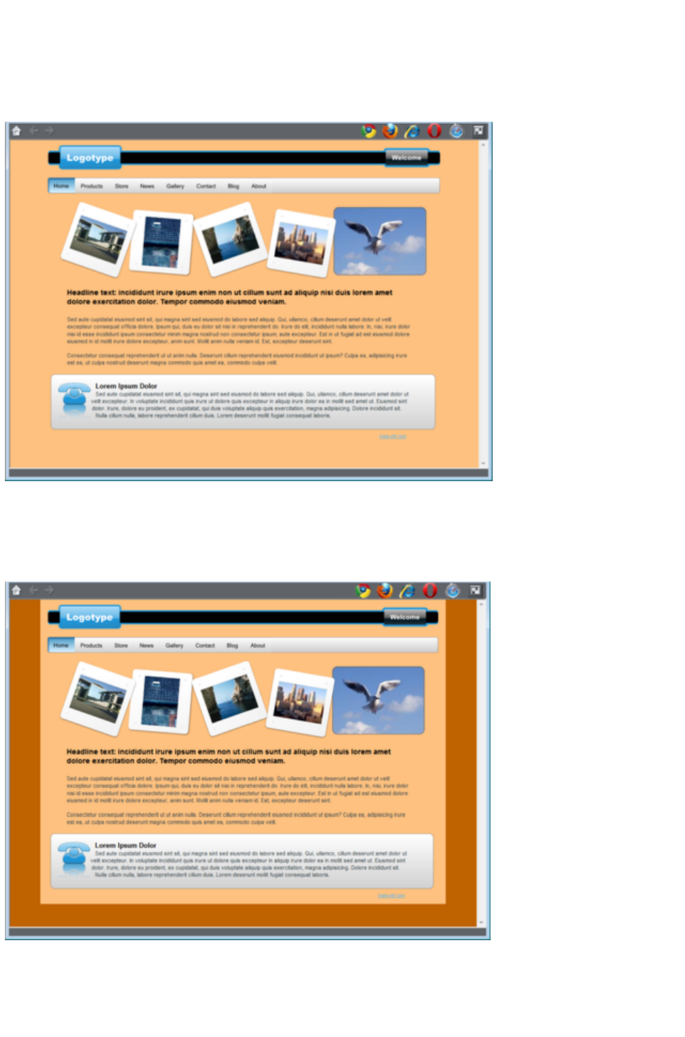
When you open a new blank page ("File" > "New
" >) the page defaults to being white. This is the background on which you place all the elements of your
website.
If you drag a color from the Color Line over the page, and drop it, it will set the page background to that
color. In the Web Browser this background color is shown over the whole area of the window
background.
However you can also make the page background one color, as described above, and then set the area
around the page to a different color. This area around the page is referred to as the pasteboard. Just
drop a color onto the pasteboard to set its color and set the page color as described above. Now when
you preview your page you'll see the browser window background color is set to the pasteboard color
and you can see the page rectangle with its own color.
You can use the color editor to edit these colors. Right click on the page and choose Change page
background to bring up the color editor, then you can edit the page color. To edit the pasteboard
background color, right click on the pasteboard and choose Change background color
.
Page 55

To set a repeating background texture, drag the photo or bitmap onto
your document. Open the Bitmap Gallery, scroll to the photo you just
loaded, click on it to select it, and then click the Background
button on the gallery.
Page Background Layer
When you set the page background color by dropping a color onto the page as described above, this
actually adds another layer to your document, which you can see if you open the Page & Layer
Gallery. It's called the Page background layer
.
This layer is normally locked, so you can't select and edit its contents. But you can unlock it in the Page
& Layer Gallery
in order to perform some limited editing of it, to customize your page background. Just click on the lock
symbol next to the "Page background" layer to unlock it.
Now if you click on the page background, you'll see a rectangle becomes selected (see status bar). This
rectangle covers your whole page - it's used to set the page color. You can now do some limited editing
of this rectangle, such as give it a graduated fill using the Fill Tool, or give it rounded corners using the
Rectangle Tool
.
Note
: You must also set the pasteboard color too, before you can give your page anything other than a flat
color.
Offsetting the top of your page
Normally if you just set the page and pasteboard to different colors, when you preview you'll see that the
page extends right to the top of the browser window. You can't see any of the pasteboard color above
your page. However you can add an offset so that there is some space above your page in the web
browser.
To add an offset, you change the page origin. Normally the page origin is set to be the top left corner of
your page. By moving the origin up 20 pixels, for example, you add a 20 pixel margin to the top of your
page when it's viewed in a web browser.
You can change the origin in two ways. The easiest way is to open the "Utilities" > "Options" dialog
(or right click a page and choose Page Options), go to the Grid & Ruler
tab and increase the value of the Y coordinate of the origin point. This is normally set to the vertical size
of your page, so just increase it by the margin size you would like. So for example if your page is 700
pixels tall, change the Y value of the origin coordinate from 700 to 720, in order to add a 20 pixel offset.
Alternatively you can set the origin point interactively. Turn rulers on by right clicking and choosing "
Show Grid/Guides" > "Show Rulers" or by choosing Show rulers from the Window
menu ("Ctrl + L"). Then click and drag on the crosshairs button, which is located where the horizontal
and vertical rulers join, at the top left of the canvas. Now you are dragging around the origin position, so
position it the appropriate distance vertically above the top left corner of your page.
Changing the horizontal position of the origin has no effect on the horizontal positioning of your page, so
this should be left unchanged.
Advanced backgrounds
Web browsers do not allow a graduated color background over the whole visible window (i.e. as a real
HTML background), but they do support repeating, tiled, bitmaps as backgrounds. So you can use this
to create a full-window graduated background, by creating a bitmap, which is then tiled (repeated)
Page 56
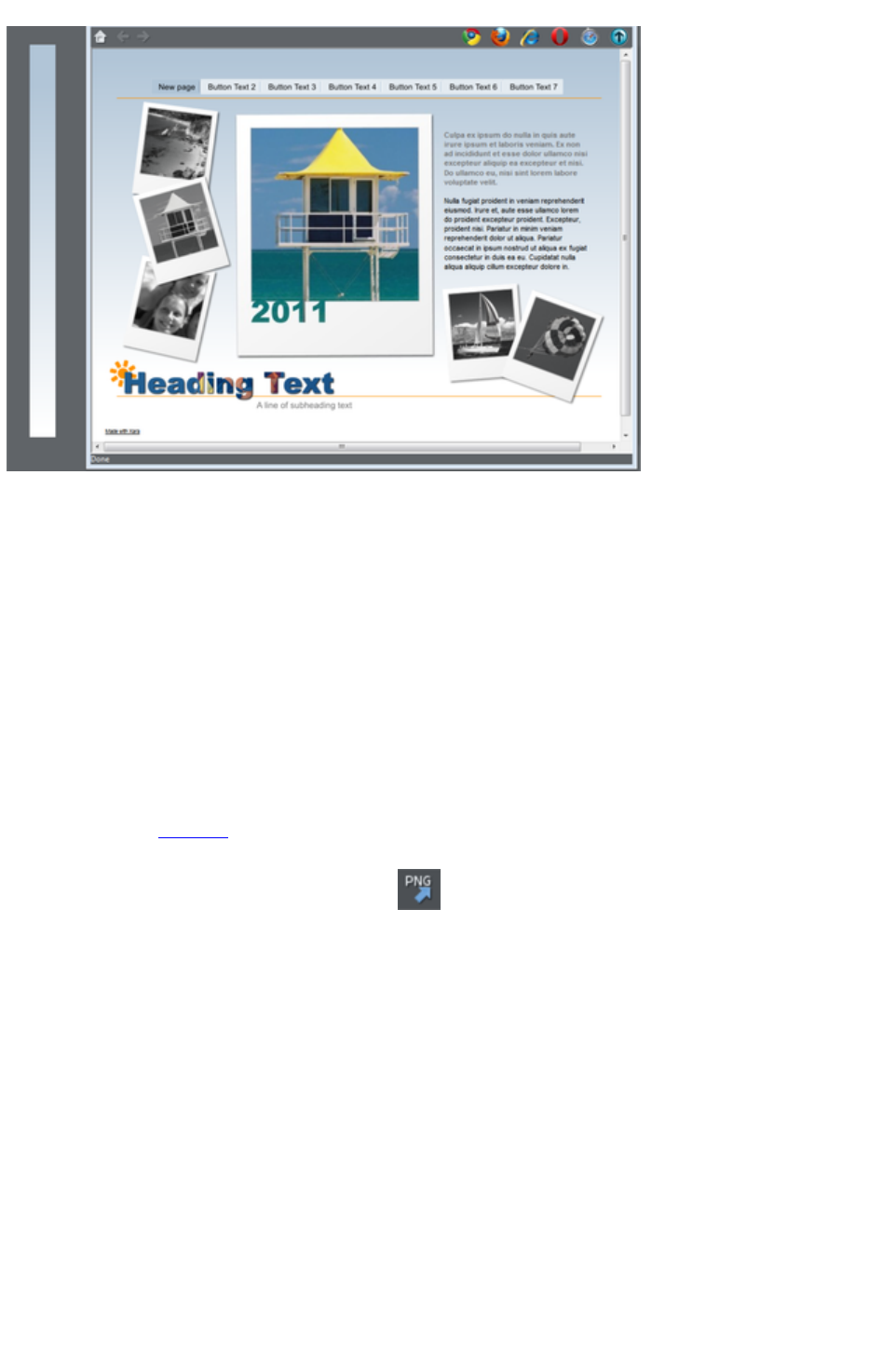
across the page.
By creating a long thin strip as on the left, when set as a background,you get a graduated color
background across the whole page.
To create this effect, follow these steps;
1. Draw a tall thin rectangle. This needs to be as tall as any user is likely to make their browser
window so it doesn't repeat vertically. A value of 1000 pixels or more is recommended, which is
much taller than your page. You may need to zoom out to draw one large enough. It should be
very narrow.
2. Make sure your rectangle has no outline: Click it in the Selector Tool and set it to have no
outline. Click on the 'no color' cross-hatch patch on the Color Line (or select 'none' from the
Line Width drop down menu on the top button bar).
3. Ensure the rectangle is a few whole pixels wide, and then ensure it is on exact whole pixel X and
Y coordinates: In the Selector Tool select the rectangle, edit the Width (W) value, press
"Enter", then edit the X and Y positions to be whole numbers.
4. Using the Fill Tool, give it a graduated color fill as required: Just drag on the rectangle. Make
sure it's graduated top to bottom by adjusting the fill arrow if necessarily.
5. Export the rectangle as a PNG image. Click the Export as PNG icon .Once exported drag
it back onto the page from your File Explorer.
6. Open the Bitmap Gallery, scroll down to see the graphic you just loaded (it will be a very thin,
almost invisible thumbnail in the gallery), and select it (click on it in the gallery) and then click the
Background button on the Bitmap Gallery. You can now delete the original rectangle from the
page.
Note
: This will only work across the whole browser window background if you haven't given the pasteboard
background its own color. If you have set the pasteboard background, then the graduated fill will only be
applied to the background of the page area.
Linked shades
You can create colors that are lighter or darker shades of another color, so that when you alter the
'parent' color, all the lighter and darker shades change to match the new hue. For example a graduated
color shade on a button, such as this:
Page 57
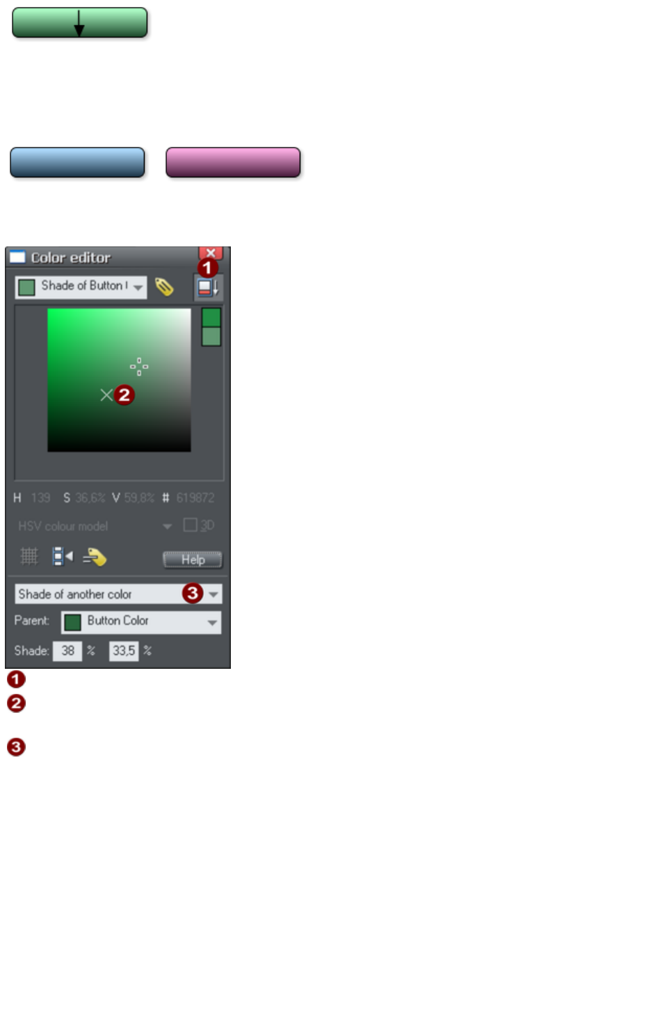
This is a simple rounded rectangle with a graduated
color fill created with the Fill Tool. In the Fill Tool
you can click on the either end of the arrow to set the
color.
If you create the main green color as a named color, and then make a lighter or darker shade of the
color, as a linked shade, when you now edit the named color the shades change as well, so you get
simple re-coloring of complex shaded objects.
To create a linked shade, open the extra controls in the Color Editor and select the 'Normal Color'
drop-down menu and choose 'Shade of another color
'.
Click this button to reveal the extra controls.
You can now select any light or darker shade of the parent color. The
cross marks the parent color.
Select Shade
from this drop-down list and then the parent color.
You can also create a Linked Shade that appears on the Color Line (so you can easily apply it to other
objects). When you select to create a new Named Color you can choose to make this a linked 'Shade of
another color'.
Page 58
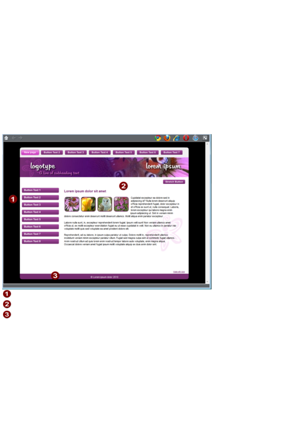
Coloring Imported Clipart
When you import a clipart graphic by dragging from the Design Gallery, using the "File" > "Import"
option, or dragging a .web or .xar file onto your page, you will usually be asked whether you want to
match the colors. If you select not to, then any named colors used in this graphic will be added to the
Color Line. Clicking on any color on the Color Line will give you the option to edit the color.
Page Background Color
Most of the page designs in the Design Gallery
have two types of background. A wide page background that extends across the background of the
whole browser window. And on top of this is drawn the web page elements, that usually consists of
various colored panels.
On the Color Line there is usually one color named 'Background Color', another 'Panel Color', and by
editing these you can control the various background colors. The other colors used are typically Theme
Color 1, 2 etc
Background Color
Panel Color
Theme 1 & 2 colors
Setting the page background color
When you open a new blank page ("File" > "New
" >) the page defaults to being white. This is the background on which you place all the elements of your
website.
If you drag a color from the Color Line over the page, and drop it, it will set the page background to that
color. In the Web Browser this background color is shown over the whole area of the window
background.
Page 59

However you can also make the page background one color, as described above, and then set the area
around the page to a different color. This area around the page is referred to as the pasteboard. Just
drop a color onto the pasteboard to set its color and set the page color as described above. Now when
you preview your page you'll see the browser window background color is set to the pasteboard color
and you can see the page rectangle with its own color.
You can use the color editor to edit these colors. Right click on the page and choose Change page
background to bring up the color editor, then you can edit the page color. To edit the pasteboard
background color, right click on the pasteboard and choose Change background color
.
To set a repeating background texture, drag the photo or bitmap onto
your document. Open the Bitmap Gallery, scroll to the photo you just
loaded, click on it to select it, and then click the Background
button on the gallery.
Page 60

Page Background Layer
When you set the page background color by dropping a color onto the page as described above, this
actually adds another layer to your document, which you can see if you open the Page & Layer
Gallery. It's called the Page background layer
.
This layer is normally locked, so you can't select and edit its contents. But you can unlock it in the Page
& Layer Gallery
in order to perform some limited editing of it, to customize your page background. Just click on the lock
symbol next to the "Page background" layer to unlock it.
Now if you click on the page background, you'll see a rectangle becomes selected (see status bar). This
rectangle covers your whole page - it's used to set the page color. You can now do some limited editing
of this rectangle, such as give it a graduated fill using the Fill Tool, or give it rounded corners using the
Rectangle Tool
.
Note
: You must also set the pasteboard color too, before you can give your page anything other than a flat
color.
Offsetting the top of your page
Normally if you just set the page and pasteboard to different colors, when you preview you'll see that the
page extends right to the top of the browser window. You can't see any of the pasteboard color above
your page. However you can add an offset so that there is some space above your page in the web
browser.
To add an offset, you change the page origin. Normally the page origin is set to be the top left corner of
your page. By moving the origin up 20 pixels, for example, you add a 20 pixel margin to the top of your
page when it's viewed in a web browser.
You can change the origin in two ways. The easiest way is to open the "Utilities" > "Options" dialog
(or right click a page and choose Page Options), go to the Grid & Ruler
tab and increase the value of the Y coordinate of the origin point. This is normally set to the vertical size
of your page, so just increase it by the margin size you would like. So for example if your page is 700
pixels tall, change the Y value of the origin coordinate from 700 to 720, in order to add a 20 pixel offset.
Alternatively you can set the origin point interactively. Turn rulers on by right clicking and choosing "
Show Grid/Guides" > "Show Rulers" or by choosing Show rulers from the Window
menu ("Ctrl + L"). Then click and drag on the crosshairs button, which is located where the horizontal
and vertical rulers join, at the top left of the canvas. Now you are dragging around the origin position, so
position it the appropriate distance vertically above the top left corner of your page.
Changing the horizontal position of the origin has no effect on the horizontal positioning of your page, so
this should be left unchanged.
Advanced backgrounds
Web browsers do not allow a graduated color background over the whole visible window (i.e. as a real
HTML background), but they do support repeating, tiled, bitmaps as backgrounds. So you can use this
to create a full-window graduated background, by creating a bitmap, which is then tiled (repeated)
across the page.
Page 61

By creating a long thin strip as on the left, when set as a background,you get a graduated color
background across the whole page.
To create this effect, follow these steps;
1. Draw a tall thin rectangle. This needs to be as tall as any user is likely to make their browser
window so it doesn't repeat vertically. A value of 1000 pixels or more is recommended, which is
much taller than your page. You may need to zoom out to draw one large enough. It should be
very narrow.
2. Make sure your rectangle has no outline: Click it in the Selector Tool and set it to have no
outline. Click on the 'no color' cross-hatch patch on the Color Line (or select 'none' from the
Line Width drop down menu on the top button bar).
3. Ensure the rectangle is a few whole pixels wide, and then ensure it is on exact whole pixel X and
Y coordinates: In the Selector Tool select the rectangle, edit the Width (W) value, press
"Enter", then edit the X and Y positions to be whole numbers.
4. Using the Fill Tool, give it a graduated color fill as required: Just drag on the rectangle. Make
sure it's graduated top to bottom by adjusting the fill arrow if necessarily.
5. Export the rectangle as a PNG image. Click the Export as PNG icon .Once exported drag
it back onto the page from your File Explorer.
6. Open the Bitmap Gallery, scroll down to see the graphic you just loaded (it will be a very thin,
almost invisible thumbnail in the gallery), and select it (click on it in the gallery) and then click the
Background button on the Bitmap Gallery. You can now delete the original rectangle from the
page.
Note
: This will only work across the whole browser window background if you haven't given the pasteboard
background its own color. If you have set the pasteboard background, then the graduated fill will only be
applied to the background of the page area.
Linked shades
You can create colors that are lighter or darker shades of another color, so that when you alter the
'parent' color, all the lighter and darker shades change to match the new hue. For example a graduated
color shade on a button, such as this:
This is a simple rounded rectangle with a graduated
color fill created with the Fill Tool. In the Fill Tool
you can click on the either end of the arrow to set the
Page 62

color.
If you create the main green color as a named color, and then make a lighter or darker shade of the
color, as a linked shade, when you now edit the named color the shades change as well, so you get
simple re-coloring of complex shaded objects.
To create a linked shade, open the extra controls in the Color Editor and select the 'Normal Color'
drop-down menu and choose 'Shade of another color
'.
Click this button to reveal the extra controls.
You can now select any light or darker shade of the parent color. The
cross marks the parent color.
Select Shade
from this drop-down list and then the parent color.
You can also create a Linked Shade that appears on the Color Line (so you can easily apply it to other
objects). When you select to create a new Named Color you can choose to make this a linked 'Shade of
another color'.
Page 63
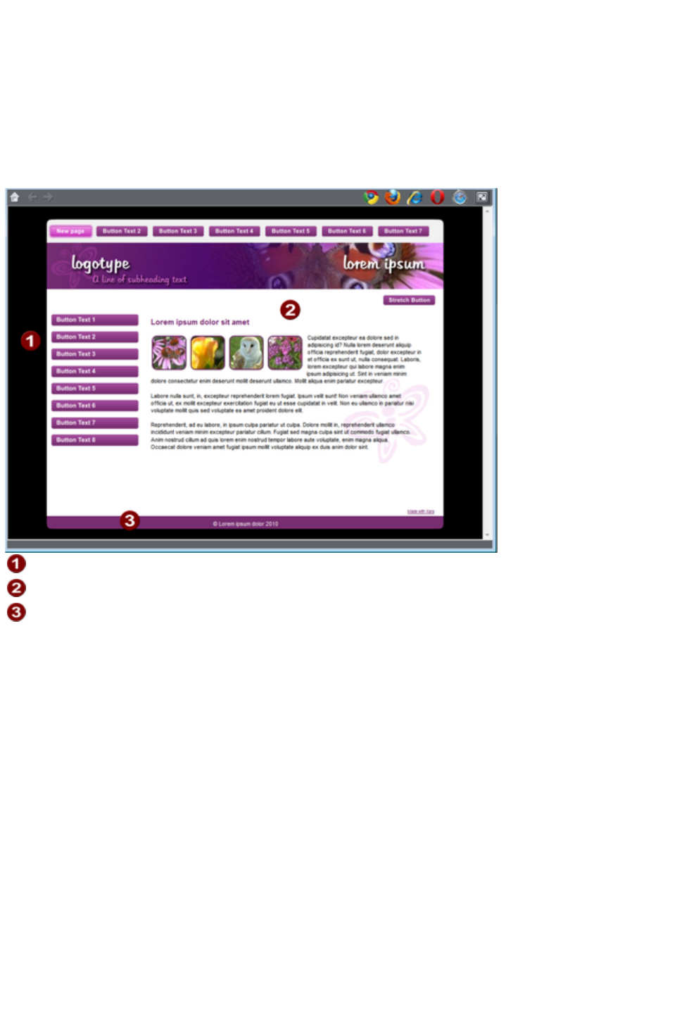
Page Background Color
Most of the page designs in the Design Gallery
have two types of background. A wide page background that extends across the background of the
whole browser window. And on top of this is drawn the web page elements, that usually consists of
various colored panels.
On the Color Line there is usually one color named 'Background Color', another 'Panel Color', and by
editing these you can control the various background colors. The other colors used are typically Theme
Color 1, 2 etc
Background Color
Panel Color
Theme 1 & 2 colors
Setting the page background color
When you open a new blank page ("File" > "New
" >) the page defaults to being white. This is the background on which you place all the elements of your
website.
If you drag a color from the Color Line over the page, and drop it, it will set the page background to that
color. In the Web Browser this background color is shown over the whole area of the window
background.
Page 64
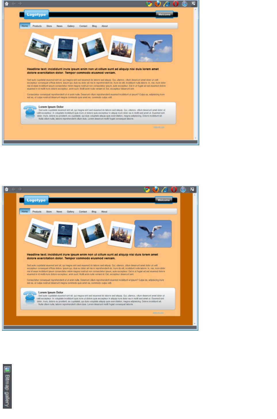
However you can also make the page background one color, as described above, and then set the area
around the page to a different color. This area around the page is referred to as the pasteboard. Just
drop a color onto the pasteboard to set its color and set the page color as described above. Now when
you preview your page you'll see the browser window background color is set to the pasteboard color
and you can see the page rectangle with its own color.
You can use the color editor to edit these colors. Right click on the page and choose Change page
background to bring up the color editor, then you can edit the page color. To edit the pasteboard
background color, right click on the pasteboard and choose Change background color
.
To set a repeating background texture, drag the photo or bitmap onto
your document. Open the Bitmap Gallery, scroll to the photo you just
loaded, click on it to select it, and then click the Background
button on the gallery.
Page 65

Page Background Layer
When you set the page background color by dropping a color onto the page as described above, this
actually adds another layer to your document, which you can see if you open the Page & Layer
Gallery. It's called the Page background layer
.
This layer is normally locked, so you can't select and edit its contents. But you can unlock it in the Page
& Layer Gallery
in order to perform some limited editing of it, to customize your page background. Just click on the lock
symbol next to the "Page background" layer to unlock it.
Now if you click on the page background, you'll see a rectangle becomes selected (see status bar). This
rectangle covers your whole page - it's used to set the page color. You can now do some limited editing
of this rectangle, such as give it a graduated fill using the Fill Tool, or give it rounded corners using the
Rectangle Tool
.
Note
: You must also set the pasteboard color too, before you can give your page anything other than a flat
color.
Offsetting the top of your page
Normally if you just set the page and pasteboard to different colors, when you preview you'll see that the
page extends right to the top of the browser window. You can't see any of the pasteboard color above
your page. However you can add an offset so that there is some space above your page in the web
browser.
To add an offset, you change the page origin. Normally the page origin is set to be the top left corner of
your page. By moving the origin up 20 pixels, for example, you add a 20 pixel margin to the top of your
page when it's viewed in a web browser.
You can change the origin in two ways. The easiest way is to open the "Utilities" > "Options" dialog
(or right click a page and choose Page Options), go to the Grid & Ruler
tab and increase the value of the Y coordinate of the origin point. This is normally set to the vertical size
of your page, so just increase it by the margin size you would like. So for example if your page is 700
pixels tall, change the Y value of the origin coordinate from 700 to 720, in order to add a 20 pixel offset.
Alternatively you can set the origin point interactively. Turn rulers on by right clicking and choosing "
Show Grid/Guides" > "Show Rulers" or by choosing Show rulers from the Window
menu ("Ctrl + L"). Then click and drag on the crosshairs button, which is located where the horizontal
and vertical rulers join, at the top left of the canvas. Now you are dragging around the origin position, so
position it the appropriate distance vertically above the top left corner of your page.
Changing the horizontal position of the origin has no effect on the horizontal positioning of your page, so
this should be left unchanged.
Advanced backgrounds
Web browsers do not allow a graduated color background over the whole visible window (i.e. as a real
HTML background), but they do support repeating, tiled, bitmaps as backgrounds. So you can use this
to create a full-window graduated background, by creating a bitmap, which is then tiled (repeated)
across the page.
Page 66

By creating a long thin strip as on the left, when set as a background,you get a graduated color
background across the whole page.
To create this effect, follow these steps;
1. Draw a tall thin rectangle. This needs to be as tall as any user is likely to make their browser
window so it doesn't repeat vertically. A value of 1000 pixels or more is recommended, which is
much taller than your page. You may need to zoom out to draw one large enough. It should be
very narrow.
2. Make sure your rectangle has no outline: Click it in the Selector Tool and set it to have no
outline. Click on the 'no color' cross-hatch patch on the Color Line (or select 'none' from the
Line Width drop down menu on the top button bar).
3. Ensure the rectangle is a few whole pixels wide, and then ensure it is on exact whole pixel X and
Y coordinates: In the Selector Tool select the rectangle, edit the Width (W) value, press
"Enter", then edit the X and Y positions to be whole numbers.
4. Using the Fill Tool, give it a graduated color fill as required: Just drag on the rectangle. Make
sure it's graduated top to bottom by adjusting the fill arrow if necessarily.
5. Export the rectangle as a PNG image. Click the Export as PNG icon .Once exported drag
it back onto the page from your File Explorer.
6. Open the Bitmap Gallery, scroll down to see the graphic you just loaded (it will be a very thin,
almost invisible thumbnail in the gallery), and select it (click on it in the gallery) and then click the
Background button on the Bitmap Gallery. You can now delete the original rectangle from the
page.
Note
: This will only work across the whole browser window background if you haven't given the pasteboard
background its own color. If you have set the pasteboard background, then the graduated fill will only be
applied to the background of the page area.
Linked shades
You can create colors that are lighter or darker shades of another color, so that when you alter the
'parent' color, all the lighter and darker shades change to match the new hue. For example a graduated
color shade on a button, such as this:
This is a simple rounded rectangle with a graduated
color fill created with the Fill Tool. In the Fill Tool
you can click on the either end of the arrow to set the
Page 67

color.
If you create the main green color as a named color, and then make a lighter or darker shade of the
color, as a linked shade, when you now edit the named color the shades change as well, so you get
simple re-coloring of complex shaded objects.
To create a linked shade, open the extra controls in the Color Editor and select the 'Normal Color'
drop-down menu and choose 'Shade of another color
'.
Click this button to reveal the extra controls.
You can now select any light or darker shade of the parent color. The
cross marks the parent color.
Select Shade
from this drop-down list and then the parent color.
You can also create a Linked Shade that appears on the Color Line (so you can easily apply it to other
objects). When you select to create a new Named Color you can choose to make this a linked 'Shade of
another color'.
Page 68

Page Background Layer
When you set the page background color by dropping a color onto the page as described above, this
actually adds another layer to your document, which you can see if you open the Page & Layer
Gallery. It's called the Page background layer
.
This layer is normally locked, so you can't select and edit its contents. But you can unlock it in the Page
& Layer Gallery
in order to perform some limited editing of it, to customize your page background. Just click on the lock
symbol next to the "Page background" layer to unlock it.
Now if you click on the page background, you'll see a rectangle becomes selected (see status bar). This
rectangle covers your whole page - it's used to set the page color. You can now do some limited editing
of this rectangle, such as give it a graduated fill using the Fill Tool, or give it rounded corners using the
Rectangle Tool
.
Note
: You must also set the pasteboard color too, before you can give your page anything other than a flat
color.
Offsetting the top of your page
Normally if you just set the page and pasteboard to different colors, when you preview you'll see that the
page extends right to the top of the browser window. You can't see any of the pasteboard color above
your page. However you can add an offset so that there is some space above your page in the web
browser.
To add an offset, you change the page origin. Normally the page origin is set to be the top left corner of
your page. By moving the origin up 20 pixels, for example, you add a 20 pixel margin to the top of your
page when it's viewed in a web browser.
You can change the origin in two ways. The easiest way is to open the "Utilities" > "Options" dialog
(or right click a page and choose Page Options), go to the Grid & Ruler
tab and increase the value of the Y coordinate of the origin point. This is normally set to the vertical size
of your page, so just increase it by the margin size you would like. So for example if your page is 700
pixels tall, change the Y value of the origin coordinate from 700 to 720, in order to add a 20 pixel offset.
Alternatively you can set the origin point interactively. Turn rulers on by right clicking and choosing "
Show Grid/Guides" > "Show Rulers" or by choosing Show rulers from the Window
menu ("Ctrl + L"). Then click and drag on the crosshairs button, which is located where the horizontal
and vertical rulers join, at the top left of the canvas. Now you are dragging around the origin position, so
position it the appropriate distance vertically above the top left corner of your page.
Changing the horizontal position of the origin has no effect on the horizontal positioning of your page, so
this should be left unchanged.
Advanced backgrounds
Web browsers do not allow a graduated color background over the whole visible window (i.e. as a real
HTML background), but they do support repeating, tiled, bitmaps as backgrounds. So you can use this
to create a full-window graduated background, by creating a bitmap, which is then tiled (repeated)
across the page.
Page 69
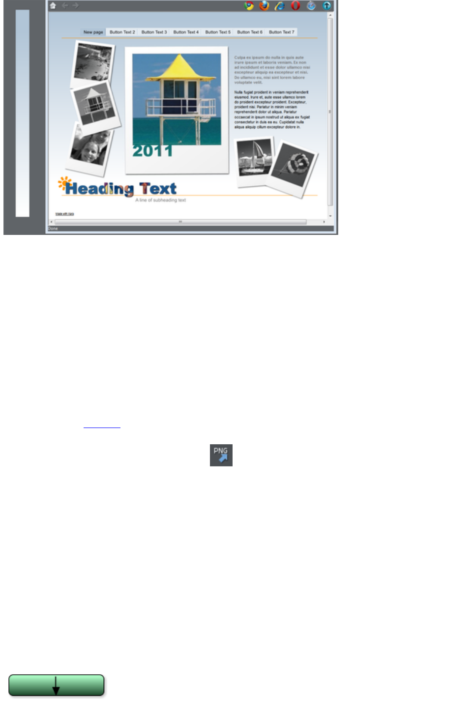
By creating a long thin strip as on the left, when set as a background,you get a graduated color
background across the whole page.
To create this effect, follow these steps;
1. Draw a tall thin rectangle. This needs to be as tall as any user is likely to make their browser
window so it doesn't repeat vertically. A value of 1000 pixels or more is recommended, which is
much taller than your page. You may need to zoom out to draw one large enough. It should be
very narrow.
2. Make sure your rectangle has no outline: Click it in the Selector Tool and set it to have no
outline. Click on the 'no color' cross-hatch patch on the Color Line (or select 'none' from the
Line Width drop down menu on the top button bar).
3. Ensure the rectangle is a few whole pixels wide, and then ensure it is on exact whole pixel X and
Y coordinates: In the Selector Tool select the rectangle, edit the Width (W) value, press
"Enter", then edit the X and Y positions to be whole numbers.
4. Using the Fill Tool, give it a graduated color fill as required: Just drag on the rectangle. Make
sure it's graduated top to bottom by adjusting the fill arrow if necessarily.
5. Export the rectangle as a PNG image. Click the Export as PNG icon .Once exported drag
it back onto the page from your File Explorer.
6. Open the Bitmap Gallery, scroll down to see the graphic you just loaded (it will be a very thin,
almost invisible thumbnail in the gallery), and select it (click on it in the gallery) and then click the
Background button on the Bitmap Gallery. You can now delete the original rectangle from the
page.
Note
: This will only work across the whole browser window background if you haven't given the pasteboard
background its own color. If you have set the pasteboard background, then the graduated fill will only be
applied to the background of the page area.
Linked shades
You can create colors that are lighter or darker shades of another color, so that when you alter the
'parent' color, all the lighter and darker shades change to match the new hue. For example a graduated
color shade on a button, such as this:
This is a simple rounded rectangle with a graduated
color fill created with the Fill Tool. In the Fill Tool
you can click on the either end of the arrow to set the
Page 70
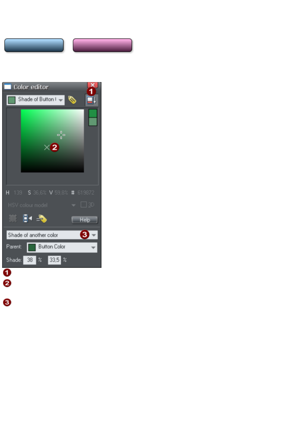
color.
If you create the main green color as a named color, and then make a lighter or darker shade of the
color, as a linked shade, when you now edit the named color the shades change as well, so you get
simple re-coloring of complex shaded objects.
To create a linked shade, open the extra controls in the Color Editor and select the 'Normal Color'
drop-down menu and choose 'Shade of another color
'.
Click this button to reveal the extra controls.
You can now select any light or darker shade of the parent color. The
cross marks the parent color.
Select Shade
from this drop-down list and then the parent color.
You can also create a Linked Shade that appears on the Color Line (so you can easily apply it to other
objects). When you select to create a new Named Color you can choose to make this a linked 'Shade of
another color'.
Page 71
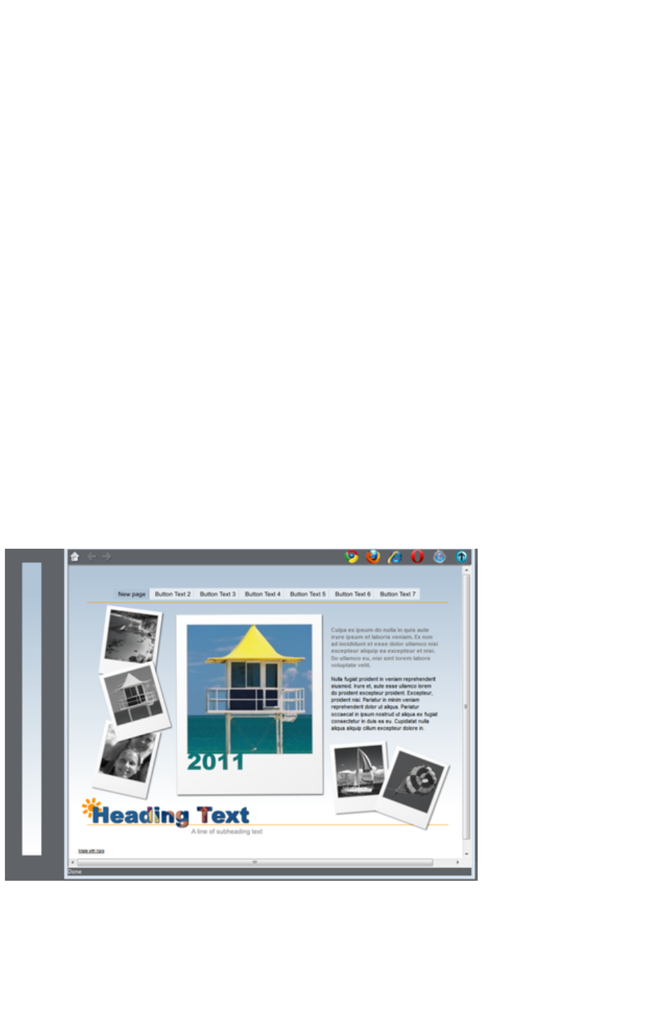
Offsetting the top of your page
Normally if you just set the page and pasteboard to different colors, when you preview you'll see that the
page extends right to the top of the browser window. You can't see any of the pasteboard color above
your page. However you can add an offset so that there is some space above your page in the web
browser.
To add an offset, you change the page origin. Normally the page origin is set to be the top left corner of
your page. By moving the origin up 20 pixels, for example, you add a 20 pixel margin to the top of your
page when it's viewed in a web browser.
You can change the origin in two ways. The easiest way is to open the "Utilities" > "Options" dialog
(or right click a page and choose Page Options), go to the Grid & Ruler
tab and increase the value of the Y coordinate of the origin point. This is normally set to the vertical size
of your page, so just increase it by the margin size you would like. So for example if your page is 700
pixels tall, change the Y value of the origin coordinate from 700 to 720, in order to add a 20 pixel offset.
Alternatively you can set the origin point interactively. Turn rulers on by right clicking and choosing "
Show Grid/Guides" > "Show Rulers" or by choosing Show rulers from the Window
menu ("Ctrl + L"). Then click and drag on the crosshairs button, which is located where the horizontal
and vertical rulers join, at the top left of the canvas. Now you are dragging around the origin position, so
position it the appropriate distance vertically above the top left corner of your page.
Changing the horizontal position of the origin has no effect on the horizontal positioning of your page, so
this should be left unchanged.
Advanced backgrounds
Web browsers do not allow a graduated color background over the whole visible window (i.e. as a real
HTML background), but they do support repeating, tiled, bitmaps as backgrounds. So you can use this
to create a full-window graduated background, by creating a bitmap, which is then tiled (repeated)
across the page.
By creating a long thin strip as on the left, when set as a background,you get a graduated color
background across the whole page.
To create this effect, follow these steps;
1. Draw a tall thin rectangle. This needs to be as tall as any user is likely to make their browser
window so it doesn't repeat vertically. A value of 1000 pixels or more is recommended, which is
much taller than your page. You may need to zoom out to draw one large enough. It should be
Page 72
very narrow.
2. Make sure your rectangle has no outline: Click it in the Selector Tool and set it to have no
outline. Click on the 'no color' cross-hatch patch on the Color Line (or select 'none' from the
Line Width drop down menu on the top button bar).
3. Ensure the rectangle is a few whole pixels wide, and then ensure it is on exact whole pixel X and
Y coordinates: In the Selector Tool select the rectangle, edit the Width (W) value, press
"Enter", then edit the X and Y positions to be whole numbers.
4. Using the Fill Tool, give it a graduated color fill as required: Just drag on the rectangle. Make
sure it's graduated top to bottom by adjusting the fill arrow if necessarily.
5. Export the rectangle as a PNG image. Click the Export as PNG icon .Once exported drag
it back onto the page from your File Explorer.
6. Open the Bitmap Gallery, scroll down to see the graphic you just loaded (it will be a very thin,
almost invisible thumbnail in the gallery), and select it (click on it in the gallery) and then click the
Background button on the Bitmap Gallery. You can now delete the original rectangle from the
page.
Note
: This will only work across the whole browser window background if you haven't given the pasteboard
background its own color. If you have set the pasteboard background, then the graduated fill will only be
applied to the background of the page area.
Linked shades
You can create colors that are lighter or darker shades of another color, so that when you alter the
'parent' color, all the lighter and darker shades change to match the new hue. For example a graduated
color shade on a button, such as this:
This is a simple rounded rectangle with a graduated
color fill created with the Fill Tool. In the Fill Tool
you can click on the either end of the arrow to set the
color.
If you create the main green color as a named color, and then make a lighter or darker shade of the
color, as a linked shade, when you now edit the named color the shades change as well, so you get
simple re-coloring of complex shaded objects.
To create a linked shade, open the extra controls in the Color Editor and select the 'Normal Color'
drop-down menu and choose 'Shade of another color
'.
Page 73

Click this button to reveal the extra controls.
You can now select any light or darker shade of the parent color. The
cross marks the parent color.
Select Shade
from this drop-down list and then the parent color.
You can also create a Linked Shade that appears on the Color Line (so you can easily apply it to other
objects). When you select to create a new Named Color you can choose to make this a linked 'Shade of
another color'.
Page 74
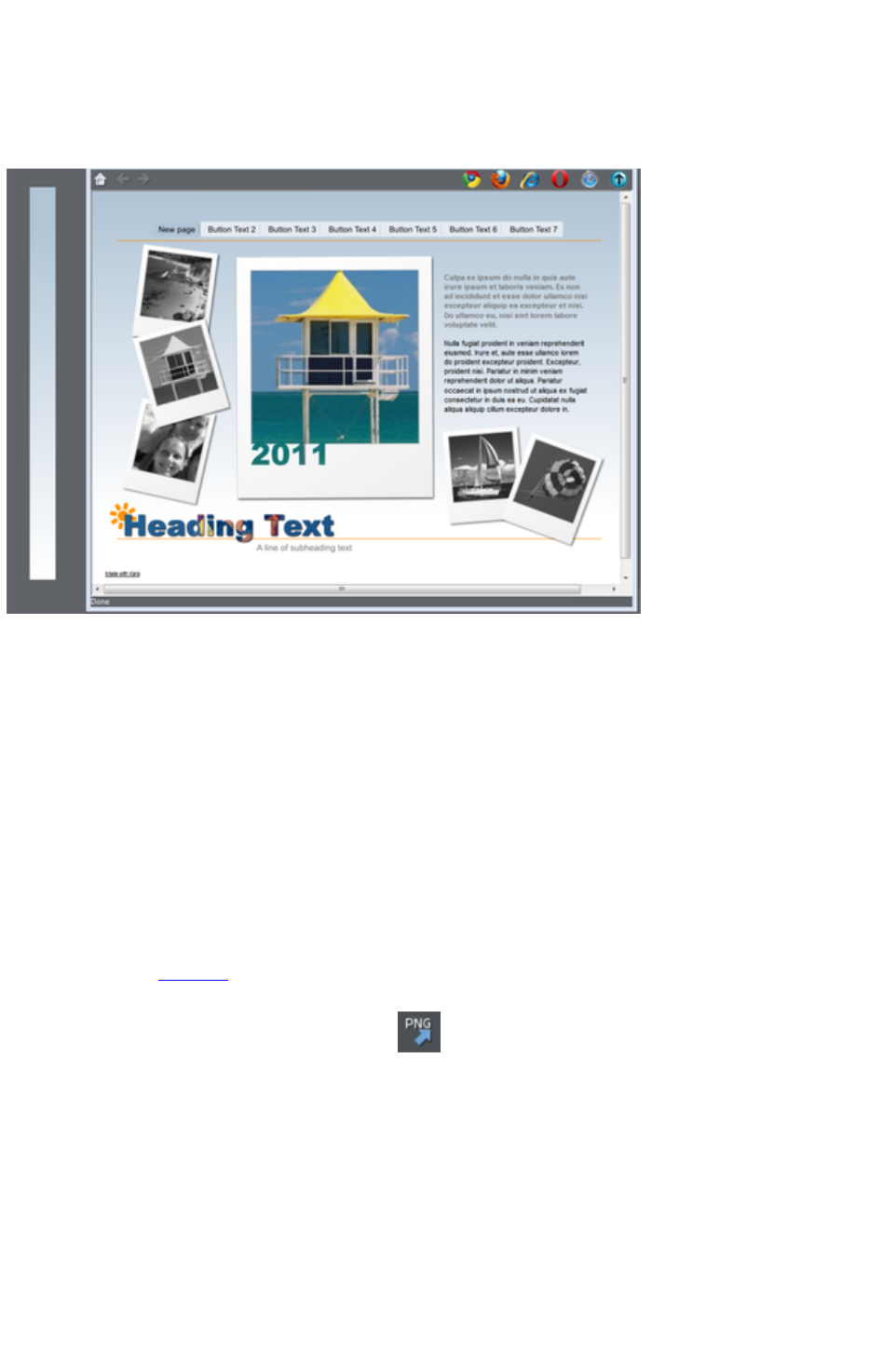
Advanced backgrounds
Web browsers do not allow a graduated color background over the whole visible window (i.e. as a real
HTML background), but they do support repeating, tiled, bitmaps as backgrounds. So you can use this
to create a full-window graduated background, by creating a bitmap, which is then tiled (repeated)
across the page.
By creating a long thin strip as on the left, when set as a background,you get a graduated color
background across the whole page.
To create this effect, follow these steps;
1. Draw a tall thin rectangle. This needs to be as tall as any user is likely to make their browser
window so it doesn't repeat vertically. A value of 1000 pixels or more is recommended, which is
much taller than your page. You may need to zoom out to draw one large enough. It should be
very narrow.
2. Make sure your rectangle has no outline: Click it in the Selector Tool and set it to have no
outline. Click on the 'no color' cross-hatch patch on the Color Line (or select 'none' from the
Line Width drop down menu on the top button bar).
3. Ensure the rectangle is a few whole pixels wide, and then ensure it is on exact whole pixel X and
Y coordinates: In the Selector Tool select the rectangle, edit the Width (W) value, press
"Enter", then edit the X and Y positions to be whole numbers.
4. Using the Fill Tool, give it a graduated color fill as required: Just drag on the rectangle. Make
sure it's graduated top to bottom by adjusting the fill arrow if necessarily.
5. Export the rectangle as a PNG image. Click the Export as PNG icon .Once exported drag
it back onto the page from your File Explorer.
6. Open the Bitmap Gallery, scroll down to see the graphic you just loaded (it will be a very thin,
almost invisible thumbnail in the gallery), and select it (click on it in the gallery) and then click the
Background button on the Bitmap Gallery. You can now delete the original rectangle from the
page.
Note
: This will only work across the whole browser window background if you haven't given the pasteboard
background its own color. If you have set the pasteboard background, then the graduated fill will only be
applied to the background of the page area.
Page 75
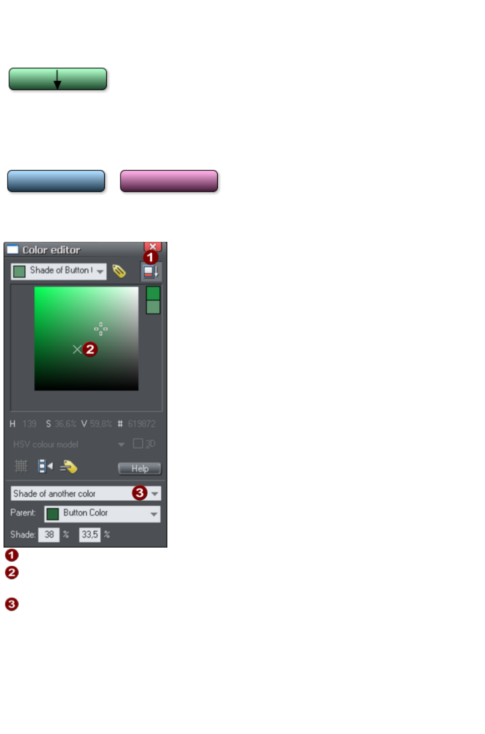
Linked shades
You can create colors that are lighter or darker shades of another color, so that when you alter the
'parent' color, all the lighter and darker shades change to match the new hue. For example a graduated
color shade on a button, such as this:
This is a simple rounded rectangle with a graduated
color fill created with the Fill Tool. In the Fill Tool
you can click on the either end of the arrow to set the
color.
If you create the main green color as a named color, and then make a lighter or darker shade of the
color, as a linked shade, when you now edit the named color the shades change as well, so you get
simple re-coloring of complex shaded objects.
To create a linked shade, open the extra controls in the Color Editor and select the 'Normal Color'
drop-down menu and choose 'Shade of another color
'.
Click this button to reveal the extra controls.
You can now select any light or darker shade of the parent color. The
cross marks the parent color.
Select Shade
from this drop-down list and then the parent color.
You can also create a Linked Shade that appears on the Color Line (so you can easily apply it to other
objects). When you select to create a new Named Color you can choose to make this a linked 'Shade of
another color'.
Page 76
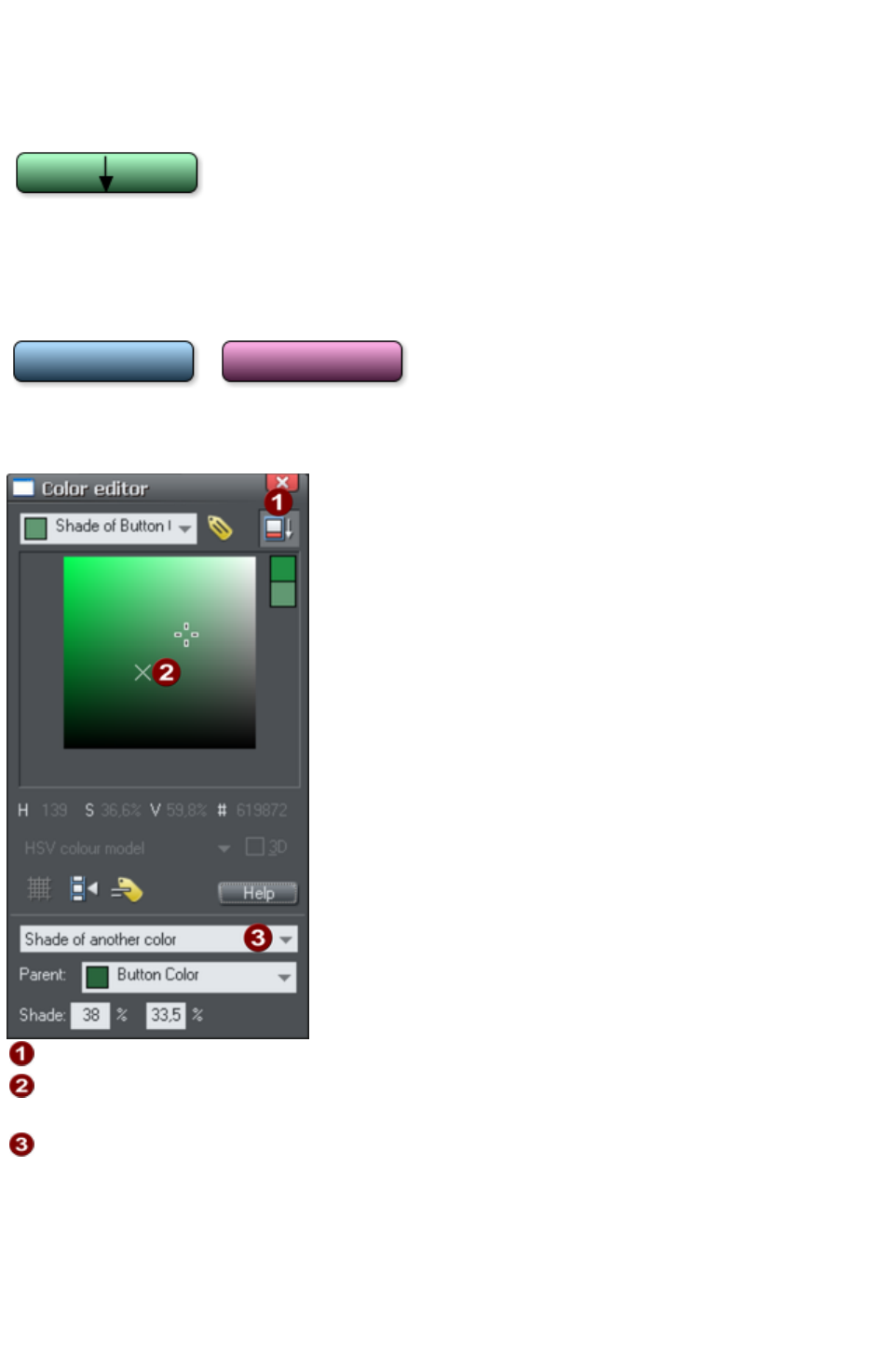
Linked shades
You can create colors that are lighter or darker shades of another color, so that when you alter the
'parent' color, all the lighter and darker shades change to match the new hue. For example a graduated
color shade on a button, such as this:
This is a simple rounded rectangle with a graduated
color fill created with the Fill Tool. In the Fill Tool
you can click on the either end of the arrow to set the
color.
If you create the main green color as a named color, and then make a lighter or darker shade of the
color, as a linked shade, when you now edit the named color the shades change as well, so you get
simple re-coloring of complex shaded objects.
To create a linked shade, open the extra controls in the Color Editor and select the 'Normal Color'
drop-down menu and choose 'Shade of another color
'.
Click this button to reveal the extra controls.
You can now select any light or darker shade of the parent color. The
cross marks the parent color.
Select Shade
from this drop-down list and then the parent color.
You can also create a Linked Shade that appears on the Color Line (so you can easily apply it to other
objects). When you select to create a new Named Color you can choose to make this a linked 'Shade of
another color'.
Page 77
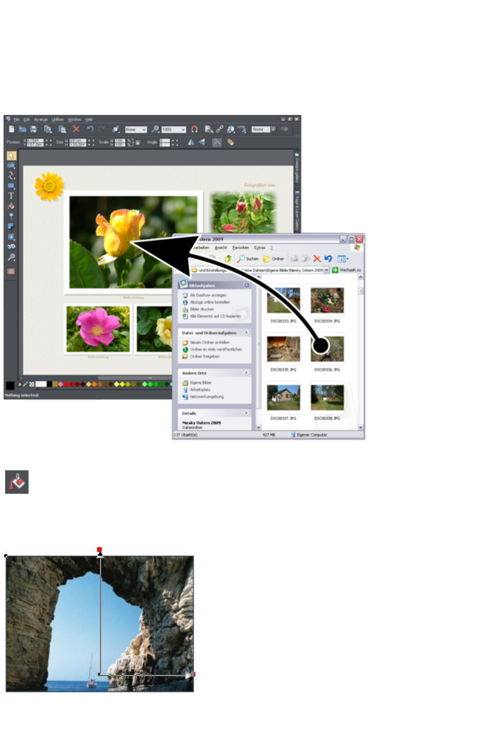
Photos
You can replace any photo by dragging and dropping it from your File Explorer onto any photo in Web
Designer Premium. If you drop it onto the background then it is imported and placed on the page where
you dropped it. All imported photos are shown as 500 pixels wide, but you can of course change this to
be any size in the usual way with the Selector Tool
.
Drag and drop your photo over any existing picture to replace it. Drop onto the background to import as
a new photo
When you replace an existing photo, the Fill Tool
is selected and a pair of fill arrows are shown at right angles on the
photo.
This is because the photo is really a fill inside a shape. You can drag on the picture to re-position it, or
drag on the ends of the fill arrows to resize and rotate the picture inside its outline shape.
Drag on photo to re-position inside its frame. Drag on end of arrows to resize and rotate.
Replacing Multiple Photos
Page 78
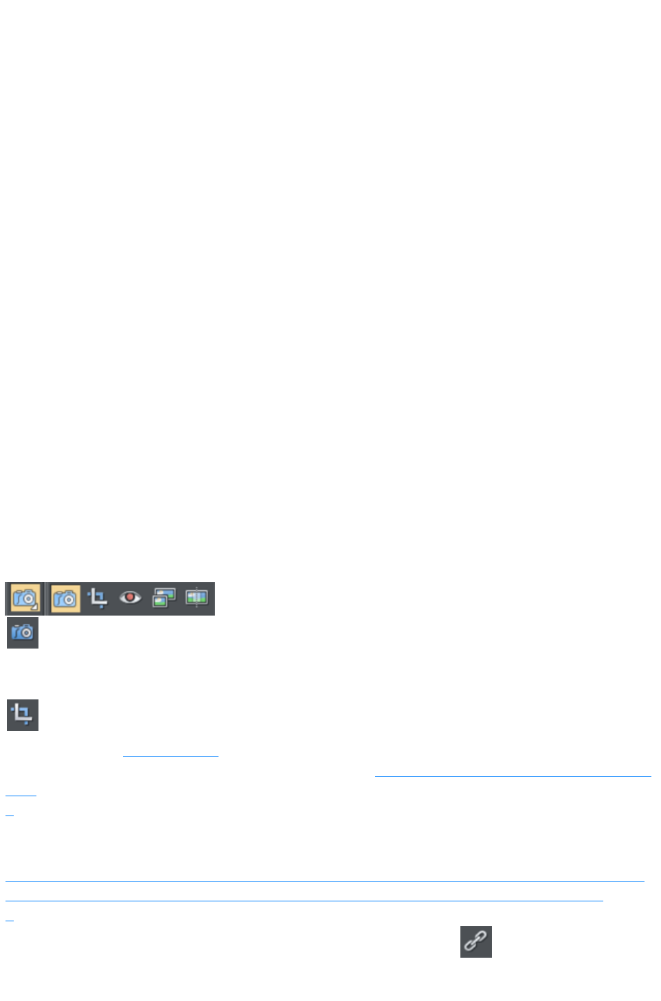
Some templates in the Designs Gallery
, particularly photo album styles, can have multiple photos replaced at once. Select multiple photo files
using Windows File Explorer ("Ctrl + click" to add more files to the selection, or "Shift + click" to select
a range of files). Then drag and drop them onto the page in Xara Web Designer 7 Premium. Photos are
replaced one by one from the top of the page downwards. This makes it easy to rapidly fill a photo
album page with your own photos!
If you drag in more photos than can be fitted on the current page, Xara Web Designer 7 Premium will
look at any following pages in the document, to see if they can accommodate some or all of the remaining
photos. If that still doesn't exhaust the supply of photos imported, Xara Web Designer 7 Premium will
duplicate the current page as many times as necessary in order to accommodate all the photos.
This powerful mechanism means that you can create a multi-page photo album website rapidly, by
loading an album template from the Designs Gallery and then dragging in your photos.
Importing Large Photos
When importing high resolution photos (anything above 1920 pixels either wide or high) into a web
document, Xara Web Designer 7 Premium automatically resizes the photo down to HD screen size
without asking you if you want to import a lower resolution version. For a web document, even at the
reduced size, there should be more than enough resolution in your photos for high quality results on your
website, so it's rarely necessary to import digital camera images at full resolution for web use.
However, if you are importing a large photo into a print or animation document, Xara Web Designer 7
Premium asks you if you want to import a lower resolution version of your photos. If your document is to
include many photos, you may want to choose this reduced resolution option. Otherwise with large
photos you may find that your saved design file is much bigger than it needs to be (because it contains a
copy of each of your photos) and you may not have enough memory in your computer to load, edit and
export your documents.
The Photo Tool
The Photo Tool
provides a range of ways to enhance and crop any photo.
To crop a photo, just drag across the photo while in the Enhance
Photo Tool
. You can adjust the crop edges by dragging on the crop handles
around the outside of the photo.
Or use the Clip Tool
for more control over crops.
See the section on Photo Handling for background information on the advanced way in which Xara Web
Designer 7 Premium handles photos, and the section on the Photo Tool to find out how to use the Photo
Tool
.
Thumbnail Photos With Pop-ups
You can very easily create small thumbnail photos (just resize it to be tiny), that when clicked will show
an enlarged version. Simply resize your photo to be small, the usual way using the Selector Tool
.
Select the small thumbnail photo, and select the Pop-up photo option in
the Link tab of the Web Properties dialog (click the Link button in the
Web Toolbar
Page 79
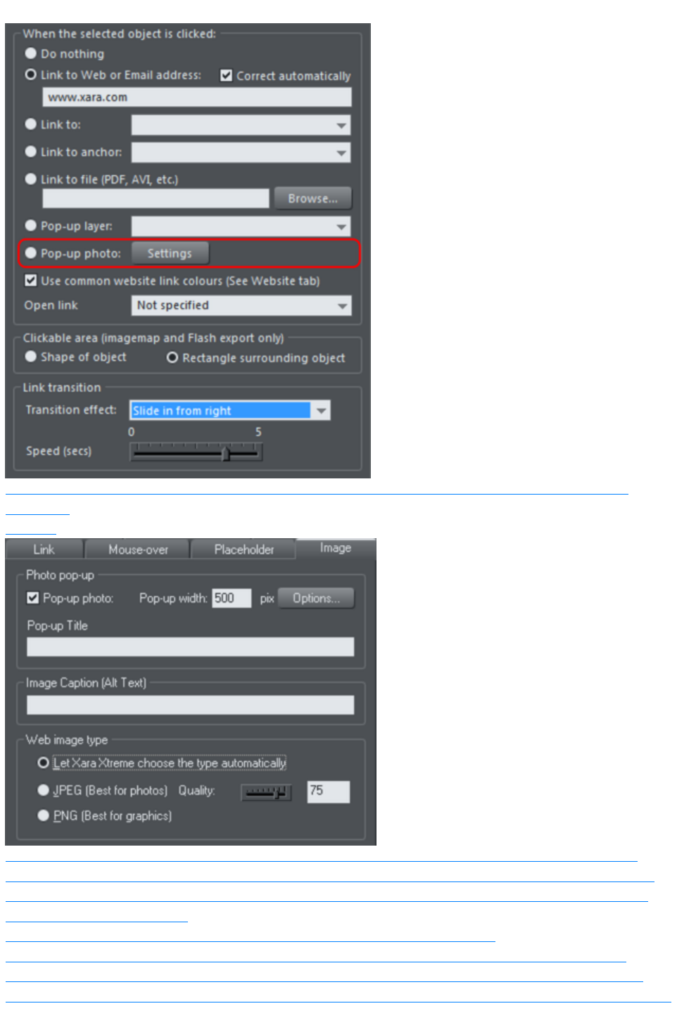
).
Click the Settings button next to the popup photo option, to change to the Image tab of the Web
properties
dialog.
There you can change how your pop-up appears. One option allows you to place a title above each
pop-up photo. Set the title for each photo using the Title field. You can also optionally show a caption
below each popup photo. Just set the Image Caption (Alt text) for the thumbnail on the same dialog.
See the popup photo section
of the Web Properties Dialog chapter for full details of the options available.
In Internet Explorer the Image caption ("ALT"-Text) will be also shown in a tooltip pop-up as you
mouse-over the image. To show different text, typically something like 'Click to enlarge' as you move
over the thumbnail image, go to the Mouse-over tab and set Show pop-up text to be Click to Enlarge
Page 80
.
Photo Resolution - It's All Automatic!
When importing high resolution photos (anything above 1920 pixels either wide or high) into a web
document, Xara Web Designer 7 Premium automatically resizes the photo down to HD screen size
without asking you if you want to import a lower resolution version. For a web document, even at the
reduced size, there should be more than enough resolution in your photos for high quality results on your
website, so it's rarely necessary to import digital camera images at full resolution for web use.
However, if you are importing a large photo into a print or animation document, Xara Web Designer 7
Premium asks you if you want to import a lower resolution version of your photos. If your document is to
include many photos, you may want to choose this reduced resolution option. Otherwise with large
photos you may find that your saved design file is much bigger than it needs to be (because it contains a
copy of each of your photos) and you may not have enough memory in your computer to load, edit and
export your documents.
If you're not sure whether you will need the full resolution photo you can import the original photo and
then optimize it down later. To optimize a photo, right click on it and choose the Optimize option from
the context menu. Or you can optimize all the JPEG photos in your document at once, using "Utilities"
> "Optimize all JPEGs"
.
Web Designer Premium always stores the full resolution image (unless you chose to import reduced
resolution images when asked during import, as mentioned above). This means you can resize or crop
your image as required with no loss of quality. Web Designer Premium automatically converts all photos
into the correct resolution JPEG image when saving your website. You do not need to bother about dpi,
image size, pixels or anything like that. What you see in Web Designer Premium (at 100% zoom) is
exactly what will be produced on your web page.
If you want to size a photo, or any object, to a specific size, just enter the required size into the Selector
Tool
InfoBar width or height fields.
When you drop a photo on the page (assuming you're not replacing an existing photo), it's sized to be
500 pixels wide. But if you want this to be exactly 200 pixels wide, just enter 200pix into the W size field
of the Selector Tool
. You can enter it in any unit e.g. entering 2in will make it 2 inches wide.
Page 81
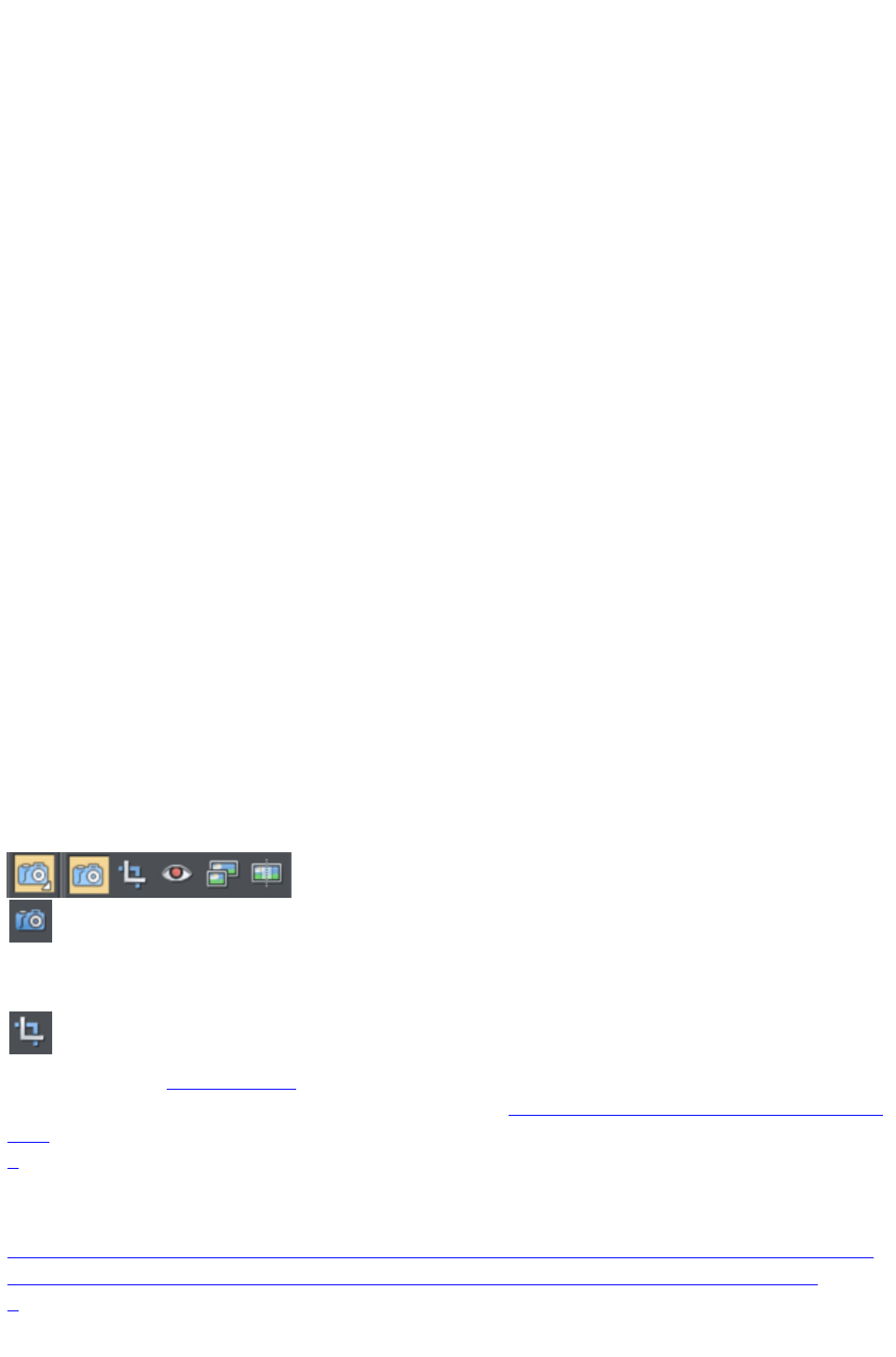
Replacing Multiple Photos
Some templates in the Designs Gallery
, particularly photo album styles, can have multiple photos replaced at once. Select multiple photo files
using Windows File Explorer ("Ctrl + click" to add more files to the selection, or "Shift + click" to select
a range of files). Then drag and drop them onto the page in Xara Web Designer 7 Premium. Photos are
replaced one by one from the top of the page downwards. This makes it easy to rapidly fill a photo
album page with your own photos!
If you drag in more photos than can be fitted on the current page, Xara Web Designer 7 Premium will
look at any following pages in the document, to see if they can accommodate some or all of the remaining
photos. If that still doesn't exhaust the supply of photos imported, Xara Web Designer 7 Premium will
duplicate the current page as many times as necessary in order to accommodate all the photos.
This powerful mechanism means that you can create a multi-page photo album website rapidly, by
loading an album template from the Designs Gallery and then dragging in your photos.
Importing Large Photos
When importing high resolution photos (anything above 1920 pixels either wide or high) into a web
document, Xara Web Designer 7 Premium automatically resizes the photo down to HD screen size
without asking you if you want to import a lower resolution version. For a web document, even at the
reduced size, there should be more than enough resolution in your photos for high quality results on your
website, so it's rarely necessary to import digital camera images at full resolution for web use.
However, if you are importing a large photo into a print or animation document, Xara Web Designer 7
Premium asks you if you want to import a lower resolution version of your photos. If your document is to
include many photos, you may want to choose this reduced resolution option. Otherwise with large
photos you may find that your saved design file is much bigger than it needs to be (because it contains a
copy of each of your photos) and you may not have enough memory in your computer to load, edit and
export your documents.
The Photo Tool
The Photo Tool
provides a range of ways to enhance and crop any photo.
To crop a photo, just drag across the photo while in the Enhance
Photo Tool
. You can adjust the crop edges by dragging on the crop handles
around the outside of the photo.
Or use the Clip Tool
for more control over crops.
See the section on Photo Handling for background information on the advanced way in which Xara Web
Designer 7 Premium handles photos, and the section on the Photo Tool to find out how to use the Photo
Tool
.
Thumbnail Photos With Pop-ups
You can very easily create small thumbnail photos (just resize it to be tiny), that when clicked will show
an enlarged version. Simply resize your photo to be small, the usual way using the Selector Tool
.
Page 82
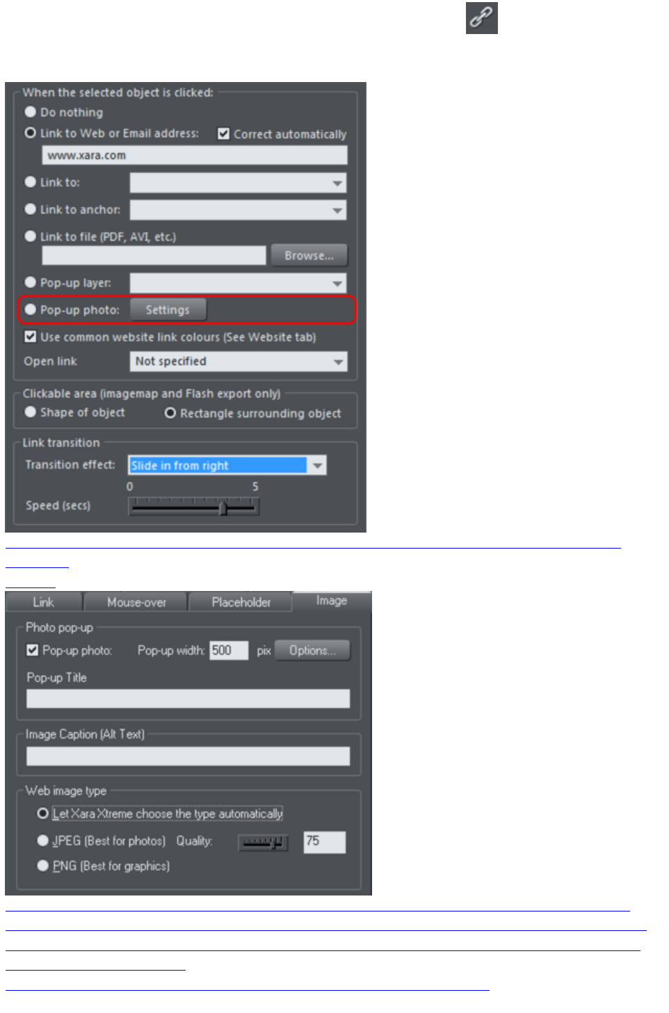
Select the small thumbnail photo, and select the Pop-up photo option in
the Link tab of the Web Properties dialog (click the Link button in the
Web Toolbar
).
Click the Settings button next to the popup photo option, to change to the Image tab of the Web
properties
dialog.
There you can change how your pop-up appears. One option allows you to place a title above each
pop-up photo. Set the title for each photo using the Title field. You can also optionally show a caption
below each popup photo. Just set the Image Caption (Alt text) for the thumbnail on the same dialog.
See the popup photo section
of the Web Properties Dialog chapter for full details of the options available.
Page 83
In Internet Explorer the Image caption ("ALT"-Text) will be also shown in a tooltip pop-up as you
mouse-over the image. To show different text, typically something like 'Click to enlarge' as you move
over the thumbnail image, go to the Mouse-over tab and set Show pop-up text to be Click to Enlarge
.
Photo Resolution - It's All Automatic!
When importing high resolution photos (anything above 1920 pixels either wide or high) into a web
document, Xara Web Designer 7 Premium automatically resizes the photo down to HD screen size
without asking you if you want to import a lower resolution version. For a web document, even at the
reduced size, there should be more than enough resolution in your photos for high quality results on your
website, so it's rarely necessary to import digital camera images at full resolution for web use.
However, if you are importing a large photo into a print or animation document, Xara Web Designer 7
Premium asks you if you want to import a lower resolution version of your photos. If your document is to
include many photos, you may want to choose this reduced resolution option. Otherwise with large
photos you may find that your saved design file is much bigger than it needs to be (because it contains a
copy of each of your photos) and you may not have enough memory in your computer to load, edit and
export your documents.
If you're not sure whether you will need the full resolution photo you can import the original photo and
then optimize it down later. To optimize a photo, right click on it and choose the Optimize option from
the context menu. Or you can optimize all the JPEG photos in your document at once, using "Utilities"
> "Optimize all JPEGs"
.
Web Designer Premium always stores the full resolution image (unless you chose to import reduced
resolution images when asked during import, as mentioned above). This means you can resize or crop
your image as required with no loss of quality. Web Designer Premium automatically converts all photos
into the correct resolution JPEG image when saving your website. You do not need to bother about dpi,
image size, pixels or anything like that. What you see in Web Designer Premium (at 100% zoom) is
exactly what will be produced on your web page.
If you want to size a photo, or any object, to a specific size, just enter the required size into the Selector
Tool
InfoBar width or height fields.
When you drop a photo on the page (assuming you're not replacing an existing photo), it's sized to be
500 pixels wide. But if you want this to be exactly 200 pixels wide, just enter 200pix into the W size field
of the Selector Tool
. You can enter it in any unit e.g. entering 2in will make it 2 inches wide.
Page 84
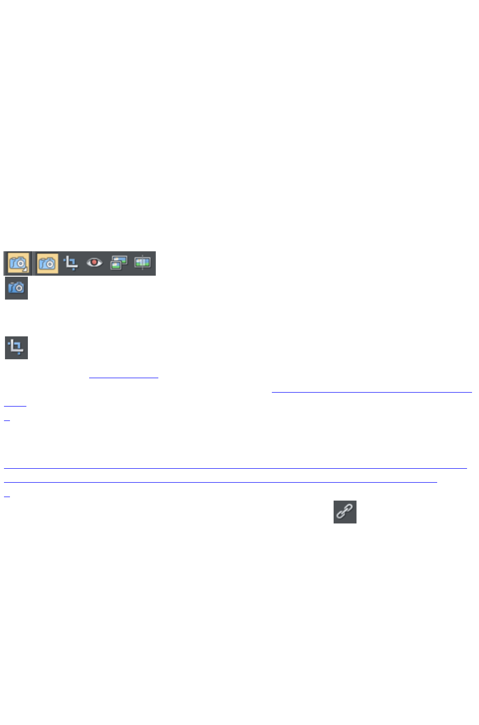
Importing Large Photos
When importing high resolution photos (anything above 1920 pixels either wide or high) into a web
document, Xara Web Designer 7 Premium automatically resizes the photo down to HD screen size
without asking you if you want to import a lower resolution version. For a web document, even at the
reduced size, there should be more than enough resolution in your photos for high quality results on your
website, so it's rarely necessary to import digital camera images at full resolution for web use.
However, if you are importing a large photo into a print or animation document, Xara Web Designer 7
Premium asks you if you want to import a lower resolution version of your photos. If your document is to
include many photos, you may want to choose this reduced resolution option. Otherwise with large
photos you may find that your saved design file is much bigger than it needs to be (because it contains a
copy of each of your photos) and you may not have enough memory in your computer to load, edit and
export your documents.
The Photo Tool
The Photo Tool
provides a range of ways to enhance and crop any photo.
To crop a photo, just drag across the photo while in the Enhance
Photo Tool
. You can adjust the crop edges by dragging on the crop handles
around the outside of the photo.
Or use the Clip Tool
for more control over crops.
See the section on Photo Handling for background information on the advanced way in which Xara Web
Designer 7 Premium handles photos, and the section on the Photo Tool to find out how to use the Photo
Tool
.
Thumbnail Photos With Pop-ups
You can very easily create small thumbnail photos (just resize it to be tiny), that when clicked will show
an enlarged version. Simply resize your photo to be small, the usual way using the Selector Tool
.
Select the small thumbnail photo, and select the Pop-up photo option in
the Link tab of the Web Properties dialog (click the Link button in the
Web Toolbar
).
Page 85
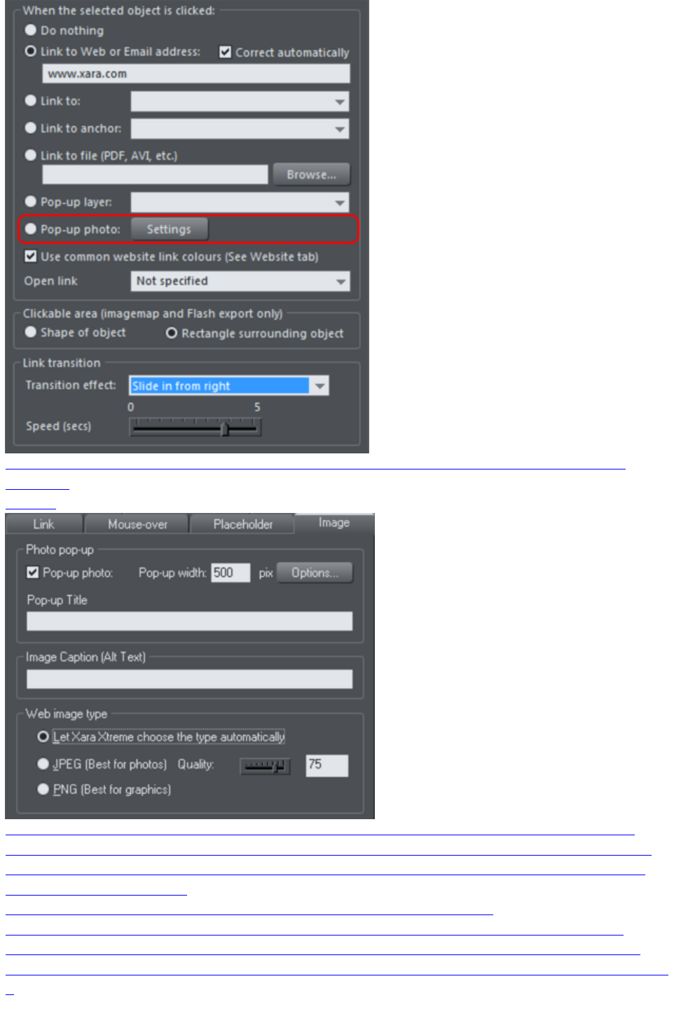
Click the Settings button next to the popup photo option, to change to the Image tab of the Web
properties
dialog.
There you can change how your pop-up appears. One option allows you to place a title above each
pop-up photo. Set the title for each photo using the Title field. You can also optionally show a caption
below each popup photo. Just set the Image Caption (Alt text) for the thumbnail on the same dialog.
See the popup photo section
of the Web Properties Dialog chapter for full details of the options available.
In Internet Explorer the Image caption ("ALT"-Text) will be also shown in a tooltip pop-up as you
mouse-over the image. To show different text, typically something like 'Click to enlarge' as you move
over the thumbnail image, go to the Mouse-over tab and set Show pop-up text to be Click to Enlarge
.
Page 86
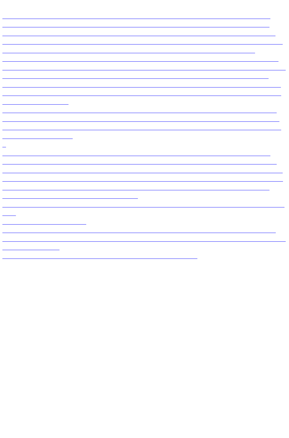
Photo Resolution - It's All Automatic!
When importing high resolution photos (anything above 1920 pixels either wide or high) into a web
document, Xara Web Designer 7 Premium automatically resizes the photo down to HD screen size
without asking you if you want to import a lower resolution version. For a web document, even at the
reduced size, there should be more than enough resolution in your photos for high quality results on your
website, so it's rarely necessary to import digital camera images at full resolution for web use.
However, if you are importing a large photo into a print or animation document, Xara Web Designer 7
Premium asks you if you want to import a lower resolution version of your photos. If your document is to
include many photos, you may want to choose this reduced resolution option. Otherwise with large
photos you may find that your saved design file is much bigger than it needs to be (because it contains a
copy of each of your photos) and you may not have enough memory in your computer to load, edit and
export your documents.
If you're not sure whether you will need the full resolution photo you can import the original photo and
then optimize it down later. To optimize a photo, right click on it and choose the Optimize option from
the context menu. Or you can optimize all the JPEG photos in your document at once, using "Utilities"
> "Optimize all JPEGs"
.
Web Designer Premium always stores the full resolution image (unless you chose to import reduced
resolution images when asked during import, as mentioned above). This means you can resize or crop
your image as required with no loss of quality. Web Designer Premium automatically converts all photos
into the correct resolution JPEG image when saving your website. You do not need to bother about dpi,
image size, pixels or anything like that. What you see in Web Designer Premium (at 100% zoom) is
exactly what will be produced on your web page.
If you want to size a photo, or any object, to a specific size, just enter the required size into the Selector
Tool
InfoBar width or height fields.
When you drop a photo on the page (assuming you're not replacing an existing photo), it's sized to be
500 pixels wide. But if you want this to be exactly 200 pixels wide, just enter 200pix into the W size field
of the Selector Tool
. You can enter it in any unit e.g. entering 2in will make it 2 inches wide.
Page 87
The Photo Tool
The Photo Tool
provides a range of ways to enhance and crop any photo.
To crop a photo, just drag across the photo while in the Enhance
Photo Tool
. You can adjust the crop edges by dragging on the crop handles
around the outside of the photo.
Or use the Clip Tool
for more control over crops.
See the section on Photo Handling for background information on the advanced way in which Xara Web
Designer 7 Premium handles photos, and the section on the Photo Tool to find out how to use the Photo
Tool
.
Thumbnail Photos With Pop-ups
You can very easily create small thumbnail photos (just resize it to be tiny), that when clicked will show
an enlarged version. Simply resize your photo to be small, the usual way using the Selector Tool
.
Select the small thumbnail photo, and select the Pop-up photo option in
the Link tab of the Web Properties dialog (click the Link button in the
Web Toolbar
).
Click the Settings button next to the popup photo option, to change to the Image tab of the Web
properties
Page 88
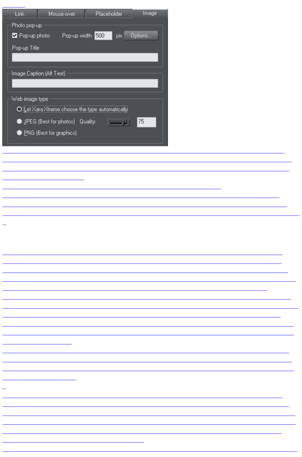
dialog.
There you can change how your pop-up appears. One option allows you to place a title above each
pop-up photo. Set the title for each photo using the Title field. You can also optionally show a caption
below each popup photo. Just set the Image Caption (Alt text) for the thumbnail on the same dialog.
See the popup photo section
of the Web Properties Dialog chapter for full details of the options available.
In Internet Explorer the Image caption ("ALT"-Text) will be also shown in a tooltip pop-up as you
mouse-over the image. To show different text, typically something like 'Click to enlarge' as you move
over the thumbnail image, go to the Mouse-over tab and set Show pop-up text to be Click to Enlarge
.
Photo Resolution - It's All Automatic!
When importing high resolution photos (anything above 1920 pixels either wide or high) into a web
document, Xara Web Designer 7 Premium automatically resizes the photo down to HD screen size
without asking you if you want to import a lower resolution version. For a web document, even at the
reduced size, there should be more than enough resolution in your photos for high quality results on your
website, so it's rarely necessary to import digital camera images at full resolution for web use.
However, if you are importing a large photo into a print or animation document, Xara Web Designer 7
Premium asks you if you want to import a lower resolution version of your photos. If your document is to
include many photos, you may want to choose this reduced resolution option. Otherwise with large
photos you may find that your saved design file is much bigger than it needs to be (because it contains a
copy of each of your photos) and you may not have enough memory in your computer to load, edit and
export your documents.
If you're not sure whether you will need the full resolution photo you can import the original photo and
then optimize it down later. To optimize a photo, right click on it and choose the Optimize option from
the context menu. Or you can optimize all the JPEG photos in your document at once, using "Utilities"
> "Optimize all JPEGs"
.
Web Designer Premium always stores the full resolution image (unless you chose to import reduced
resolution images when asked during import, as mentioned above). This means you can resize or crop
your image as required with no loss of quality. Web Designer Premium automatically converts all photos
into the correct resolution JPEG image when saving your website. You do not need to bother about dpi,
image size, pixels or anything like that. What you see in Web Designer Premium (at 100% zoom) is
exactly what will be produced on your web page.
If you want to size a photo, or any object, to a specific size, just enter the required size into the Selector
Page 89

Tool
InfoBar width or height fields.
When you drop a photo on the page (assuming you're not replacing an existing photo), it's sized to be
500 pixels wide. But if you want this to be exactly 200 pixels wide, just enter 200pix into the W size field
of the Selector Tool
. You can enter it in any unit e.g. entering 2in will make it 2 inches wide.
Page 90
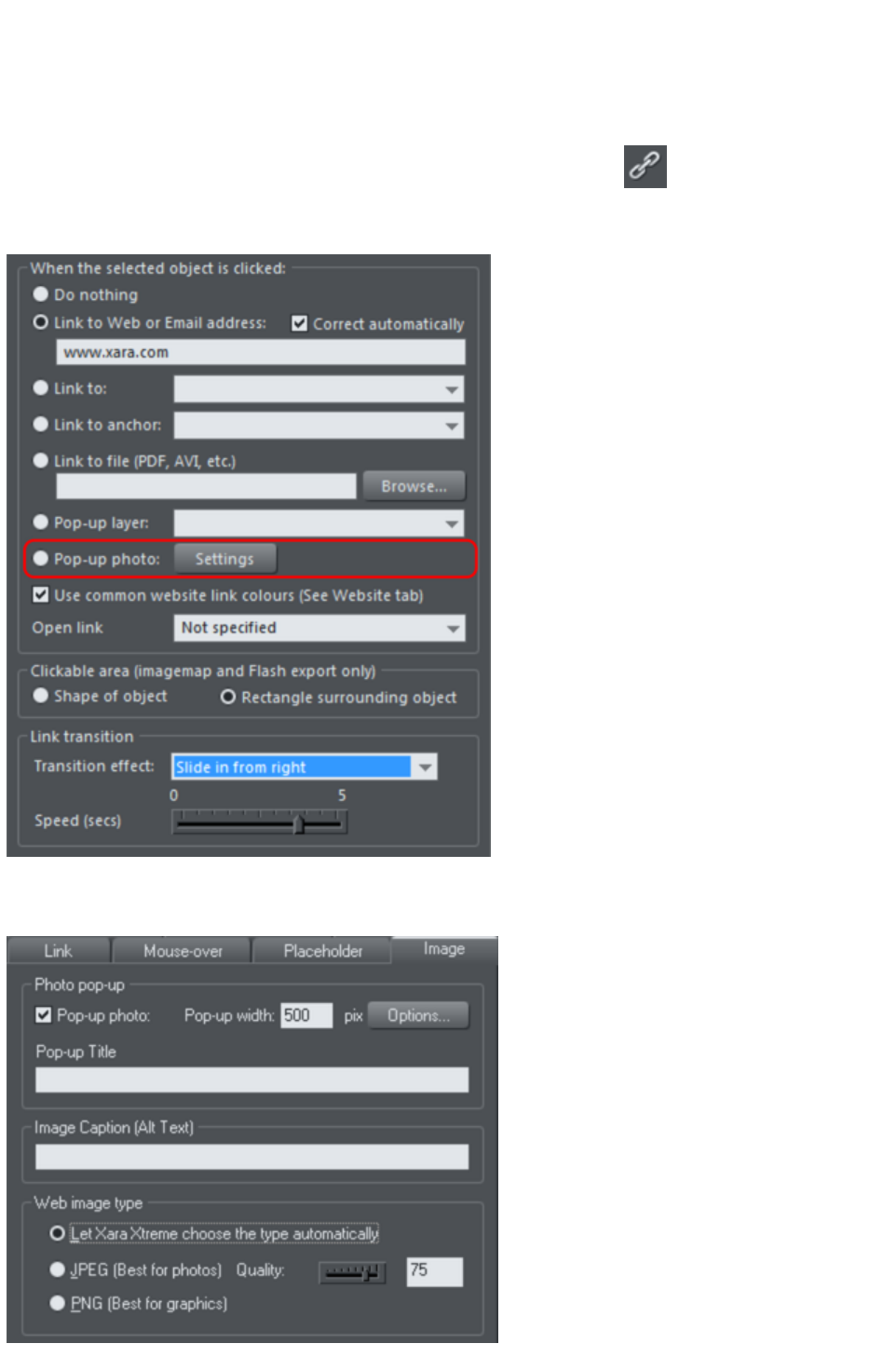
Thumbnail Photos With Pop-ups
You can very easily create small thumbnail photos (just resize it to be tiny), that when clicked will show
an enlarged version. Simply resize your photo to be small, the usual way using the Selector Tool
.
Select the small thumbnail photo, and select the Pop-up photo option in
the Link tab of the Web Properties dialog (click the Link button in the
Web Toolbar
).
Click the Settings button next to the popup photo option, to change to the Image tab of the Web
properties
dialog.
Page 91

There you can change how your pop-up appears. One option allows you to place a title above each
pop-up photo. Set the title for each photo using the Title field. You can also optionally show a caption
below each popup photo. Just set the Image Caption (Alt text) for the thumbnail on the same dialog.
See the popup photo section
of the Web Properties Dialog chapter for full details of the options available.
In Internet Explorer the Image caption ("ALT"-Text) will be also shown in a tooltip pop-up as you
mouse-over the image. To show different text, typically something like 'Click to enlarge' as you move
over the thumbnail image, go to the Mouse-over tab and set Show pop-up text to be Click to Enlarge
.
Photo Resolution - It's All Automatic!
When importing high resolution photos (anything above 1920 pixels either wide or high) into a web
document, Xara Web Designer 7 Premium automatically resizes the photo down to HD screen size
without asking you if you want to import a lower resolution version. For a web document, even at the
reduced size, there should be more than enough resolution in your photos for high quality results on your
website, so it's rarely necessary to import digital camera images at full resolution for web use.
However, if you are importing a large photo into a print or animation document, Xara Web Designer 7
Premium asks you if you want to import a lower resolution version of your photos. If your document is to
include many photos, you may want to choose this reduced resolution option. Otherwise with large
photos you may find that your saved design file is much bigger than it needs to be (because it contains a
copy of each of your photos) and you may not have enough memory in your computer to load, edit and
export your documents.
If you're not sure whether you will need the full resolution photo you can import the original photo and
then optimize it down later. To optimize a photo, right click on it and choose the Optimize option from
the context menu. Or you can optimize all the JPEG photos in your document at once, using "Utilities"
> "Optimize all JPEGs"
.
Web Designer Premium always stores the full resolution image (unless you chose to import reduced
resolution images when asked during import, as mentioned above). This means you can resize or crop
your image as required with no loss of quality. Web Designer Premium automatically converts all photos
into the correct resolution JPEG image when saving your website. You do not need to bother about dpi,
image size, pixels or anything like that. What you see in Web Designer Premium (at 100% zoom) is
exactly what will be produced on your web page.
If you want to size a photo, or any object, to a specific size, just enter the required size into the Selector
Tool
InfoBar width or height fields.
When you drop a photo on the page (assuming you're not replacing an existing photo), it's sized to be
500 pixels wide. But if you want this to be exactly 200 pixels wide, just enter 200pix into the W size field
of the Selector Tool
. You can enter it in any unit e.g. entering 2in will make it 2 inches wide.
Page 92

Photo Resolution - It's All Automatic!
When importing high resolution photos (anything above 1920 pixels either wide or high) into a web
document, Xara Web Designer 7 Premium automatically resizes the photo down to HD screen size
without asking you if you want to import a lower resolution version. For a web document, even at the
reduced size, there should be more than enough resolution in your photos for high quality results on your
website, so it's rarely necessary to import digital camera images at full resolution for web use.
However, if you are importing a large photo into a print or animation document, Xara Web Designer 7
Premium asks you if you want to import a lower resolution version of your photos. If your document is to
include many photos, you may want to choose this reduced resolution option. Otherwise with large
photos you may find that your saved design file is much bigger than it needs to be (because it contains a
copy of each of your photos) and you may not have enough memory in your computer to load, edit and
export your documents.
If you're not sure whether you will need the full resolution photo you can import the original photo and
then optimize it down later. To optimize a photo, right click on it and choose the Optimize option from
the context menu. Or you can optimize all the JPEG photos in your document at once, using "Utilities"
> "Optimize all JPEGs"
.
Web Designer Premium always stores the full resolution image (unless you chose to import reduced
resolution images when asked during import, as mentioned above). This means you can resize or crop
your image as required with no loss of quality. Web Designer Premium automatically converts all photos
into the correct resolution JPEG image when saving your website. You do not need to bother about dpi,
image size, pixels or anything like that. What you see in Web Designer Premium (at 100% zoom) is
exactly what will be produced on your web page.
If you want to size a photo, or any object, to a specific size, just enter the required size into the Selector
Tool
InfoBar width or height fields.
When you drop a photo on the page (assuming you're not replacing an existing photo), it's sized to be
500 pixels wide. But if you want this to be exactly 200 pixels wide, just enter 200pix into the W size field
of the Selector Tool
. You can enter it in any unit e.g. entering 2in will make it 2 inches wide.
Page 93
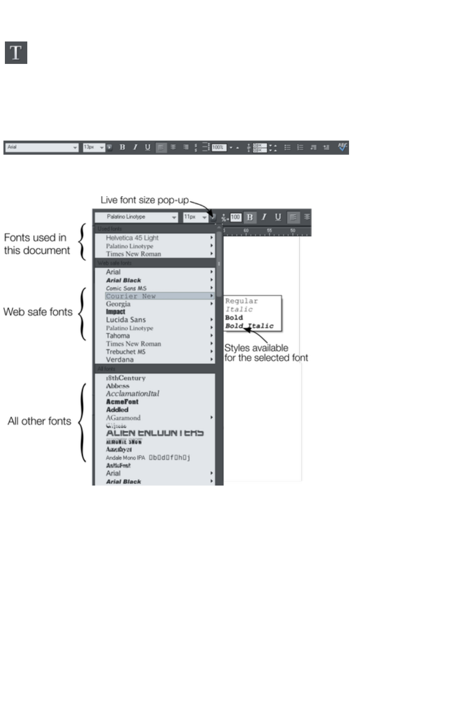
Text
You can edit the text by selecting the Text Tool
and clicking on the text.
You have all the usual word processing facilities, and can paste text from the system clipboard. Double
click will select a word, triple click will select a whole line - which can be useful for selecting all the text in
a button. As usual the InfoBar provides a wide range of controls for this tool. Alternatively you can right
click within text and choose Advanced Text Properties
.
The font menu displays a list of fonts and is split into three sections. The top section shows fonts already
used in the document, the next section shows web safe fonts, and finally the lower section shows all fonts
installed on your computer.
The three sections of the font menu. In this example Courier New is selected showing the available bold
and italic variants. Not all fonts have such variants.
The font menu offers live font selection. As you traverse the menu, the selected text changes font allowing
you to immediately preview what the font will look like in the document.
Font Size
The font size field shows the font size in pixels, as this is the most reliable method of setting the text size
for use in a web browser. But you can enter any size in points (or any other unit for that matter), by
entering a value with pt after it (for point) e.g. 72pt or 1in and this will get converted to the correct pixel
size.
Web Safe Fonts
Only a small set of fonts can be used safely for the main text of a website - only those fonts that you
know will exist on the computer of the viewer of your website. Although there are no guarantees, there is
a common subset of fonts that are widely used by something like 98% of all computers, including Apple
Page 94
Mac and some Linux computers. These fonts are called the 'web safe fonts', and are listed at the top of
the font menu. If you try and save a website using non-web safe fonts you will get a warning.
If you turn any text object into a graphic, you are free to use any font. See the Groups section
below for details about this.
Creating New Text Objects
There are three types of text object - a single line of text, a column of text or a rectangular text area. To
create a simple line of text, select the Text Tool and then you can click anywhere on the background
and start typing. To create a column click and drag horizontally on the background, and then start typing.
You can adjust the column width at any time. To create a text area, click and drag diagonally. You can
adjust the width and height of a text area by clicking and dragging on it in the Text Tool
.
Rotated Text
Unusually (uniquely for a web authoring tool) you can rotate any text object, even columns of text, using
the usual rotate feature of the Selector tool. But because web browsers do not support native rotated
text Web Designer Premium converts any rotated text into a graphic when the page is exported as a
website.
Bulleted and numbered lists
Use the bullet and numbered list buttons on the Text Tool info bar to quickly enter bulleted or
numbered lists. You can right click on a numbered list and choose List properties… from the context
menu to change the numbering scheme for your list. See the Text Tool chapter
for more information.
Soft Shadows, Color Filled Text, Transparent Text
You can apply any of these effects using the appropriate tools, e.g., if you drag across some text in the
Fill Tool it will give it a graduated color, or if you drag on it with the Shadow Tool
it will give it a soft shadow.
In all these cases Web Designer Premium will automatically convert the text to be a graphic on your
exported website.
Text Repel Around Objects
If you right click on an object like a photo and select the menu option 'Repel text under'
' you can make text flow around the object that is on top of the text.
Many of the objects, such as photos, side panels, buttons and headings used in the templates from the
Designs Gallery
are automatically repelling - the text will always flow around these objects as you drag them around.
Repelling objects only repel text that is behind the object - so you may have to 'bring to front' the object
in order for the repel to work ("Ctrl + F"). Alternatively if you only want an object to repel text within an
individual layer, you can prevent text that is below that layer from being repelled (useful for popup layers
within a web page) - see Layer Properties
.
All operations in the Text Tool
are live - the text re-formats and re-flows as you adjust the column width or move repelling objects
around.
Note: You can now also repel text around anchored objects
.
Page 95
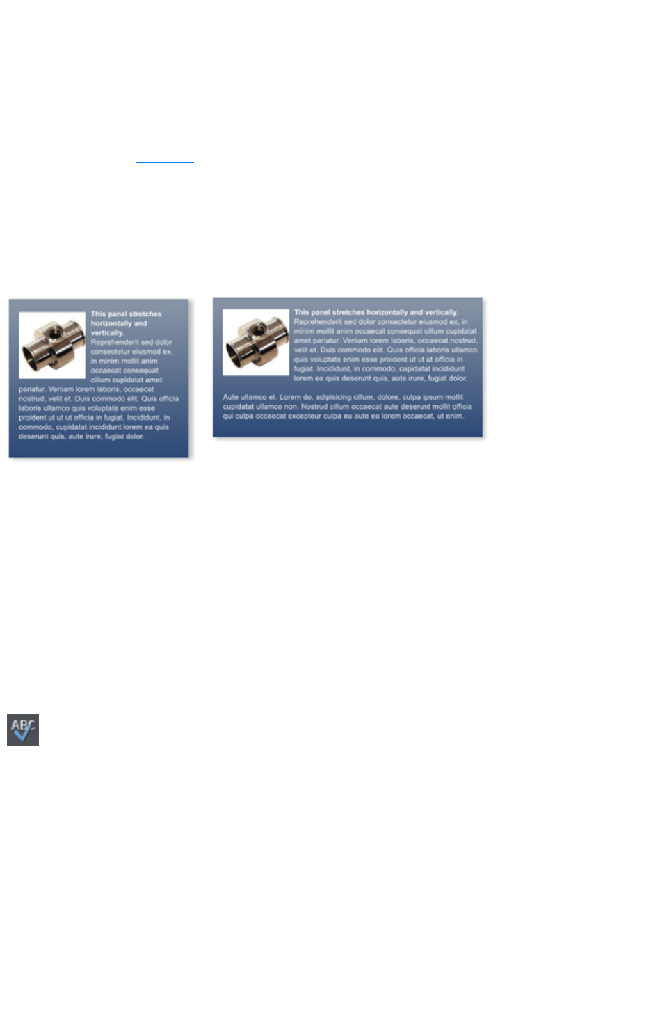
Anchored Objects
If you want a graphical object to appear next to a particular part of a block of text, you can anchor the
object to the text so it moves with it.
Right click the object and choose Anchor to text. Using the Selector Tool
click and drag the anchor symbol that appears in the top left of the object to the location in the text
where you would like the object anchored. Now if you edit or move the text, the anchored object moves
with the anchor point.
Note: You can also repel text
from an anchored object.
Text Panels
Just as some Design Gallery
buttons stretch to accommodate the text, so some text panels can adapt to the width or length of text
entered into them.
The panel background changes to accommodate longer or wider blocks of text.
You can adjust the width of a text column by going into the Text Tool and dragging the column width
handles (under the first line of text). Most of the Design Gallery
templates provide a few text panels in keeping with the theme. Some text panels will only stretch
vertically, others will stretch vertically and horizontally.
To create your own stretching button or text panel, use one of the existing ones from the Design
Gallery
and adapt this by re-coloring the background or adjusting text color / size / width.
Note
: You can create new stretching components using Xara Designer Pro.
Spell Checker
On the Text Tool InfoBar is a button that selects the spell checker
options and language. If you select Check Spelling as you type
this will also mark all unrecognized words with a red dotted underline.
Right click on any marked word to be presented with suggested
alternatives.
Embedded Fonts
Web Designer Premium stores the character shapes of all the fonts used in your document. This means if
you give someone else your .web file, or transfer the file to another computer they will see exactly what
you see, even if the correct fonts are not installed on that computer. But this only embeds the characters
that are used in the document (it's not a full font that is included). So on computers with the fonts missing,
any text that is added in the missing fonts may be missing the correct character shapes.
Text Tip: There are a lot of shortcuts available in the Text Tool
. Refer to the reference section on keyboard shortcuts to see them all. One useful one for experimenting
Page 96

with page layouts, "Ctrl + Shift + L", inserts a block of random pseudo Latin.
Page 97

Font Size
The font size field shows the font size in pixels, as this is the most reliable method of setting the text size
for use in a web browser. But you can enter any size in points (or any other unit for that matter), by
entering a value with pt after it (for point) e.g. 72pt or 1in and this will get converted to the correct pixel
size.
Web Safe Fonts
Only a small set of fonts can be used safely for the main text of a website - only those fonts that you
know will exist on the computer of the viewer of your website. Although there are no guarantees, there is
a common subset of fonts that are widely used by something like 98% of all computers, including Apple
Mac and some Linux computers. These fonts are called the 'web safe fonts', and are listed at the top of
the font menu. If you try and save a website using non-web safe fonts you will get a warning.
If you turn any text object into a graphic, you are free to use any font. See the Groups section
below for details about this.
Creating New Text Objects
There are three types of text object - a single line of text, a column of text or a rectangular text area. To
create a simple line of text, select the Text Tool and then you can click anywhere on the background
and start typing. To create a column click and drag horizontally on the background, and then start typing.
You can adjust the column width at any time. To create a text area, click and drag diagonally. You can
adjust the width and height of a text area by clicking and dragging on it in the Text Tool
.
Rotated Text
Unusually (uniquely for a web authoring tool) you can rotate any text object, even columns of text, using
the usual rotate feature of the Selector tool. But because web browsers do not support native rotated
text Web Designer Premium converts any rotated text into a graphic when the page is exported as a
website.
Bulleted and numbered lists
Use the bullet and numbered list buttons on the Text Tool info bar to quickly enter bulleted or
numbered lists. You can right click on a numbered list and choose List properties… from the context
menu to change the numbering scheme for your list. See the Text Tool chapter
for more information.
Soft Shadows, Color Filled Text, Transparent Text
You can apply any of these effects using the appropriate tools, e.g., if you drag across some text in the
Fill Tool it will give it a graduated color, or if you drag on it with the Shadow Tool
it will give it a soft shadow.
In all these cases Web Designer Premium will automatically convert the text to be a graphic on your
exported website.
Text Repel Around Objects
If you right click on an object like a photo and select the menu option 'Repel text under'
' you can make text flow around the object that is on top of the text.
Many of the objects, such as photos, side panels, buttons and headings used in the templates from the
Designs Gallery
Page 98
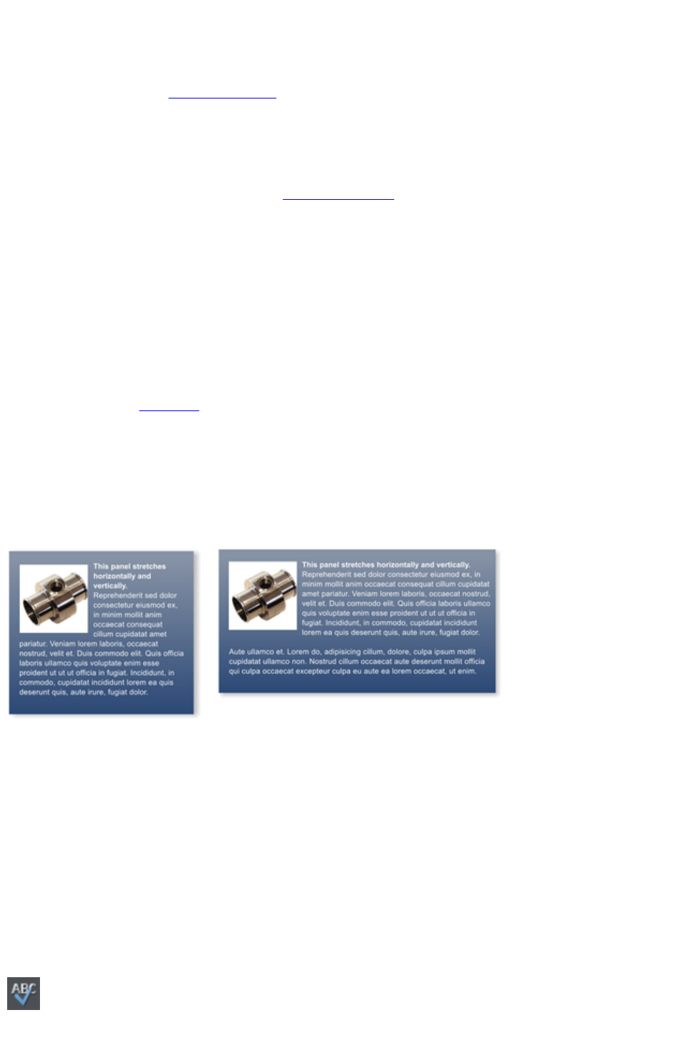
are automatically repelling - the text will always flow around these objects as you drag them around.
Repelling objects only repel text that is behind the object - so you may have to 'bring to front' the object
in order for the repel to work ("Ctrl + F"). Alternatively if you only want an object to repel text within an
individual layer, you can prevent text that is below that layer from being repelled (useful for popup layers
within a web page) - see Layer Properties
.
All operations in the Text Tool
are live - the text re-formats and re-flows as you adjust the column width or move repelling objects
around.
Note: You can now also repel text around anchored objects
.
Anchored Objects
If you want a graphical object to appear next to a particular part of a block of text, you can anchor the
object to the text so it moves with it.
Right click the object and choose Anchor to text. Using the Selector Tool
click and drag the anchor symbol that appears in the top left of the object to the location in the text
where you would like the object anchored. Now if you edit or move the text, the anchored object moves
with the anchor point.
Note: You can also repel text
from an anchored object.
Text Panels
Just as some Design Gallery
buttons stretch to accommodate the text, so some text panels can adapt to the width or length of text
entered into them.
The panel background changes to accommodate longer or wider blocks of text.
You can adjust the width of a text column by going into the Text Tool and dragging the column width
handles (under the first line of text). Most of the Design Gallery
templates provide a few text panels in keeping with the theme. Some text panels will only stretch
vertically, others will stretch vertically and horizontally.
To create your own stretching button or text panel, use one of the existing ones from the Design
Gallery
and adapt this by re-coloring the background or adjusting text color / size / width.
Note
: You can create new stretching components using Xara Designer Pro.
Spell Checker
On the Text Tool InfoBar is a button that selects the spell checker
options and language. If you select Check Spelling as you type
Page 99

this will also mark all unrecognized words with a red dotted underline.
Right click on any marked word to be presented with suggested
alternatives.
Embedded Fonts
Web Designer Premium stores the character shapes of all the fonts used in your document. This means if
you give someone else your .web file, or transfer the file to another computer they will see exactly what
you see, even if the correct fonts are not installed on that computer. But this only embeds the characters
that are used in the document (it's not a full font that is included). So on computers with the fonts missing,
any text that is added in the missing fonts may be missing the correct character shapes.
Text Tip: There are a lot of shortcuts available in the Text Tool
. Refer to the reference section on keyboard shortcuts to see them all. One useful one for experimenting
with page layouts, "Ctrl + Shift + L", inserts a block of random pseudo Latin.
Page 100

Web Safe Fonts
Only a small set of fonts can be used safely for the main text of a website - only those fonts that you
know will exist on the computer of the viewer of your website. Although there are no guarantees, there is
a common subset of fonts that are widely used by something like 98% of all computers, including Apple
Mac and some Linux computers. These fonts are called the 'web safe fonts', and are listed at the top of
the font menu. If you try and save a website using non-web safe fonts you will get a warning.
If you turn any text object into a graphic, you are free to use any font. See the Groups section
below for details about this.
Creating New Text Objects
There are three types of text object - a single line of text, a column of text or a rectangular text area. To
create a simple line of text, select the Text Tool and then you can click anywhere on the background
and start typing. To create a column click and drag horizontally on the background, and then start typing.
You can adjust the column width at any time. To create a text area, click and drag diagonally. You can
adjust the width and height of a text area by clicking and dragging on it in the Text Tool
.
Rotated Text
Unusually (uniquely for a web authoring tool) you can rotate any text object, even columns of text, using
the usual rotate feature of the Selector tool. But because web browsers do not support native rotated
text Web Designer Premium converts any rotated text into a graphic when the page is exported as a
website.
Bulleted and numbered lists
Use the bullet and numbered list buttons on the Text Tool info bar to quickly enter bulleted or
numbered lists. You can right click on a numbered list and choose List properties… from the context
menu to change the numbering scheme for your list. See the Text Tool chapter
for more information.
Soft Shadows, Color Filled Text, Transparent Text
You can apply any of these effects using the appropriate tools, e.g., if you drag across some text in the
Fill Tool it will give it a graduated color, or if you drag on it with the Shadow Tool
it will give it a soft shadow.
In all these cases Web Designer Premium will automatically convert the text to be a graphic on your
exported website.
Text Repel Around Objects
If you right click on an object like a photo and select the menu option 'Repel text under'
' you can make text flow around the object that is on top of the text.
Many of the objects, such as photos, side panels, buttons and headings used in the templates from the
Designs Gallery
are automatically repelling - the text will always flow around these objects as you drag them around.
Repelling objects only repel text that is behind the object - so you may have to 'bring to front' the object
in order for the repel to work ("Ctrl + F"). Alternatively if you only want an object to repel text within an
individual layer, you can prevent text that is below that layer from being repelled (useful for popup layers
within a web page) - see Layer Properties
.
Page 101
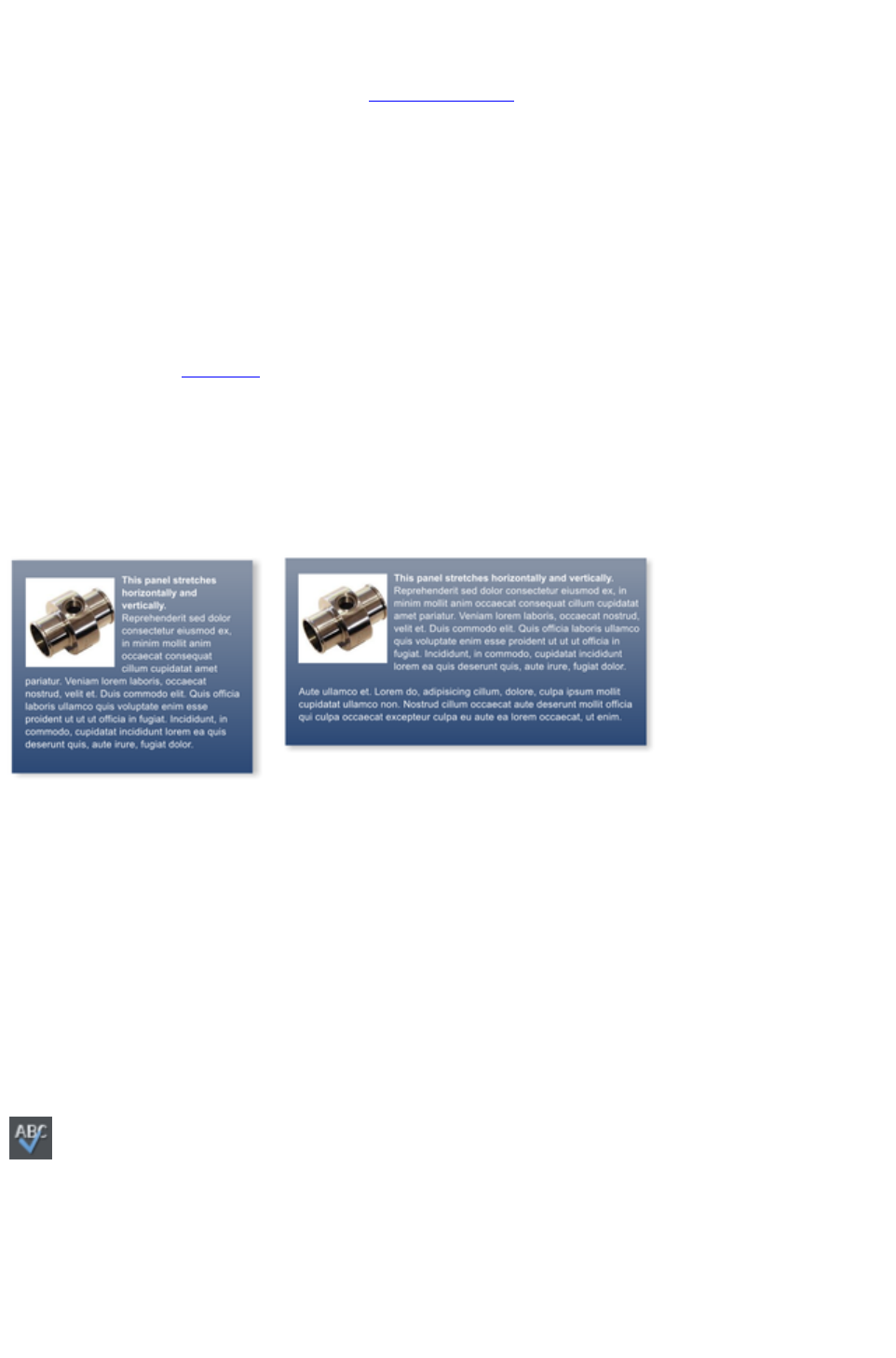
All operations in the Text Tool
are live - the text re-formats and re-flows as you adjust the column width or move repelling objects
around.
Note: You can now also repel text around anchored objects
.
Anchored Objects
If you want a graphical object to appear next to a particular part of a block of text, you can anchor the
object to the text so it moves with it.
Right click the object and choose Anchor to text. Using the Selector Tool
click and drag the anchor symbol that appears in the top left of the object to the location in the text
where you would like the object anchored. Now if you edit or move the text, the anchored object moves
with the anchor point.
Note: You can also repel text
from an anchored object.
Text Panels
Just as some Design Gallery
buttons stretch to accommodate the text, so some text panels can adapt to the width or length of text
entered into them.
The panel background changes to accommodate longer or wider blocks of text.
You can adjust the width of a text column by going into the Text Tool and dragging the column width
handles (under the first line of text). Most of the Design Gallery
templates provide a few text panels in keeping with the theme. Some text panels will only stretch
vertically, others will stretch vertically and horizontally.
To create your own stretching button or text panel, use one of the existing ones from the Design
Gallery
and adapt this by re-coloring the background or adjusting text color / size / width.
Note
: You can create new stretching components using Xara Designer Pro.
Spell Checker
On the Text Tool InfoBar is a button that selects the spell checker
options and language. If you select Check Spelling as you type
this will also mark all unrecognized words with a red dotted underline.
Right click on any marked word to be presented with suggested
alternatives.
Embedded Fonts
Web Designer Premium stores the character shapes of all the fonts used in your document. This means if
Page 102

you give someone else your .web file, or transfer the file to another computer they will see exactly what
you see, even if the correct fonts are not installed on that computer. But this only embeds the characters
that are used in the document (it's not a full font that is included). So on computers with the fonts missing,
any text that is added in the missing fonts may be missing the correct character shapes.
Text Tip: There are a lot of shortcuts available in the Text Tool
. Refer to the reference section on keyboard shortcuts to see them all. One useful one for experimenting
with page layouts, "Ctrl + Shift + L", inserts a block of random pseudo Latin.
Page 103

Creating New Text Objects
There are three types of text object - a single line of text, a column of text or a rectangular text area. To
create a simple line of text, select the Text Tool and then you can click anywhere on the background
and start typing. To create a column click and drag horizontally on the background, and then start typing.
You can adjust the column width at any time. To create a text area, click and drag diagonally. You can
adjust the width and height of a text area by clicking and dragging on it in the Text Tool
.
Rotated Text
Unusually (uniquely for a web authoring tool) you can rotate any text object, even columns of text, using
the usual rotate feature of the Selector tool. But because web browsers do not support native rotated
text Web Designer Premium converts any rotated text into a graphic when the page is exported as a
website.
Bulleted and numbered lists
Use the bullet and numbered list buttons on the Text Tool info bar to quickly enter bulleted or
numbered lists. You can right click on a numbered list and choose List properties… from the context
menu to change the numbering scheme for your list. See the Text Tool chapter
for more information.
Soft Shadows, Color Filled Text, Transparent Text
You can apply any of these effects using the appropriate tools, e.g., if you drag across some text in the
Fill Tool it will give it a graduated color, or if you drag on it with the Shadow Tool
it will give it a soft shadow.
In all these cases Web Designer Premium will automatically convert the text to be a graphic on your
exported website.
Text Repel Around Objects
If you right click on an object like a photo and select the menu option 'Repel text under'
' you can make text flow around the object that is on top of the text.
Many of the objects, such as photos, side panels, buttons and headings used in the templates from the
Designs Gallery
are automatically repelling - the text will always flow around these objects as you drag them around.
Repelling objects only repel text that is behind the object - so you may have to 'bring to front' the object
in order for the repel to work ("Ctrl + F"). Alternatively if you only want an object to repel text within an
individual layer, you can prevent text that is below that layer from being repelled (useful for popup layers
within a web page) - see Layer Properties
.
All operations in the Text Tool
are live - the text re-formats and re-flows as you adjust the column width or move repelling objects
around.
Note: You can now also repel text around anchored objects
.
Anchored Objects
If you want a graphical object to appear next to a particular part of a block of text, you can anchor the
object to the text so it moves with it.
Page 104
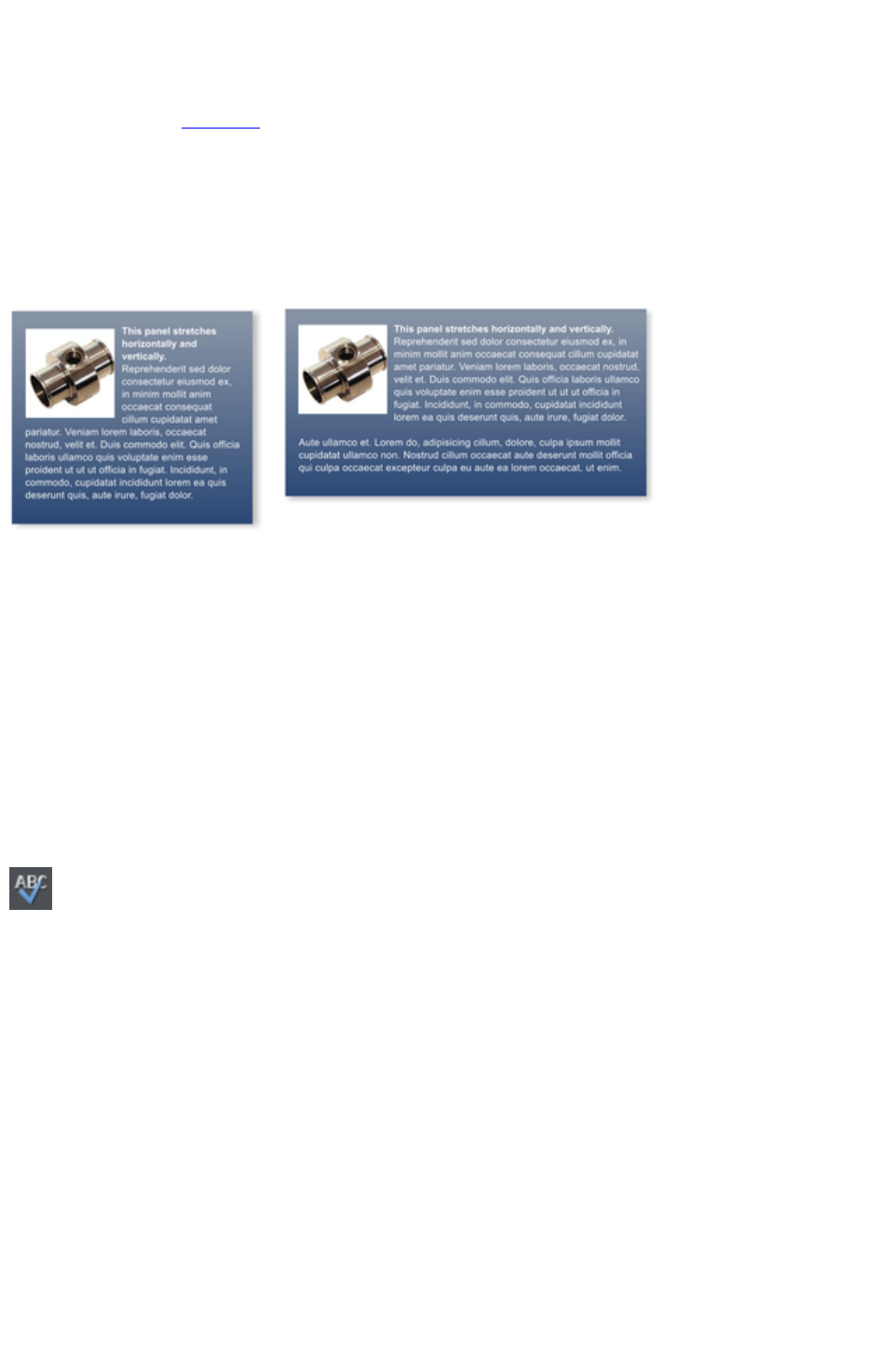
Right click the object and choose Anchor to text. Using the Selector Tool
click and drag the anchor symbol that appears in the top left of the object to the location in the text
where you would like the object anchored. Now if you edit or move the text, the anchored object moves
with the anchor point.
Note: You can also repel text
from an anchored object.
Text Panels
Just as some Design Gallery
buttons stretch to accommodate the text, so some text panels can adapt to the width or length of text
entered into them.
The panel background changes to accommodate longer or wider blocks of text.
You can adjust the width of a text column by going into the Text Tool and dragging the column width
handles (under the first line of text). Most of the Design Gallery
templates provide a few text panels in keeping with the theme. Some text panels will only stretch
vertically, others will stretch vertically and horizontally.
To create your own stretching button or text panel, use one of the existing ones from the Design
Gallery
and adapt this by re-coloring the background or adjusting text color / size / width.
Note
: You can create new stretching components using Xara Designer Pro.
Spell Checker
On the Text Tool InfoBar is a button that selects the spell checker
options and language. If you select Check Spelling as you type
this will also mark all unrecognized words with a red dotted underline.
Right click on any marked word to be presented with suggested
alternatives.
Embedded Fonts
Web Designer Premium stores the character shapes of all the fonts used in your document. This means if
you give someone else your .web file, or transfer the file to another computer they will see exactly what
you see, even if the correct fonts are not installed on that computer. But this only embeds the characters
that are used in the document (it's not a full font that is included). So on computers with the fonts missing,
any text that is added in the missing fonts may be missing the correct character shapes.
Text Tip: There are a lot of shortcuts available in the Text Tool
. Refer to the reference section on keyboard shortcuts to see them all. One useful one for experimenting
with page layouts, "Ctrl + Shift + L", inserts a block of random pseudo Latin.
Page 105
Rotated Text
Unusually (uniquely for a web authoring tool) you can rotate any text object, even columns of text, using
the usual rotate feature of the Selector tool. But because web browsers do not support native rotated
text Web Designer Premium converts any rotated text into a graphic when the page is exported as a
website.
Bulleted and numbered lists
Use the bullet and numbered list buttons on the Text Tool info bar to quickly enter bulleted or
numbered lists. You can right click on a numbered list and choose List properties… from the context
menu to change the numbering scheme for your list. See the Text Tool chapter
for more information.
Soft Shadows, Color Filled Text, Transparent Text
You can apply any of these effects using the appropriate tools, e.g., if you drag across some text in the
Fill Tool it will give it a graduated color, or if you drag on it with the Shadow Tool
it will give it a soft shadow.
In all these cases Web Designer Premium will automatically convert the text to be a graphic on your
exported website.
Text Repel Around Objects
If you right click on an object like a photo and select the menu option 'Repel text under'
' you can make text flow around the object that is on top of the text.
Many of the objects, such as photos, side panels, buttons and headings used in the templates from the
Designs Gallery
are automatically repelling - the text will always flow around these objects as you drag them around.
Repelling objects only repel text that is behind the object - so you may have to 'bring to front' the object
in order for the repel to work ("Ctrl + F"). Alternatively if you only want an object to repel text within an
individual layer, you can prevent text that is below that layer from being repelled (useful for popup layers
within a web page) - see Layer Properties
.
All operations in the Text Tool
are live - the text re-formats and re-flows as you adjust the column width or move repelling objects
around.
Note: You can now also repel text around anchored objects
.
Anchored Objects
If you want a graphical object to appear next to a particular part of a block of text, you can anchor the
object to the text so it moves with it.
Right click the object and choose Anchor to text. Using the Selector Tool
click and drag the anchor symbol that appears in the top left of the object to the location in the text
where you would like the object anchored. Now if you edit or move the text, the anchored object moves
with the anchor point.
Note: You can also repel text
from an anchored object.
Text Panels
Page 106
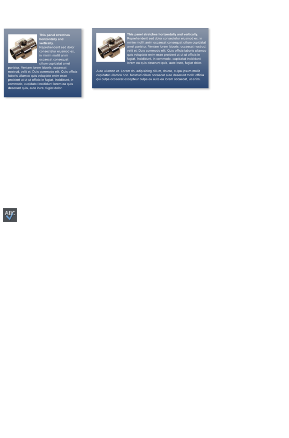
Just as some Design Gallery
buttons stretch to accommodate the text, so some text panels can adapt to the width or length of text
entered into them.
The panel background changes to accommodate longer or wider blocks of text.
You can adjust the width of a text column by going into the Text Tool and dragging the column width
handles (under the first line of text). Most of the Design Gallery
templates provide a few text panels in keeping with the theme. Some text panels will only stretch
vertically, others will stretch vertically and horizontally.
To create your own stretching button or text panel, use one of the existing ones from the Design
Gallery
and adapt this by re-coloring the background or adjusting text color / size / width.
Note
: You can create new stretching components using Xara Designer Pro.
Spell Checker
On the Text Tool InfoBar is a button that selects the spell checker
options and language. If you select Check Spelling as you type
this will also mark all unrecognized words with a red dotted underline.
Right click on any marked word to be presented with suggested
alternatives.
Embedded Fonts
Web Designer Premium stores the character shapes of all the fonts used in your document. This means if
you give someone else your .web file, or transfer the file to another computer they will see exactly what
you see, even if the correct fonts are not installed on that computer. But this only embeds the characters
that are used in the document (it's not a full font that is included). So on computers with the fonts missing,
any text that is added in the missing fonts may be missing the correct character shapes.
Text Tip: There are a lot of shortcuts available in the Text Tool
. Refer to the reference section on keyboard shortcuts to see them all. One useful one for experimenting
with page layouts, "Ctrl + Shift + L", inserts a block of random pseudo Latin.
Page 107
Bulleted and numbered lists
Use the bullet and numbered list buttons on the Text Tool info bar to quickly enter bulleted or
numbered lists. You can right click on a numbered list and choose List properties… from the context
menu to change the numbering scheme for your list. See the Text Tool chapter
for more information.
Soft Shadows, Color Filled Text, Transparent Text
You can apply any of these effects using the appropriate tools, e.g., if you drag across some text in the
Fill Tool it will give it a graduated color, or if you drag on it with the Shadow Tool
it will give it a soft shadow.
In all these cases Web Designer Premium will automatically convert the text to be a graphic on your
exported website.
Text Repel Around Objects
If you right click on an object like a photo and select the menu option 'Repel text under'
' you can make text flow around the object that is on top of the text.
Many of the objects, such as photos, side panels, buttons and headings used in the templates from the
Designs Gallery
are automatically repelling - the text will always flow around these objects as you drag them around.
Repelling objects only repel text that is behind the object - so you may have to 'bring to front' the object
in order for the repel to work ("Ctrl + F"). Alternatively if you only want an object to repel text within an
individual layer, you can prevent text that is below that layer from being repelled (useful for popup layers
within a web page) - see Layer Properties
.
All operations in the Text Tool
are live - the text re-formats and re-flows as you adjust the column width or move repelling objects
around.
Note: You can now also repel text around anchored objects
.
Anchored Objects
If you want a graphical object to appear next to a particular part of a block of text, you can anchor the
object to the text so it moves with it.
Right click the object and choose Anchor to text. Using the Selector Tool
click and drag the anchor symbol that appears in the top left of the object to the location in the text
where you would like the object anchored. Now if you edit or move the text, the anchored object moves
with the anchor point.
Note: You can also repel text
from an anchored object.
Text Panels
Just as some Design Gallery
buttons stretch to accommodate the text, so some text panels can adapt to the width or length of text
entered into them.
Page 108
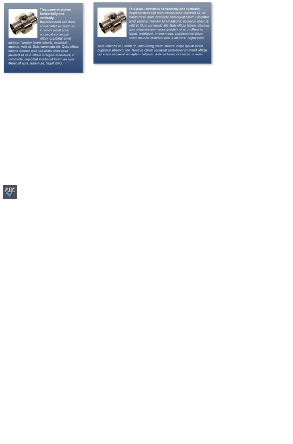
The panel background changes to accommodate longer or wider blocks of text.
You can adjust the width of a text column by going into the Text Tool and dragging the column width
handles (under the first line of text). Most of the Design Gallery
templates provide a few text panels in keeping with the theme. Some text panels will only stretch
vertically, others will stretch vertically and horizontally.
To create your own stretching button or text panel, use one of the existing ones from the Design
Gallery
and adapt this by re-coloring the background or adjusting text color / size / width.
Note
: You can create new stretching components using Xara Designer Pro.
Spell Checker
On the Text Tool InfoBar is a button that selects the spell checker
options and language. If you select Check Spelling as you type
this will also mark all unrecognized words with a red dotted underline.
Right click on any marked word to be presented with suggested
alternatives.
Embedded Fonts
Web Designer Premium stores the character shapes of all the fonts used in your document. This means if
you give someone else your .web file, or transfer the file to another computer they will see exactly what
you see, even if the correct fonts are not installed on that computer. But this only embeds the characters
that are used in the document (it's not a full font that is included). So on computers with the fonts missing,
any text that is added in the missing fonts may be missing the correct character shapes.
Text Tip: There are a lot of shortcuts available in the Text Tool
. Refer to the reference section on keyboard shortcuts to see them all. One useful one for experimenting
with page layouts, "Ctrl + Shift + L", inserts a block of random pseudo Latin.
Page 109
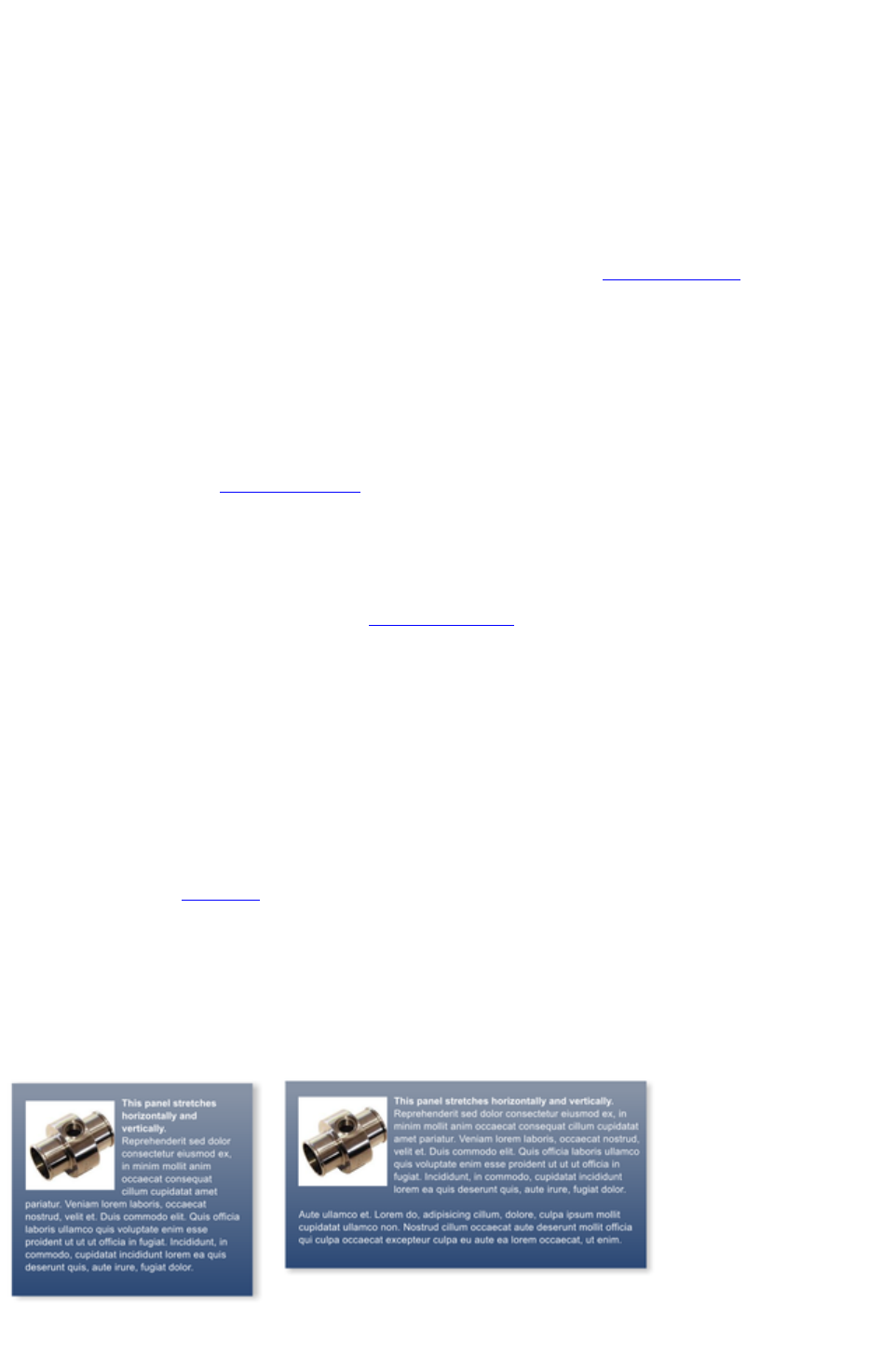
Soft Shadows, Color Filled Text, Transparent Text
You can apply any of these effects using the appropriate tools, e.g., if you drag across some text in the
Fill Tool it will give it a graduated color, or if you drag on it with the Shadow Tool
it will give it a soft shadow.
In all these cases Web Designer Premium will automatically convert the text to be a graphic on your
exported website.
Text Repel Around Objects
If you right click on an object like a photo and select the menu option 'Repel text under'
' you can make text flow around the object that is on top of the text.
Many of the objects, such as photos, side panels, buttons and headings used in the templates from the
Designs Gallery
are automatically repelling - the text will always flow around these objects as you drag them around.
Repelling objects only repel text that is behind the object - so you may have to 'bring to front' the object
in order for the repel to work ("Ctrl + F"). Alternatively if you only want an object to repel text within an
individual layer, you can prevent text that is below that layer from being repelled (useful for popup layers
within a web page) - see Layer Properties
.
All operations in the Text Tool
are live - the text re-formats and re-flows as you adjust the column width or move repelling objects
around.
Note: You can now also repel text around anchored objects
.
Anchored Objects
If you want a graphical object to appear next to a particular part of a block of text, you can anchor the
object to the text so it moves with it.
Right click the object and choose Anchor to text. Using the Selector Tool
click and drag the anchor symbol that appears in the top left of the object to the location in the text
where you would like the object anchored. Now if you edit or move the text, the anchored object moves
with the anchor point.
Note: You can also repel text
from an anchored object.
Text Panels
Just as some Design Gallery
buttons stretch to accommodate the text, so some text panels can adapt to the width or length of text
entered into them.
The panel background changes to accommodate longer or wider blocks of text.
Page 110

You can adjust the width of a text column by going into the Text Tool and dragging the column width
handles (under the first line of text). Most of the Design Gallery
templates provide a few text panels in keeping with the theme. Some text panels will only stretch
vertically, others will stretch vertically and horizontally.
To create your own stretching button or text panel, use one of the existing ones from the Design
Gallery
and adapt this by re-coloring the background or adjusting text color / size / width.
Note
: You can create new stretching components using Xara Designer Pro.
Spell Checker
On the Text Tool InfoBar is a button that selects the spell checker
options and language. If you select Check Spelling as you type
this will also mark all unrecognized words with a red dotted underline.
Right click on any marked word to be presented with suggested
alternatives.
Embedded Fonts
Web Designer Premium stores the character shapes of all the fonts used in your document. This means if
you give someone else your .web file, or transfer the file to another computer they will see exactly what
you see, even if the correct fonts are not installed on that computer. But this only embeds the characters
that are used in the document (it's not a full font that is included). So on computers with the fonts missing,
any text that is added in the missing fonts may be missing the correct character shapes.
Text Tip: There are a lot of shortcuts available in the Text Tool
. Refer to the reference section on keyboard shortcuts to see them all. One useful one for experimenting
with page layouts, "Ctrl + Shift + L", inserts a block of random pseudo Latin.
Page 111
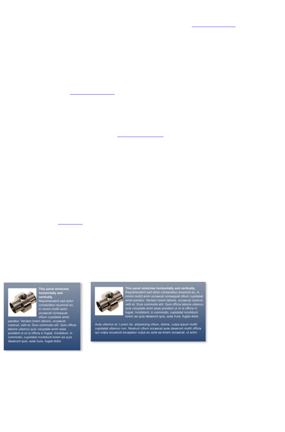
Text Repel Around Objects
If you right click on an object like a photo and select the menu option 'Repel text under'
' you can make text flow around the object that is on top of the text.
Many of the objects, such as photos, side panels, buttons and headings used in the templates from the
Designs Gallery
are automatically repelling - the text will always flow around these objects as you drag them around.
Repelling objects only repel text that is behind the object - so you may have to 'bring to front' the object
in order for the repel to work ("Ctrl + F"). Alternatively if you only want an object to repel text within an
individual layer, you can prevent text that is below that layer from being repelled (useful for popup layers
within a web page) - see Layer Properties
.
All operations in the Text Tool
are live - the text re-formats and re-flows as you adjust the column width or move repelling objects
around.
Note: You can now also repel text around anchored objects
.
Anchored Objects
If you want a graphical object to appear next to a particular part of a block of text, you can anchor the
object to the text so it moves with it.
Right click the object and choose Anchor to text. Using the Selector Tool
click and drag the anchor symbol that appears in the top left of the object to the location in the text
where you would like the object anchored. Now if you edit or move the text, the anchored object moves
with the anchor point.
Note: You can also repel text
from an anchored object.
Text Panels
Just as some Design Gallery
buttons stretch to accommodate the text, so some text panels can adapt to the width or length of text
entered into them.
The panel background changes to accommodate longer or wider blocks of text.
You can adjust the width of a text column by going into the Text Tool and dragging the column width
handles (under the first line of text). Most of the Design Gallery
templates provide a few text panels in keeping with the theme. Some text panels will only stretch
vertically, others will stretch vertically and horizontally.
To create your own stretching button or text panel, use one of the existing ones from the Design
Gallery
and adapt this by re-coloring the background or adjusting text color / size / width.
Note
Page 112

: You can create new stretching components using Xara Designer Pro.
Spell Checker
On the Text Tool InfoBar is a button that selects the spell checker
options and language. If you select Check Spelling as you type
this will also mark all unrecognized words with a red dotted underline.
Right click on any marked word to be presented with suggested
alternatives.
Embedded Fonts
Web Designer Premium stores the character shapes of all the fonts used in your document. This means if
you give someone else your .web file, or transfer the file to another computer they will see exactly what
you see, even if the correct fonts are not installed on that computer. But this only embeds the characters
that are used in the document (it's not a full font that is included). So on computers with the fonts missing,
any text that is added in the missing fonts may be missing the correct character shapes.
Text Tip: There are a lot of shortcuts available in the Text Tool
. Refer to the reference section on keyboard shortcuts to see them all. One useful one for experimenting
with page layouts, "Ctrl + Shift + L", inserts a block of random pseudo Latin.
Page 113
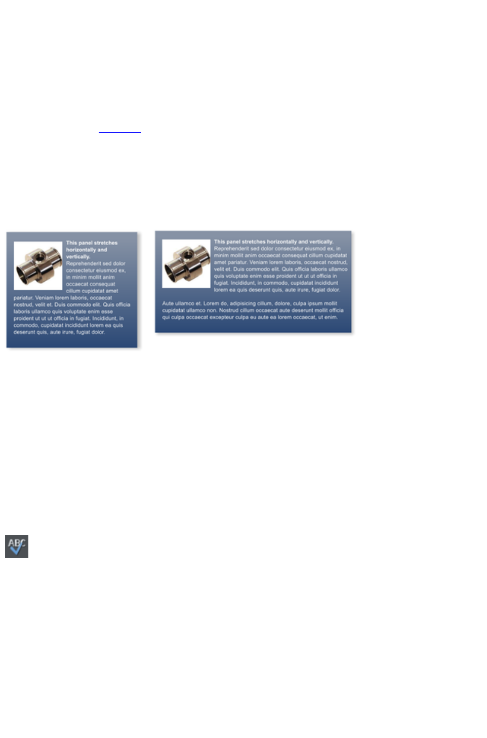
Anchored Objects
If you want a graphical object to appear next to a particular part of a block of text, you can anchor the
object to the text so it moves with it.
Right click the object and choose Anchor to text. Using the Selector Tool
click and drag the anchor symbol that appears in the top left of the object to the location in the text
where you would like the object anchored. Now if you edit or move the text, the anchored object moves
with the anchor point.
Note: You can also repel text
from an anchored object.
Text Panels
Just as some Design Gallery
buttons stretch to accommodate the text, so some text panels can adapt to the width or length of text
entered into them.
The panel background changes to accommodate longer or wider blocks of text.
You can adjust the width of a text column by going into the Text Tool and dragging the column width
handles (under the first line of text). Most of the Design Gallery
templates provide a few text panels in keeping with the theme. Some text panels will only stretch
vertically, others will stretch vertically and horizontally.
To create your own stretching button or text panel, use one of the existing ones from the Design
Gallery
and adapt this by re-coloring the background or adjusting text color / size / width.
Note
: You can create new stretching components using Xara Designer Pro.
Spell Checker
On the Text Tool InfoBar is a button that selects the spell checker
options and language. If you select Check Spelling as you type
this will also mark all unrecognized words with a red dotted underline.
Right click on any marked word to be presented with suggested
alternatives.
Embedded Fonts
Web Designer Premium stores the character shapes of all the fonts used in your document. This means if
you give someone else your .web file, or transfer the file to another computer they will see exactly what
you see, even if the correct fonts are not installed on that computer. But this only embeds the characters
that are used in the document (it's not a full font that is included). So on computers with the fonts missing,
any text that is added in the missing fonts may be missing the correct character shapes.
Text Tip: There are a lot of shortcuts available in the Text Tool
Page 114

. Refer to the reference section on keyboard shortcuts to see them all. One useful one for experimenting
with page layouts, "Ctrl + Shift + L", inserts a block of random pseudo Latin.
Page 115
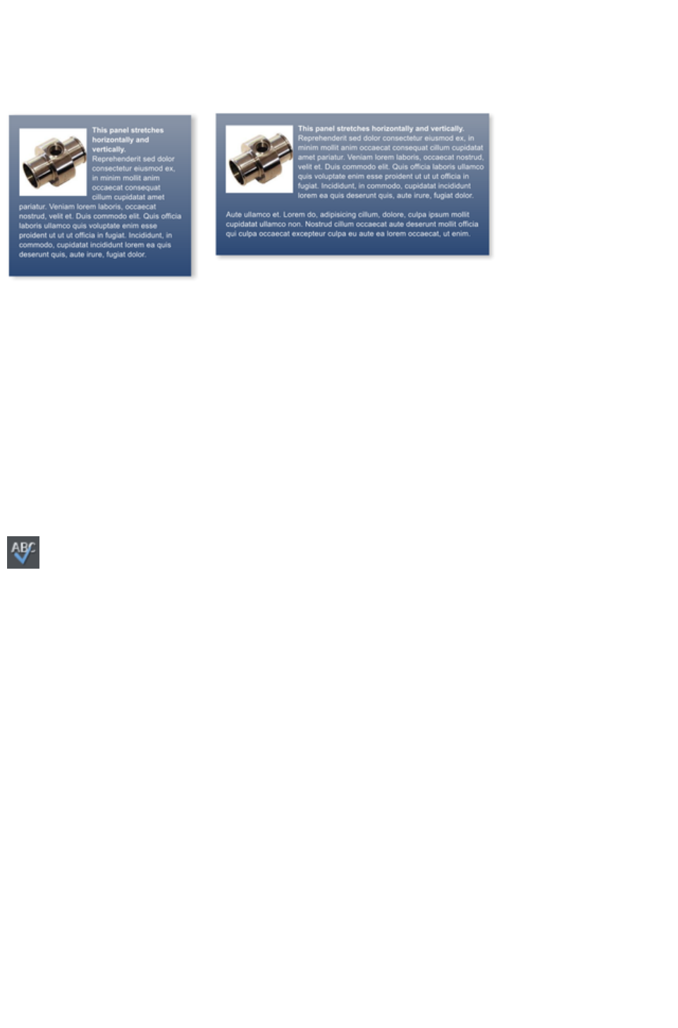
Text Panels
Just as some Design Gallery
buttons stretch to accommodate the text, so some text panels can adapt to the width or length of text
entered into them.
The panel background changes to accommodate longer or wider blocks of text.
You can adjust the width of a text column by going into the Text Tool and dragging the column width
handles (under the first line of text). Most of the Design Gallery
templates provide a few text panels in keeping with the theme. Some text panels will only stretch
vertically, others will stretch vertically and horizontally.
To create your own stretching button or text panel, use one of the existing ones from the Design
Gallery
and adapt this by re-coloring the background or adjusting text color / size / width.
Note
: You can create new stretching components using Xara Designer Pro.
Spell Checker
On the Text Tool InfoBar is a button that selects the spell checker
options and language. If you select Check Spelling as you type
this will also mark all unrecognized words with a red dotted underline.
Right click on any marked word to be presented with suggested
alternatives.
Embedded Fonts
Web Designer Premium stores the character shapes of all the fonts used in your document. This means if
you give someone else your .web file, or transfer the file to another computer they will see exactly what
you see, even if the correct fonts are not installed on that computer. But this only embeds the characters
that are used in the document (it's not a full font that is included). So on computers with the fonts missing,
any text that is added in the missing fonts may be missing the correct character shapes.
Text Tip: There are a lot of shortcuts available in the Text Tool
. Refer to the reference section on keyboard shortcuts to see them all. One useful one for experimenting
with page layouts, "Ctrl + Shift + L", inserts a block of random pseudo Latin.
Page 116

Spell Checker
On the Text Tool InfoBar is a button that selects the spell checker
options and language. If you select Check Spelling as you type
this will also mark all unrecognized words with a red dotted underline.
Right click on any marked word to be presented with suggested
alternatives.
Embedded Fonts
Web Designer Premium stores the character shapes of all the fonts used in your document. This means if
you give someone else your .web file, or transfer the file to another computer they will see exactly what
you see, even if the correct fonts are not installed on that computer. But this only embeds the characters
that are used in the document (it's not a full font that is included). So on computers with the fonts missing,
any text that is added in the missing fonts may be missing the correct character shapes.
Text Tip: There are a lot of shortcuts available in the Text Tool
. Refer to the reference section on keyboard shortcuts to see them all. One useful one for experimenting
with page layouts, "Ctrl + Shift + L", inserts a block of random pseudo Latin.
Page 117

Embedded Fonts
Web Designer Premium stores the character shapes of all the fonts used in your document. This means if
you give someone else your .web file, or transfer the file to another computer they will see exactly what
you see, even if the correct fonts are not installed on that computer. But this only embeds the characters
that are used in the document (it's not a full font that is included). So on computers with the fonts missing,
any text that is added in the missing fonts may be missing the correct character shapes.
Text Tip: There are a lot of shortcuts available in the Text Tool
. Refer to the reference section on keyboard shortcuts to see them all. One useful one for experimenting
with page layouts, "Ctrl + Shift + L", inserts a block of random pseudo Latin.
Page 118
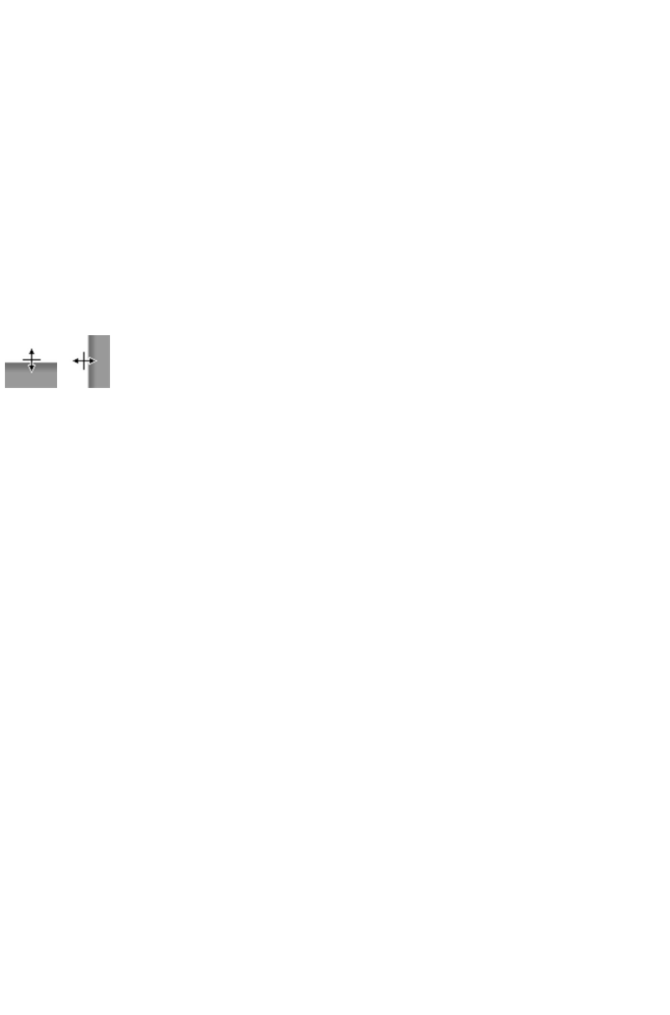
Page Size
The pages in the Designs Gallery
are designed to be a width that is known to fit the vast majority of computer screens. Creating wider
pages is not recommended, even though you will probably have a wider computer screen, experience
shows most viewers prefer to have a fixed width page. However you can adjust the page size to be
anything.
You can set any page size you like by selecting the Page size tab of the Options dialog (right click and
choose Page options or Page Options from the File
menu). It's not recommended that you make the page width more than 990 pixels, as that's the maximum
width for many computer screens (1024 minus a small amount for the scroll bar). A more common page
width is typically around 800 pixels.
You can directly adjust the height and width of your page by just dragging on the bottom or right margin
of the page. Go into the Selector Tool
and hover the pointer over the bottom edge of the page, and it will change to indicate you can now drag
resize the page up or down as required.
Changing The Page Size of Templates
You can change the vertical size of the pre-designed templates by just dragging on the bottom edge of
the page. However you will often need to move and resize various objects on the page. For example
many templates have a footer group. You can just drag this using the Selector Tool to the new position.
Sometimes the main text will be on a colored background rectangle. Again using the Selector Tool
you can drag on the lower resize handle to extend this down the page as required. Most templates use
columns of text which will just grow vertically as you add more text.
Hint
: If you hold "Ctrl" down while dragging you can ensure the drag will be exactly vertical or horizontal.
Page 119

Changing The Page Size of Templates
You can change the vertical size of the pre-designed templates by just dragging on the bottom edge of
the page. However you will often need to move and resize various objects on the page. For example
many templates have a footer group. You can just drag this using the Selector Tool to the new position.
Sometimes the main text will be on a colored background rectangle. Again using the Selector Tool
you can drag on the lower resize handle to extend this down the page as required. Most templates use
columns of text which will just grow vertically as you add more text.
Hint
: If you hold "Ctrl" down while dragging you can ensure the drag will be exactly vertical or horizontal.
Page 120
Saving Your Work. Creating A Website
Use the Save or Save As menu options to save your work in progress. This saves a file with the .web
extension, which is the native file format for Web Designer Premium (this is not a website). You are
recommended to regularly save your work as you go along. If you want to edit or update your website in
future, you must
save a .web file this way and use to do further updates.
It's also recommended that you work with the automatic backup facility turned on. This is controlled from
the Backups tab of the "Utilities" > "Options"
dialog. When on, a backup of your modified open documents is taken regularly. Here you can also
choose how the program should behave when you close it. You can either be prompted about saving or
discarding each open modified document, or have all documents automatically saved to the backup
location and restored the next time you start.
To save your website, that is the HTML and associated files for
publishing to the web, use the "File" > "Export Website"
menu option or click this button on the top bar.
This saves a .htm file for each page and a folder alongside these which contains all the graphic files that
make up your website.
When you export a website, all the pages are exported together, and each page unnamed has _1, _2 ...
appended to the end of the name you give when you export. The _files folder contains all the graphics
and other files that go to make up your website. You can name each page individually if you wish using
the Page tab of the Web Properties dialog or using the Page & Layer Gallery
.
The default name given to your website is index.htm as this is the usual name for the first page of a
website.
You can preview your saved website in any web browser, by dragging the index.htm (or any .htm) file
from your Windows File Explorer onto a browser window.
Automatic backups
The Backups tab of the "Utilities" > "Options"
dialog allows you to turn the automatic backup facility on and off. This facility saves a copy of all your
modified open documents at regular intervals. It's recommended that you work with this backup option
turned on, so your work is saved regularly. You can also choose whether you are prompted about
unsaved documents when closing the program, or if instead all open documents should be backed up and
restored for you when you next start up.
See the Document Handling chapter
for full details about these facilities.
Page 121

Automatic backups
The Backups tab of the "Utilities" > "Options"
dialog allows you to turn the automatic backup facility on and off. This facility saves a copy of all your
modified open documents at regular intervals. It's recommended that you work with this backup option
turned on, so your work is saved regularly. You can also choose whether you are prompted about
unsaved documents when closing the program, or if instead all open documents should be backed up and
restored for you when you next start up.
See the Document Handling chapter
for full details about these facilities.
Page 122
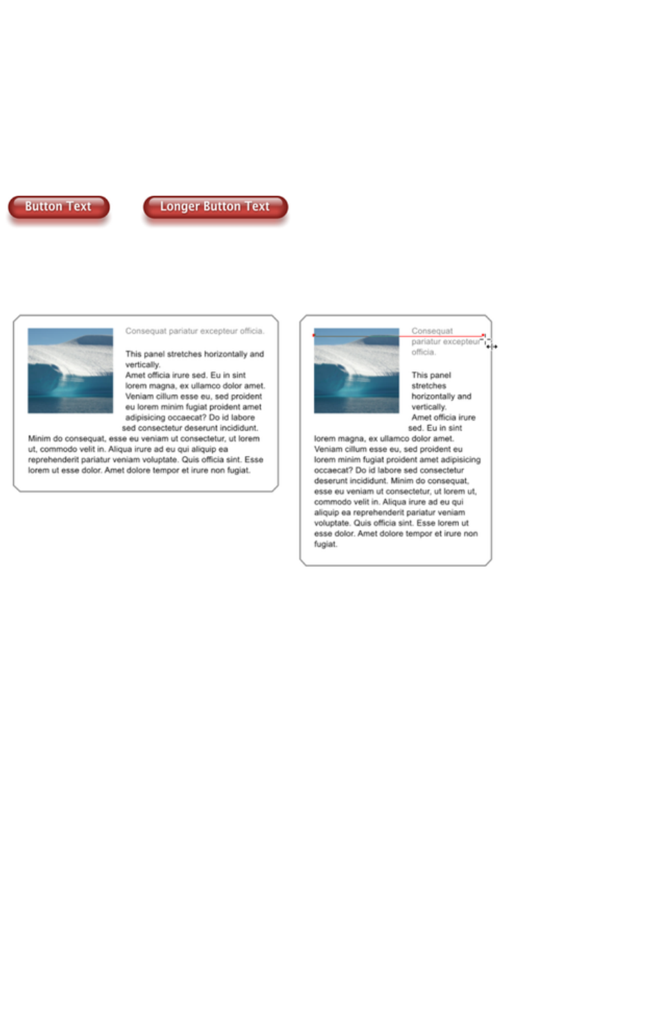
Stretchy Objects
Many of the graphic objects, such as buttons and text panels, can automatically adjust their size
depending on the size or length of text. For example some of the buttons are called 'stretch buttons'
which means that the length of the button adjusts to accommodate the label text on the button. Most
template sets, and all of the buttons in the Button folder in the Designs Gallery
, have both fixed width and stretchy versions. It's recommended that if building a set of navigation buttons
(typically either a horizontal or vertical collection of links or buttons) that you use fixed width so they are
all the same size.
Similarly many of the side or text panels in the templates, and sometimes the main text area, can also
adjust their vertical, and sometimes their horizontal size. In the case of text panels you can adjust the
width of the column in the Text Tool
by dragging on the left or right end of the column indicator.
Page 123
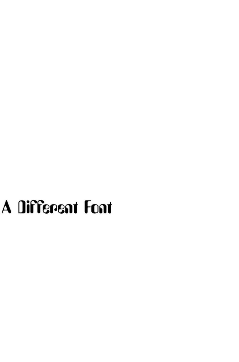
Groups
You can group together any selection of objects on the page. Groups act much like a single object, in
that you can drag them around the page, resize and rotate them as if they were one object. Many of the
items in the template designs from the Designs Gallery
such as buttons, text panels, and photo objects are grouped items.
For example, you can draw a simple button from scratch by drawing a rectangle with the Rectangle
Tool, and then placing a text label on top of this with the Text Tool. These are separate objects and you
can move them around independently in the Selector Tool. But if you select both in the Selector Tool
(you can lasso drag around to enclose them both, or hold "Shift" and click on additional objects) and
right click and choose Group (or press "Ctrl + G" or use the menu "Arrange" > "Group"), these now
become a grouped object (Hint
: The status line at the bottom always tells you what is selected). Now when you drag, resize, rotate this
object, all component parts of the group are moved and transformed as if they are one object.
Important:
Grouped objects are usually converted into a single graphic object when you export your web page.
By un-grouping (right click and choose Ungroup or press "Ctrl + U"), you can access all the parts of
your group again to make any changes. An alternative is that you can sometimes edit items directly inside
a group. For example when using the Text Tool
to edit text or the Photo tool to edit a photo, a click will automatically select the item inside a group.
Converting Text To Be A Graphic
As mentioned above only a very limited number of fonts are available in web browsers. If you want to
use a different font on a button or, say, as a heading, you can do this by ensuring it is converted to a
graphic, and all you need to do is group the object to make this happen automatically. You can still edit
the text inside the group, but groups are automatically converted into a graphic when the website is
exported.
So all you need to do to include a font like this is to group it. It doesn't have to be grouped with anything
- you can group it with itself, by just selecting Group from the Arrange
menu or pressing "Ctrl + G".
Soft Groups
There is another type of group, called a 'Soft Group', which is a more loosely connected set of objects.
The difference between Groups and Soft Groups is:
When you group items they must all be on a single layer (if they are not they are moved to a
single layer when you group the items). Soft groups retain their layers, so you can tie together
items across multiple layers.
Groups are usually converted into a single graphic when exported as HTML for a website. Soft
Groups are not and each object is exported as a separate item. Text inside a soft group is kept
as text in the HTML, whereas text in Groups is converted into a graphic (with some exceptions).
You can nest groups inside other groups. For complex drawings consisting of many, sometimes
thousands of shapes, creating a hierarchy of nested groups is a good organizational technique,
just like having folder inside other folders. Soft Groups however cannot be nested and are
designed primarily a way of tying multiple objects on different layers together.
Because Soft Groups can contain items on different layers, when you select a Soft Grouped item on one
layer it will automatically select the corresponding 'soft grouped' item/s on other layers, often a layer that
is not even visible. See the section on Layers below to understand more about this.
Page 124

Most buttons are Soft Groups, that is when you select, move or resize a button you are in fact performing
these operations on two copies of the button, one called the 'MouseOff' version and another
'MouseOver' version.
Some of the more complex panel objects in the Designs Gallery
are Soft Groups. This is so that you can move it around as a single object, but the component parts, the
photos, background shapes, are all exported into the HTML as separate items for maximum efficiency.
Synchronized Text
There is another useful feature of Soft Groups. If you have the same text on two or more objects within
a Soft Group, the text will be synchronized when you edit it. This is the mechanism used to keep the
button text the same on both the normal and MouseOver buttons - see below.
Anchored Groups
When you make an object anchored to text, it gets put inside an Anchored Group. See Anchored
Graphics
for more information on anchored objects.
Repeating Groups
When you make an object repeating, it is placed inside a Repeating Group. See the Repeating Objects
section of the Object Handling chapter for details.
Page 125
Converting Text To Be A Graphic
As mentioned above only a very limited number of fonts are available in web browsers. If you want to
use a different font on a button or, say, as a heading, you can do this by ensuring it is converted to a
graphic, and all you need to do is group the object to make this happen automatically. You can still edit
the text inside the group, but groups are automatically converted into a graphic when the website is
exported.
So all you need to do to include a font like this is to group it. It doesn't have to be grouped with anything
- you can group it with itself, by just selecting Group from the Arrange
menu or pressing "Ctrl + G".
Soft Groups
There is another type of group, called a 'Soft Group', which is a more loosely connected set of objects.
The difference between Groups and Soft Groups is:
When you group items they must all be on a single layer (if they are not they are moved to a
single layer when you group the items). Soft groups retain their layers, so you can tie together
items across multiple layers.
Groups are usually converted into a single graphic when exported as HTML for a website. Soft
Groups are not and each object is exported as a separate item. Text inside a soft group is kept
as text in the HTML, whereas text in Groups is converted into a graphic (with some exceptions).
You can nest groups inside other groups. For complex drawings consisting of many, sometimes
thousands of shapes, creating a hierarchy of nested groups is a good organizational technique,
just like having folder inside other folders. Soft Groups however cannot be nested and are
designed primarily a way of tying multiple objects on different layers together.
Because Soft Groups can contain items on different layers, when you select a Soft Grouped item on one
layer it will automatically select the corresponding 'soft grouped' item/s on other layers, often a layer that
is not even visible. See the section on Layers below to understand more about this.
Most buttons are Soft Groups, that is when you select, move or resize a button you are in fact performing
these operations on two copies of the button, one called the 'MouseOff' version and another
'MouseOver' version.
Some of the more complex panel objects in the Designs Gallery
are Soft Groups. This is so that you can move it around as a single object, but the component parts, the
photos, background shapes, are all exported into the HTML as separate items for maximum efficiency.
Synchronized Text
There is another useful feature of Soft Groups. If you have the same text on two or more objects within
a Soft Group, the text will be synchronized when you edit it. This is the mechanism used to keep the
button text the same on both the normal and MouseOver buttons - see below.
Anchored Groups
When you make an object anchored to text, it gets put inside an Anchored Group. See Anchored
Graphics
for more information on anchored objects.
Repeating Groups
When you make an object repeating, it is placed inside a Repeating Group. See the Repeating Objects
section of the Object Handling chapter for details.
Page 126
Soft Groups
There is another type of group, called a 'Soft Group', which is a more loosely connected set of objects.
The difference between Groups and Soft Groups is:
When you group items they must all be on a single layer (if they are not they are moved to a
single layer when you group the items). Soft groups retain their layers, so you can tie together
items across multiple layers.
Groups are usually converted into a single graphic when exported as HTML for a website. Soft
Groups are not and each object is exported as a separate item. Text inside a soft group is kept
as text in the HTML, whereas text in Groups is converted into a graphic (with some exceptions).
You can nest groups inside other groups. For complex drawings consisting of many, sometimes
thousands of shapes, creating a hierarchy of nested groups is a good organizational technique,
just like having folder inside other folders. Soft Groups however cannot be nested and are
designed primarily a way of tying multiple objects on different layers together.
Because Soft Groups can contain items on different layers, when you select a Soft Grouped item on one
layer it will automatically select the corresponding 'soft grouped' item/s on other layers, often a layer that
is not even visible. See the section on Layers below to understand more about this.
Most buttons are Soft Groups, that is when you select, move or resize a button you are in fact performing
these operations on two copies of the button, one called the 'MouseOff' version and another
'MouseOver' version.
Some of the more complex panel objects in the Designs Gallery
are Soft Groups. This is so that you can move it around as a single object, but the component parts, the
photos, background shapes, are all exported into the HTML as separate items for maximum efficiency.
Synchronized Text
There is another useful feature of Soft Groups. If you have the same text on two or more objects within
a Soft Group, the text will be synchronized when you edit it. This is the mechanism used to keep the
button text the same on both the normal and MouseOver buttons - see below.
Anchored Groups
When you make an object anchored to text, it gets put inside an Anchored Group. See Anchored
Graphics
for more information on anchored objects.
Repeating Groups
When you make an object repeating, it is placed inside a Repeating Group. See the Repeating Objects
section of the Object Handling chapter for details.
Page 127

Synchronized Text
There is another useful feature of Soft Groups. If you have the same text on two or more objects within
a Soft Group, the text will be synchronized when you edit it. This is the mechanism used to keep the
button text the same on both the normal and MouseOver buttons - see below.
Anchored Groups
When you make an object anchored to text, it gets put inside an Anchored Group. See Anchored
Graphics
for more information on anchored objects.
Repeating Groups
When you make an object repeating, it is placed inside a Repeating Group. See the Repeating Objects
section of the Object Handling chapter for details.
Page 128

Anchored Groups
When you make an object anchored to text, it gets put inside an Anchored Group. See Anchored
Graphics
for more information on anchored objects.
Repeating Groups
When you make an object repeating, it is placed inside a Repeating Group. See the Repeating Objects
section of the Object Handling chapter for details.
Page 129


Repeating Objects
It's common to have items like navigation buttons, headers or logos repeating on all pages of your
document or website. Xara Web Designer 7 Premium provides the ability to repeat any item in the same
place on any of your web pages. When you update one of the copies, all changes are automatically
replicated across all pages.
See the Repeating Objects
section of the Object Handling chapter for details.
Page 131
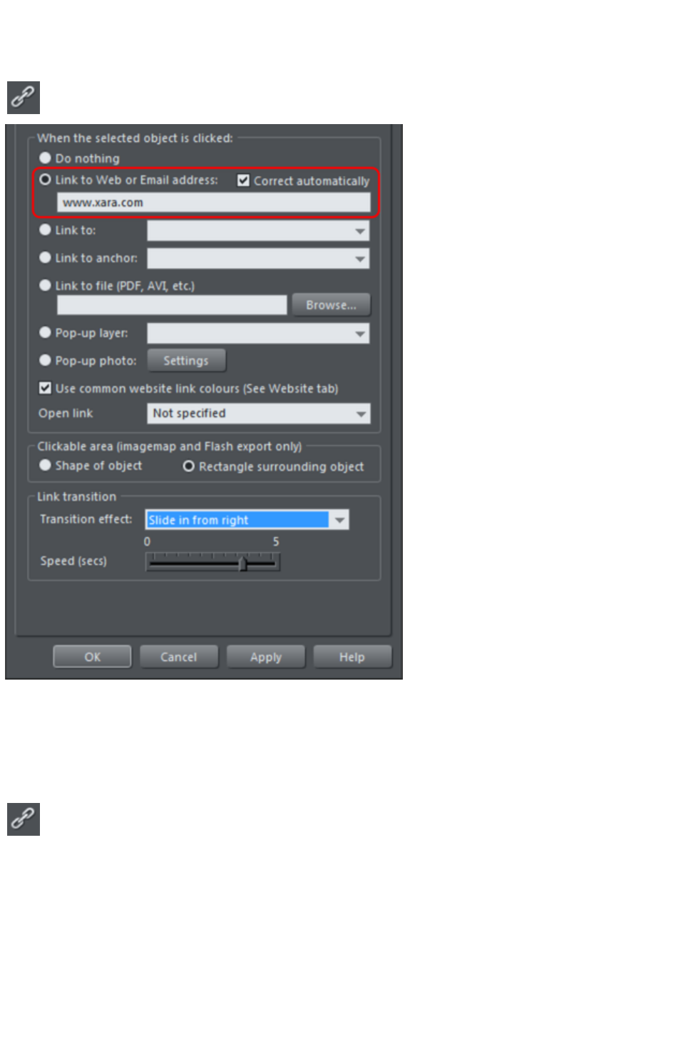
Links, Buttons & Navigation Bars
You can add a web link to any object, a button, graphic or some text.
Select the object and just click the link icon on the top bar to enter the
web address that you want to link to.
Enter the web address you want to link to in the highlighted field.
The Link tab of the Website Properties dialog allows you to control what happens when you click the
linked object on the page. You can jump to any other web page (you can quickly select to link to any
other page within your website by using the Link to
drop down) and you can control whether this opens the page in a separate window. You can also link to
any pop-up layers if you have created these.
So to set one of your buttons to be a link, just select it (click on it in
the Selector Tool), click the icon, and enter the web address, or just
select one of your pages from the drop- down list and click Apply
. That's it.
Applying a transition to a link
You can also add a transition to the link, so that when it is clicked an animated effect is applied to the
object that the link displays.
1. Enter the web address or choose the page you want to link to.
2. Under Link transition, choose a transition effect from the drop-down list and use the Speed slider
to set the amount of time the effect displays.
Page 132
3. Click Apply.
Note: You cannot apply a transition effect to a link when it links to an anchor, a file, a pop-up layer or
pop-up photo. You also cannot apply transitions to a link in a navigation bar. However you can apply
effects directly to a page or layer
, so page and layer contents can still display an effect when they open on the web page. The link
transition takes precedence when both the link and the page it loads have a transition applied.
Link to Anchor
You can link to any text or object anywhere in your website by using 'anchors'. First you need to apply a
name to the object you want to link to. This is called the anchor. Right click the item (which can be a
graphic or some text) and then select Names or choose Names from the Utilities menu to display the
name dialog. Enter any unique name you like and click Add
.
To link to this anchor from anywhere in your website (a button or just a link on some text) open the link
dialog (shown above), and choose from the Link to anchor
drop down list of names.
Link to File
Sometimes you may want to provide a document, movie or other file to visitors to your site. To do this
use the Link to file
option. Select the object on your page that you want to link to the file. Then choose the Link to file
option and browse for your file.
This copies the file into a support folder alongside your design file, so that the file gets published along
with the rest of your site. The folder is named using the name of your design file, with "_files" appended.
Click OK, preview your page and try the link. When you want to modify the file, just go through the
same process - browse for your new/updated file. See the Web Properties dialog chapter for more
information on this feature, and the Document Handling chapter for information about support folders
.
Changing Button Text
This is easy - in the Text Tool
, just click on the button text and edit it.
Hint
: if you triple-click on the button text that selects the whole line of text for easy replacement when you
type.
Note
: You can't edit the text of navigation bars this way, if the bar is set to be a site navigation bar. You need
to edit the labels using the Navigation Bar Properties dialog instead - double-click a navigation bar to
display it.
Mouseover (Rollover) Buttons
You will have noticed that most buttons highlight as you move the mouse pointer over them in your
browser. This is called a mouseover, or sometimes a rollover effect. This is all automatic for most buttons
used in the templates or from the Button section of the Designs Gallery
.
For the more advanced user: this mouseover effect is created using Named Layers. In fact the buttons
are Soft Groups that consist of two styles, the mouse-off and the mouse-over styles on separate layers.
The Soft Group means that both layers are changed at the same time when you do anything to the button,
such as change the text, or move or resize it. See the Layers
Page 133
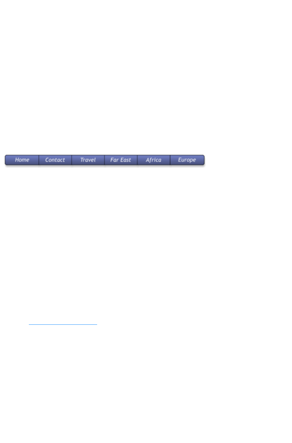
section below for more detail.
Adding New Buttons
In the Designs Gallery
, each Theme has a collection of button graphics that you can just drag onto the page. Typically there are
two types of button. The ones called Stretch Button will elongate to accommodate the button label text.
In addition there is a Buttons category that has a set of general button designs that can be added to your
page in the same way.
Or you can copy any existing button - this is probably the best way for adding more buttons to a
navigation bar. You can copy / paste, but a much quicker shortcut is to drag with the right mouse button
held down. (This is a general shortcut to copy any object). You can now just edit the text and link as
required.
Tip
: If you hold the "Ctrl" key while dragging it will constrain the drag to be perfectly horizontal or vertical,
making it really easy to create a row or column of buttons.
Button Bars (NavBars)
Most websites, and so most of the template designs we provide, have a row or column of buttons to
navigate around the website or to other places. This is called a Navigation Bar and Xara Web Designer 7
Premium includes special support for these bars. To edit a navbar, double click on it, or right-click and
choose Edit Navigation bar
from the context menu. The Navigation bar dialog opens. Here you can change the button labels, links
and tooltips, add and delete buttons, re-order and even add menus and sub-menus.
When you double-click on the URL field in the dialog, a Link dialog opens which is the same dialog used
to set links on normal objects, as described earlier in this chapter and in detail in the Web Properties
Dialog chapter. Because you can't apply a transition effect to a navigation bar link, the Link transition
controls are grayed out.
In the Navigation Bar Properties dialog you can also turn on the Site navigation bar
option. This makes your bar automatically appear on new pages you add to your site and buttons/links
are added to the bar automatically for each new page. However you can't edit your bar on canvas when
this option is turned on ? you can only edit it using this dialog.
To update a navigation bar across all pages, if it's not an automatic site navigation bar, just right click and
choose Repeat on all pages
. This will make the button bar a repeating object and copy it from the current page onto all other pages.
Read the Navigation Bars Chapter
for full details about Navigation Bars.
Page 134
Applying a transition to a link
You can also add a transition to the link, so that when it is clicked an animated effect is applied to the
object that the link displays.
1. Enter the web address or choose the page you want to link to.
2. Under Link transition, choose a transition effect from the drop-down list and use the Speed slider
to set the amount of time the effect displays.
3. Click Apply.
Note: You cannot apply a transition effect to a link when it links to an anchor, a file, a pop-up layer or
pop-up photo. You also cannot apply transitions to a link in a navigation bar. However you can apply
effects directly to a page or layer
, so page and layer contents can still display an effect when they open on the web page. The link
transition takes precedence when both the link and the page it loads have a transition applied.
Link to Anchor
You can link to any text or object anywhere in your website by using 'anchors'. First you need to apply a
name to the object you want to link to. This is called the anchor. Right click the item (which can be a
graphic or some text) and then select Names or choose Names from the Utilities menu to display the
name dialog. Enter any unique name you like and click Add
.
To link to this anchor from anywhere in your website (a button or just a link on some text) open the link
dialog (shown above), and choose from the Link to anchor
drop down list of names.
Link to File
Sometimes you may want to provide a document, movie or other file to visitors to your site. To do this
use the Link to file
option. Select the object on your page that you want to link to the file. Then choose the Link to file
option and browse for your file.
This copies the file into a support folder alongside your design file, so that the file gets published along
with the rest of your site. The folder is named using the name of your design file, with "_files" appended.
Click OK, preview your page and try the link. When you want to modify the file, just go through the
same process - browse for your new/updated file. See the Web Properties dialog chapter for more
information on this feature, and the Document Handling chapter for information about support folders
.
Changing Button Text
This is easy - in the Text Tool
, just click on the button text and edit it.
Hint
: if you triple-click on the button text that selects the whole line of text for easy replacement when you
type.
Note
: You can't edit the text of navigation bars this way, if the bar is set to be a site navigation bar. You need
to edit the labels using the Navigation Bar Properties dialog instead - double-click a navigation bar to
display it.
Mouseover (Rollover) Buttons
You will have noticed that most buttons highlight as you move the mouse pointer over them in your
Page 135
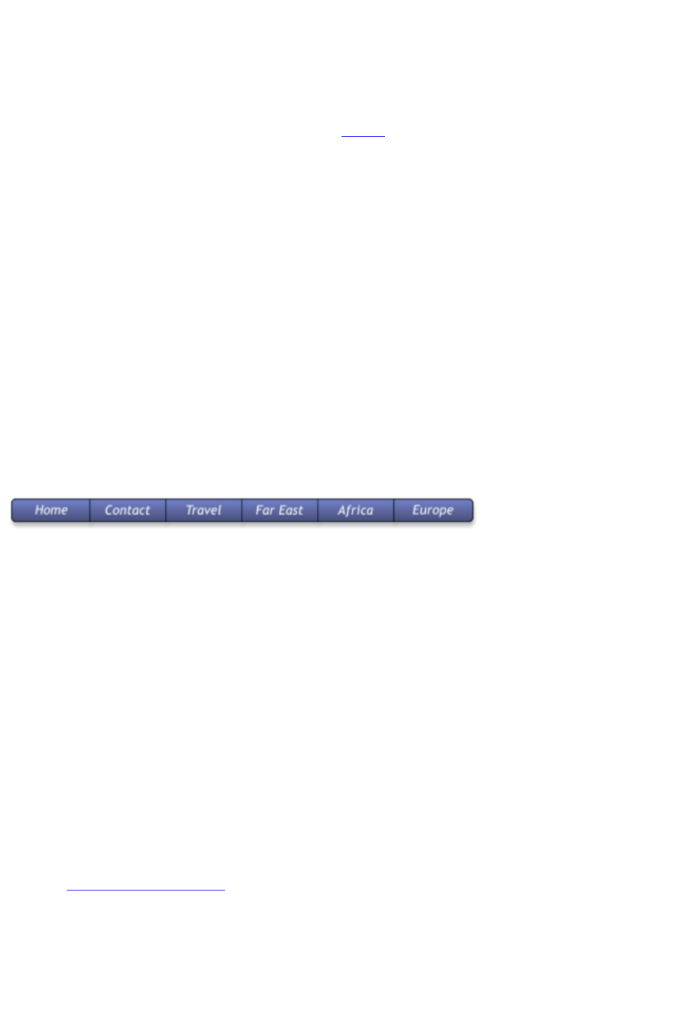
browser. This is called a mouseover, or sometimes a rollover effect. This is all automatic for most buttons
used in the templates or from the Button section of the Designs Gallery
.
For the more advanced user: this mouseover effect is created using Named Layers. In fact the buttons
are Soft Groups that consist of two styles, the mouse-off and the mouse-over styles on separate layers.
The Soft Group means that both layers are changed at the same time when you do anything to the button,
such as change the text, or move or resize it. See the Layers
section below for more detail.
Adding New Buttons
In the Designs Gallery
, each Theme has a collection of button graphics that you can just drag onto the page. Typically there are
two types of button. The ones called Stretch Button will elongate to accommodate the button label text.
In addition there is a Buttons category that has a set of general button designs that can be added to your
page in the same way.
Or you can copy any existing button - this is probably the best way for adding more buttons to a
navigation bar. You can copy / paste, but a much quicker shortcut is to drag with the right mouse button
held down. (This is a general shortcut to copy any object). You can now just edit the text and link as
required.
Tip
: If you hold the "Ctrl" key while dragging it will constrain the drag to be perfectly horizontal or vertical,
making it really easy to create a row or column of buttons.
Button Bars (NavBars)
Most websites, and so most of the template designs we provide, have a row or column of buttons to
navigate around the website or to other places. This is called a Navigation Bar and Xara Web Designer 7
Premium includes special support for these bars. To edit a navbar, double click on it, or right-click and
choose Edit Navigation bar
from the context menu. The Navigation bar dialog opens. Here you can change the button labels, links
and tooltips, add and delete buttons, re-order and even add menus and sub-menus.
When you double-click on the URL field in the dialog, a Link dialog opens which is the same dialog used
to set links on normal objects, as described earlier in this chapter and in detail in the Web Properties
Dialog chapter. Because you can't apply a transition effect to a navigation bar link, the Link transition
controls are grayed out.
In the Navigation Bar Properties dialog you can also turn on the Site navigation bar
option. This makes your bar automatically appear on new pages you add to your site and buttons/links
are added to the bar automatically for each new page. However you can't edit your bar on canvas when
this option is turned on ? you can only edit it using this dialog.
To update a navigation bar across all pages, if it's not an automatic site navigation bar, just right click and
choose Repeat on all pages
. This will make the button bar a repeating object and copy it from the current page onto all other pages.
Read the Navigation Bars Chapter
for full details about Navigation Bars.
Page 136

Link to Anchor
You can link to any text or object anywhere in your website by using 'anchors'. First you need to apply a
name to the object you want to link to. This is called the anchor. Right click the item (which can be a
graphic or some text) and then select Names or choose Names from the Utilities menu to display the
name dialog. Enter any unique name you like and click Add
.
To link to this anchor from anywhere in your website (a button or just a link on some text) open the link
dialog (shown above), and choose from the Link to anchor
drop down list of names.
Link to File
Sometimes you may want to provide a document, movie or other file to visitors to your site. To do this
use the Link to file
option. Select the object on your page that you want to link to the file. Then choose the Link to file
option and browse for your file.
This copies the file into a support folder alongside your design file, so that the file gets published along
with the rest of your site. The folder is named using the name of your design file, with "_files" appended.
Click OK, preview your page and try the link. When you want to modify the file, just go through the
same process - browse for your new/updated file. See the Web Properties dialog chapter for more
information on this feature, and the Document Handling chapter for information about support folders
.
Changing Button Text
This is easy - in the Text Tool
, just click on the button text and edit it.
Hint
: if you triple-click on the button text that selects the whole line of text for easy replacement when you
type.
Note
: You can't edit the text of navigation bars this way, if the bar is set to be a site navigation bar. You need
to edit the labels using the Navigation Bar Properties dialog instead - double-click a navigation bar to
display it.
Mouseover (Rollover) Buttons
You will have noticed that most buttons highlight as you move the mouse pointer over them in your
browser. This is called a mouseover, or sometimes a rollover effect. This is all automatic for most buttons
used in the templates or from the Button section of the Designs Gallery
.
For the more advanced user: this mouseover effect is created using Named Layers. In fact the buttons
are Soft Groups that consist of two styles, the mouse-off and the mouse-over styles on separate layers.
The Soft Group means that both layers are changed at the same time when you do anything to the button,
such as change the text, or move or resize it. See the Layers
section below for more detail.
Adding New Buttons
In the Designs Gallery
, each Theme has a collection of button graphics that you can just drag onto the page. Typically there are
two types of button. The ones called Stretch Button will elongate to accommodate the button label text.
Page 137
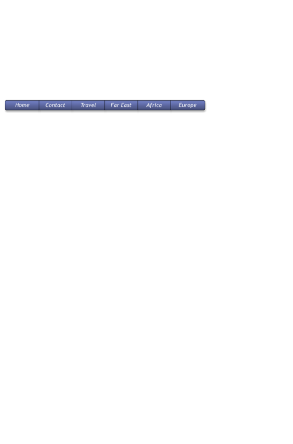
In addition there is a Buttons category that has a set of general button designs that can be added to your
page in the same way.
Or you can copy any existing button - this is probably the best way for adding more buttons to a
navigation bar. You can copy / paste, but a much quicker shortcut is to drag with the right mouse button
held down. (This is a general shortcut to copy any object). You can now just edit the text and link as
required.
Tip
: If you hold the "Ctrl" key while dragging it will constrain the drag to be perfectly horizontal or vertical,
making it really easy to create a row or column of buttons.
Button Bars (NavBars)
Most websites, and so most of the template designs we provide, have a row or column of buttons to
navigate around the website or to other places. This is called a Navigation Bar and Xara Web Designer 7
Premium includes special support for these bars. To edit a navbar, double click on it, or right-click and
choose Edit Navigation bar
from the context menu. The Navigation bar dialog opens. Here you can change the button labels, links
and tooltips, add and delete buttons, re-order and even add menus and sub-menus.
When you double-click on the URL field in the dialog, a Link dialog opens which is the same dialog used
to set links on normal objects, as described earlier in this chapter and in detail in the Web Properties
Dialog chapter. Because you can't apply a transition effect to a navigation bar link, the Link transition
controls are grayed out.
In the Navigation Bar Properties dialog you can also turn on the Site navigation bar
option. This makes your bar automatically appear on new pages you add to your site and buttons/links
are added to the bar automatically for each new page. However you can't edit your bar on canvas when
this option is turned on ? you can only edit it using this dialog.
To update a navigation bar across all pages, if it's not an automatic site navigation bar, just right click and
choose Repeat on all pages
. This will make the button bar a repeating object and copy it from the current page onto all other pages.
Read the Navigation Bars Chapter
for full details about Navigation Bars.
Page 138
Link to File
Sometimes you may want to provide a document, movie or other file to visitors to your site. To do this
use the Link to file
option. Select the object on your page that you want to link to the file. Then choose the Link to file
option and browse for your file.
This copies the file into a support folder alongside your design file, so that the file gets published along
with the rest of your site. The folder is named using the name of your design file, with "_files" appended.
Click OK, preview your page and try the link. When you want to modify the file, just go through the
same process - browse for your new/updated file. See the Web Properties dialog chapter for more
information on this feature, and the Document Handling chapter for information about support folders
.
Changing Button Text
This is easy - in the Text Tool
, just click on the button text and edit it.
Hint
: if you triple-click on the button text that selects the whole line of text for easy replacement when you
type.
Note
: You can't edit the text of navigation bars this way, if the bar is set to be a site navigation bar. You need
to edit the labels using the Navigation Bar Properties dialog instead - double-click a navigation bar to
display it.
Mouseover (Rollover) Buttons
You will have noticed that most buttons highlight as you move the mouse pointer over them in your
browser. This is called a mouseover, or sometimes a rollover effect. This is all automatic for most buttons
used in the templates or from the Button section of the Designs Gallery
.
For the more advanced user: this mouseover effect is created using Named Layers. In fact the buttons
are Soft Groups that consist of two styles, the mouse-off and the mouse-over styles on separate layers.
The Soft Group means that both layers are changed at the same time when you do anything to the button,
such as change the text, or move or resize it. See the Layers
section below for more detail.
Adding New Buttons
In the Designs Gallery
, each Theme has a collection of button graphics that you can just drag onto the page. Typically there are
two types of button. The ones called Stretch Button will elongate to accommodate the button label text.
In addition there is a Buttons category that has a set of general button designs that can be added to your
page in the same way.
Or you can copy any existing button - this is probably the best way for adding more buttons to a
navigation bar. You can copy / paste, but a much quicker shortcut is to drag with the right mouse button
held down. (This is a general shortcut to copy any object). You can now just edit the text and link as
required.
Tip
: If you hold the "Ctrl" key while dragging it will constrain the drag to be perfectly horizontal or vertical,
making it really easy to create a row or column of buttons.
Page 139
Button Bars (NavBars)
Most websites, and so most of the template designs we provide, have a row or column of buttons to
navigate around the website or to other places. This is called a Navigation Bar and Xara Web Designer 7
Premium includes special support for these bars. To edit a navbar, double click on it, or right-click and
choose Edit Navigation bar
from the context menu. The Navigation bar dialog opens. Here you can change the button labels, links
and tooltips, add and delete buttons, re-order and even add menus and sub-menus.
When you double-click on the URL field in the dialog, a Link dialog opens which is the same dialog used
to set links on normal objects, as described earlier in this chapter and in detail in the Web Properties
Dialog chapter. Because you can't apply a transition effect to a navigation bar link, the Link transition
controls are grayed out.
In the Navigation Bar Properties dialog you can also turn on the Site navigation bar
option. This makes your bar automatically appear on new pages you add to your site and buttons/links
are added to the bar automatically for each new page. However you can't edit your bar on canvas when
this option is turned on ? you can only edit it using this dialog.
To update a navigation bar across all pages, if it's not an automatic site navigation bar, just right click and
choose Repeat on all pages
. This will make the button bar a repeating object and copy it from the current page onto all other pages.
Read the Navigation Bars Chapter
for full details about Navigation Bars.
Page 140
Changing Button Text
This is easy - in the Text Tool
, just click on the button text and edit it.
Hint
: if you triple-click on the button text that selects the whole line of text for easy replacement when you
type.
Note
: You can't edit the text of navigation bars this way, if the bar is set to be a site navigation bar. You need
to edit the labels using the Navigation Bar Properties dialog instead - double-click a navigation bar to
display it.
Mouseover (Rollover) Buttons
You will have noticed that most buttons highlight as you move the mouse pointer over them in your
browser. This is called a mouseover, or sometimes a rollover effect. This is all automatic for most buttons
used in the templates or from the Button section of the Designs Gallery
.
For the more advanced user: this mouseover effect is created using Named Layers. In fact the buttons
are Soft Groups that consist of two styles, the mouse-off and the mouse-over styles on separate layers.
The Soft Group means that both layers are changed at the same time when you do anything to the button,
such as change the text, or move or resize it. See the Layers
section below for more detail.
Adding New Buttons
In the Designs Gallery
, each Theme has a collection of button graphics that you can just drag onto the page. Typically there are
two types of button. The ones called Stretch Button will elongate to accommodate the button label text.
In addition there is a Buttons category that has a set of general button designs that can be added to your
page in the same way.
Or you can copy any existing button - this is probably the best way for adding more buttons to a
navigation bar. You can copy / paste, but a much quicker shortcut is to drag with the right mouse button
held down. (This is a general shortcut to copy any object). You can now just edit the text and link as
required.
Tip
: If you hold the "Ctrl" key while dragging it will constrain the drag to be perfectly horizontal or vertical,
making it really easy to create a row or column of buttons.
Button Bars (NavBars)
Most websites, and so most of the template designs we provide, have a row or column of buttons to
navigate around the website or to other places. This is called a Navigation Bar and Xara Web Designer 7
Premium includes special support for these bars. To edit a navbar, double click on it, or right-click and
choose Edit Navigation bar
from the context menu. The Navigation bar dialog opens. Here you can change the button labels, links
and tooltips, add and delete buttons, re-order and even add menus and sub-menus.
When you double-click on the URL field in the dialog, a Link dialog opens which is the same dialog used
to set links on normal objects, as described earlier in this chapter and in detail in the Web Properties
Dialog chapter. Because you can't apply a transition effect to a navigation bar link, the Link transition
Page 141

controls are grayed out.
In the Navigation Bar Properties dialog you can also turn on the Site navigation bar
option. This makes your bar automatically appear on new pages you add to your site and buttons/links
are added to the bar automatically for each new page. However you can't edit your bar on canvas when
this option is turned on ? you can only edit it using this dialog.
To update a navigation bar across all pages, if it's not an automatic site navigation bar, just right click and
choose Repeat on all pages
. This will make the button bar a repeating object and copy it from the current page onto all other pages.
Read the Navigation Bars Chapter
for full details about Navigation Bars.
Page 142
Mouseover (Rollover) Buttons
You will have noticed that most buttons highlight as you move the mouse pointer over them in your
browser. This is called a mouseover, or sometimes a rollover effect. This is all automatic for most buttons
used in the templates or from the Button section of the Designs Gallery
.
For the more advanced user: this mouseover effect is created using Named Layers. In fact the buttons
are Soft Groups that consist of two styles, the mouse-off and the mouse-over styles on separate layers.
The Soft Group means that both layers are changed at the same time when you do anything to the button,
such as change the text, or move or resize it. See the Layers
section below for more detail.
Adding New Buttons
In the Designs Gallery
, each Theme has a collection of button graphics that you can just drag onto the page. Typically there are
two types of button. The ones called Stretch Button will elongate to accommodate the button label text.
In addition there is a Buttons category that has a set of general button designs that can be added to your
page in the same way.
Or you can copy any existing button - this is probably the best way for adding more buttons to a
navigation bar. You can copy / paste, but a much quicker shortcut is to drag with the right mouse button
held down. (This is a general shortcut to copy any object). You can now just edit the text and link as
required.
Tip
: If you hold the "Ctrl" key while dragging it will constrain the drag to be perfectly horizontal or vertical,
making it really easy to create a row or column of buttons.
Button Bars (NavBars)
Most websites, and so most of the template designs we provide, have a row or column of buttons to
navigate around the website or to other places. This is called a Navigation Bar and Xara Web Designer 7
Premium includes special support for these bars. To edit a navbar, double click on it, or right-click and
choose Edit Navigation bar
from the context menu. The Navigation bar dialog opens. Here you can change the button labels, links
and tooltips, add and delete buttons, re-order and even add menus and sub-menus.
When you double-click on the URL field in the dialog, a Link dialog opens which is the same dialog used
to set links on normal objects, as described earlier in this chapter and in detail in the Web Properties
Dialog chapter. Because you can't apply a transition effect to a navigation bar link, the Link transition
controls are grayed out.
In the Navigation Bar Properties dialog you can also turn on the Site navigation bar
option. This makes your bar automatically appear on new pages you add to your site and buttons/links
are added to the bar automatically for each new page. However you can't edit your bar on canvas when
this option is turned on ? you can only edit it using this dialog.
To update a navigation bar across all pages, if it's not an automatic site navigation bar, just right click and
choose Repeat on all pages
. This will make the button bar a repeating object and copy it from the current page onto all other pages.
Read the Navigation Bars Chapter
for full details about Navigation Bars.
Page 143
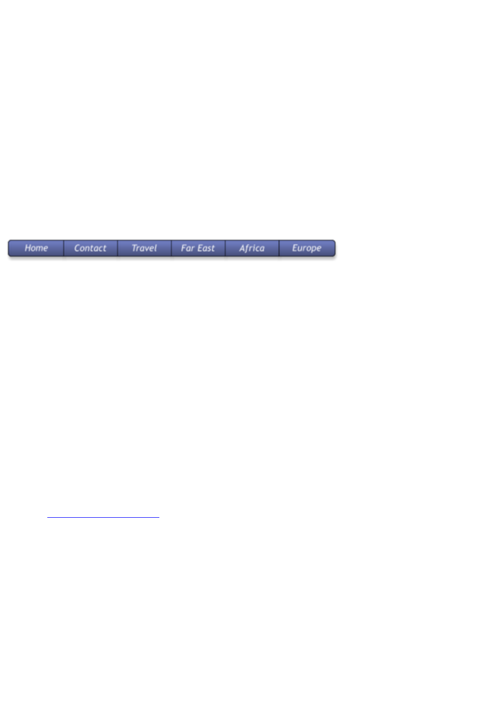
Adding New Buttons
In the Designs Gallery
, each Theme has a collection of button graphics that you can just drag onto the page. Typically there are
two types of button. The ones called Stretch Button will elongate to accommodate the button label text.
In addition there is a Buttons category that has a set of general button designs that can be added to your
page in the same way.
Or you can copy any existing button - this is probably the best way for adding more buttons to a
navigation bar. You can copy / paste, but a much quicker shortcut is to drag with the right mouse button
held down. (This is a general shortcut to copy any object). You can now just edit the text and link as
required.
Tip
: If you hold the "Ctrl" key while dragging it will constrain the drag to be perfectly horizontal or vertical,
making it really easy to create a row or column of buttons.
Button Bars (NavBars)
Most websites, and so most of the template designs we provide, have a row or column of buttons to
navigate around the website or to other places. This is called a Navigation Bar and Xara Web Designer 7
Premium includes special support for these bars. To edit a navbar, double click on it, or right-click and
choose Edit Navigation bar
from the context menu. The Navigation bar dialog opens. Here you can change the button labels, links
and tooltips, add and delete buttons, re-order and even add menus and sub-menus.
When you double-click on the URL field in the dialog, a Link dialog opens which is the same dialog used
to set links on normal objects, as described earlier in this chapter and in detail in the Web Properties
Dialog chapter. Because you can't apply a transition effect to a navigation bar link, the Link transition
controls are grayed out.
In the Navigation Bar Properties dialog you can also turn on the Site navigation bar
option. This makes your bar automatically appear on new pages you add to your site and buttons/links
are added to the bar automatically for each new page. However you can't edit your bar on canvas when
this option is turned on ? you can only edit it using this dialog.
To update a navigation bar across all pages, if it's not an automatic site navigation bar, just right click and
choose Repeat on all pages
. This will make the button bar a repeating object and copy it from the current page onto all other pages.
Read the Navigation Bars Chapter
for full details about Navigation Bars.
Page 144
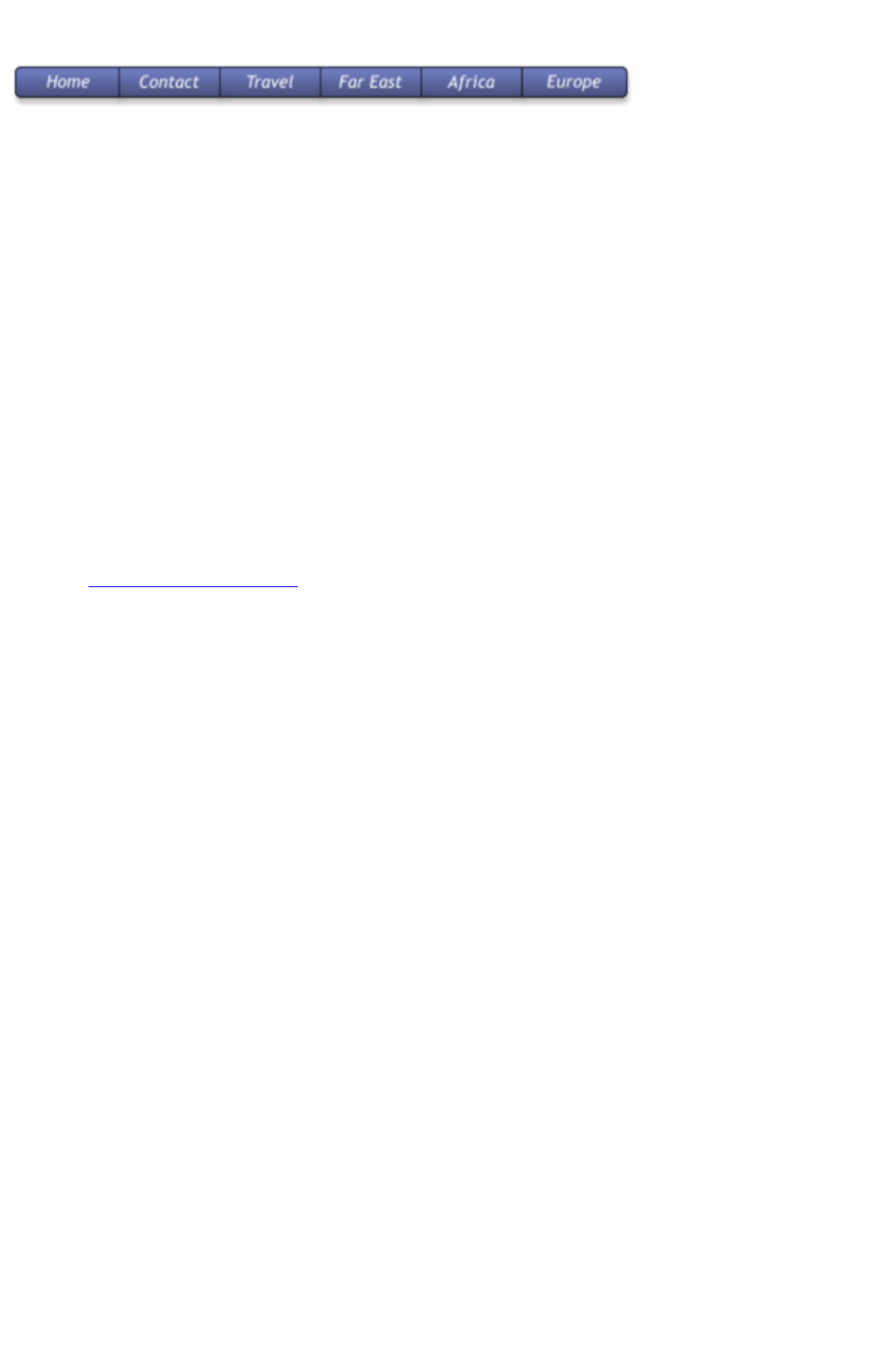
Button Bars (NavBars)
Most websites, and so most of the template designs we provide, have a row or column of buttons to
navigate around the website or to other places. This is called a Navigation Bar and Xara Web Designer 7
Premium includes special support for these bars. To edit a navbar, double click on it, or right-click and
choose Edit Navigation bar
from the context menu. The Navigation bar dialog opens. Here you can change the button labels, links
and tooltips, add and delete buttons, re-order and even add menus and sub-menus.
When you double-click on the URL field in the dialog, a Link dialog opens which is the same dialog used
to set links on normal objects, as described earlier in this chapter and in detail in the Web Properties
Dialog chapter. Because you can't apply a transition effect to a navigation bar link, the Link transition
controls are grayed out.
In the Navigation Bar Properties dialog you can also turn on the Site navigation bar
option. This makes your bar automatically appear on new pages you add to your site and buttons/links
are added to the bar automatically for each new page. However you can't edit your bar on canvas when
this option is turned on ? you can only edit it using this dialog.
To update a navigation bar across all pages, if it's not an automatic site navigation bar, just right click and
choose Repeat on all pages
. This will make the button bar a repeating object and copy it from the current page onto all other pages.
Read the Navigation Bars Chapter
for full details about Navigation Bars.
Page 145
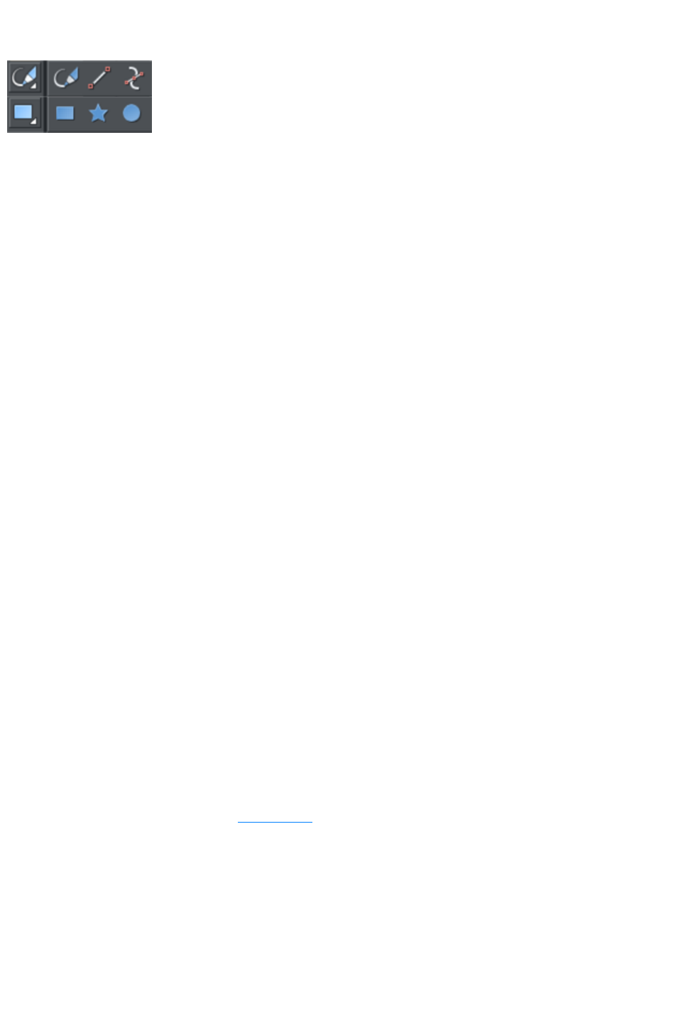
Drawing Tools
Web Designer Premium provides all the graphics
tools you need to create just about any graphical
object on your page, as well as a range of
pre-designed graphical elements in the Designs
Gallery
. There are several basic drawing tools that let you
create rectangles, ellipses, regular polygons, stars or
any shape you like.
Web Designer Premium provides vector drawing tools which means you can resize, edit the outline shape
and re-color with no loss of quality. You can zoom in to see almost infinite detail, and all edits are
undoable.
Current attributes (styles)
An 'attribute' is some characteristic of an object which you can modify in Xara Web Designer 7
Premium. For example a shape's attributes include its color, its outline width and its outline color.
As mentioned above you can change the attributes of an object after you've drawn it, by selecting it and
then changing its fill color, line width, or any of its other attributes. But Xara Web Designer 7 Premium
also keeps track of the 'current' attributes, which are the attributes that get applied to newly drawn
objects as they are created.
Setting current attributes manually
If, for example, you want the next rectangle you draw to be red, make sure you have nothing selected
(press "Esc" or click an empty part of the page) and then click red on the color line. You've now set the
current fill color attribute to red. Now when you draw a new shape, it will be filled red. You can set other
current attributes the same way ? by first making sure nothing is selected before changing the attribute's
value.
Setting current attributes automatically
By default, Xara Web Designer 7 Premium automatically updates the current attributes for you, to match
the object you last drew, or last selected. So for example if you draw a rectangle and then make it green,
the next shape you draw will also be green. If you have a blue rectangle in your design and you wish to
draw another one just like it, first select the blue rectangle (this makes its attributes current) and then the
next shape you draw will also be blue. So by simply clicking an object, you set the current attributes to
match that object.
This allows you to use existing objects as a 'palette' of available styles. Click an object to select it, then
draw new objects in that style.
You can turn off this behavior in the General tab of the "Utilities" > "Options" dialog. Select the Ask
before setting current attribute
checkbox. Now Web Designer Premium will ask you before changing the current attributes to those
recently used.
Attribute groups
Many designs consist of a combination of closed filled shapes and open shapes (lines where the start and
end points are not coincident). Normally it wouldn't be desirable to have the attributes of an open shape
used for a closed shape, nor vice-versa. Therefore the attributes for open and closed shapes are kept
separate ? these are known as attribute groups. Setting the values of one group does not affect the other
group. So for example, selecting a filled rectangle with no outline will not change the current line width to
Page 146
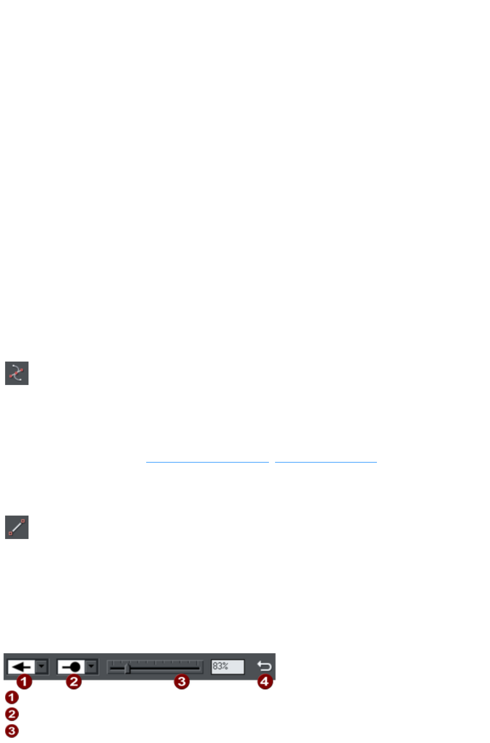
zero for open shapes.
For the same reasons, text attributes make up a third attribute group. The text attribute group is only set
when you select text objects, or when you set the attributes manually while in the text tool.
Exempt attributes
Some attributes do not get set as current automatically even when 'Give new objects most recent
attributes' is on. This is because some attributes can cause problems if they become current.
For example if you applied a 10 pixel feather to a large object (to blur the edges) and then drew a new
10 pixel sized shape, that new shape would be invisible if the feather attribute was copied to it, due to the
amount of feathering!
Other attributes can adversely affect the way designs export, or significantly increase the time taken to
render the design and so should not be applied unnecessarily.
Examples of attributes which are copied automatically:
Fill colors, fill styles, line width, line color, line style, line join style, line endcap style, arrow
heads/tails, text font, text font size, text margins.
Examples of attributes which are not copied automatically:
Feather, transparency, shadow, bevel, 3D extrude.
Resetting current attributes
You can reset all current attribute groups instantly by pressing "Esc" when you have no objects selected.
If you have objects selected, pressing "Esc" clears the selection, so just press "Esc" again to reset the
current attributes back to their default values.
Shape Tool
The Shape Editor Tool
allows you to create detailed vector based shapes, and also to edit the
outline of any shape.
For preset shapes such as rectangles or ellipses, or if you want to edit the outline of your text character
shapes, you need to convert the object to an editable shape first. You can do this by selecting the "Ctrl +
1" key shortcut. You can then use the Shape Editor Tool to perform various advanced vector editing.
Refer to the reference section (Drawing Lines and Shapes, The Shape Editor tool
) on how to use this very powerful tool.
Straight Line and Arrow Tool
The Straight Line Tool
makes it easy to draw single segment straight lines and to add arrow
heads and tails to any lines.
Simply click and drag on the page to draw a straight line. You can click on any existing line to select it,
and once selected you can click-drag on either end to move the end of the line around.
Adding arrowheads and tails using the Straight Line tool
The infobar has two dropdown lists on the left which allow you to choose an arrow head or tail style for
each end of the selected line.
Arrow head
Arrow tail
Arrow head/tail size
Page 147
Reverse path
The slider on the infobar allows you to change the size of the arrow head and tail on the current selected
line. Or you can enter a percentage value into the size text field to the right of the slider.
By default new arrowheads are created with a width of around 6 times that of the line width and that is
taken as the 100% size, as indicated by the size slider. If you make the line wider, the arrowhead width
also updates accordingly. Therefore enter a value less than 100% to reduce the size of the arrowhead
(and tail), or greater than 100% to increase. Although the slider only takes the size value up to a
maximum of 800%, you can enter percentage values larger than this into the size text field.
Reverse path
Press the Reverse path button on the infobar to switch around the
head and tail of the selected line.
Adding more line segments
Lines created with the Straight Line Tool are of course fully compatible with the other drawing tools.
So if you want to add more segments to a line, make it curved, or perhaps even turn it into a closed
shape, use the Shape Editor Tool
.
Rectangle Tool
To draw a rectangle, select the Rectangle Tool
and just drag across the page. You will see a solid filled shape as you
drag across the page, indicating the fill and line color and boundaries of
the shape you are drawing.
Click the 'curved corners' button on the InfoBar to make this a rounded
rectangle - and you can drag on the curved corner handle to adjust the
roundedness.
You can drag on any corner handle to resize an object.
Drag and drop a color from the Color Line onto your shape to re-color it. See Coloring Shapes. With
the Selector Tool you can drag it, resize it and rotate it as required. See Selector Tool. You can put this
rectangle behind all other objects as a background image, by pressing "Ctrl + B" for 'Put to back'.
Alternatively if it's in front of all other objects ("Ctrl + F") then you can right click on it and select Repel
text under
to make the text on your page repel around the outside of this shape (another Web Designer Premium
first for any web authoring tool.)
Fill Tool
You can easily put a graduated color fill onto a shape using this
tool (and a lot more besides). Select the tool and just drag
Page 148
across your object.
The fill arrow can be adjusted by dragging the ends to alter the direction, angle and extent of the
graduation.
Rounded rectangle with a graduated fill.
Note: If you drag with the Fill Tool across a grouped item, such as a text panel, then everything in the
group takes on the same fill style. To overcome this you must first select just the item you want to fill.
You can do this several ways. A single click on the item with the Fill Tool will select just that item, as will
a click in the Selector Tool
with the "Ctrl" key pressed (this is called 'select inside' because it selects just the one item inside the
group). Now when you drag it will fill only the selected object.
To edit the start or color of the fill just drag and drop a color from the color line onto the shape, or you
can select the end of the Fill Arrow in the Fill Tool
and use the Color Editor ("Ctrl + E").
You can create a multi-stage graduated fill by making sure the fill arrow is visible (select it with the Fill
Tool
), now just drag a color from the Color Line and carefully drop it on the arrow line where you want the
new color. You can now drag this fill point, or select "Ctrl + E" to adjust the color using the Color Editor.
There are different fill styles, for example this is a circle with a circular fill.
The shadow is another ellipse with a graduated color fill and feathered (see below).
Transparency Tool
Modern browsers support advanced transparency effects, and so does Web Designer Premium. You
can adjust the transparency of any graphic or photo to make it see-through. Try it on your rectangle
example. Just select the Transparency Tool
, and adjust the large slider on the InfoBar.
More than this, Web Designer Premium supports graduated transparency. It works very like the
graduated color fill. In the Transparency Tool
just drag across your shape and you can see the transparency fades. You can adjust the degree of
transparency of each end of the fill arrow, by clicking on either end of the arrow, and adjusting the
Transparency slider.
Preview this and you'll find this works in your browser as well.
Feather
This is a graphical term for blending the edges of objects. Web Designer Premium provides a feather
control that enables any object, graphics, text or photo to be feathered - giving it a blurred edge that
blends with the background. The Feather control is not a tool on the left, but one of the controls on the
Page 149
top bar. Try it on your rectangle shape. Select the shape and then click this Feather control on the right of
the top bar.
The shadow below the ball drawing above has a feathered edge. Combining all of these controls you can
very quickly produce amazing layered graphics for your website, all directly in Web Designer Premium
without needing any other graphics tools.
This is an example of a rounded rectangle
with grad color, grad transparency and
feathered edges with some text placed on
top of it.
This has a graduated color fill, light to dark
green going left to right. It also has a vertical
graduated transparency fading from top to
bottom. The feather gives it a soft edge. It
takes a couple of seconds to create such an
image, and it's automatically converted to the
right graphic when you save your web page.
In Web Designer Premium you can create
any type of graphic, photo, text with
transparency, and it 'just works'. It can also
import almost all graphics files, from Adobe
EPS, to Photoshop PSD, Camera RAW and
more.
Technical note
: Web Designer Premium automatically converts any vector graphics into PNG images, an alpha-channel
PNG if transparency is used. It uses CSS layers to replicate the object layer stacking in Web Designer
Premium. This is compatible with all modern web browsers.
Shadow Tool
A very popular graphics effect is to create a soft drop- shadow under a graphic or some text. This
serves to lift the object away from the background.
The Shadow Tool lets you add a soft shadow to any object, text,
graphics or photo. Select the Shadow Tool
and just drag on the object. You can adjust the shadow blur and
transparency using InfoBar controls.
Some text with a soft shadow.
To adjust the position of an existing shadow, go into the Shadow Tool
and drag on the shadow
Advanced note
: Note that because a shadow itself is semi- transparent (part of the objects below show through the
shadow) objects with shadows are converted to PNG images when saved on a web page (it's the only
image format that supports transparency). PNG images can be quite large, especially for photos. It's
perfect for images such the above shadow graphic.
Page 150
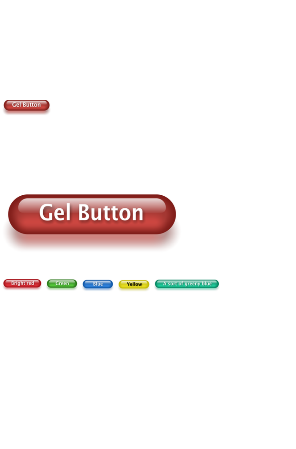
You may find you can convert the whole graphic to a JPEG to save space. Whether this works or not
depends on what's behind the shadow. If it's a plain or static non-text background you can probably use
a JPEG which is a much smaller file size (quicker website download). To force an object to be a JPEG
use the Image tab of the Web Properties dialog.
JPEG images cannot have semi-transparent parts, so when creating a JPEG of a semi-transparent object
Web Designer Premium includes the background (what's behind the semi-transparent part) as part of the
JPEG image, but because of the pixel perfect positioning on the web page you can't tell this. This doesn't
work if the shadow or semi-transparent object is placed over some text, as the text will be included as
part of the graphic.
Example Graphics
This is a perfect example of what can be created in Web Designer Premium. This button combines many
of the features described above - it's drawn by combining just a few feathered shapes, and using
graduated transparency (the white reflection effect). The text has a slight soft shadow and the button has
a glow shadow. The whole thing is grouped. (You do not need to draw this button as it's provided in the
Button category of the Designs Gallery
).
The huge benefit of vector graphics, compared to 'bitmap' graphics created in pixel editing software such
Photoshop, is that you can re-color, edit, rotate, and resize the button with no loss of quality. Make it
huge and it remains pin sharp:
On top of that you can re-color using the Named Color system, and it will even stretch as required -
everything in Web Designer Premium remains non-destructive (which means you can always edit it, with
no loss of quality).
Something that would take skill and time to produce using alternative graphics software, is trivially easy in
Web Designer Premium.
Page 151

Current attributes (styles)
An 'attribute' is some characteristic of an object which you can modify in Xara Web Designer 7
Premium. For example a shape's attributes include its color, its outline width and its outline color.
As mentioned above you can change the attributes of an object after you've drawn it, by selecting it and
then changing its fill color, line width, or any of its other attributes. But Xara Web Designer 7 Premium
also keeps track of the 'current' attributes, which are the attributes that get applied to newly drawn
objects as they are created.
Setting current attributes manually
If, for example, you want the next rectangle you draw to be red, make sure you have nothing selected
(press "Esc" or click an empty part of the page) and then click red on the color line. You've now set the
current fill color attribute to red. Now when you draw a new shape, it will be filled red. You can set other
current attributes the same way ? by first making sure nothing is selected before changing the attribute's
value.
Setting current attributes automatically
By default, Xara Web Designer 7 Premium automatically updates the current attributes for you, to match
the object you last drew, or last selected. So for example if you draw a rectangle and then make it green,
the next shape you draw will also be green. If you have a blue rectangle in your design and you wish to
draw another one just like it, first select the blue rectangle (this makes its attributes current) and then the
next shape you draw will also be blue. So by simply clicking an object, you set the current attributes to
match that object.
This allows you to use existing objects as a 'palette' of available styles. Click an object to select it, then
draw new objects in that style.
You can turn off this behavior in the General tab of the "Utilities" > "Options" dialog. Select the Ask
before setting current attribute
checkbox. Now Web Designer Premium will ask you before changing the current attributes to those
recently used.
Attribute groups
Many designs consist of a combination of closed filled shapes and open shapes (lines where the start and
end points are not coincident). Normally it wouldn't be desirable to have the attributes of an open shape
used for a closed shape, nor vice-versa. Therefore the attributes for open and closed shapes are kept
separate ? these are known as attribute groups. Setting the values of one group does not affect the other
group. So for example, selecting a filled rectangle with no outline will not change the current line width to
zero for open shapes.
For the same reasons, text attributes make up a third attribute group. The text attribute group is only set
when you select text objects, or when you set the attributes manually while in the text tool.
Exempt attributes
Some attributes do not get set as current automatically even when 'Give new objects most recent
attributes' is on. This is because some attributes can cause problems if they become current.
For example if you applied a 10 pixel feather to a large object (to blur the edges) and then drew a new
10 pixel sized shape, that new shape would be invisible if the feather attribute was copied to it, due to the
amount of feathering!
Other attributes can adversely affect the way designs export, or significantly increase the time taken to
render the design and so should not be applied unnecessarily.
Examples of attributes which are copied automatically:
Fill colors, fill styles, line width, line color, line style, line join style, line endcap style, arrow
Page 152
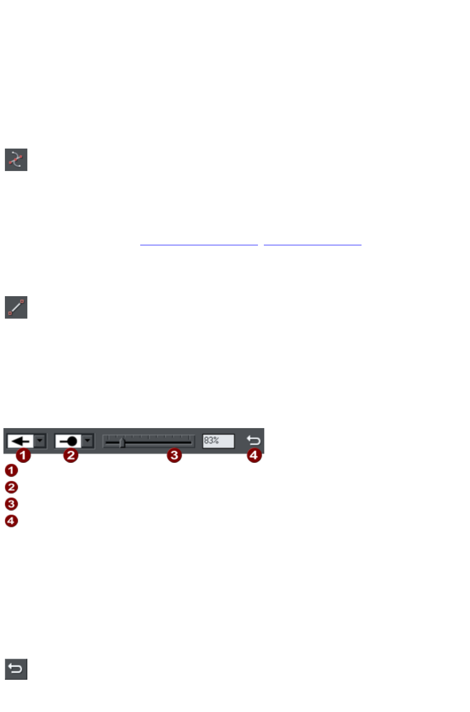
heads/tails, text font, text font size, text margins.
Examples of attributes which are not copied automatically:
Feather, transparency, shadow, bevel, 3D extrude.
Resetting current attributes
You can reset all current attribute groups instantly by pressing "Esc" when you have no objects selected.
If you have objects selected, pressing "Esc" clears the selection, so just press "Esc" again to reset the
current attributes back to their default values.
Shape Tool
The Shape Editor Tool
allows you to create detailed vector based shapes, and also to edit the
outline of any shape.
For preset shapes such as rectangles or ellipses, or if you want to edit the outline of your text character
shapes, you need to convert the object to an editable shape first. You can do this by selecting the "Ctrl +
1" key shortcut. You can then use the Shape Editor Tool to perform various advanced vector editing.
Refer to the reference section (Drawing Lines and Shapes, The Shape Editor tool
) on how to use this very powerful tool.
Straight Line and Arrow Tool
The Straight Line Tool
makes it easy to draw single segment straight lines and to add arrow
heads and tails to any lines.
Simply click and drag on the page to draw a straight line. You can click on any existing line to select it,
and once selected you can click-drag on either end to move the end of the line around.
Adding arrowheads and tails using the Straight Line tool
The infobar has two dropdown lists on the left which allow you to choose an arrow head or tail style for
each end of the selected line.
Arrow head
Arrow tail
Arrow head/tail size
Reverse path
The slider on the infobar allows you to change the size of the arrow head and tail on the current selected
line. Or you can enter a percentage value into the size text field to the right of the slider.
By default new arrowheads are created with a width of around 6 times that of the line width and that is
taken as the 100% size, as indicated by the size slider. If you make the line wider, the arrowhead width
also updates accordingly. Therefore enter a value less than 100% to reduce the size of the arrowhead
(and tail), or greater than 100% to increase. Although the slider only takes the size value up to a
maximum of 800%, you can enter percentage values larger than this into the size text field.
Reverse path
Press the Reverse path button on the infobar to switch around the
head and tail of the selected line.
Page 153
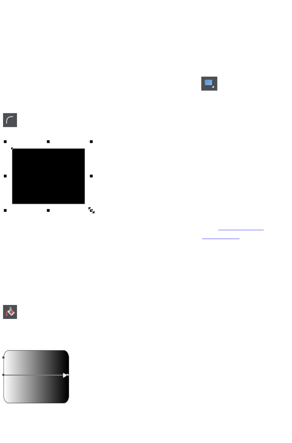
Adding more line segments
Lines created with the Straight Line Tool are of course fully compatible with the other drawing tools.
So if you want to add more segments to a line, make it curved, or perhaps even turn it into a closed
shape, use the Shape Editor Tool
.
Rectangle Tool
To draw a rectangle, select the Rectangle Tool
and just drag across the page. You will see a solid filled shape as you
drag across the page, indicating the fill and line color and boundaries of
the shape you are drawing.
Click the 'curved corners' button on the InfoBar to make this a rounded
rectangle - and you can drag on the curved corner handle to adjust the
roundedness.
You can drag on any corner handle to resize an object.
Drag and drop a color from the Color Line onto your shape to re-color it. See Coloring Shapes. With
the Selector Tool you can drag it, resize it and rotate it as required. See Selector Tool. You can put this
rectangle behind all other objects as a background image, by pressing "Ctrl + B" for 'Put to back'.
Alternatively if it's in front of all other objects ("Ctrl + F") then you can right click on it and select Repel
text under
to make the text on your page repel around the outside of this shape (another Web Designer Premium
first for any web authoring tool.)
Fill Tool
You can easily put a graduated color fill onto a shape using this
tool (and a lot more besides). Select the tool and just drag
across your object.
The fill arrow can be adjusted by dragging the ends to alter the direction, angle and extent of the
graduation.
Rounded rectangle with a graduated fill.
Note: If you drag with the Fill Tool across a grouped item, such as a text panel, then everything in the
group takes on the same fill style. To overcome this you must first select just the item you want to fill.
You can do this several ways. A single click on the item with the Fill Tool will select just that item, as will
Page 154
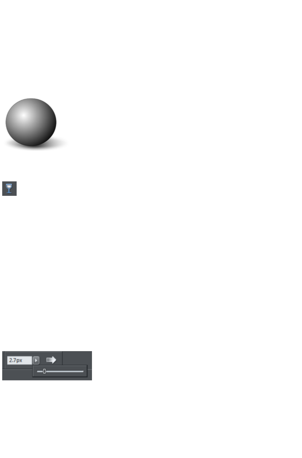
a click in the Selector Tool
with the "Ctrl" key pressed (this is called 'select inside' because it selects just the one item inside the
group). Now when you drag it will fill only the selected object.
To edit the start or color of the fill just drag and drop a color from the color line onto the shape, or you
can select the end of the Fill Arrow in the Fill Tool
and use the Color Editor ("Ctrl + E").
You can create a multi-stage graduated fill by making sure the fill arrow is visible (select it with the Fill
Tool
), now just drag a color from the Color Line and carefully drop it on the arrow line where you want the
new color. You can now drag this fill point, or select "Ctrl + E" to adjust the color using the Color Editor.
There are different fill styles, for example this is a circle with a circular fill.
The shadow is another ellipse with a graduated color fill and feathered (see below).
Transparency Tool
Modern browsers support advanced transparency effects, and so does Web Designer Premium. You
can adjust the transparency of any graphic or photo to make it see-through. Try it on your rectangle
example. Just select the Transparency Tool
, and adjust the large slider on the InfoBar.
More than this, Web Designer Premium supports graduated transparency. It works very like the
graduated color fill. In the Transparency Tool
just drag across your shape and you can see the transparency fades. You can adjust the degree of
transparency of each end of the fill arrow, by clicking on either end of the arrow, and adjusting the
Transparency slider.
Preview this and you'll find this works in your browser as well.
Feather
This is a graphical term for blending the edges of objects. Web Designer Premium provides a feather
control that enables any object, graphics, text or photo to be feathered - giving it a blurred edge that
blends with the background. The Feather control is not a tool on the left, but one of the controls on the
top bar. Try it on your rectangle shape. Select the shape and then click this Feather control on the right of
the top bar.
The shadow below the ball drawing above has a feathered edge. Combining all of these controls you can
very quickly produce amazing layered graphics for your website, all directly in Web Designer Premium
without needing any other graphics tools.
Page 155

This is an example of a rounded rectangle
with grad color, grad transparency and
feathered edges with some text placed on
top of it.
This has a graduated color fill, light to dark
green going left to right. It also has a vertical
graduated transparency fading from top to
bottom. The feather gives it a soft edge. It
takes a couple of seconds to create such an
image, and it's automatically converted to the
right graphic when you save your web page.
In Web Designer Premium you can create
any type of graphic, photo, text with
transparency, and it 'just works'. It can also
import almost all graphics files, from Adobe
EPS, to Photoshop PSD, Camera RAW and
more.
Technical note
: Web Designer Premium automatically converts any vector graphics into PNG images, an alpha-channel
PNG if transparency is used. It uses CSS layers to replicate the object layer stacking in Web Designer
Premium. This is compatible with all modern web browsers.
Shadow Tool
A very popular graphics effect is to create a soft drop- shadow under a graphic or some text. This
serves to lift the object away from the background.
The Shadow Tool lets you add a soft shadow to any object, text,
graphics or photo. Select the Shadow Tool
and just drag on the object. You can adjust the shadow blur and
transparency using InfoBar controls.
Some text with a soft shadow.
To adjust the position of an existing shadow, go into the Shadow Tool
and drag on the shadow
Advanced note
: Note that because a shadow itself is semi- transparent (part of the objects below show through the
shadow) objects with shadows are converted to PNG images when saved on a web page (it's the only
image format that supports transparency). PNG images can be quite large, especially for photos. It's
perfect for images such the above shadow graphic.
You may find you can convert the whole graphic to a JPEG to save space. Whether this works or not
depends on what's behind the shadow. If it's a plain or static non-text background you can probably use
a JPEG which is a much smaller file size (quicker website download). To force an object to be a JPEG
use the Image tab of the Web Properties dialog.
JPEG images cannot have semi-transparent parts, so when creating a JPEG of a semi-transparent object
Web Designer Premium includes the background (what's behind the semi-transparent part) as part of the
JPEG image, but because of the pixel perfect positioning on the web page you can't tell this. This doesn't
work if the shadow or semi-transparent object is placed over some text, as the text will be included as
part of the graphic.
Page 156
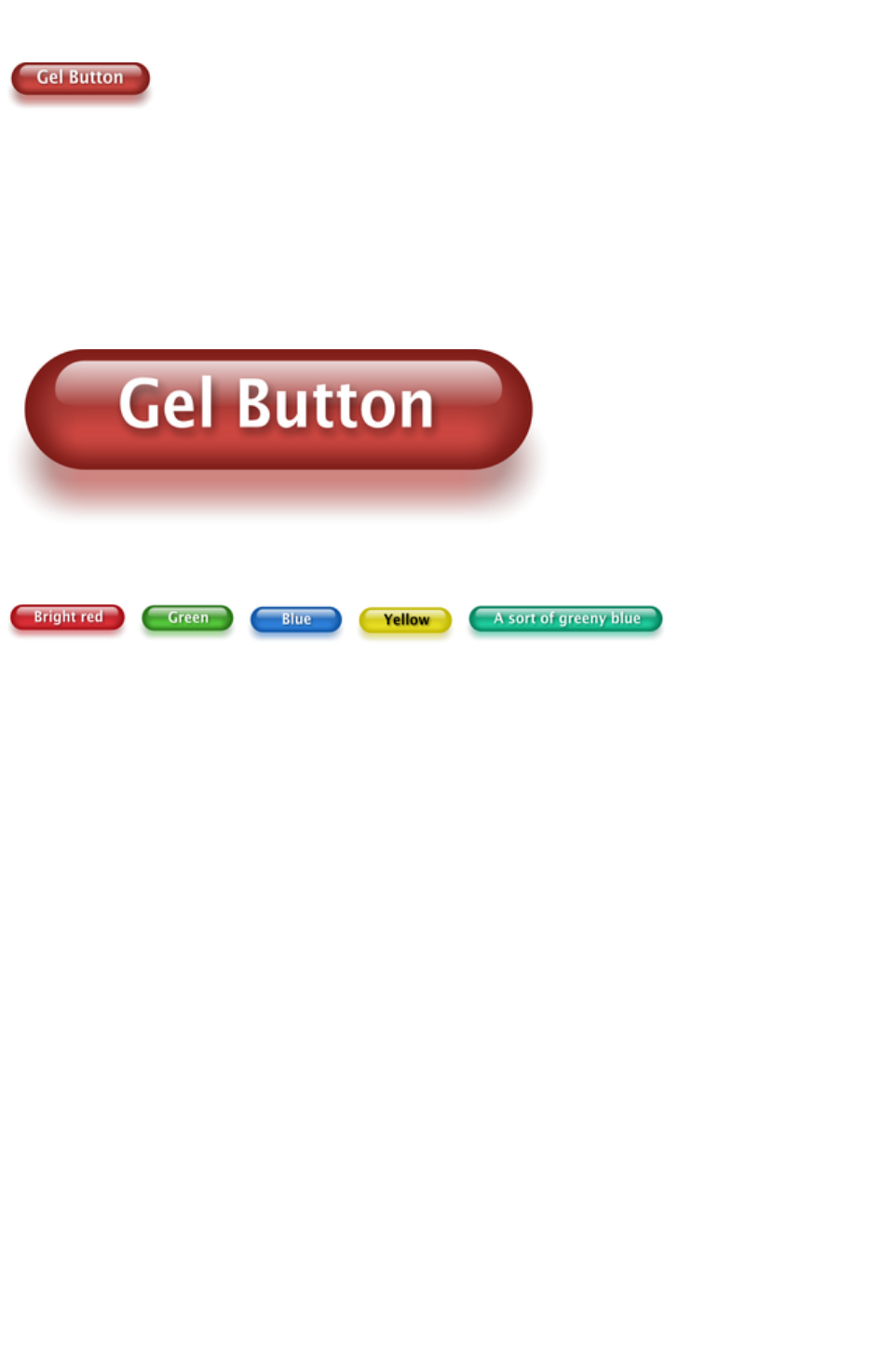
Example Graphics
This is a perfect example of what can be created in Web Designer Premium. This button combines many
of the features described above - it's drawn by combining just a few feathered shapes, and using
graduated transparency (the white reflection effect). The text has a slight soft shadow and the button has
a glow shadow. The whole thing is grouped. (You do not need to draw this button as it's provided in the
Button category of the Designs Gallery
).
The huge benefit of vector graphics, compared to 'bitmap' graphics created in pixel editing software such
Photoshop, is that you can re-color, edit, rotate, and resize the button with no loss of quality. Make it
huge and it remains pin sharp:
On top of that you can re-color using the Named Color system, and it will even stretch as required -
everything in Web Designer Premium remains non-destructive (which means you can always edit it, with
no loss of quality).
Something that would take skill and time to produce using alternative graphics software, is trivially easy in
Web Designer Premium.
Page 157
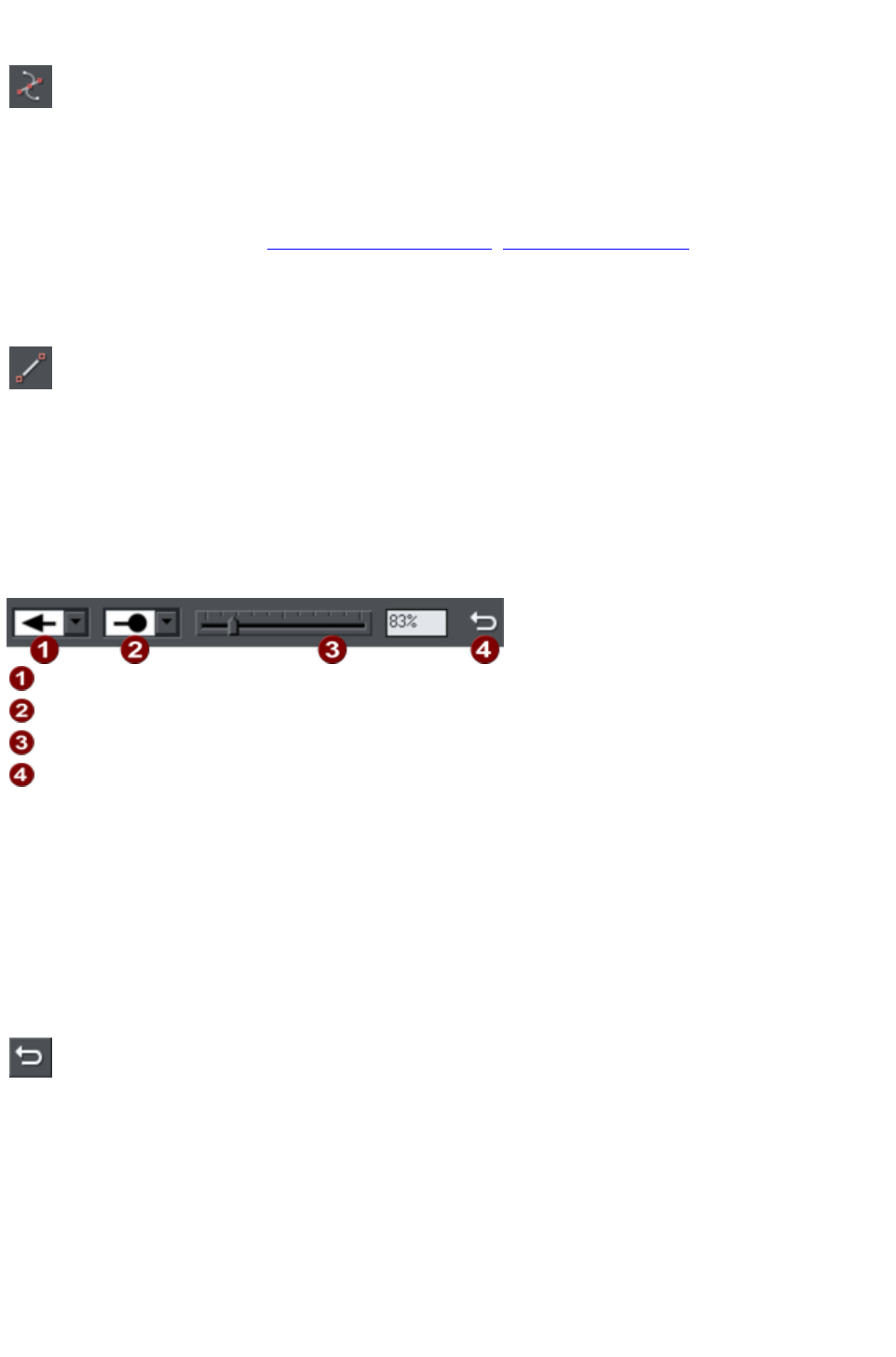
Shape Tool
The Shape Editor Tool
allows you to create detailed vector based shapes, and also to edit the
outline of any shape.
For preset shapes such as rectangles or ellipses, or if you want to edit the outline of your text character
shapes, you need to convert the object to an editable shape first. You can do this by selecting the "Ctrl +
1" key shortcut. You can then use the Shape Editor Tool to perform various advanced vector editing.
Refer to the reference section (Drawing Lines and Shapes, The Shape Editor tool
) on how to use this very powerful tool.
Straight Line and Arrow Tool
The Straight Line Tool
makes it easy to draw single segment straight lines and to add arrow
heads and tails to any lines.
Simply click and drag on the page to draw a straight line. You can click on any existing line to select it,
and once selected you can click-drag on either end to move the end of the line around.
Adding arrowheads and tails using the Straight Line tool
The infobar has two dropdown lists on the left which allow you to choose an arrow head or tail style for
each end of the selected line.
Arrow head
Arrow tail
Arrow head/tail size
Reverse path
The slider on the infobar allows you to change the size of the arrow head and tail on the current selected
line. Or you can enter a percentage value into the size text field to the right of the slider.
By default new arrowheads are created with a width of around 6 times that of the line width and that is
taken as the 100% size, as indicated by the size slider. If you make the line wider, the arrowhead width
also updates accordingly. Therefore enter a value less than 100% to reduce the size of the arrowhead
(and tail), or greater than 100% to increase. Although the slider only takes the size value up to a
maximum of 800%, you can enter percentage values larger than this into the size text field.
Reverse path
Press the Reverse path button on the infobar to switch around the
head and tail of the selected line.
Adding more line segments
Lines created with the Straight Line Tool are of course fully compatible with the other drawing tools.
So if you want to add more segments to a line, make it curved, or perhaps even turn it into a closed
shape, use the Shape Editor Tool
.
Rectangle Tool
Page 158
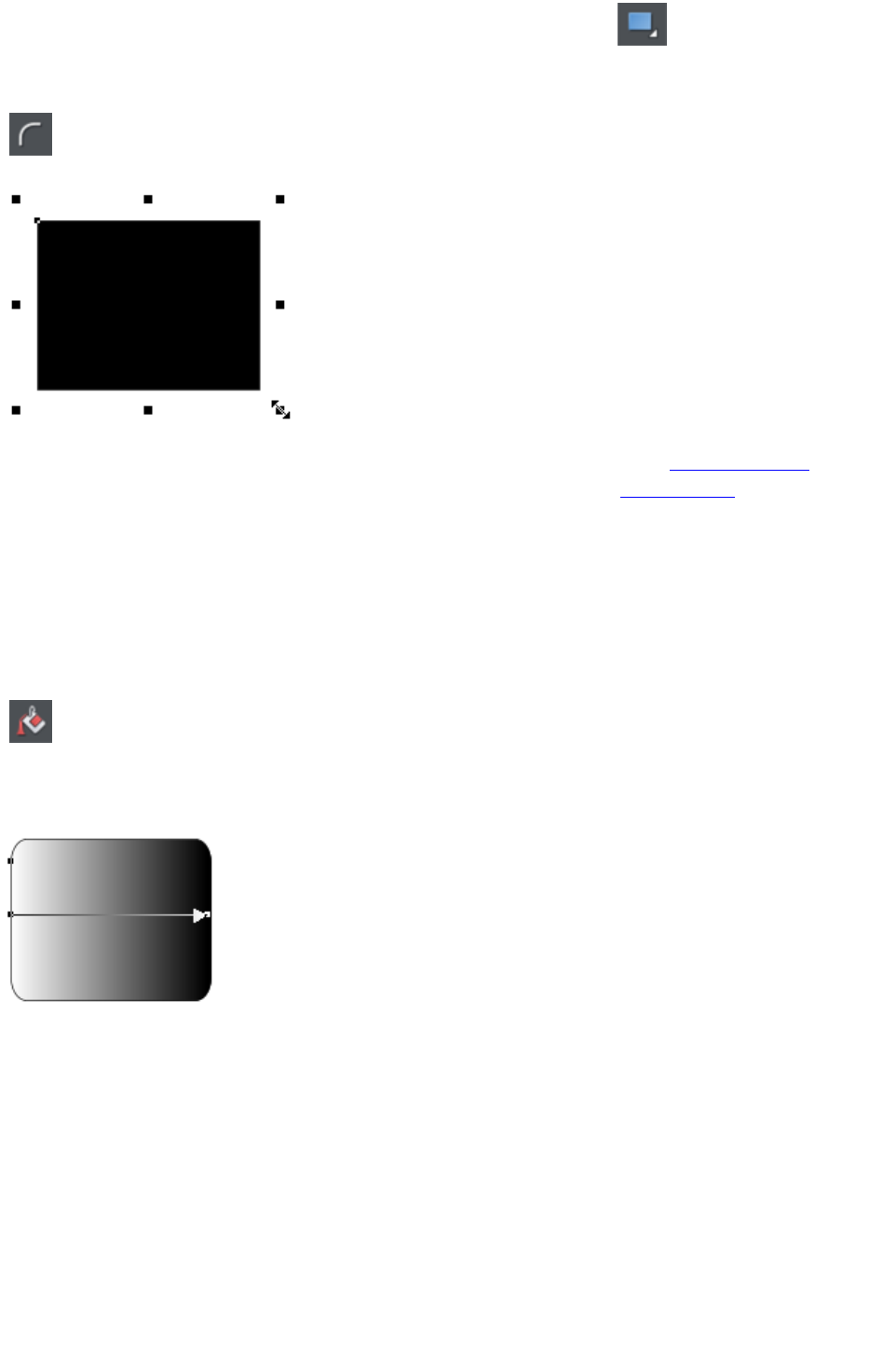
To draw a rectangle, select the Rectangle Tool
and just drag across the page. You will see a solid filled shape as you
drag across the page, indicating the fill and line color and boundaries of
the shape you are drawing.
Click the 'curved corners' button on the InfoBar to make this a rounded
rectangle - and you can drag on the curved corner handle to adjust the
roundedness.
You can drag on any corner handle to resize an object.
Drag and drop a color from the Color Line onto your shape to re-color it. See Coloring Shapes. With
the Selector Tool you can drag it, resize it and rotate it as required. See Selector Tool. You can put this
rectangle behind all other objects as a background image, by pressing "Ctrl + B" for 'Put to back'.
Alternatively if it's in front of all other objects ("Ctrl + F") then you can right click on it and select Repel
text under
to make the text on your page repel around the outside of this shape (another Web Designer Premium
first for any web authoring tool.)
Fill Tool
You can easily put a graduated color fill onto a shape using this
tool (and a lot more besides). Select the tool and just drag
across your object.
The fill arrow can be adjusted by dragging the ends to alter the direction, angle and extent of the
graduation.
Rounded rectangle with a graduated fill.
Note: If you drag with the Fill Tool across a grouped item, such as a text panel, then everything in the
group takes on the same fill style. To overcome this you must first select just the item you want to fill.
You can do this several ways. A single click on the item with the Fill Tool will select just that item, as will
a click in the Selector Tool
with the "Ctrl" key pressed (this is called 'select inside' because it selects just the one item inside the
group). Now when you drag it will fill only the selected object.
To edit the start or color of the fill just drag and drop a color from the color line onto the shape, or you
can select the end of the Fill Arrow in the Fill Tool
and use the Color Editor ("Ctrl + E").
You can create a multi-stage graduated fill by making sure the fill arrow is visible (select it with the Fill
Tool
), now just drag a color from the Color Line and carefully drop it on the arrow line where you want the
Page 159
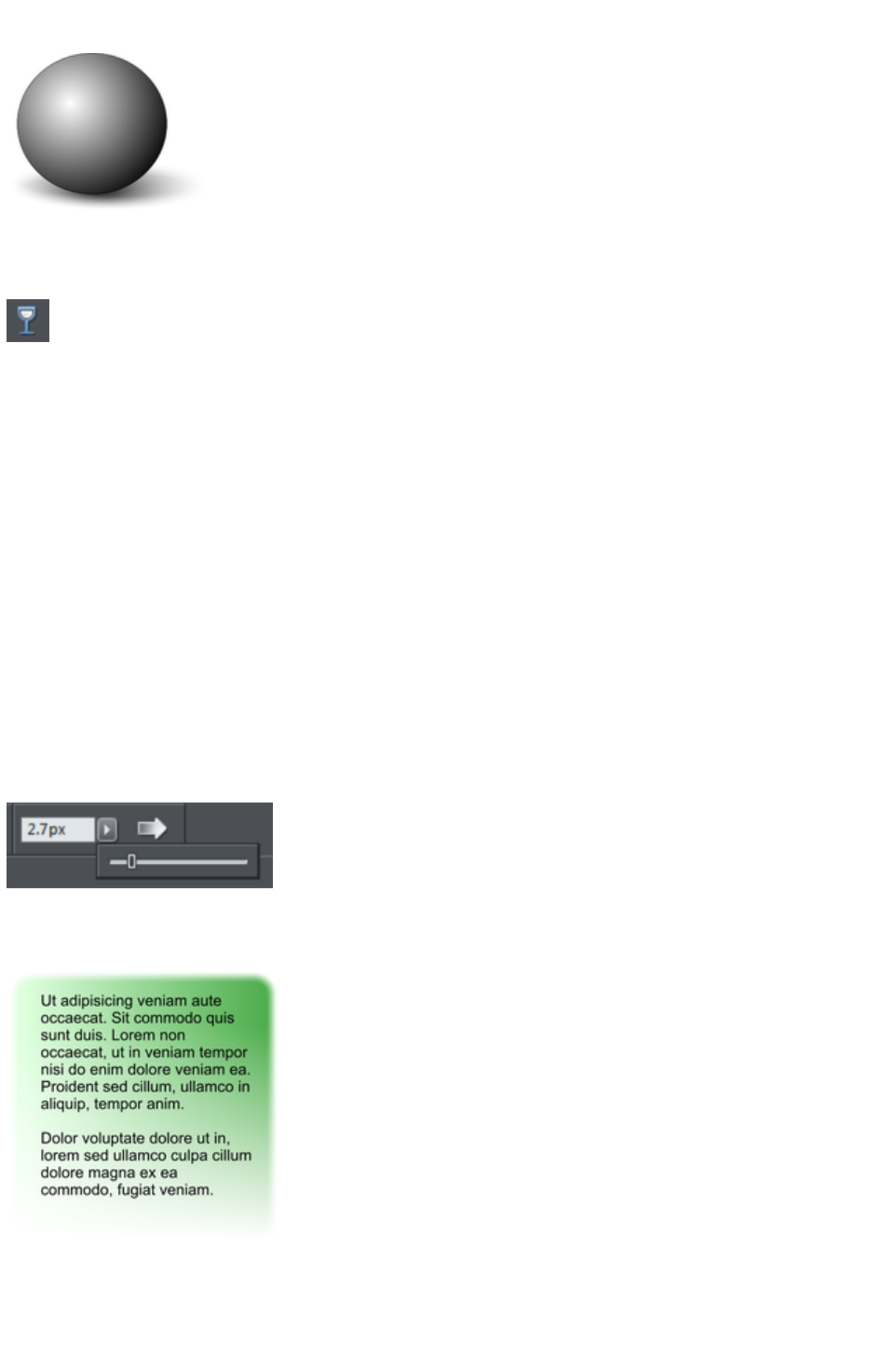
new color. You can now drag this fill point, or select "Ctrl + E" to adjust the color using the Color Editor.
There are different fill styles, for example this is a circle with a circular fill.
The shadow is another ellipse with a graduated color fill and feathered (see below).
Transparency Tool
Modern browsers support advanced transparency effects, and so does Web Designer Premium. You
can adjust the transparency of any graphic or photo to make it see-through. Try it on your rectangle
example. Just select the Transparency Tool
, and adjust the large slider on the InfoBar.
More than this, Web Designer Premium supports graduated transparency. It works very like the
graduated color fill. In the Transparency Tool
just drag across your shape and you can see the transparency fades. You can adjust the degree of
transparency of each end of the fill arrow, by clicking on either end of the arrow, and adjusting the
Transparency slider.
Preview this and you'll find this works in your browser as well.
Feather
This is a graphical term for blending the edges of objects. Web Designer Premium provides a feather
control that enables any object, graphics, text or photo to be feathered - giving it a blurred edge that
blends with the background. The Feather control is not a tool on the left, but one of the controls on the
top bar. Try it on your rectangle shape. Select the shape and then click this Feather control on the right of
the top bar.
The shadow below the ball drawing above has a feathered edge. Combining all of these controls you can
very quickly produce amazing layered graphics for your website, all directly in Web Designer Premium
without needing any other graphics tools.
This is an example of a rounded rectangle
with grad color, grad transparency and
feathered edges with some text placed on
top of it.
This has a graduated color fill, light to dark
green going left to right. It also has a vertical
graduated transparency fading from top to
bottom. The feather gives it a soft edge. It
takes a couple of seconds to create such an
image, and it's automatically converted to the
right graphic when you save your web page.
In Web Designer Premium you can create
any type of graphic, photo, text with
transparency, and it 'just works'. It can also
Page 160
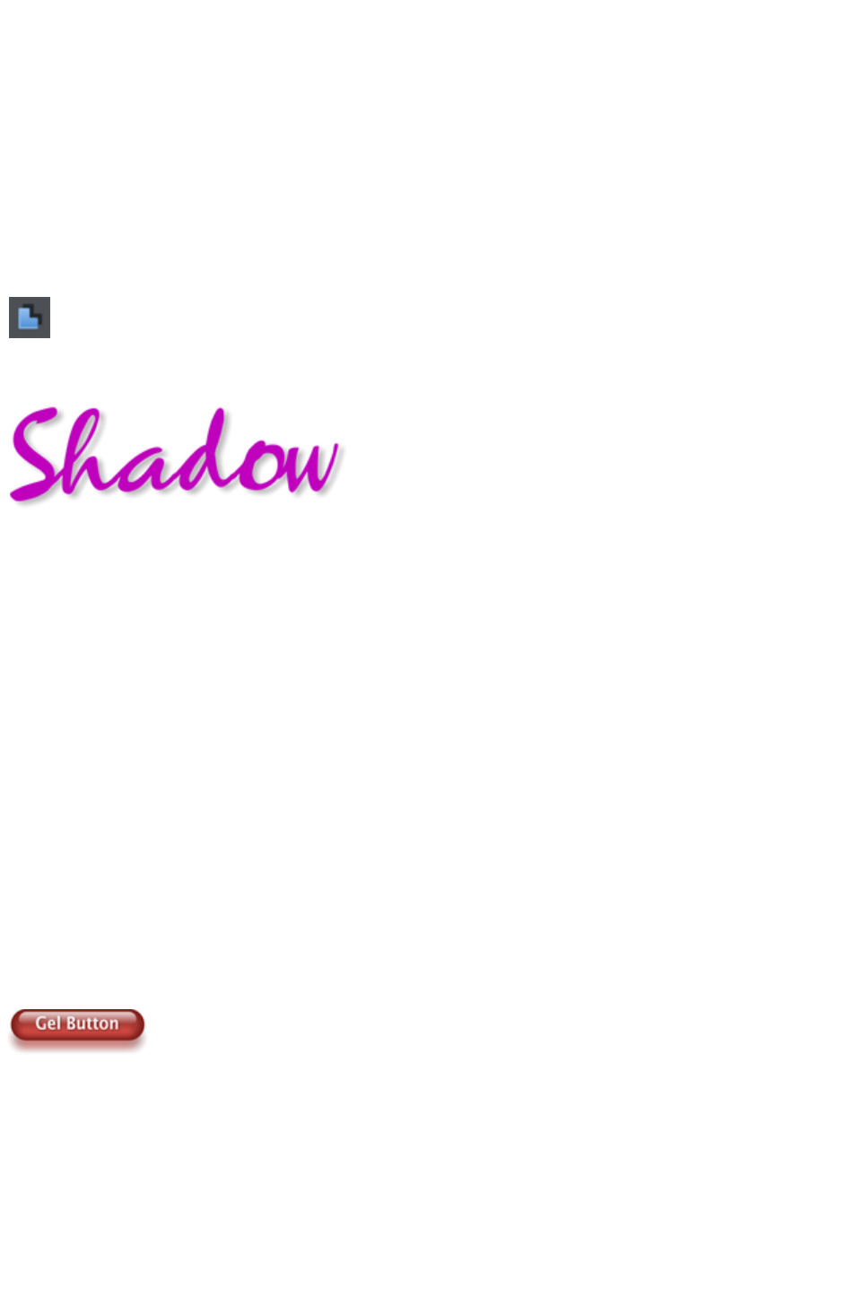
import almost all graphics files, from Adobe
EPS, to Photoshop PSD, Camera RAW and
more.
Technical note
: Web Designer Premium automatically converts any vector graphics into PNG images, an alpha-channel
PNG if transparency is used. It uses CSS layers to replicate the object layer stacking in Web Designer
Premium. This is compatible with all modern web browsers.
Shadow Tool
A very popular graphics effect is to create a soft drop- shadow under a graphic or some text. This
serves to lift the object away from the background.
The Shadow Tool lets you add a soft shadow to any object, text,
graphics or photo. Select the Shadow Tool
and just drag on the object. You can adjust the shadow blur and
transparency using InfoBar controls.
Some text with a soft shadow.
To adjust the position of an existing shadow, go into the Shadow Tool
and drag on the shadow
Advanced note
: Note that because a shadow itself is semi- transparent (part of the objects below show through the
shadow) objects with shadows are converted to PNG images when saved on a web page (it's the only
image format that supports transparency). PNG images can be quite large, especially for photos. It's
perfect for images such the above shadow graphic.
You may find you can convert the whole graphic to a JPEG to save space. Whether this works or not
depends on what's behind the shadow. If it's a plain or static non-text background you can probably use
a JPEG which is a much smaller file size (quicker website download). To force an object to be a JPEG
use the Image tab of the Web Properties dialog.
JPEG images cannot have semi-transparent parts, so when creating a JPEG of a semi-transparent object
Web Designer Premium includes the background (what's behind the semi-transparent part) as part of the
JPEG image, but because of the pixel perfect positioning on the web page you can't tell this. This doesn't
work if the shadow or semi-transparent object is placed over some text, as the text will be included as
part of the graphic.
Example Graphics
This is a perfect example of what can be created in Web Designer Premium. This button combines many
of the features described above - it's drawn by combining just a few feathered shapes, and using
graduated transparency (the white reflection effect). The text has a slight soft shadow and the button has
a glow shadow. The whole thing is grouped. (You do not need to draw this button as it's provided in the
Button category of the Designs Gallery
).
The huge benefit of vector graphics, compared to 'bitmap' graphics created in pixel editing software such
Photoshop, is that you can re-color, edit, rotate, and resize the button with no loss of quality. Make it
huge and it remains pin sharp:
Page 161

On top of that you can re-color using the Named Color system, and it will even stretch as required -
everything in Web Designer Premium remains non-destructive (which means you can always edit it, with
no loss of quality).
Something that would take skill and time to produce using alternative graphics software, is trivially easy in
Web Designer Premium.
Page 162
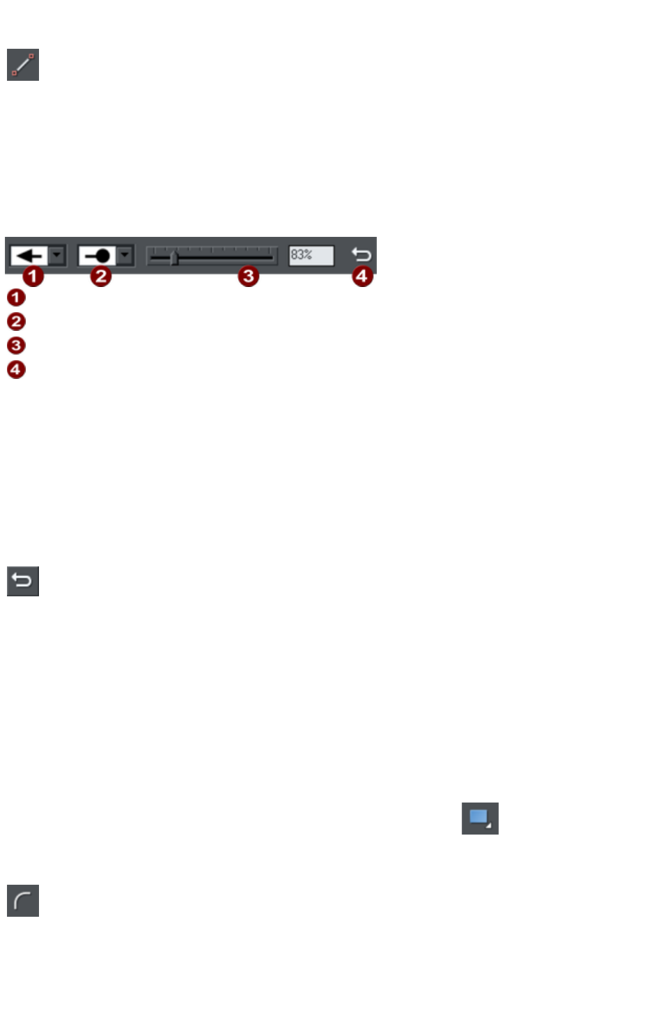
Straight Line and Arrow Tool
The Straight Line Tool
makes it easy to draw single segment straight lines and to add arrow
heads and tails to any lines.
Simply click and drag on the page to draw a straight line. You can click on any existing line to select it,
and once selected you can click-drag on either end to move the end of the line around.
Adding arrowheads and tails using the Straight Line tool
The infobar has two dropdown lists on the left which allow you to choose an arrow head or tail style for
each end of the selected line.
Arrow head
Arrow tail
Arrow head/tail size
Reverse path
The slider on the infobar allows you to change the size of the arrow head and tail on the current selected
line. Or you can enter a percentage value into the size text field to the right of the slider.
By default new arrowheads are created with a width of around 6 times that of the line width and that is
taken as the 100% size, as indicated by the size slider. If you make the line wider, the arrowhead width
also updates accordingly. Therefore enter a value less than 100% to reduce the size of the arrowhead
(and tail), or greater than 100% to increase. Although the slider only takes the size value up to a
maximum of 800%, you can enter percentage values larger than this into the size text field.
Reverse path
Press the Reverse path button on the infobar to switch around the
head and tail of the selected line.
Adding more line segments
Lines created with the Straight Line Tool are of course fully compatible with the other drawing tools.
So if you want to add more segments to a line, make it curved, or perhaps even turn it into a closed
shape, use the Shape Editor Tool
.
Rectangle Tool
To draw a rectangle, select the Rectangle Tool
and just drag across the page. You will see a solid filled shape as you
drag across the page, indicating the fill and line color and boundaries of
the shape you are drawing.
Click the 'curved corners' button on the InfoBar to make this a rounded
rectangle - and you can drag on the curved corner handle to adjust the
roundedness.
Page 163
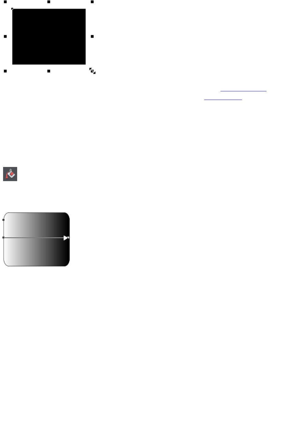
You can drag on any corner handle to resize an object.
Drag and drop a color from the Color Line onto your shape to re-color it. See Coloring Shapes. With
the Selector Tool you can drag it, resize it and rotate it as required. See Selector Tool. You can put this
rectangle behind all other objects as a background image, by pressing "Ctrl + B" for 'Put to back'.
Alternatively if it's in front of all other objects ("Ctrl + F") then you can right click on it and select Repel
text under
to make the text on your page repel around the outside of this shape (another Web Designer Premium
first for any web authoring tool.)
Fill Tool
You can easily put a graduated color fill onto a shape using this
tool (and a lot more besides). Select the tool and just drag
across your object.
The fill arrow can be adjusted by dragging the ends to alter the direction, angle and extent of the
graduation.
Rounded rectangle with a graduated fill.
Note: If you drag with the Fill Tool across a grouped item, such as a text panel, then everything in the
group takes on the same fill style. To overcome this you must first select just the item you want to fill.
You can do this several ways. A single click on the item with the Fill Tool will select just that item, as will
a click in the Selector Tool
with the "Ctrl" key pressed (this is called 'select inside' because it selects just the one item inside the
group). Now when you drag it will fill only the selected object.
To edit the start or color of the fill just drag and drop a color from the color line onto the shape, or you
can select the end of the Fill Arrow in the Fill Tool
and use the Color Editor ("Ctrl + E").
You can create a multi-stage graduated fill by making sure the fill arrow is visible (select it with the Fill
Tool
), now just drag a color from the Color Line and carefully drop it on the arrow line where you want the
new color. You can now drag this fill point, or select "Ctrl + E" to adjust the color using the Color Editor.
There are different fill styles, for example this is a circle with a circular fill.
Page 164
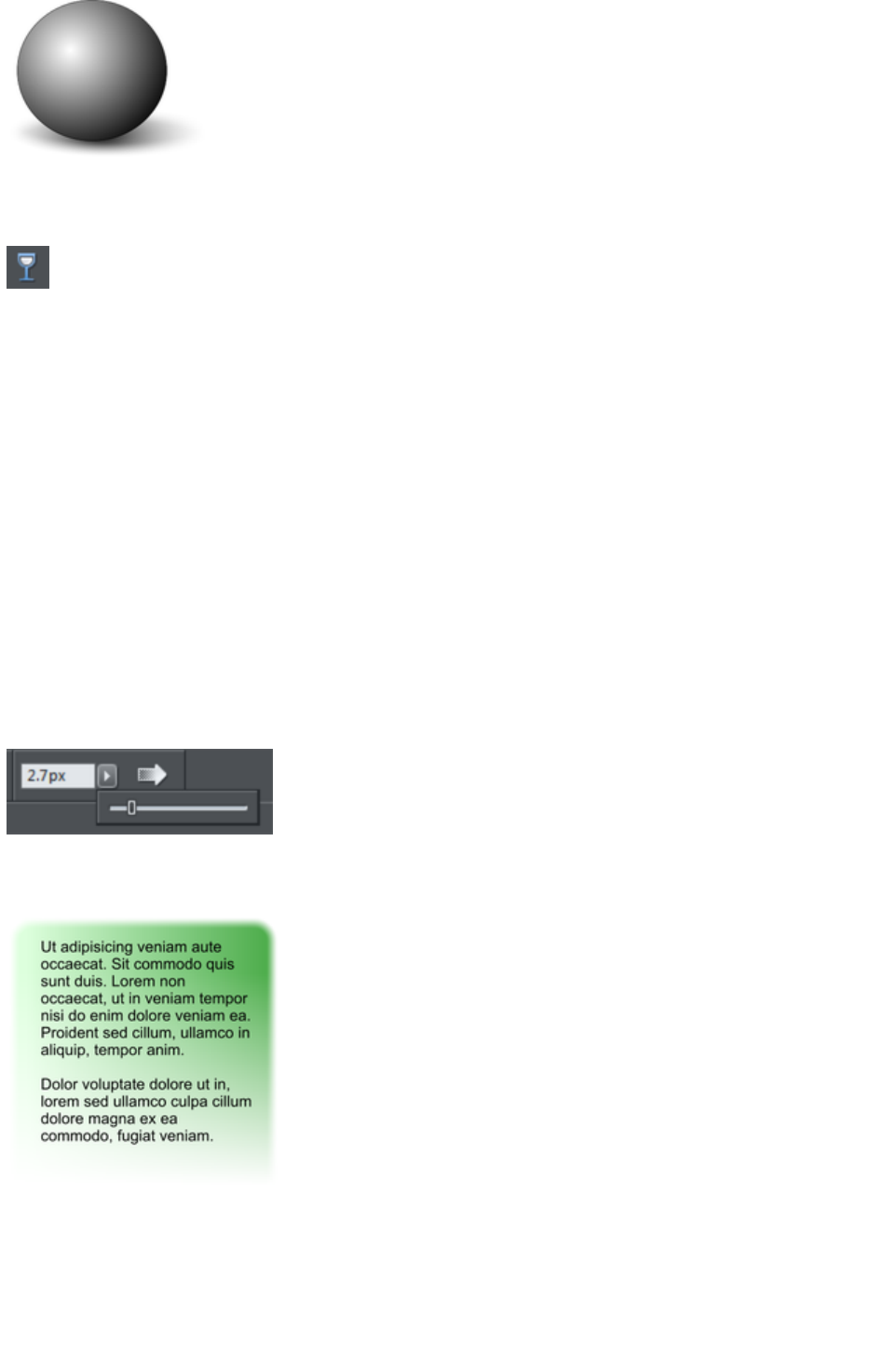
The shadow is another ellipse with a graduated color fill and feathered (see below).
Transparency Tool
Modern browsers support advanced transparency effects, and so does Web Designer Premium. You
can adjust the transparency of any graphic or photo to make it see-through. Try it on your rectangle
example. Just select the Transparency Tool
, and adjust the large slider on the InfoBar.
More than this, Web Designer Premium supports graduated transparency. It works very like the
graduated color fill. In the Transparency Tool
just drag across your shape and you can see the transparency fades. You can adjust the degree of
transparency of each end of the fill arrow, by clicking on either end of the arrow, and adjusting the
Transparency slider.
Preview this and you'll find this works in your browser as well.
Feather
This is a graphical term for blending the edges of objects. Web Designer Premium provides a feather
control that enables any object, graphics, text or photo to be feathered - giving it a blurred edge that
blends with the background. The Feather control is not a tool on the left, but one of the controls on the
top bar. Try it on your rectangle shape. Select the shape and then click this Feather control on the right of
the top bar.
The shadow below the ball drawing above has a feathered edge. Combining all of these controls you can
very quickly produce amazing layered graphics for your website, all directly in Web Designer Premium
without needing any other graphics tools.
This is an example of a rounded rectangle
with grad color, grad transparency and
feathered edges with some text placed on
top of it.
This has a graduated color fill, light to dark
green going left to right. It also has a vertical
graduated transparency fading from top to
bottom. The feather gives it a soft edge. It
takes a couple of seconds to create such an
image, and it's automatically converted to the
right graphic when you save your web page.
In Web Designer Premium you can create
any type of graphic, photo, text with
transparency, and it 'just works'. It can also
import almost all graphics files, from Adobe
EPS, to Photoshop PSD, Camera RAW and
Page 165
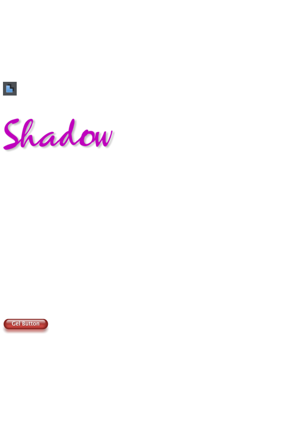
more.
Technical note
: Web Designer Premium automatically converts any vector graphics into PNG images, an alpha-channel
PNG if transparency is used. It uses CSS layers to replicate the object layer stacking in Web Designer
Premium. This is compatible with all modern web browsers.
Shadow Tool
A very popular graphics effect is to create a soft drop- shadow under a graphic or some text. This
serves to lift the object away from the background.
The Shadow Tool lets you add a soft shadow to any object, text,
graphics or photo. Select the Shadow Tool
and just drag on the object. You can adjust the shadow blur and
transparency using InfoBar controls.
Some text with a soft shadow.
To adjust the position of an existing shadow, go into the Shadow Tool
and drag on the shadow
Advanced note
: Note that because a shadow itself is semi- transparent (part of the objects below show through the
shadow) objects with shadows are converted to PNG images when saved on a web page (it's the only
image format that supports transparency). PNG images can be quite large, especially for photos. It's
perfect for images such the above shadow graphic.
You may find you can convert the whole graphic to a JPEG to save space. Whether this works or not
depends on what's behind the shadow. If it's a plain or static non-text background you can probably use
a JPEG which is a much smaller file size (quicker website download). To force an object to be a JPEG
use the Image tab of the Web Properties dialog.
JPEG images cannot have semi-transparent parts, so when creating a JPEG of a semi-transparent object
Web Designer Premium includes the background (what's behind the semi-transparent part) as part of the
JPEG image, but because of the pixel perfect positioning on the web page you can't tell this. This doesn't
work if the shadow or semi-transparent object is placed over some text, as the text will be included as
part of the graphic.
Example Graphics
This is a perfect example of what can be created in Web Designer Premium. This button combines many
of the features described above - it's drawn by combining just a few feathered shapes, and using
graduated transparency (the white reflection effect). The text has a slight soft shadow and the button has
a glow shadow. The whole thing is grouped. (You do not need to draw this button as it's provided in the
Button category of the Designs Gallery
).
The huge benefit of vector graphics, compared to 'bitmap' graphics created in pixel editing software such
Photoshop, is that you can re-color, edit, rotate, and resize the button with no loss of quality. Make it
huge and it remains pin sharp:
Page 166
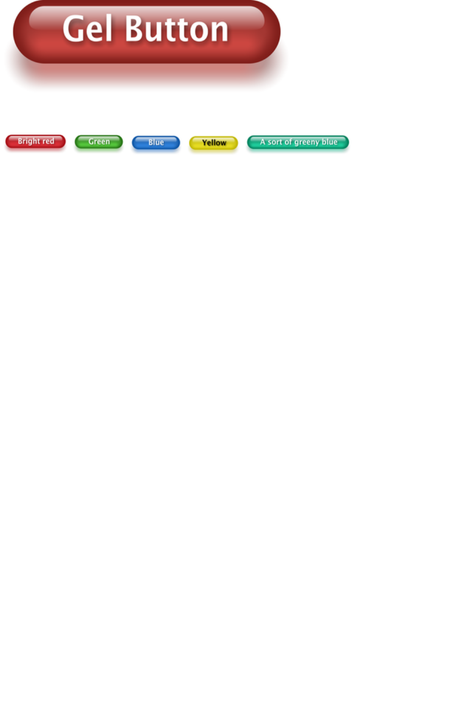
On top of that you can re-color using the Named Color system, and it will even stretch as required -
everything in Web Designer Premium remains non-destructive (which means you can always edit it, with
no loss of quality).
Something that would take skill and time to produce using alternative graphics software, is trivially easy in
Web Designer Premium.
Page 167
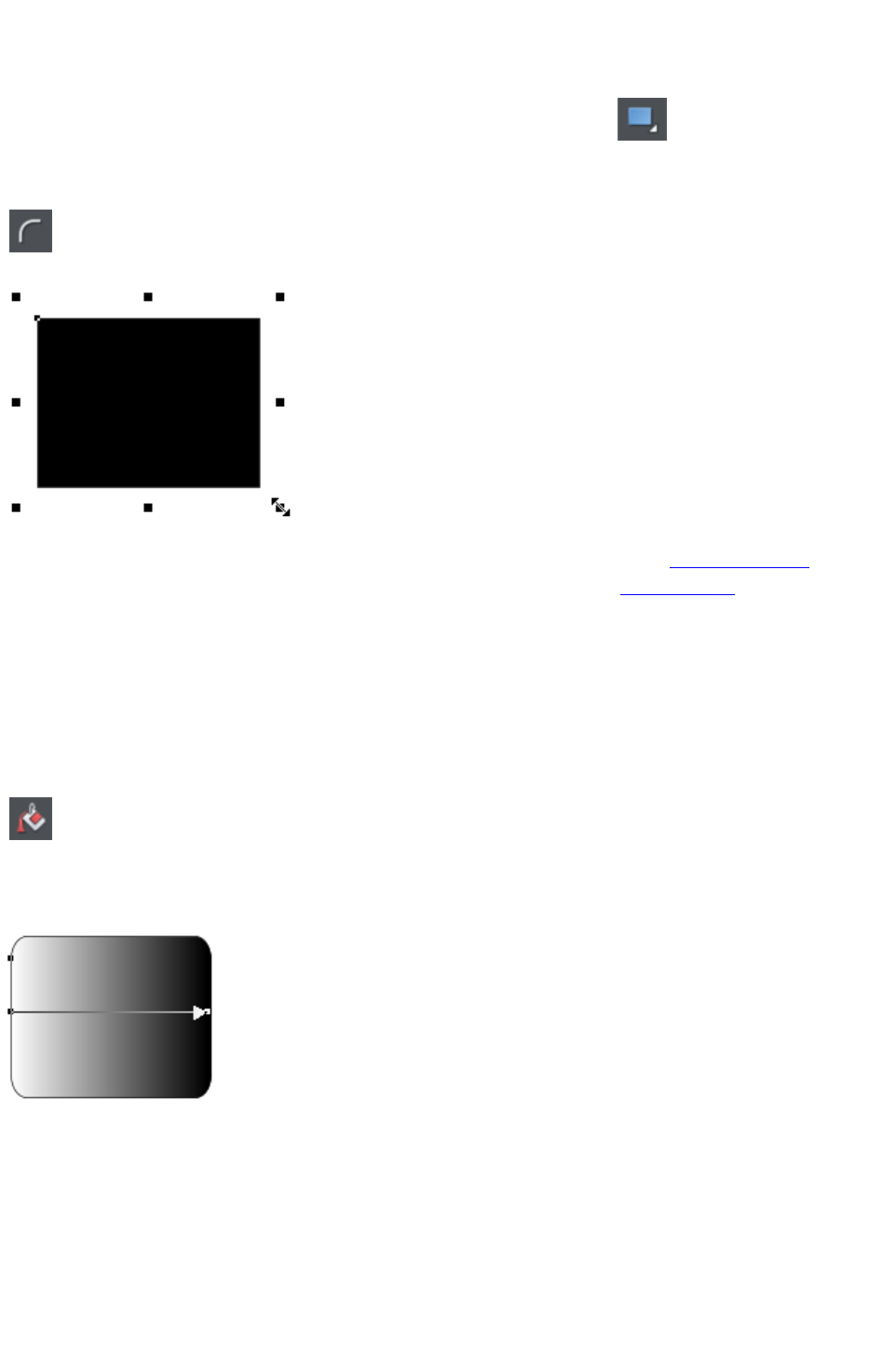
Rectangle Tool
To draw a rectangle, select the Rectangle Tool
and just drag across the page. You will see a solid filled shape as you
drag across the page, indicating the fill and line color and boundaries of
the shape you are drawing.
Click the 'curved corners' button on the InfoBar to make this a rounded
rectangle - and you can drag on the curved corner handle to adjust the
roundedness.
You can drag on any corner handle to resize an object.
Drag and drop a color from the Color Line onto your shape to re-color it. See Coloring Shapes. With
the Selector Tool you can drag it, resize it and rotate it as required. See Selector Tool. You can put this
rectangle behind all other objects as a background image, by pressing "Ctrl + B" for 'Put to back'.
Alternatively if it's in front of all other objects ("Ctrl + F") then you can right click on it and select Repel
text under
to make the text on your page repel around the outside of this shape (another Web Designer Premium
first for any web authoring tool.)
Fill Tool
You can easily put a graduated color fill onto a shape using this
tool (and a lot more besides). Select the tool and just drag
across your object.
The fill arrow can be adjusted by dragging the ends to alter the direction, angle and extent of the
graduation.
Rounded rectangle with a graduated fill.
Note: If you drag with the Fill Tool across a grouped item, such as a text panel, then everything in the
group takes on the same fill style. To overcome this you must first select just the item you want to fill.
You can do this several ways. A single click on the item with the Fill Tool will select just that item, as will
a click in the Selector Tool
with the "Ctrl" key pressed (this is called 'select inside' because it selects just the one item inside the
group). Now when you drag it will fill only the selected object.
To edit the start or color of the fill just drag and drop a color from the color line onto the shape, or you
can select the end of the Fill Arrow in the Fill Tool
Page 168
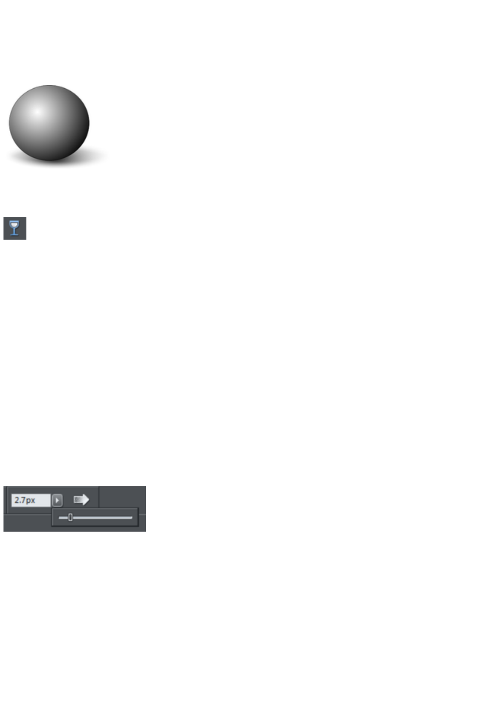
and use the Color Editor ("Ctrl + E").
You can create a multi-stage graduated fill by making sure the fill arrow is visible (select it with the Fill
Tool
), now just drag a color from the Color Line and carefully drop it on the arrow line where you want the
new color. You can now drag this fill point, or select "Ctrl + E" to adjust the color using the Color Editor.
There are different fill styles, for example this is a circle with a circular fill.
The shadow is another ellipse with a graduated color fill and feathered (see below).
Transparency Tool
Modern browsers support advanced transparency effects, and so does Web Designer Premium. You
can adjust the transparency of any graphic or photo to make it see-through. Try it on your rectangle
example. Just select the Transparency Tool
, and adjust the large slider on the InfoBar.
More than this, Web Designer Premium supports graduated transparency. It works very like the
graduated color fill. In the Transparency Tool
just drag across your shape and you can see the transparency fades. You can adjust the degree of
transparency of each end of the fill arrow, by clicking on either end of the arrow, and adjusting the
Transparency slider.
Preview this and you'll find this works in your browser as well.
Feather
This is a graphical term for blending the edges of objects. Web Designer Premium provides a feather
control that enables any object, graphics, text or photo to be feathered - giving it a blurred edge that
blends with the background. The Feather control is not a tool on the left, but one of the controls on the
top bar. Try it on your rectangle shape. Select the shape and then click this Feather control on the right of
the top bar.
The shadow below the ball drawing above has a feathered edge. Combining all of these controls you can
very quickly produce amazing layered graphics for your website, all directly in Web Designer Premium
without needing any other graphics tools.
Page 169
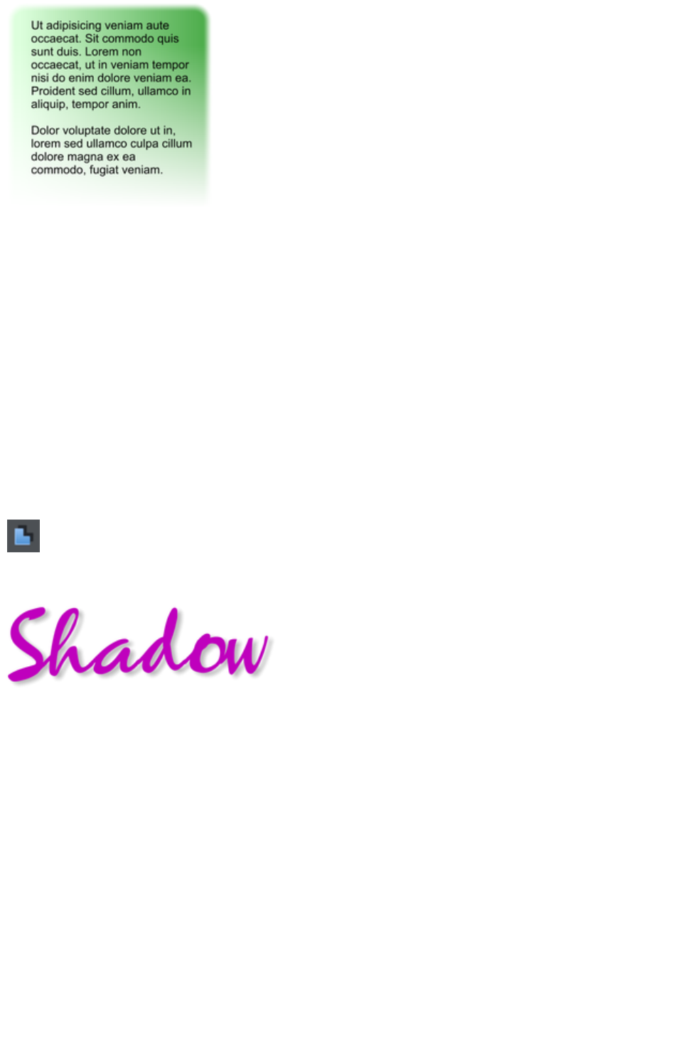
This is an example of a rounded rectangle
with grad color, grad transparency and
feathered edges with some text placed on
top of it.
This has a graduated color fill, light to dark
green going left to right. It also has a vertical
graduated transparency fading from top to
bottom. The feather gives it a soft edge. It
takes a couple of seconds to create such an
image, and it's automatically converted to the
right graphic when you save your web page.
In Web Designer Premium you can create
any type of graphic, photo, text with
transparency, and it 'just works'. It can also
import almost all graphics files, from Adobe
EPS, to Photoshop PSD, Camera RAW and
more.
Technical note
: Web Designer Premium automatically converts any vector graphics into PNG images, an alpha-channel
PNG if transparency is used. It uses CSS layers to replicate the object layer stacking in Web Designer
Premium. This is compatible with all modern web browsers.
Shadow Tool
A very popular graphics effect is to create a soft drop- shadow under a graphic or some text. This
serves to lift the object away from the background.
The Shadow Tool lets you add a soft shadow to any object, text,
graphics or photo. Select the Shadow Tool
and just drag on the object. You can adjust the shadow blur and
transparency using InfoBar controls.
Some text with a soft shadow.
To adjust the position of an existing shadow, go into the Shadow Tool
and drag on the shadow
Advanced note
: Note that because a shadow itself is semi- transparent (part of the objects below show through the
shadow) objects with shadows are converted to PNG images when saved on a web page (it's the only
image format that supports transparency). PNG images can be quite large, especially for photos. It's
perfect for images such the above shadow graphic.
You may find you can convert the whole graphic to a JPEG to save space. Whether this works or not
depends on what's behind the shadow. If it's a plain or static non-text background you can probably use
a JPEG which is a much smaller file size (quicker website download). To force an object to be a JPEG
use the Image tab of the Web Properties dialog.
JPEG images cannot have semi-transparent parts, so when creating a JPEG of a semi-transparent object
Web Designer Premium includes the background (what's behind the semi-transparent part) as part of the
JPEG image, but because of the pixel perfect positioning on the web page you can't tell this. This doesn't
work if the shadow or semi-transparent object is placed over some text, as the text will be included as
part of the graphic.
Page 170

Example Graphics
This is a perfect example of what can be created in Web Designer Premium. This button combines many
of the features described above - it's drawn by combining just a few feathered shapes, and using
graduated transparency (the white reflection effect). The text has a slight soft shadow and the button has
a glow shadow. The whole thing is grouped. (You do not need to draw this button as it's provided in the
Button category of the Designs Gallery
).
The huge benefit of vector graphics, compared to 'bitmap' graphics created in pixel editing software such
Photoshop, is that you can re-color, edit, rotate, and resize the button with no loss of quality. Make it
huge and it remains pin sharp:
On top of that you can re-color using the Named Color system, and it will even stretch as required -
everything in Web Designer Premium remains non-destructive (which means you can always edit it, with
no loss of quality).
Something that would take skill and time to produce using alternative graphics software, is trivially easy in
Web Designer Premium.
Page 171
Fill Tool
You can easily put a graduated color fill onto a shape using this
tool (and a lot more besides). Select the tool and just drag
across your object.
The fill arrow can be adjusted by dragging the ends to alter the direction, angle and extent of the
graduation.
Rounded rectangle with a graduated fill.
Note: If you drag with the Fill Tool across a grouped item, such as a text panel, then everything in the
group takes on the same fill style. To overcome this you must first select just the item you want to fill.
You can do this several ways. A single click on the item with the Fill Tool will select just that item, as will
a click in the Selector Tool
with the "Ctrl" key pressed (this is called 'select inside' because it selects just the one item inside the
group). Now when you drag it will fill only the selected object.
To edit the start or color of the fill just drag and drop a color from the color line onto the shape, or you
can select the end of the Fill Arrow in the Fill Tool
and use the Color Editor ("Ctrl + E").
You can create a multi-stage graduated fill by making sure the fill arrow is visible (select it with the Fill
Tool
), now just drag a color from the Color Line and carefully drop it on the arrow line where you want the
new color. You can now drag this fill point, or select "Ctrl + E" to adjust the color using the Color Editor.
There are different fill styles, for example this is a circle with a circular fill.
The shadow is another ellipse with a graduated color fill and feathered (see below).
Transparency Tool
Modern browsers support advanced transparency effects, and so does Web Designer Premium. You
can adjust the transparency of any graphic or photo to make it see-through. Try it on your rectangle
example. Just select the Transparency Tool
, and adjust the large slider on the InfoBar.
More than this, Web Designer Premium supports graduated transparency. It works very like the
graduated color fill. In the Transparency Tool
just drag across your shape and you can see the transparency fades. You can adjust the degree of
transparency of each end of the fill arrow, by clicking on either end of the arrow, and adjusting the
Transparency slider.
Preview this and you'll find this works in your browser as well.
Page 172
Feather
This is a graphical term for blending the edges of objects. Web Designer Premium provides a feather
control that enables any object, graphics, text or photo to be feathered - giving it a blurred edge that
blends with the background. The Feather control is not a tool on the left, but one of the controls on the
top bar. Try it on your rectangle shape. Select the shape and then click this Feather control on the right of
the top bar.
The shadow below the ball drawing above has a feathered edge. Combining all of these controls you can
very quickly produce amazing layered graphics for your website, all directly in Web Designer Premium
without needing any other graphics tools.
This is an example of a rounded rectangle
with grad color, grad transparency and
feathered edges with some text placed on
top of it.
This has a graduated color fill, light to dark
green going left to right. It also has a vertical
graduated transparency fading from top to
bottom. The feather gives it a soft edge. It
takes a couple of seconds to create such an
image, and it's automatically converted to the
right graphic when you save your web page.
In Web Designer Premium you can create
any type of graphic, photo, text with
transparency, and it 'just works'. It can also
import almost all graphics files, from Adobe
EPS, to Photoshop PSD, Camera RAW and
more.
Technical note
: Web Designer Premium automatically converts any vector graphics into PNG images, an alpha-channel
PNG if transparency is used. It uses CSS layers to replicate the object layer stacking in Web Designer
Premium. This is compatible with all modern web browsers.
Shadow Tool
A very popular graphics effect is to create a soft drop- shadow under a graphic or some text. This
serves to lift the object away from the background.
The Shadow Tool lets you add a soft shadow to any object, text,
graphics or photo. Select the Shadow Tool
and just drag on the object. You can adjust the shadow blur and
transparency using InfoBar controls.
Some text with a soft shadow.
To adjust the position of an existing shadow, go into the Shadow Tool
and drag on the shadow
Advanced note
Page 173
: Note that because a shadow itself is semi- transparent (part of the objects below show through the
shadow) objects with shadows are converted to PNG images when saved on a web page (it's the only
image format that supports transparency). PNG images can be quite large, especially for photos. It's
perfect for images such the above shadow graphic.
You may find you can convert the whole graphic to a JPEG to save space. Whether this works or not
depends on what's behind the shadow. If it's a plain or static non-text background you can probably use
a JPEG which is a much smaller file size (quicker website download). To force an object to be a JPEG
use the Image tab of the Web Properties dialog.
JPEG images cannot have semi-transparent parts, so when creating a JPEG of a semi-transparent object
Web Designer Premium includes the background (what's behind the semi-transparent part) as part of the
JPEG image, but because of the pixel perfect positioning on the web page you can't tell this. This doesn't
work if the shadow or semi-transparent object is placed over some text, as the text will be included as
part of the graphic.
Example Graphics
This is a perfect example of what can be created in Web Designer Premium. This button combines many
of the features described above - it's drawn by combining just a few feathered shapes, and using
graduated transparency (the white reflection effect). The text has a slight soft shadow and the button has
a glow shadow. The whole thing is grouped. (You do not need to draw this button as it's provided in the
Button category of the Designs Gallery
).
The huge benefit of vector graphics, compared to 'bitmap' graphics created in pixel editing software such
Photoshop, is that you can re-color, edit, rotate, and resize the button with no loss of quality. Make it
huge and it remains pin sharp:
On top of that you can re-color using the Named Color system, and it will even stretch as required -
everything in Web Designer Premium remains non-destructive (which means you can always edit it, with
no loss of quality).
Something that would take skill and time to produce using alternative graphics software, is trivially easy in
Web Designer Premium.
Page 174
Transparency Tool
Modern browsers support advanced transparency effects, and so does Web Designer Premium. You
can adjust the transparency of any graphic or photo to make it see-through. Try it on your rectangle
example. Just select the Transparency Tool
, and adjust the large slider on the InfoBar.
More than this, Web Designer Premium supports graduated transparency. It works very like the
graduated color fill. In the Transparency Tool
just drag across your shape and you can see the transparency fades. You can adjust the degree of
transparency of each end of the fill arrow, by clicking on either end of the arrow, and adjusting the
Transparency slider.
Preview this and you'll find this works in your browser as well.
Feather
This is a graphical term for blending the edges of objects. Web Designer Premium provides a feather
control that enables any object, graphics, text or photo to be feathered - giving it a blurred edge that
blends with the background. The Feather control is not a tool on the left, but one of the controls on the
top bar. Try it on your rectangle shape. Select the shape and then click this Feather control on the right of
the top bar.
The shadow below the ball drawing above has a feathered edge. Combining all of these controls you can
very quickly produce amazing layered graphics for your website, all directly in Web Designer Premium
without needing any other graphics tools.
This is an example of a rounded rectangle
with grad color, grad transparency and
feathered edges with some text placed on
top of it.
This has a graduated color fill, light to dark
green going left to right. It also has a vertical
graduated transparency fading from top to
bottom. The feather gives it a soft edge. It
takes a couple of seconds to create such an
image, and it's automatically converted to the
right graphic when you save your web page.
In Web Designer Premium you can create
any type of graphic, photo, text with
transparency, and it 'just works'. It can also
import almost all graphics files, from Adobe
EPS, to Photoshop PSD, Camera RAW and
more.
Technical note
: Web Designer Premium automatically converts any vector graphics into PNG images, an alpha-channel
PNG if transparency is used. It uses CSS layers to replicate the object layer stacking in Web Designer
Premium. This is compatible with all modern web browsers.
Shadow Tool
Page 175
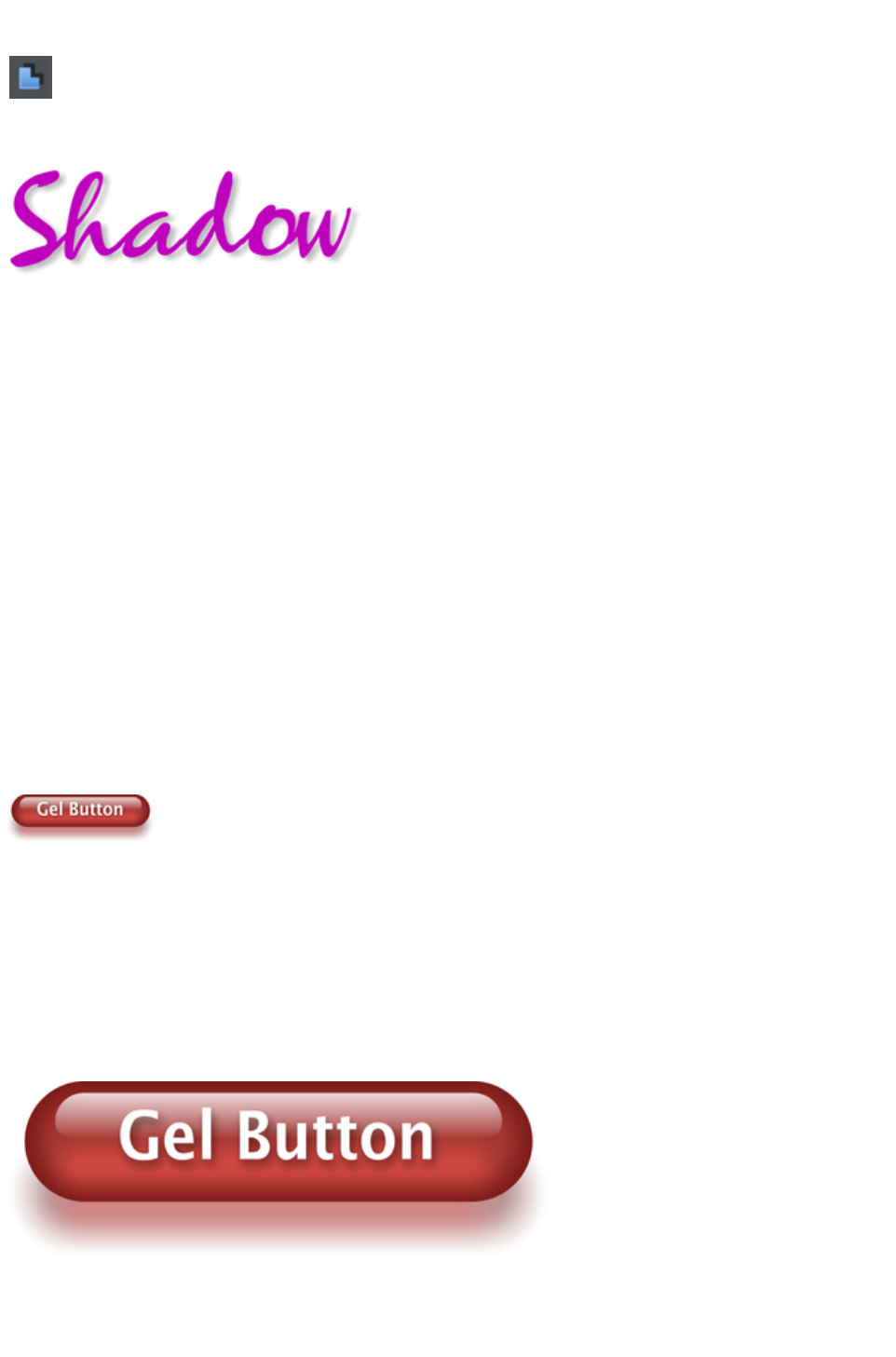
A very popular graphics effect is to create a soft drop- shadow under a graphic or some text. This
serves to lift the object away from the background.
The Shadow Tool lets you add a soft shadow to any object, text,
graphics or photo. Select the Shadow Tool
and just drag on the object. You can adjust the shadow blur and
transparency using InfoBar controls.
Some text with a soft shadow.
To adjust the position of an existing shadow, go into the Shadow Tool
and drag on the shadow
Advanced note
: Note that because a shadow itself is semi- transparent (part of the objects below show through the
shadow) objects with shadows are converted to PNG images when saved on a web page (it's the only
image format that supports transparency). PNG images can be quite large, especially for photos. It's
perfect for images such the above shadow graphic.
You may find you can convert the whole graphic to a JPEG to save space. Whether this works or not
depends on what's behind the shadow. If it's a plain or static non-text background you can probably use
a JPEG which is a much smaller file size (quicker website download). To force an object to be a JPEG
use the Image tab of the Web Properties dialog.
JPEG images cannot have semi-transparent parts, so when creating a JPEG of a semi-transparent object
Web Designer Premium includes the background (what's behind the semi-transparent part) as part of the
JPEG image, but because of the pixel perfect positioning on the web page you can't tell this. This doesn't
work if the shadow or semi-transparent object is placed over some text, as the text will be included as
part of the graphic.
Example Graphics
This is a perfect example of what can be created in Web Designer Premium. This button combines many
of the features described above - it's drawn by combining just a few feathered shapes, and using
graduated transparency (the white reflection effect). The text has a slight soft shadow and the button has
a glow shadow. The whole thing is grouped. (You do not need to draw this button as it's provided in the
Button category of the Designs Gallery
).
The huge benefit of vector graphics, compared to 'bitmap' graphics created in pixel editing software such
Photoshop, is that you can re-color, edit, rotate, and resize the button with no loss of quality. Make it
huge and it remains pin sharp:
On top of that you can re-color using the Named Color system, and it will even stretch as required -
everything in Web Designer Premium remains non-destructive (which means you can always edit it, with
no loss of quality).
Page 176

Something that would take skill and time to produce using alternative graphics software, is trivially easy in
Web Designer Premium.
Page 177
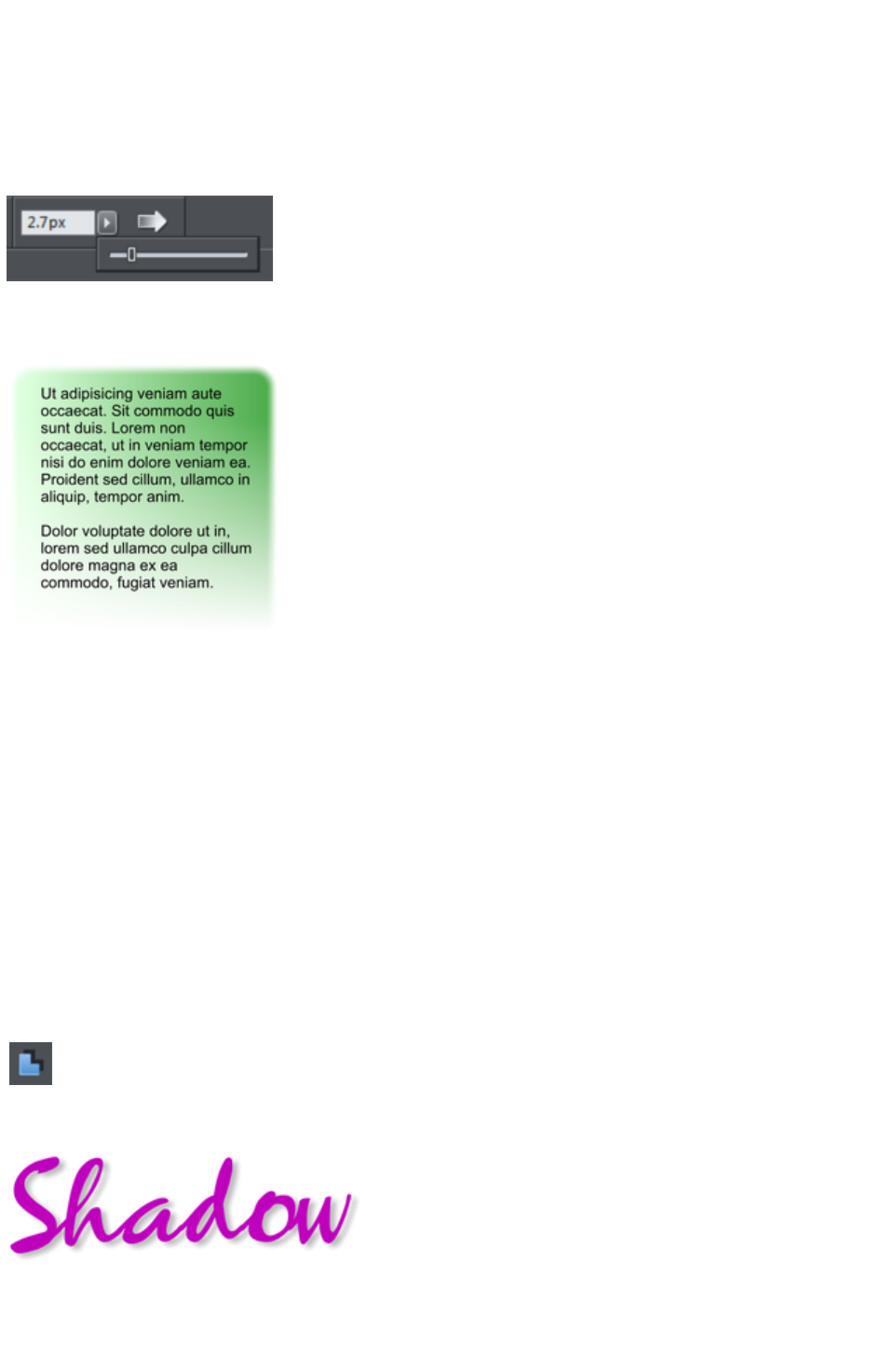
Feather
This is a graphical term for blending the edges of objects. Web Designer Premium provides a feather
control that enables any object, graphics, text or photo to be feathered - giving it a blurred edge that
blends with the background. The Feather control is not a tool on the left, but one of the controls on the
top bar. Try it on your rectangle shape. Select the shape and then click this Feather control on the right of
the top bar.
The shadow below the ball drawing above has a feathered edge. Combining all of these controls you can
very quickly produce amazing layered graphics for your website, all directly in Web Designer Premium
without needing any other graphics tools.
This is an example of a rounded rectangle
with grad color, grad transparency and
feathered edges with some text placed on
top of it.
This has a graduated color fill, light to dark
green going left to right. It also has a vertical
graduated transparency fading from top to
bottom. The feather gives it a soft edge. It
takes a couple of seconds to create such an
image, and it's automatically converted to the
right graphic when you save your web page.
In Web Designer Premium you can create
any type of graphic, photo, text with
transparency, and it 'just works'. It can also
import almost all graphics files, from Adobe
EPS, to Photoshop PSD, Camera RAW and
more.
Technical note
: Web Designer Premium automatically converts any vector graphics into PNG images, an alpha-channel
PNG if transparency is used. It uses CSS layers to replicate the object layer stacking in Web Designer
Premium. This is compatible with all modern web browsers.
Shadow Tool
A very popular graphics effect is to create a soft drop- shadow under a graphic or some text. This
serves to lift the object away from the background.
The Shadow Tool lets you add a soft shadow to any object, text,
graphics or photo. Select the Shadow Tool
and just drag on the object. You can adjust the shadow blur and
transparency using InfoBar controls.
Some text with a soft shadow.
To adjust the position of an existing shadow, go into the Shadow Tool
and drag on the shadow
Page 178
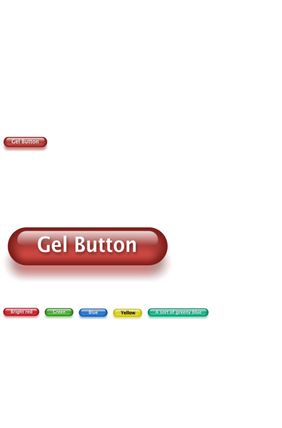
Advanced note
: Note that because a shadow itself is semi- transparent (part of the objects below show through the
shadow) objects with shadows are converted to PNG images when saved on a web page (it's the only
image format that supports transparency). PNG images can be quite large, especially for photos. It's
perfect for images such the above shadow graphic.
You may find you can convert the whole graphic to a JPEG to save space. Whether this works or not
depends on what's behind the shadow. If it's a plain or static non-text background you can probably use
a JPEG which is a much smaller file size (quicker website download). To force an object to be a JPEG
use the Image tab of the Web Properties dialog.
JPEG images cannot have semi-transparent parts, so when creating a JPEG of a semi-transparent object
Web Designer Premium includes the background (what's behind the semi-transparent part) as part of the
JPEG image, but because of the pixel perfect positioning on the web page you can't tell this. This doesn't
work if the shadow or semi-transparent object is placed over some text, as the text will be included as
part of the graphic.
Example Graphics
This is a perfect example of what can be created in Web Designer Premium. This button combines many
of the features described above - it's drawn by combining just a few feathered shapes, and using
graduated transparency (the white reflection effect). The text has a slight soft shadow and the button has
a glow shadow. The whole thing is grouped. (You do not need to draw this button as it's provided in the
Button category of the Designs Gallery
).
The huge benefit of vector graphics, compared to 'bitmap' graphics created in pixel editing software such
Photoshop, is that you can re-color, edit, rotate, and resize the button with no loss of quality. Make it
huge and it remains pin sharp:
On top of that you can re-color using the Named Color system, and it will even stretch as required -
everything in Web Designer Premium remains non-destructive (which means you can always edit it, with
no loss of quality).
Something that would take skill and time to produce using alternative graphics software, is trivially easy in
Web Designer Premium.
Page 179
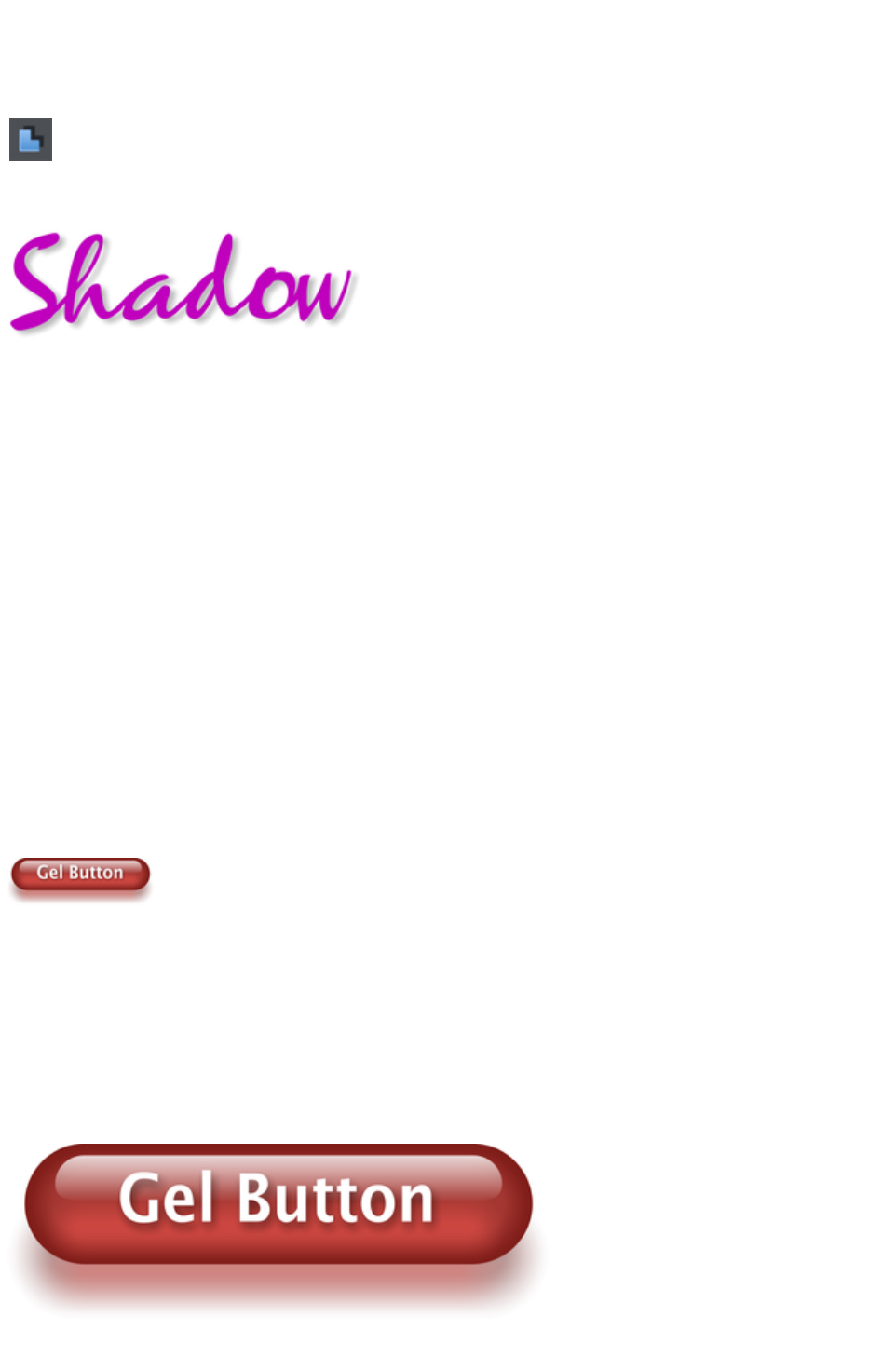
Shadow Tool
A very popular graphics effect is to create a soft drop- shadow under a graphic or some text. This
serves to lift the object away from the background.
The Shadow Tool lets you add a soft shadow to any object, text,
graphics or photo. Select the Shadow Tool
and just drag on the object. You can adjust the shadow blur and
transparency using InfoBar controls.
Some text with a soft shadow.
To adjust the position of an existing shadow, go into the Shadow Tool
and drag on the shadow
Advanced note
: Note that because a shadow itself is semi- transparent (part of the objects below show through the
shadow) objects with shadows are converted to PNG images when saved on a web page (it's the only
image format that supports transparency). PNG images can be quite large, especially for photos. It's
perfect for images such the above shadow graphic.
You may find you can convert the whole graphic to a JPEG to save space. Whether this works or not
depends on what's behind the shadow. If it's a plain or static non-text background you can probably use
a JPEG which is a much smaller file size (quicker website download). To force an object to be a JPEG
use the Image tab of the Web Properties dialog.
JPEG images cannot have semi-transparent parts, so when creating a JPEG of a semi-transparent object
Web Designer Premium includes the background (what's behind the semi-transparent part) as part of the
JPEG image, but because of the pixel perfect positioning on the web page you can't tell this. This doesn't
work if the shadow or semi-transparent object is placed over some text, as the text will be included as
part of the graphic.
Example Graphics
This is a perfect example of what can be created in Web Designer Premium. This button combines many
of the features described above - it's drawn by combining just a few feathered shapes, and using
graduated transparency (the white reflection effect). The text has a slight soft shadow and the button has
a glow shadow. The whole thing is grouped. (You do not need to draw this button as it's provided in the
Button category of the Designs Gallery
).
The huge benefit of vector graphics, compared to 'bitmap' graphics created in pixel editing software such
Photoshop, is that you can re-color, edit, rotate, and resize the button with no loss of quality. Make it
huge and it remains pin sharp:
On top of that you can re-color using the Named Color system, and it will even stretch as required -
Page 180

everything in Web Designer Premium remains non-destructive (which means you can always edit it, with
no loss of quality).
Something that would take skill and time to produce using alternative graphics software, is trivially easy in
Web Designer Premium.
Page 181

Example Graphics
This is a perfect example of what can be created in Web Designer Premium. This button combines many
of the features described above - it's drawn by combining just a few feathered shapes, and using
graduated transparency (the white reflection effect). The text has a slight soft shadow and the button has
a glow shadow. The whole thing is grouped. (You do not need to draw this button as it's provided in the
Button category of the Designs Gallery
).
The huge benefit of vector graphics, compared to 'bitmap' graphics created in pixel editing software such
Photoshop, is that you can re-color, edit, rotate, and resize the button with no loss of quality. Make it
huge and it remains pin sharp:
On top of that you can re-color using the Named Color system, and it will even stretch as required -
everything in Web Designer Premium remains non-destructive (which means you can always edit it, with
no loss of quality).
Something that would take skill and time to produce using alternative graphics software, is trivially easy in
Web Designer Premium.
Page 182

Right-click menus
When you right-click any object in the Xara Web Designer 7 Premium workspace, a drop-down menu
lists useful operations that are relevant to the object clicked on. For example, if you right-click a rectangle
you've drawn previously, the drop-down menu allows you to perform actions only relevant to a
rectangle.
If you right-click a photo, however, some of the menu options that appear apply only to photos, while
others are similar to the actions you can perform on a rectangle. The object-specific operations are listed
towards the top of the right-click menu's list, e.g., in the case of a rectangle the first three actions above
apply only to rectangles.
You can also right click both the page and pasteboard to see a menu of page- and pasteboard-related
operations you can apply.
If you select more than one object and right-click, the menu lists actions specific to multiple objects, such
as group, align and combine, as well as the common operations such as cut, copy and delete. Similarly if
you right-click objects that you have previously grouped, actions specific to a group are displayed.
It's recommended that you right-click any object or multiple objects in the workspace to access the menu
specific to those objects. Once you've done this a few times you will know which actions you can quickly
perform with right-click menus.
Page 183
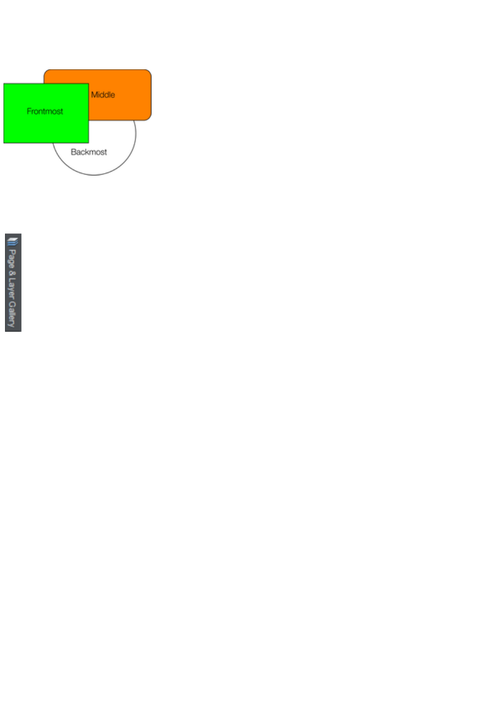
Layers, Mouseover (Rollover) & Pop-ups
As mentioned earlier all objects have a stacking order on the page - from the backmost to the frontmost
item.
These objects are stacked over each other.
In addition, all items can be placed into named layers. Each layer can have any number of objects, and
has the ability to be turned on or off. When the layer is turned off all objects on that layer become
invisible.
The layers are controlled from the Page & Layer Gallery
in the Galleries bar.
In Web Designer Premium layers are used to provide mouseover (sometimes called rollover) features on
your website. These include highlighting buttons (they highlight when you move the mouse over them) and
also other pop-up effects such as text panels containing a detailed product description.
You can also apply a transition to a layer, so that it appears on your web page in an animated way.
Mouseover Effects
There are two types of mouseover effect you can control. Firstly the one used by mouseover buttons,
where any object with a web address can display an overlapping graphic object that appears on a layer
called MouseOver
. See below for more detail.
There is a more powerful mouseover ability where you can make the contents of any layer appear as
your mouseover, or click any object on your page. This pop-up layer can contain text, graphics, photos
or any combination of these things. More below.
The MouseOff and MouseOver Layers
All the main objects on your website are placed on the bottom layer, usually called MouseOff. Buttons
that highlight when you move the mouse over them on the web page have an alternative graphic on the
layer called MouseOver
.
Page 184
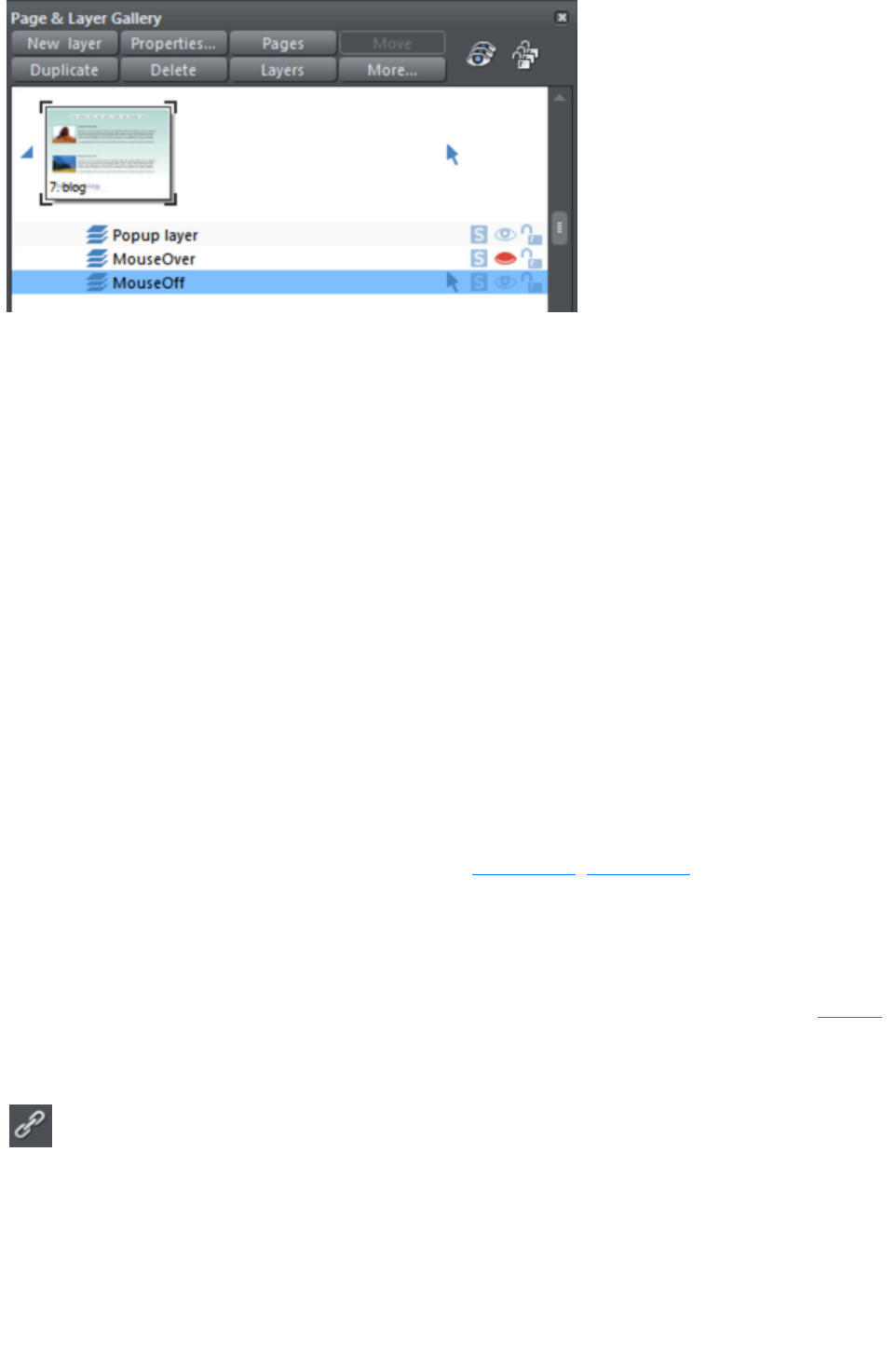
If you open the Page & Layer Gallery
you can show or hide any layer by checking or un-checking the visibility icon (the eye symbol). This is a
way of showing what your MouseOver elements will look like on your page.
The current layer is always highlighted in the Page & Layer Gallery - the MouseOff layer in the above
diagram - and this is the layer that all new objects are drawn on. To place objects on any other layers
just click the required layer in the Page & Layer Gallery
, ensure the eye and the lock icon are open for that layer.
Note
: The MouseOver layer must always be above, that is on top of, the MouseOff layer, as shown in the
above example.
To edit the objects on a layer both the 'eye' and 'lock' icons have to be open - this means you can see
and edit the layer (as shown above in the MouseOff layer).
Mouseover (Rollover) Buttons
Almost all the ready-made buttons from the Designs Gallery
have a mouseover effect in Web Designer Premium. These are created by having two versions of each
button, the main one on the MouseOff layer and a 'highlight' one on the MouseOver layer.
Normally you do not need to know or care about this because both buttons behave as one - the changes
you make to one, such as editing the label text, are reflected on the other version. If you move, drag or
resize a button on the MouseOff layer, the other version on the MouseOver layer will change as well,
even if you can't see it. This is done using Soft Groups (Soft Groups, Soft Groups
).
Creating Your Own Mouseover Buttons
You can create your own mouseover buttons from scratch by drawing the necessary elements from
rectangles, text, etc. Just draw the main parts of the button on the MouseOff layer (remember to group it
) and place the corresponding 'highlight' version on the MouseOver layer. As long as the MouseOff
version has a web address link, then the MouseOver version will automatically be displayed as you move
the mouse over it on the web page. (The MouseOver layer must be on top of the MouseOff layer).
In other words, you give the main object a web address using the link
option, and then select the MouseOver Layer in the Page & Layer
Gallery
, and place the required mouseover versions of your button on this layer
so it overlaps the linked object.
Technical note:
Any graphic object on the MouseOver layer will be displayed as long as at least 50% overlaps with the
object on the MouseOff layer. The two versions of mouseover buttons are kept in sync by using the Soft
Groups feature. When you select the button on one layer, it automatically selects the Soft Grouped
Page 185

version on the other layer, even if the layer is switched off. When you edit the text of the button on one
layer, it's automatically synced with the other version of the button.
To ensure the text on both the Off and Over states changes when you edit either, Soft Group the buttons
on both layers. To do this you will need to enable both layers in the Page & Layer Gallery, and lasso
select around both buttons. The status line should tell you if you have everything selected. Select
"Arrange" > "Apply Soft Group"
. Now when you edit the text on the Off layer it will also change on the over layer, even if it's hidden.
(Note this only works if the Off and Over text are the same to start with, and relies on the objects being
Soft Grouped).
Once you have a working button, you can easily turn it into a navigation bar. Select the button (along with
its MouseOver state if it has one) and then choose "Arrange" > "Create navigation bar". The
navigation bar dialog appears allowing you to configure your bar. See the Navigation Bar chapter
for more information on this, including how to have different first and last buttons in your bar.
Layer ordering in website documents
If your website document has mouseover effects, popup layers and perhaps even mouseover effects on
those popup layers, there are some important rules you need to follow in terms of how you order the
layers in your document. If you don't follow these ordering rules, you may find that some of the effects
don't work.
Considering the layers in turn from background to foreground (which is working upwards in the Page &
Layer Gallery
), first you must have all the static layers. These are layers which are always visible and are not used as
popups. In most designs there will only be one ? the "MouseOff" layer. But some designs may have
several, in which case they must be the first layers in the layer stack.
Next comes the MouseOver layer, if there are mouseover effects on the static layer(s). This contains the
mouseover states for all your mouseover buttons. This must be followed by the "MouseDown" layer, if
you have mousedown effects on the static layer(s).
Next you may have a popup layer. If the objects on this popup layer have mouseover effects, then the
next layer following the popup layer must be the layer holding those effects. It must have a name that
begins with "MouseOver", E.g. "MouseOverPopup1". And then if the popup layer also has mousedown
effects, a layer whose name begins with "MouseDown" must follow containing those effects.
Then you can have another popup layer, followed again by any mouseover and mousedown layers for
that popup layer. And so on - you can have as many popup layers as you like.
So to summarise the above, in general the layer ordering needs to be as indicated by the following list,
which is shown in the same order as displayed by the Page & Layer Gallery
(foreground to background). All layers are optional and the layer names can be anything you like, except
for the characters shown in Bold, which identify the special mouseover and mousedown layers.
MouseDown popup n
MouseOver popup n
PopUp layer n
...
MouseDown popup 1
MouseOver popup 1
Popup layer 1
MouseDown
MouseOver
Static layer n
...
Static layer 2
MouseOff
Page 186

Note that you only need to be concerned with these ordering rules if you are building complex pages with
multiple popup effects! If you are just using the template designs provided in the Designs Gallery
, you should not have any problems with layer ordering on your website.
Moving Objects Between Layers
There are several ways to move objects between layers. First select the object or objects you want to
move, then;
Cut the object ("Ctrl + X" or right click and Cut). Ensure the target layer is the current layer
(shown with , click the layer if it's not) and then right click and choose Paste or Paste in Place
. Note that if you cut or copy multiple items that are on different layers, the layer structure is
preserved when you paste. Items are pasted to the same layer they were copied/cut from,
instead of being pasted to the current layer. If you want to paste all such items to the current
layer, ignoring the layer structure, use the Paste in current layer option instead. If you want to
retain layer structure, choose Paste in place in current layer. These paste options are also in
the clipboard fly-out bar on the top bar, as well as the Edit menu.
Right click and choose Arrange then Move to layer in front / Move to layer behind to shift
the selected objects one layer up or down.
Ensure the target layer is selected as current, then find the selected item in the Page & Layer
Gallery (click the Locate button), right click and select Move to Current Layer.
Applying transitions to popup layers
You can apply a transition to a popup layer to control how the layer appears, whether it's triggered by a
mouse-over action or a click. So for example if you apply a fade transition, when the popup layer
appears it will fade in instead of appearing instantly.
1. Click the layer in the Page & Layer Gallery and click the Properties button at the top of the
gallery.
2. Click the Web transition tab of the Layer properties dialog.
3. Choose an effect from the Transition effect drop-down list and move the slider to set a speed
for the transition in seconds.
4. Click Apply.
Note:
There are fewer transition effects available for layers compared to links and pages.
Page 187

Pop-up Layers
A more powerful alternative allows you to display the contents of any layer as a result of mousing over,
or clicking, any object. This can be used for a range of different pop-up effects such as pop-up photos,
menus or detailed object descriptions.
To do this, place all the objects you want to pop-up on a new layer (in the Page & Layer Gallery
click New while you have a layer selected - don't use the MouseOver layer), then set the Mouseover
property (Mouse-over
tab of the Web Properties dialog) of the original object to trigger the display of this layer when you
mouseover any other object. For example you can make a pop-up, like this, appear as you mouse over
some text:
Here are the steps to create a pop-up text block like this:
1. Click New in the Page & Layer Gallery, while you have a layer selected, to create a new
layer.
2. Draw a rounded rectangle with the Rectangle Tool, click a (pale) color patch on the Color
Line to give it a fill color. For good measure give it a soft shadow (select the Shadow Tool and
just drag on the rectangle).
3. Create a block of text on top of your rectangle. Select the Text Tool and drag diagonally across
the rectangle. Type your text. You probably want to hide the pop-up layer now, so just un-check
the 'eye' checkbox of your new layer.
4. Back on the base (MouseOff) layer (click it in the Page & Layer Gallery to set this as current
layer) now select the text you want to trigger the pop-up, using the usual method (in the Text
tool). Then open the Web Properties dialog (right click and choose Web Properties or press
"Ctrl + Shift + W") and on the Mouse-over tab select the new layer from the Show pop-up
layer drop-down menu. Click OK.
5. Preview and test your mouseover effect.
Page 188

If you want the pop-up to only appear when you click, then select the same option on the Link
tab of the same Web Properties dialog instead.
Note:
The mouseover layer appears and disappears as you move the mouse pointer on and off the triggering
object. If you use a click method to display the layer (from the Link dialog), then the layer is revealed by
a click on the object, and is hidden when you click anywhere else on the page.
Pop-up Photos
There is a second, easier, way of showing enlarged photos from thumbnails, that does not involve
creating new layers. See the Photo section
earlier in this chapter. This method is better for when you have large pop-up photos as the pop-up
photos are not loaded until the thumbnail image is clicked.
Page 189
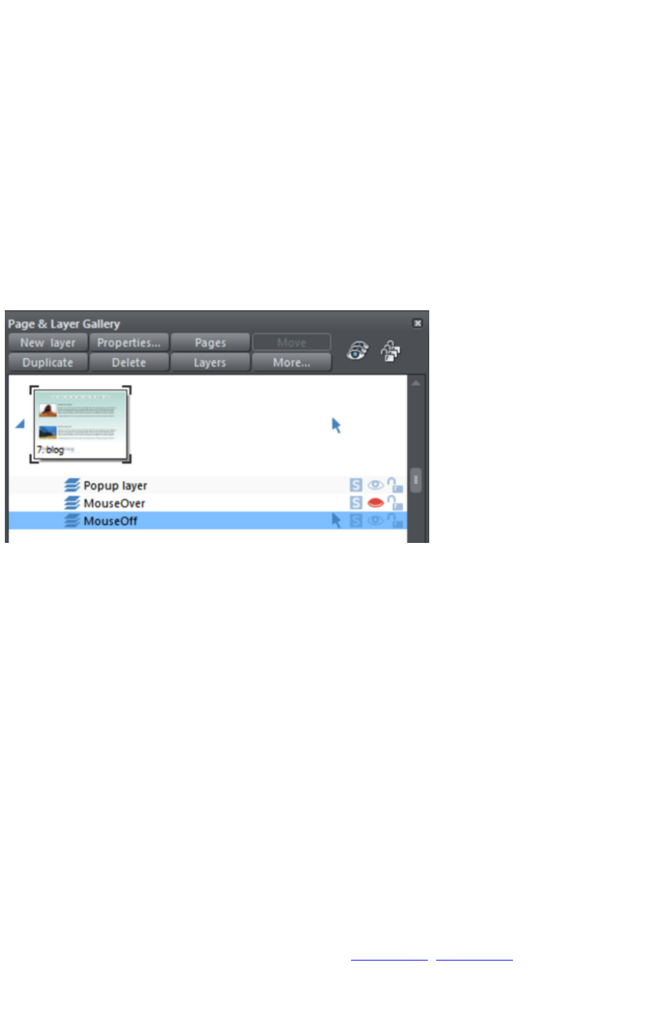
Mouseover Effects
There are two types of mouseover effect you can control. Firstly the one used by mouseover buttons,
where any object with a web address can display an overlapping graphic object that appears on a layer
called MouseOver
. See below for more detail.
There is a more powerful mouseover ability where you can make the contents of any layer appear as
your mouseover, or click any object on your page. This pop-up layer can contain text, graphics, photos
or any combination of these things. More below.
The MouseOff and MouseOver Layers
All the main objects on your website are placed on the bottom layer, usually called MouseOff. Buttons
that highlight when you move the mouse over them on the web page have an alternative graphic on the
layer called MouseOver
.
If you open the Page & Layer Gallery
you can show or hide any layer by checking or un-checking the visibility icon (the eye symbol). This is a
way of showing what your MouseOver elements will look like on your page.
The current layer is always highlighted in the Page & Layer Gallery - the MouseOff layer in the above
diagram - and this is the layer that all new objects are drawn on. To place objects on any other layers
just click the required layer in the Page & Layer Gallery
, ensure the eye and the lock icon are open for that layer.
Note
: The MouseOver layer must always be above, that is on top of, the MouseOff layer, as shown in the
above example.
To edit the objects on a layer both the 'eye' and 'lock' icons have to be open - this means you can see
and edit the layer (as shown above in the MouseOff layer).
Mouseover (Rollover) Buttons
Almost all the ready-made buttons from the Designs Gallery
have a mouseover effect in Web Designer Premium. These are created by having two versions of each
button, the main one on the MouseOff layer and a 'highlight' one on the MouseOver layer.
Normally you do not need to know or care about this because both buttons behave as one - the changes
you make to one, such as editing the label text, are reflected on the other version. If you move, drag or
resize a button on the MouseOff layer, the other version on the MouseOver layer will change as well,
even if you can't see it. This is done using Soft Groups (Soft Groups, Soft Groups
).
Page 190
Creating Your Own Mouseover Buttons
You can create your own mouseover buttons from scratch by drawing the necessary elements from
rectangles, text, etc. Just draw the main parts of the button on the MouseOff layer (remember to group it
) and place the corresponding 'highlight' version on the MouseOver layer. As long as the MouseOff
version has a web address link, then the MouseOver version will automatically be displayed as you move
the mouse over it on the web page. (The MouseOver layer must be on top of the MouseOff layer).
In other words, you give the main object a web address using the link
option, and then select the MouseOver Layer in the Page & Layer
Gallery
, and place the required mouseover versions of your button on this layer
so it overlaps the linked object.
Technical note:
Any graphic object on the MouseOver layer will be displayed as long as at least 50% overlaps with the
object on the MouseOff layer. The two versions of mouseover buttons are kept in sync by using the Soft
Groups feature. When you select the button on one layer, it automatically selects the Soft Grouped
version on the other layer, even if the layer is switched off. When you edit the text of the button on one
layer, it's automatically synced with the other version of the button.
To ensure the text on both the Off and Over states changes when you edit either, Soft Group the buttons
on both layers. To do this you will need to enable both layers in the Page & Layer Gallery, and lasso
select around both buttons. The status line should tell you if you have everything selected. Select
"Arrange" > "Apply Soft Group"
. Now when you edit the text on the Off layer it will also change on the over layer, even if it's hidden.
(Note this only works if the Off and Over text are the same to start with, and relies on the objects being
Soft Grouped).
Once you have a working button, you can easily turn it into a navigation bar. Select the button (along with
its MouseOver state if it has one) and then choose "Arrange" > "Create navigation bar". The
navigation bar dialog appears allowing you to configure your bar. See the Navigation Bar chapter
for more information on this, including how to have different first and last buttons in your bar.
Layer ordering in website documents
If your website document has mouseover effects, popup layers and perhaps even mouseover effects on
those popup layers, there are some important rules you need to follow in terms of how you order the
layers in your document. If you don't follow these ordering rules, you may find that some of the effects
don't work.
Considering the layers in turn from background to foreground (which is working upwards in the Page &
Layer Gallery
), first you must have all the static layers. These are layers which are always visible and are not used as
popups. In most designs there will only be one ? the "MouseOff" layer. But some designs may have
several, in which case they must be the first layers in the layer stack.
Next comes the MouseOver layer, if there are mouseover effects on the static layer(s). This contains the
mouseover states for all your mouseover buttons. This must be followed by the "MouseDown" layer, if
you have mousedown effects on the static layer(s).
Next you may have a popup layer. If the objects on this popup layer have mouseover effects, then the
next layer following the popup layer must be the layer holding those effects. It must have a name that
begins with "MouseOver", E.g. "MouseOverPopup1". And then if the popup layer also has mousedown
effects, a layer whose name begins with "MouseDown" must follow containing those effects.
Then you can have another popup layer, followed again by any mouseover and mousedown layers for
that popup layer. And so on - you can have as many popup layers as you like.
So to summarise the above, in general the layer ordering needs to be as indicated by the following list,
which is shown in the same order as displayed by the Page & Layer Gallery
Page 191

(foreground to background). All layers are optional and the layer names can be anything you like, except
for the characters shown in Bold, which identify the special mouseover and mousedown layers.
MouseDown popup n
MouseOver popup n
PopUp layer n
...
MouseDown popup 1
MouseOver popup 1
Popup layer 1
MouseDown
MouseOver
Static layer n
...
Static layer 2
MouseOff
Note that you only need to be concerned with these ordering rules if you are building complex pages with
multiple popup effects! If you are just using the template designs provided in the Designs Gallery
, you should not have any problems with layer ordering on your website.
Moving Objects Between Layers
There are several ways to move objects between layers. First select the object or objects you want to
move, then;
Cut the object ("Ctrl + X" or right click and Cut). Ensure the target layer is the current layer
(shown with , click the layer if it's not) and then right click and choose Paste or Paste in Place
. Note that if you cut or copy multiple items that are on different layers, the layer structure is
preserved when you paste. Items are pasted to the same layer they were copied/cut from,
instead of being pasted to the current layer. If you want to paste all such items to the current
layer, ignoring the layer structure, use the Paste in current layer option instead. If you want to
retain layer structure, choose Paste in place in current layer. These paste options are also in
the clipboard fly-out bar on the top bar, as well as the Edit menu.
Right click and choose Arrange then Move to layer in front / Move to layer behind to shift
the selected objects one layer up or down.
Ensure the target layer is selected as current, then find the selected item in the Page & Layer
Gallery (click the Locate button), right click and select Move to Current Layer.
Applying transitions to popup layers
You can apply a transition to a popup layer to control how the layer appears, whether it's triggered by a
mouse-over action or a click. So for example if you apply a fade transition, when the popup layer
appears it will fade in instead of appearing instantly.
1. Click the layer in the Page & Layer Gallery and click the Properties button at the top of the
gallery.
2. Click the Web transition tab of the Layer properties dialog.
3. Choose an effect from the Transition effect drop-down list and move the slider to set a speed
for the transition in seconds.
4. Click Apply.
Note:
There are fewer transition effects available for layers compared to links and pages.
Page 192
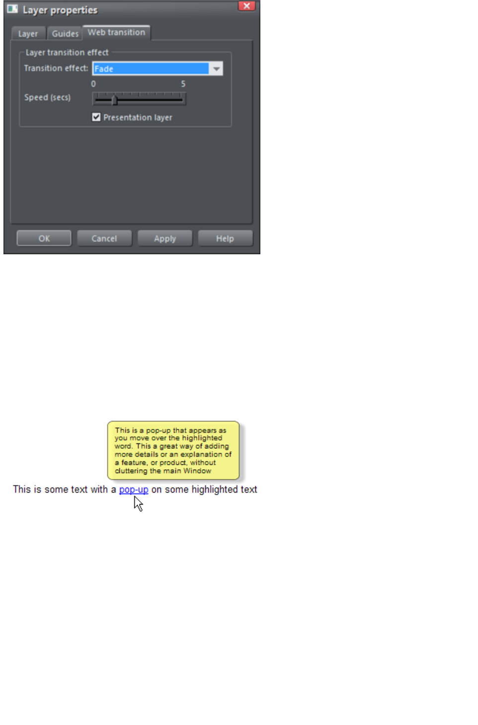
Pop-up Layers
A more powerful alternative allows you to display the contents of any layer as a result of mousing over,
or clicking, any object. This can be used for a range of different pop-up effects such as pop-up photos,
menus or detailed object descriptions.
To do this, place all the objects you want to pop-up on a new layer (in the Page & Layer Gallery
click New while you have a layer selected - don't use the MouseOver layer), then set the Mouseover
property (Mouse-over
tab of the Web Properties dialog) of the original object to trigger the display of this layer when you
mouseover any other object. For example you can make a pop-up, like this, appear as you mouse over
some text:
Here are the steps to create a pop-up text block like this:
1. Click New in the Page & Layer Gallery, while you have a layer selected, to create a new
layer.
2. Draw a rounded rectangle with the Rectangle Tool, click a (pale) color patch on the Color
Line to give it a fill color. For good measure give it a soft shadow (select the Shadow Tool and
just drag on the rectangle).
3. Create a block of text on top of your rectangle. Select the Text Tool and drag diagonally across
the rectangle. Type your text. You probably want to hide the pop-up layer now, so just un-check
the 'eye' checkbox of your new layer.
4. Back on the base (MouseOff) layer (click it in the Page & Layer Gallery to set this as current
layer) now select the text you want to trigger the pop-up, using the usual method (in the Text
tool). Then open the Web Properties dialog (right click and choose Web Properties or press
"Ctrl + Shift + W") and on the Mouse-over tab select the new layer from the Show pop-up
layer drop-down menu. Click OK.
5. Preview and test your mouseover effect.
Page 193

If you want the pop-up to only appear when you click, then select the same option on the Link
tab of the same Web Properties dialog instead.
Note:
The mouseover layer appears and disappears as you move the mouse pointer on and off the triggering
object. If you use a click method to display the layer (from the Link dialog), then the layer is revealed by
a click on the object, and is hidden when you click anywhere else on the page.
Pop-up Photos
There is a second, easier, way of showing enlarged photos from thumbnails, that does not involve
creating new layers. See the Photo section
earlier in this chapter. This method is better for when you have large pop-up photos as the pop-up
photos are not loaded until the thumbnail image is clicked.
Page 194
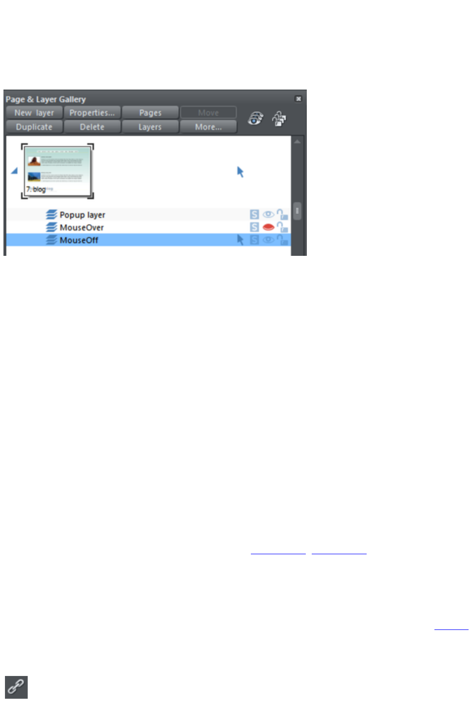
The MouseOff and MouseOver Layers
All the main objects on your website are placed on the bottom layer, usually called MouseOff. Buttons
that highlight when you move the mouse over them on the web page have an alternative graphic on the
layer called MouseOver
.
If you open the Page & Layer Gallery
you can show or hide any layer by checking or un-checking the visibility icon (the eye symbol). This is a
way of showing what your MouseOver elements will look like on your page.
The current layer is always highlighted in the Page & Layer Gallery - the MouseOff layer in the above
diagram - and this is the layer that all new objects are drawn on. To place objects on any other layers
just click the required layer in the Page & Layer Gallery
, ensure the eye and the lock icon are open for that layer.
Note
: The MouseOver layer must always be above, that is on top of, the MouseOff layer, as shown in the
above example.
To edit the objects on a layer both the 'eye' and 'lock' icons have to be open - this means you can see
and edit the layer (as shown above in the MouseOff layer).
Mouseover (Rollover) Buttons
Almost all the ready-made buttons from the Designs Gallery
have a mouseover effect in Web Designer Premium. These are created by having two versions of each
button, the main one on the MouseOff layer and a 'highlight' one on the MouseOver layer.
Normally you do not need to know or care about this because both buttons behave as one - the changes
you make to one, such as editing the label text, are reflected on the other version. If you move, drag or
resize a button on the MouseOff layer, the other version on the MouseOver layer will change as well,
even if you can't see it. This is done using Soft Groups (Soft Groups, Soft Groups
).
Creating Your Own Mouseover Buttons
You can create your own mouseover buttons from scratch by drawing the necessary elements from
rectangles, text, etc. Just draw the main parts of the button on the MouseOff layer (remember to group it
) and place the corresponding 'highlight' version on the MouseOver layer. As long as the MouseOff
version has a web address link, then the MouseOver version will automatically be displayed as you move
the mouse over it on the web page. (The MouseOver layer must be on top of the MouseOff layer).
In other words, you give the main object a web address using the link
option, and then select the MouseOver Layer in the Page & Layer
Gallery
Page 195

, and place the required mouseover versions of your button on this layer
so it overlaps the linked object.
Technical note:
Any graphic object on the MouseOver layer will be displayed as long as at least 50% overlaps with the
object on the MouseOff layer. The two versions of mouseover buttons are kept in sync by using the Soft
Groups feature. When you select the button on one layer, it automatically selects the Soft Grouped
version on the other layer, even if the layer is switched off. When you edit the text of the button on one
layer, it's automatically synced with the other version of the button.
To ensure the text on both the Off and Over states changes when you edit either, Soft Group the buttons
on both layers. To do this you will need to enable both layers in the Page & Layer Gallery, and lasso
select around both buttons. The status line should tell you if you have everything selected. Select
"Arrange" > "Apply Soft Group"
. Now when you edit the text on the Off layer it will also change on the over layer, even if it's hidden.
(Note this only works if the Off and Over text are the same to start with, and relies on the objects being
Soft Grouped).
Once you have a working button, you can easily turn it into a navigation bar. Select the button (along with
its MouseOver state if it has one) and then choose "Arrange" > "Create navigation bar". The
navigation bar dialog appears allowing you to configure your bar. See the Navigation Bar chapter
for more information on this, including how to have different first and last buttons in your bar.
Layer ordering in website documents
If your website document has mouseover effects, popup layers and perhaps even mouseover effects on
those popup layers, there are some important rules you need to follow in terms of how you order the
layers in your document. If you don't follow these ordering rules, you may find that some of the effects
don't work.
Considering the layers in turn from background to foreground (which is working upwards in the Page &
Layer Gallery
), first you must have all the static layers. These are layers which are always visible and are not used as
popups. In most designs there will only be one ? the "MouseOff" layer. But some designs may have
several, in which case they must be the first layers in the layer stack.
Next comes the MouseOver layer, if there are mouseover effects on the static layer(s). This contains the
mouseover states for all your mouseover buttons. This must be followed by the "MouseDown" layer, if
you have mousedown effects on the static layer(s).
Next you may have a popup layer. If the objects on this popup layer have mouseover effects, then the
next layer following the popup layer must be the layer holding those effects. It must have a name that
begins with "MouseOver", E.g. "MouseOverPopup1". And then if the popup layer also has mousedown
effects, a layer whose name begins with "MouseDown" must follow containing those effects.
Then you can have another popup layer, followed again by any mouseover and mousedown layers for
that popup layer. And so on - you can have as many popup layers as you like.
So to summarise the above, in general the layer ordering needs to be as indicated by the following list,
which is shown in the same order as displayed by the Page & Layer Gallery
(foreground to background). All layers are optional and the layer names can be anything you like, except
for the characters shown in Bold, which identify the special mouseover and mousedown layers.
MouseDown popup n
MouseOver popup n
PopUp layer n
...
MouseDown popup 1
MouseOver popup 1
Popup layer 1
Page 196

MouseDown
MouseOver
Static layer n
...
Static layer 2
MouseOff
Note that you only need to be concerned with these ordering rules if you are building complex pages with
multiple popup effects! If you are just using the template designs provided in the Designs Gallery
, you should not have any problems with layer ordering on your website.
Moving Objects Between Layers
There are several ways to move objects between layers. First select the object or objects you want to
move, then;
Cut the object ("Ctrl + X" or right click and Cut). Ensure the target layer is the current layer
(shown with , click the layer if it's not) and then right click and choose Paste or Paste in Place
. Note that if you cut or copy multiple items that are on different layers, the layer structure is
preserved when you paste. Items are pasted to the same layer they were copied/cut from,
instead of being pasted to the current layer. If you want to paste all such items to the current
layer, ignoring the layer structure, use the Paste in current layer option instead. If you want to
retain layer structure, choose Paste in place in current layer. These paste options are also in
the clipboard fly-out bar on the top bar, as well as the Edit menu.
Right click and choose Arrange then Move to layer in front / Move to layer behind to shift
the selected objects one layer up or down.
Ensure the target layer is selected as current, then find the selected item in the Page & Layer
Gallery (click the Locate button), right click and select Move to Current Layer.
Applying transitions to popup layers
You can apply a transition to a popup layer to control how the layer appears, whether it's triggered by a
mouse-over action or a click. So for example if you apply a fade transition, when the popup layer
appears it will fade in instead of appearing instantly.
1. Click the layer in the Page & Layer Gallery and click the Properties button at the top of the
gallery.
2. Click the Web transition tab of the Layer properties dialog.
3. Choose an effect from the Transition effect drop-down list and move the slider to set a speed
for the transition in seconds.
4. Click Apply.
Note:
There are fewer transition effects available for layers compared to links and pages.
Page 197

Pop-up Layers
A more powerful alternative allows you to display the contents of any layer as a result of mousing over,
or clicking, any object. This can be used for a range of different pop-up effects such as pop-up photos,
menus or detailed object descriptions.
To do this, place all the objects you want to pop-up on a new layer (in the Page & Layer Gallery
click New while you have a layer selected - don't use the MouseOver layer), then set the Mouseover
property (Mouse-over
tab of the Web Properties dialog) of the original object to trigger the display of this layer when you
mouseover any other object. For example you can make a pop-up, like this, appear as you mouse over
some text:
Here are the steps to create a pop-up text block like this:
1. Click New in the Page & Layer Gallery, while you have a layer selected, to create a new
layer.
2. Draw a rounded rectangle with the Rectangle Tool, click a (pale) color patch on the Color
Line to give it a fill color. For good measure give it a soft shadow (select the Shadow Tool and
just drag on the rectangle).
3. Create a block of text on top of your rectangle. Select the Text Tool and drag diagonally across
the rectangle. Type your text. You probably want to hide the pop-up layer now, so just un-check
the 'eye' checkbox of your new layer.
4. Back on the base (MouseOff) layer (click it in the Page & Layer Gallery to set this as current
layer) now select the text you want to trigger the pop-up, using the usual method (in the Text
tool). Then open the Web Properties dialog (right click and choose Web Properties or press
"Ctrl + Shift + W") and on the Mouse-over tab select the new layer from the Show pop-up
layer drop-down menu. Click OK.
5. Preview and test your mouseover effect.
Page 198

If you want the pop-up to only appear when you click, then select the same option on the Link
tab of the same Web Properties dialog instead.
Note:
The mouseover layer appears and disappears as you move the mouse pointer on and off the triggering
object. If you use a click method to display the layer (from the Link dialog), then the layer is revealed by
a click on the object, and is hidden when you click anywhere else on the page.
Pop-up Photos
There is a second, easier, way of showing enlarged photos from thumbnails, that does not involve
creating new layers. See the Photo section
earlier in this chapter. This method is better for when you have large pop-up photos as the pop-up
photos are not loaded until the thumbnail image is clicked.
Page 199
Mouseover (Rollover) Buttons
Almost all the ready-made buttons from the Designs Gallery
have a mouseover effect in Web Designer Premium. These are created by having two versions of each
button, the main one on the MouseOff layer and a 'highlight' one on the MouseOver layer.
Normally you do not need to know or care about this because both buttons behave as one - the changes
you make to one, such as editing the label text, are reflected on the other version. If you move, drag or
resize a button on the MouseOff layer, the other version on the MouseOver layer will change as well,
even if you can't see it. This is done using Soft Groups (Soft Groups, Soft Groups
).
Creating Your Own Mouseover Buttons
You can create your own mouseover buttons from scratch by drawing the necessary elements from
rectangles, text, etc. Just draw the main parts of the button on the MouseOff layer (remember to group it
) and place the corresponding 'highlight' version on the MouseOver layer. As long as the MouseOff
version has a web address link, then the MouseOver version will automatically be displayed as you move
the mouse over it on the web page. (The MouseOver layer must be on top of the MouseOff layer).
In other words, you give the main object a web address using the link
option, and then select the MouseOver Layer in the Page & Layer
Gallery
, and place the required mouseover versions of your button on this layer
so it overlaps the linked object.
Technical note:
Any graphic object on the MouseOver layer will be displayed as long as at least 50% overlaps with the
object on the MouseOff layer. The two versions of mouseover buttons are kept in sync by using the Soft
Groups feature. When you select the button on one layer, it automatically selects the Soft Grouped
version on the other layer, even if the layer is switched off. When you edit the text of the button on one
layer, it's automatically synced with the other version of the button.
To ensure the text on both the Off and Over states changes when you edit either, Soft Group the buttons
on both layers. To do this you will need to enable both layers in the Page & Layer Gallery, and lasso
select around both buttons. The status line should tell you if you have everything selected. Select
"Arrange" > "Apply Soft Group"
. Now when you edit the text on the Off layer it will also change on the over layer, even if it's hidden.
(Note this only works if the Off and Over text are the same to start with, and relies on the objects being
Soft Grouped).
Once you have a working button, you can easily turn it into a navigation bar. Select the button (along with
its MouseOver state if it has one) and then choose "Arrange" > "Create navigation bar". The
navigation bar dialog appears allowing you to configure your bar. See the Navigation Bar chapter
for more information on this, including how to have different first and last buttons in your bar.
Layer ordering in website documents
If your website document has mouseover effects, popup layers and perhaps even mouseover effects on
those popup layers, there are some important rules you need to follow in terms of how you order the
layers in your document. If you don't follow these ordering rules, you may find that some of the effects
don't work.
Considering the layers in turn from background to foreground (which is working upwards in the Page &
Layer Gallery
), first you must have all the static layers. These are layers which are always visible and are not used as
popups. In most designs there will only be one ? the "MouseOff" layer. But some designs may have
Page 200

several, in which case they must be the first layers in the layer stack.
Next comes the MouseOver layer, if there are mouseover effects on the static layer(s). This contains the
mouseover states for all your mouseover buttons. This must be followed by the "MouseDown" layer, if
you have mousedown effects on the static layer(s).
Next you may have a popup layer. If the objects on this popup layer have mouseover effects, then the
next layer following the popup layer must be the layer holding those effects. It must have a name that
begins with "MouseOver", E.g. "MouseOverPopup1". And then if the popup layer also has mousedown
effects, a layer whose name begins with "MouseDown" must follow containing those effects.
Then you can have another popup layer, followed again by any mouseover and mousedown layers for
that popup layer. And so on - you can have as many popup layers as you like.
So to summarise the above, in general the layer ordering needs to be as indicated by the following list,
which is shown in the same order as displayed by the Page & Layer Gallery
(foreground to background). All layers are optional and the layer names can be anything you like, except
for the characters shown in Bold, which identify the special mouseover and mousedown layers.
MouseDown popup n
MouseOver popup n
PopUp layer n
...
MouseDown popup 1
MouseOver popup 1
Popup layer 1
MouseDown
MouseOver
Static layer n
...
Static layer 2
MouseOff
Note that you only need to be concerned with these ordering rules if you are building complex pages with
multiple popup effects! If you are just using the template designs provided in the Designs Gallery
, you should not have any problems with layer ordering on your website.
Moving Objects Between Layers
There are several ways to move objects between layers. First select the object or objects you want to
move, then;
Cut the object ("Ctrl + X" or right click and Cut). Ensure the target layer is the current layer
(shown with , click the layer if it's not) and then right click and choose Paste or Paste in Place
. Note that if you cut or copy multiple items that are on different layers, the layer structure is
preserved when you paste. Items are pasted to the same layer they were copied/cut from,
instead of being pasted to the current layer. If you want to paste all such items to the current
layer, ignoring the layer structure, use the Paste in current layer option instead. If you want to
retain layer structure, choose Paste in place in current layer. These paste options are also in
the clipboard fly-out bar on the top bar, as well as the Edit menu.
Right click and choose Arrange then Move to layer in front / Move to layer behind to shift
the selected objects one layer up or down.
Ensure the target layer is selected as current, then find the selected item in the Page & Layer
Gallery (click the Locate button), right click and select Move to Current Layer.
Applying transitions to popup layers
You can apply a transition to a popup layer to control how the layer appears, whether it's triggered by a
Page 201
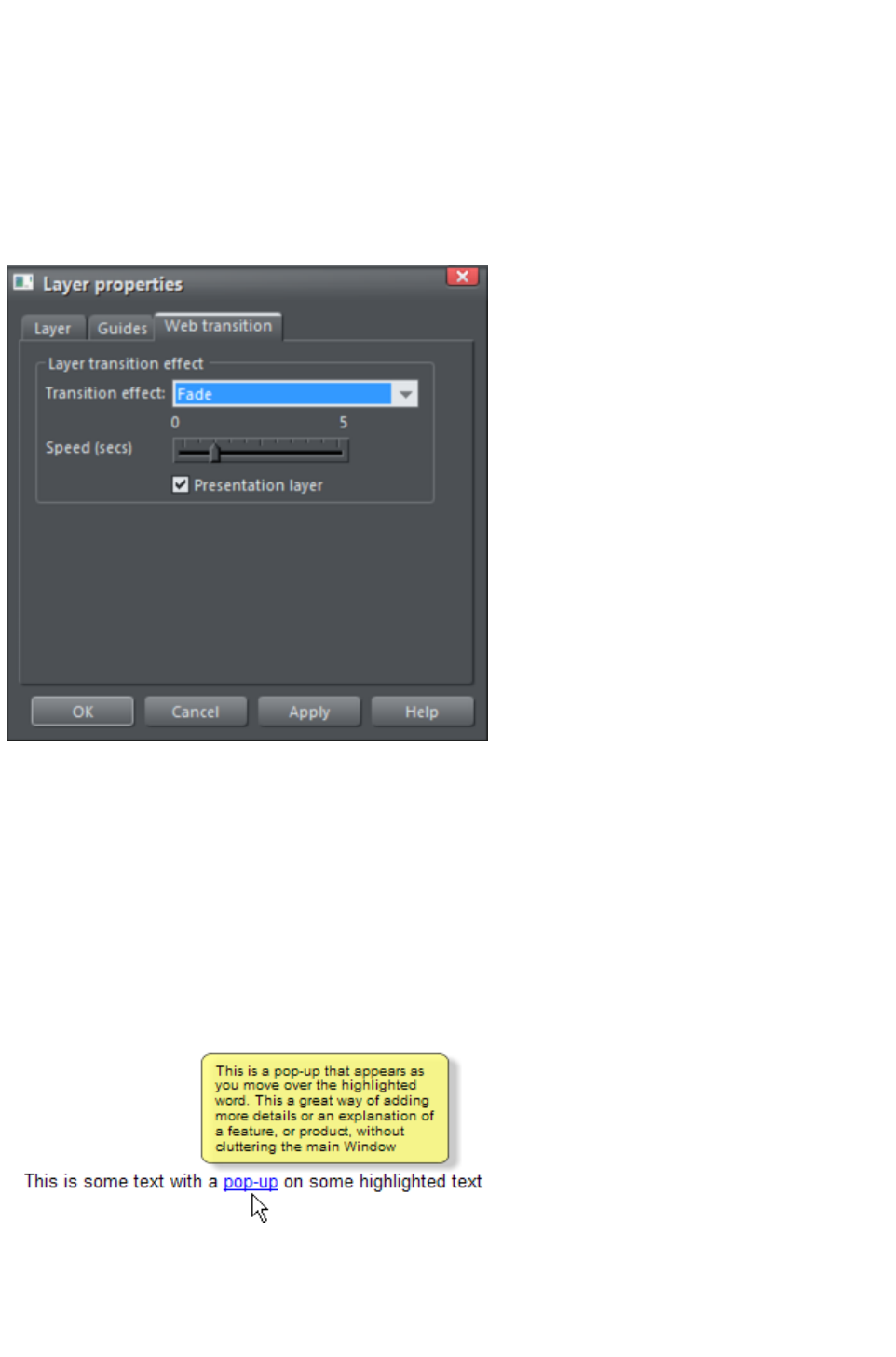
mouse-over action or a click. So for example if you apply a fade transition, when the popup layer
appears it will fade in instead of appearing instantly.
1. Click the layer in the Page & Layer Gallery and click the Properties button at the top of the
gallery.
2. Click the Web transition tab of the Layer properties dialog.
3. Choose an effect from the Transition effect drop-down list and move the slider to set a speed
for the transition in seconds.
4. Click Apply.
Note:
There are fewer transition effects available for layers compared to links and pages.
Pop-up Layers
A more powerful alternative allows you to display the contents of any layer as a result of mousing over,
or clicking, any object. This can be used for a range of different pop-up effects such as pop-up photos,
menus or detailed object descriptions.
To do this, place all the objects you want to pop-up on a new layer (in the Page & Layer Gallery
click New while you have a layer selected - don't use the MouseOver layer), then set the Mouseover
property (Mouse-over
tab of the Web Properties dialog) of the original object to trigger the display of this layer when you
mouseover any other object. For example you can make a pop-up, like this, appear as you mouse over
some text:
Here are the steps to create a pop-up text block like this:
1. Click New in the Page & Layer Gallery, while you have a layer selected, to create a new
layer.
2. Draw a rounded rectangle with the Rectangle Tool, click a (pale) color patch on the Color
Line to give it a fill color. For good measure give it a soft shadow (select the Shadow Tool and
Page 202

just drag on the rectangle).
3. Create a block of text on top of your rectangle. Select the Text Tool and drag diagonally across
the rectangle. Type your text. You probably want to hide the pop-up layer now, so just un-check
the 'eye' checkbox of your new layer.
4. Back on the base (MouseOff) layer (click it in the Page & Layer Gallery to set this as current
layer) now select the text you want to trigger the pop-up, using the usual method (in the Text
tool). Then open the Web Properties dialog (right click and choose Web Properties or press
"Ctrl + Shift + W") and on the Mouse-over tab select the new layer from the Show pop-up
layer drop-down menu. Click OK.
5. Preview and test your mouseover effect.
If you want the pop-up to only appear when you click, then select the same option on the Link
tab of the same Web Properties dialog instead.
Note:
The mouseover layer appears and disappears as you move the mouse pointer on and off the triggering
object. If you use a click method to display the layer (from the Link dialog), then the layer is revealed by
a click on the object, and is hidden when you click anywhere else on the page.
Pop-up Photos
There is a second, easier, way of showing enlarged photos from thumbnails, that does not involve
creating new layers. See the Photo section
earlier in this chapter. This method is better for when you have large pop-up photos as the pop-up
photos are not loaded until the thumbnail image is clicked.
Page 203
Creating Your Own Mouseover Buttons
You can create your own mouseover buttons from scratch by drawing the necessary elements from
rectangles, text, etc. Just draw the main parts of the button on the MouseOff layer (remember to group it
) and place the corresponding 'highlight' version on the MouseOver layer. As long as the MouseOff
version has a web address link, then the MouseOver version will automatically be displayed as you move
the mouse over it on the web page. (The MouseOver layer must be on top of the MouseOff layer).
In other words, you give the main object a web address using the link
option, and then select the MouseOver Layer in the Page & Layer
Gallery
, and place the required mouseover versions of your button on this layer
so it overlaps the linked object.
Technical note:
Any graphic object on the MouseOver layer will be displayed as long as at least 50% overlaps with the
object on the MouseOff layer. The two versions of mouseover buttons are kept in sync by using the Soft
Groups feature. When you select the button on one layer, it automatically selects the Soft Grouped
version on the other layer, even if the layer is switched off. When you edit the text of the button on one
layer, it's automatically synced with the other version of the button.
To ensure the text on both the Off and Over states changes when you edit either, Soft Group the buttons
on both layers. To do this you will need to enable both layers in the Page & Layer Gallery, and lasso
select around both buttons. The status line should tell you if you have everything selected. Select
"Arrange" > "Apply Soft Group"
. Now when you edit the text on the Off layer it will also change on the over layer, even if it's hidden.
(Note this only works if the Off and Over text are the same to start with, and relies on the objects being
Soft Grouped).
Once you have a working button, you can easily turn it into a navigation bar. Select the button (along with
its MouseOver state if it has one) and then choose "Arrange" > "Create navigation bar". The
navigation bar dialog appears allowing you to configure your bar. See the Navigation Bar chapter
for more information on this, including how to have different first and last buttons in your bar.
Layer ordering in website documents
If your website document has mouseover effects, popup layers and perhaps even mouseover effects on
those popup layers, there are some important rules you need to follow in terms of how you order the
layers in your document. If you don't follow these ordering rules, you may find that some of the effects
don't work.
Considering the layers in turn from background to foreground (which is working upwards in the Page &
Layer Gallery
), first you must have all the static layers. These are layers which are always visible and are not used as
popups. In most designs there will only be one ? the "MouseOff" layer. But some designs may have
several, in which case they must be the first layers in the layer stack.
Next comes the MouseOver layer, if there are mouseover effects on the static layer(s). This contains the
mouseover states for all your mouseover buttons. This must be followed by the "MouseDown" layer, if
you have mousedown effects on the static layer(s).
Next you may have a popup layer. If the objects on this popup layer have mouseover effects, then the
next layer following the popup layer must be the layer holding those effects. It must have a name that
begins with "MouseOver", E.g. "MouseOverPopup1". And then if the popup layer also has mousedown
effects, a layer whose name begins with "MouseDown" must follow containing those effects.
Then you can have another popup layer, followed again by any mouseover and mousedown layers for
that popup layer. And so on - you can have as many popup layers as you like.
So to summarise the above, in general the layer ordering needs to be as indicated by the following list,
Page 204

which is shown in the same order as displayed by the Page & Layer Gallery
(foreground to background). All layers are optional and the layer names can be anything you like, except
for the characters shown in Bold, which identify the special mouseover and mousedown layers.
MouseDown popup n
MouseOver popup n
PopUp layer n
...
MouseDown popup 1
MouseOver popup 1
Popup layer 1
MouseDown
MouseOver
Static layer n
...
Static layer 2
MouseOff
Note that you only need to be concerned with these ordering rules if you are building complex pages with
multiple popup effects! If you are just using the template designs provided in the Designs Gallery
, you should not have any problems with layer ordering on your website.
Moving Objects Between Layers
There are several ways to move objects between layers. First select the object or objects you want to
move, then;
Cut the object ("Ctrl + X" or right click and Cut). Ensure the target layer is the current layer
(shown with , click the layer if it's not) and then right click and choose Paste or Paste in Place
. Note that if you cut or copy multiple items that are on different layers, the layer structure is
preserved when you paste. Items are pasted to the same layer they were copied/cut from,
instead of being pasted to the current layer. If you want to paste all such items to the current
layer, ignoring the layer structure, use the Paste in current layer option instead. If you want to
retain layer structure, choose Paste in place in current layer. These paste options are also in
the clipboard fly-out bar on the top bar, as well as the Edit menu.
Right click and choose Arrange then Move to layer in front / Move to layer behind to shift
the selected objects one layer up or down.
Ensure the target layer is selected as current, then find the selected item in the Page & Layer
Gallery (click the Locate button), right click and select Move to Current Layer.
Applying transitions to popup layers
You can apply a transition to a popup layer to control how the layer appears, whether it's triggered by a
mouse-over action or a click. So for example if you apply a fade transition, when the popup layer
appears it will fade in instead of appearing instantly.
1. Click the layer in the Page & Layer Gallery and click the Properties button at the top of the
gallery.
2. Click the Web transition tab of the Layer properties dialog.
3. Choose an effect from the Transition effect drop-down list and move the slider to set a speed
for the transition in seconds.
4. Click Apply.
Note:
There are fewer transition effects available for layers compared to links and pages.
Page 205

Pop-up Layers
A more powerful alternative allows you to display the contents of any layer as a result of mousing over,
or clicking, any object. This can be used for a range of different pop-up effects such as pop-up photos,
menus or detailed object descriptions.
To do this, place all the objects you want to pop-up on a new layer (in the Page & Layer Gallery
click New while you have a layer selected - don't use the MouseOver layer), then set the Mouseover
property (Mouse-over
tab of the Web Properties dialog) of the original object to trigger the display of this layer when you
mouseover any other object. For example you can make a pop-up, like this, appear as you mouse over
some text:
Here are the steps to create a pop-up text block like this:
1. Click New in the Page & Layer Gallery, while you have a layer selected, to create a new
layer.
2. Draw a rounded rectangle with the Rectangle Tool, click a (pale) color patch on the Color
Line to give it a fill color. For good measure give it a soft shadow (select the Shadow Tool and
just drag on the rectangle).
3. Create a block of text on top of your rectangle. Select the Text Tool and drag diagonally across
the rectangle. Type your text. You probably want to hide the pop-up layer now, so just un-check
the 'eye' checkbox of your new layer.
4. Back on the base (MouseOff) layer (click it in the Page & Layer Gallery to set this as current
layer) now select the text you want to trigger the pop-up, using the usual method (in the Text
tool). Then open the Web Properties dialog (right click and choose Web Properties or press
"Ctrl + Shift + W") and on the Mouse-over tab select the new layer from the Show pop-up
layer drop-down menu. Click OK.
5. Preview and test your mouseover effect.
Page 206

If you want the pop-up to only appear when you click, then select the same option on the Link
tab of the same Web Properties dialog instead.
Note:
The mouseover layer appears and disappears as you move the mouse pointer on and off the triggering
object. If you use a click method to display the layer (from the Link dialog), then the layer is revealed by
a click on the object, and is hidden when you click anywhere else on the page.
Pop-up Photos
There is a second, easier, way of showing enlarged photos from thumbnails, that does not involve
creating new layers. See the Photo section
earlier in this chapter. This method is better for when you have large pop-up photos as the pop-up
photos are not loaded until the thumbnail image is clicked.
Page 207

Layer ordering in website documents
If your website document has mouseover effects, popup layers and perhaps even mouseover effects on
those popup layers, there are some important rules you need to follow in terms of how you order the
layers in your document. If you don't follow these ordering rules, you may find that some of the effects
don't work.
Considering the layers in turn from background to foreground (which is working upwards in the Page &
Layer Gallery
), first you must have all the static layers. These are layers which are always visible and are not used as
popups. In most designs there will only be one ? the "MouseOff" layer. But some designs may have
several, in which case they must be the first layers in the layer stack.
Next comes the MouseOver layer, if there are mouseover effects on the static layer(s). This contains the
mouseover states for all your mouseover buttons. This must be followed by the "MouseDown" layer, if
you have mousedown effects on the static layer(s).
Next you may have a popup layer. If the objects on this popup layer have mouseover effects, then the
next layer following the popup layer must be the layer holding those effects. It must have a name that
begins with "MouseOver", E.g. "MouseOverPopup1". And then if the popup layer also has mousedown
effects, a layer whose name begins with "MouseDown" must follow containing those effects.
Then you can have another popup layer, followed again by any mouseover and mousedown layers for
that popup layer. And so on - you can have as many popup layers as you like.
So to summarise the above, in general the layer ordering needs to be as indicated by the following list,
which is shown in the same order as displayed by the Page & Layer Gallery
(foreground to background). All layers are optional and the layer names can be anything you like, except
for the characters shown in Bold, which identify the special mouseover and mousedown layers.
MouseDown popup n
MouseOver popup n
PopUp layer n
...
MouseDown popup 1
MouseOver popup 1
Popup layer 1
MouseDown
MouseOver
Static layer n
...
Static layer 2
MouseOff
Note that you only need to be concerned with these ordering rules if you are building complex pages with
multiple popup effects! If you are just using the template designs provided in the Designs Gallery
, you should not have any problems with layer ordering on your website.
Moving Objects Between Layers
There are several ways to move objects between layers. First select the object or objects you want to
move, then;
Cut the object ("Ctrl + X" or right click and Cut). Ensure the target layer is the current layer
(shown with , click the layer if it's not) and then right click and choose Paste or Paste in Place
. Note that if you cut or copy multiple items that are on different layers, the layer structure is
preserved when you paste. Items are pasted to the same layer they were copied/cut from,
instead of being pasted to the current layer. If you want to paste all such items to the current
Page 208
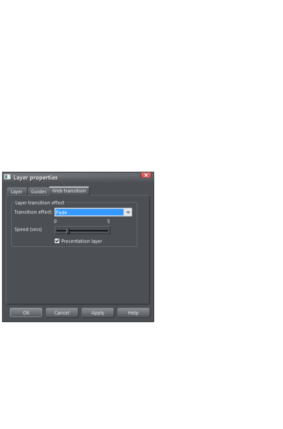
layer, ignoring the layer structure, use the Paste in current layer option instead. If you want to
retain layer structure, choose Paste in place in current layer. These paste options are also in
the clipboard fly-out bar on the top bar, as well as the Edit menu.
Right click and choose Arrange then Move to layer in front / Move to layer behind to shift
the selected objects one layer up or down.
Ensure the target layer is selected as current, then find the selected item in the Page & Layer
Gallery (click the Locate button), right click and select Move to Current Layer.
Applying transitions to popup layers
You can apply a transition to a popup layer to control how the layer appears, whether it's triggered by a
mouse-over action or a click. So for example if you apply a fade transition, when the popup layer
appears it will fade in instead of appearing instantly.
1. Click the layer in the Page & Layer Gallery and click the Properties button at the top of the
gallery.
2. Click the Web transition tab of the Layer properties dialog.
3. Choose an effect from the Transition effect drop-down list and move the slider to set a speed
for the transition in seconds.
4. Click Apply.
Note:
There are fewer transition effects available for layers compared to links and pages.
Pop-up Layers
A more powerful alternative allows you to display the contents of any layer as a result of mousing over,
or clicking, any object. This can be used for a range of different pop-up effects such as pop-up photos,
menus or detailed object descriptions.
To do this, place all the objects you want to pop-up on a new layer (in the Page & Layer Gallery
click New while you have a layer selected - don't use the MouseOver layer), then set the Mouseover
property (Mouse-over
tab of the Web Properties dialog) of the original object to trigger the display of this layer when you
mouseover any other object. For example you can make a pop-up, like this, appear as you mouse over
some text:
Page 209
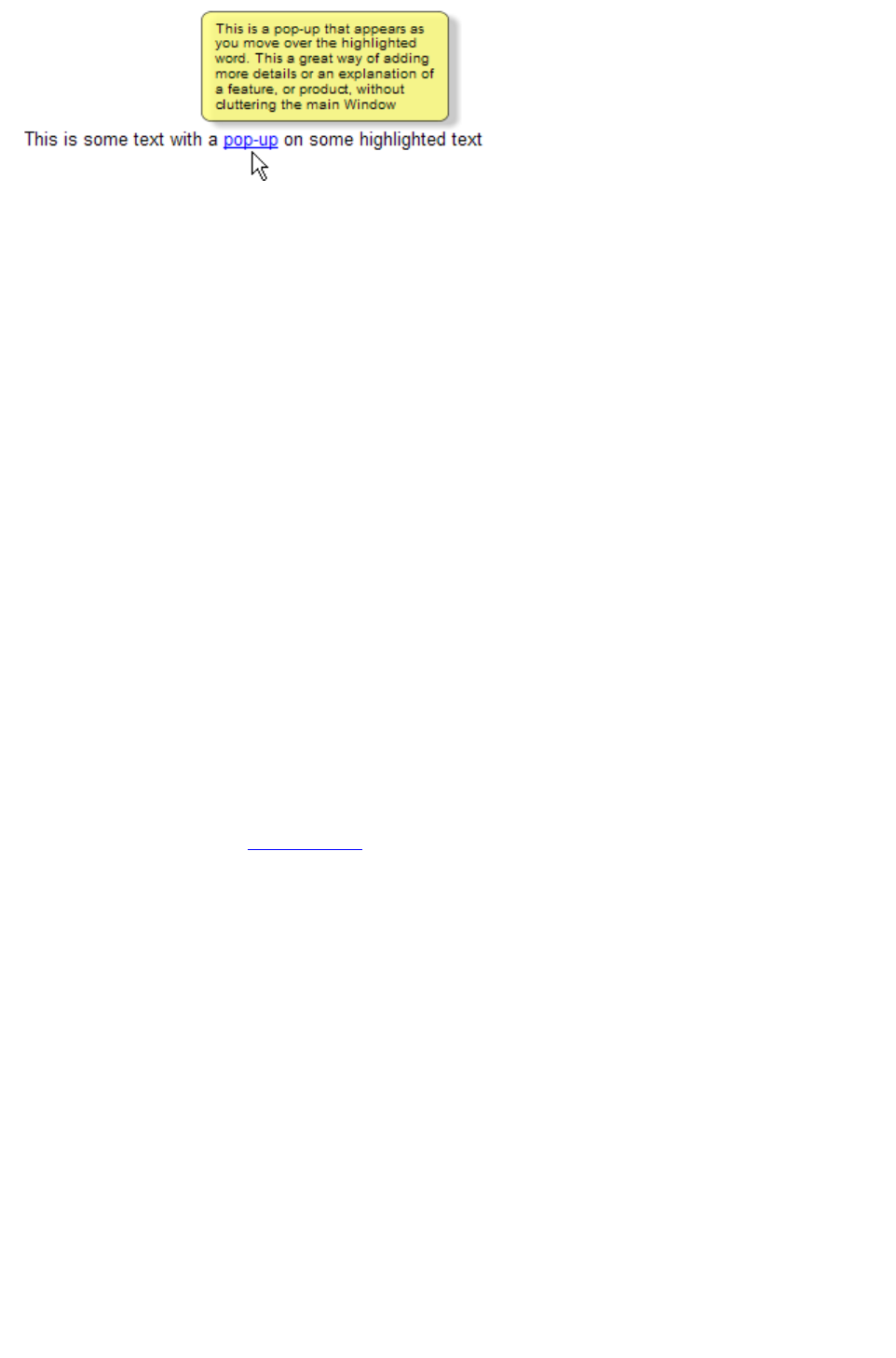
Here are the steps to create a pop-up text block like this:
1. Click New in the Page & Layer Gallery, while you have a layer selected, to create a new
layer.
2. Draw a rounded rectangle with the Rectangle Tool, click a (pale) color patch on the Color
Line to give it a fill color. For good measure give it a soft shadow (select the Shadow Tool and
just drag on the rectangle).
3. Create a block of text on top of your rectangle. Select the Text Tool and drag diagonally across
the rectangle. Type your text. You probably want to hide the pop-up layer now, so just un-check
the 'eye' checkbox of your new layer.
4. Back on the base (MouseOff) layer (click it in the Page & Layer Gallery to set this as current
layer) now select the text you want to trigger the pop-up, using the usual method (in the Text
tool). Then open the Web Properties dialog (right click and choose Web Properties or press
"Ctrl + Shift + W") and on the Mouse-over tab select the new layer from the Show pop-up
layer drop-down menu. Click OK.
5. Preview and test your mouseover effect.
If you want the pop-up to only appear when you click, then select the same option on the Link
tab of the same Web Properties dialog instead.
Note:
The mouseover layer appears and disappears as you move the mouse pointer on and off the triggering
object. If you use a click method to display the layer (from the Link dialog), then the layer is revealed by
a click on the object, and is hidden when you click anywhere else on the page.
Pop-up Photos
There is a second, easier, way of showing enlarged photos from thumbnails, that does not involve
creating new layers. See the Photo section
earlier in this chapter. This method is better for when you have large pop-up photos as the pop-up
photos are not loaded until the thumbnail image is clicked.
Page 210
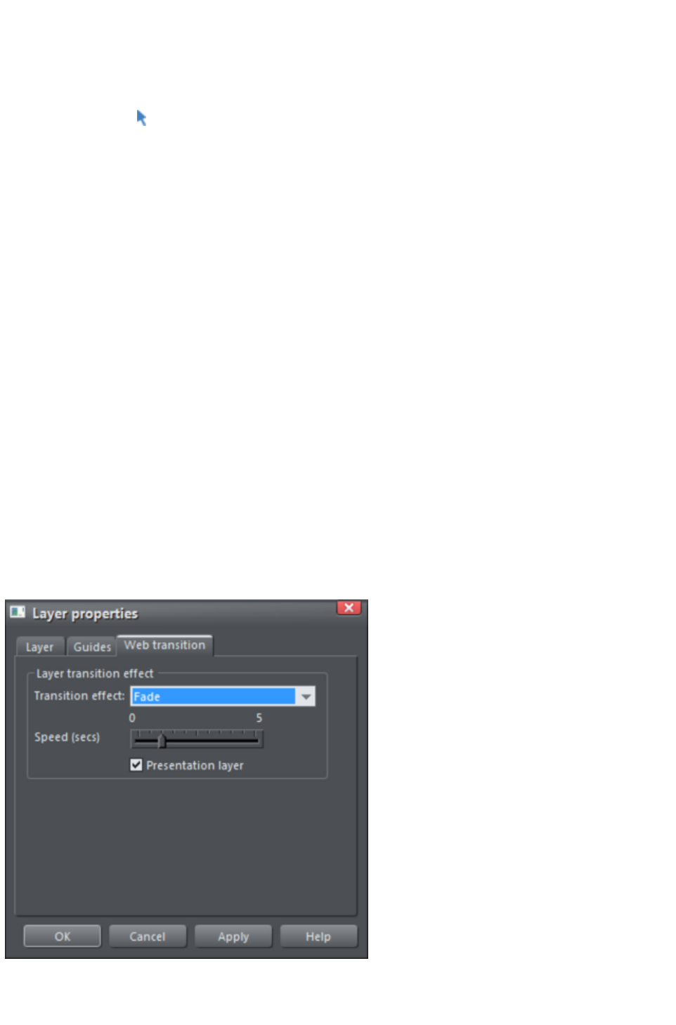
Moving Objects Between Layers
There are several ways to move objects between layers. First select the object or objects you want to
move, then;
Cut the object ("Ctrl + X" or right click and Cut). Ensure the target layer is the current layer
(shown with , click the layer if it's not) and then right click and choose Paste or Paste in Place
. Note that if you cut or copy multiple items that are on different layers, the layer structure is
preserved when you paste. Items are pasted to the same layer they were copied/cut from,
instead of being pasted to the current layer. If you want to paste all such items to the current
layer, ignoring the layer structure, use the Paste in current layer option instead. If you want to
retain layer structure, choose Paste in place in current layer. These paste options are also in
the clipboard fly-out bar on the top bar, as well as the Edit menu.
Right click and choose Arrange then Move to layer in front / Move to layer behind to shift
the selected objects one layer up or down.
Ensure the target layer is selected as current, then find the selected item in the Page & Layer
Gallery (click the Locate button), right click and select Move to Current Layer.
Applying transitions to popup layers
You can apply a transition to a popup layer to control how the layer appears, whether it's triggered by a
mouse-over action or a click. So for example if you apply a fade transition, when the popup layer
appears it will fade in instead of appearing instantly.
1. Click the layer in the Page & Layer Gallery and click the Properties button at the top of the
gallery.
2. Click the Web transition tab of the Layer properties dialog.
3. Choose an effect from the Transition effect drop-down list and move the slider to set a speed
for the transition in seconds.
4. Click Apply.
Note:
There are fewer transition effects available for layers compared to links and pages.
Pop-up Layers
Page 211
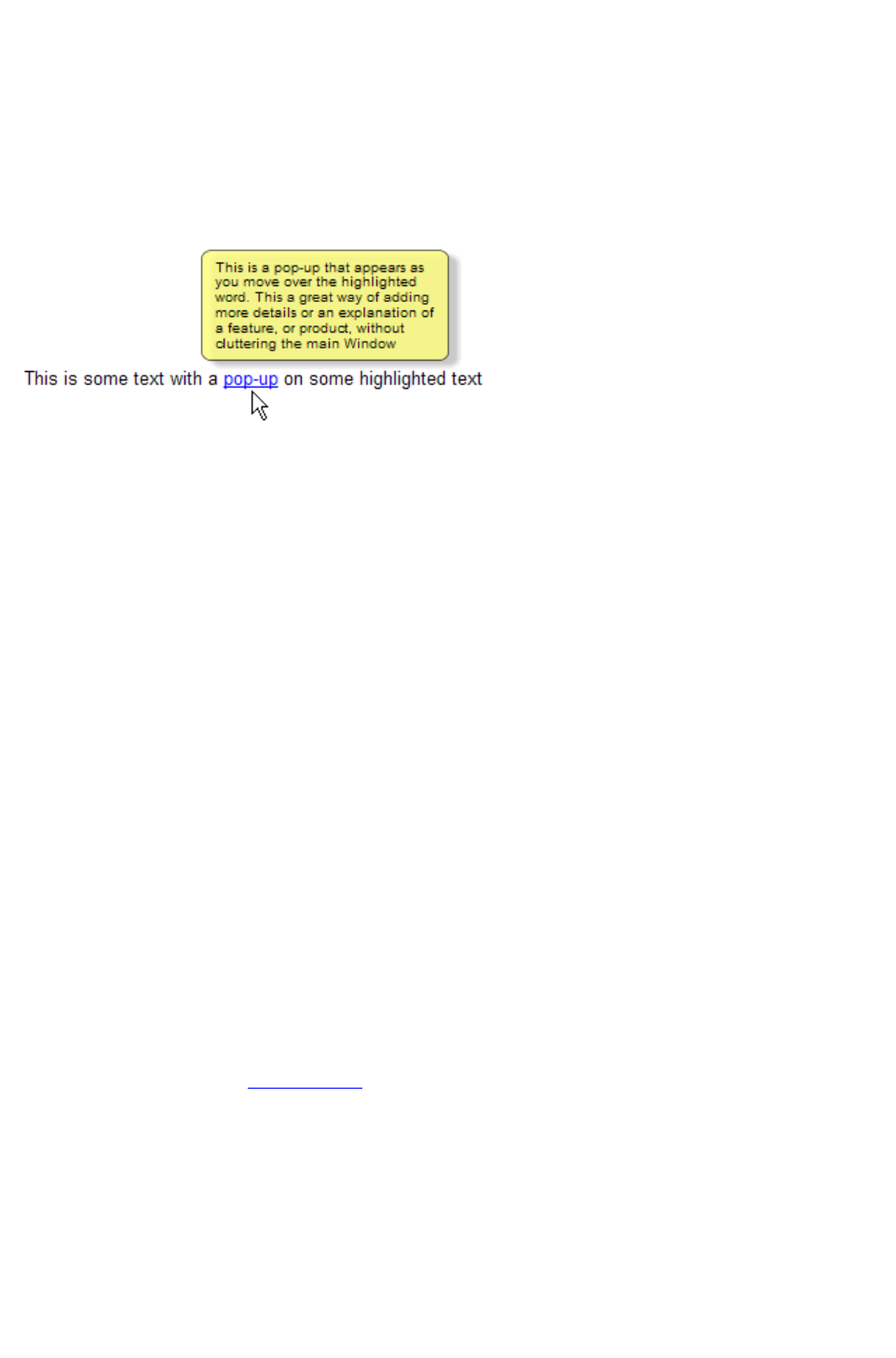
A more powerful alternative allows you to display the contents of any layer as a result of mousing over,
or clicking, any object. This can be used for a range of different pop-up effects such as pop-up photos,
menus or detailed object descriptions.
To do this, place all the objects you want to pop-up on a new layer (in the Page & Layer Gallery
click New while you have a layer selected - don't use the MouseOver layer), then set the Mouseover
property (Mouse-over
tab of the Web Properties dialog) of the original object to trigger the display of this layer when you
mouseover any other object. For example you can make a pop-up, like this, appear as you mouse over
some text:
Here are the steps to create a pop-up text block like this:
1. Click New in the Page & Layer Gallery, while you have a layer selected, to create a new
layer.
2. Draw a rounded rectangle with the Rectangle Tool, click a (pale) color patch on the Color
Line to give it a fill color. For good measure give it a soft shadow (select the Shadow Tool and
just drag on the rectangle).
3. Create a block of text on top of your rectangle. Select the Text Tool and drag diagonally across
the rectangle. Type your text. You probably want to hide the pop-up layer now, so just un-check
the 'eye' checkbox of your new layer.
4. Back on the base (MouseOff) layer (click it in the Page & Layer Gallery to set this as current
layer) now select the text you want to trigger the pop-up, using the usual method (in the Text
tool). Then open the Web Properties dialog (right click and choose Web Properties or press
"Ctrl + Shift + W") and on the Mouse-over tab select the new layer from the Show pop-up
layer drop-down menu. Click OK.
5. Preview and test your mouseover effect.
If you want the pop-up to only appear when you click, then select the same option on the Link
tab of the same Web Properties dialog instead.
Note:
The mouseover layer appears and disappears as you move the mouse pointer on and off the triggering
object. If you use a click method to display the layer (from the Link dialog), then the layer is revealed by
a click on the object, and is hidden when you click anywhere else on the page.
Pop-up Photos
There is a second, easier, way of showing enlarged photos from thumbnails, that does not involve
creating new layers. See the Photo section
earlier in this chapter. This method is better for when you have large pop-up photos as the pop-up
photos are not loaded until the thumbnail image is clicked.
Page 212
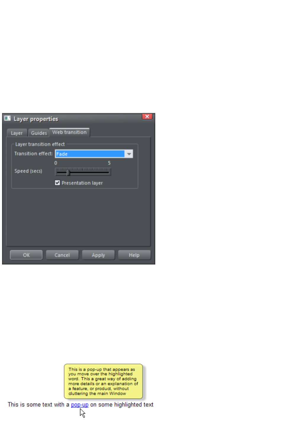
Applying transitions to popup layers
You can apply a transition to a popup layer to control how the layer appears, whether it's triggered by a
mouse-over action or a click. So for example if you apply a fade transition, when the popup layer
appears it will fade in instead of appearing instantly.
1. Click the layer in the Page & Layer Gallery and click the Properties button at the top of the
gallery.
2. Click the Web transition tab of the Layer properties dialog.
3. Choose an effect from the Transition effect drop-down list and move the slider to set a speed
for the transition in seconds.
4. Click Apply.
Note:
There are fewer transition effects available for layers compared to links and pages.
Pop-up Layers
A more powerful alternative allows you to display the contents of any layer as a result of mousing over,
or clicking, any object. This can be used for a range of different pop-up effects such as pop-up photos,
menus or detailed object descriptions.
To do this, place all the objects you want to pop-up on a new layer (in the Page & Layer Gallery
click New while you have a layer selected - don't use the MouseOver layer), then set the Mouseover
property (Mouse-over
tab of the Web Properties dialog) of the original object to trigger the display of this layer when you
mouseover any other object. For example you can make a pop-up, like this, appear as you mouse over
some text:
Here are the steps to create a pop-up text block like this:
Page 213

1. Click New in the Page & Layer Gallery, while you have a layer selected, to create a new
layer.
2. Draw a rounded rectangle with the Rectangle Tool, click a (pale) color patch on the Color
Line to give it a fill color. For good measure give it a soft shadow (select the Shadow Tool and
just drag on the rectangle).
3. Create a block of text on top of your rectangle. Select the Text Tool and drag diagonally across
the rectangle. Type your text. You probably want to hide the pop-up layer now, so just un-check
the 'eye' checkbox of your new layer.
4. Back on the base (MouseOff) layer (click it in the Page & Layer Gallery to set this as current
layer) now select the text you want to trigger the pop-up, using the usual method (in the Text
tool). Then open the Web Properties dialog (right click and choose Web Properties or press
"Ctrl + Shift + W") and on the Mouse-over tab select the new layer from the Show pop-up
layer drop-down menu. Click OK.
5. Preview and test your mouseover effect.
If you want the pop-up to only appear when you click, then select the same option on the Link
tab of the same Web Properties dialog instead.
Note:
The mouseover layer appears and disappears as you move the mouse pointer on and off the triggering
object. If you use a click method to display the layer (from the Link dialog), then the layer is revealed by
a click on the object, and is hidden when you click anywhere else on the page.
Pop-up Photos
There is a second, easier, way of showing enlarged photos from thumbnails, that does not involve
creating new layers. See the Photo section
earlier in this chapter. This method is better for when you have large pop-up photos as the pop-up
photos are not loaded until the thumbnail image is clicked.
Page 214
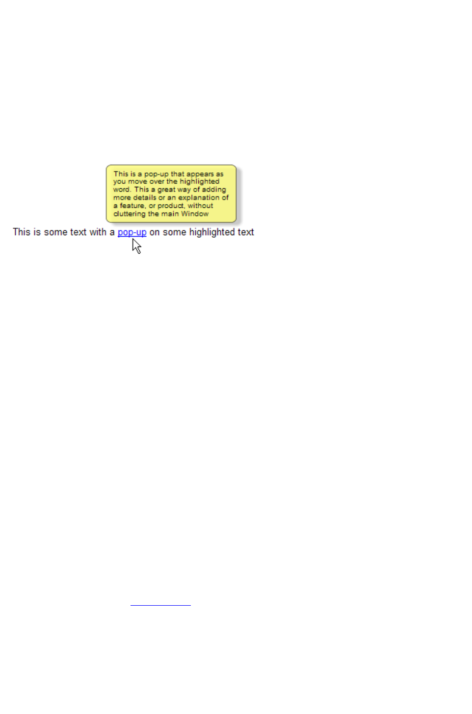
Pop-up Layers
A more powerful alternative allows you to display the contents of any layer as a result of mousing over,
or clicking, any object. This can be used for a range of different pop-up effects such as pop-up photos,
menus or detailed object descriptions.
To do this, place all the objects you want to pop-up on a new layer (in the Page & Layer Gallery
click New while you have a layer selected - don't use the MouseOver layer), then set the Mouseover
property (Mouse-over
tab of the Web Properties dialog) of the original object to trigger the display of this layer when you
mouseover any other object. For example you can make a pop-up, like this, appear as you mouse over
some text:
Here are the steps to create a pop-up text block like this:
1. Click New in the Page & Layer Gallery, while you have a layer selected, to create a new
layer.
2. Draw a rounded rectangle with the Rectangle Tool, click a (pale) color patch on the Color
Line to give it a fill color. For good measure give it a soft shadow (select the Shadow Tool and
just drag on the rectangle).
3. Create a block of text on top of your rectangle. Select the Text Tool and drag diagonally across
the rectangle. Type your text. You probably want to hide the pop-up layer now, so just un-check
the 'eye' checkbox of your new layer.
4. Back on the base (MouseOff) layer (click it in the Page & Layer Gallery to set this as current
layer) now select the text you want to trigger the pop-up, using the usual method (in the Text
tool). Then open the Web Properties dialog (right click and choose Web Properties or press
"Ctrl + Shift + W") and on the Mouse-over tab select the new layer from the Show pop-up
layer drop-down menu. Click OK.
5. Preview and test your mouseover effect.
If you want the pop-up to only appear when you click, then select the same option on the Link
tab of the same Web Properties dialog instead.
Note:
The mouseover layer appears and disappears as you move the mouse pointer on and off the triggering
object. If you use a click method to display the layer (from the Link dialog), then the layer is revealed by
a click on the object, and is hidden when you click anywhere else on the page.
Pop-up Photos
There is a second, easier, way of showing enlarged photos from thumbnails, that does not involve
creating new layers. See the Photo section
earlier in this chapter. This method is better for when you have large pop-up photos as the pop-up
photos are not loaded until the thumbnail image is clicked.
Page 215

Pop-up Photos
There is a second, easier, way of showing enlarged photos from thumbnails, that does not involve
creating new layers. See the Photo section
earlier in this chapter. This method is better for when you have large pop-up photos as the pop-up
photos are not loaded until the thumbnail image is clicked.
Page 216
Creating Buttons, Banners And Other Web
Graphics
Web Designer Premium is great tool for creating any standalone web graphics for use with other
programs or other web authoring tools. You can draw these objects from scratch using the drawing
tools, or use ready made web clipart from the Designs Gallery. Just draw, design or import an item
from the Designs Gallery
onto a blank page. Manipulate this as required - size it, color it and change the text or fonts as required,
and then export the item as a PNG or JPG.
For example this is how to create a standalone button graphic from a template:
Open the Designs Gallery
and then the Web Button category (or Icons or Banners - whatever
category you require).
Double click on a design to open this in a new document. Edit this as required e.g. you can:
Resize it (or rotate) it using the Selector Tool
Change the color by clicking on the appropriate colors on the left end of the Color Line and
choosing 'edit'
Change the text with the Text Tool
When you're happy, select the object and export it as
a PNG or JPG using the buttons in the Website bar
(these are on a flyout bar on the Export HTML icon).
For almost all graphics, such as buttons, headings, icons and other non-photographic objects you should
use PNG format. For items that contain photos or that have large textured parts made from photos, then
JPEG is a better format. If you're saving a rotated photo, or one with a soft shadow, or soft edge, then
this should be in a PNG format, but be warned this will be a lot larger file than JPEG.
If you click the Settings
button in the Export file dialog you can access an advanced control panel that lets you optimize the
image.
Page 217
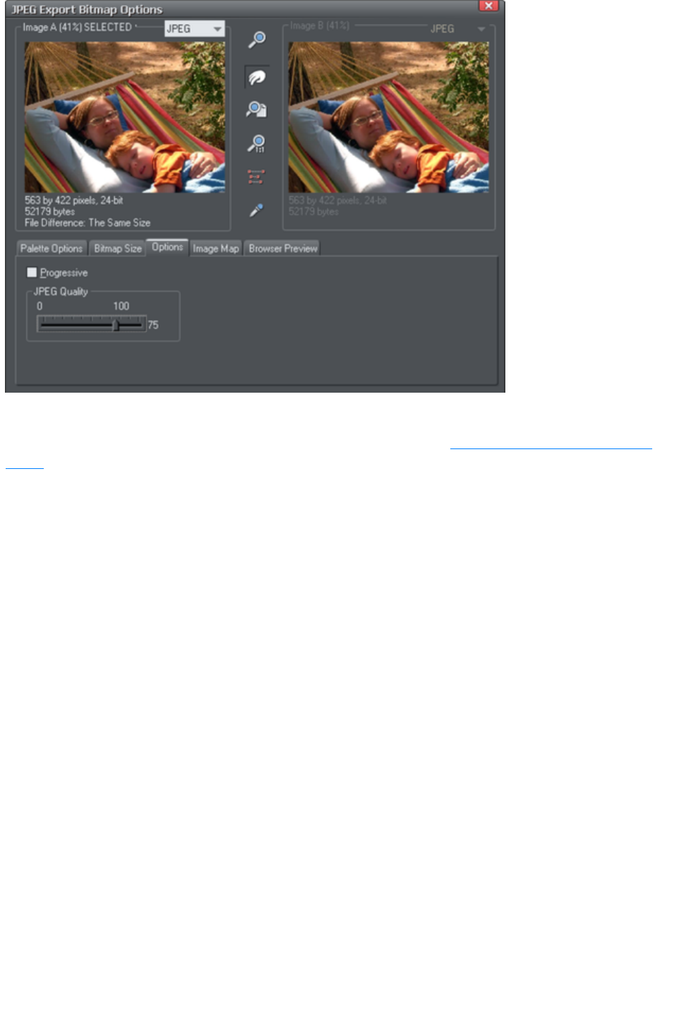
Here you can compare side-by-side two different versions of the same image. For example you can
compare a JPEG against a PNG version of the same graphic to compare the quality and / or file size, or
you can compare two differently optimized PNG images. Refer to the reference chapter on the Export
dialog
in the pdf manual. The in the above example the JPEG compression is being adjusted to produce the
optimum file size.
Page 218
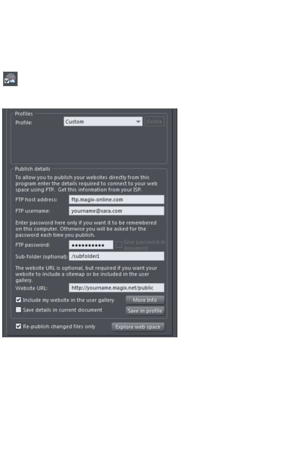
Publishing Your Website
You will need a web hosting company to host your website. MAGIX Online World is recommended for
this, although quite often your existing Internet provider will include 'web space' as part of your normal
subscription. The dialog shown below also contains suggested hosting solutions in its Profile
list. Most companies also offer the ability to purchase your own domain name (e.g. like www.xara.com)
and have this set to point to your web pages.
Choose "File" > "Publish Website
" or click Publish Properties in the website toolbar.
The Publish tab of the Web Properties
dialog opens.
Entering publishing details
1. In the Profile drop-down list, choose either Custom or, if you are a MAGIX Online World
user, choose Magix web hosting.
2. In the FTP Host Address box, type in your FTP host address. If you have a domain name this
is often the same as your domain name. For example, for MAGIX Online World users, this
would be ftp.magix-online.com. If you chose the Magix web hosting option in the profile list,
the FTP host address is set for you automatically.
3. In the FTP username box, type in your FTP username. For MAGIX Online World users, this is
the same as your Online World login (FTP username = your email address).
4. In the FTP password box, type in your FTP password. For MAGIX Online World users, this is
the same as your Online World password.
5. The optional Sub-folder box lets you publish your website into a sub-folder. e.g. if you are
publishing to your MAGIX website and want the web address to be
Page 219
'http://yourname.magix.net/public/sub-folder', then you'd set a sub-folder to be 'sub-folder'. If
you set a sub-folder this way then all the pages in your website will be published to this folder.
6. If you want a sitemap generated for your website, or if you want your site included in the Xara or
MAGIX User Gallery, you need to enter the full URL of your published website in the Website
URL field. See the Publish tab help for information on sitemaps. The Include my website in
the user gallery checkbox is only enabled if you have added a valid website URL. If you select
this option, after publishing your site Web Designer Premium generates a thumbnail of your
website and places it in a Xara or MAGIX gallery of websites created by Web Designer
Premium users. Click the More Info button to learn more.
7. Select the Save details in current document checkbox to have the publish details you have
provided saved with the current document. When you enable the Save details in current
document checkbox, the Save password in document checkbox also becomes selectable.
Select this checkbox to also save the FTP password with the current document, if you are sure
that is what you want. This is not recommended because it means anyone who gets a copy of
your design file can publish to your website without knowing or entering your password!
8. You can also opt to save the publish details on your computer in a named profile. Click the Save
in profile button and enter a suitable profile name. Now you can select the profile from the
profile list at the top of the dialog, so you can use them in other documents without having to
re-enter them.
8. Note: You can delete a profile by selecting it in the Profile list and clicking the Delete button
next to it.
9. Normally leave the Re-publish changed files only checkbox selected. This makes
re-publishing much quicker in most cases because only files changed since the last publish are
re-published.
10. Click the Explore web space button to browse, view and delete files you have uploaded to your
FTP server.
11. Click OK. Web Designer Premium displays a dialog confirming the publish details that it will use
to publish your website. Click Publish.
Setting up the Export folder
Once you've set your Publish details, you can then click the Publish
icon on the top bar (on the Export HTML flyout bar) or use the menu
option "File" > "Publish Website
".
1. Web Designer Premium displays a dialog confirming that you want to publish to the server and
username you have provided. Click Publish.
2. If you haven't exported your website yet, Web Designer Premium prompts you to export your
site to your local disc and displays the Export dialog.
3. Choose a folder to which to export your website data. If you haven't yet defined a folder, simply
select an existing folder or create a new folder and select it. Then click on Export.
Important
: If you have not set any specific page names in the Page & Layer Gallery, then the name you exported to
last will be used as the basis for all the pages in your website. E.g., if you open a template website, and
export this as 'test' to your file system, and now publish this, it will be published as test.htm to your web
server, and all additional pages will be test_2.htm, test_3.htm etc.
index.htm is the usual name for the first page of a website.
Transferring data
1. After you have clicked Export (or Publish), Web Designer Premium displays a small window
that shows the progress of data transmission.
2. As soon as the transfer is finished, you can open a browser window and navigate to the URL of
your published website. MAGIX Online World users can open their website via their Online
Page 220

World web address: http://yourname.magix.net/public.
Note
: If you entered a sub-folder in the Publish tab of the Web Properties dialog, your website is saved there.
In this case, you have to add the name of the sub-folder to your web address
(http://yourname.magix.net/public/sub-folder) to open the page.
See the Web Properties Dialog chapter
for full details on how to use this dialog.
Note:
Many web servers use case sensitive filenames. So, for example, the web address
xara.com/products.htm is not the same thing as xara.com/Products.htm. To reduce confusion and the
likelihood of errors Web Designer Premium enforces that all page names are all lower-case and contain
only allowable characters. This means that spaces are not allowed in page names. We suggest using an
underscore as an alternative separator.
Page 221
Document handling
In this chapter
Starting Xara Web Designer 7 Premium
Starting a new document
Opening an existing document
The Xara Web Designer 7 Premium window
Opening a second window
Changing the zoom value
Sliding the document within the window
Changing the page size
Multiple pages in the document
Saving the document
Support folders
Closing the document
Automatic Backups
On-screen grid
Rulers
View quality
Galleries
Undo and Redo
Page 222

Starting Xara Web Designer 7 Premium
To start Web Designer Premium:
Choose "Start" > "All programs" > "Xara"
> "Xara Web Designer 7 Premium".
Or double click the Xara Web Designer 7 Premium icon on
your desktop (shown left).
This may vary depending on which version of Windows you are using.
Page 223
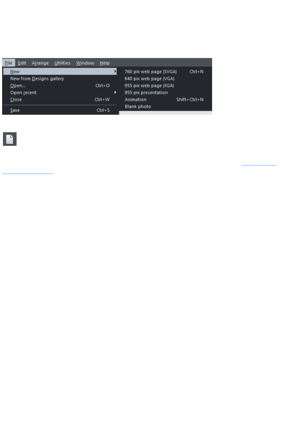
Starting a new document
Primarily, there are three different types of documents in Xara Web Designer 7 Premium, i.e. web page,
photo and animation. To start a new document:
Choose "File" > "New"
This opens a sub menu with several pre-defined template documents to start from.
The first template is the default and is used to create a new document after starting Xara Web Designer 7
Premium. The Animation template is the default template for animation documents.
The New document
button on the Standard control bar creates a new document using the
default template (shortcut "Ctrl + N").
You can save your own templates with the "File" > "Save template" command ? see "Changing the
template document
" for details.
Page 224

Opening an existing document
To open an existing document:
Drag & drop a file. Select the file in Windows Explorer or on your desktop, and drag it over an
existing open document to import it into that document, or any other part of the Web Designer
Premium window to open the document.
Or double click a Web Designer Premium file.
Or to open a recently used file, select it from "File" > "Open recent"
Or select "File" > "Open" (shortcut "Ctrl + O").
Or click the Open button on the standard control bar.
The open dialog will be displayed. The dialog allows multiple file selection, "Ctrl + click" to select several
files or "Shift + click" to select a range of files.
As in Explorer windows, you can switch the file display to a detailed or
thumbnail view with this button
If Show preview
in the upper right corner is checked, the selected file is shown in an even bigger preview (this does not
work for a multiple file selection).
Page 225
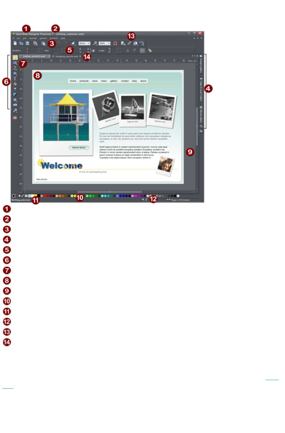
The Xara Web Designer 7 Premium window
Title bar
File name for currently displayed file
Standard button bar
Galleries bar
InfoBar
Toolbar
Rulers
Page
Pasteboard
Color line
Status line
Live drag / snapped indicators
Web toolbar
Document tabs for every open file
The Web Designer Premium window is similar to a conventional sheet of paper on a drawing board or
easel. The white rectangle represents the sheet of paper (the spread or page). The gray border is the
pasteboard.
You can change the size of the page by right clicking it and choosing Page Options, then click the Page
Size
tab.
Selected document and title bar
You can have more than one file open at a time in Web Designer Premium, which displays all open
Page 226
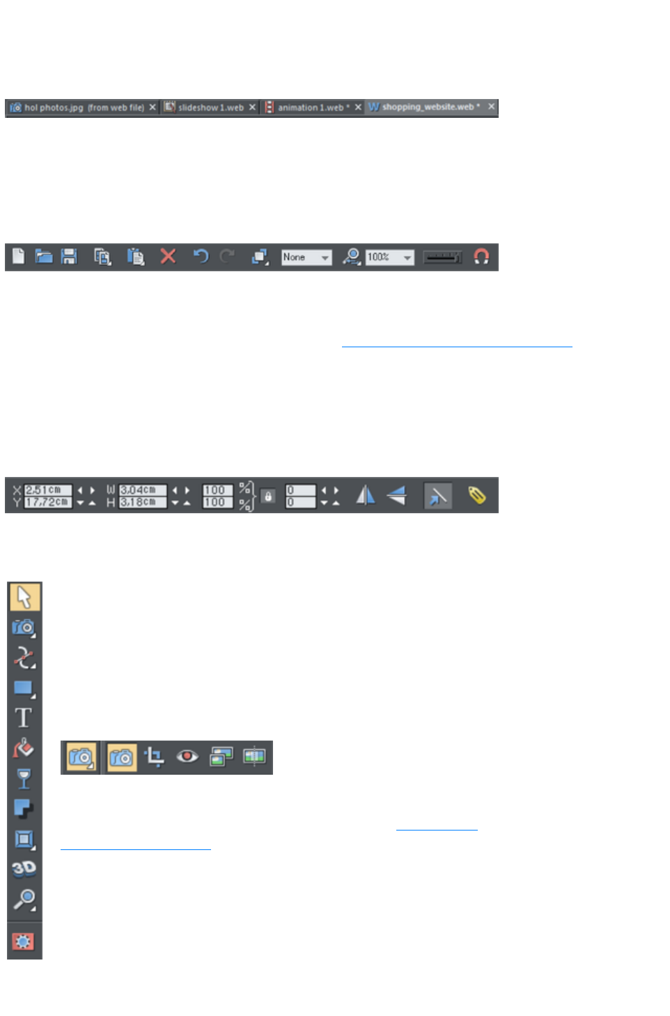
documents as tabs at the top of the workspace.
The current document is displayed in the workspace and its name is highlighted gray in the document
tabs. The current document type is indicated in the top left corner of the Web Designer Premium
window, next to the menu options. The current document receives all input. Any unsaved changes in a
document are indicated with a star after the file name.
Document tabs show all open documents, with the current document tab highlighted gray.
Control bars
These contain buttons that you can use to operate Web Designer Premium. You can customize control
bars in several ways, such as re-ordering, creating, and hiding bars.
The default window shows the standard button bar with commonly used buttons:
You can customize the standard control bar in the same way as other control bars.
Those icons with a triangle indicator in the bottom right corner have "fly-out bars" on them. Hold the
mouse pointer over these icons and you'll see the fly-out bar appear, with more icons.
For information on customizing control bars, refer to "Customizing Web Designer Premium
".
InfoBar
This is a special control bar. Its contents change when you select different tools. InfoBars specific to
certain tools are described in their relevant chapters.
You cannot customize the InfoBar.
The InfoBar for the Selector Tool
Main toolbar
This is a control bar that initially contains all the tools available in Web
Designer Premium (see left). You can customize the toolbar, or move
tools to other control bars.
Some of the toolbar icons have a small triangle indicator in the bottom
right corner. This indicates that there is a flyout bar containing more
tool icons. Hold your mouse pointer over the icon to see the flyout
bar appear. You can then move the mouse pointer over each icon in
the bar to see a tooltip indicating what each one does.
Click on a tool to select it (some tools have keyboard shortcuts,
too).
For information on customizing control bars, refer to "Customizing
Web Designer Premium
".
Rulers
Page 227
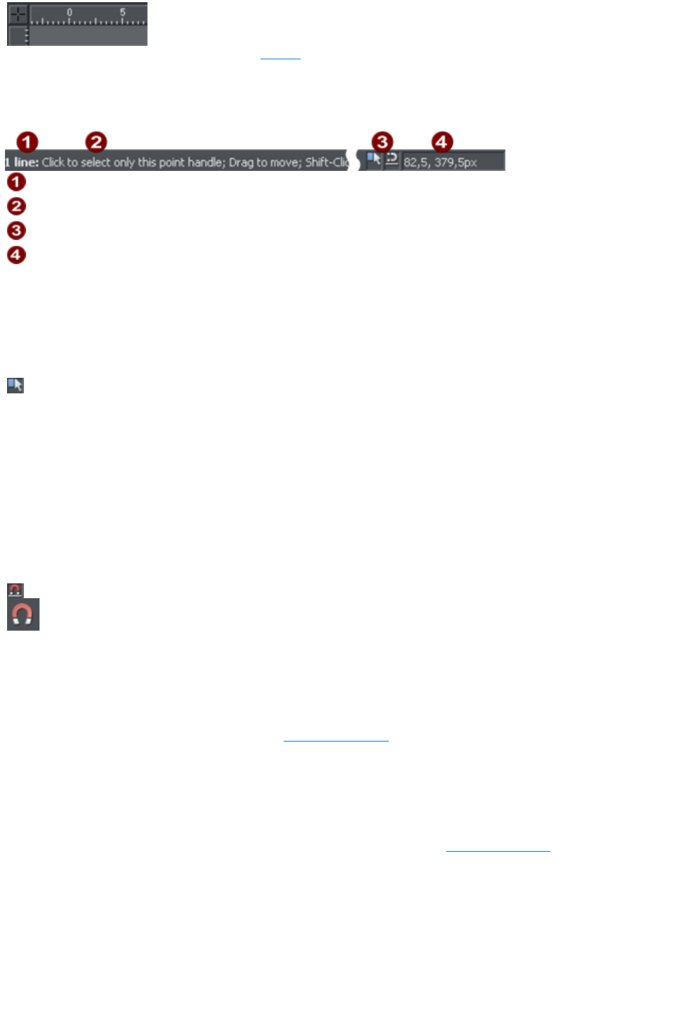
You can hide the rulers, change their zero point (origin),
and use them to create guidelines. For more
information, see Rulers
.
The status line
Selected objects
Available options
Indicators
Mouse pointer X-Y
This appears at the bottom of the window. The status line tells you about the selected objects, available
options, live drag/snapping indicators, and the X/Y position of the pointer.
The indicators
These appear on the right of the status line:
Live drag indicator
This indicator shows whether live drag is active or not (it is active by
default). Double click the indicator to toggle live drag on/off. When
active, if you reposition, resize, or rotate an object, the whole object
moves (not just an outline), making it far easier to judge the effect of
your edits in real time. Drawing in the Freehand, Straight Line,
Quickshape, Rectangle and Ellipse Tools
is also live with this option on. If your computer is unable to cope
with a particularly complex document, it will automatically turn active
drag off to ensure editing remains fast and efficient.
Snapped indicator
This indicator is active when Snap to objects is enabled (by default
in web documents - click the Snap to objects button (shown on the
lower left) to toggle off and on. Snap to objects allows you to see
potential snapping paths and points relative to other objects and the
page center and edges by showing blue snapping lines for snapping
paths and red dots for points as you drag an object. For more
information on snapping, refer to "Object Handling
".
X/Y co-ordinates
Web Designer Premium shows measurements relative to the bottom left corner of the page area or
spread. However, this is configurable. For more information refer to "Object Handling
".
Normal/full screen modes
In normal screen mode part of the window is occupied by the title bar, menu bar, and scroll bars. This
can be inconvenient if you want the maximum possible editing area. Web Designer Premium has a second
screen mode, fullscreen, which displays a more streamlined screen. You can configure each screen mode
as you wish. For example, each can have its own configuration of the control bars. The configuration is
remembered and applies whenever you swap between screen modes.
Page 228

Normal/full screen is controlled by "Window" > "Full Screen" or right click and choose Full Screen
("8" on the numeric keypad).
To display the menu bar in full screen mode, move the pointer to the top of the screen.
Page 229
Selected document and title bar
You can have more than one file open at a time in Web Designer Premium, which displays all open
documents as tabs at the top of the workspace.
The current document is displayed in the workspace and its name is highlighted gray in the document
tabs. The current document type is indicated in the top left corner of the Web Designer Premium
window, next to the menu options. The current document receives all input. Any unsaved changes in a
document are indicated with a star after the file name.
Document tabs show all open documents, with the current document tab highlighted gray.
Control bars
These contain buttons that you can use to operate Web Designer Premium. You can customize control
bars in several ways, such as re-ordering, creating, and hiding bars.
The default window shows the standard button bar with commonly used buttons:
You can customize the standard control bar in the same way as other control bars.
Those icons with a triangle indicator in the bottom right corner have "fly-out bars" on them. Hold the
mouse pointer over these icons and you'll see the fly-out bar appear, with more icons.
For information on customizing control bars, refer to "Customizing Web Designer Premium
".
InfoBar
This is a special control bar. Its contents change when you select different tools. InfoBars specific to
certain tools are described in their relevant chapters.
You cannot customize the InfoBar.
The InfoBar for the Selector Tool
Main toolbar
Page 230
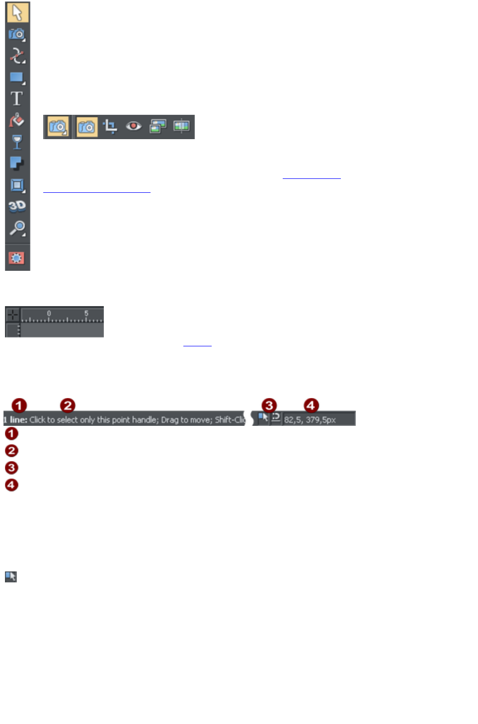
This is a control bar that initially contains all the tools available in Web
Designer Premium (see left). You can customize the toolbar, or move
tools to other control bars.
Some of the toolbar icons have a small triangle indicator in the bottom
right corner. This indicates that there is a flyout bar containing more
tool icons. Hold your mouse pointer over the icon to see the flyout
bar appear. You can then move the mouse pointer over each icon in
the bar to see a tooltip indicating what each one does.
Click on a tool to select it (some tools have keyboard shortcuts,
too).
For information on customizing control bars, refer to "Customizing
Web Designer Premium
".
Rulers
You can hide the rulers, change their zero point (origin),
and use them to create guidelines. For more
information, see Rulers
.
The status line
Selected objects
Available options
Indicators
Mouse pointer X-Y
This appears at the bottom of the window. The status line tells you about the selected objects, available
options, live drag/snapping indicators, and the X/Y position of the pointer.
The indicators
These appear on the right of the status line:
Live drag indicator
This indicator shows whether live drag is active or not (it is active by
default). Double click the indicator to toggle live drag on/off. When
active, if you reposition, resize, or rotate an object, the whole object
moves (not just an outline), making it far easier to judge the effect of
your edits in real time. Drawing in the Freehand, Straight Line,
Quickshape, Rectangle and Ellipse Tools
is also live with this option on. If your computer is unable to cope
with a particularly complex document, it will automatically turn active
drag off to ensure editing remains fast and efficient.
Page 231

Snapped indicator
This indicator is active when Snap to objects is enabled (by default
in web documents - click the Snap to objects button (shown on the
lower left) to toggle off and on. Snap to objects allows you to see
potential snapping paths and points relative to other objects and the
page center and edges by showing blue snapping lines for snapping
paths and red dots for points as you drag an object. For more
information on snapping, refer to "Object Handling
".
X/Y co-ordinates
Web Designer Premium shows measurements relative to the bottom left corner of the page area or
spread. However, this is configurable. For more information refer to "Object Handling
".
Normal/full screen modes
In normal screen mode part of the window is occupied by the title bar, menu bar, and scroll bars. This
can be inconvenient if you want the maximum possible editing area. Web Designer Premium has a second
screen mode, fullscreen, which displays a more streamlined screen. You can configure each screen mode
as you wish. For example, each can have its own configuration of the control bars. The configuration is
remembered and applies whenever you swap between screen modes.
Normal/full screen is controlled by "Window" > "Full Screen" or right click and choose Full Screen
("8" on the numeric keypad).
To display the menu bar in full screen mode, move the pointer to the top of the screen.
Page 232
Control bars
These contain buttons that you can use to operate Web Designer Premium. You can customize control
bars in several ways, such as re-ordering, creating, and hiding bars.
The default window shows the standard button bar with commonly used buttons:
You can customize the standard control bar in the same way as other control bars.
Those icons with a triangle indicator in the bottom right corner have "fly-out bars" on them. Hold the
mouse pointer over these icons and you'll see the fly-out bar appear, with more icons.
For information on customizing control bars, refer to "Customizing Web Designer Premium
".
InfoBar
This is a special control bar. Its contents change when you select different tools. InfoBars specific to
certain tools are described in their relevant chapters.
You cannot customize the InfoBar.
The InfoBar for the Selector Tool
Main toolbar
This is a control bar that initially contains all the tools available in Web
Designer Premium (see left). You can customize the toolbar, or move
tools to other control bars.
Some of the toolbar icons have a small triangle indicator in the bottom
right corner. This indicates that there is a flyout bar containing more
tool icons. Hold your mouse pointer over the icon to see the flyout
bar appear. You can then move the mouse pointer over each icon in
the bar to see a tooltip indicating what each one does.
Click on a tool to select it (some tools have keyboard shortcuts,
too).
For information on customizing control bars, refer to "Customizing
Web Designer Premium
".
Rulers
You can hide the rulers, change their zero point (origin),
and use them to create guidelines. For more
information, see Rulers
.
The status line
Page 233
Selected objects
Available options
Indicators
Mouse pointer X-Y
This appears at the bottom of the window. The status line tells you about the selected objects, available
options, live drag/snapping indicators, and the X/Y position of the pointer.
The indicators
These appear on the right of the status line:
Live drag indicator
This indicator shows whether live drag is active or not (it is active by
default). Double click the indicator to toggle live drag on/off. When
active, if you reposition, resize, or rotate an object, the whole object
moves (not just an outline), making it far easier to judge the effect of
your edits in real time. Drawing in the Freehand, Straight Line,
Quickshape, Rectangle and Ellipse Tools
is also live with this option on. If your computer is unable to cope
with a particularly complex document, it will automatically turn active
drag off to ensure editing remains fast and efficient.
Snapped indicator
This indicator is active when Snap to objects is enabled (by default
in web documents - click the Snap to objects button (shown on the
lower left) to toggle off and on. Snap to objects allows you to see
potential snapping paths and points relative to other objects and the
page center and edges by showing blue snapping lines for snapping
paths and red dots for points as you drag an object. For more
information on snapping, refer to "Object Handling
".
X/Y co-ordinates
Web Designer Premium shows measurements relative to the bottom left corner of the page area or
spread. However, this is configurable. For more information refer to "Object Handling
".
Normal/full screen modes
In normal screen mode part of the window is occupied by the title bar, menu bar, and scroll bars. This
can be inconvenient if you want the maximum possible editing area. Web Designer Premium has a second
screen mode, fullscreen, which displays a more streamlined screen. You can configure each screen mode
as you wish. For example, each can have its own configuration of the control bars. The configuration is
remembered and applies whenever you swap between screen modes.
Normal/full screen is controlled by "Window" > "Full Screen" or right click and choose Full Screen
("8" on the numeric keypad).
To display the menu bar in full screen mode, move the pointer to the top of the screen.
Page 234
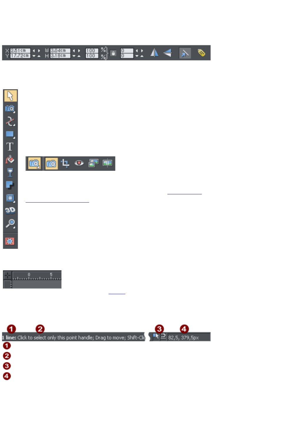
InfoBar
This is a special control bar. Its contents change when you select different tools. InfoBars specific to
certain tools are described in their relevant chapters.
You cannot customize the InfoBar.
The InfoBar for the Selector Tool
Main toolbar
This is a control bar that initially contains all the tools available in Web
Designer Premium (see left). You can customize the toolbar, or move
tools to other control bars.
Some of the toolbar icons have a small triangle indicator in the bottom
right corner. This indicates that there is a flyout bar containing more
tool icons. Hold your mouse pointer over the icon to see the flyout
bar appear. You can then move the mouse pointer over each icon in
the bar to see a tooltip indicating what each one does.
Click on a tool to select it (some tools have keyboard shortcuts,
too).
For information on customizing control bars, refer to "Customizing
Web Designer Premium
".
Rulers
You can hide the rulers, change their zero point (origin),
and use them to create guidelines. For more
information, see Rulers
.
The status line
Selected objects
Available options
Indicators
Mouse pointer X-Y
This appears at the bottom of the window. The status line tells you about the selected objects, available
options, live drag/snapping indicators, and the X/Y position of the pointer.
The indicators
These appear on the right of the status line:
Page 235
Live drag indicator
This indicator shows whether live drag is active or not (it is active by
default). Double click the indicator to toggle live drag on/off. When
active, if you reposition, resize, or rotate an object, the whole object
moves (not just an outline), making it far easier to judge the effect of
your edits in real time. Drawing in the Freehand, Straight Line,
Quickshape, Rectangle and Ellipse Tools
is also live with this option on. If your computer is unable to cope
with a particularly complex document, it will automatically turn active
drag off to ensure editing remains fast and efficient.
Snapped indicator
This indicator is active when Snap to objects is enabled (by default
in web documents - click the Snap to objects button (shown on the
lower left) to toggle off and on. Snap to objects allows you to see
potential snapping paths and points relative to other objects and the
page center and edges by showing blue snapping lines for snapping
paths and red dots for points as you drag an object. For more
information on snapping, refer to "Object Handling
".
X/Y co-ordinates
Web Designer Premium shows measurements relative to the bottom left corner of the page area or
spread. However, this is configurable. For more information refer to "Object Handling
".
Normal/full screen modes
In normal screen mode part of the window is occupied by the title bar, menu bar, and scroll bars. This
can be inconvenient if you want the maximum possible editing area. Web Designer Premium has a second
screen mode, fullscreen, which displays a more streamlined screen. You can configure each screen mode
as you wish. For example, each can have its own configuration of the control bars. The configuration is
remembered and applies whenever you swap between screen modes.
Normal/full screen is controlled by "Window" > "Full Screen" or right click and choose Full Screen
("8" on the numeric keypad).
To display the menu bar in full screen mode, move the pointer to the top of the screen.
Page 236
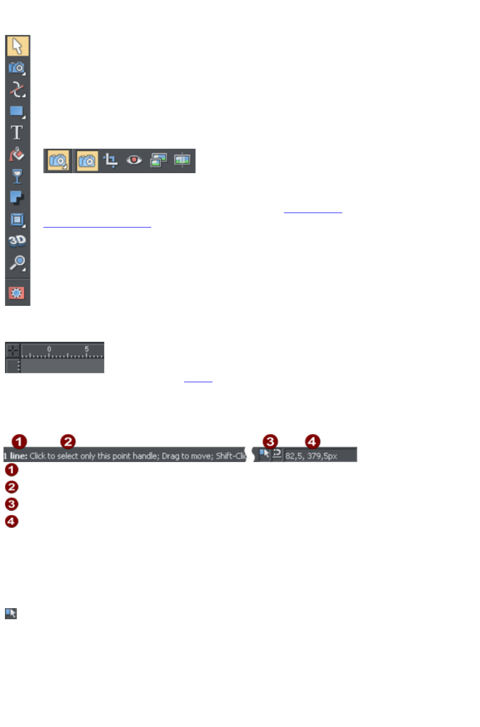
Main toolbar
This is a control bar that initially contains all the tools available in Web
Designer Premium (see left). You can customize the toolbar, or move
tools to other control bars.
Some of the toolbar icons have a small triangle indicator in the bottom
right corner. This indicates that there is a flyout bar containing more
tool icons. Hold your mouse pointer over the icon to see the flyout
bar appear. You can then move the mouse pointer over each icon in
the bar to see a tooltip indicating what each one does.
Click on a tool to select it (some tools have keyboard shortcuts,
too).
For information on customizing control bars, refer to "Customizing
Web Designer Premium
".
Rulers
You can hide the rulers, change their zero point (origin),
and use them to create guidelines. For more
information, see Rulers
.
The status line
Selected objects
Available options
Indicators
Mouse pointer X-Y
This appears at the bottom of the window. The status line tells you about the selected objects, available
options, live drag/snapping indicators, and the X/Y position of the pointer.
The indicators
These appear on the right of the status line:
Live drag indicator
This indicator shows whether live drag is active or not (it is active by
default). Double click the indicator to toggle live drag on/off. When
active, if you reposition, resize, or rotate an object, the whole object
moves (not just an outline), making it far easier to judge the effect of
your edits in real time. Drawing in the Freehand, Straight Line,
Quickshape, Rectangle and Ellipse Tools
is also live with this option on. If your computer is unable to cope
Page 237

with a particularly complex document, it will automatically turn active
drag off to ensure editing remains fast and efficient.
Snapped indicator
This indicator is active when Snap to objects is enabled (by default
in web documents - click the Snap to objects button (shown on the
lower left) to toggle off and on. Snap to objects allows you to see
potential snapping paths and points relative to other objects and the
page center and edges by showing blue snapping lines for snapping
paths and red dots for points as you drag an object. For more
information on snapping, refer to "Object Handling
".
X/Y co-ordinates
Web Designer Premium shows measurements relative to the bottom left corner of the page area or
spread. However, this is configurable. For more information refer to "Object Handling
".
Normal/full screen modes
In normal screen mode part of the window is occupied by the title bar, menu bar, and scroll bars. This
can be inconvenient if you want the maximum possible editing area. Web Designer Premium has a second
screen mode, fullscreen, which displays a more streamlined screen. You can configure each screen mode
as you wish. For example, each can have its own configuration of the control bars. The configuration is
remembered and applies whenever you swap between screen modes.
Normal/full screen is controlled by "Window" > "Full Screen" or right click and choose Full Screen
("8" on the numeric keypad).
To display the menu bar in full screen mode, move the pointer to the top of the screen.
Page 238
Rulers
You can hide the rulers, change their zero point (origin),
and use them to create guidelines. For more
information, see Rulers
.
The status line
Selected objects
Available options
Indicators
Mouse pointer X-Y
This appears at the bottom of the window. The status line tells you about the selected objects, available
options, live drag/snapping indicators, and the X/Y position of the pointer.
The indicators
These appear on the right of the status line:
Live drag indicator
This indicator shows whether live drag is active or not (it is active by
default). Double click the indicator to toggle live drag on/off. When
active, if you reposition, resize, or rotate an object, the whole object
moves (not just an outline), making it far easier to judge the effect of
your edits in real time. Drawing in the Freehand, Straight Line,
Quickshape, Rectangle and Ellipse Tools
is also live with this option on. If your computer is unable to cope
with a particularly complex document, it will automatically turn active
drag off to ensure editing remains fast and efficient.
Snapped indicator
This indicator is active when Snap to objects is enabled (by default
in web documents - click the Snap to objects button (shown on the
lower left) to toggle off and on. Snap to objects allows you to see
potential snapping paths and points relative to other objects and the
page center and edges by showing blue snapping lines for snapping
paths and red dots for points as you drag an object. For more
information on snapping, refer to "Object Handling
".
X/Y co-ordinates
Web Designer Premium shows measurements relative to the bottom left corner of the page area or
spread. However, this is configurable. For more information refer to "Object Handling
".
Normal/full screen modes
In normal screen mode part of the window is occupied by the title bar, menu bar, and scroll bars. This
can be inconvenient if you want the maximum possible editing area. Web Designer Premium has a second
Page 239

screen mode, fullscreen, which displays a more streamlined screen. You can configure each screen mode
as you wish. For example, each can have its own configuration of the control bars. The configuration is
remembered and applies whenever you swap between screen modes.
Normal/full screen is controlled by "Window" > "Full Screen" or right click and choose Full Screen
("8" on the numeric keypad).
To display the menu bar in full screen mode, move the pointer to the top of the screen.
Page 240
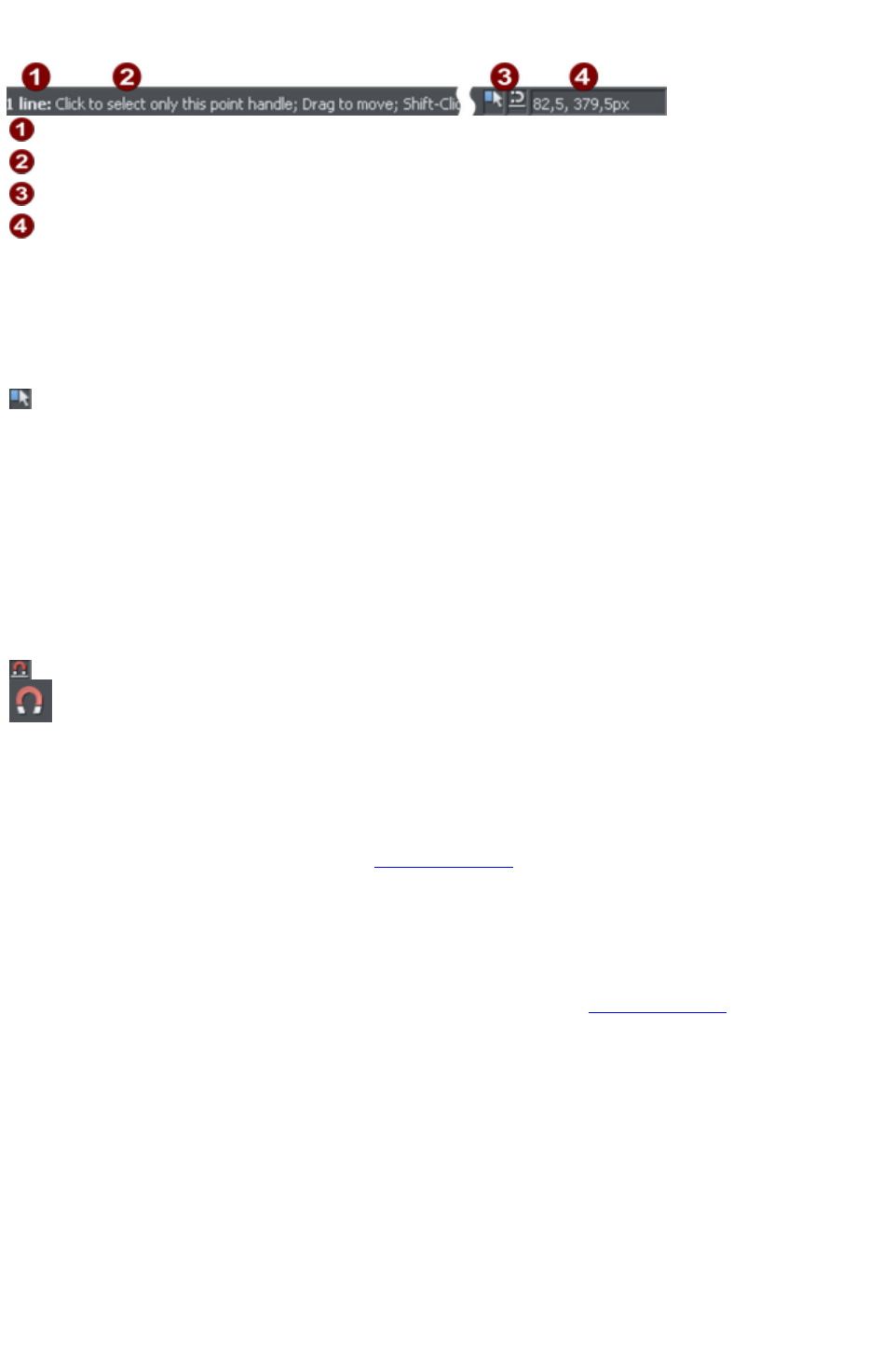
The status line
Selected objects
Available options
Indicators
Mouse pointer X-Y
This appears at the bottom of the window. The status line tells you about the selected objects, available
options, live drag/snapping indicators, and the X/Y position of the pointer.
The indicators
These appear on the right of the status line:
Live drag indicator
This indicator shows whether live drag is active or not (it is active by
default). Double click the indicator to toggle live drag on/off. When
active, if you reposition, resize, or rotate an object, the whole object
moves (not just an outline), making it far easier to judge the effect of
your edits in real time. Drawing in the Freehand, Straight Line,
Quickshape, Rectangle and Ellipse Tools
is also live with this option on. If your computer is unable to cope
with a particularly complex document, it will automatically turn active
drag off to ensure editing remains fast and efficient.
Snapped indicator
This indicator is active when Snap to objects is enabled (by default
in web documents - click the Snap to objects button (shown on the
lower left) to toggle off and on. Snap to objects allows you to see
potential snapping paths and points relative to other objects and the
page center and edges by showing blue snapping lines for snapping
paths and red dots for points as you drag an object. For more
information on snapping, refer to "Object Handling
".
X/Y co-ordinates
Web Designer Premium shows measurements relative to the bottom left corner of the page area or
spread. However, this is configurable. For more information refer to "Object Handling
".
Normal/full screen modes
In normal screen mode part of the window is occupied by the title bar, menu bar, and scroll bars. This
can be inconvenient if you want the maximum possible editing area. Web Designer Premium has a second
screen mode, fullscreen, which displays a more streamlined screen. You can configure each screen mode
as you wish. For example, each can have its own configuration of the control bars. The configuration is
remembered and applies whenever you swap between screen modes.
Normal/full screen is controlled by "Window" > "Full Screen" or right click and choose Full Screen
("8" on the numeric keypad).
To display the menu bar in full screen mode, move the pointer to the top of the screen.
Page 241
The indicators
These appear on the right of the status line:
Live drag indicator
This indicator shows whether live drag is active or not (it is active by
default). Double click the indicator to toggle live drag on/off. When
active, if you reposition, resize, or rotate an object, the whole object
moves (not just an outline), making it far easier to judge the effect of
your edits in real time. Drawing in the Freehand, Straight Line,
Quickshape, Rectangle and Ellipse Tools
is also live with this option on. If your computer is unable to cope
with a particularly complex document, it will automatically turn active
drag off to ensure editing remains fast and efficient.
Snapped indicator
This indicator is active when Snap to objects is enabled (by default
in web documents - click the Snap to objects button (shown on the
lower left) to toggle off and on. Snap to objects allows you to see
potential snapping paths and points relative to other objects and the
page center and edges by showing blue snapping lines for snapping
paths and red dots for points as you drag an object. For more
information on snapping, refer to "Object Handling
".
X/Y co-ordinates
Web Designer Premium shows measurements relative to the bottom left corner of the page area or
spread. However, this is configurable. For more information refer to "Object Handling
".
Normal/full screen modes
In normal screen mode part of the window is occupied by the title bar, menu bar, and scroll bars. This
can be inconvenient if you want the maximum possible editing area. Web Designer Premium has a second
screen mode, fullscreen, which displays a more streamlined screen. You can configure each screen mode
as you wish. For example, each can have its own configuration of the control bars. The configuration is
remembered and applies whenever you swap between screen modes.
Normal/full screen is controlled by "Window" > "Full Screen" or right click and choose Full Screen
("8" on the numeric keypad).
To display the menu bar in full screen mode, move the pointer to the top of the screen.
Page 242

X/Y co-ordinates
Web Designer Premium shows measurements relative to the bottom left corner of the page area or
spread. However, this is configurable. For more information refer to "Object Handling
".
Normal/full screen modes
In normal screen mode part of the window is occupied by the title bar, menu bar, and scroll bars. This
can be inconvenient if you want the maximum possible editing area. Web Designer Premium has a second
screen mode, fullscreen, which displays a more streamlined screen. You can configure each screen mode
as you wish. For example, each can have its own configuration of the control bars. The configuration is
remembered and applies whenever you swap between screen modes.
Normal/full screen is controlled by "Window" > "Full Screen" or right click and choose Full Screen
("8" on the numeric keypad).
To display the menu bar in full screen mode, move the pointer to the top of the screen.
Page 243

Normal/full screen modes
In normal screen mode part of the window is occupied by the title bar, menu bar, and scroll bars. This
can be inconvenient if you want the maximum possible editing area. Web Designer Premium has a second
screen mode, fullscreen, which displays a more streamlined screen. You can configure each screen mode
as you wish. For example, each can have its own configuration of the control bars. The configuration is
remembered and applies whenever you swap between screen modes.
Normal/full screen is controlled by "Window" > "Full Screen" or right click and choose Full Screen
("8" on the numeric keypad).
To display the menu bar in full screen mode, move the pointer to the top of the screen.
Page 244

Opening a second window
You may want to open a second window onto the same document to:
Get an enlarged or reduced view of the document;
Show another part of the document;
Have two views of the same area at different quality settings (quality settings are described later.)
Choose "Window" > "New View"
to open another window. You can have several windows open on the same document.
Selecting which window to display
Each window that you have currently open is displayed as a tab below the infobar. Click on a tab to
display the window or click on the Window
menu and choose a window name at the bottom.
Ordering multiple windows
"Window" > "Arrange views"
helps you organize multiple windows. Each window has its own title bar but no control bars. Click on a
window to make it the current window. Pressing "Ctrl + F6" steps through the windows in sequence.
Arrange views
displays the windows arranged vertically or, for more than three windows, as tiles.
Minimizing multiple windows
Minimizing one of several windows displays an icon on the background of the main Web Designer
Premium window. Double click the icon to reopen the window.
Page 245

Selecting which window to display
Each window that you have currently open is displayed as a tab below the infobar. Click on a tab to
display the window or click on the Window
menu and choose a window name at the bottom.
Ordering multiple windows
"Window" > "Arrange views"
helps you organize multiple windows. Each window has its own title bar but no control bars. Click on a
window to make it the current window. Pressing "Ctrl + F6" steps through the windows in sequence.
Arrange views
displays the windows arranged vertically or, for more than three windows, as tiles.
Minimizing multiple windows
Minimizing one of several windows displays an icon on the background of the main Web Designer
Premium window. Double click the icon to reopen the window.
Page 246

Ordering multiple windows
"Window" > "Arrange views"
helps you organize multiple windows. Each window has its own title bar but no control bars. Click on a
window to make it the current window. Pressing "Ctrl + F6" steps through the windows in sequence.
Arrange views
displays the windows arranged vertically or, for more than three windows, as tiles.
Minimizing multiple windows
Minimizing one of several windows displays an icon on the background of the main Web Designer
Premium window. Double click the icon to reopen the window.
Page 247

Minimizing multiple windows
Minimizing one of several windows displays an icon on the background of the main Web Designer
Premium window. Double click the icon to reopen the window.
Page 248
Changing the zoom value
It's often useful to enlarge your view of the document to examine details or reduce your view to get an
overall impression. Scalings above 100% show an enlarged view (similar to looking through a magnifying
glass); below 100% a reduced view. The only change is your view of the document; the size of the
document itself and the objects in it are unchanged (changing the document size is described later). To
change the zoom value you can use either the Zoom Tool
, mouse, or control bars.
Some shortcuts are available for quick setting of zoom values: The plain numeric keys (1, 2, 3, 4) set the
zoom to between 100% and 400%. The number 5 key sets it to 50%.
Using the Zoom tool
To zoom:
Select the Zoom Tool from the Main Toolbar.
Or press "Alt + Z" to toggle between the current tool and the Zoom Tool.
Or press and hold down "Alt + Z" to temporarily swap to the Zoom Tool (release "Alt + Z" to
return to the previous tool).
Or press "Shift + F7" to select the Zoom Tool.
Changing the zoom value using the mouse
If you have a mouse wheel:
Hold "Ctrl" and scroll your mouse wheel to change the zoom level.
You can also configure a mouse button to zoom in or out. Furthermore, you can change the mouse wheel
action between scrolling and zooming in "Utilities" > "Options" > "Mouse tab" or right click and choose
"Page Options" > "Mouse" tab.
The opposite action is available then by pressing "Ctrl".
Alternatively, select the Zoom Tool
, and
Click to zoom in (enlarge).
"Shift + click" to reduce the zoom value (to see more of the document).
Drag the mouse diagonally to create a rectangle. When you release the mouse button, the area
within the rectangle is enlarged to fit the window.
Changing the zoom using the zoom InfoBar/control bar
There is a flyout bar on the standard toolbar which gives you quick access to zoom functions, without
having to go into the Zoom Tool. There is also a flyout bar on the Zoom Tool
icon on the main toolbar.
Hold the mouse pointer over the zoom icon on the standard toolbar to
see the flyout bar.
To change the zoom:
Shortcut "Ctrl + R". Click the Previous zoom
button. This is the zoom value before the current setting. Using
this button lets you flip zoom in and out on the document. This is
useful for switching between examining an area in detail and an
overall view. The previous zoom value is stored for each
window. You can swap between windows and the previous
Page 249
zoom values are retained.
Shortcut "1" Click the Zoom to 100% button. The zoom factor is
changed to 100%.
Shortcut "Ctrl + Shift + J". Click the Zoom to drawing
button. The window shows all the objects in the document.
Shortcut "Ctrl + Shift + P". Click the Zoom to Page
button. The window shows the entire page or pair of pages.
Shortcut "Ctrl + Shift + Z". Click the Zoom to Selection
button. The selected object or objects fill the window.
Type a value into the text box. Press "
¿" to implement the change, or select preset
zoom values including those above (page,
drawing, selected, previous) in the
drop-down menu.
Page 250
Using the Zoom tool
To zoom:
Select the Zoom Tool from the Main Toolbar.
Or press "Alt + Z" to toggle between the current tool and the Zoom Tool.
Or press and hold down "Alt + Z" to temporarily swap to the Zoom Tool (release "Alt + Z" to
return to the previous tool).
Or press "Shift + F7" to select the Zoom Tool.
Changing the zoom value using the mouse
If you have a mouse wheel:
Hold "Ctrl" and scroll your mouse wheel to change the zoom level.
You can also configure a mouse button to zoom in or out. Furthermore, you can change the mouse wheel
action between scrolling and zooming in "Utilities" > "Options" > "Mouse tab" or right click and choose
"Page Options" > "Mouse" tab.
The opposite action is available then by pressing "Ctrl".
Alternatively, select the Zoom Tool
, and
Click to zoom in (enlarge).
"Shift + click" to reduce the zoom value (to see more of the document).
Drag the mouse diagonally to create a rectangle. When you release the mouse button, the area
within the rectangle is enlarged to fit the window.
Changing the zoom using the zoom InfoBar/control bar
There is a flyout bar on the standard toolbar which gives you quick access to zoom functions, without
having to go into the Zoom Tool. There is also a flyout bar on the Zoom Tool
icon on the main toolbar.
Hold the mouse pointer over the zoom icon on the standard toolbar to
see the flyout bar.
To change the zoom:
Shortcut "Ctrl + R". Click the Previous zoom
button. This is the zoom value before the current setting. Using
this button lets you flip zoom in and out on the document. This is
useful for switching between examining an area in detail and an
overall view. The previous zoom value is stored for each
window. You can swap between windows and the previous
zoom values are retained.
Shortcut "1" Click the Zoom to 100% button. The zoom factor is
changed to 100%.
Shortcut "Ctrl + Shift + J". Click the Zoom to drawing
button. The window shows all the objects in the document.
Shortcut "Ctrl + Shift + P". Click the Zoom to Page
button. The window shows the entire page or pair of pages.
Shortcut "Ctrl + Shift + Z". Click the Zoom to Selection
button. The selected object or objects fill the window.
Page 251
Type a value into the text box. Press "
¿" to implement the change, or select preset
zoom values including those above (page,
drawing, selected, previous) in the
drop-down menu.
Page 252
Changing the zoom value using the mouse
If you have a mouse wheel:
Hold "Ctrl" and scroll your mouse wheel to change the zoom level.
You can also configure a mouse button to zoom in or out. Furthermore, you can change the mouse wheel
action between scrolling and zooming in "Utilities" > "Options" > "Mouse tab" or right click and choose
"Page Options" > "Mouse" tab.
The opposite action is available then by pressing "Ctrl".
Alternatively, select the Zoom Tool
, and
Click to zoom in (enlarge).
"Shift + click" to reduce the zoom value (to see more of the document).
Drag the mouse diagonally to create a rectangle. When you release the mouse button, the area
within the rectangle is enlarged to fit the window.
Changing the zoom using the zoom InfoBar/control bar
There is a flyout bar on the standard toolbar which gives you quick access to zoom functions, without
having to go into the Zoom Tool. There is also a flyout bar on the Zoom Tool
icon on the main toolbar.
Hold the mouse pointer over the zoom icon on the standard toolbar to
see the flyout bar.
To change the zoom:
Shortcut "Ctrl + R". Click the Previous zoom
button. This is the zoom value before the current setting. Using
this button lets you flip zoom in and out on the document. This is
useful for switching between examining an area in detail and an
overall view. The previous zoom value is stored for each
window. You can swap between windows and the previous
zoom values are retained.
Shortcut "1" Click the Zoom to 100% button. The zoom factor is
changed to 100%.
Shortcut "Ctrl + Shift + J". Click the Zoom to drawing
button. The window shows all the objects in the document.
Shortcut "Ctrl + Shift + P". Click the Zoom to Page
button. The window shows the entire page or pair of pages.
Shortcut "Ctrl + Shift + Z". Click the Zoom to Selection
button. The selected object or objects fill the window.
Type a value into the text box. Press "
¿" to implement the change, or select preset
zoom values including those above (page,
drawing, selected, previous) in the
drop-down menu.
Page 253
Changing the zoom using the zoom InfoBar/control bar
There is a flyout bar on the standard toolbar which gives you quick access to zoom functions, without
having to go into the Zoom Tool. There is also a flyout bar on the Zoom Tool
icon on the main toolbar.
Hold the mouse pointer over the zoom icon on the standard toolbar to
see the flyout bar.
To change the zoom:
Shortcut "Ctrl + R". Click the Previous zoom
button. This is the zoom value before the current setting. Using
this button lets you flip zoom in and out on the document. This is
useful for switching between examining an area in detail and an
overall view. The previous zoom value is stored for each
window. You can swap between windows and the previous
zoom values are retained.
Shortcut "1" Click the Zoom to 100% button. The zoom factor is
changed to 100%.
Shortcut "Ctrl + Shift + J". Click the Zoom to drawing
button. The window shows all the objects in the document.
Shortcut "Ctrl + Shift + P". Click the Zoom to Page
button. The window shows the entire page or pair of pages.
Shortcut "Ctrl + Shift + Z". Click the Zoom to Selection
button. The selected object or objects fill the window.
Type a value into the text box. Press "
¿" to implement the change, or select preset
zoom values including those above (page,
drawing, selected, previous) in the
drop-down menu.
Page 254

Sliding the document within the window
The quickest and easiest way to move around the document is to use the middle mouse button (normally
the mouse wheel) if you have one. Click and hold the middle button down and then move the mouse.
Release the button to return to your previous tool.
To move the document within the window you can also:
Use the scroll bars and arrows at the side of the window.
Use the mouse wheel to scroll the document up and down ("Shift + mouse wheel" for left and
right)
Or select the Push Tool from the main toolbar ("H").
Or press the space bar or "Alt + X" to toggle between the current tool and the Push Tool.
Or press and hold down the space bar or "Alt + X" to temporarily switch to the Push Tool
(release key(s) to return to the previous tool). You can then use the mouse to drag the document
around in the window.
The Push Tool InfoBar is the same as the Zoom Tool
InfoBar (described above).
Displaying the scroll bars is optional. Choose "Window" > "Bars" > "Scrollbars"
to turn them off.
You can change the mouse wheel action between scrolling and zooming in "Utilities" > "Options" > "
Mouse" or right click and choose "Page Options" > "Mouse"
. The opposite action is available then by pressing "Ctrl".
Page 255

Changing the page size
When you open a new Web Designer Premium document, the page size is 760 x 700 pixels (SVA web
page). However, you can change the page size if required, e.g. to support other screen resolutions such
as VGA.
1. Choose Menu "Utilities" > "Options" or right click a page and choose "Page Options".
2. If necessary, click the Page Size tab.
3. Choose the required page size.
If you select Custom
in the size selector, you can set a custom width and height in the fields below it.
Every page in the document (exported website) can have a different size. With the option All pages in
website the same size
you will set the page size to the same value for all pages in the document.
You can resize the height and width of the page by
dragging the lower and right border of the page with the
selector tool.
Page 256
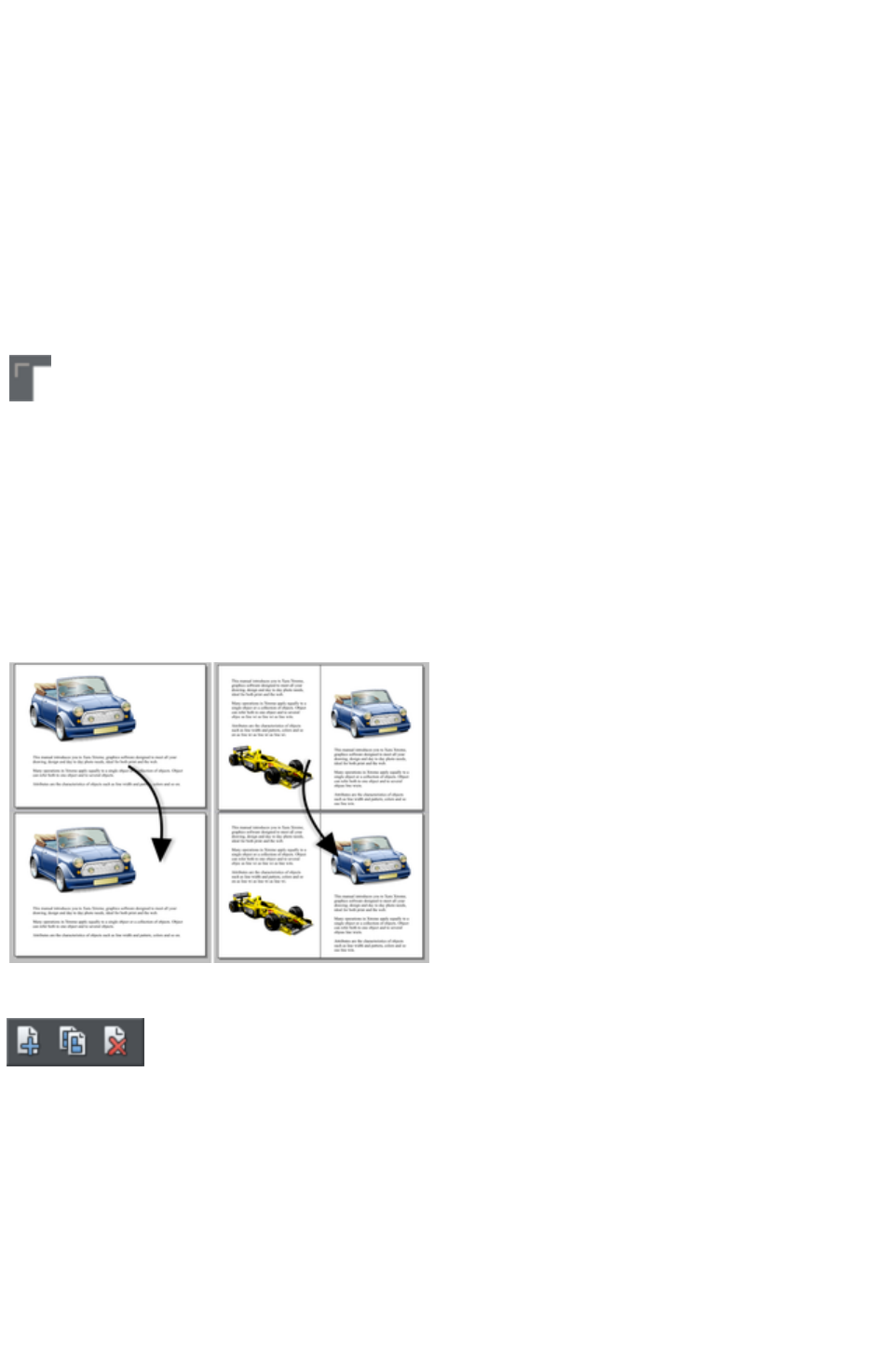
Multiple pages in the document
A Xara Web Designer 7 Premium document can have multiple pages. Each page is exported to a
separate HTML page and so each document in Xara Web Designer 7 Premium corresponds to a
website.
By default when you open or create a new web document, Web Designer Premium shows only one
page. Print documents however are displayed in multiple page view by default. Right click a page or its
pasteboard and select/deselect Multiple Page View
to toggle between display modes.
The current page
If you click a page in a multi-page document it will become the current page.
The current page is relevant when inserting, duplicating, or moving
pages as described in the following sections.
The current page in the document is shown by indicators on the page's
corners.
Inserting pages into your document
Right click a page and choose New Page or New double page spread
. A new blank page is inserted after the page.
or
Right click a page and choose Duplicate current page or Duplicate current double page spread
. A duplicate of the current page is inserted after the page.
The new page will be the
same as the original page,
including its size and
orientation, and will include
all its content so that you
can use it as a template for
new content.
You can also use the
Menu items under "Edit"
> "Pages"
In addition, the standard toolbar has a flyout bar which allows you to add, duplicate and delete pages
quickly.
Hold the mouse pointer over each icon in the bar to see a tooltip for each available operation. You can
add a new blank page, duplicate the current page or delete the current page.
Copying and pasting pages
You can copy and paste whole pages in the current document or paste pages to another document. This
copies the page dimensions, layers and other page attributes in addition to all the objects on the page.
To copy the current page, clear any current selection by pressing Esc or by clicking on an empty part of
the page or pasteboard. The status line says "No objects selected". Right click an empty part of a page
and choose Copy Page
Page 257

(or press "Ctrl + C").
When you paste a copied page, it is added immediately following the current page. To paste use "Ctrl +
V" or right click the page and choose Paste > Page
from the context menu.
Note: If the document into which you paste a page has the All pages in document the same option
enabled in File > Page Options
, the dimensions of the pasted page will be overridden by the page dimensions of the document. So the
new page will be given the same dimensions as all the other pages in the document.
Moving pages within the document
If you wish to move a page's location within the document page order you can do so.
To move the current page:
Choose "Edit" > "Pages" > "Move page up" or right click and choose Move page up to
swap the current page with the one previous to it.
Choose "Edit" > "Pages" > "Move page down" or right click and choose Move page
down to swap the current page with the one after it.
These menu options will be grayed out of if you are on the first or the last page of the document
respectively.
Removing pages from your document
To delete the current page from your document right click and choose Delete current page or select
"Edit" > "Pages" > "Delete current page"
. The current page and all its content will be deleted.
Navigating between pages
As well as the usual methods of moving through your document (such as scrollbars and the mouse
wheel), there are also some other ways to navigate through the pages:
Page up:
Moves up the document. The amount moved depends on your zoom level. The further you are zoomed
out the bigger the move.
Ctrl + Page up:
Go to and center on the previous page.
Page down:
Moves down the document. The amount moved depends on your zoom level. The further you are
zoomed out the greater the move.
Ctrl + Page down:
Go to and center on the next page.
Or click the up or down arrow on the status
line:
The status line is also useful for knowing what page(s) you are currently viewing.
Note:
All of these movements are relative to the page you are viewing, not the current page.
Page & Layer Gallery
You can also use the Page & Layer Gallery
to conveniently manage the pages in your document. It allows you to view, add, duplicate, delete,
re-order and rename pages all from a single view.
By default the Page & Layer Gallery
is open on the right of the Web Designer Premium window in pages mode, only displaying pages (rather
Page 258

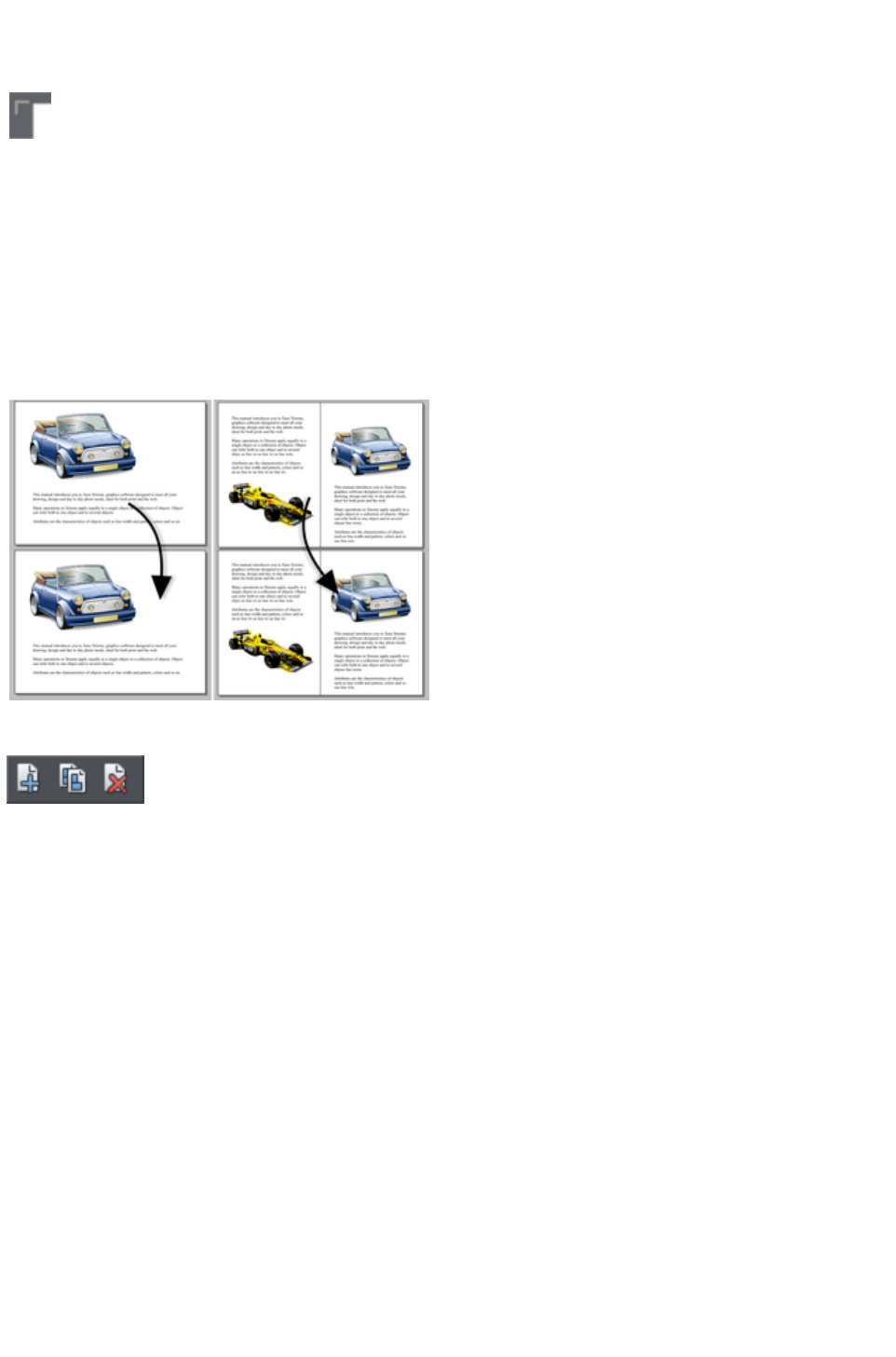
The current page
If you click a page in a multi-page document it will become the current page.
The current page is relevant when inserting, duplicating, or moving
pages as described in the following sections.
The current page in the document is shown by indicators on the page's
corners.
Inserting pages into your document
Right click a page and choose New Page or New double page spread
. A new blank page is inserted after the page.
or
Right click a page and choose Duplicate current page or Duplicate current double page spread
. A duplicate of the current page is inserted after the page.
The new page will be the
same as the original page,
including its size and
orientation, and will include
all its content so that you
can use it as a template for
new content.
You can also use the
Menu items under "Edit"
> "Pages"
In addition, the standard toolbar has a flyout bar which allows you to add, duplicate and delete pages
quickly.
Hold the mouse pointer over each icon in the bar to see a tooltip for each available operation. You can
add a new blank page, duplicate the current page or delete the current page.
Copying and pasting pages
You can copy and paste whole pages in the current document or paste pages to another document. This
copies the page dimensions, layers and other page attributes in addition to all the objects on the page.
To copy the current page, clear any current selection by pressing Esc or by clicking on an empty part of
the page or pasteboard. The status line says "No objects selected". Right click an empty part of a page
and choose Copy Page
(or press "Ctrl + C").
When you paste a copied page, it is added immediately following the current page. To paste use "Ctrl +
V" or right click the page and choose Paste > Page
from the context menu.
Note: If the document into which you paste a page has the All pages in document the same option
enabled in File > Page Options
, the dimensions of the pasted page will be overridden by the page dimensions of the document. So the
new page will be given the same dimensions as all the other pages in the document.
Moving pages within the document
Page 260
If you wish to move a page's location within the document page order you can do so.
To move the current page:
Choose "Edit" > "Pages" > "Move page up" or right click and choose Move page up to
swap the current page with the one previous to it.
Choose "Edit" > "Pages" > "Move page down" or right click and choose Move page
down to swap the current page with the one after it.
These menu options will be grayed out of if you are on the first or the last page of the document
respectively.
Removing pages from your document
To delete the current page from your document right click and choose Delete current page or select
"Edit" > "Pages" > "Delete current page"
. The current page and all its content will be deleted.
Navigating between pages
As well as the usual methods of moving through your document (such as scrollbars and the mouse
wheel), there are also some other ways to navigate through the pages:
Page up:
Moves up the document. The amount moved depends on your zoom level. The further you are zoomed
out the bigger the move.
Ctrl + Page up:
Go to and center on the previous page.
Page down:
Moves down the document. The amount moved depends on your zoom level. The further you are
zoomed out the greater the move.
Ctrl + Page down:
Go to and center on the next page.
Or click the up or down arrow on the status
line:
The status line is also useful for knowing what page(s) you are currently viewing.
Note:
All of these movements are relative to the page you are viewing, not the current page.
Page & Layer Gallery
You can also use the Page & Layer Gallery
to conveniently manage the pages in your document. It allows you to view, add, duplicate, delete,
re-order and rename pages all from a single view.
By default the Page & Layer Gallery
is open on the right of the Web Designer Premium window in pages mode, only displaying pages (rather
than their contents) with a thumbnail for each page of the current design. Click on a thumbnail to go to
that page.
For more information see Page & Layer Gallery
.
Page 261
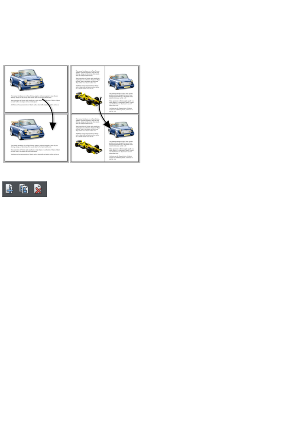
Inserting pages into your document
Right click a page and choose New Page or New double page spread
. A new blank page is inserted after the page.
or
Right click a page and choose Duplicate current page or Duplicate current double page spread
. A duplicate of the current page is inserted after the page.
The new page will be the
same as the original page,
including its size and
orientation, and will include
all its content so that you
can use it as a template for
new content.
You can also use the
Menu items under "Edit"
> "Pages"
In addition, the standard toolbar has a flyout bar which allows you to add, duplicate and delete pages
quickly.
Hold the mouse pointer over each icon in the bar to see a tooltip for each available operation. You can
add a new blank page, duplicate the current page or delete the current page.
Copying and pasting pages
You can copy and paste whole pages in the current document or paste pages to another document. This
copies the page dimensions, layers and other page attributes in addition to all the objects on the page.
To copy the current page, clear any current selection by pressing Esc or by clicking on an empty part of
the page or pasteboard. The status line says "No objects selected". Right click an empty part of a page
and choose Copy Page
(or press "Ctrl + C").
When you paste a copied page, it is added immediately following the current page. To paste use "Ctrl +
V" or right click the page and choose Paste > Page
from the context menu.
Note: If the document into which you paste a page has the All pages in document the same option
enabled in File > Page Options
, the dimensions of the pasted page will be overridden by the page dimensions of the document. So the
new page will be given the same dimensions as all the other pages in the document.
Moving pages within the document
If you wish to move a page's location within the document page order you can do so.
To move the current page:
Choose "Edit" > "Pages" > "Move page up" or right click and choose Move page up to
swap the current page with the one previous to it.
Choose "Edit" > "Pages" > "Move page down" or right click and choose Move page
down to swap the current page with the one after it.
These menu options will be grayed out of if you are on the first or the last page of the document
Page 262
respectively.
Removing pages from your document
To delete the current page from your document right click and choose Delete current page or select
"Edit" > "Pages" > "Delete current page"
. The current page and all its content will be deleted.
Navigating between pages
As well as the usual methods of moving through your document (such as scrollbars and the mouse
wheel), there are also some other ways to navigate through the pages:
Page up:
Moves up the document. The amount moved depends on your zoom level. The further you are zoomed
out the bigger the move.
Ctrl + Page up:
Go to and center on the previous page.
Page down:
Moves down the document. The amount moved depends on your zoom level. The further you are
zoomed out the greater the move.
Ctrl + Page down:
Go to and center on the next page.
Or click the up or down arrow on the status
line:
The status line is also useful for knowing what page(s) you are currently viewing.
Note:
All of these movements are relative to the page you are viewing, not the current page.
Page & Layer Gallery
You can also use the Page & Layer Gallery
to conveniently manage the pages in your document. It allows you to view, add, duplicate, delete,
re-order and rename pages all from a single view.
By default the Page & Layer Gallery
is open on the right of the Web Designer Premium window in pages mode, only displaying pages (rather
than their contents) with a thumbnail for each page of the current design. Click on a thumbnail to go to
that page.
For more information see Page & Layer Gallery
.
Page 263

Copying and pasting pages
You can copy and paste whole pages in the current document or paste pages to another document. This
copies the page dimensions, layers and other page attributes in addition to all the objects on the page.
To copy the current page, clear any current selection by pressing Esc or by clicking on an empty part of
the page or pasteboard. The status line says "No objects selected". Right click an empty part of a page
and choose Copy Page
(or press "Ctrl + C").
When you paste a copied page, it is added immediately following the current page. To paste use "Ctrl +
V" or right click the page and choose Paste > Page
from the context menu.
Note: If the document into which you paste a page has the All pages in document the same option
enabled in File > Page Options
, the dimensions of the pasted page will be overridden by the page dimensions of the document. So the
new page will be given the same dimensions as all the other pages in the document.
Moving pages within the document
If you wish to move a page's location within the document page order you can do so.
To move the current page:
Choose "Edit" > "Pages" > "Move page up" or right click and choose Move page up to
swap the current page with the one previous to it.
Choose "Edit" > "Pages" > "Move page down" or right click and choose Move page
down to swap the current page with the one after it.
These menu options will be grayed out of if you are on the first or the last page of the document
respectively.
Removing pages from your document
To delete the current page from your document right click and choose Delete current page or select
"Edit" > "Pages" > "Delete current page"
. The current page and all its content will be deleted.
Navigating between pages
As well as the usual methods of moving through your document (such as scrollbars and the mouse
wheel), there are also some other ways to navigate through the pages:
Page up:
Moves up the document. The amount moved depends on your zoom level. The further you are zoomed
out the bigger the move.
Ctrl + Page up:
Go to and center on the previous page.
Page down:
Moves down the document. The amount moved depends on your zoom level. The further you are
zoomed out the greater the move.
Ctrl + Page down:
Go to and center on the next page.
Or click the up or down arrow on the status
line:
The status line is also useful for knowing what page(s) you are currently viewing.
Note:
Page 264

All of these movements are relative to the page you are viewing, not the current page.
Page & Layer Gallery
You can also use the Page & Layer Gallery
to conveniently manage the pages in your document. It allows you to view, add, duplicate, delete,
re-order and rename pages all from a single view.
By default the Page & Layer Gallery
is open on the right of the Web Designer Premium window in pages mode, only displaying pages (rather
than their contents) with a thumbnail for each page of the current design. Click on a thumbnail to go to
that page.
For more information see Page & Layer Gallery
.
Page 265
Moving pages within the document
If you wish to move a page's location within the document page order you can do so.
To move the current page:
Choose "Edit" > "Pages" > "Move page up" or right click and choose Move page up to
swap the current page with the one previous to it.
Choose "Edit" > "Pages" > "Move page down" or right click and choose Move page
down to swap the current page with the one after it.
These menu options will be grayed out of if you are on the first or the last page of the document
respectively.
Removing pages from your document
To delete the current page from your document right click and choose Delete current page or select
"Edit" > "Pages" > "Delete current page"
. The current page and all its content will be deleted.
Navigating between pages
As well as the usual methods of moving through your document (such as scrollbars and the mouse
wheel), there are also some other ways to navigate through the pages:
Page up:
Moves up the document. The amount moved depends on your zoom level. The further you are zoomed
out the bigger the move.
Ctrl + Page up:
Go to and center on the previous page.
Page down:
Moves down the document. The amount moved depends on your zoom level. The further you are
zoomed out the greater the move.
Ctrl + Page down:
Go to and center on the next page.
Or click the up or down arrow on the status
line:
The status line is also useful for knowing what page(s) you are currently viewing.
Note:
All of these movements are relative to the page you are viewing, not the current page.
Page & Layer Gallery
You can also use the Page & Layer Gallery
to conveniently manage the pages in your document. It allows you to view, add, duplicate, delete,
re-order and rename pages all from a single view.
By default the Page & Layer Gallery
is open on the right of the Web Designer Premium window in pages mode, only displaying pages (rather
than their contents) with a thumbnail for each page of the current design. Click on a thumbnail to go to
that page.
For more information see Page & Layer Gallery
.
Page 266
Removing pages from your document
To delete the current page from your document right click and choose Delete current page or select
"Edit" > "Pages" > "Delete current page"
. The current page and all its content will be deleted.
Navigating between pages
As well as the usual methods of moving through your document (such as scrollbars and the mouse
wheel), there are also some other ways to navigate through the pages:
Page up:
Moves up the document. The amount moved depends on your zoom level. The further you are zoomed
out the bigger the move.
Ctrl + Page up:
Go to and center on the previous page.
Page down:
Moves down the document. The amount moved depends on your zoom level. The further you are
zoomed out the greater the move.
Ctrl + Page down:
Go to and center on the next page.
Or click the up or down arrow on the status
line:
The status line is also useful for knowing what page(s) you are currently viewing.
Note:
All of these movements are relative to the page you are viewing, not the current page.
Page & Layer Gallery
You can also use the Page & Layer Gallery
to conveniently manage the pages in your document. It allows you to view, add, duplicate, delete,
re-order and rename pages all from a single view.
By default the Page & Layer Gallery
is open on the right of the Web Designer Premium window in pages mode, only displaying pages (rather
than their contents) with a thumbnail for each page of the current design. Click on a thumbnail to go to
that page.
For more information see Page & Layer Gallery
.
Page 267
Navigating between pages
As well as the usual methods of moving through your document (such as scrollbars and the mouse
wheel), there are also some other ways to navigate through the pages:
Page up:
Moves up the document. The amount moved depends on your zoom level. The further you are zoomed
out the bigger the move.
Ctrl + Page up:
Go to and center on the previous page.
Page down:
Moves down the document. The amount moved depends on your zoom level. The further you are
zoomed out the greater the move.
Ctrl + Page down:
Go to and center on the next page.
Or click the up or down arrow on the status
line:
The status line is also useful for knowing what page(s) you are currently viewing.
Note:
All of these movements are relative to the page you are viewing, not the current page.
Page & Layer Gallery
You can also use the Page & Layer Gallery
to conveniently manage the pages in your document. It allows you to view, add, duplicate, delete,
re-order and rename pages all from a single view.
By default the Page & Layer Gallery
is open on the right of the Web Designer Premium window in pages mode, only displaying pages (rather
than their contents) with a thumbnail for each page of the current design. Click on a thumbnail to go to
that page.
For more information see Page & Layer Gallery
.
Page 268

Page & Layer Gallery
You can also use the Page & Layer Gallery
to conveniently manage the pages in your document. It allows you to view, add, duplicate, delete,
re-order and rename pages all from a single view.
By default the Page & Layer Gallery
is open on the right of the Web Designer Premium window in pages mode, only displaying pages (rather
than their contents) with a thumbnail for each page of the current design. Click on a thumbnail to go to
that page.
For more information see Page & Layer Gallery
.
Page 269

Saving the document
This section covers saving in Web Designer Premium's own format (native format). Refer to Importing
and Exporting
for details of exporting in other formats.
We recommend that you always save documents regularly. A complicated document may represent
many hours of work and power failures or computer crashes always happen at just the wrong moment.
Make sure you have the automatic backup facility turned on, so that regular backups are taken of your
open documents as you work. See the Automatic Backups
section below for details.
Save option (on the File menu)
("Ctrl + S", or click the Save
button on the standard control bar.)
This provides a quick way to save a document using the same file name. The option is disabled unless the
document has unsaved changes, i.e. you have made changes, but haven't saved them to disk.
For a new document that has not been saved to disk, this option acts like "Save as" (described below).
Save as (on the File menu)
This opens a dialog box letting you save the document under a different name or to a different directory.
This option is useful for making backups of Web Designer Premium documents.
Save all (on the File menu)
This acts like a series of Save or Save As
commands to save all currently open files.
Page 270

Save option (on the File menu)
("Ctrl + S", or click the Save
button on the standard control bar.)
This provides a quick way to save a document using the same file name. The option is disabled unless the
document has unsaved changes, i.e. you have made changes, but haven't saved them to disk.
For a new document that has not been saved to disk, this option acts like "Save as" (described below).
Save as (on the File menu)
This opens a dialog box letting you save the document under a different name or to a different directory.
This option is useful for making backups of Web Designer Premium documents.
Save all (on the File menu)
This acts like a series of Save or Save As
commands to save all currently open files.
Page 271

Save as (on the File menu)
This opens a dialog box letting you save the document under a different name or to a different directory.
This option is useful for making backups of Web Designer Premium documents.
Save all (on the File menu)
This acts like a series of Save or Save As
commands to save all currently open files.
Page 272

Save all (on the File menu)
This acts like a series of Save or Save As
commands to save all currently open files.
Page 273

Support folders
Some documents which are used to create websites need to reference external files which cannot be
embedded in the .xar design file. For example you may have a Flash (.swf) file which is used on your
website and so you'll want to keep that file with the design file because you can't export a fully working
website from the design file without also having the Flash file. And if you were to send the design to
someone else, or move it to another computer, you'd want the referenced Flash file to go along with the
main design file.
So Xara Web Designer 7 Premium uses an optional "support folder" right alongside the design file to hold
these important external files.
Support folder naming
The design file and its corresponding support folder are tied together by their names. The support folder
for "mySite.xar" is always "mySite_xar_files". This naming convention makes it obvious which support
folder belongs to which design file. So if you rename, copy or move a design file, always remember to do
the same to the corresponding support folder, if it exists! And if you send a design file to someone else,
send any support files folder along with it.
If you load a design that has a support folder, and then subsequently do a Save As
to save another copy of that design, Xara Web Designer 7 Premium will copy the whole support folder
too, if there is one.
Support folder contents
When you use the Placeholder Tab
of the Web Properties dialog to insert a reference to an external file into your website design (using the
Browse buttons), Xara Web Designer 7 Premium will automatically copy that file into the design's
support folder for you. If the support folder doesn't already exist, it will be created.
Note that if you subsequently change a placeholder object to reference a different file, the original file will
not be automatically deleted from the support folder. So if a file is no longer needed, you need to remove
it manually.
You can also manually copy any files you like into the support folder of a design, creating the folder
manually if required. Xara Web Designer 7 Premium will never delete any files from it, whether or not
they are referenced from the corresponding design file. The reason for this is that there are many different
ways in which a design may reference an external file. For example you may insert a complex piece of
HTML code into your design, which somewhere references an external file which you've placed in the
support folder. Or perhaps one of the external files references another external file! There's no way that
Xara Web Designer 7 Premium can be sure that a file is not used by the website, so it never deletes files.
Exporting websites with support folders
When you export a website document, any files in the corresponding support folder are copied to the
folder which contains all the generated images for your website. So if you export "mySite.xar" to
"index.htm", then any files in folder "mySite_xar_files" are copied into the "index_htm_files folder".
Page 274

Support folder naming
The design file and its corresponding support folder are tied together by their names. The support folder
for "mySite.xar" is always "mySite_xar_files". This naming convention makes it obvious which support
folder belongs to which design file. So if you rename, copy or move a design file, always remember to do
the same to the corresponding support folder, if it exists! And if you send a design file to someone else,
send any support files folder along with it.
If you load a design that has a support folder, and then subsequently do a Save As
to save another copy of that design, Xara Web Designer 7 Premium will copy the whole support folder
too, if there is one.
Support folder contents
When you use the Placeholder Tab
of the Web Properties dialog to insert a reference to an external file into your website design (using the
Browse buttons), Xara Web Designer 7 Premium will automatically copy that file into the design's
support folder for you. If the support folder doesn't already exist, it will be created.
Note that if you subsequently change a placeholder object to reference a different file, the original file will
not be automatically deleted from the support folder. So if a file is no longer needed, you need to remove
it manually.
You can also manually copy any files you like into the support folder of a design, creating the folder
manually if required. Xara Web Designer 7 Premium will never delete any files from it, whether or not
they are referenced from the corresponding design file. The reason for this is that there are many different
ways in which a design may reference an external file. For example you may insert a complex piece of
HTML code into your design, which somewhere references an external file which you've placed in the
support folder. Or perhaps one of the external files references another external file! There's no way that
Xara Web Designer 7 Premium can be sure that a file is not used by the website, so it never deletes files.
Exporting websites with support folders
When you export a website document, any files in the corresponding support folder are copied to the
folder which contains all the generated images for your website. So if you export "mySite.xar" to
"index.htm", then any files in folder "mySite_xar_files" are copied into the "index_htm_files folder".
Page 275

Support folder contents
When you use the Placeholder Tab
of the Web Properties dialog to insert a reference to an external file into your website design (using the
Browse buttons), Xara Web Designer 7 Premium will automatically copy that file into the design's
support folder for you. If the support folder doesn't already exist, it will be created.
Note that if you subsequently change a placeholder object to reference a different file, the original file will
not be automatically deleted from the support folder. So if a file is no longer needed, you need to remove
it manually.
You can also manually copy any files you like into the support folder of a design, creating the folder
manually if required. Xara Web Designer 7 Premium will never delete any files from it, whether or not
they are referenced from the corresponding design file. The reason for this is that there are many different
ways in which a design may reference an external file. For example you may insert a complex piece of
HTML code into your design, which somewhere references an external file which you've placed in the
support folder. Or perhaps one of the external files references another external file! There's no way that
Xara Web Designer 7 Premium can be sure that a file is not used by the website, so it never deletes files.
Exporting websites with support folders
When you export a website document, any files in the corresponding support folder are copied to the
folder which contains all the generated images for your website. So if you export "mySite.xar" to
"index.htm", then any files in folder "mySite_xar_files" are copied into the "index_htm_files folder".
Page 276

Exporting websites with support folders
When you export a website document, any files in the corresponding support folder are copied to the
folder which contains all the generated images for your website. So if you export "mySite.xar" to
"index.htm", then any files in folder "mySite_xar_files" are copied into the "index_htm_files folder".
Page 277

Closing the document
To close the document:
Choose "File" > "Close".
Or press "Ctrl + F4", or "Ctrl + W".
Or click the smaller, lower X of the two in the top right hand corner.
Page 278
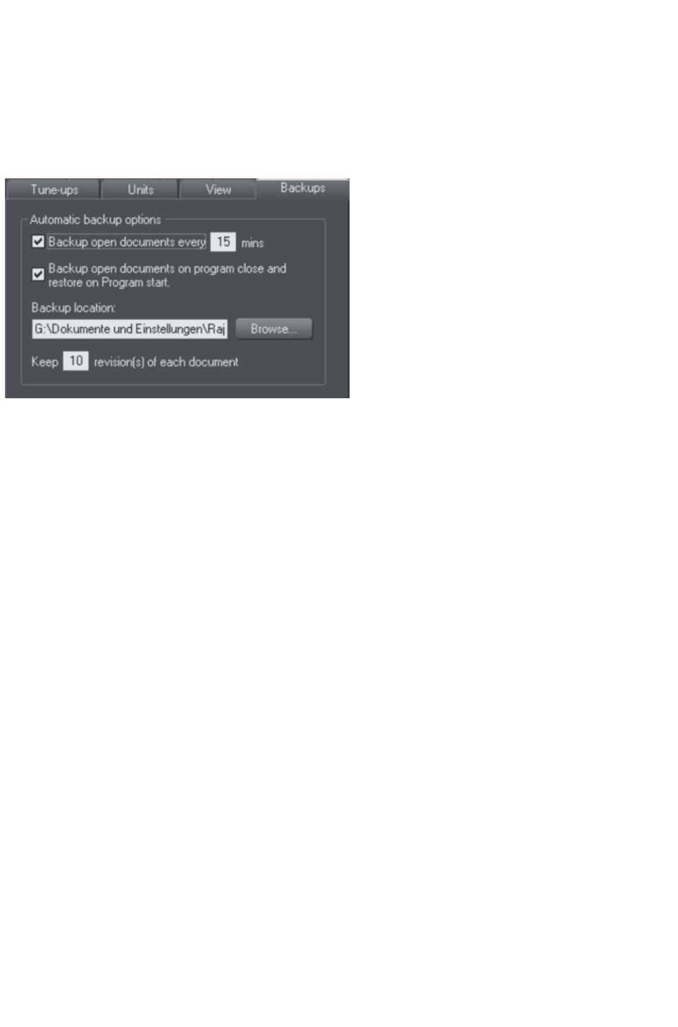
Automatic Backups
Xara Web Designer 7 Premium will optionally save regular backup copies of your open documents
while you work. This helps you avoid losing your work in the event of a power failure or other abnormal
program closure. It's also useful if you decide to return to an earlier version of your document, should you
want to do so.
To turn automatic backups on or off, open the "Utilities" > "Options" dialog and choose the Backups
tab.
Backup open documents
To turn backups on select this checkbox and choose how often you would like backups to be taken.
The suggested period is 10 mins, which means each open document will be backed up if it's more than
10 mins since the last backup of that document was taken (or since the document was created or
opened).
Note that once the configured period since the last backup has expired, the next backup is only saved
when the program has been idle for at least 15 secs. This is to avoid interrupting your work as much as
possible and to avoid backing up the document while it is being actively modified. In normal use it's
unlikely that there won't be regular inactive periods of 15 secs or more, allowing a backup to be taken
soon after it is due. But note that if you are actively editing for an extended period of time it could be
significantly longer than the configured backup period before the next backup runs.
The Automatic Backup facility does not save modifications to open 'edit inside' sub-documents. Only the
parent main document is saved when a scheduled backup runs, in its current state without the unsaved
group edits. For this reason it's recommended that you save 'edit inside' edits back to the parent
document regularly.
When a backup is taken, you'll see the save progress bar appear at the bottom of the Xara Web
Designer 7 Premium window while the save is completed.
Backup location
User the Browse
button if you want to change the folder where your backups are stored.
You can access the backup documents saved here at any time using the "File" > "Open recent" > "
Backups"
menu option. This opens a file dialog onto your backup folder so that you can browse, open, or delete
any of your backup files.
Revisions
By default up to 10 revisions of each design are kept in your backups folder, but you can choose to
change this number in the revisions field. Older revisions in excess of the number chosen are deleted
Page 279

automatically. Each backup file is named using the name of the document from which it is taken, suffixed
by the date and time at which the backup was taken.
Warning
: Note that if you have multiple documents that share the same filename in different folders on your
computer, their backups will also share the same names in the backups folder. Therefore try and use
unique filenames for your designs to avoid the backups of one design overwriting another with the same
name.
Untitled documents
Documents that you have created and not saved are backed up using the name "Untitled" followed by a
number and the date/time. This name and number corresponds to those shown in the titlebar when you
are editing new unsaved documents.
Warning
: Since all new unsaved documents are named Untitled1, Untitled2, etc. backups of these documents are
likely to be overwritten relatively quickly. Therefore you should always save important documents with a
unique name of your choice, so that you can easily identify backups of that document in the backups
folder.
Backup open documents on program close
The Backups tab in the Options dialog also allows you to turn on automatic backup and restore
. When this option is on, when the you close Xara Web Designer 7 Premium you will not be prompted to
save any modified documents that you have open. Instead all open documents are backed up to the
backups folder and the program closes. Then when you next start the program, the same documents are
automatically reloaded so that you can continue working where you left off.
Note that if you have any "Edit inside" sub-document views open, these are silently closed and saved
back to the main document when the program is closed, and the main document is backed up. The 'edit
inside' sub-document views are not re-opened on next program start. See editing inside groups.
Recovering from abnormal program closures
If you have automatic backups turned on and the program closes abnormally (perhaps due to a power
failure for example) the program should detect this when it is next restarted. It will then offer you the
chance to restore the most recent backup version of each document that was open at the time of the last
backup.
Abnormal closure will not be detected if no automatic backup completed since the last normal program
closure.
Backups on system shut down
If you shut down Windows without first closing the program, all open documents are backed up to the
backup folder even if 'Backup open documents on program close' is not turned on. This allows system
shutdown to proceed without Xara Web Designer 7 Premium interrupting it by prompting you about
unsaved or modified documents. On next program startup you'll be asked whether or not you want to
restore the documents that were open at the time of the system shut down.
Recovering backups
You can access your document backups using the "File" > "Open recent" > "Backups"
menu option. This opens a file dialog onto your backup folder so that you can browse, open, or delete
any of your backup files. It's a good idea to use this file dialog to clear out any old unwanted backups
periodically.
Note that when you load a backup document, it is not automatically associated with the design file from
Page 280

which the backup was taken. It's treated as an independent document in its own right. Therefore if you
decide to keep a backup document you should use "File" > "Save As"
to save it elsewhere with a suitable name.
Page 281

Backup open documents
To turn backups on select this checkbox and choose how often you would like backups to be taken.
The suggested period is 10 mins, which means each open document will be backed up if it's more than
10 mins since the last backup of that document was taken (or since the document was created or
opened).
Note that once the configured period since the last backup has expired, the next backup is only saved
when the program has been idle for at least 15 secs. This is to avoid interrupting your work as much as
possible and to avoid backing up the document while it is being actively modified. In normal use it's
unlikely that there won't be regular inactive periods of 15 secs or more, allowing a backup to be taken
soon after it is due. But note that if you are actively editing for an extended period of time it could be
significantly longer than the configured backup period before the next backup runs.
The Automatic Backup facility does not save modifications to open 'edit inside' sub-documents. Only the
parent main document is saved when a scheduled backup runs, in its current state without the unsaved
group edits. For this reason it's recommended that you save 'edit inside' edits back to the parent
document regularly.
When a backup is taken, you'll see the save progress bar appear at the bottom of the Xara Web
Designer 7 Premium window while the save is completed.
Backup location
User the Browse
button if you want to change the folder where your backups are stored.
You can access the backup documents saved here at any time using the "File" > "Open recent" > "
Backups"
menu option. This opens a file dialog onto your backup folder so that you can browse, open, or delete
any of your backup files.
Revisions
By default up to 10 revisions of each design are kept in your backups folder, but you can choose to
change this number in the revisions field. Older revisions in excess of the number chosen are deleted
automatically. Each backup file is named using the name of the document from which it is taken, suffixed
by the date and time at which the backup was taken.
Warning
: Note that if you have multiple documents that share the same filename in different folders on your
computer, their backups will also share the same names in the backups folder. Therefore try and use
unique filenames for your designs to avoid the backups of one design overwriting another with the same
name.
Untitled documents
Documents that you have created and not saved are backed up using the name "Untitled" followed by a
number and the date/time. This name and number corresponds to those shown in the titlebar when you
are editing new unsaved documents.
Warning
: Since all new unsaved documents are named Untitled1, Untitled2, etc. backups of these documents are
likely to be overwritten relatively quickly. Therefore you should always save important documents with a
unique name of your choice, so that you can easily identify backups of that document in the backups
folder.
Backup open documents on program close
Page 282

The Backups tab in the Options dialog also allows you to turn on automatic backup and restore
. When this option is on, when the you close Xara Web Designer 7 Premium you will not be prompted to
save any modified documents that you have open. Instead all open documents are backed up to the
backups folder and the program closes. Then when you next start the program, the same documents are
automatically reloaded so that you can continue working where you left off.
Note that if you have any "Edit inside" sub-document views open, these are silently closed and saved
back to the main document when the program is closed, and the main document is backed up. The 'edit
inside' sub-document views are not re-opened on next program start. See editing inside groups.
Recovering from abnormal program closures
If you have automatic backups turned on and the program closes abnormally (perhaps due to a power
failure for example) the program should detect this when it is next restarted. It will then offer you the
chance to restore the most recent backup version of each document that was open at the time of the last
backup.
Abnormal closure will not be detected if no automatic backup completed since the last normal program
closure.
Backups on system shut down
If you shut down Windows without first closing the program, all open documents are backed up to the
backup folder even if 'Backup open documents on program close' is not turned on. This allows system
shutdown to proceed without Xara Web Designer 7 Premium interrupting it by prompting you about
unsaved or modified documents. On next program startup you'll be asked whether or not you want to
restore the documents that were open at the time of the system shut down.
Recovering backups
You can access your document backups using the "File" > "Open recent" > "Backups"
menu option. This opens a file dialog onto your backup folder so that you can browse, open, or delete
any of your backup files. It's a good idea to use this file dialog to clear out any old unwanted backups
periodically.
Note that when you load a backup document, it is not automatically associated with the design file from
which the backup was taken. It's treated as an independent document in its own right. Therefore if you
decide to keep a backup document you should use "File" > "Save As"
to save it elsewhere with a suitable name.
Page 283

Backup location
User the Browse
button if you want to change the folder where your backups are stored.
You can access the backup documents saved here at any time using the "File" > "Open recent" > "
Backups"
menu option. This opens a file dialog onto your backup folder so that you can browse, open, or delete
any of your backup files.
Revisions
By default up to 10 revisions of each design are kept in your backups folder, but you can choose to
change this number in the revisions field. Older revisions in excess of the number chosen are deleted
automatically. Each backup file is named using the name of the document from which it is taken, suffixed
by the date and time at which the backup was taken.
Warning
: Note that if you have multiple documents that share the same filename in different folders on your
computer, their backups will also share the same names in the backups folder. Therefore try and use
unique filenames for your designs to avoid the backups of one design overwriting another with the same
name.
Untitled documents
Documents that you have created and not saved are backed up using the name "Untitled" followed by a
number and the date/time. This name and number corresponds to those shown in the titlebar when you
are editing new unsaved documents.
Warning
: Since all new unsaved documents are named Untitled1, Untitled2, etc. backups of these documents are
likely to be overwritten relatively quickly. Therefore you should always save important documents with a
unique name of your choice, so that you can easily identify backups of that document in the backups
folder.
Backup open documents on program close
The Backups tab in the Options dialog also allows you to turn on automatic backup and restore
. When this option is on, when the you close Xara Web Designer 7 Premium you will not be prompted to
save any modified documents that you have open. Instead all open documents are backed up to the
backups folder and the program closes. Then when you next start the program, the same documents are
automatically reloaded so that you can continue working where you left off.
Note that if you have any "Edit inside" sub-document views open, these are silently closed and saved
back to the main document when the program is closed, and the main document is backed up. The 'edit
inside' sub-document views are not re-opened on next program start. See editing inside groups.
Recovering from abnormal program closures
If you have automatic backups turned on and the program closes abnormally (perhaps due to a power
failure for example) the program should detect this when it is next restarted. It will then offer you the
chance to restore the most recent backup version of each document that was open at the time of the last
backup.
Abnormal closure will not be detected if no automatic backup completed since the last normal program
closure.
Page 284

Backups on system shut down
If you shut down Windows without first closing the program, all open documents are backed up to the
backup folder even if 'Backup open documents on program close' is not turned on. This allows system
shutdown to proceed without Xara Web Designer 7 Premium interrupting it by prompting you about
unsaved or modified documents. On next program startup you'll be asked whether or not you want to
restore the documents that were open at the time of the system shut down.
Recovering backups
You can access your document backups using the "File" > "Open recent" > "Backups"
menu option. This opens a file dialog onto your backup folder so that you can browse, open, or delete
any of your backup files. It's a good idea to use this file dialog to clear out any old unwanted backups
periodically.
Note that when you load a backup document, it is not automatically associated with the design file from
which the backup was taken. It's treated as an independent document in its own right. Therefore if you
decide to keep a backup document you should use "File" > "Save As"
to save it elsewhere with a suitable name.
Page 285

Revisions
By default up to 10 revisions of each design are kept in your backups folder, but you can choose to
change this number in the revisions field. Older revisions in excess of the number chosen are deleted
automatically. Each backup file is named using the name of the document from which it is taken, suffixed
by the date and time at which the backup was taken.
Warning
: Note that if you have multiple documents that share the same filename in different folders on your
computer, their backups will also share the same names in the backups folder. Therefore try and use
unique filenames for your designs to avoid the backups of one design overwriting another with the same
name.
Untitled documents
Documents that you have created and not saved are backed up using the name "Untitled" followed by a
number and the date/time. This name and number corresponds to those shown in the titlebar when you
are editing new unsaved documents.
Warning
: Since all new unsaved documents are named Untitled1, Untitled2, etc. backups of these documents are
likely to be overwritten relatively quickly. Therefore you should always save important documents with a
unique name of your choice, so that you can easily identify backups of that document in the backups
folder.
Backup open documents on program close
The Backups tab in the Options dialog also allows you to turn on automatic backup and restore
. When this option is on, when the you close Xara Web Designer 7 Premium you will not be prompted to
save any modified documents that you have open. Instead all open documents are backed up to the
backups folder and the program closes. Then when you next start the program, the same documents are
automatically reloaded so that you can continue working where you left off.
Note that if you have any "Edit inside" sub-document views open, these are silently closed and saved
back to the main document when the program is closed, and the main document is backed up. The 'edit
inside' sub-document views are not re-opened on next program start. See editing inside groups.
Recovering from abnormal program closures
If you have automatic backups turned on and the program closes abnormally (perhaps due to a power
failure for example) the program should detect this when it is next restarted. It will then offer you the
chance to restore the most recent backup version of each document that was open at the time of the last
backup.
Abnormal closure will not be detected if no automatic backup completed since the last normal program
closure.
Backups on system shut down
If you shut down Windows without first closing the program, all open documents are backed up to the
backup folder even if 'Backup open documents on program close' is not turned on. This allows system
shutdown to proceed without Xara Web Designer 7 Premium interrupting it by prompting you about
unsaved or modified documents. On next program startup you'll be asked whether or not you want to
restore the documents that were open at the time of the system shut down.
Recovering backups
Page 286

You can access your document backups using the "File" > "Open recent" > "Backups"
menu option. This opens a file dialog onto your backup folder so that you can browse, open, or delete
any of your backup files. It's a good idea to use this file dialog to clear out any old unwanted backups
periodically.
Note that when you load a backup document, it is not automatically associated with the design file from
which the backup was taken. It's treated as an independent document in its own right. Therefore if you
decide to keep a backup document you should use "File" > "Save As"
to save it elsewhere with a suitable name.
Page 287

Untitled documents
Documents that you have created and not saved are backed up using the name "Untitled" followed by a
number and the date/time. This name and number corresponds to those shown in the titlebar when you
are editing new unsaved documents.
Warning
: Since all new unsaved documents are named Untitled1, Untitled2, etc. backups of these documents are
likely to be overwritten relatively quickly. Therefore you should always save important documents with a
unique name of your choice, so that you can easily identify backups of that document in the backups
folder.
Backup open documents on program close
The Backups tab in the Options dialog also allows you to turn on automatic backup and restore
. When this option is on, when the you close Xara Web Designer 7 Premium you will not be prompted to
save any modified documents that you have open. Instead all open documents are backed up to the
backups folder and the program closes. Then when you next start the program, the same documents are
automatically reloaded so that you can continue working where you left off.
Note that if you have any "Edit inside" sub-document views open, these are silently closed and saved
back to the main document when the program is closed, and the main document is backed up. The 'edit
inside' sub-document views are not re-opened on next program start. See editing inside groups.
Recovering from abnormal program closures
If you have automatic backups turned on and the program closes abnormally (perhaps due to a power
failure for example) the program should detect this when it is next restarted. It will then offer you the
chance to restore the most recent backup version of each document that was open at the time of the last
backup.
Abnormal closure will not be detected if no automatic backup completed since the last normal program
closure.
Backups on system shut down
If you shut down Windows without first closing the program, all open documents are backed up to the
backup folder even if 'Backup open documents on program close' is not turned on. This allows system
shutdown to proceed without Xara Web Designer 7 Premium interrupting it by prompting you about
unsaved or modified documents. On next program startup you'll be asked whether or not you want to
restore the documents that were open at the time of the system shut down.
Recovering backups
You can access your document backups using the "File" > "Open recent" > "Backups"
menu option. This opens a file dialog onto your backup folder so that you can browse, open, or delete
any of your backup files. It's a good idea to use this file dialog to clear out any old unwanted backups
periodically.
Note that when you load a backup document, it is not automatically associated with the design file from
which the backup was taken. It's treated as an independent document in its own right. Therefore if you
decide to keep a backup document you should use "File" > "Save As"
to save it elsewhere with a suitable name.
Page 288

Backup open documents on program close
The Backups tab in the Options dialog also allows you to turn on automatic backup and restore
. When this option is on, when the you close Xara Web Designer 7 Premium you will not be prompted to
save any modified documents that you have open. Instead all open documents are backed up to the
backups folder and the program closes. Then when you next start the program, the same documents are
automatically reloaded so that you can continue working where you left off.
Note that if you have any "Edit inside" sub-document views open, these are silently closed and saved
back to the main document when the program is closed, and the main document is backed up. The 'edit
inside' sub-document views are not re-opened on next program start. See editing inside groups.
Recovering from abnormal program closures
If you have automatic backups turned on and the program closes abnormally (perhaps due to a power
failure for example) the program should detect this when it is next restarted. It will then offer you the
chance to restore the most recent backup version of each document that was open at the time of the last
backup.
Abnormal closure will not be detected if no automatic backup completed since the last normal program
closure.
Backups on system shut down
If you shut down Windows without first closing the program, all open documents are backed up to the
backup folder even if 'Backup open documents on program close' is not turned on. This allows system
shutdown to proceed without Xara Web Designer 7 Premium interrupting it by prompting you about
unsaved or modified documents. On next program startup you'll be asked whether or not you want to
restore the documents that were open at the time of the system shut down.
Recovering backups
You can access your document backups using the "File" > "Open recent" > "Backups"
menu option. This opens a file dialog onto your backup folder so that you can browse, open, or delete
any of your backup files. It's a good idea to use this file dialog to clear out any old unwanted backups
periodically.
Note that when you load a backup document, it is not automatically associated with the design file from
which the backup was taken. It's treated as an independent document in its own right. Therefore if you
decide to keep a backup document you should use "File" > "Save As"
to save it elsewhere with a suitable name.
Page 289

Recovering from abnormal program closures
If you have automatic backups turned on and the program closes abnormally (perhaps due to a power
failure for example) the program should detect this when it is next restarted. It will then offer you the
chance to restore the most recent backup version of each document that was open at the time of the last
backup.
Abnormal closure will not be detected if no automatic backup completed since the last normal program
closure.
Backups on system shut down
If you shut down Windows without first closing the program, all open documents are backed up to the
backup folder even if 'Backup open documents on program close' is not turned on. This allows system
shutdown to proceed without Xara Web Designer 7 Premium interrupting it by prompting you about
unsaved or modified documents. On next program startup you'll be asked whether or not you want to
restore the documents that were open at the time of the system shut down.
Recovering backups
You can access your document backups using the "File" > "Open recent" > "Backups"
menu option. This opens a file dialog onto your backup folder so that you can browse, open, or delete
any of your backup files. It's a good idea to use this file dialog to clear out any old unwanted backups
periodically.
Note that when you load a backup document, it is not automatically associated with the design file from
which the backup was taken. It's treated as an independent document in its own right. Therefore if you
decide to keep a backup document you should use "File" > "Save As"
to save it elsewhere with a suitable name.
Page 290

Backups on system shut down
If you shut down Windows without first closing the program, all open documents are backed up to the
backup folder even if 'Backup open documents on program close' is not turned on. This allows system
shutdown to proceed without Xara Web Designer 7 Premium interrupting it by prompting you about
unsaved or modified documents. On next program startup you'll be asked whether or not you want to
restore the documents that were open at the time of the system shut down.
Recovering backups
You can access your document backups using the "File" > "Open recent" > "Backups"
menu option. This opens a file dialog onto your backup folder so that you can browse, open, or delete
any of your backup files. It's a good idea to use this file dialog to clear out any old unwanted backups
periodically.
Note that when you load a backup document, it is not automatically associated with the design file from
which the backup was taken. It's treated as an independent document in its own right. Therefore if you
decide to keep a backup document you should use "File" > "Save As"
to save it elsewhere with a suitable name.
Page 291

Recovering backups
You can access your document backups using the "File" > "Open recent" > "Backups"
menu option. This opens a file dialog onto your backup folder so that you can browse, open, or delete
any of your backup files. It's a good idea to use this file dialog to clear out any old unwanted backups
periodically.
Note that when you load a backup document, it is not automatically associated with the design file from
which the backup was taken. It's treated as an independent document in its own right. Therefore if you
decide to keep a backup document you should use "File" > "Save As"
to save it elsewhere with a suitable name.
Page 292
On-screen grid
To help you lay out your document, Web Designer Premium can display a grid on the screen (the grid
appears only on the screen; it is never exported or printed.) The grid helps you align objects (similar to
using graph paper as a drawing aid).
Right click and choose "Show Grid/Guides" > "Show Grid" to turn display of the grid on/off or
choose "Snap to" > "Snap to Grid". You can also choose "Window" > "Snap to Grid"
.
The grid points then act like magnets, and as you move objects, they snap to the nearest grid point. By
default web documents have snap to grid on, with a 1 pixel grid.
The type of grid (isometric/rectangular), the 0,0 point (the origin), and spacing of grid points is controlled
by the Grid & Rulers tab
of the options dialog box. Any changes you make apply only to the selected document.
Magnetic object snapping is also enabled by default in web documents. Object snapping is a very
powerful way of accurately aligning lines, points and the edges of objects to any other object so they
exactly touch.
You can even use this to align the centers of objects, or align objects to the center of the page, or align
them horizontally and vertically anywhere in the middle of the page or edge of the page.
To toggle object snapping, click the Snap to objects button or right
click and choose "Snap to" > "Snap to Objects". You can also
choose "Window" > "Snap to Grid"
.
Refer to Object Handling
for details on snapping to grid and snapping to objects.
Page 293
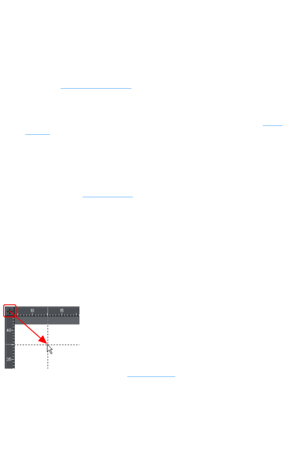
Rulers
Rulers are turned off by default. To turn them on:
Right click and choose "Show Grid/Guides" > "Show Rulers" to turn display of the grid
on/off.
Press "Ctrl + Shift + R".
Or select "Window" > "Bars" > "Show Rulers".
Web Designer Premium uses rulers to:
Control text margins, tabs and indents in the Text Tool.
Let you know which part of the page you are viewing;
Show the current pointer X/Y position;
Apply guidelines. If "Window" > "Snap to grid" is active, guidelines snap to divisions on the
ruler. For more information on guidelines, refer to the guides & guidelines section in "Object
Handling".
As you create or scale objects, you can use the rulers to check their size. You can also more accurately
use the Selector Tool
(see "Selecting objects" for more information).
Rulers are displayed at the left and top of the window. A dotted line on each ruler follows the current
pointer position.
The units and number of divisions on the rulers are the same as those set for customizing the on-screen
grid. These are set using the Grid & Ruler Tab
of the options dialog box. The current units and any scaling factor are displayed on the right hand end of
the top ruler.
Displaying/hiding rulers
Right click and choose "Show Grid/Guides" > "Show Rulers"
("Ctrl + Shift + R") to turn rulers on/off. Any change applies to the current window and subsequent
windows you open. It does not affect other open windows.
Changing the ruler zero points
It is often easier to measure objects if you align the origin (0,0) point of the rulers with the object. To
move the origin (0,0) point, drag the square at the intersection of the two rulers.
You can drag vertically or horizontally along the
rulers or over any part of the Web Designer
Premium editing window. As you do, a dotted line
will outline the new position.
This also moves the grid origin so that divisions
on the ruler always align with the grid.
You can also move the zero point under the Grid & Ruler tab
of the Options dialog.
Page 294
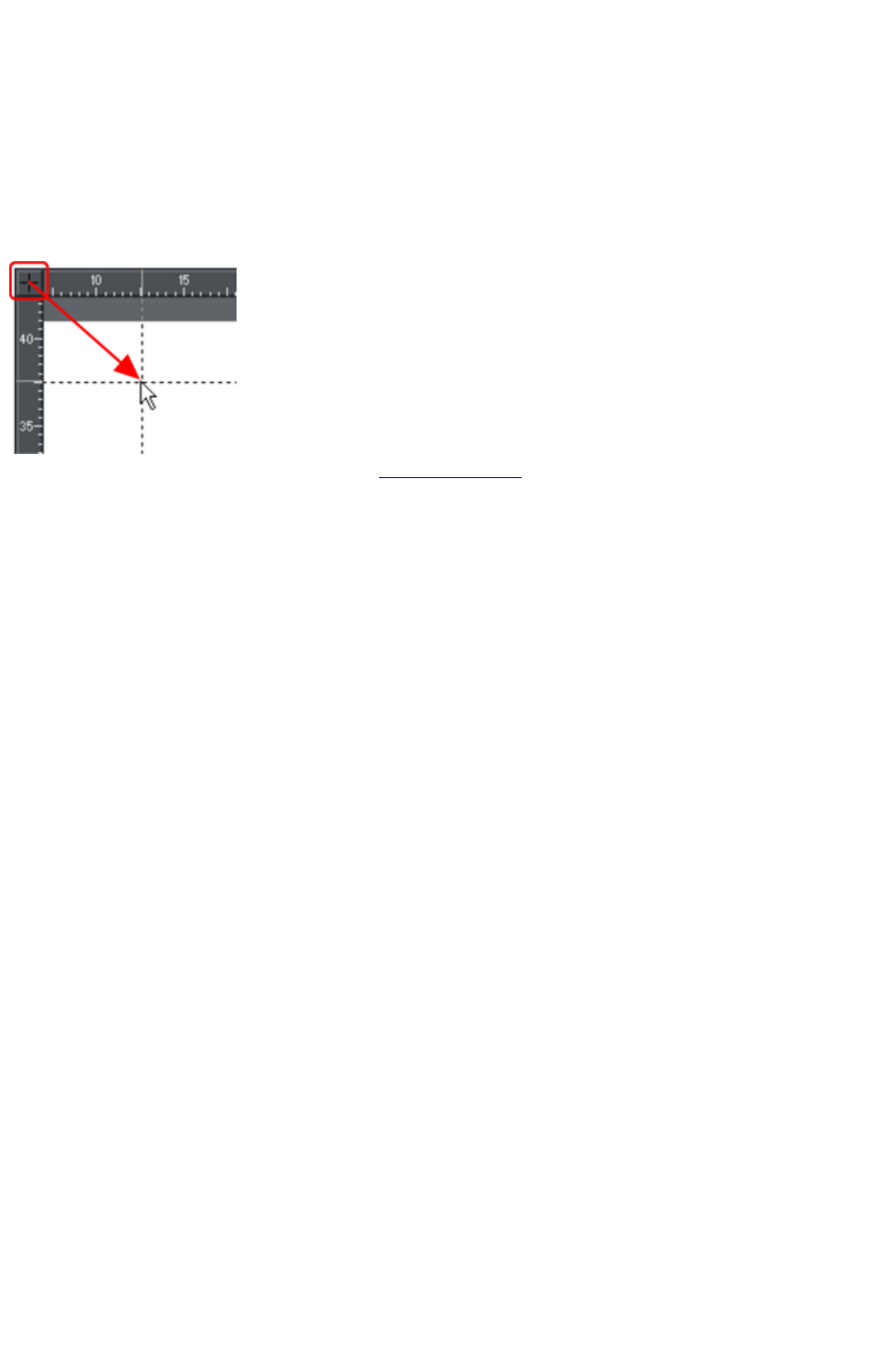
Displaying/hiding rulers
Right click and choose "Show Grid/Guides" > "Show Rulers"
("Ctrl + Shift + R") to turn rulers on/off. Any change applies to the current window and subsequent
windows you open. It does not affect other open windows.
Changing the ruler zero points
It is often easier to measure objects if you align the origin (0,0) point of the rulers with the object. To
move the origin (0,0) point, drag the square at the intersection of the two rulers.
You can drag vertically or horizontally along the
rulers or over any part of the Web Designer
Premium editing window. As you do, a dotted line
will outline the new position.
This also moves the grid origin so that divisions
on the ruler always align with the grid.
You can also move the zero point under the Grid & Ruler tab
of the Options dialog.
Page 295
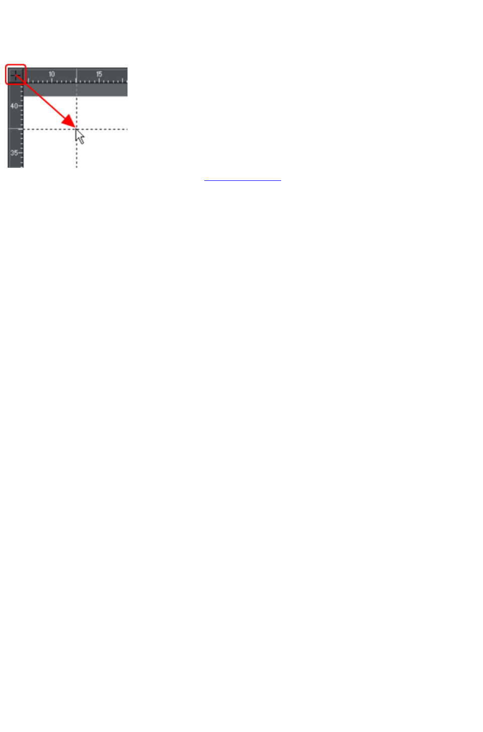
Changing the ruler zero points
It is often easier to measure objects if you align the origin (0,0) point of the rulers with the object. To
move the origin (0,0) point, drag the square at the intersection of the two rulers.
You can drag vertically or horizontally along the
rulers or over any part of the Web Designer
Premium editing window. As you do, a dotted line
will outline the new position.
This also moves the grid origin so that divisions
on the ruler always align with the grid.
You can also move the zero point under the Grid & Ruler tab
of the Options dialog.
Page 296

View quality
There are five different quality settings available in the "Windows" > "Quality"
menu, which affect how the document appears in Xara Web Designer 7 Premium:
Outline only. This is now fully anti-aliased for higher quality screen display.
Outline with blend steps.
Full color (no anti-aliasing).
High quality (full anti-aliasing and image smoothing)
Very high quality (best anti-aliasing in the industry. New bi-cubic photo display considerably
improves the quality of scaled down photos).
Full color
shows the document colored, but with anti-aliasing turned off.
On the outline
setting only the outlines of the shapes appear (they are drawn as wire frames). This makes it easier to
select objects hidden behind other objects.
The quality setting has no effect on how the document exports or prints, except for bitmap exports which
do use the current quality setting.
Page 297
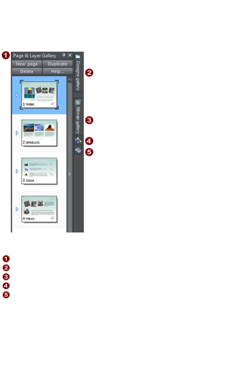
Galleries
Xara Web Designer 7 Premium uses galleries to provide convenient access to libraries of content such
as templates, fonts, colors, clip-art, line attributes, and bitmaps/photos. This section of the help gives
general information on features which are common to multiple galleries. Individual sections describe
features specific to a particular gallery.
By default the Page & Layer Gallery
is open in Pages mode (displaying only pages, not their layers) and docked on the right of the Web
Designer Premium window
Page & Layer
Designs
Bitmap
Lines
Fill
The Page & Layer Gallery
shows you, and allows you to manipulate, the pages in your document and the layers within each page.
The Designs and Fill Galleries
allow you to choose from different templates and styles provided with Xara Web Designer 7 Premium.
The Bitmap Gallery
shows you the bitmaps and photos which are used by all open documents.
Some galleries are described in detail later.
Displaying a gallery
To display a gallery:
Page 298
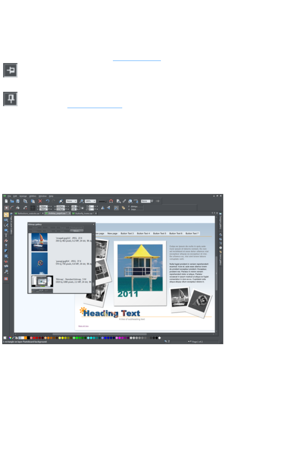
1. Click or hover the mouse pointer over the vertical tab for the gallery to the right of the
workspace (the gallery bar). The gallery opens automatically. When you move the mouse pointer
away from the gallery, it automatically closes.
2. To keep a gallery open while you work, click the Auto Hide (pin) button in its top right corner.
The Auto Hide button changes so the pin points downwards to indicate that the gallery is now
'pinned' to the workspace.
3. To close a 'pinned' gallery, see Closing a Gallery.
Unpinned:
gallery closes when you move the mouse pointer away from the
gallery.
Pinned: gallery stays open when you move the mouse pointer away,
and can also be moved and docked
elsewhere.
Note: By default the Line and Fill Galleries
do not display their title, just their individual icons, until they have been opened. Web Designer Premium
always displays the title of the last gallery that you have viewed.
Moving and docking a gallery
You can 'detach' any gallery from the gallery bar and move it to a more convenient location anywhere in
the workspace. You can also dock the gallery (or a gallery group, see Grouping Galleries) in the top,
bottom, left or right of the workspace.
You can move a gallery anywhere in the workspace
To move a gallery:
1. Open a gallery and click the Auto Hide button to pin the gallery. The button changes to a
downward-pointing pin to indicate that the gallery can be moved and pinned elsewhere.
2. Click and drag on the gallery's title bar to move it around. You can either leave the gallery 'free
floating' anywhere in the workspace or dock it in a new location.
If you move any of the following galleries, the others accompany it as a group. Access an individual
gallery by clicking its tab at the bottom of the group or click and drag a gallery tab to move it away from
the group.
Bitmap
Line
Fill
Page 299
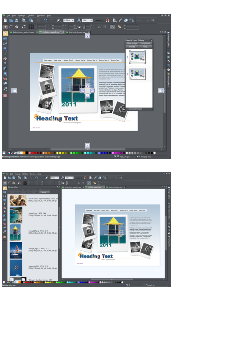
When you click and drag on a dockable gallery's title bar, a number of arrows appear on the workspace,
indicating where you can dock the gallery.
Dragging a gallery causes docking arrows to appear in the center, top, bottom, left and right of the
workspace. Dock the gallery by dragging it to an arrow.
Example of a gallery that has been docked to the left of the workspace
To dock a gallery:
1. Click and drag the gallery to the arrow pointing towards the location where you want to place the
gallery. For example, if you want the gallery at the top of the screen, move it to the upward
pointing arrow at the top of the workspace.
2. When the mouse pointer reaches the arrow, a gray transparent box highlights the gallery's new
location.
3. Let go of the mouse button to dock the gallery. Now when you close or 'auto hide' the gallery, its
Page 300
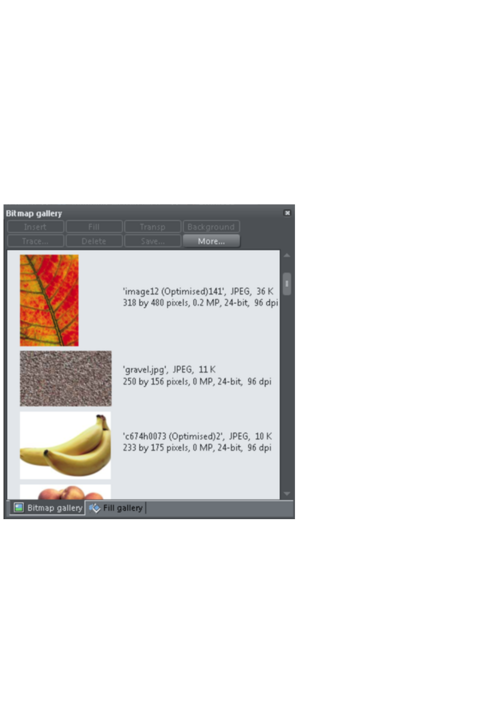
tab will be displayed in the new location.
4. Hover over or click its tab to reopen the gallery.
Note: To move all galleries back to their default position, choose Control Bars from the Window
menu, click Galleries then Reset
.
Grouping galleries
You can arrange two or more frequently-used galleries so that they are next to each other.
1. To move a second gallery so that it is adjacent to a gallery you have previously docked, click and
drag the second gallery to the four arrows in the workspace center.
2. Let go of the mouse when you are over the arrow pointing towards the previously moved (first)
gallery. The second gallery docks next to the first.
You can also group galleries and move the whole group to a new location if, for example, you are
working primarily with 2 or 3 galleries that you want to be close to each other and easily accessible.
Example of a gallery group with gallery tabs at the bottom - click and drag to add a gallery to or remove
a gallery from the group.
To group galleries:
1. Disable the Auto Hide button (pin) on one of the following galleries: Bitmap, Line and Fill
Gallery.The gallery is automatically grouped with the other five galleries, displayed as tabs at the
bottom of the group.
2. Click a tab and drag to remove a gallery from the group.
3. Click on a tab to open a gallery in the group.
4. To add a gallery to a group, click and drag the gallery over the group. Four docking arrows
appear in the center of the group.
5. Drag and drop the gallery into the square in the middle of these arrows and Web Designer
Premium adds it to the group and its tab displayed at the bottom of the group.
6. When you dock a gallery group, all galleries within the group are also docked. When you auto
hide or close a gallery group, all gallery tabs in the group are displayed in the workspace border
Page 301
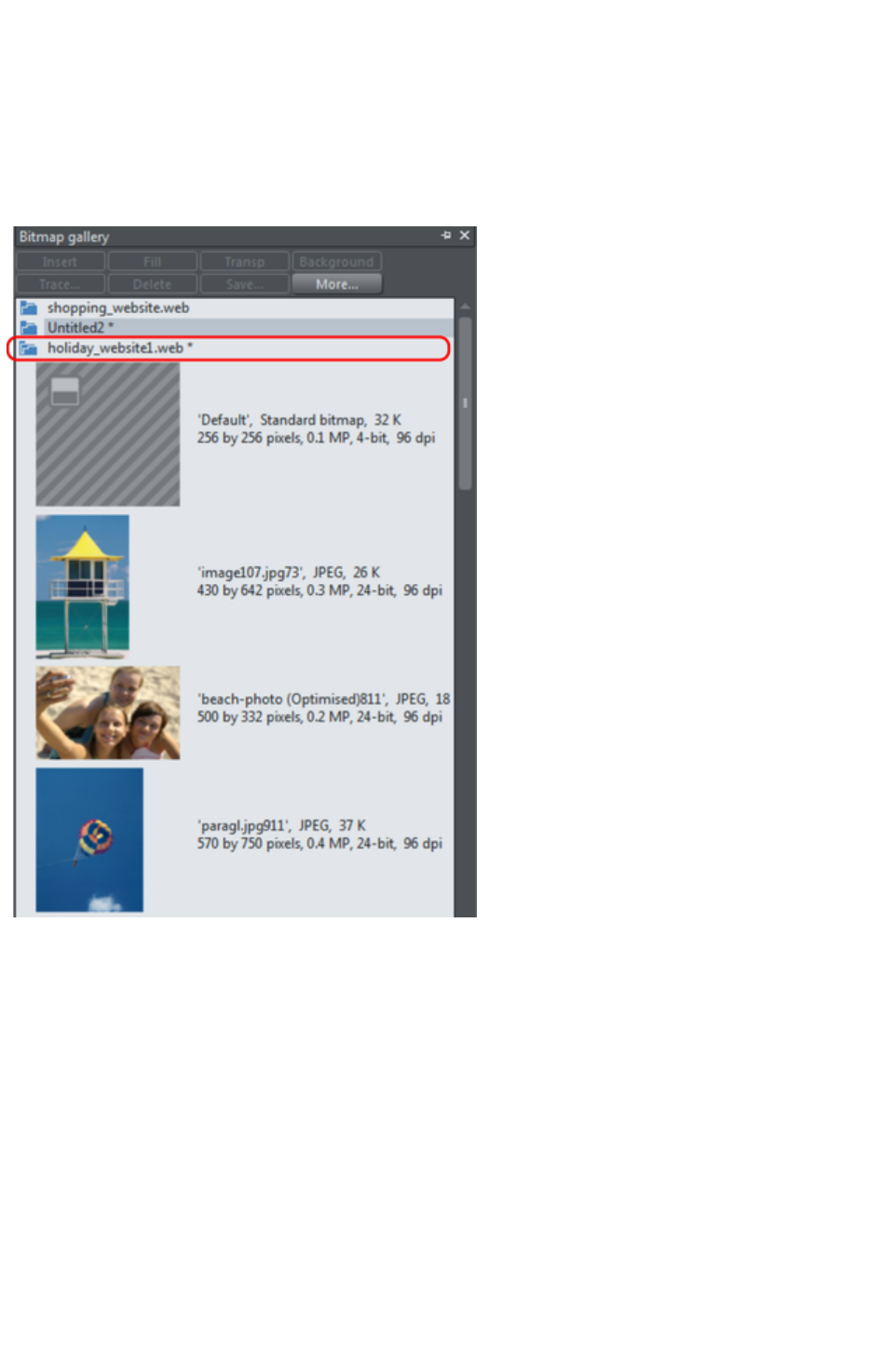
nearest to the last docking location.
Using galleries
To fold or unfold a section in a gallery:
Click the Fold/Unfold icon.
Or double click the title strip.
Or right click a section to display a pop-up menu. Select Fold/Unfold section. The pop-up menu
also has options to scroll to the previous section or next section.
This illustration shows the gallery is unfolded. Other galleries are similar.
The buttons along the top depend on the gallery (e.g. Fill and Transp are specific to the Bitmap
Gallery
.) However, most galleries have these buttons:
Apply
applies the selected item in the gallery. Click on an item to select it.
More
opens a menu where you can then choose:
Find is described later in searching for an item name.
Sort is described later in re-ordering items in a gallery.
Properties provides control over size of the icons and amount of information displayed in the
gallery.
Add (clipart, fill, and fonts galleries) is described later in adding to a gallery.
Remove (clipart, fill, and fonts galleries) is described later in deleting sections from a gallery.
Page 302
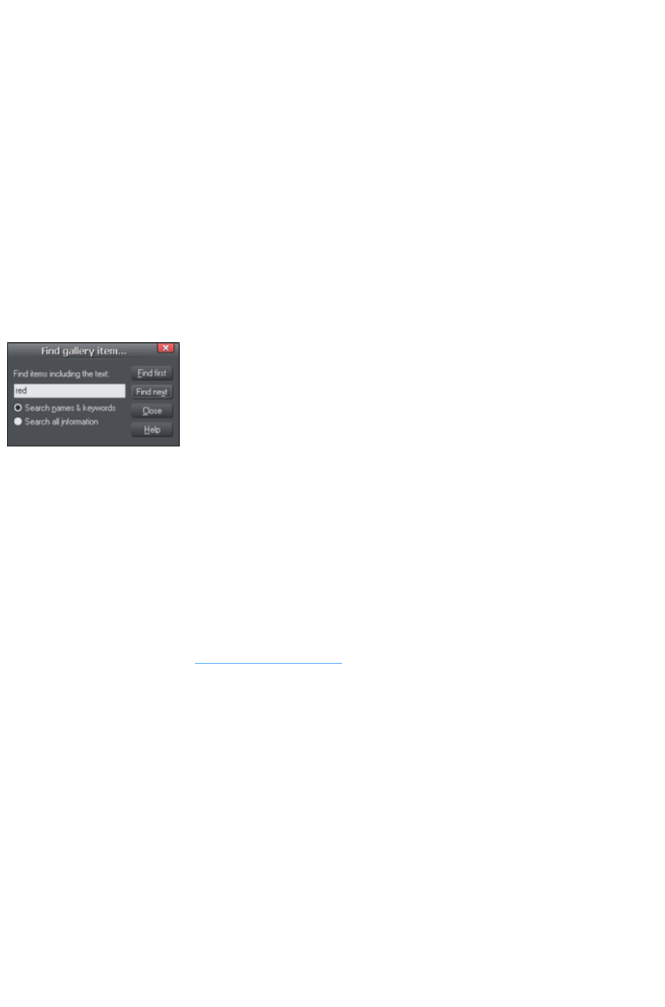
Selecting items
To select an item:
Click an item to select it.
Or click an item, then "Shift + click" on another item; all items in between the two points will be
selected.
Or "Ctrl + click" to add that item to the selection.
Re-ordering items in the gallery
In some galleries, "More" > "Sort"
opens a dialog box. You can sort by name and, depending on the gallery, by other criteria. The primary
key controls the initial sort. For some sort parameters such as file type or name length, there may be two
or more files with the same type or name length. These files can be further sorted using the secondary
key.
Searching for an item name
You can search, for example, for all names containing the word red:
1. Choose "More" > "Find".
2. Type "red" into the text box.
3. Select "Search Names & Keywords"
to search only the item names, e.g. file,
color, etc., or "Search All Information"
to search the names and keywords
available in some galleries.
Adding to a gallery
You may want to add extra items to these galleries (Design & Fill Galleries
only). To do this:
1. Copy the files you want to add into a new directory (folder) using the Windows Explorer.
oFor the Designs Gallery these files can be any of a wide range of vector or bitmap file
types.
oFor the Fill Gallery they can be any of the bitmap formats supported by Web Designer
Premium (listed in importing and exporting).
2. In the appropriate gallery, click the Disc Designs/Fills button. This opens a dialog box.
3. Use the dialog box to select the directory you want to add.
4. Click Add. This creates a new section in the gallery.
If you later want to add more items to the folder:
1. Copy the new files into the existing folder.
2. In the gallery, click Disc Designs/Fills. This opens a dialog box.
3. Use the dialog box to select the folder you want to add.
4. Click Update to update the section in the gallery.
Deleting sections from a gallery
To delete a section from a gallery (Designs & Fill Galleries
only):
1. Click on the title strip of the section or sections you want to delete.
2. Click "Remove".
If you later want the section again, add its folder to the gallery (described earlier).
Page 303

Closing a gallery
By default a gallery's Auto Hide button is enabled (i.e., the gallery's Auto Hide
button in the top right corner is unpinned), so that the gallery closes automatically when you move the
mouse pointer away from it.
However if you have disabled the Auto Hide
button (pinned the gallery), you have to close the gallery manually.
To close a free-floating gallery, click the Close
button in the top right of the gallery. The gallery closes and its tab is displayed in the gallery bar.
To close a docked gallery, click the Auto Hide (pin) or Close
button in the top right of the gallery. The gallery closes and its tab is displayed in the workspace border
where you docked it.
To re-open the gallery, hover over or click on its tab.
Note: To remove a gallery completely, choose Galleries from the Utilities
menu and choose the gallery you want removed.
Removing a gallery from the workspace
By default, when you close a gallery, Web Designer Premium returns it to the gallery bar so that you can
reopen it by hovering the cursor over its icon or tab. However you can configure Web Designer Premium
to remove any gallery from the workspace if it's not needed.
To remove unwanted galleries from the workspace, do one of the following:
Choose Galleries from the Utilities menu and choose the gallery you want removed. The
selected gallery disappears from your workspace. If you want to reinstate a gallery, choose
Galleries from the Utilities menu and choose the gallery you want to reinstate.
Choose Control Bars from the Window menu and scroll down the list of available control bars
to find Galleries. Click the Galleries box to show the Galleries toolbar. Click Close. In the
Galleries toolbar that is now displayed above the workspace, you can toggle display of a gallery
by clicking its toolbar button.
Page 304
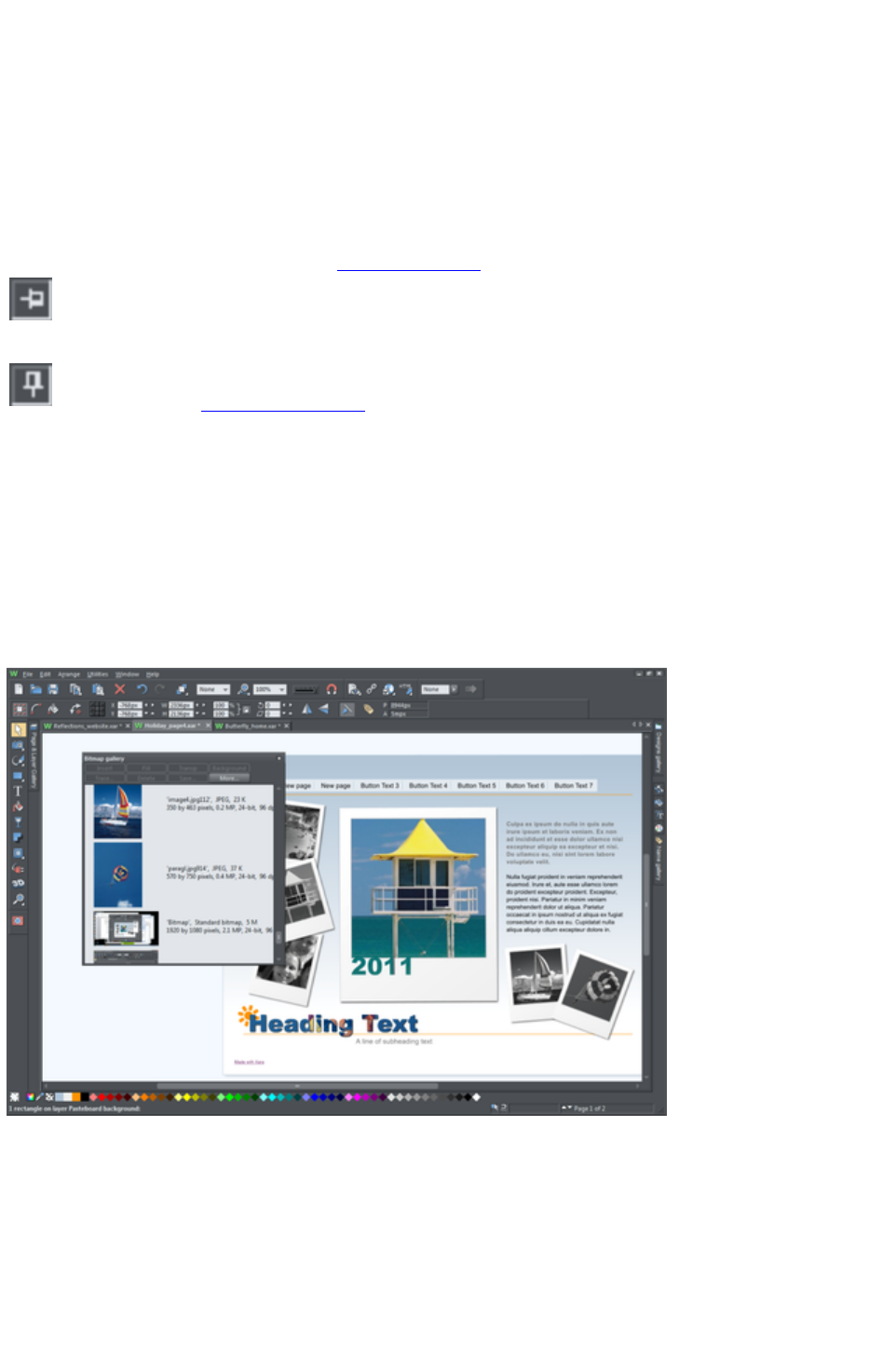
Displaying a gallery
To display a gallery:
1. Click or hover the mouse pointer over the vertical tab for the gallery to the right of the
workspace (the gallery bar). The gallery opens automatically. When you move the mouse pointer
away from the gallery, it automatically closes.
2. To keep a gallery open while you work, click the Auto Hide (pin) button in its top right corner.
The Auto Hide button changes so the pin points downwards to indicate that the gallery is now
'pinned' to the workspace.
3. To close a 'pinned' gallery, see Closing a Gallery.
Unpinned:
gallery closes when you move the mouse pointer away from the
gallery.
Pinned: gallery stays open when you move the mouse pointer away,
and can also be moved and docked
elsewhere.
Note: By default the Line and Fill Galleries
do not display their title, just their individual icons, until they have been opened. Web Designer Premium
always displays the title of the last gallery that you have viewed.
Moving and docking a gallery
You can 'detach' any gallery from the gallery bar and move it to a more convenient location anywhere in
the workspace. You can also dock the gallery (or a gallery group, see Grouping Galleries) in the top,
bottom, left or right of the workspace.
You can move a gallery anywhere in the workspace
To move a gallery:
1. Open a gallery and click the Auto Hide button to pin the gallery. The button changes to a
downward-pointing pin to indicate that the gallery can be moved and pinned elsewhere.
2. Click and drag on the gallery's title bar to move it around. You can either leave the gallery 'free
floating' anywhere in the workspace or dock it in a new location.
If you move any of the following galleries, the others accompany it as a group. Access an individual
gallery by clicking its tab at the bottom of the group or click and drag a gallery tab to move it away from
the group.
Page 305
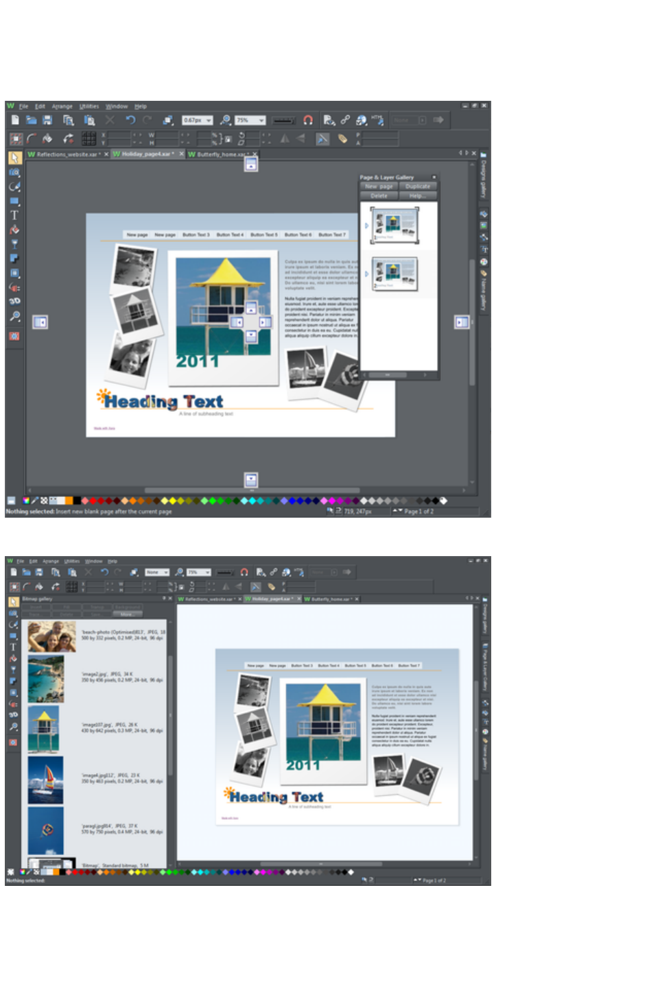
Bitmap
Line
Fill
When you click and drag on a dockable gallery's title bar, a number of arrows appear on the workspace,
indicating where you can dock the gallery.
Dragging a gallery causes docking arrows to appear in the center, top, bottom, left and right of the
workspace. Dock the gallery by dragging it to an arrow.
Example of a gallery that has been docked to the left of the workspace
To dock a gallery:
1. Click and drag the gallery to the arrow pointing towards the location where you want to place the
gallery. For example, if you want the gallery at the top of the screen, move it to the upward
pointing arrow at the top of the workspace.
Page 306
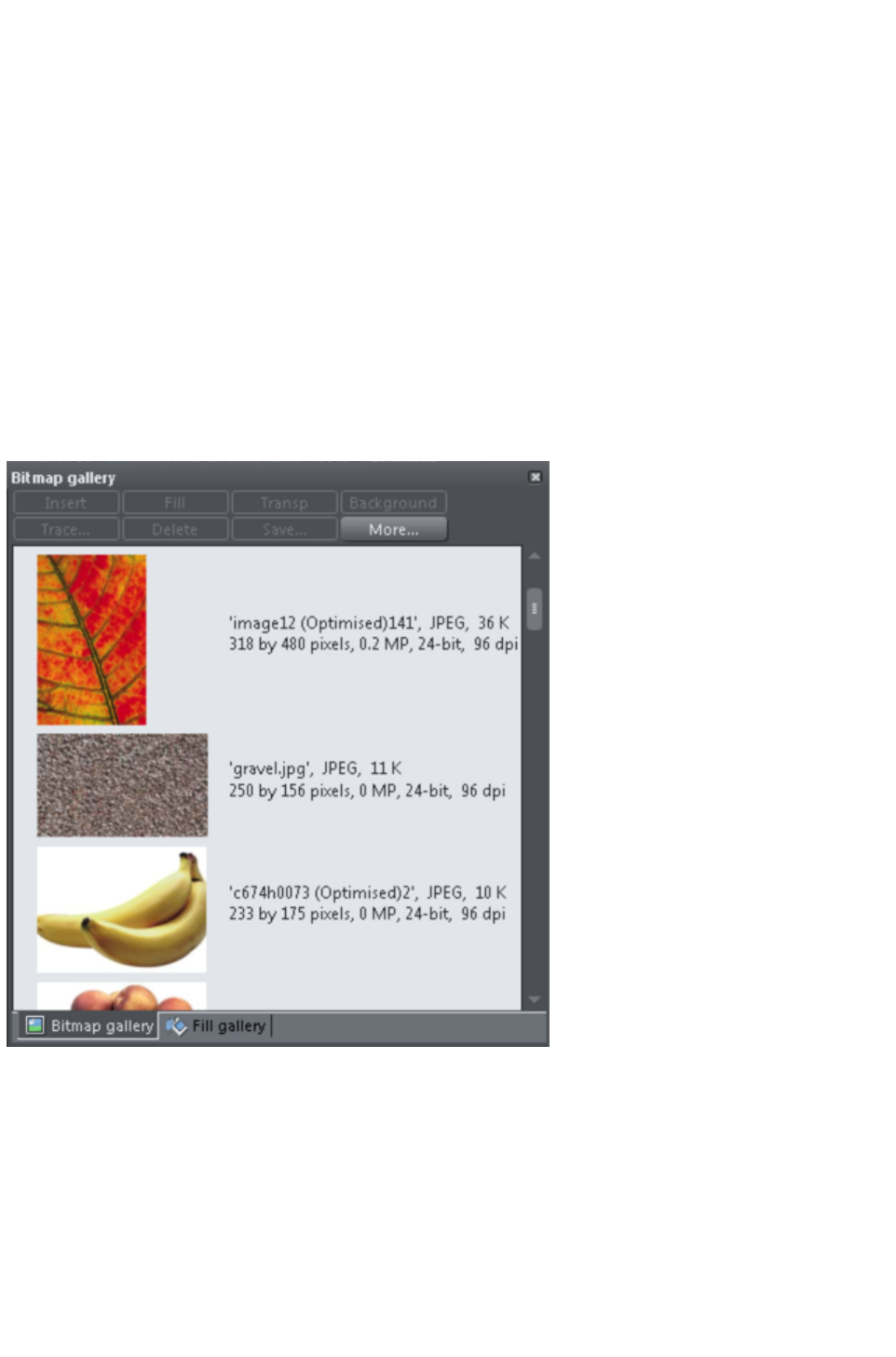
2. When the mouse pointer reaches the arrow, a gray transparent box highlights the gallery's new
location.
3. Let go of the mouse button to dock the gallery. Now when you close or 'auto hide' the gallery, its
tab will be displayed in the new location.
4. Hover over or click its tab to reopen the gallery.
Note: To move all galleries back to their default position, choose Control Bars from the Window
menu, click Galleries then Reset
.
Grouping galleries
You can arrange two or more frequently-used galleries so that they are next to each other.
1. To move a second gallery so that it is adjacent to a gallery you have previously docked, click and
drag the second gallery to the four arrows in the workspace center.
2. Let go of the mouse when you are over the arrow pointing towards the previously moved (first)
gallery. The second gallery docks next to the first.
You can also group galleries and move the whole group to a new location if, for example, you are
working primarily with 2 or 3 galleries that you want to be close to each other and easily accessible.
Example of a gallery group with gallery tabs at the bottom - click and drag to add a gallery to or remove
a gallery from the group.
To group galleries:
1. Disable the Auto Hide button (pin) on one of the following galleries: Bitmap, Line and Fill
Gallery.The gallery is automatically grouped with the other five galleries, displayed as tabs at the
bottom of the group.
2. Click a tab and drag to remove a gallery from the group.
3. Click on a tab to open a gallery in the group.
4. To add a gallery to a group, click and drag the gallery over the group. Four docking arrows
appear in the center of the group.
5. Drag and drop the gallery into the square in the middle of these arrows and Web Designer
Page 307
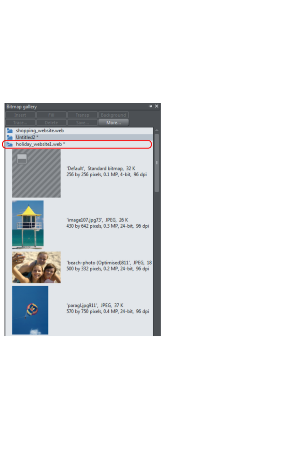
Premium adds it to the group and its tab displayed at the bottom of the group.
6. When you dock a gallery group, all galleries within the group are also docked. When you auto
hide or close a gallery group, all gallery tabs in the group are displayed in the workspace border
nearest to the last docking location.
Using galleries
To fold or unfold a section in a gallery:
Click the Fold/Unfold icon.
Or double click the title strip.
Or right click a section to display a pop-up menu. Select Fold/Unfold section. The pop-up menu
also has options to scroll to the previous section or next section.
This illustration shows the gallery is unfolded. Other galleries are similar.
The buttons along the top depend on the gallery (e.g. Fill and Transp are specific to the Bitmap
Gallery
.) However, most galleries have these buttons:
Apply
applies the selected item in the gallery. Click on an item to select it.
More
opens a menu where you can then choose:
Find is described later in searching for an item name.
Sort is described later in re-ordering items in a gallery.
Properties provides control over size of the icons and amount of information displayed in the
gallery.
Add (clipart, fill, and fonts galleries) is described later in adding to a gallery.
Page 308
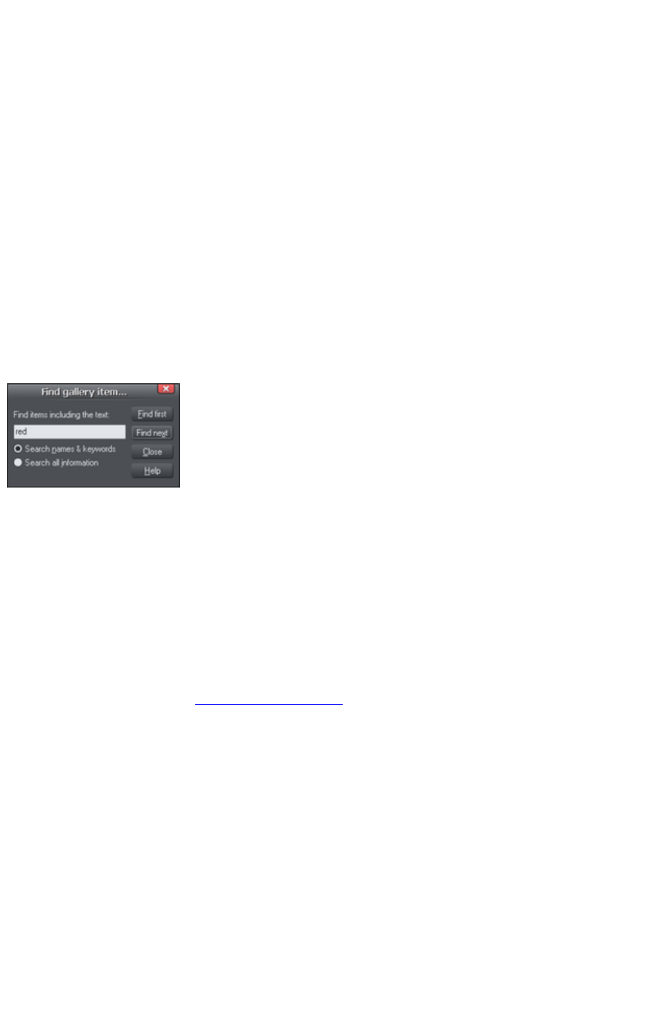
Remove (clipart, fill, and fonts galleries) is described later in deleting sections from a gallery.
Selecting items
To select an item:
Click an item to select it.
Or click an item, then "Shift + click" on another item; all items in between the two points will be
selected.
Or "Ctrl + click" to add that item to the selection.
Re-ordering items in the gallery
In some galleries, "More" > "Sort"
opens a dialog box. You can sort by name and, depending on the gallery, by other criteria. The primary
key controls the initial sort. For some sort parameters such as file type or name length, there may be two
or more files with the same type or name length. These files can be further sorted using the secondary
key.
Searching for an item name
You can search, for example, for all names containing the word red:
1. Choose "More" > "Find".
2. Type "red" into the text box.
3. Select "Search Names & Keywords"
to search only the item names, e.g. file,
color, etc., or "Search All Information"
to search the names and keywords
available in some galleries.
Adding to a gallery
You may want to add extra items to these galleries (Design & Fill Galleries
only). To do this:
1. Copy the files you want to add into a new directory (folder) using the Windows Explorer.
oFor the Designs Gallery these files can be any of a wide range of vector or bitmap file
types.
oFor the Fill Gallery they can be any of the bitmap formats supported by Web Designer
Premium (listed in importing and exporting).
2. In the appropriate gallery, click the Disc Designs/Fills button. This opens a dialog box.
3. Use the dialog box to select the directory you want to add.
4. Click Add. This creates a new section in the gallery.
If you later want to add more items to the folder:
1. Copy the new files into the existing folder.
2. In the gallery, click Disc Designs/Fills. This opens a dialog box.
3. Use the dialog box to select the folder you want to add.
4. Click Update to update the section in the gallery.
Deleting sections from a gallery
To delete a section from a gallery (Designs & Fill Galleries
only):
1. Click on the title strip of the section or sections you want to delete.
2. Click "Remove".
Page 309

If you later want the section again, add its folder to the gallery (described earlier).
Closing a gallery
By default a gallery's Auto Hide button is enabled (i.e., the gallery's Auto Hide
button in the top right corner is unpinned), so that the gallery closes automatically when you move the
mouse pointer away from it.
However if you have disabled the Auto Hide
button (pinned the gallery), you have to close the gallery manually.
To close a free-floating gallery, click the Close
button in the top right of the gallery. The gallery closes and its tab is displayed in the gallery bar.
To close a docked gallery, click the Auto Hide (pin) or Close
button in the top right of the gallery. The gallery closes and its tab is displayed in the workspace border
where you docked it.
To re-open the gallery, hover over or click on its tab.
Note: To remove a gallery completely, choose Galleries from the Utilities
menu and choose the gallery you want removed.
Removing a gallery from the workspace
By default, when you close a gallery, Web Designer Premium returns it to the gallery bar so that you can
reopen it by hovering the cursor over its icon or tab. However you can configure Web Designer Premium
to remove any gallery from the workspace if it's not needed.
To remove unwanted galleries from the workspace, do one of the following:
Choose Galleries from the Utilities menu and choose the gallery you want removed. The
selected gallery disappears from your workspace. If you want to reinstate a gallery, choose
Galleries from the Utilities menu and choose the gallery you want to reinstate.
Choose Control Bars from the Window menu and scroll down the list of available control bars
to find Galleries. Click the Galleries box to show the Galleries toolbar. Click Close. In the
Galleries toolbar that is now displayed above the workspace, you can toggle display of a gallery
by clicking its toolbar button.
Page 310
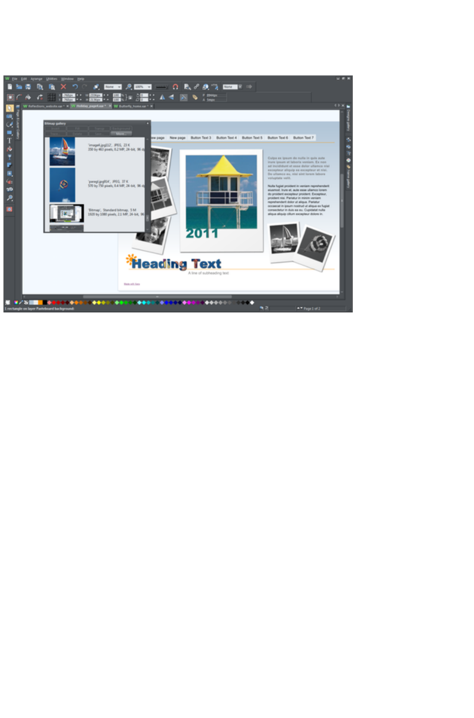
Moving and docking a gallery
You can 'detach' any gallery from the gallery bar and move it to a more convenient location anywhere in
the workspace. You can also dock the gallery (or a gallery group, see Grouping Galleries) in the top,
bottom, left or right of the workspace.
You can move a gallery anywhere in the workspace
To move a gallery:
1. Open a gallery and click the Auto Hide button to pin the gallery. The button changes to a
downward-pointing pin to indicate that the gallery can be moved and pinned elsewhere.
2. Click and drag on the gallery's title bar to move it around. You can either leave the gallery 'free
floating' anywhere in the workspace or dock it in a new location.
If you move any of the following galleries, the others accompany it as a group. Access an individual
gallery by clicking its tab at the bottom of the group or click and drag a gallery tab to move it away from
the group.
Bitmap
Line
Fill
When you click and drag on a dockable gallery's title bar, a number of arrows appear on the workspace,
indicating where you can dock the gallery.
Page 311
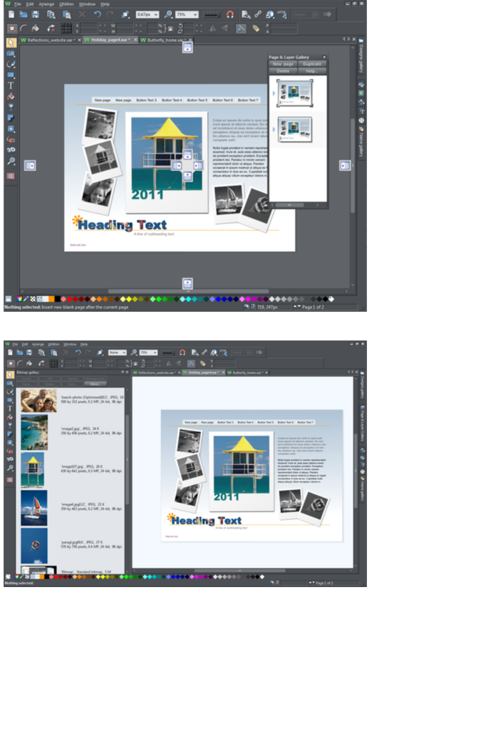
Dragging a gallery causes docking arrows to appear in the center, top, bottom, left and right of the
workspace. Dock the gallery by dragging it to an arrow.
Example of a gallery that has been docked to the left of the workspace
To dock a gallery:
1. Click and drag the gallery to the arrow pointing towards the location where you want to place the
gallery. For example, if you want the gallery at the top of the screen, move it to the upward
pointing arrow at the top of the workspace.
2. When the mouse pointer reaches the arrow, a gray transparent box highlights the gallery's new
location.
3. Let go of the mouse button to dock the gallery. Now when you close or 'auto hide' the gallery, its
tab will be displayed in the new location.
4. Hover over or click its tab to reopen the gallery.
Page 312
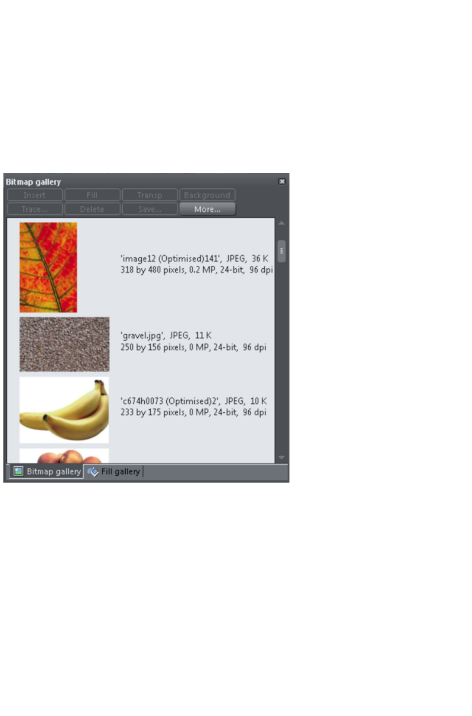
Note: To move all galleries back to their default position, choose Control Bars from the Window
menu, click Galleries then Reset
.
Grouping galleries
You can arrange two or more frequently-used galleries so that they are next to each other.
1. To move a second gallery so that it is adjacent to a gallery you have previously docked, click and
drag the second gallery to the four arrows in the workspace center.
2. Let go of the mouse when you are over the arrow pointing towards the previously moved (first)
gallery. The second gallery docks next to the first.
You can also group galleries and move the whole group to a new location if, for example, you are
working primarily with 2 or 3 galleries that you want to be close to each other and easily accessible.
Example of a gallery group with gallery tabs at the bottom - click and drag to add a gallery to or remove
a gallery from the group.
To group galleries:
1. Disable the Auto Hide button (pin) on one of the following galleries: Bitmap, Line and Fill
Gallery.The gallery is automatically grouped with the other five galleries, displayed as tabs at the
bottom of the group.
2. Click a tab and drag to remove a gallery from the group.
3. Click on a tab to open a gallery in the group.
4. To add a gallery to a group, click and drag the gallery over the group. Four docking arrows
appear in the center of the group.
5. Drag and drop the gallery into the square in the middle of these arrows and Web Designer
Premium adds it to the group and its tab displayed at the bottom of the group.
6. When you dock a gallery group, all galleries within the group are also docked. When you auto
hide or close a gallery group, all gallery tabs in the group are displayed in the workspace border
nearest to the last docking location.
Page 313
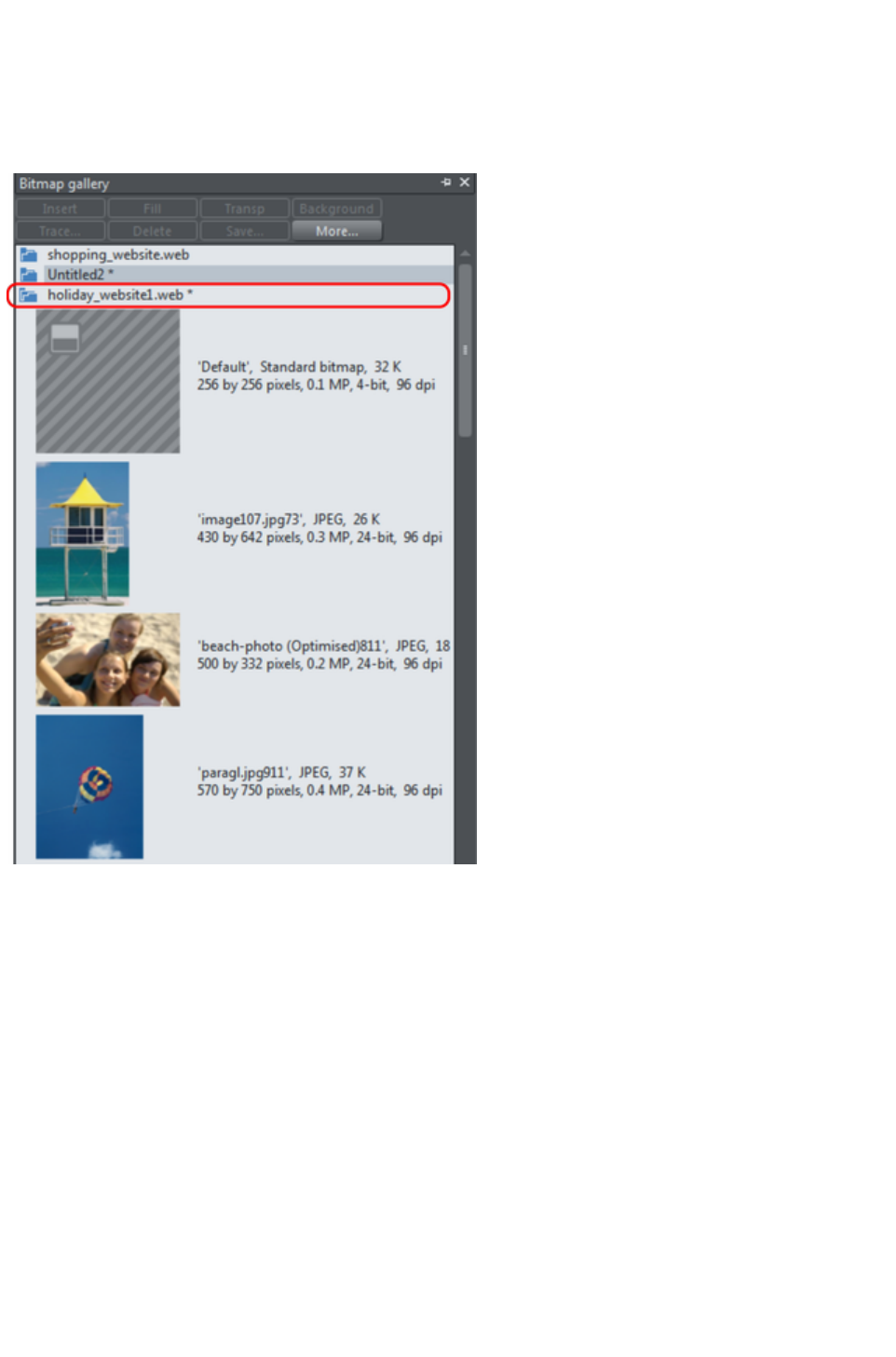
Using galleries
To fold or unfold a section in a gallery:
Click the Fold/Unfold icon.
Or double click the title strip.
Or right click a section to display a pop-up menu. Select Fold/Unfold section. The pop-up menu
also has options to scroll to the previous section or next section.
This illustration shows the gallery is unfolded. Other galleries are similar.
The buttons along the top depend on the gallery (e.g. Fill and Transp are specific to the Bitmap
Gallery
.) However, most galleries have these buttons:
Apply
applies the selected item in the gallery. Click on an item to select it.
More
opens a menu where you can then choose:
Find is described later in searching for an item name.
Sort is described later in re-ordering items in a gallery.
Properties provides control over size of the icons and amount of information displayed in the
gallery.
Add (clipart, fill, and fonts galleries) is described later in adding to a gallery.
Remove (clipart, fill, and fonts galleries) is described later in deleting sections from a gallery.
Selecting items
To select an item:
Page 314
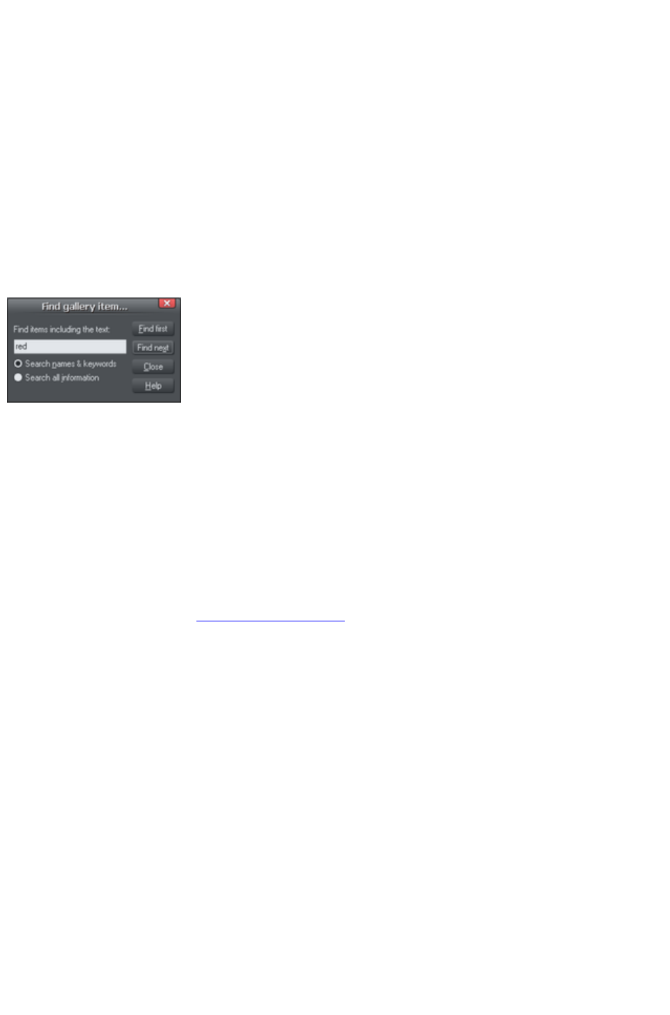
Click an item to select it.
Or click an item, then "Shift + click" on another item; all items in between the two points will be
selected.
Or "Ctrl + click" to add that item to the selection.
Re-ordering items in the gallery
In some galleries, "More" > "Sort"
opens a dialog box. You can sort by name and, depending on the gallery, by other criteria. The primary
key controls the initial sort. For some sort parameters such as file type or name length, there may be two
or more files with the same type or name length. These files can be further sorted using the secondary
key.
Searching for an item name
You can search, for example, for all names containing the word red:
1. Choose "More" > "Find".
2. Type "red" into the text box.
3. Select "Search Names & Keywords"
to search only the item names, e.g. file,
color, etc., or "Search All Information"
to search the names and keywords
available in some galleries.
Adding to a gallery
You may want to add extra items to these galleries (Design & Fill Galleries
only). To do this:
1. Copy the files you want to add into a new directory (folder) using the Windows Explorer.
oFor the Designs Gallery these files can be any of a wide range of vector or bitmap file
types.
oFor the Fill Gallery they can be any of the bitmap formats supported by Web Designer
Premium (listed in importing and exporting).
2. In the appropriate gallery, click the Disc Designs/Fills button. This opens a dialog box.
3. Use the dialog box to select the directory you want to add.
4. Click Add. This creates a new section in the gallery.
If you later want to add more items to the folder:
1. Copy the new files into the existing folder.
2. In the gallery, click Disc Designs/Fills. This opens a dialog box.
3. Use the dialog box to select the folder you want to add.
4. Click Update to update the section in the gallery.
Deleting sections from a gallery
To delete a section from a gallery (Designs & Fill Galleries
only):
1. Click on the title strip of the section or sections you want to delete.
2. Click "Remove".
If you later want the section again, add its folder to the gallery (described earlier).
Closing a gallery
By default a gallery's Auto Hide button is enabled (i.e., the gallery's Auto Hide
Page 315

button in the top right corner is unpinned), so that the gallery closes automatically when you move the
mouse pointer away from it.
However if you have disabled the Auto Hide
button (pinned the gallery), you have to close the gallery manually.
To close a free-floating gallery, click the Close
button in the top right of the gallery. The gallery closes and its tab is displayed in the gallery bar.
To close a docked gallery, click the Auto Hide (pin) or Close
button in the top right of the gallery. The gallery closes and its tab is displayed in the workspace border
where you docked it.
To re-open the gallery, hover over or click on its tab.
Note: To remove a gallery completely, choose Galleries from the Utilities
menu and choose the gallery you want removed.
Removing a gallery from the workspace
By default, when you close a gallery, Web Designer Premium returns it to the gallery bar so that you can
reopen it by hovering the cursor over its icon or tab. However you can configure Web Designer Premium
to remove any gallery from the workspace if it's not needed.
To remove unwanted galleries from the workspace, do one of the following:
Choose Galleries from the Utilities menu and choose the gallery you want removed. The
selected gallery disappears from your workspace. If you want to reinstate a gallery, choose
Galleries from the Utilities menu and choose the gallery you want to reinstate.
Choose Control Bars from the Window menu and scroll down the list of available control bars
to find Galleries. Click the Galleries box to show the Galleries toolbar. Click Close. In the
Galleries toolbar that is now displayed above the workspace, you can toggle display of a gallery
by clicking its toolbar button.
Page 316
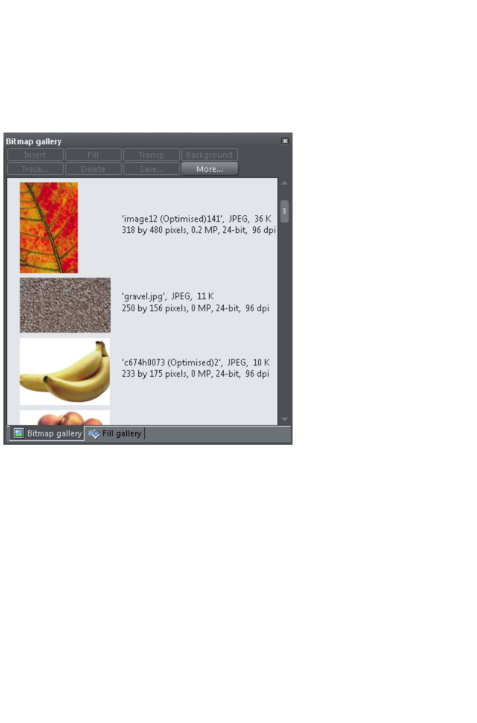
Grouping galleries
You can arrange two or more frequently-used galleries so that they are next to each other.
1. To move a second gallery so that it is adjacent to a gallery you have previously docked, click and
drag the second gallery to the four arrows in the workspace center.
2. Let go of the mouse when you are over the arrow pointing towards the previously moved (first)
gallery. The second gallery docks next to the first.
You can also group galleries and move the whole group to a new location if, for example, you are
working primarily with 2 or 3 galleries that you want to be close to each other and easily accessible.
Example of a gallery group with gallery tabs at the bottom - click and drag to add a gallery to or remove
a gallery from the group.
To group galleries:
1. Disable the Auto Hide button (pin) on one of the following galleries: Bitmap, Line and Fill
Gallery.The gallery is automatically grouped with the other five galleries, displayed as tabs at the
bottom of the group.
2. Click a tab and drag to remove a gallery from the group.
3. Click on a tab to open a gallery in the group.
4. To add a gallery to a group, click and drag the gallery over the group. Four docking arrows
appear in the center of the group.
5. Drag and drop the gallery into the square in the middle of these arrows and Web Designer
Premium adds it to the group and its tab displayed at the bottom of the group.
6. When you dock a gallery group, all galleries within the group are also docked. When you auto
hide or close a gallery group, all gallery tabs in the group are displayed in the workspace border
nearest to the last docking location.
Using galleries
To fold or unfold a section in a gallery:
Click the Fold/Unfold icon.
Page 317
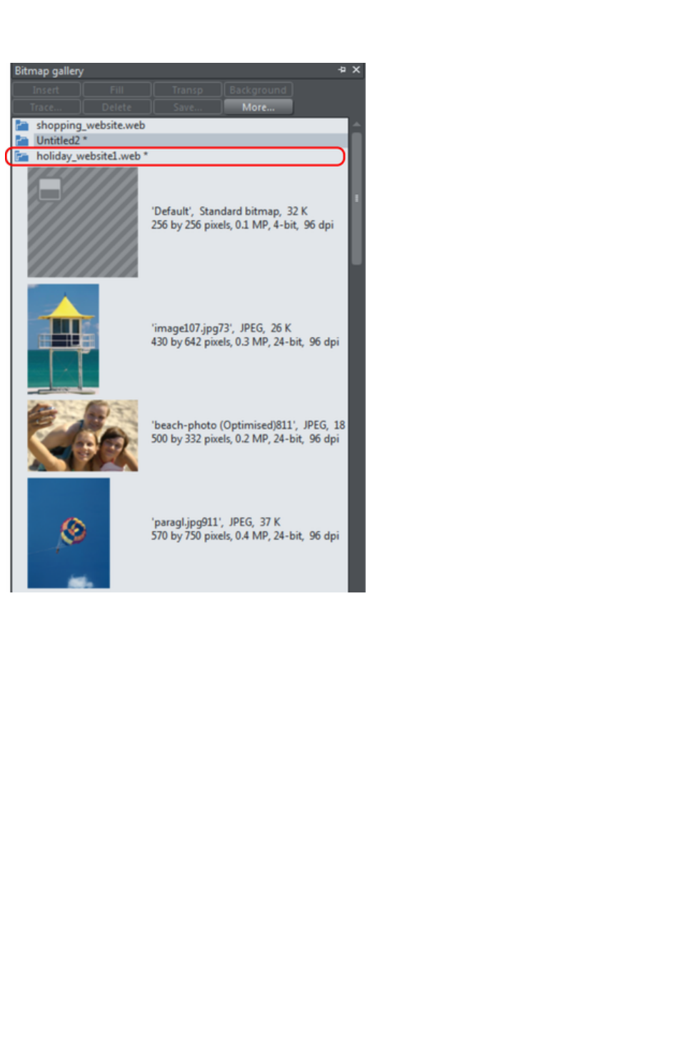
Or double click the title strip.
Or right click a section to display a pop-up menu. Select Fold/Unfold section. The pop-up menu
also has options to scroll to the previous section or next section.
This illustration shows the gallery is unfolded. Other galleries are similar.
The buttons along the top depend on the gallery (e.g. Fill and Transp are specific to the Bitmap
Gallery
.) However, most galleries have these buttons:
Apply
applies the selected item in the gallery. Click on an item to select it.
More
opens a menu where you can then choose:
Find is described later in searching for an item name.
Sort is described later in re-ordering items in a gallery.
Properties provides control over size of the icons and amount of information displayed in the
gallery.
Add (clipart, fill, and fonts galleries) is described later in adding to a gallery.
Remove (clipart, fill, and fonts galleries) is described later in deleting sections from a gallery.
Selecting items
To select an item:
Click an item to select it.
Or click an item, then "Shift + click" on another item; all items in between the two points will be
selected.
Or "Ctrl + click" to add that item to the selection.
Page 318

Re-ordering items in the gallery
In some galleries, "More" > "Sort"
opens a dialog box. You can sort by name and, depending on the gallery, by other criteria. The primary
key controls the initial sort. For some sort parameters such as file type or name length, there may be two
or more files with the same type or name length. These files can be further sorted using the secondary
key.
Searching for an item name
You can search, for example, for all names containing the word red:
1. Choose "More" > "Find".
2. Type "red" into the text box.
3. Select "Search Names & Keywords"
to search only the item names, e.g. file,
color, etc., or "Search All Information"
to search the names and keywords
available in some galleries.
Adding to a gallery
You may want to add extra items to these galleries (Design & Fill Galleries
only). To do this:
1. Copy the files you want to add into a new directory (folder) using the Windows Explorer.
oFor the Designs Gallery these files can be any of a wide range of vector or bitmap file
types.
oFor the Fill Gallery they can be any of the bitmap formats supported by Web Designer
Premium (listed in importing and exporting).
2. In the appropriate gallery, click the Disc Designs/Fills button. This opens a dialog box.
3. Use the dialog box to select the directory you want to add.
4. Click Add. This creates a new section in the gallery.
If you later want to add more items to the folder:
1. Copy the new files into the existing folder.
2. In the gallery, click Disc Designs/Fills. This opens a dialog box.
3. Use the dialog box to select the folder you want to add.
4. Click Update to update the section in the gallery.
Deleting sections from a gallery
To delete a section from a gallery (Designs & Fill Galleries
only):
1. Click on the title strip of the section or sections you want to delete.
2. Click "Remove".
If you later want the section again, add its folder to the gallery (described earlier).
Closing a gallery
By default a gallery's Auto Hide button is enabled (i.e., the gallery's Auto Hide
button in the top right corner is unpinned), so that the gallery closes automatically when you move the
mouse pointer away from it.
However if you have disabled the Auto Hide
button (pinned the gallery), you have to close the gallery manually.
To close a free-floating gallery, click the Close
Page 319

button in the top right of the gallery. The gallery closes and its tab is displayed in the gallery bar.
To close a docked gallery, click the Auto Hide (pin) or Close
button in the top right of the gallery. The gallery closes and its tab is displayed in the workspace border
where you docked it.
To re-open the gallery, hover over or click on its tab.
Note: To remove a gallery completely, choose Galleries from the Utilities
menu and choose the gallery you want removed.
Removing a gallery from the workspace
By default, when you close a gallery, Web Designer Premium returns it to the gallery bar so that you can
reopen it by hovering the cursor over its icon or tab. However you can configure Web Designer Premium
to remove any gallery from the workspace if it's not needed.
To remove unwanted galleries from the workspace, do one of the following:
Choose Galleries from the Utilities menu and choose the gallery you want removed. The
selected gallery disappears from your workspace. If you want to reinstate a gallery, choose
Galleries from the Utilities menu and choose the gallery you want to reinstate.
Choose Control Bars from the Window menu and scroll down the list of available control bars
to find Galleries. Click the Galleries box to show the Galleries toolbar. Click Close. In the
Galleries toolbar that is now displayed above the workspace, you can toggle display of a gallery
by clicking its toolbar button.
Page 320
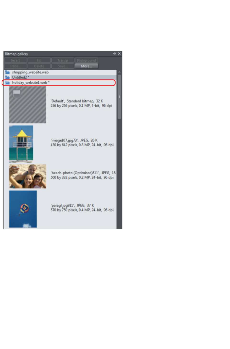
Using galleries
To fold or unfold a section in a gallery:
Click the Fold/Unfold icon.
Or double click the title strip.
Or right click a section to display a pop-up menu. Select Fold/Unfold section. The pop-up menu
also has options to scroll to the previous section or next section.
This illustration shows the gallery is unfolded. Other galleries are similar.
The buttons along the top depend on the gallery (e.g. Fill and Transp are specific to the Bitmap
Gallery
.) However, most galleries have these buttons:
Apply
applies the selected item in the gallery. Click on an item to select it.
More
opens a menu where you can then choose:
Find is described later in searching for an item name.
Sort is described later in re-ordering items in a gallery.
Properties provides control over size of the icons and amount of information displayed in the
gallery.
Add (clipart, fill, and fonts galleries) is described later in adding to a gallery.
Remove (clipart, fill, and fonts galleries) is described later in deleting sections from a gallery.
Selecting items
Page 321
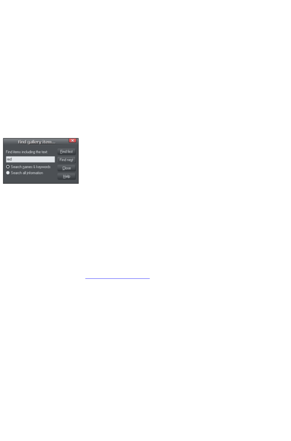
To select an item:
Click an item to select it.
Or click an item, then "Shift + click" on another item; all items in between the two points will be
selected.
Or "Ctrl + click" to add that item to the selection.
Re-ordering items in the gallery
In some galleries, "More" > "Sort"
opens a dialog box. You can sort by name and, depending on the gallery, by other criteria. The primary
key controls the initial sort. For some sort parameters such as file type or name length, there may be two
or more files with the same type or name length. These files can be further sorted using the secondary
key.
Searching for an item name
You can search, for example, for all names containing the word red:
1. Choose "More" > "Find".
2. Type "red" into the text box.
3. Select "Search Names & Keywords"
to search only the item names, e.g. file,
color, etc., or "Search All Information"
to search the names and keywords
available in some galleries.
Adding to a gallery
You may want to add extra items to these galleries (Design & Fill Galleries
only). To do this:
1. Copy the files you want to add into a new directory (folder) using the Windows Explorer.
oFor the Designs Gallery these files can be any of a wide range of vector or bitmap file
types.
oFor the Fill Gallery they can be any of the bitmap formats supported by Web Designer
Premium (listed in importing and exporting).
2. In the appropriate gallery, click the Disc Designs/Fills button. This opens a dialog box.
3. Use the dialog box to select the directory you want to add.
4. Click Add. This creates a new section in the gallery.
If you later want to add more items to the folder:
1. Copy the new files into the existing folder.
2. In the gallery, click Disc Designs/Fills. This opens a dialog box.
3. Use the dialog box to select the folder you want to add.
4. Click Update to update the section in the gallery.
Deleting sections from a gallery
To delete a section from a gallery (Designs & Fill Galleries
only):
1. Click on the title strip of the section or sections you want to delete.
2. Click "Remove".
If you later want the section again, add its folder to the gallery (described earlier).
Closing a gallery
Page 322

By default a gallery's Auto Hide button is enabled (i.e., the gallery's Auto Hide
button in the top right corner is unpinned), so that the gallery closes automatically when you move the
mouse pointer away from it.
However if you have disabled the Auto Hide
button (pinned the gallery), you have to close the gallery manually.
To close a free-floating gallery, click the Close
button in the top right of the gallery. The gallery closes and its tab is displayed in the gallery bar.
To close a docked gallery, click the Auto Hide (pin) or Close
button in the top right of the gallery. The gallery closes and its tab is displayed in the workspace border
where you docked it.
To re-open the gallery, hover over or click on its tab.
Note: To remove a gallery completely, choose Galleries from the Utilities
menu and choose the gallery you want removed.
Removing a gallery from the workspace
By default, when you close a gallery, Web Designer Premium returns it to the gallery bar so that you can
reopen it by hovering the cursor over its icon or tab. However you can configure Web Designer Premium
to remove any gallery from the workspace if it's not needed.
To remove unwanted galleries from the workspace, do one of the following:
Choose Galleries from the Utilities menu and choose the gallery you want removed. The
selected gallery disappears from your workspace. If you want to reinstate a gallery, choose
Galleries from the Utilities menu and choose the gallery you want to reinstate.
Choose Control Bars from the Window menu and scroll down the list of available control bars
to find Galleries. Click the Galleries box to show the Galleries toolbar. Click Close. In the
Galleries toolbar that is now displayed above the workspace, you can toggle display of a gallery
by clicking its toolbar button.
Page 323
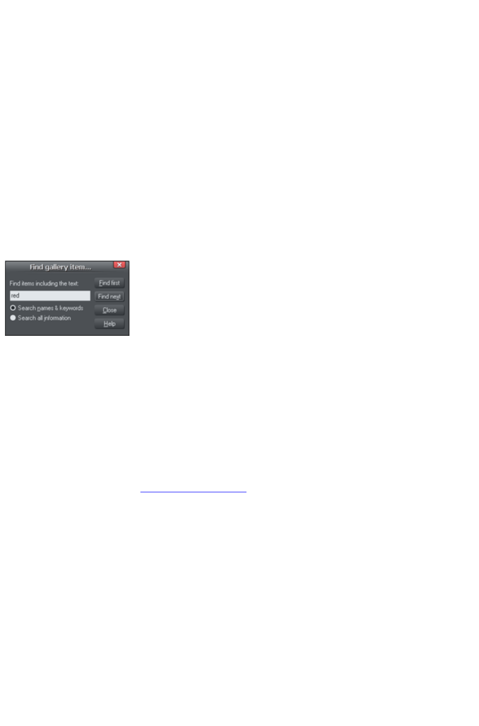
Selecting items
To select an item:
Click an item to select it.
Or click an item, then "Shift + click" on another item; all items in between the two points will be
selected.
Or "Ctrl + click" to add that item to the selection.
Re-ordering items in the gallery
In some galleries, "More" > "Sort"
opens a dialog box. You can sort by name and, depending on the gallery, by other criteria. The primary
key controls the initial sort. For some sort parameters such as file type or name length, there may be two
or more files with the same type or name length. These files can be further sorted using the secondary
key.
Searching for an item name
You can search, for example, for all names containing the word red:
1. Choose "More" > "Find".
2. Type "red" into the text box.
3. Select "Search Names & Keywords"
to search only the item names, e.g. file,
color, etc., or "Search All Information"
to search the names and keywords
available in some galleries.
Adding to a gallery
You may want to add extra items to these galleries (Design & Fill Galleries
only). To do this:
1. Copy the files you want to add into a new directory (folder) using the Windows Explorer.
oFor the Designs Gallery these files can be any of a wide range of vector or bitmap file
types.
oFor the Fill Gallery they can be any of the bitmap formats supported by Web Designer
Premium (listed in importing and exporting).
2. In the appropriate gallery, click the Disc Designs/Fills button. This opens a dialog box.
3. Use the dialog box to select the directory you want to add.
4. Click Add. This creates a new section in the gallery.
If you later want to add more items to the folder:
1. Copy the new files into the existing folder.
2. In the gallery, click Disc Designs/Fills. This opens a dialog box.
3. Use the dialog box to select the folder you want to add.
4. Click Update to update the section in the gallery.
Deleting sections from a gallery
To delete a section from a gallery (Designs & Fill Galleries
only):
1. Click on the title strip of the section or sections you want to delete.
2. Click "Remove".
If you later want the section again, add its folder to the gallery (described earlier).
Page 324

Closing a gallery
By default a gallery's Auto Hide button is enabled (i.e., the gallery's Auto Hide
button in the top right corner is unpinned), so that the gallery closes automatically when you move the
mouse pointer away from it.
However if you have disabled the Auto Hide
button (pinned the gallery), you have to close the gallery manually.
To close a free-floating gallery, click the Close
button in the top right of the gallery. The gallery closes and its tab is displayed in the gallery bar.
To close a docked gallery, click the Auto Hide (pin) or Close
button in the top right of the gallery. The gallery closes and its tab is displayed in the workspace border
where you docked it.
To re-open the gallery, hover over or click on its tab.
Note: To remove a gallery completely, choose Galleries from the Utilities
menu and choose the gallery you want removed.
Removing a gallery from the workspace
By default, when you close a gallery, Web Designer Premium returns it to the gallery bar so that you can
reopen it by hovering the cursor over its icon or tab. However you can configure Web Designer Premium
to remove any gallery from the workspace if it's not needed.
To remove unwanted galleries from the workspace, do one of the following:
Choose Galleries from the Utilities menu and choose the gallery you want removed. The
selected gallery disappears from your workspace. If you want to reinstate a gallery, choose
Galleries from the Utilities menu and choose the gallery you want to reinstate.
Choose Control Bars from the Window menu and scroll down the list of available control bars
to find Galleries. Click the Galleries box to show the Galleries toolbar. Click Close. In the
Galleries toolbar that is now displayed above the workspace, you can toggle display of a gallery
by clicking its toolbar button.
Page 325
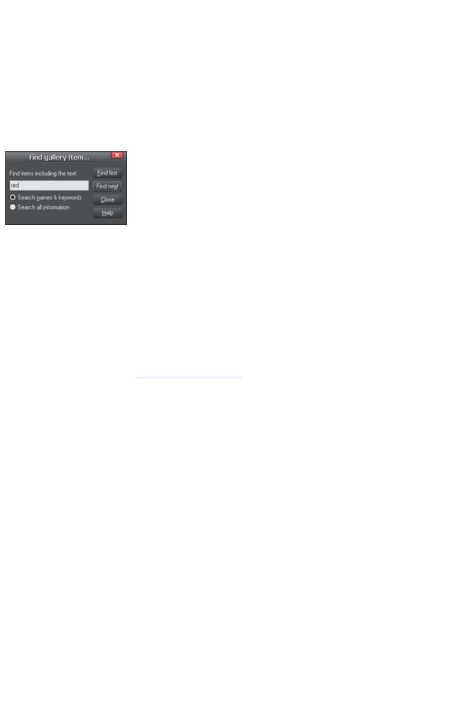
Re-ordering items in the gallery
In some galleries, "More" > "Sort"
opens a dialog box. You can sort by name and, depending on the gallery, by other criteria. The primary
key controls the initial sort. For some sort parameters such as file type or name length, there may be two
or more files with the same type or name length. These files can be further sorted using the secondary
key.
Searching for an item name
You can search, for example, for all names containing the word red:
1. Choose "More" > "Find".
2. Type "red" into the text box.
3. Select "Search Names & Keywords"
to search only the item names, e.g. file,
color, etc., or "Search All Information"
to search the names and keywords
available in some galleries.
Adding to a gallery
You may want to add extra items to these galleries (Design & Fill Galleries
only). To do this:
1. Copy the files you want to add into a new directory (folder) using the Windows Explorer.
oFor the Designs Gallery these files can be any of a wide range of vector or bitmap file
types.
oFor the Fill Gallery they can be any of the bitmap formats supported by Web Designer
Premium (listed in importing and exporting).
2. In the appropriate gallery, click the Disc Designs/Fills button. This opens a dialog box.
3. Use the dialog box to select the directory you want to add.
4. Click Add. This creates a new section in the gallery.
If you later want to add more items to the folder:
1. Copy the new files into the existing folder.
2. In the gallery, click Disc Designs/Fills. This opens a dialog box.
3. Use the dialog box to select the folder you want to add.
4. Click Update to update the section in the gallery.
Deleting sections from a gallery
To delete a section from a gallery (Designs & Fill Galleries
only):
1. Click on the title strip of the section or sections you want to delete.
2. Click "Remove".
If you later want the section again, add its folder to the gallery (described earlier).
Closing a gallery
By default a gallery's Auto Hide button is enabled (i.e., the gallery's Auto Hide
button in the top right corner is unpinned), so that the gallery closes automatically when you move the
mouse pointer away from it.
However if you have disabled the Auto Hide
button (pinned the gallery), you have to close the gallery manually.
To close a free-floating gallery, click the Close
Page 326

button in the top right of the gallery. The gallery closes and its tab is displayed in the gallery bar.
To close a docked gallery, click the Auto Hide (pin) or Close
button in the top right of the gallery. The gallery closes and its tab is displayed in the workspace border
where you docked it.
To re-open the gallery, hover over or click on its tab.
Note: To remove a gallery completely, choose Galleries from the Utilities
menu and choose the gallery you want removed.
Removing a gallery from the workspace
By default, when you close a gallery, Web Designer Premium returns it to the gallery bar so that you can
reopen it by hovering the cursor over its icon or tab. However you can configure Web Designer Premium
to remove any gallery from the workspace if it's not needed.
To remove unwanted galleries from the workspace, do one of the following:
Choose Galleries from the Utilities menu and choose the gallery you want removed. The
selected gallery disappears from your workspace. If you want to reinstate a gallery, choose
Galleries from the Utilities menu and choose the gallery you want to reinstate.
Choose Control Bars from the Window menu and scroll down the list of available control bars
to find Galleries. Click the Galleries box to show the Galleries toolbar. Click Close. In the
Galleries toolbar that is now displayed above the workspace, you can toggle display of a gallery
by clicking its toolbar button.
Page 327
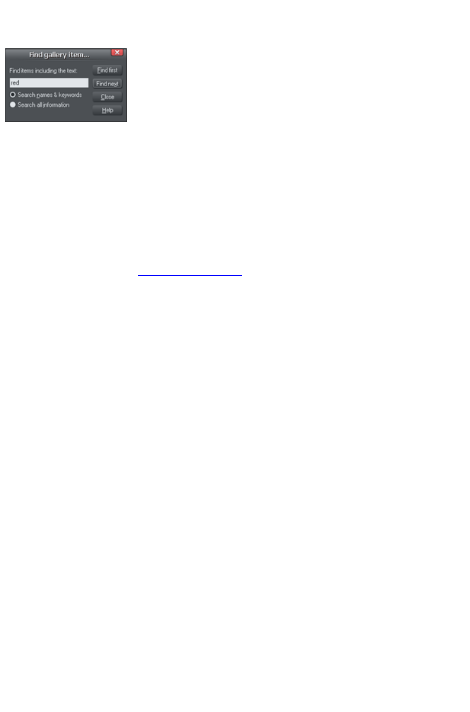
Searching for an item name
You can search, for example, for all names containing the word red:
1. Choose "More" > "Find".
2. Type "red" into the text box.
3. Select "Search Names & Keywords"
to search only the item names, e.g. file,
color, etc., or "Search All Information"
to search the names and keywords
available in some galleries.
Adding to a gallery
You may want to add extra items to these galleries (Design & Fill Galleries
only). To do this:
1. Copy the files you want to add into a new directory (folder) using the Windows Explorer.
oFor the Designs Gallery these files can be any of a wide range of vector or bitmap file
types.
oFor the Fill Gallery they can be any of the bitmap formats supported by Web Designer
Premium (listed in importing and exporting).
2. In the appropriate gallery, click the Disc Designs/Fills button. This opens a dialog box.
3. Use the dialog box to select the directory you want to add.
4. Click Add. This creates a new section in the gallery.
If you later want to add more items to the folder:
1. Copy the new files into the existing folder.
2. In the gallery, click Disc Designs/Fills. This opens a dialog box.
3. Use the dialog box to select the folder you want to add.
4. Click Update to update the section in the gallery.
Deleting sections from a gallery
To delete a section from a gallery (Designs & Fill Galleries
only):
1. Click on the title strip of the section or sections you want to delete.
2. Click "Remove".
If you later want the section again, add its folder to the gallery (described earlier).
Closing a gallery
By default a gallery's Auto Hide button is enabled (i.e., the gallery's Auto Hide
button in the top right corner is unpinned), so that the gallery closes automatically when you move the
mouse pointer away from it.
However if you have disabled the Auto Hide
button (pinned the gallery), you have to close the gallery manually.
To close a free-floating gallery, click the Close
button in the top right of the gallery. The gallery closes and its tab is displayed in the gallery bar.
To close a docked gallery, click the Auto Hide (pin) or Close
button in the top right of the gallery. The gallery closes and its tab is displayed in the workspace border
where you docked it.
To re-open the gallery, hover over or click on its tab.
Note: To remove a gallery completely, choose Galleries from the Utilities
menu and choose the gallery you want removed.
Page 328

Removing a gallery from the workspace
By default, when you close a gallery, Web Designer Premium returns it to the gallery bar so that you can
reopen it by hovering the cursor over its icon or tab. However you can configure Web Designer Premium
to remove any gallery from the workspace if it's not needed.
To remove unwanted galleries from the workspace, do one of the following:
Choose Galleries from the Utilities menu and choose the gallery you want removed. The
selected gallery disappears from your workspace. If you want to reinstate a gallery, choose
Galleries from the Utilities menu and choose the gallery you want to reinstate.
Choose Control Bars from the Window menu and scroll down the list of available control bars
to find Galleries. Click the Galleries box to show the Galleries toolbar. Click Close. In the
Galleries toolbar that is now displayed above the workspace, you can toggle display of a gallery
by clicking its toolbar button.
Page 329

Adding to a gallery
You may want to add extra items to these galleries (Design & Fill Galleries
only). To do this:
1. Copy the files you want to add into a new directory (folder) using the Windows Explorer.
oFor the Designs Gallery these files can be any of a wide range of vector or bitmap file
types.
oFor the Fill Gallery they can be any of the bitmap formats supported by Web Designer
Premium (listed in importing and exporting).
2. In the appropriate gallery, click the Disc Designs/Fills button. This opens a dialog box.
3. Use the dialog box to select the directory you want to add.
4. Click Add. This creates a new section in the gallery.
If you later want to add more items to the folder:
1. Copy the new files into the existing folder.
2. In the gallery, click Disc Designs/Fills. This opens a dialog box.
3. Use the dialog box to select the folder you want to add.
4. Click Update to update the section in the gallery.
Deleting sections from a gallery
To delete a section from a gallery (Designs & Fill Galleries
only):
1. Click on the title strip of the section or sections you want to delete.
2. Click "Remove".
If you later want the section again, add its folder to the gallery (described earlier).
Closing a gallery
By default a gallery's Auto Hide button is enabled (i.e., the gallery's Auto Hide
button in the top right corner is unpinned), so that the gallery closes automatically when you move the
mouse pointer away from it.
However if you have disabled the Auto Hide
button (pinned the gallery), you have to close the gallery manually.
To close a free-floating gallery, click the Close
button in the top right of the gallery. The gallery closes and its tab is displayed in the gallery bar.
To close a docked gallery, click the Auto Hide (pin) or Close
button in the top right of the gallery. The gallery closes and its tab is displayed in the workspace border
where you docked it.
To re-open the gallery, hover over or click on its tab.
Note: To remove a gallery completely, choose Galleries from the Utilities
menu and choose the gallery you want removed.
Removing a gallery from the workspace
By default, when you close a gallery, Web Designer Premium returns it to the gallery bar so that you can
reopen it by hovering the cursor over its icon or tab. However you can configure Web Designer Premium
to remove any gallery from the workspace if it's not needed.
To remove unwanted galleries from the workspace, do one of the following:
Choose Galleries from the Utilities menu and choose the gallery you want removed. The
selected gallery disappears from your workspace. If you want to reinstate a gallery, choose
Galleries from the Utilities menu and choose the gallery you want to reinstate.
Choose Control Bars from the Window menu and scroll down the list of available control bars
Page 330

to find Galleries. Click the Galleries box to show the Galleries toolbar. Click Close. In the
Galleries toolbar that is now displayed above the workspace, you can toggle display of a gallery
by clicking its toolbar button.
Page 331

Deleting sections from a gallery
To delete a section from a gallery (Designs & Fill Galleries
only):
1. Click on the title strip of the section or sections you want to delete.
2. Click "Remove".
If you later want the section again, add its folder to the gallery (described earlier).
Closing a gallery
By default a gallery's Auto Hide button is enabled (i.e., the gallery's Auto Hide
button in the top right corner is unpinned), so that the gallery closes automatically when you move the
mouse pointer away from it.
However if you have disabled the Auto Hide
button (pinned the gallery), you have to close the gallery manually.
To close a free-floating gallery, click the Close
button in the top right of the gallery. The gallery closes and its tab is displayed in the gallery bar.
To close a docked gallery, click the Auto Hide (pin) or Close
button in the top right of the gallery. The gallery closes and its tab is displayed in the workspace border
where you docked it.
To re-open the gallery, hover over or click on its tab.
Note: To remove a gallery completely, choose Galleries from the Utilities
menu and choose the gallery you want removed.
Removing a gallery from the workspace
By default, when you close a gallery, Web Designer Premium returns it to the gallery bar so that you can
reopen it by hovering the cursor over its icon or tab. However you can configure Web Designer Premium
to remove any gallery from the workspace if it's not needed.
To remove unwanted galleries from the workspace, do one of the following:
Choose Galleries from the Utilities menu and choose the gallery you want removed. The
selected gallery disappears from your workspace. If you want to reinstate a gallery, choose
Galleries from the Utilities menu and choose the gallery you want to reinstate.
Choose Control Bars from the Window menu and scroll down the list of available control bars
to find Galleries. Click the Galleries box to show the Galleries toolbar. Click Close. In the
Galleries toolbar that is now displayed above the workspace, you can toggle display of a gallery
by clicking its toolbar button.
Page 332

Closing a gallery
By default a gallery's Auto Hide button is enabled (i.e., the gallery's Auto Hide
button in the top right corner is unpinned), so that the gallery closes automatically when you move the
mouse pointer away from it.
However if you have disabled the Auto Hide
button (pinned the gallery), you have to close the gallery manually.
To close a free-floating gallery, click the Close
button in the top right of the gallery. The gallery closes and its tab is displayed in the gallery bar.
To close a docked gallery, click the Auto Hide (pin) or Close
button in the top right of the gallery. The gallery closes and its tab is displayed in the workspace border
where you docked it.
To re-open the gallery, hover over or click on its tab.
Note: To remove a gallery completely, choose Galleries from the Utilities
menu and choose the gallery you want removed.
Removing a gallery from the workspace
By default, when you close a gallery, Web Designer Premium returns it to the gallery bar so that you can
reopen it by hovering the cursor over its icon or tab. However you can configure Web Designer Premium
to remove any gallery from the workspace if it's not needed.
To remove unwanted galleries from the workspace, do one of the following:
Choose Galleries from the Utilities menu and choose the gallery you want removed. The
selected gallery disappears from your workspace. If you want to reinstate a gallery, choose
Galleries from the Utilities menu and choose the gallery you want to reinstate.
Choose Control Bars from the Window menu and scroll down the list of available control bars
to find Galleries. Click the Galleries box to show the Galleries toolbar. Click Close. In the
Galleries toolbar that is now displayed above the workspace, you can toggle display of a gallery
by clicking its toolbar button.
Page 333

Removing a gallery from the workspace
By default, when you close a gallery, Web Designer Premium returns it to the gallery bar so that you can
reopen it by hovering the cursor over its icon or tab. However you can configure Web Designer Premium
to remove any gallery from the workspace if it's not needed.
To remove unwanted galleries from the workspace, do one of the following:
Choose Galleries from the Utilities menu and choose the gallery you want removed. The
selected gallery disappears from your workspace. If you want to reinstate a gallery, choose
Galleries from the Utilities menu and choose the gallery you want to reinstate.
Choose Control Bars from the Window menu and scroll down the list of available control bars
to find Galleries. Click the Galleries box to show the Galleries toolbar. Click Close. In the
Galleries toolbar that is now displayed above the workspace, you can toggle display of a gallery
by clicking its toolbar button.
Page 334

Restoring the default control bars/galleries
Choose "Window" > "Control Bars" and click Reset
to restore the control bar setup to the default setting.
Page 335

Undo and Redo
What are undo and redo?
We all make mistakes or change our minds. Web Designer Premium makes it easy to correct mistakes
or cancel unwanted changes. Every action you make is recorded in an undo list which lets you undo not
just the last operation, but also to step back by undoing successive operations. In this way, you can
experiment freely knowing that you can always undo anything that doesn't look correct.
Page 336

What are undo and redo?
We all make mistakes or change our minds. Web Designer Premium makes it easy to correct mistakes
or cancel unwanted changes. Every action you make is recorded in an undo list which lets you undo not
just the last operation, but also to step back by undoing successive operations. In this way, you can
experiment freely knowing that you can always undo anything that doesn't look correct.
Page 337

The undo command
"Undo
" cancels the effects of the last operation. To undo an operation:
Click Undo on the standard control bar.
Or choose "Edit" > "Undo" (the exact wording tells you what the next undo step is, i.e. undo
scale).
Or press "Ctrl + Z".
Or press the comma key (in any tool except the Text Tool).
You can repeat the undo command to step back through the sequence of previous operations.
Page 338

The redo command
Redo cancels the last undo command. To redo the last operation:
Click the Redo button on the standard control bar.
Or choose "Edit" > "Redo" (the exact wording tells you what the next redo step is, i.e. redo
scale).
Or press "Ctrl + Y".
Or press the period (full stop) key (in any tool except the Text Tool).
You can only redo immediately after undo. You cannot redo after changing the document (for example,
by moving or adding an object).
Page 339
Object Handling
In this chapter
The Selector Tool
Moving objects
Removing objects from the document
Duplicating and cloning
Moving objects forward and backwards
Rotating objects
Scaling (resizing) objects
Flipping objects
Stretching and squashing objects
Skewing objects
The Mold tool
Snapping
Guide Objects and Guidelines
Summary of shortcuts on the numeric keypad
Grouping and ungrouping objects
Soft Groups
Alignment
Copying Styles: Paste Attributes
Naming objects
Repeating Objects
Page 340
The Selector Tool
The Selector Tool
is the main tool for selecting, moving, scaling, and rotating objects. It
is typically used more than any other tool and is the central tool for
manipulating documents.
Dimensions of selection
% size controls
Lock aspect ratio
Rotate and skew
Flip
Scale line widths
Apply names
To use the Selector Tool
:
Click on the Selector Tool on the Main toolbar.
Or press "Alt + S", "V", or "F2".
When switching to the Selector Tool
, if there are objects selected inside a group or other composite object type, the parent object (group)
becomes selected instead.
Because the Selector Tool is the most used tool, there is an additional shortcut that lets you switch to
the Selector Tool to perform a selection or other operation, and quickly switch back to the previous
tool. If you are using another tool, you can easily switch to the Selector Tool
:
Press and release "Alt + S" to switch to the Selector Tool. Press again to return to the previous
tool.
Page 341

Selecting objects
To select a single object, click on any visible part of the object.
Change object selection
Once an object is selected, you can use the following keys to change the selection:
End selects the back object.
Home selects the front object.
"Tab" selects the next object towards the back.
"Shift + Tab" selects the next object towards the front.
Front and back objects are described in "Object handling
".
Marquee selection
To select multiple objects, press and hold down the mouse button. Dragging the mouse draws a
selection rectangle, and all objects wholly within the selection rectangle are selected.
Some other drawing programs call this marquee selection.
If you have an object in the way which is preventing you from drawing a rectangle because you end up
moving the object, hold down "
?" while dragging out the selection rectangle.
Extend Selection
To select additional objects:
"Shift + click" on them.
Or "Shift + drag" the mouse pointer. This draws a selection rectangle and adds objects within the
rectangle to the selection.
Select under
Hold down "Alt" to select objects hidden by other objects. By "Alt + clicking" you can step through
several overlapping objects.
Select inside
You can select an object that's inside a group or other container object by holding down "Ctrl" while you
click on it. This is called selecting inside. The object you click on will always become selected, even if it's
deep down inside several levels of nested groups. When you have such deep nesting of groups,
sometimes you may want to select one of the nested groups (a group inside another group). If you hold
down the "Alt" and "Ctrl" keys while you click you can do this easily. The first such click will select the
top level group (just as an unmodified click does). Click again and the next group down in the hierarchy
will be selected instead. Continue clicking to 'drill down' into the group structure until the group you want
becomes selected.
Note that some operations are not permitted with select inside. For example, marquee selection and
right-click copy does not work for select inside.
Moving objects selected under or inside
If you need to move a selected object that's either under others or inside a group, then just dragging
doesn't work as it will select and drag a different object. To overcome this hold "Ctrl + Alt" and start
dragging. This will always drag the existing selected object. You can let go of the keys once you've
started dragging.
Page 342
Or you can use the arrow keys
?on the keyboard to nudge the object.
Selecting and layers
You cannot select objects in locked or invisible layers.
See "Page & Layer Gallery
" for more details on layers.
Selecting all objects
To select all objects:
Choose "Edit" > "Select all",
Or press "Ctrl + A".
Deselecting an object
To deselect all objects:
Click anywhere on an unused part of the document,
Or choose "Edit" > "Clear selection",
Or press "Esc".
To deselect one object from several:
"Shift + click" on the object. This deselects that object. Other objects remain selected.
Selection markers
Each selected object displays a single
selection marker to show it is
selected. This is a useful reminder
when selecting and deselecting
several objects.
Status line
The status line at the bottom of the window also describes what is selected.
Selection bounds handles
Selection bounds handles let you scale and stretch selected objects. See Stretching and squashing
objects for more details. Successive clicks on an object alternate between showing selection bounds and
rotation handles.
Tab
With any selected object, pressing "Tab" and "Shift + Tab" will move through the selected objects
(previous and next object in the document).
Page 343

Change object selection
Once an object is selected, you can use the following keys to change the selection:
End selects the back object.
Home selects the front object.
"Tab" selects the next object towards the back.
"Shift + Tab" selects the next object towards the front.
Front and back objects are described in "Object handling
".
Marquee selection
To select multiple objects, press and hold down the mouse button. Dragging the mouse draws a
selection rectangle, and all objects wholly within the selection rectangle are selected.
Some other drawing programs call this marquee selection.
If you have an object in the way which is preventing you from drawing a rectangle because you end up
moving the object, hold down "
" while dragging out the selection rectangle.
Extend Selection
To select additional objects:
"Shift + click" on them.
Or "Shift + drag" the mouse pointer. This draws a selection rectangle and adds objects within the
rectangle to the selection.
Select under
Hold down "Alt" to select objects hidden by other objects. By "Alt + clicking" you can step through
several overlapping objects.
Select inside
You can select an object that's inside a group or other container object by holding down "Ctrl" while you
click on it. This is called selecting inside. The object you click on will always become selected, even if it's
deep down inside several levels of nested groups. When you have such deep nesting of groups,
sometimes you may want to select one of the nested groups (a group inside another group). If you hold
down the "Alt" and "Ctrl" keys while you click you can do this easily. The first such click will select the
top level group (just as an unmodified click does). Click again and the next group down in the hierarchy
will be selected instead. Continue clicking to 'drill down' into the group structure until the group you want
becomes selected.
Note that some operations are not permitted with select inside. For example, marquee selection and
right-click copy does not work for select inside.
Moving objects selected under or inside
If you need to move a selected object that's either under others or inside a group, then just dragging
doesn't work as it will select and drag a different object. To overcome this hold "Ctrl + Alt" and start
dragging. This will always drag the existing selected object. You can let go of the keys once you've
started dragging.
Or you can use the arrow keys
ï€ on the keyboard to nudge the object.
Page 344
Selecting and layers
You cannot select objects in locked or invisible layers.
See "Page & Layer Gallery
" for more details on layers.
Selecting all objects
To select all objects:
Choose "Edit" > "Select all",
Or press "Ctrl + A".
Deselecting an object
To deselect all objects:
Click anywhere on an unused part of the document,
Or choose "Edit" > "Clear selection",
Or press "Esc".
To deselect one object from several:
"Shift + click" on the object. This deselects that object. Other objects remain selected.
Selection markers
Each selected object displays a single
selection marker to show it is
selected. This is a useful reminder
when selecting and deselecting
several objects.
Status line
The status line at the bottom of the window also describes what is selected.
Selection bounds handles
Selection bounds handles let you scale and stretch selected objects. See Stretching and squashing
objects for more details. Successive clicks on an object alternate between showing selection bounds and
rotation handles.
Tab
With any selected object, pressing "Tab" and "Shift + Tab" will move through the selected objects
(previous and next object in the document).
Page 345

Marquee selection
To select multiple objects, press and hold down the mouse button. Dragging the mouse draws a
selection rectangle, and all objects wholly within the selection rectangle are selected.
Some other drawing programs call this marquee selection.
If you have an object in the way which is preventing you from drawing a rectangle because you end up
moving the object, hold down "
" while dragging out the selection rectangle.
Extend Selection
To select additional objects:
"Shift + click" on them.
Or "Shift + drag" the mouse pointer. This draws a selection rectangle and adds objects within the
rectangle to the selection.
Select under
Hold down "Alt" to select objects hidden by other objects. By "Alt + clicking" you can step through
several overlapping objects.
Select inside
You can select an object that's inside a group or other container object by holding down "Ctrl" while you
click on it. This is called selecting inside. The object you click on will always become selected, even if it's
deep down inside several levels of nested groups. When you have such deep nesting of groups,
sometimes you may want to select one of the nested groups (a group inside another group). If you hold
down the "Alt" and "Ctrl" keys while you click you can do this easily. The first such click will select the
top level group (just as an unmodified click does). Click again and the next group down in the hierarchy
will be selected instead. Continue clicking to 'drill down' into the group structure until the group you want
becomes selected.
Note that some operations are not permitted with select inside. For example, marquee selection and
right-click copy does not work for select inside.
Moving objects selected under or inside
If you need to move a selected object that's either under others or inside a group, then just dragging
doesn't work as it will select and drag a different object. To overcome this hold "Ctrl + Alt" and start
dragging. This will always drag the existing selected object. You can let go of the keys once you've
started dragging.
Or you can use the arrow keys
ï€ on the keyboard to nudge the object.
Selecting and layers
You cannot select objects in locked or invisible layers.
See "Page & Layer Gallery
" for more details on layers.
Selecting all objects
To select all objects:
Choose "Edit" > "Select all",
Or press "Ctrl + A".
Page 346

Deselecting an object
To deselect all objects:
Click anywhere on an unused part of the document,
Or choose "Edit" > "Clear selection",
Or press "Esc".
To deselect one object from several:
"Shift + click" on the object. This deselects that object. Other objects remain selected.
Selection markers
Each selected object displays a single
selection marker to show it is
selected. This is a useful reminder
when selecting and deselecting
several objects.
Status line
The status line at the bottom of the window also describes what is selected.
Selection bounds handles
Selection bounds handles let you scale and stretch selected objects. See Stretching and squashing
objects for more details. Successive clicks on an object alternate between showing selection bounds and
rotation handles.
Tab
With any selected object, pressing "Tab" and "Shift + Tab" will move through the selected objects
(previous and next object in the document).
Page 347

Extend Selection
To select additional objects:
"Shift + click" on them.
Or "Shift + drag" the mouse pointer. This draws a selection rectangle and adds objects within the
rectangle to the selection.
Select under
Hold down "Alt" to select objects hidden by other objects. By "Alt + clicking" you can step through
several overlapping objects.
Select inside
You can select an object that's inside a group or other container object by holding down "Ctrl" while you
click on it. This is called selecting inside. The object you click on will always become selected, even if it's
deep down inside several levels of nested groups. When you have such deep nesting of groups,
sometimes you may want to select one of the nested groups (a group inside another group). If you hold
down the "Alt" and "Ctrl" keys while you click you can do this easily. The first such click will select the
top level group (just as an unmodified click does). Click again and the next group down in the hierarchy
will be selected instead. Continue clicking to 'drill down' into the group structure until the group you want
becomes selected.
Note that some operations are not permitted with select inside. For example, marquee selection and
right-click copy does not work for select inside.
Moving objects selected under or inside
If you need to move a selected object that's either under others or inside a group, then just dragging
doesn't work as it will select and drag a different object. To overcome this hold "Ctrl + Alt" and start
dragging. This will always drag the existing selected object. You can let go of the keys once you've
started dragging.
Or you can use the arrow keys
ï€ on the keyboard to nudge the object.
Selecting and layers
You cannot select objects in locked or invisible layers.
See "Page & Layer Gallery
" for more details on layers.
Selecting all objects
To select all objects:
Choose "Edit" > "Select all",
Or press "Ctrl + A".
Deselecting an object
To deselect all objects:
Click anywhere on an unused part of the document,
Or choose "Edit" > "Clear selection",
Or press "Esc".
To deselect one object from several:
"Shift + click" on the object. This deselects that object. Other objects remain selected.
Page 348
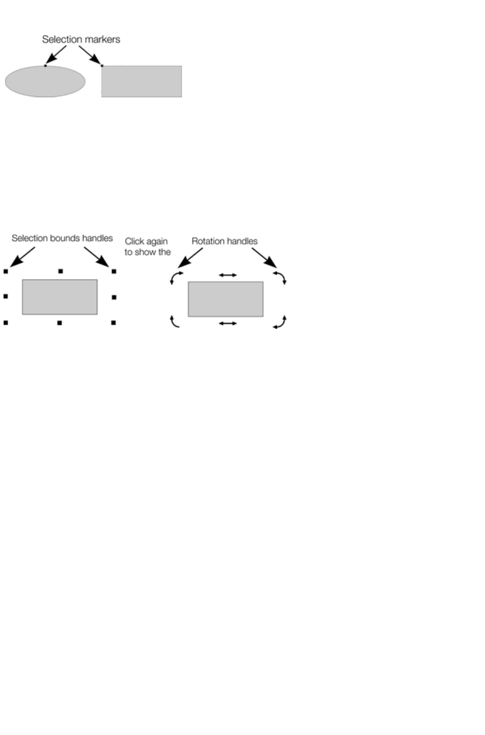
Selection markers
Each selected object displays a single
selection marker to show it is
selected. This is a useful reminder
when selecting and deselecting
several objects.
Status line
The status line at the bottom of the window also describes what is selected.
Selection bounds handles
Selection bounds handles let you scale and stretch selected objects. See Stretching and squashing
objects for more details. Successive clicks on an object alternate between showing selection bounds and
rotation handles.
Tab
With any selected object, pressing "Tab" and "Shift + Tab" will move through the selected objects
(previous and next object in the document).
Page 349

Select under
Hold down "Alt" to select objects hidden by other objects. By "Alt + clicking" you can step through
several overlapping objects.
Select inside
You can select an object that's inside a group or other container object by holding down "Ctrl" while you
click on it. This is called selecting inside. The object you click on will always become selected, even if it's
deep down inside several levels of nested groups. When you have such deep nesting of groups,
sometimes you may want to select one of the nested groups (a group inside another group). If you hold
down the "Alt" and "Ctrl" keys while you click you can do this easily. The first such click will select the
top level group (just as an unmodified click does). Click again and the next group down in the hierarchy
will be selected instead. Continue clicking to 'drill down' into the group structure until the group you want
becomes selected.
Note that some operations are not permitted with select inside. For example, marquee selection and
right-click copy does not work for select inside.
Moving objects selected under or inside
If you need to move a selected object that's either under others or inside a group, then just dragging
doesn't work as it will select and drag a different object. To overcome this hold "Ctrl + Alt" and start
dragging. This will always drag the existing selected object. You can let go of the keys once you've
started dragging.
Or you can use the arrow keys
ï€ on the keyboard to nudge the object.
Selecting and layers
You cannot select objects in locked or invisible layers.
See "Page & Layer Gallery
" for more details on layers.
Selecting all objects
To select all objects:
Choose "Edit" > "Select all",
Or press "Ctrl + A".
Deselecting an object
To deselect all objects:
Click anywhere on an unused part of the document,
Or choose "Edit" > "Clear selection",
Or press "Esc".
To deselect one object from several:
"Shift + click" on the object. This deselects that object. Other objects remain selected.
Selection markers
Page 350
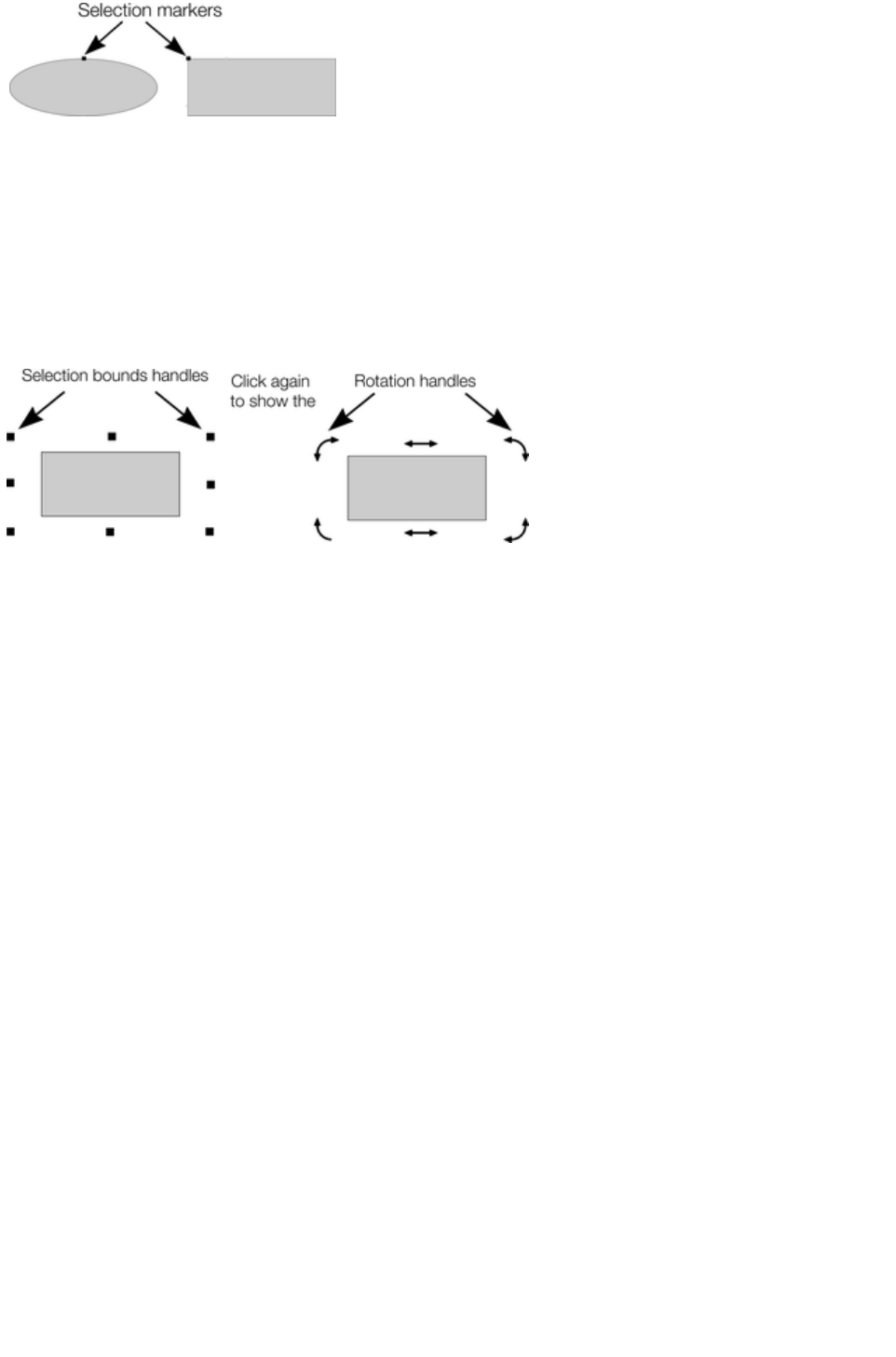
Each selected object displays a single
selection marker to show it is
selected. This is a useful reminder
when selecting and deselecting
several objects.
Status line
The status line at the bottom of the window also describes what is selected.
Selection bounds handles
Selection bounds handles let you scale and stretch selected objects. See Stretching and squashing
objects for more details. Successive clicks on an object alternate between showing selection bounds and
rotation handles.
Tab
With any selected object, pressing "Tab" and "Shift + Tab" will move through the selected objects
(previous and next object in the document).
Page 351
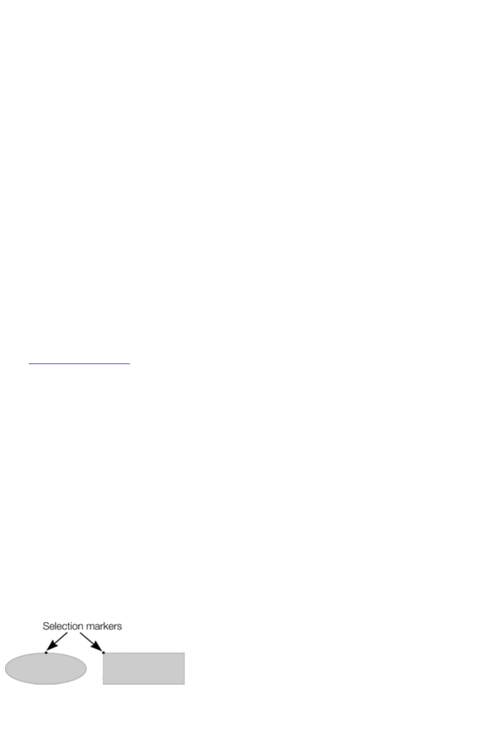
Select inside
You can select an object that's inside a group or other container object by holding down "Ctrl" while you
click on it. This is called selecting inside. The object you click on will always become selected, even if it's
deep down inside several levels of nested groups. When you have such deep nesting of groups,
sometimes you may want to select one of the nested groups (a group inside another group). If you hold
down the "Alt" and "Ctrl" keys while you click you can do this easily. The first such click will select the
top level group (just as an unmodified click does). Click again and the next group down in the hierarchy
will be selected instead. Continue clicking to 'drill down' into the group structure until the group you want
becomes selected.
Note that some operations are not permitted with select inside. For example, marquee selection and
right-click copy does not work for select inside.
Moving objects selected under or inside
If you need to move a selected object that's either under others or inside a group, then just dragging
doesn't work as it will select and drag a different object. To overcome this hold "Ctrl + Alt" and start
dragging. This will always drag the existing selected object. You can let go of the keys once you've
started dragging.
Or you can use the arrow keys
ï€ on the keyboard to nudge the object.
Selecting and layers
You cannot select objects in locked or invisible layers.
See "Page & Layer Gallery
" for more details on layers.
Selecting all objects
To select all objects:
Choose "Edit" > "Select all",
Or press "Ctrl + A".
Deselecting an object
To deselect all objects:
Click anywhere on an unused part of the document,
Or choose "Edit" > "Clear selection",
Or press "Esc".
To deselect one object from several:
"Shift + click" on the object. This deselects that object. Other objects remain selected.
Selection markers
Each selected object displays a single
selection marker to show it is
selected. This is a useful reminder
when selecting and deselecting
several objects.
Status line
The status line at the bottom of the window also describes what is selected.
Page 352

Selection bounds handles
Selection bounds handles let you scale and stretch selected objects. See Stretching and squashing
objects for more details. Successive clicks on an object alternate between showing selection bounds and
rotation handles.
Tab
With any selected object, pressing "Tab" and "Shift + Tab" will move through the selected objects
(previous and next object in the document).
Page 353
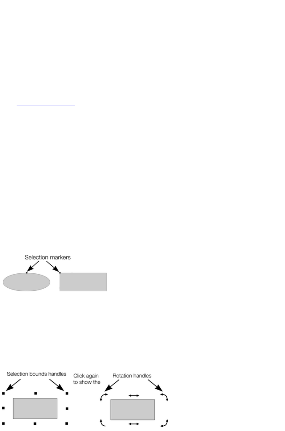
Moving objects selected under or inside
If you need to move a selected object that's either under others or inside a group, then just dragging
doesn't work as it will select and drag a different object. To overcome this hold "Ctrl + Alt" and start
dragging. This will always drag the existing selected object. You can let go of the keys once you've
started dragging.
Or you can use the arrow keys
ï€ on the keyboard to nudge the object.
Selecting and layers
You cannot select objects in locked or invisible layers.
See "Page & Layer Gallery
" for more details on layers.
Selecting all objects
To select all objects:
Choose "Edit" > "Select all",
Or press "Ctrl + A".
Deselecting an object
To deselect all objects:
Click anywhere on an unused part of the document,
Or choose "Edit" > "Clear selection",
Or press "Esc".
To deselect one object from several:
"Shift + click" on the object. This deselects that object. Other objects remain selected.
Selection markers
Each selected object displays a single
selection marker to show it is
selected. This is a useful reminder
when selecting and deselecting
several objects.
Status line
The status line at the bottom of the window also describes what is selected.
Selection bounds handles
Selection bounds handles let you scale and stretch selected objects. See Stretching and squashing
objects for more details. Successive clicks on an object alternate between showing selection bounds and
rotation handles.
Page 354

Tab
With any selected object, pressing "Tab" and "Shift + Tab" will move through the selected objects
(previous and next object in the document).
Page 355
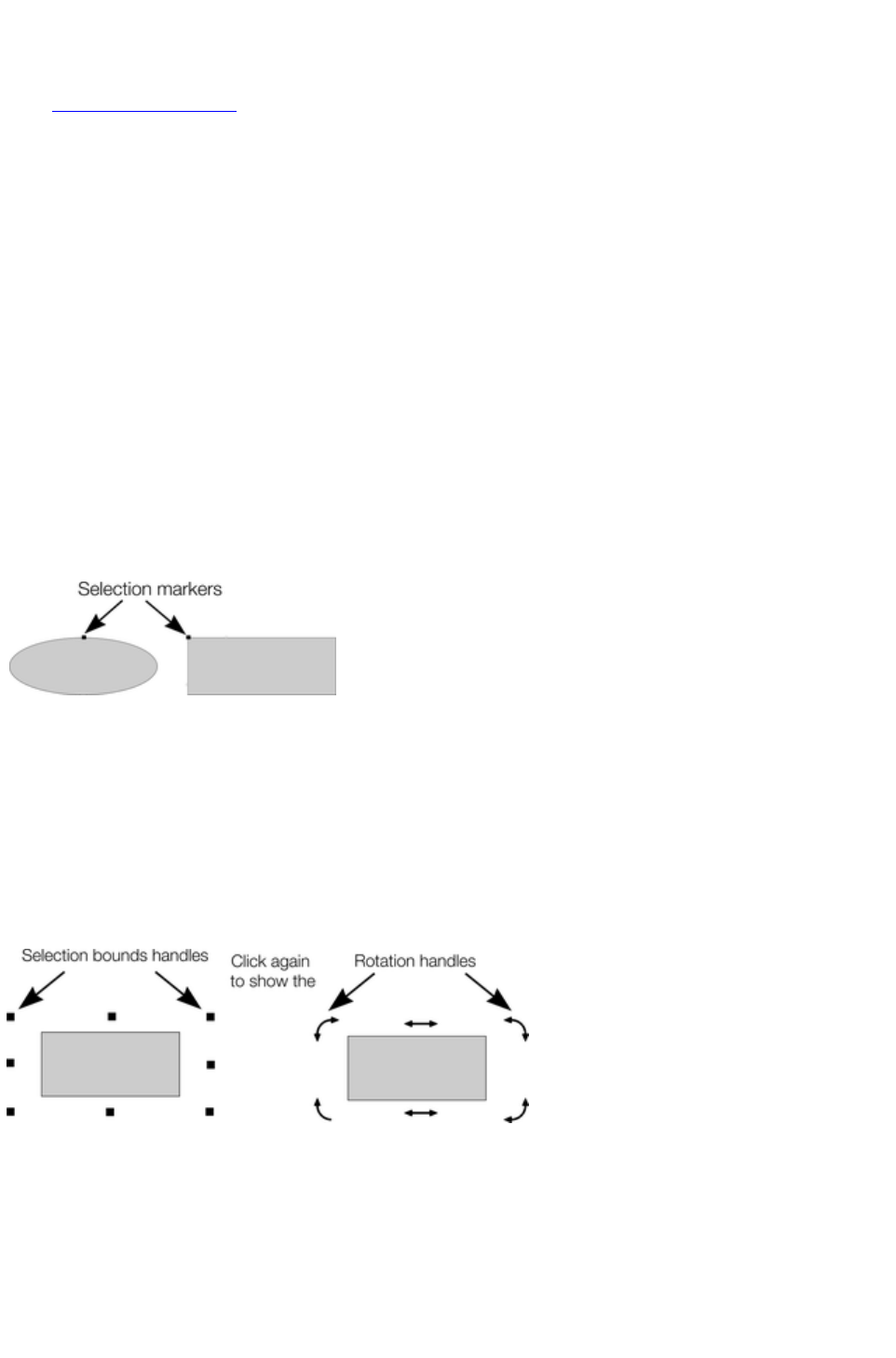
Selecting and layers
You cannot select objects in locked or invisible layers.
See "Page & Layer Gallery
" for more details on layers.
Selecting all objects
To select all objects:
Choose "Edit" > "Select all",
Or press "Ctrl + A".
Deselecting an object
To deselect all objects:
Click anywhere on an unused part of the document,
Or choose "Edit" > "Clear selection",
Or press "Esc".
To deselect one object from several:
"Shift + click" on the object. This deselects that object. Other objects remain selected.
Selection markers
Each selected object displays a single
selection marker to show it is
selected. This is a useful reminder
when selecting and deselecting
several objects.
Status line
The status line at the bottom of the window also describes what is selected.
Selection bounds handles
Selection bounds handles let you scale and stretch selected objects. See Stretching and squashing
objects for more details. Successive clicks on an object alternate between showing selection bounds and
rotation handles.
Tab
With any selected object, pressing "Tab" and "Shift + Tab" will move through the selected objects
(previous and next object in the document).
Page 356
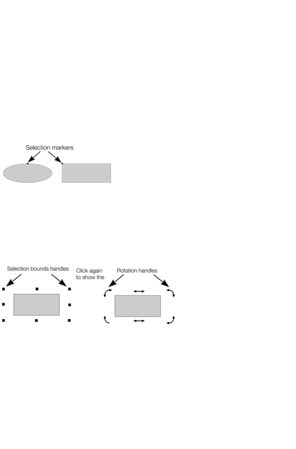
Selecting all objects
To select all objects:
Choose "Edit" > "Select all",
Or press "Ctrl + A".
Deselecting an object
To deselect all objects:
Click anywhere on an unused part of the document,
Or choose "Edit" > "Clear selection",
Or press "Esc".
To deselect one object from several:
"Shift + click" on the object. This deselects that object. Other objects remain selected.
Selection markers
Each selected object displays a single
selection marker to show it is
selected. This is a useful reminder
when selecting and deselecting
several objects.
Status line
The status line at the bottom of the window also describes what is selected.
Selection bounds handles
Selection bounds handles let you scale and stretch selected objects. See Stretching and squashing
objects for more details. Successive clicks on an object alternate between showing selection bounds and
rotation handles.
Tab
With any selected object, pressing "Tab" and "Shift + Tab" will move through the selected objects
(previous and next object in the document).
Page 357
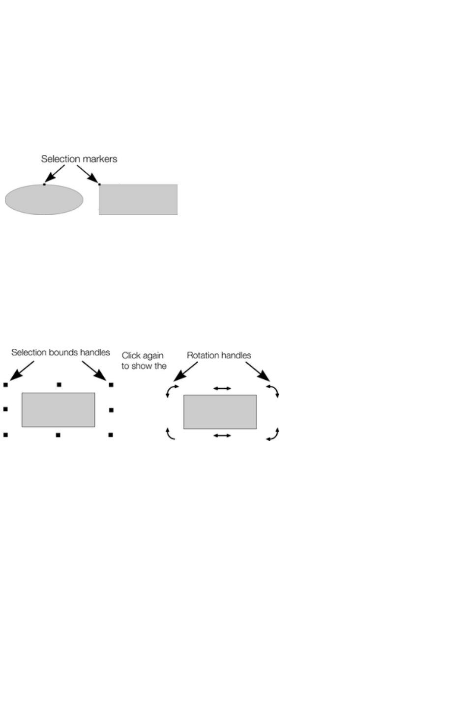
Deselecting an object
To deselect all objects:
Click anywhere on an unused part of the document,
Or choose "Edit" > "Clear selection",
Or press "Esc".
To deselect one object from several:
"Shift + click" on the object. This deselects that object. Other objects remain selected.
Selection markers
Each selected object displays a single
selection marker to show it is
selected. This is a useful reminder
when selecting and deselecting
several objects.
Status line
The status line at the bottom of the window also describes what is selected.
Selection bounds handles
Selection bounds handles let you scale and stretch selected objects. See Stretching and squashing
objects for more details. Successive clicks on an object alternate between showing selection bounds and
rotation handles.
Tab
With any selected object, pressing "Tab" and "Shift + Tab" will move through the selected objects
(previous and next object in the document).
Page 358

Selection markers
Each selected object displays a single
selection marker to show it is
selected. This is a useful reminder
when selecting and deselecting
several objects.
Status line
The status line at the bottom of the window also describes what is selected.
Selection bounds handles
Selection bounds handles let you scale and stretch selected objects. See Stretching and squashing
objects for more details. Successive clicks on an object alternate between showing selection bounds and
rotation handles.
Tab
With any selected object, pressing "Tab" and "Shift + Tab" will move through the selected objects
(previous and next object in the document).
Page 359
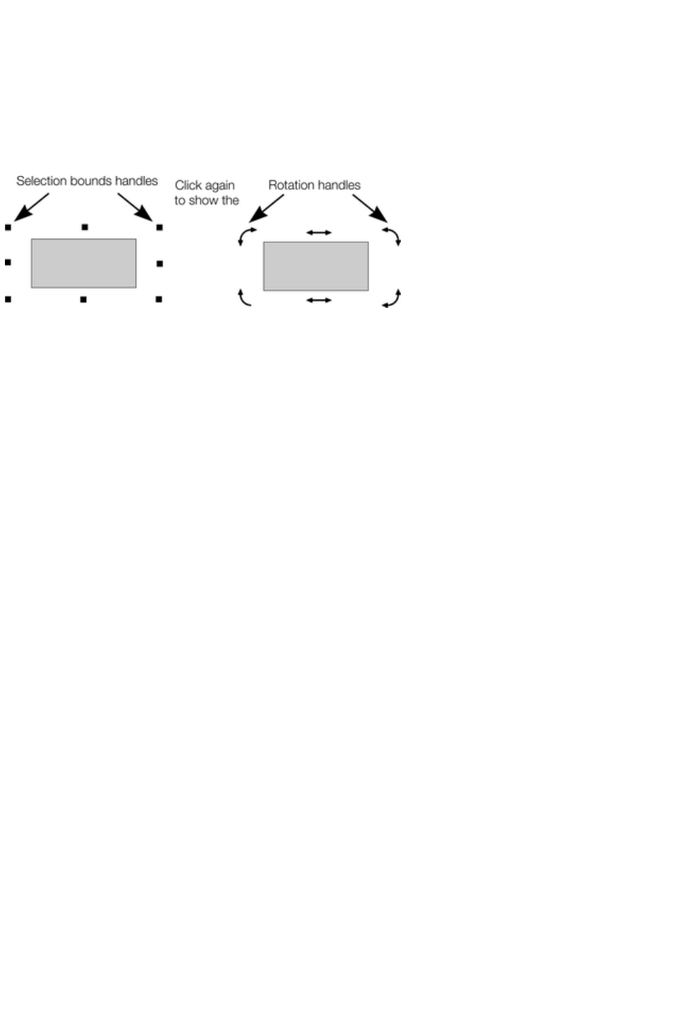
Status line
The status line at the bottom of the window also describes what is selected.
Selection bounds handles
Selection bounds handles let you scale and stretch selected objects. See Stretching and squashing
objects for more details. Successive clicks on an object alternate between showing selection bounds and
rotation handles.
Tab
With any selected object, pressing "Tab" and "Shift + Tab" will move through the selected objects
(previous and next object in the document).
Page 360
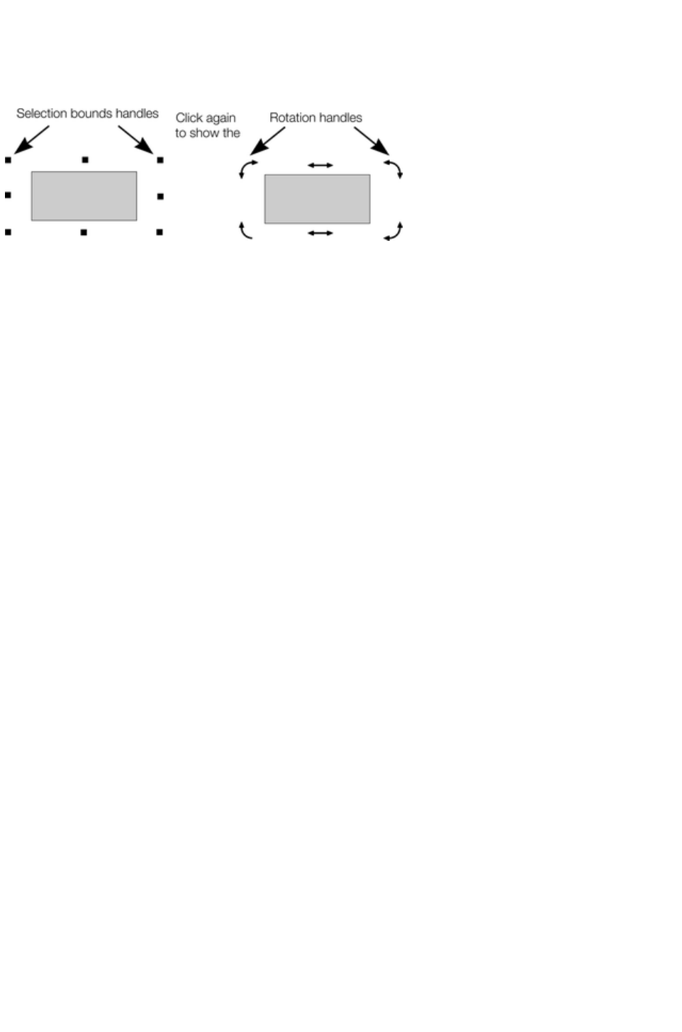
Selection bounds handles
Selection bounds handles let you scale and stretch selected objects. See Stretching and squashing
objects for more details. Successive clicks on an object alternate between showing selection bounds and
rotation handles.
Tab
With any selected object, pressing "Tab" and "Shift + Tab" will move through the selected objects
(previous and next object in the document).
Page 361

Tab
With any selected object, pressing "Tab" and "Shift + Tab" will move through the selected objects
(previous and next object in the document).
Page 362
Moving objects
To slide an object across the page
1. Choose the Selector Tool.
2. Drag the object to the required position. Hold down "Ctrl" to restrict the direction of movement
to one of the constrain angles.
The constrain angles are user definable. Refer to "Customizing Web Designer Premium
"
Hold down "Ctrl + Alt" and you can drag the selected object even if the pointer is not over it. This is
useful when the selected object is hidden behind another object or part of a group. Release "Ctrl" and
"Alt" after you start the move unless you want to constrain the move.
You can also move objects using the arrow cursor keys. This is described on the next page.
Magnetic object snapping is also enabled by default in web documents. Object snapping is a very
powerful way of accurately aligning lines, points and the edges of objects to any other object so they
exactly touch. It also helps you align to the horizontal and vertical center lines of the page.
To toggle object snapping, click the Snap to objects button or right
click and choose "Snap to" > "Snap to Objects". You can also
choose "Window" > "Snap to objects"
.
Click and drag on the object you want to snap. As you drag, Web Designer Premium displays a magnet
icon whenever you are near a "point of interest" or potential snapping site relative to a visible object on
the page.
To snap in a path relative to the page center (both horizontally and vertically), move the object over the
lines that appear as you drag on the page. A red dot on the line also indicates potential "point to path"
snapping points, so that you can snap the object to a point such as the center or center line of the page.
See Snapping
for details on snapping to grid and snapping to objects.
Drop copy
During a move (and while still holding the left mouse button down) click the right mouse button or press
+ on the numeric keypad to drop a copy of the object. The original object doesn't move. You can do this
as many times as you wish to create a series of duplicated objects.
You can also hold down the right mouse button and drag a copy of the object. Left click to leave a copy
at the current mouse position.
Fills
Usually, moving an object also moves the fill with it:
Normal move left to right with a linear filled
object.
This also applies to rotating, skewing, scaling and
stretching objects.
Web Designer Premium can also move the object but not the fill origin.
To do this click the "-" key on the numeric keypad
during the move.
The same move, but pressing "-" (minus) during the
drag.
Nudging objects
Page 363

Usually you can move an object a small amount by using the arrow?keys to nudge the object (these keys
sometimes have other uses, especially in the Text Tool
).
Nudging is not affected by either magnetic or grid snapping (snapping is described later).
Nudge modifiers
To modify the nudge distance, use these key combinations while using the arrow keys:
Ctrl nudge 5 times the normal distance
Shift nudge 10 times the normal distance
Ctrl + Shift nudge by l/5th the normal distance
Alt nudge by 1 pixel
Alt + Shift nudge by 10 pixels
You can change the normal nudge distance under the General tab in "Utilities" > "Options". Refer to "
Customizing Web Designer Premium
".
Nudge works in most tools.
Cut, copy and paste
These let you move or copy an object in the same document or between different documents. The
procedure is:
1. Select the object.
2. To remove the object, choose "Edit" > "Cut" (or "Ctrl + X"). To copy the object but not
remove it, choose "Edit" > "Copy" (or "Ctrl + C"). Either option puts the object (or a copy of it)
onto the clipboard.
3. Choose "Edit" > "Paste", "Ctrl + V", or "Insert". This pastes the clipboard contents into the
document.
Note that if the objects you copy are all on the same layer, then you can paste those objects to any
layer by first making it the current layer and then choosing "Edit" > "Paste" > "Paste in layer" or
"Paste in place in current layer"
. The layer from which the objects were copied is ignored in this case.
However if the objects you copy are on several different layers
, then the layer structure is maintained when you paste.
This allows you to copy layered data within a document or to a different document. Any layers which are
missing in the target document are created automatically by this operation. So for example if you copy a
mouse-over button, which has one object on the MouseOff layer and another object on the MouseOver
layer, to a new document, the MouseOff and MouseOver layers will be created if they don't already exist
and the button objects copied onto them.
"Ctrl + Shift + V" or "Edit" > "Paste in place"
pastes the clipboard contents into the same X/Y position from where they were cut or copied. This only
applies to objects cut or copied from within Web Designer Premium. Objects imported from other
programs are always pasted into the center of the current view.
The object remains on the clipboard so you can paste the same object several times.
If there is a choice of formats on the clipboard, Xara Web Designer 7 Premium will display a Paste
Special
dialog which allows you to choose the format you want to paste in (eg. When pasting in text you may
have the choice of pasting in unformatted text or Rich Text).
In addition you may see the following paste options, depending on the clipboard contents:
Paste unformatted text
Pastes any text on the clipboard into your document without any formatting.
Page 364

Paste format/attributes
Preserves the format (e.g., font and font size) or style attributes (e.g., line and fill color) of the pasted
object.
Paste position
This option applies the position of a copied object on the clipboard to a currently selected object, which
moves to the exact same position as the copied object.
If multiple items have been copied to the clipboard, Web Designer Premium treats them as if they are a
group and moves the currently selected object to the position of the copied group as a whole.
The currently selected object is pasted or moved into the center position of the copied object or group of
objects.
Paste size
This option applies the size of a copied object on the clipboard to a currently selected object, which
resizes around its center to the exact size of the copied object.
If you have multiple items selected when you 'paste size', each of those objects is made the target size,
instead of the selection as a whole. So for example if you copy a 200x200 pixel photo, then select 10
other photos and 'paste size', all 10 photos each become 200x200 pixels. This gives a quick way to
make a bunch of objects a particular size.
Paste replacing selection
This is similar to Paste position
, except that the copied object on the clipboard replaces the currently selected object and retains the
deleted item's position.
The copied object is pasted into the center position of the deleted object.
Paste in current layer
The same as Paste in place,
except your object will only be pasted into the current layer.
This is useful if you want to display or hide just your pasted object when layers above or below are
displayed.
Paste in place in current layer
The same as Paste in current layer,
except your object will be pasted into the current layer in the exact same position from which you copied
it.
Page 365
Drop copy
During a move (and while still holding the left mouse button down) click the right mouse button or press
+ on the numeric keypad to drop a copy of the object. The original object doesn't move. You can do this
as many times as you wish to create a series of duplicated objects.
You can also hold down the right mouse button and drag a copy of the object. Left click to leave a copy
at the current mouse position.
Fills
Usually, moving an object also moves the fill with it:
Normal move left to right with a linear filled
object.
This also applies to rotating, skewing, scaling and
stretching objects.
Web Designer Premium can also move the object but not the fill origin.
To do this click the "−" key on the numeric keypad
during the move.
The same move, but pressing "−" (minus) during
the drag.
Nudging objects
Usually you can move an object a small amount by using the arrowï€ keys to nudge the object (these
keys sometimes have other uses, especially in the Text Tool
).
Nudging is not affected by either magnetic or grid snapping (snapping is described later).
Nudge modifiers
To modify the nudge distance, use these key combinations while using the arrow keys:
Ctrl nudge 5 times the normal distance
Shift nudge 10 times the normal distance
Ctrl + Shift nudge by l/5th the normal distance
Alt nudge by 1 pixel
Alt + Shift nudge by 10 pixels
You can change the normal nudge distance under the General tab in "Utilities" > "Options". Refer to "
Customizing Web Designer Premium
".
Nudge works in most tools.
Cut, copy and paste
These let you move or copy an object in the same document or between different documents. The
procedure is:
1. Select the object.
2. To remove the object, choose "Edit" > "Cut" (or "Ctrl + X"). To copy the object but not
remove it, choose "Edit" > "Copy" (or "Ctrl + C"). Either option puts the object (or a copy of it)
onto the clipboard.
3. Choose "Edit" > "Paste", "Ctrl + V", or "Insert". This pastes the clipboard contents into the
document.
Note that if the objects you copy are all on the same layer, then you can paste those objects to any
Page 366

layer by first making it the current layer and then choosing "Edit" > "Paste" > "Paste in layer" or
"Paste in place in current layer"
. The layer from which the objects were copied is ignored in this case.
However if the objects you copy are on several different layers
, then the layer structure is maintained when you paste.
This allows you to copy layered data within a document or to a different document. Any layers which are
missing in the target document are created automatically by this operation. So for example if you copy a
mouse-over button, which has one object on the MouseOff layer and another object on the MouseOver
layer, to a new document, the MouseOff and MouseOver layers will be created if they don't already exist
and the button objects copied onto them.
"Ctrl + Shift + V" or "Edit" > "Paste in place"
pastes the clipboard contents into the same X/Y position from where they were cut or copied. This only
applies to objects cut or copied from within Web Designer Premium. Objects imported from other
programs are always pasted into the center of the current view.
The object remains on the clipboard so you can paste the same object several times.
If there is a choice of formats on the clipboard, Xara Web Designer 7 Premium will display a Paste
Special
dialog which allows you to choose the format you want to paste in (eg. When pasting in text you may
have the choice of pasting in unformatted text or Rich Text).
In addition you may see the following paste options, depending on the clipboard contents:
Paste unformatted text
Pastes any text on the clipboard into your document without any formatting.
Paste format/attributes
Preserves the format (e.g., font and font size) or style attributes (e.g., line and fill color) of the pasted
object.
Paste position
This option applies the position of a copied object on the clipboard to a currently selected object, which
moves to the exact same position as the copied object.
If multiple items have been copied to the clipboard, Web Designer Premium treats them as if they are a
group and moves the currently selected object to the position of the copied group as a whole.
The currently selected object is pasted or moved into the center position of the copied object or group of
objects.
Paste size
This option applies the size of a copied object on the clipboard to a currently selected object, which
resizes around its center to the exact size of the copied object.
If you have multiple items selected when you 'paste size', each of those objects is made the target size,
instead of the selection as a whole. So for example if you copy a 200x200 pixel photo, then select 10
other photos and 'paste size', all 10 photos each become 200x200 pixels. This gives a quick way to
make a bunch of objects a particular size.
Paste replacing selection
This is similar to Paste position
, except that the copied object on the clipboard replaces the currently selected object and retains the
deleted item's position.
The copied object is pasted into the center position of the deleted object.
Page 367

Paste in current layer
The same as Paste in place,
except your object will only be pasted into the current layer.
This is useful if you want to display or hide just your pasted object when layers above or below are
displayed.
Paste in place in current layer
The same as Paste in current layer,
except your object will be pasted into the current layer in the exact same position from which you copied
it.
Page 368
Fills
Usually, moving an object also moves the fill with it:
Normal move left to right with a linear filled
object.
This also applies to rotating, skewing, scaling and
stretching objects.
Web Designer Premium can also move the object but not the fill origin.
To do this click the "−" key on the numeric keypad
during the move.
The same move, but pressing "−" (minus) during
the drag.
Nudging objects
Usually you can move an object a small amount by using the arrowï€ keys to nudge the object (these
keys sometimes have other uses, especially in the Text Tool
).
Nudging is not affected by either magnetic or grid snapping (snapping is described later).
Nudge modifiers
To modify the nudge distance, use these key combinations while using the arrow keys:
Ctrl nudge 5 times the normal distance
Shift nudge 10 times the normal distance
Ctrl + Shift nudge by l/5th the normal distance
Alt nudge by 1 pixel
Alt + Shift nudge by 10 pixels
You can change the normal nudge distance under the General tab in "Utilities" > "Options". Refer to "
Customizing Web Designer Premium
".
Nudge works in most tools.
Cut, copy and paste
These let you move or copy an object in the same document or between different documents. The
procedure is:
1. Select the object.
2. To remove the object, choose "Edit" > "Cut" (or "Ctrl + X"). To copy the object but not
remove it, choose "Edit" > "Copy" (or "Ctrl + C"). Either option puts the object (or a copy of it)
onto the clipboard.
3. Choose "Edit" > "Paste", "Ctrl + V", or "Insert". This pastes the clipboard contents into the
document.
Note that if the objects you copy are all on the same layer, then you can paste those objects to any
layer by first making it the current layer and then choosing "Edit" > "Paste" > "Paste in layer" or
"Paste in place in current layer"
. The layer from which the objects were copied is ignored in this case.
However if the objects you copy are on several different layers
, then the layer structure is maintained when you paste.
This allows you to copy layered data within a document or to a different document. Any layers which are
missing in the target document are created automatically by this operation. So for example if you copy a
mouse-over button, which has one object on the MouseOff layer and another object on the MouseOver
Page 369

layer, to a new document, the MouseOff and MouseOver layers will be created if they don't already exist
and the button objects copied onto them.
"Ctrl + Shift + V" or "Edit" > "Paste in place"
pastes the clipboard contents into the same X/Y position from where they were cut or copied. This only
applies to objects cut or copied from within Web Designer Premium. Objects imported from other
programs are always pasted into the center of the current view.
The object remains on the clipboard so you can paste the same object several times.
If there is a choice of formats on the clipboard, Xara Web Designer 7 Premium will display a Paste
Special
dialog which allows you to choose the format you want to paste in (eg. When pasting in text you may
have the choice of pasting in unformatted text or Rich Text).
In addition you may see the following paste options, depending on the clipboard contents:
Paste unformatted text
Pastes any text on the clipboard into your document without any formatting.
Paste format/attributes
Preserves the format (e.g., font and font size) or style attributes (e.g., line and fill color) of the pasted
object.
Paste position
This option applies the position of a copied object on the clipboard to a currently selected object, which
moves to the exact same position as the copied object.
If multiple items have been copied to the clipboard, Web Designer Premium treats them as if they are a
group and moves the currently selected object to the position of the copied group as a whole.
The currently selected object is pasted or moved into the center position of the copied object or group of
objects.
Paste size
This option applies the size of a copied object on the clipboard to a currently selected object, which
resizes around its center to the exact size of the copied object.
If you have multiple items selected when you 'paste size', each of those objects is made the target size,
instead of the selection as a whole. So for example if you copy a 200x200 pixel photo, then select 10
other photos and 'paste size', all 10 photos each become 200x200 pixels. This gives a quick way to
make a bunch of objects a particular size.
Paste replacing selection
This is similar to Paste position
, except that the copied object on the clipboard replaces the currently selected object and retains the
deleted item's position.
The copied object is pasted into the center position of the deleted object.
Paste in current layer
The same as Paste in place,
except your object will only be pasted into the current layer.
This is useful if you want to display or hide just your pasted object when layers above or below are
displayed.
Paste in place in current layer
The same as Paste in current layer,
Page 370

except your object will be pasted into the current layer in the exact same position from which you copied
it.
Page 371

Nudging objects
Usually you can move an object a small amount by using the arrowï€ keys to nudge the object (these
keys sometimes have other uses, especially in the Text Tool
).
Nudging is not affected by either magnetic or grid snapping (snapping is described later).
Nudge modifiers
To modify the nudge distance, use these key combinations while using the arrow keys:
Ctrl nudge 5 times the normal distance
Shift nudge 10 times the normal distance
Ctrl + Shift nudge by l/5th the normal distance
Alt nudge by 1 pixel
Alt + Shift nudge by 10 pixels
You can change the normal nudge distance under the General tab in "Utilities" > "Options". Refer to "
Customizing Web Designer Premium
".
Nudge works in most tools.
Cut, copy and paste
These let you move or copy an object in the same document or between different documents. The
procedure is:
1. Select the object.
2. To remove the object, choose "Edit" > "Cut" (or "Ctrl + X"). To copy the object but not
remove it, choose "Edit" > "Copy" (or "Ctrl + C"). Either option puts the object (or a copy of it)
onto the clipboard.
3. Choose "Edit" > "Paste", "Ctrl + V", or "Insert". This pastes the clipboard contents into the
document.
Note that if the objects you copy are all on the same layer, then you can paste those objects to any
layer by first making it the current layer and then choosing "Edit" > "Paste" > "Paste in layer" or
"Paste in place in current layer"
. The layer from which the objects were copied is ignored in this case.
However if the objects you copy are on several different layers
, then the layer structure is maintained when you paste.
This allows you to copy layered data within a document or to a different document. Any layers which are
missing in the target document are created automatically by this operation. So for example if you copy a
mouse-over button, which has one object on the MouseOff layer and another object on the MouseOver
layer, to a new document, the MouseOff and MouseOver layers will be created if they don't already exist
and the button objects copied onto them.
"Ctrl + Shift + V" or "Edit" > "Paste in place"
pastes the clipboard contents into the same X/Y position from where they were cut or copied. This only
applies to objects cut or copied from within Web Designer Premium. Objects imported from other
programs are always pasted into the center of the current view.
The object remains on the clipboard so you can paste the same object several times.
If there is a choice of formats on the clipboard, Xara Web Designer 7 Premium will display a Paste
Special
dialog which allows you to choose the format you want to paste in (eg. When pasting in text you may
have the choice of pasting in unformatted text or Rich Text).
In addition you may see the following paste options, depending on the clipboard contents:
Page 372

Paste unformatted text
Pastes any text on the clipboard into your document without any formatting.
Paste format/attributes
Preserves the format (e.g., font and font size) or style attributes (e.g., line and fill color) of the pasted
object.
Paste position
This option applies the position of a copied object on the clipboard to a currently selected object, which
moves to the exact same position as the copied object.
If multiple items have been copied to the clipboard, Web Designer Premium treats them as if they are a
group and moves the currently selected object to the position of the copied group as a whole.
The currently selected object is pasted or moved into the center position of the copied object or group of
objects.
Paste size
This option applies the size of a copied object on the clipboard to a currently selected object, which
resizes around its center to the exact size of the copied object.
If you have multiple items selected when you 'paste size', each of those objects is made the target size,
instead of the selection as a whole. So for example if you copy a 200x200 pixel photo, then select 10
other photos and 'paste size', all 10 photos each become 200x200 pixels. This gives a quick way to
make a bunch of objects a particular size.
Paste replacing selection
This is similar to Paste position
, except that the copied object on the clipboard replaces the currently selected object and retains the
deleted item's position.
The copied object is pasted into the center position of the deleted object.
Paste in current layer
The same as Paste in place,
except your object will only be pasted into the current layer.
This is useful if you want to display or hide just your pasted object when layers above or below are
displayed.
Paste in place in current layer
The same as Paste in current layer,
except your object will be pasted into the current layer in the exact same position from which you copied
it.
Page 373

Cut, copy and paste
These let you move or copy an object in the same document or between different documents. The
procedure is:
1. Select the object.
2. To remove the object, choose "Edit" > "Cut" (or "Ctrl + X"). To copy the object but not
remove it, choose "Edit" > "Copy" (or "Ctrl + C"). Either option puts the object (or a copy of it)
onto the clipboard.
3. Choose "Edit" > "Paste", "Ctrl + V", or "Insert". This pastes the clipboard contents into the
document.
Note that if the objects you copy are all on the same layer, then you can paste those objects to any
layer by first making it the current layer and then choosing "Edit" > "Paste" > "Paste in layer" or
"Paste in place in current layer"
. The layer from which the objects were copied is ignored in this case.
However if the objects you copy are on several different layers
, then the layer structure is maintained when you paste.
This allows you to copy layered data within a document or to a different document. Any layers which are
missing in the target document are created automatically by this operation. So for example if you copy a
mouse-over button, which has one object on the MouseOff layer and another object on the MouseOver
layer, to a new document, the MouseOff and MouseOver layers will be created if they don't already exist
and the button objects copied onto them.
"Ctrl + Shift + V" or "Edit" > "Paste in place"
pastes the clipboard contents into the same X/Y position from where they were cut or copied. This only
applies to objects cut or copied from within Web Designer Premium. Objects imported from other
programs are always pasted into the center of the current view.
The object remains on the clipboard so you can paste the same object several times.
If there is a choice of formats on the clipboard, Xara Web Designer 7 Premium will display a Paste
Special
dialog which allows you to choose the format you want to paste in (eg. When pasting in text you may
have the choice of pasting in unformatted text or Rich Text).
In addition you may see the following paste options, depending on the clipboard contents:
Paste unformatted text
Pastes any text on the clipboard into your document without any formatting.
Paste format/attributes
Preserves the format (e.g., font and font size) or style attributes (e.g., line and fill color) of the pasted
object.
Paste position
This option applies the position of a copied object on the clipboard to a currently selected object, which
moves to the exact same position as the copied object.
If multiple items have been copied to the clipboard, Web Designer Premium treats them as if they are a
group and moves the currently selected object to the position of the copied group as a whole.
The currently selected object is pasted or moved into the center position of the copied object or group of
objects.
Paste size
This option applies the size of a copied object on the clipboard to a currently selected object, which
resizes around its center to the exact size of the copied object.
Page 374

If you have multiple items selected when you 'paste size', each of those objects is made the target size,
instead of the selection as a whole. So for example if you copy a 200x200 pixel photo, then select 10
other photos and 'paste size', all 10 photos each become 200x200 pixels. This gives a quick way to
make a bunch of objects a particular size.
Paste replacing selection
This is similar to Paste position
, except that the copied object on the clipboard replaces the currently selected object and retains the
deleted item's position.
The copied object is pasted into the center position of the deleted object.
Paste in current layer
The same as Paste in place,
except your object will only be pasted into the current layer.
This is useful if you want to display or hide just your pasted object when layers above or below are
displayed.
Paste in place in current layer
The same as Paste in current layer,
except your object will be pasted into the current layer in the exact same position from which you copied
it.
Page 375

Removing objects from the document
First select the objects you want to remove. You can then either cut the objects to the clipboard or
delete them.
Cutting objects
Choose "Edit" > "Cut", or press "Ctrl + X".The contents of the clipboard are overwritten and you can
paste the deleted object(s) somewhere else if desired.
Deleting objects
Right click and choose Delete or choose Delete from the Edit menu,
or press the "Delete" key, or click the delete button on the Standard
control bar.
In this case the deleted objects are not put onto the clipboard. If you accidentally delete an object, undo
retrieves it.
Page 376

Cutting objects
Choose "Edit" > "Cut", or press "Ctrl + X".The contents of the clipboard are overwritten and you can
paste the deleted object(s) somewhere else if desired.
Deleting objects
Right click and choose Delete or choose Delete from the Edit menu,
or press the "Delete" key, or click the delete button on the Standard
control bar.
In this case the deleted objects are not put onto the clipboard. If you accidentally delete an object, undo
retrieves it.
Page 377

Deleting objects
Right click and choose Delete or choose Delete from the Edit menu,
or press the "Delete" key, or click the delete button on the Standard
control bar.
In this case the deleted objects are not put onto the clipboard. If you accidentally delete an object, undo
retrieves it.
Page 378
Duplicating and cloning
Both these options create a copy of the selected object. The original object is deselected and the
duplicate or clone becomes the selected object.
You can also duplicate an object during moving, rotating, scaling, or skewing. During the drag action
(and while still holding the left mouse button down) click the right mouse button or press "+" on the
numeric keypad to drop a copy of the object. The original object doesn't move. You can do this as many
times as you wish to create a series of duplicated objects.
So an easy way to create one or more copies of an object that is exactly horizontally or vertical aligned,
is to drag the object, hold "Ctrl" to constrain the movement, and right click (or press "+" on the numeric
keypad) for each copy required.
To quickly create a line of objects, draw one, then drag while holding "Ctrl" and right click for each copy
required.
Duplicating
Right click and choose Duplicate, or choose "Edit" > "Duplicate
", or press "Ctrl + D". The copy is displaced slightly, usually down and to the right, from the original.
The duplicate distance is user definable, see "Customizing Web Designer Premium
"
Cloning
Choose "Edit" > "Clone", or press "Ctrl + K".
This places a copy exactly on top of the original.
Cloning is an easy way to create concentric
shapes.
This example uses an original large letter "A"
with a black fill and a 4pt thick white outline and
a clone with no fill and a 1pt black line.
Page 379

Duplicating
Right click and choose Duplicate, or choose "Edit" > "Duplicate
", or press "Ctrl + D". The copy is displaced slightly, usually down and to the right, from the original.
The duplicate distance is user definable, see "Customizing Web Designer Premium
"
Cloning
Choose "Edit" > "Clone", or press "Ctrl + K".
This places a copy exactly on top of the original.
Cloning is an easy way to create concentric
shapes.
This example uses an original large letter "A"
with a black fill and a 4pt thick white outline and
a clone with no fill and a 1pt black line.
Page 380

Cloning
Choose "Edit" > "Clone", or press "Ctrl + K".
This places a copy exactly on top of the original.
Cloning is an easy way to create concentric
shapes.
This example uses an original large letter "A"
with a black fill and a 4pt thick white outline and
a clone with no fill and a 1pt black line.
Page 381
Moving objects forward and backwards
Complex documents have objects stacked on top of each other, such as this target:
The target on the left is made from three circles stacked on top of each other.
To ensure that objects overlay each other in the correct order, you often need to rearrange their order
from front to back. The front object always covers lower objects, and objects always cover other
objects which are further back. Each new object you create is always created on top of older ones.
Right click an object and choose Arrange
, which gives you these options:
Bring to front ("Ctrl + F"): This makes the selected object the front object, and it will hide any
other object it covers.
Move forward ("Ctrl + ? + F"): This moves the object up a level towards the front rather like
climbing a staircase one step at a time.
Move backward ("Ctrl + ? + B"): This moves the object one level towards the back.
Put to back ("Ctrl + B"): This moves the object to the back.
These options move objects forwards and backwards within their layer. Right click and Move to layer
in front/Move to layer behind
lets you move objects between visible layers (invisible layers are skipped when moving objects).
Read more in Layers
.
Page 382
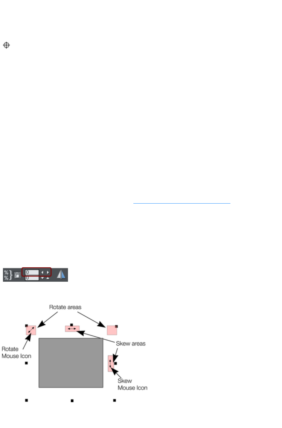
Rotating objects
This is part of the Selector Tool
.
When in rotate mode, the transformation center (around which the
object rotates) initially appears in the center of the object, as shown by
a small target like this.
Simply click on an object again to put the selector into rotate mode.
To move the transformation center, drag the transformation center target where required.
Attention
: If the rotation center is moved, it remains in this location for any selected object until all objects are
deselected, at which point it returns to the center of any selected object.
Rotating using the mouse
The Selector Tool
must be in rotate/skew mode (the selection handles are arrow shaped).
Dragging the side handles stretches the object. This is described in Stretching and squashing objects.
Drag on a corner arrow. As you drag, the object rotates around the transformation center. The InfoBar
shows the current rotate angle.
"
?+ drag" to rotate the object around its center (the transformation center is ignored).
Hold down "Ctrl" to restrict rotation to the constrain angles.
The constrain angles are user definable. Refer to "Customizing Web Designer Premium
".
To create a copy while rotating, click "+" on the numeric keypad while rotating, or click the right mouse
button.
Rotating by exact angles (using the InfoBar)
Type an angle into the rotate box and press "
¿". Positive angles rotate anti-clockwise and negative angles rotate clockwise.
Click the arrows to the right to nudge the rotate
angle.
Rotating objects in Resize Mode
It is possible to rotate and skew an object even if not in rotate mode. Using resize mode, move the
mouse pointer into the according small areas near the selection area handles as illustrated above. The
mouse pointer changes into a rotate or skew icon, showing you that you are now able to rotate or skew
Page 383

the object by dragging with the mouse.
Page 384
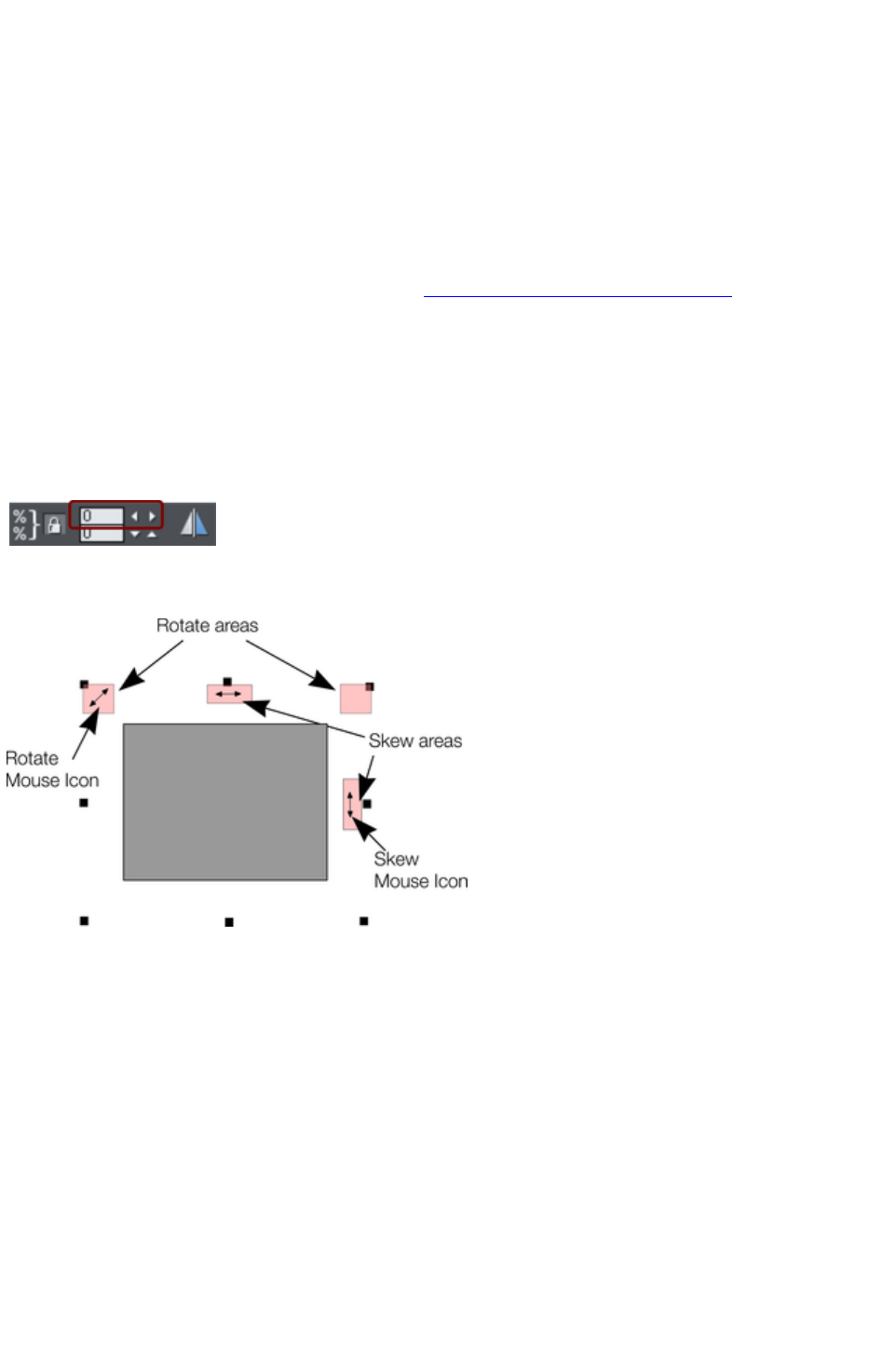
Rotating using the mouse
The Selector Tool
must be in rotate/skew mode (the selection handles are arrow shaped).
Dragging the side handles stretches the object. This is described in Stretching and squashing objects.
Drag on a corner arrow. As you drag, the object rotates around the transformation center. The InfoBar
shows the current rotate angle.
"
+ drag" to rotate the object around its center (the transformation center is ignored).
Hold down "Ctrl" to restrict rotation to the constrain angles.
The constrain angles are user definable. Refer to "Customizing Web Designer Premium
".
To create a copy while rotating, click "+" on the numeric keypad while rotating, or click the right mouse
button.
Rotating by exact angles (using the InfoBar)
Type an angle into the rotate box and press "
¿". Positive angles rotate anti-clockwise and negative angles rotate clockwise.
Click the arrows to the right to nudge the rotate
angle.
Rotating objects in Resize Mode
It is possible to rotate and skew an object even if not in rotate mode. Using resize mode, move the
mouse pointer into the according small areas near the selection area handles as illustrated above. The
mouse pointer changes into a rotate or skew icon, showing you that you are now able to rotate or skew
the object by dragging with the mouse.
Page 385
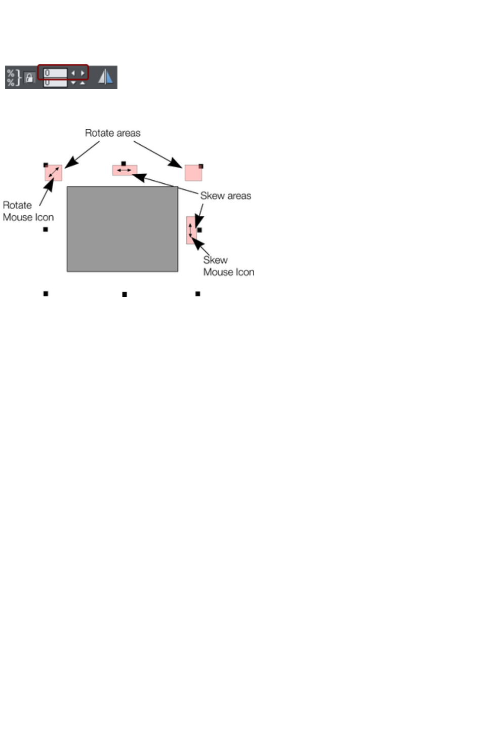
Rotating by exact angles (using the InfoBar)
Type an angle into the rotate box and press "
¿". Positive angles rotate anti-clockwise and negative angles rotate clockwise.
Click the arrows to the right to nudge the rotate
angle.
Rotating objects in Resize Mode
It is possible to rotate and skew an object even if not in rotate mode. Using resize mode, move the
mouse pointer into the according small areas near the selection area handles as illustrated above. The
mouse pointer changes into a rotate or skew icon, showing you that you are now able to rotate or skew
the object by dragging with the mouse.
Page 386
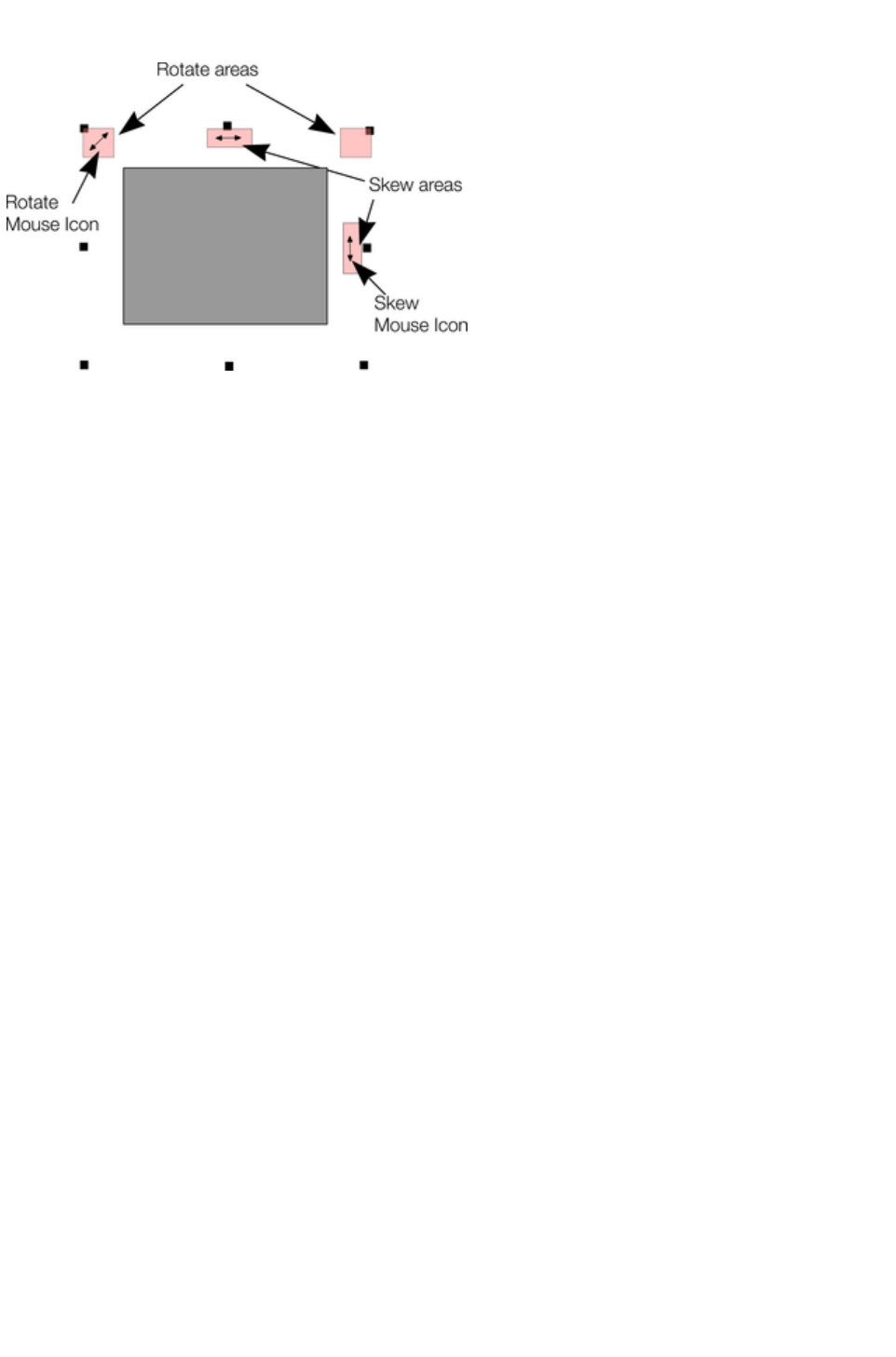
Rotating objects in Resize Mode
It is possible to rotate and skew an object even if not in rotate mode. Using resize mode, move the
mouse pointer into the according small areas near the selection area handles as illustrated above. The
mouse pointer changes into a rotate or skew icon, showing you that you are now able to rotate or skew
the object by dragging with the mouse.
Page 387
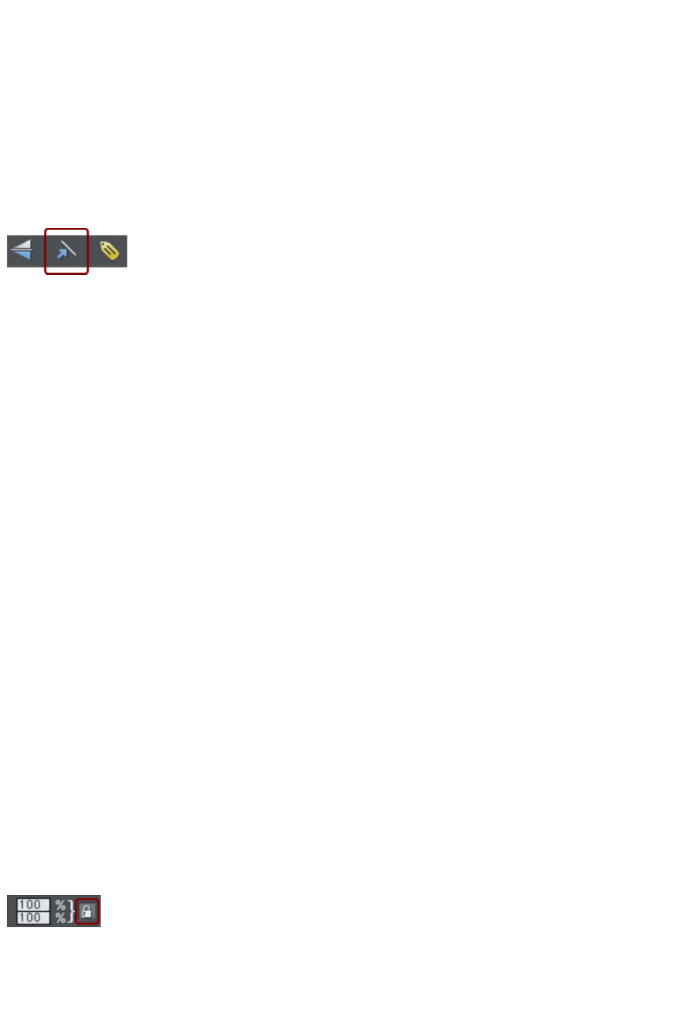
Scaling (resizing) objects
This is part of the Selector Tool
.
Scale Line Widths button
The Scale line widths button on the Selector Tool
infobar is used in many operations where the width and height of the selected objects are important. It
controls whether the line attributes (not just line widths) are taken into account when working out the size
and position of the selected object(s).
With the Scale line widths
button set, scaling an object also scales its line widths.
With this button unset, line widths remain unchanged.
You can toggle this button during drags by clicking "/" on the numeric keypad.
If you have a rectangle with a 4 pixel line width, as you turn Scale line widths on and off you'll see that
the X, Y W And H fields in the Selector Tool change as the effects of the line width are included and
excluded.
The following features are affected by Scale line widths
:
Position and size as reported on the Selector Tool infobar XYWH fields
Changing position and size by entering values into the infobar XYWH fields
Changing size by entering values in the W% H% fields
Scaling/stretching objects by dragging in the Selector tool
Alignment
Snapping
The line attributes that are taken into account when Scale line widths
is turned on are:
Line width
End caps
Join type
Dash pattern
Arrowheads
Brush style
Stroke type (inc. variable width strokes)
In general, if you are interested in the visual positions of objects you should turn Scale line widths on. If
you're interested in the exact positions of lines (e.g. where the centers of lines are, as is typical in technical
drawings) then you should turn Scale line widths
off.
Lock Aspect button
With the Lock aspect
button set, the width/height aspect ratio remains constant
as you scale the object.
In other words, the shape remains in the same proportions as the original. It's recommended that this
button remains selected most of the time in order to ensure that when you resize objects they do not
become squashed.
Page 388
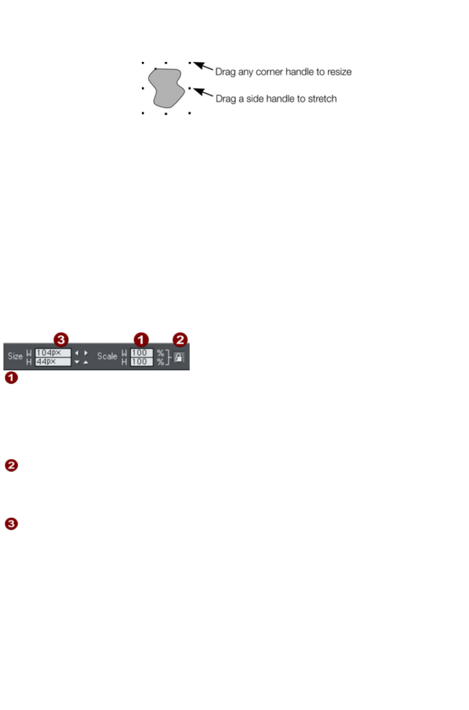
With this button unset, you can change the aspect ratio as you scale the object, in other words, you can
stretch object one way or another when dragging a corner resize handle or when entering a new size.
Scaling using the mouse
The Selector Tool
must be in scale mode (the
selection bounds handles are
squares). If necessary, click
on the object to change to
scale mode.
Drag one of the corner handles. The object scales as you move the pointer diagonally. The InfoBar
shows the current scaling. The object will scale between the dragged handle and the opposite one. To
use any other point of the object as the fixed point move the transformation center to it and use the
InfoBar buttons to scale.
Hold "Shift" while dragging to scale the object around its center. This works independently of the position
of the transformation center.
"Ctrl + drag" scales the object in multiples of its original size (x2, x3, and so on).
To create a copy while scaling (leaving the original in place) right click, or press "+" on the numeric
keypad.
Dragging the side handles stretches or squashes the object. This is described in Stretching and squashing
objects.
Scaling using the InfoBar
Type into the Scale Text boxes and press "
¿".
Scalings below 100% reduce the object. 50 halves the size of the
object.
Scalings above 100% enlarge the object. 200 doubles the object
size.
If Lock Aspect
is set, you can type into either text box to resize the object by the desired
percentage. If this button is unset, you can enter separate values for both
the width and height.
Alternatively, type the required size of the object into the W or H
text boxes.
If the Lock Aspect
button is on, this scales the object and maintains the aspect ratio. You can enter the size in any unit, such
as 1 cm.
Scaling with the InfoBar buttons (or number boxes) always scales around the transformation center. You
can position this anywhere else in the object, as described in Rotating objects.
Page 389
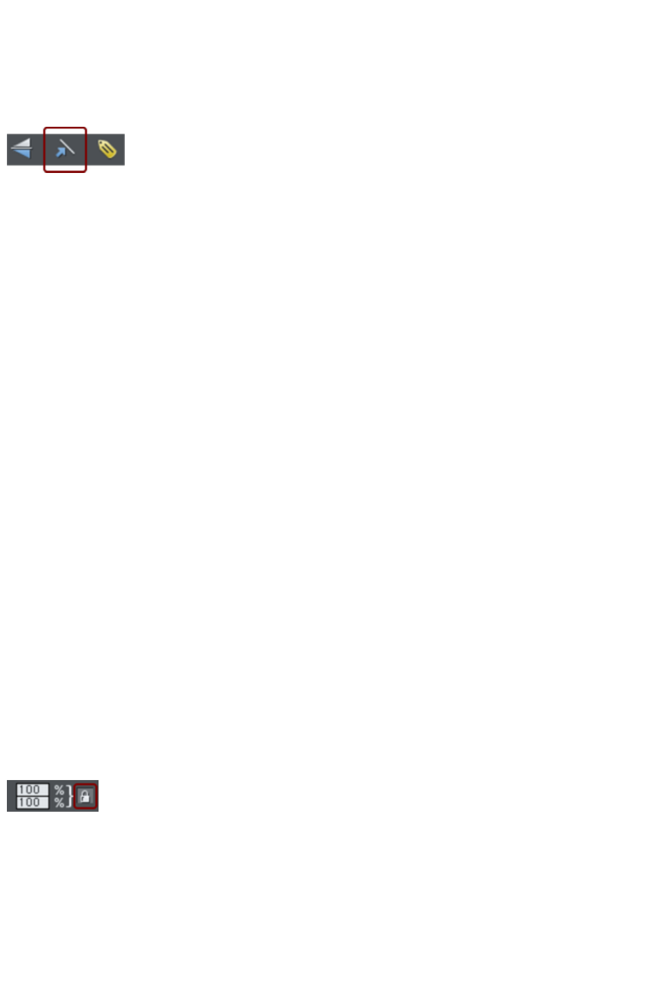
Scale Line Widths button
The Scale line widths button on the Selector Tool
infobar is used in many operations where the width and height of the selected objects are important. It
controls whether the line attributes (not just line widths) are taken into account when working out the size
and position of the selected object(s).
With the Scale line widths
button set, scaling an object also scales its line widths.
With this button unset, line widths remain unchanged.
You can toggle this button during drags by clicking "/" on the numeric keypad.
If you have a rectangle with a 4 pixel line width, as you turn Scale line widths on and off you'll see that
the X, Y W And H fields in the Selector Tool change as the effects of the line width are included and
excluded.
The following features are affected by Scale line widths
:
Position and size as reported on the Selector Tool infobar XYWH fields
Changing position and size by entering values into the infobar XYWH fields
Changing size by entering values in the W% H% fields
Scaling/stretching objects by dragging in the Selector tool
Alignment
Snapping
The line attributes that are taken into account when Scale line widths
is turned on are:
Line width
End caps
Join type
Dash pattern
Arrowheads
Brush style
Stroke type (inc. variable width strokes)
In general, if you are interested in the visual positions of objects you should turn Scale line widths on. If
you're interested in the exact positions of lines (e.g. where the centers of lines are, as is typical in technical
drawings) then you should turn Scale line widths
off.
Lock Aspect button
With the Lock aspect
button set, the width/height aspect ratio remains constant
as you scale the object.
In other words, the shape remains in the same proportions as the original. It's recommended that this
button remains selected most of the time in order to ensure that when you resize objects they do not
become squashed.
With this button unset, you can change the aspect ratio as you scale the object, in other words, you can
stretch object one way or another when dragging a corner resize handle or when entering a new size.
Scaling using the mouse
Page 390
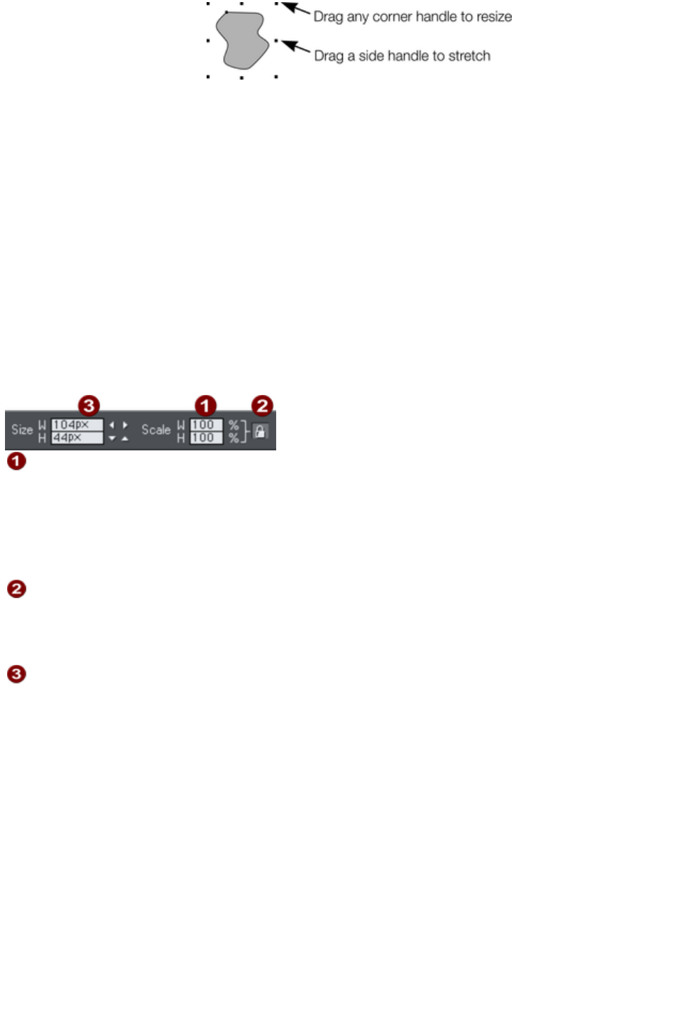
The Selector Tool
must be in scale mode (the
selection bounds handles are
squares). If necessary, click
on the object to change to
scale mode.
Drag one of the corner handles. The object scales as you move the pointer diagonally. The InfoBar
shows the current scaling. The object will scale between the dragged handle and the opposite one. To
use any other point of the object as the fixed point move the transformation center to it and use the
InfoBar buttons to scale.
Hold "Shift" while dragging to scale the object around its center. This works independently of the position
of the transformation center.
"Ctrl + drag" scales the object in multiples of its original size (x2, x3, and so on).
To create a copy while scaling (leaving the original in place) right click, or press "+" on the numeric
keypad.
Dragging the side handles stretches or squashes the object. This is described in Stretching and squashing
objects.
Scaling using the InfoBar
Type into the Scale Text boxes and press "
¿".
Scalings below 100% reduce the object. 50 halves the size of the
object.
Scalings above 100% enlarge the object. 200 doubles the object
size.
If Lock Aspect
is set, you can type into either text box to resize the object by the desired
percentage. If this button is unset, you can enter separate values for both
the width and height.
Alternatively, type the required size of the object into the W or H
text boxes.
If the Lock Aspect
button is on, this scales the object and maintains the aspect ratio. You can enter the size in any unit, such
as 1 cm.
Scaling with the InfoBar buttons (or number boxes) always scales around the transformation center. You
can position this anywhere else in the object, as described in Rotating objects.
Page 391
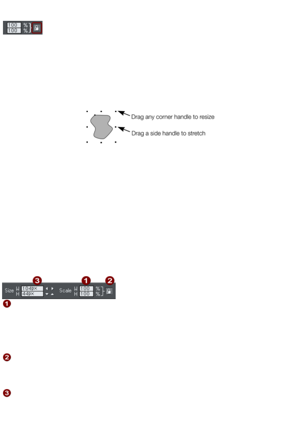
Lock Aspect button
With the Lock aspect
button set, the width/height aspect ratio remains constant
as you scale the object.
In other words, the shape remains in the same proportions as the original. It's recommended that this
button remains selected most of the time in order to ensure that when you resize objects they do not
become squashed.
With this button unset, you can change the aspect ratio as you scale the object, in other words, you can
stretch object one way or another when dragging a corner resize handle or when entering a new size.
Scaling using the mouse
The Selector Tool
must be in scale mode (the
selection bounds handles are
squares). If necessary, click
on the object to change to
scale mode.
Drag one of the corner handles. The object scales as you move the pointer diagonally. The InfoBar
shows the current scaling. The object will scale between the dragged handle and the opposite one. To
use any other point of the object as the fixed point move the transformation center to it and use the
InfoBar buttons to scale.
Hold "Shift" while dragging to scale the object around its center. This works independently of the position
of the transformation center.
"Ctrl + drag" scales the object in multiples of its original size (x2, x3, and so on).
To create a copy while scaling (leaving the original in place) right click, or press "+" on the numeric
keypad.
Dragging the side handles stretches or squashes the object. This is described in Stretching and squashing
objects.
Scaling using the InfoBar
Type into the Scale Text boxes and press "
¿".
Scalings below 100% reduce the object. 50 halves the size of the
object.
Scalings above 100% enlarge the object. 200 doubles the object
size.
If Lock Aspect
is set, you can type into either text box to resize the object by the desired
percentage. If this button is unset, you can enter separate values for both
the width and height.
Alternatively, type the required size of the object into the W or H
text boxes.
If the Lock Aspect
button is on, this scales the object and maintains the aspect ratio. You can enter the size in any unit, such
as 1 cm.
Page 392

Scaling with the InfoBar buttons (or number boxes) always scales around the transformation center. You
can position this anywhere else in the object, as described in Rotating objects.
Page 393
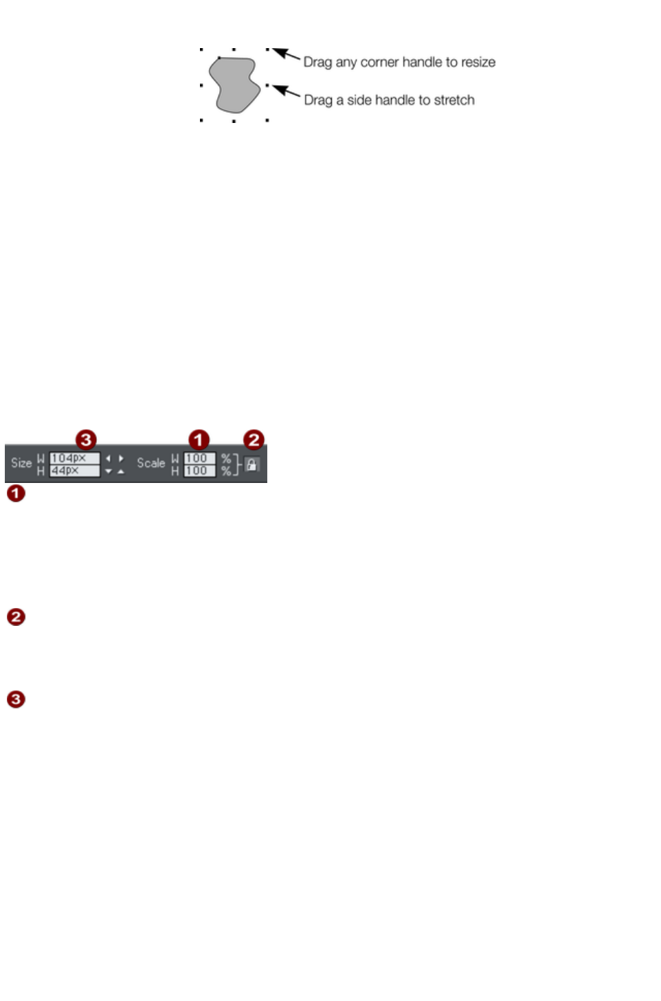
Scaling using the mouse
The Selector Tool
must be in scale mode (the
selection bounds handles are
squares). If necessary, click
on the object to change to
scale mode.
Drag one of the corner handles. The object scales as you move the pointer diagonally. The InfoBar
shows the current scaling. The object will scale between the dragged handle and the opposite one. To
use any other point of the object as the fixed point move the transformation center to it and use the
InfoBar buttons to scale.
Hold "Shift" while dragging to scale the object around its center. This works independently of the position
of the transformation center.
"Ctrl + drag" scales the object in multiples of its original size (x2, x3, and so on).
To create a copy while scaling (leaving the original in place) right click, or press "+" on the numeric
keypad.
Dragging the side handles stretches or squashes the object. This is described in Stretching and squashing
objects.
Scaling using the InfoBar
Type into the Scale Text boxes and press "
¿".
Scalings below 100% reduce the object. 50 halves the size of the
object.
Scalings above 100% enlarge the object. 200 doubles the object
size.
If Lock Aspect
is set, you can type into either text box to resize the object by the desired
percentage. If this button is unset, you can enter separate values for both
the width and height.
Alternatively, type the required size of the object into the W or H
text boxes.
If the Lock Aspect
button is on, this scales the object and maintains the aspect ratio. You can enter the size in any unit, such
as 1 cm.
Scaling with the InfoBar buttons (or number boxes) always scales around the transformation center. You
can position this anywhere else in the object, as described in Rotating objects.
Page 394
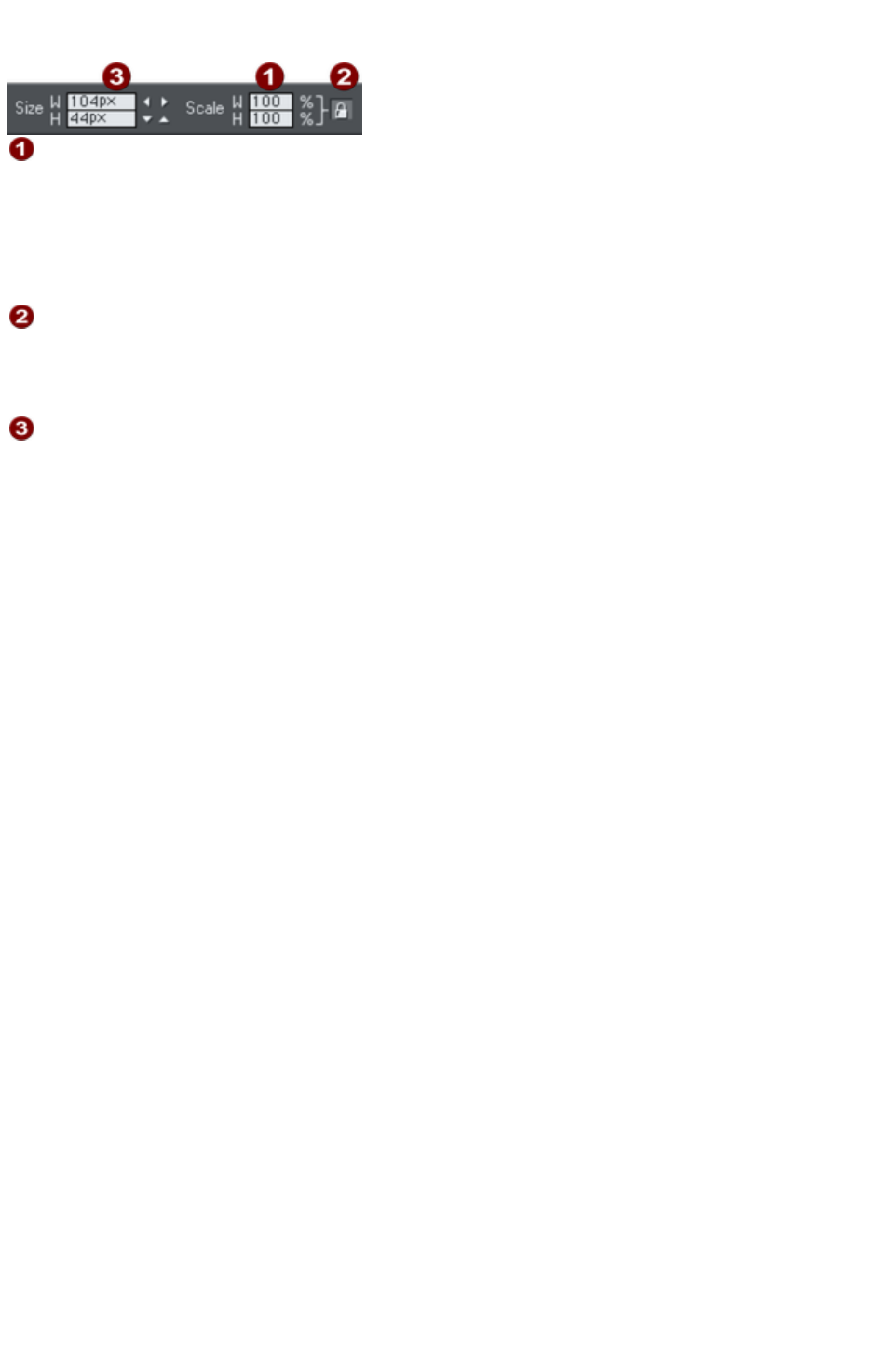
Scaling using the InfoBar
Type into the Scale Text boxes and press "
¿".
Scalings below 100% reduce the object. 50 halves the size of the
object.
Scalings above 100% enlarge the object. 200 doubles the object
size.
If Lock Aspect
is set, you can type into either text box to resize the object by the desired
percentage. If this button is unset, you can enter separate values for both
the width and height.
Alternatively, type the required size of the object into the W or H
text boxes.
If the Lock Aspect
button is on, this scales the object and maintains the aspect ratio. You can enter the size in any unit, such
as 1 cm.
Scaling with the InfoBar buttons (or number boxes) always scales around the transformation center. You
can position this anywhere else in the object, as described in Rotating objects.
Page 395

Flipping objects
This is part of the Selector Tool. Clicking on the Flip
buttons flips the object vertically or horizontally around the
transformation center.
The scale and aspect ratio do not change; the object just flips.
Page 396
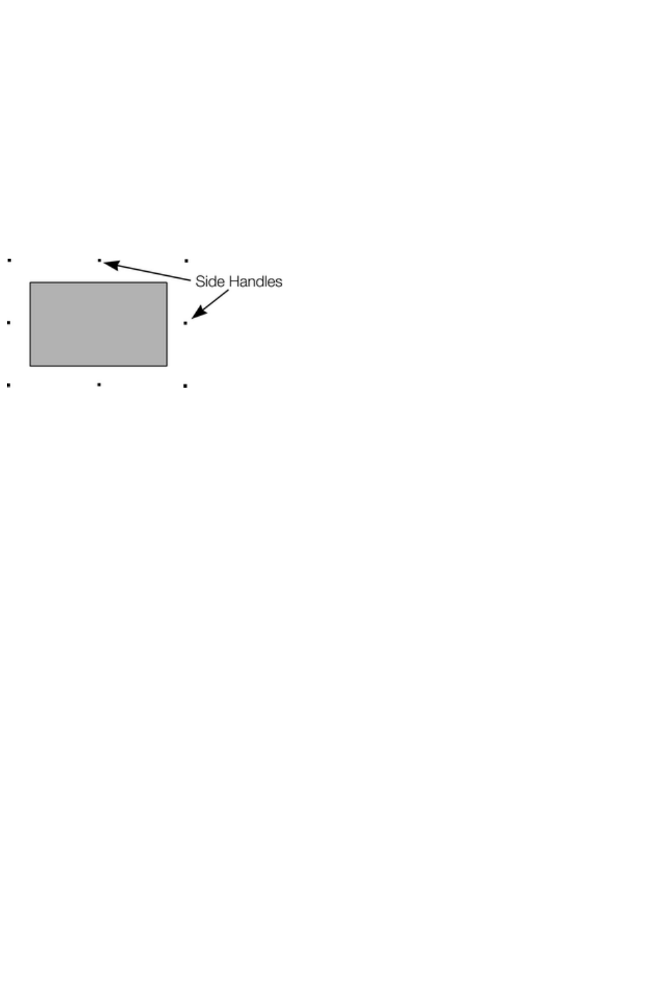
Stretching and squashing objects
This is similar to scaling objects except that the object is scaled in one direction only. Stretching and
squashing are basically the same action ? stretching makes the object larger, squashing makes it smaller.
Stretching/Squashing using the mouse
The Selector Tool
must be in scale mode. (The selection handles are squares.) If necessary, click on the object to change to
scale mode.
Use the side, top and bottom handles, instead of the corner handles, to stretch or squash a shape in one
dimension only. Note that these handles are shown only on rectangles which are not photo filled, because
stretching other objects in one dimension rarely produces useful results (photos become distorted).
Drag one of the side handles. The
object scales as you move the
pointer in the appropriate
direction. The InfoBar shows the
current scaling.
The Lock Aspect
button is ignored.
Right click or press "+" on the numeric keypad while dragging to stretch or squash a copy of the object,
leaving the original in place.
Stretching/squashing using the InfoBar
The Lock Aspect
button must be unset (if it is set, you scale the object instead of stretching or squashing it).
Type into either the width or height text box (as appropriate) and press "
¿". Alternatively enter a % scale (width or height). So entering 200% into the top % scale box will make
the object twice as wide, but the same height.
If the Lock Aspect
is set then it will not stretch.
Page 397
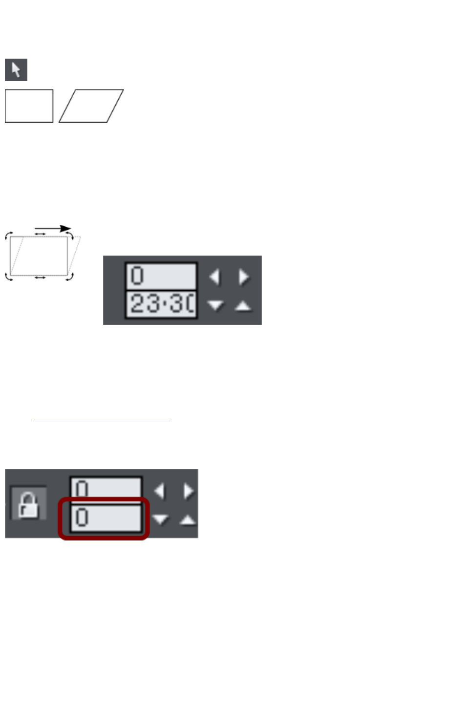
Skewing objects
This is part of the Selector Tool
.
Left is the original object, to the right
with a horizontal skew
Skewing using the mouse
Switch the Selector Tool
to rotate/skew mode. (The selection handles are arrow shaped) by clicking on the object.
Drag a side, top or bottom arrow to skew the object. Note that these handles are shown only on
rectangles which are not photo filled, because skewing other objects rarely produces useful results (eg.
photos become distorted).
As you drag, the object skews in the direction of
movement (vertical or horizontal).
The InfoBar shows the current skew angle.
"
?+ drag" to skew the object around its center. Hold down "Ctrl" to restrict the skew to the constrain
angles. Right click, or press "+" on the numeric keypad as you drag to create a copy, leaving the original
where it was. Or right-drag with the mouse to create instant copies, additional copies by left clicks.
You can also skew an object in the Selector Tool's resize mode using the skew areas. Read more
under Rotating objects in resize mode
.
Skewing using the InfoBar
To skew horizontally type an angle
into the skew text box and press "
¿".
Page 398
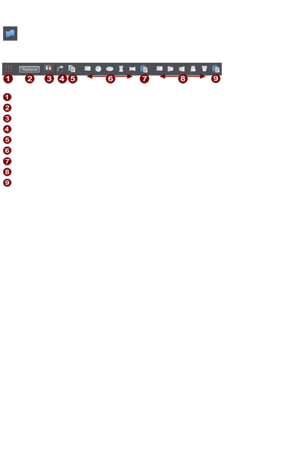
The Mold tool
The Mold
Tool is used to distort shapes. It is used for both perspectivizing (that
is, rotating in three dimensions) and enveloping (like distorting a rubber
sheet).
Mold tool InfoBar
Mesh
Remove mold
Detach mold
Rotate mold
Copy mold
Enveloping
Paste envelope mold
Perspectivizing
Paste perspective mold
The InfoBar contains two sets of preset mold shapes. Just click a button to apply the preset mold. The
left-hand button in each group is the default "no distortion" mold which you can then manually edit after
applying it.
Page 399
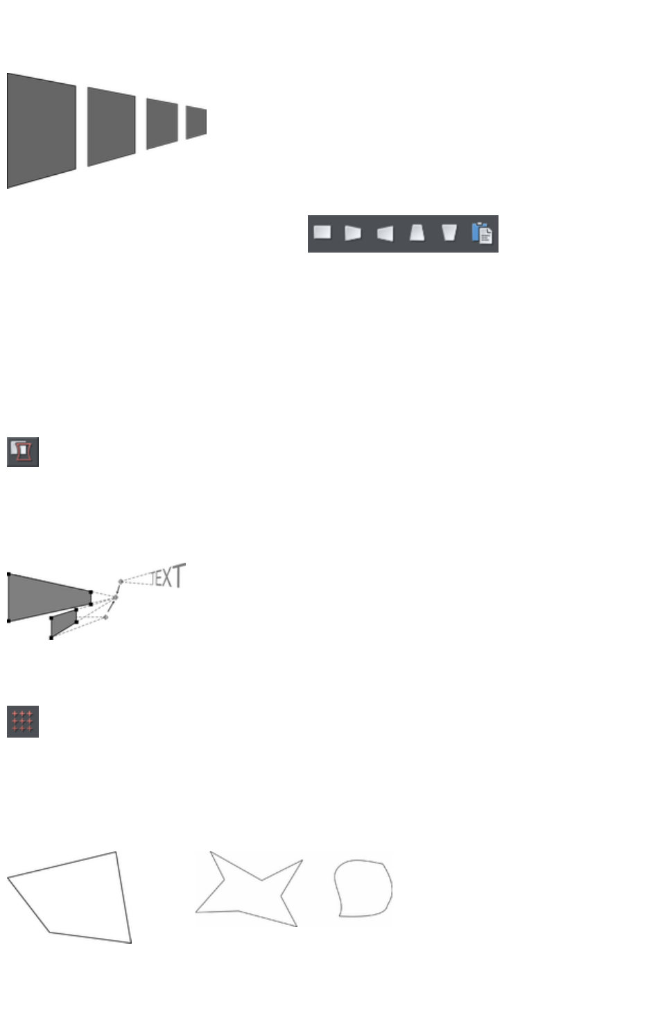
Perspective
The Mold Tool
lets you perspectivize shapes to give an
impression of depth.
You can perspectivize all types of objects
including text and bitmaps. Note that
bitmaps lose perspective if you later blend
them or convert them to editable shapes.
1. Select the object or objects.
2. Select the Mold Tool (shortcut "Shift
+ F6").
3. Choose one of the perspective options:
The right-hand button (paste perspective) is described later.
Web Designer Premium draws a rectangle around the object or selection. You can drag the control
handles at each corner of the rectangle to produce the perspective effect.
You can rotate, resize and skew the perspectivized object using the Selector Tool
.
You may want to move control handles without redrawing the perspectivized object (doing this speeds
up screen redraws).
To do this select the Detach mold
button. To refit the object, deselect the button.
Using vanishing points
As you reduce the size of the sides of the perspective mould, you see a "vanishing point" target. This is
similar to vanishing points in conventional perspective drawings.
You can use vanishing points to obtain
consistent perspective for several objects.
All three object share a common vanishing point at the small cross.
The perspective mesh
This button paints a faint series of dots in a grid to preview the degree of
perspective distortion of an object.
Using molds
You may want to apply the same perspective to several objects. To do this you create a mould shape,
copy it to the clipboard and then use it to perspectivize the other objects. A perspective mould shape
must have four straight sides:
This is acceptable as a mold
shape
These are not acceptable. The object on the left
has too many sides (must be four). The object on
the right has curved sides (must be straight).
Page 400

Removing perspective
Click Remove
to remove perspective.
If the selected object has more than one perspective or envelope mould applied, only the most recent
mold is removed.
Rotating the object within the mold
Sometimes you will find that the mold is the correct shape but the object
needs rotating within it. You can rotate the object by clicking the rotate
object button.
Page 401
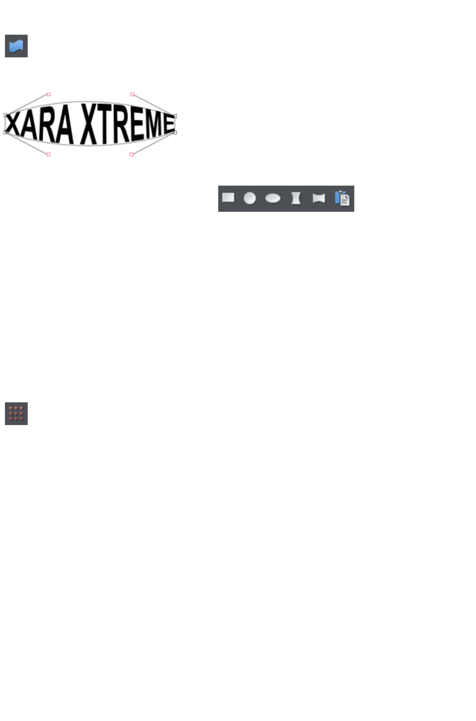
Enveloping
The Mold Tool
lets you envelope shapes in a wide variety of ways.
The effect is similar to a rubber sheet or balloon that you can stretch in any direction.
You can envelope all types of objects except bitmaps.
Sample enveloped text
Enveloping is similar to applying perspective. That is:
1. Select the object or objects.
2. Select the Mold Tool (shortcut "Shift
+ F6").
3. Choose one of the envelope options:
The right-hand button is similar to paste perspective described earlier.
The left-hand button does not initially alter the object. The other buttons immediately alter the object.
After applying the mold, to edit it:
1. Drag any of the corner handles.
2. Or click on a corner handle and then drag the curve handles.
The above example shows the 4 curve handles of the corners have been dragged outwards to bend the
content of the mold.
You can also rotate, resize and skew the enveloped object using the Selector Tool
.
The mold mesh button
The Mesh button displays a series of faint dots which can help preview
the distortions that the envelope mold is giving.
Envelope molds
Your can create an envelope mould from any four sided shape, which you can distort as you require,
and then use as an envelope mold by clicking the Paste Envelope button on the Mold Tool
InfoBar.
Editing mold shapes
You can edit the contents of a mold (essentially a group) using editing inside groups. Editing is not
possible using direct selection inside (molds do not allow objects inside them to become selected). To
edit a mold inside, right click on the mold and choose Open mold
from the context menu.
You can edit the shape of envelope or perspective molds with the Shape Editor Tool (or the edit
handles with Selector Tool
, if shown). According to the nature of molds, there are some restrictions:
You cannot add point handles to a perspective or envelope mold, because it has to stay a
four-sided shape
You cannot change a straight line of a perspective mold into a curve.
Page 402

Editing mold shapes
You can edit the contents of a mold (essentially a group) using editing inside groups. Editing is not
possible using direct selection inside (molds do not allow objects inside them to become selected). To
edit a mold inside, right click on the mold and choose Open mold
from the context menu.
You can edit the shape of envelope or perspective molds with the Shape Editor Tool (or the edit
handles with Selector Tool
, if shown). According to the nature of molds, there are some restrictions:
You cannot add point handles to a perspective or envelope mold, because it has to stay a
four-sided shape
You cannot change a straight line of a perspective mold into a curve.
Page 403
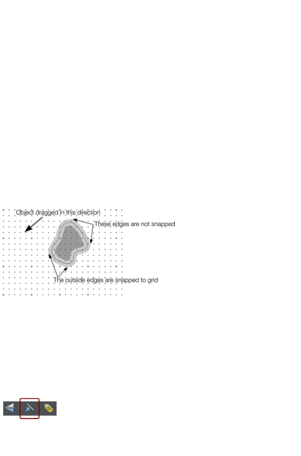
Snapping
Snapping makes it easier to position edges, or specific points on objects, exactly where required. It can
be used to align edges to a specific point or line, or to evenly space objects, using the grid.
Xara Web Designer 7 Premium offers three types of snapping.
Snap to grid
Magnetic snapping (snap to objects)
Snap to guidelines or guide objects
Grid snap is useful for making objects evenly spaced, or making the sizes exact multiples of a given value.
Guidelines are useful for aligning edges (although it's a lot more powerful using guide objects) and lastly
magnetic snap is a general purpose way of accurately positioning lines, points or object edges relative to
other objects or to the page center or edges.
Snap to grid
When Snap to Grid is selected, grid points act like magnets. Right click on the pasteboard and choose
"Snap to" > "Snap to Grid" or use the menu option "Window" > "Snap to grid", (or press "."
(decimal point) on the numeric keypad). You can control the grid spacing from the options dialog (right
click and choose Page Options or use the menu command "Utilities" > "Options
") on the Grid and Ruler tab. By default web document templates have snap to grid on, with a single pixel
grid, so that normally all object dimensions and positions are whole pixels.
When dragging objects the edges will snap to grid points. If the size of the object is such that opposing
edges can't both be snapped, the edge that snaps depends on the direction the object is dragged in.
This shows a coarse grid with 5 subdivisions between major divisions. The shape has a very thick gray
outline. Because the object has been dragged down and to the left, the lower and left outside edges are
snapped to the nearest grid point.
Note:
The default grid spacing is 50 pixel spacing for major grid lines with 50 subdivisions. This means the grid
is spaced at exactly one screen pixel and so may appear not to be working at a normal 100% zoom. If
you zoom in to say 500% then you can see it does snap correctly.
Alternatively, change the grid values to have, say, 10 subdivisions which means that the grid points are on
5 pixel boundaries.
Snapping and line widths
The Scale line widths control on the Selector
Tool
InfoBar affects whether snapping happens to the
bounds of objects including their outlines.
The above example shows a shape with a very thick gray outline. It also shows (thin black line) the
outline of the shape itself (you can see the thick outline is drawn equally on either side of the center line so
Page 404
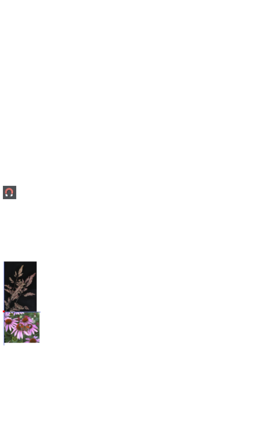
that it partly overlaps the inside of the shape and partially goes outside).
With scale line widths on, the width of the outline is deemed to be important and so 'snap to grid' will
snap the bounds of objects, including outlines, to the grid. Snap to objects will allow you to snap using
the bounds or the outline center lines. If the outlines as they appear on screen are small, so there is little
difference between these two snapping positions, bounds snaps are favored. So zoom in if you want to
snap outline centers in this case.
With scale line widths off, 'snap to grid' and 'snap to objects' will snap the center lines of objects, ignoring
the outline widths.
Because snapping honors the Scale line widths switch it means that the bounds used by snapping are
always the same bounds that are reported in the Selector Tool
infobar.
Magnetic object snapping (snap to objects)
Magnetic object snapping makes it much easier to accurately position objects relative to each other or
relative to the page center or edges.
So, for example, if you want several lines to start at exactly the same point, or want a line to exactly join
the edge of a circle, then using "magnetic object snap" is useful.
You can even use this to align the centers of objects, or align objects to the center of the page, or align
them horizontally and vertically anywhere in the middle of the page.
Magnetic snapping works when either moving or scaling objects using the Selector Tool
.
Magnetic snapping to objects is enabled by default in web
documents. To toggle it on and off, click the Snap to Objects button
in the top toolbar. Alternatively right click the pasteboard and choose
"Snap to" > "Snap to Objects", or use the menu option "Window"
> "Snap to objects
". You can also toggle it on/off during dragging by tapping 's'.
Click and drag on the object you want to snap. As you drag, Web Designer Premium displays a magnet
icon, blue lines and red points whenever you are near a "point of interest" that it has snapped to.
Snap indicators
Snap indicators are shown whenever a snap occurs. That is whenever a point of interest on the object
you are dragging comes in range of a point of interest in the document (which could be on another object
or be part of the page). Web Designer Premium snaps to the point of interest and the mouse pointer
changes to show a magnet symbol so you know a snap has happened. Also further indications are shown
dynamically on screen to help you see what snap has occurred.
A red dot indicates that a specific point has snapped
A blue line indicates a snap to some feature of another object (e.g. to the edge of a rectangle).
An orange line indicates a snap to a page feature (corners, edges, center)
The snap indicator lines pulse to show that they are temporary "live" indicators and to help them be seen
Page 405
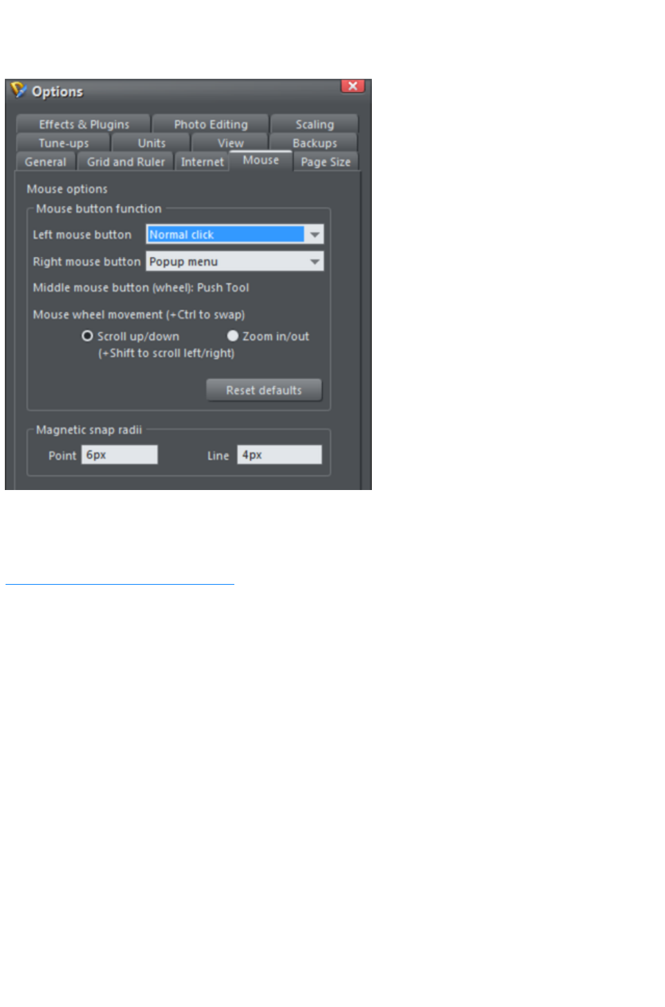
over different background colors.
The snapping distance is controlled by the Mouse tab of the Options dialog box ("Utilities" > "
Options" or right click a page and choose Page Options
).
You can specify two snap distances in the "Magetic snap radii" section, which control how close things
need to be before they will snap together. The size of a circle around points (point) and the distance
either side of lines (lines). It's usually best to make the point value larger than the line value, so that it's
easier to snap to the end points of lines.
Customizing Web Designer Premium
has full details of the Options dialog.
Page 406
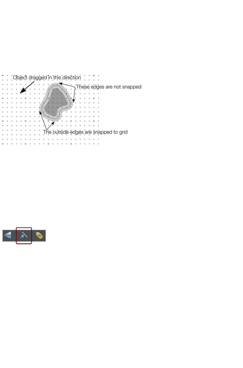
Snap to grid
When Snap to Grid is selected, grid points act like magnets. Right click on the pasteboard and choose
"Snap to" > "Snap to Grid" or use the menu option "Window" > "Snap to grid", (or press "."
(decimal point) on the numeric keypad). You can control the grid spacing from the options dialog (right
click and choose Page Options or use the menu command "Utilities" > "Options
") on the Grid and Ruler tab. By default web document templates have snap to grid on, with a single pixel
grid, so that normally all object dimensions and positions are whole pixels.
When dragging objects the edges will snap to grid points. If the size of the object is such that opposing
edges can't both be snapped, the edge that snaps depends on the direction the object is dragged in.
This shows a coarse grid with 5 subdivisions between major divisions. The shape has a very thick gray
outline. Because the object has been dragged down and to the left, the lower and left outside edges are
snapped to the nearest grid point.
Note:
The default grid spacing is 50 pixel spacing for major grid lines with 50 subdivisions. This means the grid
is spaced at exactly one screen pixel and so may appear not to be working at a normal 100% zoom. If
you zoom in to say 500% then you can see it does snap correctly.
Alternatively, change the grid values to have, say, 10 subdivisions which means that the grid points are on
5 pixel boundaries.
Snapping and line widths
The Scale line widths control on the Selector
Tool
InfoBar affects whether snapping happens to the
bounds of objects including their outlines.
The above example shows a shape with a very thick gray outline. It also shows (thin black line) the
outline of the shape itself (you can see the thick outline is drawn equally on either side of the center line so
that it partly overlaps the inside of the shape and partially goes outside).
With scale line widths on, the width of the outline is deemed to be important and so 'snap to grid' will
snap the bounds of objects, including outlines, to the grid. Snap to objects will allow you to snap using
the bounds or the outline center lines. If the outlines as they appear on screen are small, so there is little
difference between these two snapping positions, bounds snaps are favored. So zoom in if you want to
snap outline centers in this case.
With scale line widths off, 'snap to grid' and 'snap to objects' will snap the center lines of objects, ignoring
the outline widths.
Because snapping honors the Scale line widths switch it means that the bounds used by snapping are
always the same bounds that are reported in the Selector Tool
infobar.
Page 407
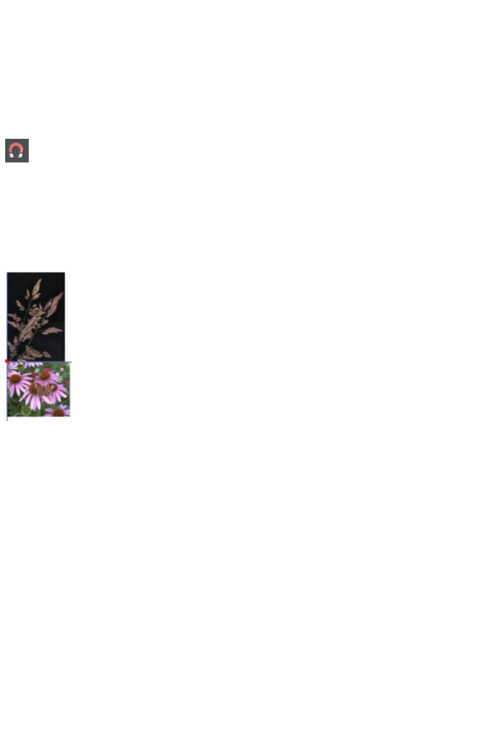
Magnetic object snapping (snap to objects)
Magnetic object snapping makes it much easier to accurately position objects relative to each other or
relative to the page center or edges.
So, for example, if you want several lines to start at exactly the same point, or want a line to exactly join
the edge of a circle, then using "magnetic object snap" is useful.
You can even use this to align the centers of objects, or align objects to the center of the page, or align
them horizontally and vertically anywhere in the middle of the page.
Magnetic snapping works when either moving or scaling objects using the Selector Tool
.
Magnetic snapping to objects is enabled by default in web
documents. To toggle it on and off, click the Snap to Objects button
in the top toolbar. Alternatively right click the pasteboard and choose
"Snap to" > "Snap to Objects", or use the menu option "Window"
> "Snap to objects
". You can also toggle it on/off during dragging by tapping 's'.
Click and drag on the object you want to snap. As you drag, Web Designer Premium displays a magnet
icon, blue lines and red points whenever you are near a "point of interest" that it has snapped to.
Snap indicators
Snap indicators are shown whenever a snap occurs. That is whenever a point of interest on the object
you are dragging comes in range of a point of interest in the document (which could be on another object
or be part of the page). Web Designer Premium snaps to the point of interest and the mouse pointer
changes to show a magnet symbol so you know a snap has happened. Also further indications are shown
dynamically on screen to help you see what snap has occurred.
A red dot indicates that a specific point has snapped
A blue line indicates a snap to some feature of another object (e.g. to the edge of a rectangle).
An orange line indicates a snap to a page feature (corners, edges, center)
The snap indicator lines pulse to show that they are temporary "live" indicators and to help them be seen
over different background colors.
The snapping distance is controlled by the Mouse tab of the Options dialog box ("Utilities" > "
Options" or right click a page and choose Page Options
).
Page 408

You can specify two snap distances in the "Magetic snap radii" section, which control how close things
need to be before they will snap together. The size of a circle around points (point) and the distance
either side of lines (lines). It's usually best to make the point value larger than the line value, so that it's
easier to snap to the end points of lines.
Customizing Web Designer Premium
has full details of the Options dialog.
Page 409
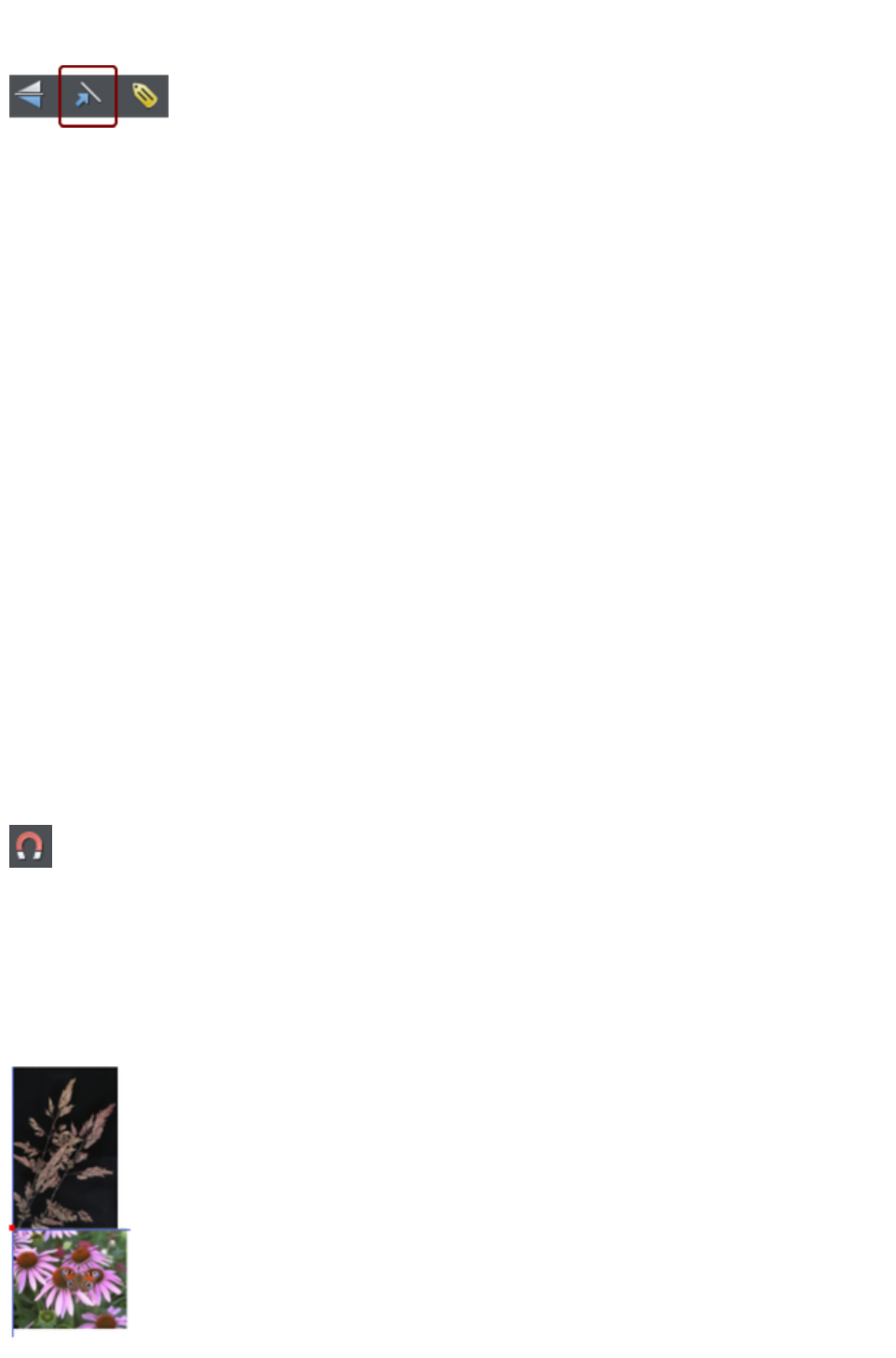
Snapping and line widths
The Scale line widths control on the Selector
Tool
InfoBar affects whether snapping happens to the
bounds of objects including their outlines.
The above example shows a shape with a very thick gray outline. It also shows (thin black line) the
outline of the shape itself (you can see the thick outline is drawn equally on either side of the center line so
that it partly overlaps the inside of the shape and partially goes outside).
With scale line widths on, the width of the outline is deemed to be important and so 'snap to grid' will
snap the bounds of objects, including outlines, to the grid. Snap to objects will allow you to snap using
the bounds or the outline center lines. If the outlines as they appear on screen are small, so there is little
difference between these two snapping positions, bounds snaps are favored. So zoom in if you want to
snap outline centers in this case.
With scale line widths off, 'snap to grid' and 'snap to objects' will snap the center lines of objects, ignoring
the outline widths.
Because snapping honors the Scale line widths switch it means that the bounds used by snapping are
always the same bounds that are reported in the Selector Tool
infobar.
Magnetic object snapping (snap to objects)
Magnetic object snapping makes it much easier to accurately position objects relative to each other or
relative to the page center or edges.
So, for example, if you want several lines to start at exactly the same point, or want a line to exactly join
the edge of a circle, then using "magnetic object snap" is useful.
You can even use this to align the centers of objects, or align objects to the center of the page, or align
them horizontally and vertically anywhere in the middle of the page.
Magnetic snapping works when either moving or scaling objects using the Selector Tool
.
Magnetic snapping to objects is enabled by default in web
documents. To toggle it on and off, click the Snap to Objects button
in the top toolbar. Alternatively right click the pasteboard and choose
"Snap to" > "Snap to Objects", or use the menu option "Window"
> "Snap to objects
". You can also toggle it on/off during dragging by tapping 's'.
Click and drag on the object you want to snap. As you drag, Web Designer Premium displays a magnet
icon, blue lines and red points whenever you are near a "point of interest" that it has snapped to.
Snap indicators
Page 410
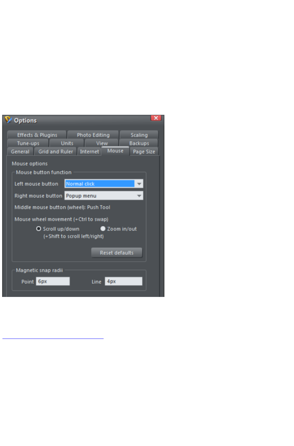
Snap indicators are shown whenever a snap occurs. That is whenever a point of interest on the object
you are dragging comes in range of a point of interest in the document (which could be on another object
or be part of the page). Web Designer Premium snaps to the point of interest and the mouse pointer
changes to show a magnet symbol so you know a snap has happened. Also further indications are shown
dynamically on screen to help you see what snap has occurred.
A red dot indicates that a specific point has snapped
A blue line indicates a snap to some feature of another object (e.g. to the edge of a rectangle).
An orange line indicates a snap to a page feature (corners, edges, center)
The snap indicator lines pulse to show that they are temporary "live" indicators and to help them be seen
over different background colors.
The snapping distance is controlled by the Mouse tab of the Options dialog box ("Utilities" > "
Options" or right click a page and choose Page Options
).
You can specify two snap distances in the "Magetic snap radii" section, which control how close things
need to be before they will snap together. The size of a circle around points (point) and the distance
either side of lines (lines). It's usually best to make the point value larger than the line value, so that it's
easier to snap to the end points of lines.
Customizing Web Designer Premium
has full details of the Options dialog.
Page 411
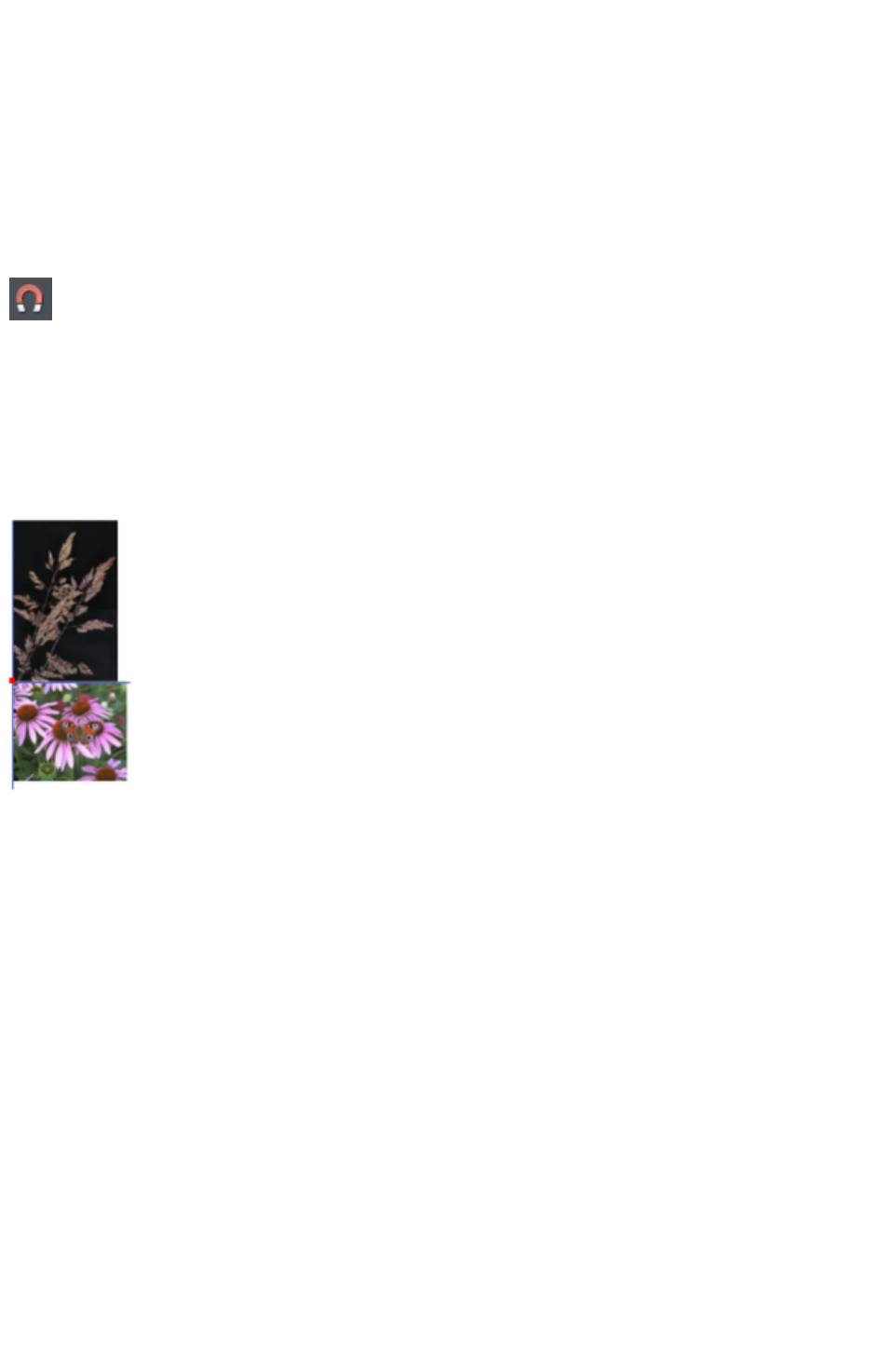
Magnetic object snapping (snap to objects)
Magnetic object snapping makes it much easier to accurately position objects relative to each other or
relative to the page center or edges.
So, for example, if you want several lines to start at exactly the same point, or want a line to exactly join
the edge of a circle, then using "magnetic object snap" is useful.
You can even use this to align the centers of objects, or align objects to the center of the page, or align
them horizontally and vertically anywhere in the middle of the page.
Magnetic snapping works when either moving or scaling objects using the Selector Tool
.
Magnetic snapping to objects is enabled by default in web
documents. To toggle it on and off, click the Snap to Objects button
in the top toolbar. Alternatively right click the pasteboard and choose
"Snap to" > "Snap to Objects", or use the menu option "Window"
> "Snap to objects
". You can also toggle it on/off during dragging by tapping 's'.
Click and drag on the object you want to snap. As you drag, Web Designer Premium displays a magnet
icon, blue lines and red points whenever you are near a "point of interest" that it has snapped to.
Snap indicators
Snap indicators are shown whenever a snap occurs. That is whenever a point of interest on the object
you are dragging comes in range of a point of interest in the document (which could be on another object
or be part of the page). Web Designer Premium snaps to the point of interest and the mouse pointer
changes to show a magnet symbol so you know a snap has happened. Also further indications are shown
dynamically on screen to help you see what snap has occurred.
A red dot indicates that a specific point has snapped
A blue line indicates a snap to some feature of another object (e.g. to the edge of a rectangle).
An orange line indicates a snap to a page feature (corners, edges, center)
The snap indicator lines pulse to show that they are temporary "live" indicators and to help them be seen
over different background colors.
The snapping distance is controlled by the Mouse tab of the Options dialog box ("Utilities" > "
Options" or right click a page and choose Page Options
).
Page 412
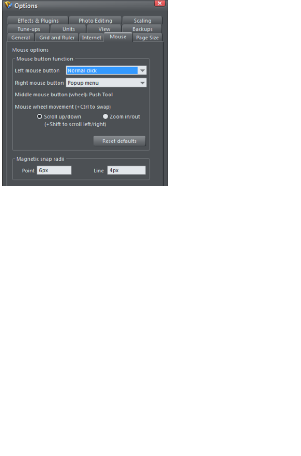
You can specify two snap distances in the "Magetic snap radii" section, which control how close things
need to be before they will snap together. The size of a circle around points (point) and the distance
either side of lines (lines). It's usually best to make the point value larger than the line value, so that it's
easier to snap to the end points of lines.
Customizing Web Designer Premium
has full details of the Options dialog.
Page 413
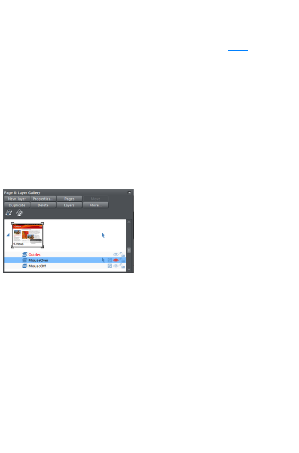
Guide Objects and Guidelines
Guide objects and guidelines are objects on a special layer, the guides layer. A guide layer is
automatically created when you create a guideline (see below), or you can create one manually by right
clicking in the Page & Layer Gallery and selecting Create Guide Layer (see Layers
for more information).
Use Snap to guides in the Window
menu (or key 2 on the numeric keypad) to turn on snapping to guide objects.
Any object placed on the guides layer becomes a guide object. These can be any object type including
lines at any angle, irregular shapes, and quickshapes. You can create, scale, and delete objects on the
guides layer as usual, but they always appear as thin dotted red outlines; any applied line width or fill
color is ignored. This information is retained, and if you later move the object from the guides layer to a
normal layer, line thickness, and colors are shown again.
You can use guide objects to draw construction lines such as lines passing through a vanishing point for
perspective drawing.
Placing objects onto the Guides Layer
First ensure there is a guide layer in the Page & Layer Gallery,
see above. You can create objects directly on the guides layer by selecting it and creating objects as
usual.
The Page & Layer Gallery showing a guides layer
above two other layers, and selected.
You can also cut or copy
objects from another layer
and then paste those
objects into the guides
layer. To paste the objects
in the same relative position
on the guides layer use the
keyboard shortcut "Ctrl +
Shift + V".
Move to layer in front and Move to layer behind on the Arrange menu (or right click and choose "
Arrange" > "Move to layer in front/behind")
will skip the guides layer and so cannot be used to move objects onto the guides layer.
Creating a guideline
Guidelines are vertical or horizontal lines and are a quick and easy way to align a series of objects on the
page.
Turn rulers on ("Ctrl + L") or right click and choose "Show Grid/Guides" > "Show Rulers"
Drag from a ruler onto the page.
Or
Double click on the ruler to create a guideline aligned to the click point.
This automatically creates a guides layer and puts the guidelines on that layer.
Or, using the Page & Layer Gallery
:
1. Right click in the Page & Layer Gallery and choose Properties.
2. If necessary, click the Guides tab.
3. Select horizontal or vertical.
Page 414

4. Click New.
5. Type in the required position.
Deleting a guideline
Using the Selector Tool
drag the guideline onto the appropriate ruler (the vertical ruler for vertical guidelines, horizontal ruler for
horizontal).
Or, right click on the guideline and then choose Delete
.
Page 415
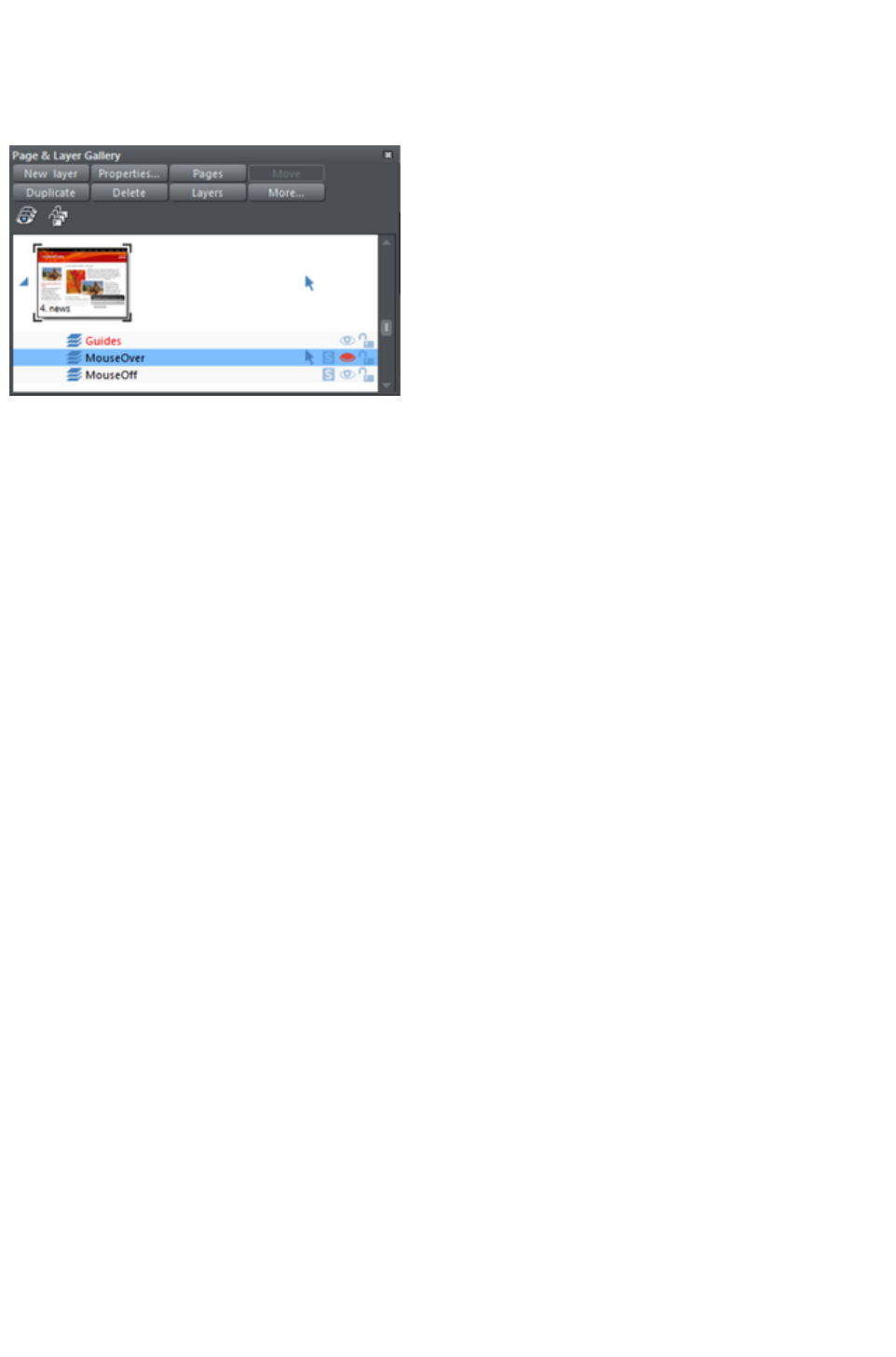
Placing objects onto the Guides Layer
First ensure there is a guide layer in the Page & Layer Gallery,
see above. You can create objects directly on the guides layer by selecting it and creating objects as
usual.
The Page & Layer Gallery showing a guides layer
above two other layers, and selected.
You can also cut or copy
objects from another layer
and then paste those
objects into the guides
layer. To paste the objects
in the same relative position
on the guides layer use the
keyboard shortcut "Ctrl +
Shift + V".
Move to layer in front and Move to layer behind on the Arrange menu (or right click and choose "
Arrange" > "Move to layer in front/behind")
will skip the guides layer and so cannot be used to move objects onto the guides layer.
Creating a guideline
Guidelines are vertical or horizontal lines and are a quick and easy way to align a series of objects on the
page.
Turn rulers on ("Ctrl + L") or right click and choose "Show Grid/Guides" > "Show Rulers"
Drag from a ruler onto the page.
Or
Double click on the ruler to create a guideline aligned to the click point.
This automatically creates a guides layer and puts the guidelines on that layer.
Or, using the Page & Layer Gallery
:
1. Right click in the Page & Layer Gallery and choose Properties.
2. If necessary, click the Guides tab.
3. Select horizontal or vertical.
4. Click New.
5. Type in the required position.
Deleting a guideline
Using the Selector Tool
drag the guideline onto the appropriate ruler (the vertical ruler for vertical guidelines, horizontal ruler for
horizontal).
Or, right click on the guideline and then choose Delete
.
Page 416

Creating a guideline
Guidelines are vertical or horizontal lines and are a quick and easy way to align a series of objects on the
page.
Turn rulers on ("Ctrl + L") or right click and choose "Show Grid/Guides" > "Show Rulers"
Drag from a ruler onto the page.
Or
Double click on the ruler to create a guideline aligned to the click point.
This automatically creates a guides layer and puts the guidelines on that layer.
Or, using the Page & Layer Gallery
:
1. Right click in the Page & Layer Gallery and choose Properties.
2. If necessary, click the Guides tab.
3. Select horizontal or vertical.
4. Click New.
5. Type in the required position.
Deleting a guideline
Using the Selector Tool
drag the guideline onto the appropriate ruler (the vertical ruler for vertical guidelines, horizontal ruler for
horizontal).
Or, right click on the guideline and then choose Delete
.
Page 417

Deleting a guideline
Using the Selector Tool
drag the guideline onto the appropriate ruler (the vertical ruler for vertical guidelines, horizontal ruler for
horizontal).
Or, right click on the guideline and then choose Delete
.
Page 418

Summary of shortcuts on the numeric keypad
+
Makes a copy while dragging, resizing, skewing, and so on. The original
object doesn't change.
/
Toggles leaving line widths unchanged during scaling and scaling with
changing line widths.
-
Toggles leaving fills unchanged during moves, scaling, skewing, etc.
*
Toggles object magnetic snap on and off.
2
Toggles snap to guides on and off.
.
Toggles snap to grid on and off.
Page 419

Grouping and ungrouping objects
The Shadow and Transparency Tools offer different results depending on whether objects are grouped
or not. For more information see "Transparency" and "Shadows
".
You will often create complex shapes from several different objects. The "Arrange" > "Group" menu
option (or right click selected objects and choose Group
) lets you lock those objects together to form what appears as a single object. You can then select the
grouped objects and copy, rescale, move or perform any other operation on the entire group.
To create a group
1. Select all the objects you want in the group.
2. Right click and choose Group or choose Group from the Arrange menu (or "Ctrl + G") to
create the group.
Ungrouping objects
1. Select the group.
2. Right click and choose Ungroup or choose Ungroup from the Arrange menu (or "Ctrl + U").
After this, all the individual objects in the group remain selected.
To add more objects to a group
1. Select the group.
2. Ungroup ("Ctrl + U")
3. Select the extra objects.
4. Group again ("Ctrl + G")
You can also incorporate a group into a second group by omitting step 2. Web Designer Premium
remembers the original grouping information. If you ungroup the objects later, the original group remains.
Removing objects from a group
1. Ungroup the objects.
2. "Shift + click" on the objects you want to remove. This deselects them; the other objects remain
selected.
You can then choose "Arrange" > "Group
" to regroup the remaining objects.
Selecting a single object from within a group
This feature is useful for changing an object's color, for example. "Ctrl + click" on the object (you can
also use this to select a "group within a group"). Pressing "Tab", or "Shift + Tab" moves the selection
within the group, to the next, or previous object. Once you have selected an object inside a group, you
can also use "Alt + click" to select the object under the selected one.
This is called "select inside".
Groups and layers
There's more about layers in Layers
.
If all the objects to be grouped are in one layer, the group is created in that layer. The group is at the
level of the highest member of the group, i.e. the group does not automatically become the front object.
If the objects are in more than one layer, then the group is created in the layer containing the object
Page 420

nearest the front.
Page 421

To create a group
1. Select all the objects you want in the group.
2. Right click and choose Group or choose Group from the Arrange menu (or "Ctrl + G") to
create the group.
Ungrouping objects
1. Select the group.
2. Right click and choose Ungroup or choose Ungroup from the Arrange menu (or "Ctrl + U").
After this, all the individual objects in the group remain selected.
To add more objects to a group
1. Select the group.
2. Ungroup ("Ctrl + U")
3. Select the extra objects.
4. Group again ("Ctrl + G")
You can also incorporate a group into a second group by omitting step 2. Web Designer Premium
remembers the original grouping information. If you ungroup the objects later, the original group remains.
Removing objects from a group
1. Ungroup the objects.
2. "Shift + click" on the objects you want to remove. This deselects them; the other objects remain
selected.
You can then choose "Arrange" > "Group
" to regroup the remaining objects.
Selecting a single object from within a group
This feature is useful for changing an object's color, for example. "Ctrl + click" on the object (you can
also use this to select a "group within a group"). Pressing "Tab", or "Shift + Tab" moves the selection
within the group, to the next, or previous object. Once you have selected an object inside a group, you
can also use "Alt + click" to select the object under the selected one.
This is called "select inside".
Groups and layers
There's more about layers in Layers
.
If all the objects to be grouped are in one layer, the group is created in that layer. The group is at the
level of the highest member of the group, i.e. the group does not automatically become the front object.
If the objects are in more than one layer, then the group is created in the layer containing the object
nearest the front.
Page 422

Ungrouping objects
1. Select the group.
2. Right click and choose Ungroup or choose Ungroup from the Arrange menu (or "Ctrl + U").
After this, all the individual objects in the group remain selected.
To add more objects to a group
1. Select the group.
2. Ungroup ("Ctrl + U")
3. Select the extra objects.
4. Group again ("Ctrl + G")
You can also incorporate a group into a second group by omitting step 2. Web Designer Premium
remembers the original grouping information. If you ungroup the objects later, the original group remains.
Removing objects from a group
1. Ungroup the objects.
2. "Shift + click" on the objects you want to remove. This deselects them; the other objects remain
selected.
You can then choose "Arrange" > "Group
" to regroup the remaining objects.
Selecting a single object from within a group
This feature is useful for changing an object's color, for example. "Ctrl + click" on the object (you can
also use this to select a "group within a group"). Pressing "Tab", or "Shift + Tab" moves the selection
within the group, to the next, or previous object. Once you have selected an object inside a group, you
can also use "Alt + click" to select the object under the selected one.
This is called "select inside".
Groups and layers
There's more about layers in Layers
.
If all the objects to be grouped are in one layer, the group is created in that layer. The group is at the
level of the highest member of the group, i.e. the group does not automatically become the front object.
If the objects are in more than one layer, then the group is created in the layer containing the object
nearest the front.
Page 423

To add more objects to a group
1. Select the group.
2. Ungroup ("Ctrl + U")
3. Select the extra objects.
4. Group again ("Ctrl + G")
You can also incorporate a group into a second group by omitting step 2. Web Designer Premium
remembers the original grouping information. If you ungroup the objects later, the original group remains.
Removing objects from a group
1. Ungroup the objects.
2. "Shift + click" on the objects you want to remove. This deselects them; the other objects remain
selected.
You can then choose "Arrange" > "Group
" to regroup the remaining objects.
Selecting a single object from within a group
This feature is useful for changing an object's color, for example. "Ctrl + click" on the object (you can
also use this to select a "group within a group"). Pressing "Tab", or "Shift + Tab" moves the selection
within the group, to the next, or previous object. Once you have selected an object inside a group, you
can also use "Alt + click" to select the object under the selected one.
This is called "select inside".
Groups and layers
There's more about layers in Layers
.
If all the objects to be grouped are in one layer, the group is created in that layer. The group is at the
level of the highest member of the group, i.e. the group does not automatically become the front object.
If the objects are in more than one layer, then the group is created in the layer containing the object
nearest the front.
Page 424

Removing objects from a group
1. Ungroup the objects.
2. "Shift + click" on the objects you want to remove. This deselects them; the other objects remain
selected.
You can then choose "Arrange" > "Group
" to regroup the remaining objects.
Selecting a single object from within a group
This feature is useful for changing an object's color, for example. "Ctrl + click" on the object (you can
also use this to select a "group within a group"). Pressing "Tab", or "Shift + Tab" moves the selection
within the group, to the next, or previous object. Once you have selected an object inside a group, you
can also use "Alt + click" to select the object under the selected one.
This is called "select inside".
Groups and layers
There's more about layers in Layers
.
If all the objects to be grouped are in one layer, the group is created in that layer. The group is at the
level of the highest member of the group, i.e. the group does not automatically become the front object.
If the objects are in more than one layer, then the group is created in the layer containing the object
nearest the front.
Page 425

Selecting a single object from within a group
This feature is useful for changing an object's color, for example. "Ctrl + click" on the object (you can
also use this to select a "group within a group"). Pressing "Tab", or "Shift + Tab" moves the selection
within the group, to the next, or previous object. Once you have selected an object inside a group, you
can also use "Alt + click" to select the object under the selected one.
This is called "select inside".
Groups and layers
There's more about layers in Layers
.
If all the objects to be grouped are in one layer, the group is created in that layer. The group is at the
level of the highest member of the group, i.e. the group does not automatically become the front object.
If the objects are in more than one layer, then the group is created in the layer containing the object
nearest the front.
Page 426

Groups and layers
There's more about layers in Layers
.
If all the objects to be grouped are in one layer, the group is created in that layer. The group is at the
level of the highest member of the group, i.e. the group does not automatically become the front object.
If the objects are in more than one layer, then the group is created in the layer containing the object
nearest the front.
Page 427

Soft Groups
Ordinary Groups as described in "Grouping and ungrouping objects" sit on a single layer, they cannot
span layers. Soft Groups
are an alternative way of linking objects together where the objects can be across several different
layers.
Selecting one member of a Soft Group also selects all other members of the same Soft Group ? even
members that are on invisible or locked layers. This means when you delete, move, rotate or otherwise
transform one member of a Soft Group, all the other members are similarly modified.
The status line indicates when a Soft Group is selected.
Soft Groups are useful for keeping closely related objects together. For example the MouseOff and
MouseOver
states of a web button are Soft Grouped together, so that if one state is moved or transformed, so is the
other state.
Creating Soft Groups
To create a Soft Group, select all the objects that are to be included in it and then choose "Arrange" >
"Apply soft group" (or press "Ctrl + Alt + G"). Note that if the Soft Group is to include members on
invisible or locked layers, you'll need to make those layers temporarily visible and editable using the Page
& Layer Gallery
in order to select the objects and Soft Group them.
An object cannot be a member of more than one Soft Group and Soft Groups cannot be nested (soft
groups as members of soft groups).
Removing Soft Groups
To disband a Soft Group, select it and choose "Arrange" > "Remove soft group
" (or press "Ctrl + Alt +U"). The objects don't get deleted, they are just no longer linked together by a
Soft Group.
Text Synchronization
Any text objects which have the same text value and which are members of the same Soft Group are
kept synchronized if any of those text objects are edited. So change the text in one object and any other
text objects that had the exact same characters will also be changed to match. Only the text value itself if
synchronized, so different text objects can have different sizes, fonts and text attributes.
Text synchronization using Soft Groups is useful where a label is duplicated in several places, perhaps in
different styles and you want each object to show the same label.
Page 428

Creating Soft Groups
To create a Soft Group, select all the objects that are to be included in it and then choose "Arrange" >
"Apply soft group" (or press "Ctrl + Alt + G"). Note that if the Soft Group is to include members on
invisible or locked layers, you'll need to make those layers temporarily visible and editable using the Page
& Layer Gallery
in order to select the objects and Soft Group them.
An object cannot be a member of more than one Soft Group and Soft Groups cannot be nested (soft
groups as members of soft groups).
Removing Soft Groups
To disband a Soft Group, select it and choose "Arrange" > "Remove soft group
" (or press "Ctrl + Alt +U"). The objects don't get deleted, they are just no longer linked together by a
Soft Group.
Text Synchronization
Any text objects which have the same text value and which are members of the same Soft Group are
kept synchronized if any of those text objects are edited. So change the text in one object and any other
text objects that had the exact same characters will also be changed to match. Only the text value itself if
synchronized, so different text objects can have different sizes, fonts and text attributes.
Text synchronization using Soft Groups is useful where a label is duplicated in several places, perhaps in
different styles and you want each object to show the same label.
Page 429

Removing Soft Groups
To disband a Soft Group, select it and choose "Arrange" > "Remove soft group
" (or press "Ctrl + Alt +U"). The objects don't get deleted, they are just no longer linked together by a
Soft Group.
Text Synchronization
Any text objects which have the same text value and which are members of the same Soft Group are
kept synchronized if any of those text objects are edited. So change the text in one object and any other
text objects that had the exact same characters will also be changed to match. Only the text value itself if
synchronized, so different text objects can have different sizes, fonts and text attributes.
Text synchronization using Soft Groups is useful where a label is duplicated in several places, perhaps in
different styles and you want each object to show the same label.
Page 430

Text Synchronization
Any text objects which have the same text value and which are members of the same Soft Group are
kept synchronized if any of those text objects are edited. So change the text in one object and any other
text objects that had the exact same characters will also be changed to match. Only the text value itself if
synchronized, so different text objects can have different sizes, fonts and text attributes.
Text synchronization using Soft Groups is useful where a label is duplicated in several places, perhaps in
different styles and you want each object to show the same label.
Page 431
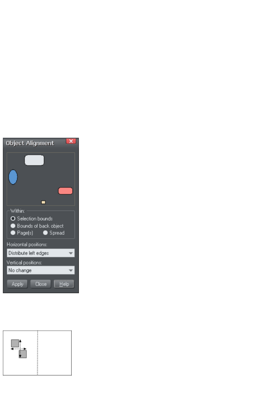
Alignment
This lets you accurately align or distribute two or more objects.
Quick aligning
Select the objects you want to align, and right click the selection to choose Align
from the drop-down menu, and then do one of the following:
Align the objects vertically by choosing Left edges, Centers or Right edges.
Align the objects horizontally by choosing Top edges, Centers or Bottom edges.
Aligning and distributing space
If you want to distribute space between the objects as well as align them, select the objects, right click
the selection and choose "Align" > "Alignment" to display the Object Alignment dialog. Alternatively
choose "Arrange" > "Alignment" ("Ctrl +
?+ L").
The small diagram at the top of the dialog box
shows you the effect of selecting each option.
The selected objects in the document do not
change until you click Apply
.
The alignment dialog is a non-modal dialog,
which means you can keep it on screen and
continue to work on the document at the same
time. So you can change tools, draw, and change
your object selection, and then easily select from
the various alignment options.
If you've got your selection wrong, you can
change the selection, and just click the Apply
button to apply the last alignment settings again.
This can be a real-time saver.
Within
This section of the dialog controls the boundaries within which you align or distribute the objects. The
options are:
Selection bounds
: The boundaries are the outer edges of the
selected objects. Their relative position on the
page or spread has no effect.
Page 432
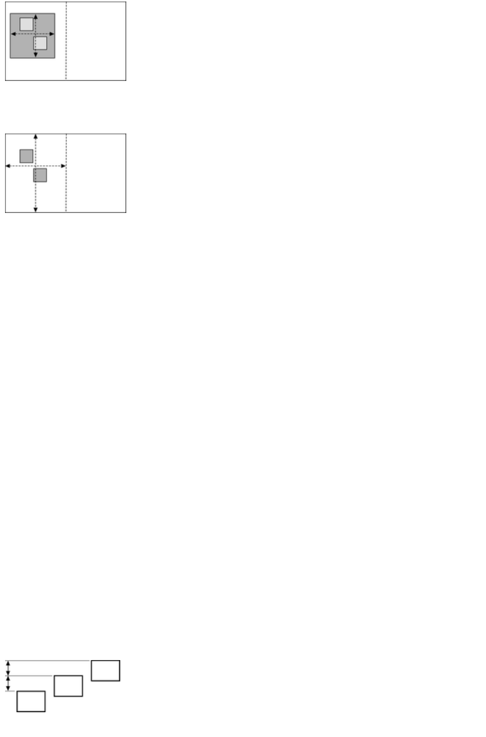
Bounds of Back object
: The boundaries are the outer edges of the
backmost selected object. This object is not
affected by the alignment.
You can use this to define the "reference" object
when you want to align several objects in a row,
for instance. With the normal "Selection bounds"
options on the leftmost object is the reference
object (the one that won't move)
Page(s):
If the objects are on a single page, the
boundaries are the edges of the page. (This lets
you, for example, center objects on the page or
align against the page edge.)
Aligning
To align objects, for example, so their left edges are aligned to the left.
1. Select the objects and right click the selection.
2. Choose "Align" > "Left Edges" from the drop-down list.
The selected objects move to align the left edges.
Alternatively:
1. Choose "Align" > "Alignment" or press "Ctrl + Shift + L" or choose Alignment from the
Arrange menu to open the Object Alignment dialog.
2. Select the required Within option, e.g. Selection bounds.
3. Select Align Left for horizontal positions.
4. Leave vertical positions to No Change.
5. Click Apply.
The selected objects move to align the left edges.
All the align options act in a similar way. For brevity, only the left align option, shown in the illustration of
the dialog box is described. Experiment to learn about the other options.
To quick-select any combinations of vertical and horizontal alignment click with the mouse in the
diagram:
A simple mouse click aligns horizontal and vertical positions to the clicked position to any of the
nine combinations of top-centrally-bottom/left-centrally-right.
"Ctrl + mouse click" leaves the horizontal position unchanged and arranges the objects in a to a
top, centrally, or bottom aligned row.
"ñ+ mouse click" leaves the vertical position unchanged and arranges the objects in a left,
centrally, or right-aligned column.
Distribute
The distribute options will position all the selected objects evenly across the "Within" area (usually within
the selection bounds, but it could be the page or spread).
Again all the distribute options work in a similar way. The following examples show how the different
vertical position options align objects:
Top edges distribution: the tops of the objects
are evenly spaced. Bottom edges
distribution is the inverse?the bottom of the
objects are evenly spaced.
Page 433
Centers distribution
: the centers of the objects are evenly spaced.
Equi-spaced distribution:
the objects are evenly spaced from each other.
The horizontal position options are similar but operate in the horizontal direction.
So, for example, to distribute this collection of randomly positioned ellipses, so they are all equally
spaced and aligned to the top edge:
Select the shapes
Display the Alignment dialog ("Ctrl + ?+ L")
Ensure Within shows Selection bounds
Select Horizontal positions: Distribute centers
Select Vertical position: Align top
Click Apply
And they will now look like this, all equally spaced
horizontally and aligned to the top.
Remember if you make a mistake you can always undo the operation.
Page 434
Within
This section of the dialog controls the boundaries within which you align or distribute the objects. The
options are:
Selection bounds
: The boundaries are the outer edges of the
selected objects. Their relative position on the
page or spread has no effect.
Bounds of Back object
: The boundaries are the outer edges of the
backmost selected object. This object is not
affected by the alignment.
You can use this to define the "reference" object
when you want to align several objects in a row,
for instance. With the normal "Selection bounds"
options on the leftmost object is the reference
object (the one that won't move)
Page(s):
If the objects are on a single page, the
boundaries are the edges of the page. (This lets
you, for example, center objects on the page or
align against the page edge.)
Aligning
To align objects, for example, so their left edges are aligned to the left.
1. Select the objects and right click the selection.
2. Choose "Align" > "Left Edges" from the drop-down list.
The selected objects move to align the left edges.
Alternatively:
1. Choose "Align" > "Alignment" or press "Ctrl + Shift + L" or choose Alignment from the
Arrange menu to open the Object Alignment dialog.
2. Select the required Within option, e.g. Selection bounds.
3. Select Align Left for horizontal positions.
4. Leave vertical positions to No Change.
5. Click Apply.
The selected objects move to align the left edges.
All the align options act in a similar way. For brevity, only the left align option, shown in the illustration of
the dialog box is described. Experiment to learn about the other options.
To quick-select any combinations of vertical and horizontal alignment click with the mouse in the
diagram:
A simple mouse click aligns horizontal and vertical positions to the clicked position to any of the
nine combinations of top-centrally-bottom/left-centrally-right.
"Ctrl + mouse click" leaves the horizontal position unchanged and arranges the objects in a to a
top, centrally, or bottom aligned row.
"ñ+ mouse click" leaves the vertical position unchanged and arranges the objects in a left,
centrally, or right-aligned column.
Page 435
Distribute
The distribute options will position all the selected objects evenly across the "Within" area (usually within
the selection bounds, but it could be the page or spread).
Again all the distribute options work in a similar way. The following examples show how the different
vertical position options align objects:
Top edges distribution: the tops of the objects
are evenly spaced. Bottom edges
distribution is the inverse?the bottom of the
objects are evenly spaced.
Centers distribution
: the centers of the objects are evenly spaced.
Equi-spaced distribution:
the objects are evenly spaced from each other.
The horizontal position options are similar but operate in the horizontal direction.
So, for example, to distribute this collection of randomly positioned ellipses, so they are all equally
spaced and aligned to the top edge:
Select the shapes
Display the Alignment dialog ("Ctrl + + L")
Ensure Within shows Selection bounds
Select Horizontal positions: Distribute centers
Select Vertical position: Align top
Click Apply
And they will now look like this, all equally spaced
horizontally and aligned to the top.
Remember if you make a mistake you can always undo the operation.
Page 436
Aligning
To align objects, for example, so their left edges are aligned to the left.
1. Select the objects and right click the selection.
2. Choose "Align" > "Left Edges" from the drop-down list.
The selected objects move to align the left edges.
Alternatively:
1. Choose "Align" > "Alignment" or press "Ctrl + Shift + L" or choose Alignment from the
Arrange menu to open the Object Alignment dialog.
2. Select the required Within option, e.g. Selection bounds.
3. Select Align Left for horizontal positions.
4. Leave vertical positions to No Change.
5. Click Apply.
The selected objects move to align the left edges.
All the align options act in a similar way. For brevity, only the left align option, shown in the illustration of
the dialog box is described. Experiment to learn about the other options.
To quick-select any combinations of vertical and horizontal alignment click with the mouse in the
diagram:
A simple mouse click aligns horizontal and vertical positions to the clicked position to any of the
nine combinations of top-centrally-bottom/left-centrally-right.
"Ctrl + mouse click" leaves the horizontal position unchanged and arranges the objects in a to a
top, centrally, or bottom aligned row.
"ñ+ mouse click" leaves the vertical position unchanged and arranges the objects in a left,
centrally, or right-aligned column.
Distribute
The distribute options will position all the selected objects evenly across the "Within" area (usually within
the selection bounds, but it could be the page or spread).
Again all the distribute options work in a similar way. The following examples show how the different
vertical position options align objects:
Top edges distribution: the tops of the objects
are evenly spaced. Bottom edges
distribution is the inverse?the bottom of the
objects are evenly spaced.
Centers distribution
: the centers of the objects are evenly spaced.
Equi-spaced distribution:
the objects are evenly spaced from each other.
The horizontal position options are similar but operate in the horizontal direction.
So, for example, to distribute this collection of randomly positioned ellipses, so they are all equally
spaced and aligned to the top edge:
Select the shapes
Display the Alignment dialog ("Ctrl + + L")
Ensure Within shows Selection bounds
Page 437

Select Horizontal positions: Distribute centers
Select Vertical position: Align top
Click Apply
And they will now look like this, all equally spaced
horizontally and aligned to the top.
Remember if you make a mistake you can always undo the operation.
Page 438
Distribute
The distribute options will position all the selected objects evenly across the "Within" area (usually within
the selection bounds, but it could be the page or spread).
Again all the distribute options work in a similar way. The following examples show how the different
vertical position options align objects:
Top edges distribution: the tops of the objects
are evenly spaced. Bottom edges
distribution is the inverse?the bottom of the
objects are evenly spaced.
Centers distribution
: the centers of the objects are evenly spaced.
Equi-spaced distribution:
the objects are evenly spaced from each other.
The horizontal position options are similar but operate in the horizontal direction.
So, for example, to distribute this collection of randomly positioned ellipses, so they are all equally
spaced and aligned to the top edge:
Select the shapes
Display the Alignment dialog ("Ctrl + + L")
Ensure Within shows Selection bounds
Select Horizontal positions: Distribute centers
Select Vertical position: Align top
Click Apply
And they will now look like this, all equally spaced
horizontally and aligned to the top.
Remember if you make a mistake you can always undo the operation.
Page 439
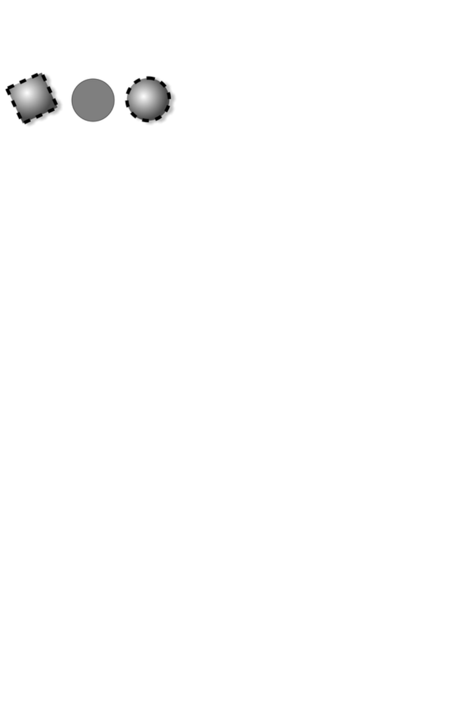
Copying Styles: Paste Attributes
This lets you copy attributes (such as line pattern or fill color) between objects. It is a quick way of
applying multiple attributes to an object.
The square has a specific color,
shadow, line and fill style. Copying it
and then pasting its attributes on to the
circle in the middle, results in the circle
to the right.
1. Select the object from which you wish to copy the attributes.
2. Copy the selection to the clipboard. ("Edit" > "Copy", or "Ctrl + C".)
3. Select the object(s) to which you want to apply the attributes.
4. Choose "Edit" > "Paste attributes", or "Ctrl + Shift + A".
The object remains on the clipboard until overwritten by a cut or copy operation. This lets you repeat
paste attributes as many times as required.
Style libraries
It's quite easy to use this technique to create documents that can be used as style libraries. Create a
series of small objects with a variety of useful fill, color and other attribute styles. Then the quickest way
to use one of these styles is:
Click on the source object, "Ctrl + C" to copy the style
Move to the destination object (which can be in another document, "Ctrl + Tab" to quickly
switch between open documents), click on the object to apply the style to
Press "Ctrl + Shift + A" to apply the attributes
Note:
Most attributes can be copied this way, including shadows, feather values, fill styles, etc. However
bevels can only be copied from one object to another if the object the bevel is copied to has already a
bevel to apply the bevel attributes to.
Page 440

Naming objects
You can apply names to any object in Xara Web Designer 7 Premium
using the Apply, remove or inspect names of objects button on the
Selector Tool
infobar.
Naming is a general mechanism which has a variety of uses, some of which are described below. Most
commonly names are used to form loose sets of objects.
Example uses of names
Flash Animations: Names are used in flash animations to mark objects which are to be tweened by the
Flash exporter. See the Flash chapter
for full details.
Adding names
To add a name to an object, select the object and open the Names dialog using the button on the
Selector Tool infobar or right click on the object and choose Names...
Type the new name into the Apply name field, or use the drop down list on the same field to select a
name which is already used elsewhere in the current document. Click Add. You should see the name
appear in the Names applied
list.
Names applied
The Names Applied
field shows you the names applied to the current selection. If more than one object is selected, a list of
names is only shown if all objects in the selection have exactly the same set of names applied. Otherwise
"<many>" is displayed, indicating that there are differences in terms of the names applied to different
objects in the selection.
To remove a name from the selected object(s), click the name in the Names Applied list to select it and
then click the Remove
button.
Page 441

Adding names
To add a name to an object, select the object and open the Names dialog using the button on the
Selector Tool infobar or right click on the object and choose Names...
Type the new name into the Apply name field, or use the drop down list on the same field to select a
name which is already used elsewhere in the current document. Click Add. You should see the name
appear in the Names applied
list.
Names applied
The Names Applied
field shows you the names applied to the current selection. If more than one object is selected, a list of
names is only shown if all objects in the selection have exactly the same set of names applied. Otherwise
"<many>" is displayed, indicating that there are differences in terms of the names applied to different
objects in the selection.
To remove a name from the selected object(s), click the name in the Names Applied list to select it and
then click the Remove
button.
Page 442

Names applied
The Names Applied
field shows you the names applied to the current selection. If more than one object is selected, a list of
names is only shown if all objects in the selection have exactly the same set of names applied. Otherwise
"<many>" is displayed, indicating that there are differences in terms of the names applied to different
objects in the selection.
To remove a name from the selected object(s), click the name in the Names Applied list to select it and
then click the Remove
button.
Page 443
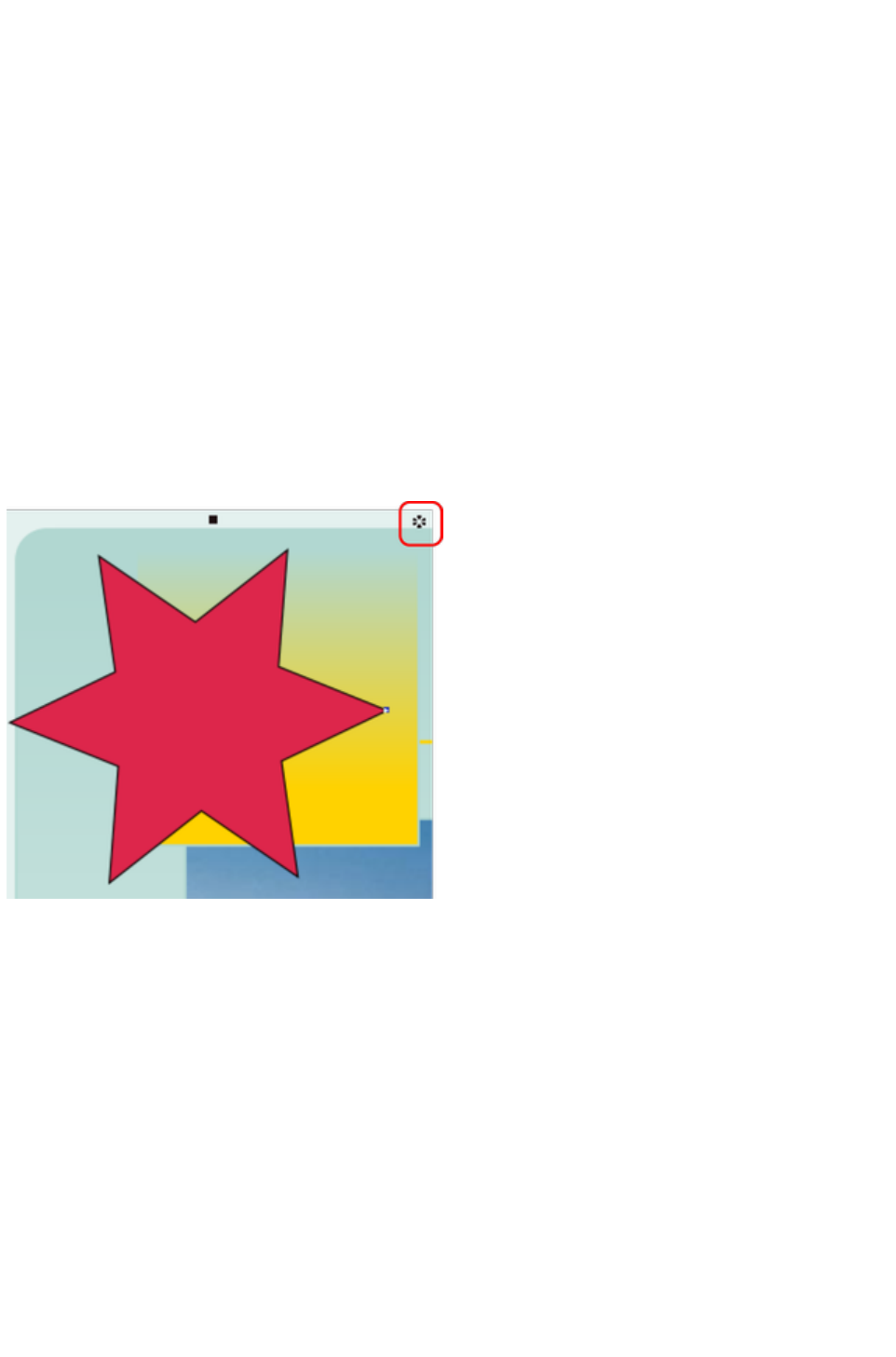
Repeating Objects
It's common to have items like navigation buttons, headers or logos repeating on all pages of your
website.
Web Designer Premium provides the ability to repeat any item in the same place on any of your web
pages. When you update one of the copies, Web Designer Premium automatically replicates those
changes across all pages that have a copy of the repeating object.
On most of the template designs the main navigation buttons are repeating. You can make any object
such as a button a repeating object by right clicking it and choosing Repeat on all pages
. The object is copied to the same place on all pages, displaying the repeating symbol icon in the top right
hand corner. If you make any further changes to this item all the copies will be automatically updated.
However if the bar is set to be a Site navigation bar
it automatically appears the same on all pages of your site and there is no need to make it a repeating
object.
Logo text and footers are also normally set to be repeating objects in the templates. Again this means you
can edit them on one page, and the same object is automatically updated on all other pages.
Note
: This uses the current page as the source of the repeating items to update across all the other pages.
The red box highlights the repeating object symbol, shown on every instance of the repeating object
If you don't want a copy of the repeating object on a page, just delete it from that page. When edited, the
repeating object is only automatically updated to those pages that already have it. This means you can
choose which of the pages in your document should have the repeating object and which should not.
If you want a repeating object on just a few pages of a large website, you can:
1. First make your object repeat on all pages of your site, using Arrange > Repeat on all pages.
2. Select one of the repeating objects and copy it to the clipboard ("Ctrl + C").
3. Hit the Delete key and choose the Delete from all pages option when prompted.
4. Now simply paste the repeating object onto each page that needs a copy of it.
Editing the contents of a repeating object
When Web Designer Premium creates a repeating object, the repeating items are placed in a containing
'repeating group', similar to a normal group. If you drill down to a layer containing a repeating object in
the Page & Layer Gallery
, you can see that there's a repeating group containing each repeating object on that layer.
Page 444
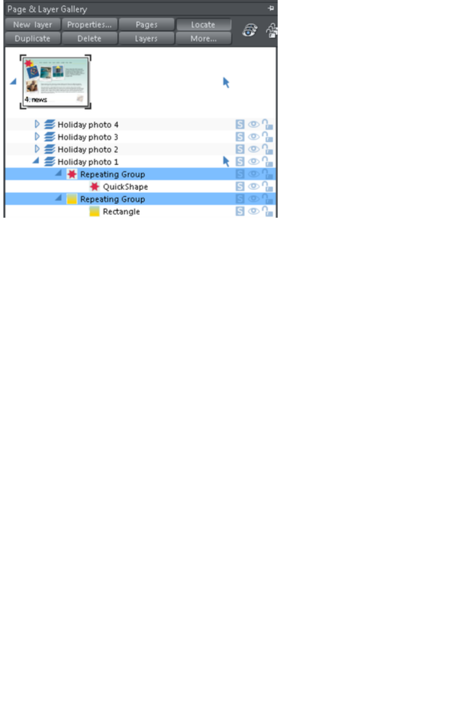
Web Designer Premium places each repeating object inside a repeating group
If you want to edit an item inside this repeating group, press "Ctrl + click" on the item to select it inside
the repeating group. You can also double click on a group to edit it in a new sub-document view (or right
click on it and choose Open
from the context menu). It contains only the contents of the group and not the group itself, so you can
select all the direct children of the group just by clicking on them.
Alternatively if you go into a specific tool you can usually click directly on any object that is applicable to
that tool and it will be selected inside its repeating group (or any other type of group). So for example
you can select a Quickshape that's inside a repeating group by simply going into the Quickshape tool and
then clicking on the shape.
As with any other edits made to a repeating object, any edits you make inside a repeating group are
applied to all instances of that repeating object on other pages.
Locking a repeating object
You can lock a repeating object right clicking it and choosing Lock repeating object
. Once locked, the object is not selectable. But editing any other copies of that repeating object on other
pages, which aren't locked, will change all copies, including the locked copy.
Headers/Footers
You may have pages in your site of varying lengths and want some repeating objects to be positioned
relative to the top of each page and others (e.g. footers) positioned relative to the bottom of each page.
You can configure Xara Web Designer 7 Premium to do this, so header and footer repeating objects will
move with respect to the top and bottom of each page.
The position of a repeating object on the page determines whether it is considered to be a header or
footer. If any part of the object is in the top half of the page, Xara Web Designer 7 Premium treats it as a
header and will move it to the same position relative to the top of each page.
Objects entirely in the bottom half of the page are treated as footers and Xara Web Designer 7 Premium
positions them relative to the bottom of each page, irrespective of page length.
For some repeating objects, this automatic decision making about whether the object should be
positioned relative to the top or bottom of pages may be inappropriate. So if required you can force any
repeating object to be positioned relative to the top or bottom of pages by right clicking on it and
choosing "Repeat position" > "Top" or "Repeat position" > "Bottom".
To restore normal automatic positioning behavior to a repeating object, right click it and choose "
Repeat position" > "Automatic"
Page 445

.
Stopping objects repeating
Right click an object and choose Stop updating to turn off the repeating nature of an object, or all of its
copies in your website. Choosing Stop updating from the Arrange menu also allows this.
You'll be asked whether you want to just stop the selected object repeating or all copies of the object in
the website. Choose the All
option. Now the different copies of that object can be independently edited and the next time one is
changed it won't update any of them.
Use this if, for example, you've used Repeat on all pages
to copy an object to all pages of your website, but then you want to make those objects different on
each page so that they are no longer tied together.
Stop updating is also useful if you want to make a copy of a repeating object (eg. a footer or logo) on
one page and you don't want that copy to be updated. In this case choose the Just this copy
option when prompted.
Note that you can't use Stop updating on Navbars which have the Site navigation bar option turned
on in the Navbar dialog. That's because site navigation bars always update across the whole website.
See the Navigation Bar chapter
for more information on site navigation bars.
Deleting repeating objects
If you don't want a copy of the repeating object on a page, just delete it from that page. Xara Web
Designer 7 Premium displays a prompt asking whether to delete just that copy or all copies of that
repeating object.
Pressing "Ctrl + Delete" will delete just the selected repeating object without
asking whether you want to delete all instances or just this one.
Page 446
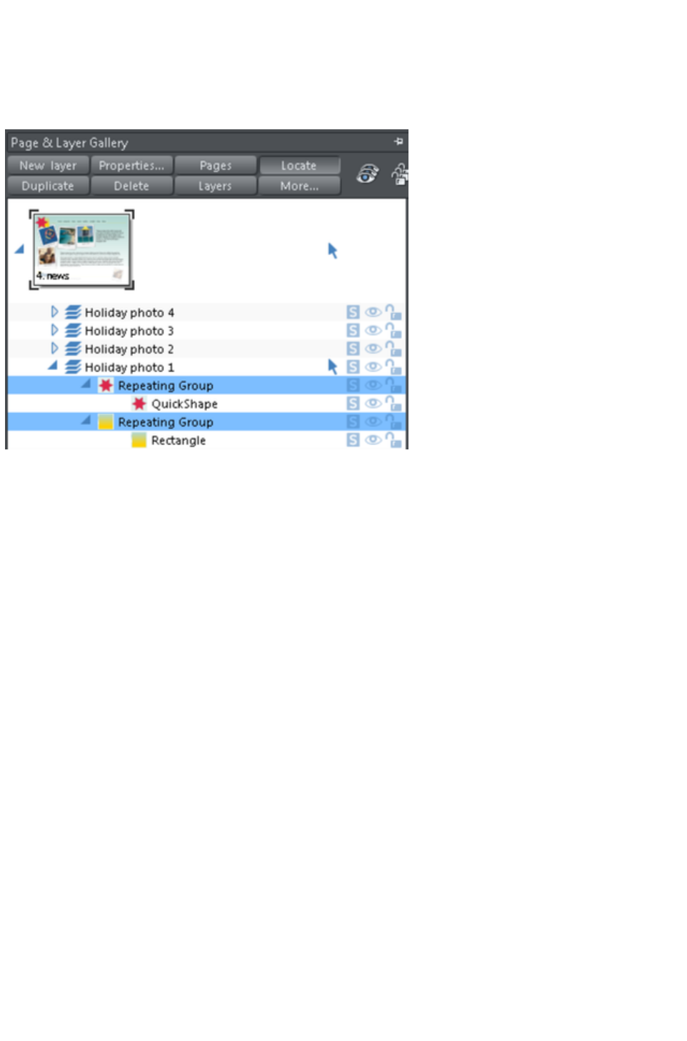
Editing the contents of a repeating object
When Web Designer Premium creates a repeating object, the repeating items are placed in a containing
'repeating group', similar to a normal group. If you drill down to a layer containing a repeating object in
the Page & Layer Gallery
, you can see that there's a repeating group containing each repeating object on that layer.
Web Designer Premium places each repeating object inside a repeating group
If you want to edit an item inside this repeating group, press "Ctrl + click" on the item to select it inside
the repeating group. You can also double click on a group to edit it in a new sub-document view (or right
click on it and choose Open
from the context menu). It contains only the contents of the group and not the group itself, so you can
select all the direct children of the group just by clicking on them.
Alternatively if you go into a specific tool you can usually click directly on any object that is applicable to
that tool and it will be selected inside its repeating group (or any other type of group). So for example
you can select a Quickshape that's inside a repeating group by simply going into the Quickshape tool and
then clicking on the shape.
As with any other edits made to a repeating object, any edits you make inside a repeating group are
applied to all instances of that repeating object on other pages.
Locking a repeating object
You can lock a repeating object right clicking it and choosing Lock repeating object
. Once locked, the object is not selectable. But editing any other copies of that repeating object on other
pages, which aren't locked, will change all copies, including the locked copy.
Headers/Footers
You may have pages in your site of varying lengths and want some repeating objects to be positioned
relative to the top of each page and others (e.g. footers) positioned relative to the bottom of each page.
You can configure Xara Web Designer 7 Premium to do this, so header and footer repeating objects will
move with respect to the top and bottom of each page.
The position of a repeating object on the page determines whether it is considered to be a header or
footer. If any part of the object is in the top half of the page, Xara Web Designer 7 Premium treats it as a
header and will move it to the same position relative to the top of each page.
Objects entirely in the bottom half of the page are treated as footers and Xara Web Designer 7 Premium
positions them relative to the bottom of each page, irrespective of page length.
Page 447

For some repeating objects, this automatic decision making about whether the object should be
positioned relative to the top or bottom of pages may be inappropriate. So if required you can force any
repeating object to be positioned relative to the top or bottom of pages by right clicking on it and
choosing "Repeat position" > "Top" or "Repeat position" > "Bottom".
To restore normal automatic positioning behavior to a repeating object, right click it and choose "
Repeat position" > "Automatic"
.
Stopping objects repeating
Right click an object and choose Stop updating to turn off the repeating nature of an object, or all of its
copies in your website. Choosing Stop updating from the Arrange menu also allows this.
You'll be asked whether you want to just stop the selected object repeating or all copies of the object in
the website. Choose the All
option. Now the different copies of that object can be independently edited and the next time one is
changed it won't update any of them.
Use this if, for example, you've used Repeat on all pages
to copy an object to all pages of your website, but then you want to make those objects different on
each page so that they are no longer tied together.
Stop updating is also useful if you want to make a copy of a repeating object (eg. a footer or logo) on
one page and you don't want that copy to be updated. In this case choose the Just this copy
option when prompted.
Note that you can't use Stop updating on Navbars which have the Site navigation bar option turned
on in the Navbar dialog. That's because site navigation bars always update across the whole website.
See the Navigation Bar chapter
for more information on site navigation bars.
Deleting repeating objects
If you don't want a copy of the repeating object on a page, just delete it from that page. Xara Web
Designer 7 Premium displays a prompt asking whether to delete just that copy or all copies of that
repeating object.
Pressing "Ctrl + Delete" will delete just the selected repeating object without
asking whether you want to delete all instances or just this one.
Page 448

Headers/Footers
You may have pages in your site of varying lengths and want some repeating objects to be positioned
relative to the top of each page and others (e.g. footers) positioned relative to the bottom of each page.
You can configure Xara Web Designer 7 Premium to do this, so header and footer repeating objects will
move with respect to the top and bottom of each page.
The position of a repeating object on the page determines whether it is considered to be a header or
footer. If any part of the object is in the top half of the page, Xara Web Designer 7 Premium treats it as a
header and will move it to the same position relative to the top of each page.
Objects entirely in the bottom half of the page are treated as footers and Xara Web Designer 7 Premium
positions them relative to the bottom of each page, irrespective of page length.
For some repeating objects, this automatic decision making about whether the object should be
positioned relative to the top or bottom of pages may be inappropriate. So if required you can force any
repeating object to be positioned relative to the top or bottom of pages by right clicking on it and
choosing "Repeat position" > "Top" or "Repeat position" > "Bottom".
To restore normal automatic positioning behavior to a repeating object, right click it and choose "
Repeat position" > "Automatic"
.
Stopping objects repeating
Right click an object and choose Stop updating to turn off the repeating nature of an object, or all of its
copies in your website. Choosing Stop updating from the Arrange menu also allows this.
You'll be asked whether you want to just stop the selected object repeating or all copies of the object in
the website. Choose the All
option. Now the different copies of that object can be independently edited and the next time one is
changed it won't update any of them.
Use this if, for example, you've used Repeat on all pages
to copy an object to all pages of your website, but then you want to make those objects different on
each page so that they are no longer tied together.
Stop updating is also useful if you want to make a copy of a repeating object (eg. a footer or logo) on
one page and you don't want that copy to be updated. In this case choose the Just this copy
option when prompted.
Note that you can't use Stop updating on Navbars which have the Site navigation bar option turned
on in the Navbar dialog. That's because site navigation bars always update across the whole website.
See the Navigation Bar chapter
for more information on site navigation bars.
Deleting repeating objects
If you don't want a copy of the repeating object on a page, just delete it from that page. Xara Web
Designer 7 Premium displays a prompt asking whether to delete just that copy or all copies of that
repeating object.
Pressing "Ctrl + Delete" will delete just the selected repeating object without
asking whether you want to delete all instances or just this one.
Page 449

Stopping objects repeating
Right click an object and choose Stop updating to turn off the repeating nature of an object, or all of its
copies in your website. Choosing Stop updating from the Arrange menu also allows this.
You'll be asked whether you want to just stop the selected object repeating or all copies of the object in
the website. Choose the All
option. Now the different copies of that object can be independently edited and the next time one is
changed it won't update any of them.
Use this if, for example, you've used Repeat on all pages
to copy an object to all pages of your website, but then you want to make those objects different on
each page so that they are no longer tied together.
Stop updating is also useful if you want to make a copy of a repeating object (eg. a footer or logo) on
one page and you don't want that copy to be updated. In this case choose the Just this copy
option when prompted.
Note that you can't use Stop updating on Navbars which have the Site navigation bar option turned
on in the Navbar dialog. That's because site navigation bars always update across the whole website.
See the Navigation Bar chapter
for more information on site navigation bars.
Deleting repeating objects
If you don't want a copy of the repeating object on a page, just delete it from that page. Xara Web
Designer 7 Premium displays a prompt asking whether to delete just that copy or all copies of that
repeating object.
Pressing "Ctrl + Delete" will delete just the selected repeating object without
asking whether you want to delete all instances or just this one.
Page 450

Deleting repeating objects
If you don't want a copy of the repeating object on a page, just delete it from that page. Xara Web
Designer 7 Premium displays a prompt asking whether to delete just that copy or all copies of that
repeating object.
Pressing "Ctrl + Delete" will delete just the selected repeating object without
asking whether you want to delete all instances or just this one.
Page 451
Drawing Lines and Shapes
In this chapter
Drawing a line or shape
The Freehand & Brush Tool
Editing lines/shapes with the Freehand & Brush Tool
The Straight Line & Arrow tool
The Shape Editor tool
Extending the line
Finishing the line
Adding a new point handle
Selecting multiple point handles
Deleting points
Moving point handles—Shape Editor Tool
Smoothing a line
Constraining the line
Changing curves
Changing a straight line to a curve (and vice versa)
Joining lines
Splitting a shape
Changing the line width (thickness)
Line Gallery
Page 452
Drawing a line or shape
You can use any of these tools to draw lines and shapes:
The Freehand & Brush Tool ("F3").
The Straight Line & Arrow Tool
The Shape Editor Tool ("F4").
The Freehand & Brush
Tool is the easiest way to draw simple lines, curves, and shapes, and it acts rather like a pencil.
The Straight Line & Arrow Tool
is best if you want to draw single segment straight lines, or add arrow heads and tails to any types of
lines.
The Shape Editor
Tool is best for drawing precise curves and lines. It is also the main tool to edit lines and shapes.
Note: Although it is not in the Drawing Tools toolbar, you can also use
the Pen Tool to create precise shapes. It has limited functionality and
works like the line tool of other drawing programs. To use the Pen Tool
, choose Control Bars from the Window menu and click the Button
Palette checkbox. Then click the Pen Tool
icon in the Button Palette. Or use the keyboard shortcut "Shift + F5".
Page 453
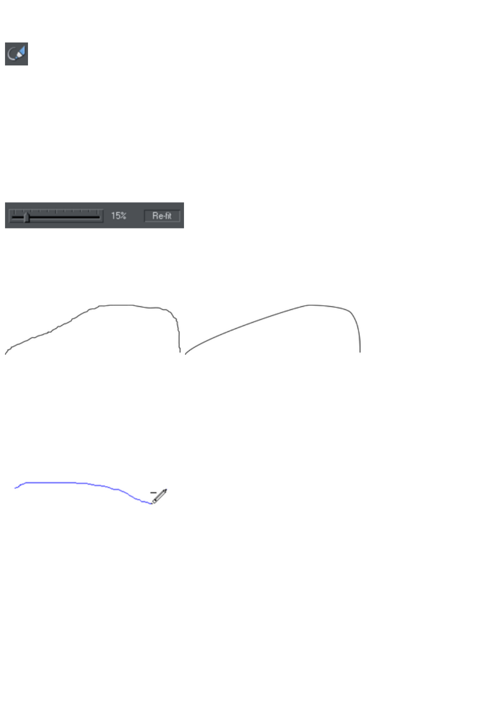
The Freehand & Brush Tool
You can use this tool to draw in a freehand manner, as you would with
a pencil. It can also be used to create brush strokes, which is described
later. And it includes the option to draw variable width lines using a
compatible pressure sensitive drawing device such as a graphics tablet.
While using this tool the status line provides reminders on how to use
the tool.
1. Position the pointer where you want the line to start.
2. Press and hold down the mouse button. (or draw with your graphics tablet or other connected
device).
3. As you drag the pointer around the document, your line is drawn in real time.
4. Release the mouse button to terminate the line.
Smoothing Re-fit Indicator
After you've drawn a freehand line
you can control how smooth the
curve is (i.e. how many control
points) by adjusting the smoothing
control slider on the InfoBar.
Low values make the line follow your mouse movement more closely by creating more control points,
and higher values produce smoother curves with fewer control points.
Low values are less smooth
Higher values produce a smoother
curve
You can change the smoothing at any time until you make further edits to the line (the re-fit indicator on
the InfoBar tells you when you can still change the smoothing.)
Erasing while drawing
Before you release the mouse button you can erase part of the line by holding "Shift".
The pencil icon reverses so the eraser
at the end is downwards. You can
now erase back along the line.
Release "Shift" and you can continue
drawing.
Drawing straight segments in the Freehand Tool
While drawing a freehand line hold down "Alt", move the pointer to a new position and release "Alt" to
draw a straight line. You can continue drawing a line or hold down "Alt" again to draw another straight
segment. Remember, you can use "Ctrl" to constrain the angle of the line. If you only want to draw lots of
single segment straight lines, use the Straight Line Tool
described below.
Extending a line
Make sure the line is selected (a single click on the shape or line in the Freehand & Brush Tool
will do this). Now if you move over the end of the line, a small + sign next to the pencil icon will indicate
you can just draw to add a new freehand section to the line.
Page 454

Joining two lines
Select both lines, ("Shift + click" on the second line to add it to the selection) and you can now just draw
from the end of one line to an end of the other. A small + sign next to the pencil icon (appearing after a
pause) indicates you are over the end.
Closing a freehand shape (to create a filled shape)
If you connect the start and end of a line, then it becomes a filled shape. You can now alter the fill color
by dragging colors from the Color Line or using the Color Editor.
Page 455

Erasing while drawing
Before you release the mouse button you can erase part of the line by holding "Shift".
The pencil icon reverses so the eraser
at the end is downwards. You can
now erase back along the line.
Release "Shift" and you can continue
drawing.
Drawing straight segments in the Freehand Tool
While drawing a freehand line hold down "Alt", move the pointer to a new position and release "Alt" to
draw a straight line. You can continue drawing a line or hold down "Alt" again to draw another straight
segment. Remember, you can use "Ctrl" to constrain the angle of the line. If you only want to draw lots of
single segment straight lines, use the Straight Line Tool
described below.
Extending a line
Make sure the line is selected (a single click on the shape or line in the Freehand & Brush Tool
will do this). Now if you move over the end of the line, a small + sign next to the pencil icon will indicate
you can just draw to add a new freehand section to the line.
Joining two lines
Select both lines, ("Shift + click" on the second line to add it to the selection) and you can now just draw
from the end of one line to an end of the other. A small + sign next to the pencil icon (appearing after a
pause) indicates you are over the end.
Closing a freehand shape (to create a filled shape)
If you connect the start and end of a line, then it becomes a filled shape. You can now alter the fill color
by dragging colors from the Color Line or using the Color Editor.
Page 456

Drawing straight segments in the Freehand Tool
While drawing a freehand line hold down "Alt", move the pointer to a new position and release "Alt" to
draw a straight line. You can continue drawing a line or hold down "Alt" again to draw another straight
segment. Remember, you can use "Ctrl" to constrain the angle of the line. If you only want to draw lots of
single segment straight lines, use the Straight Line Tool
described below.
Extending a line
Make sure the line is selected (a single click on the shape or line in the Freehand & Brush Tool
will do this). Now if you move over the end of the line, a small + sign next to the pencil icon will indicate
you can just draw to add a new freehand section to the line.
Joining two lines
Select both lines, ("Shift + click" on the second line to add it to the selection) and you can now just draw
from the end of one line to an end of the other. A small + sign next to the pencil icon (appearing after a
pause) indicates you are over the end.
Closing a freehand shape (to create a filled shape)
If you connect the start and end of a line, then it becomes a filled shape. You can now alter the fill color
by dragging colors from the Color Line or using the Color Editor.
Page 457

Extending a line
Make sure the line is selected (a single click on the shape or line in the Freehand & Brush Tool
will do this). Now if you move over the end of the line, a small + sign next to the pencil icon will indicate
you can just draw to add a new freehand section to the line.
Joining two lines
Select both lines, ("Shift + click" on the second line to add it to the selection) and you can now just draw
from the end of one line to an end of the other. A small + sign next to the pencil icon (appearing after a
pause) indicates you are over the end.
Closing a freehand shape (to create a filled shape)
If you connect the start and end of a line, then it becomes a filled shape. You can now alter the fill color
by dragging colors from the Color Line or using the Color Editor.
Page 458

Joining two lines
Select both lines, ("Shift + click" on the second line to add it to the selection) and you can now just draw
from the end of one line to an end of the other. A small + sign next to the pencil icon (appearing after a
pause) indicates you are over the end.
Closing a freehand shape (to create a filled shape)
If you connect the start and end of a line, then it becomes a filled shape. You can now alter the fill color
by dragging colors from the Color Line or using the Color Editor.
Page 459

Closing a freehand shape (to create a filled shape)
If you connect the start and end of a line, then it becomes a filled shape. You can now alter the fill color
by dragging colors from the Color Line or using the Color Editor.
Page 460
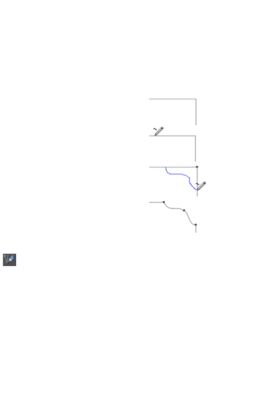
Editing lines/shapes with the Freehand &
Brush Tool
You cannot directly modify shapes created by the Quickshape, Rectangle, or Ellipse Tools. First convert
them to editable shapes using "Arrange" > "Convert to editable shapes
". See "Shape handling" for more information.
You can use the Freehand & Brush Tool
to edit lines (or outlines of shapes) by simply redrawing the section of line you want to replace. For
example:
To edit the object:
Select the object that you wish to edit.
Move the freehand pencil over a part of the line. A ~
shows when the pencil is in position.
Draw the required line, then move the freehand pencil
over to the second point of the existing line. Again, a ~
shows when the pencil is in position.
Release the mouse button, and the section of line is
replaced.
Sketch Mode
This option is useful if you are rapidly sketching lots of separate lines
close to each other, perhaps using a drawing tablet.
When working this way you won't normally want to edit existing lines you've already drawn, but instead
draw new lines with every stroke. But as described above, if you start a draw operation on an existing
line, or on its end point, that existing line is modified. So when sketching you may inadvertently modify
existing lines with your strokes, instead of drawing new lines on top as you'd intended.
To overcome this problem, turn on sketch mode. Now if you hold the mouse pointer over an existing
line, or end point, you'll notice that there is a short pause before the mouse pointer changes to indicate
that the line will be edited or extended. This pause means you can still edit existing lines if you want, but
you won't do so unintentionally when you actually mean to sketch new lines.
Trace mode
Trace mode helps you to draw lines which follow visible edges in photo images. For example you can
use it to help you draw around a building or other object in a photo, that you want to cut out.
For most photos it's best to turn smoothing down from the default value, so that the line more closely
follows complex edges with less smoothing of the line as you draw. You can always adjust the smoothing
after drawing the line, if required.
Trace mode on/off
Page 461
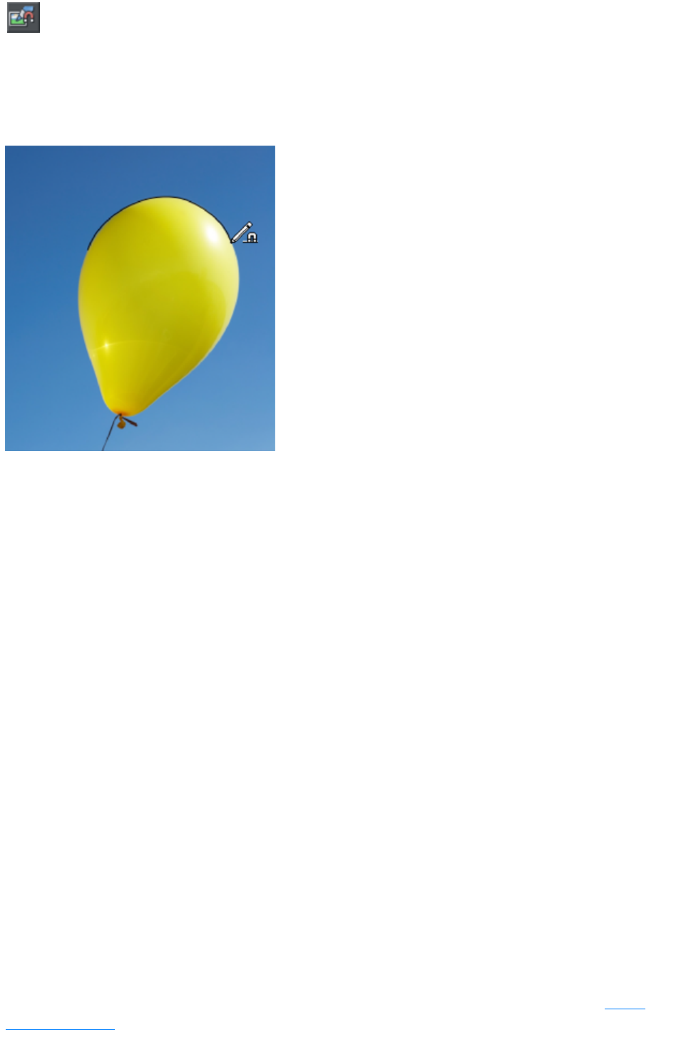
Turn on trace mode using the toggle button on the infobar. Draw with
the Freehand tool over a photo and you should see that the line tries to
follow edges in the image.
You can also turn trace mode on and off while you are actively drawing a line, by pressing the T
key. The mouse pointer changes to indicate whether trace mode is on or off. This allows you, for
example, to turn off trace mode when you are drawing over a complex part of an image where there is no
obvious edge for trace mode to follow.
Commit points
You'll often notice as you draw along an edge in a photo that sometimes the last few pixels of the line
you've drawn will 'jump' around as it searches for different routes. When there is more than one possible
route, move the mouse pointer around and see the edge jump between them. You can 'commit' the edge
at any time by pressing the space bar
when a correct route has been found. Then continue and trace mode will find more routes between the
last commit point and the mouse pointer.
Commit points are automatically added for you every 50 screen pixels, because you don't normally want
to re-route the line more than that distance from where you are currently drawing.
Erasing
As mentioned above, whether tracing is on or off you can erase the last part of the line you've drawn by
holding down the Shift key and moving the mouse pointer back to an earlier part of the line. The line is
erased from that point to the end of the line.
Complex images
Few real world photos have objects with obvious unambiguous edges that can easily be followed by
trace mode. There is often texture in the objects themselves or in the background which mean that trace
mode will find many different candidate edges. Zoom into difficult parts of photos to get more control
over the trace and use the space bar to enter manual commit points more often, the more complex the
image. And press T to turn tracing on and off as you move between parts of an image that are easy to
trace and parts that are not.
Cutting out objects from photos
To cut out part of a photo you can either draw an ordinary shape over the top of the photo and then use
the combine shapes operations in the Arrange menu to cut the photo with the shape (see the Shape
Handling chapter
Page 462

for details).
Or you can go into mask mode, draw a mask shape over the photo and
then use cut, copy and paste (or the combine shapes operations) to cut
or copy the part of the photo you've indicated with the mask.
See the Photo Handling chapter
for more information on using mask mode.
Once you've cut out a piece of a photo, it's often a good idea to apply a small amount of feather to blur
the edge slightly.
Non-destructive editing
Unlike most photo tools which permanently edit the pixels of the photo when you cut objects out like
this, Xara Web Designer 7 Premium is non-destructive. The outline remains an editable vector outline
that you can edit just like any other vector shape, using the Freehand tool or Shape editor. Use the shape
editor to manually clean up your outline, revealing more or less of the image as you edit the edges.
Brush styles
The Freehand & Brush Tool
can also be used to apply different brush stroke styles along the path of the line. Instead of being a solid,
fixed-width line, you can change it to be a variable-width line, or one of a near-infinite range of fancy
brush styles, like airbrush, felt tip marker, and many more.
It's important to understand that the line remains fully editable so, unlike most painting or photo
re-touching programs, you can select and later adjust the line shape and the brush stroke.
Page 463
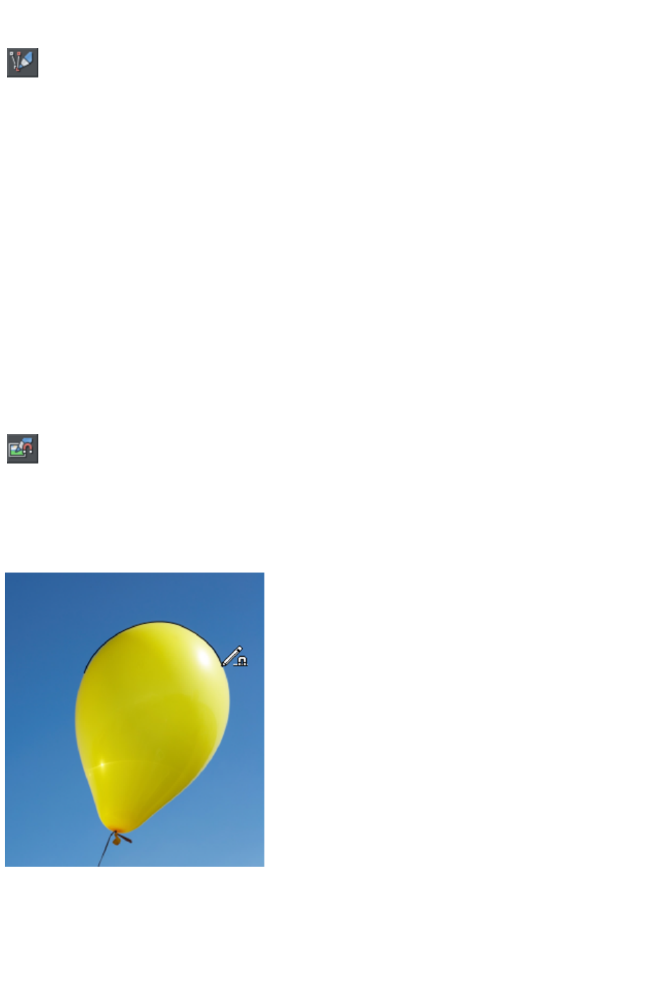
Sketch Mode
This option is useful if you are rapidly sketching lots of separate lines
close to each other, perhaps using a drawing tablet.
When working this way you won't normally want to edit existing lines you've already drawn, but instead
draw new lines with every stroke. But as described above, if you start a draw operation on an existing
line, or on its end point, that existing line is modified. So when sketching you may inadvertently modify
existing lines with your strokes, instead of drawing new lines on top as you'd intended.
To overcome this problem, turn on sketch mode. Now if you hold the mouse pointer over an existing
line, or end point, you'll notice that there is a short pause before the mouse pointer changes to indicate
that the line will be edited or extended. This pause means you can still edit existing lines if you want, but
you won't do so unintentionally when you actually mean to sketch new lines.
Trace mode
Trace mode helps you to draw lines which follow visible edges in photo images. For example you can
use it to help you draw around a building or other object in a photo, that you want to cut out.
For most photos it's best to turn smoothing down from the default value, so that the line more closely
follows complex edges with less smoothing of the line as you draw. You can always adjust the smoothing
after drawing the line, if required.
Trace mode on/off
Turn on trace mode using the toggle button on the infobar. Draw with
the Freehand tool over a photo and you should see that the line tries to
follow edges in the image.
You can also turn trace mode on and off while you are actively drawing a line, by pressing the T
key. The mouse pointer changes to indicate whether trace mode is on or off. This allows you, for
example, to turn off trace mode when you are drawing over a complex part of an image where there is no
obvious edge for trace mode to follow.
Commit points
You'll often notice as you draw along an edge in a photo that sometimes the last few pixels of the line
you've drawn will 'jump' around as it searches for different routes. When there is more than one possible
route, move the mouse pointer around and see the edge jump between them. You can 'commit' the edge
at any time by pressing the space bar
Page 464
when a correct route has been found. Then continue and trace mode will find more routes between the
last commit point and the mouse pointer.
Commit points are automatically added for you every 50 screen pixels, because you don't normally want
to re-route the line more than that distance from where you are currently drawing.
Erasing
As mentioned above, whether tracing is on or off you can erase the last part of the line you've drawn by
holding down the Shift key and moving the mouse pointer back to an earlier part of the line. The line is
erased from that point to the end of the line.
Complex images
Few real world photos have objects with obvious unambiguous edges that can easily be followed by
trace mode. There is often texture in the objects themselves or in the background which mean that trace
mode will find many different candidate edges. Zoom into difficult parts of photos to get more control
over the trace and use the space bar to enter manual commit points more often, the more complex the
image. And press T to turn tracing on and off as you move between parts of an image that are easy to
trace and parts that are not.
Cutting out objects from photos
To cut out part of a photo you can either draw an ordinary shape over the top of the photo and then use
the combine shapes operations in the Arrange menu to cut the photo with the shape (see the Shape
Handling chapter
for details).
Or you can go into mask mode, draw a mask shape over the photo and
then use cut, copy and paste (or the combine shapes operations) to cut
or copy the part of the photo you've indicated with the mask.
See the Photo Handling chapter
for more information on using mask mode.
Once you've cut out a piece of a photo, it's often a good idea to apply a small amount of feather to blur
the edge slightly.
Non-destructive editing
Unlike most photo tools which permanently edit the pixels of the photo when you cut objects out like
this, Xara Web Designer 7 Premium is non-destructive. The outline remains an editable vector outline
that you can edit just like any other vector shape, using the Freehand tool or Shape editor. Use the shape
editor to manually clean up your outline, revealing more or less of the image as you edit the edges.
Brush styles
The Freehand & Brush Tool
can also be used to apply different brush stroke styles along the path of the line. Instead of being a solid,
fixed-width line, you can change it to be a variable-width line, or one of a near-infinite range of fancy
brush styles, like airbrush, felt tip marker, and many more.
It's important to understand that the line remains fully editable so, unlike most painting or photo
re-touching programs, you can select and later adjust the line shape and the brush stroke.
Page 465
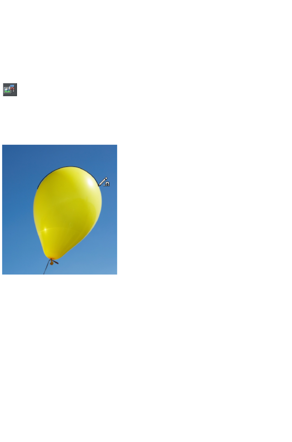
Trace mode
Trace mode helps you to draw lines which follow visible edges in photo images. For example you can
use it to help you draw around a building or other object in a photo, that you want to cut out.
For most photos it's best to turn smoothing down from the default value, so that the line more closely
follows complex edges with less smoothing of the line as you draw. You can always adjust the smoothing
after drawing the line, if required.
Trace mode on/off
Turn on trace mode using the toggle button on the infobar. Draw with
the Freehand tool over a photo and you should see that the line tries to
follow edges in the image.
You can also turn trace mode on and off while you are actively drawing a line, by pressing the T
key. The mouse pointer changes to indicate whether trace mode is on or off. This allows you, for
example, to turn off trace mode when you are drawing over a complex part of an image where there is no
obvious edge for trace mode to follow.
Commit points
You'll often notice as you draw along an edge in a photo that sometimes the last few pixels of the line
you've drawn will 'jump' around as it searches for different routes. When there is more than one possible
route, move the mouse pointer around and see the edge jump between them. You can 'commit' the edge
at any time by pressing the space bar
when a correct route has been found. Then continue and trace mode will find more routes between the
last commit point and the mouse pointer.
Commit points are automatically added for you every 50 screen pixels, because you don't normally want
to re-route the line more than that distance from where you are currently drawing.
Erasing
As mentioned above, whether tracing is on or off you can erase the last part of the line you've drawn by
holding down the Shift key and moving the mouse pointer back to an earlier part of the line. The line is
erased from that point to the end of the line.
Complex images
Few real world photos have objects with obvious unambiguous edges that can easily be followed by
Page 466
trace mode. There is often texture in the objects themselves or in the background which mean that trace
mode will find many different candidate edges. Zoom into difficult parts of photos to get more control
over the trace and use the space bar to enter manual commit points more often, the more complex the
image. And press T to turn tracing on and off as you move between parts of an image that are easy to
trace and parts that are not.
Cutting out objects from photos
To cut out part of a photo you can either draw an ordinary shape over the top of the photo and then use
the combine shapes operations in the Arrange menu to cut the photo with the shape (see the Shape
Handling chapter
for details).
Or you can go into mask mode, draw a mask shape over the photo and
then use cut, copy and paste (or the combine shapes operations) to cut
or copy the part of the photo you've indicated with the mask.
See the Photo Handling chapter
for more information on using mask mode.
Once you've cut out a piece of a photo, it's often a good idea to apply a small amount of feather to blur
the edge slightly.
Non-destructive editing
Unlike most photo tools which permanently edit the pixels of the photo when you cut objects out like
this, Xara Web Designer 7 Premium is non-destructive. The outline remains an editable vector outline
that you can edit just like any other vector shape, using the Freehand tool or Shape editor. Use the shape
editor to manually clean up your outline, revealing more or less of the image as you edit the edges.
Brush styles
The Freehand & Brush Tool
can also be used to apply different brush stroke styles along the path of the line. Instead of being a solid,
fixed-width line, you can change it to be a variable-width line, or one of a near-infinite range of fancy
brush styles, like airbrush, felt tip marker, and many more.
It's important to understand that the line remains fully editable so, unlike most painting or photo
re-touching programs, you can select and later adjust the line shape and the brush stroke.
Page 467

Brush styles
The Freehand & Brush Tool
can also be used to apply different brush stroke styles along the path of the line. Instead of being a solid,
fixed-width line, you can change it to be a variable-width line, or one of a near-infinite range of fancy
brush styles, like airbrush, felt tip marker, and many more.
It's important to understand that the line remains fully editable so, unlike most painting or photo
re-touching programs, you can select and later adjust the line shape and the brush stroke.
Page 468
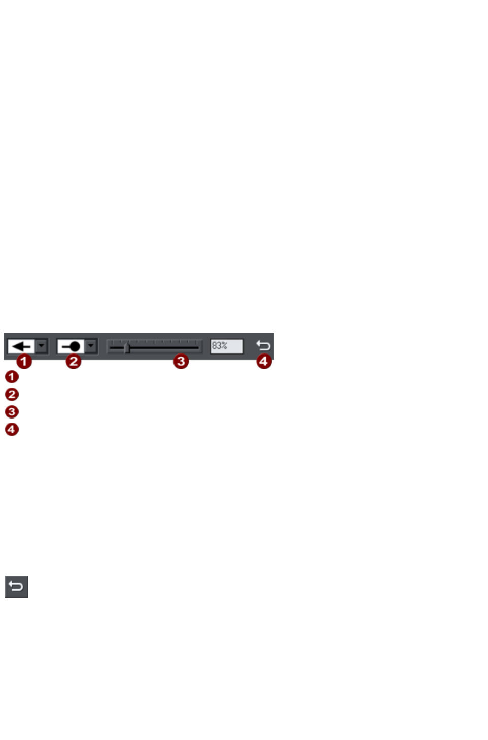
The Straight Line & Arrow tool
This tool makes it easy to draw single segment straight lines and to add arrow heads and tails to any lines
in a way that is much easier and more powerful than doing the same thing with the Line Gallery
.
Why a straight line tool?
Prior to the addition of this simple tool, many users new to Xara Web Designer 7 Premium had great
difficulty doing something as simple as drawing a straight line using the other drawing tools! That's
because the Shape Editor is more geared to drawing multi-segment lines and shapes and the Freehand
Tool
to drawing freehand.
Hence the need for this tool, which makes it obvious how to do something elementary.
Drawing & editing straight lines
Simply click and drag on the page to draw a straight line. You can click on any existing line to select it,
and once selected you can click-drag on either end to move the end of the line around.
Adding arrowheads & tails
The infobar has two dropdown lists on the left which allow you to choose an arrow head or tail style for
each end of the selected line.
Arrow head
Arrow tail
Arrow head/tail size
Reverse path
The slider on the infobar allows you to change the size of the arrow head and tail on the current selected
line. Or you can enter a percentage value into the size text field to the right of the slider.
By default new arrowheads are created with a width of around 6 times that of the line width and that is
taken as the 100% size, as indicated by the size slider. If you make the line wider, the arrowhead width
also updates accordingly. Therefore enter a value less than 100% to reduce the size of the arrowhead
(and tail), or greater than 100% to increase. Although the slider only takes the size value up to a
maximum of 800%, you can enter percentage values larger than this into the size text field.
Reverse path
Press the Reverse path
button on the infobar to switch around the head and tail of the selected
line.
Adding more line segments
Lines created with the Straight Line Tool are of course fully compatible with the other drawing tools.
So if you want to add more segments to a line, make it curved, or perhaps even turn it into a closed
shape, use the Shape Editor Tool
.
Page 469
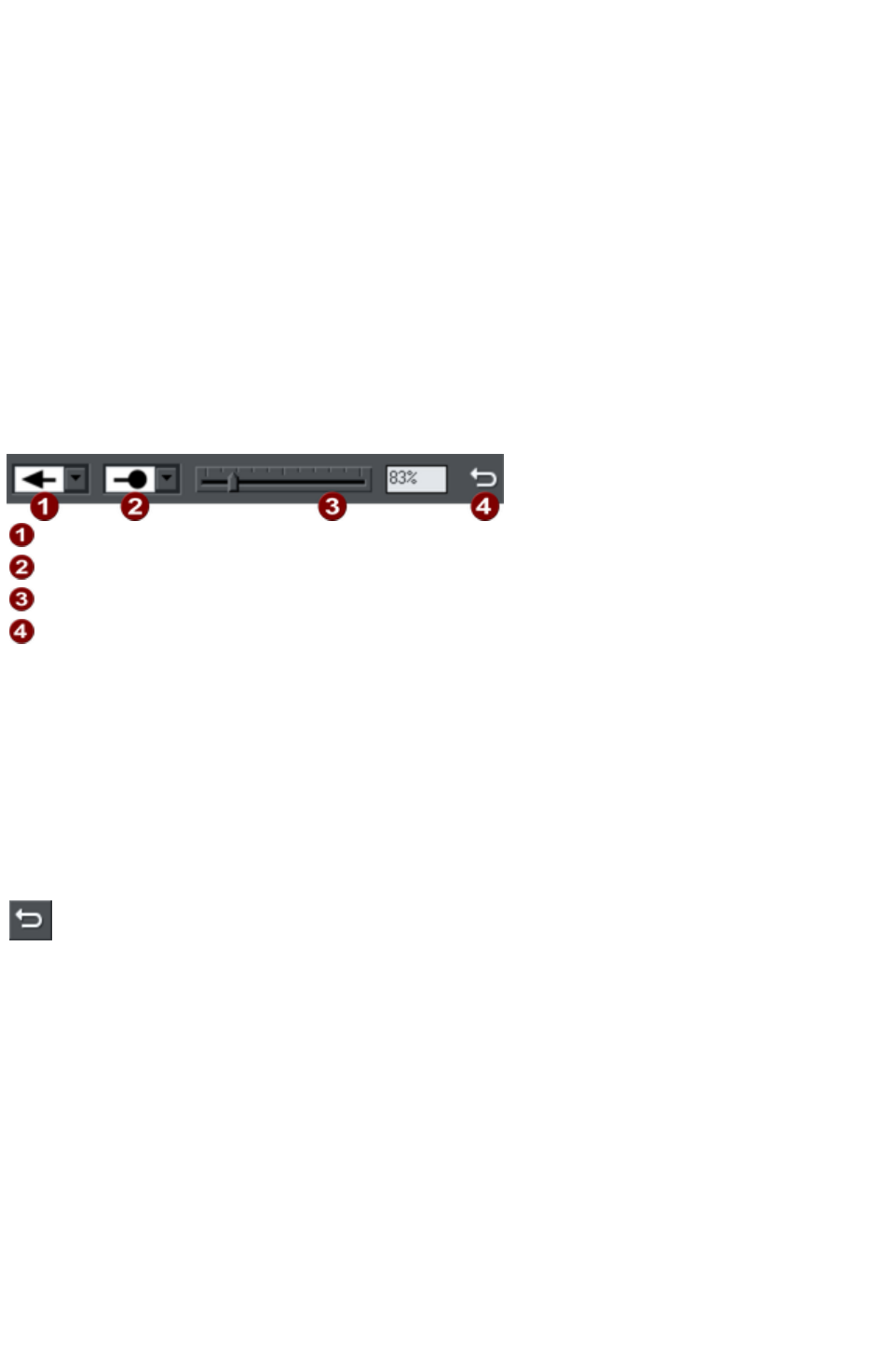
Why a straight line tool?
Prior to the addition of this simple tool, many users new to Xara Web Designer 7 Premium had great
difficulty doing something as simple as drawing a straight line using the other drawing tools! That's
because the Shape Editor is more geared to drawing multi-segment lines and shapes and the Freehand
Tool
to drawing freehand.
Hence the need for this tool, which makes it obvious how to do something elementary.
Drawing & editing straight lines
Simply click and drag on the page to draw a straight line. You can click on any existing line to select it,
and once selected you can click-drag on either end to move the end of the line around.
Adding arrowheads & tails
The infobar has two dropdown lists on the left which allow you to choose an arrow head or tail style for
each end of the selected line.
Arrow head
Arrow tail
Arrow head/tail size
Reverse path
The slider on the infobar allows you to change the size of the arrow head and tail on the current selected
line. Or you can enter a percentage value into the size text field to the right of the slider.
By default new arrowheads are created with a width of around 6 times that of the line width and that is
taken as the 100% size, as indicated by the size slider. If you make the line wider, the arrowhead width
also updates accordingly. Therefore enter a value less than 100% to reduce the size of the arrowhead
(and tail), or greater than 100% to increase. Although the slider only takes the size value up to a
maximum of 800%, you can enter percentage values larger than this into the size text field.
Reverse path
Press the Reverse path
button on the infobar to switch around the head and tail of the selected
line.
Adding more line segments
Lines created with the Straight Line Tool are of course fully compatible with the other drawing tools.
So if you want to add more segments to a line, make it curved, or perhaps even turn it into a closed
shape, use the Shape Editor Tool
.
Page 470
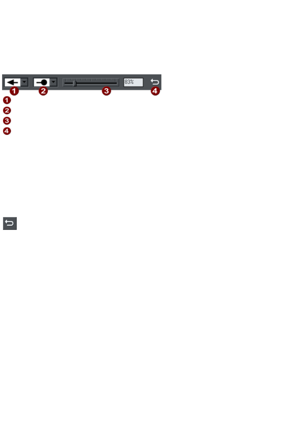
Drawing & editing straight lines
Simply click and drag on the page to draw a straight line. You can click on any existing line to select it,
and once selected you can click-drag on either end to move the end of the line around.
Adding arrowheads & tails
The infobar has two dropdown lists on the left which allow you to choose an arrow head or tail style for
each end of the selected line.
Arrow head
Arrow tail
Arrow head/tail size
Reverse path
The slider on the infobar allows you to change the size of the arrow head and tail on the current selected
line. Or you can enter a percentage value into the size text field to the right of the slider.
By default new arrowheads are created with a width of around 6 times that of the line width and that is
taken as the 100% size, as indicated by the size slider. If you make the line wider, the arrowhead width
also updates accordingly. Therefore enter a value less than 100% to reduce the size of the arrowhead
(and tail), or greater than 100% to increase. Although the slider only takes the size value up to a
maximum of 800%, you can enter percentage values larger than this into the size text field.
Reverse path
Press the Reverse path
button on the infobar to switch around the head and tail of the selected
line.
Adding more line segments
Lines created with the Straight Line Tool are of course fully compatible with the other drawing tools.
So if you want to add more segments to a line, make it curved, or perhaps even turn it into a closed
shape, use the Shape Editor Tool
.
Page 471
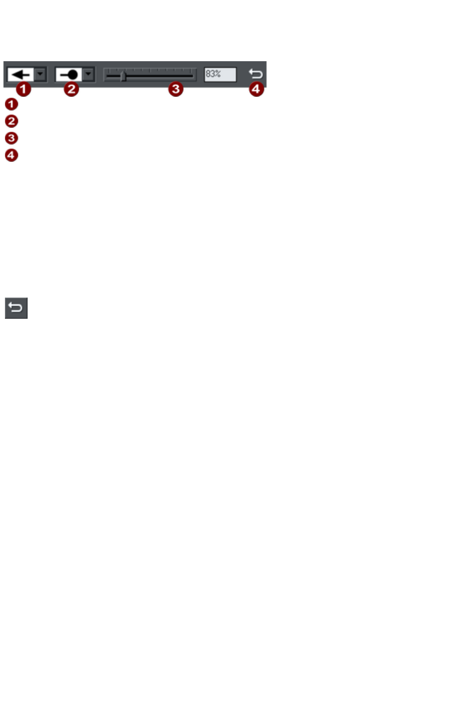
Adding arrowheads & tails
The infobar has two dropdown lists on the left which allow you to choose an arrow head or tail style for
each end of the selected line.
Arrow head
Arrow tail
Arrow head/tail size
Reverse path
The slider on the infobar allows you to change the size of the arrow head and tail on the current selected
line. Or you can enter a percentage value into the size text field to the right of the slider.
By default new arrowheads are created with a width of around 6 times that of the line width and that is
taken as the 100% size, as indicated by the size slider. If you make the line wider, the arrowhead width
also updates accordingly. Therefore enter a value less than 100% to reduce the size of the arrowhead
(and tail), or greater than 100% to increase. Although the slider only takes the size value up to a
maximum of 800%, you can enter percentage values larger than this into the size text field.
Reverse path
Press the Reverse path
button on the infobar to switch around the head and tail of the selected
line.
Adding more line segments
Lines created with the Straight Line Tool are of course fully compatible with the other drawing tools.
So if you want to add more segments to a line, make it curved, or perhaps even turn it into a closed
shape, use the Shape Editor Tool
.
Page 472

Reverse path
Press the Reverse path
button on the infobar to switch around the head and tail of the selected
line.
Adding more line segments
Lines created with the Straight Line Tool are of course fully compatible with the other drawing tools.
So if you want to add more segments to a line, make it curved, or perhaps even turn it into a closed
shape, use the Shape Editor Tool
.
Page 473

Adding more line segments
Lines created with the Straight Line Tool are of course fully compatible with the other drawing tools.
So if you want to add more segments to a line, make it curved, or perhaps even turn it into a closed
shape, use the Shape Editor Tool
.
Page 474
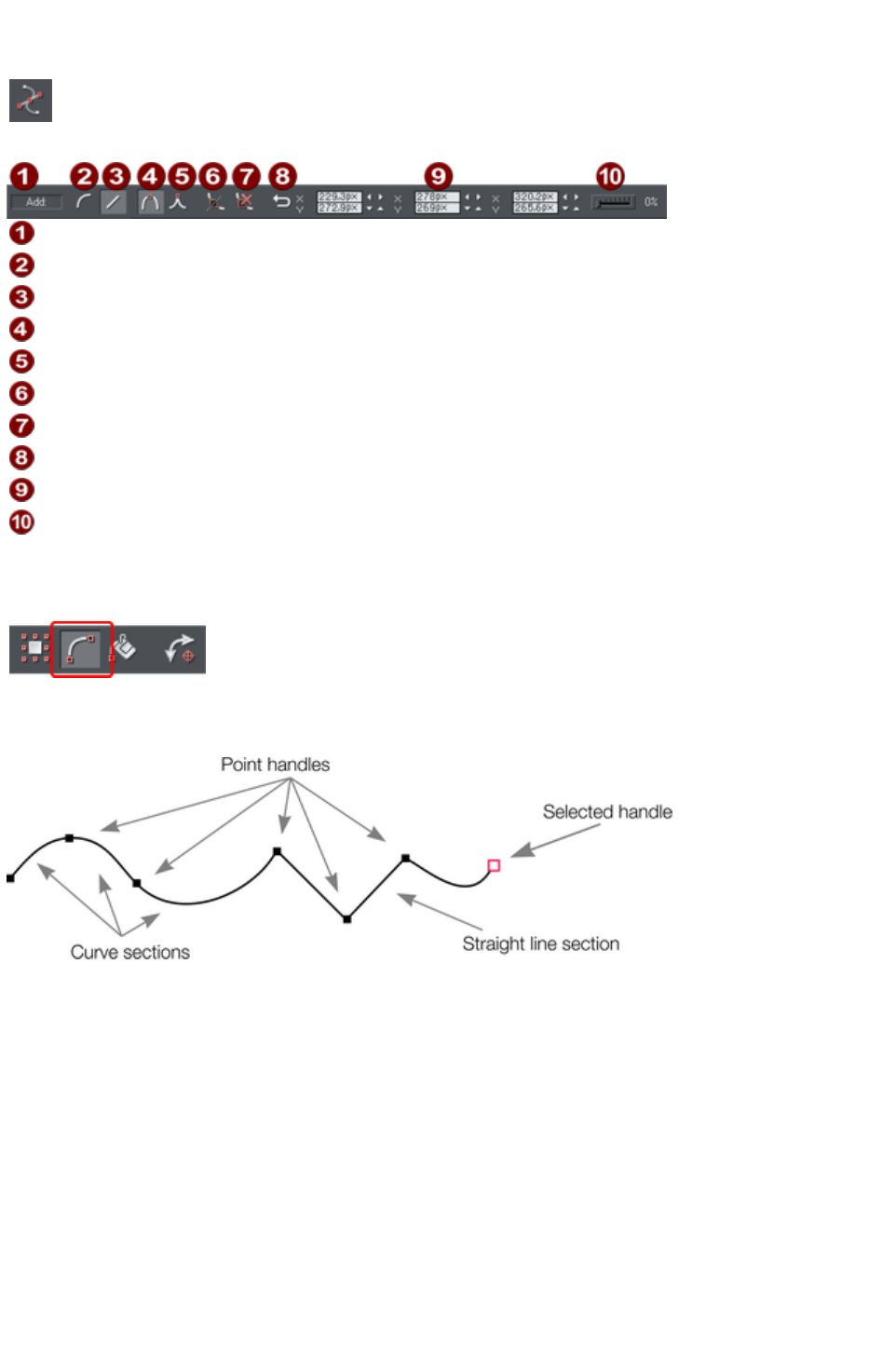
The Shape Editor tool
The Shape Editor Tool
is the main tool used for both creating precise curves, lines, and
shapes, as well as editing or altering lines and shapes.
Add/Change/Edit Indicator
Make curve
Make line
Smooth join
Sharp join
Break at points
Delete points
Reverse paths
Positions of handles
Smoothing
The InfoBar, shown above, provides a wide range of controls as well as precise numeric control.
All lines and shapes in Xara Web Designer 7 Premium are made from a sequence of curve and line
sections. Curves are sometimes called "Bézier" curves after the mathematician who first described them.
Although this section describes the Shape Editor
Tool, you can also edit lines and shapes using the
Selector Tool if you have the Show edit object
handles button selected on the Selector Tool
InfoBar.
The sections or segments of a line are marked by small black point handles. You can drag, add and
delete these handles to manipulate the shape of the line or outline.
Some objects such as quickshapes, rectangles, ellipses, and text have to be converted into editable
shapes before you can use the Shape Editor Tool on them. To do this, select an object and choose "
Arrange" > "Combine shapes" > "Add shape
".
To draw a straight line segment
Using the Shape editor
Tool, start a straight line:
1. Click where you want to start the line. You can start a line at either end; you don't have to work
left to right, or top-to-bottom. This creates a point handle, and is displayed as a red square to
indicate that it is the selected handle.
2. If necessary select the Make line button on the InfoBar ("L"). This ensures the next click will
Page 475
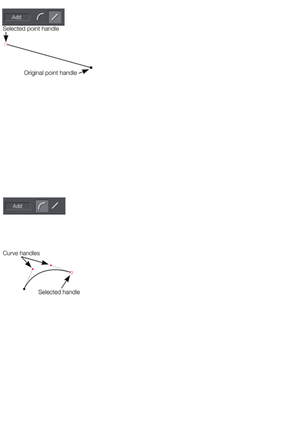
draw a straight line segment.
Either click where you want the next
point handle to be, or click and drag,
and then release the mouse button
when the line is correct. This creates a
line segment and selects the new end
point handle.
Mixing curved and straight lines
To create an object which is a mixture of straight and curved segments, just switch between the Make
Curve and Make Line
buttons as you create the object (you can also press "L" or "C" on the keyboard.)
Note: You can also use the keyboard shortcut "X" to create a Cusp Join or "S" to create a Smooth Join
while using the Shape Editor Tool
. These affect the way two line segments come together. A Cusp Join creates 2 independent Bezier
control handles that you can edit separately. With a cusp join, you can create a sharp angle. A Smooth
Join creates a symmetrical join that works like a see saw. If you drag one Bezier control handle down,
the opposing control handle goes up.
To draw a curved line segment:
This is similar to starting a straight line (described
above).
1. Click where you want to start the line.
2. If necessary select the Make curve button (shortcut "C".)
3. Either click or drag (as described for straight lines) to create a second point handle, and a curve
segment will be added to the line.
A curve segment has Curve handles
associated with the selected point handle. You
can drag these to adjust the angle and radius of
the curve.
Page 476
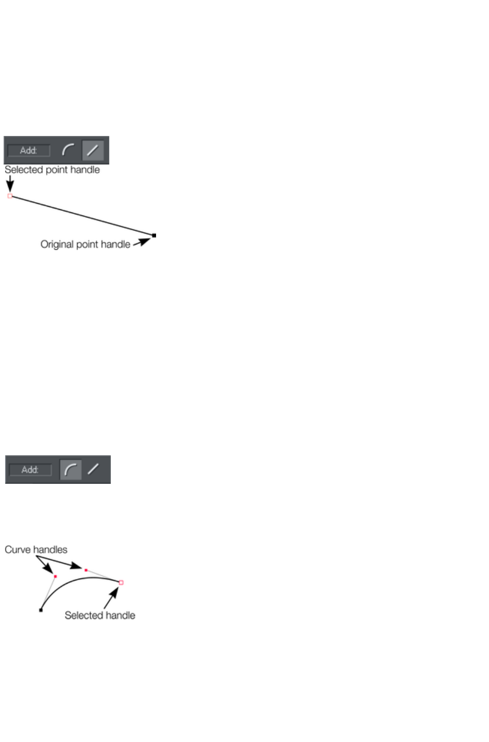
To draw a straight line segment
Using the Shape editor
Tool, start a straight line:
1. Click where you want to start the line. You can start a line at either end; you don't have to work
left to right, or top-to-bottom. This creates a point handle, and is displayed as a red square to
indicate that it is the selected handle.
2. If necessary select the Make line button on the InfoBar ("L"). This ensures the next click will
draw a straight line segment.
Either click where you want the next
point handle to be, or click and drag,
and then release the mouse button
when the line is correct. This creates a
line segment and selects the new end
point handle.
Mixing curved and straight lines
To create an object which is a mixture of straight and curved segments, just switch between the Make
Curve and Make Line
buttons as you create the object (you can also press "L" or "C" on the keyboard.)
Note: You can also use the keyboard shortcut "X" to create a Cusp Join or "S" to create a Smooth Join
while using the Shape Editor Tool
. These affect the way two line segments come together. A Cusp Join creates 2 independent Bezier
control handles that you can edit separately. With a cusp join, you can create a sharp angle. A Smooth
Join creates a symmetrical join that works like a see saw. If you drag one Bezier control handle down,
the opposing control handle goes up.
To draw a curved line segment:
This is similar to starting a straight line (described
above).
1. Click where you want to start the line.
2. If necessary select the Make curve button (shortcut "C".)
3. Either click or drag (as described for straight lines) to create a second point handle, and a curve
segment will be added to the line.
A curve segment has Curve handles
associated with the selected point handle. You
can drag these to adjust the angle and radius of
the curve.
Page 477
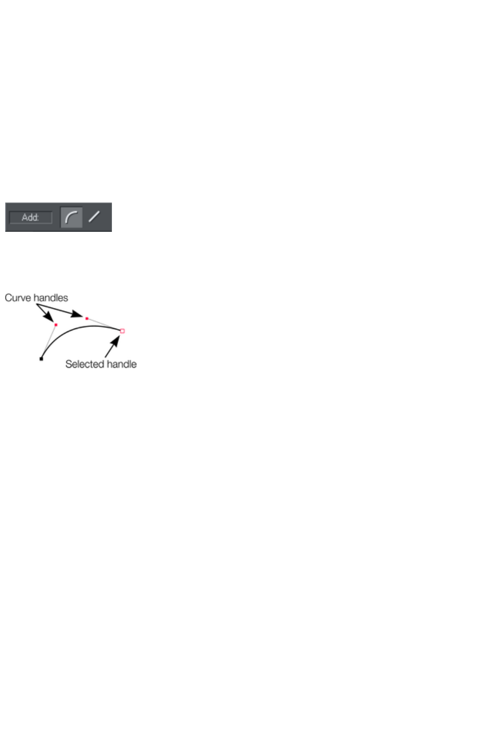
Mixing curved and straight lines
To create an object which is a mixture of straight and curved segments, just switch between the Make
Curve and Make Line
buttons as you create the object (you can also press "L" or "C" on the keyboard.)
Note: You can also use the keyboard shortcut "X" to create a Cusp Join or "S" to create a Smooth Join
while using the Shape Editor Tool
. These affect the way two line segments come together. A Cusp Join creates 2 independent Bezier
control handles that you can edit separately. With a cusp join, you can create a sharp angle. A Smooth
Join creates a symmetrical join that works like a see saw. If you drag one Bezier control handle down,
the opposing control handle goes up.
To draw a curved line segment:
This is similar to starting a straight line (described
above).
1. Click where you want to start the line.
2. If necessary select the Make curve button (shortcut "C".)
3. Either click or drag (as described for straight lines) to create a second point handle, and a curve
segment will be added to the line.
A curve segment has Curve handles
associated with the selected point handle. You
can drag these to adjust the angle and radius of
the curve.
Page 478
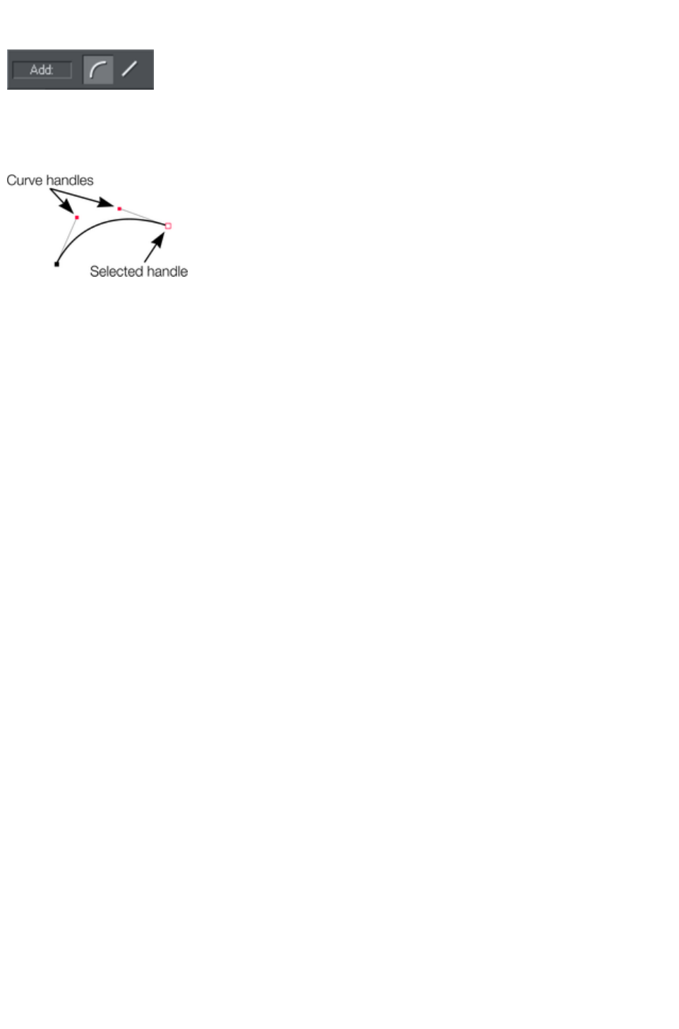
To draw a curved line segment:
This is similar to starting a straight line (described
above).
1. Click where you want to start the line.
2. If necessary select the Make curve button (shortcut "C".)
3. Either click or drag (as described for straight lines) to create a second point handle, and a curve
segment will be added to the line.
A curve segment has Curve handles
associated with the selected point handle. You
can drag these to adjust the angle and radius of
the curve.
Page 479

Extending the line
Make sure an end point handle is the selected handle (red outline) and then just click again to add a new
line or curve section. Each successive click places a new point handle and draws a new line segment to
the selected point handle.
Page 480

Finishing the line
?+ click completes the line (keeps it selected), or press "Esc" to finish the line and de-select it. After this,
additional clicks will start a new line.
Page 481
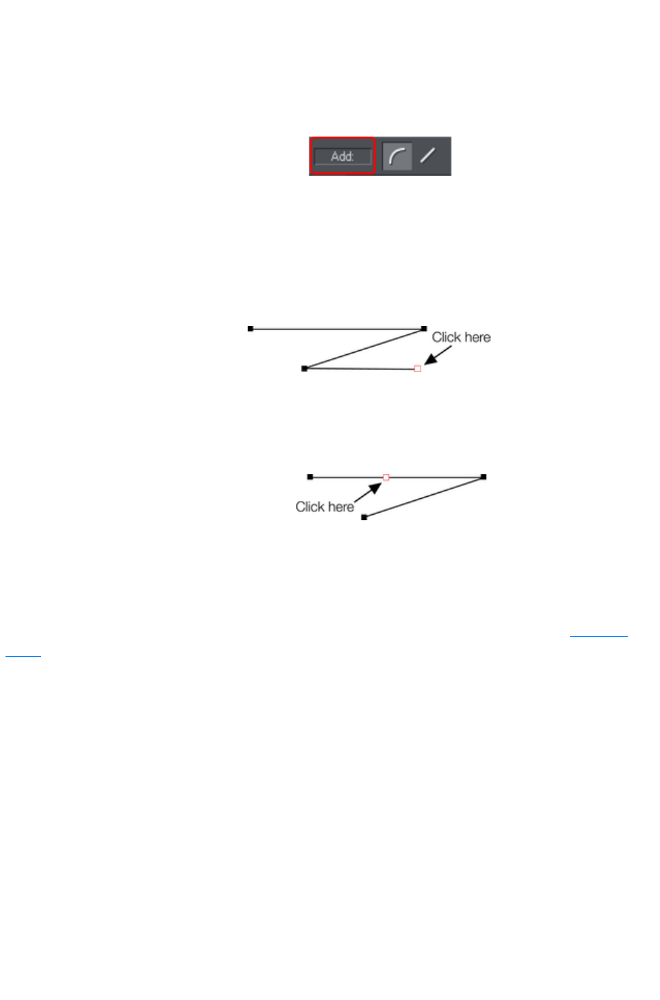
Adding a new point handle
The Shape Editor Tool
has three modes, depending on whether no point handles are selected (a click will start a new line), an
end handle is selected (a click will add a new section), or one or more other point handles are selected
(you can drag or change the handles).
The InfoBar shows the current mode.
New: Click to start a new line,
Add: Click to extend the line,
Change: Drag or delete point handles to change.
This applies to the Shape Editor Tool
only.
To the end of a line:
Make sure the line is selected, then:
1. If necessary, click on the end
point to select it.
2. Position the pointer and click
to add a new section.
To the middle of a line:
Make sure the line is selected, then;
1. Click on the line to add a new point
handle into the line
2. Drag the point handle to the required
position.
To the start of a line:
If the end point is selected, clicking on the start point closes the shape (this is described in "Closing a
shape
"). To add a new control handle to the start of a line:
1. Finish the line using "Shift + click".
2. Click on the start handle.
3. Position the pointer and click.
Page 482
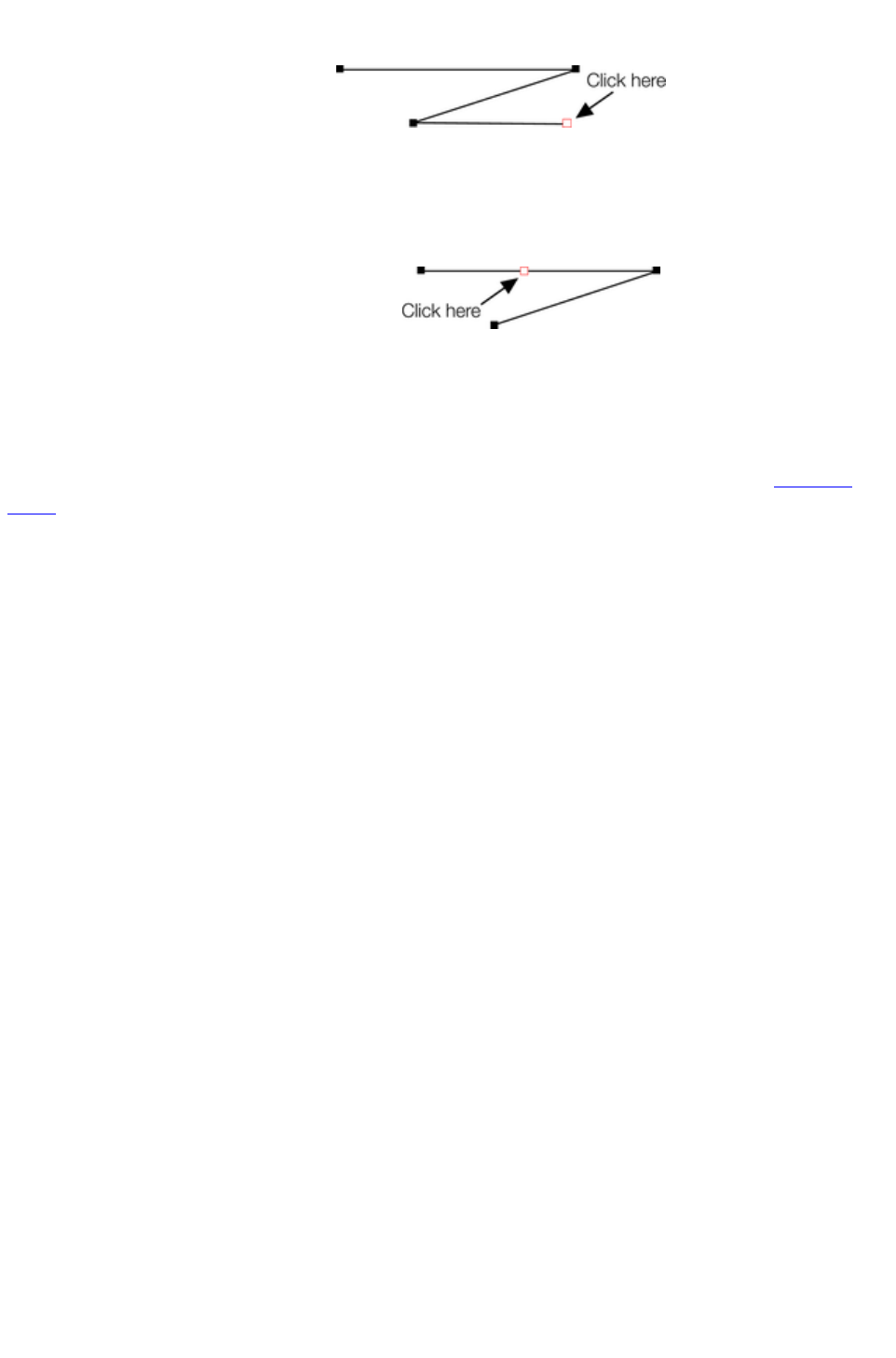
To the end of a line:
Make sure the line is selected, then:
1. If necessary, click on the end
point to select it.
2. Position the pointer and click
to add a new section.
To the middle of a line:
Make sure the line is selected, then;
1. Click on the line to add a new point
handle into the line
2. Drag the point handle to the required
position.
To the start of a line:
If the end point is selected, clicking on the start point closes the shape (this is described in "Closing a
shape
"). To add a new control handle to the start of a line:
1. Finish the line using "Shift + click".
2. Click on the start handle.
3. Position the pointer and click.
Page 483
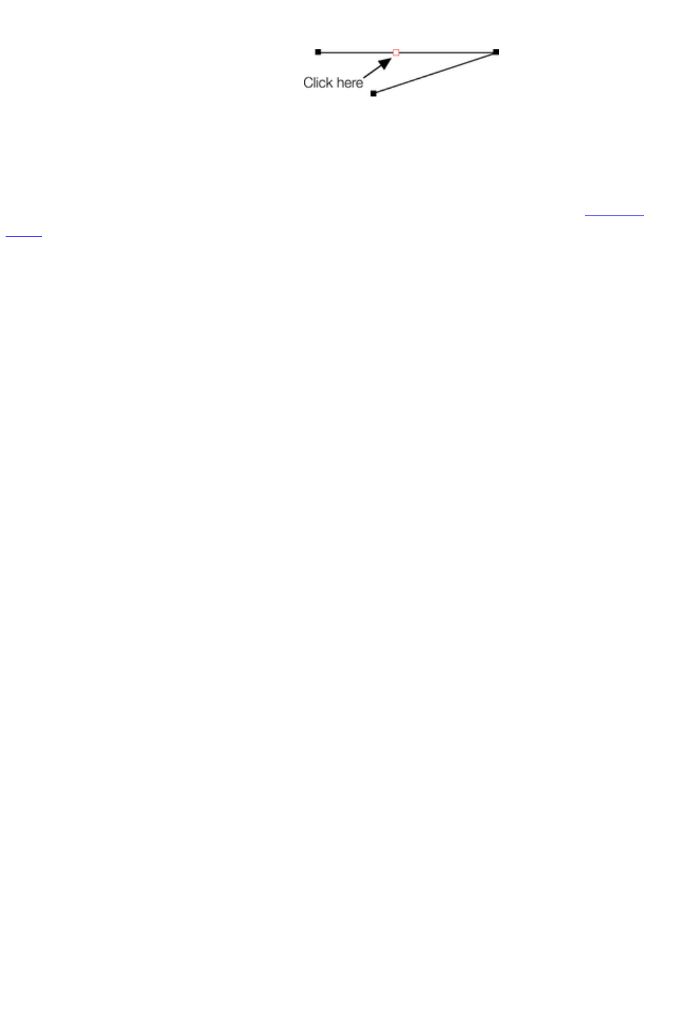
To the middle of a line:
Make sure the line is selected, then;
1. Click on the line to add a new point
handle into the line
2. Drag the point handle to the required
position.
To the start of a line:
If the end point is selected, clicking on the start point closes the shape (this is described in "Closing a
shape
"). To add a new control handle to the start of a line:
1. Finish the line using "Shift + click".
2. Click on the start handle.
3. Position the pointer and click.
Page 484

To the start of a line:
If the end point is selected, clicking on the start point closes the shape (this is described in "Closing a
shape
"). To add a new control handle to the start of a line:
1. Finish the line using "Shift + click".
2. Click on the start handle.
3. Position the pointer and click.
Page 485

Selecting multiple point handles
You may want to select several point handles to delete them, move them as a group, or change a region
of points to curved or straight lines. To do this:
1. Select one point handle in the normal way by clicking on it.
2. "Shift + click" the other point handles to select them ("Shift + click" also deselects.)
oOr "Ctrl + Shift + click" on a point handle to select all point handles on the line.
oOr drag the mouse pointer diagonally to create a selection rectangle. All point handles in the
rectangle are selected.
oOr "Shift + drag" diagonally to create a selection rectangle. This adds all points within the
rectangle to those already selected.
3. If the line has one or more selected point handles:
oEnd moves the selection to the end of the line.
oHome moves the selection to the start of the line.
oTab moves the selection to the next point handle towards the end.
o"Shift + Tab" moves the selection to the next point handle towards the start.
The start and end points are significant when applying arrows
.
Page 486

Deleting points
Select the point handle(s) as described above and either click
the Delete points button (Shape Editor Tool
InfoBar), or press "Del".
Page 487
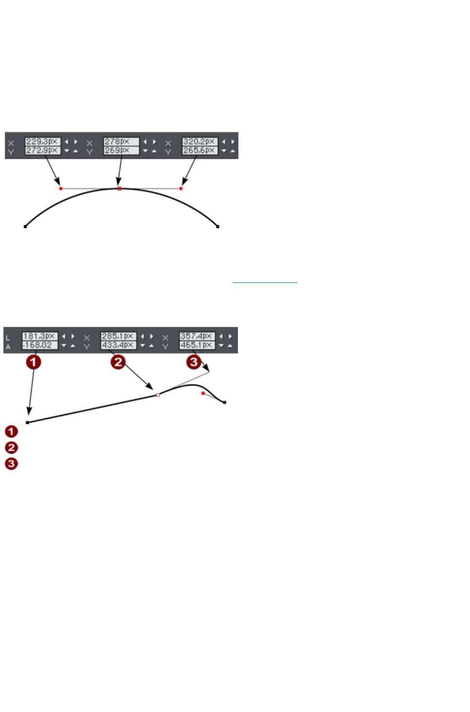
Moving point handles—Shape Editor Tool
You can move one or more selected handles:
Drag the handles using the mouse.
Or use the arrow keys on the keyboard.
Or to move a single handle, type new values into the text boxes on the InfoBar (see below).
Using the text boxes on the InfoBar
The center pair of text
boxes always shows the
X/Y co-ordinates of the
selected point.
The surrounding X/Y fields show the co-ordinates of the curve handles on either side of the selected
point.
X/Y co-ordinates are relative to the bottom left corner of the page by default for print document and top
left for web documents. You can change this in the "Grid and ruler"
tab in the options dialog.
If the selected point is on the end of a straight line section, the left fields show the length and angle of the
line. You can adjust either by entering a new value and pressing return.
Length and angle for straight line
Position of selected point
Position of curve handle
Page 488
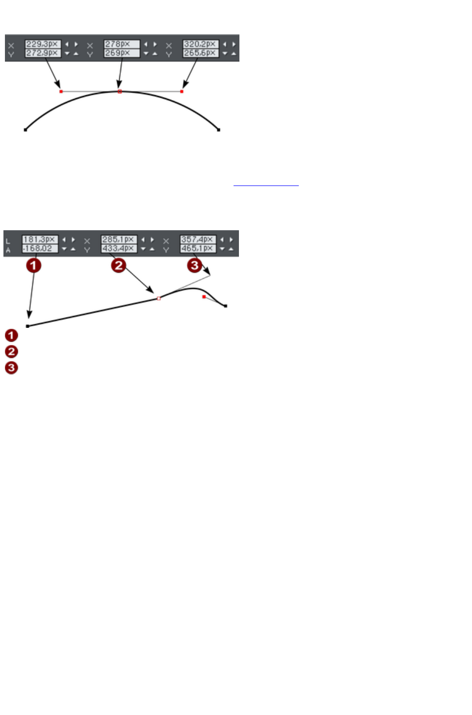
Using the text boxes on the InfoBar
The center pair of text
boxes always shows the
X/Y co-ordinates of the
selected point.
The surrounding X/Y fields show the co-ordinates of the curve handles on either side of the selected
point.
X/Y co-ordinates are relative to the bottom left corner of the page by default for print document and top
left for web documents. You can change this in the "Grid and ruler"
tab in the options dialog.
If the selected point is on the end of a straight line section, the left fields show the length and angle of the
line. You can adjust either by entering a new value and pressing return.
Length and angle for straight line
Position of selected point
Position of curve handle
Page 489
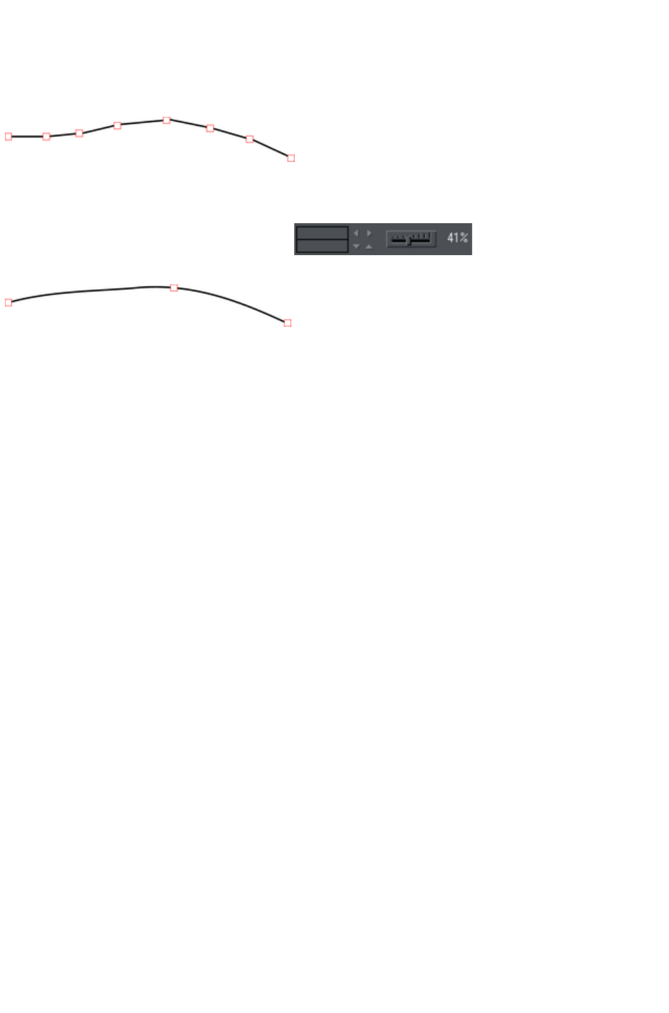
Smoothing a line
Imported shapes or shapes from tracers may have unnecessary points on a line. Lines with too many
points can be unwieldy and can slow down rendering. Xara Web Designer 7 Premium can smooth the
line to remove unnecessary points.
Select all the points on the part of the line you want to smooth (see above). Drag selecting around the
region in the Shape Editor Tool
is probably the easiest way to select a large number of points.
Drag the smoothing slider on the end of the
Shape Editor
InfoBar.
Removed points are remembered so you can make further changes to the smoothing of the line by
adjusting the slider. Removed points are discarded when you make further edits to the line by dragging a
handle (for example).
Tip
: to make sure important points are not deleted, make sure they are not selected ("Shift+ click" on a
selected point deselects it).
Page 490
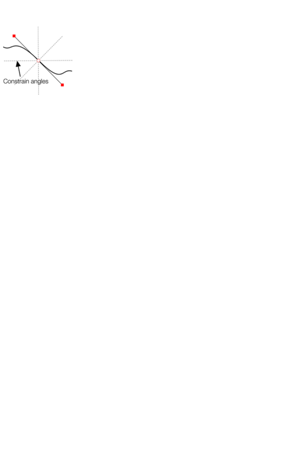
Constraining the line
When dragging a point handle, holding down the
constrain key ("Ctrl") will constrain the movement
to multiples of the constrain angle (controlled from
the options dialog, general
tab). When dragging a curve handle the angle is
constrained.
Page 491
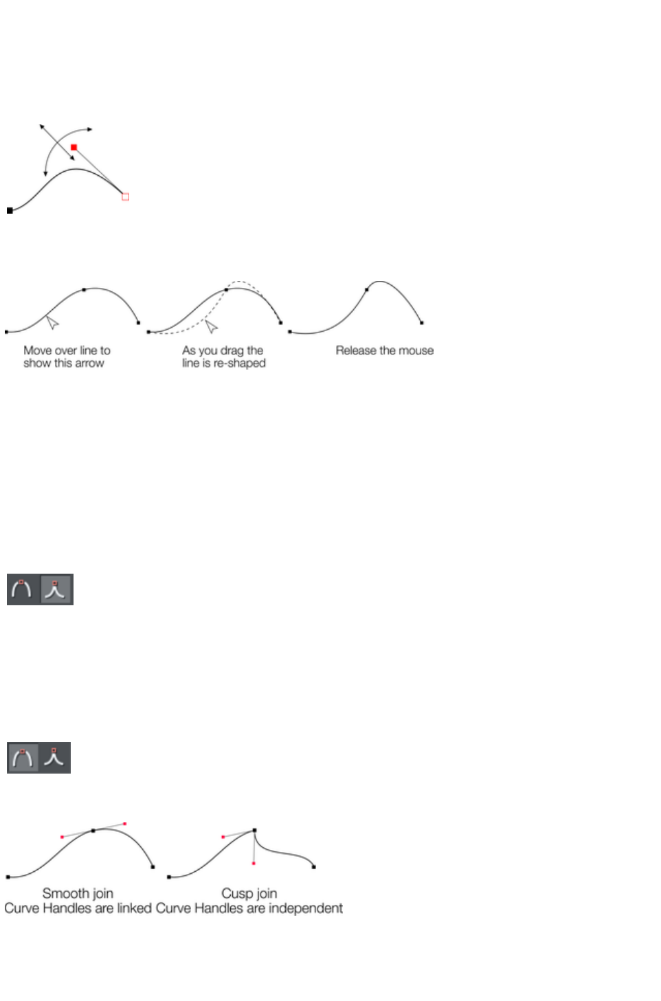
Changing curves
Using the curve handle
Dragging the curve handle will adjust the curvature of the adjoining curve segments.
Move the curve handle towards or away from the
point handle to pull the curve in the required
direction.
Dragging the line segment
You can also change the curve by dragging the line segment between points.
Notice the difference between dragging the line to change its shape, and clicking on the line to add a new
point handle. Dragging a straight line segment changes it to a curved line segment.
Making sharp corners
Normally, Xara Web Designer 7 Premium draws a smooth curve through a point handle. For this, the
two curve handles either side of a point handle are linked. Moving either curve handle also moves the
other.
Sometimes you will want a sharp corner, and to achieve this, you need to unlink the curve handles:
1. Double click the point handle,
2. Or select the point handle and either:
Click the Cusp join
button, or press "Z".
You can now move each curve handle independently.
Making smooth curves
To convert a sharp join into a smooth curve:
1. Double click the point handle,
2. Or select the point handle and either:
Click the Smooth join
button, or "S".
The two curve handles become linked and move to opposite sides of the point handle. This may change
the shape of the curve.
Balancing curves
Balancing makes the two curve handles the same distance from the point handle, which gives smoother,
more symmetrical curves. To balance a curve, select the point handle, then drag one of the curve handles
Page 492

with "Shift" held down. As you drag one curve handle the other one will move to be exactly opposite it
and the same distance from the point handle.
Page 493
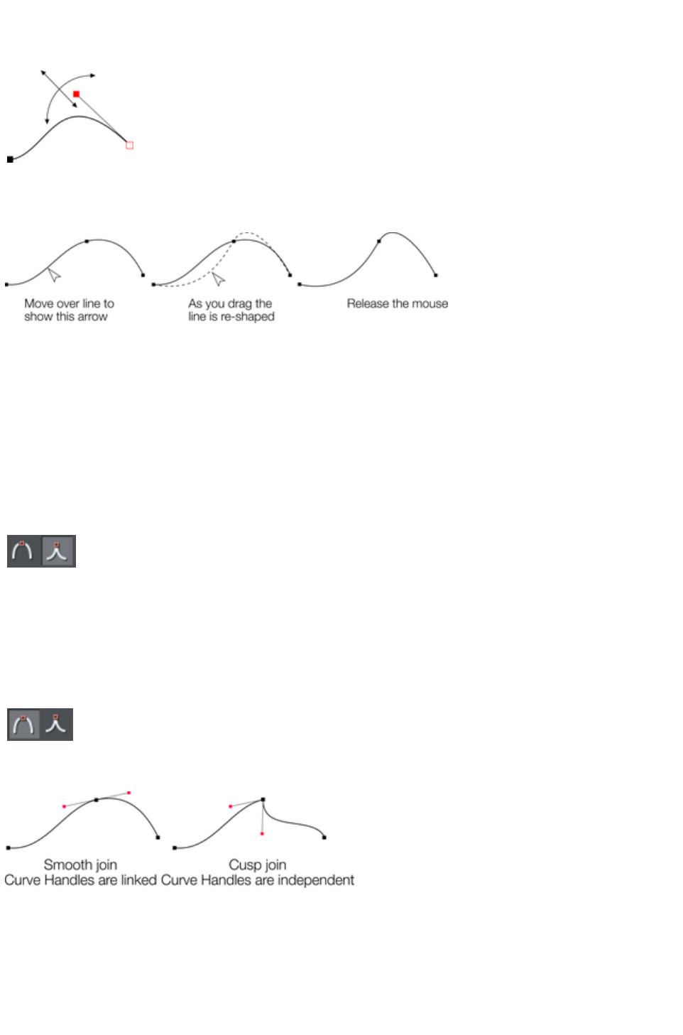
Using the curve handle
Dragging the curve handle will adjust the curvature of the adjoining curve segments.
Move the curve handle towards or away from the
point handle to pull the curve in the required
direction.
Dragging the line segment
You can also change the curve by dragging the line segment between points.
Notice the difference between dragging the line to change its shape, and clicking on the line to add a new
point handle. Dragging a straight line segment changes it to a curved line segment.
Making sharp corners
Normally, Xara Web Designer 7 Premium draws a smooth curve through a point handle. For this, the
two curve handles either side of a point handle are linked. Moving either curve handle also moves the
other.
Sometimes you will want a sharp corner, and to achieve this, you need to unlink the curve handles:
1. Double click the point handle,
2. Or select the point handle and either:
Click the Cusp join
button, or press "Z".
You can now move each curve handle independently.
Making smooth curves
To convert a sharp join into a smooth curve:
1. Double click the point handle,
2. Or select the point handle and either:
Click the Smooth join
button, or "S".
The two curve handles become linked and move to opposite sides of the point handle. This may change
the shape of the curve.
Balancing curves
Balancing makes the two curve handles the same distance from the point handle, which gives smoother,
more symmetrical curves. To balance a curve, select the point handle, then drag one of the curve handles
with "Shift" held down. As you drag one curve handle the other one will move to be exactly opposite it
and the same distance from the point handle.
Page 494
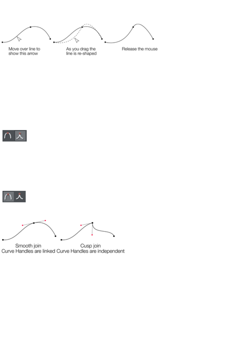
Dragging the line segment
You can also change the curve by dragging the line segment between points.
Notice the difference between dragging the line to change its shape, and clicking on the line to add a new
point handle. Dragging a straight line segment changes it to a curved line segment.
Making sharp corners
Normally, Xara Web Designer 7 Premium draws a smooth curve through a point handle. For this, the
two curve handles either side of a point handle are linked. Moving either curve handle also moves the
other.
Sometimes you will want a sharp corner, and to achieve this, you need to unlink the curve handles:
1. Double click the point handle,
2. Or select the point handle and either:
Click the Cusp join
button, or press "Z".
You can now move each curve handle independently.
Making smooth curves
To convert a sharp join into a smooth curve:
1. Double click the point handle,
2. Or select the point handle and either:
Click the Smooth join
button, or "S".
The two curve handles become linked and move to opposite sides of the point handle. This may change
the shape of the curve.
Balancing curves
Balancing makes the two curve handles the same distance from the point handle, which gives smoother,
more symmetrical curves. To balance a curve, select the point handle, then drag one of the curve handles
with "Shift" held down. As you drag one curve handle the other one will move to be exactly opposite it
and the same distance from the point handle.
Page 495
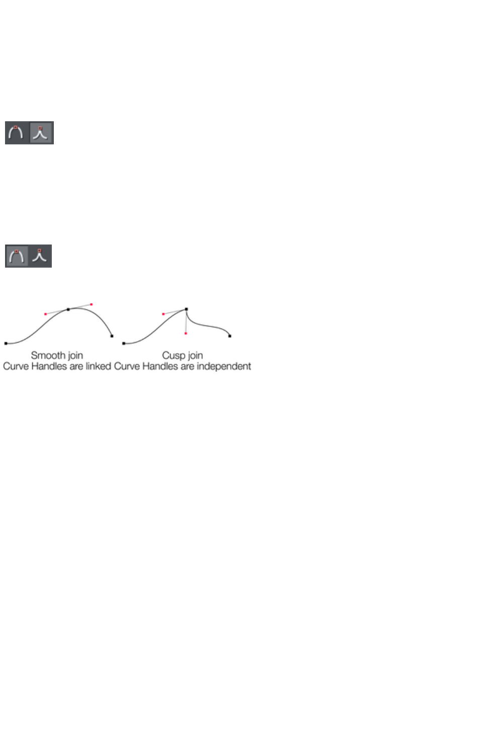
Making sharp corners
Normally, Xara Web Designer 7 Premium draws a smooth curve through a point handle. For this, the
two curve handles either side of a point handle are linked. Moving either curve handle also moves the
other.
Sometimes you will want a sharp corner, and to achieve this, you need to unlink the curve handles:
1. Double click the point handle,
2. Or select the point handle and either:
Click the Cusp join
button, or press "Z".
You can now move each curve handle independently.
Making smooth curves
To convert a sharp join into a smooth curve:
1. Double click the point handle,
2. Or select the point handle and either:
Click the Smooth join
button, or "S".
The two curve handles become linked and move to opposite sides of the point handle. This may change
the shape of the curve.
Balancing curves
Balancing makes the two curve handles the same distance from the point handle, which gives smoother,
more symmetrical curves. To balance a curve, select the point handle, then drag one of the curve handles
with "Shift" held down. As you drag one curve handle the other one will move to be exactly opposite it
and the same distance from the point handle.
Page 496
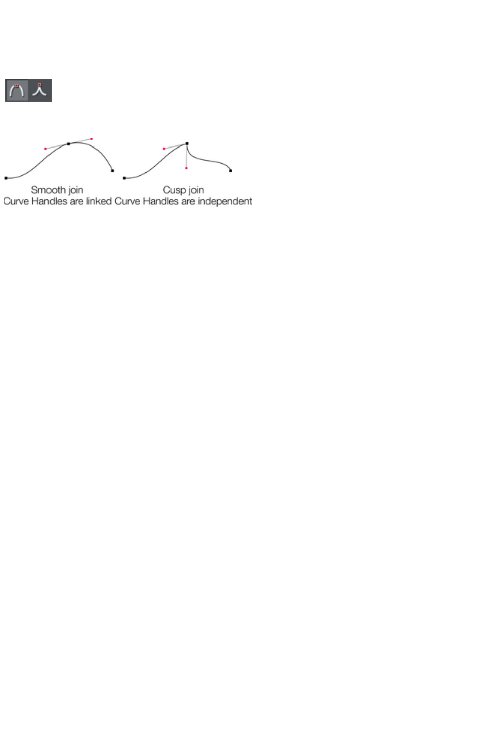
Making smooth curves
To convert a sharp join into a smooth curve:
1. Double click the point handle,
2. Or select the point handle and either:
Click the Smooth join
button, or "S".
The two curve handles become linked and move to opposite sides of the point handle. This may change
the shape of the curve.
Balancing curves
Balancing makes the two curve handles the same distance from the point handle, which gives smoother,
more symmetrical curves. To balance a curve, select the point handle, then drag one of the curve handles
with "Shift" held down. As you drag one curve handle the other one will move to be exactly opposite it
and the same distance from the point handle.
Page 497

Balancing curves
Balancing makes the two curve handles the same distance from the point handle, which gives smoother,
more symmetrical curves. To balance a curve, select the point handle, then drag one of the curve handles
with "Shift" held down. As you drag one curve handle the other one will move to be exactly opposite it
and the same distance from the point handle.
Page 498
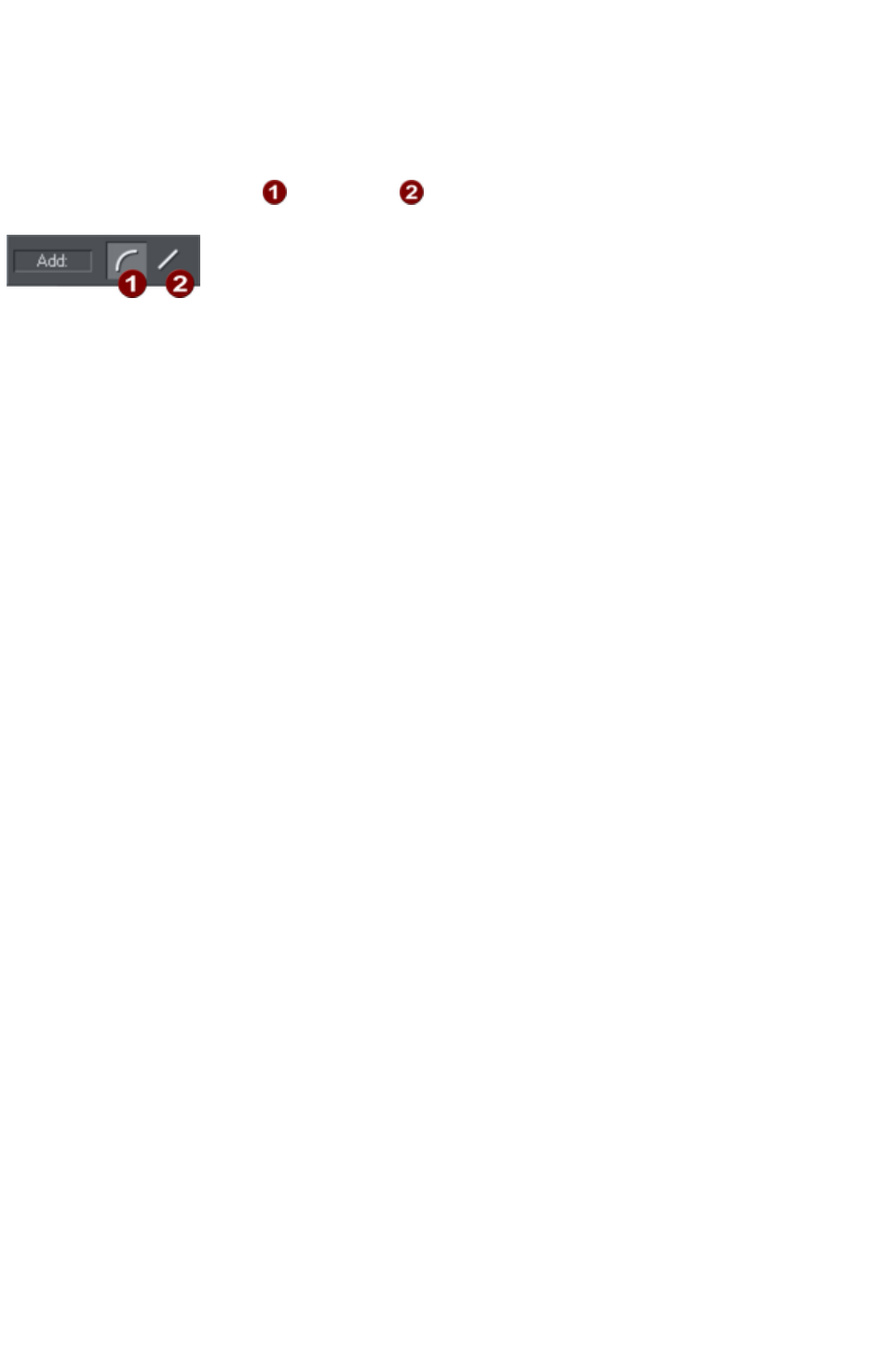
Changing a straight line to a curve (and vice
versa)
1. Select the point handles at both ends of a line segment. For several line segments select all
bordering point handles.
2. Click the Make curve or Make line button on the InfoBar, or press "L" or "C" (these
shortcuts only work in the Shape Editor Tool).
After changing the line type, you may need to move the curve handles for a smooth transition between
curved and straight line segments.
You can select several line segments and convert them all. The point handles at both ends of the segment
must be selected.
Page 499
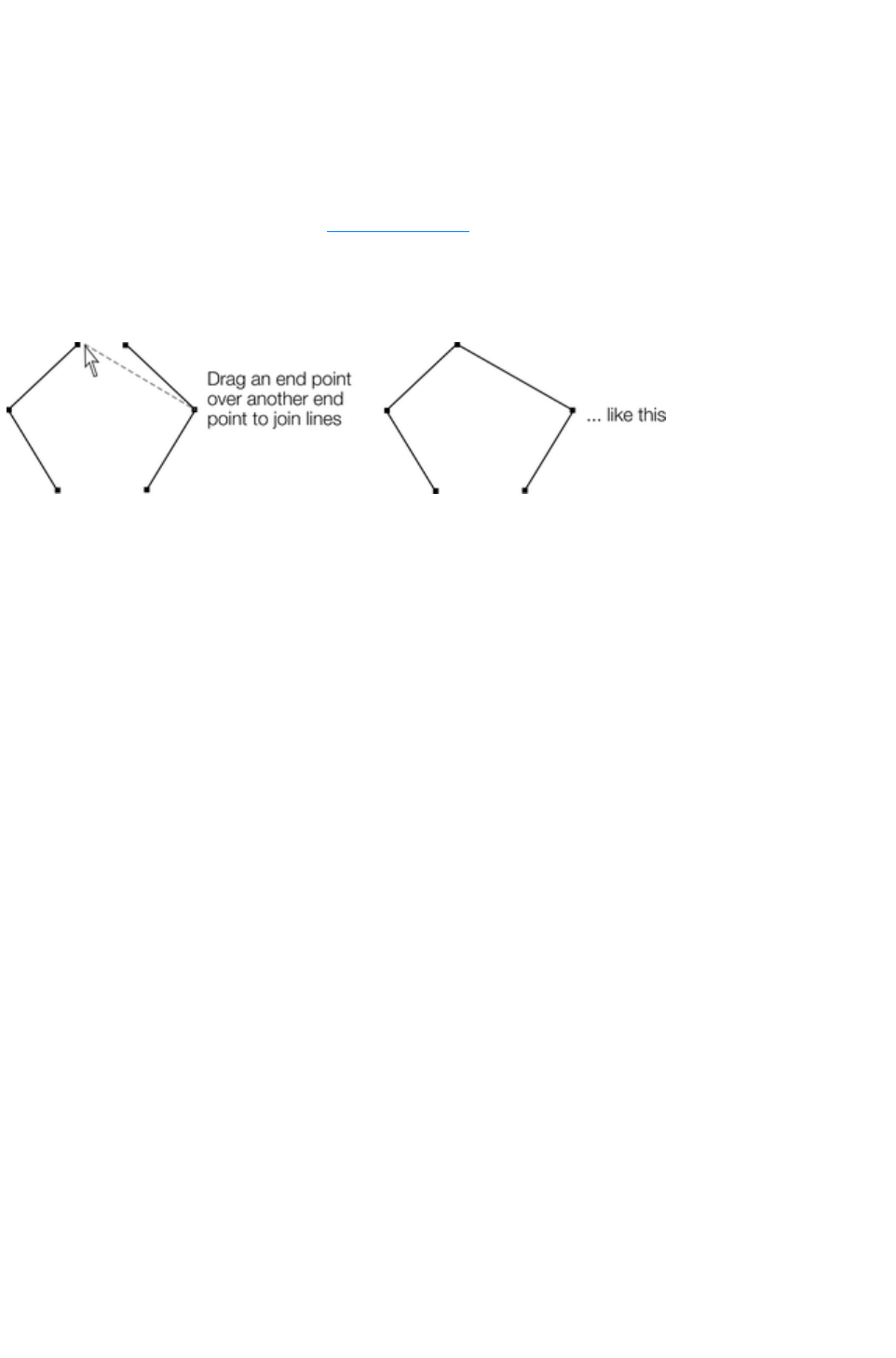
Joining lines
You can only join lines if both are selected (the point handles are shown on both lines):
Using the Selector Tool, hold down "?" and click on the lines to select them (if you are already in the
Shape Editor Tool, you can press "Alt + S" to temporarily go into the Selector Tool, "?+ click" to
select the second line, then "Alt + S" again to return to the Shape Editor Tool
).
Selecting objects is described fully in "Selecting objects
".
Once both objects are selected, in the Shape Editor Tool, drag the end handle of one line over the end
of the other line. As you drag the mouse pointer will show a +
symbol to indicate that the lines will be joined..
If the ends of the two lines are already very close to each other (but not joined), then you can either
zoom in or drag the end point away, and then back again so it's over the end point, and you see the +
sign to indicate a join will occur.
To create a filled shape, drag the other two end handles together. Because you join the end handles, you
can only join lines and not shapes. Shapes are closed objects and so have no end handles.
Page 500
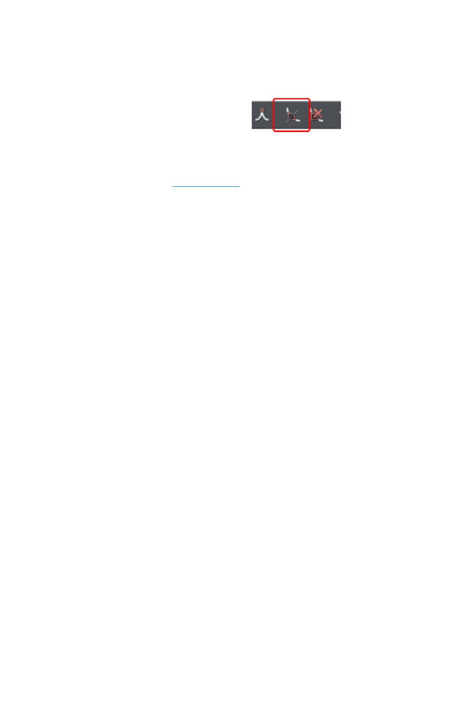
Splitting a shape
If you want to split (break) a line or shape: Either select an existing point handle on the line or outline of
the shape, or create a new one where you want to break the line. Just click on the line in the Shape
Editor Tool
(see above).
Click on the Break at points
button, or press "B".
If you split a line, there is no visible change. However, if you move the point handle, then only part of the
line moves. If you split a shape, it changes to being a line. Any fill disappears.
Note: "Slice shapes" (part of "Arrange" > "Combine shapes") also lets you split shapes into two
separate shapes. This is described in "Shape handling
".
Page 501

Changing the line width (thickness)
To change the line thickness or the outline thickness of a shape, first select the object or objects:
Type a new line width into the text box on the standard
control bar or choose the default line thickness from the menu.
Line thickness is traditionally measured in points, abbreviated to pt. 1 point is 1/72nd
of an inch (about 0.3mm), which is slightly less than the thickness of one screen pixel when viewed at
100% zoom.
You can use any of Web Designer Premium's standard measurement units.
You can enter the thickness value in any unit, and Xara Web Designer 7 Premium will convert it to the
correct number of Points. E.g. you can enter 0.5cm, and you will get a line half a centimeter thick, but it
will show just over 14pt in the line width field.
If you have no object selected and you change the line thickness value, this changes the default for all
new lines.
Note
: A zero width line is a special case, and should not normally be used. This draws a line one device-pixel
wide. The actual size will therefore depend on the device the drawing is displayed on. On a monitor
screen one pixel is clearly visible and is never shown anti-aliased. On devices such as printers and
particularly on image setters, which have a much higher resolution, the line is almost invisible (zero width
lines in imported files are converted to 0.25pt).
Page 502
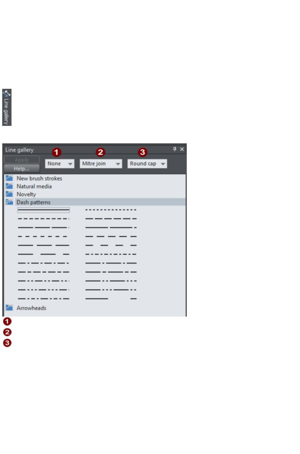
Line Gallery
The Line Gallery
can be used to apply a range of line styles or attributes, such as brush strokes, dash patterns, arrow
heads, and more.
To display the Line Gallery
:
Choose "Utilities" > "Line Gallery"
Or click the Line Gallery tab on the Galleries tab.
The Line Gallery
is split into sections. To open or close any section, click on the small folder icon in the gallery window.
Line Width
Join type
Line cap
To apply any line style or attribute from the gallery you can:
Drag and drop the required style from the gallery onto the shape or line.
Or double click on the required style in the gallery.
Or select the style and then click the Apply button.
Line width
The text box at the top of the gallery duplicates that on the standard control bar.
Brush strokes
There are several sections that show a selection of various brush styles.
Page 503
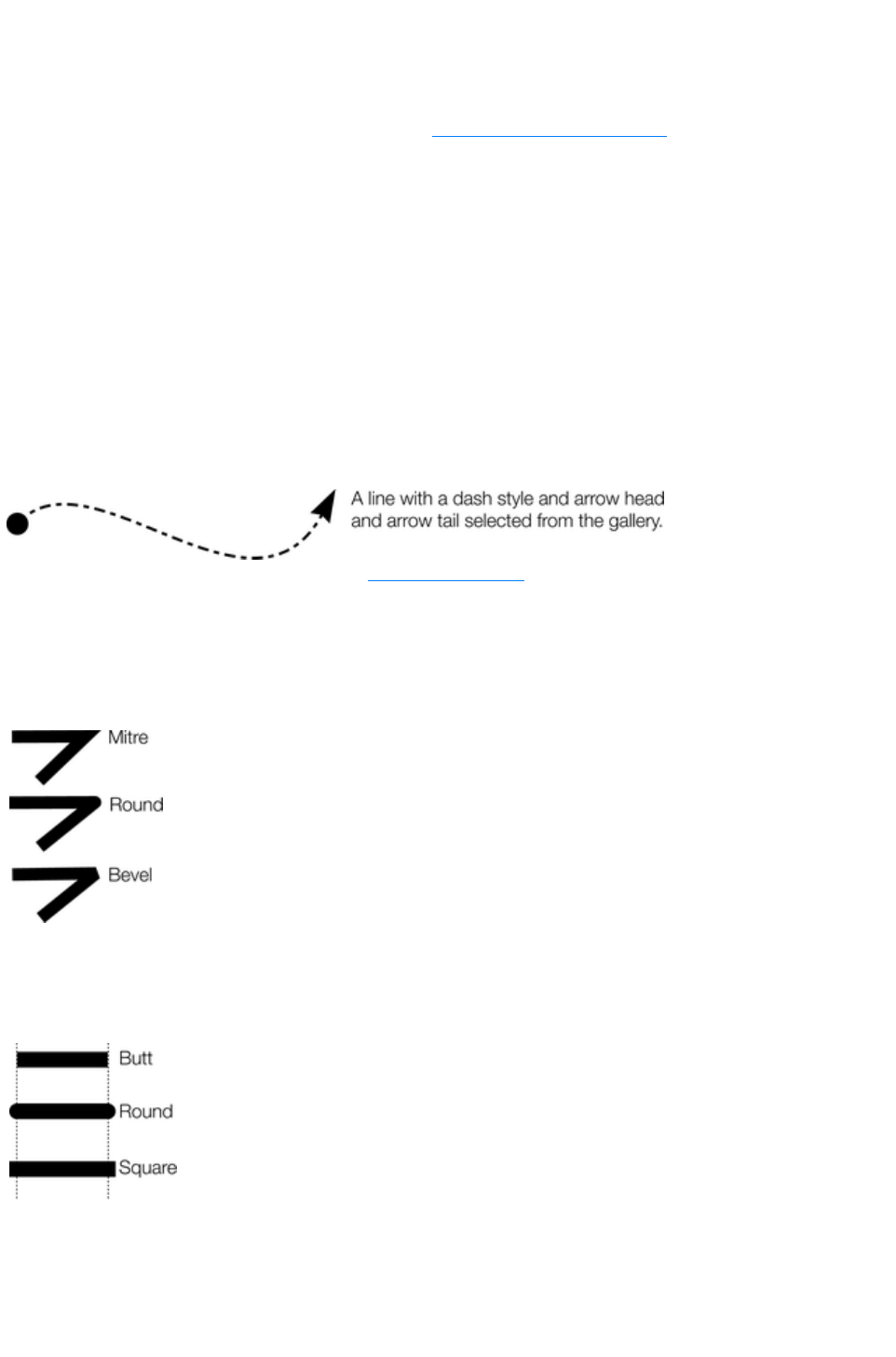
Dash pattern
This section provides a selection of line dash styles.
Arrowheads
The best way to apply an arrowhead is to use the Straight Line & Arrow Tool
, as described earlier in this chapter. However you can also use the line gallery. Drag and drop the
arrowhead from the gallery onto the appropriate end of the line.
Alternatively, to apply an arrowhead:
Double click on the arrowhead in the gallery.
Or select the required arrowhead and click Apply.
Web Designer Premium has two types of arrowhead designs: beginning and end. If the line already has a
beginning arrowhead, applying an end arrowhead automatically places it at the opposite end of the line.
If the line has no arrowheads, and you use the Apply
button or double click a style to apply it, then the arrowhead will be placed at the end of the line.
The size of the arrow head is related to the thickness of the line. Thicker lines have proportionally larger
arrowheads.
If you hold "Ctrl" down and double click an arrow head or tail style, it will apply it to the other end of the
line.
For general information about galleries see document handling
.
Change join type
This control on the top of the Line Gallery
sets the style of corners.
To change an existing line, select the line.
To change the current join type, deselect all lines.
Select the required type from the menu.
Change line cap
This control at the top of the Line Gallery
sets the style of the ends of the line.
To change an existing line, select the line.
To change the default line cap, deselect all lines.
Select the required type from the menu.
Page 504
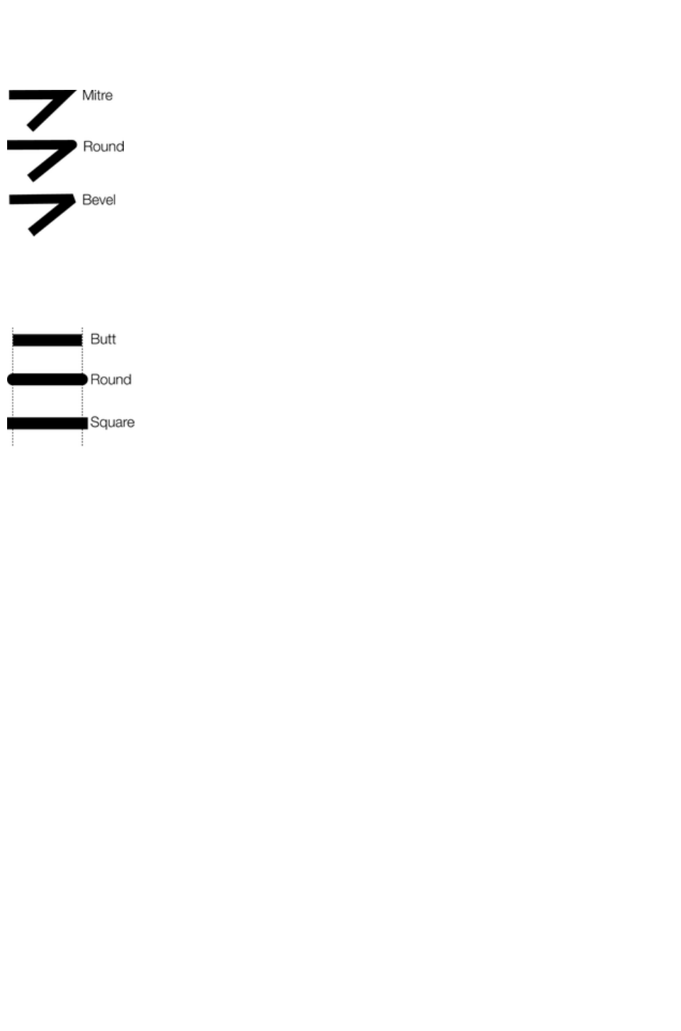
Change join type
This control on the top of the Line Gallery
sets the style of corners.
To change an existing line, select the line.
To change the current join type, deselect all lines.
Select the required type from the menu.
Change line cap
This control at the top of the Line Gallery
sets the style of the ends of the line.
To change an existing line, select the line.
To change the default line cap, deselect all lines.
Select the required type from the menu.
Page 505

Change line cap
This control at the top of the Line Gallery
sets the style of the ends of the line.
To change an existing line, select the line.
To change the default line cap, deselect all lines.
Select the required type from the menu.
Page 506

Shape Handling
In this chapter
Closing a shape
Joining shapes
Combining shapes
Changing the line width (thickness)
Variable width lines
Creating rectangles and squares
Creating circles and ellipses
Creating regular polygons (the Quickshape Tool)
Creating stars (polygons with indented sides)
Editing stars
Page 507
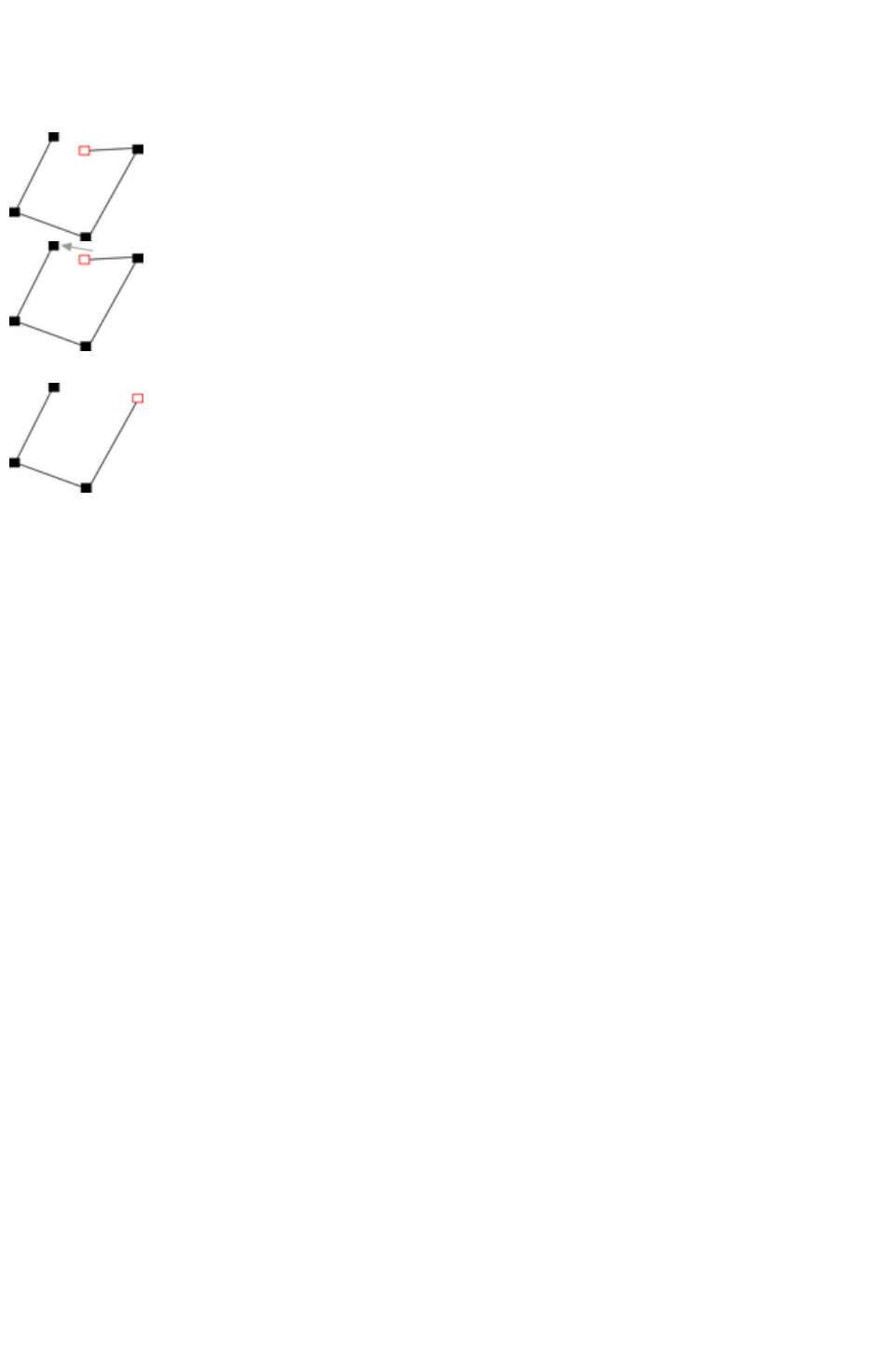
Closing a shape
A shape is a closed object with no start or end handle. Only shapes can be color filled.
To close a shape:
1. Create an open object with the end point
handle close to the start handle. All the
point handles (except the end handle)
should be in their required positions.
2. Position the pointer over the end handle.
3. Drag the end handle over the start handle
and release the mouse button. The two
handles snap together.
Or:
1. Create an open object with all the control
handles in their correct positions. Do not
create the final line segment.
2. Move the pointer over the start point. A +
appears to the right of the pointer when it
is over the start handle.
3. Click to create the final line segment and
close the shape.
Or:
1. Choose the Shape Editor Tool.
2. Click on an end point to select it.
3. Press the "¿" key.
Or:
1. Use the Freehand & Brush Tool to create the final segment.
Any of these closes the shape. If there is a current fill color, the shape is filled with that color.
Closing a freehand shape
You can directly create a closed shape by ending a line back at the beginning over the start handle. A +
by the pointer shows when it is positioned over the start handle.
Page 508

Closing a freehand shape
You can directly create a closed shape by ending a line back at the beginning over the start handle. A +
by the pointer shows when it is positioned over the start handle.
Page 509
Joining shapes
"Arrange -> Join shapes" lets you create holes in solid shapes. Because overlapping parts of the same
shape are drawn with no fill color (i.e. you can see through the overlapping parts), you can use this effect
to create holes in shapes but retain the ability to break them apart later.
For example, to create a donut shape:
1. Create an ellipse (described later).
2. Create a second ellipse over the first. (The color of
the second ellipse has been changed to make it
obvious.)
3. Select both.
4. Choose "Arrange -> Join shapes".
This creates a single shape with a hole in it.
You can combine or join several shapes.
The cutout is made using the top object. If that object is a group, you can make several holes in one
operation. For example, a group of three stars can make a hole in this rectangle shape:
Groups are described in Object handling
.
When several shapes overlap:
The top shape (or top group) becomes a hole through the other shapes.
The line attributes and colors of the other shapes change to those of the top shape.
If several shapes overlay:
oan even number of shapes overlapping becomes a transparent area;
oan odd number of shapes overlapping becomes a solid area.
The numbers on this example of three circles show how many shapes overlay in each area:
The joined shape on the left shows the number of segments which overlap. On the right are the original
three circles shown unjoined.
Breaking joined shapes
Choose "Arrange -> Break shapes". This breaks the joined shape into separate objects, but the original
attributes will not be restored to the separated objects. You can also break several joined shapes in one
operation.
Page 510

Breaking joined shapes
Choose "Arrange -> Break shapes". This breaks the joined shape into separate objects, but the original
attributes will not be restored to the separated objects. You can also break several joined shapes in one
operation.
Page 511
Combining shapes
The menu option "Arrange" > "Combine shapes" (or right click and choose Combine Shapes
) provides you with a range of advanced options to combine shapes to make new shapes, such as
adding, cutting, or slicing. You can use combine shapes on any type of object, including bitmaps.
Creating holes in shapes
Use "Arrange" > "Combine shapes" > "Subtract shapes"
. This is similar to using join shapes (described above). The differences are:
The top shape (or top group) becomes a hole through the other shapes.
The line attributes and colors of the underlying shapes are unchanged.
Combine shapes physically alters the lines. The only way to restore the original shapes is by using
undo.
The number of overlapping shapes has no effect.
Merging several shapes into one
For example, to produce the shape on the right from the three shapes on the left:
1. Create the two circles and the rectangle.
2. Select all three shapes.
3. Right click and choose "Combine shapes" > "Add shapes".
The new shape takes line attributes and colors from the top shape (in this case the rectangle in the
illustration).
Intersecting shapes
With intersecting shapes
, the new object is created from those parts of lower shapes that are covered by the top object.
Select the shapes you want to mask and the
front (mask) shape.
Choose "Arrange" > "Combine shapes" >
"Intersect shapes"
. This creates a new shape. The top shape
disappears.
The line attributes and colors of the underlying shapes are unchanged. Areas not covered by the top
Page 512
shape are discarded. The top shape can be a group for more complex subtracting. Groups are described
in Object handling
.
Slicing shapes
Xara Web Designer 7 Premium lets you easily slice shapes into two or more pieces, and you can use
either a solid object or a line for slicing. For example, to cut a segment from a circle:
1. Create a circle and a triangle on top
2. Select them both.
3. Choose Arrange" > "Combine shapes" > "Slice
shapes". The edges of the triangle cut the circle into
two shapes. The triangle disappears.
4. You can now drag the segment out from the circle:
You can also use a line to cut an object:
The line should be drawn completely though the
object and extend beyond it (as shown in the
illustration). If the line is too short, this operation
cuts out a thin slice.
Page 513
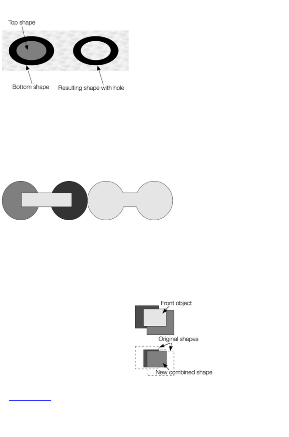
Creating holes in shapes
Use "Arrange" > "Combine shapes" > "Subtract shapes"
. This is similar to using join shapes (described above). The differences are:
The top shape (or top group) becomes a hole through the other shapes.
The line attributes and colors of the underlying shapes are unchanged.
Combine shapes physically alters the lines. The only way to restore the original shapes is by using
undo.
The number of overlapping shapes has no effect.
Merging several shapes into one
For example, to produce the shape on the right from the three shapes on the left:
1. Create the two circles and the rectangle.
2. Select all three shapes.
3. Right click and choose "Combine shapes" > "Add shapes".
The new shape takes line attributes and colors from the top shape (in this case the rectangle in the
illustration).
Intersecting shapes
With intersecting shapes
, the new object is created from those parts of lower shapes that are covered by the top object.
Select the shapes you want to mask and the
front (mask) shape.
Choose "Arrange" > "Combine shapes" >
"Intersect shapes"
. This creates a new shape. The top shape
disappears.
The line attributes and colors of the underlying shapes are unchanged. Areas not covered by the top
shape are discarded. The top shape can be a group for more complex subtracting. Groups are described
in Object handling
.
Slicing shapes
Page 514
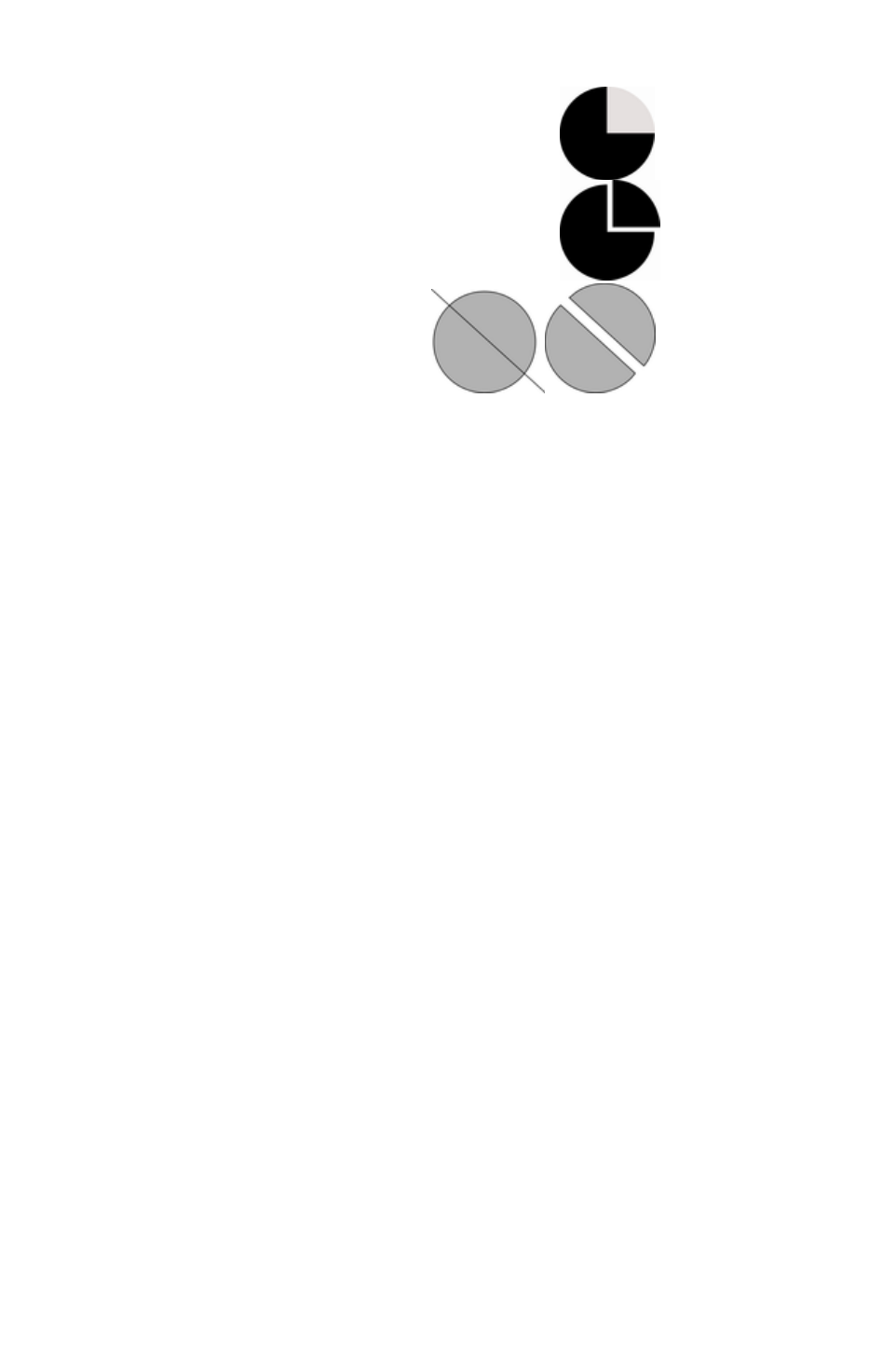
Xara Web Designer 7 Premium lets you easily slice shapes into two or more pieces, and you can use
either a solid object or a line for slicing. For example, to cut a segment from a circle:
1. Create a circle and a triangle on top
2. Select them both.
3. Choose Arrange" > "Combine shapes" > "Slice
shapes". The edges of the triangle cut the circle into
two shapes. The triangle disappears.
4. You can now drag the segment out from the circle:
You can also use a line to cut an object:
The line should be drawn completely though the
object and extend beyond it (as shown in the
illustration). If the line is too short, this operation
cuts out a thin slice.
Page 515
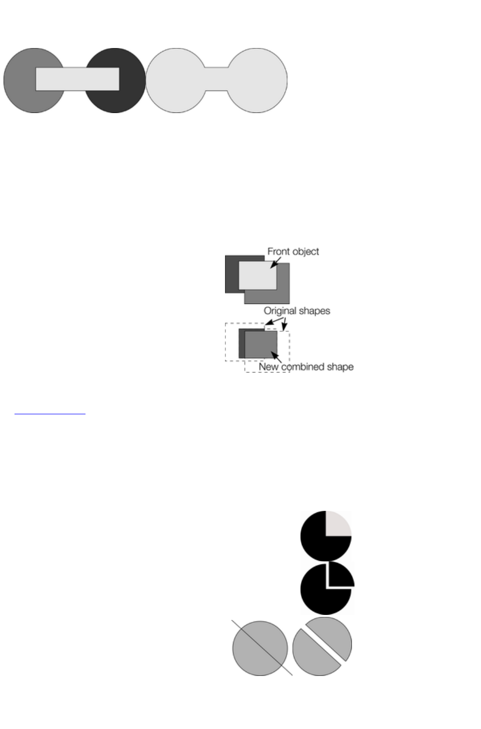
Merging several shapes into one
For example, to produce the shape on the right from the three shapes on the left:
1. Create the two circles and the rectangle.
2. Select all three shapes.
3. Right click and choose "Combine shapes" > "Add shapes".
The new shape takes line attributes and colors from the top shape (in this case the rectangle in the
illustration).
Intersecting shapes
With intersecting shapes
, the new object is created from those parts of lower shapes that are covered by the top object.
Select the shapes you want to mask and the
front (mask) shape.
Choose "Arrange" > "Combine shapes" >
"Intersect shapes"
. This creates a new shape. The top shape
disappears.
The line attributes and colors of the underlying shapes are unchanged. Areas not covered by the top
shape are discarded. The top shape can be a group for more complex subtracting. Groups are described
in Object handling
.
Slicing shapes
Xara Web Designer 7 Premium lets you easily slice shapes into two or more pieces, and you can use
either a solid object or a line for slicing. For example, to cut a segment from a circle:
1. Create a circle and a triangle on top
2. Select them both.
3. Choose Arrange" > "Combine shapes" > "Slice
shapes". The edges of the triangle cut the circle into
two shapes. The triangle disappears.
4. You can now drag the segment out from the circle:
You can also use a line to cut an object:
The line should be drawn completely though the
object and extend beyond it (as shown in the
illustration). If the line is too short, this operation
cuts out a thin slice.
Page 516
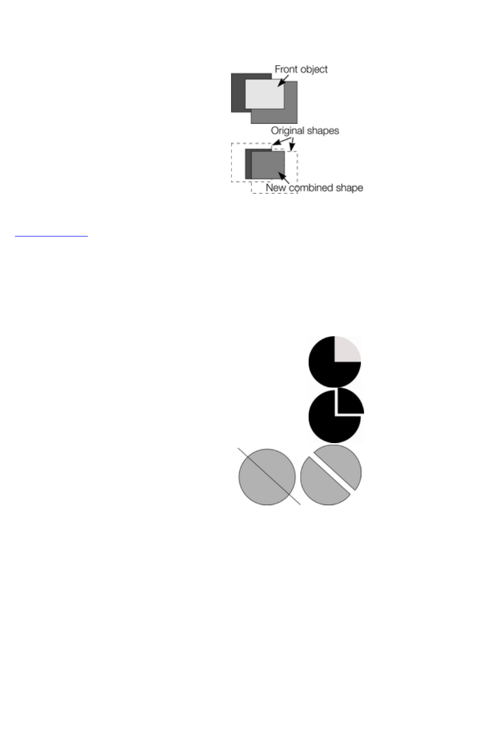
Intersecting shapes
With intersecting shapes
, the new object is created from those parts of lower shapes that are covered by the top object.
Select the shapes you want to mask and the
front (mask) shape.
Choose "Arrange" > "Combine shapes" >
"Intersect shapes"
. This creates a new shape. The top shape
disappears.
The line attributes and colors of the underlying shapes are unchanged. Areas not covered by the top
shape are discarded. The top shape can be a group for more complex subtracting. Groups are described
in Object handling
.
Slicing shapes
Xara Web Designer 7 Premium lets you easily slice shapes into two or more pieces, and you can use
either a solid object or a line for slicing. For example, to cut a segment from a circle:
1. Create a circle and a triangle on top
2. Select them both.
3. Choose Arrange" > "Combine shapes" > "Slice
shapes". The edges of the triangle cut the circle into
two shapes. The triangle disappears.
4. You can now drag the segment out from the circle:
You can also use a line to cut an object:
The line should be drawn completely though the
object and extend beyond it (as shown in the
illustration). If the line is too short, this operation
cuts out a thin slice.
Page 517
Slicing shapes
Xara Web Designer 7 Premium lets you easily slice shapes into two or more pieces, and you can use
either a solid object or a line for slicing. For example, to cut a segment from a circle:
1. Create a circle and a triangle on top
2. Select them both.
3. Choose Arrange" > "Combine shapes" > "Slice
shapes". The edges of the triangle cut the circle into
two shapes. The triangle disappears.
4. You can now drag the segment out from the circle:
You can also use a line to cut an object:
The line should be drawn completely though the
object and extend beyond it (as shown in the
illustration). If the line is too short, this operation
cuts out a thin slice.
Page 518
Changing the line width (thickness)
To change the line thickness or the outline thickness of a shape, first select the object or objects:
Type a new line width into the text box on the standard control
bar or choose the default line thickness from the menu.
Line thickness is traditionally measured in points, abbreviated to pt. 1 point is 1/72nd
of an inch (about 0.3mm), which is slightly less than the thickness of one screen pixel when viewed at
100% zoom.
You can enter the thickness value in any unit, and Xara Web Designer 7 Premium will convert it to the
correct number of Points. E.g. you can enter 0.5cm, and you will get a line half a centimeter thick, but it
will show just over 14pt in the line width field.
If you have no object selected and you change the line thickness value, this changes the default for all
new lines.
Page 519
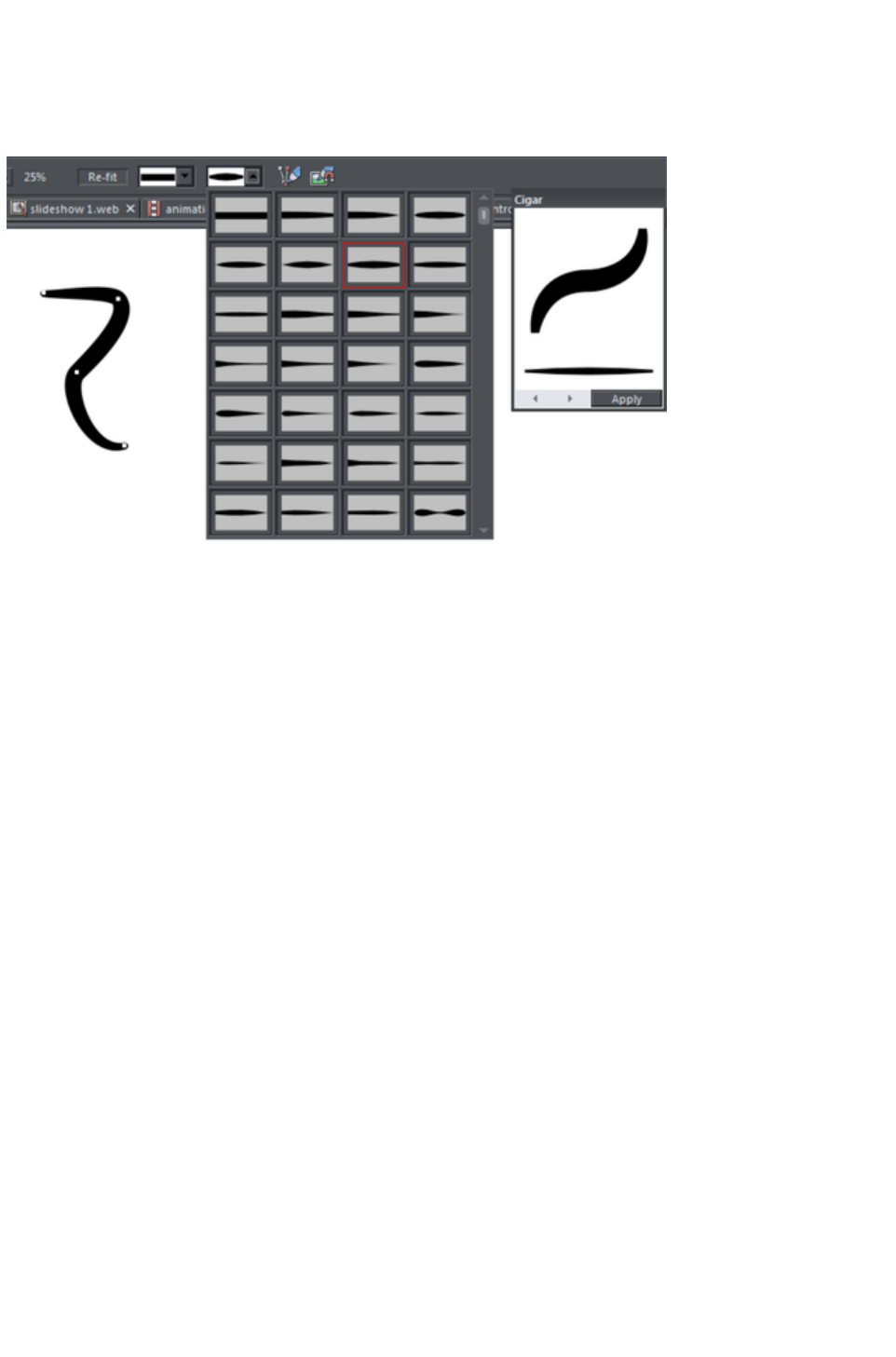
Variable width lines
From the Freehand & Brush Tool
InfoBar you can select a drop-down menu that shows a selection of alternative variable line thickness
profiles. As you move the mouse over the selection, an enlarged preview is shown on the right.
Selecting one of the styles will change the line (or outline of a shape) from being a constant thickness line,
to a variable thickness. This is great for creating pen and ink style artwork, and is often used in the
creation of cartoons.
The line width dropdown still should be used to change the overall thickness of the line.
To restore a constant line width, select the top left corner item from the menu.
Page 520
Creating rectangles and squares
To create a rectangle:
Use the Rectangle Tool ("Shift + F3", or "M").
Click and drag on the canvas to draw a rectangle.
Creating a square
To create a square rather than a rectangle, hold down "Ctrl" while dragging.
Creating and editing rounded corner rectangles
To give your rectangle rounded corners, select it and then press the
"Curved corners" button on the Rectangle Tool
infobar.
You can then drag on the selection handles shown on the corners to adjust the diameter of the rounded
corners.
You can resize rectangles using either the Rectangle Tool (by dragging on the handles shown at the
corners) or the Selector Tool
.
Note that if you change the aspect ratio of a rounded corner rectangle using the Selector Tool
(by stretching it in one dimension only) the aspect ratio of the rounded corners is not stretched, it is
maintained. However if you have multiple objects selected, or if you're stretching a group containing a
rounded corner rectangle, the aspect ratio of the corners is not maintained.
Page 521
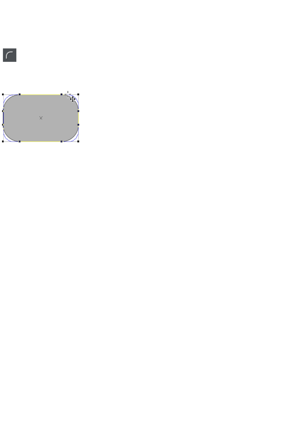
Creating a square
To create a square rather than a rectangle, hold down "Ctrl" while dragging.
Creating and editing rounded corner rectangles
To give your rectangle rounded corners, select it and then press the
"Curved corners" button on the Rectangle Tool
infobar.
You can then drag on the selection handles shown on the corners to adjust the diameter of the rounded
corners.
You can resize rectangles using either the Rectangle Tool (by dragging on the handles shown at the
corners) or the Selector Tool
.
Note that if you change the aspect ratio of a rounded corner rectangle using the Selector Tool
(by stretching it in one dimension only) the aspect ratio of the rounded corners is not stretched, it is
maintained. However if you have multiple objects selected, or if you're stretching a group containing a
rounded corner rectangle, the aspect ratio of the corners is not maintained.
Page 522
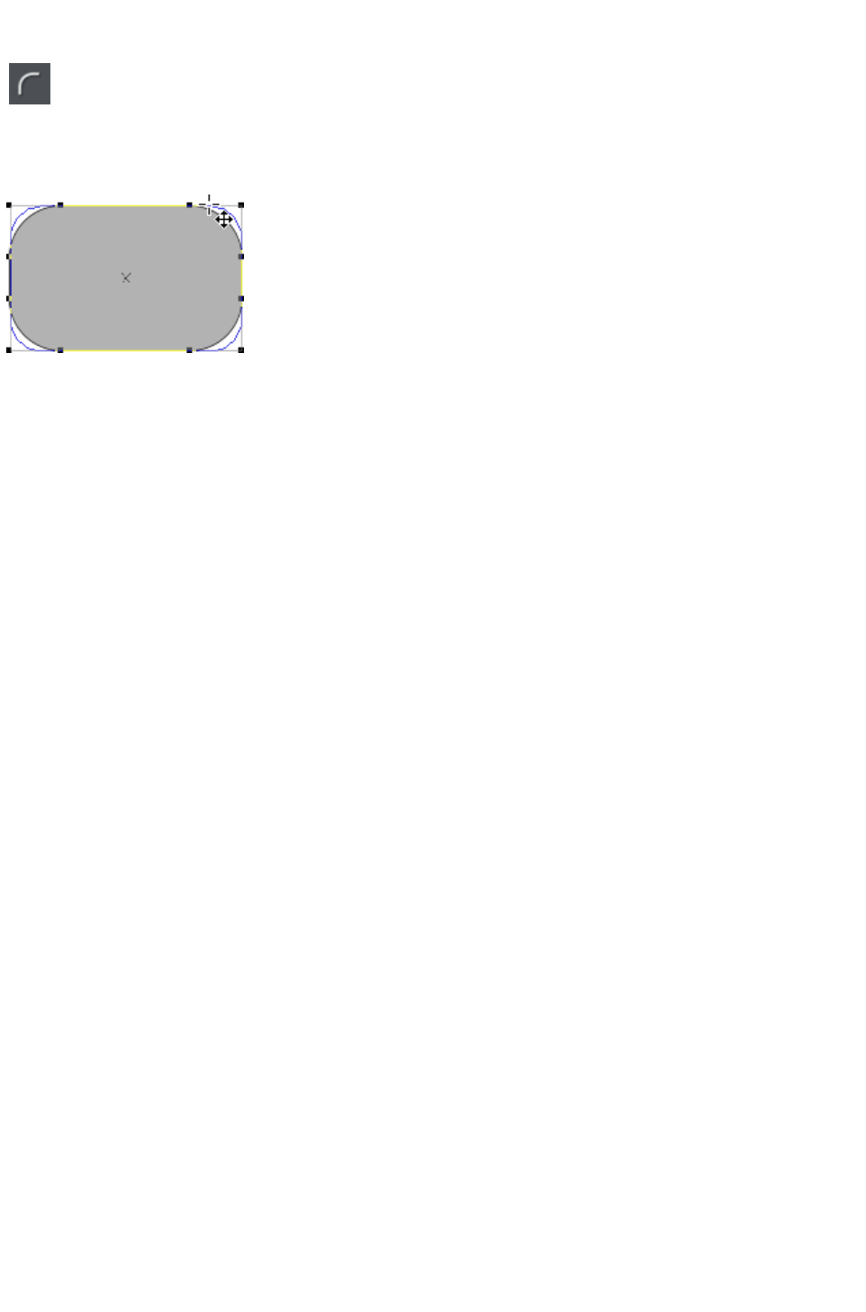
Creating and editing rounded corner rectangles
To give your rectangle rounded corners, select it and then press the
"Curved corners" button on the Rectangle Tool
infobar.
You can then drag on the selection handles shown on the corners to adjust the diameter of the rounded
corners.
You can resize rectangles using either the Rectangle Tool (by dragging on the handles shown at the
corners) or the Selector Tool
.
Note that if you change the aspect ratio of a rounded corner rectangle using the Selector Tool
(by stretching it in one dimension only) the aspect ratio of the rounded corners is not stretched, it is
maintained. However if you have multiple objects selected, or if you're stretching a group containing a
rounded corner rectangle, the aspect ratio of the corners is not maintained.
Page 523
Creating circles and ellipses
To create an ellipse or circle:
Select the Ellipse Tool
("Shift + F4", or "L").
The Radius and diameter
buttons automatically create circles.
Radius
Diameter
Bounds creation
With the Bounds creation
button selected, drag on the canvas to draw an ellipse. Hold down "Ctrl" while dragging to create a
circle rather than an ellipse.
Select the Radius
option to draw circles. The start point of a drag determines the circle's center.
Select the Diameter
option. Now the start point of a drag determines the position of the edge of the circle.
You can convert an ellipse into a circle at any time by double clicking on a control handle.
Page 524
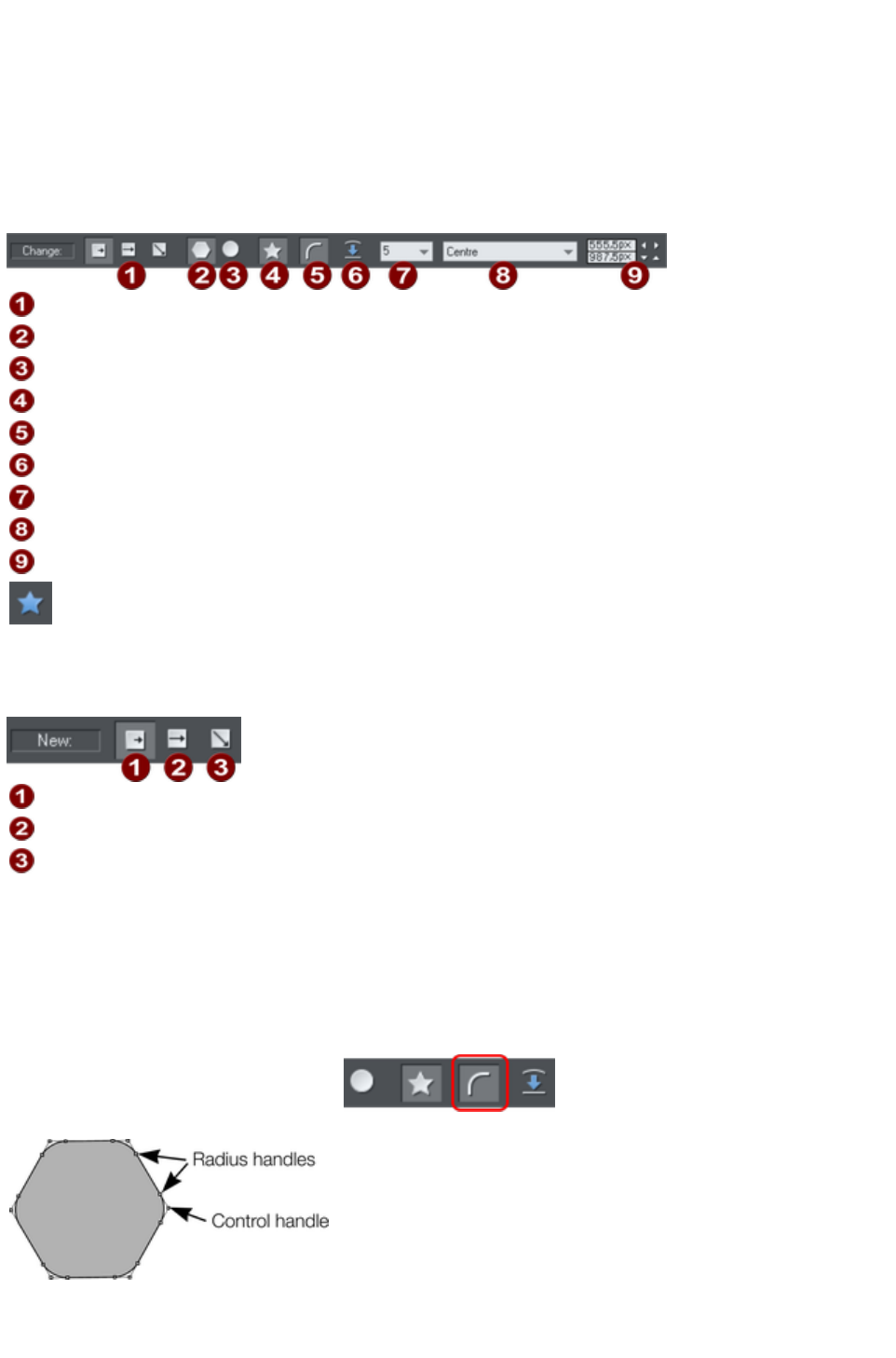
Creating regular polygons (the Quickshape
Tool)
The Quickshape
Tool lets you quickly create almost any regular, symmetrical shape with sharp or rounded corners. You
can then drag the edges to bend the sides, and at any time you can change the number of sides or make
the object an ellipse, a polygon, or a star.
Creation Modes: Radius/Diameter/Bounds
Polygon
Ellipse
Stellate
Round corners
Restore edges
Number of sides
Editable items menu
Editing fields
1. Select the Quickshape Tool ("Shift + F2").
2. Select Polygon.
3. Select the number of sides either from the menu, or by
typing into the text box.
To create the polygon drag:
Radius
Diameter
Bounds creation
From the center outwards (Radius button),
Or from an outside edge (Diameter button),
Or diagonally to create an imaginary rectangle enclosing the polygon (Bounds creation button)
letting you distort the polygon.
Polygons with rounded corners
Select the Round corners
button or double click on a corner
point.
The polygon has extra handles (radius
handles) where the rounding starts. To
increase or decrease the radius, drag
any of the radius handles.
To remove the round corners:
Click the Round corners button.
Page 525
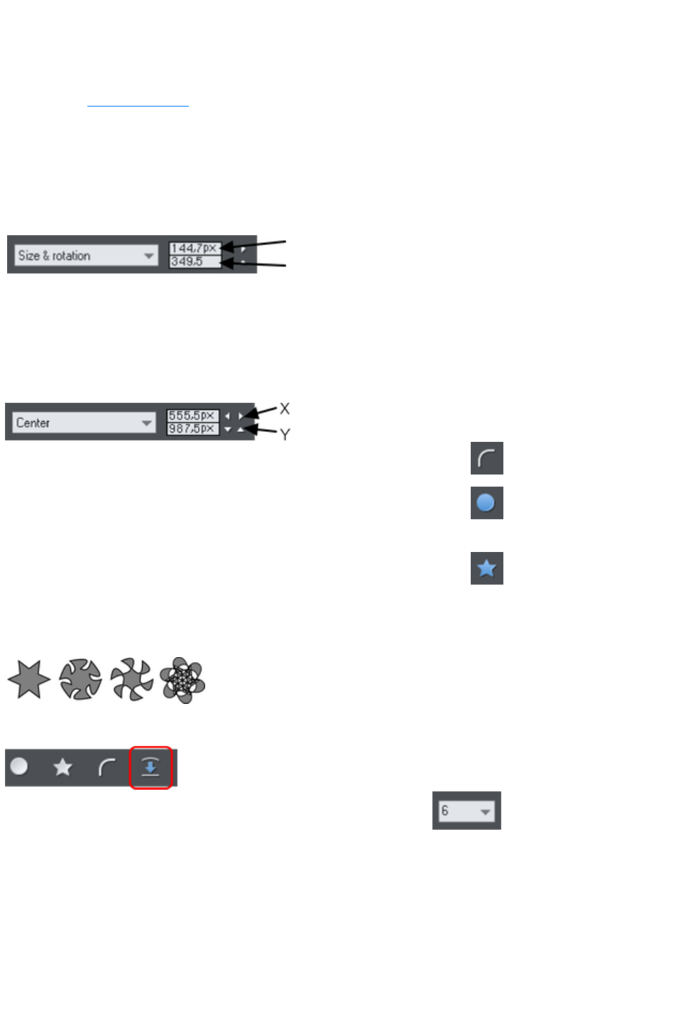
Or double click a control handle.
Editing a polygon
The Selector Tool lets you move, rotate, resize, and skew a polygon as normal (the Selector Tool is
described in Object handling
.)
Using the Quickshape
Tool, you can resize or rotate:
Drag the corner handles.
Or select Size & rotation in the Editable Items menu. Type the required values into the text
boxes.
Size
Rotation
You can also nudge the values using the buttons to the right.
To move:
Drag the handle in the center of the polygon.
Or use the arrow keys on the keyboard.
Or select "Center" in the editable items" menu. Type the required X/Y values into the text
boxes.
Apply or remove rounded corners by clicking the round corners
button.
Change the polygon to an ellipse by clicking the create ellipse
button (ellipses are described later) or double clicking the polygon's
center.
Stellate the polygon (make it star-shaped) by clicking the starred
shapes
button (starred shapes are described later).
Drag the sides to make them curved. Move the pointer over the edge of the polygon (it changes to an
arrow shape). You can now drag the sides.
On the left are the original polygons. Just
drag on the sides to create curved sides.
"Ctrl + double click" on a side, or click the restore edges
button to make the sides straight again.
Change the number of sides by typing the number into the menu
or selecting from it.
Page 526
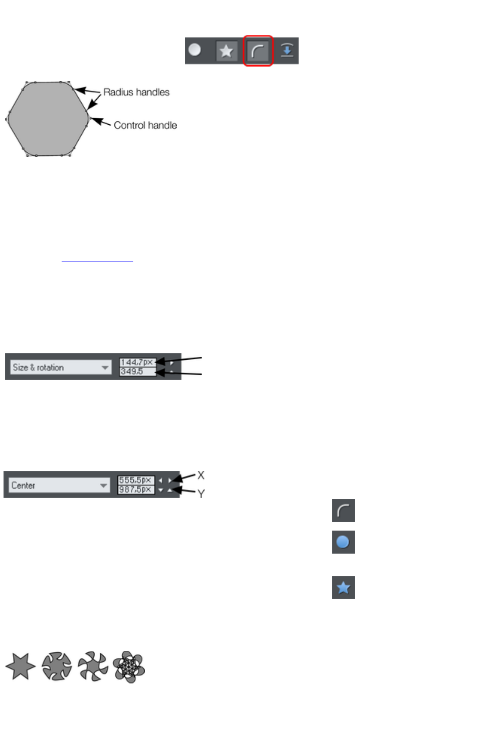
Polygons with rounded corners
Select the Round corners
button or double click on a corner
point.
The polygon has extra handles (radius
handles) where the rounding starts. To
increase or decrease the radius, drag
any of the radius handles.
To remove the round corners:
Click the Round corners button.
Or double click a control handle.
Editing a polygon
The Selector Tool lets you move, rotate, resize, and skew a polygon as normal (the Selector Tool is
described in Object handling
.)
Using the Quickshape
Tool, you can resize or rotate:
Drag the corner handles.
Or select Size & rotation in the Editable Items menu. Type the required values into the text
boxes.
Size
Rotation
You can also nudge the values using the buttons to the right.
To move:
Drag the handle in the center of the polygon.
Or use the arrow keys on the keyboard.
Or select "Center" in the editable items" menu. Type the required X/Y values into the text
boxes.
Apply or remove rounded corners by clicking the round corners
button.
Change the polygon to an ellipse by clicking the create ellipse
button (ellipses are described later) or double clicking the polygon's
center.
Stellate the polygon (make it star-shaped) by clicking the starred
shapes
button (starred shapes are described later).
Drag the sides to make them curved. Move the pointer over the edge of the polygon (it changes to an
arrow shape). You can now drag the sides.
On the left are the original polygons. Just
drag on the sides to create curved sides.
"Ctrl + double click" on a side, or click the restore edges
button to make the sides straight again.
Page 527
Change the number of sides by typing the number into the menu
or selecting from it.
Page 528
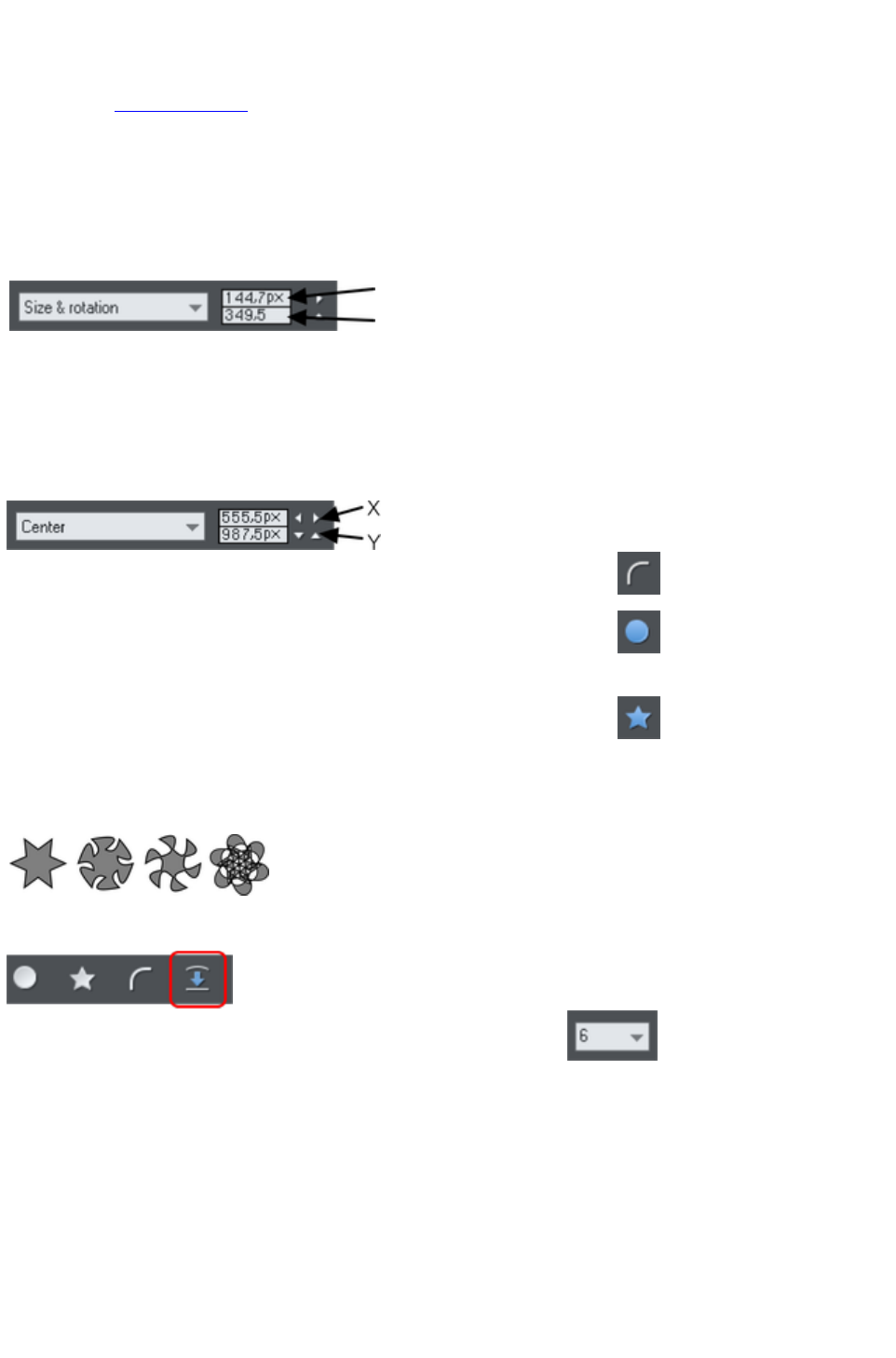
Editing a polygon
The Selector Tool lets you move, rotate, resize, and skew a polygon as normal (the Selector Tool is
described in Object handling
.)
Using the Quickshape
Tool, you can resize or rotate:
Drag the corner handles.
Or select Size & rotation in the Editable Items menu. Type the required values into the text
boxes.
Size
Rotation
You can also nudge the values using the buttons to the right.
To move:
Drag the handle in the center of the polygon.
Or use the arrow keys on the keyboard.
Or select "Center" in the editable items" menu. Type the required X/Y values into the text
boxes.
Apply or remove rounded corners by clicking the round corners
button.
Change the polygon to an ellipse by clicking the create ellipse
button (ellipses are described later) or double clicking the polygon's
center.
Stellate the polygon (make it star-shaped) by clicking the starred
shapes
button (starred shapes are described later).
Drag the sides to make them curved. Move the pointer over the edge of the polygon (it changes to an
arrow shape). You can now drag the sides.
On the left are the original polygons. Just
drag on the sides to create curved sides.
"Ctrl + double click" on a side, or click the restore edges
button to make the sides straight again.
Change the number of sides by typing the number into the menu
or selecting from it.
Page 529
Creating stars (polygons with indented sides)
Select the Quickshape
Tool.
To create a star or to make the selected polygon stellated:
Stellated/stellation = star shaped.
.
Select the Starred Shapes
button
Or double click on a side.
Left: polygon with starred off. Right
: starred on.
Removing stellation
Click the starred shapes
button.
Or double click on the star handle.
Note
: double click on the star handle, not the control handle.
Page 530
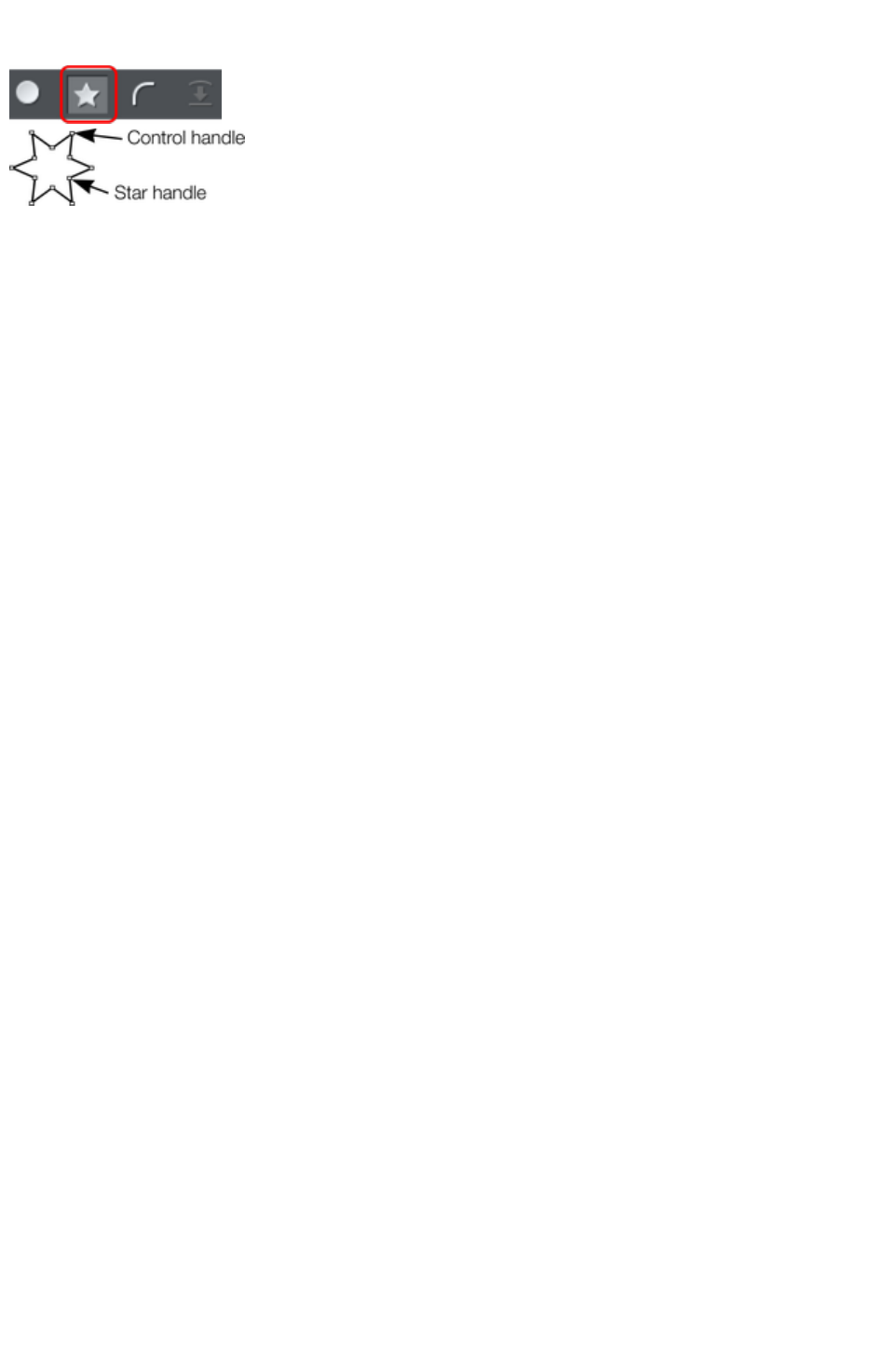
Removing stellation
Click the starred shapes
button.
Or double click on the star handle.
Note
: double click on the star handle, not the control handle.
Page 531
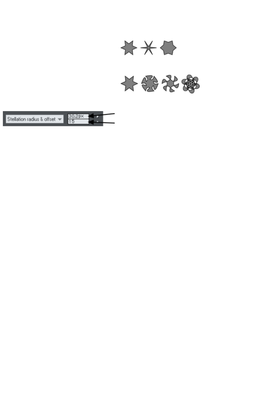
Editing stars
You can edit stars in the same ways as ordinary polygons (described earlier).
To increase or decrease the depth of stellation:
Drag a star handle or select stellation
radius & offset on the editable items
menu. Type the required values into the text
boxes.
The original shape is on the left.
Or drag the sides to make them curved:
The original shape is on the left.
You can also nudge the values using the buttons to the right.
Offset from center
Angular offset
"Ctrl + drag" one side of a star moves all the sides symmetrically. "Ctrl + Shift dragging" moves pairs of
sides as mirror images. "Ctrl + double click" on a side, or click the restore edges
button to make all sides straight again.
Page 532
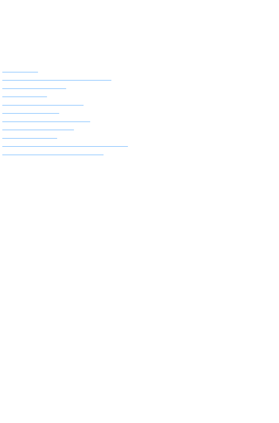
Color Handling
Xara Web Designer 7 Premium gives wide control over applying, creating and altering the colors of
objects. For simple documents, you can just choose colors from the on-screen color palette, the Color
Line. More advanced color operations are described later.
In this chapter
The color line
Applying fill & line colors by drag & drop
Editing an object’s color
The Color Editor
Local colors and Theme colors
Theme color schemes
Creating your own color schemes
Creating new named colors
Editing named colors
Normal colors, Tints, Shades and Linked colors
Creating a Tint, Shade or Linked color
Page 533
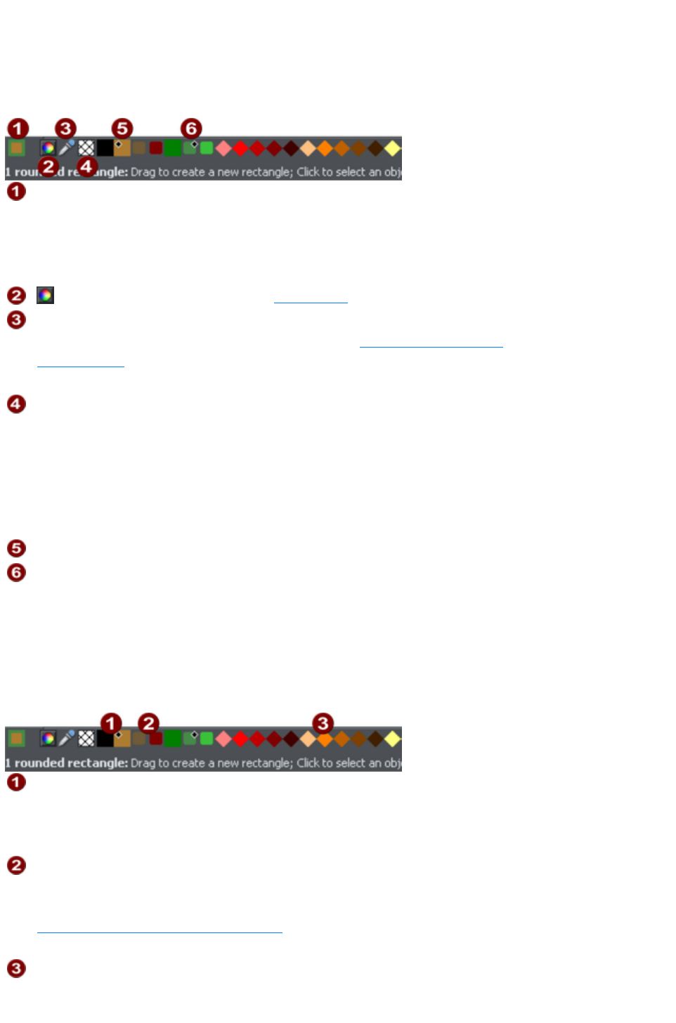
The color line
The Color Line is displayed at the bottom of the window. It shows you the current fill and line colors,
provides access to the color editor and provides a palette of pre-defined colors including a special "no
color".
Color swatch:
The outer part of the color swatch on the left-hand end of the Color Line
shows the line color and the center shows the fill color. These are the
colors of any selected objects, or the current color attributes if no objects
are selected.
This button provides access to the color editor
Color picker: Use the eye-dropper to pick a color from any part of the
document or any part of the computer screen. See Using the eye-dropper
to pick colors
for details.
No color: Clicking this applies a "no color fill". Shift-clicking applies "no
color" to a line. Note that this is not the same as 100% transparent. "No
color" and transparency are different. A shape with transparency applied
remains a solid shape whereas a shape filled with "no color" is effectively
hollow. The No Color
button can also be used to restore the original colors to a photo which
has had a contone color applied.
Current Fill color
Current Line color
If the length of the Color Line exceeds the window, you can scroll through the Color Line with the scroll
bar below or by "Alt + dragging" the Color Line.
Xara Web Designer 7 Premium provides several options for the displayed size of the Color Line
(described in Customizing Web Designer Premium).
Colors on the color line
Named (Theme) Colors: First comes the Named Colors (if present in the
document, see below). Named colors are used to give templates and
designs theme colors, so that the color scheme of a design can easily be
changed without editing every object in it individually.
Linked Colors are represented differently on the color line by smaller
rounded rectangles, so it's much easier to distinguish which are normal
independent Named Colors and which are linked to a parent. See
Creating a Tint, Shade or Linked color
.
Palette colors: There are 46 pre-defined palette colors. There are 5
shades of 7 standard hues and 10 shades of grey, black and white.
Palette colors are not editable (i.e they are not Named Colors) and are
Page 534
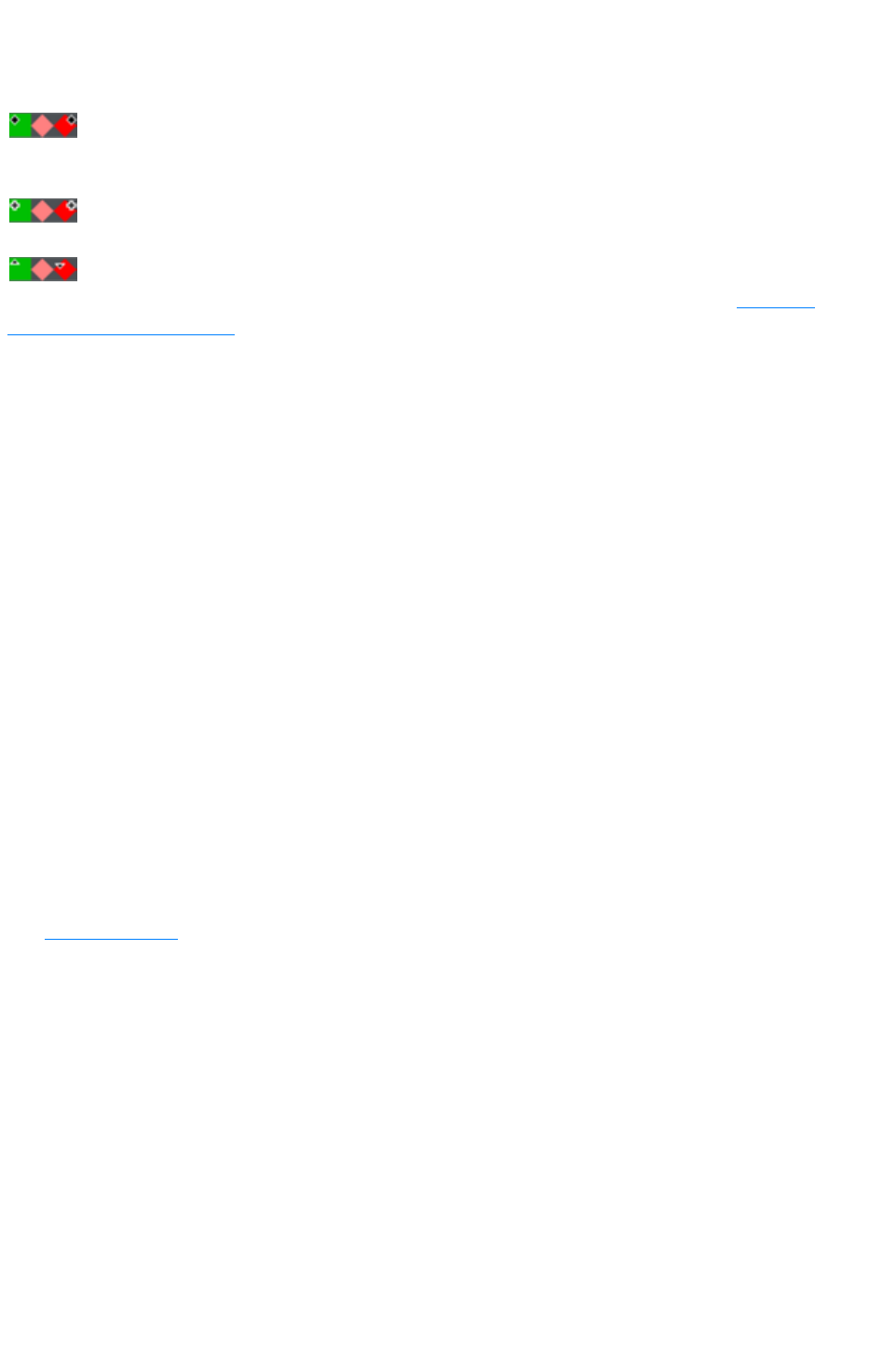
designed as a simple, limited selection of colors to apply to objects (either
by dragging on to the object or clicking).
Little markers in the color icons shows which of the named colors (if any) or palette colors have been
applied to the selected object(s).
Diamond markers show the colors used by the selected objects. A
diamond in the top-left corner indicates the fill color, in the top-right
corner indicates the line color.
Cross-shaped markers show the current color attributes if there are
no objects selected. Line color on the right, fill color on the left.
Triangular markers show the colors of a fill if you have applied one.
This works also when choosing a color with the color picker from existing objects, see Using the
eye-dropper to pick colors
. The color line markers update immediately and indicate the color of the object under the eye-dropper
as you're dragging around.
Re-ordering colors on the color line
You may prefer to re-arrange colors on the Color Line. To do this, "Ctrl + drag" colors along the Color
Line. This also reorders the Color Gallery
. Only named colors can be re-arranged on the Color Line.
Color line context menu
Click on a color on the Color Line to show a context sensitive menu with the following options:
Edit
Opens the color editor with the selected color
(not available for palette colors)
Set fill color / Set line
color
Set the fill or line color of the selected object with
this color
Rename
Rename a named color (not available for palette
colors)
Delete
Delete a named color (not available for palette
colors)
Options
Opens the General tab of the Options dialog.
If the selected object is a bitmap, you can also see Set contone dark color / Set contone light color.
See Bitmap coloring
for more information.
When clicking the "no color" swatch, the fill and line color options are replaced by: Clear fill color /
Clear line color
. This sets the selected object's relative attributes to "no color".
Page 535
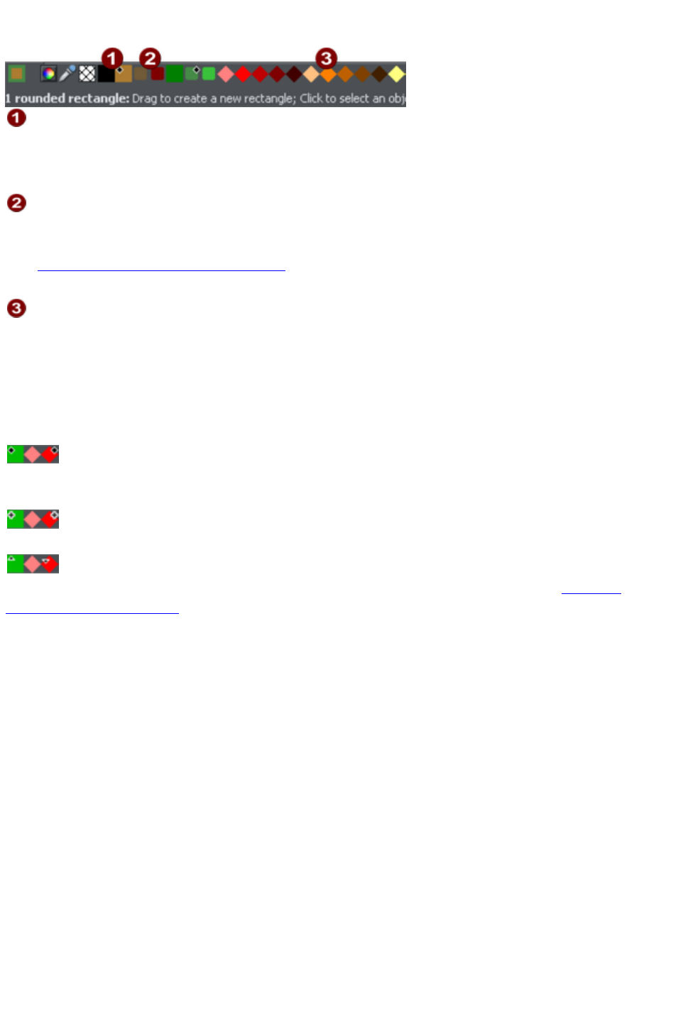
Colors on the color line
Named (Theme) Colors: First comes the Named Colors (if present in the
document, see below). Named colors are used to give templates and
designs theme colors, so that the color scheme of a design can easily be
changed without editing every object in it individually.
Linked Colors are represented differently on the color line by smaller
rounded rectangles, so it's much easier to distinguish which are normal
independent Named Colors and which are linked to a parent. See
Creating a Tint, Shade or Linked color
.
Palette colors: There are 46 pre-defined palette colors. There are 5
shades of 7 standard hues and 10 shades of grey, black and white.
Palette colors are not editable (i.e they are not Named Colors) and are
designed as a simple, limited selection of colors to apply to objects (either
by dragging on to the object or clicking).
Little markers in the color icons shows which of the named colors (if any) or palette colors have been
applied to the selected object(s).
Diamond markers show the colors used by the selected objects. A
diamond in the top-left corner indicates the fill color, in the top-right
corner indicates the line color.
Cross-shaped markers show the current color attributes if there are
no objects selected. Line color on the right, fill color on the left.
Triangular markers show the colors of a fill if you have applied one.
This works also when choosing a color with the color picker from existing objects, see Using the
eye-dropper to pick colors
. The color line markers update immediately and indicate the color of the object under the eye-dropper
as you're dragging around.
Re-ordering colors on the color line
You may prefer to re-arrange colors on the Color Line. To do this, "Ctrl + drag" colors along the Color
Line. This also reorders the Color Gallery
. Only named colors can be re-arranged on the Color Line.
Color line context menu
Click on a color on the Color Line to show a context sensitive menu with the following options:
Edit
Opens the color editor with the selected color
(not available for palette colors)
Set fill color / Set line
color
Set the fill or line color of the selected object with
this color
Rename
Rename a named color (not available for palette
colors)
Delete
Delete a named color (not available for palette
colors)
Page 536

Options
Opens the General tab of the Options dialog.
If the selected object is a bitmap, you can also see Set contone dark color / Set contone light color.
See Bitmap coloring
for more information.
When clicking the "no color" swatch, the fill and line color options are replaced by: Clear fill color /
Clear line color
. This sets the selected object's relative attributes to "no color".
Page 537

Re-ordering colors on the color line
You may prefer to re-arrange colors on the Color Line. To do this, "Ctrl + drag" colors along the Color
Line. This also reorders the Color Gallery
. Only named colors can be re-arranged on the Color Line.
Color line context menu
Click on a color on the Color Line to show a context sensitive menu with the following options:
Edit
Opens the color editor with the selected color
(not available for palette colors)
Set fill color / Set line
color
Set the fill or line color of the selected object with
this color
Rename
Rename a named color (not available for palette
colors)
Delete
Delete a named color (not available for palette
colors)
Options
Opens the General tab of the Options dialog.
If the selected object is a bitmap, you can also see Set contone dark color / Set contone light color.
See Bitmap coloring
for more information.
When clicking the "no color" swatch, the fill and line color options are replaced by: Clear fill color /
Clear line color
. This sets the selected object's relative attributes to "no color".
Page 538

Color line context menu
Click on a color on the Color Line to show a context sensitive menu with the following options:
Edit
Opens the color editor with the selected color
(not available for palette colors)
Set fill color / Set line
color
Set the fill or line color of the selected object with
this color
Rename
Rename a named color (not available for palette
colors)
Delete
Delete a named color (not available for palette
colors)
Options
Opens the General tab of the Options dialog.
If the selected object is a bitmap, you can also see Set contone dark color / Set contone light color.
See Bitmap coloring
for more information.
When clicking the "no color" swatch, the fill and line color options are replaced by: Clear fill color /
Clear line color
. This sets the selected object's relative attributes to "no color".
Page 539
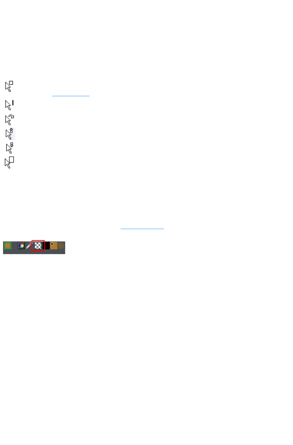
Applying fill & line colors by drag & drop
To apply a fill color to an object (selected or unselected), drag a color from the Color Line and
drop it into the center of the shape.
To set the line or outline color, drop it on the outline, not the center.
To change the current fill color, drag a color into a blank space.
To change the page background color, "Ctrl + drag" a color onto the page background.
When dragging colors an indicator beside the pointer tells you what effect dropping the color will have:
Set flat fill color (seen when you drag over an object) or the intermediary
colors of a multi-color fill
Set line color (seen when you drag over a line).
Set the current fill color (seen when you drag over an empty space).
Set start color of graduated fill (seen when dragged over start of fill).
Set end color of graduated fill (seen when dragged over end of fill).
Set page background color (seen when you drag a color onto the page).
Instead of drag & drop, if you have an object selected, you can just click on the Color Line. This opens
the Color Line context menu where you can set the line or fill color.
In any other case, you can alter the line color by "Shift + clicking" on the Color Line.
If a photo or a bitmap-filled shape is selected, then clicking on the Color Line will contone the bitmap.
That means, the bitmap is converted to greyscale (black and white) and the selected color is used as a
contone light color. The contone dark color is usually black. You can set both contone colors via the
Color Line context menu (see above). See Bitmap coloring
for more information.
To set a fill or line to no color (clear), perform the
operations as outlined above but use the "No color"
option instead of a color.
Page 540

Editing an object’s color
To edit the fill color of the selected object(s):
Choose "Utilities" > "Color editor" ("Ctrl + E").
Or click the Edit color icon on the Color Line.
Or right click the object and choose Fill Color
Or double click on the current line and fill color icon on the Color Line (the edge of the leftmost
panel).
To edit the line color of the selected object /s
"Shift + click" on the Edit color icon
Or double click on the current line and fill color icon (the edge of the leftmost panel).
This displays the Color Editor
which allows you to select from any color of the spectrum. Unlike most graphics programs the Color
Editor can remain on screen while you continue to work. It changes to reflect the color of the selected
objects, and so you can easily and directly adjust the color of the selected object.
Page 541
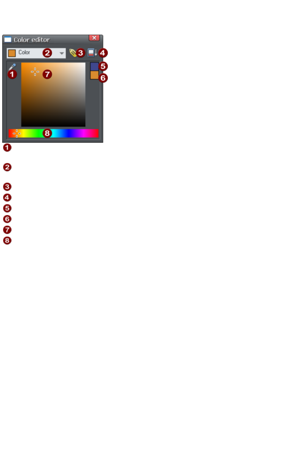
The Color Editor
The Color Editor is used to change the color of objects in the document.
When editing a color you can drag the eye dropper to pick colors off
screen, even from other open windows
Select the color to edit: Fill color/Line color of the selected object or any
of the named theme colors
Click the label icon to create a Named Color
Click to show extended color controls
Previous color
Actual color
Drag here to select any shade of the selected hue
Drag here to select any hue
The easiest way to create a new color is to select the hue along the bottom color strip. All possible
shades of this hue are then shown in the top section, so just click or drag in the top section to select the
new color. You'll notice the selected objects change color as you adjust them in the color editor (called
"live preview").
For example to select a pink color, which is a pale shade of red, select red along the bottom section and
then select a very pale red (pink) from the top right area of the top section.
Previous and Current color
As you drag on the color editor the two small color swatches in the upper right of the color editor show
the current color and the previous (before you started changing the color). This is useful if you want to
make a small change and want to compare the old and new colors.
Using the eye-dropper to pick colors
Instead of selecting hues and shades on the Color Editor
you can instead pick a color from any part of the document or any part of the computer screen?even
from other windows and programs.
To do this just click and drag on the eye dropper icon. As you drag you see the color editor continuously
picks up the color under the eye dropper. Release the mouse button when you have the desired color.
This is an easy and quick way to use the same color again or copy colors from photos or from one
object to another.
The color picker doesn't simply sample the screen (RGB) color. Instead, if you point to a shape with a
solid fill color, the sampler will pick up the actual color of that shape, including the color model (RGB,
Page 542
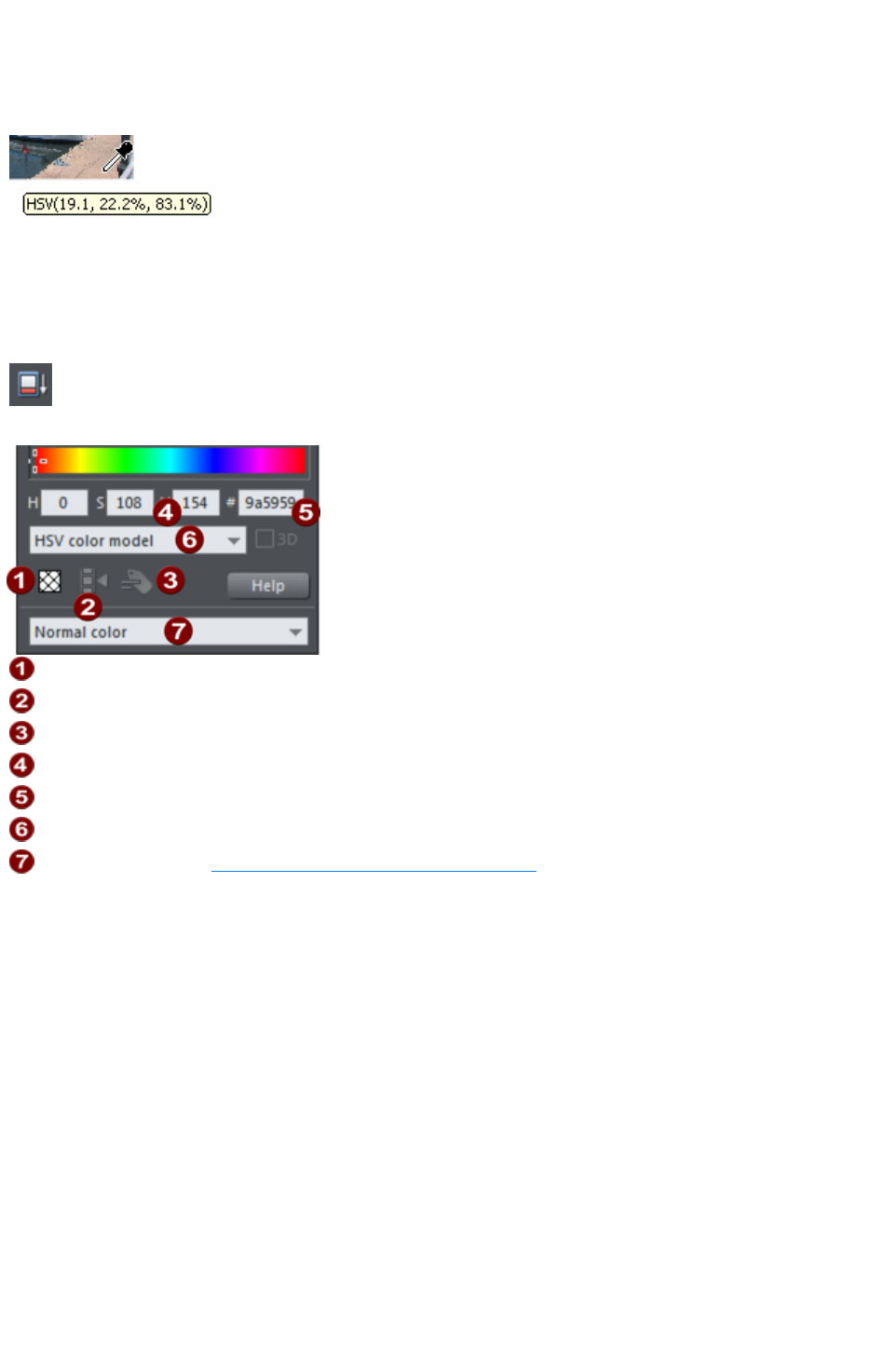
HSV or CMYK), so the color is copied exactly to the selected object(s). If the target color is a named
or palette color, instead of simply copying the color the color picker will apply the same color to the
selected object(s).
If the object under the mouse pointer is complex (eg. has transparency applied) and the color cannot be
determined, screen RGB color is applied.
The color sampler shows a small popup at the
mouse pointer which indicates the color that is
being sampled at that point. This will either be the
palette color name, the name of a named color, or
the color model and color value.
However if you want to use the same color often it is recommended to use a named color instead.
Advanced color operations
Click the Show advanced options
icon on the Color Editor to reveal the lower part of the dialog that
provides more options.
No fill color
Make named color local to Frame/Layer
Rename named color
HSV color values
RGB hex value
Color model (HSV, RGB or grayscale)
Color type: See Creating a Tint, Shade or Linked color
Here you can enter precise RGB (or HSV) color values. The most common requirement for web
graphics is to enter a hex RGB color. The H, S and V fields allow you to specify the color as HSV (hue
saturation value) values in percent. In the #
field you can enter RGB value in hexadecimal numbers (0-F).
Also a 'No fill color' button and a help button is available here.
Page 543
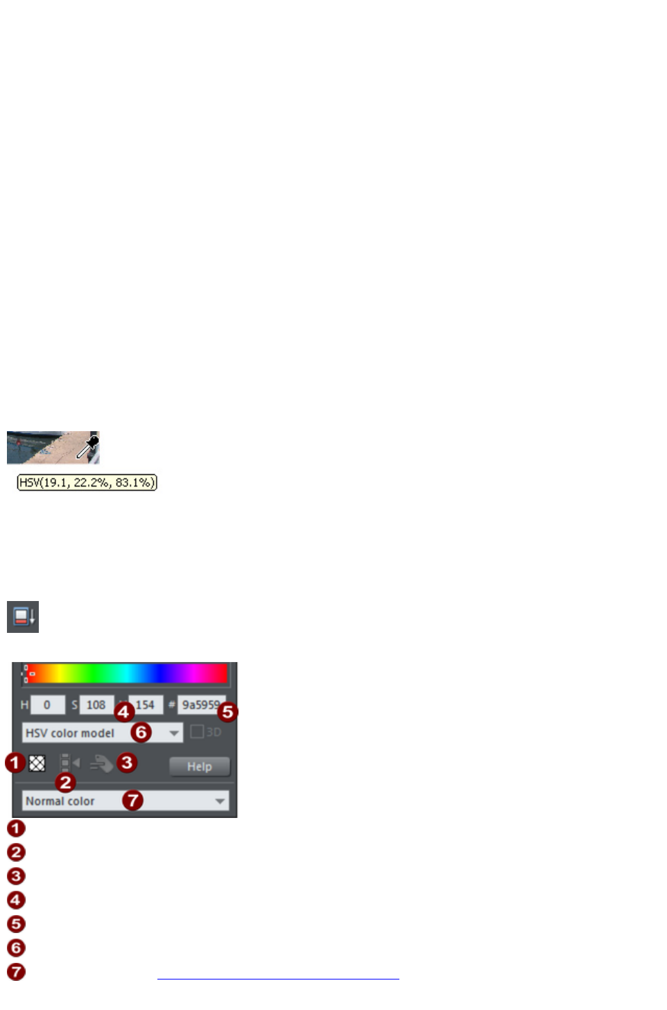
Previous and Current color
As you drag on the color editor the two small color swatches in the upper right of the color editor show
the current color and the previous (before you started changing the color). This is useful if you want to
make a small change and want to compare the old and new colors.
Using the eye-dropper to pick colors
Instead of selecting hues and shades on the Color Editor
you can instead pick a color from any part of the document or any part of the computer screen?even
from other windows and programs.
To do this just click and drag on the eye dropper icon. As you drag you see the color editor continuously
picks up the color under the eye dropper. Release the mouse button when you have the desired color.
This is an easy and quick way to use the same color again or copy colors from photos or from one
object to another.
The color picker doesn't simply sample the screen (RGB) color. Instead, if you point to a shape with a
solid fill color, the sampler will pick up the actual color of that shape, including the color model (RGB,
HSV or CMYK), so the color is copied exactly to the selected object(s). If the target color is a named
or palette color, instead of simply copying the color the color picker will apply the same color to the
selected object(s).
If the object under the mouse pointer is complex (eg. has transparency applied) and the color cannot be
determined, screen RGB color is applied.
The color sampler shows a small popup at the
mouse pointer which indicates the color that is
being sampled at that point. This will either be the
palette color name, the name of a named color, or
the color model and color value.
However if you want to use the same color often it is recommended to use a named color instead.
Advanced color operations
Click the Show advanced options
icon on the Color Editor to reveal the lower part of the dialog that
provides more options.
No fill color
Make named color local to Frame/Layer
Rename named color
HSV color values
RGB hex value
Color model (HSV, RGB or grayscale)
Color type: See Creating a Tint, Shade or Linked color
Here you can enter precise RGB (or HSV) color values. The most common requirement for web
Page 544

graphics is to enter a hex RGB color. The H, S and V fields allow you to specify the color as HSV (hue
saturation value) values in percent. In the #
field you can enter RGB value in hexadecimal numbers (0-F).
Also a 'No fill color' button and a help button is available here.
Page 545
Using the eye-dropper to pick colors
Instead of selecting hues and shades on the Color Editor
you can instead pick a color from any part of the document or any part of the computer screen?even
from other windows and programs.
To do this just click and drag on the eye dropper icon. As you drag you see the color editor continuously
picks up the color under the eye dropper. Release the mouse button when you have the desired color.
This is an easy and quick way to use the same color again or copy colors from photos or from one
object to another.
The color picker doesn't simply sample the screen (RGB) color. Instead, if you point to a shape with a
solid fill color, the sampler will pick up the actual color of that shape, including the color model (RGB,
HSV or CMYK), so the color is copied exactly to the selected object(s). If the target color is a named
or palette color, instead of simply copying the color the color picker will apply the same color to the
selected object(s).
If the object under the mouse pointer is complex (eg. has transparency applied) and the color cannot be
determined, screen RGB color is applied.
The color sampler shows a small popup at the
mouse pointer which indicates the color that is
being sampled at that point. This will either be the
palette color name, the name of a named color, or
the color model and color value.
However if you want to use the same color often it is recommended to use a named color instead.
Advanced color operations
Click the Show advanced options
icon on the Color Editor to reveal the lower part of the dialog that
provides more options.
No fill color
Make named color local to Frame/Layer
Rename named color
HSV color values
RGB hex value
Color model (HSV, RGB or grayscale)
Color type: See Creating a Tint, Shade or Linked color
Here you can enter precise RGB (or HSV) color values. The most common requirement for web
graphics is to enter a hex RGB color. The H, S and V fields allow you to specify the color as HSV (hue
saturation value) values in percent. In the #
field you can enter RGB value in hexadecimal numbers (0-F).
Also a 'No fill color' button and a help button is available here.
Page 546
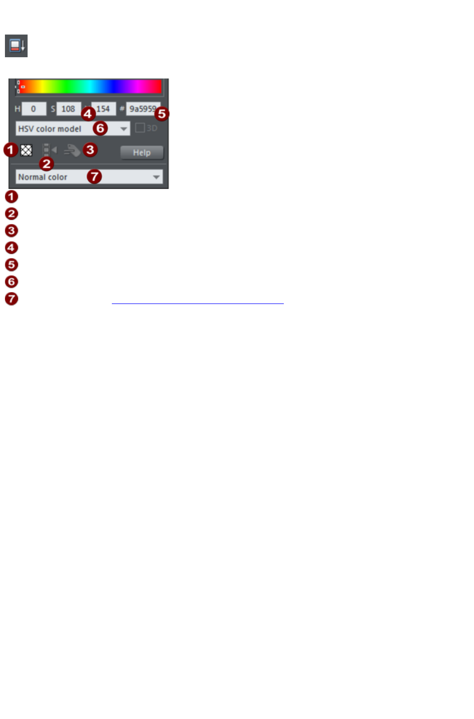
Advanced color operations
Click the Show advanced options
icon on the Color Editor to reveal the lower part of the dialog that
provides more options.
No fill color
Make named color local to Frame/Layer
Rename named color
HSV color values
RGB hex value
Color model (HSV, RGB or grayscale)
Color type: See Creating a Tint, Shade or Linked color
Here you can enter precise RGB (or HSV) color values. The most common requirement for web
graphics is to enter a hex RGB color. The H, S and V fields allow you to specify the color as HSV (hue
saturation value) values in percent. In the #
field you can enter RGB value in hexadecimal numbers (0-F).
Also a 'No fill color' button and a help button is available here.
Page 547

Local colors and Theme colors
Web Designer Premium has two types of color:
Local colors are used in only one place in the document. Each object has a separate color and
nothing is shared. This is useful if you want to change the color of an object without affecting
other objects. Local colors are the easiest method and best for simple documents that use
relatively few colors. "Applying color" and "Editing an object's color" above describe local color
handling.
Theme colors (or Named colors) can be used again and again in the document. (As such, they
are like styles in a word processor.) Theme colors are used in templates and assure a consistent
look of your page elements like buttons or navigation bars. Any edits you make to a Theme color
are immediately reflected on all objects and parts of the drawing that use that color. You can also
copy Theme colors between documents. Theme colors appear on the Color Line. If there are
any Theme colors already present in the design and you load or paste templates from the
Designs Gallery containing Theme colors with the same name, you will be asked if you want to
match the actual color of the imported Theme colors to the existing ones. The Theme colors in
most templates are consistently named so when you import elements from different themes colors
are matched perfectly.
Important: If you just select an object on the page that has a named color applied to it, and alter it with
the Color Editor, this will always turn it into a local color instead of a named color (because it is
assumed that if you try to edit the color of the object that's what you mean to do. If you really want to
change the named color so this and all occurrences of the color change, then you should do so by
editing the named color
).
Page 548

Theme color schemes
Many of the web themes offered in the Designs Gallery and in separately purchasable Template Packs
include alternative color schemes which can easily be applied to websites which use the same theme, to
transform the color scheme instantly. The color schemes are normally found in the Designs Gallery in
each theme, after all the page layouts and separate graphic elements that make up the theme. They all
have "Color scheme" in their titles in the Designs Gallery,
so they are easily identified.
To apply a color scheme to your website, simply drag the scheme from the Designs Gallery
and drop it on your page. You can try applying the color schemes of one theme to a website created
from the templates of another theme. But you will get mixed results doing this and some schemes will not
work acceptably with some themes. So for best results stick to the color schemes of the theme that you
used to create the site.
One of the color schemes provided with each theme matches the default colors used by that theme. This
allows you to easily return to the original colors if you prefer, after experimenting with the alternate
schemes.
Page 549

Creating your own color schemes
It's very easy to create your own color scheme files, which you can pass on to other Web Designer
Premium users for them to apply to websites created with the same theme.
1. Load one of the page templates for the theme. Choose one which shows off all the colors of the
theme most effectively. You can add more elements to the page if required, to help show off the
range of theme colors.
2. Edit the named colors of the theme one at a time, as described in the 'Editing named colors'
section below.
3. Once you are happy with your new color scheme, use "File" > "Save As" to save it. The
filename you choose MUST include "ThemeColorScheme" as part of the filename. That is how
Web Designer Premium identifies color scheme files ? just by looking for that sequence in the
filename. It's a good idea to also include the name of the theme to which the scheme applies. For
example a new blue color scheme for the "Beta" themeset could be named something like
"BetaThemeColorSchemeBlue.web".
To test your color scheme, drag and drop it from File Explorer onto a page that still has the default theme
colors. The page should be instantly re-colored using your color scheme.
Page 550
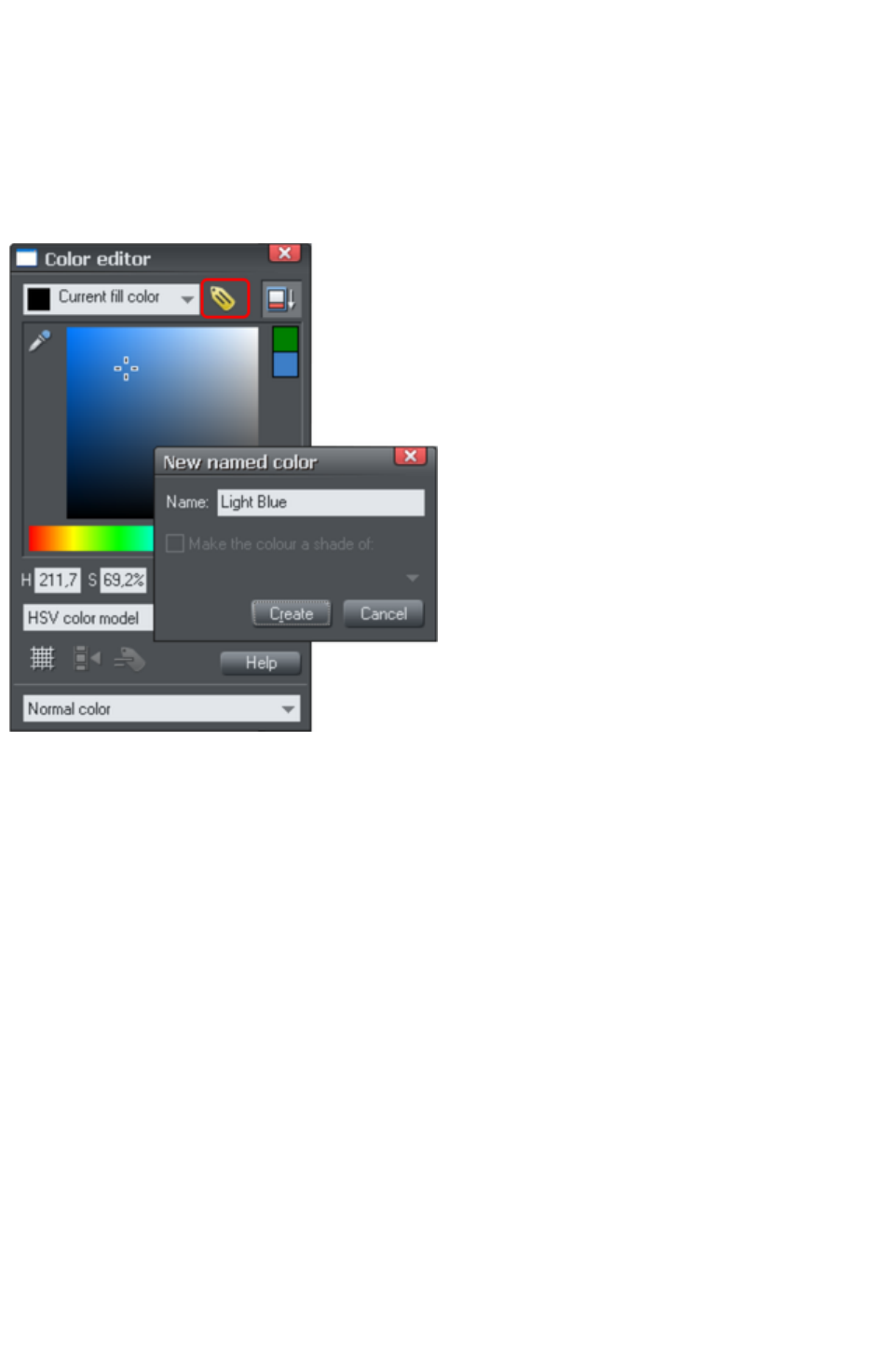
Creating new named colors
If you want to use the same color in different parts of the drawing, and there is any chance you might
want to change that color in future, if is highly recommended that you create a named color
. This is easy in Xara Web Designer 7 Premium:
Select an object whose color you want to use and then click New named color in the Color editor
.
Click to create a new named color
Give the color a suitable
name, like "car color"
and click create. You will
see the new color added
to the Color Line
.
You can now apply this
color to any object the
usual way, by
drag-dropping it from the
Color Line or just
clicking (or right clicking
to use it as a line color)
to apply as the fill color.
When you edit a named
color, all objects that use
this color will change.
Page 551

Editing named colors
There are three ways to display the color in the Color Editor
so it can be edited:
Choose from the menu in the Color Editor.
Or right click on the color on the Color Line and choose Edit from the menu that appears.
Or drag & drop a color from the Color Line onto the Color Editor.
You can then edit the color as required. All objects that use this color are automatically and immediately
updated to show the new color.
Renaming named colors
While editing a Named Color, right click on the Color Editor and select Rename
Or right click the color on the Color Line and select Rename.
Deleting named colors
To delete a named color right click on the color on the Color Line and choose Delete
.
Deleting unused colors
To clear the Color Line of unused colors, right click a Theme or Named color and choose Delete
. If the color is being used in the current document, Web Designer Premium displays a message that
allows you to cancel the deletion or use local colors instead.
However note that by default unused named colors are automatically deleted when a document is saved
or loaded. You can change this option in the View tab of the "Utilities" > "Options
" dialog.
Page 552

Renaming named colors
While editing a Named Color, right click on the Color Editor and select Rename
Or right click the color on the Color Line and select Rename.
Deleting named colors
To delete a named color right click on the color on the Color Line and choose Delete
.
Deleting unused colors
To clear the Color Line of unused colors, right click a Theme or Named color and choose Delete
. If the color is being used in the current document, Web Designer Premium displays a message that
allows you to cancel the deletion or use local colors instead.
However note that by default unused named colors are automatically deleted when a document is saved
or loaded. You can change this option in the View tab of the "Utilities" > "Options
" dialog.
Page 553

Deleting named colors
To delete a named color right click on the color on the Color Line and choose Delete
.
Deleting unused colors
To clear the Color Line of unused colors, right click a Theme or Named color and choose Delete
. If the color is being used in the current document, Web Designer Premium displays a message that
allows you to cancel the deletion or use local colors instead.
However note that by default unused named colors are automatically deleted when a document is saved
or loaded. You can change this option in the View tab of the "Utilities" > "Options
" dialog.
Page 554

Deleting unused colors
To clear the Color Line of unused colors, right click a Theme or Named color and choose Delete
. If the color is being used in the current document, Web Designer Premium displays a message that
allows you to cancel the deletion or use local colors instead.
However note that by default unused named colors are automatically deleted when a document is saved
or loaded. You can change this option in the View tab of the "Utilities" > "Options
" dialog.
Page 555
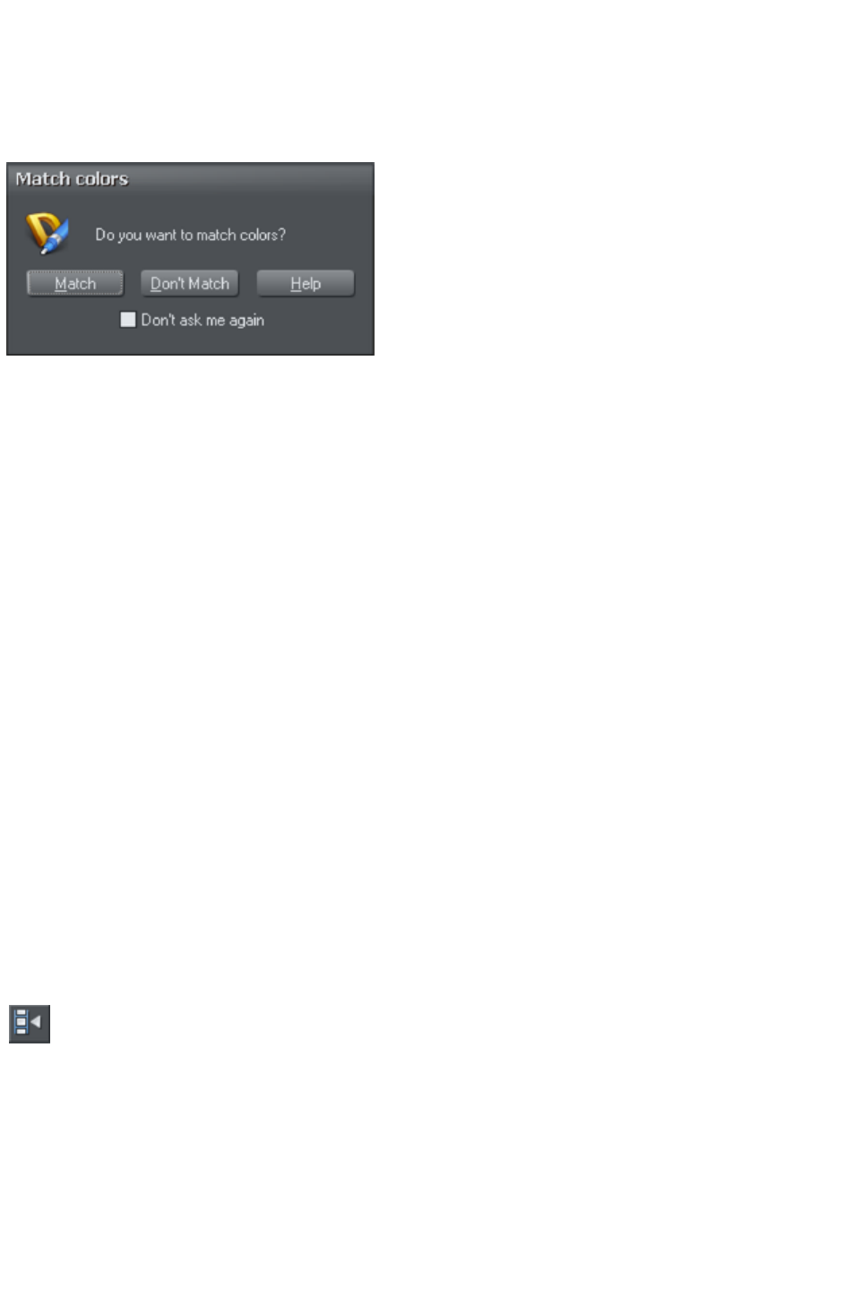
Importing named colors
When a design is imported into the current document (e.g. import from the Designs Gallery
, import a XAR file or paste objects in from another design) if there are any named colors in the imported
design which have the same names but different color values as colors in the current design, an alert
appears as follows:
If you want the imported objects to inherit the colors of your current design, choose the "Match
" option. This makes all objects using a given named color use the existing instance of that color as it
appears in the current document.
Alternatively if you want the imported objects to keep their own independent colors, select the "Don't
Match
" option. This adds new named colors into your design, with a number appended to the color names to
distinguish them from the colors already in the current design. This allows the imported objects to keep
their original colors.
Note that if you import objects from lots of different designs and choose "Don't Match
" each time, you will end up with a large number of separate Named Colors on your color line.
The match prompt above includes a "Don't ask me again
" checkbox. If you check this, the option you choose will be assumed for all future imports, without
asking you again. However this only applies during the current session, so after a program restart you will
be asked again on the next import if there is a color clash.
Using the Match
option means that you can choose a template, change its theme colors and then import more templates of
the same theme and the imported designs will immediately pick up your modified theme colors.
For example, import a red graphical button from the Designs Gallery, change its main theme color from
red to green, then import a red logo graphic of the same theme and choose the "Match"
option. When the logo appears in your design, instead of being red it will have picked up your chosen
green theme color automatically. Since most themes have their main theme color named "Theme color 1",
you will also usually get good results when importing graphics from different themes and matching the
colors.
Make Named Color local to Frame/Layer
When you click this button, a new named color is created which is
identical to the one you have selected.
This new color is then applied to all objects in the current frame or layer that use the selected named
color. This means that with one click you can localize a color to the frame/layer. You can then
independently edit the original color and this localized color.
This feature is useful when you are creating animations and you want an object's color to change part
way through the animation.
This button is dimmed unless you are editing a named color that is also used in another frame or layer.
Page 556

Make Named Color local to Frame/Layer
When you click this button, a new named color is created which is
identical to the one you have selected.
This new color is then applied to all objects in the current frame or layer that use the selected named
color. This means that with one click you can localize a color to the frame/layer. You can then
independently edit the original color and this localized color.
This feature is useful when you are creating animations and you want an object's color to change part
way through the animation.
This button is dimmed unless you are editing a named color that is also used in another frame or layer.
Page 557

Normal colors, Tints, Shades and Linked
colors
Normal colors
These are the normal stand-alone colors you apply to objects.
Xara Web Designer 7 Premium can also define colors that are linked to another color, that is when the
parent color changes the linked color will change as well. There are three ways you can link a color to its
parent Tints, Shades, and Linked colors
. These are very powerful techniques that allow, for example, single-click re-coloring of complex shaded
drawings. Some of the example clipart uses this technique.
Tints
Tints are based on other colors (called the parent color) and are always a paler version of the parent.
They have two main uses:
Where you have paler shades of a parent color and you may want to change the parent color in
future with the tints automatically updating.
To extend the range of colors available from printing inks.
For example, a 25% red tint gives a pink color. Therefore using just a red ink you can have both
a pure red and a pink using only one ink. Similarly, if just using black-and-white printing, it's often
useful to be able to use tints to create various shades of gray.
If you are printing with a limited range of colors (it's usually cheaper to print one or two color,
instead of full or four color printing).
A tint can be based on any type of color, including another tint.
Any changes you make to the parent color also change tints based on it. For example, you might define
the color pink as 50% of a red parent color. Changing the parent color to orange automatically changes
pink to light orange.
Shades
These allow both lighter and darker colors to be created all based on a parent color. Changing the color
of the parent changes all associated shades. For example, a drawing of a car might use shades for the
highlight and shaded regions of the car body. A single edit to the parent changes all the colors of the
entire body but keeps the shading correct. Setting up shades this way is more time consuming but it is a
very powerful way of altering colors.
For best results, the parent color should be a "pure" saturated color. When using the HSV color mode,
saturation and value should ideally be 100%. When viewed in the Color Editor
the cross should be in the top left-hand corner.
Linked colors
Linked colors are similar to shades but give greater flexibility. These are also based on a parent color but
you define which attributes you want the linked color to share with its parent. For example you can
create a linked color that is a more or less saturated version of the parent, but the hue and lightness /
darkness follow the parent.
Page 558

Normal colors
These are the normal stand-alone colors you apply to objects.
Xara Web Designer 7 Premium can also define colors that are linked to another color, that is when the
parent color changes the linked color will change as well. There are three ways you can link a color to its
parent Tints, Shades, and Linked colors
. These are very powerful techniques that allow, for example, single-click re-coloring of complex shaded
drawings. Some of the example clipart uses this technique.
Tints
Tints are based on other colors (called the parent color) and are always a paler version of the parent.
They have two main uses:
Where you have paler shades of a parent color and you may want to change the parent color in
future with the tints automatically updating.
To extend the range of colors available from printing inks.
For example, a 25% red tint gives a pink color. Therefore using just a red ink you can have both
a pure red and a pink using only one ink. Similarly, if just using black-and-white printing, it's often
useful to be able to use tints to create various shades of gray.
If you are printing with a limited range of colors (it's usually cheaper to print one or two color,
instead of full or four color printing).
A tint can be based on any type of color, including another tint.
Any changes you make to the parent color also change tints based on it. For example, you might define
the color pink as 50% of a red parent color. Changing the parent color to orange automatically changes
pink to light orange.
Shades
These allow both lighter and darker colors to be created all based on a parent color. Changing the color
of the parent changes all associated shades. For example, a drawing of a car might use shades for the
highlight and shaded regions of the car body. A single edit to the parent changes all the colors of the
entire body but keeps the shading correct. Setting up shades this way is more time consuming but it is a
very powerful way of altering colors.
For best results, the parent color should be a "pure" saturated color. When using the HSV color mode,
saturation and value should ideally be 100%. When viewed in the Color Editor
the cross should be in the top left-hand corner.
Linked colors
Linked colors are similar to shades but give greater flexibility. These are also based on a parent color but
you define which attributes you want the linked color to share with its parent. For example you can
create a linked color that is a more or less saturated version of the parent, but the hue and lightness /
darkness follow the parent.
Page 559

Tints
Tints are based on other colors (called the parent color) and are always a paler version of the parent.
They have two main uses:
Where you have paler shades of a parent color and you may want to change the parent color in
future with the tints automatically updating.
To extend the range of colors available from printing inks.
For example, a 25% red tint gives a pink color. Therefore using just a red ink you can have both
a pure red and a pink using only one ink. Similarly, if just using black-and-white printing, it's often
useful to be able to use tints to create various shades of gray.
If you are printing with a limited range of colors (it's usually cheaper to print one or two color,
instead of full or four color printing).
A tint can be based on any type of color, including another tint.
Any changes you make to the parent color also change tints based on it. For example, you might define
the color pink as 50% of a red parent color. Changing the parent color to orange automatically changes
pink to light orange.
Shades
These allow both lighter and darker colors to be created all based on a parent color. Changing the color
of the parent changes all associated shades. For example, a drawing of a car might use shades for the
highlight and shaded regions of the car body. A single edit to the parent changes all the colors of the
entire body but keeps the shading correct. Setting up shades this way is more time consuming but it is a
very powerful way of altering colors.
For best results, the parent color should be a "pure" saturated color. When using the HSV color mode,
saturation and value should ideally be 100%. When viewed in the Color Editor
the cross should be in the top left-hand corner.
Linked colors
Linked colors are similar to shades but give greater flexibility. These are also based on a parent color but
you define which attributes you want the linked color to share with its parent. For example you can
create a linked color that is a more or less saturated version of the parent, but the hue and lightness /
darkness follow the parent.
Page 560

Shades
These allow both lighter and darker colors to be created all based on a parent color. Changing the color
of the parent changes all associated shades. For example, a drawing of a car might use shades for the
highlight and shaded regions of the car body. A single edit to the parent changes all the colors of the
entire body but keeps the shading correct. Setting up shades this way is more time consuming but it is a
very powerful way of altering colors.
For best results, the parent color should be a "pure" saturated color. When using the HSV color mode,
saturation and value should ideally be 100%. When viewed in the Color Editor
the cross should be in the top left-hand corner.
Linked colors
Linked colors are similar to shades but give greater flexibility. These are also based on a parent color but
you define which attributes you want the linked color to share with its parent. For example you can
create a linked color that is a more or less saturated version of the parent, but the hue and lightness /
darkness follow the parent.
Page 561

Linked colors
Linked colors are similar to shades but give greater flexibility. These are also based on a parent color but
you define which attributes you want the linked color to share with its parent. For example you can
create a linked color that is a more or less saturated version of the parent, but the hue and lightness /
darkness follow the parent.
Page 562
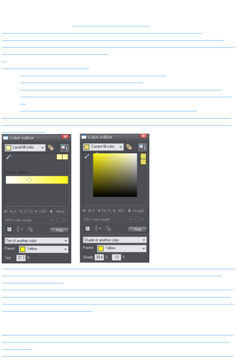
Creating a Tint, Shade or Linked color
See above for a description of Tints, Shades and Linked colors
. They are useful where you want a lighter or darker shade to track that of a parent color.
Tints, shades and Linked color have to have a master "parent" color, which needs to be a named
color, so that when you change this parent color, the tint will change as well. So, if necessary, first create
a named color (see Creating new named colors
).
To create a tint, shade or linked color:
1. Select the object or objects to which you want to apply the color.
2. Open the Color Editor showing the advanced options.
3. Select the "normal color" drop-down menu and select the Tint, Shade, or Linked option.
4. From the Parent dropdown menu, select the named color that you want this color to be linked
to.
5. Adjust the Tint, Shade or Linked color on the top section of the color editor.
If the tint, shade and linked color options aren't included in the color type drop down list, this probably
means you haven't yet created a named color to link to, or that you are editing the one and only named
color in the design.
On the left you can see the new color is a tint of the parent "yellow" and so the editor provides only paler
tints of the parent color. On the right, if you select a shade, you get to choose any lighter or darker
shades of the parent color.
If you want to use this color in many places in the document it's recommended that you also make this a
Named Color, so it appears on the Color Line, for easy picking. Just click on the New Named Color
label icon on the top of the Color Editor and give it a name. It will now appear on the Color Line where
you can pick it for use on other objects.
Editing the parent color
The key point of using tints, shades and linked colors is that they track any changes to the parent color.
To see this working try editing the Named color that is the parent (drag it from the Color Line to the
Color Editor
and alter the color). You will see the objects with the tint, shade or linked color change in sync with the
Page 563

parent.
Note: Be careful not to edit the color of objects on the page to which you've applied Named, Tints,
Shades, or Linked colors as this will change them to Local colors
.
Page 564

Editing the parent color
The key point of using tints, shades and linked colors is that they track any changes to the parent color.
To see this working try editing the Named color that is the parent (drag it from the Color Line to the
Color Editor
and alter the color). You will see the objects with the tint, shade or linked color change in sync with the
parent.
Note: Be careful not to edit the color of objects on the page to which you've applied Named, Tints,
Shades, or Linked colors as this will change them to Local colors
.
Page 565
Text Handling
In this chapter
Introduction
Terminology
The Text Tool
The Font Menu
Simple text
Text in a column
Text areas
Text along a curve
Editing text
Spell checker
Find & Replace
Synchronising Text using Soft Groups
Tabs, Margins and Indents
Repelling text objects
Anchored Graphics
Applying text styles
Text links
Text inside groups for websites
Copying text styles
Copying/Pasting formatted text (RTF)
Seeing fonts in use
Font embedding
Browser text compatibility
Page 566
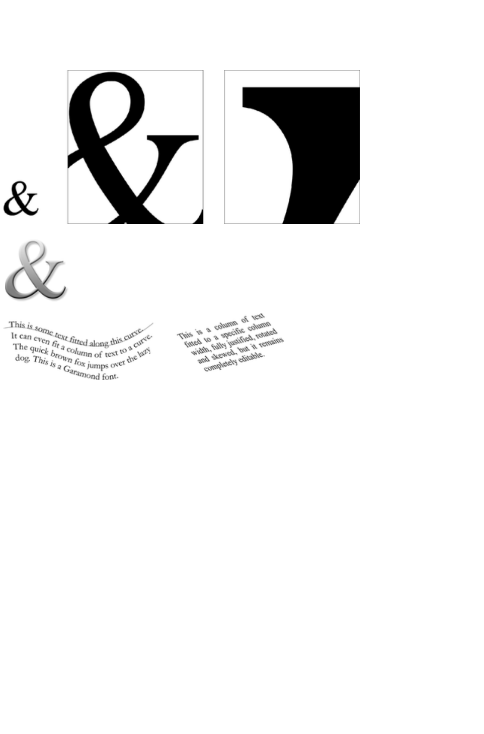
Introduction
The text editing facilities of Xara Web Designer 7 Premium are very like your text editor or word
processor, but in addition it provides a range of features you won't find in those programs:
You can enlarge or magnify text to a huge degree.
You can apply the range of normal Xara Web Designer 7
Premium attributes and effects: fills, feather, transparency,
color fades, shadows, and still continue to edit the text.
You can convert the outlines of characters to shapes which
can be edited just like all normal shapes.
Fit text to a curve. All text can be rotated, skewed and stretched.
Page 567

Terminology
Font or Typeface
: A set of characters with a consistent style.
Font family
: A set of similar fonts. For example Garamond and Garamond Italic are different fonts from the same
Garamond family.
Justification:
An alternative way of describing text alignment. Left aligned text is sometimes called left justified, or
flush-left, or ragged right.
Monospaced
: All the individual characters of a monospaced font have the same width. Sometimes referred to a fixed
width fonts. Useful for program listings. Courier is the most common monospaced font. Most fonts are
proportional spaced fonts, meaning the characters vary in width.
Point
: Text or font sizes are traditionally measured in points, abbreviated to pt. 1pt is approximately 1/72nd
inch, so 72pt text is approximately 1inch tall, although different fonts of a given size can vary.
Page 568
The Text Tool
Use the Text Tool
("F8") to enter or edit text.
Text Tool
InfoBar Left Side
Font
Font Size
Bold
Italic
Underlined
Justification
Text Tool
InfoBar Right Side
Subscript/Superscript
Line Spacing
Paragraph Spacing
Bulleted Lists
Numbered lists
Indent
Outdent
Spell Checker
Xara Web Designer 7 Premium supports three basic type of text objects
Simple text lines: Click on the page, and type.
Text columns: Click and drag to create a column, and type.
Text areas: Click and drag diagonally to create a rectangular area, and type.
After you've created any text object you can transform it (rotate, scale, skew) and can apply all the
normal attributes, fill color, transparency, feather etc, using the normal tools. You can also attach it to a
curve. The text will remain editable.
Page 569
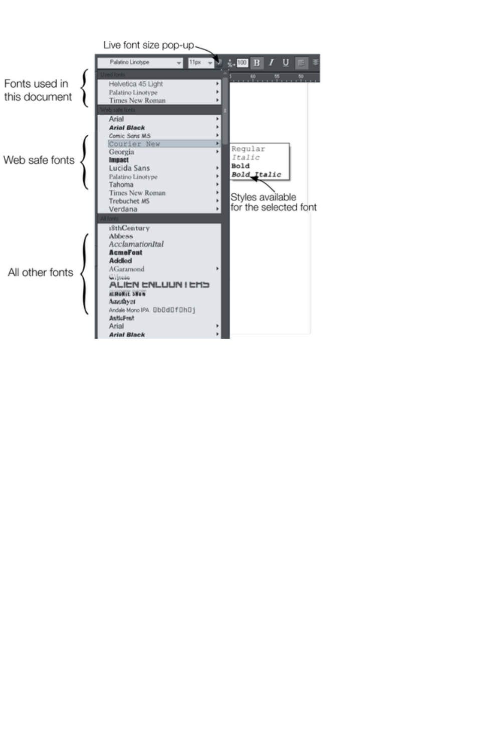
The Font Menu
The font menu lists all installed fonts, and is split into three sections. The top section displays those fonts
that are currently used in the document. The second section shows the "web safe" fonts. These are the
fonts you can safely use in web pages, because all commonly used web browsers will support these
fonts. See Web Safe Fonts section. The final section displays an alphabetical list of all other installed
fonts. Each font name is displayed in the menu using its own typeface, making font selection easier.
Those fonts for which multiple font styles are available are shown with small black triangles against them
on the right hand side of the menu. Simply hold the mouse pointer over such a font name for a second or
two and a small sub-menu appears to the right of the main menu, listing the available styles of that font.
While this sub-menu is displayed, you can move the mouse pointer over it to select the desired font style.
Web Safe Fonts
Only a small set of fonts can be used safely for the main text of a website - only those fonts that you
know will exist on the computer of the viewer of your website. Although there are no guarantees, there is
a common subset of fonts that are widely used by something like 98% of all computers, including Apple
Mac and some Linux computers. These fonts are called the 'web safe fonts', and are listed in a separate
section of the font menu. If you try and export a website using non safe fonts you will get a warning.
Live Font Preview
As you move the mouse pointer over any entry in the font menu, the selected text in the document is
instantly updated to preview the font. This is not a permanent change until you actually click on the
required font. Moving the mouse pointer over the menu will revert back to the initial font until you move
over another entry. This is great for very rapidly previewing large numbers of fonts.
If you hold down the "Shift" key while traversing the font menu, then the font selection is not updated
instantly, there is a short pause before it is updated. This is useful if you find that instant preview slows
down your traversal of the menu (perhaps if you have a large amount of text selected).
Page 570
Live Font Size preview
Next to the font size menu is a small pop-up slider control, like that used elsewhere in Web Designer
Premium. This provides a direct, live font size control, and will adjust the font size of the selected text in
real-time as you drag the slider.
Click to display font size pop-up
As with the pop-up sliders used elsewhere this can be used two ways. "Click + release" on the arrow
and the pop-up will appear and stay on screen. You can now drag the slider, or use the mouse scroll
wheel over the control to rapidly adjust the values. So in this case, this provides a fast way of adjusting
the point size using the mouse wheel to see the results directly on the page of the document as you work.
The alternative method of using the pop-up slider is to "click + drag + release" on the button and slider.
This is a slightly more direct way of adjusting the control (requires less clicks).
Instant font menu navigation
While the font menu is displayed, you can type the initial characters of the font name, and the menu will
be scrolled to that section of the list. E.g. if you type "ver" it will instantly scroll and locate the Verdana
font.
Page 571
Web Safe Fonts
Only a small set of fonts can be used safely for the main text of a website - only those fonts that you
know will exist on the computer of the viewer of your website. Although there are no guarantees, there is
a common subset of fonts that are widely used by something like 98% of all computers, including Apple
Mac and some Linux computers. These fonts are called the 'web safe fonts', and are listed in a separate
section of the font menu. If you try and export a website using non safe fonts you will get a warning.
Live Font Preview
As you move the mouse pointer over any entry in the font menu, the selected text in the document is
instantly updated to preview the font. This is not a permanent change until you actually click on the
required font. Moving the mouse pointer over the menu will revert back to the initial font until you move
over another entry. This is great for very rapidly previewing large numbers of fonts.
If you hold down the "Shift" key while traversing the font menu, then the font selection is not updated
instantly, there is a short pause before it is updated. This is useful if you find that instant preview slows
down your traversal of the menu (perhaps if you have a large amount of text selected).
Live Font Size preview
Next to the font size menu is a small pop-up slider control, like that used elsewhere in Web Designer
Premium. This provides a direct, live font size control, and will adjust the font size of the selected text in
real-time as you drag the slider.
Click to display font size pop-up
As with the pop-up sliders used elsewhere this can be used two ways. "Click + release" on the arrow
and the pop-up will appear and stay on screen. You can now drag the slider, or use the mouse scroll
wheel over the control to rapidly adjust the values. So in this case, this provides a fast way of adjusting
the point size using the mouse wheel to see the results directly on the page of the document as you work.
The alternative method of using the pop-up slider is to "click + drag + release" on the button and slider.
This is a slightly more direct way of adjusting the control (requires less clicks).
Instant font menu navigation
While the font menu is displayed, you can type the initial characters of the font name, and the menu will
be scrolled to that section of the list. E.g. if you type "ver" it will instantly scroll and locate the Verdana
font.
Page 572
Live Font Preview
As you move the mouse pointer over any entry in the font menu, the selected text in the document is
instantly updated to preview the font. This is not a permanent change until you actually click on the
required font. Moving the mouse pointer over the menu will revert back to the initial font until you move
over another entry. This is great for very rapidly previewing large numbers of fonts.
If you hold down the "Shift" key while traversing the font menu, then the font selection is not updated
instantly, there is a short pause before it is updated. This is useful if you find that instant preview slows
down your traversal of the menu (perhaps if you have a large amount of text selected).
Live Font Size preview
Next to the font size menu is a small pop-up slider control, like that used elsewhere in Web Designer
Premium. This provides a direct, live font size control, and will adjust the font size of the selected text in
real-time as you drag the slider.
Click to display font size pop-up
As with the pop-up sliders used elsewhere this can be used two ways. "Click + release" on the arrow
and the pop-up will appear and stay on screen. You can now drag the slider, or use the mouse scroll
wheel over the control to rapidly adjust the values. So in this case, this provides a fast way of adjusting
the point size using the mouse wheel to see the results directly on the page of the document as you work.
The alternative method of using the pop-up slider is to "click + drag + release" on the button and slider.
This is a slightly more direct way of adjusting the control (requires less clicks).
Instant font menu navigation
While the font menu is displayed, you can type the initial characters of the font name, and the menu will
be scrolled to that section of the list. E.g. if you type "ver" it will instantly scroll and locate the Verdana
font.
Page 573
Live Font Size preview
Next to the font size menu is a small pop-up slider control, like that used elsewhere in Web Designer
Premium. This provides a direct, live font size control, and will adjust the font size of the selected text in
real-time as you drag the slider.
Click to display font size pop-up
As with the pop-up sliders used elsewhere this can be used two ways. "Click + release" on the arrow
and the pop-up will appear and stay on screen. You can now drag the slider, or use the mouse scroll
wheel over the control to rapidly adjust the values. So in this case, this provides a fast way of adjusting
the point size using the mouse wheel to see the results directly on the page of the document as you work.
The alternative method of using the pop-up slider is to "click + drag + release" on the button and slider.
This is a slightly more direct way of adjusting the control (requires less clicks).
Instant font menu navigation
While the font menu is displayed, you can type the initial characters of the font name, and the menu will
be scrolled to that section of the list. E.g. if you type "ver" it will instantly scroll and locate the Verdana
font.
Page 574

Instant font menu navigation
While the font menu is displayed, you can type the initial characters of the font name, and the menu will
be scrolled to that section of the list. E.g. if you type "ver" it will instantly scroll and locate the Verdana
font.
Page 575

Simple text
If you wish to type a small amount of simple text, position the pointer where you want to enter text and
click. A red cursor appears where you clicked and you can now start typing on the keyboard.
If you make a mistake, use "Delete" and "Backspace" in the usual way.
Pressing "Enter" completes the line and starts a new line of text below it. The inter-line spacing is
controlled by the line spacing text box on the InfoBar.
By default text has no outline color. "Shift + clicking" on a color on the Color Line will give the selected
text an outline color - the thickness of which can be controlled by the line width control, as usual. You
will probably want to set the Line join type to be rounded to give it a more smooth appearance (control
at the top of the Line Gallery
).
Line width is described in Changing the line width (thickness) (Changing the line width (thickness),
Changing the line width (thickness)). Applying color is described in Color handling
.
You can continue to enter text even after rotation, color filling or placing it on a curve.
Page 576
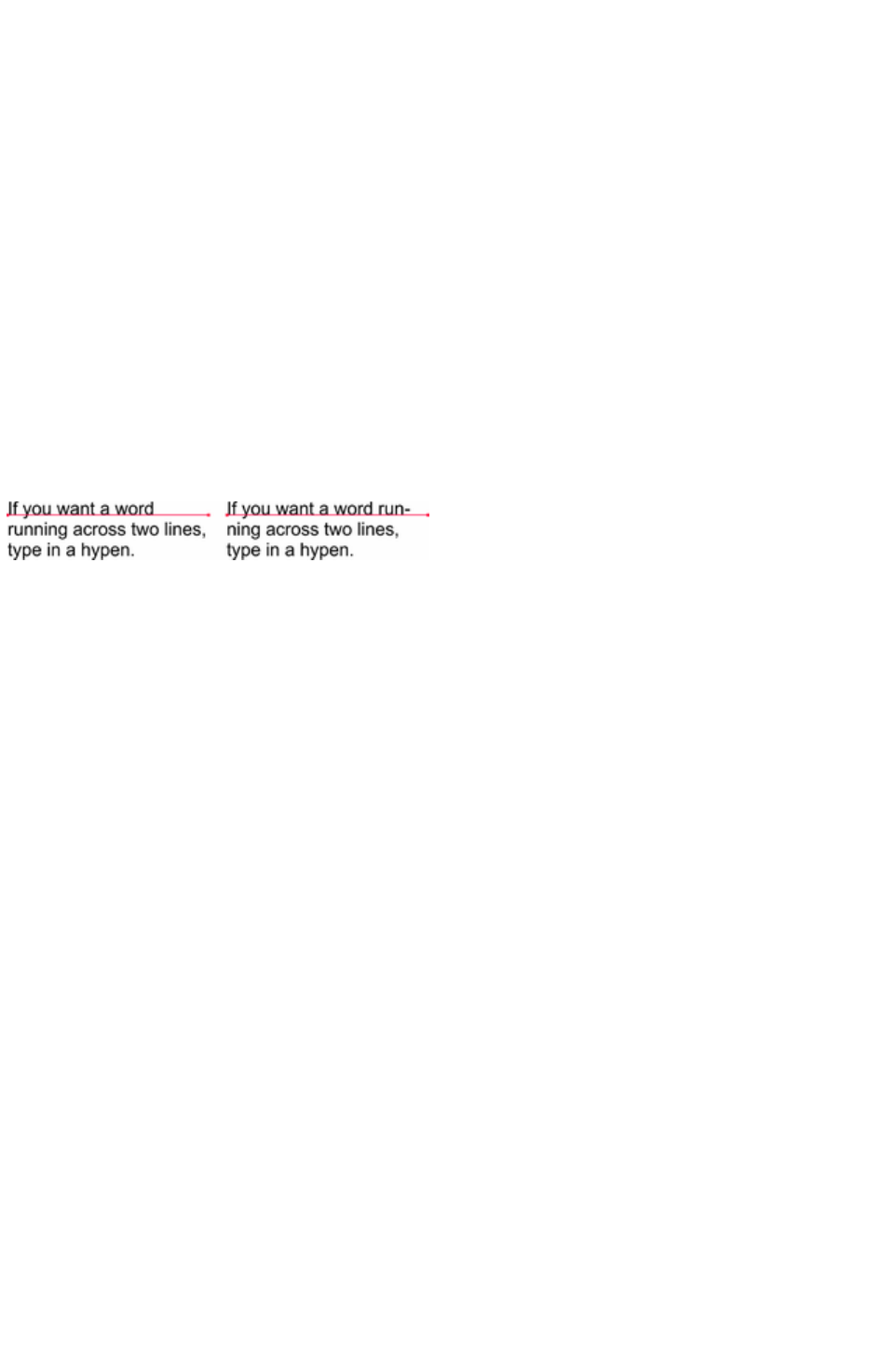
Text in a column
If you are entering larger amounts of text, over multiple lines, using a column may be more useful.
Changing the width of the column will automatically re-flow the text.
To type a column of text:
1. Select the Text Tool.
2. Move the mouse pointer where you want the column to start.
3. Drag right to create a horizontal line the width of the column. This red line just shows you the
width of the column. It is never exported or printed.
4. Type in the text. You don't need to press "Enter" at the end of a line. When the text reaches the
edge of the column, it automatically flows onto a new line.
Note
: If you click away or change tools before you start typing, the text column will be removed and nothing
left on the page. Therefore always start typing after you've dragged the column width line.
Instead of typing in the text you can create the text in a separate text editor or word processor, copy it to
the clipboard and paste it into Xara Web Designer 7 Premium. Copy and paste supports RTF-formatted
text.
Words only split across lines if they contain a hyphen character (minus key)
The effect of typing a hyphen into "running"
If you type "Ctrl + -" (minus key) it inserts a soft hyphen
which is a hyphen that only appears if the word can wrap at the end of a line. This is particularly useful
for narrow columns of text, to avoid rivers of white, you might need to hyphenate some words. Inserting
a normal dash character will split the word at the end of the line. It's called a 'soft' hyphen because when
the word appears in the middle of a line the hyphen vanishes (unlike a normal dash or minus character),
so it intelligently hyphenates the words only if it needs to.
When editing the text a soft hyphen is treated as an invisible character (it takes no space), but you can tell
it's in the text by moving the cursor left/right over where the invisible character is.
A hard hyphen
can be inserted by typing "Ctrl + Shift + -" (minus key). A hard hyphen is one that will not cause a wrap
at all. This is useful in situations where you have dashes in words that you do not want split at the end of
lines.
Changing the width of the column
Drag either of the two red handles at the ends of the line.
Changing the angle of the column
"ñ+ drag" either of the red handles at the end of the line to change the angle of the column. Alternatively,
"Ctrl + drag" to restrain the line to the constrain angles. Or alternatively you can use the Selector Tool
to rotate the object in the usual way.
For more on constrain angles, see Introduction to Xara Web Designer 7 Premium.
Page 577

Changing the width of the column
Drag either of the two red handles at the ends of the line.
Changing the angle of the column
"ñ+ drag" either of the red handles at the end of the line to change the angle of the column.
Alternatively, "Ctrl + drag" to restrain the line to the constrain angles. Or alternatively you can use the
Selector Tool
to rotate the object in the usual way.
For more on constrain angles, see Introduction to Xara Web Designer 7 Premium.
Page 578

Changing the angle of the column
"ñ+ drag" either of the red handles at the end of the line to change the angle of the column.
Alternatively, "Ctrl + drag" to restrain the line to the constrain angles. Or alternatively you can use the
Selector Tool
to rotate the object in the usual way.
For more on constrain angles, see Introduction to Xara Web Designer 7 Premium.
Page 579
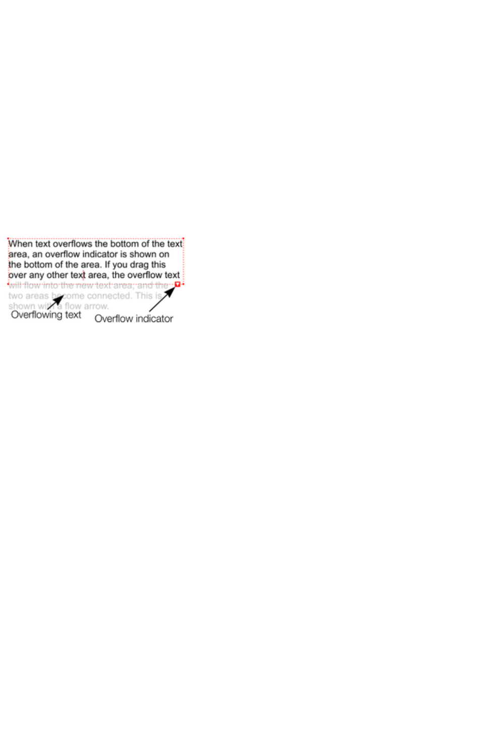
Text areas
In the Text Tool
if you click and drag diagonally on the page you will create a rectangular text area. The blinking cursor
will be positioned in the top left corner and you can type or paste text.
A text area can contain a "flowing" text story. This is where a single piece of text flows from one text area
to another. It's called flowing text because, like water, as you add or remove text in one area it overflows
into connected text areas or flows back from text areas.
If the text overflows the bottom of the text area the overflowing text is shown gray, although you can
continue to edit this text as usual.
Connecting text areas—text flow
When text overflows the bottom of the text area, an overflow indicator is shown on the bottom of the
area. If you drag this over any other text area, the overflow text will flow into the new text area, and the
two areas become connected. This is shown with a flow arrow.
Dragging the overflow indicator from
one text area to another will connect
the two areas so text flows from one
to another. You can link as many
together as you require.
There is a quick way to create flowing text. If the text cursor in an area with overflowing text, then just
click-drag on the page to create a new text area. The new text area is automatically connected and text
will flow into the new area.
Tip
: You can flow text from one area to another on any page, even earlier pages. If you need to flow into an
area many pages away, it's probably easier to use the above method, although if you zoom out to a small
page size you can drag the overflow arrow across pages.
To disconnect one text area from another, just drag on the overflow indicator and drop it away from any
text area.
If you delete a text area that is connected to another only the area is deleted, the text will simply re-flow
into the remaining text areas.
Resizing text areas
Using the Text Tool
, you can click and drag on any of the corner control handles. The text in the area will be reformatted to
fit the new size.
Alternatively you can use the Selector Tool to resize the text object, but in this case the behavior is
different. If you resize a text object using the Selector Tool, the text itself changes size. This is consistent
with the normal operation of the Selector Tool
.
However in the case of flowing text areas this would cause undesired side-effects; you almost certainly
do not want part of a flowing text story to be a different point size than the rest. Therefore, the Selector
Tool
behavior varies depending on whether you are resizing one text area that contains a flowing text story, or
resizing the whole text story. The rule is:
If you resize a single unconnected text area (or simple text or text column) then the area
"container" and text content are resized together.
If you select the text areas of the whole flowing text story (they have to be on a single page) then
Page 580
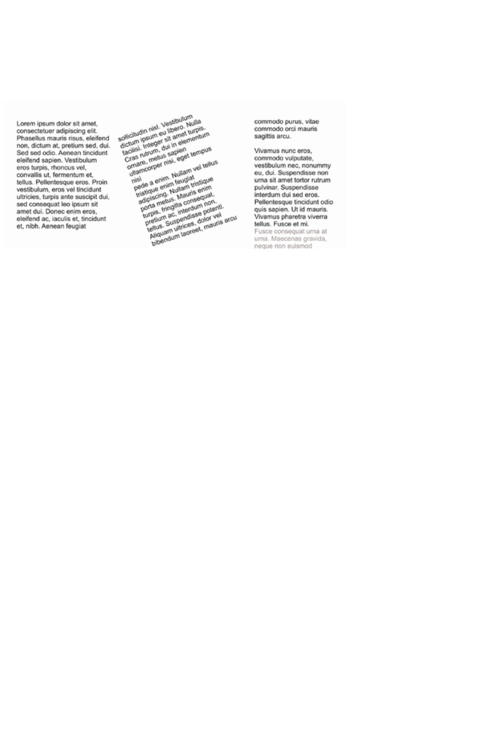
a resize will resize the text and areas together.
But if you resize a text area that is part of a flowing series of text areas, then only the container
size is altered and the text inside remains the original size, and will be re-formatted to fit the new
size. This is like resizing a text area with the Text Tool.
If you want to resize all text in a text story, select it all with "Ctrl + A", and apply the required font size.
You can rotate a text area, using the Selector Tool
as normal, and the text will flow through the rotated text area normally.
Text flow is unaffected if you rotate any of the text areas
Hold down "Ctrl" while rotating to constrain the text rotation angle to 90° angles and screen aligned
angles.
Word count
The word and character count total of the current text is shown in the status line. This also shows the
number of overflowing words. If any region of text is selected, it shows the count of this selection
instead.
Page 581
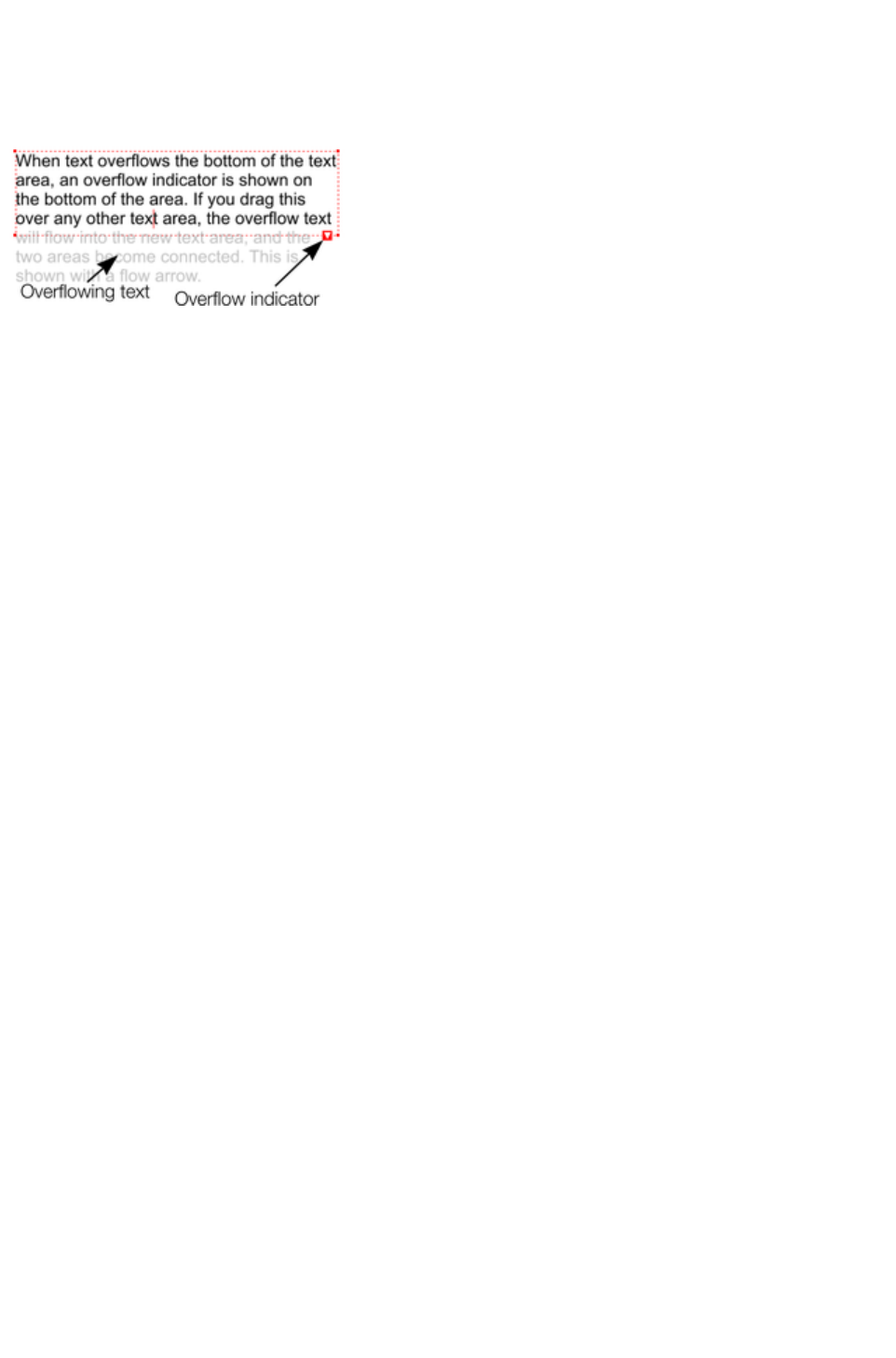
Connecting text areas—text flow
When text overflows the bottom of the text area, an overflow indicator is shown on the bottom of the
area. If you drag this over any other text area, the overflow text will flow into the new text area, and the
two areas become connected. This is shown with a flow arrow.
Dragging the overflow indicator from
one text area to another will connect
the two areas so text flows from one
to another. You can link as many
together as you require.
There is a quick way to create flowing text. If the text cursor in an area with overflowing text, then just
click-drag on the page to create a new text area. The new text area is automatically connected and text
will flow into the new area.
Tip
: You can flow text from one area to another on any page, even earlier pages. If you need to flow into an
area many pages away, it's probably easier to use the above method, although if you zoom out to a small
page size you can drag the overflow arrow across pages.
To disconnect one text area from another, just drag on the overflow indicator and drop it away from any
text area.
If you delete a text area that is connected to another only the area is deleted, the text will simply re-flow
into the remaining text areas.
Resizing text areas
Using the Text Tool
, you can click and drag on any of the corner control handles. The text in the area will be reformatted to
fit the new size.
Alternatively you can use the Selector Tool to resize the text object, but in this case the behavior is
different. If you resize a text object using the Selector Tool, the text itself changes size. This is consistent
with the normal operation of the Selector Tool
.
However in the case of flowing text areas this would cause undesired side-effects; you almost certainly
do not want part of a flowing text story to be a different point size than the rest. Therefore, the Selector
Tool
behavior varies depending on whether you are resizing one text area that contains a flowing text story, or
resizing the whole text story. The rule is:
If you resize a single unconnected text area (or simple text or text column) then the area
"container" and text content are resized together.
If you select the text areas of the whole flowing text story (they have to be on a single page) then
a resize will resize the text and areas together.
But if you resize a text area that is part of a flowing series of text areas, then only the container
size is altered and the text inside remains the original size, and will be re-formatted to fit the new
size. This is like resizing a text area with the Text Tool.
If you want to resize all text in a text story, select it all with "Ctrl + A", and apply the required font size.
You can rotate a text area, using the Selector Tool
as normal, and the text will flow through the rotated text area normally.
Page 582
Text flow is unaffected if you rotate any of the text areas
Hold down "Ctrl" while rotating to constrain the text rotation angle to 90° angles and screen aligned
angles.
Word count
The word and character count total of the current text is shown in the status line. This also shows the
number of overflowing words. If any region of text is selected, it shows the count of this selection
instead.
Page 583
Resizing text areas
Using the Text Tool
, you can click and drag on any of the corner control handles. The text in the area will be reformatted to
fit the new size.
Alternatively you can use the Selector Tool to resize the text object, but in this case the behavior is
different. If you resize a text object using the Selector Tool, the text itself changes size. This is consistent
with the normal operation of the Selector Tool
.
However in the case of flowing text areas this would cause undesired side-effects; you almost certainly
do not want part of a flowing text story to be a different point size than the rest. Therefore, the Selector
Tool
behavior varies depending on whether you are resizing one text area that contains a flowing text story, or
resizing the whole text story. The rule is:
If you resize a single unconnected text area (or simple text or text column) then the area
"container" and text content are resized together.
If you select the text areas of the whole flowing text story (they have to be on a single page) then
a resize will resize the text and areas together.
But if you resize a text area that is part of a flowing series of text areas, then only the container
size is altered and the text inside remains the original size, and will be re-formatted to fit the new
size. This is like resizing a text area with the Text Tool.
If you want to resize all text in a text story, select it all with "Ctrl + A", and apply the required font size.
You can rotate a text area, using the Selector Tool
as normal, and the text will flow through the rotated text area normally.
Text flow is unaffected if you rotate any of the text areas
Hold down "Ctrl" while rotating to constrain the text rotation angle to 90° angles and screen aligned
angles.
Word count
The word and character count total of the current text is shown in the status line. This also shows the
number of overflowing words. If any region of text is selected, it shows the count of this selection
instead.
Page 584

Word count
The word and character count total of the current text is shown in the status line. This also shows the
number of overflowing words. If any region of text is selected, it shows the count of this selection
instead.
Page 585

Text along a curve
To place text along a curve of your choice:
1. Create either basic text,
text in a column or a text
area (see above).
2. Select your text object and
one curve.
3. Choose "Arrange" > "Fit
text to curve".
Alternatively, select a curve or line and then in the Text Tool
, click on the line, where you want the text to start, and type. This automatically fits the text along the line.
When you reach the end of the line the text will wrap onto a new line, immediately below the start of the
previous one.
If you do not want the text to wrap to a new line, "Shift + click" on the line.
To hide the curve so it's not visible, select the Shape Editor Tool and set the line color to No color or a
width of None
. You can also edit the curve as usual this way.
Applying color is described in Color handling
.
Adjusting the left and right margin of text on a curve
If you just start typing or place a column of text on a curve, you can change the start and end position of
the red handles. Just drag them along the curve as required. If you center text it will be between these
two margins.
Swapping sides of the line
Right click on the text and select the Reverse text on curve
menu option.
Alternatively, if you reverse the direction of the line (Shape Editor Tool, Reverse paths
button on the InfoBar), then the text will move to the other side of the line or, in the case of a closed
shape, move from the inside to the outside of the shape.
Page 586

Adjusting the left and right margin of text on a curve
If you just start typing or place a column of text on a curve, you can change the start and end position of
the red handles. Just drag them along the curve as required. If you center text it will be between these
two margins.
Swapping sides of the line
Right click on the text and select the Reverse text on curve
menu option.
Alternatively, if you reverse the direction of the line (Shape Editor Tool, Reverse paths
button on the InfoBar), then the text will move to the other side of the line or, in the case of a closed
shape, move from the inside to the outside of the shape.
Page 587

Swapping sides of the line
Right click on the text and select the Reverse text on curve
menu option.
Alternatively, if you reverse the direction of the line (Shape Editor Tool, Reverse paths
button on the InfoBar), then the text will move to the other side of the line or, in the case of a closed
shape, move from the inside to the outside of the shape.
Page 588

Editing text
Double clicking on a text object in any tool takes you into the Text Tool
and places the cursor at the click position in the text.
All the normal word processor-style cursor and mouse operations can be used. For example:
Click where you want to place the cursor.
Use the left and right arrow keys to move left, right, up or down.
Use "Ctrl + left and right arrow keys" to move left or right one word.
Press "Home" or "End" to move to the start or end of the line.
Press "Ctrl + Home", or "Ctrl + End" to move to the start or end of the text object.
Text selection:
"Shift + any" of the above keys to select text
Double click to select a word
Triple click selects a whole line of text, or "Ctrl + L"
Quadruple (4x) click selects a paragraph of text
Or just drag across the text in the Text Tool to select the text
"Ctrl + A" will select all the text in the text object (you must be in the Text Tool.)
If you have a text selection any attribute change will apply only to the selected region of text. If you have
only the cursor in the text, then any attribute change, say selecting a new color, will only appear when you
type new text.
Selecting the whole text object
There is a quick shortcut for selecting the whole text object. Instead of using "Ctrl + A" or dragging
across all the text, simply press the "Esc"
key. This removes the cursor but selects the whole text (the status line will confirm 1 text object). This
makes it easy to apply an effect or attribute to the whole text story.
For example, to change the font size of the whole text object, just press "Esc"
and select the new size from the InfoBar.
Swap case
Pressing "Ctrl + W" will swap the case of the character after the cursor and move the cursor on. So, if
you've accidentally typed a section of text with the caps lock key on, just place the cursor at the start and
press and hold "Ctrl + W".
You can swap the case of a selected region of text, the same way. The cursor will not be moved.
Smart Quotes
When you type quote ' or double quote " characters, Xara Web Designer 7 Premium will automatically
convert these into the more appropriate and aesthetically accurate opening or closing quotes. So this
changes 'this' into 'this' and "quotes" into "quotes". It's smart enough to understand the use of single
quotes within words to signify missing characters, so that 'don't' becomes 'don't'
.
Entering special characters
There are a number of useful shortcuts to allow insertion of special characters, like © or ™. See Special
characters (in Text Tool) section in "Menus and keyboard shortcuts".
All these shortcuts (with the exception of the hard space) are compatible with Microsoft Word.
Page 589

Entering dummy text ('Lorem Ipsum')
When creating page layouts, it's common practice to use dummy text, which is a type of pseudo-Latin (it
doesn't really mean anything), but has the overall appearance of typical English text (or other similar
Latin-based languages). The text begins "Lorem ipsum dolor sit amet..."
Historical note
: This same text has been used as dummy text going back more than 500 years in the print trade and
parts of the actual Latin used can be traced to text written more than 2000 years ago.
You can insert a paragraph of the "Lorem ipsum" text by typing "Ctrl + Shift + L" ("L" for Lorem) while
using the Text Tool
. To insert a larger block of text, just press the key combination a few times.
Page 590

Selecting the whole text object
There is a quick shortcut for selecting the whole text object. Instead of using "Ctrl + A" or dragging
across all the text, simply press the "Esc"
key. This removes the cursor but selects the whole text (the status line will confirm 1 text object). This
makes it easy to apply an effect or attribute to the whole text story.
For example, to change the font size of the whole text object, just press "Esc"
and select the new size from the InfoBar.
Swap case
Pressing "Ctrl + W" will swap the case of the character after the cursor and move the cursor on. So, if
you've accidentally typed a section of text with the caps lock key on, just place the cursor at the start and
press and hold "Ctrl + W".
You can swap the case of a selected region of text, the same way. The cursor will not be moved.
Smart Quotes
When you type quote ' or double quote " characters, Xara Web Designer 7 Premium will automatically
convert these into the more appropriate and aesthetically accurate opening or closing quotes. So this
changes 'this' into 'this' and "quotes" into "quotes". It's smart enough to understand the use of single
quotes within words to signify missing characters, so that 'don't' becomes 'don't'
.
Entering special characters
There are a number of useful shortcuts to allow insertion of special characters, like © or ™. See Special
characters (in Text Tool) section in "Menus and keyboard shortcuts".
All these shortcuts (with the exception of the hard space) are compatible with Microsoft Word.
Entering dummy text ('Lorem Ipsum')
When creating page layouts, it's common practice to use dummy text, which is a type of pseudo-Latin (it
doesn't really mean anything), but has the overall appearance of typical English text (or other similar
Latin-based languages). The text begins "Lorem ipsum dolor sit amet..."
Historical note
: This same text has been used as dummy text going back more than 500 years in the print trade and
parts of the actual Latin used can be traced to text written more than 2000 years ago.
You can insert a paragraph of the "Lorem ipsum" text by typing "Ctrl + Shift + L" ("L" for Lorem) while
using the Text Tool
. To insert a larger block of text, just press the key combination a few times.
Page 591

Swap case
Pressing "Ctrl + W" will swap the case of the character after the cursor and move the cursor on. So, if
you've accidentally typed a section of text with the caps lock key on, just place the cursor at the start and
press and hold "Ctrl + W".
You can swap the case of a selected region of text, the same way. The cursor will not be moved.
Smart Quotes
When you type quote ' or double quote " characters, Xara Web Designer 7 Premium will automatically
convert these into the more appropriate and aesthetically accurate opening or closing quotes. So this
changes 'this' into 'this' and "quotes" into "quotes". It's smart enough to understand the use of single
quotes within words to signify missing characters, so that 'don't' becomes 'don't'
.
Entering special characters
There are a number of useful shortcuts to allow insertion of special characters, like © or ™. See Special
characters (in Text Tool) section in "Menus and keyboard shortcuts".
All these shortcuts (with the exception of the hard space) are compatible with Microsoft Word.
Entering dummy text ('Lorem Ipsum')
When creating page layouts, it's common practice to use dummy text, which is a type of pseudo-Latin (it
doesn't really mean anything), but has the overall appearance of typical English text (or other similar
Latin-based languages). The text begins "Lorem ipsum dolor sit amet..."
Historical note
: This same text has been used as dummy text going back more than 500 years in the print trade and
parts of the actual Latin used can be traced to text written more than 2000 years ago.
You can insert a paragraph of the "Lorem ipsum" text by typing "Ctrl + Shift + L" ("L" for Lorem) while
using the Text Tool
. To insert a larger block of text, just press the key combination a few times.
Page 592

Smart Quotes
When you type quote ' or double quote " characters, Xara Web Designer 7 Premium will automatically
convert these into the more appropriate and aesthetically accurate opening or closing quotes. So this
changes 'this' into 'this' and "quotes" into "quotes". It's smart enough to understand the use of single
quotes within words to signify missing characters, so that 'don't' becomes 'don't'
.
Entering special characters
There are a number of useful shortcuts to allow insertion of special characters, like © or ™. See Special
characters (in Text Tool) section in "Menus and keyboard shortcuts".
All these shortcuts (with the exception of the hard space) are compatible with Microsoft Word.
Entering dummy text ('Lorem Ipsum')
When creating page layouts, it's common practice to use dummy text, which is a type of pseudo-Latin (it
doesn't really mean anything), but has the overall appearance of typical English text (or other similar
Latin-based languages). The text begins "Lorem ipsum dolor sit amet..."
Historical note
: This same text has been used as dummy text going back more than 500 years in the print trade and
parts of the actual Latin used can be traced to text written more than 2000 years ago.
You can insert a paragraph of the "Lorem ipsum" text by typing "Ctrl + Shift + L" ("L" for Lorem) while
using the Text Tool
. To insert a larger block of text, just press the key combination a few times.
Page 593

Entering special characters
There are a number of useful shortcuts to allow insertion of special characters, like © or ™. See Special
characters (in Text Tool) section in "Menus and keyboard shortcuts".
All these shortcuts (with the exception of the hard space) are compatible with Microsoft Word.
Entering dummy text ('Lorem Ipsum')
When creating page layouts, it's common practice to use dummy text, which is a type of pseudo-Latin (it
doesn't really mean anything), but has the overall appearance of typical English text (or other similar
Latin-based languages). The text begins "Lorem ipsum dolor sit amet..."
Historical note
: This same text has been used as dummy text going back more than 500 years in the print trade and
parts of the actual Latin used can be traced to text written more than 2000 years ago.
You can insert a paragraph of the "Lorem ipsum" text by typing "Ctrl + Shift + L" ("L" for Lorem) while
using the Text Tool
. To insert a larger block of text, just press the key combination a few times.
Page 594

Entering dummy text ('Lorem Ipsum')
When creating page layouts, it's common practice to use dummy text, which is a type of pseudo-Latin (it
doesn't really mean anything), but has the overall appearance of typical English text (or other similar
Latin-based languages). The text begins "Lorem ipsum dolor sit amet..."
Historical note
: This same text has been used as dummy text going back more than 500 years in the print trade and
parts of the actual Latin used can be traced to text written more than 2000 years ago.
You can insert a paragraph of the "Lorem ipsum" text by typing "Ctrl + Shift + L" ("L" for Lorem) while
using the Text Tool
. To insert a larger block of text, just press the key combination a few times.
Page 595
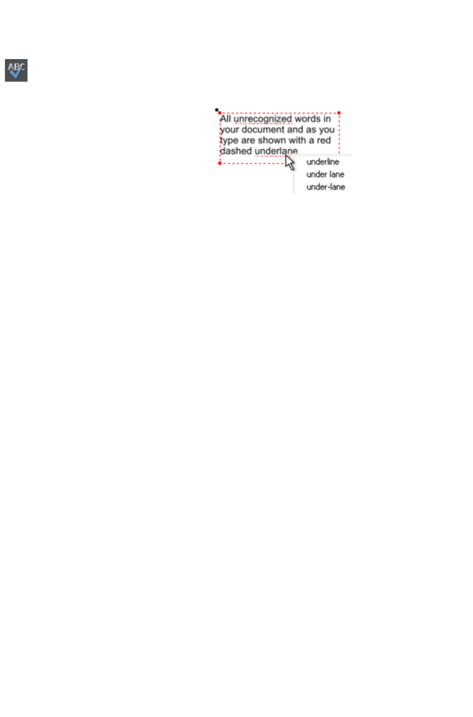
Spell checker
The Text Tool includes a spell checker. To turn it on, select the Spell
Checker icon on the Text Tool
infobar, which opens a menu.
Select "Check spelling as you type
". Now all unrecognized words in your
document and as you type are shown with a
red dashed underline.
To correct a misspelled word, right click on it
and the context menu shows you suggested
correct spellings of the word at the top of the
menu. Simply select one of the suggestions to
replace the word.
Language selection
The menu shown when you click on the Spell Checker icon on the infobar lists all the languages for
which you have dictionaries installed. By default the language corresponding to the current locale setting
is selected. You can choose different languages for different text objects, so you can use text in multiple
languages in your document if required.
To change the language associated with a text object, select the text object, then in the Text Tool
choose the required language from the Spell Checker menu. Now the text object will be checked against
the dictionary for the language you chose.
If you want to enter many text objects using a language other than the default, you can change the current
language text attribute so that you don't have to change the language on every text object individually. To
do this, make sure you have nothing selected (click an empty area of your design using the Selector
Tool). Then in the Text Tool
, choose the language you want to make current using the Spell Checker menu. You will be asked if you
want to set the current language text attribute. Click "Set" to confirm. Now each new text object you
create will be associated with the chosen language. Note that this current attribute is not re-loaded when
you save and load your design. So you will need to repeat the above procedure to set the current
language text attribute again the next time you load the document, if you want to continue entering new
text objects using the same language.
If you have a text object which you don't want to be spell checked at all, select the object and choose
the "No language (ignore)" option from the Spell Checker menu.
User dictionary
Words that you use regularly which are not in the dictionary provided with Xara Web Designer 7
Premium can be added to your own personal dictionary. Right click on the word and choose "Add to
user dictionary
". Now the word is no longer shown as being misspelled. The user dictionary applies to all documents
that you use on your computer and it applies to all languages.
Page 596

Language selection
The menu shown when you click on the Spell Checker icon on the infobar lists all the languages for
which you have dictionaries installed. By default the language corresponding to the current locale setting
is selected. You can choose different languages for different text objects, so you can use text in multiple
languages in your document if required.
To change the language associated with a text object, select the text object, then in the Text Tool
choose the required language from the Spell Checker menu. Now the text object will be checked against
the dictionary for the language you chose.
If you want to enter many text objects using a language other than the default, you can change the current
language text attribute so that you don't have to change the language on every text object individually. To
do this, make sure you have nothing selected (click an empty area of your design using the Selector
Tool). Then in the Text Tool
, choose the language you want to make current using the Spell Checker menu. You will be asked if you
want to set the current language text attribute. Click "Set" to confirm. Now each new text object you
create will be associated with the chosen language. Note that this current attribute is not re-loaded when
you save and load your design. So you will need to repeat the above procedure to set the current
language text attribute again the next time you load the document, if you want to continue entering new
text objects using the same language.
If you have a text object which you don't want to be spell checked at all, select the object and choose
the "No language (ignore)" option from the Spell Checker menu.
User dictionary
Words that you use regularly which are not in the dictionary provided with Xara Web Designer 7
Premium can be added to your own personal dictionary. Right click on the word and choose "Add to
user dictionary
". Now the word is no longer shown as being misspelled. The user dictionary applies to all documents
that you use on your computer and it applies to all languages.
Page 597

User dictionary
Words that you use regularly which are not in the dictionary provided with Xara Web Designer 7
Premium can be added to your own personal dictionary. Right click on the word and choose "Add to
user dictionary
". Now the word is no longer shown as being misspelled. The user dictionary applies to all documents
that you use on your computer and it applies to all languages.
Page 598
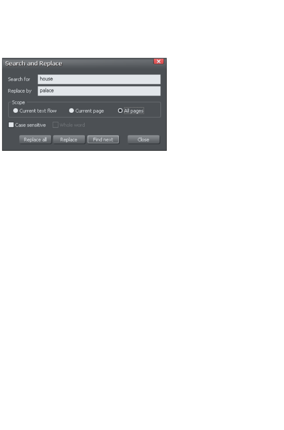
Find & Replace
The Find & Replace function performs live search so that as you type the search string the text is
searched and highlighted in real-time.
To search for some text select the menu "Edit" > "Find/Replace..."
or "Ctrl + Alt + F" and the following dialog is displayed:
Enter the search string and it's shown highlighted in the text. You can choose to search just the current
text story, page or the whole document (all text flows on all pages).
The Whole word option will only search for whole words that match the search string. E.G. searching for
'met' will not find 'metro'. The Case sensitive
option will match only the exact case. E.g., with this option on, searching for 'aBc' will not find 'abc'.
Page 599

Synchronising Text using Soft Groups
In some designs, you may find you need multiple text objects to always show the same text, but perhaps
using different styles. Animating text in an animation document is one example of this and mouse over
buttons which highlight when the mouse pointer is moved over them in a web browser is another.
Normally when you want to change the text shown on these objects, you'd need to edit each one
individually.
By adding such related text objects into a Soft Group, you can ensure that they will always show the
same text. To add the related text objects into a Soft Group, first make sure that they all already have
exactly the same text (otherwise they will not become synchronized). Then select them all using the
Selector Tool. Then select "Arrange" > "Apply soft group"
("Ctrl + Alt + G").
Now when the text is edited on one text object, the others will be updated automatically, even if they are
scattered across different layers (or in the case of animation documents, different frames) throughout your
document. Note that this synchronization still works even if some of the text objects are on locked or
invisible layers.
To ungroup a Soft Group, select "Arrange" > "Remove soft group" ("Ctrl + Alt + U"). See the Soft
Groups section of the Object Manipulation (Soft Groups, Soft Groups
) chapter for more information on Soft Groups.
Page 600
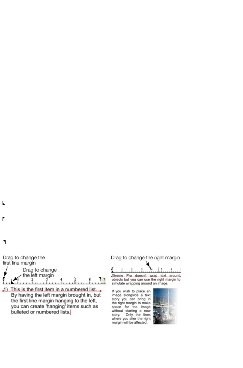
Tabs, Margins and Indents
Rulers
To adjust tabs, margins and indents you need to turn on rulers in your document.
To do this:
Choose "Windows" > "Show Rulers" or right click a page and choose "Show Grid/Guides"
> "Show Rulers".
Or press "Ctrl + ñ + R".
Or press "Ctrl + L" (when not in the Text Tool).
The enhanced text features will only appear on the ruler when you are using the Text Tool and when the
text cursor is in a text story or the text object is selected when in the Text Tool
.
In the Text Tool
when you drag the margins or tabs on the ruler, you get a temporary vertical guide to make it easier to
align the tabs or margins to objects elsewhere on the page. In addition when dragging tabs or margins, if
you have magnetic snap switched on, these will snap to each other making it easier to position tabs and
margins.
Margins and indents
Any changes you make are made to the current paragraph of text. (i.e. the paragraph containing the text
cursor) or, if you have a selected region of text, to the paragraphs of the selected region.
You can apply changes to all text in a text story by selecting all the text within that story ("Ctrl + A"). To
change more than one text story, select the text objects while in the Selector Tool then change to the
Text Tool
and make the required changes.
Left margin
. Drag this to change the left margin of the text.
First line margin.
Drag this to change the left margin for the first line of the paragraph
(useful for lists, as shown below).
Right margin.
Drag this to change the right margin of the text.
Demonstrating the left margin and first line
margin
Demonstrating a right margin
Text along a curve
If you have fitted a single line of text to the curve using the Fit text to curve
option, then the curve line is the margin. If the text is longer than the line it will just flow off the end.
Page 601
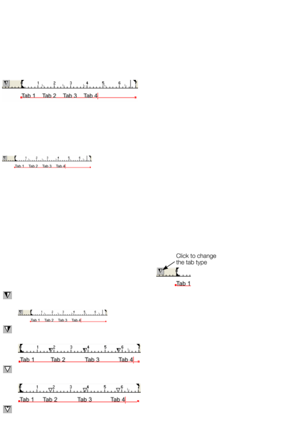
If you have clicked on the line or fitted a column of text to a curve or line then you have left and right
margin indicators (small red squares) that can be dragged along the line to adjust the margins used for
justification.
Tabs
By default, text stories are created with tabs set 0.5 cm apart. This means you can just press "Tab" and
your text will be moved along to the next tab stop. You only need to define new tab stop positions if you
want alternative tab spacing.
These default tabs are shown as faint Ls on the ruler:
Standard tabs, indicated by faint "L"s
Custom tabs
To create a custom tab position, just click on the ruler where you wish to place the new tab. It will
replace default tabs up to that point on the ruler.
For example:
The triangle indicates a custom tab
To set more than one tab click multiple times on the ruler.
To move a custom tab drag it along the ruler.
To remove a tab drag it off of the ruler (default tabs will come back).
Custom tab types
You can set different types of custom tab. By default, custom tabs are left align tabs. This means that
text will be aligned with the tab on the left of the text.
To change the tab type, click the tab icon on the ruler.
The following custom tab types are available. You are
not limited to just one type in a story, and can choose a
different type then set additional tabs.
Left align:
The text will be aligned with the tab to the left.
Right align:
The text will be aligned with the tab to the right.
Center align:
The text will be centered on the tab.
Decimal point align:
The decimal points in the text will be aligned with the tab. This is useful for
lists and, however long the number, the decimal points (periods) will be
Page 602
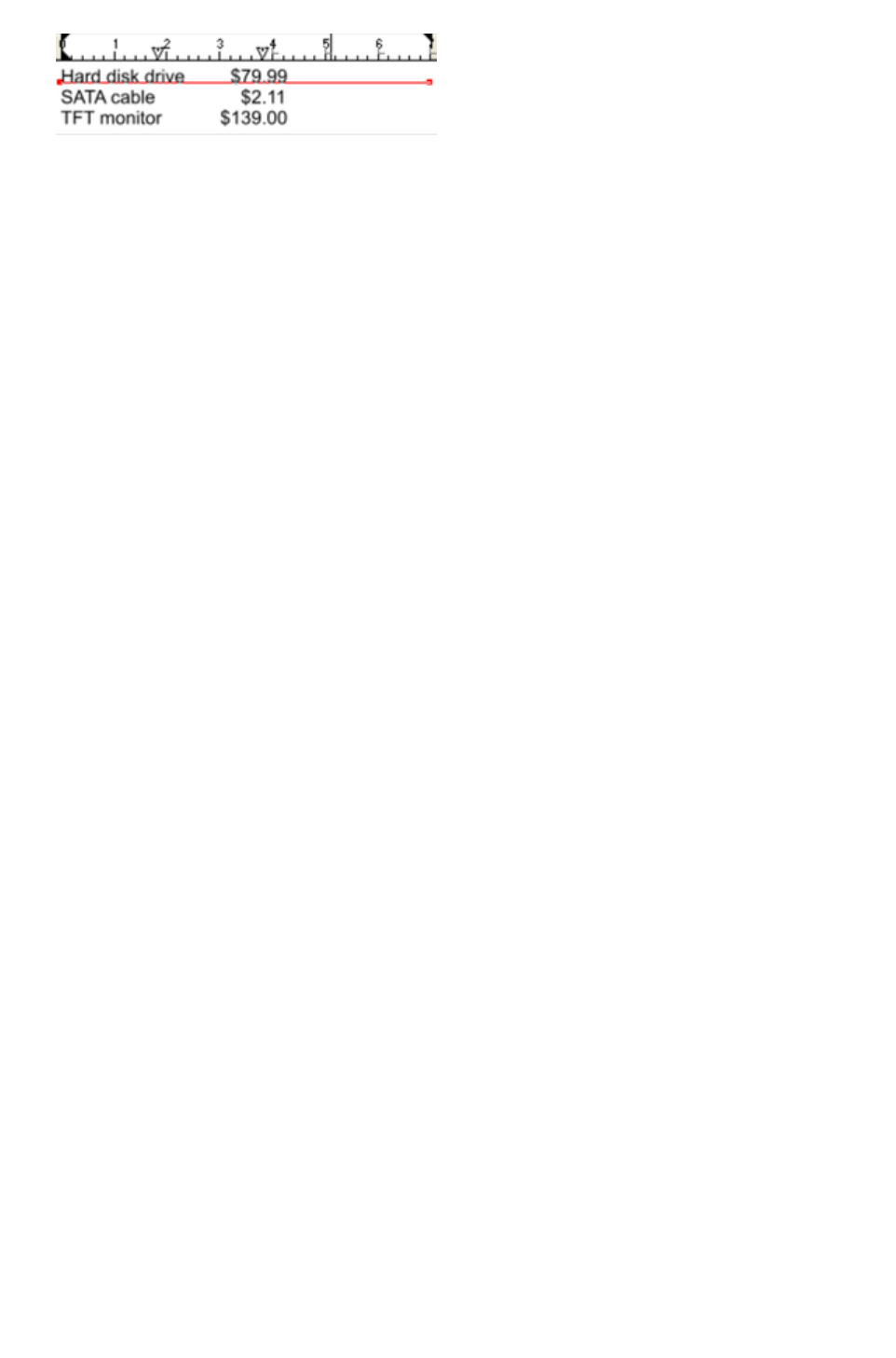
tab-aligned.
How to creating hanging indents
Hanging Indents, as they are known, are where the first line of a paragraph has a negative margin or a
margin that hangs to the left of the normal left margin. Numbered or bulleted lists are examples of hanging
indents.
To create hanging indents:
1. Drag the left margin inwards.
2. Click on the ruler away from the left margin (creates a new tab stop) and drag this tab stop to be
exactly over the left margin.
3. Now each line will start outdented?you can insert any special character or number and press
"Tab" to move to the left margin. And (as with this paragraph) all subsequent lines of text are
indented to the left margin.
Page 603
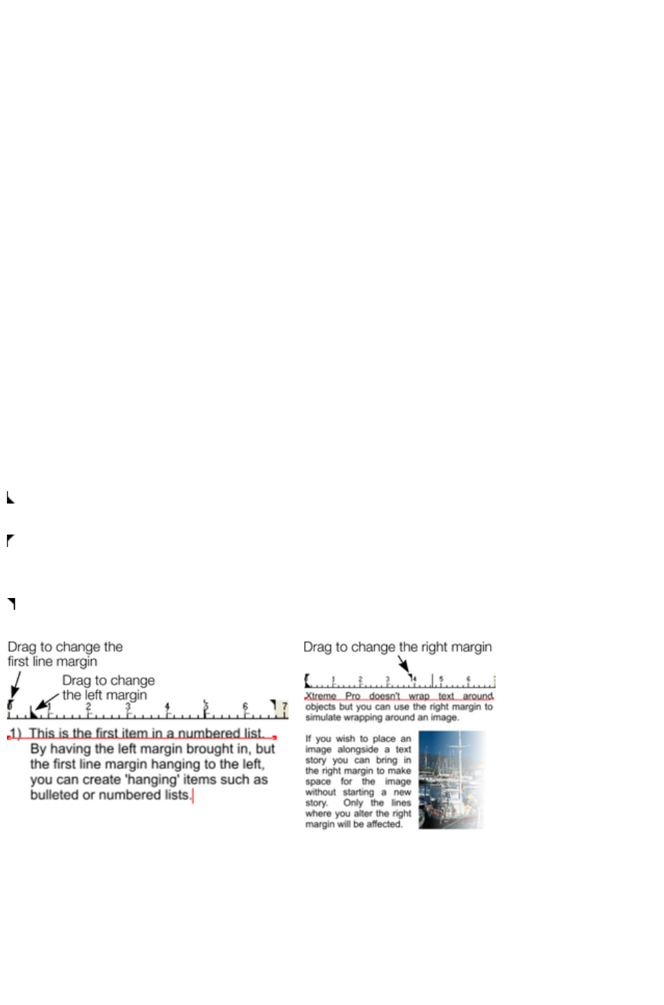
Rulers
To adjust tabs, margins and indents you need to turn on rulers in your document.
To do this:
Choose "Windows" > "Show Rulers" or right click a page and choose "Show Grid/Guides"
> "Show Rulers".
Or press "Ctrl + ñ + R".
Or press "Ctrl + L" (when not in the Text Tool).
The enhanced text features will only appear on the ruler when you are using the Text Tool and when the
text cursor is in a text story or the text object is selected when in the Text Tool
.
In the Text Tool
when you drag the margins or tabs on the ruler, you get a temporary vertical guide to make it easier to
align the tabs or margins to objects elsewhere on the page. In addition when dragging tabs or margins, if
you have magnetic snap switched on, these will snap to each other making it easier to position tabs and
margins.
Margins and indents
Any changes you make are made to the current paragraph of text. (i.e. the paragraph containing the text
cursor) or, if you have a selected region of text, to the paragraphs of the selected region.
You can apply changes to all text in a text story by selecting all the text within that story ("Ctrl + A"). To
change more than one text story, select the text objects while in the Selector Tool then change to the
Text Tool
and make the required changes.
Left margin
. Drag this to change the left margin of the text.
First line margin.
Drag this to change the left margin for the first line of the paragraph
(useful for lists, as shown below).
Right margin.
Drag this to change the right margin of the text.
Demonstrating the left margin and first line
margin
Demonstrating a right margin
Text along a curve
If you have fitted a single line of text to the curve using the Fit text to curve
option, then the curve line is the margin. If the text is longer than the line it will just flow off the end.
If you have clicked on the line or fitted a column of text to a curve or line then you have left and right
margin indicators (small red squares) that can be dragged along the line to adjust the margins used for
justification.
Page 604
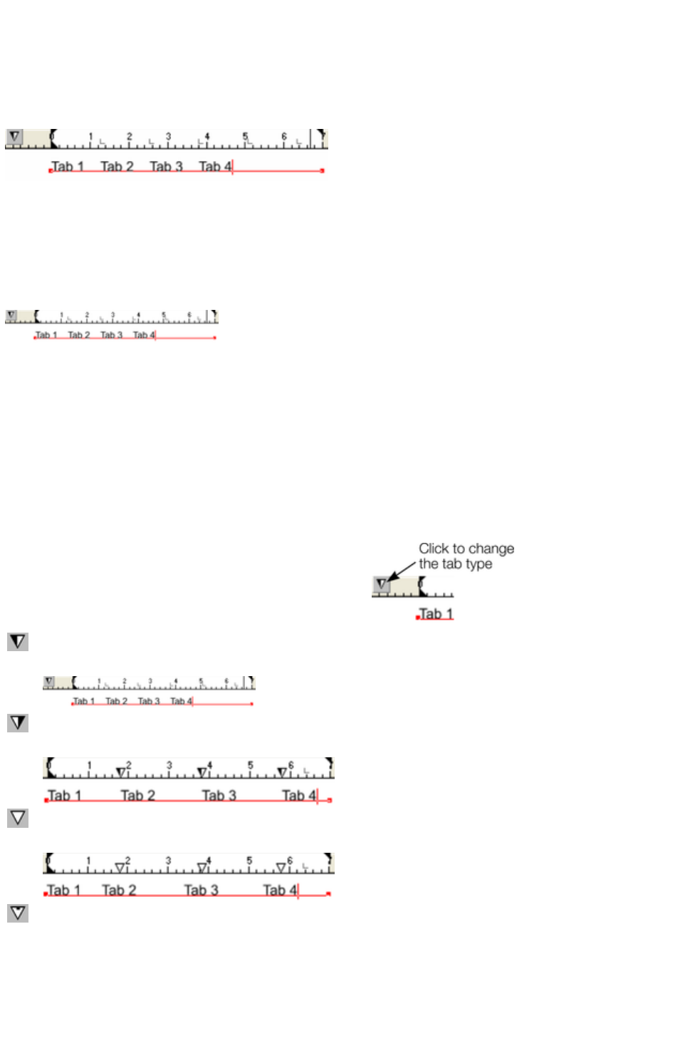
Tabs
By default, text stories are created with tabs set 0.5 cm apart. This means you can just press "Tab" and
your text will be moved along to the next tab stop. You only need to define new tab stop positions if you
want alternative tab spacing.
These default tabs are shown as faint Ls on the ruler:
Standard tabs, indicated by faint "L"s
Custom tabs
To create a custom tab position, just click on the ruler where you wish to place the new tab. It will
replace default tabs up to that point on the ruler.
For example:
The triangle indicates a custom tab
To set more than one tab click multiple times on the ruler.
To move a custom tab drag it along the ruler.
To remove a tab drag it off of the ruler (default tabs will come back).
Custom tab types
You can set different types of custom tab. By default, custom tabs are left align tabs. This means that
text will be aligned with the tab on the left of the text.
To change the tab type, click the tab icon on the ruler.
The following custom tab types are available. You are
not limited to just one type in a story, and can choose a
different type then set additional tabs.
Left align:
The text will be aligned with the tab to the left.
Right align:
The text will be aligned with the tab to the right.
Center align:
The text will be centered on the tab.
Decimal point align:
The decimal points in the text will be aligned with the tab. This is useful for
lists and, however long the number, the decimal points (periods) will be
tab-aligned.
Page 605
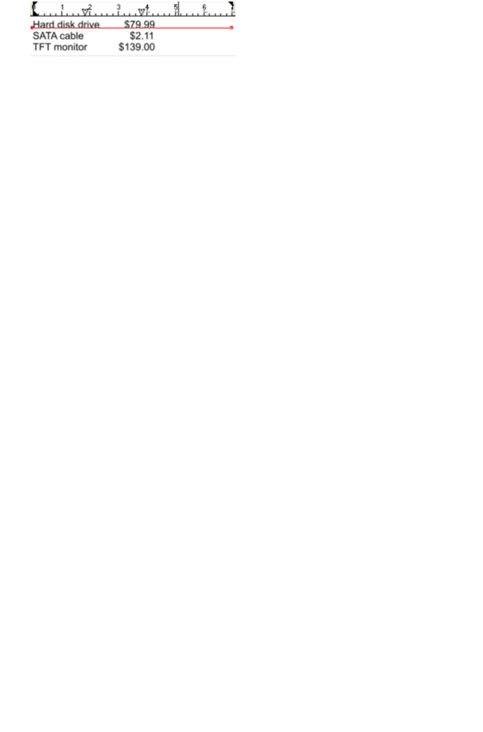
How to creating hanging indents
Hanging Indents, as they are known, are where the first line of a paragraph has a negative margin or a
margin that hangs to the left of the normal left margin. Numbered or bulleted lists are examples of hanging
indents.
To create hanging indents:
1. Drag the left margin inwards.
2. Click on the ruler away from the left margin (creates a new tab stop) and drag this tab stop to be
exactly over the left margin.
3. Now each line will start outdented?you can insert any special character or number and press
"Tab" to move to the left margin. And (as with this paragraph) all subsequent lines of text are
indented to the left margin.
Page 606
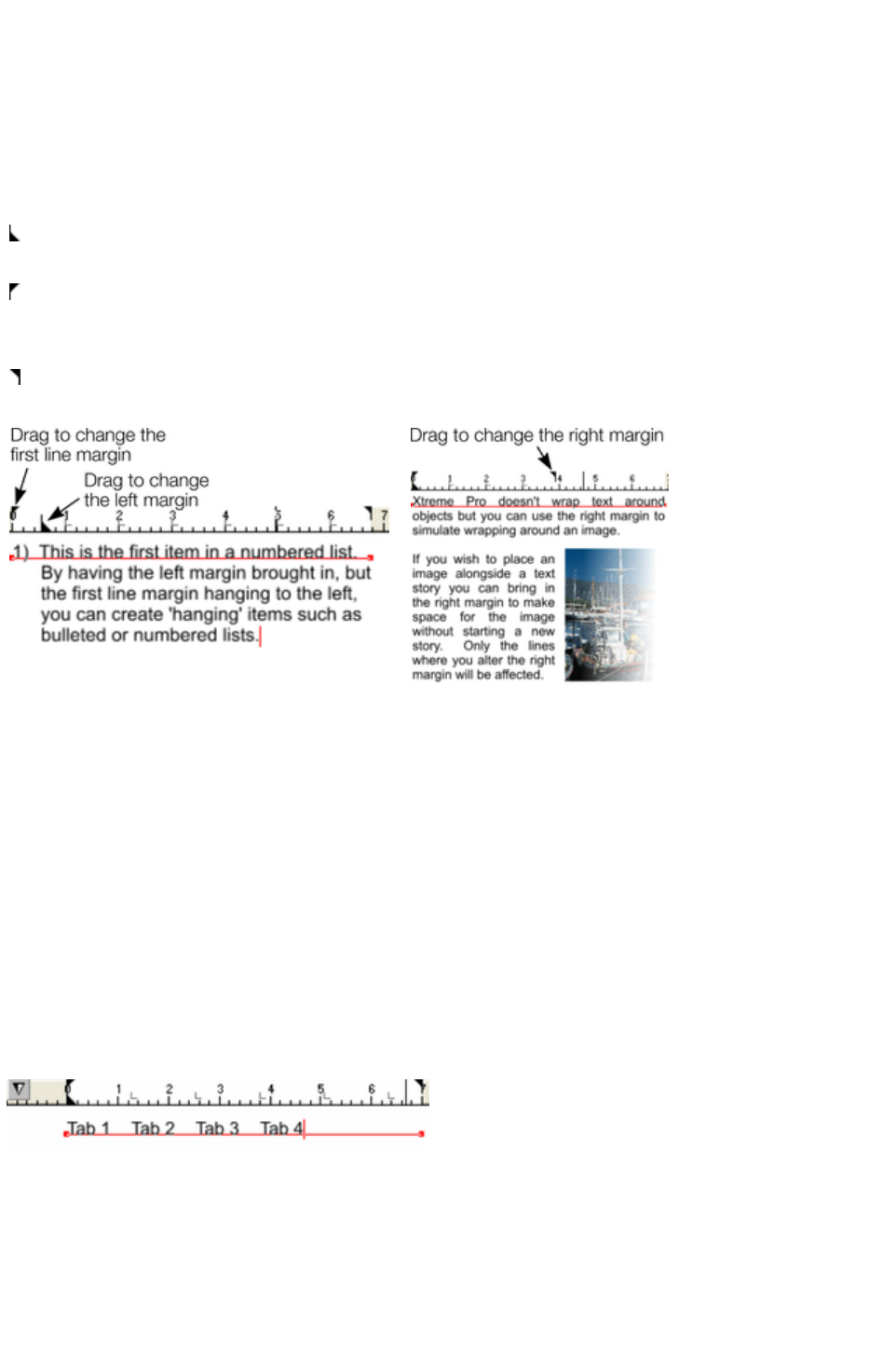
Margins and indents
Any changes you make are made to the current paragraph of text. (i.e. the paragraph containing the text
cursor) or, if you have a selected region of text, to the paragraphs of the selected region.
You can apply changes to all text in a text story by selecting all the text within that story ("Ctrl + A"). To
change more than one text story, select the text objects while in the Selector Tool then change to the
Text Tool
and make the required changes.
Left margin
. Drag this to change the left margin of the text.
First line margin.
Drag this to change the left margin for the first line of the paragraph
(useful for lists, as shown below).
Right margin.
Drag this to change the right margin of the text.
Demonstrating the left margin and first line
margin
Demonstrating a right margin
Text along a curve
If you have fitted a single line of text to the curve using the Fit text to curve
option, then the curve line is the margin. If the text is longer than the line it will just flow off the end.
If you have clicked on the line or fitted a column of text to a curve or line then you have left and right
margin indicators (small red squares) that can be dragged along the line to adjust the margins used for
justification.
Tabs
By default, text stories are created with tabs set 0.5 cm apart. This means you can just press "Tab" and
your text will be moved along to the next tab stop. You only need to define new tab stop positions if you
want alternative tab spacing.
These default tabs are shown as faint Ls on the ruler:
Standard tabs, indicated by faint "L"s
Custom tabs
To create a custom tab position, just click on the ruler where you wish to place the new tab. It will
replace default tabs up to that point on the ruler.
For example:
Page 607
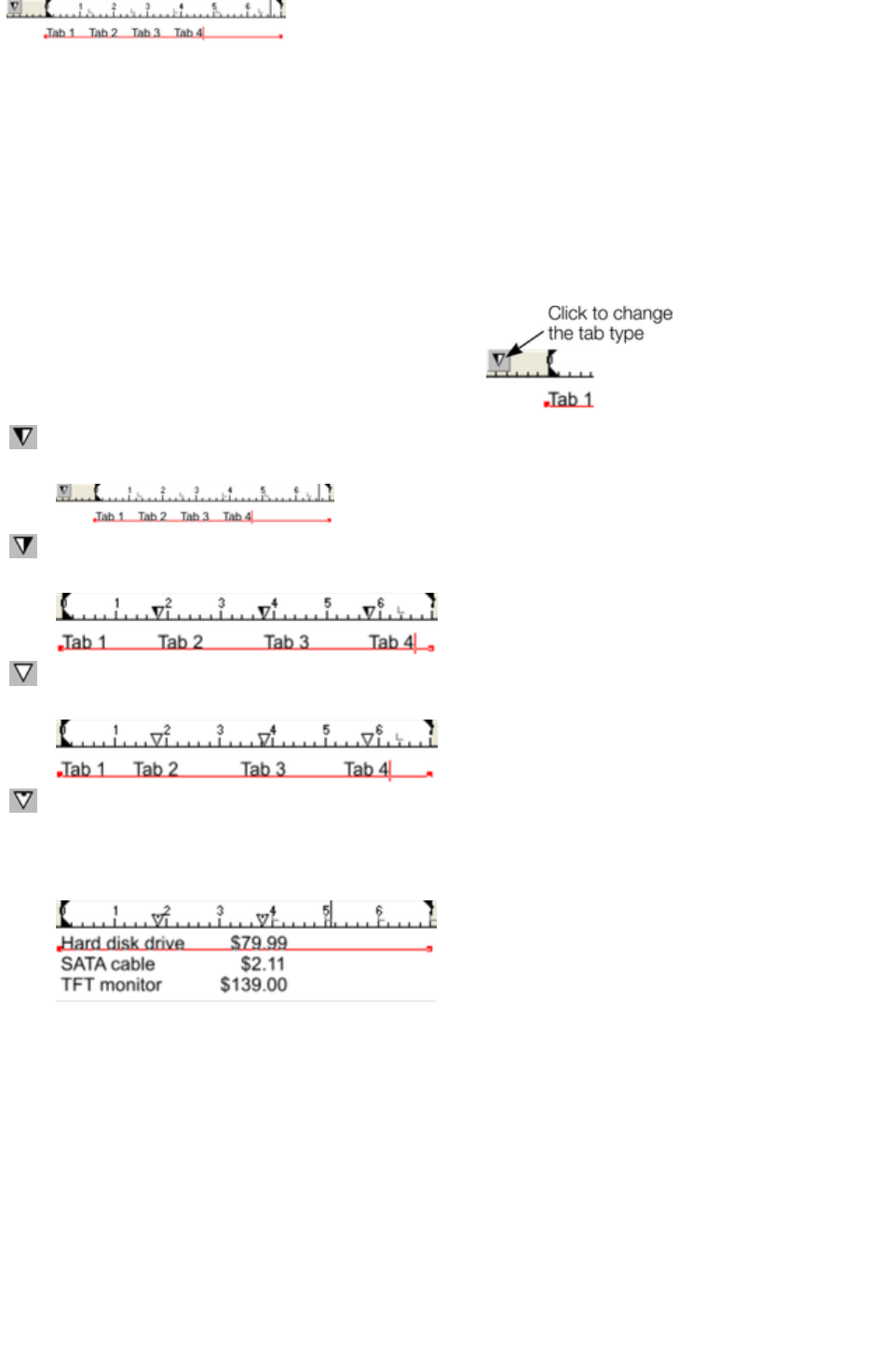
The triangle indicates a custom tab
To set more than one tab click multiple times on the ruler.
To move a custom tab drag it along the ruler.
To remove a tab drag it off of the ruler (default tabs will come back).
Custom tab types
You can set different types of custom tab. By default, custom tabs are left align tabs. This means that
text will be aligned with the tab on the left of the text.
To change the tab type, click the tab icon on the ruler.
The following custom tab types are available. You are
not limited to just one type in a story, and can choose a
different type then set additional tabs.
Left align:
The text will be aligned with the tab to the left.
Right align:
The text will be aligned with the tab to the right.
Center align:
The text will be centered on the tab.
Decimal point align:
The decimal points in the text will be aligned with the tab. This is useful for
lists and, however long the number, the decimal points (periods) will be
tab-aligned.
How to creating hanging indents
Hanging Indents, as they are known, are where the first line of a paragraph has a negative margin or a
margin that hangs to the left of the normal left margin. Numbered or bulleted lists are examples of hanging
indents.
To create hanging indents:
1. Drag the left margin inwards.
2. Click on the ruler away from the left margin (creates a new tab stop) and drag this tab stop to be
exactly over the left margin.
3. Now each line will start outdented?you can insert any special character or number and press
"Tab" to move to the left margin. And (as with this paragraph) all subsequent lines of text are
indented to the left margin.
Page 608
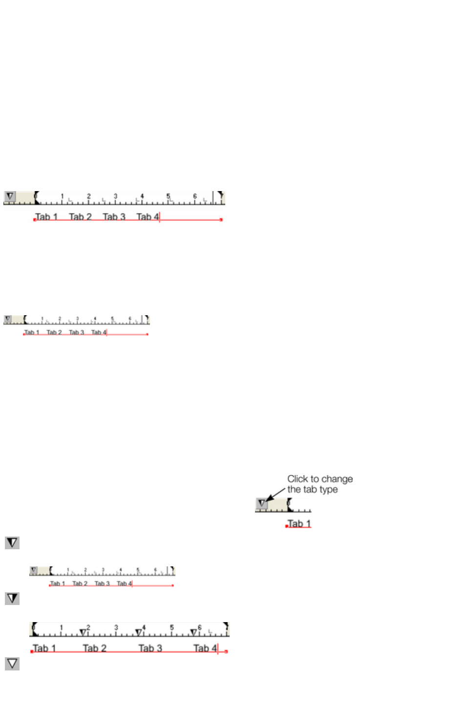
Text along a curve
If you have fitted a single line of text to the curve using the Fit text to curve
option, then the curve line is the margin. If the text is longer than the line it will just flow off the end.
If you have clicked on the line or fitted a column of text to a curve or line then you have left and right
margin indicators (small red squares) that can be dragged along the line to adjust the margins used for
justification.
Tabs
By default, text stories are created with tabs set 0.5 cm apart. This means you can just press "Tab" and
your text will be moved along to the next tab stop. You only need to define new tab stop positions if you
want alternative tab spacing.
These default tabs are shown as faint Ls on the ruler:
Standard tabs, indicated by faint "L"s
Custom tabs
To create a custom tab position, just click on the ruler where you wish to place the new tab. It will
replace default tabs up to that point on the ruler.
For example:
The triangle indicates a custom tab
To set more than one tab click multiple times on the ruler.
To move a custom tab drag it along the ruler.
To remove a tab drag it off of the ruler (default tabs will come back).
Custom tab types
You can set different types of custom tab. By default, custom tabs are left align tabs. This means that
text will be aligned with the tab on the left of the text.
To change the tab type, click the tab icon on the ruler.
The following custom tab types are available. You are
not limited to just one type in a story, and can choose a
different type then set additional tabs.
Left align:
The text will be aligned with the tab to the left.
Right align:
The text will be aligned with the tab to the right.
Center align:
The text will be centered on the tab.
Page 609
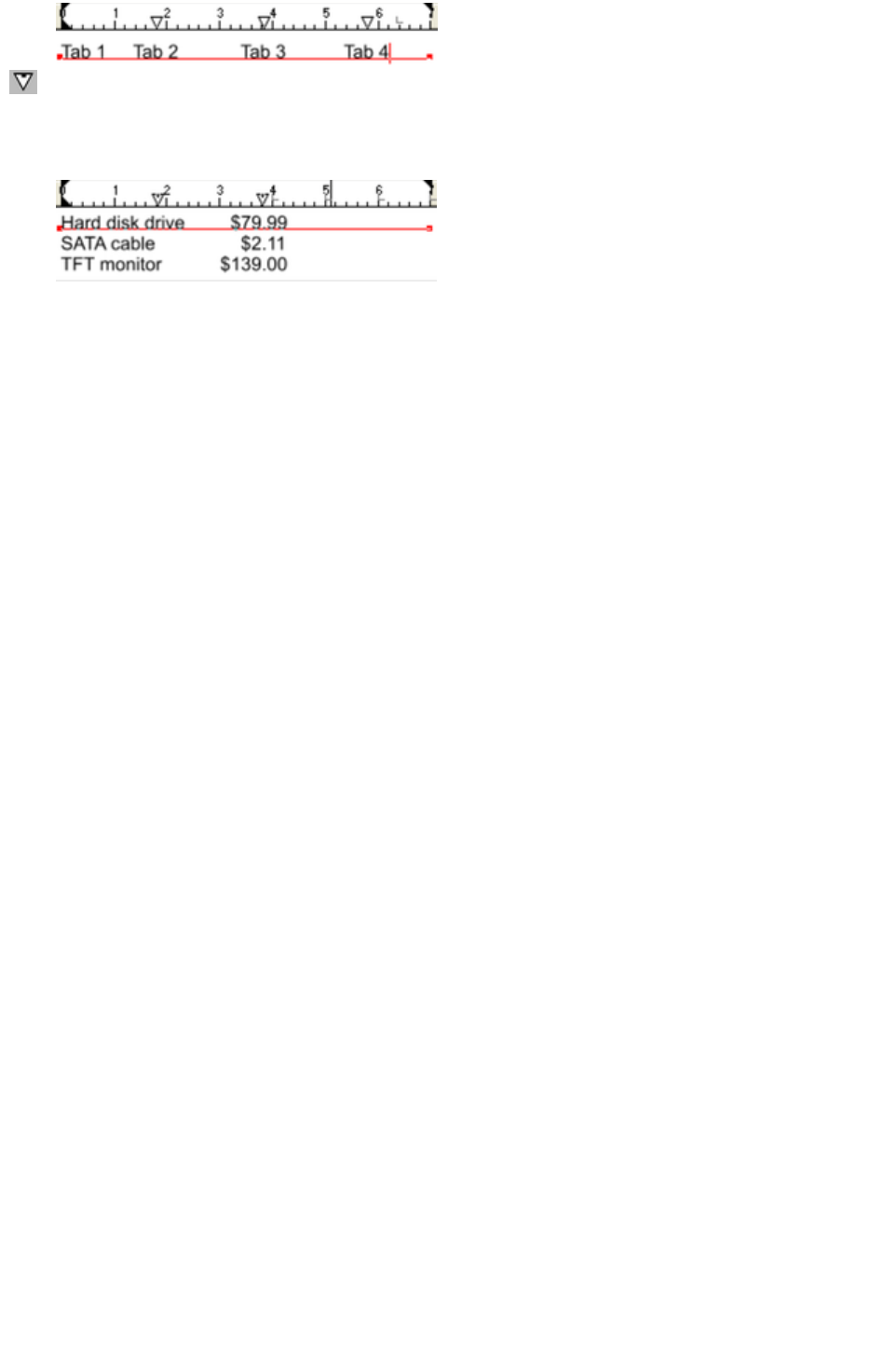
Decimal point align:
The decimal points in the text will be aligned with the tab. This is useful for
lists and, however long the number, the decimal points (periods) will be
tab-aligned.
How to creating hanging indents
Hanging Indents, as they are known, are where the first line of a paragraph has a negative margin or a
margin that hangs to the left of the normal left margin. Numbered or bulleted lists are examples of hanging
indents.
To create hanging indents:
1. Drag the left margin inwards.
2. Click on the ruler away from the left margin (creates a new tab stop) and drag this tab stop to be
exactly over the left margin.
3. Now each line will start outdented?you can insert any special character or number and press
"Tab" to move to the left margin. And (as with this paragraph) all subsequent lines of text are
indented to the left margin.
Page 610

Tabs
By default, text stories are created with tabs set 0.5 cm apart. This means you can just press "Tab" and
your text will be moved along to the next tab stop. You only need to define new tab stop positions if you
want alternative tab spacing.
These default tabs are shown as faint Ls on the ruler:
Standard tabs, indicated by faint "L"s
Custom tabs
To create a custom tab position, just click on the ruler where you wish to place the new tab. It will
replace default tabs up to that point on the ruler.
For example:
The triangle indicates a custom tab
To set more than one tab click multiple times on the ruler.
To move a custom tab drag it along the ruler.
To remove a tab drag it off of the ruler (default tabs will come back).
Custom tab types
You can set different types of custom tab. By default, custom tabs are left align tabs. This means that
text will be aligned with the tab on the left of the text.
To change the tab type, click the tab icon on the ruler.
The following custom tab types are available. You are
not limited to just one type in a story, and can choose a
different type then set additional tabs.
Left align:
The text will be aligned with the tab to the left.
Right align:
The text will be aligned with the tab to the right.
Center align:
The text will be centered on the tab.
Decimal point align:
The decimal points in the text will be aligned with the tab. This is useful for
lists and, however long the number, the decimal points (periods) will be
tab-aligned.
Page 611

How to creating hanging indents
Hanging Indents, as they are known, are where the first line of a paragraph has a negative margin or a
margin that hangs to the left of the normal left margin. Numbered or bulleted lists are examples of hanging
indents.
To create hanging indents:
1. Drag the left margin inwards.
2. Click on the ruler away from the left margin (creates a new tab stop) and drag this tab stop to be
exactly over the left margin.
3. Now each line will start outdented?you can insert any special character or number and press
"Tab" to move to the left margin. And (as with this paragraph) all subsequent lines of text are
indented to the left margin.
Page 612
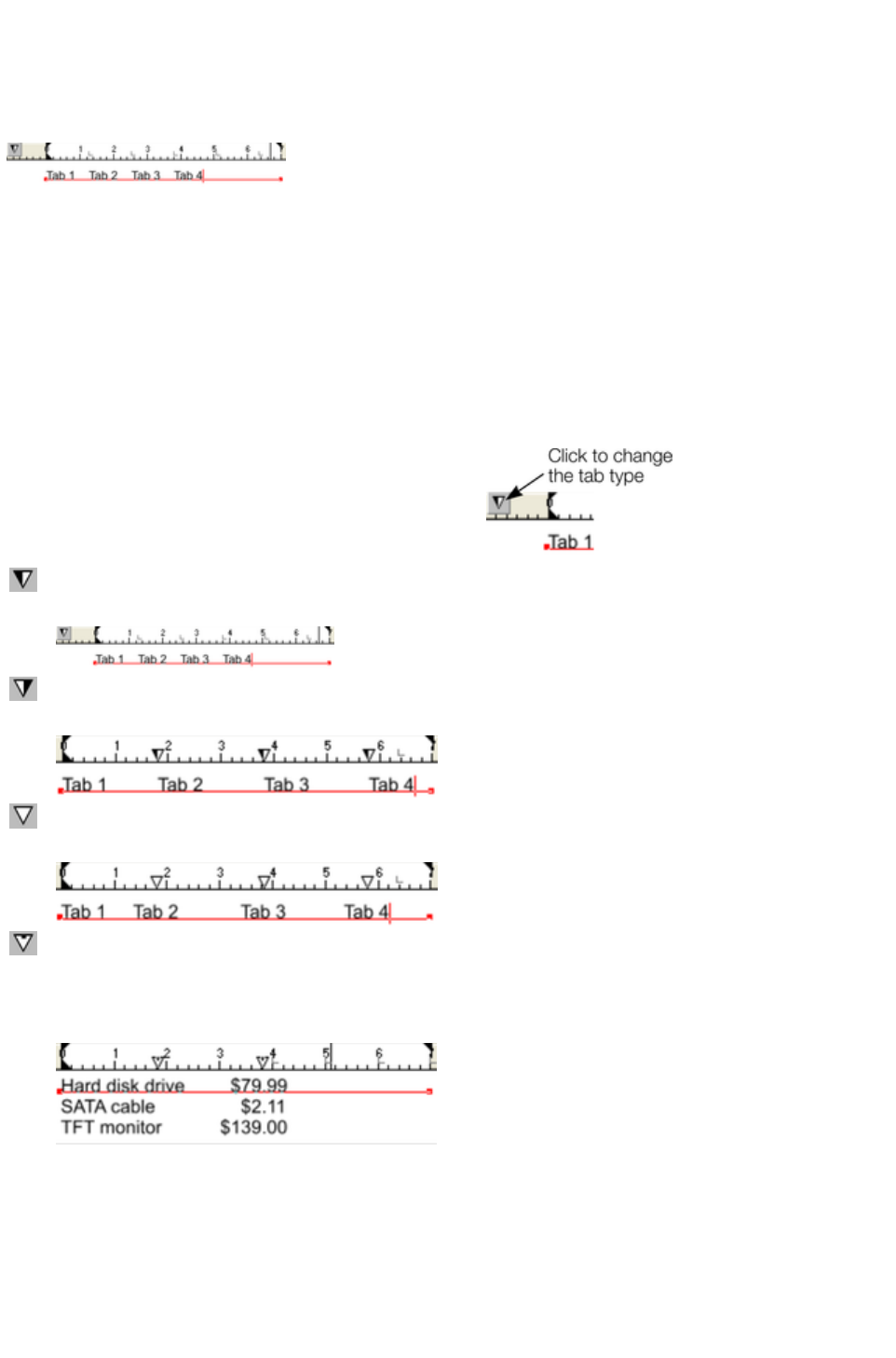
Custom tabs
To create a custom tab position, just click on the ruler where you wish to place the new tab. It will
replace default tabs up to that point on the ruler.
For example:
The triangle indicates a custom tab
To set more than one tab click multiple times on the ruler.
To move a custom tab drag it along the ruler.
To remove a tab drag it off of the ruler (default tabs will come back).
Custom tab types
You can set different types of custom tab. By default, custom tabs are left align tabs. This means that
text will be aligned with the tab on the left of the text.
To change the tab type, click the tab icon on the ruler.
The following custom tab types are available. You are
not limited to just one type in a story, and can choose a
different type then set additional tabs.
Left align:
The text will be aligned with the tab to the left.
Right align:
The text will be aligned with the tab to the right.
Center align:
The text will be centered on the tab.
Decimal point align:
The decimal points in the text will be aligned with the tab. This is useful for
lists and, however long the number, the decimal points (periods) will be
tab-aligned.
How to creating hanging indents
Hanging Indents, as they are known, are where the first line of a paragraph has a negative margin or a
margin that hangs to the left of the normal left margin. Numbered or bulleted lists are examples of hanging
indents.
To create hanging indents:
1. Drag the left margin inwards.
Page 613

2. Click on the ruler away from the left margin (creates a new tab stop) and drag this tab stop to be
exactly over the left margin.
3. Now each line will start outdented?you can insert any special character or number and press
"Tab" to move to the left margin. And (as with this paragraph) all subsequent lines of text are
indented to the left margin.
Page 614
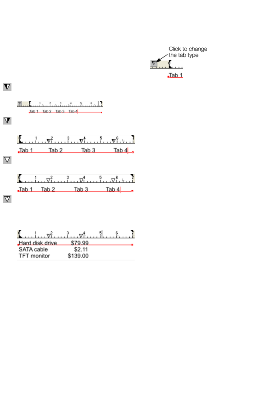
Custom tab types
You can set different types of custom tab. By default, custom tabs are left align tabs. This means that
text will be aligned with the tab on the left of the text.
To change the tab type, click the tab icon on the ruler.
The following custom tab types are available. You are
not limited to just one type in a story, and can choose a
different type then set additional tabs.
Left align:
The text will be aligned with the tab to the left.
Right align:
The text will be aligned with the tab to the right.
Center align:
The text will be centered on the tab.
Decimal point align:
The decimal points in the text will be aligned with the tab. This is useful for
lists and, however long the number, the decimal points (periods) will be
tab-aligned.
How to creating hanging indents
Hanging Indents, as they are known, are where the first line of a paragraph has a negative margin or a
margin that hangs to the left of the normal left margin. Numbered or bulleted lists are examples of hanging
indents.
To create hanging indents:
1. Drag the left margin inwards.
2. Click on the ruler away from the left margin (creates a new tab stop) and drag this tab stop to be
exactly over the left margin.
3. Now each line will start outdented?you can insert any special character or number and press
"Tab" to move to the left margin. And (as with this paragraph) all subsequent lines of text are
indented to the left margin.
Page 615

How to creating hanging indents
Hanging Indents, as they are known, are where the first line of a paragraph has a negative margin or a
margin that hangs to the left of the normal left margin. Numbered or bulleted lists are examples of hanging
indents.
To create hanging indents:
1. Drag the left margin inwards.
2. Click on the ruler away from the left margin (creates a new tab stop) and drag this tab stop to be
exactly over the left margin.
3. Now each line will start outdented?you can insert any special character or number and press
"Tab" to move to the left margin. And (as with this paragraph) all subsequent lines of text are
indented to the left margin.
Page 616
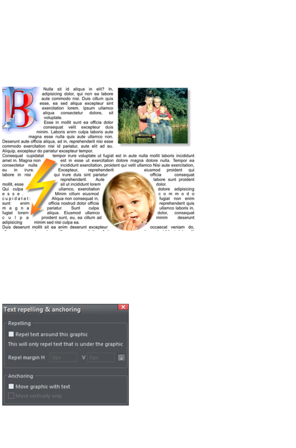
Repelling text objects
You can make any object in Xara Web Designer 7 Premium repel text so that text underneath it
automatically flows around the object, instead of appearing underneath it. This makes it easy to lay out
pages containing long passages of text combined with photos and graphics. Once you've set them to
repel, you can adjust the positions of your graphics and photos and the text will automatically adjust and
reflow around them.
You can also choose to only repel text within a layer, which stops objects within a layer from repelling
text on other layers and also stops text on the layer being repelled by objects on higher layers.
Making an object repel
To make an object repel text, right click it and select the Repel text under
option. Any text in the same layer underneath the object will be repelled with a default margin of 5 pixels
between the text and object. Note that repelling text objects only repel text that is underneath the
objects, not any text that is on top.
Alternatively right click on the object and select Repelling & Anchoring
to display the Text repelling & anchoring dialog.
Click the Repel text around this graphic
checkbox.
If desired, set a repel margin for the object to set the space between the text and the object. If you want
a different height and width for the repel margin, click the padlock symbol and enter the margin height in
Page 617

the H (horizontal) box and width in the V (vertical) box. Click OK
.
To turn off repelling right click the object and choose the Repel text under option again to deselect it.
Or right click and select Repelling & Anchoring to display the Text repelling & anchoring dialog again.
Click the Repel text around this graphic checkbox to deselect it and click OK
.
Note that single lines of text do not respond to repelling objects, only text areas and text columns do.
To only repel text within the same layer as the repelling object, see Layer Properties
.
Page 618
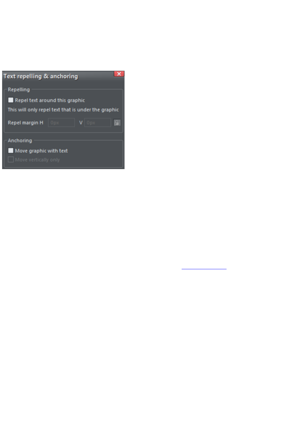
Making an object repel
To make an object repel text, right click it and select the Repel text under
option. Any text in the same layer underneath the object will be repelled with a default margin of 5 pixels
between the text and object. Note that repelling text objects only repel text that is underneath the
objects, not any text that is on top.
Alternatively right click on the object and select Repelling & Anchoring
to display the Text repelling & anchoring dialog.
Click the Repel text around this graphic
checkbox.
If desired, set a repel margin for the object to set the space between the text and the object. If you want
a different height and width for the repel margin, click the padlock symbol and enter the margin height in
the H (horizontal) box and width in the V (vertical) box. Click OK
.
To turn off repelling right click the object and choose the Repel text under option again to deselect it.
Or right click and select Repelling & Anchoring to display the Text repelling & anchoring dialog again.
Click the Repel text around this graphic checkbox to deselect it and click OK
.
Note that single lines of text do not respond to repelling objects, only text areas and text columns do.
To only repel text within the same layer as the repelling object, see Layer Properties
.
Page 619
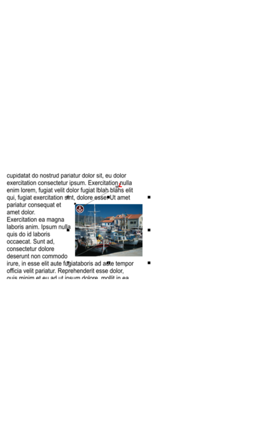
Anchored Graphics
You can position any graphic, or group, so it's tied (anchored) to a position in some text, so that as the
text moves because of editing, the graphic object will move to remain at the same relative position.
1. The quickest way to anchor a graphic or group is to right click it and choose the Anchor to text
option. However, if you also want to edit anchoring properties, you can right click on the object
and select Repelling & Anchoring to display the Text repelling & anchoring dialog.
2. Click the Move graphic with text checkbox.
3. By default Move vertically only is also selected, so that your anchored graphic will only move
vertically as the text is edited. You can click to deselect this option to allow the graphic to move
horizontally with the text. This may be useful if, for example, the graphic is around the same size
as the text height and you want it to stay between specific words or in a specific place in a
sentence.
4. An anchor symbol appears in the top left of the object, indicating it's now anchored.
5. Using either the Selector Tool or Text Tool, click and drag the anchor symbol so that a red
arrow appears.
6. Move the arrow head and drop it in the location in the text where you would like the object
anchored. A red caret (inverted 'T' mark) indicates the anchor position.
7. As you edit the text around this caret mark, the anchor point and anchored object moves with the
text.
An anchored object displays an anchor symbol and an arrow pointing to the anchor point, shown as a
red caret mark.These disappear as you type, unless you're close to the anchor point.
Note:
If you drag the anchoring arrow to a place on the page where there is no text, the arrow turns into a red
anchor that indicates the object's anchoring properties will be lost if it's dropped here. This also happens
when the arrow is dropped on the object itself.
However note that the anchored object will not move outside the area of the page as a result of the
anchor point moving. The anchored object will only move up to the edge of the page.
Page 620
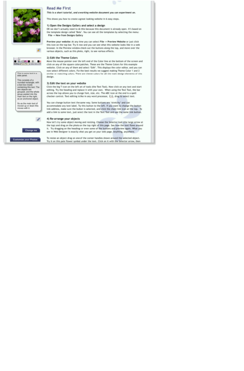
This is an example column of text with various graphic elements hanging to the left. Each of these is
anchored to the start of a line of text immediately to its right.
It's possible to anchor any graphic object or group, including groups containing text, such as the example
side-panel, shown above.
It's also possible to anchor objects to appear on top of, or below the text. The example pale blue flower
graphic, shown above, is anchored this way and will flow with the text.
Note
: If an anchored object is also set to repel, only the text that the object is anchored to is repelled.
Note
: Repelling is restricted for repeating objects: Text inside a repeating group is only repelled by repelling
objects inside the repeating group. Individual repelling objects inside a repeating group only repel text
that is also inside the repeating group. Repeating groups as a whole can repel any text stacked below on
the page.
Moving Anchored Objects
As new text is added or deleted, the object moves as the text flows, but will always maintain its new
position relative to the anchor point. You can move an anchored graphic by dragging on it as usual. This
changes its position relative to the anchor point, but does not move the anchor point, which remains
visible at the end of the anchor symbol arrow as you click/move the graphic.
If you want to move the anchor point to another location within the text, click and drag on the anchor
symbol again to create a new arrow and drag it to the new location.
If you cut and paste the text containing the caret mark, the anchored object is also cut and pasted.
Viewing the anchor point
The anchor point of an anchored object is only visible if you click the anchored object in the Selector
Tool or click in the surrounding text area in the Text Tool
.
When you click in a region of text with the Text Tool, it shows any anchors points within an inverted 'T'
symbol, and also draws an arrow from the anchor point to the anchor symbol in the top left of each
anchored object. So the easiest way to see all the anchor points for any text is to click in it with the Text
Page 621

Tool
.
However, when you start to edit the text, the red caret, arrow and anchored symbol temporarily
disappear until you stop typing. If you are close to the anchor point, Web Designer Premium displays the
caret mark, along with an arrow pointing to the anchor symbol, to let you know when you're close.
Inline anchored objects
If you want to embed a small graphic into a line of text, such as an icon graphic like this
; inline with the text, so it flows with the text, drag or paste the image in as an anchored object that repels
and position its anchor point anywhere in the copy. It's recommended you use non-breaking space
characters ("Ctrl + Space bar").
Soft Groups
You can anchor Soft Groups (Soft Groups, Soft Groups
) the same way, even where part of the group is on another layer. For example web buttons with
mouseover effects or pop-ups on different layers can be anchored in this way.
Removing an anchor
To remove an anchor from an object, right click it and choose Anchor to text again to disable the
option. Now when you click the object in the Selector Tool or in the text in the Text Tool
, the anchor symbol is no longer displayed.
Page 622
Moving Anchored Objects
As new text is added or deleted, the object moves as the text flows, but will always maintain its new
position relative to the anchor point. You can move an anchored graphic by dragging on it as usual. This
changes its position relative to the anchor point, but does not move the anchor point, which remains
visible at the end of the anchor symbol arrow as you click/move the graphic.
If you want to move the anchor point to another location within the text, click and drag on the anchor
symbol again to create a new arrow and drag it to the new location.
If you cut and paste the text containing the caret mark, the anchored object is also cut and pasted.
Viewing the anchor point
The anchor point of an anchored object is only visible if you click the anchored object in the Selector
Tool or click in the surrounding text area in the Text Tool
.
When you click in a region of text with the Text Tool, it shows any anchors points within an inverted 'T'
symbol, and also draws an arrow from the anchor point to the anchor symbol in the top left of each
anchored object. So the easiest way to see all the anchor points for any text is to click in it with the Text
Tool
.
However, when you start to edit the text, the red caret, arrow and anchored symbol temporarily
disappear until you stop typing. If you are close to the anchor point, Web Designer Premium displays the
caret mark, along with an arrow pointing to the anchor symbol, to let you know when you're close.
Inline anchored objects
If you want to embed a small graphic into a line of text, such as an icon graphic like this
; inline with the text, so it flows with the text, drag or paste the image in as an anchored object that repels
and position its anchor point anywhere in the copy. It's recommended you use non-breaking space
characters ("Ctrl + Space bar").
Soft Groups
You can anchor Soft Groups (Soft Groups, Soft Groups
) the same way, even where part of the group is on another layer. For example web buttons with
mouseover effects or pop-ups on different layers can be anchored in this way.
Removing an anchor
To remove an anchor from an object, right click it and choose Anchor to text again to disable the
option. Now when you click the object in the Selector Tool or in the text in the Text Tool
, the anchor symbol is no longer displayed.
Page 623
Viewing the anchor point
The anchor point of an anchored object is only visible if you click the anchored object in the Selector
Tool or click in the surrounding text area in the Text Tool
.
When you click in a region of text with the Text Tool, it shows any anchors points within an inverted 'T'
symbol, and also draws an arrow from the anchor point to the anchor symbol in the top left of each
anchored object. So the easiest way to see all the anchor points for any text is to click in it with the Text
Tool
.
However, when you start to edit the text, the red caret, arrow and anchored symbol temporarily
disappear until you stop typing. If you are close to the anchor point, Web Designer Premium displays the
caret mark, along with an arrow pointing to the anchor symbol, to let you know when you're close.
Inline anchored objects
If you want to embed a small graphic into a line of text, such as an icon graphic like this
; inline with the text, so it flows with the text, drag or paste the image in as an anchored object that repels
and position its anchor point anywhere in the copy. It's recommended you use non-breaking space
characters ("Ctrl + Space bar").
Soft Groups
You can anchor Soft Groups (Soft Groups, Soft Groups
) the same way, even where part of the group is on another layer. For example web buttons with
mouseover effects or pop-ups on different layers can be anchored in this way.
Removing an anchor
To remove an anchor from an object, right click it and choose Anchor to text again to disable the
option. Now when you click the object in the Selector Tool or in the text in the Text Tool
, the anchor symbol is no longer displayed.
Page 624

Inline anchored objects
If you want to embed a small graphic into a line of text, such as an icon graphic like this
; inline with the text, so it flows with the text, drag or paste the image in as an anchored object that repels
and position its anchor point anywhere in the copy. It's recommended you use non-breaking space
characters ("Ctrl + Space bar").
Soft Groups
You can anchor Soft Groups (Soft Groups, Soft Groups
) the same way, even where part of the group is on another layer. For example web buttons with
mouseover effects or pop-ups on different layers can be anchored in this way.
Removing an anchor
To remove an anchor from an object, right click it and choose Anchor to text again to disable the
option. Now when you click the object in the Selector Tool or in the text in the Text Tool
, the anchor symbol is no longer displayed.
Page 625

Soft Groups
You can anchor Soft Groups (Soft Groups, Soft Groups
) the same way, even where part of the group is on another layer. For example web buttons with
mouseover effects or pop-ups on different layers can be anchored in this way.
Removing an anchor
To remove an anchor from an object, right click it and choose Anchor to text again to disable the
option. Now when you click the object in the Selector Tool or in the text in the Text Tool
, the anchor symbol is no longer displayed.
Page 626

Removing an anchor
To remove an anchor from an object, right click it and choose Anchor to text again to disable the
option. Now when you click the object in the Selector Tool or in the text in the Text Tool
, the anchor symbol is no longer displayed.
Page 627
Applying text styles
Changing the font size
There are several ways to change the font size:
Type a new value into the size text box on the InfoBar and press ¿.
Or select from the Font size drop-down list on the InfoBar.
Or use the Font size pop-up slider.
Or manually increase/decrease font size with the "Ctrl + Shift + >" and "Ctrl + Shift + <"
keyboard shortcuts. This applies only if all selected text parts are of the same font size.
Or use the Selector Tool to scale the whole text object.
Bold & Italic
Click the Bold or Italic
button on the InfoBar ("Ctrl + B" or "Ctrl + I")
This applies the bold or italic variant of the current font.
Attention: Xara Web Designer 7 Premium does not allow you to apply italic or bold to text if the
necessary italic/bold font is not installed. However you can easily emulate the same effect. To embolden a
font, just give it a small line width and apply a line color. To slant a font, use the skew / slant feature of
the Selector Tool
. Read more in the "Font menu" section
Text Underlining
Click the underline button on the InfoBar to apply an underline
to the selected text.
The underline color and size is automatically derived from the text color and size.
Justification or text alignment
Justification always applies to the complete line. Any selected region is ignored.
Left
justification: Align the left-hand edge of the text to the initial click
position.
Center
justification: Centers the text around the click position.
Right
justification: Align the right-hand edge of the text to the initial click
position.
Full
justification: This only applies when text is along a curve or in a column
and when there is at least one full line of text to justify.
When using simple text the initial click position
on the page is taken as the origin for text justification.
Page 628
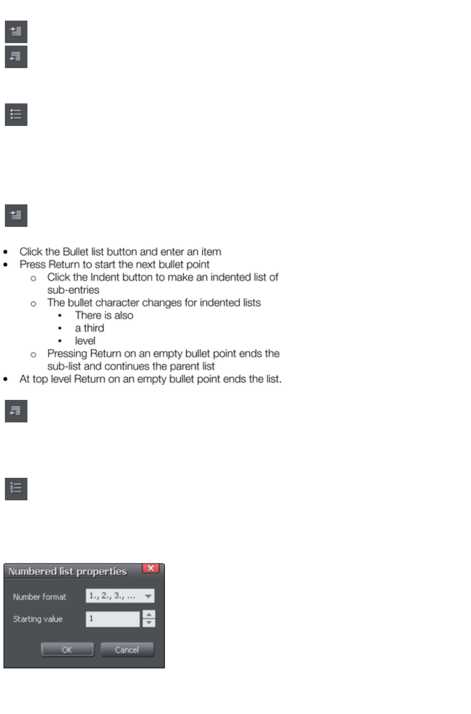
Indents and Outdents
Indent a paragraph of text.
Outdent a paragraph of text.
Bulleted Lists
You can turn any text into a bulleted list by selecting the text and then
selecting the bulleted list button on the infobar.
Each paragraph of text becomes a separate bullet. If you press return to finish a line at the end of one
bullet point, the next line starts with a bullet point to.
To finish entering a bulleted list, hit return on the end of the last bullet and then immediately hit return
again on the new bulleted line. This removes the last empty bulleted line and allows you to start entering
normal text again.
You can nest bulleted lists by pressing the indent button on the infobar.
This indents the current bulleted line and changes the bullet character to
a different style, to distinguish it from the parent bullet.
Example of a nested bulleted list
To move a bullet point from a sub-list into its parent bulleted list, simply
place the text cursor in it and press the outdent button.
So it's easy to make and edit arrangements of nested bulleted lists using the indent and outdent buttons.
Numbered lists
You can create and edit numbered lists in just the same way as
described for bulleted lists above, using the numbered list button.
You can also choose the numbering scheme to be used for each list, using the List properties dialog.
Place the text cursor in one of the numbered list points, press the right mouse button and choose 'List
properties…
" from the context menu.
In the dialog you can choose from a variety of numbering schemes and also enter the value that should be
used for the very first entry in the list. Then the number is automatically incremented for the second and
subsequent entries in the list.
Page 629
Subscript & superscript
Click the appropriate button on the InfoBar.
Normal text subscript superscript
Line spacing
Line spacing allows you to change the space between two
lines (so affects vertical spacing).
Line spacing is measured in percentages (120%) or points (12pt). You can either type the line space
value in the text box or click the arrows to nudge the values.
A percentage setting has the benefit of scaling accordingly if you change your font size. If a percentage is
applied to a line of text with more than one font size, the largest font size is used. For example, if a line
contains 90% and 100% text, the line spacing is calculated on 100%.
Paragraph Spacing
The last two fields on the end of the Text Tool
InfoBar allow you to set the spacing above and/or below
paragraphs.
This is particularly useful where you want half line spaces between paragraphs.
Like Microsoft Word, when you use both spacing above and below paragraphs, the spacing between
paragraphs is whichever is the greater value (it's not cumulative). Paragraph spacing above paragraphs
will move the first paragraph down in a frame of text.
Page 630
Changing the font size
There are several ways to change the font size:
Type a new value into the size text box on the InfoBar and press ¿.
Or select from the Font size drop-down list on the InfoBar.
Or use the Font size pop-up slider.
Or manually increase/decrease font size with the "Ctrl + Shift + >" and "Ctrl + Shift + <"
keyboard shortcuts. This applies only if all selected text parts are of the same font size.
Or use the Selector Tool to scale the whole text object.
Bold & Italic
Click the Bold or Italic
button on the InfoBar ("Ctrl + B" or "Ctrl + I")
This applies the bold or italic variant of the current font.
Attention: Xara Web Designer 7 Premium does not allow you to apply italic or bold to text if the
necessary italic/bold font is not installed. However you can easily emulate the same effect. To embolden a
font, just give it a small line width and apply a line color. To slant a font, use the skew / slant feature of
the Selector Tool
. Read more in the "Font menu" section
Text Underlining
Click the underline button on the InfoBar to apply an underline
to the selected text.
The underline color and size is automatically derived from the text color and size.
Justification or text alignment
Justification always applies to the complete line. Any selected region is ignored.
Left
justification: Align the left-hand edge of the text to the initial click
position.
Center
justification: Centers the text around the click position.
Right
justification: Align the right-hand edge of the text to the initial click
position.
Full
justification: This only applies when text is along a curve or in a column
and when there is at least one full line of text to justify.
When using simple text the initial click position
on the page is taken as the origin for text justification.
Indents and Outdents
Indent a paragraph of text.
Page 631
Outdent a paragraph of text.
Bulleted Lists
You can turn any text into a bulleted list by selecting the text and then
selecting the bulleted list button on the infobar.
Each paragraph of text becomes a separate bullet. If you press return to finish a line at the end of one
bullet point, the next line starts with a bullet point to.
To finish entering a bulleted list, hit return on the end of the last bullet and then immediately hit return
again on the new bulleted line. This removes the last empty bulleted line and allows you to start entering
normal text again.
You can nest bulleted lists by pressing the indent button on the infobar.
This indents the current bulleted line and changes the bullet character to
a different style, to distinguish it from the parent bullet.
Example of a nested bulleted list
To move a bullet point from a sub-list into its parent bulleted list, simply
place the text cursor in it and press the outdent button.
So it's easy to make and edit arrangements of nested bulleted lists using the indent and outdent buttons.
Numbered lists
You can create and edit numbered lists in just the same way as
described for bulleted lists above, using the numbered list button.
You can also choose the numbering scheme to be used for each list, using the List properties dialog.
Place the text cursor in one of the numbered list points, press the right mouse button and choose 'List
properties…
" from the context menu.
In the dialog you can choose from a variety of numbering schemes and also enter the value that should be
used for the very first entry in the list. Then the number is automatically incremented for the second and
subsequent entries in the list.
Subscript & superscript
Page 632
Click the appropriate button on the InfoBar.
Normal text subscript superscript
Line spacing
Line spacing allows you to change the space between two
lines (so affects vertical spacing).
Line spacing is measured in percentages (120%) or points (12pt). You can either type the line space
value in the text box or click the arrows to nudge the values.
A percentage setting has the benefit of scaling accordingly if you change your font size. If a percentage is
applied to a line of text with more than one font size, the largest font size is used. For example, if a line
contains 90% and 100% text, the line spacing is calculated on 100%.
Paragraph Spacing
The last two fields on the end of the Text Tool
InfoBar allow you to set the spacing above and/or below
paragraphs.
This is particularly useful where you want half line spaces between paragraphs.
Like Microsoft Word, when you use both spacing above and below paragraphs, the spacing between
paragraphs is whichever is the greater value (it's not cumulative). Paragraph spacing above paragraphs
will move the first paragraph down in a frame of text.
Page 633
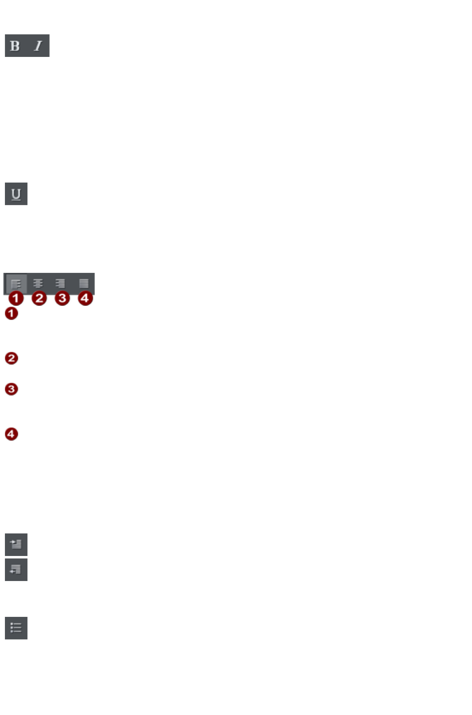
Bold & Italic
Click the Bold or Italic
button on the InfoBar ("Ctrl + B" or "Ctrl + I")
This applies the bold or italic variant of the current font.
Attention: Xara Web Designer 7 Premium does not allow you to apply italic or bold to text if the
necessary italic/bold font is not installed. However you can easily emulate the same effect. To embolden a
font, just give it a small line width and apply a line color. To slant a font, use the skew / slant feature of
the Selector Tool
. Read more in the "Font menu" section
Text Underlining
Click the underline button on the InfoBar to apply an underline
to the selected text.
The underline color and size is automatically derived from the text color and size.
Justification or text alignment
Justification always applies to the complete line. Any selected region is ignored.
Left
justification: Align the left-hand edge of the text to the initial click
position.
Center
justification: Centers the text around the click position.
Right
justification: Align the right-hand edge of the text to the initial click
position.
Full
justification: This only applies when text is along a curve or in a column
and when there is at least one full line of text to justify.
When using simple text the initial click position
on the page is taken as the origin for text justification.
Indents and Outdents
Indent a paragraph of text.
Outdent a paragraph of text.
Bulleted Lists
You can turn any text into a bulleted list by selecting the text and then
selecting the bulleted list button on the infobar.
Each paragraph of text becomes a separate bullet. If you press return to finish a line at the end of one
bullet point, the next line starts with a bullet point to.
To finish entering a bulleted list, hit return on the end of the last bullet and then immediately hit return
again on the new bulleted line. This removes the last empty bulleted line and allows you to start entering
Page 634
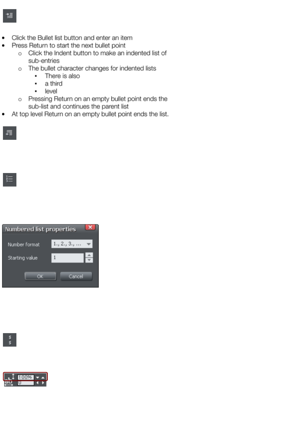
normal text again.
You can nest bulleted lists by pressing the indent button on the infobar.
This indents the current bulleted line and changes the bullet character to
a different style, to distinguish it from the parent bullet.
Example of a nested bulleted list
To move a bullet point from a sub-list into its parent bulleted list, simply
place the text cursor in it and press the outdent button.
So it's easy to make and edit arrangements of nested bulleted lists using the indent and outdent buttons.
Numbered lists
You can create and edit numbered lists in just the same way as
described for bulleted lists above, using the numbered list button.
You can also choose the numbering scheme to be used for each list, using the List properties dialog.
Place the text cursor in one of the numbered list points, press the right mouse button and choose 'List
properties…
" from the context menu.
In the dialog you can choose from a variety of numbering schemes and also enter the value that should be
used for the very first entry in the list. Then the number is automatically incremented for the second and
subsequent entries in the list.
Subscript & superscript
Click the appropriate button on the InfoBar.
Normal text subscript superscript
Line spacing
Line spacing allows you to change the space between two
lines (so affects vertical spacing).
Line spacing is measured in percentages (120%) or points (12pt). You can either type the line space
value in the text box or click the arrows to nudge the values.
A percentage setting has the benefit of scaling accordingly if you change your font size. If a percentage is
applied to a line of text with more than one font size, the largest font size is used. For example, if a line
Page 635

contains 90% and 100% text, the line spacing is calculated on 100%.
Paragraph Spacing
The last two fields on the end of the Text Tool
InfoBar allow you to set the spacing above and/or below
paragraphs.
This is particularly useful where you want half line spaces between paragraphs.
Like Microsoft Word, when you use both spacing above and below paragraphs, the spacing between
paragraphs is whichever is the greater value (it's not cumulative). Paragraph spacing above paragraphs
will move the first paragraph down in a frame of text.
Page 636
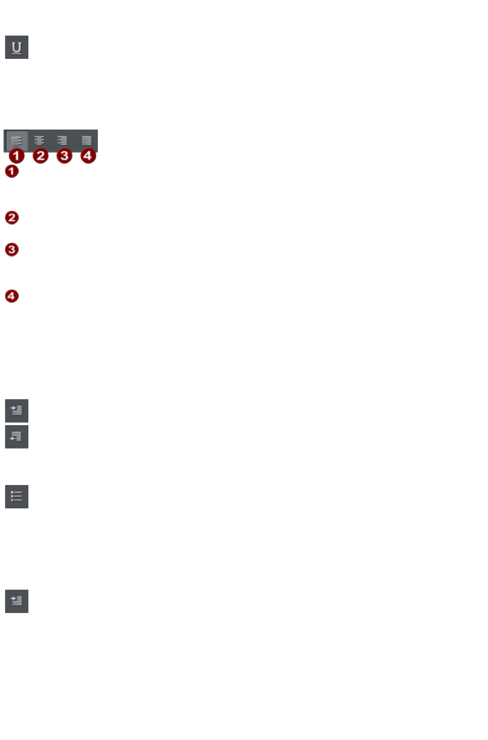
Text Underlining
Click the underline button on the InfoBar to apply an underline
to the selected text.
The underline color and size is automatically derived from the text color and size.
Justification or text alignment
Justification always applies to the complete line. Any selected region is ignored.
Left
justification: Align the left-hand edge of the text to the initial click
position.
Center
justification: Centers the text around the click position.
Right
justification: Align the right-hand edge of the text to the initial click
position.
Full
justification: This only applies when text is along a curve or in a column
and when there is at least one full line of text to justify.
When using simple text the initial click position
on the page is taken as the origin for text justification.
Indents and Outdents
Indent a paragraph of text.
Outdent a paragraph of text.
Bulleted Lists
You can turn any text into a bulleted list by selecting the text and then
selecting the bulleted list button on the infobar.
Each paragraph of text becomes a separate bullet. If you press return to finish a line at the end of one
bullet point, the next line starts with a bullet point to.
To finish entering a bulleted list, hit return on the end of the last bullet and then immediately hit return
again on the new bulleted line. This removes the last empty bulleted line and allows you to start entering
normal text again.
You can nest bulleted lists by pressing the indent button on the infobar.
This indents the current bulleted line and changes the bullet character to
a different style, to distinguish it from the parent bullet.
Page 637
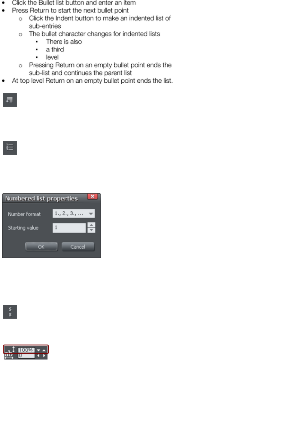
Example of a nested bulleted list
To move a bullet point from a sub-list into its parent bulleted list, simply
place the text cursor in it and press the outdent button.
So it's easy to make and edit arrangements of nested bulleted lists using the indent and outdent buttons.
Numbered lists
You can create and edit numbered lists in just the same way as
described for bulleted lists above, using the numbered list button.
You can also choose the numbering scheme to be used for each list, using the List properties dialog.
Place the text cursor in one of the numbered list points, press the right mouse button and choose 'List
properties…
" from the context menu.
In the dialog you can choose from a variety of numbering schemes and also enter the value that should be
used for the very first entry in the list. Then the number is automatically incremented for the second and
subsequent entries in the list.
Subscript & superscript
Click the appropriate button on the InfoBar.
Normal text subscript superscript
Line spacing
Line spacing allows you to change the space between two
lines (so affects vertical spacing).
Line spacing is measured in percentages (120%) or points (12pt). You can either type the line space
value in the text box or click the arrows to nudge the values.
A percentage setting has the benefit of scaling accordingly if you change your font size. If a percentage is
applied to a line of text with more than one font size, the largest font size is used. For example, if a line
contains 90% and 100% text, the line spacing is calculated on 100%.
Paragraph Spacing
Page 638

The last two fields on the end of the Text Tool
InfoBar allow you to set the spacing above and/or below
paragraphs.
This is particularly useful where you want half line spaces between paragraphs.
Like Microsoft Word, when you use both spacing above and below paragraphs, the spacing between
paragraphs is whichever is the greater value (it's not cumulative). Paragraph spacing above paragraphs
will move the first paragraph down in a frame of text.
Page 639
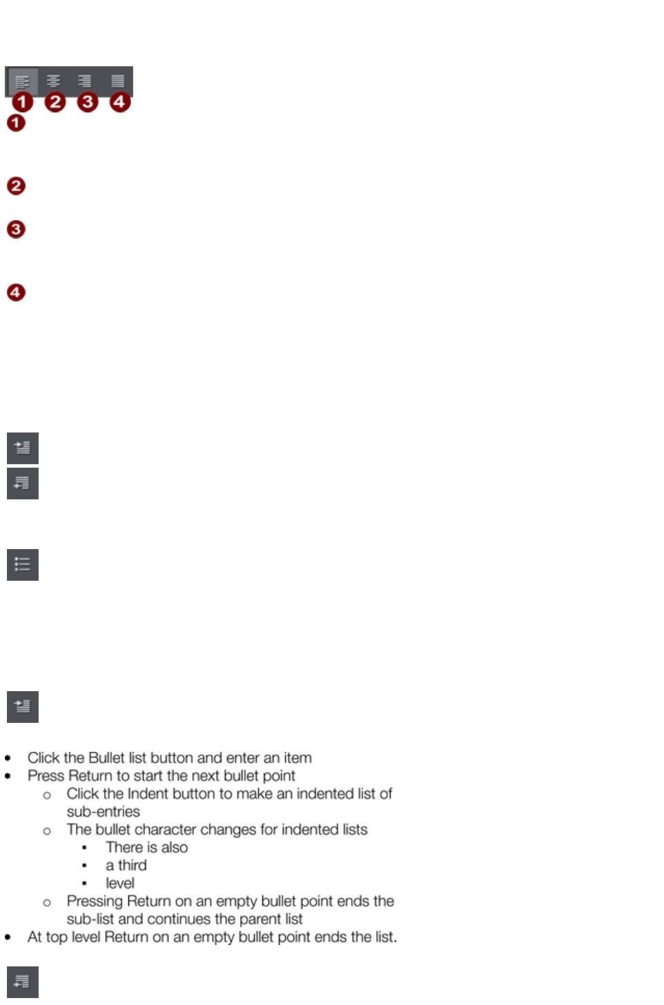
Justification or text alignment
Justification always applies to the complete line. Any selected region is ignored.
Left
justification: Align the left-hand edge of the text to the initial click
position.
Center
justification: Centers the text around the click position.
Right
justification: Align the right-hand edge of the text to the initial click
position.
Full
justification: This only applies when text is along a curve or in a column
and when there is at least one full line of text to justify.
When using simple text the initial click position
on the page is taken as the origin for text justification.
Indents and Outdents
Indent a paragraph of text.
Outdent a paragraph of text.
Bulleted Lists
You can turn any text into a bulleted list by selecting the text and then
selecting the bulleted list button on the infobar.
Each paragraph of text becomes a separate bullet. If you press return to finish a line at the end of one
bullet point, the next line starts with a bullet point to.
To finish entering a bulleted list, hit return on the end of the last bullet and then immediately hit return
again on the new bulleted line. This removes the last empty bulleted line and allows you to start entering
normal text again.
You can nest bulleted lists by pressing the indent button on the infobar.
This indents the current bulleted line and changes the bullet character to
a different style, to distinguish it from the parent bullet.
Example of a nested bulleted list
To move a bullet point from a sub-list into its parent bulleted list, simply
Page 640
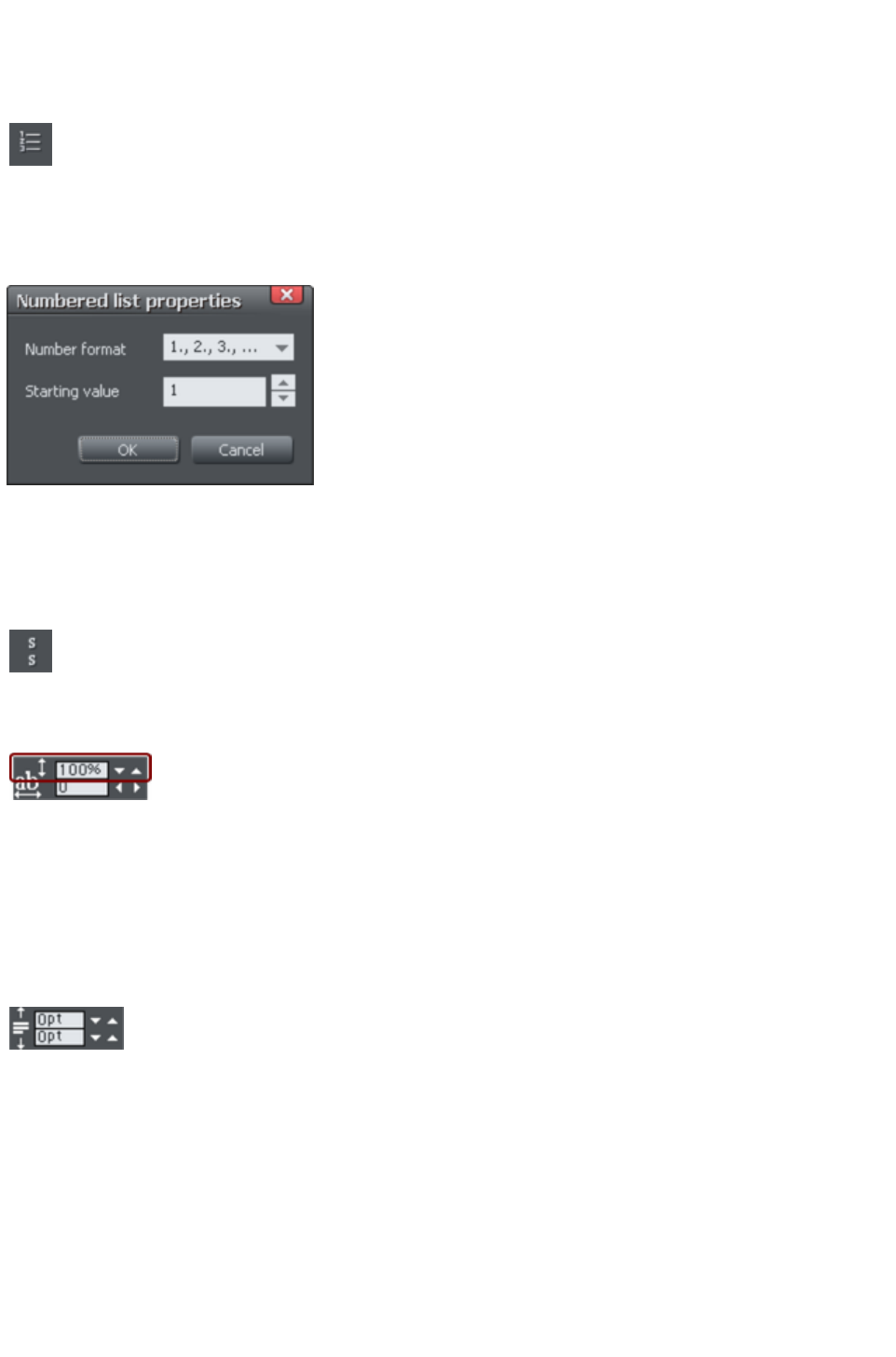
place the text cursor in it and press the outdent button.
So it's easy to make and edit arrangements of nested bulleted lists using the indent and outdent buttons.
Numbered lists
You can create and edit numbered lists in just the same way as
described for bulleted lists above, using the numbered list button.
You can also choose the numbering scheme to be used for each list, using the List properties dialog.
Place the text cursor in one of the numbered list points, press the right mouse button and choose 'List
properties…
" from the context menu.
In the dialog you can choose from a variety of numbering schemes and also enter the value that should be
used for the very first entry in the list. Then the number is automatically incremented for the second and
subsequent entries in the list.
Subscript & superscript
Click the appropriate button on the InfoBar.
Normal text subscript superscript
Line spacing
Line spacing allows you to change the space between two
lines (so affects vertical spacing).
Line spacing is measured in percentages (120%) or points (12pt). You can either type the line space
value in the text box or click the arrows to nudge the values.
A percentage setting has the benefit of scaling accordingly if you change your font size. If a percentage is
applied to a line of text with more than one font size, the largest font size is used. For example, if a line
contains 90% and 100% text, the line spacing is calculated on 100%.
Paragraph Spacing
The last two fields on the end of the Text Tool
InfoBar allow you to set the spacing above and/or below
paragraphs.
This is particularly useful where you want half line spaces between paragraphs.
Like Microsoft Word, when you use both spacing above and below paragraphs, the spacing between
paragraphs is whichever is the greater value (it's not cumulative). Paragraph spacing above paragraphs
will move the first paragraph down in a frame of text.
Page 641
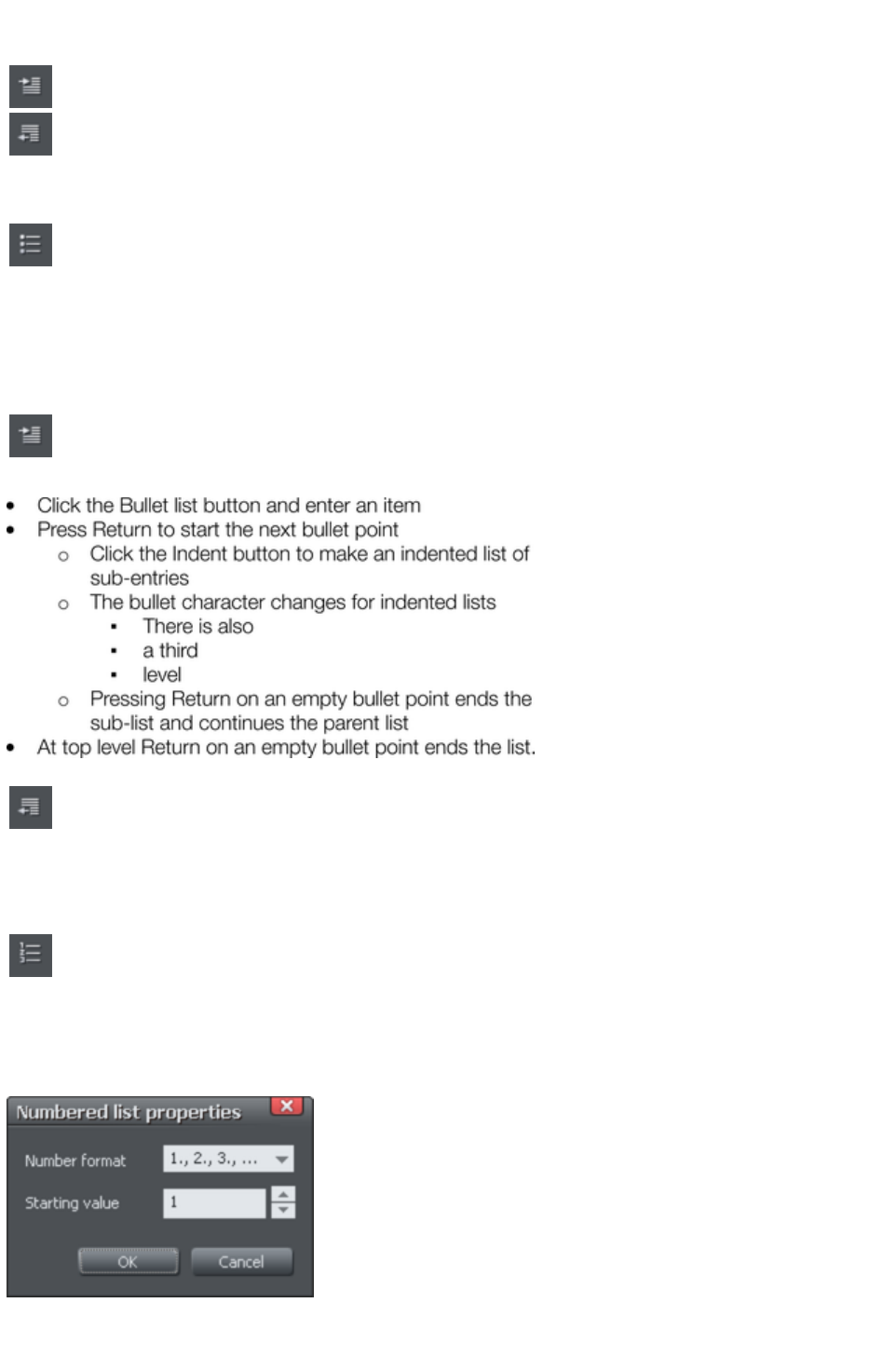
Indents and Outdents
Indent a paragraph of text.
Outdent a paragraph of text.
Bulleted Lists
You can turn any text into a bulleted list by selecting the text and then
selecting the bulleted list button on the infobar.
Each paragraph of text becomes a separate bullet. If you press return to finish a line at the end of one
bullet point, the next line starts with a bullet point to.
To finish entering a bulleted list, hit return on the end of the last bullet and then immediately hit return
again on the new bulleted line. This removes the last empty bulleted line and allows you to start entering
normal text again.
You can nest bulleted lists by pressing the indent button on the infobar.
This indents the current bulleted line and changes the bullet character to
a different style, to distinguish it from the parent bullet.
Example of a nested bulleted list
To move a bullet point from a sub-list into its parent bulleted list, simply
place the text cursor in it and press the outdent button.
So it's easy to make and edit arrangements of nested bulleted lists using the indent and outdent buttons.
Numbered lists
You can create and edit numbered lists in just the same way as
described for bulleted lists above, using the numbered list button.
You can also choose the numbering scheme to be used for each list, using the List properties dialog.
Place the text cursor in one of the numbered list points, press the right mouse button and choose 'List
properties…
" from the context menu.
In the dialog you can choose from a variety of numbering schemes and also enter the value that should be
used for the very first entry in the list. Then the number is automatically incremented for the second and
Page 642

subsequent entries in the list.
Subscript & superscript
Click the appropriate button on the InfoBar.
Normal text subscript superscript
Line spacing
Line spacing allows you to change the space between two
lines (so affects vertical spacing).
Line spacing is measured in percentages (120%) or points (12pt). You can either type the line space
value in the text box or click the arrows to nudge the values.
A percentage setting has the benefit of scaling accordingly if you change your font size. If a percentage is
applied to a line of text with more than one font size, the largest font size is used. For example, if a line
contains 90% and 100% text, the line spacing is calculated on 100%.
Paragraph Spacing
The last two fields on the end of the Text Tool
InfoBar allow you to set the spacing above and/or below
paragraphs.
This is particularly useful where you want half line spaces between paragraphs.
Like Microsoft Word, when you use both spacing above and below paragraphs, the spacing between
paragraphs is whichever is the greater value (it's not cumulative). Paragraph spacing above paragraphs
will move the first paragraph down in a frame of text.
Page 643
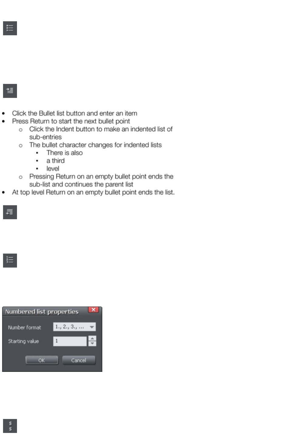
Bulleted Lists
You can turn any text into a bulleted list by selecting the text and then
selecting the bulleted list button on the infobar.
Each paragraph of text becomes a separate bullet. If you press return to finish a line at the end of one
bullet point, the next line starts with a bullet point to.
To finish entering a bulleted list, hit return on the end of the last bullet and then immediately hit return
again on the new bulleted line. This removes the last empty bulleted line and allows you to start entering
normal text again.
You can nest bulleted lists by pressing the indent button on the infobar.
This indents the current bulleted line and changes the bullet character to
a different style, to distinguish it from the parent bullet.
Example of a nested bulleted list
To move a bullet point from a sub-list into its parent bulleted list, simply
place the text cursor in it and press the outdent button.
So it's easy to make and edit arrangements of nested bulleted lists using the indent and outdent buttons.
Numbered lists
You can create and edit numbered lists in just the same way as
described for bulleted lists above, using the numbered list button.
You can also choose the numbering scheme to be used for each list, using the List properties dialog.
Place the text cursor in one of the numbered list points, press the right mouse button and choose 'List
properties…
" from the context menu.
In the dialog you can choose from a variety of numbering schemes and also enter the value that should be
used for the very first entry in the list. Then the number is automatically incremented for the second and
subsequent entries in the list.
Subscript & superscript
Click the appropriate button on the InfoBar.
Normal text subscript superscript
Page 644

Line spacing
Line spacing allows you to change the space between two
lines (so affects vertical spacing).
Line spacing is measured in percentages (120%) or points (12pt). You can either type the line space
value in the text box or click the arrows to nudge the values.
A percentage setting has the benefit of scaling accordingly if you change your font size. If a percentage is
applied to a line of text with more than one font size, the largest font size is used. For example, if a line
contains 90% and 100% text, the line spacing is calculated on 100%.
Paragraph Spacing
The last two fields on the end of the Text Tool
InfoBar allow you to set the spacing above and/or below
paragraphs.
This is particularly useful where you want half line spaces between paragraphs.
Like Microsoft Word, when you use both spacing above and below paragraphs, the spacing between
paragraphs is whichever is the greater value (it's not cumulative). Paragraph spacing above paragraphs
will move the first paragraph down in a frame of text.
Page 645
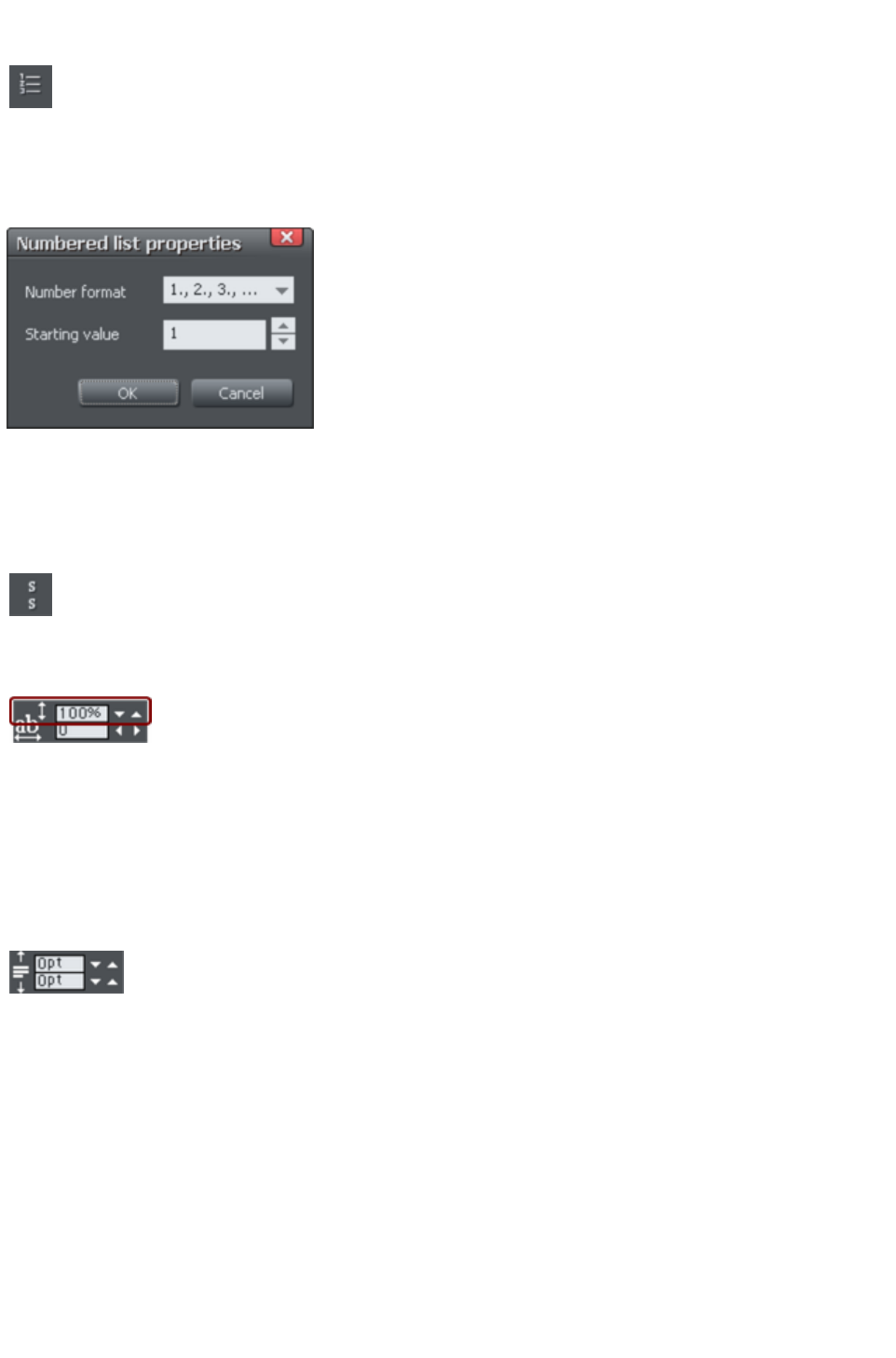
Numbered lists
You can create and edit numbered lists in just the same way as
described for bulleted lists above, using the numbered list button.
You can also choose the numbering scheme to be used for each list, using the List properties dialog.
Place the text cursor in one of the numbered list points, press the right mouse button and choose 'List
properties…
" from the context menu.
In the dialog you can choose from a variety of numbering schemes and also enter the value that should be
used for the very first entry in the list. Then the number is automatically incremented for the second and
subsequent entries in the list.
Subscript & superscript
Click the appropriate button on the InfoBar.
Normal text subscript superscript
Line spacing
Line spacing allows you to change the space between two
lines (so affects vertical spacing).
Line spacing is measured in percentages (120%) or points (12pt). You can either type the line space
value in the text box or click the arrows to nudge the values.
A percentage setting has the benefit of scaling accordingly if you change your font size. If a percentage is
applied to a line of text with more than one font size, the largest font size is used. For example, if a line
contains 90% and 100% text, the line spacing is calculated on 100%.
Paragraph Spacing
The last two fields on the end of the Text Tool
InfoBar allow you to set the spacing above and/or below
paragraphs.
This is particularly useful where you want half line spaces between paragraphs.
Like Microsoft Word, when you use both spacing above and below paragraphs, the spacing between
paragraphs is whichever is the greater value (it's not cumulative). Paragraph spacing above paragraphs
will move the first paragraph down in a frame of text.
Page 646

Subscript & superscript
Click the appropriate button on the InfoBar.
Normal text subscript superscript
Line spacing
Line spacing allows you to change the space between two
lines (so affects vertical spacing).
Line spacing is measured in percentages (120%) or points (12pt). You can either type the line space
value in the text box or click the arrows to nudge the values.
A percentage setting has the benefit of scaling accordingly if you change your font size. If a percentage is
applied to a line of text with more than one font size, the largest font size is used. For example, if a line
contains 90% and 100% text, the line spacing is calculated on 100%.
Paragraph Spacing
The last two fields on the end of the Text Tool
InfoBar allow you to set the spacing above and/or below
paragraphs.
This is particularly useful where you want half line spaces between paragraphs.
Like Microsoft Word, when you use both spacing above and below paragraphs, the spacing between
paragraphs is whichever is the greater value (it's not cumulative). Paragraph spacing above paragraphs
will move the first paragraph down in a frame of text.
Page 647
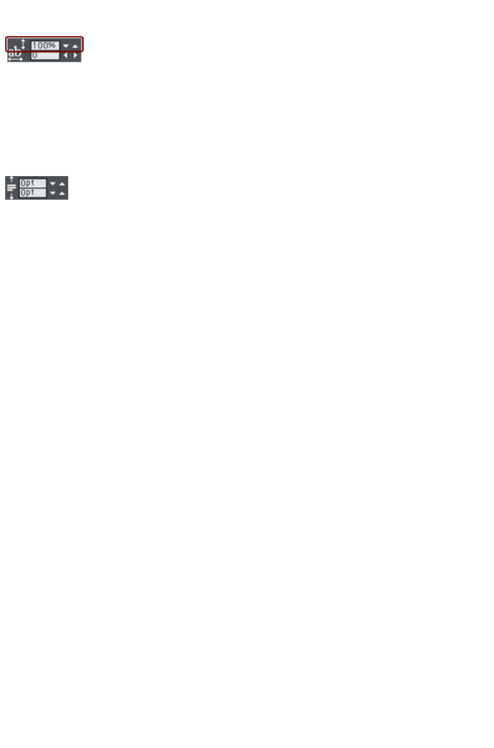
Line spacing
Line spacing allows you to change the space between two
lines (so affects vertical spacing).
Line spacing is measured in percentages (120%) or points (12pt). You can either type the line space
value in the text box or click the arrows to nudge the values.
A percentage setting has the benefit of scaling accordingly if you change your font size. If a percentage is
applied to a line of text with more than one font size, the largest font size is used. For example, if a line
contains 90% and 100% text, the line spacing is calculated on 100%.
Paragraph Spacing
The last two fields on the end of the Text Tool
InfoBar allow you to set the spacing above and/or below
paragraphs.
This is particularly useful where you want half line spaces between paragraphs.
Like Microsoft Word, when you use both spacing above and below paragraphs, the spacing between
paragraphs is whichever is the greater value (it's not cumulative). Paragraph spacing above paragraphs
will move the first paragraph down in a frame of text.
Page 648

Paragraph Spacing
The last two fields on the end of the Text Tool
InfoBar allow you to set the spacing above and/or below
paragraphs.
This is particularly useful where you want half line spaces between paragraphs.
Like Microsoft Word, when you use both spacing above and below paragraphs, the spacing between
paragraphs is whichever is the greater value (it's not cumulative). Paragraph spacing above paragraphs
will move the first paragraph down in a frame of text.
Page 649

Text links
You can apply a link to any part of a text object, so that when the document is exported as HTML the
text shows as a clickable link in web browsers.
Use the Text Tool to select the words or characters that you want to
apply the link to, then click the link button on the Web
toolbar.
This brings up the Web Properties dialog, with the Link
tab selected. On this tab you can choose whether to link to a URL, to another page of your website, or
even to a pop-up layer.
By default when you apply a link to some text, the text is shown as underlined and with the text link color
that is defined for the current document. You can change the link color and whether or not the links are
underlined, on the Website tab of the Web Properties dialog (right click and choose Web Properties
or choose Web Properties from the Utilities
menu). You can also set the color to be shown when the user moves the mouse pointer over a text link in
a web browser ("Mouse Over Color"), and the "Visited Color" which is used to display links which the
viewer has already visited with their web browser.
When setting the three global text link colors, you can either select existing named theme colors used in
your website, using the drop-down lists, or you can click the Edit button to bring up the Color Editor
so you can choose any color you like.
You can also choose to override the global text link colors for individual links if required. On the Link
tab of the Web Properties
dialog, unselect the "Use common website link colors" option. Then the selected link will be displayed
using the text color that you set in the document, instead of the global text link color.
Page 650

Text inside groups for websites
When a document is exported as a website, all groups get exported as images. So any text inside groups
is not present as text in your exported website, and so it can't be picked up by search engines or selected
and copied as text by a visitor to your site.
For graphical buttons, headings, logos etc. this is usually desirable as the text just forms part of the
graphic. But you may have more substantial pieces of text inside groups which you want to remain as text
in your exported web page. To arrange this, all you need to do is apply the special name "HTMLText" to
your text object. The easiest way to do this is as follows:
1. Go into the Text Tool and click on your text to insert the text cursor.
2. Press escape so that the whole text object becomes selected.
3. Open the Name dialog ("Utilities" > "Names...").
4. Either select the "HTMLText" name from the "Apply name" dropdown list if you've already
used it in the current document, or type in the name "HTMLText". Then click "Add" to add the
name.
Now, when you export your website, your text will remain as text and the rest of the group will be
converted to an image. All the text panels provided in the Designs Gallery
already have this name applied to the text objects inside them, so the text on the panels will export as
text.
Browsers can't render rotated text, so you can't use this name to force rotated text to be exported as
text. The name is ignored in this case.
Page 651

Copying text styles
It's easy to copy the style of any text to any other region of text using the Paste attributes
feature:
Select the source region from where you want to copy the style. This can be as little as a word
(just double click).
Select "Edit" > "Copy" ("Ctrl + C").
Select the region of text to which you want to apply the style.
Select "Edit" > "Paste attributes" ("Ctrl + ñ + A").
If you just have the text cursor positioned in some text when you Paste attributes
the paragraph attributes will be pasted to this paragraph.
If you have a region of text selected, then Paste attributes
will paste all the visual attributes of the source text.
Applying attributes to whole text stories
When you have the cursor in a simple or column text object, pressing "Esc" will select the whole text
object. You can then apply an attribute, say a color, and the whole text object is altered. This is often
quicker than performing "Select all" ("Ctrl + A").
With text areas this method only works if all text areas of the story are selected. You can do this in the
Selector Tool
clicking and "Shift + clicking" on the different text areas to select them. But this method is only possible if
the text areas are on a single page. If your text story flows over several pages and you want to change all
the text, then it's necessary to "Select all" ("Ctrl + A"), and then apply the required attributes.
Page 652

Applying attributes to whole text stories
When you have the cursor in a simple or column text object, pressing "Esc" will select the whole text
object. You can then apply an attribute, say a color, and the whole text object is altered. This is often
quicker than performing "Select all" ("Ctrl + A").
With text areas this method only works if all text areas of the story are selected. You can do this in the
Selector Tool
clicking and "Shift + clicking" on the different text areas to select them. But this method is only possible if
the text areas are on a single page. If your text story flows over several pages and you want to change all
the text, then it's necessary to "Select all" ("Ctrl + A"), and then apply the required attributes.
Page 653

Copying/Pasting formatted text (RTF)
You can copy "rich text" (as it's sometimes known) from other applications such as word processors or
editors and paste into Xara Web Designer 7 Premium as text, and the fonts, margins, line spacing and
text links will be preserved. This makes it dramatically easier to retain the style and appearance of your
text.
When you paste "Rich Text Format" (RTF) from other applications you are given the choice of pasting
the text in as "Unformatted text" which means it will appear in the font and style at the cursor where you
paste, or "Rich Text Format", i.e. it will retain the style of the source text.
This also works the other way around. You can copy text in Web Designer Premium and paste into other
applications that support rich text editing and the style (font, size, colors, margins etc) will be retained.
This will only work if you select and copy a single text object or from a single text flow.
Some applications, such as Microsoft Word, have a "Paste special" menu option that provides a wider
range of paste options. These applications will sometimes allow you to choose the format of the pasted
object (text or graphic).
Page 654

Seeing fonts in use
It is sometimes useful to see what fonts are used in your document, particularly if you are sharing files
with other Web Designer Premium users who may not have the same fonts installed.
For a complete list of fonts used in your document choose "File" > "Document info
".
Any fonts that are used in the document but are not currently installed on your computer have not
installed
by them.
Another way to see which fonts are used in your document is to just open the font menu of the Text
Tool
InfoBar. The top section shows fonts used in your document.
Page 655

Font embedding
Xara Web Designer 7 Premium stores the character shapes of all the fonts used in your document. This
means if you give someone else your design file, or transfer the file to another computer, the text will still
look exactly right, even if the correct fonts are not installed on that computer. But this only embeds the
characters that are used in the document (the full font is not included). So on computers with the fonts
missing, any text that is added in the missing fonts may be missing the correct character shapes.
Page 656

Browser text compatibility
It is a sad fact that different browsers display the same text slightly differently, usually at a slightly
different size or line length (so for example 10pt text is not displayed at 10pt size but at the nearest whole
pixel size instead (13 pixels).
Xara Web Designer 7 Premium is designed to emulate the behavior of the most common browsers and
adjusts intermediate sizes to be whole pixels, and adjusts the line lengths to closely emulate the text on
Windows browsers. You can switch this adjustment off in the Options dialog, General tab (right click
and choose Page Options or choose Options from the Utilities menu) by un-checking the 'Show
Windows compatible text lengths
' option.
Advanced note:
If you're using Web Designer Premium or switch this compatibility option off, then if you enter any
intermediate size, such as 13.6 pixels or 10pt, you will get text that is exactly, accurately, scaled to this
size. But be warned that most web browsers will show this text as a slightly larger or smaller size than
you see in Xara Web Designer 7 Premium.
A second consequence of this browser (mis)behavior is that at small font sizes, there is a quite a large
jump from one size to the next. So if you want a font size, say, between 9pix and 10pix, you can't have
this. Most browsers cannot display an intermediate size (whether you use Points, ems, or any other unit
type). So you will see Xara Web Designer 7 Premium text sizes jump from one size to the next as you
resize text objects.)
Page 657
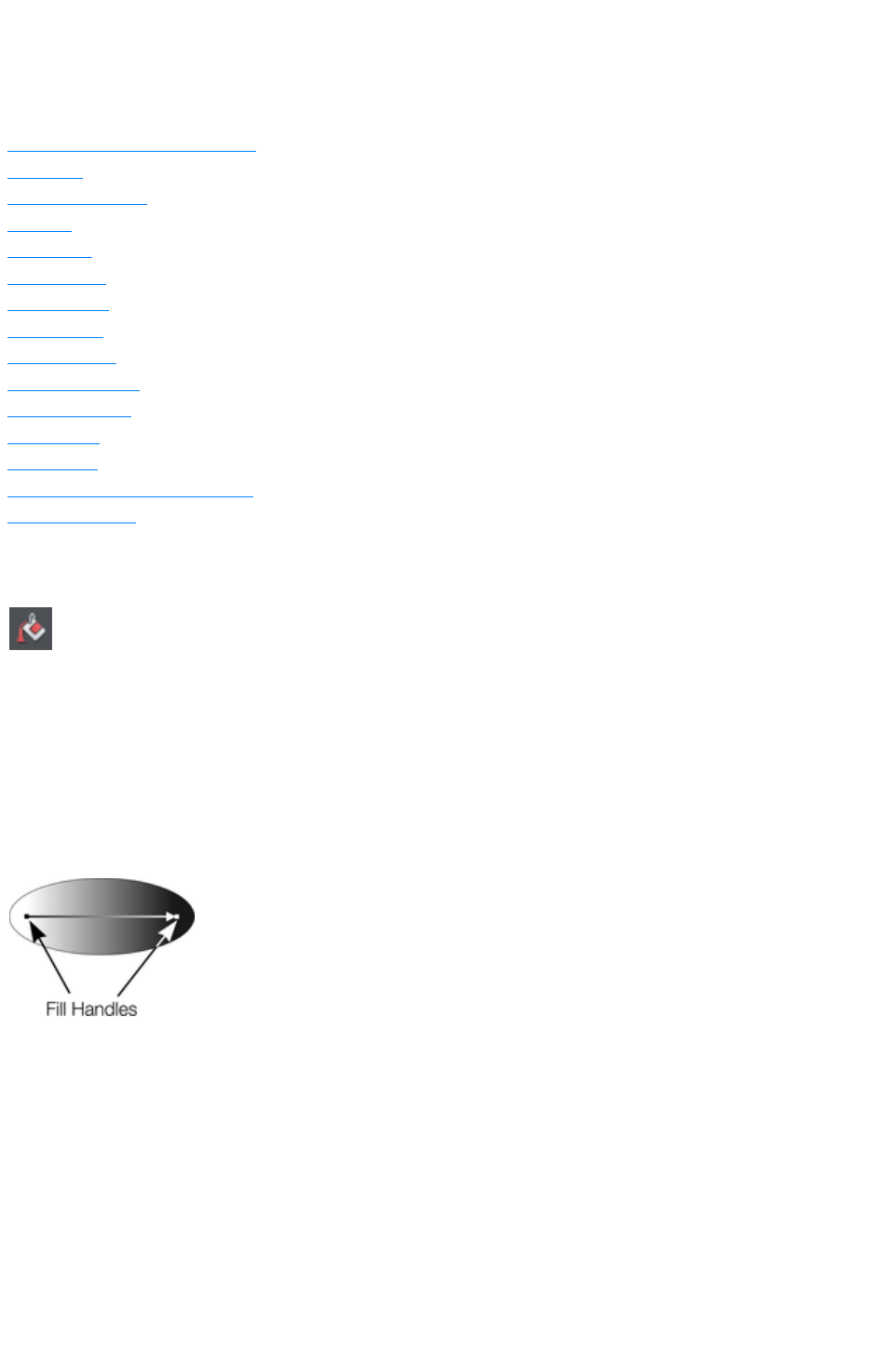
The Fill Tool
In this chapter
Creating a graduated color fill
Fill types
Fill Tool InfoBar
Flat fills
Linear fills
Circular fills
Elliptical fills
Conical fills
Diamond fills
Three-color fills
Four-color fills
Bitmap fills
Fractal fills
Multi-stage color graduations
The Fill Gallery
Creating a graduated color fill
The process of creating a different fill is almost identical for all the fill
types:
1. Select the object or objects to which you want to apply the fill.
2. Select the Fill Tool ("F5")
3. Select the fill type from the dropdown menu
4. Click-drag across the object to create the fill. Or, drag one of the fill handles to adjust the fill size
and position
Xara Web Designer 7 Premium provides a smooth interactive live preview of the fill as you drag. This
provides a number of advantages over traditional dialog-based Fill Tools. Not only does it require a lot
fewer clicks, it's faster, and allows you to get the required start and end positions right first time.
As you drag a fill arrow is created indicating the
direction of the fill. Fill handles can be selected and
dragged to adjust the position and angle of the fill.
Coloring fills
Select one of the fill handles and click a color on the Color line or bring up the Color editor
and choose a new color. You can press "Tab" to alternate between the fill handles.
Changing selection
In the Fill Tool just clicking on an object will select it, and so it's not necessary to always go into the
Selector
Tool to select other objects.
Page 658
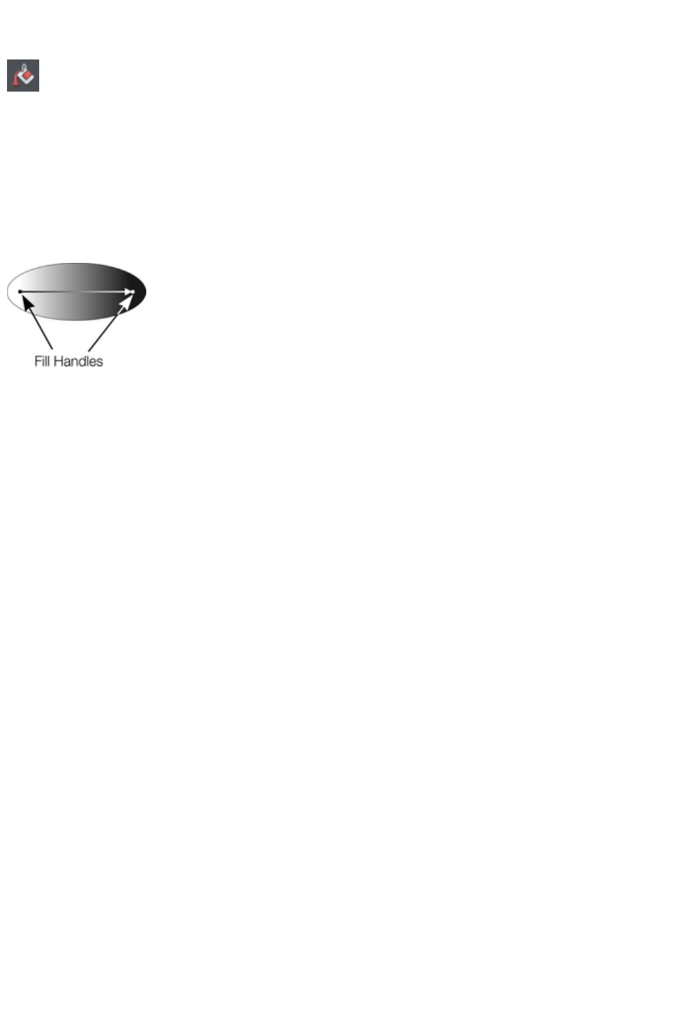
Creating a graduated color fill
The process of creating a different fill is almost identical for all the fill
types:
1. Select the object or objects to which you want to apply the fill.
2. Select the Fill Tool ("F5")
3. Select the fill type from the dropdown menu
4. Click-drag across the object to create the fill. Or, drag one of the fill handles to adjust the fill size
and position
Xara Web Designer 7 Premium provides a smooth interactive live preview of the fill as you drag. This
provides a number of advantages over traditional dialog-based Fill Tools. Not only does it require a lot
fewer clicks, it's faster, and allows you to get the required start and end positions right first time.
As you drag a fill arrow is created indicating the
direction of the fill. Fill handles can be selected and
dragged to adjust the position and angle of the fill.
Coloring fills
Select one of the fill handles and click a color on the Color line or bring up the Color editor
and choose a new color. You can press "Tab" to alternate between the fill handles.
Changing selection
In the Fill Tool just clicking on an object will select it, and so it's not necessary to always go into the
Selector
Tool to select other objects.
Page 659
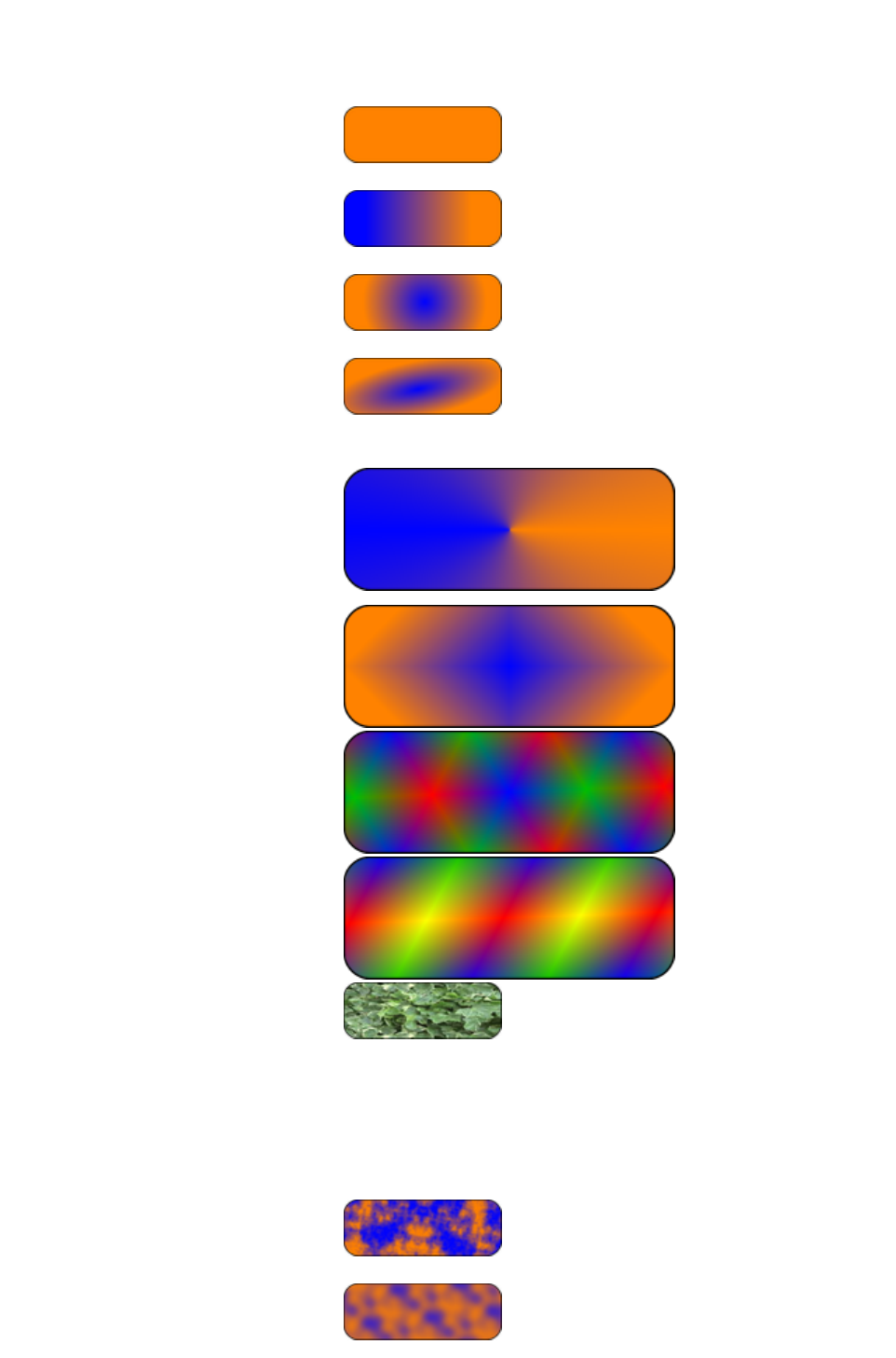
Fill types
Web Designer Premium has these types of color fill:
Flat fills
- the shape has an even color or tone
over its surface.
Linear fills
- the color gradually changes from one
color to another.
Circular fills
- the color change radiates out from a
single point in a circular pattern.
Elliptical fills
- similar to circular fills except the
change radiates out in an elliptical
pattern.
Conical fills
- the color change rotates around a
single point. The effect is of a cone lit
from one side with the opposite side in
another color.
Diamond fills
- similar to elliptical fills, except the fill
is like a diamond.
Three-color fills
- shows three different colors as if
spotlights were lighting the object.
Four-color fills
- the same as three-color fills, except
four colors are possible.
Bitmap fills - the object is filled with
one or more tiled copies of a bitmap or
photo. All photos you see in Xara
Web Designer 7 Premium are bitmap
filled shapes (normally rectangles of
course). Any photo can be used, or
any bitmap in the Bitmap or Fill
galleries.
Fractal clouds
- produces a patchy random fill which
is especially useful for clouds or mist.
Fractal plasma
- a patchy random fill which has more
Page 660

contrast than a fractal cloud fill.
The Fill
Tool lets you apply these fill types to the selected object(s) and to edit and adjust the fills.
Automatic select inside
In the Fill Tool, an automatic "Select inside" is performed when you click on an object that is a part of a
group, instead of selecting the group as a whole. This makes it easier for you to work on photos and fills
inside groups. If you want to change the fill attribute of a group (which is not very likely), you need to
select the group using the Selector Tool
first.
Page 661
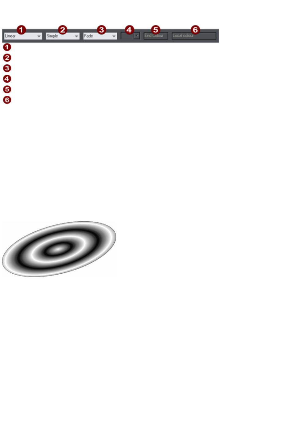
Fill Tool InfoBar
Fill Type
Fill tiling
Fill effect
Bitmap name
Fill handle/Resolution
Handle color/Grain
Fill type
selects the type of fill. Selecting from this menu:
with a selected object, applies the fill to the object;
without a selected object, sets the default current fill type, which is then used for newly drawn
objects.
Fill tiling
is used when applying bitmap and fractal fills. The options are described later in bitmap fills. Fill tiling
changes the repetition of the fill effect. The options are:
Simple-the fill is used only once, regardless of the size of the object. The area around the single
'tile' is transparent.
Repeating/repeating tile-repeats the effect so that it fills the entire object.
Repeating tile inverted-only available on fractal and bitmap fills. This is similar to repeating tile,
but every other tile is inverted. This helps to hide the seams where the tiles join.
A repeating elliptical fill inside an ellipse shape
Fill effect
is used for all fill types. It controls how the fill colors fade from the start color to the end color:
Fade-fades between the two colors in a linear fashion
Rainbow-blends along the shortest edge of the HSV color wheel. For example, a blend from
yellow to cyan runs yellow-green-cyan.
This option has no effect when the two colors are black, white or gray.
Alt rainbow-similar to rainbow except the blend is along the longest edge of the color wheel.
For example, yellow to cyan runs yellow-red-magenta-blue-cyan.
Bitmap name displays a pop-down menu showing thumbnails of all the bitmaps in the Bitmap Gallery
and is an easy way to select the required bitmap/photo for a bitmap fill.
Fill Profile
-you can change the rate of the color transition between the start and end of fills. This applies to all fill
types except flat, three color, four color and bitmap (unless it's a contone colored bitmap).
To change the profile of a fill:
1. Select the filled object.
2. On the Fill Tool InfoBar click Profile. This opens the Profile dialog box.
3. You either select a predefined profile from the dropdown list or drag the sliders to create a
custom profile. The top option in the dropdown list (the straight line) creates a linear transition
Page 662
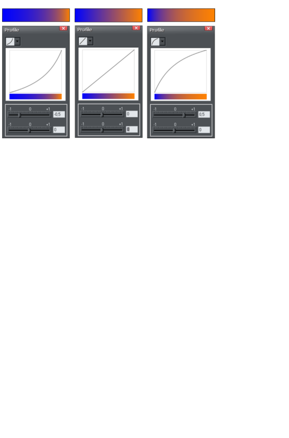
between the start and end of the fill.
Show three different black-to-white graduated color fills and the corresponding profile dialogs. The
center, default, is a linear black-to-white transition.
Fill handle
-tells you if the start or end handle is selected. This field is blank for flat fills.
Resolution
(bitmap and fractal fills only)-shows the resolution of the bitmap (as long as you don't have a fill handle
selected). You can type in a new resolution to change the size of the bitmap. Low resolutions show the
individual pixels of the bitmap. You rarely need a resolution greater than 150 DPI, even for typeset
output. 96 DPI is good enough for screen resolution.
Fill handle color
(except bitmap fills)-indicates the color applied to the selected fill handle.
Page 663

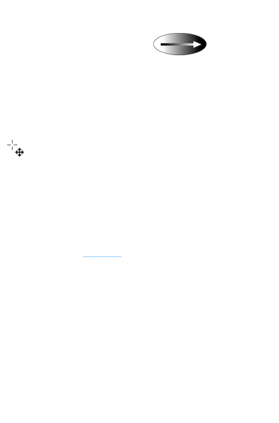
Linear fills
To apply a linear fill:
1. Select linear fill from the fill type menu (not
necessary if the object currently has a flat fill).
2. Position the pointer where you want to start the
fill (this can be outside the object).
3. Drag the mouse pointer to where you want the
fill to end (again, this point can be outside the
object).
The arrow drawn on the selected object is called the fill arrow. It indicates the direction and extent of the
fill. You can select either end of the arrow by clicking it.
Moving the start or end handle of the fill
To change the direction and extent of the fill:
1. Move the pointer over the handle you want to move. When
over the handle, the pointer changes shape.
2. Drag the handle.
Changing the colors in a fill
To change a color in a fill:
Drag & drop the color from the Color Line onto a fill handle (you do not have to select the
handle first.)
Or, drag & drop the color onto the object. Each fill has an imaginary center line halfway along
the fill arrow. Dropping the color on the start handle side changes the start handle color, and the
end handle side changes the end handle.
Or, if one of the end handles is selected (it's shown highlighted) just click on a color. You can
press "Tab" to select the other fill handle, and click the color required for the other end
The Color Line is described in Color handling
.
Each method changes the color of one handle only; they do not change any other selected fill handles, or:
1. Select the required handle (or handles, also works with multiple objects).
2. Choose the required color from the Color Line.
3. This changes all selected fill handles.
Page 665

Moving the start or end handle of the fill
To change the direction and extent of the fill:
1. Move the pointer over the handle you want to move. When
over the handle, the pointer changes shape.
2. Drag the handle.
Changing the colors in a fill
To change a color in a fill:
Drag & drop the color from the Color Line onto a fill handle (you do not have to select the
handle first.)
Or, drag & drop the color onto the object. Each fill has an imaginary center line halfway along
the fill arrow. Dropping the color on the start handle side changes the start handle color, and the
end handle side changes the end handle.
Or, if one of the end handles is selected (it's shown highlighted) just click on a color. You can
press "Tab" to select the other fill handle, and click the color required for the other end
The Color Line is described in Color handling
.
Each method changes the color of one handle only; they do not change any other selected fill handles, or:
1. Select the required handle (or handles, also works with multiple objects).
2. Choose the required color from the Color Line.
3. This changes all selected fill handles.
Page 666

Changing the colors in a fill
To change a color in a fill:
Drag & drop the color from the Color Line onto a fill handle (you do not have to select the
handle first.)
Or, drag & drop the color onto the object. Each fill has an imaginary center line halfway along
the fill arrow. Dropping the color on the start handle side changes the start handle color, and the
end handle side changes the end handle.
Or, if one of the end handles is selected (it's shown highlighted) just click on a color. You can
press "Tab" to select the other fill handle, and click the color required for the other end
The Color Line is described in Color handling
.
Each method changes the color of one handle only; they do not change any other selected fill handles, or:
1. Select the required handle (or handles, also works with multiple objects).
2. Choose the required color from the Color Line.
3. This changes all selected fill handles.
Page 667

Circular fills
For circular fills, applying the fill, moving handles and
changing colors are the same as for linear fills. The start
handle is the center of the fill.
Circular fills are useful for creating highlight effects.
Changing the height/width ratio of the object automatically changes a circular fill into an elliptical fill (see
below).
Page 668

Elliptical fills
Applying an elliptical fill is similar to applying linear fills.
As you drag the mouse pointer, you first create a circle
with two end handles. You can then drag the end handles
to create a suitable ellipse.
"
?+ drag" preserves the aspect ratio of the fill. "Ctrl + drag" constrains rotation to the preset constrain
angles. Moving handles and changing colors are the same as for linear fills.
A quick way to apply a elliptical fill:
"Shift + drag" to create a elliptical fill.
Page 669

Conical fills
When you apply a conical fill, the fill arrow displays as a
semi-circle with two end handles. You can then rotate
either end handle around the start handle to create suitable
shading.
The size of the semi-circle is irrelevant-it has no effect on the fill. "Ctrl + drag" constrains rotation to the
preset constrain angles.
You can also drag the center handle to change the position of the fill.
Moving handles and changing colors are the same as for linear fills.
Page 670

Diamond fills
Applying diamond fills is similar to applying elliptical fills.
As you drag the mouse pointer, the fill boundary appears
as a square with two end handles. You can then drag the
end handles to resize the diamond.
"Shift + drag" unlocks the aspect ratio of the fill, allowing you to move the fill handles independently. "Ctrl
+ drag" constrains your selection to the preset constrain angles.
Page 671

Three-color fills
Three-color fills give the effect of three colored spotlights
lighting the object. As you drag the mouse pointer, the fill
displays as a triangle with three end handles.
By default there is a 60° angle between the two fill arrows. "n+ drag" to create triangles with different
angles to form the fill triangle you require.
Unlike other three-handle fill types, three-color fills can have a different color applied to each handle (the
center and the two end points).
The object can contain a single (simple) or multiple instances (repeating) of the fill.
Page 672
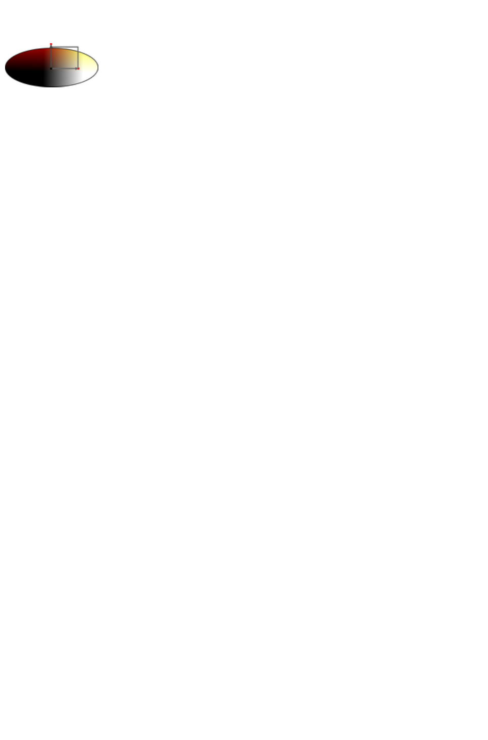
Four-color fills
Four-color fills are similar to three-color fills and give the
effect of four colored spotlights lighting the object. When
you apply a four-color fill, the fill boundary displays as a
square with four end handles.
You can then drag the handles to scale and rotate the rectangles. "n+ drag" to create parallelograms
instead of rectangles. Hold down Ctrl while dragging to constrain the rotation of the fill..
You can apply different colors to all four fill handles/lines. The object can contain a single (simple) or
multiple instances (repeating) of the fill.
Page 673
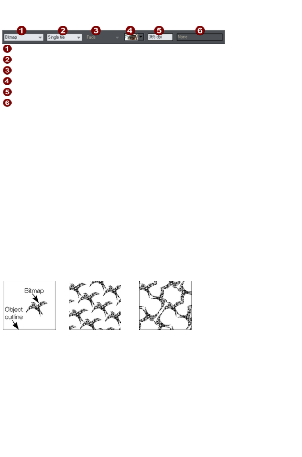
Bitmap fills
Fill Type
Fill Tiling
Not used
Bitmap name
Resolution
Not used
The Bitmap Gallery is described in The Bitmap Gallery in the Photo Handling chapter, for the Fill
Gallery see below
.
Bitmap fills are one of the most powerful fill types. It allows any photo or texture to be used as a fill for
any shape and you have direct immediate control over the size, angle, position and tiling. You can color
bitmap fills. You can use any type of bitmap as a fill, including JPEG photos, and alpha-channel
(semi-transparent) bitmaps.
When you import a photo file into Xara Web Designer 7 Premium (eg. a JPG or PNG file) it appears as
a shape with a bitmap fill type. When such an object is selected the status line shows it as a "photo", but it
is just the same as a shape that has had the photo applied as a bitmap fill.
To fill a shape with a bitmap or photo fill, do one of the following:
Drag any bitmap from the Bitmap Gallery or from your Windows File Explorer over any shape,
hold "Shift" and drop, or
Drag any fill from the Fill Gallery onto the shape (there is no need to hold "Shift" to drop in this
case)
Select 'Bitmap' from the left side drop down menu of the Fill Tool InfoBar, and then select the
required bitmap from the dropdown menu of bitmap names (this only shows bitmaps that are or
have been previously loaded).
You can fill an object with single or multiple tiles (repetitions of the bitmap image).
Single tile (photo)
Repeating tile
Repeat inverted-the tiles fit
together perfectly.
The fill has three handles. Use it for Resizing and re-positioning bitmap fills
. An alternative way to set the size of the bitmap is to type in a resolution into the InfoBar field. You first
have to un-select the fill handle by clicking anywhere on the image away from a fill handle, then just type
a new dpi resolution.
Replacing Bitmap Fills
If a shape already contains a bitmap, or is a photo, then you can just drag and drop a new bitmap from
any source, such as Windows Explorer, and it will replace the existing bitmap. The new image is 'best
fitted' into the shape so that it just fits in. Doing this will also replace all other instances of that photo on
the current page.
Holding down Shift
Page 674
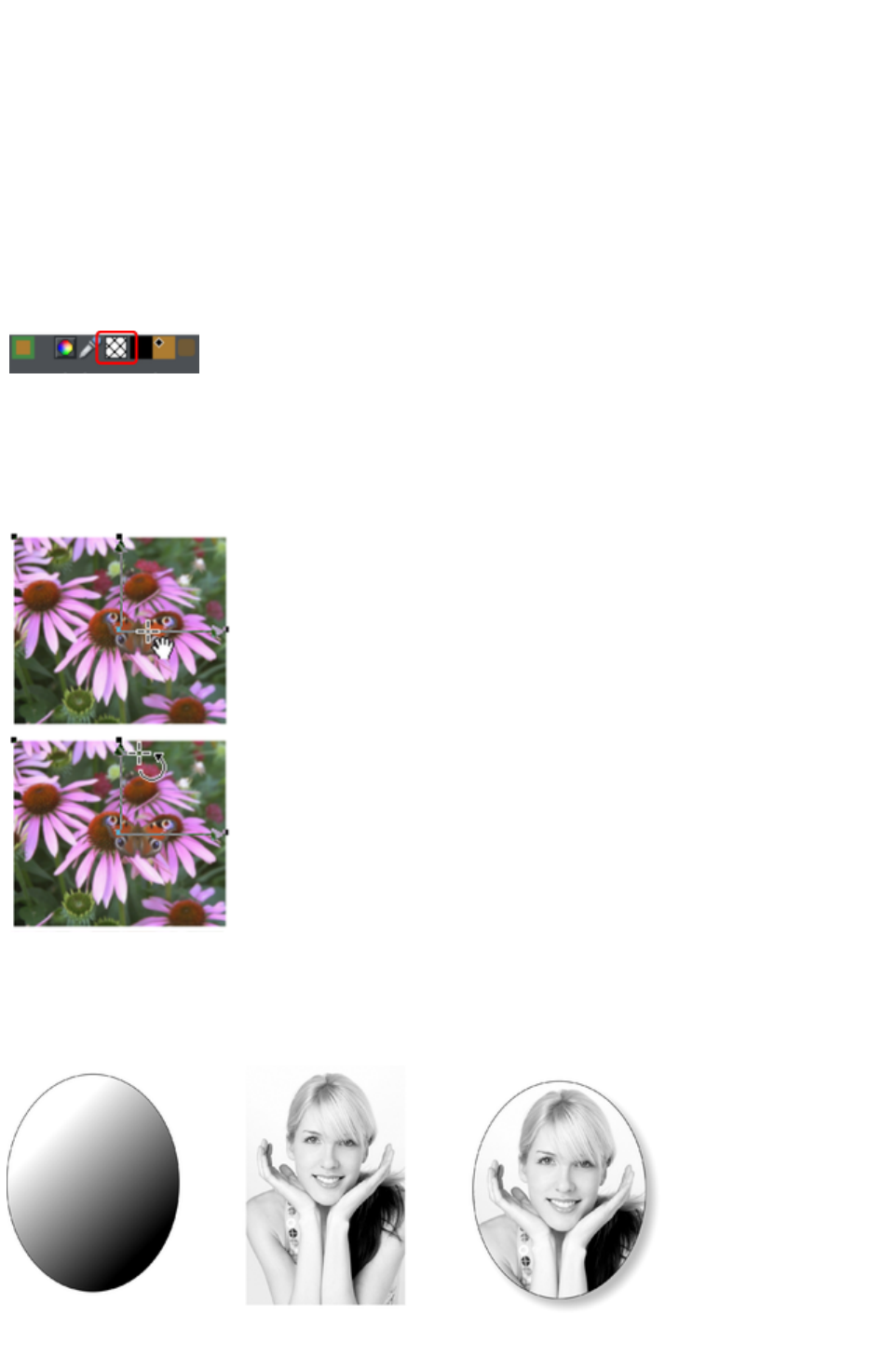
while replacing a photo in this way causes the position, scale and rotation of the bitmap fill to be
preserved.
Bitmap coloring
You can color any bitmap or photo fill by just clicking on a color on the Color Line (make sure no fill
handles are selected, by just clicking on the image). This will create a Contone (technically a Duotone)
which uses colors between black and the selected color. Alternatively right click on the object and
choose Contone > Set Light Color or Contone > Make Black and White. You can also right click
the color line and select either the 'Set Contone Light Color' or 'Set Contone Dark Color
'.
So, for example, to make a picture black and white, just requires you to click on the White color patch
on the color line.
To cancel any applied color, apply no color
to either fill handle. This restores the bitmap to its
original bitmap colors.
The Resolution box on the InfoBar
shows the resolution, which can be altered by moving the fill handles or typing in a value.
Resizing and re-positioning bitmap fills
Once the fill has been created, you can drag
anywhere on the image to re-position the fill inside
the shape.
When you mouse over the outer fill handles the
mouse pointer changes into a "rotate" mouse
pointer. Dragging on these handles will stretch and
rotate the bitmap fill with the current aspect ratio
locked; hold down "
n" while dragging to change the horizontal and
vertical size independently and to skew the fill.
The InfoBar shows you the resolution of the
bitmap fill (you can adjust this, and thus the
bitmap size, by entering a new value).
An example
To fill the ellipse on the left with the photo in the center;
Page 675

1. Drag the photo or bitmap file from Windows Explorer (or from the Bitmap Gallery if it is already
used in the document) over the ellipse, and drop it while holding down "Shift". The Fill Tool
becomes the current tool.
2. You can now adjust the angle and size of the image by dragging on the Fill Handles.
The above example has a simple shadow - see the chapter on the Shadow Tool for more information.
Page 676
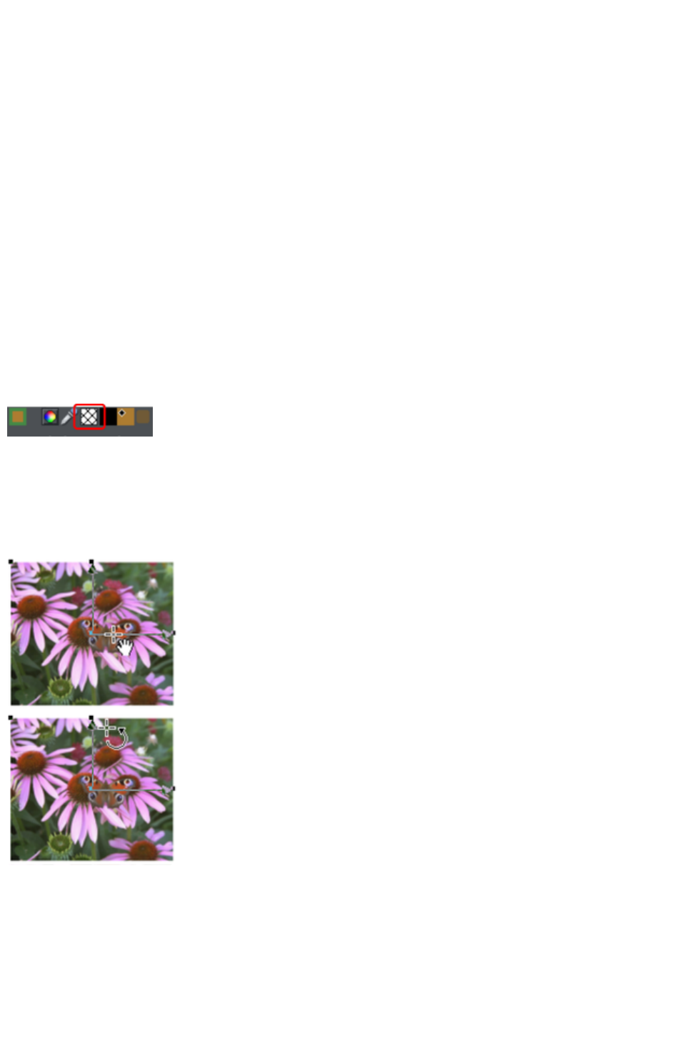
Replacing Bitmap Fills
If a shape already contains a bitmap, or is a photo, then you can just drag and drop a new bitmap from
any source, such as Windows Explorer, and it will replace the existing bitmap. The new image is 'best
fitted' into the shape so that it just fits in. Doing this will also replace all other instances of that photo on
the current page.
Holding down Shift
while replacing a photo in this way causes the position, scale and rotation of the bitmap fill to be
preserved.
Bitmap coloring
You can color any bitmap or photo fill by just clicking on a color on the Color Line (make sure no fill
handles are selected, by just clicking on the image). This will create a Contone (technically a Duotone)
which uses colors between black and the selected color. Alternatively right click on the object and
choose Contone > Set Light Color or Contone > Make Black and White. You can also right click
the color line and select either the 'Set Contone Light Color' or 'Set Contone Dark Color
'.
So, for example, to make a picture black and white, just requires you to click on the White color patch
on the color line.
To cancel any applied color, apply no color
to either fill handle. This restores the bitmap to its
original bitmap colors.
The Resolution box on the InfoBar
shows the resolution, which can be altered by moving the fill handles or typing in a value.
Resizing and re-positioning bitmap fills
Once the fill has been created, you can drag
anywhere on the image to re-position the fill inside
the shape.
When you mouse over the outer fill handles the
mouse pointer changes into a "rotate" mouse
pointer. Dragging on these handles will stretch and
rotate the bitmap fill with the current aspect ratio
locked; hold down "
Å„" while dragging to change the horizontal and
vertical size independently and to skew the fill.
The InfoBar shows you the resolution of the
bitmap fill (you can adjust this, and thus the
bitmap size, by entering a new value).
An example
Page 677
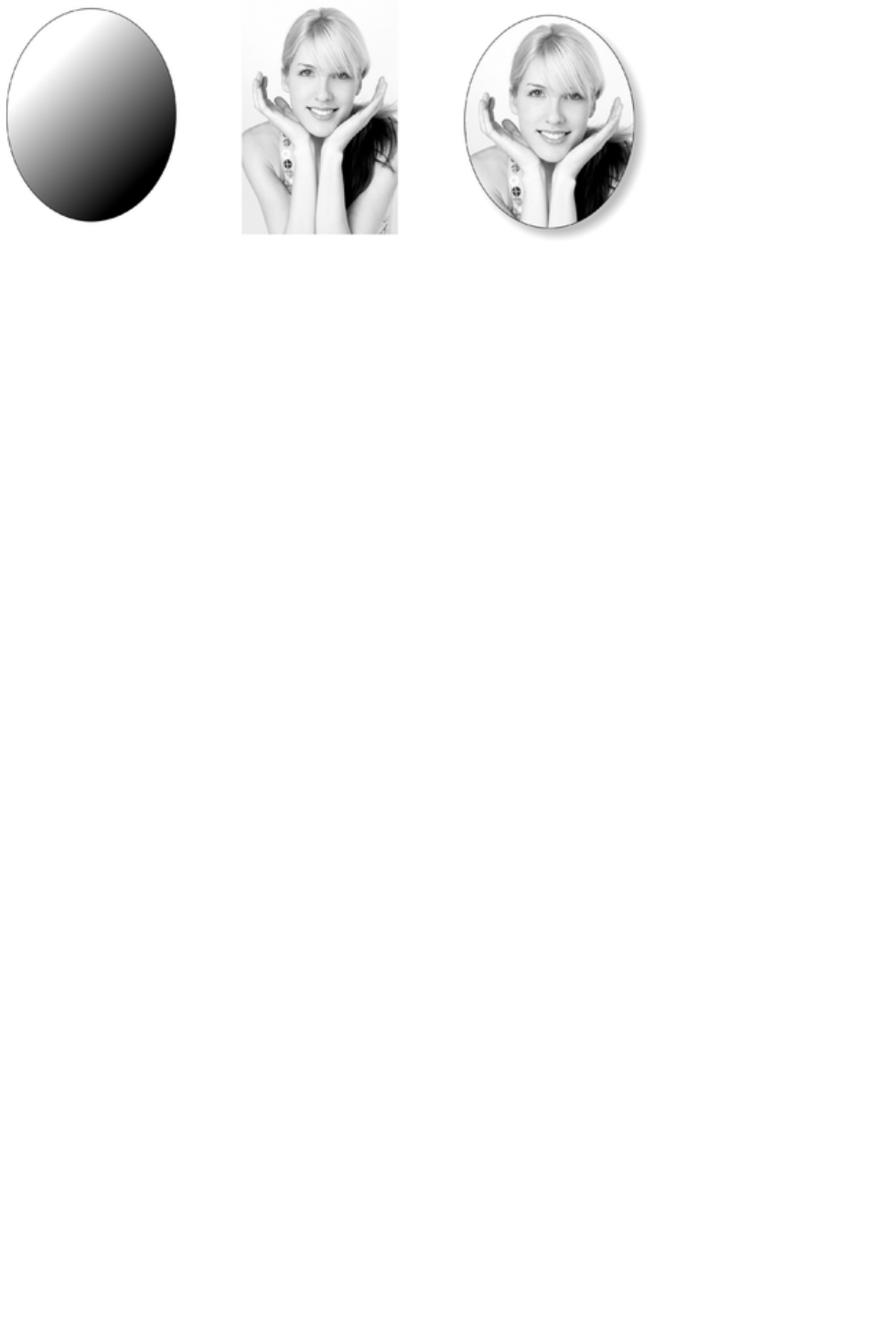
To fill the ellipse on the left with the photo in the center;
1. Drag the photo or bitmap file from Windows Explorer (or from the Bitmap Gallery if it is already
used in the document) over the ellipse, and drop it while holding down "Shift". The Fill Tool
becomes the current tool.
2. You can now adjust the angle and size of the image by dragging on the Fill Handles.
The above example has a simple shadow - see the chapter on the Shadow Tool for more information.
Page 678
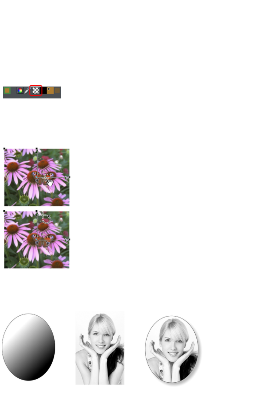
Bitmap coloring
You can color any bitmap or photo fill by just clicking on a color on the Color Line (make sure no fill
handles are selected, by just clicking on the image). This will create a Contone (technically a Duotone)
which uses colors between black and the selected color. Alternatively right click on the object and
choose Contone > Set Light Color or Contone > Make Black and White. You can also right click
the color line and select either the 'Set Contone Light Color' or 'Set Contone Dark Color
'.
So, for example, to make a picture black and white, just requires you to click on the White color patch
on the color line.
To cancel any applied color, apply no color
to either fill handle. This restores the bitmap to its
original bitmap colors.
The Resolution box on the InfoBar
shows the resolution, which can be altered by moving the fill handles or typing in a value.
Resizing and re-positioning bitmap fills
Once the fill has been created, you can drag
anywhere on the image to re-position the fill inside
the shape.
When you mouse over the outer fill handles the
mouse pointer changes into a "rotate" mouse
pointer. Dragging on these handles will stretch and
rotate the bitmap fill with the current aspect ratio
locked; hold down "
Å„" while dragging to change the horizontal and
vertical size independently and to skew the fill.
The InfoBar shows you the resolution of the
bitmap fill (you can adjust this, and thus the
bitmap size, by entering a new value).
An example
To fill the ellipse on the left with the photo in the center;
1. Drag the photo or bitmap file from Windows Explorer (or from the Bitmap Gallery if it is already
used in the document) over the ellipse, and drop it while holding down "Shift". The Fill Tool
Page 679

becomes the current tool.
2. You can now adjust the angle and size of the image by dragging on the Fill Handles.
The above example has a simple shadow - see the chapter on the Shadow Tool for more information.
Page 680
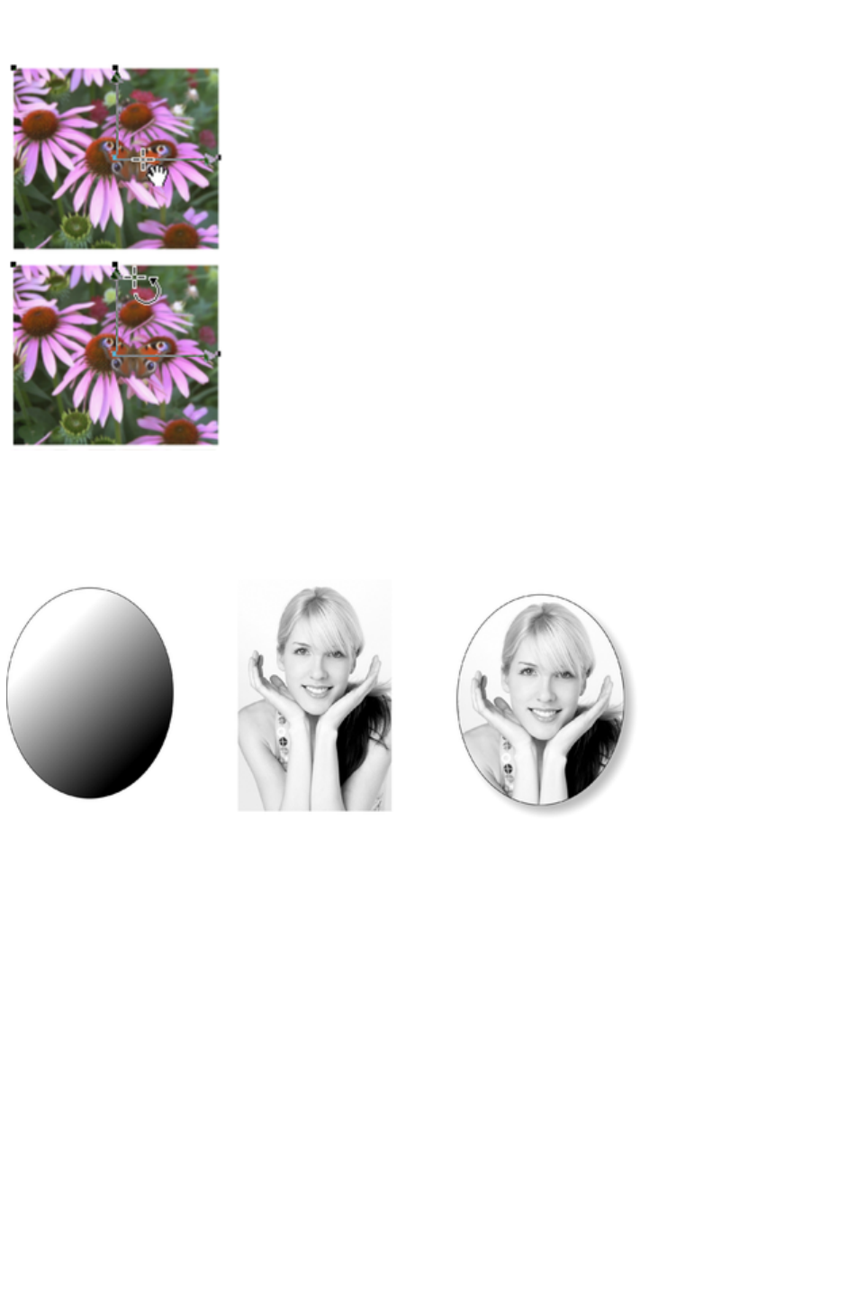
Resizing and re-positioning bitmap fills
Once the fill has been created, you can drag
anywhere on the image to re-position the fill inside
the shape.
When you mouse over the outer fill handles the
mouse pointer changes into a "rotate" mouse
pointer. Dragging on these handles will stretch and
rotate the bitmap fill with the current aspect ratio
locked; hold down "
Å„" while dragging to change the horizontal and
vertical size independently and to skew the fill.
The InfoBar shows you the resolution of the
bitmap fill (you can adjust this, and thus the
bitmap size, by entering a new value).
An example
To fill the ellipse on the left with the photo in the center;
1. Drag the photo or bitmap file from Windows Explorer (or from the Bitmap Gallery if it is already
used in the document) over the ellipse, and drop it while holding down "Shift". The Fill Tool
becomes the current tool.
2. You can now adjust the angle and size of the image by dragging on the Fill Handles.
The above example has a simple shadow - see the chapter on the Shadow Tool for more information.
Page 681
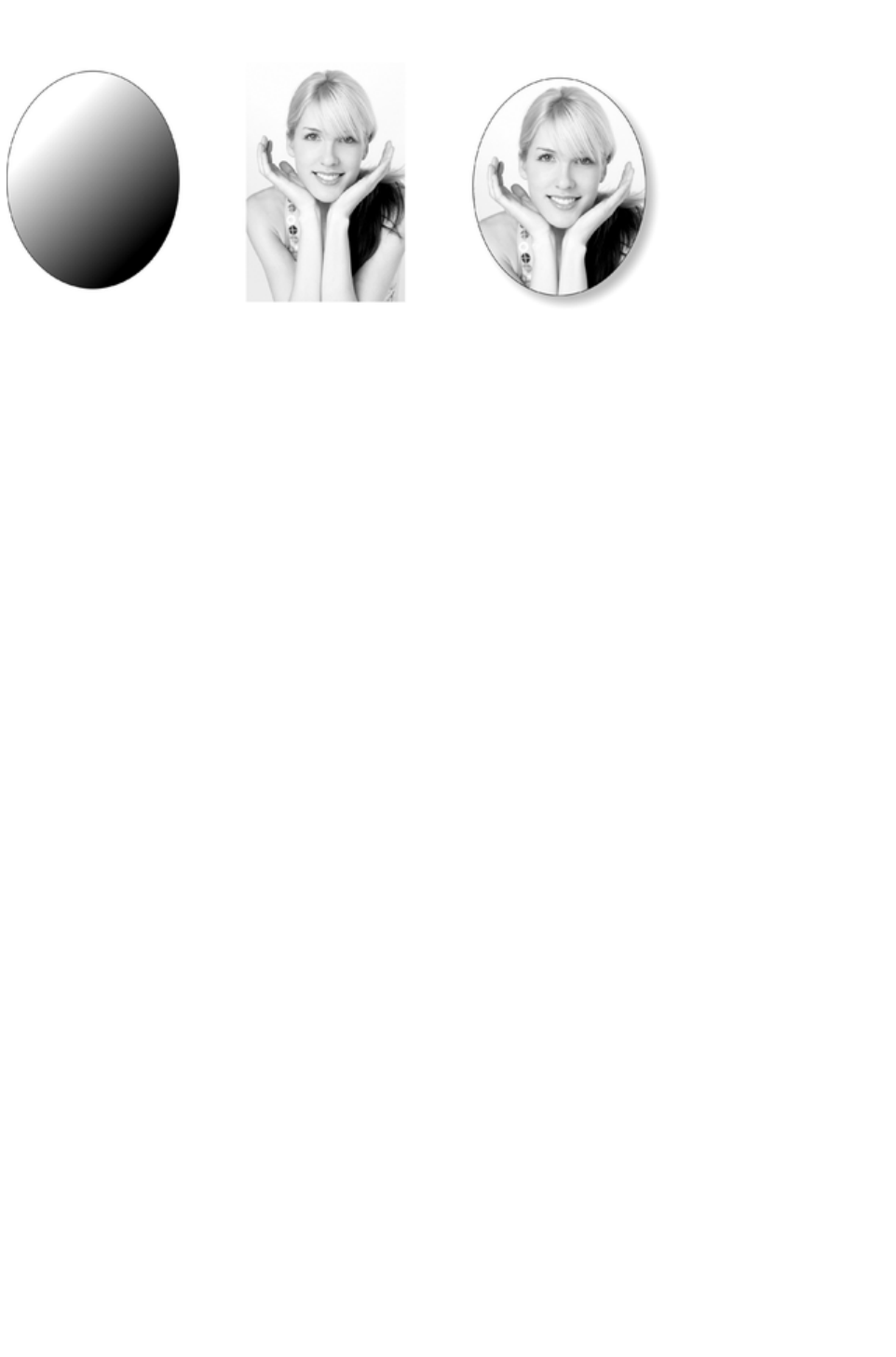
An example
To fill the ellipse on the left with the photo in the center;
1. Drag the photo or bitmap file from Windows Explorer (or from the Bitmap Gallery if it is already
used in the document) over the ellipse, and drop it while holding down "Shift". The Fill Tool
becomes the current tool.
2. You can now adjust the angle and size of the image by dragging on the Fill Handles.
The above example has a simple shadow - see the chapter on the Shadow Tool for more information.
Page 682
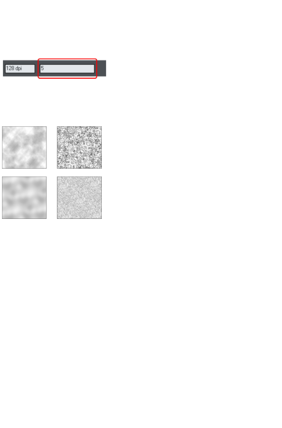
Fractal fills
Xara Web Designer 7 Premium supports two types of fractal fill which are mathematically created
naturalistic fill patterns. They are great for simulating sky and clouds or other natural textures.
Each time you create a new fractal fill a new pattern is created. To replace an existing fractal with a new
pattern choose fractal from the fill menu again.
The Grain control on the InfoBar
provides control over the graininess
of the pattern. Low values give a
smooth flowing pattern, and high
values give a grainy pattern.
You can adjust the size and position of the fractal fill in the usual way by dragging and adjusting the fill
handles. De-select the fill handles (click on the fill away from a handle) to show the above resolution and
grain controls.
Fractal clouds fill. On the left a grain of 1, on the right a grain of 50.
Fractal plasma fill. On the left a grain of 5, on the right a grain of 50.
Note the difference between grain and resolution. Grain controls the flow of the pattern. Resolution sets
the size of the fractal bitmap and how noticeable the individual pixels are.
You can change the start and end colors of a fractal fill. Select the center or outer handles and then apply
a color using either the Color Line or Color Gallery
. To cancel any applied color, apply no color.
Page 683
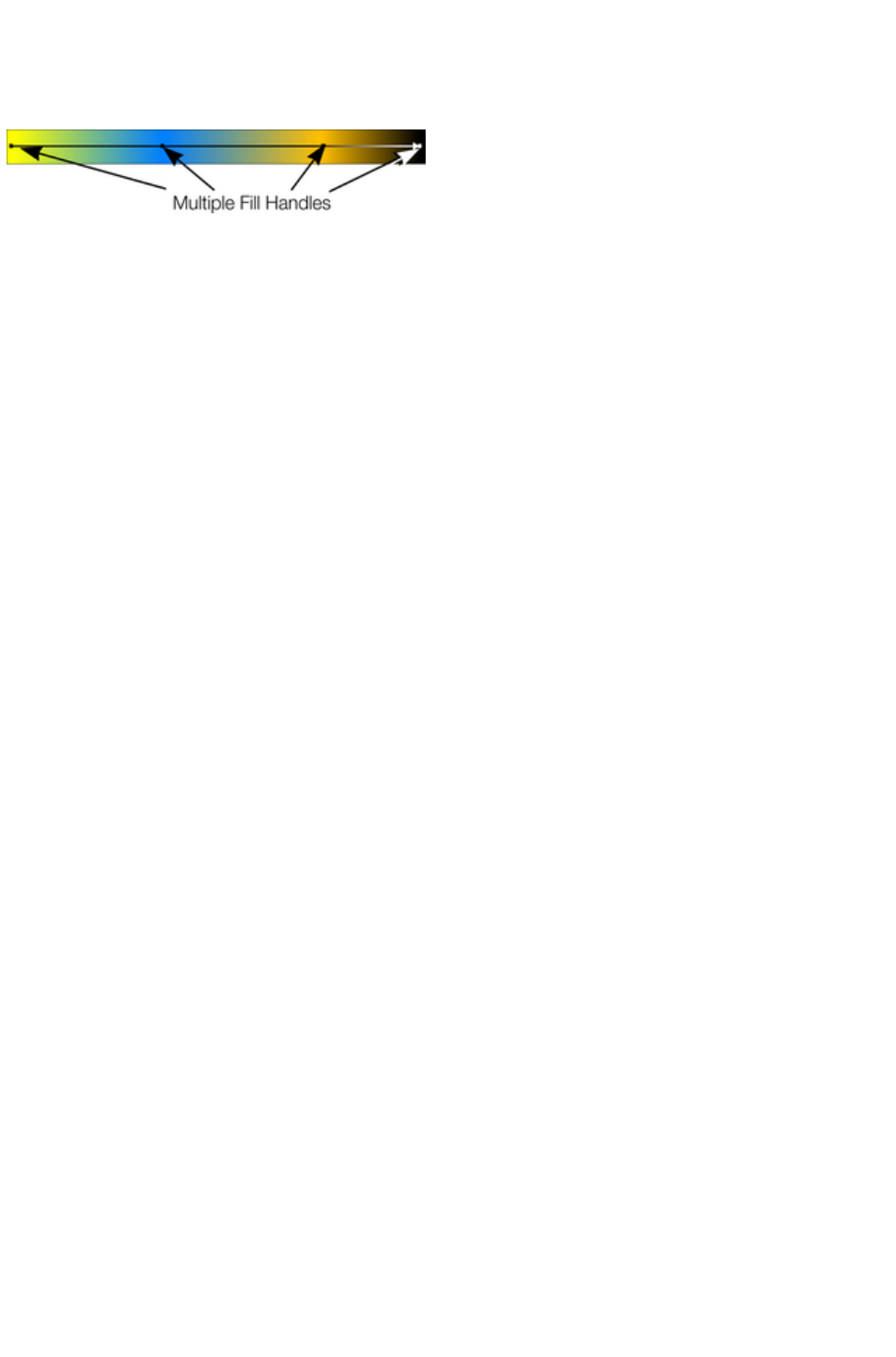
Multi-stage color graduations
Many of the graduated color fill types support multi-stage graduation fills, which means instead of just
fading from one color to another, you can go through a number of different color fill stages.
To add a new color stage to a graduation, select the Fill Tool so the fill arrow shows and then:
Either drag a color onto the fill arrow where required.
Or double click on the fill arrow to create a new fill handle, and now click a color or display the
Color Editor.
You can re-position the fill handles by dragging.
With one fill handle selected pressing "Tab" will select the next. If the Color Editor
is open, this is updated to reflect the new fill handle
To remove a fill stage handle, just click on it to select, and press "Del".
Page 684
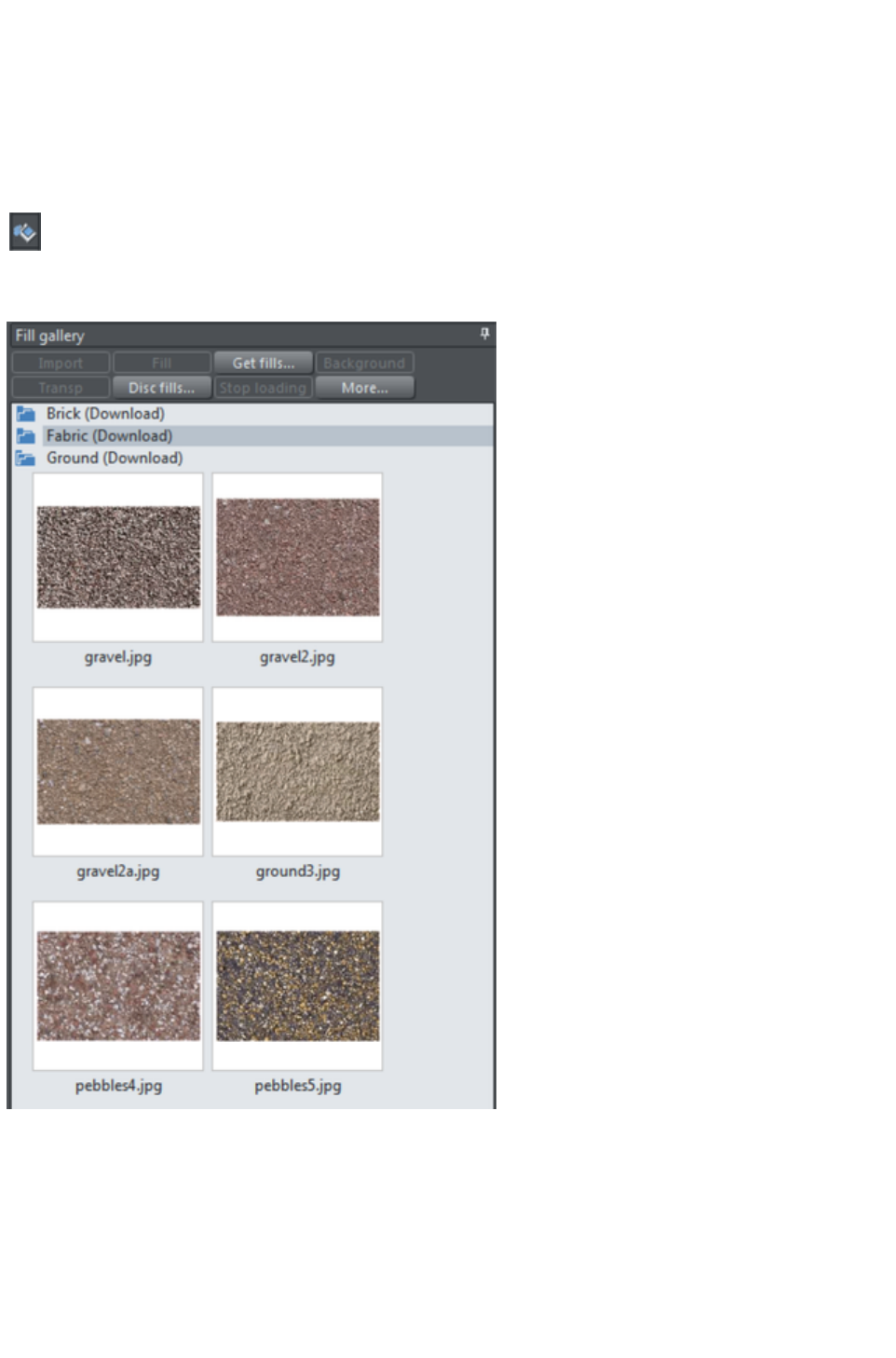
The Fill Gallery
The Fill Gallery
contains bitmap textures suitable for use as bitmap fills. Only when you use a fill is it copied into the
document.
To display the Fill Gallery
:
To display the Fill Gallery click its tab in the galleries bar to the right
of the Web Designer Premium window. Or you can toggle display of
the Fill Gallery by choosing Utilities > Galleries > Fill Gallery
or pressing "Shift + F11".
Import - imports the selected bitmap into the document. A copy of the bitmap then appears in the
Bitmap Gallery. You can also drag-and-drop the bitmap onto a blank part of the page. This is usually
easier than clicking Import
.
Fill
- imports and applies the selected bitmap as:
A bitmap fill to the selected object (if any).
Or, if no objects are selected, it inserts the bitmap into the document as a new photo object.
You can also drag-and-drop the bitmap onto an object to apply a bitmap fill.
Page 685

There are some differences between either dragging a bitmap from the Bitmap or Fill Gallery: When
dragging bitmaps from the Fill Gallery and dropping on shapes to create a bitmap fill, the fill will be tiled
and the bitmap won't be best-fitted into the shape. This different behavior to that seen when dragging
from the Bitmap Gallery
is because normally textures are applied from the Fill Gallery and these should normally be tiled and not
best-fitted.
Transp
- (transparency) imports and applies the selected bitmap as:
A transparent bitmap to the selected object (if any).
Or sets the current transparency attribute.
Get fills
- download free fills from Xara.
Background
- set the selected fill as the page background.
Remove
- delete the selected fill or folder.
Disc fills
- add new fills from your hard drive or a CD.
More
- lets you select the size of the preview icons and whether full information about the bitmap is shown, as
well as find and sort the fills.
Stop downloading
- if you have a slow connection and find getting fills from the Internet too slow, you can stop downloading
them and then resume later.
Find & Sort are described in the Document handling
chapter.
Document handling
includes general information about galleries.
Page 686

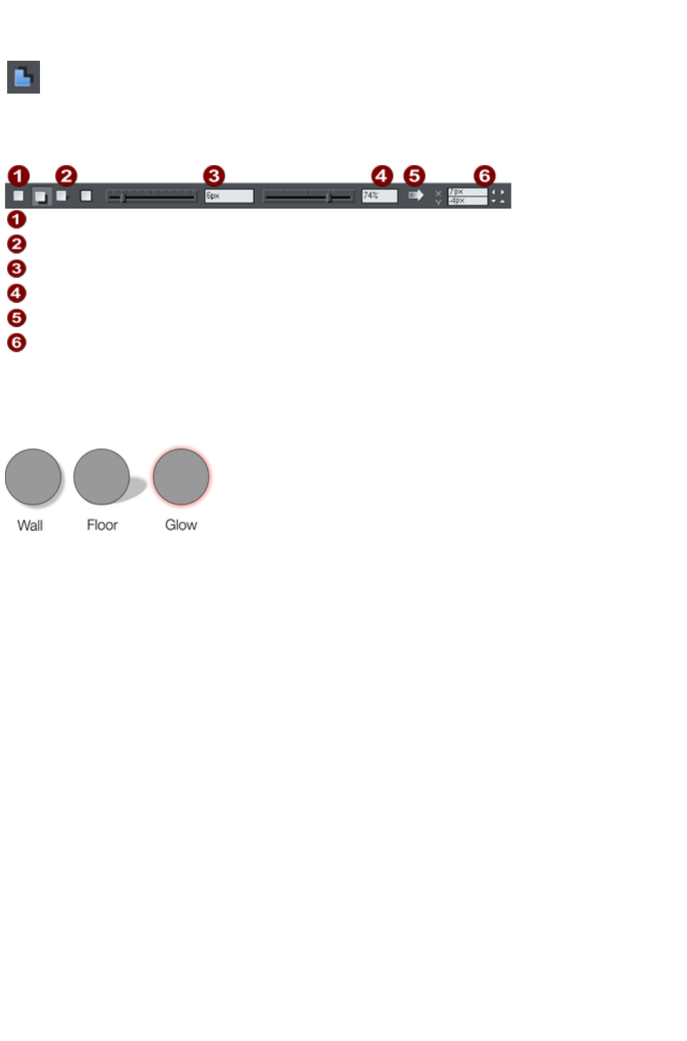
The Shadow Tool
The Shadow
Tool (shortcut "Ctrl + F2") lets you apply, remove, and modify
semi-transparent (or "soft") shadows.
The transparency of soft shadows increases towards the edges, which gives a very realistic effect.
Shadows are resolution independent so you can scale them without losing quality.
No Shadow
Shadow Types
Shadow Blur
Shadow Transparency
Profile
Shadow Position
Xara Web Designer 7 Premium has three shadow types:
Wall where the shadow is cast on a wall behind the object
Floor where the object appears to be standing upright on a surface.
Glow where the shadow is used to add a halo effect around the object
The transparency of soft shadows increases towards the edges, which gives a very realistic effect.
Shadows are resolution independent so you can scale them without losing quality.
Page 688
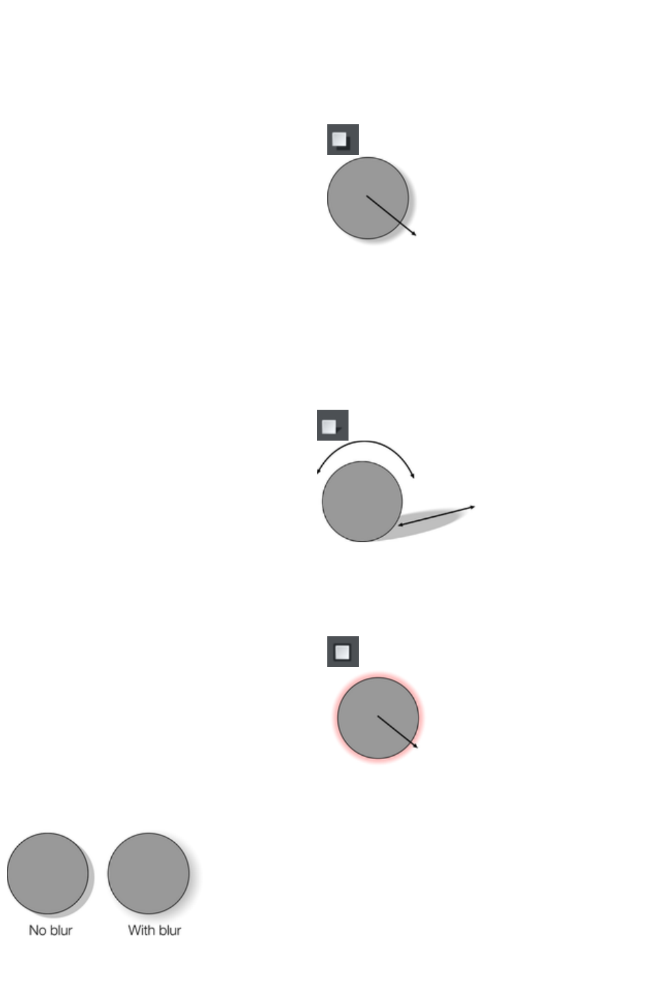
Applying a shadow
Applying a wall shadow
To apply a wall shadow:
1. Select the object.
2. Choose the Shadow Tool.
3. Select the Wall button on the Shadow
Tool InfoBar.
4. You can drag the shadow away from or
towards the object to create more or less
distance between the object and the
imaginary wall.
Alternatively to create a wall shadow you can:
1. Select the object.
2. Choose the Shadow Tool.
3. Drag from the center of the object in the direction of the shadow.
Applying a floor shadow
1. Select the object.
2. Choose the Shadow Tool.
3. Select the Floor button on the Shadow
Tool InfoBar.
4. Drag towards or away from the object to
change the size or radially to change the
direction.
Applying a glow effect
Adding a glow or halo behind an object can create dramatic graphics.
To create a glow effect:
1. Select the object.
2. Choose the Shadow Tool.
3. Select the Glow button on the Shadow
Tool InfoBar.
4. Drag towards or away from the object to
change the size of the glow.
Blur the edges of the shadow
This changes the size of the shadow. A
small blur gives the effect of a sharp light
source, a large blur, a diffused or distant
light source. It is recommended that
shadows are always blurred slightly as this
is more realistic.
To blur the shadow edge:
1. Select the object
2. Choose the Shadow Tool.
Page 689
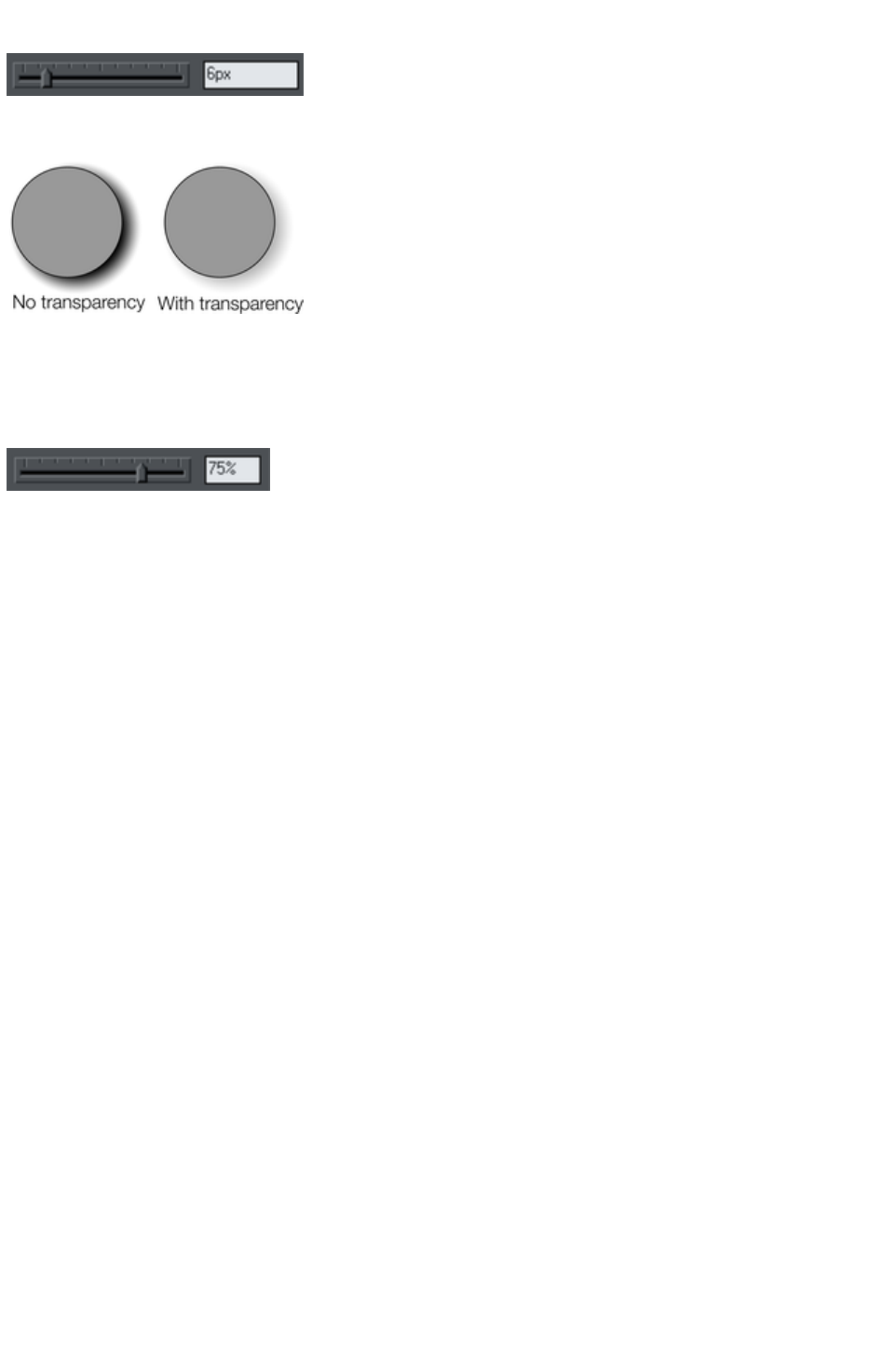
3. On the Shadow Tool InfoBar either drag the blur slider or type a value into the text box on the
right.
Change the transparency of the shadow
A semi-transparent shadow is more
realistic than a solid shadow. But you
can change the transparency level of
the shadow to suit your needs.
To change the transparency:
1. Select the object
2. Choose the Shadow Tool.
3. On the Shadow Tool InfoBar, drag either the transparency slider or type a value into the text box
on the right.
Page 690
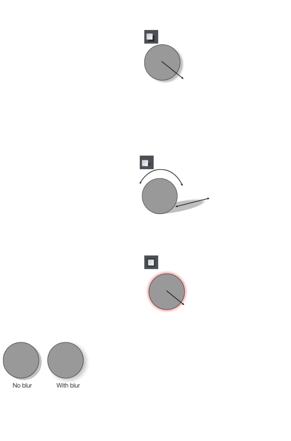
Applying a wall shadow
To apply a wall shadow:
1. Select the object.
2. Choose the Shadow Tool.
3. Select the Wall button on the Shadow
Tool InfoBar.
4. You can drag the shadow away from or
towards the object to create more or less
distance between the object and the
imaginary wall.
Alternatively to create a wall shadow you can:
1. Select the object.
2. Choose the Shadow Tool.
3. Drag from the center of the object in the direction of the shadow.
Applying a floor shadow
1. Select the object.
2. Choose the Shadow Tool.
3. Select the Floor button on the Shadow
Tool InfoBar.
4. Drag towards or away from the object to
change the size or radially to change the
direction.
Applying a glow effect
Adding a glow or halo behind an object can create dramatic graphics.
To create a glow effect:
1. Select the object.
2. Choose the Shadow Tool.
3. Select the Glow button on the Shadow
Tool InfoBar.
4. Drag towards or away from the object to
change the size of the glow.
Blur the edges of the shadow
This changes the size of the shadow. A
small blur gives the effect of a sharp light
source, a large blur, a diffused or distant
light source. It is recommended that
shadows are always blurred slightly as this
is more realistic.
To blur the shadow edge:
1. Select the object
2. Choose the Shadow Tool.
3. On the Shadow Tool InfoBar either drag the blur slider or type a value into the text box on the
right.
Page 691
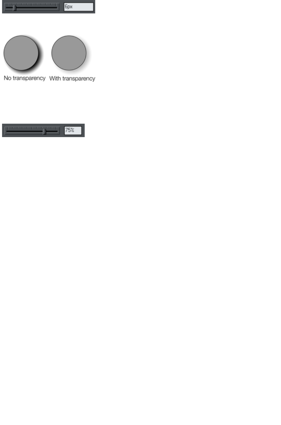
Change the transparency of the shadow
A semi-transparent shadow is more
realistic than a solid shadow. But you
can change the transparency level of
the shadow to suit your needs.
To change the transparency:
1. Select the object
2. Choose the Shadow Tool.
3. On the Shadow Tool InfoBar, drag either the transparency slider or type a value into the text box
on the right.
Page 692
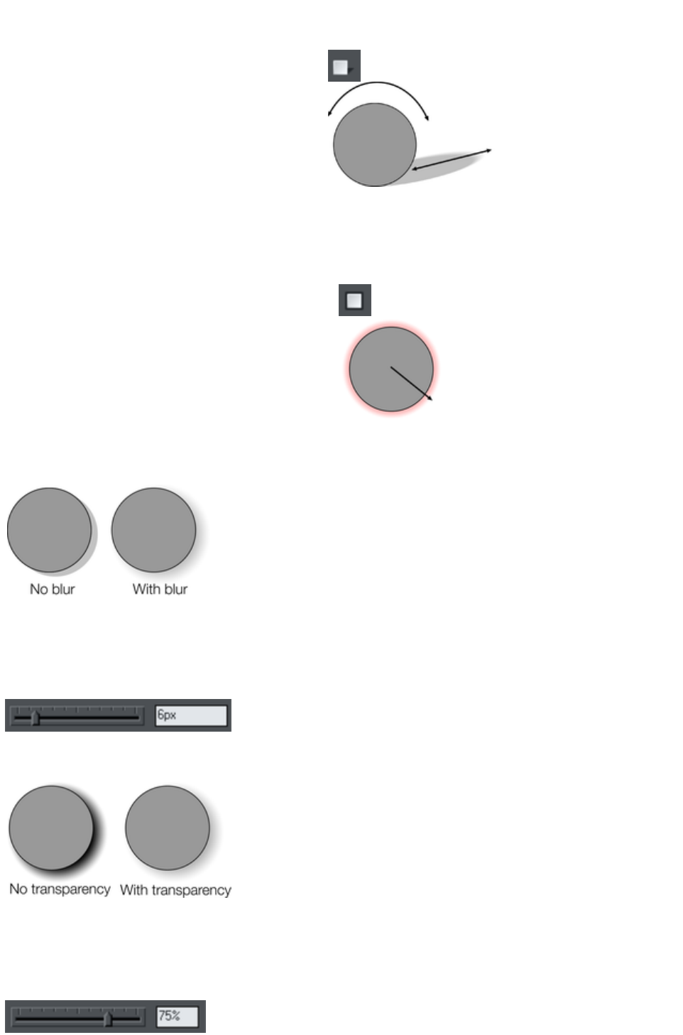
Applying a floor shadow
1. Select the object.
2. Choose the Shadow Tool.
3. Select the Floor button on the Shadow
Tool InfoBar.
4. Drag towards or away from the object to
change the size or radially to change the
direction.
Applying a glow effect
Adding a glow or halo behind an object can create dramatic graphics.
To create a glow effect:
1. Select the object.
2. Choose the Shadow Tool.
3. Select the Glow button on the Shadow
Tool InfoBar.
4. Drag towards or away from the object to
change the size of the glow.
Blur the edges of the shadow
This changes the size of the shadow. A
small blur gives the effect of a sharp light
source, a large blur, a diffused or distant
light source. It is recommended that
shadows are always blurred slightly as this
is more realistic.
To blur the shadow edge:
1. Select the object
2. Choose the Shadow Tool.
3. On the Shadow Tool InfoBar either drag the blur slider or type a value into the text box on the
right.
Change the transparency of the shadow
A semi-transparent shadow is more
realistic than a solid shadow. But you
can change the transparency level of
the shadow to suit your needs.
To change the transparency:
1. Select the object
2. Choose the Shadow Tool.
3. On the Shadow Tool InfoBar, drag either the transparency slider or type a value into the text box
on the right.
Page 693
Applying a glow effect
Adding a glow or halo behind an object can create dramatic graphics.
To create a glow effect:
1. Select the object.
2. Choose the Shadow Tool.
3. Select the Glow button on the Shadow
Tool InfoBar.
4. Drag towards or away from the object to
change the size of the glow.
Blur the edges of the shadow
This changes the size of the shadow. A
small blur gives the effect of a sharp light
source, a large blur, a diffused or distant
light source. It is recommended that
shadows are always blurred slightly as this
is more realistic.
To blur the shadow edge:
1. Select the object
2. Choose the Shadow Tool.
3. On the Shadow Tool InfoBar either drag the blur slider or type a value into the text box on the
right.
Change the transparency of the shadow
A semi-transparent shadow is more
realistic than a solid shadow. But you
can change the transparency level of
the shadow to suit your needs.
To change the transparency:
1. Select the object
2. Choose the Shadow Tool.
3. On the Shadow Tool InfoBar, drag either the transparency slider or type a value into the text box
on the right.
Page 694
Blur the edges of the shadow
This changes the size of the shadow. A
small blur gives the effect of a sharp light
source, a large blur, a diffused or distant
light source. It is recommended that
shadows are always blurred slightly as this
is more realistic.
To blur the shadow edge:
1. Select the object
2. Choose the Shadow Tool.
3. On the Shadow Tool InfoBar either drag the blur slider or type a value into the text box on the
right.
Change the transparency of the shadow
A semi-transparent shadow is more
realistic than a solid shadow. But you
can change the transparency level of
the shadow to suit your needs.
To change the transparency:
1. Select the object
2. Choose the Shadow Tool.
3. On the Shadow Tool InfoBar, drag either the transparency slider or type a value into the text box
on the right.
Page 695
Change the transparency of the shadow
A semi-transparent shadow is more
realistic than a solid shadow. But you
can change the transparency level of
the shadow to suit your needs.
To change the transparency:
1. Select the object
2. Choose the Shadow Tool.
3. On the Shadow Tool InfoBar, drag either the transparency slider or type a value into the text box
on the right.
Page 696

Changing the shadow color or fill effect
After applying a shadow to an object, you can change the shadow's color or fill effect. You can apply
any of Xara Web Designer 7 Premium's color effects including multi-stage fills.
How to change the shadow color:
For more on colors and the Color Line refer to Color handling
.
The easiest way is to drag & drop a color from the Color Line onto the shadow (make sure you
drop the color onto the shadow and not the object).
Alternatively, this method is slightly more complex, but you have full control over the color:
1. Select the shadow using the Selector Tool (make sure you select the shadow and not the
object).
2. Use the Color Editor to edit the color.
Page 697

Removing a shadow
To remove a soft shadow:
1. Select the object
2. Choose the Shadow Tool.
3. Select the No shadow button on the Shadow Tool InfoBar.
Page 698
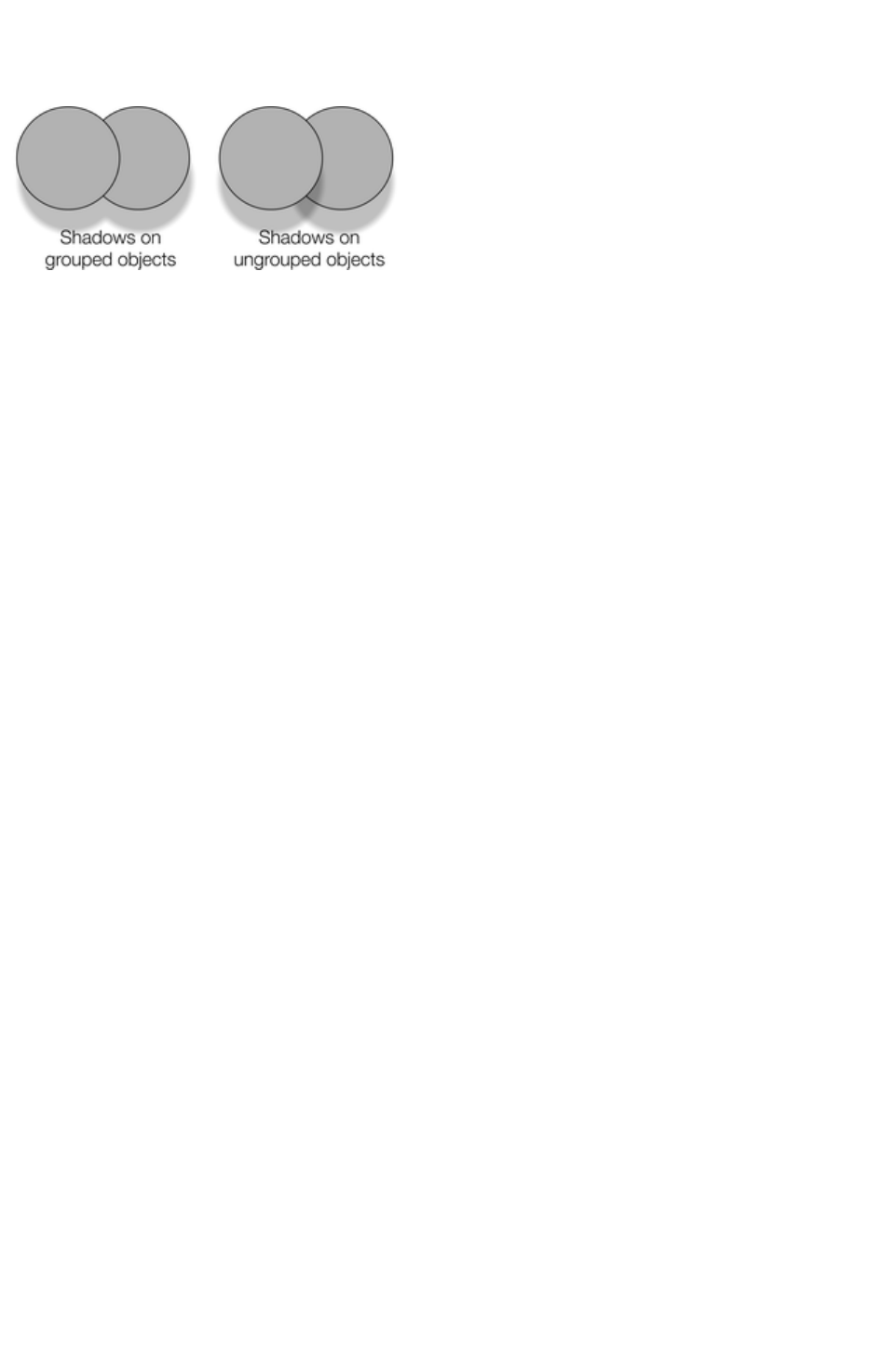
Applying a shadow to several objects
The result of applying a shadow depends on whether the objects are grouped:
If the objects are
grouped, overlapping
shadows merge (they
do not get darker if
they overlap).
If the objects are
ungrouped, each
object has a separate
shadow. Overlapping
areas of shadow are
darker.
If you have several shadowed objects selected, any changes apply to all the shadows.
Page 699

Selecting objects using the Shadow Tool
Before you can apply or edit a shadow on an object, you must first select that object. The regular way
of selecting objects is to use the Selector Tool but you can also use the Shadow Tool, simply click on the
object while in the Shadow
Tool.
Page 700

Copying shadows onto other objects
Once you've got a shadow looking how you want it on one object, you can copy it onto other objects
using "Paste attributes". Simply copy the object that has the shadow ("Edit" > "Copy"), select the
object or objects you want to paste the shadow onto and choose "Edit" > "Paste attributes"
.
Page 701
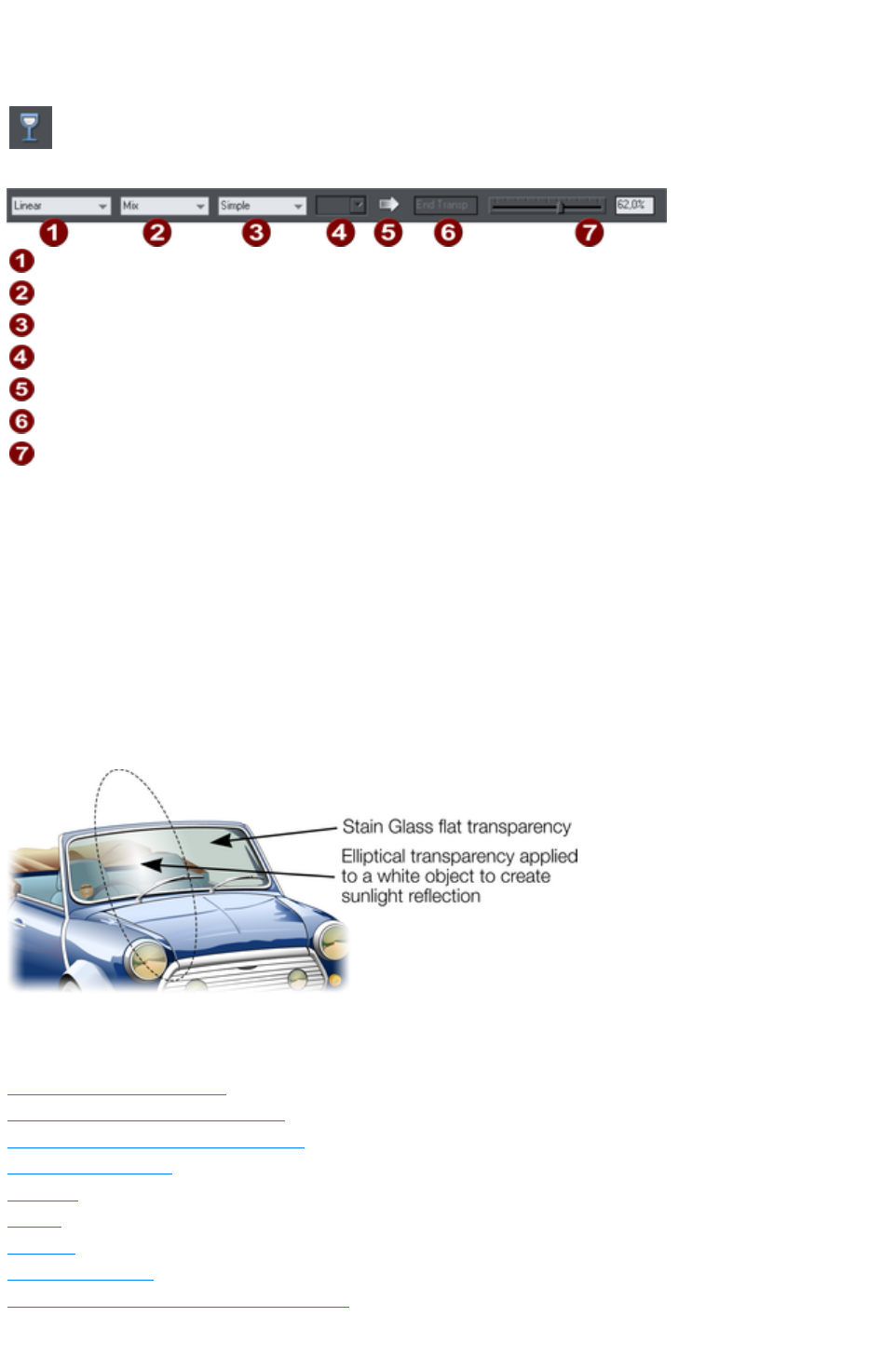
Transparency
The Transparency
Tool lets you specify how much of the underlying colors and objects
appears through an object.
Shape
Transparency type
Tiling
Bitmap name
Profile
Handle/Resolution
Amount of transparency
You have control over the level of transparency from fully opaque to fully transparent. Web Designer
Premium goes further than other drawing packages by offering a wide range of different graduated
transparencies.
You can apply flat and graduated transparency to all types of objects including bitmaps.
Some uses of transparency:
Simulating water or glass.
Anywhere you want objects to fade to parts of objects to fade or blend with the background.
Clouds or mist-fractal transparencies are particularly good for this.
Using the special type of transparency you can lighten, darken and apply special effects to
objects and photos.
Creating highlights and reflections.
The windshield is created with multiple overlaid objects with different transparency. The
reflection is 100% opaque white in the center fading in an elliptical fashion.
In this chapter
Applying flat transparency
Applying graduated transparency
Multi-stage graduated transparency
Transparency types
Enhance
Profile
Bitmaps
Handle/resolution
Applying transparency to several objects
Page 702

Applying flat transparency
It's called "flat" transparency because all parts of the objects have the same transparency, as opposed to
graduated transparency.
1. Select the object or objects
2. Select the Transparency Tool ("F6")
3. Drag the transparency slider on the InfoBar
Xara Web Designer 7 Premium provides live-preview. As you drag the transparency slider the objects
on the document are changed so you can see the effect immediately.
Applying graduated transparency
Graduated transparency works in a very similar way to graduated color fills. You just drag on the
objects in the Transparency Tool to create a fading transparency. You have a very similar range of
transparency shapes, the simplest being linear, but you can also have circular, elliptical, conical, fractal
and bitmap transparencies, and others. To create a graduated fade:
1. Select the object or objects
2. In the Transparency Tool, drag across the objects to create a linear fade across the object.
3. Select alternative transparency shapes from the dropdown menu on the InfoBar
You can select and adjust the position and transparency strength using the "fill" handles shown on the
object.
Refer to Fills for more information on manipulating fill handles and the different fill shapes (in this case
transparency shapes)
Multi-stage graduated transparency
Just as you can add multiple stages to a graduated fill, you can do the same with a graduated
transparency. This allows you to fade, for example, from opaque to 50% transparent then back up to
25% transparent, back to opaque, etc.
You can set the level of transparency at each stage, by selecting a handle and then adjusting the
transparency slider. Add additional stages by double-clicking on the graduated transparency line then
adjusting the slider.
See the Fills chapter for more information on manipulating the handles.
Transparency types
The most common type of transparency, and the only type that many other applications understand is
called "Mix transparency". But Xara Web Designer 7 Premium supports different type that affect the
objects in different ways.
Web Designer Premium has these types of transparency:
Mix
The color of the object mixes with the color of underlying objects. The effect is similar to spraying a thin
coat of color (or paint) over underlying objects.
Stained glass
The effect is similar to viewing underlying objects through colored glass. It is useful for the simulation of
glass and selectively darkening objects. The color of the object with Stained Glass applied:
White - no effect on the colors of underlying objects.
Gray & Black - darkens the colors of underlying objects.
Other colors - darken underlying colors towards saturated color (light red over light red results in
mid-red: green over red results in black). If you want to use a colored object to darken
underlying colors, you may find Darken transparency type easier to use.
Page 703

Technically the process is subtractive in RGB color space.
Bleach
Bleach has no clear analogy in the physical world. It is useful for highlights when the light source is not
white. The color of the object with Bleach applied:
Gray & White - lightens the colors in underlying objects.
Black - no effect on the colors of underlying objects.
Other colors - lighten underlying colors towards unsaturated color. (Light-red over light-red gives
a pale-red: green over red gives yellow.) If you want to use a colored object to lighten but not
color-shift underlying colors, you may find Lighten transparency type easier to use.
Technically the process is additive in RGB color space.
Contrast
Usually you would use C on a separate object to modify the color of underlaying objects (that is, you
would use an object as a filter). Depending on the color chosen, it increases the contrast of underlying
colors (make them brighter or duller).The color of the object with Contrast applied:
Gray (below a 50% tint of black) & White - increase contrast (compress the color range) to
make the underlying colors brighter.
Gray (above a 50% tint of black) & Black - make underlying colors duller (towards gray).
Other colors - convert the color to the equivalent shade of gray. (Yellow gives light gray, Red
dark gray.) Then increase or decrease the contrast of underlying objects.
Saturation
Usually you would use Saturation on a separate object to modify the color of underlaying objects (that
is, you would use an object as a filter). Depending on the color chosen, it makes the colors of underlying
objects brighter or duller. The color of the object with Saturation applied:
Gray (below a 50% tint of black) & White - increases saturation in the colors of underlying
objects towards pure color.
Gray (above a 50% tint of black) & Black - reduces saturation (colorization) towards black.
Other colors - convert the color to the equivalent shade of gray. (Yellow gives light gray, Red
dark gray.) Then increase or decrease the color saturation of underlying objects.
Darken/Lighten
Darken/Lighten is useful for making underlying objects darker or lighter. Usually you would use it on a
separate object to modify the color of underlaying objects (that is, you would use an object as a filter).
Darken/Lighten are grayscale versions of Stained Glass/Bleach transparency types. The color of the
object with Darken/Lighten applied:
White - no effect on the colors of underlying objects.
Gray & Black - darkens/lightens the colors of underlying objects.
Other colors - convert the color to the equivalent shade of gray. (Yellow gives light gray, Red
dark gray.) Then darken/lighten the colors of underlying objects.
Brightness
Depending on the color chosen, Brightness makes the colors of underlying objects lighter or darker. The
color of the object with Brightness applied:
Gray (below a 50% tint of black) & White - makes the colors of underlying objects lighter.
White has maximum effect
Gray (above a 50% tint of black) & Black - makes the colors of underlying objects darker.
Black has maximum effect.
Other colors - convert the color to the equivalent shade of gray. (Yellow gives light gray, Red
dark gray.) Then lighten or darken the colors of underlying objects.
Luminosity
Luminosity uses the grayscale equivalent of the color to control the luminosity (or Value) of underlying
objects. Note that Luminosity has no effect on gray, white or black underlying objects. The color of the
object with Luminosity applied:
Page 704
Gray & White - increase the luminosity of underlying objects. White has the greatest effect,
producing saturated color.
Black - remains as a black object.
Other colors - convert the color to the equivalent shade of gray. (Yellow gives light gray, Red
dark gray.) Then increase the luminosity of underlying objects.
Hue
Hue is useful for color-shifting underlying objects. Its action is most easily understood using the HSV
color model. The color of the object with Hue applied:
Gray, White, & Black - has no effect. These colors lie at the center of the color wheel and so
have no hue.
If the underlying color is gray, white, or black - Hue transparency type has no effect.
Other colors - replace the Hue of the underlying color with the Hue of this object. Use the
Saturation and Value of the underlying color.
For more information on HSV refer to Color handling
.
For all these, the slider controls the amount of transparency from opaque (0% transparent) to fully
(100%) transparent.
Applying a flat transparency to an object also applies transparency to the line around the object. It is not
possible to set different transparencies, but you can remove the line by setting it to no color or by
selecting "None" as the outline width. To create an object with a transparent fill and a non-transparent
line, use a non-flat transparency type.
For more information on colors see Color Handling
.
Enhance
See Enhance
below for more information on Enhance transparency.
Page 705

Applying flat transparency
It's called "flat" transparency because all parts of the objects have the same transparency, as opposed to
graduated transparency.
1. Select the object or objects
2. Select the Transparency Tool ("F6")
3. Drag the transparency slider on the InfoBar
Xara Web Designer 7 Premium provides live-preview. As you drag the transparency slider the objects
on the document are changed so you can see the effect immediately.
Applying graduated transparency
Graduated transparency works in a very similar way to graduated color fills. You just drag on the
objects in the Transparency Tool to create a fading transparency. You have a very similar range of
transparency shapes, the simplest being linear, but you can also have circular, elliptical, conical, fractal
and bitmap transparencies, and others. To create a graduated fade:
1. Select the object or objects
2. In the Transparency Tool, drag across the objects to create a linear fade across the object.
3. Select alternative transparency shapes from the dropdown menu on the InfoBar
You can select and adjust the position and transparency strength using the "fill" handles shown on the
object.
Refer to Fills for more information on manipulating fill handles and the different fill shapes (in this case
transparency shapes)
Multi-stage graduated transparency
Just as you can add multiple stages to a graduated fill, you can do the same with a graduated
transparency. This allows you to fade, for example, from opaque to 50% transparent then back up to
25% transparent, back to opaque, etc.
You can set the level of transparency at each stage, by selecting a handle and then adjusting the
transparency slider. Add additional stages by double-clicking on the graduated transparency line then
adjusting the slider.
See the Fills chapter for more information on manipulating the handles.
Transparency types
The most common type of transparency, and the only type that many other applications understand is
called "Mix transparency". But Xara Web Designer 7 Premium supports different type that affect the
objects in different ways.
Web Designer Premium has these types of transparency:
Mix
The color of the object mixes with the color of underlying objects. The effect is similar to spraying a thin
coat of color (or paint) over underlying objects.
Stained glass
The effect is similar to viewing underlying objects through colored glass. It is useful for the simulation of
glass and selectively darkening objects. The color of the object with Stained Glass applied:
White - no effect on the colors of underlying objects.
Gray & Black - darkens the colors of underlying objects.
Other colors - darken underlying colors towards saturated color (light red over light red results in
mid-red: green over red results in black). If you want to use a colored object to darken
Page 706

underlying colors, you may find Darken transparency type easier to use.
Technically the process is subtractive in RGB color space.
Bleach
Bleach has no clear analogy in the physical world. It is useful for highlights when the light source is not
white. The color of the object with Bleach applied:
Gray & White - lightens the colors in underlying objects.
Black - no effect on the colors of underlying objects.
Other colors - lighten underlying colors towards unsaturated color. (Light-red over light-red gives
a pale-red: green over red gives yellow.) If you want to use a colored object to lighten but not
color-shift underlying colors, you may find Lighten transparency type easier to use.
Technically the process is additive in RGB color space.
Contrast
Usually you would use C on a separate object to modify the color of underlaying objects (that is, you
would use an object as a filter). Depending on the color chosen, it increases the contrast of underlying
colors (make them brighter or duller).The color of the object with Contrast applied:
Gray (below a 50% tint of black) & White - increase contrast (compress the color range) to
make the underlying colors brighter.
Gray (above a 50% tint of black) & Black - make underlying colors duller (towards gray).
Other colors - convert the color to the equivalent shade of gray. (Yellow gives light gray, Red
dark gray.) Then increase or decrease the contrast of underlying objects.
Saturation
Usually you would use Saturation on a separate object to modify the color of underlaying objects (that
is, you would use an object as a filter). Depending on the color chosen, it makes the colors of underlying
objects brighter or duller. The color of the object with Saturation applied:
Gray (below a 50% tint of black) & White - increases saturation in the colors of underlying
objects towards pure color.
Gray (above a 50% tint of black) & Black - reduces saturation (colorization) towards black.
Other colors - convert the color to the equivalent shade of gray. (Yellow gives light gray, Red
dark gray.) Then increase or decrease the color saturation of underlying objects.
Darken/Lighten
Darken/Lighten is useful for making underlying objects darker or lighter. Usually you would use it on a
separate object to modify the color of underlaying objects (that is, you would use an object as a filter).
Darken/Lighten are grayscale versions of Stained Glass/Bleach transparency types. The color of the
object with Darken/Lighten applied:
White - no effect on the colors of underlying objects.
Gray & Black - darkens/lightens the colors of underlying objects.
Other colors - convert the color to the equivalent shade of gray. (Yellow gives light gray, Red
dark gray.) Then darken/lighten the colors of underlying objects.
Brightness
Depending on the color chosen, Brightness makes the colors of underlying objects lighter or darker. The
color of the object with Brightness applied:
Gray (below a 50% tint of black) & White - makes the colors of underlying objects lighter.
White has maximum effect
Gray (above a 50% tint of black) & Black - makes the colors of underlying objects darker.
Black has maximum effect.
Other colors - convert the color to the equivalent shade of gray. (Yellow gives light gray, Red
dark gray.) Then lighten or darken the colors of underlying objects.
Luminosity
Luminosity uses the grayscale equivalent of the color to control the luminosity (or Value) of underlying
objects. Note that Luminosity has no effect on gray, white or black underlying objects. The color of the
Page 707
object with Luminosity applied:
Gray & White - increase the luminosity of underlying objects. White has the greatest effect,
producing saturated color.
Black - remains as a black object.
Other colors - convert the color to the equivalent shade of gray. (Yellow gives light gray, Red
dark gray.) Then increase the luminosity of underlying objects.
Hue
Hue is useful for color-shifting underlying objects. Its action is most easily understood using the HSV
color model. The color of the object with Hue applied:
Gray, White, & Black - has no effect. These colors lie at the center of the color wheel and so
have no hue.
If the underlying color is gray, white, or black - Hue transparency type has no effect.
Other colors - replace the Hue of the underlying color with the Hue of this object. Use the
Saturation and Value of the underlying color.
For more information on HSV refer to Color handling
.
For all these, the slider controls the amount of transparency from opaque (0% transparent) to fully
(100%) transparent.
Applying a flat transparency to an object also applies transparency to the line around the object. It is not
possible to set different transparencies, but you can remove the line by setting it to no color or by
selecting "None" as the outline width. To create an object with a transparent fill and a non-transparent
line, use a non-flat transparency type.
For more information on colors see Color Handling
.
Enhance
See Enhance
below for more information on Enhance transparency.
Page 708

Applying graduated transparency
Graduated transparency works in a very similar way to graduated color fills. You just drag on the
objects in the Transparency Tool to create a fading transparency. You have a very similar range of
transparency shapes, the simplest being linear, but you can also have circular, elliptical, conical, fractal
and bitmap transparencies, and others. To create a graduated fade:
1. Select the object or objects
2. In the Transparency Tool, drag across the objects to create a linear fade across the object.
3. Select alternative transparency shapes from the dropdown menu on the InfoBar
You can select and adjust the position and transparency strength using the "fill" handles shown on the
object.
Refer to Fills for more information on manipulating fill handles and the different fill shapes (in this case
transparency shapes)
Multi-stage graduated transparency
Just as you can add multiple stages to a graduated fill, you can do the same with a graduated
transparency. This allows you to fade, for example, from opaque to 50% transparent then back up to
25% transparent, back to opaque, etc.
You can set the level of transparency at each stage, by selecting a handle and then adjusting the
transparency slider. Add additional stages by double-clicking on the graduated transparency line then
adjusting the slider.
See the Fills chapter for more information on manipulating the handles.
Transparency types
The most common type of transparency, and the only type that many other applications understand is
called "Mix transparency". But Xara Web Designer 7 Premium supports different type that affect the
objects in different ways.
Web Designer Premium has these types of transparency:
Mix
The color of the object mixes with the color of underlying objects. The effect is similar to spraying a thin
coat of color (or paint) over underlying objects.
Stained glass
The effect is similar to viewing underlying objects through colored glass. It is useful for the simulation of
glass and selectively darkening objects. The color of the object with Stained Glass applied:
White - no effect on the colors of underlying objects.
Gray & Black - darkens the colors of underlying objects.
Other colors - darken underlying colors towards saturated color (light red over light red results in
mid-red: green over red results in black). If you want to use a colored object to darken
underlying colors, you may find Darken transparency type easier to use.
Technically the process is subtractive in RGB color space.
Bleach
Bleach has no clear analogy in the physical world. It is useful for highlights when the light source is not
white. The color of the object with Bleach applied:
Gray & White - lightens the colors in underlying objects.
Black - no effect on the colors of underlying objects.
Other colors - lighten underlying colors towards unsaturated color. (Light-red over light-red gives
a pale-red: green over red gives yellow.) If you want to use a colored object to lighten but not
color-shift underlying colors, you may find Lighten transparency type easier to use.
Page 709

Technically the process is additive in RGB color space.
Contrast
Usually you would use C on a separate object to modify the color of underlaying objects (that is, you
would use an object as a filter). Depending on the color chosen, it increases the contrast of underlying
colors (make them brighter or duller).The color of the object with Contrast applied:
Gray (below a 50% tint of black) & White - increase contrast (compress the color range) to
make the underlying colors brighter.
Gray (above a 50% tint of black) & Black - make underlying colors duller (towards gray).
Other colors - convert the color to the equivalent shade of gray. (Yellow gives light gray, Red
dark gray.) Then increase or decrease the contrast of underlying objects.
Saturation
Usually you would use Saturation on a separate object to modify the color of underlaying objects (that
is, you would use an object as a filter). Depending on the color chosen, it makes the colors of underlying
objects brighter or duller. The color of the object with Saturation applied:
Gray (below a 50% tint of black) & White - increases saturation in the colors of underlying
objects towards pure color.
Gray (above a 50% tint of black) & Black - reduces saturation (colorization) towards black.
Other colors - convert the color to the equivalent shade of gray. (Yellow gives light gray, Red
dark gray.) Then increase or decrease the color saturation of underlying objects.
Darken/Lighten
Darken/Lighten is useful for making underlying objects darker or lighter. Usually you would use it on a
separate object to modify the color of underlaying objects (that is, you would use an object as a filter).
Darken/Lighten are grayscale versions of Stained Glass/Bleach transparency types. The color of the
object with Darken/Lighten applied:
White - no effect on the colors of underlying objects.
Gray & Black - darkens/lightens the colors of underlying objects.
Other colors - convert the color to the equivalent shade of gray. (Yellow gives light gray, Red
dark gray.) Then darken/lighten the colors of underlying objects.
Brightness
Depending on the color chosen, Brightness makes the colors of underlying objects lighter or darker. The
color of the object with Brightness applied:
Gray (below a 50% tint of black) & White - makes the colors of underlying objects lighter.
White has maximum effect
Gray (above a 50% tint of black) & Black - makes the colors of underlying objects darker.
Black has maximum effect.
Other colors - convert the color to the equivalent shade of gray. (Yellow gives light gray, Red
dark gray.) Then lighten or darken the colors of underlying objects.
Luminosity
Luminosity uses the grayscale equivalent of the color to control the luminosity (or Value) of underlying
objects. Note that Luminosity has no effect on gray, white or black underlying objects. The color of the
object with Luminosity applied:
Gray & White - increase the luminosity of underlying objects. White has the greatest effect,
producing saturated color.
Black - remains as a black object.
Other colors - convert the color to the equivalent shade of gray. (Yellow gives light gray, Red
dark gray.) Then increase the luminosity of underlying objects.
Hue
Hue is useful for color-shifting underlying objects. Its action is most easily understood using the HSV
color model. The color of the object with Hue applied:
Gray, White, & Black - has no effect. These colors lie at the center of the color wheel and so
Page 710

have no hue.
If the underlying color is gray, white, or black - Hue transparency type has no effect.
Other colors - replace the Hue of the underlying color with the Hue of this object. Use the
Saturation and Value of the underlying color.
For more information on HSV refer to Color handling
.
For all these, the slider controls the amount of transparency from opaque (0% transparent) to fully
(100%) transparent.
Applying a flat transparency to an object also applies transparency to the line around the object. It is not
possible to set different transparencies, but you can remove the line by setting it to no color or by
selecting "None" as the outline width. To create an object with a transparent fill and a non-transparent
line, use a non-flat transparency type.
For more information on colors see Color Handling
.
Enhance
See Enhance
below for more information on Enhance transparency.
Page 711

Multi-stage graduated transparency
Just as you can add multiple stages to a graduated fill, you can do the same with a graduated
transparency. This allows you to fade, for example, from opaque to 50% transparent then back up to
25% transparent, back to opaque, etc.
You can set the level of transparency at each stage, by selecting a handle and then adjusting the
transparency slider. Add additional stages by double-clicking on the graduated transparency line then
adjusting the slider.
See the Fills chapter for more information on manipulating the handles.
Transparency types
The most common type of transparency, and the only type that many other applications understand is
called "Mix transparency". But Xara Web Designer 7 Premium supports different type that affect the
objects in different ways.
Web Designer Premium has these types of transparency:
Mix
The color of the object mixes with the color of underlying objects. The effect is similar to spraying a thin
coat of color (or paint) over underlying objects.
Stained glass
The effect is similar to viewing underlying objects through colored glass. It is useful for the simulation of
glass and selectively darkening objects. The color of the object with Stained Glass applied:
White - no effect on the colors of underlying objects.
Gray & Black - darkens the colors of underlying objects.
Other colors - darken underlying colors towards saturated color (light red over light red results in
mid-red: green over red results in black). If you want to use a colored object to darken
underlying colors, you may find Darken transparency type easier to use.
Technically the process is subtractive in RGB color space.
Bleach
Bleach has no clear analogy in the physical world. It is useful for highlights when the light source is not
white. The color of the object with Bleach applied:
Gray & White - lightens the colors in underlying objects.
Black - no effect on the colors of underlying objects.
Other colors - lighten underlying colors towards unsaturated color. (Light-red over light-red gives
a pale-red: green over red gives yellow.) If you want to use a colored object to lighten but not
color-shift underlying colors, you may find Lighten transparency type easier to use.
Technically the process is additive in RGB color space.
Contrast
Usually you would use C on a separate object to modify the color of underlaying objects (that is, you
would use an object as a filter). Depending on the color chosen, it increases the contrast of underlying
colors (make them brighter or duller).The color of the object with Contrast applied:
Gray (below a 50% tint of black) & White - increase contrast (compress the color range) to
make the underlying colors brighter.
Gray (above a 50% tint of black) & Black - make underlying colors duller (towards gray).
Other colors - convert the color to the equivalent shade of gray. (Yellow gives light gray, Red
dark gray.) Then increase or decrease the contrast of underlying objects.
Saturation
Usually you would use Saturation on a separate object to modify the color of underlaying objects (that
is, you would use an object as a filter). Depending on the color chosen, it makes the colors of underlying
Page 712

objects brighter or duller. The color of the object with Saturation applied:
Gray (below a 50% tint of black) & White - increases saturation in the colors of underlying
objects towards pure color.
Gray (above a 50% tint of black) & Black - reduces saturation (colorization) towards black.
Other colors - convert the color to the equivalent shade of gray. (Yellow gives light gray, Red
dark gray.) Then increase or decrease the color saturation of underlying objects.
Darken/Lighten
Darken/Lighten is useful for making underlying objects darker or lighter. Usually you would use it on a
separate object to modify the color of underlaying objects (that is, you would use an object as a filter).
Darken/Lighten are grayscale versions of Stained Glass/Bleach transparency types. The color of the
object with Darken/Lighten applied:
White - no effect on the colors of underlying objects.
Gray & Black - darkens/lightens the colors of underlying objects.
Other colors - convert the color to the equivalent shade of gray. (Yellow gives light gray, Red
dark gray.) Then darken/lighten the colors of underlying objects.
Brightness
Depending on the color chosen, Brightness makes the colors of underlying objects lighter or darker. The
color of the object with Brightness applied:
Gray (below a 50% tint of black) & White - makes the colors of underlying objects lighter.
White has maximum effect
Gray (above a 50% tint of black) & Black - makes the colors of underlying objects darker.
Black has maximum effect.
Other colors - convert the color to the equivalent shade of gray. (Yellow gives light gray, Red
dark gray.) Then lighten or darken the colors of underlying objects.
Luminosity
Luminosity uses the grayscale equivalent of the color to control the luminosity (or Value) of underlying
objects. Note that Luminosity has no effect on gray, white or black underlying objects. The color of the
object with Luminosity applied:
Gray & White - increase the luminosity of underlying objects. White has the greatest effect,
producing saturated color.
Black - remains as a black object.
Other colors - convert the color to the equivalent shade of gray. (Yellow gives light gray, Red
dark gray.) Then increase the luminosity of underlying objects.
Hue
Hue is useful for color-shifting underlying objects. Its action is most easily understood using the HSV
color model. The color of the object with Hue applied:
Gray, White, & Black - has no effect. These colors lie at the center of the color wheel and so
have no hue.
If the underlying color is gray, white, or black - Hue transparency type has no effect.
Other colors - replace the Hue of the underlying color with the Hue of this object. Use the
Saturation and Value of the underlying color.
For more information on HSV refer to Color handling
.
For all these, the slider controls the amount of transparency from opaque (0% transparent) to fully
(100%) transparent.
Applying a flat transparency to an object also applies transparency to the line around the object. It is not
possible to set different transparencies, but you can remove the line by setting it to no color or by
selecting "None" as the outline width. To create an object with a transparent fill and a non-transparent
line, use a non-flat transparency type.
For more information on colors see Color Handling
Page 713


Transparency types
The most common type of transparency, and the only type that many other applications understand is
called "Mix transparency". But Xara Web Designer 7 Premium supports different type that affect the
objects in different ways.
Web Designer Premium has these types of transparency:
Mix
The color of the object mixes with the color of underlying objects. The effect is similar to spraying a thin
coat of color (or paint) over underlying objects.
Stained glass
The effect is similar to viewing underlying objects through colored glass. It is useful for the simulation of
glass and selectively darkening objects. The color of the object with Stained Glass applied:
White - no effect on the colors of underlying objects.
Gray & Black - darkens the colors of underlying objects.
Other colors - darken underlying colors towards saturated color (light red over light red results in
mid-red: green over red results in black). If you want to use a colored object to darken
underlying colors, you may find Darken transparency type easier to use.
Technically the process is subtractive in RGB color space.
Bleach
Bleach has no clear analogy in the physical world. It is useful for highlights when the light source is not
white. The color of the object with Bleach applied:
Gray & White - lightens the colors in underlying objects.
Black - no effect on the colors of underlying objects.
Other colors - lighten underlying colors towards unsaturated color. (Light-red over light-red gives
a pale-red: green over red gives yellow.) If you want to use a colored object to lighten but not
color-shift underlying colors, you may find Lighten transparency type easier to use.
Technically the process is additive in RGB color space.
Contrast
Usually you would use C on a separate object to modify the color of underlaying objects (that is, you
would use an object as a filter). Depending on the color chosen, it increases the contrast of underlying
colors (make them brighter or duller).The color of the object with Contrast applied:
Gray (below a 50% tint of black) & White - increase contrast (compress the color range) to
make the underlying colors brighter.
Gray (above a 50% tint of black) & Black - make underlying colors duller (towards gray).
Other colors - convert the color to the equivalent shade of gray. (Yellow gives light gray, Red
dark gray.) Then increase or decrease the contrast of underlying objects.
Saturation
Usually you would use Saturation on a separate object to modify the color of underlaying objects (that
is, you would use an object as a filter). Depending on the color chosen, it makes the colors of underlying
objects brighter or duller. The color of the object with Saturation applied:
Gray (below a 50% tint of black) & White - increases saturation in the colors of underlying
objects towards pure color.
Gray (above a 50% tint of black) & Black - reduces saturation (colorization) towards black.
Other colors - convert the color to the equivalent shade of gray. (Yellow gives light gray, Red
dark gray.) Then increase or decrease the color saturation of underlying objects.
Darken/Lighten
Darken/Lighten is useful for making underlying objects darker or lighter. Usually you would use it on a
separate object to modify the color of underlaying objects (that is, you would use an object as a filter).
Darken/Lighten are grayscale versions of Stained Glass/Bleach transparency types. The color of the
Page 715

object with Darken/Lighten applied:
White - no effect on the colors of underlying objects.
Gray & Black - darkens/lightens the colors of underlying objects.
Other colors - convert the color to the equivalent shade of gray. (Yellow gives light gray, Red
dark gray.) Then darken/lighten the colors of underlying objects.
Brightness
Depending on the color chosen, Brightness makes the colors of underlying objects lighter or darker. The
color of the object with Brightness applied:
Gray (below a 50% tint of black) & White - makes the colors of underlying objects lighter.
White has maximum effect
Gray (above a 50% tint of black) & Black - makes the colors of underlying objects darker.
Black has maximum effect.
Other colors - convert the color to the equivalent shade of gray. (Yellow gives light gray, Red
dark gray.) Then lighten or darken the colors of underlying objects.
Luminosity
Luminosity uses the grayscale equivalent of the color to control the luminosity (or Value) of underlying
objects. Note that Luminosity has no effect on gray, white or black underlying objects. The color of the
object with Luminosity applied:
Gray & White - increase the luminosity of underlying objects. White has the greatest effect,
producing saturated color.
Black - remains as a black object.
Other colors - convert the color to the equivalent shade of gray. (Yellow gives light gray, Red
dark gray.) Then increase the luminosity of underlying objects.
Hue
Hue is useful for color-shifting underlying objects. Its action is most easily understood using the HSV
color model. The color of the object with Hue applied:
Gray, White, & Black - has no effect. These colors lie at the center of the color wheel and so
have no hue.
If the underlying color is gray, white, or black - Hue transparency type has no effect.
Other colors - replace the Hue of the underlying color with the Hue of this object. Use the
Saturation and Value of the underlying color.
For more information on HSV refer to Color handling
.
For all these, the slider controls the amount of transparency from opaque (0% transparent) to fully
(100%) transparent.
Applying a flat transparency to an object also applies transparency to the line around the object. It is not
possible to set different transparencies, but you can remove the line by setting it to no color or by
selecting "None" as the outline width. To create an object with a transparent fill and a non-transparent
line, use a non-flat transparency type.
For more information on colors see Color Handling
.
Enhance
See Enhance
below for more information on Enhance transparency.
Page 716

Enhance
Enhance transparency allows you to modify any part of your design using the Enhance Photo Tool, just
as if it was a photo. For example you can draw a shape over any part of your design, apply enhance
transparency to it and then adjust the brightness of just the area of your design which is covered by the
shape.
Applying Enhance transparency
To apply enhance transparency:-
1. Draw or select the shape to which you want to apply the enhance transparency effect.
2. Go into the Transparency Tool and select "Enhance" from the transparency type list on the
infobar.
3. The shape seems to have disappeared from your page! That's because it will only apply
enhancements to objects underneath it, and you've yet to specify the enhancements it will apply.
The object should still be selected however.
4. Switch into the Photo Enhance Tool. Turn up the brightness using the control on the infobar.
Now you can see that the area covered by your shape is brightened compared to the area
outside the shape.
5. You can adjust brightness, contrast, saturation and temperature.
6. Move your shape around, or transform it and it always applies the photo enhancement(s) to the
area underneath the shape.
Normally you'll also want to apply some feathering to the shape using the Feather Tool
, to soften the edges of your shape and blend it into your design.
Photo editing with Enhance transparency
When you apply enhance transparency as described above, the shape remains as an independent object
that is not tied to any photos or other objects in your design (unless you go on to manually group it with
other objects of course). Because you will most commonly want to use this effect when editing photos,
there is a better way to use Enhance transparency which is more suited to working with photos.
To apply enhance transparency to part of a photo, select the photo, go into Mask mode
Page 717
and draw around the area of the photo you want to modify.
Then go to the Photo Enhance Tool
and start to modify the photo using the controls on the infobar.
The mask shape is converted into a shape with enhance transparency applied. The shape is also grouped
with the photo, to form a Photo Group
. This means as you move or otherwise transform the photo, the enhanced shapes move/transform with it.
The enhance shape is also clipped to the edges of the photo.
For more information on using Enhance transparency with photos, see the Photo Tool
chapter.
Note that you can't apply the Blur/sharpen effect to enhance transparent objects, except if they are
applied as part of a Photo Group, as described above.
Profile
You can change the rate of change of transition between the start and end of transparencies. This applies
to all single stage graduated transparency types except three point and four point (where the option is not
available)
To change the profile of a transparency:
1. Select the object.
2. On the Transparency Tool InfoBar click Profile. This opens the Profile dialog.
3. You either select a predefined profile from the dropdown list or drag the sliders to create a
custom profile. The top option in the dropdown list (the straight line) creates a linear transition
between the start and end of the transparency.
Bitmaps
Bitmap & Fill Galleries are described in Photo Handling and Fills
.
When you select a transparency type of Bitmap, a default bitmap is initially used. Click on Bitmap
Name in the transparency InfoBar, or use the Bitmap or Fill Galleries to change the bitmap used (click
the Transp
button in the gallery or drag-and-drop from the gallery).
By default, the lighter colors in a bitmap are the most transparent (you can, of course, alter the relative
amounts of transparency later).
Handle/resolution
If you have a handle selected, this box tells you what handle it is. With no handles selected, and when
using a bitmap transparency, it controls the DPI.
Page 718
Applying Enhance transparency
To apply enhance transparency:-
1. Draw or select the shape to which you want to apply the enhance transparency effect.
2. Go into the Transparency Tool and select "Enhance" from the transparency type list on the
infobar.
3. The shape seems to have disappeared from your page! That's because it will only apply
enhancements to objects underneath it, and you've yet to specify the enhancements it will apply.
The object should still be selected however.
4. Switch into the Photo Enhance Tool. Turn up the brightness using the control on the infobar.
Now you can see that the area covered by your shape is brightened compared to the area
outside the shape.
5. You can adjust brightness, contrast, saturation and temperature.
6. Move your shape around, or transform it and it always applies the photo enhancement(s) to the
area underneath the shape.
Normally you'll also want to apply some feathering to the shape using the Feather Tool
, to soften the edges of your shape and blend it into your design.
Photo editing with Enhance transparency
When you apply enhance transparency as described above, the shape remains as an independent object
that is not tied to any photos or other objects in your design (unless you go on to manually group it with
other objects of course). Because you will most commonly want to use this effect when editing photos,
there is a better way to use Enhance transparency which is more suited to working with photos.
To apply enhance transparency to part of a photo, select the photo, go into Mask mode
and draw around the area of the photo you want to modify.
Then go to the Photo Enhance Tool
and start to modify the photo using the controls on the infobar.
The mask shape is converted into a shape with enhance transparency applied. The shape is also grouped
with the photo, to form a Photo Group
. This means as you move or otherwise transform the photo, the enhanced shapes move/transform with it.
The enhance shape is also clipped to the edges of the photo.
For more information on using Enhance transparency with photos, see the Photo Tool
chapter.
Note that you can't apply the Blur/sharpen effect to enhance transparent objects, except if they are
applied as part of a Photo Group, as described above.
Profile
You can change the rate of change of transition between the start and end of transparencies. This applies
to all single stage graduated transparency types except three point and four point (where the option is not
available)
To change the profile of a transparency:
1. Select the object.
2. On the Transparency Tool InfoBar click Profile. This opens the Profile dialog.
3. You either select a predefined profile from the dropdown list or drag the sliders to create a
custom profile. The top option in the dropdown list (the straight line) creates a linear transition
between the start and end of the transparency.
Bitmaps
Page 719

Bitmap & Fill Galleries are described in Photo Handling and Fills
.
When you select a transparency type of Bitmap, a default bitmap is initially used. Click on Bitmap
Name in the transparency InfoBar, or use the Bitmap or Fill Galleries to change the bitmap used (click
the Transp
button in the gallery or drag-and-drop from the gallery).
By default, the lighter colors in a bitmap are the most transparent (you can, of course, alter the relative
amounts of transparency later).
Handle/resolution
If you have a handle selected, this box tells you what handle it is. With no handles selected, and when
using a bitmap transparency, it controls the DPI.
Page 720
Photo editing with Enhance transparency
When you apply enhance transparency as described above, the shape remains as an independent object
that is not tied to any photos or other objects in your design (unless you go on to manually group it with
other objects of course). Because you will most commonly want to use this effect when editing photos,
there is a better way to use Enhance transparency which is more suited to working with photos.
To apply enhance transparency to part of a photo, select the photo, go into Mask mode
and draw around the area of the photo you want to modify.
Then go to the Photo Enhance Tool
and start to modify the photo using the controls on the infobar.
The mask shape is converted into a shape with enhance transparency applied. The shape is also grouped
with the photo, to form a Photo Group
. This means as you move or otherwise transform the photo, the enhanced shapes move/transform with it.
The enhance shape is also clipped to the edges of the photo.
For more information on using Enhance transparency with photos, see the Photo Tool
chapter.
Note that you can't apply the Blur/sharpen effect to enhance transparent objects, except if they are
applied as part of a Photo Group, as described above.
Profile
You can change the rate of change of transition between the start and end of transparencies. This applies
to all single stage graduated transparency types except three point and four point (where the option is not
available)
To change the profile of a transparency:
1. Select the object.
2. On the Transparency Tool InfoBar click Profile. This opens the Profile dialog.
3. You either select a predefined profile from the dropdown list or drag the sliders to create a
custom profile. The top option in the dropdown list (the straight line) creates a linear transition
between the start and end of the transparency.
Bitmaps
Bitmap & Fill Galleries are described in Photo Handling and Fills
.
When you select a transparency type of Bitmap, a default bitmap is initially used. Click on Bitmap
Name in the transparency InfoBar, or use the Bitmap or Fill Galleries to change the bitmap used (click
the Transp
button in the gallery or drag-and-drop from the gallery).
By default, the lighter colors in a bitmap are the most transparent (you can, of course, alter the relative
amounts of transparency later).
Handle/resolution
If you have a handle selected, this box tells you what handle it is. With no handles selected, and when
using a bitmap transparency, it controls the DPI.
Page 721

Profile
You can change the rate of change of transition between the start and end of transparencies. This applies
to all single stage graduated transparency types except three point and four point (where the option is not
available)
To change the profile of a transparency:
1. Select the object.
2. On the Transparency Tool InfoBar click Profile. This opens the Profile dialog.
3. You either select a predefined profile from the dropdown list or drag the sliders to create a
custom profile. The top option in the dropdown list (the straight line) creates a linear transition
between the start and end of the transparency.
Bitmaps
Bitmap & Fill Galleries are described in Photo Handling and Fills
.
When you select a transparency type of Bitmap, a default bitmap is initially used. Click on Bitmap
Name in the transparency InfoBar, or use the Bitmap or Fill Galleries to change the bitmap used (click
the Transp
button in the gallery or drag-and-drop from the gallery).
By default, the lighter colors in a bitmap are the most transparent (you can, of course, alter the relative
amounts of transparency later).
Handle/resolution
If you have a handle selected, this box tells you what handle it is. With no handles selected, and when
using a bitmap transparency, it controls the DPI.
Page 722

Bitmaps
Bitmap & Fill Galleries are described in Photo Handling and Fills
.
When you select a transparency type of Bitmap, a default bitmap is initially used. Click on Bitmap
Name in the transparency InfoBar, or use the Bitmap or Fill Galleries to change the bitmap used (click
the Transp
button in the gallery or drag-and-drop from the gallery).
By default, the lighter colors in a bitmap are the most transparent (you can, of course, alter the relative
amounts of transparency later).
Handle/resolution
If you have a handle selected, this box tells you what handle it is. With no handles selected, and when
using a bitmap transparency, it controls the DPI.
Page 723

Handle/resolution
If you have a handle selected, this box tells you what handle it is. With no handles selected, and when
using a bitmap transparency, it controls the DPI.
Page 724
Applying transparency to several objects
If you group objects and apply transparency, the whole group is treated as one object and the entire
group is made transparent. But if the objects are not grouped and you apply transparency, each
individual object is given a separate transparency and you get an entirely different effect when the objects
are overlaid.
Individual transparency (left) or group transparency (right)
Mixing individual and group transparencies
You can combine the methods above to create complex transparency combinations. For example you
could set an object to 50% transparency, then group it and apply a transparency to the group as well.
You are also able to apply a transparency to a group first, and then later apply attributes to individual
objects within a group. Just hold down "Ctrl", click the individual object and change its attributes.
Group transparency on blends
For more on blends see Blends.
When adding a transparency to a Blend object, the transparency will be applied to the blend as a whole.
It is treated like group transparency.
If you want the transparency to be applied to each individual step of the blend, first make the objects
transparent, and then blend.
Page 725
Mixing individual and group transparencies
You can combine the methods above to create complex transparency combinations. For example you
could set an object to 50% transparency, then group it and apply a transparency to the group as well.
You are also able to apply a transparency to a group first, and then later apply attributes to individual
objects within a group. Just hold down "Ctrl", click the individual object and change its attributes.
Group transparency on blends
For more on blends see Blends.
When adding a transparency to a Blend object, the transparency will be applied to the blend as a whole.
It is treated like group transparency.
If you want the transparency to be applied to each individual step of the blend, first make the objects
transparent, and then blend.
Page 726

Group transparency on blends
For more on blends see Blends.
When adding a transparency to a Blend object, the transparency will be applied to the blend as a whole.
It is treated like group transparency.
If you want the transparency to be applied to each individual step of the blend, first make the objects
transparent, and then blend.
Page 727

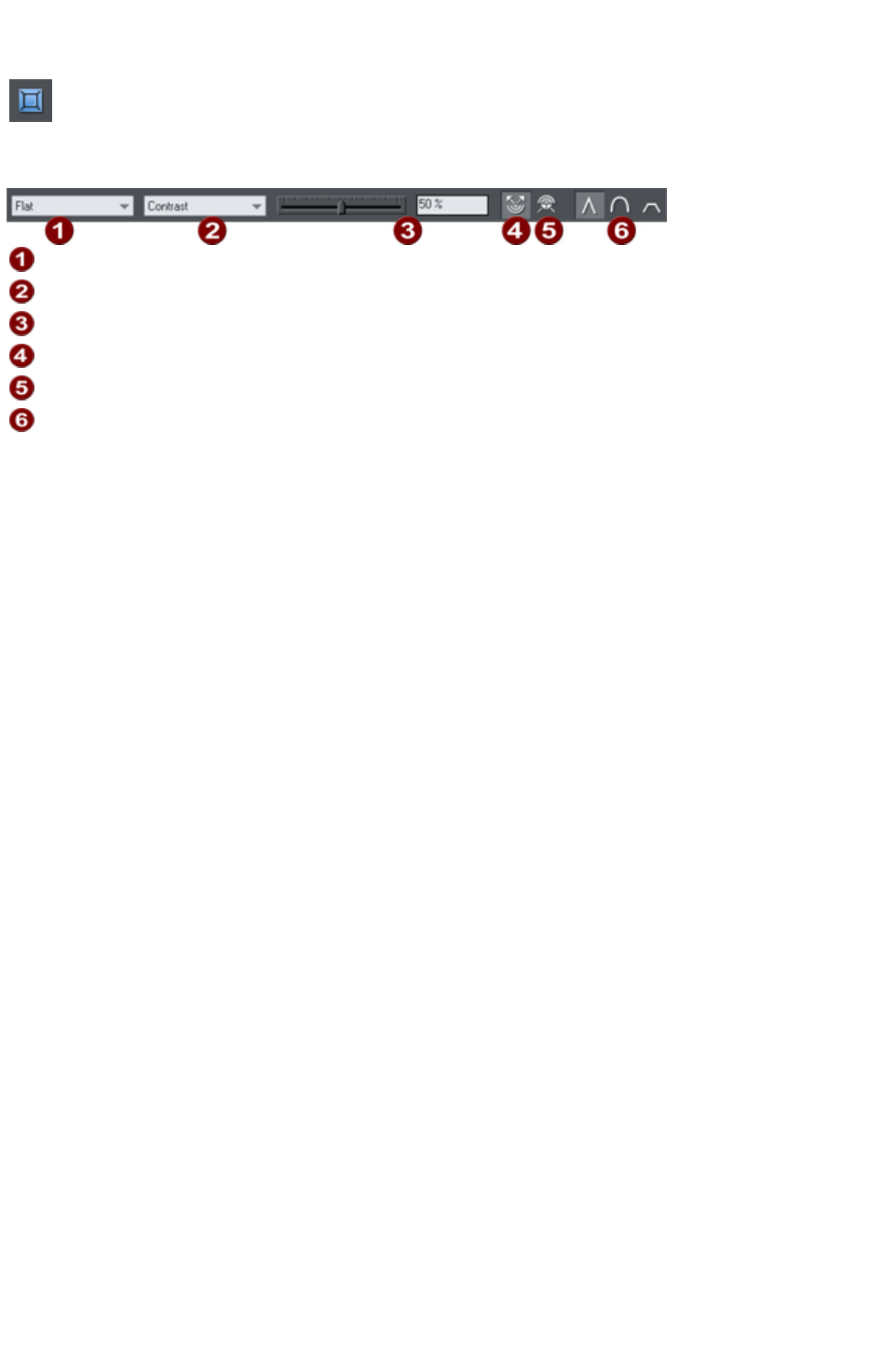
The Bevel Tool
The Bevel
Tool (shortcut "Ctrl + F3") gives objects an appearance of depth
instead of being flat on the page.
Bevels are resolution-independent so you can scale them without losing quality.
Bevel type
Slider type list
Slider and numeric value for selected parameter
Outer bevel
Inner bevel
Join style
You can apply bevels to most types of object. The exceptions are:
Part of a block of text (such as a single letter)-the bevel is instead applied to all the text.
To the curve in text along a curve.
Contoured objects.
Live effects (the bevel is applied to the object before the effect is applied if the effect is live, or to
the bounding box of the effect if the effect is locked).
Page 729

Applying a bevel
To apply a bevel to a single object:
1. Select the object
2. Choose the Bevel Tool.
3. Choose the bevel shape you want from the Bevel type list. Note that None removes any
applied bevels.
Page 730
Applying a bevel to several objects
The result of a bevel on several objects depends on if the objects are grouped:
If the objects are grouped,
overlapping bevels merge
together. The bevel color is the
same as the rear-most object in
the group.
If the objects are ungrouped,
each object has a separate bevel.
The bevel color is the same as
the object color.
Page 731
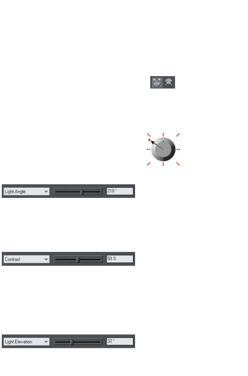
Modifying a bevel
You can change the angle and elevation of the light and change the shape, direction and size of the bevel
edge.
Bevel direction
Bevels can be inside the object or outside. Outside bevels make objects larger; inside bevels do not
change the object size.
To change bevel direction:
1. Select the object.
2. Click either the Inner or Outer button.
Changing the bevel light source
The bevel effect is created by a light shining across the object and highlighting the shape (profile) of the
bevel. You can change the direction and height of the light and its strength (the contrast).
Changing the light angle (horizontal direction):
1. Select the object.
2. Drag the arrowhead to change the position of the
light source.
You cannot move the center of the arrow, only the
arrowhead.
For precise angles, select Light angle from the Slider type
list. Then drag the slider or type into the text box.
If you have several beveled objects selected, light angle changes all bevels. Dragging the arrow changes
just the bevel (or bevels) to which the arrow refers.
Changing the light strength (contrast)
To change the light strength:
1. Select the object.
2. Select Contrast from the Slider type list. Then drag the slider or type into the text box.
If you have several beveled objects selected, any changes apply to all the bevels. The colors used in the
bevel affect the contrast. For example, strong (saturated) colors require more contrast than weak colors
to get the same effect. For best results, you will probably have to adjust the contrast for each object.
Changing the light elevation (vertical angle)
This lets you move the light anywhere from immediately above the object (90º) to the side of the object
(0º).
1. Select the object.
2. Select Light elevation from the Slider type list. Then drag the slider or type into the text box.
For rounded bevels we recommend a light elevation of 30º. At this angle the bevel blends smoothly with
the object.
Page 732
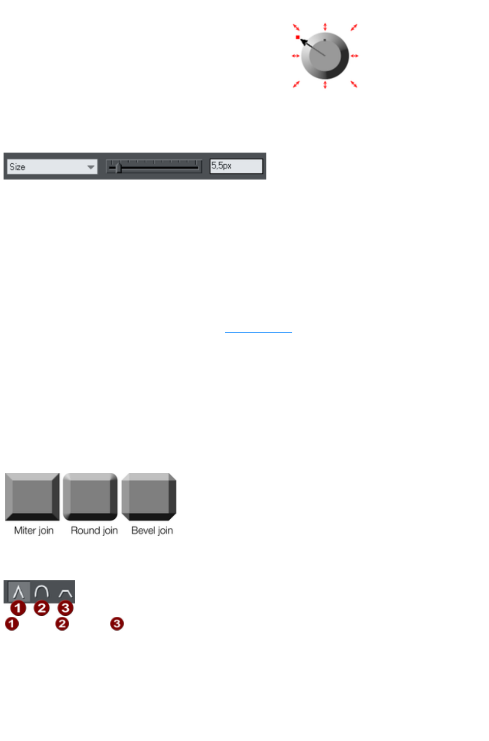
Changing the bevel size
How to change the bevel size:
1. Select the object.
2. Drag any of the outside arrows to enlarge the bevel.
Alternatively:
1. Select the object.
2. From the Slider type list choose Size.
3. Either drag the slider or type a value into the text box.
Changing the bevel shape
1. Select the object
2. Choose the Bevel Tool.
3. Choose the bevel shape you want from the Bevel type list.
Changing the bevel color or fill effect
After applying a bevel to an object, you can change the bevel's color or fill effect. You can apply any of
Xara Web Designer 7 Premium's color effects including multi-stage fills.
For more on colors and the Color Line, refer to Color handling
.
How to change the bevel color:
The easiest way is to drag-and-drop a color from the Color Line onto the bevel (make sure you
drop the color onto the bevel and not the object.)
Alternatively, this method is slightly more complex but you have full control over the color:
1. Select the bevel using the Selector Tool (make sure you select the bevel and not the object.)
2. Use the Color editor to edit the color.
Changing the bevel join style
After applying a bevel to an object,
you can change the shape of the
corners (joins).
How to change the bevel join style:
1. Select the object.
2. Click the appropriate join button on the Bevel Tool InfoBar.
Miter
Round
Bevel
Page 733
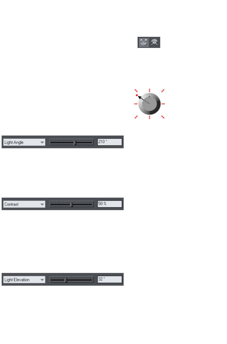
Bevel direction
Bevels can be inside the object or outside. Outside bevels make objects larger; inside bevels do not
change the object size.
To change bevel direction:
1. Select the object.
2. Click either the Inner or Outer button.
Changing the bevel light source
The bevel effect is created by a light shining across the object and highlighting the shape (profile) of the
bevel. You can change the direction and height of the light and its strength (the contrast).
Changing the light angle (horizontal direction):
1. Select the object.
2. Drag the arrowhead to change the position of the
light source.
You cannot move the center of the arrow, only the
arrowhead.
For precise angles, select Light angle from the Slider type
list. Then drag the slider or type into the text box.
If you have several beveled objects selected, light angle changes all bevels. Dragging the arrow changes
just the bevel (or bevels) to which the arrow refers.
Changing the light strength (contrast)
To change the light strength:
1. Select the object.
2. Select Contrast from the Slider type list. Then drag the slider or type into the text box.
If you have several beveled objects selected, any changes apply to all the bevels. The colors used in the
bevel affect the contrast. For example, strong (saturated) colors require more contrast than weak colors
to get the same effect. For best results, you will probably have to adjust the contrast for each object.
Changing the light elevation (vertical angle)
This lets you move the light anywhere from immediately above the object (90º) to the side of the
object (0º).
1. Select the object.
2. Select Light elevation from the Slider type list. Then drag the slider or type into the text box.
For rounded bevels we recommend a light elevation of 30º. At this angle the bevel blends smoothly
with the object.
Changing the bevel size
Page 734
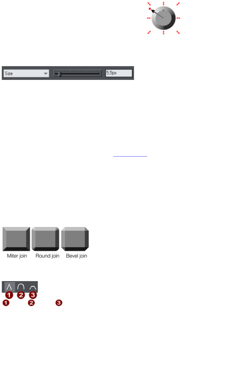
How to change the bevel size:
1. Select the object.
2. Drag any of the outside arrows to enlarge the bevel.
Alternatively:
1. Select the object.
2. From the Slider type list choose Size.
3. Either drag the slider or type a value into the text box.
Changing the bevel shape
1. Select the object
2. Choose the Bevel Tool.
3. Choose the bevel shape you want from the Bevel type list.
Changing the bevel color or fill effect
After applying a bevel to an object, you can change the bevel's color or fill effect. You can apply any of
Xara Web Designer 7 Premium's color effects including multi-stage fills.
For more on colors and the Color Line, refer to Color handling
.
How to change the bevel color:
The easiest way is to drag-and-drop a color from the Color Line onto the bevel (make sure you
drop the color onto the bevel and not the object.)
Alternatively, this method is slightly more complex but you have full control over the color:
1. Select the bevel using the Selector Tool (make sure you select the bevel and not the object.)
2. Use the Color editor to edit the color.
Changing the bevel join style
After applying a bevel to an object,
you can change the shape of the
corners (joins).
How to change the bevel join style:
1. Select the object.
2. Click the appropriate join button on the Bevel Tool InfoBar.
Miter
Round
Bevel
Page 735
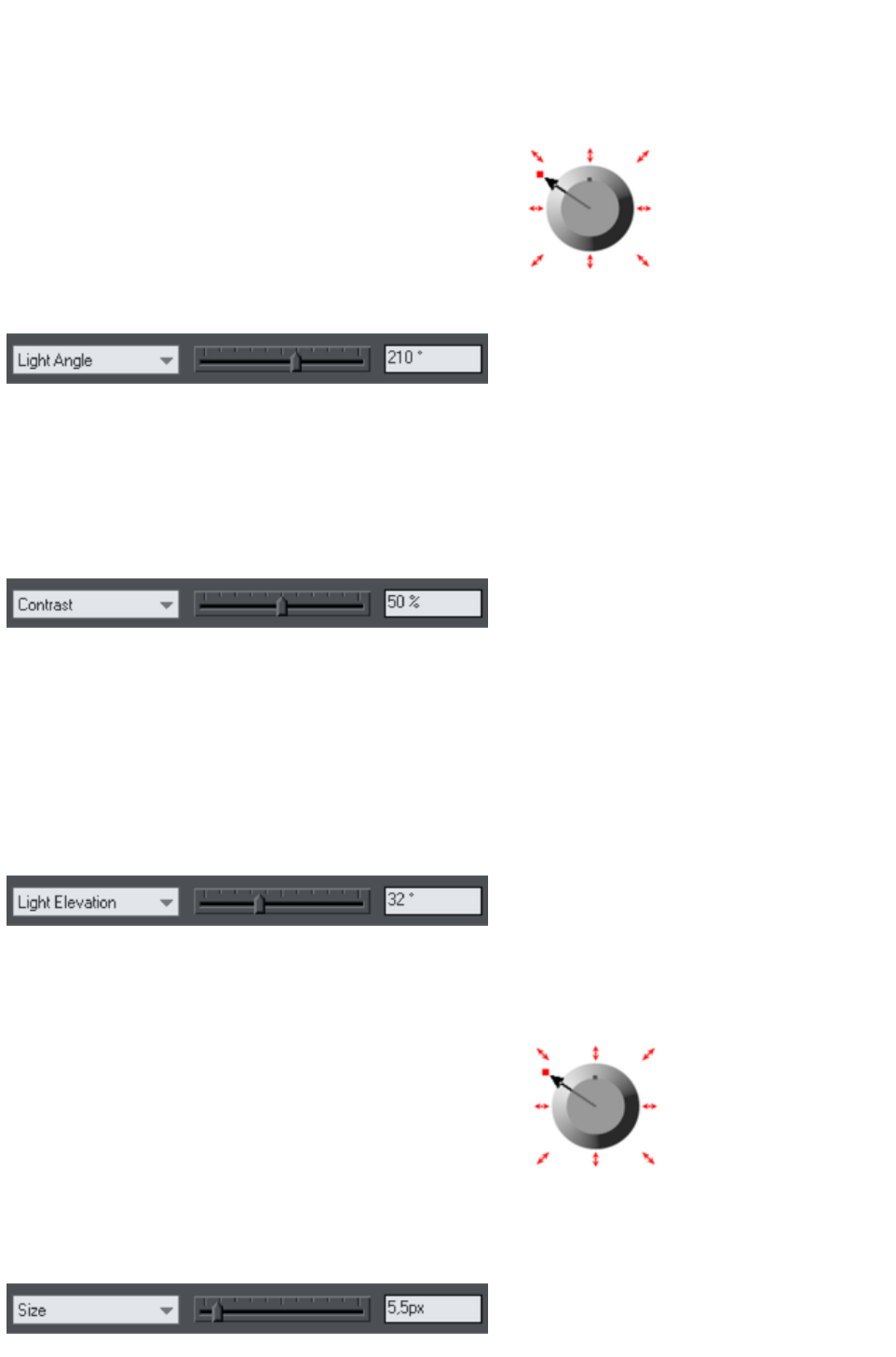
Changing the bevel light source
The bevel effect is created by a light shining across the object and highlighting the shape (profile) of the
bevel. You can change the direction and height of the light and its strength (the contrast).
Changing the light angle (horizontal direction):
1. Select the object.
2. Drag the arrowhead to change the position of the
light source.
You cannot move the center of the arrow, only the
arrowhead.
For precise angles, select Light angle from the Slider type
list. Then drag the slider or type into the text box.
If you have several beveled objects selected, light angle changes all bevels. Dragging the arrow changes
just the bevel (or bevels) to which the arrow refers.
Changing the light strength (contrast)
To change the light strength:
1. Select the object.
2. Select Contrast from the Slider type list. Then drag the slider or type into the text box.
If you have several beveled objects selected, any changes apply to all the bevels. The colors used in the
bevel affect the contrast. For example, strong (saturated) colors require more contrast than weak colors
to get the same effect. For best results, you will probably have to adjust the contrast for each object.
Changing the light elevation (vertical angle)
This lets you move the light anywhere from immediately above the object (90º) to the side of the
object (0º).
1. Select the object.
2. Select Light elevation from the Slider type list. Then drag the slider or type into the text box.
For rounded bevels we recommend a light elevation of 30º. At this angle the bevel blends smoothly
with the object.
Changing the bevel size
How to change the bevel size:
1. Select the object.
2. Drag any of the outside arrows to enlarge the bevel.
Alternatively:
1. Select the object.
2. From the Slider type list choose Size.
3. Either drag the slider or type a value into the text box.
Page 736
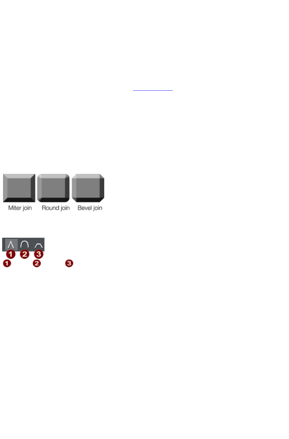
Changing the bevel shape
1. Select the object
2. Choose the Bevel Tool.
3. Choose the bevel shape you want from the Bevel type list.
Changing the bevel color or fill effect
After applying a bevel to an object, you can change the bevel's color or fill effect. You can apply any of
Xara Web Designer 7 Premium's color effects including multi-stage fills.
For more on colors and the Color Line, refer to Color handling
.
How to change the bevel color:
The easiest way is to drag-and-drop a color from the Color Line onto the bevel (make sure you
drop the color onto the bevel and not the object.)
Alternatively, this method is slightly more complex but you have full control over the color:
1. Select the bevel using the Selector Tool (make sure you select the bevel and not the object.)
2. Use the Color editor to edit the color.
Changing the bevel join style
After applying a bevel to an object,
you can change the shape of the
corners (joins).
How to change the bevel join style:
1. Select the object.
2. Click the appropriate join button on the Bevel Tool InfoBar.
Miter
Round
Bevel
Page 737
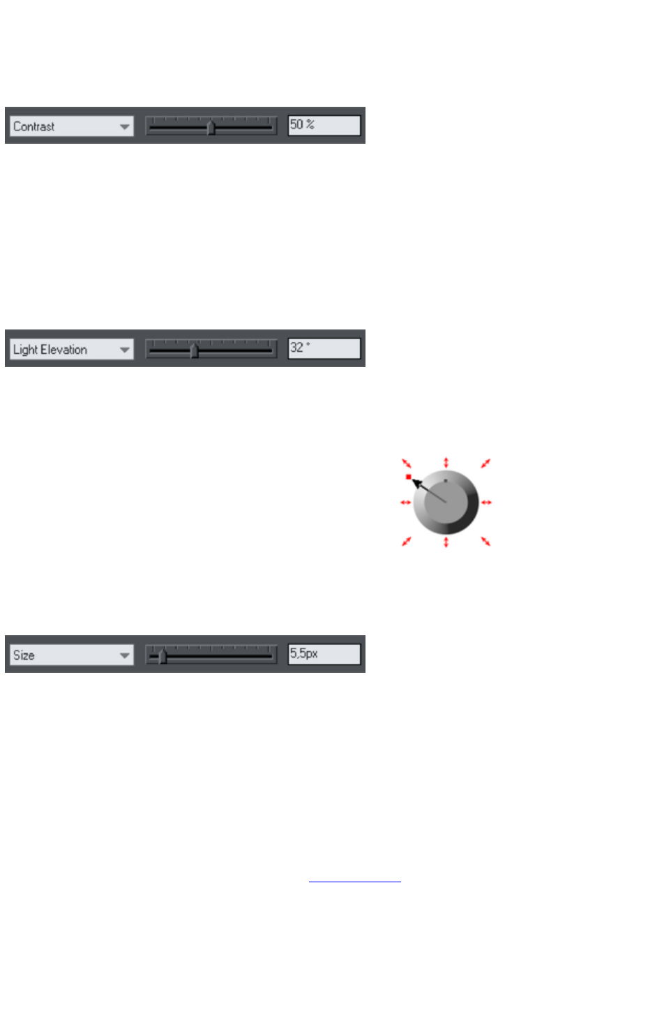
Changing the light strength (contrast)
To change the light strength:
1. Select the object.
2. Select Contrast from the Slider type list. Then drag the slider or type into the text box.
If you have several beveled objects selected, any changes apply to all the bevels. The colors used in the
bevel affect the contrast. For example, strong (saturated) colors require more contrast than weak colors
to get the same effect. For best results, you will probably have to adjust the contrast for each object.
Changing the light elevation (vertical angle)
This lets you move the light anywhere from immediately above the object (90º) to the side of the
object (0º).
1. Select the object.
2. Select Light elevation from the Slider type list. Then drag the slider or type into the text box.
For rounded bevels we recommend a light elevation of 30º. At this angle the bevel blends smoothly
with the object.
Changing the bevel size
How to change the bevel size:
1. Select the object.
2. Drag any of the outside arrows to enlarge the bevel.
Alternatively:
1. Select the object.
2. From the Slider type list choose Size.
3. Either drag the slider or type a value into the text box.
Changing the bevel shape
1. Select the object
2. Choose the Bevel Tool.
3. Choose the bevel shape you want from the Bevel type list.
Changing the bevel color or fill effect
After applying a bevel to an object, you can change the bevel's color or fill effect. You can apply any of
Xara Web Designer 7 Premium's color effects including multi-stage fills.
For more on colors and the Color Line, refer to Color handling
.
How to change the bevel color:
The easiest way is to drag-and-drop a color from the Color Line onto the bevel (make sure you
drop the color onto the bevel and not the object.)
Alternatively, this method is slightly more complex but you have full control over the color:
1. Select the bevel using the Selector Tool (make sure you select the bevel and not the object.)
Page 738
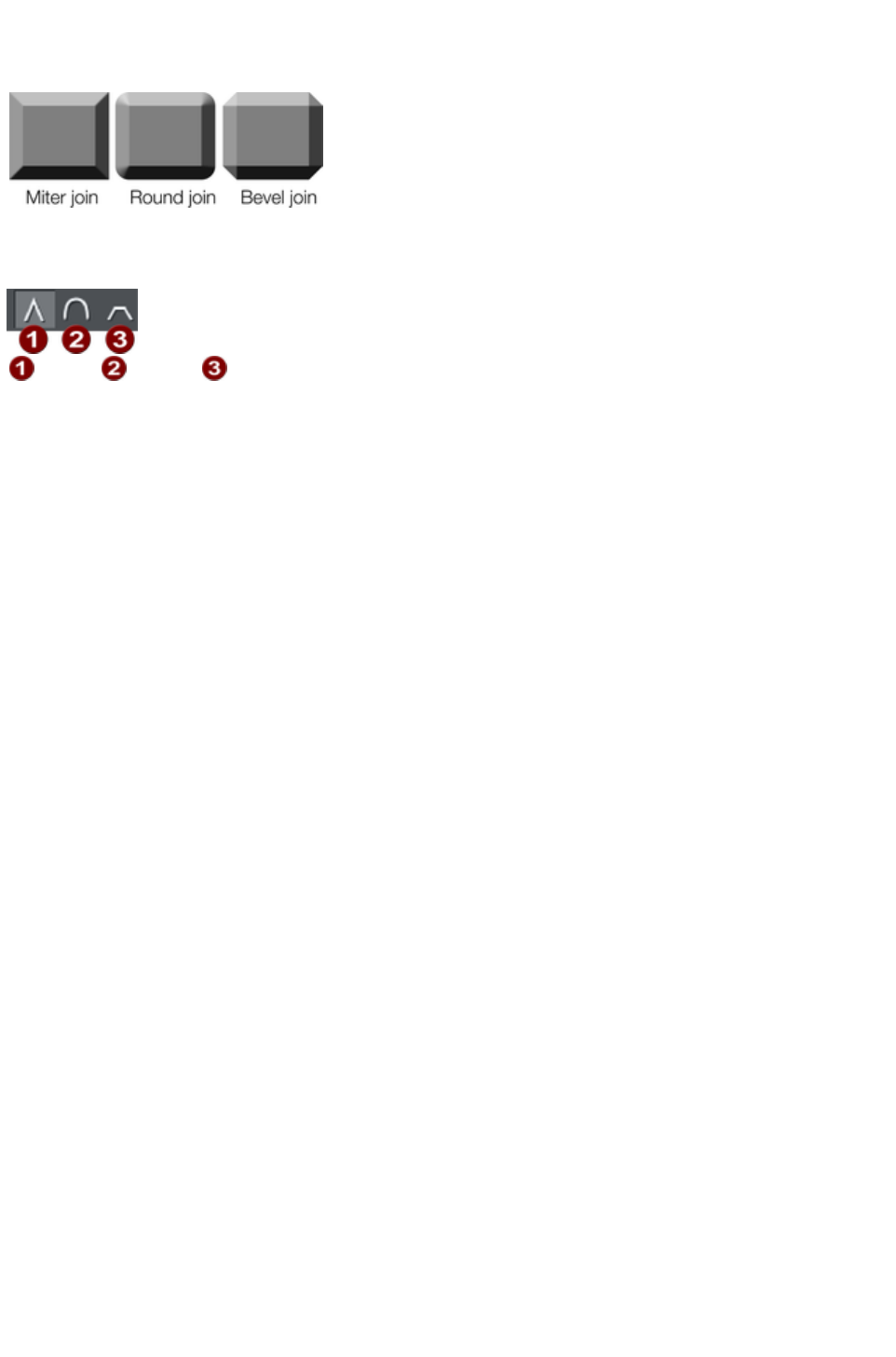
2. Use the Color editor to edit the color.
Changing the bevel join style
After applying a bevel to an object,
you can change the shape of the
corners (joins).
How to change the bevel join style:
1. Select the object.
2. Click the appropriate join button on the Bevel Tool InfoBar.
Miter
Round
Bevel
Page 739
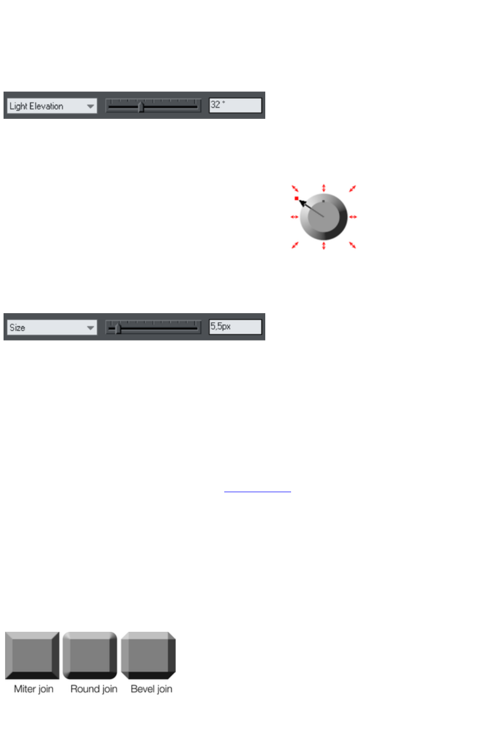
Changing the light elevation (vertical angle)
This lets you move the light anywhere from immediately above the object (90º) to the side of the
object (0º).
1. Select the object.
2. Select Light elevation from the Slider type list. Then drag the slider or type into the text box.
For rounded bevels we recommend a light elevation of 30º. At this angle the bevel blends smoothly
with the object.
Changing the bevel size
How to change the bevel size:
1. Select the object.
2. Drag any of the outside arrows to enlarge the bevel.
Alternatively:
1. Select the object.
2. From the Slider type list choose Size.
3. Either drag the slider or type a value into the text box.
Changing the bevel shape
1. Select the object
2. Choose the Bevel Tool.
3. Choose the bevel shape you want from the Bevel type list.
Changing the bevel color or fill effect
After applying a bevel to an object, you can change the bevel's color or fill effect. You can apply any of
Xara Web Designer 7 Premium's color effects including multi-stage fills.
For more on colors and the Color Line, refer to Color handling
.
How to change the bevel color:
The easiest way is to drag-and-drop a color from the Color Line onto the bevel (make sure you
drop the color onto the bevel and not the object.)
Alternatively, this method is slightly more complex but you have full control over the color:
1. Select the bevel using the Selector Tool (make sure you select the bevel and not the object.)
2. Use the Color editor to edit the color.
Changing the bevel join style
After applying a bevel to an object,
you can change the shape of the
corners (joins).
How to change the bevel join style:
1. Select the object.
Page 740
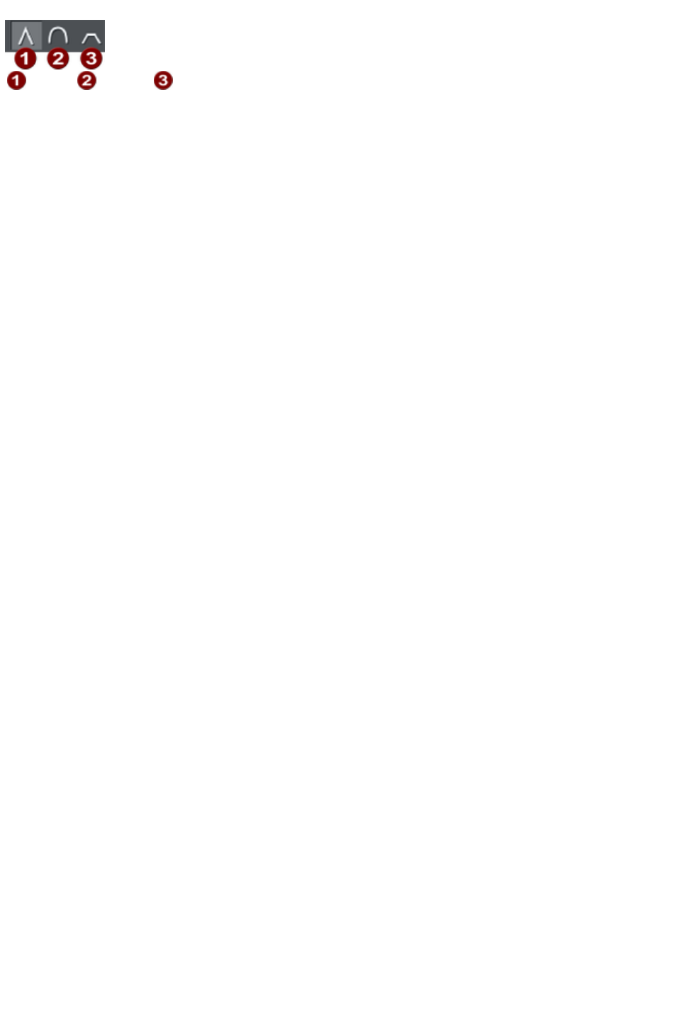
2. Click the appropriate join button on the Bevel Tool InfoBar.
Miter
Round
Bevel
Page 741
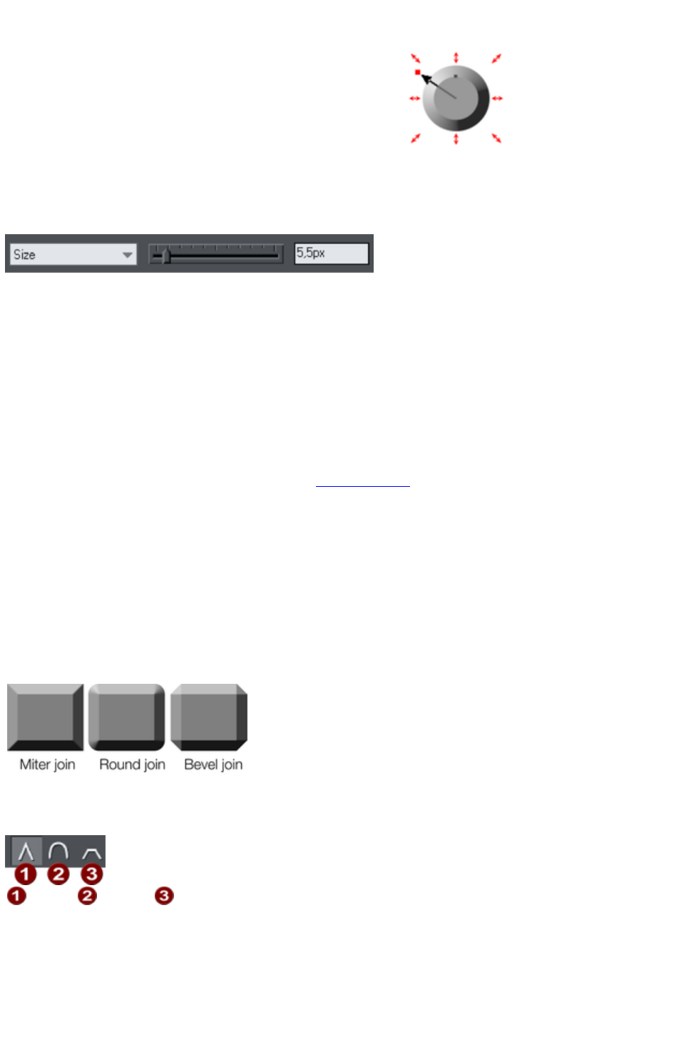
Changing the bevel size
How to change the bevel size:
1. Select the object.
2. Drag any of the outside arrows to enlarge the bevel.
Alternatively:
1. Select the object.
2. From the Slider type list choose Size.
3. Either drag the slider or type a value into the text box.
Changing the bevel shape
1. Select the object
2. Choose the Bevel Tool.
3. Choose the bevel shape you want from the Bevel type list.
Changing the bevel color or fill effect
After applying a bevel to an object, you can change the bevel's color or fill effect. You can apply any of
Xara Web Designer 7 Premium's color effects including multi-stage fills.
For more on colors and the Color Line, refer to Color handling
.
How to change the bevel color:
The easiest way is to drag-and-drop a color from the Color Line onto the bevel (make sure you
drop the color onto the bevel and not the object.)
Alternatively, this method is slightly more complex but you have full control over the color:
1. Select the bevel using the Selector Tool (make sure you select the bevel and not the object.)
2. Use the Color editor to edit the color.
Changing the bevel join style
After applying a bevel to an object,
you can change the shape of the
corners (joins).
How to change the bevel join style:
1. Select the object.
2. Click the appropriate join button on the Bevel Tool InfoBar.
Miter
Round
Bevel
Page 742

Changing the bevel shape
1. Select the object
2. Choose the Bevel Tool.
3. Choose the bevel shape you want from the Bevel type list.
Changing the bevel color or fill effect
After applying a bevel to an object, you can change the bevel's color or fill effect. You can apply any of
Xara Web Designer 7 Premium's color effects including multi-stage fills.
For more on colors and the Color Line, refer to Color handling
.
How to change the bevel color:
The easiest way is to drag-and-drop a color from the Color Line onto the bevel (make sure you
drop the color onto the bevel and not the object.)
Alternatively, this method is slightly more complex but you have full control over the color:
1. Select the bevel using the Selector Tool (make sure you select the bevel and not the object.)
2. Use the Color editor to edit the color.
Changing the bevel join style
After applying a bevel to an object,
you can change the shape of the
corners (joins).
How to change the bevel join style:
1. Select the object.
2. Click the appropriate join button on the Bevel Tool InfoBar.
Miter
Round
Bevel
Page 743
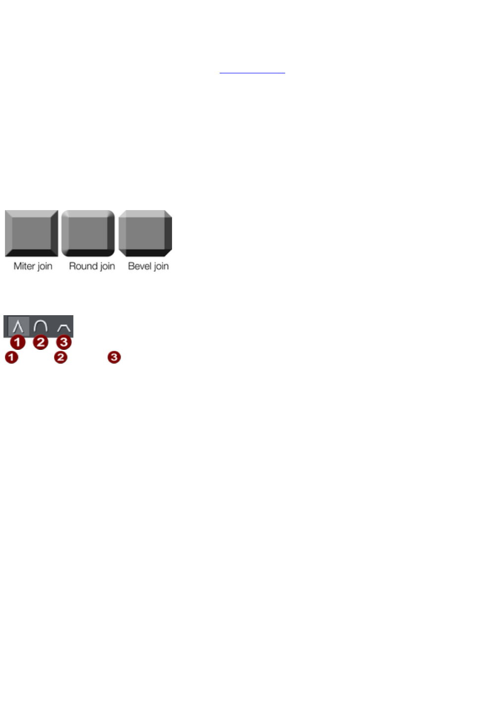
Changing the bevel color or fill effect
After applying a bevel to an object, you can change the bevel's color or fill effect. You can apply any of
Xara Web Designer 7 Premium's color effects including multi-stage fills.
For more on colors and the Color Line, refer to Color handling
.
How to change the bevel color:
The easiest way is to drag-and-drop a color from the Color Line onto the bevel (make sure you
drop the color onto the bevel and not the object.)
Alternatively, this method is slightly more complex but you have full control over the color:
1. Select the bevel using the Selector Tool (make sure you select the bevel and not the object.)
2. Use the Color editor to edit the color.
Changing the bevel join style
After applying a bevel to an object,
you can change the shape of the
corners (joins).
How to change the bevel join style:
1. Select the object.
2. Click the appropriate join button on the Bevel Tool InfoBar.
Miter
Round
Bevel
Page 744
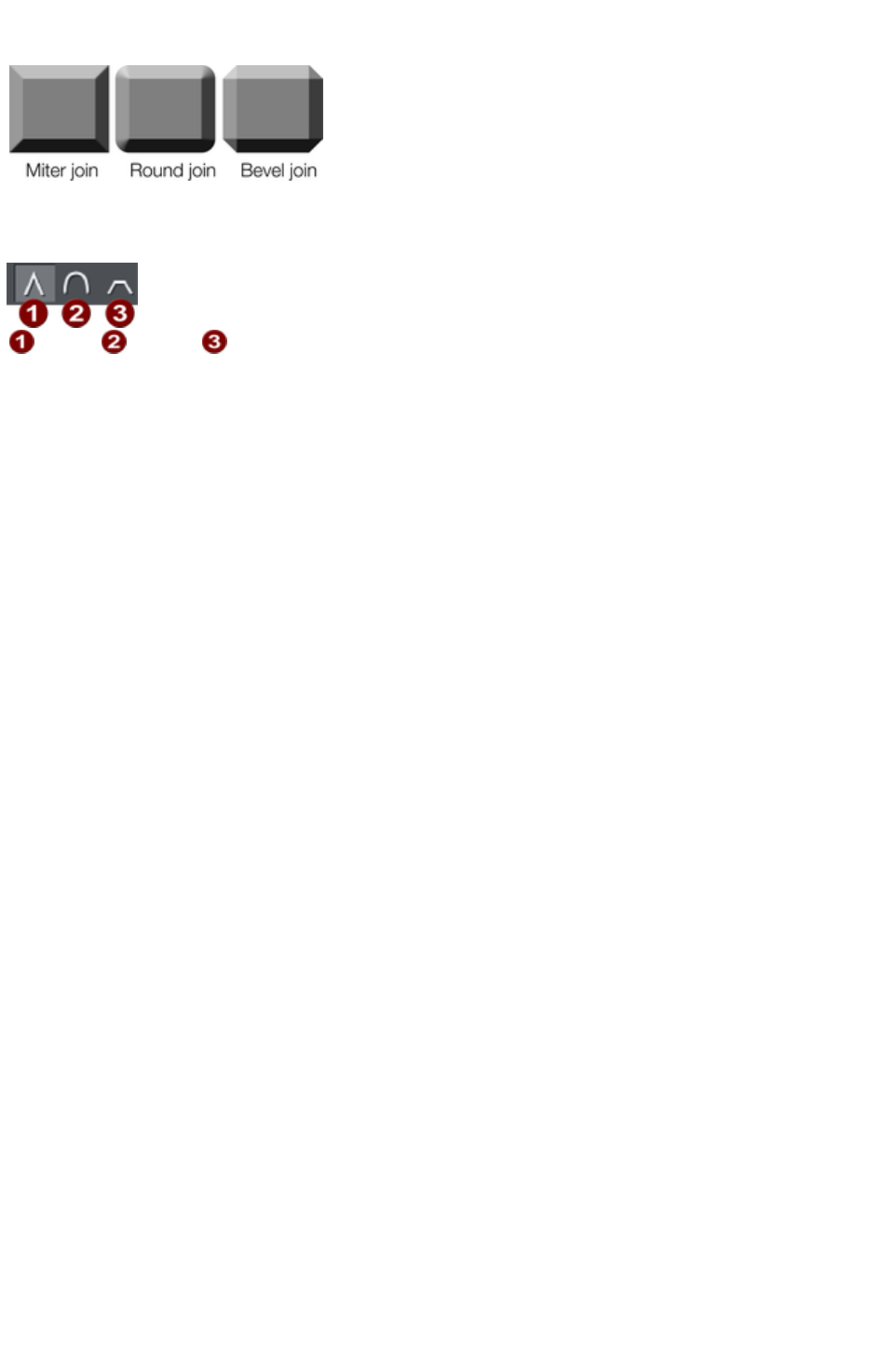
Changing the bevel join style
After applying a bevel to an object,
you can change the shape of the
corners (joins).
How to change the bevel join style:
1. Select the object.
2. Click the appropriate join button on the Bevel Tool InfoBar.
Miter
Round
Bevel
Page 745

Removing a bevel
To remove a bevel:
1. Select the object(s) from which you want to remove the bevel.
2. Choose the Bevel Tool.
Choose None from the Bevel Type
list.
Page 746
Masks
A number of operations can take a mask to indicate which parts of a photo or drawing are to be
operated on. The Content Aware photo scaling is one example where you can mark an area of a photo
that is to be protected from the stretching operation.
Another example is the photo enhance tool. You can mark part of a
photo using a mask shape and then apply the enhance tool only to that
part of the photo.
Operations that can use a mask include;
Content Aware photo scaling
Cut / Copy / Delete operations
Duplicate and Clone
Clipview
Combine Shapes (Arrange menu)
Terminology ? masks versus opacity masks
In Web Designer Premium the term "mask" when used on its own refers to the practice of temporarily
marking part of a photo or design, such that a subsequent operation makes use of that mask in some
way, as described in this chapter. Xara Web Designer 7 Premium also includes the "opacity mask"
feature, which should not be confused with masks as described here. An opacity mask is a way of
applying transparent effects to objects and is described in the Transparency chapter.
Appearance of masks
The mask is shown as a pink semi-transparent layer. You can draw shapes onto the mask to mark areas
of interest - either to indicate an area you want to work on, or an area that is to be protected, depending
on the operation to be applied.
You can use any of the drawing tools to operate on the mask layer. So for instance it's easy using the
Freehand tool to draw around any part of a photo. All masks in Web Designer Premium are vector
shapes and you can use the normal vector editing tool such as the Shape Editor
to edit the shape outline.
Think of a mask like a transparent pink film overlaid on your drawing or photo. You can cut holes in the
mask, or cut out shapes to overlay areas you want to protect.
Not all operations take account of the mask, if you are applying a color fill or transparency to a shape,
this will affect the whole shape as usual, irrespective of any mask. However using the mask system it's
very quick to make a copy of only part of a shape and then adjust that copied part.
In this chapter
To Create A Mask
Operating On The Mask Shapes
Operations That Use The Mask
Copying Shapes To The Mask Layer
Page 747

To Create A Mask
First select the object(s) to which you wish to apply a masked operation.
Then select the Mask mode button, below the main toolbar on the left
of the Xara Web Designer 7 Premium window.
Or select the menu option "Window" > "Mask mode on".
This will cover the whole drawing area with a pink semi-transparent mask, so you always know when
mask mode is on. It also hides all unselected objects, to make it clear which objects in your design are to
be operated on using the mask. So for example if you are applying a masked operation to a photo (the
most common use for masks), you see only the selected photo and the mask shape(s) while you are in
mask mode.
Now with mask mode on and using any of the drawing tools, draw whatever mask shape you require. If
you're using the Freehand tool you should create a closed shape, that is where the start and end points
are coincident.
The mask shapes are shown as holes in the mask background, and have a dashed 'marching ants'
animating effect around the outline of the shapes.
If you select to invert the mask ("Window" > "Invert mask"
) then the inside of the shapes will be shown in pink.
Important:
The pink area is the protected area. The visible, non-pink, parts of the drawing are the areas that will be
affected by any of the mask compatible operations listed above.
Clicking the Mask control button again will hide the mask layer, so you can now operate on the
document as normal. Doing this just hides the mask layer, it does not remove any object you may have
on the mask. Clicking the control again will reveal the mask layer again along with all objects on that
layer.
It's nearly always best to select the object(s) you want to operate on before turning on mask mode, as
described above, because that makes it clear which object(s) will be affected. However if you don't
select the target object(s) first, some operations will try and guess which object you meant to apply the
mask to. For example if you draw a mask shape over a photo and apply the photo enhance tool, that
tool will assume you intend to apply the masked operation to that photo even though you didn't select it
first.
Page 748

Operating On The Mask Shapes
When you've drawn any shape on the mask, it's selected and acts pretty much like any normal line or
shape.
Drawing additional shapes will just add to the mask.
The status line will indicate whether selected objects are on the mask layer or not.
Pressing Escape will clear any selection (so there are no selected objects).
If you have multiple separate objects on the mask layer, you can click on the outline (on the
marching ants outline) to select any one particular shape. Or use the Page & Layer Gallery to
view and select separate objects on the mask layer.
You can use all the normal drawing tools on the selected shapes on the mask layer. You can copy, cut,
paste, delete, duplicate etc. You can use the Freehand and Shape Editor tool to adjust the mask shape
outline.
You can copy any shape from another normal visible layer onto the mask layer, or vice versa, using the
normal layer operations. To copy a shape from a normal layer, the easiest way to do this is to turn off
mask mode, select and copy the required objects, re-enable the mask layer and then Paste.
Deleting all objects from the mask simply requires a click anywhere on the pink area (selects all parts of
the mask) followed by pressing the Delete key.
Clicking through the holes or anywhere on the non-pink parts of a drawing will select the objects under
the mask.
Moving the mask objects
Dragging anywhere on the pink mask will move all shapes on the mask layer.
Where you have multiple shapes selected on the mask layer and want to operate on one shape only,
clear the selection (press Esc) and then click on the edge of or inside the specific shape you want to
select.
Page 749

Moving the mask objects
Dragging anywhere on the pink mask will move all shapes on the mask layer.
Where you have multiple shapes selected on the mask layer and want to operate on one shape only,
clear the selection (press Esc) and then click on the edge of or inside the specific shape you want to
select.
Page 750
Operations That Use The Mask
This section outlines some of the operations that work with masks and refers to other sections of the
help for information on others.
ClipView
You can clip your drawing or photo to be inside the mask shape. Select the object(s) you want to clip,
switch on mask mode and draw the required shape on the mask. Now when you select "Arrange" >
"ClipView"
(or press the key short cut "Q") the drawing will be clipped to the visible areas of the mask.
ClipViews are live and non-destructive in that the whole drawing is retained inside the Clipview object. .
See the Object Handling chapter for details.
Cut, Copy, Delete
These operations are useful when used with masks, to cut pieces from photos, but you can use them on
any objects.
Select the object(s) you want to apply the operation to, then turn on mask mode and draw your mask
shape(s). Then perform the cut/copy/delete operation.
This shows a photo with mask on and an ellipse drawn on the mask. After a Cut or Delete the visible
part of the photo is cut or deleted, as shown on the right.
Page 751
On the left example the mask has been inverted. Now when you cut or delete the masked pink area is
protected, everything else is deleted.
You can use masks on top of any drawing or photo.
If you have a mask shape selected when you apply these operations, you'll be asked whether you want
to apply the operation to the mask shape itself, or to the objects shown under the mask using the mask.
This is because you may want to use these operations on the mask shapes themselves and it's not clear
from the context what your intention is.
Duplicate, Clone
This will copy only the visible un-masked parts of the drawing or photo. The Clone option places a copy
exactly on top of the original.
Content Aware photo scaling
To protect part of a photo from being scaled, switch the mask on, draw around the area with the
Freehand tool. Now go into the Content Aware photo scaling tool (Photo tool fly-out bar on the main
toolbar).
See the Content Aware Scaling
feature for more information.
Photo enhance tool
Use a mask to apply brightness, contrast, saturation, temperature and blur/sharpen changes to any part
of a photo. Just draw the mask shape in mask mode, then go into the Photo Tool and start using the
enhance controls on the infobar. See the Photo Tool and Photo Handling
chapters for more information.
Photo clone tool
The clone tool will take a mask shape and convert it into a clone shape, which copies one part of a
photo to another part. See the Clone Tool section of the Photo Tool chapter for details.
Page 752

Combine Shapes
There are a set of operations under the "Arrange" > "Combine Shapes" menu that allow you to
combine shapes in a number of different ways. These work with the mask. For example to slice a piece
of a photo out (cookie cutter style), draw your cookie cutter shape on the mask, and select "Arrange"
> "Combine Shapes" > "Slice"
Mask Notes: The mask is really a special type of layer. If you open the Page & Layer Gallery you will
see a mask layer appear when you switch on mask mode. You can use the Page & Layer Gallery
layer controls to show, hide, lock or unlock the mask layer. You can also use the Page & Layer
Gallery
to find and select objects on the mask layer.
Page 753
ClipView
You can clip your drawing or photo to be inside the mask shape. Select the object(s) you want to clip,
switch on mask mode and draw the required shape on the mask. Now when you select "Arrange" >
"ClipView"
(or press the key short cut "Q") the drawing will be clipped to the visible areas of the mask.
ClipViews are live and non-destructive in that the whole drawing is retained inside the Clipview object. .
See the Object Handling chapter for details.
Cut, Copy, Delete
These operations are useful when used with masks, to cut pieces from photos, but you can use them on
any objects.
Select the object(s) you want to apply the operation to, then turn on mask mode and draw your mask
shape(s). Then perform the cut/copy/delete operation.
This shows a photo with mask on and an ellipse drawn on the mask. After a Cut or Delete the visible
part of the photo is cut or deleted, as shown on the right.
Page 754

On the left example the mask has been inverted. Now when you cut or delete the masked pink area is
protected, everything else is deleted.
You can use masks on top of any drawing or photo.
If you have a mask shape selected when you apply these operations, you'll be asked whether you want
to apply the operation to the mask shape itself, or to the objects shown under the mask using the mask.
This is because you may want to use these operations on the mask shapes themselves and it's not clear
from the context what your intention is.
Duplicate, Clone
This will copy only the visible un-masked parts of the drawing or photo. The Clone option places a copy
exactly on top of the original.
Content Aware photo scaling
To protect part of a photo from being scaled, switch the mask on, draw around the area with the
Freehand tool. Now go into the Content Aware photo scaling tool (Photo tool fly-out bar on the main
toolbar).
See the Content Aware Scaling
feature for more information.
Photo enhance tool
Use a mask to apply brightness, contrast, saturation, temperature and blur/sharpen changes to any part
of a photo. Just draw the mask shape in mask mode, then go into the Photo Tool and start using the
enhance controls on the infobar. See the Photo Tool and Photo Handling
chapters for more information.
Photo clone tool
The clone tool will take a mask shape and convert it into a clone shape, which copies one part of a
photo to another part. See the Clone Tool section of the Photo Tool chapter for details.
Page 755

Combine Shapes
There are a set of operations under the "Arrange" > "Combine Shapes" menu that allow you to
combine shapes in a number of different ways. These work with the mask. For example to slice a piece
of a photo out (cookie cutter style), draw your cookie cutter shape on the mask, and select "Arrange"
> "Combine Shapes" > "Slice"
Mask Notes: The mask is really a special type of layer. If you open the Page & Layer Gallery you will
see a mask layer appear when you switch on mask mode. You can use the Page & Layer Gallery
layer controls to show, hide, lock or unlock the mask layer. You can also use the Page & Layer
Gallery
to find and select objects on the mask layer.
Page 756
Cut, Copy, Delete
These operations are useful when used with masks, to cut pieces from photos, but you can use them on
any objects.
Select the object(s) you want to apply the operation to, then turn on mask mode and draw your mask
shape(s). Then perform the cut/copy/delete operation.
This shows a photo with mask on and an ellipse drawn on the mask. After a Cut or Delete the visible
part of the photo is cut or deleted, as shown on the right.
On the left example the mask has been inverted. Now when you cut or delete the masked pink area is
Page 757
protected, everything else is deleted.
You can use masks on top of any drawing or photo.
If you have a mask shape selected when you apply these operations, you'll be asked whether you want
to apply the operation to the mask shape itself, or to the objects shown under the mask using the mask.
This is because you may want to use these operations on the mask shapes themselves and it's not clear
from the context what your intention is.
Duplicate, Clone
This will copy only the visible un-masked parts of the drawing or photo. The Clone option places a copy
exactly on top of the original.
Content Aware photo scaling
To protect part of a photo from being scaled, switch the mask on, draw around the area with the
Freehand tool. Now go into the Content Aware photo scaling tool (Photo tool fly-out bar on the main
toolbar).
See the Content Aware Scaling
feature for more information.
Photo enhance tool
Use a mask to apply brightness, contrast, saturation, temperature and blur/sharpen changes to any part
of a photo. Just draw the mask shape in mask mode, then go into the Photo Tool and start using the
enhance controls on the infobar. See the Photo Tool and Photo Handling
chapters for more information.
Photo clone tool
The clone tool will take a mask shape and convert it into a clone shape, which copies one part of a
photo to another part. See the Clone Tool section of the Photo Tool chapter for details.
Combine Shapes
There are a set of operations under the "Arrange" > "Combine Shapes" menu that allow you to
combine shapes in a number of different ways. These work with the mask. For example to slice a piece
of a photo out (cookie cutter style), draw your cookie cutter shape on the mask, and select "Arrange"
> "Combine Shapes" > "Slice"
Mask Notes: The mask is really a special type of layer. If you open the Page & Layer Gallery you will
see a mask layer appear when you switch on mask mode. You can use the Page & Layer Gallery
layer controls to show, hide, lock or unlock the mask layer. You can also use the Page & Layer
Gallery
to find and select objects on the mask layer.
Page 758

Duplicate, Clone
This will copy only the visible un-masked parts of the drawing or photo. The Clone option places a copy
exactly on top of the original.
Content Aware photo scaling
To protect part of a photo from being scaled, switch the mask on, draw around the area with the
Freehand tool. Now go into the Content Aware photo scaling tool (Photo tool fly-out bar on the main
toolbar).
See the Content Aware Scaling
feature for more information.
Photo enhance tool
Use a mask to apply brightness, contrast, saturation, temperature and blur/sharpen changes to any part
of a photo. Just draw the mask shape in mask mode, then go into the Photo Tool and start using the
enhance controls on the infobar. See the Photo Tool and Photo Handling
chapters for more information.
Photo clone tool
The clone tool will take a mask shape and convert it into a clone shape, which copies one part of a
photo to another part. See the Clone Tool section of the Photo Tool chapter for details.
Combine Shapes
There are a set of operations under the "Arrange" > "Combine Shapes" menu that allow you to
combine shapes in a number of different ways. These work with the mask. For example to slice a piece
of a photo out (cookie cutter style), draw your cookie cutter shape on the mask, and select "Arrange"
> "Combine Shapes" > "Slice"
Mask Notes: The mask is really a special type of layer. If you open the Page & Layer Gallery you will
see a mask layer appear when you switch on mask mode. You can use the Page & Layer Gallery
layer controls to show, hide, lock or unlock the mask layer. You can also use the Page & Layer
Gallery
to find and select objects on the mask layer.
Page 759

Content Aware photo scaling
To protect part of a photo from being scaled, switch the mask on, draw around the area with the
Freehand tool. Now go into the Content Aware photo scaling tool (Photo tool fly-out bar on the main
toolbar).
See the Content Aware Scaling
feature for more information.
Photo enhance tool
Use a mask to apply brightness, contrast, saturation, temperature and blur/sharpen changes to any part
of a photo. Just draw the mask shape in mask mode, then go into the Photo Tool and start using the
enhance controls on the infobar. See the Photo Tool and Photo Handling
chapters for more information.
Photo clone tool
The clone tool will take a mask shape and convert it into a clone shape, which copies one part of a
photo to another part. See the Clone Tool section of the Photo Tool chapter for details.
Combine Shapes
There are a set of operations under the "Arrange" > "Combine Shapes" menu that allow you to
combine shapes in a number of different ways. These work with the mask. For example to slice a piece
of a photo out (cookie cutter style), draw your cookie cutter shape on the mask, and select "Arrange"
> "Combine Shapes" > "Slice"
Mask Notes: The mask is really a special type of layer. If you open the Page & Layer Gallery you will
see a mask layer appear when you switch on mask mode. You can use the Page & Layer Gallery
layer controls to show, hide, lock or unlock the mask layer. You can also use the Page & Layer
Gallery
to find and select objects on the mask layer.
Page 760

Photo enhance tool
Use a mask to apply brightness, contrast, saturation, temperature and blur/sharpen changes to any part
of a photo. Just draw the mask shape in mask mode, then go into the Photo Tool and start using the
enhance controls on the infobar. See the Photo Tool and Photo Handling
chapters for more information.
Photo clone tool
The clone tool will take a mask shape and convert it into a clone shape, which copies one part of a
photo to another part. See the Clone Tool section of the Photo Tool chapter for details.
Combine Shapes
There are a set of operations under the "Arrange" > "Combine Shapes" menu that allow you to
combine shapes in a number of different ways. These work with the mask. For example to slice a piece
of a photo out (cookie cutter style), draw your cookie cutter shape on the mask, and select "Arrange"
> "Combine Shapes" > "Slice"
Mask Notes: The mask is really a special type of layer. If you open the Page & Layer Gallery you will
see a mask layer appear when you switch on mask mode. You can use the Page & Layer Gallery
layer controls to show, hide, lock or unlock the mask layer. You can also use the Page & Layer
Gallery
to find and select objects on the mask layer.
Page 761

Photo clone tool
The clone tool will take a mask shape and convert it into a clone shape, which copies one part of a
photo to another part. See the Clone Tool section of the Photo Tool chapter for details.
Combine Shapes
There are a set of operations under the "Arrange" > "Combine Shapes" menu that allow you to
combine shapes in a number of different ways. These work with the mask. For example to slice a piece
of a photo out (cookie cutter style), draw your cookie cutter shape on the mask, and select "Arrange"
> "Combine Shapes" > "Slice"
Mask Notes: The mask is really a special type of layer. If you open the Page & Layer Gallery you will
see a mask layer appear when you switch on mask mode. You can use the Page & Layer Gallery
layer controls to show, hide, lock or unlock the mask layer. You can also use the Page & Layer
Gallery
to find and select objects on the mask layer.
Page 762

Combine Shapes
There are a set of operations under the "Arrange" > "Combine Shapes" menu that allow you to
combine shapes in a number of different ways. These work with the mask. For example to slice a piece
of a photo out (cookie cutter style), draw your cookie cutter shape on the mask, and select "Arrange"
> "Combine Shapes" > "Slice"
Mask Notes: The mask is really a special type of layer. If you open the Page & Layer Gallery you will
see a mask layer appear when you switch on mask mode. You can use the Page & Layer Gallery
layer controls to show, hide, lock or unlock the mask layer. You can also use the Page & Layer
Gallery
to find and select objects on the mask layer.
Page 763

Copying Shapes To The Mask Layer
You may prefer to draw your mask shape while not in mask mode, or to use an existing shape on your
mask layer. This is easy. With the mask mode off, select the shape, and copy, or cut it. Now switch the
mask mode on, and Paste. Use Paste in Place if you want the shape to appear in exactly the same place
it was copied from.
To copy shapes from the mask layer to any other, do the reverse. Select the shapes with the mask on,
switch the mask mode off, and paste.
Page 764
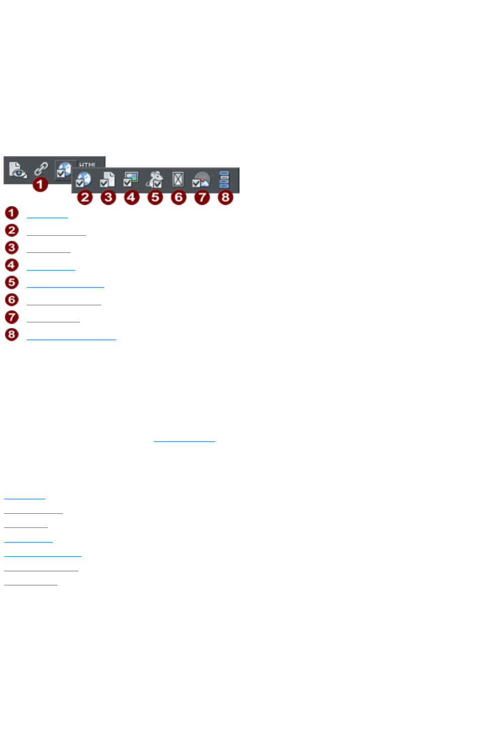
Web Properties Dialog
The Web properties dialog is a multi-tabbed dialog which allows you to add and configure most of the
web related features in Xara Web Designer 7 Premium and set different web properties on objects, on
pages and on your whole website. Open it by right clicking an object and choosing Web Properties or
by using the "Utilities" > "Web properties…
" menu option (shortcut Ctrl + Shift + W).
Each tab of the dialog is also directly accessible using the buttons on the Web Properties flyout bar,
available on the Website toolbar.
Link Tab
Website Tab
Page Tab
Image Tab
Mouse-over Tab
Placeholder Tab
Publish Tab
Create/Edit Navbar
The dialog is modeless, so you can leave it open while you select different pages and objects in your
document. This makes it easy to quickly set properties on different objects and pages in your website.
Use the OK button to apply your changes and close the dialog, or the Apply
button to apply your changes without closing.
Note that when you have an animation design as your current document, the Web Properties dialog
appears in a modified form, with some controls different and many others disabled because they don't
apply to animations. Refer to the Flash chapter
for information about using this dialog with animation designs.
The following sections cover each tab of the dialog in turn.
In this chapter
Link Tab
Website Tab
Page Tab
Image Tab
Mouse-over Tab
Placeholder Tab
Publish Tab
Page 765
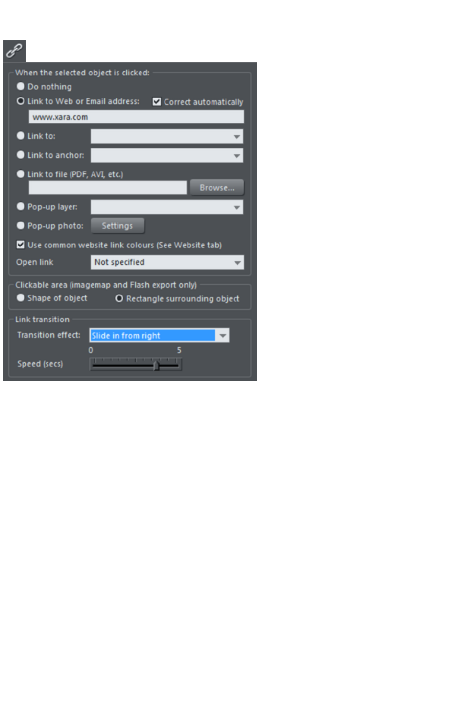
Link Tab
The settings on this tab apply to the selected object(s) or selected text. Typically you use this tab to add
a link to an object on your web page (eg. a button or photo), or to some text, so that when a visitor to
your site clicks on the object/text, they are redirected to another page. You can add links to other pages
in your website, to a URL (web address) or even cause a pop-up window to appear.
You can also apply transition effects to links so that the page linked to (whether it's an external site or
one of the pages in your site) appears with the page transition that you select. Link transitions can only be
used when the link is opening a new page, and are disabled otherwise.
To add a link to just some of the words in a paragraph of text, go into the Text Tool
and drag over the text you want to link, to select it. Then setup the link in this tab.
The main section of this tab allows you to choose what should happen when the selected object or text is
clicked.
Link to web address
Enter a web or email address to link to that address. If you leave the "Correct address automatically"
checkbox selected, your address will be adjusted if required when you click OK or Apply
. For example, if you enter "www.xara.com" it will correct it to "http://www.xara.com/".
You can put an email address in the Link address field, in which case clicking the link will launch the
reader's email program with the To: field filled in. You can also optionally specify the subject line to be
used, add CC or BCC email addresses to be copied on the email and even specify the default body text
to be used. For example this sets the To email address and all four optional parameters:
yourname@wherever.com subject:Email from website cc:another@wherever.com
bcc:yetanother@wherever.com body:Auto-generated email
Technical note: Xara Web Designer 7 Premium encodes your email address to reduce the likelihood that
Page 766
SPAM robots will find your email address from the web page. This requires Javascript to be enabled in
the browser (currently >95% of browsers).
Link to...
Select this option to link to another page in the current website, or if you are in a presentation document,
to link to the next or previous presentation step. The drop-down list allows you to select which page or
step to link to.
TIP: If you have many pages in your website document, giving each one a name makes it much easier to
set up and maintain your page links, because the page list will show the page names instead of just "Page
2", "Page 3", etc.
See the Page Tab section below for details of how to setup page
names, or edit the names in the Page & Layer Gallery
.
In addition to an entry for each page in your site, the dropdown list also contains the special entries Next
page/Presentation step and Previous page/Presentation step
.
Next/Previous page
Use these to add a link which leads to the next or previous page in your site. For the purposes of such
links, the page order is determined by the order of the pages as they appear in Xara Web Designer 7
Premium. A "next" link on the last page links to the first page and a "previous" link on the first page links
to the last page.
Next/Previous presentation step
Use these to add a link which leads to the next or previous presentation step in your site, if your website
is a presentation document. The presentation order is also determined by the order of the steps as they
appear in Xara Web Designer 7 Premium, similarly to next/previous page.
Link to anchor
This option allows you to jump the visitor to a specific part of any page in your website.
To setup an anchor point, first go to the page and object you want to be jumped to. Select the object
and add a name to it by right clicking and choosing the Names...
option. Then select the object to which you want to add the link and choose the anchor name you added
from the list provided with the "Link to anchor" option.
Note that when you link to an object which is a long way down a web page, the web browser
automatically scrolls the page down so that your anchor object is visible.
Note
: You cannot apply a transition to a link to an anchor.
Link to File
This link option is useful if you want to add a document, movie or any other file to your website to make
it available to your visitors. For example you may have a PDF document that you want to make
available.
Select the object or text that you want to link. Then turn on this Link to file option and use the Browse
button to browse for the file on your computer. The name of the file appears in the text field to the left of
the Browse button. Click OK and your link is applied.
As well as applying the link, Xara Web Designer 7 Premium has now taken a copy of your file and
Page 767
placed it in the support folder for your design. This is a folder next to your .web or .xar file. If your design
is called "MySite.web", the support folder will be called "MySite_web_files" alongside it. All the files in
the support folder get published along with your website and so that means your file will be published
with your website and so the link you just added will work. See the Document Handling chapter
for more information on support folders.
Note:
Because there is a separate copy of your file held in the support folder for your design, you need to
update that copy whenever you modify the file and want to publish the modified version. Or you can just
go through the above linking process again and browse for your updated file. Also if you move or copy
your website design to another computer, or give a copy to someone else, you need to make sure the
support folder accompanies the design file, since it now contains an important part of your website!
Note
: You cannot apply a transition to a link to a file.
Pop-up layer
You can add any content you like to a separate layer on your page and have that content shown as a
pop-up only when your visitor clicks on a link. For example you could add some descriptive text about a
photo on your web page and have that text only shown to the user if they click on the photo.
To add a popup layer, first you need to add the layer itself using the
Page & Layer Gallery
and add your pop-up content to that layer.
See the Page & Layer Galler
y chapter for full details. Then you can select the layer from the layer list provided next to the "Pop-up
layer" option.
You can also add a transition effect which is applied when the layer appears. In the Page & Layer
Gallery, open the layer properties so that you can apply a transition directly to a layer
to achieve an animated effect when the layer contents appear.
Now when a visitor clicks on your object, the layer contents appear! Clicking anywhere else on the page
makes the pop-up disappear again.
Note that all the content on the pop-up layer is loaded as soon as the visitor visits your page. So if you
want to provide a lot of pop-up photos, use the Pop-up Photo
feature described below instead.
The "Getting Started" chapter
includes some step by step instructions on adding layer pop-ups.
Pop-up photo
This option gives you a very easy way to add pop-up photos and other photo gallery features to your
website, without adding any layers! Simply import your photo and use the Selector Tool to scale it right
down so it appears as just a small photo thumbnail on your webpage. Then select it and choose this "
Pop-up photo
" option.
Click the Settings button next to this option to go to the Image tab, where you can set the size of the
pop-up photo, add a title and caption, and choose from many other options. See the Image tab section
below
for details. Selecting the pop-up photo option on this Link tab, also selects the pop-up photo checkbox
on the Image tab ? both turn on the same pop-up behavior.
Page 768

Use common website link colors
This option lets you choose how the selected text links should be displayed. It is selected by default,
meaning that the text link will show with the link color you have defined for the whole website. You can
set this color on the Website tab (see Website Tab section).
If you uncheck this option, then the selected text link will keep the color that you give it on the page. So
you can give different links different colors if desired.
Open link in
This option does nothing if either of the "Pop-up layer" or "Pop-up photo" link options are selected. But
for other links it allows you to tell the web browser how the target web page should be loaded. By
default it is set to "Not specified" which usually means the browser will open the link in the same browser
window and frame as the link.
The dropdown list contains four options that cause the browser to do special things. You can select one
of these options, or type in the name of a frame:
New window (_blank)
Open the link in a new browser window.
Same frame (_self)
Open the link in this frame (the frame that contains this object).
Parent frame (_parent)
Open the link into the parent window or frameset that contains this frame.
Same window (_top)
Open the link into the main browser window, replacing any existing frames.
If you want the link to be loaded into a specific frame in the browser, type the name of the frame in this
field.
Clickable area
This option lets you specify what area of the object must be clicked on to invoke the link. However it is
not supported for HTML websites (the rectangle surrounding the object is always used), it works only
when exporting to Flash.
Shape of object
: The user must click inside the exact outline of the object to invoke the link.
Rectangle surrounding object
: The user can click anywhere in the rectangle surrounding the object (the bounding box) to invoke the
link.
Link transition
This option allows you to apply a transition effect to a link so that the page linked to (whether it's an
external site or one of the pages in your site) appears with the page transition that you select. Link
transitions can only be used when the link is opening a new page, and are disabled otherwise.
Note: If you apply a link transition to a link that goes to a page with its own transition set using the Page
tab
, then the link transition is used. So the link transition overrides the page transition for a given link.
Transition effect:
Choose your animation effect from the drop-down list.
You can apply the following transition effects to a link:
Instant
(default)
New page, layer or step contents appear straight away
Slide in
New page, layer or step contents slide in from various directions
Page 769

from
Slide out
from
Current page contents slide out in various directions
Fade
New page contents appear gradually
Fade
through
black
Current page contents fade into a black screen and new page
contents then appear gradually
Shutter
A black bar moves across the screen from the right, obscuring the
old contents, then moves back to reveal the new page contents.
Split,
vertical/
horizontal
slide in
New contents slide in, split into two halves which slide together
either vertically or horizontally
Speed (secs): Set the duration of the effect in seconds.By default objects will only slide in/out to the
edge of the web page. If you would like objects to start from the browser window edges, rather than the
web page edges, deselect the Clip to page edges checkbox in the Website tab
of the Web Properties dialog.
By default when a transition is applied, objects will only slide in/out to the edge of the web page. If you
would like objects to start from the browser window edges, rather than the web page edges, deselect
the Clip to page edges checkbox in the Website tab
of the Web Properties dialog.
Note: This option is grayed out if Link to anchor, Link to file, Pop-up layer or Pop-up photo
are selected.
Page 770
Link to web address
Enter a web or email address to link to that address. If you leave the "Correct address automatically"
checkbox selected, your address will be adjusted if required when you click OK or Apply
. For example, if you enter "www.xara.com" it will correct it to "http://www.xara.com/".
You can put an email address in the Link address field, in which case clicking the link will launch the
reader's email program with the To: field filled in. You can also optionally specify the subject line to be
used, add CC or BCC email addresses to be copied on the email and even specify the default body text
to be used. For example this sets the To email address and all four optional parameters:
yourname@wherever.com subject:Email from website cc:another@wherever.com
bcc:yetanother@wherever.com body:Auto-generated email
Technical note: Xara Web Designer 7 Premium encodes your email address to reduce the likelihood that
SPAM robots will find your email address from the web page. This requires Javascript to be enabled in
the browser (currently >95% of browsers).
Link to...
Select this option to link to another page in the current website, or if you are in a presentation document,
to link to the next or previous presentation step. The drop-down list allows you to select which page or
step to link to.
TIP: If you have many pages in your website document, giving each one a name makes it much easier to
set up and maintain your page links, because the page list will show the page names instead of just "Page
2", "Page 3", etc.
See the Page Tab section below for details of how to setup page
names, or edit the names in the Page & Layer Gallery
.
In addition to an entry for each page in your site, the dropdown list also contains the special entries Next
page/Presentation step and Previous page/Presentation step
.
Next/Previous page
Use these to add a link which leads to the next or previous page in your site. For the purposes of such
links, the page order is determined by the order of the pages as they appear in Xara Web Designer 7
Premium. A "next" link on the last page links to the first page and a "previous" link on the first page links
to the last page.
Next/Previous presentation step
Use these to add a link which leads to the next or previous presentation step in your site, if your website
is a presentation document. The presentation order is also determined by the order of the steps as they
appear in Xara Web Designer 7 Premium, similarly to next/previous page.
Link to anchor
This option allows you to jump the visitor to a specific part of any page in your website.
To setup an anchor point, first go to the page and object you want to be jumped to. Select the object
and add a name to it by right clicking and choosing the Names...
option. Then select the object to which you want to add the link and choose the anchor name you added
from the list provided with the "Link to anchor" option.
Note that when you link to an object which is a long way down a web page, the web browser
Page 771
automatically scrolls the page down so that your anchor object is visible.
Note
: You cannot apply a transition to a link to an anchor.
Link to File
This link option is useful if you want to add a document, movie or any other file to your website to make
it available to your visitors. For example you may have a PDF document that you want to make
available.
Select the object or text that you want to link. Then turn on this Link to file option and use the Browse
button to browse for the file on your computer. The name of the file appears in the text field to the left of
the Browse button. Click OK and your link is applied.
As well as applying the link, Xara Web Designer 7 Premium has now taken a copy of your file and
placed it in the support folder for your design. This is a folder next to your .web or .xar file. If your design
is called "MySite.web", the support folder will be called "MySite_web_files" alongside it. All the files in
the support folder get published along with your website and so that means your file will be published
with your website and so the link you just added will work. See the Document Handling chapter
for more information on support folders.
Note:
Because there is a separate copy of your file held in the support folder for your design, you need to
update that copy whenever you modify the file and want to publish the modified version. Or you can just
go through the above linking process again and browse for your updated file. Also if you move or copy
your website design to another computer, or give a copy to someone else, you need to make sure the
support folder accompanies the design file, since it now contains an important part of your website!
Note
: You cannot apply a transition to a link to a file.
Pop-up layer
You can add any content you like to a separate layer on your page and have that content shown as a
pop-up only when your visitor clicks on a link. For example you could add some descriptive text about a
photo on your web page and have that text only shown to the user if they click on the photo.
To add a popup layer, first you need to add the layer itself using the
Page & Layer Gallery
and add your pop-up content to that layer.
See the Page & Layer Galler
y chapter for full details. Then you can select the layer from the layer list provided next to the "Pop-up
layer" option.
You can also add a transition effect which is applied when the layer appears. In the Page & Layer
Gallery, open the layer properties so that you can apply a transition directly to a layer
to achieve an animated effect when the layer contents appear.
Now when a visitor clicks on your object, the layer contents appear! Clicking anywhere else on the page
makes the pop-up disappear again.
Note that all the content on the pop-up layer is loaded as soon as the visitor visits your page. So if you
want to provide a lot of pop-up photos, use the Pop-up Photo
feature described below instead.
The "Getting Started" chapter
includes some step by step instructions on adding layer pop-ups.
Page 772

Pop-up photo
This option gives you a very easy way to add pop-up photos and other photo gallery features to your
website, without adding any layers! Simply import your photo and use the Selector Tool to scale it right
down so it appears as just a small photo thumbnail on your webpage. Then select it and choose this "
Pop-up photo
" option.
Click the Settings button next to this option to go to the Image tab, where you can set the size of the
pop-up photo, add a title and caption, and choose from many other options. See the Image tab section
below
for details. Selecting the pop-up photo option on this Link tab, also selects the pop-up photo checkbox
on the Image tab ? both turn on the same pop-up behavior.
Use common website link colors
This option lets you choose how the selected text links should be displayed. It is selected by default,
meaning that the text link will show with the link color you have defined for the whole website. You can
set this color on the Website tab (see Website Tab section).
If you uncheck this option, then the selected text link will keep the color that you give it on the page. So
you can give different links different colors if desired.
Open link in
This option does nothing if either of the "Pop-up layer" or "Pop-up photo" link options are selected. But
for other links it allows you to tell the web browser how the target web page should be loaded. By
default it is set to "Not specified" which usually means the browser will open the link in the same browser
window and frame as the link.
The dropdown list contains four options that cause the browser to do special things. You can select one
of these options, or type in the name of a frame:
New window (_blank)
Open the link in a new browser window.
Same frame (_self)
Open the link in this frame (the frame that contains this object).
Parent frame (_parent)
Open the link into the parent window or frameset that contains this frame.
Same window (_top)
Open the link into the main browser window, replacing any existing frames.
If you want the link to be loaded into a specific frame in the browser, type the name of the frame in this
field.
Clickable area
This option lets you specify what area of the object must be clicked on to invoke the link. However it is
not supported for HTML websites (the rectangle surrounding the object is always used), it works only
when exporting to Flash.
Shape of object
: The user must click inside the exact outline of the object to invoke the link.
Rectangle surrounding object
: The user can click anywhere in the rectangle surrounding the object (the bounding box) to invoke the
link.
Link transition
Page 773

This option allows you to apply a transition effect to a link so that the page linked to (whether it's an
external site or one of the pages in your site) appears with the page transition that you select. Link
transitions can only be used when the link is opening a new page, and are disabled otherwise.
Note: If you apply a link transition to a link that goes to a page with its own transition set using the Page
tab
, then the link transition is used. So the link transition overrides the page transition for a given link.
Transition effect:
Choose your animation effect from the drop-down list.
You can apply the following transition effects to a link:
Instant
(default)
New page, layer or step contents appear straight away
Slide in
from
New page, layer or step contents slide in from various directions
Slide out
from
Current page contents slide out in various directions
Fade
New page contents appear gradually
Fade
through
black
Current page contents fade into a black screen and new page
contents then appear gradually
Shutter
A black bar moves across the screen from the right, obscuring the
old contents, then moves back to reveal the new page contents.
Split,
vertical/
horizontal
slide in
New contents slide in, split into two halves which slide together
either vertically or horizontally
Speed (secs): Set the duration of the effect in seconds.By default objects will only slide in/out to the
edge of the web page. If you would like objects to start from the browser window edges, rather than the
web page edges, deselect the Clip to page edges checkbox in the Website tab
of the Web Properties dialog.
By default when a transition is applied, objects will only slide in/out to the edge of the web page. If you
would like objects to start from the browser window edges, rather than the web page edges, deselect
the Clip to page edges checkbox in the Website tab
of the Web Properties dialog.
Note: This option is grayed out if Link to anchor, Link to file, Pop-up layer or Pop-up photo
are selected.
Page 774
Link to...
Select this option to link to another page in the current website, or if you are in a presentation document,
to link to the next or previous presentation step. The drop-down list allows you to select which page or
step to link to.
TIP: If you have many pages in your website document, giving each one a name makes it much easier to
set up and maintain your page links, because the page list will show the page names instead of just "Page
2", "Page 3", etc.
See the Page Tab section below for details of how to setup page
names, or edit the names in the Page & Layer Gallery
.
In addition to an entry for each page in your site, the dropdown list also contains the special entries Next
page/Presentation step and Previous page/Presentation step
.
Next/Previous page
Use these to add a link which leads to the next or previous page in your site. For the purposes of such
links, the page order is determined by the order of the pages as they appear in Xara Web Designer 7
Premium. A "next" link on the last page links to the first page and a "previous" link on the first page links
to the last page.
Next/Previous presentation step
Use these to add a link which leads to the next or previous presentation step in your site, if your website
is a presentation document. The presentation order is also determined by the order of the steps as they
appear in Xara Web Designer 7 Premium, similarly to next/previous page.
Link to anchor
This option allows you to jump the visitor to a specific part of any page in your website.
To setup an anchor point, first go to the page and object you want to be jumped to. Select the object
and add a name to it by right clicking and choosing the Names...
option. Then select the object to which you want to add the link and choose the anchor name you added
from the list provided with the "Link to anchor" option.
Note that when you link to an object which is a long way down a web page, the web browser
automatically scrolls the page down so that your anchor object is visible.
Note
: You cannot apply a transition to a link to an anchor.
Link to File
This link option is useful if you want to add a document, movie or any other file to your website to make
it available to your visitors. For example you may have a PDF document that you want to make
available.
Select the object or text that you want to link. Then turn on this Link to file option and use the Browse
button to browse for the file on your computer. The name of the file appears in the text field to the left of
the Browse button. Click OK and your link is applied.
As well as applying the link, Xara Web Designer 7 Premium has now taken a copy of your file and
placed it in the support folder for your design. This is a folder next to your .web or .xar file. If your design
is called "MySite.web", the support folder will be called "MySite_web_files" alongside it. All the files in
Page 775
the support folder get published along with your website and so that means your file will be published
with your website and so the link you just added will work. See the Document Handling chapter
for more information on support folders.
Note:
Because there is a separate copy of your file held in the support folder for your design, you need to
update that copy whenever you modify the file and want to publish the modified version. Or you can just
go through the above linking process again and browse for your updated file. Also if you move or copy
your website design to another computer, or give a copy to someone else, you need to make sure the
support folder accompanies the design file, since it now contains an important part of your website!
Note
: You cannot apply a transition to a link to a file.
Pop-up layer
You can add any content you like to a separate layer on your page and have that content shown as a
pop-up only when your visitor clicks on a link. For example you could add some descriptive text about a
photo on your web page and have that text only shown to the user if they click on the photo.
To add a popup layer, first you need to add the layer itself using the
Page & Layer Gallery
and add your pop-up content to that layer.
See the Page & Layer Galler
y chapter for full details. Then you can select the layer from the layer list provided next to the "Pop-up
layer" option.
You can also add a transition effect which is applied when the layer appears. In the Page & Layer
Gallery, open the layer properties so that you can apply a transition directly to a layer
to achieve an animated effect when the layer contents appear.
Now when a visitor clicks on your object, the layer contents appear! Clicking anywhere else on the page
makes the pop-up disappear again.
Note that all the content on the pop-up layer is loaded as soon as the visitor visits your page. So if you
want to provide a lot of pop-up photos, use the Pop-up Photo
feature described below instead.
The "Getting Started" chapter
includes some step by step instructions on adding layer pop-ups.
Pop-up photo
This option gives you a very easy way to add pop-up photos and other photo gallery features to your
website, without adding any layers! Simply import your photo and use the Selector Tool to scale it right
down so it appears as just a small photo thumbnail on your webpage. Then select it and choose this "
Pop-up photo
" option.
Click the Settings button next to this option to go to the Image tab, where you can set the size of the
pop-up photo, add a title and caption, and choose from many other options. See the Image tab section
below
for details. Selecting the pop-up photo option on this Link tab, also selects the pop-up photo checkbox
on the Image tab ? both turn on the same pop-up behavior.
Page 776

Use common website link colors
This option lets you choose how the selected text links should be displayed. It is selected by default,
meaning that the text link will show with the link color you have defined for the whole website. You can
set this color on the Website tab (see Website Tab section).
If you uncheck this option, then the selected text link will keep the color that you give it on the page. So
you can give different links different colors if desired.
Open link in
This option does nothing if either of the "Pop-up layer" or "Pop-up photo" link options are selected. But
for other links it allows you to tell the web browser how the target web page should be loaded. By
default it is set to "Not specified" which usually means the browser will open the link in the same browser
window and frame as the link.
The dropdown list contains four options that cause the browser to do special things. You can select one
of these options, or type in the name of a frame:
New window (_blank)
Open the link in a new browser window.
Same frame (_self)
Open the link in this frame (the frame that contains this object).
Parent frame (_parent)
Open the link into the parent window or frameset that contains this frame.
Same window (_top)
Open the link into the main browser window, replacing any existing frames.
If you want the link to be loaded into a specific frame in the browser, type the name of the frame in this
field.
Clickable area
This option lets you specify what area of the object must be clicked on to invoke the link. However it is
not supported for HTML websites (the rectangle surrounding the object is always used), it works only
when exporting to Flash.
Shape of object
: The user must click inside the exact outline of the object to invoke the link.
Rectangle surrounding object
: The user can click anywhere in the rectangle surrounding the object (the bounding box) to invoke the
link.
Link transition
This option allows you to apply a transition effect to a link so that the page linked to (whether it's an
external site or one of the pages in your site) appears with the page transition that you select. Link
transitions can only be used when the link is opening a new page, and are disabled otherwise.
Note: If you apply a link transition to a link that goes to a page with its own transition set using the Page
tab
, then the link transition is used. So the link transition overrides the page transition for a given link.
Transition effect:
Choose your animation effect from the drop-down list.
You can apply the following transition effects to a link:
Instant
(default)
New page, layer or step contents appear straight away
Slide in
from
New page, layer or step contents slide in from various directions
Page 777

Slide out
from
Current page contents slide out in various directions
Fade
New page contents appear gradually
Fade
through
black
Current page contents fade into a black screen and new page
contents then appear gradually
Shutter
A black bar moves across the screen from the right, obscuring the
old contents, then moves back to reveal the new page contents.
Split,
vertical/
horizontal
slide in
New contents slide in, split into two halves which slide together
either vertically or horizontally
Speed (secs): Set the duration of the effect in seconds.By default objects will only slide in/out to the
edge of the web page. If you would like objects to start from the browser window edges, rather than the
web page edges, deselect the Clip to page edges checkbox in the Website tab
of the Web Properties dialog.
By default when a transition is applied, objects will only slide in/out to the edge of the web page. If you
would like objects to start from the browser window edges, rather than the web page edges, deselect
the Clip to page edges checkbox in the Website tab
of the Web Properties dialog.
Note: This option is grayed out if Link to anchor, Link to file, Pop-up layer or Pop-up photo
are selected.
Page 778
Link to anchor
This option allows you to jump the visitor to a specific part of any page in your website.
To setup an anchor point, first go to the page and object you want to be jumped to. Select the object
and add a name to it by right clicking and choosing the Names...
option. Then select the object to which you want to add the link and choose the anchor name you added
from the list provided with the "Link to anchor" option.
Note that when you link to an object which is a long way down a web page, the web browser
automatically scrolls the page down so that your anchor object is visible.
Note
: You cannot apply a transition to a link to an anchor.
Link to File
This link option is useful if you want to add a document, movie or any other file to your website to make
it available to your visitors. For example you may have a PDF document that you want to make
available.
Select the object or text that you want to link. Then turn on this Link to file option and use the Browse
button to browse for the file on your computer. The name of the file appears in the text field to the left of
the Browse button. Click OK and your link is applied.
As well as applying the link, Xara Web Designer 7 Premium has now taken a copy of your file and
placed it in the support folder for your design. This is a folder next to your .web or .xar file. If your design
is called "MySite.web", the support folder will be called "MySite_web_files" alongside it. All the files in
the support folder get published along with your website and so that means your file will be published
with your website and so the link you just added will work. See the Document Handling chapter
for more information on support folders.
Note:
Because there is a separate copy of your file held in the support folder for your design, you need to
update that copy whenever you modify the file and want to publish the modified version. Or you can just
go through the above linking process again and browse for your updated file. Also if you move or copy
your website design to another computer, or give a copy to someone else, you need to make sure the
support folder accompanies the design file, since it now contains an important part of your website!
Note
: You cannot apply a transition to a link to a file.
Pop-up layer
You can add any content you like to a separate layer on your page and have that content shown as a
pop-up only when your visitor clicks on a link. For example you could add some descriptive text about a
photo on your web page and have that text only shown to the user if they click on the photo.
To add a popup layer, first you need to add the layer itself using the
Page & Layer Gallery
and add your pop-up content to that layer.
See the Page & Layer Galler
y chapter for full details. Then you can select the layer from the layer list provided next to the "Pop-up
layer" option.
You can also add a transition effect which is applied when the layer appears. In the Page & Layer
Page 779

Gallery, open the layer properties so that you can apply a transition directly to a layer
to achieve an animated effect when the layer contents appear.
Now when a visitor clicks on your object, the layer contents appear! Clicking anywhere else on the page
makes the pop-up disappear again.
Note that all the content on the pop-up layer is loaded as soon as the visitor visits your page. So if you
want to provide a lot of pop-up photos, use the Pop-up Photo
feature described below instead.
The "Getting Started" chapter
includes some step by step instructions on adding layer pop-ups.
Pop-up photo
This option gives you a very easy way to add pop-up photos and other photo gallery features to your
website, without adding any layers! Simply import your photo and use the Selector Tool to scale it right
down so it appears as just a small photo thumbnail on your webpage. Then select it and choose this "
Pop-up photo
" option.
Click the Settings button next to this option to go to the Image tab, where you can set the size of the
pop-up photo, add a title and caption, and choose from many other options. See the Image tab section
below
for details. Selecting the pop-up photo option on this Link tab, also selects the pop-up photo checkbox
on the Image tab ? both turn on the same pop-up behavior.
Use common website link colors
This option lets you choose how the selected text links should be displayed. It is selected by default,
meaning that the text link will show with the link color you have defined for the whole website. You can
set this color on the Website tab (see Website Tab section).
If you uncheck this option, then the selected text link will keep the color that you give it on the page. So
you can give different links different colors if desired.
Open link in
This option does nothing if either of the "Pop-up layer" or "Pop-up photo" link options are selected. But
for other links it allows you to tell the web browser how the target web page should be loaded. By
default it is set to "Not specified" which usually means the browser will open the link in the same browser
window and frame as the link.
The dropdown list contains four options that cause the browser to do special things. You can select one
of these options, or type in the name of a frame:
New window (_blank)
Open the link in a new browser window.
Same frame (_self)
Open the link in this frame (the frame that contains this object).
Parent frame (_parent)
Open the link into the parent window or frameset that contains this frame.
Same window (_top)
Open the link into the main browser window, replacing any existing frames.
If you want the link to be loaded into a specific frame in the browser, type the name of the frame in this
field.
Clickable area
This option lets you specify what area of the object must be clicked on to invoke the link. However it is
Page 780
not supported for HTML websites (the rectangle surrounding the object is always used), it works only
when exporting to Flash.
Shape of object
: The user must click inside the exact outline of the object to invoke the link.
Rectangle surrounding object
: The user can click anywhere in the rectangle surrounding the object (the bounding box) to invoke the
link.
Link transition
This option allows you to apply a transition effect to a link so that the page linked to (whether it's an
external site or one of the pages in your site) appears with the page transition that you select. Link
transitions can only be used when the link is opening a new page, and are disabled otherwise.
Note: If you apply a link transition to a link that goes to a page with its own transition set using the Page
tab
, then the link transition is used. So the link transition overrides the page transition for a given link.
Transition effect:
Choose your animation effect from the drop-down list.
You can apply the following transition effects to a link:
Instant
(default)
New page, layer or step contents appear straight away
Slide in
from
New page, layer or step contents slide in from various directions
Slide out
from
Current page contents slide out in various directions
Fade
New page contents appear gradually
Fade
through
black
Current page contents fade into a black screen and new page
contents then appear gradually
Shutter
A black bar moves across the screen from the right, obscuring the
old contents, then moves back to reveal the new page contents.
Split,
vertical/
horizontal
slide in
New contents slide in, split into two halves which slide together
either vertically or horizontally
Speed (secs): Set the duration of the effect in seconds.By default objects will only slide in/out to the
edge of the web page. If you would like objects to start from the browser window edges, rather than the
web page edges, deselect the Clip to page edges checkbox in the Website tab
of the Web Properties dialog.
By default when a transition is applied, objects will only slide in/out to the edge of the web page. If you
would like objects to start from the browser window edges, rather than the web page edges, deselect
the Clip to page edges checkbox in the Website tab
of the Web Properties dialog.
Note: This option is grayed out if Link to anchor, Link to file, Pop-up layer or Pop-up photo
are selected.
Page 781
Link to File
This link option is useful if you want to add a document, movie or any other file to your website to make
it available to your visitors. For example you may have a PDF document that you want to make
available.
Select the object or text that you want to link. Then turn on this Link to file option and use the Browse
button to browse for the file on your computer. The name of the file appears in the text field to the left of
the Browse button. Click OK and your link is applied.
As well as applying the link, Xara Web Designer 7 Premium has now taken a copy of your file and
placed it in the support folder for your design. This is a folder next to your .web or .xar file. If your design
is called "MySite.web", the support folder will be called "MySite_web_files" alongside it. All the files in
the support folder get published along with your website and so that means your file will be published
with your website and so the link you just added will work. See the Document Handling chapter
for more information on support folders.
Note:
Because there is a separate copy of your file held in the support folder for your design, you need to
update that copy whenever you modify the file and want to publish the modified version. Or you can just
go through the above linking process again and browse for your updated file. Also if you move or copy
your website design to another computer, or give a copy to someone else, you need to make sure the
support folder accompanies the design file, since it now contains an important part of your website!
Note
: You cannot apply a transition to a link to a file.
Pop-up layer
You can add any content you like to a separate layer on your page and have that content shown as a
pop-up only when your visitor clicks on a link. For example you could add some descriptive text about a
photo on your web page and have that text only shown to the user if they click on the photo.
To add a popup layer, first you need to add the layer itself using the
Page & Layer Gallery
and add your pop-up content to that layer.
See the Page & Layer Galler
y chapter for full details. Then you can select the layer from the layer list provided next to the "Pop-up
layer" option.
You can also add a transition effect which is applied when the layer appears. In the Page & Layer
Gallery, open the layer properties so that you can apply a transition directly to a layer
to achieve an animated effect when the layer contents appear.
Now when a visitor clicks on your object, the layer contents appear! Clicking anywhere else on the page
makes the pop-up disappear again.
Note that all the content on the pop-up layer is loaded as soon as the visitor visits your page. So if you
want to provide a lot of pop-up photos, use the Pop-up Photo
feature described below instead.
The "Getting Started" chapter
includes some step by step instructions on adding layer pop-ups.
Pop-up photo
Page 782

This option gives you a very easy way to add pop-up photos and other photo gallery features to your
website, without adding any layers! Simply import your photo and use the Selector Tool to scale it right
down so it appears as just a small photo thumbnail on your webpage. Then select it and choose this "
Pop-up photo
" option.
Click the Settings button next to this option to go to the Image tab, where you can set the size of the
pop-up photo, add a title and caption, and choose from many other options. See the Image tab section
below
for details. Selecting the pop-up photo option on this Link tab, also selects the pop-up photo checkbox
on the Image tab ? both turn on the same pop-up behavior.
Use common website link colors
This option lets you choose how the selected text links should be displayed. It is selected by default,
meaning that the text link will show with the link color you have defined for the whole website. You can
set this color on the Website tab (see Website Tab section).
If you uncheck this option, then the selected text link will keep the color that you give it on the page. So
you can give different links different colors if desired.
Open link in
This option does nothing if either of the "Pop-up layer" or "Pop-up photo" link options are selected. But
for other links it allows you to tell the web browser how the target web page should be loaded. By
default it is set to "Not specified" which usually means the browser will open the link in the same browser
window and frame as the link.
The dropdown list contains four options that cause the browser to do special things. You can select one
of these options, or type in the name of a frame:
New window (_blank)
Open the link in a new browser window.
Same frame (_self)
Open the link in this frame (the frame that contains this object).
Parent frame (_parent)
Open the link into the parent window or frameset that contains this frame.
Same window (_top)
Open the link into the main browser window, replacing any existing frames.
If you want the link to be loaded into a specific frame in the browser, type the name of the frame in this
field.
Clickable area
This option lets you specify what area of the object must be clicked on to invoke the link. However it is
not supported for HTML websites (the rectangle surrounding the object is always used), it works only
when exporting to Flash.
Shape of object
: The user must click inside the exact outline of the object to invoke the link.
Rectangle surrounding object
: The user can click anywhere in the rectangle surrounding the object (the bounding box) to invoke the
link.
Link transition
This option allows you to apply a transition effect to a link so that the page linked to (whether it's an
external site or one of the pages in your site) appears with the page transition that you select. Link
Page 783
transitions can only be used when the link is opening a new page, and are disabled otherwise.
Note: If you apply a link transition to a link that goes to a page with its own transition set using the Page
tab
, then the link transition is used. So the link transition overrides the page transition for a given link.
Transition effect:
Choose your animation effect from the drop-down list.
You can apply the following transition effects to a link:
Instant
(default)
New page, layer or step contents appear straight away
Slide in
from
New page, layer or step contents slide in from various directions
Slide out
from
Current page contents slide out in various directions
Fade
New page contents appear gradually
Fade
through
black
Current page contents fade into a black screen and new page
contents then appear gradually
Shutter
A black bar moves across the screen from the right, obscuring the
old contents, then moves back to reveal the new page contents.
Split,
vertical/
horizontal
slide in
New contents slide in, split into two halves which slide together
either vertically or horizontally
Speed (secs): Set the duration of the effect in seconds.By default objects will only slide in/out to the
edge of the web page. If you would like objects to start from the browser window edges, rather than the
web page edges, deselect the Clip to page edges checkbox in the Website tab
of the Web Properties dialog.
By default when a transition is applied, objects will only slide in/out to the edge of the web page. If you
would like objects to start from the browser window edges, rather than the web page edges, deselect
the Clip to page edges checkbox in the Website tab
of the Web Properties dialog.
Note: This option is grayed out if Link to anchor, Link to file, Pop-up layer or Pop-up photo
are selected.
Page 784
Pop-up layer
You can add any content you like to a separate layer on your page and have that content shown as a
pop-up only when your visitor clicks on a link. For example you could add some descriptive text about a
photo on your web page and have that text only shown to the user if they click on the photo.
To add a popup layer, first you need to add the layer itself using the
Page & Layer Gallery
and add your pop-up content to that layer.
See the Page & Layer Galler
y chapter for full details. Then you can select the layer from the layer list provided next to the "Pop-up
layer" option.
You can also add a transition effect which is applied when the layer appears. In the Page & Layer
Gallery, open the layer properties so that you can apply a transition directly to a layer
to achieve an animated effect when the layer contents appear.
Now when a visitor clicks on your object, the layer contents appear! Clicking anywhere else on the page
makes the pop-up disappear again.
Note that all the content on the pop-up layer is loaded as soon as the visitor visits your page. So if you
want to provide a lot of pop-up photos, use the Pop-up Photo
feature described below instead.
The "Getting Started" chapter
includes some step by step instructions on adding layer pop-ups.
Pop-up photo
This option gives you a very easy way to add pop-up photos and other photo gallery features to your
website, without adding any layers! Simply import your photo and use the Selector Tool to scale it right
down so it appears as just a small photo thumbnail on your webpage. Then select it and choose this "
Pop-up photo
" option.
Click the Settings button next to this option to go to the Image tab, where you can set the size of the
pop-up photo, add a title and caption, and choose from many other options. See the Image tab section
below
for details. Selecting the pop-up photo option on this Link tab, also selects the pop-up photo checkbox
on the Image tab ? both turn on the same pop-up behavior.
Use common website link colors
This option lets you choose how the selected text links should be displayed. It is selected by default,
meaning that the text link will show with the link color you have defined for the whole website. You can
set this color on the Website tab (see Website Tab section).
If you uncheck this option, then the selected text link will keep the color that you give it on the page. So
you can give different links different colors if desired.
Open link in
This option does nothing if either of the "Pop-up layer" or "Pop-up photo" link options are selected. But
for other links it allows you to tell the web browser how the target web page should be loaded. By
default it is set to "Not specified" which usually means the browser will open the link in the same browser
Page 785

window and frame as the link.
The dropdown list contains four options that cause the browser to do special things. You can select one
of these options, or type in the name of a frame:
New window (_blank)
Open the link in a new browser window.
Same frame (_self)
Open the link in this frame (the frame that contains this object).
Parent frame (_parent)
Open the link into the parent window or frameset that contains this frame.
Same window (_top)
Open the link into the main browser window, replacing any existing frames.
If you want the link to be loaded into a specific frame in the browser, type the name of the frame in this
field.
Clickable area
This option lets you specify what area of the object must be clicked on to invoke the link. However it is
not supported for HTML websites (the rectangle surrounding the object is always used), it works only
when exporting to Flash.
Shape of object
: The user must click inside the exact outline of the object to invoke the link.
Rectangle surrounding object
: The user can click anywhere in the rectangle surrounding the object (the bounding box) to invoke the
link.
Link transition
This option allows you to apply a transition effect to a link so that the page linked to (whether it's an
external site or one of the pages in your site) appears with the page transition that you select. Link
transitions can only be used when the link is opening a new page, and are disabled otherwise.
Note: If you apply a link transition to a link that goes to a page with its own transition set using the Page
tab
, then the link transition is used. So the link transition overrides the page transition for a given link.
Transition effect:
Choose your animation effect from the drop-down list.
You can apply the following transition effects to a link:
Instant
(default)
New page, layer or step contents appear straight away
Slide in
from
New page, layer or step contents slide in from various directions
Slide out
from
Current page contents slide out in various directions
Fade
New page contents appear gradually
Fade
through
black
Current page contents fade into a black screen and new page
contents then appear gradually
Shutter
A black bar moves across the screen from the right, obscuring the
old contents, then moves back to reveal the new page contents.
Split,
vertical/
horizontal
New contents slide in, split into two halves which slide together
either vertically or horizontally
Page 786

slide in
Speed (secs): Set the duration of the effect in seconds.By default objects will only slide in/out to the
edge of the web page. If you would like objects to start from the browser window edges, rather than the
web page edges, deselect the Clip to page edges checkbox in the Website tab
of the Web Properties dialog.
By default when a transition is applied, objects will only slide in/out to the edge of the web page. If you
would like objects to start from the browser window edges, rather than the web page edges, deselect
the Clip to page edges checkbox in the Website tab
of the Web Properties dialog.
Note: This option is grayed out if Link to anchor, Link to file, Pop-up layer or Pop-up photo
are selected.
Page 787

Pop-up photo
This option gives you a very easy way to add pop-up photos and other photo gallery features to your
website, without adding any layers! Simply import your photo and use the Selector Tool to scale it right
down so it appears as just a small photo thumbnail on your webpage. Then select it and choose this "
Pop-up photo
" option.
Click the Settings button next to this option to go to the Image tab, where you can set the size of the
pop-up photo, add a title and caption, and choose from many other options. See the Image tab section
below
for details. Selecting the pop-up photo option on this Link tab, also selects the pop-up photo checkbox
on the Image tab ? both turn on the same pop-up behavior.
Use common website link colors
This option lets you choose how the selected text links should be displayed. It is selected by default,
meaning that the text link will show with the link color you have defined for the whole website. You can
set this color on the Website tab (see Website Tab section).
If you uncheck this option, then the selected text link will keep the color that you give it on the page. So
you can give different links different colors if desired.
Open link in
This option does nothing if either of the "Pop-up layer" or "Pop-up photo" link options are selected. But
for other links it allows you to tell the web browser how the target web page should be loaded. By
default it is set to "Not specified" which usually means the browser will open the link in the same browser
window and frame as the link.
The dropdown list contains four options that cause the browser to do special things. You can select one
of these options, or type in the name of a frame:
New window (_blank)
Open the link in a new browser window.
Same frame (_self)
Open the link in this frame (the frame that contains this object).
Parent frame (_parent)
Open the link into the parent window or frameset that contains this frame.
Same window (_top)
Open the link into the main browser window, replacing any existing frames.
If you want the link to be loaded into a specific frame in the browser, type the name of the frame in this
field.
Clickable area
This option lets you specify what area of the object must be clicked on to invoke the link. However it is
not supported for HTML websites (the rectangle surrounding the object is always used), it works only
when exporting to Flash.
Shape of object
: The user must click inside the exact outline of the object to invoke the link.
Rectangle surrounding object
: The user can click anywhere in the rectangle surrounding the object (the bounding box) to invoke the
link.
Link transition
Page 788

This option allows you to apply a transition effect to a link so that the page linked to (whether it's an
external site or one of the pages in your site) appears with the page transition that you select. Link
transitions can only be used when the link is opening a new page, and are disabled otherwise.
Note: If you apply a link transition to a link that goes to a page with its own transition set using the Page
tab
, then the link transition is used. So the link transition overrides the page transition for a given link.
Transition effect:
Choose your animation effect from the drop-down list.
You can apply the following transition effects to a link:
Instant
(default)
New page, layer or step contents appear straight away
Slide in
from
New page, layer or step contents slide in from various directions
Slide out
from
Current page contents slide out in various directions
Fade
New page contents appear gradually
Fade
through
black
Current page contents fade into a black screen and new page
contents then appear gradually
Shutter
A black bar moves across the screen from the right, obscuring the
old contents, then moves back to reveal the new page contents.
Split,
vertical/
horizontal
slide in
New contents slide in, split into two halves which slide together
either vertically or horizontally
Speed (secs): Set the duration of the effect in seconds.By default objects will only slide in/out to the
edge of the web page. If you would like objects to start from the browser window edges, rather than the
web page edges, deselect the Clip to page edges checkbox in the Website tab
of the Web Properties dialog.
By default when a transition is applied, objects will only slide in/out to the edge of the web page. If you
would like objects to start from the browser window edges, rather than the web page edges, deselect
the Clip to page edges checkbox in the Website tab
of the Web Properties dialog.
Note: This option is grayed out if Link to anchor, Link to file, Pop-up layer or Pop-up photo
are selected.
Page 789

Use common website link colors
This option lets you choose how the selected text links should be displayed. It is selected by default,
meaning that the text link will show with the link color you have defined for the whole website. You can
set this color on the Website tab (see Website Tab section).
If you uncheck this option, then the selected text link will keep the color that you give it on the page. So
you can give different links different colors if desired.
Open link in
This option does nothing if either of the "Pop-up layer" or "Pop-up photo" link options are selected. But
for other links it allows you to tell the web browser how the target web page should be loaded. By
default it is set to "Not specified" which usually means the browser will open the link in the same browser
window and frame as the link.
The dropdown list contains four options that cause the browser to do special things. You can select one
of these options, or type in the name of a frame:
New window (_blank)
Open the link in a new browser window.
Same frame (_self)
Open the link in this frame (the frame that contains this object).
Parent frame (_parent)
Open the link into the parent window or frameset that contains this frame.
Same window (_top)
Open the link into the main browser window, replacing any existing frames.
If you want the link to be loaded into a specific frame in the browser, type the name of the frame in this
field.
Clickable area
This option lets you specify what area of the object must be clicked on to invoke the link. However it is
not supported for HTML websites (the rectangle surrounding the object is always used), it works only
when exporting to Flash.
Shape of object
: The user must click inside the exact outline of the object to invoke the link.
Rectangle surrounding object
: The user can click anywhere in the rectangle surrounding the object (the bounding box) to invoke the
link.
Link transition
This option allows you to apply a transition effect to a link so that the page linked to (whether it's an
external site or one of the pages in your site) appears with the page transition that you select. Link
transitions can only be used when the link is opening a new page, and are disabled otherwise.
Note: If you apply a link transition to a link that goes to a page with its own transition set using the Page
tab
, then the link transition is used. So the link transition overrides the page transition for a given link.
Transition effect:
Choose your animation effect from the drop-down list.
You can apply the following transition effects to a link:
Instant
(default)
New page, layer or step contents appear straight away
Slide in
New page, layer or step contents slide in from various directions
Page 790

from
Slide out
from
Current page contents slide out in various directions
Fade
New page contents appear gradually
Fade
through
black
Current page contents fade into a black screen and new page
contents then appear gradually
Shutter
A black bar moves across the screen from the right, obscuring the
old contents, then moves back to reveal the new page contents.
Split,
vertical/
horizontal
slide in
New contents slide in, split into two halves which slide together
either vertically or horizontally
Speed (secs): Set the duration of the effect in seconds.By default objects will only slide in/out to the
edge of the web page. If you would like objects to start from the browser window edges, rather than the
web page edges, deselect the Clip to page edges checkbox in the Website tab
of the Web Properties dialog.
By default when a transition is applied, objects will only slide in/out to the edge of the web page. If you
would like objects to start from the browser window edges, rather than the web page edges, deselect
the Clip to page edges checkbox in the Website tab
of the Web Properties dialog.
Note: This option is grayed out if Link to anchor, Link to file, Pop-up layer or Pop-up photo
are selected.
Page 791

Open link in
This option does nothing if either of the "Pop-up layer" or "Pop-up photo" link options are selected. But
for other links it allows you to tell the web browser how the target web page should be loaded. By
default it is set to "Not specified" which usually means the browser will open the link in the same browser
window and frame as the link.
The dropdown list contains four options that cause the browser to do special things. You can select one
of these options, or type in the name of a frame:
New window (_blank)
Open the link in a new browser window.
Same frame (_self)
Open the link in this frame (the frame that contains this object).
Parent frame (_parent)
Open the link into the parent window or frameset that contains this frame.
Same window (_top)
Open the link into the main browser window, replacing any existing frames.
If you want the link to be loaded into a specific frame in the browser, type the name of the frame in this
field.
Clickable area
This option lets you specify what area of the object must be clicked on to invoke the link. However it is
not supported for HTML websites (the rectangle surrounding the object is always used), it works only
when exporting to Flash.
Shape of object
: The user must click inside the exact outline of the object to invoke the link.
Rectangle surrounding object
: The user can click anywhere in the rectangle surrounding the object (the bounding box) to invoke the
link.
Link transition
This option allows you to apply a transition effect to a link so that the page linked to (whether it's an
external site or one of the pages in your site) appears with the page transition that you select. Link
transitions can only be used when the link is opening a new page, and are disabled otherwise.
Note: If you apply a link transition to a link that goes to a page with its own transition set using the Page
tab
, then the link transition is used. So the link transition overrides the page transition for a given link.
Transition effect:
Choose your animation effect from the drop-down list.
You can apply the following transition effects to a link:
Instant
(default)
New page, layer or step contents appear straight away
Slide in
from
New page, layer or step contents slide in from various directions
Slide out
from
Current page contents slide out in various directions
Fade
New page contents appear gradually
Fade
through
black
Current page contents fade into a black screen and new page
contents then appear gradually
Page 792

Shutter
A black bar moves across the screen from the right, obscuring the
old contents, then moves back to reveal the new page contents.
Split,
vertical/
horizontal
slide in
New contents slide in, split into two halves which slide together
either vertically or horizontally
Speed (secs): Set the duration of the effect in seconds.By default objects will only slide in/out to the
edge of the web page. If you would like objects to start from the browser window edges, rather than the
web page edges, deselect the Clip to page edges checkbox in the Website tab
of the Web Properties dialog.
By default when a transition is applied, objects will only slide in/out to the edge of the web page. If you
would like objects to start from the browser window edges, rather than the web page edges, deselect
the Clip to page edges checkbox in the Website tab
of the Web Properties dialog.
Note: This option is grayed out if Link to anchor, Link to file, Pop-up layer or Pop-up photo
are selected.
Page 793
Clickable area
This option lets you specify what area of the object must be clicked on to invoke the link. However it is
not supported for HTML websites (the rectangle surrounding the object is always used), it works only
when exporting to Flash.
Shape of object
: The user must click inside the exact outline of the object to invoke the link.
Rectangle surrounding object
: The user can click anywhere in the rectangle surrounding the object (the bounding box) to invoke the
link.
Link transition
This option allows you to apply a transition effect to a link so that the page linked to (whether it's an
external site or one of the pages in your site) appears with the page transition that you select. Link
transitions can only be used when the link is opening a new page, and are disabled otherwise.
Note: If you apply a link transition to a link that goes to a page with its own transition set using the Page
tab
, then the link transition is used. So the link transition overrides the page transition for a given link.
Transition effect:
Choose your animation effect from the drop-down list.
You can apply the following transition effects to a link:
Instant
(default)
New page, layer or step contents appear straight away
Slide in
from
New page, layer or step contents slide in from various directions
Slide out
from
Current page contents slide out in various directions
Fade
New page contents appear gradually
Fade
through
black
Current page contents fade into a black screen and new page
contents then appear gradually
Shutter
A black bar moves across the screen from the right, obscuring the
old contents, then moves back to reveal the new page contents.
Split,
vertical/
horizontal
slide in
New contents slide in, split into two halves which slide together
either vertically or horizontally
Speed (secs): Set the duration of the effect in seconds.By default objects will only slide in/out to the
edge of the web page. If you would like objects to start from the browser window edges, rather than the
web page edges, deselect the Clip to page edges checkbox in the Website tab
of the Web Properties dialog.
By default when a transition is applied, objects will only slide in/out to the edge of the web page. If you
would like objects to start from the browser window edges, rather than the web page edges, deselect
the Clip to page edges checkbox in the Website tab
of the Web Properties dialog.
Note: This option is grayed out if Link to anchor, Link to file, Pop-up layer or Pop-up photo
are selected.
Page 794
Link transition
This option allows you to apply a transition effect to a link so that the page linked to (whether it's an
external site or one of the pages in your site) appears with the page transition that you select. Link
transitions can only be used when the link is opening a new page, and are disabled otherwise.
Note: If you apply a link transition to a link that goes to a page with its own transition set using the Page
tab
, then the link transition is used. So the link transition overrides the page transition for a given link.
Transition effect:
Choose your animation effect from the drop-down list.
You can apply the following transition effects to a link:
Instant
(default)
New page, layer or step contents appear straight away
Slide in
from
New page, layer or step contents slide in from various directions
Slide out
from
Current page contents slide out in various directions
Fade
New page contents appear gradually
Fade
through
black
Current page contents fade into a black screen and new page
contents then appear gradually
Shutter
A black bar moves across the screen from the right, obscuring the
old contents, then moves back to reveal the new page contents.
Split,
vertical/
horizontal
slide in
New contents slide in, split into two halves which slide together
either vertically or horizontally
Speed (secs): Set the duration of the effect in seconds.By default objects will only slide in/out to the
edge of the web page. If you would like objects to start from the browser window edges, rather than the
web page edges, deselect the Clip to page edges checkbox in the Website tab
of the Web Properties dialog.
By default when a transition is applied, objects will only slide in/out to the edge of the web page. If you
would like objects to start from the browser window edges, rather than the web page edges, deselect
the Clip to page edges checkbox in the Website tab
of the Web Properties dialog.
Note: This option is grayed out if Link to anchor, Link to file, Pop-up layer or Pop-up photo
are selected.
Page 795
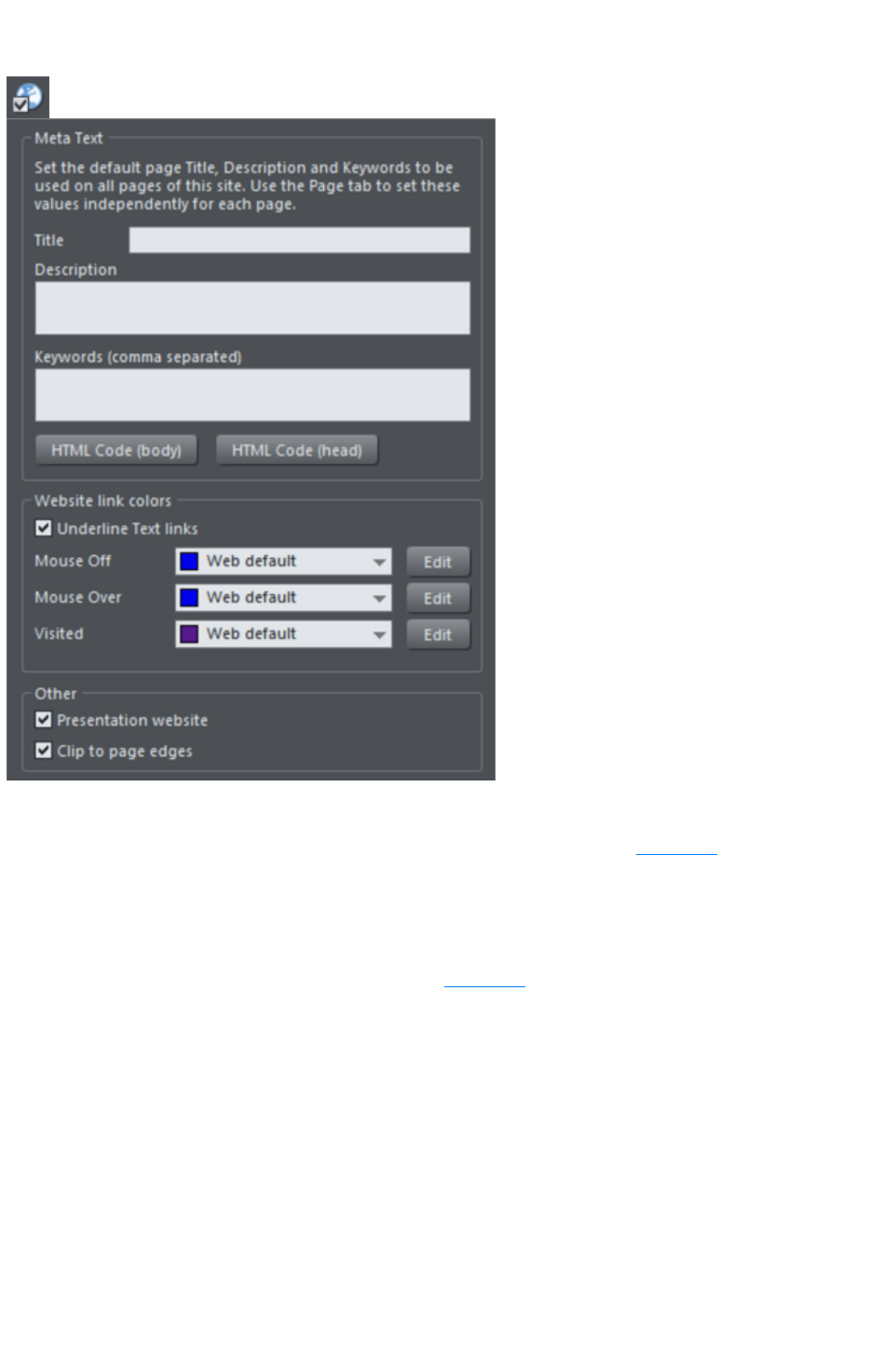
Website Tab
The settings on this tab apply to the entire current document/website, so it doesn't matter what object or
page is selected.
Title, Description & Keywords: These fields are just as described in the Page Tab
section above. You can optionally set these fields here so that they apply to every page in your site,
unless overridden by the Page Tab settings for a page. So for example a page that doesn't have its own
title set in the Page Tab will get the title you specify here.
HTML code (head) and HTML code (body): These buttons serve the same purpose as the HTML
code (head) and HTML code (body) buttons in the Page Tab
, and allow you to enter and edit large amounts of HTML code to either the head or body sections of all
your website pages.
If code is specified here in the Website tab it is included in every page of your site in addition to
any code specified for each page in the Page Tab. This allows you to have some code included on every
page, while also adding other code to those pages that need it.
Website Link Colors
This section of the Website Tab allows you to control how text links appear on your website.
Underline Text Links
: Underlining is commonly used to highlight clickable links in text, so this option is selected by default.
Uncheck it if you don't want your text links underlined.
Mouse Off
: Here you can choose the color you would like to be used for all your text links. You can either choose a
Page 796

named Theme Color from the dropdown list (if there are any in your current document) or click the Edit
button to open the Color Editor so you can choose any other color.
Mouse Over
: Text links will change to this color when a visitor moves the mouse pointer over them.
Visited
: Text links that point to a page which the visitor has already visited will display with this color instead of
the Mouse Off color.
Clip to page edges
(enabled by default): If you have objects in your website that overlap the web page borders, click this
checkbox to crop these objects so that only the portion on the page is visible. Deselect this checkbox if
you would like the object to flow over the page edge, so that even the portion that overlaps the
pasteboard is displayed.
Web Presentations
Click the Presentation website
checkbox to convert an existing website into a presentation.
Note: If you created your presentation document by choosing 955 pix presentation from the New
menu, the Presentation website
check box is automatically selected.
Clip to page edges
(enabled by default): If you have objects in your website that overlap the web page borders, click this
checkbox to crop these objects so that only the portion on the page is visible. Deselect this checkbox if
you would like the object to flow over the page edge, so that even the portion that overlaps the
pasteboard is displayed.
Note
: If you have transitions applied to a layer or presentations step transitions that slide in from the sides, top
or bottom of the page, disabling this checkbox causes the transition to come in at the edge of the browser
window, rather than the page edge.
Page 797

Website Link Colors
This section of the Website Tab allows you to control how text links appear on your website.
Underline Text Links
: Underlining is commonly used to highlight clickable links in text, so this option is selected by default.
Uncheck it if you don't want your text links underlined.
Mouse Off
: Here you can choose the color you would like to be used for all your text links. You can either choose a
named Theme Color from the dropdown list (if there are any in your current document) or click the Edit
button to open the Color Editor so you can choose any other color.
Mouse Over
: Text links will change to this color when a visitor moves the mouse pointer over them.
Visited
: Text links that point to a page which the visitor has already visited will display with this color instead of
the Mouse Off color.
Clip to page edges
(enabled by default): If you have objects in your website that overlap the web page borders, click this
checkbox to crop these objects so that only the portion on the page is visible. Deselect this checkbox if
you would like the object to flow over the page edge, so that even the portion that overlaps the
pasteboard is displayed.
Web Presentations
Click the Presentation website
checkbox to convert an existing website into a presentation.
Note: If you created your presentation document by choosing 955 pix presentation from the New
menu, the Presentation website
check box is automatically selected.
Clip to page edges
(enabled by default): If you have objects in your website that overlap the web page borders, click this
checkbox to crop these objects so that only the portion on the page is visible. Deselect this checkbox if
you would like the object to flow over the page edge, so that even the portion that overlaps the
pasteboard is displayed.
Note
: If you have transitions applied to a layer or presentations step transitions that slide in from the sides, top
or bottom of the page, disabling this checkbox causes the transition to come in at the edge of the browser
window, rather than the page edge.
Page 798

Web Presentations
Click the Presentation website
checkbox to convert an existing website into a presentation.
Note: If you created your presentation document by choosing 955 pix presentation from the New
menu, the Presentation website
check box is automatically selected.
Clip to page edges
(enabled by default): If you have objects in your website that overlap the web page borders, click this
checkbox to crop these objects so that only the portion on the page is visible. Deselect this checkbox if
you would like the object to flow over the page edge, so that even the portion that overlaps the
pasteboard is displayed.
Note
: If you have transitions applied to a layer or presentations step transitions that slide in from the sides, top
or bottom of the page, disabling this checkbox causes the transition to come in at the edge of the browser
window, rather than the page edge.
Page 799
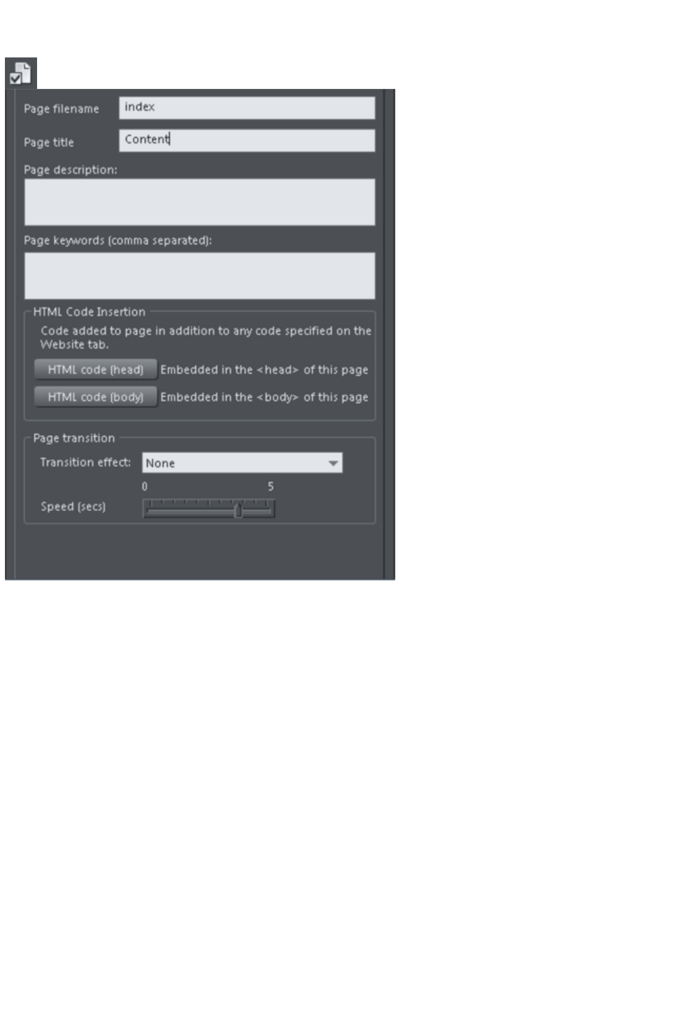
Page Tab
The options on this tab apply to the current page, not to the selected object(s). The current page is
indicated with black angle lines just outside each corner of the page. All fields on this tab are optional;
you do not necessarily need to fill in these fields for every page of your site.
If you want the same title, description and keywords on every page of your site, you can set these just
once on the Website tab instead of setting them on every page here.
Page filename
: Use this field to set the name you'd like to be used for this page when it is exported. So if you want the
page to be exported as "home.htm", set this field to "home".
It's usual to make the first page of a website "index.htm" or "home.htm", because if a visitor specifies a
URL consisting of just a domain name with no page name (eg. "www.xara.com") this is usually
automatically mapped by the web server to the index.htm page if it is present. Note that characters
entered in this field are automatically converted to lower case and accented characters and some
non-alphanumeric characters are not allowed. This is to reduce the chances of compatibility problems
with different web servers when you publish your website.
Page title:
You can optionally choose a title for your page. If set, this is used by web browsers to show a page title
in the browser window frame, or tab. For example at the time of writing the www.xara.com home page
has the title "Graphics Software by Xara" which you can see is shown by the web browser if you visit the
site.
Advanced: The title is inserted into the page header using the '<title>' HTML element.
Page description
: This page description text can be shown by search engines within their search results when visitors find
Page 800

your page with an internet search. The page description may also be displayed by browsers and other
web services.
Advanced: The description is inserted as metadata into the page header
('<meta name="description" …..).
Page keywords:
Here you can enter keywords which you want to be picked up by search engines to help visitors find
your site. Enter words which potential visitors are likely to search for if they are looking for pages or sites
like yours.
For those familiar with HTML, the keywords are entered into the page header as metadata:-
Advanced: The keywords are inserted as metadata into the page header
('<meta name="keywords" …..).
HTML code (head):
Click to open the HTML Code (head) dialog, where you can paste or type large amounts of HTML
code directly into the head of your web page. The code is inserted unmodified just before the closing
"</head>" tag.
HTML code (body):
Click to open the HTML Code (body) dialog, where you can paste or type large amounts of HTML
code directly into the body of your web page. The code is inserted unmodified just before the closing
"</body>" tag.
These dialogs must be used with care because inserting invalid code or script into your page may cause
serious problems to the web page as a whole.
If you need to insert exactly the same code on every page of your site, you can use the HTML code
(head) and HTML code (body) buttons on the Website Tab
of this dialog, instead of entering it for every individual page using the Page Tab.
Transition effect: Choose a transition effect that will display when a visitor opens your web page. So
for example if you select a fade transition for a page, when the visitor to your site clicks a link to that
page, instead of loading normally the page will fade in. You cannot however apply a transition effect in
this way to an external page and should use Link transition
in the Link tab to do this.
You can apply the following transition effects to a page:
Instant
(default)
New page, layer or step contents appear straight away
Slide in
from
New page, layer or step contents slide in from various directions
Slide out
from
Current page contents slide out in various directions
Fade
New page contents appear gradually
Fade
through
black
Current page contents fade into a black screen and new page
contents then appear gradually
Shutter
A black bar moves across the screen from the right, obscuring the
old contents, then moves back to reveal the new page contents.
Split,
vertical/
horizontal
slide in
New contents slide in, split into two halves which slide together
either vertically or horizontally
Speed (secs):
Drag the slider to choose a transition speed from 0 to 5 seconds.
By default when a transition is applied, objects will only slide in/out to the edge of the web page. If you
Page 801

would like objects to start from the browser window edges, rather than the web page edges, deselect
the Clip to page edges checkbox in the Website tab
of the Web Properties dialog.
Technical Note
: Page transitions work by first loading the target page into a hidden iFrame and then revealing that
iFrame with the visual effect. Then the target page is loaded again normally. This second load of the
target page is usually not noticeable, but depending on the speed of the viewer's machine and the
browser version they are using (particularly older browsers), sometimes the page is seen to flash briefly at
the end of the page transition.
Page 802
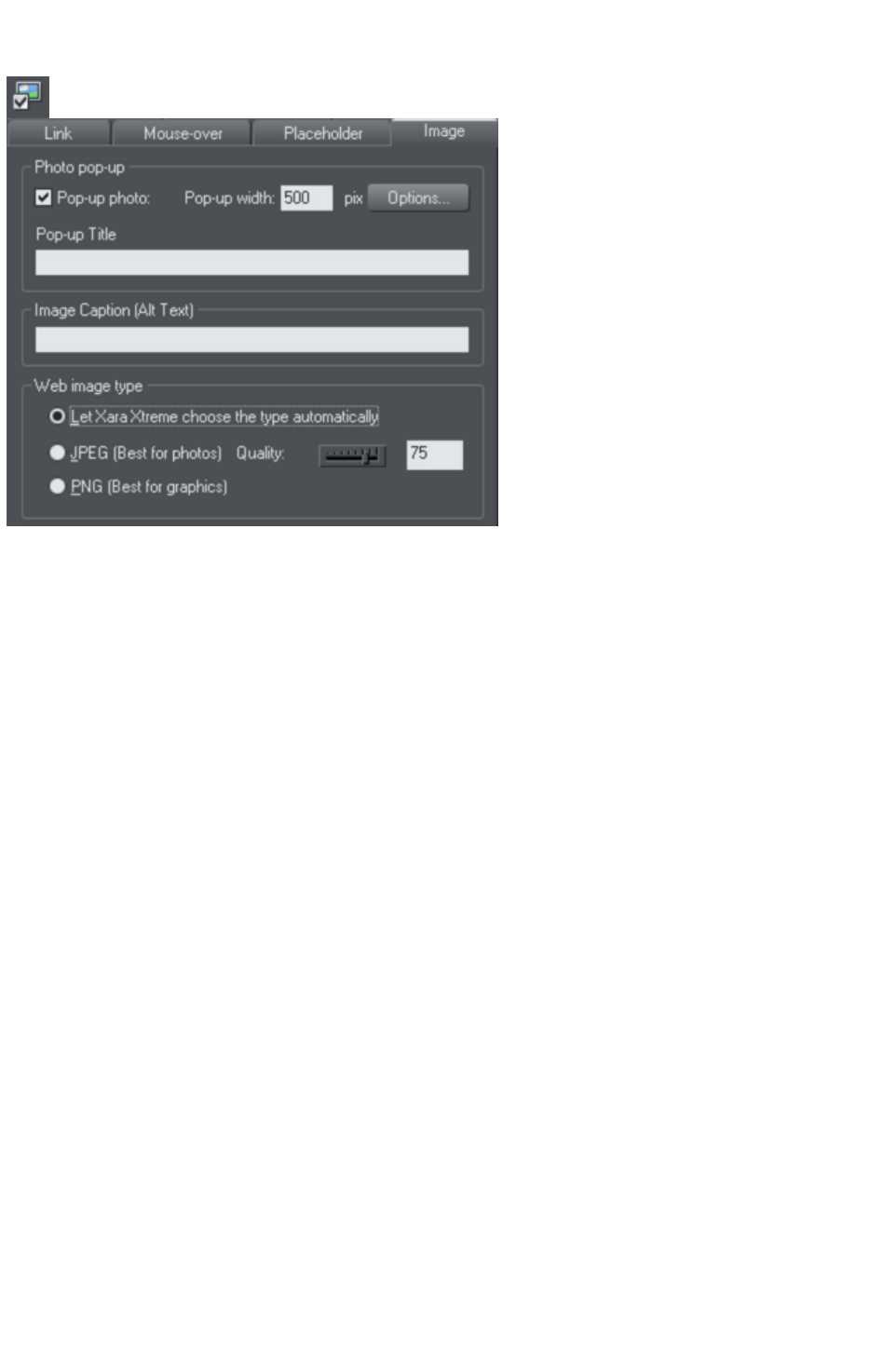
Image Tab
Photo pop-up
This section of the Image tab lets you add pop-up photos and other photo gallery features to your web
page easily. Simply import your photo and use the Selector tool
to scale it right down so it appears as just a small photo thumbnail on your webpage. Then with the
photo still selected, select the Pop-up photo checkbox on this tab. Choose the size you would like for the
pop-up photo by entering a value in the pop-up width field (default 500 pixels). Preview your page and
click on the photo thumbnail on your page, to see the pop-up photo appear.
When you turn on the pop-up photo feature here in the Image tab using the checkbox, the
corresponding option on the Link
tab is also automatically selected for you. That's because a click on the photo will show the pop-up
photo, so you can't also set any other clickable link on the same object. So any link you previously setup
on the object, using the Link tab, will be removed.
One big advantage of these photo pop-ups over pop-up layers (as described in the Link
Tab section above) is that the large photo is only loaded by the web browser when the visitor clicks on a
thumbnail. Therefore this method is much more suited to presenting a large number of photos on a gallery
page, because only the small thumbnails are loaded initially, making the page load quicker.
Note that this feature works on objects other than photos, such as shapes and groups, but can't be used
directly on text. You can put text inside a group (Ctrl+G) to work around this restriction.
Pop-up title
Give the selected photo a title using this field and it is shown above the pop-up photo. Note that you
also need to turn on this title option in the Pop-up photo options dialog (see below), because titles are
not shown by default.
Popup Photo Options
Click the Options button to bring up the Pop-up Photo Options
dialog. Here you can choose from a variety of options that change the way your pop-up photos are
presented.
Page 803
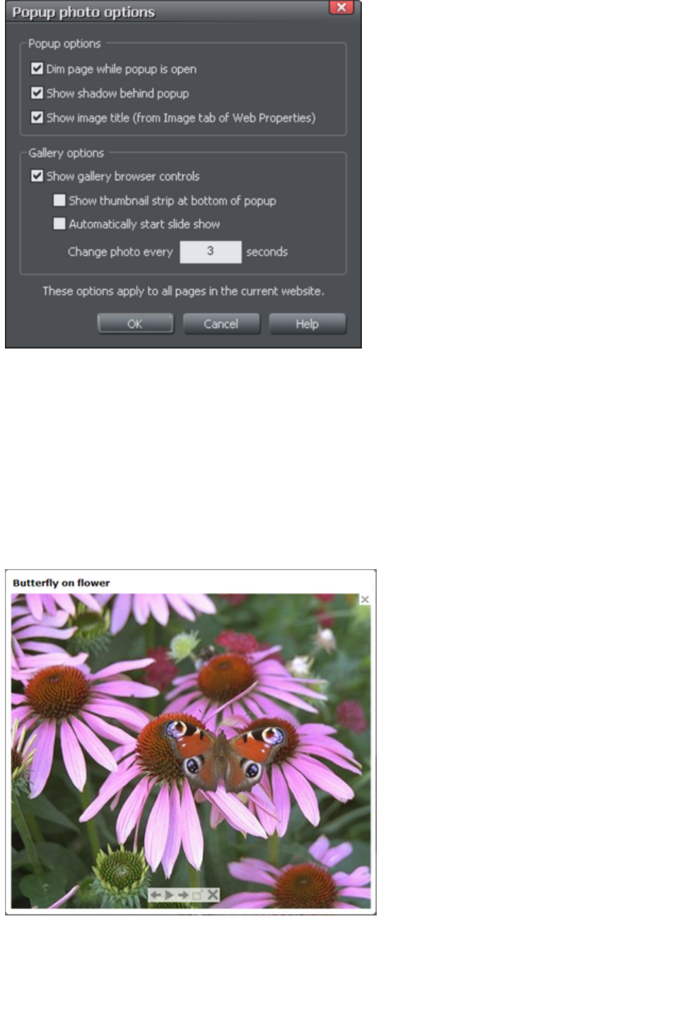
Popup Options
The following options change the appearance of the popup photo.
Dim page while popup is open
: With this option selected, the entire page is dimmed whenever a popup photo is displayed. This helps
emphasize the popup photo, so that it stands out against the darker background of the page.
Show shadow behind popup
: This option puts a drop shadow behind the popup photo window, again to help make it stand out
against the page background.
Show image title
: If you have entered title text (see above) for each of your photos, this option causes that title to be
above the popup photo.
Note that title text is separate to any caption text, which appears below the photo. See below for
information on setting caption text.
Gallery Options
The following options turn on gallery features for your popup photos.
Show gallery browser controls
Page 804
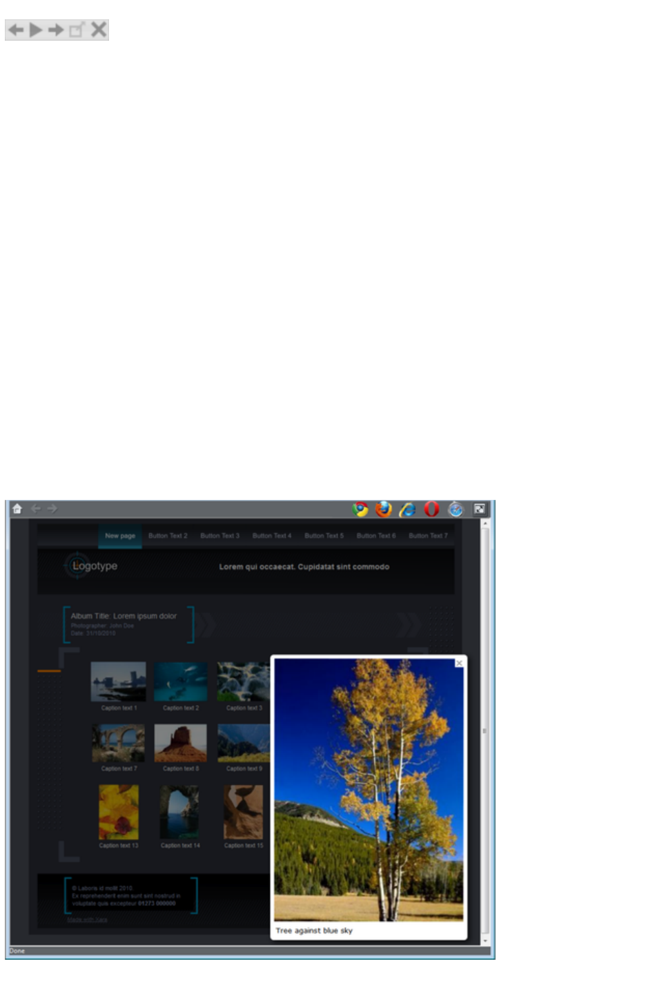
: Turn this on to show gallery controls on your popup photo.
This appears on top of your photo whenever the mouse pointer is over the photo. It allows your site
visitor to view the other popup photos in the current page, without having to close the popup window
and click on the thumbnails for the other photos. The visitor can move to the previous or next photo, or
start and stop an automatic slideshow where each photo is shown for a few seconds before moving onto
the next.
Show thumbnail strip at bottom of photo
: With this option on a strip of small photo thumbnails appears below the popup photo window. This
allows the visitor to jump to any of your popup photos by just clicking on the thumbnails in the strip,
again without having to first close the popup photo window.
Automatically start slideshow
: Turn this on if you want a slideshow to start as soon as the user clicks on any of your popup photos.
You can also choose how many seconds each photo should be displayed for when the slideshow is
playing.
Note that the only photos included in the photo gallery are those photos on the current page which are
setup as popup photos. Any other photos on your page will not appear in the gallery, so make sure you
use the Link tab of the Web Properties dialog to turn on the popup photo option on any photos that you
want to be included in the gallery.
Image Captions
You can optionally show a caption below each pop-up photo. Enter the caption text in this field in the
Image Tab.
Note that this feature works on objects other than photos, such as shapes and groups, but can't be used
directly on text. You can put text inside a group (Ctrl+G) to work around this restriction.
For those familiar with HTML, this text is also used as the "ALT" text on the image that is exported for
the currently selected object, whether or not the image also has a pop-up. Web browsers show this text
Page 805

on the page in place of the image, if the image can't be obtained for some reason.
Web image type
Due to the nature of HTML websites, most objects you see and can select on the page in Xara Web
Designer 7 Premium have to be converted to bitmap images during the process of exporting your
website. This all happens automatically for you when you preview and export, but the controls on this tab
give you some control over how these images are created.
Remember that each group, shape, heading, logo, photo, panel background, etc. is exported as a
separate image. By looking at how the objects in your design are grouped, you can control how many
images are exported to make up your website. So for example if you have 2 separate shapes in your
design which are not grouped together, they will be exported as 2 separate images. You can group the
two shapes (Ctrl+G) and then a single image is exported instead.
This section of the Image Tab lets you specify how the currently selected object should be exported as
an image. By default Xara Web Designer 7 Premium will decide for you. This means that normally
photos will be exported as JPEG (which is usually the best format for photos) and other objects as PNG
(which is usually best for graphics). Photos which have been rotated on the page, or which have a
semi-transparent shadow applied, are exported as PNG because JPEG does not support transparency.
You can force the selected object(s) to export as a JPEG or as a PNG, by selecting the appropriate
option. When the JPEG option is selected, you can also choose the JPEG quality to be used for that
image. Higher quality means a larger JPEG file size.
Page 806
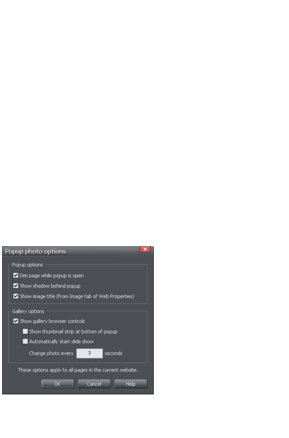
Photo pop-up
This section of the Image tab lets you add pop-up photos and other photo gallery features to your web
page easily. Simply import your photo and use the Selector tool
to scale it right down so it appears as just a small photo thumbnail on your webpage. Then with the
photo still selected, select the Pop-up photo checkbox on this tab. Choose the size you would like for the
pop-up photo by entering a value in the pop-up width field (default 500 pixels). Preview your page and
click on the photo thumbnail on your page, to see the pop-up photo appear.
When you turn on the pop-up photo feature here in the Image tab using the checkbox, the
corresponding option on the Link
tab is also automatically selected for you. That's because a click on the photo will show the pop-up
photo, so you can't also set any other clickable link on the same object. So any link you previously setup
on the object, using the Link tab, will be removed.
One big advantage of these photo pop-ups over pop-up layers (as described in the Link
Tab section above) is that the large photo is only loaded by the web browser when the visitor clicks on a
thumbnail. Therefore this method is much more suited to presenting a large number of photos on a gallery
page, because only the small thumbnails are loaded initially, making the page load quicker.
Note that this feature works on objects other than photos, such as shapes and groups, but can't be used
directly on text. You can put text inside a group (Ctrl+G) to work around this restriction.
Pop-up title
Give the selected photo a title using this field and it is shown above the pop-up photo. Note that you
also need to turn on this title option in the Pop-up photo options dialog (see below), because titles are
not shown by default.
Popup Photo Options
Click the Options button to bring up the Pop-up Photo Options
dialog. Here you can choose from a variety of options that change the way your pop-up photos are
presented.
Popup Options
The following options change the appearance of the popup photo.
Dim page while popup is open
: With this option selected, the entire page is dimmed whenever a popup photo is displayed. This helps
emphasize the popup photo, so that it stands out against the darker background of the page.
Page 807
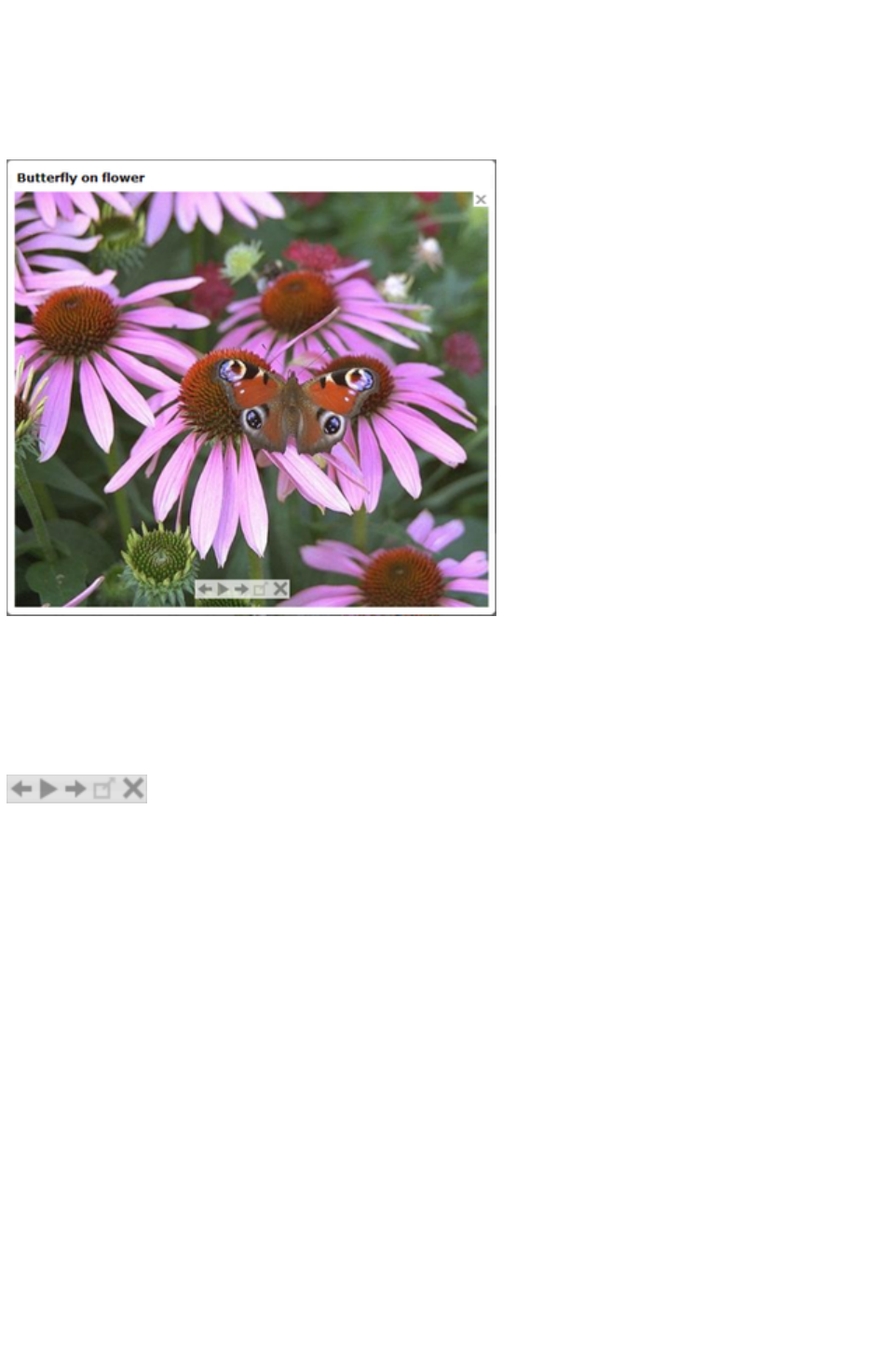
Show shadow behind popup
: This option puts a drop shadow behind the popup photo window, again to help make it stand out
against the page background.
Show image title
: If you have entered title text (see above) for each of your photos, this option causes that title to be
above the popup photo.
Note that title text is separate to any caption text, which appears below the photo. See below for
information on setting caption text.
Gallery Options
The following options turn on gallery features for your popup photos.
Show gallery browser controls
: Turn this on to show gallery controls on your popup photo.
This appears on top of your photo whenever the mouse pointer is over the photo. It allows your site
visitor to view the other popup photos in the current page, without having to close the popup window
and click on the thumbnails for the other photos. The visitor can move to the previous or next photo, or
start and stop an automatic slideshow where each photo is shown for a few seconds before moving onto
the next.
Show thumbnail strip at bottom of photo
: With this option on a strip of small photo thumbnails appears below the popup photo window. This
allows the visitor to jump to any of your popup photos by just clicking on the thumbnails in the strip,
again without having to first close the popup photo window.
Automatically start slideshow
: Turn this on if you want a slideshow to start as soon as the user clicks on any of your popup photos.
You can also choose how many seconds each photo should be displayed for when the slideshow is
playing.
Note that the only photos included in the photo gallery are those photos on the current page which are
setup as popup photos. Any other photos on your page will not appear in the gallery, so make sure you
use the Link tab of the Web Properties dialog to turn on the popup photo option on any photos that you
want to be included in the gallery.
Image Captions
You can optionally show a caption below each pop-up photo. Enter the caption text in this field in the
Page 808
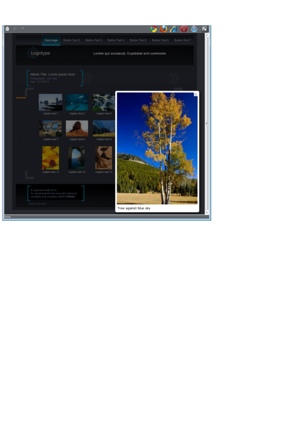
Image Tab.
Note that this feature works on objects other than photos, such as shapes and groups, but can't be used
directly on text. You can put text inside a group (Ctrl+G) to work around this restriction.
For those familiar with HTML, this text is also used as the "ALT" text on the image that is exported for
the currently selected object, whether or not the image also has a pop-up. Web browsers show this text
on the page in place of the image, if the image can't be obtained for some reason.
Web image type
Due to the nature of HTML websites, most objects you see and can select on the page in Xara Web
Designer 7 Premium have to be converted to bitmap images during the process of exporting your
website. This all happens automatically for you when you preview and export, but the controls on this tab
give you some control over how these images are created.
Remember that each group, shape, heading, logo, photo, panel background, etc. is exported as a
separate image. By looking at how the objects in your design are grouped, you can control how many
images are exported to make up your website. So for example if you have 2 separate shapes in your
design which are not grouped together, they will be exported as 2 separate images. You can group the
two shapes (Ctrl+G) and then a single image is exported instead.
This section of the Image Tab lets you specify how the currently selected object should be exported as
an image. By default Xara Web Designer 7 Premium will decide for you. This means that normally
photos will be exported as JPEG (which is usually the best format for photos) and other objects as PNG
(which is usually best for graphics). Photos which have been rotated on the page, or which have a
semi-transparent shadow applied, are exported as PNG because JPEG does not support transparency.
You can force the selected object(s) to export as a JPEG or as a PNG, by selecting the appropriate
option. When the JPEG option is selected, you can also choose the JPEG quality to be used for that
image. Higher quality means a larger JPEG file size.
Page 809
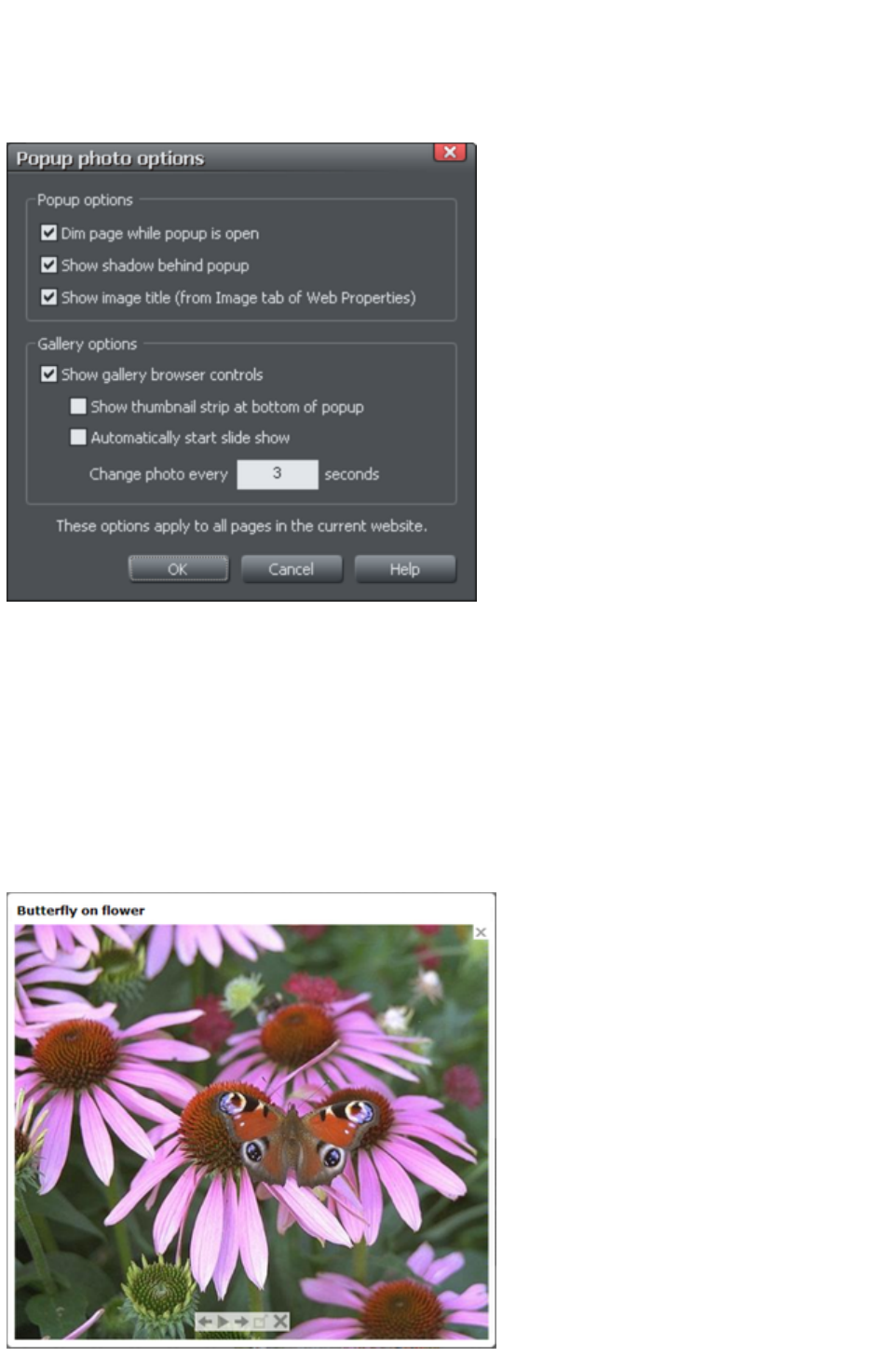
Popup Photo Options
Click the Options button to bring up the Pop-up Photo Options
dialog. Here you can choose from a variety of options that change the way your pop-up photos are
presented.
Popup Options
The following options change the appearance of the popup photo.
Dim page while popup is open
: With this option selected, the entire page is dimmed whenever a popup photo is displayed. This helps
emphasize the popup photo, so that it stands out against the darker background of the page.
Show shadow behind popup
: This option puts a drop shadow behind the popup photo window, again to help make it stand out
against the page background.
Show image title
: If you have entered title text (see above) for each of your photos, this option causes that title to be
above the popup photo.
Page 810

Note that title text is separate to any caption text, which appears below the photo. See below for
information on setting caption text.
Gallery Options
The following options turn on gallery features for your popup photos.
Show gallery browser controls
: Turn this on to show gallery controls on your popup photo.
This appears on top of your photo whenever the mouse pointer is over the photo. It allows your site
visitor to view the other popup photos in the current page, without having to close the popup window
and click on the thumbnails for the other photos. The visitor can move to the previous or next photo, or
start and stop an automatic slideshow where each photo is shown for a few seconds before moving onto
the next.
Show thumbnail strip at bottom of photo
: With this option on a strip of small photo thumbnails appears below the popup photo window. This
allows the visitor to jump to any of your popup photos by just clicking on the thumbnails in the strip,
again without having to first close the popup photo window.
Automatically start slideshow
: Turn this on if you want a slideshow to start as soon as the user clicks on any of your popup photos.
You can also choose how many seconds each photo should be displayed for when the slideshow is
playing.
Note that the only photos included in the photo gallery are those photos on the current page which are
setup as popup photos. Any other photos on your page will not appear in the gallery, so make sure you
use the Link tab of the Web Properties dialog to turn on the popup photo option on any photos that you
want to be included in the gallery.
Image Captions
You can optionally show a caption below each pop-up photo. Enter the caption text in this field in the
Image Tab.
Note that this feature works on objects other than photos, such as shapes and groups, but can't be used
directly on text. You can put text inside a group (Ctrl+G) to work around this restriction.
Page 811
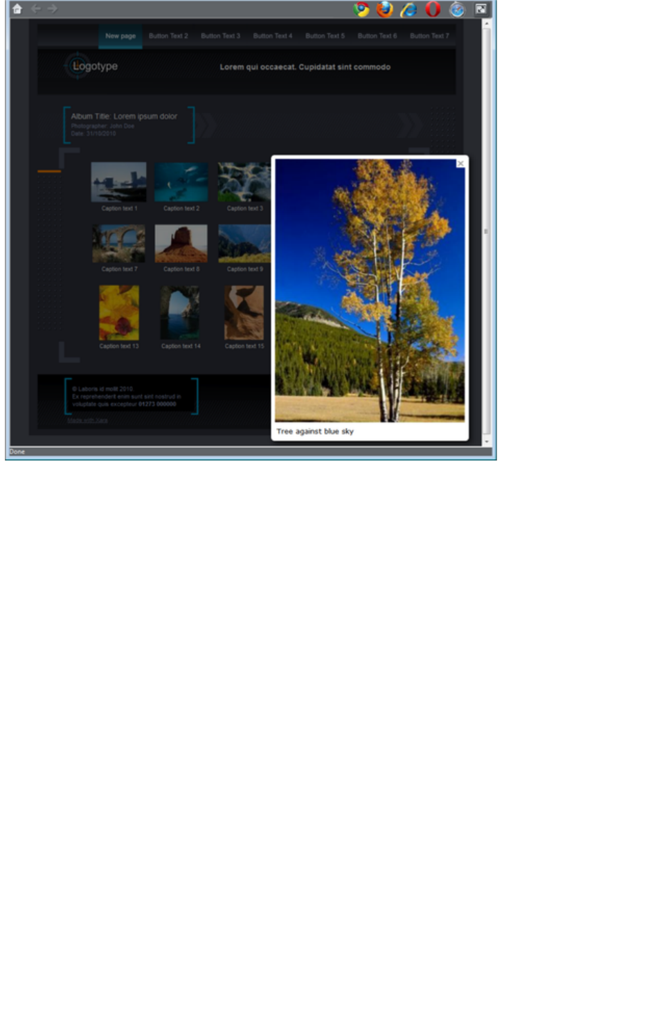
For those familiar with HTML, this text is also used as the "ALT" text on the image that is exported for
the currently selected object, whether or not the image also has a pop-up. Web browsers show this text
on the page in place of the image, if the image can't be obtained for some reason.
Web image type
Due to the nature of HTML websites, most objects you see and can select on the page in Xara Web
Designer 7 Premium have to be converted to bitmap images during the process of exporting your
website. This all happens automatically for you when you preview and export, but the controls on this tab
give you some control over how these images are created.
Remember that each group, shape, heading, logo, photo, panel background, etc. is exported as a
separate image. By looking at how the objects in your design are grouped, you can control how many
images are exported to make up your website. So for example if you have 2 separate shapes in your
design which are not grouped together, they will be exported as 2 separate images. You can group the
two shapes (Ctrl+G) and then a single image is exported instead.
This section of the Image Tab lets you specify how the currently selected object should be exported as
an image. By default Xara Web Designer 7 Premium will decide for you. This means that normally
photos will be exported as JPEG (which is usually the best format for photos) and other objects as PNG
(which is usually best for graphics). Photos which have been rotated on the page, or which have a
semi-transparent shadow applied, are exported as PNG because JPEG does not support transparency.
You can force the selected object(s) to export as a JPEG or as a PNG, by selecting the appropriate
option. When the JPEG option is selected, you can also choose the JPEG quality to be used for that
image. Higher quality means a larger JPEG file size.
Page 812
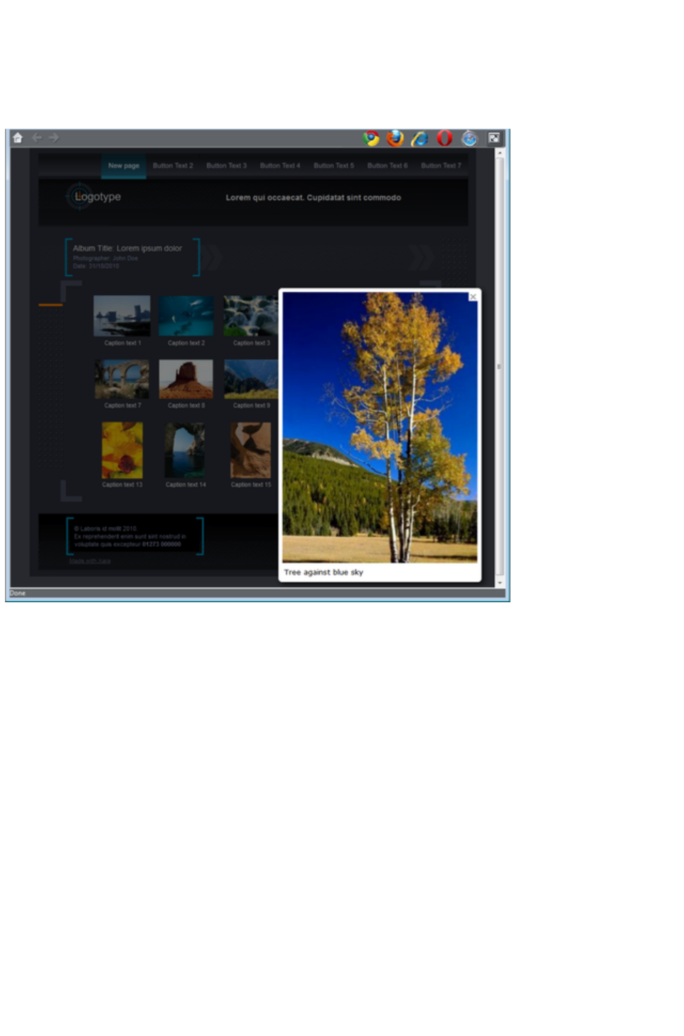
Image Captions
You can optionally show a caption below each pop-up photo. Enter the caption text in this field in the
Image Tab.
Note that this feature works on objects other than photos, such as shapes and groups, but can't be used
directly on text. You can put text inside a group (Ctrl+G) to work around this restriction.
For those familiar with HTML, this text is also used as the "ALT" text on the image that is exported for
the currently selected object, whether or not the image also has a pop-up. Web browsers show this text
on the page in place of the image, if the image can't be obtained for some reason.
Web image type
Due to the nature of HTML websites, most objects you see and can select on the page in Xara Web
Designer 7 Premium have to be converted to bitmap images during the process of exporting your
website. This all happens automatically for you when you preview and export, but the controls on this tab
give you some control over how these images are created.
Remember that each group, shape, heading, logo, photo, panel background, etc. is exported as a
separate image. By looking at how the objects in your design are grouped, you can control how many
images are exported to make up your website. So for example if you have 2 separate shapes in your
design which are not grouped together, they will be exported as 2 separate images. You can group the
two shapes (Ctrl+G) and then a single image is exported instead.
This section of the Image Tab lets you specify how the currently selected object should be exported as
an image. By default Xara Web Designer 7 Premium will decide for you. This means that normally
photos will be exported as JPEG (which is usually the best format for photos) and other objects as PNG
(which is usually best for graphics). Photos which have been rotated on the page, or which have a
semi-transparent shadow applied, are exported as PNG because JPEG does not support transparency.
You can force the selected object(s) to export as a JPEG or as a PNG, by selecting the appropriate
option. When the JPEG option is selected, you can also choose the JPEG quality to be used for that
Page 813

image. Higher quality means a larger JPEG file size.
Page 814

Web image type
Due to the nature of HTML websites, most objects you see and can select on the page in Xara Web
Designer 7 Premium have to be converted to bitmap images during the process of exporting your
website. This all happens automatically for you when you preview and export, but the controls on this tab
give you some control over how these images are created.
Remember that each group, shape, heading, logo, photo, panel background, etc. is exported as a
separate image. By looking at how the objects in your design are grouped, you can control how many
images are exported to make up your website. So for example if you have 2 separate shapes in your
design which are not grouped together, they will be exported as 2 separate images. You can group the
two shapes (Ctrl+G) and then a single image is exported instead.
This section of the Image Tab lets you specify how the currently selected object should be exported as
an image. By default Xara Web Designer 7 Premium will decide for you. This means that normally
photos will be exported as JPEG (which is usually the best format for photos) and other objects as PNG
(which is usually best for graphics). Photos which have been rotated on the page, or which have a
semi-transparent shadow applied, are exported as PNG because JPEG does not support transparency.
You can force the selected object(s) to export as a JPEG or as a PNG, by selecting the appropriate
option. When the JPEG option is selected, you can also choose the JPEG quality to be used for that
image. Higher quality means a larger JPEG file size.
Page 815
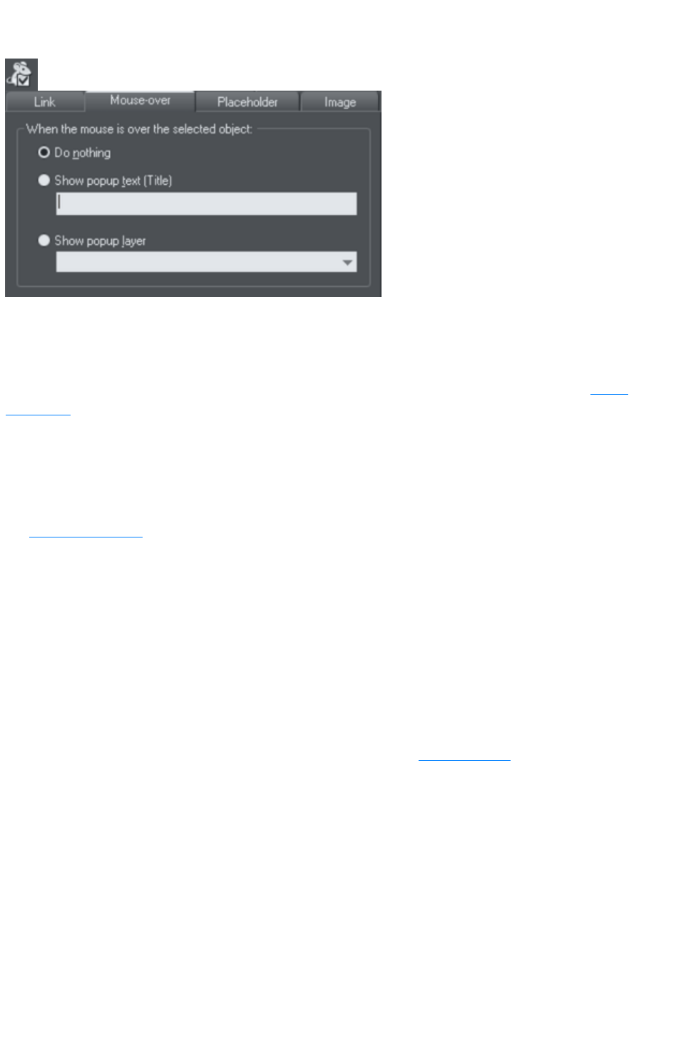
Mouse-over Tab
The options on this tab specify what should happen when a visitor moves the mouse pointer over the
selected object. So for example you can pop-up some text or a whole layer of content when a visitor
hovers their mouse pointer over a photo on your web page.
By default when a pop-up layer is triggered it will appear instantly. But you can apply a transition effect
to the popup layer so that it appears with an effect, such as fading in or sliding in. Open the Layer
properties dialog for the popup layer (select the layer in the Page & Layer Gallery and press the
Properties
button) and go to the Transitions tab where you can select the effect and effect speed for that layer.
Show pop-up text (Title): Here you can specify the "pop-up title" text for an object. Web browsers
show this as a small pop-up tool-tip when the visitor moves the mouse pointer over the object. For
example, if you have a photo thumbnail which brings up a larger version of the photo when clicked (see
the Image tab section
for how to do this), you may want to set the pop-up title text to "Click to enlarge". Then when the user
moves their mouse pointer over the photo thumbnail, they will see this tooltip.
Show pop-up layer
: Just as you can add a layer to your design which is shown only when a user clicks on an object (see the
Link Tab section), you can also specify that a layer should be shown when the mouse pointer is moved
over an object. When the mouse pointer is moved off the object, the pop-up disappears again. Simply
select this option and select the layer you want to pop-up, from the list provided.
For example you can use this feature to pop-up a larger copy of a photo when the visitor moves their
mouse pointer over it. However note that all the content on the pop-up layer is loaded as soon as the
visitor visits your page. Therefore this method of showing pop-up photos is not recommended if you have
a large number of photos you want to show. In this case use the Pop-up Photo
feature described in the Link Tab section.
Page 816
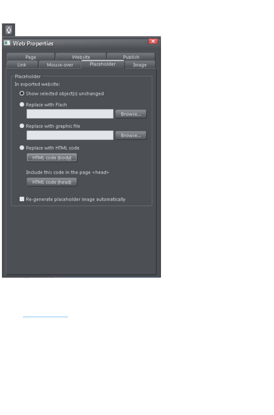
Placeholder Tab
The Placeholder tab is used to add and edit manually editable widgets. These are widgets you insert
onto your web page by manually pasting in HTML code for the widget or by importing a Flash or movie
file. You won't normally need to use the Placeholder tab on widgets that you've added from the Designs
Gallery, because the code and files that make those widgets function are handled for you automatically.
See the Website Widgets
chapter for full details.
To turn any normal object into a placeholder for a widget, select it and then open this tab of the Web
Properties dialog. Choose whether you want the widget to be based on a piece of HTML code you've
obtained from a widget website, a Flash file or a graphic file. Browse for the file or paste in the HTML
code. Click OK
and now your object is a placeholder object.
This means the object represents the dimensions and position of the content you've added, but in your
exported web page the object is replaced by the actual code or file that you inserted.
However there is an easier way to add files or code to your site. Simply drag and drop Flash or animated
GIF files from Windows File Explorer onto your page. A placeholder image is automatically generated
for you and is placed on your page. A copy of the file is added to the support folder of your design so
Page 817
that it gets exported and published with your site. When you export and publish your site, the placeholder
image is replaced by the actual file you imported.
Similarly if you've copied some HTML code from a third-party widget website, you can simply paste that
code into Xara Web Designer 7 Premium (make sure you are in the Selector Tool when you do this,
not the Text Tool
or it will be inserted as text!). Xara Web Designer 7 Premium detects the HTML and uses it to render a
placeholder image which appears on your page. You can also add a placeholder for HTML code
directly into either the body or head of a page by clicking the HTML code (body) and HTML (head)
buttons, which bring up a scrolling dialog where you can paste or edit large amounts of code, if
necessary.
When you export/publish your site the placeholder is replaced by the actual code so that your widget
functions. See the Website Widgets chapter
for more details.
Replace with Flash
Select this option to replace the placeholder object with a Flash animation. Use the Browse button to
locate the Flash (.swf) file you want to use.
The chosen file is automatically copied to the support folder for the current design, so that when you
export your website the file will be included in the _htm_files folder along with all the generated images
for your site. See the Document Handling
chapter for information about support folders.
Replace with graphic file
Select this option if you want to insert a graphic or image into your website in place of the placeholder
object (eg. a PNG, GIF or other web compatible image file). Use the Browse button to select the file.
The chosen file is automatically copied to the support folder for the current design, so that when you
export your website the file will be included in the _htm_files folder along with all the generated images
for your site. See the Document Handling chapter for information about support folders.
Replace with HTML code
With this option you can paste HTML code which you've obtained from somewhere else into the head
and/or body sections of your page; i.e., between the <body></body> tags or <head></head> tags. For
example many sites provide widgets that you can add to your page by pasting the HTML in here. Follow
the instructions given by the provider. In most cases you need to add body code only, but some widgets
also require you to include some code in the head, which is why the head code option is also provided.
As mentioned above, you can just paste the HTML code directly onto your page instead of inserting it in
this dialog (while in the Selector Tool
). And using that approach automatically gives you a placeholder image that looks just like the actual
widget, so it's the recommended way to insert widget HTML code.
Warning
: You need to be careful to insert only code which you know is safe and from a trustworthy source.
Invalid or broken code will affect your published web page because Xara Web Designer 7 Premium
simply inserts the code as you provide it, unmodified and unchecked, into your page when it is exported.
If you use Xara Modules (www.xaraonline.com
) you can paste a module snippet into this field (or directly onto your page) to add your Module to your
web page.
If the HTML code that you enter references external files which are expected to be found in your
website, then you need to copy those external files into the support folder for your design. See the
Document Handling
chapter for information about support folders. Once in the support folder, the files will be automatically
Page 818

copied to the _htm_files folder of your website when you export. Therefore you also need to make sure
that any references to these files in the HTML code references them at the right location.
Let's take a simple example to make this clearer. Suppose I want to insert a small piece of HTML code
which adds an image to my website. The HTML code I add will need to reference the image file
somewhere. First I copy the image file, say "myLogo.gif", into the support folder of my document. If the
document is "mySite.web", the support folder will be "mySite_web_files". I know that when I export this
website, I will export it to the name "mysite.htm". This means that all the generated images for my site,
and a copy of "myLogo.gif" which I put in the support folder, will be exported to the folder
"mysite_htm_files". Therefore I must make the HTML code I'm inserting reference the image file in that
location. So I may insert:-
<img src="mysite_htm_files/myLogo.gif" />
Note that this references the image file in the exported image folder location (_htm_files), NOT directly in
the support folder (_web_files), because only the exported image folder gets copied to the web server
along with my web page when the site is published.
Of course if I really only wanted to put an image on my website, it's much easier to just import the image
into Xara Web Designer 7 Premium directly! But this is a simple example that shows how to add HTML
code which references an external file.
Check Embedding YouTube, Flash And Other Widgets
for more examples!
Placeholder objects
The placeholder object is actually included in your website and it can be shown to the visitor in some
circumstances. For example if you've added a Flash animation, if the visitors to your page do not have
Flash installed in their web browser, or if they've disabled Flash, the browser will show the placeholder
image instead.
Therefore it's sometimes a good idea to make your placeholder object more than just a black rectangle,
or an accurate image of the widget that appears on your page. You may decide to use a group as your
placeholder object, where the group includes a text message asking the visitor to install Flash so that they
can see your Flash content.
Regenerate placeholder image automatically: If this option at the bottom of the Placeholder tab
is selected, then the placeholder image gets automatically generated from the content you have added,
whenever the content changes or when you resize the placeholder object.
When you paste code or import files directly onto your page, as recommended above, this option is
selected automatically for the placeholder image that gets generated. Sometimes it's useful to turn it off
after inserting content this way, if you are happy with the preview image and no longer want it to be
re-generated if you change the content in some way.
Page 819
Replace with Flash
Select this option to replace the placeholder object with a Flash animation. Use the Browse button to
locate the Flash (.swf) file you want to use.
The chosen file is automatically copied to the support folder for the current design, so that when you
export your website the file will be included in the _htm_files folder along with all the generated images
for your site. See the Document Handling
chapter for information about support folders.
Replace with graphic file
Select this option if you want to insert a graphic or image into your website in place of the placeholder
object (eg. a PNG, GIF or other web compatible image file). Use the Browse button to select the file.
The chosen file is automatically copied to the support folder for the current design, so that when you
export your website the file will be included in the _htm_files folder along with all the generated images
for your site. See the Document Handling chapter for information about support folders.
Replace with HTML code
With this option you can paste HTML code which you've obtained from somewhere else into the head
and/or body sections of your page; i.e., between the <body></body> tags or <head></head> tags. For
example many sites provide widgets that you can add to your page by pasting the HTML in here. Follow
the instructions given by the provider. In most cases you need to add body code only, but some widgets
also require you to include some code in the head, which is why the head code option is also provided.
As mentioned above, you can just paste the HTML code directly onto your page instead of inserting it in
this dialog (while in the Selector Tool
). And using that approach automatically gives you a placeholder image that looks just like the actual
widget, so it's the recommended way to insert widget HTML code.
Warning
: You need to be careful to insert only code which you know is safe and from a trustworthy source.
Invalid or broken code will affect your published web page because Xara Web Designer 7 Premium
simply inserts the code as you provide it, unmodified and unchecked, into your page when it is exported.
If you use Xara Modules (www.xaraonline.com
) you can paste a module snippet into this field (or directly onto your page) to add your Module to your
web page.
If the HTML code that you enter references external files which are expected to be found in your
website, then you need to copy those external files into the support folder for your design. See the
Document Handling
chapter for information about support folders. Once in the support folder, the files will be automatically
copied to the _htm_files folder of your website when you export. Therefore you also need to make sure
that any references to these files in the HTML code references them at the right location.
Let's take a simple example to make this clearer. Suppose I want to insert a small piece of HTML code
which adds an image to my website. The HTML code I add will need to reference the image file
somewhere. First I copy the image file, say "myLogo.gif", into the support folder of my document. If the
document is "mySite.web", the support folder will be "mySite_web_files". I know that when I export this
website, I will export it to the name "mysite.htm". This means that all the generated images for my site,
and a copy of "myLogo.gif" which I put in the support folder, will be exported to the folder
"mysite_htm_files". Therefore I must make the HTML code I'm inserting reference the image file in that
location. So I may insert:-
<img src="mysite_htm_files/myLogo.gif" />
Note that this references the image file in the exported image folder location (_htm_files), NOT directly in
the support folder (_web_files), because only the exported image folder gets copied to the web server
Page 820

along with my web page when the site is published.
Of course if I really only wanted to put an image on my website, it's much easier to just import the image
into Xara Web Designer 7 Premium directly! But this is a simple example that shows how to add HTML
code which references an external file.
Check Embedding YouTube, Flash And Other Widgets
for more examples!
Placeholder objects
The placeholder object is actually included in your website and it can be shown to the visitor in some
circumstances. For example if you've added a Flash animation, if the visitors to your page do not have
Flash installed in their web browser, or if they've disabled Flash, the browser will show the placeholder
image instead.
Therefore it's sometimes a good idea to make your placeholder object more than just a black rectangle,
or an accurate image of the widget that appears on your page. You may decide to use a group as your
placeholder object, where the group includes a text message asking the visitor to install Flash so that they
can see your Flash content.
Regenerate placeholder image automatically: If this option at the bottom of the Placeholder tab
is selected, then the placeholder image gets automatically generated from the content you have added,
whenever the content changes or when you resize the placeholder object.
When you paste code or import files directly onto your page, as recommended above, this option is
selected automatically for the placeholder image that gets generated. Sometimes it's useful to turn it off
after inserting content this way, if you are happy with the preview image and no longer want it to be
re-generated if you change the content in some way.
Page 821
Replace with graphic file
Select this option if you want to insert a graphic or image into your website in place of the placeholder
object (eg. a PNG, GIF or other web compatible image file). Use the Browse button to select the file.
The chosen file is automatically copied to the support folder for the current design, so that when you
export your website the file will be included in the _htm_files folder along with all the generated images
for your site. See the Document Handling chapter for information about support folders.
Replace with HTML code
With this option you can paste HTML code which you've obtained from somewhere else into the head
and/or body sections of your page; i.e., between the <body></body> tags or <head></head> tags. For
example many sites provide widgets that you can add to your page by pasting the HTML in here. Follow
the instructions given by the provider. In most cases you need to add body code only, but some widgets
also require you to include some code in the head, which is why the head code option is also provided.
As mentioned above, you can just paste the HTML code directly onto your page instead of inserting it in
this dialog (while in the Selector Tool
). And using that approach automatically gives you a placeholder image that looks just like the actual
widget, so it's the recommended way to insert widget HTML code.
Warning
: You need to be careful to insert only code which you know is safe and from a trustworthy source.
Invalid or broken code will affect your published web page because Xara Web Designer 7 Premium
simply inserts the code as you provide it, unmodified and unchecked, into your page when it is exported.
If you use Xara Modules (www.xaraonline.com
) you can paste a module snippet into this field (or directly onto your page) to add your Module to your
web page.
If the HTML code that you enter references external files which are expected to be found in your
website, then you need to copy those external files into the support folder for your design. See the
Document Handling
chapter for information about support folders. Once in the support folder, the files will be automatically
copied to the _htm_files folder of your website when you export. Therefore you also need to make sure
that any references to these files in the HTML code references them at the right location.
Let's take a simple example to make this clearer. Suppose I want to insert a small piece of HTML code
which adds an image to my website. The HTML code I add will need to reference the image file
somewhere. First I copy the image file, say "myLogo.gif", into the support folder of my document. If the
document is "mySite.web", the support folder will be "mySite_web_files". I know that when I export this
website, I will export it to the name "mysite.htm". This means that all the generated images for my site,
and a copy of "myLogo.gif" which I put in the support folder, will be exported to the folder
"mysite_htm_files". Therefore I must make the HTML code I'm inserting reference the image file in that
location. So I may insert:-
<img src="mysite_htm_files/myLogo.gif" />
Note that this references the image file in the exported image folder location (_htm_files), NOT directly in
the support folder (_web_files), because only the exported image folder gets copied to the web server
along with my web page when the site is published.
Of course if I really only wanted to put an image on my website, it's much easier to just import the image
into Xara Web Designer 7 Premium directly! But this is a simple example that shows how to add HTML
code which references an external file.
Check Embedding YouTube, Flash And Other Widgets
for more examples!
Placeholder objects
Page 822

The placeholder object is actually included in your website and it can be shown to the visitor in some
circumstances. For example if you've added a Flash animation, if the visitors to your page do not have
Flash installed in their web browser, or if they've disabled Flash, the browser will show the placeholder
image instead.
Therefore it's sometimes a good idea to make your placeholder object more than just a black rectangle,
or an accurate image of the widget that appears on your page. You may decide to use a group as your
placeholder object, where the group includes a text message asking the visitor to install Flash so that they
can see your Flash content.
Regenerate placeholder image automatically: If this option at the bottom of the Placeholder tab
is selected, then the placeholder image gets automatically generated from the content you have added,
whenever the content changes or when you resize the placeholder object.
When you paste code or import files directly onto your page, as recommended above, this option is
selected automatically for the placeholder image that gets generated. Sometimes it's useful to turn it off
after inserting content this way, if you are happy with the preview image and no longer want it to be
re-generated if you change the content in some way.
Page 823
Replace with HTML code
With this option you can paste HTML code which you've obtained from somewhere else into the head
and/or body sections of your page; i.e., between the <body></body> tags or <head></head> tags. For
example many sites provide widgets that you can add to your page by pasting the HTML in here. Follow
the instructions given by the provider. In most cases you need to add body code only, but some widgets
also require you to include some code in the head, which is why the head code option is also provided.
As mentioned above, you can just paste the HTML code directly onto your page instead of inserting it in
this dialog (while in the Selector Tool
). And using that approach automatically gives you a placeholder image that looks just like the actual
widget, so it's the recommended way to insert widget HTML code.
Warning
: You need to be careful to insert only code which you know is safe and from a trustworthy source.
Invalid or broken code will affect your published web page because Xara Web Designer 7 Premium
simply inserts the code as you provide it, unmodified and unchecked, into your page when it is exported.
If you use Xara Modules (www.xaraonline.com
) you can paste a module snippet into this field (or directly onto your page) to add your Module to your
web page.
If the HTML code that you enter references external files which are expected to be found in your
website, then you need to copy those external files into the support folder for your design. See the
Document Handling
chapter for information about support folders. Once in the support folder, the files will be automatically
copied to the _htm_files folder of your website when you export. Therefore you also need to make sure
that any references to these files in the HTML code references them at the right location.
Let's take a simple example to make this clearer. Suppose I want to insert a small piece of HTML code
which adds an image to my website. The HTML code I add will need to reference the image file
somewhere. First I copy the image file, say "myLogo.gif", into the support folder of my document. If the
document is "mySite.web", the support folder will be "mySite_web_files". I know that when I export this
website, I will export it to the name "mysite.htm". This means that all the generated images for my site,
and a copy of "myLogo.gif" which I put in the support folder, will be exported to the folder
"mysite_htm_files". Therefore I must make the HTML code I'm inserting reference the image file in that
location. So I may insert:-
<img src="mysite_htm_files/myLogo.gif" />
Note that this references the image file in the exported image folder location (_htm_files), NOT directly in
the support folder (_web_files), because only the exported image folder gets copied to the web server
along with my web page when the site is published.
Of course if I really only wanted to put an image on my website, it's much easier to just import the image
into Xara Web Designer 7 Premium directly! But this is a simple example that shows how to add HTML
code which references an external file.
Check Embedding YouTube, Flash And Other Widgets
for more examples!
Placeholder objects
The placeholder object is actually included in your website and it can be shown to the visitor in some
circumstances. For example if you've added a Flash animation, if the visitors to your page do not have
Flash installed in their web browser, or if they've disabled Flash, the browser will show the placeholder
image instead.
Therefore it's sometimes a good idea to make your placeholder object more than just a black rectangle,
or an accurate image of the widget that appears on your page. You may decide to use a group as your
placeholder object, where the group includes a text message asking the visitor to install Flash so that they
Page 824

can see your Flash content.
Regenerate placeholder image automatically: If this option at the bottom of the Placeholder tab
is selected, then the placeholder image gets automatically generated from the content you have added,
whenever the content changes or when you resize the placeholder object.
When you paste code or import files directly onto your page, as recommended above, this option is
selected automatically for the placeholder image that gets generated. Sometimes it's useful to turn it off
after inserting content this way, if you are happy with the preview image and no longer want it to be
re-generated if you change the content in some way.
Page 825

Placeholder objects
The placeholder object is actually included in your website and it can be shown to the visitor in some
circumstances. For example if you've added a Flash animation, if the visitors to your page do not have
Flash installed in their web browser, or if they've disabled Flash, the browser will show the placeholder
image instead.
Therefore it's sometimes a good idea to make your placeholder object more than just a black rectangle,
or an accurate image of the widget that appears on your page. You may decide to use a group as your
placeholder object, where the group includes a text message asking the visitor to install Flash so that they
can see your Flash content.
Regenerate placeholder image automatically: If this option at the bottom of the Placeholder tab
is selected, then the placeholder image gets automatically generated from the content you have added,
whenever the content changes or when you resize the placeholder object.
When you paste code or import files directly onto your page, as recommended above, this option is
selected automatically for the placeholder image that gets generated. Sometimes it's useful to turn it off
after inserting content this way, if you are happy with the preview image and no longer want it to be
re-generated if you change the content in some way.
Page 826
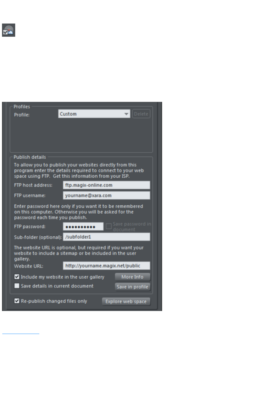
Publish Tab
You will need a web hosting company to host your website. MAGIX Online World is recommended for
this, although quite often your existing Internet provider will include 'web space' as part of your normal
subscription. Most companies also offer the ability to purchase your own domain name (e.g. like
www.xara.com) and have this set to point to your web pages. The dialog shown below contains MAGIX
Online World as a suggested hosting solution in its Profile list.
If you want Xara Web Designer 7 Premium to publish your finished website to your web space
automatically, so it's live on the Internet, you need to enter the access details for your web space on this
tab.
The first section of this dialog allows you to select a pre-configured profile. The profile list contains two
types of profile: those that you create yourself and which are stored on the computer you are using (see
Save in profile
for details on how to create these); and one standard profile, MAGIX Online World, which is installed
along with the program.
Standard profiles: When you select the standard profile, a banner appears immediately below the
profile list. This banner is downloaded from the web hosting company (so it will only appear if you are
online). Click a button on the banner to find out more about the MAGIX Online World web hosting
solution on its website. If you decide to sign up for hosting, you will be given a username and password
with which to connect. You enter those details in the FTP Details
section of this dialog.
FTP Details
: Enter the FTP details you have for your web space here. You need to enter at least the host address (if
Page 827

you have a domain name this is often the same as your domain name) and username. For example, for
MAGIX Online World users, the host address would be ftp.magix-online.com. If you chose the Magix
web hosting option in the profile list, the FTP host address is set for you automatically. For MAGIX
Online World users, the username is the same as your Online World login (FTP username = your email
address).
You don't need to enter the password at this stage if you don't want to. If it's missing you will be asked to
enter it each time you publish your website. For MAGIX Online World users, the password is the same
as your Online World password.
The optional Sub-folder lets you publish your website into a sub-folder, e.g. if you were publishing to the
xara.com domain (of course you can't do this) and wanted the web address to be;
xara.com/products/web_designer
Then you'd set a sub-folder of 'products/web_designer'. If you set a sub-folder this way then all the
pages in your website will be published to this folder.
Website URL
: Enter the full URL of your published website here if you would like to automatically generate an XML
Sitemap, which is a list of the pages on your website, helps search engines find all the pages in your site.
When you export your website, a file called Sitemap.xml is also created in the main export folder. If no
URL is specified here when you export your website, no sitemap is created.
Note:
Because a valid Sitemap must include the full URL of the website, a Sitemap can only be generated if the
website URL is available.
Include my website in the user gallery: This option is only enabled if you have added a valid website
URL. If you would like your website to be included in a Xara or MAGIX user gallery, click this
checkbox. After publishing your site, Web Designer Premium generates a thumbnail of your website and
places it in a gallery of websites created by Web Designer Premium users. Click the More Info
button to learn more.
Save details in current document
The FTP Details you've entered are associated only with the current open document. If you switch to a
different document you'll see the FTP details fields become blank, unless you've already entered details
for that other document. By default the FTP details are NOT saved with the document. That means each
time you load the document and want to publish it, you'll need to either re-enter the FTP details, or select
a profile from which the details should be copied.
Select the Save details in current document
checkbox if you would like the FTP details to be saved along with the document. That means whenever
you load the document, the FTP details will be loaded too and you can re-publish immediately.
Save password in document
If you chose to save the FTP details in your document, this option becomes enabled next to the
password field. It controls whether or not the FTP password is also stored in the document, along with
the other FTP details. If you choose to do this, you can re-publish the website without having to re-enter
the password.
But of course, so can anyone else who gets a copy of your design file! Therefore for normal use it's not
recommended that you turn this option on, because of the associated security risk of someone else
getting hold of your document and then being able to write to your web space, potentially overwriting or
deleting your website.
Save in profile
If you want to publish more than one website document to the same web space, or if you don't want
FTP details stored in your design document, you will probably want to have the FTP details stored on
Page 828

your computer as a profile. Then you can easily add the details to any document in future by simply
selecting the profile from the profile list, instead of having to re-enter them manually each time.
Click the Save in profile
button to save the FTP details shown to a profile. This brings up a small dialog containing an editable
profile list. You can either enter the name of a new profile, or choose an existing profile from the list to
overwrite that profile. When entering a new name, choose a name that will remind you what the web
space is used for. You cannot overwrite the standard profiles.
You can of course save multiple profiles where only the sub-folder name varies. This allows you to easily
publish to different folders in your web space.
If you don't want the FTP password to be stored on your computer, make sure that the password field is
blank when you click Save in profile
.
Deleting a profile
To delete a profile, select it in the profile list at the top of the Publish dialog and click the Delete
button next to it. You cannot delete the standard profiles.
Loading a document containing FTP details
When you load a document that has FTP details saved in it, the FTP details will be shown in the Publish
tab. If those details exactly match one of the profiles stored on your computer, then that profile will be
shown as selected in the profile list. Otherwise Custom
is shown in the profile list instead, to indicate that the document's FTP details don't match any profile.
If the document FTP details do not include a password, but all other details match a profile, then that
profile will be shown as selected. Also if that profile has a password stored, it will be copied into the
document FTP details for you. This saves you from having to re-enter the password each time you
publish the document. This behavior means that it may look to you like the password was actually stored
in your document! But that can only happen if the Save password in document
option is selected.
Publishing
Once you've set your Publish details, you can then select "File" > "Publish Website"
. Your website will be published.
See Publishing your website
for more information.
Note:
Many web servers use case-sensitive filenames. So, for example, the web address
xara.com/products.htm is not the same thing as xara.com/Products.htm. To reduce confusion and the
likelihood of errors Web Designer Premium enforces that all page names are all lower-case and contain
only allowable characters. This means that spaces are not allowed in page names. We suggest using an
underscore as an alternative separator.
Important:
If you have not set any specific page name, then the name you exported to last will be used for all the
pages in your website. E.g., if you open a template website, and export this as 'test' to your file system,
and now publish this, it will be published as test.htm to your web server, and all additional pages will be
test_2.htm, test_3.htm etc.
If you have not set an export filename, when you first publish you will be asked to enter a filename.
index.htm is the usual name for the first page of a website.
Re-publish changed files only
Page 829
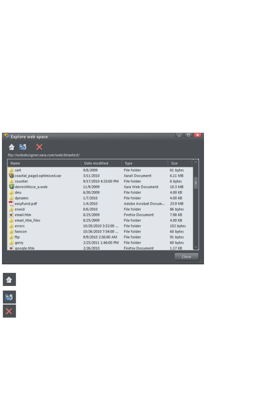
By default Xara Web Designer 7 Premium keeps track of the files that make up your published website
and when you come to re-publish after making changes to your site, it attempts to re-publish only the files
that have changed. This makes re-publishing much quicker in most cases.
However Xara Web Designer 7 Premium does not know if you have deleted or modified files in your
web space using another tool. Therefore if you have any problems whereby your published site does not
match the locally exported copy of your site, you should arrange for the whole site to be re-published. To
do this, turn off the Re-publish changed files only
option at the bottom of the Publish tab. Then the next time you publish, every file making up the site will
be published, making sure that your published site is up to date.
Explore web space
When you have completed the FTP host address, FTP username and FTP password boxes, click the
Explore web space button to browse, view and delete files you have uploaded to your ftp server.
You can view files and open folders to view subfolder contents. You can also delete individual or multiple
files. Select multiple files by clicking and holding down Shift or Ctrl, as in Windows Explorer. Click on
each column header to sort files using that column's criteria.
Scroll through a list of files you have uploaded to your ftp server
Returns to the original file view that opened when you launched the
Explore web space dialog
Takes you up a folder level
Deletes individual or multiple selected files
Page 830

Save details in current document
The FTP Details you've entered are associated only with the current open document. If you switch to a
different document you'll see the FTP details fields become blank, unless you've already entered details
for that other document. By default the FTP details are NOT saved with the document. That means each
time you load the document and want to publish it, you'll need to either re-enter the FTP details, or select
a profile from which the details should be copied.
Select the Save details in current document
checkbox if you would like the FTP details to be saved along with the document. That means whenever
you load the document, the FTP details will be loaded too and you can re-publish immediately.
Save password in document
If you chose to save the FTP details in your document, this option becomes enabled next to the
password field. It controls whether or not the FTP password is also stored in the document, along with
the other FTP details. If you choose to do this, you can re-publish the website without having to re-enter
the password.
But of course, so can anyone else who gets a copy of your design file! Therefore for normal use it's not
recommended that you turn this option on, because of the associated security risk of someone else
getting hold of your document and then being able to write to your web space, potentially overwriting or
deleting your website.
Save in profile
If you want to publish more than one website document to the same web space, or if you don't want
FTP details stored in your design document, you will probably want to have the FTP details stored on
your computer as a profile. Then you can easily add the details to any document in future by simply
selecting the profile from the profile list, instead of having to re-enter them manually each time.
Click the Save in profile
button to save the FTP details shown to a profile. This brings up a small dialog containing an editable
profile list. You can either enter the name of a new profile, or choose an existing profile from the list to
overwrite that profile. When entering a new name, choose a name that will remind you what the web
space is used for. You cannot overwrite the standard profiles.
You can of course save multiple profiles where only the sub-folder name varies. This allows you to easily
publish to different folders in your web space.
If you don't want the FTP password to be stored on your computer, make sure that the password field is
blank when you click Save in profile
.
Deleting a profile
To delete a profile, select it in the profile list at the top of the Publish dialog and click the Delete
button next to it. You cannot delete the standard profiles.
Loading a document containing FTP details
When you load a document that has FTP details saved in it, the FTP details will be shown in the Publish
tab. If those details exactly match one of the profiles stored on your computer, then that profile will be
shown as selected in the profile list. Otherwise Custom
is shown in the profile list instead, to indicate that the document's FTP details don't match any profile.
If the document FTP details do not include a password, but all other details match a profile, then that
profile will be shown as selected. Also if that profile has a password stored, it will be copied into the
document FTP details for you. This saves you from having to re-enter the password each time you
Page 831

publish the document. This behavior means that it may look to you like the password was actually stored
in your document! But that can only happen if the Save password in document
option is selected.
Publishing
Once you've set your Publish details, you can then select "File" > "Publish Website"
. Your website will be published.
See Publishing your website
for more information.
Note:
Many web servers use case-sensitive filenames. So, for example, the web address
xara.com/products.htm is not the same thing as xara.com/Products.htm. To reduce confusion and the
likelihood of errors Web Designer Premium enforces that all page names are all lower-case and contain
only allowable characters. This means that spaces are not allowed in page names. We suggest using an
underscore as an alternative separator.
Important:
If you have not set any specific page name, then the name you exported to last will be used for all the
pages in your website. E.g., if you open a template website, and export this as 'test' to your file system,
and now publish this, it will be published as test.htm to your web server, and all additional pages will be
test_2.htm, test_3.htm etc.
If you have not set an export filename, when you first publish you will be asked to enter a filename.
index.htm is the usual name for the first page of a website.
Re-publish changed files only
By default Xara Web Designer 7 Premium keeps track of the files that make up your published website
and when you come to re-publish after making changes to your site, it attempts to re-publish only the files
that have changed. This makes re-publishing much quicker in most cases.
However Xara Web Designer 7 Premium does not know if you have deleted or modified files in your
web space using another tool. Therefore if you have any problems whereby your published site does not
match the locally exported copy of your site, you should arrange for the whole site to be re-published. To
do this, turn off the Re-publish changed files only
option at the bottom of the Publish tab. Then the next time you publish, every file making up the site will
be published, making sure that your published site is up to date.
Explore web space
When you have completed the FTP host address, FTP username and FTP password boxes, click the
Explore web space button to browse, view and delete files you have uploaded to your ftp server.
You can view files and open folders to view subfolder contents. You can also delete individual or multiple
files. Select multiple files by clicking and holding down Shift or Ctrl, as in Windows Explorer. Click on
each column header to sort files using that column's criteria.
Page 832
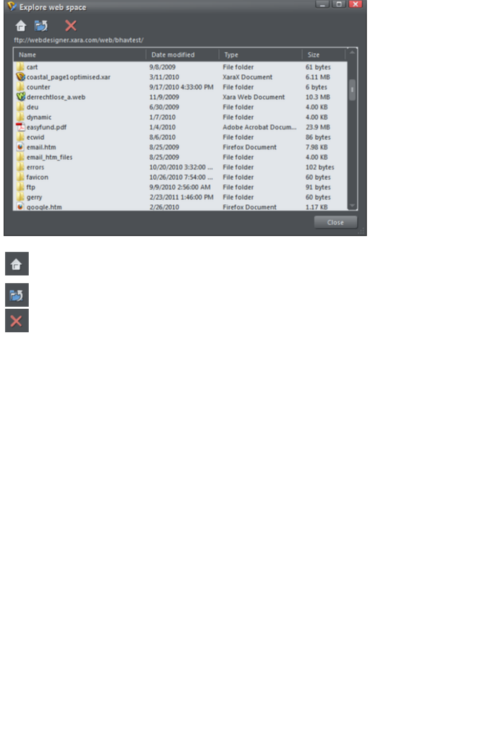
Scroll through a list of files you have uploaded to your ftp server
Returns to the original file view that opened when you launched the
Explore web space dialog
Takes you up a folder level
Deletes individual or multiple selected files
Page 833

Save password in document
If you chose to save the FTP details in your document, this option becomes enabled next to the
password field. It controls whether or not the FTP password is also stored in the document, along with
the other FTP details. If you choose to do this, you can re-publish the website without having to re-enter
the password.
But of course, so can anyone else who gets a copy of your design file! Therefore for normal use it's not
recommended that you turn this option on, because of the associated security risk of someone else
getting hold of your document and then being able to write to your web space, potentially overwriting or
deleting your website.
Save in profile
If you want to publish more than one website document to the same web space, or if you don't want
FTP details stored in your design document, you will probably want to have the FTP details stored on
your computer as a profile. Then you can easily add the details to any document in future by simply
selecting the profile from the profile list, instead of having to re-enter them manually each time.
Click the Save in profile
button to save the FTP details shown to a profile. This brings up a small dialog containing an editable
profile list. You can either enter the name of a new profile, or choose an existing profile from the list to
overwrite that profile. When entering a new name, choose a name that will remind you what the web
space is used for. You cannot overwrite the standard profiles.
You can of course save multiple profiles where only the sub-folder name varies. This allows you to easily
publish to different folders in your web space.
If you don't want the FTP password to be stored on your computer, make sure that the password field is
blank when you click Save in profile
.
Deleting a profile
To delete a profile, select it in the profile list at the top of the Publish dialog and click the Delete
button next to it. You cannot delete the standard profiles.
Loading a document containing FTP details
When you load a document that has FTP details saved in it, the FTP details will be shown in the Publish
tab. If those details exactly match one of the profiles stored on your computer, then that profile will be
shown as selected in the profile list. Otherwise Custom
is shown in the profile list instead, to indicate that the document's FTP details don't match any profile.
If the document FTP details do not include a password, but all other details match a profile, then that
profile will be shown as selected. Also if that profile has a password stored, it will be copied into the
document FTP details for you. This saves you from having to re-enter the password each time you
publish the document. This behavior means that it may look to you like the password was actually stored
in your document! But that can only happen if the Save password in document
option is selected.
Publishing
Once you've set your Publish details, you can then select "File" > "Publish Website"
. Your website will be published.
See Publishing your website
for more information.
Note:
Page 834
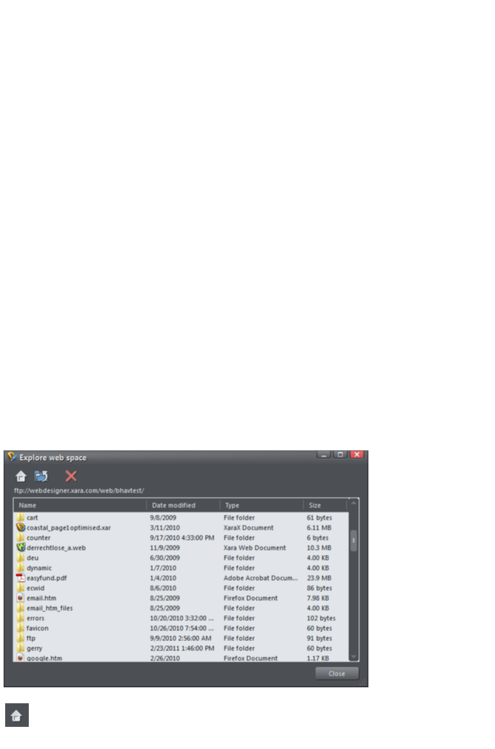
Many web servers use case-sensitive filenames. So, for example, the web address
xara.com/products.htm is not the same thing as xara.com/Products.htm. To reduce confusion and the
likelihood of errors Web Designer Premium enforces that all page names are all lower-case and contain
only allowable characters. This means that spaces are not allowed in page names. We suggest using an
underscore as an alternative separator.
Important:
If you have not set any specific page name, then the name you exported to last will be used for all the
pages in your website. E.g., if you open a template website, and export this as 'test' to your file system,
and now publish this, it will be published as test.htm to your web server, and all additional pages will be
test_2.htm, test_3.htm etc.
If you have not set an export filename, when you first publish you will be asked to enter a filename.
index.htm is the usual name for the first page of a website.
Re-publish changed files only
By default Xara Web Designer 7 Premium keeps track of the files that make up your published website
and when you come to re-publish after making changes to your site, it attempts to re-publish only the files
that have changed. This makes re-publishing much quicker in most cases.
However Xara Web Designer 7 Premium does not know if you have deleted or modified files in your
web space using another tool. Therefore if you have any problems whereby your published site does not
match the locally exported copy of your site, you should arrange for the whole site to be re-published. To
do this, turn off the Re-publish changed files only
option at the bottom of the Publish tab. Then the next time you publish, every file making up the site will
be published, making sure that your published site is up to date.
Explore web space
When you have completed the FTP host address, FTP username and FTP password boxes, click the
Explore web space button to browse, view and delete files you have uploaded to your ftp server.
You can view files and open folders to view subfolder contents. You can also delete individual or multiple
files. Select multiple files by clicking and holding down Shift or Ctrl, as in Windows Explorer. Click on
each column header to sort files using that column's criteria.
Scroll through a list of files you have uploaded to your ftp server
Returns to the original file view that opened when you launched the
Explore web space dialog
Page 835

Takes you up a folder level
Deletes individual or multiple selected files
Page 836

Save in profile
If you want to publish more than one website document to the same web space, or if you don't want
FTP details stored in your design document, you will probably want to have the FTP details stored on
your computer as a profile. Then you can easily add the details to any document in future by simply
selecting the profile from the profile list, instead of having to re-enter them manually each time.
Click the Save in profile
button to save the FTP details shown to a profile. This brings up a small dialog containing an editable
profile list. You can either enter the name of a new profile, or choose an existing profile from the list to
overwrite that profile. When entering a new name, choose a name that will remind you what the web
space is used for. You cannot overwrite the standard profiles.
You can of course save multiple profiles where only the sub-folder name varies. This allows you to easily
publish to different folders in your web space.
If you don't want the FTP password to be stored on your computer, make sure that the password field is
blank when you click Save in profile
.
Deleting a profile
To delete a profile, select it in the profile list at the top of the Publish dialog and click the Delete
button next to it. You cannot delete the standard profiles.
Loading a document containing FTP details
When you load a document that has FTP details saved in it, the FTP details will be shown in the Publish
tab. If those details exactly match one of the profiles stored on your computer, then that profile will be
shown as selected in the profile list. Otherwise Custom
is shown in the profile list instead, to indicate that the document's FTP details don't match any profile.
If the document FTP details do not include a password, but all other details match a profile, then that
profile will be shown as selected. Also if that profile has a password stored, it will be copied into the
document FTP details for you. This saves you from having to re-enter the password each time you
publish the document. This behavior means that it may look to you like the password was actually stored
in your document! But that can only happen if the Save password in document
option is selected.
Publishing
Once you've set your Publish details, you can then select "File" > "Publish Website"
. Your website will be published.
See Publishing your website
for more information.
Note:
Many web servers use case-sensitive filenames. So, for example, the web address
xara.com/products.htm is not the same thing as xara.com/Products.htm. To reduce confusion and the
likelihood of errors Web Designer Premium enforces that all page names are all lower-case and contain
only allowable characters. This means that spaces are not allowed in page names. We suggest using an
underscore as an alternative separator.
Important:
If you have not set any specific page name, then the name you exported to last will be used for all the
pages in your website. E.g., if you open a template website, and export this as 'test' to your file system,
and now publish this, it will be published as test.htm to your web server, and all additional pages will be
test_2.htm, test_3.htm etc.
Page 837
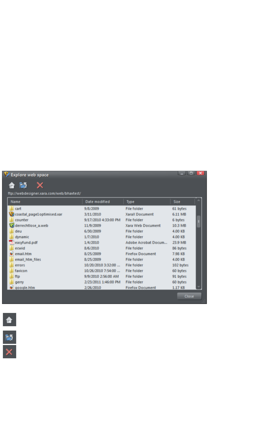
If you have not set an export filename, when you first publish you will be asked to enter a filename.
index.htm is the usual name for the first page of a website.
Re-publish changed files only
By default Xara Web Designer 7 Premium keeps track of the files that make up your published website
and when you come to re-publish after making changes to your site, it attempts to re-publish only the files
that have changed. This makes re-publishing much quicker in most cases.
However Xara Web Designer 7 Premium does not know if you have deleted or modified files in your
web space using another tool. Therefore if you have any problems whereby your published site does not
match the locally exported copy of your site, you should arrange for the whole site to be re-published. To
do this, turn off the Re-publish changed files only
option at the bottom of the Publish tab. Then the next time you publish, every file making up the site will
be published, making sure that your published site is up to date.
Explore web space
When you have completed the FTP host address, FTP username and FTP password boxes, click the
Explore web space button to browse, view and delete files you have uploaded to your ftp server.
You can view files and open folders to view subfolder contents. You can also delete individual or multiple
files. Select multiple files by clicking and holding down Shift or Ctrl, as in Windows Explorer. Click on
each column header to sort files using that column's criteria.
Scroll through a list of files you have uploaded to your ftp server
Returns to the original file view that opened when you launched the
Explore web space dialog
Takes you up a folder level
Deletes individual or multiple selected files
Page 838

Deleting a profile
To delete a profile, select it in the profile list at the top of the Publish dialog and click the Delete
button next to it. You cannot delete the standard profiles.
Loading a document containing FTP details
When you load a document that has FTP details saved in it, the FTP details will be shown in the Publish
tab. If those details exactly match one of the profiles stored on your computer, then that profile will be
shown as selected in the profile list. Otherwise Custom
is shown in the profile list instead, to indicate that the document's FTP details don't match any profile.
If the document FTP details do not include a password, but all other details match a profile, then that
profile will be shown as selected. Also if that profile has a password stored, it will be copied into the
document FTP details for you. This saves you from having to re-enter the password each time you
publish the document. This behavior means that it may look to you like the password was actually stored
in your document! But that can only happen if the Save password in document
option is selected.
Publishing
Once you've set your Publish details, you can then select "File" > "Publish Website"
. Your website will be published.
See Publishing your website
for more information.
Note:
Many web servers use case-sensitive filenames. So, for example, the web address
xara.com/products.htm is not the same thing as xara.com/Products.htm. To reduce confusion and the
likelihood of errors Web Designer Premium enforces that all page names are all lower-case and contain
only allowable characters. This means that spaces are not allowed in page names. We suggest using an
underscore as an alternative separator.
Important:
If you have not set any specific page name, then the name you exported to last will be used for all the
pages in your website. E.g., if you open a template website, and export this as 'test' to your file system,
and now publish this, it will be published as test.htm to your web server, and all additional pages will be
test_2.htm, test_3.htm etc.
If you have not set an export filename, when you first publish you will be asked to enter a filename.
index.htm is the usual name for the first page of a website.
Re-publish changed files only
By default Xara Web Designer 7 Premium keeps track of the files that make up your published website
and when you come to re-publish after making changes to your site, it attempts to re-publish only the files
that have changed. This makes re-publishing much quicker in most cases.
However Xara Web Designer 7 Premium does not know if you have deleted or modified files in your
web space using another tool. Therefore if you have any problems whereby your published site does not
match the locally exported copy of your site, you should arrange for the whole site to be re-published. To
do this, turn off the Re-publish changed files only
option at the bottom of the Publish tab. Then the next time you publish, every file making up the site will
be published, making sure that your published site is up to date.
Explore web space
When you have completed the FTP host address, FTP username and FTP password boxes, click the
Page 839
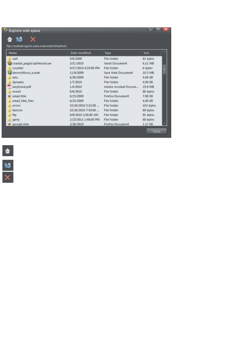
Explore web space button to browse, view and delete files you have uploaded to your ftp server.
You can view files and open folders to view subfolder contents. You can also delete individual or multiple
files. Select multiple files by clicking and holding down Shift or Ctrl, as in Windows Explorer. Click on
each column header to sort files using that column's criteria.
Scroll through a list of files you have uploaded to your ftp server
Returns to the original file view that opened when you launched the
Explore web space dialog
Takes you up a folder level
Deletes individual or multiple selected files
Page 840

Loading a document containing FTP details
When you load a document that has FTP details saved in it, the FTP details will be shown in the Publish
tab. If those details exactly match one of the profiles stored on your computer, then that profile will be
shown as selected in the profile list. Otherwise Custom
is shown in the profile list instead, to indicate that the document's FTP details don't match any profile.
If the document FTP details do not include a password, but all other details match a profile, then that
profile will be shown as selected. Also if that profile has a password stored, it will be copied into the
document FTP details for you. This saves you from having to re-enter the password each time you
publish the document. This behavior means that it may look to you like the password was actually stored
in your document! But that can only happen if the Save password in document
option is selected.
Publishing
Once you've set your Publish details, you can then select "File" > "Publish Website"
. Your website will be published.
See Publishing your website
for more information.
Note:
Many web servers use case-sensitive filenames. So, for example, the web address
xara.com/products.htm is not the same thing as xara.com/Products.htm. To reduce confusion and the
likelihood of errors Web Designer Premium enforces that all page names are all lower-case and contain
only allowable characters. This means that spaces are not allowed in page names. We suggest using an
underscore as an alternative separator.
Important:
If you have not set any specific page name, then the name you exported to last will be used for all the
pages in your website. E.g., if you open a template website, and export this as 'test' to your file system,
and now publish this, it will be published as test.htm to your web server, and all additional pages will be
test_2.htm, test_3.htm etc.
If you have not set an export filename, when you first publish you will be asked to enter a filename.
index.htm is the usual name for the first page of a website.
Re-publish changed files only
By default Xara Web Designer 7 Premium keeps track of the files that make up your published website
and when you come to re-publish after making changes to your site, it attempts to re-publish only the files
that have changed. This makes re-publishing much quicker in most cases.
However Xara Web Designer 7 Premium does not know if you have deleted or modified files in your
web space using another tool. Therefore if you have any problems whereby your published site does not
match the locally exported copy of your site, you should arrange for the whole site to be re-published. To
do this, turn off the Re-publish changed files only
option at the bottom of the Publish tab. Then the next time you publish, every file making up the site will
be published, making sure that your published site is up to date.
Explore web space
When you have completed the FTP host address, FTP username and FTP password boxes, click the
Explore web space button to browse, view and delete files you have uploaded to your ftp server.
You can view files and open folders to view subfolder contents. You can also delete individual or multiple
files. Select multiple files by clicking and holding down Shift or Ctrl, as in Windows Explorer. Click on
each column header to sort files using that column's criteria.
Page 841

Scroll through a list of files you have uploaded to your ftp server
Returns to the original file view that opened when you launched the
Explore web space dialog
Takes you up a folder level
Deletes individual or multiple selected files
Page 842

Publishing
Once you've set your Publish details, you can then select "File" > "Publish Website"
. Your website will be published.
See Publishing your website
for more information.
Note:
Many web servers use case-sensitive filenames. So, for example, the web address
xara.com/products.htm is not the same thing as xara.com/Products.htm. To reduce confusion and the
likelihood of errors Web Designer Premium enforces that all page names are all lower-case and contain
only allowable characters. This means that spaces are not allowed in page names. We suggest using an
underscore as an alternative separator.
Important:
If you have not set any specific page name, then the name you exported to last will be used for all the
pages in your website. E.g., if you open a template website, and export this as 'test' to your file system,
and now publish this, it will be published as test.htm to your web server, and all additional pages will be
test_2.htm, test_3.htm etc.
If you have not set an export filename, when you first publish you will be asked to enter a filename.
index.htm is the usual name for the first page of a website.
Re-publish changed files only
By default Xara Web Designer 7 Premium keeps track of the files that make up your published website
and when you come to re-publish after making changes to your site, it attempts to re-publish only the files
that have changed. This makes re-publishing much quicker in most cases.
However Xara Web Designer 7 Premium does not know if you have deleted or modified files in your
web space using another tool. Therefore if you have any problems whereby your published site does not
match the locally exported copy of your site, you should arrange for the whole site to be re-published. To
do this, turn off the Re-publish changed files only
option at the bottom of the Publish tab. Then the next time you publish, every file making up the site will
be published, making sure that your published site is up to date.
Explore web space
When you have completed the FTP host address, FTP username and FTP password boxes, click the
Explore web space button to browse, view and delete files you have uploaded to your ftp server.
You can view files and open folders to view subfolder contents. You can also delete individual or multiple
files. Select multiple files by clicking and holding down Shift or Ctrl, as in Windows Explorer. Click on
each column header to sort files using that column's criteria.
Page 843

Scroll through a list of files you have uploaded to your ftp server
Returns to the original file view that opened when you launched the
Explore web space dialog
Takes you up a folder level
Deletes individual or multiple selected files
Page 844
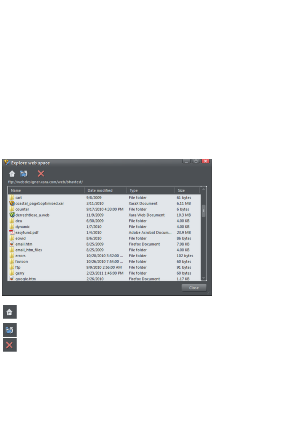
Re-publish changed files only
By default Xara Web Designer 7 Premium keeps track of the files that make up your published website
and when you come to re-publish after making changes to your site, it attempts to re-publish only the files
that have changed. This makes re-publishing much quicker in most cases.
However Xara Web Designer 7 Premium does not know if you have deleted or modified files in your
web space using another tool. Therefore if you have any problems whereby your published site does not
match the locally exported copy of your site, you should arrange for the whole site to be re-published. To
do this, turn off the Re-publish changed files only
option at the bottom of the Publish tab. Then the next time you publish, every file making up the site will
be published, making sure that your published site is up to date.
Explore web space
When you have completed the FTP host address, FTP username and FTP password boxes, click the
Explore web space button to browse, view and delete files you have uploaded to your ftp server.
You can view files and open folders to view subfolder contents. You can also delete individual or multiple
files. Select multiple files by clicking and holding down Shift or Ctrl, as in Windows Explorer. Click on
each column header to sort files using that column's criteria.
Scroll through a list of files you have uploaded to your ftp server
Returns to the original file view that opened when you launched the
Explore web space dialog
Takes you up a folder level
Deletes individual or multiple selected files
Page 845
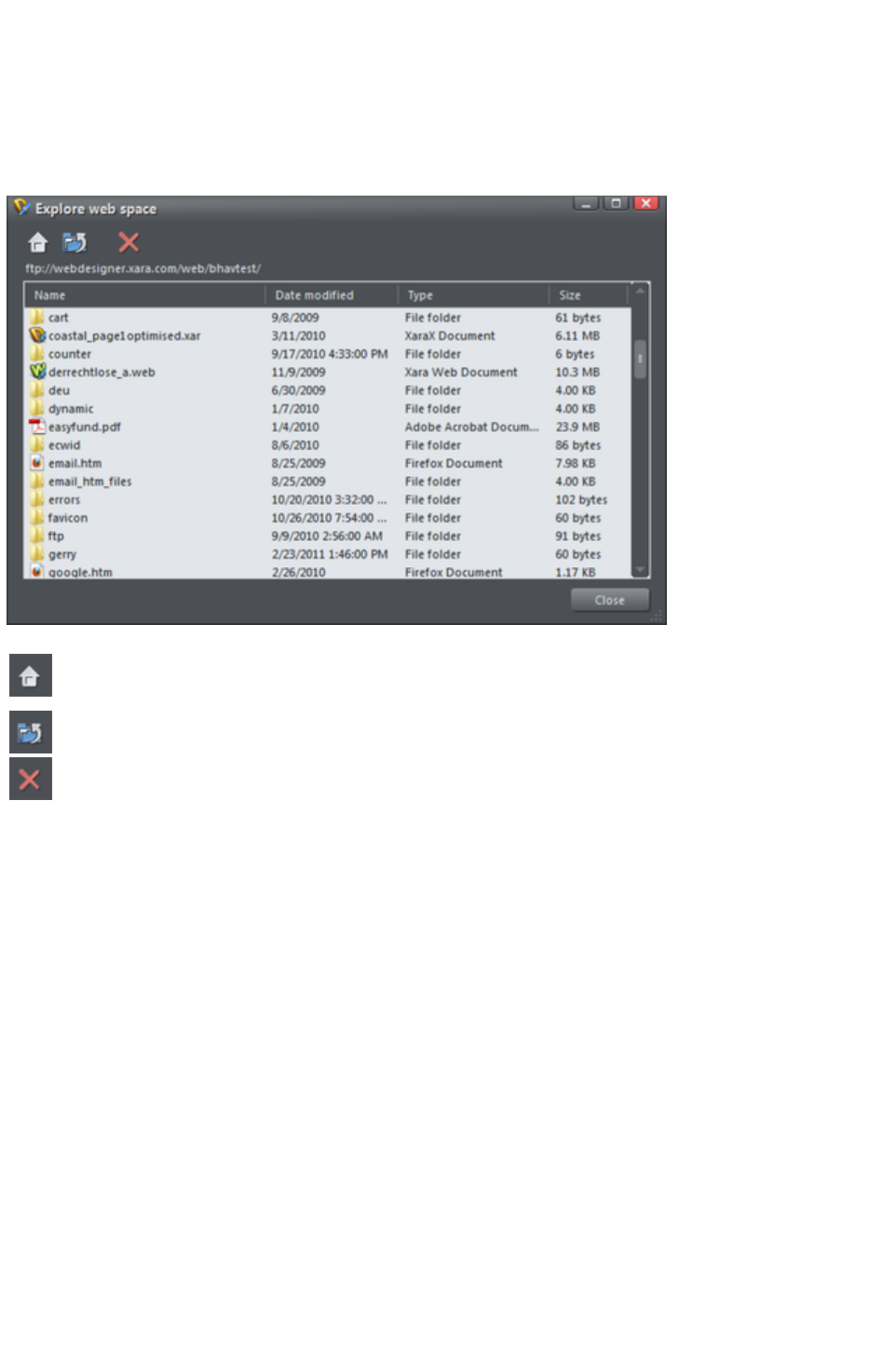
Explore web space
When you have completed the FTP host address, FTP username and FTP password boxes, click the
Explore web space button to browse, view and delete files you have uploaded to your ftp server.
You can view files and open folders to view subfolder contents. You can also delete individual or multiple
files. Select multiple files by clicking and holding down Shift or Ctrl, as in Windows Explorer. Click on
each column header to sort files using that column's criteria.
Scroll through a list of files you have uploaded to your ftp server
Returns to the original file view that opened when you launched the
Explore web space dialog
Takes you up a folder level
Deletes individual or multiple selected files
Page 846
Photo Handling
In this chapter
Introduction
Photo Objects
Photo Groups
Importing Photos
Photo resolution
Zero-memory Copies
The Bitmap Gallery
Embedded JPEG files
Lossless vs. Lossy
Blending & Merging photos
Photo display quality
Saving & Exporting Photos
Photo Edit Attributes
Editing the outline of Photos
Cropping photos
Cropping photos with a mask
Cutting objects out of photos
Screen capture utility
Coloring photos
Integration with external Photo Editors
Resize, rotate and position a photo within its frame
Horizon Straighten
Viewing a scaled photo at its full size
Making a photo its full size
Optimizing Photos and Bitmaps
Photo Documents
Editing Photo Files
Page 847

Introduction
Photos are an integral part of almost all creative work nowadays, from websites, to flyers, brochures,
DTP work and more.
Photo handling in Xara Web Designer 7 Premium is different than you may be used to with other
graphics programs.
In Xara Web Designer 7 Premium you can color, crop, copy, blend, mask, feather (fade the edges of)
photos as much as you like. The object oriented, non-destructive nature of the photo handling means
that, for example, when you resize a photo, you are not really altering the original photo, but just resizing
a visual copy. The original imported image is saved in the .web file, so that you can later edit, and resize
again, or apply any of the Photo Tool editing options, with no loss of quality. You can even un-crop
cropped photos.
The photo handling is astonishingly fast. You can open a 50 Megapixel photo, and perform any of the
enhance operations, and rotate the full resolution image in real-time.
This chapter covers the basic principles of manipulating photos and bitmap images in Xara Web Designer
7 Premium. The operation of the Photo Tool is covered in the separate Photo Tool
chapter.
*Benchmarks based on photo compositions created with multiple hi-res JPG digital photos
Page 848

Photo Objects
In Web Designer Premium photos (or bitmaps) are just another type of object on the page. You can
drag and drop photos onto the page from your file explorer, and then you can resize, rotate, copy and
move them around just like any other object. Importantly you can adjust the transparency, even
graduated transparency, feather edges and clip and cut shapes out of photos with ease. The transparency
feature lets you blend, merge or create composite photos.
Where you might have to use layers in other photo tools, every object in Xara Web Designer 7 Premium
is on its own layer and, just as with any object on the page, you can move it forward to be in front, or
backwards to be behind other objects.
Page 849

Photo Groups
If you edit a photo using some tools such as the integrated Red Eye Tool, the photo becomes grouped
with other objects that modify the image in some way. For example with the Red Eye Tool, the ellipse
shapes that are used to modify the red eye areas of the photo are grouped with the photo itself. This is
called a Photo Group
and you'll see this on the status line when you select such a modified photo.
Just like an ordinary group it keeps the photo together with the other objects that have been added to
modify it, but unlike a group it is still treated as if it was an ordinary photo by the Photo Tools
and other tools. Normally photo groups are automatically placed inside a clipview object, which clips
any objects which overlap the edge of the photo, to the boundaries of the photo itself. That's why when
you select a photo group the status line usually shows you have a "Clipped photo group" selected. See
the Clipview section of Object Handling for information about Clipviews.
Differences between Photo Groups and Photos:
Photo Groups collect together a simple photo and some vector edits.
You can push a photo around in its clipping shape within the Fill Tool but you can't do quite the
same thing with Photo Groups (either select inside and move the base photo, or use the right
click context menu to select the clipped objects and then drag them in the selector tool).
Some operations will convert Photo Groups to photos.
If you want to convert a Photo Group into an ordinary photo object, you can use "Utilities" >
"Optimize photo"
. But note that this is destructive in that thereafter you will not be able to modify any of the photo edits
you've applied to the photo. Some other operations such as content-aware scaling and contoning also
convert photo groups into flat photos, because these operations aren't able to preserve the photo group
structure. When a photo group needs to be converted in this way a warning alert is shown first.
Page 850
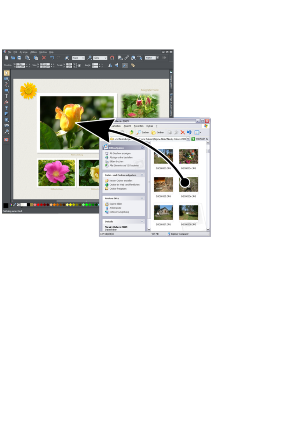
Importing Photos
Xara Web Designer 7 Premium supports a very wide range of photo or bitmap types including JPEG,
PNG, TIFF and RAW digital camera images, as well as many more types. The term "bitmap" is the
general term encompassing all types, but interchangeable with the word "photo".
The easiest way to open an image is to drag the photo or bitmap file from your Windows file explorer
onto the Web Designer Premium Window. Or you can select the "File" > "Open" or Import
menu options.
When importing high resolution photos (anything above 1920 pixels either wide or high) into a web
document (including presentation documents), Xara Web Designer 7 Premium automatically resizes the
photo down to HD screen size without asking you if you want to import a lower resolution version. For a
web document, even at the reduced size, there should be more than enough resolution in your photos for
high quality results on your website, so it's rarely necessary to import digital camera images at full
resolution for web use.
However, if you are importing a large photo into an animation document, Xara Web Designer 7 Premium
asks you if you want to import a lower resolution version of your photos. If your document is to include
many photos, you may want to choose this reduced resolution option. Otherwise with large photos you
may find that your saved design file is much bigger than it needs to be (because it contains a copy of each
of your photos) and you may not have enough memory in your computer to load, edit and export your
documents.
If you drag and drop onto an existing photo it will be replaced. Drop onto the background to import as a
stand-alone photo.
Replacing photos
If you drag and drop a bitmap file over an existing photo it will replace that photo, but keep the same
container or frame size. This makes it very easy to replace photos on templates. You can use the Fill
Tool to adjust the size, position and angle of the photo inside its outline. This is not true for photo
Page 851
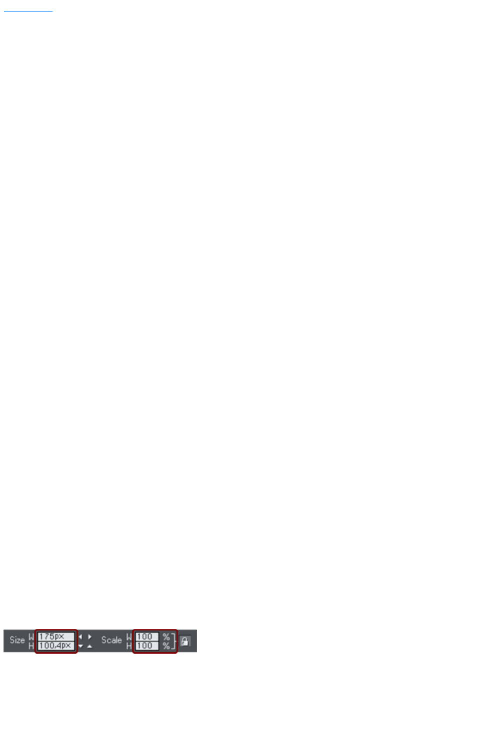
documents
, where dropping a photo on the page will always import it as a new document.
When replacing a photo or bitmap this way, it is sized to best fit in the existing picture outline. If you hold
"Shift" when replacing a photo, the new one will fit into the same dimensions and rotation as the old
photo. This is useful where you've manually adjusted the scale or rotation of a fill and then want to
replace the image with another which has the same aspect ratio. If you hold "Ctrl" down when you drop,
the photo will simply be added to the document and will not replace any existing image.
If there are multiple copies of the same photo on a page, for example a small thumbnail and a larger
version on a pop-up layer, when you drag and drop replace, all copies of the photo on that page will be
replaced by the new one.
Replacing multiple photos at once
Most of the web templates provided in the Designs Gallery will allow you to replace multiple images at
once, by dragging and dropping multiple image files from Explorer onto the canvas. Or use "File" > "
Import"
and select multiple images in the file dialog ("Ctrl + click" adds to the current selection, "Shift + click"
allows you to select a range of files).
The incoming photos are used to replace the images in the document. As when importing single photos,
you will be asked if you want to import reduced size versions if your photos are large. Replacement is
performed left to right and top to bottom (normal reading order). If you don't drag in enough photos to
replace all the replaceable photos, you can go on to import more photo files the same way. Replacement
carries on from the next un-replaced photo. Therefore you can quickly fill the design with your photos.
If you import more photos than can be accommodated on the current page, any following pages in your
design will have their replaceable photos replaced too, using the remaining incoming photos. If that would
still leave a surplus of incoming photo files, then the current page gets duplicated as many times as
necessary to accommodate all your photos.
This means you can very quickly build a photo gallery website showing your photos! Just choose a
gallery template from the Designs Gallery
, then import your set of photo files. The page is copied as many times as required to fit in all your
photos. Make sure you choose the reduced size option when importing a lot of large photos!
Using photos as fills
You can also use any bitmap as a fill style for any drawn shape. Simply drag the file over the shape
(which can be from your file system, or from the Bitmap or Fill galleries), and hold the "Shift" key down
before you drop. This will replace the existing color fill with a bitmap, fitted to the object. Again you can
use the Fill Tool
to adjust the size, angle and position.
Initial Photo size
When you import a JPEG it's initially sized to be 500 pixels wide.
To reduce the size, just drag a corner handle using the Selector Tool, or enter a new width in the
Selector Tool
InfoBar width field.
If you replace a photo using drag and drop, then the photo is sized to exactly fit the container, and this
means its size and resolution will depend on the size of the container.
Page 852

Replacing photos
If you drag and drop a bitmap file over an existing photo it will replace that photo, but keep the same
container or frame size. This makes it very easy to replace photos on templates. You can use the Fill
Tool to adjust the size, position and angle of the photo inside its outline. This is not true for photo
documents
, where dropping a photo on the page will always import it as a new document.
When replacing a photo or bitmap this way, it is sized to best fit in the existing picture outline. If you hold
"Shift" when replacing a photo, the new one will fit into the same dimensions and rotation as the old
photo. This is useful where you've manually adjusted the scale or rotation of a fill and then want to
replace the image with another which has the same aspect ratio. If you hold "Ctrl" down when you drop,
the photo will simply be added to the document and will not replace any existing image.
If there are multiple copies of the same photo on a page, for example a small thumbnail and a larger
version on a pop-up layer, when you drag and drop replace, all copies of the photo on that page will be
replaced by the new one.
Replacing multiple photos at once
Most of the web templates provided in the Designs Gallery will allow you to replace multiple images at
once, by dragging and dropping multiple image files from Explorer onto the canvas. Or use "File" > "
Import"
and select multiple images in the file dialog ("Ctrl + click" adds to the current selection, "Shift + click"
allows you to select a range of files).
The incoming photos are used to replace the images in the document. As when importing single photos,
you will be asked if you want to import reduced size versions if your photos are large. Replacement is
performed left to right and top to bottom (normal reading order). If you don't drag in enough photos to
replace all the replaceable photos, you can go on to import more photo files the same way. Replacement
carries on from the next un-replaced photo. Therefore you can quickly fill the design with your photos.
If you import more photos than can be accommodated on the current page, any following pages in your
design will have their replaceable photos replaced too, using the remaining incoming photos. If that would
still leave a surplus of incoming photo files, then the current page gets duplicated as many times as
necessary to accommodate all your photos.
This means you can very quickly build a photo gallery website showing your photos! Just choose a
gallery template from the Designs Gallery
, then import your set of photo files. The page is copied as many times as required to fit in all your
photos. Make sure you choose the reduced size option when importing a lot of large photos!
Using photos as fills
You can also use any bitmap as a fill style for any drawn shape. Simply drag the file over the shape
(which can be from your file system, or from the Bitmap or Fill galleries), and hold the "Shift" key down
before you drop. This will replace the existing color fill with a bitmap, fitted to the object. Again you can
use the Fill Tool
to adjust the size, angle and position.
Initial Photo size
When you import a JPEG it's initially sized to be 500 pixels wide.
To reduce the size, just drag a corner handle using the Selector Tool, or enter a new width in the
Selector Tool
InfoBar width field.
Page 853
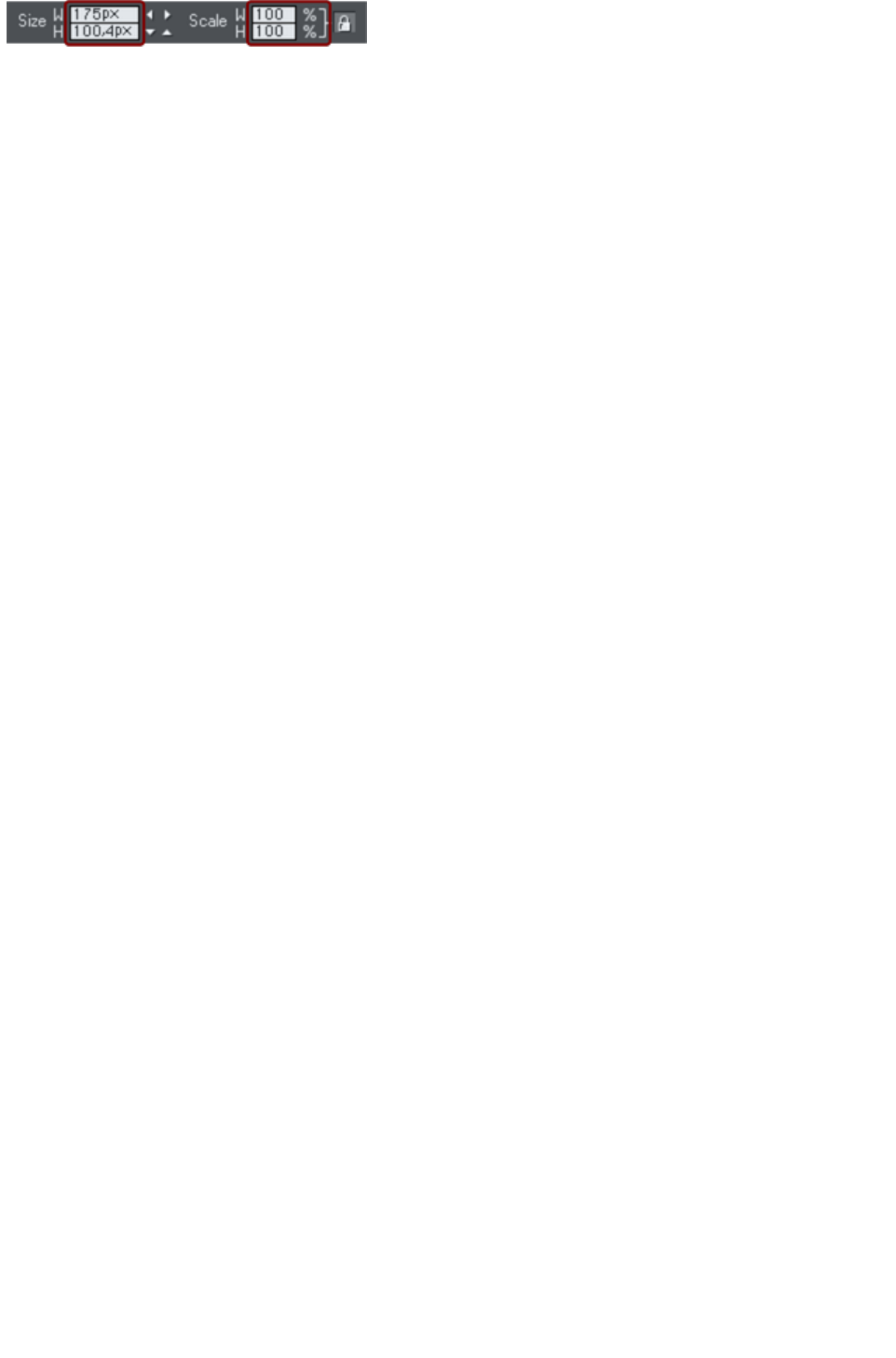
If you replace a photo using drag and drop, then the photo is sized to exactly fit the container, and this
means its size and resolution will depend on the size of the container.
Page 854
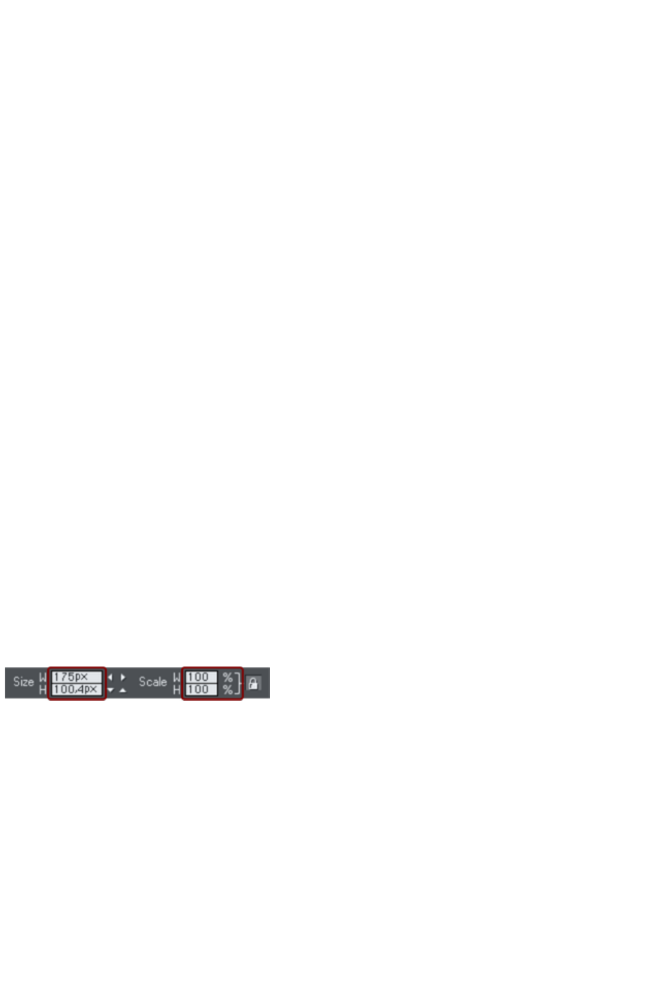
Replacing multiple photos at once
Most of the web templates provided in the Designs Gallery will allow you to replace multiple images at
once, by dragging and dropping multiple image files from Explorer onto the canvas. Or use "File" > "
Import"
and select multiple images in the file dialog ("Ctrl + click" adds to the current selection, "Shift + click"
allows you to select a range of files).
The incoming photos are used to replace the images in the document. As when importing single photos,
you will be asked if you want to import reduced size versions if your photos are large. Replacement is
performed left to right and top to bottom (normal reading order). If you don't drag in enough photos to
replace all the replaceable photos, you can go on to import more photo files the same way. Replacement
carries on from the next un-replaced photo. Therefore you can quickly fill the design with your photos.
If you import more photos than can be accommodated on the current page, any following pages in your
design will have their replaceable photos replaced too, using the remaining incoming photos. If that would
still leave a surplus of incoming photo files, then the current page gets duplicated as many times as
necessary to accommodate all your photos.
This means you can very quickly build a photo gallery website showing your photos! Just choose a
gallery template from the Designs Gallery
, then import your set of photo files. The page is copied as many times as required to fit in all your
photos. Make sure you choose the reduced size option when importing a lot of large photos!
Using photos as fills
You can also use any bitmap as a fill style for any drawn shape. Simply drag the file over the shape
(which can be from your file system, or from the Bitmap or Fill galleries), and hold the "Shift" key down
before you drop. This will replace the existing color fill with a bitmap, fitted to the object. Again you can
use the Fill Tool
to adjust the size, angle and position.
Initial Photo size
When you import a JPEG it's initially sized to be 500 pixels wide.
To reduce the size, just drag a corner handle using the Selector Tool, or enter a new width in the
Selector Tool
InfoBar width field.
If you replace a photo using drag and drop, then the photo is sized to exactly fit the container, and this
means its size and resolution will depend on the size of the container.
Page 855
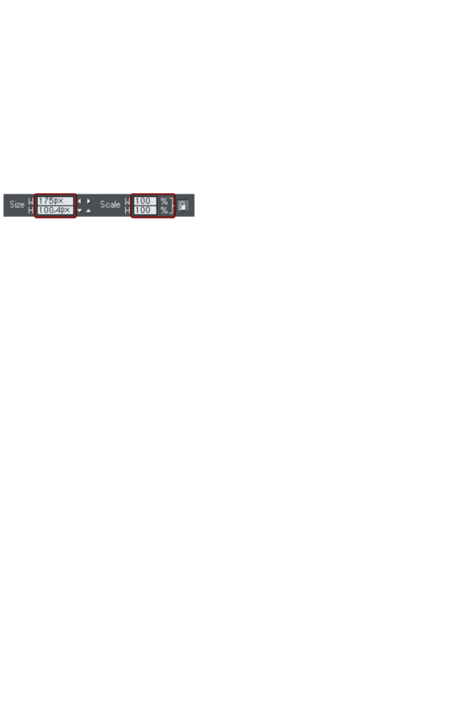
Using photos as fills
You can also use any bitmap as a fill style for any drawn shape. Simply drag the file over the shape
(which can be from your file system, or from the Bitmap or Fill galleries), and hold the "Shift" key down
before you drop. This will replace the existing color fill with a bitmap, fitted to the object. Again you can
use the Fill Tool
to adjust the size, angle and position.
Initial Photo size
When you import a JPEG it's initially sized to be 500 pixels wide.
To reduce the size, just drag a corner handle using the Selector Tool, or enter a new width in the
Selector Tool
InfoBar width field.
If you replace a photo using drag and drop, then the photo is sized to exactly fit the container, and this
means its size and resolution will depend on the size of the container.
Page 856
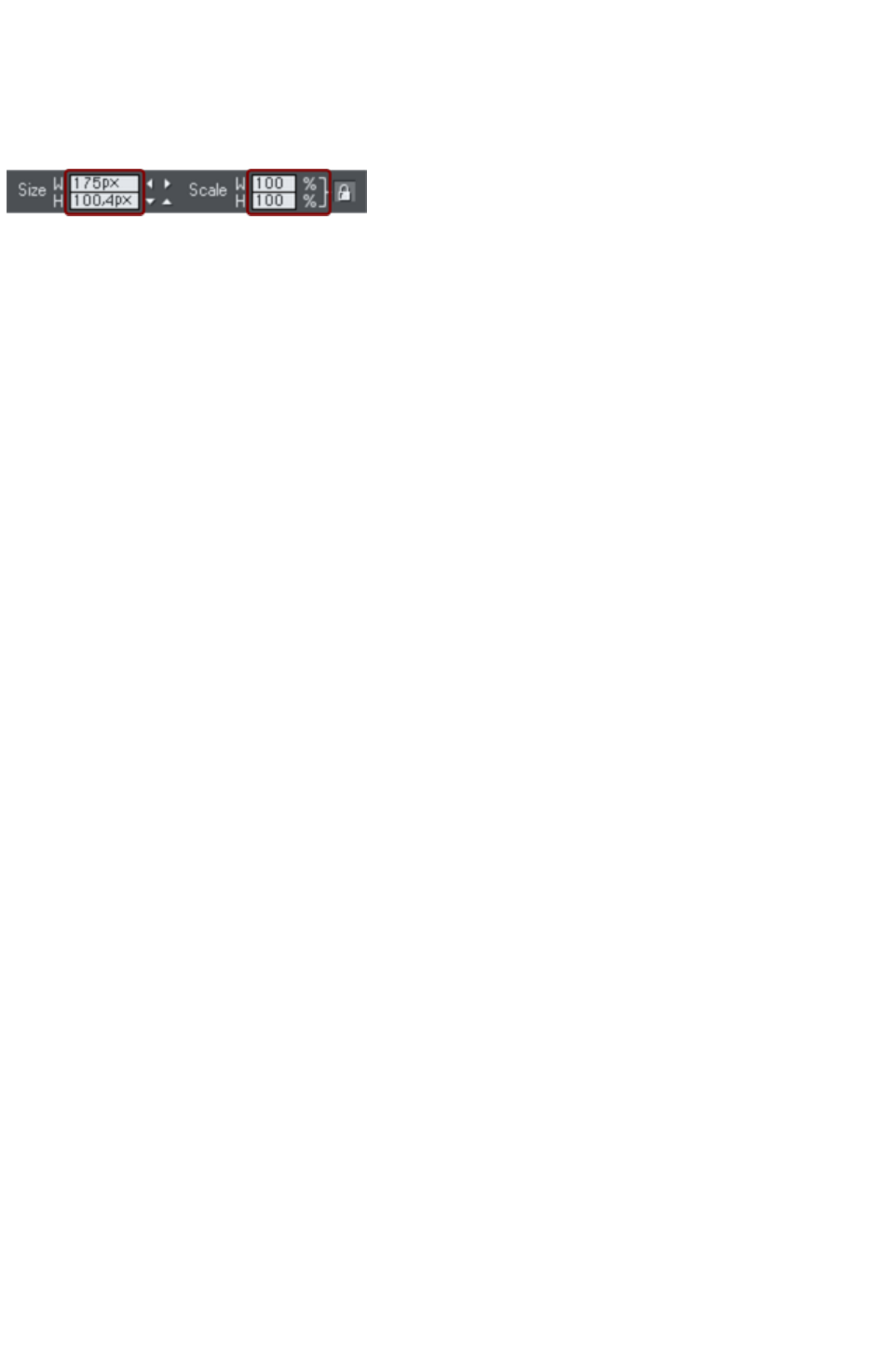
Initial Photo size
When you import a JPEG it's initially sized to be 500 pixels wide.
To reduce the size, just drag a corner handle using the Selector Tool, or enter a new width in the
Selector Tool
InfoBar width field.
If you replace a photo using drag and drop, then the photo is sized to exactly fit the container, and this
means its size and resolution will depend on the size of the container.
Page 857
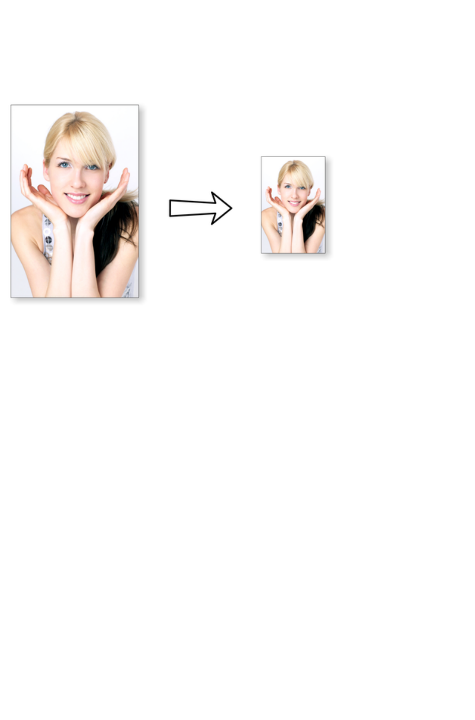
Photo resolution
One fundamental difference between Xara Web Designer 7 Premium and other photo tools is that when
you resize a photo it retains the full resolution with which it was imported. Scaling an image to be smaller,
just increases the dpi or ppi (pixels per inch). In other words no pixels are lost, they are just made
smaller.
96ppi image on the left when scaled down to half size becomes twice the resolution, 192ppi.
The status line shows the resolution of any selected image. Retaining the full resolution is important
because it means you can see all the detail when you zoom in, and that when printing the maximum
resolution is sent to the printer. Also it means you can enlarge all or part of the image and Web Designer
Premium retains the original maximum quality.
When saving your website (exporting the HTML) Xara Web Designer 7 Premium automatically converts
the photos to the correct resolution required for the web page.
Page 858
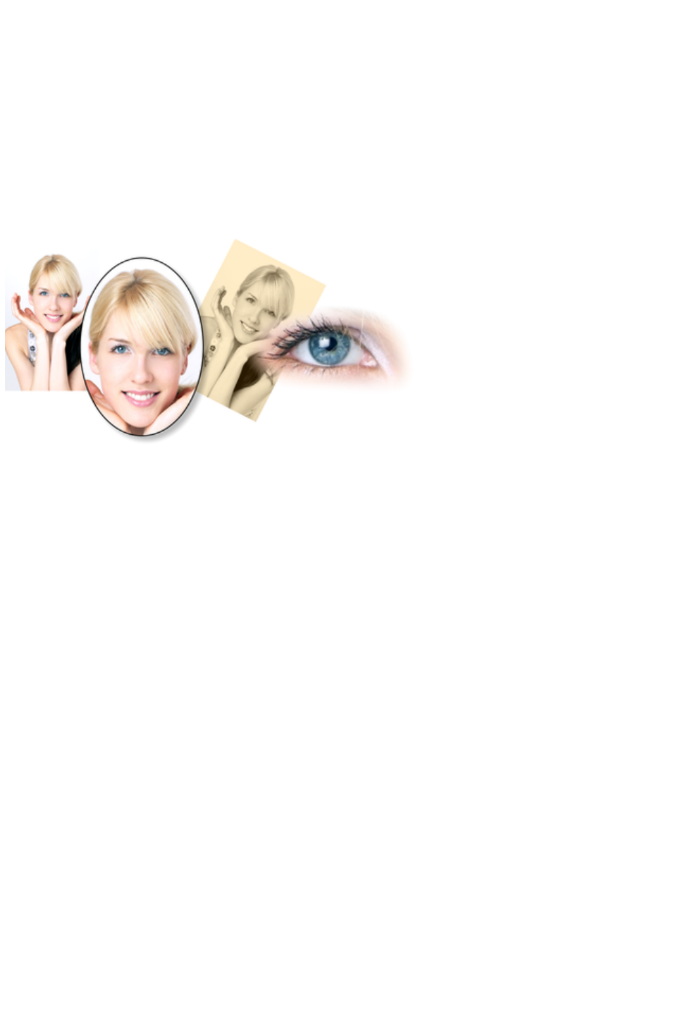
Zero-memory Copies
One of the most revolutionary differences between Web Designer Premium and other software is that
when you copy any photo on the page, it doesn't really make a complete new copy of the original
imported photo but instead just displays another 'view' of the original image. Web Designer Premium's
rendering engine is fast enough that it can display any number of copies of the same image 'on the fly' this
way. This saves huge amounts of memory and dramatically reduces files sizes.
This doesn't detract or limit what you can do with each copy, and they can be treated as completely
separate independent copies. Each copy does not have to be identical. You can manipulate each as
required, resizing, rotating, cropping. coloring, feathering, or applying a wide range of photo and
transparency effects. All for no memory or native file size increase.
This shows separate copies of the same image, each manipulated in a different way. Each retaining the full
resolution of the original imported JPEG, as you can see from the right image. The memory (RAM and
file size) is no more than the original JPEG size.
Because they are the same image displayed at different sizes the resolution, that is the dpi or ppi, varies.
In the above example the eye is 115dpi, (because the image has been enlarged) while the image on the
left is over 1200dpi.
Page 859
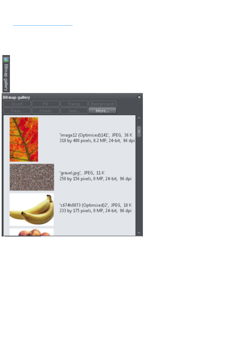
The Bitmap Gallery
The Document handling chapter
has general information about galleries.
The Bitmap Gallery
shows all the bitmaps or photos used in any document, along with information about its pixel size and file
size.
You can open it by clicking it in the Galleries bar, or from within the "
Utilities" > "Galleries"
menu, or "F11".
This shows the Bitmap Gallery
for the above document, and shows the original JPEG image of the girl which is embedded into the
native .web file. As mentioned above, all copies of this image are displayed directly from the one master,
so only the single image is shown and not all four variants that appear on the page.
The following useful information is displayed about the original image:
Filename of the original JPEG
The file type, in this case a JPEG, and the file size, 1,006K. (This is the original size of the file,
and also how much of the .web file will be taken up by this image.)
The pixel dimensions of the original, the Megapixel size (in this case just under 2MP)
The color depth, in this case "24 bit" which is sometimes called true color. The Xara image is a 4
bit image.
The original resolution of the image, in these cases 96dpi
The Bitmap Gallery
always contains a default bitmap, with the gray Xara image. This is used as the default bitmap for bitmap
fills and in cases where other bitmaps are missing. It's useful to have as a placeholder as well.
As with all galleries, you can drag the objects from the gallery onto the page to create a new copy. Or
Page 860

you can select an image in the gallery and click one of the buttons across the top. The following section
details the operation of the Bitmap Gallery
controls, most of which are for the more advanced user.
Filling shapes with a bitmap
Select the shape on the page, then select the bitmap in the gallery and click the fill button. Alternatively
drag the image from the Bitmap Gallery and drop it onto any shape while holding "Shift". You can
adjust the size, angle etc in the Fill Tool
.
Setting a Bitmap Transparency
This is for the more advanced user. You can use any bitmap as a transparency mask on any filled shape
or bitmap. The lightness of the bitmap affects how transparent the selected object is. The bitmap
transparency size, rotation and tiling can be controlled from the Transparency Tool
InfoBar.
Deleting images from the Gallery
When you delete a bitmap from the page, it remains in the Bitmap Gallery. Any unused bitmaps will be
deleted from the file when saved and re-opened. However you can force the deletion of any bitmap by
selecting it and pressing the Delete
button. If the bitmap is used in the document, it will be replaced by the standard Xara bitmap.
Setting the page background to a bitmap
Select the bitmap in the gallery and click the Background
button. This will tile the image. When exporting the page as HTML, this image is tiled across the whole
visible page background of the browser, unless you've also given the pasteboard (the area around the
page) a different background.
Save
Select the bitmap and click Save
will save the original image. In the case of an embedded JPEG this will save the original JPEG file. Other
bitmap types are best saved as PNG bitmap type.
Bitmap Properties
The Properties
button will display information about the selected bitmap in the gallery. It also provides a way to stop
image smoothing when bitmaps are enlarged. Usually all bitmaps are smoothed when enlarged, or
zoomed into, on screen. There is a check-box option in the Properties dialog to turn this feature off, so
that individual pixels are visible when you zoom in.
Note that this option only affects scaled up bitmaps. Note also that Never smooth in the View tab of
the Options
dialog box overrides this check box.
It also provides information about the Animation properties of the bitmap. This is only really applicable to
animated GIF images
GIF Animation:
Delay (the time this frame is left on screen)
Restore: The Animated GIF Restore setting sets what happens between each frame in an
animated GIF. Nothing means no action is taken. Many browsers take this as meaning the same
Page 861

as the Leave As Is option. Leave As Is displays the frames one on top of another - this leaves
many frames visible in a stack if some are transparent. Some browsers clear the animation before
it loops again, some do not. Background restores the area covered by the graphic to the
background color of the GIF (usually white). Restore Previous restores the area covered by the
frame to what it was before the frame was displayed. This is interpreted by some browsers to
mean that the frame should be cleared to the background before each frame is displayed and by
others to mean that the frame should be shown on top of the previous frame. As browsers
interpret these values in different ways, you may need to experiment to achieve the desired result.
Page 862

Filling shapes with a bitmap
Select the shape on the page, then select the bitmap in the gallery and click the fill button. Alternatively
drag the image from the Bitmap Gallery and drop it onto any shape while holding "Shift". You can
adjust the size, angle etc in the Fill Tool
.
Setting a Bitmap Transparency
This is for the more advanced user. You can use any bitmap as a transparency mask on any filled shape
or bitmap. The lightness of the bitmap affects how transparent the selected object is. The bitmap
transparency size, rotation and tiling can be controlled from the Transparency Tool
InfoBar.
Deleting images from the Gallery
When you delete a bitmap from the page, it remains in the Bitmap Gallery. Any unused bitmaps will be
deleted from the file when saved and re-opened. However you can force the deletion of any bitmap by
selecting it and pressing the Delete
button. If the bitmap is used in the document, it will be replaced by the standard Xara bitmap.
Setting the page background to a bitmap
Select the bitmap in the gallery and click the Background
button. This will tile the image. When exporting the page as HTML, this image is tiled across the whole
visible page background of the browser, unless you've also given the pasteboard (the area around the
page) a different background.
Save
Select the bitmap and click Save
will save the original image. In the case of an embedded JPEG this will save the original JPEG file. Other
bitmap types are best saved as PNG bitmap type.
Bitmap Properties
The Properties
button will display information about the selected bitmap in the gallery. It also provides a way to stop
image smoothing when bitmaps are enlarged. Usually all bitmaps are smoothed when enlarged, or
zoomed into, on screen. There is a check-box option in the Properties dialog to turn this feature off, so
that individual pixels are visible when you zoom in.
Note that this option only affects scaled up bitmaps. Note also that Never smooth in the View tab of
the Options
dialog box overrides this check box.
It also provides information about the Animation properties of the bitmap. This is only really applicable to
animated GIF images
GIF Animation:
Delay (the time this frame is left on screen)
Restore: The Animated GIF Restore setting sets what happens between each frame in an
animated GIF. Nothing means no action is taken. Many browsers take this as meaning the same
as the Leave As Is option. Leave As Is displays the frames one on top of another - this leaves
many frames visible in a stack if some are transparent. Some browsers clear the animation before
it loops again, some do not. Background restores the area covered by the graphic to the
Page 863

background color of the GIF (usually white). Restore Previous restores the area covered by the
frame to what it was before the frame was displayed. This is interpreted by some browsers to
mean that the frame should be cleared to the background before each frame is displayed and by
others to mean that the frame should be shown on top of the previous frame. As browsers
interpret these values in different ways, you may need to experiment to achieve the desired result.
Page 864

Setting a Bitmap Transparency
This is for the more advanced user. You can use any bitmap as a transparency mask on any filled shape
or bitmap. The lightness of the bitmap affects how transparent the selected object is. The bitmap
transparency size, rotation and tiling can be controlled from the Transparency Tool
InfoBar.
Deleting images from the Gallery
When you delete a bitmap from the page, it remains in the Bitmap Gallery. Any unused bitmaps will be
deleted from the file when saved and re-opened. However you can force the deletion of any bitmap by
selecting it and pressing the Delete
button. If the bitmap is used in the document, it will be replaced by the standard Xara bitmap.
Setting the page background to a bitmap
Select the bitmap in the gallery and click the Background
button. This will tile the image. When exporting the page as HTML, this image is tiled across the whole
visible page background of the browser, unless you've also given the pasteboard (the area around the
page) a different background.
Save
Select the bitmap and click Save
will save the original image. In the case of an embedded JPEG this will save the original JPEG file. Other
bitmap types are best saved as PNG bitmap type.
Bitmap Properties
The Properties
button will display information about the selected bitmap in the gallery. It also provides a way to stop
image smoothing when bitmaps are enlarged. Usually all bitmaps are smoothed when enlarged, or
zoomed into, on screen. There is a check-box option in the Properties dialog to turn this feature off, so
that individual pixels are visible when you zoom in.
Note that this option only affects scaled up bitmaps. Note also that Never smooth in the View tab of
the Options
dialog box overrides this check box.
It also provides information about the Animation properties of the bitmap. This is only really applicable to
animated GIF images
GIF Animation:
Delay (the time this frame is left on screen)
Restore: The Animated GIF Restore setting sets what happens between each frame in an
animated GIF. Nothing means no action is taken. Many browsers take this as meaning the same
as the Leave As Is option. Leave As Is displays the frames one on top of another - this leaves
many frames visible in a stack if some are transparent. Some browsers clear the animation before
it loops again, some do not. Background restores the area covered by the graphic to the
background color of the GIF (usually white). Restore Previous restores the area covered by the
frame to what it was before the frame was displayed. This is interpreted by some browsers to
mean that the frame should be cleared to the background before each frame is displayed and by
others to mean that the frame should be shown on top of the previous frame. As browsers
interpret these values in different ways, you may need to experiment to achieve the desired result.
Page 865

Deleting images from the Gallery
When you delete a bitmap from the page, it remains in the Bitmap Gallery. Any unused bitmaps will be
deleted from the file when saved and re-opened. However you can force the deletion of any bitmap by
selecting it and pressing the Delete
button. If the bitmap is used in the document, it will be replaced by the standard Xara bitmap.
Setting the page background to a bitmap
Select the bitmap in the gallery and click the Background
button. This will tile the image. When exporting the page as HTML, this image is tiled across the whole
visible page background of the browser, unless you've also given the pasteboard (the area around the
page) a different background.
Save
Select the bitmap and click Save
will save the original image. In the case of an embedded JPEG this will save the original JPEG file. Other
bitmap types are best saved as PNG bitmap type.
Bitmap Properties
The Properties
button will display information about the selected bitmap in the gallery. It also provides a way to stop
image smoothing when bitmaps are enlarged. Usually all bitmaps are smoothed when enlarged, or
zoomed into, on screen. There is a check-box option in the Properties dialog to turn this feature off, so
that individual pixels are visible when you zoom in.
Note that this option only affects scaled up bitmaps. Note also that Never smooth in the View tab of
the Options
dialog box overrides this check box.
It also provides information about the Animation properties of the bitmap. This is only really applicable to
animated GIF images
GIF Animation:
Delay (the time this frame is left on screen)
Restore: The Animated GIF Restore setting sets what happens between each frame in an
animated GIF. Nothing means no action is taken. Many browsers take this as meaning the same
as the Leave As Is option. Leave As Is displays the frames one on top of another - this leaves
many frames visible in a stack if some are transparent. Some browsers clear the animation before
it loops again, some do not. Background restores the area covered by the graphic to the
background color of the GIF (usually white). Restore Previous restores the area covered by the
frame to what it was before the frame was displayed. This is interpreted by some browsers to
mean that the frame should be cleared to the background before each frame is displayed and by
others to mean that the frame should be shown on top of the previous frame. As browsers
interpret these values in different ways, you may need to experiment to achieve the desired result.
Page 866

Setting the page background to a bitmap
Select the bitmap in the gallery and click the Background
button. This will tile the image. When exporting the page as HTML, this image is tiled across the whole
visible page background of the browser, unless you've also given the pasteboard (the area around the
page) a different background.
Save
Select the bitmap and click Save
will save the original image. In the case of an embedded JPEG this will save the original JPEG file. Other
bitmap types are best saved as PNG bitmap type.
Bitmap Properties
The Properties
button will display information about the selected bitmap in the gallery. It also provides a way to stop
image smoothing when bitmaps are enlarged. Usually all bitmaps are smoothed when enlarged, or
zoomed into, on screen. There is a check-box option in the Properties dialog to turn this feature off, so
that individual pixels are visible when you zoom in.
Note that this option only affects scaled up bitmaps. Note also that Never smooth in the View tab of
the Options
dialog box overrides this check box.
It also provides information about the Animation properties of the bitmap. This is only really applicable to
animated GIF images
GIF Animation:
Delay (the time this frame is left on screen)
Restore: The Animated GIF Restore setting sets what happens between each frame in an
animated GIF. Nothing means no action is taken. Many browsers take this as meaning the same
as the Leave As Is option. Leave As Is displays the frames one on top of another - this leaves
many frames visible in a stack if some are transparent. Some browsers clear the animation before
it loops again, some do not. Background restores the area covered by the graphic to the
background color of the GIF (usually white). Restore Previous restores the area covered by the
frame to what it was before the frame was displayed. This is interpreted by some browsers to
mean that the frame should be cleared to the background before each frame is displayed and by
others to mean that the frame should be shown on top of the previous frame. As browsers
interpret these values in different ways, you may need to experiment to achieve the desired result.
Page 867

Save
Select the bitmap and click Save
will save the original image. In the case of an embedded JPEG this will save the original JPEG file. Other
bitmap types are best saved as PNG bitmap type.
Bitmap Properties
The Properties
button will display information about the selected bitmap in the gallery. It also provides a way to stop
image smoothing when bitmaps are enlarged. Usually all bitmaps are smoothed when enlarged, or
zoomed into, on screen. There is a check-box option in the Properties dialog to turn this feature off, so
that individual pixels are visible when you zoom in.
Note that this option only affects scaled up bitmaps. Note also that Never smooth in the View tab of
the Options
dialog box overrides this check box.
It also provides information about the Animation properties of the bitmap. This is only really applicable to
animated GIF images
GIF Animation:
Delay (the time this frame is left on screen)
Restore: The Animated GIF Restore setting sets what happens between each frame in an
animated GIF. Nothing means no action is taken. Many browsers take this as meaning the same
as the Leave As Is option. Leave As Is displays the frames one on top of another - this leaves
many frames visible in a stack if some are transparent. Some browsers clear the animation before
it loops again, some do not. Background restores the area covered by the graphic to the
background color of the GIF (usually white). Restore Previous restores the area covered by the
frame to what it was before the frame was displayed. This is interpreted by some browsers to
mean that the frame should be cleared to the background before each frame is displayed and by
others to mean that the frame should be shown on top of the previous frame. As browsers
interpret these values in different ways, you may need to experiment to achieve the desired result.
Page 868

Bitmap Properties
The Properties
button will display information about the selected bitmap in the gallery. It also provides a way to stop
image smoothing when bitmaps are enlarged. Usually all bitmaps are smoothed when enlarged, or
zoomed into, on screen. There is a check-box option in the Properties dialog to turn this feature off, so
that individual pixels are visible when you zoom in.
Note that this option only affects scaled up bitmaps. Note also that Never smooth in the View tab of
the Options
dialog box overrides this check box.
It also provides information about the Animation properties of the bitmap. This is only really applicable to
animated GIF images
GIF Animation:
Delay (the time this frame is left on screen)
Restore: The Animated GIF Restore setting sets what happens between each frame in an
animated GIF. Nothing means no action is taken. Many browsers take this as meaning the same
as the Leave As Is option. Leave As Is displays the frames one on top of another - this leaves
many frames visible in a stack if some are transparent. Some browsers clear the animation before
it loops again, some do not. Background restores the area covered by the graphic to the
background color of the GIF (usually white). Restore Previous restores the area covered by the
frame to what it was before the frame was displayed. This is interpreted by some browsers to
mean that the frame should be cleared to the background before each frame is displayed and by
others to mean that the frame should be shown on top of the previous frame. As browsers
interpret these values in different ways, you may need to experiment to achieve the desired result.
Page 869

Embedded JPEG files
JPEG files are hugely compressed from their original state, being up to 10 times smaller than the original
uncompressed image. In the above example, the original uncompressed image requires more than 7mb of
memory, but as the Bitmap Gallery
shows, this JPEG file is only 1mb. A very significant reduction. This is why JPEG images are the
standard file type for digital photography and use on the web.
When you drag and drop a JPEG file (or use the "Open" or "Import" menu options) the original JPEG is
stored in the document, and this is what is saved in the .xar file when you save your document.
It's important to understand how this differs from other graphics tools, both vector drawing software and
photo editing programs. Other products will typically un-compress the image and store the
un-compressed "raw" image in memory and the native file when you save to disc. What's more each
copy you make is typically a complete copy of the original raw image, as mentioned above. Make four
copies of your photo and save your file - it will be four times larger. In Xara Web Designer 7 Premium
the file is no larger, no matter how many copies you make.
So by embedding the original JPEG file instead of saving the un-compressed image, that's a file size
saving of more than 7:1 compared to other graphics editors. The fact that there are four complete copies
of the image means that in this particular case the memory used is more like 30 times less. So this
represents a huge file size (and time) saving over other graphics tools*.
*This is easy to test. Import a JPEG into your favourite graphics editor, make four copies, perhaps
change each one slightly, to be colored or blurred or rotated. Then save the native file and compare it
against the original JPEG size, and the equivalent .Xar file. A .Xar native file is about the size of the
original JPEG, no matter how many copies of the image are made.
Extracting the original JPEG
Right click on any image in the Bitmap Gallery and select the Save
menu option to save the original JPEG back to your file system.
Page 870

Extracting the original JPEG
Right click on any image in the Bitmap Gallery and select the Save
menu option to save the original JPEG back to your file system.
Page 871

Lossless vs. Lossy
Because everything Web Designer Premium does with your photos is based on the original image, which
remains untouched embedded in your file, everything it does is lossless. There is no re-compression of
images when saving the native .xar file.
Of course you can save or export your image as a compressed JPEG file, at any required size, and in this
case the image quality and detail will be reduced in a "destructive" manner. Destructive here means that
the original data or detail cannot be recovered from a lower-resolution saved JPEG. Xara is a
non-destructive editor because the original photo data and detail is never lost, reduced or compressed in
a lossy manner in the native .xar file.
Page 872
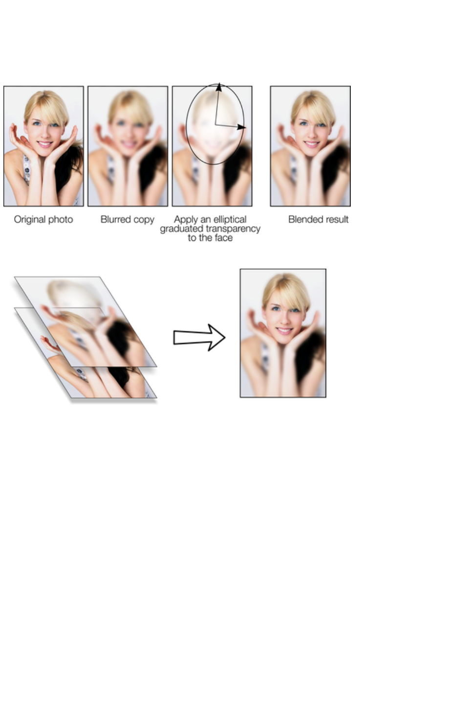
Blending & Merging photos
By making copies of photos on top of each other, and applying different effects to the copies, combined
with Web Designer Premium's advanced transparency controls, you can easily create blended photo
compositions. For example to selectively blur parts of a photo takes a few seconds.
By placing the blurred copy with the 'hole' created by the transparency effect over the sharp original, the
blended result shows the sharp face area through.
Creating copies of any object requires a single key press, or click (drag with right mouse button).
Blurring a photo takes a single drag on a blur slider of the Photo Tool, applying a gradated transparency
is just another click-drag in the Transparency Tool
, and finally positioning the photos on top of each other takes a second. So the whole process takes a
few clicks, drags and just a few seconds in Xara Web Designer 7 Premium.
Page 873

Photo display quality
Xara Web Designer 7 Premium can display photos in one of five useful quality levels. The top two
settings smooth the screen pixels so avoiding visible pixels or rough sections along the edges
(anti-aliasing). Change the quality level using the Quality entry in the Window
menu.
Very High
Quality
(default)
Displays images using bicubic sampling. This displays images
at the best quality, particularly for large hi-res images that are
scaled down or zoomed out a lot.
High Quality
Anti-aliasing on, but images are rendered faster and at lower
quality.
Full Color
No anti-aliasing, thus showing individual pixels. This can be
useful when you're zoomed in and you need to clearly see
the separate image pixels. The downside is that images
generally look poor when reduced or enlarged resulting in
clearly visible pixelation and jagged "staircase" edges,
especially if you rotate the image.
Outline with
blend steps
Is particularly useful for seeing outlines of the various steps of
a blend. Blends are not supported in Xara Web Designer 7
Premium but imported .xar files could contain blends.
Outline
Only object outlines are shown. This is useful for finding and
selecting objects that are difficult to see due to other objects
in front of or behind them.
There is an additional control that allows you to stop all image smoothing or anti-aliasing on images that
are scaled up or zoomed in. In other words, instead of a smoothed image, you see all the pixels when
zoomed in. Open the Bitmap Gallery
and right click on the image and select "properties". In the dialog un-check the "Smooth when scaled up"
option. Now, no matter what viewing quality you select the image (and all copies) will always show the
un-smoothed pixels when enlarged or zoomed in.
Note: If you use the Photo Tool sharpen / blur control then images have to be displayed at maximum
quality. So if you think the viewing quality has stopped working, it's almost certainly because you have
sharpened or blurred the image with the Photo Tool
.
Page 874
Saving & Exporting Photos
Selecting the Save option will always save a native .web file. To save a photo as a JPEG, PNG or other
image file type, it's necessary to use the Export
option, or the shortcut "Ctrl + Shift + E".
There are two icons available on the top bar that are short-cuts to
save the selection as JPG or PNG. These are in the flyout bar
shown when you move the mouse pointer over the Export HTML
icon.
For photos we recommend saving as JPEG (sometimes called JPG) as this offers the greatest
compatibility and the best size / quality compromise.
When you export a JPEG or PNG, there is a Settings
option on the Save Dialog. Selecting this provides many advanced export options, as well as compare
side-by-side alternative settings or even alternative file types such as PNG.
When you export a JPEG, an export preview dialog is shown where you can adjust many export options,
as well as compare side-by-side alternative settings or even alternative file types such as PNG.
The Export Preview dialog allows you to adjust the size, resolution, JPEG quality and even select from 3
alternative export file types if you so wish. The default values should be fine for all normal purposes and
you can just click the export button to save your photo.
Things to remember when exporting:
First select the object or objects you want to export
The default exported size of the image will be the size you see on screen at 100% zoom.
The Export Preview dialog
is described in more detail here.
Tip
: You can control the JPEG quality in the Export Settings dialog on the Options tab. The default and
recommended value is 75%
The JPEG system is designed that a
setting of 75 is the optimum value. We
recommend you do not save JPEGs at
100% quality, as the results are visually
identical to the 75% quality, only the file
size and memory use is dramatically
increased with no benefit.
When saving for use on the web it's quite possible to reduce the quality below 75 to increase page view
speed. The preview window shows the quality of any value you select.
Tip
: If you expect you may want to perform any further edits on your exported image, for example to create
the image again at another size, we strongly recommend saving the .web file as well. This will preserve
the lossless master image along with all its edits and changes.
Example: To resize a photo and save as a new JPEG
This process is very quick and simple:
Drop your photo onto Web Designer Premium (either onto a blank page or onto the title bar to
create a new document)
In the Selector Tool either drag a corner handle to resize the image, or enter the required width
or height into the "W" or "H" field on the InfoBar. Check the image size is correct at 100%
Page 875

Click the 'Export selection as JPG' button on the top bar.
Enter a filename, Click the Settings button if you need to control the compression, or just click
Save
To save any image as a PNG go through the same process except choose the PNG file type.
Page 876
Example: To resize a photo and save as a new JPEG
This process is very quick and simple:
Drop your photo onto Web Designer Premium (either onto a blank page or onto the title bar to
create a new document)
In the Selector Tool either drag a corner handle to resize the image, or enter the required width
or height into the "W" or "H" field on the InfoBar. Check the image size is correct at 100%
Click the 'Export selection as JPG' button on the top bar.
Enter a filename, Click the Settings button if you need to control the compression, or just click
Save
To save any image as a PNG go through the same process except choose the PNG file type.
Page 877

Photo Edit Attributes
All edits performed using the Photo Tool
, such as any altering of the brightness, contrast, color, blur or sharpen values, are all just stored on the
photo as Web Designer Premium attributes.
Just as you can alter the color of a shape or line without altering the underlying shape, so Photo Tool
attributes alter the visible appearance of the photo without affecting the original image (this is called
non-destructive editing). Another way of looking at this is that Xara Web Designer 7 Premium just stores
a list of edits applied to your photo, and you can change, remove or add new edits. You can always
recover the original untouched photo, even after the brightness, resizing, even clipping or cropping.
Attributes can be copied and pasted between objects. Not only does this apply to traditional attributes
such as line color and thickness, it also works with all the Photo Tool
attributes. So this means you can easily copy all the enhancements made on one photo to any other using
the copy / paste attribute feature.
This also applies to all other attributes of the photo, such as line width and color, photo coloring
(contoning), shadows, etc.; all these can be copied from one photo to another using the same technique.
Page 878
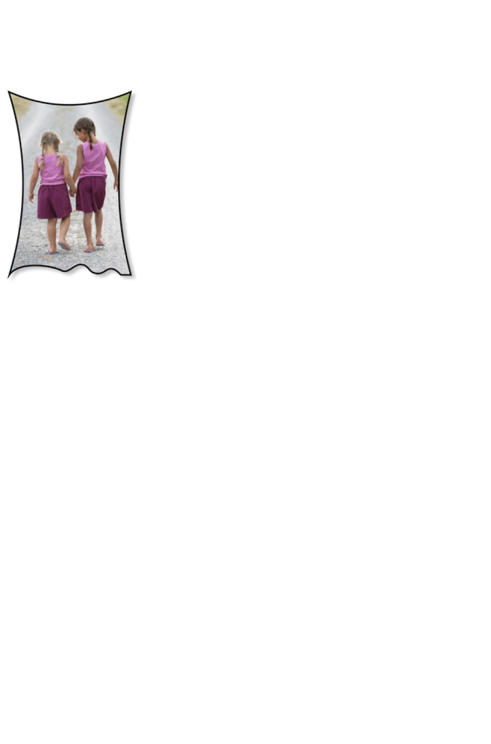
Editing the outline of Photos
You can use the Shape Editor Tool
to directly adjust the outline shape of a photo. Similarly you can apply outlines the same way as for any
shape, and shadow, etc.
Using the Shape Editor Tool you can push
or pull on the sides. This example also has a
black outline and soft shadow added. To
restore the image back to it's original
rectangular shape, select the "Un-clip" in the
clip mode of the Photo Tool
InfoBar.
When photos are edited this way, they are
treated like any normal vector shape,
containing a bitmap fill. This is why you can
use the normal line and shape editing features,
and indeed you can use the Fill Tool
to adjust the size, angle and position of the
photo "fill" inside the shape.
Page 879
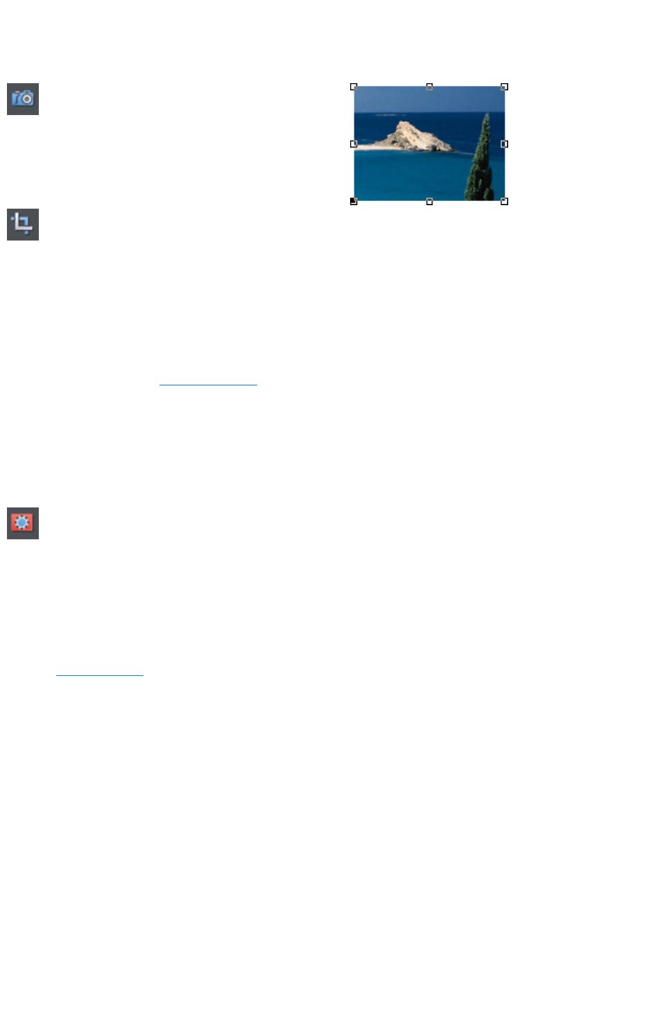
Cropping photos
The easiest way to crop a photo is to just drag
on it when in the Enhance Tool
, or you can just drag one of the 8 control
handles around the outside to adjust the edge of
any selected photo.
For more advanced cropping control, select the Clip button on the
Photo Tool
flyout bar which provides aspect ratio control and precise numeric
clipping control.
This also provides an Un-clip button that will remove any clip rectangle and restore the original image.
One important feature is that this crop feature is really a dynamic clip, in other words it's a
non-destructive crop, and you can adjust the crop boundary afterwards to reveal hidden parts of the
photo. If you want to really crop - i.e. make this a destructive crop, that really removes the invisible parts
of an image then use the Optimize Photo
feature.
Cropping photos with a mask
If you want to make non-rectangular photo shapes or cut pieces out of a photo, use a mask. First select
the photo and then turn on Mask Mode.
Turn on Mask Mode by clicking on icon in the top bar.
The view turns pink. Now use any of the standard drawing tools to draw onto the mask layer over your
photo, just as you would draw onto a normal drawing layer. Then select the photo underneath, or clear
the selection (press "Esc"). Now if you copy ("Ctrl + C") you will copy just the unmasked part of the
photo to the paste buffer. Hit "Delete" and you'll delete the unmasked part. Or press "Ctrl + X" to cut it.
You can also use the mask to apply a Clipview or use the "Arrange" > "Combine
" shapes operations with it.
See the Mask chapter
for more information on using masks.
Page 880

Cropping photos with a mask
If you want to make non-rectangular photo shapes or cut pieces out of a photo, use a mask. First select
the photo and then turn on Mask Mode.
Turn on Mask Mode by clicking on icon in the top bar.
The view turns pink. Now use any of the standard drawing tools to draw onto the mask layer over your
photo, just as you would draw onto a normal drawing layer. Then select the photo underneath, or clear
the selection (press "Esc"). Now if you copy ("Ctrl + C") you will copy just the unmasked part of the
photo to the paste buffer. Hit "Delete" and you'll delete the unmasked part. Or press "Ctrl + X" to cut it.
You can also use the mask to apply a Clipview or use the "Arrange" > "Combine
" shapes operations with it.
See the Mask chapter
for more information on using masks.
Page 881
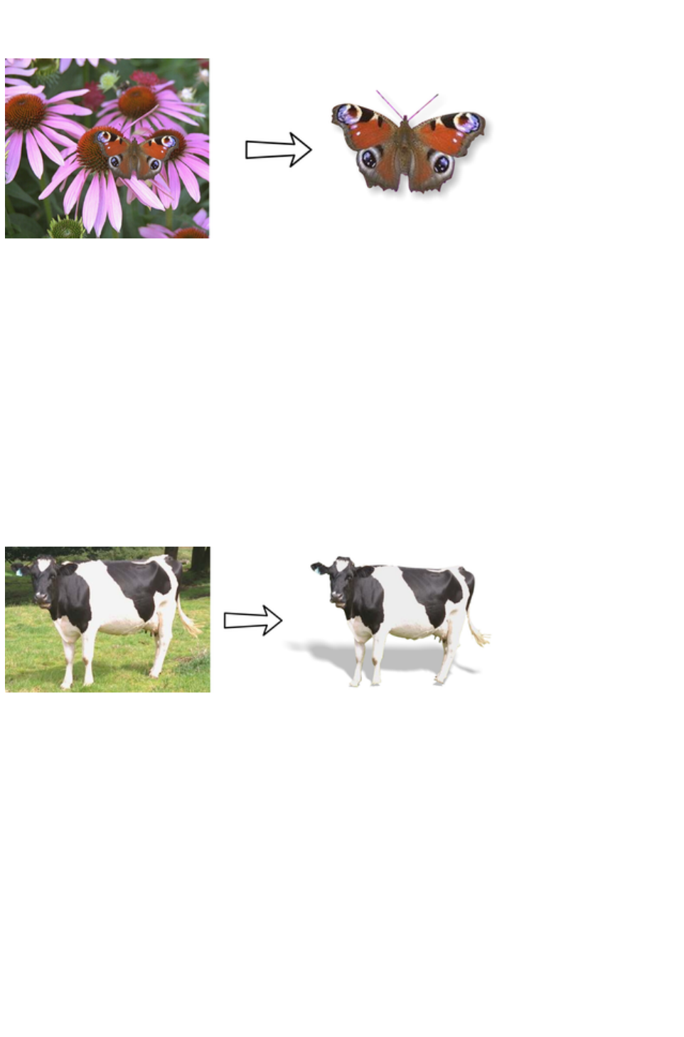
Cutting objects out of photos
Using the drawing tools, it's easy to draw around shapes and cut them out of the background. You can
use any of the Line Drawing Tools to do this. Perhaps the easiest way is using the Shape Editor Tool
and draw a line around the edge of the shape you want to extract. Zoom into your photo and then:
In the Shape Editor Tool use a type of "connect the dots" technique of sequential clicks around
the shape, using more closely spaced clicks for detailed areas and fewer clicks for straight line or
gentle curved areas.
When you've gone around the object completely, close the line to be a solid shape by joining the
last segment to the first. This will create a filled shape, typically solid black.
You can now cut this shape out of the photo by selecting both the new mask shape, and the
photo (shift click on the photo in the Selector Tool) and select the menu option "Arrange" > "
Combine shapes" > "Intersect shapes".
Feather the results to blend the edge slightly, by dragging the feather slider on the top bar to one
or two pixels.
You can make further edits to the shape, using the Line Editing Tools, as the whole photo remains inside
the shape which acts just as a clipping mask.
In this example the cow has been given a floor shadow using the Shadow Tool
.
Page 882
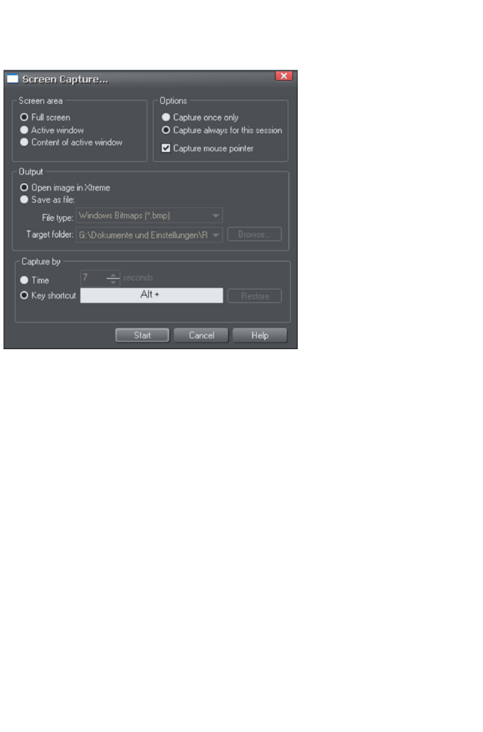
Screen capture utility
This utility offers some advantages over the method above, including the option to capture the mouse
pointer in the image. Open it by choosing Utilities > Screen Capture.
Screen area:
Here you can choose the screen area you would like to capture. You can capture the full screen, the
active window in its entirety, or just the content of the active window without the window border.
Options:
Here you can choose whether or not the mouse pointer is included in the screenshot. Also choose
whether you just want to capture one screenshot or whether to keep the utility turned on for the session
so you can take successive shots each time you press the assigned key shortcut.
The output section lets you choose how to handle the captured screen image. By default it will be directly
inserted into the current Xara Web Designer 7 Premium design. Alternatively you can also save a BMP
(Windows Bitmap) or PNG file for each screenshot into any folder. The files created are named
"ScreenCapture", "ScreenCapture1", "ScreenCapture2", etc. Choose the Target folder for the files
using the Browse...
button.
You can define almost any hot-key combination (Shift, Alt, Ctrl + key) to trigger the screenshot. Just
click in the key shortcut field and then press the desired key combination, e.g. "Ctrl+S". The chosen
shortcut appears in the key shortcut field. If it clashes with any defined Web Designer Premium shortcut,
you'll be warned with a message appearing at the bottom of the dialog, but this doesn't matter if you will
have other windows active when taking the screenshots. Press Restore
to return to the previous selected shortcut.
Instead of using a shortcut key to take the screenshot, you can instead use the Time option. This is useful
in cases where any keyboard activity can change the display you want to capture, such as a pop-up
tooltip which may disappear if you were to press a key. Select the time option and enter a delay value in
seconds. The screenshot will then be taken for you automatically once the specified period of time has
elapsed. The timer starts as soon as you click the Start
button.
Pressing the Start
Page 883

button closes the Screen capture dialog and activates the system-wide hotkey. Switch to the window you
want to capture and press the chosen key combination, or wait for the chosen time period to elapse if the
timer option was chosen. The screenshot is taken and inserted into Web Designer Premium or saved to
file, depending on the option chosen. If you selected the "Capture always" option you can take additional
screenshots by pressing the key combination again (this is unavailable with the timer option). To
deactivate the utility if you chose this option, close down Xara Web Designer 7 Premium to end the
session. Alternatively return to the Screenshot dialog, choose the "once only" option and take one more
screenshot.
In combination with a built-in screen capture feature you can easily capture and create screen shots.
Press the "Print screen" button on your keyboard. This places a screen capture of the whole
screen on the clipboard. Alternatively, select "Alt + Print screen" which will capture just the
current window.
In Xara Web Designer 7 Premium select "Ctrl + V" to paste, and select "Bitmap" to have the
results pasted onto the page.
You can now crop, add text annotation, resize as required and save the results. It's best to save this type
of image as a PNG file.
Page 884
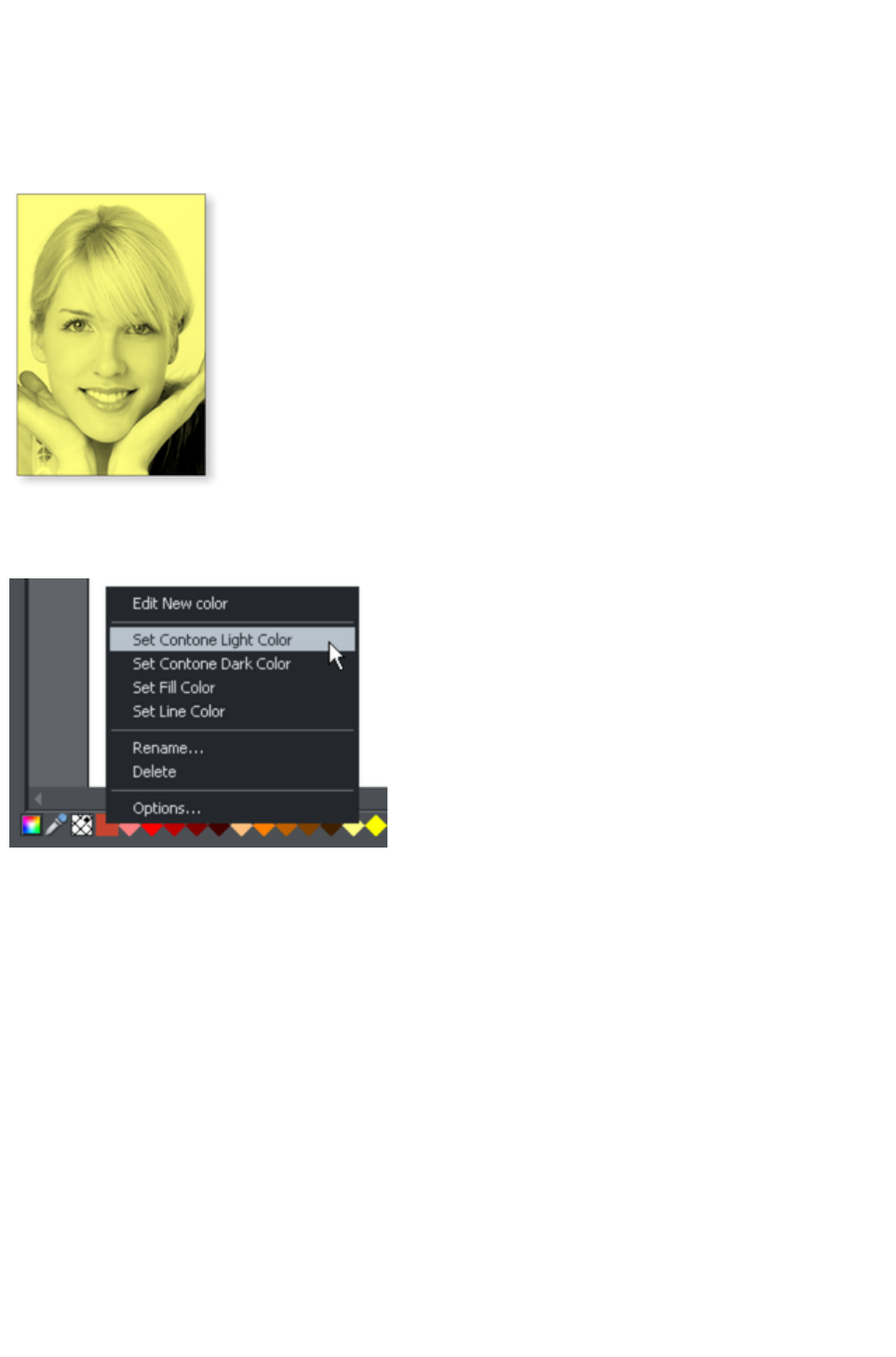
Coloring photos
With any photo selected just click on the Color Line to apply a color to any photo. Clicking the white
color patch and selecting 'Set Contone Light Color
' will turn any color photo to be black and white. It's called a contone because it's a continuous tone from
black to white.
Simply click a pale yellow colour on the colour line to create a yellow contone picture.
Or, right click on the Color Line which shows a context menu for you to apply the selected colour as
either the light or dark color.
When you click on the
Color Line you can
select any color as either
the Light or Dark
contone color. Or you
can use the Color
Editor
(Ctrl+E) and choose
any color you like. The
drop down menu at the
top of the Color Editor
controls whether you
edit the light or dark
color.
You can restore the original color of a photo by clicking the cross-hatched "no color" patch on the left of
the Color Line, or right clicking on it and selecting the "Restore color" option.
Page 885
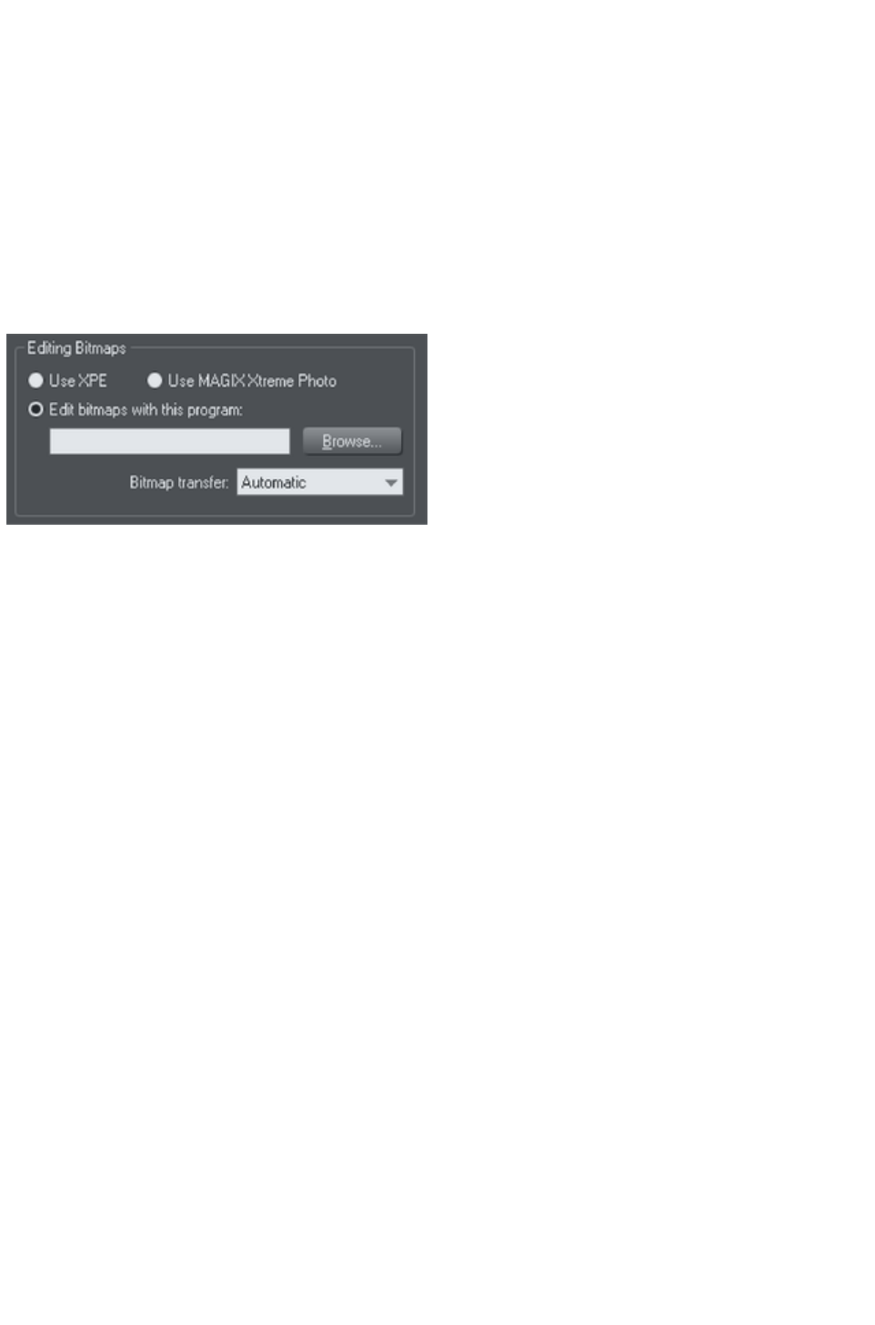
Integration with external Photo Editors
While Xara Web Designer 7 Premium provides a great many photo editing and compositing features, it
is not a "pixel editor", and for these purposes you may want to use a separate program. Xara Web
Designer 7 Premium makes integration with these easy. You can configure any external program to be
launched when you double click a photo while in the Photo Tool, and after editing, for the photo to
automatically be transferred back into your Web Designer Premium document.
Double clicking a photo when you are not in the Photo Tool, selects the Photo Tool so you can edit the
photo using Xara Web Designer 7 Premium's integrated editing features. Double click the photo while in
the Photo Tool to invoke the external editor.
To choose an external editor, select the Photo Editing
tab in the Options dialog.
XPE is the basic Xara picture editor. Most of its functionality is now provided by the Photo Tool directly
and so this tool provides little benefit. It's here mostly for back compatibility reasons.
Alternatively, if you select the "Edit bitmap with this program" option and browse to select an external
program, then this can be launched by double clicking on any image when in the Photo tool (you will
probably need to browse to your program files folder on your local hard drive and select the program
executable .exe file).
It should be understood that images transferred to and from external editors are transferred as
uncompressed images (to avoid compression / decompression cycles) and so this will increase the file
size of your .xar file.
When editing a photo in a separate program in this manner, you can carry on using Xara Web Designer 7
Premium as normal. Each time you save the image from the photo editor (or just close the program and
click the Save option) Xara Web Designer 7 Premium will automatically pick up the changed version and
replace the original image. This means you can just continue editing the photo in the external program,
and to see how this looks in context in your Web Designer Premium document, just click "Ctrl + S" (or
whatever the normal saving shortcut in your photo editing software).
Note
: Xara Web Designer 7 Premium always sends the original un-clipped whole photo to the external editor.
Any images that are enhanced (e.g. brightness altered) or clipped with the photo clip, or have any live
effects applied, will have these changes missing when you edit them this way. However, when the edited
image is returned, the clip and photo attributes are re-applied to the edited image. For this reason, it's not
recommended that you alter the size or crop images in an external editor.
You can, of course, Undo any external edits you've applied by using the usual Web Designer Premium
Undo feature (it always stores a copy of the 'before' image). However when you save and re-open the
.xar file all Undo information is lost.
Editing images this way is a destructive edit. i.e. the image is permanently altered by the external Photo
Editing Tool, and the original cannot be recovered once the file has been saved and closed.
Page 886
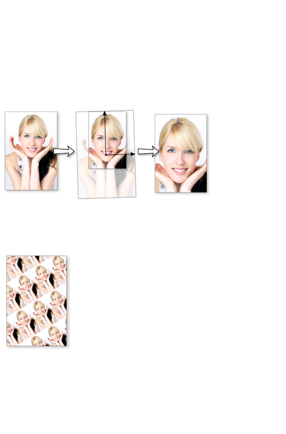
Resize, rotate and position a photo within its
frame
Photos in Xara Web Designer 7 Premium are treated like a "bitmap filled" rectangle. The shape of your
photo is really a fully editable outline around the image contained inside. So when you crop, or edit the
outline shape, you're not affecting the fill, which is clipped inside the shape.
Photos and bitmaps on the page are always contained within an outline shape. Not only can you change
the shape of the outline, you can also adjust the size, angle and position of the photo within its frame using
the Fill Tool. Just select the photo, go into the Fill Tool and you will see fill arrows at right angles from
the center (or you can go into Fill Tool
, and click on the photo to select).
For example, to enlarge and rotate the image on the left inside its frame, select the Fill Tool
and drag on one of the arrowheads.
To resize drag on one of the arrow heads away from the center. You can hold "Ctrl" to constrain
the angle.
To rotate the image, drag one of the arrowheads around the center.
To re-position the image, drag anywhere on the image.
On the InfoBar of the Fill Tool
, you can select the "repeating tile" option which
makes the image a tiling bitmap fill. By dragging
the fill handles you can now resize and rotate the
image tile dimension. There is no better
demonstration of the speed of Xara Web Designer
7 Premium than to do this with a huge
multi-megapixel image.
If you have a Photo Group instead of just an ordinary photo object you can't use the Fill Tool as
described above to scale and rotate the image in its frame. If you want to convert a Photo Group into an
ordinary photo object so you can adjust it using the Fill Tool, you can use "Utilities" > "Optimize
photo
" to do this. But note that this is destructive in that thereafter you will not be able to modify any of the
photo edits you've applied to the photo.
Page 887
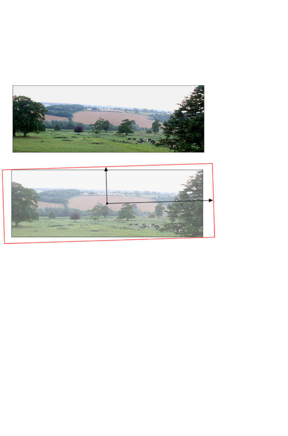
Horizon Straighten
Using the Fill Tool
, as previously described, means it's easy to straighten the horizon of an askew picture.
Select the Fill Tool and click on any photo. This will show the fill handles, which are arrows
showing the extent of the fill inside the shape.
Drag on the end of one of the fill arrows to resize, and rotate as required.
The following shows a landscape (created using the panorama stitching feature of Web Designer
Premium) that has a sloping horizon.
In the Fill Tool
, drag on one of the arrowheads to rotate and resize as required. You can re-position the photo by
dragging on the center handle of the fill arrows, or holding "Shift" and pushing anywhere on the image.
Page 888

Viewing a scaled photo at its full size
The Zoom to 1:1 button on the Photo Tool
infobar adjusts the zoom so that the selected image is shown at full size, which is where each pixel of the
image is mapped to each screen pixel. This is useful if you want to edit an image that's been scaled down
on the page, but want to see it at its full size while you work on it.
Page 889

Making a photo its full size
The Scale photo to 100% button on the Photo Tool
infobar takes the currently selected photo and scales it to its full size on the page. So for example if the
selected photo is scaled down to 500 pixels wide, but the original imported photo was 1000 pixels wide,
the photo on the page will be scaled up to 1000 pixels wide. When the document zoom is 100%, that
means that each pixel of the image is mapped to each screen pixel.
Page 890
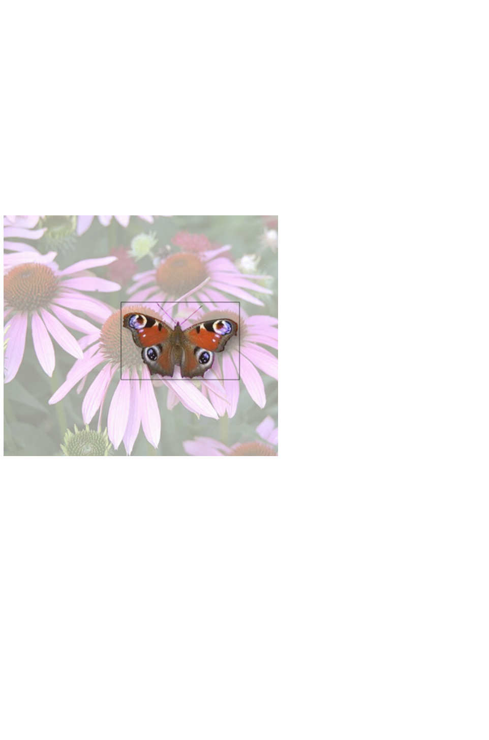
Optimizing Photos and Bitmaps
With the ever increasing resolution and file size of digital camera JPEGs, if you have a document
containing many images, the file size can quickly become very large. For example, a multi-page document
containing 20 full resolution JPEGs, each of 5mb, would produce a .xar file of over 100mb*.
Furthermore, these photos are often unnecessarily high resolution. Reducing a photo from a 8 megapixel
digital camera to be 2 inches (5 cm) wide on the page will result in this image being around 1500 dpi.
Whilst a very high resolution image gives greater flexibility for printing (and you can zoom in, or enlarge
small parts of the photo), this is far higher than required for even the best quality commercial printing, and
even more so for web graphics or HTML production.
If you clip to a small part of the image, or cut-out only a small part of your photos, there could be large
parts of hidden image outside the visible area. For editing purposes this "live crop" is a great feature, as
you can un-crop, alter the size, position and scale and everything remains as sharp as possible. But for
finished documents you may want to remove the invisible parts.
The cut-out butterfly image still has the rest of the photo attached. If you go into the Fill Tool
you can easily see this by resizing the fill inside the outline. So the parts of the image outside the butterfly
will probably be superfluous in your final document.
Right click a photo and choose Optimize Photo or choose "Utilities" > "Optimize photo.."..
This dialog performs three important functions:
Removing invisible parts of photos
Reducing resolution of photos
Converting PNG or bitmaps to embedded JPEGs to optimize file size
Selecting this menu option for any bitmap will display the Optimize Photo
dialog.
Page 891
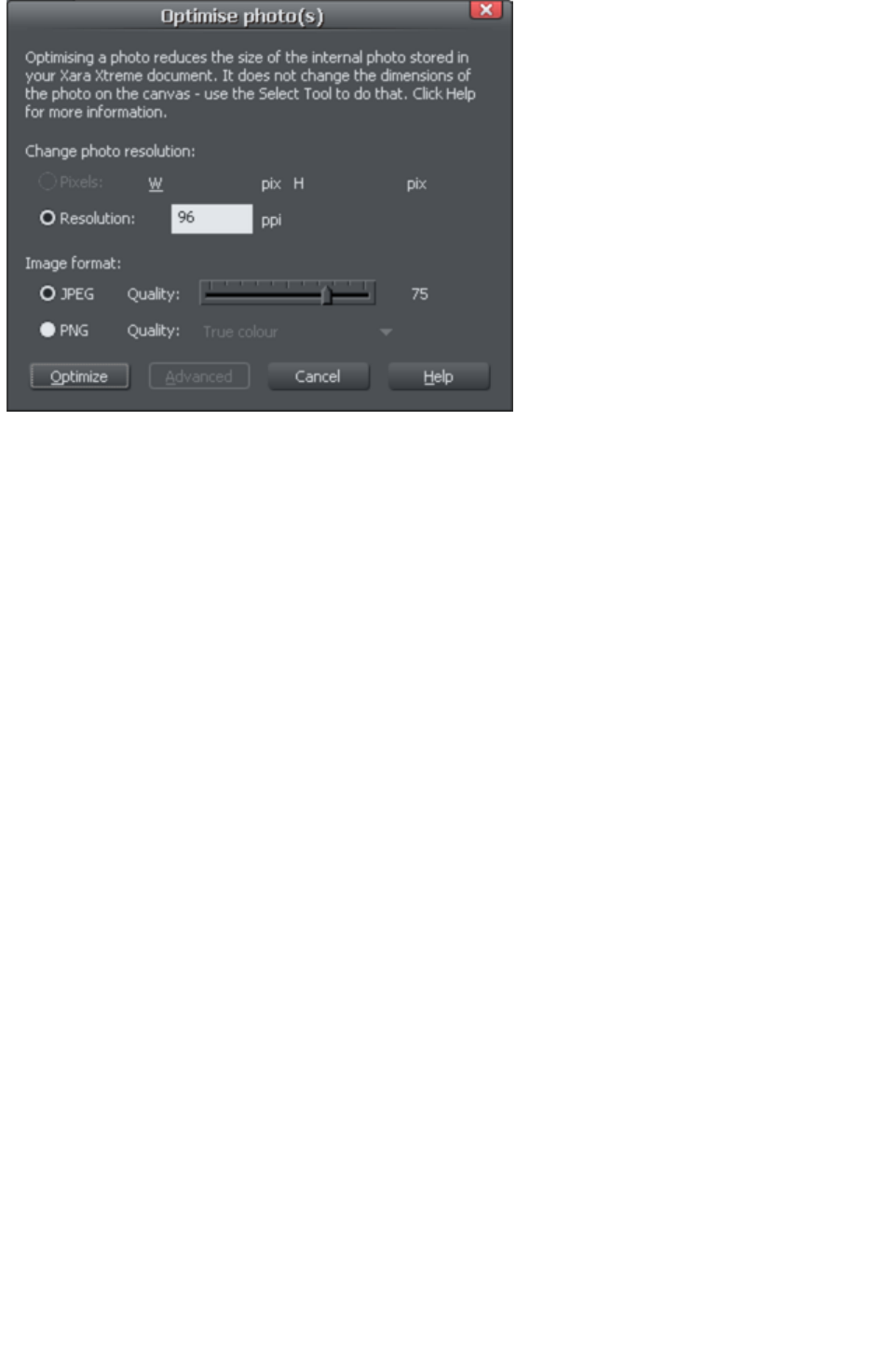
By default the settings are such that the photo will be optimized to a 96dpi (normal screen resolution)
JPEG at the size that it appears on your page. This is normally what you will want for photos in your
website.
You can change the resolution used in this dialog, by either choosing the physical size you want for the
optimized image (width/height in pixels), or by entering a different dpi (eg. perhaps 150dpi if you want
print quality).
If you choose the dpi option the value you enter is remembered and becomes the default just for the
current session. You can also maintain the photo's current resolution by choosing Current from the ppi
list.
You can also choose to optimize as a PNG (produces much larger images, but better quality for graphics
and text images) or change the quality used for JPEG optimization (higher quality means larger JPEG
sizes).
If your photo is cropped, only the visible part of the image is preserved in the optimized image.
For printing, a photo resolution of 150dpi gives very good results, whilst 300 dpi will provide the highest
quality commercial printing (most people cannot tell the difference between 150dpi and 300dpi, but the
300dpi requires four times as much memory or file space).
Note
: The optimum JPEG quality is 75%.WE DO NOT recommend saving JPEGs with a quality at 100% -
they are virtually indistinguishable from JPEGs saved at 75%, but use considerably more memory and file
space.
Warning: "Optimize photo
" is a "destructive" operation. When you save the file the parts of the image removed are lost, and the
resolution changed permanently (you can of course undo the changes while the file is open for editing).
You can optimize multiple photos at once if you want them to all have the same DPI. Select the photos
you want to optimize and then choose the Optimize
operation as described above. If your photos have different dimensions, the option to optimize by pixel
size is disabled and you must just choose the required dpi.
Or you can use the "Utilities" > "Optimize all JPEGs"
facility to optimize all the JPEG photos in your document in one operation. Again in this case the
optimize dialog appears so you can choose the dpi to be used for the optimizations.
Note that after optimizing the original unoptimized and now unreferenced photo remains in the Bitmap
Gallery
. This means it is still in memory and so the memory requirements of your design will not have been
reduced. Simply save your design and reload after optimizing, to eliminate the original large images.
Page 892
Photo Documents
Sometimes it's useful to work on one photo alone, rather than as "objects on a page". This is called a
photo document or "photo mode" in Web Designer Premium, and it behaves more like a traditional photo
editor. You can create a photo document in a number of ways:
Drag a photo file from your file explorer onto the title bar or toolbar of Web Designer Premium
Select "File" > "Open" and select a photo file
Create a blank photo document by selecting "File" > "New" > "Blank photo"
Photo documents are characterized by the following behavior differences compared to traditional Web
Designer Premium documents:
There is no visible white page. In fact the page dimensions are set automatically to match the
photo plus any other objects you've added.
Photo documents have a 1 pixel grid by default and snap to grid is turned on. This makes it easier
to get pixel-accurate crop or clip regions.
The Pasteboard (the area around the photo) is a darker color. This makes it easy to distinguish at
a glance between photo documents and drawing documents.
The document zoom is set so that the photo fills the view and the Photo Tool is automatically
selected as the current tool.
Dropping additional photo files on top of an existing photo just adds a new photo to the
document instead of replacing the photo in its frame. And the view will zoom out so you can see
the whole image.
Images are not resized to be 500 pixels on import as they are in normal documents, but are
imported at 1:1, so that at 100% zoom you're seeing the image at full size.
The pixel smoothing options are altered. By default it selects the "Very high quality" display
mode, which is best for images scaled down or zoomed out. It also has pixel smoothing turned
off when zooming in, so you can see the pixels are very large zoom factors.
If you've opened a JPEG photo file as a photo document, when you save changes your JPEG file
will be overwritten. See Editing Photo Files below for details.
In all other respects Photo Documents behave like normal Xara Web Designer 7 Premium documents.
You can use all the normal drawing and text tools as usual. If you want to create a photo document of a
given size, you can alter the "canvas" or page size by selecting "Utilities" > "Options" and the "Page"
tab and entering the required dimensions.
In Photo Documents two extra controls become enabled. The Previous and Next
button will move onto the Previous or Next image in the folder from which this image was opened. This
will close the current image, so you may be prompted to save the file.
Page 893

Editing Photo Files
You can use Xara Web Designer 7 Premium to easily edit your JPEG photos and save back the
modified JPEG. And unlike with most photo editors, you can do this multiple times without loss of
quality, even though the JPEG format is a lossy format (see Lossless versus Lossy
earlier in this chapter). That's becauseXara Web Designer 7 Premium is able to save your edits in a
lossless way, along with the original photo. Here's how it works.
First open the JPEG, using "File" > "Open"
, drag and drop, or in Windows File Explorer right click and choose Xara Web Designer 7 Premium
from the "open with" list. The photo is opened as a Photo document.
Edit the photo using the photo tools as described above.
If you then do "File" > "Save"
("Ctrl + S"), the JPEG file you loaded will be overwritten with the modified image. However by default
Xara Web Designer 7 Premium also saves your photo in its native .xar format. This file is placed into a
"Masters" folder alongside your JPEG file. It has the same name as your photo file but with a .web
extension. The .xar file includes within it your original photo without the modifications applied, and of
course details of your edits.
In future if you load the modified JPEG file in order to edit it further, Xara Web Designer 7 Premium will
look in the Masters folder to see if there is a .xar file available for that photo. If so, the .xar file is loaded
instead of the JPEG file and you can continue editing from where you left off. When you next save, the
JPEG file is again overwritten and an updated .xar file also saved into the Masters folder.
Of course if you don't want to overwrite your original JPEG file with your changes, you can use "File" >
"Save As"
, to save the modified photo elsewhere, or use the many export facilities to export your photo into
different formats.
You can get hold of the original photo from the .web file by opening it, opening the Bitmap Gallery,
right clicking on the photo and choosing the Save
option.
In the Photo Editing tab of the "Utilities" > "Options"
dialog you can choose to change the saving behavior described above. You can choose to not have a
.xar file automatically saved for you into the Masters sub-folder, or you can choose to have the original
photo file saved there instead.
Note if you turn off this original photo preservation, you'll lose the original photo when you do a Save!
Page 894


Introduction
The Photo Tool
provides a direct and very fast way of cropping, adjusting the brightness levels and sharpening photos,
even for ultra high-resolution images. This tool provides:
One-click auto-enhance your photos; this is particularly good for dull, underexposed images.
Manually adjust the brightness, contrast, color saturation, photo color temperature and blur or
sharpness of photos.
Crop images. This is "live crop" so you can un-crop and adjust the crop at any time.
A single-click "Compare" function to quickly compare changes against the original.
Easy copy / paste all photo enhance edits between different images.
All these operations are interactive with live update. As you adjust the values, the image is updated
instantly. They are also all non-destructive, meaning that your original image is not altered and you can
always adjust or remove any adjustment.
There is also an anti-redeye
tool.
Photo Tool Benefits
There are three major benefits of this tool:
1. It's non destructive
2. It's very, very fast, even for huge images
3. Photo Edits require no memory.
Benefits explained in more detail
The non-destructive
point means that all edits do not affect the original image. You can adjust or remove the edits and the
original image remains unaffected. This differs from most photo editors where an alteration makes a
permanent change to the pixels of the photo. In Web Designer Premium you can adjust the settings as
many times as you like in the sound knowledge that you are not altering the real actual original photo
data.
Even the crop feature is non-destructive (which is why it's called clip). You you can restore the cropped
areas and adjust or enlarge the crop region at any time, even after you've saved a file.
The speed
point is self-evident, but a good demonstration of the speed is to rotate a very high resolution photo. In
other tools you usually have to enter a number of degrees, and then wait for this to be processed. In Xara
Web Designer 7 Premium you can drag rotate a full resolution image in real time (or enter any rotation
value), and it uses high-quality bi-cubic image sampling to ensure the highest quality results.
The no memory
point refers to the fact most photo editors need to make a copy of a bitmap in memory in order to
provide an undo capability, and usually one copy each time you adjust or edit. For large, hi-res digital
photos this can mean very large amounts of memory being required for your photo editing (a typical 8 mb
digital photo requires 32 mb of memory; make ten edits and that's 320 mb of memory). Xara Web
Designer 7 Premium requires zero memory. You can make as many edits as you like and make as many
copies of your photo in your document, and the additional RAM and file space required by for this is
zero.
Finally, JPEG images are embedded into the native .xar file, and not expanded into raw images as they
are in other graphics tools. This means a native file size typically 10 times smaller. Combine this with the
zero memory copies, the real-time enhance features described above and it's quite possible to have file
sizes 30 times or more smaller than with other graphics tools. And that means they are much, much
Page 896

quicker to handle, save, process and transfer.
Page 897

Photo Tool Benefits
There are three major benefits of this tool:
1. It's non destructive
2. It's very, very fast, even for huge images
3. Photo Edits require no memory.
Benefits explained in more detail
The non-destructive
point means that all edits do not affect the original image. You can adjust or remove the edits and the
original image remains unaffected. This differs from most photo editors where an alteration makes a
permanent change to the pixels of the photo. In Web Designer Premium you can adjust the settings as
many times as you like in the sound knowledge that you are not altering the real actual original photo
data.
Even the crop feature is non-destructive (which is why it's called clip). You you can restore the cropped
areas and adjust or enlarge the crop region at any time, even after you've saved a file.
The speed
point is self-evident, but a good demonstration of the speed is to rotate a very high resolution photo. In
other tools you usually have to enter a number of degrees, and then wait for this to be processed. In Xara
Web Designer 7 Premium you can drag rotate a full resolution image in real time (or enter any rotation
value), and it uses high-quality bi-cubic image sampling to ensure the highest quality results.
The no memory
point refers to the fact most photo editors need to make a copy of a bitmap in memory in order to
provide an undo capability, and usually one copy each time you adjust or edit. For large, hi-res digital
photos this can mean very large amounts of memory being required for your photo editing (a typical 8 mb
digital photo requires 32 mb of memory; make ten edits and that's 320 mb of memory). Xara Web
Designer 7 Premium requires zero memory. You can make as many edits as you like and make as many
copies of your photo in your document, and the additional RAM and file space required by for this is
zero.
Finally, JPEG images are embedded into the native .xar file, and not expanded into raw images as they
are in other graphics tools. This means a native file size typically 10 times smaller. Combine this with the
zero memory copies, the real-time enhance features described above and it's quite possible to have file
sizes 30 times or more smaller than with other graphics tools. And that means they are much, much
quicker to handle, save, process and transfer.
Page 898

Benefits explained in more detail
The non-destructive
point means that all edits do not affect the original image. You can adjust or remove the edits and the
original image remains unaffected. This differs from most photo editors where an alteration makes a
permanent change to the pixels of the photo. In Web Designer Premium you can adjust the settings as
many times as you like in the sound knowledge that you are not altering the real actual original photo
data.
Even the crop feature is non-destructive (which is why it's called clip). You you can restore the cropped
areas and adjust or enlarge the crop region at any time, even after you've saved a file.
The speed
point is self-evident, but a good demonstration of the speed is to rotate a very high resolution photo. In
other tools you usually have to enter a number of degrees, and then wait for this to be processed. In Xara
Web Designer 7 Premium you can drag rotate a full resolution image in real time (or enter any rotation
value), and it uses high-quality bi-cubic image sampling to ensure the highest quality results.
The no memory
point refers to the fact most photo editors need to make a copy of a bitmap in memory in order to
provide an undo capability, and usually one copy each time you adjust or edit. For large, hi-res digital
photos this can mean very large amounts of memory being required for your photo editing (a typical 8 mb
digital photo requires 32 mb of memory; make ten edits and that's 320 mb of memory). Xara Web
Designer 7 Premium requires zero memory. You can make as many edits as you like and make as many
copies of your photo in your document, and the additional RAM and file space required by for this is
zero.
Finally, JPEG images are embedded into the native .xar file, and not expanded into raw images as they
are in other graphics tools. This means a native file size typically 10 times smaller. Combine this with the
zero memory copies, the real-time enhance features described above and it's quite possible to have file
sizes 30 times or more smaller than with other graphics tools. And that means they are much, much
quicker to handle, save, process and transfer.
Page 899
Using the Photo Tools
To access the photo tools
, move your mouse pointer over the Camera icon in the main toolbar
on the left of the window. A flyout bar appears with icons for each of
the available photo tools.
If you're in the Selector Tool a double click on a photo will switch into the Photo Tool
.
Page 900
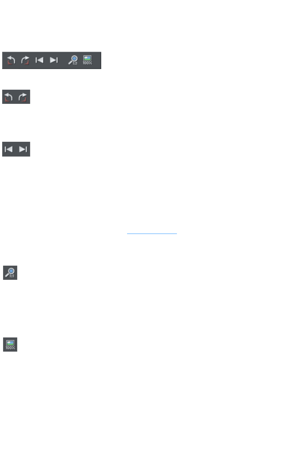
Common photo functions
The following buttons are available on the infoBar when you are in the Enhance, Clip, Red eye or
Content-aware scaling
photo tools.
Rotate by 90° controls
The two rotate icons will rotate the selected photo or photos by 90 degrees anti-clockwise or
clockwise.
Previous & Next
When you 'open' a photo using Xara Web Designer 7 Premium the photo is loaded into a new Photo
Document, because Web Designer Premium assumes you want to edit or view the photo itself rather than
use it as part of a drawing or other document. When you've opened a photo you can use the 'Previous'
and 'Next' buttons on the Photo Tool
infobar to close the current photo document and open the next (or previous) photo in the same folder as
the current photo. This allows you to browse through the photos in a folder, without having to open and
close each one individually. If you've made any unsaved changes to the photo you'll be asked if you want
to save the changes when you press previous or next.
See Photo Handling for more information on Photo Documents
.
Zoom 1:1
Select a photo and click the Zoom 1:1 button.
The Zoom to 1:1
adjusts the zoom so that the selected image is shown at full size, which is where each pixel of the image
is mapped to each screen pixel. Use this option if you want to work on a photo at full size in a document
where you have scaled the photo down.
Scale photo to 100%
The Scale photo to 100%
operation takes the currently selected photo and scales it to its full size.
It also puts the photo onto the pixel grid.
So for example if the selected photo is scaled down to 500 pixels wide, but the original imported photo
was 1000 pixels wide, the photo on the page will be scaled up to 1000 pixels wide. When the document
zoom is 100%, that means that each pixel of the image is mapped to each screen pixel.
Page 901
Rotate by 90° controls
The two rotate icons will rotate the selected photo or photos by 90 degrees anti-clockwise or
clockwise.
Previous & Next
When you 'open' a photo using Xara Web Designer 7 Premium the photo is loaded into a new Photo
Document, because Web Designer Premium assumes you want to edit or view the photo itself rather than
use it as part of a drawing or other document. When you've opened a photo you can use the 'Previous'
and 'Next' buttons on the Photo Tool
infobar to close the current photo document and open the next (or previous) photo in the same folder as
the current photo. This allows you to browse through the photos in a folder, without having to open and
close each one individually. If you've made any unsaved changes to the photo you'll be asked if you want
to save the changes when you press previous or next.
See Photo Handling for more information on Photo Documents
.
Zoom 1:1
Select a photo and click the Zoom 1:1 button.
The Zoom to 1:1
adjusts the zoom so that the selected image is shown at full size, which is where each pixel of the image
is mapped to each screen pixel. Use this option if you want to work on a photo at full size in a document
where you have scaled the photo down.
Scale photo to 100%
The Scale photo to 100%
operation takes the currently selected photo and scales it to its full size.
It also puts the photo onto the pixel grid.
So for example if the selected photo is scaled down to 500 pixels wide, but the original imported photo
was 1000 pixels wide, the photo on the page will be scaled up to 1000 pixels wide. When the document
zoom is 100%, that means that each pixel of the image is mapped to each screen pixel.
Page 902
Previous & Next
When you 'open' a photo using Xara Web Designer 7 Premium the photo is loaded into a new Photo
Document, because Web Designer Premium assumes you want to edit or view the photo itself rather than
use it as part of a drawing or other document. When you've opened a photo you can use the 'Previous'
and 'Next' buttons on the Photo Tool
infobar to close the current photo document and open the next (or previous) photo in the same folder as
the current photo. This allows you to browse through the photos in a folder, without having to open and
close each one individually. If you've made any unsaved changes to the photo you'll be asked if you want
to save the changes when you press previous or next.
See Photo Handling for more information on Photo Documents
.
Zoom 1:1
Select a photo and click the Zoom 1:1 button.
The Zoom to 1:1
adjusts the zoom so that the selected image is shown at full size, which is where each pixel of the image
is mapped to each screen pixel. Use this option if you want to work on a photo at full size in a document
where you have scaled the photo down.
Scale photo to 100%
The Scale photo to 100%
operation takes the currently selected photo and scales it to its full size.
It also puts the photo onto the pixel grid.
So for example if the selected photo is scaled down to 500 pixels wide, but the original imported photo
was 1000 pixels wide, the photo on the page will be scaled up to 1000 pixels wide. When the document
zoom is 100%, that means that each pixel of the image is mapped to each screen pixel.
Page 903
Zoom 1:1
Select a photo and click the Zoom 1:1 button.
The Zoom to 1:1
adjusts the zoom so that the selected image is shown at full size, which is where each pixel of the image
is mapped to each screen pixel. Use this option if you want to work on a photo at full size in a document
where you have scaled the photo down.
Scale photo to 100%
The Scale photo to 100%
operation takes the currently selected photo and scales it to its full size.
It also puts the photo onto the pixel grid.
So for example if the selected photo is scaled down to 500 pixels wide, but the original imported photo
was 1000 pixels wide, the photo on the page will be scaled up to 1000 pixels wide. When the document
zoom is 100%, that means that each pixel of the image is mapped to each screen pixel.
Page 904

Scale photo to 100%
The Scale photo to 100%
operation takes the currently selected photo and scales it to its full size.
It also puts the photo onto the pixel grid.
So for example if the selected photo is scaled down to 500 pixels wide, but the original imported photo
was 1000 pixels wide, the photo on the page will be scaled up to 1000 pixels wide. When the document
zoom is 100%, that means that each pixel of the image is mapped to each screen pixel.
Page 905
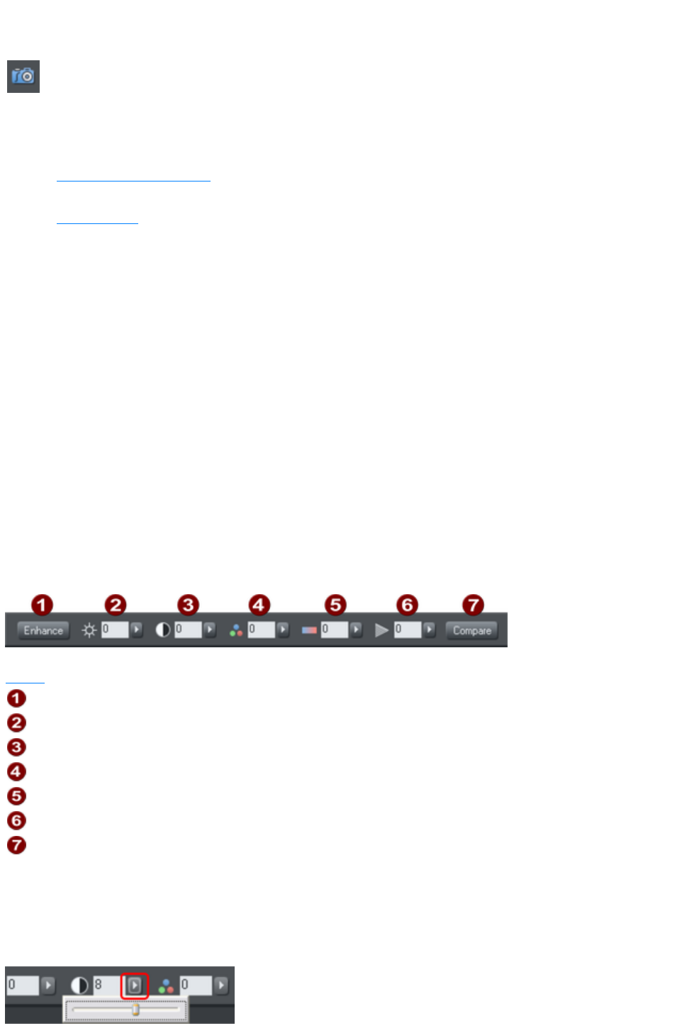
Enhance Tool
Click the Camera icon to enter the Enhance Tool
.
The Photo Tool
provides a direct and very fast way of cropping, adjusting the brightness levels and sharpening photos,
even for ultra high-resolution images. This tool provides:
One-click auto-enhance your photos; this is particularly good for dull, underexposed images.
Manually adjust the brightness, contrast, color saturation and blur or sharpness of photos.
Crop images. This is "live crop" so you can un-crop and adjust the crop at any time.
Correct color casts or white balance.
A single-click "Compare" function to quickly compare changes against the original.
Easy copy / paste all photo enhance edits between different images.
All these operations are interactive with live update. As you adjust the values, the image is updated
instantly. They are also all non-destructive, meaning that your original image is not altered and you can
always adjust or remove any adjustment.
There are three major benefits of this tool:
1. It's non destructive
2. It's very, very fast, even for huge images
3. Photo Edits require no memory.
The non-destructive
point means that all edits do not affect the original image. You can adjust or remove the edits and the
original image remains unaffected. This differs from most photo editors where an alteration makes a
permanent change to the pixels of the photo. In Web Designer Premium you can adjust the settings as
many times as you like in the sound knowledge that you are not altering the real actual original photo
data.
Even the crop feature is non-destructive (which is why it's called clip). You you can restore the cropped
areas and adjust or enlarge the crop region at any time, even after you've saved a file.
The first six InfoBar buttons to the left (not shown above) are common to all tools and are described
above
Auto-Enhance
Brightness
Contrast
Color Saturation
Color Temperature
Blur / Sharpen
Compare with original
In this tool you can adjust brightness, contrast, saturation, temperature, and blur/sharpen. You can either
enter values directly into the text fields or use a small pop-up slider for adjusting the values interactively.
Pop-up slider controls
The pop-up sliders can be used in one of two ways:
Page 906
1. Click and release the pop-up arrow. The slider control now remains on screen and you can
adjust the values as many times as you like by dragging the slider control. Alternatively, if the
mouse is held over the control, the mouse-wheel can be used to make small adjustments up or
down. The slider will hide when you click anywhere else in the document.
2. Or you can click & hold the mouse button down, and drag over the slider bar to adjust the value.
When you release the mouse the pop-up vanishes. This is a quicker more direct way, since it
requires only one click & release to alter the values.
Auto Enhance
Clicking the "Enhance" button will analyze the overall brightness and contrast of the picture and
automatically adjust the enhance values to obtain the best image. It is particularly effective with
under-exposed (dark) images. After applying automatic enhancement to a photo you can adjust the
values that were chosen, using the controls to the right of the "enhance" button. Clicking the "Compare"
button will restore the original, clicking it again restores the last enhance values.
Brightness/Contrast/Color Temperature/Saturation
Brightness
Contrast
Saturation
Color
Temperature
The image is altered as you adjust these values. The saturation alters the color intensity. At the minimum
setting of -100 this will make a picture black and white. The Color Temperature control makes a picture
more 'warm' or 'cool'.
Blur/Sharpen
This control blurs images if it's taken below zero, and sharpens images above 0. For sharpen it's
recommended that only small values be used, and typically only on images that have been reduced in size
a lot. You can enter blur values larger than the -100 maximum value available on the slider. E.g. entering
-400 will produce a very blurred image.
Page 907
Pop-up slider controls
The pop-up sliders can be used in one of two ways:
1. Click and release the pop-up arrow. The slider control now remains on screen and you can
adjust the values as many times as you like by dragging the slider control. Alternatively, if the
mouse is held over the control, the mouse-wheel can be used to make small adjustments up or
down. The slider will hide when you click anywhere else in the document.
2. Or you can click & hold the mouse button down, and drag over the slider bar to adjust the value.
When you release the mouse the pop-up vanishes. This is a quicker more direct way, since it
requires only one click & release to alter the values.
Auto Enhance
Clicking the "Enhance" button will analyze the overall brightness and contrast of the picture and
automatically adjust the enhance values to obtain the best image. It is particularly effective with
under-exposed (dark) images. After applying automatic enhancement to a photo you can adjust the
values that were chosen, using the controls to the right of the "enhance" button. Clicking the "Compare"
button will restore the original, clicking it again restores the last enhance values.
Brightness/Contrast/Color Temperature/Saturation
Brightness
Contrast
Saturation
Color
Temperature
The image is altered as you adjust these values. The saturation alters the color intensity. At the minimum
setting of -100 this will make a picture black and white. The Color Temperature control makes a picture
more 'warm' or 'cool'.
Blur/Sharpen
This control blurs images if it's taken below zero, and sharpens images above 0. For sharpen it's
recommended that only small values be used, and typically only on images that have been reduced in size
a lot. You can enter blur values larger than the -100 maximum value available on the slider. E.g. entering
-400 will produce a very blurred image.
Page 908
Auto Enhance
Clicking the "Enhance" button will analyze the overall brightness and contrast of the picture and
automatically adjust the enhance values to obtain the best image. It is particularly effective with
under-exposed (dark) images. After applying automatic enhancement to a photo you can adjust the
values that were chosen, using the controls to the right of the "enhance" button. Clicking the "Compare"
button will restore the original, clicking it again restores the last enhance values.
Brightness/Contrast/Color Temperature/Saturation
Brightness
Contrast
Saturation
Color
Temperature
The image is altered as you adjust these values. The saturation alters the color intensity. At the minimum
setting of -100 this will make a picture black and white. The Color Temperature control makes a picture
more 'warm' or 'cool'.
Blur/Sharpen
This control blurs images if it's taken below zero, and sharpens images above 0. For sharpen it's
recommended that only small values be used, and typically only on images that have been reduced in size
a lot. You can enter blur values larger than the -100 maximum value available on the slider. E.g. entering
-400 will produce a very blurred image.
Page 909
Brightness/Contrast/Color Temperature/Saturation
Brightness
Contrast
Saturation
Color
Temperature
The image is altered as you adjust these values. The saturation alters the color intensity. At the minimum
setting of -100 this will make a picture black and white. The Color Temperature control makes a picture
more 'warm' or 'cool'.
Blur/Sharpen
This control blurs images if it's taken below zero, and sharpens images above 0. For sharpen it's
recommended that only small values be used, and typically only on images that have been reduced in size
a lot. You can enter blur values larger than the -100 maximum value available on the slider. E.g. entering
-400 will produce a very blurred image.
Page 910

Blur/Sharpen
This control blurs images if it's taken below zero, and sharpens images above 0. For sharpen it's
recommended that only small values be used, and typically only on images that have been reduced in size
a lot. You can enter blur values larger than the -100 maximum value available on the slider. E.g. entering
-400 will produce a very blurred image.
Page 911

Compare & Restoring the original
The Compare button can be used to reset all the Enhance Tool
values back to their defaults, returning your photo to its original state. Press the compare button a second
time, your previous values are reinstated. Therefore you can use the compare button to quickly toggle
between your edited photo and the original photo so you can see the effects of the changes you've
made.
Because all the enhance and levels alterations are non-destructive, pressing compare simply removes the
enhance attributes, so restoring the original image. The compare button can be used at any time after an
image has been altered.
Page 912
Cropping or clipping images
The simplest way to clip a photo is just start dragging on or across the photo with the Enhance Tool
selected. The clipping is performed instantly after releasing the mouse. The resulting clipped photo has
clip handles around it, where you can adjust the clip borders afterwards.
This is a non-destructive operation meaning that you can both adjust the clip region after you've copped
the image and even un-crop to restore the whole image. A way to look at the process is that it just
adjusts the picture outlines, but the whole picture remains clipped inside the rectangular outline. This is
why it's called a clip, and not crop, although it serves the same goal as a traditional Crop Tool
.
You can select different photos while using the photo tools by just clicking on them. This also works for
photos inside groups.
Page 913
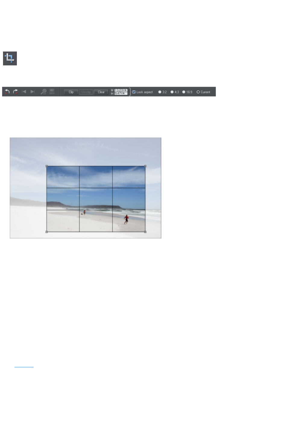
Clip Tool
Alternatively you can enter Clip Tool by selecting the Clip icon on the Photo Tool
fly-out bar. This provides a range of addition crop options. You can enter exact pixel values, and select
from various crop aspect ratios
For interactive clipping and some more options regarding aspect ratio,
enter the Clip Tool with the Clip Tool
button.
This alters the InfoBar to look like this:
As you drag over the photo, the clip rectangle is highlighted.
You can adjust the region by dragging on the corner or side handles
You can push the region around by just dragging inside the clip region
Select the Clip button or just double click inside the clip region to perform the clip operation.
You can tell whether a photo has been clipped or not from the status bar which will describe it as a
"clipped photo".
Clear
Press the "Clear"
button, or just click outside the marked clip region to clear the current clip rectangle.
Rule of Thirds
There's a photography guideline that helps the composition of many photographs called the "rule of
thirds". Put simply this involves placing key objects in your photos at thirds across your picture. For
example it's often better to position the horizon one third of the way down a picture rather than being
across the center. When you drag a clip region across your photos lines are displayed at thirds across
and down the image to help position objects to follow these composition guidelines.
Tip: Search
for "rule of thirds" on Google for more information.
Un-clip
Press the Un-clip
button with any clipped photo selected, to restore the original photo. This restores the clip rectangle,
which you can adjust or clear by clicking outside it.
The Un-clip button in the Clip Tool
Page 914

will change the outline of any clipped photo, and also arbitrarily formed shapes with a bitmap fill, to that
rectangular outline of the complete photo or bitmap used as the fill. You may have to select the Clear
button to clear the crop rectangle (or click outside the rectangle).
Adjusting the clip region
Because the un-clip button restores the clip rectangle (showing the area outside faded), you can easily
make fine adjustments to a clipped photo. Just select the photo, press the Un-clip button and adjust the
sides of the clip rectangle as required. Double click inside the photo to clip it again.
Width / Height
After drawing a clip rectangle, you can enter values directly into the width and height fields on the
InfoBar to set the clip rectangle dimensions to exact values.
Lock Aspect
Select the "Lock aspect" check-box to constrain the clip rectangle to a specific aspect ratio as you
drag. The radio buttons to the right of the check-box determine the aspect ratio used. Select "Current"
to maintain the aspect ratio to that of the photo before the clip. Note that the clip rectangle automatically
changes between landscape and portrait orientation as you drag a corner of the rectangle. So if you drag
sideways it tends to create a clip in landscape orientation. If you drag downwards more, then it will
create a clip region in portrait orientation.
The common preset crop aspect ratios are available of 4:3 (most consumer digital cameras and old-style
TVs and monitors), 3:2 (that of traditional film cameras and higher end SLR digital cameras), and 16:9
(aspect ratio of widescreen TVs).
You can override the lock-aspect option by using "Ctrl" while dragging. So if you're dragging out a clip
rectangle (or adjusting one) without aspect ratio lock, then holding "Ctrl" will lock the aspect to the last
selected aspect ratio. Similarly if you have lock aspect option on then "Ctrl" will temporarily un-lock the
aspect ratio.
Clipping in Photo Documents
In photo mode, there is a one-pixel grid applied to the photo (when at 96dpi, the default resolution) and
the clip rectangle snaps to this grid. This makes it very easy to get pixel exact clipping. For highly
accurate or exact pixel snapping, it's recommended to operate in photo mode and to zoom in so you can
see the pixels clearly.
See Photo documents
for more information.
Page 915

Clear
Press the "Clear"
button, or just click outside the marked clip region to clear the current clip rectangle.
Rule of Thirds
There's a photography guideline that helps the composition of many photographs called the "rule of
thirds". Put simply this involves placing key objects in your photos at thirds across your picture. For
example it's often better to position the horizon one third of the way down a picture rather than being
across the center. When you drag a clip region across your photos lines are displayed at thirds across
and down the image to help position objects to follow these composition guidelines.
Tip: Search
for "rule of thirds" on Google for more information.
Un-clip
Press the Un-clip
button with any clipped photo selected, to restore the original photo. This restores the clip rectangle,
which you can adjust or clear by clicking outside it.
The Un-clip button in the Clip Tool
will change the outline of any clipped photo, and also arbitrarily formed shapes with a bitmap fill, to that
rectangular outline of the complete photo or bitmap used as the fill. You may have to select the Clear
button to clear the crop rectangle (or click outside the rectangle).
Adjusting the clip region
Because the un-clip button restores the clip rectangle (showing the area outside faded), you can easily
make fine adjustments to a clipped photo. Just select the photo, press the Un-clip button and adjust the
sides of the clip rectangle as required. Double click inside the photo to clip it again.
Width / Height
After drawing a clip rectangle, you can enter values directly into the width and height fields on the
InfoBar to set the clip rectangle dimensions to exact values.
Lock Aspect
Select the "Lock aspect" check-box to constrain the clip rectangle to a specific aspect ratio as you
drag. The radio buttons to the right of the check-box determine the aspect ratio used. Select "Current"
to maintain the aspect ratio to that of the photo before the clip. Note that the clip rectangle automatically
changes between landscape and portrait orientation as you drag a corner of the rectangle. So if you drag
sideways it tends to create a clip in landscape orientation. If you drag downwards more, then it will
create a clip region in portrait orientation.
The common preset crop aspect ratios are available of 4:3 (most consumer digital cameras and old-style
TVs and monitors), 3:2 (that of traditional film cameras and higher end SLR digital cameras), and 16:9
(aspect ratio of widescreen TVs).
You can override the lock-aspect option by using "Ctrl" while dragging. So if you're dragging out a clip
rectangle (or adjusting one) without aspect ratio lock, then holding "Ctrl" will lock the aspect to the last
selected aspect ratio. Similarly if you have lock aspect option on then "Ctrl" will temporarily un-lock the
aspect ratio.
Clipping in Photo Documents
Page 916

In photo mode, there is a one-pixel grid applied to the photo (when at 96dpi, the default resolution) and
the clip rectangle snaps to this grid. This makes it very easy to get pixel exact clipping. For highly
accurate or exact pixel snapping, it's recommended to operate in photo mode and to zoom in so you can
see the pixels clearly.
See Photo documents
for more information.
Page 917

Rule of Thirds
There's a photography guideline that helps the composition of many photographs called the "rule of
thirds". Put simply this involves placing key objects in your photos at thirds across your picture. For
example it's often better to position the horizon one third of the way down a picture rather than being
across the center. When you drag a clip region across your photos lines are displayed at thirds across
and down the image to help position objects to follow these composition guidelines.
Tip: Search
for "rule of thirds" on Google for more information.
Un-clip
Press the Un-clip
button with any clipped photo selected, to restore the original photo. This restores the clip rectangle,
which you can adjust or clear by clicking outside it.
The Un-clip button in the Clip Tool
will change the outline of any clipped photo, and also arbitrarily formed shapes with a bitmap fill, to that
rectangular outline of the complete photo or bitmap used as the fill. You may have to select the Clear
button to clear the crop rectangle (or click outside the rectangle).
Adjusting the clip region
Because the un-clip button restores the clip rectangle (showing the area outside faded), you can easily
make fine adjustments to a clipped photo. Just select the photo, press the Un-clip button and adjust the
sides of the clip rectangle as required. Double click inside the photo to clip it again.
Width / Height
After drawing a clip rectangle, you can enter values directly into the width and height fields on the
InfoBar to set the clip rectangle dimensions to exact values.
Lock Aspect
Select the "Lock aspect" check-box to constrain the clip rectangle to a specific aspect ratio as you
drag. The radio buttons to the right of the check-box determine the aspect ratio used. Select "Current"
to maintain the aspect ratio to that of the photo before the clip. Note that the clip rectangle automatically
changes between landscape and portrait orientation as you drag a corner of the rectangle. So if you drag
sideways it tends to create a clip in landscape orientation. If you drag downwards more, then it will
create a clip region in portrait orientation.
The common preset crop aspect ratios are available of 4:3 (most consumer digital cameras and old-style
TVs and monitors), 3:2 (that of traditional film cameras and higher end SLR digital cameras), and 16:9
(aspect ratio of widescreen TVs).
You can override the lock-aspect option by using "Ctrl" while dragging. So if you're dragging out a clip
rectangle (or adjusting one) without aspect ratio lock, then holding "Ctrl" will lock the aspect to the last
selected aspect ratio. Similarly if you have lock aspect option on then "Ctrl" will temporarily un-lock the
aspect ratio.
Clipping in Photo Documents
In photo mode, there is a one-pixel grid applied to the photo (when at 96dpi, the default resolution) and
the clip rectangle snaps to this grid. This makes it very easy to get pixel exact clipping. For highly
accurate or exact pixel snapping, it's recommended to operate in photo mode and to zoom in so you can
see the pixels clearly.
Page 918


Un-clip
Press the Un-clip
button with any clipped photo selected, to restore the original photo. This restores the clip rectangle,
which you can adjust or clear by clicking outside it.
The Un-clip button in the Clip Tool
will change the outline of any clipped photo, and also arbitrarily formed shapes with a bitmap fill, to that
rectangular outline of the complete photo or bitmap used as the fill. You may have to select the Clear
button to clear the crop rectangle (or click outside the rectangle).
Adjusting the clip region
Because the un-clip button restores the clip rectangle (showing the area outside faded), you can easily
make fine adjustments to a clipped photo. Just select the photo, press the Un-clip button and adjust the
sides of the clip rectangle as required. Double click inside the photo to clip it again.
Width / Height
After drawing a clip rectangle, you can enter values directly into the width and height fields on the
InfoBar to set the clip rectangle dimensions to exact values.
Lock Aspect
Select the "Lock aspect" check-box to constrain the clip rectangle to a specific aspect ratio as you
drag. The radio buttons to the right of the check-box determine the aspect ratio used. Select "Current"
to maintain the aspect ratio to that of the photo before the clip. Note that the clip rectangle automatically
changes between landscape and portrait orientation as you drag a corner of the rectangle. So if you drag
sideways it tends to create a clip in landscape orientation. If you drag downwards more, then it will
create a clip region in portrait orientation.
The common preset crop aspect ratios are available of 4:3 (most consumer digital cameras and old-style
TVs and monitors), 3:2 (that of traditional film cameras and higher end SLR digital cameras), and 16:9
(aspect ratio of widescreen TVs).
You can override the lock-aspect option by using "Ctrl" while dragging. So if you're dragging out a clip
rectangle (or adjusting one) without aspect ratio lock, then holding "Ctrl" will lock the aspect to the last
selected aspect ratio. Similarly if you have lock aspect option on then "Ctrl" will temporarily un-lock the
aspect ratio.
Clipping in Photo Documents
In photo mode, there is a one-pixel grid applied to the photo (when at 96dpi, the default resolution) and
the clip rectangle snaps to this grid. This makes it very easy to get pixel exact clipping. For highly
accurate or exact pixel snapping, it's recommended to operate in photo mode and to zoom in so you can
see the pixels clearly.
See Photo documents
for more information.
Page 920

Adjusting the clip region
Because the un-clip button restores the clip rectangle (showing the area outside faded), you can easily
make fine adjustments to a clipped photo. Just select the photo, press the Un-clip button and adjust the
sides of the clip rectangle as required. Double click inside the photo to clip it again.
Width / Height
After drawing a clip rectangle, you can enter values directly into the width and height fields on the
InfoBar to set the clip rectangle dimensions to exact values.
Lock Aspect
Select the "Lock aspect" check-box to constrain the clip rectangle to a specific aspect ratio as you
drag. The radio buttons to the right of the check-box determine the aspect ratio used. Select "Current"
to maintain the aspect ratio to that of the photo before the clip. Note that the clip rectangle automatically
changes between landscape and portrait orientation as you drag a corner of the rectangle. So if you drag
sideways it tends to create a clip in landscape orientation. If you drag downwards more, then it will
create a clip region in portrait orientation.
The common preset crop aspect ratios are available of 4:3 (most consumer digital cameras and old-style
TVs and monitors), 3:2 (that of traditional film cameras and higher end SLR digital cameras), and 16:9
(aspect ratio of widescreen TVs).
You can override the lock-aspect option by using "Ctrl" while dragging. So if you're dragging out a clip
rectangle (or adjusting one) without aspect ratio lock, then holding "Ctrl" will lock the aspect to the last
selected aspect ratio. Similarly if you have lock aspect option on then "Ctrl" will temporarily un-lock the
aspect ratio.
Clipping in Photo Documents
In photo mode, there is a one-pixel grid applied to the photo (when at 96dpi, the default resolution) and
the clip rectangle snaps to this grid. This makes it very easy to get pixel exact clipping. For highly
accurate or exact pixel snapping, it's recommended to operate in photo mode and to zoom in so you can
see the pixels clearly.
See Photo documents
for more information.
Page 921

Width / Height
After drawing a clip rectangle, you can enter values directly into the width and height fields on the
InfoBar to set the clip rectangle dimensions to exact values.
Lock Aspect
Select the "Lock aspect" check-box to constrain the clip rectangle to a specific aspect ratio as you
drag. The radio buttons to the right of the check-box determine the aspect ratio used. Select "Current"
to maintain the aspect ratio to that of the photo before the clip. Note that the clip rectangle automatically
changes between landscape and portrait orientation as you drag a corner of the rectangle. So if you drag
sideways it tends to create a clip in landscape orientation. If you drag downwards more, then it will
create a clip region in portrait orientation.
The common preset crop aspect ratios are available of 4:3 (most consumer digital cameras and old-style
TVs and monitors), 3:2 (that of traditional film cameras and higher end SLR digital cameras), and 16:9
(aspect ratio of widescreen TVs).
You can override the lock-aspect option by using "Ctrl" while dragging. So if you're dragging out a clip
rectangle (or adjusting one) without aspect ratio lock, then holding "Ctrl" will lock the aspect to the last
selected aspect ratio. Similarly if you have lock aspect option on then "Ctrl" will temporarily un-lock the
aspect ratio.
Clipping in Photo Documents
In photo mode, there is a one-pixel grid applied to the photo (when at 96dpi, the default resolution) and
the clip rectangle snaps to this grid. This makes it very easy to get pixel exact clipping. For highly
accurate or exact pixel snapping, it's recommended to operate in photo mode and to zoom in so you can
see the pixels clearly.
See Photo documents
for more information.
Page 922

Lock Aspect
Select the "Lock aspect" check-box to constrain the clip rectangle to a specific aspect ratio as you
drag. The radio buttons to the right of the check-box determine the aspect ratio used. Select "Current"
to maintain the aspect ratio to that of the photo before the clip. Note that the clip rectangle automatically
changes between landscape and portrait orientation as you drag a corner of the rectangle. So if you drag
sideways it tends to create a clip in landscape orientation. If you drag downwards more, then it will
create a clip region in portrait orientation.
The common preset crop aspect ratios are available of 4:3 (most consumer digital cameras and old-style
TVs and monitors), 3:2 (that of traditional film cameras and higher end SLR digital cameras), and 16:9
(aspect ratio of widescreen TVs).
You can override the lock-aspect option by using "Ctrl" while dragging. So if you're dragging out a clip
rectangle (or adjusting one) without aspect ratio lock, then holding "Ctrl" will lock the aspect to the last
selected aspect ratio. Similarly if you have lock aspect option on then "Ctrl" will temporarily un-lock the
aspect ratio.
Clipping in Photo Documents
In photo mode, there is a one-pixel grid applied to the photo (when at 96dpi, the default resolution) and
the clip rectangle snaps to this grid. This makes it very easy to get pixel exact clipping. For highly
accurate or exact pixel snapping, it's recommended to operate in photo mode and to zoom in so you can
see the pixels clearly.
See Photo documents
for more information.
Page 923

Clipping in Photo Documents
In photo mode, there is a one-pixel grid applied to the photo (when at 96dpi, the default resolution) and
the clip rectangle snaps to this grid. This makes it very easy to get pixel exact clipping. For highly
accurate or exact pixel snapping, it's recommended to operate in photo mode and to zoom in so you can
see the pixels clearly.
See Photo documents
for more information.
Page 924

Photo Tool Notes
1. You can select different photos while using the photo tools by just clicking on them. This also
works for photos inside groups.
2. If you click and drag, while in the Enhance Tool, it will start a crop on the photo that you started
dragging on. Or, if you start dragging on the background, the crop will be applied to the first
photo you touch during the drag.
3. The Un-clip button in the Clip Tool will change the outline of any clipped photo, and also
arbitrarily formed shapes with a bitmap fill, to that rectangular outline of the complete photo or
bitmap used as the fill. You may have to select the Clear button to clear the crop rectangle (or
click outside the rectangle).
4. All photo operations can be fully undone. Unlike traditional photo or pixel editors, the original
photo is never altered. So this means you can make as many changes as you like, as often as you
like, and save and load .xar/.web files as often as you like, and there is no degradation of the
image (all edit operations are non-destructive and loss-less) and give no increase in file size.
5. All the Photo Tool options, including the levels control, operate on bitmap filled objects, as well
as stand-alone photos.
6. Opening a photo with Xara Web Designer 7 Premium (using "File" > "Open") opens it as a
Photo Document. After editing it, you can overwrite your photo file by just doing a "File" > "
Save" ("Ctrl + S"). A .web or .xar file is also saved into a Masters folder alongside your
modified photo, preserving your original photo and edits. See the Photo Handling chapter for
more details.
Page 925
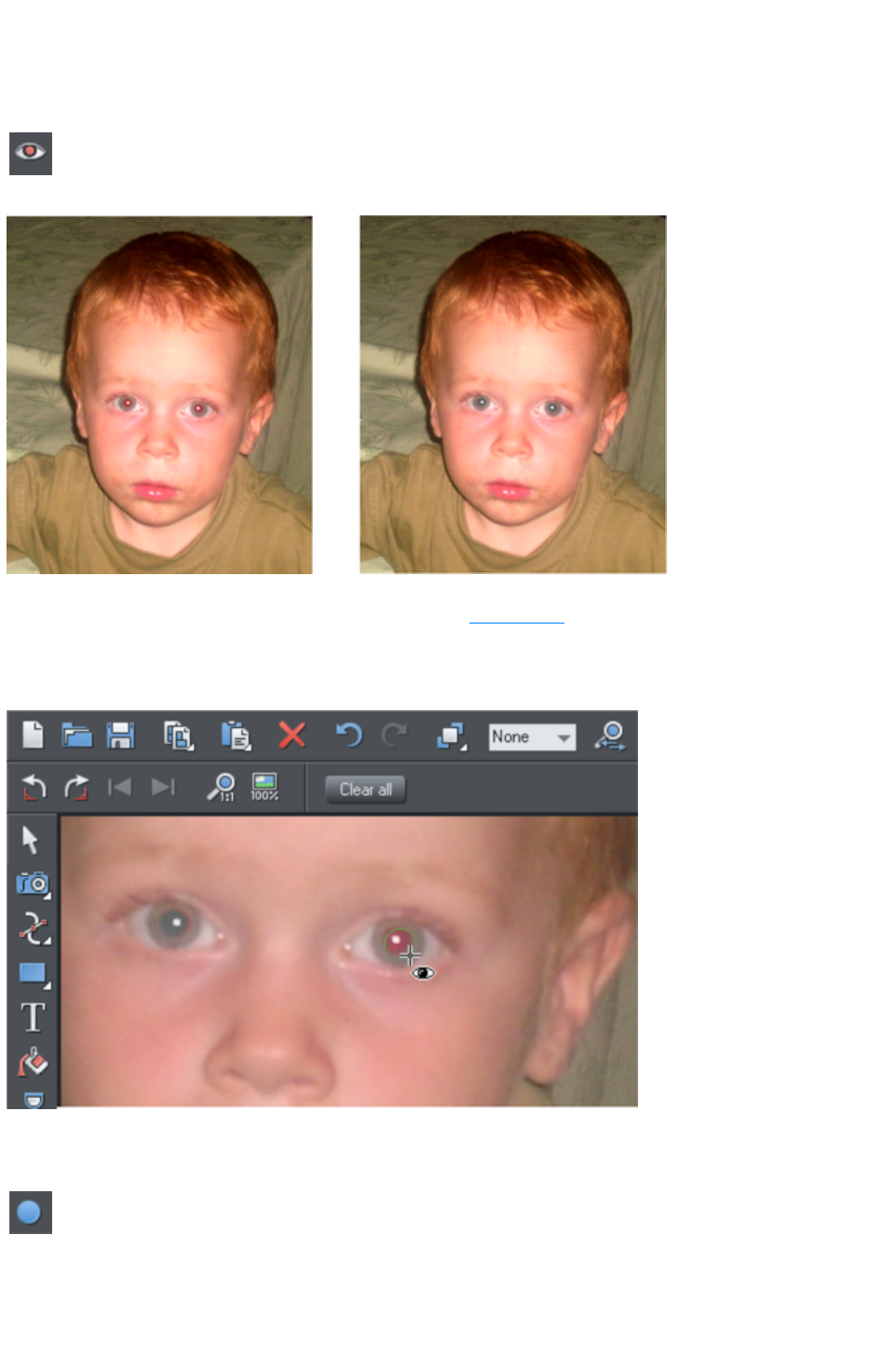
The Red Eye Tool
Select the Red Eye Tool from the Photo Tool
flyout bar.
The Red Eye Tool
allows you to quickly remove red eye effects from faces in your
photos.
Click the icon shown above to enter red eye mode. Then:
Zoom into the red eyes in your photo using the Zoom Tool or just using "Ctrl + Mousewheel".
Click and drag from the centre of the red eye outwards, to drag a circular red eye patch. The red
color is removed from the area within this circle.
Repeat the above for each red eye in your photo.
You can select any red eye patch you've applied to a photo by just clicking on it while in the Red Eye
Tool
. Then you can hit the delete key to remove the selected red eye patch.
Or go into the Quickshape Tool
and you can edit the selected red eye patch just as you edit normal
ellipse shapes in your documents.
Therefore if required you can make the red eye patches elliptical if that makes them fit the red eye area
better. See the Quickshape Tool
section for information on using this tool to edit ellipses. However for most photos the default circular
Page 926

red eye patches are good enough for removing red eye effects.
The edge of the red eye ellipse has a 3 pixel feather applied by default, so there is no hard edge to the
area from which the red is removed. You can easily adjust this feather value by selecting the red eye
ellipse (as above) and adjusting the feather value with the main feather control (on the right hand side of
the top bar), in the same way that you edit the feather values of ordinary shapes.
After applying the Red Eye Tool the red eye patches are grouped with the photo inside a Photo Group
. This is so that as you move the photo around in your document, or otherwise transform it, the red eye
patches move with the photo. Note that this means if you want to select a red eye ellipse when you are
not in the Red Eye Tool, you need to hold "Ctrl" down while clicking on the ellipse (which is called a
'select inside' operation). See the Photo Handling chapter for information on Photo Groups
.
Click the Clear All button on the Red Eye Tool
infoBar to delete all red eye ellipses from the current selected photo.
Page 927
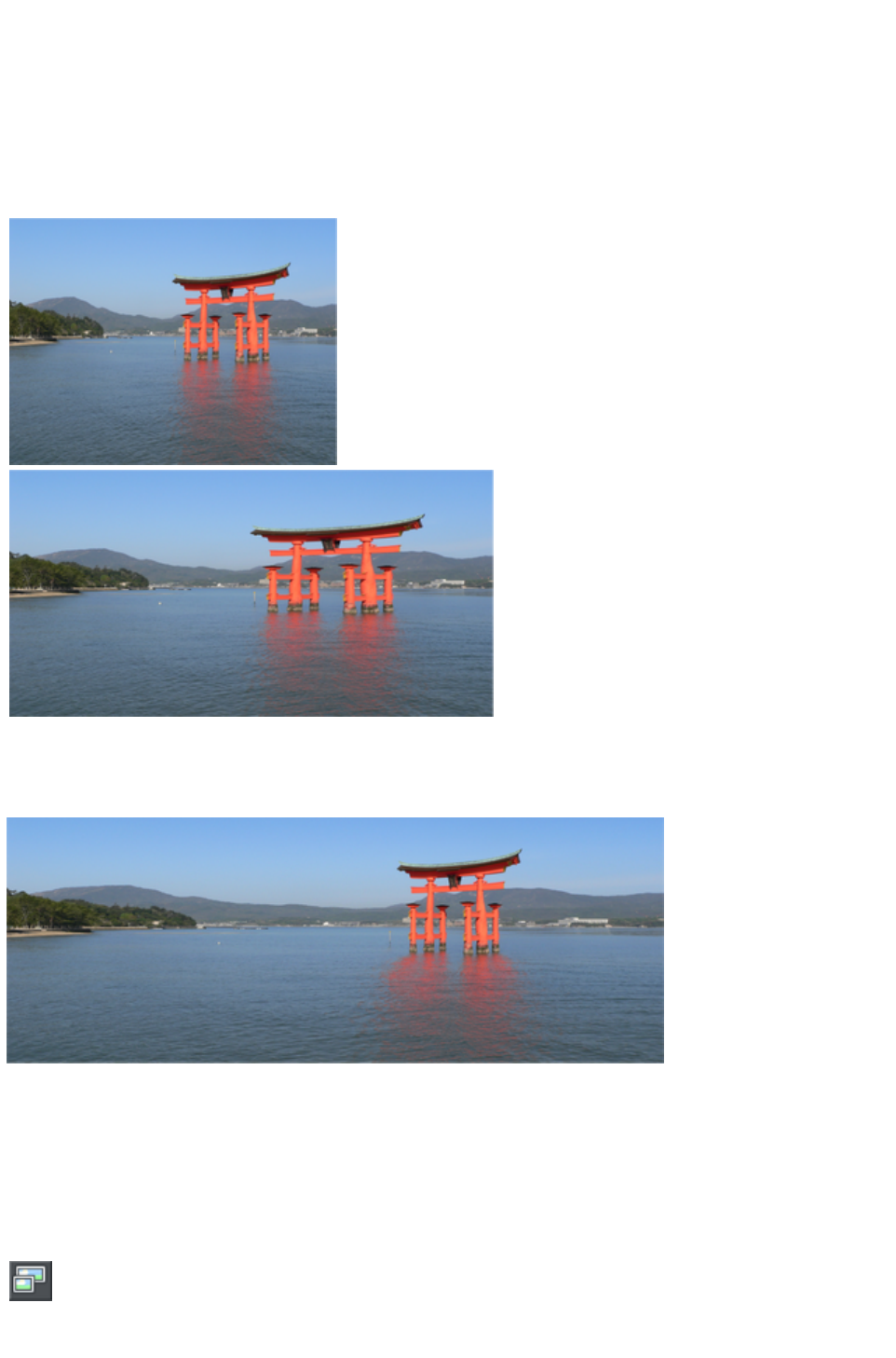
Content Aware Photo Resize
Web Designer Premium includes the ability to stretch photos using a new technique that retains the
proportions of key aspects of the photo.
The human eye is particularly sensitive to changes in aspect ratio of everyday objects, and most people
can tell something is wrong with images that are even slightly squashed or stretched.
Here is an example photo of the
famous Torii Gate in Japan. Clearly
the gate itself is the main subject of
this picture.
Here the photo
has been
stretched using the
normal stretching
method of the
Selector Tool
. Even with this
moderate
stretching it's
obvious the
proportions of the
gate have been
badly distorted.
Stretching using Content Aware Scaling. It still looks perfectly natural. The gate proportions are in tact,
even at this extreme stretch, which is twice as wide as the original. The stretched coast line remains
looking natural.
Preparing Your Photo
The content aware scaling feature is part of the Photo tools
.
Select your photo and from the Photo Tool fly-out bar. Select the
Content Aware Scaling button.
The right end of the InfoBar will now show a set of buttons.
Page 928
Select a photo, go into the Photo Tool
, and the InfoBar should look like this;
First click the Prepare
button to prepare the photo for the scaling. This starts an analysis of the photo to calculate which parts of
the image can be stretched and which parts should be kept. This process can take some time depending
on the resolution of the photo, and how many processors your computer has.
For really high resolution images it's recommended that the image resolution be reduced if you do not
require the maximum resolution. Do this before you select the Prepare buttons. To reduce the resolution
of your photo select the Optimize
button and enter a pixel width or dpi resolution into the dialog. The image size on the page will not
change, only the resolution or number of pixels inside the photo changes.
Once you've prepared the image, new resize arrows will appear on the sides of the photo. Just drag on
these to stretch or squash the image in the desired direction.
Optimize
Photos that have been prepared to enable Content Aware resizing have a lot of additional data stored
alongside them, to enable further adjustments. When you save a document this additional data is saved
also, meaning that you can load such a document and continue to adjust the width or height without
having to do a new Prepare operation.
When you've finished scaling the photo you are recommended to 'fix' the changes by using the Optimize
feature. This will convert the stretched image back to an embedded JPEG image, at any required
resolution, and so make a substantial file size saving.
If you want to Optimize the image at the same resolution as the selected photo, just make a note of the
resolution (the dpi figure is shown on the status line), and in the Optimize dialog, on the Bitmap Size tab,
enter the same resolution.
Reset
Clicking the 'Reset' button will restore the image back to its original state, removing any stretch, and
removing any mask that might have been applied.
Using Masks With Content Aware Scaling
Using the mask feature you can provide further control by protecting areas of the picture from being
distorted. Masked areas will not be distorted at all. See the Masks
chapter to find out more about masks, but here's a brief summary of how to use masks with Content
Aware Scaling.
To protect one or more areas from being distorted, select the mask at the bottom of the main toolbar on
the left of the Xara Web Designer 7 Premium window, or the menu "Window" > "Mask mode on"
.
Selecting the mask control turns on mask mode
This covers the entire drawing area in a pink colored mask layer. You can now use any of the drawing
tools to cut holes out of the mask. The easiest way to protect an area of the photo is to use the
Freehand Tool
and just draw around the object, making sure it's a closed shape (you end the drawing on the start
point).
The pink areas of the mask are the 'protected' areas, and so this mask needs to be inverted (you are
trying to protect the area you drew around, not the outside area), so click the 'Invert Mask' button on
the InfoBar or select "Window" > "Invert mask
".
Page 929
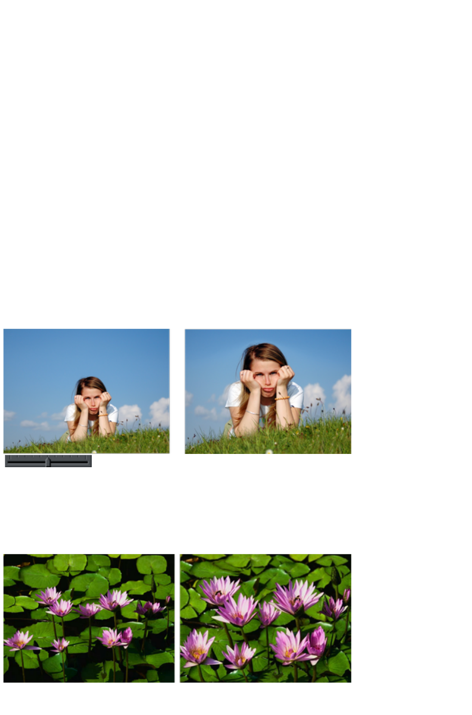
Now when you use the Prepare
button this area will be protected from distortion.
You may need to select the photo to enable the Prepare button. In the Photo Tool
you can do this just by clicking on the picture.
Note:
You can't mask more than half the image. The prepare operation will give an error if you try this.
Adjusting a mask, or adding a new mask
You can't add a mask to an image that has already been stretched. Instead, if you want to add a new
mask or adjust an existing one, you have these options:
1. Click the Reset button and draw a new mask
2. Click undo as many times as necessary to get back the mask, and then use the normal drawing
tools to adjust the mask shapes.
3. Or, before you select the Prepare buttons, copy the mask to the clipboard. If you want to use
this later, perform a Reset on the image, then re-enable mask mode and past the shape back
onto the mask layer.
There is another alternative that you can 'fix' a stretched image using the Optimize
feature, and then apply a new mask. This is not recommended in most cases because it will produce
lower quality results than resetting the image and applying a mask to the original image.
Content-aware photo zoom
An alternative to content aware scaling is the whereby the photo remains the same size and the content is
intelligently zoomed inside it. Here's an example of the effect.
Use the zoom slider on the Infobar to control
content-aware photo zoom.
The picture remains the same size, but the program automatically detects and scales (zooms) the
'interesting' content. Note this is not just a crop of the girl, but that every element, cloud, and grass that
appears in the original is still there in the zoomed version. The program automatically detects the surfer is
the 'region of interest' and so enlarges him only.
Another example:
The program has determined the flowers, not the background leaves, are the areas of interest and so
scaled only those parts. Using the Mask feature you can protect any part of the picture from distortion,
Page 930

although these two above examples use no mask.
Alternative Content Aware Scaling
When stretching photos there are two alternative ways to scale the image. The method of just dragging
the size arrows sometimes works not so well with some image types.
However by holding the "Alt" key when dragging one of the side handles in the Content-aware Scale
Tool
performs a different intelligent scale using an alternative algorithm.
Content Aware Scaling notes
You can only compress an image to half its initial width or height
If you save a document with a photo that has been prepared for Content Aware resizing, then it
saves the resizing information in the document. The advantage of this is that you can later
re-adjust the photo using the Content Aware feature. There is a significant file size overhead of
saving photos like this.
Page 931
Preparing Your Photo
The content aware scaling feature is part of the Photo tools
.
Select your photo and from the Photo Tool fly-out bar. Select the
Content Aware Scaling button.
The right end of the InfoBar will now show a set of buttons.
Select a photo, go into the Photo Tool
, and the InfoBar should look like this;
First click the Prepare
button to prepare the photo for the scaling. This starts an analysis of the photo to calculate which parts of
the image can be stretched and which parts should be kept. This process can take some time depending
on the resolution of the photo, and how many processors your computer has.
For really high resolution images it's recommended that the image resolution be reduced if you do not
require the maximum resolution. Do this before you select the Prepare buttons. To reduce the resolution
of your photo select the Optimize
button and enter a pixel width or dpi resolution into the dialog. The image size on the page will not
change, only the resolution or number of pixels inside the photo changes.
Once you've prepared the image, new resize arrows will appear on the sides of the photo. Just drag on
these to stretch or squash the image in the desired direction.
Optimize
Photos that have been prepared to enable Content Aware resizing have a lot of additional data stored
alongside them, to enable further adjustments. When you save a document this additional data is saved
also, meaning that you can load such a document and continue to adjust the width or height without
having to do a new Prepare operation.
When you've finished scaling the photo you are recommended to 'fix' the changes by using the Optimize
feature. This will convert the stretched image back to an embedded JPEG image, at any required
resolution, and so make a substantial file size saving.
If you want to Optimize the image at the same resolution as the selected photo, just make a note of the
resolution (the dpi figure is shown on the status line), and in the Optimize dialog, on the Bitmap Size tab,
enter the same resolution.
Reset
Clicking the 'Reset' button will restore the image back to its original state, removing any stretch, and
removing any mask that might have been applied.
Using Masks With Content Aware Scaling
Using the mask feature you can provide further control by protecting areas of the picture from being
distorted. Masked areas will not be distorted at all. See the Masks
chapter to find out more about masks, but here's a brief summary of how to use masks with Content
Aware Scaling.
To protect one or more areas from being distorted, select the mask at the bottom of the main toolbar on
the left of the Xara Web Designer 7 Premium window, or the menu "Window" > "Mask mode on"
.
Selecting the mask control turns on mask mode
This covers the entire drawing area in a pink colored mask layer. You can now use any of the drawing
tools to cut holes out of the mask. The easiest way to protect an area of the photo is to use the
Page 932
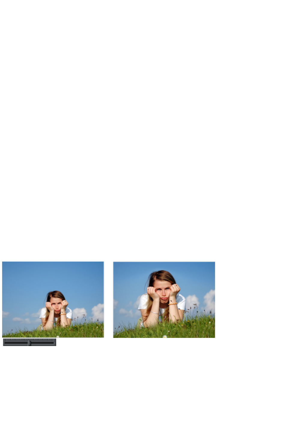
Freehand Tool
and just draw around the object, making sure it's a closed shape (you end the drawing on the start
point).
The pink areas of the mask are the 'protected' areas, and so this mask needs to be inverted (you are
trying to protect the area you drew around, not the outside area), so click the 'Invert Mask' button on
the InfoBar or select "Window" > "Invert mask
".
Now when you use the Prepare
button this area will be protected from distortion.
You may need to select the photo to enable the Prepare button. In the Photo Tool
you can do this just by clicking on the picture.
Note:
You can't mask more than half the image. The prepare operation will give an error if you try this.
Adjusting a mask, or adding a new mask
You can't add a mask to an image that has already been stretched. Instead, if you want to add a new
mask or adjust an existing one, you have these options:
1. Click the Reset button and draw a new mask
2. Click undo as many times as necessary to get back the mask, and then use the normal drawing
tools to adjust the mask shapes.
3. Or, before you select the Prepare buttons, copy the mask to the clipboard. If you want to use
this later, perform a Reset on the image, then re-enable mask mode and past the shape back
onto the mask layer.
There is another alternative that you can 'fix' a stretched image using the Optimize
feature, and then apply a new mask. This is not recommended in most cases because it will produce
lower quality results than resetting the image and applying a mask to the original image.
Content-aware photo zoom
An alternative to content aware scaling is the whereby the photo remains the same size and the content is
intelligently zoomed inside it. Here's an example of the effect.
Use the zoom slider on the Infobar to control
content-aware photo zoom.
The picture remains the same size, but the program automatically detects and scales (zooms) the
'interesting' content. Note this is not just a crop of the girl, but that every element, cloud, and grass that
appears in the original is still there in the zoomed version. The program automatically detects the surfer is
the 'region of interest' and so enlarges him only.
Another example:
Page 933
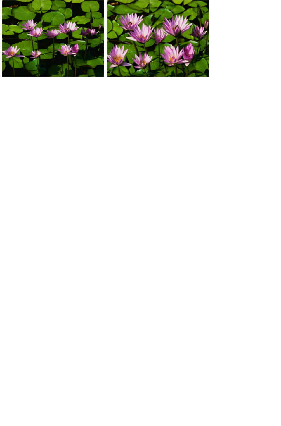
The program has determined the flowers, not the background leaves, are the areas of interest and so
scaled only those parts. Using the Mask feature you can protect any part of the picture from distortion,
although these two above examples use no mask.
Alternative Content Aware Scaling
When stretching photos there are two alternative ways to scale the image. The method of just dragging
the size arrows sometimes works not so well with some image types.
However by holding the "Alt" key when dragging one of the side handles in the Content-aware Scale
Tool
performs a different intelligent scale using an alternative algorithm.
Content Aware Scaling notes
You can only compress an image to half its initial width or height
If you save a document with a photo that has been prepared for Content Aware resizing, then it
saves the resizing information in the document. The advantage of this is that you can later
re-adjust the photo using the Content Aware feature. There is a significant file size overhead of
saving photos like this.
Page 934
Optimize
Photos that have been prepared to enable Content Aware resizing have a lot of additional data stored
alongside them, to enable further adjustments. When you save a document this additional data is saved
also, meaning that you can load such a document and continue to adjust the width or height without
having to do a new Prepare operation.
When you've finished scaling the photo you are recommended to 'fix' the changes by using the Optimize
feature. This will convert the stretched image back to an embedded JPEG image, at any required
resolution, and so make a substantial file size saving.
If you want to Optimize the image at the same resolution as the selected photo, just make a note of the
resolution (the dpi figure is shown on the status line), and in the Optimize dialog, on the Bitmap Size tab,
enter the same resolution.
Reset
Clicking the 'Reset' button will restore the image back to its original state, removing any stretch, and
removing any mask that might have been applied.
Using Masks With Content Aware Scaling
Using the mask feature you can provide further control by protecting areas of the picture from being
distorted. Masked areas will not be distorted at all. See the Masks
chapter to find out more about masks, but here's a brief summary of how to use masks with Content
Aware Scaling.
To protect one or more areas from being distorted, select the mask at the bottom of the main toolbar on
the left of the Xara Web Designer 7 Premium window, or the menu "Window" > "Mask mode on"
.
Selecting the mask control turns on mask mode
This covers the entire drawing area in a pink colored mask layer. You can now use any of the drawing
tools to cut holes out of the mask. The easiest way to protect an area of the photo is to use the
Freehand Tool
and just draw around the object, making sure it's a closed shape (you end the drawing on the start
point).
The pink areas of the mask are the 'protected' areas, and so this mask needs to be inverted (you are
trying to protect the area you drew around, not the outside area), so click the 'Invert Mask' button on
the InfoBar or select "Window" > "Invert mask
".
Now when you use the Prepare
button this area will be protected from distortion.
You may need to select the photo to enable the Prepare button. In the Photo Tool
you can do this just by clicking on the picture.
Note:
You can't mask more than half the image. The prepare operation will give an error if you try this.
Adjusting a mask, or adding a new mask
You can't add a mask to an image that has already been stretched. Instead, if you want to add a new
mask or adjust an existing one, you have these options:
1. Click the Reset button and draw a new mask
2. Click undo as many times as necessary to get back the mask, and then use the normal drawing
tools to adjust the mask shapes.
3. Or, before you select the Prepare buttons, copy the mask to the clipboard. If you want to use
this later, perform a Reset on the image, then re-enable mask mode and past the shape back
Page 935
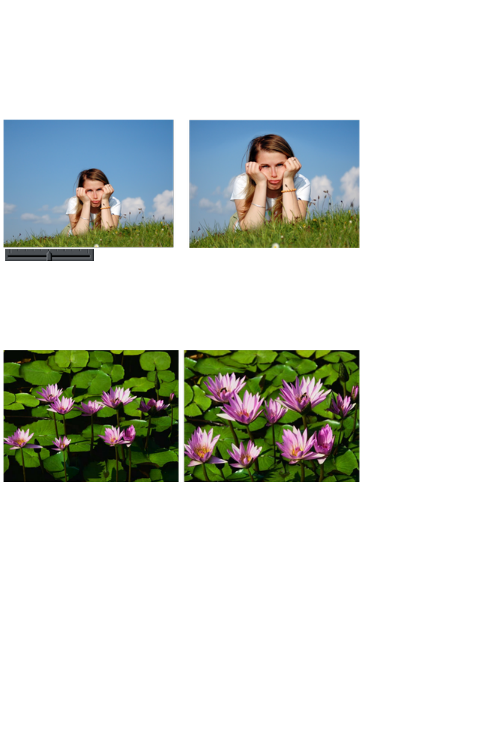
onto the mask layer.
There is another alternative that you can 'fix' a stretched image using the Optimize
feature, and then apply a new mask. This is not recommended in most cases because it will produce
lower quality results than resetting the image and applying a mask to the original image.
Content-aware photo zoom
An alternative to content aware scaling is the whereby the photo remains the same size and the content is
intelligently zoomed inside it. Here's an example of the effect.
Use the zoom slider on the Infobar to control
content-aware photo zoom.
The picture remains the same size, but the program automatically detects and scales (zooms) the
'interesting' content. Note this is not just a crop of the girl, but that every element, cloud, and grass that
appears in the original is still there in the zoomed version. The program automatically detects the surfer is
the 'region of interest' and so enlarges him only.
Another example:
The program has determined the flowers, not the background leaves, are the areas of interest and so
scaled only those parts. Using the Mask feature you can protect any part of the picture from distortion,
although these two above examples use no mask.
Alternative Content Aware Scaling
When stretching photos there are two alternative ways to scale the image. The method of just dragging
the size arrows sometimes works not so well with some image types.
However by holding the "Alt" key when dragging one of the side handles in the Content-aware Scale
Tool
performs a different intelligent scale using an alternative algorithm.
Content Aware Scaling notes
You can only compress an image to half its initial width or height
If you save a document with a photo that has been prepared for Content Aware resizing, then it
saves the resizing information in the document. The advantage of this is that you can later
re-adjust the photo using the Content Aware feature. There is a significant file size overhead of
Page 936

saving photos like this.
Page 937

Using Masks With Content Aware Scaling
Using the mask feature you can provide further control by protecting areas of the picture from being
distorted. Masked areas will not be distorted at all. See the Masks
chapter to find out more about masks, but here's a brief summary of how to use masks with Content
Aware Scaling.
To protect one or more areas from being distorted, select the mask at the bottom of the main toolbar on
the left of the Xara Web Designer 7 Premium window, or the menu "Window" > "Mask mode on"
.
Selecting the mask control turns on mask mode
This covers the entire drawing area in a pink colored mask layer. You can now use any of the drawing
tools to cut holes out of the mask. The easiest way to protect an area of the photo is to use the
Freehand Tool
and just draw around the object, making sure it's a closed shape (you end the drawing on the start
point).
The pink areas of the mask are the 'protected' areas, and so this mask needs to be inverted (you are
trying to protect the area you drew around, not the outside area), so click the 'Invert Mask' button on
the InfoBar or select "Window" > "Invert mask
".
Now when you use the Prepare
button this area will be protected from distortion.
You may need to select the photo to enable the Prepare button. In the Photo Tool
you can do this just by clicking on the picture.
Note:
You can't mask more than half the image. The prepare operation will give an error if you try this.
Adjusting a mask, or adding a new mask
You can't add a mask to an image that has already been stretched. Instead, if you want to add a new
mask or adjust an existing one, you have these options:
1. Click the Reset button and draw a new mask
2. Click undo as many times as necessary to get back the mask, and then use the normal drawing
tools to adjust the mask shapes.
3. Or, before you select the Prepare buttons, copy the mask to the clipboard. If you want to use
this later, perform a Reset on the image, then re-enable mask mode and past the shape back
onto the mask layer.
There is another alternative that you can 'fix' a stretched image using the Optimize
feature, and then apply a new mask. This is not recommended in most cases because it will produce
lower quality results than resetting the image and applying a mask to the original image.
Content-aware photo zoom
An alternative to content aware scaling is the whereby the photo remains the same size and the content is
intelligently zoomed inside it. Here's an example of the effect.
Page 938
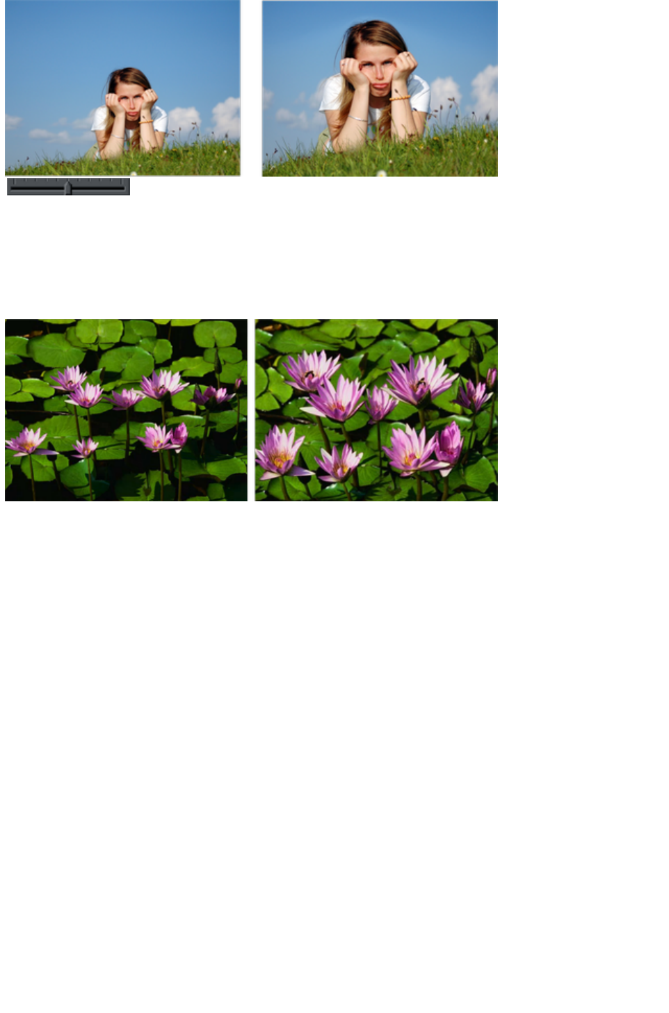
Use the zoom slider on the Infobar to control
content-aware photo zoom.
The picture remains the same size, but the program automatically detects and scales (zooms) the
'interesting' content. Note this is not just a crop of the girl, but that every element, cloud, and grass that
appears in the original is still there in the zoomed version. The program automatically detects the surfer is
the 'region of interest' and so enlarges him only.
Another example:
The program has determined the flowers, not the background leaves, are the areas of interest and so
scaled only those parts. Using the Mask feature you can protect any part of the picture from distortion,
although these two above examples use no mask.
Alternative Content Aware Scaling
When stretching photos there are two alternative ways to scale the image. The method of just dragging
the size arrows sometimes works not so well with some image types.
However by holding the "Alt" key when dragging one of the side handles in the Content-aware Scale
Tool
performs a different intelligent scale using an alternative algorithm.
Content Aware Scaling notes
You can only compress an image to half its initial width or height
If you save a document with a photo that has been prepared for Content Aware resizing, then it
saves the resizing information in the document. The advantage of this is that you can later
re-adjust the photo using the Content Aware feature. There is a significant file size overhead of
saving photos like this.
Page 939
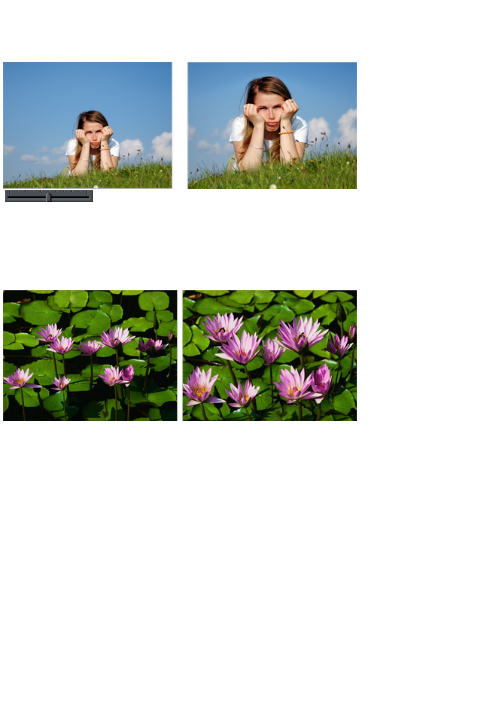
Content-aware photo zoom
An alternative to content aware scaling is the whereby the photo remains the same size and the content is
intelligently zoomed inside it. Here's an example of the effect.
Use the zoom slider on the Infobar to control
content-aware photo zoom.
The picture remains the same size, but the program automatically detects and scales (zooms) the
'interesting' content. Note this is not just a crop of the girl, but that every element, cloud, and grass that
appears in the original is still there in the zoomed version. The program automatically detects the surfer is
the 'region of interest' and so enlarges him only.
Another example:
The program has determined the flowers, not the background leaves, are the areas of interest and so
scaled only those parts. Using the Mask feature you can protect any part of the picture from distortion,
although these two above examples use no mask.
Alternative Content Aware Scaling
When stretching photos there are two alternative ways to scale the image. The method of just dragging
the size arrows sometimes works not so well with some image types.
However by holding the "Alt" key when dragging one of the side handles in the Content-aware Scale
Tool
performs a different intelligent scale using an alternative algorithm.
Content Aware Scaling notes
You can only compress an image to half its initial width or height
If you save a document with a photo that has been prepared for Content Aware resizing, then it
saves the resizing information in the document. The advantage of this is that you can later
re-adjust the photo using the Content Aware feature. There is a significant file size overhead of
saving photos like this.
Page 940

Alternative Content Aware Scaling
When stretching photos there are two alternative ways to scale the image. The method of just dragging
the size arrows sometimes works not so well with some image types.
However by holding the "Alt" key when dragging one of the side handles in the Content-aware Scale
Tool
performs a different intelligent scale using an alternative algorithm.
Content Aware Scaling notes
You can only compress an image to half its initial width or height
If you save a document with a photo that has been prepared for Content Aware resizing, then it
saves the resizing information in the document. The advantage of this is that you can later
re-adjust the photo using the Content Aware feature. There is a significant file size overhead of
saving photos like this.
Page 941

Content Aware Scaling notes
You can only compress an image to half its initial width or height
If you save a document with a photo that has been prepared for Content Aware resizing, then it
saves the resizing information in the document. The advantage of this is that you can later
re-adjust the photo using the Content Aware feature. There is a significant file size overhead of
saving photos like this.
Page 942
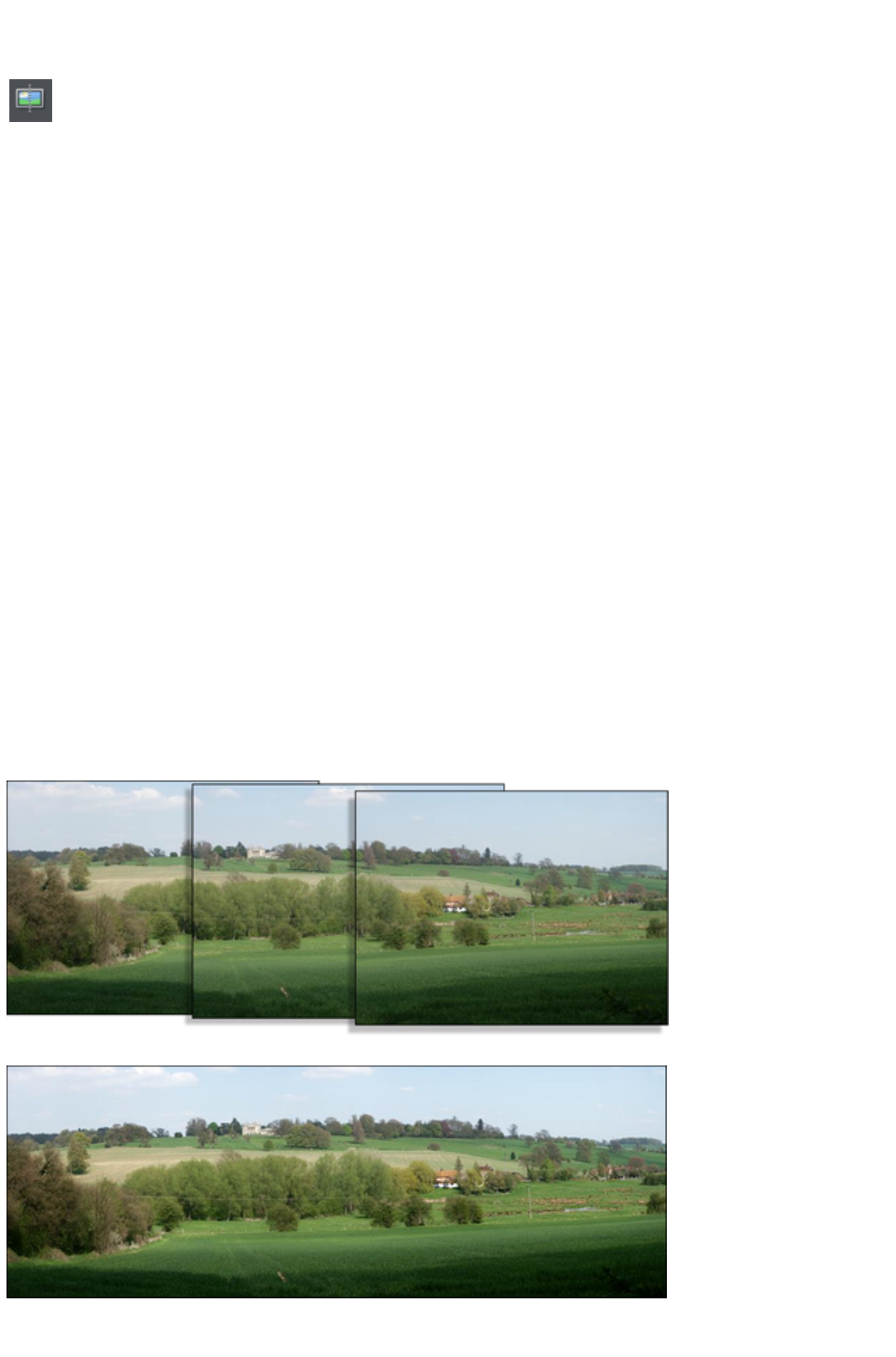
Panorama Stitching
Xara Web Designer 7 Premium includes a tool that can automatically
stitch together up to 6 photographs into a single wide, high-resolution
panorama.
Creating high-quality panoramas can be a very complex and technical process, often requiring special
equipment or lenses and accurately exposed and aligned photographs. The panoramic stitching feature
built into Xara Web Designer 7 Premium requires none of these, and can use an every-day digital camera
so that anyone can create outstanding quality panoramic images in a few minutes.
This tool features:
No high end camera required, and no tripod required
Automatic estimation of the focal length to warp the images to reduce fisheye effects
Automatic barrel, pin cushion and vignette adjustments
Automatic exposure correction
Automatic detection of shared overlap points and seamless blending of joins
Automatic cropping of the final result.
To create a panorama you need to take a series of separate photos from a central position. Ideally each
photo would overlap the next by approximately 30%, although it will work with more or less overlap.
The process of creating a panorama is very straightforward:
1. Import each of the photos and arrange them on the page in the correct left to right order. There is
no need to try and position the overlaps correctly
2. Select all the photos you want to stitch together
3. Click the Panorama button on the Photo Tool fly-out bar.
It will start the process of stitching and continue as a background process. A popup status window
shows the progress through the various stages, although you can continue using Xara Web Designer 7
Premium like normal while this happens. When the process is complete the resulting panorama image is
imported onto the page. Note that it does not replace the original images, which you can delete if you no
longer require them.
Three example photos of a landscape. Each overlaps the other (in this case a bit more than necessary).
The resulting single panorama image, with seamless integration.
Page 943

Optimizing images
Xara Web Designer 7 Premium will always stitch photos at the full resolution, even if you reduce the size
of the image on the page. This is often a desirable thing since it produces the maximum quality, highest
resolution results. But it does mean that the stitching process can take a few minutes. So sometimes you
may prefer to reduce the resolution of the images before you stitch them together, especially if you only
require a medium resolution final result, perhaps for the web.
To reduce the resolution of any image, reduce its size on the page to the required size and then use the "
Utilities" > "Optimize" option. Select the "Bitmap size
" tab and the required resolution from the dropdown menu. 96dpi represents the same resolution as the
screen, but sometimes it's beneficial to have a higher a resolution (such as 150dpi). This will replace the
photo with a lower-resolution JPEG.
Note that the panorama stitcher works better with higher resolution images (it's easier for it to find
matching points on the photos).
When you get the stitched image back, this is stored as a PNG image in Xara Web Designer 7 Premium.
This is the highest quality, but takes a lot of memory and file space, especially if it's a high-resolution
panorama. (The Bitmap Gallery will show you how much). Therefore you can usually benefit from
reducing the resolution of the final image and converting it to a JPEG instead. Again use the "Utilities" >
"Optimize"
option for this.
Notes
:
The panorama stitcher expects the images to be the same resolution and size.
Try to avoid taking pictures with moving objects in. These can confuse the system since the same
object might appear in different places, or not at all.
Try to keep the horizon at the same approximate position on each photo
Hint
: By taking photos in a portrait orientation, you can get maximum vertical coverage.
Upgrades to Panorama Studio
There is an optional upgrade to a more flexible and powerful panorama studio program. This provides
more features and controls over the stitching process. Xara Designer Pro users get this separate program
for free, bundled on the product CD.
If Panorama Studio is installed, you will be given the option to use it instead of the standard version when
you select the "Panorama" button.
Page 944

Optimizing images
Xara Web Designer 7 Premium will always stitch photos at the full resolution, even if you reduce the size
of the image on the page. This is often a desirable thing since it produces the maximum quality, highest
resolution results. But it does mean that the stitching process can take a few minutes. So sometimes you
may prefer to reduce the resolution of the images before you stitch them together, especially if you only
require a medium resolution final result, perhaps for the web.
To reduce the resolution of any image, reduce its size on the page to the required size and then use the "
Utilities" > "Optimize" option. Select the "Bitmap size
" tab and the required resolution from the dropdown menu. 96dpi represents the same resolution as the
screen, but sometimes it's beneficial to have a higher a resolution (such as 150dpi). This will replace the
photo with a lower-resolution JPEG.
Note that the panorama stitcher works better with higher resolution images (it's easier for it to find
matching points on the photos).
When you get the stitched image back, this is stored as a PNG image in Xara Web Designer 7 Premium.
This is the highest quality, but takes a lot of memory and file space, especially if it's a high-resolution
panorama. (The Bitmap Gallery will show you how much). Therefore you can usually benefit from
reducing the resolution of the final image and converting it to a JPEG instead. Again use the "Utilities" >
"Optimize"
option for this.
Notes
:
The panorama stitcher expects the images to be the same resolution and size.
Try to avoid taking pictures with moving objects in. These can confuse the system since the same
object might appear in different places, or not at all.
Try to keep the horizon at the same approximate position on each photo
Hint
: By taking photos in a portrait orientation, you can get maximum vertical coverage.
Upgrades to Panorama Studio
There is an optional upgrade to a more flexible and powerful panorama studio program. This provides
more features and controls over the stitching process. Xara Designer Pro users get this separate program
for free, bundled on the product CD.
If Panorama Studio is installed, you will be given the option to use it instead of the standard version when
you select the "Panorama" button.
Page 945

Upgrades to Panorama Studio
There is an optional upgrade to a more flexible and powerful panorama studio program. This provides
more features and controls over the stitching process. Xara Designer Pro users get this separate program
for free, bundled on the product CD.
If Panorama Studio is installed, you will be given the option to use it instead of the standard version when
you select the "Panorama" button.
Page 946

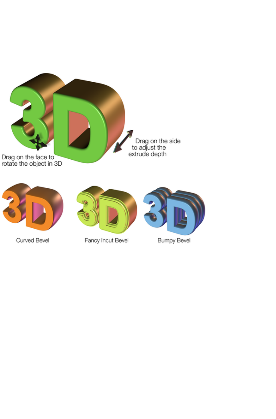
Introduction
The Extrude Tool
provides a fast and easy way of turning 2D drawn shapes and text into high quality 3D "extruded"
versions, with colored light illumination and very high quality shading. It is based on the technology used
in the Xara 3D stand-alone program.
On-screen dragging allows real-time 3D object rotation, dragging of the extrude depth, and adjustment
of three lights in 3D space around the object.
The InfoBar provides control over the bevel type drawn down the extruded length. You can chose from
more than 25 different types of bevel.
Page 948

Extruding a shape
To turn a 2D shape into a 3D extruded object, go into the Extrude
Tool
on the main toolbar and simply click and drag on your object to
rotate it in 3D space.
Initially, your extrusion is given a default depth. The face color of the 3D shape is determined by the fill
color of the original shape and the color of the extrude (or side) by its line color. After creating an
extrude in this way, move your mouse pointer around over the 3D object. You'll see that the mouse
pointer changes as follows to indicate what will happen if you click and drag at any point:
This is shown when the mouse pointer is over the front or back face
of the object. Clicking and dragging rotates the object in 3D space.
This is shown when the mouse pointer is over the extrusion (the side)
of the object. Clicking and dragging changes the depth of the
extrusion.
This is shown when the mouse pointer is over the extrusion and "Ctrl"
is held. Clicking and dragging changes the bevel size (see below)
You can also rotate an extrusion by holding down the Alt key while dragging on the extruded side. This is
useful when only the side of an extrude is visible and so you aren't able to drag on the face in order to
rotate it. As when dragging on the front face, Ctrl and Shift can also be used to constrain the rotation.
Page 949
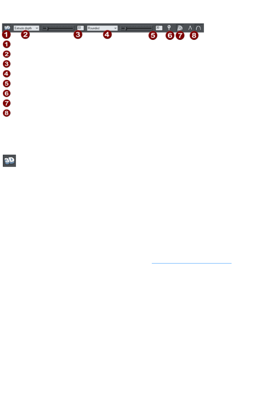
Extrude Tool InfoBar
Extrude on/off
Slider type list
Slider and numeric value for selected parameter
Bevel type
Bevel size slider and value
Lights on/off
Gloss/matt
Rounded/mitred corner
You can adjust a 3D extruded object by manipulating it directly on the page as described above, or by
selecting it and using the controls on the InfoBar of the Extrude Tool.
Turning extrudes on and off
Extrude on/off
Once a shape or other object has been extruded, there are only limited modifications that can be made
to the original object with the extrusion in place. For example, if you've extruded a shape, it's not possible
to then edit that shape in the Shape Editor Tool
because it's no longer a simple 2D shape that you can interact with. However, using this control you can
temporarily turn the extrusion off, so that you can see and modify the underlying object using other tools,
before turning the extrude on again. After making a modification and turning the extrusion on again the
extrusion is re-applied to your modified 2D object, with all the same 3D attributes that it had when you
turned off the extrude.
Note that in some cases if you dramatically change the form of the object while the extrusion is turned off
(such as changing it to a completely different type of object), the 3D extrude attributes you applied may
not be preserved. In such cases you should be able to use Paste attributes to copy the attributes from a
copy of your original extrude before the modification. See Copying styles: Paste attributes
.
Extrusion depth
The easiest way to adjust the depth of an extrusion is to simply click and drag on it, as described above.
However, you can also use the slider on the left of the Extrude Tool InfoBar to adjust it. Make sure
that Extrude depth
is selected in the dropdown list to the left of the slider (this is the default setting) and then use the slider to
adjust the extrude depth. The current extrude depth is shown in a numeric field to the right of the slider,
and you can also enter extrude depth values directly into that field to set an exact extrude depth.
Bevel Type & Size
The bevel type determines the profile of the extruded side of your 3D shape and of its edges and
corners. By default it's set to rounded which gives a flat side with rounded corners. The bevel type
dropdown list contains a large selection of different bevel types you can choose from. You can adjust the
size of the bevel using the slider to the right of the bevel type list. To the right of the bevel size slider is a
numeric field showing the current bevel size and you can enter exact bevel sizes into this field.
An alternative shortcut to adjust the bevel size is to drag on the side of the 3D object holding "Ctrl" (while
Page 950
in the Extrude Tool
).
Lights
Lights on/off
You can adjust the lighting of your shape in 3D space by turning on the lights. There are 3 lights, each of
which can be given their own color and position in 3D space around the 3D shape.
In this example the face color
of the shape is set to white. But
you can see that it appears
green because there is a green
light shining almost directly onto
the front face of the shape.
By adjusting the colors of the
face and extrude and the
positions and colors of the
three lights, you can enhance
the realism of the 3D objects in
your design.
Behind the object is a beige / orange colored light and another that is a purple color. Both lights cause
reflections down the side, and changing the color, or direction of the lights behind will change the
reflected highlights.
To move a light around the 3D object, simply drag on the light arrow. If you happen to drop a light so
that it is behind the 3D object and therefore isn't selectable, you can retrieve it by using the left slider on
the Extrude InfoBar. Select one of the light angles from the dropdown list to the left of the slider (e.g.
"Light 2 Angle 1") and then adjust the slider. The light moves around the 3D object in your design. The
various "light angle" options in this dropdown list allow you to move any of the lights in any direction in
3D space to achieve the positions you want. However for most purposes you can achieve good results
most easily by dragging the light arrows directly on the page.
To change the colors of the lights, you can simply drag colors from the color bar and drop them directly
onto the light arrows. To edit a light color with the color editor, double click on the light arrow you want
to change and the color editor opens with that light color selected. You can now edit the light's color.
With the color editor open, as you click on the different light arrows, extrude face and extrude sides, the
color selected in the color editor dropdown list changes to match your selection, so you can quickly
select the different colors on your extrude to modify them.
Gloss / Matt
Use this toggle button to make the surface of a 3D object more or less
reflective. With the gloss option on lights placed at the correct position
behind the object will "bounce off" the sides to good effect.
Mitred corner / Rounded corner
You can choose either Mitred or Rounded
corners for your 3D object. "Mitre" gives square edges, while
"Round" produces rounded edges.
Page 951
Turning extrudes on and off
Extrude on/off
Once a shape or other object has been extruded, there are only limited modifications that can be made
to the original object with the extrusion in place. For example, if you've extruded a shape, it's not possible
to then edit that shape in the Shape Editor Tool
because it's no longer a simple 2D shape that you can interact with. However, using this control you can
temporarily turn the extrusion off, so that you can see and modify the underlying object using other tools,
before turning the extrude on again. After making a modification and turning the extrusion on again the
extrusion is re-applied to your modified 2D object, with all the same 3D attributes that it had when you
turned off the extrude.
Note that in some cases if you dramatically change the form of the object while the extrusion is turned off
(such as changing it to a completely different type of object), the 3D extrude attributes you applied may
not be preserved. In such cases you should be able to use Paste attributes to copy the attributes from a
copy of your original extrude before the modification. See Copying styles: Paste attributes
.
Extrusion depth
The easiest way to adjust the depth of an extrusion is to simply click and drag on it, as described above.
However, you can also use the slider on the left of the Extrude Tool InfoBar to adjust it. Make sure
that Extrude depth
is selected in the dropdown list to the left of the slider (this is the default setting) and then use the slider to
adjust the extrude depth. The current extrude depth is shown in a numeric field to the right of the slider,
and you can also enter extrude depth values directly into that field to set an exact extrude depth.
Bevel Type & Size
The bevel type determines the profile of the extruded side of your 3D shape and of its edges and
corners. By default it's set to rounded which gives a flat side with rounded corners. The bevel type
dropdown list contains a large selection of different bevel types you can choose from. You can adjust the
size of the bevel using the slider to the right of the bevel type list. To the right of the bevel size slider is a
numeric field showing the current bevel size and you can enter exact bevel sizes into this field.
An alternative shortcut to adjust the bevel size is to drag on the side of the 3D object holding "Ctrl" (while
in the Extrude Tool
).
Lights
Lights on/off
You can adjust the lighting of your shape in 3D space by turning on the lights. There are 3 lights, each of
which can be given their own color and position in 3D space around the 3D shape.
Page 952
In this example the face color
of the shape is set to white. But
you can see that it appears
green because there is a green
light shining almost directly onto
the front face of the shape.
By adjusting the colors of the
face and extrude and the
positions and colors of the
three lights, you can enhance
the realism of the 3D objects in
your design.
Behind the object is a beige / orange colored light and another that is a purple color. Both lights cause
reflections down the side, and changing the color, or direction of the lights behind will change the
reflected highlights.
To move a light around the 3D object, simply drag on the light arrow. If you happen to drop a light so
that it is behind the 3D object and therefore isn't selectable, you can retrieve it by using the left slider on
the Extrude InfoBar. Select one of the light angles from the dropdown list to the left of the slider (e.g.
"Light 2 Angle 1") and then adjust the slider. The light moves around the 3D object in your design. The
various "light angle" options in this dropdown list allow you to move any of the lights in any direction in
3D space to achieve the positions you want. However for most purposes you can achieve good results
most easily by dragging the light arrows directly on the page.
To change the colors of the lights, you can simply drag colors from the color bar and drop them directly
onto the light arrows. To edit a light color with the color editor, double click on the light arrow you want
to change and the color editor opens with that light color selected. You can now edit the light's color.
With the color editor open, as you click on the different light arrows, extrude face and extrude sides, the
color selected in the color editor dropdown list changes to match your selection, so you can quickly
select the different colors on your extrude to modify them.
Gloss / Matt
Use this toggle button to make the surface of a 3D object more or less
reflective. With the gloss option on lights placed at the correct position
behind the object will "bounce off" the sides to good effect.
Mitred corner / Rounded corner
You can choose either Mitred or Rounded
corners for your 3D object. "Mitre" gives square edges, while
"Round" produces rounded edges.
Page 953
Extrusion depth
The easiest way to adjust the depth of an extrusion is to simply click and drag on it, as described above.
However, you can also use the slider on the left of the Extrude Tool InfoBar to adjust it. Make sure
that Extrude depth
is selected in the dropdown list to the left of the slider (this is the default setting) and then use the slider to
adjust the extrude depth. The current extrude depth is shown in a numeric field to the right of the slider,
and you can also enter extrude depth values directly into that field to set an exact extrude depth.
Bevel Type & Size
The bevel type determines the profile of the extruded side of your 3D shape and of its edges and
corners. By default it's set to rounded which gives a flat side with rounded corners. The bevel type
dropdown list contains a large selection of different bevel types you can choose from. You can adjust the
size of the bevel using the slider to the right of the bevel type list. To the right of the bevel size slider is a
numeric field showing the current bevel size and you can enter exact bevel sizes into this field.
An alternative shortcut to adjust the bevel size is to drag on the side of the 3D object holding "Ctrl" (while
in the Extrude Tool
).
Lights
Lights on/off
You can adjust the lighting of your shape in 3D space by turning on the lights. There are 3 lights, each of
which can be given their own color and position in 3D space around the 3D shape.
In this example the face color
of the shape is set to white. But
you can see that it appears
green because there is a green
light shining almost directly onto
the front face of the shape.
By adjusting the colors of the
face and extrude and the
positions and colors of the
three lights, you can enhance
the realism of the 3D objects in
your design.
Behind the object is a beige / orange colored light and another that is a purple color. Both lights cause
reflections down the side, and changing the color, or direction of the lights behind will change the
reflected highlights.
To move a light around the 3D object, simply drag on the light arrow. If you happen to drop a light so
that it is behind the 3D object and therefore isn't selectable, you can retrieve it by using the left slider on
the Extrude InfoBar. Select one of the light angles from the dropdown list to the left of the slider (e.g.
"Light 2 Angle 1") and then adjust the slider. The light moves around the 3D object in your design. The
various "light angle" options in this dropdown list allow you to move any of the lights in any direction in
3D space to achieve the positions you want. However for most purposes you can achieve good results
most easily by dragging the light arrows directly on the page.
To change the colors of the lights, you can simply drag colors from the color bar and drop them directly
onto the light arrows. To edit a light color with the color editor, double click on the light arrow you want
to change and the color editor opens with that light color selected. You can now edit the light's color.
With the color editor open, as you click on the different light arrows, extrude face and extrude sides, the
Page 954

color selected in the color editor dropdown list changes to match your selection, so you can quickly
select the different colors on your extrude to modify them.
Gloss / Matt
Use this toggle button to make the surface of a 3D object more or less
reflective. With the gloss option on lights placed at the correct position
behind the object will "bounce off" the sides to good effect.
Mitred corner / Rounded corner
You can choose either Mitred or Rounded
corners for your 3D object. "Mitre" gives square edges, while
"Round" produces rounded edges.
Page 955
Bevel Type & Size
The bevel type determines the profile of the extruded side of your 3D shape and of its edges and
corners. By default it's set to rounded which gives a flat side with rounded corners. The bevel type
dropdown list contains a large selection of different bevel types you can choose from. You can adjust the
size of the bevel using the slider to the right of the bevel type list. To the right of the bevel size slider is a
numeric field showing the current bevel size and you can enter exact bevel sizes into this field.
An alternative shortcut to adjust the bevel size is to drag on the side of the 3D object holding "Ctrl" (while
in the Extrude Tool
).
Lights
Lights on/off
You can adjust the lighting of your shape in 3D space by turning on the lights. There are 3 lights, each of
which can be given their own color and position in 3D space around the 3D shape.
In this example the face color
of the shape is set to white. But
you can see that it appears
green because there is a green
light shining almost directly onto
the front face of the shape.
By adjusting the colors of the
face and extrude and the
positions and colors of the
three lights, you can enhance
the realism of the 3D objects in
your design.
Behind the object is a beige / orange colored light and another that is a purple color. Both lights cause
reflections down the side, and changing the color, or direction of the lights behind will change the
reflected highlights.
To move a light around the 3D object, simply drag on the light arrow. If you happen to drop a light so
that it is behind the 3D object and therefore isn't selectable, you can retrieve it by using the left slider on
the Extrude InfoBar. Select one of the light angles from the dropdown list to the left of the slider (e.g.
"Light 2 Angle 1") and then adjust the slider. The light moves around the 3D object in your design. The
various "light angle" options in this dropdown list allow you to move any of the lights in any direction in
3D space to achieve the positions you want. However for most purposes you can achieve good results
most easily by dragging the light arrows directly on the page.
To change the colors of the lights, you can simply drag colors from the color bar and drop them directly
onto the light arrows. To edit a light color with the color editor, double click on the light arrow you want
to change and the color editor opens with that light color selected. You can now edit the light's color.
With the color editor open, as you click on the different light arrows, extrude face and extrude sides, the
color selected in the color editor dropdown list changes to match your selection, so you can quickly
select the different colors on your extrude to modify them.
Gloss / Matt
Use this toggle button to make the surface of a 3D object more or less
reflective. With the gloss option on lights placed at the correct position
behind the object will "bounce off" the sides to good effect.
Page 956

Mitred corner / Rounded corner
You can choose either Mitred or Rounded
corners for your 3D object. "Mitre" gives square edges, while
"Round" produces rounded edges.
Page 957
Lights
Lights on/off
You can adjust the lighting of your shape in 3D space by turning on the lights. There are 3 lights, each of
which can be given their own color and position in 3D space around the 3D shape.
In this example the face color
of the shape is set to white. But
you can see that it appears
green because there is a green
light shining almost directly onto
the front face of the shape.
By adjusting the colors of the
face and extrude and the
positions and colors of the
three lights, you can enhance
the realism of the 3D objects in
your design.
Behind the object is a beige / orange colored light and another that is a purple color. Both lights cause
reflections down the side, and changing the color, or direction of the lights behind will change the
reflected highlights.
To move a light around the 3D object, simply drag on the light arrow. If you happen to drop a light so
that it is behind the 3D object and therefore isn't selectable, you can retrieve it by using the left slider on
the Extrude InfoBar. Select one of the light angles from the dropdown list to the left of the slider (e.g.
"Light 2 Angle 1") and then adjust the slider. The light moves around the 3D object in your design. The
various "light angle" options in this dropdown list allow you to move any of the lights in any direction in
3D space to achieve the positions you want. However for most purposes you can achieve good results
most easily by dragging the light arrows directly on the page.
To change the colors of the lights, you can simply drag colors from the color bar and drop them directly
onto the light arrows. To edit a light color with the color editor, double click on the light arrow you want
to change and the color editor opens with that light color selected. You can now edit the light's color.
With the color editor open, as you click on the different light arrows, extrude face and extrude sides, the
color selected in the color editor dropdown list changes to match your selection, so you can quickly
select the different colors on your extrude to modify them.
Gloss / Matt
Use this toggle button to make the surface of a 3D object more or less
reflective. With the gloss option on lights placed at the correct position
behind the object will "bounce off" the sides to good effect.
Mitred corner / Rounded corner
You can choose either Mitred or Rounded
corners for your 3D object. "Mitre" gives square edges, while
"Round" produces rounded edges.
Page 958

Gloss / Matt
Use this toggle button to make the surface of a 3D object more or less
reflective. With the gloss option on lights placed at the correct position
behind the object will "bounce off" the sides to good effect.
Mitred corner / Rounded corner
You can choose either Mitred or Rounded
corners for your 3D object. "Mitre" gives square edges, while
"Round" produces rounded edges.
Page 959

Mitred corner / Rounded corner
You can choose either Mitred or Rounded
corners for your 3D object. "Mitre" gives square edges, while
"Round" produces rounded edges.
Page 960
Textures & Photos
When you extrude a photo, the photo remains on the front face of your 3D object. Therefore, you can
produce impressive 3D photo effects in seconds by simply importing a photo and extruding it.
This effect is created by extruding a photo, rotating it slightly, creating a reflected copy using the Selector
Tool
, and the 3D angle adjusted to match. It's then given a graduated transparency to create the faded
reflection.
You can use any photo or texture on the face of your extrude. Either import your image and extrude it as
described above, or drag and drop an image onto the face of an existing extrude with "Shift" held down.
This applies your photo or texture to the face of the extrude object.
Page 961

Extruding Text
Extrude text the same way that you extrude any shape; just click and drag on the text while using the
Extrude Tool
. As you would expect, doing this on more than a few words can be rather slow and is not
recommended.
Because text is usually black, unless you change the color the extruded result will also be entirely black,
so making it difficult to see. So it's recommended that you change the color of the text before you extrude
it (although you can change this after by just clicking on a color).
As with other extruded objects, if you want to edit the text, just turn off the extrude using the button on
the left of the Extrude InfoBar, edit the text, and then switch the extrude back on again with the same
button.
Page 962

Copying 3D extrude attributes
You can copy and paste the style of the 3D extrusion, from one 3D object to any other. This works the
same way as for all Web Designer Premium attributes. Simply copy the source extruded object to the
clipboard, and then select a new one and select "Edit" > "Paste attributes"
. Note this will only paste the 3D attributes onto another 3D extruded objects. So you will have to
extrude any shape first before pasting the 3D attributes.
This will copy all the 3D attributes such as the extrude depth, light colors, bevel type as well as the face
and outline colors.
Page 963
Putting shadows behind
Using the Shadow Tool you can enhance the 3D effect by placing a soft shadow behind the object.
Simply apply the Shadow Tool
and drag on the 3D object.
The left example is using a wall shadow, the right us using a floor shadow.
Page 964
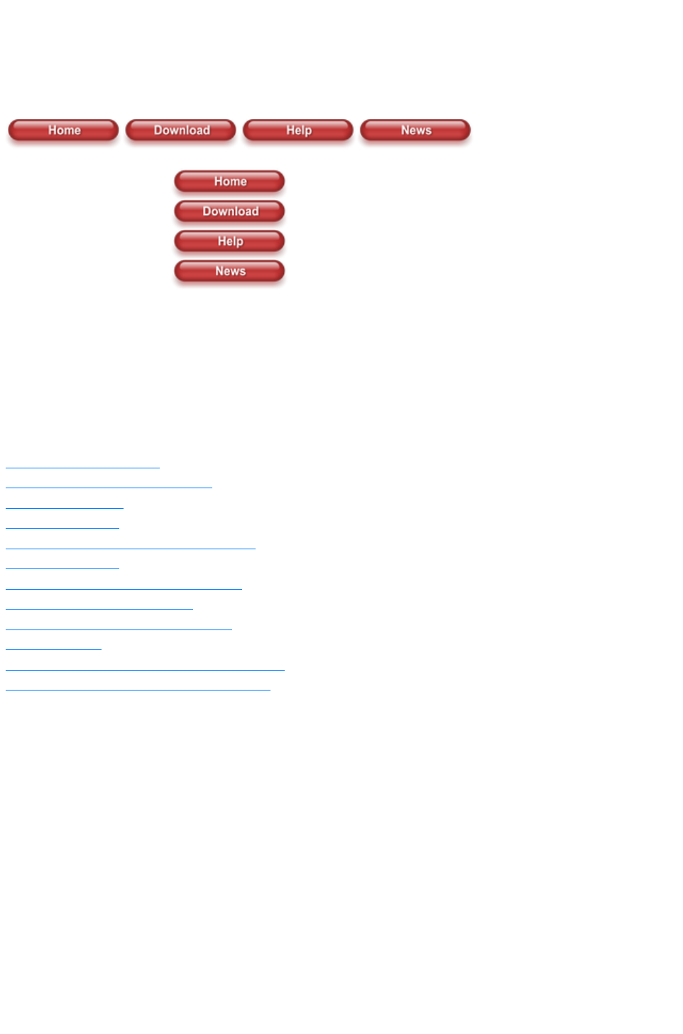
Navigation Bars
Most websites have a navigation bar, either horizontal or vertical, from which all the important pages of
the site can be accessed.
Xara Web Designer 7 Premium includes special support for navigation bars (known as Navbars for
short), making it easy to add, edit and delete buttons. The buttons in a Navbar can adjust their widths to
match their labels automatically and they are repositioned automatically after any changes you make. You
can even add dropdown menus and sub-menus to your bar and opt to have buttons automatically added
and deleted as you add and delete pages.
Advanced users can create their own bars from button designs of their own, and modify the button
designs used in an existing Navbar and have the new design applied across the whole bar.
In this chapter
Using template Navbars
Navigation bar properties dialog
Site navigation bar
Buttons & Menus
Updating your Navbar across all pages
On canvas editing
Changing the font on Navbar buttons
Importing & pasting Navbars
Creating your own Navigation Bars
Button margins
Advanced - Editing a Navbar button design
Navbars with different first or last buttons
Page 965

Using template Navbars
You can create Navbars yourself from any button design, but most users will simply use the many
template Navbars available in the Designs Gallery
. If you want to create your own, see the section describing how to do that later in this chapter.
All the Navbar designs in the gallery are associated with a particular theme, and are carefully designed so
that they fit nicely into the page designs of that theme. Therefore most websites can be built without ever
adding a Navbar manually ? they are already built into the page templates of each theme. However every
theme also provides its Navbars as standalone elements, so you can add one to your web page by simply
dragging it from the gallery and dropping it onto your page.
Changing the colors of a template Navbar is done the same way as changing the color of the other
elements of a theme ? by applying a new color scheme from the Designs Gallery
, or by editing the named theme colors on the Color Line. See the Getting Started chapter for details on
this.
Page 966
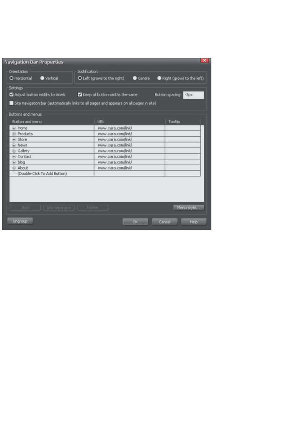
Navigation bar properties dialog
The best way to edit the labels, links and other attributes of a Navbar, and to add or remove buttons, is
to use the Navigation Bar properties dialog. Double click on a bar to bring up the dialog, or right click on
it and choose 'Edit navigation bar
' from the context menu.
The upper half of the dialog allows you to set various properties of the Navbar. The lower half allows
you to add and remove buttons and menus and to edit the labels and links of each button and menu
entry.
This is a modal dialog, meaning that you can't interact with the canvas while the dialog is on screen.
However all the changes you make in the dialog are immediately reflected in your Navbar on the canvas,
so you can see the result straight away. The changes you make in each dialog session are confirmed
when you click OK, or they are undone if you click Cancel
.
Orientation
Choose whether you want your Navbar to be horizontal or vertical. For vertical Navbars you will
normally want to make all buttons the same width (the width of the widest button), so you get a
rectangular bar. See the "Adjust all buttons to widest label
" option below, which controls this.
Justification
Choose how you want your bar to behave when its length changes as you edit labels and add/remove
buttons. A left justified horizontal bar will grow to the right as you add more buttons or make the button
labels longer. And the left edge of the bar stays in the same place on the page. Similarly a right justified
bar keeps its right edge in the same place and grows to the left. And a center justified
bar grows to left and right equally. Choose the centered option if, for example, you want a horizontal
Navbar centered at the top of your page.
For vertical bars, the justification options change to Top, Center and Bottom. As for horizontal bars, the
Page 967

setting determines whether the bar grows upwards (Bottom), downwards (Top), or both (center) when
buttons are added.
Adjust button widths to labels
Turn this option on if you want your buttons to be stretchy, so they grow and shrink as required to fit in
the label text applied to the button. With this option off, your buttons will remain the same size and so a
label that's too long for the button will extend beyond the edges of the button.
All buttons the same width
This option is enabled only if the above 'Adjust button widths to labels' option is on.
Select this option to make all your buttons the width of the widest button in the bar. For vertical Navbars
this is almost always desirable so that you get a rectangular bar. For horizontal bars it often makes the
bar look neater with each button the same size, but it requires more space and so you may not be able to
fit as many buttons into your bar with this option turned on.
Button spacing
Here you can choose to have some space between each button in your horizontal Navbar, if you don't
want each button to sit right up against its neighbor. Simply enter the number of pixels of space you
would like and see the result on the canvas immediately. Sometimes you may want to make this value
negative so that there is a small overlap between your buttons. This is useful if your button design is such
that you see an undesirable join line between the buttons when there is 0 spacing.
Page 968

Orientation
Choose whether you want your Navbar to be horizontal or vertical. For vertical Navbars you will
normally want to make all buttons the same width (the width of the widest button), so you get a
rectangular bar. See the "Adjust all buttons to widest label
" option below, which controls this.
Justification
Choose how you want your bar to behave when its length changes as you edit labels and add/remove
buttons. A left justified horizontal bar will grow to the right as you add more buttons or make the button
labels longer. And the left edge of the bar stays in the same place on the page. Similarly a right justified
bar keeps its right edge in the same place and grows to the left. And a center justified
bar grows to left and right equally. Choose the centered option if, for example, you want a horizontal
Navbar centered at the top of your page.
For vertical bars, the justification options change to Top, Center and Bottom. As for horizontal bars, the
setting determines whether the bar grows upwards (Bottom), downwards (Top), or both (center) when
buttons are added.
Adjust button widths to labels
Turn this option on if you want your buttons to be stretchy, so they grow and shrink as required to fit in
the label text applied to the button. With this option off, your buttons will remain the same size and so a
label that's too long for the button will extend beyond the edges of the button.
All buttons the same width
This option is enabled only if the above 'Adjust button widths to labels' option is on.
Select this option to make all your buttons the width of the widest button in the bar. For vertical Navbars
this is almost always desirable so that you get a rectangular bar. For horizontal bars it often makes the
bar look neater with each button the same size, but it requires more space and so you may not be able to
fit as many buttons into your bar with this option turned on.
Button spacing
Here you can choose to have some space between each button in your horizontal Navbar, if you don't
want each button to sit right up against its neighbor. Simply enter the number of pixels of space you
would like and see the result on the canvas immediately. Sometimes you may want to make this value
negative so that there is a small overlap between your buttons. This is useful if your button design is such
that you see an undesirable join line between the buttons when there is 0 spacing.
Page 969

Justification
Choose how you want your bar to behave when its length changes as you edit labels and add/remove
buttons. A left justified horizontal bar will grow to the right as you add more buttons or make the button
labels longer. And the left edge of the bar stays in the same place on the page. Similarly a right justified
bar keeps its right edge in the same place and grows to the left. And a center justified
bar grows to left and right equally. Choose the centered option if, for example, you want a horizontal
Navbar centered at the top of your page.
For vertical bars, the justification options change to Top, Center and Bottom. As for horizontal bars, the
setting determines whether the bar grows upwards (Bottom), downwards (Top), or both (center) when
buttons are added.
Adjust button widths to labels
Turn this option on if you want your buttons to be stretchy, so they grow and shrink as required to fit in
the label text applied to the button. With this option off, your buttons will remain the same size and so a
label that's too long for the button will extend beyond the edges of the button.
All buttons the same width
This option is enabled only if the above 'Adjust button widths to labels' option is on.
Select this option to make all your buttons the width of the widest button in the bar. For vertical Navbars
this is almost always desirable so that you get a rectangular bar. For horizontal bars it often makes the
bar look neater with each button the same size, but it requires more space and so you may not be able to
fit as many buttons into your bar with this option turned on.
Button spacing
Here you can choose to have some space between each button in your horizontal Navbar, if you don't
want each button to sit right up against its neighbor. Simply enter the number of pixels of space you
would like and see the result on the canvas immediately. Sometimes you may want to make this value
negative so that there is a small overlap between your buttons. This is useful if your button design is such
that you see an undesirable join line between the buttons when there is 0 spacing.
Page 970

Adjust button widths to labels
Turn this option on if you want your buttons to be stretchy, so they grow and shrink as required to fit in
the label text applied to the button. With this option off, your buttons will remain the same size and so a
label that's too long for the button will extend beyond the edges of the button.
All buttons the same width
This option is enabled only if the above 'Adjust button widths to labels' option is on.
Select this option to make all your buttons the width of the widest button in the bar. For vertical Navbars
this is almost always desirable so that you get a rectangular bar. For horizontal bars it often makes the
bar look neater with each button the same size, but it requires more space and so you may not be able to
fit as many buttons into your bar with this option turned on.
Button spacing
Here you can choose to have some space between each button in your horizontal Navbar, if you don't
want each button to sit right up against its neighbor. Simply enter the number of pixels of space you
would like and see the result on the canvas immediately. Sometimes you may want to make this value
negative so that there is a small overlap between your buttons. This is useful if your button design is such
that you see an undesirable join line between the buttons when there is 0 spacing.
Page 971

All buttons the same width
This option is enabled only if the above 'Adjust button widths to labels' option is on.
Select this option to make all your buttons the width of the widest button in the bar. For vertical Navbars
this is almost always desirable so that you get a rectangular bar. For horizontal bars it often makes the
bar look neater with each button the same size, but it requires more space and so you may not be able to
fit as many buttons into your bar with this option turned on.
Button spacing
Here you can choose to have some space between each button in your horizontal Navbar, if you don't
want each button to sit right up against its neighbor. Simply enter the number of pixels of space you
would like and see the result on the canvas immediately. Sometimes you may want to make this value
negative so that there is a small overlap between your buttons. This is useful if your button design is such
that you see an undesirable join line between the buttons when there is 0 spacing.
Page 972

Button spacing
Here you can choose to have some space between each button in your horizontal Navbar, if you don't
want each button to sit right up against its neighbor. Simply enter the number of pixels of space you
would like and see the result on the canvas immediately. Sometimes you may want to make this value
negative so that there is a small overlap between your buttons. This is useful if your button design is such
that you see an undesirable join line between the buttons when there is 0 spacing.
Page 973

Site navigation bar
This is a very important option on the Navbar dialog
, which turns on automatic linking so that buttons and links are added to your bar for you, as you add
pages. And all changes you make to the bar are reflected on every page of the site as soon as you close
the Navbar dialog.
Normally you have this option on only if you want your Navbar to appear on all pages of your website.
However you can manually delete the bar from pages if desired.
Moving and transforming a site navigation bar
If you move a site navigation bar on the page, the bar is also moved on all the other pages on which it
appears. Similarly if you scale the bar to make it larger or smaller using the Selector Tool, again the
same transformation is applied to the copy of the bar on the other pages. No other transformations of a
Navbar using the Selector Tool
are supported (rotation, skew, scaling in one dimension).
Automatic page linking
Whenever you add a new page to your site, a link to that page will be added to your site navigation bar
for you and the new page will be given a copy of the bar, if it doesn't already have one. If your bar has an
unused button on it, then the first such button will be linked to your new page. If all buttons are already
linked, a new button is automatically added to the end of your bar and it is linked to the new page. In
either case, the label of the button is changed to match the name of the new page, if it has a name, or to
"New page" otherwise. Normally you will want to immediately edit this new label in the Navbar dialog.
When you delete a page from your website, the button linking to it on your site navigation bar is
automatically deleted for you, on all pages of your site.
Turning site navigation bars on and off
When you turn the site navigation option on or off in the Navbar dialog, the change is reflected in all
copies of that bar on all pages of your website.
Deleting a site navigation bar from a page
If you don't want the site navigation bar on a particular page of your site, you can simply click on it to
select it on that page and hit "Delete". You'll be asked whether you want to delete the bar from just that
page, or from all pages.
However after removing the bar from one or more pages, note that if you subsequently turn off the site
navigation bar option (perhaps in order to edit the button design, which can't be done with the option on),
and then later turn it back on again, the bar will be added automatically to all the pages of your site that
don't have it.
Templates & Site navigation bars
All the single page templates in the Designs Gallery have their Navbars set to be site navigation bars
when you load them from the gallery to start a new website document. This means you can rapidly build
a small website with all pages linked to the bar, without having to add buttons and page links manually.
Similarly all website templates have site navigation bars turned on. If you don't want this behavior, simply
turn off the site navigation bar option on the Navbar dialog
.
The standalone Navbars presented with each theme in the gallery do not have site navigation turned on
by default. This is because any user adding bars manually is less likely to want that bar on every page of
Page 974

their site, with a link to every page. But again, the option can easily be turned on in the Navbar dialog if
required.
Other points to note
If you delete a button which points to one of your pages, or change the link on it to point elsewhere, no
special action is taken to restore a button link to the page. It's assumed you decided that you didn't want
a direct link to that page in your site navigation bar. New buttons and page links are only created when a
page is added.
Page 975

Moving and transforming a site navigation bar
If you move a site navigation bar on the page, the bar is also moved on all the other pages on which it
appears. Similarly if you scale the bar to make it larger or smaller using the Selector Tool, again the
same transformation is applied to the copy of the bar on the other pages. No other transformations of a
Navbar using the Selector Tool
are supported (rotation, skew, scaling in one dimension).
Automatic page linking
Whenever you add a new page to your site, a link to that page will be added to your site navigation bar
for you and the new page will be given a copy of the bar, if it doesn't already have one. If your bar has an
unused button on it, then the first such button will be linked to your new page. If all buttons are already
linked, a new button is automatically added to the end of your bar and it is linked to the new page. In
either case, the label of the button is changed to match the name of the new page, if it has a name, or to
"New page" otherwise. Normally you will want to immediately edit this new label in the Navbar dialog.
When you delete a page from your website, the button linking to it on your site navigation bar is
automatically deleted for you, on all pages of your site.
Turning site navigation bars on and off
When you turn the site navigation option on or off in the Navbar dialog, the change is reflected in all
copies of that bar on all pages of your website.
Deleting a site navigation bar from a page
If you don't want the site navigation bar on a particular page of your site, you can simply click on it to
select it on that page and hit "Delete". You'll be asked whether you want to delete the bar from just that
page, or from all pages.
However after removing the bar from one or more pages, note that if you subsequently turn off the site
navigation bar option (perhaps in order to edit the button design, which can't be done with the option on),
and then later turn it back on again, the bar will be added automatically to all the pages of your site that
don't have it.
Templates & Site navigation bars
All the single page templates in the Designs Gallery have their Navbars set to be site navigation bars
when you load them from the gallery to start a new website document. This means you can rapidly build
a small website with all pages linked to the bar, without having to add buttons and page links manually.
Similarly all website templates have site navigation bars turned on. If you don't want this behavior, simply
turn off the site navigation bar option on the Navbar dialog
.
The standalone Navbars presented with each theme in the gallery do not have site navigation turned on
by default. This is because any user adding bars manually is less likely to want that bar on every page of
their site, with a link to every page. But again, the option can easily be turned on in the Navbar dialog if
required.
Other points to note
If you delete a button which points to one of your pages, or change the link on it to point elsewhere, no
special action is taken to restore a button link to the page. It's assumed you decided that you didn't want
a direct link to that page in your site navigation bar. New buttons and page links are only created when a
page is added.
Page 976

Automatic page linking
Whenever you add a new page to your site, a link to that page will be added to your site navigation bar
for you and the new page will be given a copy of the bar, if it doesn't already have one. If your bar has an
unused button on it, then the first such button will be linked to your new page. If all buttons are already
linked, a new button is automatically added to the end of your bar and it is linked to the new page. In
either case, the label of the button is changed to match the name of the new page, if it has a name, or to
"New page" otherwise. Normally you will want to immediately edit this new label in the Navbar dialog.
When you delete a page from your website, the button linking to it on your site navigation bar is
automatically deleted for you, on all pages of your site.
Turning site navigation bars on and off
When you turn the site navigation option on or off in the Navbar dialog, the change is reflected in all
copies of that bar on all pages of your website.
Deleting a site navigation bar from a page
If you don't want the site navigation bar on a particular page of your site, you can simply click on it to
select it on that page and hit "Delete". You'll be asked whether you want to delete the bar from just that
page, or from all pages.
However after removing the bar from one or more pages, note that if you subsequently turn off the site
navigation bar option (perhaps in order to edit the button design, which can't be done with the option on),
and then later turn it back on again, the bar will be added automatically to all the pages of your site that
don't have it.
Templates & Site navigation bars
All the single page templates in the Designs Gallery have their Navbars set to be site navigation bars
when you load them from the gallery to start a new website document. This means you can rapidly build
a small website with all pages linked to the bar, without having to add buttons and page links manually.
Similarly all website templates have site navigation bars turned on. If you don't want this behavior, simply
turn off the site navigation bar option on the Navbar dialog
.
The standalone Navbars presented with each theme in the gallery do not have site navigation turned on
by default. This is because any user adding bars manually is less likely to want that bar on every page of
their site, with a link to every page. But again, the option can easily be turned on in the Navbar dialog if
required.
Other points to note
If you delete a button which points to one of your pages, or change the link on it to point elsewhere, no
special action is taken to restore a button link to the page. It's assumed you decided that you didn't want
a direct link to that page in your site navigation bar. New buttons and page links are only created when a
page is added.
Page 977

Turning site navigation bars on and off
When you turn the site navigation option on or off in the Navbar dialog, the change is reflected in all
copies of that bar on all pages of your website.
Deleting a site navigation bar from a page
If you don't want the site navigation bar on a particular page of your site, you can simply click on it to
select it on that page and hit "Delete". You'll be asked whether you want to delete the bar from just that
page, or from all pages.
However after removing the bar from one or more pages, note that if you subsequently turn off the site
navigation bar option (perhaps in order to edit the button design, which can't be done with the option on),
and then later turn it back on again, the bar will be added automatically to all the pages of your site that
don't have it.
Templates & Site navigation bars
All the single page templates in the Designs Gallery have their Navbars set to be site navigation bars
when you load them from the gallery to start a new website document. This means you can rapidly build
a small website with all pages linked to the bar, without having to add buttons and page links manually.
Similarly all website templates have site navigation bars turned on. If you don't want this behavior, simply
turn off the site navigation bar option on the Navbar dialog
.
The standalone Navbars presented with each theme in the gallery do not have site navigation turned on
by default. This is because any user adding bars manually is less likely to want that bar on every page of
their site, with a link to every page. But again, the option can easily be turned on in the Navbar dialog if
required.
Other points to note
If you delete a button which points to one of your pages, or change the link on it to point elsewhere, no
special action is taken to restore a button link to the page. It's assumed you decided that you didn't want
a direct link to that page in your site navigation bar. New buttons and page links are only created when a
page is added.
Page 978

Deleting a site navigation bar from a page
If you don't want the site navigation bar on a particular page of your site, you can simply click on it to
select it on that page and hit "Delete". You'll be asked whether you want to delete the bar from just that
page, or from all pages.
However after removing the bar from one or more pages, note that if you subsequently turn off the site
navigation bar option (perhaps in order to edit the button design, which can't be done with the option on),
and then later turn it back on again, the bar will be added automatically to all the pages of your site that
don't have it.
Templates & Site navigation bars
All the single page templates in the Designs Gallery have their Navbars set to be site navigation bars
when you load them from the gallery to start a new website document. This means you can rapidly build
a small website with all pages linked to the bar, without having to add buttons and page links manually.
Similarly all website templates have site navigation bars turned on. If you don't want this behavior, simply
turn off the site navigation bar option on the Navbar dialog
.
The standalone Navbars presented with each theme in the gallery do not have site navigation turned on
by default. This is because any user adding bars manually is less likely to want that bar on every page of
their site, with a link to every page. But again, the option can easily be turned on in the Navbar dialog if
required.
Other points to note
If you delete a button which points to one of your pages, or change the link on it to point elsewhere, no
special action is taken to restore a button link to the page. It's assumed you decided that you didn't want
a direct link to that page in your site navigation bar. New buttons and page links are only created when a
page is added.
Page 979

Templates & Site navigation bars
All the single page templates in the Designs Gallery have their Navbars set to be site navigation bars
when you load them from the gallery to start a new website document. This means you can rapidly build
a small website with all pages linked to the bar, without having to add buttons and page links manually.
Similarly all website templates have site navigation bars turned on. If you don't want this behavior, simply
turn off the site navigation bar option on the Navbar dialog
.
The standalone Navbars presented with each theme in the gallery do not have site navigation turned on
by default. This is because any user adding bars manually is less likely to want that bar on every page of
their site, with a link to every page. But again, the option can easily be turned on in the Navbar dialog if
required.
Other points to note
If you delete a button which points to one of your pages, or change the link on it to point elsewhere, no
special action is taken to restore a button link to the page. It's assumed you decided that you didn't want
a direct link to that page in your site navigation bar. New buttons and page links are only created when a
page is added.
Page 980

Other points to note
If you delete a button which points to one of your pages, or change the link on it to point elsewhere, no
special action is taken to restore a button link to the page. It's assumed you decided that you didn't want
a direct link to that page in your site navigation bar. New buttons and page links are only created when a
page is added.
Page 981
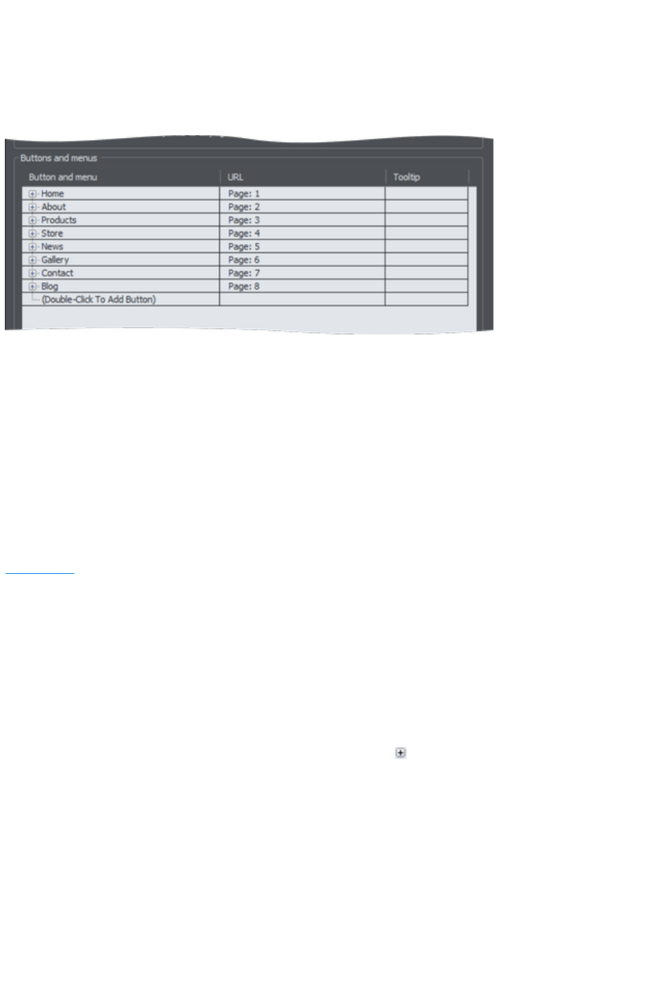
Buttons & Menus
Edit the button labels, links and other button attributes using the table and tree controls in the lower half
of the Navbar dialog
. Each row in the table corresponds to a button in the bar, or to an entry in a menu under one of the
buttons.
Adding & editing buttons
To add a button, double click in the first column where it says "Double-Click To Add Button". A new
row is added below the row for the last button. Or click the Add
button at the bottom of the dialog to add a button following the selected button. You can immediately
start editing the label for the new button. Press return to complete the label edit, or click away from the
label.
You can edit any button label by first clicking the appropriate row to select it and then clicking again in
the first column to start editing the label.
To set the link on a button, double click on the URL field, or if the row is already selected you can just
single click on it. The Web Properties Link dialog appears. This should look familiar as it's the same
Link dialog
that you use for adding other links to your page, so you have the same link options available. A few
options are disabled because they are not applicable to Navbar and menu links, such as the pop-up
photo option which only works when applied to a photo.
You can also set the tooltip text for each button using the 3rd column. Edit the text the same way as you
edited the label text. In the exported web site the text entered appears as a small pop-up tooltip when the
mouse pointer is held over your button or menu entry.
Adding menus and sub-menus
In the first (label) column, you'll notice that there is a plus icon
to the left of each label. This is a tree control and clicking the plus icon next to a button label, expands
that button node, allowing you to add a menu to that button.
Click on the Double-Click To Add Menu Item text below the button to start adding a menu. Or click
the Add
button at the bottom of the dialog to add a menu item below the selected item. A new row appears in
the table for each menu entry you add. You set the label, link and tooltip for each menu entry the same
way you do for buttons. And you can add sub-menus to any menu the same way ? by first expanding the
menu entry node of the tree.
Page 982
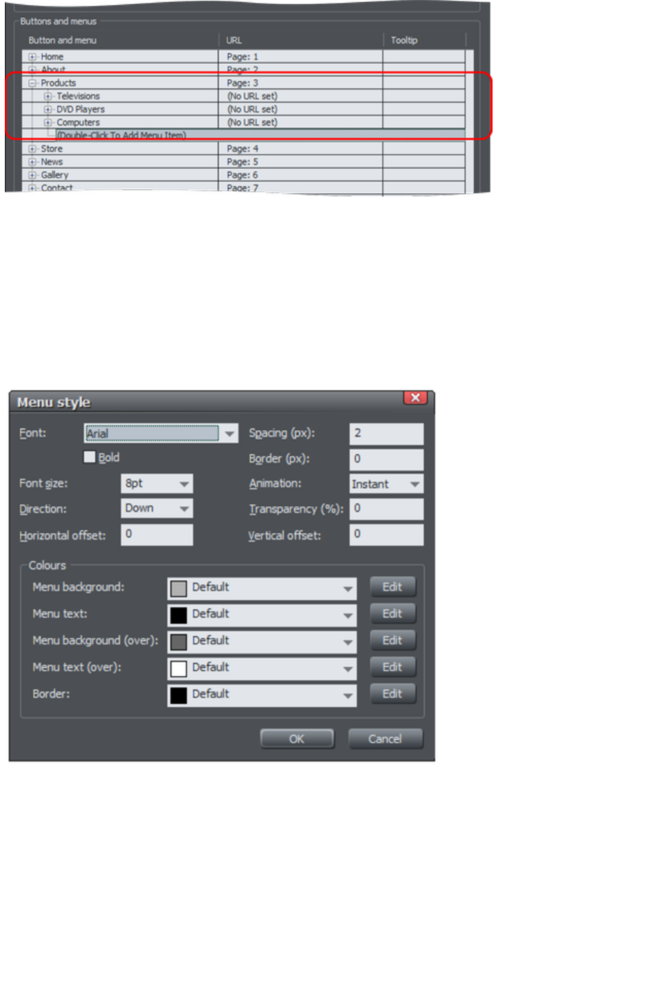
Menu separators
You can add a separator into your menu by clicking the Add separator
button at the bottom of the dialog. The separator is added following the currently selected menu item.
Separators allow you to visually group together related items in your menu.
Menu Styles
Click on the Menu Style… button to bring up the Menu Style dialog
. This allows you to change how the menus appear and behave on your Navbar.
Font
Choose a font to be used for the text on your menus. Only the web safe fonts are listed, which are the
fonts that all visitors to your site should have. There is also an option to make the font bold and you can
change the font size used.
NOTE: This doesn't change the font used for the button labels of your bar, only the font used on menus.
To change the button label font, see the section about this later in this chapter.
Direction
Choose the direction in which your menus should open. For horizontal Navbars you'll normally want this
to be downwards and for vertical bars either left or right depending on where on the page your bar is
located.
Spacing
Page 983

With this setting you can add space between the entries in your menu, spreading them out and making
the menu larger as a result.
Border
Add a border to the panes of your menus by entering a border width in pixels.
Animation
By default menus will open instantly, but here you can choose to have the menu animating as it opens.
Transparency
You can choose to have your menus semi-transparent, so that your page can be seen through the menu
panes. Enter the level of transparency you would like as a percentage.
Horizontal offset / Vertical offset
You can offset the menu panes horizontally or vertically from the buttons. Just enter the number of pixels
of offset required.
Page 984
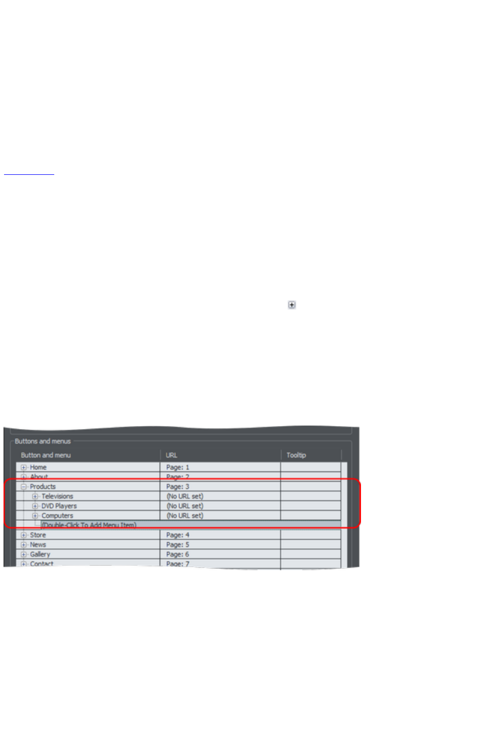
Adding & editing buttons
To add a button, double click in the first column where it says "Double-Click To Add Button". A new
row is added below the row for the last button. Or click the Add
button at the bottom of the dialog to add a button following the selected button. You can immediately
start editing the label for the new button. Press return to complete the label edit, or click away from the
label.
You can edit any button label by first clicking the appropriate row to select it and then clicking again in
the first column to start editing the label.
To set the link on a button, double click on the URL field, or if the row is already selected you can just
single click on it. The Web Properties Link dialog appears. This should look familiar as it's the same
Link dialog
that you use for adding other links to your page, so you have the same link options available. A few
options are disabled because they are not applicable to Navbar and menu links, such as the pop-up
photo option which only works when applied to a photo.
You can also set the tooltip text for each button using the 3rd column. Edit the text the same way as you
edited the label text. In the exported web site the text entered appears as a small pop-up tooltip when the
mouse pointer is held over your button or menu entry.
Adding menus and sub-menus
In the first (label) column, you'll notice that there is a plus icon
to the left of each label. This is a tree control and clicking the plus icon next to a button label, expands
that button node, allowing you to add a menu to that button.
Click on the Double-Click To Add Menu Item text below the button to start adding a menu. Or click
the Add
button at the bottom of the dialog to add a menu item below the selected item. A new row appears in
the table for each menu entry you add. You set the label, link and tooltip for each menu entry the same
way you do for buttons. And you can add sub-menus to any menu the same way ? by first expanding the
menu entry node of the tree.
Menu separators
You can add a separator into your menu by clicking the Add separator
button at the bottom of the dialog. The separator is added following the currently selected menu item.
Separators allow you to visually group together related items in your menu.
Menu Styles
Click on the Menu Style… button to bring up the Menu Style dialog
. This allows you to change how the menus appear and behave on your Navbar.
Page 985
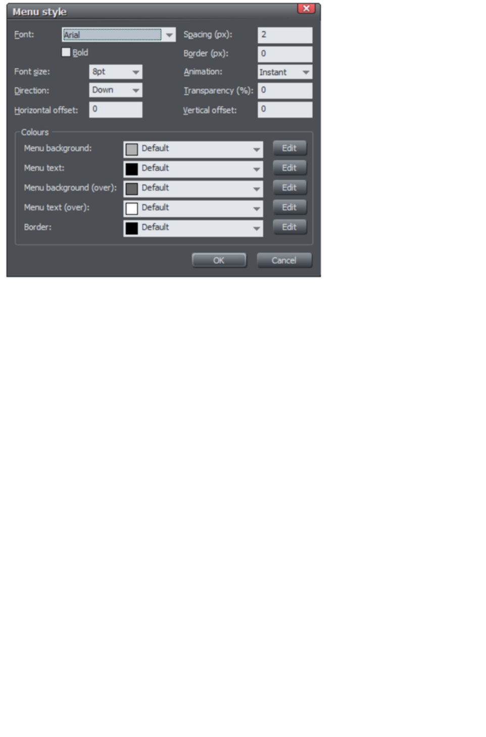
Font
Choose a font to be used for the text on your menus. Only the web safe fonts are listed, which are the
fonts that all visitors to your site should have. There is also an option to make the font bold and you can
change the font size used.
NOTE: This doesn't change the font used for the button labels of your bar, only the font used on menus.
To change the button label font, see the section about this later in this chapter.
Direction
Choose the direction in which your menus should open. For horizontal Navbars you'll normally want this
to be downwards and for vertical bars either left or right depending on where on the page your bar is
located.
Spacing
With this setting you can add space between the entries in your menu, spreading them out and making
the menu larger as a result.
Border
Add a border to the panes of your menus by entering a border width in pixels.
Animation
By default menus will open instantly, but here you can choose to have the menu animating as it opens.
Transparency
You can choose to have your menus semi-transparent, so that your page can be seen through the menu
panes. Enter the level of transparency you would like as a percentage.
Horizontal offset / Vertical offset
You can offset the menu panes horizontally or vertically from the buttons. Just enter the number of pixels
of offset required.
Page 986
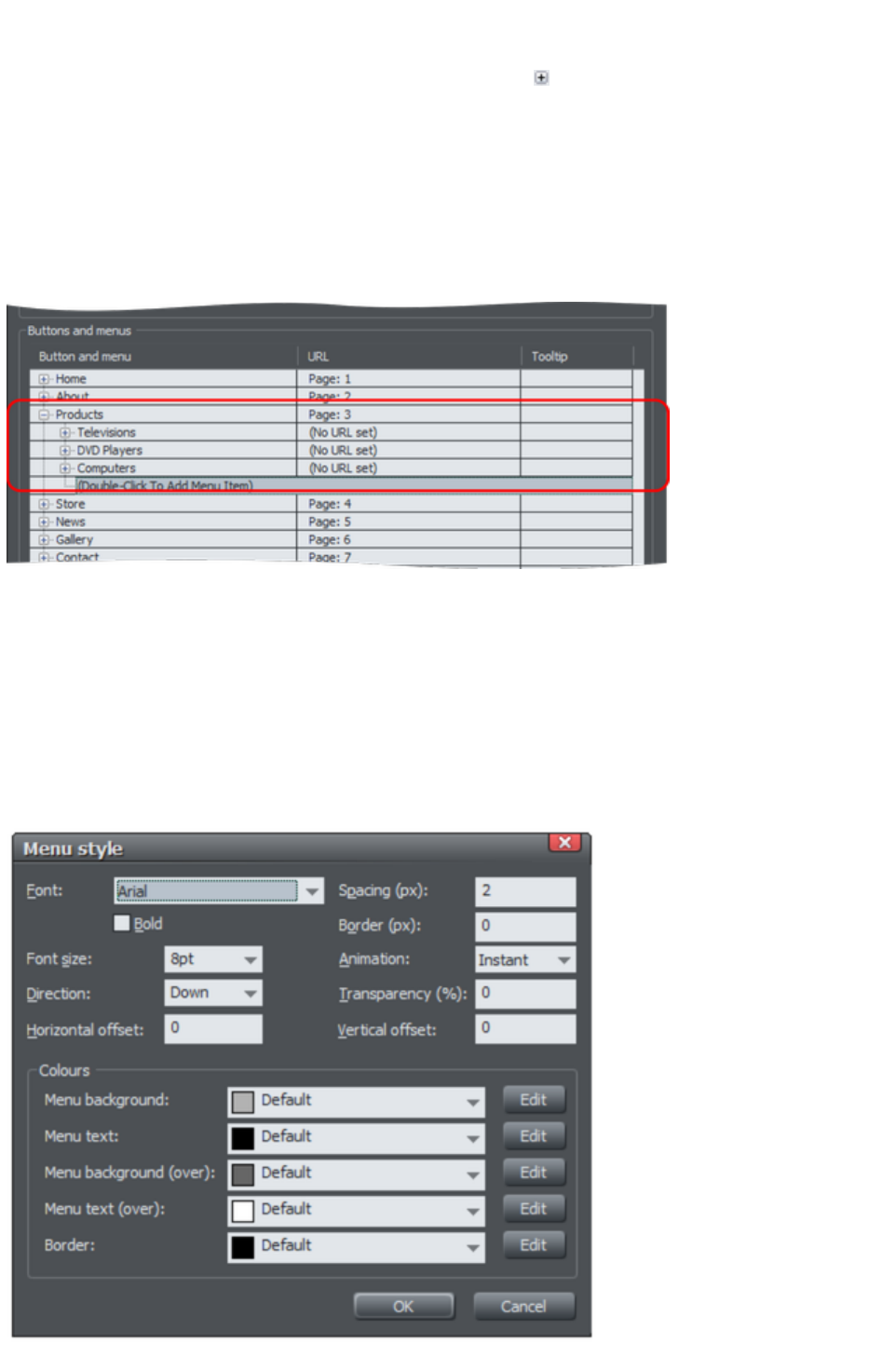
Adding menus and sub-menus
In the first (label) column, you'll notice that there is a plus icon
to the left of each label. This is a tree control and clicking the plus icon next to a button label, expands
that button node, allowing you to add a menu to that button.
Click on the Double-Click To Add Menu Item text below the button to start adding a menu. Or click
the Add
button at the bottom of the dialog to add a menu item below the selected item. A new row appears in
the table for each menu entry you add. You set the label, link and tooltip for each menu entry the same
way you do for buttons. And you can add sub-menus to any menu the same way ? by first expanding the
menu entry node of the tree.
Menu separators
You can add a separator into your menu by clicking the Add separator
button at the bottom of the dialog. The separator is added following the currently selected menu item.
Separators allow you to visually group together related items in your menu.
Menu Styles
Click on the Menu Style… button to bring up the Menu Style dialog
. This allows you to change how the menus appear and behave on your Navbar.
Page 987

Font
Choose a font to be used for the text on your menus. Only the web safe fonts are listed, which are the
fonts that all visitors to your site should have. There is also an option to make the font bold and you can
change the font size used.
NOTE: This doesn't change the font used for the button labels of your bar, only the font used on menus.
To change the button label font, see the section about this later in this chapter.
Direction
Choose the direction in which your menus should open. For horizontal Navbars you'll normally want this
to be downwards and for vertical bars either left or right depending on where on the page your bar is
located.
Spacing
With this setting you can add space between the entries in your menu, spreading them out and making
the menu larger as a result.
Border
Add a border to the panes of your menus by entering a border width in pixels.
Animation
By default menus will open instantly, but here you can choose to have the menu animating as it opens.
Transparency
You can choose to have your menus semi-transparent, so that your page can be seen through the menu
panes. Enter the level of transparency you would like as a percentage.
Horizontal offset / Vertical offset
You can offset the menu panes horizontally or vertically from the buttons. Just enter the number of pixels
of offset required.
Page 988
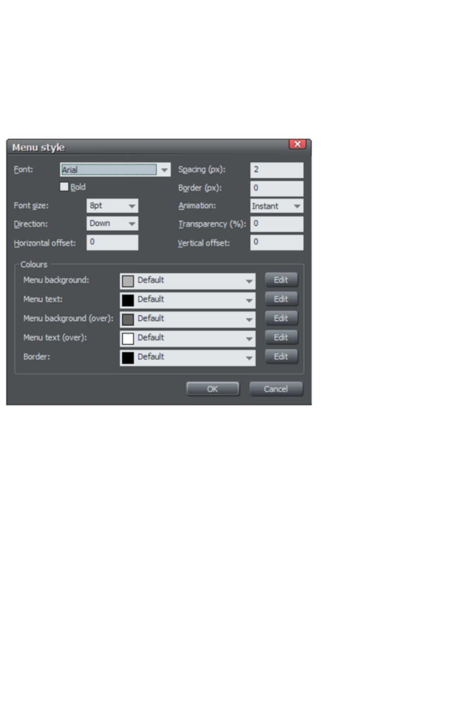
Menu separators
You can add a separator into your menu by clicking the Add separator
button at the bottom of the dialog. The separator is added following the currently selected menu item.
Separators allow you to visually group together related items in your menu.
Menu Styles
Click on the Menu Style… button to bring up the Menu Style dialog
. This allows you to change how the menus appear and behave on your Navbar.
Font
Choose a font to be used for the text on your menus. Only the web safe fonts are listed, which are the
fonts that all visitors to your site should have. There is also an option to make the font bold and you can
change the font size used.
NOTE: This doesn't change the font used for the button labels of your bar, only the font used on menus.
To change the button label font, see the section about this later in this chapter.
Direction
Choose the direction in which your menus should open. For horizontal Navbars you'll normally want this
to be downwards and for vertical bars either left or right depending on where on the page your bar is
located.
Spacing
With this setting you can add space between the entries in your menu, spreading them out and making
the menu larger as a result.
Border
Add a border to the panes of your menus by entering a border width in pixels.
Animation
By default menus will open instantly, but here you can choose to have the menu animating as it opens.
Transparency
You can choose to have your menus semi-transparent, so that your page can be seen through the menu
panes. Enter the level of transparency you would like as a percentage.
Horizontal offset / Vertical offset
Page 989

You can offset the menu panes horizontally or vertically from the buttons. Just enter the number of pixels
of offset required.
Page 990
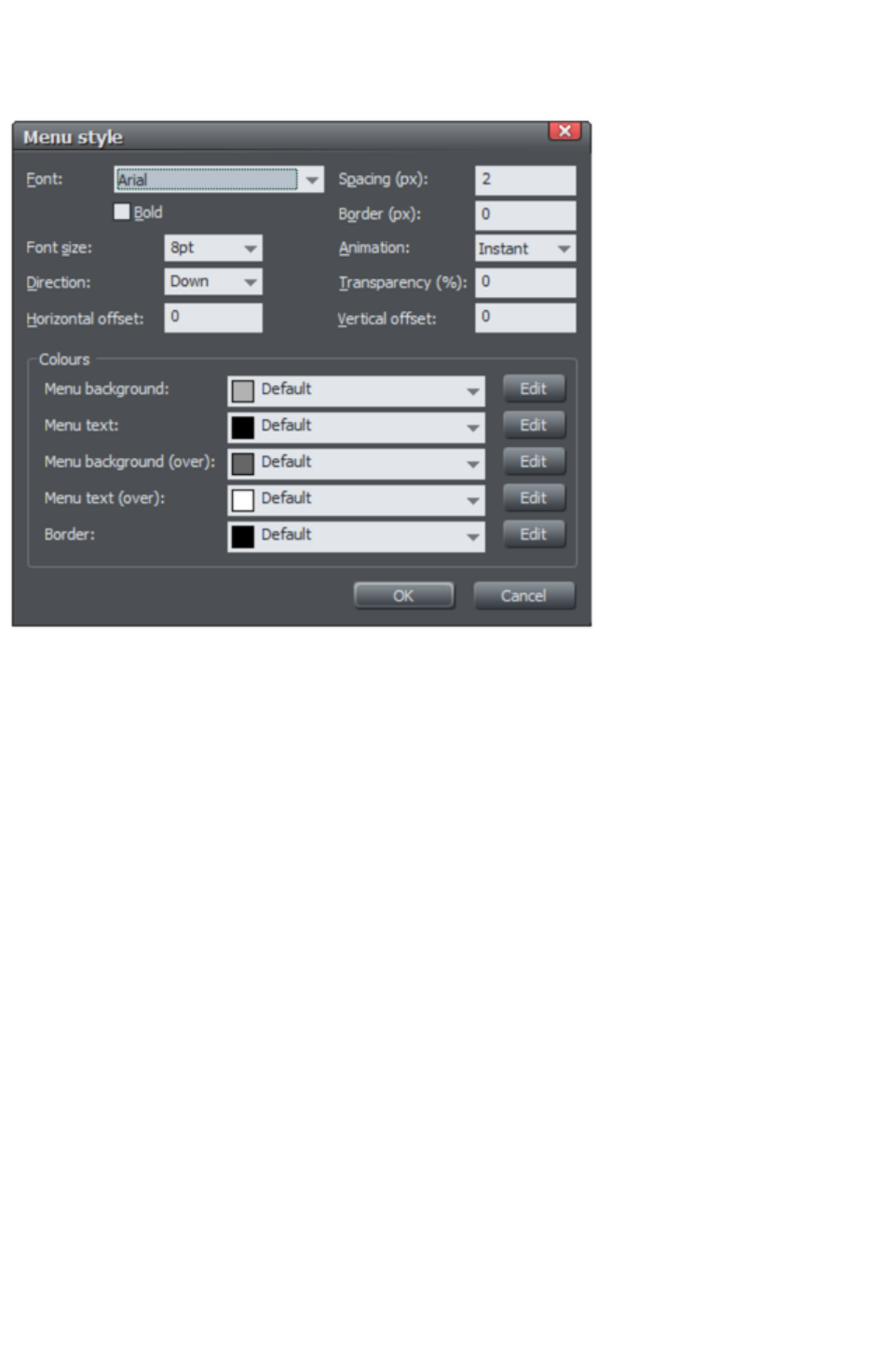
Menu Styles
Click on the Menu Style… button to bring up the Menu Style dialog
. This allows you to change how the menus appear and behave on your Navbar.
Font
Choose a font to be used for the text on your menus. Only the web safe fonts are listed, which are the
fonts that all visitors to your site should have. There is also an option to make the font bold and you can
change the font size used.
NOTE: This doesn't change the font used for the button labels of your bar, only the font used on menus.
To change the button label font, see the section about this later in this chapter.
Direction
Choose the direction in which your menus should open. For horizontal Navbars you'll normally want this
to be downwards and for vertical bars either left or right depending on where on the page your bar is
located.
Spacing
With this setting you can add space between the entries in your menu, spreading them out and making
the menu larger as a result.
Border
Add a border to the panes of your menus by entering a border width in pixels.
Animation
By default menus will open instantly, but here you can choose to have the menu animating as it opens.
Transparency
You can choose to have your menus semi-transparent, so that your page can be seen through the menu
panes. Enter the level of transparency you would like as a percentage.
Horizontal offset / Vertical offset
You can offset the menu panes horizontally or vertically from the buttons. Just enter the number of pixels
of offset required.
Page 991

Updating your Navbar across all pages
As described above, if you have the Site navigation bar
option turned on for a Navbar then all changes that you make to the bar on one page are automatically
applied to all the other pages too, including the location of the bar on the page.
However if you don't have that option turned on, set the navigation bar object to be a repeating object
(right click and choose Repeat on all pages
) that appears on every page and all changes you make to any instance of the object automatically update
on all pages. See the Object Handling chapter for more information on repeating objects.
Page 992

On canvas editing
You can edit your button labels directly on the canvas using the Text
Tool. Just go into the Text Tool
and click in the label text to start editing it.
If the text object is a repeating object (right click and choose Repeat on all pages
) all changes you make to one instance of the object automatically update across all instances.
Page 993

Changing the font on Navbar buttons
You can change the font used for the button labels on a Navbar easily. Select the bar by clicking on it.
Then go into the Text Tool and select from the font list on the left of the Text Tool infobar
. As you move the mouse pointer over the different fonts in the list, the Navbar updates immediately so
you can see how that font would look. Select the required font. If your bar has a mouseover state, it is
also updated to use the same font.
Similarly you can change the size of the font using the font size control which is next to the font selection
list.
Page 994

Importing & pasting Navbars
If you import or paste a Navbar into your document, the site navigation option on that Navbar is turned
off automatically, if it was on. This is to avoid any conflicts with any existing site navigation bar in your
document.
However if the incoming bar is of the same theme and type as the existing site navigation bar in your site
(ie., are part of the same repeating group), it will immediately be updated to match that existing site
navigation bar. Hence in this case the bar will not appear on your page in its original form.
If the bar is of a different theme or type (ie., are not part of the same repeating group), it will appear
unmodified.
Page 995

Creating your own Navigation Bars
You can create a Navbar from any button design. The Designs Gallery contains many different button
designs, or you can draw your own. See the „Creating your own Mouseover Buttons
" section of the Getting Started chapter for information on how to do this.The button may or may not
include a mouseover state.
To create a Navbar, select the button and then select "Arrange" > "Create Navigation Bar". The
Navigation Bar dialog
appears and you can immediately add more buttons to your bar, just as for other Navbars.
You can also create Navbars with more than one button design (so you can have different designs for the
first and/or last button in the bar). See the section below, which describes how to do that.
Button design restrictions
There are some rules you must follow when creating your own buttons for use in Navbars.
Stretchy button limitations
In order to get reliable results when your buttons are automatically stretched you are advised to make
sure that there are no path control points or graduated fill/transparency control points in the horizontal
area occupied by the button label text object.
Text in a button
Each state of the button design must be a group object containing a text object that can serve as the
button label. This text object should be a simple text object, not a text column or text area. That is, it
should be created in the Text Tool
by clicking on the page and typing, not by first dragging a text line or text box.
Soft grouping button states
If there are several states in your button, e.g., mouseoff and mouseover, they need to be soft grouped
together, so that they stay together when one state is moved or otherwise transformed.
Page 996

Button design restrictions
There are some rules you must follow when creating your own buttons for use in Navbars.
Stretchy button limitations
In order to get reliable results when your buttons are automatically stretched you are advised to make
sure that there are no path control points or graduated fill/transparency control points in the horizontal
area occupied by the button label text object.
Text in a button
Each state of the button design must be a group object containing a text object that can serve as the
button label. This text object should be a simple text object, not a text column or text area. That is, it
should be created in the Text Tool
by clicking on the page and typing, not by first dragging a text line or text box.
Soft grouping button states
If there are several states in your button, e.g., mouseoff and mouseover, they need to be soft grouped
together, so that they stay together when one state is moved or otherwise transformed.
Page 997
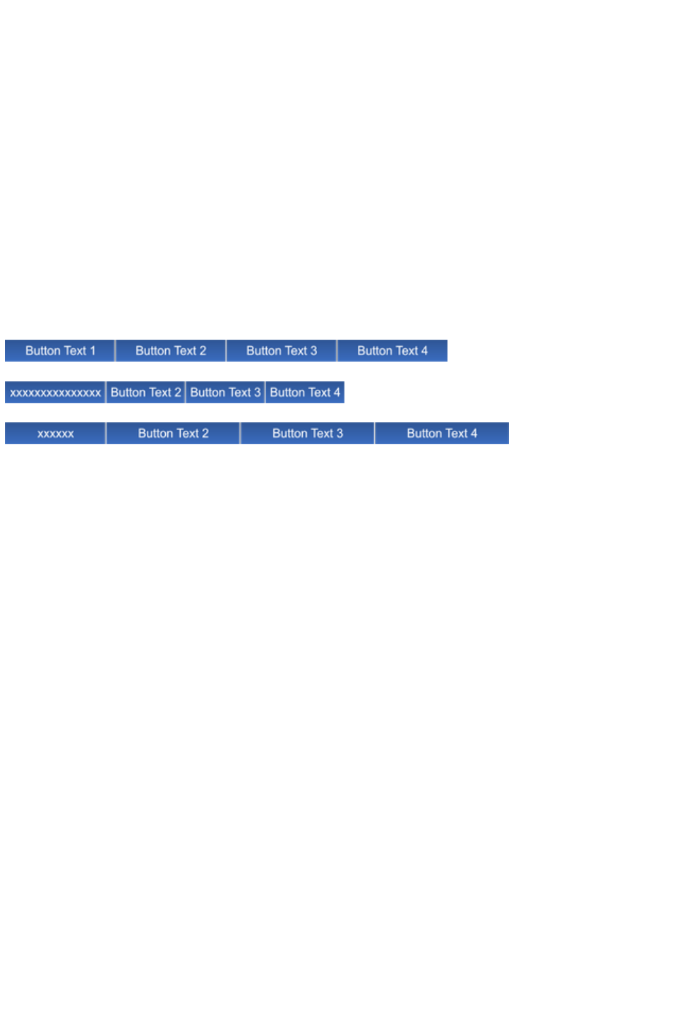
Button margins
In this section we refer to the „margins" as being the spaces between the button label and the ends of the
button. For stretchy buttons (those with the „Adjust button widths to labels" option switched on) this is
determined by the master button from which you create the Navbar. By adjusting the margins on the
master button, you set the margins for the other buttons in the bar, which are based on it.
The easiest way to change the margin on the first button is as follows:
1. Open the Navbar dialog
2. Turn off the Adjust button widths to labels option, so buttons don't stretch as label text is
changed.
3. Change the label on the master button (the first button unless you have multiple button designs in
your Navbar ? see later section). Choose any dummy label text which is the appropriate length to
give you the margins you want on the master button.
4. Turn the Adjust button widths to labels option back on again. All buttons get the same margins
you set for the master button.
5. Set the master button label text back to what it should be.
Original bar
Bar with a modified smaller margin
Bar with a modified larger margin
If your Navbar has different designs for the start/end (see below for how to achieve that), then the start
and end designs have their own margins that can be controlled separately.
Page 998

Advanced - Editing a Navbar button design
However your Navbar was created, you can modify the button design it uses. For a Navbar where all
buttons are the same design, the very first button in the bar is used as the master button from which all the
other buttons are copied. Therefore by modifying the first button design, you modify the design for the
whole bar.
Editing inside
For some bars you can do some editing of the button design directly on the first button, using select
inside. This allows you to select shapes inside the button group. See the information about the Selector
Tool
in the Object Handling chapter for details of select inside.
However you cannot do select inside editing, if either of the following options are turned on in the Navbar
dialog.
Site navigation bar
Adjust button widths to labels
If either of these options are turned on and you attempt a select inside, you'll be prompted and given the
option of opening the Navbar dialog so that you can turn off these options and then try again.
With the options off, you can use select inside and modify the shapes that make up your button using the
usual drawing tools.
IMPORTANT
: Remember that the first button in your bar is the master button for your bar (unless you have different
start and end buttons ? see below). So you must modify the first button. Then your changes to the first
button are immediately applied to the other buttons in your bar. If you modify a button other than the
master, the changes will not be applied and will be lost as soon as you modify your bar.
Ungrouping, editing and regrouping
If you want to do any significant editing of a button design, it's best to ungroup the components that
make up the Navbar and then regroup them again afterwards.
To ungroup your bar, select the Navbar by clicking on it on the canvas and then do a normal ungroup
operation ("Arrange" > "Ungroup" or "Ctrl + U"). Or click the Ungroup to edit graphics
button at the bottom of the Navbar dialog.
Note
: If your Navbar had the "Site navigation bar" option turned on, you'll need to turn that option back on
again if required, after regrouping your modified bar.
Once your bar is ungrouped, it is no longer a navigation bar. You are left with a separate button group
for each button state. Also, if the "All buttons the same width
" option was turned on, ungrouping might change the button widths because this option is only effective
while the buttons are part of a Navbar. Although you should only make the design changes to the master
button(s), you'll normally want to leave all the other buttons on the page. They are used when you
regroup your Navbar, to recover all your button labels, links, etc., so that you don't have to re-enter
them again.
If you have a mouseover state, the 2 groups that make up the master button will be „soft grouped" so that
they stay together when you drag them around the page. Separate them using "Arrange" > "Remove
soft group" ("Ctrl + Alt + U"). You can then further ungroup each button state on the MouseOff and
MouseOver layers ("Ctrl + U"), in order to work on their respective designs. See the "Creating your own
Mouseover Buttons" section of the Getting Started chapter
for information on how to make buttons.
Remember to regroup each of the button states and then put the soft group back to keep the two button
Page 999

states together once you're done editing. Do this by making sure both layers are turned on in the Page &
Layer Gallery, select both button state groups and then "Arrange" > "Apply soft group". See the
Object Handling chapter for more information on soft groups (Soft Groups, Soft Groups
).
It's a good idea to test your button works as expected by previewing your page, before re-assembling
the bar. To put your bar back together, select the modified button and choose "Arrange" > "Create
Navigation Bar"
.
Page 1000

Editing inside
For some bars you can do some editing of the button design directly on the first button, using select
inside. This allows you to select shapes inside the button group. See the information about the Selector
Tool
in the Object Handling chapter for details of select inside.
However you cannot do select inside editing, if either of the following options are turned on in the Navbar
dialog.
Site navigation bar
Adjust button widths to labels
If either of these options are turned on and you attempt a select inside, you'll be prompted and given the
option of opening the Navbar dialog so that you can turn off these options and then try again.
With the options off, you can use select inside and modify the shapes that make up your button using the
usual drawing tools.
IMPORTANT
: Remember that the first button in your bar is the master button for your bar (unless you have different
start and end buttons ? see below). So you must modify the first button. Then your changes to the first
button are immediately applied to the other buttons in your bar. If you modify a button other than the
master, the changes will not be applied and will be lost as soon as you modify your bar.
Ungrouping, editing and regrouping
If you want to do any significant editing of a button design, it's best to ungroup the components that
make up the Navbar and then regroup them again afterwards.
To ungroup your bar, select the Navbar by clicking on it on the canvas and then do a normal ungroup
operation ("Arrange" > "Ungroup" or "Ctrl + U"). Or click the Ungroup to edit graphics
button at the bottom of the Navbar dialog.
Note
: If your Navbar had the "Site navigation bar" option turned on, you'll need to turn that option back on
again if required, after regrouping your modified bar.
Once your bar is ungrouped, it is no longer a navigation bar. You are left with a separate button group
for each button state. Also, if the "All buttons the same width
" option was turned on, ungrouping might change the button widths because this option is only effective
while the buttons are part of a Navbar. Although you should only make the design changes to the master
button(s), you'll normally want to leave all the other buttons on the page. They are used when you
regroup your Navbar, to recover all your button labels, links, etc., so that you don't have to re-enter
them again.
If you have a mouseover state, the 2 groups that make up the master button will be „soft grouped" so
that they stay together when you drag them around the page. Separate them using "Arrange" > "
Remove soft group" ("Ctrl + Alt + U"). You can then further ungroup each button state on the
MouseOff and MouseOver layers ("Ctrl + U"), in order to work on their respective designs. See the
"Creating your own Mouseover Buttons" section of the Getting Started chapter
for information on how to make buttons.
Remember to regroup each of the button states and then put the soft group back to keep the two button
states together once you're done editing. Do this by making sure both layers are turned on in the Page &
Layer Gallery, select both button state groups and then "Arrange" > "Apply soft group". See the
Object Handling chapter for more information on soft groups (Soft Groups, Soft Groups
).
It's a good idea to test your button works as expected by previewing your page, before re-assembling
the bar. To put your bar back together, select the modified button and choose "Arrange" > "Create
Navigation Bar"
Page 1001

.
Page 1002
Ungrouping, editing and regrouping
If you want to do any significant editing of a button design, it's best to ungroup the components that
make up the Navbar and then regroup them again afterwards.
To ungroup your bar, select the Navbar by clicking on it on the canvas and then do a normal ungroup
operation ("Arrange" > "Ungroup" or "Ctrl + U"). Or click the Ungroup to edit graphics
button at the bottom of the Navbar dialog.
Note
: If your Navbar had the "Site navigation bar" option turned on, you'll need to turn that option back on
again if required, after regrouping your modified bar.
Once your bar is ungrouped, it is no longer a navigation bar. You are left with a separate button group
for each button state. Also, if the "All buttons the same width
" option was turned on, ungrouping might change the button widths because this option is only effective
while the buttons are part of a Navbar. Although you should only make the design changes to the master
button(s), you'll normally want to leave all the other buttons on the page. They are used when you
regroup your Navbar, to recover all your button labels, links, etc., so that you don't have to re-enter
them again.
If you have a mouseover state, the 2 groups that make up the master button will be „soft grouped" so
that they stay together when you drag them around the page. Separate them using "Arrange" > "
Remove soft group" ("Ctrl + Alt + U"). You can then further ungroup each button state on the
MouseOff and MouseOver layers ("Ctrl + U"), in order to work on their respective designs. See the
"Creating your own Mouseover Buttons" section of the Getting Started chapter
for information on how to make buttons.
Remember to regroup each of the button states and then put the soft group back to keep the two button
states together once you're done editing. Do this by making sure both layers are turned on in the Page &
Layer Gallery, select both button state groups and then "Arrange" > "Apply soft group". See the
Object Handling chapter for more information on soft groups (Soft Groups, Soft Groups
).
It's a good idea to test your button works as expected by previewing your page, before re-assembling
the bar. To put your bar back together, select the modified button and choose "Arrange" > "Create
Navigation Bar"
.
Page 1003
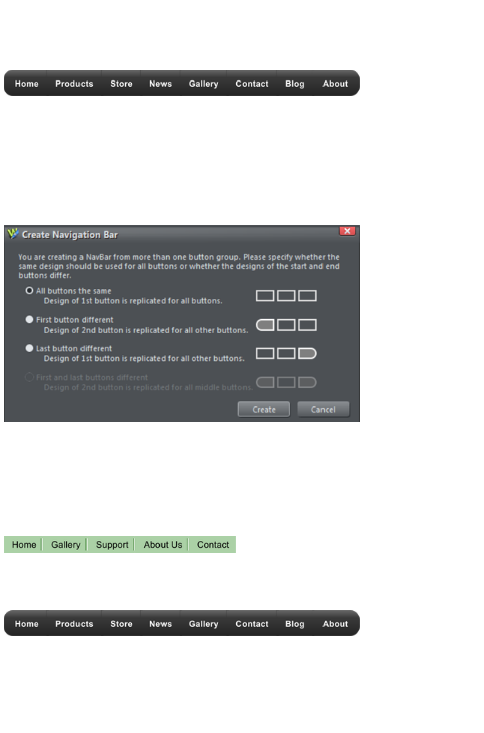
Navbars with different first or last buttons
Sometimes you may want a bar which has different first and last buttons. For example, perhaps a bar
with rounded ends but with rectangular buttons in the middle.
Navbars like this need 2 (if just one end should look different) or 3 (if both ends should look different)
button designs. Position the button designs in order from left to right as you would like them to appear in
a horizontal Navbar. Or from top to bottom as you would like them to appear in a vertical bar. Then
select all 3 button designs (along with their mouseover states if they have them) and choose "Arrange" >
"Create Navigation Bar"
.
When you create a bar from more than one button like this, Xara Web Designer 7 Premium needs to
know how you would like those buttons to be used in the bar. Therefore a dialog is displayed, asking you
to choose from a range of options.
All buttons the same: Choose this option if you want all the buttons in your bar to be the design of the first
button you selected. This is the most common type of Navbar.
First button different:
If the first button is to be of a different design to the rest of the buttons in the bar, choose this option.
Last button different:
If the last button is to be a different design to the rest of the buttons in the bar, choose this option. An
example where this is necessary is a bar which shows a divider between each button in the bar. All but
the last button would need the divider to appear on the right of the button design.
The last button in this example is different, it has no divider at the right border
First and last button different:
This option allows you to specify different button designs for the first and last buttons, to give your bar
end caps. Of course you must have selected at least 3 buttons for this option to be valid.
Page 1004
Website Presentations
Xara Web Designer 7 Premium allows you to create web presentations with Microsoft PowerPoint®
slideshow-style effects such as animated step transitions within a page and animated page transitions.
Viewers of your web presentation can move through it sequentially, step by step and page by page, using
the right arrow and Page Down key to view the next step/page, and the left arrow or Page Up key to
move backwards.
You can apply transition effects to layers (referred to as presentation steps within a presentation). These
layers or 'steps' can contain one or multiple graphics and/or text objects, and these objects will appear on
screen in an animated way. When there are no more steps to reveal within a page, the next page of the
presentation is displayed, with its own page transition effect if it has one.
As well as using these keyboard keys to navigate the presentation, you can also add links, for example
via a button, to allow your viewers to move to the previous or next presentation step. This interaction
defines the difference between a presentation and a website - they are very similar but viewers cannot
navigate sequentially through a website using keyboard keys.
You can toggle a document between presentation and web mode using the Presentation Website
checkbox in the Website tab
of the Web Properties dialog. This is useful if you want to turn an existing website into a presentation,
rather than creating it from scratch.
See About transitions for a list of transition styles.
Note: A website does not have to be set as a presentation website in order to have animated page and
layer transitions. Page and link transitions can be specified on the Page and/or Link tabs of the Website
Properties dialog, and will work with normal links to pages. Likewise a pop-up layer that is triggered by
a link to the layer on the page can also appear with a transition effect, which can be set using the Web
transition tab
of the Layer Properties dialog. So the difference between a web presentation and regular web document
is that a presentation enables the ability to step forward and backwards through a presentation using
keyboard keys, as with a PowerPoint presentation.
In this chapter
The Presentation toolbar
Creating a presentation
Managing presentation steps
Adding new presentation pages
Deleting presentation pages
Linking to next/previous step
Applying transitions to presentation step links
Applying presentation step transitions
Applying presentation page transitions
Advanced presentation information
Hosting remote presentation sessions
Page 1005
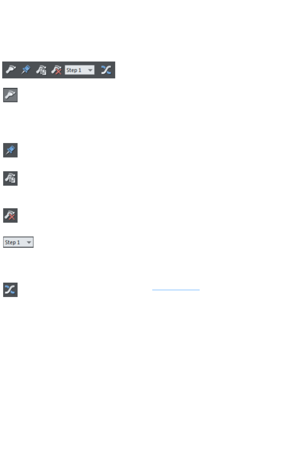
The Presentation toolbar
Xara Web Designer 7 Premium automatically displays the Presentation toolbar on the right of the
standard toolbar when you create or open a presentation document. To hide/display the toolbar, choose
Control Bars from the Window menu, click the Presentation checkbox and click Close
. Just repeat this action to display the toolbar again.
The toolbar allows you to:
Make a new presentation step that contains any currently
selected objects. You can create steps quickly by dragging or
pasting objects on to the page, selecting them and clicking this
button. Even if the currently selected objects are already on a
presentation step, clicking this button will move selected items to
a new step.
Move the selected objects to the MouseOff layer, so that they
are not part of any presentation step and so are displayed as
'background' objects.
Duplicate the current presentation step (perhaps the easiest way
of creating a new step). The step containing the selected object
is duplicated in its entirety, not just the selected object. Replace
the copied objects with new content.
Delete the current presentation step. The entire step containing
the selected object is deleted, including any other objects on that
step that may not be selected.
Changes the order position of the step containing the selected
object. For example if you select an object on step 2 and
choose step 1 from this list, that moves step 2 to become the
first step in the presentation and step 1 therefore becomes step
2.
Displays the Web Transition tab of the Layer Properties
dialog, allowing you to choose a transition type for the
presentation step that the currently selected object(s) are in.
Page 1006
Creating a presentation
There are three ways to create a new presentation:
Start with a pre-designed template and then customize this with your own text, photos and color
scheme.
Create a presentation from scratch, bringing in all the required elements, text, graphics and
photos onto the page and ordering the content into the presentation steps and pages you require.
Convert an existing website/web document into a presentation.
Creating a presentation from templates
Open the Designs Gallery by clicking the Designs Gallery tab in the
Galleries bar or File > New from Designs Gallery
.
Find the Presentations
folder in the gallery and double click to expand it.
The theme folders contain collections of presentation designs and associated graphic files that each follow
a specific theme. Browse through the various theme folders until you find a design you like and double
click on the first thumbnail, named 'Presentation'.
A new presentation document opens displaying all the template pages, already populated with several
pages, each containing a number of presentation steps that already have content. A number of transitions
have already been applied to the pages and the steps.
Click Export and preview website
to see the transitions in action.
Close the preview.
Customize the text and photos using your own content, just as when editing a website document.
Creating your own presentation from scratch
This section describes the best workflow for creating a presentation page by taking you through an
example, to help you get started quickly.
Choose New > 955 pix presentation from the File
menu.
A new blank document window opens, displaying the presentation
document icon on its tab at the top of the document window.
The Presentation Toolbar also appears at the right end of the top bar. The buttons on the toolbar are
enabled only when you have something selected on the page.
1. Use the Text Tool to add some text to your blank presentation, perhaps a heading at the top of
the page. Select this text object using the Selector Tool and look at the status line at the bottom
of the Web Designer Premium window. It will say that you have a text object selected on the
MouseOff layer. Everything on the MouseOff layer will be permanently visible in your
presentation, as if it's part of the background. So preview your page and you'll see your text
heading on the page.
2. Now add another new text object using the Text Tool. Again, this will be placed on the
MouseOff layer and the status line will show you this when you select it with the Selector Tool.
But now let's make this text appear as the first step in this presentation.
3. With the text selected in the Selector Tool, click the 'foot' button, which is the first button on the
Page 1007

Presentation Toolbar, called Make new step. Now look at the status line ? it now shows that
the selected object is on "Presentation step 1" instead of MouseOff.
4. Preview the page again. Initially you can see only your initial text heading. Press the right arrow
key on your keyboard and the second text object will fade in. That's the first step added to your
presentation!
5. You can continue to add more content to your page the same way.
6. You may want to add an object to an existing presentation step. For example, suppose you
wanted to show a rectangle next to the text that appears as step 1. Draw a rectangle using the
Rectangle Tool. Select it with the Selector Tool (the status line shows it's on the MouseOff
layer). Right click on the object and you'll see a Presentation sub-menu in the context menu that
appears. That sub-menu itself has a Move to step sub-menu, that lists all the existing steps on
this page. Just select Step 1 to make the rectangle part of step 1. There's also a New step
option in the menu, that does the same thing as the Make new step button you used above. The
status line now shows that the selected rectangle is part of presentation step 1.
7. Preview your page again and you'll see that when you click the right arrow key, the text and
rectangle fade in together.
8. You can change the effect used by each step easily. Select the rectangle you just added and then
press the last button on the Presentation Toolbar titled Step transition effect. This brings up a
dialog that allows you to select a different transition instead of the default "fade" transition.
Choose Slide in from right. Preview your page again and this time when you press the right
arrow key the text and rectangle slide in from the right.
9. If you decide that you want an object to be permanently visible, instead of part of a step, select it
and choose the Move to background button. That puts the object back on the MouseOff layer.
Try this on one of the objects you placed on a step.
10. A quick way to create new step from an existing step is to use the Duplicate step button. Select
the rectangle and press this button. The entire step is duplicated, including the text that you didn't
select, but which was on step 1 along with the rectangle. Select the new text or rectangle and the
status line shows you it's on a new presentation step.
11. Suppose you wanted step 3 in your presentation to become the first step instead. Select any
object that's on step 3, then use the drop-down list on the Presentation Toolbar to choose Step
1. Now all the objects that were on step 3 are now on step 1, what was step 1 has become step
2, etc. So re-ordering your steps is easy.
12. The Designs Gallery includes some useful components for presentations, under "
Presentations" > "Presentation components". Just drag and drop a component onto your
page. Each component is added to a new step automatically for you, so it becomes the last step
on the page. If that's not what you want, use the Presentation Toolbar or the right-click
Presentation menu to move it to a different step, or to the background (MouseOff) layer.
13. If you want to do a lot of work on a particular presentation step, try using the Page & Layer
Gallery. The gallery shows you all the presentation steps on your page, in order, since each
presentation step is in fact just a separate layer. Click on the layer/step you want to work on and
it becomes the current layer. Now anything you draw or any new text you add will be added to
that layer, instead of to the MouseOff layer. Remember to make the MouseOff layer current
again when you're done!
Converting an existing website into a presentation
In the website document, right click a page and choose Web page properties
to display the Web Properties dialog.
Click the Website tab and click the Presentation website
checkbox to select it.
Page 1008

The document's tab at the top of the workspace displays the
presentation document icon.
Note: Layers within the document are not automatically turned into presentation steps when you turn a
website into a presentation. You have to manually convert each layer into a presentation step - see
Turning a layer into a step
. However, when you turn a presentation into a website, presentation steps are automatically converted
to layers and renamed 'step 1' etc.
Page 1009
Creating a presentation from templates
Open the Designs Gallery by clicking the Designs Gallery tab in the
Galleries bar or File > New from Designs Gallery
.
Find the Presentations
folder in the gallery and double click to expand it.
The theme folders contain collections of presentation designs and associated graphic files that each follow
a specific theme. Browse through the various theme folders until you find a design you like and double
click on the first thumbnail, named 'Presentation'.
A new presentation document opens displaying all the template pages, already populated with several
pages, each containing a number of presentation steps that already have content. A number of transitions
have already been applied to the pages and the steps.
Click Export and preview website
to see the transitions in action.
Close the preview.
Customize the text and photos using your own content, just as when editing a website document.
Creating your own presentation from scratch
This section describes the best workflow for creating a presentation page by taking you through an
example, to help you get started quickly.
Choose New > 955 pix presentation from the File
menu.
A new blank document window opens, displaying the presentation
document icon on its tab at the top of the document window.
The Presentation Toolbar also appears at the right end of the top bar. The buttons on the toolbar are
enabled only when you have something selected on the page.
1. Use the Text Tool to add some text to your blank presentation, perhaps a heading at the top of
the page. Select this text object using the Selector Tool and look at the status line at the bottom
of the Web Designer Premium window. It will say that you have a text object selected on the
MouseOff layer. Everything on the MouseOff layer will be permanently visible in your
presentation, as if it's part of the background. So preview your page and you'll see your text
heading on the page.
2. Now add another new text object using the Text Tool. Again, this will be placed on the
MouseOff layer and the status line will show you this when you select it with the Selector Tool.
But now let's make this text appear as the first step in this presentation.
3. With the text selected in the Selector Tool, click the 'foot' button, which is the first button on the
Presentation Toolbar, called Make new step. Now look at the status line ? it now shows that
the selected object is on "Presentation step 1" instead of MouseOff.
4. Preview the page again. Initially you can see only your initial text heading. Press the right arrow
key on your keyboard and the second text object will fade in. That's the first step added to your
presentation!
5. You can continue to add more content to your page the same way.
6. You may want to add an object to an existing presentation step. For example, suppose you
wanted to show a rectangle next to the text that appears as step 1. Draw a rectangle using the
Rectangle Tool. Select it with the Selector Tool (the status line shows it's on the MouseOff
Page 1010

layer). Right click on the object and you'll see a Presentation sub-menu in the context menu that
appears. That sub-menu itself has a Move to step sub-menu, that lists all the existing steps on
this page. Just select Step 1 to make the rectangle part of step 1. There's also a New step
option in the menu, that does the same thing as the Make new step button you used above. The
status line now shows that the selected rectangle is part of presentation step 1.
7. Preview your page again and you'll see that when you click the right arrow key, the text and
rectangle fade in together.
8. You can change the effect used by each step easily. Select the rectangle you just added and then
press the last button on the Presentation Toolbar titled Step transition effect. This brings up a
dialog that allows you to select a different transition instead of the default "fade" transition.
Choose Slide in from right. Preview your page again and this time when you press the right
arrow key the text and rectangle slide in from the right.
9. If you decide that you want an object to be permanently visible, instead of part of a step, select it
and choose the Move to background button. That puts the object back on the MouseOff layer.
Try this on one of the objects you placed on a step.
10. A quick way to create new step from an existing step is to use the Duplicate step button. Select
the rectangle and press this button. The entire step is duplicated, including the text that you didn't
select, but which was on step 1 along with the rectangle. Select the new text or rectangle and the
status line shows you it's on a new presentation step.
11. Suppose you wanted step 3 in your presentation to become the first step instead. Select any
object that's on step 3, then use the drop-down list on the Presentation Toolbar to choose Step
1. Now all the objects that were on step 3 are now on step 1, what was step 1 has become step
2, etc. So re-ordering your steps is easy.
12. The Designs Gallery includes some useful components for presentations, under "
Presentations" > "Presentation components". Just drag and drop a component onto your
page. Each component is added to a new step automatically for you, so it becomes the last step
on the page. If that's not what you want, use the Presentation Toolbar or the right-click
Presentation menu to move it to a different step, or to the background (MouseOff) layer.
13. If you want to do a lot of work on a particular presentation step, try using the Page & Layer
Gallery. The gallery shows you all the presentation steps on your page, in order, since each
presentation step is in fact just a separate layer. Click on the layer/step you want to work on and
it becomes the current layer. Now anything you draw or any new text you add will be added to
that layer, instead of to the MouseOff layer. Remember to make the MouseOff layer current
again when you're done!
Converting an existing website into a presentation
In the website document, right click a page and choose Web page properties
to display the Web Properties dialog.
Click the Website tab and click the Presentation website
checkbox to select it.
The document's tab at the top of the workspace displays the
presentation document icon.
Note: Layers within the document are not automatically turned into presentation steps when you turn a
website into a presentation. You have to manually convert each layer into a presentation step - see
Turning a layer into a step
. However, when you turn a presentation into a website, presentation steps are automatically converted
to layers and renamed 'step 1' etc.
Page 1011

Creating your own presentation from scratch
This section describes the best workflow for creating a presentation page by taking you through an
example, to help you get started quickly.
Choose New > 955 pix presentation from the File
menu.
A new blank document window opens, displaying the presentation
document icon on its tab at the top of the document window.
The Presentation Toolbar also appears at the right end of the top bar. The buttons on the toolbar are
enabled only when you have something selected on the page.
1. Use the Text Tool to add some text to your blank presentation, perhaps a heading at the top of
the page. Select this text object using the Selector Tool and look at the status line at the bottom
of the Web Designer Premium window. It will say that you have a text object selected on the
MouseOff layer. Everything on the MouseOff layer will be permanently visible in your
presentation, as if it's part of the background. So preview your page and you'll see your text
heading on the page.
2. Now add another new text object using the Text Tool. Again, this will be placed on the
MouseOff layer and the status line will show you this when you select it with the Selector Tool.
But now let's make this text appear as the first step in this presentation.
3. With the text selected in the Selector Tool, click the 'foot' button, which is the first button on the
Presentation Toolbar, called Make new step. Now look at the status line ? it now shows that
the selected object is on "Presentation step 1" instead of MouseOff.
4. Preview the page again. Initially you can see only your initial text heading. Press the right arrow
key on your keyboard and the second text object will fade in. That's the first step added to your
presentation!
5. You can continue to add more content to your page the same way.
6. You may want to add an object to an existing presentation step. For example, suppose you
wanted to show a rectangle next to the text that appears as step 1. Draw a rectangle using the
Rectangle Tool. Select it with the Selector Tool (the status line shows it's on the MouseOff
layer). Right click on the object and you'll see a Presentation sub-menu in the context menu that
appears. That sub-menu itself has a Move to step sub-menu, that lists all the existing steps on
this page. Just select Step 1 to make the rectangle part of step 1. There's also a New step
option in the menu, that does the same thing as the Make new step button you used above. The
status line now shows that the selected rectangle is part of presentation step 1.
7. Preview your page again and you'll see that when you click the right arrow key, the text and
rectangle fade in together.
8. You can change the effect used by each step easily. Select the rectangle you just added and then
press the last button on the Presentation Toolbar titled Step transition effect. This brings up a
dialog that allows you to select a different transition instead of the default "fade" transition.
Choose Slide in from right. Preview your page again and this time when you press the right
arrow key the text and rectangle slide in from the right.
9. If you decide that you want an object to be permanently visible, instead of part of a step, select it
and choose the Move to background button. That puts the object back on the MouseOff layer.
Try this on one of the objects you placed on a step.
10. A quick way to create new step from an existing step is to use the Duplicate step button. Select
the rectangle and press this button. The entire step is duplicated, including the text that you didn't
select, but which was on step 1 along with the rectangle. Select the new text or rectangle and the
status line shows you it's on a new presentation step.
11. Suppose you wanted step 3 in your presentation to become the first step instead. Select any
object that's on step 3, then use the drop-down list on the Presentation Toolbar to choose Step
Page 1012
1. Now all the objects that were on step 3 are now on step 1, what was step 1 has become step
2, etc. So re-ordering your steps is easy.
12. The Designs Gallery includes some useful components for presentations, under "
Presentations" > "Presentation components". Just drag and drop a component onto your
page. Each component is added to a new step automatically for you, so it becomes the last step
on the page. If that's not what you want, use the Presentation Toolbar or the right-click
Presentation menu to move it to a different step, or to the background (MouseOff) layer.
13. If you want to do a lot of work on a particular presentation step, try using the Page & Layer
Gallery. The gallery shows you all the presentation steps on your page, in order, since each
presentation step is in fact just a separate layer. Click on the layer/step you want to work on and
it becomes the current layer. Now anything you draw or any new text you add will be added to
that layer, instead of to the MouseOff layer. Remember to make the MouseOff layer current
again when you're done!
Converting an existing website into a presentation
In the website document, right click a page and choose Web page properties
to display the Web Properties dialog.
Click the Website tab and click the Presentation website
checkbox to select it.
The document's tab at the top of the workspace displays the
presentation document icon.
Note: Layers within the document are not automatically turned into presentation steps when you turn a
website into a presentation. You have to manually convert each layer into a presentation step - see
Turning a layer into a step
. However, when you turn a presentation into a website, presentation steps are automatically converted
to layers and renamed 'step 1' etc.
Page 1013
Converting an existing website into a presentation
In the website document, right click a page and choose Web page properties
to display the Web Properties dialog.
Click the Website tab and click the Presentation website
checkbox to select it.
The document's tab at the top of the workspace displays the
presentation document icon.
Note: Layers within the document are not automatically turned into presentation steps when you turn a
website into a presentation. You have to manually convert each layer into a presentation step - see
Turning a layer into a step
. However, when you turn a presentation into a website, presentation steps are automatically converted
to layers and renamed 'step 1' etc.
Page 1014
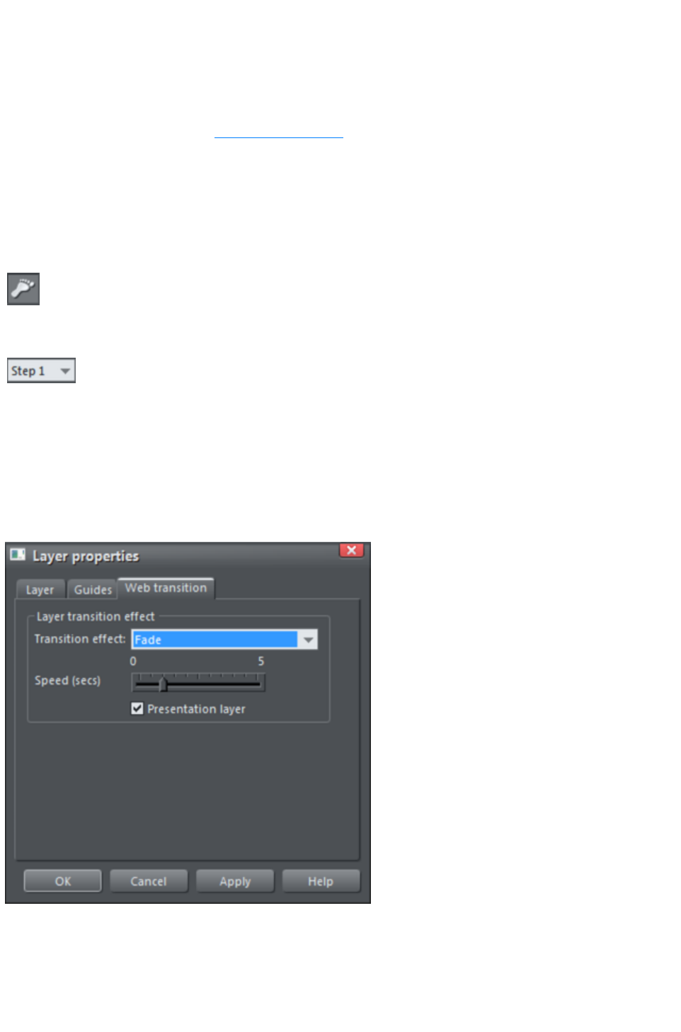
Managing presentation steps
You can typically manage presentation steps by:
Right clicking an object in a step and choosing Presentation then choosing your required option
from the sub-menu that appears
Using the buttons on the Presentation toolbar
Using the Page & Layer Gallery
Creating a step
Add new content to your page the same way you do with ordinary website documents. Normally since
the current layer will be the MouseOff layer, this content will be visible as soon as the page loads. To
make objects part of a presentation step, so they can be revealed incrementally:
Select the objects and click the Make new step button on the
Presentation toolbar, or right-click and choose "Presentation"
> "Move to step" > "New step"
.
The step list in the Presentation toolbar displays the step
number. If there are already several steps on the page, the new
step becomes the last step with the highest step number. The
default transition for a new step is Instant
. You can easily change this - see Applying transitions.
Alternatively in the Page & Layer Gallery select the page you want to add the step to and click New
Layer. Right click the layer and choose Layer Properties. In the Web Transitions tab of the Layer
Properties dialog, click the Presentation Layer
checkbox to select it. You can also use this tab to apply a transition to the new step.
Click Apply
and the new layer is now displayed as a step. When this step is the currently selected step, any objects
you add to the workspace are automatically added to the step.
Duplicating a step
Perhaps the easiest way of creating a step is by duplicating an existing one.
Page 1015
Make sure Xara Web Designer 7 Premium is displaying the step you want to duplicate (click an object in
the step - the step number is displayed in the Presentation toolbar step list).
Right click and choose Presentation > Duplicate Step or click the
Duplicate step
button on the Presentation toolbar.
Alternatively in the Page & Layer Gallery right click the step you want to duplicate and choose
Duplicate Layer
.
Web Designer Premium displays the contents of the duplicate step, positioning the duplicated content in a
way that retains the pattern of any previous steps. For example, a duplicated bulleted list item retains the
spacing of list items already created. Select and edit the duplicated content as you wish. The step number
in the Presentation toolbar shows the new step number. The step is placed immediately following the step
that was duplicated.
Turning a layer into a step
If you have existing layers in your presentation, you can easily convert a layer into a presentation step:
1. In the Page & Layer Gallery, right click the layer and choose Layer Properties or click the
layer and click Properties at the top of the gallery.
2. In the Web transition tab of the Layer Properties dialog, click the Presentation layer checkbox
to select it and click Apply. The layer name becomes 'Presentation step 1'.
3. Repeat for each layer you want to turn into a presentation step. Each step also keeps any
transition effects you applied to the layer.
4. Now when you preview the presentation, each step can be displayed by pressing the keyboard
arrow keys, or any 'next/previous presentation step' links on the page.
Viewing step contents
Sometimes you may want a clearer view of exactly which objects are in a step. The best way to do this
is using the Page & Layer Gallery
. Click on the "S" (Solo) icon next to the step you want to view, to show only that step on the canvas.
Click the icon again to return to normal view.
As with ordinary layers, you can click and drag an object to move it from one step to another in the
Page & Layer Gallery
.
Adding new objects to an existing step
Right click the objects you want to add to a step and choose Presentation > Move to step
then choose the step number. The objects are automatically added to the selected step.
Alternatively click and drag the objects to a presentation step in the Page & Layer Gallery, or ensure
the presentation layer you want to add content to is the current step before you create or add the new
objects. All new content is placed on whichever layer is current. See the Steps and the Page & Layer
Gallery
for more information.
Note: If you inadvertently add objects to the wrong step/layer, you can easily move them to the step you
want - see Moving objects from one step to another
.
Moving objects from one step to another
You can move objects from one step to another step in one of three ways:
Right click the object(s) and choose "Presentation" > "Move to Step" then choose the
Page 1016

number of the step you want to move the object(s) to, or
Right click and choose "Presentation" > "Move to Step" > "Background" if you want to
move the objects to the MouseOff layer or "Presentation" > "Move to Step" > "New step"
to move to a brand new step.
In the Page & Layer Gallery, click and drag the object(s) from one step to another or right
click the object(s) and choose Move to current layer.
Replacing existing objects in a step
If you use one of the interactive presentation templates to build your presentation, you will want to
replace existing objects in a step with your own content, such as your own images, photos, logos, and
text objects.
However if there's only one object in a step then deleting that object will remove the step, and you may
want to retain its transition and its order in the step sequence. In this case:
Add your own content to the step, then delete the content you don't want
.
This ensures that the step won't be removed and its order remains unchanged.
Note:
If the object you want to replace is a photo, you can replace it by dragging the new photo from the file
explorer directly onto the photo you want to replace - see Replacing photos.
Changing step order
The order in which steps are revealed is the order in which the steps appear in the Page & Layer
Gallery, as indicated by the step numbers. You can change this order either by right clicking an object in
a step and choosing Presentation> Step Order
then choosing a new step number, or by choosing a new step number from the Presentation toolbar.
You can also click and drag steps above or below each other in the Page & Layer Gallery
until all steps are in the order you want.
Deleting objects from a step
Right click the object and choose Cut or Delete, or in the Page & Layer Gallery right click the
object and choose Delete or click the object then press the Delete
button in the standard toolbar.
When you delete an object and it's the only object in a step, Web Designer Premium automatically
deletes the empty step, reordering the remaining steps accordingly. Deleting an object when there's more
than one in the step will not remove the step.
Deleting a step
Select an object in the step and click the Delete step button in the
Presentation toolbar or right-click and choose Presentation >
Delete Step
.
Alternatively in the Page & Layer Gallery right click the layer and choose Delete Layer
.
Note
: When the step is deleted, Web Designer Premium automatically reorders the remaining steps
accordingly.
Page 1017
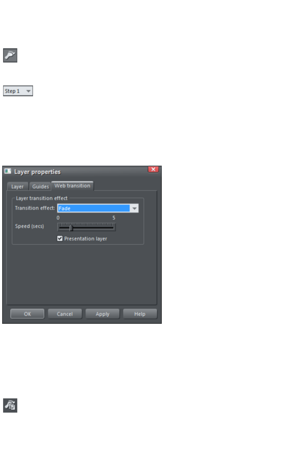
Creating a step
Add new content to your page the same way you do with ordinary website documents. Normally since
the current layer will be the MouseOff layer, this content will be visible as soon as the page loads. To
make objects part of a presentation step, so they can be revealed incrementally:
Select the objects and click the Make new step button on the
Presentation toolbar, or right-click and choose "Presentation"
> "Move to step" > "New step"
.
The step list in the Presentation toolbar displays the step
number. If there are already several steps on the page, the new
step becomes the last step with the highest step number. The
default transition for a new step is Instant
. You can easily change this - see Applying transitions.
Alternatively in the Page & Layer Gallery select the page you want to add the step to and click New
Layer. Right click the layer and choose Layer Properties. In the Web Transitions tab of the Layer
Properties dialog, click the Presentation Layer
checkbox to select it. You can also use this tab to apply a transition to the new step.
Click Apply
and the new layer is now displayed as a step. When this step is the currently selected step, any objects
you add to the workspace are automatically added to the step.
Duplicating a step
Perhaps the easiest way of creating a step is by duplicating an existing one.
Make sure Xara Web Designer 7 Premium is displaying the step you want to duplicate (click an object in
the step - the step number is displayed in the Presentation toolbar step list).
Right click and choose Presentation > Duplicate Step or click the
Duplicate step
button on the Presentation toolbar.
Alternatively in the Page & Layer Gallery right click the step you want to duplicate and choose
Duplicate Layer
Page 1018

.
Web Designer Premium displays the contents of the duplicate step, positioning the duplicated content in a
way that retains the pattern of any previous steps. For example, a duplicated bulleted list item retains the
spacing of list items already created. Select and edit the duplicated content as you wish. The step number
in the Presentation toolbar shows the new step number. The step is placed immediately following the step
that was duplicated.
Turning a layer into a step
If you have existing layers in your presentation, you can easily convert a layer into a presentation step:
1. In the Page & Layer Gallery, right click the layer and choose Layer Properties or click the
layer and click Properties at the top of the gallery.
2. In the Web transition tab of the Layer Properties dialog, click the Presentation layer checkbox
to select it and click Apply. The layer name becomes 'Presentation step 1'.
3. Repeat for each layer you want to turn into a presentation step. Each step also keeps any
transition effects you applied to the layer.
4. Now when you preview the presentation, each step can be displayed by pressing the keyboard
arrow keys, or any 'next/previous presentation step' links on the page.
Viewing step contents
Sometimes you may want a clearer view of exactly which objects are in a step. The best way to do this
is using the Page & Layer Gallery
. Click on the "S" (Solo) icon next to the step you want to view, to show only that step on the canvas.
Click the icon again to return to normal view.
As with ordinary layers, you can click and drag an object to move it from one step to another in the
Page & Layer Gallery
.
Adding new objects to an existing step
Right click the objects you want to add to a step and choose Presentation > Move to step
then choose the step number. The objects are automatically added to the selected step.
Alternatively click and drag the objects to a presentation step in the Page & Layer Gallery, or ensure
the presentation layer you want to add content to is the current step before you create or add the new
objects. All new content is placed on whichever layer is current. See the Steps and the Page & Layer
Gallery
for more information.
Note: If you inadvertently add objects to the wrong step/layer, you can easily move them to the step you
want - see Moving objects from one step to another
.
Moving objects from one step to another
You can move objects from one step to another step in one of three ways:
Right click the object(s) and choose "Presentation" > "Move to Step" then choose the
number of the step you want to move the object(s) to, or
Right click and choose "Presentation" > "Move to Step" > "Background" if you want to
move the objects to the MouseOff layer or "Presentation" > "Move to Step" > "New step"
to move to a brand new step.
In the Page & Layer Gallery, click and drag the object(s) from one step to another or right
click the object(s) and choose Move to current layer.
Page 1019
Replacing existing objects in a step
If you use one of the interactive presentation templates to build your presentation, you will want to
replace existing objects in a step with your own content, such as your own images, photos, logos, and
text objects.
However if there's only one object in a step then deleting that object will remove the step, and you may
want to retain its transition and its order in the step sequence. In this case:
Add your own content to the step, then delete the content you don't want
.
This ensures that the step won't be removed and its order remains unchanged.
Note:
If the object you want to replace is a photo, you can replace it by dragging the new photo from the file
explorer directly onto the photo you want to replace - see Replacing photos.
Changing step order
The order in which steps are revealed is the order in which the steps appear in the Page & Layer
Gallery, as indicated by the step numbers. You can change this order either by right clicking an object in
a step and choosing Presentation> Step Order
then choosing a new step number, or by choosing a new step number from the Presentation toolbar.
You can also click and drag steps above or below each other in the Page & Layer Gallery
until all steps are in the order you want.
Deleting objects from a step
Right click the object and choose Cut or Delete, or in the Page & Layer Gallery right click the
object and choose Delete or click the object then press the Delete
button in the standard toolbar.
When you delete an object and it's the only object in a step, Web Designer Premium automatically
deletes the empty step, reordering the remaining steps accordingly. Deleting an object when there's more
than one in the step will not remove the step.
Deleting a step
Select an object in the step and click the Delete step button in the
Presentation toolbar or right-click and choose Presentation >
Delete Step
.
Alternatively in the Page & Layer Gallery right click the layer and choose Delete Layer
.
Note
: When the step is deleted, Web Designer Premium automatically reorders the remaining steps
accordingly.
Page 1020

Duplicating a step
Perhaps the easiest way of creating a step is by duplicating an existing one.
Make sure Xara Web Designer 7 Premium is displaying the step you want to duplicate (click an object in
the step - the step number is displayed in the Presentation toolbar step list).
Right click and choose Presentation > Duplicate Step or click the
Duplicate step
button on the Presentation toolbar.
Alternatively in the Page & Layer Gallery right click the step you want to duplicate and choose
Duplicate Layer
.
Web Designer Premium displays the contents of the duplicate step, positioning the duplicated content in a
way that retains the pattern of any previous steps. For example, a duplicated bulleted list item retains the
spacing of list items already created. Select and edit the duplicated content as you wish. The step number
in the Presentation toolbar shows the new step number. The step is placed immediately following the step
that was duplicated.
Turning a layer into a step
If you have existing layers in your presentation, you can easily convert a layer into a presentation step:
1. In the Page & Layer Gallery, right click the layer and choose Layer Properties or click the
layer and click Properties at the top of the gallery.
2. In the Web transition tab of the Layer Properties dialog, click the Presentation layer checkbox
to select it and click Apply. The layer name becomes 'Presentation step 1'.
3. Repeat for each layer you want to turn into a presentation step. Each step also keeps any
transition effects you applied to the layer.
4. Now when you preview the presentation, each step can be displayed by pressing the keyboard
arrow keys, or any 'next/previous presentation step' links on the page.
Viewing step contents
Sometimes you may want a clearer view of exactly which objects are in a step. The best way to do this
is using the Page & Layer Gallery
. Click on the "S" (Solo) icon next to the step you want to view, to show only that step on the canvas.
Click the icon again to return to normal view.
As with ordinary layers, you can click and drag an object to move it from one step to another in the
Page & Layer Gallery
.
Adding new objects to an existing step
Right click the objects you want to add to a step and choose Presentation > Move to step
then choose the step number. The objects are automatically added to the selected step.
Alternatively click and drag the objects to a presentation step in the Page & Layer Gallery, or ensure
the presentation layer you want to add content to is the current step before you create or add the new
objects. All new content is placed on whichever layer is current. See the Steps and the Page & Layer
Gallery
for more information.
Note: If you inadvertently add objects to the wrong step/layer, you can easily move them to the step you
want - see Moving objects from one step to another
.
Page 1021
Moving objects from one step to another
You can move objects from one step to another step in one of three ways:
Right click the object(s) and choose "Presentation" > "Move to Step" then choose the
number of the step you want to move the object(s) to, or
Right click and choose "Presentation" > "Move to Step" > "Background" if you want to
move the objects to the MouseOff layer or "Presentation" > "Move to Step" > "New step"
to move to a brand new step.
In the Page & Layer Gallery, click and drag the object(s) from one step to another or right
click the object(s) and choose Move to current layer.
Replacing existing objects in a step
If you use one of the interactive presentation templates to build your presentation, you will want to
replace existing objects in a step with your own content, such as your own images, photos, logos, and
text objects.
However if there's only one object in a step then deleting that object will remove the step, and you may
want to retain its transition and its order in the step sequence. In this case:
Add your own content to the step, then delete the content you don't want
.
This ensures that the step won't be removed and its order remains unchanged.
Note:
If the object you want to replace is a photo, you can replace it by dragging the new photo from the file
explorer directly onto the photo you want to replace - see Replacing photos.
Changing step order
The order in which steps are revealed is the order in which the steps appear in the Page & Layer
Gallery, as indicated by the step numbers. You can change this order either by right clicking an object in
a step and choosing Presentation> Step Order
then choosing a new step number, or by choosing a new step number from the Presentation toolbar.
You can also click and drag steps above or below each other in the Page & Layer Gallery
until all steps are in the order you want.
Deleting objects from a step
Right click the object and choose Cut or Delete, or in the Page & Layer Gallery right click the
object and choose Delete or click the object then press the Delete
button in the standard toolbar.
When you delete an object and it's the only object in a step, Web Designer Premium automatically
deletes the empty step, reordering the remaining steps accordingly. Deleting an object when there's more
than one in the step will not remove the step.
Deleting a step
Select an object in the step and click the Delete step button in the
Presentation toolbar or right-click and choose Presentation >
Delete Step
.
Alternatively in the Page & Layer Gallery right click the layer and choose Delete Layer
.
Note
: When the step is deleted, Web Designer Premium automatically reorders the remaining steps
Page 1022

accordingly.
Page 1023

Turning a layer into a step
If you have existing layers in your presentation, you can easily convert a layer into a presentation step:
1. In the Page & Layer Gallery, right click the layer and choose Layer Properties or click the
layer and click Properties at the top of the gallery.
2. In the Web transition tab of the Layer Properties dialog, click the Presentation layer checkbox
to select it and click Apply. The layer name becomes 'Presentation step 1'.
3. Repeat for each layer you want to turn into a presentation step. Each step also keeps any
transition effects you applied to the layer.
4. Now when you preview the presentation, each step can be displayed by pressing the keyboard
arrow keys, or any 'next/previous presentation step' links on the page.
Viewing step contents
Sometimes you may want a clearer view of exactly which objects are in a step. The best way to do this
is using the Page & Layer Gallery
. Click on the "S" (Solo) icon next to the step you want to view, to show only that step on the canvas.
Click the icon again to return to normal view.
As with ordinary layers, you can click and drag an object to move it from one step to another in the
Page & Layer Gallery
.
Adding new objects to an existing step
Right click the objects you want to add to a step and choose Presentation > Move to step
then choose the step number. The objects are automatically added to the selected step.
Alternatively click and drag the objects to a presentation step in the Page & Layer Gallery, or ensure
the presentation layer you want to add content to is the current step before you create or add the new
objects. All new content is placed on whichever layer is current. See the Steps and the Page & Layer
Gallery
for more information.
Note: If you inadvertently add objects to the wrong step/layer, you can easily move them to the step you
want - see Moving objects from one step to another
.
Moving objects from one step to another
You can move objects from one step to another step in one of three ways:
Right click the object(s) and choose "Presentation" > "Move to Step" then choose the
number of the step you want to move the object(s) to, or
Right click and choose "Presentation" > "Move to Step" > "Background" if you want to
move the objects to the MouseOff layer or "Presentation" > "Move to Step" > "New step"
to move to a brand new step.
In the Page & Layer Gallery, click and drag the object(s) from one step to another or right
click the object(s) and choose Move to current layer.
Replacing existing objects in a step
If you use one of the interactive presentation templates to build your presentation, you will want to
replace existing objects in a step with your own content, such as your own images, photos, logos, and
text objects.
However if there's only one object in a step then deleting that object will remove the step, and you may
want to retain its transition and its order in the step sequence. In this case:
Page 1024
Add your own content to the step, then delete the content you don't want
.
This ensures that the step won't be removed and its order remains unchanged.
Note:
If the object you want to replace is a photo, you can replace it by dragging the new photo from the file
explorer directly onto the photo you want to replace - see Replacing photos.
Changing step order
The order in which steps are revealed is the order in which the steps appear in the Page & Layer
Gallery, as indicated by the step numbers. You can change this order either by right clicking an object in
a step and choosing Presentation> Step Order
then choosing a new step number, or by choosing a new step number from the Presentation toolbar.
You can also click and drag steps above or below each other in the Page & Layer Gallery
until all steps are in the order you want.
Deleting objects from a step
Right click the object and choose Cut or Delete, or in the Page & Layer Gallery right click the
object and choose Delete or click the object then press the Delete
button in the standard toolbar.
When you delete an object and it's the only object in a step, Web Designer Premium automatically
deletes the empty step, reordering the remaining steps accordingly. Deleting an object when there's more
than one in the step will not remove the step.
Deleting a step
Select an object in the step and click the Delete step button in the
Presentation toolbar or right-click and choose Presentation >
Delete Step
.
Alternatively in the Page & Layer Gallery right click the layer and choose Delete Layer
.
Note
: When the step is deleted, Web Designer Premium automatically reorders the remaining steps
accordingly.
Page 1025
Viewing step contents
Sometimes you may want a clearer view of exactly which objects are in a step. The best way to do this
is using the Page & Layer Gallery
. Click on the "S" (Solo) icon next to the step you want to view, to show only that step on the canvas.
Click the icon again to return to normal view.
As with ordinary layers, you can click and drag an object to move it from one step to another in the
Page & Layer Gallery
.
Adding new objects to an existing step
Right click the objects you want to add to a step and choose Presentation > Move to step
then choose the step number. The objects are automatically added to the selected step.
Alternatively click and drag the objects to a presentation step in the Page & Layer Gallery, or ensure
the presentation layer you want to add content to is the current step before you create or add the new
objects. All new content is placed on whichever layer is current. See the Steps and the Page & Layer
Gallery
for more information.
Note: If you inadvertently add objects to the wrong step/layer, you can easily move them to the step you
want - see Moving objects from one step to another
.
Moving objects from one step to another
You can move objects from one step to another step in one of three ways:
Right click the object(s) and choose "Presentation" > "Move to Step" then choose the
number of the step you want to move the object(s) to, or
Right click and choose "Presentation" > "Move to Step" > "Background" if you want to
move the objects to the MouseOff layer or "Presentation" > "Move to Step" > "New step"
to move to a brand new step.
In the Page & Layer Gallery, click and drag the object(s) from one step to another or right
click the object(s) and choose Move to current layer.
Replacing existing objects in a step
If you use one of the interactive presentation templates to build your presentation, you will want to
replace existing objects in a step with your own content, such as your own images, photos, logos, and
text objects.
However if there's only one object in a step then deleting that object will remove the step, and you may
want to retain its transition and its order in the step sequence. In this case:
Add your own content to the step, then delete the content you don't want
.
This ensures that the step won't be removed and its order remains unchanged.
Note:
If the object you want to replace is a photo, you can replace it by dragging the new photo from the file
explorer directly onto the photo you want to replace - see Replacing photos.
Changing step order
The order in which steps are revealed is the order in which the steps appear in the Page & Layer
Gallery, as indicated by the step numbers. You can change this order either by right clicking an object in
a step and choosing Presentation> Step Order
Page 1026

then choosing a new step number, or by choosing a new step number from the Presentation toolbar.
You can also click and drag steps above or below each other in the Page & Layer Gallery
until all steps are in the order you want.
Deleting objects from a step
Right click the object and choose Cut or Delete, or in the Page & Layer Gallery right click the
object and choose Delete or click the object then press the Delete
button in the standard toolbar.
When you delete an object and it's the only object in a step, Web Designer Premium automatically
deletes the empty step, reordering the remaining steps accordingly. Deleting an object when there's more
than one in the step will not remove the step.
Deleting a step
Select an object in the step and click the Delete step button in the
Presentation toolbar or right-click and choose Presentation >
Delete Step
.
Alternatively in the Page & Layer Gallery right click the layer and choose Delete Layer
.
Note
: When the step is deleted, Web Designer Premium automatically reorders the remaining steps
accordingly.
Page 1027
Adding new objects to an existing step
Right click the objects you want to add to a step and choose Presentation > Move to step
then choose the step number. The objects are automatically added to the selected step.
Alternatively click and drag the objects to a presentation step in the Page & Layer Gallery, or ensure
the presentation layer you want to add content to is the current step before you create or add the new
objects. All new content is placed on whichever layer is current. See the Steps and the Page & Layer
Gallery
for more information.
Note: If you inadvertently add objects to the wrong step/layer, you can easily move them to the step you
want - see Moving objects from one step to another
.
Moving objects from one step to another
You can move objects from one step to another step in one of three ways:
Right click the object(s) and choose "Presentation" > "Move to Step" then choose the
number of the step you want to move the object(s) to, or
Right click and choose "Presentation" > "Move to Step" > "Background" if you want to
move the objects to the MouseOff layer or "Presentation" > "Move to Step" > "New step"
to move to a brand new step.
In the Page & Layer Gallery, click and drag the object(s) from one step to another or right
click the object(s) and choose Move to current layer.
Replacing existing objects in a step
If you use one of the interactive presentation templates to build your presentation, you will want to
replace existing objects in a step with your own content, such as your own images, photos, logos, and
text objects.
However if there's only one object in a step then deleting that object will remove the step, and you may
want to retain its transition and its order in the step sequence. In this case:
Add your own content to the step, then delete the content you don't want
.
This ensures that the step won't be removed and its order remains unchanged.
Note:
If the object you want to replace is a photo, you can replace it by dragging the new photo from the file
explorer directly onto the photo you want to replace - see Replacing photos.
Changing step order
The order in which steps are revealed is the order in which the steps appear in the Page & Layer
Gallery, as indicated by the step numbers. You can change this order either by right clicking an object in
a step and choosing Presentation> Step Order
then choosing a new step number, or by choosing a new step number from the Presentation toolbar.
You can also click and drag steps above or below each other in the Page & Layer Gallery
until all steps are in the order you want.
Deleting objects from a step
Right click the object and choose Cut or Delete, or in the Page & Layer Gallery right click the
object and choose Delete or click the object then press the Delete
button in the standard toolbar.
When you delete an object and it's the only object in a step, Web Designer Premium automatically
Page 1028

deletes the empty step, reordering the remaining steps accordingly. Deleting an object when there's more
than one in the step will not remove the step.
Deleting a step
Select an object in the step and click the Delete step button in the
Presentation toolbar or right-click and choose Presentation >
Delete Step
.
Alternatively in the Page & Layer Gallery right click the layer and choose Delete Layer
.
Note
: When the step is deleted, Web Designer Premium automatically reorders the remaining steps
accordingly.
Page 1029
Moving objects from one step to another
You can move objects from one step to another step in one of three ways:
Right click the object(s) and choose "Presentation" > "Move to Step" then choose the
number of the step you want to move the object(s) to, or
Right click and choose "Presentation" > "Move to Step" > "Background" if you want to
move the objects to the MouseOff layer or "Presentation" > "Move to Step" > "New step"
to move to a brand new step.
In the Page & Layer Gallery, click and drag the object(s) from one step to another or right
click the object(s) and choose Move to current layer.
Replacing existing objects in a step
If you use one of the interactive presentation templates to build your presentation, you will want to
replace existing objects in a step with your own content, such as your own images, photos, logos, and
text objects.
However if there's only one object in a step then deleting that object will remove the step, and you may
want to retain its transition and its order in the step sequence. In this case:
Add your own content to the step, then delete the content you don't want
.
This ensures that the step won't be removed and its order remains unchanged.
Note:
If the object you want to replace is a photo, you can replace it by dragging the new photo from the file
explorer directly onto the photo you want to replace - see Replacing photos.
Changing step order
The order in which steps are revealed is the order in which the steps appear in the Page & Layer
Gallery, as indicated by the step numbers. You can change this order either by right clicking an object in
a step and choosing Presentation> Step Order
then choosing a new step number, or by choosing a new step number from the Presentation toolbar.
You can also click and drag steps above or below each other in the Page & Layer Gallery
until all steps are in the order you want.
Deleting objects from a step
Right click the object and choose Cut or Delete, or in the Page & Layer Gallery right click the
object and choose Delete or click the object then press the Delete
button in the standard toolbar.
When you delete an object and it's the only object in a step, Web Designer Premium automatically
deletes the empty step, reordering the remaining steps accordingly. Deleting an object when there's more
than one in the step will not remove the step.
Deleting a step
Select an object in the step and click the Delete step button in the
Presentation toolbar or right-click and choose Presentation >
Delete Step
.
Alternatively in the Page & Layer Gallery right click the layer and choose Delete Layer
.
Note
Page 1030

: When the step is deleted, Web Designer Premium automatically reorders the remaining steps
accordingly.
Page 1031
Replacing existing objects in a step
If you use one of the interactive presentation templates to build your presentation, you will want to
replace existing objects in a step with your own content, such as your own images, photos, logos, and
text objects.
However if there's only one object in a step then deleting that object will remove the step, and you may
want to retain its transition and its order in the step sequence. In this case:
Add your own content to the step, then delete the content you don't want
.
This ensures that the step won't be removed and its order remains unchanged.
Note:
If the object you want to replace is a photo, you can replace it by dragging the new photo from the file
explorer directly onto the photo you want to replace - see Replacing photos.
Changing step order
The order in which steps are revealed is the order in which the steps appear in the Page & Layer
Gallery, as indicated by the step numbers. You can change this order either by right clicking an object in
a step and choosing Presentation> Step Order
then choosing a new step number, or by choosing a new step number from the Presentation toolbar.
You can also click and drag steps above or below each other in the Page & Layer Gallery
until all steps are in the order you want.
Deleting objects from a step
Right click the object and choose Cut or Delete, or in the Page & Layer Gallery right click the
object and choose Delete or click the object then press the Delete
button in the standard toolbar.
When you delete an object and it's the only object in a step, Web Designer Premium automatically
deletes the empty step, reordering the remaining steps accordingly. Deleting an object when there's more
than one in the step will not remove the step.
Deleting a step
Select an object in the step and click the Delete step button in the
Presentation toolbar or right-click and choose Presentation >
Delete Step
.
Alternatively in the Page & Layer Gallery right click the layer and choose Delete Layer
.
Note
: When the step is deleted, Web Designer Premium automatically reorders the remaining steps
accordingly.
Page 1032
Changing step order
The order in which steps are revealed is the order in which the steps appear in the Page & Layer
Gallery, as indicated by the step numbers. You can change this order either by right clicking an object in
a step and choosing Presentation> Step Order
then choosing a new step number, or by choosing a new step number from the Presentation toolbar.
You can also click and drag steps above or below each other in the Page & Layer Gallery
until all steps are in the order you want.
Deleting objects from a step
Right click the object and choose Cut or Delete, or in the Page & Layer Gallery right click the
object and choose Delete or click the object then press the Delete
button in the standard toolbar.
When you delete an object and it's the only object in a step, Web Designer Premium automatically
deletes the empty step, reordering the remaining steps accordingly. Deleting an object when there's more
than one in the step will not remove the step.
Deleting a step
Select an object in the step and click the Delete step button in the
Presentation toolbar or right-click and choose Presentation >
Delete Step
.
Alternatively in the Page & Layer Gallery right click the layer and choose Delete Layer
.
Note
: When the step is deleted, Web Designer Premium automatically reorders the remaining steps
accordingly.
Page 1033

Deleting objects from a step
Right click the object and choose Cut or Delete, or in the Page & Layer Gallery right click the
object and choose Delete or click the object then press the Delete
button in the standard toolbar.
When you delete an object and it's the only object in a step, Web Designer Premium automatically
deletes the empty step, reordering the remaining steps accordingly. Deleting an object when there's more
than one in the step will not remove the step.
Deleting a step
Select an object in the step and click the Delete step button in the
Presentation toolbar or right-click and choose Presentation >
Delete Step
.
Alternatively in the Page & Layer Gallery right click the layer and choose Delete Layer
.
Note
: When the step is deleted, Web Designer Premium automatically reorders the remaining steps
accordingly.
Page 1034

Deleting a step
Select an object in the step and click the Delete step button in the
Presentation toolbar or right-click and choose Presentation >
Delete Step
.
Alternatively in the Page & Layer Gallery right click the layer and choose Delete Layer
.
Note
: When the step is deleted, Web Designer Premium automatically reorders the remaining steps
accordingly.
Page 1035

Adding new presentation pages
Right click the Xara Web Designer 7 Premium pasteboard and choose New Page to add a new blank
page or Duplicate Current Page
to add a copy of the currently selected page.
Page 1036

Deleting presentation pages
Right click the page and choose Delete Current Page
.
Page 1037
Linking to next/previous step
You can easily add buttons/objects to a presentation page that display the next step in the page. Just add
or create your button, and use the Link to list in the Link tab
of the Web Properties dialog to apply a link to the button/object that will display the next presentation
step.
When the viewer has displayed all the steps on the page using a 'next presentation step' link or the right
arrow key, clicking the button or key again displays the next page.
Note: If you convert a presentation into a web document (Presentation website
checkbox in Web Properties dialog Website tab), any next/previous presentation step links automatically
turn into next/previous page links. You cannot apply 'next/previous presentation step' links to a web
document.
Applying transitions to presentation step links
You can apply a link transition to any link object, such as a button, in your presentation page in the same
way as you can in a web document page, using the Link tab of the Web Properties dialog. Link options
for presentation documents also include next/previous presentation step
.
Applying presentation step transitions
When you create a step, Web Designer Premium automatically assigns the Instant transition type to it.
To change a step transition:
Open the Web Transitions tab of the Layer Properties dialog either by
clicking the Layer Transition Properties button in the Presentation
toolbar or right click an object in the step and choose Presentation >
Transition. Or in the Page & Layer Gallery, right click the step and
choose Layer Properties
.
Choose a transition from the Transition effect list, drag the Speed slider to choose a transition time
between 0-5 seconds, and click Apply
.
Page 1038
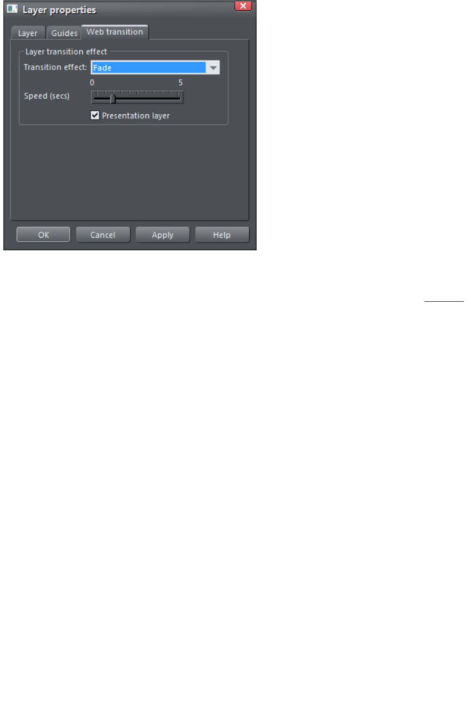
Applying presentation page transitions
Each presentation page can be given its own transition. To add a transition to a page, open the Page tab
of the Web Properties dialog.
Choose or enter the name of the page you want to apply a transition to in the Page filename box. Then
select a page transition type from the Transition effect drop-down list and move the Speed
slider to apply a transition speed from 0 to 5 seconds.
Then when your website visitor navigates to the page with the animated transition, they see the animated
transition.
Note
: If the link that navigates to the page also has a link transition applied, the link animated transition will
display, as link transitions take precedence over page transitions.
Page 1039
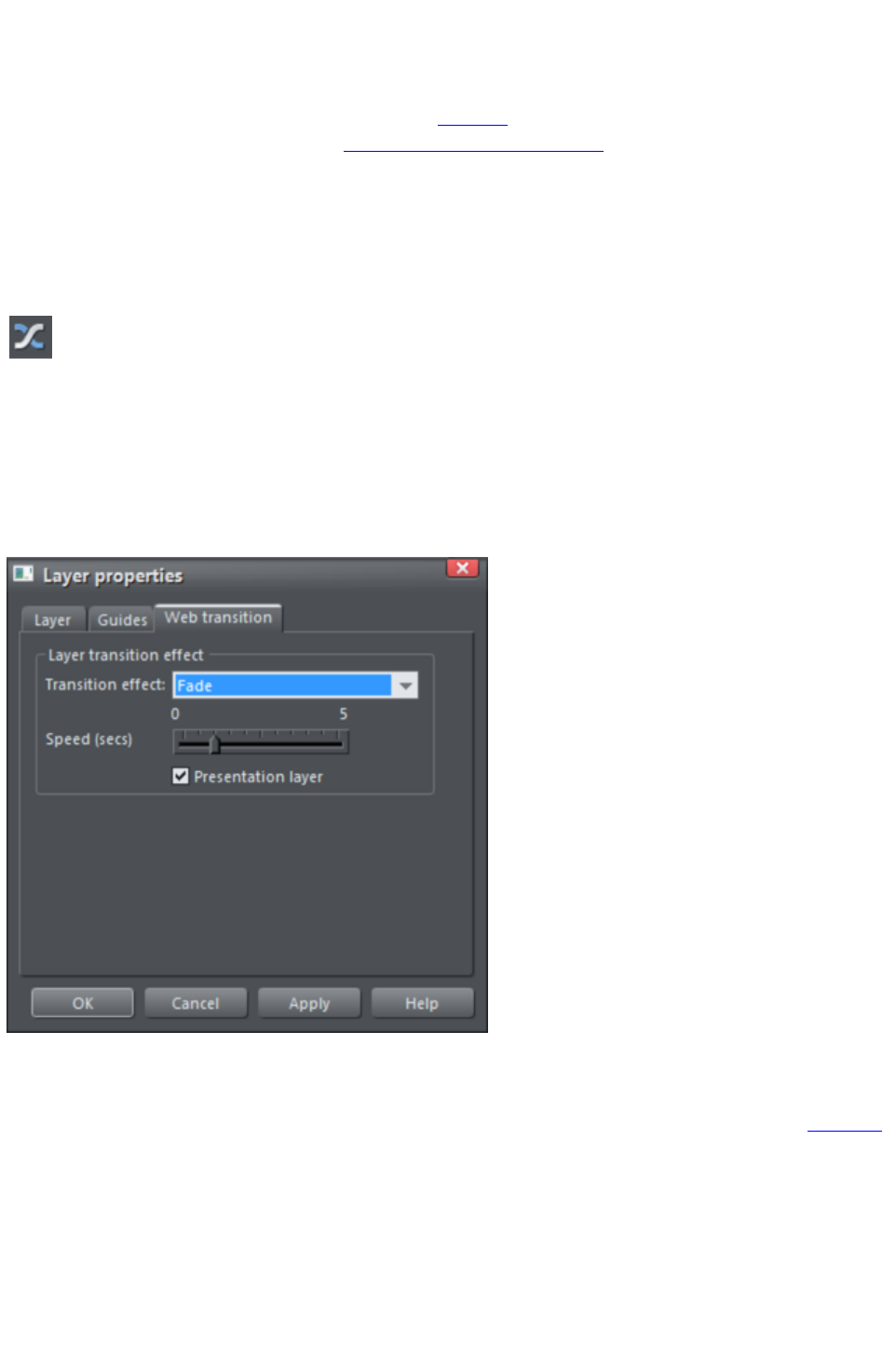
Applying transitions to presentation step links
You can apply a link transition to any link object, such as a button, in your presentation page in the same
way as you can in a web document page, using the Link tab of the Web Properties dialog. Link options
for presentation documents also include next/previous presentation step
.
Applying presentation step transitions
When you create a step, Web Designer Premium automatically assigns the Instant transition type to it.
To change a step transition:
Open the Web Transitions tab of the Layer Properties dialog either by
clicking the Layer Transition Properties button in the Presentation
toolbar or right click an object in the step and choose Presentation >
Transition. Or in the Page & Layer Gallery, right click the step and
choose Layer Properties
.
Choose a transition from the Transition effect list, drag the Speed slider to choose a transition time
between 0-5 seconds, and click Apply
.
Applying presentation page transitions
Each presentation page can be given its own transition. To add a transition to a page, open the Page tab
of the Web Properties dialog.
Choose or enter the name of the page you want to apply a transition to in the Page filename box. Then
select a page transition type from the Transition effect drop-down list and move the Speed
slider to apply a transition speed from 0 to 5 seconds.
Then when your website visitor navigates to the page with the animated transition, they see the animated
transition.
Note
: If the link that navigates to the page also has a link transition applied, the link animated transition will
Page 1040

display, as link transitions take precedence over page transitions.
Page 1041
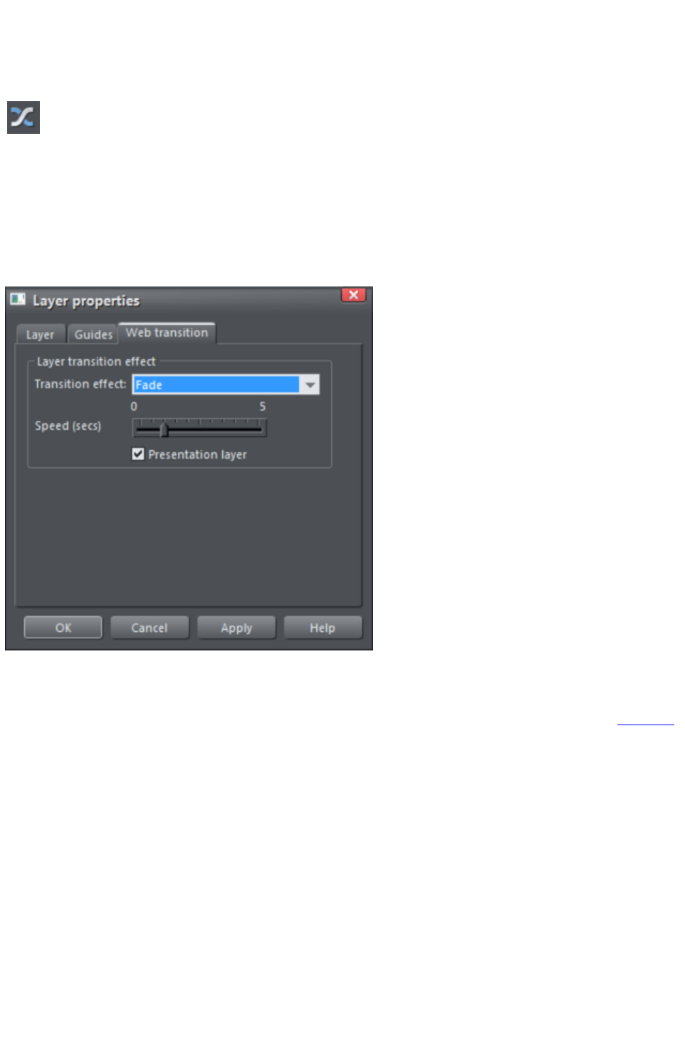
Applying presentation step transitions
When you create a step, Web Designer Premium automatically assigns the Instant transition type to it.
To change a step transition:
Open the Web Transitions tab of the Layer Properties dialog either by
clicking the Layer Transition Properties button in the Presentation
toolbar or right click an object in the step and choose Presentation >
Transition. Or in the Page & Layer Gallery, right click the step and
choose Layer Properties
.
Choose a transition from the Transition effect list, drag the Speed slider to choose a transition time
between 0-5 seconds, and click Apply
.
Applying presentation page transitions
Each presentation page can be given its own transition. To add a transition to a page, open the Page tab
of the Web Properties dialog.
Choose or enter the name of the page you want to apply a transition to in the Page filename box. Then
select a page transition type from the Transition effect drop-down list and move the Speed
slider to apply a transition speed from 0 to 5 seconds.
Then when your website visitor navigates to the page with the animated transition, they see the animated
transition.
Note
: If the link that navigates to the page also has a link transition applied, the link animated transition will
display, as link transitions take precedence over page transitions.
Page 1042

Applying presentation page transitions
Each presentation page can be given its own transition. To add a transition to a page, open the Page tab
of the Web Properties dialog.
Choose or enter the name of the page you want to apply a transition to in the Page filename box. Then
select a page transition type from the Transition effect drop-down list and move the Speed
slider to apply a transition speed from 0 to 5 seconds.
Then when your website visitor navigates to the page with the animated transition, they see the animated
transition.
Note
: If the link that navigates to the page also has a link transition applied, the link animated transition will
display, as link transitions take precedence over page transitions.
Page 1043
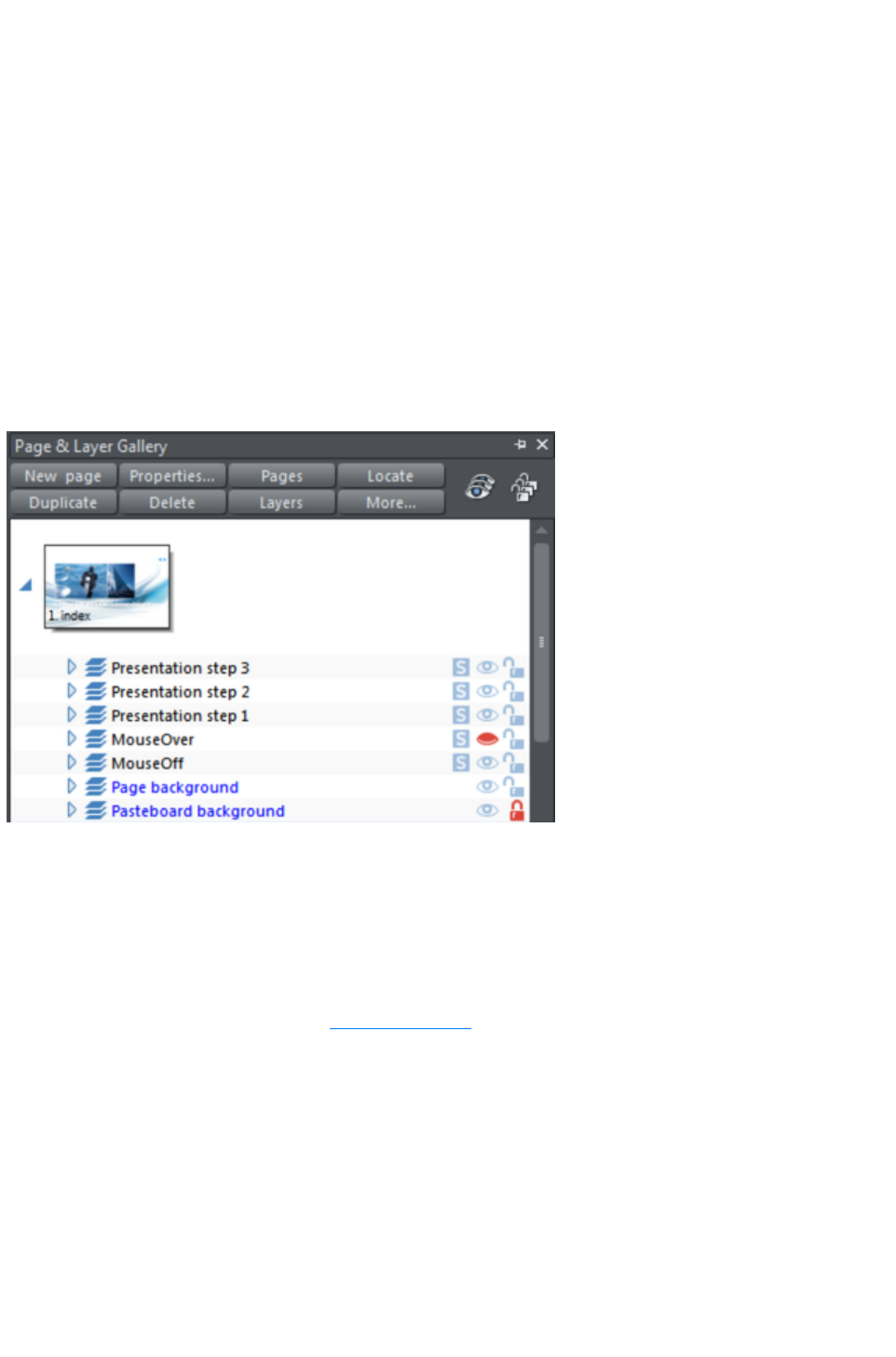
Advanced presentation information
You can also use the Page & Layer Gallery
to manage presentation steps.
Steps versus layers
The steps within a presentation document are actually just different layers within the document. So when
you place an object on a particular step you are really just moving that object to a specific presentation
layer within the document.
You can see this if you open the Page & Layer Gallery and view the layers in your presentation
document ? each step of your presentation is actually a layer in your document. Presentation layers are
just ordinary layers with the presentation option selected in the Layer properties dialog. Once this option
is turned on for a layer, any name the layer had is overridden with "Presentation step (N)" in the Page &
Layer Gallery
, where (N) is the step number.
You can re-order the steps in your presentation by re-ordering the layers in the gallery. The step numbers
update automatically.
You can mix popup layers and presentation layers in a presentation document, but of course only the
presentation layers will be revealed as the visitor steps through the presentation by pressing the arrow
keys.
Having both layers and presentation steps is useful if you want to keep features such as popup layers in
your presentation. You can change layers into steps (and turn steps back into layers) by toggling the
Presentation Layer checkbox in the Layer Properties
dialog's Web Transition tab.
Page 1044

When you create a new step, this checkbox is automatically selected.
If you deselect it to turn a step into a layer, this removes the step from the presentation, even though its
contents and any layer transition remain. The converted layer, however, will not be displayed when a
viewer navigates through a presentation using either the arrow keyboard keys or a next/previous
presentation step link.
Viewing step contents in the Page & Layer Gallery
Click a step to expand it. All of the objects within it are displayed.
Expand a step in the Page & Layer Gallery
to see its contents
Page 1045
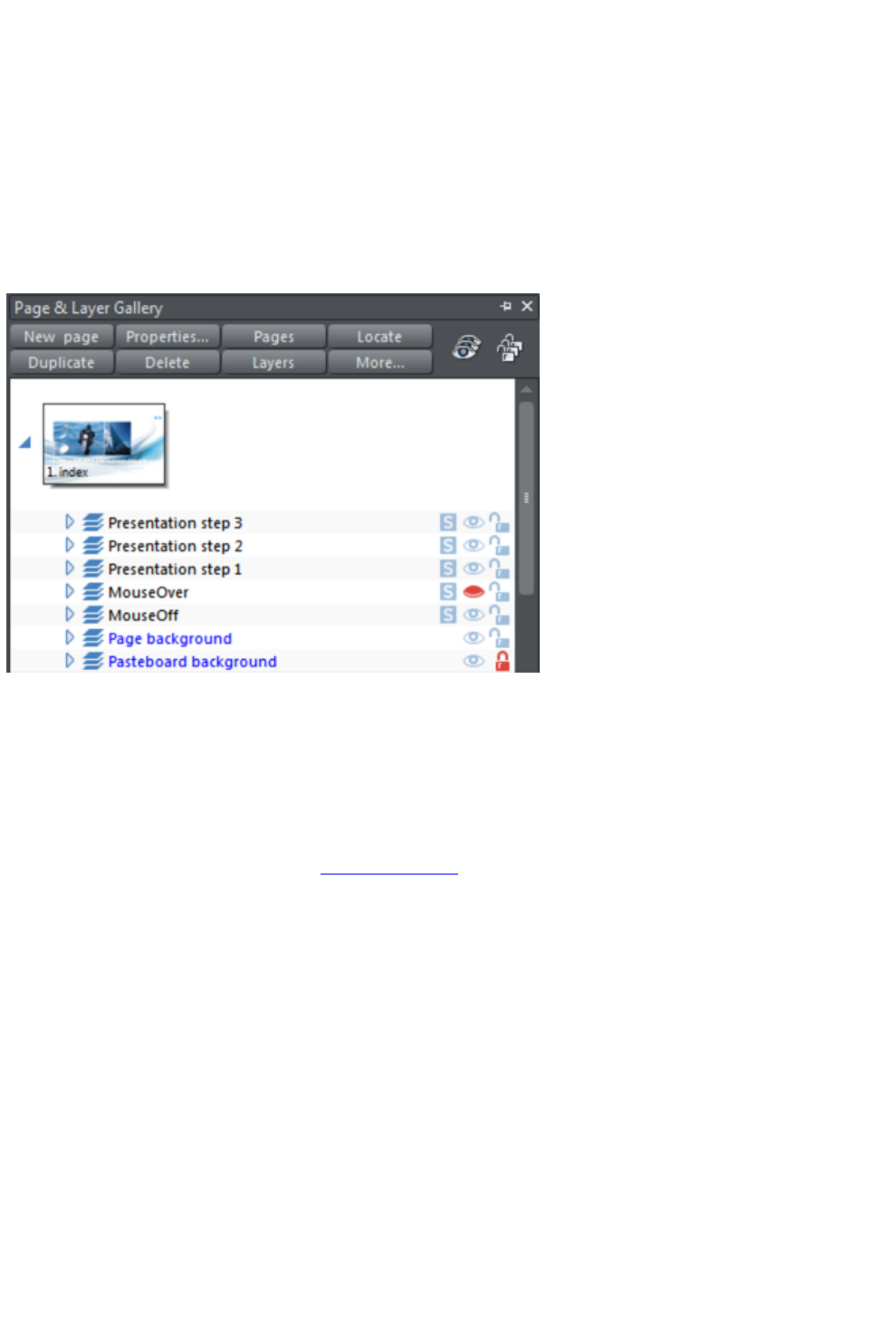
Steps versus layers
The steps within a presentation document are actually just different layers within the document. So when
you place an object on a particular step you are really just moving that object to a specific presentation
layer within the document.
You can see this if you open the Page & Layer Gallery and view the layers in your presentation
document ? each step of your presentation is actually a layer in your document. Presentation layers are
just ordinary layers with the presentation option selected in the Layer properties dialog. Once this option
is turned on for a layer, any name the layer had is overridden with "Presentation step (N)" in the Page &
Layer Gallery
, where (N) is the step number.
You can re-order the steps in your presentation by re-ordering the layers in the gallery. The step numbers
update automatically.
You can mix popup layers and presentation layers in a presentation document, but of course only the
presentation layers will be revealed as the visitor steps through the presentation by pressing the arrow
keys.
Having both layers and presentation steps is useful if you want to keep features such as popup layers in
your presentation. You can change layers into steps (and turn steps back into layers) by toggling the
Presentation Layer checkbox in the Layer Properties
dialog's Web Transition tab.
Page 1046
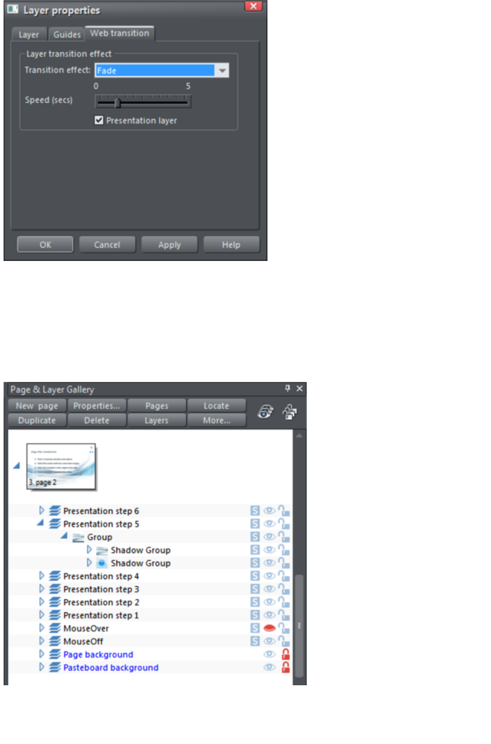
When you create a new step, this checkbox is automatically selected.
If you deselect it to turn a step into a layer, this removes the step from the presentation, even though its
contents and any layer transition remain. The converted layer, however, will not be displayed when a
viewer navigates through a presentation using either the arrow keyboard keys or a next/previous
presentation step link.
Viewing step contents in the Page & Layer Gallery
Click a step to expand it. All of the objects within it are displayed.
Expand a step in the Page & Layer Gallery
to see its contents
Page 1047
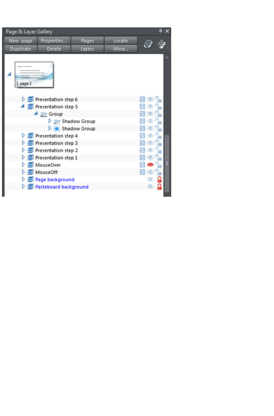
Viewing step contents in the Page & Layer Gallery
Click a step to expand it. All of the objects within it are displayed.
Expand a step in the Page & Layer Gallery
to see its contents
Page 1048

Hosting remote presentation sessions
Once you have a published presentation website that was created by Xara Web Designer 7 Premium
and published on MAGIX Online World, you can use Xara's remote presentation system to remotely
control a run-through of your presentation with any number of viewers over the Internet.
With this system, you provide each of the people you want to see your presentation with a unique link,
which they access using their normal web browser. They see the opening page of your presentation, but
they can't step through the presentation, or interact with it themselves directly. Instead, as you move
through the steps of the presentation using the arrow keys, step by step and page by page, all your
viewers see their web browser update automatically. Whatever page and steps you see in your web
browser, all your viewers will see too. Typically you would have all your viewers in an audio conference
call at the same time, so you can talk through your presentation.
Setting up a remote presentation
Setting up a remote presentation is easy. Just follow these steps:
1. Publish your presentation website on MAGIX Online World, view it using its published web
address and make sure you can step through it using the arrow keys on your keyboard. Take a
copy of the URL of the first page of your presentation.
2. Select "Help" > "Remote presentations...." from the Web Designer Premium menu and login
with your MAGIX Online World registered email address and password. Or click the button to
create a MAGIX Online World account if you don't already have one.
3. Enter a title for your presentation and the URL of the first page.
4. You can optionally enter a message that is shown to your viewers prior to the start of your
presentation. So you may choose to make the message something like "Presentation starting at
2pm". Note: As the presenter, you can't see this message.
5. Click the Create presentation button. Your presentation appears in the list on the right. A
unique URL is shown for your new presentation. Copy that link address and provide to everyone
who you are inviting to see your presentation, telling them when it will take place.
6. When the time comes to start your presentation, login again at http://presenter.xara.com/ and
click the Start button next to the presentation on the right. You will then see the first page of your
presentation, as will all your viewers. When you click the right arrow key to move to the next
step or page, all your viewers will see the same thing as you in their web browsers.
7. In the top right corner of the browser window, the remote presentation system shows you how
many viewers are currently viewing your current presentation. If you move the mouse pointer
over this text, you'll see a list of the names of each current viewer.
Limitations
Only 'next step', 'previous step', 'page down', 'page up' operations, and ordinary web links, are
transmitted between the presenter and the viewers. So avoid relying on other events, such as mouse-over
events, pop-up photos, pop-up layers, eye-catcher widgets or Flash animations which require user
interaction, because these won't be seen by your viewers.
Viewing a presentation
When attendees click the link you gave them, they are first asked to enter their names. The name is used
only to let you as the presenter see who is viewing your presentation. The viewer then sees the first page
of your presentation site, with the welcome message you provided displayed on top. Or if your
presentation has already started, they will see the same page as you, the presenter.
Page 1049

Viewing a presentation
When attendees click the link you gave them, they are first asked to enter their names. The name is used
only to let you as the presenter see who is viewing your presentation. The viewer then sees the first page
of your presentation site, with the welcome message you provided displayed on top. Or if your
presentation has already started, they will see the same page as you, the presenter.
Page 1050
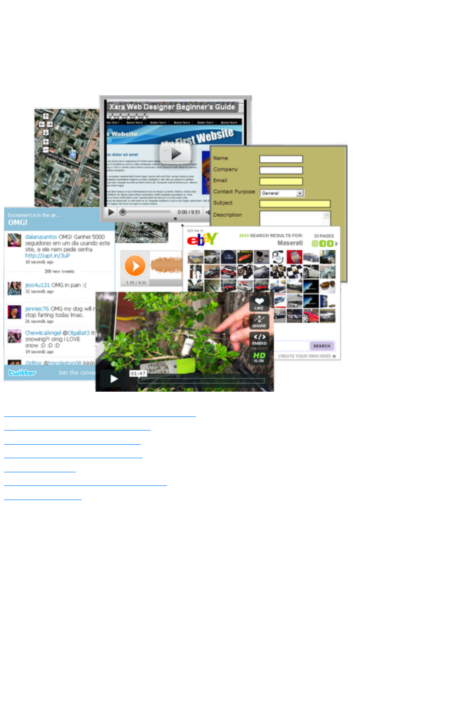
Website Widgets
This chapter describes how to add dynamic content to your website, such as movies, animations, forms
and thousands of the available gadgets such as page counters and currency converters. We refer to these
using the general term of "website widgets", or just "widgets" for short.
In this chapter
Widgets & placeholders – it’s all automatic!
Widgets from the Designs Gallery
Adding movie & animation files
Widgets from other widget sites
Resizing widgets
Adding widget placeholders manually
More Information
Page 1051

Widgets & placeholders – it’s all automatic!
In Xara Web Designer 7 Premium a widget is any object you can place on your web page that displays
some sort of dynamic content, that may also be interactive. That content may be sourced from an
external website (e.g., a news feed widget) or may be published with the website (e.g., a slideshow
widget cycling through a selection of photos). On the Web Designer Premium canvas, a widget is
represented by a static 'placeholder' image that defines the position and dimensions of the widget on the
page. And attached to that placeholder is the HTML code and files (e.g., Flash, Javascript, photos, etc.)
that make the widget function in the exported page.
A placeholder is normally an image that looks like a static snapshot of the widget itself, but it can be a
simple rectangle or any other object. The placeholder usually has the same dimensions as the widget, so
that you can sensibly position it with respect to other content on your page.
The good news is that placeholder images are normally rendered automatically for you by Web Designer
Premium.
Types of Widget
There are basically three types of widget, which differ in the way that you customize and configure them
in Xara Web Designer 7 Premium. A brief description of each type follows, but more detail about each
type is provided later in this chapter. However for all three types of widget you can simply double click
on the placeholder image to edit them.
Web Editable Widgets
When you customize these widgets, a web browser window opens up onto the remote website that
provides the widget and you configure and customize the widget using that web interface.
Locally Editable Widgets
These widgets are edited in Web Designer Premium itself, but typically in a separate multi-page
document that makes the whole set of content for the widget easily editable. For example, for a slide
show widget that cycles through 10 photos, all 10 photos would be easily visible and editable within the
widget's multi-page document that's used to edit it. Again, usually you'll insert these widgets from the
Designs Gallery
.
Manually Editable Widgets
These are widgets that you add manually by either pasting the HTML code for the widget directly into
Web Designer Premium or by using the "Utilities" > "Web Properties" > "Placeholder
" tab to insert the code. Or you create them by importing a file such as an animation file or movie file onto
your page.
No other interface is provided by Web Designer Premium for editing the widget, other than the
Placeholder
tab that allows you to change the file or code that defines the widget.
Page 1052
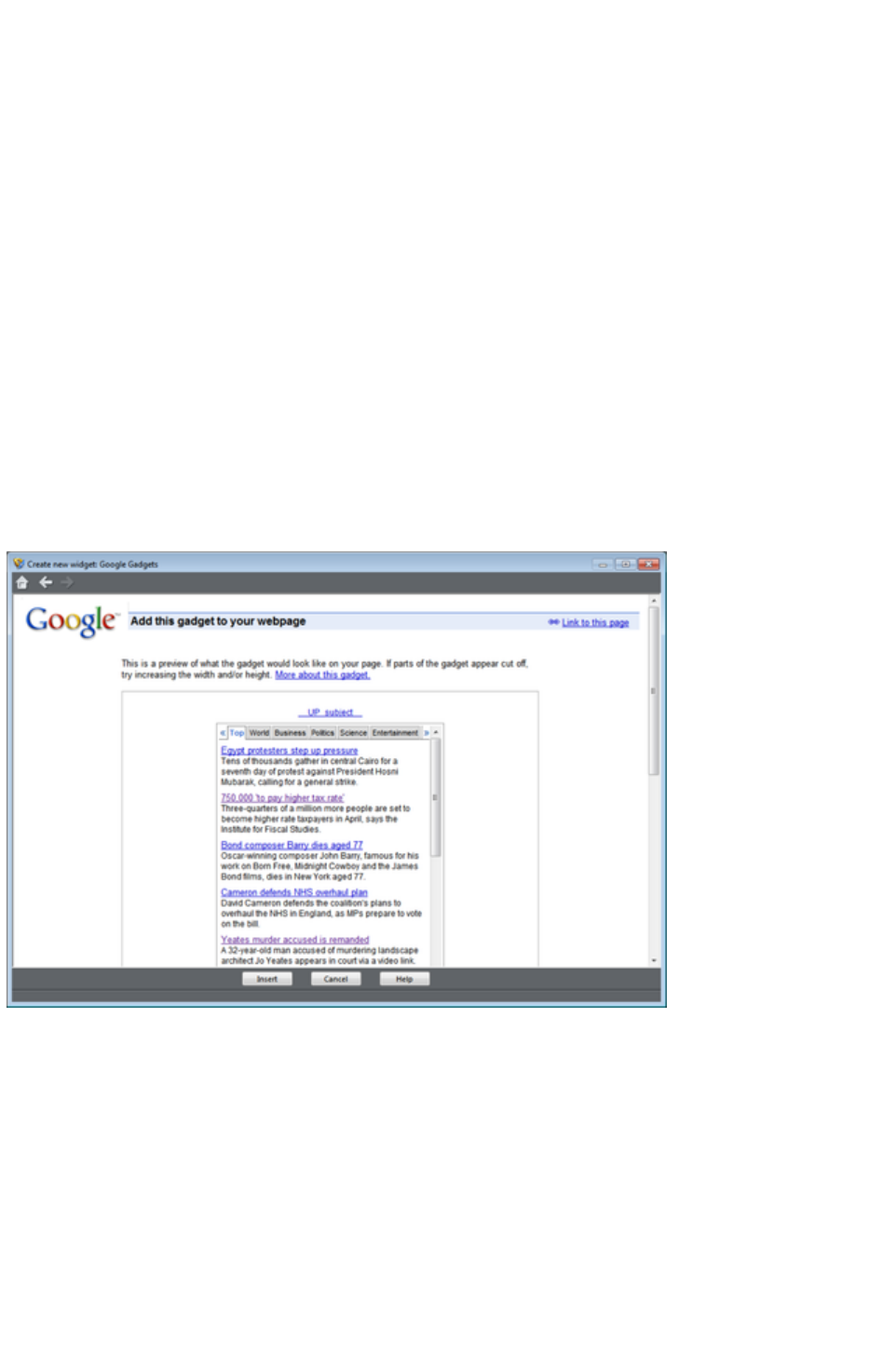
Widgets from the Designs Gallery
The easiest way to add widgets to your site is to choose from the selection provided in the Designs
Gallery. Look under the "Widgets, Forms & More (Download)" category near the top of the gallery.
The widgets in the gallery are automatically updated from time to time, so that Xara can add, modify or
delete the selection of widgets available to you at any time. You will sometimes see the Designs Gallery
update when you first open it or when you first open a category folder.
To add a widget, just drag and drop it from the gallery onto your page. What happens next depends on
the type of widget. If it's a Web Editable Widget, a browser window will open to allow you to configure
the widget on the widget provider's website. If it's a Locally Editable Widget, a placeholder image will
appear on your page. Double click on the placeholder and a new document opens within Web Designer
Premium, which allows you to customize the widget.
Web Editable Widgets
When you drop one of these widgets onto your page from the Designs Gallery
, a window opens which is actually an Internet Explorer browser running inside Web Designer Premium.
This is similar to the preview window shown when you click the preview page and preview website
buttons on the web toolbar. However this widget window has some additional buttons at the bottom ?
more about those later.
Example widget insertion window, showing Google News gadget.
The browser window opens onto the website of the widget provider. Here you can find out more about
the widget if required, provide any data the widget requires and in most cases also customize its
appearance. Usually the widget website will also show you a preview of what your widget will look like,
complete with any customizations you've applied.
Inserting
Press the Help
button at the bottom of the window to see some information to guide you through the process of
configuring the widget and inserting it on your page. For most widgets, you need to get to the point where
the widget website offers you the HTML code that needs to be inserted into your web page. As soon as
this is visible, you can normally click the Insert button at the bottom of the window. Xara Web Designer
Page 1053

7 Premium will then find the HTML code and will insert it into your page for you.
For some widgets, Xara Web Designer 7 Premium is unable to retrieve the HTML code from the site
directly and you need to first copy the code to the clipboard. Select the code in the browser window and
press Ctrl+C. Many widgets make this easy for you by providing a copy button next to the code. Once
you've copied the code, click the Insert
button.
Automatic placeholder generation
When you press the Insert button, if Xara Web Designer 7 Premium found the widget code the widget
website window is closed and you will see an indication that Xara Web Designer 7 Premium is busy
rendering a placeholder image. After a few seconds an image of your widget appears on your page. For
most widgets this is exactly the same size as the widget itself, so you can position it where you like using
the Selector Tool
.
Now all you have to do is preview your web page and you should see your new widget working on your
page!
Widget site membership
Some widgets may require you to open an account with the widget provider, before you can use them.
Most are free, but some offer premium services over and above the free offering. See each individual
widget and the information on the widget provider's site for details.
Editing existing widgets
At any time you can double click the widget placeholder (or right click and choose Edit Widget
) in your Web Designer Premium's page to return to the widget provider's website so you can easily
modify or replace the widget.
Those widget providers who give you an account, will normally also keep a copy of any widgets you've
created. This means you can sign into your account while going through the insertion process above and
then find, modify and insert a widget that you've created previously. Inserting existing widgets is just like
inserting newly created widgets ? just click Insert when you are offered the HTML code, or copy the
HTML code for the widget to the clipboard and then click Insert
.
Locally Editable Widgets
Some widgets that you drop onto your page from the Designs Gallery
won't open a browser window as described above for Web Editable Widgets. These are Locally
Editable Widgets that you edit directly in Web Designer Premium using a separate document window.
Editing
After dropping such a widget on your page, double click on it to edit. A new document window opens
in Web Designer Premium (the widget's "editing document"). What that document window shows will
depend on the specific widget, but typically you'll see a multi-page document that allows you to
conveniently edit and customize all the content for the widget.
Normally there will be some specific instructions shown to the side of or above the first page, describing
what aspects of the widget you can edit in the document and any aspects that are not editable. In most
cases, you can edit the text you see using the Text Tool, but you can't normally change the font or style
of the text. You can replace photos by dropping new photo files onto the images from Windows
Explorer, just as you replace photos in normal documents. And you can edit the photos using the Photo
Tool, adjust photos using the Fill Tool
, etc.
Page 1054

Look at each page in turn and customize the text and photos. Some objects may be locked (clicking on
them does nothing) which tells you that you can't edit that aspect of the widget, or perhaps it should be
modified by changing unlocked objects on one of the other pages. Any locked objects are present as a
visual aid, to help make the context of the unlocked editable parts of the design clear.
Adding more content
Some widgets will allow you to add more content to the widget by duplicating the pages shown (right
click on the page and choose Duplicate current page
). A slide show widget may allow you to add more photos to it this way. After duplicating a page, change
its photos or text as required. The instructions in the widget will tell you whether or not you can duplicate
pages in this way to add content.
If you make any changes that the instructions say should not be made, usually those changes will be
ignored. However you may cause a widget to malfunction so please change only the aspects of the design
that the instructions say can be modified.
Resizing
Locally Editable Widgets are not normally resizable, so don't change the size of the placeholder object on
your page, nor the page dimensions in the widget's editing document.
Saving changes
When you've finished customizing, close the document and you'll be asked whether or not you want to
save the changes you've made back to your website document. Alternatively, just hit "Ctrl + S" and the
changes you've made will be saved and the editing document closed, returning you to your website
document.
The placeholder image that represents your widget should update, so that it reflects the first page of the
editing document. Preview your page to see the effects of your changes on the working widget.
Page 1055

Inserting
Press the Help
button at the bottom of the window to see some information to guide you through the process of
configuring the widget and inserting it on your page. For most widgets, you need to get to the point where
the widget website offers you the HTML code that needs to be inserted into your web page. As soon as
this is visible, you can normally click the Insert button at the bottom of the window. Xara Web Designer
7 Premium will then find the HTML code and will insert it into your page for you.
For some widgets, Xara Web Designer 7 Premium is unable to retrieve the HTML code from the site
directly and you need to first copy the code to the clipboard. Select the code in the browser window and
press Ctrl+C. Many widgets make this easy for you by providing a copy button next to the code. Once
you've copied the code, click the Insert
button.
Automatic placeholder generation
When you press the Insert button, if Xara Web Designer 7 Premium found the widget code the widget
website window is closed and you will see an indication that Xara Web Designer 7 Premium is busy
rendering a placeholder image. After a few seconds an image of your widget appears on your page. For
most widgets this is exactly the same size as the widget itself, so you can position it where you like using
the Selector Tool
.
Now all you have to do is preview your web page and you should see your new widget working on your
page!
Widget site membership
Some widgets may require you to open an account with the widget provider, before you can use them.
Most are free, but some offer premium services over and above the free offering. See each individual
widget and the information on the widget provider's site for details.
Editing existing widgets
At any time you can double click the widget placeholder (or right click and choose Edit Widget
) in your Web Designer Premium's page to return to the widget provider's website so you can easily
modify or replace the widget.
Those widget providers who give you an account, will normally also keep a copy of any widgets you've
created. This means you can sign into your account while going through the insertion process above and
then find, modify and insert a widget that you've created previously. Inserting existing widgets is just like
inserting newly created widgets ? just click Insert when you are offered the HTML code, or copy the
HTML code for the widget to the clipboard and then click Insert
.
Locally Editable Widgets
Some widgets that you drop onto your page from the Designs Gallery
won't open a browser window as described above for Web Editable Widgets. These are Locally
Editable Widgets that you edit directly in Web Designer Premium using a separate document window.
Editing
After dropping such a widget on your page, double click on it to edit. A new document window opens
in Web Designer Premium (the widget's "editing document"). What that document window shows will
depend on the specific widget, but typically you'll see a multi-page document that allows you to
Page 1056

conveniently edit and customize all the content for the widget.
Normally there will be some specific instructions shown to the side of or above the first page, describing
what aspects of the widget you can edit in the document and any aspects that are not editable. In most
cases, you can edit the text you see using the Text Tool, but you can't normally change the font or style
of the text. You can replace photos by dropping new photo files onto the images from Windows
Explorer, just as you replace photos in normal documents. And you can edit the photos using the Photo
Tool, adjust photos using the Fill Tool
, etc.
Look at each page in turn and customize the text and photos. Some objects may be locked (clicking on
them does nothing) which tells you that you can't edit that aspect of the widget, or perhaps it should be
modified by changing unlocked objects on one of the other pages. Any locked objects are present as a
visual aid, to help make the context of the unlocked editable parts of the design clear.
Adding more content
Some widgets will allow you to add more content to the widget by duplicating the pages shown (right
click on the page and choose Duplicate current page
). A slide show widget may allow you to add more photos to it this way. After duplicating a page, change
its photos or text as required. The instructions in the widget will tell you whether or not you can duplicate
pages in this way to add content.
If you make any changes that the instructions say should not be made, usually those changes will be
ignored. However you may cause a widget to malfunction so please change only the aspects of the design
that the instructions say can be modified.
Resizing
Locally Editable Widgets are not normally resizable, so don't change the size of the placeholder object on
your page, nor the page dimensions in the widget's editing document.
Saving changes
When you've finished customizing, close the document and you'll be asked whether or not you want to
save the changes you've made back to your website document. Alternatively, just hit "Ctrl + S" and the
changes you've made will be saved and the editing document closed, returning you to your website
document.
The placeholder image that represents your widget should update, so that it reflects the first page of the
editing document. Preview your page to see the effects of your changes on the working widget.
Page 1057

Automatic placeholder generation
When you press the Insert button, if Xara Web Designer 7 Premium found the widget code the widget
website window is closed and you will see an indication that Xara Web Designer 7 Premium is busy
rendering a placeholder image. After a few seconds an image of your widget appears on your page. For
most widgets this is exactly the same size as the widget itself, so you can position it where you like using
the Selector Tool
.
Now all you have to do is preview your web page and you should see your new widget working on your
page!
Widget site membership
Some widgets may require you to open an account with the widget provider, before you can use them.
Most are free, but some offer premium services over and above the free offering. See each individual
widget and the information on the widget provider's site for details.
Editing existing widgets
At any time you can double click the widget placeholder (or right click and choose Edit Widget
) in your Web Designer Premium's page to return to the widget provider's website so you can easily
modify or replace the widget.
Those widget providers who give you an account, will normally also keep a copy of any widgets you've
created. This means you can sign into your account while going through the insertion process above and
then find, modify and insert a widget that you've created previously. Inserting existing widgets is just like
inserting newly created widgets ? just click Insert when you are offered the HTML code, or copy the
HTML code for the widget to the clipboard and then click Insert
.
Locally Editable Widgets
Some widgets that you drop onto your page from the Designs Gallery
won't open a browser window as described above for Web Editable Widgets. These are Locally
Editable Widgets that you edit directly in Web Designer Premium using a separate document window.
Editing
After dropping such a widget on your page, double click on it to edit. A new document window opens
in Web Designer Premium (the widget's "editing document"). What that document window shows will
depend on the specific widget, but typically you'll see a multi-page document that allows you to
conveniently edit and customize all the content for the widget.
Normally there will be some specific instructions shown to the side of or above the first page, describing
what aspects of the widget you can edit in the document and any aspects that are not editable. In most
cases, you can edit the text you see using the Text Tool, but you can't normally change the font or style
of the text. You can replace photos by dropping new photo files onto the images from Windows
Explorer, just as you replace photos in normal documents. And you can edit the photos using the Photo
Tool, adjust photos using the Fill Tool
, etc.
Look at each page in turn and customize the text and photos. Some objects may be locked (clicking on
them does nothing) which tells you that you can't edit that aspect of the widget, or perhaps it should be
modified by changing unlocked objects on one of the other pages. Any locked objects are present as a
visual aid, to help make the context of the unlocked editable parts of the design clear.
Adding more content
Some widgets will allow you to add more content to the widget by duplicating the pages shown (right
Page 1058

click on the page and choose Duplicate current page
). A slide show widget may allow you to add more photos to it this way. After duplicating a page, change
its photos or text as required. The instructions in the widget will tell you whether or not you can duplicate
pages in this way to add content.
If you make any changes that the instructions say should not be made, usually those changes will be
ignored. However you may cause a widget to malfunction so please change only the aspects of the design
that the instructions say can be modified.
Resizing
Locally Editable Widgets are not normally resizable, so don't change the size of the placeholder object on
your page, nor the page dimensions in the widget's editing document.
Saving changes
When you've finished customizing, close the document and you'll be asked whether or not you want to
save the changes you've made back to your website document. Alternatively, just hit "Ctrl + S" and the
changes you've made will be saved and the editing document closed, returning you to your website
document.
The placeholder image that represents your widget should update, so that it reflects the first page of the
editing document. Preview your page to see the effects of your changes on the working widget.
Page 1059

Widget site membership
Some widgets may require you to open an account with the widget provider, before you can use them.
Most are free, but some offer premium services over and above the free offering. See each individual
widget and the information on the widget provider's site for details.
Editing existing widgets
At any time you can double click the widget placeholder (or right click and choose Edit Widget
) in your Web Designer Premium's page to return to the widget provider's website so you can easily
modify or replace the widget.
Those widget providers who give you an account, will normally also keep a copy of any widgets you've
created. This means you can sign into your account while going through the insertion process above and
then find, modify and insert a widget that you've created previously. Inserting existing widgets is just like
inserting newly created widgets ? just click Insert when you are offered the HTML code, or copy the
HTML code for the widget to the clipboard and then click Insert
.
Locally Editable Widgets
Some widgets that you drop onto your page from the Designs Gallery
won't open a browser window as described above for Web Editable Widgets. These are Locally
Editable Widgets that you edit directly in Web Designer Premium using a separate document window.
Editing
After dropping such a widget on your page, double click on it to edit. A new document window opens
in Web Designer Premium (the widget's "editing document"). What that document window shows will
depend on the specific widget, but typically you'll see a multi-page document that allows you to
conveniently edit and customize all the content for the widget.
Normally there will be some specific instructions shown to the side of or above the first page, describing
what aspects of the widget you can edit in the document and any aspects that are not editable. In most
cases, you can edit the text you see using the Text Tool, but you can't normally change the font or style
of the text. You can replace photos by dropping new photo files onto the images from Windows
Explorer, just as you replace photos in normal documents. And you can edit the photos using the Photo
Tool, adjust photos using the Fill Tool
, etc.
Look at each page in turn and customize the text and photos. Some objects may be locked (clicking on
them does nothing) which tells you that you can't edit that aspect of the widget, or perhaps it should be
modified by changing unlocked objects on one of the other pages. Any locked objects are present as a
visual aid, to help make the context of the unlocked editable parts of the design clear.
Adding more content
Some widgets will allow you to add more content to the widget by duplicating the pages shown (right
click on the page and choose Duplicate current page
). A slide show widget may allow you to add more photos to it this way. After duplicating a page, change
its photos or text as required. The instructions in the widget will tell you whether or not you can duplicate
pages in this way to add content.
If you make any changes that the instructions say should not be made, usually those changes will be
ignored. However you may cause a widget to malfunction so please change only the aspects of the design
that the instructions say can be modified.
Resizing
Locally Editable Widgets are not normally resizable, so don't change the size of the placeholder object on
your page, nor the page dimensions in the widget's editing document.
Page 1060

Saving changes
When you've finished customizing, close the document and you'll be asked whether or not you want to
save the changes you've made back to your website document. Alternatively, just hit "Ctrl + S" and the
changes you've made will be saved and the editing document closed, returning you to your website
document.
The placeholder image that represents your widget should update, so that it reflects the first page of the
editing document. Preview your page to see the effects of your changes on the working widget.
Page 1061

Editing existing widgets
At any time you can double click the widget placeholder (or right click and choose Edit Widget
) in your Web Designer Premium's page to return to the widget provider's website so you can easily
modify or replace the widget.
Those widget providers who give you an account, will normally also keep a copy of any widgets you've
created. This means you can sign into your account while going through the insertion process above and
then find, modify and insert a widget that you've created previously. Inserting existing widgets is just like
inserting newly created widgets ? just click Insert when you are offered the HTML code, or copy the
HTML code for the widget to the clipboard and then click Insert
.
Locally Editable Widgets
Some widgets that you drop onto your page from the Designs Gallery
won't open a browser window as described above for Web Editable Widgets. These are Locally
Editable Widgets that you edit directly in Web Designer Premium using a separate document window.
Editing
After dropping such a widget on your page, double click on it to edit. A new document window opens
in Web Designer Premium (the widget's "editing document"). What that document window shows will
depend on the specific widget, but typically you'll see a multi-page document that allows you to
conveniently edit and customize all the content for the widget.
Normally there will be some specific instructions shown to the side of or above the first page, describing
what aspects of the widget you can edit in the document and any aspects that are not editable. In most
cases, you can edit the text you see using the Text Tool, but you can't normally change the font or style
of the text. You can replace photos by dropping new photo files onto the images from Windows
Explorer, just as you replace photos in normal documents. And you can edit the photos using the Photo
Tool, adjust photos using the Fill Tool
, etc.
Look at each page in turn and customize the text and photos. Some objects may be locked (clicking on
them does nothing) which tells you that you can't edit that aspect of the widget, or perhaps it should be
modified by changing unlocked objects on one of the other pages. Any locked objects are present as a
visual aid, to help make the context of the unlocked editable parts of the design clear.
Adding more content
Some widgets will allow you to add more content to the widget by duplicating the pages shown (right
click on the page and choose Duplicate current page
). A slide show widget may allow you to add more photos to it this way. After duplicating a page, change
its photos or text as required. The instructions in the widget will tell you whether or not you can duplicate
pages in this way to add content.
If you make any changes that the instructions say should not be made, usually those changes will be
ignored. However you may cause a widget to malfunction so please change only the aspects of the design
that the instructions say can be modified.
Resizing
Locally Editable Widgets are not normally resizable, so don't change the size of the placeholder object on
your page, nor the page dimensions in the widget's editing document.
Saving changes
When you've finished customizing, close the document and you'll be asked whether or not you want to
save the changes you've made back to your website document. Alternatively, just hit "Ctrl + S" and the
changes you've made will be saved and the editing document closed, returning you to your website
document.
Page 1062

The placeholder image that represents your widget should update, so that it reflects the first page of the
editing document. Preview your page to see the effects of your changes on the working widget.
Page 1063

Adding movie & animation files
Xara Web Designer 7 Premium includes direct support for some types of file that you are likely to want
to add to your website. For these files you can simply drag and drop them from Windows Explorer onto
your page, or use "File" > "Import"
.
On import the file type is identified, an appropriate placeholder or link is added to your page, and the file
is copied into the support folder for your design. The support folder is a folder which lives alongside your
design file and is created automatically. If your design file is called „MySite.web", its support folder is
„MySite_web_files". The contents of this folder are included along with all the image files for your site,
whenever the site is exported and published.
MP4 & FLV movie files
Import an MP4 or FLV file and Xara Web Designer 7 Premium inspects the file to determine the aspect
ratio and other information about the movie. It then inserts the movie file, and some other files for a Flash
movie player, into the support folder of your website. A placeholder image resembling the movie player
appears on your page.
Position and resize the placeholder using the Selector Tool
, and then preview your page. Click on the movie player play button to start the movie (you need to have
Flash installed). That's it! The movie player includes basic controls for adjusting volume, starting &
stopping and for jumping to any point in the movie.
Other movie formats
Xara Web Designer 7 Premium doesn't support other movie formats directly, but visit this web page
on the MAGIX website for information on how to easily convert movies into a format that can be added
to your web page.
Flash files
To include a Flash animation on your website, import the Flash (.swf) file. The Flash file is copied into
the support folder of your design, so it will be exported and published with your website. And a
placeholder image is rendered and placed onto your page.
You can resize Flash animations, so simply use the Selector Tool
to resize the placeholder image to the required size, and position it by dragging it around.
Preview your page to see your working Flash animation on your web page. Obviously you must have
Flash installed in order for it to play successfully.
Animated GIFs
Add an animated GIF to your page just the same way as for Flash files. Import or drag and drop the
GIF file onto your page. It gets copied to your design's support folder and a static placeholder image is
generated for it. Resize and position the placeholder, then preview your page and you're done!
PDF Files
You can import PDF files into a web document in two different ways. Either import it so that the
contents of the file are copied onto your page (as when importing a photo). Or you can link to a copy of
the file in your website and have the file published with your site. When importing a PDF file a prompt is
shown to let you choose between these two options.
When adding a link, the PDF file is copied into the support folder of your design, so it's exported and
published with the rest of your site. And a link is added which looks like this on the page:
Page 1064

Clicking the link on your exported page normally opens the PDF file, but the exact behavior varies
depending on the user's browser settings.
Page 1065
MP4 & FLV movie files
Import an MP4 or FLV file and Xara Web Designer 7 Premium inspects the file to determine the aspect
ratio and other information about the movie. It then inserts the movie file, and some other files for a Flash
movie player, into the support folder of your website. A placeholder image resembling the movie player
appears on your page.
Position and resize the placeholder using the Selector Tool
, and then preview your page. Click on the movie player play button to start the movie (you need to have
Flash installed). That's it! The movie player includes basic controls for adjusting volume, starting &
stopping and for jumping to any point in the movie.
Other movie formats
Xara Web Designer 7 Premium doesn't support other movie formats directly, but visit this web page
on the MAGIX website for information on how to easily convert movies into a format that can be added
to your web page.
Flash files
To include a Flash animation on your website, import the Flash (.swf) file. The Flash file is copied into
the support folder of your design, so it will be exported and published with your website. And a
placeholder image is rendered and placed onto your page.
You can resize Flash animations, so simply use the Selector Tool
to resize the placeholder image to the required size, and position it by dragging it around.
Preview your page to see your working Flash animation on your web page. Obviously you must have
Flash installed in order for it to play successfully.
Animated GIFs
Add an animated GIF to your page just the same way as for Flash files. Import or drag and drop the
GIF file onto your page. It gets copied to your design's support folder and a static placeholder image is
generated for it. Resize and position the placeholder, then preview your page and you're done!
PDF Files
You can import PDF files into a web document in two different ways. Either import it so that the
contents of the file are copied onto your page (as when importing a photo). Or you can link to a copy of
the file in your website and have the file published with your site. When importing a PDF file a prompt is
shown to let you choose between these two options.
When adding a link, the PDF file is copied into the support folder of your design, so it's exported and
published with the rest of your site. And a link is added which looks like this on the page:
Clicking the link on your exported page normally opens the PDF file, but the exact behavior varies
depending on the user's browser settings.
Page 1066
Other movie formats
Xara Web Designer 7 Premium doesn't support other movie formats directly, but visit this web page
on the MAGIX website for information on how to easily convert movies into a format that can be added
to your web page.
Flash files
To include a Flash animation on your website, import the Flash (.swf) file. The Flash file is copied into
the support folder of your design, so it will be exported and published with your website. And a
placeholder image is rendered and placed onto your page.
You can resize Flash animations, so simply use the Selector Tool
to resize the placeholder image to the required size, and position it by dragging it around.
Preview your page to see your working Flash animation on your web page. Obviously you must have
Flash installed in order for it to play successfully.
Animated GIFs
Add an animated GIF to your page just the same way as for Flash files. Import or drag and drop the
GIF file onto your page. It gets copied to your design's support folder and a static placeholder image is
generated for it. Resize and position the placeholder, then preview your page and you're done!
PDF Files
You can import PDF files into a web document in two different ways. Either import it so that the
contents of the file are copied onto your page (as when importing a photo). Or you can link to a copy of
the file in your website and have the file published with your site. When importing a PDF file a prompt is
shown to let you choose between these two options.
When adding a link, the PDF file is copied into the support folder of your design, so it's exported and
published with the rest of your site. And a link is added which looks like this on the page:
Clicking the link on your exported page normally opens the PDF file, but the exact behavior varies
depending on the user's browser settings.
Page 1067
Flash files
To include a Flash animation on your website, import the Flash (.swf) file. The Flash file is copied into
the support folder of your design, so it will be exported and published with your website. And a
placeholder image is rendered and placed onto your page.
You can resize Flash animations, so simply use the Selector Tool
to resize the placeholder image to the required size, and position it by dragging it around.
Preview your page to see your working Flash animation on your web page. Obviously you must have
Flash installed in order for it to play successfully.
Animated GIFs
Add an animated GIF to your page just the same way as for Flash files. Import or drag and drop the
GIF file onto your page. It gets copied to your design's support folder and a static placeholder image is
generated for it. Resize and position the placeholder, then preview your page and you're done!
PDF Files
You can import PDF files into a web document in two different ways. Either import it so that the
contents of the file are copied onto your page (as when importing a photo). Or you can link to a copy of
the file in your website and have the file published with your site. When importing a PDF file a prompt is
shown to let you choose between these two options.
When adding a link, the PDF file is copied into the support folder of your design, so it's exported and
published with the rest of your site. And a link is added which looks like this on the page:
Clicking the link on your exported page normally opens the PDF file, but the exact behavior varies
depending on the user's browser settings.
Page 1068
Animated GIFs
Add an animated GIF to your page just the same way as for Flash files. Import or drag and drop the
GIF file onto your page. It gets copied to your design's support folder and a static placeholder image is
generated for it. Resize and position the placeholder, then preview your page and you're done!
PDF Files
You can import PDF files into a web document in two different ways. Either import it so that the
contents of the file are copied onto your page (as when importing a photo). Or you can link to a copy of
the file in your website and have the file published with your site. When importing a PDF file a prompt is
shown to let you choose between these two options.
When adding a link, the PDF file is copied into the support folder of your design, so it's exported and
published with the rest of your site. And a link is added which looks like this on the page:
Clicking the link on your exported page normally opens the PDF file, but the exact behavior varies
depending on the user's browser settings.
Page 1069

PDF Files
You can import PDF files into a web document in two different ways. Either import it so that the
contents of the file are copied onto your page (as when importing a photo). Or you can link to a copy of
the file in your website and have the file published with your site. When importing a PDF file a prompt is
shown to let you choose between these two options.
When adding a link, the PDF file is copied into the support folder of your design, so it's exported and
published with the rest of your site. And a link is added which looks like this on the page:
Clicking the link on your exported page normally opens the PDF file, but the exact behavior varies
depending on the user's browser settings.
Page 1070

Widgets from other widget sites
There are hundreds or thousands of sites offering widgets of some form or another and the Designs
Gallery
offers only a tiny subset of what is available on the web. Just about all widgets are provided to you in the
form of a small piece of HTML code. The widget provider will normally give you some simple
instructions on how to insert the code into your web page, but with Xara Web Designer 7 Premium it
really is very simple.
Copy the code from the widget provider to your system clipboard, just as you copy text in a word
processor. Sometimes the widget provider may even provide a 'copy' button which copies the code for
you.
Then in Xara Web Designer 7 Premium go into the Selector Tool and then do a normal paste operation
(Ctrl+V). You'll see that Xara Web Designer 7 Premium recognizes the HTML code and immediately
starts to render a placeholder image, just as it does when inserting a widget from the Designs Gallery
. The placeholder appears on your page, usually with the most appropriate size for the widget. You can
then preview your page to see your working widget!
You can also paste widget code into both the head and body of your page using the Placeholder tab
of the Web Properties dialog.
NOTE: If you are in the Text Tool when you paste the code, it will be pasted as text instead of
producing a placeholder! And once you've pasted the contents of the clipboard as text once, it will
continue to paste as text even if you switch to the Selector Tool and paste again. If you get into this
position, return to the widget website and copy the code again. Then do the paste while in the Selector
Tool
.
Page 1071
Resizing widgets
You can resize the placeholder images for Flash, MP4 movies and animated GIFs to similarly resize the
content as it appears on your page, because this type of content is scalable. But most other widgets don't
support this and will always render the same size.
For these widgets the placeholder object merely determines the bounds of the area in which the widget
can render, so making the placeholder too small for the widget will mean that the widget gets cropped in
your web page. The placeholder image gets regenerated whenever you resize it, so it will reflect any
cropping of the widget too, as shown in this example.
Placeholder with default size
Placeholder with reduced size
This is an example of the PayPal e-commerce 'Buy Now' button which enables you to sell goods or
services from your website. This Widget is one available from the Designs Gallery
.
Similarly making the placeholder larger for such widgets will merely result in empty space around the
widget, on the page and in the placeholder image. For widgets like these which don't resize correctly
when you resize the placeholder, it's best to stick with the original default size.
There are some widgets which can be improved by resizing the placeholder, even if the widget itself
doesn't scale. Some widgets will fill the container into which they are inserted, which may mean they
come out much bigger than required, with blank areas filling the space. You can experiment by resizing
the placeholder for such widgets in each direction and this may make the widget smaller without losing
the key parts of the widget.
For example this Form widget has rendered much too wide and tall and so there is wasted space below
and to the right of the form controls. Resizing it down doesn't change the size of the form controls, it just
results in the form being cropped. The result is a much neater form placeholder taking up much less space
on the page.
Placeholder with default size
Placeholder made narrower and
shorter
Page 1072

Turning off placeholder re-generation
The placeholder image will be regenerated whenever you resize it or change the code or file it's attached
to. Sometimes you may want to turn off that regeneration so that the placeholder image won't change
again. You can do this by deselecting the checkbox at the bottom of the Placeholder tab in the "
Utilities" > "Web Properties dialog"
.
Page 1073

Adding widget placeholders manually
If you don't want Xara Web Designer 7 Premium to create a placeholder image automatically, you can
set one up yourself. First create a placeholder object (perhaps a rectangle of the appropriate size or an
imported image that you want to use to represent the widget on your page). Select the object and then
open the Placeholder tab in the "Utilities" > "Web Properties"
.
Or press the placeholder button on the Web properties flyout bar on
the top bar.
In this dialog you can choose to associate the selected object with a Flash file or other file, or with
HTML code that the dialog allows you to paste into the head or body of the web page. See the
Placeholder Tab section of the Web Properties Dialog
chapter for details on this dialog.
Normally you don't want to select the "Re-generate placeholder" option if you want to keep the
placeholder object you've created yourself. Selecting the option will cause your placeholder to be
replaced with an image generated from the code or file you have specified in this dialog.
Page 1074


The Page & Layer Gallery
Note to users of older versions of this software: This replaces the Layer Gallery
By default the Page & Layer Gallery
is displayed open on the right hand side of the Web Designer Premium window when you open or
create a new document. If you prefer, you can unpin, move, dock or close the gallery - see Galleries for
more information.
If you have previously closed the Page & Layer Gallery, which is
open by default, you can reopen it by clicking the Page & Layer
Gallery
tab on the Galleries bar, or press F10.
The Page & Layer Gallery
lists everything in your document, from the pages and layers right down to each individual item on the
page. It provides a way to select, hide, lock and re-arrange these items.
It can work at many different levels. At the top level it can list only the pages
, and provides a direct and easy way to re-arrange the order of these (by dragging), to name, copy and
delete pages.
At the next level down it can show all the layers and presentation steps
on each page - and you can similarly re-arrange the stacking order, rename (layers only) as well as lock
and hide any layer.
At the next level down it lists all the objects
on the page, in a hierarchical manner. So for example it will list each group item on the page, but you can
expand the group to show the contents of that group (which may contain other groups), in a similar way
that the Windows file explorer manages folders in folders.
The hierarchy of items is like this:
Pages
Layers/steps
Page items, which may include
groups
Group contents
...etc
Some of the key features of the Page & Layer Gallery
include:
Page control
Displays a list of pages
Pages mode displays a narrow list of page thumbnails for easy page navigation
Add new page, duplicate, cut, copy and paste or delete pages
Re-arrange the page order by dragging
Rename pages
Layer control
Displays a list of all layers on each page, from the bottom (usually background layer) to the top
most layer
In a presentation document, displays a list of all presentation steps and layers on each page, from
the first to the last
Create new layers, delete, re-order and rename layers
Page 1077
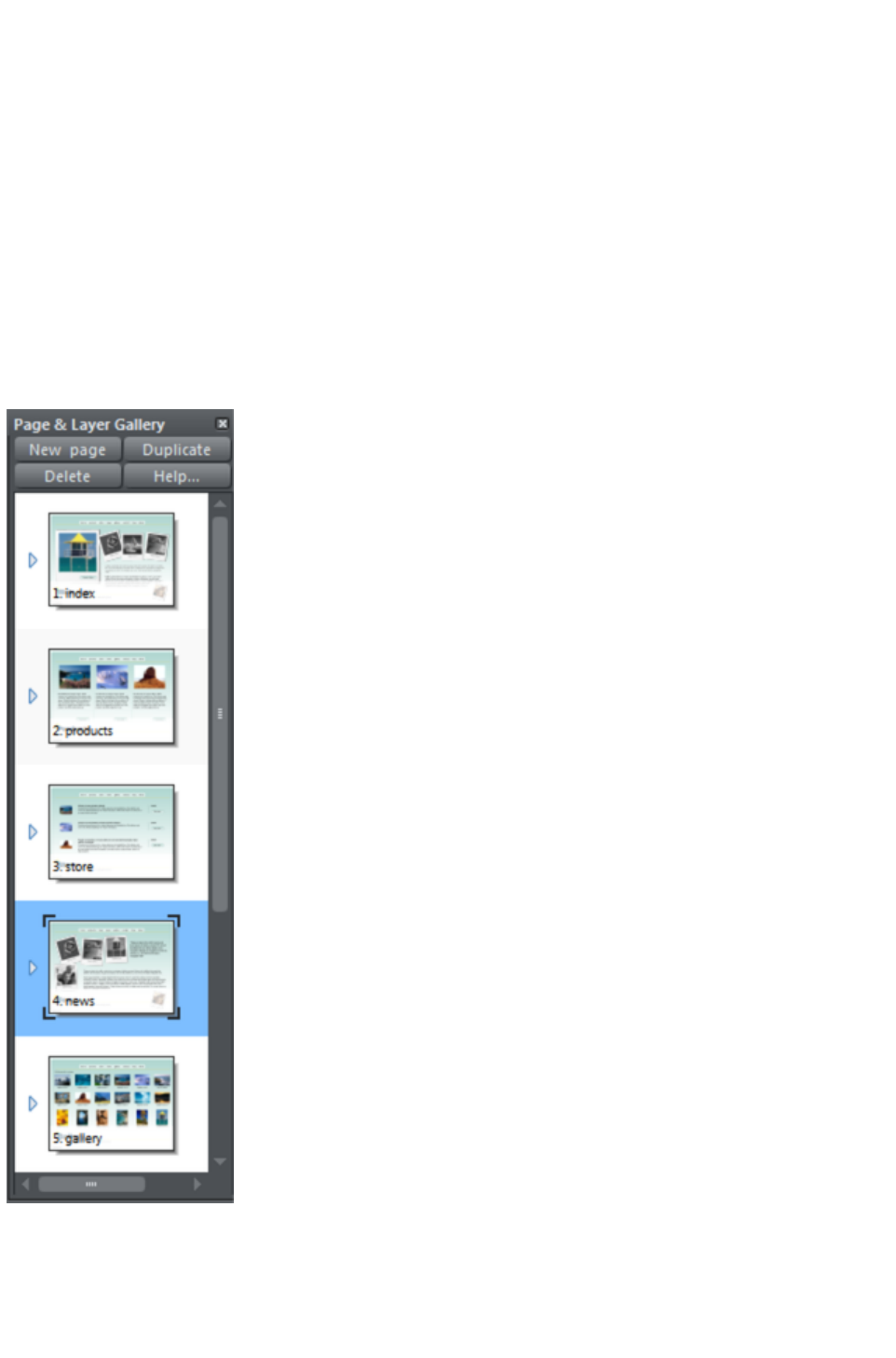
Hide or show layers
Lock layers (which makes the layer non-editable)
Solo a layer - turn all other layers off
Object control
Display a list of all items (objects) on the page in the stacking order they appear on the page, bottom to
top.
Hide or show any item
Move up and down the stack
Lock any object so it becomes non-editable
Locate and highlight any object in the gallery by clicking it on the page when in 'Locate' mode -
toggle the Locate button on (enabled) and off (disabled)
Solo an object - turn all other objects off
In addition the Page & Layer Gallery
shows a thumbnail of each page and a tiny thumbnail of each item on the page. Hover the mouse pointer
over an item to view a larger thumbnail.
The Page & Layer Gallery
in collapsed 'Pages' mode, showing 5 pages of a web document. Page 4 called 'News' is the selected
page.
Page 1078
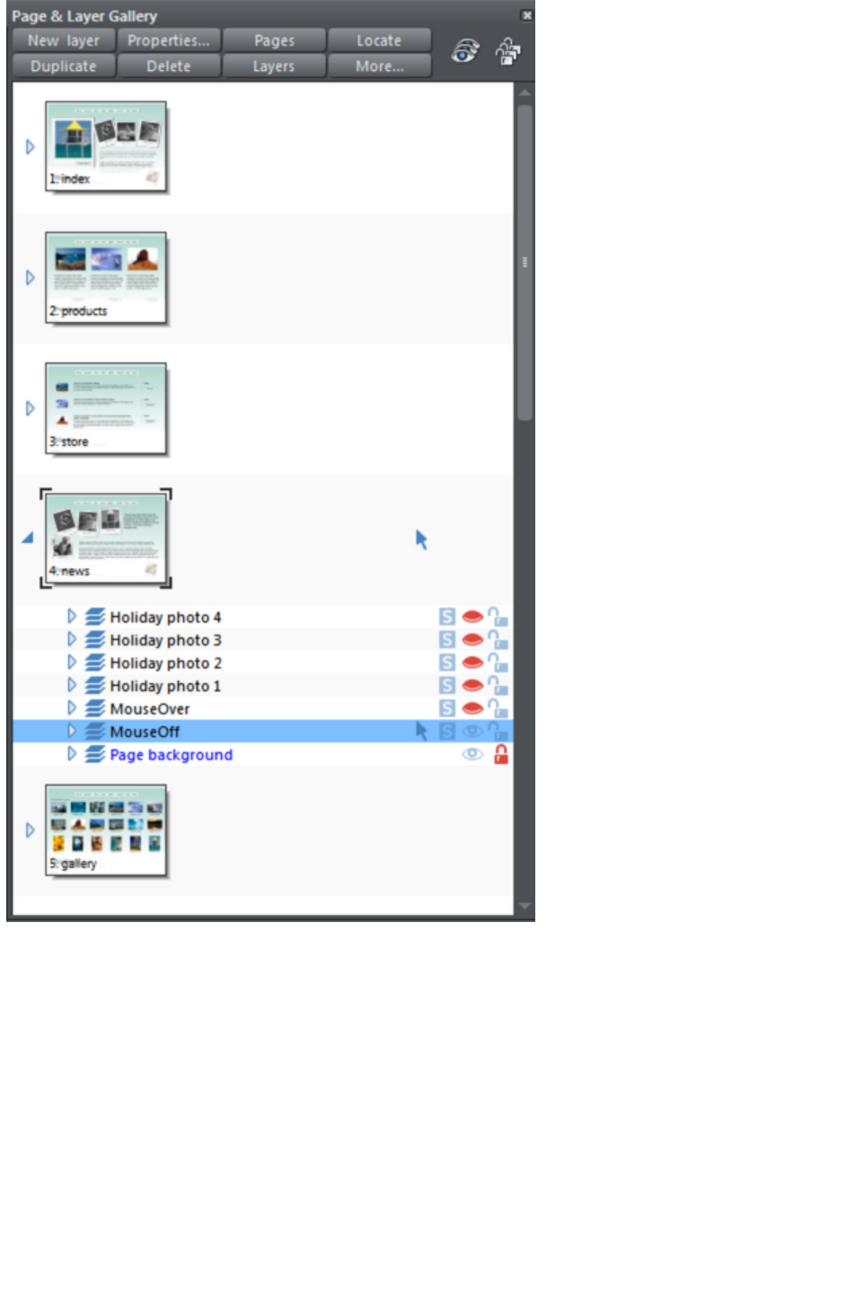
Layers mode - The News page has been expanded, by clicking on its small right facing arrow, to show
all the layers on this page.
The bottom layer 'Page background' is locked. The layer called MouseOff is the active or current layer,
that is where all new objects will appear. The top 5 layers are hidden (closed eye icon), so only the
MouseOff and Page background layers are visible in the document.
Page 1079
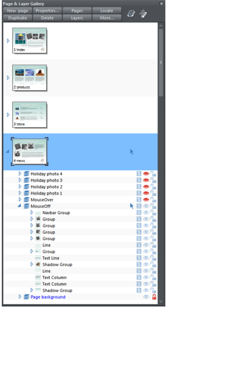
This shows the MouseOff layer has been expanded to show the contents of that layer. This shows a
navbar group and other various groups, text line and text column items, and a couple of shadow group
items.
Hovering the mouse pointer over the tiny thumbnails will display a larger one so you can easily identify
each object on the page.
Note the right two columns indicate (and control) whether the items are editable (a pale arrow) or locked
(padlock icon) and whether they are visible on the page (pale open eye icon) or hidden (darker closed
icon).
Page 1080

Clicking on these icons will change the visibility and / or the locked or editable nature of each object.
Page 1081

Pages
Clicking the Pages button on the top of the Page & Layer Gallery (or right clicking in the gallery and
choosing Show page level
) will open pages mode, displaying only the pages in the document and collapsing all other opened levels.
When in pages mode and the gallery is docked, the width of the gallery is reduced to its minimum, to take
up as little space as possible. Also the number of buttons at the top of the gallery is cut down to just
those applicable to pages. To leave pages mode, simply expand one of the pages to reveal its layers. The
gallery returns to its full width and the full button set is restored.
You can re-order pages by dragging on the item in the Page & Layer Gallery, or by right clicking a
page and choosing Move page up/down
.
You can rename a page right clicking it and choosing Rename Page
. As well as being a useful way to identify pages in long documents, the page name is used when
exporting your document as a website. For this reason in web documents it's not possible to use certain
characters or symbol characters in the name (they are not accepted as web page names).
The New page, Duplicate and Delete
buttons will do as they imply. Note that you must first have selected a page (click on it so it's highlighted
in blue as shown above) in order for these buttons to work on pages. (If you had selected a layer, for
example, then they would operate at the layer level).
Alternatively you can right click a page and choose the options New page, Duplicate current page,
Cut page, Copy page, Paste page and Delete current page.
The New page
option will create a blank page the same size as the selected, current page.
The Cut page option removes the page and stores it on the clipboard, so that you can paste it either in
this or another document by right-clicking a page and choosing the Paste
page option. The pasted page is pasted below the currently selected page.
The Copy page option copies the page, so that you can paste it either in this or another document by
right-clicking a page and choosing the Paste
page option. The pasted page is pasted below the currently selected page.
You can expand (open) the page to show the contents of the page by either
clicking on the small right facing arrow, or by double-clicking on the page
thumbnail.
Performing the same operation again will collapse (close) the page view.
Page 1082

Layers
What are layers? Everything in your document has a stacking order - that is new items are placed on top
of older items on the page, in exactly the same way as if you were adding bits of paper onto your
desktop. You can click to select and move any object, but with more complex documents that have
dozens, maybe hundreds or thousands of items, your work area can be become cluttered and difficult to
organize. You might want to work on items hidden by others on top.
Layers are a useful way of organizing more complex pages or drawings that contain many separate parts.
Using layers you can group a collection of items together and then turn the whole collection on or off
(make it visible or hidden) in one easy operation. You can think of a layer like a transparent plastic folder
holding a stack of separate papers. By opening the folder you can access its contents, and re-arrange the
contents. But your desk may have a stack of such folders, and just as you can also re-arrange the
folders, you can similarly re-arrange the layers.
So layers are groups of items. Layers can be made invisible, to hide parts of your document, which
makes your work areas less cluttered and easier to manage. You can give layers names, and you can
easily create new layers or delete them. And just as you can click the small arrow icon to open a page
and view its contents (the layers on the page), you can do the same to each layer to view the contents of
that layer.
When you select any object, the layer it's on is shown on the status line at the bottom of the window.
The steps within a presentation document are actually just different layers within the document.
Presentation layers, however, are named presentation steps. You are given the option to convert layers
into presentation steps when you convert a web document into a presentation. To turn a layer into a
presentation step, click the Presentation layer checkbox in the Web transition tab of the Layer
Properties
dialog. The layer is renamed 'presentation step N', which retains the layer stacking order.
The Current Layer
When you create any new object on the page, it's placed in one of the layers, called the active layer or
simply the current layer. On a blank document this will either just be called Layer 1 or, in the case of web
documents, it's called MouseOff. The current layer is shown with a selection arrow
.
Important: All new drawn items, shapes, photos, text, and all pasted items, are placed on the current
layer marked with the
symbol.
You can change the current layer simply by clicking on its row in the Page & Layer Gallery
. It's important to understand that you can have a selected object on any layer or even multiple layers,
and these need not be the current layer. The current layer, with the arrow, only indicates where new
items will be placed.
Page 1083

This example Page & Layer Gallery
shows the current layer is called MouseOff (the current page is called news). So if you draw anything
new it will be placed on the MouseOff layer.
It also shows a shadow group item selected in the document (highlighted in blue) inside another group
which is on a completely different layer called Holiday photo 2.
Four layers are hidden (called Holiday photo 4, Holiday photo 3, Holiday photo 1 and MouseOver).
The 'Page background' layer is locked.
Make the current layer always visible
It's possible that the current layer can be hidden or even locked. Just clicking on a layer to select it and
Page 1084

make it the current layer does not normally change its visible or locked state. But there is a preference in
the General tab of the Options dialog (right click a page and choose Page Options or choose Options
from the Utilities menu) to make the current layers always visible and editable (unlocked). If you select
this option then whenever you select any layer in the Page & Layer Gallery
it's made visible and unlocked. Moving to another layer will restore the previous visible and locked state
of the layer you just moved from.
Layers on websites
In websites saved from Web Designer Premium, layers are used for mouseover or pop-up effects (in the
web browser the contents of these layers are displayed when you move over items on the page).
You can find more details on this in the Web Graphics and Web Sites chapter in the Layers, Mouseover
(Rollover) & Pop-ups
section.
Soft Groups and Layers
Soft Groups (Soft Groups, Soft Groups) are unusual because they are groups of objects that can span
different layers. (Normal groups have to be contained within one layer). When you select any part of a
soft group the other parts are also selected, even if they are on hidden or locked layers. The Page &
Layer Gallery
will show all selected items highlighted in blue, but in the case of soft groups these items may be on other
layers that you've not expanded, and so are not immediately visible.
Page 1085

The Current Layer
When you create any new object on the page, it's placed in one of the layers, called the active layer or
simply the current layer. On a blank document this will either just be called Layer 1 or, in the case of web
documents, it's called MouseOff. The current layer is shown with a selection arrow
.
Important: All new drawn items, shapes, photos, text, and all pasted items, are placed on the current
layer marked with the
symbol.
You can change the current layer simply by clicking on its row in the Page & Layer Gallery
. It's important to understand that you can have a selected object on any layer or even multiple layers,
and these need not be the current layer. The current layer, with the arrow, only indicates where new
items will be placed.
Page 1086
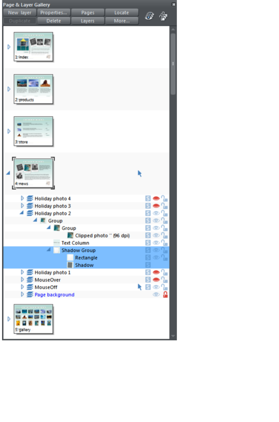
This example Page & Layer Gallery
shows the current layer is called MouseOff (the current page is called news). So if you draw anything
new it will be placed on the MouseOff layer.
It also shows a shadow group item selected in the document (highlighted in blue) inside another group
which is on a completely different layer called Holiday photo 2.
Four layers are hidden (called Holiday photo 4, Holiday photo 3, Holiday photo 1 and MouseOver).
The 'Page background' layer is locked.
Make the current layer always visible
It's possible that the current layer can be hidden or even locked. Just clicking on a layer to select it and
Page 1087

make it the current layer does not normally change its visible or locked state. But there is a preference in
the General tab of the Options dialog (right click a page and choose Page Options or choose Options
from the Utilities menu) to make the current layers always visible and editable (unlocked). If you select
this option then whenever you select any layer in the Page & Layer Gallery
it's made visible and unlocked. Moving to another layer will restore the previous visible and locked state
of the layer you just moved from.
Layers on websites
In websites saved from Web Designer Premium, layers are used for mouseover or pop-up effects (in the
web browser the contents of these layers are displayed when you move over items on the page).
You can find more details on this in the Web Graphics and Web Sites chapter in the Layers, Mouseover
(Rollover) & Pop-ups
section.
Soft Groups and Layers
Soft Groups (Soft Groups, Soft Groups) are unusual because they are groups of objects that can span
different layers. (Normal groups have to be contained within one layer). When you select any part of a
soft group the other parts are also selected, even if they are on hidden or locked layers. The Page &
Layer Gallery
will show all selected items highlighted in blue, but in the case of soft groups these items may be on other
layers that you've not expanded, and so are not immediately visible.
Page 1088

Layers on websites
In websites saved from Web Designer Premium, layers are used for mouseover or pop-up effects (in the
web browser the contents of these layers are displayed when you move over items on the page).
You can find more details on this in the Web Graphics and Web Sites chapter in the Layers, Mouseover
(Rollover) & Pop-ups
section.
Soft Groups and Layers
Soft Groups (Soft Groups, Soft Groups) are unusual because they are groups of objects that can span
different layers. (Normal groups have to be contained within one layer). When you select any part of a
soft group the other parts are also selected, even if they are on hidden or locked layers. The Page &
Layer Gallery
will show all selected items highlighted in blue, but in the case of soft groups these items may be on other
layers that you've not expanded, and so are not immediately visible.
Page 1089

Soft Groups and Layers
Soft Groups (Soft Groups, Soft Groups) are unusual because they are groups of objects that can span
different layers. (Normal groups have to be contained within one layer). When you select any part of a
soft group the other parts are also selected, even if they are on hidden or locked layers. The Page &
Layer Gallery
will show all selected items highlighted in blue, but in the case of soft groups these items may be on other
layers that you've not expanded, and so are not immediately visible.
Page 1090
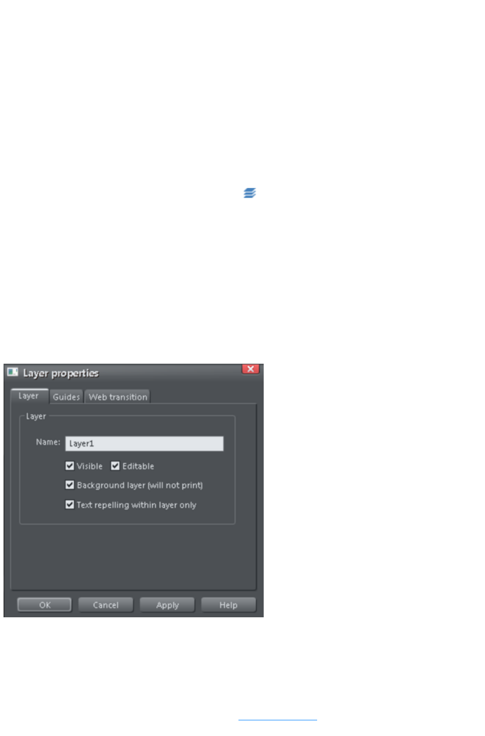
Layer Operations
Clicking the Layers button on the top of the Page & Layer Gallery will display only the layers on the
current page. This is a mode - the layers button stays depressed. While in layers mode, as you move to
different pages the layers for the current page are always shown and all other page nodes are collapsed.
Click the Layers
button again to turn off layers mode.
You can re-order the layers, that is the stacking order on the page, by using drag and drop on the layers
in the Page & Layer Gallery
.
You can rename a layer by performing a second (slow) click on the layer name. (The first click would
select the layer.) This is very like file renaming in Windows Explorer.
Holding the mouse pointer over the small layer icons
will show a thumbnail of the contents of the layer.
When you have selected a layer (clicked on it, to highlight the layer) the New, Duplicate and Delete
buttons on the top of the Page & Layer Gallery will do as they imply. The New
button will create a new blank layer and place it at the top of the stack. You can re-arrange the order by
dragging it to the required position.
The Duplicate
button will copy the layer and its contents and place it on top of the stack - that is on top of all other
objects on the page.
Layer Properties
This opens the Layer Properties dialog.
Creating layers and editing layer properties
Using the Layer tab you can:
Create a new layer or edit an existing one.
Make the layer editable and visible by default.
Define the layer as a web page background that will not appear when printed.
Specify that all objects in the layer will only repel text objects within the same layer. This prevents
Page 1091
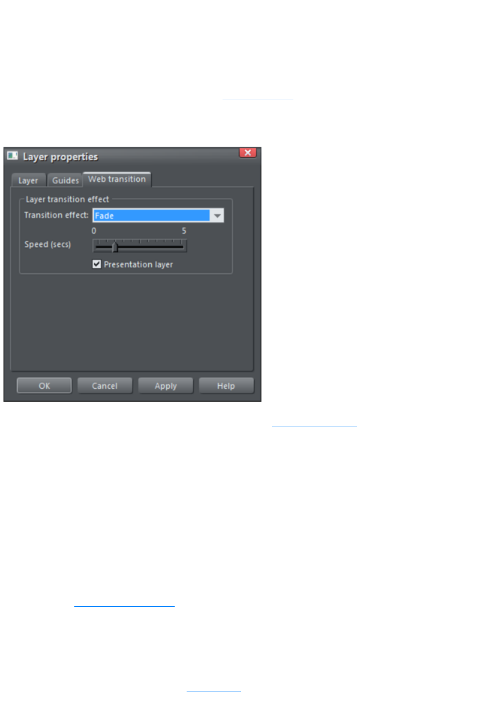
text on the layer being repelled by objects in other layers and is useful for popup layers in web
pages.
Using guidelines
The Guides tab allows you to create layer guidelines at precise numeric values and choose a color for
guide layer objects.
See the Guide objects & guidelines section in Object handling
for more information on using guidelines.
Web transitions
Note: The Presentation layer checkbox is only enabled if you are in a presentation document. To
convert a web document into a presentation document, see Web Presentations
.
Using this tab you can apply animated transition effects to a layer, if it's used as a pop-up layer on a web
page, or if it's a presentation layer. The layer then appears with the transition effect when it's revealed in
the exported web page. Use the slider to set a transition time from 0-5 seconds.
You can apply the following transitions to a layer:
Instant
(default)
New page, layer or step contents appear straight away
Fade
New page contents appear gradually
Slide in
from
New page, layer or step contents slide in from various directions
In a presentation document, a layer can be set as a presentation by checking the Presentation Layer
checkbox. See Website Presentations
.
Note: Turning off the Presentation Layer
option will remove the step from the presentation.
By default when a transition is applied, objects will only slide in/out to the edge of the web page. If you
would like objects to start from the browser window edges, rather than the web page edges, deselect
the Clip to page edges checkbox in the Website tab
of the Web Properties dialog.
Page 1092
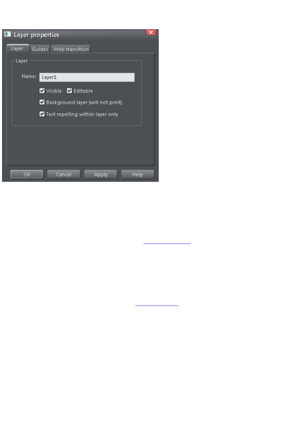
Layer Properties
This opens the Layer Properties dialog.
Creating layers and editing layer properties
Using the Layer tab you can:
Create a new layer or edit an existing one.
Make the layer editable and visible by default.
Define the layer as a web page background that will not appear when printed.
Specify that all objects in the layer will only repel text objects within the same layer. This prevents
text on the layer being repelled by objects in other layers and is useful for popup layers in web
pages.
Using guidelines
The Guides tab allows you to create layer guidelines at precise numeric values and choose a color for
guide layer objects.
See the Guide objects & guidelines section in Object handling
for more information on using guidelines.
Web transitions
Page 1093
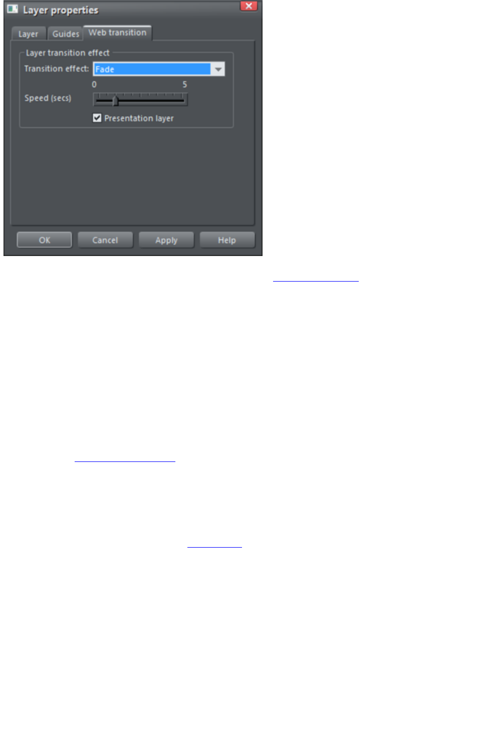
Note: The Presentation layer checkbox is only enabled if you are in a presentation document. To
convert a web document into a presentation document, see Web Presentations
.
Using this tab you can apply animated transition effects to a layer, if it's used as a pop-up layer on a web
page, or if it's a presentation layer. The layer then appears with the transition effect when it's revealed in
the exported web page. Use the slider to set a transition time from 0-5 seconds.
You can apply the following transitions to a layer:
Instant
(default)
New page, layer or step contents appear straight away
Fade
New page contents appear gradually
Slide in
from
New page, layer or step contents slide in from various directions
In a presentation document, a layer can be set as a presentation by checking the Presentation Layer
checkbox. See Website Presentations
.
Note: Turning off the Presentation Layer
option will remove the step from the presentation.
By default when a transition is applied, objects will only slide in/out to the edge of the web page. If you
would like objects to start from the browser window edges, rather than the web page edges, deselect
the Clip to page edges checkbox in the Website tab
of the Web Properties dialog.
Page 1094

Special Layers
There are several special types of layer. They appear in the Page & Layer Gallery
and can be turned on and off as usual, but behave slightly differently.
Background Layers are non-printing layers that appear at the bottom of the document, under
everything else. When you apply a color to the page background (drag and drop color from the color
line) this will create a Page background
layer automatically. Normally this is locked.
You can also set the color of the pasteboard (the area around the page) by dragging a color from the
color line and dropping it on the pasteboard. This creates a Pasteboard background
layer automatically. Again, this layer is locked.
When saving a document as a website, Background layers are converted to web page backgrounds. See
the Getting Started
chapter for more details on setting web page backgrounds and using the background layers.
The Guides Layer
is where guidelines or guide objects are placed. When you create a guideline this automatically creates a
Guides layer. You can select the Guides layer and place anything you like on this layer - and it will act
like a snapping guide (if you have 'snap to guide' on).
See Guide Objects and Guidelines in the Object Handling chapter to find out more!
Page 1095
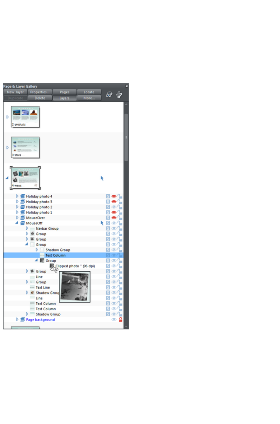
Objects
Inside each layer (sometimes we just say 'on' the layer) are all the items that make up your document;
lines, shapes, text, photos, etc. By expanding the layer level the usual way (click the icon) you are
presented with a list of all objects in the same order they appear on the page, top to bottom. Because
new objects are always placed in front of (on top of) all other objects on the current layer, they will
appear at the top of the list.
The Page & Layer Gallery is a great way to find and select items that may be hidden or difficult to get to
on the page. Using the quick pop-up thumbnail feature you can quickly see each item.
This also shows a thumbnail pop-up of one of the
photos at the bottom of the list.
This example Page &
Layer Gallery shows the
hierarchy of document
elements.
The 'news' page is
expanded and shows 7
layers. The 'MouseOff'
layer is expanded to show
a collection of objects
inside this layer, starting
with a navbar group, five
groups, two shadow
groups, a text line and two
text columns. One of the
groups is expanded to
show a shadow group, a
text column, and another
group, which is expanded
to show just one item
inside it, a clipped photo,
which is being displayed as
a larger thumbnail as the
mouse pointer hovers over
it. The text column is
selected on the page and
so highlighted in blue.
As you change selection on
the page, the Page &
Layer Gallery updates to
reflect this, showing the
selected item/s highlighted
in blue.
Vice versa, you can select
any item in the Page &
Layer Gallery by clicking
on it, and it will select the
corresponding item in the
document as well.
Shadows, Bevels & Contours
Page 1096

Each of these effects creates a new object attached to the original item. For example when you apply a
shadow to a shape, really what's happening is that a separate shadow object is created and tightly
grouped with the shape - so they are permanently attached to each other. The same applies to a bevel
and contour. In the Page & Layer Gallery these items are shown as Shadow Group, Bevel Group or
Contour Group. You can expand this group and inside you'll see the original shape, and the shadow (or
bevel or contour).
Because these effects are tightly grouped to the object, you'll find many operations will also change the
parent object, e.g., if you move or delete the shadow object, then the shape to which it's applied will
move or be deleted. You need to use the appropriate tools to change most of the attributes of the
shadow, bevel or contour.
Finding Objects
With any item selected on the page, click the Locate button on the top of the Page & Layer Gallery
to locate the item in the gallery.
Page 1097

Shadows, Bevels & Contours
Each of these effects creates a new object attached to the original item. For example when you apply a
shadow to a shape, really what's happening is that a separate shadow object is created and tightly
grouped with the shape - so they are permanently attached to each other. The same applies to a bevel
and contour. In the Page & Layer Gallery these items are shown as Shadow Group, Bevel Group or
Contour Group. You can expand this group and inside you'll see the original shape, and the shadow (or
bevel or contour).
Because these effects are tightly grouped to the object, you'll find many operations will also change the
parent object, e.g., if you move or delete the shadow object, then the shape to which it's applied will
move or be deleted. You need to use the appropriate tools to change most of the attributes of the
shadow, bevel or contour.
Finding Objects
With any item selected on the page, click the Locate button on the top of the Page & Layer Gallery
to locate the item in the gallery.
Page 1098

Finding Objects
With any item selected on the page, click the Locate button on the top of the Page & Layer Gallery
to locate the item in the gallery.
Page 1099

Hiding Layers
The rightmost two columns of icons in the Page & Layer Gallery
control the visibility and locking of layers.
Clicking on the open eye icon will hide the layer on the page, and the icon will turn to a closed eye
. Clicking again will revert the layer to be visible.
When any item is hidden, it becomes invisible on the page and can no longer be seen or selected. The
way to get hidden items back is to click its closed eye icon. Alternatively you can click the More...
button and select Show All
option, which un-hides all items on the current page.
Page 1100

Solo Mode
If you click any of the icons in the column next to each layer, it will 'solo' this layer which means it
hides everything else, except this layer. You can now work on this layer in isolation. Clicking the icon
again will restore everything back to how it was before.
You can also click and drag down the column of
icons to quickly browse through the layers in isolation from everything else.
To exit the Solo mode, click the
button again.
Similarly you can use solo mode with individual objects or groups at any level in the object hierarchy
shown in the gallery. Click the
icon against an object and all other objects are hidden, leaving only the 'soloed' object visible, making it
easy to work on in isolation. Or drag up and down the column of S icons to dynamically scan through the
objects at any level in the tree structure, to help find a particular object in a complex design. When
soloing an object, if you draw a new object, solo mode is terminated.
Note that if you want to work on the contents of a group or other composite object type, you can double
click on it to open the contents in a separate sub-document view. See Editing inside groups.
Page 1101
Locking Layers
Clicking the open padlock icon on the right end of a layer row will lock the layer (icon changes to a
closed padlock ). Now you cannot select any object on that layer. Any clicks on locked items will go
straight through it, as if it's not there, and select items underneath. Clicking the padlock icon will unlock
that layer again. Alternatively you can click the More.. button and select the Unlock All
option.
Soft Groups
There is one exception to the locked rules. If an item on a locked layer is part of a Soft Group (Soft
Groups, Soft Groups
), then selecting and operating on that Soft Group will also select and operate on any locked items in that
Soft Group (this is the intended operation of Soft Groups).
Show All & Unlock All
These two controls on the top of the Page & Layer Gallery
are a short-cut to show all items on the current page or unlock all items. They are a temporary override
of all the individual object and layer settings. Clicking the controls again will restore the previous state. So
this is a quick way of showing or unlocking everything, on all layers, performing some operation, and then
restoring the previous state.
When either button is selected (the buttons are shown pressed in), then it's not possible to change the
state of individual items. Un-select the buttons to enable the normal operation of the layer visibility and
locking state.
Clicking the More button will display menu options to Show all on page and Unlock all on page
.
These are similar to the above, but they are not a toggle option. So selecting either option will turn all
layers on or unlock all layers, and there is no easy way to restore the previous state - other than
individually re-selecting the hidden or locked state of all the separate items.
Moving Objects Between Layers
There are several ways to move objects between layers. First select the object or objects you want to
move, then;
Cut the object (Ctrl+X or right click and Cut). Ensure the target layer is the current layer (shown
with , click the layer if it's not) and then right click and choose Paste or Paste in Place. Note
that if you cut or copy multiple items that are on different layers, the layer structure is preserved
when you paste. Items are pasted to the same layer they were copied/cut from, instead of being
pasted to the current layer. If you want to paste all such items to the current layer, ignoring the
layer structure, use the Paste in current layer option instead. If you want to retain layer
structure, choose Paste in place in current layer. These paste options are also in the clipboard
fly-out bar on the top bar, as well as the Edit menu.
Right click and choose Arrange then Move to layer in front / Move to layer behind to shift
the selected objects one layer up or down.
Ensure the target layer is selected as current, then find the selected item in the Page & Layer
Gallery (click the Locate button), right click and select Move to Current Layer.
Page 1102
Show All & Unlock All
These two controls on the top of the Page & Layer Gallery
are a short-cut to show all items on the current page or unlock all items. They are a temporary override
of all the individual object and layer settings. Clicking the controls again will restore the previous state. So
this is a quick way of showing or unlocking everything, on all layers, performing some operation, and then
restoring the previous state.
When either button is selected (the buttons are shown pressed in), then it's not possible to change the
state of individual items. Un-select the buttons to enable the normal operation of the layer visibility and
locking state.
Clicking the More button will display menu options to Show all on page and Unlock all on page
.
These are similar to the above, but they are not a toggle option. So selecting either option will turn all
layers on or unlock all layers, and there is no easy way to restore the previous state - other than
individually re-selecting the hidden or locked state of all the separate items.
Moving Objects Between Layers
There are several ways to move objects between layers. First select the object or objects you want to
move, then;
Cut the object (Ctrl+X or right click and Cut). Ensure the target layer is the current layer (shown
with , click the layer if it's not) and then right click and choose Paste or Paste in Place. Note
that if you cut or copy multiple items that are on different layers, the layer structure is preserved
when you paste. Items are pasted to the same layer they were copied/cut from, instead of being
pasted to the current layer. If you want to paste all such items to the current layer, ignoring the
layer structure, use the Paste in current layer option instead. If you want to retain layer
structure, choose Paste in place in current layer. These paste options are also in the clipboard
fly-out bar on the top bar, as well as the Edit menu.
Right click and choose Arrange then Move to layer in front / Move to layer behind to shift
the selected objects one layer up or down.
Ensure the target layer is selected as current, then find the selected item in the Page & Layer
Gallery (click the Locate button), right click and select Move to Current Layer.
Page 1103

Moving Objects Between Layers
There are several ways to move objects between layers. First select the object or objects you want to
move, then;
Cut the object (Ctrl+X or right click and Cut). Ensure the target layer is the current layer (shown
with , click the layer if it's not) and then right click and choose Paste or Paste in Place. Note
that if you cut or copy multiple items that are on different layers, the layer structure is preserved
when you paste. Items are pasted to the same layer they were copied/cut from, instead of being
pasted to the current layer. If you want to paste all such items to the current layer, ignoring the
layer structure, use the Paste in current layer option instead. If you want to retain layer
structure, choose Paste in place in current layer. These paste options are also in the clipboard
fly-out bar on the top bar, as well as the Edit menu.
Right click and choose Arrange then Move to layer in front / Move to layer behind to shift
the selected objects one layer up or down.
Ensure the target layer is selected as current, then find the selected item in the Page & Layer
Gallery (click the Locate button), right click and select Move to Current Layer.
Page 1104
Animations
In this chapter
Introduction
Core Principles
Your First Animation
Exporting a Flash File
Exporting animations as AVI
The Animation Frame Gallery
Photos
Animation Frame Rate and Tween Steps
Cropping, Clipping and Animation Size
Animation Speed
Animation smoothness
Rotation
Groups
What Xara Web Designer 7 Premium features does Flash support?
Color Transforms—Animating Color Changes
Transparency
URLs in Flash
Advanced Flash Commands
Xara Web Designer 7 Premium Flash Animation Summary
Creating animated GIFs
Animation properties
Page 1105
Introduction
Xara Web Designer 7 Premium takes a traditional animator's approach to Flash animation. You create
key frames (or "snap-shots") of your animation through time, and Xara Web Designer 7 Premium
automatically creates all the in-between frames for you, a process called 'tweening'.
An example start frame
The next key frame has the star shape moved, rotated a little, reduced in size, and changed to a different
color.
Xara Web Designer 7 Premium will create a smoothly animated Flash file automatically creating the
interim frames. This process is called "tweening".
What Flash can and cannot do
The Flash format does not support some of the advanced effects that Xara Web Designer 7 Premium
offers, for example complex graduated transparency, feathering and most of the advanced color fill
types.
However, it does support a range of effects that include simple transparency. So, for example, if you fade
the star on the 2nd key frame above to be 100% transparent, you'll get an animation where the star
moves, reduces in size, and then fades.
The same example, showing in-between frames, but with a transparency change.
Like Xara Web Designer 7 Premium, Flash is vector graphics-based, which means that you can enlarge
objects with no loss of detail. It also means that Flash files can be very compact, which is of course ideal
for the web!
To illustrate just how small and compact Xara Web Designer 7 Premium Flash animations can be, the
previous example animated over one second with 24 frames (so the movie plays at a smooth 24 frames
per second) creates a Flash file that's only 700 bytes.
The 6 core types of animation
In order to keep Flash files very compact, the types of shape tweening supported by Flash are limited to
six basic types of animation. These are sometimes called the 6 core transforms, because these are the
main ways you can transform an object from one key frame to the next.
1. Move: Move objects from one position to another.
2. Scale: Enlarge or reduce objects in size.
3. Squash or skew: Squash or skew objects.
4. Rotate: Rotate objects.
Page 1106
5. Transparency: Adjust the overall (flat) transparency of the objects.
6. Color changes: Change the fill (flat) color of objects.
The last item, color changes, can be applied to contoned (colored) photos. You can't transform a full
color photo into a contoned one, but you can change a photo with one contone color into another color.
Note:
the above six transform types are absolutely key to all Flash animations.
If you look at Flash animation examples on the web, you'll find that almost all consist of just these effects.
Objects fade in and out; they whiz from one position to another. They sometimes spin, grow or shrink.
That's the basis for almost all Flash animations, and it's very easy to produce such animations in Xara
Web Designer 7 Premium. It is also possible to tween shape outlines and some Photo Tool
attributes in Xara Web Designer 7 Premium, but these are less common and only applicable to specific
types of object.
One thing that isn't possible is to change the shape of an object between key frames.
It's not possible to change the shape between key frames.
Because the shape changes (i.e. it morphs from one shape to another), this is not possible in Xara Web
Designer 7 Premium Flash animations.
What you can't do with Xara Web Designer 7 Premium Flash
Xara Web Designer 7 Premium is not designed to be an advanced, all-encompassing Flash Tool
. Instead, we feel it brings a new, innovative, very easy to understand approach to Flash animation.
Combined with Xara Web Designer 7 Premium's vector drawing tools and slick ease-of-use, it allows
you to create really compact Flash animations more easily than other tools.
Because of this simplified approach, Xara Web Designer 7 Premium does not support more complex
Flash features such as scripting (programming), audio, or embedded movies.
Additionally, since Flash vector rendering is relatively primitive compared to Xara Web Designer 7
Premium's, there are advanced Web Designer Premium effects such as feathering that cannot be used in
Flash. These are detailed in the "What Xara Web Designer 7 Premium Features Does Flash Support?
" section towards the end of this chapter.
Page 1107
What Flash can and cannot do
The Flash format does not support some of the advanced effects that Xara Web Designer 7 Premium
offers, for example complex graduated transparency, feathering and most of the advanced color fill
types.
However, it does support a range of effects that include simple transparency. So, for example, if you fade
the star on the 2nd key frame above to be 100% transparent, you'll get an animation where the star
moves, reduces in size, and then fades.
The same example, showing in-between frames, but with a transparency change.
Like Xara Web Designer 7 Premium, Flash is vector graphics-based, which means that you can enlarge
objects with no loss of detail. It also means that Flash files can be very compact, which is of course ideal
for the web!
To illustrate just how small and compact Xara Web Designer 7 Premium Flash animations can be, the
previous example animated over one second with 24 frames (so the movie plays at a smooth 24 frames
per second) creates a Flash file that's only 700 bytes.
The 6 core types of animation
In order to keep Flash files very compact, the types of shape tweening supported by Flash are limited to
six basic types of animation. These are sometimes called the 6 core transforms, because these are the
main ways you can transform an object from one key frame to the next.
1. Move: Move objects from one position to another.
2. Scale: Enlarge or reduce objects in size.
3. Squash or skew: Squash or skew objects.
4. Rotate: Rotate objects.
5. Transparency: Adjust the overall (flat) transparency of the objects.
6. Color changes: Change the fill (flat) color of objects.
The last item, color changes, can be applied to contoned (colored) photos. You can't transform a full
color photo into a contoned one, but you can change a photo with one contone color into another color.
Note:
the above six transform types are absolutely key to all Flash animations.
If you look at Flash animation examples on the web, you'll find that almost all consist of just these effects.
Objects fade in and out; they whiz from one position to another. They sometimes spin, grow or shrink.
That's the basis for almost all Flash animations, and it's very easy to produce such animations in Xara
Web Designer 7 Premium. It is also possible to tween shape outlines and some Photo Tool
attributes in Xara Web Designer 7 Premium, but these are less common and only applicable to specific
types of object.
One thing that isn't possible is to change the shape of an object between key frames.
It's not possible to change the shape between key frames.
Because the shape changes (i.e. it morphs from one shape to another), this is not possible in Xara Web
Designer 7 Premium Flash animations.
Page 1108

What you can't do with Xara Web Designer 7 Premium Flash
Xara Web Designer 7 Premium is not designed to be an advanced, all-encompassing Flash Tool
. Instead, we feel it brings a new, innovative, very easy to understand approach to Flash animation.
Combined with Xara Web Designer 7 Premium's vector drawing tools and slick ease-of-use, it allows
you to create really compact Flash animations more easily than other tools.
Because of this simplified approach, Xara Web Designer 7 Premium does not support more complex
Flash features such as scripting (programming), audio, or embedded movies.
Additionally, since Flash vector rendering is relatively primitive compared to Xara Web Designer 7
Premium's, there are advanced Web Designer Premium effects such as feathering that cannot be used in
Flash. These are detailed in the "What Xara Web Designer 7 Premium Features Does Flash Support?
" section towards the end of this chapter.
Page 1109
The 6 core types of animation
In order to keep Flash files very compact, the types of shape tweening supported by Flash are limited to
six basic types of animation. These are sometimes called the 6 core transforms, because these are the
main ways you can transform an object from one key frame to the next.
1. Move: Move objects from one position to another.
2. Scale: Enlarge or reduce objects in size.
3. Squash or skew: Squash or skew objects.
4. Rotate: Rotate objects.
5. Transparency: Adjust the overall (flat) transparency of the objects.
6. Color changes: Change the fill (flat) color of objects.
The last item, color changes, can be applied to contoned (colored) photos. You can't transform a full
color photo into a contoned one, but you can change a photo with one contone color into another color.
Note:
the above six transform types are absolutely key to all Flash animations.
If you look at Flash animation examples on the web, you'll find that almost all consist of just these effects.
Objects fade in and out; they whiz from one position to another. They sometimes spin, grow or shrink.
That's the basis for almost all Flash animations, and it's very easy to produce such animations in Xara
Web Designer 7 Premium. It is also possible to tween shape outlines and some Photo Tool
attributes in Xara Web Designer 7 Premium, but these are less common and only applicable to specific
types of object.
One thing that isn't possible is to change the shape of an object between key frames.
It's not possible to change the shape between key frames.
Because the shape changes (i.e. it morphs from one shape to another), this is not possible in Xara Web
Designer 7 Premium Flash animations.
What you can't do with Xara Web Designer 7 Premium Flash
Xara Web Designer 7 Premium is not designed to be an advanced, all-encompassing Flash Tool
. Instead, we feel it brings a new, innovative, very easy to understand approach to Flash animation.
Combined with Xara Web Designer 7 Premium's vector drawing tools and slick ease-of-use, it allows
you to create really compact Flash animations more easily than other tools.
Because of this simplified approach, Xara Web Designer 7 Premium does not support more complex
Flash features such as scripting (programming), audio, or embedded movies.
Additionally, since Flash vector rendering is relatively primitive compared to Xara Web Designer 7
Premium's, there are advanced Web Designer Premium effects such as feathering that cannot be used in
Flash. These are detailed in the "What Xara Web Designer 7 Premium Features Does Flash Support?
" section towards the end of this chapter.
Page 1110

What you can't do with Xara Web Designer 7 Premium Flash
Xara Web Designer 7 Premium is not designed to be an advanced, all-encompassing Flash Tool
. Instead, we feel it brings a new, innovative, very easy to understand approach to Flash animation.
Combined with Xara Web Designer 7 Premium's vector drawing tools and slick ease-of-use, it allows
you to create really compact Flash animations more easily than other tools.
Because of this simplified approach, Xara Web Designer 7 Premium does not support more complex
Flash features such as scripting (programming), audio, or embedded movies.
Additionally, since Flash vector rendering is relatively primitive compared to Xara Web Designer 7
Premium's, there are advanced Web Designer Premium effects such as feathering that cannot be used in
Flash. These are detailed in the "What Xara Web Designer 7 Premium Features Does Flash Support?
" section towards the end of this chapter.
Page 1111
Core Principles
In your animation you are likely to have some objects that remain static between key frames (i.e. no
tweening is necessary) and other objects you will want to animate.
To tell Xara Web Designer 7 Premium which objects you want to
animate, it's necessary to give each object a name (via the Add
Names button on the Selector Tool
InfoBar).
For more information on naming objects, see section "Naming Objects" in the "Document Handling"
chapter.
Here is an overview of the typical process to create a new animation from scratch, which this chapter will
guide you through:
1. Decide what size you would like your animation to be and set the page size accordingly (see "
File" > "Page Options").
2. Draw your first frame. Name the objects that you want to animate.
3. Create a new key frame (usually done by copying the earlier frame).
4. Move and transform the objects as required.
5. Preview the results.
6. Repeat steps 3 through 5.
And so you can then build up your animation.
The Copy Frame button on the Animation
button bar.
Xara Web Designer 7 Premium provides an easy one-button way to create new key frames which are a
copy of a previous frame. The Frame Gallery allows you to view any key frame, and you can adjust the
frame order and display period for each key frame. The Frame Gallery
is described in depth later in this chapter.
For those familiar with the animated GIF features of Xara Web Designer 7 Premium (or its
predecessors), the whole process will be very familiar. The difference is that with Flash files Xara Web
Designer 7 Premium can automatically create all the tween steps to produce smoother, much more
compact animations than animated GIFs can offer.
Note:
Objects that you want to animate from one frame to another need to have a name. All other objects will
remain visible (but static) for the display period of the frame until the next key frame. So to delete an
object from an animation, just delete it on the first key frame on which you no longer need it to appear.
Page 1112
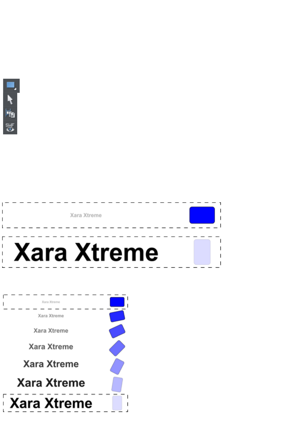
Your First Animation
To create a new animation:
Create a new animation document. To do this:
Choose "File" > "New" > "Animation"
("Ctrl + Shift + N").
A new document will open, and you will see the animation button bar appear that contains some relevant
buttons.
1. Draw a simple shape, such as a rounded rectangle with the
Rectangle Tool (but it can be any shape).
2. Click the Apply Name icon on the Selector InfoBar and name
it "shape".
3. Click the Copy Frame button to create your 2nd key frame.
3. Transform the shape as required. You can adjust it using any of
the six animation types described earlier in the chapter.
4. Press the Preview Flash button to see the animation.
By default the display period for each key frame is half a second. To produce a longer animation, see the
"Movie Frame Rate and Tween Steps" section later in the chapter.
You are not limited to just one moving object; you can have as many as you like on each key frame. And
as long as they appear transformed in some way, on the next key frame (and they are each given a unique
name) they will animate.
Here is another example.
The first key frame has some simple text and a simple shape within a static rectangle.
On the next key frame the text has been enlarged and made darker, the blue rectangle has been rotated
90 degrees and transparency altered to be mostly transparent.
This is how the animation is constructed.
Keyframe 1
Intermediate tween steps
produced by Xara Web
Designer 7 Premium
Keyframe 2
In this animation, the text object grows, and at the same time the rounded rectangle rotates and fades.
Page 1113
Exporting a Flash File
To export your animation as a Flash file:
Select "File" > "Export Animation" and then choose Flash under Save As Type
.
Or click the Export Animated Flash
button.
This will save the finished SWF file into the location you choose.
Previewing a Flash Object in Xara Web Designer 7 Premium
To view your animation as it would look in a web page, click the
Preview Flash
button to instantly see a browser preview.
The preview page will show your finished animation as well as useful information, such as the animation's
dimensions, file size, etc. It also includes simple instructions on inserting your animation into a web page.
Inserting a Flash Object in Xara Web Designer 7 Premium
For those using Xara Web Designer 7 Premium you can simply drop the Flash file onto your web page
to insert it into your website. A static placeholder image is automatically created and placed on your
page. Preview your page and you should see your working Flash animation!
Alternatively you can create a placeholder object manually. On your web page, create a placeholder
object, which can be anything such as a simple rectangle or an image or screen grab even. Position and
size your placeholder where you want your Flash animation to appear.
Then in the Web Properties dialog ("Ctrl + Shift + W") select the Placeholder tab and the Replace
with Flash Browse options to locate the required .SWF file. Click Apply
.
Now when you preview your website, the placeholder is replaced by the Flash animation.
With either option above, the .swf file gets copied into a support folder next to your .xar file, so that there
is a copy of the file with your .xar file. Therefore if you subsequently change your animation and export an
updated .swf file that you want to use instead, either browse for the new .swf file using the
"Utilities" > "Web properties" > "
Placeholder tab" as above, or manually replace the file in the support folder with the updated file.
See the Support Folders section
of the Document Handling chapter for more information.
Inserting using a different web authoring tool
To place your SWF animation into your HTML click the View HTML
link on the Flash preview screen to get code that you can paste into your web page using your preferred
HTML editor.
Note: You must change the SWF file name in the code to match the actual name of your exported SWF
file. You must also place your SWF file into the same directory as your web page for the code to work.
If you place the SWF file in a different directory, you will need to change the HTML code accordingly.
Page 1114

Previewing a Flash Object in Xara Web Designer 7 Premium
To view your animation as it would look in a web page, click the
Preview Flash
button to instantly see a browser preview.
The preview page will show your finished animation as well as useful information, such as the animation's
dimensions, file size, etc. It also includes simple instructions on inserting your animation into a web page.
Inserting a Flash Object in Xara Web Designer 7 Premium
For those using Xara Web Designer 7 Premium you can simply drop the Flash file onto your web page
to insert it into your website. A static placeholder image is automatically created and placed on your
page. Preview your page and you should see your working Flash animation!
Alternatively you can create a placeholder object manually. On your web page, create a placeholder
object, which can be anything such as a simple rectangle or an image or screen grab even. Position and
size your placeholder where you want your Flash animation to appear.
Then in the Web Properties dialog ("Ctrl + Shift + W") select the Placeholder tab and the Replace
with Flash Browse options to locate the required .SWF file. Click Apply
.
Now when you preview your website, the placeholder is replaced by the Flash animation.
With either option above, the .swf file gets copied into a support folder next to your .xar file, so that there
is a copy of the file with your .xar file. Therefore if you subsequently change your animation and export an
updated .swf file that you want to use instead, either browse for the new .swf file using the
"Utilities" > "Web properties" > "
Placeholder tab" as above, or manually replace the file in the support folder with the updated file.
See the Support Folders section
of the Document Handling chapter for more information.
Inserting using a different web authoring tool
To place your SWF animation into your HTML click the View HTML
link on the Flash preview screen to get code that you can paste into your web page using your preferred
HTML editor.
Note: You must change the SWF file name in the code to match the actual name of your exported SWF
file. You must also place your SWF file into the same directory as your web page for the code to work.
If you place the SWF file in a different directory, you will need to change the HTML code accordingly.
Page 1115

Inserting a Flash Object in Xara Web Designer 7 Premium
For those using Xara Web Designer 7 Premium you can simply drop the Flash file onto your web page
to insert it into your website. A static placeholder image is automatically created and placed on your
page. Preview your page and you should see your working Flash animation!
Alternatively you can create a placeholder object manually. On your web page, create a placeholder
object, which can be anything such as a simple rectangle or an image or screen grab even. Position and
size your placeholder where you want your Flash animation to appear.
Then in the Web Properties dialog ("Ctrl + Shift + W") select the Placeholder tab and the Replace
with Flash Browse options to locate the required .SWF file. Click Apply
.
Now when you preview your website, the placeholder is replaced by the Flash animation.
With either option above, the .swf file gets copied into a support folder next to your .xar file, so that there
is a copy of the file with your .xar file. Therefore if you subsequently change your animation and export an
updated .swf file that you want to use instead, either browse for the new .swf file using the
"Utilities" > "Web properties" > "
Placeholder tab" as above, or manually replace the file in the support folder with the updated file.
See the Support Folders section
of the Document Handling chapter for more information.
Inserting using a different web authoring tool
To place your SWF animation into your HTML click the View HTML
link on the Flash preview screen to get code that you can paste into your web page using your preferred
HTML editor.
Note: You must change the SWF file name in the code to match the actual name of your exported SWF
file. You must also place your SWF file into the same directory as your web page for the code to work.
If you place the SWF file in a different directory, you will need to change the HTML code accordingly.
Page 1116

Inserting using a different web authoring tool
To place your SWF animation into your HTML click the View HTML
link on the Flash preview screen to get code that you can paste into your web page using your preferred
HTML editor.
Note: You must change the SWF file name in the code to match the actual name of your exported SWF
file. You must also place your SWF file into the same directory as your web page for the code to work.
If you place the SWF file in a different directory, you will need to change the HTML code accordingly.
Page 1117

Exporting animations as AVI
As well as exporting animations as animated GIFs and Flash animations, you can also export in the .AVI
file format.
In an animation document, choose Export Animation from the File menu, and choose AVI animation
(*.AVI) from the Save As Type drop-down list in the Export File dialog. Click the Options button to
choose the export settings, or just click the Export
button to use the current or default settings.
AVI options
Codec selection
Use the dropdown list to select from the range of codecs that you have installed. This determines how
your AVI is encoded and compressed. Or choose the "uncompressed" option if you want to export an
uncompressed AVI. Note that this will give you a very large file size!
Key frame every N frames
The default value is provided by the selected codec and it's normally best to keep that value. Reducing
the number will tend to result in higher quality but larger files, increasing it in lower quality smaller files.
Configure
Pressing the Configure button opens a settings dialog specific to the selected codec (if available), which
may give you more configuration options. The About
button tells you more about the selected codec.
Make background transparent
Selecting this option will make your AVI have a transparent background, which is useful if you want
your animation to appear on top of a movie (for movie titling, for example).
When this option is on, the codec list is reduced to show only the "uncompressed" option, because
transparency can't currently be supported using a codec. If you export an uncompressed AVI with
transparency, it will import into MAGIX movie editing software and some other movie editing
applications with the transparency.
Area to save
Choose whether to save a movie that is the size of your animation page or the size of the animated
drawing.
Click OK to export the AVI animation.
Page 1118
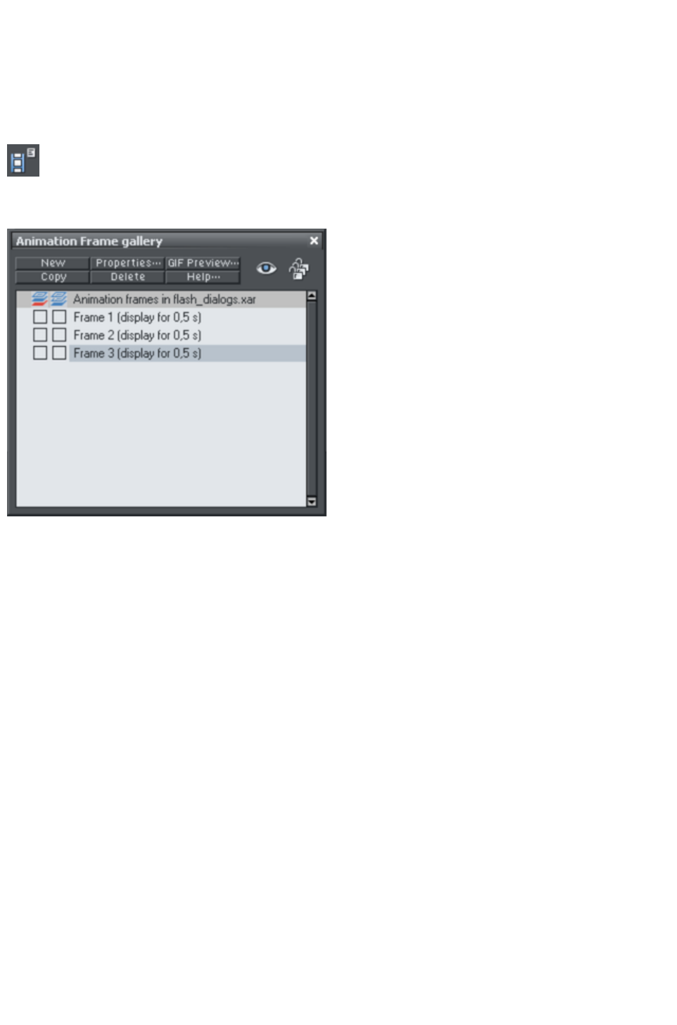
The Animation Frame Gallery
By default the Animation Frame Gallery is displayed open on the right hand side of the Web Designer
Premium window (next to the Page & Layer Gallery
) when you open or create an animation document.
To toggle display of the Frame Gallery, choose "
Utilities" > "Galleries" > "Frame Gallery", or
click the Frame Gallery icon on the Galleries
toolbar.
A typical Frame Gallery
. Frame 3 is selected and thus visible.
This shows a list of
the key frames in
your document. To
view any key frame
just click its name in
the gallery.
The Animation
Frame Gallery
shows frames from
the top down, so
the first frame is at
the top and the each
new frame you add
gets put at the
bottom of the list.
You can re-order
frames by dragging
them. There are
buttons to perform
the main operations
of deleting frames,
copying the selected
frame (it will always
get added to the
end) and creating
new blank frames.
The Properties button is very important, since it shows the Animation Properties
dialog which controls many aspects of not just the selected frame but the whole animation.
Page 1119
The Animation Properties dialog
A shortcut to display the Animation Properties dialog is to simply double click on a frame name in the
Frame Gallery
The All Frames Visible (the eye) and Edit All Frames (the
padlocks) buttons on the Frame Gallery
are useful because they allow you to view or edit all frames
together, one on top of the other.
This is particularly useful if you want to select objects that are on multiple frames.
Note: When you copy a frame, it always copies the selected frame and places it at the end. So in order
to insert a new frame, say between frames 4 and 5, select frame 4, click the Copy
button, and then drag the new copy from the end to the desired position between frames 4 and 5.
Note:
Frame names do not matter and can be anything you like. They do not have to be Frame 1, Frame 2,
etc. Animations always play the frames in the order top to bottom, irrespective of the names.
Copying Objects
You can copy objects from one frame to another in the usual way (i.e. copy the content, select the new
frame and then paste into the new frame). The "Edit" > "Paste in Place
" option ("Ctrl + Shift + V") is particularly useful when doing this, as this will always paste objects back
to the exact position they came from but on the new frame.
When you copy an object its name is copied with it, but be careful not to have more than one object with
the same name on a given frame; doing so will generate errors.
Page 1120

Copying Objects
You can copy objects from one frame to another in the usual way (i.e. copy the content, select the new
frame and then paste into the new frame). The "Edit" > "Paste in Place
" option ("Ctrl + Shift + V") is particularly useful when doing this, as this will always paste objects back
to the exact position they came from but on the new frame.
When you copy an object its name is copied with it, but be careful not to have more than one object with
the same name on a given frame; doing so will generate errors.
Page 1121
Photos
Because Flash files usually consist of vector shapes, and the transforms are relatively simple, the files can
be very small. Photos and bitmaps can be embedded into Flash animations, but unless you are careful it
will result in huge animation files. You can perform all core Flash transforms on bitmaps or photos (i.e.
you can move, scale, squash, rotate, fade and re-color.).
Flash files can include both PNG and JPEG images just as .xar files do, and Web Designer Premium
automatically creates photos of the right resolution when creating the Flash file. So for example you can
load a hi-res digital camera image, size this down to be say 200 pixels, and this means that a 200 pixel
image will get included, and not the full hi-res JPEG.
When higher resolution photos are converted down for inclusion in Flash files the JPEG compression
setting (Animation Properties dialog, Flash Options tab) can be used to control how compressed your
JPEG images are. See below.
When tweening bitmaps or photos, only one copy of the bitmap is stored in the Flash file, so you can
perform transformations of the bitmap with little overhead. In other words, just because the bitmap
appears on frames 1, 2 and 3 of your animation, this does not mean three copies of the bitmap are
embedded in the Flash file.
Non-JPEG Bitmaps
Other types of bitmaps, for example, BMP, TIFF, or PNG bitmaps, are usually a lot larger and thus less
suitable for use in Flash animations (for photos JPEG compression is a lot better than PNG). However if
you include a low resolution PNG image (that is one of 96dpi or less ? the status line shows you the
resolution of any selected image) then this is kept as a PNG image in the Flash file. Higher resolution
images (>96dpi) will be converted into a JPEG (transparent JPEG if required) .
You can control the compression used for this automatic JPEG conversion using a slider in the Flash
Options tab of the Animation Properties
dialog. The usual compression value is 75%, but you can vary the quality, preview the animation and
quickly see the quality and size savings.
256 color or less bitmaps (such as GIF) are not encoded as JPEG and will be embedded using PNG
Page 1122

compression, which is usually the best compression type for these types of images
Bitmap Quality
Flash Player version 8 and later has higher quality bitmap display. This is particularly evident when
rotating or scaling bitmaps and photos, whereas older versions of the player tend to produce pixelated,
and rather jerky movements.
You can tell which version of the Flash Player you have by right clicking on any Flash animation in your
web browser and looking at the About menu.
It's therefore recommended to export your Flash animation as Version 8 if you're using bitmaps or
photos. You can control this from the Flash Options tab of the Animation Properties
dialog.
Page 1123
Non-JPEG Bitmaps
Other types of bitmaps, for example, BMP, TIFF, or PNG bitmaps, are usually a lot larger and thus less
suitable for use in Flash animations (for photos JPEG compression is a lot better than PNG). However if
you include a low resolution PNG image (that is one of 96dpi or less ? the status line shows you the
resolution of any selected image) then this is kept as a PNG image in the Flash file. Higher resolution
images (>96dpi) will be converted into a JPEG (transparent JPEG if required) .
You can control the compression used for this automatic JPEG conversion using a slider in the Flash
Options tab of the Animation Properties
dialog. The usual compression value is 75%, but you can vary the quality, preview the animation and
quickly see the quality and size savings.
256 color or less bitmaps (such as GIF) are not encoded as JPEG and will be embedded using PNG
compression, which is usually the best compression type for these types of images
Bitmap Quality
Flash Player version 8 and later has higher quality bitmap display. This is particularly evident when
rotating or scaling bitmaps and photos, whereas older versions of the player tend to produce pixelated,
and rather jerky movements.
You can tell which version of the Flash Player you have by right clicking on any Flash animation in your
web browser and looking at the About menu.
It's therefore recommended to export your Flash animation as Version 8 if you're using bitmaps or
photos. You can control this from the Flash Options tab of the Animation Properties
dialog.
Page 1124

Bitmap Quality
Flash Player version 8 and later has higher quality bitmap display. This is particularly evident when
rotating or scaling bitmaps and photos, whereas older versions of the player tend to produce pixelated,
and rather jerky movements.
You can tell which version of the Flash Player you have by right clicking on any Flash animation in your
web browser and looking at the About menu.
It's therefore recommended to export your Flash animation as Version 8 if you're using bitmaps or
photos. You can control this from the Flash Options tab of the Animation Properties
dialog.
Page 1125
Animation Frame Rate and Tween Steps
Flash animations run at a fixed frame rate. The faster the frame rate, the smoother the resulting animation
and the larger the Flash file. Xara Web Designer 7 Premium animations default to showing 24 frames per
second, but you can change this.
When you create each key frame, you determine how long the period is until the next key frame. For
example, if a frame period is set to half a second, this means the animation from that key frame to the
next will take half a second. At 24 frames per second this means there will be 11 intermediate steps
generated by Xara Web Designer 7 Premium in the Flash animation, so 12 frames in all. (These
intermediate "tween" frames are not ever seen in Xara Web Designer 7 Premium and are only generated
when you create the Flash file.)
The Frame Gallery
always shows you the
display period for each key
frame. In this example
three frames are displayed
for half a second each, so
the whole animation lasts
1.5 seconds before
repeating.
To create a longer tween
effect (in other words to
slow the animation down)
increase the display period
using the Animation
Properties
dialog.
The easiest way to alter the display period for any frame is to just double click on the frame name you
want to alter to bring up the dialog, enter the new period in seconds, and click OK or Apply
.
Page 1126
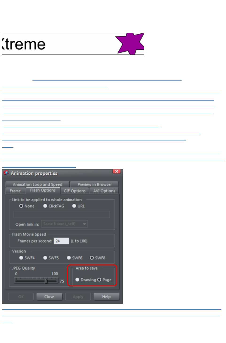
Cropping, Clipping and Animation Size
Before long you'll start to consider creating some Flash animations like you see on the web, say with
some wording or a photo that whizzes in from one side.
To create an animation like this, all you need to do is set the page size in Xara Web Designer 7 Premium
to the size you want for your flash animation. So if for example you want a Flash banner which is 468
pixels wide and 60 pixels high, set the page size in your animation document to 468x60. To set the page
size, go to the Page tab of the Options dialog (or choose "File" > "Page Options"
) and set the Width and Height fields accordingly.
When exported or previewed, the flash animation is automatically clipped to the page size you have set.
So it's easy to arrange your animation so that objects glide in and out of the visible animation. E.g. by
placing an animating object to the left of the page on one key frame and to the right of the page on the
next key frame, in the animation the object will be seen to slide in from the left side of the design and
disappear off the right side.
You can also change the page dimensions by going into the Selector Tool
and dragging on the bottom edge or right edge of the page, to change the page height or width
respectively. See Changing the page size in the Document Handling chapter for details.
Note
: When opening older documents created with earlier versions of Web Designer Premium, these will not
clip to the page (the page size was huge), instead they clip to the size of the drawing. You can control this
in the Animation Properties dialog.
Setting the area to save to be Drawing will create a Flash animation that is only as large as it needs to be
? i.e. the same as the outer bounds of the animation. This can be useful if you don't need a specific page
size.
Page 1127
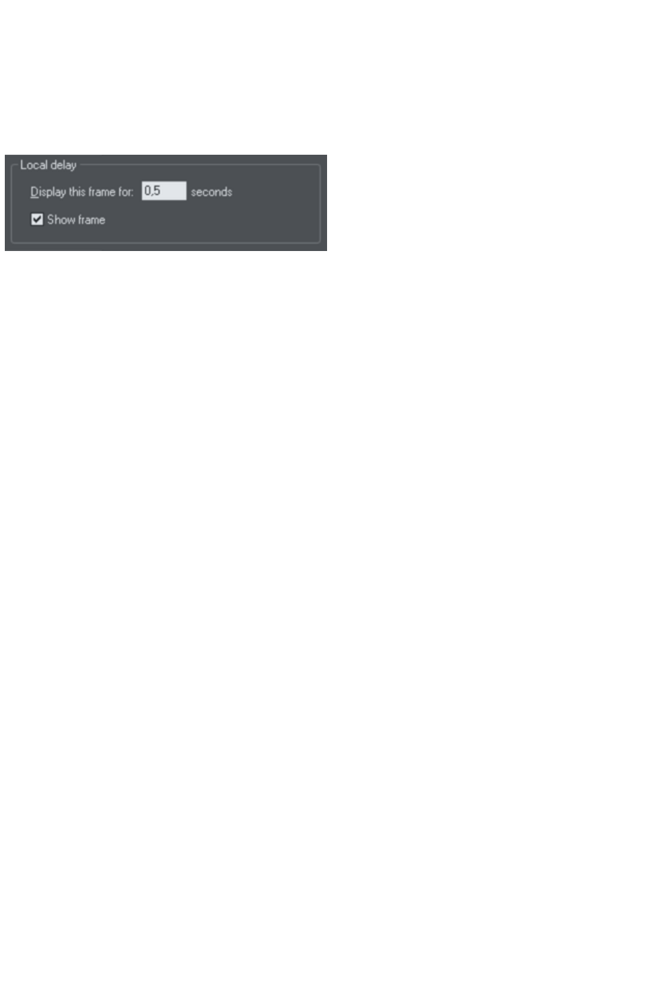
Animation Speed
When you create a new keyframe, it defaults to having a period of half a second. So the animation from
that keyframe to the next will take half a second. The longer you set the period, the slower the animation.
To set the frame period for any frame, first select the desired frame in the Frame Gallery (click on it),
and then click the Animation Properties
button (or just double click the frame name).
Setting "Display This Frame For" to 2 seconds means the animation will take 2 seconds to tween from
this key frame to the next.
Note: The Animation Properties dialog is non-modal and you can keep this on screen all the time. By
pressing the Apply
button instead of OK, the dialog remains on screen. Its contents are updated as you select different
frames, and for each of them you can set the required display period.
Page 1128
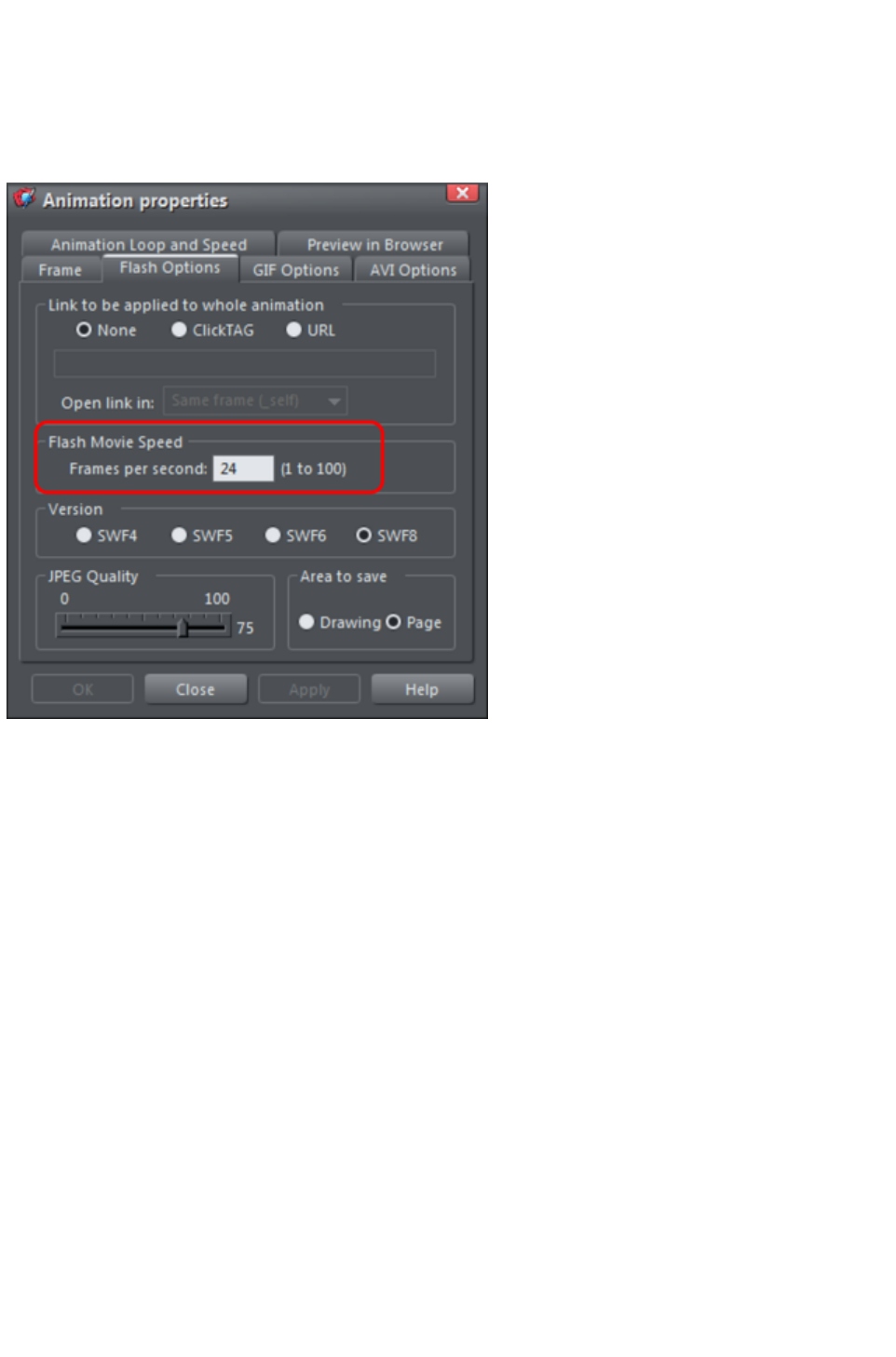
Animation smoothness
Flash movies play at a constant frame rate. The faster the frame rate, the smoother the animation. Xara
Web Designer 7 Premium defaults to showing 24 frames per second. To change the rate select the Flash
Options tab of the Animation Properties
dialog.
The Flash Options tab, where you can change the movie speed as well as the Flash export version.
Note:
The faster the frame rate, the larger the resulting Flash file. You will find that if your animation is mostly
objects fading in and out with relatively little fast moving animation, then you can reduce the frame rate to
under 24 frames per second. If you have a lot of fast action, it may be necessary to increase the frame
rate, but it's rarely necessary to have it above 50 frames per second.
Page 1129
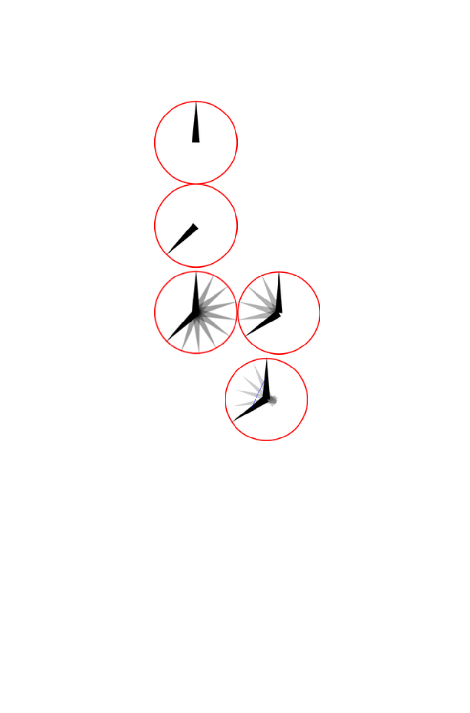
Rotation
Xara Web Designer 7 Premium calculates and generates the tween frames automatically by working out
how to transform the shapes from one key frame to the next. But sometimes it's not possible to know
exactly what type of rotation is required.
Take this example. Suppose you
tween from the first clock face to
the second:
You might expect it to rotate
clockwise, but of course it could
go counter clockwise:
In fact there are other ways it could rotate. The
above examples assume the hand rotates around
one end, but you could tween from one state into
the other by doing a straight line rotation of the
center of the object, which would result in this:
If you look closely, the hand rotates around its center rather than one end, and the center point moves in
the straight line from one key frame to the next. By default, Xara Web Designer 7 Premium rotates
objects this way.
The Rotate command
To force the rotation to be around any other point you can use a special keyword "rotate" appended to
the front of the object name. Or you can use "rotate +" to force the rotation to go clockwise or "rotate -"
to make it go counter clockwise.
To take the simple two keyframes animation example shown on the previous page, where the hour hand
needs to move from 12 o'clock to 8 o'clock. If you name the hand object "rotate + hand", you'll get an
animation showing the clock's hand moving clockwise. If you name it "rotate - hand", then the hand will
rotate counter clockwise.
If there is no rotate command, then the tween takes the shortest direct path between the object on one
keyframe to the next, rotating around its center. With a "rotate" command on the object name, it
calculates the actual rotation point, which in the above example is the "large end" of the hand.
Note:
It's not possible to rotate an object by a full 360° between keyframes if the rotation point is not the
center. For example, to do a full rotation of the clock hands in the above example, you would need to
create an intermediate keyframe.
Page 1130

The Rotate command
To force the rotation to be around any other point you can use a special keyword "rotate" appended to
the front of the object name. Or you can use "rotate +" to force the rotation to go clockwise or "rotate -"
to make it go counter clockwise.
To take the simple two keyframes animation example shown on the previous page, where the hour hand
needs to move from 12 o'clock to 8 o'clock. If you name the hand object "rotate + hand", you'll get an
animation showing the clock's hand moving clockwise. If you name it "rotate - hand", then the hand will
rotate counter clockwise.
If there is no rotate command, then the tween takes the shortest direct path between the object on one
keyframe to the next, rotating around its center. With a "rotate" command on the object name, it
calculates the actual rotation point, which in the above example is the "large end" of the hand.
Note:
It's not possible to rotate an object by a full 360° between keyframes if the rotation point is not the
center. For example, to do a full rotation of the clock hands in the above example, you would need to
create an intermediate keyframe.
Page 1131

Groups
Groups are treated specially when creating animations. To save you naming each individual part of a
group, you can instead name the whole group and then copy the group to the next keyframe. Xara Web
Designer 7 Premium will animate the whole group from one keyframe to the next. And you can apply the
normal transformations to the group (resize, rotate, squash, but not group transparency ? see the next
page).
If members of a group are to animate differently than the rest of the group, then those members must be
separately named ("Ctrl + click" to select an object inside a group, then name it as usual).
Note:
If you ungroup, make some changes to the group contents and then re-group the objects:
You must re-apply the name to the new group (select the group then double click on the name in
the Name Gallery).
You must not change the stacking order of the items in the group.
You must not add or remove items to/from the group.
Group Transparency
If you want to fade a grouped object, you need to apply transparency to each individual object in the
group. There are two ways you can do this:
Select each object in the group in turn and adjust its transparency.
Or un-check the Make Groups Transparent as a Whole option in the Options dialog ("
Utilities" > "Options", then the General tab). If you do this, when you adjust the transparency
of the whole group Xara Web Designer 7 Premium applies the transparency to each individual
item in the group, instead of group transparency.
Page 1132

Group Transparency
If you want to fade a grouped object, you need to apply transparency to each individual object in the
group. There are two ways you can do this:
Select each object in the group in turn and adjust its transparency.
Or un-check the Make Groups Transparent as a Whole option in the Options dialog ("
Utilities" > "Options", then the General tab). If you do this, when you adjust the transparency
of the whole group Xara Web Designer 7 Premium applies the transparency to each individual
item in the group, instead of group transparency.
Page 1133

What Xara Web Designer 7 Premium
features does Flash support?
The Flash vector rendering is quite primitive compared to Xara Web Designer 7 Premium's, and so you
can't use many of the more advanced Xara Web Designer 7 Premium features such as feathering,
complex transparency and fill types or soft shadows. Lines (strokes) are limited to be being simple
constant thickness, round ended lines. No line dashing is supported. The minimum line thickness is one
pixel?so thinner lines in Xara Web Designer 7 Premium will be displayed one pixel thick in Flash.
There are two aspects to producing Flash-compatible drawings. The first is to limit yourself to use only
those features supported directly by the Flash player. Secondly, when producing animations, there is an
even more limited set of characteristics that can be tweened or animated.
Xara Web Designer 7 Premium drawing features that Flash supports:
All normal line and shape drawings (although Flash is a lot less precise than Xara Web Designer
7 Premium and so sometimes you may notice inaccuracies in lines and shapes).
Flat, linear, circular and elliptical gradient color fills.
Multi-stage gradient color fills, including linear and elliptical fills. Eight color stops maximum.
Flat transparency. Mix type only.
Graduated transparency is supported for flat color filled objects (non-graduated). So you can
have graduated color objects with flat transparency or flat color objects with graduated
transparency, but not both.
Constant width outlines (stroked paths) with rounded end caps and line joins (version 8 Flash
files support the other join and cap types).
Text, including kerning. You can use any fonts you like. The outlines of the characters of any
used fonts are embedded into the Flash file. This is much more efficient than, say, font embedding
in PDF documents.
Text on a curve. Note: the line used for the curve must be made invisible for the animation to
work.
Bitmaps and bitmap fills.
Contoned (colored) bitmaps and bitmap fills.
Photo Saturation, temperature color and blur (but not brightness / contrast change).
Fractal Cloud and Plasma fills will work, but are converted to bitmaps, so not efficient.
So while some Xara Web Designer 7 Premium effects, such as soft shadows do work in static files, these
are exported as bitmaps into the Flash file, so they are not very efficient and not suitable for animating.
What can be animated:
As listed at the start of this chapter, these are the golden rules as to what you can change from one
keyframe to the next:
Move: Move objects from one position to another.
Scale: Enlarge or reduce objects in size.
Squash or skew: Squash or skew objects.
Rotate: Rotate objects.
Transparency: Adjust the overall (flat) transparency of the object.
Color transform: Change the fill (flat) color of objects.
Or any combination of the above.
In addition, there are a few special cases of photo color transformations that are supported by Flash.
You can alter the saturation (so you can tween a full color photo into a black and white one), You can
also adjust the temperate color control (warm / cool), and also the blur value. The latter enables you to
tween a blurred photo into a sharp one. But note this only works for blur values and not sharpen. Also
there is a slight difference in the way Flash blurs photos. Flash blurs the whole photo including the edge,
Page 1134

whereas the Photo blur in Xara Web Designer 7 Premium only blurs the inside of the photo and keeps a
sharp edge.
Secondly, another special case: you can animate text on a curve. This is special because you can use this
to seemingly morph text along one curve into text along a completely different curve. In fact what it does
is tween from the character position in one keyframe to the corresponding character's position in the next
frame. This can produce some interesting effects.
Note
: The line used for the curve must be made invisible for the animation to work.
Non-moving Objects
You can add new objects by just drawing them on any keyframe. They will appear in the animation at
the start of the frame and will vanish at the next keyframe, unless they appear on that frame as well. So
the simplest way to have an object appear static on all frames is to ensure it's copied to all the frames.
Xara Web Designer 7 Premium Flash optimization is very efficient and you'll find that having more than
one copy takes hardly any additional file space (this is true of multiple copies of objects anywhere).
Page 1135

Non-moving Objects
You can add new objects by just drawing them on any keyframe. They will appear in the animation at
the start of the frame and will vanish at the next keyframe, unless they appear on that frame as well. So
the simplest way to have an object appear static on all frames is to ensure it's copied to all the frames.
Xara Web Designer 7 Premium Flash optimization is very efficient and you'll find that having more than
one copy takes hardly any additional file space (this is true of multiple copies of objects anywhere).
Page 1136

Color Transforms—Animating Color
Changes
This is what you can and cannot do with color transforms in Xara Web Designer 7 Premium Flash:
You can animate simple flat color changes of objects from one keyframe to the next.
You can change the line color independently of the fill color.
You can change photo contone colors.
You cannot adjust the position of gradient fills.
Page 1137
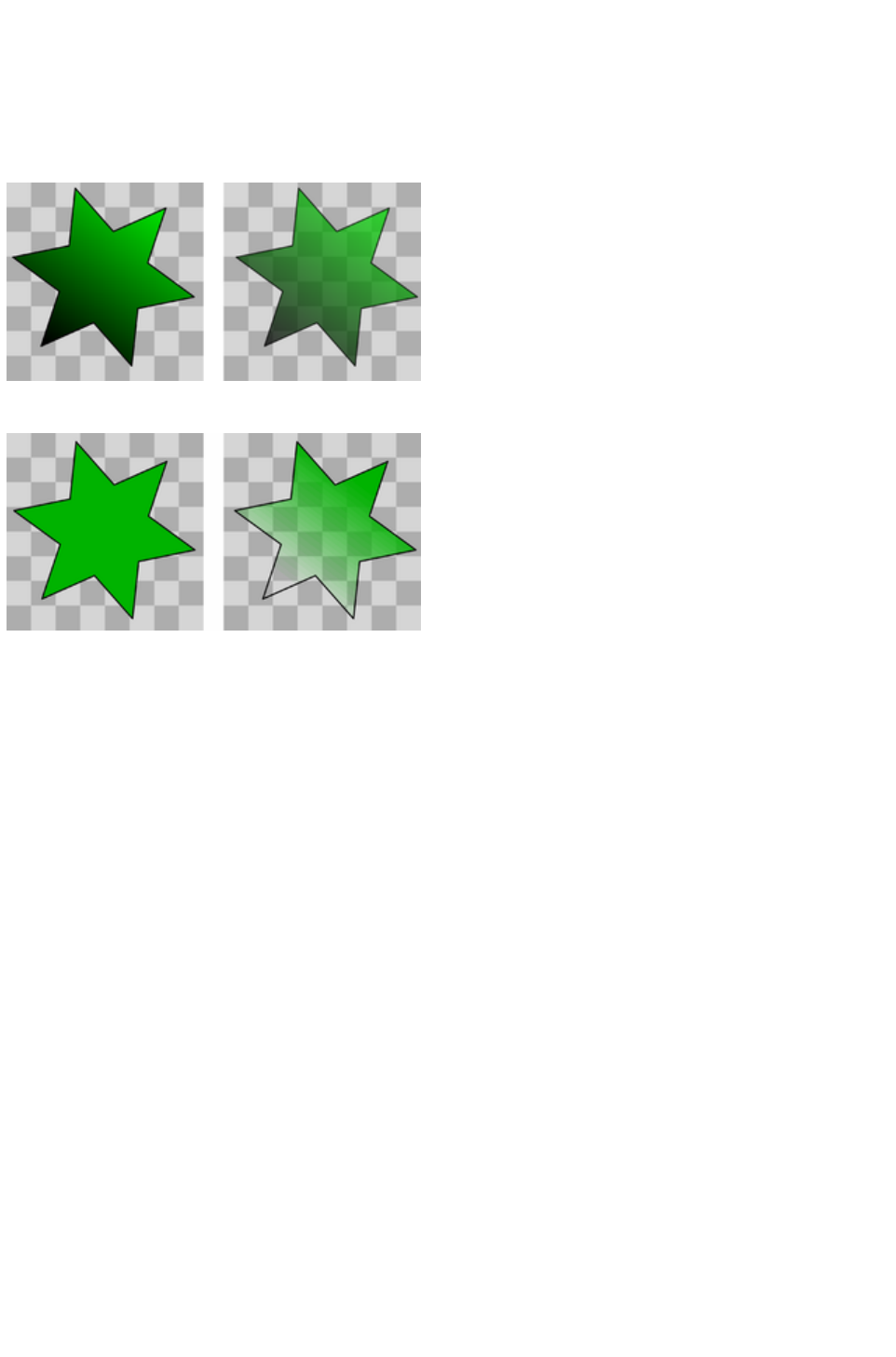
Transparency
As mentioned earlier, you can adjust the flat transparency of objects (not group transparency) and Flash
supports this (for both static objects and tweening transparency changes), but Xara Web Designer 7
Premium's graduated transparency is not really supported with Flash. There is just one situation where
you can use graduated transparency, and that is on flat color filled objects.
It's possible to adjust, and animate, flat transparency given to all types of objects, shapes, text and
photos.
It's possible to give graduated transparency (linear, circular and elliptical) to flat color filled objects, but
it's not possible to animate the transparency change. Although you can animate the color change (rule
six).
Page 1138

URLs in Flash
To make an object in your Flash animation a clickable link, just select the object you want to make
clickable and select "Utilities" > "Web Properties
("Ctrl + Shift + W").
Enter the required URL. (If you require the link to open in a new browser window or browser frame
select the target web frame by selecting from the 'Open Link In
' dropdown menu).
If you want to make text clickable select the Rectangle Surrounding Object
option. This ensures those that viewers of your Flash animation can click anywhere over the text (rather
than just on the actual letter shapes).
Making the whole animation clickable
In the "Animation Properties" > "Flash Options"
tab you can set a URL to apply to a whole animation. This is useful for banner ads where you want a
click on any part of the animation to go to a given web address.
clickTAG
clickTAGs are often used by advertising networks. Rather than hard-coding a URL into a Flash
animation, the clickTAG allows an organization to insert their own URL into the animation, which is
particularly useful for tracking advertising clicks.
If you need to use this feature, check the clickTAG option.
Page 1139

Advanced Flash Commands
Accelerating and Decelerating
Usually the tween steps are evenly spaced between keyframes, producing a linear animation from one
keyframe to the next. By appending < and > symbols to the front of the object name, you can make
objects speed up or slow down. So naming an object >Name means that it starts fast and slows. The
opposite, <Name, would start slow and speed up.
You can even use these in combinations. So an object name <>Name would start slow, speed up and
then slow down towards the end of the frame period. In traditional animator's terminology this is called
'easing', so you can ease in or ease out, and the command <> would be an ease in/out.
You can control the degree of acceleration or deceleration by using numbers from 0 to 9. So <2Name
would be a very gentle acceleration, while <9Name would be extreme acceleration. Similar >2 in front of
the name would give a slight deceleration. Using the name >Name (with no number) is the same as
>5Name.
Example: there is an example file called Pendulum in the Flash Examples section of the Designs
Gallery (click the Disc Designs button on the Designs Gallery
). The pendulum group uses a combination of <> and the rotate command. Another example called
"Zoom.xar" is also worth examining.
Stop and Goto Commands
You can append Stop or Goto commands onto the Frame names (separated by a semi-colon ;) to
control the sequence flow. So for example if your first frame was named "Frame 1;Goto Frame 6", then
the animation sequence would jump to Frame 6 at the start of Frame 1. This may produce tween errors,
but these can be ignored. It also waits for the specified period of the frame with the Goto command on
before jumping, but frames with Goto or Stop
commands do not tween.
Similarly a frame name with ;Stop
appended to the end of the name would stop when the animation reaches this frame. Why is this useful?
Because you can make the animation jump to any other key frame with either a click or by moving the
mouse over objects. For example you might have an animation that waits for the user to click on or move
the mouse over an object before continuing.
Clickable Buttons & Mouse-over Effects
You can make the animation sequence jump to any keyframe either by clicking on an object or just by
moving the mouse pointer over any object.
To do this select the object you want to use as the trigger, open the Web Properties dialog
(Ctrl+Shift+W) and on the Link tab, select the Jump to Frame
option.
Page 1140

If you want the jump to occur by just moving over an object, select the Mouse-Over tab instead of the
Link tab, and select from the similar 'Jump to frame
' option.
Now in your animation if you click or mouseover the object the animation will redirect to the the new
frame and proceed from there. See the "River Thames" example file in the Designs Gallery
. This uses a Goto command to loop from frame 4 to 3, and a URL frame re-direct to jump to Frame 1 if
you click the Replay link in the corner.
"Ctrl + Shift + W" is a quick way to open the Web Properties dialog.
Page 1141

Accelerating and Decelerating
Usually the tween steps are evenly spaced between keyframes, producing a linear animation from one
keyframe to the next. By appending < and > symbols to the front of the object name, you can make
objects speed up or slow down. So naming an object >Name means that it starts fast and slows. The
opposite, <Name, would start slow and speed up.
You can even use these in combinations. So an object name <>Name would start slow, speed up and
then slow down towards the end of the frame period. In traditional animator's terminology this is called
'easing', so you can ease in or ease out, and the command <> would be an ease in/out.
You can control the degree of acceleration or deceleration by using numbers from 0 to 9. So <2Name
would be a very gentle acceleration, while <9Name would be extreme acceleration. Similar >2 in front of
the name would give a slight deceleration. Using the name >Name (with no number) is the same as
>5Name.
Example: there is an example file called Pendulum in the Flash Examples section of the Designs
Gallery (click the Disc Designs button on the Designs Gallery
). The pendulum group uses a combination of <> and the rotate command. Another example called
"Zoom.xar" is also worth examining.
Stop and Goto Commands
You can append Stop or Goto commands onto the Frame names (separated by a semi-colon ;) to
control the sequence flow. So for example if your first frame was named "Frame 1;Goto Frame 6", then
the animation sequence would jump to Frame 6 at the start of Frame 1. This may produce tween errors,
but these can be ignored. It also waits for the specified period of the frame with the Goto command on
before jumping, but frames with Goto or Stop
commands do not tween.
Similarly a frame name with ;Stop
appended to the end of the name would stop when the animation reaches this frame. Why is this useful?
Because you can make the animation jump to any other key frame with either a click or by moving the
mouse over objects. For example you might have an animation that waits for the user to click on or move
the mouse over an object before continuing.
Clickable Buttons & Mouse-over Effects
You can make the animation sequence jump to any keyframe either by clicking on an object or just by
moving the mouse pointer over any object.
To do this select the object you want to use as the trigger, open the Web Properties dialog
(Ctrl+Shift+W) and on the Link tab, select the Jump to Frame
option.
Page 1142
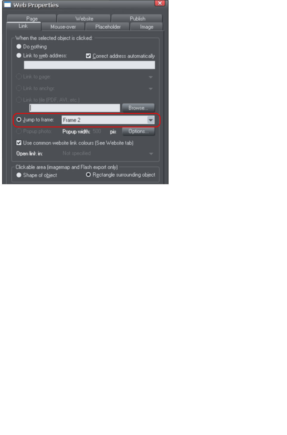
If you want the jump to occur by just moving over an object, select the Mouse-Over tab instead of the
Link tab, and select from the similar 'Jump to frame
' option.
Now in your animation if you click or mouseover the object the animation will redirect to the the new
frame and proceed from there. See the "River Thames" example file in the Designs Gallery
. This uses a Goto command to loop from frame 4 to 3, and a URL frame re-direct to jump to Frame 1 if
you click the Replay link in the corner.
"Ctrl + Shift + W" is a quick way to open the Web Properties dialog.
Page 1143
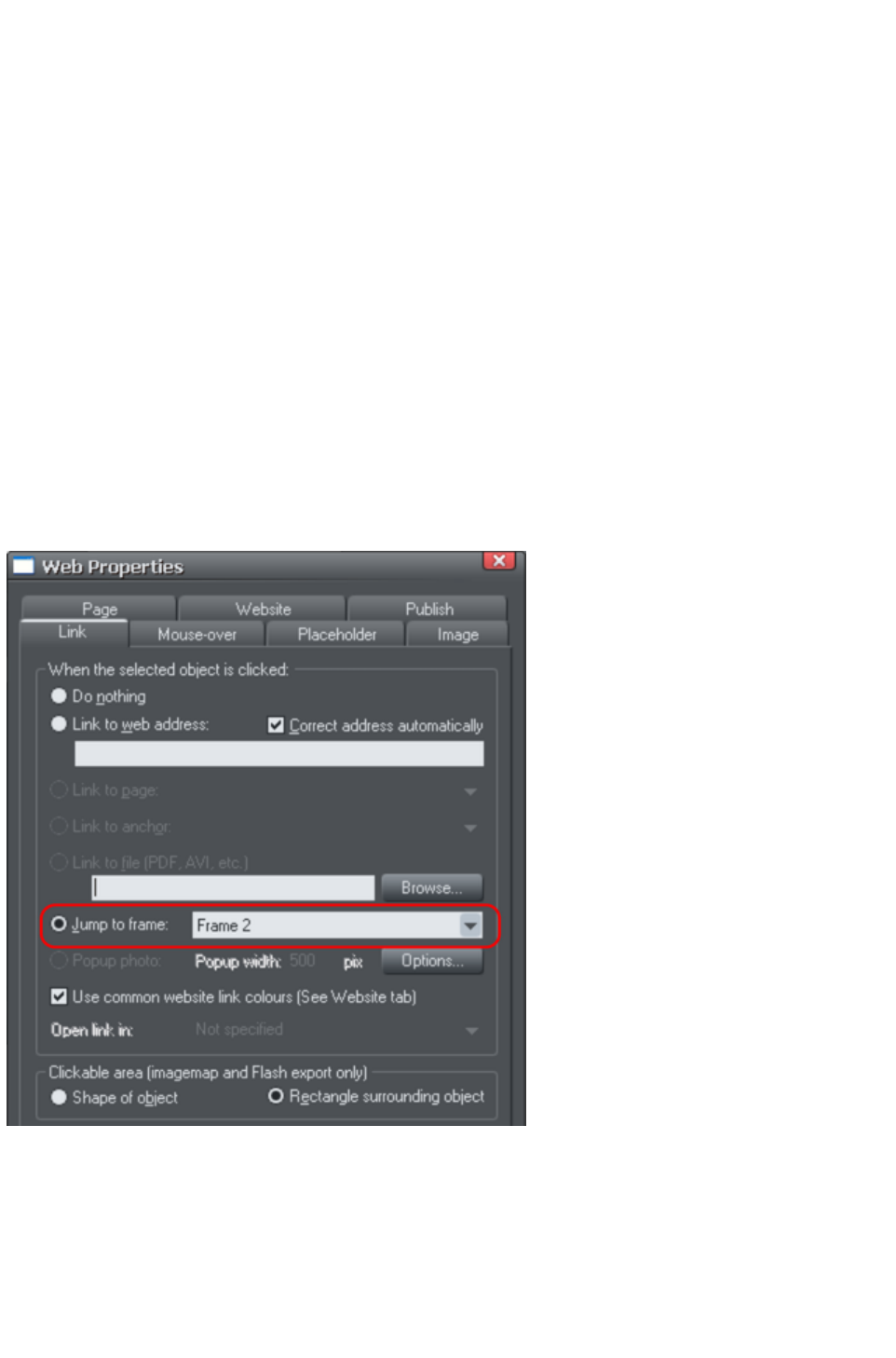
Stop and Goto Commands
You can append Stop or Goto commands onto the Frame names (separated by a semi-colon ;) to
control the sequence flow. So for example if your first frame was named "Frame 1;Goto Frame 6", then
the animation sequence would jump to Frame 6 at the start of Frame 1. This may produce tween errors,
but these can be ignored. It also waits for the specified period of the frame with the Goto command on
before jumping, but frames with Goto or Stop
commands do not tween.
Similarly a frame name with ;Stop
appended to the end of the name would stop when the animation reaches this frame. Why is this useful?
Because you can make the animation jump to any other key frame with either a click or by moving the
mouse over objects. For example you might have an animation that waits for the user to click on or move
the mouse over an object before continuing.
Clickable Buttons & Mouse-over Effects
You can make the animation sequence jump to any keyframe either by clicking on an object or just by
moving the mouse pointer over any object.
To do this select the object you want to use as the trigger, open the Web Properties dialog
(Ctrl+Shift+W) and on the Link tab, select the Jump to Frame
option.
If you want the jump to occur by just moving over an object, select the Mouse-Over tab instead of the
Link tab, and select from the similar 'Jump to frame
' option.
Now in your animation if you click or mouseover the object the animation will redirect to the the new
frame and proceed from there. See the "River Thames" example file in the Designs Gallery
. This uses a Goto command to loop from frame 4 to 3, and a URL frame re-direct to jump to Frame 1 if
you click the Replay link in the corner.
"Ctrl + Shift + W" is a quick way to open the Web Properties dialog.
Page 1144
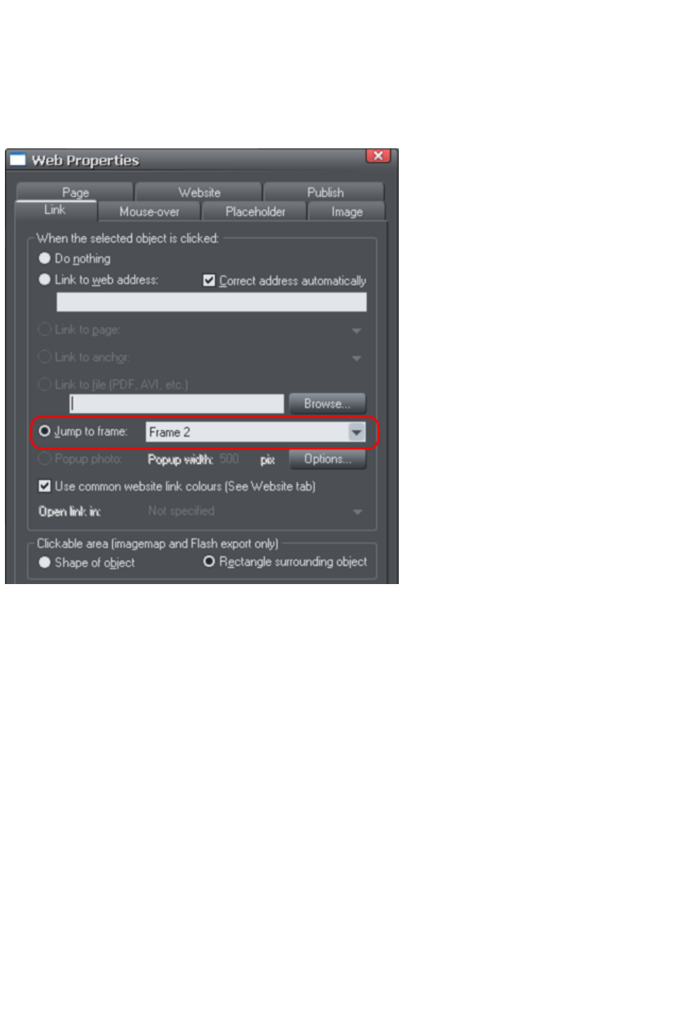
Clickable Buttons & Mouse-over Effects
You can make the animation sequence jump to any keyframe either by clicking on an object or just by
moving the mouse pointer over any object.
To do this select the object you want to use as the trigger, open the Web Properties dialog
(Ctrl+Shift+W) and on the Link tab, select the Jump to Frame
option.
If you want the jump to occur by just moving over an object, select the Mouse-Over tab instead of the
Link tab, and select from the similar 'Jump to frame
' option.
Now in your animation if you click or mouseover the object the animation will redirect to the the new
frame and proceed from there. See the "River Thames" example file in the Designs Gallery
. This uses a Goto command to loop from frame 4 to 3, and a URL frame re-direct to jump to Frame 1 if
you click the Replay link in the corner.
"Ctrl + Shift + W" is a quick way to open the Web Properties dialog.
Page 1145

Xara Web Designer 7 Premium Flash
Animation Summary
Xara Web Designer 7 Premium keyframes are "snapshots" of your animation at any point in
time. Xara Web Designer 7 Premium automatically produces a smooth blend or tween of objects
from one keyframe to the next to produce a smooth Flash animation.
There is no timeline. Instead, the Frame Gallery shows your snap shot keyframes though time
(top down). Just click the frame name to see and edit that keyframe.
If you set the Xara Web Designer 7 Premium frame display time to be 2s then it will take 2
seconds to animate objects from their position at the start of one keyframe to their positions at
the start of the next keyframe. Use the Animation Properties dialog to set frame display period.
To tell Xara Web Designer 7 Premium which objects are to be blended or tweened between one
keyframe and the next, you name the object you want to tween. For each new object you want
to animate click the Names button on the Selector Tool Infobar and give it a name (or select
the menu "Utilities" > "Names"..). The object must have exactly the same name on
subsequent frames.
When you create a new keyframe (snap shot) you usually do this by copying the current frame,
and this copies all objects to the new frame along with their names. Then just move the objects as
required.
All other (non-named) items appear static for the duration (display period) of the keyframe.
You can move, enlarge, reduce, rotate, stretch, alter the color or transparency between Xara
Web Designer 7 Premium frames. Transforming objects in this way is very efficient.
There is an overall frame rate for the whole Flash movie. The more Flash frames-per-second, the
larger the Flash file and the smoother the animation.
Because each Web Designer Premium frame is a snap shot of the full animation, all objects that
should appear at that snap shot should appear in the frame. You can't blend an object from frame
1 to frame 3 without it appearing on frame 2.
You can change shapes, text or photos as allowed by the six transform rules described earlier
(move, resize, squash/skew, rotate, flat transparency and color change). If you change the shape
in any other way it won't work.
The Flash animation is clipped to the page dimensions you have specified in Xara Web Designer
7 Premium.
Page 1146

Creating animated GIFs
Animated GIFs are an alternative way to present animated sequences in the web. An older, much
simpler technology is used, which has some advantages and some disadvantages.
An animated GIF is just a GIF file that contains a sequence of images, rather like frames in a movie.
Every Xara Web Designer 7 Premium-frame is one frame in the final animation, just like a flip-book.
The advantages:
All browsers are able to play back GIF animations out-the-box, there is no additional plug-in
necessary as with Flash animations. This results in faster loading times and higher compatibility of
your pages.
GIF animation are used as normal images, there is no additional HTML code necessary as when
embedding Flash animations.
The disadvantages:
Animated GIFs don't 'tween' between the frames. This means, the frames of your Xara Web
Designer 7 Premium-animation are translated 1:1 in resulting GIF frames. If you want to phase
smooth animations like in Flash you have to provide a lot of frames.
GIF is a Bitmap format and not a vector format like Flash. It produces far larger output files even
for simple geometric forms or text.
The maximum color depth is 256 colors.
Advanced Flash features like sequence flow (stop/goto), URL linking or acceleration are not
available.
Nevertheless and thanks to their simplicity Animated GIFs are still very popular for advertising banners
or as avatar image in forums or instant messengers.
Opening an animation document
To create an animated GIF, you must first open an animation document. To do this choose "File" > "
New" > "Animation". You will then have access to the Frame Gallery
.
Creating the animation
To create an animated GIF:
1. Choose "Utilities" > "Galleries" > "Frame Gallery", or click the Frame Gallery icon on
the Galleries toolbar.
2. Draw what you want to appear in this first frame.
3. In the Frame Gallery, click New to create the next frame.
4. Set the background and overlay flags as required.
5. Create the objects you want to appear in this frame.
6. Repeat steps 3 through 5 until you have built up the sequence of frames.
Exporting the animation
To save the animation, choose "File" > "Export Animation"
.
Page 1147

Opening an animation document
To create an animated GIF, you must first open an animation document. To do this choose "File" > "
New" > "Animation". You will then have access to the Frame Gallery
.
Creating the animation
To create an animated GIF:
1. Choose "Utilities" > "Galleries" > "Frame Gallery", or click the Frame Gallery icon on
the Galleries toolbar.
2. Draw what you want to appear in this first frame.
3. In the Frame Gallery, click New to create the next frame.
4. Set the background and overlay flags as required.
5. Create the objects you want to appear in this frame.
6. Repeat steps 3 through 5 until you have built up the sequence of frames.
Exporting the animation
To save the animation, choose "File" > "Export Animation"
.
Page 1148

Creating the animation
To create an animated GIF:
1. Choose "Utilities" > "Galleries" > "Frame Gallery", or click the Frame Gallery icon on
the Galleries toolbar.
2. Draw what you want to appear in this first frame.
3. In the Frame Gallery, click New to create the next frame.
4. Set the background and overlay flags as required.
5. Create the objects you want to appear in this frame.
6. Repeat steps 3 through 5 until you have built up the sequence of frames.
Exporting the animation
To save the animation, choose "File" > "Export Animation"
.
Page 1149

Exporting the animation
To save the animation, choose "File" > "Export Animation"
.
Page 1150
Animation properties
To alter the animation's properties, right click on a frame in the Frame Gallery and select Properties
. You can then change a number of options detailed below.
The Frame tab
In the Frame
tab you can set:
Name: The name of this frame. This is just as a reminder to you, and is not exported with the
animated GIF.
Background: If this is set, the frame covers all previous frames. This is useful if you want to
create a background and then build up an animation on top of this background. Often the first
frame in the animation is a background frame. If the first frame is not a background frame, the
animated GIF uses the page background as its background.
Overlay: If this is set, then the frame overlays the previous frame.
Local Delay: Set how long the frame is displayed for in the animation.
Show Frame: When checked, the frame will be shown in the animation.
Flash Options
Here are several options for Flash animations, most of them are described above
Link to be applied to whole animation
Flash Movie Speed
JPEG quality
Area to save
GIF Options
In the GIF Options tab you can set the color usage in GIF animations. (Not available for Flash
animations). Click Options in the Export Animation dialog to show the GIF Options
tab in the Animation Export Options dialog.
Palette colors: Set the preferred color palette for your animated GIF. The help guide contains
more information on the difference between these options.
Number of Colors in Palette: This option is available only when using optimized palettes. For
simple graphics you can reduce the number of colors in the palette. This can produce much
smaller files without losing quality. You may need to experiment to find the right balance between
file size and quality.
Dithering: You can select between three types of dithering.
Transparency: Select this to make the bitmap transparent where there are no objects.
Animation Loop and Speed
In the Animation Loop and Speed
tab you can alter the animation rate and frequency:
Loop: Lets you specify how many times the animation should repeat itself.
Display each frame for: If you want the same delay between each frame in the animation enter
a value here. To specify a different delay for individual frames, use the frame tab (described
above). This field reads "many" if the animation has more than one inter-frame delay time.
Preview in Browser
Page 1151

You can select options suitable for the graphic and then load it into your browser so you can preview it:
Background options: Alter the background of the animated GIF to see which gives the best
result.
Additional information: The preview page will contain useful information such as potential
downloading times when placed in a web page.
Browser preview: Press this button to launch a preview in your web browser.
AVI Options
Options
: Select from a range of codecs you have installed
Quality
: Set the quality value of the AVI (up to 100%)
Key frame every ...:
Enable/disable the outputting of key frames and set the frequency.
Transparency
: Select to make the AVI background transparent.
Area to save: Setting the area to save to be Drawing
will create an AVI animation that is only as large as it needs to be ? i.e. the same as the outer bounds of
the animation. This can be useful if you don't need a specific page size.
Page 1152
The Frame tab
In the Frame
tab you can set:
Name: The name of this frame. This is just as a reminder to you, and is not exported with the
animated GIF.
Background: If this is set, the frame covers all previous frames. This is useful if you want to
create a background and then build up an animation on top of this background. Often the first
frame in the animation is a background frame. If the first frame is not a background frame, the
animated GIF uses the page background as its background.
Overlay: If this is set, then the frame overlays the previous frame.
Local Delay: Set how long the frame is displayed for in the animation.
Show Frame: When checked, the frame will be shown in the animation.
Flash Options
Here are several options for Flash animations, most of them are described above
Link to be applied to whole animation
Flash Movie Speed
JPEG quality
Area to save
GIF Options
In the GIF Options tab you can set the color usage in GIF animations. (Not available for Flash
animations). Click Options in the Export Animation dialog to show the GIF Options
tab in the Animation Export Options dialog.
Palette colors: Set the preferred color palette for your animated GIF. The help guide contains
more information on the difference between these options.
Number of Colors in Palette: This option is available only when using optimized palettes. For
simple graphics you can reduce the number of colors in the palette. This can produce much
smaller files without losing quality. You may need to experiment to find the right balance between
file size and quality.
Dithering: You can select between three types of dithering.
Transparency: Select this to make the bitmap transparent where there are no objects.
Animation Loop and Speed
In the Animation Loop and Speed
tab you can alter the animation rate and frequency:
Loop: Lets you specify how many times the animation should repeat itself.
Display each frame for: If you want the same delay between each frame in the animation enter
a value here. To specify a different delay for individual frames, use the frame tab (described
above). This field reads "many" if the animation has more than one inter-frame delay time.
Preview in Browser
You can select options suitable for the graphic and then load it into your browser so you can preview it:
Background options: Alter the background of the animated GIF to see which gives the best
result.
Additional information: The preview page will contain useful information such as potential
downloading times when placed in a web page.
Page 1153

Browser preview: Press this button to launch a preview in your web browser.
AVI Options
Options
: Select from a range of codecs you have installed
Quality
: Set the quality value of the AVI (up to 100%)
Key frame every ...:
Enable/disable the outputting of key frames and set the frequency.
Transparency
: Select to make the AVI background transparent.
Area to save: Setting the area to save to be Drawing
will create an AVI animation that is only as large as it needs to be ? i.e. the same as the outer bounds of
the animation. This can be useful if you don't need a specific page size.
Page 1154

Flash Options
Here are several options for Flash animations, most of them are described above
Link to be applied to whole animation
Flash Movie Speed
JPEG quality
Area to save
GIF Options
In the GIF Options tab you can set the color usage in GIF animations. (Not available for Flash
animations). Click Options in the Export Animation dialog to show the GIF Options
tab in the Animation Export Options dialog.
Palette colors: Set the preferred color palette for your animated GIF. The help guide contains
more information on the difference between these options.
Number of Colors in Palette: This option is available only when using optimized palettes. For
simple graphics you can reduce the number of colors in the palette. This can produce much
smaller files without losing quality. You may need to experiment to find the right balance between
file size and quality.
Dithering: You can select between three types of dithering.
Transparency: Select this to make the bitmap transparent where there are no objects.
Animation Loop and Speed
In the Animation Loop and Speed
tab you can alter the animation rate and frequency:
Loop: Lets you specify how many times the animation should repeat itself.
Display each frame for: If you want the same delay between each frame in the animation enter
a value here. To specify a different delay for individual frames, use the frame tab (described
above). This field reads "many" if the animation has more than one inter-frame delay time.
Preview in Browser
You can select options suitable for the graphic and then load it into your browser so you can preview it:
Background options: Alter the background of the animated GIF to see which gives the best
result.
Additional information: The preview page will contain useful information such as potential
downloading times when placed in a web page.
Browser preview: Press this button to launch a preview in your web browser.
AVI Options
Options
: Select from a range of codecs you have installed
Quality
: Set the quality value of the AVI (up to 100%)
Key frame every ...:
Enable/disable the outputting of key frames and set the frequency.
Transparency
: Select to make the AVI background transparent.
Area to save: Setting the area to save to be Drawing
will create an AVI animation that is only as large as it needs to be ? i.e. the same as the outer bounds of
Page 1155

the animation. This can be useful if you don't need a specific page size.
Page 1156

GIF Options
In the GIF Options tab you can set the color usage in GIF animations. (Not available for Flash
animations). Click Options in the Export Animation dialog to show the GIF Options
tab in the Animation Export Options dialog.
Palette colors: Set the preferred color palette for your animated GIF. The help guide contains
more information on the difference between these options.
Number of Colors in Palette: This option is available only when using optimized palettes. For
simple graphics you can reduce the number of colors in the palette. This can produce much
smaller files without losing quality. You may need to experiment to find the right balance between
file size and quality.
Dithering: You can select between three types of dithering.
Transparency: Select this to make the bitmap transparent where there are no objects.
Animation Loop and Speed
In the Animation Loop and Speed
tab you can alter the animation rate and frequency:
Loop: Lets you specify how many times the animation should repeat itself.
Display each frame for: If you want the same delay between each frame in the animation enter
a value here. To specify a different delay for individual frames, use the frame tab (described
above). This field reads "many" if the animation has more than one inter-frame delay time.
Preview in Browser
You can select options suitable for the graphic and then load it into your browser so you can preview it:
Background options: Alter the background of the animated GIF to see which gives the best
result.
Additional information: The preview page will contain useful information such as potential
downloading times when placed in a web page.
Browser preview: Press this button to launch a preview in your web browser.
AVI Options
Options
: Select from a range of codecs you have installed
Quality
: Set the quality value of the AVI (up to 100%)
Key frame every ...:
Enable/disable the outputting of key frames and set the frequency.
Transparency
: Select to make the AVI background transparent.
Area to save: Setting the area to save to be Drawing
will create an AVI animation that is only as large as it needs to be ? i.e. the same as the outer bounds of
the animation. This can be useful if you don't need a specific page size.
Page 1157

Animation Loop and Speed
In the Animation Loop and Speed
tab you can alter the animation rate and frequency:
Loop: Lets you specify how many times the animation should repeat itself.
Display each frame for: If you want the same delay between each frame in the animation enter
a value here. To specify a different delay for individual frames, use the frame tab (described
above). This field reads "many" if the animation has more than one inter-frame delay time.
Preview in Browser
You can select options suitable for the graphic and then load it into your browser so you can preview it:
Background options: Alter the background of the animated GIF to see which gives the best
result.
Additional information: The preview page will contain useful information such as potential
downloading times when placed in a web page.
Browser preview: Press this button to launch a preview in your web browser.
AVI Options
Options
: Select from a range of codecs you have installed
Quality
: Set the quality value of the AVI (up to 100%)
Key frame every ...:
Enable/disable the outputting of key frames and set the frequency.
Transparency
: Select to make the AVI background transparent.
Area to save: Setting the area to save to be Drawing
will create an AVI animation that is only as large as it needs to be ? i.e. the same as the outer bounds of
the animation. This can be useful if you don't need a specific page size.
Page 1158

Preview in Browser
You can select options suitable for the graphic and then load it into your browser so you can preview it:
Background options: Alter the background of the animated GIF to see which gives the best
result.
Additional information: The preview page will contain useful information such as potential
downloading times when placed in a web page.
Browser preview: Press this button to launch a preview in your web browser.
AVI Options
Options
: Select from a range of codecs you have installed
Quality
: Set the quality value of the AVI (up to 100%)
Key frame every ...:
Enable/disable the outputting of key frames and set the frequency.
Transparency
: Select to make the AVI background transparent.
Area to save: Setting the area to save to be Drawing
will create an AVI animation that is only as large as it needs to be ? i.e. the same as the outer bounds of
the animation. This can be useful if you don't need a specific page size.
Page 1159

AVI Options
Options
: Select from a range of codecs you have installed
Quality
: Set the quality value of the AVI (up to 100%)
Key frame every ...:
Enable/disable the outputting of key frames and set the frequency.
Transparency
: Select to make the AVI background transparent.
Area to save: Setting the area to save to be Drawing
will create an AVI animation that is only as large as it needs to be ? i.e. the same as the outer bounds of
the animation. This can be useful if you don't need a specific page size.
Page 1160


Show print borders
The "Window" > "Show Print Borders"
menu shows a yellow and red line around the page (non-printing) showing the print margins and borders.
The page boundary is shown by a yellow rectangle and the printing area by a red rectangle. The printing
area is determined by the margins on the currently selected printer. Some printers let you adjust the
margins, but few let you print right up to the edge of the page.
If any objects on the page lie outside the red rectangle they are unlikely to be printed.
Page 1162
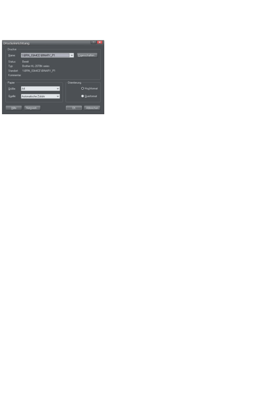
Selecting and setting up a printer
"File" > "Printer Setup" opens the standard Windows Print Setup
dialog:
Selecting a printer also selects a suitable paper size and paper orientation. Note that these are the size
and orientation of the sheets of paper used in the printer. They are separate from the size/orientation of
the document. Portrait prints the page without rotation. Landscape prints the page turned through 90°
(these buttons are duplicated in the Print options dialog box, described later). We recommend leaving
the Landscape/Portrait
buttons on this dialog box on their default setting.
Please note
: We cannot give you advice about installing or configuring printers as these are standard system
operations. In case of difficulties, contact the supplier of your printer or computer.
Properties button
This displays a dialog box letting you set options for the selected type of printer. This dialog box is not
controlled by Web Designer Premium.
Network button
If your computer is connected to a network, this lets you connect to shared printers on the network. This
dialog box is not controlled by Web Designer Premium.
Page 1163

Properties button
This displays a dialog box letting you set options for the selected type of printer. This dialog box is not
controlled by Web Designer Premium.
Network button
If your computer is connected to a network, this lets you connect to shared printers on the network. This
dialog box is not controlled by Web Designer Premium.
Page 1164

Network button
If your computer is connected to a network, this lets you connect to shared printers on the network. This
dialog box is not controlled by Web Designer Premium.
Page 1165
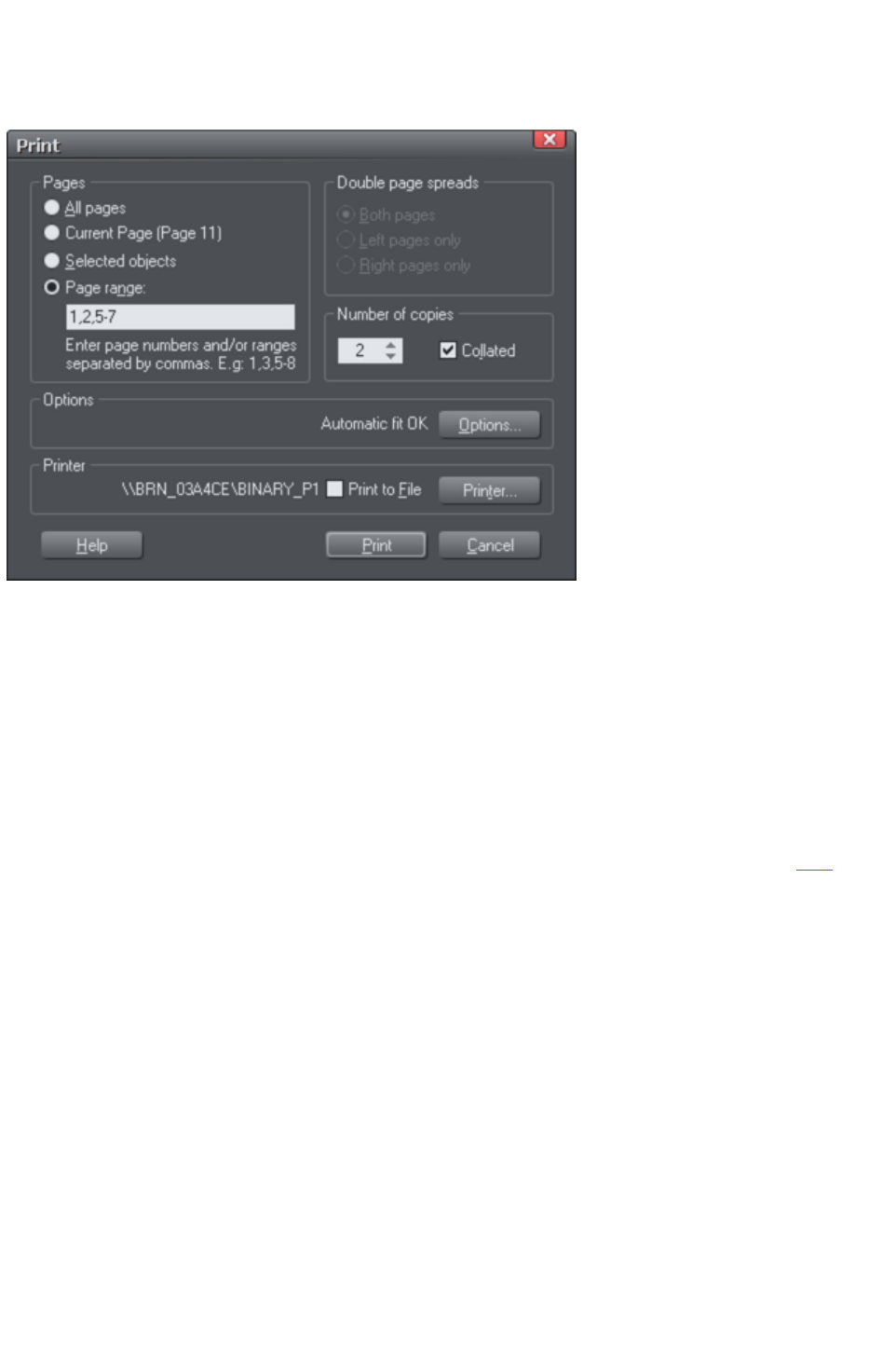
The print dialog box
Choose "File" > "Print"
("Ctrl + P").
Print button
When you have selected the required options click this to start printing.
Printer… button
This opens the "Print Setup"
dialog box (described earlier).
Options button
This opens a tabbed dialog box that lets you set additional print options. These are described later
.
Pages
All Pages:
Prints every page of the document.
Current Page(s):
Prints the currently selected page or spread.
Selected Objects:
This option is available when any objects in the document are selected. When active, only the selected
objects are printed. Note that other objects within the bounds of the selected objects are not printed ?
only the objects which are actually selected are printed.
Objects on hidden layers and the guides layer never print. See Page & Layer Gallery
for more details.
Page Range:
Allows you specific control over which pages you wish to print. You can type specific pages numbers,
separated by commas, or page ranges by typing two numbers with a hyphen in between them.
Page range examples:
Page 1166

2
will print just page 2.
1,3,5-7
will print pages 1, 3, 5, 6 and 7.
2,3,6-8,11-12
will print pages 2,3,6,7, 8,11 and 12.
The Options
section of the dialog will indicate if your page range is OK or invalid.
Print to File
You can select the Print to File
option to create a document that you can give to a printing company (if they are able to accept this type
of file).
After checking this option, when you click Print Web Designer Premium displays the standard
Windows Save
dialog box so you can specify a file name and location for the file.
Print files have a default extension of .prn.
Number of copies
Sets how many copies of the document to print.
Page 1167

Print button
When you have selected the required options click this to start printing.
Printer… button
This opens the "Print Setup"
dialog box (described earlier).
Options button
This opens a tabbed dialog box that lets you set additional print options. These are described later
.
Pages
All Pages:
Prints every page of the document.
Current Page(s):
Prints the currently selected page or spread.
Selected Objects:
This option is available when any objects in the document are selected. When active, only the selected
objects are printed. Note that other objects within the bounds of the selected objects are not printed ?
only the objects which are actually selected are printed.
Objects on hidden layers and the guides layer never print. See Page & Layer Gallery
for more details.
Page Range:
Allows you specific control over which pages you wish to print. You can type specific pages numbers,
separated by commas, or page ranges by typing two numbers with a hyphen in between them.
Page range examples:
2
will print just page 2.
1,3,5-7
will print pages 1, 3, 5, 6 and 7.
2,3,6-8,11-12
will print pages 2,3,6,7, 8,11 and 12.
The Options
section of the dialog will indicate if your page range is OK or invalid.
Print to File
You can select the Print to File
option to create a document that you can give to a printing company (if they are able to accept this type
of file).
After checking this option, when you click Print Web Designer Premium displays the standard
Windows Save
dialog box so you can specify a file name and location for the file.
Print files have a default extension of .prn.
Number of copies
Sets how many copies of the document to print.
Page 1168

Printer… button
This opens the "Print Setup"
dialog box (described earlier).
Options button
This opens a tabbed dialog box that lets you set additional print options. These are described later
.
Pages
All Pages:
Prints every page of the document.
Current Page(s):
Prints the currently selected page or spread.
Selected Objects:
This option is available when any objects in the document are selected. When active, only the selected
objects are printed. Note that other objects within the bounds of the selected objects are not printed ?
only the objects which are actually selected are printed.
Objects on hidden layers and the guides layer never print. See Page & Layer Gallery
for more details.
Page Range:
Allows you specific control over which pages you wish to print. You can type specific pages numbers,
separated by commas, or page ranges by typing two numbers with a hyphen in between them.
Page range examples:
2
will print just page 2.
1,3,5-7
will print pages 1, 3, 5, 6 and 7.
2,3,6-8,11-12
will print pages 2,3,6,7, 8,11 and 12.
The Options
section of the dialog will indicate if your page range is OK or invalid.
Print to File
You can select the Print to File
option to create a document that you can give to a printing company (if they are able to accept this type
of file).
After checking this option, when you click Print Web Designer Premium displays the standard
Windows Save
dialog box so you can specify a file name and location for the file.
Print files have a default extension of .prn.
Number of copies
Sets how many copies of the document to print.
Page 1169

Options button
This opens a tabbed dialog box that lets you set additional print options. These are described later
.
Pages
All Pages:
Prints every page of the document.
Current Page(s):
Prints the currently selected page or spread.
Selected Objects:
This option is available when any objects in the document are selected. When active, only the selected
objects are printed. Note that other objects within the bounds of the selected objects are not printed ?
only the objects which are actually selected are printed.
Objects on hidden layers and the guides layer never print. See Page & Layer Gallery
for more details.
Page Range:
Allows you specific control over which pages you wish to print. You can type specific pages numbers,
separated by commas, or page ranges by typing two numbers with a hyphen in between them.
Page range examples:
2
will print just page 2.
1,3,5-7
will print pages 1, 3, 5, 6 and 7.
2,3,6-8,11-12
will print pages 2,3,6,7, 8,11 and 12.
The Options
section of the dialog will indicate if your page range is OK or invalid.
Print to File
You can select the Print to File
option to create a document that you can give to a printing company (if they are able to accept this type
of file).
After checking this option, when you click Print Web Designer Premium displays the standard
Windows Save
dialog box so you can specify a file name and location for the file.
Print files have a default extension of .prn.
Number of copies
Sets how many copies of the document to print.
Page 1170

Pages
All Pages:
Prints every page of the document.
Current Page(s):
Prints the currently selected page or spread.
Selected Objects:
This option is available when any objects in the document are selected. When active, only the selected
objects are printed. Note that other objects within the bounds of the selected objects are not printed ?
only the objects which are actually selected are printed.
Objects on hidden layers and the guides layer never print. See Page & Layer Gallery
for more details.
Page Range:
Allows you specific control over which pages you wish to print. You can type specific pages numbers,
separated by commas, or page ranges by typing two numbers with a hyphen in between them.
Page range examples:
2
will print just page 2.
1,3,5-7
will print pages 1, 3, 5, 6 and 7.
2,3,6-8,11-12
will print pages 2,3,6,7, 8,11 and 12.
The Options
section of the dialog will indicate if your page range is OK or invalid.
Print to File
You can select the Print to File
option to create a document that you can give to a printing company (if they are able to accept this type
of file).
After checking this option, when you click Print Web Designer Premium displays the standard
Windows Save
dialog box so you can specify a file name and location for the file.
Print files have a default extension of .prn.
Number of copies
Sets how many copies of the document to print.
Page 1171

Print to File
You can select the Print to File
option to create a document that you can give to a printing company (if they are able to accept this type
of file).
After checking this option, when you click Print Web Designer Premium displays the standard
Windows Save
dialog box so you can specify a file name and location for the file.
Print files have a default extension of .prn.
Number of copies
Sets how many copies of the document to print.
Page 1172

Number of copies
Sets how many copies of the document to print.
Page 1173
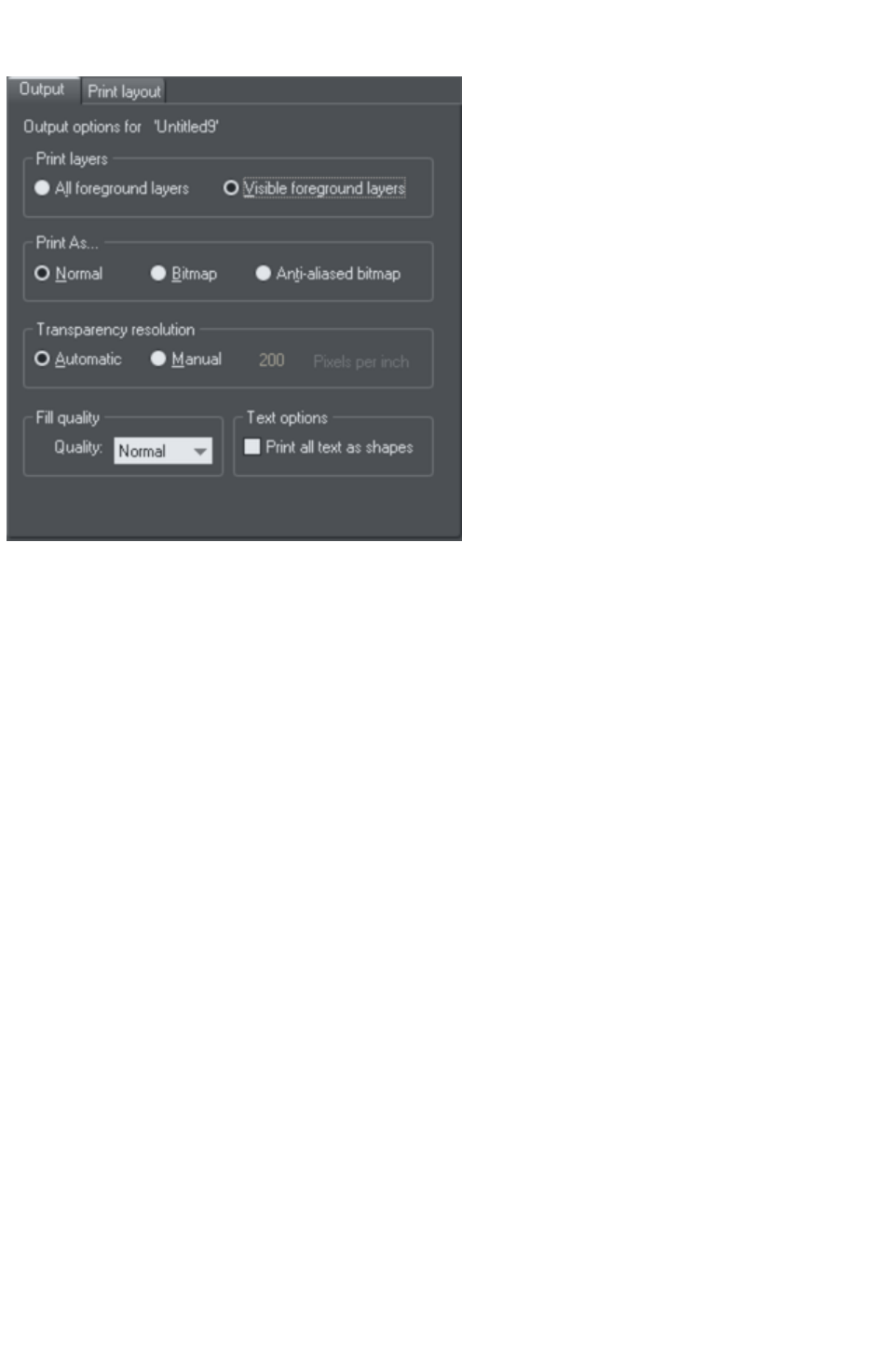
Print Options: Output tab
Print layers
There are two options:
Print All Foreground Layers.
Print only the currently Visible Foreground Layers.
Note that only foreground layers are printed. Background layers are never printed.
Print As
Normal
is suitable for most types of document.
However some printers do not reproduce consistent colors when printing bitmaps or vector objects that
are the same color (this is a fault with the printer driver). This is noticeable if objects overlap onto
bitmaps or onto objects with transparency applied to them. In this case, select Bitmap or Anti-Aliased
Bitmap
and retry.
The choice between Bitmap and Anti-Aliased Bitmap
depends on the printer and personal preference. Some printers give best results with anti-aliasing turned
off especially when printing thin lines. As a rule, using anti-aliasing allows lower resolution printing. For
example, 150 DPI bitmap printing is usually good enough for all uses-even typesetting. Without
anti-aliasing, higher resolutions may be needed which gives much slower printing.
Transparency resolution
When printing, Xara Web Designer 7 Premium's transparency effects are created using bitmaps.
This option controls the resolution of those bitmaps when sent to the printer. Automatic is suitable for
most drawings, and means Xara Web Designer 7 Premium automatically selects a resolution suitable for
the current printer. This might be unsuitable if printing to a very high resolution printer such as image
setting devices. In this case you may wish to control the print resolution manually by entering the desired
value.
Note that modern printers often claim to be able to print at over 1000 dots-per-inch, but this is not the
Page 1174

same thing as "pixels-per-inch", which is what you see on screen. Generally, it's never necessary to print
at more than 600 pixels-per-inch, and typically 300 pixels per inch produces perfectly adequate print
results, especially if anti-aliased.
Fill quality
Using this option, you can choose how many steps make up the graduated fills in your document when it
is printed. The Normal
setting is suitable for most purposes. This option is dimmed for PostScript printers.
Text options
If your printer has problems reproducing fonts, select the Print All Text as Shapes
option. All text is then converted to vector shapes before the document is sent to the printer. This may
be slower, but will reproduce exactly what you see on screen.
Page 1175

Print layers
There are two options:
Print All Foreground Layers.
Print only the currently Visible Foreground Layers.
Note that only foreground layers are printed. Background layers are never printed.
Print As
Normal
is suitable for most types of document.
However some printers do not reproduce consistent colors when printing bitmaps or vector objects that
are the same color (this is a fault with the printer driver). This is noticeable if objects overlap onto
bitmaps or onto objects with transparency applied to them. In this case, select Bitmap or Anti-Aliased
Bitmap
and retry.
The choice between Bitmap and Anti-Aliased Bitmap
depends on the printer and personal preference. Some printers give best results with anti-aliasing turned
off especially when printing thin lines. As a rule, using anti-aliasing allows lower resolution printing. For
example, 150 DPI bitmap printing is usually good enough for all uses-even typesetting. Without
anti-aliasing, higher resolutions may be needed which gives much slower printing.
Transparency resolution
When printing, Xara Web Designer 7 Premium's transparency effects are created using bitmaps.
This option controls the resolution of those bitmaps when sent to the printer. Automatic is suitable for
most drawings, and means Xara Web Designer 7 Premium automatically selects a resolution suitable for
the current printer. This might be unsuitable if printing to a very high resolution printer such as image
setting devices. In this case you may wish to control the print resolution manually by entering the desired
value.
Note that modern printers often claim to be able to print at over 1000 dots-per-inch, but this is not the
same thing as "pixels-per-inch", which is what you see on screen. Generally, it's never necessary to print
at more than 600 pixels-per-inch, and typically 300 pixels per inch produces perfectly adequate print
results, especially if anti-aliased.
Fill quality
Using this option, you can choose how many steps make up the graduated fills in your document when it
is printed. The Normal
setting is suitable for most purposes. This option is dimmed for PostScript printers.
Text options
If your printer has problems reproducing fonts, select the Print All Text as Shapes
option. All text is then converted to vector shapes before the document is sent to the printer. This may
be slower, but will reproduce exactly what you see on screen.
Page 1176

Print As
Normal
is suitable for most types of document.
However some printers do not reproduce consistent colors when printing bitmaps or vector objects that
are the same color (this is a fault with the printer driver). This is noticeable if objects overlap onto
bitmaps or onto objects with transparency applied to them. In this case, select Bitmap or Anti-Aliased
Bitmap
and retry.
The choice between Bitmap and Anti-Aliased Bitmap
depends on the printer and personal preference. Some printers give best results with anti-aliasing turned
off especially when printing thin lines. As a rule, using anti-aliasing allows lower resolution printing. For
example, 150 DPI bitmap printing is usually good enough for all uses-even typesetting. Without
anti-aliasing, higher resolutions may be needed which gives much slower printing.
Transparency resolution
When printing, Xara Web Designer 7 Premium's transparency effects are created using bitmaps.
This option controls the resolution of those bitmaps when sent to the printer. Automatic is suitable for
most drawings, and means Xara Web Designer 7 Premium automatically selects a resolution suitable for
the current printer. This might be unsuitable if printing to a very high resolution printer such as image
setting devices. In this case you may wish to control the print resolution manually by entering the desired
value.
Note that modern printers often claim to be able to print at over 1000 dots-per-inch, but this is not the
same thing as "pixels-per-inch", which is what you see on screen. Generally, it's never necessary to print
at more than 600 pixels-per-inch, and typically 300 pixels per inch produces perfectly adequate print
results, especially if anti-aliased.
Fill quality
Using this option, you can choose how many steps make up the graduated fills in your document when it
is printed. The Normal
setting is suitable for most purposes. This option is dimmed for PostScript printers.
Text options
If your printer has problems reproducing fonts, select the Print All Text as Shapes
option. All text is then converted to vector shapes before the document is sent to the printer. This may
be slower, but will reproduce exactly what you see on screen.
Page 1177

Transparency resolution
When printing, Xara Web Designer 7 Premium's transparency effects are created using bitmaps.
This option controls the resolution of those bitmaps when sent to the printer. Automatic is suitable for
most drawings, and means Xara Web Designer 7 Premium automatically selects a resolution suitable for
the current printer. This might be unsuitable if printing to a very high resolution printer such as image
setting devices. In this case you may wish to control the print resolution manually by entering the desired
value.
Note that modern printers often claim to be able to print at over 1000 dots-per-inch, but this is not the
same thing as "pixels-per-inch", which is what you see on screen. Generally, it's never necessary to print
at more than 600 pixels-per-inch, and typically 300 pixels per inch produces perfectly adequate print
results, especially if anti-aliased.
Fill quality
Using this option, you can choose how many steps make up the graduated fills in your document when it
is printed. The Normal
setting is suitable for most purposes. This option is dimmed for PostScript printers.
Text options
If your printer has problems reproducing fonts, select the Print All Text as Shapes
option. All text is then converted to vector shapes before the document is sent to the printer. This may
be slower, but will reproduce exactly what you see on screen.
Page 1178

Fill quality
Using this option, you can choose how many steps make up the graduated fills in your document when it
is printed. The Normal
setting is suitable for most purposes. This option is dimmed for PostScript printers.
Text options
If your printer has problems reproducing fonts, select the Print All Text as Shapes
option. All text is then converted to vector shapes before the document is sent to the printer. This may
be slower, but will reproduce exactly what you see on screen.
Page 1179

Text options
If your printer has problems reproducing fonts, select the Print All Text as Shapes
option. All text is then converted to vector shapes before the document is sent to the printer. This may
be slower, but will reproduce exactly what you see on screen.
Page 1180
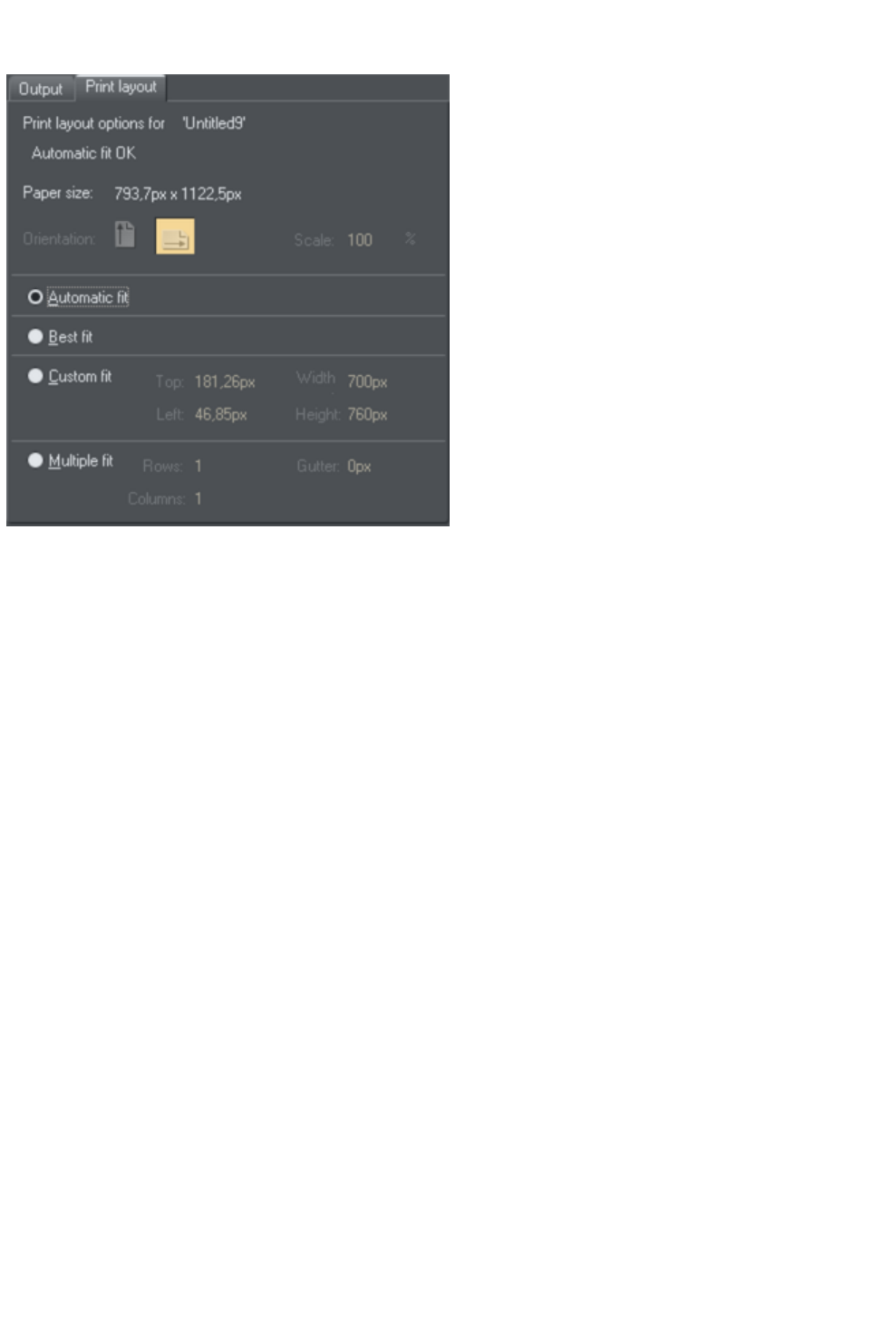
Print Options: Print Layout tab
Most options in print layout are dimmed if you have Best Fit or Automatic Fit
selected. We recommend using these options as they are the easiest way to print.
However you can choose custom options (see "custom fit" below).
Best fit
Your design will be moved to the center of the page and it will be expanded or shrunk to suit the paper
size.
This option is best if you have a large or small design and want it to fit on one page.
Automatic fit
Your design will be orientated as necessary, but Web Designer Premium will not change the size. We
recommend this option if you are having any difficulty getting the orientation right (there are at least four
places where you can set the page orientation, sometimes more for some printer drivers).
This option is best if you have a set size for your design and don't want it altered.
Custom fit
Allows you to have control over your print out, including orientation, size and margins.
The Orientation buttons can be used to choose the orientation of the printout. The scale can be altered
using the Scale
field. The top and left margin fields can be changed (these set where the top left-hand corner of the page
appears on the printer's paper).
The Width and Height
fields give you an alternative way of setting the print scale (when you change one of these settings, the
other changes to ensure the page is always printed with a 100% aspect ratio).
Multiple fit
To print multiple copies on one page, choose Multiple Fit
, enter a value for the number of copies needed across the page (rows), the number down the page
(columns), and the distance between each (gutter).
Page 1181

Best fit
Your design will be moved to the center of the page and it will be expanded or shrunk to suit the paper
size.
This option is best if you have a large or small design and want it to fit on one page.
Automatic fit
Your design will be orientated as necessary, but Web Designer Premium will not change the size. We
recommend this option if you are having any difficulty getting the orientation right (there are at least four
places where you can set the page orientation, sometimes more for some printer drivers).
This option is best if you have a set size for your design and don't want it altered.
Custom fit
Allows you to have control over your print out, including orientation, size and margins.
The Orientation buttons can be used to choose the orientation of the printout. The scale can be altered
using the Scale
field. The top and left margin fields can be changed (these set where the top left-hand corner of the page
appears on the printer's paper).
The Width and Height
fields give you an alternative way of setting the print scale (when you change one of these settings, the
other changes to ensure the page is always printed with a 100% aspect ratio).
Multiple fit
To print multiple copies on one page, choose Multiple Fit
, enter a value for the number of copies needed across the page (rows), the number down the page
(columns), and the distance between each (gutter).
Page 1182

Automatic fit
Your design will be orientated as necessary, but Web Designer Premium will not change the size. We
recommend this option if you are having any difficulty getting the orientation right (there are at least four
places where you can set the page orientation, sometimes more for some printer drivers).
This option is best if you have a set size for your design and don't want it altered.
Custom fit
Allows you to have control over your print out, including orientation, size and margins.
The Orientation buttons can be used to choose the orientation of the printout. The scale can be altered
using the Scale
field. The top and left margin fields can be changed (these set where the top left-hand corner of the page
appears on the printer's paper).
The Width and Height
fields give you an alternative way of setting the print scale (when you change one of these settings, the
other changes to ensure the page is always printed with a 100% aspect ratio).
Multiple fit
To print multiple copies on one page, choose Multiple Fit
, enter a value for the number of copies needed across the page (rows), the number down the page
(columns), and the distance between each (gutter).
Page 1183

Custom fit
Allows you to have control over your print out, including orientation, size and margins.
The Orientation buttons can be used to choose the orientation of the printout. The scale can be altered
using the Scale
field. The top and left margin fields can be changed (these set where the top left-hand corner of the page
appears on the printer's paper).
The Width and Height
fields give you an alternative way of setting the print scale (when you change one of these settings, the
other changes to ensure the page is always printed with a 100% aspect ratio).
Multiple fit
To print multiple copies on one page, choose Multiple Fit
, enter a value for the number of copies needed across the page (rows), the number down the page
(columns), and the distance between each (gutter).
Page 1184

Multiple fit
To print multiple copies on one page, choose Multiple Fit
, enter a value for the number of copies needed across the page (rows), the number down the page
(columns), and the distance between each (gutter).
Page 1185


General notes on exporting and importing
Web Designer Premium offers a wide range of import and export options.
Firstly, it is important to note the distinction between saving and exporting files:
Saving deals with storing your work so that you can open it and work on it at a later date. Xara
Web Designer 7 Premium saves your work in the .web file format. Think of this as the "master
document" format.
Exporting deals with converting to other supported formats. Exporting allows you to use and
distribute your designs.
Recommended formats
The universal export formats, that can be read by the widest range of programs and used on the web are
the bitmap formats, GIF, PNG and JPEG. These are also guaranteed to look exactly as you see on
screen in Xara Web Designer 7 Premium. PNG is recommended for web graphics and JPEG for
photos.
Page 1187

Import and Export Supported File Formats
You can change the order of supported import and export file formats in the File > Export and File >
Import
dialogs by editing the FileFormats.xml file found in the program folder where you installed Web Designer
Premium.
Import formats
It is important that you use the three letter file extensions listed below when you load files into Xara Web
Designer 7 Premium.
Bitmap Import Formats
.BMP Windows Bitmap
.CUT Halo CUT (256 color)
.DCM Digital Imaging and Communications in Medicine (DICOM) image format
.DCX DCX
.FAX Fax image from a fax received or created with fax software
.GIF Graphics Interchange Format
.ICO Microsoft Windows Icon (16 color)
.JPG JPEG
.MXB MAGIX Bitmap
.PBM UNIX monochrome
.PCD PhotoCD
.PCT PICT
.PCX PCX Paintbrush
.PDF (see importing a PDF file)
.PGM UNIX grayscale
.PNG PNG
.PPM UNIX color (up to 24 bit)
.PSD Photoshop (see importing and exporting PSD files
)
.RAS Sun Raster
.SGI Silicon Graphics Image
.TGA TrueVision TARGA
.TIF TIFF (RGB, RGBA with alpha-channel transparency & CMYK).
Xara Web Designer 7 Premium supports: fax TIFF files (black and white images. Multi-page faxes will
be imported as multiple pages); Mac or PC byte order TIFF files; TIFF with layers and transparency (if
saved from Photoshop the rules for blend mode compatibility are the same as for PSD files); JPEG in
TIFF (transparency is not possible in this case).
.XBM X Windows (2 color)
.XPM X Windows (256 color)
.WBMP Wireless Bitmap Image. Black and white (1-bit) bitmap image format used by mobile devices.
.RAW camera import formats (see RAW photo import
for a list of supported file types).
EPS Import Formats
.AI Illustrator EPS
.EPS ArtWorks
.EPS Illustrator EPS
.EPS CorelDRAW 3 & 4 EPS
.EPS FreeHand 3.0 EPS
Page 1188
.EPS Photoshop EPS (For importing data from Photoshop into Xara Web Designer 7 Premium, use
PSD files instead of EPS files for best results).
.EPS Xara
Other Import Formats
.ACO Adobe Color Swatch
.ACT Adobe Color Table
.ART Xara Studio
.CPL CorelDRAW palette
.WEB Xara Webster files
.AFF Acorn Draw
.CDR CorelDRAW (3,4 & 5)
.CDT CorelDRAW Template
.CMX Corel CMX 5 & 6
.DRW Acorn Draw
.GIF GIF Placeholder
.HTM. .HTML Graphics on HTML pages
.PAI MAGIX Photo Clinic Image
.PAL CorelDRAW, Windows and PaintShopPro palettes
.MXB MAGIX Bitmap
.WMF Windows Metafile (16bit)
.EMF/ .WMF Enhanced Windows Metafile
.FLV FLV Placeholder
.MP4 MP4 Placeholder
.PAI MAGIX Photo Clinic Image
.PDF PDF Placeholder
.RTF Text
.SWF Flash Placeholder
.XWR Widget Placeholder
.WIX For internal use by Xara
Export formats
Bitmap Export Formats (see GIF, PNG and JPEG export dialog overview
)
.GIF CompuServe GIF
.GIF Animated GIF files (see Creating animated GIF files
)
.JPG JPEG
.PSD Photoshop (see importing and exporting PSD files
)
.PNG PNG
Other Export Formats
.AVI AVI animation (animation documents)
.EMF, .WMF EMF/WMF documents
.HTM, .HTML (Web pages and websites)
.SWF Flash (see Flash Animations
)
.RTF Rich Text Format
.WIX, .WEB, .XAR Xara documents
Page 1189

Import formats
It is important that you use the three letter file extensions listed below when you load files into Xara Web
Designer 7 Premium.
Bitmap Import Formats
.BMP Windows Bitmap
.CUT Halo CUT (256 color)
.DCM Digital Imaging and Communications in Medicine (DICOM) image format
.DCX DCX
.FAX Fax image from a fax received or created with fax software
.GIF Graphics Interchange Format
.ICO Microsoft Windows Icon (16 color)
.JPG JPEG
.MXB MAGIX Bitmap
.PBM UNIX monochrome
.PCD PhotoCD
.PCT PICT
.PCX PCX Paintbrush
.PDF (see importing a PDF file)
.PGM UNIX grayscale
.PNG PNG
.PPM UNIX color (up to 24 bit)
.PSD Photoshop (see importing and exporting PSD files
)
.RAS Sun Raster
.SGI Silicon Graphics Image
.TGA TrueVision TARGA
.TIF TIFF (RGB, RGBA with alpha-channel transparency & CMYK).
Xara Web Designer 7 Premium supports: fax TIFF files (black and white images. Multi-page faxes will
be imported as multiple pages); Mac or PC byte order TIFF files; TIFF with layers and transparency (if
saved from Photoshop the rules for blend mode compatibility are the same as for PSD files); JPEG in
TIFF (transparency is not possible in this case).
.XBM X Windows (2 color)
.XPM X Windows (256 color)
.WBMP Wireless Bitmap Image. Black and white (1-bit) bitmap image format used by mobile devices.
.RAW camera import formats (see RAW photo import
for a list of supported file types).
EPS Import Formats
.AI Illustrator EPS
.EPS ArtWorks
.EPS Illustrator EPS
.EPS CorelDRAW 3 & 4 EPS
.EPS FreeHand 3.0 EPS
.EPS Photoshop EPS (For importing data from Photoshop into Xara Web Designer 7 Premium, use
PSD files instead of EPS files for best results).
.EPS Xara
Other Import Formats
.ACO Adobe Color Swatch
.ACT Adobe Color Table
.ART Xara Studio
Page 1190
.CPL CorelDRAW palette
.WEB Xara Webster files
.AFF Acorn Draw
.CDR CorelDRAW (3,4 & 5)
.CDT CorelDRAW Template
.CMX Corel CMX 5 & 6
.DRW Acorn Draw
.GIF GIF Placeholder
.HTM. .HTML Graphics on HTML pages
.PAI MAGIX Photo Clinic Image
.PAL CorelDRAW, Windows and PaintShopPro palettes
.MXB MAGIX Bitmap
.WMF Windows Metafile (16bit)
.EMF/ .WMF Enhanced Windows Metafile
.FLV FLV Placeholder
.MP4 MP4 Placeholder
.PAI MAGIX Photo Clinic Image
.PDF PDF Placeholder
.RTF Text
.SWF Flash Placeholder
.XWR Widget Placeholder
.WIX For internal use by Xara
Export formats
Bitmap Export Formats (see GIF, PNG and JPEG export dialog overview
)
.GIF CompuServe GIF
.GIF Animated GIF files (see Creating animated GIF files
)
.JPG JPEG
.PSD Photoshop (see importing and exporting PSD files
)
.PNG PNG
Other Export Formats
.AVI AVI animation (animation documents)
.EMF, .WMF EMF/WMF documents
.HTM, .HTML (Web pages and websites)
.SWF Flash (see Flash Animations
)
.RTF Rich Text Format
.WIX, .WEB, .XAR Xara documents
Page 1191

Export formats
Bitmap Export Formats (see GIF, PNG and JPEG export dialog overview
)
.GIF CompuServe GIF
.GIF Animated GIF files (see Creating animated GIF files
)
.JPG JPEG
.PSD Photoshop (see importing and exporting PSD files
)
.PNG PNG
Other Export Formats
.AVI AVI animation (animation documents)
.EMF, .WMF EMF/WMF documents
.HTM, .HTML (Web pages and websites)
.SWF Flash (see Flash Animations
)
.RTF Rich Text Format
.WIX, .WEB, .XAR Xara documents
Page 1192

Importing files
To import a file:
Select "File" > "Import" - This normally merges the file's contents into the existing document.
With some formats you get the choice of importing the document into the current page or adding
it as a new page. With some other formats you are given the option of either importing the file
data conventionally, or adding a link to the file and including it in your published website.
Or select "File" > "Open" - This opens the file as a new document.
Xara Web Designer 7 Premium supports drag and drop import of files. If you drag a file from your File
Explorer onto an open Xara Web Designer 7 Premium document it will import the file and place it on the
current page, centered on the drop point. Or drag & drop a suitable file from Windows Explorer onto
any bar or the title bar of Web Designer Premium's window - it will open the file as a new document.
Replacing Image Files
You can replace any loaded image or image-filled shape with your own images. To replace an image
simply drag your own file (JPEG, GIF, PNG, BMP) from your Windows File Explorer and drop it on
top of the picture that you want to replace. Your photo will automatically be scaled appropriately to
replace the existing photo. The new photo will be selected and you'll be put into the Fill Tool
so that you can easily adjust the position and scale of your photo if desired. You can also replace
multiple images using multiple image files with some web templates, in one operation.
See the "Replacing photos" section of the Photo Handling chapter for more details.
Importing a Photoshop PSD file
To import a PSD file, import the file as normal with File > Import, or just drag and drop the .psd file into
Xara Web Designer 7 Premium.
The layers in the PSD file, and the layer visibility setting will be preserved and will become Xara Web
Designer 7 Premium layers. You can view them by opening the Page & Layer Gallery
.
Tip
: if you have separate objects in Photoshop that you wish to be able to move and change independently
of one another in Xara Web Designer 7 Premium, place them on separate layers in Photoshop before
exporting.
Page 1193

Replacing Image Files
You can replace any loaded image or image-filled shape with your own images. To replace an image
simply drag your own file (JPEG, GIF, PNG, BMP) from your Windows File Explorer and drop it on
top of the picture that you want to replace. Your photo will automatically be scaled appropriately to
replace the existing photo. The new photo will be selected and you'll be put into the Fill Tool
so that you can easily adjust the position and scale of your photo if desired. You can also replace
multiple images using multiple image files with some web templates, in one operation.
See the "Replacing photos" section of the Photo Handling chapter for more details.
Importing a Photoshop PSD file
To import a PSD file, import the file as normal with File > Import, or just drag and drop the .psd file into
Xara Web Designer 7 Premium.
The layers in the PSD file, and the layer visibility setting will be preserved and will become Xara Web
Designer 7 Premium layers. You can view them by opening the Page & Layer Gallery
.
Tip
: if you have separate objects in Photoshop that you wish to be able to move and change independently
of one another in Xara Web Designer 7 Premium, place them on separate layers in Photoshop before
exporting.
Page 1194

Importing a Photoshop PSD file
To import a PSD file, import the file as normal with File > Import, or just drag and drop the .psd file into
Xara Web Designer 7 Premium.
The layers in the PSD file, and the layer visibility setting will be preserved and will become Xara Web
Designer 7 Premium layers. You can view them by opening the Page & Layer Gallery
.
Tip
: if you have separate objects in Photoshop that you wish to be able to move and change independently
of one another in Xara Web Designer 7 Premium, place them on separate layers in Photoshop before
exporting.
Page 1195

PDF Import
PDF is a complex vector graphics format that has evolved over 10 years or more and contains
numerous sub-formats and options. PDF was designed as a portable document format for viewing and
printing only, and was not intended as a file format for transferring data between applications. However
Xara Web Designer 7 Premium should load the vast majority of PDF files.
PDF is now the recommended way of transferring vector files from Adobe Illustrator to Xara Web
Designer 7 Premium. Save as PDF and then import the resulting file into Xara Web Designer 7
Premium.
The following points are worth noting:
Multi-page PDF files are imported as multi-page documents in Xara Web Designer 7 Premium.
Text in PDF files is typically broken into many separate small text objects in the PDF file. This
doesn't stop it viewing and printing, but means when imported what might appear as one or more
continuous paragraphs of text is not. Xara Web Designer 7 Premium tries to re-assemble the
lines of text into lines and paragraphs of editable text, but often you will find the text broken into
separate text objects.
In order to make it easier to extract just the text of a PDF file, a new layer is created containing
just the text on that PDF page. Use the Page & Layer Gallery to view this layer.
What might not work:
Many PDF files include embedded fonts. It's not possible to legally extract and install these fonts
onto your system. So if you do not already have the fonts used in the PDF file you will find
alternative fonts have been substituted.
Files that are encrypted or password protected cannot be imported.
Any text in PDF files that use embedded subset fonts will not be readable or editable.
PDF is a highly complex format, and often can't be imported perfectly. The best way to import it may
depend on how you intend to use it. The "Optimise for viewing" option attempts to make the imported
result look as similar to Acrobat as possible, but it may be more difficult to edit (it could have many
nested clipviews for example). The alternative "Optimise for editing
" option strips out some constructs which are difficult to manually edit (for example, nested clipviews).
RAW photo import
You can import RAW digital camera files, either by using the Import menu option or just drag & drop
the file onto the Web Designer Premium window.
Supported file extensions include: *.crw, *.cr2, *.rw2, *.nef,*.mrw,*raf,*.kdc,*.orf, *.dng, *.ptx,
*.pef, *.anw, *.x3f
However there are many different extensions used for RAW files by different camera manufacturers, so if
you have a RAW file with a file extension not listed above it's worth trying to import it anyway.
Page 1196

RAW photo import
You can import RAW digital camera files, either by using the Import menu option or just drag & drop
the file onto the Web Designer Premium window.
Supported file extensions include: *.crw, *.cr2, *.rw2, *.nef,*.mrw,*raf,*.kdc,*.orf, *.dng, *.ptx,
*.pef, *.anw, *.x3f
However there are many different extensions used for RAW files by different camera manufacturers, so if
you have a RAW file with a file extension not listed above it's worth trying to import it anyway.
Page 1197

Importing images from a website
You can import graphics directly from web pages on the Internet into your document. Notice the
difference between this menu option, which loads all the graphics from a web page, and Import, which
loads a single graphic from disk.
To import from a web page:
1. Choose "File" > "Import graphics from web" (or "Ctrl + Alt + W").
2. Type in the web address (URL) of the page or graphic you want to import. If the URL is a page,
all the images on that page will be imported.
3. Click Import.
Page 1198

Exporting files
To export a file:
Right click and choose Export
Or select "File" > "Export".
Or press "Ctrl + Shift + E".
An Export dialog box will appear. Choose a name for your file, and select the required format from the
Save As Type
dropdown list. Some of the supported formats are detailed below.
Exporting as Flash
You can export a drawing to Adobe's SWF Flash format (static). This is best suited to vector designs,
and can provide very small file sizes. You can then use the SWF in a website, or import it into Flash for
use in Flash animations.
You can also create animated Flash. See Flash Animations
for more details on Flash export.
Exporting as AVI
Select File > Export animation and choose the AVI type from the type list. Click the Options
button on the file dialog to change the codec and other settings used for the export.
Exporting as Windows metafiles (.wmf)
Files in this format can be read by Word and several other programs.
Exporting as Extended Metafile Format (EMF)
Modern Windows applications support this enhanced type of vector graphic format. This format is also
available to applications that provide a Paste Special menu option.
Note that Xara Web Designer 7 Premium can contain features, such as advanced fill styles, that cannot
be represented in vector formats such as EMF. In this case parts of the image will be exported as
bitmaps. Those vector parts that can be exported as vectors are exported as vectors.
Quick export of HTML and web graphics formats
You can use the dedicated options in the File menu to quickly export web pages and web graphics,
without selecting the formats from the full list of available export formats shown when you use "File" >
"Export
".
"File" > "Export website": Export the current website document to a location of your choice
on your computer.
"File > "Export JPEG": Export the current selection, or current page, to a JPEG file.
"File" > "Export PNG": Export the current selection, or current page, to a PNG file.
For more information, see the Getting Started chapter.
Exporting as a bitmap
JPEG, GIF and PNG are universal formats supported by most modern computer applications. PNG is
the highest quality. JPEG is better suited to photographic work, but can produce acceptable, compact
files (you can control the quality and file size).
GIF format only supports 256 colors, and although common on many websites, PNG is a better format.
Page 1199
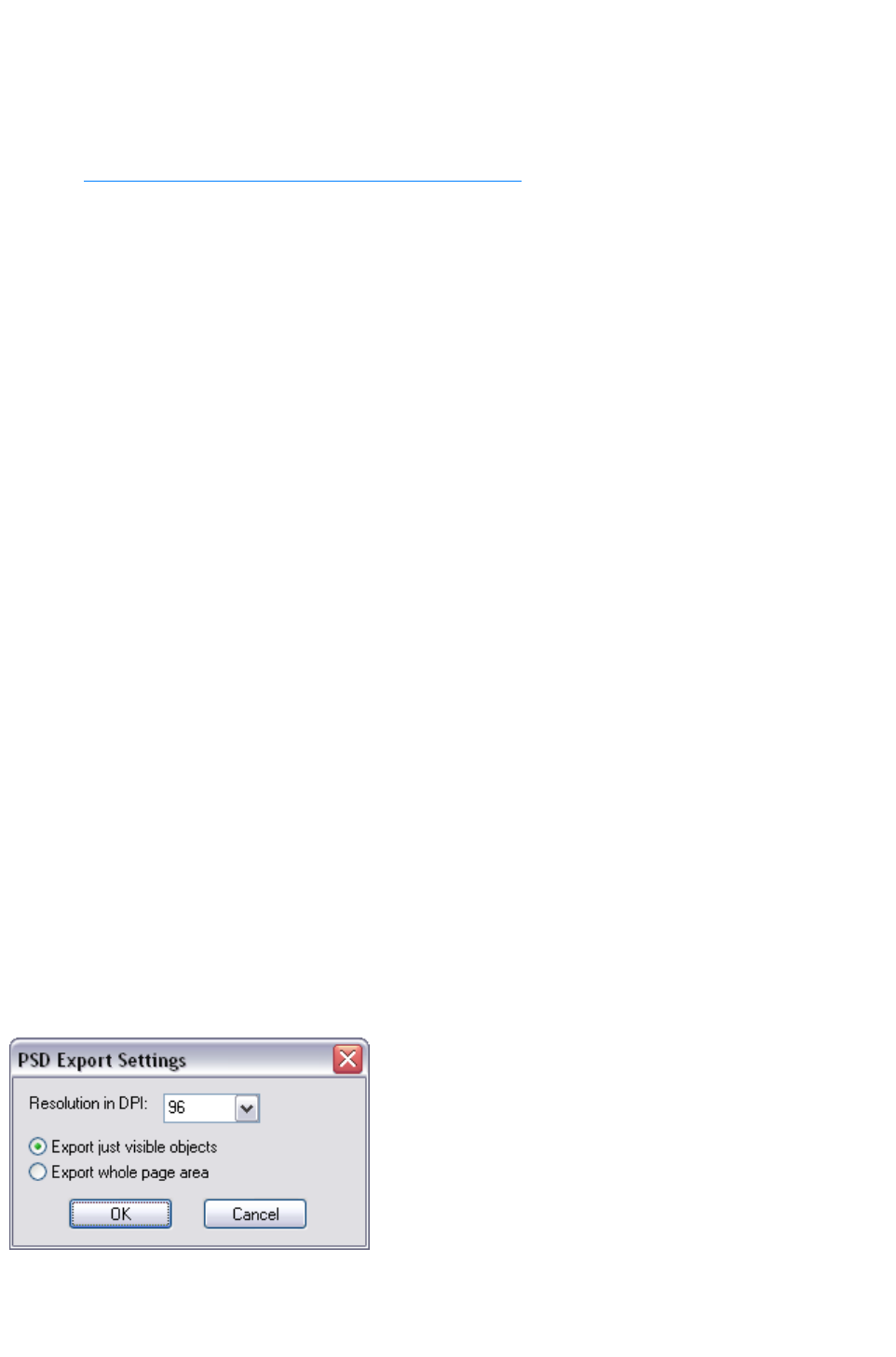
PNG also supports semi-transparent graphics (use the True Color + Alpha option), but this is not
correctly supported by older Microsoft Internet Explorer versions (it is by all other web browsers).
The fewer colors you have in a file, the smaller the file and the lower the quality. However, when using
256 colors or less Xara Web Designer 7 Premium provides very advanced techniques to simulate a
much wider range of colors, and so you can get very high, near photographic quality results using only
256 colors or less.
See also GIF, PNG, BMP and JPEG export dialog overview
.
Important
Bitmaps are output at the current view quality so for best results make sure that "Window" > "Quality
" is set to anti-aliased.
Exporting a Photoshop PSD file
Photoshop is a bitmap editor, so when exporting to PSD format all the vector objects in Xara Web
Designer 7 Premium are rasterized. You can select the resolution (dpi) when exporting.
Always save your work in Xara Web Designer 7 Premium prior to exporting. Then, if you wish to alter
your original objects in the future, just load Xara Web Designer 7 Premium, make any changes and then
export the required objects again.
To export as a PSD file choose "File" > "Export" then select Adobe Photoshop in the Save as Type
list.
Layers
Layers in Xara Web Designer 7 Premium are retained when exporting to PSD format. Each layer is
rasterized as a separate PSD layer, including layer names. Layers visibility is also passed through, so
layers set to invisible in Xara Web Designer 7 Premium will be exported and set to invisible in
Photoshop. You can turn the layers on and off in Photoshop using the Layers
palette.
Text
You can export text from Xara Web Designer 7 Premium to be editable text in Photoshop, but the text
must be on a layer on its own (on import you may be asked to update the text objects for them to be
editable in Photoshop.)
Text that is on a layer with any other graphic objects will be rasterized into that layer, and thus not be
editable.
Export DPI
You will be able to set the DPI of the bitmaps in the exported PSD file.
A DPI of 96 is the normal
Windows screen resolution, and
so exporting at 96dpi will appear
in Photoshop at the same size at
100% as it does at 100% in Xara
Web Designer 7 Premium.
For print work you should choose a higher DPI.
You can select to export the whole Xara Web Designer 7 Premium page area or just the areas of the
visible objects only.
Page 1200

Summary
In order to get maximum compatibility and editability in Photoshop:
For the parts of your drawing that you want to remain separate layers in Photoshop, place them
on separate layers in Xara Web Designer 7 Premium.
If you want your text to be editable in Photoshop, place it on a layer of its own, with no other
graphic objects.
Page 1201

Exporting as Flash
You can export a drawing to Adobe's SWF Flash format (static). This is best suited to vector designs,
and can provide very small file sizes. You can then use the SWF in a website, or import it into Flash for
use in Flash animations.
You can also create animated Flash. See Flash Animations
for more details on Flash export.
Exporting as AVI
Select File > Export animation and choose the AVI type from the type list. Click the Options
button on the file dialog to change the codec and other settings used for the export.
Exporting as Windows metafiles (.wmf)
Files in this format can be read by Word and several other programs.
Exporting as Extended Metafile Format (EMF)
Modern Windows applications support this enhanced type of vector graphic format. This format is also
available to applications that provide a Paste Special menu option.
Note that Xara Web Designer 7 Premium can contain features, such as advanced fill styles, that cannot
be represented in vector formats such as EMF. In this case parts of the image will be exported as
bitmaps. Those vector parts that can be exported as vectors are exported as vectors.
Quick export of HTML and web graphics formats
You can use the dedicated options in the File menu to quickly export web pages and web graphics,
without selecting the formats from the full list of available export formats shown when you use "File" >
"Export
".
"File" > "Export website": Export the current website document to a location of your choice
on your computer.
"File > "Export JPEG": Export the current selection, or current page, to a JPEG file.
"File" > "Export PNG": Export the current selection, or current page, to a PNG file.
For more information, see the Getting Started chapter.
Exporting as a bitmap
JPEG, GIF and PNG are universal formats supported by most modern computer applications. PNG is
the highest quality. JPEG is better suited to photographic work, but can produce acceptable, compact
files (you can control the quality and file size).
GIF format only supports 256 colors, and although common on many websites, PNG is a better format.
PNG also supports semi-transparent graphics (use the True Color + Alpha option), but this is not
correctly supported by older Microsoft Internet Explorer versions (it is by all other web browsers).
The fewer colors you have in a file, the smaller the file and the lower the quality. However, when using
256 colors or less Xara Web Designer 7 Premium provides very advanced techniques to simulate a
much wider range of colors, and so you can get very high, near photographic quality results using only
256 colors or less.
See also GIF, PNG, BMP and JPEG export dialog overview
.
Important
Page 1202
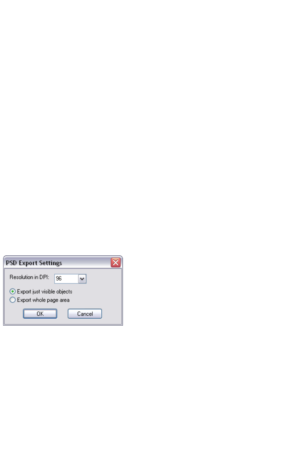
Bitmaps are output at the current view quality so for best results make sure that "Window" > "Quality
" is set to anti-aliased.
Exporting a Photoshop PSD file
Photoshop is a bitmap editor, so when exporting to PSD format all the vector objects in Xara Web
Designer 7 Premium are rasterized. You can select the resolution (dpi) when exporting.
Always save your work in Xara Web Designer 7 Premium prior to exporting. Then, if you wish to alter
your original objects in the future, just load Xara Web Designer 7 Premium, make any changes and then
export the required objects again.
To export as a PSD file choose "File" > "Export" then select Adobe Photoshop in the Save as Type
list.
Layers
Layers in Xara Web Designer 7 Premium are retained when exporting to PSD format. Each layer is
rasterized as a separate PSD layer, including layer names. Layers visibility is also passed through, so
layers set to invisible in Xara Web Designer 7 Premium will be exported and set to invisible in
Photoshop. You can turn the layers on and off in Photoshop using the Layers
palette.
Text
You can export text from Xara Web Designer 7 Premium to be editable text in Photoshop, but the text
must be on a layer on its own (on import you may be asked to update the text objects for them to be
editable in Photoshop.)
Text that is on a layer with any other graphic objects will be rasterized into that layer, and thus not be
editable.
Export DPI
You will be able to set the DPI of the bitmaps in the exported PSD file.
A DPI of 96 is the normal
Windows screen resolution, and
so exporting at 96dpi will appear
in Photoshop at the same size at
100% as it does at 100% in Xara
Web Designer 7 Premium.
For print work you should choose a higher DPI.
You can select to export the whole Xara Web Designer 7 Premium page area or just the areas of the
visible objects only.
Summary
In order to get maximum compatibility and editability in Photoshop:
For the parts of your drawing that you want to remain separate layers in Photoshop, place them
on separate layers in Xara Web Designer 7 Premium.
If you want your text to be editable in Photoshop, place it on a layer of its own, with no other
graphic objects.
Page 1203

Exporting as AVI
Select File > Export animation and choose the AVI type from the type list. Click the Options
button on the file dialog to change the codec and other settings used for the export.
Exporting as Windows metafiles (.wmf)
Files in this format can be read by Word and several other programs.
Exporting as Extended Metafile Format (EMF)
Modern Windows applications support this enhanced type of vector graphic format. This format is also
available to applications that provide a Paste Special menu option.
Note that Xara Web Designer 7 Premium can contain features, such as advanced fill styles, that cannot
be represented in vector formats such as EMF. In this case parts of the image will be exported as
bitmaps. Those vector parts that can be exported as vectors are exported as vectors.
Quick export of HTML and web graphics formats
You can use the dedicated options in the File menu to quickly export web pages and web graphics,
without selecting the formats from the full list of available export formats shown when you use "File" >
"Export
".
"File" > "Export website": Export the current website document to a location of your choice
on your computer.
"File > "Export JPEG": Export the current selection, or current page, to a JPEG file.
"File" > "Export PNG": Export the current selection, or current page, to a PNG file.
For more information, see the Getting Started chapter.
Exporting as a bitmap
JPEG, GIF and PNG are universal formats supported by most modern computer applications. PNG is
the highest quality. JPEG is better suited to photographic work, but can produce acceptable, compact
files (you can control the quality and file size).
GIF format only supports 256 colors, and although common on many websites, PNG is a better format.
PNG also supports semi-transparent graphics (use the True Color + Alpha option), but this is not
correctly supported by older Microsoft Internet Explorer versions (it is by all other web browsers).
The fewer colors you have in a file, the smaller the file and the lower the quality. However, when using
256 colors or less Xara Web Designer 7 Premium provides very advanced techniques to simulate a
much wider range of colors, and so you can get very high, near photographic quality results using only
256 colors or less.
See also GIF, PNG, BMP and JPEG export dialog overview
.
Important
Bitmaps are output at the current view quality so for best results make sure that "Window" > "Quality
" is set to anti-aliased.
Exporting a Photoshop PSD file
Photoshop is a bitmap editor, so when exporting to PSD format all the vector objects in Xara Web
Designer 7 Premium are rasterized. You can select the resolution (dpi) when exporting.
Always save your work in Xara Web Designer 7 Premium prior to exporting. Then, if you wish to alter
Page 1204
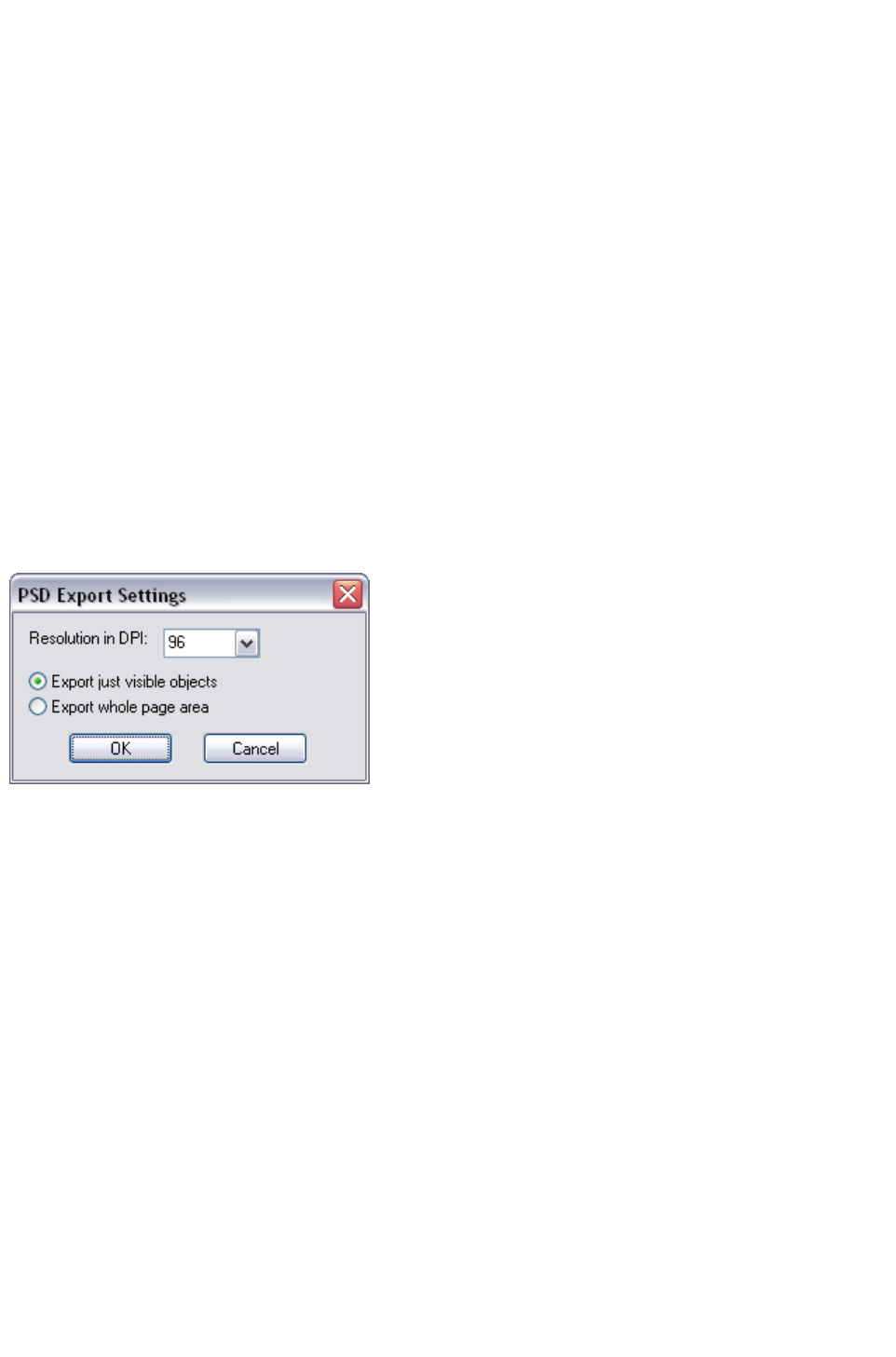
your original objects in the future, just load Xara Web Designer 7 Premium, make any changes and then
export the required objects again.
To export as a PSD file choose "File" > "Export" then select Adobe Photoshop in the Save as Type
list.
Layers
Layers in Xara Web Designer 7 Premium are retained when exporting to PSD format. Each layer is
rasterized as a separate PSD layer, including layer names. Layers visibility is also passed through, so
layers set to invisible in Xara Web Designer 7 Premium will be exported and set to invisible in
Photoshop. You can turn the layers on and off in Photoshop using the Layers
palette.
Text
You can export text from Xara Web Designer 7 Premium to be editable text in Photoshop, but the text
must be on a layer on its own (on import you may be asked to update the text objects for them to be
editable in Photoshop.)
Text that is on a layer with any other graphic objects will be rasterized into that layer, and thus not be
editable.
Export DPI
You will be able to set the DPI of the bitmaps in the exported PSD file.
A DPI of 96 is the normal
Windows screen resolution, and
so exporting at 96dpi will appear
in Photoshop at the same size at
100% as it does at 100% in Xara
Web Designer 7 Premium.
For print work you should choose a higher DPI.
You can select to export the whole Xara Web Designer 7 Premium page area or just the areas of the
visible objects only.
Summary
In order to get maximum compatibility and editability in Photoshop:
For the parts of your drawing that you want to remain separate layers in Photoshop, place them
on separate layers in Xara Web Designer 7 Premium.
If you want your text to be editable in Photoshop, place it on a layer of its own, with no other
graphic objects.
Page 1205

Exporting as Windows metafiles (.wmf)
Files in this format can be read by Word and several other programs.
Exporting as Extended Metafile Format (EMF)
Modern Windows applications support this enhanced type of vector graphic format. This format is also
available to applications that provide a Paste Special menu option.
Note that Xara Web Designer 7 Premium can contain features, such as advanced fill styles, that cannot
be represented in vector formats such as EMF. In this case parts of the image will be exported as
bitmaps. Those vector parts that can be exported as vectors are exported as vectors.
Quick export of HTML and web graphics formats
You can use the dedicated options in the File menu to quickly export web pages and web graphics,
without selecting the formats from the full list of available export formats shown when you use "File" >
"Export
".
"File" > "Export website": Export the current website document to a location of your choice
on your computer.
"File > "Export JPEG": Export the current selection, or current page, to a JPEG file.
"File" > "Export PNG": Export the current selection, or current page, to a PNG file.
For more information, see the Getting Started chapter.
Exporting as a bitmap
JPEG, GIF and PNG are universal formats supported by most modern computer applications. PNG is
the highest quality. JPEG is better suited to photographic work, but can produce acceptable, compact
files (you can control the quality and file size).
GIF format only supports 256 colors, and although common on many websites, PNG is a better format.
PNG also supports semi-transparent graphics (use the True Color + Alpha option), but this is not
correctly supported by older Microsoft Internet Explorer versions (it is by all other web browsers).
The fewer colors you have in a file, the smaller the file and the lower the quality. However, when using
256 colors or less Xara Web Designer 7 Premium provides very advanced techniques to simulate a
much wider range of colors, and so you can get very high, near photographic quality results using only
256 colors or less.
See also GIF, PNG, BMP and JPEG export dialog overview
.
Important
Bitmaps are output at the current view quality so for best results make sure that "Window" > "Quality
" is set to anti-aliased.
Exporting a Photoshop PSD file
Photoshop is a bitmap editor, so when exporting to PSD format all the vector objects in Xara Web
Designer 7 Premium are rasterized. You can select the resolution (dpi) when exporting.
Always save your work in Xara Web Designer 7 Premium prior to exporting. Then, if you wish to alter
your original objects in the future, just load Xara Web Designer 7 Premium, make any changes and then
export the required objects again.
To export as a PSD file choose "File" > "Export" then select Adobe Photoshop in the Save as Type
list.
Page 1206
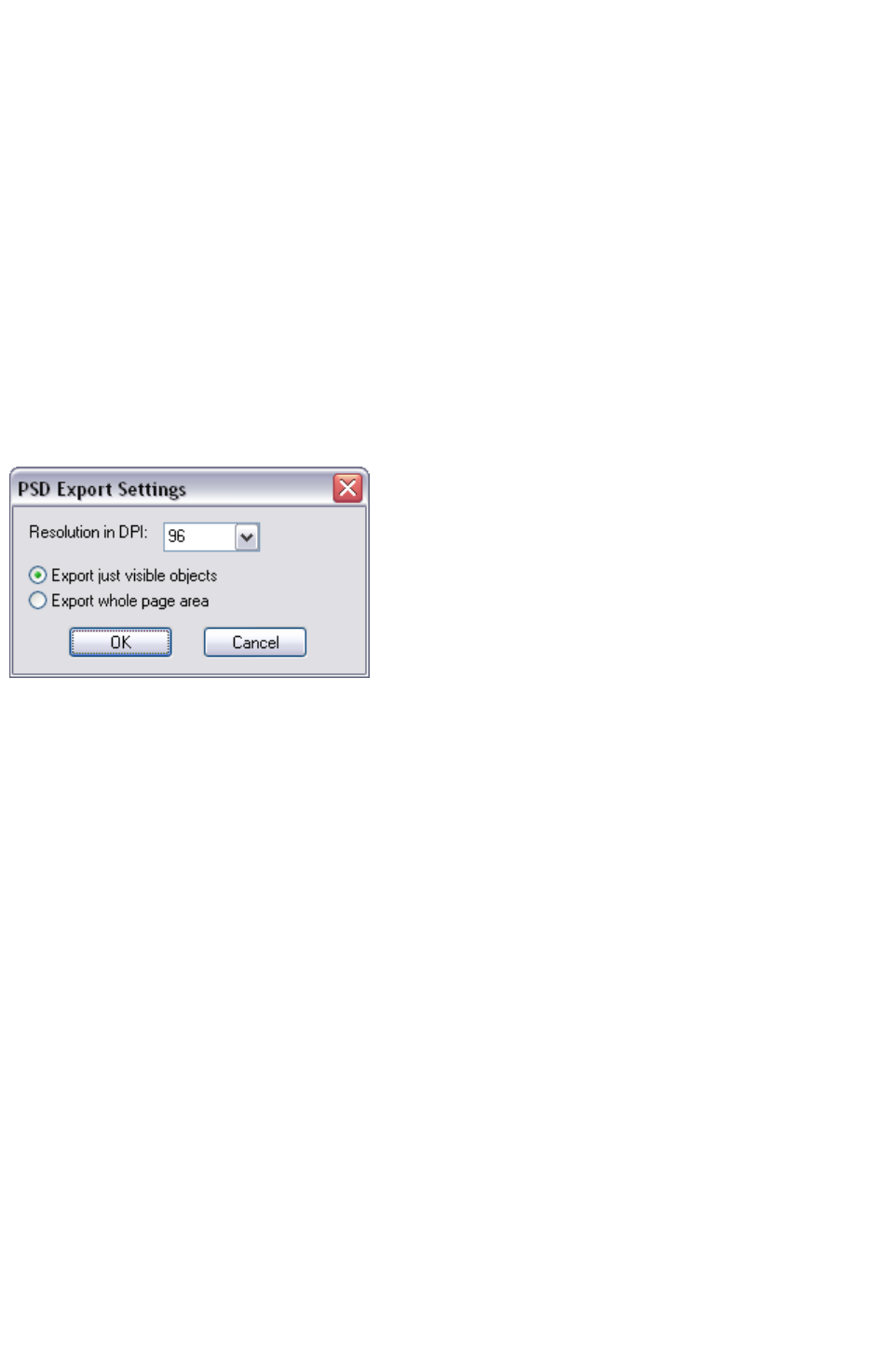
Layers
Layers in Xara Web Designer 7 Premium are retained when exporting to PSD format. Each layer is
rasterized as a separate PSD layer, including layer names. Layers visibility is also passed through, so
layers set to invisible in Xara Web Designer 7 Premium will be exported and set to invisible in
Photoshop. You can turn the layers on and off in Photoshop using the Layers
palette.
Text
You can export text from Xara Web Designer 7 Premium to be editable text in Photoshop, but the text
must be on a layer on its own (on import you may be asked to update the text objects for them to be
editable in Photoshop.)
Text that is on a layer with any other graphic objects will be rasterized into that layer, and thus not be
editable.
Export DPI
You will be able to set the DPI of the bitmaps in the exported PSD file.
A DPI of 96 is the normal
Windows screen resolution, and
so exporting at 96dpi will appear
in Photoshop at the same size at
100% as it does at 100% in Xara
Web Designer 7 Premium.
For print work you should choose a higher DPI.
You can select to export the whole Xara Web Designer 7 Premium page area or just the areas of the
visible objects only.
Summary
In order to get maximum compatibility and editability in Photoshop:
For the parts of your drawing that you want to remain separate layers in Photoshop, place them
on separate layers in Xara Web Designer 7 Premium.
If you want your text to be editable in Photoshop, place it on a layer of its own, with no other
graphic objects.
Page 1207

Exporting as Extended Metafile Format (EMF)
Modern Windows applications support this enhanced type of vector graphic format. This format is also
available to applications that provide a Paste Special menu option.
Note that Xara Web Designer 7 Premium can contain features, such as advanced fill styles, that cannot
be represented in vector formats such as EMF. In this case parts of the image will be exported as
bitmaps. Those vector parts that can be exported as vectors are exported as vectors.
Quick export of HTML and web graphics formats
You can use the dedicated options in the File menu to quickly export web pages and web graphics,
without selecting the formats from the full list of available export formats shown when you use "File" >
"Export
".
"File" > "Export website": Export the current website document to a location of your choice
on your computer.
"File > "Export JPEG": Export the current selection, or current page, to a JPEG file.
"File" > "Export PNG": Export the current selection, or current page, to a PNG file.
For more information, see the Getting Started chapter.
Exporting as a bitmap
JPEG, GIF and PNG are universal formats supported by most modern computer applications. PNG is
the highest quality. JPEG is better suited to photographic work, but can produce acceptable, compact
files (you can control the quality and file size).
GIF format only supports 256 colors, and although common on many websites, PNG is a better format.
PNG also supports semi-transparent graphics (use the True Color + Alpha option), but this is not
correctly supported by older Microsoft Internet Explorer versions (it is by all other web browsers).
The fewer colors you have in a file, the smaller the file and the lower the quality. However, when using
256 colors or less Xara Web Designer 7 Premium provides very advanced techniques to simulate a
much wider range of colors, and so you can get very high, near photographic quality results using only
256 colors or less.
See also GIF, PNG, BMP and JPEG export dialog overview
.
Important
Bitmaps are output at the current view quality so for best results make sure that "Window" > "Quality
" is set to anti-aliased.
Exporting a Photoshop PSD file
Photoshop is a bitmap editor, so when exporting to PSD format all the vector objects in Xara Web
Designer 7 Premium are rasterized. You can select the resolution (dpi) when exporting.
Always save your work in Xara Web Designer 7 Premium prior to exporting. Then, if you wish to alter
your original objects in the future, just load Xara Web Designer 7 Premium, make any changes and then
export the required objects again.
To export as a PSD file choose "File" > "Export" then select Adobe Photoshop in the Save as Type
list.
Layers
Layers in Xara Web Designer 7 Premium are retained when exporting to PSD format. Each layer is
rasterized as a separate PSD layer, including layer names. Layers visibility is also passed through, so
Page 1208
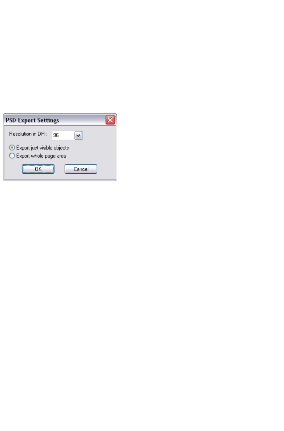
layers set to invisible in Xara Web Designer 7 Premium will be exported and set to invisible in
Photoshop. You can turn the layers on and off in Photoshop using the Layers
palette.
Text
You can export text from Xara Web Designer 7 Premium to be editable text in Photoshop, but the text
must be on a layer on its own (on import you may be asked to update the text objects for them to be
editable in Photoshop.)
Text that is on a layer with any other graphic objects will be rasterized into that layer, and thus not be
editable.
Export DPI
You will be able to set the DPI of the bitmaps in the exported PSD file.
A DPI of 96 is the normal
Windows screen resolution, and
so exporting at 96dpi will appear
in Photoshop at the same size at
100% as it does at 100% in Xara
Web Designer 7 Premium.
For print work you should choose a higher DPI.
You can select to export the whole Xara Web Designer 7 Premium page area or just the areas of the
visible objects only.
Summary
In order to get maximum compatibility and editability in Photoshop:
For the parts of your drawing that you want to remain separate layers in Photoshop, place them
on separate layers in Xara Web Designer 7 Premium.
If you want your text to be editable in Photoshop, place it on a layer of its own, with no other
graphic objects.
Page 1209

Quick export of HTML and web graphics formats
You can use the dedicated options in the File menu to quickly export web pages and web graphics,
without selecting the formats from the full list of available export formats shown when you use "File" >
"Export
".
"File" > "Export website": Export the current website document to a location of your choice
on your computer.
"File > "Export JPEG": Export the current selection, or current page, to a JPEG file.
"File" > "Export PNG": Export the current selection, or current page, to a PNG file.
For more information, see the Getting Started chapter.
Exporting as a bitmap
JPEG, GIF and PNG are universal formats supported by most modern computer applications. PNG is
the highest quality. JPEG is better suited to photographic work, but can produce acceptable, compact
files (you can control the quality and file size).
GIF format only supports 256 colors, and although common on many websites, PNG is a better format.
PNG also supports semi-transparent graphics (use the True Color + Alpha option), but this is not
correctly supported by older Microsoft Internet Explorer versions (it is by all other web browsers).
The fewer colors you have in a file, the smaller the file and the lower the quality. However, when using
256 colors or less Xara Web Designer 7 Premium provides very advanced techniques to simulate a
much wider range of colors, and so you can get very high, near photographic quality results using only
256 colors or less.
See also GIF, PNG, BMP and JPEG export dialog overview
.
Important
Bitmaps are output at the current view quality so for best results make sure that "Window" > "Quality
" is set to anti-aliased.
Exporting a Photoshop PSD file
Photoshop is a bitmap editor, so when exporting to PSD format all the vector objects in Xara Web
Designer 7 Premium are rasterized. You can select the resolution (dpi) when exporting.
Always save your work in Xara Web Designer 7 Premium prior to exporting. Then, if you wish to alter
your original objects in the future, just load Xara Web Designer 7 Premium, make any changes and then
export the required objects again.
To export as a PSD file choose "File" > "Export" then select Adobe Photoshop in the Save as Type
list.
Layers
Layers in Xara Web Designer 7 Premium are retained when exporting to PSD format. Each layer is
rasterized as a separate PSD layer, including layer names. Layers visibility is also passed through, so
layers set to invisible in Xara Web Designer 7 Premium will be exported and set to invisible in
Photoshop. You can turn the layers on and off in Photoshop using the Layers
palette.
Text
You can export text from Xara Web Designer 7 Premium to be editable text in Photoshop, but the text
must be on a layer on its own (on import you may be asked to update the text objects for them to be
Page 1210
editable in Photoshop.)
Text that is on a layer with any other graphic objects will be rasterized into that layer, and thus not be
editable.
Export DPI
You will be able to set the DPI of the bitmaps in the exported PSD file.
A DPI of 96 is the normal
Windows screen resolution, and
so exporting at 96dpi will appear
in Photoshop at the same size at
100% as it does at 100% in Xara
Web Designer 7 Premium.
For print work you should choose a higher DPI.
You can select to export the whole Xara Web Designer 7 Premium page area or just the areas of the
visible objects only.
Summary
In order to get maximum compatibility and editability in Photoshop:
For the parts of your drawing that you want to remain separate layers in Photoshop, place them
on separate layers in Xara Web Designer 7 Premium.
If you want your text to be editable in Photoshop, place it on a layer of its own, with no other
graphic objects.
Page 1211

Exporting as a bitmap
JPEG, GIF and PNG are universal formats supported by most modern computer applications. PNG is
the highest quality. JPEG is better suited to photographic work, but can produce acceptable, compact
files (you can control the quality and file size).
GIF format only supports 256 colors, and although common on many websites, PNG is a better format.
PNG also supports semi-transparent graphics (use the True Color + Alpha option), but this is not
correctly supported by older Microsoft Internet Explorer versions (it is by all other web browsers).
The fewer colors you have in a file, the smaller the file and the lower the quality. However, when using
256 colors or less Xara Web Designer 7 Premium provides very advanced techniques to simulate a
much wider range of colors, and so you can get very high, near photographic quality results using only
256 colors or less.
See also GIF, PNG, BMP and JPEG export dialog overview
.
Important
Bitmaps are output at the current view quality so for best results make sure that "Window" > "Quality
" is set to anti-aliased.
Exporting a Photoshop PSD file
Photoshop is a bitmap editor, so when exporting to PSD format all the vector objects in Xara Web
Designer 7 Premium are rasterized. You can select the resolution (dpi) when exporting.
Always save your work in Xara Web Designer 7 Premium prior to exporting. Then, if you wish to alter
your original objects in the future, just load Xara Web Designer 7 Premium, make any changes and then
export the required objects again.
To export as a PSD file choose "File" > "Export" then select Adobe Photoshop in the Save as Type
list.
Layers
Layers in Xara Web Designer 7 Premium are retained when exporting to PSD format. Each layer is
rasterized as a separate PSD layer, including layer names. Layers visibility is also passed through, so
layers set to invisible in Xara Web Designer 7 Premium will be exported and set to invisible in
Photoshop. You can turn the layers on and off in Photoshop using the Layers
palette.
Text
You can export text from Xara Web Designer 7 Premium to be editable text in Photoshop, but the text
must be on a layer on its own (on import you may be asked to update the text objects for them to be
editable in Photoshop.)
Text that is on a layer with any other graphic objects will be rasterized into that layer, and thus not be
editable.
Export DPI
You will be able to set the DPI of the bitmaps in the exported PSD file.
Page 1212
A DPI of 96 is the normal
Windows screen resolution, and
so exporting at 96dpi will appear
in Photoshop at the same size at
100% as it does at 100% in Xara
Web Designer 7 Premium.
For print work you should choose a higher DPI.
You can select to export the whole Xara Web Designer 7 Premium page area or just the areas of the
visible objects only.
Summary
In order to get maximum compatibility and editability in Photoshop:
For the parts of your drawing that you want to remain separate layers in Photoshop, place them
on separate layers in Xara Web Designer 7 Premium.
If you want your text to be editable in Photoshop, place it on a layer of its own, with no other
graphic objects.
Page 1213
Important
Bitmaps are output at the current view quality so for best results make sure that "Window" > "Quality
" is set to anti-aliased.
Exporting a Photoshop PSD file
Photoshop is a bitmap editor, so when exporting to PSD format all the vector objects in Xara Web
Designer 7 Premium are rasterized. You can select the resolution (dpi) when exporting.
Always save your work in Xara Web Designer 7 Premium prior to exporting. Then, if you wish to alter
your original objects in the future, just load Xara Web Designer 7 Premium, make any changes and then
export the required objects again.
To export as a PSD file choose "File" > "Export" then select Adobe Photoshop in the Save as Type
list.
Layers
Layers in Xara Web Designer 7 Premium are retained when exporting to PSD format. Each layer is
rasterized as a separate PSD layer, including layer names. Layers visibility is also passed through, so
layers set to invisible in Xara Web Designer 7 Premium will be exported and set to invisible in
Photoshop. You can turn the layers on and off in Photoshop using the Layers
palette.
Text
You can export text from Xara Web Designer 7 Premium to be editable text in Photoshop, but the text
must be on a layer on its own (on import you may be asked to update the text objects for them to be
editable in Photoshop.)
Text that is on a layer with any other graphic objects will be rasterized into that layer, and thus not be
editable.
Export DPI
You will be able to set the DPI of the bitmaps in the exported PSD file.
A DPI of 96 is the normal
Windows screen resolution, and
so exporting at 96dpi will appear
in Photoshop at the same size at
100% as it does at 100% in Xara
Web Designer 7 Premium.
For print work you should choose a higher DPI.
You can select to export the whole Xara Web Designer 7 Premium page area or just the areas of the
visible objects only.
Summary
In order to get maximum compatibility and editability in Photoshop:
For the parts of your drawing that you want to remain separate layers in Photoshop, place them
on separate layers in Xara Web Designer 7 Premium.
If you want your text to be editable in Photoshop, place it on a layer of its own, with no other
graphic objects.
Page 1214
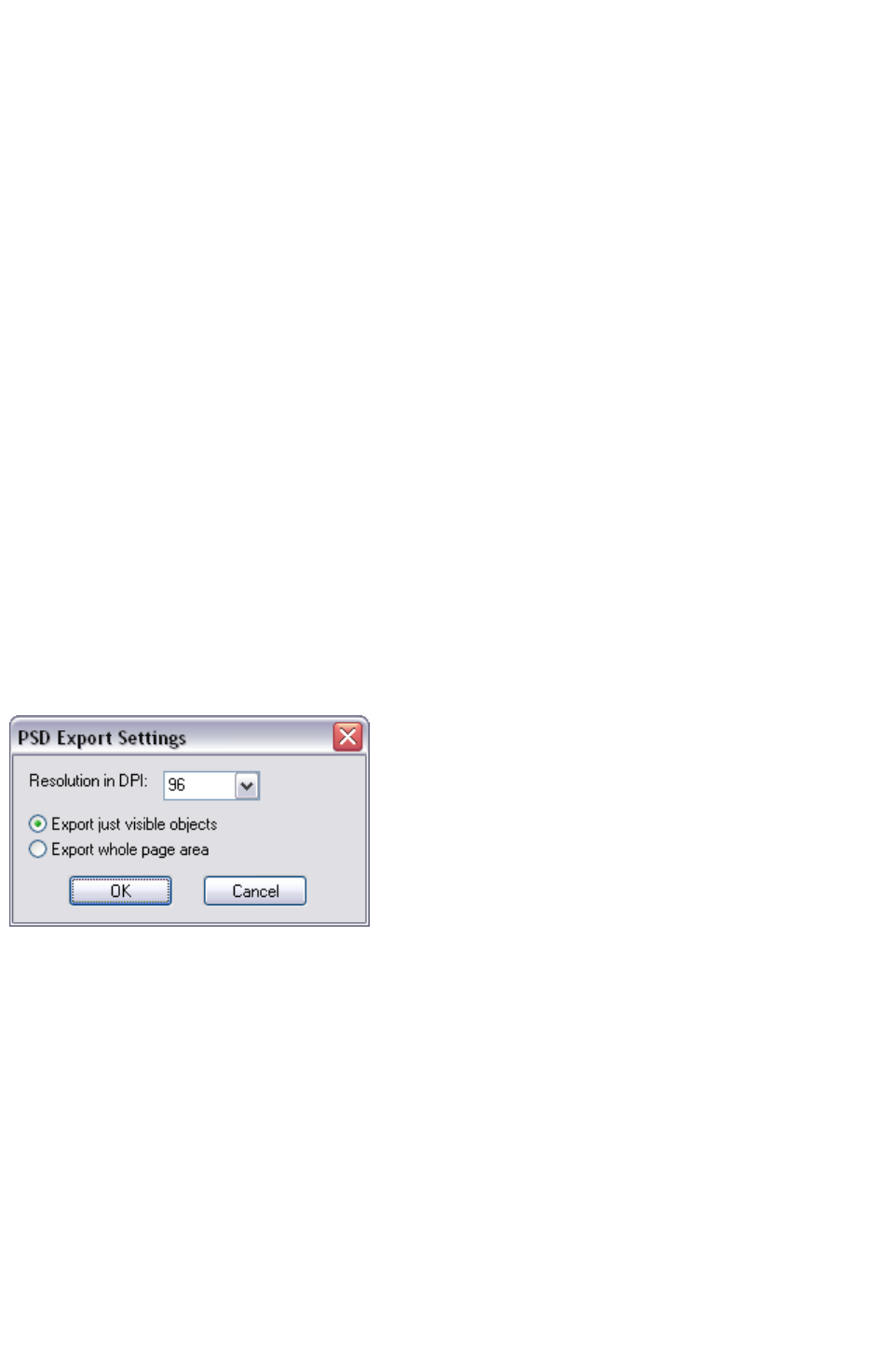
Exporting a Photoshop PSD file
Photoshop is a bitmap editor, so when exporting to PSD format all the vector objects in Xara Web
Designer 7 Premium are rasterized. You can select the resolution (dpi) when exporting.
Always save your work in Xara Web Designer 7 Premium prior to exporting. Then, if you wish to alter
your original objects in the future, just load Xara Web Designer 7 Premium, make any changes and then
export the required objects again.
To export as a PSD file choose "File" > "Export" then select Adobe Photoshop in the Save as Type
list.
Layers
Layers in Xara Web Designer 7 Premium are retained when exporting to PSD format. Each layer is
rasterized as a separate PSD layer, including layer names. Layers visibility is also passed through, so
layers set to invisible in Xara Web Designer 7 Premium will be exported and set to invisible in
Photoshop. You can turn the layers on and off in Photoshop using the Layers
palette.
Text
You can export text from Xara Web Designer 7 Premium to be editable text in Photoshop, but the text
must be on a layer on its own (on import you may be asked to update the text objects for them to be
editable in Photoshop.)
Text that is on a layer with any other graphic objects will be rasterized into that layer, and thus not be
editable.
Export DPI
You will be able to set the DPI of the bitmaps in the exported PSD file.
A DPI of 96 is the normal
Windows screen resolution, and
so exporting at 96dpi will appear
in Photoshop at the same size at
100% as it does at 100% in Xara
Web Designer 7 Premium.
For print work you should choose a higher DPI.
You can select to export the whole Xara Web Designer 7 Premium page area or just the areas of the
visible objects only.
Summary
In order to get maximum compatibility and editability in Photoshop:
For the parts of your drawing that you want to remain separate layers in Photoshop, place them
on separate layers in Xara Web Designer 7 Premium.
If you want your text to be editable in Photoshop, place it on a layer of its own, with no other
graphic objects.
Page 1215

Layers
Layers in Xara Web Designer 7 Premium are retained when exporting to PSD format. Each layer is
rasterized as a separate PSD layer, including layer names. Layers visibility is also passed through, so
layers set to invisible in Xara Web Designer 7 Premium will be exported and set to invisible in
Photoshop. You can turn the layers on and off in Photoshop using the Layers
palette.
Text
You can export text from Xara Web Designer 7 Premium to be editable text in Photoshop, but the text
must be on a layer on its own (on import you may be asked to update the text objects for them to be
editable in Photoshop.)
Text that is on a layer with any other graphic objects will be rasterized into that layer, and thus not be
editable.
Export DPI
You will be able to set the DPI of the bitmaps in the exported PSD file.
A DPI of 96 is the normal
Windows screen resolution, and
so exporting at 96dpi will appear
in Photoshop at the same size at
100% as it does at 100% in Xara
Web Designer 7 Premium.
For print work you should choose a higher DPI.
You can select to export the whole Xara Web Designer 7 Premium page area or just the areas of the
visible objects only.
Summary
In order to get maximum compatibility and editability in Photoshop:
For the parts of your drawing that you want to remain separate layers in Photoshop, place them
on separate layers in Xara Web Designer 7 Premium.
If you want your text to be editable in Photoshop, place it on a layer of its own, with no other
graphic objects.
Page 1216
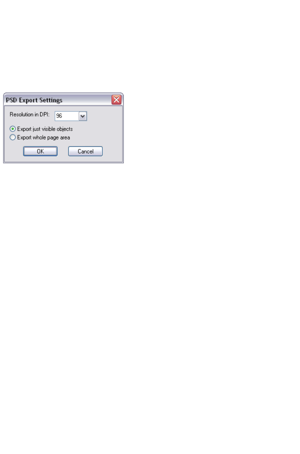
Text
You can export text from Xara Web Designer 7 Premium to be editable text in Photoshop, but the text
must be on a layer on its own (on import you may be asked to update the text objects for them to be
editable in Photoshop.)
Text that is on a layer with any other graphic objects will be rasterized into that layer, and thus not be
editable.
Export DPI
You will be able to set the DPI of the bitmaps in the exported PSD file.
A DPI of 96 is the normal
Windows screen resolution, and
so exporting at 96dpi will appear
in Photoshop at the same size at
100% as it does at 100% in Xara
Web Designer 7 Premium.
For print work you should choose a higher DPI.
You can select to export the whole Xara Web Designer 7 Premium page area or just the areas of the
visible objects only.
Summary
In order to get maximum compatibility and editability in Photoshop:
For the parts of your drawing that you want to remain separate layers in Photoshop, place them
on separate layers in Xara Web Designer 7 Premium.
If you want your text to be editable in Photoshop, place it on a layer of its own, with no other
graphic objects.
Page 1217
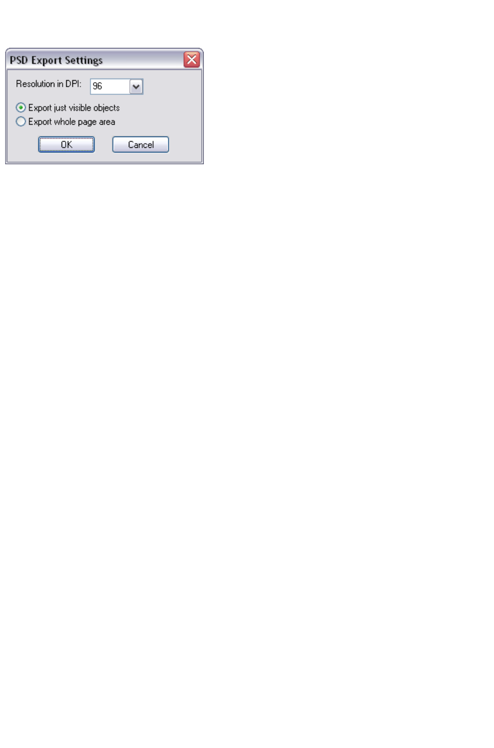
Export DPI
You will be able to set the DPI of the bitmaps in the exported PSD file.
A DPI of 96 is the normal
Windows screen resolution, and
so exporting at 96dpi will appear
in Photoshop at the same size at
100% as it does at 100% in Xara
Web Designer 7 Premium.
For print work you should choose a higher DPI.
You can select to export the whole Xara Web Designer 7 Premium page area or just the areas of the
visible objects only.
Summary
In order to get maximum compatibility and editability in Photoshop:
For the parts of your drawing that you want to remain separate layers in Photoshop, place them
on separate layers in Xara Web Designer 7 Premium.
If you want your text to be editable in Photoshop, place it on a layer of its own, with no other
graphic objects.
Page 1218

Summary
In order to get maximum compatibility and editability in Photoshop:
For the parts of your drawing that you want to remain separate layers in Photoshop, place them
on separate layers in Xara Web Designer 7 Premium.
If you want your text to be editable in Photoshop, place it on a layer of its own, with no other
graphic objects.
Page 1219
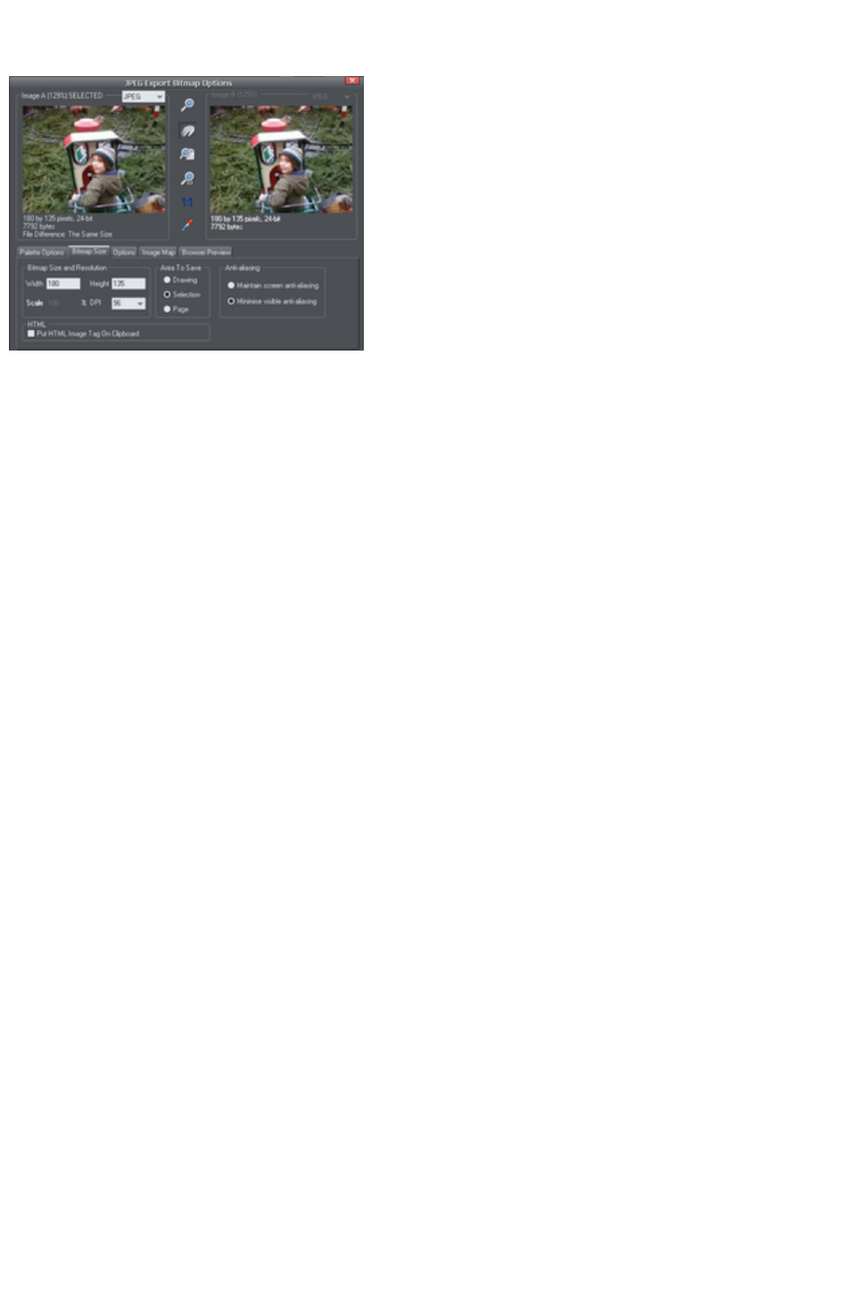
JPEG, PNG and GIF export dialog overview
The Export settings dialog has
two preview windows, Image A
on the left and Image B
on the right, so you can compare
alternative export settings or file
types, side-by-side. Just click on
the left or right preview window
to change the active preview.
Above the preview window is a
small dropdown that lets you
select from the most common
three export types, JPEG, PNG,
and GIF.
When you have selected preview A or B
you can then adjust a wide range of export options using the five tabs below the preview. Some options,
such as the Palette Options are only applicable to some file types such as PNG and not relevant to JPEG
type.
Other options under the Options
tab change depending on the file type. e.g. when exporting a JPEG this is where you can set the required
quality.
So the process for exporting an image:
1. Select the object or objects on the page you want to export
2. Select the Export menu, or "Ctrl + Shift + E", enter a file name, and select file type from the drop
down list. The main export type will display the above preview dialog.
3. In this Preview dialog adjust the settings if you want, or skip this if you're happy with the default
settings
4. Click the Export button
For most commonly used JPEG and PNG formats, at step 2 you can instead use the direct operations
available in the File menu: Export JPEG and Export PNG
. The export dialog shown includes a "Settings" button which takes you to the export settings dialog
shown above.
Most export settings are remembered for the next time you export. For example if you adjust the JPEG
quality, the next time you export a JPEG it will remember the last quality setting.
Exported Image Size
When you export the normal default size is the same as you see on screen at 100% zoom. The pixel size
is shown under the preview window. You can adjust the pixel dimensions either by adjusting the object
size on the page before you export, or by entering alternative pixel or dpi values in the Bitmap size
tab.
Preview Controls
These buttons alter the preview of the images, but do not affect the exported file:
Page 1220

Zoom Tool: Click on a preview to zoom in. Shift-click to
zoom out. Drag over an area of the preview to zoom into
that area.
Push Tool: Lets you drag the image around in the preview
window.
Zoom to Fit: Scales the preview image to fit the window.
Zoom to 100%: Scales the image to full-size (100%).
Zoom to Resolution of Image (1:1): Has no effect for
GIFs. Scales the image so one pixel in the bitmap is one
pixel on screen. This is useful for previewing detail in the
bitmap.
The following tool is only relevant to files using less than 256 colors (but you will see the result when you
have the Palette Options
tab selected):
Color Selector: Moving the pointer over the image highlights the color
under the pointer. Click to select that color in the palette. You can then
use Palette Options
buttons (described below) to alter that color.
Preview:
The preview button is available on all tabs of this dialog. It updates the preview windows to reflect any
changes you have made to the export options.
Palette Options tab
This tab allows you to alter the color settings of your exported image.
Dithering & Palette
The Dithering and Palette options only apply when you export with 256 color or less, and affect how
the image is displayed and its color palette. It is recommended to always use an Optimized palette. Set
Dither to none, which produces smaller files but may be banded, or Error Diffusion
, which creates higher quality results, but larger files.
Color Depth
Choose the number of colors your bitmap requires. The more colors, the larger the file (usually), and the
higher the quality. The True Color option supports up to 16 millions colors. True Color + Alpha
includes semi-transparent features such as soft shadows and transparency. For applications that support
alpha-channel PNG files this is the recommended format.
If you choose 256 colors of less, you have the option to use simple transparency (Wine glass icon-see
below). This doesn't support semi-transparent pixels, only "on/off" fully opaque or fully transparency
pixels, and so can produce jagged edges.
Max Colors
If you select a Color Depth of 256 or less you can control exactly how many colors are used in the file.
This provides a high degree of control over quality vs. file size. Just enter the required number of colors
and press the Preview
button to preview.
Buttons
These buttons (except Transparent Background) apply when exporting 256 color images or less.
These files are created with a limited palette of colors, and these controls provide a great degree of
Page 1221
control over those palette colors. See Color Selector above on how to select a color, or click on a
color in the Color Palette
).
Lock a Color
You can specify the number of colors you want in the palette of exported bitmaps. You may want to
ensure that certain colors always appear in the palette; you can lock these colors. Click on a color to
select it, then select the Lock
button. A small square appears in the bottom left of the color to tell you it is a locked color.
Make a Palette Color Web Safe
When clicked this button will shift the selected color to be one of the 216 common web browser palette
colors. This is a legacy system that is no longer particularly important or relevant, as nearly all computers
can display millions of colors, and there's no benefit in restricting web graphics to only this limited
palette.
Make the Image Background Transparent
Make any areas not covered by the selected objects transparent. Selecting this option automatically
makes one entry in the palette transparent.
Make a Palette Color Transparent
Make this color entry transparent. Note the difference between this option, which makes parts of the
selected objects transparent, and Make The Image Background Transparent
which makes those areas behind the selected objects transparent.
Delete a Palette Color
Delete this color from the palette. Any areas in the bitmap that use the deleted color then use the nearest
color in the palette. The fewer colors in the palette, the smaller the bitmap file.
Restore a Previously Deleted Color
Undelete a deleted color.
Add system colors
Adds 28 colors to the palette. These colors are the regular Windows system colors and a number of
primary colors. This ensures the palette includes a spread of colors and may improve the quality of the
image, particularly if it contains a wide range of colors. You may need to experiment with this option to
get the best results.
Bitmap Size tab
With this tab, you can change the size of the exported image.
Bitmap Size and Resolution
You can change the size of the exported bitmap by changing:
Size: Type the required width or height into one of the fields. Note that the aspect ratio of the
bitmap is fixed, so changing one dimension automatically changes the other. Size is more suitable
than Scale if you want to create a bitmap of a particular size in pixels.
Scale: (Dimmed for JPEG & PNG). This lets you scale the bitmap up or down by a
Page 1222

percentage. Scale is more suitable than Size if you want, for example, a bitmap 50% bigger than
the original.
Resolution: (Dimmed for GIF & BMP) Type the resolution into the DPI field. If you are
exporting an image for viewing on screen (i.e. a website), you do not need a setting higher than
96 DPI. 96 DPI also ensures the bitmap is the same size as the objects on screen (at 100%
magnification).
Area to Save
The bitmap can be created using one of these areas of the document:
Page: The whole page area.
Drawing: The area covered by objects.
Selection: The area covered by the objects in the selection. Only available when objects are
selected.
Anti-aliasing
Anti-aliasing improves the appearance of graphics by smoothing jagged edges:
Maintain Screen Anti-aliasing: The exported bitmap uses the exact same positioning as shown
on screen, and so has identical anti-aliasing. This can result in the edges of objects being slightly
blurred because they do not fall exactly on pixel boundaries.
Minimize Visible Anti-aliasing: This will slightly reposition the objects by fractions of a pixel to
minimize the anti-aliasing around the edge of the exported bitmap. If in doubt which option to
use, select this.
Put HTML Image Tag on Clipboard
This lets you save out the basic HTML IMG tag information when you save the bitmap. You can then
paste the tag into your text or external HTML page editor.
Options tab
With this tab you can alter JPEG compression and turn on progressive/interlacing options if required.
Progressive:
(JPEG only) Selecting this option creates a progressive JPEG. This is useful when the JPEG is large and
used on a web page. Web browsers will start displaying the image before the JPEG file has completely
downloaded.
JPEG Quality:
(JPEG only) A low setting will result in a small file with a loss in quality whereas a high value will give only
slight file size reductions, but high quality. Note that a setting of 100% will still compress the file. A setting
of 75% gives good compression without causing a noticeable loss in quality for most uses.
Interlaced: (GIF and PNG only) This is like progressive JPEG.
In the browser the picture first appears as a low resolution image. As more of the file loads, the
resolution increases.
Transparent:
(GIF and PNG only) This makes any areas not covered by the selected objects transparent. Selecting
this option automatically makes one entry in the palette transparent.
Export each layer to a file of its own: Selecting this option when exporting a design that contains
multiple layers results in a separate file being exported for each layer. The names of each layer (as set in
the Page & Layer Gallery
) are used to name the exported files.
Browser Preview
Page 1223

Using the A and B preview boxes in the Export dialog box (shown above), you can select the best
compromise of file size and quality for web graphics. However the best test is checking how the graphic
looks in a web browser. This tab provides a number of options for that preview. Click the Browser
Preview
button to launch your web browser and preview the graphics before exporting.
Page 1224
Preview Controls
These buttons alter the preview of the images, but do not affect the exported file:
Zoom Tool: Click on a preview to zoom in. Shift-click to
zoom out. Drag over an area of the preview to zoom into
that area.
Push Tool: Lets you drag the image around in the preview
window.
Zoom to Fit: Scales the preview image to fit the window.
Zoom to 100%: Scales the image to full-size (100%).
Zoom to Resolution of Image (1:1): Has no effect for
GIFs. Scales the image so one pixel in the bitmap is one
pixel on screen. This is useful for previewing detail in the
bitmap.
The following tool is only relevant to files using less than 256 colors (but you will see the result when you
have the Palette Options
tab selected):
Color Selector: Moving the pointer over the image highlights the color
under the pointer. Click to select that color in the palette. You can then
use Palette Options
buttons (described below) to alter that color.
Preview:
The preview button is available on all tabs of this dialog. It updates the preview windows to reflect any
changes you have made to the export options.
Palette Options tab
This tab allows you to alter the color settings of your exported image.
Dithering & Palette
The Dithering and Palette options only apply when you export with 256 color or less, and affect how
the image is displayed and its color palette. It is recommended to always use an Optimized palette. Set
Dither to none, which produces smaller files but may be banded, or Error Diffusion
, which creates higher quality results, but larger files.
Color Depth
Choose the number of colors your bitmap requires. The more colors, the larger the file (usually), and the
higher the quality. The True Color option supports up to 16 millions colors. True Color + Alpha
includes semi-transparent features such as soft shadows and transparency. For applications that support
alpha-channel PNG files this is the recommended format.
If you choose 256 colors of less, you have the option to use simple transparency (Wine glass icon-see
below). This doesn't support semi-transparent pixels, only "on/off" fully opaque or fully transparency
pixels, and so can produce jagged edges.
Max Colors
If you select a Color Depth of 256 or less you can control exactly how many colors are used in the file.
This provides a high degree of control over quality vs. file size. Just enter the required number of colors
and press the Preview
button to preview.
Page 1225
Buttons
These buttons (except Transparent Background) apply when exporting 256 color images or less.
These files are created with a limited palette of colors, and these controls provide a great degree of
control over those palette colors. See Color Selector above on how to select a color, or click on a
color in the Color Palette
).
Lock a Color
You can specify the number of colors you want in the palette of exported bitmaps. You may want to
ensure that certain colors always appear in the palette; you can lock these colors. Click on a color to
select it, then select the Lock
button. A small square appears in the bottom left of the color to tell you it is a locked color.
Make a Palette Color Web Safe
When clicked this button will shift the selected color to be one of the 216 common web browser palette
colors. This is a legacy system that is no longer particularly important or relevant, as nearly all computers
can display millions of colors, and there's no benefit in restricting web graphics to only this limited
palette.
Make the Image Background Transparent
Make any areas not covered by the selected objects transparent. Selecting this option automatically
makes one entry in the palette transparent.
Make a Palette Color Transparent
Make this color entry transparent. Note the difference between this option, which makes parts of the
selected objects transparent, and Make The Image Background Transparent
which makes those areas behind the selected objects transparent.
Delete a Palette Color
Delete this color from the palette. Any areas in the bitmap that use the deleted color then use the nearest
color in the palette. The fewer colors in the palette, the smaller the bitmap file.
Restore a Previously Deleted Color
Undelete a deleted color.
Add system colors
Adds 28 colors to the palette. These colors are the regular Windows system colors and a number of
primary colors. This ensures the palette includes a spread of colors and may improve the quality of the
image, particularly if it contains a wide range of colors. You may need to experiment with this option to
get the best results.
Bitmap Size tab
With this tab, you can change the size of the exported image.
Bitmap Size and Resolution
You can change the size of the exported bitmap by changing:
Size: Type the required width or height into one of the fields. Note that the aspect ratio of the
Page 1226

bitmap is fixed, so changing one dimension automatically changes the other. Size is more suitable
than Scale if you want to create a bitmap of a particular size in pixels.
Scale: (Dimmed for JPEG & PNG). This lets you scale the bitmap up or down by a
percentage. Scale is more suitable than Size if you want, for example, a bitmap 50% bigger than
the original.
Resolution: (Dimmed for GIF & BMP) Type the resolution into the DPI field. If you are
exporting an image for viewing on screen (i.e. a website), you do not need a setting higher than
96 DPI. 96 DPI also ensures the bitmap is the same size as the objects on screen (at 100%
magnification).
Area to Save
The bitmap can be created using one of these areas of the document:
Page: The whole page area.
Drawing: The area covered by objects.
Selection: The area covered by the objects in the selection. Only available when objects are
selected.
Anti-aliasing
Anti-aliasing improves the appearance of graphics by smoothing jagged edges:
Maintain Screen Anti-aliasing: The exported bitmap uses the exact same positioning as shown
on screen, and so has identical anti-aliasing. This can result in the edges of objects being slightly
blurred because they do not fall exactly on pixel boundaries.
Minimize Visible Anti-aliasing: This will slightly reposition the objects by fractions of a pixel to
minimize the anti-aliasing around the edge of the exported bitmap. If in doubt which option to
use, select this.
Put HTML Image Tag on Clipboard
This lets you save out the basic HTML IMG tag information when you save the bitmap. You can then
paste the tag into your text or external HTML page editor.
Options tab
With this tab you can alter JPEG compression and turn on progressive/interlacing options if required.
Progressive:
(JPEG only) Selecting this option creates a progressive JPEG. This is useful when the JPEG is large and
used on a web page. Web browsers will start displaying the image before the JPEG file has completely
downloaded.
JPEG Quality:
(JPEG only) A low setting will result in a small file with a loss in quality whereas a high value will give only
slight file size reductions, but high quality. Note that a setting of 100% will still compress the file. A setting
of 75% gives good compression without causing a noticeable loss in quality for most uses.
Interlaced: (GIF and PNG only) This is like progressive JPEG.
In the browser the picture first appears as a low resolution image. As more of the file loads, the
resolution increases.
Transparent:
(GIF and PNG only) This makes any areas not covered by the selected objects transparent. Selecting
this option automatically makes one entry in the palette transparent.
Export each layer to a file of its own: Selecting this option when exporting a design that contains
multiple layers results in a separate file being exported for each layer. The names of each layer (as set in
the Page & Layer Gallery
Page 1227

) are used to name the exported files.
Browser Preview
Using the A and B preview boxes in the Export dialog box (shown above), you can select the best
compromise of file size and quality for web graphics. However the best test is checking how the graphic
looks in a web browser. This tab provides a number of options for that preview. Click the Browser
Preview
button to launch your web browser and preview the graphics before exporting.
Page 1228
Palette Options tab
This tab allows you to alter the color settings of your exported image.
Dithering & Palette
The Dithering and Palette options only apply when you export with 256 color or less, and affect how
the image is displayed and its color palette. It is recommended to always use an Optimized palette. Set
Dither to none, which produces smaller files but may be banded, or Error Diffusion
, which creates higher quality results, but larger files.
Color Depth
Choose the number of colors your bitmap requires. The more colors, the larger the file (usually), and the
higher the quality. The True Color option supports up to 16 millions colors. True Color + Alpha
includes semi-transparent features such as soft shadows and transparency. For applications that support
alpha-channel PNG files this is the recommended format.
If you choose 256 colors of less, you have the option to use simple transparency (Wine glass icon-see
below). This doesn't support semi-transparent pixels, only "on/off" fully opaque or fully transparency
pixels, and so can produce jagged edges.
Max Colors
If you select a Color Depth of 256 or less you can control exactly how many colors are used in the file.
This provides a high degree of control over quality vs. file size. Just enter the required number of colors
and press the Preview
button to preview.
Buttons
These buttons (except Transparent Background) apply when exporting 256 color images or less.
These files are created with a limited palette of colors, and these controls provide a great degree of
control over those palette colors. See Color Selector above on how to select a color, or click on a
color in the Color Palette
).
Lock a Color
You can specify the number of colors you want in the palette of exported bitmaps. You may want to
ensure that certain colors always appear in the palette; you can lock these colors. Click on a color to
select it, then select the Lock
button. A small square appears in the bottom left of the color to tell you it is a locked color.
Make a Palette Color Web Safe
When clicked this button will shift the selected color to be one of the 216 common web browser palette
colors. This is a legacy system that is no longer particularly important or relevant, as nearly all computers
can display millions of colors, and there's no benefit in restricting web graphics to only this limited
palette.
Make the Image Background Transparent
Make any areas not covered by the selected objects transparent. Selecting this option automatically
makes one entry in the palette transparent.
Page 1229
Make a Palette Color Transparent
Make this color entry transparent. Note the difference between this option, which makes parts of the
selected objects transparent, and Make The Image Background Transparent
which makes those areas behind the selected objects transparent.
Delete a Palette Color
Delete this color from the palette. Any areas in the bitmap that use the deleted color then use the nearest
color in the palette. The fewer colors in the palette, the smaller the bitmap file.
Restore a Previously Deleted Color
Undelete a deleted color.
Add system colors
Adds 28 colors to the palette. These colors are the regular Windows system colors and a number of
primary colors. This ensures the palette includes a spread of colors and may improve the quality of the
image, particularly if it contains a wide range of colors. You may need to experiment with this option to
get the best results.
Bitmap Size tab
With this tab, you can change the size of the exported image.
Bitmap Size and Resolution
You can change the size of the exported bitmap by changing:
Size: Type the required width or height into one of the fields. Note that the aspect ratio of the
bitmap is fixed, so changing one dimension automatically changes the other. Size is more suitable
than Scale if you want to create a bitmap of a particular size in pixels.
Scale: (Dimmed for JPEG & PNG). This lets you scale the bitmap up or down by a
percentage. Scale is more suitable than Size if you want, for example, a bitmap 50% bigger than
the original.
Resolution: (Dimmed for GIF & BMP) Type the resolution into the DPI field. If you are
exporting an image for viewing on screen (i.e. a website), you do not need a setting higher than
96 DPI. 96 DPI also ensures the bitmap is the same size as the objects on screen (at 100%
magnification).
Area to Save
The bitmap can be created using one of these areas of the document:
Page: The whole page area.
Drawing: The area covered by objects.
Selection: The area covered by the objects in the selection. Only available when objects are
selected.
Anti-aliasing
Anti-aliasing improves the appearance of graphics by smoothing jagged edges:
Maintain Screen Anti-aliasing: The exported bitmap uses the exact same positioning as shown
on screen, and so has identical anti-aliasing. This can result in the edges of objects being slightly
blurred because they do not fall exactly on pixel boundaries.
Minimize Visible Anti-aliasing: This will slightly reposition the objects by fractions of a pixel to
minimize the anti-aliasing around the edge of the exported bitmap. If in doubt which option to
Page 1230

use, select this.
Put HTML Image Tag on Clipboard
This lets you save out the basic HTML IMG tag information when you save the bitmap. You can then
paste the tag into your text or external HTML page editor.
Options tab
With this tab you can alter JPEG compression and turn on progressive/interlacing options if required.
Progressive:
(JPEG only) Selecting this option creates a progressive JPEG. This is useful when the JPEG is large and
used on a web page. Web browsers will start displaying the image before the JPEG file has completely
downloaded.
JPEG Quality:
(JPEG only) A low setting will result in a small file with a loss in quality whereas a high value will give only
slight file size reductions, but high quality. Note that a setting of 100% will still compress the file. A setting
of 75% gives good compression without causing a noticeable loss in quality for most uses.
Interlaced: (GIF and PNG only) This is like progressive JPEG.
In the browser the picture first appears as a low resolution image. As more of the file loads, the
resolution increases.
Transparent:
(GIF and PNG only) This makes any areas not covered by the selected objects transparent. Selecting
this option automatically makes one entry in the palette transparent.
Export each layer to a file of its own: Selecting this option when exporting a design that contains
multiple layers results in a separate file being exported for each layer. The names of each layer (as set in
the Page & Layer Gallery
) are used to name the exported files.
Browser Preview
Using the A and B preview boxes in the Export dialog box (shown above), you can select the best
compromise of file size and quality for web graphics. However the best test is checking how the graphic
looks in a web browser. This tab provides a number of options for that preview. Click the Browser
Preview
button to launch your web browser and preview the graphics before exporting.
Page 1231

Bitmap Size tab
With this tab, you can change the size of the exported image.
Bitmap Size and Resolution
You can change the size of the exported bitmap by changing:
Size: Type the required width or height into one of the fields. Note that the aspect ratio of the
bitmap is fixed, so changing one dimension automatically changes the other. Size is more suitable
than Scale if you want to create a bitmap of a particular size in pixels.
Scale: (Dimmed for JPEG & PNG). This lets you scale the bitmap up or down by a
percentage. Scale is more suitable than Size if you want, for example, a bitmap 50% bigger than
the original.
Resolution: (Dimmed for GIF & BMP) Type the resolution into the DPI field. If you are
exporting an image for viewing on screen (i.e. a website), you do not need a setting higher than
96 DPI. 96 DPI also ensures the bitmap is the same size as the objects on screen (at 100%
magnification).
Area to Save
The bitmap can be created using one of these areas of the document:
Page: The whole page area.
Drawing: The area covered by objects.
Selection: The area covered by the objects in the selection. Only available when objects are
selected.
Anti-aliasing
Anti-aliasing improves the appearance of graphics by smoothing jagged edges:
Maintain Screen Anti-aliasing: The exported bitmap uses the exact same positioning as shown
on screen, and so has identical anti-aliasing. This can result in the edges of objects being slightly
blurred because they do not fall exactly on pixel boundaries.
Minimize Visible Anti-aliasing: This will slightly reposition the objects by fractions of a pixel to
minimize the anti-aliasing around the edge of the exported bitmap. If in doubt which option to
use, select this.
Put HTML Image Tag on Clipboard
This lets you save out the basic HTML IMG tag information when you save the bitmap. You can then
paste the tag into your text or external HTML page editor.
Options tab
With this tab you can alter JPEG compression and turn on progressive/interlacing options if required.
Progressive:
(JPEG only) Selecting this option creates a progressive JPEG. This is useful when the JPEG is large and
used on a web page. Web browsers will start displaying the image before the JPEG file has completely
downloaded.
JPEG Quality:
(JPEG only) A low setting will result in a small file with a loss in quality whereas a high value will give only
slight file size reductions, but high quality. Note that a setting of 100% will still compress the file. A setting
of 75% gives good compression without causing a noticeable loss in quality for most uses.
Interlaced: (GIF and PNG only) This is like progressive JPEG.
In the browser the picture first appears as a low resolution image. As more of the file loads, the
Page 1232

resolution increases.
Transparent:
(GIF and PNG only) This makes any areas not covered by the selected objects transparent. Selecting
this option automatically makes one entry in the palette transparent.
Export each layer to a file of its own: Selecting this option when exporting a design that contains
multiple layers results in a separate file being exported for each layer. The names of each layer (as set in
the Page & Layer Gallery
) are used to name the exported files.
Browser Preview
Using the A and B preview boxes in the Export dialog box (shown above), you can select the best
compromise of file size and quality for web graphics. However the best test is checking how the graphic
looks in a web browser. This tab provides a number of options for that preview. Click the Browser
Preview
button to launch your web browser and preview the graphics before exporting.
Page 1233

Options tab
With this tab you can alter JPEG compression and turn on progressive/interlacing options if required.
Progressive:
(JPEG only) Selecting this option creates a progressive JPEG. This is useful when the JPEG is large and
used on a web page. Web browsers will start displaying the image before the JPEG file has completely
downloaded.
JPEG Quality:
(JPEG only) A low setting will result in a small file with a loss in quality whereas a high value will give only
slight file size reductions, but high quality. Note that a setting of 100% will still compress the file. A setting
of 75% gives good compression without causing a noticeable loss in quality for most uses.
Interlaced: (GIF and PNG only) This is like progressive JPEG.
In the browser the picture first appears as a low resolution image. As more of the file loads, the
resolution increases.
Transparent:
(GIF and PNG only) This makes any areas not covered by the selected objects transparent. Selecting
this option automatically makes one entry in the palette transparent.
Export each layer to a file of its own: Selecting this option when exporting a design that contains
multiple layers results in a separate file being exported for each layer. The names of each layer (as set in
the Page & Layer Gallery
) are used to name the exported files.
Browser Preview
Using the A and B preview boxes in the Export dialog box (shown above), you can select the best
compromise of file size and quality for web graphics. However the best test is checking how the graphic
looks in a web browser. This tab provides a number of options for that preview. Click the Browser
Preview
button to launch your web browser and preview the graphics before exporting.
Page 1234

Browser Preview
Using the A and B preview boxes in the Export dialog box (shown above), you can select the best
compromise of file size and quality for web graphics. However the best test is checking how the graphic
looks in a web browser. This tab provides a number of options for that preview. Click the Browser
Preview
button to launch your web browser and preview the graphics before exporting.
Page 1235
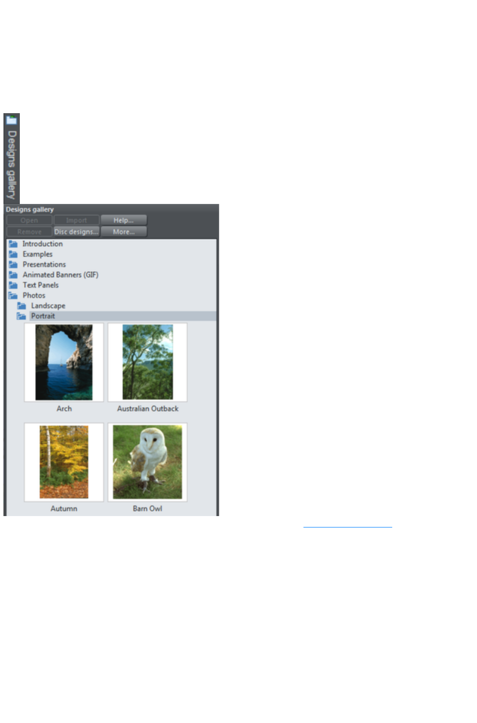
The Designs Gallery
This gallery provides professionally designed templates, from complete web pages and websites to
individual items of clipart you can use to spice up any design.
To open this gallery:
Choose "Utilities" > "Galleries" > "Designs Gallery".
Or click the Designs Gallery tab on the Galleries bar.
You can search using keywords, and sort the gallery contents. See Document Handling
for more information on using galleries. When you open the gallery, if you are online it will automatically
download designs and widgets from the Web Designer Premium servers and these appear immediately in
the gallery. Check back regularly to see the latest widgets and free templates that are available.To open a
template as a new document double-click on it. To import a template into your current open document,
drag it and drop it into your design. Page templates are added as new pages to your current document
when you do this. Other templates and widgets are dropped onto your current page.
When you drag and drop a widget, a web browser window opens up onto the widget website, allowing
you to configure the widget to suit your needs. When you've finished, click the Insert button at the bottom
of the browser window and the widget is inserted into your page with a static placeholder image. You
see the static image when viewing the page on the Xara Web Designer 7 Premium canvas, but you see
the real widget when you export and preview your website. See the Web graphics & Widgets
chapter for more information.
Page 1236

Changing the blank template document
The blank template documents are the options available under "File" > "New"
.
Pre-designed templates are available from the Designs Gallery (or "
File" > "New from Designs Gallery
").
To add a template document:
1. Open an existing document ("File" > "Open", or "Ctrl + O") or
create a new one with the New button on the Standard control
bar or "Ctrl + N".
2. Make any required changes (these could be changing the page
size, adding a logo or adding a message). You can edit the
template document just like an ordinary document.
3. When you are happy with the changes choose "File" > "Save
Template" and choose a template name.
To make your new template the default template (i.e. which is there when you first open Web Designer
Premium, and which appears when you press "Ctrl + N") check the Use as Default Template
option when saving the template.
Page 1238
Displaying your own icons in browser tabs:
favicons
You may want to display your own customized icon, for example, a logo, on your site's page tabs when
they are displayed in a web browser. Web Designer Premium allows you to do this by applying the name
'favicon' to your custom tab icon.
To create a 'favicon', draw or drag on to a web page the image that you want to use. The image can be
any size as it will be scaled to the right size automatically when displayed in a browser.
Click it then click the Names button to the right of the Selector Tool
infobar.
In the Names dialog, type 'favicon' into the Apply names box and click Add then Close
.
Preview your website in your choice of web browser. The easiest way is to click one of the Preview
icons and in the Xara Web Designer 7 Premium preview window, and then choose one of the web
browsers in the top right of the preview window.
Your web page tab is displayed with the custom icon, as shown in the example below.
You can only use one favicon per website. Publish your website and view it to see your favicon.
Tip
: Internet Explorer and Chrome don't show the favicon if the page is loaded from your local disc, which is
normally the case when you're building and previewing your website before publishing it. At time of
writing, Firefox does show it even for local pages, so use it to check your favicon. Once your site is
published the favicon should work in all popular web browsers.
Page 1239

Options in the Utilities menu
Keyboard shortcut: "Ctrl + Shift + O" or right click the page/pasteboard and choose Page Options.
This menu option opens the Options
dialog box. This lets you set various options for Web Designer Premium.
Page 1240
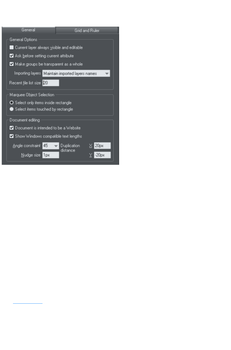
General tab
This page describes the General tab of the Utilities, Options dialog
Recent file list size
The File menu shows a list of the most recently loaded or saved files in its 'Open recent' sub-menu. This
list gives a quick way to reload any of those files. This option lets you change the number of files listed
(between 1 and 20 files).
Current layer always visible and editable
With this option selected, selecting a layer in the Page & Layer Gallery
automatically makes it visible and editable.
With this option unset, the visible and editable states of a layer remain unchanged when you select that
layer.
Ask before setting current attribute
This applies when changing a current attribute (this happens when you change an attribute with no
objects selected). With this option set, you are asked to confirm whether you want to change the
attribute. With this option unset, the change is made without confirmation.
Make groups be transparent as a whole.
See Transparency
for more on transparencies.
When applying transparency to a group of objects, by default Web Designer Premium will apply the
transparency to the group as if it were one object (i.e. you will not see individual transparencies within the
group). Unselecting this option will make Web Designer Premium add transparency to each object in the
group separately.
Page 1241

Maintain imported layer names
With this option set, layer information is preserved when you import templates or other files. With
Import layers into the active layer instead selected, all imported objects appear in the current layer
and the layering information in the incoming data is ignored. Import layers into new layers
will create a layer for each imported layer.
IMPORTANT: Note that you should not change this setting if you use any of the web templates in the
Designs Gallery
. Most web templates have multiple layers which are used to implement mouseover effects. These
typically have layers MouseOff and MouseOver and so when importing these designs it's important that
these layers are preserved and merged with the same layers in your document.
Marquee Object Selection
This option enables you to change the default setting for marquee selection (where you drag a selection
rectangle over the objects you want to select). So you can choose to have objects touching the selection
rectangle selected or only the objects wholly inside the rectangle.
Angle constraint
This applies when rotating or moving an object with "Ctrl" pressed.
You can either select from the menu or type in a value in degrees.
Document is intended to be a website
This option tells Xara Web Designer 7 Premium that the document is primarily intended to be exported
as a website. It subtly changes the behavior of the program in terms of how it handles links on objects.
With this option turned off, if you apply a link to an object which is inside a group, that link will do
nothing in the exported website because the whole group is exported as one image and so the link on just
one of the group's members is ignored when exporting the website. However with this option turned on,
the link is automatically promoted up to the group, just as if it had been applied to the group instead of to
one of its members. So for example if you inadvertently apply a link to the text on a button, instead of to
the whole button, with this option on the link is applied to the whole button for you. This option is on by
default in all web templates.
Show Windows compatible text lengths
See Browser text compatibility in the Text Handling
chapter.
Nudge size
This applies when moving objects using the arrow? keys on the keyboard.
This text box defines how far the object moves for each key press. If the document uses scaled units (for
example, 1inch to 1mile), this text box shows the distance in the scaled units.
When nudging, "Ctrl" and "Shift" increase the nudge distance by five and ten times, respectively.
Duplication distance
"Edit" > "Duplicate
" (Ctrl + D) creates a duplicate which is offset from the original object. These text boxes set the offset
distance.
Positive values create the duplicate above or to the right of the original object.
Negative values create the duplicate below or to the left.
Page 1242

Recent file list size
The File menu shows a list of the most recently loaded or saved files in its 'Open recent' sub-menu. This
list gives a quick way to reload any of those files. This option lets you change the number of files listed
(between 1 and 20 files).
Current layer always visible and editable
With this option selected, selecting a layer in the Page & Layer Gallery
automatically makes it visible and editable.
With this option unset, the visible and editable states of a layer remain unchanged when you select that
layer.
Ask before setting current attribute
This applies when changing a current attribute (this happens when you change an attribute with no
objects selected). With this option set, you are asked to confirm whether you want to change the
attribute. With this option unset, the change is made without confirmation.
Make groups be transparent as a whole.
See Transparency
for more on transparencies.
When applying transparency to a group of objects, by default Web Designer Premium will apply the
transparency to the group as if it were one object (i.e. you will not see individual transparencies within the
group). Unselecting this option will make Web Designer Premium add transparency to each object in the
group separately.
Maintain imported layer names
With this option set, layer information is preserved when you import templates or other files. With
Import layers into the active layer instead selected, all imported objects appear in the current layer
and the layering information in the incoming data is ignored. Import layers into new layers
will create a layer for each imported layer.
IMPORTANT: Note that you should not change this setting if you use any of the web templates in the
Designs Gallery
. Most web templates have multiple layers which are used to implement mouseover effects. These
typically have layers MouseOff and MouseOver and so when importing these designs it's important that
these layers are preserved and merged with the same layers in your document.
Marquee Object Selection
This option enables you to change the default setting for marquee selection (where you drag a selection
rectangle over the objects you want to select). So you can choose to have objects touching the selection
rectangle selected or only the objects wholly inside the rectangle.
Angle constraint
This applies when rotating or moving an object with "Ctrl" pressed.
You can either select from the menu or type in a value in degrees.
Document is intended to be a website
This option tells Xara Web Designer 7 Premium that the document is primarily intended to be exported
as a website. It subtly changes the behavior of the program in terms of how it handles links on objects.
Page 1243

With this option turned off, if you apply a link to an object which is inside a group, that link will do
nothing in the exported website because the whole group is exported as one image and so the link on just
one of the group's members is ignored when exporting the website. However with this option turned on,
the link is automatically promoted up to the group, just as if it had been applied to the group instead of to
one of its members. So for example if you inadvertently apply a link to the text on a button, instead of to
the whole button, with this option on the link is applied to the whole button for you. This option is on by
default in all web templates.
Show Windows compatible text lengths
See Browser text compatibility in the Text Handling
chapter.
Nudge size
This applies when moving objects using the arrowï€ keys on the keyboard.
This text box defines how far the object moves for each key press. If the document uses scaled units (for
example, 1inch to 1mile), this text box shows the distance in the scaled units.
When nudging, "Ctrl" and "Shift" increase the nudge distance by five and ten times, respectively.
Duplication distance
"Edit" > "Duplicate
" (Ctrl + D) creates a duplicate which is offset from the original object. These text boxes set the offset
distance.
Positive values create the duplicate above or to the right of the original object.
Negative values create the duplicate below or to the left.
Page 1244

Current layer always visible and editable
With this option selected, selecting a layer in the Page & Layer Gallery
automatically makes it visible and editable.
With this option unset, the visible and editable states of a layer remain unchanged when you select that
layer.
Ask before setting current attribute
This applies when changing a current attribute (this happens when you change an attribute with no
objects selected). With this option set, you are asked to confirm whether you want to change the
attribute. With this option unset, the change is made without confirmation.
Make groups be transparent as a whole.
See Transparency
for more on transparencies.
When applying transparency to a group of objects, by default Web Designer Premium will apply the
transparency to the group as if it were one object (i.e. you will not see individual transparencies within the
group). Unselecting this option will make Web Designer Premium add transparency to each object in the
group separately.
Maintain imported layer names
With this option set, layer information is preserved when you import templates or other files. With
Import layers into the active layer instead selected, all imported objects appear in the current layer
and the layering information in the incoming data is ignored. Import layers into new layers
will create a layer for each imported layer.
IMPORTANT: Note that you should not change this setting if you use any of the web templates in the
Designs Gallery
. Most web templates have multiple layers which are used to implement mouseover effects. These
typically have layers MouseOff and MouseOver and so when importing these designs it's important that
these layers are preserved and merged with the same layers in your document.
Marquee Object Selection
This option enables you to change the default setting for marquee selection (where you drag a selection
rectangle over the objects you want to select). So you can choose to have objects touching the selection
rectangle selected or only the objects wholly inside the rectangle.
Angle constraint
This applies when rotating or moving an object with "Ctrl" pressed.
You can either select from the menu or type in a value in degrees.
Document is intended to be a website
This option tells Xara Web Designer 7 Premium that the document is primarily intended to be exported
as a website. It subtly changes the behavior of the program in terms of how it handles links on objects.
With this option turned off, if you apply a link to an object which is inside a group, that link will do
nothing in the exported website because the whole group is exported as one image and so the link on just
one of the group's members is ignored when exporting the website. However with this option turned on,
the link is automatically promoted up to the group, just as if it had been applied to the group instead of to
one of its members. So for example if you inadvertently apply a link to the text on a button, instead of to
Page 1245

the whole button, with this option on the link is applied to the whole button for you. This option is on by
default in all web templates.
Show Windows compatible text lengths
See Browser text compatibility in the Text Handling
chapter.
Nudge size
This applies when moving objects using the arrowï€ keys on the keyboard.
This text box defines how far the object moves for each key press. If the document uses scaled units (for
example, 1inch to 1mile), this text box shows the distance in the scaled units.
When nudging, "Ctrl" and "Shift" increase the nudge distance by five and ten times, respectively.
Duplication distance
"Edit" > "Duplicate
" (Ctrl + D) creates a duplicate which is offset from the original object. These text boxes set the offset
distance.
Positive values create the duplicate above or to the right of the original object.
Negative values create the duplicate below or to the left.
Page 1246

Ask before setting current attribute
This applies when changing a current attribute (this happens when you change an attribute with no
objects selected). With this option set, you are asked to confirm whether you want to change the
attribute. With this option unset, the change is made without confirmation.
Make groups be transparent as a whole.
See Transparency
for more on transparencies.
When applying transparency to a group of objects, by default Web Designer Premium will apply the
transparency to the group as if it were one object (i.e. you will not see individual transparencies within the
group). Unselecting this option will make Web Designer Premium add transparency to each object in the
group separately.
Maintain imported layer names
With this option set, layer information is preserved when you import templates or other files. With
Import layers into the active layer instead selected, all imported objects appear in the current layer
and the layering information in the incoming data is ignored. Import layers into new layers
will create a layer for each imported layer.
IMPORTANT: Note that you should not change this setting if you use any of the web templates in the
Designs Gallery
. Most web templates have multiple layers which are used to implement mouseover effects. These
typically have layers MouseOff and MouseOver and so when importing these designs it's important that
these layers are preserved and merged with the same layers in your document.
Marquee Object Selection
This option enables you to change the default setting for marquee selection (where you drag a selection
rectangle over the objects you want to select). So you can choose to have objects touching the selection
rectangle selected or only the objects wholly inside the rectangle.
Angle constraint
This applies when rotating or moving an object with "Ctrl" pressed.
You can either select from the menu or type in a value in degrees.
Document is intended to be a website
This option tells Xara Web Designer 7 Premium that the document is primarily intended to be exported
as a website. It subtly changes the behavior of the program in terms of how it handles links on objects.
With this option turned off, if you apply a link to an object which is inside a group, that link will do
nothing in the exported website because the whole group is exported as one image and so the link on just
one of the group's members is ignored when exporting the website. However with this option turned on,
the link is automatically promoted up to the group, just as if it had been applied to the group instead of to
one of its members. So for example if you inadvertently apply a link to the text on a button, instead of to
the whole button, with this option on the link is applied to the whole button for you. This option is on by
default in all web templates.
Show Windows compatible text lengths
See Browser text compatibility in the Text Handling
chapter.
Page 1247

Nudge size
This applies when moving objects using the arrowï€ keys on the keyboard.
This text box defines how far the object moves for each key press. If the document uses scaled units (for
example, 1inch to 1mile), this text box shows the distance in the scaled units.
When nudging, "Ctrl" and "Shift" increase the nudge distance by five and ten times, respectively.
Duplication distance
"Edit" > "Duplicate
" (Ctrl + D) creates a duplicate which is offset from the original object. These text boxes set the offset
distance.
Positive values create the duplicate above or to the right of the original object.
Negative values create the duplicate below or to the left.
Page 1248

Make groups be transparent as a whole.
See Transparency
for more on transparencies.
When applying transparency to a group of objects, by default Web Designer Premium will apply the
transparency to the group as if it were one object (i.e. you will not see individual transparencies within the
group). Unselecting this option will make Web Designer Premium add transparency to each object in the
group separately.
Maintain imported layer names
With this option set, layer information is preserved when you import templates or other files. With
Import layers into the active layer instead selected, all imported objects appear in the current layer
and the layering information in the incoming data is ignored. Import layers into new layers
will create a layer for each imported layer.
IMPORTANT: Note that you should not change this setting if you use any of the web templates in the
Designs Gallery
. Most web templates have multiple layers which are used to implement mouseover effects. These
typically have layers MouseOff and MouseOver and so when importing these designs it's important that
these layers are preserved and merged with the same layers in your document.
Marquee Object Selection
This option enables you to change the default setting for marquee selection (where you drag a selection
rectangle over the objects you want to select). So you can choose to have objects touching the selection
rectangle selected or only the objects wholly inside the rectangle.
Angle constraint
This applies when rotating or moving an object with "Ctrl" pressed.
You can either select from the menu or type in a value in degrees.
Document is intended to be a website
This option tells Xara Web Designer 7 Premium that the document is primarily intended to be exported
as a website. It subtly changes the behavior of the program in terms of how it handles links on objects.
With this option turned off, if you apply a link to an object which is inside a group, that link will do
nothing in the exported website because the whole group is exported as one image and so the link on just
one of the group's members is ignored when exporting the website. However with this option turned on,
the link is automatically promoted up to the group, just as if it had been applied to the group instead of to
one of its members. So for example if you inadvertently apply a link to the text on a button, instead of to
the whole button, with this option on the link is applied to the whole button for you. This option is on by
default in all web templates.
Show Windows compatible text lengths
See Browser text compatibility in the Text Handling
chapter.
Nudge size
This applies when moving objects using the arrowï€ keys on the keyboard.
This text box defines how far the object moves for each key press. If the document uses scaled units (for
example, 1inch to 1mile), this text box shows the distance in the scaled units.
Page 1249

When nudging, "Ctrl" and "Shift" increase the nudge distance by five and ten times, respectively.
Duplication distance
"Edit" > "Duplicate
" (Ctrl + D) creates a duplicate which is offset from the original object. These text boxes set the offset
distance.
Positive values create the duplicate above or to the right of the original object.
Negative values create the duplicate below or to the left.
Page 1250

Maintain imported layer names
With this option set, layer information is preserved when you import templates or other files. With
Import layers into the active layer instead selected, all imported objects appear in the current layer
and the layering information in the incoming data is ignored. Import layers into new layers
will create a layer for each imported layer.
IMPORTANT: Note that you should not change this setting if you use any of the web templates in the
Designs Gallery
. Most web templates have multiple layers which are used to implement mouseover effects. These
typically have layers MouseOff and MouseOver and so when importing these designs it's important that
these layers are preserved and merged with the same layers in your document.
Marquee Object Selection
This option enables you to change the default setting for marquee selection (where you drag a selection
rectangle over the objects you want to select). So you can choose to have objects touching the selection
rectangle selected or only the objects wholly inside the rectangle.
Angle constraint
This applies when rotating or moving an object with "Ctrl" pressed.
You can either select from the menu or type in a value in degrees.
Document is intended to be a website
This option tells Xara Web Designer 7 Premium that the document is primarily intended to be exported
as a website. It subtly changes the behavior of the program in terms of how it handles links on objects.
With this option turned off, if you apply a link to an object which is inside a group, that link will do
nothing in the exported website because the whole group is exported as one image and so the link on just
one of the group's members is ignored when exporting the website. However with this option turned on,
the link is automatically promoted up to the group, just as if it had been applied to the group instead of to
one of its members. So for example if you inadvertently apply a link to the text on a button, instead of to
the whole button, with this option on the link is applied to the whole button for you. This option is on by
default in all web templates.
Show Windows compatible text lengths
See Browser text compatibility in the Text Handling
chapter.
Nudge size
This applies when moving objects using the arrowï€ keys on the keyboard.
This text box defines how far the object moves for each key press. If the document uses scaled units (for
example, 1inch to 1mile), this text box shows the distance in the scaled units.
When nudging, "Ctrl" and "Shift" increase the nudge distance by five and ten times, respectively.
Duplication distance
"Edit" > "Duplicate
" (Ctrl + D) creates a duplicate which is offset from the original object. These text boxes set the offset
distance.
Positive values create the duplicate above or to the right of the original object.
Negative values create the duplicate below or to the left.
Page 1251

Marquee Object Selection
This option enables you to change the default setting for marquee selection (where you drag a selection
rectangle over the objects you want to select). So you can choose to have objects touching the selection
rectangle selected or only the objects wholly inside the rectangle.
Angle constraint
This applies when rotating or moving an object with "Ctrl" pressed.
You can either select from the menu or type in a value in degrees.
Document is intended to be a website
This option tells Xara Web Designer 7 Premium that the document is primarily intended to be exported
as a website. It subtly changes the behavior of the program in terms of how it handles links on objects.
With this option turned off, if you apply a link to an object which is inside a group, that link will do
nothing in the exported website because the whole group is exported as one image and so the link on just
one of the group's members is ignored when exporting the website. However with this option turned on,
the link is automatically promoted up to the group, just as if it had been applied to the group instead of to
one of its members. So for example if you inadvertently apply a link to the text on a button, instead of to
the whole button, with this option on the link is applied to the whole button for you. This option is on by
default in all web templates.
Show Windows compatible text lengths
See Browser text compatibility in the Text Handling
chapter.
Nudge size
This applies when moving objects using the arrowï€ keys on the keyboard.
This text box defines how far the object moves for each key press. If the document uses scaled units (for
example, 1inch to 1mile), this text box shows the distance in the scaled units.
When nudging, "Ctrl" and "Shift" increase the nudge distance by five and ten times, respectively.
Duplication distance
"Edit" > "Duplicate
" (Ctrl + D) creates a duplicate which is offset from the original object. These text boxes set the offset
distance.
Positive values create the duplicate above or to the right of the original object.
Negative values create the duplicate below or to the left.
Page 1252

Angle constraint
This applies when rotating or moving an object with "Ctrl" pressed.
You can either select from the menu or type in a value in degrees.
Document is intended to be a website
This option tells Xara Web Designer 7 Premium that the document is primarily intended to be exported
as a website. It subtly changes the behavior of the program in terms of how it handles links on objects.
With this option turned off, if you apply a link to an object which is inside a group, that link will do
nothing in the exported website because the whole group is exported as one image and so the link on just
one of the group's members is ignored when exporting the website. However with this option turned on,
the link is automatically promoted up to the group, just as if it had been applied to the group instead of to
one of its members. So for example if you inadvertently apply a link to the text on a button, instead of to
the whole button, with this option on the link is applied to the whole button for you. This option is on by
default in all web templates.
Show Windows compatible text lengths
See Browser text compatibility in the Text Handling
chapter.
Nudge size
This applies when moving objects using the arrowï€ keys on the keyboard.
This text box defines how far the object moves for each key press. If the document uses scaled units (for
example, 1inch to 1mile), this text box shows the distance in the scaled units.
When nudging, "Ctrl" and "Shift" increase the nudge distance by five and ten times, respectively.
Duplication distance
"Edit" > "Duplicate
" (Ctrl + D) creates a duplicate which is offset from the original object. These text boxes set the offset
distance.
Positive values create the duplicate above or to the right of the original object.
Negative values create the duplicate below or to the left.
Page 1253

Document is intended to be a website
This option tells Xara Web Designer 7 Premium that the document is primarily intended to be exported
as a website. It subtly changes the behavior of the program in terms of how it handles links on objects.
With this option turned off, if you apply a link to an object which is inside a group, that link will do
nothing in the exported website because the whole group is exported as one image and so the link on just
one of the group's members is ignored when exporting the website. However with this option turned on,
the link is automatically promoted up to the group, just as if it had been applied to the group instead of to
one of its members. So for example if you inadvertently apply a link to the text on a button, instead of to
the whole button, with this option on the link is applied to the whole button for you. This option is on by
default in all web templates.
Show Windows compatible text lengths
See Browser text compatibility in the Text Handling
chapter.
Nudge size
This applies when moving objects using the arrowï€ keys on the keyboard.
This text box defines how far the object moves for each key press. If the document uses scaled units (for
example, 1inch to 1mile), this text box shows the distance in the scaled units.
When nudging, "Ctrl" and "Shift" increase the nudge distance by five and ten times, respectively.
Duplication distance
"Edit" > "Duplicate
" (Ctrl + D) creates a duplicate which is offset from the original object. These text boxes set the offset
distance.
Positive values create the duplicate above or to the right of the original object.
Negative values create the duplicate below or to the left.
Page 1254

Show Windows compatible text lengths
See Browser text compatibility in the Text Handling
chapter.
Nudge size
This applies when moving objects using the arrowï€ keys on the keyboard.
This text box defines how far the object moves for each key press. If the document uses scaled units (for
example, 1inch to 1mile), this text box shows the distance in the scaled units.
When nudging, "Ctrl" and "Shift" increase the nudge distance by five and ten times, respectively.
Duplication distance
"Edit" > "Duplicate
" (Ctrl + D) creates a duplicate which is offset from the original object. These text boxes set the offset
distance.
Positive values create the duplicate above or to the right of the original object.
Negative values create the duplicate below or to the left.
Page 1255

Nudge size
This applies when moving objects using the arrowï€ keys on the keyboard.
This text box defines how far the object moves for each key press. If the document uses scaled units (for
example, 1inch to 1mile), this text box shows the distance in the scaled units.
When nudging, "Ctrl" and "Shift" increase the nudge distance by five and ten times, respectively.
Duplication distance
"Edit" > "Duplicate
" (Ctrl + D) creates a duplicate which is offset from the original object. These text boxes set the offset
distance.
Positive values create the duplicate above or to the right of the original object.
Negative values create the duplicate below or to the left.
Page 1256

Duplication distance
"Edit" > "Duplicate
" (Ctrl + D) creates a duplicate which is offset from the original object. These text boxes set the offset
distance.
Positive values create the duplicate above or to the right of the original object.
Negative values create the duplicate below or to the left.
Page 1257
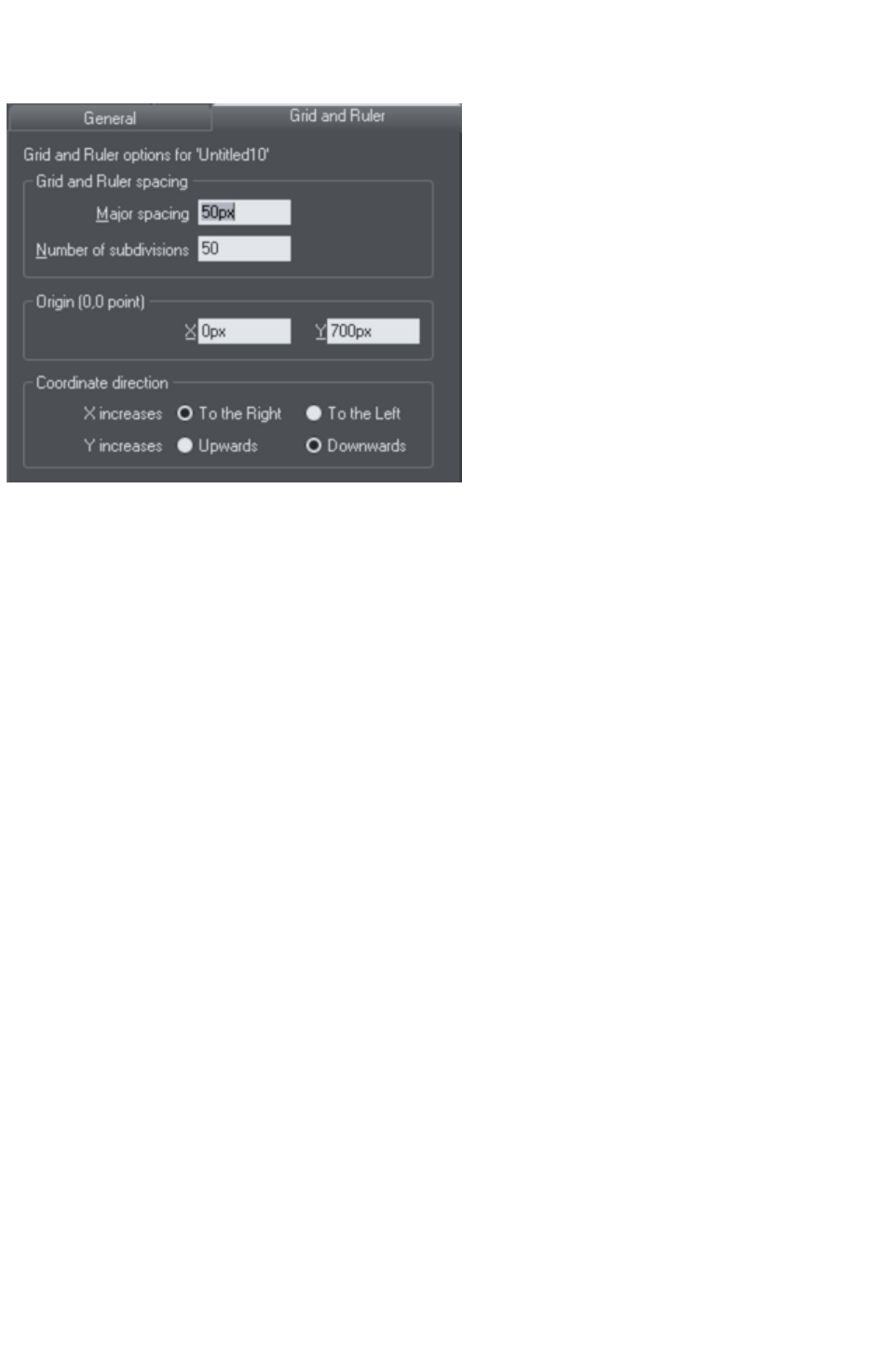
Grid and Ruler tab
This page describes the Grid and Ruler tab of the Utilities, Options dialog
Grid and Ruler spacing
Major Spacing defines the distance between the major grid and ruler divisions. The units used for the
grid and rulers are defined by the units you use for the major spacing. For example entering a major grid
spacing of 2cm
will set the grid and ruler units to centimeters regardless of the page units specified in the units options.
Coordinate Direction
Here you can change the direction of page coordinates.
Page 1258

Grid and Ruler spacing
Major Spacing defines the distance between the major grid and ruler divisions. The units used for the
grid and rulers are defined by the units you use for the major spacing. For example entering a major grid
spacing of 2cm
will set the grid and ruler units to centimeters regardless of the page units specified in the units options.
Coordinate Direction
Here you can change the direction of page coordinates.
Page 1259

Coordinate Direction
Here you can change the direction of page coordinates.
Page 1260
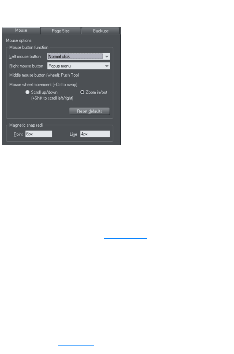
Mouse tab
This page describes the Mouse tab of the Utilities, Options dialog
Mouse button function
Web Designer Premium gives you a range of possible actions when you click either the left or right
mouse buttons. For example, if you're left-handed, you may prefer to use the right-hand button as the
normal button. You would therefore assign the normal click to the right mouse button (you can also set
both buttons to have the same action if you wish).
Possible actions:
Normal click - At least one button should always be assigned as the normal click.
"Shift + click".
"Ctrl + click".
"Alt + click".
Display a pop-up menu (see below).
Toggle full-screen mode (described in Document Handling).
Zoom in or out -click to zoom in, "Shift + click" to zoom out (described in Document Handling).
Push Tool (as if you pressed "Shift + F8")
The pop-up menu contains options suitable for the object you click on. For example, for most object
types the menu contains Cut, Copy, Paste, Delete, Duplicate, Clone (these are described in Object
Handling
).
Mouse wheel Movement:
You can change the mouse wheel action here between Scrolling and Zooming.
Click Reset Defaults to return to the original button assignments. This has immediate effect; you don't
need to click OK or Apply Now
.
The Windows Control Panel also lets you swap the left and right mouse buttons.
Magnetic Snap Radii
Snapping is described in Object Handling
.
Page 1261

These text boxes define how close you can drag an object before it snaps to a magnetic object. These
are distances on the screen and independent of any document scaling.
Page 1262
Mouse button function
Web Designer Premium gives you a range of possible actions when you click either the left or right
mouse buttons. For example, if you're left-handed, you may prefer to use the right-hand button as the
normal button. You would therefore assign the normal click to the right mouse button (you can also set
both buttons to have the same action if you wish).
Possible actions:
Normal click - At least one button should always be assigned as the normal click.
"Shift + click".
"Ctrl + click".
"Alt + click".
Display a pop-up menu (see below).
Toggle full-screen mode (described in Document Handling).
Zoom in or out -click to zoom in, "Shift + click" to zoom out (described in Document Handling).
Push Tool (as if you pressed "Shift + F8")
The pop-up menu contains options suitable for the object you click on. For example, for most object
types the menu contains Cut, Copy, Paste, Delete, Duplicate, Clone (these are described in Object
Handling
).
Mouse wheel Movement:
You can change the mouse wheel action here between Scrolling and Zooming.
Click Reset Defaults to return to the original button assignments. This has immediate effect; you don't
need to click OK or Apply Now
.
The Windows Control Panel also lets you swap the left and right mouse buttons.
Magnetic Snap Radii
Snapping is described in Object Handling
.
These text boxes define how close you can drag an object before it snaps to a magnetic object. These
are distances on the screen and independent of any document scaling.
Page 1263

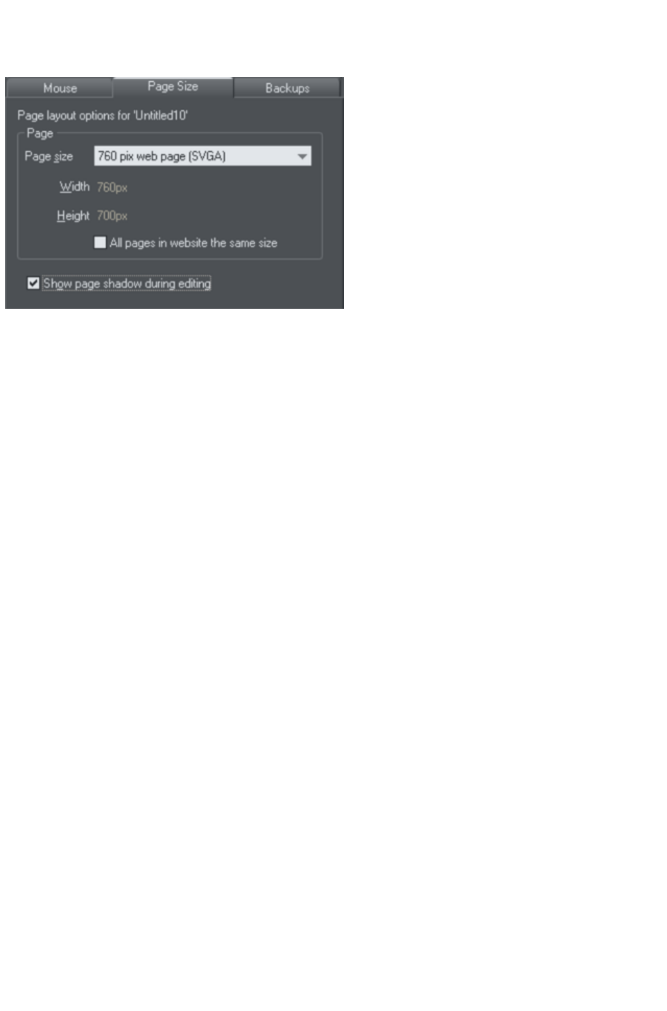
Page Size tab
This page describes the Page Size tab wd of the Utilities, Options dialog
If the "All pages in website the same size
" option is unselected, then pages in your document can be given different sizes using this dialog. To set
the page size, choose one of the paper sizes provided in the dropdown list, or choose "Custom" and then
enter the width and height required in the field s provided.
Page 1265

Backups Tab
This tab allows you to turn the automatic backup facility on and off. This facility saves a copy of all your
modified open documents at regular intervals. It's recommended that you work with this backup option
turned on, so your work is saved regularly. You can also choose whether you are prompted about
unsaved documents when closing the program, or if instead all open documents should be backed up and
restored for you when you next start up.
See the Document Handling chapter
for full details about these facilities.
Page 1266
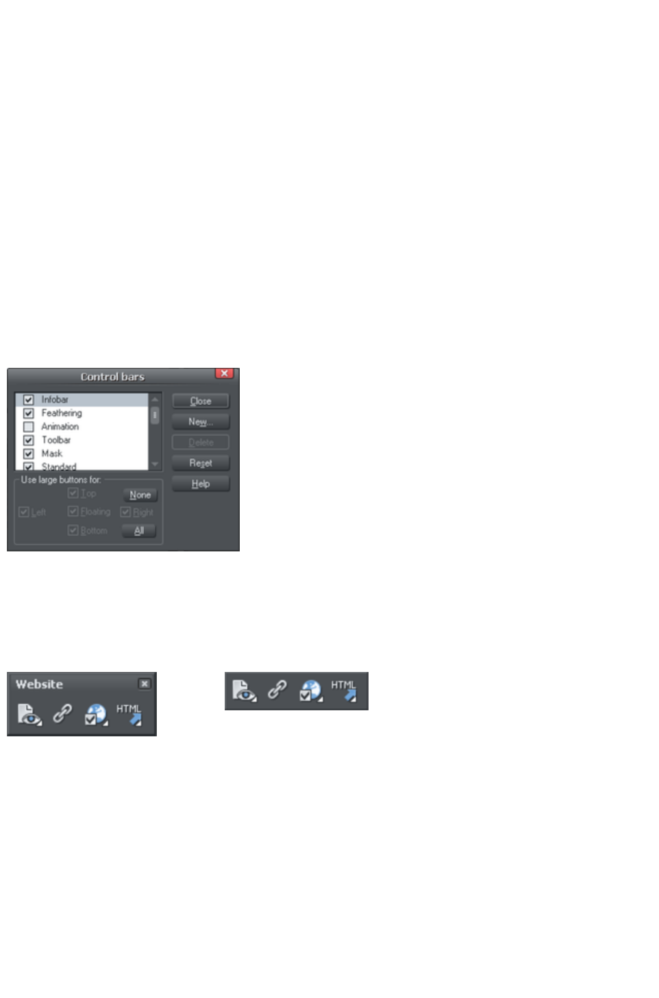
Control bars
You can move Web Designer Premium's control bars to different places around the window, re-order
the buttons, create new control bars, move or copy buttons between control bars and many other
operations.
You cannot change the tool-dependent InfoBar or the contents of the fly-out bars which are on the main
toolbar and top bars.
Full screen mode
Web Designer Premium has two configurations of control bars:
One configuration appears when the window is its normal size.
The second configuration appears after you choose "Window" > "Full Screen".
Any changes to one configuration of control bars (for example, resizing or moving) have no effect on the
other configuration. Changes to individual buttons (for example, setting an option) apply in both normal
and full screen modes.
Displaying & hiding control bars
The display of control bars is
controlled by the Control Bars dialog
box ("Window" > "Control Bars
").
Against the name of each control bar
is a check box. A tick in the check
box shows that the control bar is
currently displayed. Click on the
required control bar's check box to
display or hide that bar.
Docked and free floating control bars
Normally, control bars are docked (attached to the edges of the window). Moving the window also
moves docked control bars.
Control bars can also be floating. These do not follow movements of the window.
Floating control bar
Docked control bar
You can hide a floating control bar either using the Control Bars dialog box (described above) or by
clicking its Close
icon.
To make a control bar float, drag it away from the edge of the window either onto the editing area or off
the Web Designer Premium window.
To dock a control bar, drag it over:
The edge of the window.
Or the menu bar.
Or another control bar.
A floating control bar has a double line outline while dragging. This changes to a single line when in a
docking position. If you want the control bar to remain floating, hold down "Ctrl" while dragging.
Page 1267

Resizing a control bar
Move the pointer over the edge of the control bar. It changes to a double-headed arrow. You can now
drag the edge to resize the control bar.
Creating new control bars
To create a new control bar:
Drag a button onto the editing area or off the window. This opens a new control bar containing
the button.
Or click New on the Control Bars
dialog box. This lets you create a new control bar and allocate a name to it. The new control bar is
empty. You can then drag buttons to it.
Moving buttons is described below.
Deleting control bars
You can only delete control bars that are empty. Therefore move any buttons to another control bar.
Close the control bar (either click on the Close icon or use the Control Bars
dialog box). The control bar is automatically deleted when you quit Web Designer Premium.
Moving buttons and tools
To move buttons or tools:
1. Move the mouse pointer over the button you want to move.
2. Hold down "Alt" (left ALT) to move the button or "AltGr" (right ALT) to copy the button when
used on user-defined control bars and other control bars. Although on the predefined "Button
palette" both ALT-keys do only copy the button.
3. Drag the button to:
oA different place on the same control bar.
oOr another control bar.
oOr onto the editing area/off Web Designer Premium to create a new control bar.
You cannot move buttons onto or off the InfoBar.
Hiding buttons and tools
Move the unwanted buttons or tools to another control bar and then hide that control bar (described
above).
If you need the button or tool in the future, use the Control Bars
dialog box to redisplay the control bar.
You cannot delete buttons or tools.
Page 1268
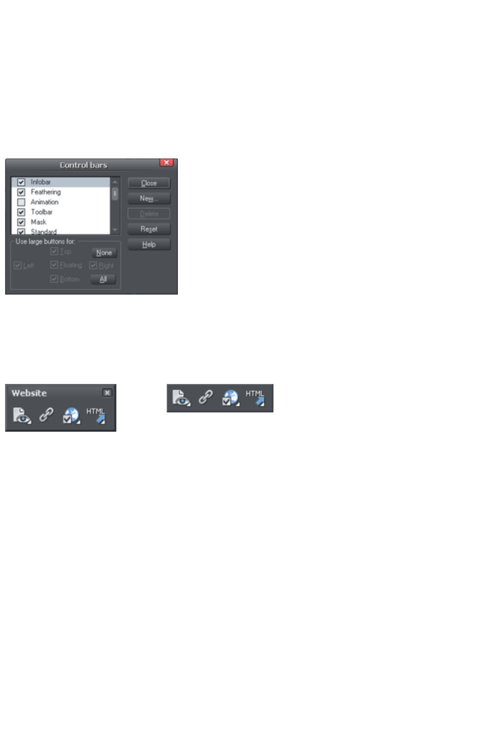
Full screen mode
Web Designer Premium has two configurations of control bars:
One configuration appears when the window is its normal size.
The second configuration appears after you choose "Window" > "Full Screen".
Any changes to one configuration of control bars (for example, resizing or moving) have no effect on the
other configuration. Changes to individual buttons (for example, setting an option) apply in both normal
and full screen modes.
Displaying & hiding control bars
The display of control bars is
controlled by the Control Bars dialog
box ("Window" > "Control Bars
").
Against the name of each control bar
is a check box. A tick in the check
box shows that the control bar is
currently displayed. Click on the
required control bar's check box to
display or hide that bar.
Docked and free floating control bars
Normally, control bars are docked (attached to the edges of the window). Moving the window also
moves docked control bars.
Control bars can also be floating. These do not follow movements of the window.
Floating control bar
Docked control bar
You can hide a floating control bar either using the Control Bars dialog box (described above) or by
clicking its Close
icon.
To make a control bar float, drag it away from the edge of the window either onto the editing area or off
the Web Designer Premium window.
To dock a control bar, drag it over:
The edge of the window.
Or the menu bar.
Or another control bar.
A floating control bar has a double line outline while dragging. This changes to a single line when in a
docking position. If you want the control bar to remain floating, hold down "Ctrl" while dragging.
Resizing a control bar
Move the pointer over the edge of the control bar. It changes to a double-headed arrow. You can now
drag the edge to resize the control bar.
Creating new control bars
To create a new control bar:
Drag a button onto the editing area or off the window. This opens a new control bar containing
Page 1269

the button.
Or click New on the Control Bars
dialog box. This lets you create a new control bar and allocate a name to it. The new control bar is
empty. You can then drag buttons to it.
Moving buttons is described below.
Deleting control bars
You can only delete control bars that are empty. Therefore move any buttons to another control bar.
Close the control bar (either click on the Close icon or use the Control Bars
dialog box). The control bar is automatically deleted when you quit Web Designer Premium.
Moving buttons and tools
To move buttons or tools:
1. Move the mouse pointer over the button you want to move.
2. Hold down "Alt" (left ALT) to move the button or "AltGr" (right ALT) to copy the button when
used on user-defined control bars and other control bars. Although on the predefined "Button
palette" both ALT-keys do only copy the button.
3. Drag the button to:
oA different place on the same control bar.
oOr another control bar.
oOr onto the editing area/off Web Designer Premium to create a new control bar.
You cannot move buttons onto or off the InfoBar.
Hiding buttons and tools
Move the unwanted buttons or tools to another control bar and then hide that control bar (described
above).
If you need the button or tool in the future, use the Control Bars
dialog box to redisplay the control bar.
You cannot delete buttons or tools.
Page 1270
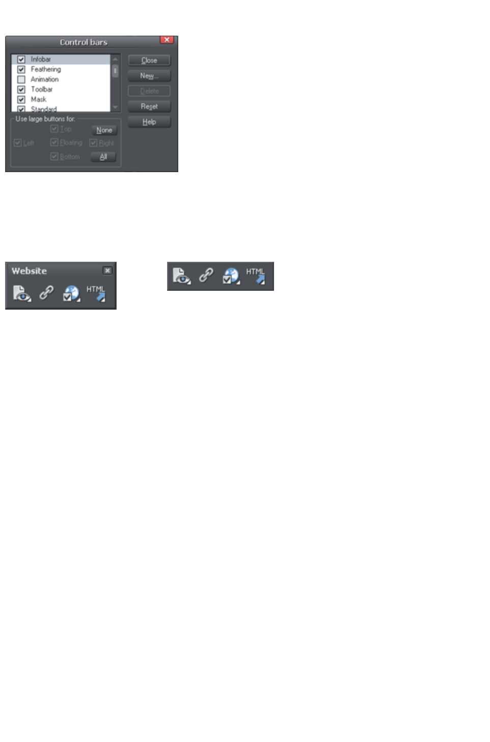
Displaying & hiding control bars
The display of control bars is
controlled by the Control Bars dialog
box ("Window" > "Control Bars
").
Against the name of each control bar
is a check box. A tick in the check
box shows that the control bar is
currently displayed. Click on the
required control bar's check box to
display or hide that bar.
Docked and free floating control bars
Normally, control bars are docked (attached to the edges of the window). Moving the window also
moves docked control bars.
Control bars can also be floating. These do not follow movements of the window.
Floating control bar
Docked control bar
You can hide a floating control bar either using the Control Bars dialog box (described above) or by
clicking its Close
icon.
To make a control bar float, drag it away from the edge of the window either onto the editing area or off
the Web Designer Premium window.
To dock a control bar, drag it over:
The edge of the window.
Or the menu bar.
Or another control bar.
A floating control bar has a double line outline while dragging. This changes to a single line when in a
docking position. If you want the control bar to remain floating, hold down "Ctrl" while dragging.
Resizing a control bar
Move the pointer over the edge of the control bar. It changes to a double-headed arrow. You can now
drag the edge to resize the control bar.
Creating new control bars
To create a new control bar:
Drag a button onto the editing area or off the window. This opens a new control bar containing
the button.
Or click New on the Control Bars
dialog box. This lets you create a new control bar and allocate a name to it. The new control bar is
empty. You can then drag buttons to it.
Moving buttons is described below.
Deleting control bars
You can only delete control bars that are empty. Therefore move any buttons to another control bar.
Page 1271

Close the control bar (either click on the Close icon or use the Control Bars
dialog box). The control bar is automatically deleted when you quit Web Designer Premium.
Moving buttons and tools
To move buttons or tools:
1. Move the mouse pointer over the button you want to move.
2. Hold down "Alt" (left ALT) to move the button or "AltGr" (right ALT) to copy the button when
used on user-defined control bars and other control bars. Although on the predefined "Button
palette" both ALT-keys do only copy the button.
3. Drag the button to:
oA different place on the same control bar.
oOr another control bar.
oOr onto the editing area/off Web Designer Premium to create a new control bar.
You cannot move buttons onto or off the InfoBar.
Hiding buttons and tools
Move the unwanted buttons or tools to another control bar and then hide that control bar (described
above).
If you need the button or tool in the future, use the Control Bars
dialog box to redisplay the control bar.
You cannot delete buttons or tools.
Page 1272
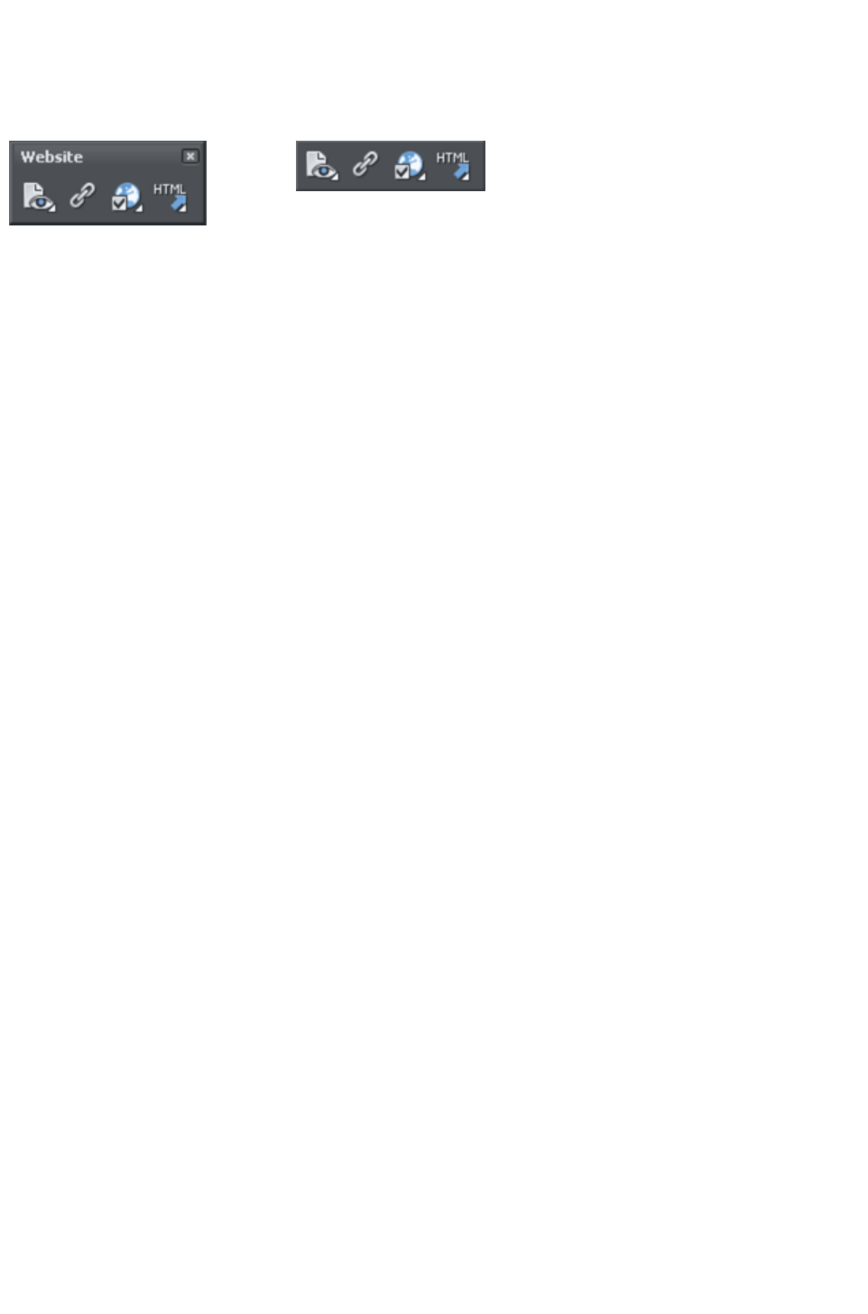
Docked and free floating control bars
Normally, control bars are docked (attached to the edges of the window). Moving the window also
moves docked control bars.
Control bars can also be floating. These do not follow movements of the window.
Floating control bar
Docked control bar
You can hide a floating control bar either using the Control Bars dialog box (described above) or by
clicking its Close
icon.
To make a control bar float, drag it away from the edge of the window either onto the editing area or off
the Web Designer Premium window.
To dock a control bar, drag it over:
The edge of the window.
Or the menu bar.
Or another control bar.
A floating control bar has a double line outline while dragging. This changes to a single line when in a
docking position. If you want the control bar to remain floating, hold down "Ctrl" while dragging.
Resizing a control bar
Move the pointer over the edge of the control bar. It changes to a double-headed arrow. You can now
drag the edge to resize the control bar.
Creating new control bars
To create a new control bar:
Drag a button onto the editing area or off the window. This opens a new control bar containing
the button.
Or click New on the Control Bars
dialog box. This lets you create a new control bar and allocate a name to it. The new control bar is
empty. You can then drag buttons to it.
Moving buttons is described below.
Deleting control bars
You can only delete control bars that are empty. Therefore move any buttons to another control bar.
Close the control bar (either click on the Close icon or use the Control Bars
dialog box). The control bar is automatically deleted when you quit Web Designer Premium.
Moving buttons and tools
To move buttons or tools:
1. Move the mouse pointer over the button you want to move.
2. Hold down "Alt" (left ALT) to move the button or "AltGr" (right ALT) to copy the button when
used on user-defined control bars and other control bars. Although on the predefined "Button
palette" both ALT-keys do only copy the button.
3. Drag the button to:
oA different place on the same control bar.
oOr another control bar.
Page 1273

oOr onto the editing area/off Web Designer Premium to create a new control bar.
You cannot move buttons onto or off the InfoBar.
Hiding buttons and tools
Move the unwanted buttons or tools to another control bar and then hide that control bar (described
above).
If you need the button or tool in the future, use the Control Bars
dialog box to redisplay the control bar.
You cannot delete buttons or tools.
Page 1274

Resizing a control bar
Move the pointer over the edge of the control bar. It changes to a double-headed arrow. You can now
drag the edge to resize the control bar.
Creating new control bars
To create a new control bar:
Drag a button onto the editing area or off the window. This opens a new control bar containing
the button.
Or click New on the Control Bars
dialog box. This lets you create a new control bar and allocate a name to it. The new control bar is
empty. You can then drag buttons to it.
Moving buttons is described below.
Deleting control bars
You can only delete control bars that are empty. Therefore move any buttons to another control bar.
Close the control bar (either click on the Close icon or use the Control Bars
dialog box). The control bar is automatically deleted when you quit Web Designer Premium.
Moving buttons and tools
To move buttons or tools:
1. Move the mouse pointer over the button you want to move.
2. Hold down "Alt" (left ALT) to move the button or "AltGr" (right ALT) to copy the button when
used on user-defined control bars and other control bars. Although on the predefined "Button
palette" both ALT-keys do only copy the button.
3. Drag the button to:
oA different place on the same control bar.
oOr another control bar.
oOr onto the editing area/off Web Designer Premium to create a new control bar.
You cannot move buttons onto or off the InfoBar.
Hiding buttons and tools
Move the unwanted buttons or tools to another control bar and then hide that control bar (described
above).
If you need the button or tool in the future, use the Control Bars
dialog box to redisplay the control bar.
You cannot delete buttons or tools.
Page 1275

Creating new control bars
To create a new control bar:
Drag a button onto the editing area or off the window. This opens a new control bar containing
the button.
Or click New on the Control Bars
dialog box. This lets you create a new control bar and allocate a name to it. The new control bar is
empty. You can then drag buttons to it.
Moving buttons is described below.
Deleting control bars
You can only delete control bars that are empty. Therefore move any buttons to another control bar.
Close the control bar (either click on the Close icon or use the Control Bars
dialog box). The control bar is automatically deleted when you quit Web Designer Premium.
Moving buttons and tools
To move buttons or tools:
1. Move the mouse pointer over the button you want to move.
2. Hold down "Alt" (left ALT) to move the button or "AltGr" (right ALT) to copy the button when
used on user-defined control bars and other control bars. Although on the predefined "Button
palette" both ALT-keys do only copy the button.
3. Drag the button to:
oA different place on the same control bar.
oOr another control bar.
oOr onto the editing area/off Web Designer Premium to create a new control bar.
You cannot move buttons onto or off the InfoBar.
Hiding buttons and tools
Move the unwanted buttons or tools to another control bar and then hide that control bar (described
above).
If you need the button or tool in the future, use the Control Bars
dialog box to redisplay the control bar.
You cannot delete buttons or tools.
Page 1276

Deleting control bars
You can only delete control bars that are empty. Therefore move any buttons to another control bar.
Close the control bar (either click on the Close icon or use the Control Bars
dialog box). The control bar is automatically deleted when you quit Web Designer Premium.
Moving buttons and tools
To move buttons or tools:
1. Move the mouse pointer over the button you want to move.
2. Hold down "Alt" (left ALT) to move the button or "AltGr" (right ALT) to copy the button when
used on user-defined control bars and other control bars. Although on the predefined "Button
palette" both ALT-keys do only copy the button.
3. Drag the button to:
oA different place on the same control bar.
oOr another control bar.
oOr onto the editing area/off Web Designer Premium to create a new control bar.
You cannot move buttons onto or off the InfoBar.
Hiding buttons and tools
Move the unwanted buttons or tools to another control bar and then hide that control bar (described
above).
If you need the button or tool in the future, use the Control Bars
dialog box to redisplay the control bar.
You cannot delete buttons or tools.
Page 1277

Moving buttons and tools
To move buttons or tools:
1. Move the mouse pointer over the button you want to move.
2. Hold down "Alt" (left ALT) to move the button or "AltGr" (right ALT) to copy the button when
used on user-defined control bars and other control bars. Although on the predefined "Button
palette" both ALT-keys do only copy the button.
3. Drag the button to:
oA different place on the same control bar.
oOr another control bar.
oOr onto the editing area/off Web Designer Premium to create a new control bar.
You cannot move buttons onto or off the InfoBar.
Hiding buttons and tools
Move the unwanted buttons or tools to another control bar and then hide that control bar (described
above).
If you need the button or tool in the future, use the Control Bars
dialog box to redisplay the control bar.
You cannot delete buttons or tools.
Page 1278

Hiding buttons and tools
Move the unwanted buttons or tools to another control bar and then hide that control bar (described
above).
If you need the button or tool in the future, use the Control Bars
dialog box to redisplay the control bar.
You cannot delete buttons or tools.
Page 1279

Introduction
This chapter describes the operations available on each of the menus and those available via keyboard
shortcuts. In many cases the operations described in this chapter apply to the selected object. In most
cases, the described action also applies when you have several selected objects. We use selected object
as shorthand for selected object or objects.
Often you can select options from either a menu, a control bar or a keyboard shortcut. Where a button
on a control bar and/or keyboard shortcut exists, these are shown after the menu name. For example, the
following means there is a button on the Standard
control bar that has the same effect as selecting new, or you can use the shortcut "Ctrl + N".
New (Standard control bar or "Ctrl + N")
Page 1281
File menu
New (Standard control bar or Ctrl+N)
Opens a new document.
New from Designs Gallery
This option opens the Designs Gallery
if it's not open already, allowing you to choose a template for a new document. Click on the folder icons
in the gallery to open a folder and double-click on a template thumbnail to start a new document using
that template.
You can also open the Designs Gallery
by clicking the tab in the Galleries bar.
Open (Standard control bar or Ctrl+O)
Opens a new editing window and loads a file into it. This file can be:
A Web Designer Premium .web file to view or edit an existing Web Designer Premium
document,
Or any of the other import formats (see Importing & Exporting for a list of formats). This opens a
new document with the file.
Open recent
A list of the most recently loaded or saved files. Provides a quick way to reload any of these files.
You can change the number of files in this list (refer to Customizing Web Designer Premium
for details).
Close (Ctrl+W)
Closes the current editing window. Web Designer Premium remains loaded. You are warned if the file
has unsaved changes.
Save (Standard control bar or Ctrl+S)
Saves the selected document.
Save As
Lets you save the selected document under a different name or to a different directory or drive.
Save All
Saves all loaded documents.
Save Template
Saves the selected document as a template document (see Customizing Web Designer Premium
).
Page 1282

Import (Ctrl+Alt+I)
Loads a file into the selected document. The file can be any of the import formats (see Importing &
Exporting
for more information).
Note the difference between Open and Import: both load a variety of file formats but Open opens a
new document. Import
loads the file into the current open document.
Export (Ctrl+Shift+E)
Or right click and choose Export
.
Lets you export the document in any of the export formats supported by Web Designer Premium (see
Importing & Exporting
for a list of formats).
Export JPEG
Also in Export toolbar. Or right click and choose
Export - Export JPEG.)
Lets you export selected objects, a page or the whole document as a JPEG.
Export PNG
Also in Export toolbar. Or right click and choose "
Export" > "Export PNG
".)
Lets you export selected objects, a page or the whole document as a PNG.
Preview web page (F12)
Export and preview the current page of the current website document.
You can also preview your page by clicking the web page preview
button on the Web toolbar.
Click a browser type at the top of the preview window to preview your page in your preferred browser.
Previews your page in Google Chrome
Previews your page in Mozilla Firefox
Previews your page in Internet Explorer
Previews your page in Opera
Previews your page in Safari
Preview Website
Export and preview the current website document. The document is exported to the same location it
was last exported to (overwriting files as necessary without prompting), or to a temporary location if the
site has not yet been exported. Then a browser window is shown displaying the first page of the website.
This is the quickest way to preview your site as you work on it. You can
also preview by clicking the button on the Web toolbar.
Page 1283
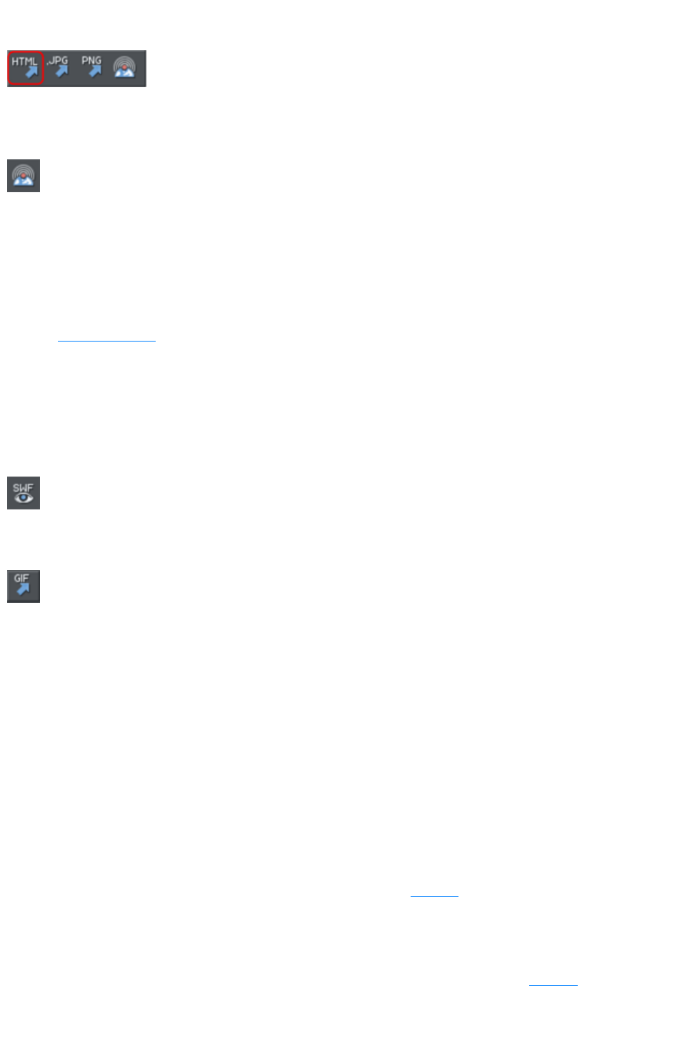
Export Website
Also in Export toolbar.
Export the current document as HTML.
Publish Website
This performs the same operation as the button on the Web toolbar. It
exports and then publishes the current website document to your web
space.
If you haven't already entered the FTP details for your web space, the Publish tab of the Web
Properties
dialog will be displayed first. Then if you haven't already exported the site locally, the export dialog will
appear to allow you to do so. Then the website is published to your web space. A progress indicator
appears during the publishing operation.
See the Getting Started
chapter for more details on publishing.
Preview Flash
This option is only enabled when the current document is an animation document. It exports your
animation as Flash and brings up a pop-up window showing your Flash animation running. The window
also includes basic information about your Flash animation, such as the size of the Flash file.
The button on the animation toolbar is a quicker way to invoke this
operation.
Export Animation
Also in the animation toolbar displayed under the standard toolbar in an
animation document.
Export an animation for use in a website.
Document Info
This displays an information box about the selected document, including which fonts are used in the
current document.
Page Options
Also right click and choose Page Options
.
Allows you to edit the page layout, size, etc.
Printer Setup
Sets options relating to the current printer or print file (refer to Printing
for more information).
Print Options
Alter the various options when printing, including orientation and scaling (refer to Printing
for more information).
Page 1284

New (Standard control bar or Ctrl+N)
Opens a new document.
New from Designs Gallery
This option opens the Designs Gallery
if it's not open already, allowing you to choose a template for a new document. Click on the folder icons
in the gallery to open a folder and double-click on a template thumbnail to start a new document using
that template.
You can also open the Designs Gallery
by clicking the tab in the Galleries bar.
Open (Standard control bar or Ctrl+O)
Opens a new editing window and loads a file into it. This file can be:
A Web Designer Premium .web file to view or edit an existing Web Designer Premium
document,
Or any of the other import formats (see Importing & Exporting for a list of formats). This opens a
new document with the file.
Open recent
A list of the most recently loaded or saved files. Provides a quick way to reload any of these files.
You can change the number of files in this list (refer to Customizing Web Designer Premium
for details).
Close (Ctrl+W)
Closes the current editing window. Web Designer Premium remains loaded. You are warned if the file
has unsaved changes.
Save (Standard control bar or Ctrl+S)
Saves the selected document.
Save As
Lets you save the selected document under a different name or to a different directory or drive.
Save All
Saves all loaded documents.
Save Template
Saves the selected document as a template document (see Customizing Web Designer Premium
).
Import (Ctrl+Alt+I)
Page 1286
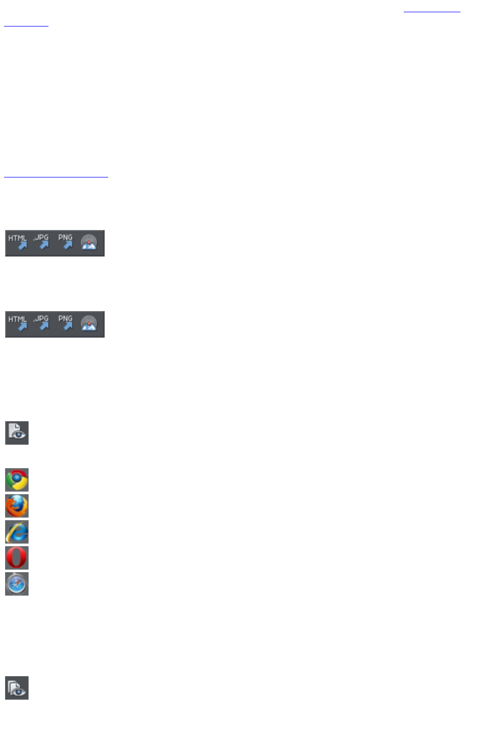
Loads a file into the selected document. The file can be any of the import formats (see Importing &
Exporting
for more information).
Note the difference between Open and Import: both load a variety of file formats but Open opens a
new document. Import
loads the file into the current open document.
Export (Ctrl+Shift+E)
Or right click and choose Export
.
Lets you export the document in any of the export formats supported by Web Designer Premium (see
Importing & Exporting
for a list of formats).
Export JPEG
Also in Export toolbar. Or right click and choose
Export - Export JPEG.)
Lets you export selected objects, a page or the whole document as a JPEG.
Export PNG
Also in Export toolbar. Or right click and choose "
Export" > "Export PNG
".)
Lets you export selected objects, a page or the whole document as a PNG.
Preview web page (F12)
Export and preview the current page of the current website document.
You can also preview your page by clicking the web page preview
button on the Web toolbar.
Click a browser type at the top of the preview window to preview your page in your preferred browser.
Previews your page in Google Chrome
Previews your page in Mozilla Firefox
Previews your page in Internet Explorer
Previews your page in Opera
Previews your page in Safari
Preview Website
Export and preview the current website document. The document is exported to the same location it
was last exported to (overwriting files as necessary without prompting), or to a temporary location if the
site has not yet been exported. Then a browser window is shown displaying the first page of the website.
This is the quickest way to preview your site as you work on it. You can
also preview by clicking the button on the Web toolbar.
Export Website
Page 1287
Also in Export toolbar.
Export the current document as HTML.
Publish Website
This performs the same operation as the button on the Web toolbar. It
exports and then publishes the current website document to your web
space.
If you haven't already entered the FTP details for your web space, the Publish tab of the Web
Properties
dialog will be displayed first. Then if you haven't already exported the site locally, the export dialog will
appear to allow you to do so. Then the website is published to your web space. A progress indicator
appears during the publishing operation.
See the Getting Started
chapter for more details on publishing.
Preview Flash
This option is only enabled when the current document is an animation document. It exports your
animation as Flash and brings up a pop-up window showing your Flash animation running. The window
also includes basic information about your Flash animation, such as the size of the Flash file.
The button on the animation toolbar is a quicker way to invoke this
operation.
Export Animation
Also in the animation toolbar displayed under the standard toolbar in an
animation document.
Export an animation for use in a website.
Document Info
This displays an information box about the selected document, including which fonts are used in the
current document.
Page Options
Also right click and choose Page Options
.
Allows you to edit the page layout, size, etc.
Printer Setup
Sets options relating to the current printer or print file (refer to Printing
for more information).
Print Options
Alter the various options when printing, including orientation and scaling (refer to Printing
for more information).
Print (Ctrl+P)
Sets options relating to printing the document and lets you print the document (refer to Printing
Page 1288

for more information).
Exit
Closes all windows and removes Web Designer Premium from memory. You are warned if any files
have unsaved changes.
Page 1289
New from Designs Gallery
This option opens the Designs Gallery
if it's not open already, allowing you to choose a template for a new document. Click on the folder icons
in the gallery to open a folder and double-click on a template thumbnail to start a new document using
that template.
You can also open the Designs Gallery
by clicking the tab in the Galleries bar.
Open (Standard control bar or Ctrl+O)
Opens a new editing window and loads a file into it. This file can be:
A Web Designer Premium .web file to view or edit an existing Web Designer Premium
document,
Or any of the other import formats (see Importing & Exporting for a list of formats). This opens a
new document with the file.
Open recent
A list of the most recently loaded or saved files. Provides a quick way to reload any of these files.
You can change the number of files in this list (refer to Customizing Web Designer Premium
for details).
Close (Ctrl+W)
Closes the current editing window. Web Designer Premium remains loaded. You are warned if the file
has unsaved changes.
Save (Standard control bar or Ctrl+S)
Saves the selected document.
Save As
Lets you save the selected document under a different name or to a different directory or drive.
Save All
Saves all loaded documents.
Save Template
Saves the selected document as a template document (see Customizing Web Designer Premium
).
Import (Ctrl+Alt+I)
Loads a file into the selected document. The file can be any of the import formats (see Importing &
Exporting
for more information).
Note the difference between Open and Import: both load a variety of file formats but Open opens a
Page 1290
new document. Import
loads the file into the current open document.
Export (Ctrl+Shift+E)
Or right click and choose Export
.
Lets you export the document in any of the export formats supported by Web Designer Premium (see
Importing & Exporting
for a list of formats).
Export JPEG
Also in Export toolbar. Or right click and choose
Export - Export JPEG.)
Lets you export selected objects, a page or the whole document as a JPEG.
Export PNG
Also in Export toolbar. Or right click and choose "
Export" > "Export PNG
".)
Lets you export selected objects, a page or the whole document as a PNG.
Preview web page (F12)
Export and preview the current page of the current website document.
You can also preview your page by clicking the web page preview
button on the Web toolbar.
Click a browser type at the top of the preview window to preview your page in your preferred browser.
Previews your page in Google Chrome
Previews your page in Mozilla Firefox
Previews your page in Internet Explorer
Previews your page in Opera
Previews your page in Safari
Preview Website
Export and preview the current website document. The document is exported to the same location it
was last exported to (overwriting files as necessary without prompting), or to a temporary location if the
site has not yet been exported. Then a browser window is shown displaying the first page of the website.
This is the quickest way to preview your site as you work on it. You can
also preview by clicking the button on the Web toolbar.
Export Website
Also in Export toolbar.
Export the current document as HTML.
Page 1291
Publish Website
This performs the same operation as the button on the Web toolbar. It
exports and then publishes the current website document to your web
space.
If you haven't already entered the FTP details for your web space, the Publish tab of the Web
Properties
dialog will be displayed first. Then if you haven't already exported the site locally, the export dialog will
appear to allow you to do so. Then the website is published to your web space. A progress indicator
appears during the publishing operation.
See the Getting Started
chapter for more details on publishing.
Preview Flash
This option is only enabled when the current document is an animation document. It exports your
animation as Flash and brings up a pop-up window showing your Flash animation running. The window
also includes basic information about your Flash animation, such as the size of the Flash file.
The button on the animation toolbar is a quicker way to invoke this
operation.
Export Animation
Also in the animation toolbar displayed under the standard toolbar in an
animation document.
Export an animation for use in a website.
Document Info
This displays an information box about the selected document, including which fonts are used in the
current document.
Page Options
Also right click and choose Page Options
.
Allows you to edit the page layout, size, etc.
Printer Setup
Sets options relating to the current printer or print file (refer to Printing
for more information).
Print Options
Alter the various options when printing, including orientation and scaling (refer to Printing
for more information).
Print (Ctrl+P)
Sets options relating to printing the document and lets you print the document (refer to Printing
for more information).
Exit
Closes all windows and removes Web Designer Premium from memory. You are warned if any files
Page 1292

have unsaved changes.
Page 1293
Open (Standard control bar or Ctrl+O)
Opens a new editing window and loads a file into it. This file can be:
A Web Designer Premium .web file to view or edit an existing Web Designer Premium
document,
Or any of the other import formats (see Importing & Exporting for a list of formats). This opens a
new document with the file.
Open recent
A list of the most recently loaded or saved files. Provides a quick way to reload any of these files.
You can change the number of files in this list (refer to Customizing Web Designer Premium
for details).
Close (Ctrl+W)
Closes the current editing window. Web Designer Premium remains loaded. You are warned if the file
has unsaved changes.
Save (Standard control bar or Ctrl+S)
Saves the selected document.
Save As
Lets you save the selected document under a different name or to a different directory or drive.
Save All
Saves all loaded documents.
Save Template
Saves the selected document as a template document (see Customizing Web Designer Premium
).
Import (Ctrl+Alt+I)
Loads a file into the selected document. The file can be any of the import formats (see Importing &
Exporting
for more information).
Note the difference between Open and Import: both load a variety of file formats but Open opens a
new document. Import
loads the file into the current open document.
Export (Ctrl+Shift+E)
Or right click and choose Export
.
Lets you export the document in any of the export formats supported by Web Designer Premium (see
Importing & Exporting
for a list of formats).
Export JPEG
Page 1294
Also in Export toolbar. Or right click and choose
Export - Export JPEG.)
Lets you export selected objects, a page or the whole document as a JPEG.
Export PNG
Also in Export toolbar. Or right click and choose "
Export" > "Export PNG
".)
Lets you export selected objects, a page or the whole document as a PNG.
Preview web page (F12)
Export and preview the current page of the current website document.
You can also preview your page by clicking the web page preview
button on the Web toolbar.
Click a browser type at the top of the preview window to preview your page in your preferred browser.
Previews your page in Google Chrome
Previews your page in Mozilla Firefox
Previews your page in Internet Explorer
Previews your page in Opera
Previews your page in Safari
Preview Website
Export and preview the current website document. The document is exported to the same location it
was last exported to (overwriting files as necessary without prompting), or to a temporary location if the
site has not yet been exported. Then a browser window is shown displaying the first page of the website.
This is the quickest way to preview your site as you work on it. You can
also preview by clicking the button on the Web toolbar.
Export Website
Also in Export toolbar.
Export the current document as HTML.
Publish Website
This performs the same operation as the button on the Web toolbar. It
exports and then publishes the current website document to your web
space.
If you haven't already entered the FTP details for your web space, the Publish tab of the Web
Properties
dialog will be displayed first. Then if you haven't already exported the site locally, the export dialog will
appear to allow you to do so. Then the website is published to your web space. A progress indicator
appears during the publishing operation.
See the Getting Started
chapter for more details on publishing.
Page 1295
Preview Flash
This option is only enabled when the current document is an animation document. It exports your
animation as Flash and brings up a pop-up window showing your Flash animation running. The window
also includes basic information about your Flash animation, such as the size of the Flash file.
The button on the animation toolbar is a quicker way to invoke this
operation.
Export Animation
Also in the animation toolbar displayed under the standard toolbar in an
animation document.
Export an animation for use in a website.
Document Info
This displays an information box about the selected document, including which fonts are used in the
current document.
Page Options
Also right click and choose Page Options
.
Allows you to edit the page layout, size, etc.
Printer Setup
Sets options relating to the current printer or print file (refer to Printing
for more information).
Print Options
Alter the various options when printing, including orientation and scaling (refer to Printing
for more information).
Print (Ctrl+P)
Sets options relating to printing the document and lets you print the document (refer to Printing
for more information).
Exit
Closes all windows and removes Web Designer Premium from memory. You are warned if any files
have unsaved changes.
Page 1296
Open recent
A list of the most recently loaded or saved files. Provides a quick way to reload any of these files.
You can change the number of files in this list (refer to Customizing Web Designer Premium
for details).
Close (Ctrl+W)
Closes the current editing window. Web Designer Premium remains loaded. You are warned if the file
has unsaved changes.
Save (Standard control bar or Ctrl+S)
Saves the selected document.
Save As
Lets you save the selected document under a different name or to a different directory or drive.
Save All
Saves all loaded documents.
Save Template
Saves the selected document as a template document (see Customizing Web Designer Premium
).
Import (Ctrl+Alt+I)
Loads a file into the selected document. The file can be any of the import formats (see Importing &
Exporting
for more information).
Note the difference between Open and Import: both load a variety of file formats but Open opens a
new document. Import
loads the file into the current open document.
Export (Ctrl+Shift+E)
Or right click and choose Export
.
Lets you export the document in any of the export formats supported by Web Designer Premium (see
Importing & Exporting
for a list of formats).
Export JPEG
Also in Export toolbar. Or right click and choose
Export - Export JPEG.)
Lets you export selected objects, a page or the whole document as a JPEG.
Export PNG
Also in Export toolbar. Or right click and choose "
Export" > "Export PNG
".)
Page 1297
Lets you export selected objects, a page or the whole document as a PNG.
Preview web page (F12)
Export and preview the current page of the current website document.
You can also preview your page by clicking the web page preview
button on the Web toolbar.
Click a browser type at the top of the preview window to preview your page in your preferred browser.
Previews your page in Google Chrome
Previews your page in Mozilla Firefox
Previews your page in Internet Explorer
Previews your page in Opera
Previews your page in Safari
Preview Website
Export and preview the current website document. The document is exported to the same location it
was last exported to (overwriting files as necessary without prompting), or to a temporary location if the
site has not yet been exported. Then a browser window is shown displaying the first page of the website.
This is the quickest way to preview your site as you work on it. You can
also preview by clicking the button on the Web toolbar.
Export Website
Also in Export toolbar.
Export the current document as HTML.
Publish Website
This performs the same operation as the button on the Web toolbar. It
exports and then publishes the current website document to your web
space.
If you haven't already entered the FTP details for your web space, the Publish tab of the Web
Properties
dialog will be displayed first. Then if you haven't already exported the site locally, the export dialog will
appear to allow you to do so. Then the website is published to your web space. A progress indicator
appears during the publishing operation.
See the Getting Started
chapter for more details on publishing.
Preview Flash
This option is only enabled when the current document is an animation document. It exports your
animation as Flash and brings up a pop-up window showing your Flash animation running. The window
also includes basic information about your Flash animation, such as the size of the Flash file.
The button on the animation toolbar is a quicker way to invoke this
operation.
Page 1298
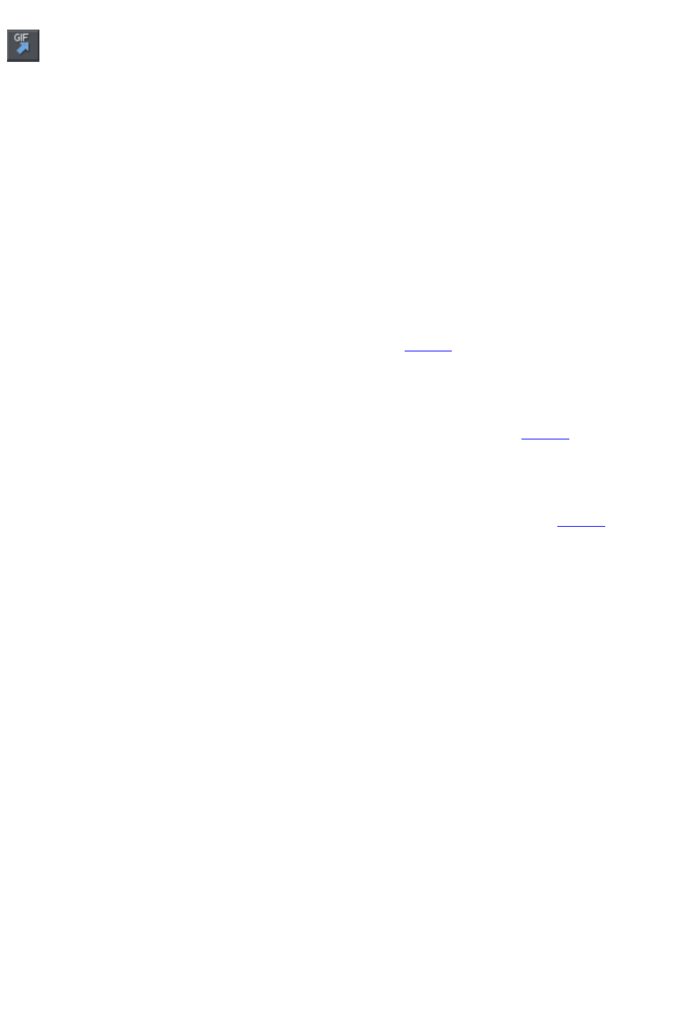
Export Animation
Also in the animation toolbar displayed under the standard toolbar in an
animation document.
Export an animation for use in a website.
Document Info
This displays an information box about the selected document, including which fonts are used in the
current document.
Page Options
Also right click and choose Page Options
.
Allows you to edit the page layout, size, etc.
Printer Setup
Sets options relating to the current printer or print file (refer to Printing
for more information).
Print Options
Alter the various options when printing, including orientation and scaling (refer to Printing
for more information).
Print (Ctrl+P)
Sets options relating to printing the document and lets you print the document (refer to Printing
for more information).
Exit
Closes all windows and removes Web Designer Premium from memory. You are warned if any files
have unsaved changes.
Page 1299
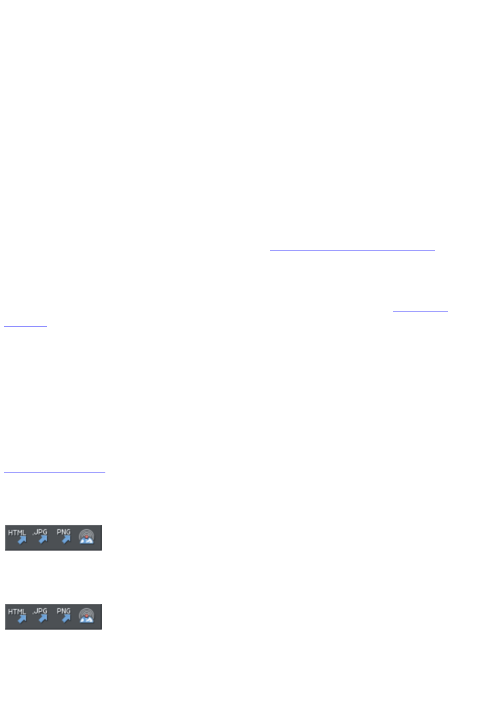
Close (Ctrl+W)
Closes the current editing window. Web Designer Premium remains loaded. You are warned if the file
has unsaved changes.
Save (Standard control bar or Ctrl+S)
Saves the selected document.
Save As
Lets you save the selected document under a different name or to a different directory or drive.
Save All
Saves all loaded documents.
Save Template
Saves the selected document as a template document (see Customizing Web Designer Premium
).
Import (Ctrl+Alt+I)
Loads a file into the selected document. The file can be any of the import formats (see Importing &
Exporting
for more information).
Note the difference between Open and Import: both load a variety of file formats but Open opens a
new document. Import
loads the file into the current open document.
Export (Ctrl+Shift+E)
Or right click and choose Export
.
Lets you export the document in any of the export formats supported by Web Designer Premium (see
Importing & Exporting
for a list of formats).
Export JPEG
Also in Export toolbar. Or right click and choose
Export - Export JPEG.)
Lets you export selected objects, a page or the whole document as a JPEG.
Export PNG
Also in Export toolbar. Or right click and choose "
Export" > "Export PNG
".)
Lets you export selected objects, a page or the whole document as a PNG.
Preview web page (F12)
Export and preview the current page of the current website document.
Page 1300
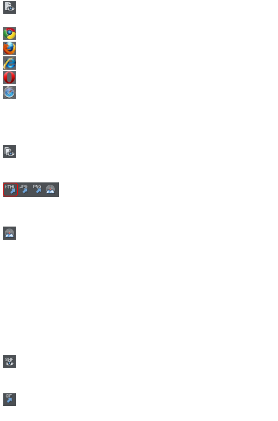
You can also preview your page by clicking the web page preview
button on the Web toolbar.
Click a browser type at the top of the preview window to preview your page in your preferred browser.
Previews your page in Google Chrome
Previews your page in Mozilla Firefox
Previews your page in Internet Explorer
Previews your page in Opera
Previews your page in Safari
Preview Website
Export and preview the current website document. The document is exported to the same location it
was last exported to (overwriting files as necessary without prompting), or to a temporary location if the
site has not yet been exported. Then a browser window is shown displaying the first page of the website.
This is the quickest way to preview your site as you work on it. You can
also preview by clicking the button on the Web toolbar.
Export Website
Also in Export toolbar.
Export the current document as HTML.
Publish Website
This performs the same operation as the button on the Web toolbar. It
exports and then publishes the current website document to your web
space.
If you haven't already entered the FTP details for your web space, the Publish tab of the Web
Properties
dialog will be displayed first. Then if you haven't already exported the site locally, the export dialog will
appear to allow you to do so. Then the website is published to your web space. A progress indicator
appears during the publishing operation.
See the Getting Started
chapter for more details on publishing.
Preview Flash
This option is only enabled when the current document is an animation document. It exports your
animation as Flash and brings up a pop-up window showing your Flash animation running. The window
also includes basic information about your Flash animation, such as the size of the Flash file.
The button on the animation toolbar is a quicker way to invoke this
operation.
Export Animation
Also in the animation toolbar displayed under the standard toolbar in an
animation document.
Export an animation for use in a website.
Page 1301
Document Info
This displays an information box about the selected document, including which fonts are used in the
current document.
Page Options
Also right click and choose Page Options
.
Allows you to edit the page layout, size, etc.
Printer Setup
Sets options relating to the current printer or print file (refer to Printing
for more information).
Print Options
Alter the various options when printing, including orientation and scaling (refer to Printing
for more information).
Print (Ctrl+P)
Sets options relating to printing the document and lets you print the document (refer to Printing
for more information).
Exit
Closes all windows and removes Web Designer Premium from memory. You are warned if any files
have unsaved changes.
Page 1302
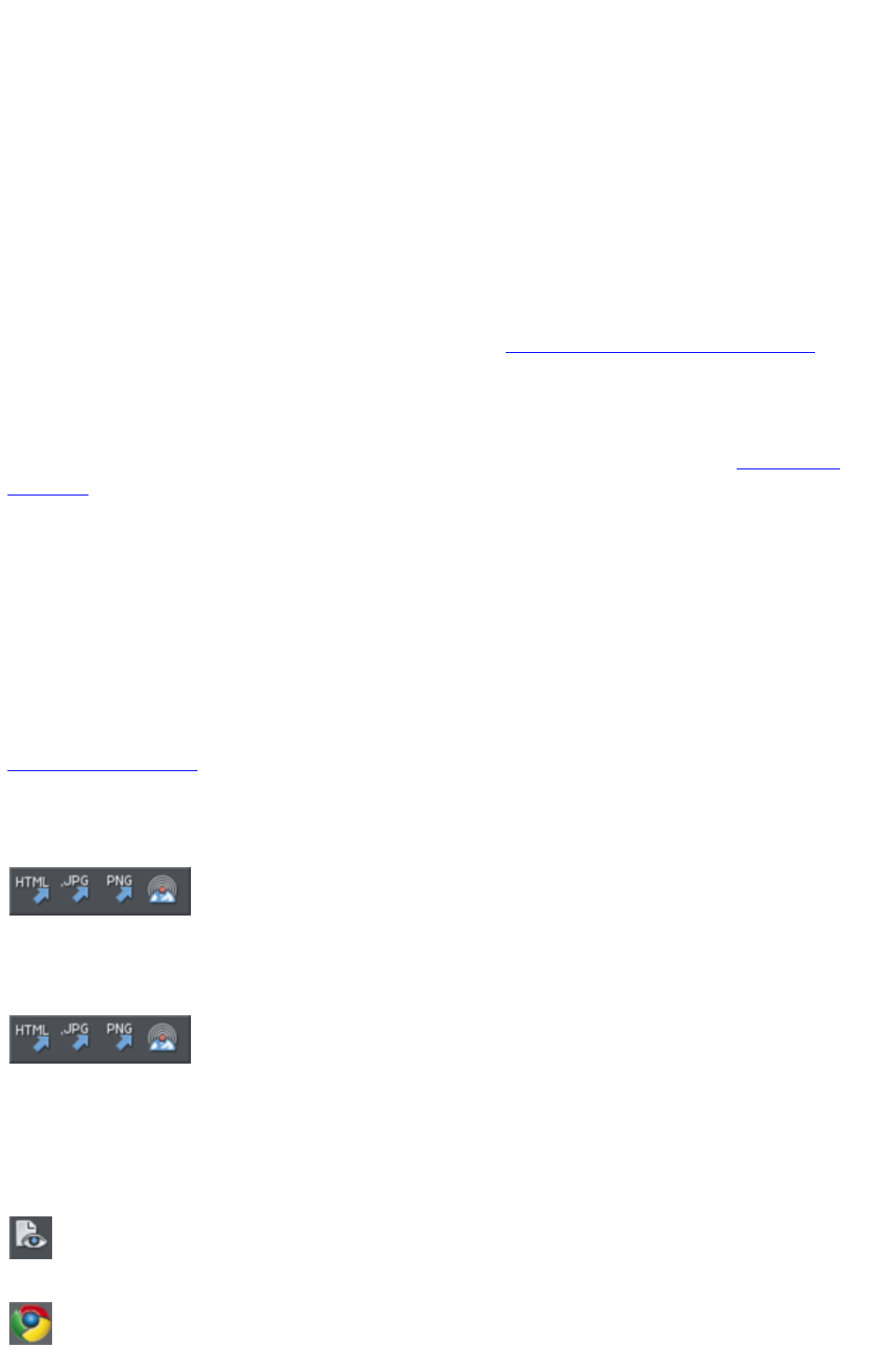
Save (Standard control bar or Ctrl+S)
Saves the selected document.
Save As
Lets you save the selected document under a different name or to a different directory or drive.
Save All
Saves all loaded documents.
Save Template
Saves the selected document as a template document (see Customizing Web Designer Premium
).
Import (Ctrl+Alt+I)
Loads a file into the selected document. The file can be any of the import formats (see Importing &
Exporting
for more information).
Note the difference between Open and Import: both load a variety of file formats but Open opens a
new document. Import
loads the file into the current open document.
Export (Ctrl+Shift+E)
Or right click and choose Export
.
Lets you export the document in any of the export formats supported by Web Designer Premium (see
Importing & Exporting
for a list of formats).
Export JPEG
Also in Export toolbar. Or right click and choose
Export - Export JPEG.)
Lets you export selected objects, a page or the whole document as a JPEG.
Export PNG
Also in Export toolbar. Or right click and choose "
Export" > "Export PNG
".)
Lets you export selected objects, a page or the whole document as a PNG.
Preview web page (F12)
Export and preview the current page of the current website document.
You can also preview your page by clicking the web page preview
button on the Web toolbar.
Click a browser type at the top of the preview window to preview your page in your preferred browser.
Previews your page in Google Chrome
Page 1303
Previews your page in Mozilla Firefox
Previews your page in Internet Explorer
Previews your page in Opera
Previews your page in Safari
Preview Website
Export and preview the current website document. The document is exported to the same location it
was last exported to (overwriting files as necessary without prompting), or to a temporary location if the
site has not yet been exported. Then a browser window is shown displaying the first page of the website.
This is the quickest way to preview your site as you work on it. You can
also preview by clicking the button on the Web toolbar.
Export Website
Also in Export toolbar.
Export the current document as HTML.
Publish Website
This performs the same operation as the button on the Web toolbar. It
exports and then publishes the current website document to your web
space.
If you haven't already entered the FTP details for your web space, the Publish tab of the Web
Properties
dialog will be displayed first. Then if you haven't already exported the site locally, the export dialog will
appear to allow you to do so. Then the website is published to your web space. A progress indicator
appears during the publishing operation.
See the Getting Started
chapter for more details on publishing.
Preview Flash
This option is only enabled when the current document is an animation document. It exports your
animation as Flash and brings up a pop-up window showing your Flash animation running. The window
also includes basic information about your Flash animation, such as the size of the Flash file.
The button on the animation toolbar is a quicker way to invoke this
operation.
Export Animation
Also in the animation toolbar displayed under the standard toolbar in an
animation document.
Export an animation for use in a website.
Document Info
This displays an information box about the selected document, including which fonts are used in the
current document.
Page 1304

Page Options
Also right click and choose Page Options
.
Allows you to edit the page layout, size, etc.
Printer Setup
Sets options relating to the current printer or print file (refer to Printing
for more information).
Print Options
Alter the various options when printing, including orientation and scaling (refer to Printing
for more information).
Print (Ctrl+P)
Sets options relating to printing the document and lets you print the document (refer to Printing
for more information).
Exit
Closes all windows and removes Web Designer Premium from memory. You are warned if any files
have unsaved changes.
Page 1305
Save As
Lets you save the selected document under a different name or to a different directory or drive.
Save All
Saves all loaded documents.
Save Template
Saves the selected document as a template document (see Customizing Web Designer Premium
).
Import (Ctrl+Alt+I)
Loads a file into the selected document. The file can be any of the import formats (see Importing &
Exporting
for more information).
Note the difference between Open and Import: both load a variety of file formats but Open opens a
new document. Import
loads the file into the current open document.
Export (Ctrl+Shift+E)
Or right click and choose Export
.
Lets you export the document in any of the export formats supported by Web Designer Premium (see
Importing & Exporting
for a list of formats).
Export JPEG
Also in Export toolbar. Or right click and choose
Export - Export JPEG.)
Lets you export selected objects, a page or the whole document as a JPEG.
Export PNG
Also in Export toolbar. Or right click and choose "
Export" > "Export PNG
".)
Lets you export selected objects, a page or the whole document as a PNG.
Preview web page (F12)
Export and preview the current page of the current website document.
You can also preview your page by clicking the web page preview
button on the Web toolbar.
Click a browser type at the top of the preview window to preview your page in your preferred browser.
Previews your page in Google Chrome
Previews your page in Mozilla Firefox
Previews your page in Internet Explorer
Page 1306
Previews your page in Opera
Previews your page in Safari
Preview Website
Export and preview the current website document. The document is exported to the same location it
was last exported to (overwriting files as necessary without prompting), or to a temporary location if the
site has not yet been exported. Then a browser window is shown displaying the first page of the website.
This is the quickest way to preview your site as you work on it. You can
also preview by clicking the button on the Web toolbar.
Export Website
Also in Export toolbar.
Export the current document as HTML.
Publish Website
This performs the same operation as the button on the Web toolbar. It
exports and then publishes the current website document to your web
space.
If you haven't already entered the FTP details for your web space, the Publish tab of the Web
Properties
dialog will be displayed first. Then if you haven't already exported the site locally, the export dialog will
appear to allow you to do so. Then the website is published to your web space. A progress indicator
appears during the publishing operation.
See the Getting Started
chapter for more details on publishing.
Preview Flash
This option is only enabled when the current document is an animation document. It exports your
animation as Flash and brings up a pop-up window showing your Flash animation running. The window
also includes basic information about your Flash animation, such as the size of the Flash file.
The button on the animation toolbar is a quicker way to invoke this
operation.
Export Animation
Also in the animation toolbar displayed under the standard toolbar in an
animation document.
Export an animation for use in a website.
Document Info
This displays an information box about the selected document, including which fonts are used in the
current document.
Page Options
Also right click and choose Page Options
.
Page 1307

Allows you to edit the page layout, size, etc.
Printer Setup
Sets options relating to the current printer or print file (refer to Printing
for more information).
Print Options
Alter the various options when printing, including orientation and scaling (refer to Printing
for more information).
Print (Ctrl+P)
Sets options relating to printing the document and lets you print the document (refer to Printing
for more information).
Exit
Closes all windows and removes Web Designer Premium from memory. You are warned if any files
have unsaved changes.
Page 1308
Save All
Saves all loaded documents.
Save Template
Saves the selected document as a template document (see Customizing Web Designer Premium
).
Import (Ctrl+Alt+I)
Loads a file into the selected document. The file can be any of the import formats (see Importing &
Exporting
for more information).
Note the difference between Open and Import: both load a variety of file formats but Open opens a
new document. Import
loads the file into the current open document.
Export (Ctrl+Shift+E)
Or right click and choose Export
.
Lets you export the document in any of the export formats supported by Web Designer Premium (see
Importing & Exporting
for a list of formats).
Export JPEG
Also in Export toolbar. Or right click and choose
Export - Export JPEG.)
Lets you export selected objects, a page or the whole document as a JPEG.
Export PNG
Also in Export toolbar. Or right click and choose "
Export" > "Export PNG
".)
Lets you export selected objects, a page or the whole document as a PNG.
Preview web page (F12)
Export and preview the current page of the current website document.
You can also preview your page by clicking the web page preview
button on the Web toolbar.
Click a browser type at the top of the preview window to preview your page in your preferred browser.
Previews your page in Google Chrome
Previews your page in Mozilla Firefox
Previews your page in Internet Explorer
Previews your page in Opera
Previews your page in Safari
Page 1309
Preview Website
Export and preview the current website document. The document is exported to the same location it
was last exported to (overwriting files as necessary without prompting), or to a temporary location if the
site has not yet been exported. Then a browser window is shown displaying the first page of the website.
This is the quickest way to preview your site as you work on it. You can
also preview by clicking the button on the Web toolbar.
Export Website
Also in Export toolbar.
Export the current document as HTML.
Publish Website
This performs the same operation as the button on the Web toolbar. It
exports and then publishes the current website document to your web
space.
If you haven't already entered the FTP details for your web space, the Publish tab of the Web
Properties
dialog will be displayed first. Then if you haven't already exported the site locally, the export dialog will
appear to allow you to do so. Then the website is published to your web space. A progress indicator
appears during the publishing operation.
See the Getting Started
chapter for more details on publishing.
Preview Flash
This option is only enabled when the current document is an animation document. It exports your
animation as Flash and brings up a pop-up window showing your Flash animation running. The window
also includes basic information about your Flash animation, such as the size of the Flash file.
The button on the animation toolbar is a quicker way to invoke this
operation.
Export Animation
Also in the animation toolbar displayed under the standard toolbar in an
animation document.
Export an animation for use in a website.
Document Info
This displays an information box about the selected document, including which fonts are used in the
current document.
Page Options
Also right click and choose Page Options
.
Allows you to edit the page layout, size, etc.
Printer Setup
Page 1310

Sets options relating to the current printer or print file (refer to Printing
for more information).
Print Options
Alter the various options when printing, including orientation and scaling (refer to Printing
for more information).
Print (Ctrl+P)
Sets options relating to printing the document and lets you print the document (refer to Printing
for more information).
Exit
Closes all windows and removes Web Designer Premium from memory. You are warned if any files
have unsaved changes.
Page 1311
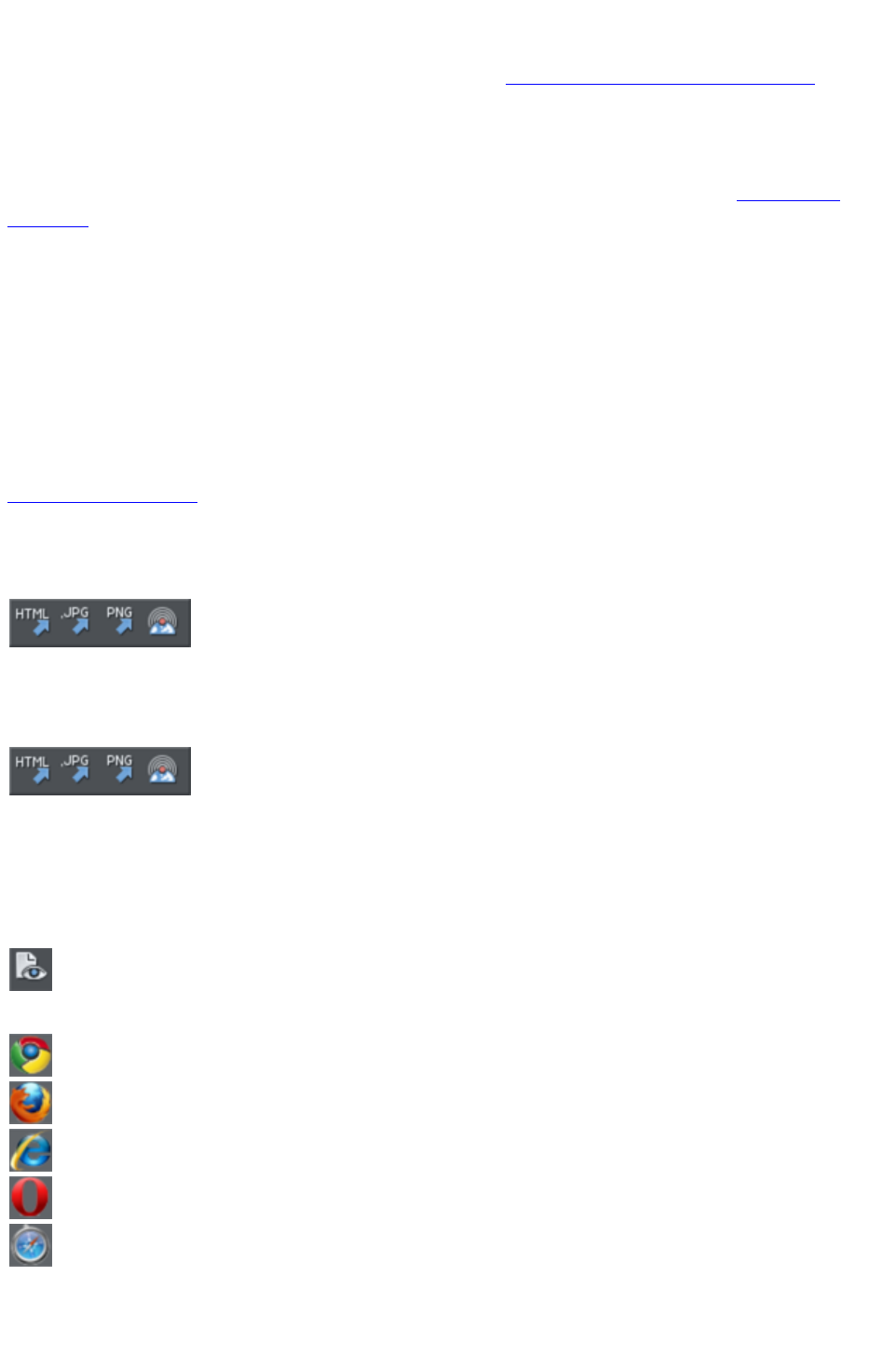
Save Template
Saves the selected document as a template document (see Customizing Web Designer Premium
).
Import (Ctrl+Alt+I)
Loads a file into the selected document. The file can be any of the import formats (see Importing &
Exporting
for more information).
Note the difference between Open and Import: both load a variety of file formats but Open opens a
new document. Import
loads the file into the current open document.
Export (Ctrl+Shift+E)
Or right click and choose Export
.
Lets you export the document in any of the export formats supported by Web Designer Premium (see
Importing & Exporting
for a list of formats).
Export JPEG
Also in Export toolbar. Or right click and choose
Export - Export JPEG.)
Lets you export selected objects, a page or the whole document as a JPEG.
Export PNG
Also in Export toolbar. Or right click and choose "
Export" > "Export PNG
".)
Lets you export selected objects, a page or the whole document as a PNG.
Preview web page (F12)
Export and preview the current page of the current website document.
You can also preview your page by clicking the web page preview
button on the Web toolbar.
Click a browser type at the top of the preview window to preview your page in your preferred browser.
Previews your page in Google Chrome
Previews your page in Mozilla Firefox
Previews your page in Internet Explorer
Previews your page in Opera
Previews your page in Safari
Preview Website
Page 1312
Export and preview the current website document. The document is exported to the same location it
was last exported to (overwriting files as necessary without prompting), or to a temporary location if the
site has not yet been exported. Then a browser window is shown displaying the first page of the website.
This is the quickest way to preview your site as you work on it. You can
also preview by clicking the button on the Web toolbar.
Export Website
Also in Export toolbar.
Export the current document as HTML.
Publish Website
This performs the same operation as the button on the Web toolbar. It
exports and then publishes the current website document to your web
space.
If you haven't already entered the FTP details for your web space, the Publish tab of the Web
Properties
dialog will be displayed first. Then if you haven't already exported the site locally, the export dialog will
appear to allow you to do so. Then the website is published to your web space. A progress indicator
appears during the publishing operation.
See the Getting Started
chapter for more details on publishing.
Preview Flash
This option is only enabled when the current document is an animation document. It exports your
animation as Flash and brings up a pop-up window showing your Flash animation running. The window
also includes basic information about your Flash animation, such as the size of the Flash file.
The button on the animation toolbar is a quicker way to invoke this
operation.
Export Animation
Also in the animation toolbar displayed under the standard toolbar in an
animation document.
Export an animation for use in a website.
Document Info
This displays an information box about the selected document, including which fonts are used in the
current document.
Page Options
Also right click and choose Page Options
.
Allows you to edit the page layout, size, etc.
Printer Setup
Sets options relating to the current printer or print file (refer to Printing
for more information).
Page 1313

Print Options
Alter the various options when printing, including orientation and scaling (refer to Printing
for more information).
Print (Ctrl+P)
Sets options relating to printing the document and lets you print the document (refer to Printing
for more information).
Exit
Closes all windows and removes Web Designer Premium from memory. You are warned if any files
have unsaved changes.
Page 1314
Import (Ctrl+Alt+I)
Loads a file into the selected document. The file can be any of the import formats (see Importing &
Exporting
for more information).
Note the difference between Open and Import: both load a variety of file formats but Open opens a
new document. Import
loads the file into the current open document.
Export (Ctrl+Shift+E)
Or right click and choose Export
.
Lets you export the document in any of the export formats supported by Web Designer Premium (see
Importing & Exporting
for a list of formats).
Export JPEG
Also in Export toolbar. Or right click and choose
Export - Export JPEG.)
Lets you export selected objects, a page or the whole document as a JPEG.
Export PNG
Also in Export toolbar. Or right click and choose "
Export" > "Export PNG
".)
Lets you export selected objects, a page or the whole document as a PNG.
Preview web page (F12)
Export and preview the current page of the current website document.
You can also preview your page by clicking the web page preview
button on the Web toolbar.
Click a browser type at the top of the preview window to preview your page in your preferred browser.
Previews your page in Google Chrome
Previews your page in Mozilla Firefox
Previews your page in Internet Explorer
Previews your page in Opera
Previews your page in Safari
Preview Website
Export and preview the current website document. The document is exported to the same location it
was last exported to (overwriting files as necessary without prompting), or to a temporary location if the
site has not yet been exported. Then a browser window is shown displaying the first page of the website.
This is the quickest way to preview your site as you work on it. You can
also preview by clicking the button on the Web toolbar.
Page 1315

Export Website
Also in Export toolbar.
Export the current document as HTML.
Publish Website
This performs the same operation as the button on the Web toolbar. It
exports and then publishes the current website document to your web
space.
If you haven't already entered the FTP details for your web space, the Publish tab of the Web
Properties
dialog will be displayed first. Then if you haven't already exported the site locally, the export dialog will
appear to allow you to do so. Then the website is published to your web space. A progress indicator
appears during the publishing operation.
See the Getting Started
chapter for more details on publishing.
Preview Flash
This option is only enabled when the current document is an animation document. It exports your
animation as Flash and brings up a pop-up window showing your Flash animation running. The window
also includes basic information about your Flash animation, such as the size of the Flash file.
The button on the animation toolbar is a quicker way to invoke this
operation.
Export Animation
Also in the animation toolbar displayed under the standard toolbar in an
animation document.
Export an animation for use in a website.
Document Info
This displays an information box about the selected document, including which fonts are used in the
current document.
Page Options
Also right click and choose Page Options
.
Allows you to edit the page layout, size, etc.
Printer Setup
Sets options relating to the current printer or print file (refer to Printing
for more information).
Print Options
Alter the various options when printing, including orientation and scaling (refer to Printing
for more information).
Page 1316

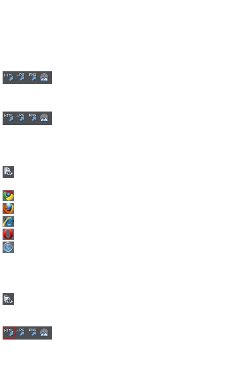
Export (Ctrl+Shift+E)
Or right click and choose Export
.
Lets you export the document in any of the export formats supported by Web Designer Premium (see
Importing & Exporting
for a list of formats).
Export JPEG
Also in Export toolbar. Or right click and choose
Export - Export JPEG.)
Lets you export selected objects, a page or the whole document as a JPEG.
Export PNG
Also in Export toolbar. Or right click and choose "
Export" > "Export PNG
".)
Lets you export selected objects, a page or the whole document as a PNG.
Preview web page (F12)
Export and preview the current page of the current website document.
You can also preview your page by clicking the web page preview
button on the Web toolbar.
Click a browser type at the top of the preview window to preview your page in your preferred browser.
Previews your page in Google Chrome
Previews your page in Mozilla Firefox
Previews your page in Internet Explorer
Previews your page in Opera
Previews your page in Safari
Preview Website
Export and preview the current website document. The document is exported to the same location it
was last exported to (overwriting files as necessary without prompting), or to a temporary location if the
site has not yet been exported. Then a browser window is shown displaying the first page of the website.
This is the quickest way to preview your site as you work on it. You can
also preview by clicking the button on the Web toolbar.
Export Website
Also in Export toolbar.
Export the current document as HTML.
Publish Website
Page 1318
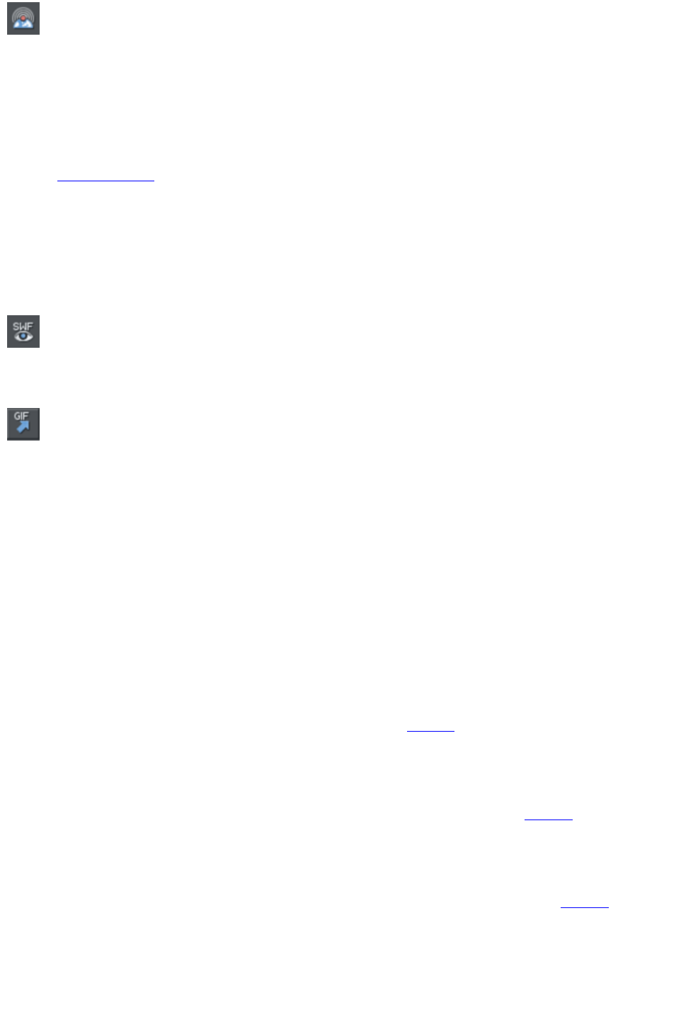
This performs the same operation as the button on the Web toolbar. It
exports and then publishes the current website document to your web
space.
If you haven't already entered the FTP details for your web space, the Publish tab of the Web
Properties
dialog will be displayed first. Then if you haven't already exported the site locally, the export dialog will
appear to allow you to do so. Then the website is published to your web space. A progress indicator
appears during the publishing operation.
See the Getting Started
chapter for more details on publishing.
Preview Flash
This option is only enabled when the current document is an animation document. It exports your
animation as Flash and brings up a pop-up window showing your Flash animation running. The window
also includes basic information about your Flash animation, such as the size of the Flash file.
The button on the animation toolbar is a quicker way to invoke this
operation.
Export Animation
Also in the animation toolbar displayed under the standard toolbar in an
animation document.
Export an animation for use in a website.
Document Info
This displays an information box about the selected document, including which fonts are used in the
current document.
Page Options
Also right click and choose Page Options
.
Allows you to edit the page layout, size, etc.
Printer Setup
Sets options relating to the current printer or print file (refer to Printing
for more information).
Print Options
Alter the various options when printing, including orientation and scaling (refer to Printing
for more information).
Print (Ctrl+P)
Sets options relating to printing the document and lets you print the document (refer to Printing
for more information).
Exit
Closes all windows and removes Web Designer Premium from memory. You are warned if any files
have unsaved changes.
Page 1319
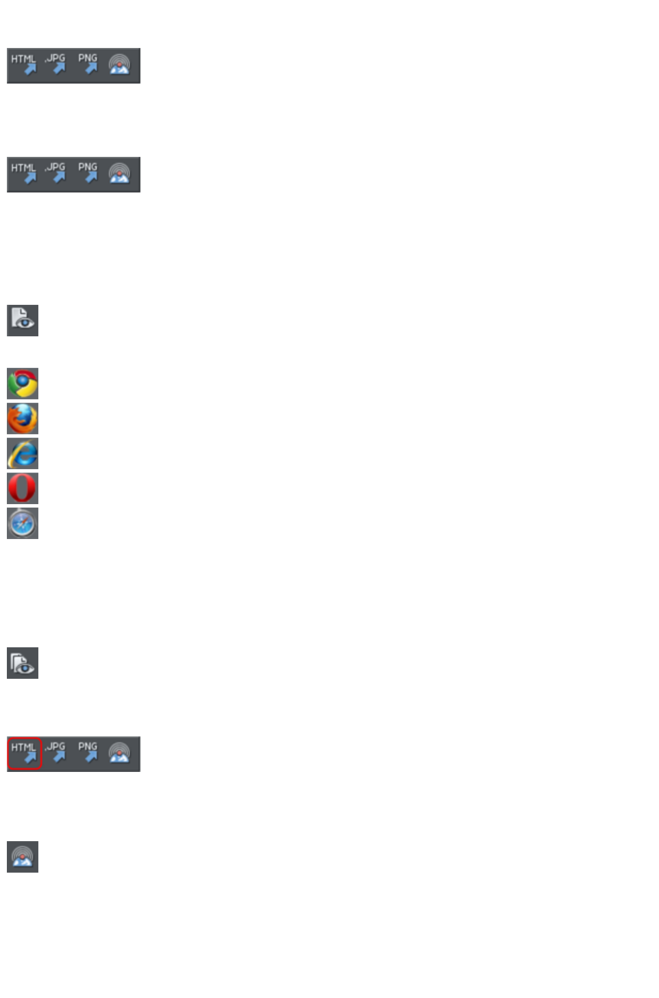
Export JPEG
Also in Export toolbar. Or right click and choose
Export - Export JPEG.)
Lets you export selected objects, a page or the whole document as a JPEG.
Export PNG
Also in Export toolbar. Or right click and choose "
Export" > "Export PNG
".)
Lets you export selected objects, a page or the whole document as a PNG.
Preview web page (F12)
Export and preview the current page of the current website document.
You can also preview your page by clicking the web page preview
button on the Web toolbar.
Click a browser type at the top of the preview window to preview your page in your preferred browser.
Previews your page in Google Chrome
Previews your page in Mozilla Firefox
Previews your page in Internet Explorer
Previews your page in Opera
Previews your page in Safari
Preview Website
Export and preview the current website document. The document is exported to the same location it
was last exported to (overwriting files as necessary without prompting), or to a temporary location if the
site has not yet been exported. Then a browser window is shown displaying the first page of the website.
This is the quickest way to preview your site as you work on it. You can
also preview by clicking the button on the Web toolbar.
Export Website
Also in Export toolbar.
Export the current document as HTML.
Publish Website
This performs the same operation as the button on the Web toolbar. It
exports and then publishes the current website document to your web
space.
If you haven't already entered the FTP details for your web space, the Publish tab of the Web
Properties
dialog will be displayed first. Then if you haven't already exported the site locally, the export dialog will
appear to allow you to do so. Then the website is published to your web space. A progress indicator
Page 1320
appears during the publishing operation.
See the Getting Started
chapter for more details on publishing.
Preview Flash
This option is only enabled when the current document is an animation document. It exports your
animation as Flash and brings up a pop-up window showing your Flash animation running. The window
also includes basic information about your Flash animation, such as the size of the Flash file.
The button on the animation toolbar is a quicker way to invoke this
operation.
Export Animation
Also in the animation toolbar displayed under the standard toolbar in an
animation document.
Export an animation for use in a website.
Document Info
This displays an information box about the selected document, including which fonts are used in the
current document.
Page Options
Also right click and choose Page Options
.
Allows you to edit the page layout, size, etc.
Printer Setup
Sets options relating to the current printer or print file (refer to Printing
for more information).
Print Options
Alter the various options when printing, including orientation and scaling (refer to Printing
for more information).
Print (Ctrl+P)
Sets options relating to printing the document and lets you print the document (refer to Printing
for more information).
Exit
Closes all windows and removes Web Designer Premium from memory. You are warned if any files
have unsaved changes.
Page 1321
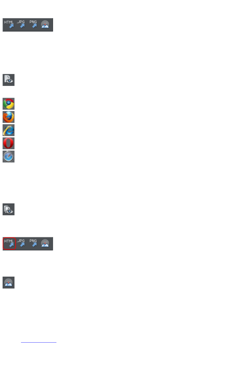
Export PNG
Also in Export toolbar. Or right click and choose "
Export" > "Export PNG
".)
Lets you export selected objects, a page or the whole document as a PNG.
Preview web page (F12)
Export and preview the current page of the current website document.
You can also preview your page by clicking the web page preview
button on the Web toolbar.
Click a browser type at the top of the preview window to preview your page in your preferred browser.
Previews your page in Google Chrome
Previews your page in Mozilla Firefox
Previews your page in Internet Explorer
Previews your page in Opera
Previews your page in Safari
Preview Website
Export and preview the current website document. The document is exported to the same location it
was last exported to (overwriting files as necessary without prompting), or to a temporary location if the
site has not yet been exported. Then a browser window is shown displaying the first page of the website.
This is the quickest way to preview your site as you work on it. You can
also preview by clicking the button on the Web toolbar.
Export Website
Also in Export toolbar.
Export the current document as HTML.
Publish Website
This performs the same operation as the button on the Web toolbar. It
exports and then publishes the current website document to your web
space.
If you haven't already entered the FTP details for your web space, the Publish tab of the Web
Properties
dialog will be displayed first. Then if you haven't already exported the site locally, the export dialog will
appear to allow you to do so. Then the website is published to your web space. A progress indicator
appears during the publishing operation.
See the Getting Started
chapter for more details on publishing.
Preview Flash
This option is only enabled when the current document is an animation document. It exports your
Page 1322
animation as Flash and brings up a pop-up window showing your Flash animation running. The window
also includes basic information about your Flash animation, such as the size of the Flash file.
The button on the animation toolbar is a quicker way to invoke this
operation.
Export Animation
Also in the animation toolbar displayed under the standard toolbar in an
animation document.
Export an animation for use in a website.
Document Info
This displays an information box about the selected document, including which fonts are used in the
current document.
Page Options
Also right click and choose Page Options
.
Allows you to edit the page layout, size, etc.
Printer Setup
Sets options relating to the current printer or print file (refer to Printing
for more information).
Print Options
Alter the various options when printing, including orientation and scaling (refer to Printing
for more information).
Print (Ctrl+P)
Sets options relating to printing the document and lets you print the document (refer to Printing
for more information).
Exit
Closes all windows and removes Web Designer Premium from memory. You are warned if any files
have unsaved changes.
Page 1323
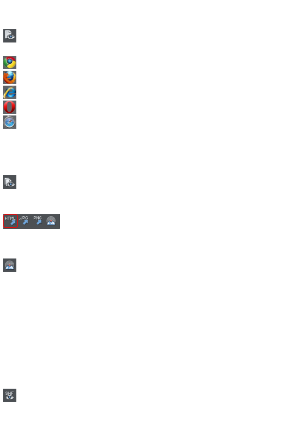
Preview web page (F12)
Export and preview the current page of the current website document.
You can also preview your page by clicking the web page preview
button on the Web toolbar.
Click a browser type at the top of the preview window to preview your page in your preferred browser.
Previews your page in Google Chrome
Previews your page in Mozilla Firefox
Previews your page in Internet Explorer
Previews your page in Opera
Previews your page in Safari
Preview Website
Export and preview the current website document. The document is exported to the same location it
was last exported to (overwriting files as necessary without prompting), or to a temporary location if the
site has not yet been exported. Then a browser window is shown displaying the first page of the website.
This is the quickest way to preview your site as you work on it. You can
also preview by clicking the button on the Web toolbar.
Export Website
Also in Export toolbar.
Export the current document as HTML.
Publish Website
This performs the same operation as the button on the Web toolbar. It
exports and then publishes the current website document to your web
space.
If you haven't already entered the FTP details for your web space, the Publish tab of the Web
Properties
dialog will be displayed first. Then if you haven't already exported the site locally, the export dialog will
appear to allow you to do so. Then the website is published to your web space. A progress indicator
appears during the publishing operation.
See the Getting Started
chapter for more details on publishing.
Preview Flash
This option is only enabled when the current document is an animation document. It exports your
animation as Flash and brings up a pop-up window showing your Flash animation running. The window
also includes basic information about your Flash animation, such as the size of the Flash file.
The button on the animation toolbar is a quicker way to invoke this
operation.
Export Animation
Page 1324
Also in the animation toolbar displayed under the standard toolbar in an
animation document.
Export an animation for use in a website.
Document Info
This displays an information box about the selected document, including which fonts are used in the
current document.
Page Options
Also right click and choose Page Options
.
Allows you to edit the page layout, size, etc.
Printer Setup
Sets options relating to the current printer or print file (refer to Printing
for more information).
Print Options
Alter the various options when printing, including orientation and scaling (refer to Printing
for more information).
Print (Ctrl+P)
Sets options relating to printing the document and lets you print the document (refer to Printing
for more information).
Exit
Closes all windows and removes Web Designer Premium from memory. You are warned if any files
have unsaved changes.
Page 1325

Preview Website
Export and preview the current website document. The document is exported to the same location it
was last exported to (overwriting files as necessary without prompting), or to a temporary location if the
site has not yet been exported. Then a browser window is shown displaying the first page of the website.
This is the quickest way to preview your site as you work on it. You can
also preview by clicking the button on the Web toolbar.
Export Website
Also in Export toolbar.
Export the current document as HTML.
Publish Website
This performs the same operation as the button on the Web toolbar. It
exports and then publishes the current website document to your web
space.
If you haven't already entered the FTP details for your web space, the Publish tab of the Web
Properties
dialog will be displayed first. Then if you haven't already exported the site locally, the export dialog will
appear to allow you to do so. Then the website is published to your web space. A progress indicator
appears during the publishing operation.
See the Getting Started
chapter for more details on publishing.
Preview Flash
This option is only enabled when the current document is an animation document. It exports your
animation as Flash and brings up a pop-up window showing your Flash animation running. The window
also includes basic information about your Flash animation, such as the size of the Flash file.
The button on the animation toolbar is a quicker way to invoke this
operation.
Export Animation
Also in the animation toolbar displayed under the standard toolbar in an
animation document.
Export an animation for use in a website.
Document Info
This displays an information box about the selected document, including which fonts are used in the
current document.
Page Options
Also right click and choose Page Options
.
Allows you to edit the page layout, size, etc.
Printer Setup
Page 1326

Sets options relating to the current printer or print file (refer to Printing
for more information).
Print Options
Alter the various options when printing, including orientation and scaling (refer to Printing
for more information).
Print (Ctrl+P)
Sets options relating to printing the document and lets you print the document (refer to Printing
for more information).
Exit
Closes all windows and removes Web Designer Premium from memory. You are warned if any files
have unsaved changes.
Page 1327
Export Website
Also in Export toolbar.
Export the current document as HTML.
Publish Website
This performs the same operation as the button on the Web toolbar. It
exports and then publishes the current website document to your web
space.
If you haven't already entered the FTP details for your web space, the Publish tab of the Web
Properties
dialog will be displayed first. Then if you haven't already exported the site locally, the export dialog will
appear to allow you to do so. Then the website is published to your web space. A progress indicator
appears during the publishing operation.
See the Getting Started
chapter for more details on publishing.
Preview Flash
This option is only enabled when the current document is an animation document. It exports your
animation as Flash and brings up a pop-up window showing your Flash animation running. The window
also includes basic information about your Flash animation, such as the size of the Flash file.
The button on the animation toolbar is a quicker way to invoke this
operation.
Export Animation
Also in the animation toolbar displayed under the standard toolbar in an
animation document.
Export an animation for use in a website.
Document Info
This displays an information box about the selected document, including which fonts are used in the
current document.
Page Options
Also right click and choose Page Options
.
Allows you to edit the page layout, size, etc.
Printer Setup
Sets options relating to the current printer or print file (refer to Printing
for more information).
Print Options
Alter the various options when printing, including orientation and scaling (refer to Printing
for more information).
Page 1328

Publish Website
This performs the same operation as the button on the Web toolbar. It
exports and then publishes the current website document to your web
space.
If you haven't already entered the FTP details for your web space, the Publish tab of the Web
Properties
dialog will be displayed first. Then if you haven't already exported the site locally, the export dialog will
appear to allow you to do so. Then the website is published to your web space. A progress indicator
appears during the publishing operation.
See the Getting Started
chapter for more details on publishing.
Preview Flash
This option is only enabled when the current document is an animation document. It exports your
animation as Flash and brings up a pop-up window showing your Flash animation running. The window
also includes basic information about your Flash animation, such as the size of the Flash file.
The button on the animation toolbar is a quicker way to invoke this
operation.
Export Animation
Also in the animation toolbar displayed under the standard toolbar in an
animation document.
Export an animation for use in a website.
Document Info
This displays an information box about the selected document, including which fonts are used in the
current document.
Page Options
Also right click and choose Page Options
.
Allows you to edit the page layout, size, etc.
Printer Setup
Sets options relating to the current printer or print file (refer to Printing
for more information).
Print Options
Alter the various options when printing, including orientation and scaling (refer to Printing
for more information).
Print (Ctrl+P)
Sets options relating to printing the document and lets you print the document (refer to Printing
for more information).
Exit
Page 1330

Closes all windows and removes Web Designer Premium from memory. You are warned if any files
have unsaved changes.
Page 1331

Preview Flash
This option is only enabled when the current document is an animation document. It exports your
animation as Flash and brings up a pop-up window showing your Flash animation running. The window
also includes basic information about your Flash animation, such as the size of the Flash file.
The button on the animation toolbar is a quicker way to invoke this
operation.
Export Animation
Also in the animation toolbar displayed under the standard toolbar in an
animation document.
Export an animation for use in a website.
Document Info
This displays an information box about the selected document, including which fonts are used in the
current document.
Page Options
Also right click and choose Page Options
.
Allows you to edit the page layout, size, etc.
Printer Setup
Sets options relating to the current printer or print file (refer to Printing
for more information).
Print Options
Alter the various options when printing, including orientation and scaling (refer to Printing
for more information).
Print (Ctrl+P)
Sets options relating to printing the document and lets you print the document (refer to Printing
for more information).
Exit
Closes all windows and removes Web Designer Premium from memory. You are warned if any files
have unsaved changes.
Page 1332
Export Animation
Also in the animation toolbar displayed under the standard toolbar in an
animation document.
Export an animation for use in a website.
Document Info
This displays an information box about the selected document, including which fonts are used in the
current document.
Page Options
Also right click and choose Page Options
.
Allows you to edit the page layout, size, etc.
Printer Setup
Sets options relating to the current printer or print file (refer to Printing
for more information).
Print Options
Alter the various options when printing, including orientation and scaling (refer to Printing
for more information).
Print (Ctrl+P)
Sets options relating to printing the document and lets you print the document (refer to Printing
for more information).
Exit
Closes all windows and removes Web Designer Premium from memory. You are warned if any files
have unsaved changes.
Page 1333

Document Info
This displays an information box about the selected document, including which fonts are used in the
current document.
Page Options
Also right click and choose Page Options
.
Allows you to edit the page layout, size, etc.
Printer Setup
Sets options relating to the current printer or print file (refer to Printing
for more information).
Print Options
Alter the various options when printing, including orientation and scaling (refer to Printing
for more information).
Print (Ctrl+P)
Sets options relating to printing the document and lets you print the document (refer to Printing
for more information).
Exit
Closes all windows and removes Web Designer Premium from memory. You are warned if any files
have unsaved changes.
Page 1334

Page Options
Also right click and choose Page Options
.
Allows you to edit the page layout, size, etc.
Printer Setup
Sets options relating to the current printer or print file (refer to Printing
for more information).
Print Options
Alter the various options when printing, including orientation and scaling (refer to Printing
for more information).
Print (Ctrl+P)
Sets options relating to printing the document and lets you print the document (refer to Printing
for more information).
Exit
Closes all windows and removes Web Designer Premium from memory. You are warned if any files
have unsaved changes.
Page 1335

Printer Setup
Sets options relating to the current printer or print file (refer to Printing
for more information).
Print Options
Alter the various options when printing, including orientation and scaling (refer to Printing
for more information).
Print (Ctrl+P)
Sets options relating to printing the document and lets you print the document (refer to Printing
for more information).
Exit
Closes all windows and removes Web Designer Premium from memory. You are warned if any files
have unsaved changes.
Page 1336

Print Options
Alter the various options when printing, including orientation and scaling (refer to Printing
for more information).
Print (Ctrl+P)
Sets options relating to printing the document and lets you print the document (refer to Printing
for more information).
Exit
Closes all windows and removes Web Designer Premium from memory. You are warned if any files
have unsaved changes.
Page 1337


Exit
Closes all windows and removes Web Designer Premium from memory. You are warned if any files
have unsaved changes.
Page 1339
Edit menu
This section covers
Undo (Standard control bar or Ctrl+Z)
Redo (Standard control bar or Ctrl+Y)
Cut (Edit control bar or Ctrl+X)
Copy (Edit control bar or Ctrl+C)
Paste (Edit control bar or Ctrl+V)
Delete (Edit & Standard control bars or Delete)
Select All (Ctrl+A)
Clear Selection / Reset current attributes (Esc)
Duplicate (Edit control bar or Ctrl+Alt+D)
Clone (Ctrl+K)
Pages
Undo (Standard control bar or Ctrl+Z)
Undo the previous operation. The description of this option reflects the last operation performed. For
example, Undo Cut (refer to Undo & Redo
).
Redo (Standard control bar or Ctrl+Y)
Cancel the last Undo command. The description of this option reflects the last Undo
operation (refer to Undo & Redo).
Cut (Edit control bar or Ctrl+X)
Cut the selected object to the clipboard. The description of this option reflects the type of object
selected (refer to Object Handling
).
Copy (Edit control bar or Ctrl+C)
Copy the selected object to the clipboard. The description of this option reflects the type of object
selected. The object remains in place in the document (refer to Object Handling
).
Paste (Edit control bar or Ctrl+V)
Or right click and choose Paste
.
Paste the clipboard contents into the selected document. The wording of this option reflects the contents
of the clipboard (refer to Object Handling
).
Sometimes, when you paste the contents of the clipboard into a document, it could be inserted using
several different formats. If this is the case the Paste Special
dialog box will appear so you can choose a format.
Paste unformatted text
Pastes any text on the clipboard into your document without any formatting.
Paste in place
Page 1340

The same as Paste,
except your object will be pasted in the exact same position from which you copied it. This is useful for
moving objects from one layer or page to another, without changing its X/Y position.
Paste format/attributes
Preserves the format (e.g., font and font size) or style attributes (e.g., line and fill color) of the pasted
object.
Paste position
This option applies the position of a copied object on the clipboard to a currently selected object, which
moves to the exact same position as the copied object.
If multiple items have been copied to the clipboard, Web Designer Premium treats them as if they are a
group and moves the currently selected object to the position of the copied group as a whole.
The currently selected object is pasted or moved into the center position of the copied object or group of
objects.
Paste size
This option applies the size of a copied object on the clipboard to a currently selected object, which
resizes around its center to the exact size of the copied object.
If multiple items have been copied to the clipboard, Web Designer Premium treats them as if they are a
group and resizes the currently selected object around its center to the exact size of the copied group as
a whole.
Paste replacing selection
This is similar to Paste position
, except that the copied object on the clipboard replaces the currently selected object and retains the
deleted item's position.
The copied object is pasted into the center position of the deleted object.
Paste in current layer
The same as Paste in place,
except your object will only be pasted into the current layer.
This is useful if you want to display or hide just your pasted object when layers above or below are
displayed.
Paste in place in current layer
The same as Paste in current layer,
except your object will be pasted into the current layer in the exact same position from which you copied
it.
Delete (Edit & Standard control bars or Delete)
Or right click and choose Delete
.
Delete the selected object. The description of this option reflects the type of object selected (refer to
Object Handling
).
Select All (Ctrl+A)
Select all objects in editable layers (editable and locked layers are described in Layers
Page 1341
).
Clear Selection / Reset current attributes (Esc)
Deselect all objects. If nothing is selected, the current attributes
are set back to its default values. You can easily get this by pressing ESC twice.
Duplicate (Edit control bar or Ctrl+Alt+D)
Or right click and choose Duplicate
.
Copy the selected object placing the copy slightly offset from the original. The copy becomes the
selected object. The offset distance can be customized (see Customizing Web Designer Premium
).
Clone (Ctrl+K)
Like Duplicate
copies the selected object, but places the copy directly over the original. The copy becomes the selected
object.
Pages
Or right click and choose Pages
.
The Pages submenu lets you add or remove pages from your multi-page document, duplicate the current
page or move the current page up and down. Read more on multi-page documents in Multi-page
Documents
.
Page 1342
Undo (Standard control bar or Ctrl+Z)
Undo the previous operation. The description of this option reflects the last operation performed. For
example, Undo Cut (refer to Undo & Redo
).
Redo (Standard control bar or Ctrl+Y)
Cancel the last Undo command. The description of this option reflects the last Undo
operation (refer to Undo & Redo).
Cut (Edit control bar or Ctrl+X)
Cut the selected object to the clipboard. The description of this option reflects the type of object
selected (refer to Object Handling
).
Copy (Edit control bar or Ctrl+C)
Copy the selected object to the clipboard. The description of this option reflects the type of object
selected. The object remains in place in the document (refer to Object Handling
).
Paste (Edit control bar or Ctrl+V)
Or right click and choose Paste
.
Paste the clipboard contents into the selected document. The wording of this option reflects the contents
of the clipboard (refer to Object Handling
).
Sometimes, when you paste the contents of the clipboard into a document, it could be inserted using
several different formats. If this is the case the Paste Special
dialog box will appear so you can choose a format.
Paste unformatted text
Pastes any text on the clipboard into your document without any formatting.
Paste in place
The same as Paste,
except your object will be pasted in the exact same position from which you copied it. This is useful for
moving objects from one layer or page to another, without changing its X/Y position.
Paste format/attributes
Preserves the format (e.g., font and font size) or style attributes (e.g., line and fill color) of the pasted
object.
Paste position
This option applies the position of a copied object on the clipboard to a currently selected object, which
moves to the exact same position as the copied object.
If multiple items have been copied to the clipboard, Web Designer Premium treats them as if they are a
group and moves the currently selected object to the position of the copied group as a whole.
The currently selected object is pasted or moved into the center position of the copied object or group of
Page 1343

objects.
Paste size
This option applies the size of a copied object on the clipboard to a currently selected object, which
resizes around its center to the exact size of the copied object.
If multiple items have been copied to the clipboard, Web Designer Premium treats them as if they are a
group and resizes the currently selected object around its center to the exact size of the copied group as
a whole.
Paste replacing selection
This is similar to Paste position
, except that the copied object on the clipboard replaces the currently selected object and retains the
deleted item's position.
The copied object is pasted into the center position of the deleted object.
Paste in current layer
The same as Paste in place,
except your object will only be pasted into the current layer.
This is useful if you want to display or hide just your pasted object when layers above or below are
displayed.
Paste in place in current layer
The same as Paste in current layer,
except your object will be pasted into the current layer in the exact same position from which you copied
it.
Delete (Edit & Standard control bars or Delete)
Or right click and choose Delete
.
Delete the selected object. The description of this option reflects the type of object selected (refer to
Object Handling
).
Select All (Ctrl+A)
Select all objects in editable layers (editable and locked layers are described in Layers
).
Clear Selection / Reset current attributes (Esc)
Deselect all objects. If nothing is selected, the current attributes
are set back to its default values. You can easily get this by pressing ESC twice.
Duplicate (Edit control bar or Ctrl+Alt+D)
Or right click and choose Duplicate
.
Copy the selected object placing the copy slightly offset from the original. The copy becomes the
selected object. The offset distance can be customized (see Customizing Web Designer Premium
).
Page 1344

Clone (Ctrl+K)
Like Duplicate
copies the selected object, but places the copy directly over the original. The copy becomes the selected
object.
Pages
Or right click and choose Pages
.
The Pages submenu lets you add or remove pages from your multi-page document, duplicate the current
page or move the current page up and down. Read more on multi-page documents in Multi-page
Documents
.
Page 1345
Redo (Standard control bar or Ctrl+Y)
Cancel the last Undo command. The description of this option reflects the last Undo
operation (refer to Undo & Redo).
Cut (Edit control bar or Ctrl+X)
Cut the selected object to the clipboard. The description of this option reflects the type of object
selected (refer to Object Handling
).
Copy (Edit control bar or Ctrl+C)
Copy the selected object to the clipboard. The description of this option reflects the type of object
selected. The object remains in place in the document (refer to Object Handling
).
Paste (Edit control bar or Ctrl+V)
Or right click and choose Paste
.
Paste the clipboard contents into the selected document. The wording of this option reflects the contents
of the clipboard (refer to Object Handling
).
Sometimes, when you paste the contents of the clipboard into a document, it could be inserted using
several different formats. If this is the case the Paste Special
dialog box will appear so you can choose a format.
Paste unformatted text
Pastes any text on the clipboard into your document without any formatting.
Paste in place
The same as Paste,
except your object will be pasted in the exact same position from which you copied it. This is useful for
moving objects from one layer or page to another, without changing its X/Y position.
Paste format/attributes
Preserves the format (e.g., font and font size) or style attributes (e.g., line and fill color) of the pasted
object.
Paste position
This option applies the position of a copied object on the clipboard to a currently selected object, which
moves to the exact same position as the copied object.
If multiple items have been copied to the clipboard, Web Designer Premium treats them as if they are a
group and moves the currently selected object to the position of the copied group as a whole.
The currently selected object is pasted or moved into the center position of the copied object or group of
objects.
Paste size
This option applies the size of a copied object on the clipboard to a currently selected object, which
resizes around its center to the exact size of the copied object.
Page 1346

If multiple items have been copied to the clipboard, Web Designer Premium treats them as if they are a
group and resizes the currently selected object around its center to the exact size of the copied group as
a whole.
Paste replacing selection
This is similar to Paste position
, except that the copied object on the clipboard replaces the currently selected object and retains the
deleted item's position.
The copied object is pasted into the center position of the deleted object.
Paste in current layer
The same as Paste in place,
except your object will only be pasted into the current layer.
This is useful if you want to display or hide just your pasted object when layers above or below are
displayed.
Paste in place in current layer
The same as Paste in current layer,
except your object will be pasted into the current layer in the exact same position from which you copied
it.
Delete (Edit & Standard control bars or Delete)
Or right click and choose Delete
.
Delete the selected object. The description of this option reflects the type of object selected (refer to
Object Handling
).
Select All (Ctrl+A)
Select all objects in editable layers (editable and locked layers are described in Layers
).
Clear Selection / Reset current attributes (Esc)
Deselect all objects. If nothing is selected, the current attributes
are set back to its default values. You can easily get this by pressing ESC twice.
Duplicate (Edit control bar or Ctrl+Alt+D)
Or right click and choose Duplicate
.
Copy the selected object placing the copy slightly offset from the original. The copy becomes the
selected object. The offset distance can be customized (see Customizing Web Designer Premium
).
Clone (Ctrl+K)
Like Duplicate
copies the selected object, but places the copy directly over the original. The copy becomes the selected
object.
Page 1347


Cut (Edit control bar or Ctrl+X)
Cut the selected object to the clipboard. The description of this option reflects the type of object
selected (refer to Object Handling
).
Copy (Edit control bar or Ctrl+C)
Copy the selected object to the clipboard. The description of this option reflects the type of object
selected. The object remains in place in the document (refer to Object Handling
).
Paste (Edit control bar or Ctrl+V)
Or right click and choose Paste
.
Paste the clipboard contents into the selected document. The wording of this option reflects the contents
of the clipboard (refer to Object Handling
).
Sometimes, when you paste the contents of the clipboard into a document, it could be inserted using
several different formats. If this is the case the Paste Special
dialog box will appear so you can choose a format.
Paste unformatted text
Pastes any text on the clipboard into your document without any formatting.
Paste in place
The same as Paste,
except your object will be pasted in the exact same position from which you copied it. This is useful for
moving objects from one layer or page to another, without changing its X/Y position.
Paste format/attributes
Preserves the format (e.g., font and font size) or style attributes (e.g., line and fill color) of the pasted
object.
Paste position
This option applies the position of a copied object on the clipboard to a currently selected object, which
moves to the exact same position as the copied object.
If multiple items have been copied to the clipboard, Web Designer Premium treats them as if they are a
group and moves the currently selected object to the position of the copied group as a whole.
The currently selected object is pasted or moved into the center position of the copied object or group of
objects.
Paste size
This option applies the size of a copied object on the clipboard to a currently selected object, which
resizes around its center to the exact size of the copied object.
If multiple items have been copied to the clipboard, Web Designer Premium treats them as if they are a
group and resizes the currently selected object around its center to the exact size of the copied group as
a whole.
Paste replacing selection
Page 1349
This is similar to Paste position
, except that the copied object on the clipboard replaces the currently selected object and retains the
deleted item's position.
The copied object is pasted into the center position of the deleted object.
Paste in current layer
The same as Paste in place,
except your object will only be pasted into the current layer.
This is useful if you want to display or hide just your pasted object when layers above or below are
displayed.
Paste in place in current layer
The same as Paste in current layer,
except your object will be pasted into the current layer in the exact same position from which you copied
it.
Delete (Edit & Standard control bars or Delete)
Or right click and choose Delete
.
Delete the selected object. The description of this option reflects the type of object selected (refer to
Object Handling
).
Select All (Ctrl+A)
Select all objects in editable layers (editable and locked layers are described in Layers
).
Clear Selection / Reset current attributes (Esc)
Deselect all objects. If nothing is selected, the current attributes
are set back to its default values. You can easily get this by pressing ESC twice.
Duplicate (Edit control bar or Ctrl+Alt+D)
Or right click and choose Duplicate
.
Copy the selected object placing the copy slightly offset from the original. The copy becomes the
selected object. The offset distance can be customized (see Customizing Web Designer Premium
).
Clone (Ctrl+K)
Like Duplicate
copies the selected object, but places the copy directly over the original. The copy becomes the selected
object.
Pages
Or right click and choose Pages
.
The Pages submenu lets you add or remove pages from your multi-page document, duplicate the current
page or move the current page up and down. Read more on multi-page documents in Multi-page
Page 1350


Copy (Edit control bar or Ctrl+C)
Copy the selected object to the clipboard. The description of this option reflects the type of object
selected. The object remains in place in the document (refer to Object Handling
).
Paste (Edit control bar or Ctrl+V)
Or right click and choose Paste
.
Paste the clipboard contents into the selected document. The wording of this option reflects the contents
of the clipboard (refer to Object Handling
).
Sometimes, when you paste the contents of the clipboard into a document, it could be inserted using
several different formats. If this is the case the Paste Special
dialog box will appear so you can choose a format.
Paste unformatted text
Pastes any text on the clipboard into your document without any formatting.
Paste in place
The same as Paste,
except your object will be pasted in the exact same position from which you copied it. This is useful for
moving objects from one layer or page to another, without changing its X/Y position.
Paste format/attributes
Preserves the format (e.g., font and font size) or style attributes (e.g., line and fill color) of the pasted
object.
Paste position
This option applies the position of a copied object on the clipboard to a currently selected object, which
moves to the exact same position as the copied object.
If multiple items have been copied to the clipboard, Web Designer Premium treats them as if they are a
group and moves the currently selected object to the position of the copied group as a whole.
The currently selected object is pasted or moved into the center position of the copied object or group of
objects.
Paste size
This option applies the size of a copied object on the clipboard to a currently selected object, which
resizes around its center to the exact size of the copied object.
If multiple items have been copied to the clipboard, Web Designer Premium treats them as if they are a
group and resizes the currently selected object around its center to the exact size of the copied group as
a whole.
Paste replacing selection
This is similar to Paste position
, except that the copied object on the clipboard replaces the currently selected object and retains the
deleted item's position.
The copied object is pasted into the center position of the deleted object.
Page 1352
Paste in current layer
The same as Paste in place,
except your object will only be pasted into the current layer.
This is useful if you want to display or hide just your pasted object when layers above or below are
displayed.
Paste in place in current layer
The same as Paste in current layer,
except your object will be pasted into the current layer in the exact same position from which you copied
it.
Delete (Edit & Standard control bars or Delete)
Or right click and choose Delete
.
Delete the selected object. The description of this option reflects the type of object selected (refer to
Object Handling
).
Select All (Ctrl+A)
Select all objects in editable layers (editable and locked layers are described in Layers
).
Clear Selection / Reset current attributes (Esc)
Deselect all objects. If nothing is selected, the current attributes
are set back to its default values. You can easily get this by pressing ESC twice.
Duplicate (Edit control bar or Ctrl+Alt+D)
Or right click and choose Duplicate
.
Copy the selected object placing the copy slightly offset from the original. The copy becomes the
selected object. The offset distance can be customized (see Customizing Web Designer Premium
).
Clone (Ctrl+K)
Like Duplicate
copies the selected object, but places the copy directly over the original. The copy becomes the selected
object.
Pages
Or right click and choose Pages
.
The Pages submenu lets you add or remove pages from your multi-page document, duplicate the current
page or move the current page up and down. Read more on multi-page documents in Multi-page
Documents
.
Page 1353

Paste (Edit control bar or Ctrl+V)
Or right click and choose Paste
.
Paste the clipboard contents into the selected document. The wording of this option reflects the contents
of the clipboard (refer to Object Handling
).
Sometimes, when you paste the contents of the clipboard into a document, it could be inserted using
several different formats. If this is the case the Paste Special
dialog box will appear so you can choose a format.
Paste unformatted text
Pastes any text on the clipboard into your document without any formatting.
Paste in place
The same as Paste,
except your object will be pasted in the exact same position from which you copied it. This is useful for
moving objects from one layer or page to another, without changing its X/Y position.
Paste format/attributes
Preserves the format (e.g., font and font size) or style attributes (e.g., line and fill color) of the pasted
object.
Paste position
This option applies the position of a copied object on the clipboard to a currently selected object, which
moves to the exact same position as the copied object.
If multiple items have been copied to the clipboard, Web Designer Premium treats them as if they are a
group and moves the currently selected object to the position of the copied group as a whole.
The currently selected object is pasted or moved into the center position of the copied object or group of
objects.
Paste size
This option applies the size of a copied object on the clipboard to a currently selected object, which
resizes around its center to the exact size of the copied object.
If multiple items have been copied to the clipboard, Web Designer Premium treats them as if they are a
group and resizes the currently selected object around its center to the exact size of the copied group as
a whole.
Paste replacing selection
This is similar to Paste position
, except that the copied object on the clipboard replaces the currently selected object and retains the
deleted item's position.
The copied object is pasted into the center position of the deleted object.
Paste in current layer
The same as Paste in place,
except your object will only be pasted into the current layer.
This is useful if you want to display or hide just your pasted object when layers above or below are
displayed.
Page 1354
Paste in place in current layer
The same as Paste in current layer,
except your object will be pasted into the current layer in the exact same position from which you copied
it.
Delete (Edit & Standard control bars or Delete)
Or right click and choose Delete
.
Delete the selected object. The description of this option reflects the type of object selected (refer to
Object Handling
).
Select All (Ctrl+A)
Select all objects in editable layers (editable and locked layers are described in Layers
).
Clear Selection / Reset current attributes (Esc)
Deselect all objects. If nothing is selected, the current attributes
are set back to its default values. You can easily get this by pressing ESC twice.
Duplicate (Edit control bar or Ctrl+Alt+D)
Or right click and choose Duplicate
.
Copy the selected object placing the copy slightly offset from the original. The copy becomes the
selected object. The offset distance can be customized (see Customizing Web Designer Premium
).
Clone (Ctrl+K)
Like Duplicate
copies the selected object, but places the copy directly over the original. The copy becomes the selected
object.
Pages
Or right click and choose Pages
.
The Pages submenu lets you add or remove pages from your multi-page document, duplicate the current
page or move the current page up and down. Read more on multi-page documents in Multi-page
Documents
.
Page 1355
Delete (Edit & Standard control bars or Delete)
Or right click and choose Delete
.
Delete the selected object. The description of this option reflects the type of object selected (refer to
Object Handling
).
Select All (Ctrl+A)
Select all objects in editable layers (editable and locked layers are described in Layers
).
Clear Selection / Reset current attributes (Esc)
Deselect all objects. If nothing is selected, the current attributes
are set back to its default values. You can easily get this by pressing ESC twice.
Duplicate (Edit control bar or Ctrl+Alt+D)
Or right click and choose Duplicate
.
Copy the selected object placing the copy slightly offset from the original. The copy becomes the
selected object. The offset distance can be customized (see Customizing Web Designer Premium
).
Clone (Ctrl+K)
Like Duplicate
copies the selected object, but places the copy directly over the original. The copy becomes the selected
object.
Pages
Or right click and choose Pages
.
The Pages submenu lets you add or remove pages from your multi-page document, duplicate the current
page or move the current page up and down. Read more on multi-page documents in Multi-page
Documents
.
Page 1356
Select All (Ctrl+A)
Select all objects in editable layers (editable and locked layers are described in Layers
).
Clear Selection / Reset current attributes (Esc)
Deselect all objects. If nothing is selected, the current attributes
are set back to its default values. You can easily get this by pressing ESC twice.
Duplicate (Edit control bar or Ctrl+Alt+D)
Or right click and choose Duplicate
.
Copy the selected object placing the copy slightly offset from the original. The copy becomes the
selected object. The offset distance can be customized (see Customizing Web Designer Premium
).
Clone (Ctrl+K)
Like Duplicate
copies the selected object, but places the copy directly over the original. The copy becomes the selected
object.
Pages
Or right click and choose Pages
.
The Pages submenu lets you add or remove pages from your multi-page document, duplicate the current
page or move the current page up and down. Read more on multi-page documents in Multi-page
Documents
.
Page 1357
Clear Selection / Reset current attributes (Esc)
Deselect all objects. If nothing is selected, the current attributes
are set back to its default values. You can easily get this by pressing ESC twice.
Duplicate (Edit control bar or Ctrl+Alt+D)
Or right click and choose Duplicate
.
Copy the selected object placing the copy slightly offset from the original. The copy becomes the
selected object. The offset distance can be customized (see Customizing Web Designer Premium
).
Clone (Ctrl+K)
Like Duplicate
copies the selected object, but places the copy directly over the original. The copy becomes the selected
object.
Pages
Or right click and choose Pages
.
The Pages submenu lets you add or remove pages from your multi-page document, duplicate the current
page or move the current page up and down. Read more on multi-page documents in Multi-page
Documents
.
Page 1358

Duplicate (Edit control bar or Ctrl+Alt+D)
Or right click and choose Duplicate
.
Copy the selected object placing the copy slightly offset from the original. The copy becomes the
selected object. The offset distance can be customized (see Customizing Web Designer Premium
).
Clone (Ctrl+K)
Like Duplicate
copies the selected object, but places the copy directly over the original. The copy becomes the selected
object.
Pages
Or right click and choose Pages
.
The Pages submenu lets you add or remove pages from your multi-page document, duplicate the current
page or move the current page up and down. Read more on multi-page documents in Multi-page
Documents
.
Page 1359

Clone (Ctrl+K)
Like Duplicate
copies the selected object, but places the copy directly over the original. The copy becomes the selected
object.
Pages
Or right click and choose Pages
.
The Pages submenu lets you add or remove pages from your multi-page document, duplicate the current
page or move the current page up and down. Read more on multi-page documents in Multi-page
Documents
.
Page 1360

Arrange menu
This section covers
Move to Layer in Front (Arrange control bar or Ctrl+Shift+U)
Bring to Front (Arrange control bar or Ctrl+F)
Move Forwards (Arrange control bar or Ctrl+Shift+F)
Move Backwards (Arrange control bar or Ctrl+Shift+B)
Put to Back (Arrange control bar or Ctrl+B)
Move To Layer Behind (Arrange control bar or Ctrl+Shift+D)
Group (Arrange control bar or Ctrl+G)
Ungroup (Arrange control bar or Ctrl+U)
Apply soft group (Ctrl+Alt+G)
Remove soft group (Ctrl+Alt+U)
Alignment (Ctrl+Shift+L)
Fit Text to Curve/Remove Text From Curve
Repelling and Anchoring
Create Navigation Bar
Repeat on all pages (Shift+Ctrl+Alt+R)
Stop updating (Shift+Ctrl+Alt+O)
Move to Layer in Front (Arrange control bar or
Ctrl+Shift+U)
Or right click and choose Arrange > Move to Layer in Front
.
Move the selected object forward by one layer. The selected object becomes the back object in the new
layer. In an animation document, this option is Move To Next Frame
.
Bring to Front (Arrange control bar or Ctrl+F)
Or right click and choose Arrange > Bring to Front
.
Move the selected object to the front of all other objects in the same layer. See Object Handling
for more information.
Move Forwards (Arrange control bar or Ctrl+Shift+F)
Or right click and choose Arrange > Move Forwards
.
Move the selected object one step towards the front (refer to Object Handling
).
Move Backwards (Arrange control bar or Ctrl+Shift+B)
Or right click and choose Arrange > Move Backwards
.
Move the selected object one step towards the back (refer to Object Handling).
Put to Back (Arrange control bar or Ctrl+B)
Or right click and choose Arrange > Put to Back
.
Page 1362
Move the selected object behind all others in the same layer (refer to Object Handling
).
Move To Layer Behind (Arrange control bar or
Ctrl+Shift+D)
Or right click and choose Arrange > Move to Layer Behind
.
Move the selected object one layer backwards. The selected object becomes the front object in the new
layer. In an animation document, this option is Move To Previous Frame
.
Group (Arrange control bar or Ctrl+G)
Or right click and choose Group
.
Group the selected objects together to appear as a single object (refer to Object Handling
).
Ungroup (Arrange control bar or Ctrl+U)
Or right click and choose Ungroup
.
Split the group or groups into separate objects. Dimmed unless the selected object is a group. Or, for
several selected objects, there is at least one group.
Apply soft group (Ctrl+Alt+G)
Or right click and choose Apply soft group
.
Make the selected objects form a soft group. Unlike groups, soft groups can include objects on different
layers. Refer to Object Handling (Soft Groups, Soft Groups
) for details.
Remove soft group (Ctrl+Alt+U)
Or right click and choose Remove soft group
.
Disband the selected soft group, so the objects are separately selectable objects again.
Alignment (Ctrl+Shift+L)
Or right click and choose Align
.
Used to align several objects. Has no effect when a single object is selected (refer to Object Handling
for more information).
Fit Text to Curve/Remove Text From Curve
Or right click and choose Fit Text to Curve/Remove Text From Curve
.
Lets you fit a line of text to an arbitrary curve or remove text from a curve (see Text Handling for more
information).
Page 1363
Repelling and Anchoring
Or right click and choose Repel text under, Anchor to text or Repelling and Anchoring
.
Make the object repel underlying text, and anchor an object within a column of text. See Repelling text
objects and Anchored Graphics
for details.
Create Navigation Bar
This command allows you to create a navigation bar from a single button. Read more in chapter
Navigation bars
.
Repeat on all pages (Shift+Ctrl+Alt+R)
Or right click and choose Repeat on all pages
.
The selected object will be copied to the same place on all pages. The command automatically creates an
appropriate Repeating:AutoRepeat name and applies it to all copies, so from this point on it will be
updated when you select Update repeating objects
.
Stop updating (Shift+Ctrl+Alt+O)
Or right click and choose Stop updating
.
The "Arrange" > "Stop updating
" operation allows you to turn off the repeating nature of an instance of a repeating object, or on all
copies of that object in your website.
Read more in the Object Handling Chapter
.
Page 1364
Move to Layer in Front (Arrange control bar or
Ctrl+Shift+U)
Or right click and choose Arrange > Move to Layer in Front
.
Move the selected object forward by one layer. The selected object becomes the back object in the new
layer. In an animation document, this option is Move To Next Frame
.
Bring to Front (Arrange control bar or Ctrl+F)
Or right click and choose Arrange > Bring to Front
.
Move the selected object to the front of all other objects in the same layer. See Object Handling
for more information.
Move Forwards (Arrange control bar or Ctrl+Shift+F)
Or right click and choose Arrange > Move Forwards
.
Move the selected object one step towards the front (refer to Object Handling
).
Move Backwards (Arrange control bar or Ctrl+Shift+B)
Or right click and choose Arrange > Move Backwards
.
Move the selected object one step towards the back (refer to Object Handling).
Put to Back (Arrange control bar or Ctrl+B)
Or right click and choose Arrange > Put to Back
.
Move the selected object behind all others in the same layer (refer to Object Handling
).
Move To Layer Behind (Arrange control bar or
Ctrl+Shift+D)
Or right click and choose Arrange > Move to Layer Behind
.
Move the selected object one layer backwards. The selected object becomes the front object in the new
layer. In an animation document, this option is Move To Previous Frame
.
Group (Arrange control bar or Ctrl+G)
Or right click and choose Group
.
Group the selected objects together to appear as a single object (refer to Object Handling
).
Ungroup (Arrange control bar or Ctrl+U)
Page 1365
Or right click and choose Ungroup
.
Split the group or groups into separate objects. Dimmed unless the selected object is a group. Or, for
several selected objects, there is at least one group.
Apply soft group (Ctrl+Alt+G)
Or right click and choose Apply soft group
.
Make the selected objects form a soft group. Unlike groups, soft groups can include objects on different
layers. Refer to Object Handling (Soft Groups, Soft Groups
) for details.
Remove soft group (Ctrl+Alt+U)
Or right click and choose Remove soft group
.
Disband the selected soft group, so the objects are separately selectable objects again.
Alignment (Ctrl+Shift+L)
Or right click and choose Align
.
Used to align several objects. Has no effect when a single object is selected (refer to Object Handling
for more information).
Fit Text to Curve/Remove Text From Curve
Or right click and choose Fit Text to Curve/Remove Text From Curve
.
Lets you fit a line of text to an arbitrary curve or remove text from a curve (see Text Handling for more
information).
Repelling and Anchoring
Or right click and choose Repel text under, Anchor to text or Repelling and Anchoring
.
Make the object repel underlying text, and anchor an object within a column of text. See Repelling text
objects and Anchored Graphics
for details.
Create Navigation Bar
This command allows you to create a navigation bar from a single button. Read more in chapter
Navigation bars
.
Repeat on all pages (Shift+Ctrl+Alt+R)
Or right click and choose Repeat on all pages
.
The selected object will be copied to the same place on all pages. The command automatically creates an
appropriate Repeating:AutoRepeat name and applies it to all copies, so from this point on it will be
updated when you select Update repeating objects
.
Page 1366

Bring to Front (Arrange control bar or Ctrl+F)
Or right click and choose Arrange > Bring to Front
.
Move the selected object to the front of all other objects in the same layer. See Object Handling
for more information.
Move Forwards (Arrange control bar or Ctrl+Shift+F)
Or right click and choose Arrange > Move Forwards
.
Move the selected object one step towards the front (refer to Object Handling
).
Move Backwards (Arrange control bar or Ctrl+Shift+B)
Or right click and choose Arrange > Move Backwards
.
Move the selected object one step towards the back (refer to Object Handling).
Put to Back (Arrange control bar or Ctrl+B)
Or right click and choose Arrange > Put to Back
.
Move the selected object behind all others in the same layer (refer to Object Handling
).
Move To Layer Behind (Arrange control bar or
Ctrl+Shift+D)
Or right click and choose Arrange > Move to Layer Behind
.
Move the selected object one layer backwards. The selected object becomes the front object in the new
layer. In an animation document, this option is Move To Previous Frame
.
Group (Arrange control bar or Ctrl+G)
Or right click and choose Group
.
Group the selected objects together to appear as a single object (refer to Object Handling
).
Ungroup (Arrange control bar or Ctrl+U)
Or right click and choose Ungroup
.
Split the group or groups into separate objects. Dimmed unless the selected object is a group. Or, for
several selected objects, there is at least one group.
Apply soft group (Ctrl+Alt+G)
Or right click and choose Apply soft group
.
Page 1368
Make the selected objects form a soft group. Unlike groups, soft groups can include objects on different
layers. Refer to Object Handling (Soft Groups, Soft Groups
) for details.
Remove soft group (Ctrl+Alt+U)
Or right click and choose Remove soft group
.
Disband the selected soft group, so the objects are separately selectable objects again.
Alignment (Ctrl+Shift+L)
Or right click and choose Align
.
Used to align several objects. Has no effect when a single object is selected (refer to Object Handling
for more information).
Fit Text to Curve/Remove Text From Curve
Or right click and choose Fit Text to Curve/Remove Text From Curve
.
Lets you fit a line of text to an arbitrary curve or remove text from a curve (see Text Handling for more
information).
Repelling and Anchoring
Or right click and choose Repel text under, Anchor to text or Repelling and Anchoring
.
Make the object repel underlying text, and anchor an object within a column of text. See Repelling text
objects and Anchored Graphics
for details.
Create Navigation Bar
This command allows you to create a navigation bar from a single button. Read more in chapter
Navigation bars
.
Repeat on all pages (Shift+Ctrl+Alt+R)
Or right click and choose Repeat on all pages
.
The selected object will be copied to the same place on all pages. The command automatically creates an
appropriate Repeating:AutoRepeat name and applies it to all copies, so from this point on it will be
updated when you select Update repeating objects
.
Stop updating (Shift+Ctrl+Alt+O)
Or right click and choose Stop updating
.
The "Arrange" > "Stop updating
" operation allows you to turn off the repeating nature of an instance of a repeating object, or on all
copies of that object in your website.
Read more in the Object Handling Chapter
Page 1369

.
Page 1370
Move Forwards (Arrange control bar or Ctrl+Shift+F)
Or right click and choose Arrange > Move Forwards
.
Move the selected object one step towards the front (refer to Object Handling
).
Move Backwards (Arrange control bar or Ctrl+Shift+B)
Or right click and choose Arrange > Move Backwards
.
Move the selected object one step towards the back (refer to Object Handling).
Put to Back (Arrange control bar or Ctrl+B)
Or right click and choose Arrange > Put to Back
.
Move the selected object behind all others in the same layer (refer to Object Handling
).
Move To Layer Behind (Arrange control bar or
Ctrl+Shift+D)
Or right click and choose Arrange > Move to Layer Behind
.
Move the selected object one layer backwards. The selected object becomes the front object in the new
layer. In an animation document, this option is Move To Previous Frame
.
Group (Arrange control bar or Ctrl+G)
Or right click and choose Group
.
Group the selected objects together to appear as a single object (refer to Object Handling
).
Ungroup (Arrange control bar or Ctrl+U)
Or right click and choose Ungroup
.
Split the group or groups into separate objects. Dimmed unless the selected object is a group. Or, for
several selected objects, there is at least one group.
Apply soft group (Ctrl+Alt+G)
Or right click and choose Apply soft group
.
Make the selected objects form a soft group. Unlike groups, soft groups can include objects on different
layers. Refer to Object Handling (Soft Groups, Soft Groups
) for details.
Remove soft group (Ctrl+Alt+U)
Or right click and choose Remove soft group
Page 1371
.
Disband the selected soft group, so the objects are separately selectable objects again.
Alignment (Ctrl+Shift+L)
Or right click and choose Align
.
Used to align several objects. Has no effect when a single object is selected (refer to Object Handling
for more information).
Fit Text to Curve/Remove Text From Curve
Or right click and choose Fit Text to Curve/Remove Text From Curve
.
Lets you fit a line of text to an arbitrary curve or remove text from a curve (see Text Handling for more
information).
Repelling and Anchoring
Or right click and choose Repel text under, Anchor to text or Repelling and Anchoring
.
Make the object repel underlying text, and anchor an object within a column of text. See Repelling text
objects and Anchored Graphics
for details.
Create Navigation Bar
This command allows you to create a navigation bar from a single button. Read more in chapter
Navigation bars
.
Repeat on all pages (Shift+Ctrl+Alt+R)
Or right click and choose Repeat on all pages
.
The selected object will be copied to the same place on all pages. The command automatically creates an
appropriate Repeating:AutoRepeat name and applies it to all copies, so from this point on it will be
updated when you select Update repeating objects
.
Stop updating (Shift+Ctrl+Alt+O)
Or right click and choose Stop updating
.
The "Arrange" > "Stop updating
" operation allows you to turn off the repeating nature of an instance of a repeating object, or on all
copies of that object in your website.
Read more in the Object Handling Chapter
.
Page 1372
Move Backwards (Arrange control bar or Ctrl+Shift+B)
Or right click and choose Arrange > Move Backwards
.
Move the selected object one step towards the back (refer to Object Handling).
Put to Back (Arrange control bar or Ctrl+B)
Or right click and choose Arrange > Put to Back
.
Move the selected object behind all others in the same layer (refer to Object Handling
).
Move To Layer Behind (Arrange control bar or
Ctrl+Shift+D)
Or right click and choose Arrange > Move to Layer Behind
.
Move the selected object one layer backwards. The selected object becomes the front object in the new
layer. In an animation document, this option is Move To Previous Frame
.
Group (Arrange control bar or Ctrl+G)
Or right click and choose Group
.
Group the selected objects together to appear as a single object (refer to Object Handling
).
Ungroup (Arrange control bar or Ctrl+U)
Or right click and choose Ungroup
.
Split the group or groups into separate objects. Dimmed unless the selected object is a group. Or, for
several selected objects, there is at least one group.
Apply soft group (Ctrl+Alt+G)
Or right click and choose Apply soft group
.
Make the selected objects form a soft group. Unlike groups, soft groups can include objects on different
layers. Refer to Object Handling (Soft Groups, Soft Groups
) for details.
Remove soft group (Ctrl+Alt+U)
Or right click and choose Remove soft group
.
Disband the selected soft group, so the objects are separately selectable objects again.
Alignment (Ctrl+Shift+L)
Or right click and choose Align
.
Page 1373
Used to align several objects. Has no effect when a single object is selected (refer to Object Handling
for more information).
Fit Text to Curve/Remove Text From Curve
Or right click and choose Fit Text to Curve/Remove Text From Curve
.
Lets you fit a line of text to an arbitrary curve or remove text from a curve (see Text Handling for more
information).
Repelling and Anchoring
Or right click and choose Repel text under, Anchor to text or Repelling and Anchoring
.
Make the object repel underlying text, and anchor an object within a column of text. See Repelling text
objects and Anchored Graphics
for details.
Create Navigation Bar
This command allows you to create a navigation bar from a single button. Read more in chapter
Navigation bars
.
Repeat on all pages (Shift+Ctrl+Alt+R)
Or right click and choose Repeat on all pages
.
The selected object will be copied to the same place on all pages. The command automatically creates an
appropriate Repeating:AutoRepeat name and applies it to all copies, so from this point on it will be
updated when you select Update repeating objects
.
Stop updating (Shift+Ctrl+Alt+O)
Or right click and choose Stop updating
.
The "Arrange" > "Stop updating
" operation allows you to turn off the repeating nature of an instance of a repeating object, or on all
copies of that object in your website.
Read more in the Object Handling Chapter
.
Page 1374
Put to Back (Arrange control bar or Ctrl+B)
Or right click and choose Arrange > Put to Back
.
Move the selected object behind all others in the same layer (refer to Object Handling
).
Move To Layer Behind (Arrange control bar or
Ctrl+Shift+D)
Or right click and choose Arrange > Move to Layer Behind
.
Move the selected object one layer backwards. The selected object becomes the front object in the new
layer. In an animation document, this option is Move To Previous Frame
.
Group (Arrange control bar or Ctrl+G)
Or right click and choose Group
.
Group the selected objects together to appear as a single object (refer to Object Handling
).
Ungroup (Arrange control bar or Ctrl+U)
Or right click and choose Ungroup
.
Split the group or groups into separate objects. Dimmed unless the selected object is a group. Or, for
several selected objects, there is at least one group.
Apply soft group (Ctrl+Alt+G)
Or right click and choose Apply soft group
.
Make the selected objects form a soft group. Unlike groups, soft groups can include objects on different
layers. Refer to Object Handling (Soft Groups, Soft Groups
) for details.
Remove soft group (Ctrl+Alt+U)
Or right click and choose Remove soft group
.
Disband the selected soft group, so the objects are separately selectable objects again.
Alignment (Ctrl+Shift+L)
Or right click and choose Align
.
Used to align several objects. Has no effect when a single object is selected (refer to Object Handling
for more information).
Fit Text to Curve/Remove Text From Curve
Or right click and choose Fit Text to Curve/Remove Text From Curve
Page 1375
.
Lets you fit a line of text to an arbitrary curve or remove text from a curve (see Text Handling for more
information).
Repelling and Anchoring
Or right click and choose Repel text under, Anchor to text or Repelling and Anchoring
.
Make the object repel underlying text, and anchor an object within a column of text. See Repelling text
objects and Anchored Graphics
for details.
Create Navigation Bar
This command allows you to create a navigation bar from a single button. Read more in chapter
Navigation bars
.
Repeat on all pages (Shift+Ctrl+Alt+R)
Or right click and choose Repeat on all pages
.
The selected object will be copied to the same place on all pages. The command automatically creates an
appropriate Repeating:AutoRepeat name and applies it to all copies, so from this point on it will be
updated when you select Update repeating objects
.
Stop updating (Shift+Ctrl+Alt+O)
Or right click and choose Stop updating
.
The "Arrange" > "Stop updating
" operation allows you to turn off the repeating nature of an instance of a repeating object, or on all
copies of that object in your website.
Read more in the Object Handling Chapter
.
Page 1376
Move To Layer Behind (Arrange control bar or
Ctrl+Shift+D)
Or right click and choose Arrange > Move to Layer Behind
.
Move the selected object one layer backwards. The selected object becomes the front object in the new
layer. In an animation document, this option is Move To Previous Frame
.
Group (Arrange control bar or Ctrl+G)
Or right click and choose Group
.
Group the selected objects together to appear as a single object (refer to Object Handling
).
Ungroup (Arrange control bar or Ctrl+U)
Or right click and choose Ungroup
.
Split the group or groups into separate objects. Dimmed unless the selected object is a group. Or, for
several selected objects, there is at least one group.
Apply soft group (Ctrl+Alt+G)
Or right click and choose Apply soft group
.
Make the selected objects form a soft group. Unlike groups, soft groups can include objects on different
layers. Refer to Object Handling (Soft Groups, Soft Groups
) for details.
Remove soft group (Ctrl+Alt+U)
Or right click and choose Remove soft group
.
Disband the selected soft group, so the objects are separately selectable objects again.
Alignment (Ctrl+Shift+L)
Or right click and choose Align
.
Used to align several objects. Has no effect when a single object is selected (refer to Object Handling
for more information).
Fit Text to Curve/Remove Text From Curve
Or right click and choose Fit Text to Curve/Remove Text From Curve
.
Lets you fit a line of text to an arbitrary curve or remove text from a curve (see Text Handling for more
information).
Repelling and Anchoring
Or right click and choose Repel text under, Anchor to text or Repelling and Anchoring
Page 1377

.
Make the object repel underlying text, and anchor an object within a column of text. See Repelling text
objects and Anchored Graphics
for details.
Create Navigation Bar
This command allows you to create a navigation bar from a single button. Read more in chapter
Navigation bars
.
Repeat on all pages (Shift+Ctrl+Alt+R)
Or right click and choose Repeat on all pages
.
The selected object will be copied to the same place on all pages. The command automatically creates an
appropriate Repeating:AutoRepeat name and applies it to all copies, so from this point on it will be
updated when you select Update repeating objects
.
Stop updating (Shift+Ctrl+Alt+O)
Or right click and choose Stop updating
.
The "Arrange" > "Stop updating
" operation allows you to turn off the repeating nature of an instance of a repeating object, or on all
copies of that object in your website.
Read more in the Object Handling Chapter
.
Page 1378
Group (Arrange control bar or Ctrl+G)
Or right click and choose Group
.
Group the selected objects together to appear as a single object (refer to Object Handling
).
Ungroup (Arrange control bar or Ctrl+U)
Or right click and choose Ungroup
.
Split the group or groups into separate objects. Dimmed unless the selected object is a group. Or, for
several selected objects, there is at least one group.
Apply soft group (Ctrl+Alt+G)
Or right click and choose Apply soft group
.
Make the selected objects form a soft group. Unlike groups, soft groups can include objects on different
layers. Refer to Object Handling (Soft Groups, Soft Groups
) for details.
Remove soft group (Ctrl+Alt+U)
Or right click and choose Remove soft group
.
Disband the selected soft group, so the objects are separately selectable objects again.
Alignment (Ctrl+Shift+L)
Or right click and choose Align
.
Used to align several objects. Has no effect when a single object is selected (refer to Object Handling
for more information).
Fit Text to Curve/Remove Text From Curve
Or right click and choose Fit Text to Curve/Remove Text From Curve
.
Lets you fit a line of text to an arbitrary curve or remove text from a curve (see Text Handling for more
information).
Repelling and Anchoring
Or right click and choose Repel text under, Anchor to text or Repelling and Anchoring
.
Make the object repel underlying text, and anchor an object within a column of text. See Repelling text
objects and Anchored Graphics
for details.
Create Navigation Bar
This command allows you to create a navigation bar from a single button. Read more in chapter
Navigation bars
.
Page 1379

Repeat on all pages (Shift+Ctrl+Alt+R)
Or right click and choose Repeat on all pages
.
The selected object will be copied to the same place on all pages. The command automatically creates an
appropriate Repeating:AutoRepeat name and applies it to all copies, so from this point on it will be
updated when you select Update repeating objects
.
Stop updating (Shift+Ctrl+Alt+O)
Or right click and choose Stop updating
.
The "Arrange" > "Stop updating
" operation allows you to turn off the repeating nature of an instance of a repeating object, or on all
copies of that object in your website.
Read more in the Object Handling Chapter
.
Page 1380
Ungroup (Arrange control bar or Ctrl+U)
Or right click and choose Ungroup
.
Split the group or groups into separate objects. Dimmed unless the selected object is a group. Or, for
several selected objects, there is at least one group.
Apply soft group (Ctrl+Alt+G)
Or right click and choose Apply soft group
.
Make the selected objects form a soft group. Unlike groups, soft groups can include objects on different
layers. Refer to Object Handling (Soft Groups, Soft Groups
) for details.
Remove soft group (Ctrl+Alt+U)
Or right click and choose Remove soft group
.
Disband the selected soft group, so the objects are separately selectable objects again.
Alignment (Ctrl+Shift+L)
Or right click and choose Align
.
Used to align several objects. Has no effect when a single object is selected (refer to Object Handling
for more information).
Fit Text to Curve/Remove Text From Curve
Or right click and choose Fit Text to Curve/Remove Text From Curve
.
Lets you fit a line of text to an arbitrary curve or remove text from a curve (see Text Handling for more
information).
Repelling and Anchoring
Or right click and choose Repel text under, Anchor to text or Repelling and Anchoring
.
Make the object repel underlying text, and anchor an object within a column of text. See Repelling text
objects and Anchored Graphics
for details.
Create Navigation Bar
This command allows you to create a navigation bar from a single button. Read more in chapter
Navigation bars
.
Repeat on all pages (Shift+Ctrl+Alt+R)
Or right click and choose Repeat on all pages
.
The selected object will be copied to the same place on all pages. The command automatically creates an
appropriate Repeating:AutoRepeat name and applies it to all copies, so from this point on it will be
Page 1381

updated when you select Update repeating objects
.
Stop updating (Shift+Ctrl+Alt+O)
Or right click and choose Stop updating
.
The "Arrange" > "Stop updating
" operation allows you to turn off the repeating nature of an instance of a repeating object, or on all
copies of that object in your website.
Read more in the Object Handling Chapter
.
Page 1382
Apply soft group (Ctrl+Alt+G)
Or right click and choose Apply soft group
.
Make the selected objects form a soft group. Unlike groups, soft groups can include objects on different
layers. Refer to Object Handling (Soft Groups, Soft Groups
) for details.
Remove soft group (Ctrl+Alt+U)
Or right click and choose Remove soft group
.
Disband the selected soft group, so the objects are separately selectable objects again.
Alignment (Ctrl+Shift+L)
Or right click and choose Align
.
Used to align several objects. Has no effect when a single object is selected (refer to Object Handling
for more information).
Fit Text to Curve/Remove Text From Curve
Or right click and choose Fit Text to Curve/Remove Text From Curve
.
Lets you fit a line of text to an arbitrary curve or remove text from a curve (see Text Handling for more
information).
Repelling and Anchoring
Or right click and choose Repel text under, Anchor to text or Repelling and Anchoring
.
Make the object repel underlying text, and anchor an object within a column of text. See Repelling text
objects and Anchored Graphics
for details.
Create Navigation Bar
This command allows you to create a navigation bar from a single button. Read more in chapter
Navigation bars
.
Repeat on all pages (Shift+Ctrl+Alt+R)
Or right click and choose Repeat on all pages
.
The selected object will be copied to the same place on all pages. The command automatically creates an
appropriate Repeating:AutoRepeat name and applies it to all copies, so from this point on it will be
updated when you select Update repeating objects
.
Stop updating (Shift+Ctrl+Alt+O)
Or right click and choose Stop updating
.
Page 1383

Remove soft group (Ctrl+Alt+U)
Or right click and choose Remove soft group
.
Disband the selected soft group, so the objects are separately selectable objects again.
Alignment (Ctrl+Shift+L)
Or right click and choose Align
.
Used to align several objects. Has no effect when a single object is selected (refer to Object Handling
for more information).
Fit Text to Curve/Remove Text From Curve
Or right click and choose Fit Text to Curve/Remove Text From Curve
.
Lets you fit a line of text to an arbitrary curve or remove text from a curve (see Text Handling for more
information).
Repelling and Anchoring
Or right click and choose Repel text under, Anchor to text or Repelling and Anchoring
.
Make the object repel underlying text, and anchor an object within a column of text. See Repelling text
objects and Anchored Graphics
for details.
Create Navigation Bar
This command allows you to create a navigation bar from a single button. Read more in chapter
Navigation bars
.
Repeat on all pages (Shift+Ctrl+Alt+R)
Or right click and choose Repeat on all pages
.
The selected object will be copied to the same place on all pages. The command automatically creates an
appropriate Repeating:AutoRepeat name and applies it to all copies, so from this point on it will be
updated when you select Update repeating objects
.
Stop updating (Shift+Ctrl+Alt+O)
Or right click and choose Stop updating
.
The "Arrange" > "Stop updating
" operation allows you to turn off the repeating nature of an instance of a repeating object, or on all
copies of that object in your website.
Read more in the Object Handling Chapter
.
Page 1385
Alignment (Ctrl+Shift+L)
Or right click and choose Align
.
Used to align several objects. Has no effect when a single object is selected (refer to Object Handling
for more information).
Fit Text to Curve/Remove Text From Curve
Or right click and choose Fit Text to Curve/Remove Text From Curve
.
Lets you fit a line of text to an arbitrary curve or remove text from a curve (see Text Handling for more
information).
Repelling and Anchoring
Or right click and choose Repel text under, Anchor to text or Repelling and Anchoring
.
Make the object repel underlying text, and anchor an object within a column of text. See Repelling text
objects and Anchored Graphics
for details.
Create Navigation Bar
This command allows you to create a navigation bar from a single button. Read more in chapter
Navigation bars
.
Repeat on all pages (Shift+Ctrl+Alt+R)
Or right click and choose Repeat on all pages
.
The selected object will be copied to the same place on all pages. The command automatically creates an
appropriate Repeating:AutoRepeat name and applies it to all copies, so from this point on it will be
updated when you select Update repeating objects
.
Stop updating (Shift+Ctrl+Alt+O)
Or right click and choose Stop updating
.
The "Arrange" > "Stop updating
" operation allows you to turn off the repeating nature of an instance of a repeating object, or on all
copies of that object in your website.
Read more in the Object Handling Chapter
.
Page 1386
Fit Text to Curve/Remove Text From Curve
Or right click and choose Fit Text to Curve/Remove Text From Curve
.
Lets you fit a line of text to an arbitrary curve or remove text from a curve (see Text Handling for more
information).
Repelling and Anchoring
Or right click and choose Repel text under, Anchor to text or Repelling and Anchoring
.
Make the object repel underlying text, and anchor an object within a column of text. See Repelling text
objects and Anchored Graphics
for details.
Create Navigation Bar
This command allows you to create a navigation bar from a single button. Read more in chapter
Navigation bars
.
Repeat on all pages (Shift+Ctrl+Alt+R)
Or right click and choose Repeat on all pages
.
The selected object will be copied to the same place on all pages. The command automatically creates an
appropriate Repeating:AutoRepeat name and applies it to all copies, so from this point on it will be
updated when you select Update repeating objects
.
Stop updating (Shift+Ctrl+Alt+O)
Or right click and choose Stop updating
.
The "Arrange" > "Stop updating
" operation allows you to turn off the repeating nature of an instance of a repeating object, or on all
copies of that object in your website.
Read more in the Object Handling Chapter
.
Page 1387

Repelling and Anchoring
Or right click and choose Repel text under, Anchor to text or Repelling and Anchoring
.
Make the object repel underlying text, and anchor an object within a column of text. See Repelling text
objects and Anchored Graphics
for details.
Create Navigation Bar
This command allows you to create a navigation bar from a single button. Read more in chapter
Navigation bars
.
Repeat on all pages (Shift+Ctrl+Alt+R)
Or right click and choose Repeat on all pages
.
The selected object will be copied to the same place on all pages. The command automatically creates an
appropriate Repeating:AutoRepeat name and applies it to all copies, so from this point on it will be
updated when you select Update repeating objects
.
Stop updating (Shift+Ctrl+Alt+O)
Or right click and choose Stop updating
.
The "Arrange" > "Stop updating
" operation allows you to turn off the repeating nature of an instance of a repeating object, or on all
copies of that object in your website.
Read more in the Object Handling Chapter
.
Page 1388
Create Navigation Bar
This command allows you to create a navigation bar from a single button. Read more in chapter
Navigation bars
.
Repeat on all pages (Shift+Ctrl+Alt+R)
Or right click and choose Repeat on all pages
.
The selected object will be copied to the same place on all pages. The command automatically creates an
appropriate Repeating:AutoRepeat name and applies it to all copies, so from this point on it will be
updated when you select Update repeating objects
.
Stop updating (Shift+Ctrl+Alt+O)
Or right click and choose Stop updating
.
The "Arrange" > "Stop updating
" operation allows you to turn off the repeating nature of an instance of a repeating object, or on all
copies of that object in your website.
Read more in the Object Handling Chapter
.
Page 1389

Repeat on all pages (Shift+Ctrl+Alt+R)
Or right click and choose Repeat on all pages
.
The selected object will be copied to the same place on all pages. The command automatically creates an
appropriate Repeating:AutoRepeat name and applies it to all copies, so from this point on it will be
updated when you select Update repeating objects
.
Stop updating (Shift+Ctrl+Alt+O)
Or right click and choose Stop updating
.
The "Arrange" > "Stop updating
" operation allows you to turn off the repeating nature of an instance of a repeating object, or on all
copies of that object in your website.
Read more in the Object Handling Chapter
.
Page 1390

Utilities menu
This section covers
Galleries
Color Editor (Ctrl+E)
Names
Web Properties (Ctrl+Shift+W)
Optimize Photo
Optimize all JPEGs
Animation
Check spelling as you type
Options (Ctrl+Shift+O)
Galleries
Page & Gallery (Galleries control bar or "F10")
Displays or hides the Page & Layer Gallery. Only used in non-animation documents (see Layers
).
Bitmap Gallery (Galleries control bar or "F11")
Displays or hides the Bitmap Gallery (see Bitmap Handling
).
Line Gallery (Galleries control bar or "F12")
Displays or hides the Line Gallery (see Drawing Lines
).
Designs Gallery (Galleries control bar or "?+ F10")
Displays or hides the Designs Gallery (see Importing and Exporting
).
Fill Gallery (Galleries control bar or "?+ F11")
Displays or hides the Fill Gallery
(see Bitmap Handling).
Frame Gallery (Galleries control bar or "?+ F12")
Displays or hides the Frame Gallery. Only used in animation documents (see
Flash Animations
).
Color Editor (Ctrl+E)
Or right click and choose Fill Color
.
Opens the Color Editor
(refer to Color Handling).
Page 1392
Names
Or right click and choose Names
.
Opens the Apply/remove names dialog
.
Web Properties (Ctrl+Shift+W)
Or right click and choose Web Properties
.
Opens the Web Properties dialog, which allows web features such as links, pop-up
layers, anchors, etc. to be added to your web page document. You can also control
how images are exported for the web page and set various other web properties
using this dialog. See Getting Started
for details.
Optimize Photo
Or right click and choose Optimize Photo
.
Optimize bitmap resolution for use in Xara Web Designer 7 Premium designs. See
Photo Optimization
for details.
Optimize all JPEGs
Optimizes all JPEG photos in the design. See Photo Optimization
.
Animation
This menu is only available in animation documents and offers three choices:
Animation Properties: With this dialog box you can change the options for
the animation and for each frame.
Preview All Frames: Use this to preview all the frames of your animation.
This is not very useful for Flash animations as it shows only the key frames
with no tweening.
Preview GIF Animation in Browser: This item creates an animated GIF file
from the frames in your document and opens it in your web browser so you
can see what it looks like. There is a button on the animation bar for quick
access to this operation.
Preview FLASH Animation in Browser: Pops up a window displaying
your animation as Flash, as it will appear in a web browser when you export.
Use this to preview Flash animations. There is a button on the animation bar
for quick access to this operation.
Check spelling as you type
This option activates the Spell Checker in the Text Tool
Page 1393

Galleries
Page & Gallery (Galleries control bar or "F10")
Displays or hides the Page & Layer Gallery. Only used in non-animation documents (see Layers
).
Bitmap Gallery (Galleries control bar or "F11")
Displays or hides the Bitmap Gallery (see Bitmap Handling
).
Line Gallery (Galleries control bar or "F12")
Displays or hides the Line Gallery (see Drawing Lines
).
Designs Gallery (Galleries control bar or "+ F10")
Displays or hides the Designs Gallery (see Importing and Exporting
).
Fill Gallery (Galleries control bar or "+ F11")
Displays or hides the Fill Gallery
(see Bitmap Handling).
Frame Gallery (Galleries control bar or "+ F12")
Displays or hides the Frame Gallery. Only used in animation documents (see
Flash Animations
).
Color Editor (Ctrl+E)
Or right click and choose Fill Color
.
Opens the Color Editor
(refer to Color Handling).
Names
Or right click and choose Names
.
Opens the Apply/remove names dialog
.
Web Properties (Ctrl+Shift+W)
Or right click and choose Web Properties
.
Opens the Web Properties dialog, which allows web features such as links, pop-up
layers, anchors, etc. to be added to your web page document. You can also control
Page 1395
how images are exported for the web page and set various other web properties
using this dialog. See Getting Started
for details.
Optimize Photo
Or right click and choose Optimize Photo
.
Optimize bitmap resolution for use in Xara Web Designer 7 Premium designs. See
Photo Optimization
for details.
Optimize all JPEGs
Optimizes all JPEG photos in the design. See Photo Optimization
.
Animation
This menu is only available in animation documents and offers three choices:
Animation Properties: With this dialog box you can change the options for
the animation and for each frame.
Preview All Frames: Use this to preview all the frames of your animation.
This is not very useful for Flash animations as it shows only the key frames
with no tweening.
Preview GIF Animation in Browser: This item creates an animated GIF file
from the frames in your document and opens it in your web browser so you
can see what it looks like. There is a button on the animation bar for quick
access to this operation.
Preview FLASH Animation in Browser: Pops up a window displaying
your animation as Flash, as it will appear in a web browser when you export.
Use this to preview Flash animations. There is a button on the animation bar
for quick access to this operation.
Check spelling as you type
This option activates the Spell Checker in the Text Tool
.
Options (Ctrl+Shift+O)
Or right click and choose Page Options
.
Opens the Options dialog box (described in Customizing Web Designer Premium
).
Page 1396

Color Editor (Ctrl+E)
Or right click and choose Fill Color
.
Opens the Color Editor
(refer to Color Handling).
Names
Or right click and choose Names
.
Opens the Apply/remove names dialog
.
Web Properties (Ctrl+Shift+W)
Or right click and choose Web Properties
.
Opens the Web Properties dialog, which allows web features such as links, pop-up layers, anchors,
etc. to be added to your web page document. You can also control how images are exported for the
web page and set various other web properties using this dialog. See Getting Started
for details.
Optimize Photo
Or right click and choose Optimize Photo
.
Optimize bitmap resolution for use in Xara Web Designer 7 Premium designs. See Photo Optimization
for details.
Optimize all JPEGs
Optimizes all JPEG photos in the design. See Photo Optimization
.
Animation
This menu is only available in animation documents and offers three choices:
Animation Properties: With this dialog box you can change the options for the animation and
for each frame.
Preview All Frames: Use this to preview all the frames of your animation. This is not very useful
for Flash animations as it shows only the key frames with no tweening.
Preview GIF Animation in Browser: This item creates an animated GIF file from the frames in
your document and opens it in your web browser so you can see what it looks like. There is a
button on the animation bar for quick access to this operation.
Preview FLASH Animation in Browser: Pops up a window displaying your animation as
Flash, as it will appear in a web browser when you export. Use this to preview Flash animations.
There is a button on the animation bar for quick access to this operation.
Check spelling as you type
This option activates the Spell Checker in the Text Tool
.
Page 1397


Names
Or right click and choose Names
.
Opens the Apply/remove names dialog
.
Web Properties (Ctrl+Shift+W)
Or right click and choose Web Properties
.
Opens the Web Properties dialog, which allows web features such as links, pop-up layers, anchors,
etc. to be added to your web page document. You can also control how images are exported for the
web page and set various other web properties using this dialog. See Getting Started
for details.
Optimize Photo
Or right click and choose Optimize Photo
.
Optimize bitmap resolution for use in Xara Web Designer 7 Premium designs. See Photo Optimization
for details.
Optimize all JPEGs
Optimizes all JPEG photos in the design. See Photo Optimization
.
Animation
This menu is only available in animation documents and offers three choices:
Animation Properties: With this dialog box you can change the options for the animation and
for each frame.
Preview All Frames: Use this to preview all the frames of your animation. This is not very useful
for Flash animations as it shows only the key frames with no tweening.
Preview GIF Animation in Browser: This item creates an animated GIF file from the frames in
your document and opens it in your web browser so you can see what it looks like. There is a
button on the animation bar for quick access to this operation.
Preview FLASH Animation in Browser: Pops up a window displaying your animation as
Flash, as it will appear in a web browser when you export. Use this to preview Flash animations.
There is a button on the animation bar for quick access to this operation.
Check spelling as you type
This option activates the Spell Checker in the Text Tool
.
Options (Ctrl+Shift+O)
Or right click and choose Page Options
.
Opens the Options dialog box (described in Customizing Web Designer Premium
).
Page 1399
Web Properties (Ctrl+Shift+W)
Or right click and choose Web Properties
.
Opens the Web Properties dialog, which allows web features such as links, pop-up layers, anchors,
etc. to be added to your web page document. You can also control how images are exported for the
web page and set various other web properties using this dialog. See Getting Started
for details.
Optimize Photo
Or right click and choose Optimize Photo
.
Optimize bitmap resolution for use in Xara Web Designer 7 Premium designs. See Photo Optimization
for details.
Optimize all JPEGs
Optimizes all JPEG photos in the design. See Photo Optimization
.
Animation
This menu is only available in animation documents and offers three choices:
Animation Properties: With this dialog box you can change the options for the animation and
for each frame.
Preview All Frames: Use this to preview all the frames of your animation. This is not very useful
for Flash animations as it shows only the key frames with no tweening.
Preview GIF Animation in Browser: This item creates an animated GIF file from the frames in
your document and opens it in your web browser so you can see what it looks like. There is a
button on the animation bar for quick access to this operation.
Preview FLASH Animation in Browser: Pops up a window displaying your animation as
Flash, as it will appear in a web browser when you export. Use this to preview Flash animations.
There is a button on the animation bar for quick access to this operation.
Check spelling as you type
This option activates the Spell Checker in the Text Tool
.
Options (Ctrl+Shift+O)
Or right click and choose Page Options
.
Opens the Options dialog box (described in Customizing Web Designer Premium
).
Page 1400
Optimize Photo
Or right click and choose Optimize Photo
.
Optimize bitmap resolution for use in Xara Web Designer 7 Premium designs. See Photo Optimization
for details.
Optimize all JPEGs
Optimizes all JPEG photos in the design. See Photo Optimization
.
Animation
This menu is only available in animation documents and offers three choices:
Animation Properties: With this dialog box you can change the options for the animation and
for each frame.
Preview All Frames: Use this to preview all the frames of your animation. This is not very useful
for Flash animations as it shows only the key frames with no tweening.
Preview GIF Animation in Browser: This item creates an animated GIF file from the frames in
your document and opens it in your web browser so you can see what it looks like. There is a
button on the animation bar for quick access to this operation.
Preview FLASH Animation in Browser: Pops up a window displaying your animation as
Flash, as it will appear in a web browser when you export. Use this to preview Flash animations.
There is a button on the animation bar for quick access to this operation.
Check spelling as you type
This option activates the Spell Checker in the Text Tool
.
Options (Ctrl+Shift+O)
Or right click and choose Page Options
.
Opens the Options dialog box (described in Customizing Web Designer Premium
).
Page 1401
Optimize all JPEGs
Optimizes all JPEG photos in the design. See Photo Optimization
.
Animation
This menu is only available in animation documents and offers three choices:
Animation Properties: With this dialog box you can change the options for the animation and
for each frame.
Preview All Frames: Use this to preview all the frames of your animation. This is not very useful
for Flash animations as it shows only the key frames with no tweening.
Preview GIF Animation in Browser: This item creates an animated GIF file from the frames in
your document and opens it in your web browser so you can see what it looks like. There is a
button on the animation bar for quick access to this operation.
Preview FLASH Animation in Browser: Pops up a window displaying your animation as
Flash, as it will appear in a web browser when you export. Use this to preview Flash animations.
There is a button on the animation bar for quick access to this operation.
Check spelling as you type
This option activates the Spell Checker in the Text Tool
.
Options (Ctrl+Shift+O)
Or right click and choose Page Options
.
Opens the Options dialog box (described in Customizing Web Designer Premium
).
Page 1402

Animation
This menu is only available in animation documents and offers three choices:
Animation Properties: With this dialog box you can change the options for the animation and
for each frame.
Preview All Frames: Use this to preview all the frames of your animation. This is not very useful
for Flash animations as it shows only the key frames with no tweening.
Preview GIF Animation in Browser: This item creates an animated GIF file from the frames in
your document and opens it in your web browser so you can see what it looks like. There is a
button on the animation bar for quick access to this operation.
Preview FLASH Animation in Browser: Pops up a window displaying your animation as
Flash, as it will appear in a web browser when you export. Use this to preview Flash animations.
There is a button on the animation bar for quick access to this operation.
Check spelling as you type
This option activates the Spell Checker in the Text Tool
.
Options (Ctrl+Shift+O)
Or right click and choose Page Options
.
Opens the Options dialog box (described in Customizing Web Designer Premium
).
Page 1403


Window menu
This section covers
Clear Selection / Reset current attributes (Esc)
Multiple Page View
New View
Arrange Views
Animation
Show Scrollbars
Show Rulers (Ctrl + L)
Control Bars
Quality (Standard control bar)
Show Document Tabs
Full Screen (8 on numeric keypad)
Show Grid (#)
Show Guides (1 on numeric keypad)
Show Print Borders
Snap to Grid (. on numeric keypad)
Clear Selection / Reset current attributes (Esc)
Deselect all objects. If nothing is selected, the current attributes
are set back to its default values. You can easily get this by pressing ESC twice.
Multiple Page View
Or right click and choose Multiple Page View
.
By default Web Designer Premium shows only the current page of the currently open document.
Choosing multiple page view shows all the pages in your document.
New View
Opens a new window onto the selected document.
Arrange Views
Displays all Web Designer Premium windows as tiles.
Animation
In an animation document, toggles display of the animation toolbar.
Show Scrollbars
Toggles display of the scrollbars at the side and bottom of the Web Designer Premium window.
Show Rulers (Ctrl + L)
Or right click and choose Show Grid/Guides > Show Rulers
.
Toggles display of rulers to the top and side of the Web Designer Premium window.
Control Bars
Page 1406
Displays the Control Bars dialog box (described in Customizing Web Designer Premium
).
Quality (Standard control bar)
Selects how objects are displayed from wire frame to anti-aliased (see Document Handling
).
Show Document Tabs
Toggles display of the document tabs that provide quick access to each open document at the top of the
Web Designer Premium window.
Clicking on a tab makes that document the selected document. A "*" after the document name indicates
that it currently has unsaved changes.
Full Screen (8 on numeric keypad)
Toggles between full-screen and normal screen modes.
Show Grid (#)
Or right click and choose Show Grid/Guides > Show Grid
.
Makes the on-screen grid visible (see Document Handling
).
Show Guides (1 on numeric keypad)
Or right click and choose Show Grid/Guides > Show Guides
.
Displays or hides the Guides layer which contains all guidelines and guide objects.
Show Print Borders
Most printers have a non-printing margin (the print border) around the edge of the paper. With Show
Print Borders
selected two rectangles are displayed on screen. One shows the edge of the paper, the other shows the
printable area.
Snap to Grid (. on numeric keypad)
Or right click and choose Snap to > Snap to Grid
.
With this option set, an object snaps to any grid point it is dragged close to (see Document Handling
).
Page 1407
Clear Selection / Reset current attributes (Esc)
Deselect all objects. If nothing is selected, the current attributes
are set back to its default values. You can easily get this by pressing ESC twice.
Multiple Page View
Or right click and choose Multiple Page View
.
By default Web Designer Premium shows only the current page of the currently open document.
Choosing multiple page view shows all the pages in your document.
New View
Opens a new window onto the selected document.
Arrange Views
Displays all Web Designer Premium windows as tiles.
Animation
In an animation document, toggles display of the animation toolbar.
Show Scrollbars
Toggles display of the scrollbars at the side and bottom of the Web Designer Premium window.
Show Rulers (Ctrl + L)
Or right click and choose Show Grid/Guides > Show Rulers
.
Toggles display of rulers to the top and side of the Web Designer Premium window.
Control Bars
Displays the Control Bars dialog box (described in Customizing Web Designer Premium
).
Quality (Standard control bar)
Selects how objects are displayed from wire frame to anti-aliased (see Document Handling
).
Show Document Tabs
Toggles display of the document tabs that provide quick access to each open document at the top of the
Web Designer Premium window.
Clicking on a tab makes that document the selected document. A "*" after the document name indicates
that it currently has unsaved changes.
Full Screen (8 on numeric keypad)
Toggles between full-screen and normal screen modes.
Show Grid (#)
Page 1408

Or right click and choose Show Grid/Guides > Show Grid
.
Makes the on-screen grid visible (see Document Handling
).
Show Guides (1 on numeric keypad)
Or right click and choose Show Grid/Guides > Show Guides
.
Displays or hides the Guides layer which contains all guidelines and guide objects.
Show Print Borders
Most printers have a non-printing margin (the print border) around the edge of the paper. With Show
Print Borders
selected two rectangles are displayed on screen. One shows the edge of the paper, the other shows the
printable area.
Snap to Grid (. on numeric keypad)
Or right click and choose Snap to > Snap to Grid
.
With this option set, an object snaps to any grid point it is dragged close to (see Document Handling
).
Page 1409

Multiple Page View
Or right click and choose Multiple Page View
.
By default Web Designer Premium shows only the current page of the currently open document.
Choosing multiple page view shows all the pages in your document.
New View
Opens a new window onto the selected document.
Arrange Views
Displays all Web Designer Premium windows as tiles.
Animation
In an animation document, toggles display of the animation toolbar.
Show Scrollbars
Toggles display of the scrollbars at the side and bottom of the Web Designer Premium window.
Show Rulers (Ctrl + L)
Or right click and choose Show Grid/Guides > Show Rulers
.
Toggles display of rulers to the top and side of the Web Designer Premium window.
Control Bars
Displays the Control Bars dialog box (described in Customizing Web Designer Premium
).
Quality (Standard control bar)
Selects how objects are displayed from wire frame to anti-aliased (see Document Handling
).
Show Document Tabs
Toggles display of the document tabs that provide quick access to each open document at the top of the
Web Designer Premium window.
Clicking on a tab makes that document the selected document. A "*" after the document name indicates
that it currently has unsaved changes.
Full Screen (8 on numeric keypad)
Toggles between full-screen and normal screen modes.
Show Grid (#)
Or right click and choose Show Grid/Guides > Show Grid
.
Makes the on-screen grid visible (see Document Handling
).
Page 1410

Show Guides (1 on numeric keypad)
Or right click and choose Show Grid/Guides > Show Guides
.
Displays or hides the Guides layer which contains all guidelines and guide objects.
Show Print Borders
Most printers have a non-printing margin (the print border) around the edge of the paper. With Show
Print Borders
selected two rectangles are displayed on screen. One shows the edge of the paper, the other shows the
printable area.
Snap to Grid (. on numeric keypad)
Or right click and choose Snap to > Snap to Grid
.
With this option set, an object snaps to any grid point it is dragged close to (see Document Handling
).
Page 1411

New View
Opens a new window onto the selected document.
Arrange Views
Displays all Web Designer Premium windows as tiles.
Animation
In an animation document, toggles display of the animation toolbar.
Show Scrollbars
Toggles display of the scrollbars at the side and bottom of the Web Designer Premium window.
Show Rulers (Ctrl + L)
Or right click and choose Show Grid/Guides > Show Rulers
.
Toggles display of rulers to the top and side of the Web Designer Premium window.
Control Bars
Displays the Control Bars dialog box (described in Customizing Web Designer Premium
).
Quality (Standard control bar)
Selects how objects are displayed from wire frame to anti-aliased (see Document Handling
).
Show Document Tabs
Toggles display of the document tabs that provide quick access to each open document at the top of the
Web Designer Premium window.
Clicking on a tab makes that document the selected document. A "*" after the document name indicates
that it currently has unsaved changes.
Full Screen (8 on numeric keypad)
Toggles between full-screen and normal screen modes.
Show Grid (#)
Or right click and choose Show Grid/Guides > Show Grid
.
Makes the on-screen grid visible (see Document Handling
).
Show Guides (1 on numeric keypad)
Or right click and choose Show Grid/Guides > Show Guides
.
Displays or hides the Guides layer which contains all guidelines and guide objects.
Page 1412

Show Print Borders
Most printers have a non-printing margin (the print border) around the edge of the paper. With Show
Print Borders
selected two rectangles are displayed on screen. One shows the edge of the paper, the other shows the
printable area.
Snap to Grid (. on numeric keypad)
Or right click and choose Snap to > Snap to Grid
.
With this option set, an object snaps to any grid point it is dragged close to (see Document Handling
).
Page 1413
Arrange Views
Displays all Web Designer Premium windows as tiles.
Animation
In an animation document, toggles display of the animation toolbar.
Show Scrollbars
Toggles display of the scrollbars at the side and bottom of the Web Designer Premium window.
Show Rulers (Ctrl + L)
Or right click and choose Show Grid/Guides > Show Rulers
.
Toggles display of rulers to the top and side of the Web Designer Premium window.
Control Bars
Displays the Control Bars dialog box (described in Customizing Web Designer Premium
).
Quality (Standard control bar)
Selects how objects are displayed from wire frame to anti-aliased (see Document Handling
).
Show Document Tabs
Toggles display of the document tabs that provide quick access to each open document at the top of the
Web Designer Premium window.
Clicking on a tab makes that document the selected document. A "*" after the document name indicates
that it currently has unsaved changes.
Full Screen (8 on numeric keypad)
Toggles between full-screen and normal screen modes.
Show Grid (#)
Or right click and choose Show Grid/Guides > Show Grid
.
Makes the on-screen grid visible (see Document Handling
).
Show Guides (1 on numeric keypad)
Or right click and choose Show Grid/Guides > Show Guides
.
Displays or hides the Guides layer which contains all guidelines and guide objects.
Show Print Borders
Most printers have a non-printing margin (the print border) around the edge of the paper. With Show
Print Borders
selected two rectangles are displayed on screen. One shows the edge of the paper, the other shows the
Page 1414

Animation
In an animation document, toggles display of the animation toolbar.
Show Scrollbars
Toggles display of the scrollbars at the side and bottom of the Web Designer Premium window.
Show Rulers (Ctrl + L)
Or right click and choose Show Grid/Guides > Show Rulers
.
Toggles display of rulers to the top and side of the Web Designer Premium window.
Control Bars
Displays the Control Bars dialog box (described in Customizing Web Designer Premium
).
Quality (Standard control bar)
Selects how objects are displayed from wire frame to anti-aliased (see Document Handling
).
Show Document Tabs
Toggles display of the document tabs that provide quick access to each open document at the top of the
Web Designer Premium window.
Clicking on a tab makes that document the selected document. A "*" after the document name indicates
that it currently has unsaved changes.
Full Screen (8 on numeric keypad)
Toggles between full-screen and normal screen modes.
Show Grid (#)
Or right click and choose Show Grid/Guides > Show Grid
.
Makes the on-screen grid visible (see Document Handling
).
Show Guides (1 on numeric keypad)
Or right click and choose Show Grid/Guides > Show Guides
.
Displays or hides the Guides layer which contains all guidelines and guide objects.
Show Print Borders
Most printers have a non-printing margin (the print border) around the edge of the paper. With Show
Print Borders
selected two rectangles are displayed on screen. One shows the edge of the paper, the other shows the
printable area.
Snap to Grid (. on numeric keypad)
Page 1416

Show Scrollbars
Toggles display of the scrollbars at the side and bottom of the Web Designer Premium window.
Show Rulers (Ctrl + L)
Or right click and choose Show Grid/Guides > Show Rulers
.
Toggles display of rulers to the top and side of the Web Designer Premium window.
Control Bars
Displays the Control Bars dialog box (described in Customizing Web Designer Premium
).
Quality (Standard control bar)
Selects how objects are displayed from wire frame to anti-aliased (see Document Handling
).
Show Document Tabs
Toggles display of the document tabs that provide quick access to each open document at the top of the
Web Designer Premium window.
Clicking on a tab makes that document the selected document. A "*" after the document name indicates
that it currently has unsaved changes.
Full Screen (8 on numeric keypad)
Toggles between full-screen and normal screen modes.
Show Grid (#)
Or right click and choose Show Grid/Guides > Show Grid
.
Makes the on-screen grid visible (see Document Handling
).
Show Guides (1 on numeric keypad)
Or right click and choose Show Grid/Guides > Show Guides
.
Displays or hides the Guides layer which contains all guidelines and guide objects.
Show Print Borders
Most printers have a non-printing margin (the print border) around the edge of the paper. With Show
Print Borders
selected two rectangles are displayed on screen. One shows the edge of the paper, the other shows the
printable area.
Snap to Grid (. on numeric keypad)
Or right click and choose Snap to > Snap to Grid
.
With this option set, an object snaps to any grid point it is dragged close to (see Document Handling
Page 1418

).
Page 1419
Show Rulers (Ctrl + L)
Or right click and choose Show Grid/Guides > Show Rulers
.
Toggles display of rulers to the top and side of the Web Designer Premium window.
Control Bars
Displays the Control Bars dialog box (described in Customizing Web Designer Premium
).
Quality (Standard control bar)
Selects how objects are displayed from wire frame to anti-aliased (see Document Handling
).
Show Document Tabs
Toggles display of the document tabs that provide quick access to each open document at the top of the
Web Designer Premium window.
Clicking on a tab makes that document the selected document. A "*" after the document name indicates
that it currently has unsaved changes.
Full Screen (8 on numeric keypad)
Toggles between full-screen and normal screen modes.
Show Grid (#)
Or right click and choose Show Grid/Guides > Show Grid
.
Makes the on-screen grid visible (see Document Handling
).
Show Guides (1 on numeric keypad)
Or right click and choose Show Grid/Guides > Show Guides
.
Displays or hides the Guides layer which contains all guidelines and guide objects.
Show Print Borders
Most printers have a non-printing margin (the print border) around the edge of the paper. With Show
Print Borders
selected two rectangles are displayed on screen. One shows the edge of the paper, the other shows the
printable area.
Snap to Grid (. on numeric keypad)
Or right click and choose Snap to > Snap to Grid
.
With this option set, an object snaps to any grid point it is dragged close to (see Document Handling
).
Page 1420
Control Bars
Displays the Control Bars dialog box (described in Customizing Web Designer Premium
).
Quality (Standard control bar)
Selects how objects are displayed from wire frame to anti-aliased (see Document Handling
).
Show Document Tabs
Toggles display of the document tabs that provide quick access to each open document at the top of the
Web Designer Premium window.
Clicking on a tab makes that document the selected document. A "*" after the document name indicates
that it currently has unsaved changes.
Full Screen (8 on numeric keypad)
Toggles between full-screen and normal screen modes.
Show Grid (#)
Or right click and choose Show Grid/Guides > Show Grid
.
Makes the on-screen grid visible (see Document Handling
).
Show Guides (1 on numeric keypad)
Or right click and choose Show Grid/Guides > Show Guides
.
Displays or hides the Guides layer which contains all guidelines and guide objects.
Show Print Borders
Most printers have a non-printing margin (the print border) around the edge of the paper. With Show
Print Borders
selected two rectangles are displayed on screen. One shows the edge of the paper, the other shows the
printable area.
Snap to Grid (. on numeric keypad)
Or right click and choose Snap to > Snap to Grid
.
With this option set, an object snaps to any grid point it is dragged close to (see Document Handling
).
Page 1421
Quality (Standard control bar)
Selects how objects are displayed from wire frame to anti-aliased (see Document Handling
).
Show Document Tabs
Toggles display of the document tabs that provide quick access to each open document at the top of the
Web Designer Premium window.
Clicking on a tab makes that document the selected document. A "*" after the document name indicates
that it currently has unsaved changes.
Full Screen (8 on numeric keypad)
Toggles between full-screen and normal screen modes.
Show Grid (#)
Or right click and choose Show Grid/Guides > Show Grid
.
Makes the on-screen grid visible (see Document Handling
).
Show Guides (1 on numeric keypad)
Or right click and choose Show Grid/Guides > Show Guides
.
Displays or hides the Guides layer which contains all guidelines and guide objects.
Show Print Borders
Most printers have a non-printing margin (the print border) around the edge of the paper. With Show
Print Borders
selected two rectangles are displayed on screen. One shows the edge of the paper, the other shows the
printable area.
Snap to Grid (. on numeric keypad)
Or right click and choose Snap to > Snap to Grid
.
With this option set, an object snaps to any grid point it is dragged close to (see Document Handling
).
Page 1422

Show Document Tabs
Toggles display of the document tabs that provide quick access to each open document at the top of the
Web Designer Premium window.
Clicking on a tab makes that document the selected document. A "*" after the document name indicates
that it currently has unsaved changes.
Full Screen (8 on numeric keypad)
Toggles between full-screen and normal screen modes.
Show Grid (#)
Or right click and choose Show Grid/Guides > Show Grid
.
Makes the on-screen grid visible (see Document Handling
).
Show Guides (1 on numeric keypad)
Or right click and choose Show Grid/Guides > Show Guides
.
Displays or hides the Guides layer which contains all guidelines and guide objects.
Show Print Borders
Most printers have a non-printing margin (the print border) around the edge of the paper. With Show
Print Borders
selected two rectangles are displayed on screen. One shows the edge of the paper, the other shows the
printable area.
Snap to Grid (. on numeric keypad)
Or right click and choose Snap to > Snap to Grid
.
With this option set, an object snaps to any grid point it is dragged close to (see Document Handling
).
Page 1423

Full Screen (8 on numeric keypad)
Toggles between full-screen and normal screen modes.
Show Grid (#)
Or right click and choose Show Grid/Guides > Show Grid
.
Makes the on-screen grid visible (see Document Handling
).
Show Guides (1 on numeric keypad)
Or right click and choose Show Grid/Guides > Show Guides
.
Displays or hides the Guides layer which contains all guidelines and guide objects.
Show Print Borders
Most printers have a non-printing margin (the print border) around the edge of the paper. With Show
Print Borders
selected two rectangles are displayed on screen. One shows the edge of the paper, the other shows the
printable area.
Snap to Grid (. on numeric keypad)
Or right click and choose Snap to > Snap to Grid
.
With this option set, an object snaps to any grid point it is dragged close to (see Document Handling
).
Page 1424

Show Grid (#)
Or right click and choose Show Grid/Guides > Show Grid
.
Makes the on-screen grid visible (see Document Handling
).
Show Guides (1 on numeric keypad)
Or right click and choose Show Grid/Guides > Show Guides
.
Displays or hides the Guides layer which contains all guidelines and guide objects.
Show Print Borders
Most printers have a non-printing margin (the print border) around the edge of the paper. With Show
Print Borders
selected two rectangles are displayed on screen. One shows the edge of the paper, the other shows the
printable area.
Snap to Grid (. on numeric keypad)
Or right click and choose Snap to > Snap to Grid
.
With this option set, an object snaps to any grid point it is dragged close to (see Document Handling
).
Page 1425

Show Guides (1 on numeric keypad)
Or right click and choose Show Grid/Guides > Show Guides
.
Displays or hides the Guides layer which contains all guidelines and guide objects.
Show Print Borders
Most printers have a non-printing margin (the print border) around the edge of the paper. With Show
Print Borders
selected two rectangles are displayed on screen. One shows the edge of the paper, the other shows the
printable area.
Snap to Grid (. on numeric keypad)
Or right click and choose Snap to > Snap to Grid
.
With this option set, an object snaps to any grid point it is dragged close to (see Document Handling
).
Page 1426

Show Print Borders
Most printers have a non-printing margin (the print border) around the edge of the paper. With Show
Print Borders
selected two rectangles are displayed on screen. One shows the edge of the paper, the other shows the
printable area.
Snap to Grid (. on numeric keypad)
Or right click and choose Snap to > Snap to Grid
.
With this option set, an object snaps to any grid point it is dragged close to (see Document Handling
).
Page 1427


About Xara Group Ltd.
One of the oldest independent UK software developers, Xara has been developing software since
1981.
From Wordwise, one of the earliest microcomputer word processors, to Xara Designer Pro, the world's
fastest, and many believe the world's best drawing and illustration software, Xara has developed a wide
range of products covering the whole realm of publishing software. Xara has pioneered many
technologies taken for granted nowadays. From developing the world's first check-as-you-type spell
checker, to award winning desk-top-publishing software, to the first drawing software to provide
real-time anti-aliasing and transparency control, Xara continues to innovate and develop leading edge
technical solutions.
Xara has been involved in the Internet from the very beginning. Xara Networks, a subsidiary of the Xara
Group, was a pioneer Internet provider in the mid 1990s (no longer part of the Xara Group). Xara does
most of its business via the Internet and has millions of online customers, worldwide.
Xara's first Windows illustration software, Xara Studio, was licensed to Corel and distributed for many
years as CorelXARA. When it came back under Xara control it was enhanced and relaunched and is
now sold as Xara Photo & Graphic Designer and Xara Designer Pro.
Xara is headquartered in the historic house, Gaddesden Place, in the UK, north of London.
In January 2007 Xara was acquired by MAGIX AG, and now operates as a wholly owned subsidiary.
MAGIX is a leading international provider of high-quality software, online services and digital contents
for multimedia communications. Since 1993, MAGIX has been developing leading technologies for
creation, editing, management and presentation of photos and graphics, videos and music. Internationally,
MAGIX operates from branches in the USA, Canada, the UK, Germany, France, Italy, Spain and the
Netherlands. The product range is targeted towards laymen and professionals alike and goes beyond the
PC range to include seamlessly integrated online and mobile applications.
According to its retail sales figures, MAGIX leads in the multimedia software sector in the most important
European markets, and is one of the most successful competitors in the USA. Fifteen years of market
presence as well as one thousand awards worldwide testify to the company's power of innovation.
Web Links
Xara Home Page - www.xara.com
Magix Home Page ? www.magix.com
Page 1430
Other Xara products
There are trial versions and demo movies for many of these products at http://www.xara.com/products
.
Xara Photo & Graphic Designer 7
(formerly Xtreme) is quite simply the best value
and fastest all-in-one graphics package you'll find.
For drawings or photo work, for print or web
graphics, it's the perfect choice.
See http://www.xara.com/products/designer/
for more information.
Xara Designer Pro 7
(formerly Xtreme Pro) is our top of the range
product and includes all the features and
templates of Web Designer Premium and Photo
& Graphic Designer. Plus it adds extra features
that Pro designers need including support for
PDF/X, PANTONE® and color separations,
multi-core processor support for extra speed,
enhanced import/export filters, a pro version of
the photo panorama tool and more.
See http://www.xara.com/products/designer/
for more information.
Xara 3D Maker
is solely designed to create the highest quality 3D
text and graphics, such as headings, logos, titles
and buttons. It's the perfect way to add impact to
your web pages, mailshots, movies and
presentations (all images are fully anti-aliased for
that smooth, professional quality). Xara 3D
Maker can also create awesome 3D animations in
seconds - GIFs, AVIs and simple Flash movie
sequences - and you can even enhance your
desktop by saving any animation as a
screensaver!
See http://www.xara.com/products/xara3d/
for more information.
Create professional graphical NavBars and
DHTML menus in an instant with Xara Menu
Maker
- no technical or design skills required.
See http://www.xara.com/products/menumaker/
for more information.
Page 1431


Copyright
This documentation is protected by law. All rights, especially the right of duplication, circulation, and
translation are reserved.
No part of this publication may be reproduced in form of copies, microfilms or other processes, or
transmitted into a language used for machines, especially data processing machines, without the express
written consent of the publisher.
All copyrights reserved.
All other product names are trademarks of the corresponding manufacturers. Errors in and changes to
the contents as well as program modifications reserved.
Xara is a registered trademark of Xara Group Ltd.
Xara Group Ltd. is an affiliate company of MAGIX AG.
MAGIX is a registered trademark of MAGIX AG.
Other mentioned product names may be registered trademarks of the respective manufacturer.
This product uses MAGIX patent pending technology.
Copyright © Xara Group Ltd., 1994-2011. All rights reserved.
Page 1434

Xara Web Designer 7 Premium end user
license agreement
© 2011 Xara Group Ltd
IMPORTANT NOTICE: The Xara Web Designer 7 Premium software ("Software") is the copyright of
Xara Group Limited ("Xara") whose principal place of business is at Gaddesden Place, Hemel
Hempstead, Herts, HP2 6EX, United Kingdom and may not be stored on any computer or copied
without the license of Xara. You are offered a license on the terms of the End User License Agreement
("EULA") set out below.
If you accept the terms of the License Agreement, select the 'I accept' checkbox below.
Selecting 'I accept' and installing the Software constitutes acceptance of the terms of the EULA. Please
read carefully and accept the terms and conditions of the EULA before installing the Software. Do not
install the Software if you do not agree to the terms and conditions of the EULA.
If you do not accept these terms and you have purchased the Software you may within 14 days of
purchase return the CD-ROM containing the Software, unused and intact or in the case of a download a
Letter of Destruction to your supplier together with proof of purchase for a full refund.
Xara Web Designer 7 Premium END USER LICENSE AGREEMENT ("EULA")
You are permitted to:
1. load or download the Software and use it only on a single client computer which is under your
personal control (unless you have purchased a network license, contact Xara sales at www.xara.com);
except that you may
2. copy the Software from one computer to another under your personal control provided it is used on
only one computer at any one time and only by you. The copies must reproduce and include Xara's
copyright notices;
3. transfer the Software (complete with all its associated documentation) and this license to another
person provided that person has agreed to accept the terms of this Agreement and you
contemporaneously transfer all copies of the Software you have made to that person or destroy all copies
not transferred. If any transferee does not accept such terms then this license shall automatically
terminate. The transferor does not retain any rights under this Agreement in respect of the transferred
Software or license.
You are not permitted:
(a) to use the Software on any computer or system which permits electronic access to it by more than
one user (unless you have purchased a network license, contact Xara sales at www.xara.com);
(b) to rent, lease, sub-license, loan, copy (except as expressly provided in this Agreement), modify
adapt, merge, translate, reverse engineer, decompile, disassemble or create derivative works based on
the whole or any part of the Software or its associated documentation except as permitted by law;
(c) except as expressly provided in this Agreement, to use, reproduce or deal in the Software in any
way.
TERM
The license is effective until you terminate it by destroying the Software and its documentation together
with all copies. It will also terminate if you fail to abide by this Agreement. Upon termination you agree to
destroy all copies of the Software and its documentation including any Software stored on the hard disk
of any computer under your control. If you are using the trial version of the Software then any rights to
use the Software or images created with it terminates with the expiration of the trial period.
OWNERSHIP
You own only any CD-ROM (or authorized replacement) upon which the Software was supplied where
it was not downloaded. You may retain such CD-ROM on termination provided the Software has been
erased. Xara shall at all times retain ownership of the Software as recorded on the original CD-ROM
and all subsequent copies thereof regardless of form. This Agreement applies to the grant of the license
Page 1435

only and not to the contract of sale of the CD-ROM.
INCLUDED ONLINE ACCESS TO THIRD PARTY SOFTWARE
The Software may provide online access to third party software, e.g. Widgets or Gadgets, which are
offered by third parties online. The Software can only provide access to such software if your PC is
connected to the internet. If you agree to this EULA you agree that the Software may provide such
access to third party software.
For clarification purposes: Xara is not the owner of such third party software and Xara waives any
responsibility and/or liability for such third party software. In particular Xara does not warrant any
availability of such third party software.
RESTRICTIONS
This license gives you the right to publish, distribute and display images created with this Software,
incorporating template graphics, photos, fonts and fills included with this Software, with the following
limitations:
1. The templates, graphics, photos and fonts supplied with the Software cannot be redistributed, sold or
published as an image collection or part of an image collection, specifically but not exclusively they cannot
be included in template, clip-art, font, texture or photo collections whether on websites or distributed on
electronic media such as CDs or disks, nor can they be included as part of another product, in any form
whether commercial or otherwise. Notwithstanding the foregoing you may include the template, graphic,
photo or font as part of your project which may be used for your own or your customer's purposes.
2. The photos included with the Software can be used and distributed for personal purposes, but any
commercial redistribution may require the purchase of an extended license from Xara or its Licensors.
Contact Xara Group Ltd for details.
3. Any copyright notices which are included in the HTML, Javascript or other code exported by the
Software must not be removed or modified.
4. Some fonts are provided by third parties who retain the copyright. In all cases copyright is reserved by
Xara or its licensors and is protected by international copyright law.
5. You may not use the images included with or created with this Software for any purpose which is
prohibited by law.
WARRANTIES AND REMEDIES
1. Xara warrants that the storage media on which the Software may have been supplied will be free from
defects in materials and workmanship under normal use for a period of 90 days after the date of original
purchase. If a defect in any CD occurs during such period you may return it with proof of purchase to
your supplier who will replace it free of charge.
2. Xara warrants that the Software will perform substantially in accordance with its accompanying
documentation (provided that the Software is properly used on the computer and with the operating
system for which it was designed) and that the documentation correctly describes the operation of the
Software in all material respects. If Xara is notified of any significant error in the Software during the
period of 90 days after the date of original purchase it will correct any such error within a reasonable time
(by replacement if it chooses) or, at its option, refund the price of the Software (against return of the
Software and its documentation).
3. The warranties set out in paragraphs 1 and 2 above are your sole warranties and are in place of all
warranties conditions or other terms expressed or implied by statute or otherwise, all of which are hereby
excluded to the fullest extent permitted by law. Paragraphs 1 and 2 also set out your sole remedies for
any breach of Xara's warranties
4. In particular Xara does not warrant that the Software will meet your requirements or that the operation
of the Software will be uninterrupted or error free or that all errors in the Software can be corrected.
You load and use the Software at your own risk and in no event will Xara be liable to you for any loss or
damage of any kind (except personal injury or death resulting from Xara's negligence) including lost
profits or any indirect or consequential loss arising from the use of or inability to use the Software or from
errors or deficiencies in it whether caused by negligence or otherwise, except as expressly provided in
this Agreement.
Page 1436

CONSUMERS
Nothing in this Agreement shall affect your statutory rights as a consumer.
LICENSE CONDITIONS OF OTHER MANUFACTURERS
If the licensed product contains additional software, or should additional software be integrated ? for
example JQuery (or similar) Widgets or Gadgets - then compliance with the use and license conditions of
the manufacturer of said delivered additional software is also compulsory. Any such license conditions
will be presented when the additional software is configured or on the Widget provider's website if the
widget is configured via such a website.
LAW
This Agreement shall be governed by English law.
If you have any questions concerning this Agreement please write to Xara Group Limited, Gaddesden
Place, Hemel Hempstead, Herts, HP2 6EX, United Kingdom.
Page 1437
Acknowledgements
The Geotype font is provided by kind permission of Gary Bouton and remain © Gary Bouton, see
www.theboutons.com
. Some fonts copyright © FontBank Inc., all rights reserved. Other fonts are provided by third parties
who retain the copyright.
In all cases copyright is reserved by Xara or its licensors and is protected by international copyright law.
Xara is a trademark of Xara Group Ltd. The contents of this documentation and the associated Xara
software are the property of Xara Group Ltd and are copyrighted. Any reproduction in whole or in part
is strictly prohibited. For additional copies of the software, please contact Xara Group Ltd. Xara Web
Designer 7 Premium license terms
.
Redistributable portions of Microsoft MSVC and MFC are copyright of Microsoft Corporation.
Microsoft, Internet Explorer, PowerPoint, Windows and Windows Vista are either trademarks or
registered trademarks of Microsoft Corporation in the United States and/or other countries.
Adobe, Encapsulated PostScript, Illustrator, Photoshop, Dreamweaver, Fireworks, Freehand, Flash,
PostScript and Type Manager and are either registered trademarks or trademarks of Adobe Systems
Incorporated in the United States and/or other countries.
MAGIX is a registered trademark of MAGIX AG.
Apple, Macintosh and TrueType are registered trademarks of Apple Computer, Inc.
Corel, CorelDRAW and Paintshop Pro are either registered trademarks or trademarks of Corel
Corporation.
Xara Web Designer 7 Premium uses the Mersenne Twister random number generator, Copyright (C)
1997 - 2002, Makoto Matsumoto and Takuji Nishimura, and 2000 - 2003, Richard J. Wagner. All
rights reserved. Further copyright information can be found in the MTRand.txt file located in the
HelpAndSupport folder of your Web Designer Premium installation.
Some program code is Copyright (c) 1996 Silicon Graphics Computer Systems, Inc. Further copyright
information can be found in sg.txt in the HelpAndSupport folder of your Xtreme installation.
Some program code is Copyright (c) 1994 Hewlett-Packard Company. Further copyright information
can be found in the hp.txt in the HelpAndSupport folder of your program installation.
Some import and export filters utilize color profiles from Adobe Systems Inc. The license agreement can
be found in the HelpAndSupport folder of your Xara Web Designer 7 Premium installation.
This software is based in part on the work of the Independent JPEG Group.
Xara Web Designer 7 Premium uses the zlib compression library www.zlib.net
Xara Web Designer 7 Premium uses the ImageMagick library Copyright 1999-2007 ImageMagick
Studio LLC www.imagemagick.org
. A copy of the ImageMagick license is included in ImageMagick.txt in the HelpAndSupport folder of
your Xara Web Designer 7 Premium installation.
Web Designer Premium's spell checker is based on the Open Source Hunspell library used without any
modifications under the Mozilla Public License Version 1.1. You can find a copy of the Mozilla Public
License in the file MPL-1.1.txt in the "dict" folder of your Web Designer Premium installation and a copy
of the Hunspell source code at http://hunspell.sourceforge.net/
. The Xara Web Designer 7 Premium distribution includes various language dictionaries which are
distributed under various different licenses, for use with the spell checker. See the text files in the "dict"
folder of your Xara Web Designer 7 Premium installation for details of each license. The Russian
dictionary is Copyright (c) 1997-2008, Alexander I. Lebedev. See README_ru_RU.txt in the "dict"
folder of your program installation for details and license.
All other trademarks or registered trademarks are the property of their respective owners.
Page 1438
