Quark XPress 2016 User Guide QXP UG EN
User Manual: quark QuarkXPress - 2016 - User Guide Free User Guide for QuarkXPress Software, Manual
Open the PDF directly: View PDF  .
.
Page Count: 437 [warning: Documents this large are best viewed by clicking the View PDF Link!]
- Contents
- About this guide
- The user interface
- Tools
- Menus
- Context menus
- Palettes
- Advanced Image Control palette
- Books palette
- Callout Styles palette
- Colors palette
- Color Blends palette
- Conditional Styles palette
- Content palette
- Content Variables palette
- Footnote Styles palette
- Glyphs palette
- Grid Styles palette
- Guides palette
- HTML5 Palette
- Hyperlinks palette
- Index palette
- Item Styles palette
- Layers palette
- Lists palette
- Measurements palette
- Measurements palette - Mac OS X
- Measurements palette - Windows
- Page Layout palette
- Profile Information palette
- Redline palette
- Reflow Tagging palette
- Scale palette
- Style Sheets palette
- Table Styles palette
- Tools palette
- Palette groups and palette sets
- Layout controls
- Views and view sets
- Projects and layouts
- Native QuarkXPress objects
- Content variables
- Boxes, lines, and tables
- Understanding items and content
- Understanding handles
- Understanding Bézier shapes
- Drop Shadow XTensions software
- Item Find/Change XTensions software
- Working with boxes
- Creating text and picture boxes
- Resizing boxes
- Locking box and picture proportions
- Reshaping boxes
- Adding frames to boxes
- Applying colors to boxes
- Applying blends to boxes
- Merging and splitting boxes
- Adding text and pictures to boxes
- Changing box type
- Creating a box from a clipping path
- Super Step and Repeat XTensions software
- ShapeMaker XTensions software
- Working with lines
- Manipulating items
- Working with callouts
- Working with tables
- Drawing a table
- Converting text to tables
- Importing Excel tables
- Importing Excel charts
- Inline tables
- Table styles
- Adding text and pictures to tables
- Editing table text
- Linking table cells
- Formatting tables
- Formatting gridlines
- Inserting and deleting rows and columns
- Combining cells
- Manually resizing tables, rows, and columns
- Converting tables back to text
- Working with tables and groups
- Continuing tables in other locations
- Table Import XTensions software
- Text and typography
- Editing text
- Importing and exporting text
- Finding and changing text
- Working with footnotes and endnotes
- Checking spelling
- Counting words and characters
- Applying character attributes
- Applying a font
- Choosing a font size
- Applying type styles
- Applying color, shade, and opacity
- Applying horizontal or vertical scale
- Applying baseline shift
- Applying emphasis
- Controlling half-width characters
- Counting characters
- Working with font sets
- Working with grouped characters
- Aligning characters on a line
- Applying multiple character attributes
- Applying paragraph attributes
- Format painter
- Controlling kerning
- Controlling hyphenation and justification
- Controlling tracking
- Working with style sheets
- Working with conditional styles
- Bullets and numbering
- Positioning text in text boxes
- Controlling font usage
- Converting text to boxes
- Using text runaround
- Working with text paths
- Creating drop caps
- Creating rules above and below paragraphs
- Using anchored boxes
- Working with OpenType fonts
- Working with the Glyphs palette
- Displaying invisible characters
- Inserting special characters
- Specifying character language
- Using font fallback
- Working with font mapping rules
- Working with design grids
- Working with rubi text
- Working with hanging characters
- Working with Mojigumi sets and classes
- Character mapping for legacy projects
- Type Tricks
- Hyperlinks
- Creating a destination
- Creating an anchor
- Creating a hyperlink using an existing destination
- Creating a hyperlink from scratch
- Showing links in the Hyperlinks palette
- Formatting hyperlinks
- Editing and deleting destinations
- Editing and deleting anchors
- Editing and deleting hyperlinks
- Navigating using the Hyperlinks palette
- Pictures
- Cross references
- Color, opacity, and drop shadows
- Working with colors
- The Colors palette
- The Colors dialog box
- Creating a color
- Creating multi-color blends
- Editing a color
- Duplicating a color
- Deleting a color
- Adding colors using the color picker tool
- Importing colors from another article or project
- Changing all instances of one color to another color
- Applying color and shade
- Applying color and shade to text
- Applying color and shade to lines
- Working with opacity
- Color management
- Source setups and output setups
- The color management experience for users
- Working with source setups and output setups from a color expert
- Working in a legacy color management environment
- Proofing color on screen (soft proofing)
- Color management for experts
- Creating a source setup
- Creating an output setup
- Managing profiles
- Working with drop shadows
- Working with colors
- Custom Bleeds
- DejaVu XTensions software (Windows only)
- Document construction
- Using automatic page numbering
- Creating an automatic text box
- Working with master pages
- Working with layers
- Understanding layers
- Creating layers
- Selecting layers
- Showing and hiding layers
- Determining which layer an item is on
- Deleting layers
- Changing layer options
- Moving items to a different layer
- Copying and pasting items between layers
- Changing the stacking order of layers
- Layers and text runaround
- Duplicating layers
- Merging layers
- Locking items on layers
- Using master pages with layers
- Suppressing printout of layers
- Using PDF layers
- Working with lists
- Working with indexes
- Working with books
- Working with libraries
- Guide Manager Pro XTensions software
- Scale XTensions software
- Cloner XTensions software
- ImageGrid XTensions software
- Linkster XTensions software
- Output
- Collaboration and single-sourcing
- Notes
- Redline
- Job Jackets
- Understanding Job Jackets
- Working with Job Jackets
- Working with Job Tickets
- The default Job Jackets file
- Working with Resources: Advanced mode
- Working with Layout Specifications
- Working with Rules and Rule Sets
- Evaluating a layout
- Job Jackets locking
- Printing with JDF output
- Working with multiple languages
- XTensions software
- Preferences
- Understanding preferences
- Application preferences
- Preferences — Application — Display
- Preferences — Application — Color Theme
- Preferences — Application — Key Shortcuts
- Preferences — Application — Input Settings
- Preferences — Application — Font Fallback
- Preferences — Application — Undo
- Preferences — Application — Open and Save
- Preferences — Application — XTensions Manager
- Preferences — Application — Sharing
- Preferences — Application — Fonts
- Preferences — Application — Text Highlighting
- Preferences — Application — East Asian
- Preferences — Application — Dynamic Guides Color
- Preferences — Application — File List
- Preferences — Application — Default Path
- Preferences — Application — Index
- Preferences — Application — Job Jackets
- Preferences — Application — Notes
- Preferences — Application — PDF
- Preferences — Application — Redline
- Preferences — Application — Spell-Check
- Preferences — Application — Tables
- Preferences — Application — Fraction/Price
- Project preferences
- Layout preferences
- Legal notices
- Index

A Guide to QuarkXPress
2016
Contents
About this guide.........................................................................16
What we're assuming about you.....................................................................16
Where to go for help.......................................................................................16
Conventions....................................................................................................16
Technology note..............................................................................................17
The user interface.......................................................................19
Tools................................................................................................................19
Scissors XTensions software....................................................................................22
Shape of Things XTensions software.......................................................................22
Menus..............................................................................................................23
QuarkXPress menu (Mac OS X only).......................................................................23
File menu.................................................................................................................23
Edit menu................................................................................................................24
Style menu...............................................................................................................26
Item menu...............................................................................................................29
Page menu..............................................................................................................31
Layout menu............................................................................................................31
Table menu.............................................................................................................32
View menu...............................................................................................................33
Utilities menu...........................................................................................................34
Window menu.........................................................................................................36
Help menu ..............................................................................................................38
Context menus................................................................................................38
Palettes...........................................................................................................38
Advanced Image Control palette............................................................................39
Books palette..........................................................................................................39
Callout Styles palette..............................................................................................40
Colors palette..........................................................................................................40
Color Blends palette...............................................................................................40
Conditional Styles palette.......................................................................................41
Content palette.......................................................................................................41
Content Variables palette.......................................................................................41
Footnote Styles palette...........................................................................................42
Glyphs palette.........................................................................................................43
Grid Styles palette...................................................................................................43
Guides palette.........................................................................................................44
HTML5 Palette.........................................................................................................44
ii | A GUIDE TO QUARKXPRESS 2016
CONTENTS
Hyperlinks palette...................................................................................................44
Index palette...........................................................................................................45
Item Styles palette...................................................................................................45
Layers palette..........................................................................................................45
Lists palette.............................................................................................................46
Measurements palette.............................................................................................46
Measurements palette - Mac OS X.........................................................................47
Measurements palette - Windows...........................................................................49
Page Layout palette................................................................................................50
Profile Information palette......................................................................................50
Redline palette........................................................................................................51
Reflow Tagging palette...........................................................................................51
Scale palette............................................................................................................51
Style Sheets palette.................................................................................................51
Table Styles palette.................................................................................................52
Tools palette...........................................................................................................52
Palette groups and palette sets..............................................................................52
Layout controls................................................................................................54
Views and view sets........................................................................................54
Splitting a window...................................................................................................55
Creating a window..................................................................................................55
Using Story Editor view...........................................................................................56
View sets..................................................................................................................56
Projects and layouts...................................................................58
Working with projects.....................................................................................58
Options for Print layouts.........................................................................................59
Saving and naming a QuarkXPress project.............................................................60
Exporting layouts and projects................................................................................60
Custom page size....................................................................................................60
Working with layouts......................................................................................62
Project-level and layout-level resources..................................................................63
Working with guides.......................................................................................63
Column and margin guides.....................................................................................64
Ruler guides............................................................................................................64
Snapping to guides.................................................................................................65
Dynamic Guides......................................................................................................65
Undoing and redoing actions..........................................................................66
Native QuarkXPress objects......................................................67
Convert existing item to a native QuarkXPress object...................................67
Import an object as a native QuarkXPress object...........................................68
Content variables.......................................................................70
Edit content variables.....................................................................................71
A GUIDE TO QUARKXPRESS 2016 | iii
CONTENTS
Create a custom content variable...................................................................72
Insert a content variable.................................................................................74
Boxes, lines, and tables..............................................................75
Understanding items and content...................................................................75
Understanding handles....................................................................................76
Understanding Bézier shapes..........................................................................77
Drop Shadow XTensions software..................................................................80
Item Find/Change XTensions software...........................................................81
Working with boxes........................................................................................82
Creating text and picture boxes..............................................................................82
Resizing boxes.........................................................................................................84
Locking box and picture proportions......................................................................84
Reshaping boxes.....................................................................................................85
Adding frames to boxes..........................................................................................85
Applying colors to boxes........................................................................................85
Applying blends to boxes.......................................................................................86
Merging and splitting boxes...................................................................................86
Adding text and pictures to boxes..........................................................................87
Changing box type..................................................................................................87
Creating a box from a clipping path.......................................................................87
Super Step and Repeat XTensions software...........................................................87
ShapeMaker XTensions software............................................................................88
Working with lines...........................................................................................93
Creating lines..........................................................................................................93
Line modes for orthogonal lines.............................................................................93
Resizing lines...........................................................................................................94
Reshaping lines.......................................................................................................94
Controlling line appearance....................................................................................94
Joining lines............................................................................................................95
Joining, extending and closing open paths............................................................95
Manipulating items..........................................................................................95
Selecting items........................................................................................................95
Moving items...........................................................................................................96
Cutting, copying, and pasting items.......................................................................96
Controlling the stacking order of items...................................................................96
Grouping items.......................................................................................................97
Duplicating items....................................................................................................98
Spacing and aligning items ....................................................................................98
Rotating items.........................................................................................................98
Skewing items.........................................................................................................99
Locking and unlocking items...................................................................................99
Anchoring items and groups in text........................................................................99
Working with callouts....................................................................................100
Understanding callouts..........................................................................................100
Creating a callout..................................................................................................102
iv | A GUIDE TO QUARKXPRESS 2016
CONTENTS
Configuring a callout anchor.................................................................................103
Working with callout styles....................................................................................103
Callouts and runaround.........................................................................................104
Working with tables......................................................................................105
Drawing a table.....................................................................................................105
Converting text to tables......................................................................................106
Importing Excel tables...........................................................................................107
Importing Excel charts...........................................................................................109
Inline tables...........................................................................................................109
Table styles............................................................................................................110
Adding text and pictures to tables........................................................................111
Editing table text ..................................................................................................111
Linking table cells..................................................................................................112
Formatting tables..................................................................................................113
Formatting gridlines..............................................................................................113
Inserting and deleting rows and columns.............................................................114
Combining cells.....................................................................................................115
Manually resizing tables, rows, and columns........................................................115
Converting tables back to text..............................................................................115
Working with tables and groups...........................................................................115
Continuing tables in other locations.....................................................................115
Table Import XTensions software..........................................................................119
Text and typography................................................................121
Editing text...................................................................................................121
Fit Box to Text feature...........................................................................................121
Importing and exporting text.......................................................................122
Importing and exporting text with Unicode options.............................................123
Finding and changing text.............................................................................123
Special character codes.........................................................................................125
Working with footnotes and endnotes.........................................................126
Inserting footnotes and endnotes.........................................................................126
Footnote/Endnote styles.......................................................................................127
Footnote separators..............................................................................................130
Checking spelling..........................................................................................132
Auxiliary dictionaries.............................................................................................133
Counting words and characters.....................................................................134
Applying character attributes.......................................................................135
Applying a font......................................................................................................135
Choosing a font size..............................................................................................136
Applying type styles..............................................................................................136
Applying color, shade, and opacity......................................................................137
Applying horizontal or vertical scale.....................................................................137
Applying baseline shift..........................................................................................138
Applying emphasis................................................................................................138
Controlling half-width characters .........................................................................138
A GUIDE TO QUARKXPRESS 2016 | v
CONTENTS
Counting characters..............................................................................................139
Working with font sets...........................................................................................139
Working with grouped characters.........................................................................140
Aligning characters on a line.................................................................................140
Applying multiple character attributes..................................................................142
Applying paragraph attributes......................................................................143
Controlling alignment...........................................................................................143
Controlling indentation.........................................................................................144
Controlling leading...............................................................................................145
Controlling space before and after paragraphs....................................................146
Setting tabs...........................................................................................................146
Controlling widow and orphan lines.....................................................................146
Working with non-breaking character sets............................................................147
Format painter..............................................................................................148
Controlling kerning.......................................................................................148
Kerning manually...................................................................................................148
Kerning automatically............................................................................................149
Controlling hyphenation and justification.....................................................149
Specifying hyphenation exceptions......................................................................151
Hyphenation exception files..................................................................................152
Using discretionary hyphens.................................................................................160
Controlling tracking.......................................................................................161
Tracking manually..................................................................................................161
Editing tracking tables...........................................................................................161
Sending ................................................................................................................162
Working with style sheets.............................................................................162
Creating and editing paragraph style sheets........................................................162
Creating and editing character style sheets..........................................................165
Applying style sheets............................................................................................167
Appending style sheets.........................................................................................168
Working with conditional styles....................................................................168
Creating a conditional style...................................................................................170
Applying a conditional style..................................................................................172
Removing conditional styles..................................................................................173
Using conditional style markers.............................................................................173
Editing a conditional style.....................................................................................174
Bullets and numbering...................................................................................174
Working with bullet styles.....................................................................................175
Working with numbering styles.............................................................................176
Working with outline styles...................................................................................178
Bullets, numbering, outlines, and style sheets......................................................180
Positioning text in text boxes.......................................................................181
Using baseline grid................................................................................................181
Aligning text vertically...........................................................................................181
Specifying text inset..............................................................................................182
Specifying story direction......................................................................................182
vi | A GUIDE TO QUARKXPRESS 2016
CONTENTS
Controlling font usage...................................................................................183
Converting text to boxes..............................................................................183
Using text runaround....................................................................................183
Running text around all sides of an item...............................................................184
Running text around lines and text paths..............................................................184
Running text around text boxes ...........................................................................184
Running text around pictures................................................................................185
Fine-tuning a runaround path...............................................................................186
Editing a runaround path......................................................................................186
Working with text paths...............................................................................187
Creating drop caps........................................................................................188
Creating rules above and below paragraphs................................................188
Using anchored boxes...................................................................................188
Anchoring boxes and lines in text.........................................................................188
Cutting, copying, pasting, and deleting anchored boxes and lines.....................189
Unanchoring boxes and lines................................................................................189
Working with OpenType fonts......................................................................189
Applying OpenType styles....................................................................................190
Using ligatures.......................................................................................................192
Working with OpenType stylistic sets...................................................................193
Working with the Glyphs palette..................................................................196
Displaying invisible characters......................................................................197
Inserting special characters...........................................................................197
Inserting spaces.....................................................................................................197
Inserting other special characters..........................................................................197
Specifying character language......................................................................197
Using font fallback........................................................................................198
Working with font mapping rules.................................................................198
Working with design grids............................................................................199
Understanding design grids..................................................................................199
Design grid basics.................................................................................................202
Working with grid styles........................................................................................213
Using design grids.................................................................................................216
Working with rubi text..................................................................................217
Rubi alignment options.........................................................................................219
Mono rubi..............................................................................................................221
Rubi base alignment options.................................................................................222
Rubi overhang options..........................................................................................223
Working with hanging characters.................................................................225
Creating hanging character classes.......................................................................227
Creating hanging character sets ..........................................................................228
Applying hanging character sets...........................................................................229
Working with Mojigumi sets and classes.......................................................229
Creating and editing Mojigumi character classes.................................................230
Creating and editing Mojigumi sets......................................................................230
Applying Mojigumi sets........................................................................................233
A GUIDE TO QUARKXPRESS 2016 | vii
CONTENTS
Character mapping for legacy projects.........................................................234
Mapping for projects that use UDA/VDA characters............................................234
Mapping for projects that use custom characters.................................................235
Type Tricks....................................................................................................236
Make Fraction........................................................................................................236
Make Price.............................................................................................................236
Word Space Tracking............................................................................................237
Line Check.............................................................................................................237
Custom Underline.................................................................................................238
Hyperlinks.....................................................................................................239
Creating a destination...........................................................................................240
Creating an anchor................................................................................................241
Creating a hyperlink using an existing destination...............................................241
Creating a hyperlink from scratch.........................................................................242
Showing links in the Hyperlinks palette.................................................................242
Formatting hyperlinks............................................................................................242
Editing and deleting destinations.........................................................................243
Editing and deleting anchors................................................................................243
Editing and deleting hyperlinks............................................................................243
Navigating using the Hyperlinks palette...............................................................243
Pictures.....................................................................................244
Working with pictures...................................................................................244
Importing a picture................................................................................................244
Moving pictures.....................................................................................................245
Resizing pictures....................................................................................................245
Cropping pictures.................................................................................................245
Rotating and skewing pictures..............................................................................245
Coloring and shading pictures..............................................................................245
Flipping pictures....................................................................................................246
Listing, verifying status of, and updating pictures.................................................246
Specifying background colors for pictures............................................................246
Maintaining picture attributes...............................................................................246
Working with clipping paths.........................................................................247
Creating clipping paths.........................................................................................247
Using embedded clipping paths...........................................................................248
Manipulating clipping paths..................................................................................248
Creating special effects with clipping paths..........................................................249
Working with alpha masks............................................................................249
Working with PSD pictures...........................................................................250
Preparing PSD files................................................................................................251
Working with PSD layers.......................................................................................251
Working with PSD channels...................................................................................252
Working with PSD paths........................................................................................253
Printing with PSD Import.......................................................................................253
viii | A GUIDE TO QUARKXPRESS 2016
CONTENTS
Cross references.......................................................................254
Inserting a cross reference............................................................................254
Synchronizing cross references.....................................................................256
Color, opacity, and drop shadows............................................257
Working with colors......................................................................................257
The Colors palette.................................................................................................257
The Colors dialog box...........................................................................................258
Creating a color.....................................................................................................258
Creating multi-color blends...................................................................................259
Editing a color.......................................................................................................261
Duplicating a color................................................................................................261
Deleting a color.....................................................................................................262
Adding colors using the color picker tool.............................................................262
Importing colors from another article or project...................................................263
Changing all instances of one color to another color...........................................263
Applying color and shade.....................................................................................263
Applying color and shade to text..........................................................................263
Applying color and shade to lines.........................................................................264
Working with opacity....................................................................................264
Specifying opacity.................................................................................................264
Specifying opacity for groups...............................................................................264
Creating blends with transparency........................................................................265
Color management........................................................................................265
Source setups and output setups..........................................................................265
The color management experience for users........................................................265
Working with source setups and output setups from a color expert....................266
Working in a legacy color management environment..........................................267
Proofing color on screen (soft proofing)................................................................267
Color management for experts.............................................................................268
Creating a source setup........................................................................................268
Creating an output setup......................................................................................269
Managing profiles.................................................................................................270
Working with drop shadows.........................................................................271
Applying drop shadows........................................................................................271
Customizing drop shadows...................................................................................272
Incorporating drop shadows with items................................................................272
Custom Bleeds..........................................................................273
Using Custom Bleeds.....................................................................................273
Using Clip at Bleed Edge...............................................................................274
DejaVu XTensions software (Windows only) ...........................275
Document construction............................................................276
A GUIDE TO QUARKXPRESS 2016 | ix
CONTENTS
Using automatic page numbering.................................................................276
Creating an automatic text box....................................................................276
Working with master pages..........................................................................277
Creating a master page.........................................................................................277
Applying master pages.........................................................................................281
Updating master pages.........................................................................................281
Master pages and layout families..........................................................................282
Working with layers......................................................................................282
Understanding layers.............................................................................................283
Creating layers......................................................................................................283
Selecting layers.....................................................................................................283
Showing and hiding layers....................................................................................284
Determining which layer an item is on..................................................................285
Deleting layers......................................................................................................285
Changing layer options.........................................................................................285
Moving items to a different layer..........................................................................286
Copying and pasting items between layers..........................................................286
Changing the stacking order of layers..................................................................287
Layers and text runaround.....................................................................................287
Duplicating layers..................................................................................................288
Merging layers.......................................................................................................288
Locking items on layers.........................................................................................289
Using master pages with layers.............................................................................289
Suppressing printout of layers...............................................................................289
Using PDF layers...................................................................................................290
Working with lists.........................................................................................290
Preparing for lists..................................................................................................290
Creating a list........................................................................................................291
Importing lists from another document................................................................292
Navigating with lists..............................................................................................292
Building lists..........................................................................................................292
Updating lists........................................................................................................293
Working with indexes...................................................................................293
Specifying the index marker color.........................................................................293
Creating index entries...........................................................................................293
Creating cross-references......................................................................................295
Editing an index entry...........................................................................................296
Deleting an index entry.........................................................................................297
Specifying the punctuation used in an index........................................................297
Building an index...................................................................................................298
Editing final indexes..............................................................................................299
Working with books......................................................................................299
Creating books......................................................................................................300
Working with chapters...........................................................................................301
Controlling page numbers....................................................................................302
Synchronizing chapters.........................................................................................303
x | A GUIDE TO QUARKXPRESS 2016
CONTENTS
Printing chapters...................................................................................................305
Generate a PDF from a Book................................................................................305
Creating indexes and tables of contents for books..............................................306
Working with libraries...................................................................................306
Creating libraries...................................................................................................307
Adding library entries............................................................................................308
Retrieving library entries........................................................................................308
Manipulating library entries...................................................................................308
Working with labels...............................................................................................308
Saving libraries......................................................................................................309
Guide Manager Pro XTensions software.......................................................309
Using the Guides palette......................................................................................310
Guides palette menu.............................................................................................311
Creating guides with Guide Manager Pro.............................................................312
Creating grids with Guide Manager Pro...............................................................313
Creating rows and columns...................................................................................315
Creating bleed and safety guides.........................................................................316
Scale XTensions software..............................................................................318
Cloner XTensions software...........................................................................320
ImageGrid XTensions software.....................................................................321
Linkster XTensions software.........................................................................323
Output......................................................................................325
Printing layouts.............................................................................................325
Updating picture paths.........................................................................................325
Setting Print dialog box controls...........................................................................325
Print dialog box.....................................................................................................327
Printing color separations......................................................................................332
Printing color composites......................................................................................333
Exporting layouts..........................................................................................334
Exporting a layout in EPS format...........................................................................334
Exporting a layout in PDF format..........................................................................335
Creating a PostScript file.......................................................................................337
Exporting a layout as an image.............................................................................337
Using Collect for Output...............................................................................337
Working with output styles...........................................................................339
App Studio output styles.......................................................................................339
Working with trapping..................................................................................341
Understanding flattening and production issues..........................................341
PDF Filter XTensions software......................................................................341
Importing a PDF file into a picture box.................................................................341
Collaboration and single-sourcing............................................343
Working with shared content........................................................................343
Sharing and synchronizing content.......................................................................344
A GUIDE TO QUARKXPRESS 2016 | xi
CONTENTS
Understanding synchronization options................................................................346
Placing a synchronized item..................................................................................347
Placing synchronized content................................................................................347
Importing content into the shared content library................................................347
Working with Composition Zones.................................................................347
Understanding Composition Zones......................................................................347
Creating a Composition Zones item.....................................................................350
Placing a Composition Zones item................................................................352
Managing multiple pages in a placed Composition Zones item..........................353
Editing the attributes of a Composition Zones item.............................................354
Converting a Composition Zones item to a picture..............................................354
Unsynchronizing a Composition Zones item.........................................................355
Editing a composition layout: Content..........................................................355
Editing the contents of a composition layout...............................................355
Unsynchronizing a composition layout..........................................................356
Deleting a composition layout......................................................................356
Notes........................................................................................357
Creating notes...............................................................................................357
Working with notes.......................................................................................358
Opening and closing notes...................................................................................358
Showing and hiding notes.....................................................................................358
Deleting notes.......................................................................................................358
Converting between notes and text......................................................................358
Viewing notes by author, date, name, or color.....................................................358
Moving and resizing notes....................................................................................359
Printing notes........................................................................................................359
Notes in PDFs........................................................................................................359
Redline......................................................................................360
Tracking changes...........................................................................................360
Viewing tracked changes..............................................................................361
Accepting and rejecting changes..................................................................362
Job Jackets...............................................................................363
Understanding Job Jackets...........................................................................363
What are Job Jackets?..........................................................................................364
The structure of Job Jackets.................................................................................364
Sample Job Jackets workflow...............................................................................368
Working with Job Jackets.............................................................................369
Basic mode and Advanced mode.........................................................................369
Creating Job Jackets files.....................................................................................370
Working with Job Tickets..............................................................................374
Creating a Job Ticket template.............................................................................374
Adding a layout definition to a Job Ticket: Advanced mode...............................378
xii | A GUIDE TO QUARKXPRESS 2016
CONTENTS
Applying a Job Ticket template to a project.........................................................379
Applying a layout definition to a project...............................................................382
Exporting and importing Job Tickets....................................................................382
The default Job Jackets file...........................................................................383
Editing the default Job Ticket template: File menu..............................................383
Editing the default Job Ticket template: Utilities menu........................................383
Editing the default Job Jackets file.......................................................................384
Working with Resources: Advanced mode...................................................384
Accessing Resources: Advanced mode.................................................................384
Configuring Resources: Advanced mode..............................................................385
Specifying the location of Resources: Advanced mode........................................386
Working with Layout Specifications..............................................................387
Creating a Layout Specification: Advanced mode................................................387
Applying a Layout Specification to a layout..........................................................388
Working with Rules and Rule Sets.................................................................390
Creating Rules: Advanced mode..........................................................................391
Adding Rules to a Rule Set: Advanced mode.......................................................393
Applying a Rule Set to a layout.............................................................................394
Evaluating a layout........................................................................................395
Job Jackets locking.......................................................................................397
Printing with JDF output...............................................................................398
Working with multiple languages.............................................400
Applying a character language......................................................................400
Changing the program language...................................................................401
XTensions software..................................................................402
Working with XTensions modules.................................................................402
Installing XTensions modules................................................................................402
Enabling and disabling XTensions modules.........................................................402
Working with XTensions sets (Windows only) ......................................................403
Item Styles XTensions software....................................................................403
Using the Item Styles palette................................................................................403
Creating Item Styles..............................................................................................404
Checking Item Style usage....................................................................................405
Script XTensions software.............................................................................406
Box Tools submenu...............................................................................................407
Grid submenu........................................................................................................407
Images submenu...................................................................................................407
Picture Box submenu............................................................................................407
Saving submenu....................................................................................................407
Special submenu...................................................................................................408
Stories submenu....................................................................................................408
Tables submenu....................................................................................................408
Typography submenu...........................................................................................408
A GUIDE TO QUARKXPRESS 2016 | xiii
CONTENTS
Word Filter....................................................................................................409
Other XTensions modules.............................................................................409
Preferences...............................................................................411
Understanding preferences...........................................................................411
Nonmatching Preferences alert.............................................................................411
Changes to QuarkXPress preferences...................................................................412
What's in the preferences files..............................................................................412
Application preferences................................................................................413
Preferences — Application — Display..................................................................414
Preferences — Application — Color Theme.........................................................414
Preferences — Application — Key Shortcuts........................................................415
Preferences — Application — Input Settings........................................................415
Preferences — Application — Font Fallback.........................................................416
Preferences — Application — Undo.....................................................................417
Preferences — Application — Open and Save.....................................................417
Preferences — Application — XTensions Manager..............................................418
Preferences — Application — Sharing..................................................................418
Preferences — Application — Fonts.....................................................................418
Preferences — Application — Text Highlighting..................................................418
Preferences — Application — East Asian..............................................................419
Preferences — Application — Dynamic Guides Color..........................................419
Preferences — Application — File List..................................................................419
Preferences — Application — Default Path..........................................................419
Preferences — Application — Index.....................................................................419
Preferences — Application — Job Jackets...........................................................420
Preferences — Application — Notes....................................................................420
Preferences — Application — PDF.......................................................................421
Preferences — Application — Redline..................................................................421
Preferences — Application — Spell-Check...........................................................422
Preferences — Application — Tables....................................................................422
Preferences — Application — Fraction/Price........................................................422
Project preferences.......................................................................................423
Preferences — Project — General.........................................................................423
Layout preferences.......................................................................................423
Preferences — Layout — General.........................................................................423
Preferences — Layout — Measurements..............................................................424
Preferences — Layout — Paragraph.....................................................................425
Preferences — Layout — Character......................................................................426
Preferences — Layout — Tools.............................................................................428
Preferences — Layout — Guides and Grid...........................................................428
Preferences — Layout — Grid Cell Fill..................................................................429
Preferences — Layout — Color Manager..............................................................429
Preferences — Layout — Layers............................................................................430
xiv | A GUIDE TO QUARKXPRESS 2016
CONTENTS
About this guide
You do not need to read the QuarkXPress® documentation from beginning to end.
Instead, use this guide to quickly look up information, find out what you need to
know, and get on with your work.
What we're assuming about you
In writing this guide, we assume that you are familiar with your computer and know
how to:
•Launch an application
•Open, save, and close files
•Use menus, dialog boxes, and palettes
•Work within a networked computing environment
•Use the mouse, keyboard commands, and modifier keys
Consult the documentation provided with your computer or other resources if you
need more information in any of these areas.
Where to go for help
If you're new to QuarkXPress, or if you want to explore one of its other longstanding
features, consult the following resources:
•Third-party books
•General books about desktop publishing
If your issues are at the system level — saving files, moving files, activating fonts, for
example — consult the documentation resources provided with your computer.
Conventions
Formatting conventions highlight information to help you quickly find what you
need.
16 | A GUIDE TO QUARKXPRESS 2016
ABOUT THIS GUIDE

•Bold type style: The names of all dialog boxes, fields, and other controls are set
in bold type. For example: "Click OK."
•References: In descriptions of features, parenthetical references guide you in
accessing those features. For example: "The Find/Change dialog box (Edit menu)
lets you find and replace text."
•Arrows: You will often see arrows (>), which map out the menu path to a feature.
For example: "Choose Edit > Style Sheets to display the Style Sheets dialog box."
•Icons: Although many tools and buttons are referenced by name, which you can
see by displaying ToolTips, in some cases icons are shown for easy identification.
For example, "Click the button on the Measurements palette to center text."
•Cross-platform issues: This application is quite consistent across operating systems.
However, some labels, buttons, key combinations, and other aspects of the
application must differ between Mac OS® and Windows® because of user interface
conventions or other factors. In such cases, both the Mac OS and Windows versions
are presented, separated by a slash, with the Mac OS version presented first. For
example, if the Mac OS version of a button is labeled Select, and the Windows
version is labeled Browse, you are directed to "Click Select/Browse." More complex
cross-platform differences are mentioned in notes or parenthetical statements.
Technology note
Quark developed QuarkXPress for Mac OS X and Windows to give publishers control
over typography, color, and collaboration. In addition to unique typographic controls,
QuarkXPress offers comprehensive font support, including support for TrueType®,
OpenType®, and Unicode®. Designers can use PANTONE® (the PANTONE MATCHING
SYSTEM®), Hexachrome®, Trumatch®, Focoltone®, DIC®, and Toyo to add color to
page layouts.
QuarkXPress acts as a hub for collaborative publishing environments because it allows
you to import and export content in multiple file formats, and to share design
components with other users. You can import files from applications such as Microsoft®
Word, Microsoft Excel®, Adobe® Illustrator®, and Adobe Photoshop®. QuarkXPress
supports copy paste of content from external applications, and allows the user to
convert the imported vector picture data to Native Objects. You can output content
as PostScript® or in PDF format for Adobe Acrobat® Reader®. QuarkXPress supports
export of digital output in ePub, Kindle format, and HTML5 Publications. The ePub
file is compatible with all prominent ePub Readers and Google Chrome. The Kindle
file is compatible with Kindle devices.You can also export files that can be viewed
using Internet Explorer®, Safari®, Google Chrome®, and Firefox®. Using features such
as Job Jackets® and Composition Zones®, you can be sure that multiple people share
specifications to produce consistent publications, even while working on a single
publication simultaneously.
The QuarkXPress software architecture lets you and software developers expand
publishing capability. Through XTensions® software technology, third-party developers
can create custom modules for QuarkXPress. QuarkXTensions® (Quark® XTensions
software) also provide a modular approach for meeting your particular publishing
A GUIDE TO QUARKXPRESS 2016 | 17
ABOUT THIS GUIDE
needs. And if you can write AppleScript® scripts, you can use this scripting language
from Apple® to automate many QuarkXPress activities.
18 | A GUIDE TO QUARKXPRESS 2016
ABOUT THIS GUIDE
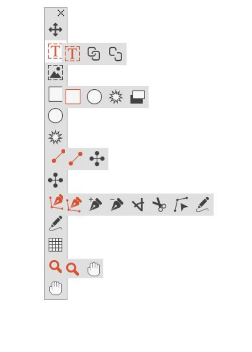
The user interface
Skimming through the QuarkXPress user interface, you will find that many commands
are familiar or self-explanatory. Once you become familiar with QuarkXPress menus
and dialog boxes, you will discover that keyboard commands and palettes offer
convenient access to features that you can also access through menus.
Tools
The Tools palette
The Tools palette includes the following controls:
A GUIDE TO QUARKXPRESS 2016 | 19
THE USER INTERFACE
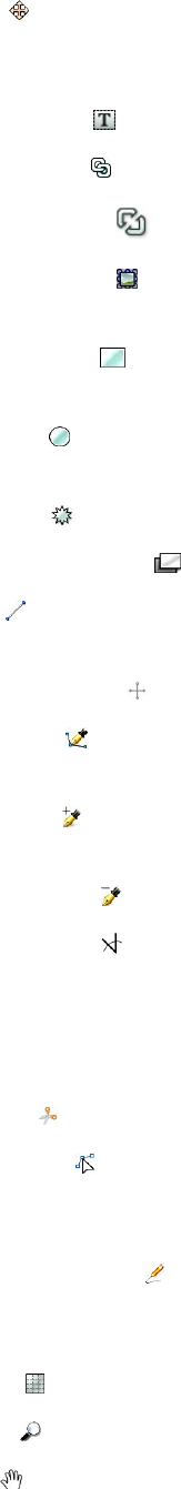
•Use the Item tool to select, move, resize, and reshape items (boxes, lines, text
paths, and groups). When the Item tool is not selected, you can press
Command/Ctrl to temporarily access the Item tool.
•Use the Text Content tool to draw text boxes and work with text in boxes.
•Use the Text Linking tool to link text boxes.
•
Use the Text Unlinking tool to unlink text boxes.
•Use the Picture Content tool to draw picture boxes and work with pictures in
boxes.
•Use the Rectangle Box tool to create a rectangular box. To draw a square box,
press and hold Shift while drawing.
•Use the Oval Box tool to create an oval box. To create a circular box, press and
hold Shift while drawing.
•Use the Starburst tool to create a star-shaped box.
•Use the Composition Zones tool to create a Composition Zones box.
•Use the Line tool to create straight diagonal lines of any angle. To constrain a
line angle to 45 degrees, press and hold Shift while drawing.
•Use the Orthogonal Line tool to create orthogonal lines.
•Use the Bézier Pen tool to create Bézier lines and boxes. To constrain a line
angle to 45 degrees, press and hold Shift while drawing.
•Use the Add Point tool to add a point to any type of path. Adding a point to
a content box automatically turns the content box into a Bézier item.
•Use the Remove Point tool to remove a point from any type of path.
•Use the Convert Point tool to automatically convert corner points to curve
points, and curve points to corner points. Click and drag to change the position
of a point, the curve of a curved line segment, or the position of a straight line
segment. Select this tool and click a rectangular box or straight line to convert
the item to a Bézier box or line.
•Use the Scissors tool to cut an item into distinct paths.
•Use the Select Point tool to select curves or points so that you can move them
or delete them. Press Shift and click to select multiple points. Option-click/Alt-click
a point to make it symmetrical.
•Use the Freehand Drawing tool to draw any shape line or box you want. If
you don't close a freehand box, it remains a line. To automatically close a freehand
box, press Option/Alt.
•Use the Tables tool to create a table.
•Use the Zoom tool to enlarge or reduce the document view.
•Use the Pan tool to reposition the active layout.
20 | A GUIDE TO QUARKXPRESS 2016
THE USER INTERFACE
You can use key commands to declare the box content type as you draw using the
Rectangle Box tool: Press R while drawing to declare Picture content or press T while
drawing to declare Text content. To change the content type of an existing box,
right-click on the box and choose Content > Text, Picture or None
For more information about Bézier boxes and lines, see "Creating Bézier boxes" and
"Creating Bézier lines."
To pan the layout while a Pen tool is selected, press Shift+Space and then click and
drag.
To add text to a line or path, select the Text Content tool and double-click the line
or path.
For more information about Composition Zones, see "Creating a Composition Zones
item."
Users can display the Tools palette (Windows menu) horizontally, as well as vertically.
To display the palette horizontally, on Windows Ctrl+double-click the title bar and on
Mac OS X dock the tool palette to the top edge.
Tool key commands
When no text box or text path is active, you can switch tools quickly using the
following key commands:
Mac OS XWindowsTool
VVItem tool
TTText Content tool
NTText Linking tool
NTText Unlinking tool
RRPicture Content tool
BBRectangle Box tool
BBOval Box tool
BBStarburst tool
BLComposition Zones tool
LPLine tool
LPOrthogonal Line tool
PPBézier Pen tool
PPAdd Point tool
PPRemove Point tool
A GUIDE TO QUARKXPRESS 2016 | 21
THE USER INTERFACE
Mac OS XWindowsTool
PPConvert Point tool
PPScissors tool
PPSelect Point tool
PPFreehand Drawing tool
GGTable tool
ZZZoom tool
XXPan tool
Scissors XTensions software
Scissors XTensions software adds the Scissors tool to the Tools palette. You can use
the Scissors tool to cut the outline of a box and turn it into a line, or to cut a line or
text path into two.
When the Scissors XTensions software is loaded, the Scissors tool displays in the
QuarkXPress Tools palette. To use the Scissors tool:
1Select the Scissors tool .
•When a picture box is cut, it is converted to a Bézier line. As a result, the contents
of the box are not retained after the cut is made.
•When a text box is cut, it is converted to a text path.
•When a text path is cut, it is converted into two linked text paths.
2Select the Select Point tool and click and drag the point to adjust it.
Shape of Things XTensions software
Shape of Things XTensions software adds the Starburst tool to QuarkXPress. You can
use this tool to quickly and easily create star-shaped boxes.
Using the Starburst tool
You can create a star-shaped picture box in two ways.
1 Select the Starburst tool , and then click and drag.
2 To define specific attributes as you create the star burst box, select the Starburst tool,
and then position the crosshair pointer where you want the star-shaped box and
click once. When the Starburst dialog box displays, enter values for the following
fields, and then click OK:
•Star Width
•Star Height
•Number of Spikes
22 | A GUIDE TO QUARKXPRESS 2016
THE USER INTERFACE
•Spike Depth: Enter the desired distance from the tip of the spike to the base of
the spike as a percentage.
•Random Spikes: Enter a value between 0 and 100, where 0 is no randomness
applied and 100 is full randomness applied.
Menus
The topics below describe the menus and menu items available in QuarkXPress.
QuarkXPress menu (Mac OS X only)
The QuarkXPress menu is a part of QuarkXPress for Mac OS X. This menu contains
the same commands as in the application menu for other Mac OS X applications —
to hide or show QuarkXPress and other applications, to access preferences, and to quit
QuarkXPress. This menu includes the following commands:
•About QuarkXPress: Use this command to display information about QuarkXPress,
such as the version number.
•Edit License Code: Use this command to change the validation code of an installed
copy of QuarkXPress. By changing this code, you can change a Test Drive
version (formerly called "evaluation copy") of QuarkXPress into a fully functional
version, change the languages supported by the user interface, or change
QuarkXPress into a Plus edition.
•Activate QuarkXPress: Use this command to activate QuarkXPress on your
computer. Available only when QuarkXPress is running in demo mode.
•Check for Updates: Use this command to check for updates to QuarkXPress.
•Quark Update Settings: Use this command to configure automatic update settings.
•Preferences: Lets you modify default values and settings. For more information,
see "Preferences."
•Quit QuarkXPress: Use this command to exit the application.
File menu
The File menu enables you to manipulate electronic files in a number of ways, including
the ability to create, open, print, and save. This menu includes the following
commands:
•New: Choose an option from the New submenu to create a project. If you choose
New Project from Ticket, you can select a Job Ticket from which you can create
the project. You can also use this submenu to create new libraries and books.
•Open: Use this option to open project files.
•Open Recent (Mac OS X only, on Windows, a list of the recently opened files are
displayed at the end of the File menu.): Use this option to open a project from a list
of recently opened files.
•Close: Use this option to close the active project.
•Save: Use this option to save the active project.
A GUIDE TO QUARKXPRESS 2016 | 23
THE USER INTERFACE
•Save As: Use this option to save a copy of the active project.
•Revert to Saved: Use this option to return the active project to the state it was in
when it was last saved.
•Import: Use this command to import text into a text box or to import a picture
into a picture box.
•Save Text: Use this option to save the contents of the active text box as a separate
file.
•Append: Use this option to append style sheets, colors, layouts, and a variety of
other types of resources from another file.
•Export: Use this option to export a layout as another file type or version.
•Collect for Output: Use this option to copy a file, an output report, and selected
resources into one folder. Collect for output can be performed on all layouts in
the project.
•Job Jackets: Use this submenu to access the specifications and rules for creating
and inspecting a layout, link a project to a Job Jackets file, modify a Job Ticket,
and evaluate a layout.
•Print: Use this option to print the active file.
•Exit (Windows only): Use this option to exit the application.
Edit menu
The Edit menu includes the following commands:
•Undo: Undoes the last action.
•Redo: Redoes an undone action.
•Cut: Cuts the selected content.
•Copy: Copies the selected content to the clipboard.
•Paste: Pastes the clipboard contents on the active page.
•Paste Without Formatting: Pastes the clipboard contents as plain text.
•Paste In Place: Pastes a duplicated or copied item onto the active page at the same
position from which it was originally copied.
•Paste as Native Objects: To convert the item to be pasted to a native QuarkXPress
object.
•Delete (Windows only): Deletes the active content.
•Select All: Selects all content in the active box or text path.
•Show Clipboard (Windows only): Displays the contents of the clipboard.
•Find/Change: Displays the Find/Change palette, which you can use to find and
change text based on content, formatting, or both.
•Item Find/Change: Displays and hides the Item Find/Change palette.
•Preferences (Windows only): Lets you modify default values and settings. For more
information, see "Preferences."
24 | A GUIDE TO QUARKXPRESS 2016
THE USER INTERFACE

•Colors: Lets you add, edit, and delete color definitions. For more information,
see "Working with colors."
•Style Sheets: Lets you add, edit, and delete style sheet definitions. For more
information, see "Working with style sheets."
•Item Styles: Lets you add, edit, and delete item definitions that you can apply to
QuarkXPress items with the Item Styles palette (Window menu).
•Callout Styles: Lets you add, edit, and delete callout styles. For more information,
see "Working with callouts."
•Conditional Styles: Lets you add, edit, and delete conditional styles. For more
information, see "Working with conditional styles."
•Bullet, Numbering, and Outline Styles: Lets you add, edit, and delete bullet,
numbering, and outline styles. For more information, see "Bullets and numbering."
•Footnote Styles: Lets you add, edit, and delete footnote styles. For more
information, see "Working with footnotes and endnotes."
•Underline Styles: Lets you access and modify underline styles.
•Hyperlinks: Lets you add, edit, and delete hyperlinks including URLs, anchors,
and page links.
•Hanging Characters: Lets you add, edit, and delete custom hanging character
definitions. For more information, see "Working with hanging characters."
•Lists: Lets you add, edit, and delete list definitions. The Lists feature is a tool for
automatically generating tables of contents and other types of listed content. For
more information, see "Working with lists."
•H&Js: Lets you add, edit, and delete H&J (hyphenation and justification)
definitions. H&Js let you control how text breaks. For more information, see
"Controlling hyphenation and justification."
•Grid Styles: Lets you add, edit, and delete patterns of non-printing design grids
that you can apply to text components. For more information, see "Working with
design grids."
•Dashes and Stripes: Lets you add, edit, and delete custom line patterns.
•Font Sets: Lets you add, edit, and delete custom scaling, sizing, and direction for
specific fonts.
This feature is considered an East Asian feature and is only available when you
have the East Asian preference enabled (QuarkXPress/Edit > Preferences > East
Asian).
•Output Styles: Lets you add, edit, and delete output style definitions. Output
styles let you easily switch between different sets of output options. For more
information, see "Working with output styles."
•Mojigumi: Lets you add, edit, and delete Mojigumi sets and classes. For more
information, see "Working with Mojigumi sets and classes."
A GUIDE TO QUARKXPRESS 2016 | 25
THE USER INTERFACE

This feature is considered an East Asian feature and is only available when you
have the East Asian preference enabled (QuarkXPress/Edit > Preferences > East
Asian).
•Non-Breaking Character Sets: Lets you add, edit, and delete rules for two-byte
character sets.
This feature is considered an East Asian feature and is only available when you
have the East Asian preference enabled (QuarkXPress/Edit > Preferences > East
Asian).
•Kerning Pairs (Mac OS X only): Lets you control kerning for installed fonts.
•Font Tracking Tables (Mac OS X only): Lets you control tracking for installed
fonts..
•Set Tool Preferences From Selected (Mac OS X only): Lets you set the tool
preferences to the currently selected box's attributes.
•Restore Tool Preferences To Default (Mac OS X only): Lets you restore the tool
preferences back to the defaults.
•Color Setups: Lets you access and modify setups for Source and Output Setups.
•Program Language (Windows only): Lets you change the language of the user
interface.
Style menu
The Style menu changes depending on whether a text box, a picture box, or a line is
active.
Style menu for text
The Style menu for text includes commands for specifying character attributes and
paragraph formats. This menu includes the following commands:
•Font: Lets you change the font of selected text.
•Size: Lets you change the size of selected text.
•Type Style: Lets you apply type styles such as bold, italic, and underline to selected
text. The Type Style sub menu also contains Underline Styles, Make Fraction,
Make Price and Remove Custom Underline (on Mac OS X).
•Color: Lets you change the color of selected text.
•Shade: Lets you set the tint of an applied color.
•Opacity: Lets you control the transparency of selected text.
•Horizontal/Vertical Scale (Windows only): Lets you stretch selected text
horizontally or vertically.
•Kern (Windows only) : Lets you add or remove all manual kerning applied between
characters, or remove kerning from a kerning pair.
•Story Direction: Lets you specify horizontal or vertical story direction for the
selected text box.
26 | A GUIDE TO QUARKXPRESS 2016
THE USER INTERFACE

This feature is considered an East Asian feature and is only available when you
have the East Asian preference enabled (QuarkXPress/Edit > Preferences > East
Asian).
•Rubi: Lets you control rubi characters applied to text.
This feature is considered an East Asian feature and is only available when you
have the East Asian preference enabled (QuarkXPress/Edit > Preferences > East
Asian).
•Group Characters: Lets you place horizontal text in a vertical story.
This feature is considered an East Asian feature and is only available when you
have the East Asian preference enabled (QuarkXPress/Edit > Preferences > East
Asian).
•Alignment: Lets you align active paragraphs to the left, right, or center. Also lets
you justify or force-justify selected paragraphs.
•Character Alignment: Lets you align active characters to the top, center, baseline,
or bottom.
In East Asian configuration, the options are: ICF Box Top, ICF Box Bottom,
Embox Top, Embox Center, Embox Bottom and Roman Baseline . These let
you align the small characters in a line to the ICF specified by the large characters.
In vertical text frames, ICF Top/Right aligns the text to the right of the ICF, and
ICF Bottom/Left aligns the text to the left of the ICF.
•Baseline Shift (Windows only): Lets you move selected text up or down in relation
to the baseline without changing line spacing.
•Character (Windows only): Displays the Character Attributes dialog box, which
lets you control every aspect of character formatting for selected text.
•Leading (Windows only): Lets you change the line spacing of selected paragraphs.
•Formats (Windows only): Displays the Paragraph Attributes dialog box, which
lets you control every aspect of paragraph formatting for selected text.
•Tabs (Windows only): Lets you set tab stops for selected paragraphs.
•Rules (Windows only): Lets you create automatic lines above and below selected
paragraphs.
•Paragraph Style Sheet: Lets you apply paragraph style sheets to selected text.
•Character Style Sheet: Lets you apply character style sheets to selected text.
•Footnotes/Endnotes: Lets you view, add and edit footnotes and endnotes.
•Footnote Separator Style: Lets you apply a different footnote separator style.
•Update Style Sheet: Lets you update a character or paragraph style sheet definition
based on local changes to the applied style sheet.
•Item Styles: Lets you view and update applied item styles.
A GUIDE TO QUARKXPRESS 2016 | 27
THE USER INTERFACE
•Change Case: Lets you change case of selected text to uppercase, lower case, or
title case.
•Flip Horizontal: Lets you flip selected text horizontally.
•Flip Vertical: Lets you flip selected text vertically.
•Cross Reference: Lets you insert and synchronize cross references.
•Hyperlink: Lets you modify and apply a hyperlink, page link, or anchor to selected
text.
•Anchor: Lets you create or modify an anchor for selected text.
•Remove Manual Kerning (Mac OS only) : Lets you remove all manual kerning
applied between characters, or remove kerning from a kerning pair.
•Underline Styles (Windows only): Lets you modify and apply an underline style
to selected text.
Style menu for pictures
The Style menu for pictures includes commands for formatting and editing pictures.
This menu includes the following commands:
•Color: Applies a color to a selected grayscale or one-bit picture.
•Shade: Lets you set the intensity of an applied color.
•Opacity: Lets you control the transparency of a selected picture.
•Halftone (Windows only): Lets you apply a halftone screen pattern to a selected
grayscale picture.
•Stretch Picture To Fit Box: Reduces or enlarges the selected picture horizontally
and vertically to fill its picture box.
•Scale Picture To Box: Reduces or enlarges the selected picture proportionately
to fill its picture box.
•Fit Box To Picture: Reduces or enlarges the picture box to fit the size of the
selected picture.
•Item Styles: Lets you view and update applied item styles.
•Center Picture: Centers the selected picture in its picture box.
•Flip Horizontal: Flips the selected picture horizontally.
•Flip Vertical: Flips the selected picture vertically.
•Convert to Native Objects: Convert the existing item to a native QuarkXPress
object.
•Hyperlink: Lets you modify and apply a hyperlink, page link, or anchor to a
selected picture or box.
•Anchor: Lets you create or modify an anchor for a selected picture or box.
Style menu for lines
The Style menu for lines includes the following commands:
28 | A GUIDE TO QUARKXPRESS 2016
THE USER INTERFACE
•Line Style: Lets you apply a line style to a selected line.
•Arrowheads: Lets you apply an arrowhead style to a selected line.
•Width: Lets you adjust the width of a selected line.
•Color: Lets you change the color of a selected line.
•Shade: Lets you set the intensity of an applied color.
•Opacity: Lets you control the transparency of a selected line.
•Item Styles: Lets you view and update applied item styles.
•Hyperlink: Lets you modify and apply a hyperlink, page link, or anchor to a
selected line.
•Anchor: Lets you create or modify an anchor for a selected line.
Item menu
The Item menu includes commands for controlling item attributes, positions, grouping,
sharing, and more.
•Modify (Windows only): Lets you access a comprehensive set of controls such as
color, shade, position, size, frame, runaround, clipping path, and more for an
item.
•Frame (Windows only): Lets you specify frame attributes such as width, style, color,
and opacity for an item.
•Runaround (Windows only): Lets you specify whether text runs inside, outside,
or through a picture or its picture box.
•Clipping (Windows only): Lets you select the clipping type for a given item and
control its outset.
•Duplicate: Lets you create a copy of an item and its contents.
•Step and Repeat (Windows only): Lets you duplicate an active item multiple times
and in any position you specify.
•Super Step and Repeat: Lets you duplicate an active item multiple times and
specify scale, rotation, and shading for the duplicates.
•Delete: Lets you delete a selected item and its contents.
•Lock: Lets you prevent accidental changes to items and their contents by locking
its position or content.
•Fit Box to Text: Reduces or enlarges the text box to fit the size of the text it
contains.
•Send & Bring (Mac OS X only): Lets you move an item one level backward in the
page or layer's stacking order, move an item to the back of the page or layer, move
an item to the front of the page or layer, or move an item one level forward in
the page or layer's stacking order.
•Send Backward (Windows only): Moves an item one level backward in the page
or layer's stacking order.
•Send to Back (Windows only): Moves an item to the back of the page or layer.
A GUIDE TO QUARKXPRESS 2016 | 29
THE USER INTERFACE
•Bring Forward (Windows only): Moves an item one level forward in the page or
layer's stacking order.
•Bring to Front (Windows only): Moves an item to the front of the page or layer.
•Group: Lets you combine two or more active items (including lines, boxes, text
paths, tables, and other groups) into a group.
•Ungroup: Performs an Ungroup on the currently selected grouped items.
•Ungroup All: Lets you break a group into its component items or groups.
•Insert Inline Table: Lets you insert an inline table.
•Space/Align: Lets you position the selected items evenly with regard to each other
or with regard to the page or spread.
•Constrain: Lets you restrict an item so that it cannot move beyond the boundaries
of the item to which it is constrained.
•Unconstrain: Removes any constrains applied to the item.
•Content: Lets you change the content type of an item.
•Shape: Lets you change the shape of an active item.
•Merge: Lets you merge selected items in a number of ways. (Mac OS X : Merge or
Split Paths)
•Split: Lets you split boxes that contain non-overlapping shapes, split boxes that
contain shapes within shapes, or split boxes that contain a border that crosses
over itself (such as a figure eight). (Mac OS X : Merge or Split Paths)
•Point/Segment Type: Lets you change the point or segment type of an item so
you can manipulate points, curve handles, and line segments.
•Convert Text To Boxes: Lets you convert the contents of a selected text box to
a Bézier box.
•Edit: Lets you modify item shape, runaround, or clipping path.
•Flip Shape: Lets you flip a Bézier shape in its frame either vertically or horizontally.
•Share: Lets you access sharing properties of an item and synchronize or re-use
content such as text, pictures, boxes, lines, and Composition Zones.
•Unsynchronize Size: Removes synchronization of a single instance of the item
without affecting other occurrences of that item (or the synchronization attributes).
•Unsynchronize Item/Content: Removes synchronization of a single instance of
the item without affecting other occurrences of that item (or the synchronization
attributes).
•Drop Shadow (Windows only): Lets you apply or modify an item's drop shadow.
•Copy To Other Layouts: Lets you copy to selected items to another layout.
•Callout Anchor: Lets you configure callout anchors and callouts. For more
information, see "Working with callouts."
•Composition Zones: Lets you create or modify Composition Zones.
30 | A GUIDE TO QUARKXPRESS 2016
THE USER INTERFACE
•Digital Publishing: Lets you configure items for digital publishing in ePub, Kindle,
App Studio and HTML5 Publication output formats. For more information, see
Digital Publishing with QuarkXPress.
•New Box From Clipping: Lets you to create a box from a clipping path.
•Scale: Lets you set the scale settings.
•Note: Lets you insert, delete, and navigate between notes. For more information,
see "Notes."
Page menu
The Page menu includes commands for inserting, deleting, and moving pages; working
with guides, grids, and sections; navigating through pages, and more.
•Insert: Lets you add new pages.
•Delete: Lets you delete pages.
•Move: Lets you move a page to a different location.
•Master Guides and Grid: Lets you modify the placement of page guides and
design grids on master pages.
•Section: Lets you change the numbering system for a layout or a range of pages
in a layout.
•Previous: Navigates to the preceding page.
•Next: Navigates to the following page.
•First: Navigates to the first page.
•Last: Navigates to the last page.
•Go to: Lets you navigate to a particular page.
•Display: Lets you display a page or a master page.
Layout menu
The Layout menu includes commands for working with and navigating to layouts.
•New: Lets you add a new layout.
•Duplicate: Lets you duplicate one layout to copy its items and content to another.
•Delete: Lets you remove a layout.
•New/Edit Layout Specification: Lets you create or modify Job Jackets properties
for a layout.
•Layout Properties: Lets you modify layout properties such as name, type, and
size.
•Advanced Layout Properties: Lets you modify sharing properties of a layout.
•eBook Metadata: Lets you apply metadata to the layout for eBook export. For
more information, see Digital Publish with QuarkXPress.
•Add Pages to Reflow: Lets you add page components to reflow tagging palette
to be able export to Reflow ePub.
A GUIDE TO QUARKXPRESS 2016 | 31
THE USER INTERFACE
•Previous: Activates the layout tab that was active prior to the current layout.
•Next: Activates the layout tab that is positioned to the immediate right of the
active layout.
•First: Activates the far-left layout tab.
•Last: Activates the far-right layout tab.
•Go to: Lets you activate a specific layout and then choose the layout from the
submenu.
Table menu
The Table menu includes commands for adding rows and columns to tables, modifying
table attributes, converting tables, and more.
•Insert: Lets you add a row or column to a table.
•Select: Lets you select a pattern of rows and columns or other table elements. This
makes it easy to apply alternating formatting — such as shading every other row.
•Delete: Lets you delete a selection from the table.
•Combine Cells: Lets you combine a rectangular selection of adjacent table cells
— including entire rows or columns — into a single cell.
•Table Break: Lets you continue a table in another location. The table break is the
maximum size the table can reach before it splits into two linked tables.
•Make Separate Tables: Lets you sever the link between continued tables so each
table becomes completely separate. This prevents changes to one portion of the
table from affecting all the continued tables.
•Repeat As Header: Lets you specify a header row to repeat automatically in
continued instances of a table.
•Repeat As Footer: Lets you specify a footer row to repeat automatically in
continued instances of a table.
•Convert Text to Table: Lets you convert text that has already been imported or
typed into a text box to a table. This works best with text that is delimited in some
way to indicate how to divide the information into columns and rows.
•Convert Table: Lets you convert the information in a table to text or to a group
of related boxes. You might convert a table for easy exporting of the current data
or to save a document containing features that are not supported in earlier versions
of QuarkXPress.
•Table Direction: Lets you specify horizontal or vertical orientation for a table.
•Link Text Cells: Lets you link table cells to each other just as text boxes and text
paths can be linked. Text that is typed, imported, or pasted into a linked cell fills
the first text cell, and then flows on to each subsequent linked cell.
•Maintain Geometry: Lets you prevent the width and height of a table from
changing when you insert or delete rows or columns.
32 | A GUIDE TO QUARKXPRESS 2016
THE USER INTERFACE
View menu
The View menu provides options for viewing your document and specifying what
you see on screen when the menu item is checked. This menu includes the following
commands:
•Fit in Window: Automatically scales the view to fit (and center) an entire page
in the layout window.
•50%: Scales the layout view to 50%.
•75%: Scales the layout view to 75%.
•Actual Size: Scales the layout view to 100%.
•200%: Scales the layout view to 200%.
•Thumbnails: Displays small representations of each page that you can rearrange
and copy between projects.
•Enter Full Screen (Mac OS X only): Lets you switch to full screen mode.
•Dynamic Guides: Displays nonprinting lines that appear when you create or
manipulate item on pages. They help you align, edit, and transform items relative
to other items on the page by displaying location and measurement values.
Displays a submenu allowing you to turn Dynamic Guides on and off and specify
the type of dynamic guides and feedback that appear (such as Align to Center of
Item, Align to Edges of Item, Align to Center of Page, Show Equal Dimensions,
Show Equal Spacing, and Show Measurements for Dimensions/Spacing).
Unlike Guides, which are document settings, displaying Dynamic Guides are
application specific settings.
•Guides: Displays nonprinting lines used to position items on pages, including
margin guides, the outlines of boxes, the "X" pattern in empty picture boxes, and
ruler guides.
•Hide Selection: Allows you to put QuarkXPress into a mode where selections are
not indicated visually in the document (no text highlighting, no handles), but
the selection is still honored by QuarkXPress.
•Page Grids: Displays nonprinting gridlines defined for the master page on which
the active layout page is based.
•Text Box Grids: Displays nonprinting gridlines applied to text boxes.
•Snap to Guides: Lets you quickly align items with guides so items will snap to
the nearest guide.
•Snap to Page Grids: Lets you quickly align items with page grids so items will
snap to the nearest guide.
•Rulers: Displays rulers, which you can use to position items and guides, along
the top and left edges or top and right edges of the layout window.
•Ruler Direction: Lets you position page rulers on the top and left or top and right
edges of the layout window.
•Invisibles: Displays editable, nonprinting characters such as spaces, tabs, and
paragraph returns in text.
A GUIDE TO QUARKXPRESS 2016 | 33
THE USER INTERFACE
•Visual Indicators: Displays indicators for non-printing elements, such as
hyperlinks and missing font highlighting.
•Highlight Content Variables: Displays indicators for the content variables.
•Highlight Cross References: Displays indicators for cross references.
•Trim View: Simulates what the page will look like when trimmed by cropping
any items that extend beyond the page boundary. You can control the color of
the pasteboard that displays when this item is selected in the Display pane of the
Preferences dialog box (QuarkXPress/Edit > Preferences).
•Hide Suppressed: Hides all items for which the Suppress Output box is checked
in the Box, Line, Picture, or Layout pane of the Modify dialog box, including
the Measurements palette (Mac OS X only), as well as layers for which Suppress
Output is checked in the Attributes dialog box. In addition, this option hides
underlines on hyperlinks, hyperlink anchors, index markers, and the text overflow
symbol.
•Show/Hide Notes: Allows you to hide or show notes in your project.
•Proof Output : Lets you preview how the layout will look when output to different
media and for different printing methods. This display simulation is accurate
enough for soft proofing.
•Story Editor: Displays the active story in Story Editor view. For more information,
see "Using Story Editor view."
•View Sets: Lets you create and easily switch between different view options.
Utilities menu
The Utilities menu includes the following commands:
•Insert Character: Lets you easily insert special characters, including special
breaking and nonbreaking spaces.
•Content Variable: Lets you insert a content variable as well as create new, edit,
remove (not delete) and convert to text..
•Check Spelling: Use the submenu to display the Check Spelling palette to check
the spelling of a word, a selection of text, a story, a layout, or all master pages in
a layout. On Mac OS X, Auxiliary Dictionary and Edit Auxiliary are part of
Check Spelling submenu.
•Auxiliary Dictionary (Windows only): Lets you specify an auxiliary dictionary for
use in spell checking.
•Edit Auxiliary (Windows only): Lets you edit the auxiliary dictionary associated
with the active layout .
•Word and Character Count: Use the submenu to display the Word and Character
Count dialog box. This dialog box displays the number of full-width characters,
half-width characters, and various other kinds of characters in the active text
component or in the layout.
•Line Check: Displays a submenu that lets you find widows, orphans, loosely
justified lines, lines that end with a hyphen, and overflow situations.
•IME Reconversion: IME Reconversion is supported in the following ways:
34 | A GUIDE TO QUARKXPRESS 2016
THE USER INTERFACE

On Mac OS X: IME Reconversion is supported through the IME Menu. However
it works for Japanese IME Only.
1
2On Windows: IME Reconversion is supported through the IME Reconversion menu
option on the QuarkXPress Utilities Menu, as well as the Context Menu. It works
for all Japanese IME, Korean IMEs and a few Simplified and Traditional Chinese
IMEs.
IME Reconversion is also supported through the keyboard on both Windows and
Mac OS X.
•Suggested Hyphenation: Displays the suggested hyphenation for the word
containing the text insertion point.
•Hyphenation Exceptions: Displays a submenu that allows you to edit the
exceptions and also import and export .xml files containing lists of
language-specific hyphenation exceptions. Displays the Hyphenation Exceptions
dialog box.
•Convert Project Language : Lets you convert all of the characters in the active
project that use a particular character language to a different character language.
•Usage: Lets you view and update the status of fonts, pictures, color profiles, tables,
Composition Zones, and assets used in layouts. Multiple missing digital files can
be updated all at once using the Usage dialog.
•Item Styles Usage: Lets you view and update applied item styles.
•Job Jackets Manager: Displays the Job Jackets Manager dialog box.
•Build Index: Lets you create an index from the contents of the Index palette.
•Insert Placeholder Text: Generates random text in the active text box so that
you can preview how text will flow and be styled, even though you might not
have actual content yet.
•Cloner: Displays the Cloner dialog box. For more information, see " Cloner
XTensions software."
•ImageGrid: Displays the ImageGrid dialog box. For more information, see "
ImageGrid XTensions software."
•Tracking Edit (Windows only): Lets you control tracking for installed fonts.
•Kerning Table Edit (Windows only): Lets you control kerning for installed fonts.
•Linkster: Displays the Linkster dialog box. For more information, see " Linkster
XTensions software."
•ShapeMaker: Displays the ShapeMaker dialog box. For more information, see "
ShapeMaker XTensions software."
•Remove Manual Kerning (Windows only): Lets you remove all manual kerning
applied between characters, or remove kerning from a kerning pair.
•Font Mapping: Lets you create and edit rules for substituting a new font for a
font that is requested by a project but which is not installed on your computer.
•Component Status (Windows only): Lets you view the status of required software
components.
A GUIDE TO QUARKXPRESS 2016 | 35
THE USER INTERFACE
•PPD Manager : Lets you control which PostScript Printer Description files (PPDs)
are loaded in the Print dialog box.
•Convert Old Underlines: Converts all underlines in the active text chain from
QuarkXPress 3.x (Stars & Stripes) format to Type Tricks format.
•XTensions Manager: Lets you control which XTensions modules are loaded when
the application is launched.
•Profile Manager: Lets you control which color profiles are loaded in the
application.
•Make QR Code: Lets you generate vector Quick Response (QR) codes directly
within QuarkXPress then style and color them the way you want.. You have the
choise between creating vector based QR codes or pixel based QR codes. If you
choose pixel based QR codes, they will be created in your Documents folder. When
you call the QR Code dialog again, the data behind the QR code will be shown.
•Redline: Use the submenu to turn automatic tracking and highlighting on and
off. You can also use this submenu to display the Redline palette.
•Check Out License/Check In License: Displays only if you have installed the
application for use with Quark License Administrator (QLA). Lets you check
licenses in and out.
Window menu
The Window menu enables you to control the on-screen display of open windows
and palettes. This menu includes the following commands:
•New Window: Displays the active project in a new window. You can then view
different parts of the project in each window.
•Split Window: Splits the project window into two parts. You can then view
different parts of the project in each part of the window.
•Bring All to Front (Mac OS X only): Positions and displays all open windows.
•Cascade (Windows only): Layers multiple open projects so just a portion of each
project's menu bar displays.
•Tile (Mac OS X only): Tiles all open windows horizontally to fit on the screen.
•Tile Horizontally (Windows only): Tiles all open windows horizontally to fit on
the screen.
•Tile Vertically (Windows only): Tiles all open windows vertically to fit on the
screen.
•Arrange Icons (Windows only): Minimizes all active projects.
•Close All (Windows only): Closes all active projects.
•Palette Sets: Use the submenu to store and recall arrangements of palettes.
•Turn Hiding On (Mac OS X only): Allows you to display and hide groups of docked
palettes.
•Advanced Image Control: Displays and hides the Advanced Image Control
palette.
36 | A GUIDE TO QUARKXPRESS 2016
THE USER INTERFACE
•App Studio Publishing: Displays and hides the App Studio Publishing palette.
For more information, see Digital Publishing with QuarkXPress.
•Books: Displays and hides the Books palette. For more information, see "Working
with books."
•Callout Styles: Displays the Callout Styles palette. For more information, see
"Working with callout styles."
•Colors: Displays and hides the Colors palette.
•Color Blends: Displays and hides the Color Blends palette. For more information,
see "Creating multi-color blends."
•Conditional Styles: Displays the Conditional Styles palette. For more information,
see "Working with conditional styles."
•Footnote Styles: Displays and hides the Footnote Styles palette. For more
information, see "Working with footnotes and endnotes."
•Content: Displays and hides the Content palette.
•Content Variables: Displays and hides the Content Variables palette.
•Glyphs: Displays and hides the Glyphs palette.
•Grid Styles: Displays and hides the Grid Styles palette.
•Guides: Displays and hides the Guides palette.
•HTML5: Displays and hides the HTML5 palette.
•Hyperlinks: Displays and hides the Hyperlinks palette.
•Index: Displays and hides the Index palette.
•Item Styles: Displays and hides the Item Styles palette.
•Layers: Displays and hides the Layers palette.
•Lists: Displays and hides the Lists palette.
•Table Styles: Displays and hides the Table Styles palette.
•Measurements: Displays and hides the Measurements palette.
•Page Layout: Displays and hides the Page Layout palette.
•Profile Information: Displays and hides the Profile Information palette.
•Redline: Displays and hides the Redline palette.
•Reflow Tagging: Displays the Reflow Tagging palette. For more information,
see "Working with Reflow."
•Scale: Displays and hides the Scale palette. For more information, see "Scale
XTensions software."
•Style Sheets: Displays and hides the Style Sheets palette.
•Tools: Displays and hides the Tools palette.
•Welcome Screen: Displays the welcome screen.
In addition, this menu includes an item for every open window. You can use these
menu items to easily switch between windows.
A GUIDE TO QUARKXPRESS 2016 | 37
THE USER INTERFACE
Help menu
The Help menu provides access to the online help. This menu includes the following
commands:
•Search Use this command to search the local help file.
•Help Topics (Mac OS X only): Use this command to display the online help.
•Contents (Windows only): Use this option to view the Contents tab of the Help
window.
•Index (Windows only): Use this option to view the Index tab of the Help window.
•What's New: Use this option to explore What's New in this version of QuarkXPress.
•Transfer QuarkXPress License (Windows only): Use this option to transfer your
license to another computer.
•About QuarkXPress (Windows only): Use this command to display information
about QuarkXPress, such as the version number and the build number.
•Edit License Code (Windows only): Use this command to change the validation
code of an installed copy of QuarkXPress. By changing this code, you can change
a Test Drive version (formerly called "evaluation copy") of QuarkXPress into a
fully functional version, change the languages supported by the user interface,
or change QuarkXPress into a Plus edition.
•Check for Updates (Windows only): Use this command to check for updates to
QuarkXPress.
•Quark Update Settings (Windows only): Use this command to configure automatic
update settings.
Context menus
QuarkXPress offers a wide variety of functionality through context menus. To display
a context menu, Control+click (Mac OS X) or right-click in text, on a picture, or on a
palette.
Palettes
To open or display a palette, check the palette name in the Window menu.
To close an open palette, click the close box in the upper-left corner of the palette,
uncheck the palette name in the Window menu, or use the appropriate keyboard
equivalent.
(Mac OS X only) Palettes can be vertically docked to the left and right edges of the
screen, and docked palettes on screen edges form a group and can be moved as a group.
You can also hide groups of docked palettes by choosing Window > Turn Hiding On.
Docked palettes contain snaps giving a unified look to the application. In the document
window, the resize (+) button can be used to unsnap / snap a window to the palettes.
A splitter is added between the window and palette edges so that resizing the palette
also resizes the window.
38 | A GUIDE TO QUARKXPRESS 2016
THE USER INTERFACE
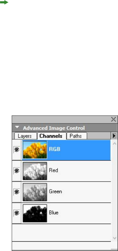
Due to its width, the Measurements palette can only be docked horizontally to the
upper or lower edge of the screen. The Tool palette can be docked either vertically or
horizontally.
(Mac OS X only) Palettes can be dragged and merged into any palette groups. When
dragging, a thumbnail is shown indicating whether the palette will be merged or placed
above. A blue line indicator is shown in the palette group to indicate the location the
palette will be dropped.
Advanced Image Control palette
The Advanced Image Control palette lets you control the display of imported images.
For more information, see "Working with PSD pictures."
The Advanced Image Control palette lets you manipulate imported images.
Books palette
The Books palette allows you to work with books. The buttons at the top of this palette
let you create and open books and add, edit, and delete chapters in books.
For more information, see "Working with books."
A GUIDE TO QUARKXPRESS 2016 | 39
THE USER INTERFACE
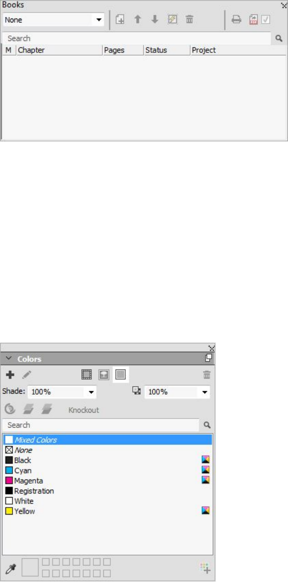
The Books palette lets you work with books.
Callout Styles palette
The Callout Styles palette lets you work with callout styles. For more information,
see "Working with callout styles."
Colors palette
The Colors palette lets you view and apply colors defined in the active project. The
buttons at the top of this palette let you create, edit, and delete colors.
Users create colors through the Colors dialog box (Edit > Colors). For more
information, see "Working with colors."
The Colors palette lets you view and apply colors.
Color Blends palette
The Color Blends palette lets you define and apply multi-color blends.
For more information, see "Creating multi-color blends."
40 | A GUIDE TO QUARKXPRESS 2016
THE USER INTERFACE
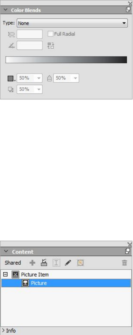
The Color Blends palette lets you define and apply multi-color blends.
Conditional Styles palette
The Conditional Styles palette lets you work with conditional styles. For more
information, see "Working with conditional styles."
Content palette
The Content palette provides access to items in the shared content library. From this
palette, you can duplicate and synchronize that content across different layouts. The
buttons at the top of this palette let you add, import, insert, edit, and control the
synchronization of content.
Users can create shared items through the Shared Item Properties dialog box (Item >
Share). For more information, see "Working with shared content."
The Content palette provides access to items in the shared content library.
Content Variables palette
The Content Variables palette provides access to content variables. From this palette,
you can add, edit, and duplicate content variables. You can also search for content
variables and convert existing content variables to text. This palette lists the preefined
content variables and allows you to create new ones of various content variable types.
A GUIDE TO QUARKXPRESS 2016 | 41
THE USER INTERFACE
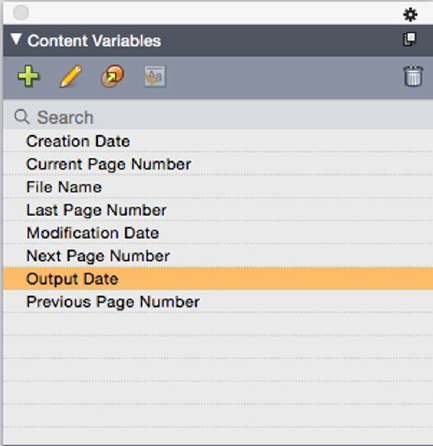
To highlight existing content variables, use the View > Highlight Content Variable
menu item. Users can also insert, add and edit content variables using the Utilities >
Content Variable menu item. For more information, see "Content variables."
The Content Variable palette provides access to the content variables.
Footnote Styles palette
The Footnote Styles palette allows you to:
•add, edit, delete and duplicate footnote styles.
•insert new footnotes and endnotes or modify existing footnotes and endnotes
using a custom Footnote/Endnote option/button.
•change between different footnote/endnote styles by selecting the
footnote/endnote reference in the parent text and clicking on the desired style
in the palette.
Users can also insert, add and edit footnote styles using the Edit > Footnote Styles
menu item.
Users can also insert footnotes and switch between footnotes and the reference text
using the Style > Footnotes/Endnotes menu item. For more information, see "Working
with footnotes and endnotes."
42 | A GUIDE TO QUARKXPRESS 2016
THE USER INTERFACE
The Footnote Styles palette provides access to footnotes.
Glyphs palette
The Glyphs palette gives you easy access to every character in each font on your
computer. You can display all characters in the selected font or narrow down the
selection by choosing an option from the second drop-down menu. The selected
characters Unicode value is visible at the bottom right. You can add characters to a
story by double-clicking them. Using the Favorite Glyphs area at the bottom of the
palette, you can store often-used characters for easy access.
The Glyphs palette gives you easy access to every character in every font.
Grid Styles palette
A grid style is a named package of settings that describe a grid — like a style sheet for
a design grid. You can apply grid styles to text boxes and can use them as the basis for
master page grids. You can also base grid styles on other grid styles. Grid styles are
displayed in the Grid Styles palette (Window menu). For more information, see
"Working with grid styles."
A GUIDE TO QUARKXPRESS 2016 | 43
THE USER INTERFACE
The Grid Styles palette lets you create and apply grid styles.
Guides palette
The Guides palette lets you work with guides. For more information, see "Using the
Guides palette."
HTML5 Palette
The HTML5 palette lets you create and configure movies, slideshows, buttons, and
more for Digital layouts. For more information on creating a Digital, see Digital
Publishing with QuarkXPress.
Hyperlinks palette
The Hyperlinks palette lets you add and edit hyperlinks in your document. For more
information, see "Hyperlinks."
The Hyperlinks palette allows you to work with hypelinks in your document.
44 | A GUIDE TO QUARKXPRESS 2016
THE USER INTERFACE
Index palette
The Index palette lets you tag text for indexing. When you create an index, all of the
tags you created with the Index palette are automatically turned into a customizable
index. For more information, see "Working with indexes."
The Index palette lets you tag text for inclusion in an automatically generated index.
Item Styles palette
The Item Styles palette lets you work with item styles. For more information, see "Item
Styles XTensions software."
Layers palette
The Layers palette lets you create layers, edit layer properties, control whether those
layers display and print, and move objects between layers. For more information, See
"Working with layers."
A GUIDE TO QUARKXPRESS 2016 | 45
THE USER INTERFACE
The Layers palette lets you work with layers and the objects on those layers.
Lists palette
The Lists palette helps you view and generate lists. This feature is useful for creating
things like tables of contents. You can create lists in the Lists dialog box (Edit > Lists).
The List Name drop-down menu lets you choose from among the lists defined in the
active project and the Update button lets you refresh the list currently displayed in
the palette.
The Find button enables you to locate items in the Lists palette. You can also navigate
to a word or heading by simply double-clicking it in the palette.
The Build button lets you insert the active list into the active text chain. If the list
already exists in the story, you can update it rather than inserting another copy. The
Format As style sheets for the list are applied automatically.
The Lists palette lets you create things like tables of contents
Measurements palette
With the Measurements palette (Window menu), you can quickly edit many
commonly used controls. Options in the Measurements palette change to reflect the
46 | A GUIDE TO QUARKXPRESS 2016
THE USER INTERFACE
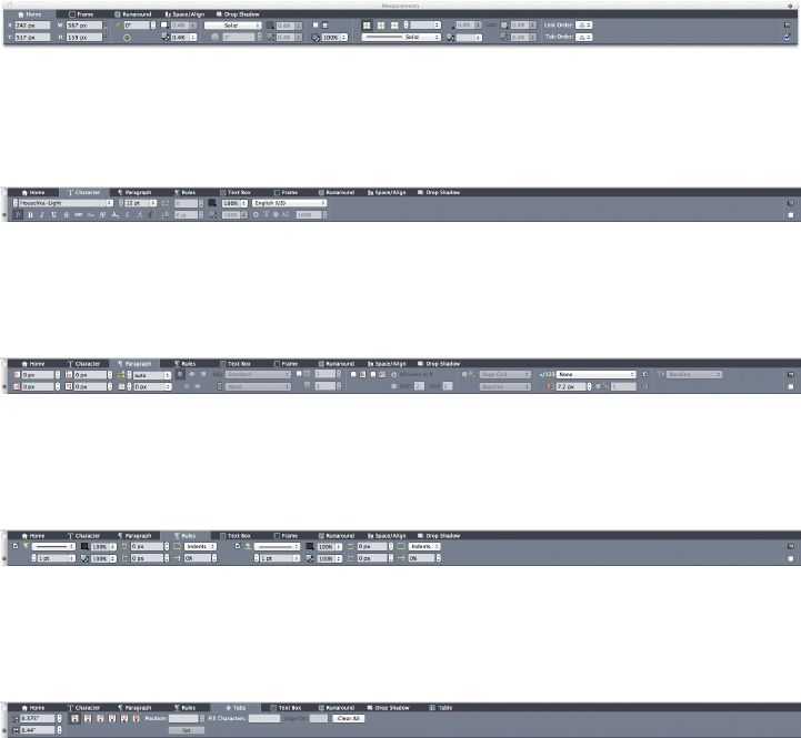
selected tool or item. When you select multiple items of the same type (such as three
separate picture boxes), the Measurements palette controls apply to all selected items.
You have the option to make the Measurements palette 50% larger, perfect for smaller
screens with high resolutions.
The Measurements palette displays a row of icons called the navigator tab above the
center of the palette. You can cycle left-to-right through the Measurements palette
navigator tab icons by pressing Command+Option+;/Ctrl+Alt+;. You can move in
reverse (right-to-left) by pressing Command+Option+,/Ctrl+Alt+,.
To continuously display the navigator tab, Control+click/right-click the Measurements
palette title bar and choose Always Show Tab Bar. To permanently hide the navigator
tab, Control+click/right-click the Measurements palette title bar and choose Always
Hide Tab Bar. To make the navigator tab bar display interactively.
Control+click/right-click the Measurements palette title bar and choose Show Tab
on Rollover.
Measurements palette - Mac OS X
The selection of tabs displayed on the Measurements palette depends on which items
are active, and the display of any tab changes to fit the item or items that are active.
The available tabs are as follows:
•Home tab: Contains often-used controls. Displays differently for text boxes, picture
boxes, lines, and tables.
•Character tab: Contains controls allowing you to set the character attributes of
the currently selected text.
•Paragraph tab: Contains controls allowing you to set the paragraph attributes of
the currently selected text box.
•Rules tab: Contains controls allowing you to set the rules attributes of the currently
selected text box.
•Tabs tab: Contains controls allowing you to set up the tabs in the currently selected
text box.
A GUIDE TO QUARKXPRESS 2016 | 47
THE USER INTERFACE
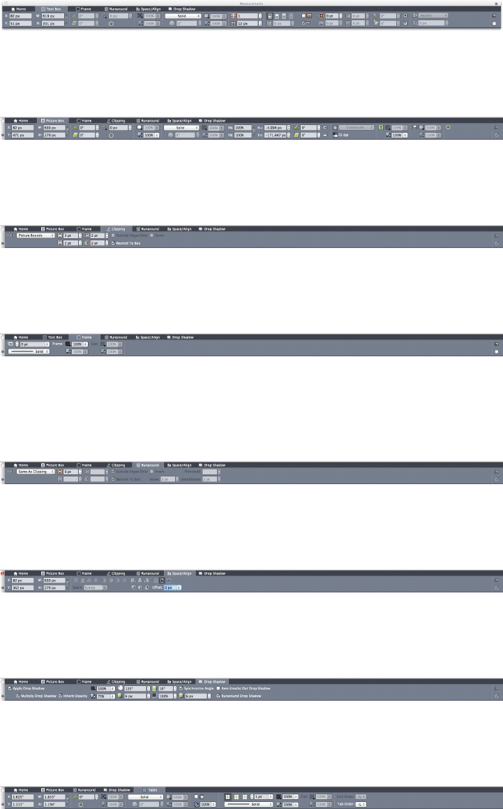
•Text Box tab: Contains controls allowing you to set the text attributes of the
currently selected text box.
•Picture Box tab: Contains controls allowing you to set the picture attributes of
the currently selected picture box.
•Clipping tab: Contains controls allowing you to set the clipping attributes of the
currently selected picture box.
•Frame tab: Contains controls allowing you to set the frame attributes of the
currently selected box.
•Runaround tab: Contains controls allowing you to set the frame attributes of the
currently selected object. Displays differently for text boxes, picture boxes, and
lines.
•Space/Align tab: Contains controls from the Space/Align submenu (Item >
Space/Align).
•Drop Shadow tab: Contains controls allowing you to set the drop shadow
attributes of the currently selected object.
•Table tab: Contains controls allowing you to set the table attributes of the currently
selected table.
•Composition Zones tab: Contains controls allowing you to set the attributes for
the currently selected composition zone .
48 | A GUIDE TO QUARKXPRESS 2016
THE USER INTERFACE
When you select a picture box that contains an image, the number next to the Effective
Image Resolution icon in the Home tab of the Measurements palette displays the
effective resolution of the image. The actual image resolution divided by the scale of
the image equals the effective resolution. For example, if you import an image with
an actual image resolution of 100 dpi and then increase the scale from 100% to 200%,
the effective resolution is 50 dpi. The higher the effective resolution is, the higher the
quality of the reproduced image will be. Note that if you select multiple picture boxes
with varying effective resolutions, no number displays next to the Effective Image
Resolution icon.
Measurements palette - Windows
The selection of tabs displayed on the Measurements palette depends on which items
are active, and the display of any tab changes to fit the item or items that are active.
The available tabs are as follows:
•Classic tab: Contains often-used controls. Displays differently for text boxes,
picture boxes, lines, and tables.
•Text tab: Contains controls from the Text tab of the Modify dialog box
(Item > Modify).
•Frame tab: Contains controls from the Frame tab of the Modify dialog box.
•Runaround tab: Contains controls from the Runaround tab of the Modify
dialog box. Displays differently for text boxes, picture boxes, and lines.
•Clipping tab: Contains controls from the Clipping tab of the Modify dialog
box.
•Character Attributes tab: Contains controls from the Character Attributes
dialog box (Style > Character).
•Paragraph Attributes tab: Contains controls from the Formats tab of the
Paragraph Attributes dialog box (Style > Formats).
•Text Path tab: Contains controls from the Text Path tab of the Modify dialog
box.
•Space/Align tab: Contains controls from the Space/Align submenu (Item >
Space/Align).
•Grids tab: Contains controls from the Grid tab of the Modify dialog box.
(selected tables only).
•Drop Shadow tab: Contains controls from the Drop Shadow tab of the Modify
dialog box.
•Tabs tab: Contains controls from the Tabs tab of the Paragraph Attributes
dialog box.
When you select a picture box that contains an image, the number next to the Effective
Image Resolution icon in the Classic tab of the Measurements palette displays the
effective resolution of the image. The actual image resolution divided by the scale of
the image equals the effective resolution. For example, if you import an image with
A GUIDE TO QUARKXPRESS 2016 | 49
THE USER INTERFACE
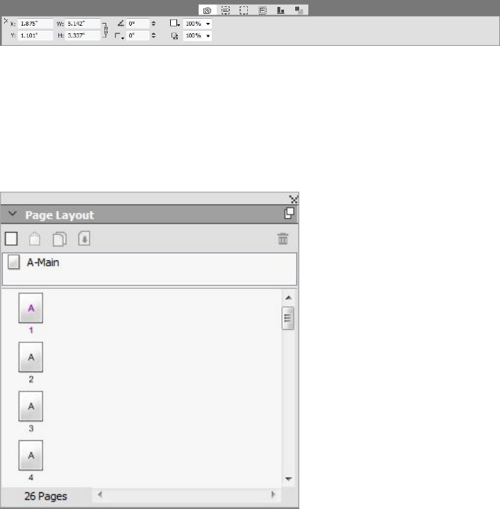
an actual image resolution of 100 dpi and then increase the scale from 100% to 200%,
the effective resolution is 50 dpi. The higher the effective resolution is, the higher the
quality of the reproduced image will be. Note that if you select multiple picture boxes
with varying effective resolutions, no number displays next to the Effective Image
Resolution icon.
The tab bar displays above the center of the Measurements palette.
Page Layout palette
The Page Layout palette provides a variety of features having to do with pages and
navigation.
The Page Layout palette lets you work with master pages and layout pages.
The top portion of the palette lets you create, duplicate, and delete master pages. To
view and edit a master page, double-click it; the master page displays in the active
project window. A single-sided master page displays as a rectangle, while a facing-page
master page displays with two folded corners.
The bottom portion of the palette lets you navigate through the pages in the active
layout. To go to a layout page, double-click in this portion of the palette.
To apply a master page to a layout page, drag the master page icon onto the layout
page icon. Alternatively, you can select the layout page icons in the palette and them
Command-click/Ctrl-click the master page icon.
Profile Information palette
The Profile Information palette lets you view and update color management settings
for pictures. For more information, see "Color management."
50 | A GUIDE TO QUARKXPRESS 2016
THE USER INTERFACE
The Profile Information palette lets you precisely control color management settings for
pictures.
Redline palette
The Redline palette allows you to setup the tracking of changes in your projects.
For more information, see "Redline."
The Redline palette lets you work with tracking.
Reflow Tagging palette
The Reflow Tagging palette lets you tag content for Reflow ePub.
Scale palette
The Scale palette lets you perform advanced scaling operations. For more information,
see "Scale XTensions software."
Style Sheets palette
The Style Sheets palette (Window > Style Sheets) enables you to apply character and
paragraph style sheets by clicking style sheet names. The buttons at the top of each
section of this palette let you create, edit, duplicate, update, and delete style sheets.
A plus sign next to a style sheet indicates that local formatting has been applied.
A GUIDE TO QUARKXPRESS 2016 | 51
THE USER INTERFACE
The Style Sheets palette lets you view and apply paragraph and character style sheets.
Table Styles palette
The Table Styles palette allows you to add, edit, and delete table styles.
The Table Styles palette provides access to the table styles.
Tools palette
The Tools palette lets you easily switch between a wide variety of tools for working
with layouts. For more information, see "Tools."
Palette groups and palette sets
QuarkXPress offers two features that help you to manage palettes: palette groups and
palette sets.
Using palette groups
The Palette Groups feature lets you combine several palettes into one.
52 | A GUIDE TO QUARKXPRESS 2016
THE USER INTERFACE
This palette group shows the Colors, Advanced Image Control, and Style Sheets palettes
attached as one, which economizes space while providing easy access to functions.
(Windows only)To attach a palette to a palette group, Control+click/right-click the title
bar of a palette group and choose an unchecked palette name. When you attach a
palette that is already displayed, the palette moves to become part of the palette group.
To detach a palette from a palette group, Control+click/right-click the palette name
and choose Detach [palette name].
(Mac OS X only)To attach a palette to a palette group, click the icon in the top
right of a palette and choose an unchecked palette name from the list. Palettes that
are already displayed can also be dragged and merged into a palette group. When
dragging, a thumbnail is shown indicating whether the palette will be merged or placed
above. A blue line indicator is shown in the palette group to indicate the location the
palette will be dropped.
(Mac OS X only)Docked palettes on screen edges form a palette group and can be moved
as a group. Palette groups can be set to auto show/hide.
Using palette sets
The Palette Sets feature lets you store and recall the position and status of all open
palettes and libraries, so that you can easily switch between different palette
configurations.
A GUIDE TO QUARKXPRESS 2016 | 53
THE USER INTERFACE
To create a palette set, first display all of the palettes you will need for a particular task
and hide all other palettes. Then choose Window > Palette Sets > Save Palette Set
As to display the Save Palette Set As dialog box, enter a name, and optionally assign
a key command.
To retrieve a palette set, choose Window > Palette Sets > [name of palette set] or
press the keyboard combination for that palette set.
Layout controls
When you open a project, you have immediate access to some basic features at the
bottom left of the project window.
Layout controls
1Zoom: Enter a zoom percentage or choose a zoom value from the drop-down menu
(the maximum zoom limit is 8000%).
2Page Number: Enter a page number in the Page Number field or choose a page from
the page list that displays when you click the upward facing arrow to the right of the
field.
3Previous Page: Navigate to the previous page.
4Next Page: Navigate to the next page.
5View Master Page: Switch back and forth between the active layout page and its master
page.
6Split Screen Horizontal: View the layout in two or more separate panes one above
the other.
7Split Screen Vertical: View the layout in two or more separate panes side by side.
8Export: Display the same export options that are available when you choose File >
Export.
9Page Preview: Click the up arrow next to the Page Number field to see a thumbnail
view of all of the pages in the layout. Mac OS X users can continue to click the up
arrow to enlarge the thumbnails.
Views and view sets
QuarkXPress gives you multiple ways to view your layouts. You can split a window or
create a new window to show two different layouts, or two different views of the same
54 | A GUIDE TO QUARKXPRESS 2016
THE USER INTERFACE
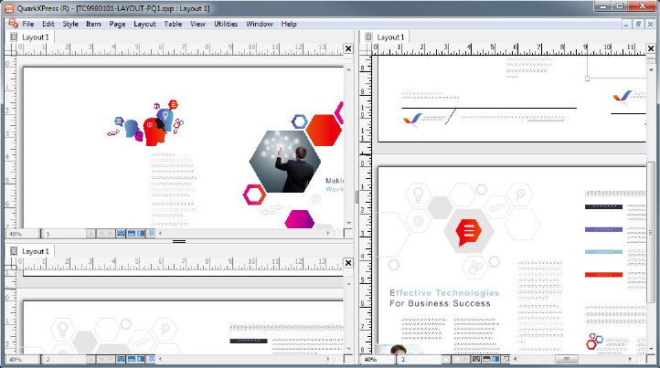
layout. You can use Story Editor view to concentrate on text without having to look
at the layout. And the View Sets feature lets you create and easily switch between
different view options.
Splitting a window
By splitting a window into two or more panes, you can display multiple views of one
project at the same time, and you can see changes in all panes simultaneously. You
can even use different view modes in each pane, and see your edits in one pane and
update in the other pane in real time. You can split multiple views horizontally or
vertically within a window.
By splitting a window, you can view your work at different magnifications at the same time.
There are three ways to split a window:
•Choose Window > Split Window > Horizontal or Window > Split Window >
Vertical.
•(Windows only) Click the split bar to the right of the scroll bar (for a vertical split)
or at the top of the scroll bar (for a horizontal split).
•Click the split-screen icons in the layout controls bar at the bottom of the project
window.
Once a window has been split, you can change the width and height of the split by
dragging the bars between the splits.
To remove splits from a window, use one of the following techniques:
•Choose Window > Split Window > Remove All.
•Click the close button in the top right corner of the window.
Creating a window
To create a new window that displays the active project, choose Window > New
Window.
A GUIDE TO QUARKXPRESS 2016 | 55
THE USER INTERFACE
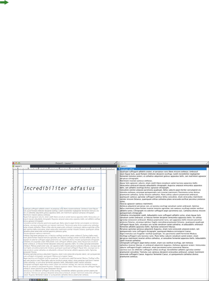
If you open multiple windows for a project, make changes to that project, and then
begin closing the windows, the application will not prompt you to save the project
until you attempt to close the last window that displays the project.
Using Story Editor view
Story Editor view lets you concentrate on the text of a story without the distraction
of the layout. In Story Editor view, all text is the same size and the same font, the
text fills the entire window, and only the most basic character formatting (such as
bold and italic) are displayed. A red background indicates where text has overflowed
beyond the last text box or path in the story.
To display the contents of the active story in a new Story Editor window, select a box
or line that contains the target story and choose View > Story Editor. (If a Story Editor
window is already open, the selected item's story displays in that window.)
If you want to monitor the overall appearance of a page as you edit its text at an
easy-to-view size, you can position a Story Editor window next to a layout window
that shows the same story.
A story in layout view (left) and in a Story Editor window (right)
View sets
The View menu provides various options for how a layout displays. You can display
or hide guides, grids, invisible characters, visual indicators, and more. (For more
information, see "View menu.") The View Sets feature lets you store and recall different
combinations of these settings. The settings that are stored in a view set are as follows:
•View > Guides
•View > Page Grids
•View > Text Box Grids
•View > Rulers
•View > Ruler Direction
•View > Visual Indicators
56 | A GUIDE TO QUARKXPRESS 2016
THE USER INTERFACE
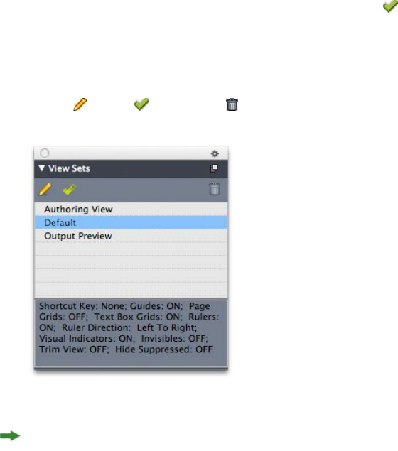
•View > Invisibles
•View > Trim View
•View > Hide Suppressed
QuarkXPress ships with several default view sets:
•Default: This is the default set of view options that displays when you create your
first layout after launching QuarkXPress for the first time.
•Output Preview: This view set simulates a printed page as closely as possible.
Guides, grids, invisibles, and visual indicators are hidden. View > Trim View,
View > Hide Suppressed is turned on. The pasteboard displays using the color
you specify in the Display pane of the Preferences dialog box (QuarkXPress/Edit
> Preferences).
•Authoring View: This view set displays guides, invisibles, visual indicators, and
the ruler.
To create a view set, first turn on only the view options you want to store in that view
set. Then choose View > View Sets > Save View Set As to display the Save View Set
As dialog box, enter a name, and optionally assign a key command.
To switch to a view set, do one of the following things:
•Choose View > View Sets > [name of view set].
•Press the keyboard combination for the view set.
•Display the View Sets palette (View > View Sets > Manage View Sets), click the
name of the view set in the palette, and then click Apply (or simply double-click
the view set name).
To manage the view sets you have created, choose View > View Sets > Manage View
Sets. The View Sets palette displays. You can use the buttons at the top of this palette
to Edit , Apply , and Delete the selected view set.
View Sets palette
View sets are saved at the application level. However, any view settings you apply to
a layout using view sets are saved with that layout.
A GUIDE TO QUARKXPRESS 2016 | 57
THE USER INTERFACE
Projects and layouts
QuarkXPress files are referred to as projects, and each project contains one or more
layouts. Every layout is stored within a project, and every project contains at least one
layout. Each layout can contain as many as 2,000 pages, and can be as large as 224" x
224" in size (or 112" x 224" for a two-page spread). A project can contain an unlimited
number of layouts.
Because multiple layouts can be stored in a single file, you can easily share content
between different versions of a document — for example, a letter with identical text
in US letter and A4 layout sizes.
A QuarkXPress project can contain two types of layouts: Print and Digital. You can
use one project to create content for various media — such as print, PDF, ePub, native
apps, Kindle books and HTML5 Publications.
Working with projects
To create a project, choose File > New > Project. The New Project dialog box displays.
58 | A GUIDE TO QUARKXPRESS 2016
PROJECTS AND LAYOUTS
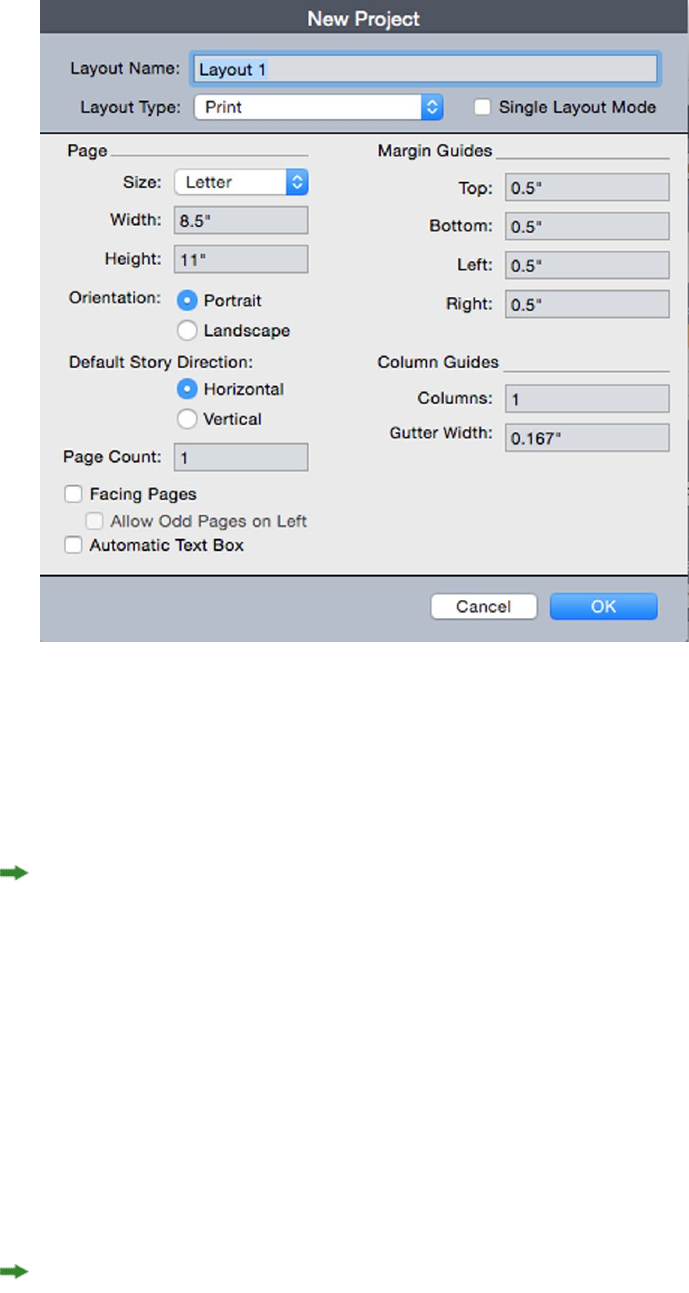
New Project dialog box for Print layout type
Every QuarkXPress project contains at least one layout. Therefore, when you create a
project, you must specify a default layout for the file. To indicate the type of the default
layout, choose Print or Digital from the Layout Type drop-down menu.
For more information about Digital layouts, see Digital Publishing with QuarkXPress.
A project created in any language edition of QuarkXPress can be edited, printed, and
saved in any other language edition of QuarkXPress. All available spell checking
dictionaries and hyphenation rules are supported by every language edition.
Options for Print layouts
You can use the default layout name or enter a new name for the layout in the Layout
Name field.
By default, tabs display at the top of the project window for each of the layouts in a
project. To prevent these tabs from displaying, check Single Layout Mode. (You can
still add layouts to a project, but this will turn off the Single Layout mode.)
The controls in the Page area let you set the page size and orientation for the default
layout.
To use custom page sizes see the information in "Custom page size."
The Facing Pages check box lets you create spreads. In a project with a horizontal
default story direction, the Allow Odd Pages On Left check box lets you control
A GUIDE TO QUARKXPRESS 2016 | 59
PROJECTS AND LAYOUTS
whether you can have odd pages on the left. In a project with a vertical default story
direction, the Allow Odd Pages On Right check box lets you control whether you
can have odd pages on the right.
The Automatic Text Box check box lets you add a text box to the default master page
for the layout.
The Margin Guides controls let you set default margins for the layout, and the controls
in the Column Guides area lets you create a multi-column page by default.
The Page Count allows you to specify the number of pages you want to initially create.
Saving and naming a QuarkXPress project
When you save a QuarkXPress project for the first time, the Save As dialog box displays.
Use this dialog box to specify a project name, location, and type.
When you save a QuarkXPress project, you can choose an option from the Type/Save
as type drop-down menu:
•Choose Project to save a project that you can modify.
•Choose Project Template to save a read-only version of the project.
Exporting layouts and projects
To export one or more layouts in the active project, choose File > Export > Layouts
as Project. Enter a name in the Save As field, and specify a location.
To export all the layouts in a project, check Select All in the Layouts area. To export
individual layouts, check them in this area.
To export selected layouts that you can open in an earlier version of QuarkXPress,
choose the earlier version number from the Version drop-down menu.
Custom page size
If you use a specific custom page size on a regular basis, you can define this page size
and add it to the Page Size drop-down menu in the New Project dialog. These custom
page sizes can be used for Print and eBook layouts.
To create a custom page size:
1Choose File > New > Project. The New Project dialog box displays.
2Choose either Print or Digital from the Layout Type drop-down menu.
60 | A GUIDE TO QUARKXPRESS 2016
PROJECTS AND LAYOUTS
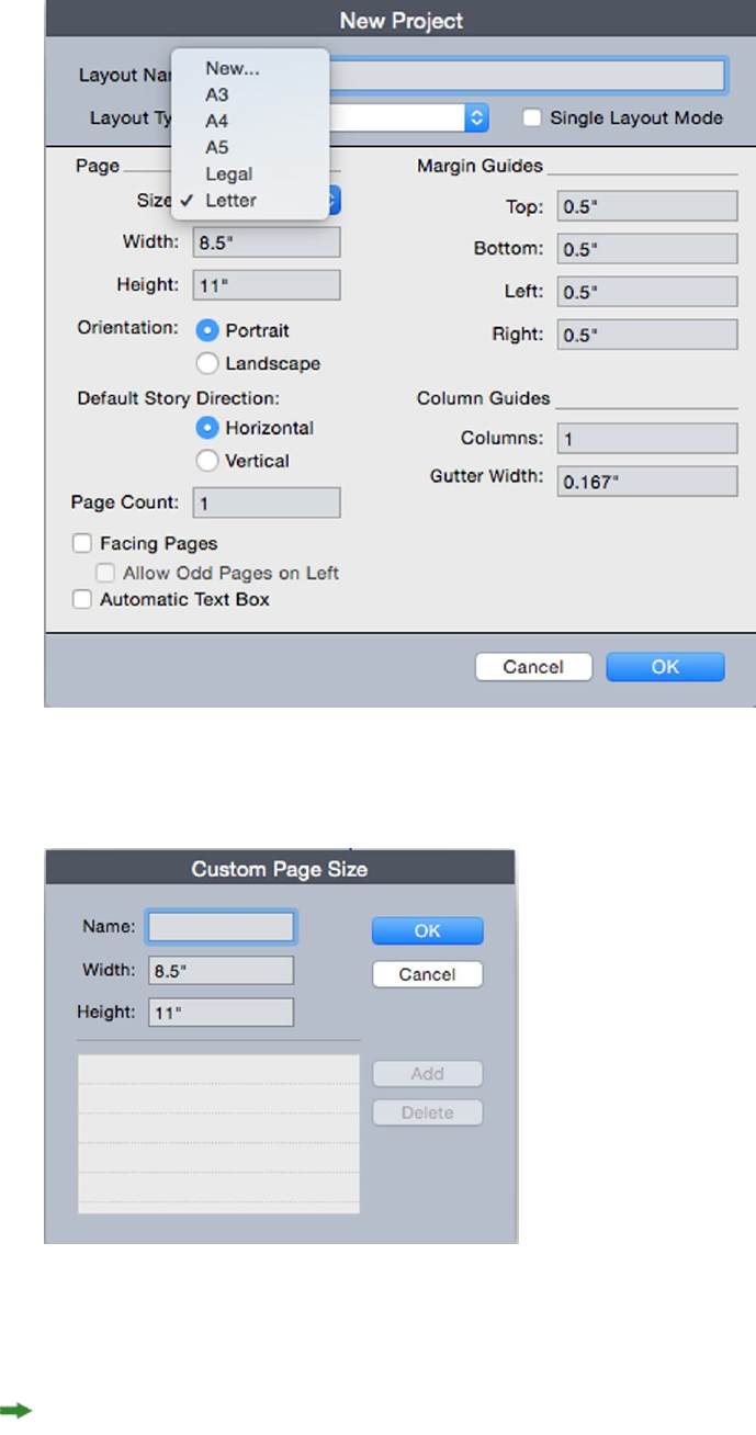
3Choose New from the Page Size: drop-down menu. The Custom Page Size dialog box
displays.
4Fill in a Name for the new custom page size, and define the Width and Height. The
orientation will be assigned automatically, depending on the values input for Width
and Height.
To create multiple custom page sizes, click Add. The new custom page size will appear
in the list and you will be able to create another. To delete a custom page size, select
it from the list and click Delete.. To edit a custom page size, select it from the list and
redefine the Width and Height fields.
A GUIDE TO QUARKXPRESS 2016 | 61
PROJECTS AND LAYOUTS

5Click OK.
Any custom page sizes you create will appear in the Page Size drop-down menu in
the New Project and the New Layout dialog boxes and can be selected when creating
new Print and eBook layouts, however, custom page sizes defined for Print layouts can
only be used selected when creating new Print layouts, and custom page sizes defined
for eBook layouts can only be used selected when creating new eBook layouts. The
custom page sizes will be removed when your preferences are deleted and new
preferences created.
Custom page sizes can also be created using the New Layout dialog. (Layout > New).
Working with layouts
It's easy to navigate between layouts, add layouts, duplicate layouts, and delete layouts.
By default, tabs display at the top of the project window for each of the layouts in a
project. On Mac OS X only, you can change the order of layouts displayed in the layout
tab by dragging and dropping the layout name tabs. This setting is saved with the
document and the order is maintained.
To navigate between layouts, use the tabs at the top of the project window.
To add a layout to the active project, choose Layout > New or click a layout tab and
choose New from its context menu.
To duplicate a layout, display the layout you want to duplicate, then choose Layout >
Duplicate or choose Duplicate from the Layout tab context menu. User can duplicate
a Print layout into a Digital layout by choosing Digital as the layout type. (For more
information, see Digital Publishing with QuarkXPress.)
To change a layout's properties, display the layout, then choose Layout > Layout
Properties or choose Layout Properties from the Layout tab context menu. The
Layout Properties dialog box displays. You can use this dialog box to change limited
layout properties based on the layout type, but you cannot change a layout to or from
a Digital layout type. (For more information, see Digital Publishing with QuarkXPress.)
To delete a layout, display the layout, then choose Layout > Delete or choose Delete
from the Layout tab context menu.
When you use the following commands, only the active layout is included in the
resulting output:
•File > Export > Layout as PDF
•File > Export > Layouts as Project
•File > Export > Page as EPS
•File > Export > Layout as ePub
•File > Export > Layout as Kindle
•File > Export > Layout as HTML5 Publications
•File > Export > Layout as Image
62 | A GUIDE TO QUARKXPRESS 2016
PROJECTS AND LAYOUTS

Layers apply to the layout that is active when you create and edit them.
When you perform a project-level action (Edit > Undo), the action is added to the
Undo History in all layouts.
When you check spelling (Utilities menu), QuarkXPress checks only the active layout.
The Find/Change feature (Edit menu) can search only the active layout.
Project-level and layout-level resources
Some resources are defined at the project level, and others are defined at the layout
level.
Project-level resources
Project-level resources can be used by every layout in the project, and they are the
same in every layout where they are used. Project-level resources include application
preferences, style sheets, colors, H&Js, lists, and dashes and stripes.
Although every list definition you create can be used in any layout in the project, a
list only draws from the active layout when you build it.
Layout-level resources
Layout-level resources can be unique for every layout in the project. Layout-level
resources include the following:
•Layout preferences (QuarkXPress/Edit > Preferences > Layout )
•(Windows only) Kerning settings (Utilities > Tracking Edit)
•(Mac OS X only)Kerning settings (Edit > Kerning Pairs)
•(Windows only)Tracking settings (Utilities > Kerning Table Edit)
•(Mac OS X only)Tracking settings (Edit > Font Tracking Tables)
•Hyphenation exceptions
•Zoom values
Working with guides
Guides are nonprinting guidelines that help you to line up items and text in a layout.
There are three types of guides: Ruler guides, column and margin guides and Dynamic
guides.
Design grids are nonprinting guidelines that you can use to align items and text
according to text size and position.
For more information, see "Guide Manager Pro XTensions software" and "Understanding
design grids."
A GUIDE TO QUARKXPRESS 2016 | 63
PROJECTS AND LAYOUTS

Column and margin guides
Column and margin guides show where a page's outside margins are and where columns
(if any) should be placed.
QuarkXPress automatically places column guides and margin guides in all new Print
layouts. You can specify their position in the Column Guides and Margin Guides
fields in the New Project dialog box (File > New > Project) or in the New Layout
dialog box (Layout > New).
When a master page is displayed in the project window, you can use the Master Guides
& Grid dialog box (Page > Master Guides & Grid) to change the placement of column
guides and margin guides. If you check Automatic Text Box in the New Project dialog
box (File > New > Project) or the New Layout dialog box (Layout > New), the values
you specify in the Margin Guides area define the size and placement of the automatic
text box.
For information about creating column and margin guides, see "Configuring a master
page grid."
For more information, see "Guide Manager Pro XTensions software."
Ruler guides
Ruler guides (or simply "guides") are nonprinting guidelines that you can position
manually. You can create ruler guides by dragging them off the horizontal and vertical
rulers (View > Rulers). You can create ruler guides on master pages and on individual
layout pages.
•To create a horizontal ruler guide, click the top ruler; when the pointer displays,
drag the ruler guide into position on the page. To create a vertical ruler guide,
click the vertical ruler, and then drag the ruler guide onto the page when the
pointer displays. If the Measurements palette is open when you drag a
ruler guide, the guide's position is indicated in the X field (for vertical ruler guides)
or the Y field (for horizontal ruler guides).
•If, as you create a horizontal ruler guide, you release the mouse button when the
ruler guide is positioned over the pasteboard, the ruler guide will extend across
the pasteboard and all the pages in the spread. If you release the mouse button
when the horizontal ruler guide is positioned over a document page, the ruler
guide will display only on that page.
•To reposition a ruler guide, click it, and then drag it to a different location when
the guide pointer displays. You can also double-click the ruler guide with the Item
tool selected and enter a new location into the Guide Manager Pro dialog box.
•To remove a ruler guide, drag the guide off the page.
•To remove all ruler guides from a page, scroll until a portion of the page displays,
then press Option/Alt and drag the guide back on to the ruler.
•To remove all ruler guides from a spread's pasteboard, scroll until a portion of the
pasteboard displays, then press Option/Alt and click a portion of the ruler.
See also "Guide Manager Pro XTensions software."
64 | A GUIDE TO QUARKXPRESS 2016
PROJECTS AND LAYOUTS

Snapping to guides
QuarkXPress lets you create a "magnetic field" around guides so that when you drag
an item close to a guide, it automatically aligns with it. This feature is called Snap to
Guides (View menu) and the width of the magnetic field is called the Snap Distance.
To control snapping with QuarkXPress controls, make sure View > Snap to Guides is
checked. To specify the distance, choose QuarkXPress/Edit > Preferences > Print
Layout > Guides & Grid and enter a pixel value in the Snap Distance field.
You can also choose View > Snap to Page Grids to force items to align with the master
page grid. The value in the Snap Distance field applies to master page grids as well.
For more information, see "Snapping items to design grids."
Dynamic Guides
Dynamic Guides are nonprinting temporary guides that appear when you create or
manipulate items on a page. They help you align items relative to other items and to
the page in a layout . You can specify the type of dynamic guides and the feedback
that appears.
When you create, transform or move an item, Dynamic Guides automatically appear
to assist in positioning the new item relative to an existing item or to the page.
Choose View > Dynamic Guides > Show/Hide Dynamic Guides to turn guides on
or off.
You can change when and how Dynamic Guides appear by using the View > Dynamic
Guides sub-menu to select the following options:
•Select Align to Center of Item to display guide lines that are generated when the
center of items are aligned with the center and/or edges of other items. These are
generated when you create and move items.
•Select Align to Edges of Item to display guide lines that are generated when the
edges of items are aligned with the edges of other items. These are generated when
you create and move items.
•Select Align to Center of Page to display guide lines that are generated when the
edges or center of items are aligned with the center of the page. These are generated
when you create and move items.
•Select Show Equal Dimensions to display guide lines that are generated when
the dimensions of items are equal to the dimensions of other items. These are
generated when you create and resize items.
•Select Show Equal Spacing to display guide lines that are generated when the
horizontal and/or vertical distance between items is equal to the distance between
other items on the page. These are generated when you create and move items.
•Select Show Measurements for Dimensions/Spacing) to display the value of the
dimensions when Show Equal Dimensions is selected and the value of the spacing
when Show Equal Spacing is selected.
This option is only available when Show Equal Dimensions or Show Equal
Spacing is selected.
A GUIDE TO QUARKXPRESS 2016 | 65
PROJECTS AND LAYOUTS

Dynamic Guides are on and all options selected by default.
When Align to Center of Item and Align to Edges of Item are selected, guides are
generated not only when the center and edges of other text boxes are aligned, but will
also appear when the center and edges of columns within the surrounding text boxes
are aligned.
In Windows, use the Dynamic Guides Color pane of the Preferences dialog box to
specify a color for each type of dynamic guide. See "Preferences — Application — Dynamic
Guides Color." In Mac OS X you set the color for the dynamic guides using the Color
Theme pane of the Preferences dialog box. See "Preferences — Application — Color
Theme."
Undoing and redoing actions
The Undo command (Edit menu) reverses the last action performed on an item. For
example, if you accidentally cut a picture box, the Undo command will bring the
picture box back into the layout from the Clipboard. The Redo command (Edit menu)
lets you reimplement an action you had undone.
Choose Edit > Undo (Command+Z/Ctrl+Z) to reverse the last action performed. The
menu item identifies the specific action that can be undone. For example, the Undo
Deletion command is available in the Edit menu after you have used the Item >
Delete command. Cannot Undo displays as gray text when the Undo feature is
unavailable.
To reimplement the action, choose Edit > Redo (Command+Shift+Z/Ctrl+Y) after you
undo an action.
66 | A GUIDE TO QUARKXPRESS 2016
PROJECTS AND LAYOUTS
Native QuarkXPress objects
QuarkXPress allows you to convert items from other application such as Excel,
Illustrator, PowerPoint and InDesign, as well as PDFs, Illustrator,WMF and EPS files to
native QuarkXPress objects.
This allows you to:
•Convert and edit vector data (like logos, etc) from supported file formats that
include AI, WMF, EPS and PDF.
•Convert editable PDFs, update content and republish as PDF or other formats that
are supported in QuarkXPress.
•Extract colors and typography from PDF's to use in QuarkXPress.
You can get native QuarkXPress objects in the following ways:
•Convert existing items Convert files that have been imported into your document
to native QuarkXPress objects.
•Import items Copy items and then paste them as native QuarkXPress objects.
This results in fully editable Bezier version of vector graphics and editable text. Colors
and font information are automatically extracted.
Convert existing item to a native QuarkXPress object
To convert existing items to native QuarkXPress objects:
1Right click on the object and choose Convert To Native Objects from the context
menu (or choose Style > Convert to Native Objects). The Convert to Native Objects
dialog displays.
A GUIDE TO QUARKXPRESS 2016 | 67
NATIVE QUARKXPRESS OBJECTS
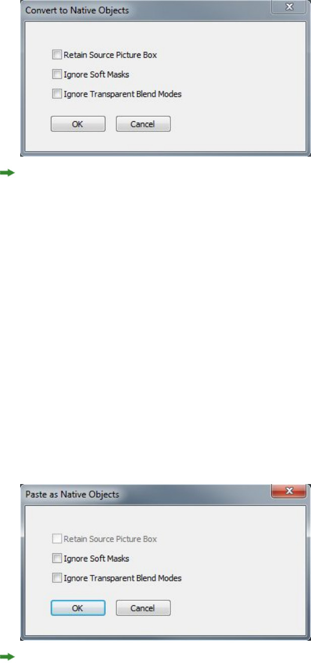
The image you are attempting to convert must have vector or text components in it.
The Convert to Native Objects feature is not supported for Raster only images.
2Check Retain Source Picture Box to compare the converted objects with the imported
source image.
3Check Ignore Soft Masks to exclude the conversion of soft masks from the source
image.
4Check Ignore Transparent Blend Modes to ignore transparency applied to blends on
the source image.
5Click OK.
Import an object as a native QuarkXPress object
To import an item as a native QuarkXPress object:
1Copy the object from its application to the clipboard
2Right click in your project where you want to place the object and choose Paste as
Native Objects from the context menu (or Edit > Paste as Native Objects). The Paste
as Native Objects dialog displays.
To skip the dialog, hold down the Option key (Mac OS X) or the Alt key (Windows)
when choosing Paste as Native Objects from the context menu.
68 | A GUIDE TO QUARKXPRESS 2016
NATIVE QUARKXPRESS OBJECTS

The options you select in this dialog persist and will be used if you choose to suppress
the dialog.
3Check Retain Source Picture Box to compare the converted objects with the imported
source image.
4Check Ignore Soft Masks to exclude the conversion of soft masks from the source
image.
5Check Ignore Transparent Blend Modes to ignore transparency applied to blends on
the source image.
6Click OK.
The item is pasted into your project as a native QuarkXPress object.
If the item contains fonts not installed on your system, an alert will display. You can
list the fonts not available on your system and optionally, replace them at this time.
A GUIDE TO QUARKXPRESS 2016 | 69
NATIVE QUARKXPRESS OBJECTS
Content variables
A content variable is an item you insert in your document that varies according to the
context. For example, the Last Page Number variable displays the page number of
the last page of the document. If you add or remove pages, the variable is updated
accordingly.
Content variables will line wrap and break just like text, including hyphenating when
appropriate.
The text within a content variable is searchable using the Find/Change palette. If the
text you are searching for is contained within a content variable, the entire variable
will be highlighted.
To highlight all content variables in the current project, choose View > Highlight
Content Variables.
QuarkXPress includes the following preset content variables that you can insert in
your document:
•Creation Date
•Current Page Number
•File Name
•Last Page Number
•Modification Date
•Next Page Number
•Output Date
•Previous Page Number
You can edit the format of these variables, or you can create your own.
In addition to the set of pre-defined variables, you can create the following additional
text type variables:
•Custom Variable: You can combine a text string with other pre-defined variables
to make a combination.
•Running Header: This variable type allows you to choose source data within the
document by referring to a paragraph or character style sheet. This variable type
can be applied in the master page so that the running headers are automatically
updated. For example, a left side page can have book title and on right side page can
have Chapter/Section title.
70 | A GUIDE TO QUARKXPRESS 2016
CONTENT VARIABLES

•Page Reference: This variable is used to create a reference to an existing layout
object using the existing Anchors feature, and allows you to refer to that object
elsewhere in the document, including the page number for the referred to object.
•Static Text: With this you can create a simple static text variable that can be
inserted throughout the document. For example, if you want to refer to a company
name across a document consistently and want to make any changes to it in one
go, this variable can be useful.
Edit content variables
To edit content variables, choose Window > Content Variables to display the Content
Variables palette. The buttons at the top of this palette let you add, edit and duplicate
content variables. Choose an existing content variable and click the button to edit
it, or click the button to add a new content variable.
The Edit Content Variable dialog displays.
If you are adding a new content variable, you can also display this dialog by choosing
Utilities > Content Variable and selecting New from the drop-down menu.
Enter a name in the Name field. If you are adding a new content variable or duplicating
an existing content variable , select the content variable Type from the drop-down
menu. Specify the attributes for your content variable, these will vary depending on
the type of content variable you are editing :
•Creation Date: Creation Date inserts the date or time the document was first saved.
You can insert text before and after the date, and you can modify the date format
for all date variables using the drop-down menus.
•Current Page Number: This variable inserts the current page number of the current
project into the document.
•Custom Variable: See "Create a custom content variable" for more information.
•File Name: This variable inserts the name of the current file into the document.
Select Include Extension to include the file name extension. The File Name
variable is updated whenever you save the file with a new name or to a new
location. The extension does not appear in the document until it is saved.
•Flow Box Page Number: This variable inserts the page number where the current
box continues (or where the current box is continuing from) if the current box
spans multiple pages that may not be contiguous. From the Context drop-down
menu, choose either Next Box or Previous Box to specify whether to insert the
page number where this box continues or where it is continuing from.
•Last Page Number: This variable inserts the last page number of the current project
into the document. The Last Page Number type is useful for adding the total
number of pages in a document to headers and footers using the common Page
3 of 12 format. In this case, the number 12 is generated by the Last Page Number,
and is updated whenever pages are added or removed. From the Scope drop-down
A GUIDE TO QUARKXPRESS 2016 | 71
CONTENT VARIABLES

menu, choose an option to determine whether the last page number in the section
or layout is used.
•Modification Date: Modification Date inserts the date or time the document was
last saved. You can insert text before and after the date, and you can modify the
date format for all date variables using the drop-down menus.
•Next Page Number: This variable inserts the next page number of the current
project into the document. From the Scope drop-down menu, choose an option
to determine whether the next page number in the section or layout is used.
•Output Date: Output Date inserts the date or time the document was printed or
exported. You can insert text before and after the date, and you can modify the
date format for all date variables using the drop-down menus.
•Page Reference: You can insert text before and after the page reference variable.
Select an Anchor Name from the drop-down menu. Select Create Hyperlink to
create a hyperlink in the text.
•Previous Page Number: This variable inserts the previous page number of the
current project. From the Scope drop-down menu, choose an option to determine
whether the previous page number in the section or layout is used.
•Running Header: Choose the source style sheet to display in your header and then
choose whether you want to display the first occurrence on the page, the last
occurrence on the page, the first occurrence on the spread or the last occurrence
on the spread.
•Static Text: Type in the text you want to appear when inserting this content
variable.
When you're done, click OK.
After you have added or updated a content variable, it will be listed in the Utilities >
Content Variable drop-down menu and also in the Content Variables palette
(Window > Content Variables). The new variable will be available when you attempt
to insert a content variable into the text.
Create a custom content variable
In addition to the existing preset content variables offered by QuarkXPress, you can
also create custom content variables to use in your projects. Custom variables are great
if you want to use text content somewhere within a text story and the same content
in a different story or at a different place. When you change the content of the custom
variable, it is changed everywhere where used.
To create a custom content variable:
1Place the insertion point where you want the variable to appear.
2Select Utilities > Content Variable and choose New from the drop-down menu.
The Edit Content Variable dialog displays.
3Enter a name in the Name field.
72 | A GUIDE TO QUARKXPRESS 2016
CONTENT VARIABLES
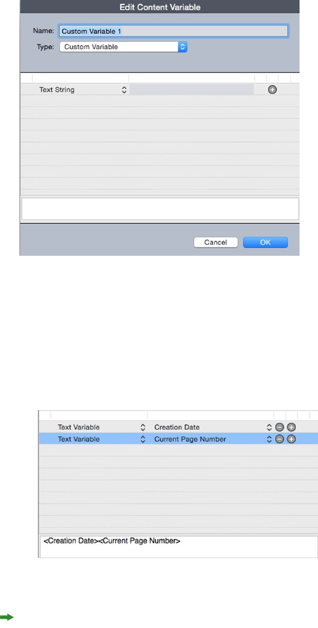
4Choose Custom Variable from the Type drop-down menu.
5You can choose to insert a Text String or a Text Variable when using this custom
content variable.
•If creating a custom variable that inserts a text string, type in the text you want
to appear when inserting this content variable. Click the plus symbol to add more
lines to the text.
•If creating a custom variable that inserts a text variable, select the text variable
you want from the drop-down menu. You can combine 2 or more text variables
by clicking the plus symbol to add another.
6Click OK.
After you have added a custom content variable, it will be listed in the Utilities >
Content Variable drop-down menu and also in the Content Variables palette
A GUIDE TO QUARKXPRESS 2016 | 73
CONTENT VARIABLES

(Window > Content Variables). The new variable will be available when you attempt
to insert a content variable into the text.
Insert a content variable
To insert a content variable in your project:
1Place the insertion point where you want the variable to appear.
2Select Utilities > Content Variable and choose the variable you want to insert from
the drop-down menu.
The variable appears on the page as if you'd typed it in the document.
Content variables can be inserted into lists and indexes.
74 | A GUIDE TO QUARKXPRESS 2016
CONTENT VARIABLES
Boxes, lines, and tables
To create a successful page layout, you need an orderly way to arrange text and pictures
— you need boxes. Boxes are items that can contain text or pictures; they can even
be created to contain no content at all, perhaps to create colorful design elements on
a page. Box boundaries give text and pictures a specific shape, size, and placement on
a page.
Understanding items and content
QuarkXPress works on the concept of items (containers) and content (things that go
inside of items).
Items are the building blocks of a page layout. The Item tool lets you do things like
move, resize, rotate, reshape, cut, copy, and paste items.
The basic types of items are as follows:
•Boxes, including text boxes, picture boxes, and no-content boxes. Boxes can come
in a variety of shapes, such as rectangular, round, and Bézier.
•Lines, including "plain" lines and text paths (which can include text). Lines, too,
can be straight or Bézier.
•Groups, which are sets of items that have been "glued" together so that they act
like a single item.
•Tables, which can contain both text and pictures.
Content is, basically, text and pictures. To create a layout, you will typically draw some
text boxes and picture boxes, and then insert text and pictures into those boxes.
Because items and content are different, you use separate tools for manipulating each:
•The Text Content tool lets you create rectangular text boxes and format text
in text boxes or on text paths. You can also use the Text Content tool to cut,
copy, and paste text.
•The Picture Content tool lets you create rectangular picture boxes and
manipulate pictures in picture boxes. You can also use the Picture Content tool
to cut, copy, and paste pictures.
A GUIDE TO QUARKXPRESS 2016 | 75
BOXES, LINES, AND TABLES
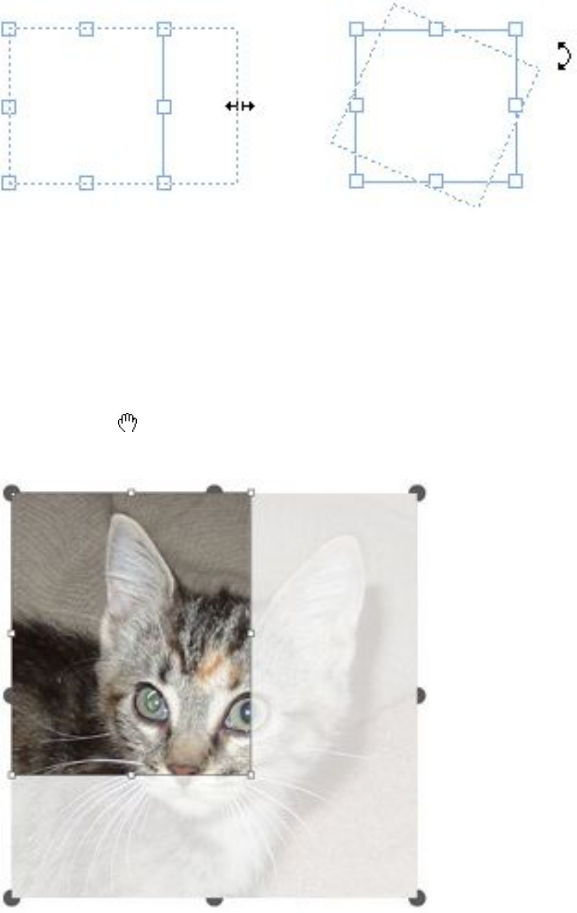
Understanding handles
The bounding boxes of selected text paths, lines, and boxes have small white squares
called item handles. You can use these handles to resize and rotate a selected item.
Item handles
To resize an item, click and drag its item handles. To rotate an item, click and drag
just outside one of the item's corner handles. The mouse pointer changes when you
move it over or near a handle to indicate which action you can perform:
You can use item handles to resize or rotate an item.
Picture handles
When you select the Picture Content tool and click a picture box that contains a
picture, the picture displays with large circles for handles. These handles are called
picture content handles. When you click any part of the picture overlay, you can use the
Move pointer to move the picture within its box.
Picture box displaying picture content handles
Picture content handles display even if the selected picture exceeds the size of its box
(see illustration above). The picture displays beyond the box boundary. You can crop
the image by resizing the picture box.
76 | A GUIDE TO QUARKXPRESS 2016
BOXES, LINES, AND TABLES
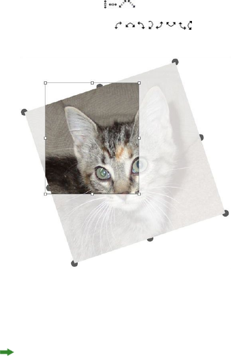
You can use picture content handles to resize or rotate a picture without changing the
size or angle of its picture box.
•Resize pointers:
•Rotation pointers:
Rotated picture in an unrotated box
If you want to move a picture box or see what its crop looks like without the transparent
overlay, press the Command/Ctrl key. This temporarily dismisses the overlay and
allows you to interact with the box as if the Item tool were selected.
If you click and drag with the Picture Content tool when the mouse pointer is
positioned over a spot where a picture box handle and picture content handle overlap,
only the picture is resized or rotated. If you want to move the item handle, select the
Item tool.
Understanding Bézier shapes
Before reshaping Bézier boxes and lines, make sure you understand the following
definitions.
Point: A point connects line segments and defines where line segments start and end.
Points connecting curved line segments have curve handles that control the shape of
the curves. QuarkXPress offers three types of points: Corner, smooth, and symmetrical.
Corner point: A corner point connects two straight lines, a straight line and a curved
line, or two noncontinuous curved lines. With curved lines, the corner point's curve
handles can be manipulated independently, usually to form a sharp transition between
the two segments:
A GUIDE TO QUARKXPRESS 2016 | 77
BOXES, LINES, AND TABLES
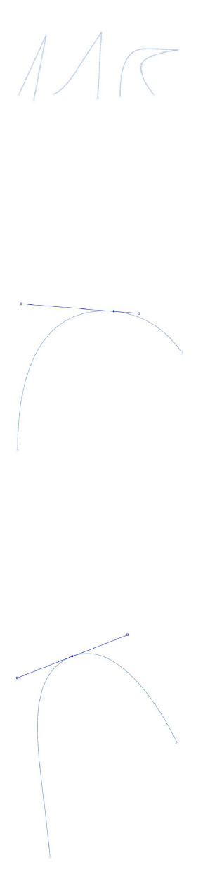
Examples of corner points
Smooth point: A smooth point connects two curved lines to form a continuous curve.
The curve handles always rest on a straight line through the point, but they can be
distanced independently:
A smooth point
Symmetrical point: A symmetrical point connects two curved lines to form a continuous
curve. The result is similar to a smooth point, but the curve handles are always
equidistant from the point:
A symmetrical point
Curve handles: Curve handles extend from either side of a point and control a curve's
shape:
78 | A GUIDE TO QUARKXPRESS 2016
BOXES, LINES, AND TABLES
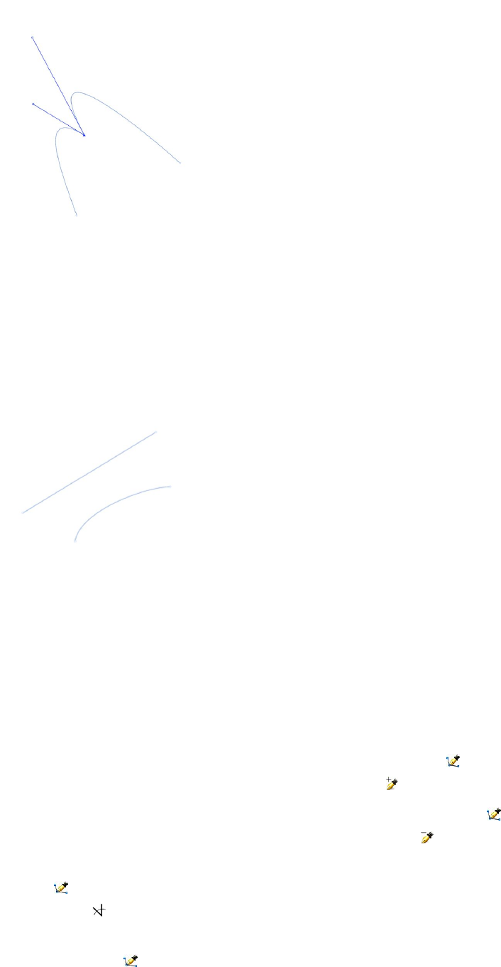
Curve handles (upper left)
Line segments: Line segments are straight or curved line sections positioned between
two points:
Line segments
When the Select Point tool is positioned over an active Bézier box or line, various
pointers display indicating whether you can select a point, the curve handles, or a line
segment. Click and drag using the pointers to reshape the Bézier box or line.
•To change the shape entirely, choose a different option from the Item > Shape
submenu.
•To add a point to a Bézier box while working with the Bézier Pen tool , click a
line segment. Alternatively, you can use the Add Point tool .
•To remove a point from a Bézier box while working with the Bézier Pen tool ,
click the point. Alternatively, you can use the Remove Point tool .
•To convert a point to another type of point while working with the Bézier Pen
tool , Option+click/Alt+click the point. Alternatively, you can use the Convert
Point tool .
•To move a point or change the shape of a line segment while working with the
Bézier Pen tool , Command+drag/Ctrl+drag the point or line segment.
A GUIDE TO QUARKXPRESS 2016 | 79
BOXES, LINES, AND TABLES

•To select curves or points so that you can move them or delete them, use the
Select Point tool . Press Shift and click to select multiple points.
Option+click/Alt+click a point to make it symmetrical.
To pan the layout while a Pen tool is selected, press Shift+Space and then click and
drag.
Drop Shadow XTensions software
With Drop Shadow XTensions software, you can apply automatic feathered drop
shadows to items and text in a layout.
There are two ways to apply drop shadow effects to active items: Using the Drop
Shadow tab of the Measurements palette and using the Drop Shadow pane of the
Modify dialog box (Item menu). In either case, however, the options are as follows:
•Angle field: Enter a value between 180° and –180° in .001 increments to specify
the angle of the "light source" causing the drop shadow.
•Synchronize Angle check box: Check this to synchronize the angle with other
drop shadows in the layout for which this feature is checked. Changing the Angle
value of any drop shadows for which Synchronize Angle is checked will affect
all of the drop shadows for which the box is checked.
•Distance field: Enter an offset value for the item; the drop shadow offset is
measured from the upper left corner of the item's bounding box.
•Scale field: Enter a value from 0 to 1,000% to specify the size of the drop shadow
in relation to the original item.
•Blur field: Enter a value to specify how blurry the edges of the drop shadow are,
with higher values creating fuzzier edges.
•Skew field: Enter a value between –75° and 75° to slant the drop shadow at a
certain angle.
•Color, Shade, and Opacity: Choose a color from the drop-down menu and enter
values in the fields to specify color, shade, and opacity of the drop shadow.
•Multiply Drop Shadow: This setting controls how the shadow is combined with
its background. When this box is checked, the shadow color is combined with
the background color or colors using a "multiply" blending mode, producing a
darker result (similar to an overprint). When this box is unchecked, the color of
the background is combined with the color of the shadow to create the
intermediate shades you see on screen. In general, this box should be checked
when the shadow is black (regardless of shade or opacity) but unchecked when
the shadow is a lighter color.
•Inherit Item's Opacity: Check this to have the drop shadow reflect different
opacities in the item, such as differences in the box background and frame.
•Item Knocks Out Drop Shadow: Check this to prevent a shadow from displaying
through semi-opaque areas of an item — to keep a shadow from peeping through
its box, for example.
80 | A GUIDE TO QUARKXPRESS 2016
BOXES, LINES, AND TABLES
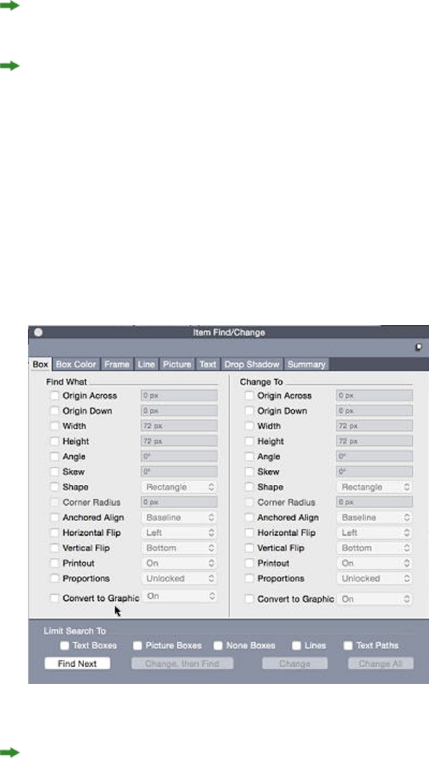
•Runaround Drop Shadow: Check this to include a drop shadow with the text
wrap contour specified in the Runaround pane (Item > Modify). The runaround
Outset value is measured from the edges of the drop shadow. For example, if text
is wrapping around a rectangular pull-out quote with a drop shadow, text will
not overlap the drop shadow when Runaround Drop Shadow is checked.
To create text with a drop shadow, put the text in a box with a background of None,
and apply the drop shadow to the box.
When you apply drop shadows to several non-grouped items, the items can cast
shadows on each other if they overlap. When you apply a drop shadow to a group,
however, the group as a whole casts a single shadow.
Item Find/Change XTensions software
This XTensions software adds the Item Find/Change palette to QuarkXPress (Edit >
Item Find/Change). You can use this palette to perform find-change operations on
text boxes, picture boxes, no-content boxes, lines, and text paths. You can find and
change attributes including location, shape, color, opacity, frame style, picture scale,
number of columns, and more.
The Item Find/Change palette
Item Find/Change does not support tables.
The Item Find/Change palette works as follows:
•Tabs across the top display the type of attributes you can search for: Box, Box
Color, Frame, Line, Picture, Text, and Drop Shadow. The attributes in each
A GUIDE TO QUARKXPRESS 2016 | 81
BOXES, LINES, AND TABLES
pane correspond to attributes in the Modify dialog box (Item menu) for each
type of item.
•Each pane contains two sides: Find What and Change To. You check the attributes
you're searching for on the Find What side, and then check those attributes you
want to change on the Change To side of the palette. You can search on attributes
in multiple panes at the same time.
•The palette menu lets you put the selected item's attributes into the Find What
side of the palette. You can specify options in all the panes in the Item
Find/Change palette by choosing Acquire All Attributes or complete one pane
at a time by choosing Acquire Panel Attributes. You can use Clear All Attributes
and Clear Panel Attributes to clear panes.
•The Summary pane summarizes the settings in all of the panes.
•The check boxes at the bottom of the palette let you restrict your search to specific
types of items. To find and replace all types of items, leave all of these boxes are
unchecked.
•When you click Find Next, Item Find/Change searches the entire layout from
start to finish. To limit a search to the active spread, Option/Alt+click the Find
Next button.
Working with boxes
There are three types of boxes: Text boxes, picture boxes, and no-content boxes (boxes
with a content of None). All three box types can contain color, shades, blends, and
frames. When you draw a text box, picture box, or no-content box, the available
controls correspond to the box type you create. But you can import text into picture
boxes that contain pictures, and you can import pictures into text boxes that contain
text. In addition to changing content type, you can change the shape and other
attributes of a box.
Creating text and picture boxes
There are three ways to create boxes:
•To create a no-content box (a box that can be changed into a picture box or a text
box), click and drag with the Rectangle Box tool , the Oval Box tool , or the
Starburst tool . You can declare text content by pressing T as you draw a
no-content box. You can declare picture content by pressing R as you draw a
no-content box.
•To create a rectangular text or picture box, click and drag with the Text Content
tool or Picture Content tool .
•To create a Bézier box, use the Bézier pen tool . For more information, see
"Creating Bézier boxes."
To constrain rectangular boxes to squares and oval boxes to circles, press Shift while
you drag.
You can create boxes with the following tools:
82 | A GUIDE TO QUARKXPRESS 2016
BOXES, LINES, AND TABLES
To change a no-content box into a text box, press Command+E/Alt+E and import a
text file.
To change a no-content box into a picture box, press Command+E/Alt+E and import
a picture file.
You can change the corner type of rectangular boxes to rounded, concave, and beveled
corners using the Item > Shape submenu or the Box Corner Style drop-down menu
in the Measurements palette. You can add and alter rounded corners by entering
values in the Box Corner Radius field in the Home/Classic tab of the Measurements
palette. On Windows, you can also enter values in the Corner Radius field (Item >
Modify > Box tab).
Creating Bézier boxes
The Bézier Pen tool lets you draw multi-sided Bézier boxes and lines that can have
straight and curved line segments (see "Understanding Bézier shapes").
For another way to make uniquely shaped boxes, see " ShapeMaker XTensions software."
To draw a Bézier box:
1Select the Bézier Pen tool from the Tools palette. Move the Crosshair pointer to
any position on the page and click to establish the first point.
2Move the pointer to where you want the next point positioned. To constrain pointer
movement to a 45-degree angle relative to the page, press Shift.
3Click to create points and line segments.
•Clicking a point without dragging creates a straight line and corner point. To
create a curved line segment and smooth point, click and drag wherever you want
the next point positioned. A point with two curve handles displays. You can
control the curve's size and shape by dragging a curve handle. Press Option/Alt
while dragging a smooth point to create a curved segment and corner point.
4If desired, edit the Bézier shape while you are still drawing it.
•To add a point to an existing segment of the shape, click the line segment where
you want the point to be.
•To delete a point from the active shape while you are drawing it, click the point.
5To close the box, close the path by positioning the mouse pointer over the beginning
of the line and then click when the Close Box pointer displays.
When any of the drawing tools are active, you can press Command/Ctrl to temporarily
switch to the Select Point tool. When the Select Point tool is active, you can press
Command+Option/Ctrl+Alt to temporarily switch to the Item tool.
You can join, extend or close existing open paths. For more information see "Joining,
extending and closing open paths".
A GUIDE TO QUARKXPRESS 2016 | 83
BOXES, LINES, AND TABLES
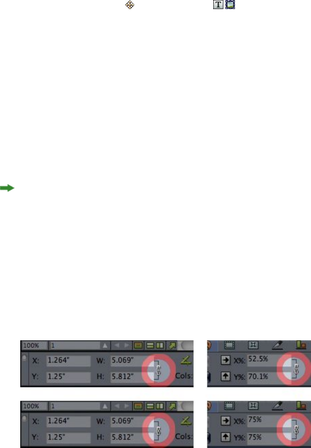
Resizing boxes
You can resize any box by modifying the size of its bounding box. A bounding box is
a nonprinting, rectangular shape that encloses every box. The box's item handles
demarcate the bounding box. The best way to view the bounding box clearly is to use
the Item tool to select item handles on a Bézier box.
You can resize active boxes using any of the following methods:
•Select the Item tool or a Content tool and move the mouse pointer over
a selected box's item handle to display the Resizing pointer. Click and drag the
handle to a new location to reduce or enlarge the box. Press Shift to maintain the
box's aspect ratio. Press Option/Alt to resize the box from the center. Press
Command/Ctrl to resize the box contents along with the box.
•Enter values in the W and H fields of the Home/Classic or Space/Align tabs of
the Measurements palette to change the width and height, and then press
Return/Enter.
•(Windows only) Choose Item > Modify (Command+M/Ctrl+M), and then click
the Box tab. Enter values in the Width and Height fields to precisely change the
size of a box, and then click OK.
You can lock a box's proportions, so that you don't have to press Shift to maintain the
aspect ratio. For more information, see "Locking box and picture proportions."
Locking box and picture proportions
To lock the selected box's proportions, display the Home/Classic tab of the
Measurements palette and click the proportion lock control next to the W and H
fields. If this control is locked, QuarkXPress maintains the item's aspect ratio during
resizing operations. On Windows, you can also lock box proportions in the Box tab of
the Modify dialog box.
The proportion lock controls in the unlocked (top) and locked (bottom) states
To lock the proportions of the picture in the selected box, display the Home/Classic
tab of the Measurements palette and click the proportion lock control next to the
X% and Y% fields. If this control is locked, QuarkXPress maintains the picture's aspect
ratio during resizing operations. On Windows, you can also lock box proportions in
the Picture tab of the Modify dialog box.
To use the proportion-locking feature with the Item Find/Change feature, display the
Box or Picture tab of the Item Find/Change palette (Edit menu), then check or
uncheck Proportions in the Find What or Change To area.
84 | A GUIDE TO QUARKXPRESS 2016
BOXES, LINES, AND TABLES

To use the proportion-locking feature with item styles, display the Box or Picture tab
of the Edit Item Style dialog box (Edit > Item Styles) and check Proportions.
Reshaping boxes
You can change the shape of a box in three ways:
•You can change the shape entirely by choosing a different option from the Item >
Shape submenu.
•(Windows only) You can add and alter rounded corners to rectangular boxes by
entering values in the Corner Radius field (Item > Modify > Box tab).
•You can use the Box Corner Radius field in the Home/Classic or Space/Align
tab of the Measurements palette.
•You can reshape Bézier boxes by repositioning points, curve handles, and line
segments. For more information, see "Understanding Bézier shapes."
Adding frames to boxes
Frames are decorative borders that can be placed around any type of box. To access
frame controls for active boxes:
•(Windows only) Choose Item > Frame to display the Frame tab of the Modify
dialog box.
•Display the Frame tab of the Measurements palette.
Use the controls in these tabs to specify a frame style, width, color, and opacity. If the
frame style contains gaps, you can also specify gap color and opacity.
You can also create your own frame styles in the Dashes and Stripes dialog box (Edit
menu) and specify frame settings in an Item Style. For more about Item Styles, see
"Item Styles XTensions software."
Applying colors to boxes
To apply a background color to active boxes, do one of the following:
•(Windows only) Choose Item > Modify (Command+M/Ctrl+M), click the Box tab,
and then use the controls in the Box area.
•Display the Colors palette (Window > Colors), click the Background Color
button , and then use the controls in the palette.
•Use the controls in the Home/Classic tab of the Measurements palette.
The controls available in these tabs and palette are as follows:
•Box or Background Color: Lets you specify the background color for the box.
•Shade: Lets you specify the tint of the background color (0% = white, 100% = full
color).
•Opacity: Lets you control the transparency of the box background (0% = fully
transparent, 100% = fully opaque).
A GUIDE TO QUARKXPRESS 2016 | 85
BOXES, LINES, AND TABLES
You can also specify box color in an Item Style. For more about Item Styles, see "Item
Styles XTensions software."
Applying blends to boxes
A blend is a gradual transition from one color to another. To apply a blend to the
background of active boxes, see Creating multi-color blends".
Merging and splitting boxes
Options in the Merge or Split Paths submenu (Item menu) let you create complex
Bézier boxes from existing boxes. For example, if a rectangular box overlaps an oval
box, you can select the submenu and choose an option that will create a single box
with the same content. If you merge two picture boxes, one picture will display in the
combined box. If you merge two text boxes, the text flows as one story through both
boxes.
To use the Merge feature, select two items and then choose one of the following
options from the Merge or Split Paths submenu:
•The Intersection command retains any areas where items overlap the back item,
and removes the rest.
•The Union command combines all the items into one box, retaining all overlapped
areas as well as non-overlapped areas.
•The Difference command deletes the front items. Any overlapping areas will be
cut out.
•The Reverse Difference command deletes the back item. Any overlapping areas
will be cut out.
•The Exclusive Or command leaves all of the shapes intact but cuts out any areas
where there is overlap. If you want to edit the points surrounding the cut-out
area, you will notice that there are now two points at every location where two
lines originally crossed.
•The Combine command is similar to the Exclusive Or command, but if you look
at the points surrounding the cut-out area, you will notice that no points were
added where two lines intersect.
•The Split command either splits a merged box into separate boxes, splits a complex
box that contains paths within paths into separate boxes, or splits a box that
contains a border that crosses over itself (such as a figure eight). To use this feature,
select two items and then choose one of the following options from the Merge
or Split Paths submenu.
•The Outside Paths command works with a merged box that contains several,
non-overlapping shapes. Outside Paths keeps all the outside path information
and divides non-overlapping outside paths into separate boxes.
•The All Paths command creates separate boxes out of every shape within a complex
box.
86 | A GUIDE TO QUARKXPRESS 2016
BOXES, LINES, AND TABLES

Adding text and pictures to boxes
To add text to a box, choose the Text Content tool , double-click the box, and then
either start typing, paste text copied from elsewhere, or choose File > Import.
To place a picture in a box, select the box with the Picture Content tool and then
either paste a picture copied from elsewhere or choose File > Import.
Changing box type
To convert a selected box to a different type, choose Picture, Text, or None from the
Content submenu (Item menu). However, you can also change a text box to a picture
box by choosing File > Import and selecting a picture. You can change a picture box
to a text box by choosing File > Import and selecting a text file.
To convert a selected text box to a text path, choose a line shape from the Item >
Shape submenu.
When you select a Box tool, you can use the following modifier keys to create text or
picture boxes:
•Press T as you draw to create a text box.
•Press R as you draw to create a picture box.
Creating a box from a clipping path
If a picture box has an associated clipping path (embedded or automatically created),
you can create a new box that has the shape of that clipping path by selecting the
picture box and choosing Item > New Box From Clipping.
Super Step and Repeat XTensions software
You can use Super Step and Repeat to transform items as you duplicate them by scaling,
rotating, and skewing the items.
Using Super Step and Repeat
Use Super Step and Repeat to quickly and easily duplicate items while rotating, scaling,
or skewing them. To use Super Step and Repeat:
1Select a picture box, text box, text path, or line.
•To specify the number of times you want the item to be duplicated, enter a number
from 1 to 100 in the Repeat Count field.
•To specify the horizontal placement of copies relative to the original item, enter
a value in the Horizontal Offset field. A negative value places copies to the left
of the original; a positive value places copies to the right of it.
•To specify the vertical placement of copies relative to the original item, enter a
value in the Vertical Offset field. A negative value places copies above the original;
a positive value places copies below it.
•To rotate each duplicated item, specify the rotation value for each item in degrees
in the Angle field. For example, if you enter 10, the first duplicated item will be
rotated 10 degrees from the original item; the second duplicated item will be
A GUIDE TO QUARKXPRESS 2016 | 87
BOXES, LINES, AND TABLES
rotated 20 degrees from the original item; and so on. The rotation is
counterclockwise from the original item.
•To specify the thickness of either the final duplicated frame (for a picture box or
text box), or the final duplicated line (for a text path or line), enter a point value
in the End Frame/Line Width or End Line Width field.
•When duplicating a box or a line, enter a value from 0% to 100% in the End Box
Shade or End Line Shade field to specify the background color shade in the final
duplicated box or the line color shade of the final duplicated text path or line.
•When duplicating a box that has a blended background, the End Box Shade 2
field is enabled. Enter a value from 0% to 100% in the End Box Shade 2 field to
specify the second background shade for the blend in the final duplicated box.
•To specify the scale of the final duplicated picture box, text box, text path, or
line, enter a value from 1% to 1000% in the End Item Scale or End Line Scale
field.
•To skew a duplicated box, enter a value from 75° to –75° in the End Item Skew
field to specify the skew or slant of the final duplicated box.
•To scale the contents of a picture box, text box, or text path scaled to fit the
duplicate boxes, check Scale Contents.
•To specify the point around which rotation or scaling will take place for the item,
choose an option from the Rotate & Scale Relative To drop-down menu. Note
that Selected Point is available as a choice in the Rotate & Scale Relative To
drop-down menu only when a point on a Bezier item is selected.
2Click OK.
ShapeMaker XTensions software
With ShapeMaker XTensions software, you can create a wide variety of intricate shapes.
You can create new shapes from scratch, or apply new shapes to existing boxes.
To display the ShapeMaker dialog box, choose Utilities > ShapeMaker.
The ShapeMaker dialog box provides tabs that let you create various types of shapes.
All of the tabs have the following controls:
•Item: Lets you choose whether you want to create a text box, picture box,
no-content box, text path, or rule path.
•Width and Height: Lets you specify the width and height of the box or path. If
you have an item or items selected when you choose Utilities > ShapeMaker,
these values are filled in automatically to match the selected item or items.
•Columns and Gutters: When Text Box is selected from the Item menu, you can
use these fields to specify how many columns the text box should have and how
wide their gutters should be.
•Lines and Spacing: When Text Path is selected from the Item menu, you can
use these fields to specify how many lines to create and how far apart they are.
(If a box is selected and Lines is set to zero, the application will create as many
paths as are necessary to fill the area described by that box.)
88 | A GUIDE TO QUARKXPRESS 2016
BOXES, LINES, AND TABLES
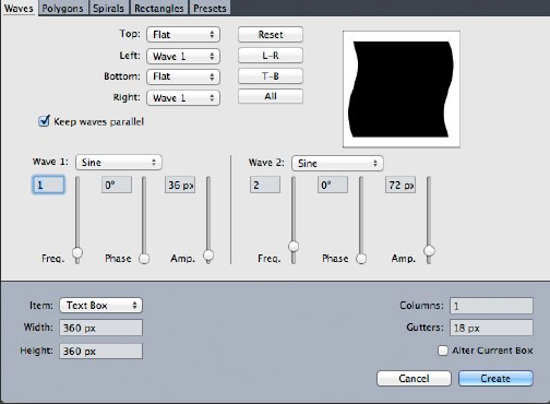
•Alter Current Box: If a box is selected when you choose Utilities > ShapeMaker,
the application updates the shape of that box instead of creating a new item.
The controls in the tabs are described in the topics below.
ShapeMaker Waves tab
The Waves tab of the ShapeMaker dialog box (Utilities > ShapeMaker) lets you create
boxes with wavy sides. To use this tab, describe the waves you want to use in the Wave
1 and Wave 2 areas, then assign them to the four sides of the box using the controls
in the top part of the tab.
Waves tab of ShapeMaker dialog box
The controls in this tab are as follows:
Top, Left, Bottom, and Right: These controls let you configure the four sides of the
box. You can choose Wave 1, Wave 2, or Flat.
Reset: Makes all four sides of the box flat.
L-R: Applies the Wave 1 setting to the left and right sides of the box.
T-B: Applies the Wave 1 setting to the top and bottom of the box.
All: Applies the Wave 1 setting to all sides of the box.
Keep waves parallel: Keeps waves on either side of the box parallel with one another.
The controls in the Wave 1 and Wave 2 areas let you choose which type of wave to
use, the frequency of the wave, the phase (starting point) of the wave, and the
amplitude (depth) of the wave.
ShapeMaker Polygons tab
The Polygons tab of the ShapeMaker dialog box (Utilities > ShapeMaker) lets you
create polygonal boxes.
A GUIDE TO QUARKXPRESS 2016 | 89
BOXES, LINES, AND TABLES
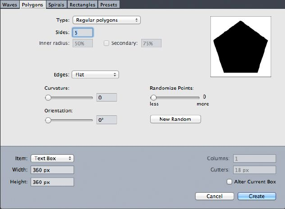
Polygons tab of ShapeMaker dialog box
The controls in this tab are as follows:
The Type drop-down menu lets you choose what type of polygon to create. The controls
immediately under this drop-down menu change depending on what type of polygon
is selected.
•Regular polygons: Lets you specify how many sides the polygon has.
•Stars: In addition to specifying how many sides the polygon has, you can specify
the radius of the space inside the spikes and superimpose a secondary star at a
different size.
•Polygrams: Similar to Stars, but instead of specifying a radius, you can control
the way the sides line up with each other with the Point Skip field.
•Spirograms: Similar to Polygrams, but creates only an outline.
•Random polygons: Lets you create polygons with randomized sides
•Golden rectangle: Lets you create a polygon with the golden ratio (approximately
1:1.618).
•Double square: Lets you create a polygon in the shape of two adjacent squares.
Edges: Lets you control whether the edges of the box are flat or curved. If you choose
an option other than Flat, you can indicate the curvature of the sides with the
Curvature controls. If you choose one of the Swirl options, you can indicate the
direction of the swirl with the Orientation controls.
Randomize Points: Lets you control the degree of randomness in the shape, from 0
(none) to 100 (maximum).
New Random: Applies some randomness to the shape.
ShapeMaker Spirals tab
The Spirals tab of the ShapeMaker dialog box (Utilities > ShapeMaker) lets you create
spiral shapes.
90 | A GUIDE TO QUARKXPRESS 2016
BOXES, LINES, AND TABLES
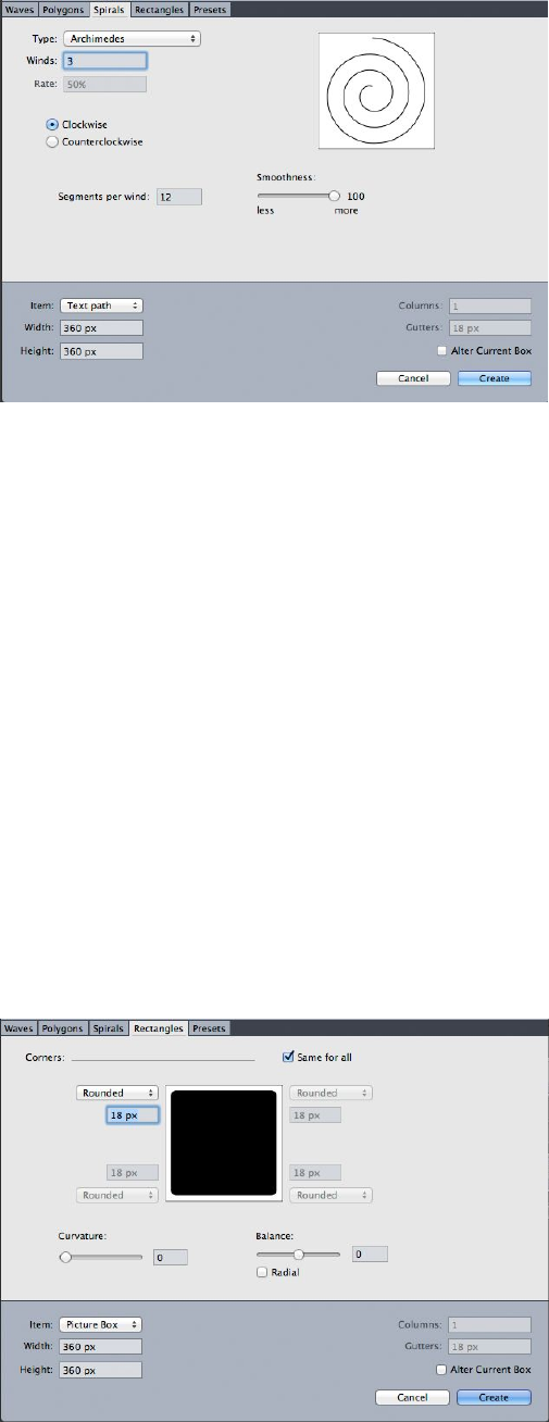
Spirals tab of ShapeMaker dialog box
The controls in this tab are as follows:
Type: Lets you choose Archimedes (an evenly spaced circular spiral), Golden Spiral
(a spiral built with the golden ratio), or Custom (this makes the Winds field available,
so you can control how many times the spiral goes around).
Rate: Lets you control how quickly the width of the spiral increases.
Clockwise and Counterclockwise: Lets you control the direction of the spiral.
Segments per wind: Lets you control how circular the spiral is.
Smoothness: Lets you control how smooth the spiral is. You can get a harder-edged
shape by lowering the Segments per wind value and decreasing the Smoothness
value.
ShapeMaker Rectangles tab
The Rectangles tab of the ShapeMaker dialog box (Utilities > ShapeMaker) lets you
create rectangular boxes with customized corners.
Rectangles tab of ShapeMaker dialog box
A GUIDE TO QUARKXPRESS 2016 | 91
BOXES, LINES, AND TABLES
In this tab, you can separately configure each corner of the box by unchecking Same
for all, or check Same for all and configure all four corners with a single set of controls.
Whichever way you do it, you can use the drop-down menu to specify a corner type
(Normal, Rounded, Beveled, Concave, Pointed, or Inset) and a diameter (for options
that involve a diameter).
Curvature: Controls how curved the corners are if you select an option that includes
curvature.
Balance: For some options, lets you control whether the corners lean toward the sides
of the box or toward the top.
Radial: For some options, lets you control whether the corners of the box are aligned
with the center of the box or not.
ShapeMaker Presets tab
The Presets tab of the ShapeMaker dialog box (Utilities > ShapeMaker) lets you store
settings that you like so that you can reuse them later.
Presets tab of ShapeMaker dialog box
To store all of the settings in all tabs of the ShapeMaker dialog box, enter a name in
the Name field and click Save. An entry is added to the list on the left, with an image
of the shape from the last tab you were looking at.
To load a set of saved settings, select it in the list on the left, click Use Settings, then
go to the desired tab and create the shape you want.
To replace the settings stored with an entry, select the entry and click Replace.
To delete an entry, select it and click Delete.
To rename an entry, select it and click Rename.
To restore all tabs of the ShapeMaker dialog box to the settings they had when you
opened the dialog box, click Revert All.
92 | A GUIDE TO QUARKXPRESS 2016
BOXES, LINES, AND TABLES
Working with lines
There are two types of lines: Straight and Bézier lines. You can apply colors and line
styles to any type of line.
Creating lines
To create a line, first select the Line tool from the Tools palette and move the
Crosshair pointer to any position on the page. Click and drag to draw the line.
You can constrain a line to 0, 45, or 90 degrees by pressing Shift while you draw it.
You can also create orthogonal lines using the Orthogonal Line tool
Creating Bézier lines
The Bézier Pen tool lets you draw multi sided Bézier boxes and lines that can have
straight and curved line segments (see "Understanding Bézier shapes").
To draw a Bézier line:
1Select the Bézier Pen tool from the Tools palette. Move the Crosshair pointer to
any position on the page and click to establish the first point.
2Move the pointer to where you want the next point positioned. To constrain pointer
movement to a 45-degree angle relative to the page, press Shift.
3Click to create a point and line segments.
•To make a curved line segment, click and drag wherever you want the next point
positioned. A point with two curve handles displays. You can control the curve's
size and shape by dragging a curve handle.
•To make a corner point, press Option/Alt before you click. If you click and hold,
you can control the radius of the corner point by dragging a curve handle.
•To add a point to an existing segment of the shape, click the line segment where
you want the point to be.
•To delete a point from the active shape while you are drawing it, click the point.
4To finish the line, double-click.
When any of the drawing tools are active, you can press Command/Ctrl to temporarily
switch to the Select Point tool. When the Select Point tool is active, you can press
Command+Option/Ctrl+Alt to temporarily switch to the Item tool.
Line modes for orthogonal lines
There are four line modes: Endpoints, Left Point, Midpoint, and Right Point.
Depending on the mode you choose in either the Line tab (Item > Modify) on
Windows, or the Measurements palette (Home/Classic or Space/Align tabs), line
length and position will be described differently.
A GUIDE TO QUARKXPRESS 2016 | 93
BOXES, LINES, AND TABLES

•Endpoints mode: The X1 field indicates the horizontal position of the first
end-point; the Y1 field indicates the vertical position of the first end-point. The
X2 field indicates the horizontal position of the last end-point; the Y2 field
indicates the vertical position of the last end-point.
•Left Point mode: The X1 field indicates the horizontal position of the leftmost
end-point; the Y1 field indicates the vertical position of the leftmost end-point.
•Midpoint mode: The XC field indicates the horizontal position of the midpoint
of the line; the YC field indicates the vertical position of the midpoint of the line.
•Right Point mode: The X2 field indicates the horizontal position of the rightmost
end-point; the Y2 field indicates the vertical position of the rightmost end-point.
Resizing lines
You can resize active straight lines using any of the following methods:
•Select the Item tool and move the Arrow pointer over an Understanding handles
to display the Resizing pointer. Click and drag the handle to a new location to
reduce or extend the length of the line.
•(Windows only) Choose Item > Modify (Command+M/Ctrl+M), then click the
Line tab. Click the Mode drop-down menu to display the four mode options (see
"Line modes for orthogonal lines"). Choose Left Point, Midpoint, or Right Point
to display a Length field. Enter values in the Length field to precisely change the
length of a line, then click OK.
•Choose either Left Point, Midpoint, or Right Point from the Line Mode
drop-down menu in the Home/Classic or Space/Align tab of the Measurements
palette to display the L (Length) field. To precisely change the length of a line,
enter a value in the L field, then press Return/Enter.
You can resize any Bézier line by modifying the size of its bounding box. To do so,
make sure Item > Edit > Shape is unchecked, and then resize the line as if it were a
box.
Reshaping lines
You can change the shape of a line in the following ways:
•You can change the shape entirely by choosing a different option from the Item >
Shape submenu.
•You can reshape Bézier lines by repositioning points, curve handles, and line
segments. For more information, see "Understanding Bézier shapes."
To pan the layout while a Pen tool is selected, press Shift+Space and then click and
drag.
Controlling line appearance
To control the appearance of active lines, use the controls in the following places:
•Home/Classic tab of the Measurements palette
94 | A GUIDE TO QUARKXPRESS 2016
BOXES, LINES, AND TABLES
•(Windows only) Line tab of Modify dialog box (Item menu)
•Colors palette (Window menu) — for line color only
In addition to color, shade, and opacity, you can control the following characteristics
for lines:
•Line style: This option lets you control the general appearance of a line. Several
line styles are included by default, and you can add new ones with the Dashes &
Stripes dialog box (Edit menu).
•Width: You can specify the width of lines in any measurement system. You can
also specify a Hairline width; the printed width of a hairline rule is .125 pt on a
PostScript imagesetter, with a wider value on some laser printers.
•Arrowheads: You can apply arrowheads to lines using the Arrowheads drop-down
menu.
You can also specify line appearance in an Item Style. For more about Item Styles, see
"Item Styles XTensions software."
Joining lines
You can merge two lines into one by selecting the Item tool , selecting the lines,
and choosing Item > Merge > Join Endpoints. The Join Endpoints command is
available when the endpoints of lines or text paths are within six points of each other.
Joining, extending and closing open paths
You can click an endpoint of an existing shape and it selects that point and goes into
regular draw mode, so the next click adds a new point and a segment to the selected
line. You can add as many segments as you need.
Double-click and endpoint to finish the line as an open path.
Click an opposite endpoint to close the path (just like during the original draw
operation).
While drawing, if you click the endpoint of another open path then the path being
drawn and the path just clicked become joined. Using these techniques together, you
can begin to extend one path, and end up joining it with another.
Manipulating items
Items can be cut and then pasted in new locations, locked so they cannot move,
duplicated once or many times, stacked to create unusual visual effects, and
manipulated in other ways.
Selecting items
To manipulate items, you must first select them. Once selected, most kinds of items
display outlines and handles for reshaping.
To select an item, first select the Item tool , the Text Content tool , or the Picture
Content tool and move the Arrow pointer over an item. Click once to select a single
A GUIDE TO QUARKXPRESS 2016 | 95
BOXES, LINES, AND TABLES
item or Shift+click individual items to select more than one item at a time. You can
also select multiple items by selecting the Item tool and drawing around an area
that contains the items.
(Windows only) With the Item tool selected, if you double-click a text box, the
Modify dialog box displays. If you double-click an empty picture box with the Picture
Content tool selected, the Import dialog box displays. If the picture box contains
a picture, the Picture Content tool is selected and the Edit Original dialog box
displays .
To deselect an active item, click outside it. When the Item tool is selected, you can
press Tab to deselect any active items.
Moving items
You can move items by:
•(Windows only) Entering values in the Origin Across and Origin Down fields in
the Modify dialog box (Item menu).
•Entering values in the X and Y fields on the Home/Classic tab in the
Measurements palette.
•Manually moving items using the Item tool . If you hold down the mouse before
moving a box or text path, you can see the contents as you move the item. You
can also "nudge" items by selecting the Item tool and pressing an arrow key on
your keyboard.
The box's item handles demarcate the bounding box. The best way to view the bounding
box clearly is to use the Item tool to select item handles on a Bézier box.
Cutting, copying, and pasting items
When the Item tool is selected, the Cut, Copy, and Paste commands (Edit menu)
are available for active boxes, lines, and text paths. Choose Edit > Paste
(Command+V/Ctrl+V) to place a copy of the items contained on the Clipboard in the
center of the project window.
When the Item tool is selected, you can remove items with the Delete command.
Deleted items are not copied to the Clipboard.
Controlling the stacking order of items
When two or more items overlap, each is either positioned in front of or behind the
other item. The term "stacking order" refers to the front-to-back relationship of the
various items on a page. Each item you create occupies its own level in the stacking
order. Every new item you create becomes the front item.
The Item menu includes commands that let you control item stacking order.
•Choose Item > Send to Back to move an item to the back of the page or layer.
•Choose Item > Bring to Front to move an item to the front of the page or layer.
96 | A GUIDE TO QUARKXPRESS 2016
BOXES, LINES, AND TABLES
•To move an item one level backward in the page or layer on Mac OS X, press
Option and choose Item > Send Backward. On Windows, choose Item > Send
Backward.
•To move an item one level forward in the page or layer on Mac OS X, press Option
and choose Item > Bring Forward. On Windows, choose Item > Bring Forward.
In a document with layers, the layers themselves are in a particular stacking order;
within each layer, each item has its own relationship to the stacking order. When you
use the Send to Back, Send Backward, Bring to Front, and Bring Forward commands
(Item menu), the stacking order of the items is altered within the layer.
To activate an item that is hidden behind other items, select the Item tool and press
Command+Option+Shift/Ctrl+Alt+Shift while you click repeatedly at the point where
multiple items overlap. Pressing Command+Option+Shift/Ctrl+Alt+Shift while clicking
will successively activate items from the front of the stacking order to the back.
Grouping items
You can combine multiple items on a page or spread into a single group. Grouping
items is useful when you want to select or move several items simultaneously. You
can move, cut, copy, duplicate, and perform a number of other functions on a group.
For example, you can group all the items that compose a publication masthead; once
grouped, you can modify or move the entire group as you would a single box, line, or
text path.
After you create a group, you can still edit, resize, and reposition individual items while
maintaining the group relationship. You can also place a copy of a group into an open
QuarkXPress library for use in other documents.
Items can be grouped when two or more items (lines, boxes, text paths, or other groups)
are active. To select multiple items with the Item tool , either Shift+click each item
or draw a marquee around the items you want to group. Choose Item > Group
(Command+G/Ctrl+G) to place multiple selected items into a single group.
You can group groups, and multiple-select a group (or groups) along with individual
boxes, lines, and text paths to create a larger group.
With the Item tool selected, you can move, cut, copy, paste, duplicate, rotate, and
color a group. With the Text Content tool or Picture Content tool selected, you
can manipulate individual items as you would any ungrouped item.
To move an item within a group, press Command/Ctrl and select the item with the
Item tool , the Text Content tool , or the Picture Content tool .
(Windows only) If an active group contains the same kind of items (for example, all
picture boxes), the Modify dialog box will include a tab (or tabs) that refer specifically
to those items. If an active group contains a variety of items, the Modify dialog box
may display only a Group tab.
(MAC OS X only) The active fields in the Measurement palette tabs will affect the active
group.
A GUIDE TO QUARKXPRESS 2016 | 97
BOXES, LINES, AND TABLES
Choose Item > Ungroup (Command+U/Ctrl+U) to ungroup a single group, or Item
> Ungroup All to ungroup every group in a group that contains other groups.
Resizing grouped items
To resize every item in a group simultaneously, click and drag the group's item handles.
If you press Command+Shift/Ctrl+Shift while resizing a group, all frame widths, line
weights, pictures, and text are resized proportionally. If you press Command/Ctrl while
resizing a group, frame widths, pictures, and text are still resized, but not proportionally.
Duplicating items
QuarkXPress lets you make single or multiple copies of boxes, lines, and text paths.
Create a single copy of a selected item using the Duplicate command (Item menu).
You can also press Option/Alt while dragging an item or group to create a duplicate.
The Super Step and Repeat feature is useful for laying out design elements that contain
a number of evenly spaced copies of an item. Create multiple copies of an item and
specify the distance between them using the Super Step and Repeat command (Item
menu).
For another way to make uniquely shaped boxes, see " ShapeMaker XTensions software."
Spacing and aligning items
You can control the position of multiple selected items relative to one another using
the Item > Space/Align submenu or the Space/Align tab of the Measurements palette.
You can choose from among eight spacing and six alignment options in the
Measurements palette, and you can specify alignment relative to selected items, the
page, or (for Print layouts with facing pages) the spread. The Item > Space/Align
submenu includes the "Item relative" and "Page relative" modes described below. The
Measurements palette also includes a third mode called "Spread relative."
The space/align modes are as follows:
•Item relative mode positions items relative to the uppermost active item, which
does not move. The uppermost item is determined by the location of the item's
top edges. If two or more items have the same top edges, then items are spaced
from the leftmost item.
•Page relative mode positions items relative to the page edges (left, right, top, or
bottom).
•Spread relative mode is available for active Print layouts that include facing pages.
Assume that you have opened a layout with a spread and then selected an item
on a left page and another item on the right page. If you then click the Spread
relative mode icon in the Measurements palette and choose Space horizontal
centers , the selected items position themselves on the far-left and far-right
sides of the spread.
Rotating items
To rotate active items, do one of the following:
98 | A GUIDE TO QUARKXPRESS 2016
BOXES, LINES, AND TABLES
•Select the Item tool and move the mouse over a corner handle. When the
Rotation pointer displays, click to establish a rotation point; then drag in a circular
motion to rotate the item. The Arrowhead pointer and the item's position will
display as you drag. If you press the Shift key when rotating, movements are
constrained to 45-degree angles.
•(Windows only) Choose Item > Modify (Command+M/Ctrl+M), enter a value in
the Angle field, and click OK.
•Enter a value in the field on the Measurements palette (Home/Classic and
Space/Align tabs) and press Return/Enter.
To rotate a straight line, choose either Left Point, Midpoint, or Right Point from the
Mode drop-down menu (Modify dialog box or Measurements palette) to display the
Angle field.
Skewing items
To skew active items within bounding boxes:
•(Windows only) Choose Item > Modify (Command+M/Ctrl+M); then click the
Box tab. Enter a value in the Skew field.
•Enter a value in the Box Skew field on the Home/Classic tab of the Measurement
palette.
Positive values slant items to the right; negative values slant them to the left.
Locking and unlocking items
Locking lets you protect items and content from accidental changes. You can do the
following:
•To prevent an item's size and position from being changed (and to prevent the
item from being deleted), check Item > Lock > Position.
•To prevent an item's contents from being edited, check Item > Lock > Story or
Item > Lock > Picture.
To unlock selected items, uncheck the appropriate option in the Item > Lock submenu.
Alternatively, on Windows, choose Item > Modify and click the lock icon next to
a field.
Anchoring items and groups in text
You can anchor an item or group so that it flows as a character within text. To anchor
an item or group within text, use the Item tool to select the item or group you want
to anchor and choose Edit > Copy (Command+C/Ctrl+C) or Edit > Cut
(Command+X/Ctrl+X). Then, with the Text Content tool selected, place the text
insertion point at the point in text where you want to anchor the item or group and
choose Edit > Paste (Command+V/Ctrl+V).
QuarkXPress also provides support for nested anchors (i.e an anchored item can contain
a further anchored item to the nth level).
A GUIDE TO QUARKXPRESS 2016 | 99
BOXES, LINES, AND TABLES
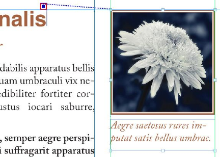
Working with callouts
The Callouts feature lets you create floating boxes that always display on the same
page or spread as the content they pertain to. For example:
•You can create figures with pictures and text that follow their references from
page to page.
•You can create pull quotes that can automatically move to a different page with
their source text.
•You can create "floating" icons that sit in the space to the left of a paragraph to
indicate that the paragraph is a tip, a note, a warning, and so forth.
For more information, see the topics below.
Understanding callouts
A callout is a floating box that always displays on the same page or spread as the content
it pertains to. Each callout is anchored to a particular spot in a text story called a callout
anchor. A callout anchor flows along with text like a character. When a callout anchor
moves to a new page or spread, the callout moves with it. When guides are displayed,
a line links each callout anchor with its associated callout (if any).
A callout anchor with its associated callout
A callout's position in a layout is based on two things:
•The location of its callout anchor. A callout is always on the same page or spread
as its callout anchor.
•The callout anchor's settings. You can position a callout relative to the spread,
the page, the box or cell that contains the callout anchor, the paragraph that
contains the callout anchor, or the callout anchor itself.
For example, you can configure a callout so that its horizontal location is always against
the outside margin, but its vertical location is always aligned with the paragraph that
contains its callout anchor. The settings for such a configuration look like this:
100 | A GUIDE TO QUARKXPRESS 2016
BOXES, LINES, AND TABLES
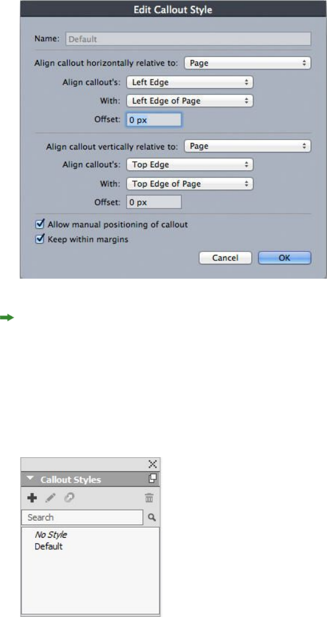
Settings for a callout with a fixed horizontal location and a variable vertical location
It is important to note that the settings for a callout are stored with its callout anchor,
not with the callout itself
You can control the positioning of a callout by configuring its callout anchor directly,
or by applying a callout style to the callout anchor. A callout style is a named package
of callout settings that displays in a palette. Callout styles are useful in documents
where you use different callout settings over and over; rather than recreating those
settings each time, you can simply select the callout anchor and click the appropriate
callout style in the Callout Styles palette.
Callout Styles palette
A GUIDE TO QUARKXPRESS 2016 | 101
BOXES, LINES, AND TABLES
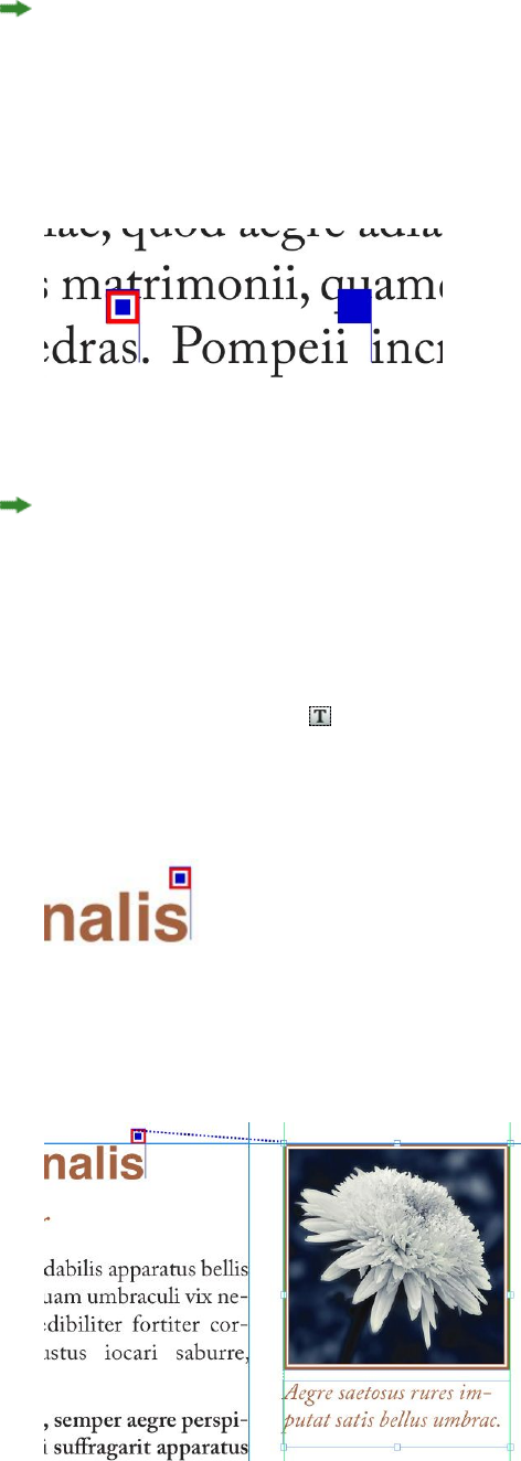
You can think of callout styles as similar to style sheets (for more information, see
"Working with style sheets"). Like style sheets and other resources, callout styles can be
managed with Job Jackets (for more information, see "Job Jackets").
A callout anchor can be selected or unselected. When a callout anchor is selected, it
has a red outline and its callout style (if any) is selected in the Callout Styles palette.
A selected callout anchor (left) and an unselected callout anchor (right)
When guides are turned off, you can see only the selected callout anchor.
When you cut or copy and paste text that contains a callout anchor that has an
associated callout, the callout is cut or copied and pasted along with the text.
Creating a callout
To create a callout:
1Select the Text Content tool and place the text cursor at the point in the text where
you want the callout anchor to be.
2Choose Item > Callout Anchor > Insert Callout Anchor. A callout anchor is inserted
and automatically selected.
Selected callout anchor
3Select the item or group that you want to make into a callout.
4Choose Item > Callout Anchor > Associate with Callout Anchor. The item or group
becomes a callout, and a line displays between the callout and the callout anchor.
Callout anchor associated with a callout
5Configure the callout anchor. There are two ways to configure a callout anchor:
102 | A GUIDE TO QUARKXPRESS 2016
BOXES, LINES, AND TABLES

•To apply a callout style to the callout anchor, display the Callout Styles palette
(Window menu) and click the name of the callout style, or choose Item > Callout
Anchor > Callout Styles > [Callout Style Name]. For more information, see
"Working with callout styles."
•To edit the settings of the callout anchor directly, choose Item > Callout Anchor >
Edit Callout Settings. If a callout style has been applied to the callout anchor,
any changes you make will override the callout style's settings.
For information on how to configure a callout anchor or callout style, see
"Configuring a callout anchor."
Configuring a callout anchor
The process of configuring a callout anchor is essentially the same whether you are
configuring a callout style or directly configuring a callout anchor.
To configure a callout anchor:
1Select the callout anchor and choose Item > Callout Anchor > Edit Callout Settings.
The Edit Callout Settings dialog box displays.
2To control how the callout aligns horizontally, use the controls in the Align callout
horizontally relative to area. (The Offset field lets you adjust the horizontal
positioning of the callout from where it would otherwise be.)
If you choose Spread from the Align callout horizontally relative to drop-down menu
and specify a horizontal offset, that offset is inverted on left-facing pages. This allows
you, for example, to configure a callout to always be .25" inside of the inside margin;
on a right-facing page, such an offset moves the callout to the right, but on a left-facing
page the offset must move the callout to the left.
3To control how the callout aligns vertically, use the controls in the Align callout
vertically relative to area. (The Offset field lets you adjust the vertical positioning of
the callout from where it would otherwise be.)
4To allow the callout to be manually repositioned, check Allow manual positioning
of callout. If you subsequently move the callout, the values in the Offset fields will
be automatically updated to reflect the new position of the callout.
To prevent the callout from being manually repositioned, leave this box unchecked.
5To prevent the callout from extending beyond the page margins, check Keep within
margins.
6Click OK.
Working with callout styles
Callout styles make it easy for you to apply often-used settings to callout anchors. To
create, edit, duplicate, or delete callout styles, use the Callout Styles dialog box (Edit >
Callout Styles). You can also use this dialog box to append callout styles from other
projects.
A GUIDE TO QUARKXPRESS 2016 | 103
BOXES, LINES, AND TABLES
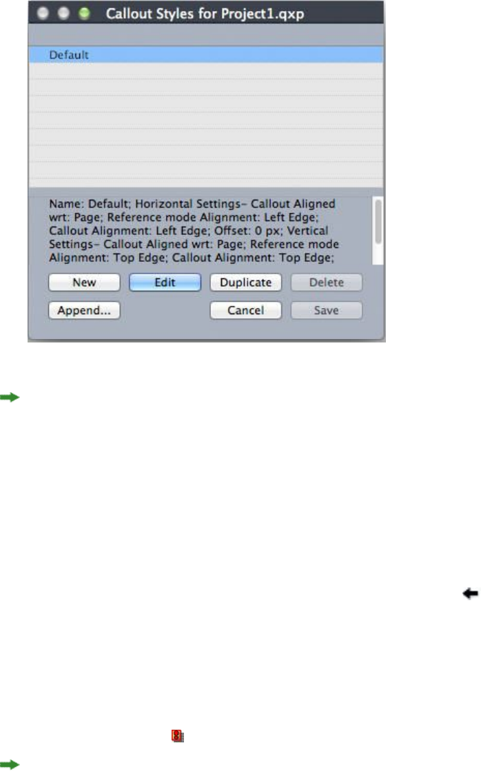
Callout Styles dialog box
You can edit the Default callout style, but you cannot delete it.
Callouts and runaround
If a callout with runaround causes its callout anchor to move, this can lead to an error
state. For example, if a callout's runaround pushes its callout anchor to the next page,
the callout moves to the next page — which allows the callout anchor to return to the
previous page, which causes the callout to return to the previous page, and so on.
When QuarkXPress detects this kind of a situation, the following things happen:
1The callout switches to the settings defined in the Default callout style. An icon
displays next to the callout style's name in the Callout Styles palette when the callout
anchor is selected.
2If the error condition still occurs, QuarkXPress applies the No Style settings to the
callout and it is positioned at its last valid location.
3If the application cannot find a valid location, it turns runaround off for the callout.
When QuarkXPress turns off a callout's runaround this way, it also places this visual
indicator on the callout:
To view visual indicators, check View > Visual Indicators.
To turn runaround back on for such a callout, on Windows use the Runaround tab of
the Modify dialog box (Item menu) or the drop-down menu in the Runaround tab
of the Measurements palette.
104 | A GUIDE TO QUARKXPRESS 2016
BOXES, LINES, AND TABLES
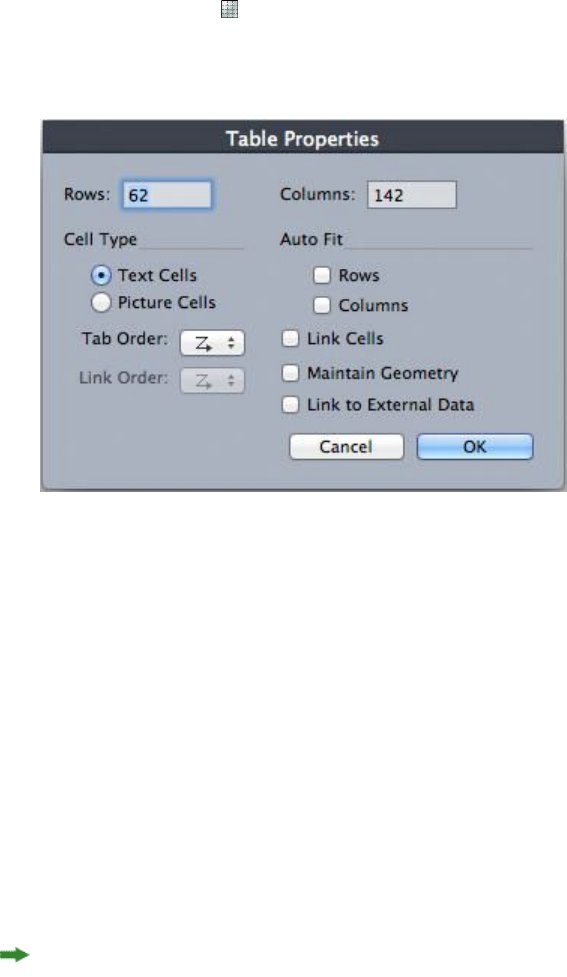
Working with tables
In QuarkXPress, a table is a distinct item, like a text box, picture box, text path, or
line. When working with tables, you can pretty much think of a cell as an individual
picture box, text box, or no-content box, and you can handle cells in much the same
way you handle these other items. To work with elements of the table itself — such
as rows and columns — use the Table menu.
Drawing a table
To draw a table and specify its properties, do the following:
1Select the Tables tool from the Tool palette, drag to draw a rectangle that is roughly
the size of the final table, and then release the mouse button. The Table Properties
dialog box displays.
The Table Properties dialog box
2Specify the number of horizontal rows in the Rows field, and specify the number of
vertical columns in the Columns field.
3To specify the default cell type, click Text Cells or Picture Cells in the Cell Type area.
Later, you can select specific cells and convert the content type if needed.
4If you want to create text cells that expand as you add text, use the controls in the
Auto Fit area.
5If you have a preference for how to navigate through cells in a table when you press
Tab, you can choose a different option from the Tab Order drop-down menu.
6If you want to link text cells so imported text flows through the specified cells —
similar to linked text boxes — check Link Cells. If you check Link Cells, you can
choose the order in which to link the text cells from the Link Order drop-down menu.
If you do not link cells in this manner, you can link them later using the Linking tool
or the Link Text Cells command (Table menu). In addition, even if you don't link
the text cells, you can still use Tab to jump from cell to cell while entering or editing
data.
A GUIDE TO QUARKXPRESS 2016 | 105
BOXES, LINES, AND TABLES

7If you intend to import data from Excel, check Link to External Data. For more
information, see "Importing Excel tables."
8If you want the table to remain the same size if you add or delete rows, check Maintain
Geometry.
9To specify the story direction for table cells, click Horizontal or Vertical in the Story
Direction area.
10 To specify the table orientation, click Horizontal or Vertical in the Table Direction
area.
11 Click OK.
Converting text to tables
The success of converting text to a table depends on the text preparation itself. It's
important that paragraphs, tabs, spaces, or commas (the characters QuarkXPress can
convert) are used consistently in a text block, because these characters are used in the
table conversion to define rows and columns. It's common for users to use multiple
tab characters in a word processor to align columns of data — rather than setting
appropriate tab stops. If the text block you are converting has such multiple tab
characters, the text block probably has an inconsistent number of tabs between columns
of data. You will need to make the tab characters consistent before you convert the
text to a table.
To convert text to a table:
1Using the Text Content tool , select all the text you want to convert to a table.
2Choose Table > Convert Text to Table to display the Convert Text to Table dialog
box. Based on the selected text, QuarkXPress guesses what to Separate Rows With,
what to Separate Columns With, and how many Rows and Columns are necessary
for the worst-case scenarios in the selected text.
106 | A GUIDE TO QUARKXPRESS 2016
BOXES, LINES, AND TABLES
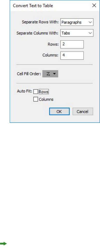
The Convert Text to Table dialog box
3If you want to create text cells that expand as you add text, use the controls in the
Auto Fit area.
4If you want the information in the table to flow differently — for example, if the values
are currently in descending order but would have more impact in ascending order —
you can change the flow. Choose an option from the Cell Fill Order drop-down menu
(the default is Left to Right, Top Down).
5Click OK. A new table is created, offset from the original text box.
Importing Excel tables
Table data often originates in a spreadsheet program such as Excel, and you can import
table data just as you import pictures. Although the technique is slightly different, the
results are the same: The table in QuarkXPress is linked to the Excel file for tracking
and updating.
You can import only .xlsx files in QuarkXPress.
If you import a table from Excel using the Link to External Table feature in the Table
Properties dialog box, table usage will be tracked just as picture usage is tracked. This
ensures that you're notified if the source table changes, and that you have the latest
table data when you output the layout, whether you print, collect for output, or save
as a PDF. To check the status of a table, choose Utilities > Usage, and then click the
Tables tab.
Although you can update tables just as you can update pictures, you'll need to keep
the following points in mind:
•If you check Include Formats in the Table Link dialog box when you first import
an Excel table, the table's Excel formatting is preserved (as much as possible) in
A GUIDE TO QUARKXPRESS 2016 | 107
BOXES, LINES, AND TABLES
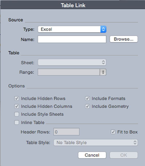
QuarkXPress. If you later update the table, any local formatting you have applied
in QuarkXPress is removed and replaced with the formatting from the Excel file.
•If you do not check Include Formats in the Table Link dialog box when you first
import an Excel table, the table's Excel formatting is discarded. If you later update
the table, QuarkXPress attempts to preserve any local formatting you have applied
to the table in QuarkXPress.
To import an Excel table and maintain the link in QuarkXPress:
1Using the Tables tool, drag to draw a table of approximately the dimensions you need.
The Table Properties dialog box displays when you release the mouse button.
2Check Link to External Data.
3Click OK to display the Table Link dialog box.
The Table Link dialog box
4Click Browse to locate and select an Excel file to import.
5If the file includes multiple worksheets, choose the one you want to import from the
Sheet drop-down menu. If you want to import only a portion of the data, you can
specify a cell range in the Range field or choose a named range from the drop-down
menu.
6In the Options area, check the attributes you want to import.
7Click OK.
108 | A GUIDE TO QUARKXPRESS 2016
BOXES, LINES, AND TABLES

Formulas and references are not imported. Instead, the final values that result from
formulas and references are imported. Inserted pictures are not imported. Text with
Auto Filter or Advance Filter (Data > Filter) applied is imported as static text.
A quicker way to create a table from Excel data — without linking the source table to
the QuarkXPress project for updates — is to copy and paste. To do this, select any
portion of data in an Excel worksheet and copy the selected data. Then simply switch
to QuarkXPress and choose Edit > Paste. QuarkXPress creates a table appropriate to
the data and inserts the text.
Importing Excel charts
If you have charts or pictures created using Insert > Chart or Insert > Picture in Excel
that you want to use in a QuarkXPress layout, you can import those charts or pictures
the same way you import other pictures. To do this, use the Insert Chart tab of the
Import Picture dialog box (File menu). Charts and pictures imported from Excel are
tracked by the Pictures tab of the Usage dialog box (Utilities menu) just like other
pictures.
Inline tables
Excel tables can be imported and inserted inline with text.
The advantages of inline tables over the designer tables are:
•Inline Tables are much faster when creating large tables that span multiple pages.
•Table styles can only be applied to Inline Tables.
Inserting an inline table
To import an Excel table and insert it inline with text:
1Place the cursor in the text where you want the table to be.
2Choose Item > Insert Inline Table . The Table Link dialog box displays.
A GUIDE TO QUARKXPRESS 2016 | 109
BOXES, LINES, AND TABLES
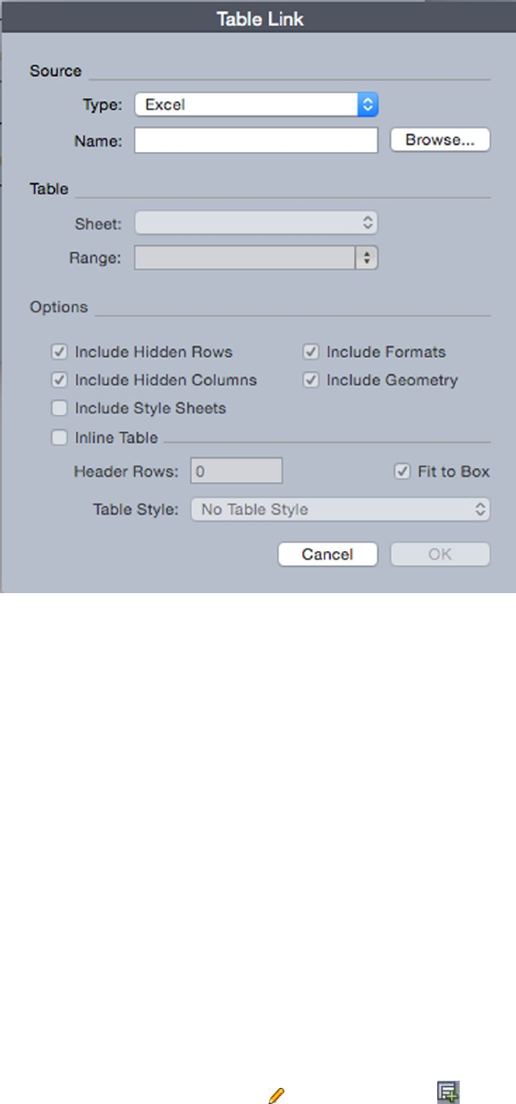
The Table Link dialog box
3Click Browse to locate and select an Excel file to import.
4If the file includes multiple worksheets, choose the one you want to import from the
Sheet drop-down menu. If you want to import only a portion of the data, you can
specify a cell range in the Range field or choose a named range from the drop-down
menu.
5In the Options area, check the attributes you want to import.
6Indicate how many header rows you would like to include in the Header Rows field.
7Optionally you can choose a table style to apply to the imported table from the Table
Style drop-down menu. For more information, see "Table styles."
8Click OK.
Table styles
To edit table styles, choose Window > Table Styles to display the Table Styles palette.
The buttons at the top of this palette let you add, edit and duplicate table styles. Choose
an existing table style and click the button, or click the button to add a new
table style.
The Edit Table Style dialog displays.
•In the Name field, enter a name for the table style, or the application will use a
default "New Table Style" name.
110 | A GUIDE TO QUARKXPRESS 2016
BOXES, LINES, AND TABLES
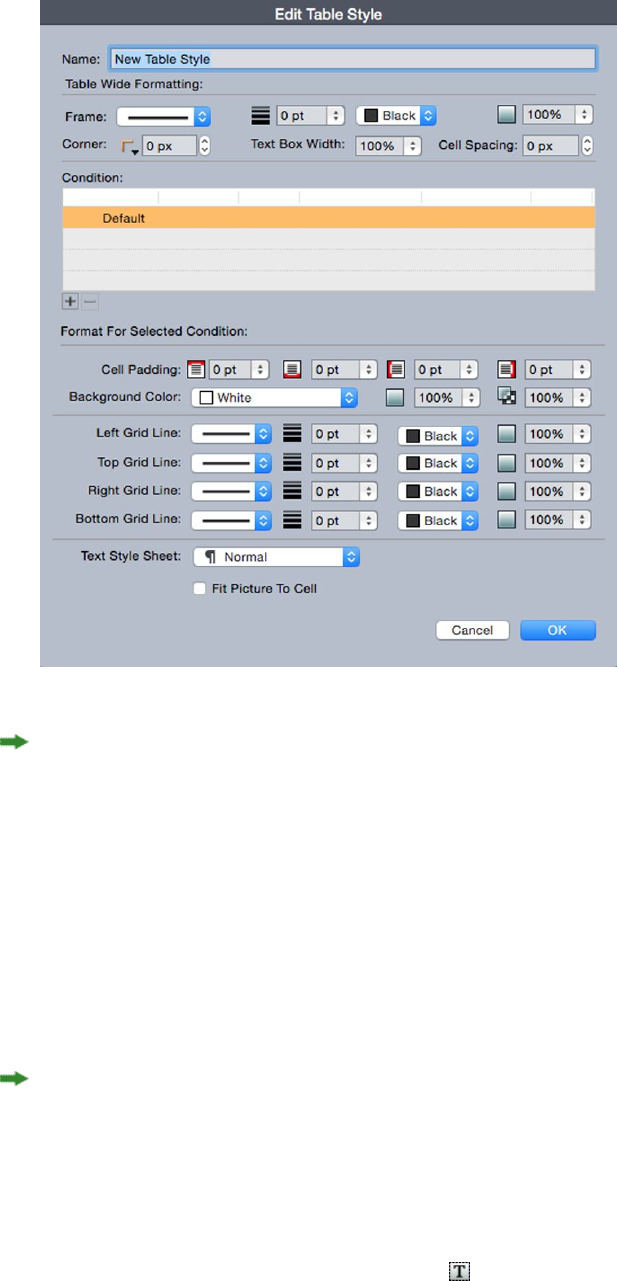
•Specify the table attributes you want the new table style to have.
When you're done, click OK.
After you have added a table style, it is listed in the Table Styles palette (Window >
Table Styles). The new style will be available when you attempt to insert an inline
table.
Adding text and pictures to tables
When working with tables, think of a table cell as a text box or a picture box. Each
box contains content — text that may or may not be linked to the next cell, an
individual picture, or nothing (maybe just a blend). Therefore, you can add content
to tables much as you add content to boxes — by typing text, importing text, or
importing pictures.
Converting text cells to picture cells is the same as converting a text box to a picture
box. Select all the cells you want to convert and choose Item > Content > Picture.
Editing table text
Two important things to know about editing text within tables are how to navigate
between cells and how to select text for formatting. As always when working with
text, you must first select the Text Content tool .
A GUIDE TO QUARKXPRESS 2016 | 111
BOXES, LINES, AND TABLES

Navigating through a table works as follows:
•Click in a cell in which you want to enter or import text.
•Press Tab to move to the next cell.
•Press Shift+Tab to go back to the previous cell.
•Press the arrow keys to move through the text in a cell, and to move from cell to
cell.
To enter a tab character in a text cell, press Control+Tab. To enter a right-indent tab,
press Option+Tab/Control+Shift+Tab. If you need to align numbers within a table on
the decimal point or other character, you can insert tabs in each table cell and then
specify the appropriate Align On tab stops (Style > Tabs).
Selecting text in rows and columns works as follows:
•To select all the text in a row, click outside the right or left edge of the table.
•To select all the text in a column, click outside the top or bottom edge of the
table.
•To select all the text over several rows or columns, drag along an edge of the table.
•To select text in non-adjacent rows or columns, Shift+click the specific rows or
columns.
•To select text in various rows and columns, use the options in the Select submenu
of the Table menu. Options include Cell, Row, Odd Rows, Even Rows, Column,
Odd Columns, Even Columns, All Cells, Header Rows, Footer Rows, and Body
Rows. The Select commands in the Table menu are helpful for applying different
formatting to alternating rows or columns.
Linking table cells
When cells are linked, text that is typed, imported, or pasted into a cell fills the first
text cell in the linked story, and then flows into each subsequent linked cell. As with
text in linked boxes, the Next Column character (enter on the numeric keypad) is
helpful for controlling text flow in linked cells. In addition to linking table cells to
each other, you can link cells to and from text boxes and text paths.
•To link all the cells in a table, check Link Cells in the Table Properties dialog
box when you create the table.
•To link selected cells in a table, choose Table > Link Text Cells. All but the first
cell in the selection must be empty.
•To manually link table cells, use the Linking tool . As with linking text boxes,
click to select the starting cell and then click the next cell you want to add. To
redirect existing links, Shift+click with the Linking tool.
•
To unlink table cells, use the Unlinking tool to click the blunt end of the
arrow between linked cells.
•To link table cells to text boxes or text paths, use the Linking tool .
112 | A GUIDE TO QUARKXPRESS 2016
BOXES, LINES, AND TABLES
If you combine linked text cells (Table > Combine Cells), the combined cells are
removed from the text chain; the remaining links are unaffected. If a combined cell
is split (Table > Split Cell), the links are maintained and text flows according to the
specified Link Order.
Formatting tables
On Windows, as with other items in QuarkXPress, tables have their own version of the
Modify dialog box (Item menu) for formatting table attributes. The panes available
in the Modify dialog box depend on what is selected — for example, you can select
the entire table with the Item tool ; select individual cells or groups of cells with
the Text Content tool ; or select specific gridlines, picture cells, or text cells. Options
in the Measurements palette and Colors palette reflect table selections as well, allowing
you to make some adjustments.
On Mac OS X, the Table tab in the Measurements palette is available when a content
tool is selected, otherwise the options are available in the Home tab.
Formatting gridlines
Gridlines are the horizontal lines between rows and the vertical lines between columns.
When gridlines are selected, you can use the Grids tab of the Modify dialog box
(Windows) or the Home/Classic tab of the Measurements palette to specify line style,
width, color, gap color, shades, and opacities.
1To format gridlines, first select them as follows:
•For an individual gridline, click the gridline with the Text Content tool .
•For multiple gridlines, Shift+click each gridline.
•For the entire table, all horizontal gridlines, or all vertical gridlines, select the
table with the Item tool . Then you can specify a selection in the Modify dialog
box.
•Choose an option from the Select submenu of the Table menu: Horizontal Grids,
Vertical Grids, Border, or All Grids.
2Once the appropriate gridlines are selected, on Windows, choose Item > Modify, and
then click the Grid tab.
A GUIDE TO QUARKXPRESS 2016 | 113
BOXES, LINES, AND TABLES
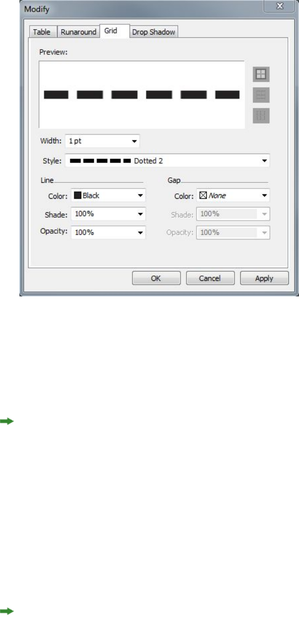
The Grid tab of the Modify dialog box
3To select all gridlines, vertical gridlines, or horizontal gridlines, click one of the buttons
to the right of the Preview area. From top to bottom, the buttons select All Gridlines,
Horizontal Gridlines, or Vertical Gridlines.
4Change any values in the Grid tab, using the Preview area and the Apply button to
help you make decisions.
On the Home/Classic tab of the Measurements palette, there is a section for formatting
the selected gridlines.
Inserting and deleting rows and columns
You can insert rows and columns anywhere within a table. Simply click in a cell that
is immediately above or below where you want to add a row. Or, click in a cell to the
right or left of where you want to add a column. Then, choose Table > Insert > Row
or Table > Insert > Column.
To select rows or columns to delete, drag the arrow pointer over a table edge and then
Shift+click the arrow pointer, or use the commands in the Select submenu of the Table
menu (such as Odd Rows). Then, choose Table > Delete > Row or Table > Delete >
Column.
If Maintain Geometry is checked in the Table menu and you delete a column or row,
existing columns or rows increase in size to fill the space of the deleted columns or
rows. If Maintain Geometry is unchecked, the table becomes smaller as necessary.
114 | A GUIDE TO QUARKXPRESS 2016
BOXES, LINES, AND TABLES
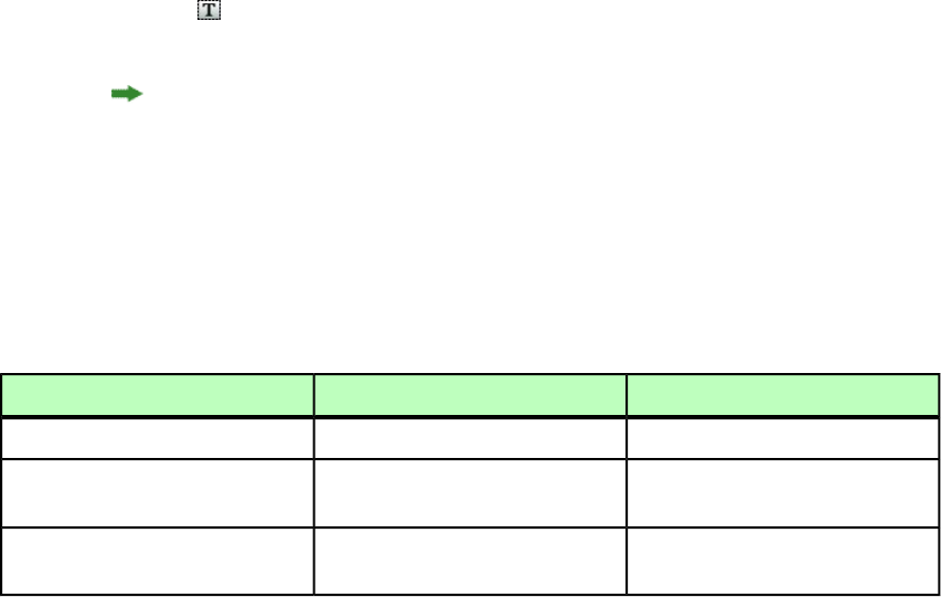
Combining cells
To combine cells, Shift+click a rectangular selection of cells with the Text Content
tool . Choose Table > Combine Cells. To revert combined cells to match the
surrounding table, select the combined cells and then choose Table > Split Cells.
If you combine unlinked cells containing text or pictures, the content of the upper-left
cell in the selection is maintained for the combined cell.
Manually resizing tables, rows, and columns
As with other items in QuarkXPress, you can drag to resize rows, columns, and tables.
To resize a row or column, click a gridline to display the resize pointer. Drag the pointer
up or down to resize a row and left or right to resize a column. To resize an entire
table, press one of the following keyboard commands while you drag a resize handle.
Windows commandMac OS X commandEffect on table
CtrlCommandTable and contents resized
ShiftShiftTable (but not contents)
resized proportionally
Ctrl+ShiftCommand+ShiftTable and contents resized
proportionally
Converting tables back to text
If you need to export the current data from a table — for example, to save the data as
a Word file — you can convert the information to text. To do so, select the table and
then choose Table > Convert Table > To Text.
Working with tables and groups
For flexibility, you can group tables to other items using the Group command (Item
menu). In addition, you can disassemble a table by converting its cells to a series of
grouped text boxes, picture boxes, or both. This method lets you separate elements of
a table and use those elements elsewhere in a layout. To do this, select a table and
choose Table > Convert Table > To Group. To work with the individual boxes, choose
Item > Ungroup.
Continuing tables in other locations
Because tables do not always fit on one page or spread — or within the space allotted
in a design — tables can be automatically continued to other locations anywhere in
a layout.
There are two ways to continue tables:
•Anchoring the table in a text box. This is the preferred way to break a table in
most situations, because it is easiest to use
•Breaking the table manually. This method is necessary when you break a table
horizontally (for example, if you want to put the first five columns of a table on
one page and the remaining three columns on a different page).
A GUIDE TO QUARKXPRESS 2016 | 115
BOXES, LINES, AND TABLES

When tables are continued, you may still need a legend to explain what's in the table.
You can add a legend in the form of automatically created and synchronized header
and footer rows, and you can create special "continued" table headers for portions of
a table after the first.
Anchoring tables in text
One way to continue a table in another location is to anchor the table in a text box.
An anchored table flows with the text like any other anchored object, but it also breaks
automatically if it is too long to fit in the box and it is the only thing in the paragraph
that contains it.
To anchor a table in text:
1Create the table.
2Select the table with the Item tool .
3Choose Edit > Cut.
4Select the Text Content tool and place the text insertion point where you want
the table to be.
5Choose Edit > Paste.
At this point, the table will break automatically as it flows through the text. However,
it will not have a header unless you add it. For more information, see "Adding header
and footer rows to tables."
Breaking a table manually
One way to continue a table in another location is to specify a table break. The table
break is the maximum size the table can reach before it splits into two linked tables.
In continued tables, any changes to a table, such as inserted columns, are reflected
throughout the table. To manually create a continued instance of a table:
1Choose Table > Table Break to display the Table Break Properties dialog box.
116 | A GUIDE TO QUARKXPRESS 2016
BOXES, LINES, AND TABLES
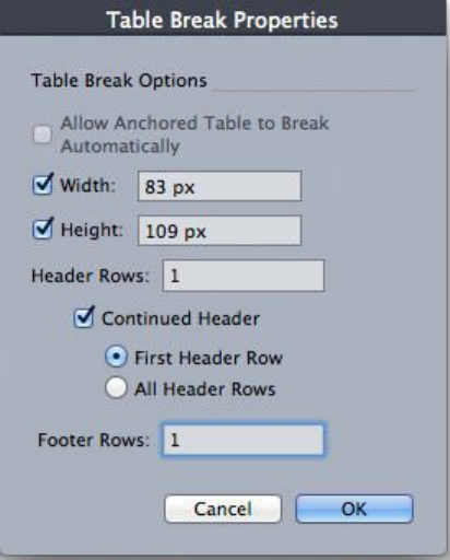
The Table Break Properties dialog box
2Check Width to break the table when its width exceeds the value in the field. By
default, the current width of the table displays in the Width field — decreasing this
value will break the table.
3Check Height to break the table when its height exceeds the value in the field. By
default, the current height of the table displays in the Height field — decreasing this
value will break the table.
4You can specify the number of header rows by entering a value in the Header Rows
field. (For more information, see "Adding header and footer rows to tables.")
5If the table has a header, you can check Continued Header to create a different
version of the header that displays in continued instances of a table. For example, if
the header on the first portion of the table is "List of Contributors," the continued
header might be "List of Contributors (continued)." Click First Header Row to limit
the continued header to the first header row, or All Header Rows to create continued
headers from all header rows.
To set the continued header's contents, close this dialog box, then go to a portion of
the table after the first and change the header contents there.
6You can specify the number of footer rows by entering a value in the Footer Rows
field.
7Click OK. If the height or width of the table meets the Table Break criteria, the table
separates into two or more linked tables. You can move the continued tables to other
locations in the layout. The table may break later as you adjust it by resizing or adding
rows and columns.
A GUIDE TO QUARKXPRESS 2016 | 117
BOXES, LINES, AND TABLES
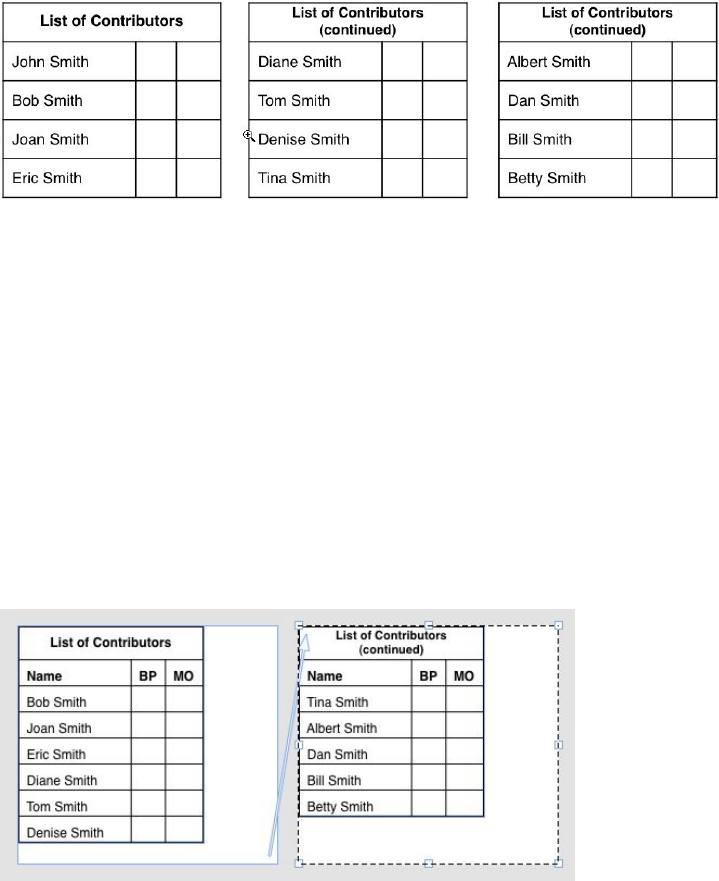
A broken table with a continued header
The Table Break feature works in both directions: it continues the table using additional
sub-tables as necessary if the table gets larger and recombines tables as necessary if the
table gets smaller.
To sever the links between continued tables, select any instance of the continued table
and choose Table > Make Separate Tables.
Adding header and footer rows to tables
You can specify that header and footer rows repeat automatically in continued instances
of tables. Even better, header and footer rows are automatically synchronized, so any
changes in the text are reflected throughout all instances of a continued table.
In this continued table, the first two rows — the table heading and the column heads —
repeat as header rows in the continued instances of the table. The first row is a continued
header.
To add header and footer rows to a table:
1Set up the table to break. For more information, see "Breaking a table manually" and
"Anchoring tables in text."
2There are two ways to create header and footer rows:
•To create an automatic header, select the first one or more rows of the table and
choose Table > Repeat As Header. To create an automatic footer, select the last
one or more rows of the table and choose Table > Repeat As Footer.
•Choose Table > Table Break. The Table Break Options dialog box displays. To
set the number of header and footer rows, enter values in the Header Rows and
Footer Rows fields, respectively.
118 | A GUIDE TO QUARKXPRESS 2016
BOXES, LINES, AND TABLES
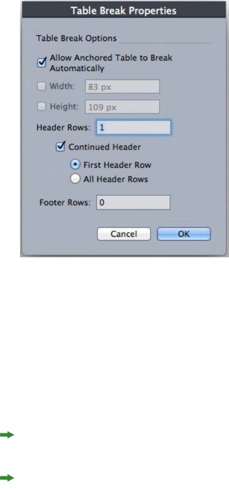
Table Break Properties dialog box for anchored table
To create a secondary header that displays in portions of a table after the first, check
Continued Header. For example, if the header on the first portion of the table is "List
of Contributors," the continued header might be "List of Contributors (continued)."
Click First Header Row to limit the continued header to the first header row, or All
Header Rows to create continued headers from all header rows.
When you're finished, click OK.
3To set a continued header or footer's contents, go to a portion of the table after the
first and change the header contents there.
You can uncheck Repeat as Header or Repeat as Footer in the Table menu any time
to remove the header or footer rows from continued tables.
Once you add automatic header rows and footer rows, the remaining table rows are
considered "body rows." Options in the Select submenu of the Table menu let you
select all the Header Rows, Footer Rows, and Body Rows in any instance of a
continued table for formatting.
Table Import XTensions software
You can use Table Import XTensions software to create a table in QuarkXPress using
a Microsoft Excel (.xlsx) file as the data source, and you can update that same
QuarkXPress table when the data changes in the Excel file. You can also use this
XTensions module to import and update charts and pictures from Microsoft Excel.
When the Table Import XTensions software is active or loaded, the following additions
display in the QuarkXPress interface:
•The Link to external data check box is added to the Table Properties dialog box.
A GUIDE TO QUARKXPRESS 2016 | 119
BOXES, LINES, AND TABLES
•The Tables tab is added to the Usage dialog box.
•The Insert Chart tab is added to the Import Picture dialog box and displays all
the charts present in the workbook.
120 | A GUIDE TO QUARKXPRESS 2016
BOXES, LINES, AND TABLES

Text and typography
Text is an integral part of nearly every publication. QuarkXPress lets you create and
edit text directly in your publications or import text from most popular word processing
applications. In addition to the standard text formatting and editing features,
QuarkXPress includes such features as finding and changing text and its attributes,
spell checking, custom spelling dictionaries, and a font usage utility for making
project-wide changes to text formatting.
Typography is the art of making the appearance of your text convey the tone or
meaning of the content. QuarkXPress lets you control the tone of your text by letting
you adjust every facet of typography, including typefaces, type styles, leading, and
spacing.
The icon indicates text features that are considered East Asian features and are only
available when you have the East Asian preference enabled (QuarkXPress/Edit ( >
Preferences > East Asian).
Editing text
To enter and import text into active text boxes, use the Text Content tool .
Characters are entered at the text insertion point, indicated by the blinking line.
A story is all of the text in a text box. If a series of boxes is linked, all of the text in all
of the boxes is a single story.
You can select text using multiple mouse clicks. A double-click selects the word
containing the text insertion point; a triple-click selects the line containing the text
insertion point; four clicks selects the entire paragraph containing the text insertion
point; five clicks selects the entire story.
When you double-click to select a word and cut or copy it, the application looks at
the context of the word and adds or deletes a space automatically as needed when you
paste the word in its new location. This feature is referred to as Smart Space. If you
want an accompanying punctuation mark included with the word you're selecting,
double-click between the word and its adjacent punctuation.
Fit Box to Text feature
If the text you have entered does not fit in the text box, the overflow symbol displays.
Automatically adust the box size to fit the text by choosing Fit Box to Text from the
A GUIDE TO QUARKXPRESS 2016 | 121
TEXT AND TYPOGRAPHY
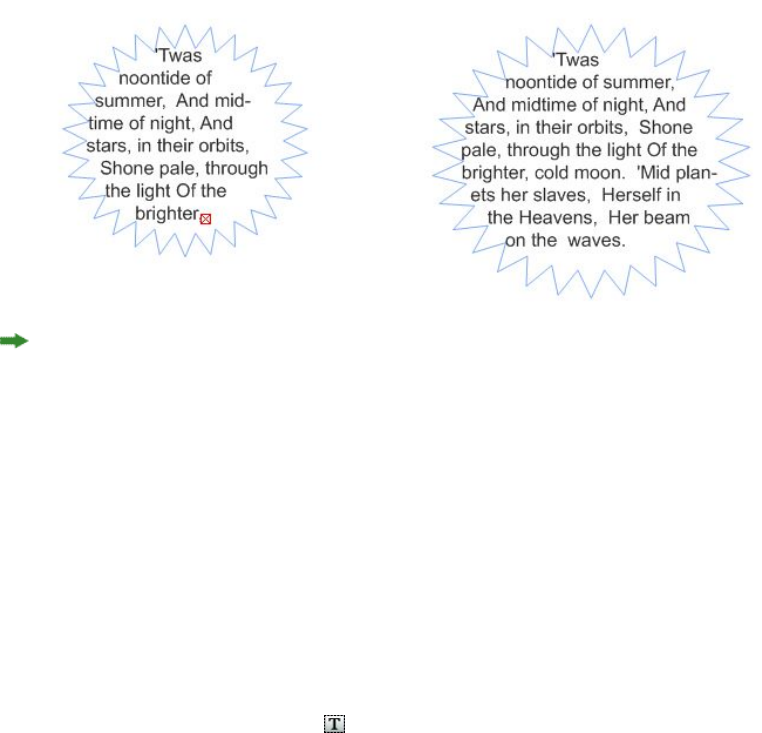
context menu (or Item menu). The Fit Box to Text feature works on any shape or size
of text box.
This feature is not available on locked boxes or when the proportion of the box is
locked.
The Fit Box to Text feature can be used for boxes which have overflow or underflow.
The Fit Box to Text feature can be used for all kinds of text boxes, including linked
boxes, multicolumn boxes, rotated boxes. It will work on text that has various attributes
applied to as well as text containing footnotes and endnotes.
Importing and exporting text
To import text, do one of the following:
•Select the Text Content tool , place the text insertion point where you want
text to be inserted, and then choose File > Import. Check Convert Quotes option
to convert double hyphens to em dashes and convert foot or inch marks to
typesetter's apostrophes and quotation marks. Check Include Style Sheets to
import style sheets from a Microsoft Word or convert "XPress Tags" to formatted
text.
•Drag a text file from the file system onto a text box.
•Drag text from another application onto a text box.
•Press Command/Ctrl and drag a text file from the file system onto a picture box
or a no-content box.
•Press Command/Ctrl and drag text from another application onto a picture box
or a no-content box.
If you drag content onto a box that already contains text or a picture, QuarkXPress
creates a new box for the dragged content. To replace the contents of the box instead,
press Command/Ctrl while dragging the content to the box. To always create a new
box for dragged-in content, press Option/Alt while dragging.
If all the imported text does not fit in the text box, the overflow symbol displays. After
importing text into a box, you can choose Fit Box to Text from the context menu (or
Item menu). If Auto Page Insertion (QuarkXPress/Edit > Preferences > Print Layout >
122 | A GUIDE TO QUARKXPRESS 2016
TEXT AND TYPOGRAPHY

General pane) is enabled, pages are inserted (when you import text into an automatic
text box) as necessary to contain the text.
To export text, first either place the text insertion point in a text box (if you want to
save all of the text in that box) or select the text you want to export. Then choose
File > Save Text, choose an option from the Format pop-up menu, enter a name,
choose a location, and then click Save.
To export in .docx format, choose Word Document from the Format drop-down
menu.
Importing and exporting text with Unicode options
You can specify an encoding type when importing text and exporting text. The
encoding type specifies the byte sequence used to represent each glyph in text.The
options work as follows:
•The Import dialog box includes an Encoding drop-down menu when a plain text
or "XPress Tags" text file is selected. The software attempts to determine the
encoding of selected text files and apply an appropriate encoding type. You can,
however, choose a different option for text.
•The Save Text dialog box provides an Encoding drop-down menu when you're
exporting text in plain text or "XPress Tags" format.
•The Convert Quotes option continues to convert straight quotes to typesetter's
quotation marks and double hyphens to em dashes.
Finding and changing text
The Find/Change palette (Edit menu) lets you perform standard search-and-replace
operations. In addition, you can use this palette to:
•Find and change using wild card characters: Command+Shift+?/Ctrl+Shift+?
•Find and change text formatting, including style sheet, font, size, color, and type
style (including OpenType styles)
•Find and change based on breaking or non-breaking spaces/dashes/hyphens within
the text (i.e. you can search for all breaking spaces and replace them with
non-breaking spaces.)
•Constrain find/change operations to a single story, or to an entire layout
•Find and change based on character language (see "Applying a character language")
•Find and change ligatures
•Find and change special characters (see "Special character codes")
•Find and change emphasis marks (in East Asian configuration)
•Search in Locked Content
•Find and change text in Footnotes/ Endnotes. To enable Search in Footnote, you
must first select Layout. When the Search In Footnotes option is checked, the
A GUIDE TO QUARKXPRESS 2016 | 123
TEXT AND TYPOGRAPHY
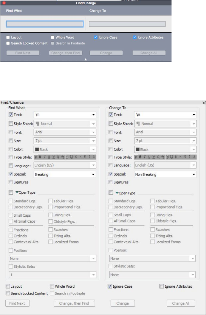
Ignore Attributes option will be disabled and only text can be searched and
replaced at that time.
Press Option/Alt to change the Find Next button to Find First.
The search text for the last 10 searches are saved in the drop-down menus under Find
What and Change To.
Use the Find/Change dialog box to search for and replace text.
To search and replace based on formatting attributes, uncheck Ignore Attributes.
124 | A GUIDE TO QUARKXPRESS 2016
TEXT AND TYPOGRAPHY
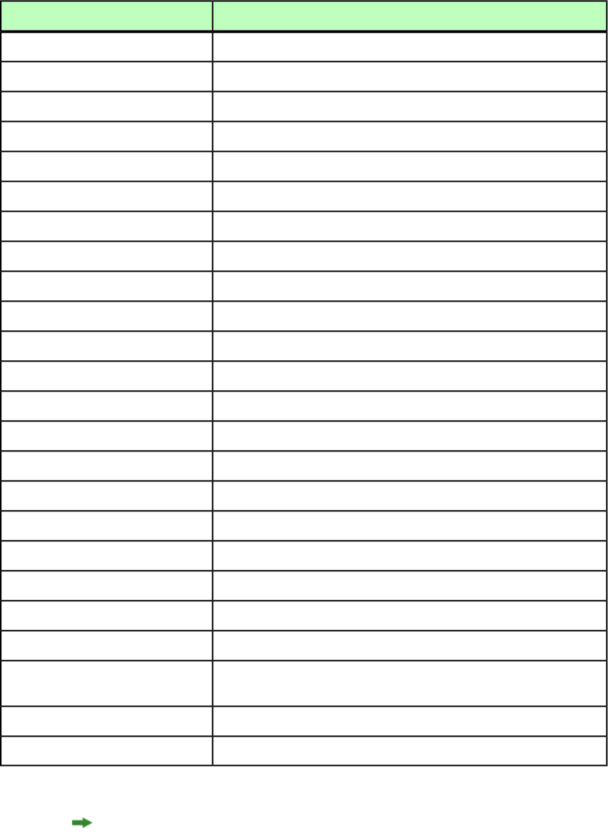
Special character codes
You can use special character codes to find/change special characters. You can also
use these codes when creating conditional styles.
Character
Code
\tTab
\pNew paragraph
\nNew line
\cNew column
\bNew box
\\Backslash
\.Punctuation space
\fFlex space
\hDiscretionary hyphen*
\IIndent here
\dDiscretionary new line
\mEm space
\eEn space
\53-per-Em space
\$4-per-em space
\^6-per-em space
\8Figure space
\{Hair space
\[Thin space
\zZero width space
\jWord joiner*
\rConditional style marker (Find/Change
only)
\oFootnote/Endnote reference marker*
\vContent Variable reference*
*Not applicable in conditional styles.
*You can only search for Footnote/Endnote reference markers or Content Variable
references. You are unable to replace them.
A GUIDE TO QUARKXPRESS 2016 | 125
TEXT AND TYPOGRAPHY
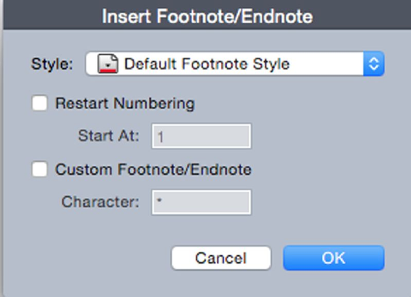
Working with footnotes and endnotes
Footnotes and Endnotes consists of two linked parts: the reference number that appears
in the text, and the Footnote/Endnote text that appears at the bottom of the text.
Footnote text is created at the end of a page and Endnote text is created at the end of
a story.
As you insert/delete Footnotes and Endnotes, they are automatically numbered as they
are added to/deleted from the text. This numbering will restart with each new story.
You can define the numbering style, appearance, and layout of Footnotes and Endnotes.
Footnotes and Endnotes can applied to text within an anchored box, including nested
anchored boxes. The footnote text of the anchored text will appear at the bottom of
the page while its endnote text will appear at the end of the document.
Footnotes/Endnotes adhere to the following rules:
•Text export is not supported for Footnote/Endnote in any format in QuarkXPress.
•Each Footnote/Endnote text is a different story, and thus the user cannot select
Footnote/Endnote text toegther.
•Footnotes/Endnotes can be copy pasted within the same project and across projects
•Footnote/Endnotes can be imported from Microsoft Word (.docx) files.
Inserting footnotes and endnotes
To insert a Footnote or an Endnote:
1Place the insertion point where you want the Footnote/Endnote reference number to
appear, or select the word for which you want to add a Footnote/Endnote.
2Choose Style > Footnote/Endnotes.
3Select Insert Footnote, Insert Endnote or Custom Footnote/Endnote from the drop
down menu. If you choose Custom Footnote/Endnote, the Insert Footnote/Endnote
dialog box appears:
126 | A GUIDE TO QUARKXPRESS 2016
TEXT AND TYPOGRAPHY
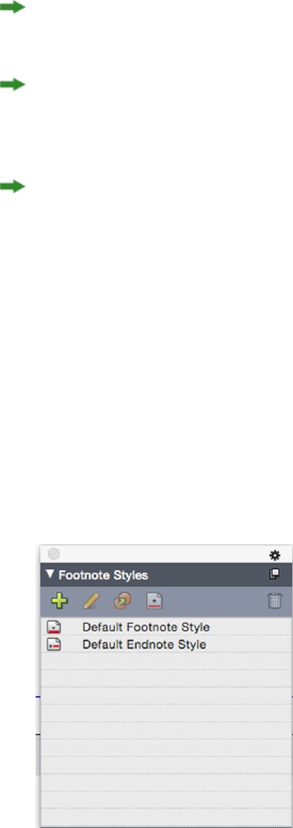
This allows you to select a Footnote style. User can change an applied Footnote style
to a different style or to an Endnote style and vice versa.
Footnote/Endnotes are supported for linked text chain and multi-column boxes.
Footnote/Endnote text can flow across the text chain.
Use the Restart Numbering option to restart the numbering of a Footnote/Endnote.
Use the Custom Footnote/Endnote option to specify a custom mark as the
Footnote/Endnote reference number.
4Type the Footnote/Endnote text.
The Footnote/Endnote is added to the document
When the insertion point is in the Footnote text, you can choose Style >
Footnotes/Endnotes and select Return to Reference to return to the reference text.
You can select a Footnote/Endnote reference number and jump to the corresponding
Footnote/Endnote text by choosing Style > Footnotes/Endnotes and select Go to
Footnote/ Endnote.
You can insert Footnotes/Endnotes or return to reference using the following shortcut
key commands:
•Insert Footnote: Ctrl+ Alt+Shift+F1 (Windows); Cmd+ Opt+Shift+F1 (Mac OS X)
•Insert Endnote: Ctrl+ Alt+Shift+F2 (Windows); Cmd+ Opt+Shift+F2 (Mac OS X)
•Return to Reference: Ctrl+ Alt+Shift+F4 (Windows); Cmd+ Opt+Shift+F4 (Mac OS
X)
Footnote/Endnote styles
To edit Footnote/Endnote styles, choose Window > Footnote Styles to display the
Footnote Styles palette.
Use the Footnote Styles palette to add, edit, duplicate and delete footnote styles.
The buttons at the top of this palette let you add, edit, duplicate and delete Footnote
styles. You can also apply a different Footnote/Endnote style on an already applied
A GUIDE TO QUARKXPRESS 2016 | 127
TEXT AND TYPOGRAPHY
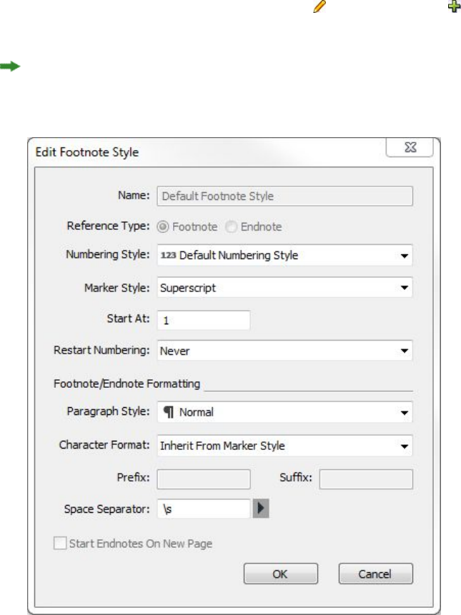
Footnote/Endnote reference number by clicking on the desired style in the palette.
You can access the Insert Footnote/Endnote dialog using the Custom
Footnote/Endnote button in the palette.
To add a new Footnote/Endnote style or to edit an existing Footnote/Endnote style,
choose an existing Footnote style and click the button, or click the button.
The Edit Footnote Style dialog displays.
You can also display this dialog by choosing Edit > Footnote Styles to display the
Footnote Styles dialog. Choose an existing Footnote style and click the Edit button,
or click the New button.
Specify the attributes for your Footnote/Endnote style. The attributes in the top half
of the dialog will be applied to the footnote/endnote reference text, the attributes
under the Footnote/Endnote Formatting section of the dialog will be applied to the
actual footnote text:
•Name: Enter a name in this field, or the application will use a default "New
Footnote Style" name.
•Reference Type: Indicate if this will be a Footnote or an Endnote style.
•Numbering Style: Select a numbering style that will be applied to the
Footnote/Endnote reference numbers from the Numbering Style drop-down
menu. To create a numbering style, see "Working with numbering styles
128 | A GUIDE TO QUARKXPRESS 2016
TEXT AND TYPOGRAPHY

•Marker Style: Select a marker style that will appear in the reference text from the
Marker Style drop-down menu.There are 3 options: Superscript, Subscript and
Inherit from Numbering. If the Inherit from Numbering option is selected,
then the character styling applied on the selected numbering style will be applied
as the marker style.
•Start At: Specify the number used for the first Footnote in the story. Each story
in a document begins with the same Start At number.
•Restart Numbering: Specify when you wish to restart the numbering. Choose
Never if you wish the numbering to never restart for the entire project. Choose
Each Page or Each Section to specify when Footnote numbering is to be restarted.
This option is only available only for Footnotes and not Endnotes.
•Paragraph Style: To associate a paragraph style sheet with the Footnote/Endnote
style, choose an option from the Paragraph Style drop-down menu. To create a
paragraph style sheet, see "Creating and editing paragraph style sheets".
•Character Format: Choose Inherit From Marker Style to retain the styling applied
on the footnote/endnote reference number. To associate a different character
styling with the footnote/endnote marker, choose a character style sheet from a
list of character style sheets available in the Character Format drop-down menu.
To create a character style sheet, see "Creating and editing character style sheets".
•Prefix: Enter text that you want to appear before the footnote marker.
•Suffix: Enter text that you want to appear after the footnote marker.
•Space Separator: Select the space separator/s you want between the
footnote/endnote marker and the text of the note.
•Start Endnotes on New Page: Specify if you wish to to start the Endnotes from
a new page or from the same page just after the end of the story. This option is
available only for Endnotes, not Footnotes. By default, the Start Endnotes on
New Page option is unchecked for an Endnote style.
If you select Start Endnotes on New Page, then you should not set Auto Page
Insertion in preferences to Off, otherwise Endnotes will not be displayed.
The space between two footnotes/endnotes can be specified using the Space Before
and Space After settings of the paragraph styling applied to the footnote text.
When you're done, click OK.
After you have added a Footnote/Endnote style, it is listed in the Footnote Style dialog
(Edit > Footnote Styles) and also in the Footnote Styles palette (Window > Footnote
Styles). The new style will be available when you attempt to insert a custom
Footnote/Endnote into the text.
Footnote styles can be appended from another project
A GUIDE TO QUARKXPRESS 2016 | 129
TEXT AND TYPOGRAPHY
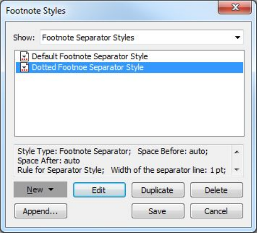
Footnote separators
The Footnote separator is the line separator between the parent text and Footnote
text. The Footnote separator style is a box attribute and as such you can apply a different
Footnote separators to different boxes in the same story, or to different stories in the
same layout.
To add or edit Footnote separator styles, choose Edit > Footnote Styles to display the
Footnote Styles dialog.
Select Footnote Separator Styles from the drop-down menu under Show:. The existing
Footnote separator styles will be listed. Choose an existing Footnote separator style
and click the Edit or Duplicate button, or click the New button.
The Edit Footnote Separator Style dialog displays:
130 | A GUIDE TO QUARKXPRESS 2016
TEXT AND TYPOGRAPHY
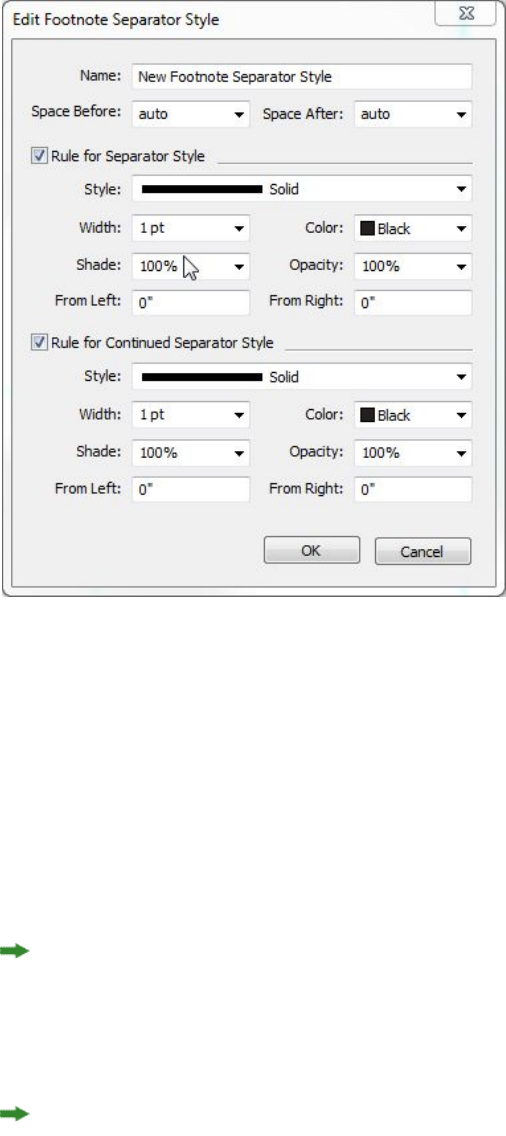
Specify the attributes for the Footnote separator style:
•Name: Enter a name in this field, or the application will use a default "New
Footnote Separator Style" name.
•Space Before: Specify the desired amount of space above the separator (between
the body text and the separator).
•Space After: Specify the desired amount of space below the separator (between
the separator and the footnote/endnote text).
•Rule for Separator Style: Check to specify the attrubutes for the main footnote
separator style.
If this box is not checked, there will be no separator between the text and the
footnote.
•Rule for Continued Separator Style: Check to specify the attributes of the
separator style if the footnote will be continued onto a subsequent page or column.
If this box is not checked and the footnote text overflows onto the next page or
column, there will be no separator between the text and the footnote on the
second page or column.
•Style: Select a line style for the separator from the Style drop-down menu.
•Width: Select a width or type in a value for the width of the separator from the
Width drop-down menu.
•Color: Select a color for the separator from the Color drop-down menu.
A GUIDE TO QUARKXPRESS 2016 | 131
TEXT AND TYPOGRAPHY
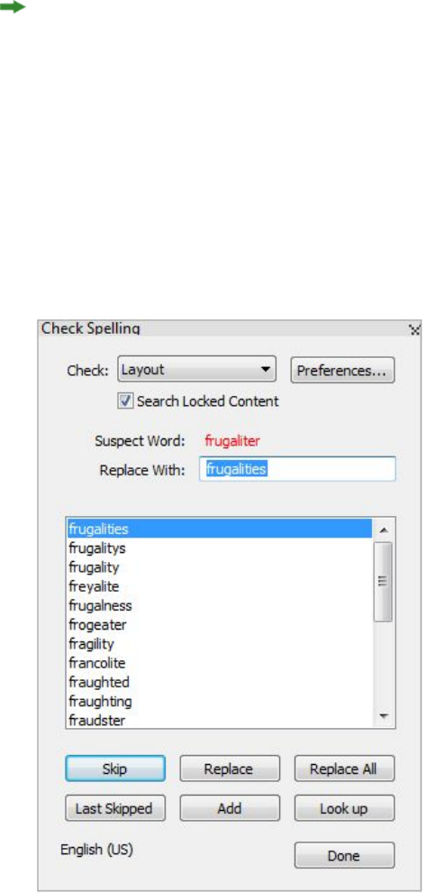
•Shade: Select a shade or type in a value for the shade of the separator using the
slider tool in the Shade drop-down menu.
•Opacity: Select an opacity or type in a value for the opacity of the separator using
the slider tool in the Opacity drop-down menu.
•From Left: Specify the Left Indent offset for the separator. This value can be an
absolute value or a relative value in terms of a percentage of the box.
•From Right: Specify the Right Indent offset for the separator. This value can be
an absolute value or a relative value in terms of a percentage of the box.
When you're done, click OK.
After you have added a Footnote separator style, it is listed in the Footnote Styles
dialog (Edit > Footnote Styles).
To apply the new Footnote separator style, choose Style > Footnote Separator Style
and select the new style.
Checking spelling
To check spelling, choose an option from the Utilities > Check Spelling submenu:
Word, Story or Layout. The Check Spelling palette displays.
Check Spelling palette
132 | A GUIDE TO QUARKXPRESS 2016
TEXT AND TYPOGRAPHY

To change the scope of the spell check, choose an option from the Check drop-down
menu. The options are Word, Selection, End Of Story, Story, or Layout. If you choose
Layout, the spell check skips applied master page items and then checks the master
page(s) after checking spelling on all layout pages.
To check spelling in locked text boxes, cells, and paths, check Search Locked Content.
Spell checking always starts from the text insertion point.
To start a spell check, click Start. To start the spell check from the beginning of the
active story, Shift+click Start.
To replace a misspelled word, type the correct spelling in the Replace With field or
choose the correct word from the list, then click Replace. To replace all occurrences
of the misspelled word, click Replace All.
To look up suggestions for the word in the Replace With field, click Look up.
To skip the selected word, click Skip. After you have skipped a word, the Last Skipped
button will be enabled. Clicking this button will take you back to the last word you
skipped. The skip history will be maintained for the current spell check session only.
To add the word in the Replace With field to an auxiliary dictionary, click Add. If no
auxiliary dictionary is open, you can select or create one after you click Add. To add
all suspect words to an open auxiliary dictionary, press Option+Shift/Alt+Shift and
click Add All.
To close the Check Spelling palette, click Done.
Spell checking is restricted to text boxes on visible layers only.
You can click outside the Check Spelling palette and return to the palette to restart
a spell check.
To reverse changes from the Check Spelling palette, choose Edit > Undo Text Change.
To display spell checking preferences, click Preferences. For more information, see
"Preferences — Application — Spell-Check."
Auxiliary dictionaries
To prevent a word from being flagged by the spell checker, create an auxiliary dictionary
and add the word to that auxiliary dictionary. To create an auxiliary dictionary:
•(Windows) Choose Utilities > Auxiliary Dictionary, enter a name, and then click
New
•(Mac OS X) Choose Utilities > Check Spelling > Auxiliary Dictionary, enter a
name, and then click New
To add words to an auxiliary dictionary:
•(Windows) Choose Utilities > Edit Auxiliary
•(Mac OS X) Choose Utilities > Check Spelling > Edit Auxiliary
A GUIDE TO QUARKXPRESS 2016 | 133
TEXT AND TYPOGRAPHY
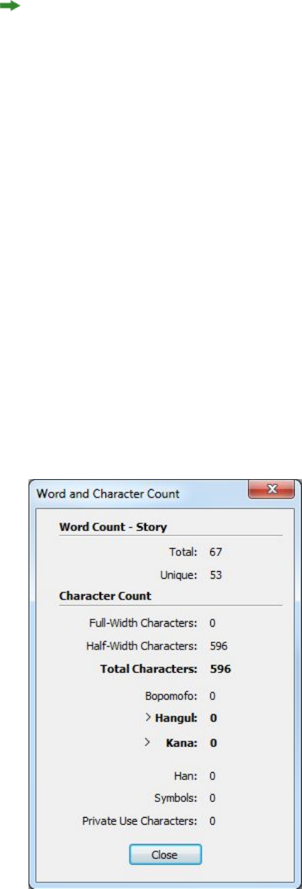
Beginning with QuarkXPress 2015, Auxiliary Dictionarys are saved in .xml format.
Users will still be able to open legacy version documents and auxiliary dictionaries in
QuarkXPress 2016, but those dictionaries will get converted to .xml format.
Only one auxiliary dictionary at a time can be open for use with an article. An auxiliary
dictionary remains associated with an article until you click Close in the Auxiliary
Dictionary dialog box or until you open a different auxiliary dictionary.
Auxiliary dictionaries are saved as separate files on your hard drive. The path to an
article's auxiliary dictionary is saved with the project, so if you move an open auxiliary
dictionary to another folder or volume, the application will be unable to find it.
To create or open an auxiliary dictionary without closing the Check Spelling palette,
click Add while a word you want to keep is highlighted.
To add all suspect words to an open auxiliary dictionary, press Option+Shift/Alt+Shift
and click Add All.
Counting words and characters
To display a count of the words and characters in a laout or story, choose an option
from the Utilities > Word and Character Count submenu: Layout or Story. The
Story option will only be available if there is a story selected.
134 | A GUIDE TO QUARKXPRESS 2016
TEXT AND TYPOGRAPHY
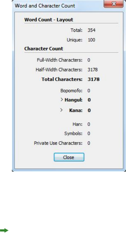
Word and Character Count dialog box
The Word Count area displays the number of total and unique words in the story or
layout.
The Character Count area displays the total number of characters and specific language
characters in the story or layout.
Private Use Characters are unique characters specified within a range of the Unicode
character set by individuals, organizations, and software vendors outside the ISO and
Unicode Consortium.
Applying character attributes
QuarkXPress lets you maintain precise, character-by-character control over text
formatting.
Applying a font
To apply a font to selected text, do one of the following things:
•Choose Style > Font and choose a font from the submenu.
•(Windows only): Display the Character Attributes dialog box (Style > Character)
and choose a font from the Font menu.
•Choose a font from the Font drop-down menu in the Home/Classic or
Character/Character Attributes tab of the Measurements palette.
A GUIDE TO QUARKXPRESS 2016 | 135
TEXT AND TYPOGRAPHY

•Press Command+Option+Shift+M/Ctrl+Alt+Shift+M to jump directly to the font
field in the Measurements palette, enter the first few characters of the font name
until it is recognized, then press Return/Enter.
Your most recently used fonts display at the top of the font list.
(Windows only):To display font previews in font menus, check the Show in Font Menu
box in the Fonts pane of the Preferences dialog box (QuarkXPress/Edit menu). Press
Shift to temporarily override this preference.
(Mac OS X only): QuarkXPress automatically shows a preview of all typefaces in the
font pop-ups. Press Shift to temporarily override this preference.
Choosing a font size
You can apply font sizes from 2 to 16128 points. To apply a size to selected text, do
one of the following things:
•Choose Style > Size and choose a point size from the submenu.
•Click the arrow next to the current font size to display a list of point sizes, then
either choose a size from the list or enter a new point size.
•Use one of the keyboard commands below.
Mac OS X
•Increase 1 pt: Command+Option+Shift+>
•Decrease 1 pt: Command+Option+Shift+<
•Increase in preset range: Command+Shift+>
•Decrease in preset range: Command+Shift+<
Windows
•Increase 1 pt: Ctrl+Alt+Shift+>
•Decrease 1 pt: Ctrl+Alt+Shift+<
•Increase in preset range: Ctrl+Shift+>
•Decrease in preset range: Ctrl+Shift+<
Applying type styles
To apply a type style to selected text, do one of the following things:
•Choose Style > Type Style and choose a type style from the submenu.
•(Windows only): Choose Style > Character and click check boxes in the Type Style
area.
•Choose a type style from the Text Styles drop-down menu in the Measurements
palette. Apply bold and italic type styles using the icons to the left of the Text
Styles drop-down menu. To remove all styles from selected text, choose Remove
All Styles from the Text Styles drop-down menu.
136 | A GUIDE TO QUARKXPRESS 2016
TEXT AND TYPOGRAPHY

Intrinsic fonts are distinct font styles built into font families, such as “Times New
Roman MT Std Bd” in the “Times New Roman MT Std” font family.
Simulated fonts are plain intrinsic fonts that have been modified to simulate bold,
italic, or bold italic. When a font family does not include a bold or italic variation as
a separate intrinsic font, you can apply the bold and italic type styles to allow your
operating system to perform a transform to create a bold or italic rendition of the font.
The result is a simulated font.
When you apply bold to a plain font, the application first tries to find an intrinsic
bold version of the font, and then if it can't find such a font, it creates a simulated
bold version of the font.
Warning icons identify simulated fonts in a layout because simulated fonts can cause
output problems. Simulated fonts display with a warning icon in the Measurements
palette, the Glyphs palette, the Character Attributes dialog box, the Style > Type
Style submenu, the Edit Character Style Sheet dialog box, the Change To area of
the Find/Change palette, the Fonts pane of the Usage dialog box (Utilities menu),
the Replace Font dialog box accessible from the Usage dialog box, and the Character
Attributes tab of the Rubi dialog box.
Applying color, shade, and opacity
To apply color, shade, and opacity to selected text, do one of the following things:
•Choose options from the Style > Color, Style > Shade, and Style > Opacity
submenus.
•Display the Colors palette (Window > Show Colors), click a color, and then
choose or enter Shade and Opacity values.
•Use the color, shade, and opacity controls in the Home/Classic or Character
Attributes tab of the Measurements palette.
Applying horizontal or vertical scale
To apply horizontal or vertical scaling to selected text, do one of the following things:
•(Windows only): Choose Style > Horizontal/Vertical Scale, choose Horizontal
or Vertical from the Scale drop-down menu, enter a value in the field, and then
click OK.
•Choose Scale Text Horizontally or Scale Text Vertically from the
Character/Character Attributes tab of the Measurements palette, and enter a
value in the field.
•Use one of the keyboard commands below. If a range of text is selected that has
both horizontal and vertical scaling applied, the keyboard commands will increase
or decrease the text accordingly.
You cannot apply horizontal and vertical scaling values simultaneously.
Mac OS X
•Condense 5%: Command+[
A GUIDE TO QUARKXPRESS 2016 | 137
TEXT AND TYPOGRAPHY
•Expand 5%: Command+]
•Condense 1%: Command+Option+[
•Expand 1%: Command+Option+]
Windows
•Condense 5%: Ctrl+[
•Expand 5%: Ctrl+]
•Condense 1%: Ctrl+Alt+[
•Expand 1%: Ctrl+Alt+]
Applying baseline shift
You can place characters above or below their baseline without affecting paragraph
spacing. A positive value raises the text; a negative value lowers the text. To apply
baseline shift to selected text, do one of the following things:
•(Windows only): Choose Style > Baseline Shift, enter a value in the Baseline Shift
field, and then click OK.
•Enter a value in the Baseline field of the Character/Character Attributes tab of
the Measurements palette.
•Use one of the keyboard commands below.
Mac OS X
•Down 1 pt: Command+Option+Shift+-
•Up 1 pt: Command+Option++
Windows
•Down 1 pt: Ctrl+Alt+Shift+9
•Up 1 pt: Ctrl+Alt+Shift+0
Applying emphasis
To apply an emphasis mark to a character, select the character, click the Emphasis
Mark drop down in the Paragraph/Paragraph Attributes tab of the Measurements
palette to display the emphasis mark options, and then click one of the options. These
options are also available in the Emphasis Mark drop-down menu under Style > Type
Style. On Windows, these options are also available in the Emphasis Mark drop-down
menu in the Character Attributes palette (Style > Character).
Controlling half-width characters
To keep half-width characters (such as Roman characters) horizontal in a vertical story:
•(Windows only) Check the Keep Half-Width Characters Upright box in the
Character Attributes dialog box (Style > Character) .
138 | A GUIDE TO QUARKXPRESS 2016
TEXT AND TYPOGRAPHY
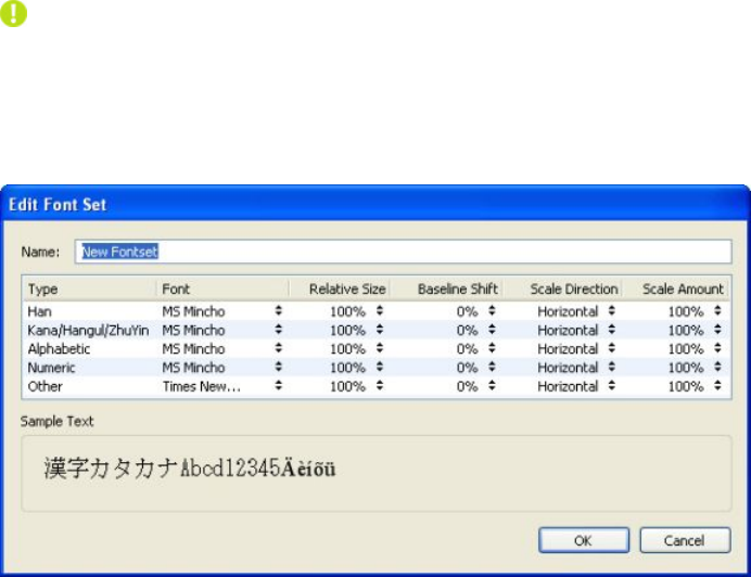
•(Mac OS X only) Check the Keep Half-Width Characters Upright box on the
Character tab of the Measurements palette.
Counting characters
The Character Count dialog box (Utilities menu) displays the number of full-width,
half-width, Bopomofo, Hangul, Kana, and Han characters used in the active story. It
also displays the number of symbols and private use characters in the selected story.
Working with font sets
Font sets let you control how different types of characters — such as Alphabetic
(Roman) and Han characters — display when they occur together in text.
You can create a new font set in the Edit Font Set dialog box (Edit > Font Sets). Each
font set is composed of a set of font types, each of which has its own settings.
Use the Edit Font Set dialog box to configure a font set.
For each type in a font set, you can control the following:
•Font: Specify a font for each type of character group.
•Relative Size: Specify the relative size of each font based on the font size used in
the layout. For example, if the font size in your layout is 12 points, and you specify
a relative setting of 200%, the font displays at 24 points.
•Baseline Shift: Specify a value to raise or lower the font from its baseline.
•Scale Direction: Specify whether the font is scaled horizontally or vertically.
•Scale Amount: Specify the amount of horizontal or vertical scaling.
The Sample Text area of the dialog box displays sample text that uses each of the
fonts in the font set.
You can apply a font set to text in the same way that you apply a font to text. Simply
select the text and choose a font set from the font drop-down menu in the
Measurements palette. Font sets display at the top of the list.
A GUIDE TO QUARKXPRESS 2016 | 139
TEXT AND TYPOGRAPHY

To append a font set to a project, use the Append button in the Font Sets dialog box
(Edit > Font Sets).
Working with grouped characters
Use the Group Characters dialog box (Style menu) to include a group of horizontal
characters, such as Roman characters, within a vertical line of text. Grouped characters
always display horizontally and do not break at the end of a line. To group selected
characters:
1Choose Style > Group Characters.
2Choose Vertical or Horizontal from the Scale drop-down menu and enter a percentage
in the field to the right of the Scale drop-down menu.
3If you want to change the character spacing, enter a value in the Track/Sending
Amount field.
4Click OK.
Aligning characters on a line
The Character Alignment feature gives you several options for aligning small
characters in a line of text to the largest character in a line of text. You can align
characters based on their baselines, their em boxes, or their ICF boxes.
Em boxes are the bounding boxes of characters. The ideographic character face (ICF) box
is a boundary inside the em box beyond which a glyph cannot extend. ICF boxes are
necessary to ensure that glyphs in an East Asian text flow do not touch each other.
The red area in the diagram below represents the boundaries of the em box. The yellow
area represents the ICF box.
Red represents the em box. Yellow represents the ICF box.
You can align smaller characters with the largest characters that appear in the same
line of text in one of following ways:
140 | A GUIDE TO QUARKXPRESS 2016
TEXT AND TYPOGRAPHY
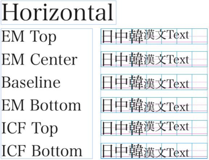
•Choose an option from the Style > Character Alignment submenu.
•(Windows only): Choose Style > Formats and choose an option from the Char
Align drop-down menu under the Formats tab.
•(Mac OS X only): Choose an option from the Char Align drop-down menu on the
Paragraph tab of the Measurements palette..
The alignment options are:
•ICF Box Top: Aligns small characters with the top of the ICF box.
•Embox Top: Aligns small characters with the top edge of the em box of the largest
character in a line of horizontal text.
•Embox Bottom: Aligns small characters with the bottom edge of the em box of
the largest character in a line of horizontal text.
•Embox Centered: Aligns small characters with the center of the em box of the
largest character.
•Embox Right: Aligns small characters with the right edge of the em box of the
largest character in a line of vertical text.
•Embox Left: Aligns small characters with the left edge of the em box of the largest
character in a line of vertical text.
•Roman Baseline: Aligns small characters with the baseline of the largest character.
•ICF Box Bottom: Aligns small characters with the bottom of the ICF box.
Examples of horizontal character alignment
A GUIDE TO QUARKXPRESS 2016 | 141
TEXT AND TYPOGRAPHY
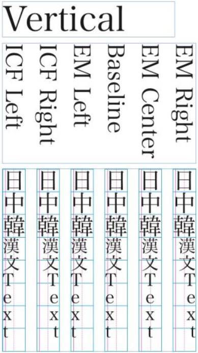
Examples of vertical alignment
Applying multiple character attributes
You can view and edit all character attributes at one time using the Character
Attributes dialog box (Style > Character) on Windows, or by using the Paragraph tab
of the Measurements palette on Mac OS X.
Blank fields and gray check boxes indicate that multiple styles are applied to selected
text. For example, if the Font field is blank, then more than one font is applied to the
selected text.
If you enter a value in a blank field, that value will be applied to all the selected text.
If you check or uncheck a gray check box, that style setting will be applied to or
removed from all selected text.
142 | A GUIDE TO QUARKXPRESS 2016
TEXT AND TYPOGRAPHY
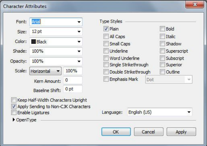
Use the Character Attributes dialog box to format text.
Applying paragraph attributes
Paragraph attributes are formatting options that apply to a paragraph as a whole. They
include alignment, indents, leading, and tab settings. To apply attributes to selected
paragraphs, use the Paragraph/Paragraph Attributes tab of the Measurements palette
and on Windows you can also use the Paragraph Attributes dialog box (Windows
only) (Style > Formats).
You can copy any applied paragraph formats from one paragraph to other paragraphs
in the same box or text chain. To copy applied paragraph formats, select the paragraph
or range of paragraphs that you want to change, then press Option+/Alt+Shift while
clicking anywhere in the paragraph with the formats you want to copy. Copying
paragraph formats in this way will not change any character attributes.
Controlling alignment
You can choose from five paragraph alignments: Left, Centered, Right, Justified, and
Forced. The Forced option aligns all lines between the left and right indentations, like
the Justified option, but also justifies the last line (if there is a return at the end of the
paragraph).
To set the alignment of selected text, do one of the following things:
•Choose an alignment from the Style > Alignment submenu.
•Click an alignment icon in the Home/Classic tab or the Paragraph/Paragraph
Attributes tab of the Measurements palette.
•Use one of the keyboard commands below.
A GUIDE TO QUARKXPRESS 2016 | 143
TEXT AND TYPOGRAPHY
Mac OS X
•Left : Command+Shift+L
•Centered : Command+Shift+C
•Right : Command+Shift+R
•Justified :Command+Shift+J
•Forced : Command+Option+J
Windows
•Left : Ctrl+Shift+L
•Centered : Ctrl+Shift+C
•Right : Ctrl+Shift+R
•Justified : Ctrl+Shift+J
•Forced : Ctrl+Alt+Shift+J
Controlling indentation
You can specify indents for selected paragraphs in the following ways:
•Use the Style > Alignment submenu
•(Windows only): Use the Paragraph Attributes dialog box (Style > Formats)
•Use the Paragraph/Paragraph Attributes tab of the Measurements palette
Use the following fields to specify the indents:
•To specify how far a paragraph is indented from the left edge of a box or column,
enter a value in the Left Indent field.
•To specify how far the first line of a paragraph is indented from the Left Indent
value, enter a value in the First Line field. Note that First Line indentation is
relative to the Left Indent applied to a paragraph. For example, if you specify a
Left Indent of .5", and a First Line indentation of .5", the first line will begin 1"
from the left edge of the text box.
•To specify how far a paragraph is indented from the right edge of a box or column,
enter a value in the Right Indent field. Click OK.
•To create a hanging indentation, specify a positive Left Indent and a negative
First Line indentation or drag the indentation icons on the column ruler. In
Windows, you can use the Apply button in the Formats tab of the Paragraph
Attributes dialog box (Style > Formats) to experiment with the hanging
indentation.
In addition to setting hanging indents as a paragraph attribute, you can enter a special
character that forces the indenting of all lines of text from that point to the next
paragraph return. Press Command+\ (Mac OS X) or Ctrl+\ (Windows) to enter a special
144 | A GUIDE TO QUARKXPRESS 2016
TEXT AND TYPOGRAPHY
Indent Here character. (The Indent Here character is an invisible character; to view
invisible characters, choose View > Invisibles (Command+I/Ctrl+I.)
Alignment and indentations are both measured from the Text Inset field specified in
the Text tab of the Modify dialog box (Item menu) on Windows, or in the Text Inset
field on the Text Box tab of the Measurements palette. The Text Inset value affects
the four sides of a text box; it does not affect the inner columns of a text box.
Controlling leading
Leading is a measure of line spacing — the distance between text baselines in
paragraphs. When you specify a leading value, it is applied to all lines in selected
paragraphs. You can specify leading by three methods:
•Absolute leading sets the distance between baselines of text to a specific value,
regardless of the size of characters on the lines. For example, if you specify an
absolute leading value of 16 points for a paragraph, all baselines will be spaced
16 points apart. When specifying absolute leading, use a value that is the total
vertical distance you want between text baselines.
•Incremental auto leading combines a base amount of auto leading with an absolute
value specified in the Leading field. Incremental leading values must be preceded
by a plus (+) or minus (–) sign.
•Auto leading means the application uses the value in the Auto Leading field
(QuarkXPress /Edit > Preferences > Paragraph pane) to decide whether
percentage-based or incremental auto leading occurs. The default —
percentage-based — takes the base amount of auto leading and adds to it a fixed
percentage of the largest font size on the upper line to determine the total amount
of leading between an auto-leaded line and the line above it. The default value
for percentage-based auto leading is 20%. To specify auto leading, enter auto in
the Leading field.
To set the alignment of selected paragraphs, do one of the following things:
•(Windows only) : Choose Style > Leading, then enter an absolute leading value,
an incremental leading value (preceded by a plus or minus sign), or auto in the
Leading field.
•Use the Leading controls in the Measurements palette.
•Use one of the keyboard commands below.
Mac OS X
•Decrease 1 pt: Command+Shift+:
•Decrease .1 pt: Command+Option+Shift+:
•Increase 1 pt: Command+Shift+"
•Increase .1 pt: Command+Option+Shift+"
Windows
•Decrease 1 pt: Ctrl+Shift+:
A GUIDE TO QUARKXPRESS 2016 | 145
TEXT AND TYPOGRAPHY

•Decrease .1 pt: Ctrl+Alt+Shift+:
•Increase 1 pt: Ctrl+Shift+"
•Increase .1 pt: Ctrl+Alt+Shift+"
Controlling space before and after paragraphs
Space Before and Space After controls let you specify the amount of space before and
after selected paragraphs.
To set the space before and after selected paragraphs, do one of the following things:
•(Windows only): Choose Style > Formats, then enter values in the Space Before
or Space After fields.
•Use the Space Before Paragraph and Space After Paragraph controls in the
Paragraph/Paragraph Attributes tab of the Measurements palette.
Setting tabs
You can choose from six kinds of tab stops:
•Left aligns text flush left on the tab stop.
•Center aligns text centrally on that tab stop.
•Right aligns text flush right on the tab stop.
•Decimal aligns text on a decimal point (period).
•Comma aligns text on a first comma.
•Align On aligns text on any character you specify. When you select this tab, the
Align On field displays. Select the existing entry, and enter the character to align
on.
If you do not set custom tabs, the application sets default left-aligned tabs every
half-inch.
You can apply tabs to selected paragraphs in the following ways:
•(Windows only): Use the controls in the Tabs tab of the Paragraph Attributes
dialog box (Style > Tabs).
•Use the controls in the Tabs tab of the Measurements palette. Using the
Measurements palette conserves screen space, and you continuously see the
effects updated as you change tab settings. You can drag tab icons to the ruler or
drag tab icons directly into text. When you are dragging tabs to the ruler or to
text, a vertical line displays on screen to help you decide where to position the
tab.
Controlling widow and orphan lines
Widows and orphans are two kinds of typographically undesirable lines. Traditionally,
a widow is defined as the last line of a paragraph that falls at the top of a column. An
orphan is the first line of a paragraph that falls at the bottom of a column.
146 | A GUIDE TO QUARKXPRESS 2016
TEXT AND TYPOGRAPHY

Using the Keep Lines Together feature, you can choose not to break paragraphs, so
that if all the lines in a paragraph do not fit in a column or on a page, the whole
paragraph will flow to the top of the next column or page. Alternatively, you can
specify the number of lines that must be left at the bottom of a column or box, and
at the top of the following column or box, when a paragraph is broken. Using the
Keep with Next ¶ feature, you can keep a paragraph together with the paragraph that
follows it. This lets you keep a subhead together with the paragraph that follows it, or
keep other lines of text that logically go together from being separated.
It is common to specify Keep with Next ¶ for headline and subhead style sheets and
specify Keep Lines Together (usually with Start and End parameters) for body text
style sheets.
To turn the Keep Lines Together and Keep with Next ¶ features on or off for selected
paragraphs:
•(Windows only): Choose Style > Formats to display the Formats tab of the
Paragraph Attributes dialog box, then check or uncheck Keep Lines Together
and Keep with Next ¶
•(Mac OS X only):Use the Paragraph tab of the Measurements palette.
Working with non-breaking character sets
Non-breaking characters are characters that cannot begin or end a line, and also
which cannot be separated from each other at line breaks. The Non-Breaking Character
Set dialog box (Edit > NonBreaking Character Sets) includes default non-breaking
character sets for Japanese Strong, Japanese Weak, Korean Standard, Simplified
Chinese Standard and Traditional Chinese Standard.
To create custom non-breaking character sets:
1Choose Edit > Non-Breaking Character Sets. The Non-Breaking Character Sets
dialog box displays.
2Click New.
3Enter a name in the Name field.
4Enter characters in the Enter characters that cannot begin a line field, the Enter
characters that cannot end a line field, and the Enter non-separable characters
field.
5Click OK.
6Click Save.
To apply a non-breaking character set to a paragraph, choose one from the
Non-Breaking Char Set drop-down menu in the Edit Hyphenation & Justification
dialog box (Edit > H&Js > Edit).
A GUIDE TO QUARKXPRESS 2016 | 147
TEXT AND TYPOGRAPHY

Format painter
Format Painter allows you to copy formatting that is applied to one piece of text and
apply it to others. The Format Painter will copy and apply all formatting that has been
applied to that text including any applied style sheets (paragraph and character).
To use the Format Painter:
1Select the text with the desired formatting.
2Select the Format Painter in the Home/Classic or Character/Character Attributes
tab of the Measurements palette.
3Select the text that you wish to apply the desired formatting to.
IMPORTANT: Whether format painter applies only character formatting in addition
to paragraph formatting is determined by the original selection; if you select a few
characters, then only character formatting is applied, if you select several lines,
paragraph formatting is also applied. Style sheets are never applied using the Format
Painter.
Controlling kerning
Kerning is the adjustment of space between character pairs. Because of their shapes,
certain character pairs look better when kerned. You can use automatic kerning, and
you can also use manual kerning controls to specify additional kerning between
characters.
Kerning values are expressed as 1/200 of an em space. A positive kerning value increases
the amount of space between characters; a negative value decreases it.
Kerning manually
To apply kerning between two characters, do one of the following things:
•(Windows only) : Choose Style > Kern and enter a value in the Kern Amount field.
Click OK.
•Use the Kern Amount controls in the Measurements palette.
•Use one of the keyboard commands below.
Mac OS X
•Decrease 1/20-em: Command+Shift+{
•Increase 1/20-em: Command+Shift+}
•Decrease 1/200-em: Command+Option+Shift+{
•Increase 1/200-em: Command+Option+Shift+}
Windows
•Decrease 1/20-em: Ctrl+Shift+{
148 | A GUIDE TO QUARKXPRESS 2016
TEXT AND TYPOGRAPHY
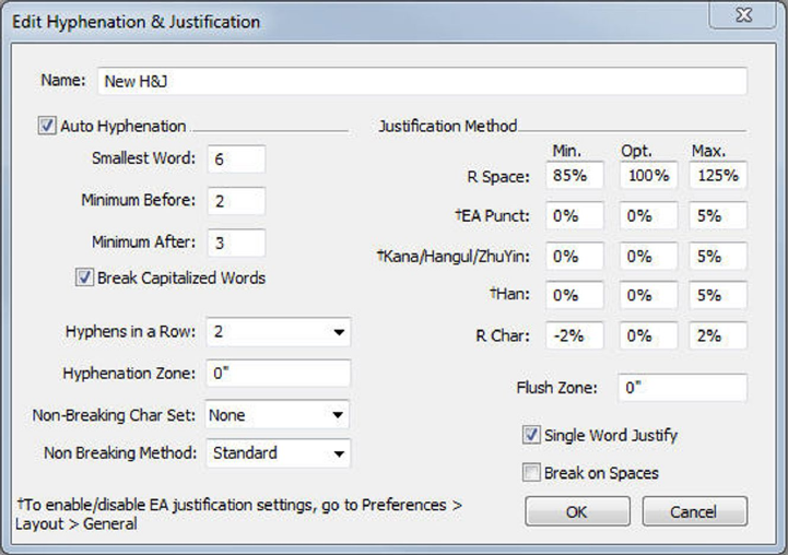
•Increase 1/20-em: Ctrl+Shift+}
•Decrease 1/200-em: Ctrl+Alt+Shift+{
•Increase 1/200-em: Ctrl+Alt+Shift+}
Kerning automatically
To automatically kern text above a specific point size, display the Character pane of
the Preferences dialog box (QuarkXPress/Edit menu), check Auto Kern Above, and
enter a value in the field.
QuarkXPress uses kerning information that is built into the font (the font's kerning
table). A kerning table contains a number of character pairs — "Ta," for example —
and an associated kerning value for each pair in the table. You can't change a font's
kerning table, but you can create a custom kerning table for any font using the Kerning
Table Edit dialog box (Utilities menu). You can use this dialog box to customize both
horizontal (With-Stream) and vertical (Cross-Stream) space in kerning pairs.
You can create your own kerning tables in QuarkXPress.
Controlling hyphenation and justification
A hyphenation and justification (H&J) specification is a named package of settings for
hyphenating words that go over the margin of a line of text and for justifying spaces
between words and characters. You can apply H&Js to individual paragraphs, or you
can associate an H&J with a paragraph style sheet. Use the Edit Hyphenation &
Justification dialog box (Edit > H&Js > New) to control these settings.
The Edit Hyphenation & Justification dialog box
•Auto Hyphenation: Specify whether automatic hyphenation is allowed.
A GUIDE TO QUARKXPRESS 2016 | 149
TEXT AND TYPOGRAPHY

•Smallest Word: Specify the minimum number of characters a word must contain
to allow hyphenation.
•Minimum Before: Specify the minimum number of characters before a hyphen.
•Minimum After: Specify the minimum number of characters after a hyphen.
•Break Capitalized Words: Specify whether hyphenation of capitalized words is
allowed.
•Hyphens in a Row: Specify how many words can be hyphenated in consecutive
line ends.
•Hyphenation Zone: Specify the area before the right indentation in which
hyphenation can occur. For example, if you set the hyphenation zone to .05", the
word is hyphenated when an acceptable hyphenation point falls within .05" of
the right indentation. The word preceding the hyphenated word must not fall
within the hyphenation zone.
•Hyphenation Zone: For words containing Roman characters, specify the area
before the right indentation in which hyphenation can occur. For example, if
you set the hyphenation zone to .05", the word is hyphenated when an acceptable
hyphenation point falls within .05" of the right indentation. The word preceding
the hyphenated word must not fall within the hyphenation zone.
•Justification Method: Specify how words and characters are spaced.
•Space: Specify the minimum and maximum amount of space between words in
paragraphs that have justified or forced alignment. Specify the optimum amount
of space between words in all paragraphs, regardless of their alignment.
•Char: Specify the minimum and maximum amount of space between characters
in paragraphs that have justified or forced alignment. Specify the optimum amount
of space between characters in all paragraphs, regardless of their alignment.
•Non-Breaking Char Set: Choose a non-breaking character set from the
drop-down menu. For more information about non-breaking character sets, see
"Working with non-breaking character sets."
•Non Breaking Method: Choose a non-breaking method from the drop-down
menu. When the last character in a line of justified text is a non-breaking character
that cannot end a line, Run Back pulls the first character of the next line up to
the current line, based on the value in the Min. field. Run Down pushes the
character to the next line, based on the value in the Max. field. For more
information about non-breaking characters, see "Working with non-breaking character
sets."
•R Space: Specify the amount of space between words containing Roman
characters in justified paragraphs. Specify the optimum amount of space between
words containing Roman characters in all paragraphs, regardless of their alignment.
•EA Punct: Specify the minimum and maximum amount of space between
East Asian punctuation characters in justified paragraphs. Specify the optimum
amount of space between East Asian punctuation characters in all paragraphs,
regardless of their alignment.
150 | A GUIDE TO QUARKXPRESS 2016
TEXT AND TYPOGRAPHY

•Kana/Hangul/ZhuYin: Specify the minimum and maximum amount of space
between Kana, Hangul, or Zhu Yin characters in justified paragraphs. Specify the
optimum amount of space between Kana, Hangul, or Zhu Yin characters in all
paragraphs, regardless of their alignment.
•Han: Specify the minimum and maximum amount of space between Han
characters in justified paragraphs. Specify the optimum amount of space between
Han characters in all paragraphs, regardless of their alignment.
•R Char: Specify the minimum and maximum amount of space between Roman
characters in justified paragraphs. Specify the optimum amount of space between
Roman characters in all paragraphs, regardless of their alignment.
•Flush Zone: Specify the area before the right indentation within which the last
word in the last line of a justified paragraph must fall in order to justify that line.
For example, if you enter 1", the last line of a paragraph to which the hyphenation
and justification specification is applied will not be justified until the last word
in the line falls within 1" of the right indentation.
•Single Word Justify: Specify whether a single word on a line in a justified
paragraph extends from the left indentation to the right indentation. When the
box is unchecked, a single word on a line is left-aligned.
•Break on Spaces: Specify whether Chinese, Japanese, and Korean text breaks
on spaces.
To enable/ disable justification settings for East Asian text categories of EA Punct, Han,
Kana/ Hangul/ ZhuYin specified in H&J, go to Preferences > Layout > General
Specifying hyphenation exceptions
In QuarkXPress, you can create language-specific lists of hyphenation exceptions. The
Hyphenation Exceptions dialog box (Utilities > Hyphenation Exceptions > Edit)
has a Language drop-down menu that lets you specify which language a hyphenation
exception applies to. When a paragraph is automatically hyphenated, the application
checks the list of hyphenation exceptions for the appropriate paragraph language.
A GUIDE TO QUARKXPRESS 2016 | 151
TEXT AND TYPOGRAPHY
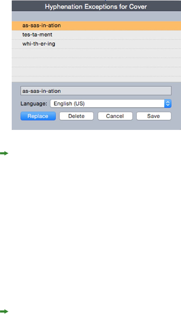
The Hyphenation Exceptions dialog box
The Suggested Hyphenation dialog box (Utilities menu) displays the recommended
hyphenation of a word that is based on the hyphenation method specified for the
paragraph and the hyphenation exceptions for the paragraph's language.
Hyphenation exception files
Hyphenation exception lists can be stored in separate .xml files. These .xml files can
than be imported into your project and also exported and shared with other users and
projects. This allows the same list of hypenation exceptions to be used in multiple
projects.
Hyphenation exception files can be imported and applied at the layout level so different
layouts in the same project can have separate .xml files applied. You apply the desired
external hyphenation exception file to a layout through a Job Jacket, as a job jacket
resource. (see "Job Jackets with hyphenation exceptions")
After you have applied a hyphenation exception file to a project, if you change anything
in the .xml file, these changes will be reflected in the project the next time you open
the project. In addition, any changes made to hyphenation exceptions in the project
will be reflected in the linked .xml file.
This two-way link works only when the.xml file is linked through a Job Jacket, we do
not link thexml file directly to a layout.
Importing hyphenation exeption files
To import hyphenation exception files:
1Choose Utilities > Hyphenation Exceptions > Import. The Select Hyphenation
Exceptions File dialog box displays.
152 | A GUIDE TO QUARKXPRESS 2016
TEXT AND TYPOGRAPHY
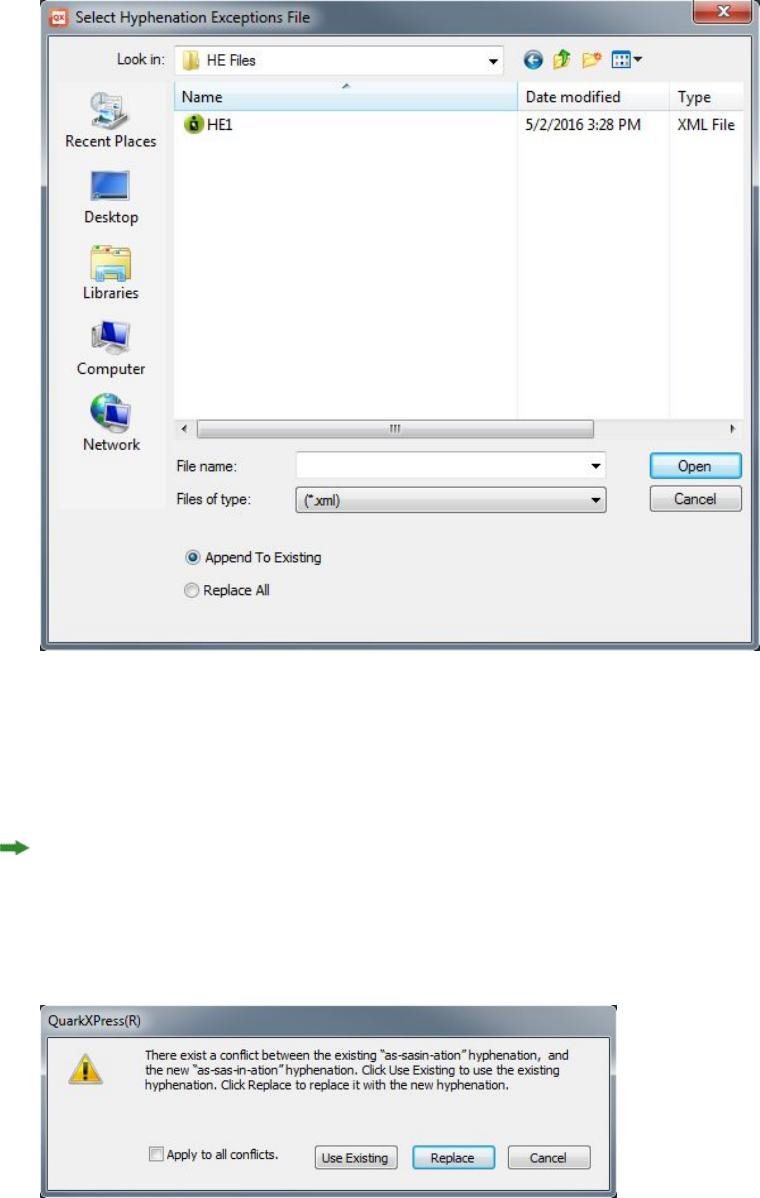
The Select Hyphenation Exceptions File dialog box
2Search for and select the hyphenation exception .xml file you wish to import.
3Check Append to Existing (default) to append the hyphenation exceptions to an
existing list.
If there are conflicts between words on the old list and the list you are attempting to
append, a conflict resolution window will open. This allows you to choose to keep the
old hyphenation exception (Use Existing), or replace it with the new hyphenation
exception from the .xml file you are importing (Replace).
The Conflict Resolution window.
4Check Replace All to replace any existing hyphenation exceptions with the
hyphenation exceptions in the file you have selected. Check Apply to all conflicts
to take the same action for all the conflicts that occur while importing.
A GUIDE TO QUARKXPRESS 2016 | 153
TEXT AND TYPOGRAPHY
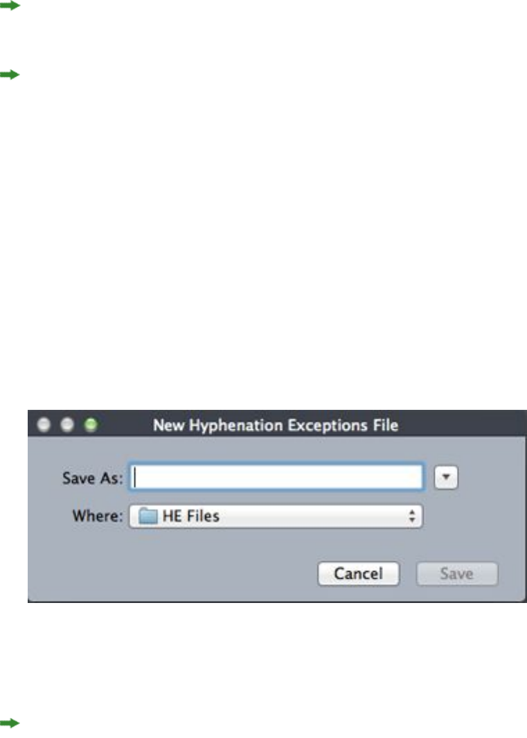
If the file you are importing does not contain hyphenation exceptions for a particular
language, then any existing hyphenation exceptions for that language will be erased.
Since Hyphenation Exceptions can be added at either at the application or layout level:
•Importing hyphenation exceptions when no project is open would result in the
hyphenation exceptions being imported at the application level for all the
languages.
•Importing hyphenation exceptions with a multi-layout project open would result
in the hyphenation exceptions being imported into the current layout of the
project.
Exporting hyphenation exeption files
Users can export hyphenation exceptions from QuarkXPress to an external .xml file.
To export hyphenation exception files:
1Choose Utilities > Hyphenation Exceptions > Export. The New Hyphenation
Exceptions File dialog box displays.
The New Hyphenation Exceptions File dialog box
2Specify the location and the name for the .xml file.
3Click Save.
•Exporting hyphenation exceptions when no project is open creates an external
.xml file containing the hyphenation exceptions present in QuarkXPress at the
application level for all the languages.
•Exporting hyphenation exceptions with a multi-layout project open creates an
external .xml file containing the hyphenation exceptions present in the current
layout of the project.
Job Jackets with hyphenation exceptions
A new Hyphenation Exceptions resource has been added at the Job Jacket level. This
feature allows users to share hyphenation exceptions among users who are creating
projects from the same Job Jacket. A user can create many hyphenation exception
154 | A GUIDE TO QUARKXPRESS 2016
TEXT AND TYPOGRAPHY
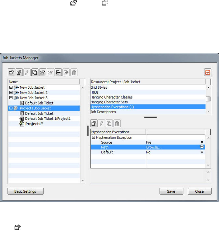
resources at the job jacket level. These resources are not available at the Job Ticket
level but can be referenced in the layout item.
To add a hyphenation exceptions files as a Job Jacket resource:
1Open the Job Jackets Manager dialog box (Utilities menu).
2In the list on the left, open or create a Job Jackets file. The Resource categories
in the Job Jackets file are listed in alphabetical order in the list on the upper right.
3Select the desired target Job Jacket from the list on the left.
4Select Hyphenation Exceptions from the list of Resource types in the top-right list.
Existing hyphenation exception resources are listed in the bottom-right list.
5Click to add a hyphenation exception files as a resource. You can select this file to
be the default hyphenation exception file. When there is no layout item at Job Ticket
level, this will be the default hyphenation exception file applied to layouts defined in
the Job Ticket.
6Browse to and select the desired .xml file.
The Hyphenation Exceptions resource item has three attributes:
•Source: specifies the type of repository available from where the external
hyphenation exceptions file could be selected for reference. By default it is File.
•Path: shows the URI of the external hyphenation exceptions file. It allows the
user to select the external hyphenation exceptions file to be referred to this
hyphenation exceptions resource item. Depending upon the type of Source
selected, the user is asked to select the external hyphenation exceptions file by
invoking the source browser.
•Default: used to designate this resource item as the hyphenation exceptions file
if a job ticket defined in the job jacket does not have a layout item defined in it.
A GUIDE TO QUARKXPRESS 2016 | 155
TEXT AND TYPOGRAPHY

By default the value of this attribute is No. To make it default, change its value
to Yes. Only one hyphenation exceptions resource item can be declared as the
default.
If you make changes to the Job Jacket, you must then link the new Job Jacket to the
project using File > Job Jackets > Link Project.
Job Tickets and hyphenation exceptions
Hyphenation exceptions reside at the layout level and not the project level. To use
this feature you must add layout items in the Job Ticket and associate one of the
available hyphenation exception resource items.
Key points:
•Hyphenation exceptions from an external hyphenation exceptions files associated
with layout items on the job ticket get imported into the corresponding layout
of the newly created project.
•a user can create any number of layout items. Each layout created in the project
would contain hyphenation exceptions present in external hyphenation exception
file associated to the layout items.
•If there are hyphenation exceptions present in the application, those hyphenation
exceptions would not become part of the layouts if hyphenation exceptions are
present in the layout items.
•If hyphenation exceptions resource items are present in the Job Jacket, but no
layout item and/or default hyphenation exception item has been defined then
hyphenation exceptions present in the application would be included in the
layouts.
•If a user links/attaches a project (having no hyphenation exceptions) with the
job jacket containing hyphenation exceptions, then hyphenation exceptions
would get imported in the project's layout.
•If a user links/attaches a project (already containing hyphenation exceptions)
with the job jacket containing different hyphenation exceptions, then hyphenation
exceptions in the project's layout would get replaced with the ones in the job
jacket.
•If a user makes any changes related to hyphenation exceptions resource items in
the job jacket that is already linked with a project, then all the changes would
get reflected only after relinking the project with the same Job Jacket.
To add hyphenation exceptions to Layout specifications:
1Open the Job Jackets Manager dialog box (Utilities > Job Jackets Manager) and
select the target Job Jacket from the list on the left.
2Select the desired Job Ticket from the Job Jacket and either open that Job Ticket or
create a new Job Ticket file. The resource categories in the Job Ticket file are listed
in alphabetical order in the list on the upper right.
156 | A GUIDE TO QUARKXPRESS 2016
TEXT AND TYPOGRAPHY
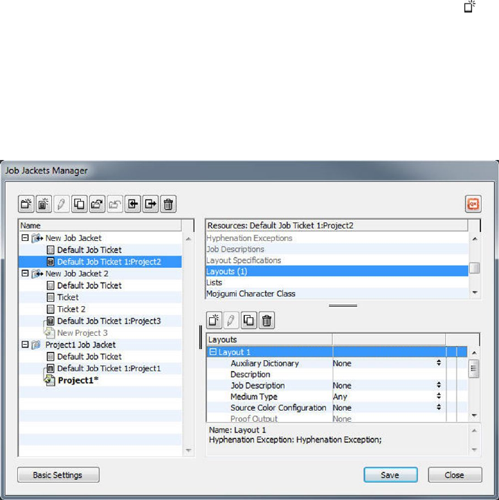
3Select Layouts from the list of resource types in the top-right list. Any layout definitions
in the Job Ticket display in the bottom-right list.
4Select an existing layout from the list of layouts in the bottom-right list or click to
create a new layout definition.
5Click the expander button next to the layout definition name to display the fields of
the layout definition.
6Scroll down to Hyphenation Exception and select the hyphenation exception file to
link to for the chosen layout.
Existing hyphenation exception resources are listed in the bottom-right list.
Synchronization between hyphenation exception files and layouts
QuarkXPress supports synchronization between a layout and the hyphenation exception
file when it is part of a Job Jacket resource.
If you have created a project from a Job Jacket, containing a hyphentation exception
reference, then any changes performed in the hyphenation exception file will get
reflected in the layout the next time the project is opened or re-linked to the job ticket.
If you add/delete/modify any hyphenation exception in the layout, when you save
the project the newly added hyphenation exceptions will be reflected in the
hyphenation exceptions file.
Synchronization behavior:
•Any modification in the external hyphenation exceptions file which is referenced
in a Job Jacket will be reflected in the project's layout created from the same Job
Jacket the next time the project is opened.
•Any modicifation in the hyphenation exceptions from within QuarkXPress will
be reflected in the referenced external hyphenation exceptions file when the user
saves the project.
A GUIDE TO QUARKXPRESS 2016 | 157
TEXT AND TYPOGRAPHY
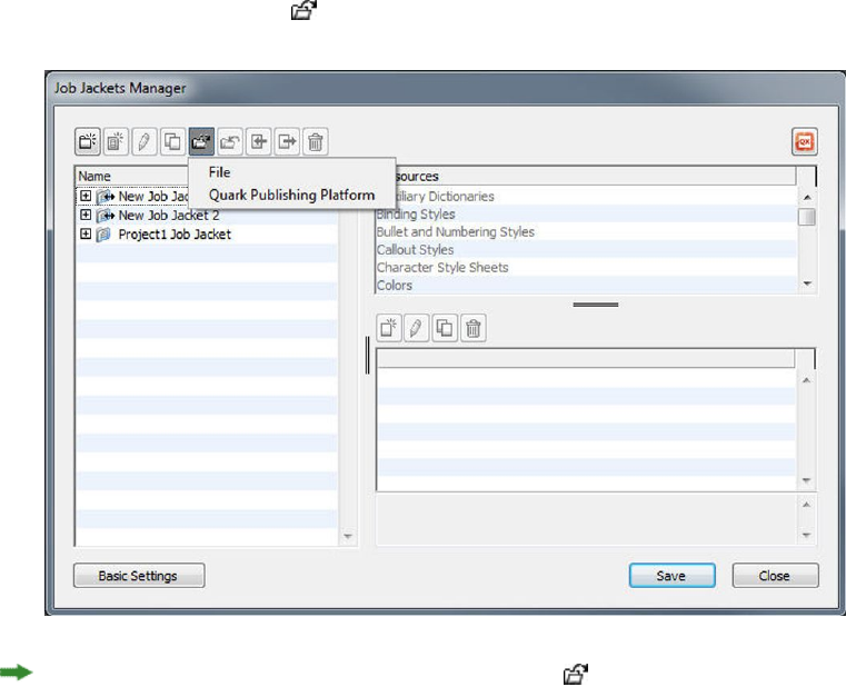
•If the user has defined a hyphenation exception resource item as the Default, the
synchronization feature works even when there is no layout item defined in the
Job Ticket.
•Synchronization does not work if any change related to hyphenation exceptions
resource item is made in the Job Jacket that is already linked with a project. In
order to get the changes reflected, user must relink the project with the same Job
Jacket.
•The synchronization feature works for all the languages.
Integrating with Quark Publishing Platform
Tto integrate a Job Jacket with an external hyphenation exceptions file checked into
the Quark Publishing Platform server:
1Open the Job Jackets Manager dialog box (Utilities > Job Jackets Manager) and click
the open Job Jacket button . Select Quark Publishing Platform from the dropdown.
The dropdown menu under the open Job Jacket button is only displayed when
QuarkXPress is launched with the Quark Publishing Platform XTension. Select File to
open a local Job Jacket and Quark Publishing Platform to open a Job Jacket from the
server
2Browse for the desired collection.
158 | A GUIDE TO QUARKXPRESS 2016
TEXT AND TYPOGRAPHY
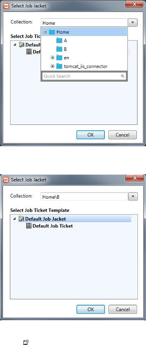
3Select the desired Job Jacket and click OK.
4Select Hyphenation Exceptions from the list of Resource types in the top-right list
and click to add a hyphenation exception file as a resource.
5Click the Source attribute and select Quark Publishing Platform from the dropdown
menu.
A GUIDE TO QUARKXPRESS 2016 | 159
TEXT AND TYPOGRAPHY
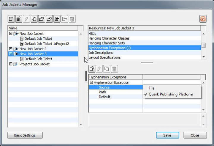
6Click the Browse button and select the desired hyphenation exceptions file and click
OK.
Synchronization of hyphenation exceptions files on Platform
If you have created a project from a Job Jacket, containing a hyphentation exception
reference, then any changes performed in the hyphenation exception file will get
reflected in the layout the next time the project is opened or re-linked to the job ticket.
If you add/delete/modify any hyphenation exception in the layout, when you save
the project the newly added hyphenation exceptions will be reflected in the
hyphenation exceptions file.
Synchronization behavior within the Quark Publishing Platform environment:
•Any change made in the external hyphenation exceptions file which is checked
in to server, will be reflected in the project's layout the next time the project is
opened or checked out.
•Any change made in the hyphenation exceptions from the QuarkXPress end will
be reflected in the referenced external hyphenation exceptions file whenthe user
performs a Save or Check In of the project. A new revision (major) of the referenced
hyphenation exception asset will be silently created on the server.
Using discretionary hyphens
In addition to hyphenating text automatically, you can control line breaks and text
flow by inserting manual, or discretionary, hyphens (Command+- [hyphen]/Ctrl+-
[hyphen]). A discretionary hyphen is inserted only when a word is broken at the end
of a line.
160 | A GUIDE TO QUARKXPRESS 2016
TEXT AND TYPOGRAPHY
Controlling tracking
Tracking lets you adjust the space between selected characters and words for copyfitting
and typographic effects. Tracking values are expressed as 1/200 of an em space. A
positive tracking value increases the space to the right of each character; a negative
value decreases it.
Tracking is commonly used for copyfitting. However, too much tracking can interfere
with design and readability. When you are using tracking for copyfitting, consider
these guidelines:
•Track whole paragraphs rather than one line or one word.
•Establish guidelines for tracking (for example from +3 to –3).
•Make sure vertically adjacent paragraphs have similar tracking applied.
These are general rules; appropriate tracking values depend on the design, font, column
width, and other factors.
Tracking manually
To apply tracking to selected text, do one of the following things:
•(Windows only) : Choose Style > Track, enter a value in the Track Amount field,
and then click OK.
•Use the Track Amount controls in the Measurements palette.
•Use one of the keyboard commands below.
Mac OS X
•Decrease 1/20-em: Command+Shift+{
•Increase 1/20-em: Command+Shift+}
•Decrease 1/200-em: Command+Option+Shift+{
•Increase 1/200-em: Command+Option+Shift+}
Windows
•Decrease 1/20-em: Ctrl+Shift+{
•Increase 1/20-em: Ctrl+Shift+}
•Decrease 1/200-em: Ctrl+Alt+Shift+{
•Increase 1/200-em: Ctrl+Alt+Shift+}
Editing tracking tables
The application uses tracking information that is built into the font (the font's tracking
table). You can't change a font's tracking table, but you can create a custom tracking
table for any font by using the Tracking Edit dialog box (Utilities menu).
A GUIDE TO QUARKXPRESS 2016 | 161
TEXT AND TYPOGRAPHY

Sending
Sending lets you fix the distance between the left edges of successive character
bounding boxes in horizontal text, or the top edges of successive character bounding
boxes in vertical text. You can apply sending by selecting text and entering an explicit
measurement (such as 2mm or 8q) in the Track Amount field in the Home/Classic
or Character/Character Attributes tab of the Measurements palette. Alternatively
on Windows, you can choose Style > Track/Sending and enter an explicit measurement
(such as 2mm or 8q) in the Track Amount field of the Character Attributes dialog
box.
If you enter a number in a Track Amount field but do not specify a measurement
system, tracking is applied instead of sending. To apply sending, specify a measurement
unit.
You can apply sending to characters that do not have Chinese, Japanese, and Korean
language applied to them. Simply check the Apply Sending to Non-CJK Characters
box in the Character Attributes dialog box (Edit > Character) (Windows only), or
in the Character tab of the Measurements palette (Mac OS X only).
Working with style sheets
A style sheet is a group of paragraph attributes, character attributes, or both that can
be applied to selected paragraphs and characters in one step. Use style sheets to change
unformatted text into styles such as headlines, subheadings, captions, or body copy.
Using style sheets to apply a number of character and paragraph attributes at one time
reduces layout time and helps maintain typographic consistency.
Creating and editing paragraph style sheets
A paragraph style sheet is a named package of paragraph and character attributes. You
can apply all of a paragraph style sheet's formatting attributes to text by simply applying
the style sheet to the text. To create, edit, duplicate, or delete paragraph style sheets,
use the Style Sheets dialog box (Edit > Style Sheets).
162 | A GUIDE TO QUARKXPRESS 2016
TEXT AND TYPOGRAPHY
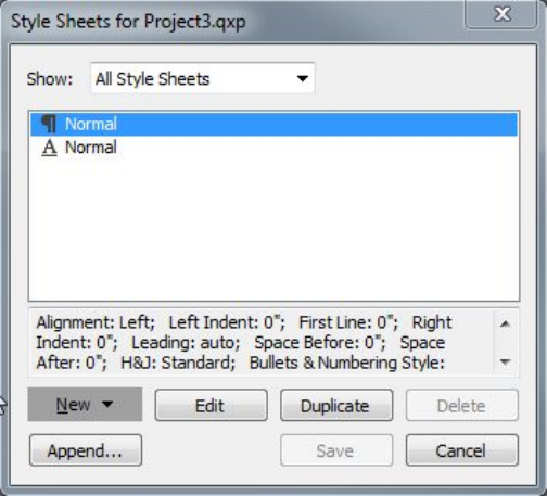
Use the Style Sheets dialog box to create, edit, and delete style sheets.
To create a paragraph style sheet, choose Paragraph from the New drop-down button.
The Edit Paragraph Style Sheet dialog box displays. Use the controls in this dialog
box to configure the attributes of the style sheet.
A GUIDE TO QUARKXPRESS 2016 | 163
TEXT AND TYPOGRAPHY
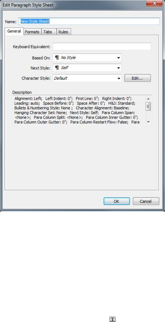
Use the Edit Paragraph Style Sheet dialog box to configure a paragraph style sheet.
First, configure the controls in the General tab:
•Name: Enter a name in this field, or the application will use a default "New Style
Sheet" name.
•Keyboard Equivalent: To define a keyboard command for the style sheet, enter
one in the Keyboard Equivalent field. You can enter any combination of
Command, Option, Shift, or Control/Ctrl or Ctrl+Alt, along with a function or
keypad key.
•If you define a keyboard equivalent for a style sheet with a key sequence that also
defines an existing command, the style sheet command will override the existing
command when the Text Content tool is selected and a text box is active.
•Based on: To base the attributes of a new style sheet on an existing one, click the
Based on drop-down menu and choose a style sheet from the list. Note that if
you use the Based on drop-down menu in the Edit Paragraph Style Sheet dialog
box to base a style sheet on an existing one, changes you make to the original
style sheet are automatically applied to those based on it.
•Next Style: To select a transition from one paragraph style sheet to another after
entering a carriage return, choose a paragraph style sheet from the Next Style
drop-down menu.
164 | A GUIDE TO QUARKXPRESS 2016
TEXT AND TYPOGRAPHY

•Style: To associate a character style sheet with the paragraph style sheet, choose
an option from the Style drop-down menu in the Character Attributes area. To
create a character style sheet, see "Creating and editing character style sheets."
Next, use the Formats, Tabs, and Rules tabs to specify additional attributes for your
paragraph style sheet. When you're done, click OK to return to the Style Sheets dialog
box, then click Save to save the style sheet. After you save a paragraph style sheet, it
is listed in the Paragraph Style Sheet submenu (Style menu) and also in the Style
Sheets palette.
When you create a style sheet with no projects open, that style sheet becomes part of
the default style sheet list and is included in all subsequently created projects. When
you create a style sheet with an project open, that style sheet is included only in the
active project's style sheet list.
To create a paragraph style sheet based on formatted text, first place the text insertion
point within a paragraph that uses the format attributes that you want in your
paragraph style sheet. Choose Edit > Style Sheets to display the Style Sheets dialog
box. Choose New > Paragraph and enter a name in the Name field. Click Save. Then
apply the new style sheet to the paragraph. When you check the preference "Apply
Style Sheet after creation" the style sheet gets automatically applied to the paragraph
you have currently selected.
Updating paragraph style sheets
When you place the cursor in a paragraph that has uniform local formatting applied,
you can update the style sheet applied to that text to include the local formatting by
clicking the Update button . Alternatively, you can choose Style > Update Style
Sheet > Paragraph.
To update both the paragraph style sheet and the character style sheet applied to text
so that they reflect local formatting, choose Style > Update Style Sheet > Both.
Creating and editing character style sheets
A character style sheet is a named package of character attributes. You can apply all
of a character style sheet's formatting attributes to text by simply applying the style
sheet to the text. To create, edit, or delete character style sheets, use the Style Sheets
dialog box (Edit > Style Sheets).
To create a character style sheet, choose Character from the New drop-down button.
The Edit Character Style Sheet dialog box displays. Use the controls in this dialog
box to configure the attributes of the style sheet.
A GUIDE TO QUARKXPRESS 2016 | 165
TEXT AND TYPOGRAPHY
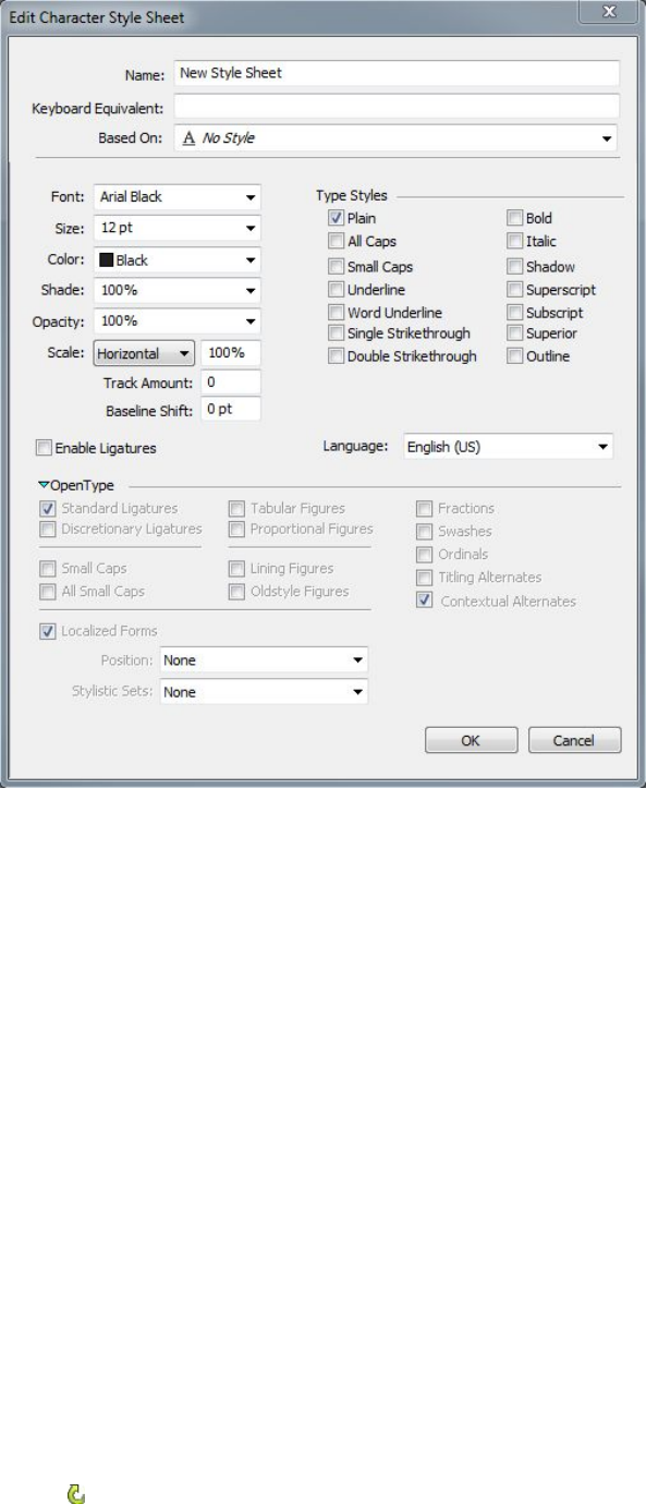
Use the Edit Character Style Sheet dialog box to configure a character style sheet.
First, configure the controls in the General tab:
•Name: Enter a name in this field, or the application will use the default "New
Style Sheet" name.
•Keyboard Equivalent: To define a keyboard command for the style sheet, enter
one in the Keyboard Equivalent field. You can enter any combination of
Command, Option, Shift, or Control/Ctrl or Ctrl+Alt, along with a function or
keypad key.
•Based On: To base the attributes of a new style sheet on an existing one, choose
a style sheet from the Based On drop-down menu.
Next, choose character attributes from the lower section of the Edit Character Style
Sheet dialog box. When you're done, click OK to return to the Style Sheets dialog
box, then click Save to save the style sheet. After you save a character style sheet, it is
listed in the Character Style Sheet submenu (Style menu) and also in the Style Sheets
palette.
Updating character style sheets
When you select text that has uniform local formatting applied, you can update the
style sheet applied to that text to include the local formatting by clicking the Update
button . Alternatively, you can choose Style > Update Style Sheet > Character.
166 | A GUIDE TO QUARKXPRESS 2016
TEXT AND TYPOGRAPHY
To update both the paragraph style sheet and the character style sheet applied to text
so that they reflect local formatting, choose Style > Update Style Sheet > Both.
Applying style sheets
To apply a style sheet to selected text, do one of the following things:
•Choose the style sheet name from the Style > Paragraph Style Sheet submenu
or the Style > Character Style Sheet submenu.
•Display the Style Sheets palette (Window menu) and then click the style sheet
name in the palette.
•Use the keyboard command (if any) displayed next to the style sheet name in the
Style Sheets palette.
In addition, the Style Sheets palette menu and the context menu for style sheets
provide the following options:
•Apply Style Sheet & Retain Local Type Styles: Applies the selected style sheet,
leaving only local type styles (such as bold and italic) intact.
•Apply Style Sheet & Retain Local Type Styles & OpenType Styles: Applies the
selected style sheet, leaving both local type styles (such as bold and italic) and
OpenType type styles intact.
•Apply Style Sheet & Remove Local Formatting: Applies the selected style sheet
and removes all local formatting. Equivalent to Option/Alt-clicking the style sheet
name.
•Apply Style Sheet & Remove Local Paragraph Formatting: Applies the selected
style sheet and removes only local paragraph formatting. All local character
formatting is left intact.
•Apply Style Sheet & Maintain Appearance: Applies the selected style sheet, plus
any local formatting necessary to maintain the paragraph's current appearance.
If you use one of the following commands, QuarkXPress applies the indicated paragraph
style sheet to the selected text, then if that style sheet has a specified Next Style, applies
that style to the following paragraph. This process continues until QuarkXPress
encounters a paragraph that does not have a specified Next Style. The options for this
feature are as follows:
•Apply Using Next Style: Applies style sheets using Next Style.
•Apply Using Next Style & Retain Local Type Styles: Applies style sheets using
Next Style, leaving local type styles (such as bold and italic) intact.
•Apply Using Next Style & Retain Local Type Styles & OpenType Style: Applies
style sheets using Next Style, leaving both local type styles (such as bold and italic)
and OpenType type styles intact.
•Apply Using Next Style & Remove Local Formatting: Applies style sheets using
Next Style, plus any local formatting necessary to maintain each paragraph's
current appearance.
A GUIDE TO QUARKXPRESS 2016 | 167
TEXT AND TYPOGRAPHY
When local paragraph or character attributes exist in selected text, a plus sign displays
next to the style sheet name in the Style Sheets palette. To remove local attributes,
click No Style and then reselect the style sheet, or Option+click/Alt+click the style
sheet name.
Appending style sheets
To import paragraph and character style sheets from a different article or project,
choose File > Append, navigate to the target article or project file, then display the
Style Sheets pane and import the style sheets you want.
If a style sheet from the source file has the same name as a style sheet in the target
project, but is defined differently, the Append Conflict dialog box displays. You can
use this dialog box to determine how such conflicts are handled.
Working with conditional styles
Conditional styles let you automatically apply formatting to text based on the content
of that text. For example, consider the text-formatting conventions shown in the
following image:
Text that can be formatted with conditional styles
The conventions used here could be described like so:
1Apply the Headline paragraph style sheet to the first paragraph.
2Apply the Bold Body character style sheet to the first sentence of the second paragraph.
3Apply the Body paragraph style sheet until you get to the end of the story.
4When you get to the end, turn around and apply the Byline character style sheet
backwards until you get to an em dash.
Each step is executed only after the previous step executes, and at the point in the text
where the previous step leaves off. If any step fails, the rest of the steps are not executed.
The Conditional Styles feature lets you capture such instructions and apply them
automatically to text. For example, you could implement the above conventions with
the following conditional style:
168 | A GUIDE TO QUARKXPRESS 2016
TEXT AND TYPOGRAPHY
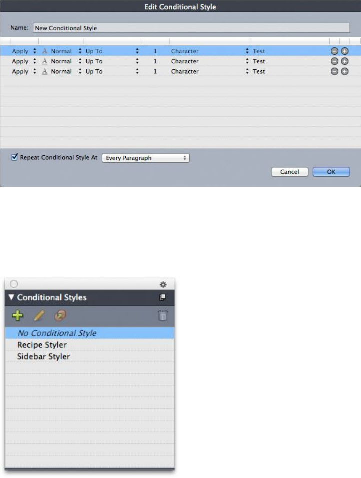
A conditional style that produces the above formatting
Once you've captured these rules in a conditional style, you can style a run of text by
simply selecting it and then clicking the conditional style's name in the Conditional
Styles palette.
Conditional Styles palette
It is important to understand that conditional styles are applied at the paragraph level.
Each paragraph can have only one conditional style applied to it. If a paragraph does
not have a conditional style applied to it, it cannot be reformatted by a conditional
style that is applied to a different paragraph.
It is also important to understand that when you apply a conditional style to a sequence
of paragraphs, that conditional style affects only that series of paragraphs. If a
conditional style is applied to a series of paragraphs at the beginning of a story and
to a series of paragraphs at the end of the same story, they cannot affect one another,
even if (for example) the series at the beginning of the story includes a rule with an
End of the Story reference.
A GUIDE TO QUARKXPRESS 2016 | 169
TEXT AND TYPOGRAPHY
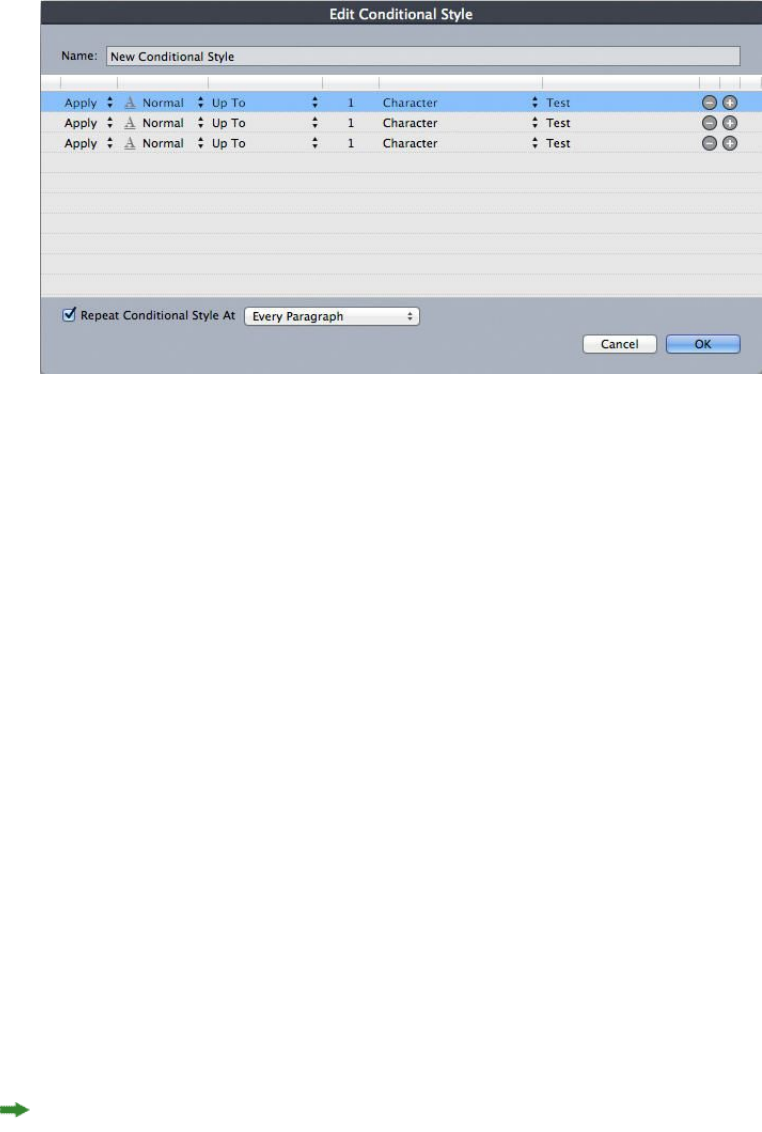
Creating a conditional style
To create a conditional style:
1Choose Edit > Conditional Styles. The Conditional Styles dialog box displays.
2Click New. The Edit Conditional Style dialog box displays.
Edit Conditional Style dialog box
3Enter a name for the conditional style in the Name field.
4To begin building a rule, choose an option in the first column:
•Apply: Use this option to apply formatting to text.
•Go: Use this option to move to a different point in the text. The rule after a Go
rule is applied beginning at the point where the Go rule stops.
The option you choose in the first column determines which options are available in
the other columns.
5If you chose Apply in the first column, choose the paragraph or character style sheet
you want to apply in the second column.
6Use the next three columns to indicate which text to style or jump over. Start with
the third column:
•Up To: Moves forward and stops immediately before the indicated point.
•Through: Moves forward and stops immediately after the indicated point.
•Backwards To: Moves backward and stops immediately before the indicated
point.
•Backwards Through: Moves backward and stops immediately after the indicated
point.
The option selected in the fifth column controls whether all of these options are
available in this column.
170 | A GUIDE TO QUARKXPRESS 2016
TEXT AND TYPOGRAPHY

7In the fourth column, indicate how many occurrences of the option in the fifth column
to apply to or through.
8In the fifth column, choose which entity to jump or format to or through:
•Cursor Position: Choose this option to apply a paragraph style sheet to the current
location without moving.
•Conditional Style Marker: Choose this option to jump or format to the next
conditional style marker. For more information, see "Conditional style markers."
•Character: Choose this option to target a particular character, then enter the
character in the next column. If you want to move to or through one of several
characters, enter all of them with no characters between them. For example, if
you enter "abc" here, the application will stop for "a", "b", or "c".
•Number: Choose this option to jump or format to or through the next occurrence
of a number.
•Text: Choose this option to target a particular chunk of text, then enter the target
text in the next column.
•Number of Characters: Choose this option to format a particular number of
characters.
•Number of Words: Choose this option to format a particular number of words.
•Beginning of the Sentence: Choose this option to format backwards to the
beginning of the current sentence.
•End of the Sentence: Choose this option to format through the end of the current
sentence.
•Beginning of the Paragraph: Choose this option to jump or format backwards
to the beginning of the current paragraph.
•End of the Paragraph: Choose this option to jump or format through the end
of the current paragraph.
•Next Paragraph: Choose this option to jump to or through the next paragraph.
•Last Paragraph: Choose this option to jump to or through the final paragraph.
•Number of Sentences: Choose this option to format a particular number of
sentences.
•End of the Story: Choose this option to jump or format through the end of the
story.
•Beginning of the Story: Choose this option to jump or format backwards to the
beginning of the story.
When you use text as part of a conditional style, you can also use special characters
(see "Special character codes")
9To add a rule, click the + button at the end of the first row. (To delete a rule, click the
- button.)
10 To make the rules repeat, check Repeat Conditional Style At and choose an option:
A GUIDE TO QUARKXPRESS 2016 | 171
TEXT AND TYPOGRAPHY
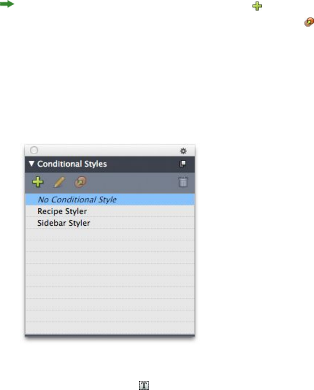
•Text: Choose this option to repeat when a particular chunk of text is found, then
enter the target text in the field.
•Character: Choose this option to repeat when a particular character is found,
then enter the character in the next column. If you want to repeat at each instance
of one of several characters, enter all of them with no characters between them.
For example, if you enter "abc" here, the application will repeat when "a", "b", or
"c" is encountered.
•Conditional Style Marker: Choose this option to repeat when a conditional style
marker is found.
•Every Paragraph: Choose this option to repeat at the beginning of every
paragraph.
11 Click OK.
You can also create a conditional style by clicking New in the Conditional Styles
palette. You can duplicate a conditional style by clicking Duplicate in the
Conditional Styles palette.
Applying a conditional style
To apply a conditional style:
1Display the Conditional Styles palette (Window menu).
Conditional Styles palette
2Select the Text Content tool and select the target paragraphs or place the text cursor
where you want the conditional styling to begin.
3Click the name of the conditional style in the Conditional Styles palette.
Note that once you have applied a conditional style to text, that text will continue to
be automatically formatted until you remove the conditional style. To remove a
conditional style from a paragraph, select the paragraph or place the text insertion
172 | A GUIDE TO QUARKXPRESS 2016
TEXT AND TYPOGRAPHY
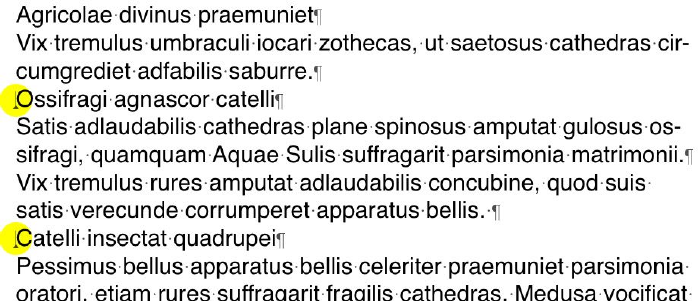
point in the paragraph, then click No Conditional Style in the Conditional Styles
palette.
Removing conditional styles
There are two ways to remove conditional styles from text to which they have been
applied:
•To remove the conditional styles from the selected paragraphs and revert the text
to its underlying paragraph style sheets, choose Revert to Base Style from the
Conditional Styles palette menu.
•To remove the conditional styles from the selected paragraphs and leave the
styling applied by the conditional styles in place, click No Conditional Style in
the Conditional Styles palette or choose Resolve Conditional Style from the
Conditional Styles palette menu.
Using conditional style markers
If there is no natural aspect of a text flow (such as a particular character or the end of
a sentence) where you can stop or start the application of a conditional style, you can
insert a zero-width character called a conditional style marker. For example, assume you
have a plain text file that contains a series of multi-paragraph articles, each with a
one-paragraph headline. You can still use conditional styles to format them, like so:
1Insert a conditional style marker at the beginning of each headline. To insert a
conditional style marker, choose Utilities > Insert Character > Special > Conditional
Style Marker.
Plain text with conditional style markers (highlighted in yellow)
2Create a conditional style that applies the Headline paragraph style sheet to the first
paragraph and the Body style sheet until the next occurrence of a conditional style
marker. At the bottom of the Edit Conditional Style dialog box, check Repeat
Conditional Style At and select Conditional Style Marker.
A GUIDE TO QUARKXPRESS 2016 | 173
TEXT AND TYPOGRAPHY
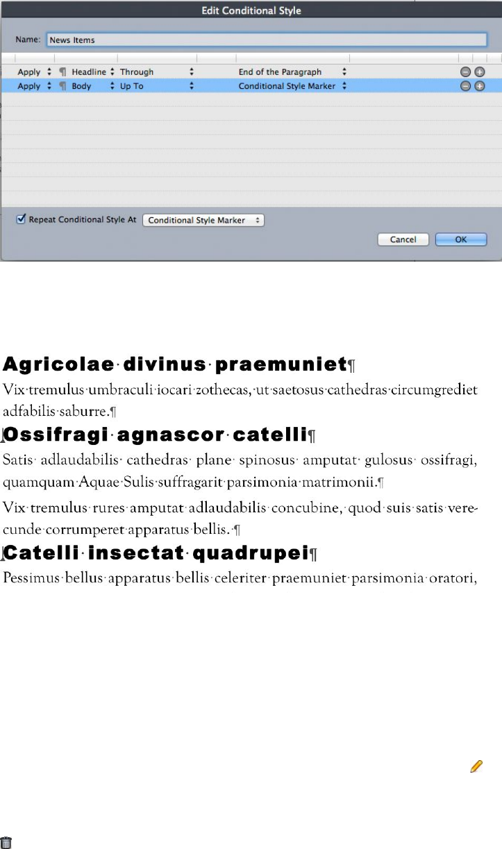
Conditional style that uses conditional style markers
3Apply the conditional style to the text. Each article is automatically formatted.
Text with conditional style applied
Editing a conditional style
There are two ways to edit a conditional style:
•Choose Edit > Conditional Styles, select the conditional style, and then click
Edit.
•Select the conditional style in the Conditional Styles palette and click Edit .
To delete a conditional style, use the Delete button in the Conditional Styles dialog
box or select the conditional style in the Conditional Styles palette and click Delete
.
Bullets and numbering
Rather than using manually created and formatted bullets and numbers, you can create
bulleted and numbered lists with bullet styles, numbering styles, and outline styles.
174 | A GUIDE TO QUARKXPRESS 2016
TEXT AND TYPOGRAPHY
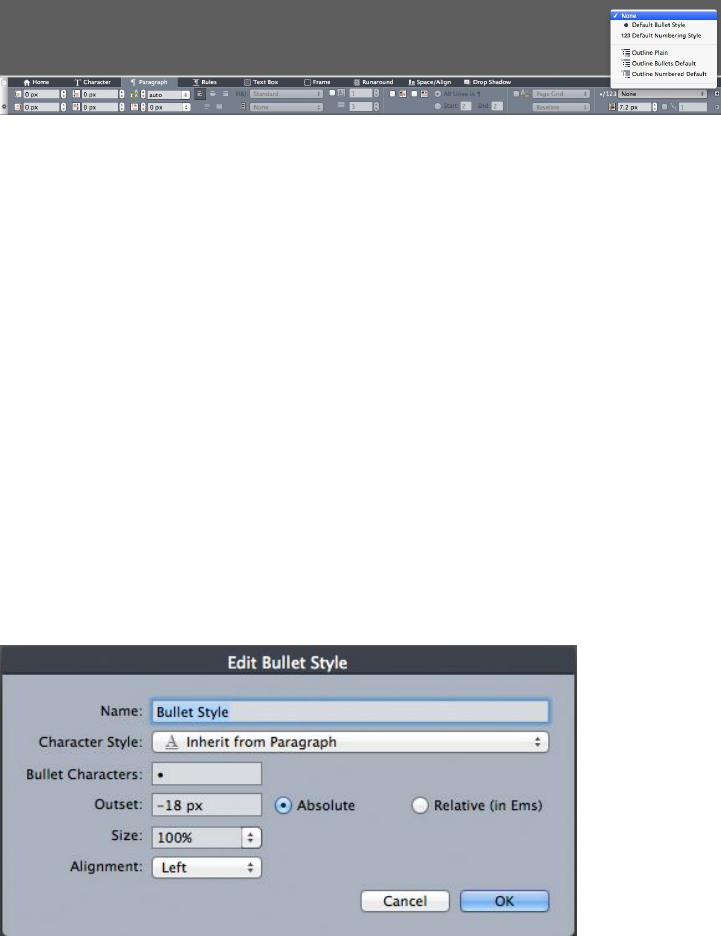
A bullet style describes how a bullet should look, how far it should be from the text,
and how it should be aligned.
A numbering style describes how a number should look, what format it should have,
how far it should be from the text, and how it should be aligned.
An outline style defines indents for up to nine indent levels. You can associate a bullet
or numbering style with each level. You can also choose whether to include the
numbers from previous levels, as you would in some types of outline.
To apply a bullet, numbering, or outline style, use the •/123 drop-down menu on the
right side of the Paragraph/Paragraph Attributes tab of the Measurements palette.
If you've applied an outline style, the Decrease Indent and Increase Indent buttons
let you increase and decrease a paragraph's indent level.
•/123 drop-down menu and indent buttons
In addition to the settings in bullet, numbering, and outline styles, there is a paragraph
attribute called Minimum Bullet/Number Distance from Text:
•(Windows) Style > Formats > Formats tab
•(Mac OS X) On the Paragraph tab of the Measurements palette
This value lets you handle situations where a left-aligned or center-aligned number is
pushing into the paragraph.
Working with bullet styles
A bullet style describes how a bullet should look, how far it should be from the text,
and how it should be aligned.
To create a bullet style, choose Edit > Bullet, Numbering, and Outline Styles, then
choose Bullet Style from the New button in the Bullet, Numbering, and Outline
Styles dialog box. The Edit Bullet Style dialog box displays.
Edit Bullet Style dialog box
A GUIDE TO QUARKXPRESS 2016 | 175
TEXT AND TYPOGRAPHY
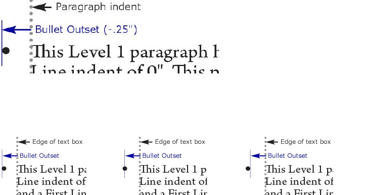
To control how the bullet is styled, choose an option from the Character Style
drop-down menu. Choose Inherit from Paragraph to use the paragraph's character
formatting for the bullet, or choose a character style sheet to use that character style
sheet's formatting.
Enter the actual bullet character or characters in the Bullet Characters field.
If you are inheriting the bullet's formatting from the paragraph, you can change the
size of the bullet character or characters using the Size field.
The Outset value controls how far the bullet is from the paragraph. You can specify
this distance in Absolute units, or click Relative (in Ems) and specify the value in em
spaces. The Relative (in Ems) option may be preferable when you will be using the
bullet style with different-sized text.
Bullet outset
Alignment controls how the bullet aligns to the outset point.
Left-aligned, center-aligned, and right-aligned bullets
You can apply a bullet style in three ways:
•By choosing the bullet style's name from the •/123 menu in the
Paragraph/Paragraph Attributes tab of the Measurements palette. If you do it
this way, the bullet is positioned to the left of the paragraph's first line indent by
its Outset value.
•By choosing an outline style that uses the bullet style from the •/123 menu in
the Paragraph/Paragraph Attributes tab of the Measurements palette. If you
do it this way, the bullet's position is controlled by the outline style. For more
information, see "Working with outline styles."
•Associate the bullet style with a paragraph style sheet, then apply that style sheet
to the text. For more information, see "Bullets, numbering, outlines, and style sheets."
Working with numbering styles
A numbering style describes how a number should look, what format it should have,
how far it should be from the text, and how it should be aligned.
To create a numbering style, choose Edit > Bullet, Numbering, and Outline Styles,
then choose Numbering Style from the New button in the Bullet, Numbering, and
Outline Styles dialog box. The Edit Numbering Style dialog box displays.
176 | A GUIDE TO QUARKXPRESS 2016
TEXT AND TYPOGRAPHY
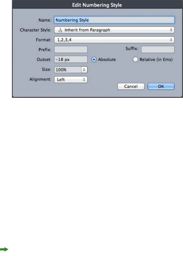
Edit Numbering Style dialog box
To control how the numbers are styled, choose an option from the Character Style
drop-down menu. Choose Inherit from Paragraph to use the paragraph's character
formatting for the numbers, or choose a character style sheet to use that character
style sheet's formatting.
Choose a number format from the Format drop-down menu.
If you want prefix or suffix characters around the number, enter them in the Prefix
and Suffix fields.
If you are inheriting the numbers' formatting from the paragraph, you can change the
size of the numbers using the Size field.
The Outset value controls how far each number is from the paragraph. You can specify
this distance in Absolute units, or click Relative (in Ems) and specify the value in em
spaces. The Relative (in Ems) option may be preferable when you will be using the
numbering style with different-sized text.
Numbering alignment and offset works the same way bullet alignment and offset
works. For more information, see "Working with bullet styles."
You can apply a numbering style in three ways:
•Choose the numbering style's name from the •/123 menu in the
Paragraph/Paragraph Attributes tab of the Measurements palette. If you do it
this way, the numbers are positioned to the left of the paragraph's first line indent
by its Outset value.
•Choose an outline style that uses the numbering style from the •/123 menu in
the Paragraph/Paragraph Attributes tab of the Measurements palette. If you
do it this way, the numbers' positions are controlled by the outline style. For more
information, see "Working with outline styles."
•Associate the numbering style with a paragraph style sheet, then apply that style
sheet to the text. For more information, see "Bullets, numbering, outlines, and style
sheets."
To change the starting number of a paragraph:
A GUIDE TO QUARKXPRESS 2016 | 177
TEXT AND TYPOGRAPHY
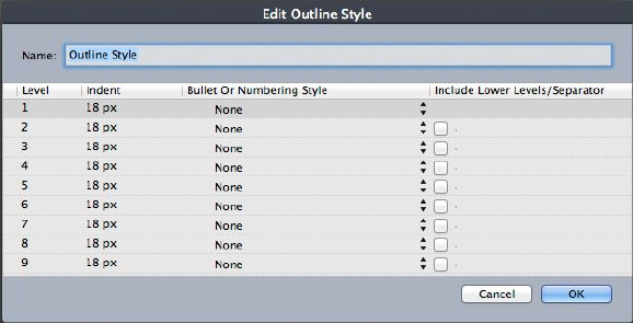
•(Windows only): Choose Style > Formats, check Restart Numbering, and enter a
starting number in the Start At field.
•(Mac OS X only): Use the Bullets and Numbers tab of the Measurements palette.
Working with outline styles
An outline style defines indents for up to nine indent levels. You can associate a bullet
or numbering style with each level. You can also choose whether to include the
numbers from previous levels, as you would in some types of outline.
To create an outline style, choose Edit > Bullet, Numbering, and Outline Styles, then
choose Outline Style from the New button in the Bullet, Numbering, and Outline
Styles dialog box. The Edit Outline Style dialog box displays.
Edit Outline Style dialog box
Each outline style has nine levels, although you do not have to use all nine. Each level
has an indent, which you can specify in the Indent field for that level. Indents are
applied cumulatively; if level 1 has a 6 pt indent and level 2 has a 6 pt indent, a
paragraph at level 2 is indented by 12 pt.
Outline style indents are applied on top of paragraph indents. If a paragraph has a left
indent of 12 pt, and the indent for an outline style's first level is 6 pt, a paragraph at
level 1 would visually be indented by 18 pt.
Each level can have a bullet or numbering style, or neither. To assign a bullet or
numbering style to a level, choose an option in the Bullet or Numbering Style column
for that level.
178 | A GUIDE TO QUARKXPRESS 2016
TEXT AND TYPOGRAPHY
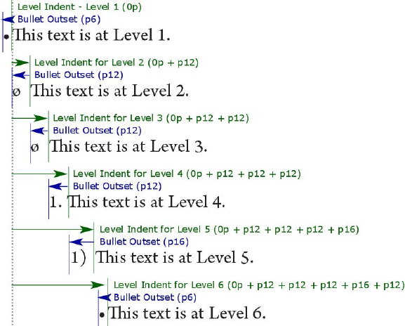
This diagram illustrates the relationship between level indents and bullet outsets. Numbering
outsets work the same way.
The Include Lower Levels/Separator column lets you choose to append the numbers
from lower levels to the beginning of a number, and to specify how the numbers from
the various levels are separated. For example, if you check this box for level 3 and
specify a period as the separator, the numbering for level-3 text might look like this:
1.3.1 This paragraph is at level 3.
1.3.2 This paragraph is at level 3.
1.3.3 This paragraph is at level 3.
To change the character inserted between levels for a given level, double-click to the
right of the Include Lower Levels/Separator check box and enter a new character or
characters.
When you include numbers from lower levels and use left or center number alignment,
there is a chance the numbers can extend to be longer than the number outset and
potentially overlap the text. To address this possibility:
•(Windows only): There is a paragraph attribute called Minimum Bullet/Number
Distance from Text (Style > Formats > Formats tab). If a number's length becomes
longer than the number outset, the application moves the paragraph text to the
right so that there is always this much distance between the number and the text.
•(Mac OS X only):The Minimum Bullet/Number Distance from Textparagraph
attribute can be found on the Paragraph tab of the Measurements palette.
A GUIDE TO QUARKXPRESS 2016 | 179
TEXT AND TYPOGRAPHY
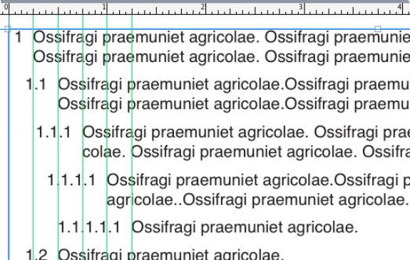
How the Minimum Bullet/Number Distance from Text value is applied
There are two ways to apply an outline style to text:
•Choose the outline style's name from the •/123 menu in the Paragraph/Paragraph
Attributes tab of the Measurements palette.
•Associate the outline style with a paragraph style sheet, then apply that style sheet
to the text. For more information, see "Bullets, numbering, outlines, and style sheets."
Bullets, numbering, outlines, and style sheets
To associate a bullet, numbering, or outline style with a paragraph style sheet:
1Display the Formats tab of the Edit Paragraph Style Sheet dialog box (Edit > Style
Sheets > New or Edit).
2Choose a bullet, numbering, or outline style from the •/123 drop-down menu.
180 | A GUIDE TO QUARKXPRESS 2016
TEXT AND TYPOGRAPHY
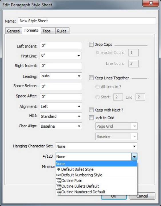
Associating a bullet, numbering, or outline style with a paragraph style sheet
When you apply this style sheet to a paragraph, the bullet, numbering, or
outline style will also be applied.
Positioning text in text boxes
The topics below cover several ways to control the vertical and horizontal positioning
of text in text boxes.
Using baseline grid
QuarkXPress versions 7.0 and earlier included a feature called Baseline Grid. The
baseline grid was an evenly spaced series of invisible horizontal lines running from
the top to the bottom of each page. Locking paragraphs to the baseline grid let you
align baselines from column to column and from box to box, across a page and across
spreads.
Since QuarkXPress 8.0, the Baseline Grid feature has been replaced by the Design Grid
feature. For more information, see "Working with design grids."
Aligning text vertically
There are four options for positioning lines of text vertically within text boxes:
A GUIDE TO QUARKXPRESS 2016 | 181
TEXT AND TYPOGRAPHY

•Top: In top-aligned text boxes, lines of text are positioned in the box with the
top of the first line positioned as specified in the First Baseline area.
•Centered: In center-aligned text boxes, lines of text are centered between the
First Baseline's ascent and the bottom of the text box.
•Bottom: In bottom-aligned text boxes, lines of text are positioned with the last
line flush with the bottom of the box.
•Justified: In justified text boxes, lines of text are positioned in the box with the
first line positioned as specified in the First Baseline area, the last line flush with
text inset at the bottom of the box, and the remaining lines justified between.
When vertically justifying text, you can specify the maximum vertical distance
between paragraphs.
To use these options:
•(Windows only) Choose an option from the Type drop-down menu (Item >
Modify > Text tab > Vertical Alignment area.
•(Mac OS X only)Choose an option from the Text Box tab of the Measurements
palette.
The Inter ¶ Max field (available only when Justified is selected in the Type drop-down
menu) lets you specify the amount of space that can be inserted between vertically
justified paragraphs.
The Centered, Bottom, and Justified alignment options are intended only for
rectangular text areas, and can be disrupted by obstructing items.
Specifying text inset
Text inset lets you specify the distance that characters are inset from the inside edge
of a text box. To specify the text inset for an active text box, use the text inset controls:
•(Windows only) (Item > Modify > Text tab > Text Inset area)
•(Mac OS X only) Use the Text Box tab of the Measurement palette.
To specify the same inset for all four sides, leave Multiple Insets unchecked and then
enter a number in the All Edges field. To specify different insets for the four sides,
check Multiple Insets and then enter numbers in the Top, Left, Bottom, and Right
fields.
Specifying story direction
You can position text so that it runs left-to-right and top-to-bottom or top-to-bottom
and right-to-left. To specify a story direction, choose Style > Story Direction, and
then choose Horizontal or Vertical.
182 | A GUIDE TO QUARKXPRESS 2016
TEXT AND TYPOGRAPHY
Controlling font usage
To view and replace fonts, display the Fonts pane of the Usage dialog box (Utilities
menu). This pane lists all fonts used in the active project. To replace every occurrence
of a font, select the font name, click Replace, and choose a replacement font.
If a font is listed in the Fonts tab (Utilities > Usage) as [Name of Font] preceded by
a negative number, the system you are using does not have that font installed. When
this occurs, you can install the necessary font and reopen the document, or you can
use the Usage command to locate occurrences of the font and apply a different font.
Converting text to boxes
To convert the selected character or characters into a Bézier box, choose an option
from the Item > Text to Box submenu.
To convert selected text to unanchored Bézier boxes, choose Item > Convert Text to
Boxes > Unanchored.
To convert selected text to anchored Bézier boxes, choose Item > Convert Text to
Boxes > Anchored.
To convert the entire contents of a text box or multiple text boxes to unanchored
Bézier boxes, choose Item > Convert Text to Boxes > Convert Entire Box.
For more information, see "Understanding Bézier shapes" and "Using anchored boxes."
In versions 8 and later of QuarkXPress, you can convert more than one line of text at
a time to boxes.
Using text runaround
The text runaround feature lets you control the way text runs behind, around, or
within items and pictures. You can specify text to run around the actual item, or you
can create custom runaround paths and then manually modify them.
Runaround is a great way to make a page visually distinctive.
A GUIDE TO QUARKXPRESS 2016 | 183
TEXT AND TYPOGRAPHY
Running text around all sides of an item
To run text around all sides of an item, select a text box with either the Text Content
tool or the Item tool , and then:
•(Windows only): Display the Text tab of the Modify dialog box (Item menu), and
then check Run Text Around All Sides
•(Mac OS X only): Use the Text Box tab of the Measurements palette.
The Run Text Around All Sides preference is set by default.
Whether text runs around three sides or all sides of an item is determined by the text
box, and not by the items that obstruct the text. This is the only runaround control
that acts on the text box itself. All other runaround controls act on the item(s) placed
in front of the text box.
Running text around lines and text paths
To apply text runaround to a line or text path in front of a text box, select the line or
text path, on Windows, choose Item > Runaround, or on Mac OS X use the Runaround
tab on the Measurements palette, and then choose an option from the Type drop-down
menu:
•Choose None to run text behind the line or text path.
•Choose Item to run text around the line or text path. You can specify the distance
text maintains from the top, bottom, left, and right edges of the selected item. If
the selected item is a text path, other text will only run around the path, not the
text on the path.
•Choose Manual to create an editable runaround path. You can specify a new
path's distance from text, and then you can modify that path on Windows by
choosing Item > Edit > Runaround and on Mac OS X by choosing the appropriate
field from the Runaround tab of the Measurements palette. For information
about modifying a runaround path, see "Fine-tuning a runaround path" and "Editing
a runaround path."
Running text around text boxes
To apply text runaround to a text box in front of another text box, select the front
text box, and then:
•(Windows only): Choose Item > Runaround, and then choose an option from the
Type drop-down menu:
•Choose None to run text behind an active text box.
•Choose Item to run text around an active text box. If the text box is
rectangular, enter values in the Top, Left, Bottom, and Right fields to outset
or inset the runaround area. If the text box is not rectangular, a single Outset
field is provided.
•(Mac OS X only): User the Runaround tab of the Measurements palette.
184 | A GUIDE TO QUARKXPRESS 2016
TEXT AND TYPOGRAPHY

Running text around pictures
Image editing applications can embed paths and alpha channels in an image. A path
is a smooth Bézier shape, whereas an alpha channel is usually a grayscale image. Both
paths and alpha channels are typically used to determine which parts of an image
should be shown and which parts should be hidden or transparent.
If you import a picture that has an embedded path or alpha channel, you can use that
path or alpha channel to control the way text runs around that picture. More
specifically: The application can scan a path or channels and create a text runaround
path based on the information.
To apply text runaround to a picture box in front of a text box, select the picture box,
on Windows choose Item > Runaround, and then choose an option from the Type
drop-down menu. On Mac OS X use the Runaround tab of the Measurements palette:
•Choose None to run text behind the active picture component.
•Choose Item to run text around the picture component's boundaries. If the picture
component is rectangular, enter values in the Top, Left, Bottom, and Right fields
to outset or inset the runaround area. If the picture component is not rectangular,
a single Outset field is provided.
•Choose Auto Image to create a Bézier clipping and runaround path based on the
picture's non-white areas.
•Choose Embedded Path to run text around a path embedded in an image by an
image-editing application.
•Choose Alpha Channel to run text around an alpha channel embedded in an
image by an image-editing application.
•Choose Non-White Areas to create a runaround path based on the picture's
subject. Depending on the value in the Threshold field, the runaround path will
outline a dark figure within a larger white or near-white background (or vice
versa).
•Choose Same As Clipping to set the text runaround path to the clipping path
selected in the Clipping tab.
•Choose Picture Bounds to run text around the rectangular "canvas area" of the
imported picture file. This includes any white background areas saved with your
original picture file. Enter values in the Top, Left, Bottom, and Right fields to
determine the outset or inset of the text from the picture's boundaries.
The inner path in the Preview area represents the runaround path, and the outer
outline represents the picture box.
A GUIDE TO QUARKXPRESS 2016 | 185
TEXT AND TYPOGRAPHY
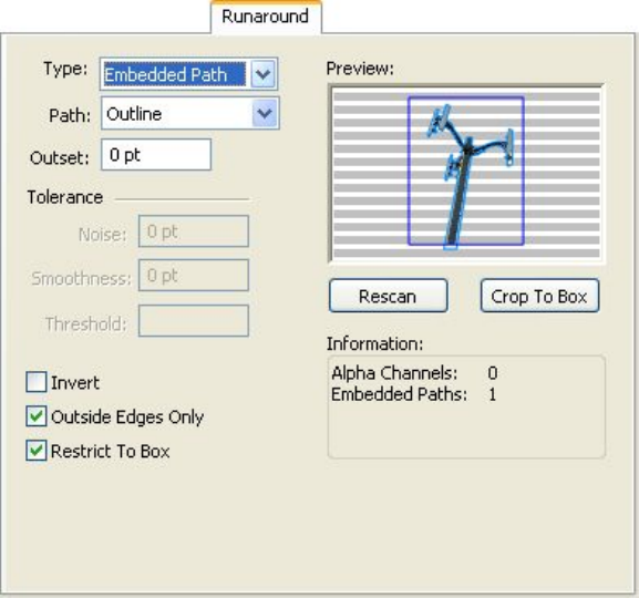
Runaround tab of Picture dialog box, showing runaround preview
(Mac OS X only): To apply text runaround to a picture box in front of a text box, select
the picture box, use the Runaround tab of the Measurements palette.
Fine-tuning a runaround path
When you choose Auto Image, Embedded Path, Alpha Channel, Non-White Areas,
or Same As Clipping from the Type drop-down menu (Item > Runaround) (Windows),
or the Runaround tab of the Measurements palette (Mac OS X), the following fields
let you manipulate the runaround path:
1Outset changes the size of the runaround path. Positive values result in a runaround
path that is further from the original setting, negative values decrease the amount of
image included in the runaround path.
2Noise lets you specify the smallest allowable closed path. Any closed path smaller than
the noise value is ignored. Noise values are useful for cleaning up runaround paths
and making them easier to output.
3Smoothness lets you control path accuracy. A lower value creates a more complex
path with a greater number of points. A higher value creates a less accurate path.
4Threshold determines how "white" is defined. All pixels defined as "white" are excluded.
For example, if the Threshold value is 20%, and a pixel's gray value is below or at
20%, the pixel will be considered "white" and excluded from the runaround path.
Editing a runaround path
To adjust a runaround path, check Runaround (Item > Edit). The runaround path
displays as a magenta outline. You can then edit the path as you would any Bézier
object.
186 | A GUIDE TO QUARKXPRESS 2016
TEXT AND TYPOGRAPHY
You can also change the types of the runaround path's points and segments with the
controls in the Measurements palette. To change a point from one type to another,
use one of the following three buttons:
•Symmetrical Point : A symmetrical point connects two curved lines to form
a continuous curve. The result is similar to a smooth point, but the curve handles
always rest on a straight line through the point and are always equidistant from
the point.
•Smooth Point : A smooth point connects two curved lines to form a
continuous curve. The curve handles always rest on a straight line through the
point, but they can be distanced independently.
•Corner Point : A corner point connects two straight lines, a straight line and
a curved line, or two noncontinuous curved lines. With curved lines, the corner
point's curve handles can be manipulated independently, usually to form a sharp
transition between the two segments.
To change the character of a line segment, use one of the following buttons:
•Straight Segment : Makes the active segment straight.
•Curved Segment : Makes the active segment curved.
You can also change point and segment types with the Style > Point/Segment Type
submenu.
Working with text paths
A text path is a line that you can add text to. You can manipulate the way text rides
the path, the attributes of the text (such as font, color, and size), and the shape and
style attributes of the path.
To add text to a line or path, select the Text Content tool and double-click the line
or path.
To control the way text rides the selected text path:
•(Windows only) Display the Text Path tab of the Modify dialog box (Item menu),
and then click a button in the Text Orientation area to choose how the text
should ride the path. You can also choose an option from the Align Text
drop-down menu to determine which part of a font is used to position characters
on the path
•(Mac OS X only) Use the Text Box tab of the Measurements palette .
A GUIDE TO QUARKXPRESS 2016 | 187
TEXT AND TYPOGRAPHY
Creating drop caps
Drop caps are initial caps that hang two or more lines below the first line of a paragraph.
The automatic Drop Caps feature enlarges the drop cap characters and runs the
paragraph around the drop caps automatically. The typeface and styles match the rest
of the paragraph.
To apply drop caps to a selected paragraph, display the Formats tab of the Paragraph
Attributes dialog box (Windows) or the Paragraph/Paragraph Attributes tab of the
Measurements palette, and check Drop Caps. To specify how many characters to use
as drop caps, enter a value from 1 to 127 in the Character Count field. To specify the
number of lines the characters are dropped, enter a value from 2 to 16 in the Line
Count field.
Drop caps are a great way to make text visually distinctive.
Drop caps are measured by percentage rather than by points. When you select a drop
cap, the default size is 100%.
Creating rules above and below paragraphs
Rules are frequently used above or below text to set off paragraphs, to indicate related
information, or just to add a graphic flair to page design. To create rules, use the Rules
tab of the Paragraph Attributes dialog box (Style menu) (Windows), or the Rules tab
of the Measurements palette (Mac OS X).
Using anchored boxes
You can paste boxes and lines of any shape in text, which makes them act like
characters and flow with text. This is especially helpful when text reflows, because
anchored items reflow like other characters in the text. If items are not anchored and
text reflows, they become displaced, and can end up overlapping text.
Anchored objects (boxes, lines and tables) can be nested as deep as you like with no
limit.
Anchoring boxes and lines in text
When you anchor an item, it behaves like a character flowing in text. To anchor an
item:
1Select the Item tool , then select the item you want to anchor.
188 | A GUIDE TO QUARKXPRESS 2016
TEXT AND TYPOGRAPHY
2Choose Edit > Cut or Edit > Copy.
3Select the Text Content tool and place the Text Insertion bar where you want to
anchor the item.
4Choose Edit > Paste to anchor the item at the text insertion point.
Cutting, copying, pasting, and deleting anchored boxes and lines
To cut or copy an anchored item, select the item as you would any text character and
choose Edit > Cut or Edit > Copy. To paste the anchored item elsewhere, place the
Text Insertion bar in a different location and choose Edit > Paste. To delete an anchored
item, select the item or insert the Text Insertion bar after it, and press Delete/Backspace.
Unanchoring boxes and lines
To unanchor an item, select it with the Item tool and choose Item > Duplicate to
create an unanchored copy of the item — the duplicated item will be placed on the
page according to the settings in the Super Step & Repeat dialog box (Item menu).
Then delete the anchored item from the text by selecting it with the Text Content
tool and pressing Delete/Backspace.
If you want to anchor objects that should remain outside the boundaries of a text box
or are wider than the text box you are trying to anchor it in, then use the Callout
functionality.
Working with OpenType fonts
OpenType is a cross-platform font format developed by Adobe and Microsoft that
accommodates large character sets and glyphs, often including fractions, discretionary
ligatures, old-style numerals, and more. When text has an OpenType font applied,
you can access any style options built into that font through the Character Attributes
dialog box (Style > Character) (Windows only), or the Character/Character Attributes
tab of the Measurements palette.
Learning about the distinction between characters and glyphs can help you understand
how OpenType styles work. A character is an element of a written language — uppercase
letters, lowercase letters, numerals, and punctuation are all characters. A glyph is
actually an image that represents a character, possibly in different forms. For example,
a standard numeral 1 is a character, whereas an old-style numeral 1 is a glyph. As
another example, an "f" and an "I" next to each other are characters, whereas an "fi"
ligature is a glyph.
A one-to-one relationship does not always exist between characters and glyphs. In
some cases, three characters (such as a 1, a virgule, and a 4) make up a single fraction
glyph. Or, one character may be represented by three possible glyphs (three different
ampersand symbols, for example). You can select individual characters for formatting
and editing, regardless of the glyphs used.
A GUIDE TO QUARKXPRESS 2016 | 189
TEXT AND TYPOGRAPHY
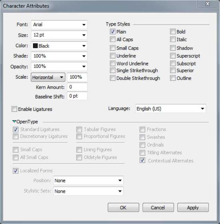
Applying OpenType styles
You can apply an OpenType "style" to characters to display different, specially designed,
or repositioned glyphs within the current font. For example, you can apply Fractions
to access specific fraction glyphs instead of manually formatting fractions by resizing
and repositioning existing characters. Likewise, applying Standard Ligatures represents
characters according to ligatures available in the font. (See "Using ligatures" for more
information.) You can apply many styles in combination, although some, such as
Superscript and Subscript, are mutually exclusive.
To apply OpenType styles in the Character Attributes dialog box (Style > Character)
(Windows only), or the Character/Character Attributes tab of the Measurements
palette, and the Edit Character Attributes panes (Edit > Style Sheets) for setting up
character and paragraph style sheets, click the arrow next to OpenType to display the
styles, and then use the check boxes to apply styles. A check box that is unavailable
or a drop-down menu option in brackets indicates an OpenType style that the current
font does not support.
190 | A GUIDE TO QUARKXPRESS 2016
TEXT AND TYPOGRAPHY
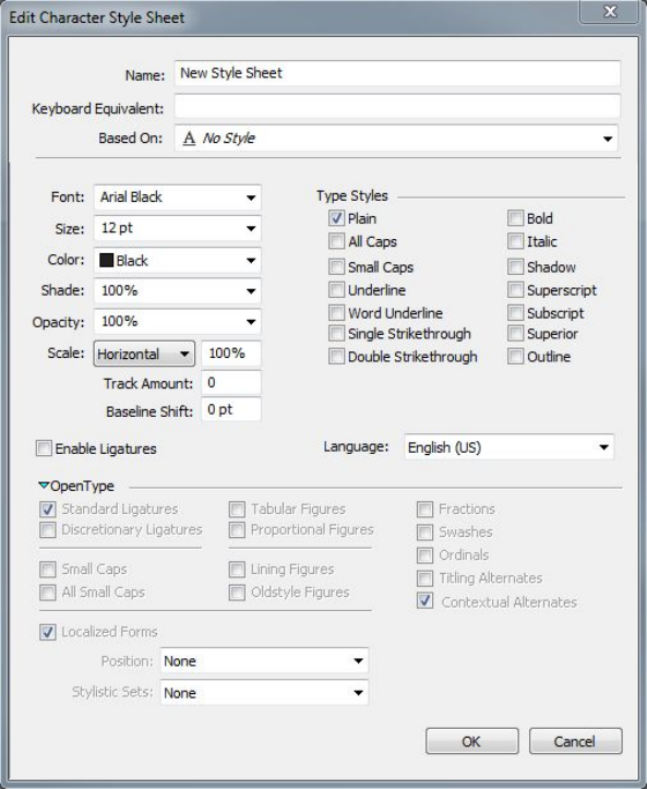
OpenType styles available in the Character Attributes dialog box
OpenType styles include the following:
•Standard Ligatures: Apply ligatures that are designed to enhance readability and
are in standard use.
•Discretionary Ligatures: Apply ligatures that are not in standard use. This feature
covers the ligatures that may be used for special effect at the user's preference.
•Tabular Figures: Apply equal widths to numbers.
•Proportional Figures: Apply unequal widths to numbers.
•Small Caps: Apply small capital letters to lowercase text.
•All Small Caps: Apply small capital letters to all upper case, title case and lower
case text.
•Lining Figures: Apply modern numeric styles that align better with text that is
in all capital letters.
•Oldstyle Figures: Apply numeric styles that are best suited for numbers that are
integrated into text.
•Italics: Apply italic glyphs.
•Fractions: Apply slashed fraction glyphs.
•Swashes: Apply calligraphic glyphs.
A GUIDE TO QUARKXPRESS 2016 | 191
TEXT AND TYPOGRAPHY

•Ordinals: Apply ordinal number glyphs.
•Titling Alternates: Apply capital letter glyphs designed for titles at larger point
sizes.
•Contextual Alternates: Apply alternate glyph variations based on contextual
juxtapositions of text.
•Localized Forms: Replace default forms of glyphs with localized forms. This
feature is dependent on the text language of the base text.
•H\V Kana Alternates: Apply specially designed horizontal or vertical Kana
forms that correspond with the story direction (vertical or horizontal).
•Position: Apply superscript, subscript, scientific inferior, numerator, and
denominator glyphs to selected text.
•Alternate Metrics: Apply alternate widths or heights based on story direction
(vertical or horizontal).
Alternate Vertical Half Metrics: Fit glyphs to individual, proportional heights.
Alternate Vertical Metrics: Center glyphs inside a full-em height.
Proportional Alternate Metrics: Fit glyphs to individual, proportional widths.
Full Widths: Replace glyphs set on other em widths with glyphs set on full-em widths.
Half Widths: Replace full-em width glyphs with half-em width glyphs.
Third Widths: Replace glyphs set on other em widths with glyphs set on third-em
widths.
Quarter Widths: Replace glyphs set on other em widths with glyphs set on quarter-em
widths.
Proportional Alternate Widths: Fit glyphs to individual, proportional widths.
•Alternate Forms: Apply alternate glyph forms, such as JIS2004, JIS78, JIS90,
Simplified, and Traditional. These glyph forms are specially designed for some
Japanese OpenType fonts.
Using ligatures
There are two methods for using ligatures: The legacy method or the OpenType method.
The legacy method supports standard ligatures such as fi and fl in PostScript fonts.
The OpenType method allows access to both standard ligatures and discretionary
ligatures in OpenType fonts. Both methods are applied as character attributes, meaning
that you can apply them to any selected text.
•To apply ligatures to selected text using the legacy method, check Enable Ligatures
on the Character/Character Attributes tab of the Measurements palette (Window
menu) or check Ligatures in the Character Attributes dialog box (Style >
Character) (Windows only).
•To apply ligatures to selected text using the OpenType method, select text that
uses an OpenType and then choose Standard Ligatures from the OpenType
menu on the Home/Classic or Character/Character Attributes tab of the
192 | A GUIDE TO QUARKXPRESS 2016
TEXT AND TYPOGRAPHY

Measurements palette (Window menu). This will apply ligatures such as fi, fl, ff,
ffi, ffl, fj, ffj, and th — if they are built into the font. In addition, you can choose
Discretionary Ligatures to apply rare ligatures such as ct, sp, st, and fh. If either
ligature option displays in brackets, the OpenType font in use does not support
those ligature features. On Windows, you can also check Standard Ligatures and
Discretionary Ligatures in the OpenType area of the Character Attributes dialog
box.
Ligature preferences
You can set preferences for ligatures in the Character pane of the Preferences dialog
box (QuarkXPress/Edit > Preferences > Print Layout > Character):
•Break Above: The value in the field specifies a tracking or kerning value above
which ligatures will break apart. At the default value of 1, if you track text +1
(1/200th of an em space), the ligatures revert to standard letters.
•Not "ffi" or "ffl": Check this box to prevent fi and fl ligatures in words such as
"office" or "waffle" when ffi and ffl ligatures do not exist in the current font.
Working with OpenType stylistic sets
Some OpenType fonts with numerous alternate characters organize these alternates
into stylistic sets. This eliminates the time-consuming task of selecting each alternate
character individually to find which ones look best with which others.
OpenType stylistic sets allow you to instantly apply a group of related alternative
characters to your text. Use the measurements palette to choose from a number of
available stylistic sets to apply to a whole selection of text at one time.
To apply a stylistic set to selected text, click on the OpenType font icon from the
Measurements palette, and choose Stylistic Sets from the drop-down menu.
A GUIDE TO QUARKXPRESS 2016 | 193
TEXT AND TYPOGRAPHY
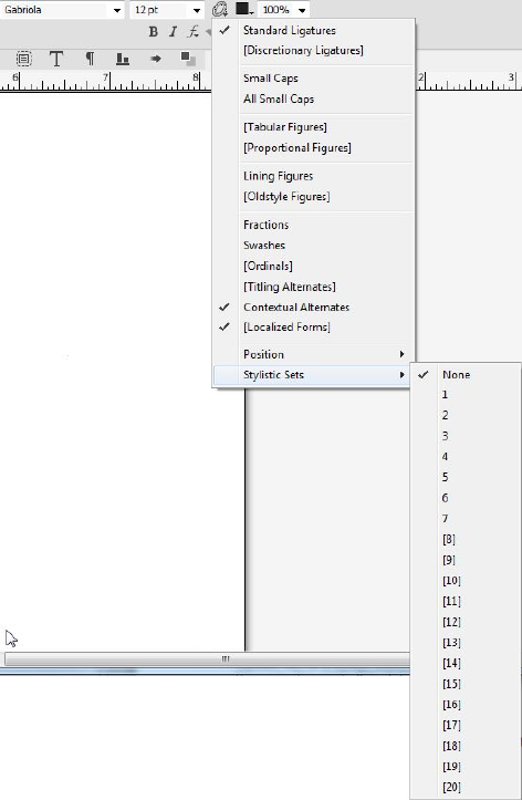
You can also apply stylistic sets to a style sheet when adding a new style sheet or
editing an existing style sheet. On the Character Attributes of New Style Sheet dialog
use the OpenType > Stylistic Sets drop-down menu,
194 | A GUIDE TO QUARKXPRESS 2016
TEXT AND TYPOGRAPHY
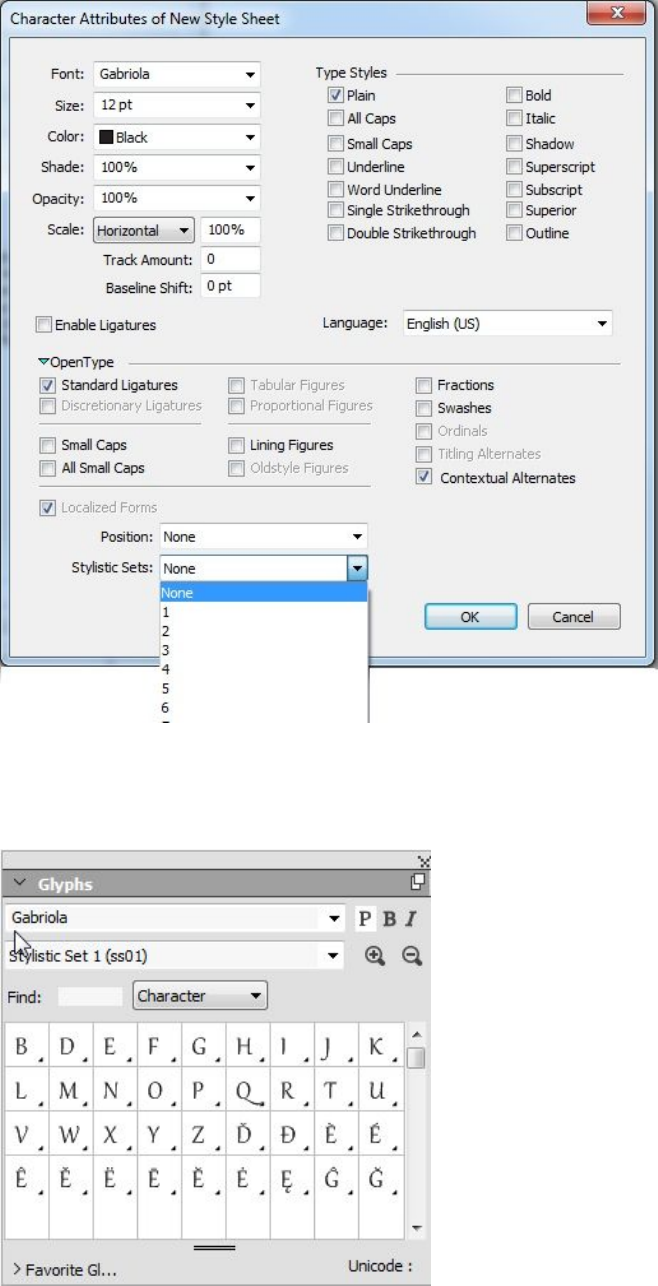
Use the Glyphs palettes to view the available stylistic sets available for each font. The
alternates that are grouped for each stylistic set will be displayed.
A GUIDE TO QUARKXPRESS 2016 | 195
TEXT AND TYPOGRAPHY
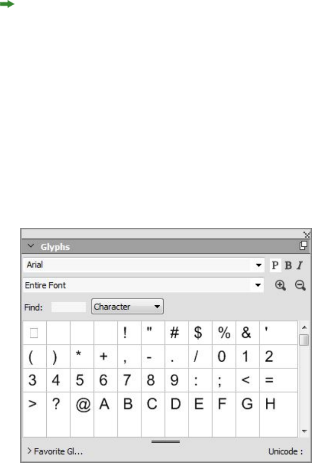
After a stylistic set has been applied to text, you can use the Find/Change palette to
search for text based on the stylistic set applied, and then optionally change the stylistic
set that is applied.
Working with the Glyphs palette
A glyph is the smallest unit of a font — each uppercase letter, for example, consists of
its own glyph. To access all the glyphs in a font — especially an OpenType font that
may include tens of thousands of glyphs — you need to view a complete character
map. You can access such a character map in the Glyphs palette (Window menu),
which enables you to view all the glyphs in the selected font, view bold or italic glyphs,
double-click a glyph to insert that glyph in text, and save favorite glyphs for easy
access.
The Glyphs palette makes it easy to work with large character sets and professional-quality
fonts.
To view the glyphs in a font, display the Glyphs palette (Window menu) and choose
a font from the Font menu in the upper-left corner. Options available in the Glyphs
palette include the following:
•You can use the Bold and Italic buttons to display the bold and italic versions of
glyphs; if the bold, italic, or bold italic instance of the font is not active on your
system, the application will simulate bold, italic, or bold italic on the glyphs as
it does when you apply the Bold and Italic type styles using the Measurements
palette.
•To view a subset of the glyphs in the font, choose an option from the Show
drop-down menu.
•To see any alternates available for a glyph, click the box in the lower-right corner
of an individual glyph's cell.
196 | A GUIDE TO QUARKXPRESS 2016
TEXT AND TYPOGRAPHY

•If necessary, click the Zoom tool on the palette to increase the size of the glyphs.
•If you need a glyph's Unicode code point — for HTML authoring, for example —
you can see the Unicode code in the lower part of the palette.
•To insert a glyph at the text insertion point, double-click the glyph in the Glyphs
palette.
•If you frequently use specific glyphs from a font, you can save those glyphs as
favorites for quick access. To create a favorites list, first click the expander next
to Favorite Glyphs in the Glyphs palette (Window menu). Then, simply drag a
glyph to an empty cell in the Favorite Glyphs area. To delete a favorite,
Control+click/right+click the glyph and use the context menu. The Unicode value
of the selected glyph displays at the right bottom corner (above the Favorite
Glyphs pane).
Displaying invisible characters
The Invisibles option (View menu) is always helpful when editing text or fine-tuning
typography because it allows you to see common "invisible characters" such as spaces,
tabs, and paragraph returns.
Inserting special characters
There are all kinds of special characters for typographic and formatting purposes. You
can enter such special characters using keyboard commands or choose them from the
Utilities > Insert Character submenu. Each character displays differently when
invisibles are showing (View > Invisibles).
Inserting spaces
To insert a specific type of space — such as an em space — at the text insertion point,
choose Utilities > Insert Character > Special > Em Space or Utilities > Insert
Character > Special (nonbreaking) > Em Space. The options in the Nonbreaking
Space submenu act as "glue" between two words or numbers, for example, preventing
breaks from occurring between the two "glued" elements at the end of a line.
Inserting other special characters
To insert a special character other than a space — such as an em dash or a current page
number placeholder character — at the text insertion point, choose Utilities > Insert
Character > Special or Utilities > Insert Character > Nonbreaking Special.
Special characters (breaking and non breaking) can be searched for using the
Find/Change palette, see "Finding and changing text".
Specifying character language
You can specify the language to be used for hyphenation and spell checking by applying
a character language to text. This lets you mix words from different languages in the
A GUIDE TO QUARKXPRESS 2016 | 197
TEXT AND TYPOGRAPHY
same paragraph without triggering poor hyphenation or more Suspect Words in Spell
Check (Utilities menu). In addition to applying a specific language to characters, you
can apply None so that a word is not considered for hyphenation or spell checking.
To apply a language to selected characters, use the Language drop-down menu in the
Character Attributes dialog box (Style > Character) (Windows only), or the
Character/Character Attributes tab of the Measurements palette.
Using font fallback
When Font Fallback is on, if the application encounters a character that is not available
in the current font, it searches through the active fonts on your system to find a font
that does include that character. For example, if Helvetica is applied at the text insertion
point and you import or paste text containing a Kanji character, the application might
apply the Hiragino font to that character. If the application cannot find an active font
that contains the character, the character still displays as a box or symbol.
Font Fallback is implemented as an application preference, meaning that the feature
is either on or off for your copy of the program. The feature is on by default, but if
you need to turn it off, uncheck Font Fallback in the Font Fallback pane of the
Preferences dialog box (QuarkXPress/Edit > Preferences).
For more information about the Font Fallback feature, see "Preferences — Application
— Font Fallback."
Working with font mapping rules
When you open a project, the application checks to make sure all the fonts applied
to text are active on your system. If not, the Missing Fonts alert displays, which gives
you the opportunity to replace missing fonts with active fonts. You can save those
replacements as global "font mapping rules," which can be applied automatically each
time you open a project.
To create a font mapping rule, first open a project that uses a missing (inactive) font.
Click List Fonts to display the Missing Fonts alert. Use the Replace button to choose
replacement fonts for any missing fonts, then click Save As Rule. All the replacements
listed in the Missing Fonts alert are saved as rules, even if only some replacements are
selected. If you change your mind about a replacement, select its line and click Reset.
You can also choose File > Revert to Saved after you open the article. This will display
the Missing Fonts alert again and allow you to make changes. (Note that the changes
apply only to that article — not to any rules you just saved.)
Once you create a font mapping rule by clicking Save As Rule in the Missing Fonts
alert, the rule is saved in preferences for your copy of the application and applied to
all articles. If you need to change, delete, or share font mapping rules, choose Utilities >
Font Mapping.
You can use the Fonts pane (QuarkXPress/Edit > Preferences) to specify a default
replacement font and to control whether the Missing Fonts alert displays when you
open a project with missing fonts. For more information, see "Preferences — Application
— Fonts."
198 | A GUIDE TO QUARKXPRESS 2016
TEXT AND TYPOGRAPHY
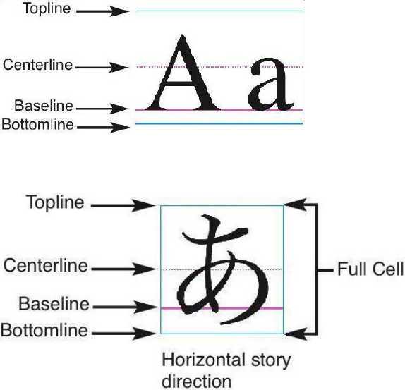
Working with design grids
The design grid feature is an extension of the baseline grid feature in versions 7 and
earlier of QuarkXPress and QuarkCopyDesk. Design grids make it even easier for you
to define grids, allowing you to align text and objects precisely on both the page and
text box levels.
For information on preferences related to design grids, see "Preferences — Layout —
Guides and Grid."
For information on preferences related to design grids, see "Preferences — Layout —
Guides and Grid" and "Preferences — Layout — Grid Cell Fill."
Understanding design grids
A design grid is a sequence of nonprinting guidelines for aligning text and items.
Grid lines
Each design grid includes the following grid lines: bottomline, baseline, centerline, and
topline. In addition, design grids include a full cell box, which makes it easy for you
to align characters vertically or horizontally. You can align text and items to any of
these grid lines.
A line in a design grid includes a bottomline, a baseline, a centerline, and a topline.
In the horizontal story direction, a line in a design grid includes a bottomline, a baseline,
a centerline, a topline, and a full cell box.
A GUIDE TO QUARKXPRESS 2016 | 199
TEXT AND TYPOGRAPHY
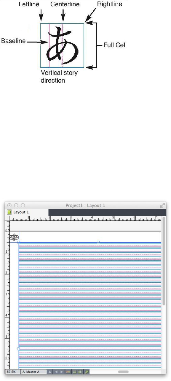
In the vertical story direction, a line in a design grid includes a leftline, a baseline, a
centerline, a rightline, and a full cell box.
Master page grids and text box grids
There are two kinds of default design grids: Master page grids and text box grids. Every
page and every text box has a design grid associated with it. You can hide or show
design grids for an entire layout by choosing View > Page Grids or View > Text Box
Grids.
You can configure a page's design grid by displaying the page's master page and then
choosing Page > Master Guides & Grid. You can control a text box's design grid by
choosing Grid Settings from the text box's context menu.
A page with its master page grid displayed, with all grid lines showing.
200 | A GUIDE TO QUARKXPRESS 2016
TEXT AND TYPOGRAPHY
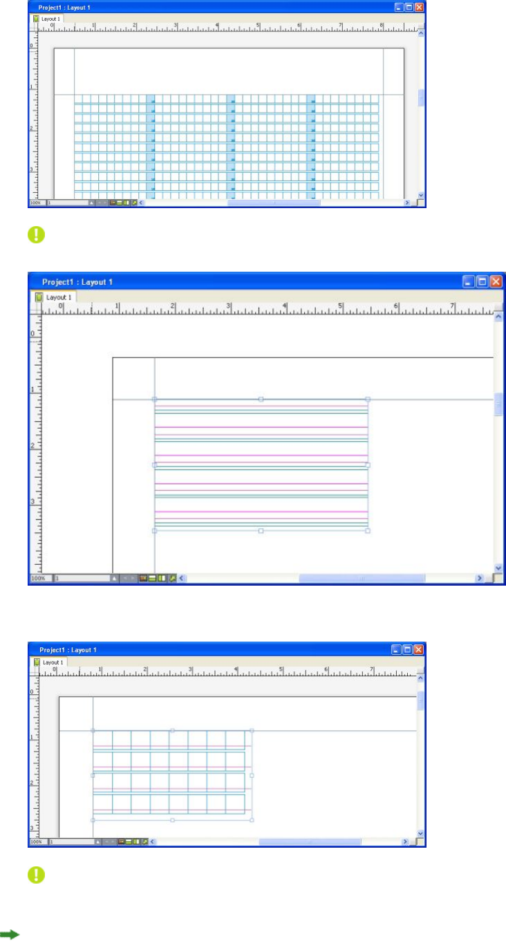
A page with its master page grid displayed, with only full cell boxes showing.
A text box with its text box grid displayed, with all grid lines showing.
A text box with its text box grid displayed, with the baseline and full cell boxes showing.
For more information, see "Using a master page grid."
To use the baseline grid feature as it existed in QuarkXPress and QuarkCopyDesk 7.x
and earlier, show the baseline and hide the other grid lines.
A GUIDE TO QUARKXPRESS 2016 | 201
TEXT AND TYPOGRAPHY
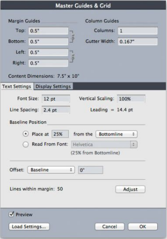
Grid styles
A grid style is a named package of settings that describe a grid — like a style sheet for
a design grid. You can apply grid styles to text boxes and can use them as the basis for
master page grids. You can also base grid styles on other grid styles. Grid styles are
displayed in the Grid Styles palette (Window menu). For more information, see
"Working with grid styles."
Design grid basics
The following topics explain how to work with design grids. For information about
grid styles, see "Working with grid styles."
Configuring a master page grid
To configure a master page grid, display a master page and then choose Page > Master
Guides & Grid. The Master Guides & Grid dialog box displays.
Use the Master Guides & Grid dialog box to control master page grids.
•Under Margin Guides, use the Top, Bottom, Left, and Right fields to specify
margin placement relative to the top, bottom, left, and right edges of the page.
202 | A GUIDE TO QUARKXPRESS 2016
TEXT AND TYPOGRAPHY
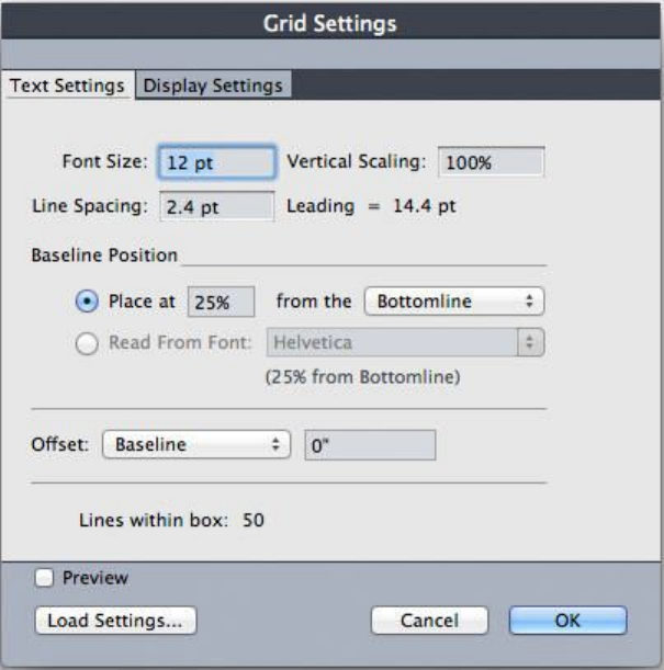
To synchronize the values in the Top and Bottom or Left and Right fields, click
the chain icon next to the fields.
•Under Column Guides, enter a value in the Columns field to specify the number
of columns on the master page. Enter a value in the Gutter Width field to define
the space between columns.
•The Content Dimensions field displays the area inside the margin guides.
•To control the placement and spacing of the grid, use the controls in the Text
Settings tab. For more information, see "Design Grids: Text Settings tab."
•To control the display of the grid, use the controls in the Display Settings tab.
For more information, see "Design Grids: Text Settings tab."
•To preview changes as you make them, check Preview.
•To use the specifications of an existing master page grid, grid style, or style sheet,
click Load Settings. For more information, see "Loading grid settings."
Configuring a text box grid
To configure a text box grid, Control+click/right-click the text box and choose Grid
Settings. The Grid Settings dialog box displays.
Grid Settings dialog box
•To control the placement and spacing of the grid, use the controls in the Text
Settings tab. For more information, see "Design Grids: Text Settings tab."
•To control the alignment of cells, use the controls in the Cell Alignment tab. For
more information, see "Design grids: Cell Alignment tab."
A GUIDE TO QUARKXPRESS 2016 | 203
TEXT AND TYPOGRAPHY
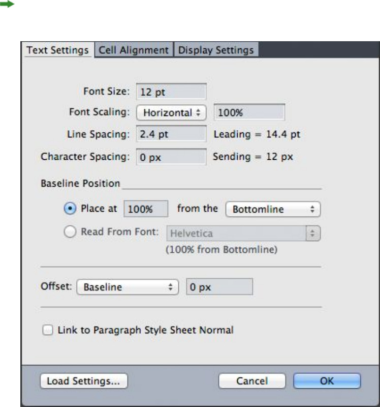
•To specify which grid lines display, use the controls in the Display Settings tab.
For more information, see "Design grids: Display Settings tab."
•To preview changes as you make them, check Preview.
•To use the specifications of an existing master page grid, grid style, or style sheet,
click Load Settings. For more information, see "Loading grid settings."
Design Grids: Text Settings tab
To determine the size, scale, and position of a design grid, use the controls in the Text
Settings tab. The Text Settings tab displays in the Master Guides & Grid, Edit Grid
Style, and the Grid Settings dialog boxes.
If you check Preview, you can view the results of changes as you make them.
Text Settings tab of Master Guides & Grid
•Font Size: Enter a size to determine the height of each line in a design grid. This
value also determines the full cell height and width.
•Vertical Scaling: Enter a percentage value to adjust the height of each line in a
design grid, based on the font size.
204 | A GUIDE TO QUARKXPRESS 2016
TEXT AND TYPOGRAPHY

•Font Scaling: Choose Horizontal or Vertical and enter a percentage of the font
size in the field. If you choose Horizontal, this value determines the full cell
width. If you choose Vertical, this value determines the full cell height.
•Line Spacing and Leading: The Line Spacing and Leading values determine grid
spacing. Line spacing is based on the following formula: Font Size multiplied by
Vertical Scaling plus Line Spacing equals Leading. For example, if Font Size is
12 pt, Vertical Scaling is 100%, and Line Spacing is 2 pt, then Leading is 14 pt.
•Line Spacing and Leading: The Line Spacing and Leading values determine grid
spacing and cell spacing. Line spacing is based on the following formula: Font
Size multiplied by Vertical font scaling or Horizontal font scaling plus Line
Spacing equals Leading. For example, if Font Size is 12 pt, Vertical Scaling is
100%, and Line Spacing is 2 pt, then Leading is 14 pt.
•When a design grid is based on a paragraph style sheet, the Leading value is
defined in the style sheet. The Leading value can be a specific number or, if the
value is auto, it is derived from the Auto Leading value in the Paragraph tab of
the Preferences dialog box (QuarkXPress/Edit > Preferences). See "Loading grid
settings" for information about linking style sheets to grid styles.
•Character Spacing and Sending: The Character Spacing and Sending values
determine the horizontal Full Cell spacing in horizontal story direction and the
vertical Full Cell spacing in vertical story direction.
•Baseline Position: Choose an option in this area to specify positioning for the
baseline in the design grid.
To specify the offset origin, click Place at, choose Topline, Center (Up), Center
(Down), or Bottomline in the from the drop-down menu, and then enter a percentage
value in the field to specify the baseline position relative to the topline, centerline, or
bottomline.
To read the offset origin from a font, click Read From Font and then select a font
from the drop-down menu. The baseline defined for the selected font determines the
baseline position for each line in the grid. The percentage value displayed below the
font list indicates the relationship between the baseline and the bottomline in the
font's design.
•Offset: To control where the first line of the design grid is placed on the page or
in the box, choose Topline, Centerline, Baseline, or Bottomline and enter a
measurement value in the field.
•Adjust: Click to display the Adjust Lines Within Margins dialog box for master
page grids. For more information, see "Adjust Lines Within Margins dialog box."
•Adjust: Click to display the Adjust Lines Within Margins dialog box for master
page grids, or the Adjust Lines Within Box dialog box for text box grids. For
more information, see "Adjust Lines Within Margins dialog box."
•Lines within margin or Lines within box: This field displays the number of lines
that can fit on a page or in a box, based on the settings above.
•Cells per line: This field displays the number of cells that can fit on a line,
based on the settings above.
A GUIDE TO QUARKXPRESS 2016 | 205
TEXT AND TYPOGRAPHY
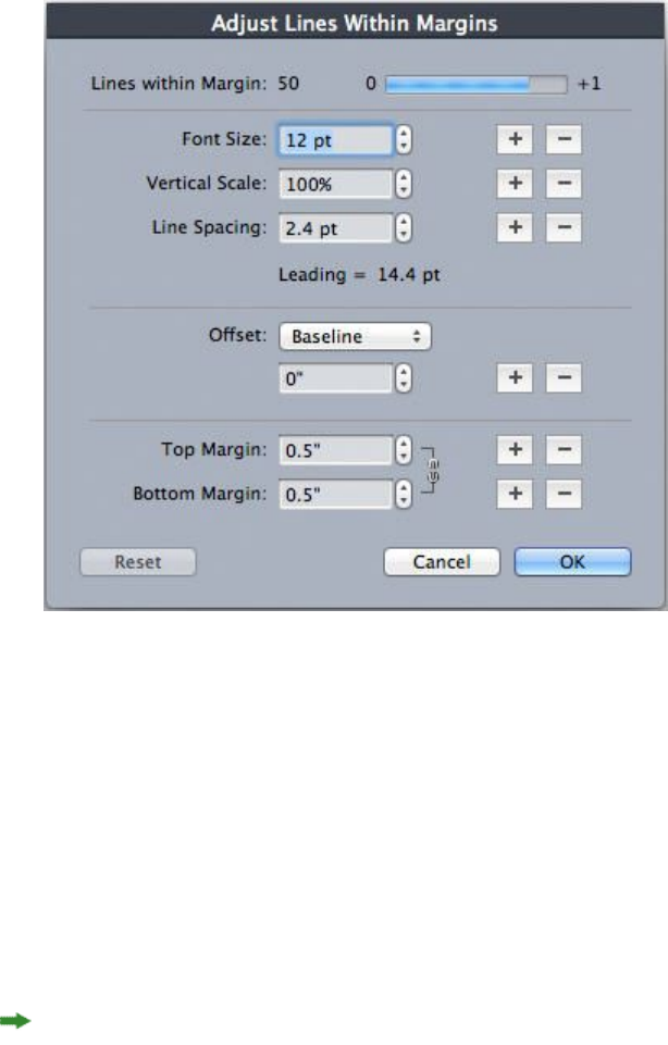
Adjust Lines Within Margins dialog box
Use the Adjust Lines Within Margins dialog box (Master Guides & Grid > Adjust)
to change the number of grid lines that fit within the margins of a master page. Use
the Adjust Lines Within Margins dialog box (Master Guides & Grid > Adjust) to
change the number of cells per line and the number of grid lines that fit within the
margins of a master page. Many of the controls in this dialog box are also in the Text
Settings tab; changes are reflected in both locations.
Use the Adjust Lines Within Margins dialog box to adjust grid settings for a master page.
•The Lines per page field displays the number of lines on a page. This value updates
as you make changes.
•Click + or – next to a field to increase or decrease the number of lines on the page
in one-line increments. For example, if the Lines per page value is 50, the Font
Size value is 12 pt, and vertical font scaling is 100%, when you click + next to
Font Size, the Lines per page value increases to 51 and the Font Size value
decreases to 11.765 pt.
•Enter values in the Cells per line and Lines per page fields to change the number
of cells and lines on a page.
When you click Adjust Margins, changes to the Cells per line and Lines per page
fields affect the Content Height and Content Width values. When you click Adjust
Spacing, changes to the Cells per line and Lines per page fields affect the Leading
and Sending values.
•The increment bar displays a percentage (from 0 to +1) to indicate the fraction
by which a grid pattern does not fit on the page. If the grid increments align
206 | A GUIDE TO QUARKXPRESS 2016
TEXT AND TYPOGRAPHY

perfectly, the increment bar displays 0. If the grid increments do not align perfectly
with the page, an estimate of the fraction displays in the increment bar.
•The Characters per page field displays the number of characters that can fit on
a page, based on the current values.
•Click Adjust Margins to adjust the Cells per line and Lines per page values based
on changes to margin guide positions. Click one of the nine squares to anchor
the base margin from which changes are calculated. The four outside squares
anchor the top and left, top and right, bottom and left, and bottom and right
margins. The middle squares anchor margins and link corresponding margins.
The Content Height and Content Width fields update according to your margin
changes.
•Click Adjust Spacing to adjust the Cells per line and Lines per page values based
on your changes to the Line Space and Character Space fields. The Leading and
Sending values update according to your changes.
•Open Other Adjustments to access the Font Size, Offset, and Horizontal/Vertical
scale controls. Changes to these values increase or decrease the Cells per line and
Lines per page values.
•Click Reset to restore the values in all fields to the state they were in before you
displayed the dialog box.
If you check Preview before displaying this dialog box, you can view the results of
changes as you make them.
Adjust Lines Within Box dialog box
Use the Adjust Lines Within Box dialog box (Grid Settings > Adjust) to change the
number of cells per line and the number of grid lines that fit within the text box. Many
of the controls in this dialog box are also in the Text Settings tab; changes are updated
in both locations.
A GUIDE TO QUARKXPRESS 2016 | 207
TEXT AND TYPOGRAPHY
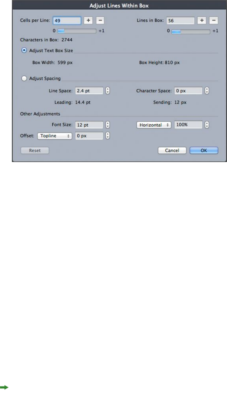
Use the Adjust Lines Within Box dialog box to adjust grid settings for an active text box.
•Enter values in the Cells per line and Lines in Box field to change the number
of cells and lines in the active box.
•The increment bars display a percentage (from 0 to +1) to indicate the fraction
by which a grid pattern does not fit in the box. If the Cells per line or Lines in
Box increments align perfectly, the increment bar displays 0. If the grid increments
do not align perfectly with the box, an estimate of the fraction displays in the
increment bar.
•The Characters in Box field displays the number of characters that can fit in the
active text box, based on the values in the Adjust Lines Within Box dialog box.
This field is not editable.
•Click Adjust Text Box Size to automatically adjust the size of the text box to
accommodate the Cells per line and Lines in Box value changes. The Box Width
and Box Height fields update according to your changes.
•Click Adjust Spacing to adjust the Cells per line and Lines per Box values based
on your changes to the Line Space and Character Space fields. The Leading and
Sending values update according to your changes.
•Open Other Adjustments to access the Font Size, Offset, and Horizontal/Vertical
scale controls. Changes to these values increase or decrease the Cells per line and
Lines per Box values.
•Click Reset to restore the values in all fields to the state they were in before you
displayed the dialog box.
If you check Preview before displaying the Adjust Lines Within Box dialog box, you
can view the results of changes when you close the dialog box.
208 | A GUIDE TO QUARKXPRESS 2016
TEXT AND TYPOGRAPHY
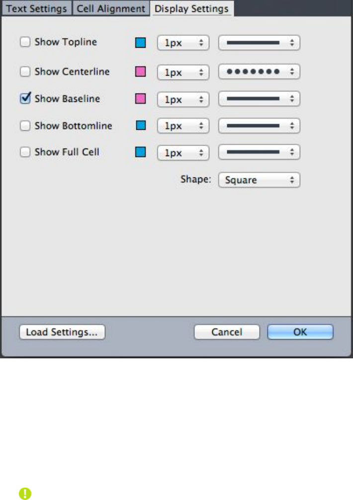
Design grids: Display Settings tab
A design grid includes separate lines to indicate the topline, the centerline, the baseline,
and the bottomline. A design grid includes separate lines to indicate the topline, the
centerline, the baseline, the bottomline, and the full cell box. Use the controls in the
Display Settings tab to show or hide grid lines and to specify grid line color, width,
and style. The Display Settings tab displays in the Master Guides & Grid, Edit Grid
Style, and the Grid Settings dialog boxes.
Display Settings tab in the Master Guides & Grid dialog box.
•Check Show <grid line type> to display each type of grid line when the grid is
displayed.
•Click the Color box to specify a color for each grid line.
•Choose a width from the Width drop-down menu.
•Choose a style from the Style drop-down menu.
• Choose a cell shape from the Shape drop-down menu.
•Master Guides & Grid dialog box only: To specify the master page grid boundaries,
choose Within Margins, To Page, or Pasteboard from the Show Grid drop-down
menu.
A GUIDE TO QUARKXPRESS 2016 | 209
TEXT AND TYPOGRAPHY
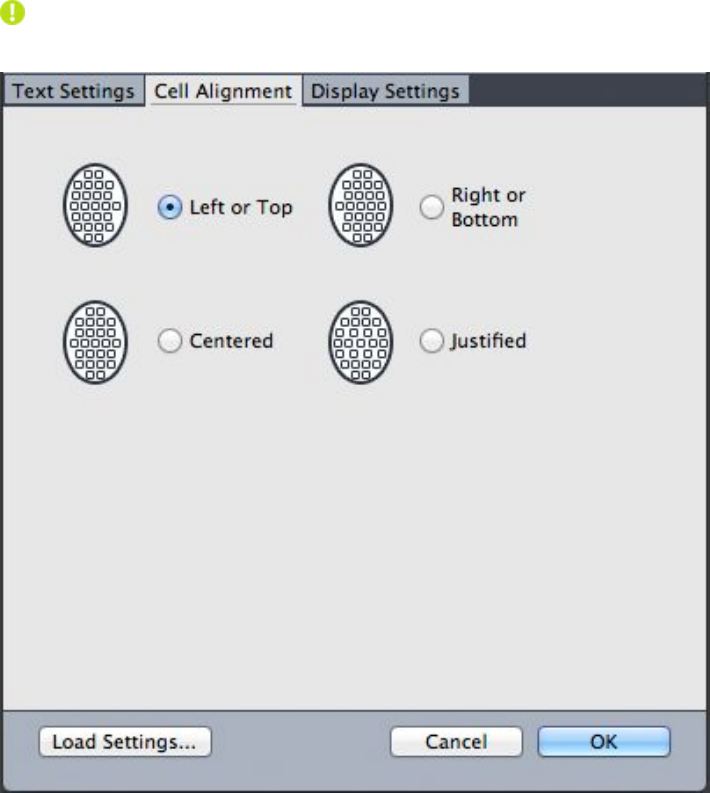
Design grids: Cell Alignment tab
Use the Cell Alignment tab to specify how cells are aligned within the grid.
The Cell Alignment tab in the Grid Settings and Edit Grid Style dialog boxes
Loading grid settings
To use a grid style, style sheet, or master page grid as the basis for a master page grid
or text box grid:
1Click Load Settings in the Master Guides & Grid, Grid Settings, or Edit Grid Style
dialog box. The Load Settings dialog box displays.
210 | A GUIDE TO QUARKXPRESS 2016
TEXT AND TYPOGRAPHY
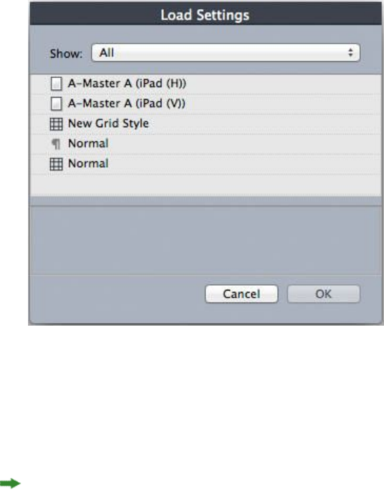
Select a grid style, style sheet, or master page in the Load Settings dialog box.
2Choose All, Grid Styles, Master Pages, or Paragraph Style Sheets from the Show
drop-down menu.
3Select an existing grid style, style sheet, or master page from the list, and then click
OK.
The specifications in the grid style, style sheet, or master page you load are displayed
in the Master Guides & Grid, Grid Settings, or Edit Grid Style dialog box. You can
modify these grid settings after loading them.
A GUIDE TO QUARKXPRESS 2016 | 211
TEXT AND TYPOGRAPHY
Grid style with "Body Copy" style sheet loaded
If you load a style sheet for a grid style, you can specify that future changes to the
style sheet update the grid style automatically by checking Link to Paragraph Style
Sheet <style sheet name>. Notice that the font and spacing controls become
unavailable.
212 | A GUIDE TO QUARKXPRESS 2016
TEXT AND TYPOGRAPHY
Grid style with "Body Copy" style sheet loaded and linked
Working with grid styles
A grid style includes grid attributes you can apply to a text box or use as the basis for
a master page grid or another grid style.
Creating grid styles
To create, edit, duplicate, or delete grid styles, use the Grid Styles dialog box (Edit >
Grid Styles).
A GUIDE TO QUARKXPRESS 2016 | 213
TEXT AND TYPOGRAPHY
Use the Grid Styles dialog box to create, edit, duplicate, and delete grid styles.
When you click New, Edit, or Duplicate in the Grid Styles dialog box, the Edit Grid
Style dialog box displays.
The Edit Grid Style dialog box
214 | A GUIDE TO QUARKXPRESS 2016
TEXT AND TYPOGRAPHY
•To specify a name for the grid style, enter a value in the Name field.
•To control the placement and spacing of the grid, use the controls in the Text
Settings tab. For more information, see "Design Grids: Text Settings tab."
•To control the alignment of the full cell to the grid, use the controls in the Cell
Alignment tab. For more information, see "Design grids: Cell Alignment tab."
•To specify which grid lines display, use the controls in the Display Settings tab.
For more information, see "Design grids: Display Settings tab."
•To use the specifications of an existing master page grid, grid style, or style sheet,
click Load Settings. For more information, see "Loading grid settings."
When you create a grid style with no projects open, that grid style becomes part of
the default grid style list and is included in all subsequently created projects.
Applying a grid style to a text box
To apply a grid style to the selected text box:
1To display text box grids, make sure View > Text Box Grids is checked.
2To display the Grid Styles palette, make sure Window > Grid Styles is checked.
Use the Grid Styles palette to apply grid styles to text boxes.
3Click a grid style name in the Grid Styles palette.
A plus sign next to a grid style name in the Grid Styles palette indicates that the text
box grid has been modified since the grid style was applied to the text box. To apply
the grid style again and override local text box grid formatting, click No Style and
then click the grid style name (or press Option/Alt and click the modified grid style
name).
A GUIDE TO QUARKXPRESS 2016 | 215
TEXT AND TYPOGRAPHY
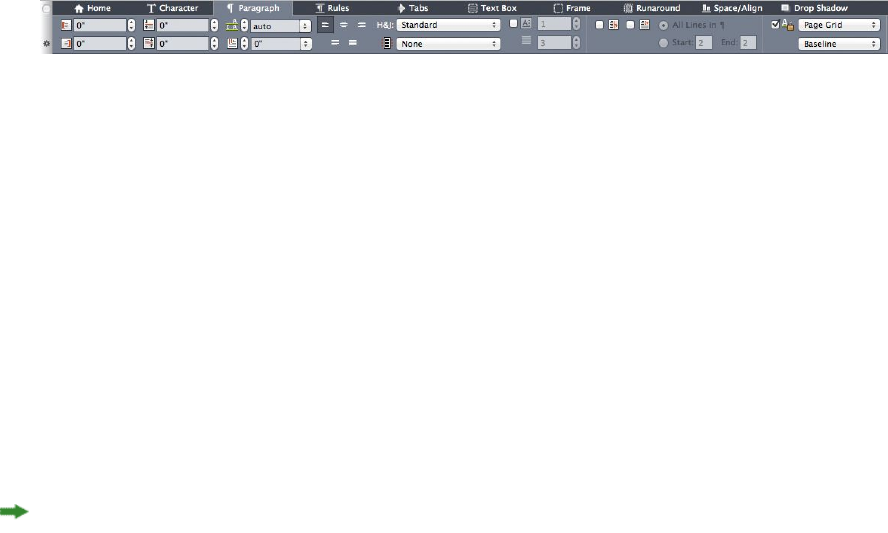
Using design grids
After you apply design grids to text boxes or configure master page grids, you can use
the grids for alignment. You can visually align items with design grids, and you can
choose View > Snap to Page Grids to force items you move to align with master page
grids.
Using a master page grid
To specify a master page grid for a layout page, apply the master page to the project
page.
Locking text to a grid
Using a style sheet or local paragraph formatting, you can lock text to the master page
grid or a text box grid. To lock text to a grid:
1To set up text locking for a style sheet, choose Edit > Style Sheets, select a paragraph
style sheet, click Edit, and then click the Formats tab. To set up text locking for a
paragraph, select the paragraph and then choose Style > Formats (Windows only), or
use the Paragraph/Paragraph Attributes tab of the Measurements palette.
Paragraph Attributes tab of the Measurements palette.
2In the Formats tab, check Lock to Grid.
3To specify the grid to which the text will lock, choose Page Grid or Text box Grid
from the first drop-down menu below Lock to Grid.
4To specify the grid line to which text will lock, choose Topline, Centerline, Baseline,
or Bottomline from the second drop-down menu below Lock to Grid.
Snapping items to design grids
You can make items snap to master page grid lines, and when you resize a text box,
you can snap to the text box grid.
To snap to a master page grid line, display the master page grid (View > Page Grid)
and then choose View > Snap to Page Grid.
The Snap Distance field in the Guides & Grids pane of the Preferences dialog box
enables you to change the 6-pixel default distance at which items snap to page grids
when Snap to Page Grids is chosen (View menu).
To snap to a text box grid line when you resize a text box, display the text box grid
and resize the box.
Aligning grids
To align a text box grid line to a master page grid line or to a guide: To align a text
box grid line or cell to a master page grid line or a guide:
216 | A GUIDE TO QUARKXPRESS 2016
TEXT AND TYPOGRAPHY

1Make sure View > Guides, View > Page Grids, and View > Text Box Grids are checked.
2Select the Item tool .
3Click a grid line in the text box and then drag the box. Note that even as you move
the grid line, the original position of the box continues to display. You can align the
selected grid line with another grid line in the box, a master page grid line, or a guide.
(See notes on Live Drag below.)
4Click a grid line or cell in the text box and then drag the box. Notice how the selected
grid line or cell you're moving displays and the original position of the box continues
to display. You can align the selected grid line with another grid line or cell in the
box, a master page grid line, or a guide.
Live drag is a feature that lets you see the contents of an item while you are moving
the item. However, selected grid lines or cells do not display when live drag is active.
Working with rubi text
Rubi text clarifies the meaning or pronunciation of base text. Base text can run
vertically or horizontally, and rubi text usually follows the direction of the base text.
Rubi text can be placed to the right of or to the left of base text in a vertical story, and
above or below base text in a horizontal story.
There are two types of rubi text: mono rubi and group rubi. Mono rubi is rubi text that
is associated with a single character of the base text. Group rubi is rubi text that is
associated with more than one character of the base text.
You can manipulate the alignment, placement, scale, font, color, opacity, shade, type
style, and relative size of rubi text. In addition, you can choose from several options
that allow you to control rubi text that overhangs unrelated base text.
Use the Rubi dialog box (Style menu) to add rubi text to selected base text.
A GUIDE TO QUARKXPRESS 2016 | 217
TEXT AND TYPOGRAPHY
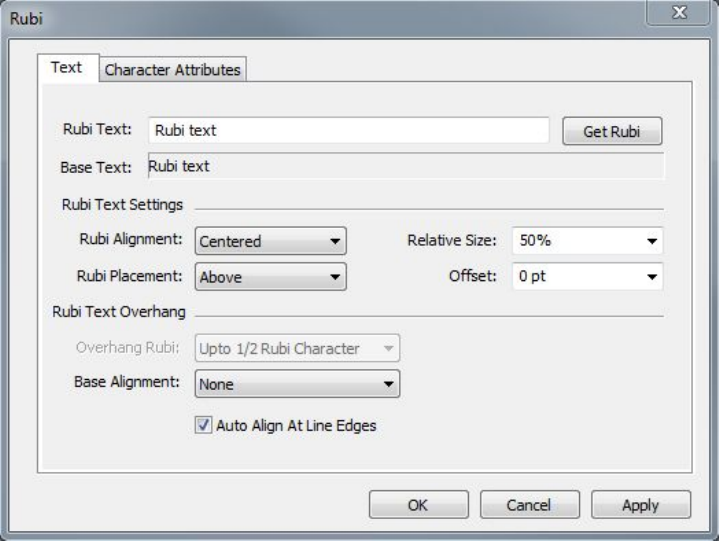
The Rubi dialog box
You can apply automatic rubi to a series of words (separated by spaces or punctuation)
by selecting a range of text and then pressing Command+Option+R/Ctrl+Alt+R. For
more information about automatic rubi, see the Rubi Text bullet in the list under
"Text tab," below.
Text tab
The Text tab of the Rubi dialog box lets you control the following options:
•Rubi Text: Use this field to specify the rubi text to be applied to the selected base
text. When you display the Rubi dialog box for a new rubi, the application
automatically fills this field with a phonetic reading of the base text from the
input method editor (IME). This feature works for languages for which IME
dictionaries are available (as of this writing, Chinese and Japanese only).
•Get Rubi: Use this button to refresh the content of the Rubi Text field from the
IME.
•Base Text: This field displays the selected base text.
•Rubi Alignment: Use this drop-down menu to control how non-overhanging
rubi text aligns with the base text. For more information, see "Rubi alignment
options."
•Rubi Placement: Use this drop-down menu to specify whether rubi text displays
above or below the base text (in a horizontal story) or to the left of or right of the
base text (in a vertical story).
•Relative Size: Use this field to specify the size of the rubi text compared to the
base text.
•Offset: Use this field to control how far the rubi text is offset from the base text.
218 | A GUIDE TO QUARKXPRESS 2016
TEXT AND TYPOGRAPHY
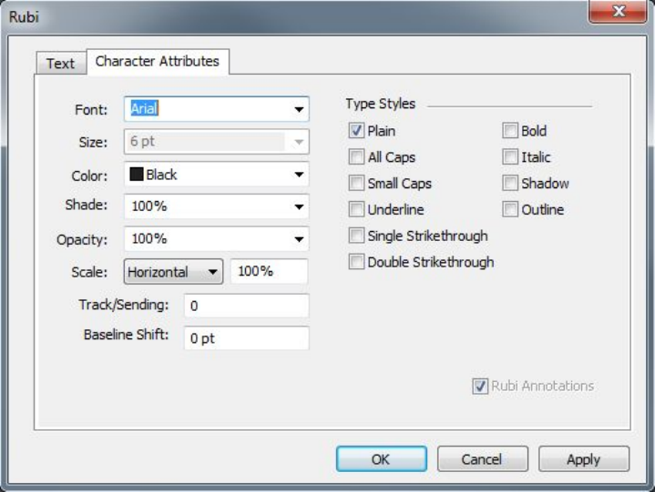
•Overhang Rubi: Use this field to control how far the rubi text can overhang base
text that is unrelated to the rubi text. For more information, see "Rubi overhang
options." Note that this feature is disabled when Base Alignment is set to None.
•Base Alignment: Use this field to control how base text aligns with overhanging
rubi text. For more information, see "Rubi base alignment options."
•Auto Align At Line Edges: Check this box to automatically align rubi text with
the border of a text box when the rubi text overhangs the base text and touches
the edge of the text box.
Character Attributes tab
The Character Attributes tab of the Rubi dialog box lets you control rubi text
formatting.
Use the Character Attributes tab to specify how rubi characters display
•The Font, Size, Color, Shade, Opacity, Scale, Track/Sending, Baseline Shift,
and Type Styles controls let you apply basic formatting to the text.
•To enable or disable the use of specifically designed Kana glyphs for Rubi, check
or uncheck Rubi Annotations. These glyphs are available only in some Japanese
OpenType fonts.
Rubi alignment options
The Rubi Alignment options in the Text tab of the Rubi dialog box (Style menu) are:
•Left: Aligns rubi text with the left side of base text in a horizontal story.
•Centered: Aligns rubi text with the center of base text in a horizontal or vertical
story.
A GUIDE TO QUARKXPRESS 2016 | 219
TEXT AND TYPOGRAPHY
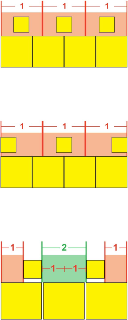
•Right: Aligns rubi text with the right side of base text in a horizontal story.
•Top: Aligns rubi text with the top of base text in a vertical story.
•Bottom: Aligns rubi text with the bottom of base text in a vertical story.
•Justified: Centers rubi text above or next to base text as shown in the diagram
below.
Justified alignment of rubi text
•Forced: Aligns rubi text flush with the left and right of base text in a horizontal
story, or flush with the top and bottom of base text in a vertical story.
Forced alignment of rubi text
•1–2–1 (JIS) Rule: Aligns rubi text with base text according to a 1:2:1 ratio, leaving
a certain amount of space at the beginning and end of the line of rubi text.
1–2–1 (JIS) Rule alignment of rubi text
220 | A GUIDE TO QUARKXPRESS 2016
TEXT AND TYPOGRAPHY
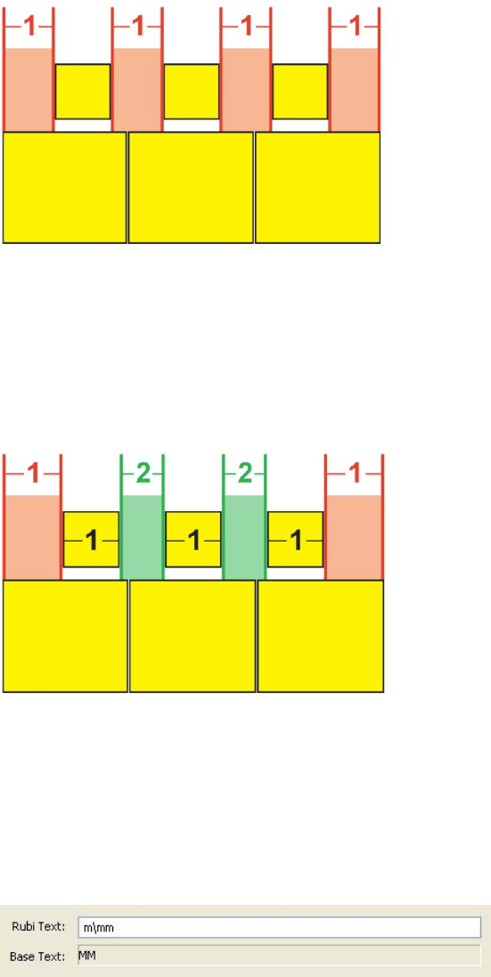
•Equal Space: Aligns rubi text so that the space at the beginning of the line of rubi
text, the space at the end of the line of rubi text, and the spaces between each
rubi text character are equal.
Equal Space alignment of rubi text
•1 Rubi Space: Aligns rubi text so that the space at the beginning of the line of
rubi text and the space at the end of the line of rubi text are equal to the width
of one rubi text character but not equal to the spaces between each rubi text
character. The spaces between rubi text characters are distributed evenly.
1 Rubi Space alignment of rubi text
Mono rubi
To control the placement of individual rubi text characters, insert a backslash or
Japanese Yen sign between rubi text characters in the Rubi Text field of the Rubi
dialog box (Style menu).
Backslashes between rubi text characters indicate mono rubi.
For example, if you select two base text characters that are associated with three rubi
text characters, and you want only the first rubi text character to be placed over the
first base text character and the other two to be placed over the second base character,
insert a backslash between the first and second rubi text characters. Backslashes
A GUIDE TO QUARKXPRESS 2016 | 221
TEXT AND TYPOGRAPHY
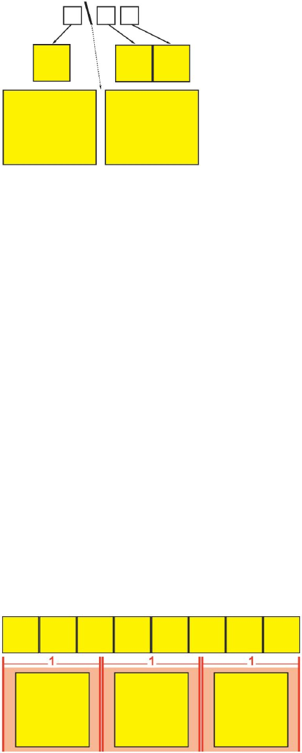
correspond with the spaces between base text characters, so you can place as many
rubi text characters between backslashes as you want.
Backslashes correspond with the space between base text characters
Rubi base alignment options
You can apply Base Alignment options only when rubi text overhangs the base text.
The Base Alignment options are:
•None: No base text alignment is applied.
•Left: Aligns base text with the left side of rubi text in a horizontal story.
•Centered: Aligns base text under or next to rubi text so that rubi text has equal
overhang on each side of the base text.
•Right: Aligns base text with the right side of rubi text in a horizontal story.
•Top: Aligns base text with the top of rubi text in a vertical story.
•Bottom: Aligns base text with the bottom of rubi text in a vertical story.
•Justified: Centers base text under or next to rubi text as shown in the diagram
below. (Note that this diagram assumes that Rubi Overhang is set to None. If
rubi text is set to overhang by a particular amount, the rubi characters extend
beyond the left and right edges of the base character sequence by that amount,
and the base characters are justified in the remaining space.)
Justified alignment of base text
•Forced: Aligns base text flush with the left and right of rubi text in a horizontal
story, or flush with the top and bottom of rubi text in a vertical story. (Note that
this diagram assumes that Rubi Overhang is set to None. If rubi text is set to
overhang by a particular amount, the rubi characters extend beyond the left and
222 | A GUIDE TO QUARKXPRESS 2016
TEXT AND TYPOGRAPHY
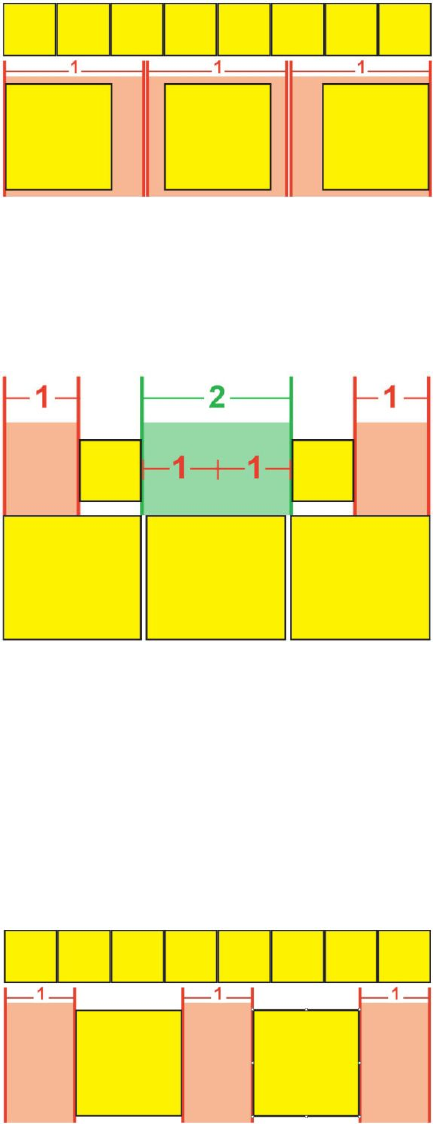
right edges of the base character sequence by that amount, and the base characters
are force-justified in the remaining space.)
Forced alignment of base text
•1–2–1 (JIS) Rule: Aligns base text with rubi text according to a 1:2:1 ratio, leaving
a certain amount of space at the beginning and end of the line of base text.
1–2–1 (JIS) Rule alignment of base text
•Equal Space: Aligns base text so that the space at the beginning of the line of
base text, the space at the end of the line of base text, and the spaces between
base text characters are equal. (Note that this diagram assumes that Rubi Overhang
is set to None. If rubi text is set to overhang by a particular amount, the rubi
characters extend beyond the left and right edges of the base character sequence
by that amount, and the base characters are distributed in the remaining space.)
Equal Space alignment of base text
Rubi overhang options
The Overhang Rubi options in the Text tab of the Rubi dialog box (Style menu)let
you control how far rubi text characters overhang on either side of a base text character
A GUIDE TO QUARKXPRESS 2016 | 223
TEXT AND TYPOGRAPHY
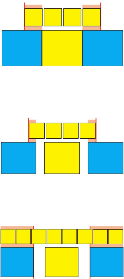
that is unrelated to overhanging rubi text characters. The colored diagrams below
demonstrate the different Overhang Rubi options. Yellow signifies base text and rubi
text that are related to each other. Blue signifies base text that is unrelated to the
overhanging rubi text.
•None: No overhang is allowed.
•Up to 1 Rubi Character: Allows the full width of a rubi text character to overhang
an unrelated base text character.
Up to 1 Rubi Character
•Up to ½ Rubi Character: Allows ½ the width of a rubi text character to overhang
an unrelated base text character.
Up to ½ Rubi Character
•Up to 1 Base Character: Allows the full width of a base text character to be placed
under unrelated rubi text characters.
Up to 1 Base Character
•Up to ½ Base Character: Allows ½ the width of a base character to be placed
under unrelated rubi text characters.
224 | A GUIDE TO QUARKXPRESS 2016
TEXT AND TYPOGRAPHY
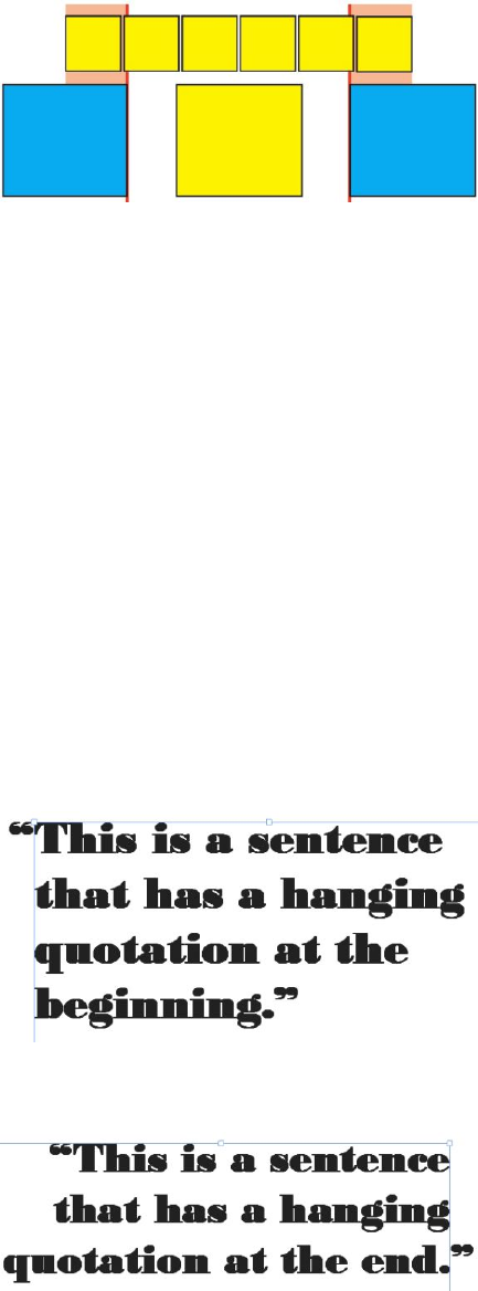
Up to ½ Base Character
•Unrestricted: Allows overhang without any restrictions.
Working with hanging characters
Hanging character sets handle both hanging punctuation and margin alignment. Margin
alignment lets you hang characters partially outside the margin to create visually
uniform text alignment along the margin. Hanging punctuation lets you hang
punctuation characters fully outside the margin so that the text is flush against either
a uniform margin at the beginning of a line of text (leading) or against a uniform
margin at the end of a line of text (trailing). For example, the quotation mark in the
first sample text below is hanging outside the leading margin, which allows the first
character in the first line of text to align evenly with the rows of text below it. The
quotation mark in the second sample text below is hanging outside the trailing margin.
For example, the period in the second sample text below is hanging outside the trailing
margin.
The opening quotation mark in this sample text is a leading hanging character
The closing quotation mark in this sample text is a trailing hanging character
A GUIDE TO QUARKXPRESS 2016 | 225
TEXT AND TYPOGRAPHY
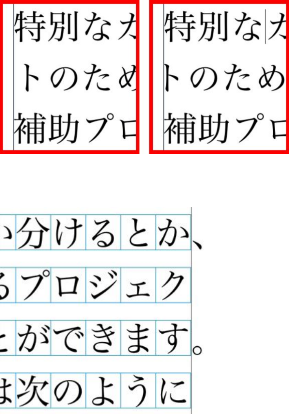
The second line in this sample text shows no hang on the left, but shows a leading hang
on the right.
The punctuation characters in this sample text are trailing hanging characters.
You can create custom hanging character classes and hanging character sets, or you can
use the default classes and sets that come with the software. A hanging character class
is a group of characters that should always hang outside the margin or indent inside
the margin by the same percentage. A hanging character set is a group of hanging
character classes. You can use a hanging character set to apply one or several hanging
character classes to paragraphs.
To view, create, edit, duplicate, and delete hanging character sets and classes, use the
Hanging Characters dialog box (Edit > Hanging Characters).
226 | A GUIDE TO QUARKXPRESS 2016
TEXT AND TYPOGRAPHY
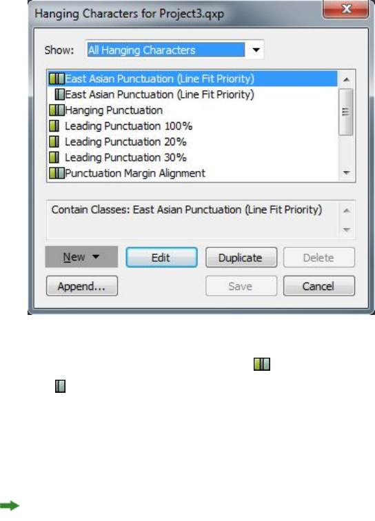
The Hanging Characters dialog box
Hanging character sets are preceded by a icon. Hanging character classes are preceded
by a icon.
If you select a hanging character set in the center pane of the dialog box, the lower
pane displays the hanging character classes that belong to that set. If you select a class
in the center pane of the dialog box, the lower pane displays the sets to which the
selected class belongs and the attributes of the selected class.
To compare hanging character sets or classes, select two classes or sets in the Hanging
Characters dialog box and press Option/Alt. The Append button changes to Compare.
Creating hanging character classes
Use the Edit Hanging Character Class dialog box (Edit > Hanging Characters >
New > Class) to specify the characters to be included in a hanging character class, the
hang percentage of the class, and whether the class is leading or trailing.
A GUIDE TO QUARKXPRESS 2016 | 227
TEXT AND TYPOGRAPHY
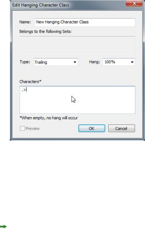
The Edit Hanging Character Class dialog box
Enter characters in the Characters pane. Then choose a percentage from the Hang
drop-down menu. The hang percentage specifies what percentage of the glyph width
should always hang over the margin or what percentage of the glyph width should
always indent. For example, if you choose –50%, the characters in the character class
indent inside of the margin by half of their glyph width. If you choose 100%, the
characters in the character class hang outside of the margin by their full glyph width.
Next, choose whether the character class is Leading or Trailing. Characters in a
Leading class hang over the beginning margin. Characters in a Trailing class hang
over the end margin.
After you have saved a hanging character class in a hanging character set, you can
check Preview to view changes to the hanging character class as you edit.
Creating hanging character sets
Use the Edit Hanging Character Set dialog box (Edit > Hanging Characters > New >
Set) to specify the hanging character classes to be included in a hanging character set.
228 | A GUIDE TO QUARKXPRESS 2016
TEXT AND TYPOGRAPHY
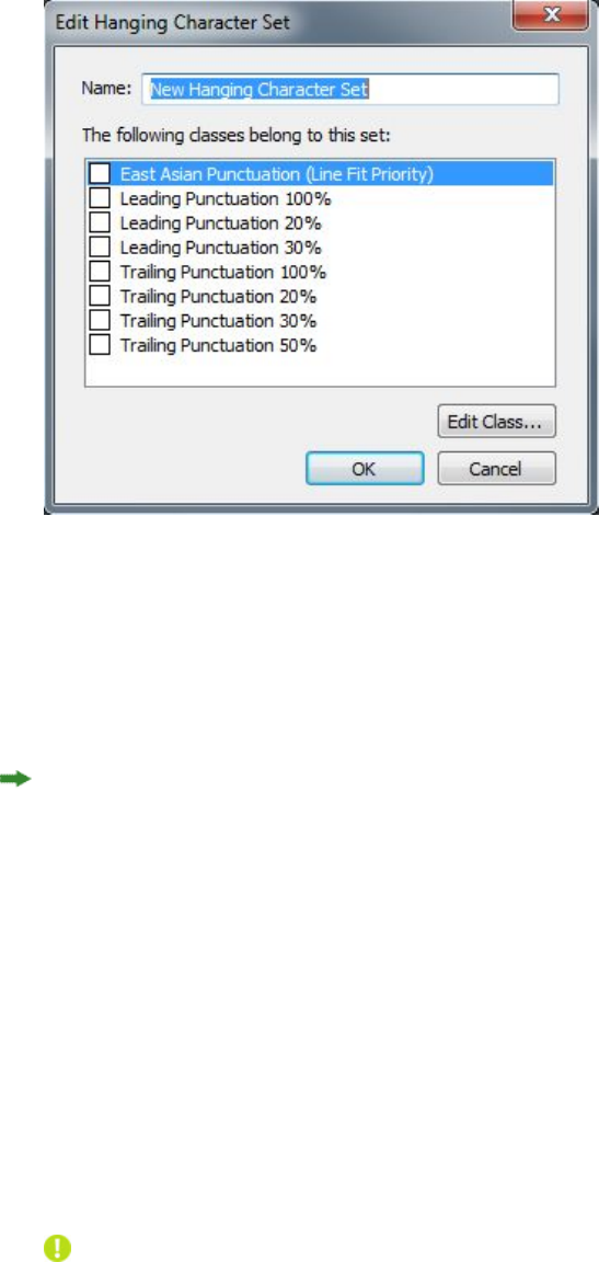
The Edit Hanging Character Set dialog box
The center pane of the dialog box displays all of the available hanging character classes
that can be added to a hanging character set. Check the boxes next to the classes you
want to add, give the hanging character set a name, and then click OK.
To edit a hanging character class before saving the new hanging character set, select
the class and click Edit Class.
You cannot specify different leading or trailing values for a single character within a
hanging character set.
Applying hanging character sets
To apply a hanging character set to text, choose an option from the Hanging Character
Set drop-down menu in the Paragraph Attributes dialog box (Edit > Formats).
To apply a hanging character set to a paragraph style sheet, choose an option from
the Hanging Character Sets drop-down menu in the Formats tab of the Edit
Paragraph Style Sheet dialog box (Edit > Style Sheets > New > Paragraph or Edit >
Style Sheets > Edit).
Working with Mojigumi sets and classes
The Mojigumi feature lets you control spacing for specific punctuation characters
when they occur in particular locations. To use this feature, you must choose or create
a Mojigumi character class and a Mojigumi set.
•A Mojigumi character class is a named set of punctuation characters that should
always be spaced in a particular way.
•A Mojigumi set is a set of character spacing specifications based on the widths of
character em boxes. For example, a mojigumi set might dictate that open
punctuation should use fixed half-width spacing when it occurs at the beginning
A GUIDE TO QUARKXPRESS 2016 | 229
TEXT AND TYPOGRAPHY

of a line, and that close punctuation should use full-width or half-width spacing
when it occurs at the end of a line. Each Mojigumi set is associated with one
mojigumi character class.
To use the Mojigumi feature, apply a mojigumi set to a paragraph. The Mojigumi set's
settings are applied to the characters in the associated mojigumi character class.
For example, if you do not want a parenthesis to occupy a full em-box width when it
occurs between two full-width characters, you can create a Mojigumi character class
that contains parentheses and then specify in the Mojigumi set settings that these
characters should always use a half-em width when they fall between two full em-width
characters.
Only one Mojigumi set can be applied to each paragraph.
For more information about the difference between characters and glyphs, see "Working
with the Glyphs palette."
Creating and editing Mojigumi character classes
A Mojigumi character class is a named set of punctuation characters that is designed to
be used with a Mojigumi set (for more information, see "Working with Mojigumi sets
and classes"). You can create custom Mojigumi character classes, or you can use the
default Mojigumi character classes that come with the software.
To create a custom Mojigumi character class:
1Choose Edit > Mojigumi > Character Classes. The Mojigumi Character Classes
dialog box displays.
2Click New. The Edit Mojigumi Character Class dialog box displays.
3Enter a name in the Name field.
4Enter characters in the OpenPunctuation field, the Close Punctuation (Paren) field,
the Close Punctuation (Kutoh-ten) field, and the Middle Punctuation field.
5Click OK.
6Click Save.
Kutoh-ten is a Japanese word meaning "period and comma."
Creating and editing Mojigumi sets
A Mojigumi set is a set of specifications that can be associated with a Mojigumi character
class and then applied to paragraphs. For more information, see "Working with Mojigumi
sets and classes."
To create a Mojigumi set, choose Edit > Mojigumi > Sets to display the Mojigumi
Sets dialog box. Next, click New. When the Edit Mojigumi Set dialog box displays,
enter a name in the Name field and then choose a Mojigumi character class from the
Class drop-down menu.
230 | A GUIDE TO QUARKXPRESS 2016
TEXT AND TYPOGRAPHY
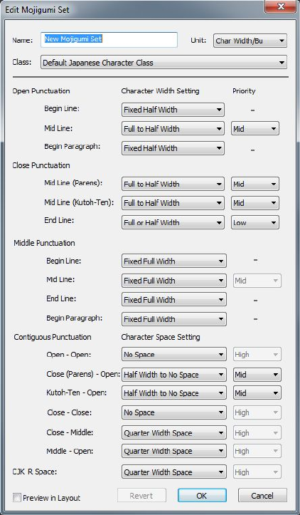
The settings in the Edit Mojigumi Sets dialog box let you control the width or spacing
for characters in the specified Mojigumi character class. You can also control which
adjustments take priority.
The Edit Mojigumi Sets dialog box
•Name: Displays the name of the Mojigumi set being edited.
•Units: Specify the units that you prefer to see in this dialog.
•Class: Displays the name of the Mojigumi character class being edited.
Open Punctuation
•Begin Line: Specify character width or spacing for opening punctuation that falls
at the beginning of a line.
•Mid Line: Specify character width or spacing for opening punctuation that falls
in the middle of a line.
•Begin Paragraph: Specify character width or spacing for opening punctuation
that falls at the beginning of a paragraph. This setting takes priority over the Begin
Line setting.
A GUIDE TO QUARKXPRESS 2016 | 231
TEXT AND TYPOGRAPHY
Close Punctuation
•Mid Line (Parens): Specify character width or spacing for closing punctuation
that falls in the middle of a line.
•Mid Line (Kutoh-ten): Specify character width or spacing for Kutoh-ten that falls
in the middle of a line. Kutoh-ten is a Japanese word meaning "period and comma."
•End Line: Specify character width or spacing for closing punctuation that falls at
the end of a line.
Middle Punctuation
•Begin Line: Specify character width or spacing for middle punctuation that falls
at the beginning of a line.
•Mid Line: Specify character width or spacing for middle punctuation that falls
in the middle of a line.
•End Line: Specify character width or spacing for middle punctuation that falls at
the end of aline.
•Begin Paragraph: Specify character width or spacing for middle punctuation that
falls at the beginning of a paragraph. This setting takes priority over the Begin
Line setting.
Contiguous Punctuation
•Open — Open: Specify character width or spacing for adjacent opening
punctuation. For example: ((
•Close (Parens) — Open: Specify character width or spacing for adjacent closing
and opening punctuation. For example: )(
•Kutoh-ten — Open: Specify character width or spacing for Kutoh-ten that is
adjacent to opening punctuation. Kutoh-ten is a Japanese word meaning "period
and comma." For example:. (
•Close — Close: Specify character width or spacing for adjacent closing punctuation.
For example: ))
•Close — Middle: Specify character width or spacing for adjacent closing and
middle punctuation. For example: ;)
•Middle — Open: Specify character width or spacing for adjacent middle and
opening punctuation. For example: (:
CJK & R Space
Specify the character spacing for Chinese, Japanese, or Korean characters that
are adjacent to Roman characters. This feature overrides the percentage in the
Space between CJK & R field in the Character panes of the Preferences dialog
box (QuarkXPress/Edit > Preferences). However, this affects only the
characters in the Mojigumi character set.
Character Width Setting, Character Space Setting
Specify the character width or spacing for Open Punctuation, Close Punctuation,
Middle Punctuation, and Contiguous Punctuation.
232 | A GUIDE TO QUARKXPRESS 2016
TEXT AND TYPOGRAPHY

•Fixed Full Width: Specify the character width to a fixed full-em width.
•Fixed Half Width: Specify the character width to a fixed half-em width.
•Full Width to Half Width: Specify the character width to a full-em width, but
allow characters to be squeezed down to a half-em width.
•Half Width to Full Width: Specify the character glyph width to a half-em width,
but allow characters to be stretched up to a full-em width.
•Full Width or Half Width: Allow characters to fit either a full-em width or a
half-em width. Full width has priority.
•Half Width or Full Width: Allow characters to fit either a half-em width or a
full-em width. Half width has priority.
•Full Width Space: Specify the space between character glyphs to a full-em width.
•Half Width Space: Specify the space between character glyphs to a half-em width.
•Full Width to No Space: Specify the space between character glyphs to a full-em
width, but allow spaces to be squeezed to no-em width.
•Half Width to No Space: Specify the space between character glyphs to a half-em
width, but allow spaces to squeeze to no-em width.
•None to Half Width Space: Specify the space between character glyphs to no-em
width, but allow spaces to be stretched to a half-em width.
•Quarter Width Space: Specify the space between character glyphs to a quarter-em
width.
•Quarter Width to No Space: Specify the space between character glyphs to a
quarter-em width, but allow spaces to be squeezed to no-em width.
Priority
Specify the order in which Mojigumi spacing adjusts.
•High: Adjust first.
•Mid: Adjust second.
•Low: Adjust last.
Preview
Enable or disable an editable preview of the width and spacing settings.
Applying Mojigumi sets
To apply a Mojigumi set to a paragraph, choose its name from the Mojigumi Sets
drop-down menu in the Paragraph Attributes dialog box (Style > Formats) ( Windows),
or the Paragraph tab of the Measurements palette ( Mac OS X).
To apply a Mojigumi set to a paragraph style sheet, choose the Mojigumi set name
from the Mojigumi Sets drop-down menu in the Format tab of the Edit Paragraph
Style Sheet dialog box (Edit > Style Sheets > New > Paragraph or Edit > Style Sheets >
Edit).
You can apply only one Mojigumi set to a paragraph.
A GUIDE TO QUARKXPRESS 2016 | 233
TEXT AND TYPOGRAPHY
Character mapping for legacy projects
Projects saved in East Asian versions of QuarkXPress earlier than 8.0 do not contain
Unicode text. Rather, they contain text that is stored with a particular encoding (such
as GB2312, Big5, ShiftJIS, or x-mac-korean). When you open such files in QuarkXPress 8
or later, the application attempts to automatically convert encoding-specific characters
to Unicode characters. However, the default Unicode conversion may not work for
the following types of characters:
•Characters that are in a Traditional Chinese encoding's UDA/VDA (User Defined
Area/Vendor Defined Area) range.
•Characters that are in an encoding's custom character range.
Those characters may not map to specific Unicode glyphs, so the glyphs that correspond
to these code points may differ from font to font. For example, a character that is in
an encoding's UDA/VDA range may map to one glyph in a font that uses the Taiwanese
Big5 character mapping standard, but map to a different glyph in a font that uses
Hong Kong's Big5 character mapping standard. A character in an encoding's custom
character range may be mapped to glyphs that are specific to a particular language or
industry.
QuarkXPress includes mapping tables that make it easy to solve the first problem. You
can also create your own mapping tables to accommodate projects that use custom
characters.
Mapping for projects that use UDA/VDA characters
When you open a project created in a Chinese version of QuarkXPress 3 or 4,
QuarkXPress automatically highlights all UDA/VDA characters to indicate that they
should be checked to make sure they display the proper glyph. You can turn off this
highlighting by unchecking the Highlight characters defined by Traditional Chinese
font vendors box in the Fonts pane of the Preferences dialog box(QuarkXPress/Edit
>Preferences).
If a project's highlighted glyphs display incorrectly, you may need to map the characters
in that project to Unicode using a mapping table. A mapping table is a text file that
tells QuarkXPress how to convert text that uses a particular flavor of encoding to
Unicode. Each mapping table contains a list of encoding-specific code points and their
corresponding Unicode codepoints.
If you know that a pre-8.0 project uses (for example) the Hong Kong Big5 encoding,
you can use a Hong Kong Big5 mapping table to convert its characters to Unicode
when you first open the project in QuarkXPress 8.0 or later. QuarkXPress ships with
several such mapping tables. To use one of these included mapping tables, first navigate
to the "CustomMappingTables" folder:
•Mac OS X: [DRIVE]:Library:Application
Support:Quark:QuarkXPress[version]:CustomMappingTables
•Windows:
[DRIVE]:\ProgramData\Quark\QuarkXPress[version]\CustomMappingTables
Within this folder are the following mapping table files:
234 | A GUIDE TO QUARKXPRESS 2016
TEXT AND TYPOGRAPHY

•chinsimpmac.txt: Used for legacy files that use Mac OS X Simplified Chinese
encodings.
•chintradbig5.txt: Used for legacy files that use Traditional Chinese encodings.
•japanesemac.txt: Used for legacy files that use Mac OS X Japanese encodings
•japanesewin.txt: Used for legacy files that use Windows Japanese encodings.
•koreanmac.txt: Used for legacy files that use Mac OS X Korean encodings.
•koreanwin.txt: Used for legacy files that use Windows Korean encodings.
As installed, these mapping tables contain instructions for creating custom mappings,
but they do not include any actual mappings. To utilize a special mapping, you must
replace one of these files with a file that does contain mappings for a particular type
of encoding. You can find such files in the folders in the "LegacyMappingTables" folder
(inside the "CustomMappingTables" folder):
•Hong Kong: Contains a "chintradbig5.txt" file that maps Hong Kong Big5 characters
to Unicode.
•Korean: Contains a "koreanmac.txt" file that maps Mac OS X Korean characters
to Unicode.
•Taiwanese: Contains a "chintradbig5.txt" file that maps Taiwan Big5 characters to
Unicode.
For example, if you have a pre-8.0 project that uses the Hong Kong Big5 encoding,
copy the "chintradbig5.txt" folder from the LegacyMappingTables/Hong Kong folder
to the "CustomMappingTables" folder, replacing the existing "chintradbig5.txt" file
(you may want to save a copy of the original "chintradbig5.txt" file elsewhere). Then
quit QuarkXPress, relaunch, and open the project. When you open the project,
QuarkXPress uses the Hong Kong-specific mapping table to convert the project's Big5
text to Unicode.
Mapping tables are used only when opening pre-8.0 projects. Once you have saved a
project in the current QuarkXPress version format, the text is in Unicode and the
mapping table is no longer required.
Mapping for projects that use custom characters
If characters in a legacy project use an extended code range, those characters may
display incorrectly when you open that project in QuarkXPress 8.0 or later. To fix this
problem, you can change the way the problematic characters are mapped to Unicode
characters by using a custom mapping table. A mapping table is a text file that tells
QuarkXPress how to convert text that uses a particular flavor of encoding to Unicode.
Each mapping table contains a list of encoding-specific code points and their
corresponding Unicode code points.
To create a mapping table, first navigate to the "CustomMappingTables" folder:
•Mac OS X: [DRIVE]:Library:Application
Support:Quark:QuarkXPress[version]:CustomMappingTables
A GUIDE TO QUARKXPRESS 2016 | 235
TEXT AND TYPOGRAPHY

•Windows: [DRIVE]:\Documents and
Settings\ProgramData\Quark\QuarkXPress[version]\CustomMappingTables
Within this folder are the following mapping table files:
•chinsimpmac.txt: Used for legacy files that use Mac OS X Simplified Chinese
encodings.
•chintradbig5.txt: Used for legacy files that use Traditional Chinese encodings.
•japanesemac.txt: Used for legacy files that use Mac OS X Japanese encodings.
•japanesewin.txt: Used for legacy files that use Windows Japanese encodings.
•koreanmac.txt: Used for legacy files that use Mac OS X Korean encodings.
•koreanwin.txt: Used for legacy files that use Windows Korean encodings.
As installed, these mapping tables contain instructions for creating custom mappings,
but they do not include any actual mappings. To create custom mappings, open the
file that corresponds to the encoding used by the target project, and then follow the
instructions in the file to create the mappings you need. Then quit QuarkXPress,
relaunch, and open the project. When you open the project, QuarkXPress uses your
custom mapping table to convert the project's characters to Unicode.
Mapping tables are used only when opening pre-8.0 projects. Once you have saved a
project in the current QuarkXPress version format, the text is in Unicode and the
mapping table is no longer required.
Type Tricks
Type Tricks is XTensions software that adds the following typographic utilities: Make
Fraction, Make Price, Word Space Tracking, Line Check, and Custom Underline.
Make Fraction
The Make Fraction command (Style > Type Style) enables you to format fractions
automatically. This command becomes active when a fraction is selected or the cursor
is placed adjacent to (and on the same line as) the characters that make up the fraction.
Examples of fractions that could be formatted are: 11/42, 131/416, and 11/4x.
To convert characters into a fraction, select the characters and choose Style > Type
Style > Make Fraction.
The characters in the fraction are converted using Baseline Shift and the formatting
specified in the Fraction/Price tab of the Preferences dialog box (QuarkXPress/Edit >
Preferences > Application > Fraction/Price).
Make Price
The Make Price command (Style > Type Style) enables you to format prices
automatically. This command is available when text that can be formatted as a price
(such as $1.49, £20.00, and a.bc) is selected or the cursor is adjacent to (and on the
same line as) any of the characters. A price must contain a radix (decimal symbol),
236 | A GUIDE TO QUARKXPRESS 2016
TEXT AND TYPOGRAPHY
which is indicated by a period or comma. Characters before and after the radix can
be only letters or numbers.
To convert characters to a price, select the characters you want to format and choose
Style > Type Style > Make Price.
When you apply Make Price, QuarkXPress automatically applies the superior type
style to the characters that follow the radix.
The appearance of converted fractions and prices is determined by the values and
selections entered in the Fraction/Price tab of the Preferences dialog box ( Edit >
Preferences > Application > Fraction/Price).
Word Space Tracking
The Word Space Tracking feature enables you to apply tracking to word spaces only.
(Tracking values are normally applied between both characters and words.) This feature
can only be accessed through keyboard commands.
Mac OS X
CommandTracking value
Command+Control+Shift+]Increase space by 05 em
Command+Control+Option+Shift+]Increase space by .005 em
Command+Control+Shift+[Decrease space by .05 em
Command+Control+Option+Shift+[Decrease space by .005 em
Windows
CommandTracking value
Control+Shift+@Increase space by .05 em
Control+Alt+Shift+@Increase space by .005 em
Control+Shift+!Decrease space by .05 em
Control+Alt+Shift+!Decrease space by .005 em
Word Space Tracking is applied by applying manual kerning after each selected space.
To remove Word Space Tracking, select the text and then choose Utilities > Remove
Manual Kerning (on Windows) or Style > Remove Manual Kerning (on Mac OS X)
Line Check
Use the Line Check feature to find widows, orphans, loosely justified lines, lines that
end with a hyphen, and text box overflow. Line Check (Utilities > Line Check) moves
through a document, highlighting questionable lines.
To specify what Line Check should look for, display the Search Criteria dialog box
(Utilities > Line Check > Search Criteria) and check the categories of undesirable
typography you want to search for:
A GUIDE TO QUARKXPRESS 2016 | 237
TEXT AND TYPOGRAPHY
•Loose Justification is a justified line containing word or character spaces that
exceed the maximum word or character space values in the hyphenation and
justification specifications applied to the paragraph.
•An Auto Hyphenated line ends with a hyphen placed by the automatic
hyphenation function.
•A Manual Hyphenated line ends with a hyphen entered by a user.
•A Widow is the last line of a paragraph, less than a full measure wide, that falls
at the top of the following column or page.
•An Orphan is the first line of a paragraph that falls at the bottom of a column or
page.
•Text Box Overflow occurs when text cannot be displayed within its text box.
This condition is represented by an overflow symbol in the lower right corner of
a text box.
To search the entire document, place the cursor somewhere in the text and choose
Utilities > Line Check > First Line. To search from the location of the cursor to the
end of the document, place the cursor where you want to start the search and choose
Utilities > Line Check > Next Line or press Command+;/Ctrl+;. To continue the
search, press Command+;/Ctrl+;.
Custom Underline
The Custom Underline feature lets you customize the color, shade, width, and offset
of underlines. Custom underlines behave much like type style underlines, but can be
customized with more control over the underline attributes.
Custom underline styles work much like style sheets. To create, edit, or delete an
underline style, choose Edit > Underline Styles. To apply a custom underline style,
choose its name from the Style > Underline Styles submenu on Windows and from
the Style > Type Style > Underline Styles submenu on Mac OS X .
To apply a custom underline, select the text you want to underline and choose Style >
Underline Styles > Custom on Windows and choose Style > Type Style > Underline
Styles > Custom on Mac OS X. In the Underline Attributes dialog box, you can specify
the color, shade, width, and offset of the underline.
238 | A GUIDE TO QUARKXPRESS 2016
TEXT AND TYPOGRAPHY
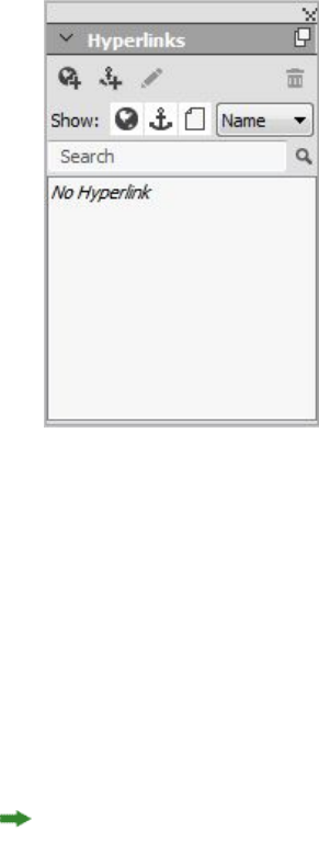
To remove a custom underline, select the text and then choose Style > Type Style >
Remove Custom Underline on Windows or Style > Type Style > Underline Styles >
Remove Custom Underline on Mac OS X.
Hyperlinks
In most HTML tools, you create a hyperlink by selecting a range of text or an image
and then entering the URL into a field. QuarkXPress does things a little differently.
The Hyperlinks palette
Destinations
A destination is a "container" for a particular URL. Just as a QuarkXPress project can
contain lists of colors and style sheets, it can contain a list of destinations. Each
destination contains one of the following types of URL:
•URL: Points to a particular resource on the Web.
•Page: Points to a particular page in the same layout.
•Anchor: Points to a particular part of a page in the layout.
Although the user interface differentiates between URLs, pages, and anchors, the actual
link included in the exported HTML file is always a URL.
Just like colors and style sheets, each destination has a name. You can give any name
you want to a destination. For example, if you have a destination for the URL
http://www.quark.com, you could name it "Quark Web Site."
Just as you can see a list of a project's colors in the Colors palette, you can see the list
of a project's destinations in the Hyperlinks palette. And just as you can apply a color
from the Colors palette, you can "apply" a destination to the selected text or item by
clicking that hyperlink in the Hyperlinks palette.
A GUIDE TO QUARKXPRESS 2016 | 239
TEXT AND TYPOGRAPHY

You can edit your list of destinations in the Hyperlinks dialog box (Edit menu). Note
that as with colors, a project's destination list can contain destinations that are not
actually used in the project.
If you prefer to create hyperlinks by selecting something and then entering a URL, you
can still do so in QuarkXPress. However, you should be aware that when you do so,
you are creating a destination, and that destination will be added to the project's list
of destinations and listed in the Hyperlinks palette.
Anchors
An anchor is simply a marker that you have attached to an object somewhere in the
layout. You can attach anchors to the following:
•A word, character, or string in a raster or HTML text box or in text on a path
•A picture box
•A particular area in an image map
•A particular cell in a table
•An empty box
•A line
In QuarkXPress, anchor indicators look like this: or .
Creating a destination
A destination contains a URL that a hyperlink can point to. To create a destination:
1Choose Window > Hyperlinks. The Hyperlinks palette displays.
•To specify the URL manually, choose URL, and then either type the URL in the
URL field or use the Select button to create a path to a particular file. (Keep in
mind that you must make sure the path is still valid in the exported HTML page.)
You can choose from four common protocols using the drop-down menu next
to the URL field.
•To link to a different page in the same layout, choose Page from the Type field
and then choose a page from the Page drop-down menu.
•To link to a particular anchor in the same layout, choose Anchor from the Type
field and then choose an anchor from the Anchor drop-down menu.
2Click OK. (If you are adding multiple destinations, press Shift while you click OK, and
the New Hyperlink dialog box will remain open.)
240 | A GUIDE TO QUARKXPRESS 2016
TEXT AND TYPOGRAPHY
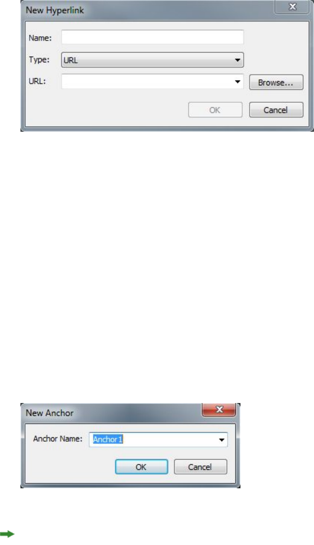
Create a destination using the New Hyperlink dialog box.
Creating an anchor
An anchor is simply a pointer to a specific place in a layout. To create an anchor:
1Choose Window > Hyperlinks. The Hyperlinks palette displays.
•Click the New Anchor button in the Hyperlinks palette.
•Choose Style > Anchor > New.
•Display the Hyperlinks palette menu and choose New Anchor.
•Display the context menu for the selected text or item and choose Anchor > New.
2Enter a name for the anchor in the Anchor Name field or choose an unused anchor
name from the drop-down menu.
3Click OK.
Configure a new anchor using the New Anchor dialog box.
To create an "empty" anchor, deselect everything and then click the New Anchor
button in the Hyperlinks palette. Use this method to create hyperlinks that point to
anchors in parts of the layout that you don't have access to or that you haven't created
yet.
Creating a hyperlink using an existing destination
A hyperlink is a text string, box, or line that points to a particular destination. To
create a hyperlink using an existing destination, select the range of text or picture box
you want to use as the hyperlink, and then do one of the following:
•Click a destination in the Hyperlinks palette.
•Choose Style > Hyperlink > [destination].
A GUIDE TO QUARKXPRESS 2016 | 241
TEXT AND TYPOGRAPHY
•Display the context menu for the selected text or item and choose Hyperlink >
[destination].
Creating a hyperlink from scratch
A hyperlink is a text string, box, or line that points to a particular destination. To
create a hyperlink and a destination at the same time:
1Select the range of text or item you want to use as the hyperlink.
•Click the New Hyperlink button in the Hyperlinks palette.
•Choose Style > Hyperlink > New.
•Display the context menu for the selected text or box and choose Hyperlink.
•To specify the URL manually, choose URL, and then either type the URL in the
URL field or use the Select button to create a path to a particular file. (Keep in
mind that you must make sure the path is still valid in the exported HTML page.)
You can choose from four common protocols using the drop-down menu next
to the URL field.
•To link to a different page in the same layout, choose Page and then choose a
page from the Page drop-down menu.
•To link to a particular anchor in the same layout, choose Anchor and then choose
an anchor from the Anchor drop-down menu.
2Click OK.
Showing links in the Hyperlinks palette
The Show buttons and drop-down menu in the Hyperlinks palette let you control
what is displayed in the palette's scroll list:
•Click the Show Destinations button to show destinations.
•Click the Show Anchors button to show anchors.
•Click the Show Page Links button to show links to pages in this layout.
•Choose Name to show items in the list by their names, or choose Link to show
items in the list by their URL.
Formatting hyperlinks
By default, hyperlinked text is underlined and colored according to the default colors
defined in the Preferences dialog box (Print Layout or Digital Layout > General).
You can override the default appearance of individual hyperlinks by selecting the
specific word(s) in the hyperlink and applying the desired formatting (color, size, and
font).
If you change the formatting of a paragraph that contains hyperlinked text, the
hyperlinks will reflect the font and font-size changes of the paragraph, while retaining
their default color and underlined text formatting.
242 | A GUIDE TO QUARKXPRESS 2016
TEXT AND TYPOGRAPHY
Editing and deleting destinations
To edit the name or URL of a destination, select the destination in the Hyperlinks
palette and click the Edit button . Any changes you make apply to all hyperlinks in
this layout that use the destination.
To delete a destination, select the destination in the Hyperlinks palette and click the
Delete button . All hyperlinks to this destination are removed from the layout.
Alternatively, you can edit and delete destinations using the Hyperlinks dialog box
(Edit menu).
Editing and deleting anchors
To edit the name of an anchor, select the anchor in the Hyperlinks palette and click
the Edit button . You can edit the name of the anchor and the anchor itself. If an
anchor does not have a name, only the anchor displays in the Hyperlinks palette.
To delete an anchor, select the anchor in the Hyperlinks palette and click the Delete
button . All hyperlinks to this anchor are removed from the layout.
Alternatively, you can edit and delete anchors using the Hyperlinks dialog box (Edit
menu).
Editing and deleting hyperlinks
To edit the destination of a hyperlink, select the hyperlink in the layout, click the Edit
button in the Hyperlinks palette, and then enter a new value in the URL field or
choose an option from the drop-down menu next to the URL field.
To remove the destination of a hyperlink, select the hyperlink in the layout and then
click No Hyperlink in the Hyperlinks palette or choose Style > Hyperlink > Delete.
Navigating using the Hyperlinks palette
In addition to creating hyperlinks in the Hyperlinks palette, you can use the
Hyperlinks palette to navigate to hyperlinks and anchors in the active QuarkXPress
layout. To navigate using the Hyperlinks palette:
•To view a destination that is a URL, double-click that destination in the Hyperlinks
palette. The URL is passed to the designated Web browser.
•To navigate to an anchor in the active layout, double-click the anchor's name in
the Hyperlinks palette.
A GUIDE TO QUARKXPRESS 2016 | 243
TEXT AND TYPOGRAPHY
Pictures
You can import pictures from image-editing or other graphic applications into
QuarkXPress. Once a picture is in a box, you can perform a number of operations on
it, such as altering its position, changing its size, or skewing or flipping it.
Working with pictures
QuarkXPress provides a wide variety of tools for working with pictures.
Importing a picture
To import a picture, do one of the following:
•Choose File > Import.
•Select the Picture Content tool , select a picture box, and then choose File >
Import.
•Select the Picture Content tool , select a picture box, and then paste a picture
from the clipboard.
•Drag a picture file from the file system onto a picture box.
•Drag a picture file from the file system onto a page.
•Drag a picture from another application onto a picture box.
•Press Command/Ctrl and drag a picture file from the file system onto a text box,
a no-content box, an empty picture box, or a box that contains a picture.
•Press Command/Ctrl and drag a picture from another application onto a text box,
a no-content box, an empty picture box, or a box that contains a picture.
If you drag content onto a box that already contains text or a picture, QuarkXPress
creates a new box for the dragged content. To replace the contents of the box instead,
press Command/Ctrl while dragging the content to the box. To always create a new
box for dragged-in content, press Option/Alt while dragging.
When you import a picture, the image is imported at full size, with the origin (upper-left
corner) in the upper-left corner of the box's bounding box. With the Picture Content
tool selected, the picture's full image displays beyond the box boundary.
You may need to resize or reposition a picture after you import it to make it fit properly
within its box.
244 | A GUIDE TO QUARKXPRESS 2016
PICTURES
Moving pictures
You can move pictures inside their boxes with:
•the Picture Content tool
•the Measurements palette
•(Windows only) the Modify dialog box (Item > Modify)
With the Picture Content tool selected, you can click any part of an image, regardless
of its position in its box. You can also nudge a picture in its box by using the arrow
keys.
If the Item tool is selected when you are using the arrow keys on the keyboard, the
box will move instead of the picture within the box. See "Moving items" for more
information about moving pictures.
Resizing pictures
You can scale pictures to make them larger or smaller using:
•the Picture Content tool
•the Measurements palette
•the Style menu
•(Windows only) the Item menu (Item > Modify)
After importing a picture into a box, you can choose Fit Box to Picture and Scale
Picture to Box from the context menu (or Style menu). Press the Shift key while
resizing a picture with the Picture Content tool to resize the picture proportionately.
Cropping pictures
If you only want a portion of your image to display, you can manually crop it by
adjusting the size of the box.
Rotating and skewing pictures
Rotating a picture sets it at a different angle within the box, while skewing a picture
applies a slanted look to it.
To rotate a picture, select the Picture Content tool and move the mouse over one
of the picture's corner handles. A Rotation pointer displays according to the selected
corner. Drag the pointer to rotate the picture. You can also enter rotate values for a
picture in the Picture Angle field of the Modify dialog box (Item > Modify > Picture)
on Windows, or the Measurements palette (Home/Classic tab).
To skew a picture, enter a value in the Picture Skew field of the Modify dialog box
(Item > Modify) on Windows or the Measurements palette (Home/Classic tab).
Coloring and shading pictures
You can apply color and shade values to the shadows and middle tones of
black-and-white and grayscale pictures using the Colors palette (Window > Colors),
A GUIDE TO QUARKXPRESS 2016 | 245
PICTURES
the Modify dialog box (Windows only)(Item menu) (Style > Picture), the
Measurements palette, or the Style menu. You can also apply color to the picture
background and the box background.
•To apply color to a black-and-white or grayscale picture, select the Picture Color
icon and click a color name.
•To apply color to the background of a black-and-white or grayscale picture, select
the Picture Background Color icon and click a color name.
Flipping pictures
You can flip the contents of a picture box from left to right and from top to bottom
using the Style menu (Style > Flip Horizontal or Style > Flip Vertical) or the
Home/Classic tab of the Measurements palette (click the flip horizontal icon or
the flip vertical icon ).
Listing, verifying status of, and updating pictures
The Usage feature (Utilities menu) lets you keep track of all your imported pictures.
To use this feature, choose Utilities > Usage, then click Pictures to display the Pictures
pane.
The Show button displays the selected picture in the layout.
The Update button lets you update missing and modified pictures. To update modified
pictures without a confirmation alert, Option+click/Alt+click the Update button.
Specifying background colors for pictures
To increase your design options with pictures, you can modify box color, picture color,
and picture background color. See "Coloring and shading pictures" for more information.
•For gray pixels, the picture color and picture background color are mixed.
•If you specify different opacities for the picture color or picture background color,
the colors will interact with each other and the box color.
Grayscale and 1-bit images only: When you open a project from a previous version of
QuarkXPress, the box color is mapped to the picture background color so the picture
looks the same.
Maintaining picture attributes
When you import a picture into a picture box — whether or not the picture box already
contains a picture — you can retain all picture attributes. For example, if an empty
picture box in a template specifies that the picture should be scaled 50% and rotated
90 degrees, you can import a new picture and those attributes are automatically applied.
To import a picture and retain the attributes specified for the box and/or the existing
picture, check Maintain Picture Attributes in the Import dialog box (File menu).
246 | A GUIDE TO QUARKXPRESS 2016
PICTURES

Working with clipping paths
A clipping path is a closed Bézier shape that indicates which parts of a picture should
be displayed and which parts should be treated as transparent. Clipping paths are
especially useful when you are attempting to isolate the picture's subject from its
surrounding background in the original picture file.
You can create clipping paths from scratch in QuarkXPress or QuarkCopyDesk, or you
can use embedded path or alpha channel information to create clipping paths. Clipping
paths created by QuarkXPress or QuarkCopyDesk are based on the picture file, and
are stored with the layout.
A clipping path lets you control which parts of a picture show and which parts are hidden.
Creating clipping paths
To create or assign a clipping path, choose Item > Clipping on Windows, and then
choose an option from the Type drop-down menu, or use the Clipping tab on the
Measurements palette on Mac OS X:
•Choose Item to crop an image to the box boundaries. Choosing Item does not
create a clipping path; it simply crops the picture to its box.
•Choose Embedded Path to clip a picture around a path already embedded in the
picture file. Choose a path from the Path drop-down menu if the picture file
contains more than one embedded path.
•Choose Alpha Channel to clip a picture around an alpha channel already
embedded in a picture file. Choose an alpha channel from the Alpha drop-down
menu if the picture file contains more than one embedded alpha channel. Note
that using a clipping path around an alpha channel will create a hard edge rather
than a blended effect. If you want a semi-opaque blend, use an alpha mask. (See
"Working with alpha masks.")
•Choose Non-White Areas to create a clipping path based on the picture's subject.
Depending on the image and the value in the Threshold field, the clipping path
will outline a non-white figure within a larger white or near-white image (or vice
versa). The Non-White Areas option works best when the unwanted parts of the
image are much lighter than the subject itself (or vice versa).
•Choose Picture Bounds to clip a picture around the rectangular "canvas area" of
the imported picture file. This includes any white background areas saved with
the original picture file. Enter values in the Top, Left, Bottom, and Right fields
A GUIDE TO QUARKXPRESS 2016 | 247
PICTURES
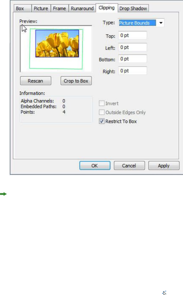
to determine the outset of the clipping path from the picture's boundaries. Positive
values increase the outset, and negative values decrease the outset.
Clipping tab of the Modify dialog box
The green path in the Preview area corresponds to the clipping path, and the blue
outline corresponds to the picture box.
Using embedded clipping paths
You can use image-editing applications to embed paths and alpha channels in an
image. If a picture storing this information is imported into QuarkXPress, you can
access the path and channel information using the Clipping tab in the Modify dialog
boxon Windows , or the Clipping tab of the Measurements paletteon MAC OS X.
TIFFs and PSDs can have embedded paths and alpha channels. EPS, BMP, JPEG, and
PICT files can only have embedded paths.
Manipulating clipping paths
After you apply a clipping path, choose Item > Edit > Clipping Path to enable clipping
path editing. Then choose one of the following tools: The Select Point tool , the
248 | A GUIDE TO QUARKXPRESS 2016
PICTURES
Add Point tool , the Remove Point tool , and the Convert Point tool . For more
information, see "Tools."
You can also manipulate clipping paths with the controls in the Measurements palette.
To change a point from one type to another, use one of the following three buttons:
•Symmetrical Point : A symmetrical point connects two curved lines to form
a continuous curve. The result is similar to a smooth point, but the curve handles
always rest on a straight line through the point and are always equidistant from
the point.
•Smooth Point : A smooth point connects two curved lines to form a
continuous curve. The curve handles always rest on a straight line through the
point, but they can be distanced independently.
•Corner Point : A corner point connects two straight lines, a straight line and
a curved line, or two noncontinuous curved lines. With curved lines, the corner
point's curve handles can be manipulated independently, usually to form a sharp
transition between the two segments.
To change the character of a line segment, use one of the following buttons:
•Straight Segment : Makes the active segment straight.
•Curved Segment : Makes the active segment curved.
You can also change point and segment types with the Item > Point/Segment Type
submenu.
Creating special effects with clipping paths
Various options in the Clipping tab let you invert a clipping path or specify whether
a picture is clipped using outside edges only, or whether the picture is contained within
its box. You can create special effects such as making visible regions transparent and
transparent regions visible, allowing holes within a path, cropping the picture to the
edges of the picture box, or removing portions of the clipping path that fall outside
the box borders.
Working with alpha masks
Unlike clipping paths, which produce a smooth edge primarily used for separating a
foreground image from a background image, alpha masks can include transparency
information to subtly blend a foreground image into a new background. To work with
alpha masks in QuarkXPress, you must first create an alpha mask in an image-editing
application such as Adobe Photoshop. You can then use the alpha mask in QuarkXPress.
A GUIDE TO QUARKXPRESS 2016 | 249
PICTURES
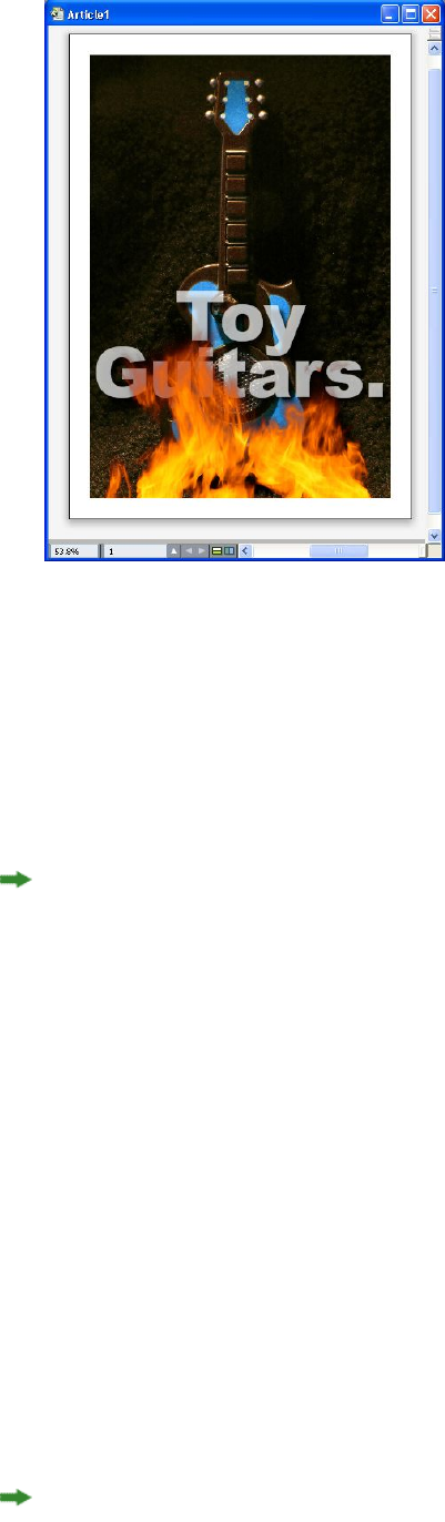
The alpha mask on the flames allows the text in the background to show through.
To work with alpha masks in QuarkXPress, you'll need to save them with the picture
in a format that supports alpha channels.
To apply an alpha mask to the selected picture, choose an alpha channel from the
Measurements palette's Mask drop-down menu. On Windows, you can also apply an
alpha mask with the Channel drop-down menu in the Picture tab of the Modify
dialog box (Item menu).
By default, this drop-down menu is set to Composite, which preserves the image's
overall transparency.
Working with PSD pictures
You can import native, unflattened picture files from Adobe Photoshop directly into
QuarkXPress with PSD Import XTensions software. Once files are imported, you can
manipulate any layers, channels, and paths saved with the Photoshop (PSD) files. This
integration between Photoshop and QuarkXPress streamlines your workflow by allowing
you to skip flattening; saves hard disk space by enabling you to work with native files;
and enhances your creative possibilities by providing access to layers, channels, and
paths.
When the PSD Import XTensions software is running, you can use File > Import to
import a PSD file into a selected QuarkXPress picture box.
To work with layers, channels, and paths in the image, choose Window > Advanced
Image Control. You can use the Advanced Image Control palette to blend layers,
work with color channels, and select paths.
To work with PSD files in QuarkXPress, you must have the PSD Import XTension
loaded.
250 | A GUIDE TO QUARKXPRESS 2016
PICTURES

Preparing PSD files
When you're preparing pictures in Photoshop for use with Advanced Image Control,
you need to keep a few things in mind:
•You do not need to save the image in another file format, which means that you
don't have to flatten the layers.
•Create alpha channels or clipping paths for any contours that you might want to
wrap text around.
•Create channels for areas where you might want to apply a different spot color
or varnish.
•Advanced Image Control cannot read layer information for certain images —
including those that use layer effects. The composite image is used instead.
Advanced Image Control supports PSD files in grayscale, RGB, CMYK, index, Duotone
and multichannel modes.
Working with PSD layers
Experimenting with layers allows you to see different images within the context of
the entire layout. In addition, you can modify the opacity of a layer and try different
blend modes — such as dissolve, lighten, and difference — to see how these effects
work with the rest of a design.
You can use the Layers pane of the Advanced Image Control palette to show, hide,
blend, and change the opacity of layers within PSD pictures. The Advanced Image
Control palette displays information about how the picture file was created, but does
not allow you to make fundamental changes to the picture file:
•You cannot create, name, copy, duplicate, align, reposition, delete, or merge layers
using the Layers pane.
•If there are no layers in the PSD file, the Advanced Image Control palette shows
only the background layer.
Blending PSD layers
The Blend Mode drop-down menu in the Layers pane lets you control how pixels in
a selected layer interact with pixels in all the layers below the selected layer. The blend
modes are similar to those in image-editing applications: They include options such
as Multiply, Color Dodge, Exclusion, and Saturation.
Showing and hiding Photoshop layers
You can view and print layers that are showing; hidden layers do not display on-screen
or in print. Advanced Image Control allows you to hide any layer, including the
background layer.
•To show a layer, click the empty box icon to the left of the layer.
•To show all layers, Option+Shift+click/Alt+Shift+click the empty box icon.
•To hide a layer, click the eye icon .
A GUIDE TO QUARKXPRESS 2016 | 251
PICTURES

•To hide all but one layer, Option+click/Alt+click the eye icon .
If changing the blending and opacity of layers produces undesirable results, you can
revert the layers to their original state in the imported PSD file with the Revert Layer
or Revert All Layers options in the Advanced Image Control palette menu.
Modifying PSD layer opacity
A field on the Layers pane let you control the transparency of pixels on a selected
layer. You can specify a transparency from 0% (transparent) to 100% (opaque).
Working with layer masks
If layer masks are saved with PSD files, you can enable and disable the masks in the
Layers pane of the Advanced Image Control palette by Shift-clicking the thumbnail
preview of the layer mask.
Working with PSD channels
Photoshop channels store color information about images. By default, grayscale and
indexed color images have one channel, RGB images have three channels, and CMYK
images have four channels. These are referred to collectively as the default channels.
You can use the Channels pane of the Advanced Image Control palette to show and
hide all channels, to change the color and ink solidity of a selected spot-color channel
or alpha channel, and to assign spot colors to selected indexed colors. For example,
you might assign special effects such as varnishes, embossing, and die cuts to channels.
Showing and hiding channels
Visible channels in imported PSD files display on screen and can be printed; channels
that are hidden do not display on screen and cannot be printed. The process to show
and hide channels is the same as for layers.
Clicking the composite channel displays all the default channels, such as CMYK or
RGB.
Modifying channel color and solidity
You can use the Advanced Image Control palette to change the color, shade, and ink
solidity of any spot color, mask, or alpha channel you created in Photoshop. You can
assign spot colors to channels that overprint composite images, and you can specify
solidity for displaying channels on-screen and printing color composites.
Channels specified as mask channels in Photoshop are imported differently than
channels specified as spot colors. In Photoshop, mask channels are assigned an opacity
setting, while spot channels are assigned a solidity setting. Since PSD Import supports
ink solidity, mask channels are imported with a 0% ink solidity. To see mask channels
in imported PSDs, you need to manually turn on the mask channels in the Channels
tab of the Advanced Image Control palette. Spot-color channels, on the other hand,
retain the solidity setting saved in the PSD file and are mapped to QuarkXPress colors
by default.
Use the Channel Options dialog box to modify the color, shade, or ink solidity of
pixels in a spot-color or alpha channel. To display the Channel Options dialog box,
252 | A GUIDE TO QUARKXPRESS 2016
PICTURES

simply double-click a channel in the Channels pane of the Advanced Image Control
palette (Window menu).
Working with indexed color channels
By default, when you print color separations from QuarkXPress using PSD Import, the
colors in indexed color images separate to CMYK. You can override this by creating a
spot color or multi-ink color (Edit > Colors) and assigning that color to the selected
indexed colors in the image. Advanced Image Control also allows you to create spot
colors from colors in the indexed color image. Indexed colors that you do not modify
will still separate to CMYK.
Working with PSD paths
You can also use PSD Import to choose among embedded paths for specifying clipping
and runaround. The Paths pane in the Advanced Image Control palette provides
convenient access to the clipping-path and text-runaround functions in QuarkXPress
Using the Paths pane, you can select different clipping paths to use for text runaround
contours. To select a text runaround contour, click the empty box in the first column.
The Text Runaround icon displays and the text wraps around the contours of the
clipping path.
For text runaround to occur, the picture box needs to be in front of the text. If the text
is not wrapping, select the picture box and choose Item > Bring Forward or Item >
Bring to Front.
You also can use the Paths pane to control the display of an image by selecting a
clipping path you created in Photoshop. To select a clipping path, click in the empty
box in the second column. The Clipping Path icon displays and the area of the picture
within the selected clipping path displays.
You can reverse any changes you make to paths in PSD Import. The paths will revert
to their original state as they were created in the imported PSD file. To do this, choose
Revert Path or Revert All Paths from the Advanced Image Control palette or context
menu.
Printing with PSD Import
When you print a layout using Advanced Image Control, you can specify the layers,
channels, and paths within each PSD picture to print. Since the eye icon in the
Advanced Image Control palette controls both display and printing, pictures print
as they display.
A GUIDE TO QUARKXPRESS 2016 | 253
PICTURES
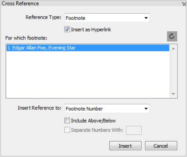
Cross references
A cross reference in a document is text that refers to related material located elsewhere
within the document. If the cross reference is inserted as a hyperlink, and the document
is exported as PDF, then the reader will be able to click on a cross reference and follow
the link to the specified location within the document.
Cross references can only be linked to footnotes, endnotes and numbered items. Cross
references to footnotes and endnotes allow you to have multiple references to the
same footnote or endnote without having to create separate footnotes or endnotes for
each reference point.
Inserting a cross reference
To insert a cross reference:
1Place the insertion point where you want to insert the cross reference.
2Choose Style > Cross Reference > Insert Cross Reference. The Cross Reference dialog
box appears:
254 | A GUIDE TO QUARKXPRESS 2016
CROSS REFERENCES
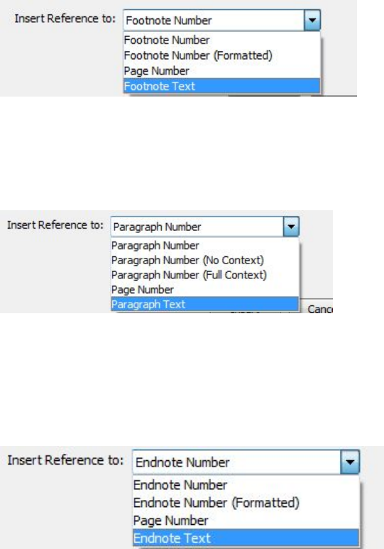
3Choose the type of cross reference you are inserting from the Reference Type drop
down menu: Footnote, Endnote or Numbered Item.
4Check Insert as Hyperlink to insert the cross reference as a hyperlink in the exported
PDF document.
5Once you have chosen a cross reference type, the available references to link to will
be listed. Choose a reference to link to.
6Choose an option from the Insert Reference to drop-down menu. The options in this
drop-down menu depend on what cross reference type you have choosen. What you
choose here will determine the text of the cross reference link.
Insert Reference to options for a Footnote Reference Type.
You can choose to display the footnote number (in its formatted or unformatted state),
the page number the footnote resides on or to the text of the footnote itselft.
Insert Reference to options for a Numbered Item Reference Type.
You can choose to display the paragraph number of the numbered iem (with or without
context), the page number the numbered item resides on or to the text of the item
itselft.
Insert Reference to options for a Endnote Reference Type.
You can choose to display the endnote number (in its formatted or unformatted state),
the page number the endnote resides on or to the text of the endnote itselft.
7If you check Include Above/Below, the cross reference will specify whether the
referenced item is above or below the cross reference in the layout.
8The Separate Numbers With option is available only when you are inserting a cross
reference to a numbered item. The numbered item may be a nested item, and this
option gives you the opportunity to specify that you want to separate the paragraph
numbers with a symbol of your choosing (for example, 3.2.1 or 3*2*1).
A GUIDE TO QUARKXPRESS 2016 | 255
CROSS REFERENCES

If you have specified a suffix in the outline style, then that will be the default. The
Outline Style Suffix character will be applied to the cross reference and any character
you put in the Separate Numbers With field will be ignored.
9Click Insert.
The cross reference is inserted into the document
You can go to the parent of the cross reference using a shortcut (Ctrl/Alt/Shift+ F12
on Windows, Cmd/Opt/Shift+ F12 on Mac OS X). Place the cursor within the cross
reference text or select part of the cross reference text and press the shortcut.
Synchronizing cross references
If the referenced content for a cross reference is modified, this will not be reflected in
the cross reference until you synchronize the cross reference. You can choose to
synchronize a selected cross reference or all cross references in the document .
To synchronize cross references:
1To synchronize a single cross reference, place the cursor on the cross reference.
2Choose Style > Cross Reference > Synchronize Cross Reference, to synchronize the
selected cross reference or Style > Cross Reference > Synchronize All Cross Reference
to synchronize all cross references in the current document.
Any modifications that were made to the referenced content will now be reflected in
the cross reference.
256 | A GUIDE TO QUARKXPRESS 2016
CROSS REFERENCES
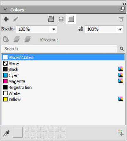
Color, opacity, and drop shadows
QuarkXPress lets you create custom colors, choose colors from several standardized
color matching systems, and edit colors. You can apply both color and shade to text
and pictures. You can also control the opacity of text in the same way you control its
color. You can apply drop shadows to both items and text.
Working with colors
Some colors are automatically included in the Colors palette. To use other colors,
you'll need to create colors or edit existing colors using the Colors dialog box, which
allows you to create colors using color wheels, numeric fields, or color matching
systems. You can also add colors to your project using the color picker tool.
The Colors palette
You can use the Colors palette (Window > Colors) to add, create, edit, duplicate, and
manage project colors. The palette also allows you to control overprint and knockout
settings.
The Colors palette lets you create, edit, and delete colors.
A GUIDE TO QUARKXPRESS 2016 | 257
COLOR, OPACITY, AND DROP SHADOWS
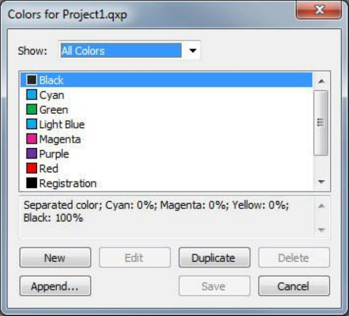
The Colors dialog box
You can use the Colors dialog box (Edit > Colors) to create, edit, duplicate, delete,
and append colors.
The Colors dialog box lets you create, edit, and delete color definitions.
Creating a color
You can choose from several color models and from a number of color matching
systems when you create colors. If you have colors you use frequently, you can create
colors for the default color list in the application when no files are open. You can
create up to 1,000 default or article-specific colors. To create a color, choose Edit >
Colors to display the Colors dialog box, and click New to display the Edit Color dialog
box. Then, enter a name in the Name field and specify the color model for your new
color. You can also click the New button on the Colors palette to create colors.
•RGB: This additive color system is most often used with slide recorders or color
video monitors, and also works well for digital output. Red, green, and blue light
is mixed to represent colors on a video screen.
•HSB: This color model is often used by artists because it resembles the manner in
which they mix colors. Hue describes color pigment; saturation measures the
amount of color pigment; and brightness measures the amount of black in a color.
•LAB: This color space is designed to be independent of differing interpretations
imposed by monitor or printer manufacturers. The LAB color model, also referred
to as LAB color space, is a standard three-dimensional model for representing
258 | A GUIDE TO QUARKXPRESS 2016
COLOR, OPACITY, AND DROP SHADOWS
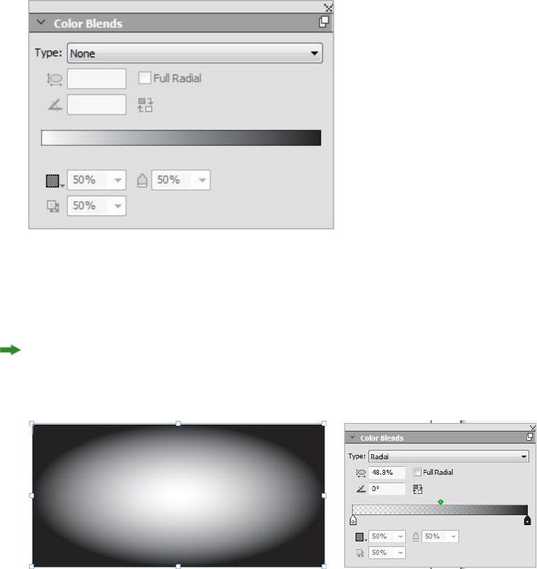
colors. Colors are specified by a luminance coordinate (L) and two chrominance
coordinates (A for green-red), and (B for blue-yellow).
•Multi-Ink: This color model is color based on tint percentages of existing process
or spot inks.
•CMYK: CMYK is a subtractive color model used by professional printers to
reproduce colors by combining cyan, magenta, yellow, and black inks on a press.
•To select a color from a color matching system and add it to your color list, choose
one of the standardized color matching systems from the Model drop-down menu.
Creating multi-color blends
A blend is a transition from one color to another. You can use the Color Blends palette
(Window > Color Blends) to create multi-color blends, specifying the blend colors,
their shades, opacity, the pattern in which they blend, and the angle at which they
blend relative to the box. A blend can contain any colors available in a project.
To create a multi-color blend:
1Open the Color Blends palette (Window > Color Blends).
2Select the box (or boxes) on the layout you want to apply the blend to, the blend will
be applied to all selected items.
3Choose the type of color blend you are creating from the Type drop down menu:
Axial, Radial, Rectangular or Diamond.
As soon as you choose a type of blend, a default blend is automatically created from two
colors: the background color of the box you have selected and black. Choosing a blend also
enables and disables the options and controls appropriate to your selection.
A GUIDE TO QUARKXPRESS 2016 | 259
COLOR, OPACITY, AND DROP SHADOWS
You can change the type of blend at any time. When you switch between Axial and
Radial types, all colors and options that you have defined will be retained, but if you
switch to a Rectangular or Diamond from an Axial or Radial, only the first and last
colors of the blend will be maintained.
4Define your blend using the following options and controls:
•Angle: define the angle of the blend.
•Click the reverse icon to reverse the color blend.
•The Gradient Slider gives you a preview of how your blend will appear. The color
stop icons ( ) are positioned at the beginning and end of each two color blend.
You can click and drag a color stop to change its location, or you can select any
color stop and use the options below to define the color and shade ( ), opacity
( ), and location ( ) numerically. The icon is positioned midway between
two color stops. You can click and drag the midway icon to change its location,
or you can select it and change its location numerically.
The midway icons location must remain between 13% and 87%. You will not be
able to drag it beyond, or enter a value outside of, this restriction.
Add colors using the Gradient Slider by clicking anywhere between two color
stops to add a new color stop. A plus symbol ( ) will appear next to your cursor
when you are at a place that allows you to insert a new color stop. You can then
define the color, shade, opacity and location of the new color stop.
When defining the color, you can choose any color that is available in this project,
or you can select to create a new color at this time. To add a color stop and define
a new color at the same time, Shift+Click when adding the color stop. You can
edit an existing color by double clicking on the color stop to display the Edit
Color palette.
You can delete any color stop by clicking and dragging it down.
When creating rectangular and diamond color blends, you cannot add more
colors, these can only be two color blends. You can change the color, shade and
opacity of the two color stops, but not the location of either the color stops or
the midway point.
•Check Full Radial to spread the center color out to soften the blend. This option
is only available for radial blends.
•Aspect Ratio: The aspect ratio is used to define and control the shape of the
radial blend. The default aspect ratio for each radial blend you create is dependent
on the box shape you have selected. If you change the size/shape of the selected
box, the aspect ratio will automatically adjust. This option is only available for
radial blends.
5The following options are on the drop-down menu under the icon:
•Copy Color Blend: Use this option to copy the color blend applied to the selected
box.
260 | A GUIDE TO QUARKXPRESS 2016
COLOR, OPACITY, AND DROP SHADOWS
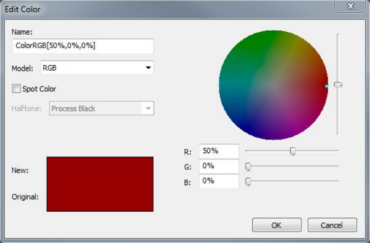
•Copy Color Stops: Use this option to copy only the defined color stops of the
blend applied to the selected box. You can then apply these color stop definitions
to another blend.
•Paste Blend: Use this option to paste the copied color blend onto the selected
box.
•Paste Color Stops: Use this option to paste the copied color stops onto the existing
blend in the selected box.
•Overprint Blend: Use this option to set the overprint option, to prevent knockout.
The mixed blend color you have created will appear on the Colors palette, as a
background color called Mixed Colors, when the box the color is applied to is selected.
You can change the shade and opacity of all of the colors in the blend at one time
using the Colors palette.
Editing a color
To edit an existing color, choose Edit > Colors, select the color you want to edit in
the Colors list, then click Edit to display the Edit Color dialog box. You can also
double-click the color you want to edit in the Colors list to display the Edit Color
dialog box.
Edit Color dialog box
Duplicating a color
To duplicate an existing color, choose Edit > Colors, select the color you want to
duplicate from the Colors list, then click Duplicate to display the Edit Color dialog
box for the duplicate color.
A GUIDE TO QUARKXPRESS 2016 | 261
COLOR, OPACITY, AND DROP SHADOWS
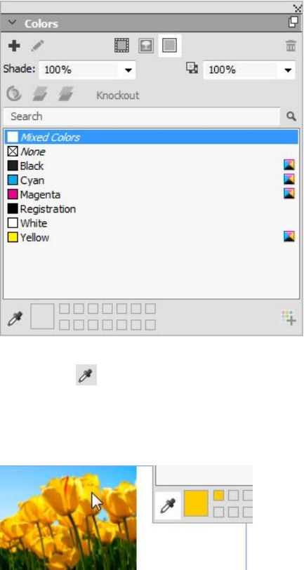
Deleting a color
While you cannot delete some of the default colors, you can delete any new or duplicate
colors you have created. To remove a color from the color list, choose Edit > Colors,
select the color you want to remove from the Colors list, and then click Delete.
Adding colors using the color picker tool
The color picker tool on the Colors palette allows you to pick any color from items
and images in your project and add them to the list of available colors. You can pick
multiple colors and then decide which colors you want to save or discard.
After being added, these colors are then available to your project and can be used on
text, lines, and boxes and can also be used to create custom color blends.
To add colors to your project using the color picker tool:
1Open the Colors palette.
2Click on the color picker tool.
3Click on any color in your project that you want to add. The color will be displayed
at the bottom of the Colors palette.
4To add an individual color, double click on the color. To remove an individual color,
press the Alt key and click on the color.
262 | A GUIDE TO QUARKXPRESS 2016
COLOR, OPACITY, AND DROP SHADOWS
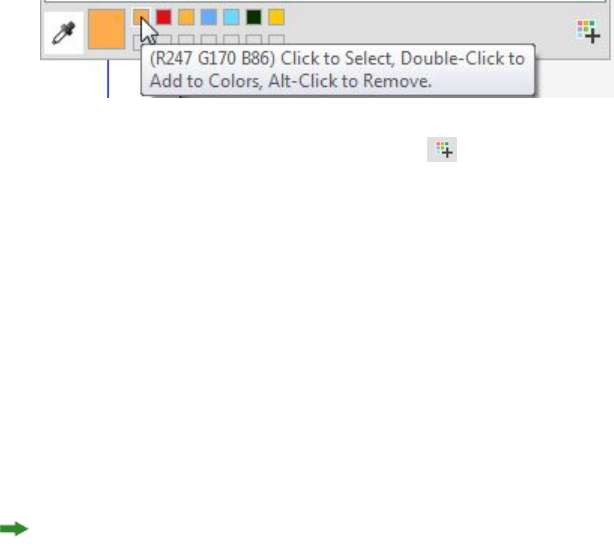
5Hold down Alt/Option+Shift and click on the icon to add all of the colors that
were chosen with the color picker tool at one time.
Importing colors from another article or project
You can append colors from another article or project using the Colors dialog box
(Edit > Colors) or the Append command (File > Append).
Changing all instances of one color to another color
To globally change all items of one color to another color, either edit the color you
want to change to the desired color or choose Edit > Colors to display the Colors
dialog box, and select the name of a color to edit; then click Edit, and make your
changes.
When you are globally changing all items and text from one color to another, remember
to save your work before you do so. That way, if you accidentally change everything
to the wrong color, you can simply choose File > Revert to Saved to undo the error
without losing any of your other work.
Applying color and shade
There are three ways to apply colors and shades to boxes, frames, and pictures:
•(Windows only) Use the Box and Frame tabs of the Modify dialog box (Item >
Modify).
•Use the Colors palette (Window > Colors).
•Use the Measurement palette.
You can apply color to the dark areas of black-and-white bitmap and grayscale pictures
by choosing the Color command (Style > Color) when a picture box containing a
picture in one of these formats is active.
Applying color and shade to text
There are five ways to apply color and shade to text:
•You can apply color and shade using the Style > Color and Style > Shade
commands.
•You can use the Colors palette (Window > Colors).
•You can use the Character Style Sheet command (Style > Character Style Sheet)
to apply color and shade to selected text using character style sheets you have
created.
•(Windows only) You can use the Character Attributes dialog box (Style >
Character).
A GUIDE TO QUARKXPRESS 2016 | 263
COLOR, OPACITY, AND DROP SHADOWS
•You can use the Measurements palette.
Applying color and shade to lines
Four methods are available to apply color and shade to lines:
•(Windows only) You can use the Line tab of the Modify dialog box (Item >
Modify).
•You can use the Colors palette (Window > Colors).
•You can apply color, shade, and line gap settings using the Style > Color and
Style > Shade commands.
•You can use the Measurements palette.
Working with opacity
Opacity is applied at the color level, so you can specify opacity for just about anything
you can apply a color to, including the first or second color in a blend. This means
you can have different opacities at work on different attributes of the same item — a
text box frame, a background, a picture, and each character of text, for example, can
have differing opacities.
Specifying opacity
Specifying opacity is as easy as specifying the shade of a color. In fact, wherever you
can pick a color — in the Colors palette, the Measurements palette, the Style menu,
various tabs of the Modify dialog box, and more — you can enter an opacity value
from 0% (transparent) to 100% (opaque) in 0.1% increments.
To specify opacity for a picture:
•(Windows only) Enter a value in the Opacity field of the Picture tab (Item >
Modify).
•(Mac OS X only) Enter a value in the Opacity field of the Picture Box tab of the
Measurements palette.
Specifying opacity for groups
Keep in mind that when you stack items of varying opacities, the colors are combined
and may produce a buildup of ink. For example, if you place a yellow box with a 30%
opacity in front of a cyan box with 100% opacity, the box in front will become slightly
greenish.
You can control this by grouping items and specifying a group opacity rather than
individual item opacities. To do this, on Windows, use the Group Opacity field in the
Group tab of the Modify dialog box (Item menu) and on Mac OS X use the Home tab
of the Measurements palette. Depending on the effect you want, you may need to
revert the Opacity field for the individual items to 100% (otherwise, each item's opacity
is added to the group's opacity).
264 | A GUIDE TO QUARKXPRESS 2016
COLOR, OPACITY, AND DROP SHADOWS

With these three grouped items, compare individual item opacity to group opacity. At
left, each item is 50% opaque — the items in front compose against the items behind
them. At right, each item's opacity is 100% while the group's opacity is 50% — the entire
group composes against the background. The items in the group, however, could have
individual opacities in addition to the group opacity.
Creating blends with transparency
You can blend a color with None rather than just with white. Simply choose None
for the first or second color in a blend in the Colors palette, or on Windows, you can
use the Box tab of the Modify dialog box (Item menu).
Color management
QuarkXPress addresses the issue of producing predictable color with ICC-based color
management tools that require little input from users. For color experts, however,
QuarkXPress provides control over every aspect of color management. In addition to
streamlining the implementation of color management, QuarkXPress offers true soft
proofing through previews that simulate output on various devices.
Source setups and output setups
The color management implementation in QuarkXPress allows color experts to create
and fine-tune "packages" of color management settings called source setups and output
setups. The source setups individually specify profiles and rendering intents for solid
colors and images in RGB, CMYK, LAB, and grayscale color spaces; specify source color
spaces for named colors; and indicate underlying color spaces for inks. The output
setups specify output profiles and color models, and configure proofing options for
simulating different types of output on screen.
The color management experience for users
You have many options for how you work: You can work with proven default settings,
implement source setups and output setups from a color expert, or work within a
legacy color management environment.
Working in the default color management environment
The default settings are designed to provide accurate previews and excellent output
in the majority of situations. You do not need to set anything, but if you want to look
at the default settings, you can check the Display and Color Manager selections in
the Preferences dialog box (QuarkXPress/Edit menu).
A GUIDE TO QUARKXPRESS 2016 | 265
COLOR, OPACITY, AND DROP SHADOWS
Specifying a monitor profile
The Display pane shows the monitor profile in use. The default setting, Automatic,
refers to the current monitor recognized by Mac OS X or Windows. You can choose a
different profile from the Monitor Profile drop-down menu. You might change the
default monitor profile, for example, if you have a custom profile for your monitor or
if you're switching between a laptop and a desktop computer and want to simulate
the same viewing environment.
Specifying a source setup
The Color Manager pane's Source Options area shows the default source setup,
QuarkXPress 7.0 Default, which provides the most recent, proven color management
environment. If you prefer the color management environment from a version of
QuarkXPress prior to 7.0, you can choose QuarkXPress Emulate Legacy from the
Source Setup drop-down menu.
Specifying a default proof output setup
To specify a default output setup for viewing color in Print layouts, choose an option
from the Proof Output drop-down list.
Specifying a rendering intent
The Rendering Intent drop-down menu shows the method used for converting colors
from one color space to another. The default setting, Relative Colorimetric, retains
colors that are in both the source gamut and the destination gamut. The only source
colors that are changed are those that are not within the destination gamut. Depending
on the type of jobs you work on — for example, if the emphasis is on line art and
Pantone colors rather than on photographs — you may want to choose a different
option from the Rendering Intent drop-down menu.
Color managing multi-color-space EPS and PDF pictures
Some EPS and PDF files can contain elements that use different color spaces. For
example, a PDF or EPS file might contain a picture that uses the RGB color space and
a color that uses the CMYK color space. To allow QuarkXPress to manage these various
elements appropriately, using the specified output setup, in subsequently imported
EPS and PDF pictures, check Color Manage Vector EPS/PDF.
To color manage vector content in EPS and PDF files that have already been imported
in the active project, check Include Existing Vector EPS/PDF in Layout.
Working with source setups and output setups from a color expert
If a color expert creates custom source setups and output setups specific to your
workflow — or even specific to individual jobs or clients — you can easily employ
those setups through preferences, view options, output settings, and Job Jackets. For
example, a service bureau or printer may provide setups for you that help ensure
appropriate output for their equipment.
Appending source setups
If source setups are created for a project you work on, you can append those source
setups to other projects. Use the Append button in the Source Setups dialog box
(Edit > Color Setups > Source) to navigate to and select a source setup.
266 | A GUIDE TO QUARKXPRESS 2016
COLOR, OPACITY, AND DROP SHADOWS
Importing output setups
If output setups are created for you, import them through the Output Setups dialog
box (Edit > Color Setups > Output). Use the Import button to navigate to and select
the output setup files.
Selecting source setups and output setups
To use custom source setups and output setups, you choose them from various color
management menus as follows:
•Color sources: To use a custom source setup, choose it from the Source Setup
drop-down menu in the Color Manager pane of the Preferences dialog box
(QuarkXPress/Edit menu) for the layout.
•Color display: To use a custom output setup for proofing, choose it from the Proof
Output submenu of the View menu.
•Color output: To use a custom output setup for printing or other types of output,
choose it from the Setup drop-down menu in the Colors pane of the Print dialog
box (File > Print).
Working with source and output setups in Job Jackets
When you create a project from a Job Jackets file, the appropriate source setups and
output setups are included and selected for you. You can still import, append, and
create additional setups, and select those setups for display and output.
Working in a legacy color management environment
You can open projects from QuarkXPress 7.x, 8.x, or 9.x, and be confident that color
will display and output as it always has.
You can continue to work in a legacy color management environment from
QuarkXPress versions 7.x, 8.x, or 9.x. If you choose to work in a legacy color
management environment, you can still take advantage of the soft proofing features
in QuarkXPress.
You can easily upgrade to the QuarkXPress 7 methods by changing the Source Setup
to QuarkXPress 7.0 Default (or to a custom option) in Color Manager preferences
(QuarkXPress/Edit menu > Preferences). The Source Setup is layout specific, so if
you open a project with multiple layouts, you can change the source setup for each
layout. Then, make sure any output setups you use (Edit > Color Setups > Output)
specify QuarkXPress 7.0 Default profiles rather than profiles from previous versions.
Proofing color on screen (soft proofing)
QuarkXPress provides display simulation that is accurate enough for soft proofing a
range of output. Using the information in the source setup, output setup, and any
other custom settings (such as different profiles applied to pictures), the flexible
simulation options show how the same layout will look when output to different
media and for different printing methods.
To perform soft proofing, choose an option from the Proof Output submenu of the
View menu. The menu lists all the output setups available in the layout, so if you have
imported custom output setups from a color expert, they are listed here. When you
A GUIDE TO QUARKXPRESS 2016 | 267
COLOR, OPACITY, AND DROP SHADOWS
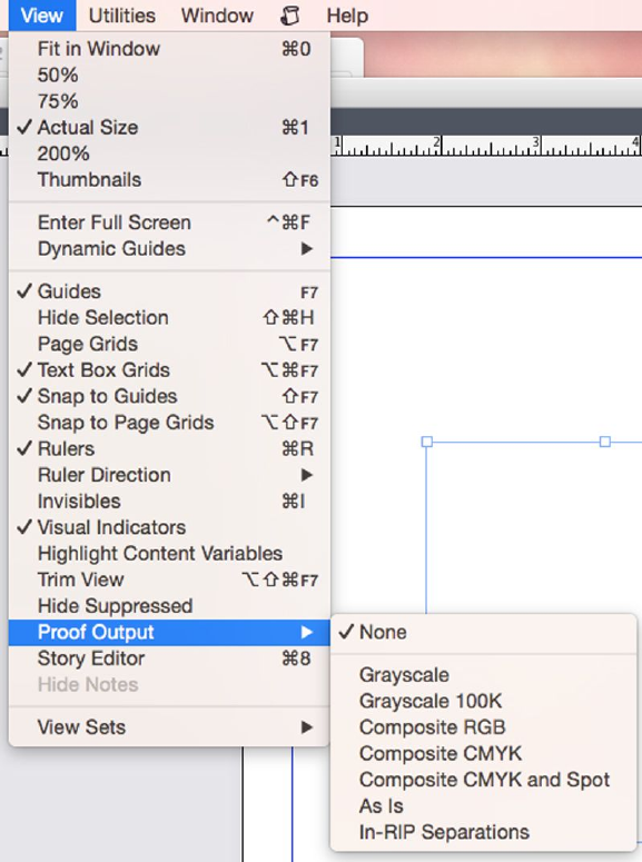
choose an option, the entire layout displays in that color space — including the Colors
palette (Window menu) and any color swatches shown throughout QuarkXPress.
The Proof Output submenu (View menu) provides display simulation options so you can
see how colors will output. For example, if you plan to convert spot colors to process colors
or output an entire RGB layout as grayscale, you can preview how your choice will look.
Color management for experts
While QuarkXPress is designed to provide great color throughout a workflow right
out of the box, a color expert can always customize and fine-tune color management
settings to specific jobs, equipment, and output processes. If you understand color
theory and all the terminology involved in color management — such as profiles and
rendering intents — you can create custom source setups and output setups that reflect
specific workflows. The setups are portable, so you can then share them with users to
prevent color surprises, on screen and on press.
Creating a source setup
A source setup describes colors in a layout as they exist prior to output — in other words,
where the colors came from. A source setup contains profiles and rendering intents
for both solid colors and pictures in RGB, CMYK, LAB, and grayscale. In addition, it
268 | A GUIDE TO QUARKXPRESS 2016
COLOR, OPACITY, AND DROP SHADOWS
includes information about the underlying color space for named colors (such as
Pantone Process Coated colors) and inks (such as cyan, magenta, yellow, black, and
multi-inks). You might create source setups for clients based on their standard
workflows, or you might create source setups for a specific project.
To get started in creating a source setup, you will need to know some details about
the hardware and software involved in a client's workflow — what type of digital
camera and scanner they use, for example — and you'll need to make sure the relevant
profiles are available. It's also helpful to see sample projects so you know what types
of pictures, colors, inks, and devices they're working with, such as logos, charts and
graphs, photographs, and duotones, and output to SWOP.
To create a source setup choose Edit > Color Setups > Source.
Creating an output setup
An output setup describes the capabilities of various types of output devices and
determines how colors are handled in various output scenarios. You can think of an
output setup as "where colors are going." An output setup specifies composite or
separation output, the output mode, and an output profile. You create output setups
both for display simulation using View > Proof Output and for actual output in print,
PDF, and other formats.
As with source setups, to get started in creating an output setup, you need to know
details about typical jobs, output methods, and equipment. For example, it's helpful
to know the name and have the profiles for any composite printing devices.
QuarkXPress provides default output setups for various workflows:
•Grayscale
•Grayscale 100K
•Composite RGB
•Composite CMYK
•Composite CMYK and Spot
•As Is
•In-RIP Separations
To create an output setup, choose Edit > Color Setups > Output.
Sharing source and output setups
Source setups and output setups are portable, so color experts can easily distribute
them to users and workgroups. Source setups can be appended from other projects
and output setups can be exported as individual files and saved in output styles. Both
types of setups, source and output, can be shared through inclusion in Job Jackets.
Before distributing setups to a workgroup or to clients, be sure to test the setups with
typical jobs.
•To share setups, append setups, export setups, or import setups, choose Edit >
Color Setups and modify the corresponding setting.
A GUIDE TO QUARKXPRESS 2016 | 269
COLOR, OPACITY, AND DROP SHADOWS

•To incorporate setups into Job Jackets and specify the source and output setups
used in a Job Jackets structure or Job Ticket, in the Job Jacket Manager dialog
box (Utilities menu):
1(Windows only) Click the Advanced Settings button.
2Select a project that contains source or output setups in the list on the left.
3Drag the source or output setups to the target Job Jackets structure or Job Ticket.
You can also choose an output style that includes specific output setups.
•To use a custom output setup for printing or other types of output, choose that
output setup from the Setup drop-down menu in the Color pane of the Output
Styles dialog box (Edit > Output Styles > New/Edit).
Fine-tuning color management for individual pictures
If you need to specify profiles and rendering intents for individual pictures, you can
still do that in much the same way that you did in previous versions of QuarkXPress.
This overrides the QuarkXPress default settings or the selected source setup. For
example, you might change the rendering intent of an EPS logo to saturation while
leaving the remaining pictures in a layout, mostly photographs, at perceptual.
To access color management controls for individual pictures, first make the features
available by checking Enable Access to Picture Profiles in the Color Manager pane
of the Preferences dialog box (QuarkXPress/Edit menu). To apply and change profiles
for pictures:
•Changing profiles: The Profile Information palette (Window menu) displays
information about the selected picture's type and color space. You can use this
palette to quickly change the picture's Profile, Rendering Intent, and Color
Manage to [type of device] setting.
Managing profiles
Color management, at its roots, is profile driven. As you adopt new workflows, acquire
new devices, and troubleshoot output, you may need to install new profiles, control
which profiles are available, and determine how individual profiles are used throughout
a layout. You can perform these tasks using the Profile Manager and Profile Usage
features.
The Profile Manager and Profile Usage features are considered advanced color
management features.
Installing profiles
If you acquire new profiles from manufacturers, and those profiles are not automatically
installed at the system level, you can drag them to the "Profiles" folder inside the
"Required Components" folder in your QuarkXPress application folder.
A system restart is required to begin using the new profile.
The next time you launch QuarkXPress, the profiles will be available in the relevant
color management drop-down menus. Using the Profile Manager dialog box (Utilities
menu), you can specify a new profiles folder as well.
270 | A GUIDE TO QUARKXPRESS 2016
COLOR, OPACITY, AND DROP SHADOWS
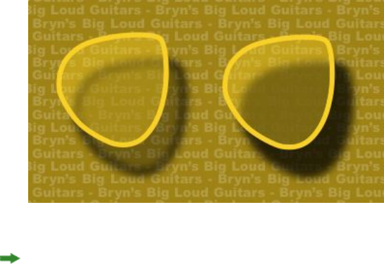
Loading profiles
If you have more profiles than you need for a particular workflow, you can streamline
the profiles available in QuarkXPress. To do this, use the Profile Manager dialog box
(Utilities menu).
Checking profile usage
When you're working with layouts from other users, you can quickly see how those
users have implemented color management by looking at the Profiles pane of the
Usage dialog box (Utilities menu). Similar to Picture Usage and Font Usage, the Profile
Usage feature lets you see where profiles are available in the layout and whether they're
specified in source/output setups or applied to pictures. For profiles applied to pictures,
you can replace one profile with another.
Working with drop shadows
A drop shadow is an item attribute, much like color, that you apply using the
Measurements palette, or on Windows, the Drop Shadow tab of the Modify dialog
box (Item menu) . You can create drop shadows for items, frames, text, pictures, and
more, depending on how the items are formatted.
QuarkXPress lets you create automatic drop shadows.
To work with drop shadows, you must have DropShadow XTensions software loaded.
Applying drop shadows
To apply a drop shadow, select the item and check Apply Drop Shadow in the Drop
Shadow tab of the Measurements palette or on Windows, the Modify dialog box
(Item menu). You can apply drop shadows to the shape of an item — box, line, text
path, table — provided that the item has a background color applied to it. You can
apply a drop shadow to text when the box background has an opacity of less than
100%. You can apply a drop shadow to the contours of a picture when a clipping path
or alpha mask is selected and the box background is None. You can apply a drop
shadow to a group with the drop shadow reflecting the collective shape of all of the
items in the group.
A GUIDE TO QUARKXPRESS 2016 | 271
COLOR, OPACITY, AND DROP SHADOWS

Customizing drop shadows
Using the controls in the Measurements palette, or on Windows, the Drop Shadow
tab of the Modify dialog box (Item menu), you can customize how a drop shadow
looks, including its distance from the item, size in relation to the original item, offset,
angle of light source, color, shade, opacity, blur, and more. You can also synchronize
the angle with other drop shadows in the layout, making it easy to maintain a
significant light source throughout a layout and making drop shadows seem more
natural.
Incorporating drop shadows with items
Additional options control how drop shadows interact with items, including handling
opacity and text runaround. As with the other controls, these options are located in
the Measurements palette, or on Windows, the Drop Shadow tab of the Modify dialog
box (Item menu) .
•Use Inherit Item's Opacity to have the drop shadow reflect different opacities in
the item, such as differences in the box background and frame.
•Use Item Knocks Out Drop Shadow to prevent a shadow from displaying through
semi-opaque areas of an item — to keep a shadow from peeping through its box,
for example.
•Use Runaround Drop Shadow to include a drop shadow with the text wrap
contour.
•Use Inherit Item's Opacity and Item Knocks Out Drop Shadow combined to
achieve different results based on the combination of these settings, as shown
here.
At far left, both Inherit Item's Opacity and Item Knocks Out Drop Shadow are unchecked.
Second from left, only Inherit Item's Opacity is checked. At far right, both options are
checked.
272 | A GUIDE TO QUARKXPRESS 2016
COLOR, OPACITY, AND DROP SHADOWS

Custom Bleeds
Bleed is the term used to describe items that are printed to the edge of a finished page.
Custom Bleeds XTensions software provides enhanced bleed functionality for
QuarkXPress, giving you more control over how items will bleed.
To create a bleed in QuarkXPress, simply create items that extend past the edge of the
page onto the pasteboard, and then specify how much of the area beyond the edge of
the page should be printed. There are three types of bleeds:
•A symmetric bleed extends the same distance from each edge of the layout page.
•An asymmetric bleed specifies different bleed amounts for each edge of the page.
•A page item bleed prints all items that extend beyond the page edge in their entirety.
The bleed rectangle is the distance the bleed extends beyond the page boundaries, and
is defined by the bleed values you enter. For example, if you create a symmetric bleed
with a value of 2 picas, the bleed rectangle encompasses everything that is within 2
picas of each edge of the page. It is important to note that the Custom Bleeds feature
automatically creates the bleed rectangle, but it does not automatically extend items
into that area. You must position items so that they extend beyond the layout page
edge to create the bleed.
Before you output a layout to film, take a moment to preview the layout to make sure
the bleed will output as you expect. Choose File > Print > Summary. The graphic page
icon on the top-right side displays the bleed area for the first page of the layout, and
indicates whether any of the layout or bleed is outside the imageable area. Remember
to add the bleed area to the layout dimensions when comparing the layout size to the
imageable area.
Using Custom Bleeds
You can use Custom Bleeds XTensions software to create bleeds when printing, saving
a page as an EPS file, exporting a layout as a PDF file, and exporting a layout in PPML
format. The procedure is similar for all of these output options, but some bleed options
are only available for certain output methods.
•Print: The Bleed Type drop-down menu is in the Bleeds pane of the Print dialog
box.
•EPS: The Bleed Type drop-down menu is in the Save Page as EPS dialog box.
When you save a page as an EPS file, the Page Items and Clip at Bleed Edge
A GUIDE TO QUARKXPRESS 2016 | 273
CUSTOM BLEEDS

options are not available. This is because these options create a bounding box
that includes any item extending off the page. This could result in a different
bounding box for every page in a layout, which could lead to inaccurate output.
•PDF: The Bleed Type drop-down menu is in the Export as PDF dialog box.
Using Clip at Bleed Edge
When creating a symmetric or asymmetric bleed, you can use the Clip at Bleed Edge
check box to define whether QuarkXPress uses the bleed value to clip items:
•If Clip at Bleed Edge is checked, QuarkXPress prints all layout page items and
pasteboard items that are at least partially within the bleed rectangle, and
QuarkXPress uses the bleed values to clip items.
•If Clip at Bleed Edge is unchecked, QuarkXPress prints all layout page items and
pasteboard items that are at least partially within the bleed rectangle, and does
not clip such items unless they extend beyond the limits of the printing device's
imageable area. Pasteboard items that are not within the bleed rectangle do not
print.
If you store items on the pasteboard, make sure they are placed outside the bleed
rectangle when using a symmetric or asymmetric bleed. If they are within the bleed
rectangle, pasteboard items may print on final output.
274 | A GUIDE TO QUARKXPRESS 2016
CUSTOM BLEEDS

DejaVu XTensions software (Windows
only)
DejaVu XTensions software adds a list of recently opened projects to the File menu,
either at the bottom or as a hierarchical menu from the File > Open submenu. This
list enables you to access projects with increased speed and ease. You can also use
DejaVu to designate default folders for retrieving text and pictures, and for opening
and saving projects.
The File List feature adds a list of recently opened projects to the File menu, either at
the bottom or as a hierarchical menu from the File > Open submenu. You can choose
to display from three to nine recently edited and saved projects. To change File List
settings, use the controls in the File List pane of the Preferences dialog box
(QuarkXPress/Edit menu).
Use the Default Path feature to designate default folders for the following File menu
commands: Open, Import, Save, and Save as.
The Default Path feature does not work until you specify default paths. To do so, display
the Default Path pane of the Preferences dialog box (QuarkXPress/Edit menu). Once
you have specified a default path for a File menu command, the application uses that
path whenever you execute that command.
A GUIDE TO QUARKXPRESS 2016 | 275
DEJAVU XTENSIONS SOFTWARE (WINDOWS ONLY)

Document construction
The Layers feature lets you easily hide, show, and suppress the printing of groups of
objects. The Lists feature lets you create tables of contents and other lists. The Index
feature lets you automatically generate an index of a layout. The Libraries feature lets
you keep often-used elements in an easy-to-reach place.
Using automatic page numbering
To insert an automatic page number on every page:
1Display a master page by choosing its name from the Display submenu (Page >
Display), or by clicking on the icon at the lower left hand corner of the document
window.
2Create a text box where you want a page number to appear.
3Press Command+3/Ctrl+3. This enters the Current Page Number character <#>. Layout
pages based on that master page will display the current page number in the location
where you place the Current Page Number character.
4Select the Current Page Number character <#> and specify the desired character
attributes.
Creating an automatic text box
An automatic text box lets you automatically flow text from page to page. To create
an automatic text box:
1Display a master page by choosing its name from the Display submenu (Page >
Display).
2Create a text box where you want the automatic text box to appear.
3Select the Linking tool .
4Click the Auto Text Box Linking icon in the upper left hand corner of the page.
5Click the box you created in step 2.
All pages based on this master page will contain an automatic text box. Text inserted
into this box will automatically flow from page to page.
276 | A GUIDE TO QUARKXPRESS 2016
DOCUMENT CONSTRUCTION
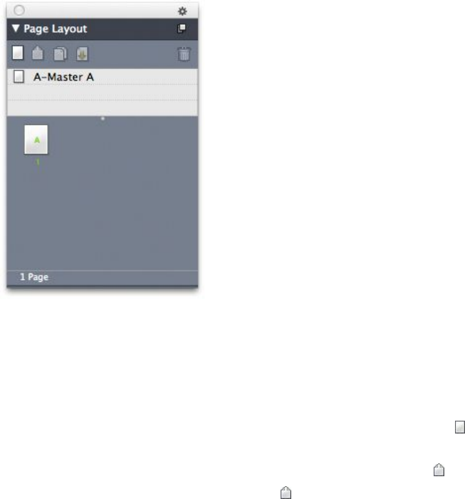
Working with master pages
Master pages are like templates for pages. If you want to use the same heading, footing,
background, page number positioning, and so forth on some of your pages, you can
create these things on a master page, and then just apply that master page to the layout
pages that need it. If you want to use a different set of page content on either side of
a spread, you can do that too. A single layout can have multiple master pages, so that
you can automatically format different parts of the same layout.
The topics below describe master pages in more detail.
Creating a master page
The best way to explain master pages is by example. In this example, we will create a
facing-page master page with an automatic text box, automatic page numbers in the
footer, and wide inside margins. To create such a master page:
1Create a new facing-page layout with an automatic text box.
2Choose Window > Page Layout. The Page Layout palette displays.
Page Layout palette
Note that there is already a default master page named A-Master A. You can tell that
this master page has been applied to the first page because of the A that displays on
the page icon in the bottom part of the palette.
3You can create single-page master pages by dragging the Blank Single Page icon
into the master page area at the top of the palette. In facing-page documents, you can
also create facing-page master pages by dragging the Blank Facing Page icon into
the master page area. Drag Blank Facing Page . A new facing-page master page
named B-Master B displays in the palette.
A GUIDE TO QUARKXPRESS 2016 | 277
DOCUMENT CONSTRUCTION
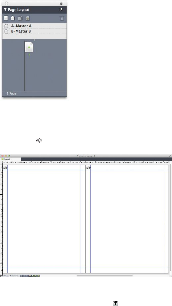
Page Layout palette with new master page
4To display the new master page for editing, double-click the B-Master B icon. The
master page displays in the main window. Note that because this is a facing-page
master page, it includes two pages: The left page and the right page. Also, note the
broken-link icons in the upper left.
Blank facing-page master page
5To add page numbers, draw two boxes on the lower left and right, as shown below.
In each of these boxes, click with the Text Content tool and then choose Utilities
> Insert Character > Special > Current Box Page #. This inserts a character that will
display as the current page number in layout pages. Format and justify the character
any way you like. (Of course, you can put your page numbers anywhere you want to.)
278 | A GUIDE TO QUARKXPRESS 2016
DOCUMENT CONSTRUCTION
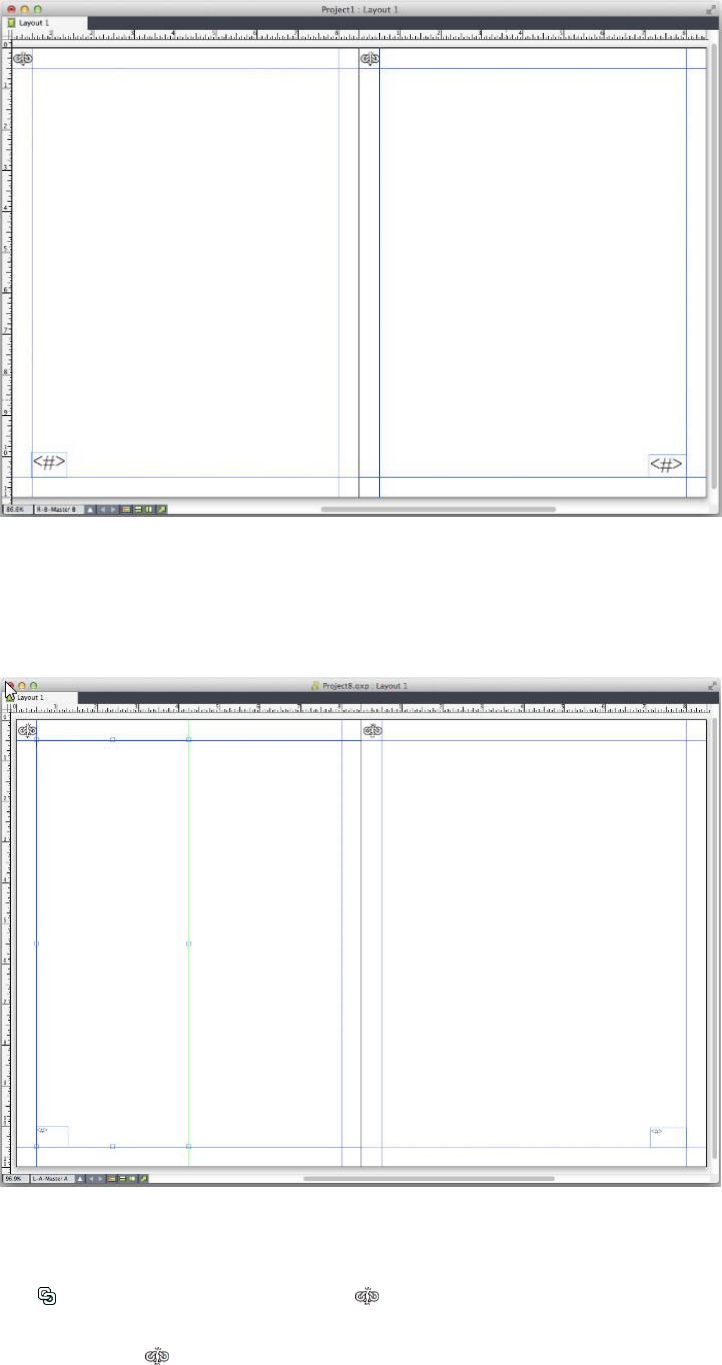
Page number characters on either side of a facing-page master page
6To indicate where the text should go, draw some guides and then draw two text boxes
like those shown below.
Master page with guides and text boxes
7Now you must link the text boxes to the automatic text chain. With the Text Linking
tool selected, click the broken-link icon at the top of the left page, then the text
box on the left page. Then click on a blank part of the page. Finally, click the
broken-link icon at the top of the right page, and then the text box on the right
A GUIDE TO QUARKXPRESS 2016 | 279
DOCUMENT CONSTRUCTION
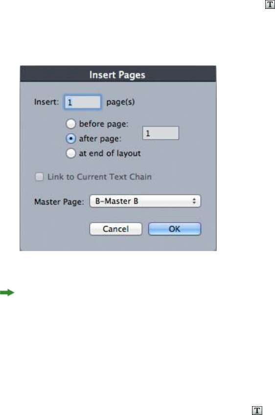
page. The text boxes on these two master pages are now linked to the automatic text
chain.
8Double-click the master page's name in the Page Layout palette and change it from
"B-Master B" to "B-Body Spread."
9Choose Page > Display > Layout. The view switches back to the layout pages.
10 Click in the text box on page 1 with the Text Content tool .
11 To add two new pages that use the new master page, choose Page > Insert. The Insert
Pages dialog box displays.
Insert Pages dialog box
You can also add pages by pressing Option/Alt and then dragging a master page to the
desired location in the bottom part of the Page Layout dialog box.
12 Enter 4 in the page(s) field, click after page, and choose B-Body Spread from the
Master Page drop-down menu. After you choose the master page, check Link to
Current Text Chain, then click OK. Four new pages are added to the layout, and both
of them have the text boxes and page numbers you created on the master page.
To verify that the new master pages have been linked to the master text chain, click
in any of the main text boxes with the Text Content tool and then choose Utilities
> Insert Placeholder Text. The entire text chain fills with text.
280 | A GUIDE TO QUARKXPRESS 2016
DOCUMENT CONSTRUCTION
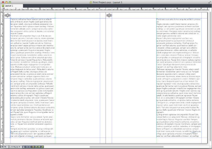
Master pages filled with Placeholder Text.
Applying master pages
There are two ways to apply a master page to a layout page.
•Drag the master page from the top part of the Page Layout palette (Windows
menu) to the target page in the bottom part of the palette.
•Select the target page or pages in the bottom part of the Page Layout palette,
then press Option/Alt and click the desired master page in the top part of the
palette.
Updating master pages
When you make a change to a master page, that change is automatically made to any
layout pages that use that master page. In other words, if you move the page number
box on a master page, the page number box will be automatically repositioned on
every page that uses that master page.
If you make a change to a master page item on a layout page, then reapply the master
page, one of two things can happen:
•If Master Page Items is set to Keep Changes (QuarkXPress/Edit > Preferences
> Print Layout > General pane), the changed item is left where it is but is no
longer linked with the master page, and a copy of the item from the master page
is added.
•If Master Page Items is set to Delete Changes (QuarkXPress/Edit > Preferences
> Print Layout > General pane), the changed item is deleted and replaced with
a copy of the item from the master page.
A GUIDE TO QUARKXPRESS 2016 | 281
DOCUMENT CONSTRUCTION
Master pages and layout families
Master pages work a little bit differently with layout families than they do with layouts
that are not part of a layout family. (For more information about layout families, see
"Understanding layout families" in A Guide to App Studio.)
•If you add, delete, or rename a master page in a layout family, the master page is
added, deleted, or renamed in all of the layouts in that layout family.
•If you add pages to one of a layout family's layouts with a particular master page,
pages with that same master page are added to the other layouts in the layout
family.
•If you apply a master page to a layout page in one of a layout family's layouts,
that master page is not applied to the corresponding pages in the layout family's
other layouts. This allows you to use different master pages for the vertical and
horizontal versions of a page in a layout family.
•If you make a change to a given master page in one of a layout family's layouts,
that change is not reflected in the same-named master pages in the other layouts.
This allows you to customize master pages for each of a layout family's page
designs.
Working with layers
The Layers palette is the "control center" for layers. You can hide, show, lock, or unlock
layers with a single click in this palette. You also can use this palette to specify the
active layer (where newly drawn objects will go), to rearrange the stacking order of
layers, to merge layers, and to move objects from one layer to another.
Each layer you create has a unique color swatch in the Layers palette. When you create
an item on a layer, the item's bounding box and handles use that layer's color.
To display the Layers palette, choose View > Layers.
You can work with layers in the Layers palette.
Every layout has a Default layer. You can add and remove items from the Default
layer, but you cannot delete the Default layer.
A layout can contain up to 256 layers, including the Default layer.
282 | A GUIDE TO QUARKXPRESS 2016
DOCUMENT CONSTRUCTION

Understanding layers
A QuarkXPress layer is like a clear overlay that covers every page in a layout. You can
put almost anything on a layer, including picture boxes, text boxes, lines, tables,
interactive objects, and any other kind of QuarkXPress item.
Layers can be useful in many different ways:
•You can put all pictures on a one layer and all text on another layer, allowing you
to work more easily with boxes should they overlap.
•You can put different translations of a document on different layers, and thus
store all language versions of the document in the same layout. When you print
the layout, you can hide all of the layers except the one that contains the language
you want.
•You can put different versions of a design on different layers, so that you can
easily switch back and forth among variations on the design theme when showing
a design to a client.
•You can use layer locking to prevent accidental changes to layers containing page
elements that should not be altered. For example, if you're going to be printing
on stock that is preprinted with a letterhead and background graphic, you can
include that letterhead and background graphic in a layer so that you can see
what the finished printed piece will look like, and then you can lock that layer
and omit it from printing.
If you have used image-editing applications such as Adobe Photoshop, you may already
be familiar with the concept of layers. However, layers have some implications in
QuarkXPress layouts that they do not have in image editing:
•Even if a front layer is showing, you can "click through" any empty portions of
that layer and select items on underlying layers, without having to manually
change the active layer.
•Each layer exists on every page in a QuarkXPress layout, rather than being specific
to a page or spread. This makes it easy to control the appearance of every page in
a long layout.
•Text in a rear layer can run around objects in a front layer.
Creating layers
To create a layer, click the New Layer button in the Layers palette. The new layer
is added to the Layers palette, in front of the active layer. The new layer is active by
default, which means that any items you create will be placed on that layer.
To create a new item on a particular layer, first click the layer's name in the Layers
palette to activate that layer. Then use any of the standard item creation tools to create
items on the layer.
Selecting layers
The active layer is identified in the Layers palette by the Edit icon . The active layer
is the layer where any new items you create will be put. You can set the active layer
in two ways:
A GUIDE TO QUARKXPRESS 2016 | 283
DOCUMENT CONSTRUCTION

•Click the layer name in the Layers palette.
•Select a single item on the page. That item's layer automatically becomes the
active layer.
Only one layer can be active at a time (even if you select items on more than one layer
at a time). However, you can select more than one layer at a time (for example, if you
want to merge the layers). To select more than one layer, do one of the following
things:
•Select items from more than one layer (for example, by selecting everything on
the page).
•To select consecutive layers in the palette, press Shift while you click the first and
last layer in the range you want to select.
•To select non-consecutive layers in the palette, press Command/Ctrl while clicking
the layers you want to select.
To deselect a layer when multiple layers are selected, press Command/Ctrl and click
the layer you want to deselect.
Showing and hiding layers
The Visible column in the Layers palette controls which layers display at any
given time. When the Visible icon appears in the Visible column, a layer is visible.
•To show or hide a layer, click in the Visible column to the left of that layer's
name. You can also double-click a layer to display its Attributes dialog box, check
or uncheck Visible in the dialog box, and then click OK.
•To show or hide all the layers in a layout at once, select a layer name and choose
Show All Layers or Hide All Layers from the Layers palette context menu.
•To hide all layers except the active layer, select the name of the layer that you
want to be active and then choose Hide Other Layers from the Layers palette
context menu. Alternatively, you can press Control/Ctrl while clicking the Visible
icon of the layer you want to display; all other layers will be hidden.
•To display all layers except the active layer, choose Show Other Layers from the
Layers palette context menu.
When you use the Find/Change feature, QuarkXPress searches hidden layers as well
as visible layers. If a match is found on a hidden layer, QuarkXPress temporarily displays
the hidden text box or text path.
When you check the spelling in a layout or story, QuarkXPress searches all layers in
the layout or story. If questionable spelling is encountered on a hidden layer,
QuarkXPress temporarily displays the hidden text box or text path.
When a layer is hidden, that layer displays unchecked by default in the Layers pane
of the Print dialog box, and consequently that layer will not print (unless you click
to check the layer manually in the Print dialog box).
When you create an item on a hidden layer, that item remains visible until you deselect
the item.
284 | A GUIDE TO QUARKXPRESS 2016
DOCUMENT CONSTRUCTION

Determining which layer an item is on
There are two ways to determine which layer an item is on:
•Look at the object's bounding box and handles (you may need to choose View >
Guides to see them). Each layer (except the Default layer) is assigned a unique
color swatch in the Layers palette, and the bounding boxes and handles for objects
on that layer are drawn in the layer's color.
•Look at the Layers palette. When you select a page item, the Item icon displays
in the Layers palette next to the name of the layer that contains the selected item.
If you select multiple items on different layers, the Item icon displays next to
each layer that contains a selected item.
Deleting layers
You cannot delete the Default layer, but you can delete any other layer. When you
delete layers, you can choose whether to delete the items on the layers or move the
items to another layer. To delete a layer:
1In the Layers palette, select the layer or layers to delete.
2Click the Delete Layer button .
3If there are items on the layers you are deleting, the Delete Layer dialog box displays.
Choose an option:
•If the layers include items that you want to delete, check Delete items on selected
Layer(s).
•If the layers include items that you want to move to another layer, uncheck Delete
items on selected Layer(s), and choose a destination layer from the Move items
to Layer drop-down menu.
4Click OK.
To delete all unused layers in a layout, choose Delete Unused Layers from the palette
menu.
Changing layer options
You can control the following options for the selected layer in the Attributes dialog
box:
•Name: The layer's name, as displayed in the Layers palette.
•Layer Color: The color used for the bounding boxes and handles of objects on
that layer.
•Visible: Controls whether the layer is visible in QuarkXPress.
•Suppress Output: Controls whether the layer is set to print when the layout is
printed. You can override this setting in the Print dialog box.
•Locked: Controls whether you can manipulate objects on this layer.
A GUIDE TO QUARKXPRESS 2016 | 285
DOCUMENT CONSTRUCTION
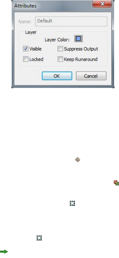
•Keep Runaround: Controls whether runaround from objects on this layer applies
to underlying layers when this layer is hidden.
To display the Attributes dialog box for a layer, double-click the layer's name in the
Layers palette, or select a layer name in the palette and then choose Edit Layer from
the palette menu.
You can control layer options in the Attributes dialog box.
You can set the default values of the Visible, Locked, Suppress Output, and Keep
Runaround check boxes for new layers in the Layers panes of the Preferences dialog
box (QuarkXPress/Edit menu).
Moving items to a different layer
The Layers palette provides three methods for moving existing items to a different
layer. Using the Item tool , select the items you want to move, and then do one of
the following things:
•Click the Move Item to Layer button , and then choose the target layer in the
Move Items dialog box.
•Drag the Item icon to the target layer.
•Cut the items from their current layer and paste them on the target layer.
To place a copy of an item on a different layer, press Control/Ctrl while dragging the
Item icon to the target layer in the Layers palette.
You can move master page items on layout pages from the Default layer to other
layers, but those items will no longer be master page items if you do so.
Copying and pasting items between layers
There is an option in the Layers palette that allows you to set Paste To Remember
Layers.
286 | A GUIDE TO QUARKXPRESS 2016
DOCUMENT CONSTRUCTION
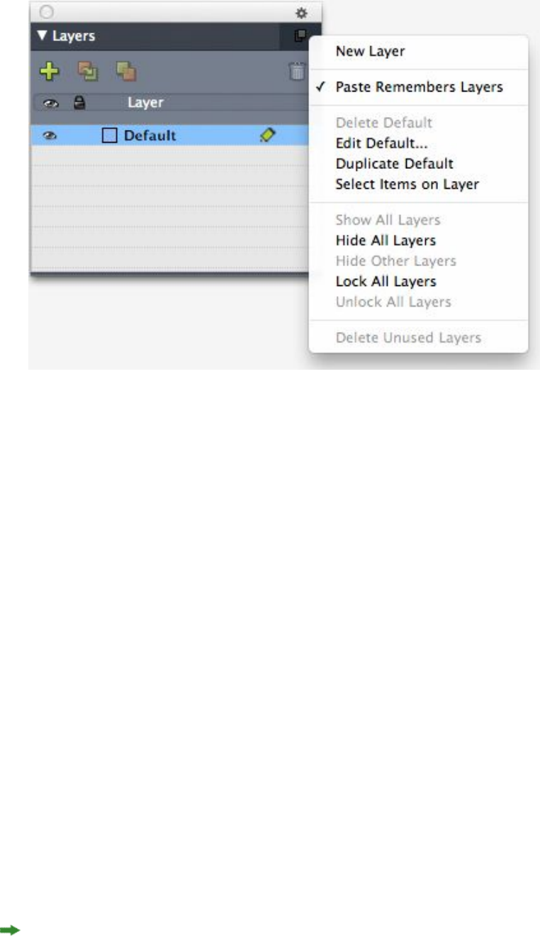
Placeholder for image of the Layers palette.
This option is turned on by default. When it is on and one or more items are copied
and pasted, then the elements will be pasted on the same layer from which they were
copied. Layer matching is done by name, so if the item comes from a different
document with different layer names, a new layer with that name will be created.
If the preference is turned off, all items will be pasted on the layer that is currently
active.
Changing the stacking order of layers
Stacking on a layer works the same way it does on a "plain" page. Within a layer, each
item has its own position in the stacking order (the front-to-back positioning of the
items on the layer). When you draw items on a layer, new items are stacked in front
of existing items on that layer. You can use the Send to Back, Send Backward, Bring
to Front, and Bring Forward commands (Item menu) to change the stacking order
of items within a layer, but these commands do not move items to different layers.
However, everything on a front layer displays in front of everything on a rear layer.
To change the stacking order of layers, you can drag a layer to a new position in the
Layers palette. (The layer at the top of the Layers palette is the frontmost layer of the
layout.)
Layers and text runaround
Items on layers follow the standard runaround rule in QuarkXPress: Text can only
wrap around items that are in front of that text. For example, if you draw a small
picture box in the center of a column of text, the text will wrap around the picture
box by default.
QuarkXPress also evaluates the Type setting in the Runaround tab of the Modify
dialog box (Item menu) when determining whether to wrap text around items.
A GUIDE TO QUARKXPRESS 2016 | 287
DOCUMENT CONSTRUCTION

When you hide a layer, you can either show or hide the text runaround caused by the
obstructing items on that layer. By default, text runaround forced by hidden items is
maintained.
•To hide the text runaround forced by items on a hidden layer, double-click the
hidden layer in the Layers palette to display the Attributes dialog box, and then
uncheck Keep Runaround and click OK.
•To change this default runaround setting for new layers, uncheck Keep Runaround
in the Layers pane of the Preferences dialog box (QuarkXPress/Edit menu).
Duplicating layers
To duplicate a layer, select that layer in the Layers palette and choose Duplicate Layer
from the Layers palette menu. The new, duplicate layer is placed directly in front of
the original layer.
If you duplicate a story with linked text boxes that have been placed on different
layers, you will observe the following behaviors:
•If you duplicate the layer containing the first box in the story, all of the text in
that box, as well as the text in the linked boxes that complete the story, is
duplicated. The first box displays on the duplicated layer and displays an overflow
symbol.
•If you duplicate a layer that includes one of the boxes in the middle of the story,
all of the text in that box, as well as the text in the linked boxes that complete
the story, is duplicated. The middle box displays on the duplicated layer and
displays an overflow symbol. None of the text from any preceding boxes in the
story is copied onto the duplicate layer.
•If you duplicate the layer that contains only the last box in a story, only the text
in that last box, and none of the text from any preceding boxes in the story, is
copied to the duplicate layer.
Merging layers
When you merge two or more layers, all the items on all of the layers move to the
same layer. Stacking order is maintained both within and among all of the merged
layers (in other words, everything on a front layer remains in front of everything on
a rear layer). To merge layers:
1In the Layers palette, select the layers to be merged.
2Click the Merge Layers button in the Layers palette. The Merge Layers dialog box
displays.
3Choose a target layer from the Choose Destination Layer drop-down menu.
4Click OK. The visual indicators for the merged items display the color of the layer to
which you merged, and the layers that you selected for merging are deleted.
Layers cannot be merged when one of the selected layers is locked.
288 | A GUIDE TO QUARKXPRESS 2016
DOCUMENT CONSTRUCTION

Items may be merged from the Default layer, but the Default layer is never deleted by
a merge operation.
Locking items on layers
To avoid inadvertently making changes to items on a layer, you can use the Layers
palette to lock the entire layer.
Layer locking is independent from item locking. Items locked using Item > Lock can
still be selected and edited; items on a locked layer cannot be selected at all. If you
lock an item on a layer using Item > Lock, and then lock and unlock the layer, the
item retains the item lock even after the layer is unlocked.
The Lock column in the Layers palette controls the locking of layers. To lock layers,
use one of the following methods:
•To lock or unlock a layer, click in the Lock column to the left of the layer's name.
You can also double-click the layer to display its Attributes dialog box, check or
uncheck Locked, and then click OK.
•To lock all but one layer, press Command/Ctrl and click in the Lock column next
to the layer you want to edit.
•To lock all layers, choose Lock All Layers from the palette menu.
Using master pages with layers
You can also use layers on master pages. Remember that items that come from a master
page that reside on the same layer will always be positioned behind items on the
document page.
If you downsave to QuarkXPress 9 (which did not support layers on master pages), all
items on the master page will be put on the default layer and this might create a
different stacking order than existed in QuarkXPress 10.
Suppressing printout of layers
Just as you can suppress the printout of items such as picture boxes using the Modify
dialog box, you can suppress the printout of layers. To suppress the printout of a layer,
double-click that layer in the Layers palette. In the Attributes dialog box, check
Suppress Output, and then click OK.
When Suppress Output is checked for a layer, that layer displays unchecked by default
in the Layers pane of the Print dialog box, and consequently that layer will not print
(unless you check the layer manually in the Print dialog box).
A GUIDE TO QUARKXPRESS 2016 | 289
DOCUMENT CONSTRUCTION
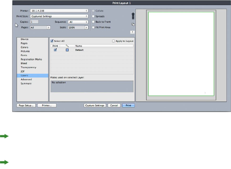
The Print dialog box provides settings for controlling which layers will print.
To change the default print setting for new layers, check Suppress Output in the
Layers panes of the Preferences dialog box (QuarkXPress/Edit menu).
The Suppress Output setting for a layer is independent of the Suppress Output and
Suppress Picture Printout controls in the Modify dialog box (Item menu).
Using PDF layers
If you export a layout that includes layers as a PDF file, you can separately control the
following:
•Which layers are included in the exported PDF files
•Whether or not QuarkXPress layers exported as native PDF layers
For more information, see "Exporting a layout in PDF format."
Working with lists
The Lists feature lets you collect the text of paragraphs that have specific character or
paragraph style sheets applied to them. Although the Lists feature is most often used
for creating a table of contents, you can also use it to create a list of figures or pictures
used in a publication.
Preparing for lists
Before you create a list, you must create and apply style sheets in your document.
Begin by creating style sheets to be used in a table of contents, such as "Chapter Name,"
"Section Name," and "Body Text." Then create another paragraph style sheet for the
formatted table of contents.
Including style sheets in a list
The first step in creating a list is to decide what style sheets you want to include in
the list. To create a table of contents, you might include chapter and section style
290 | A GUIDE TO QUARKXPRESS 2016
DOCUMENT CONSTRUCTION
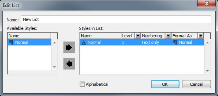
sheets in your list, since a table of contents generally lists chapter titles and their
respective page numbers. You can include paragraph and character style sheets in lists.
Specifying levels in a list
You will also need to decide how the different levels in the paragraph style sheets will
be defined before generating a list. You might want chapter headings to be at the first
level and subjects within a chapter to be at the second level. For example, if you are
writing a manual about an application, and a chapter in the manual is titled "File
Menu," you might want the chapter heading "File Menu" to be the first level on your
list. The "New," "Open," "Close," and "Save" items (subheadings in the "File Menu"
chapter) could be at the second level. Making decisions such as these beforehand will
simplify the process of generating a list.
Creating a list
Once you have created and applied the style sheets in your document and have decided
which ones will be included in your list, you are ready to start creating your list. Choose
Edit > Lists and click New to display the Edit List dialog box and enter a name in the
Name field.
The Available Styles list displays all of the style sheets in the active project. Select
each style sheet you want to use in the list and click Add to add it to the Styles in List
list. For example, if you want to include all headings that use the "Heading 1" and
"Heading 2" style sheets in a TOC, add these two style sheets to the Styles in List list.
Once you've indicated which style sheets should determine what goes into the TOC,
you can specify how the TOC should be formatted. For each style in the Styles in List
list, choose a Level, a Numbering option, and a Format As style sheet:
•Level determines how the contents of the list are indented on the Lists palette
(higher levels are indented further).
•Numbering lets you control if and where the list includes the page number for
each occurrence of a style sheet.
•Format As lets you specify the style sheet to be applied to each level of the
automatically generated TOC.
You can use the Edit List dialog box to create lists for things like automatic tables of
contents.
A GUIDE TO QUARKXPRESS 2016 | 291
DOCUMENT CONSTRUCTION
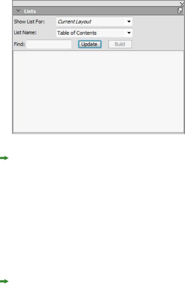
Importing lists from another document
QuarkXPress lets you append lists from another document or from the Lists dialog
box (Edit > Lists), or by using the Append command (File > Append).
Navigating with lists
To view a list, display the Lists palette (Window menu), select the list in the List
Name drop-down menu, and then click Update. The selected list displays in the Lists
palette.
You can use the Lists palette to navigate in a layout.
If your article contains multiple layouts, you can choose a different layout from the
Show List For drop-down list.
To locate a particular line in the active list, enter a word from that line in the palette's
Find field. The list in the palette scrolls to the first appearance of that word in the list.
To jump to a particular paragraph, double-click it in the Lists palette. The window
scrolls to that paragraph's location in the layout.
Building lists
To create a TOC (or other type of list) in the layout, place the text insertion point
where you want the list to go, then click Build in the Lists palette. The list is built
automatically. The style sheets you selected for the list in the Format As drop-down
menu (New List dialog box) are applied automatically.
If the text in the document is on the pasteboard, then a dagger character (Mac OS X)
or the characters "PB " (Windows) displays next to the text in the built list instead of a
page number.
292 | A GUIDE TO QUARKXPRESS 2016
DOCUMENT CONSTRUCTION

Updating lists
The Lists palette is not automatically updated as you work. When you make changes
to text, you must update the list to be sure it is current. Clicking the Update button
in the Lists palette scans the document for list items, and rebuilds a list in the Lists
palette.
To update a list that you have already flowed into a text box, select the box, click
Update to make sure the list is up-to-date, and then click Build. The application detects
that there is already a copy of the list in the layout and displays an alert asking if you
want to Insert a new copy of the list or Replace the existing version. To update the
existing list, click Replace.
Working with indexes
In QuarkXPress, indexing is accomplished by marking words in documents as first
level, second level, third level, or fourth level index entries. You can create
cross-references and choose whether index entries cover a word, a number of
paragraphs, a text selection, or all the text until the next occurrence of a specific style
sheet. When it is time to build the index, you specify a format (nested or run-in),
punctuation, a master page, and style sheets for the various levels. QuarkXPress then
creates and styles the index for you.
Software can automate the process of typing, formatting, and updating page numbers
in an index, but a person has to decide what goes into a meaningful, useful index.
Since the process cannot be fully automated, it may take extra time to create an index,
but when your readers are able to find the information they need, it will be time well
spent.
Specifying the index marker color
When you add a word to an index, QuarkXPress tags it with brackets or a box; these
are called index markers. Index markers are displayed in a document when the Index
palette is open (Windows > Index). You can customize the color of index markers
using the Index Preferences dialog box.
1Choose QuarkXPress/Edit > Preferences > Index.
2Click the Index Marker Color button to display a color picker.
3Use the sliders, arrows, fields, or color wheel to specify a color for the index markers.
4Click OK to close the color picker; then click OK to close the Index Preferences dialog
box.
When you index a range of text, it is marked with brackets. When you place the Text
Insertion bar in text and enter an index entry, the location is marked with a box.
Creating index entries
Each item in an index, whether it is one word or several, is called an entry. Each entry
is assigned a level. Levels indicate the hierarchy of the entry, from first to fourth. First
level entries are the most general, and fourth level entries are the most specific.
A GUIDE TO QUARKXPRESS 2016 | 293
DOCUMENT CONSTRUCTION
QuarkXPress lets you create four levels of index entries in a nested index and two levels
of index entries in a run-in index.
Creating a first-level index entry
A first-level index entry is a primary topic sorted alphabetically in an index.
Before you start adding words to the index, you need to decide whether you are creating
a nested index or a run-in index. A nested index has up to four levels of information
with entries separated by paragraph returns and different style sheets. A run-in index
has two levels of information with second level entries immediately following first-level
entries in the same paragraph.
1Place the Text Insertion bar in the text or select a range of text to establish the
beginning of the text you want to index.
2To enter text for the first-level entry in the Text field of the Index palette (View menu),
select text in the document or type in the field.
3To override the alphabetical indexing of the entry, enter text in the Sort As field. For
example, if the entry is "20th Century," you might want it sorted as "Twentieth
Century." This does not affect the spelling of the index entry.
4Choose First Level from the Level drop-down menu.
5To override the default character formatting applied to a page number or cross-reference,
choose another character style sheet from the Style drop-down menu. The default
formatting is the character style of the entry text.
6Choose an option from the Scope drop-down menu to specify the range of text the
index entry covers.
7Click the Add button on the Index palette; the first-level index entry is listed
alphabetically in the Entries list. The indexed text is marked with brackets or a box
in the document. You can also click the Add All button to add all occurrences of
the selected text to the Entries list.
You can add an index entry by selecting the text in the document, displaying the
context menu, and selecting Add to Index. The entry will be added using the selected
levels, style, and scope. The displayed context menu is the same as the context menu
for a text box, with the exception of Add to Index.
If you select a word, add it to an index, and then try to add the selected word to the
index again (for example, under a different level), you will receive an alert: "An index
reference already exists at this location." To index the same word more than once,
place the Text Insertion bar in the word, then enter the desired word in the Text field.
The second index entry displays a box plus brackets for the index marker.
Pressing Option/Alt changes the Add button to Add Reversed . The Add Reversed
button adds an entry to the Entries list in reverse order and adds a comma to the
entry. For example, "Elaine DeKooning" is added as "DeKooning, Elaine" when you
click the Add Reversed button. "Lila Cabot Perry" would be added as "Perry, Lila Cabot."
294 | A GUIDE TO QUARKXPRESS 2016
DOCUMENT CONSTRUCTION
Pressing Option/Alt changes the Add All button to Add All Reversed . Clicking the
Add All Reversed button will add all occurrences of the selected text to the Entries
list in reverse order.
Creating a second-, third-, or fourth-level index entry
In a nested index, second-level, third-level, and fourth-level entries are positioned
under first-level entries in the new paragraph. In a run-in index, second-level entries
follow first-level entries in the same paragraph.
1Place the Text Insertion bar at the beginning of the range of text you want to index.
2Use the Text, Sort As, Style, and Scope controls as you would to create a first-level
index entry.
3Click next to an entry in the left column of the Entries list to specify that entry as the
higher-level entry that the second-, third-, or fourth-level entry will go under.
Second-, third-, and fourth-level entries are indented if the paragraph style sheet used
in the built index has a left indent value.
4Choose Second Level, Third Level, or Fourth Level from the Level drop-down menu.
The arrow location determines which Level options are available. The Second Level
option is available when the arrow is next to a first- or second-level entry, the Third
Level option is available when the arrow is next to a first-, second-, or third-level entry,
and the Fourth Level option is available when the arrow is next to a first-, second-,
third-, or fourth-level entry.
5Click the Add button . The new index entry is alphabetized and indented under the
appropriate entry.
Choose Suppress Page # in the Scope drop-down menu when an index entry will be
used as a heading for more levels of information. For example, if you were creating a
cookbook, you might create an entry for "Cake," suppress its page number, and then
list different types of cakes, such as "chocolate" or "lemon," as second- or third-level
entries.
Creating cross-references
In addition to listing page numbers for index entries, you can also refer readers to
other topics. For example, in a reference to "Typography," you might list "See also
Fonts." To do this, you create cross-references. You can create a cross-reference to an
existing entry in the index, or you can add a new entry specifically for the
cross-reference. Use the Index palette (View > Show Index) to create cross-references.
Creating a cross-reference for a new index entry
To create a cross-reference for a new index entry:
1Place the Text Insertion bar anywhere in text (it doesn't matter where you place it
because page numbers will not be listed for this entry).
2Enter text for the entry in the Text field of the Index palette.
A GUIDE TO QUARKXPRESS 2016 | 295
DOCUMENT CONSTRUCTION

3Use the Sort As and Level controls as you would to create any other index entry.
4Choose Cross-Reference from the Scope drop-down menu. Choose the type of
cross-reference you want from the drop-down menu: See, See also, or See herein.
5Specify the index entry being cross-referenced by entering text in the field or clicking
an existing entry in the list.
6Click the Add button. Expand the entry to see the cross-reference text.
Creating a cross-reference for an existing index entry
To create a cross-reference for an existing index entry:
1Place the Text Insertion bar anywhere in text (it doesn't matter where you place it
because page numbers will not be listed for this entry).
2Select an entry in the Entries list. The entry is automatically placed in the Text field.
3Click the Edit button on the Index palette, double-click the entry, or select the
entry and display the context menu.
4Choose Cross-Reference from the Scope drop-down menu. Choose the type of
cross-reference you want from the drop-down menu: See, See also, or See herein.
5Specify the index entry being cross-referenced by entering text in the field or clicking
an existing entry in the list.
To see the cross-reference text in the Entries list along with the page number references,
expand the entry.
When you build an index, cross-references immediately follow page number references.
They are formatted with the character style sheet specified in the Index Preferences
dialog box (Edit > Preferences > Index). If you specify Entry's Style, the cross-reference
will use the same style sheet as the entry it follows. Using the Style drop-down menu
(Index palette) to specify a character style sheet for a cross-reference will override the
style sheet you specified in the Index Preferences dialog box. The text you enter in
the Cross-Reference field will have that style sheet applied; however, the style sheet
will not be applied to the "See," "See also," or "See herein" part of the cross-reference.
The punctuation preceding cross-references is specified in the Before Cross-References
field of the Index Preferences dialog box (QuarkXPress/Edit > Preferences > Index).
If you want punctuation following a cross-reference, enter it after the cross-reference
text you entered in the Index palette.
Editing an index entry
You can select an index entry and edit the information in the Text or Sort As fields.
You can also select a cross-reference or page number reference and edit the information
in the Style or Scope drop-down menus. You can also change an entry's level.
1Select an entry or reference in the Entries list. (To see the references, expand an entry.)
2Click the Edit button on the Index palette, double-click the entry, or select the entry
and choose Edit from the context menu.
296 | A GUIDE TO QUARKXPRESS 2016
DOCUMENT CONSTRUCTION

While you are in edit mode, the Edit button displays reversed.
3Make any changes to the selected entry or reference. You can also select and edit other
entries and references.
4Click the Edit button again to exit the edit mode.
Deleting an index entry
To delete an index entry and remove its index markers from the text:
1Select an entry or reference in the Entries list. (To see the references, expand an entry.)
2Display the context menu and choose Delete or click the Delete button on the
Index palette.
Specifying the punctuation used in an index
The Index Preferences dialog box lets you specify the punctuation that is automatically
inserted when you build an index.
1Choose QuarkXPress/Edit > Preferences > Index.
2Enter index punctuation, including any surrounding spaces, and cross-reference style
sheet in the Separation Characters fields.
•Following Entry specifies the punctuation immediately following each entry in
an index (usually a colon). For example, "QuarkXPress: xii, 16–17, 19" uses a colon
and a space after the index entry "QuarkXPress."
When a cross-reference immediately follows an index entry, the Before Cross-Reference
characters are used rather than the Following Entry characters.
•Between Page #s specifies the words or punctuation used to separate a list of page
numbers (usually a comma or semicolon). For example, "QuarkXPress: xii, 16–17,
19" uses a comma and a space between page numbers.
•Between Page Range specifies the words or punctuation used to indicate a range
of pages (usually an en dash or the word "to" with a space on either side, like this:
" to "). For example, "QuarkXPress: xii, 16–17, 19" uses an en dash between a range
of pages.
•Before Cross-Reference specifies the words or punctuation used before a
cross-reference (usually a period, semicolon, or space). For example, "QuarkXPress:
xii, 16–17, 19. See also Page Layout" uses a period and a space before the
cross-reference.
•Cross-Ref style specifies the style sheet to be used for a cross-reference. This style
sheet is applied only to "See," "See also," and "See herein."
•Between Entries specifies the words or punctuation used between entry levels in
a run-in index (usually a semicolon or period). A run-in index lists the entries and
sub-entries of an index entry in a paragraph rather than with nested tabs. For
example, "QuarkXPress: xii, 16–17, 19; Printing from: 62–64; Typesetting in: 32,
34" uses a semicolon between entries.
A GUIDE TO QUARKXPRESS 2016 | 297
DOCUMENT CONSTRUCTION

In a nested index, the Between Entries characters are used as the ending punctuation
for each paragraph.
3Click OK.
The completed index consists of formatted text, not of dynamic links to indexed text.
If you continue to edit text or the Entries list, you need to rebuild the index.
You can enter up to 72 characters in any of the Separation Characters fields. You can
also use certain "XPress Tags" in the Separation Characters fields. For example, if you
enter \t in the Following Entry field, when you build your index, a default tab will
automatically be inserted after your entry.
Building an index
Use the Build Index dialog box to create an index from the contents of the Index
palette.
When you build an index, QuarkXPress compiles the list, formats it according to your
specifications, and flows it into pages based on the master page you choose. Index
preferences are document-specific when set with a document open.
Before building the index, create a master page with an automatic text box for your
index. Next, create paragraph style sheets for the section heads and all the levels used
in your index. Normally, the levels are distinguished by varying indentations.
To build an index:
1Choose Utilities > Build Index or display the context menu for the Index palette and
choose Build Index.
2Click Nested or Run-in for the Format. If your index is organized with more than two
levels of information, you should create a nested index. If you decide to create a run-in
index, all levels of information for any entry will be listed in the same paragraph with
no hierarchy.
3Check Replace Existing Index to overwrite the existing index.
4To add headings to each alphabetical section in the index, check Add Letter Headings
and choose a style sheet from the drop-down menu.
5Choose a Master Page for the index (only master pages with automatic text boxes are
listed). QuarkXPress automatically adds the necessary pages to the end of the document
to contain the index. If you specify a facing-page master page, a right-facing page is
added first.
6Choose style sheets for each level of the index from the Level Styles drop-down menus.
If you clicked Run-in for the Format, only the First Level drop-down menu is available
(because all the levels are flowed into the same paragraph).
7Click OK to close the Build Index dialog box and create the index.
If you need to compare two versions of an index, uncheck Replace Existing Index in
the Build Index dialog box (Utilities menu).
298 | A GUIDE TO QUARKXPRESS 2016
DOCUMENT CONSTRUCTION
Editing final indexes
After you build an index, you need to look it over closely. Check that the index is
thorough, the cross-references are appropriate, and the levels are logical. See if you
like the punctuation and formatting. It is unlikely that you will be absolutely happy
with the first index you build. You can solve some issues by editing and rebuilding
the index, while other issues will require local formatting of the index text.
Nonprinting text in an index
If the text marked in brackets will not print because it is on the pasteboard, obscured
by another item, or overflowing its box, then a dagger character † (Mac OS X) or the
characters "PB" with a space after the B (Windows) displays next to the entry in the
index instead of a page number.
Mac OS X only: To search for the dagger character, enter Option+T in the Find what
field of the Find/Change dialog box (Edit menu), and then see if you can solve the
problem in the document or simply remove the daggers from the built index.
Windows only: To search for the "PB "characters, enter them (including the space) in
the Find what field of the Find/Change dialog box (Edit menu), and then see if you
can solve the problem in the document or simply remove the characters from the built
index.
Editing and rebuilding the index
To solve issues with the punctuation, the index entries, or the organization of the
index, go back to the Index palette, the Index Preferences dialog box
(QuarkXPress/Edit > Preferences > Index), or the Build Index dialog box (Utilities
menu). Make the necessary changes, and rebuild the index.
Updating the index
If you edit an indexed document after you build the index, you should build the index
again. Because QuarkXPress will not update the index text automatically, you should
build your final index only when you are fairly certain the document is final.
Applying local formatting to the index
When you have an index you are happy with — and are almost certain the publication
will not change — you can often still improve your index with local formatting. For
example, if you only have one entry each under the headings "W," "X," "Y," and "Z,"
you might combine them into a single heading for "W–Z." Or you might want to use
the Find/Change dialog box (Edit menu) to apply type styles to certain words.
Remember that the changes will not be reflected in future versions of the index if you
decide to delete or change entries at this stage.
Working with books
Multiple-document publications can be challenging to manage. Page numbers need
to be consecutive, colors and style sheets to be synchronized. Books help you meet
this challenge.
A GUIDE TO QUARKXPRESS 2016 | 299
DOCUMENT CONSTRUCTION

Books are QuarkXPress files that display as windows containing links to individual
layouts from single or multiple projects, called chapters. Once chapters are added to
a book, you can open, close, and track chapters through the Book palette. QuarkXPress
lets you synchronize style sheets and other specifications used in the chapters of a
book, print chapters from the Book palette, and automatically update page numbers
across chapters. You can also export to multiple PDFs (per chapter) or export all chapters
to a single PDF from the Book palette.
You can open only one book at a time. While QuarkXPress is running, it remembers
recent opened books so that you can switch to/open another book from the palette
history. Books can be opened by more than one user at the same time, so members of
a workgroup can access different chapters. Books stay open until you close them or
until you quit QuarkXPress. Changes made to books are saved when you close the
Book palette or quit QuarkXPress.
Changes to books (such as adding or reordering chapters) are saved automatically
when you close books, or when you quit QuarkXPress. When you open and edit
chapters, the chapter documents need to be saved the same way as any standalone
QuarkXPress project, by using the Save command (File menu).
As members of a workgroup make changes to a book — for example, opening or
reordering chapters in a book — the book is updated to reflect the changes. Only the
first user to open a book can make changes to the book. All other users can open the
book in read-only mode. A user can open chapters of the book that have not yet been
opened by other members, make changes and save. The other users will see the modified
state.
Creating books
In QuarkXPress, a book is a collection of documents (chapters). You can create a new
book at any time. To create a new book:
1Choose File > New > Book.
2Use the controls in the dialog box to specify a location for the new book file.
3Enter a name for the book in the Book Name/File name field.
4Click Create. The new book displays as a window in front of all open documents.
When a book is created a Job Jacket XML file with the same name is also created in
the same location. This Job Jacket file is automatically attached to the QuarkXPress
project when it is added to the book. When the book is copied to another location,
this Job Jacket XML file must also be copied to the new location.
If you store book files in a shared location, multiple users can open books and edit
chapters. To use the Book feature in a multi-user environment, all users must have the
same path from their computers to the book; therefore, the book must be stored on a
common network server rather than a user's computer that is also accessing the book.
Legacy books are not supported in 10 and books in QuarkXPress 10 are not compatible
with books from QuarkXPress 3 to 9. To recreate legacy books you must add existing
chapters to a new book after saving them in the QuarkXPress 10 format.
300 | A GUIDE TO QUARKXPRESS 2016
DOCUMENT CONSTRUCTION

Working with chapters
Books contain individual print layouts from QuarkXPress projects (called chapters).
To create chapters, you add print layouts from a single project or multiple projects to
open books. Chapters are opened through the Book palette rather than the Open
command (File menu). You can rearrange the chapters within a book and you can
remove chapters from a book. The chapters in a book must be stored on the same
volume as the book.
Adding chapters to books
To add chapters to an open book:
1Click the Add Chapter button in the Book palette.
2Use the controls in the dialog box to locate the first print layout to add to the book.
The dialog box presents the layouts available in the project to select from. You can
select a single layout or multiple layouts to be added to the book. (By default all layouts
in a project are selected to be added to the book.) Each layout is treated as a separate
chapter. When you add the first chapter to a book, it becomes the master chapter by
default. The master chapter defines the style sheets, colors, hyphenation and
justification specifications, lists, and dashes and stripes that will be used throughout
the book. These attributes are specific to the master chapter: nonmaster chapters have
attributes independent of those in the master chapter.
QuarkXPress only supports adding Print layouts to a book. Ebook and App Studio
layouts are not supported.
3Select the project and the print layouts in the list and click Add.
When legacy projects are added without saving them in a QuarkXPress 10 format, a
new file with a suffix of _001 (_002, etc) is created and the newly saved project is added
to the book. The legacy project remains untouched.
4Repeat steps 1–3 to add additional chapters to the book.
As you add chapters, they are listed in the Book palette. If a chapter is selected in the
Book palette when you click the Add Chapter button , the next chapter is added
immediately after that chapter. If no chapter is selected, the next chapter is added to
the end of the list.
A chapter can belong to only one book. If you also want to use a chapter in another
book, use the Save As command (File menu) to create a copy of the document. Add
the copy of the document to the other book. Placing a chapter in another book may
change the book's page numbering.
Chapter status
Once you have chapters in a book, you and other users can begin to open, close, and
track chapters using the Book palette. The Status column in the Book palette shows
the current state of each chapter:
•Available indicates that you can open the chapter.
•Open indicates that you already have the chapter open on your computer.
A GUIDE TO QUARKXPRESS 2016 | 301
DOCUMENT CONSTRUCTION
•Modified indicates that the chapter has been opened and edited independently
of the book. To update the status to Available, reopen the chapter through the
Book palette, and then close the chapter.
•Missing indicates that the chapter's file has been moved since it was added to the
book. Double-click the chapter name to display a dialog box; then locate the file.
Opening chapters in books
Although multiple users can open the same book, only one user at a time can open a
chapter. To open a chapter, the Status column must show that the chapter is Available
or Modified. Double-click the name of an available chapter to open it.
Opening chapters independently of books
If you need to work on a computer that is not part of the network where the book
resides (for example, if you need to edit a chapter at home), you can work on a copy
of a chapter independently of its book. When you are finished with the chapter, copy
it back to its original location on the network; it will display in the Book palette as
Modified.
To ensure that other users do not edit the original chapter while you are editing a
copy, you can place the original chapter file in another folder so its status will display
in the Book palette as Missing.
Reordering chapters in books
You can reorder chapters in a book at any time, regardless of their status. When you
reorder chapters, automatic page numbers are updated. Click the chapter name to
select it; then click a Move Chapter button in the Book palette. The selected
chapter will move up or down one row.
Removing chapters from books
You can remove a chapter from a book at any time. Click the chapter name to select
it; then click the Remove Chapter button . The chapter name is removed from the
Book palette and the links to the chapter are broken. The chapter becomes a standard
QuarkXPress document.
Controlling page numbers
If your chapters have sections (Page > Section) when you add them to a book, the
sections and page numbers are maintained. For example, each chapter in a book might
be a new section. If your chapters do not have sections, QuarkXPress assigns sequential
page numbers to the chapters in a book. For example, if the first chapter in a book is
10 pages long, the second chapter starts on page 11.
You can add and remove sections to change the page numbering of a book. If a
document page has an automatic page number character on it, that page will display
the appropriate page number.
302 | A GUIDE TO QUARKXPRESS 2016
DOCUMENT CONSTRUCTION

Working with sectioned chapters
If a chapter contains a section start, the section page numbering remains in effect
throughout the book until QuarkXPress encounters a new section start. For example,
when the first chapter in a book is a section with a page number prefix of "A" all the
pages in following chapters will have the "A" prefix until QuarkXPress encounters a
new section. In this example, the second chapter might be a new section with a "B"
prefix.
You can add, change, and delete sections in book chapters at any time (Page > Section).
If you remove all the sections from all the chapters in a book, the book will revert to
sequential page numbering.
To view chapter page numbers in the Book palette, you must use automatic page
numbering.
Working with nonsectioned chapters
If chapters do not have sections, QuarkXPress creates a "book chapter start" for the
first page of each chapter. A book chapter start tells a chapter to begin its page
numbering after the last page of the previous chapter. To override a book chapter start
and create a section, open the chapter and choose Page > Section. When you add
pages to a chapter, reorder chapters, or remove chapters, subsequent pages and chapters
will be numbered according to this section start.
For output chapter pages to accurately reflect the page numbering of the book, page
numbers should be placed using the Current Page Number character.
Any user who opens a book can add, reorder, and delete chapters. The user can also
add sections to chapters to override the sequential page numbering or synchronize
chapters. You may want to assign these tasks to one user (such as the editor) and ask
other users to simply open and close chapters through the palette.
If you open a chapter outside of its associated QuarkXPress book (meaning that you
didn't use the Book palette to open it), the page numbers may temporarily change. If
the chapter contains book chapter starts, which automatically update page numbers
across chapters, then the chapter will begin on page number 1 while you are editing
outside the book. When you reopen the chapter using the Book palette, the page
numbers will automatically update. If the chapter contains regular section starts, then
the page numbers will not be affected when editing outside the book.
Synchronizing chapters
To ensure that all the style sheets, colors, hyphenation and justification specifications,
lists, and dashes and stripes used in book chapters are the same, you can synchronize
these specifications to match those in a master chapter. By default, the first chapter
in the book is the master chapter, but you can change the master chapter at any time.
When you synchronize chapters, all the specifications in each chapter are compared
to the master chapter and modified as necessary. After you synchronize chapters, each
chapter in the book will have the same style sheets, colors, hyphenation and
justification specifications, lists, and dashes and stripes as the master chapter.
A GUIDE TO QUARKXPRESS 2016 | 303
DOCUMENT CONSTRUCTION
Specifying the master chapter
By default, the first chapter you add to a book is the master chapter. The master chapter
is indicated by an M to the left of the chapter name in the Book palette. To change
the master chapter, click to select the new master chapter. Then click the blank area
to the left of the chapter name; the master chapter icon M moves to the new chapter.
Synchronizing specifications
Before you synchronize the specifications in a book, first make sure that the style
sheets, colors, hyphenation and justification specifications, lists, and dashes and stripes
in the current master chapter are defined correctly. Then:
1Make sure all the chapters in the book have a status of Available. If a chapter is
unavailable, its specifications will not be synchronized.
2Select the chapters you want to synchronize. To select a range of chapters, click the
first chapter and press Shift while you click the last chapter in the range. To select
nonconsecutive chapters, press Command/Ctrl while you click the chapters.
3Click the Synchronize Book button in the Book palette. The Synchronize Selected
Chapters dialog box displays.
4Click the Style Sheets, Colors, H&Js, Lists, or Dashes & Stripes tab to choose from a
list of those specifications. The Available list displays all the appropriate specifications.
Select the specifications you want to synchronize and double-click them, or click the
arrow to move them to the Include column.
5To synchronize all the specifications in the Synchronize Selected Chapters dialog
box, click the Synch All button.
6Click OK. Each chapter in the book is opened, compared to the master chapter,
modified as necessary, and saved. When you synchronize chapters, they are modified
as follows:
•Specifications with the same name are compared; chapter specifications are edited
as necessary to match specifications in the master chapter.
•Specifications in the master chapter that are missing from other chapters are added
to those chapters.
•Specifications in other chapters that are not defined in the master chapter remain
untouched.
If you make changes that affect the specifications in a book, you will need to
synchronize the chapters again.
You can use synchronization to make global changes to any of the specifications in a
book. For example, if you decide to change a spot color used throughout a book, change
the color's definition in the master chapter; then click the Synchronize Book button
.
304 | A GUIDE TO QUARKXPRESS 2016
DOCUMENT CONSTRUCTION
Printing chapters
The Book palette provides a quick method for printing multiple chapters with the
same settings. You can print an entire book or just selected chapters from the Book
palette. To print chapters in an open book:
1Make sure the chapters you want to print have a status of Available or Open. You
cannot print chapters that are listed as Missing or are currently in use by other users.
2To print the entire book, make sure no chapters are selected. To choose one chapter,
click it. To select consecutive chapters, press Shift while you click them. To select
nonconsecutive chapters, press Command/Ctrl while you click them.
3Click the Print Chapters button in the Book palette to display the Print dialog
box.
4To print all the pages in all the selected chapters, choose All from the Pages drop-down
menu.
5Specify other print settings as usual, or choose an option from the Print Style
drop-down menu. All the pages or chapters will print with these settings.
6Click OK. QuarkXPress will open all the chapters, print them, and then close each
chapter. If a chapter is missing or in use by someone else, then the book will not print.
In fields that require you to enter page numbers (for example, the Print dialog box),
you must enter the complete page number, including any prefix, or an absolute page
number. An absolute page number is a page's actual position relative to the first page
of a document, regardless of the way in which the document is sectioned. To specify
an absolute page number in a dialog box, precede the number you enter with a plus
(+) sign. For example, to display the first page in a document, enter "+1."
Generate a PDF from a Book
The Book palette provides a quick method for producing a PDF. You can produce a
single PDF based on the entire book or separate PDF's of selected chapters. To produce
a PDF:
1Make sure the chapters you want be in the PDF have a status of Available or Open.
You cannot use chapters that are listed as Missing or are currently in use by other
users.
2To include the entire book, make sure no chapters are selected. To choose one chapter,
click it. To select consecutive chapters, press Shift while you click them. To select
nonconsecutive chapters, press Command/Ctrl while you click them.
3Next to the Export as PDF button is the Single File check box :
•Check the check box to generate a single PDF for all or selected chapters. You will
be prompted to enter a file name for the PDF.
•Leave the check box unchecked to generate multiple PDFs per chapter. You will
be prompted to enter a file name for the PDF and the first chapter is exported
with the given name and subsequent chapters use the same name with the suffix
_002, _003 etc.
A GUIDE TO QUARKXPRESS 2016 | 305
DOCUMENT CONSTRUCTION

4Click the Export as PDF button in the Book palette to display the Export as PDF
dialog box.
5To print all the pages in all the selected chapters, choose All from the Pages drop-down
menu.
6Choose an option from the PDF Style drop-down menu. All the pages or chapters will
print with these settings.
7Check the Open PDF after Export check box to open the PDF after the file has been
exported.
8Click Options to specify the other PDF output options.
9Click OK. QuarkXPress will open all the chapters, produce the PDF, and then close
each chapter. If a chapter is missing or in use by someone else, then the PDF will not
be created.
In fields that require you to enter page numbers (for example, the Export as PDF dialog
box), you must enter the complete page number, including any prefix, or an absolute
page number. An absolute page number is a page's actual position relative to the first
page of a document, regardless of the way in which the document is sectioned. To
specify an absolute page number in a dialog box, precede the number you enter with
a plus (+) sign. For example, to display the first page in a document, enter "+1."
Creating indexes and tables of contents for books
QuarkXPress lets you generate an index and a table of contents for an entire book.
These functions are accomplished through the lists and indexing features rather than
through the Book palette. However, all the chapters in a book must be Available to
generate a complete list or index.
Indexes for books
The indexing features are available when the Index QuarkXTensions software is loaded.
Creating an index involves using the Index palette (View menu) to tag text as an
index entry. You specify punctuation for the index in the Index Preferences dialog
box (QuarkXPress/Edit > Preferences > Index). When a book is complete, you generate
the index using the Build Index dialog box (Utilities menu).
Lists for books
In QuarkXPress, a list is a compilation of text that is styled with specific paragraph
style sheets. For example, you can take all the text in your "Chapter Name" style sheet
and all the text in your "Section Head" style sheet and compile a table of contents with
two levels. Lists are not limited to tables of contents — for example, you can create a
list of illustrations from the style sheets used on captions. Generating lists involves
the Lists dialog box (Edit menu) and the Lists palette (View menu).
Working with libraries
Libraries are convenient for storing frequently used page items such as logos, publication
mastheads, legal text, and photographs. You can store up to 2,000 entries in an
306 | A GUIDE TO QUARKXPRESS 2016
DOCUMENT CONSTRUCTION
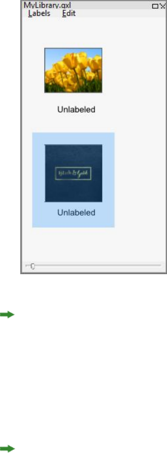
individual library. A library entry can be a text box, text path, picture box, line,
multiple-selected items, or a group. To move entries in and out of libraries, you simply
drag them or cut/copy and paste them.
Libraries are good for storing items that may be needed at any time in a layout. For
example, corporate logos, legal information, commonly used pictures and text, chart
formats, and clip art are all good candidates for library entries. Items with
hard-to-remember formatting can also be saved in a library.
Use the Library palette's scroll bar to scroll vertically through library entries. Drag the
resize box in the lower-right corner of a Library palette to resize it. You can expand a
Library palette by clicking its zoom box. Click the zoom box again to return to the
previous display.
A Library palette
QuarkXPress libraries are not cross-platform, so libraries must be opened using the
platform on which they were created.
Creating libraries
You can create a new library any time, as long as you have fewer than 25 files open.
To create a new library:
1Choose File > New > Library.
When you create a new library, it stays open until you manually close it. When you
launch QuarkXPress, any library palettes that were previously open are reopened
automatically and placed in the default library positions.
2Use the controls in the dialog box to specify a location for the new library file.
A GUIDE TO QUARKXPRESS 2016 | 307
DOCUMENT CONSTRUCTION
3Enter a name for the library in the Library Name/File name field.
4Click Create.
Adding library entries
When you add entries to a library, copies of the items are placed in the library and
displayed as thumbnails. The original items are not removed from the document. To
add entries to an open library:
1Select the Item tool .
2Select the items or group of items to place in the library. To select multiple items, press
the Shift key while clicking them. However, if you select multiple items, they will be
saved in the library as one entry and not as individual items.
3Drag the items or group into the library and release the mouse button when the Library
pointer displays. The library entry is placed between the arrow icons.
Retrieving library entries
To place a library entry into a document, select any tool and click the library entry.
Drag the entry into the document. A copy of the library entry is placed in the
document.
Manipulating library entries
You can rearrange the order of entries within a library, move entries from one library
to another, replace and delete library entries.
•To rearrange an entry within a library, click it and drag it to a new position.
•To copy an entry from one library into another, click it and drag it to the other
open library.
•To replace an entry in a library, select the replacement items in a document; then
choose Edit > Copy. Click the entry in the library to select it and choose Edit >
Paste.
•To remove an entry from a library on Mac OS X, click it and choose Edit > Clear,
Edit > Cut, or press Delete. To remove an entry from a library on Windows, choose
Edit (Library palette menu) > Delete or Edit > Cut.
Windows only: When copying, pasting, or deleting library items on Windows, use the
Edit menu at the top of the Library palette.
If you move a high-resolution picture after importing it into your document, you will
need to update the path to the picture with the Usage command (Utilities menu)
when you move the library entry onto a document.
Working with labels
QuarkXPress lets you manage your library entries by applying labels to them. You can
apply the same label to multiple entries and you can selectively display library entries
308 | A GUIDE TO QUARKXPRESS 2016
DOCUMENT CONSTRUCTION
according to their labels. For example, if you have a library full of different corporate
logos, you can label each entry with the appropriate company name.
Labeling library entries
Once you label one library entry, you can use that label for other entries. Alternatively,
you can give each of your library entries a unique name. To label library entries:
1Double-click a library entry to display the Library Entry dialog box.
2Enter a descriptive name in the Label field or choose one from the Label list. To
rename a library entry, enter in a new label or choose a different label from the list.
3Click OK.
Displaying library entries by label
To display entries by label, click the drop-down menu (Mac OS X) or Labels menu
(Windows) in the upper left corner of a Library palette. Choose labels to display
associated entries.
•The menu lists All, Unlabeled, and any labels you created and applied to entries.
•You can choose more than one label to display multiple categories of entries; a
checkmark displays next to each selected label.
•If you choose more than one label on Mac OS X, Mixed Labels is displayed in the
drop-down menu. When you select the Labels menu on Windows, a checkmark
displays next to labels displayed in the palette.
•To view all library entries, regardless of label, choose All.
•To view entries to which no label has been applied, choose Unlabeled. You can
choose Unlabeled in addition to other labels.
•To hide entries to which a label is applied, choose the label again.
Saving libraries
When you click the close box on a Library palette, QuarkXPress automatically saves
changes made to the library. If you prefer, you can use the Auto Library Save feature
to save each change on the fly. To enable Auto Library Save:
1Choose QuarkXPress/Edit > Preferences ; then click Save in the list on the left to
display the Save pane.
2Check Auto Library Save.
3Click OK.
Guide Manager Pro XTensions software
Guide Manager Pro provides precision controls for creating and editing on-screen
guides. You can specify a location for a guide, whether it's horizontal or vertical,
whether it applies to a page or entire spread, a display color, and a view scale at which
A GUIDE TO QUARKXPRESS 2016 | 309
DOCUMENT CONSTRUCTION
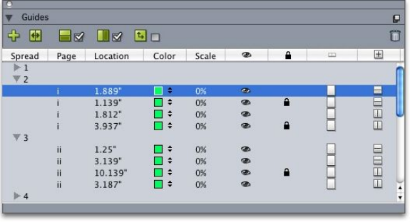
the guide displays. You can edit, copy, and paste guides; mirror guides; create grids,
rows, and columns of guides; create guides from a box; and add bleed and safety guides.
This XTensions software adds the Guides palette to QuarkXPress (Window menu).
See "Working with guides."
Using the Guides palette
The Guides palette provides powerful controls for manipulating guides.
The Guides palette
The Guides palette works as follows:
•Controls across the top of the palette, from left to right, let you create new guides,
mirror guides, show horizontal guides, show vertical guides, show only current
guides, and delete guides.
•To sort guides by an attribute, click the column heading for that attribute.
•To add columns of information to the palette, choose an option from the Column
Selector button at the right side of the list of columns.
•The Spread column displays a number for each page or spread in the layout. To
display a page or spread, click that spread in the Spread column. To display a
spread's guides in the palette, click the arrow next to the spread. To edit a guide,
double-click it.
•To display a context menu of editing options, Control+click/Right-click in each
column. For example, the context menu for the Guide column includes the
following options: Cut Guide, Copy Guide, Paste Guide, Delete Guide and
Select All Guides.
For information about the options in the palette menu, see "Guides palette menu."
Regardless of whether guides are showing on-screen, you can work with them in the
Guides palette (Window menu) as follows:
•To view a page or spread's guides, click the arrow next to that page or spread in
the Guide column.
•To view guides on all the pages or spreads, Option/Alt+click an arrow next to a
spread.
310 | A GUIDE TO QUARKXPRESS 2016
DOCUMENT CONSTRUCTION
•To display only vertical or horizontal guides, choose Show Vertical Guides or
Show Horizontal Guides from the palette menu. To display all guides, choose
both.
•To display only page guides (horizontal guides limited to a single page) or only
spread guides (horizontal guides that encompass all the pages in a spread), choose
Show Page Guides or Show Spread Guides from the palette menu. To display
all guides choose both.
•To display only guides on the page or spread displayed in the project window,
choose Show Current Only from the palette menu.
Guides palette menu
The Guides palette menu includes the following options.
•New Guide: Lets you create a new guide. See "Creating guides with Guide Manager
Pro."
•Cut Guide: Cuts the selected guide.
•Copy Guide: Copies the selected guide to the clipboard.
•Paste Guide: Pastes the guide currently stored on the clipboard to the active page
or spread.
•Select All: Selects all guides on the active page or spread.
•Mirror Guide: Copies the selected guide to the opposite side of the page or spread.
•Delete Guide: Deletes the selected guide.
•Create Grid: Lets you create a grid. See "Creating grids with Guide Manager Pro."
•Create Rows & Columns: Lets you create rows and columns of guides. See
"Creating rows and columns of guides."
•Create Guides from Box: Lets you create guides from a box. See "Creating guides
with Guide Manager Pro."
•Create Bleed & Safety Guides: Lets you create bleed and safety guides. See "Creating
bleed and safety guides."
•Show/Hide Vertical Guides: Shows or hides vertical guides.
•Show/Hide Horizontal Guides: Shows or hides horizontal guides.
•Show/Hide Page Guides: Shows or hides guides on the active page.
•Show/Hide Spread Guides: Shows or hides guides on the active spread.
•Guides in Front: Toggles guides and page grids between being in front of page
content and being behind page content.
•Snap to Guides: Turns the snap-to-guides feature on or off.
•Snap Distance: Lets you control the snap distance for the Snap to Guides feature.
•Edit Colors: Lets you edit the colors available for guides created in Guide Manager
Pro.
•Import: Lets you import guides from an exported guide file.
•Export: Lets you export guides into a separate file.
A GUIDE TO QUARKXPRESS 2016 | 311
DOCUMENT CONSTRUCTION
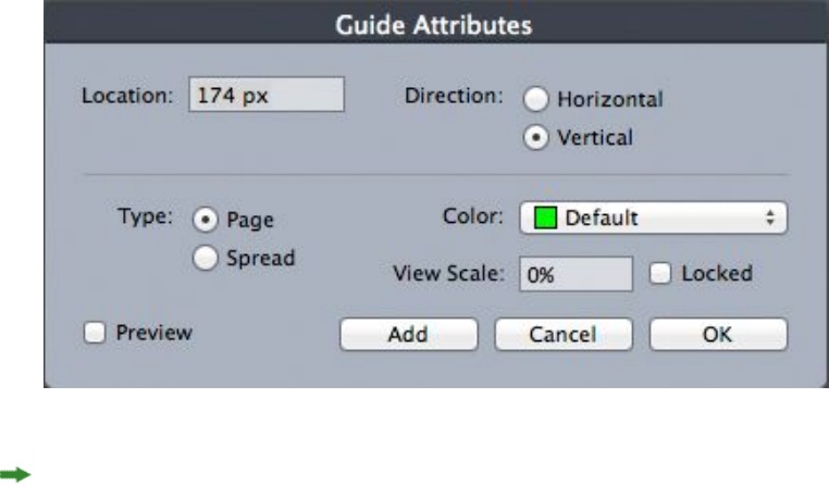
See also "Working with guides."
Creating guides with Guide Manager Pro
Guide Manager Pro provides two methods for creating guides.
•To create guides numerically using Guide Manager Pro, click the Create a New
Guide button at the top of the Guides palette or choose New from the palette
menu. Use the Guide Attributes dialog box to specify the Location, Direction,
and guide Type. You can also specify the View Scale at which the guide displays
(at the default value, 0%, the guide will always display). Choose a Guide Color
and specify whether it is Locked so it cannot be moved with the mouse. Click
Preview to see your guide on-screen before creating it, and then click OK.
The Guide Attributes dialog box
You can also display the Guide Attributes dialog box by double-clicking an existing
guide in the layout.
•To create guides automatically from the boundaries of a box, select the box and
then choose Create Guides From Box from the palette menu. Use the Create
Guides From Box controls to adjust the positions of the guides that will be placed
at the Top, Bottom, Left, and Right sides of the box. The remaining controls
work the same as those in the Guide Attributes dialog box.
312 | A GUIDE TO QUARKXPRESS 2016
DOCUMENT CONSTRUCTION
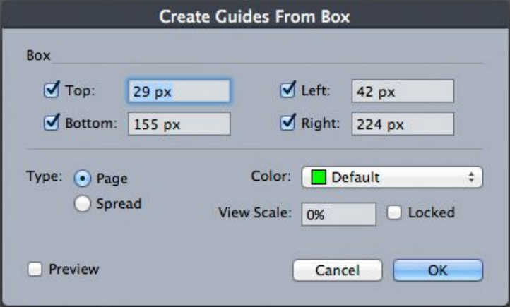
The Create Guides From Box options for creating guides around the rectangular
boundaries of a box of any shape.
Creating grids with Guide Manager Pro
Guide Manager Pro provides a quick method for creating a grid of evenly spaced guides
on pages and spreads.
A GUIDE TO QUARKXPRESS 2016 | 313
DOCUMENT CONSTRUCTION
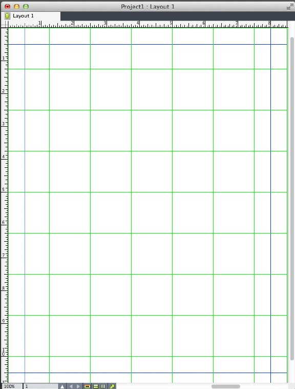
Guide Manager Pro makes it easy to create a grid like this one
To create a grid on the active page or spread:
1Choose Create Grid from the Guides palette menu.
314 | A GUIDE TO QUARKXPRESS 2016
DOCUMENT CONSTRUCTION
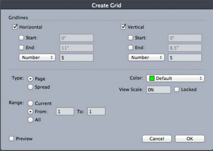
Create Grid controls
2In the Gridlines area, check Horizontal and/or Vertical.
3If you want the guides to start at a specific location, for example within the margins,
check the Start and/or End fields and then enter the distance from the page edges to
start and end the guides.
4To create evenly spaced guides, choose Number and enter the number of guides you
want in the field. To create guides that are a specific distance apart, choose Step and
enter the distance in the field.
5Use the Type, Range, Color, View Scale, and Locked controls as you do in the Guide
Attributes dialog box (see "Creating guides with Guide Manager Pro").
6Click Preview to see the grid on-screen, and then click OK.
Creating rows and columns
Guide Manager Pro lets you create evenly spaced rows and columns of guides with
gutters. To create rows and columns of guides on the active page or spread:
1Choose Create Rows and Columns from the Guides palette menu.
A GUIDE TO QUARKXPRESS 2016 | 315
DOCUMENT CONSTRUCTION
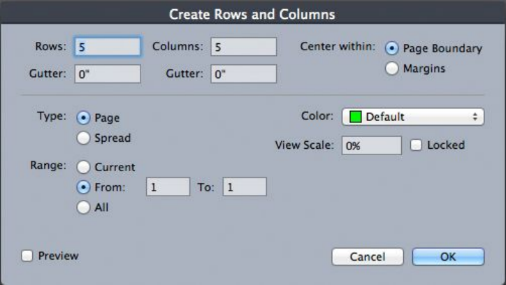
The Create Rows and Columns dialog box
2Enter the number of horizontal rows in the Rows field. If you want space between the
rows, enter a value in the Gutter field.
3Enter the number of vertical columns in the Columns field. If you want space between
the columns, enter a value in the Gutter field.
4To create guides inside the master guides, click Margins. Otherwise, leave Page
Boundary selected.
5Use the Type, Range, Color, View Scale, and Locked controls as you do in the Guide
Attributes dialog box (see "Creating guides with Guide Manager Pro").
6Click Preview to see the guides on-screen, then click OK.
Creating bleed and safety guides
If you need bleed and/or safety guides, you can add them with Guide Manager Pro
rather than altering the page size or drawing your own guides.
316 | A GUIDE TO QUARKXPRESS 2016
DOCUMENT CONSTRUCTION
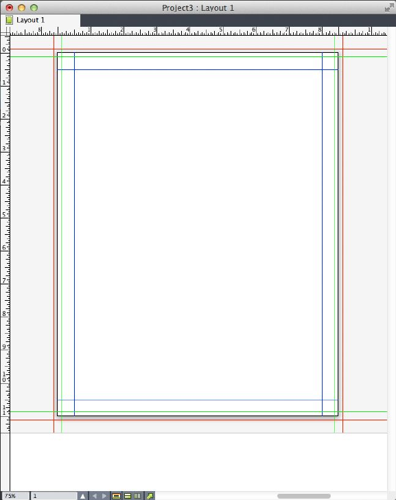
Here, red bleed guides are placed 9 pts outside the page while green safety guides are
placed 9 pts inside the page.
To create bleed and/or safety guides on the active page:
1Choose Create Bleed and Safety Guides from the Guides palette menu.
2For bleed guides, check Bleed, enter a value in the Gutter field to specify how far
outside the page to place the guides, and then choose an option from the Color menu.
3For safety guides, check Safety, enter a value in the Gutter field to specify how far
inside the page to place the guides, and then choose an option from the Color menu.
4Use the View Scale and Locked controls as you do in the Guide Attributes dialog
box (see "Creating guides with Guide Manager Pro").
5To apply the bleed and safety guides to multiple pages, use the Spread Range controls.
A GUIDE TO QUARKXPRESS 2016 | 317
DOCUMENT CONSTRUCTION
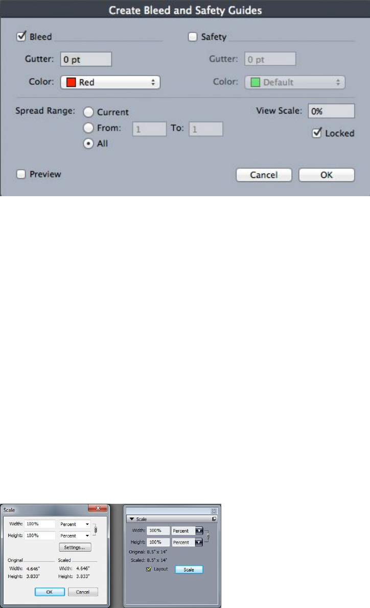
You can add bleed and safety guides to master pages and layout pages.
6Click Preview to see the guides on-screen, and then click OK.
Scale XTensions software
Scale XTensions software lets you quickly scale QuarkXPress layouts, items, groups,
and contents similar to the way drawing programs scale objects. Through the Scale
Settings dialog box, you can specify what gets scaled — text, frames, offsets, line
weights, and more.
Scale XTensions software adds the following to QuarkXPress:
•Item > Scale lets you specify a new width, a new height, or both for the selected
item, items, or group.
•Window > Scale displays the Scale palette, which provides the same controls as
the Scale command. In addition, the Scale palette lets you scale the entire layout.
You can also scale the selected item, items, group, or layout up or down by 5%
by choosing Increase Size or Decrease Size from the palette menu.
Scale dialog box and Scale palette
Both the Scale dialog box and the Scale palette offer the following features:
•You can scale in terms of percentages of the item’s current size (percent), or by
entering new dimensions (in current units of measurement). First, choose Percent
318 | A GUIDE TO QUARKXPRESS 2016
DOCUMENT CONSTRUCTION
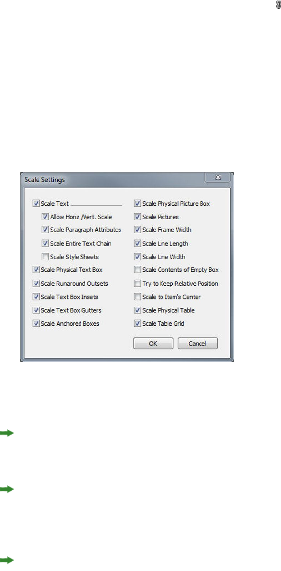
or Units from the menus to the right of the Width and Height fields, and then
enter appropriate values in the fields.
•To scale items proportionally, click the Constrain button . When you constrain
scaling, the Height option is unavailable and items will be scaled equally vertically
and horizontally according to the entry in the Width field.
•The Original and Scaled dimensions of the bounding box of the item or group
are displayed (in current units of measurement). These values are updated whenever
you change a value in the Width or Height fields.
•To change scaling settings, click the Settings button in the Scale dialog box or
choose Scale Settings from the Scale palette menu. The Scale Settings dialog box
displays. Each check box controls whether a particular item or attribute is scaled
or not.
Scale Settings dialog box
In the Scale palette, you can check Layout to scale the entire layout and everything
in it.
Scale XT allows you to scale an item so that it is smaller or larger than QuarkXPress
allows. Such an item will print correctly, but if you attempt to modify it with
QuarkXPress tools or commands, an error message will display.
Scale XT is not designed to work with all items synchronized through the Content
palette Window > Content). Instances of the shared item will inherit only width and
height changes from Scale XT. In addition, do not scale entire layouts that include
Composition Zones.
Rotated items are scaled according to their original geometry. For example, if you scale
just the width of a square box that has been rotated 45 degrees, a rotated rectangle is
produced (rather than, as you might have wanted, a wider diamond).
A GUIDE TO QUARKXPRESS 2016 | 319
DOCUMENT CONSTRUCTION
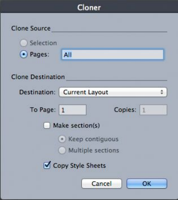
Cloner XTensions software
With Cloner XTensions software, you can copy selected items to the same location
on different pages or in a different project. You can also copy pages into a separate
project.
To use Cloner, first select the items you want to clone, or deselect all items if you want
to clone pages. Next, choose Utilities > Cloner to display the Cloner dialog box.
Cloner dialog box
The Clone Source area lets you choose what you want to clone. Click Selection to
clone the selected items, or Pages to clone a range of pages (specified in terms of
absolute position).
The Clone Destination area lets you choose where the cloned content goes. Choose
an option from the Destination drop-down menu:
•Current Layout: Copies the selected items to a different location in this layout.
•Quark File: Copies the selected items or pages into an existing QuarkXPress
project.
•New Project: Copies the selected items or pages to a new QuarkXPress project.
•New Layout: Copies the selected items or pages to a new layout in this
QuarkXPress project.
•Split to Single Pages: Creates a one-page project file from each page indicated.
•Split Layouts to Projects: Creates a single-layout project from each layout in this
project.
•All Open Layouts: Copies the selected items to all layouts in this project.
•[Layout name]: Copies the selected items or pages into that layout.
Enter the target page in the To Page field.
If you are cloning a selection, use the Copies field to enter the number of copies you
want to make of the selected items. For example, if To Page is set to 2 and Copies is
320 | A GUIDE TO QUARKXPRESS 2016
DOCUMENT CONSTRUCTION
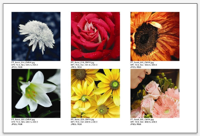
set to 5, copies will be created on pages 2, 3, 4, 5, and 6. If you are working in a
facing-page layout, the copies are placed on both sides of the spread.
If you are cloning pages, check Make section(s) to create sections in the page clones,
then choose an option:
•Keep contiguous: Keeps all of the page copies in a single layout in the destination
layout, even if they originate from different sections.
•Multiple sections: If the indicated page range includes section breaks, the section
breaks are preserved in the copies.
If you are cloning into a new project or splitting into projects, check Copy style sheets
to include all of the style sheets from the source layout in the new project or projects.
If you do not check this box, only style sheets that are used are copied.
ImageGrid XTensions software
With ImageGrid XTensions software, you can automatically create a grid of images
from a folder of image files.
A page created by ImageGrid
To use ImageGrid with the active layout, Choose Utilities > ImageGrid. The ImageGrid
dialog box displays.
A GUIDE TO QUARKXPRESS 2016 | 321
DOCUMENT CONSTRUCTION
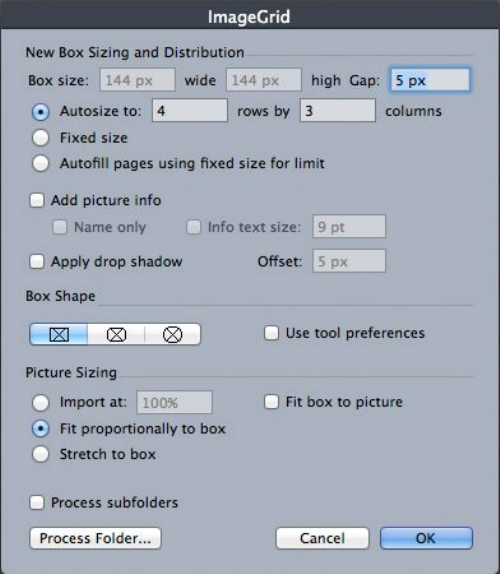
ImageGrid dialog box
To manually specify the size of the boxes that make up the grid, enter values in the
Box Size fields and then click Fixed size. (Box size values are ignored if you click
Autosize to.) Indicate the gap you want between images in the Gap field.
To specify how many rows and columns should be included in the grid and allow the
application to size the boxes to fit automatically, click Autosize to and enter values
in the rows and columns fields.
To automatically size boxes depending on their proportions, with the values in the
Box size area as the maximum size, click Autofill pages using fixed size for limit.
Check Add picture info to add a caption text box under each picture box, indicating
the picture file's name, resolution, dimensions in pixels, file format, and color space.
To limit this caption to the name of the picture file, check Name only. To control the
size of the caption text, check Info text size (if you don't check this box, the application
uses font size specified in the Normal character style sheet).
To apply an automatic drop shadow to the picture boxes, check Apply Drop Shadow
and enter a drop shadow offset in the Offset field.
The Box Shape controls let you specify the shape of the picture boxes. To use the
default picture box attributes specified in the tool preferences (QuarkXPress/Edit >
Preferences > Tools tab), check Use Tool Preferences. If you do not check this box,
the picture boxes will have a white background.
In the Picture Sizing area, choose one of the following options:
•Import at: Lets you specify the scale at which pictures are imported. To also
change the size of the box to fit the picture, check Fit box to picture. Note that
322 | A GUIDE TO QUARKXPRESS 2016
DOCUMENT CONSTRUCTION
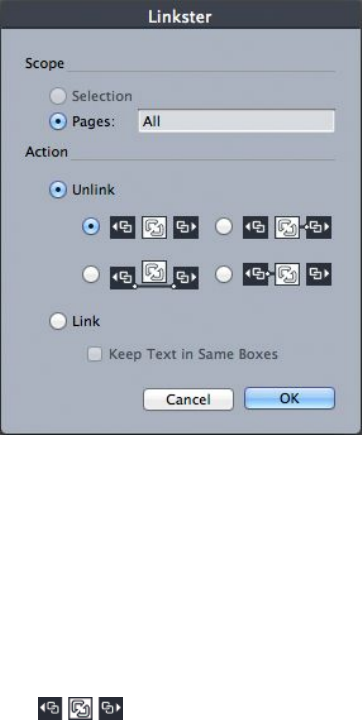
this may override some of the settings in the New Box Sizing and Distribution
area.
•Fit proportionally to box: Fits the picture to the box proportionally.
•Stretch to box: Fits the picture to the box non-proportionally.
Check Process subfolders to include pictures in subfolders of the target folder.
To choose the target folder and start the process, click Process Folder. To start the
process with the currently selected target folder, click OK.
Linkster XTensions software
With Linkster XTensions software, you can link and unlink text boxes without causing
reflow.
To use Linkster, first select the items you want to link or unlink. Next, choose Utilities >
Linkster to display the Linkster dialog box.
Linkster dialog box
Click Selection to unlink the selected items, or Pages to unlink a range of pages
(specified in terms of absolute position).
To unlink stories, click Unlink, then choose one of the following options:
•Option 1 creates three stories: one for the boxes before the selected box, one for
the selected box, and one for the boxes after the selected box.
•Option 2 creates two stories: one for the boxes before and after the selected box,
and one for the selected box.
A GUIDE TO QUARKXPRESS 2016 | 323
DOCUMENT CONSTRUCTION
•Option 3 creates two stories: one for the boxes before the selected box, and one
for the selected box and the boxes after the selected box.
•Option 4 creates two stories: one for the boxes before the selected box and the
selected box, and one for the boxes after the selected box.
To link text boxes, click Link. If Pages is selected, this option links only those boxes
that have been unlinked by Linkster. If Selection is selected, Linkster tries to link the
selected boxes in the order you selected them.
Click Keep text in same boxes to attempt to keep the text in the same boxes after
linking.
324 | A GUIDE TO QUARKXPRESS 2016
DOCUMENT CONSTRUCTION

Output
Whether you want to print proof copies for review on a laser printer, or you need final
film or plate output on a high-resolution imagesetter or platesetter, QuarkXPress will
help you get satisfying results every time. QuarkXPress 9 and later versions, no longer
support host-based separations, but you can continue to output using In-RIP separations
or Composite output.
Printing layouts
In many publishing environments, you can print using a wide variety of output devices,
from desktop inkjet printers to office laser printers or even high-end platesetters. The
topics below explain printing how to print from QuarkXPress.
Updating picture paths
QuarkXPress uses two types of information for imported pictures: low-resolution and
high-resolution. Low-resolution information is used to display picture previews. When
you print, high-resolution information contained in the original picture files is accessed
using paths to the pictures.
A path to a picture is established when you import a picture. The application keeps
information about each picture's path as well as when the picture was last modified.
If a picture is moved or changed after it is imported, the application warns you when
you execute the Output command (Print, PDF, EPS or Digital Outputs) or the Collect
for Output command (File menu).
If you keep your pictures in the same folder as the project, you will not have to maintain
picture paths. If you keep your pictures in the same folder as the article, you will not
have to maintain picture paths. The application can always "find" pictures that are in
the same folder as the document, whether or not the picture was in that folder at the
time it was imported.
Setting Print dialog box controls
To print a Print layout:
1Choose File > Print (Command+P/Ctrl+P). The Print dialog box displays.
2To select a printer driver, choose an option from the Printer drop-down menu.
A GUIDE TO QUARKXPRESS 2016 | 325
OUTPUT
•Windows only: Clicking the Properties button opens a dialog box with controls
specific to the selected printer driver. For more information about the options in
this dialog box or how to install printers, consult the documentation provided
with Microsoft Windows software.
3Specify output options in one of the following ways:
•To use an existing print output style, choose an option from the Print Style
drop-down menu.
•To manually configure print options, use the controls in the bottom half of the
dialog box. This part of the Print dialog box is divided into panes. To display a
pane, click its name in the list on the bottom left. For information, see "Print dialog
box."
•To capture the selected print options as a new output style, choose New Print
Output Style from the Print Style drop-down menu.
4To specify the number of copies you want to print, enter a value in the Copies field.
5To specify which pages you want to print, enter a value in the Pages field. You can
enter ranges of pages, non-sequential pages, or a combination of ranges and
non-sequential pages for printing. Use commas and hyphens to define a sequential
or non-sequential range of pages. For example, if you have a 20-page layout and you
want to print pages 3 through 9, pages 12 through 15, and page 19, then enter 3–9,
12–15, 19 in the Pages field.
6To specify whether only odd, only even, or all pages should be printed, choose an
option from the Page Sequence drop-down menu. All (the default setting) prints all
of the related pages. When you choose Odd, only odd-numbered pages print. When
you choose Even, only even-numbered pages print.
7To make your document print smaller or larger, enter a percentage in the Scale field.
The default is 100%.
8If you are printing two or more copies of the layout, and you want each copy to emerge
from the printer in sequential order, check Collate. If Collate is unchecked, the
application prints multiple copies of each page at a time.
9To print spreads (horizontally adjoining pages) side by side on the film or paper, check
Spreads.
10 To print a multipage layout in reverse order, check Back to Front. The last page in
the layout will print first.
11 Check Fit in Print Area to reduce or enlarge the size of a page in your document to
fit the imageable area of the selected media.
12 Mac OS X only: Click the Printer button to open the Printer Driver dialog box. Consult
the documentation supplied with your computer for more information.
13 Click Print to print the layout.
14 Click Cancel to close the Print dialog box without saving settings or printing the
layout.
326 | A GUIDE TO QUARKXPRESS 2016
OUTPUT

(Windows only) The area at the upper right of the Print dialog box is the page preview
area. You can use this image to preview how the pages will appear on the output device.
(Mac OS X only) The Print dialog has been enhanced to show the actual preview
Print dialog box
The panes in the Print dialog box are described in the topics below.
Device pane
Use the Device pane to control device-specific settings, including PPD selection and
page positioning:
•When you specify a PPD, the Paper Size, Width, and Height fields are
automatically filled with default information supplied by the PPD. If you choose
a PPD for an imagesetter, the Page Gap and Paper Offset fields also will be
available. On Windows you can customize the list of PPDs available in the PPD
drop-down menu using the PPD Manager dialog box (Utilities menu). On Mac
OS X you will have to install the PPDs in the MAC HD > Library > Printers
> PPDs folder, and relaunch QuarkXPress. All of the PPDs will now be listed in
the PPDs list in the Print dialog. If you do not have the right PPD, choose a similar
built-in, generic PPD.
•To specify the media size used by your printer, choose a size from the Paper Size
drop-down menu.
•To specify the width and height of custom media supported by your printer,
choose Custom from the Paper Size drop-down menu and enter values in the
Width and Height fields. When sending output to a continuous-feed or nondrum
imagesetter, use the Automatic setting in the Height field.
•To position your document on the selected output media, choose an option from
the Position drop-down menu.
•The default resolution for the selected PPD is entered automatically in the
Resolution field.
•For imagesetters only: Enter a value in the Paper Offset field to specify the distance
that the left edge of the page will be offset (or inset) from the left edge of the roll
media.
•For imagesetters only: Enter a value in the Page Gap field to specify the amount of
space between pages of the layout as the pages print on the roll.
•To print negative page images, check Negative Print.
•To receive printed PostScript error reporting during output, check PostScript Error
Handler.
Pages pane
Use the Pages pane to specify page orientation, tiling, page flipping, and related
options:
A GUIDE TO QUARKXPRESS 2016 | 327
OUTPUT
•To specify whether to print in portrait or landscape mode, click an Orientation
radio button (Portrait or Landscape).
•To include blank pages in the output, check Include Blank Pages.
•To print the multiple pages of the layout in thumbnail view (reduced size), check
Thumbnails.
•To flip the output vertically or horizontally, choose an option from the Page Flip
drop-down menu.
To print a large layout in sections (tiles), choose an option from the Page Tiling
drop-down menu. The application prints tickmarks and location information on each
tile to aid you in reassembling them.
•To control the way in which a page is tiled by positioning the ruler origin, choose
Manual.
•To have the application determine the number of tiles needed to print each
document page based on the layout size, the media size, whether or not Absolute
Overlap is checked, and the value in the Overlap field, choose Automatic. The
value entered in the Overlap field is the amount the application will use to extend
the page as needed to create the tile. When Absolute Overlap is checked, the
application will use only the value in the Overlap field when extending the page
to create the tile. If Absolute Overlap is unchecked, the application will use at
least the amount in the Overlap field when creating the tile, but may use a larger
amount if necessary. Do not check Absolute Overlap if you want your layout
centered on the final assembled tiles.
Pictures pane
Use the Pictures pane to control the way pictures are printed:
•To specify how pictures are printed, choose an option from the Output drop-down
menu. Normal provides high-resolution output of pictures using the data from
the pictures' source files. Low Resolution prints pictures at screen preview
resolution. Rough suppresses printout of pictures and blends and prints a box
with the frame and an "x" in it, much like an empty picture box on screen.
•To select a format for print data, choose an option from the Data drop-down
menu. Although documents print more quickly in Binary format, the ASCII option
is more portable because it is a standard format readable by a wider range of
printers and print spoolers. The Clean 8-bit option combines ASCII and binary
in a versatile and portable file format.
•Check Overprint EPS Black to force all black elements in imported EPS pictures
to overprint (regardless of their overprint settings in the EPS file).
•To print 1-bit TIFFs at full resolution (not to exceed the resolution specified in
the Device list item), check Full Resolution TIFF Output. If Full Resolution TIFF
Output is unchecked, images greater than 1-bit will be subsampled to twice the
lines per inch (lpi) setting.
328 | A GUIDE TO QUARKXPRESS 2016
OUTPUT
Fonts pane
Use the Fonts pane to specify which fonts are included in output. Note that many of
the options in this pane are available only when printing to a PostScript output device.
•To read the list of downloaded fonts from the printer's PPD file, check Use PPD
Font Settings. Fonts listed in the PPD file are not downloaded. Checking this box
disables many of the other controls in this tab.
•If you are printing to a PostScript level 3 or later output device, or to a device that
uses PostScript level 2 version 2015 or later, check Optimize Font Formats.
•To download all fonts used in the layout , check Download Layout Fonts. To
control which fonts are downloaded, uncheck Download Layout Fonts and then
check Download for each font you want to download. You can control which
fonts are listed by choosing an option from the Show drop-down menu.
•To download all fonts that are required by imported PDF and EPS files, check
Download Imported PDF/EPS Fonts.
•To retrieve a list of the fonts included on the active printer, click Scan Printer.
Note that this process can take a long time; you may want to check Use PPD Font
Settings, and use your printer manufacturer's PPD file.
Color pane
Use the Color pane to control color output.
•To print all colors on one page, choose Composite from the Mode drop-down
menu. To print to a device that handles in-RIP separations, choose Separations
from the Mode drop-down menu. For more information about composite output,
see "Printing color composites." For more information about separations, see "Printing
color separations."
•To specify an output setup for the output device, choose an option from the Setup
drop-down menu. For more information about color management, see "Source
setups and output setups."
•To specify default halftone shape and frequency, use the Halftones and Frequency
drop-down menus. The Printer option on the Halftones drop-down menu lets
the output device determine all halftone settings.
Registration Marks pane
Use the Registration Marks pane to include crop marks, registration marks, and bleed
marks in the output. Crop marks are short vertical and horizontal lines printed outside
the page's final trim size, indicating where to cut the page. Registration marks are symbols
that are used to align overlaying plates. Bleed marks indicate where page bleeds end.
•To include crop marks and registration marks on every page, choose Centered or
Off Center from the Mode drop-down menu.
•When you choose Centered or Off Center, the Width, Length, and Offset fields
are available. Values in the Width and Length fields specify the width and length
of the crop marks. Values in the Offset field specify the distance of the crop marks
from the page edge.
A GUIDE TO QUARKXPRESS 2016 | 329
OUTPUT

•To include marks indicating bleed location, select the Include Bleed Marks option.
Layers pane
Use the Layers pane to specify which layers to output and which layers to suppress.
Print and PDF Outputdialog box only: To apply the settings in the Layers pane to the
layout, check Apply to Layout.
Bleed pane
Use the Bleed pane to allow items to bleed (extend beyond the page edges) at printout.
Bleed settings apply to every page in the layout.
To create a bleed by defining how far the bleed extends from the layout page edges,
choose Symmetric or Asymmetric from the Bleed Type drop-down menu.
•To create a bleed that extends the same distance from each page edge, choose
Symmetric and enter a value in the Amount field to specify the bleed's distances.
•To create a bleed with different distances from each page edge, choose Asymmetric
and enter values in the Top, Bottom, Left, and Right fields to specify the bleed
distances.
•Print and PDF output only: To extend the bleed to encompass all page items that
extend beyond the page boundary, choose Page Items.
•Print and PDF output only: To define whether items that bleed are cut off at the
bleed edge or allowed to print in their entirety, check Clip at Bleed Edge.
The Bleed pane is available only if Custom Bleeds XTensions software is installed.
Transparency pane
Use the Transparency pane to specify how transparency is handled at export.
•The Vector Images control lets you specify a resolution for rasterizing pictures
that include vector data when they occur in a transparency relationship. It's
generally a good idea to keep this value high because vector images typically
include sharp lines that will look jagged at lower resolutions.
•The Blends control lets you specify a resolution for blends when they occur in a
transparency relationship. Blends can typically be rasterized at a relatively low
resolution because they do not contain sharp edges.
•The Drop Shadows control lets you specify a resolution for rasterizing drop
shadows. This value can be relatively low, unless you create drop shadows with
a Blur of zero.
Choosing a lower resolution value for one or more of these fields can reduce the time
required for flattening and can save processing time when you send the layout to
output.
Rotated or skewed items that participate in a transparency relationship must be
rasterized before they are sent to the RIP. Because rotate and skew operations tend to
degrade the quality of an image if they are performed at low resolutions, QuarkXPress
can upsample such items prior to rotating or skewing them, thus minimizing image
330 | A GUIDE TO QUARKXPRESS 2016
OUTPUT

degradation. Check Upsample Rotations if you want to manually set the upsampled
resolution for rotated or skewed items and images that are involved in a transparency
relationship. If you're using low-resolution values, and a rotated or skewed item appears
blocky or degraded, check this box and then enter a value in the To field. The To field
value should be at least equal to the highest resolution value among the Vector Images,
Blends, and Drop Shadows fields.
The dpi for images less than field lets you specify a value above which rotated or
skewed items are not upsampled. The purpose of this field is to prevent rotated or
skewed items that are near the Upsample Rotations To value from being needlessly
upsampled. In general, set this value to about 100dpi less than the Upsample Rotations
To value.
To print items without taking their opacity values into account, check Ignore
Transparency Flattening. All items are treated as 100% opaque, regardless of the
opacity value applied, and drop shadows and picture masks are ignored. This option
can be useful for troubleshooting transparency-related output issues.
To control the resolution of the flattened transparency in imported PDF and Adobe
Illustrator files, enter a value in the Flattening Resolution field.
The flattener rasterizes an area only if that area includes a raster element such as a
drop shadow, a blend, a semiopaque picture, or a picture masked with an alpha channel.
The flattener does not rasterize areas of solid color (regardless of whether they are the
result of semiopaque layering) unless such areas are overlapped by a raster element.
JDF pane
Use the JDF pane to specify whether to save a JDF file from the project's Job Jackets
structure. When you check Output JDF, the Include Job Jacket Contact drop-down
list becomes available; choose a contact from among the Contact Resources in the
project's Job Jacket structure.
Advanced pane
In the Advanced pane, you can specify the PostScript level of the output device.
Summary pane
The Summary pane displays a summary of the settings in the other panes.
Page preview area
On Windows, the Print dialog box (File menu) for Print layouts provides a graphical
depiction of the output page called the page preview area. The page preview area does
not display the actual items on the layout pages or the specified pages; rather, it
represents the shape and orientation of the pages in relation to the target media.
On Mac OS X, the page preview area has been enhanced. The page preview area will
display the actual items on the layout pages or the specified pages; it represents the
actual page.
•The blue rectangle represents the layout page.
•The green rectangle represents the imageable area for the selected media.
A GUIDE TO QUARKXPRESS 2016 | 331
OUTPUT
•A black rectangle represents the media area when a sheet-fed device is chosen in
the PPD drop-down menu (Device pane).
•A gray area surrounding the layout represents bleeds when a bleed setting is chosen
using the Custom Bleeds XTensions software (Bleed pane).
•If the page size, including crop marks and/or bleed, is greater than the imageable
area of the print media, a red area indicates portions of the layout that are outside
the imageable area and will therefore be clipped. If Automatic tiling is enabled
in the Pages pane, the red area does not display.
•An R will display for the Negative Print. Pages will rotate as per the orientation
and the paper size.
•The arrow to the left of the graphic preview indicates the film or page feed
direction.
•To the left of the graphic preview are two smaller icons. The cut-sheet icon
indicates that you have selected a cut-sheet output device from the PPD drop-down
menu (Device pane), whereas a roll-fed icon indicates that you have selected a
roll-fed output device from the PPD drop-down menu. The question mark is a
drop-down button that displays a legend of the colors used in the page preview
area.
•If registration marks are turned on (Registration Marks pane), they are also
displayed in the page preview area.
•If Thumbnails is checked (Pages pane), a preview with thumbnails displays.
Printing color separations
To print color separations:
1Display the Color pane of the Print dialog box (File menu).
2Choose Separation from the Mode drop-down menu.
3Choose an option from the Setup drop-down list:
•The In-RIP Separations option prints all process and spot color plates and the
output is in the composite format. However, the PostScript file to be printed
contains separations information. The In-RIP Separations option must be selected
only if you are using a PostScript level 3 device. Note also that the Setup
drop-down menu also contains all separations-based output setups listed in the
Default Output Setups dialog box (Edit > Output Setups).
4Choose an option from the Halftones drop-down menu:
•To use the halftone settings you specify, choose Conventional.
•To use the halftone settings built into the RIP, choose Printer. Choosing this
option disables the halftone controls in this pane.
5To specify a line frequency other than the default value, enter a lines per inch (lpi)
value in the Frequency field, or choose an option from the Frequency drop-down
menu.
332 | A GUIDE TO QUARKXPRESS 2016
OUTPUT

6The list at the bottom of the Color pane displays the plates used in the layout, as well
as the default Halftone, Frequency, Angle, and Function settings. Generally, the
default settings in the plate list give you correct printing results. However, you may
need to adjust these settings for your particular circumstances. A dash in a column
indicates that the column entry is not editable.
•The Plate column lists spot colors and process inks in the document when you
choose Separations from the Mode drop-down menu. The Setup drop-down
menu at the top of the Color pane specifies which layout plates are listed.
•The Halftone drop-down menu lets you assign a different screen angle to a spot
color. The default screen values for spot colors are specified in the Halftone
drop-down menu in the Edit Colors dialog box (Edit > Colors > New).
•The Frequency column lists the line screen frequency value. This is the lines per
inch (lpi) value that will be applied to each of the color plates. If you do not want
to use the default value for a plate, choose Other from the Frequency drop-down
menu to display the Frequency/Other dialog box.
•The Angle column lists the screen angle for each color plate. If you do not want
to use the default value, choose Other from the Angle drop-down menu to display
the Angle/Other dialog box.
•To specify alternate dot shapes in printed screens, choose an option from the
Function column drop-down menu.
Printing color composites
To print composite color output (as opposed to color separations):
1Display the Color pane of the Print dialog box (File menu).
2Choose Composite from the Mode drop-down menu.
3Choose an option from the Setup drop-down list:
•Grayscale
•Grayscale 100K
•Composite RGB
•Composite CMYK
•Composite CMYK and Spot (prints with composite PostScript, for a device that
supports In-RIP separations)
•As Is (describes color items using their source color space, for output to a PostScript
composite color device)
The Setup drop-down menu also contains all output styles listed in the Default Output
Styles dialog box (Edit > Output Styles).
4Choose Conventional or Printer from the Halftones drop-down menu. The
Conventional option uses QuarkXPress calculated halftone screen values. The Printer
option uses halftone screen values provided by the selected printer; in this case,
QuarkXPress does not send halftoning information.
A GUIDE TO QUARKXPRESS 2016 | 333
OUTPUT

5To specify a line frequency other than the default value, enter a lines per inch (lpi)
value in the Frequency field, or choose an option from the Frequency drop-down
menu.
Exporting layouts
Through Export, Print, and other commands, you can output files in the following
formats:
•Image (PNG or JPEG)
•PostScript (PS)
•Encapsulated PostScript (EPS)
•Portable Document Format (PDF), with or without PDF/X verification
•Extensible Stylesheet Language (XSL)
•Extensible Stylesheet Language Translator (XSLT)
•HTML5 Publications (for more information, see Digital Publishing with QuarkXPress)
•ePub (for more information, see Digital Publishing with QuarkXPress)
•Kindle (for more information, see Digital Publishing with QuarkXPress)
To access export options, choose File > Export or click the Export button .
Exporting a layout in EPS format
When you export a layout page as an Encapsulated PostScript (EPS) file, you can specify
a file name and location and set multiple EPS export parameters (through custom
controls or an EPS output style). To use the basic EPS export controls:
1Choose File > Export > Page as EPS. The Page as EPS dialog box displays.
2Enter a page range in the Page field.
3To use an existing output style, choose an option from the EPS Style drop-down menu.
4To modify output settings, click Options. Use the panes in the resulting dialog box
to control the format of the exported file.
•To use an EPS output style, choose an option from the EPS Style drop-down menu.
To create an EPS output style using the current settings, choose New EPS Output
Style.
•Use the General pane to specify the scale of the EPS file, the format of the EPS
file's preview, the format of the data (ASCII, Binary or Clean 8 Bit), whether to
treat the page's white areas as transparent or opaque in the EPS file, and whether
to output the EPS file as a spread.
•Use the Color pane to choose an output setup for the EPS file and to select which
plates should be included in the output.
•Use the Fonts pane to specify which fonts are embedded within the exported EPS
file.
334 | A GUIDE TO QUARKXPRESS 2016
OUTPUT
•Use the Registration Marks pane to specify the positioning, width, and length
of registration marks in the EPS file.
•Use the Bleed pane to designate a symmetric or asymmetric bleed type and specify
bleed distance around the EPS file.
•Use the Transparency pane to turn transparency on or off, and to control the
resolution of flattened items in the EPS file.
•Use the JDF pane to indicate whether a Job Definition Format (JDF) file should
be created at the same time as the EPS file. You might choose to do this if you're
using Job Jackets in a JDF workflow.
•Use the Advanced pane to choose whether the EPS adheres to PostScript Level 2
or PostScript Level 3.
•The Summary pane will display a summary of all the choices you have made in
the previous panes.
5Click OK. (To capture the current settings without creating an EPS file, click Capture
Settings.)
6Click Save.
Exporting a layout in PDF format
To export the active layout in PDF format:
1Choose File > Export > Layout as PDF. The Export as PDF dialog box displays.
2Enter a page range in the Pages field.
3To use an existing output style, choose an option from the PDF Style drop-down
menu.
4Check the Open PDF after Export check box to open the PDF after the file has been
exported.
5To modify output settings, click Options. Use the panes in the resulting dialog box
to control the format of the exported file.
•To use a PDF output style, choose an option from the PDF Style drop-down menu.
To create a PDF output style using the current settings, choose New PDF Output
Style.
•To use PDF/X verification, choose an option from the Verification drop-down
menu. Available options include PDF/X-1a, PDF/X-3 and PDF/X-4. Note that
PDF/X-1a verification permits only CMYK and spot colors, while PDF/X-3
verification allows you to include colors and pictures that use other color spaces,
along with ICC color profiles (which are defined in the source and output setups
for color management). PDF/X-4 allows native transparency, whereas PDF/X-1a
and PDF/X-3 do not.
•Use the Color pane to specify whether to create composite output or separations,
to choose an output setup for the PDF file, and to select which plates should be
included in the output.
A GUIDE TO QUARKXPRESS 2016 | 335
OUTPUT

•Use the Compression pane to specify compression options for different image
types in the PDF file.
•Use the Pages pane to specify whether to export spreads, whether to export each
page as a separate PDF file, whether to include blank pages, and whether to embed
a thumbnail of the PDF file.
•Use the Registration Marks pane to specify the positioning, width, and length
of registration marks in the PDF file.
•Use the Hyperlink pane to specify how links and lists from the layout export and
how hyperlinks should appear in the PDF. You can also use this pane to specify
the default zoom of the PDF file.
•Use the Meta Data pane to provide the details that display in the Description
tab of the Document Properties dialog box in Adobe Acrobat Reader.
•Use the Fonts pane to specify which fonts are embedded within the exported PDF
file.
•Use the Bleed pane to specify how bleeds are handled in the PDF file.
•Use the Layers pane to specify which layers to include in the PDF file, and to
create PDF layers from the layers in the QuarkXPress layout.
•Use the Transparency pane to control how transparent items are flattened. To
disable flattening and maintain transparency relationships in the exported PDF,
click Export Transparency Natively. To output items without taking their opacity
values into account, click Ignore Transparency. To turn on flattening, click
Flatten Transparency.
When flattening is turned on, you can specify a resolution for rasterizing pictures that
include vector data in a transparency relationship. To do so, click the Vector Images
drop-down menu and choose or enter a dpi value. This control applies only when
flattening is turned on.
To specify a resolution for blends (regardless of whether flattening is turned on), click
the Blends drop-down menu and choose or enter a dpi value. To specify a resolution
for rasterizing drop shadows (regardless of whether flattening is turned on), click the
Drop Shadows drop-down menu and choose or enter a dpi value.
To specify resolution for rotated and skewed objects when flattening is turned on,
check Upsample Rotations and then enter a value in the To field. The To field value
should be at least equal to the highest resolution value among the Vector Images,
Blends, and Drop Shadows fields.
To control the resolution of flattened transparency in imported PDF and Adobe
Illustrator files, enter a value in the Flattening Resolution field.
Export Transparency Natively is unavailable if you choose PDF/X–1a: 2001 or
PDF/X–3: 2002 from the Verification drop-down menu. This feature is also unavailable
if you choose Separations from the Mode drop-down menu in the Color pane.
•Use the JDF pane to indicate whether a Job Definition Format (JDF) file should
be created at the same time as the PDF file. You might choose to do this if you're
using Job Jackets in a JDF workflow.
336 | A GUIDE TO QUARKXPRESS 2016
OUTPUT

•Use the Summary pane to view a summary of the selected PDF export options.
6Click OK. (To capture the current settings without creating a PDF file, click Capture
Settings.)
7Click Save.
If you are using a third-party distiller program and you want to create a PostScript file,
change your settings in the PDF pane of the Preferences dialog box (QuarkXPress/Edit
menu). For more information, see "Preferences — Application — PDF."
Creating a PostScript file
To create a PostScript file from a layout, display the PDF pane of the Preferences dialog
box (QuarkXPress/Edit > Preferences) and check Create PostScript File for Later
Distilling. When you choose File > Export > Layouts as PDF, QuarkXPress generates
a PostScript file with the name and location you specify rather than creating a PDF
file.
Exporting a layout as an image
When you export a layout page as an image file you can specify a file name and location
and set various export image options. To export a layout as an image:
1Choose File > Export > Image. The Export Pages as Images dialog box displays.
2Choose the layout to be exported from the File Name drop-down menu.
3To modify output settings, click Options. Use the panes in the resulting dialog box
to control the format of the exported image
•Enter a value in the Resolution field.
•Choose the image format (PNG or JPEG) from the Format drop-down menu.
•Choose a compression value from the Compression drop-down menu.
•Select Transparent Background to set the image background to be transparent.
•Select Spreads to esxport spreads.
•Select Include Guides to include the on screen guides in the image.
•Select Include Text Grids to include the text grids in the image.
4Click OK.
5Click Save.
Using Collect for Output
To use the Collect for Output feature:
1Display the Fonts pane of the Usage dialog box (Utilities menu) to confirm that all
fonts are available. Then check the Pictures pane of the Usage dialog box to confirm
that all imported pictures are linked to the document and display a status of OK.
A GUIDE TO QUARKXPRESS 2016 | 337
OUTPUT

2Choose File > Collect for Output. The Collect for Output dialog box displays.
3Display the Collect for Output tab. When you use this feature, a report is generated
automatically. To generate only this report, check Report Only in the Collect for
Output tab. If you uncheck this box, you can check one or more of the following
boxes:
•The Layout option copies the project file to the specified target folder. In the
selection box you can see all layouts of your project. Check or uncheck the ones
you want to collect.
•The Linked Pictures option copies imported picture files that must remain linked
to the document for high-resolution output. When QuarkXPress collects pictures
with the document, the path to each collected picture is updated to reflect the
new file locations in the "Pictures" folder within the target folder. If you have
more than one layout selected, then all images of all selected layouts will be
collected.
•The Color Profiles option copies any International Color Consortium (ICC)
profiles associated with the document or imported pictures. If you have more
than one layout selected, then all ICC profiles used in all selected layouts will be
collected.
•Mac OS X only: The Screen Fonts option copies any screen fonts required for
displaying the document. If you have more than one layout selected, then all
screen fonts used in all seelcted layouts will be collected.
•Mac OS X only: The Printer Fonts option copies any printer fonts required for
printing the document. If you have more than one layout selected, then all printer
fonts used in all selected layouts will be collected.
•Windows only: The Fonts option copies any fonts required for printing the
document. If you have more than one layout selected, then all fonts used in all
selected layouts will be collected.
On Mac OS X, TrueType fonts function as both screen fonts and printer fonts. If your
document uses only TrueType fonts, QuarkXPress will collect them either when you
check Screen Fonts or when you check Printer Fonts. If your document uses a
combination of TrueType and Type 1 fonts, or uses only Type 1 fonts, check both
Screen Fonts and Printer Fonts to be sure the Type 1 fonts are collected completely.
4Click Save.
When you choose to collect fonts, QuarkXPress will also collect fonts within imported
EPS files, if those fonts are active on your computer.
The Collect for Output feature is not designed for use with layouts that have been
customized for export in the App Studio issue formats. You can use this feature with
such layouts, but it will not collect all of the assets used in App Studio interactivity,
and it will not collect every layout in a layout family.
338 | A GUIDE TO QUARKXPRESS 2016
OUTPUT
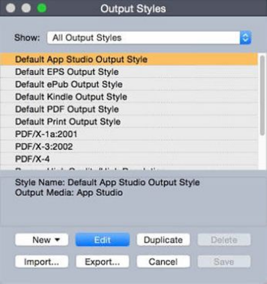
Working with output styles
Output styles let you capture settings for output in print, PDF, ePub, App Studio,
Kindle, and EPS formats. You can use output styles when using the File > Print, File >
Export > Layout as PDF, File > Export > Layouts as Project, File > Export > Page as
EPS, File > Export > Layout as ePub, and File > Export > Layout as Kindle commands.
QuarkXPress includes default settings for all output options, which can serve as a basis
for you to customize according to need. Or, you can create output styles from scratch.
To create an output style:
1Choose Edit > Output Styles. The Output Styles dialog box displays.
Use the Output Styles dialog box to create, import, export, edit, and remove output
styles.
2Choose an option from the New drop-down menu.
3Enter a name for your style in the Name field.
4Specify settings in the panes. For information about EPS options, see "Exporting a layout
in EPS format." For information about PDF options, see "Exporting a layout in PDF format."
For more information about App Studio, ePub, Kindle and HTML Publication options,
see Digital Publishing with QuarkXPress.
5Click OK.
6Click Save.
App Studio output styles
To specify the settings for App Studio output styles:
A GUIDE TO QUARKXPRESS 2016 | 339
OUTPUT
The Output Styles dialog.
1To edit an App Studio output style, choose the output style and click Edit. To add a
new output style, select App Studio from the New drop-down menu. The App Studio
Export Options dialog displays.
App Studio Export Options dialog
2Enter a name for your style in the App Studio Style field.
3In the Pictures pane, specify the desired image resolution for Retina/HiDPI display.
340 | A GUIDE TO QUARKXPRESS 2016
OUTPUT

4Click OK.
Working with trapping
Overprints and knockout controls are available in the Colors palette.
Understanding flattening and production issues
Flattening is the process of simulating transparency by altering page elements to produce
the intended design. Flattening occurs only in the output stream — as items are fed
to the print engine, or exported to PDF — so your QuarkXPress layouts are never
actually modified. In QuarkXPress, flattening works as follows.
First, boxes are decomposed, transparent elements are identified, and relationships
between discrete shapes (including text outlines) are deconstructed. Regions that do
not have to be rasterized are filled with a new color that is created by merging existing
colors. (None and 0% opacity areas do not need to be flattened except when used for
blends and pictures.)
Regions that need to be rasterized result in clipping paths. (Semi-opaque pictures, drop
shadows, semi-opaque blends, and semi-opaque items that overlap page elements must
be rasterized.)
The settings in the Transparency pane of the Print dialog box (File menu) control
the output resolution of page elements that are rasterized due to transparency effects
or drop shadows. For more information, see "Transparency pane."
In general, when working with transparency relationships, trapping is not necessary.
When exporting a PDF, you can choose whether to flatten items that are in transparency
relationships or to use native PDF transparency. If you export a PDF with native PDF
transparency, vector graphics in transparency relationships remain in vector format.
This can result in faster output and make color management easier.
PDF Filter XTensions software
You can use PDF Filter XTensions software to do two things:
•Save a page or range of pages from a QuarkXPress layout as a Portable Document
Format (PDF) file. For more information, see "Exporting a layout in PDF format."
•Import a page of a PDF file into a picture box. For more information, see "Importing
a PDF file into a picture box."
Importing a PDF file into a picture box
To import a PDF file into the active picture box:
1Choose File > Import Picture.
A GUIDE TO QUARKXPRESS 2016 | 341
OUTPUT

•TrimBox: Uses the size of the page after trimming is done. This option does not
include registration marks and is unaffected by any bleeds applied to the layout
space when the PDF is created.
•CropBox: Uses the size of the page plus space for any specified bleeds and space
allotted for registration marks. CropBox equals the size of the layout space from
the PDF Boxer XT software standpoint.
•BleedBox: Uses the size of the page plus space for bleeds.
•MediaBox: Uses the size of the page, not including space for bleeds or registration
marks.
2Click Open.
To preview a different page of a PDF file in the Import Picture dialog box, check the
Preview check box, and then enter the page number in the PDF Page field.
To find out which page of a PDF file was imported into a layout, display the Pictures
pane of the Usage dialog box (Utilities menu), and then check More Information.
342 | A GUIDE TO QUARKXPRESS 2016
OUTPUT
Collaboration and single-sourcing
You can use the synchronization feature to easily package the same information for
distribution in multiple formats and through multiple channels. In addition to
customizing designs according to medium — print and digital — you can also create
projects that contain multiple layout sizes. Best of all, you can streamline your work
by automatically synchronizing your content between layouts of any type.
Working with shared content
If you've ever worked on a project where the same content needs to be maintained
identically in multiple places, you know there is a certain degree of risk involved. What
if the print version of a document is updated, but the digital version is not? To address
this problem, QuarkXPress includes the shared content feature. This feature lets you
link content that is used in different places within a project file. If one copy of the
content changes, the other copies are immediately and automatically updated to reflect
those changes.
For most synchronized items, QuarkXPress maintains a master version in an invisible
part of the project file called the shared content library. When you make a change to
any synchronized item in a layout, that change is written to the master version in the
shared content library, and then QuarkXPress automatically updates all synchronized
copies of that item in the project to reflect the change. So if you update item A, item
B gets updated automatically via the master item in the shared content library — and
if you update item B, item A is updated the same way.
The shared content library can hold pictures, boxes, lines, formatted and unformatted
text, chains of text boxes, groups, and Composition Zones. When you add something
to the shared content library, you can control which aspects of that content or item
should be synchronized (kept the same in every instance) and which aspects should not
be synchronized.
A GUIDE TO QUARKXPRESS 2016 | 343
COLLABORATION AND SINGLE-SOURCING
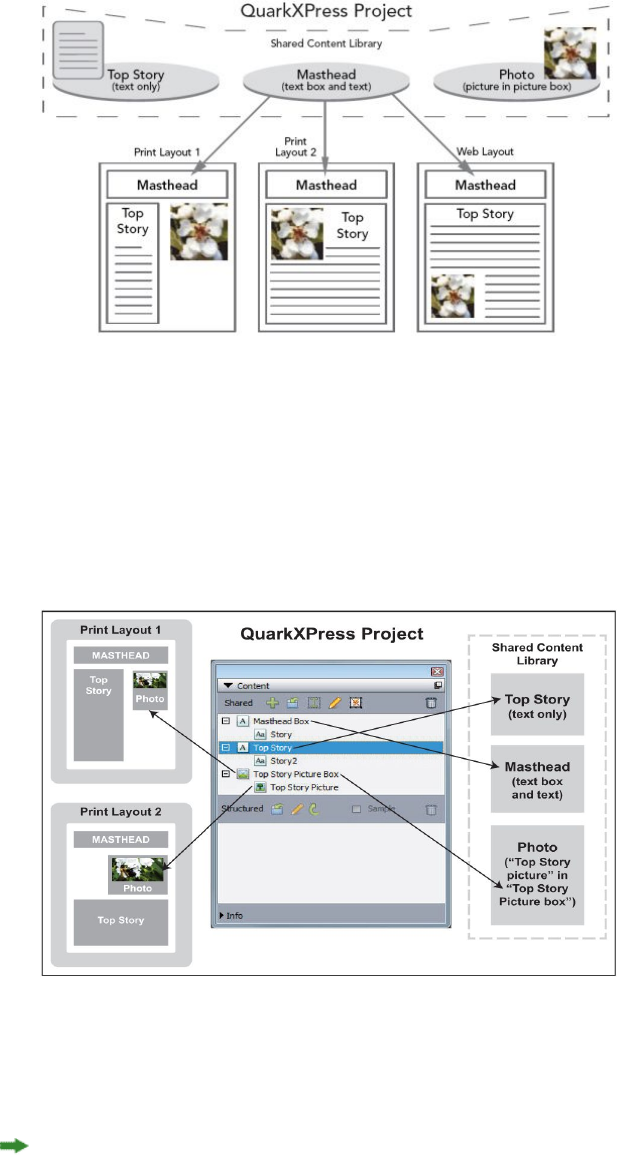
The shared content library contains text, pictures, lines, Composition Zones, and items
that can be used in different layouts within a project. When you change any instance of a
shared content library item in a layout, all instances in all layouts are automatically updated
because they are all linked to the master version in the shared content library.
Items in the shared content library are displayed in the Content palette. From this
palette, you can duplicate and synchronize that content across different layouts, as
illustrated below.
The Content palette provides access to items in the shared content library. Here, "Print
Layout 1" uses "Top Story Picture Box" and the picture within it, but "Print Layout 2" uses
only the picture itself (in a larger picture box). If the picture changes in either layout, both
layouts are updated automatically.
For information about including different types of layouts in a single project, see
"Projects and layouts."
Sharing and synchronizing content
To share and synchronize boxes, lines, groups, and content:
1Display the Content palette (Window menu).
2Select the items you want to synchronize.
344 | A GUIDE TO QUARKXPRESS 2016
COLLABORATION AND SINGLE-SOURCING
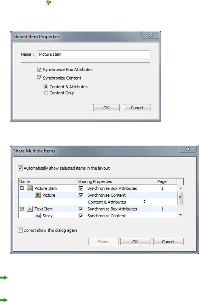
3Click Add Item in the Content palette. If one item is selected, the Shared Item
Properties dialog box displays. If multiple objects are selected, the Share Multiple
Items dialog box displays.
Use the Shared Item Properties dialog box to share and synchronize individual items.
Use the Share Multiple Items dialog box to share and synchronize multiple items.
If Automatically show selected items in the layout is checked, you can navigate to
an item by clicking its name in the list.
Only the attributes of shared lines can be synchronized.
4To share the characteristics of a selected item, check Synchronize Box Attributes for
that item.
5To share the text or picture in a selected item, check Synchronize Content for that
box. To share both the text or picture and its formatting, click or choose Content and
Attributes. To share only the text or picture, click or choose Content Only. See
"Understanding synchronization options" for box and content options.
A GUIDE TO QUARKXPRESS 2016 | 345
COLLABORATION AND SINGLE-SOURCING
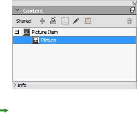
6Click OK to add the selected items to the Content palette.
The Content palette provides access to the items and content in the shared content library.
When you share the content in a text box, the complete text will be shared, it is not possible
to share a fraction of text. If you need to share only part of the text, then you should be
using a content variable. Content Variables allow you to achieve that using a custom
variable.
Understanding synchronization options
When you add items and content to the Content palette, you can choose various
synchronization options in the Shared Item Properties dialog box.
•To synchronize the content of the selected text box, text path, or picture box
without synchronizing the box or path itself, uncheck Synchronize Box Attributes
and check Synchronize Content. Text synchronized in this way must be dragged
into a text box or path, and pictures synchronized in this way must be dragged
into a picture box.
•You can synchronize the text or picture and its content attributes (such as,
formatting for text and scaling, rotation, and effects for pictures) by clicking or
choosing Content and Attributes.
•You can synchronize the text or picture while allowing unique content attribute
edits by clicking or choosing Content Only. If you do this, the text or picture can
be formatted differently in different parts of the project. But if you edit the text
or update the picture in one place, that change is made everywhere.
•To synchronize a text box, text path, or picture box and its attributes without
synchronizing its contents, check Synchronize Box Attributes and uncheck
Synchronize Content. For example, assume you do this with a text or picture
box, and then drag out two copies of the box. If you then resize and add a frame
to one of the boxes, the other box is automatically resized and acquires the same
frame. You may, however, import different content into each box.
To synchronize item attributes, content, and content attributes, check Synchronize
Box Attributes and Synchronize Content, and click or choose Content and Attributes.
If you synchronize two boxes this way, any change made to one is automatically made
to the other, including changes to box size, contents, and formatting.
346 | A GUIDE TO QUARKXPRESS 2016
COLLABORATION AND SINGLE-SOURCING
Placing a synchronized item
To place a synchronized item or group:
1Select the target entry in the Content palette.
2Drag the Content palette entry onto the page.
Placing synchronized content
To place synchronized content:
1Select a text box, text path, or picture box.
2Select the text or picture content entry in the Content palette and click Insert. Note
how the item's resizing handles change to synchronization symbols. You can also drag
the text or picture entry from the Content palette to an active text box, text path, or
picture box.
You can also drag the text or picture entry from the Content palette to an active text
box, text path, or picture box.
Importing content into the shared content library
In addition to importing text or pictures into text or picture boxes, you can import
content directly into the Content palette using the Content palette's Import button
. However, this button is available only when you select a text content icon or
picture content icon in the Content palette.
Text imported this way becomes embedded in the project file; no link to the source
text file is maintained. Pictures imported this way, however, can be viewed and updated
in the Pictures pane of the Usage dialog box.
Working with Composition Zones
The following topics show how Composition Zones can streamline existing workflows
by allowing team members to work on the same QuarkXPress project at the same time.
Understanding Composition Zones
A Composition Zones item is a layout or user-defined area within a layout that can be
shared with other QuarkXPress users.
To work with Composition Zones in QuarkXPress, you must have Composition Zones
XTensions software loaded.
Imagine a layout artist in charge of the QuarkXPress project files for a magazine. The
layout artist can use Composition Zones to share content with writers, editors, graphic
artists, and remote contributors who also use QuarkXPress.
Using QuarkXPress, the layout artist can "draw out" the area of the project for an ad
using the Composition Zones tool and then export that Composition Zones item as
a separate file. The resulting file includes the correct specs, and this approach saves
A GUIDE TO QUARKXPRESS 2016 | 347
COLLABORATION AND SINGLE-SOURCING
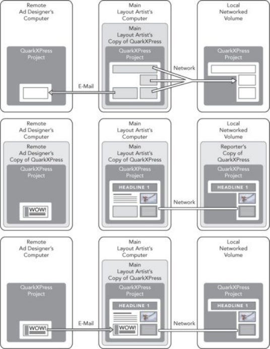
steps when the remote ad creator receives the file. The ad creator works in QuarkXPress
to add the content and then returns the file — along with necessary graphics and fonts
— to the layout artist. The layout artist then places the updated file in the proper
folder, and the layout is updated automatically to show the ad. And because the
Composition Zones item works just like a QuarkXPress layout, the layout artist can
open the file to make changes.
Meanwhile, the layout artist can designate another Composition Zones item for an
article on the same page as the ad. The layout artist draws three boxes: One for the
headline, one for the body of the article, and one for a picture. Using the Shift key to
select all three boxes, the layout artist creates a new Composition Zones file from those
three boxes, exports that file, and then notifies the writer that the file is available in
the staff's shared network folder. As the writer works with the file and saves each
updated version, the updates display in the layout artist's project. And like the
advertisement, the article can be edited later in the project.
Top: The main layout artist exports parts of a project as Composition Zones, and then
sends one file through e-mail to a remote ad designer and puts another file on a local
networked server. Middle: The main layout artist, the reporter, and the ad designer all
work on their parts of the page simultaneously. Bottom: The ad designer sends the
completed ad to the main layout artist in an e-mail message, the page updates
automatically, and the layout is done.
The scenario above shows the primary uses for Composition Zones, but the feature
can accommodate other collaborative workflow issues as well. For example,
Composition Zones can be restricted to the project where they are defined, which you
348 | A GUIDE TO QUARKXPRESS 2016
COLLABORATION AND SINGLE-SOURCING
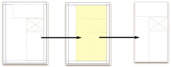
might want to do for a number of reasons. Perhaps the layout artist wants to use an
ad in more than one place in the project, and the ad might include multiple text and
picture boxes. You cannot use the Content palette to synchronize a group of items,
but if the layout artist creates a Composition Zones item based on a selection of multiple
items, that Composition Zones item becomes synchronized and available for use
throughout the project. Maybe the layout artist designates one layout for the printed
magazine and another layout in the same project for a digital page that includes the
ad. The layout artist can restrict the use of this Composition Zones item to this single
project, but the ad can match exactly in print and digital output.
Composition Zones terminology
Composition Zones are unique because they have the characteristics of items when
you place them in a layout, but they behave like layouts when you edit their contents.
•Composition Zones item: An item that shows the contents of a layout that exists
elsewhere. You can think of a Composition Zones item as a "window" through
which you can see the contents of a different layout. The layout shown in a
Composition Zones item is called its composition layout (see next definition). Each
Composition Zones item gets its content from one (and only one) composition
layout.
•Composition layout: A special kind of layout that is used only to provide contents
for a Composition Zones item. You can think of a composition layout as the
layout that is visible through the "window" of a Composition Zones item. Multiple
synchronized Composition Zones items can display the contents of a single
composition layout. However, a composition layout can be edited by only one
person at a time.
When you create a Composition Zones item, QuarkXPress automatically creates a
composition layout to provide content for that Composition Zones item.
A GUIDE TO QUARKXPRESS 2016 | 349
COLLABORATION AND SINGLE-SOURCING
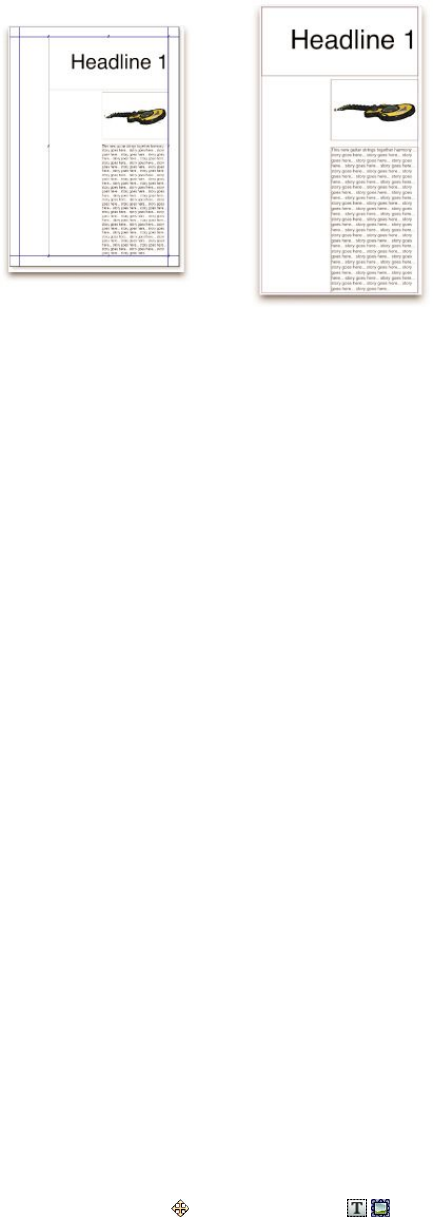
When you add content to a composition layout, it automatically updates any corresponding
Composition Zones items. The updates display in the Composition Zones items according
to the preferences that are set for the layouts that contain the Composition Zones items
(immediately, at print time, or when opening the project).
•Original Composition Zones item: The initial layout or user-defined area from which
a Composition Zones item was created.
•Placed Composition Zones item: A Composition Zones item that you have positioned
in a layout using the Content palette.
•Original host layout: The layout where a Composition Zones item was created.
•Host layout: Any layout into which a Composition Zones item has been placed.
Creating a Composition Zones item
You can use three methods to create a Composition Zones item (and its corresponding
composition layout):
•You can select multiple objects and then choose Item > Composition Zones >
Create.
•You can designate an entire layout as a Composition Zones item.
•You can select the Composition Zones tool and manually outline the space for
your Composition Zones item.
The following topics show all three methods for creating a Composition Zones item,
in this case for exclusive use within one project (that is, a single-project composition
layout).
Creating a Composition Zones item from a selection of multiple items
To create a Composition Zones item based on a selection of multiple items:
1Select the Item tool or a Content tool , press the Shift key, and select more
than one item.
2Choose Item > Composition Zones > Create. A box that equals the size of the bounds
of the group replaces the group.
350 | A GUIDE TO QUARKXPRESS 2016
COLLABORATION AND SINGLE-SOURCING
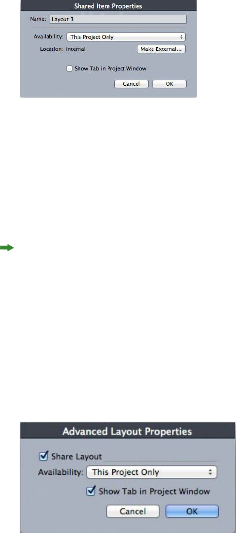
3To finish creating the Composition Zones item, choose Item > Share, or display the
Content palette (Window menu) and click Add Item. Either way, the Shared Item
Properties dialog box displays.
Use the Shared Item Properties dialog box to name your composition layout and designate
availability.
4Enter a name for the composition layout in the Name field.
5Choose This Project Only from the Availability drop-down menu.
6Check Show Tab in Project Window to provide access to the composition layout
from the layout tab at the bottom of the project window.
7Click OK to save the composition layout.
If the position of one or more selected items is locked (Item > Lock > Position), then
you cannot create a Composition Zones item.
Creating a Composition Zones item from a layout
To create a Composition Zones item based on an entire layout:
1Display the layout you'd like to designate as a Composition Zones item (for example,
"Layout 1").
2Choose Layout > Advanced Layout Properties.
3Check Share Layout.
Use the Advanced Layout Properties dialog box to specify sharing for a composition
layout that is based on an entire layout.
4Choose This Project Only from the Availability drop-down menu.
5Check Show Tab in Project Window to display the composition layout for easy access
from the layout tab at the bottom of the project window. If you uncheck Show Tab
A GUIDE TO QUARKXPRESS 2016 | 351
COLLABORATION AND SINGLE-SOURCING
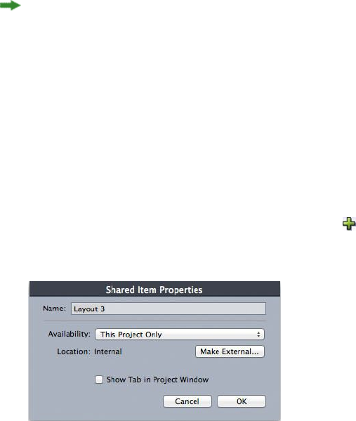
in Project Window, you can access the composition layout by selecting the
Composition Zones item and choosing Item > Composition Zones > Edit.
6Click OK. The composition layout displays in the Content palette.
A composition layout may contain multiple pages. You can use the Page menu or the
Page Layout palette to add, delete, or move pages.
Creating a Composition Zones item with the Composition Zones tool
To manually define a Composition Zones item:
1Select the Composition Zones tool in the Tools palette.
2Drag to draw the Composition Zones item.
3To finish creating the Composition Zones item, choose Item > Share, or display the
Content palette (Window menu) and click Add Item . Either way, the Shared Item
Properties dialog box displays.
Use the Shared Item Properties dialog box to name your composition layout, designate
availability, and specify whether a tab displays at the bottom of the project window.
4Enter a name for the composition layout in the Name field.
5Choose This Project Only from the Availability drop-down menu.
6Click OK. The composition layout displays in the Content palette.
Placing a Composition Zones item
After you add a composition layout to the Content palette, you can place a
Composition Zones item based on that composition layout onto a page. To place a
Composition Zones item:
1Display the Content palette (Window menu).
352 | A GUIDE TO QUARKXPRESS 2016
COLLABORATION AND SINGLE-SOURCING
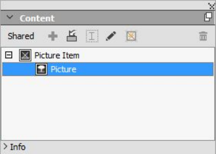
The Content palette lists composition layouts as well as other shared content.
2Select the composition layout you want to place.
3Drag the composition layout from the Content palette to the layout.
Managing multiple pages in a placed Composition Zones item
A composition layout may contain multiple pages. However, a Composition Zones
item based on that composition layout can show only one page at a time. To indicate
which page to show in a Composition Zones item:
1Select the Composition Zones item.
2Choose Item > Modify, and click the Layout tab.
3Choose a page from the Page drop-down menu.
A GUIDE TO QUARKXPRESS 2016 | 353
COLLABORATION AND SINGLE-SOURCING
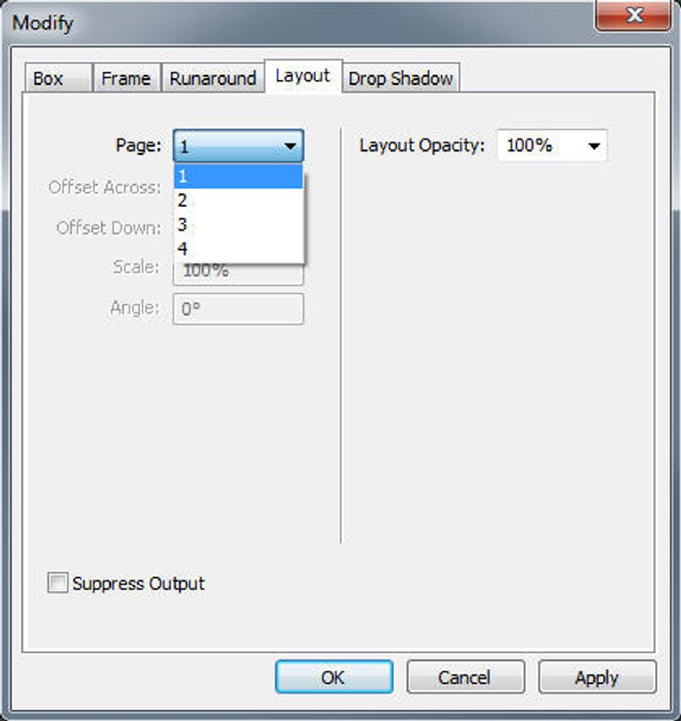
Use the Page drop-down menu in the Layout tab of the Modify dialog box to display a
specific page of a composition layout in your placed Composition Zones item.
4Click OK.
Editing the attributes of a Composition Zones item
To edit the attributes of a Composition Zones item:
1Select a Composition Zones item.
2Choose Item > Modify.
3Use the Box tab of the Modify dialog box to specify positioning, size, alignment, color,
opacity, and printing ability.
4Use the Frame, Runaround, and Drop Shadow tabs to make other structural
adjustments.
5Use the Layout tab to navigate between pages, suppress or enable printing, and adjust
layout opacity.
Converting a Composition Zones item to a picture
To create an external picture file from a Composition Zones item, choose Item >
Composition Zones > Convert to Picture. This creates a picture appropriate for the
layout type within which the Compositions Zones was created.
354 | A GUIDE TO QUARKXPRESS 2016
COLLABORATION AND SINGLE-SOURCING

Before you convert a Composition Zones item to a picture, the Composition Zones
item displays in the Composition Zones pane of the Usage dialog box (Utilities
menu). But when you choose Item > Composition Zones > Convert to Picture, an
alert indicates that the Composition Zones item will become unsynchronized. The
resulting picture displays in the Picture pane of the Usage dialog box. However, the
composition layout remains in the Content palette.
Unsynchronizing a Composition Zones item
When you unsynchronize a Composition Zones item, its composition layout remains
available in your project. To unsynchronize a Composition Zones item:
1Select the Composition Zones item in the layout window.
2Choose Item > Unsynchronize. The composition layout remains in the Content
palette for future use. But subsequent changes to the unsynchronized
Composition Zones items in the layout window will not be synchronized.
Editing a composition layout: Content
When you edit a composition layout, you can change content and adjust layout-level
attributes.
To edit the contents of a composition layout:
1Click the layout name in the layout tab at the bottom of the project window (available
if Show Tab in Project Window is checked). If the composition layout name does
not display in the layout tab, select the Item tool and double-click the Compositions
Zones item.
2When the composition layout displays, all the composition layout contents are available
for editing. You can use menu and palette commands to alter text, graphics, and items,
and you can use tools to add content.
3Closing the window updates the content in the Composition Zones item.
Editing the contents of a composition layout
Your method for accessing a composition layout for editing is determined by your
Show Tab in Project Window setting in the Advanced Layout Properties dialog box.
When you check Show Tab in Project Window, you can access the composition
layout from the layout tab at the top of the project window. Simply click the tab to
activate the composition layout for editing content and layout attributes.
If you don't check Show Tab in Project Window, you have to select the Item tool
and double click the original Composition Zones item. The composition layout displays.
For a composition layout created from an entire layout, check Show Tab in Project
Window in the Advanced Layout Properties dialog box so you can access the layout
easily. Otherwise, you have to select the composition layout in the Content palette,
click Edit, and then check Show Tab in Project Window.
A GUIDE TO QUARKXPRESS 2016 | 355
COLLABORATION AND SINGLE-SOURCING
Unsynchronizing a composition layout
When you unsynchronize a composition layout, QuarkXPress breaks the link between
that composition layout and all existing Composition Zones items based on that
composition layout. To unsynchronize all instances of a Composition Zones items in
a project, select the composition layout in the Content palette, and click the
Unsynchronize All button . However, if you subsequently change the composition
layout and place a new Composition Zones item based on it, the new
Composition Zones item will reflect the change.
Deleting a composition layout
To delete a composition layout:
1Display the Content palette.
2Select the composition layout in the palette and click Delete .
356 | A GUIDE TO QUARKXPRESS 2016
COLLABORATION AND SINGLE-SOURCING
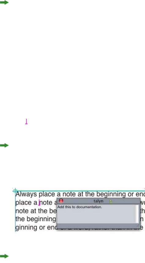
Notes
The Notes feature lets you store comments in a project without affecting the actual
content of the project. You can use notes to add reminders, comments on the content,
or URLs to a project. An open note looks like adhesive or "sticky" notes you might
stick to hard copy.
When used with Quark Publishing Platform, the Notes feature uses settings defined
in Quark Publishing Platform. For more information, see A Guide to Quark Publishing
Platform.
Creating notes
To work with notes, first choose View > Show Notes to make sure notes are visible.
(If this menu item displays as Hide Notes, notes are already visible.) When this option
is unchecked, note icons are no longer visible in text and menu items for working
with notes are disabled.
To create a note, place the text insertion point where you want to enter the note and
choose Item > Note > Insert. A note window displays and in WYSIWYG view, a Note
icon also displays to the right of the text insertion point. Enter the note text in the
note window.
On Mac OS X, a link is also shown between the note icon and the note window and
the newly created note is not shown on the Article area, instead it is shown in the
pasteboard area and doesn't hide the Article text.
You can use notes to store comments in projects.
The Note icon is actually a special kind of text character. It does not affect the flow of
text, but in other ways it works like a regular text character. For example, if you select
a range of text that contains a Note icon, then start entering characters, the text
(including the Note icon) is replaced by the characters you enter, and the note is lost.
A GUIDE TO QUARKXPRESS 2016 | 357
NOTES
To change the formatting of notes, use the Notes preferences. For more information,
see "Preferences — Application — Notes."
Working with notes
You can use the commands in the Item > Notes submenu to navigate through notes,
to create and delete individual notes, and to open and close all notes in a project.
Opening and closing notes
To open and close notes as you review comments:
•To open an existing note, click the Note icon and then choose Item > Notes >
Open Note.
•To open all notes in the project, choose Item > Notes > Open All Notes.
•To close a note, click the close box in the upper-left (Mac OS X) or upper-right
(Windows) corner of the note window, or choose Item > Notes > Close Note.
•To close all open notes in the project, choose Item > Notes > Close All Notes.
•To move the text insertion point to the next note in the text, choose Item >
Notes > Go to Next. To move the text insertion point to the previous note in
text, choose Item > Notes > Go to Previous.
Showing and hiding notes
To show notes when they are hidden, choose View > Show Notes. To hide notes when
they are visible, choose View > Hide Notes.
Deleting notes
To delete a note, do one of the following things:
•Click the Note icon and then choose Item > Notes > Delete.
•Click an open note window and then choose Item > Notes > Delete.
•Place the text insertion bar to the right of the note icon and press Delete/Backspace.
•Select a range of text that contains a note icon and press Delete or Backspace.
Converting between notes and text
To convert the selected text to a note, choose Item > Note > Convert Selection to
Note .
Viewing notes by author, date, name, or color
To view notes by a certain author or by the date they were created, choose View >
Show Notes to enable notes, choose Item > Notes > Open Notes By to display the
Open Notes dialog box, click All Notes, and then use the controls in the All Notes
area.
358 | A GUIDE TO QUARKXPRESS 2016
NOTES

To view notes by name or color, choose Item > Note > Open All Notes in New
Document , then choose an option from the By Name submenu or the By Color
submenu. The notes display as text in a new project.
Moving and resizing notes
To move a note window, drag its title bar. You can move note windows anywhere
within a project. In Windows, if a note has been moved, you can return it to its original
location by clicking the note's button.
To resize a note, click and drag the resize box in the lower-right corner of the note
window.
Printing notes
When you print a project, you can choose whether you want notes to be included and
how they should be formatted. In the Print dialog box (File menu), click Notes in the
list on the left to display the Notes pane, then check Print Notes to include notes in
the output. You can choose whether to include all notes or only notes that are open.
Notes in PDFs
When you create a PDF from a project that contains notes, you can choose whether
you want the notes to appear in the PDF. The notes are included as PDF notes.
To include notes in a PDF file, click Options in the Export as PDF dialog box ( File >
Export > Layout as PDF ), click Notes in the list on the left, and then check Include
Notes in PDF.
A GUIDE TO QUARKXPRESS 2016 | 359
NOTES
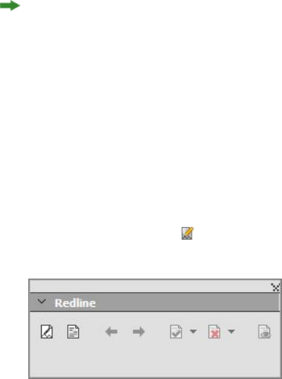
Redline
In a document review environment, reviewers such as managing editors and copy
editors make changes to projects. The Redline feature provides a way to track these
changes so writers, editors, project managers, and other users can see what is happening
to a project and confirm that changes are appropriate. Using the Redline feature, you
can view the insertions and deletions made in a project and decide whether to accept
or reject the changes.
When used with Quark Publishing Platform®, the Redline feature uses settings defined
in Quark Publishing Platform. For more information, see A Guide to Quark Publishing
Platform.
Tracking changes
To turn on tracking, do one of the following things:
•Make sure Utilities > Redline > Tracking is checked.
•Display the Redline toolbar (Utilities > Redline > Show ToolBar) and then click
the Tracking button .
You can use the Redline toolbar to turn change tracking on and off.
When tracking is turned on, QuarkXPress tracks all changes made to the text of the
active project. Deleted text is not displayed in WYSIWYG view, but the deletions are
still tracked. Deletions are visible in Galley and Full Screen Views.
360 | A GUIDE TO QUARKXPRESS 2016
REDLINE
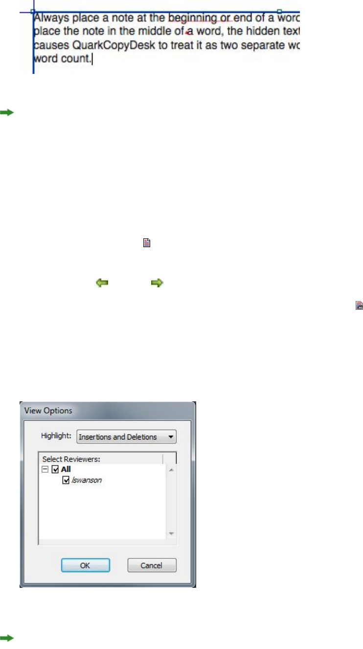
You can use the Redline feature to track changes you make
Formatting changes are not tracked.
Viewing tracked changes
To display all tracked changes, do one of the following:
•Make sure Utilities > Redline > Highlighting is checked.
•Display the Redline toolbar (Utilities > Redline > Show ToolBar) and then click
the Highlighting button .
You can navigate through the changes made to the component using the navigation
buttons (Previous and Next ) on the Redline toolbar.
To control what kind of changes are displayed, click View Highlighting Options
in the Redline toolbar. The View Highlighting Options dialog box displays. In the
Highlight drop-down menu, you can choose to view Insertions Only, Deletions
Only, or Insertions and Deletions. You can use the Select Reviewers list to view only
changes made by a particular reviewer, or check All to view changes made by all
reviewers.
You can use the View Options dialog box to control which reviewers' edits you view, and
whether you view insertions, deletions, or both.
Only insertions and deletions that were made to the component while Tracking was
enabled are highlighted.
A GUIDE TO QUARKXPRESS 2016 | 361
REDLINE

To change the appearance of change-tracking formatting, use the controls in the
Redline pane of the Application Preferences dialog box (Edit > Preferences (Windows)
or (QuarkXPress > Preferences (Mac OS X)).
Accepting and rejecting changes
Accepting an insertion removes the highlighting and adds the text to the component's
content. Accepting a deletion removes the content from the component. To accept a
change, select the target text and then choose an option from the Accept drop-down
menu (Redline toolbar):
•Accept Change: Accepts the selected change.
•Accept All Displayed Changes: Accepts all changes highlighted in the component.
•Accept All Changes: Accepts all changes made by all reviewers.
Rejecting an insertion removes the text from the component, while rejecting a deletion
removes the highlighting and keeps the text in the component as normal text. To
reject a change, select the target text and then choose an option from the Reject
drop-down menu (Redline toolbar):
•Reject Change: Rejects the selected change.
•Reject All Displayed Changes: Rejects all the changes highlighted in the
component.
•Reject All Changes: Rejects all changes made by all reviewers.
362 | A GUIDE TO QUARKXPRESS 2016
REDLINE
Job Jackets
The Job Jackets feature takes a revolutionary step beyond preflighting: It helps to ensure
that a print job adheres to its specifications from the moment it is created, and that it
continues to adhere to those specifications all the way through until it rolls off the
press. Furthermore, Job Jackets expand the concept of job specification enforcement
beyond the realm of the individual user by linking projects to synchronized,
dynamically updateable design specifications that include everything from style sheets
and colors to page size and count.
Understanding Job Jackets
Job Jackets serve two main purposes:
•To allow a job definer to create detailed specifications for Print and Digital layouts.
•To allow a layout artist to create projects and layouts from those specifications,
share the specifications with other layout artists, and verify that a layout follows
its specifications.
Job Jackets were created because producing a layout and successfully sending it to
output can be a complex task.
For example, consider some of the difficulties that have plagued creators of print
layouts. Different presses have different capabilities, and modern page layout
applications must be versatile enough to support all of those capabilities. Consequently,
any number of things can go wrong, especially when you include the inevitable
possibility of simple human error. Just to provide a few examples:
•A layout artist may use colors or imported graphics that cannot be reproduced
accurately on the target press.
•A document that has been budgeted at 100 pages may be sent to output with a
length of 112 pages.
•A project may be sent to the output device without its required graphic files or
fonts.
•A layout with small text in a spot color may be sent to a four-color press, resulting
in text that is unreadable.
•Color management settings may be configured incorrectly for the output device,
leading to unexpected results.
A GUIDE TO QUARKXPRESS 2016 | 363
JOB JACKETS
Large and complex print jobs provide even more opportunities for error, and the cost
of such errors becomes much greater. Job Jackets prevent unprintable or incorrectly
constructed jobs from being constructed in the first place.
What are Job Jackets?
Technically speaking, Job Jackets are XML structures that include specifications and
rules for creating and inspecting QuarkXPress layouts. Conceptually, a Job Jackets
structure can be compared to a folder containing job tickets that describe various types
of projects and layouts, as well as other types of information.
Job Jackets are based on the latest version of the JDF (Job Definition Format) schema.
In addition to letting you control QuarkXPress related specifications, Job Jackets also
let you set values for various other specifications covered by JDF, such as binding and
crossover settings. When you send a layout to output, you have the option of including
the layout's JDF information, so that downstream systems can use that information
for automation and for informational purposes. And the Job Jackets specification is
extendable, so developers of JDF-compatible systems can embed their own
implementation-specific settings into Job Jackets before passing the Job Jackets upstream
to the layout artist. These settings can then be preserved in the Job Jackets file and
used by XTensions software, by JDF-enabled applications, or by other systems, to
automate and streamline a wide variety of processes.
Job Jackets can also help you to collaborate within a workgroup. Several layout artists
working on layouts that share the same set of specifications can link their projects to
a shared Job Jackets file, so that if one layout artist makes a change to something like
a style sheet, the same change can be automatically propagated to the other artists'
layouts.
The structure of Job Jackets
Job Jackets are XML structures containing specifications and rules. The topics below
describe the way these specifications and rules are organized in Job Jackets.
Resources
Job Jackets contain Resources, which include the following:
1Project-level Resources: Things that can be applied to a particular project, such as style
sheets, colors, output styles, and color management settings.
2Layout-level Resources: Things that can be applied to a particular layout, such as:
•Layout Specifications: Settings that can be used to assign a particular size,
orientation, and so forth to a layout.
•Rules and Rule Sets: Tests that can be run to inspect a layout and verify its adherence
to specifications.
In addition to the Resources described above, Job Jackets can contain certain
informational Resources, including the following:
•Job Descriptions: This category includes a job number, revision, instructions, notes,
and keywords.
364 | A GUIDE TO QUARKXPRESS 2016
JOB JACKETS
•Contacts: Contact information for job definers and others associated with the job.
Adding contacts can make it easier to track down the appropriate person if
something goes wrong with the job.
Job Tickets
The Resources in Job Jackets are organized into one or more Job Tickets. Each Job Ticket
contains a set of particular Resources that can be applied to a QuarkXPress project.
Within a Job Ticket, Resources are grouped as follows:
1Project settings: A set of project-level Resources that can be applied to a single project.
Project settings include things like style sheets, colors, output styles, and color
management settings. Each Job Ticket contains one set of project settings.
2Layout definitions: Sets of layout-level Resources, each of which can be applied to a
single layout. Each Job Ticket can contain zero or more layout definitions. Each layout
definition can include the following:
•A Layout Specification (page size, orientation, and so forth)
•Zero or more Output Specifications (configurations for a particular output device)
•Zero or more Rule Sets (for inspecting the layout)
•A medium type (Print or Digital)
•Color management settings (Source Setup and Output Setup)
•Proofing specifications (Proof Output and Proof Intent)
•Informational Resources (Description, Job Description, and Instructions)
A GUIDE TO QUARKXPRESS 2016 | 365
JOB JACKETS
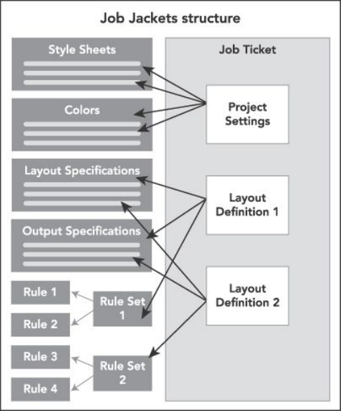
Resources are defined and stored in a Job Jackets structure. A Job Ticket contains a set
of project settings for a particular type of project and layout definitions for zero or more
layouts. Note that Resource definitions do not "live" in Job Tickets; Job Tickets refer or
"point" to Resource definitions, which live in the Job Jackets structure.
Job Tickets and Job Ticket templates
There are three kinds of Job Tickets:
•A Job Ticket template is a definition for a "master" Job Ticket. In some ways, a Job
Ticket template is similar to a master page or a QuarkXPress template file.
•An active Job Ticket is a copy of a Job Ticket template that is associated with a
particular project.
•A deferred Job Ticket is a copy of a Job Ticket template that has been associated
with a project, but is no longer associated with that project (for example, if the
project was closed without being saved).
366 | A GUIDE TO QUARKXPRESS 2016
JOB JACKETS
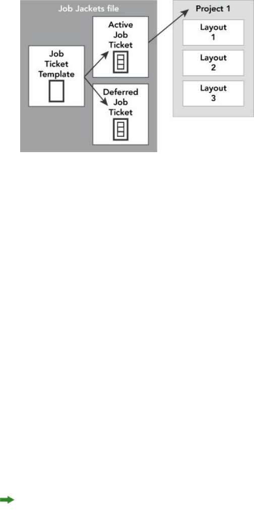
A Job Jackets file can contain Job Ticket templates (containing definitions for Job Tickets),
active Job Tickets (which are associated with a particular project), and deferred Job Tickets
(which have been associated with a project, but are no longer associated with that project).
Each Job Ticket template can be used to generate Job Tickets for one or more projects.
Each Job Ticket can apply to only one project. When a Job Ticket is applied to a project,
the Resources in that Job Ticket become available in the project (for example, the
project inherits all of the color, style sheet, and layout definitions listed in the Job
Ticket).
There are two ways to apply a Job Ticket to a project:
•When creating the project, choose File > New > Project from Ticket, and then
select a Job Ticket template. QuarkXPress copies the Job Ticket template's
information into a new Job Ticket for the new project. The new project
automatically contains a pre-configured layout for each of the layout definitions
in the Job Ticket template, plus all of the project settings defined in the Job Ticket
template.
•Create or open an existing project, and then choose File > Job Jackets > Link
Project and select a Job Ticket template. Again, QuarkXPress copies the Job Ticket
template's information into a new Job Ticket for this particular project. The project
acquires all of the project settings defined in the Job Ticket template, and a new
pre-configured layout is created for each of the layout definitions in the Job Ticket
template.
A Job Ticket maintains no link to the Job Ticket template from which it was created.
Changes made to a Job Ticket template are not propagated to existing Job Tickets.
Linked and embedded Job Jackets
Every QuarkXPress project is associated with a Job Jackets structure. A project's
Job Jackets structure may be embedded in the project, or it may be stored in an XML
Job Jackets file in the local file system. The location of a project's Job Jackets structure
depends on how you create the project; for more information, see "Applying a Job
Ticket template to a project."
A GUIDE TO QUARKXPRESS 2016 | 367
JOB JACKETS
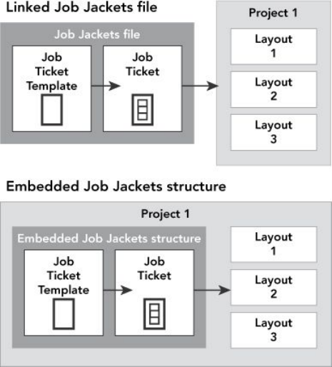
A Job Jackets structure can exist as an XML file in the file system, or can be embedded in
the project file.
By default, non-embedded Job Jackets files are stored in the location specified in the
Job Jackets pane of the Preferences dialog box (QuarkXPress/Edit menu). However,
you can store Job Jackets files wherever you like. For example, if you're sharing a
Job Jackets file among layout artists in a workgroup (see "Shared Job Jackets"), you might
choose to put that Job Jackets file on a file server that everyone can reach through the
network.
To change the default location where Job Jackets are stored, go to the Job Jackets
pane of the Preferences dialog box (QuarkXPress/Edit menu), click Select the path,
click the Select button, and navigate to the target directory.
Sample Job Jackets workflow
This topic describes a suggested workflow for Job Jackets. Note that this is not the only
possible workflow; it is just an example to show how Job Jackets can be used. The
following definitions are used:
•Job definer: The person who knows what the print job is supposed to consist of —
for example, number of pages, size, colors, and so forth.
•Output specialist: The person who knows how a print job must be created and
configured to print correctly on the target press.
•Layout artist: The person who actually creates the layout in QuarkXPress.
The intended workflow for Job Jackets is as follows:
1An output specialist and a job definer work together to define the output specifications
and rules that are appropriate for a print job (or for a set of related print jobs), including
things like page size, page count, list of colors, trapping settings, style sheets, line
thicknesses, and valid color spaces for imported pictures.
368 | A GUIDE TO QUARKXPRESS 2016
JOB JACKETS

2The job definer uses these specifications and rules to create a Job Ticket template in a
Job Jackets file. The Job Ticket template describes a particular project, and may include
different specifications and rules for each layout in that project (here, we'll assume
only one layout is defined in the Job Ticket template). When the Job Jackets file is
complete, the job definer gives the file to the layout artist.
3The layout artist creates a project from the Job Ticket template using the command
File > New > Project from Ticket. QuarkXPress automatically creates a Job Ticket
from the Job Ticket template, and associates the Job Ticket with the project.
QuarkXPress reads the Job Ticket and automatically inserts all of the Job Ticket's
Resources into the project (such as colors, style sheets, and color management settings).
QuarkXPress also automatically creates any layouts defined in the Job Ticket.
4Using the Job Ticket as a set of guidelines, the layout artist builds the layout.
Periodically, the layout artist chooses File > Job Jackets > Evaluate Layout to verify
that she is staying within the guidelines defined in the Job Ticket. When she does so,
a dialog box lets her identify and navigate to any design elements that violate the
rules defined in the Job Ticket. This lets the layout artist fix problems as they arise,
rather than leaving them to be found at prepress.
5When a layout is complete, the layout artist sends it to output through any of several
methods, including direct printing, Collect for Output, or export to PDF or PDF/X. If
the Job Jackets file includes Output Specifications, those Output Specifications can be
used to send the job to output to specific formats and with specific settings. Because
the layout has been developed within the specifications provided by the Job Ticket
template, the layout is correct when it arrives at the press.
Working with Job Jackets
Job Jackets information is stored in XML format. However, QuarkXPress provides a
comprehensive interface that makes it easy to create and modify Job Jackets. The
following topics describe the basics of the Job Jackets user interface.
Basic mode and Advanced mode
Basic Mode is only available on Windows.
The Job Jackets Manager dialog box (Utilities > Job Jackets Manager) provides a
unified interface where a job definer can create and configure Job Jackets and the
components that they are made of.
By default, the Job Jackets Manager dialog box shows the Job Jackets in the default
Job Jackets folder (see "The default Job Jackets file"), as well as the Job Jackets associated
with any open projects. The active project (if any) is shown in bold with an asterisk.
The Job Jackets Manager dialog box has two modes:
•(Windows only) Basic mode is for layout artists and job definers who don't need to
use the advanced JDF capabilities of Job Jackets. Basic mode offers all the controls
necessary to create, manage, and share Job Jackets.
•Advanced mode is for production administrators seeking to use the features of JDF
to automate and integrate portions of their workflow. Advanced mode uses a
A GUIDE TO QUARKXPRESS 2016 | 369
JOB JACKETS
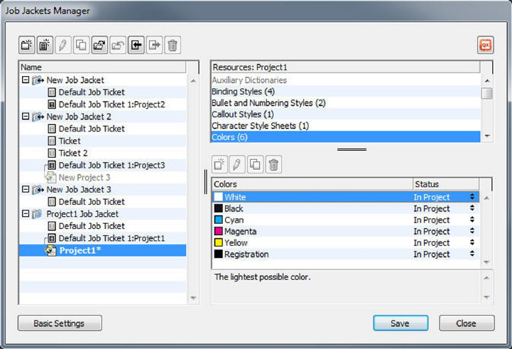
different user interface that provides access to everything in basic mode plus
additional Resources, such as Rules, and JDF-only Resources, such as binding and
crossover specifications.
(Windows only) To use advanced mode, open the Job Jackets Manager dialog box
(Utilities menu) and click the Advanced Settings button. To switch back to basic
mode, click the Basic Settings button.
The Job Jackets Manager dialog box (Utilities > Job Jackets Manager) lets a job definer
work with Job Jackets files and their components. This dialog box has a basic mode (top)
and an advanced mode (bottom).
Creating Job Jackets files
First of all, when and why should a job definer create a Job Jackets file? There are no
hard-and-fast rules for answering this question: If you want to, you can put Job Tickets
for all of your print jobs in one great big Job Jackets file. However, here are some
guidelines to indicate when you might want to have separate Job Jackets files.
•If you plan to create a number of print jobs that share the same Resources (such
as colors, style sheets, trapping settings, color management settings, and page
sizes), you might want to create one Job Jackets file for all of those print jobs. For
example, if you're a design firm that serves several different clients, each of which
has its own visual identity, you might create one Job Jackets file for each client.
•If you are in charge of a design group and you'd like to make sure that every layout
artist working on a particular project (such as a promotional campaign) uses the
exact same Resources, you might want to create a Job Jackets file and Job Ticket
template containing those Resources, and have all of the layout artists share that
Job Jackets file.
•If you are an output provider and you have a particular press with particular
requirements, you might create a Job Jackets file that captures that press's
370 | A GUIDE TO QUARKXPRESS 2016
JOB JACKETS

requirements for your customers (and thus helps them to avoid exceeding those
requirements). You might even be able to download a Job Jackets file containing
a press's requirements from the press manufacturer.
Creating a Job Jackets file: Basic mode (Windows only)
To create a Job Jackets file using basic mode:
1Open the Job Jackets Manager dialog box (Utilities > Job Jackets Manager).
2If more than one list displays in the dialog box, click Basic Settings to show the basic
pane.
3Click the New Job Jackets button . The New Job Jackets dialog box displays.
4Enter a name for the Job Jackets file in the Name field.
5If you plan to allow multiple users to share this Job Jackets file, check Share this Jacket.
If you do not check this box, the Job Jackets file will be embedded in the active project
(if any). For more information, see "Collaborating with shared Job Jackets."
6If you checked Share this Jacket in the previous step, specify where the Job Jackets
file should be stored by choosing an option from the Save in drop-down menu:
•To use the default location (see "Linked and embedded Job Jackets"), choose Default
Jacket Folder.
•To store the shared Job Jackets file in the same folder as the active project, choose
Project Folder.
•To store the shared Job Jackets file somewhere else, choose Other and browse to
a target directory (such as a networked volume available to all of the layout artists).
7Click the Settings control to show the Tickets, Style Settings, Contacts, and Layout
Specification tabs.
A GUIDE TO QUARKXPRESS 2016 | 371
JOB JACKETS
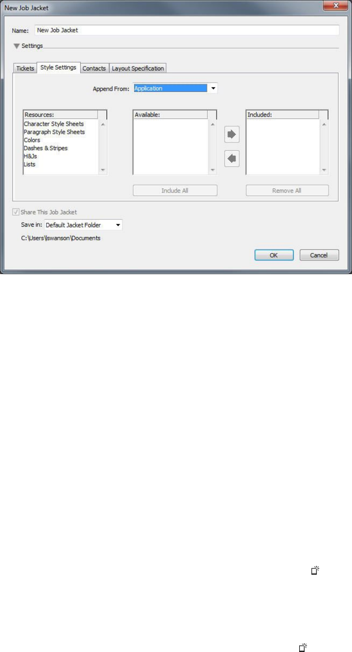
The New Job Jackets dialog box lets you add Resources to a new Job Jackets file.
8Use the Tickets tab to add Job Ticket templates to the Job Jackets file. For more
information, see "Creating a Job Ticket template: Basic mode (Windows only) ."
9Use the Style Settings tab to add Resources to the Job Jackets file. You can append
project-level Resources from a variety of sources using the Append From option:
•To append Resources from the application defaults, click Application.
•To append Resources from a project file or from another Job Jackets file,
click Other, and then click Select and navigate to the target file.
To copy Resources to the Job Ticket template, use the three lists at the bottom of the
dialog box. Choose a type of Resource from the first list, and then choose specific
Resources in the second list and click the button to copy those Resources into the third
list (which shows the Resources of this type in the Job Ticket template).
To remove Resources from the Job Jackets file, choose a type of Resource from the first
list, and then choose specific Resources in the third list, and click the Remove button.
10 Contacts can make it easy for anyone who works with a QuarkXPress file to get in
touch with the job definer if problems arise. To add JDF contact information to the
Job Jackets file, click the Contacts tab, and then click the New Item button to add
a contact. Click the expander next to the new contact to expose its fields, and then
fill in the details for each field.
11 A Layout Specification lets you set attributes like page size and page count for
automatically generated layouts. To add a Layout Specification to the Job Jackets file,
click the Layout Specification tab, and then click the New Item button to add a
Layout Specification. Click the expander next to the new Layout Specification to expose
its fields, and then fill in the details for each field.
372 | A GUIDE TO QUARKXPRESS 2016
JOB JACKETS
12 Click OK.
Creating a Job Jackets file: Advanced mode
To create a Job Jackets file using advanced mode:
1Open the Job Jackets Manager dialog box (Utilities menu).
2If only one list displays in the dialog box, click Advanced Settings to show the
advanced pane.
3Click the New Job Jackets button . The New Job Jackets dialog box displays.
4Enter a name for the Job Jackets file, navigate to the target directory, and click Save.
If you plan to allow multiple layout artists to access the same Job Jackets file, you may
want to choose a directory where all of the layout artists can access the Job Jackets file
over the network.
5Add Resources to the Job Jackets file, as described in "Adding Resources to a Job Jackets
file: Advanced mode."
Adding Resources to a Job Jackets file: Advanced mode
The following procedure is useful if you want to create a Job Jackets file using the
Resources in an existing project. For example, if you have last year's copy of a brochure
project, and you'd like to put all of the brochure project's style sheets, colors, and so
forth into a new Job Jackets file, you can do so with this procedure. You can also use
this procedure to copy Resources from one Job Jackets file to another.
To add Resources to a Job Jackets file using advanced mode:
1Open the Job Jackets Manager dialog box (Utilities menu).
2If only one list displays in the dialog box, click Advanced Settings to show the
advanced pane.
3Specify where you want to copy Resources from:
•To copy Resources from a Job Jackets structure, Job Ticket template, or Job Ticket,
select the source item in the list on the left.
•To copy Resources from an open project, select the project in the list on the left.
•To copy Resources from the application defaults, click the Load Application
Resources button .
4Select a Resource category in the list on the top right.
5Drag and drop individual Resources from the list on the bottom right to the target
Job Jackets icon in the list on the left.
You can also drag Resources to a Job Ticket or project.
For information about changing the locations of Resources in a Job Ticket, see "Specifying
the location of Resources: Advanced mode."
A GUIDE TO QUARKXPRESS 2016 | 373
JOB JACKETS
Working with Job Tickets
A Job Ticket is a set of Resources (specifications and rules) that can be applied to one
or more QuarkXPress projects. Each Job Ticket has a name and is stored in a particular
Job Jackets structure. A Job Ticket contains both project-level Resources (such as colors,
style sheets, and color management settings) and layout-level Resources (such as Layout
Specifications and layout definitions).
There are three kinds of Job Tickets:
•A Job Ticket template is a definition for a "master" Job Ticket. In some ways, a Job
Ticket template is similar to a master page or a QuarkXPress template file.
•An active Job Ticket is a copy of a Job Ticket template that is associated with a
particular project.
•A deferred Job Ticket is a copy of a Job Ticket template that has been associated
with a project, but is no longer associated with that project (for example, if the
project was closed without being saved).
Creating a Job Ticket template
Here are some guidelines to indicate when you might want to have separate Job Ticket
templates:
•If you have a recurring print job, such as a newsletter or magazine, you might
want to create a Job Ticket template for that job.
•If you plan to create several types of layouts (such as a poster, postcard, and digital
medium) that are all based on a single campaign or theme, you might want to
create a Job Ticket template for each layout and store all of the Job Ticket templates
in a single Job Jackets file. That way, all of the layouts can share the same style
sheets, colors, and so forth.
•If you have a standard format that is used by a number of people, such as an ad
format, you might want to use a Job Ticket template to help your customers
construct their ads according to the guidelines.
•If a group of layout artists needs to ensure that they are all using the same style
sheets, colors, or other Resources, and to keep those Resources synchronized
among the layout artists if the Resources should change, you might want to store
those Resources in a Job Ticket template so the layout artists can access the
Resources via a shared Job Jackets file. This approach can help you to maintain
corporate brand standards in a large organization.
Creating a Job Ticket template: Basic mode (Windows only)
To add a Job Ticket template to a Job Jackets structure using basic mode:
1Open the Job Jackets Manager dialog box (Utilities > Job Jackets Manager). If more
than one list displays in the dialog box, click Basic Settings to show the basic pane.
374 | A GUIDE TO QUARKXPRESS 2016
JOB JACKETS
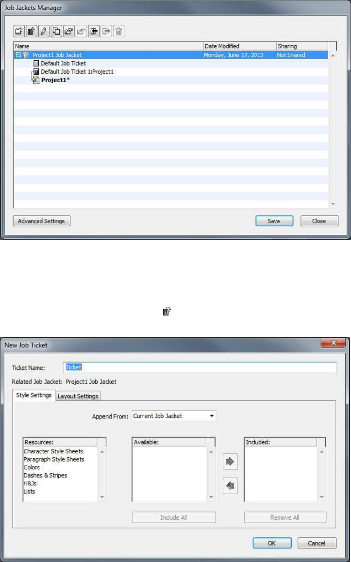
You can create Job Ticket templates in the basic pane of the Job Jackets Manager dialog
box (Utilities menu).
2Select the Job Jackets structure that will contain the Job Ticket template.
3Click the New Ticket Template button . The New Job Ticket dialog box displays.
You can assign Resources to a new Job Ticket template in the New Job Ticket dialog
box.
4Configure the new Job Ticket template as described in "Working with Resources in a Job
Ticket: Basic mode (Windows only) ."
A GUIDE TO QUARKXPRESS 2016 | 375
JOB JACKETS
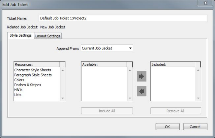
Editing a Job Ticket: basic mode (Windows only)
To edit a project's active Job Ticket, open the project and then choose File >
Job Jackets > Modify Job Ticket. The Edit Job Ticket dialog box displays. For
information on how to use the Edit Job Ticket dialog box, see "Working with Resources
in a Job Ticket: Basic mode (Windows only) ."
Working with Resources in a Job Ticket: Basic mode (Windows only)
This topic describes how to add and remove Resources in a Job Ticket or Job Ticket
template using the New Job Ticket or Edit Job Ticket dialog box. These two dialog
boxes are basically the same, except that the Edit Job Ticket dialog box looks slightly
different for Job Tickets than it does for Job Ticket templates.
You can add Resources to a Job Ticket template or Job Ticket in the New Job Ticket and
Edit Job Ticket dialog boxes.
To assign Resources using the New Job Ticket or Edit Job Ticket dialog box:
1To add or remove project-level Resources, use the controls on the Style Settings tab
(for Job Ticket templates) or the Project Settings tab (for active and deferred Job
Tickets).
You can append project-level Resources from a variety of sources using the Append
From drop-down menu:
•To append Resources from the Job Ticket's parent Job Jackets structure, choose
Current Jacket.
•To append Resources from the active project, choose Current Linked Project.
•To append Resources from the application defaults, choose Application.
•To append Resources from a project file or from a Job Jackets file, choose Other,
and then click Select and navigate to the target file.
376 | A GUIDE TO QUARKXPRESS 2016
JOB JACKETS

To copy Resources to the Job Ticket, use the three lists at the bottom of the dialog box.
Choose a type of Resource from the first list, then choose specific Resources in the
second list, and click the right-facing arrow to copy those Resources into the third list
(which shows the Resources of this type in the Job Ticket).
To remove Resources from the Job Ticket, choose a type of Resource from the first list,
then choose specific Resources in the third list, and click the left-facing arrow.
2The presence of a layout definition means that QuarkXPress will automatically create
a layout when this Job Ticket is applied to a project. When creating a layout definition,
you can specify a Layout Specification (with information such as page size and page
count), a Medium Type (Print, Digital), Rule Sets, and Output Specifications.
To add a layout definition to the Job Ticket, click the Layout Settings tab, then click
the button; a layout definition is added to the list.
To configure the selected layout definition, first click the Layout Properties control
to display the layout property controls, then:
•To name the layout definition, enter a name in the Layout Name field. This name
will be applied to the automatically generated layout.
•To specify information such as page size and page count for the layout definition,
choose an option from the Layout Specification drop-down menu. (Note that a
Layout Specification must be present in the Job Jackets structure before you can
choose the Layout Specification here; see "Creating Job Jackets files" for
more information.)
•To indicate what type of layout should be created automatically for this layout
definition, choose an option from the Medium Type drop-down menu.
•To copy Rule Sets and Output Specifications from the parent Job Jackets structure
to the layout definition, use the three lists at the bottom of the dialog box. Choose
a type of Resource from the first list, then choose specific Resources in the second
list, and click the button to copy those Resources into the third list (which shows
the Resources of this type in the layout definition).
To delete a layout definition, select it and click the button.
3When you are finished configuring the Job Ticket, click OK.
Creating a Job Ticket template: Advanced mode
To add a Job Ticket template to a Job Jackets structure using advanced mode:
1Open the Job Jackets Manager dialog box (Utilities > Job Jackets Manager). If only
one list displays in the dialog box, click Advanced Settings to show the advanced
pane.
2To indicate where the new Job Ticket template should be stored, create or select a
Job Jackets icon in the left list.
3Click the New Ticket template button . A Job Ticket template is added to the selected
Job Jackets structure.
A GUIDE TO QUARKXPRESS 2016 | 377
JOB JACKETS

4Configure the new Job Ticket template as described in "Working with Resources in a Job
Ticket: Advanced mode."
Working with Resources in a Job Ticket: Advanced mode
You might need to work with a Job Ticket's Resources in several situations:
•You can use this procedure if you want to create a Job Ticket template using the
Resources in an existing project. For example, if you have last year's copy of a
brochure project, and you'd like to put all of the brochure project's style sheets,
colors, and so forth into a new Job Ticket template, or into an existing project's
active Job Ticket, you can do so with this procedure.
•You can use this procedure to copy Resources from one Job Ticket to another.
•You can use this procedure to copy Resources from a Job Jackets structure or a
project to a Job Ticket.
To add Resources to a Job Jackets structure using advanced mode:
1Open the Job Jackets Manager dialog box (Utilities menu).
2If only one list displays in the dialog box, click Advanced Settings to show the
advanced pane.
3Specify where you want to copy Resources from:
•To copy Resources from a Job Jackets structure, Job Ticket template, or Job Ticket,
select the source item in the list on the top left.
•To copy Resources from an open project, select the project in the list on the left.
•To copy Resources from the application defaults, click the Load Application
Resources button .
4Select a Resource category in the list on the top right.
5Drag and drop individual Resources from the list on the bottom right to the target Job
Ticket template or Job Ticket in the list on the left.
Adding a layout definition to a Job Ticket: Advanced mode
A layout definition is a group of specifications that combine to describe a single layout.
A layout definition includes Resources such as medium (output) type (Print, Digital),
Output Specifications, and Rule Sets.
When you create a project from a Job Ticket template, QuarkXPress automatically
creates a layout for each layout definition in the Job Ticket template. If a layout
definition does not contain a Layout Specification, QuarkXPress displays the New
Project dialog box so you can specify the page size, margins, and so forth.
When you add a layout definition to an active Job Ticket, a layout is created from that
layout definition and automatically added to the corresponding project.
To add a layout definition to a Job Ticket template or Job Ticket:
378 | A GUIDE TO QUARKXPRESS 2016
JOB JACKETS

1Open the Job Jackets Manager dialog box (Utilities > Job Jackets Manager) and
select the target Job Ticket in the left list.
2To display Resource controls, click the Advanced Settings button.
3Select Layouts in the top-right list. Any layout definitions in the Job Ticket display in
the bottom-right list.
4Click the New Item button above the bottom-right list. A layout definition named
"Layouts" is added. (The name you give to a layout definition is the name that will be
applied to the actual layout when you create a project. To rename a layout definition,
double-click its name and then enter the new name.)
5Click the expander button next to the layout definition name to display the fields of
the layout definition.
6Specify or enter a value for any fields you want to use.
7Click Save.
For information on using layout definitions, see "Applying a layout definition to a project."
Applying a Job Ticket template to a project
You can apply a Job Ticket template to a project in two ways:
•Create a project from the Job Ticket template.
•Link an existing project to a Job Ticket template.
In either case, a Job Ticket is created from the Job Ticket template, and the new Job
Ticket instance is applied to the new project. The topics below describe both approaches.
Creating a project from a Job Ticket template
When you create a project from a Job Ticket template, QuarkXPress always creates a
Job Ticket from that Job Ticket template. You can choose where that Job Ticket is
stored: In a shared Job Jackets file, or in an embedded Job Jackets structure in the
project file.
To create a project from a Job Ticket template:
1Choose File > New > Project from Ticket. The New Project from Ticket dialog box
displays.
A GUIDE TO QUARKXPRESS 2016 | 379
JOB JACKETS
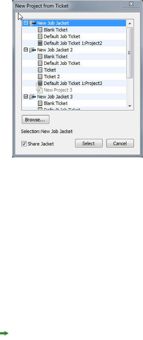
Use the New Project from Ticket dialog box to select a Job Ticket template for a new
project.
2If the Job Jackets structure you want is not displayed, click Browse, navigate to the
Job Jackets file, and then click Open.
3Select the target Job Ticket template in the list. (Note that you can also select a deferred
Job Ticket.)
4Check or uncheck the Share Jacket check box, as follows:
•To store this project's active Job Ticket in an external Job Jackets file, so the Job
Ticket can share Resources with other users of that Job Jackets file, check Share
Jacket. (For more information, see "Collaborating with shared Job Jackets.")
•To store this project's Job Ticket in an embedded Job Jackets structure in the
project file, uncheck Share Jacket.
5Click Select. The new project inherits the Job Ticket template's project settings, and
QuarkXPress automatically creates layouts for any layout definitions in the Job Ticket
template.
You cannot store a Job Ticket in the default Job Jackets structure. Consequently, if you
create a project from a Job Ticket template that is in the default Job Jackets structure,
and you check Share Jacket, you will be prompted to save a new Job Jackets file in
the file system.
Linking an existing project to a Job Jackets file
When you link an existing project to a Job Jackets file, you remove the project's current
active Job Ticket and link the project to a new Job Ticket created from a Job Ticket
template in another Job Jackets file. You might choose to do this if, for example, you
want to link an existing project to a Job Jackets file where another layout artist has an
380 | A GUIDE TO QUARKXPRESS 2016
JOB JACKETS

active Job Ticket, and thus synchronize some or all of the Resources that the two of
you are using. (For details, see "Collaborating with shared Job Jackets.")
To apply a Job Ticket to an existing project:
1Create or open the project.
2Choose File > Job Jackets > Link Project. The Link Project dialog box displays.
3If the Job Jackets file you want is not displayed, click Browse, navigate to the file, and
then click Open.
4Select the target Job Ticket template in the list.
5Check or uncheck the Share Jacket check box, as follows:
•To store this project's Job Ticket in the Job Jackets file containing the target Job
Ticket template, check Share Jacket.
•To store this project's Job Ticket in an embedded Job Jackets structure in the
project file, uncheck Share Jacket.
6Click Attach. The project inherits the Job Ticket template's project settings, and layouts
are automatically created for any layout definitions in the Job Ticket template.
If you use a Job Ticket template in the default Job Jackets structure, and you check
Share Jacket, you will be prompted to save a new Job Jackets file in the file system.
This is because you cannot store a Job Ticket in the default Job Jackets structure.
Viewing Job Ticket relationships
You can see the relationships between Job Jackets, Job Ticket templates, Job Tickets,
and projects in the Job Jackets Manager dialog box (Utilities menu). The icons shown
in this dialog box are as follows:
•Job Jackets structure (linked)
•Job Jackets structure (embedded)
•Job Ticket template
•Active or deferred Job Ticket
•Project (a bold project name indicates the active project)
A project that is linked to an active Job Ticket is displayed like this:
A project that is linked to an active Job Ticket
A deferred Job Ticket has a icon, but is not linked to a project. This may mean that
the project was moved, deleted, or never saved.
A GUIDE TO QUARKXPRESS 2016 | 381
JOB JACKETS
Applying a layout definition to a project
A layout definition provides a group of settings that combine to describe a layout.
These settings can include a medium type (Print, Digital), Rule Sets, Output Setups,
and a color management Source Setup. A layout definition also can include a Layout
Specification, which includes information such as page size and page count (note that
Layout Specifications must be created at the Job Jackets level).
When you associate a project with a Job Ticket template, QuarkXPress automatically
creates a layout for each layout definition in that Job Ticket template. Such layouts
have the same names as the layout definitions they were based on.
You can apply a layout definition to a project in two ways:
•Create a project from the Job Ticket containing the layout definition, as described
in "Creating a project from a Job Ticket template."
•Link the Job Ticket to the active project after the project has been created,
as described in "Linking an existing project to a Job Jackets file."
Whichever approach you use, the defined layouts are created automatically.
Exporting and importing Job Tickets
There may be situations in which a job definer needs to copy a Job Ticket template or
Job Ticket from one Job Jackets file to another, or to import all of a Job Jackets
structure's Job Ticket templates and Job Tickets into another Job Jackets structure. You
can do both of these things with the Job Ticket export and import features.
Exporting a Job Ticket template or Job Ticket
To export a Job Ticket template or Job Ticket from a Job Jackets structure:
1Open the Job Jackets Manager dialog box (Utilities menu) and select the target Job
Ticket (or Job Tickets) in the left list.
2Click the Export Ticket button above the left list. The New Job Jackets dialog box
displays.
3Specify a name and location and click Save. All selected Job Tickets are saved into a
Job Jackets file with the indicated file name, along with any Resources they require.
Importing a Job Ticket template or Job Ticket
To import a Job Ticket template or Job Ticket into a Job Jackets structure:
1Open the Job Jackets Manager dialog box (Utilities menu) and select the target
Job Jackets icon in the left list.
2Click the Import button above the left list. The Select Job Jackets File dialog box
displays.
3Select a Job Jackets file and click Open. All Job Ticket templates and Job Tickets in the
selected file are imported into the selected Job Jackets structure, along with any
Resources they require.
382 | A GUIDE TO QUARKXPRESS 2016
JOB JACKETS

The default Job Jackets file
When QuarkXPress is installed, a default Job Jackets file (containing a default Job
Ticket template) named "DefaultJacket.xml" is installed as well in the location specified
in the Job Jackets pane of the Preferences dialog box (QuarkXPress/Edit menu).
When you create a project by choosing File > New > Project, the following things
happen:
•QuarkXPress makes a copy of this default Job Jackets file (named "Default
Job Jackets") and embeds it in the new project. The embedded Job Jackets structure
is named "[filename] Job Jackets."
•In the embedded Job Jackets structure, QuarkXPress creates a Job Ticket from the
default Job Ticket template (named "Default Job Ticket"). The new Job Ticket is
named "[filename] Ticket."
•QuarkXPress associates the Job Ticket in the embedded Job Jackets structure with
the new project.
You can use the default Job Jackets file to control the Resources that are used in new
QuarkXPress projects. You can also edit the default Job Ticket template that is used
by projects created via File > New > Project. This topic explains both procedures.
You cannot store a new Job Ticket in the default Job Jackets file. For more information,
see "Creating a project from a Job Ticket template."
Editing the default Job Ticket template: File menu
The default Job Ticket template is used by projects created using File > New > Project.
There are two ways to edit the default Job Ticket template.
To edit the default Job Ticket template from the File menu:
1Close any open projects.
2To open the default Job Ticket template in the Modify Job Ticket dialog box, choose
File > Job Jackets > Modify Job Ticket.
3Use the controls in the Modify Job Ticket dialog box to configure the default Job
Ticket template, and then click OK.
Editing the default Job Ticket template: Utilities menu
To edit the default Job Ticket template from the Job Jackets Manager dialog box:
1Display the Job Jackets Manager dialog box (Utilities menu).
2Click the Open Jacket button, navigate to the default Job Jackets file, and click Open.
3Expand the default Job Jackets structure and select the Job Ticket template named
"Default Job Ticket" in the list.
4Click the Edit button . The Edit Job Ticket dialog box displays.
5Use the controls in the Edit Job Ticket dialog box to configure the default Job Ticket
template.
A GUIDE TO QUARKXPRESS 2016 | 383
JOB JACKETS
6Click OK.
The next project you create using File > New > Project will use the modified default
Job Ticket template.
Editing the default Job Jackets file
You can use the default Job Jackets file to control the Resources that are used in new
QuarkXPress projects. To edit the default Job Jackets file:
1Open the Job Jackets Manager dialog box (Utilities menu).
2Click the Open Jacket button , navigate to the default Job Jackets file, and click
Open.
3Select the Job Jackets structure named "Default Job Jackets" in the list.
4Use the controls in the Job Jackets Manager dialog box to configure the default
Job Jackets structure, and then click OK.
For information on working with Resources, see "Working with Resources in a Job Ticket:
Advanced mode."
Working with Resources: Advanced mode
"Resources" is a generic category that describes most of the components that make up
Job Jackets and Job Tickets. Resources include everything from style sheets to page size
specifications. The topics below describe how to access, create, and update Resources
in the advanced pane of the Job Jackets Manager dialog box (Utilities menu).
Job definers will use this procedure often, for various purposes. Layout artists, however,
may never need to use this procedure at all.
Accessing Resources: Advanced mode
Before you can work with a Resource, you have to be able to get to it. To access a
Resource:
1Open the Job Jackets Manager dialog box (Utilities menu).
2If only one list displays in the dialog box, click Advanced Settings to show the
Advanced pane.
3In the list on the left, open or create a Job Jackets file. The Resource categories
in the Job Jackets file are listed in alphabetical order in the list on the upper right.
4To work with Resources that are specific to a Job Jackets structure, select the target
Job Jackets structure in the list on the left. Note that Resource categories that are
unavailable represent Resources that must be specified at the Job Ticket level.
5To work with Resources that are specific to a Job Ticket, expand the Job Jackets structure;
create , duplicate , or import a Job Ticket; and then make sure the target Job
384 | A GUIDE TO QUARKXPRESS 2016
JOB JACKETS
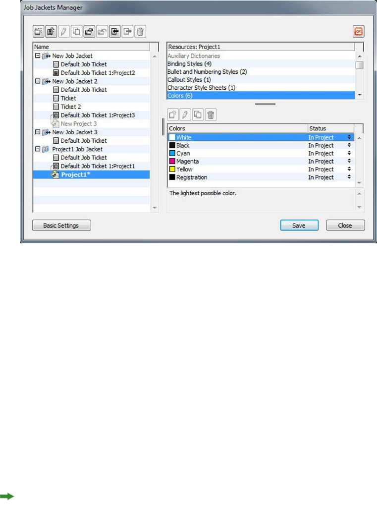
Ticket is selected in the list on the left. Note that dimmed Resource categories represent
Resources that must be specified at the Job Jackets level.
6Select a Resource type in the top-right list. Existing Resources of the selected type are
listed in the bottom-right list.
Use the Job Jackets Manager dialog box to view, create, duplicate, delete, import, and
export Resources.
Configuring Resources: Advanced mode
Once you've navigated to a Resource in the Job Jackets Manager dialog box, you can
configure that Resource. Different options are available for different types of Resources
in this dialog box:
•You can specify a location for most Resources.
•You can delete most Resources.
•You can create and modify some types of Resources, but others must be created
and modified using other parts of the QuarkXPress user interface.
•You can create, duplicate, delete, and configure layout definitions, Output
Specifications, Layout Specifications, Job Descriptions, Contacts, Rules, and Rule
Sets in a Job Jackets structure.
In Job Jackets, App Studio layouts are represented by Digital layout resources.
If a Resource permits it, you can create and configure that Resource in the Job Jackets
Manager dialog box as follows:
1To create a Resource of the type selected in the top-right list, click the New Item button
in the bottom-right list. To rename the Resource, click its name.
A GUIDE TO QUARKXPRESS 2016 | 385
JOB JACKETS

2If a Resource has an expander icon, click that icon to expand the Resource, and then
configure the fields that are revealed. Some Resource fields include drop-down menus,
while others allow you to enter values manually.
3If a Resource has a button, click that button to create additional instances of the
Resource. For example, when creating a Layout Specification, you can click this button
on the Spot Color Resource to create additional spot colors.
Specifying the location of Resources: Advanced mode
Resources can exist in several locations:
•In Jacket: Stored in a Job Jackets structure, but not used in any of that Job Jackets
structure's Job Ticket templates or Job Tickets.
•In Ticket: Stored in a Job Jackets structure and associated with a Job Ticket
template or Job Ticket. If an "In Ticket" Resource is in a Job Ticket template that
is associated with a project, that Resource is also available in the project.
•In Project: Stored in a project, but NOT associated with a Job Jackets structure or
Job Ticket.
You can specify the location of Resources as follows:
1Access a Resource using the Job Jackets Manager dialog box, as described in "Accessing
Resources: Advanced mode."
2Select the Resource in the bottom-right list.
3Choose a location from the drop-down menu in the Status column:
•If the item selected in the left list is a Job Jackets structure, you can choose only
In Jacket.
•If the item selected in the left list is a Job Ticket template or Job Ticket, you can
specify whether or not the Resource is associated with that Job Ticket template
or Job Ticket by choosing In Jacket or In Ticket.
•If the item selected in the left list is a project, you can specify whether the Resource
is defined only in the project (Status = In Project) or uses the definition in the
project's active Job Ticket (Status = In Ticket).
386 | A GUIDE TO QUARKXPRESS 2016
JOB JACKETS
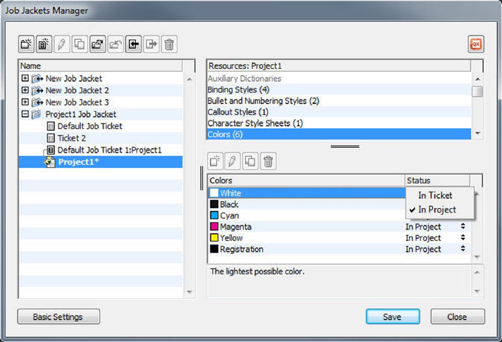
Use the Job Jackets Manager dialog box (Utilities menu) to specify where Resources are
stored.
Working with Layout Specifications
A Layout Specification lets you define layout-specific information such as page size,
page count, margins, spread information, bleed information, binding information,
and so forth.
The standard procedure for working with Layout Specifications is:
1Create a Layout Specification (see "Creating a Layout Specification: Advanced mode"). This
part of the job is typically done by a job definer.
2Associate the Layout Specification with a layout using a Job Ticket template or Job
Ticket. This is typically done by the layout artist.
The topics below describe each of the above procedures in detail.
Creating a Layout Specification: Advanced mode
Layout Specifications are Resources, and thus must be created in the Job Jackets
Manager dialog box, as described in "Working with Resources: Advanced mode."
A GUIDE TO QUARKXPRESS 2016 | 387
JOB JACKETS
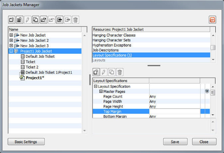
You can use the Job Jackets Manager dialog box (Utilities menu) to create Layout
Specifications.
Applying a Layout Specification to a layout
You can associate a Layout Specification with a layout in two ways: by creating the
layout from a Job Ticket template, or by applying the Layout Specification to an existing
layout's active Job Ticket.
A job definer will typically add a Layout Specification to a layout definition in a
Job Jackets file before the actual project and layout are created. Because a Layout
Specification is a Resource, you add it to a layout definition just as you would any
other Resource (see "Working with Resources: Advanced mode").
388 | A GUIDE TO QUARKXPRESS 2016
JOB JACKETS
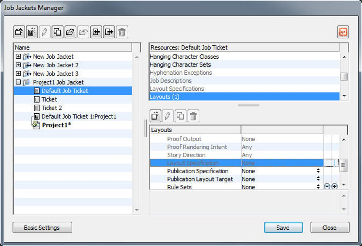
To configure a Job Ticket template to automatically create a layout that follows a particular
Layout Specification, associate the Layout Specification with the layout definition using
the Job Jackets Manager dialog box.
A layout artist can apply a Layout Specification to a layout's active Job Ticket after the
project and layout are created using the Edit Job Ticket dialog box (File > Job Jackets >
Modify Job Ticket). To add a Layout Specification to an active Job Ticket, click the
Layout Settings tab, select the layout in the layout list, and choose an option from
the Layout Specs drop-down menu.
A GUIDE TO QUARKXPRESS 2016 | 389
JOB JACKETS
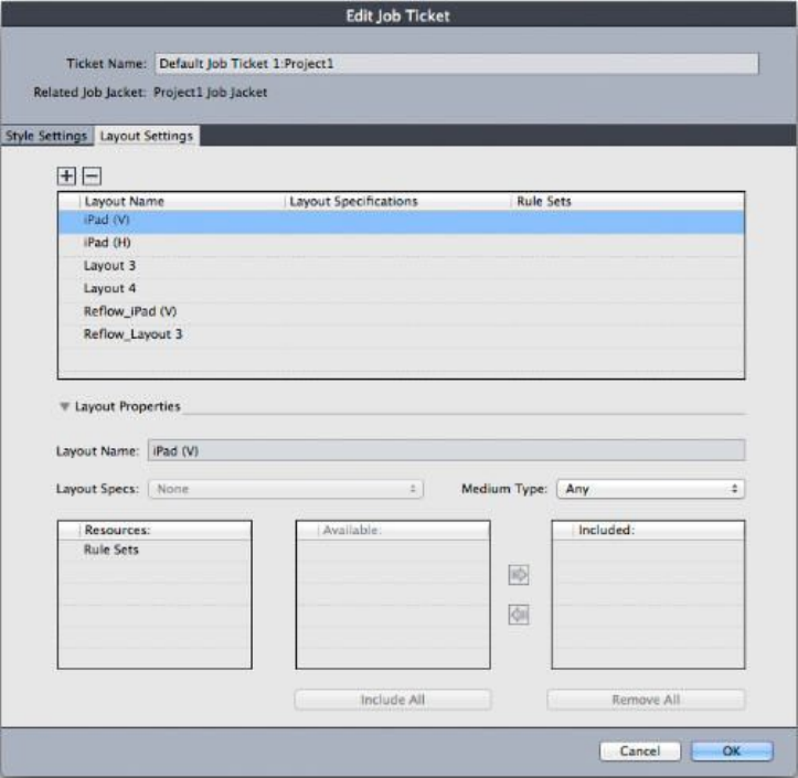
You can use the Edit Job Ticket dialog box (File > Job Jackets > Modify Job Ticket) to
assign a Layout Specification to a layout in the active project.
Working with Rules and Rule Sets
A Rule is a test that is executed against the active layout when you choose File >
Job Jackets > Evaluate Layout.
Each Rule can test one condition. For example, a Rule might state that all text characters
should be set to overprint. Rules also can include descriptions, policies (to indicate to
the layout artist whether a given condition is mandatory, recommended, or forbidden),
and instructions for fixing problem situations.
The standard procedure for working with Rules and Rule Sets is:
1Create Rules (see "Creating Rules: Advanced mode") and add them to a Rule Set (see
"Adding Rules to a Rule Set: Advanced mode"). This is typically done by a job definer,
possibly working with an output specialist.
2Associate the Rule Set with a layout using a Job Ticket template (see "Applying a Rule
Set to a layout"). This is typically done by the job definer.
3Use the Rule Set to evaluate the layout (see "Evaluating a layout"). This is typically done
by a layout artist.
390 | A GUIDE TO QUARKXPRESS 2016
JOB JACKETS
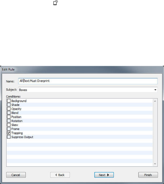
The following topics describe each of the above procedures in detail.
Creating Rules: Advanced mode
To construct a Rule, first navigate to the Rule Resources in the Job Jackets Manager
dialog box, as described in "Working with Resources: Advanced mode." Then use the
Rule wizard, as follows:
1Click the New button . The Edit Rule dialog box (the first part of the Rule wizard)
displays.
2Enter a name for the Rule in the Name field.
3To indicate what kind of object the Rule should apply to, choose an option from the
Subject drop-down menu. Available subjects include all boxes, text boxes, picture
boxes, text characters, lines, text paths, pictures, and fonts.
Use the Edit Rule dialog box to create rules.
4To indicate what you want the Rule to check, check an option in the Conditions area.
The available conditions depend on the selected subject.
Repeat this step for each condition you want to include in the Rule. The conditions
are combined with a logical AND operator. For example, to create a Rule specifying
that text boxes should have a background of 50% Blue, choose Text Boxes and then
check both Background and Shade.
5Click Next to display the next dialog box in the Rule wizard. In this dialog box, you
must specify the conditions that trigger the Rule (for example, "is not Overprint" or
"is less than 10pt"). To configure each condition, click the expander to expand the
item in the list, then choose options and enter values in the provided fields.
A GUIDE TO QUARKXPRESS 2016 | 391
JOB JACKETS
Use the second dialog box in the Rule wizard to configure a rule.
If a condition has a button, you can click this button to add additional clauses to
the condition. Clauses are combined with a logical OR operator. For example, to specify
that the indicated item should have a color that is either a CMYK color or a spot color,
configure the first line to check for CMYK, then add a second line, and configure it
to check for Spot Ink.
6Click Next to display the third and final dialog box in the Rule wizard. Use this dialog
box to specify a Description of the Rule, a Policy (which determines what kind of
icon displays if the Rule is broken), and Instructions for fixing the problem. The
information you enter in Instructions is displayed when a layout artist chooses
Evaluate Layout if the Rule is broken.
Use the third dialog box in the Rule wizard to control what happens when a rule is broken.
392 | A GUIDE TO QUARKXPRESS 2016
JOB JACKETS
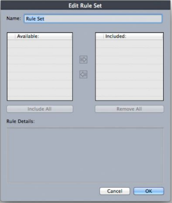
Adding Rules to a Rule Set: Advanced mode
Rules must be put into Rule Sets, which are named collections of Rules. A job definer
can include one or more Rule Sets in a layout definition in a Job Ticket template. A
layout artist working in a layout that is based on that layout definition can then
evaluate the layout using the Rules in those Rule Sets (see "Evaluating a layout"). To
add a Rule to a Rule Set:
1Open the Job Jackets Manager dialog box (Utilities menu).
2If only one list displays in the dialog box, click Advanced Settings to show the
Advanced pane.
3Create or select a Job Jackets structure.
4Select Rule Sets in the upper-right list.
5Click the New button to create a Rule Set. The Edit Rule Set dialog box displays.
Use the Edit Rule Set dialog box to work with Rule Sets.
6Enter a name for the Rule Set in the Name field.
7Select the Rules you want in the Available list and click the button, or click Include
All to add all of the Rules in the Available list to the active Rule Set.
8Click OK.
A GUIDE TO QUARKXPRESS 2016 | 393
JOB JACKETS
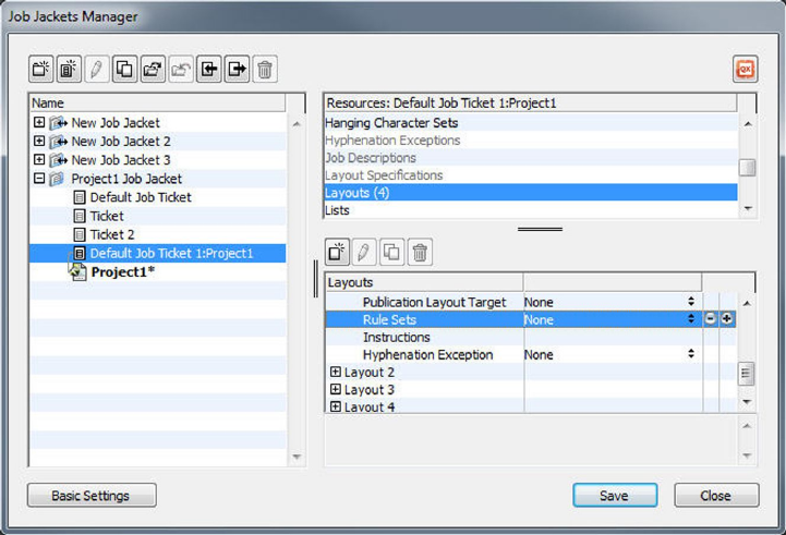
Applying a Rule Set to a layout
Once a Rule Set has been associated with a layout's Job Ticket template instance, the
layout artist can evaluate the layout against that Rule Set (see "Evaluating a layout").
You can associate a Rule Set with a layout in two ways.
A job definer will typically add a Rule Set to a layout definition in a Job Jackets file
before the actual project and layout are created. Because a Rule Set is a Resource, you
add it to a layout definition just as you would any other Resource (see "Working with
Resources: Advanced mode").
To make a Rule Set available in a layout as soon as that layout is created, associate the
Rule Set with the layout definition using the Job Jackets Manager dialog box.
A layout artist can add a Rule Set to a layout after the project and layout are created.
For information on how to do this, see "Working with Resources in a Job Ticket: Basic
mode (Windows only) ."
394 | A GUIDE TO QUARKXPRESS 2016
JOB JACKETS
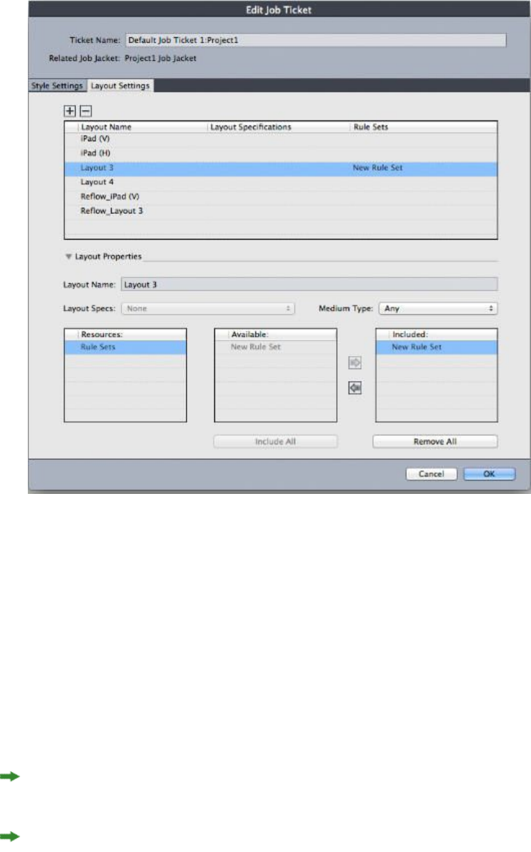
A layout artist can use the Edit Job Ticket dialog box (File > Job Jackets > Modify Job
Ticket) to assign a Rule Set to a layout in the active project.
Evaluating a layout
Rule Sets, Layout Specifications, and Output Specifications provide tests that can be
evaluated to determine whether a layout adheres to the specifications created by the
job definer. The Evaluate Layout command lets you execute those tests and determine
whether (and where) any violations occur. This command also checks the layout
against its layout definition, to verify medium type (Print, Digital) and color
management settings. Once violations are identified, a layout artist can decide what
(if anything) to do about them.
Before you attempt to evaluate a layout, make sure the project is associated with a Job
Ticket that defines Rule Sets or Output Specifications for the active layout.
The Evaluate Layout feature is designed to highlight layout problems and indicate
where they can be fixed. However, it cannot prevent a layout artist from making
changes that violate the specifications and Rules defined in a Job Ticket.
To evaluate a layout:
A GUIDE TO QUARKXPRESS 2016 | 395
JOB JACKETS
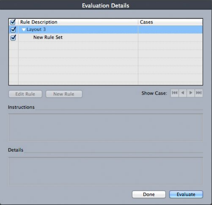
1Choose File > Job Jackets > Evaluate Layout. The Layout Evaluation dialog box
displays, with applicable Rule Sets, Layout Specifications, and Output Specifications
listed. To expand a Rule Set, Layout Specification, or Output Specification and see its
component Rules, click the expander icon next to it.
Use the Layout Evaluation dialog box to evaluate the active layout against Rule Sets,
Layout Specifications, and Output Specifications.
2To edit the selected Rule, click its name and then click the Edit Rule button. Any
changes to the Rule are written back to the Job Jackets file and apply to any other
projects that use this Job Ticket.
3To indicate that a Rule should be checked, check the box next to that Rule. To indicate
that all Rules in a Rule Set, Layout Specification, or Output Specification should be
checked, check the box next to the name of the Rule Set, Layout Specification, or
Output Specification.
4To evaluate the active layout against the checked Rules, click Evaluate. The Cases
column is updated to show whether the document passes each Rule check.
5To view more detailed information about a violated Rule, click its name and then
check the Instructions and Details boxes. The Instructions box shows any instructions
written by the Rule creator, and the Details box provides information about the project
(such as whether it has been modified since the last evaluation).
396 | A GUIDE TO QUARKXPRESS 2016
JOB JACKETS
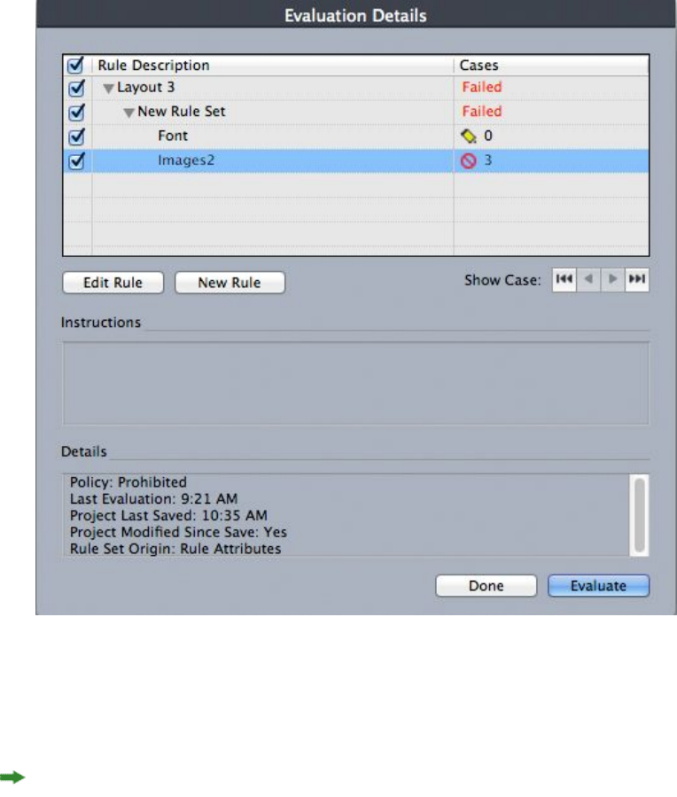
The Layout Evaluation dialog box shows which Rules are passed and which Rules are
violated.
6To scroll the layout to the locations where Rules are violated, click the Show Case
buttons. This makes it easy to fix Rule violations.
You can configure QuarkXPress to automatically evaluate each layout when the project
is opened, when the project is saved, when the project is closed, and when the layout
is sent to output. For more information, see "Preferences — Application — Job Jackets."
Job Jackets locking
To avoid having two people attempt to edit a Resource at the same time, QuarkXPress
locks shared Job Jackets files under the following circumstances:
•When the user of a project that shares a Job Jackets file displays the Edit Job
Ticket dialog box (File > Job Jackets > Modify Job Ticket), QuarkXPress locks
that Job Jackets file.
•When a user displays the Job Jackets Manager dialog box (Utilities menu),
QuarkXPress locks all Job Jackets files displayed in the Job Jackets Manager dialog
box.
•When the user of a project that shares a Job Jackets file creates, duplicates, edits,
or deletes a Resource that is in the shared Job Jackets file, QuarkXPress locks the
A GUIDE TO QUARKXPRESS 2016 | 397
JOB JACKETS

Job Jackets file. For example, if Tara is working in a project that shares the "Product
List" Job Jackets file, and she chooses Edit > Colors and starts to modify a color
that is in the project's Job Ticket, QuarkXPress locks all shared Resources in the
"Product List" Job Jackets file so that only Tara can modify them.
When a Job Jackets file is locked:
•You cannot create a project from a Job Ticket template in that Job Jackets file.
•You cannot link a project to the Job Jackets file.
•You cannot display the Edit Job Ticket dialog box (File > Job Jackets > Modify
Job Ticket) for a project that shares the Job Jackets file.
•You can display the Job Jackets Manager dialog box (Utilities menu), but you
cannot edit the locked Job Jackets file or any of its Job Tickets.
•You cannot edit a shared Resource in the Job Jackets file. For example, if Tara has
locked the "Product List" Job Jackets file, and Samuel chooses Edit > Colors and
tries to modify a color that is in the project's Job Ticket, the color is dimmed and
unavailable until Tara unlocks the Job Jackets file.
•You cannot add a layout or change the name of an existing layout in a project
that shares the Job Jackets file.
•You cannot edit a rule from the Layout Evaluation dialog box (File > Job Jackets >
Evaluate Layout).
A locked Job Jackets file becomes unlocked at the following points:
•When the user with the lock closes the Edit Job Ticket dialog box.
•When the user with the lock closes the Job Jackets Manager dialog box.
•When the user with the lock finishes editing a Resource that is in the shared
Job Jackets file. Using the example above, this would be when Tara clicks Save or
Cancel in the Colors dialog box after changing the shared color.
Because of Job Jackets locking, it is important to display Edit Job Ticket and the
Job Jackets Manager dialog boxes only when necessary, and to close them as soon as
you've completed any work you need to do with them.
If you display the Job Jackets Manager dialog box (Utilities menu) and find that you
cannot edit the Job Jackets file associated with your project, that Job Jackets file is
probably locked by another user.
Printing with JDF output
When you send a project to output, you can now indicate that a JDF file should be
generated and stored wherever the output file is saved. (Note that if you are printing
directly to the output device, no JDF file is generated.)
398 | A GUIDE TO QUARKXPRESS 2016
JOB JACKETS
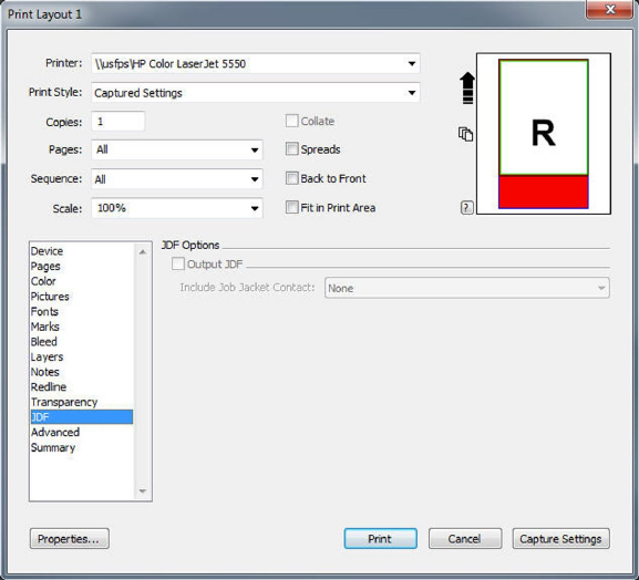
Use the JDF pane of the Print dialog box to specify that Job Jackets information be
included at output in the form of a JDF-compliant XML file.
A GUIDE TO QUARKXPRESS 2016 | 399
JOB JACKETS

Working with multiple languages
QuarkXPress is available in several language configurations. If your language
configuration supports it, you can:
•Open and edit projects that use any supported character language. Character
language is an attribute that you can apply to text to indicate which hyphenation
and spell checking rules should be used with that text. You can apply character
language at the character level — so even if a sentence uses words in two different
languages, every word can be hyphenated and spell checked correctly. For more
information, see "Applying a character language."
•(Windows only) Change the user interface and keyboard commands to any
supported program language. Program language refers to the language used in
application menus and dialog boxes. Program language affects only the user
interface; it does not affect spell checking and hyphenation. For more information,
see "Changing the program language."
•(Mac OS X only) The program language is determined by your OS language at the
time of install. You can change the UI language by changing the display language
of OS X in System Preferences and restarting QuarkXPress.
Any language edition of QuarkXPress can open, display, and output a project that uses
East Asian features. However, you can only edit text that uses East Asian features if
your East Asian Preference is enabled (QuarkXPress/Edit > East Asian)..
Applying a character language
The character language attribute determines which dictionary is used for spell checking
and which rules and exceptions are used for hyphenation. When you check the spelling
of text that uses different languages, each word is checked using the assigned language
dictionary. When automatic hyphenation is enabled for a project that uses different
character languages, each word is hyphenated using the appropriate hyphenation rules
and hyphenation exceptions for that language.
To apply a character language to text:
•(Windows only) Use the Language drop-down menu in the Character Attributes
dialog box (Style > Character)
•Use style sheets and the Character/Character Attributes pane of the
Measurements palette.
400 | A GUIDE TO QUARKXPRESS 2016
WORKING WITH MULTIPLE LANGUAGES

Changing the program language
To specify the program language:
•(Windows only) Choose an option from the Edit > Program Language submenu.
•(Mac OS X only) The program language is determined by your OS language at the
time of install. You can change the UI language by changing the display language
of OS X in System Preferences and restarting QuarkXPress.
Your menus, dialog boxes, and palettes change to the chosen language. Keyboard
commands are based on the program language.
The program language has no effect on hyphenation and spell checking.
A GUIDE TO QUARKXPRESS 2016 | 401
WORKING WITH MULTIPLE LANGUAGES
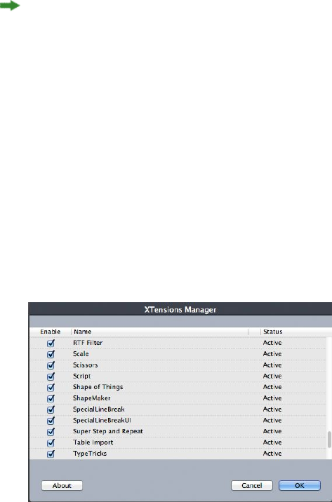
XTensions software
You can use XTensions modules to add features such as palettes, commands, tools,
and menus that augment just about every activity you undertake.
Working with XTensions modules
QuarkXPress ships with a default set of XTensions modules, documented in this chapter.
You can also install additional XTensions software developed by Quark or by third-party
companies.
Most XTensions come in two parts: One file for the functionality of the XTensions
module, and another file for its user interface. The name of the user interface module
typically ends in "UI." XTensions modules that do not have any user interface do not
have to have a UI file.
Installing XTensions modules
To install XTensions modules, place them in the "XTensions" folder within your
application folder. Newly installed XTensions modules load the next time you launch.
Enabling and disabling XTensions modules
You might want to disable XTensions modules if you are short on memory or for
troubleshooting purposes. To enable or disable an XTensions module, first choose
Utilities > XTensions Manager to display the XTensions Manager dialog box.
You can use the XTensions Manager dialog box to enable and disable XTensions modules.
402 | A GUIDE TO QUARKXPRESS 2016
XTENSIONS SOFTWARE
To enable a module, check the box next to its name in the Enable column. To disable
a module, uncheck its box. The change takes effect the next time you launch the
application.
Working with XTensions sets (Windows only)
If you find that you frequently enable and disable particular groups of XTensions
modules, you can create an XTensions set that makes it easy to switch between these
groups.
To create an XTensions group, first display the XTensions Manager dialog box (Utilities
menu) and enable the XTensions modules you want in the group. Then click Save As
and enter a name for the group. When you want to switch to this group, simply display
the XTensions Manager dialog box and choose the group's name from the Set
drop-down menu.
You can also import and export XTensions sets with the Import and Export buttons,
for situations where you want to share them with other users.
Item Styles XTensions software
Item Styles lets you save collections of item attributes — including color, frame style,
line width, picture scale, and text inset — as named styles that you can apply from a
palette.
Item Styles XTensions software adds the Item Styles palette (Window > Item Styles),
the Edit Item Styles dialog box (Edit > Item Styles), and the Item Styles Usage dialog
box (Utilities > Item Styles Usage).
Item Styles do not affect locked attributes of items (position, story, or picture). For
example, if you apply an Item Style to an item whose position is locked (Item > Lock >
Position), the item will not move according to any X, Y values specified in the Item
Style. When the item is selected, the name of its Item Style will display with a + next
to the name.
Do not use Item Styles with the Shared Content and Composition Zones features.
Item Styles does not support tables.
Using the Item Styles palette
To apply an Item Style to all selected items, click the Item Style's name in the Item
Styles palette. The New and Delete buttons let you add and delete Item Styles.
The Update button lets you update an item style definition based on local changes
to the applied item style.
You can also apply an Item Style to selected items by choosing the Item Style name
from the Style > Item Styles submenu.
A GUIDE TO QUARKXPRESS 2016 | 403
XTENSIONS SOFTWARE
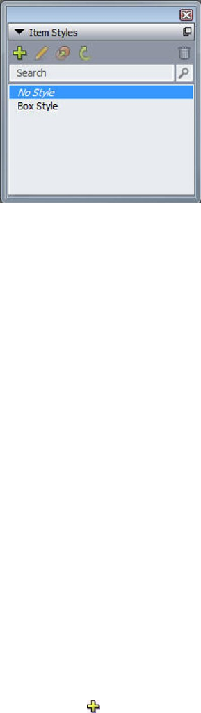
The Item Styles palette
To apply an Item Style, select the target items and then click the name of the Item
Style in the Item Styles palette. You can also press the keyboard command shown to
the right of the Item Style's name.
The Item Style applied to the selected item (if any) displays in bold in the Item Styles
palette. If the name has a + next to it, the item uses local formatting that is different
from what is defined in the Item Style. To remove local formatting from an item, select
the item, click No Style at the top of the Item Styles palette, and then click the Item
Style name again. You can also remove local formatting by Option+clicking/Alt+clicking
the name of the Item Style.
To create, edit, duplicate, delete, import, or export Item Styles, use the Item Styles
dialog box (Edit > Item Styles). You can also edit Item Styles by
Option+clicking/Alt+clicking the Item Style name in the Item Styles palette or selecting
the Item Style and choosing Edit from the Item Styles palette menu.
See also "Creating Item Styles" and "Checking Item Style usage."
Creating Item Styles
You can base an Item Style on a formatted item or create it from scratch. To create an
Item Style:
1To start with a formatted item, select it. To start from scratch, make sure no items are
selected.
2Click the New button in the Item Styles palette. You can also choose New from
the palette menu, or choose Edit > Item Style and then click New in the dialog box.
404 | A GUIDE TO QUARKXPRESS 2016
XTENSIONS SOFTWARE
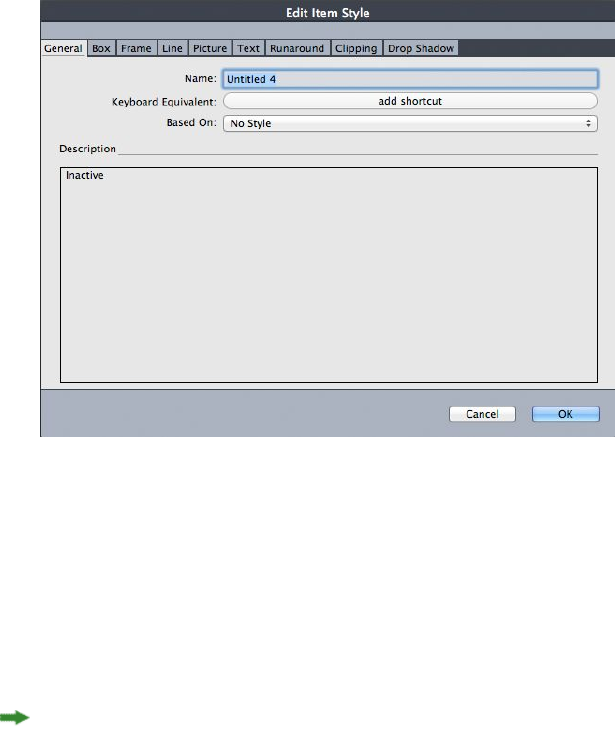
Edit Item Style dialog box
3In the General tab, enter a descriptive name in the Name field.
4If you want a keyboard shortcut, enter it in the Keyboard Equivalent field. On Mac OS
X, you can use any combination of Command, Option, Control, and Shift with the
numbers on the numeric keypad or the function keys. On Windows, you can use any
combination of Control and Alt with the numbers on the numeric keypad, or any
combination of Control, Alt, and Shift with the function keys.
If you choose to use the function keys, you will override any QuarkXPress commands
and system-level commands.
5If you want to base this Item Style on another Item Style, choose an option from the
Based On drop-down menu.
6If you're starting with a selected item, review the attributes listed in the Description
area or click the tabs to review their settings.
7To make changes to the Item Style, first click a tab, and then:
•Check Apply to include attributes from a tab with the Item Style. Then, check
each attribute you want to include and modify it as necessary.
•Uncheck Apply if you don't want to include any attributes from an entire tab.
•Uncheck an individual attribute to remove it from the Item Style.
Checking Item Style usage
To see where Item Styles are used and where local overrides occur, choose Utilities >
Item Styles Usage. The Item Styles Usage dialog box lists each use of an Item Style,
its page number, and its status.
A GUIDE TO QUARKXPRESS 2016 | 405
XTENSIONS SOFTWARE
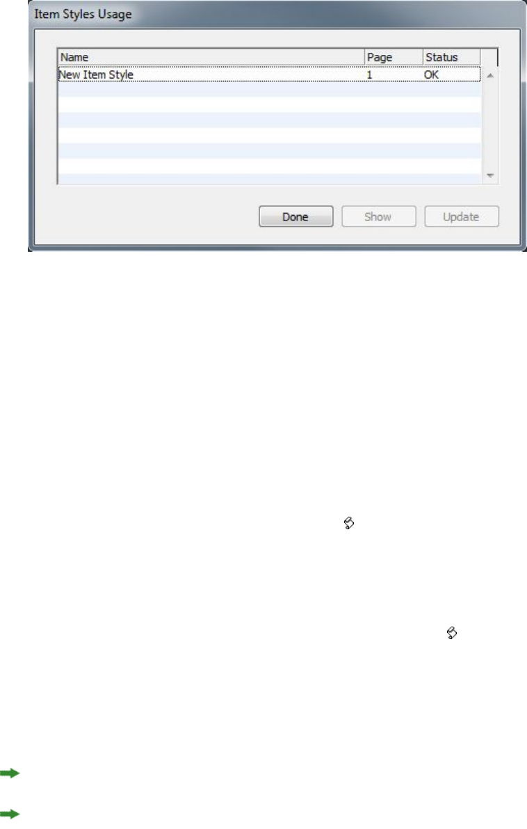
The Item Styles Usage dialog box
The options in the Item Styles Usage dialog box work as follows:
•To scroll to an item that uses an Item Style, click it in the Name column and then
click Show.
•If a selected item is listed as Modified, it has local overrides. Click Update to get
rid of all local overrides.
•If your Item Style usage contains errors, click Show Errors.
Script XTensions software
When Script XTensions software is loaded, the Scripts menu is available in the
QuarkXPress menu bar. From this menu, you can run any AppleScript script in the
"Scripts" folder in the QuarkXPress application folder. Script XTensions software makes
a collection of AppleScript scripts available from this menu by default, and you can
add your own AppleScript scripts to the menu by adding them to the "Scripts" folder.
To use Script XTensions software, simply choose a script from the Scripts menu, and
the script runs. The provided default scripts are organized into submenus.
Please note that although these scripts are designed to operate in as many workflows
as possible, specific settings in your workflow might prevent them from operating
correctly. Therefore, we recommend that you save your layouts before running any
scripts that affect them
Script XTensions software is for Mac OS X only.
Script XTensions software must be loaded before you can run any AppleScript scripts
that affect QuarkXPress, whether the scripts are launched from QuarkXPress or from
another location (such as the desktop).
Other required components include the following:
•Standard Additions Scripting Addition
•AppleScript Extension
406 | A GUIDE TO QUARKXPRESS 2016
XTENSIONS SOFTWARE

Box Tools submenu
This topic describes the AppleScript scripts available through the Box Tools submenu
of the Scripts menu when Script XTensions software is installed.
•Use Add Crop Marks to place crop marks around the selected box.
•Use Easy Banner to create a "banner" (text box) in the top-left corner of a selected
box; you specify the text in the banner.
•Use Make Caption Box to create a caption box (text box) below the selected box.
•Use Shrink or Grow at Center to resize a box from the box's center, rather than
from its origin (the 0,0 coordinates).
Grid submenu
This topic describes the AppleScript scripts available through the Grid submenu of
the Scripts menu when Script XTensions software is installed.
Use By Dividing a Box to create a grid of boxes based on the dimensions of the selected
box.
Images submenu
This topic describes the AppleScript scripts available through the Images submenu of
the Scripts menu when Script XTensions software is installed.
•Use Contents to PICT File to save the PICT preview of the selected picture to a
file.
•Use Copy to Folder to save a copy of the picture in the selected picture box to a
specified folder.
•Use Fldr to Select PBoxes to import picture files from a specified folder into
selected picture boxes. Pictures are imported in alphabetical order.
Picture Box submenu
This topic describes the AppleScript scripts available through the Picture Box submenu
of the Scripts menu when Script XTensions software is installed.
•Use Crop Marks & Name to place crop marks around the active picture box and
enter the name of the picture file into a text box below the picture box.
•Use Place Name to enter the name of a picture into a text box below the picture
box that contains the picture.
•Use Set All Bkgnd None to change the background color of every picture box in
the layout to None.
•Use Set All Bkgnd to change the background of every picture box in the layout
to a specified color and shade.
Saving submenu
This topic describes the AppleScript scripts available through the Saving submenu of
the Scripts menu when Script XTensions software is installed.
A GUIDE TO QUARKXPRESS 2016 | 407
XTENSIONS SOFTWARE

Use Each Page as EPS to save each page of the layout as an individual EPS file with a
color TIFF preview.
•To save the pages of the active layout as EPS files, click Active.
•To save the pages of a layout in a different project, click Choose to display the
Choose a File dialog box, navigate to the target project, and then click Choose.
The script saves the pages of whichever layout was active when the project was
last saved.
Special submenu
This topic describes the AppleScript scripts available through the Special submenu of
the Scripts menu when Script XTensions software is installed.
•Use Move to Scripts Folder to copy or move a selected AppleScript script to a
selected folder within the "Scripts" folder.
•Use Open Apple Events Scripting PDF to open "A Guide to Apple Events
Scripting.pdf." This PDF file contains detailed information about writing
AppleScript scripts for QuarkXPress.
•Use Open QuarkXPress Folders to open specified folders within the QuarkXPress
folder.
Stories submenu
This topic describes the AppleScript scripts available through the Stories submenu of
the Scripts menu when Script XTensions software is installed.
•Use Link Selected Text Boxes to link selected text boxes. The text chain order is
based on the stacking order of the text boxes.
•To or From XPress Tags converts the text in the selected box to "XPress Tags"
codes, or from "XPress Tags" codes to formatted text (the text is formatted using
"XPress Tags" codes). This script requires that the "XPress Tags" Filter be loaded.
•Unlink Selected Boxes breaks the links between selected text boxes while retaining
the position of the text in the text chain.
Tables submenu
This topic describes the AppleScript scripts available through the Tables submenu of
the Scripts menu when Script XTensions software is installed.
•Use Row or Column Color to apply a specified color and shade to every other
row or column in a table.
Typography submenu
This topic describes the AppleScript scripts available through the Typography submenu
of the Scripts menu when Script XTensions software is installed.
•Use Baseline Grid +1pt to increase the size of the baseline grid (the space between
gridlines) by 1 point.
408 | A GUIDE TO QUARKXPRESS 2016
XTENSIONS SOFTWARE
•Use Baseline Grid –1pt to decrease the size of the baseline grid (the space between
gridlines) by 1 point.
•Use Columns & Gutter Width to set the columns and gutter width (space between
columns) for a selected text box.
•Use Make Fractions to convert all instances of numbers on either side of a slash
(for example, ½) into formatted fractions.
•Use Set Textbox Insets to specify the text box inset values for each side of the
selected text box.
Word Filter
The Word Filter allows Word documents to be imported from, or exported to, .docx
formats.
To avoid import problems, uncheck Allow fast saves (in the Save tab of the Options
dialog box) in Microsoft Word or use the Save As command to create a copy of the
Word file to be imported.
To export in .docx format, choose Word Document from the Format drop-down
menu.
Other XTensions modules
This topic lists additional XTensions modules that are installed with QuarkXPress.
•Composition Zones: Enables the Composition Zones feature (see "Working with
Composition Zones").
•Design Grid: Enables the Design Grid feature (see "Design grids").
•EA Text: Allows QuarkXPress to open projects that use East Asian typography
features, such as rubi text, grouped characters, East Asian character alignment,
emphasis marks, and East Asian character count.
•Edit Original: Lets you open pictures with a default application and update
modified pictures using Edit Original and Update commands for picture boxes
and picture cells. When Edit Original XTensions software is loaded, you can display
the Edit Original dialog box by using the Picture Content tool to double-click
a picture box containing an imported picture.
•Error Reporting: Allows QuarkXPress to send reports to Quark when the application
unexpectedly quits.
•Glyph Palette: Enables the Glyphs palette (see "Working with the Glyphs palette").
•DiHyphenation: Enables and references the Dieckmann hyphenation resources
in the "Resources" folder.
•Hyph_CNS_1, Hyph_CNS_2, Hyph_CNS_3 (Mac OS X only): Enables the Circle
Noetics resources. Support is only available for legacy documents.
•Index: Enables the Index feature (see "Working with indexes").
A GUIDE TO QUARKXPRESS 2016 | 409
XTENSIONS SOFTWARE

•Jabberwocky: Generates random text. To create random text, select a text box
with the Text Content tool and then choose Utilities > Insert Placeholder
Text.
•Kern-Track: Enables custom kerning tables and tracking sets (see "Kerning
automatically" and "Editing tracking tables").
•Mojigumi: Enables the Mojigumi feature in East Asian projects (see "Mojigumi").
•PNG Filter: Lets you import pictures in Portable Network Graphics (PNG) format.
•PSD Import: Enables the Advanced Image Control feature (see "Working with PSD
pictures").
•RTF Filter: Lets you import and export text in Rich Text Format (RTF).
•Special Line Break: Enables the Non Breaking Character feature in QuarkXPress.
There are many more XTensions included in the XTensions folder, these can be
managed using the XTensions Manager dialog. In this dialog, you can double click
on the XTension name for a description.
410 | A GUIDE TO QUARKXPRESS 2016
XTENSIONS SOFTWARE
Preferences
Preferences let you control the default behavior of QuarkXPress.
Understanding preferences
The Preferences command (QuarkXPress/Edit > Preferences) displays the Preferences
dialog box. The Preferences dialog box contains several panes that enable you to
specify default settings for the various functions of the application. To view a pane,
click its name in the list on the left. There are three types of preferences:
•Application preferences apply to the application and affect the way all projects are
handled.
•Project preferences affect all layouts in the active project. However, if you change
project preferences with no projects open, the new preferences become the default
settings for all new projects.
•Layout preferences affect only the active layout. However, if you change layout
preferences with no projects open, the new preferences become the default settings
for all new layouts.
Additional panes and options display in the Preferences submenu when certain
XTensions software is loaded.
Nonmatching Preferences alert
The Nonmatching Preferences alert displays when you open a project that was last
saved with kerning table information, tracking table information, or hyphenation
exceptions that are different from the settings contained in the current preferences
files. You have the option of using the settings in the project or those in the preferences
files.
•If you click Use XPress Preferences, the preference information that had been
saved with the project is ignored and all layouts are changed to the preference
settings in your preferences files. Text might reflow because of different automatic
kerning or tracking information or different hyphenation exceptions. Changes
you make to these settings while the project is active are stored both in the project
and in the preferences files. The advantage of the Use XPress Preferences feature
is that the project will be based on the same kerning table information, tracking
table information, and hyphenation exceptions as your other projects.
A GUIDE TO QUARKXPRESS 2016 | 411
PREFERENCES
•If you click Keep Project Settings, the project will retain the preferences previously
specified for each layout. Text will not reflow. Automatic kerning, tracking, or
hyphenation exception changes made while the project is active will be stored
only with the project. The Keep Project Settings feature is useful if you want to
open and print a layout without running the risk of text reflow.
Changes to QuarkXPress preferences
Changes to QuarkXPress preferences are handled in the following ways:
•If you make changes to application preferences in the Preferences dialog box
(QuarkXPress/Edit menu) with or without projects open, the changes are saved
in the preferences files and immediately affect all open projects and all
subsequently opened projects.
•If you make changes to XTensions Manager settings (Utilities menu) with or
without projects open, the changes are saved in the preferences files and affect
all projects after you relaunch QuarkXPress.
•(Windows only) If you make changes to PPD Manager settings (Utilities menu)
with or without projects open, the changes are saved in the preferences files and
immediately affect all open projects and all subsequently opened projects.
•If you make changes to layout preferences in the Preferences dialog box
(QuarkXPress/Edit menu) with a project open, the changes are saved only with
the active project.
•If you choose a different auxiliary dictionary with a project open, the change is
saved only with the active project.
•If you make changes to the kerning table information, tracking table information,
and hyphenation exceptions in a new project, these changes are saved with the
active project and in the preferences files.
If the Nonmatching Preferences alert displays when you open a project and you click
Use XPress Preferences, changes you make to the kerning table information, tracking
table information, and hyphenation exceptions will be stored both in that project and
in the preferences files.
What's in the preferences files
The contents of the preferences files are as follows. The list is divided into three groups
according to how the various preferences are saved.
Group A
Group A contains the following information:
•Kerning tables (Utilities > Kerning Table Edit)
•Tracking tables (Utilities > Tracking Edit)
•Hyphenation exceptions (Utilities > Hyphenation Exceptions)
Any changes you make to the settings in Group A while no projects are open are stored
in the preferences files and are used for all subsequently created projects.
412 | A GUIDE TO QUARKXPRESS 2016
PREFERENCES
If the Nonmatching Preferences alert displays when you open a project and you click
Use XPress Preferences, subsequent changes you make to the settings in Group A are
saved to both the project and the preferences files. (The project's original Group A
settings are discarded when you click Use XPress Preferences.)
If the Nonmatching Preferences alert displays when you open a project, and you
click Keep Document Settings, subsequent changes you make to the settings in Group
A are saved only with the project.
Group B
Group B contains the following information:
•Default style sheets, colors, dashes and frames, lists, and hyphenation and
justification specifications (Edit menu)
•Settings in the Project panes of the Preferences dialog box (QuarkXPress/Edit >
Preferences)
•Path information for the default auxiliary dictionary: Windows (Utilities >
Auxiliary Dictionary), and Mac OS X (Utilities > Check Spelling > Auxiliary
Dictionary)
Any changes you make to the settings in Group B while no projects are open are stored
in the preferences files and are used for all subsequently created projects. Any changes
you make to the settings in Group B while a project is open are saved with that project
only.
Group C
Group C contains the following information:
•Output styles (Edit > Output Styles)
•Settings in the XTensions Manager dialog box.
•(Windows only) Settings in the PPD Manager dialog box (Utilities menu)
•Settings in the Application panes of the Preferences dialog box
(QuarkXPress/Edit > Preferences)
Any changes you make to the settings in Group C are always stored in the preferences,
whether or not a project is open.
Application preferences
The controls in the Application panes of the Preferences dialog box
(QuarkXPress/Edit > Preferences) affect the way QuarkXPress works with all projects,
including how projects are displayed and saved. These settings are saved with the
application and are never saved with projects.
A GUIDE TO QUARKXPRESS 2016 | 413
PREFERENCES

Preferences — Application — Display
Use the Display pane of the Preferences dialog box (QuarkXPress/Edit menu) to
specify how the pasteboard and other elements in the application appear on screen
for all projects.
Settings in the Pasteboard area include the following:
•Use the Pasteboard Width field to specify the width of the pasteboard on either
side of the page or spread in a Print layout. Pasteboard width is measured as a
percentage of the layout width.
•Use the Color control to specify a color for the pasteboard.
•To display the pasteboard of the active spread in a different color, check Change
Pasteboard Color to Indicate Active Spread and then choose a color with the
corresponding Color control.
•To display the pasteboard in a different color when you are in Trim View mode
(View > Trim View), check Trim View Pasteboard Color and then choose a color
with the corresponding Color control.
Settings in the Display area include the following:
•Check Opaque Text Box Editing to turn text boxes temporarily opaque while
you are editing them.
•(Windows only) Use the Display DPI Value field to adjust your monitor so that it
displays the best representation of your document on screen.
•Choose a profile that corresponds to your monitor from the Monitor Profile
drop-down menu, or choose Automatic. Profiles can be placed in the "Profiles"
folder in the QuarkXPress application folder. (For more information about color
management preferences, see "Preferences — Layout — Color Manager.")
•Use the Adaptive Resolution area to choose between Quality and Performance.
Choosing Quality will cause images to be rendered in the best possible quality.
Choosing Performance will give you better perfomance while working with
images (faster moving, panning etc), but the quality of the image will be
compromized.
This preference can only be set when there are no open projects.
Preferences — Application — Color Theme
Mac OS X only.
Use the Color Theme pane of the Preferences dialog box ( QuarkXPress/Edit menu)
to specify a color theme for QuarkXPress.
Use the Color Theme drop-down menu to choose from the existing color themes or
click on the icon to duplicate an existing color theme.
Use the Color control to specify a color for each of the categories.
414 | A GUIDE TO QUARKXPRESS 2016
PREFERENCES
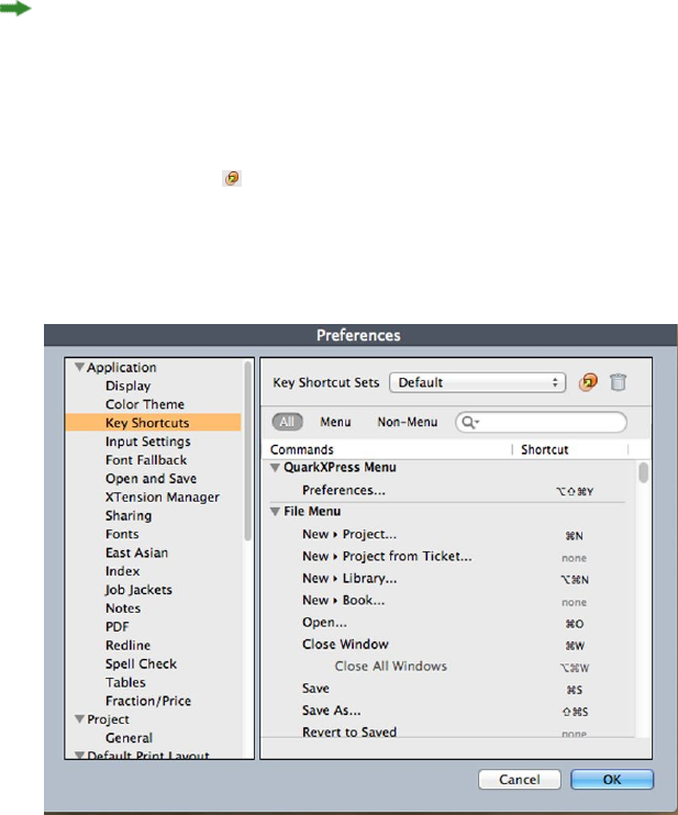
Preferences — Application — Key Shortcuts
Mac OS X only.
Use the Key Shortcuts pane of the Preferences dialog box ( QuarkXPress/Edit menu)
to customize key shortcuts for QuarkXPress.
Use the Key Shortcut Sets drop-down menu to choose from the existing key shortcuts
sets or click on the icon to duplicate an existing set.
Choose All to display all key shortcuts, Menu to display only shortcuts related to
QuarkXPress menu items and Non-Menu to display all shortcuts not related to menu
items.
Key Shortcuts pane of the Preferences dialog box
Preferences — Application — Input Settings
Use the Input Settings pane of the Preferences dialog box (QuarkXPress/Edit menu)
to customize scrolling and other "on-the-fly" actions.
•Use the Scrolling area to specify how quickly you can scroll through layouts and
how layouts update on screen. (Windows only)Check Live Scroll to update the
layout view as you drag the scroll boxes in layout window scroll bars. To turn
Live Scroll on and off while you are scrolling, press Alt as you drag a scroll box.
•Use the Format drop-down menu and the Smart Quotes check box to choose a
style for converting and entering quotation marks. To specify the default characters
to be used with the Smart Quotes feature and with the Convert Quotes option
in the Import dialog box (File > Import), choose an option from the Quotes
drop-down menu. Check Smart Quotes to force the application to automatically
replace foot and inch marks (' and ") with the chosen quotation marks as you
type.
•Hyphens and commas are the default separators for indicating sequential and
non-sequential ranges in the Pages field of the Print dialog box for a Print layout.
If you specified commas or hyphens as part of page numbers in the Section dialog
A GUIDE TO QUARKXPRESS 2016 | 415
PREFERENCES

box (Page menu), you need to change the default separators here. For example,
if your page numbers are "A–1, A–2," then you cannot specify ranges in the Pages
field using hyphens. To edit the separators, enter new characters in the Sequential
and Nonsequential fields.
•Mac OS X only: Use the Key Press Activates area to control what the Control key
does. Click Zoom to make the Control key temporarily invoke the Zoom tool .
Click Contextual Menu to make the Control key invoke a context menu.
(Control+Shift performs whichever function is not selected.)
•Windows only: Use the Delay Before Live Refresh Drag field to set the time delay
between clicking and dragging for live refresh. Live refresh shows any runaround
changes caused by the moving item in real time. If this option is checked, you
can activate live refresh by pressing the mouse button until the resize handles
disappear and then dragging the item.
•Check Drag and Drop Text to cut, copy, and paste text in a story with the mouse
rather than with menu or keyboard commands. On Mac OS X, you can temporarily
turn on this feature by holding Control+Command before starting a drag. To cut
and paste, select the text, and then drag it to a new location. To copy and paste,
select the text; then press Shift while you drag it to a new location.
•(Windows only) Check Show Tool Tips to display the names of tools or palette
icons when you place your pointer over them.
•Check Maintain Picture Box Attributes to make a picture box "remember" its
scaling and other attributes by default when you import a new picture into the
box.
•(Windows only) By default, you can input text directly into text boxes the same
way you would in a system-supplied input window for East Asian characters. To
disable this feature, uncheck Inline Input.
•(Windows only) To also allow OpenType fonts to be scanned when you click Scan
Printer in the Fonts pane of the Print dialog box (File menu), check Enable OTF
Printer Font Scan.
Preferences — Application — Font Fallback
Use the Font Fallback pane of the Preferences dialog box (QuarkXPress/Edit menu)
to control what happens when the application opens a project that uses missing fonts.
Check Font Fallback to activate the Font Fallback feature. When this feature is active,
if the application encounters a character it cannot display in the current font, it
attempts to find a font that can display the character.
If the application encounters a missing font when opening a project, it uses the
preferences in this pane to determine which substitute fonts to use.
If you add characters to an existing project and the font cannot support those
characters, the application searches the system for a font that can display the characters.
Check Search to have the application search for a suitable font that is used in the
active story. To restrict the search to a particular range, check Last and then enter a
number in the Paragraphs field. To expand the search to the entire story where a
missing font occurs, check Active Story.
416 | A GUIDE TO QUARKXPRESS 2016
PREFERENCES

To indicate which fallback fonts should be used when no other font can be found
(taking the Search settings into account), choose an option in the Font column for
each script/language listed in the Script/Lang column.
To indicate which font should be used for the slug line when a layout is printed with
registration marks turned on, choose an option from the Slug Line Font drop-down
menu.
Preferences — Application — Undo
Windows only.
Use the Undo pane of the Preferences dialog box (QuarkXPress/Edit menu) to control
Multiple Undo options.
•Use the Redo Key drop-down menu to specify which keyboard command invokes
the Redo command.
•Use the Maximum History Actions field to specify the number of actions that
you can store in your undo history. The undo history can hold as many as 100
actions.
Preferences — Application — Open and Save
Use the Open and Save pane of the Preferences dialog box (QuarkXPress/Edit menu)
to customize how the application saves and performs backups.
•Check Auto Save to protect your work from system or power failure. When this
option is checked, the application automatically records changes to a temporary
file in your project folder after a specified time interval. Enter the interval (in
minutes) in the Every minutes field. You can specify a minimum time interval
of .25 minutes. When Auto Save is checked, the default setting is Every 5 minutes.
The application does not overwrite the original file until you manually save (File >
Save). When you open the project after a system interruption, the application
displays an alert indicating that the project will be restored to the last auto-saved
version.
•Check Auto Backup and enter a value in the Keep revisions field to retain as
many as 100 revisions of a project. Each time you manually save (File > Save),
the application copies the previous manually saved version to the Destination
folder you specify. The default setting for Auto Backup is unchecked. Click Project
Folder to store revisions in the same folder with the project. Click Other Folder
and then click Browse to choose a different folder for storing revisions.
Consecutive numbers are added to the file name for each backup. When the last
revision is created (for example, 5 of 5), the oldest revision in the folder is deleted.
To retrieve a backup from the destination folder, simply open the revision file.
•Check Save Layout Position if you want the application to automatically
remember the size, position, and proportions of your project window.
•Under Non-Unicode Support, choose an option from the Encoding drop-down
menu to indicate how the application should display characters in non-Unicode
text.
A GUIDE TO QUARKXPRESS 2016 | 417
PREFERENCES

Preferences — Application — XTensions Manager
Use the XTensions Manager pane of the Preferences dialog box (QuarkXPress/Edit
menu) to control when the XTensions Manager dialog box displays.
Preferences — Application — Sharing
Use the Sharing pane of the Preferences dialog box (QuarkXPress/Edit menu) to set
the default options for new shared content. For information on the meaning of these
options, see "Sharing and synchronizing content."
To always use the options specified in this pane when adding multiple items to the
shared content space, check Do not display dialog when sharing multiple items.
Preferences — Application — Fonts
Use the Fonts pane of the Preferences dialog box (QuarkXPress/Edit menu) to specify
the following preferences.
In the Font Previews area, check Show in Font Menu to show each font name in the
corresponding font.
In the Font Mapping area:
•To suppress the display of the Missing Fonts dialog box, check Do Not Display
Missing Fonts Dialog. The radio buttons below this check box determine what
happens when you open a project that contains a missing font for which you
have not defined a replacement.
•To specify a default replacement font, check Specify Default Replacement Font
and choose a replacement font from the Default Replacement Font drop-down
menu.
•To specify default replacement fonts, check Specify Default Replacement Font
and choose options from the Roman and East Asian drop-down menu.
•To highlight characters that are in a Traditional Chinese encoding's UDA/VDA
(User Defined Area/Vendor Defined Area) range so that these characters can be
visually verified, check Highlight character ranges defined by Traditional
Chinese font vendors.
Preferences — Application — Text Highlighting
Windows only.
Use the Text Highlighting pane of the Preferences dialog box (QuarkXPress/Edit
menu) to specify the following preferences.
In the Missing Font Background area:
•Use the Color control to specify a color.
•Use the Opacity control to specify an opacity value from 0% (transparent) to
100% (opaque).
418 | A GUIDE TO QUARKXPRESS 2016
PREFERENCES

Preferences — Application — East Asian
Use the East Asian pane of the Preferences dialog box (QuarkXPress/Edit menu) to
enable East Asian functionality.
Preferences — Application — Dynamic Guides Color
Windows only. On MAC OS X set the Dynamic Guides color using the Color Theme
pane of the Preferences dialog box.
(Windows only) Use the Dynamic Guides Color pane of the Preferences dialog box
(QuarkXPress/Edit menu) to specify a color for each type of dynamic guide.
Use the Color control to specify a color for each of the following types of Dynamic
Guides:
•Dynamic Guides Center of Item
•Dynamic Guides Center of Page
•Dynamic Guides Edges of Item
•Dynamic Guides Equal Dimensions
•Dynamic Guides Equal Spacing
Preferences — Application — File List
Windows only. On MAC OS X you inherit the OS level preferences.
Use the File List pane of the Preferences dialog box (QuarkXPress/Edit menu) to
customize the display of recently opened and saved files in the File menu:
•Use the Number of Recent Files to Display field to specify the number of recently
opened and saved files to display.
•Use the File List Location area to choose which menu displays the list of recently
opened files.
•Check Alphabetize Names to display the file list in alphabetical order.
•Check Show Full Path to display the location of the files.
Preferences — Application — Default Path
(Windows only) Use the Default Path pane of the Preferences dialog box
(QuarkXPress/Edit menu) to define a default location in the file system or on the
network for Open, Save/Save As, and Import commands.
Preferences — Application — Index
The Index pane enables you to customize the index marker color and punctuation
for built indexes.
To change the color of the index markers, click the Index Marker Color button.
Use the Separation Characters settings to control how your built index is punctuated:
A GUIDE TO QUARKXPRESS 2016 | 419
PREFERENCES
•Enter characters in the Following Entry field to specify the punctuation that
immediately follows each entry in an index.
•Enter characters in the Between Page #s field to specify the words or punctuation
that separate a list of page numbers in an index.
•Enter characters in the Between Page Range field to specify the words or
punctuation that separate a range of pages in an index.
•Enter characters in the Before Cross-Reference field to specify the words or
punctuation that precede a cross-reference (usually a period, semicolon, or space).
•Use the Cross-Ref style drop-down list to select a character style sheet to apply
to your cross-references. This style sheet is applied only to "See," "See also," or "See
herein," not to the entry or the reference.
•Enter characters in the Between Entries field to specify the words or punctuation
inserted between entries in a run-in index or at the end of a paragraph in a nested
index.
Preferences — Application — Job Jackets
Use the Job Jacket pane of the Preferences dialog box (QuarkXPress/Edit menu) to
specify preferences for automatic layout evaluation and to indicate a default location
for Job Jackets files.
Use the options in the Layout Evaluation area to control when QuarkXPress
automatically executes the File > Evaluate Layout command. For example, by checking
On Output, you can make sure that you always evaluate a layout before you send it
to output. The options are:
•At Open
•At Save
•At Output
•At Close
Use the options in the Location area to specify where Job Jackets files are stored by
default. To save Job Jackets files in the default location, click Use Default Path for
Shared Jackets. The default location is the "Documents" folder on Mac OS X and the
"My Documents" folder on Windows.
Preferences — Application — Notes
Use the Notes pane of the Preferences dialog box (QuarkXPress/Edit) to control the
way notes display.
In the Sticky Note Attributes area:
•Use the Font drop-down menu to choose a font
•Use the Size drop-down menu to specify a font size
•Use the Leading field to specify the line spacing.
•Use the Color drop-down menu in the Background section to specify the
background color.
420 | A GUIDE TO QUARKXPRESS 2016
PREFERENCES
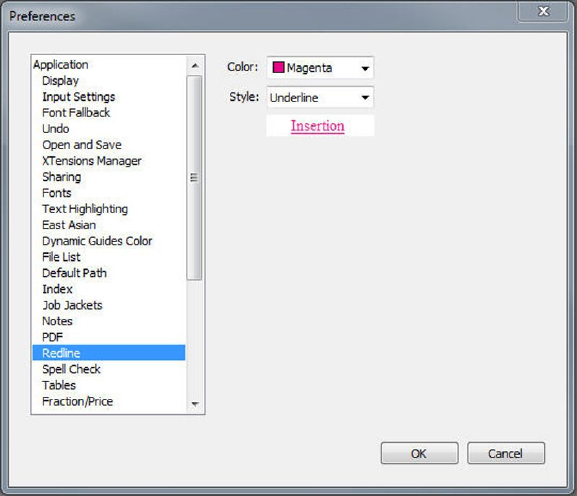
Preferences — Application — PDF
Use the PDF pane of the Preferences dialog box (QuarkXPress/Edit menu) to set
preferences for PDF export.
Use the options in the PDF Workflow area to determine how PDF files are distilled:
•Click Direct to PDF to have QuarkXPress distill the PDF file.
•Click Create PostScript File for Later Distilling to export a PostScript file with
PDF marks. Using this option, you can later generate the PDF file using a
third-party PDF distilling application. If you check this option, you can also check
Use "Watched Folder" and specify the directory where PostScript files should be
placed (presumably for automatic processing by a PDF distilling tool). If you do
not check Use "Watched Folder," you will be prompted for a location for the
PostScript file.
Mac OS X only: To increase the amount of virtual memory available for rendering large
PDF files during a PDF export operation, increase the value in the Virtual Memory
field.
Use the Default Name drop-down menu to choose a default name for exported PDF
files.
Check Log Errors to create a log of errors (if any) during the creation of PDF files.
When this option is checked, you can check Use Log Folder to specify where to save
the log file. If Use Log Folder is unchecked, the log file is created in the same directory
as the exported PDF file.
Preferences — Application — Redline
Use the Redline pane of the Preferences dialog box (QuarkXPress/Edit menu) to
specify the way inserted text and deleted text display.
Redline pane of Preferences dialog box
In the WYSIWYG View area:
A GUIDE TO QUARKXPRESS 2016 | 421
PREFERENCES
•Use the Color control to specify a color.
•Use the Style drop-down to specify a style.
Preferences — Application — Spell-Check
Use the SpellCheck pane of the Preferences dialog box (QuarkXPress/Edit menu) to
set spell checking options.
In the Spell Check Exceptions area:
•To exclude words that include numbers from spell checking, check Ignore words
with numbers.
•To exclude e-mail addresses and URLs from spell checking, check Ignore Internet
and file addresses.
•To exclude capitalization and spacing checks for words set to German languages
— German, German (Swiss), German (Reformed), and German (Swiss Reformed)
— when spell checking, check Ignore capitalization for German languages.
•To exclude capitalization and spacing checks for words set to non-German
languages when spell checking, check Ignore capitalization for non-German
languages.
In the Reformed Languages area, check Use Reformed German 2006 to use reformed
German rules when spell checking text tagged with the German character language.
Preferences — Application — Tables
Use the Tables pane of the Preferences dialog box (QuarkXPress/Edit menu) to turn
on and off the Allow Anchored Tables to Break Automatically functionality.
Preferences — Application — Fraction/Price
Use the Fraction/Price pane of the Preferences dialog box (QuarkXPress/Edit menu)
to format fractions and prices automatically.
•In the Numerator area, the Offset option positions the numerator in relation to
the baseline; the VScale option determines the height of the numerator as a
percentage of font size; the HScale option determines the width of the numerator
as a percentage of normal character width; and the Kern option adjusts the spacing
between the characters and the forward slash.
•In the Denominator area, the Offset option positions the denominator in relation
to the baseline; the VScale option determines the height of the denominator as
a percentage of font size; the HScale option determines the width of the
denominator as a percentage of normal character width; and the Kern option
adjusts the spacing between the characters and the forward slash.
•In the Slash area, the Offset option positions the forward slash in relation to the
baseline; the VScale option determines the height of the forward slash as a
percentage of font size; the HScale option determines the width of the forward
slash as a percentage of normal character width; and the Kern option adjusts the
spacing between the characters and the forward slash. Check Fraction Slash to
retain type size when you choose Style > Type Style > Make Fraction.
422 | A GUIDE TO QUARKXPRESS 2016
PREFERENCES

•In the Price area, the Underline cents option places an underline beneath the
cents characters and the Delete Radix option removes the decimal or comma
character from the price.
Project preferences
The Project panes in the Preferences dialog box (QuarkXPress/Edit > Preferences)
affect all layouts in the active project. However, if you change project preferences with
no projects open, the new preferences become the default settings for all new projects.
Preferences — Project — General
Use the Project version of the General pane of the Preferences dialog box
(QuarkXPress/Edit menu) to specify default settings for auto picture import, single
layout mode, and OpenType kerning (for OpenType fonts).
Use the Auto Picture Import drop-down menu to control whether the application
automatically updates pictures that have been modified since you last opened a layout.
•To enable the Auto Picture Import feature, choose On. When you open a project,
the application automatically re-imports modified pictures.
•To disable the Auto Picture Import feature, choose Off.
•To display an alert before the application imports modified pictures, choose Verify.
Checking Single Layout Mode with no projects open will automatically check the
Single Layout Mode check box in the New Project dialog box.
Check Use OpenType Kerning to activate the default kerning values for OpenType
fonts. When OpenType kerning is active, it overrides any kerning specified through
Kerning Table Edit (Utilities menu) for OpenType fonts.
Check Allow OpenType Transformations on Mixed Color Text to allow the user to
apply OpenType transformations on mixed color text.
To disable OpenType kerning for full-width characters, check Do Not Kern Full Width
Characters.
This option is only available for East Asian configuration.
Layout preferences
The Layout panes in the Preferences dialog (QuarkXPress/Edit > Preferences) box
affect the way certain QuarkXPress features work with documents, including whether
pages are inserted automatically when text overflows and how colors trap.
Preferences — Layout — General
Use the Layout versions of the General pane of the Preferences dialog box
(QuarkXPress/Edit menu) to specify various default settings for page layout, such as
the snap distance for guides and the colors of hyperlinks and anchors.
A GUIDE TO QUARKXPRESS 2016 | 423
PREFERENCES
In the Display area:
•When you check Greek Text Below and enter a value in the field, QuarkXPress
speeds screen redraw by "greeking" — displaying gray bars in place of text smaller
than a specified size. Greeking does not affect printing or export. Text greeking
is affected by the viewing percentage.
•Check Greek Pictures to enable QuarkXPress to display imported pictures as gray
boxes. Selecting a box that contains a greeked picture displays the picture normally.
This option is unchecked by default.
Use the Hyperlinks area to choose the color for anchor icons and hyperlinks. Both
Hyperlink icon color and anchor icon color are available for print and digital layout.
Use the Master Page Items area to control what happens to master items when master
pages are applied. New master pages are applied to layout pages whenever you (1) drag
and drop a master page icon from the master page area in the Layout palette onto a
layout page icon in the Layout palette (Window > Show Layout); (2) delete a master
page that is applied to layout pages using the Layout palette; or (3) add, delete, or
move an odd number of pages in a facing-page layout.
•Click Keep Changes if you intend modified master items on your layout pages
to remain when a new master page is applied. The items that are kept are no
longer master items.
•Click Delete Changes if you want modified master items on your layout pages
to be deleted when a new master page is applied.
Use the Framing area to specify whether frames are placed inside or outside text and
picture boxes.
•When you click Inside, the distance between the text and the frame is determined
by the box's Text Inset values (Item > Modify). When you place a frame inside
a picture box, the frame overlaps the picture.
•When you click Outside, the frame is placed outside the box, increasing the box's
width and height. The frame cannot extend beyond a constraining box or the
pasteboard.
Check Allow Justification of CJK characters to enable justification settings for East
Asian text categories of EA Punct, Han, Kana/ Hangul/ ZhuYin specified in H&J.
Print layouts only: Use the Auto Page Insertion options to determine whether pages
are inserted automatically to contain text overflow from an automatic text box or a
chain of text boxes (on a page associated with a master page that contains an automatic
text box). The drop-down menu also enables you to determine where any pages will
be inserted.
Preferences — Layout — Measurements
Use the Measurements pane of the Preferences dialog box (QuarkXPress/Edit menu)
to specify default measuring units for layout rulers and the Measurements palette:
424 | A GUIDE TO QUARKXPRESS 2016
PREFERENCES
•Use the Horizontal and Vertical drop-down menus to specify the measurement
system for the rulers displayed along the top and left of the layout window.
Horizontal corresponds to the top ruler; Vertical corresponds to the left ruler.
•Several other aspects of the user interface are affected by these two drop-down
menus, including the default X and Y coordinates in the Measurements palette.
QuarkXPress automatically converts font size, frame width, leading, and line
width to points, regardless of the measurement system you choose.
•Use the Points/Inch field to override the default value of 72 points per inch.
QuarkXPress uses the value here as the basis for all point and pica measurements,
as well as for all point- and pica-to-inch conversions. The desktop publishing
standard for points per inch is 72. However, the traditional typographic standard
used on most metal typographic rulers is usually approximately 72.27 or 72.307
points per inch (range = 60 to 80 pt, measurement system = points, smallest
increment = .001).
•Use the Ciceros/cm field to specify a ciceros-to-centimeter conversion value
different from the standard 2.1967 (range = 2 to 3 c, measurement system = ciceros,
smallest increment = .001).
•Use the Item Coordinates buttons to specify whether the increments of the
horizontal ruler repeat from zero for each Page or are continuous across a Spread.
This setting determines the coordinates of items displayed in fields. The default
option is Page.
•Use the Measurement Units drop-down menu to set the default measurement
unit for new layouts.
Preferences — Layout — Paragraph
Use the Paragraph pane of the Preferences dialog box (QuarkXPress/Edit menu) to
control various paragraph-level settings.
Use the Auto Leading feature to automatically set line spacing. You can apply this
setting to a paragraph by entering "auto" or "0" in the Leading field of the Paragraph
Attributes dialog box (Style > Leading). Unlike paragraphs with absolute leading
(identical line spacing above every line), paragraphs with auto leading may include
lines with different leading when fonts and font sizes are mixed in the same paragraph.
Auto leading starts with a base amount of leading, which QuarkXPress calculates by
examining the ascent and descent values built into the fonts used in an auto-leaded
line and the line above it; however, the user-specified text size (Style > Size) plays the
largest part in determining this base amount. Finally, a value specified by the user in
the Auto Leading field is added to the base amount to arrive at the total amount of
leading.
To specify percentage-based auto leading, enter a value from 0% to 100% in 1%
increments. This value determines the amount of leading between two lines of text
as follows: The largest font size in the line above is multiplied by the percentage value.
This outcome is added to the base amount of auto leading between the two lines.
Although the design of certain fonts complicates the process, here is a simplified
example: 10-point text styled consistently in a "standard" font with Auto Leading set
to 20% has 12 points of leading (10 pts + [20% of 10] = 12 pts). To specify incremental
auto leading, enter a value preceded by a plus sign (+) or a minus sign (–) from –63
A GUIDE TO QUARKXPRESS 2016 | 425
PREFERENCES
points to +63 points using any measurement system. Entering "+5" will add 5 points
of leading to the base amount of auto leading; entering "+5 mm" will add 5 millimeters.
Use the Maintain Leading check box to control the placement of a line of text that
falls immediately below an obstruction in a column or box. If Maintain Leading is
checked, the line's baseline is placed according to its applied leading value. If Maintain
Leading is unchecked, the ascent of the line will abut the bottom of the obstruction
or any applied runaround value (Item > Runaround).
In the Lock to Grid Based On area:
•Click Ascent and Descent to lock text to grid based on the ascenders and
descenders of characters.
•Click Font Size (Em Box) to lock text to grid based on the size of the em boxes
of the characters.
For each language in the Hyphenation list, use the Method drop-down menu in the
Hyphenation area to specify the method QuarkXPress uses to automatically hyphenate
paragraphs when no corresponding entry is found in your Hyphenation Exceptions
dictionary. The setting you choose affects only paragraphs for which Auto
Hyphenation (Edit > H&Js) is enabled:
•Choose Standard to hyphenate using the algorithm built into versions of
QuarkXPress prior to 3.1.
•The Enhanced and the Extended, 3.3 Compatible options are only available
if any legacy project having any of these hyphenation methods applied for
any language is opened in QuarkXPress 2016. This option is not available
for new projects.
•Extended 2 uses the Dieckmann exception resources and algorithm for
hyphenation. If available for a language, it is the default method for projects
created in QuarkXPress.
Preferences — Layout — Character
Use the Sharing pane of the Preferences dialog box (QuarkXPress/Edit menu) to set
the default options for new shared content. Use the Character pane of the Preferences
dialog box (QuarkXPress/Edit menu) to specify how QuarkXPress constructs
typographic styles such as Superscript and Subscript:
•Use the Superscript area to control the placement and scale (size) of superscript
characters. The Offset value determines how far below the baseline QuarkXPress
places a superscript character. The Offset value is measured as a percentage of
font size. The default value is 33%. The VScale value determines the vertical size
of the character and is a percentage of font size. The HScale value determines
width and is a percentage of the normal character width (as specified by the font
designer). The default value for both scales is 60% (range = 0 to 100%,
measurement system = percentage, smallest increment = .1).
•Use the Subscript area to control the placement and scale (size) of subscript
characters. The Offset value determines how far above the baseline QuarkXPress
places a subscript character. The Offset value is measured as a percentage of font
size. The default value is 33%. The VScale value determines the vertical size of
426 | A GUIDE TO QUARKXPRESS 2016
PREFERENCES
the character and is a percentage of font size. The HScale value determines width
and is a percentage of the normal character width (as specified by the font
designer). The default value for both scales is 100% (range = 0 to 100%,
measurement system = percentage, smallest increment = .1).
•Use the Small Caps area to control the scale of characters with the Small Caps
type style applied to them. The VScale value determines the vertical size of the
character and is measured as a percentage of font size. The HScale value determines
width and is measured as a percentage of the normal character width (as specified
by the font designer). The default value for both scales is 75% (range = 0 to 100%,
measurement system = percentage, smallest increment = .1).
•Use the Superior area to control the scale of superior characters. The VScale value
determines the vertical size of the character and is measured as a percentage of
font size. The HScale value determines width and is measured as a percentage of
the normal character width (as specified by the font designer). The default value
for both scales is 60% (range = 0 to 100%, measurement system = percentage,
smallest increment = .1).
•Use the Ligatures area to use ligatures built into a font. A ligature is a typographic
convention in which certain characters are combined into a single glyph. Most
fonts contain ligatures for the characters "f" followed by "I" and "f" followed by
"l". The Break Above field enables you to specify the kerning or tracking value
(measured in ½00 em space increments) above which characters will not be
combined into ligatures. For example, a headline with a large tracking value would
probably not contain ligatures. The default value is 1 (range = 0 to 10, measurement
system = .005 [½00] em space, smallest increment = .001). To prevent the second
two letters in "ffi" and "ffl" (as in office and waffle) from being combined into
ligatures, check Not "ffi" or "ffl". Three-character ligatures for these combinations,
common in traditional typesetting systems, are not standardized in fonts designed
for Mac OS X, so some typographers prefer to keep all three letters separate rather
than combine only two of them. Note that many PostScript fonts do not have
"ffi" and "ffl" ligatures, but most OpenType fonts do. This option is unchecked by
default.
•Check Auto Kern Above to specify that QuarkXPress uses kerning tables, which
are built into most fonts, to control intercharacter spacing. The Auto Kern Above
field enables you to specify the point size above which automatic kerning must
be used. The Auto Kern Above feature also implements custom tracking
information specified in the Tracking Values dialog box for a selected font
(Utilities > Edit Tracking). This option is checked by default, with a 4-point
threshold (range = 0 to 72 pt, measurement system = various [", pt, cm, etc.],
smallest increment = .001).
•Check Standard Em Space to specify an em-space equivalent to the point size of
the text (for example, 24pt text has a 24pt em space). If Standard Em Space is
unchecked, QuarkXPress uses the width of the two zeros in the current font as
the em-space width. This option is checked by default. You can insert an em space
in text by pressing Option+space/Ctrl+Shift+6.
•Use the Flex Space Width field to change the 50% default width of a flexible
space. To create a breaking flexible space, press Option+Shift+space/Ctrl+Shift+5;
to create a nonbreaking flexible space, press
A GUIDE TO QUARKXPRESS 2016 | 427
PREFERENCES
Command+Option+Shift+space/Ctrl+Alt+Shift+5. The Flex Space Width value
is expressed as a percentage of the normal en space for a given font and font size
(range = 0 to 400%, measurement system = percentage, smallest increment = .1).
•Use the Accents for All Caps check box to specify whether to include accent
marks on accented characters with the All Caps type style applied. This option is
checked by default.
•Use the Space between CJK & R field to indicate how much space should be
included by default between a Chinese, Japanese, or Korean character and an
adjacent Roman character.
Preferences — Layout — Tools
Use the Tools panes of the Preferences dialog box (QuarkXPress/Edit menu) to specify
default characteristics for the Zoom tool and the Item tool , and to set defaults
for items created by item creation tools.
Windows
•To configure Item tool options, select the Item tool and then click Modify.
Use the Shift + nudge Increment area to control by how many pixels the Item
tool nudges an item. Use the radio buttons under Double-Clicking a Box to
determine what happens when you double-click a box: You can choose to switch
from the Item tool to the appropriate content tool or to open the Modify dialog
box.
•To control the range and the increment of the view change for the Zoom tool ,
select the Zoom tool and then click Modify.
•To configure dragging options for the Text Content and Picture Content tools,
select the combined content tool and then click Modify. Click Create Boxes
to create a new box when you drag with a content tool selected. Click Select
Boxes to select boxes when you drag with a content tool selected.
•To change the default attributes for items created by one or more related
item-creation tools, select the tools and then click Modify.
•If you have modified the preferences for a tool and intend to change the
preferences back to the default settings, select the tool(s) from the list and click
Restore. If you have modified the preferences for several tools and intend to
change all of the tool preferences back to the default settings, click Restore All.
Mac OS X
You set the default tool preferences for the layout directly from the boxes. To set the
tool preferences, set up a box the way you want and then use Edit > Set Tool
Preferences From Selected to push the box's attributes to the tool preferences. Use
the Edit > Restore Tool Preferences to Default to restore the tool preferences to the
default settings.
Preferences — Layout — Guides and Grid
Use the Guides and Grid pane of the Preferences dialog box (QuarkXPress/Edit
menu) to specify various default settings for guides and design grids.
428 | A GUIDE TO QUARKXPRESS 2016
PREFERENCES
The Snap Distance field enables you to change the 6-pixel default distance at which
objects snap to page guides when Snap to Guides is chosen (View menu) (range = 1
to 216, measurement system = pixels, smallest increment = 1).
In the Guides area:
•To specify default margin and guide colors, use the Margin Color and Guide
Color buttons.
•Click In Front of Content or Behind Content to specify whether ruler guides
and page guides are placed in front of or behind all items on a page.
In the Page Grid area:
•To control the minimum zoom value at which the master page grid and text box
grids become visible, enter a value in the Zoom Visibility field.
•Click In Front of Content or Behind Content to specify whether the master page
grid is placed in front of or behind all items on a page. If you click In Front of
Content, you can also specify whether the master page grid is in front of or behind
guides.
Preferences — Layout — Grid Cell Fill
Use the Grid Cell Fill pane of the Preferences dialog box (QuarkXPress/Edit menu)
to control how design grid cells are filled.
When you check Show Full Cell in the Display Settings tab (see "Design grids: Display
Settings tab") for a grid style or master page grid, you can designate one of the cells in
the sequence to be filled with the color that outlines other cells in the grid. To designate
the cell number and positioning in the sequence, use the controls in the Grid Cell
Fill pane in the Preferences dialog box (QuarkXPress/Edit > Preferences):
•To specify which cells will be filled, check Increment Fill and enter a value in
the field. For example, to fill cells four, eight, and twelve, enter 4.
•To restart cell counting at the beginning of each line in a text box, click Start of
Line. To start cell counting from the beginning of the story and continue counting
regardless of line breaks, click Start of Story.
Preferences — Layout — Color Manager
Use the Color Manager panes of the Preferences dialog box (QuarkXPress/Edit menu)
to define colors so they display or output consistently across all devices.
In the Source Options area:
•Use the Source Setup drop-down menu to specify the source color space of pictures
and colors used in QuarkXPress.
•To enable the Profile Information command in the Window menu and the
Color Management tab in the Import Picture dialog box, check Enable access
to image profiles. This option allows you to view information about profiles.
Print layouts only: To specify how layouts display when you use the View > Proof
Output submenu, use the options in the Soft Proofing area:
A GUIDE TO QUARKXPRESS 2016 | 429
PREFERENCES
•To specify a default proof output setup, choose an option from the Proof Output
drop-down menu.
•To specify a rendering intent for soft proofing, choose an option from the
Rendering Intent drop-down list. Perceptual scales all the colors in the source
gamut so that they all fit within the destination gamut. Relative Colorimetric
retains colors that are in both the source gamut and the destination gamut. The
only source colors that are changed are those that are not within the destination
gamut. Saturation considers the saturation of source colors and changes them to
colors with the same relative saturation in the destination gamut. Absolute
Colorimetric retains colors that are in both the source gamut and the destination
gamut. Colors that are outside the destination gamut are adjusted in relation to
how they would look when printed on white paper. Defined by Sources uses the
rendering intents defined in source setup for all colors and images.
Print layouts only: In the Vector EPS/PDF Files area:
•To color manage vector content in imported EPS and PDF files, check Color
Manage Vector EPS/PDF. Note that this preference applies only to EPS and PDF
files imported after this box is checked.
•To color manage vector content in EPS and PDF files that have already been
imported in the active project, check Include Existing Vector EPS/PDF in Layout.
Preferences — Layout — Layers
Use the Layers pane of the Preferences dialog box (QuarkXPress/Edit menu) to specify
the settings used when a new layer is created.
•To make new layers visible by default, check Visible.
•To suppress the printout of new layers by default, check Suppress Output.
•To make new layers locked by default, check Locked.
•To maintain runaround on new layers so that text on visible layers flows around
items on hidden layers, click Keep Runaround.
430 | A GUIDE TO QUARKXPRESS 2016
PREFERENCES
Legal notices
©2016 Quark Software Inc. and its licensors. All rights reserved.
Protected by the following United States Patents: 5,541,991; 5,907,704; 6,005,560;
6,052,514; 6,081,262; 6,633,666 B2; 6,947,959 B1; 6,940,518 B2; 7,116,843; 7,463,793;
and other patents pending.
Quark, the Quark logo, QuarkXPress, and QuarkCopyDesk are trademarks or registered
trademarks of Quark Software Inc. and its affiliates in the U.S. and/or other countries.
All other marks are the property of their respective owners.
A GUIDE TO QUARKXPRESS 2016 | 431
LEGAL NOTICES
Index
A
accents on all caps 426
Add Point tool 19
advanced 331
Advanced Image Control 39
aligning 98
alignment 143
alpha masks 249
anchor color 423
anchored boxes 99, 188
anchored lines 188
anchors 239, 241, 242, 243
App Studio 339
App Studio layouts 58, 385
appending 24, 292
AppleScript 406, 407, 408
application preferences 411, 413, 414, 415, 416,
417, 418, 419, 420, 421, 422
arrowheads 94
Authoring View 56
Auto Kern Above 426
auto leading 425
auto page insertion 423
auto picture import 423
automatic kerning 149
auxiliary dictionaries 133
B
background colors 246
baseline 199
baseline grid 181
baseline shift 138
Bézier 77, 85, 86, 93, 94
Bézier boxes 83, 183
Bézier tool 19
bleed 330
bleeds 273, 274, 316
blend modes 251
blends 86, 259, 265
books 39, 299, 300, 301, 302, 303, 304, 305, 306
bottomline 199
boxes 75, 76, 82, 83, 84, 85, 86, 87, 95, 96, 97, 98,
99
C
callouts 100
cell alignment 210
centerline 199
channels 252, 253
chapters 301, 302, 303, 304
character attributes 135, 136, 142
character language 197
character style sheets 165
clipping paths 87, 247, 248, 249, 253
Cloner 320
CMYK 258
collaboration 343
Collaboration Setup 347
Collect for Output 337
color 137, 245, 262, 329
color engine 265
color management 50, 265, 266, 267, 268, 269,
270, 271, 429
color management, EPS 265
color management, legacy 267
color management, PDF 265
color management, pictures 270
color theme 414
colors 40, 85, 86, 257, 258, 259, 261, 262, 263, 264
composition layouts 349, 350, 355, 356
Composition Zones 347, 349, 350, 351, 352, 353,
354, 355, 356, 409
Composition Zones items 347, 349, 350, 351, 352,
353, 354, 355
Compressed Image Import 409
content 75
content variable 41, 71, 72
context menus 38
Convert Point tool 19
copying 96, 189
counting characters 139
cropping 245
cross-references 295, 296
432 | A GUIDE TO QUARKXPRESS 2016
INDEX
Custom Underline 238
cutting 96
D
default path 419
DejaVu 275
deleting 189
Design Grid 409
design grids 199, 200, 202, 203, 204, 206, 207,
209, 210, 213, 215, 216, 428, 429
destinations 239, 240, 241, 242, 243
digital layout resources 385
discretionary hyphens 160
display 414
docx 123, 409
drag and drop text 121, 415
drop caps 188
drop shadows 80, 271, 272
duplicating 98
dynamic guides 419
dynamic guides color 419
E
EA Text 409
east asian 419
Edit Original 409
editing 121
effective image resolution 46
em space, standard 426
emphasis marks 138
endnote style 127
endpoints 93
EPS 334
Error Reporting 409
Excel charts 109, 119
Excel spreadsheets 119
Excel tables 107
export directories 423
exporting 122, 123
exporting layouts 60
eyedropper 262
F
file list 419
find/change 123
flattening 341
flex space width 426
flipping 246
font fallback 198, 415, 416
font mapping 198, 418
font sets 139
font size 136
fonts 135, 183, 329
footers 118
footnote 42
footnote separator 130
footnote style 127
fractions 422
frames 85
framing 423
Freehand Line tool 19
full cell box 199
G
glyphs 196
Glyphs palette 43, 409
greeking 423
grid styles 213, 215
gridlines 113
grids 313
group rubi 217
grouped characters 140
grouping 97
groups 98, 115, 264
Guide Manager Pro 309, 310, 311, 312, 313, 315,
316
guides 63, 64, 65, 309, 310, 311, 312, 313, 315,
316, 428
H
half-width characters 138
handles 76
hanging character classes 225, 227
hanging character sets 225, 228, 229
hanging characters 225, 227, 228, 229
hanging punctuation 225
headers 118
help 38
hide notes 34
Hide Suppressed 34
horizontal scaling 137
HSB 258
HTML5 44
hyperlink color 423
hyperlinks 239, 240, 241, 242, 243
Hyph_CNS_1 409
Hyph_CNS_2 409
A GUIDE TO QUARKXPRESS 2016 | 433
INDEX
Hyph_CNS_3 409
HyphDieckmann 409
hyphenation 149
hyphenation exceptions 151
hyphenation methods 425
I
ICC profiles 265
Ichitaro import 409
image file 337
image maps 409
ImageGrid 321
importing 122, 123, 244, 246
indentation 144
index 299
indexed colors 253
indexes 45, 293, 294, 295, 296, 297, 298, 299, 306,
409
indexing 419
inline input 415
inline tables 109
input settings 415
Interactive layouts 409
invisibles 197
Item Find/Change 81
item handles 76
Item Styles 403, 404, 405
Item tool 19
items 75, 76, 82, 95, 96, 97, 98, 99, 184
J
Jabberwocky 409
JDF 331, 364, 398
job definer 368
Job Jackets 266, 267, 363, 364, 365, 366, 367, 368,
369, 370, 371, 373, 374, 376, 377, 378, 379, 380,
381, 382, 383, 384, 385, 386, 387, 388, 390, 391,
393, 394, 395, 397, 398, 420
Job Jackets, shared 382
Job Ticket templates 374, 376, 377, 379, 380, 381,
382, 383, 384
Job Ticket Templates 366
Job Tickets 365, 366, 374, 376, 377, 378, 379, 381,
382
joining 95
JPEG 337
justification 149
K
Kern-Track editor 409
kerning 148
key commands 19
key shortcuts 415
L
LAB 258
layers 45, 251, 252, 282, 283, 284, 285, 286, 287,
288, 289, 330, 430
layout artist 368
layout definitions 365, 378, 382
layout families 282
layout preferences 411, 423, 424, 425, 426, 428,
429, 430
layout specifications 387, 388
layouts 31, 58, 60, 62, 63, 325, 334, 351, 353
leading 145, 425
libraries 306, 307, 308, 309
ligatures 192, 426
Line Check 237
line segments 77
Line tool 19
lines 28, 75, 93, 94, 95, 96, 97, 98, 99, 184, 264
Linking tool 19
Linkster 323
lists 46, 290, 291, 292, 293, 306
live scroll 415
lock to grid 425
locking 99, 289, 347
M
Make Fraction 236
Make Price 236
manual kerning 148
manual tracking 161
margin alignment 225
marks 329
master chapter 304
master page grids 200, 202, 213, 216
master page items 423
master page toggle 54
master pages 50, 277, 282, 289
measurements 424
Measurements palette 46
merging 86
midpoints 93
missing fonts 416, 418
434 | A GUIDE TO QUARKXPRESS 2016
INDEX
Mojigumi 409
monitor profile 265
mono rubi 217, 221
moving 96
multi-ink colors 258
N
nonmatching preferences 411
notes 420
O
opacity 137, 252, 264, 265
opening 417
opentype fonts 193
OpenType fonts 189
OpenType kerning 423
OpenType styles 190
orphans 146
Orthogonal Line tool 19
OTF printer scan 415
output 325, 327, 329, 330, 331, 334, 335, 337,
339, 341
Output Preview 56
output setups 265, 266, 267, 268, 269
output specialist 368
output style 339
output styles 339
Oval Box tool 19
P
page grids 213, 216
Page Layout palette 50
page numbering 302, 303
page separators 415
pages 31
palette groups 52
palette sets 52
palettes 38
Pan tool 19
paragraph attributes 143, 188
paragraph spacing 146
paragraph style sheets 162
pasting 96, 189
paths 253
PDF 335, 421
PDF Filter 341
PDF layers 290
PDF/X-4 335
PDFs 341
Photoshop files 250, 251, 252, 253, 409
Photoshop import 39
picture boxes 82, 87
Picture Content tool 19
picture effects 409
picture handles 76
picture paths 325
picture usage 246
pictures 28, 185, 244, 245, 246, 247, 354
PNG 337
points 77
PostScript 337
preferences 411, 412, 413, 414, 415, 416, 417, 418,
419, 420, 421, 422, 423, 424, 425, 426, 428, 429,
430
preflighting 395
preview 331
prices 422
print dialog box 325
Print layouts 58
printing 253, 305
private use characters 139
profiles 50, 270, 271
project preferences 411, 423
project settings 365
projects 58, 60, 63
PSD Import 39, 250, 251, 252, 253, 409
Q
QuarkVista 409
R
random text 409
Rectangle Box tool 19
redline 51, 421
redo 66
reformed German 2006 422
Remove Point tool 19
rendering intent 265
reshaping 85, 94
resizing 84, 94, 98
resolution 46
resources 63
Resources 364, 365, 373, 374, 376, 377, 378, 379,
384, 385, 386, 387, 388
RGB 258
rotating 98, 245
RTF Filter 409
A GUIDE TO QUARKXPRESS 2016 | 435
INDEX
rubi 217
rubi annotations 217
rubi text 217, 219, 221, 222, 223
rule sets 390, 393, 394, 395
rules 390, 391, 393, 395
rules above 188
rules below 188
runaround 183, 184, 185, 186, 253, 287
S
saving 417
Scissors 22
Scissors tool 19
Script XTensions software 406, 407, 408
sections 303
Select Point tool 19
selecting 95
send backward 96
send forward 96
send to back 96
send to front 96
shade 137, 245, 263, 264
Shape of Things 22
ShapeMaker 88
shapes 76, 77
shared content 41, 343, 344, 346, 347, 352, 418
shared content library 343
sharing 418
show notes 34
single layout mode 58, 423
single-sourcing 343
skewing 99, 245
small caps 426
smart quotes 415
snapping to guides 216
soft proofing 267
source setup 265
source setups 265, 266, 267, 268
spaces 197
spacing 98
special characters 197
Special Line Break 409
speed scroll 415
spell checking 132, 133, 422
split screen 54
splitting 86
splitting windows 55
stacking order 96
Star Box tool 19, 22
Starburst tool 22
step and repeat 87
Story Editor view 56
style sheets 51, 162, 167, 168
stylistic sets 193
subscript 426
summary 331
Super Step and Repeat 87
superior 426
superscript 426
SWF Import 409
SWF Toolkit 409
synchronization 343, 344, 346, 347, 355, 356, 418
synchronizing 303, 304
T
Table Import 119
table of contents 290, 291, 292, 293, 306
table style 110
tables 32, 52, 75, 105, 106, 107, 109, 110, 111,
112, 113, 114, 115, 118, 422
Tables tool 19
tabs 146
templates 60
text 71, 121, 122, 123, 127, 130, 132, 133, 183,
184, 185, 186, 187, 188, 189
text box grids 200, 203, 215
text boxes 82, 87, 181, 184
Text Content tool 19
text formatting 26
text highlighting 418
text insertion point 121
text inset 182
text paths 184, 187
text positioning 181
text to box 183
tool tips 415
tools 52, 428
Tools palette 19, 52
topline 199
tracking 161
tracking tables 161
transparency 330
trapping 341
Trim view 34, 414
type styles 136
Type Tricks 236, 237, 238
436 | A GUIDE TO QUARKXPRESS 2016
INDEX
typography 121, 135, 136, 137, 138, 142, 143, 144,
145, 146, 148, 149, 151, 160, 161, 162, 165, 167,
168, 181, 182, 183, 188, 189, 190, 192, 196, 197,
198
U
unanchored boxes 189
unanchored lines 189
undo 66, 417
Unicode 43
Unlinking tool 19
usage 246
V
vertical scaling 137
vertical text alignment 181
view sets 56
W
widows 146
windows 55
Word 409
Word 6–2000 Filter 409
Word Space Tracking 237
X
XTensions 402, 403, 409, 418
XTensions sets 403
Z
zoom 54
Zoom tool 19
A GUIDE TO QUARKXPRESS 2016 | 437
INDEX
