Developing Responsive Websites With Bootstrap And J Query Trainer Guide
User Manual:
Open the PDF directly: View PDF  .
.
Page Count: 111 [warning: Documents this large are best viewed by clicking the View PDF Link!]
- Initial Pages
- Preface
- Session 1 TG_Final
- Session 2 TG_Final
- Session 3 TG_Final
- Session 4 TG_Final
- Session 5 TG_Final
- Session 6 TG_Final
- Session 7 TG_Final
- Session 8 TG_Final
- Session 9 TG_Final
- Session 10 TG_Final
- Session 11 TG_Final
- Session 12 TG_Final
- Session 13 TG_Final
- Session 14 TG_Final
- Session 15_AAD_TG1
- Session 16_AAD_TG1
- Session 17_AAD_TG1
- Session 18_AAD_TG1
- Session 16_AAD_TG1.pdf
- Session 15_AAD_TG1.pdf
- Session 16_AAD_TG1.pdf
- Session 17_AAD_TG1.pdf
- Session 18_AAD_TG1.pdf
- BS_TG1.pdf
- BS_TG2.pdf
- BS_TG3.pdf
- BS_TG4.pdf
- BS_TG5.pdf
- BS_TG6.pdf
- BS_TG4.pdf
- BS_TG4.pdf
- BS_TG5.pdf
- BS_TG6.pdf

Developing Responsive Websites with
Bootstrap and jQuery
For Aptech Centre Use Only

Developing Responsive Websites with
Bootstrap and jQuery
Trainer’s Guide
© 2017 Aptech Limited
All rights reserved.
No part of this book may be reproduced or copied in any form or by any means – graphic, electronic or
mechanical, including photocopying, recording, taping, or storing in informaon retrieval system or sent
or transferred without the prior wrien permission of copyright owner Aptech Limited.
All trademarks acknowledged.
APTECH LIMITED
Contact E-mail: ov-support@onlinevarsity.com
First Edition - 2017
For Aptech Centre Use Only

Dear Learner,
We congratulate you on your decision to pursue an Aptech Worldwide course.
Aptech Ltd. designs its courses using a sound instruconal design model – from
conceptualizaon to execuon, incorporang the following key aspects:
¾Scanning the user system and needs assessment
Needs assessment is carried out to nd the educaonal and training needs of
the learner.
Technology trends are regularly scanned and tracked by core teams at Aptech Ltd.
TAG* analyzes these on a monthly basis to understand the emerging technology
training needs for the Industry.
An annual Industry Recruitment Prole Survey# is conducted during August -
October to understand the technologies that Industries would be adapng in
the next 2 to 3 years. An analysis of these trends & recruitment needs is then
carried out to understand the skill requirements for dierent roles & career
opportunies.
The skill requirements are then mapped with the learner prole (user system) to
derive the Learning objecves for the dierent roles.
¾Needs analysis and design of curriculum
The Learning objecves are then analyzed and translated into learning tasks. Each
learning task or acvity is analyzed in terms of knowledge, skills and atudes
that are required to perform that task. Teachers and domain experts do this
jointly. These are then grouped in clusters to form the subjects to be covered by
the curriculum.
In addion, the society, the teachers, and the industry expect certain knowledge
and skills that are related to abilies such as learning-to-learn, thinking,
adaptability, problem solving, posive atude etc. These competencies would
cover both cognive and aecve domains.
A precedence diagram for the subjects is drawn where the prerequisites for each subject are
graphically illustrated. The number of levels in this diagram is determined by the duration of
the course in terms of number of semesters etc. Using the precedence diagram and the time
duration for each subject, the curriculum is organized.
For Aptech Centre Use Only

¾Design & development of instructional materials
The content outlines are developed by including addional topics that are
required for the compleon of the domain and for the logical development of
the competencies idened. Evaluaon strategy and scheme is developed for
the subject. The topics are arranged/organized in a meaningful sequence.
The detailed instruconal material – Training aids, Learner material, reference
material, project guidelines, etc.- are then developed. Rigorous quality checks
are conducted at every stage.
¾Strategies for delivery of instruction
Careful consideraon is given for the integral development of abilies like thinking,
problem solving, learning-to-learn etc. by selecng appropriate instruconal
strategies (training methodology), instruconal acvies and instruconal
materials.
The area of IT is fast changing and nebulous. Hence, considerable exibility is
provided in the instruconal process by specially including creave acvies with
group interacon between the students and the trainer. The posive aspects of
Web based learning –acquiring informaon, organizing informaon and acng
on the basis of insucient informaon are some of the aspects, which are
incorporated, in the instruconal process.
¾Assessment of learning
The learning is assessed through dierent modes – tests, assignments & projects.
The assessment system is designed to evaluate the level of knowledge & skills as
dened by the learning objecves.
¾Evaluation of instructional process and instructional materials
The instruconal process is backed by an elaborate monitoring system to evaluate
- on-me delivery, understanding of a subject module, ability of the instructor
to impart learning. As an integral part of this process, we request you to kindly
send us your feedback in the reply pre-paid form appended at the end of each
module.
For Aptech Centre Use Only
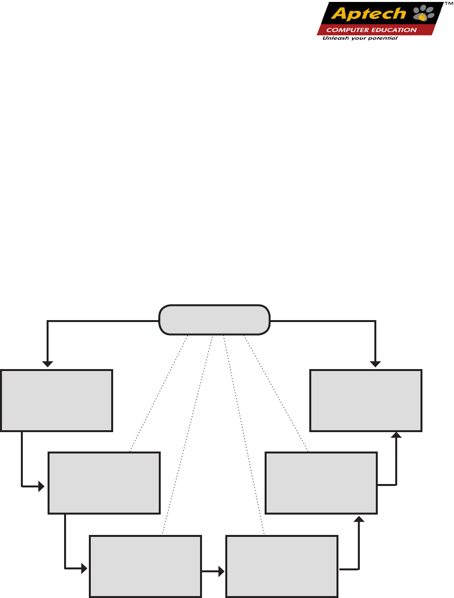
Scanning the user
system and needs
assessment
Evaluation of
Instructional
Processes and
Material
Need Analysis
and design of
curriculum
Assessment of
learning
Design and
development of
instructional
material
Strategies for
delivery of
instructions
Key Aspects
Aptech New Products Design Model
1
2
3
4
5
6
*TAG – Technology & Academics Group comprises of members from Aptech Ltd., professors
from reputed Academic Instuons, Senior Managers from Industry, Technical gurus from
Soware Majors & representaves from regulatory organizaons/forums.
Technology heads of Aptech Ltd. meet on a monthly basis to share and evaluate the
technology trends. The group interfaces with the representaves of the TAG thrice a year
to review and validate the technology and academic direcons and endeavors of Aptech
Ltd.
For Aptech Centre Use Only

“
“
A little learning is a dangerous thing,
but a lot of ignorance is just as bad
For Aptech Centre Use Only

The book ‘Developing Responsive Websites with Bootstrap and jQuery’ Trainer’s Guide serves
understanding on new features and functionalities of Bootstrap framework and jQuery. The
faculty/trainer should teach the concepts in the theory class using the slides. This Trainer’s Guide will
provide guidance on the flow of the session and also provide tips and additional examples wherever
necessary. The trainer can ask questions to make the session interactive and also to test the
understanding of the students.
This book is the result of a concentrated eort of the Design Team, which is connuously striving to bring
you the best and the latest in Informaon Technology. The process of design has been a part of the ISO
9001 Cercaon for Aptech-IT Division, Educaon Support Services. As part of Aptech’s quality drive,
this team does intensive research and curriculum enrichment to keep it in line with industry trends.
We will be glad to receive your suggesons.
Design Team
Preface
For Aptech Centre Use Only

“
“
Practice is the best of
all instructors.
For Aptech Centre Use Only

Sessions
Table of Contents
1. Basics of Bootstrap
2. Understanding Programming in Bootstrap
3. Basics of jQuery
4. Functions, Widgets, Plugins in jQuery
5. Creating Bootstrap Responsive Layout
6. Creating Responsive Webpages Using Bootstrap and jQuery
For Aptech Centre Use Only

“
“
The future depends on what
we do in the present.
For Aptech Centre Use Only

Developing Responsive Websites with Bootstrap and jQuery
Session 01: Basics of Bootstrap
1.1 Pre-Class Activities
Before you commence the session, you should familiarize yourself with the topics of this
session in-depth. Prepare a question or two that will be a key point to relate the current session
objectives.
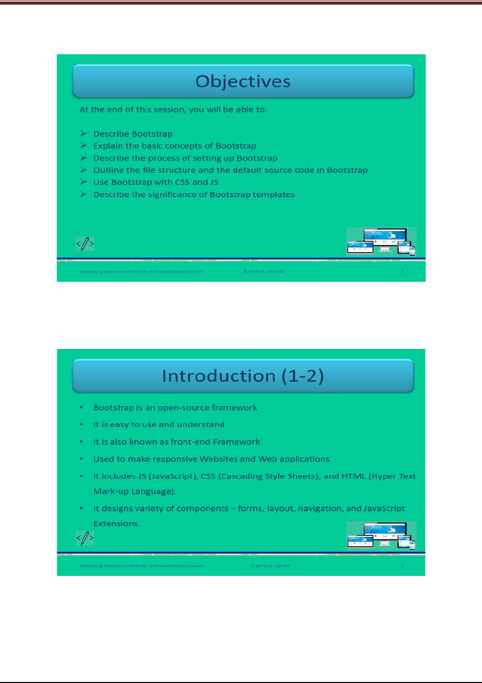
1.1.1 Objectives
At the end of this session, you will be able to:
Describe Bootstrap
Explain the basic concepts of Bootstrap
Describe the process of setting up Bootstrap
Outline the file structure and the default source code in Bootstrap
Use Bootstrap with CSS and JS
Describe the significance of Bootstrap templates
1.1.2 Teaching Skills
To teach this session, you should be well versed with the concepts of Bootstrap. You should be
familiar with the Bootstrap in detail. You should also know how to get started with Bootstrap
and its benefits over JavaScript.
You should teach the concepts in the theory class using the images provided. For teaching in
the class, you are expected to use slides and LCD projectors.
Tips:
It is recommended that you test the understanding of the students by asking questions in
between the class.
In-Class Activities
Follow the order given here during In-Class activities.
Overview of the Session
Give the students an overview of the current session in the form of session objectives. Read out
the objectives given on slide 2.
© APTECH LIMITED
For Aptech Centre Use Only
Developing Responsive Websites with Bootstrap and jQuery
Slide 2
1.2 In-Class Explanations
Slide 3
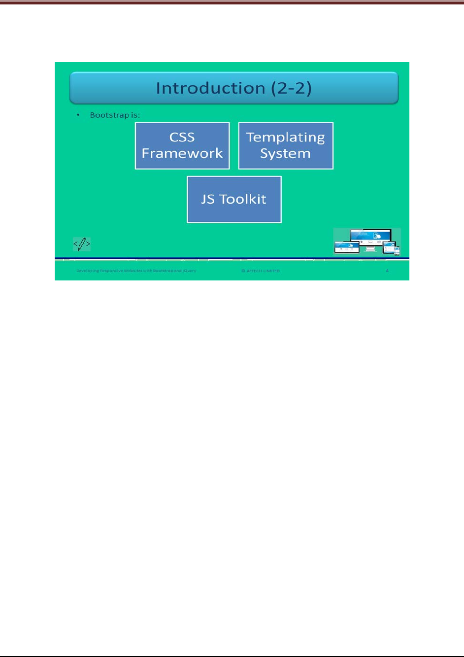
Let us introduce Bootstrap.
Explain Bootstrap. Bootstrap is used to make simple and quick front end development of Web
applications. Explain students that Bootstrap helps in saving time in designing the Webpages by
styling elements. It reduces the burden of writing custom CSS classes of the Webpages
elements by including Bootstrap files and predefined class names.
© APTECH LIMITED
For Aptech Centre Use Only
Developing Responsive Websites with Bootstrap and jQuery
Slide 4
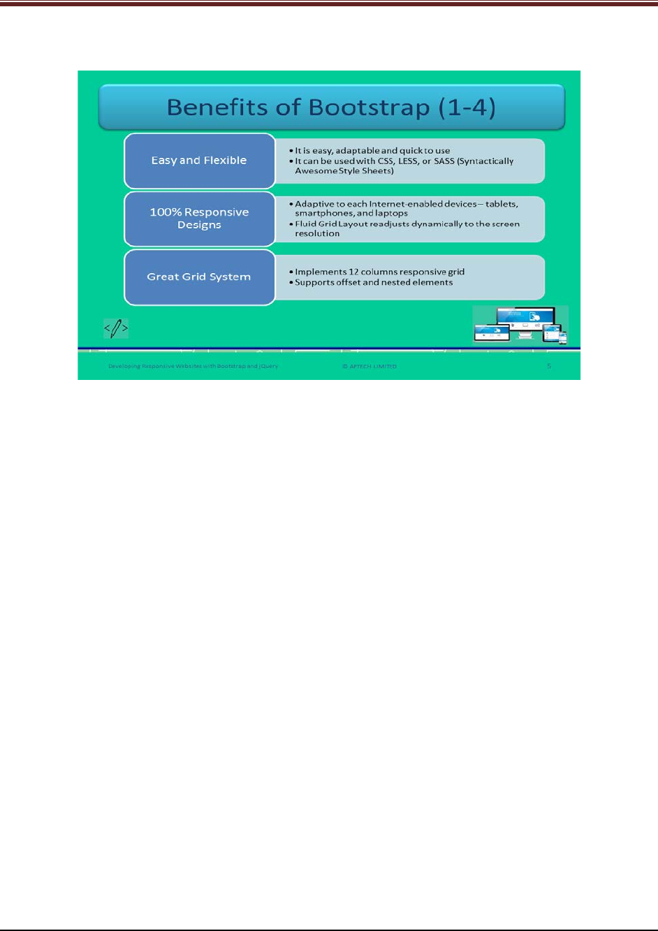
Let us understand about components of Bootstrap.
Elaborate each component of Bootstrap in detail using slide 4.
CSS Framework: CSS is used for applying styles to the elements of the Webpage. You can use
them by including the classes and thus, assigning classes to the elements.
Templating System: Bootstrap is a templating system, which provides template for Websites.
This will help the Web developers or designers in reducing time in writing entire code for each
page. Bootstrap templates can be used directly.
JS Toolkit: JavaScript Toolkit helps in including js files that will reduce time in writing code. It is
just drag and drop facility.
© APTECH LIMITED
For Aptech Centre Use Only
Developing Responsive Websites with Bootstrap and jQuery
Slides 5 to 8
Let us understand about benefits of Bootstrap.
Tell the students benefits of Bootstrap point wise and explain each one using slide 5.
1. Easy and Flexible: Bootstrap is very easy to use and adaptable to different Web projects.
It is very quick and responsive. It reduces time by dragging and dropping the elements
instead of writing the code for each element.
2. 100% Responsive Designs: It should be responsive to each Internet enabled devices. For
example, it should fit to the screen of devices – smartphones, tablets, laptops, and
desktops. It should be easy adaptive to screens with smooth appearance and easy
navigation. This is achieved through Fluid container, which readjusts its width
dynamically to screen resolution.
3. Great Grid System: Bootstrap has 12 column and responsive grid. This grid system
supports offset and nested elements.
© APTECH LIMITED
For Aptech Centre Use Only

Developing Responsive Websites with Bootstrap and jQuery
Continue explaining benefits of Bootstrap using slide 6.
4. Better Development Speed: Bootstrap provides already written block of code to developers
for designing Webpages. Thus, this helps in reduce time in designing and making Bootstrap
even more efficient. Back-end developers can merge the readymade blocks with cross browser
compatibility and CSS-Less functionality will help in saving lot of time.
5. Browser Compatibility: Bootstrap helps in resolving cross-browser compatibility issues. With
the help of containers the screen width readjusts itself with smooth navigation and no pixels
distortion. Web applications developed in Bootstrap will help in smooth running in many Web
browsers.
6. Customization: Bootstrap can be used as per distinct design requirements. Developers can
select and deselect the aspects as per requirements during customization. It is available on
custom page, including CSS components, JS components, and utilities.
© APTECH LIMITED
For Aptech Centre Use Only
Developing Responsive Websites with Bootstrap and jQuery
Continue explaining benefits of Bootstrap using slide 7.
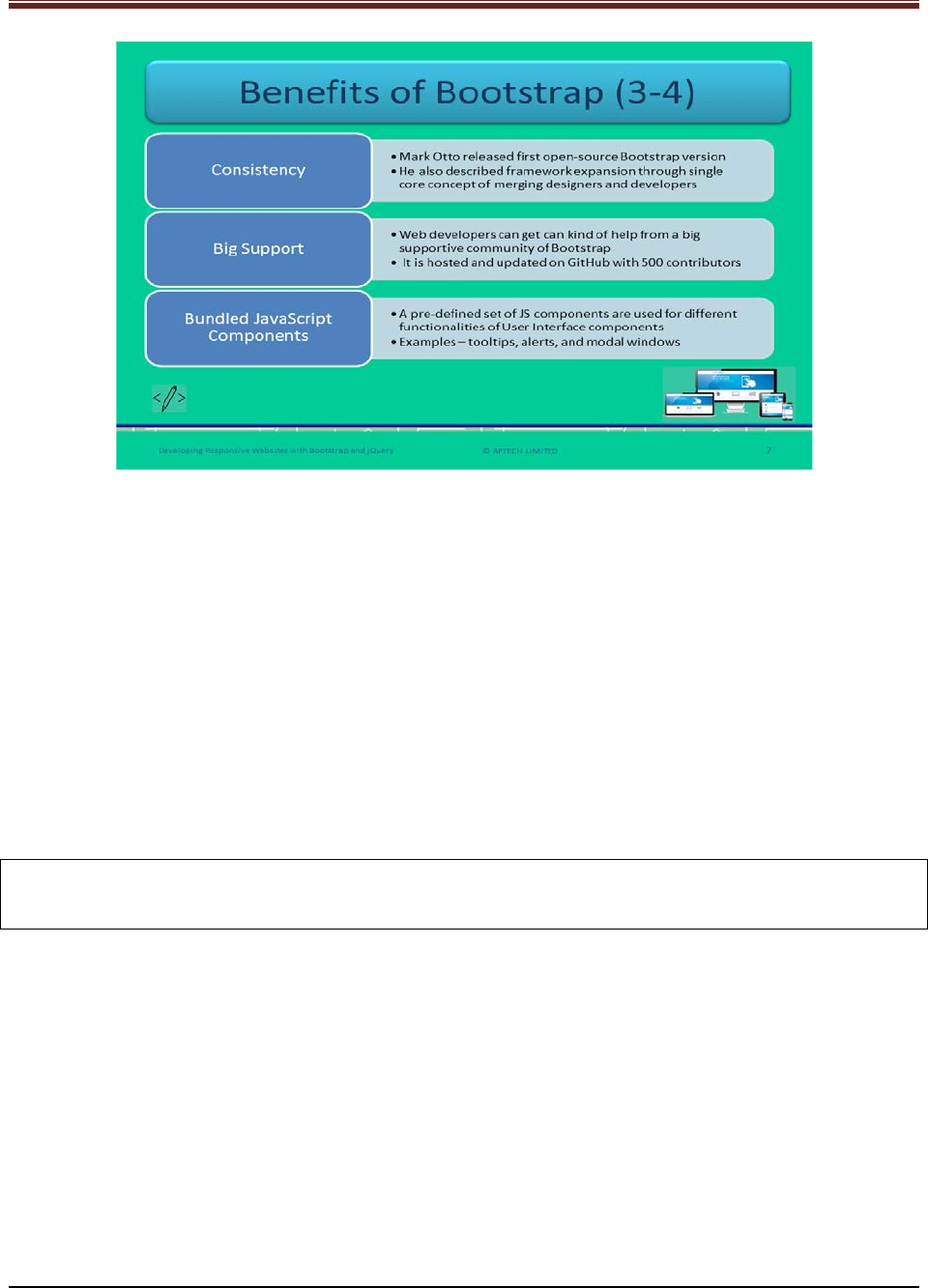
7. Consistency: At first, the twitter team expanded framework to improve the consistency
across the internal tools. Later, the co-founder Mark Otto released first version of open source
Bootstrap framework.
8. Big Support: Bootstrap provides a big supportive community that help Web developers with
any sort of help at any point of time. Apart from this, the makers of Bootstrap keep the
framework updated. Give students an idea about GitHub. GitHub is a Web based version
control repository and Internet hosting service. It provides all the distributed version control
and source code management functionality. Currently, it is being hosted on GitHub with 500
contributors.
Note: Bootstrap is the free open source framework. You need not to pay anything, it is available
for free.
9. Bundled JavaScript Components: This framework has a set of JS components that use for UI
components. Name a few examples to students such as – tooltips, alerts, and modal windows.
A tooltip is also known as infotip or as a hint. It is a user interface element which appears when
a user hovers the pointer or cursor on an item. An alert is a dialog box that gives warning
message to the users. Modal window is a pop up window that appears on the top of the current
page.
© APTECH LIMITED
For Aptech Centre Use Only
Developing Responsive Websites with Bootstrap and jQuery
Continue to explain benefits of Bootstrap using slide 8.
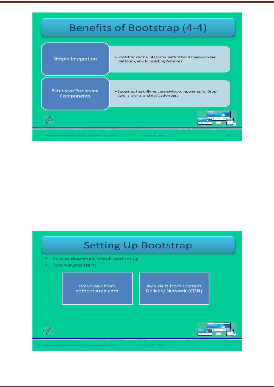
10. Simple Integration: Bootstrap has the added advantage of integrating with other
frameworks and platforms. It can also use existing CSS files.
11. Extensive Pre-styled components: Bootstrap has pre-styled components such as drop-
downs, alerts, and navigation bars. Developers need not to write code for such components.
Slide 9
Let us understand about setting up Bootstrap.
Explain students, how to set up BootStrap using slide 9.
© APTECH LIMITED
For Aptech Centre Use Only
Developing Responsive Websites with Bootstrap and jQuery
Bootstrap is very easy to download and available for free. Tell the students that there are two
ways to start using the framework on a Website:
1. Download from getbootstrap.com
2. Including it from Content Delivery Network
Slide 10
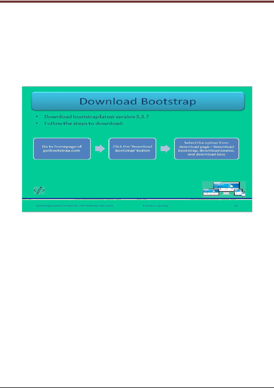
Let us understand steps to download Bootstrap.
Explain students the steps for downloading Bootstrap from getbootstrap.com Website using
slide 10.
1. Go to the site getbootstrap.com
2. Click the button ‘download Bootstrap’
3. Select an option from download page:
a) Download Bootstrap: It allows the precompiled, mini versions of CSS, fonts, and
JavaScript downloads excluding original files of source code or documentation. It
provides drag and drop facility rather than writing code for each element. It also
includes complied CSS, JS files, mini complied versions, Bootstrap theme, and
Glyphicon fonts.
b) Download Source: It is the source code version of Bootstrap. It provides
downloading latest documentation and JS source code from GitHub. It consists of
precompiled CSS and JS files, font files, and Bootstrap Less assets.
c) Download Sass: It is the latest Bootstrap version which is imported from LESS to
SASS. It is only for Sass projects.
© APTECH LIMITED
For Aptech Centre Use Only
Developing Responsive Websites with Bootstrap and jQuery
Slide 11
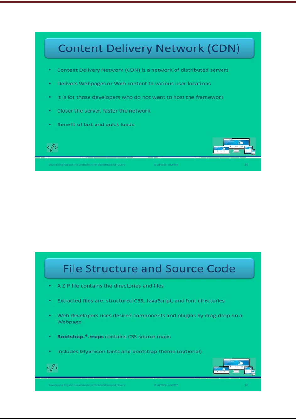
Let us understand about Content Delivery Network (CDN).
Define CDN to students using slide 10.
Content Delivery Network is a system of network of distributed servers which delivers
Webpages and Web content to client locations. Basically, CDN is for the developers who do not
intend to host the framework by themselves. It focuses on quick delivery of Web content to
global sites and high traffic sites.
Slide 12
Let us understand about file structure and source code.
Explain students the file structure and source code of Bootstrap framework using slide 12.
© APTECH LIMITED
For Aptech Centre Use Only
Developing Responsive Websites with Bootstrap and jQuery
After downloading the Bootstrap with precompiled version, there will be a zip file that will be
containing all the directories and files. Once the file is extracted, the content will be visible in
the form of structured css, js, and fonts directories. CSS is a cascading style sheet files. JS is java
script files. Font directories consist of all the fonts.
Slide 13
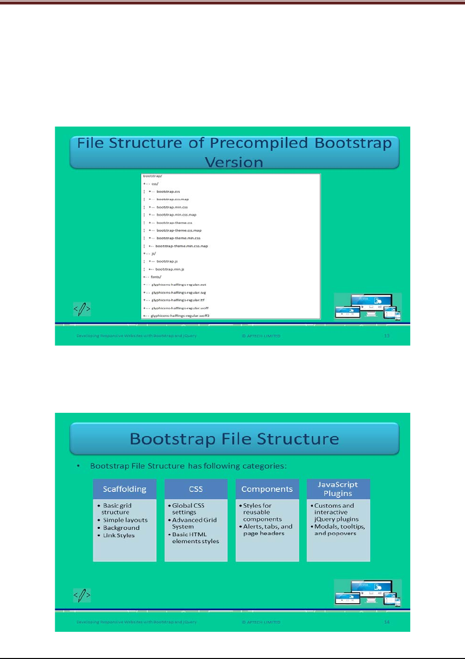
Let us understand about the file structure of precompiled Bootstrap version.
Read out the list of file names of precompiled Bootstrap file structure using slide 13.
Slide 14
Let us understand about the file structure of Bootstrap.
© APTECH LIMITED
For Aptech Centre Use Only
Developing Responsive Websites with Bootstrap and jQuery
Tell students that there are few user interface elements that are offered by components and JS
plugins using slide 14. These are listed as follows:
1. Button groups and button drop-downs
2. Page headers and hero unit
3. Navbar
4. Navigational tabs, pills, and lists
5. Labels
6. Thumbnails
7. Badges
8. drop-down
9. Tooltips
10. Alerts
11. Modals
12. Progress bars
Slide 15
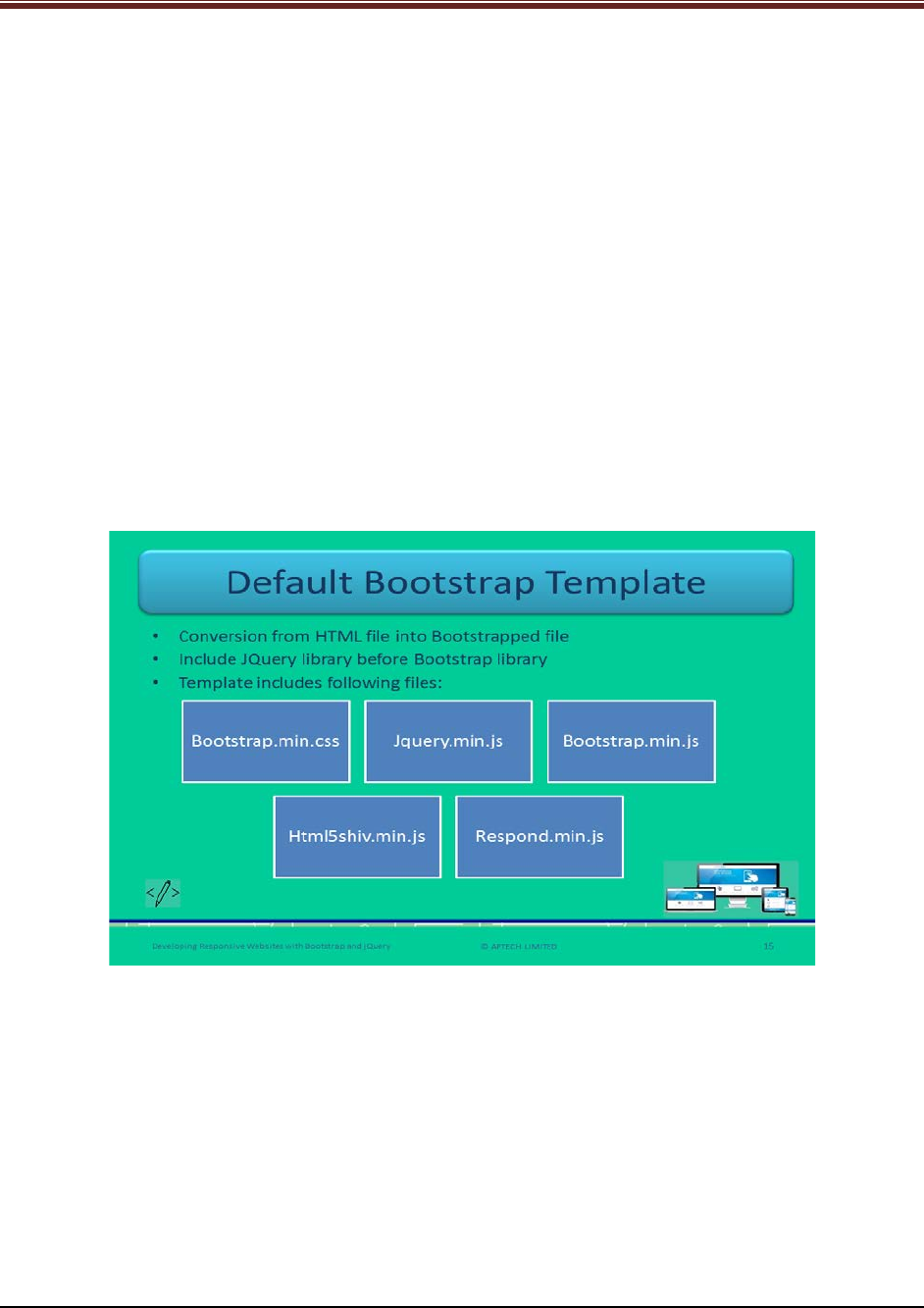
Let us understand about default Bootstrap template.
Explain students about the default Bootstrap template code and describe few tags or attributes
of HTML code using slide 15.
1. <head> tag: It ensures the depiction and touch zooming on the Internet-enabled mobile
gadgets.
2. Width: This ensures the screen resolution of the page of the device that fits
appropriately. You can set its value as ‘device-width’ that will fit into the screen of the
target device such as tablets, smartphone, desktops.
© APTECH LIMITED
For Aptech Centre Use Only
Developing Responsive Websites with Bootstrap and jQuery
Slide 16
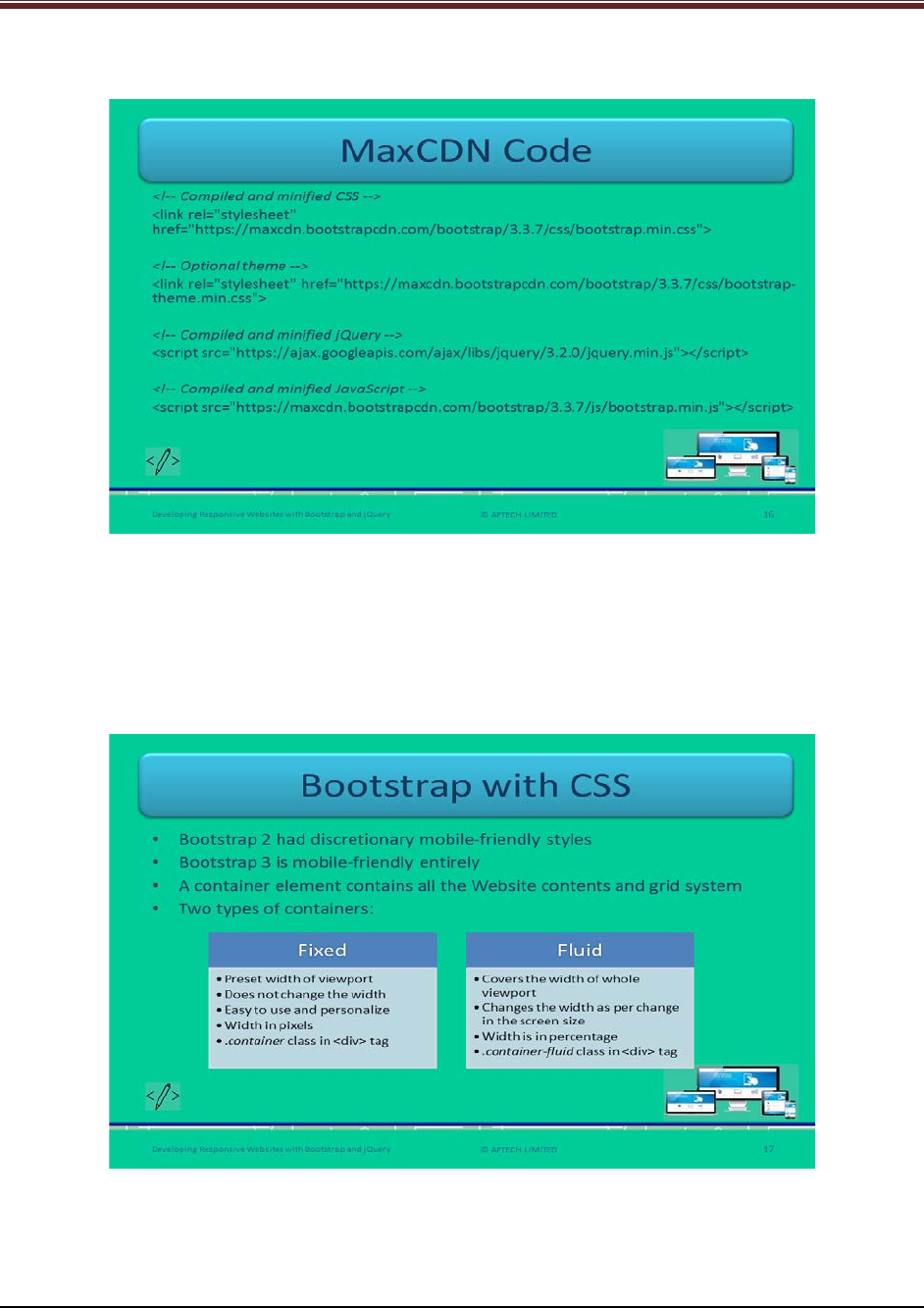
Let us understand MaxCDN Code.
Describe this code snippet to students using slide 16. First describe MaxCDN to students
mentioning that it is a CDN provider which provides desired JS and CSS files for working easily
with Bootstrap.
In this snippet, the links are referring to MaxCDN under the head tag of different versions.
Slide 17
Let us understand about Bootstrap with CSS.
Explain students the difference of Bootstrap version 3 over version 2 using slide 17. Tell the
students that the zooming can be disabled on any mobile device.
© APTECH LIMITED
For Aptech Centre Use Only
Developing Responsive Websites with Bootstrap and jQuery
In Bootstrap, containers are the containing elements that contain contents of Websites and a
grid system. These containers are non-nestable that is, no other container can include another
container. It is of two types: Fixed and Fluid.
Describe each container in detail with examples:
1. Fixed Container: It has a preset width of layout of Webpage which remains constant and
does not change across different screens and browsers. It does not vary with change in
resolution. For example, In a whole page’s layout, which is known as viewport, of width
960 pixels and each column has a preset width that does not change in fixed container.
When a user changes the browser’s window or shrinks it to, suppose, 959 pixels then
the container changes to a new layout on a media query.
2. Fluid Container: It does not have a preset width such as in fixed container. It changes its
width as there is a change in the size of browser or screen. For example, When a user
resizes the browser window then each column of the container adjusts its width
according to calculated relative size that is, 25% with 100% layout’s width.
Slides 18 and 19
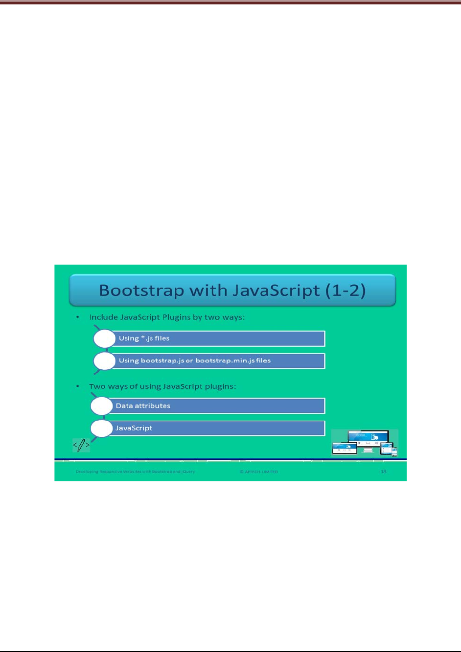
Let us understand about Bootstrap with JavaScript.
Explain students about Bootstrap with JavaScript using 18. Web developers can include JS
plugins by two ways – By using *.js files individually and by including bootstrap.js file or
bootstrap.min.js file all at once.
Then tell students that there are again two ways of using JS plugins. One is through data
attributes and other is via JavaScript.
Now, explain each method to the students by giving example or showing them code snippets:
1. Data Attributes – Developers can utilize all the Bootstrap plugins through Application
Programming Interface, short for APIs. In some cases, data attribute APIs need to be
disabled.
Explain the code snippet to students.
© APTECH LIMITED
For Aptech Centre Use Only
Developing Responsive Websites with Bootstrap and jQuery
Code Snippet:
$('body').off('.data-api') – This will frees all the events on the body with the namespace ‘data-
api’.
$('body').off('.alert.data-api') – This will turn OFF the functionality for a specific plugin ‘alert’.
2. JavaScript API – This is another way to use Bootstrap plugins. API is chainable method
that returns a collection. This method should receive an object which is optional called
options. This object is of string type. When this object is null, this means that this
method is not receiving anything and hence, the method with a default behavior.
Explain the code snippet to students.
Code Snippet:
$("#newModal").modal('show') – In this method, ‘show’ is the string object to display the
modal dialog immediately.
$("#newModal").modal() – This is the default method initialization.
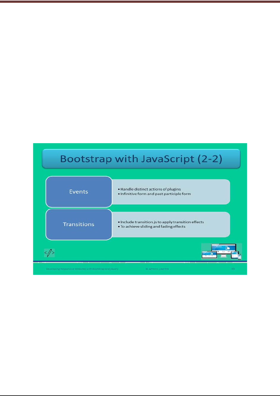
Explain students about events and transitions in Bootstrap using slide 19.
Events: These are custom events and are used to handle different actions of plugins. These are
of two types of forms: Infinitive, and Past Participle. Infinitive form is invoked at the beginning
of the event.
Transitions: It is recommended for Web developers to use transition.js file to apply basic
transition effects. This file will not be required if developers are using compiled bootstrap.js file
already.
© APTECH LIMITED
For Aptech Centre Use Only
Developing Responsive Websites with Bootstrap and jQuery
Slide 20
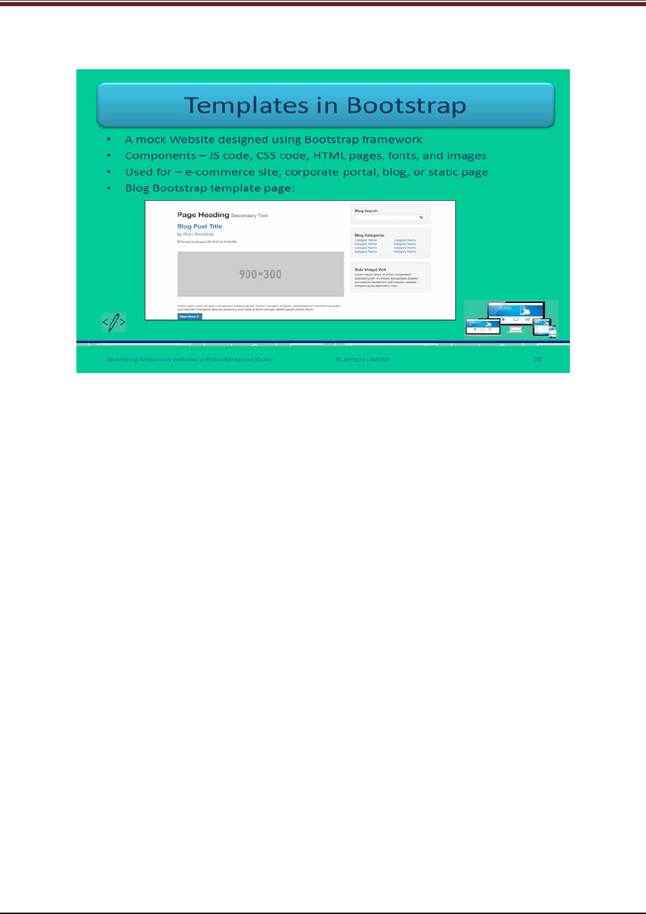
Let us understand about Bootstrap Templates.
Explain students about Bootstrap templates using slide 20.
Bootstrap template is basically a mock Website used by the Web designers for designing using
Bootstrap framework. There are few components of Bootstrap template, they are:
1. JavaScript Code
2. CSS Code
3. HTML pages
4. Fonts
5. Design images
Now, explain the students with an example, this will give a good understanding.
For example, For an e-commerce Website, the template will have product category page, cart
page, contact us page, and customer testimonial page. All these pages are standard pages for
any e-commerce site.
There are different versions of Bootstrap templates. These have few characteristics:
1. Responsive
2. Easy customization
3. Ready to use
4. Reusable
© APTECH LIMITED
For Aptech Centre Use Only
Developing Responsive Websites with Bootstrap and jQuery
Slides 21 to 23
Let us summarize the session.
© APTECH LIMITED
For Aptech Centre Use Only
Developing Responsive Websites with Bootstrap and jQuery
Using slides 21 to 23 summarize the important topics learnt at the end of this session. Use
these pointers to reinforce some essential concepts and provide a quick recap.
Next, let us check your understanding of the topics covered so far in this session.
1.3 Post Class Activities for Faculty
You should familiarize yourself with the topics of the next session.
© APTECH LIMITED
For Aptech Centre Use Only

Developing Responsive Websites with Bootstrap and jQuery
Session 02: Understanding Programming
in Bootstrap
2.1 Pre-Class Activities
Before you commence the session, you should familiarize yourself with the topics of this
session in-depth. Prepare a question or two that will be a key point to relate the current session
objectives.
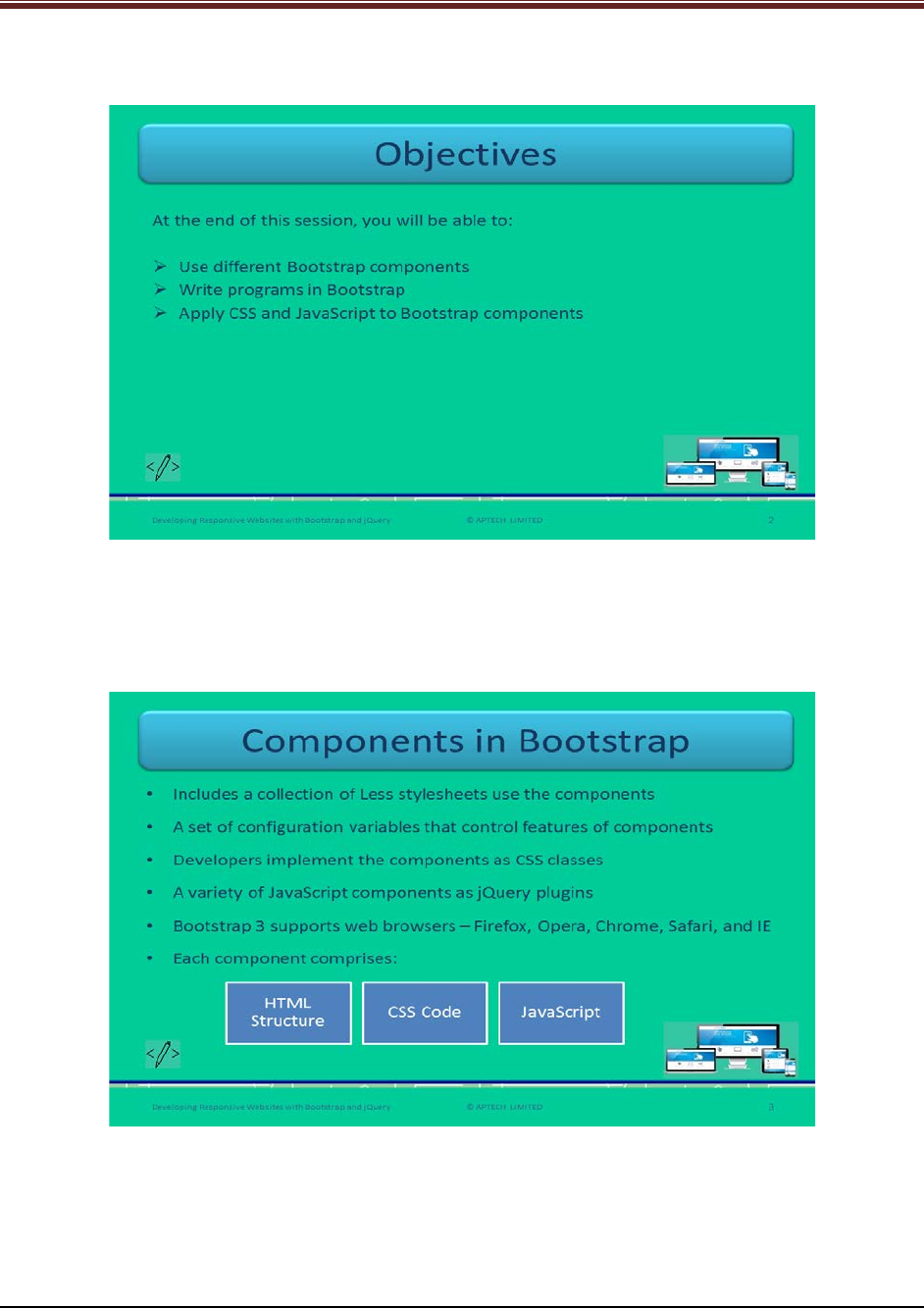
2.1.1 Objectives
At the end of this session, you will be able to:
Use different Bootstrap components
Write programs in Bootstrap
Apply CSS and JavaScript to Bootstrap components
2.1.2 Teaching Skills
To teach this session, you should be well versed with the programming in Bootstrap. You should
be familiar with the Bootstrap programming in detail. You should also know about CSS,
JavaScript, and how to write programs in Bootstrap.
You should teach the concepts in the theory class using the images provided. For teaching in
the class, you are expected to use slides and LCD projectors.
Tips:
It is recommended that you test the understanding of the students by asking questions in
between the class.
In-Class Activities
Follow the order given here during In-Class activities:
Overview of the Session
Give the students an overview of the current session in the form of session objectives. Read out
the objectives given on slide 2.
© APTECH LIMITED
For Aptech Centre Use Only
Developing Responsive Websites with Bootstrap and jQuery
Slide 2
2.2 In-Class Explanations
Slide 3
Let us understand about components of Bootstrap.
Describe the components of Bootstrap. Elaborate each point in detail using slide 3.
1. Bootstrap is a collection of Less stylesheets that basically utilize all the different
components.
© APTECH LIMITED
For Aptech Centre Use Only
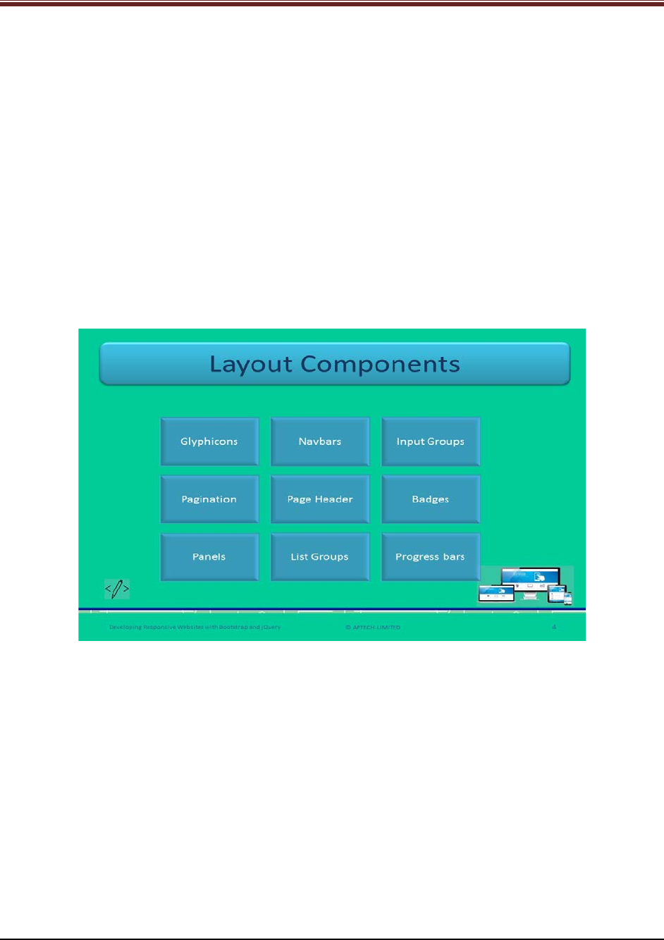
Developing Responsive Websites with Bootstrap and jQuery
Then, it compiles them into a bundle that is used in adding to Webpages where each
section can be removed or replaced. These stylesheets also provide standard style
definitions for HTML components.
2. There are group of configuration variables which regulates components’ visible features.
3. Each component consists – html structure, CSS code, and associated JS.
4. Bootstrap offers variety of JS components that are available as jQuery plugins. They
offer additional elements such as carousels, alerts, modals, popovers, tooltips, dialog
boxes, and drop-down.
5. All the latest versions of browsers are supported by Bootstrap 3. Some are mentioned –
Firefox, Opera, Chrome, IE, and Safari. The advantage of Bootstrap components is that
they are adaptive and hence, render themselves as per different browsers.
Slide 4
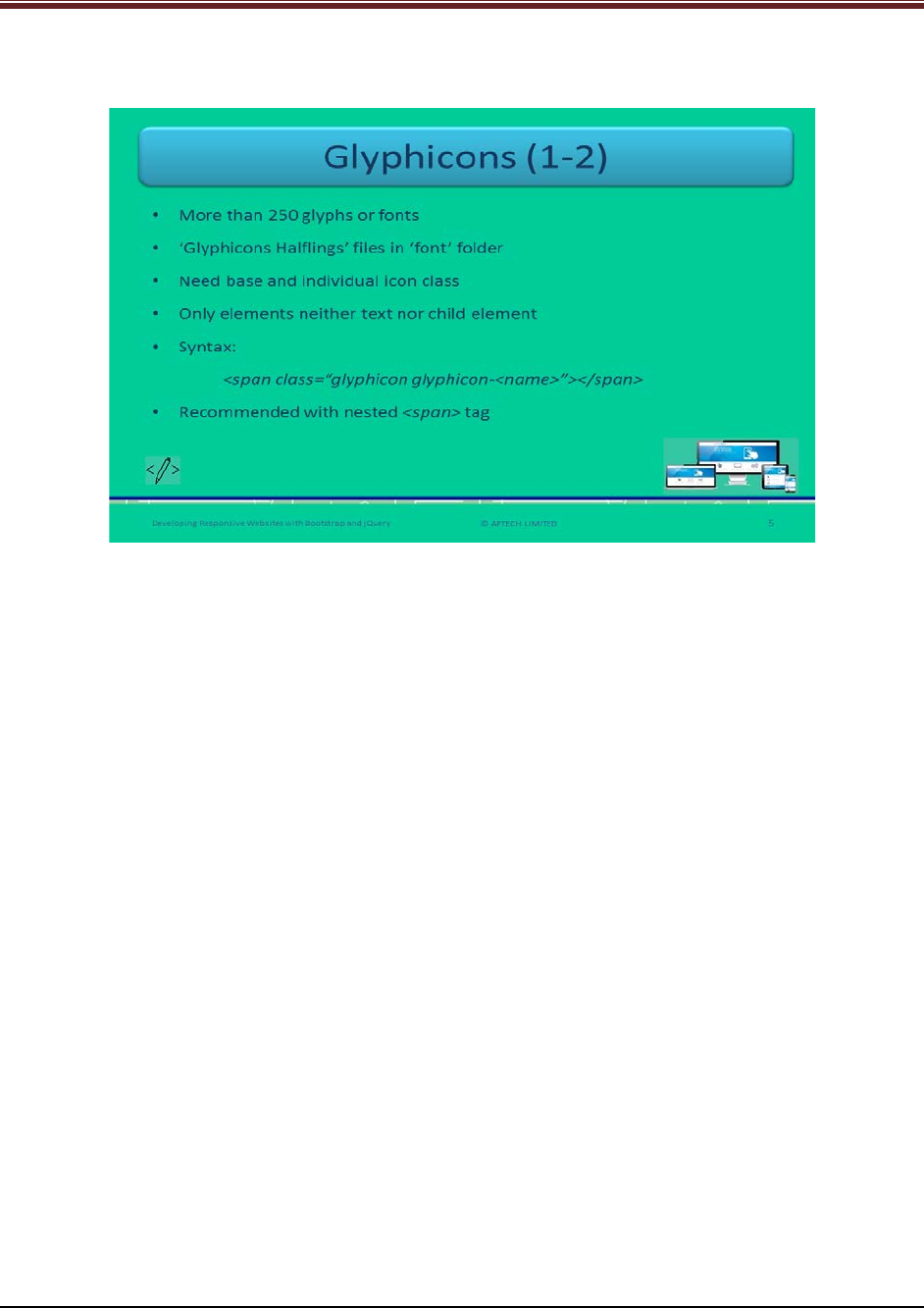
Let us understand about layout components.
Name the layout components of Bootstrap to the students using slide 4.
1. Glyphicons
2. Navbars
3. Input Groups
4. Pagination
5. Page Header
6. Badges
7. Panels
8. List Groups
9. Progress bars
© APTECH LIMITED
For Aptech Centre Use Only
Developing Responsive Websites with Bootstrap and jQuery
Slide 5
Let us understand about Glyphicons.
Explain to students about glyphicon component of Bootstrap using slide 5. Brief them:
1. There are more than 250 glyphs or fonts in Bootstrap
2. They are available in ‘Glyphicons Halfling’ of ‘font’ folder
3. They need a base as well as individual icon class
4. The syntax for using Glyphicon is mentioned on the slide. Explain each keyword in brief
to the students for better understanding.
a) Glyphicon: it is the base class
b) Glyphicon-name: it is an individual icon class. Basically, it uses unicode font
reference in glyphicons halfling.
c) Name: Here, we use the exact glyphicon name.
© APTECH LIMITED
For Aptech Centre Use Only
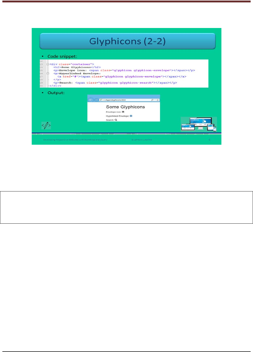
Developing Responsive Websites with Bootstrap and jQuery
Slide 6
Let us understand about how to use glyphicons in programming.
Show the students the example of using glyphicons using slide 6.
In the first image, the sample code is written. To use a glyphicon, nested span tag is used as
shown in the sample code.
<p> Envelope icon: <span class=“glyphicon glyphicon-envelope”></span></p>
Now, check the second image on slide 6, in which the output of the code is shown.
Note: 1. The aria-hidden attribute should be set to true to prevent any kind of unwanted or
confusing output by a screen reader.
2. .sr-only class for hiding the additional content on a Webpage but making it available for a
screen reader to read.
© APTECH LIMITED
For Aptech Centre Use Only
Developing Responsive Websites with Bootstrap and jQuery
Slide 7
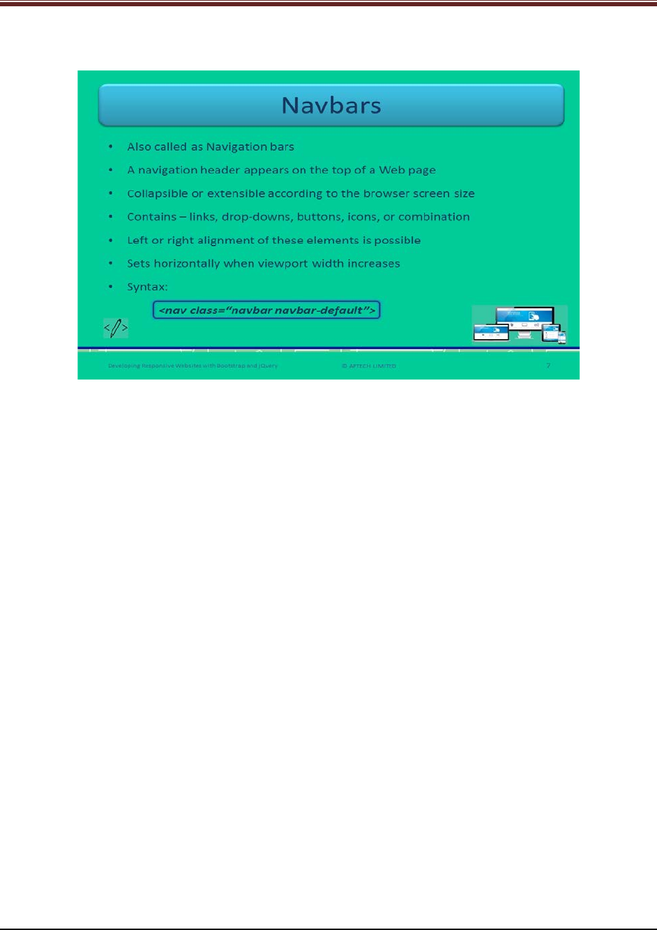
Let us understand about Navbars.
Explain to students about navbars which is short form for Navigation bars.
1. It is a responsive navigation header that is appearing on the top of the Webpage.
2. It is adaptive or collapsible – because it can adjust the as per the size of the targeted screen
in Bootstrap.
3. It can contain – links, drop-downs, buttons, icons, or may be combination of these elements.
4. It can be aligned left or right by the Web developers.
5. Basically, when the width of the viewport increases then the navbars are set horizontally.
Now, explain the syntax to the students.
<nav class= “navbar navbar-default”>
This will create a navbar in the Webpage.
.navbar-brand class is used to display the name of your organization.
.navbar-nav class is used for light and full-height navigation and it also provides classes which
helps in adding links and drop-down to an unordered list. Active class indicates the current
Webpage displaying in the browser.
© APTECH LIMITED
For Aptech Centre Use Only
Developing Responsive Websites with Bootstrap and jQuery
Slide 8
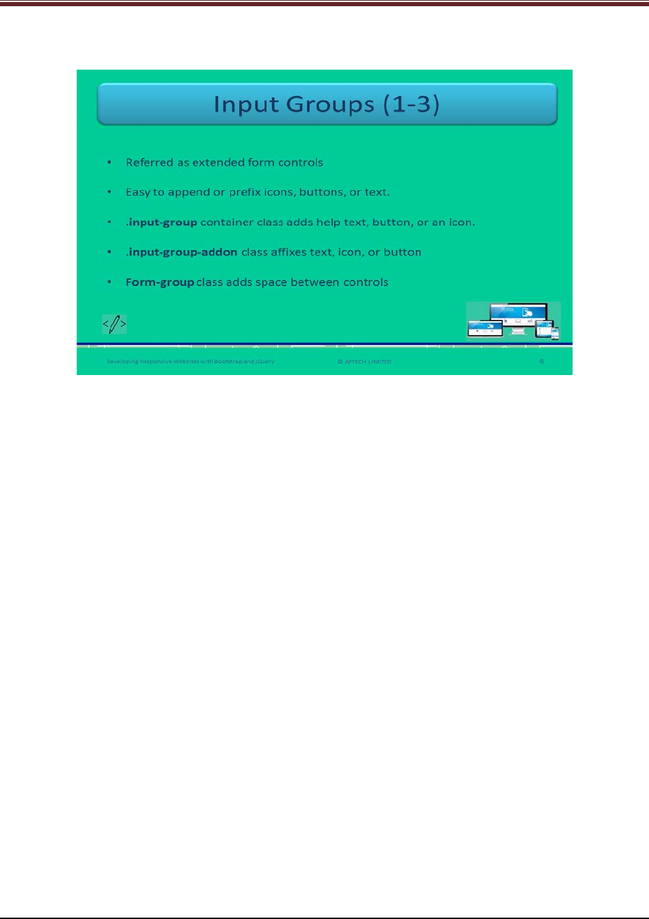
Let us understand about Input Groups.
Explain to students about input groups in Bootstrap using slide 8.
It is referred as extended form controls that append or prefix icons, buttons, or text to an input
field.
Explain this by an example – You can prefix a dollar icon with an input field accepting price in
dollars.
Explain the following classes and their uses:
1. .input-group container class – used for improving an input field by adding help text,
button, or icon in front or at the rear of input field.
2. .input-group-addon class – used to affix text, button, or icon to the input field.
3. Form-group class – used to add some spaces between controls.
© APTECH LIMITED
For Aptech Centre Use Only
Developing Responsive Websites with Bootstrap and jQuery
Slide 9
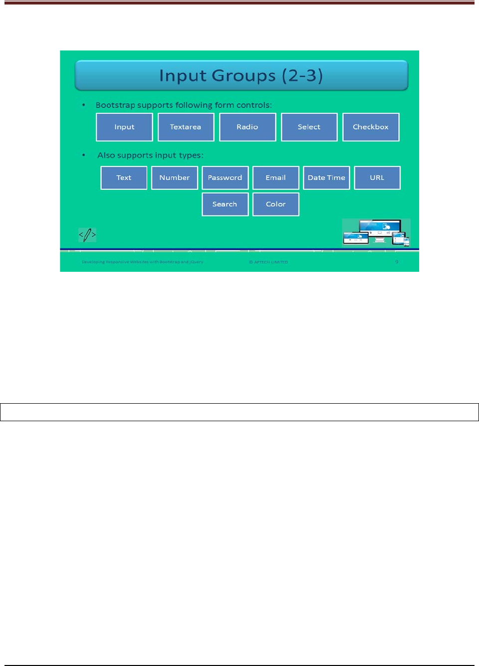
Let us understand about form controls of Input Groups.
Name all the form controls that Bootstrap supports: Input, Textarea, Radio, Select, and
Checkbox.
Tell the students that in select form control even multiple selects are possible.
Now, name the input types that Bootstrap supports: Text, number, password, email, date, time,
URL, search, and color.
Tell the students that in date and time input type includes date time-local, week, time, month,
and date.
Note: It is not possible to add several form controls in an input group.
© APTECH LIMITED
For Aptech Centre Use Only

Developing Responsive Websites with Bootstrap and jQuery
Slide 10
Let us understand about syntax of Input Groups.
Show this sample code to the students for better understanding using slide 10.
<div class="form-group">
<label for="user">Name:</label>
<input type="text" class="form-control" id="user">
</div>
<div class="form-group">
<label for="pwd">Password:</label>
<input type="password" class="form-control" id="pwd">
</div>
This code shows how to create text and password input controls using .form-control class.
© APTECH LIMITED
For Aptech Centre Use Only
Developing Responsive Websites with Bootstrap and jQuery
Slide 11
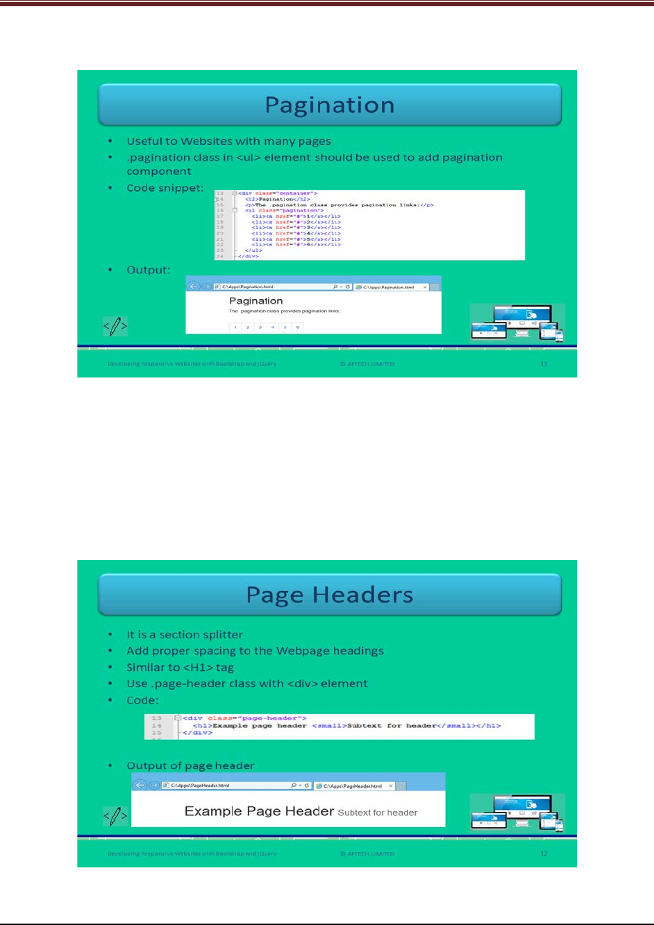
Let us understand about Pagination.
Explain to students about pagination using slide 11.
It is used when there are many Webpages in a Website.
It is used with the unordered list <ul> element. To add this component, Web developers should
use .pagination class in <ul>.
Show the screenshot given on slide 11 for the output of the pagination to the students for
better understanding.
Slide 12
Let us understand about Page Headers.
Explain the students about page headers using slide 12.
© APTECH LIMITED
For Aptech Centre Use Only
Developing Responsive Websites with Bootstrap and jQuery
1. It works such as a section splitter which splits into sections.
2. It adds proper spacing to the Webpage headings.
3. It is similar to heading 1 <H1> tag.
4. It is basically used to show each title on a Webpage specifically, when there are multiple
titles.
5. You can add a page header by using .page-header class with the <div> tag.
Show the output given on slide 12 to the students for better understanding of a page header.
Slide 13
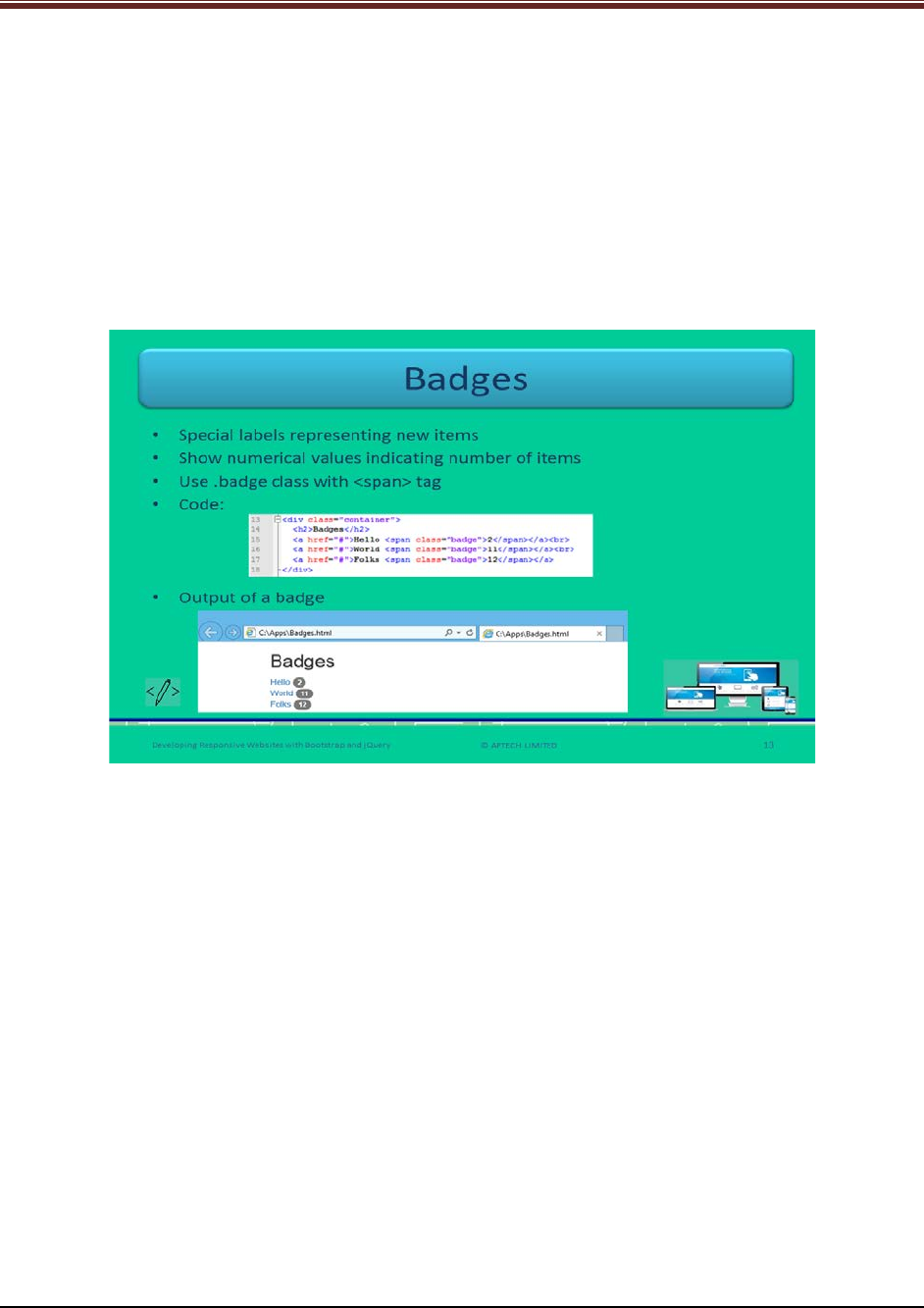
Let us understand about Badges.
Explain students about badges using slide 13.
1. These are special labels that represent new items. Similar to unread emails near the
inbox tab in the account.
2. They display numerical values that represent the number of items related to a link. For
example, the numerical value in front of ‘unread’ tab represents the number of unread
emails in an account.
3. Web developers should use .badge class within <span> tag to create badges. You can
also use this class in other elements such as buttons and list groups.
Show the output of the badge to the students for clear understanding.
© APTECH LIMITED
For Aptech Centre Use Only
Developing Responsive Websites with Bootstrap and jQuery
Slide 14
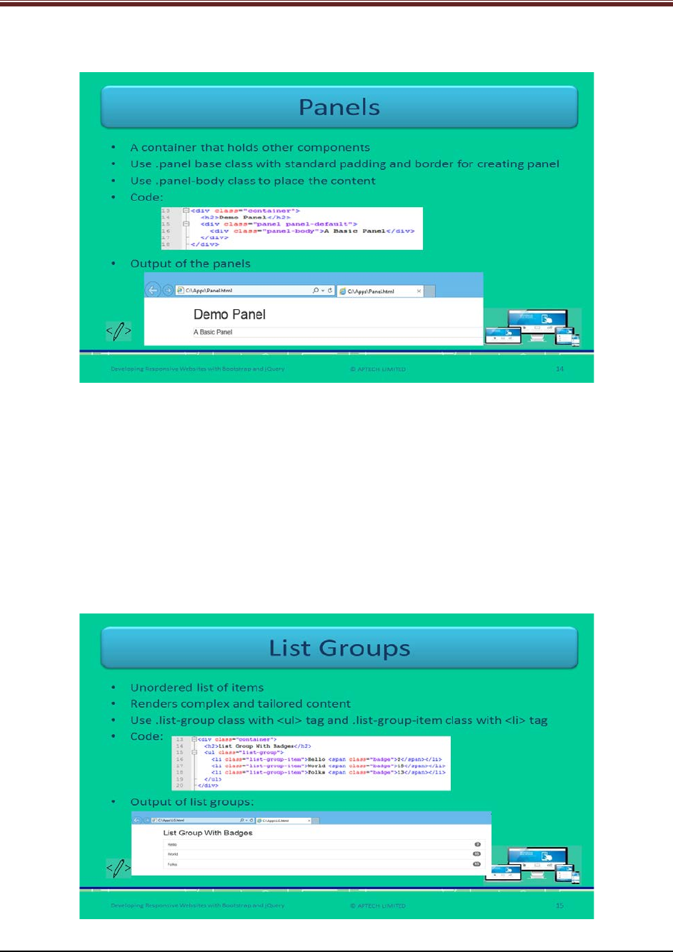
Let us understand about Panels.
Explain to students about panels using slide 14.
1. It is a container that holds the other components such as lists and tables with
appropriate padding.
2. Web developers should use .panel base class with standard padding and border to
create a panel.
3. Web developers should use .panel-body class that will place the content in the
components.
Show the output of the panels to the students for clear understanding.
Slide 15
Let us understand about List Groups.
© APTECH LIMITED
For Aptech Centre Use Only
Developing Responsive Websites with Bootstrap and jQuery
Explain to students about list groups using slide 15.
1. It renders an unordered list of items.
2. It provides complex and tailored content.
3. You can create it by using two classes - .list-group class with <ul> tag and .list-group-
item class with <li> tag.
Show the output of the list groups to the students for clear understanding.
Slides 16 and 17
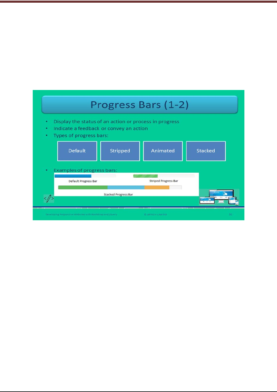
Let us understand about Progress Bars.
Explain to students about progress bars using slide 16.
1. It is used to display status of an action or process that is in progress such as
downloading progress and uploading progress of a file.
2. It also represents a feedback or conveys an action that is occurring regarding a Webpage
element.
Name the types of progress bars to the students – Default, Stripped, Animated, and Stacked.
© APTECH LIMITED
For Aptech Centre Use Only
Developing Responsive Websites with Bootstrap and jQuery
Continue explaining about progress bars using slide 17.
4. Show the examples of progress bars to the students for good understanding.
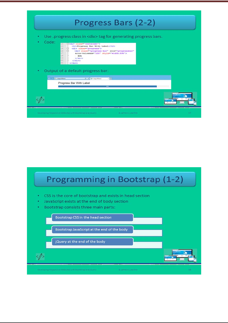
5. You can create a progress bar by using .progress class with <div> tag.
Show the output of the default type progress bar to the students for clear understanding.
Slide 18
Let us understand about programming in Bootstrap.
Brief the students that the programming in Bootstrap mainly consists of CSS, JavaScript, and
jQuery using slide 18.
In the head section of a Webpage the Bootstrap CSS exists.
At the end of the body section – Bootstrap JavaScript and jQuery exists.
© APTECH LIMITED
For Aptech Centre Use Only

Developing Responsive Websites with Bootstrap and jQuery
Tell students that JavaScript can also be a part of head section of a Webpage. A browser starts
loading a Webpage from top to bottom stepwise. If JavaScript is present in the head section
then it will slow down the loading process.
Slide 19
Let us understand about programming in Bootstrap.
Explain to students about collapsible content using slide 19.
1. A collapsible is used to show or hide the content when there is a huge amount of content.
2. You can create a collapsible button by using collapse class in the <div> element. This class will
indicate that the content in the <div> section is marked collapsible. This content will be visible
or hidden when a user clicks the button.
3. Data-toggle attribute value is set to ‘collapse’ – which means you can toggle to show or hide
the content by clicking the button.
4. Data-target attribute will link the button to the collapsible content.
5. Collapsible content in a Webpage is hidden by default.
6. The JavaScript code for collapsible content:
$('.collapse').collapse();
This will use the collapse plugin internally which will automatically provide the control over
<div>.
Show the output of the collapsible component to the students for good understanding.
Tell the students that for proper functioning of collapsible, the Bootstrap version should include
transition.js (plugin).
© APTECH LIMITED
For Aptech Centre Use Only
Developing Responsive Websites with Bootstrap and jQuery
Slide 20
Let us understand about demo on Bootstrap functionality.
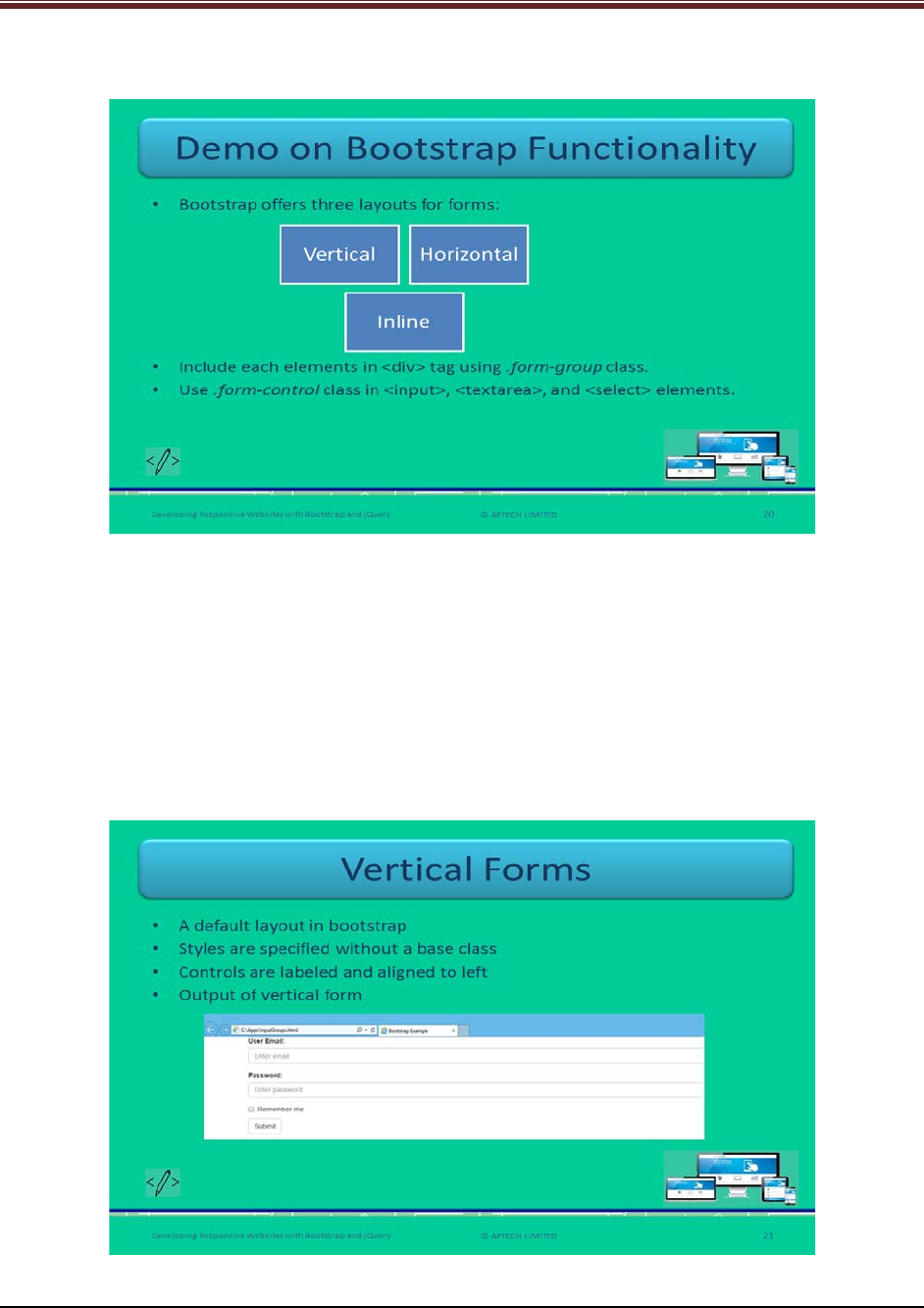
Explain students the Bootstrap functionality using slide 20.
Inform that if they style each content of HTML forms with manual CSS code then it will be very
tedious and complex and prone to errors. This is eliminated in Bootstrap by providing a
predefined collection of classes for styling and aligning the form controls.
There are three layouts of forms: Vertical, Horizontal, and Inline.
Web developers include all the elements in <div> elements by using .form-group class and
.form-control class in the elements <input>, <textarea>, and <select>.
Slide 21
Let us understand about vertical forms.
© APTECH LIMITED
For Aptech Centre Use Only
Developing Responsive Websites with Bootstrap and jQuery
Explain students about vertical forms using slide 21.
1. It is a default layout in Bootstrap for forms.
2. In this vertical layout, styles are specified for controls without using a base class.
3. In this layout, all the controls are properly labelled and are aligned to left.
Show the output of a vertical form layout to the students for better understanding.
Slide 22
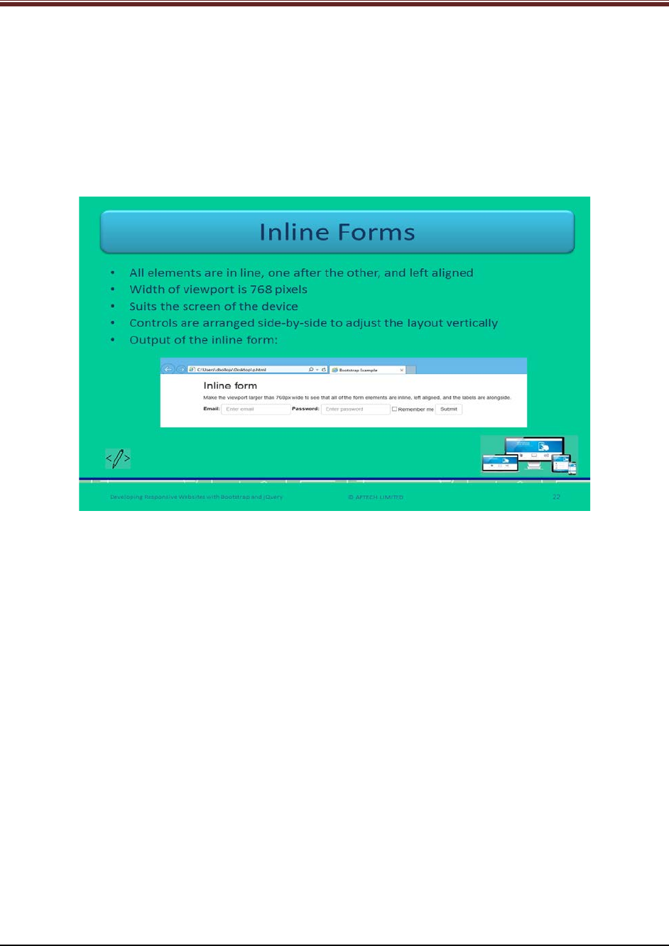
Let us understand about inline forms.
Explain students about inline forms using slide 22.
1. In this layout, all the elements are in line that is one after the other and are left aligned.
2. The minimum width of the viewport of the browser is 768 pixels.
3. Web developers arrange the controls side-by-side by squeezing the layout of the form
vertically.
4. The inline form layout is useful when the screen size of the device suits.
5. Web developers should use .form-inline class in the <form> element.
Show the output of an inline form layout to the students for better understanding.
© APTECH LIMITED
For Aptech Centre Use Only
Developing Responsive Websites with Bootstrap and jQuery
Slide 23
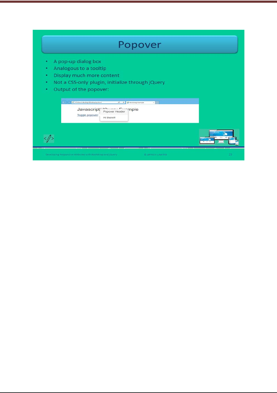
Let us understand about popovers.
Explain students about popovers using slide 23.
1. It is pop-up dialog box that appears on clicking an element on a Webpage.
2. It is similar to a tooltip.
3. A popover can display much more content unlike tooltip.
4. It is not CSS only plugin and thus, initialize through jQuery.
Show the output of a popover to the students for better understanding.
The jQuery code for popover:
$('[data-toggle="popover"]').popover()
This will select the element that has the data-toggle property value to popover that will trigger
the popover method.
© APTECH LIMITED
For Aptech Centre Use Only
Developing Responsive Websites with Bootstrap and jQuery
Slides 24 to 26
Let us summarize the session.
© APTECH LIMITED
For Aptech Centre Use Only
Developing Responsive Websites with Bootstrap and jQuery
Using slides 24 to 26 summarize the important topics learnt at the end of this session. Use
these pointers to reinforce some essential concepts and provide a quick recap.
Next, let us check your understanding of the topics covered so far in this session.
2.3 Post Class Activities for Faculty
You should familiarize yourself with the topics of the next session.
© APTECH LIMITED
For Aptech Centre Use Only

Developing Responsive Websites with Bootstrap and jQuery
Session 03: Basics of jQuery
3 Pre-Class Activities
Before you commence the session, you should familiarize yourself with the topics of this
session in-depth. Prepare a question or two that will be a key point to relate the current session
objectives.
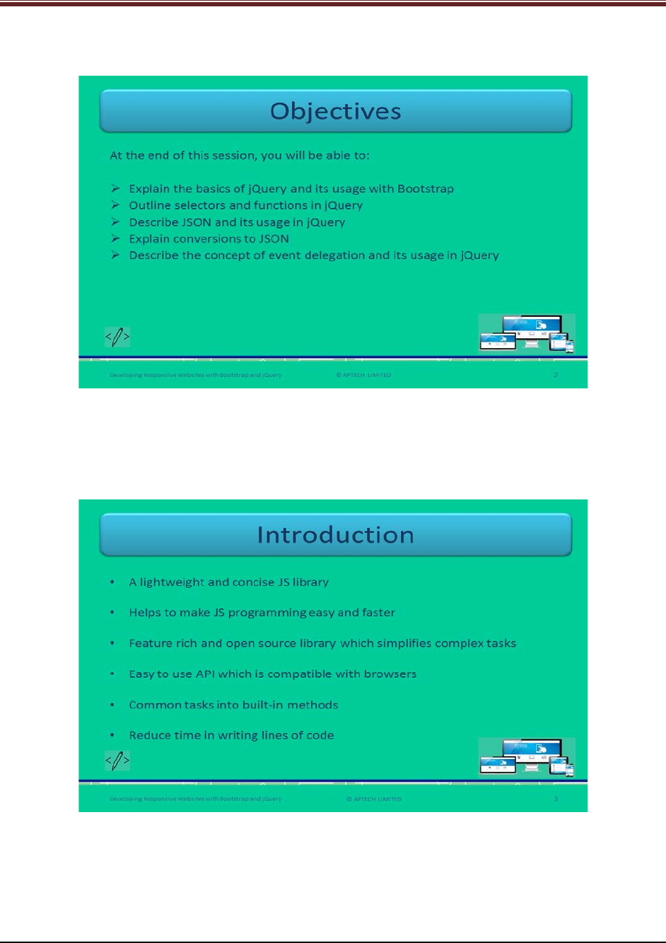
3.1.1 Objectives
At the end of this session, you will be able to:
Explain the basics of jQuery and its usage with Bootstrap
Outline selectors and functions in jQuery
Describe JSON and its usage in jQuery
Explain conversions to JSON
Describe the concept of event delegation and its usage in jQuery
3.1.2 Teaching Skills
To teach this session, you should be well versed with the concepts of jQuery. You should be
familiar with the JSON in detail. You should also know how to get started with jQuery and its
functions.
You should teach the concepts in the theory class using the images provided. For teaching in
the class, you are expected to use slides and LCD projectors.
Tips:
It is recommended that you test the understanding of the students by asking questions in
between the class.
In-Class Activities
Follow the order given here during In-Class activities:
Overview of the Session
Give the students an overview of the current session in the form of session objectives. Read out
the objectives given on slide 2.
© APTECH LIMITED
For Aptech Centre Use Only
Developing Responsive Websites with Bootstrap and jQuery
Slide 2
3.2 In-Class Explanations
Slide 3
Let us introduce jQuery.
Explain students about jQuery using slide 3.
1. It refers to a lightweight and brief JavaScript library that focuses to make the JS
programming easy and faster.
© APTECH LIMITED
For Aptech Centre Use Only
Developing Responsive Websites with Bootstrap and jQuery
2. It is a feature rich and open source library that aims to simplify complicated or complex
tasks. These tasks include – manipulating and traversing an HTML/CSS page, handling
events, animating objects, and making Asynchronous JavaScript and XML (AJAX) calls.
3. This open source library offers easy to use API. This helps in geting compatibility across
many browsers.
4. jQuery binds many common tasks into built-in methods. Instead of writing lines of code,
Web developers can take use of these built in methods of JS code. Thus, helps in
reducing time and make programming faster.
Slides 4 and 5
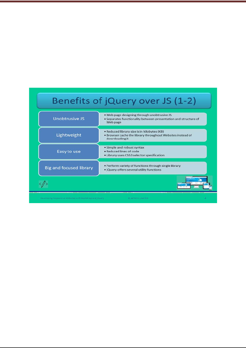
Let us understand about benefits of jQuery over JavaScript.
Explain students about benefits of jQuery over JS using slide 4.
1. Unobtrusive JS – jQuery offers Webpage designing through unobtrusive JavaScript. This
is an approach that separates functionality among presentation and structure of a
Webpage.
2. Lightweight – jQuery library size is in KB (kilo Bytes) which is smaller than a digital photo
file. The current version of jQuery 2.x is smaller than version 1.x. The version 2.x is
widely used because it supports IE 6/7/8.
3. Easy to use – jQuery is very easy to use. It has very simple yet robust syntax. This syntax
helps to select the page elements that need to be change.
4. Big and focused library – Web developers can perform variety of functions of jQuery
unlike JavaScript. Thus, jQuery offers many utility functions. The functions include –
parsing data, string trim, and array search.
© APTECH LIMITED
For Aptech Centre Use Only
Developing Responsive Websites with Bootstrap and jQuery
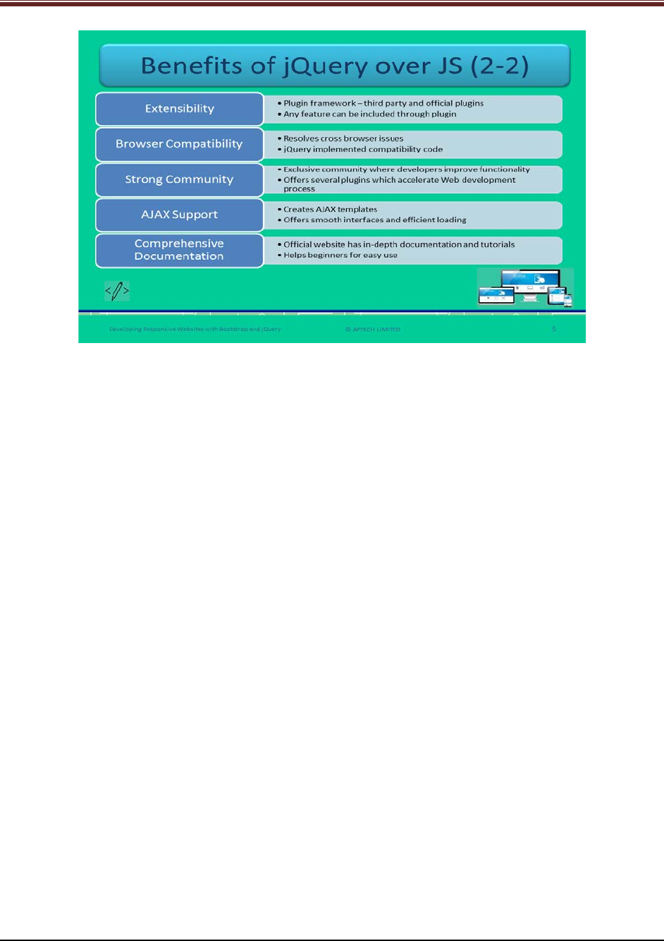
Continue to explain the benefits of jQuery to students using slide 5.
5. Extensibility – jQuery is a plugin framework which helps to reduce the complexity to extend
the jQuery. This framework has both the third-party and official plugins. Suppose, if any feature
is not there in the library then it can be included through plugins.
6. Browser Compatibility – jQuery provides good compatibility across all the Web browsers.
Similar to few JS libraries, jQuery also resolves cross-browser issues.
7. Strong Community – jQuery has an exclusive community which helps the Web developers to
improve its functionality.
8. AJAX Support – jQuery offers creating AJAX templates. These templates help in providing
smooth interface and efficient loads. Actions can be performed by users on a Webpage without
reloading the entire page.
9. Comprehensive Documentation – jQuery official Website has proper and in-depth
documentation and tutorials which help the users to understand all the features of jQuery.
© APTECH LIMITED
For Aptech Centre Use Only
Developing Responsive Websites with Bootstrap and jQuery
Slide 6
Let us understand about how to use Bootstrap and jQuery together.
Explain students about using bootstrap and jQuery together using slide 6.
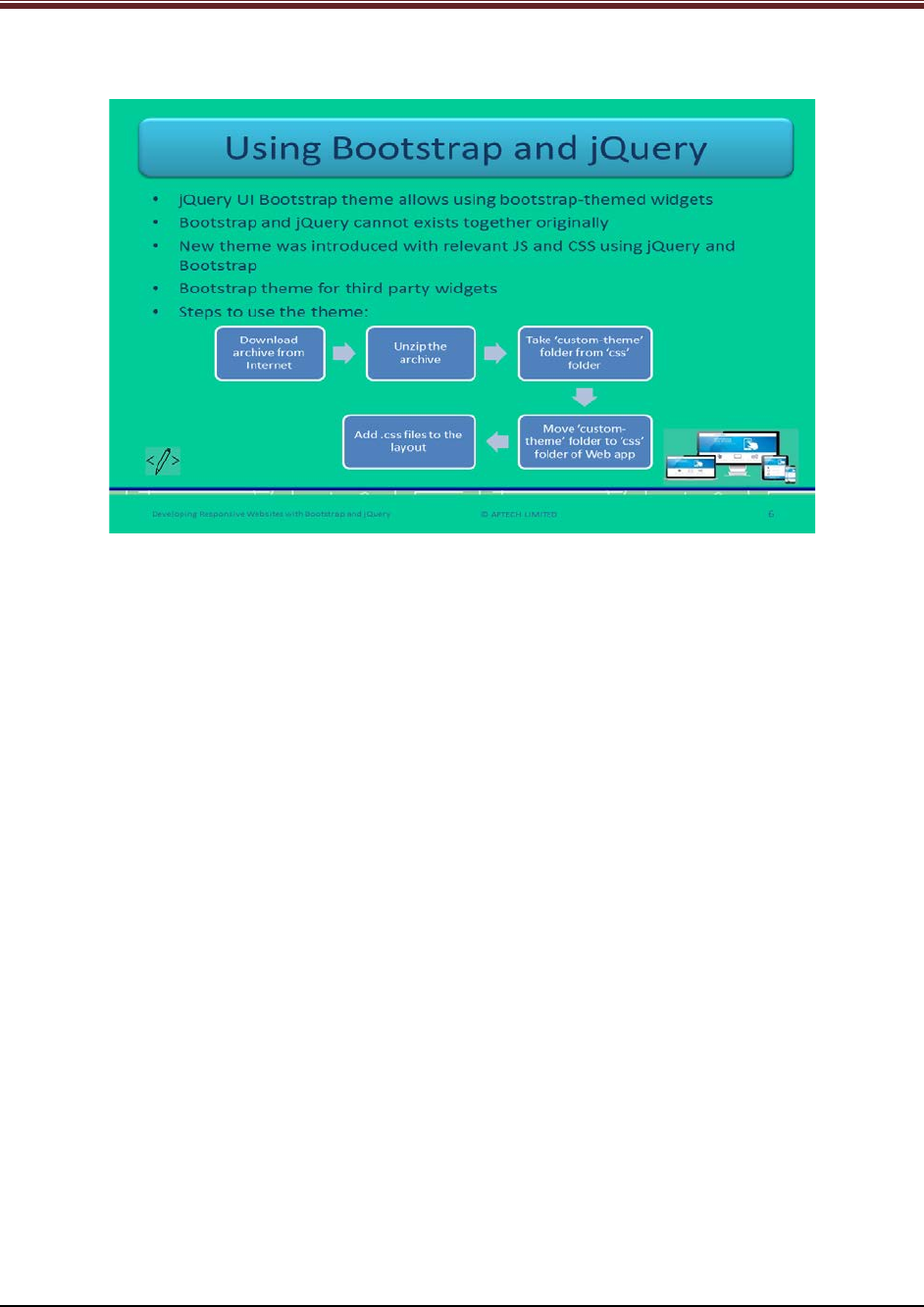
1. JQuery with bootstrap is used through jQuery UI bootstrap theme. This theme allows
bootstrap themed widgets without disturbing the appearance of components.
2. Earlier this existence was not available because of which trying to use them together
created conflicts with JS and CSS styles and classes.
3. This new theme was available with relevant JS and CSS. This is used for designing a Web
application using jQuery and bootstrap.
4. It provides bootstrap theme for third party jQuery widgets which is used for designing
UI.
5. The steps to use this theme are as follows:
1. Download the archive from the Internet.
2. Unzip the archive folder.
3. Take the folder ‘custom-theme’ from the folder ‘css’ of unzipped package.
4. Move the folder ‘custom-theme’ to the folder ‘css’ of the Web application to be
used.
Add the relevant .css files to the layout of the Website.
© APTECH LIMITED
For Aptech Centre Use Only
Developing Responsive Websites with Bootstrap and jQuery
Slide 7
Let us understand about how to use jQuery in Web application.
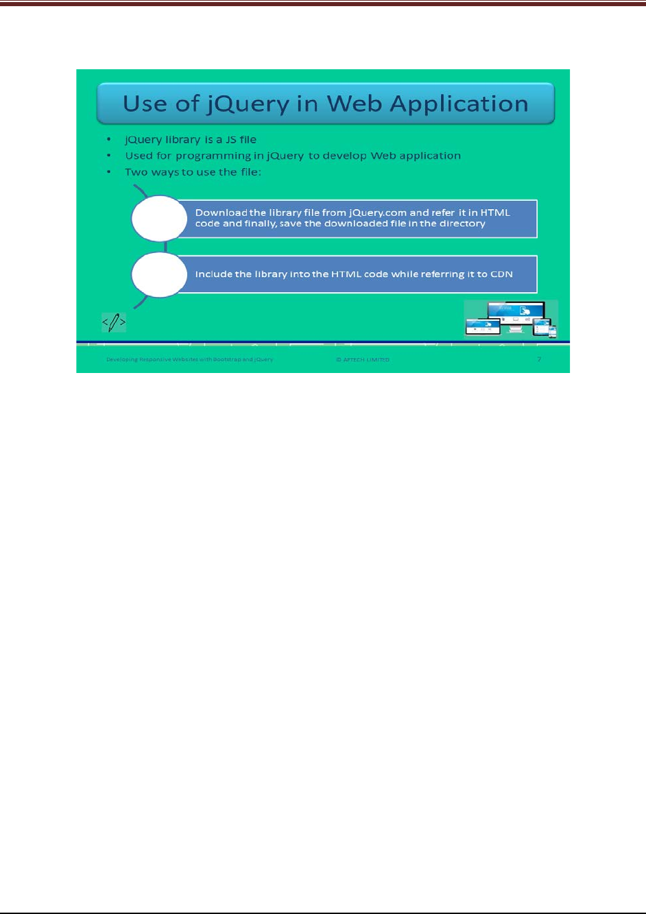
Explain students about using jQuery in a Web application using slide 7.
1. JQuery library is a JavaScript file which is used for programming in jQuery. It is used to
developed Web applications.
2. There are two ways to use the file:
1. First, download the library file from jQuery.com. Then, refer it in a HTML code
and then, save the downloaded file in the directory of Webpages.
2. Include the jQuery library in HTML code by referring to CDN. Just such as Google
and Microsoft.
Now show a code snippet to the students for good understanding.
<head>
<script src="https://ajax.aspnetcdn.com/ajax/jQuery/jquery-3.2.0.min.js"></script>
</head>
This snippet shows how to use the library in a HTML code. Here, the library is Microsoft CDN.
© APTECH LIMITED
For Aptech Centre Use Only
Developing Responsive Websites with Bootstrap and jQuery
Slide 8
Let us understand about jQuery syntax.
Explain students about jQuery syntax using slide 8.
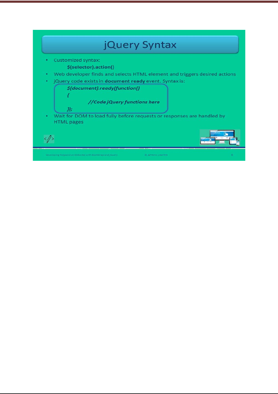
jQuery helps the Web developer to find and select the HTML elements and trigger the desired
set of actions on it. That is why, the customized syntax is being provided. The syntax is:
$(selector).action()
Explain each symbol of the syntax to the students.
$: This is the jQuery identifier which indicates the use of jQuery.
(selector): This keyword is used to find and select the HTML elements which are being
triggered.
Action(): This is a jQuery action which is performed on selected elements.
Now, tell the students about few examples of using syntax.
$(this).hide(): This function is used to hide the selected HTML element.
$(“div”).fadeIn(): This function is used to fade in all the <div> elements.
$(“#info”).hide(): This function is used to hide the element whose id is #info.
$(“.info”).show(): This function is used to show the element whose class attributes value is info.
Using the syntax mentioned on slide 8, explain students about each symbol in detail:
Document: Refers to the DOM of the HTML page.
Ready: This is an event which is raised when fully loaded DOM is ready to manipulate through
JS.
Function: An anonymous function which has no name and contains an action to be performed.
© APTECH LIMITED
For Aptech Centre Use Only
Developing Responsive Websites with Bootstrap and jQuery
Slide 9
Let us understand about functions of jQuery.
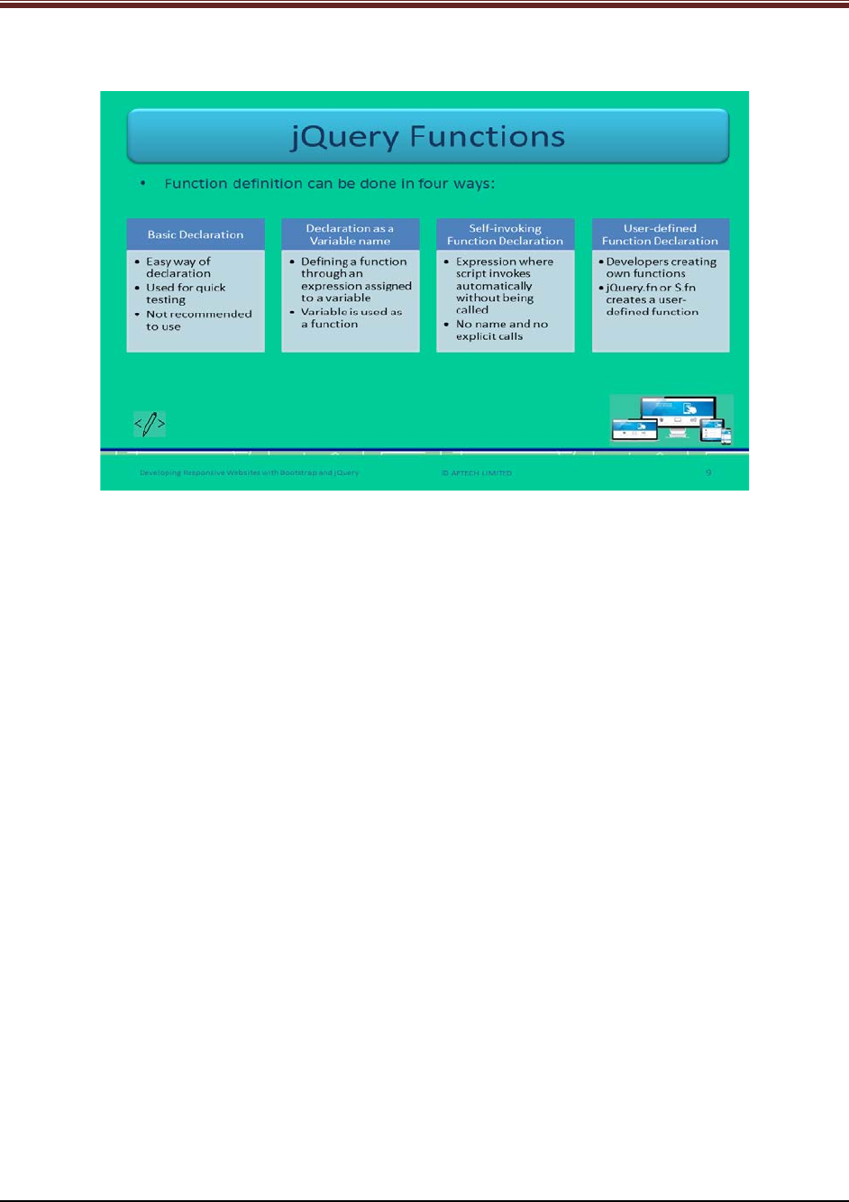
Explain jQuery functions to students using slide 9.
There are four ways to define jQuery functions:
1. Basic Declaration: It is an easy way of function declaration in jQuery.
Show a code snippet to students for good understanding.
function Multiply(var1, var2, var3)
{
return (var1 * var2 * var3);
}
document.write("Basic Way:"+Multiply(10, 10, 8));
This Multiply function is defined which returns product of three numbers.
2. Declaration as a variable name: A function can be defined through an expression which is
assigned to a variable.
Show the code snippet to students for better understanding.
var Multiply = function (var1, var2, var3)
{
return (var1 * var2 * var3);
}
document.write("Function as Variable Name "+Multiply(10, 10, 8));
In this snippet, the variable Multiply is assigned to a function which returns the product of three
numbers.
3. Self-invoking function declaration: An anonymous function can be assigned to a method
directly instead of to a variable. This function has no name and it is not possible to call it
explicitly.
Show the code snippet to students for better understanding.
(function () {document.write("Self Invoking Function, Hello! I called myself");})();
© APTECH LIMITED
For Aptech Centre Use Only
Developing Responsive Websites with Bootstrap and jQuery
The self-invoking function is defined within parentheses and calls itself on its own.
4. User-defined Function Declaration: When a Web developer creates its own function then
it is known as user defined function.
Show the code snippet to students for better understanding.
$(document).ready(function(){
$.fn.myFunction = function(){
alert('You have successfully defined the function!');
}
$(".call-btn").click(function(){
$.fn.myFunction();
});
});
$.fn object creates a user-defined function named myFunction which contains alert function.
Slides 10 to 12
Let us understand about jQuery selectors.
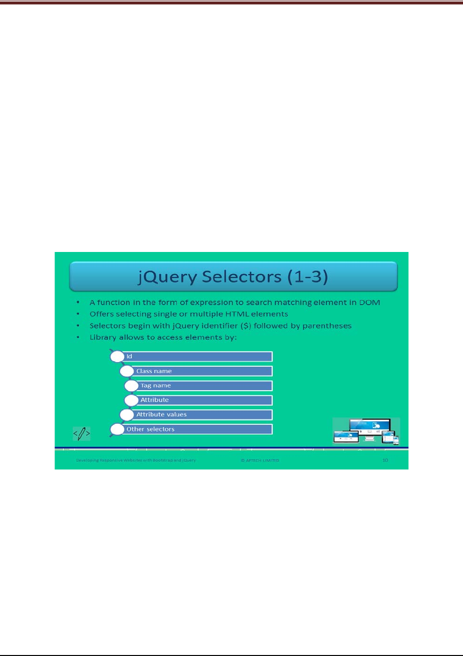
Explain to students about jQuery Selectors using slide 10.
1. jQuery library use CSS and its own custom selectors which help in smooth access and
manipulation of HTML elements in DOM.
2. jQuery selector is a function which is in the form of expression used for searching
matching element in DOM.
3. Selectors can select single or multiple HTML elements that trigger different actions.
4. Selector begin with jQuery identifier ($) and is followed by parentheses.
5. jQuery library allows accessing the elements by – Id, class name, tag name, attribute,
attribute values, and other selectors.
© APTECH LIMITED
For Aptech Centre Use Only
Developing Responsive Websites with Bootstrap and jQuery
Continue to explain to students about jQuery selectors using slide 11.
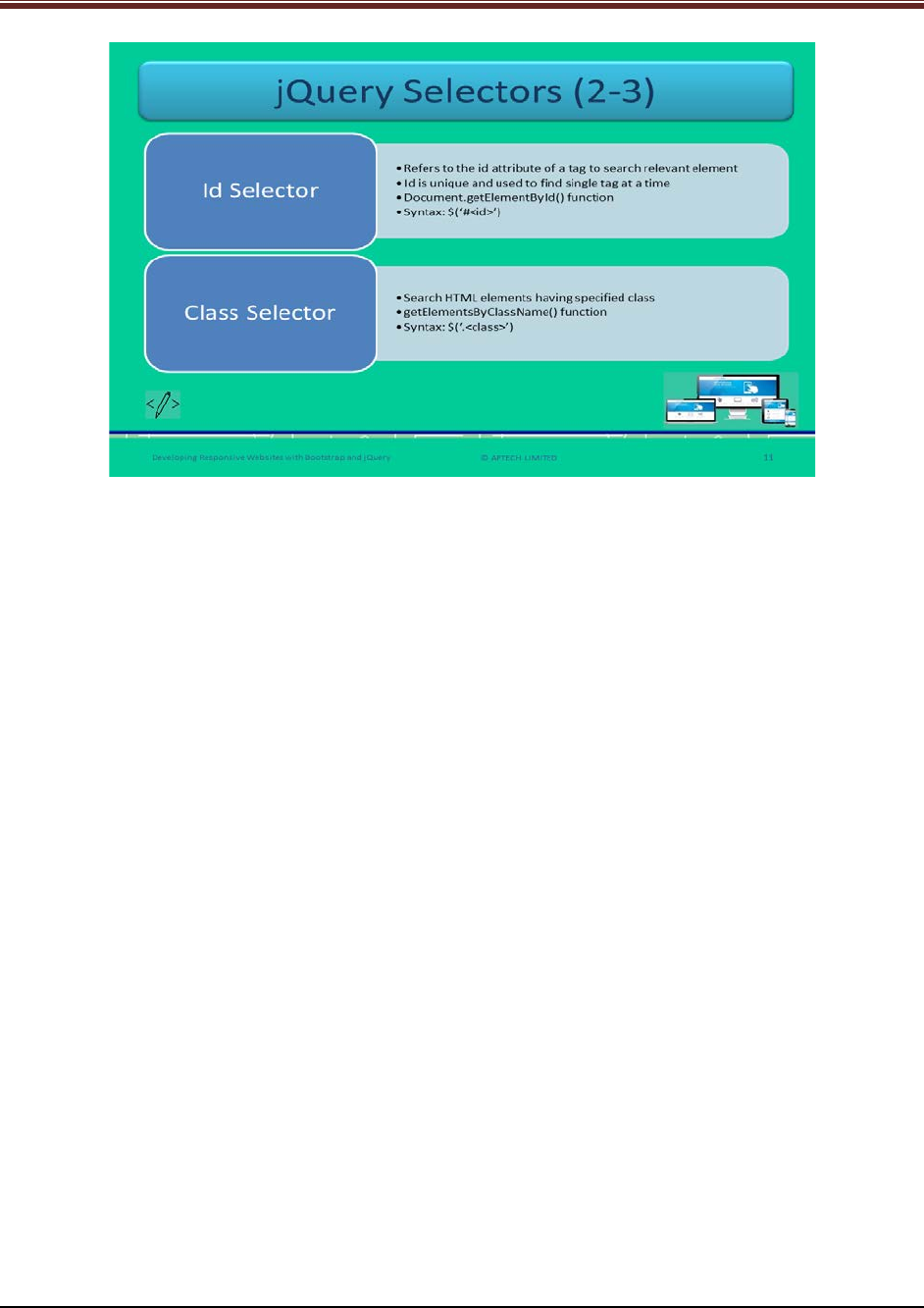
1. Id Selector: It is an id attribute of a HTML tag that is used to search corresponding HTML
element. ID is a unique identifier of each HTML element which is used to find single tag at a
time. The syntax is $(‘#<id>’)
id: the value of id attribute of the required HTML element.
Id selector features are:
1. It is the most efficient selector
2. It accesses only the first element when there are 2 or more tags with same id
3. It is not same as document.getElementById()
4. It is slow as compared to document.getElementById()
5. It is not prone to errors unlike document.getElementById() where error is raise when
element is not found
2. Class selector: This selector finds the HTML element having specified class. It works by relying
on document.getElementsByClassName() function. The syntax is:
$(‘.<class>’)
class: Is the value of class attribute of the required HTML element.
© APTECH LIMITED
For Aptech Centre Use Only
Developing Responsive Websites with Bootstrap and jQuery
Explain students further about jQuery selectors using slide 12.
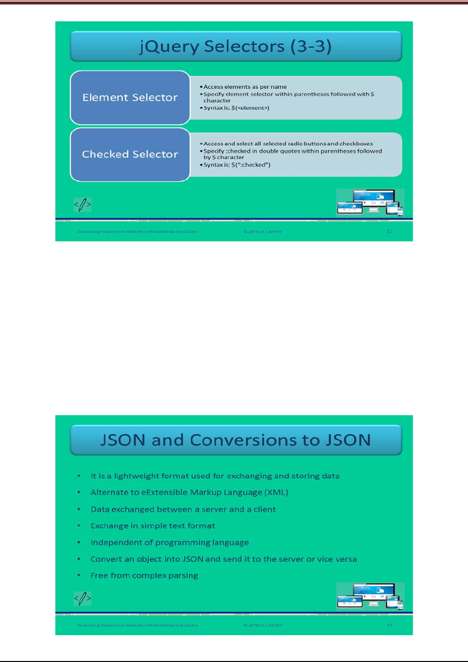
3. Element selector: It accesses elements as per their name. A Web developer specifies the
element selector within parentheses followed by $ character.
Syntax
$(<element>)
element: Is the name of the element.
4. Checked selector: It accesses and selects all selected radio buttons and check boxes.
Syntax
$(":checked")
Slide 13
Let us understand about JSON and its conversions.
© APTECH LIMITED
For Aptech Centre Use Only
Developing Responsive Websites with Bootstrap and jQuery
Explain to students about JSON using slide 13.
1. JSON refers to a lightweight format which is used for exchanging and storing data.
2. It is an easier alternative to XML because it is a self-describing format which helps in
exchanging data between server and client.
3. The data exchanged between server and client happens only in simple text format.
4. JSON is a simple text format although it uses JS syntax.
5. It works independent of any programming language.
6. A Web developer can convert an object into JSON and can send it to server or can
convert the data obtained from server into JSON objects or arrays.
These processes of conversions are free from complex parsing.
Slide 14
Let us understand about how to create JSON objects.
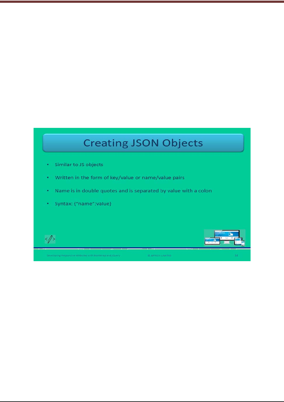
Explain to students about creating JSON objects using slide 14.
It is similar to JS objects. That is why it is written in the form of pairs – Key/value or
name/value.
In JSON, key or name is always a string that is why it is to be in double quotes unlike in JS.
Whereas in JS, the strings can be in single or double quotes.
In JSON, a name should be in double quotes and is separated by the value with a colon.
Syntax
{"name":value}
value: a valid data type – number, string, Boolean, array, null, or object
Inform students that JSON does not support date data type. It can only be represented as
string.
Show the code snippet to students for good understanding about JSON code.
Code Snippet:
{"city":"Moscow"}
© APTECH LIMITED
For Aptech Centre Use Only
Developing Responsive Websites with Bootstrap and jQuery
{"age":40}
{"marriage":"1980-12-23"}
Slide 15
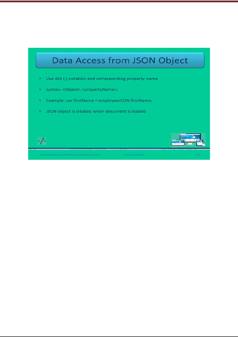
Let us understand about data access from JSON objects.
Explain to students about accessing data from JSON objects using slide 15.
To access the data from JSON objects, use dot (.) notation and corresponding property name.
Syntax
<Object>.<propertyName>;
Show a code snippet to students for better understanding about JSON objects.
var employeeJSON =
{
"firstName": "Philips",
"lastName": "LG",
"gender": "Male",
"salary": 5000,
"bike": null
};
This is creating JSON object.
var firstName = employeeJSON.firstName;
This code is accessing all the data from employeeJSON object using jQuery.
© APTECH LIMITED
For Aptech Centre Use Only
Developing Responsive Websites with Bootstrap and jQuery
Slide 16
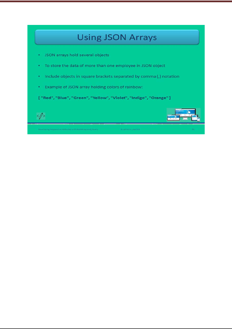
Let us understand about how to use JSON arrays.
Explain to students about JSON arrays using slide 16.
Array is useful for storing more than one data objects. JSON array holds several objects.
Create a JSON array by including objects in square brackets which is separated by comma (,).
Explain to students by showing a code snippet.
Code Snippet:
var employeesJSON = [
{
"firstName": "Philips",
"lastName": "LG",
"gender": "Male",
"salary": 5000
},
{
"firstName": "Samsung",
"lastName": "Sam",
"gender": "Female",
"salary": 4000
}];
This variable is storing data for two employees.
Code Snippet:
var result = employeesJSON[0].lastName;
var result = employeesJSON[1].lastName;
This is how to access both the JSON objects.
© APTECH LIMITED
For Aptech Centre Use Only
Developing Responsive Websites with Bootstrap and jQuery
Slide 17
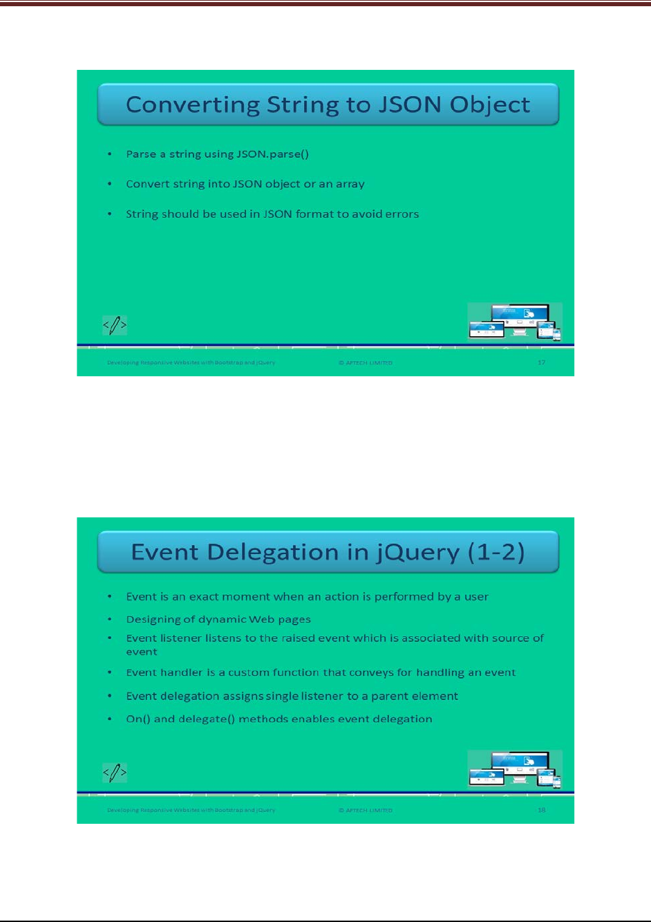
Let us understand about how to convert string to JSON object.
Explain students about conversion of string into JSON objects using slide 17.
Developers can parse a string using JSON.parse() function. It is used to convert the string into
JSON object or an array.
The string should be used in JSON format to avoid the errors.
Slide 18
Let us understand about event delegation in jQuery.
Explain students about events delegation in jQuery using slide 18.
© APTECH LIMITED
For Aptech Centre Use Only
Developing Responsive Websites with Bootstrap and jQuery
1. An event is an exact moment when an action is performed by a user. Examples of events
– Webpage loading, clicking an element, selecting or deselecting a checkbox, and
hovering a mouse.
2. Web developers can design dynamic Webpages with the help of events.
3. Event listener listens to the event being raised and notifies to the handler.
4. Event handler handles the event by a custom function that informs what needs to be
done.
5. Event delegation allows a Web developer to assign a single listener to a parent element.
This parent element listens for all the descendants corresponding to a selector.
6. The methods – on() and delegate() enables event delegation in jQuery. It eliminates the
requirement for adding event listeners to tags.
Slide 19
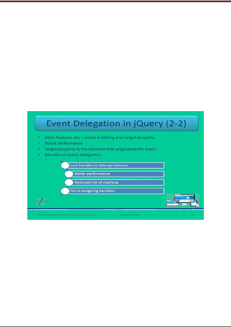
Let us understand about event delegation in jQuery.
Explain students about events delegation in jQuery using slide 19.
The main features of event delegation are – event bubbling and target property.
The target property refers to the element that has originated the event.
With the help of event delegation, developers can add a handler to an element, wait for event
bubbling, and quickly identify source of event.
The benefits of event delegation are:
1. Less handlers to take up memory
2. Better performance
3. Reduced risk of crash
4. No re-assignment of handlers when child elements get changed
© APTECH LIMITED
For Aptech Centre Use Only
Developing Responsive Websites with Bootstrap and jQuery
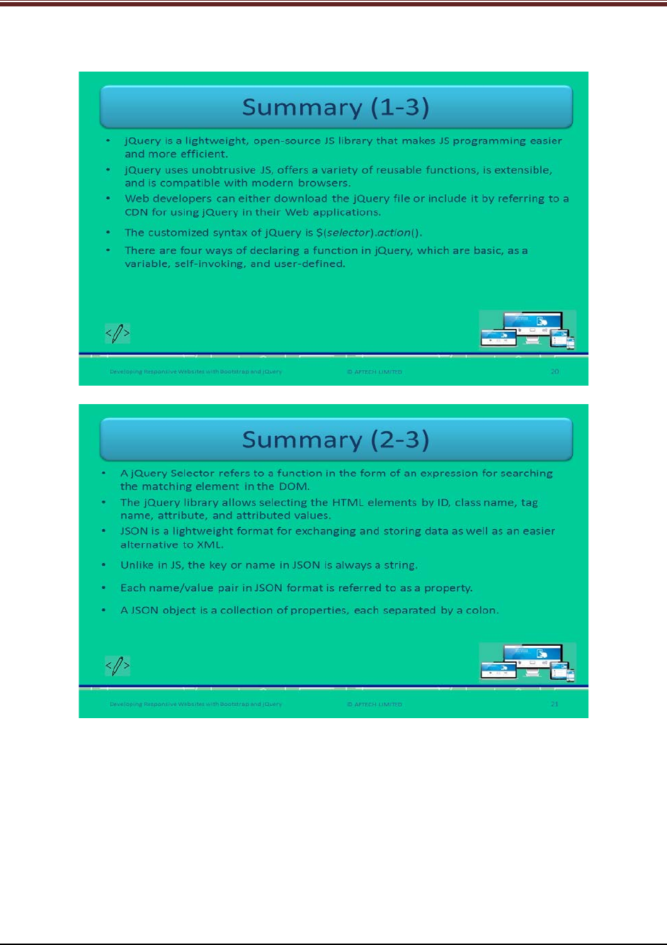
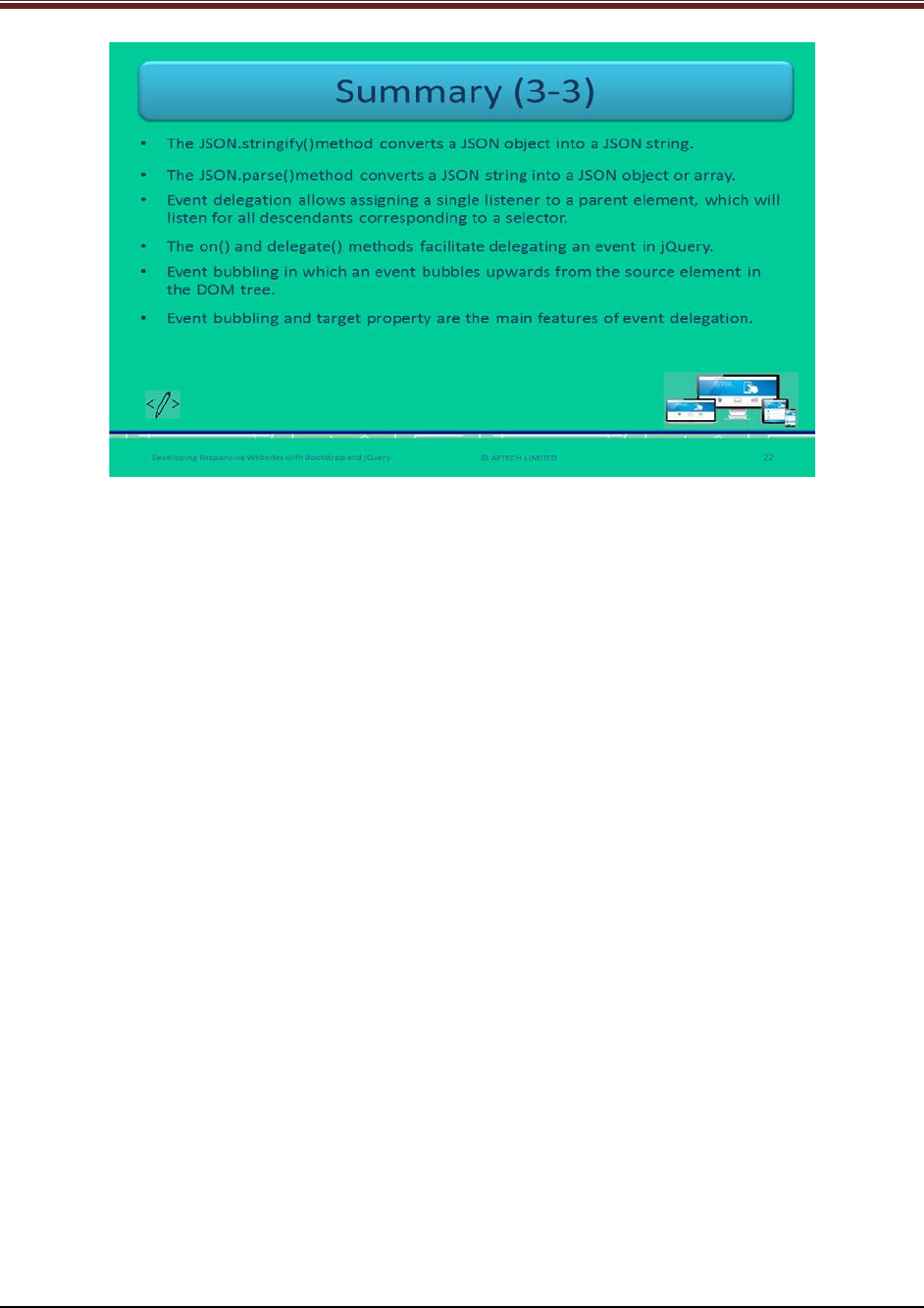
Slides 20 to 22
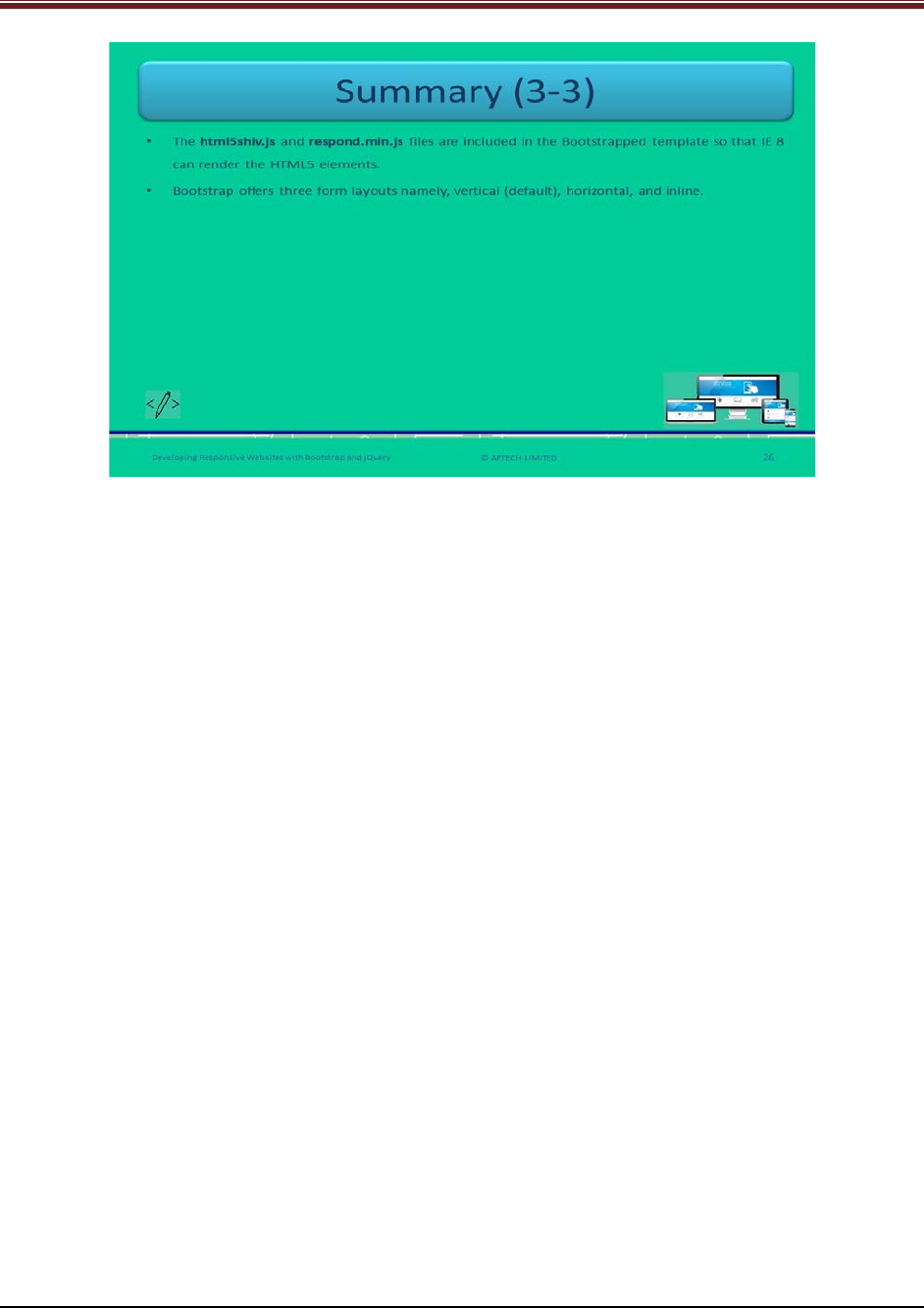
Let us summarize the session.
© APTECH LIMITED
For Aptech Centre Use Only
Developing Responsive Websites with Bootstrap and jQuery
Using slides 20 to 22 summarize the important topics learnt at the end of this session. Use
these pointers to reinforce some essential concepts and provide a quick recap.
Next, let us check your understanding of the topics covered so far in this session.
3.3 Post Class Activities for Faculty
You should familiarize yourself with the topics of the next session.
© APTECH LIMITED
For Aptech Centre Use Only

Developing Responsive Websites with Bootstrap and jQuery
Session 04: Functions, Widgets, Plugins in
jQuery
4.1 Pre-Class Activities
Before you commence the session, you should familiarize yourself with the topics of this
session in-depth. Prepare a question or two that will be a key point to relate the current session
objectives.
4.1.1 Objectives
At the end of this session, you will be able to:
Describe various types of functions in jQuery
Explain use of AJAX in jQuery
Elucidate the callback concept in jQuery
Describe implementation and use of various controls such as widgets and datatables in
jQuery
4.1.2 Teaching Skills
To teach this session, you should be well versed with the concepts of jQuery. You should be
familiar with the AJAX in detail. You should also know about functions, widgets, and plugins in
jQuery.
You should teach the concepts in the theory class using the images provided. For teaching in
the class, you are expected to use slides and LCD projectors.
Tips:
It is recommended that you test the understanding of the students by asking questions in
between the class.
In-Class Activities
Follow the order given here during In-Class activities:
Overview of the Session
Give the students an overview of the current session in the form of session objectives. Read out
the objectives given on slide 2.
© APTECH LIMITED
For Aptech Centre Use Only
Developing Responsive Websites with Bootstrap and jQuery
Slide 2
4.2 In-Class Explanations
Slides 3 to 6
Let us understand about built-in functions of jQuery.
Explain students about built-in functions of jQuery using slide 3.
jQuery contains different capabilities of JavaScript. JS has a set of built-in functions that are
handy in nature.
In JS built-in functions, the developers can manipulate data values such as dates, numbers, and
strings.
© APTECH LIMITED
For Aptech Centre Use Only
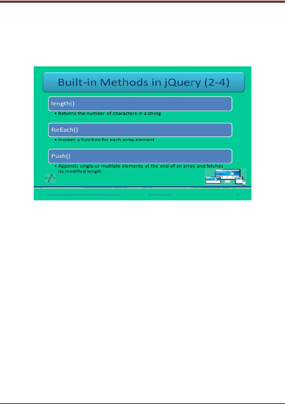
Developing Responsive Websites with Bootstrap and jQuery
Now, briefly explain built-in functions to students one by one.
1. charAt() – it fetches the character at the provided index.
2. Concat() – it will return a new string by concatenating the mentioned two strings.
3. indexOf() – it fetches the index inside the requesting string object of the initial
occurrence of the mentioned value. It will return -1 if no index is found.
Briefly explain built-in functions to students one by one using slide 4.
4. length() – It returns the number of characters in the mentioned string.
5. forEach() – It will invoke a function for each array element.
6. push() – It will append single or multiple elements at the end of an array and it will fetch the
modified length.
© APTECH LIMITED
For Aptech Centre Use Only

Developing Responsive Websites with Bootstrap and jQuery
Continue explaining built-in functions using slide 5.
7. pop() – It will remove and return the last array element.
8. subStr() – It is sub string function which will extract the string characters at the mentioned
index location till it mentioned index length.
9. Reverse() – It will reverse the entire string by changing the order of the array elements,
making the first element as last and last element as the first in the array.
Continue explaining built-in functions using slide 6.
10. sort() – It will sort all the array elements in ascending or descending order.
11. toLowerCase() – It will convert the mentioned string value into lower case.
12. toUpperCase() – It will convert the mentioned string value into upper case.
13. tostring() – It will convert the mentioned value into string.
© APTECH LIMITED
For Aptech Centre Use Only
Developing Responsive Websites with Bootstrap and jQuery
Slide 7
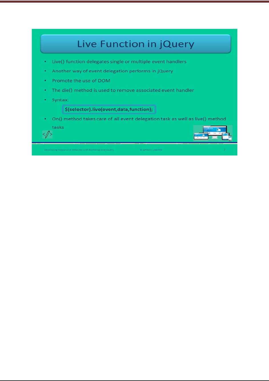
Let us understand about live function of jQuery.
Explain students about live() method in jQuery using slide 7.
1. It is a function that delivers order to single or multiple event handlers for all the
elements that match with the selector and elements that define a function to run when
an event occurs.
2. This live() method is another way to perform event delegation in jQuery.
3. The on() and delegate() functions enables bubbling up the event to the parent element
of the source.
4. An associated event handler can be removed by the use of die() method.
5. The syntax is:
$(selector).live(event,data,function);
event: A single or multiple events to delegate to the elements.
data: This is optional and it represents extra data to be passed to the function.
function: It is the function that is to be executed once the event takes place.
Tell students that jQuery recommends the use of on() and off() functions instead of live() and
die() functions in the latest versions of jQuery.
© APTECH LIMITED
For Aptech Centre Use Only
Developing Responsive Websites with Bootstrap and jQuery
Slide 8
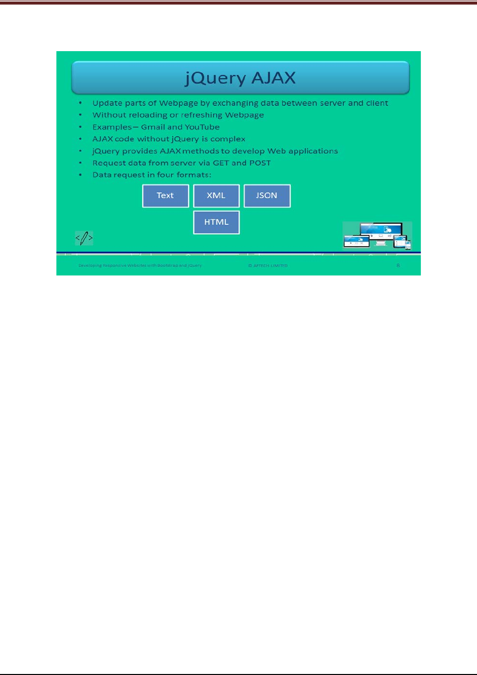
Let us understand about jQuery with AJAX.
Explain students about jQuery with AJAX using slide 8.
1. AJAX allows updating many parts of Webpage by exchanging data between server and
client.
2. It exchanges the data without reloading or refreshing the whole Webpage.
3. The examples of AJAX Websites are – Gmail and YouTube.
4. If AJAX coding is without jQuery then it will be bit complicated because syntax of
implementation will be different for different browsers.
5. With the help of jQuery the extra effort will be reduced.
6. jQuery offers many AJAX methods to develop Web applications.
7. With the help of jQuery AJAX functions, data can be requested from distant Web servers
via GET and POST.
8. This data can be in four formats – Text, eXtensible Markup language (XML), JavaScript
Object Notation (JSON), and HyperText Makrup Language (HTML).
© APTECH LIMITED
For Aptech Centre Use Only
Developing Responsive Websites with Bootstrap and jQuery
Slide 9
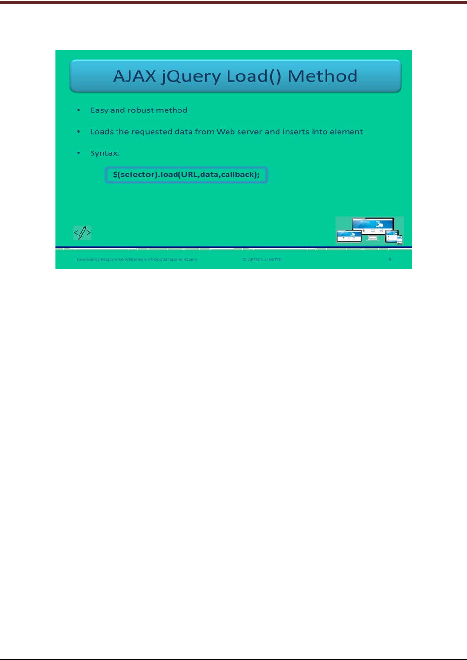
Let us understand about AJAX jQuery load() method.
Explain students about load() method of AJAX jQuery using slide 9.
1. It is an easy and yet robust AJAX functionality.
2. It first loads the data from the Web server and then inserts the data into the HTML
element.
3. Its syntax is:
$(selector).load(URL,data,callback);
URL: Uniform Resource Locator (URL) of a resource on a server
data (optional): it indicates a set of key/value pairs as a query string in the form of JSON
object or string that goes along with the request. The default request method used here
is GET.
callback (optional): it indicates the name of a callback function that will run after the
load() method completes executing the request.
© APTECH LIMITED
For Aptech Centre Use Only
Developing Responsive Websites with Bootstrap and jQuery
Slide 10
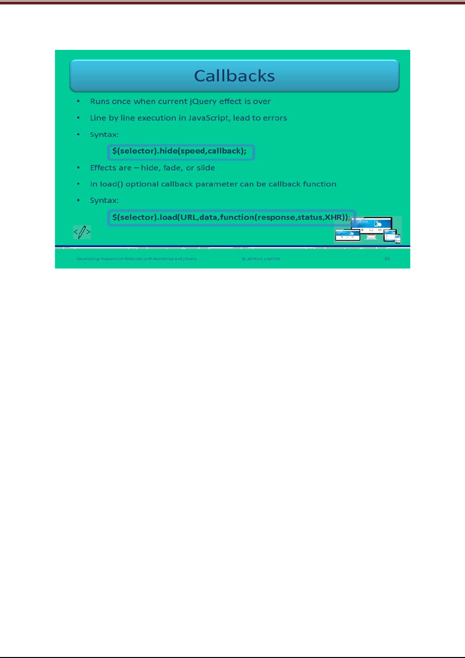
Let us understand about callbacks.
Explain students about callbacks in jQuery using slide 10.
1. Callback function runs once when any jQuery effect is over. The effects are – hide, fade,
or slide.
2. In JavaScript, the execution happens line by line which disturbs the proper output as
next line of code gets executed even when the former is not finished.
3. Its syntax is:
$(selector).hide(speed,callback);
speed: Is optional and indicates the speed of hiding an element in milliseconds or
as fast or slow.
callback: Is optional and indicates the name of a callback function to run after
hide() executes completely.
4. In load() function, the optional parameter ‘callback’ indicates callback function.
5. Its syntax:
$(selector).load(URL,data,function(response,status,XHR));
response: fetched content in case loading is successful.
status: the status of the loading action.
XHR: Possesses the XMLHttpRequest object with response text.
Tell students that XHR has all contents of the browser’s native XMLHttpRequest object.
© APTECH LIMITED
For Aptech Centre Use Only
Developing Responsive Websites with Bootstrap and jQuery
Slide 11
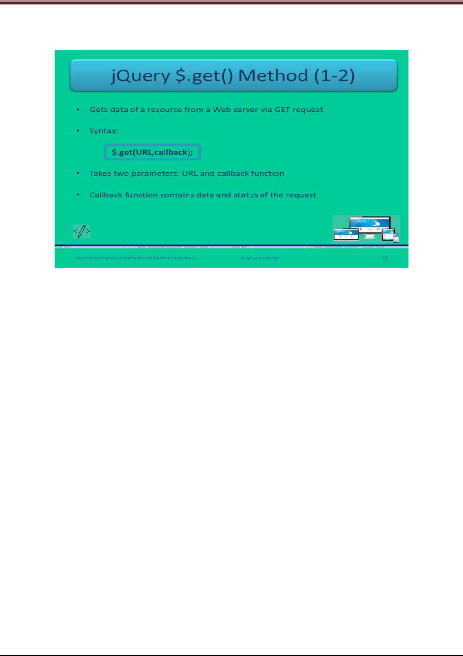
Let us understand about GET method of jQuery.
Explain students about GET method of jQuery.
1. This method is used to fetch data from a Web server through GET request.
2. It has two parameters – URL and callback function
3. Its syntax is:
$.get(URL,callback);
URL: The URL a Web developer intends to request.
callback (optional): A function to be executed when the request is successful.
4. This optional callback function contains data and status of the request.
© APTECH LIMITED
For Aptech Centre Use Only
Developing Responsive Websites with Bootstrap and jQuery
Slide 12
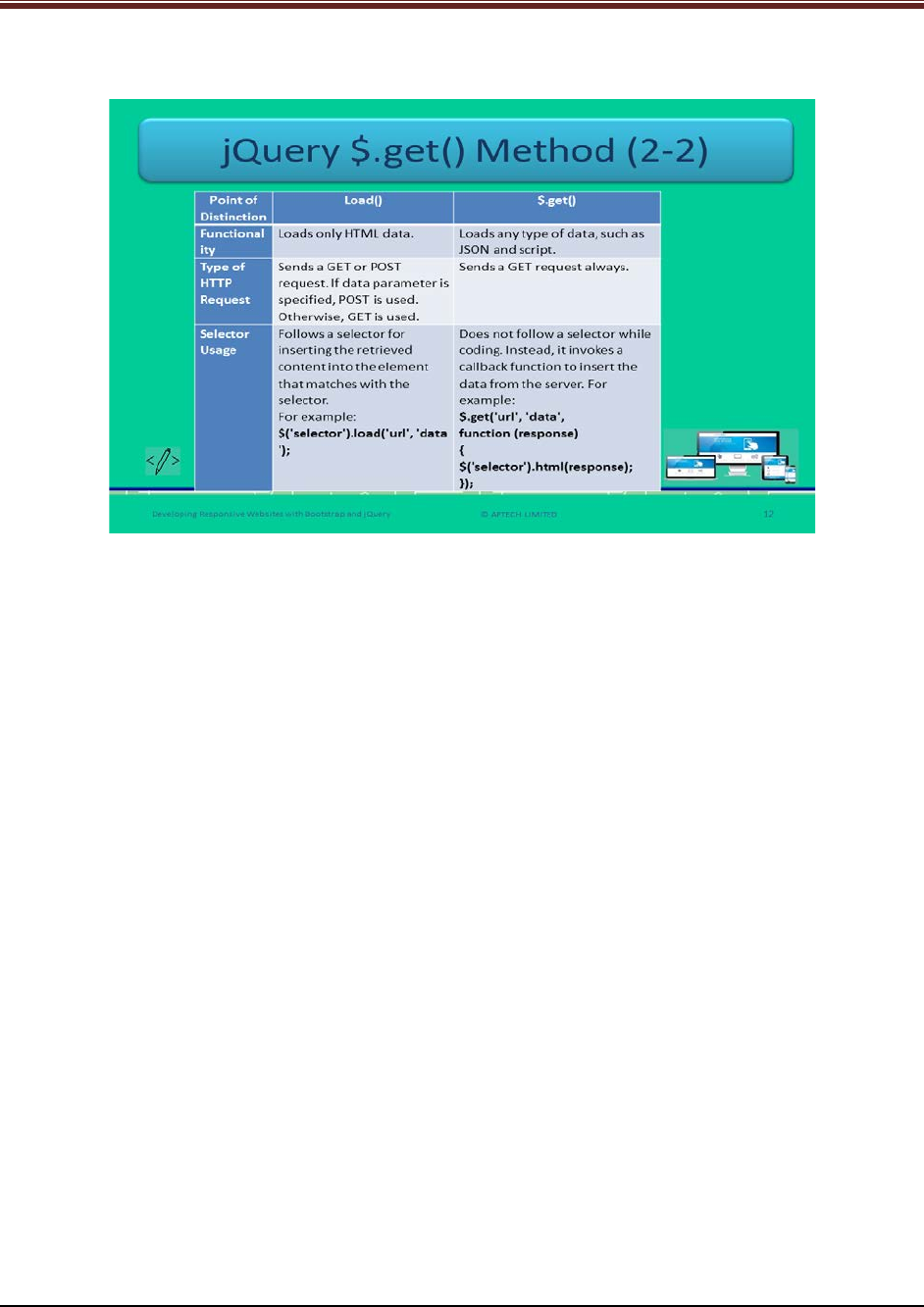
Let us understand about differences between load() method and $.get() method.
Explain students about differences between load() and $.get() using slide 12.
1. Functionality – load() function loads only HTML data whereas, $.get() function loads any
type of data – JSON and script.
2. Type of HTTP request – load() function sends GET or POST request whereas, $.get()
sends only GET request.
3. Selector Usage – load() function follows a selector to insert the content into the
matched element whereas, $.get() function does not follow a selector while coding. It
invokes a callback function instead.
4. Syntax - load() function syntax is: $(‘selector’).load(‘url’,’data’);
$.get() function syntax is:
$.get('url', 'data', function (response){
$('selector').html(response);
});
© APTECH LIMITED
For Aptech Centre Use Only
Developing Responsive Websites with Bootstrap and jQuery
Slide 13
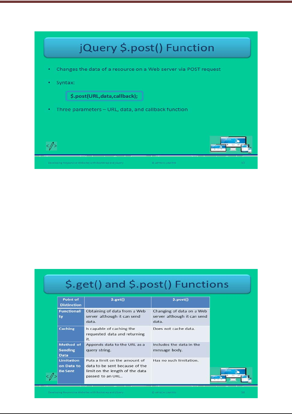
Let us understand about $.post() method of jQuery.
Explain students about jQuery $.post() function using slide 13.
1. This post() function fetches the data of a resource from a Web server through POST
request.
2. Its syntax is:
$.post(URL,data,callback);
URL: The URL a Web developer intends to request.
Data (optional): represents extra data to be passed to the function.
Callback (optional): A function to be executed when the request is successful.
Slide 14
Let us understand about the difference between $.get() method and $.post() method.
© APTECH LIMITED
For Aptech Centre Use Only
Developing Responsive Websites with Bootstrap and jQuery
Explain students about the difference between $.get() and $.post() functions using slide 14.
1. Functionality: The get() function fetches data from a Web server and can send data also
whereas, post() function changes the data on a Web server and can send data also.
2. Caching: The get() function caches the requested data and returns it whereas, post()
does not cache data.
3. Method of sending data: The get() function appends the data to the URL as a query
string whereas, post() function includes the data in the message body.
4. Limitation on sent data: The get() function has the limited amount of data to be sent
whereas, post() function has no limitation on amount of data.
Slides 15 and 16
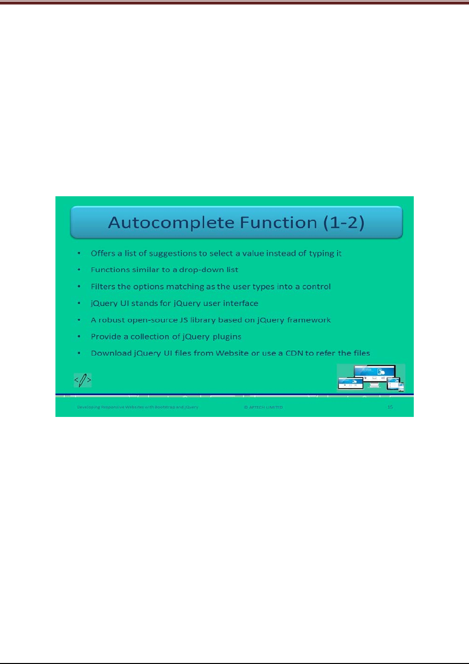
Let us understand about autocomplete function of jQuery.
Explain students about autocomplete function in jQuery using slide 15.
1. Autocomplete function provides a list of suggestions that the user can select instead of
typing it.
2. It functions similar to drop-down list. You have seen while filling a form, a drop-down
menu contains a list of words when a user types it appears and shows the matched
word.
3. It filter the options with the matching word as and when user types.
4. jQuery UI is jQuery user interface which is a robust open-source JS library based on
jQuery framework.
5. It also provides a collection of jQuery plugins.
6. Web developers can download the jQuery files from the official Website or can use CDN
to refer them.
© APTECH LIMITED
For Aptech Centre Use Only
Developing Responsive Websites with Bootstrap and jQuery
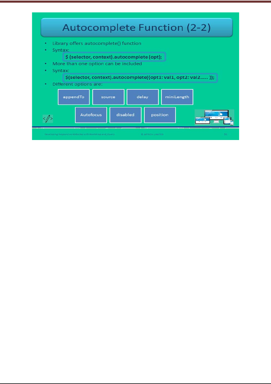
Continue explaining autocomplete function in jQuery using slide 16.
7. jQuery library offers autocomplete() function.
8. Its syntax is:
$ (selector, context).autocomplete (opt);
9. When more than one option is to be included then the syntax is:
$(selector, context).autocomplete({opt1: val1, opt2: val2..... });
10. There are different options.
- appendTo – Appends an element to the list.
- source – It indicates how the data will be obtained that will match the input.
- delay – It is the waiting time before fetch the matching value. It is in milliseconds.
- miniLength – Number of characters to be typed before matching starts.
- Autofocus – It focuses the first menu item when the value becomes true. Its default
value is false.
- disabled – It will inactivate the widget when the value is true. Its default value is false.
- position – it specifies the position of the input element on the list.
© APTECH LIMITED
For Aptech Centre Use Only
Developing Responsive Websites with Bootstrap and jQuery
Slide 17
Let us understand about widgets in jQuery.
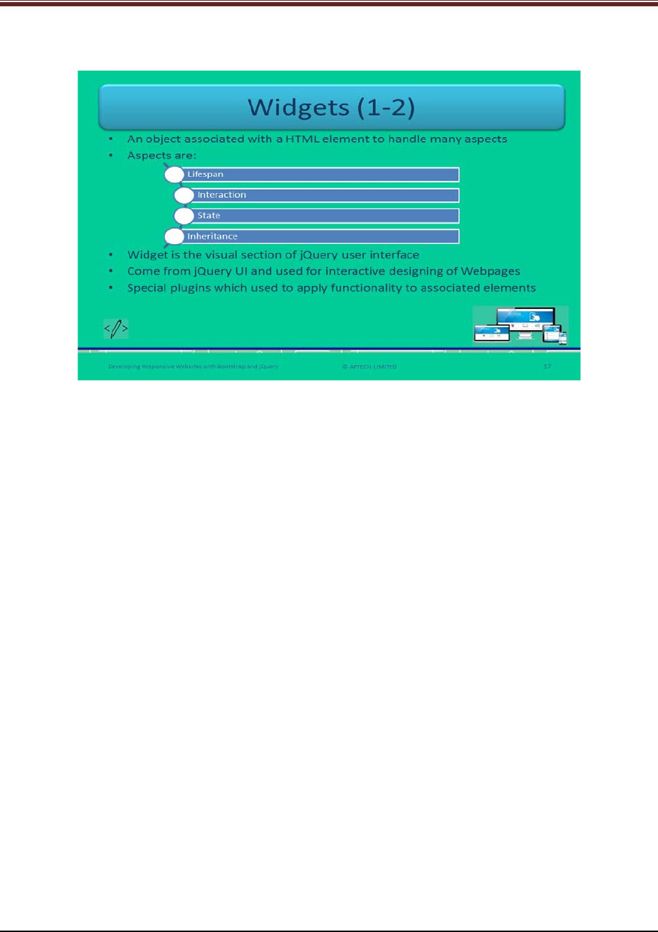
Explain students about widgets in jQuery using slide 17.
1. Widgets are referring to an object that is associated with HTML elements for handling
many aspects such as lifespan, interaction, state, and inheritance.
2. At the core, it is the visual section of jQuery UI.
3. In jQuery, widgets come from jQuery UI and these are very useful for designing
interactive Webpages.
4. As The standard plugins are not enabled with built-in functionalities or capabilities such
as regulating the lifespan of plugin, revealing methods, and associating data with its
elements.
5. In case of jQuery, the platform is the browser, JS is the language, and jQuery and jQuery
UI libraries are the major parts of environment.
© APTECH LIMITED
For Aptech Centre Use Only
Developing Responsive Websites with Bootstrap and jQuery
Slide 18
Let us understand about widgets in jQuery.
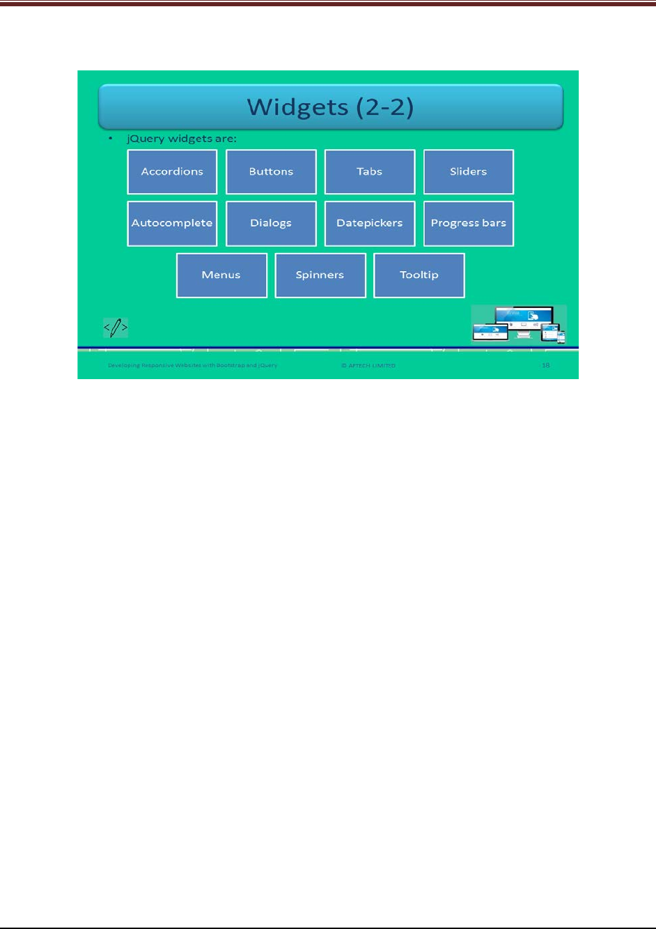
Explain students about widgets in jQuery using slide 18.
Name all the jQuery widgets to students:
1. Accordions
2. Buttons
3. Tabs
4. Sliders
5. Autocomplete
6. Dialogs
7. Datepickers
8. Progress bars
9. Menus
10. Spinners
11. Tooltip
© APTECH LIMITED
For Aptech Centre Use Only
Developing Responsive Websites with Bootstrap and jQuery
Slide 19
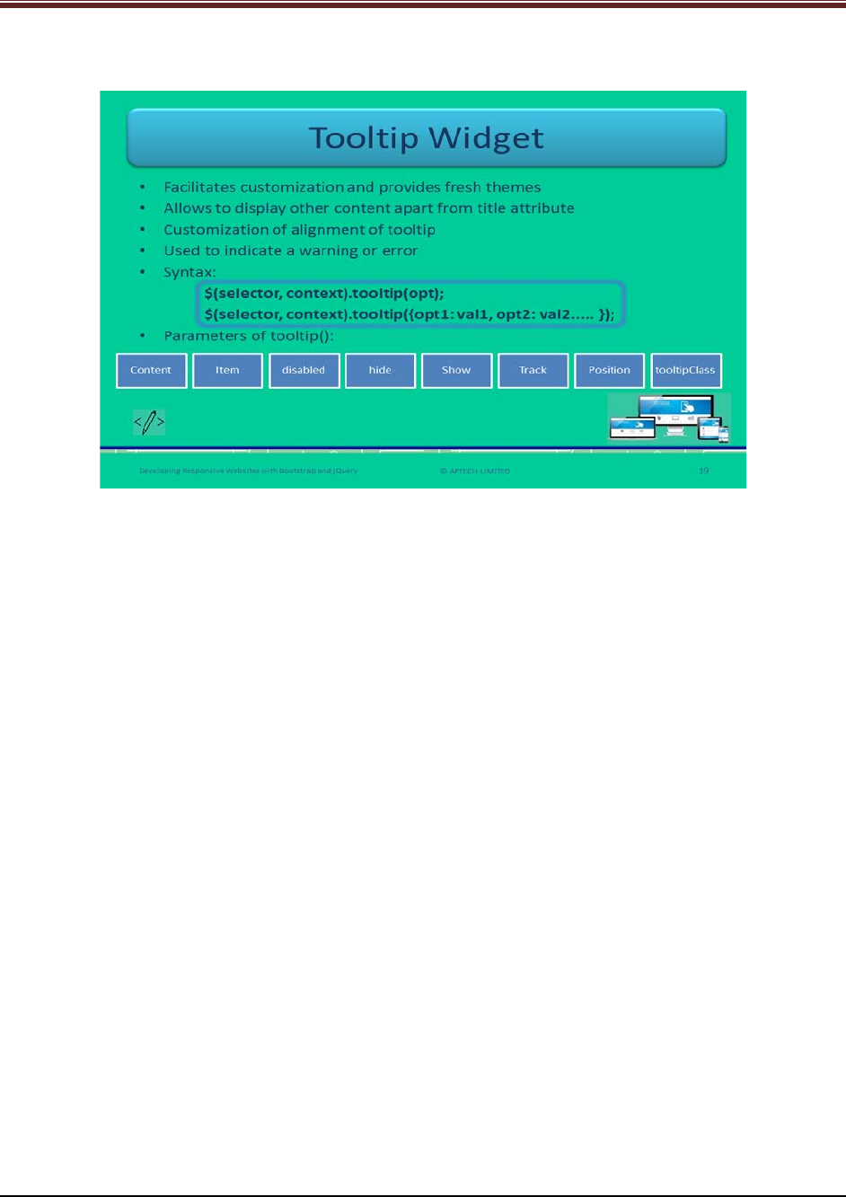
Let us understand about tooltip widgets in jQuery.
Explain students about using tooltip widgets in jQuery using slide 19.
1. Tooltip widget comes with fresh themes and facilitates customization.
2. It allows displaying other content instead of only title attribute, such as AJAX-retrieved
data and footnotes.
3. Widgets facilitates alignment of tooltip.
4. It offers additional styling for personalizing the appearance. It is useful for indicating a
warning or error.
5. Its syntax is:
$(selector, context).tooltip(opt);
$(selector, context).tooltip({opt1: val1, opt2: val2..... });
Show the students a code snippet for better understanding to how to use widget tooltip.
Code Snippet:
HTML
<label id="lName" for="tName" title="Full Name">Name</label>
<input id="tName" type="text" title="Your full name as it appears in memo"/>
jQuery
$('#tName').tooltip();
There are eight parameters of tooltip method: content, item, disabled, hide, show, track,
position, and tooltipClass.
© APTECH LIMITED
For Aptech Centre Use Only
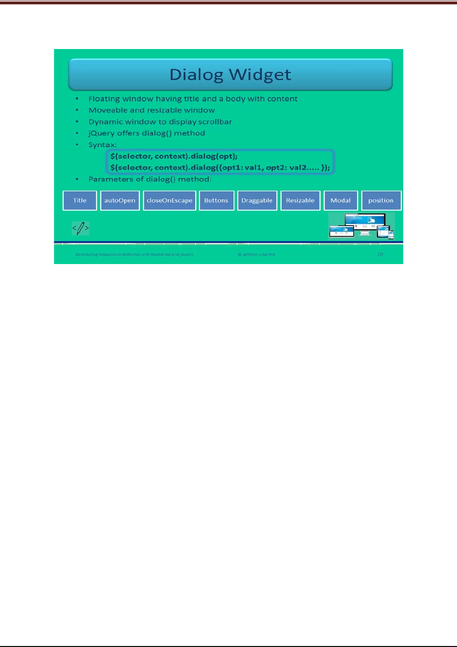
Developing Responsive Websites with Bootstrap and jQuery
Slide 20
Let us understand about dialog widgets in jQuery.
Explain students about dialog widgets using slide 20.
1. Dialog widget provides a floating window that has a title and a body of content.
2. The window is moveable by dragging and resizable by stretching.
3. User can close the dialog by clicking ‘X’ icon present on the right top corner.
4. The window is dynamic in nature as it displays the scrollbar when it exceeds its
maximum height.
5. To display the dialog in jQuery, dialog() method is there.
6. Its syntax is:
$(selector, context).dialog(opt);
$(selector, context).dialog({opt1: val1, opt2: val2..... });
7. It has the parameters: title, autoOpen, closeOnEscape, buttons, draggable, resizable,
modal, and position.
© APTECH LIMITED
For Aptech Centre Use Only
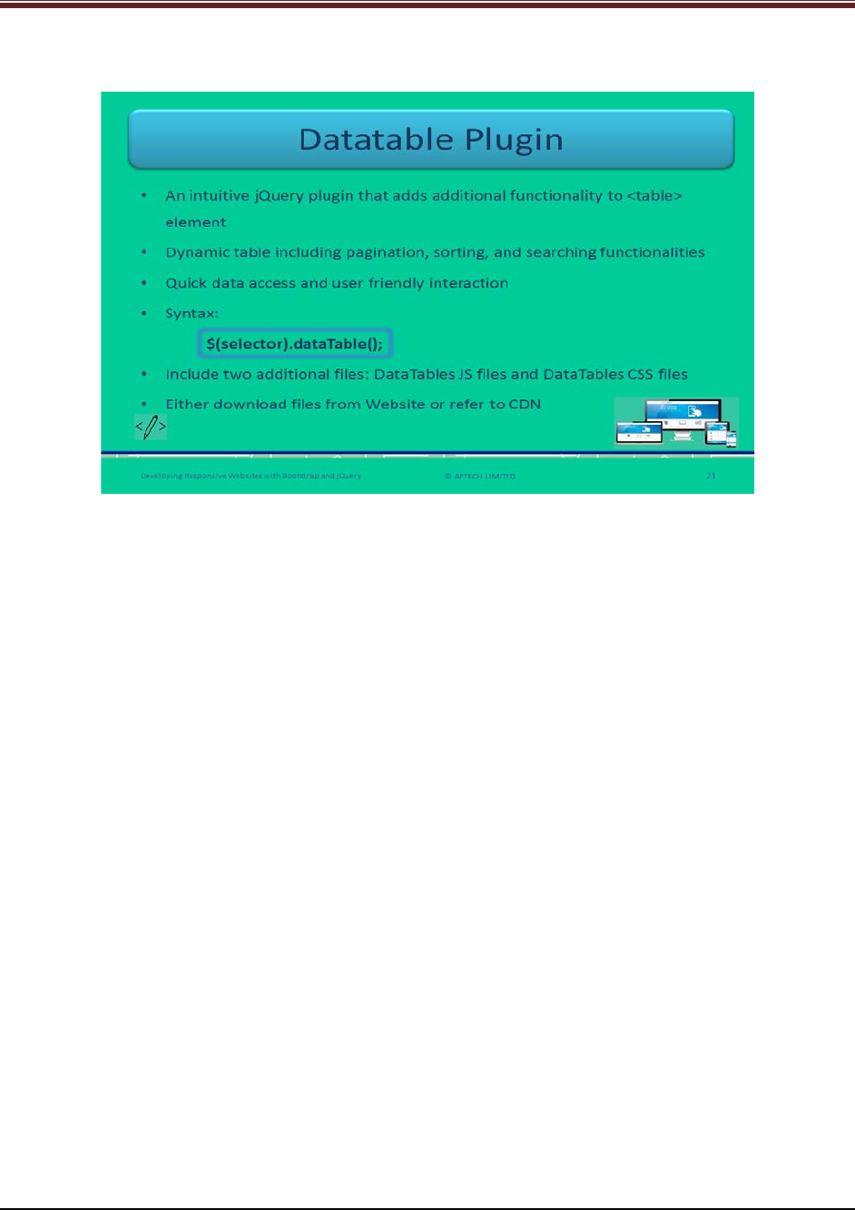
Developing Responsive Websites with Bootstrap and jQuery
Slide 21
Let us understand about datatable plugins in jQuery.
Explain students about datatable plugins in jQuery using slide 21.
1. Datatable is an intuitive jQuery plugin which facilitates adding more functions to the
<table> element.
2. It makes the plain table a dynamic by including functionalities such as – pagination,
sorting, and searching.
3. It enables quick access, flexible and user friendly interaction.
4. Its syntax is:
$(selector).dataTable();
5. Web developer needs to include only two additional files to use plugins – DataTables JS
files, and DataTables CSS files.
Show code snippet for better understanding.
Code Snippet:
$('table').dataTable( {
paginate: true,
scrollY: 400
} );
In this code, pagination and scrolling utilities are enabled.
© APTECH LIMITED
For Aptech Centre Use Only
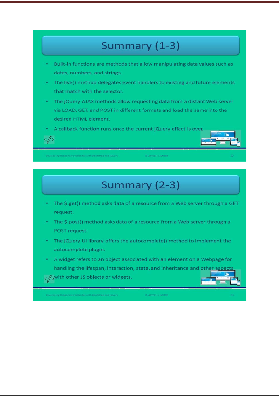
Developing Responsive Websites with Bootstrap and jQuery
Slides 22 to 24
Let us summarize the session.
© APTECH LIMITED
For Aptech Centre Use Only
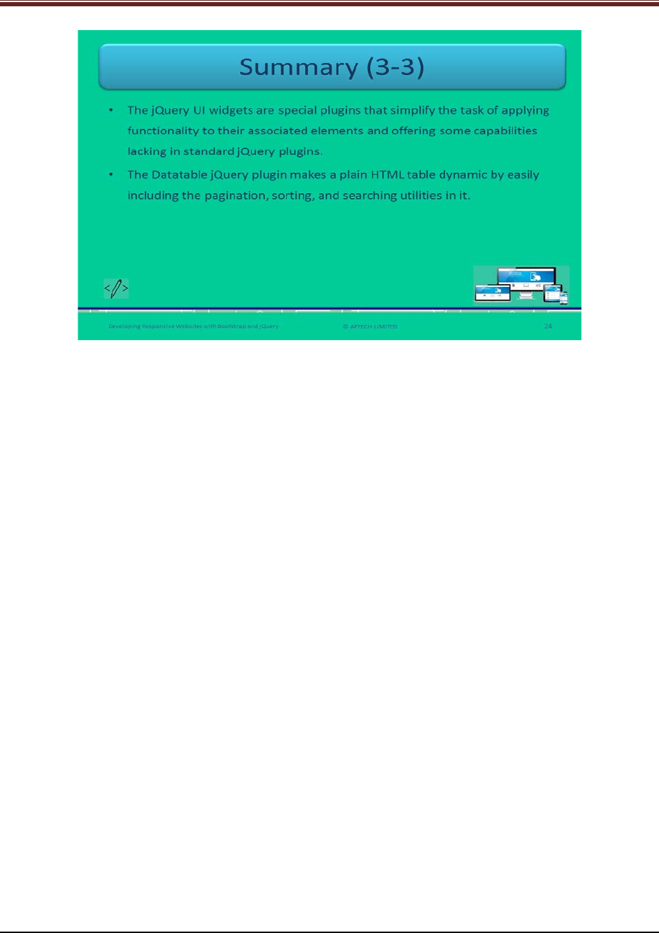
Developing Responsive Websites with Bootstrap and jQuery
Using slides 22 to 24 summarize the important topics learnt at the end of this session. Use
these pointers to reinforce some essential concepts and provide a quick recap.
Next, let us check your understanding of the topics covered so far in this session.
4.3 Post Class Activities for Faculty
You should familiarize yourself with the topics of the next session.
© APTECH LIMITED
For Aptech Centre Use Only

Developing Responsive Websites with Bootstrap and jQuery
Session 05: Creating Bootstrap
Responsive Layout
5.1 Pre-Class Activities
Before you commence the session, you should familiarize yourself with the topics of this
session in-depth. Prepare a question or two that will be a key point to relate the current session
objectives.
5.1.1 Objectives
At the end of this session, you will be able to:
Describe how bootstrap helps in achieving responsiveness
Explain the grid system
Outline the use of Jumbotron component
Describe the use of various typography classes
Describe creation of simple responsiveness pages with Bootstrap
5.1.2 Teaching Skills
To teach this session, you should be well versed with the concepts of grid system. You should
be familiar with the Bootstrap responsive layout in detail. You should also know how to create
responsive pages with Bootstrap.
You should teach the concepts in the theory class using the images provided. For teaching in
the class, you are expected to use slides and LCD projectors.
Tips:
It is recommended that you test the understanding of the students by asking questions in
between the class.
In-Class Activities
Follow the order given here during In-Class activities.
Overview of the Session
Give the students an overview of the current session in the form of session objectives. Read out
the objectives given on slide 2.
© APTECH LIMITED
For Aptech Centre Use Only
Developing Responsive Websites with Bootstrap and jQuery
Slide 2
Objectives
At the end of this session, you will be able to:
Describe how bootstrap helps in achieving responsiveness
Explain the grid system
Outline the use of Jumbotron component
Describe the use of various typography classes
Describe creation of simple responsiveness pages with Bootstrap
Developing Responsive Websites with Bootstrap and jQuery © APTECH LIMITED
2
5.2 In-Class Explanations
Slides 3 and 4
Let us introduce Bootstrap Responsive Layout.
Bootstrap Responsive Layout (1-2)
•A design process for easy access and smooth view
•Efficient way to display Website on different devices
•Responsive layout is adaptive to UI components
•Screen for devices –laptop, desktop, smartphone, or tablets
•Effortless navigation with minimal resizing, scrolling, and rotating
Developing Responsive Websites with Bootstrap and jQuery © APTECH LIMITED
3
Explain students about Bootstrap responsive layout using slide 3.
1. Bootstrap responsive layout refers to the design process of Websites which provide ease
of access and smooth viewing on different devices.
2. It is an efficient way of displaying Websites across variety of devices.
3. This responsive layout is adaptive to user interface components and functionality to any
screen size of devices.
4. The devices can be – laptop, desktop, smartphones, or tablets.
© APTECH LIMITED
For Aptech Centre Use Only
Developing Responsive Websites with Bootstrap and jQuery
5. The changing of the layout according to the size of the target device facilitates an optimal
view.
Bootstrap Responsive Layout (2-2)
•Responsive Website uses three elements:
•Grids and multimedia should be fluid and flexible
•Fluid grid handles sizing of page elements in percentage (not in pixels)
•Bootstrap code focuses on small screens first and then it expands for larger
screens
•Version 3 has four classes of grids
Developing Responsive Websites with Bootstrap and jQuery
Fluid, proportion-based grids
Flexible or fluid images
CSS3 media queries
© APTECH LIMITED
4
Continue explaining Bootstrap responsive layout using slide 4
6. This responsive Website has three elements:
- Fluid and proportion-based grids
- Flexible or fluid images
- CSS3 media queries
7. To make the Website adaptable to different environments, grids and multimedia should
be flexible and fluid.
8. Media queries are essential for displaying right assets in right manner on devices.
9. Fluid grids are used for sizing the page elements in relative units that is percentages,
rather than in absolute units that is, pixels or points.
10. The media queries used to apply different CSS styles on targeted devices.
11. Bootstrap first focus on small screen devices such as mobile devices and then it
expands its components for larger screens such as desktops and laptops.
Tell students that there is no requirement of extra style sheet to activate responsive
functionality in Bootstrap 3.
© APTECH LIMITED
For Aptech Centre Use Only
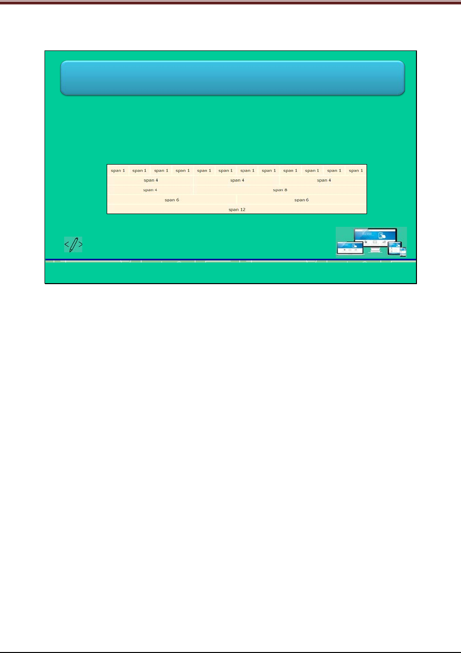
Developing Responsive Websites with Bootstrap and jQuery
Slide 5
Let us understand working with grids in Bootstrap.
Working with Grids
•A collection of HTML/CSS components
•Robust mobile-first grid system
•Allows defining rows and columns having content in resulting boxes
•Create up to 12 columns and unlimited rows, known as 12-grid system or 12-
column layout
•Consists of series of containers, rows, and columns
Developing Responsive Websites with Bootstrap and jQuery © APTECH LIMITED
5
Explain students about working with grids in Bootstrap using slide 5.
1. In Bootstrap, grid is a collection of HTML/CSS components.
2. This grid in Bootstrap is known as 12-grid system or 12-column layout which creates up
to 12 columns and unlimited rows.
3. Columns in this grid system can be re-arranged according to the size of the screen that is
why this grid system is responsive in nature.
4. The grid consists of series of containers, rows, and columns.
5. Container has content by setting margins on left and right. There are two types of
containers – fixed and fluid.
6. Rows extend from left to right edge of a container and the content is in the columns.
7. The padding of container is eliminated through a margin value of -15 pixels from both
the sides.
© APTECH LIMITED
For Aptech Centre Use Only
Developing Responsive Websites with Bootstrap and jQuery
Slides 6 and 7
Let us understand predefined grid classes.
Predefined Grid Classes (1-2)
•Four classes forming four tiers of grid system
•Use one or more classes for dynamic and fluid design layout
Developing Responsive Websites with Bootstrap and jQuery
xs –extra small screen
sm –small screen
md –medium screen
lg –large screen
© APTECH LIMITED 6
Explain students about predefined grid classes in Bootstrap using slide 6.
There are four classes to form four tiers of grid system in Bootstrap:
1. Xs – for extra small screen size
2. Sm – for small screen size
3. Md – for medium screen size
4. Lg – for large screen size
Predefined Grid Classes (2-2)
•Column specification for different browser sizes
•Symbol * denotes the number of columns a row should have
•For example, to define column as four out of 14 in one row, specification will
be .col-xs-4
Developing Responsive Websites with Bootstrap and jQuery
Column Definition Browser of Target Device Browser Size
.col-lg-* Large devices (desktops) 1200 pixels and up
.col-md-* Medium devices (desktops) 992 pixels and up
.col-sm-* Small devices (tablets) 768 pixels and up
.col-xs-*
Extra small (mobile phones)
< 768 pixels
© APTECH LIMITED 7
Continue explaining predefined grid classes in Bootstrap using slide 7.
Show the table of column specifications for different browsers.
The symbol * represents the number of columns in a row.
© APTECH LIMITED
For Aptech Centre Use Only
Developing Responsive Websites with Bootstrap and jQuery
Slide 8
Let us understand rules of grid system.
Rule of Grid System
Contents of containers to be middle-aligned
Place the rows within a container for proper aligning and padding
Columns have gaps between its content, known as gutters
Columns contain content and are only direct children of rows
Grid tiers depend on minimum widths
Predefined grid classes for rows and columns make quick grid layouts
Predefined grid classes for column indicate type of device and number of columns
Developing Responsive Websites with Bootstrap and jQuery © APTECH LIMITED
8
Explain students about the rules of Bootstrap 3 grid system using slide 8.
1. Containers are a means to middle-align the contents of Website.
2. Rows are horizontal series of columns that are used to properly align the columns. Place
the rows within container for proper aligning and padding of rows.
3. Columns hold the content of Website and can be the only direct children of rows.
4. Grid tiers depend on minimum widths that is, they are applicable to all the tiers.
5. Predefined grid classes for columns indicate two things - type of device and number of
columns.
6. Predefined grid classes for both rows and columns make grid layout quickly.
7. Columns have gaps between its content which is known as gutters. This is done through
padding, which is neutralized for the first and last column in a row via negative margin.
© APTECH LIMITED
For Aptech Centre Use Only
Developing Responsive Websites with Bootstrap and jQuery
Slide 9
Let us understand basic structure of grid.
Basic Structure of Grid
•Grid structure has one or more containers, rows, and columns
•Define a container containing rows and columns
•First, define rows within container, using .row class
•Then, define columns within row, using .col-xs-*, .col-sm-*, .col-md-*, and
.col-lg-* classes.
•Finally, these columns can contain content
Developing Responsive Websites with Bootstrap and jQuery © APTECH LIMITED
9
Explain students about basic structure of grid using slide 9.
1. The grid structure in Bootstrap has one or more containers, rows, and columns.
2. Web developer should define a container which contains rows and columns.
3. At first, Web developer should define rows within a container by using .row class.
4. Then, Web developer should define columns within a row by using .col-xs-*, .col-sm-*,
.col-md-*, and .col-lg-* classes.
5. Finally, these columns are constructed where Web developers can place the content.
Slide 10
Let us understand grids for devices.
Grids for Device
•Grid layout differs with devices
•Columns are divided in a row according to size of device
•Four types of grid:
Developing Responsive Websites with Bootstrap and jQuery
Stacked
•Also known as
horizontal grid
•Load as a stack
first on small
screen sized
devices
Small Devices
•Screen width
between 768
and 991 pixels
•Use .col-sm-*
classes
Medium Devices
•Screen width
between 992
and 1199
pixels
•Use .col-md-*
classes
Large Devices
•Screen width is
at least 1200
pixels
•Use .col-lg-*
classes
© APTECH LIMITED
10
Explain students about grids for different devices using slide 10.
© APTECH LIMITED
For Aptech Centre Use Only
Developing Responsive Websites with Bootstrap and jQuery
1. A grid system offers grid layouts that vary with different devices.
2. There are a different split percentage of columns in a row for each device.
3. The four types of grid for different devices are: Stacked or Horizontal, Small, Medium,
and Large.
Stacked or Horizontal:
Small Devices:
The screen width of small devices is between 768 and 991 pixels. Web developer should use
.col-sm-* classes. It can be split into the percentage ratio of 75/25 or 25/75.
Medium Devices:
The screen width of medium devices is between 992 and 1199 pixels. Web developers should
use .col-md-* classes. It can be split into percentage ratio of 50/50.
Large Devices:
The screen width of large devices is at least 1200 pixels. Web developers should use .col-lg-*
classes. It can be split into percentage ratio of 33/66.
Slides 11 and 12
Let us understand how to work with headers.
Working with Headers (1-2)
•Page header layout adds header to a page
•Separates rest of the page by inserting a horizontal line under heading
•Jumbotron is a flexible and lightweight component
•Extends the whole viewport to highlight key informative content
•Use .jumbotron class in <div> element
•Two ways of using this component:
Developing Responsive Websites with Bootstrap and jQuery
Insert it inside <div
class=“container”> to
prevent from extending
up to screen edges
Insert it outside <div
class=“container”> to
extend it up to screen
edges
© APTECH LIMITED
11
Explain students about working with header in Bootstrap using slide 11.
1. A page header layout component adds a heading to a Webpage.
2. It separates the heading from rest of the page by inserting a horizontal line under the
heading.
3. Jumbotron is a layout component which helps in increasing the size of heading text. It
also allows adding much space to the content of the Webpage.
4. It is flexible and lightweight component.
5. It helps to extend the whole viewport of the screen to highlight the key informative
content.
6. Web developers should use .jumbotron class within <div> element.
7. There are two ways of using this component:
© APTECH LIMITED
For Aptech Centre Use Only
Developing Responsive Websites with Bootstrap and jQuery
1. Insert it inside <div class=“container”>, to prevent from extending up to the
edges of screen
2. Insert it outside <div class=“container”>, to extend up to edges of the screen
Working with Headers (2-2)
•Output of Jumbotron inside <div>
•Output of Jumbotron outside <div>
Developing Responsive Websites with Bootstrap and jQuery © APTECH LIMITED
12
Continue explaining working with header in Bootstrap using slide 12.
Show to students the outputs of Jumbotron component when placed outside and inside of
<div> element.
Slides 13 and 14
Let us understand typography.
Typography (1-2)
•Typography classes and elements are used to style HTML elements on
Webpages
•Typography classes can be applied to text in heading, body, and list
•HTML headings have .h1 to .h6 classes
•Used to match heading font’s style and put inline text
•Use .small class for inline sub-heading to display secondary text in smaller
size and light color
•Output:
Developing Responsive Websites with Bootstrap and jQuery © APTECH LIMITED
13
Explain students about typography in Bootstrap using slide 13.
1. Typography classes and elements in Bootstrap offers styling HTML elements.
2. It helps in making text in heading, body, and list more stylish.
3. In Bootstrap, .h1 to .h6 classes are for all corresponding HTML headings.
© APTECH LIMITED
For Aptech Centre Use Only
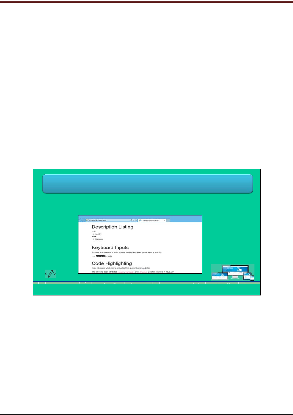
Developing Responsive Websites with Bootstrap and jQuery
4. These classes are useful for matching heading font’s style and put inline text besides the
heading text.
5. Web developers should use .small class for inline sub-heading to display secondary text
in smaller size and lighter color.
Show output to students for better understanding.
Code snippet for output mentioned on slide 13 is:
<div class="container">
<h1>h1 Text Transformation <small>subordinate text</small></h1>
<h2>h2 Text Transformation <small>subordinate text</small></h2>
<h3>h3 Text Transformation <small>subordinate text</small></h3>
<h4>h4 Text Transformation <small>subordinate text</small></h4>
<h5>h5 Text Transformation <small>subordinate text</small></h5>
<h6>h6 Text Transformation <small>subordinate text</small></h6>
</div>
Tell students that Web developers can use the heading classes in other elements to apply the
heading style in-between text.
Typography (2-2)
•Bootstrap offers styles for Description list <dl>, inline code snippet <code>,
and keyboard input text <kbd>.
•Output:
Developing Responsive Websites with Bootstrap and jQuery © APTECH LIMITED
14
Explain students about more styles in Bootstrap using slide 14.
Bootstrap also offers styles for description list <dl>, inline code snippet <code>, and keyboard
input text <kbd>.
Show output to students for good understanding.
• <dl> element provides bold style to the content in <dt>.
• <code> element highlights the text with background color.
• <kbd> element provides new font, black background color, and white text color.
© APTECH LIMITED
For Aptech Centre Use Only

Developing Responsive Websites with Bootstrap and jQuery
Slide 15
Let us understand text transformation classes.
Text Transformation Classes
•Three text transformation classes to change the text case in component:
•Output:
Developing Responsive Websites with Bootstrap and jQuery
.text-uppercase
.text-lowercase
.text-capitalize
© APTECH LIMITED
15
Explain students about text transformation classes in Bootstrap using slide 15.
There are three text transformation classes which change the text case in the HTML
components:
1. .text-uppercase: Changes each letter in upper case
2. .text-lowercase: Changes each letter in lower case
3. .text-capitalize: Changes first letter of each word in upper case
Show output to students for better understanding.
Slide 16
Let us understand responsive Web designing.
Responsive Web Designing
•The .clearfix class is used to prevent uneven wrapping and organizes the
content
•The .visible-sm class is a responsive utility to make content visible on small
devices
•The .visible-sm-block class is used to show content through media queries
•Use one or more classes to toggle content across variety of viewport
breakpoints
Developing Responsive Websites with Bootstrap and jQuery © APTECH LIMITED
16
Explain students about responsive Web designing using slide 16.
1. .clearfix class is used to prevent uneven wrapping and organizes the content
© APTECH LIMITED
For Aptech Centre Use Only
Developing Responsive Websites with Bootstrap and jQuery
2. .visible-sm and .visible-md classes are responsive utility to make content visible on small
and medium devices, respectively
3. .visible-sm-block class is used for displaying content through media queries on targeted
devices
Web developer can use one or more classes for toggling content across variety of viewport
breakpoints.
Slides 17 to 19
Let us summarize the session.
Summary (1-3)
•A responsive layout adapts its user interface components and perhaps even
functionality to any screen size on its own.
•A responsive Website adapts its layout to the viewing screen using three
elements namely, fluid grids, flexible multimedia, and CSS3 media queries.
•Bootstrap 3 mobile first technology allows the code to focus first on smaller
screens and then, expand for fitting on larger screens.
•A grid in Bootstrap is a collection of HTML/CSS components that enable a
Web developer to structure a Website and insert its contents easily in the
intended locations.
Developing Responsive Websites with Bootstrap and jQuery © APTECH LIMITED
17
Summary (2-3)
•Bootstrap provides only up to 12 columns for a Webpage regardless of the
viewport, but can have unlimited rows.
•The grid system consists of a series of containers, rows, and columns for
designing a layout and aligning its content. The container element covers the
content by setting the margins on the left and right.
•Bootstrap offers four predefined classes namely, xs, sm, md, and lg for
designing responsive layouts quickly as per the targeted devices.
•The jumbotron component allows increasing the size of heading and other
text for grabbing quick attention of visitors.
Developing Responsive Websites with Bootstrap and jQuery © APTECH LIMITED
18
© APTECH LIMITED
For Aptech Centre Use Only
Developing Responsive Websites with Bootstrap and jQuery
Summary (3-3)
•Inserting jumbotron inside a <div> tag prevents it to extend up to the edges
of the screen, while placing it outside extends it up to the edges.
•Bootstrap offers .h1 to .h6 classes for styling heading text and
accommodating inline text.
•Bootstrap provides .text-uppercase, .text-lowercase, and .text-capitalize
classes for transforming the case of words in any piece of text.
Developing Responsive Websites with Bootstrap and jQuery © APTECH LIMITED
19
Using slides 17 to 19 summarize the important topics learnt at the end of this session. Use
these pointers to reinforce some essential concepts and provide a quick recap.
Next, let us check your understanding of the topics covered so far in this session.
5.3 Post Class Activities for Faculty
You should familiarize yourself with the topics of the next session.
© APTECH LIMITED
For Aptech Centre Use Only

Developing Responsive Websites with Bootstrap and jQuery
Session 06: Creating Responsive
Webpages Using Bootstrap and jQuery
6.1 Pre-Class Activities
Before you commence the session, you should familiarize yourself with the topics of this
session in-depth. Prepare a question or two that will be a key point to relate the current session
objectives.
6.1.1 Objectives
At the end of this session, you will be able to:
Describe the role of media queries in achieving responsiveness in Bootstrap
Understand the use tables in Bootstrap
Understand the use tabs in a well in Bootstrap
Describe how to customize Bootstrap
Explain how to create a Website using Bootstrap and jQuery
6.1.2 Teaching Skills
To teach this session, you should be well versed with the concepts of tables in Bootstrap. You
should be familiar with the tabs in detail. You should also know how to create a Website with
the help of Bootstrap and jQuery.
You should teach the concepts in the theory class using the images provided. For teaching in
the class, you are expected to use slides and LCD projectors.
Tips:
It is recommended that you test the understanding of the students by asking questions in
between the class.
In-Class Activities
Follow the order given here during In-Class activities.
Overview of the Session
Give the students an overview of the current session in the form of session objectives. Read out
the objectives given on slide 2.
© APTECH LIMITED
For Aptech Centre Use Only
Developing Responsive Websites with Bootstrap and jQuery
Slide 2
6.2 In-Class Explanations
Slides 3 and 4
Let us introduce media queries.
Explain students about roles of media queries in responsive layouts using slide 3.
1. Define media query – It refers to a style rule used to display Website on specific type of
device without changing markups.
2. Media query helps in adding responsive CSS to a Bootstrap application. Basically, it defines
device specific style sheet.
© APTECH LIMITED
For Aptech Centre Use Only
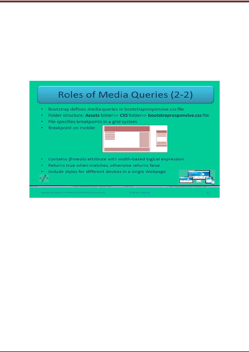
Developing Responsive Websites with Bootstrap and jQuery
3. In CSS2, media queries define stylesheets for computer screens, TV-type gadgets, handheld
devices, and printers.
4. In CSS3, media queries extend the concept of CSS2 media types and focus on characteristics
of devices rather than type of devices.
5. Media queries are useful in defining physical properties of devices: viewport’s and device’s
width and height, screen resolution, and orientation such as portrait, and landscape.
6. A breakpoint is a pixel width at which the layout of the Webpage adjusts to display better on
the targeted devices.
Using slide 4 explain that in Bootstrap, media queries are defined in a file
bootstrapresponsive.css. This file is located in CSS folder under assets folder.
This file specifies the breakpoints in a grid system.
Show code snippet to students for clear understanding.
/* Portrait phones and smaller */
@media (max-width: 480px) {}
/* Landscape phones and portrait tablets */
@media (max-width: 767px) {}
/* Portrait tablets and small desktops */
@media (min-width: 768px) and (max-width: 991px) {}
/* Landscape tablets and medium desktops */
@media (min-width: 992px) and (max-width: 1199px) {}
/* Large desktops and laptops */
@media (min-width: 1200px) {}
© APTECH LIMITED
For Aptech Centre Use Only
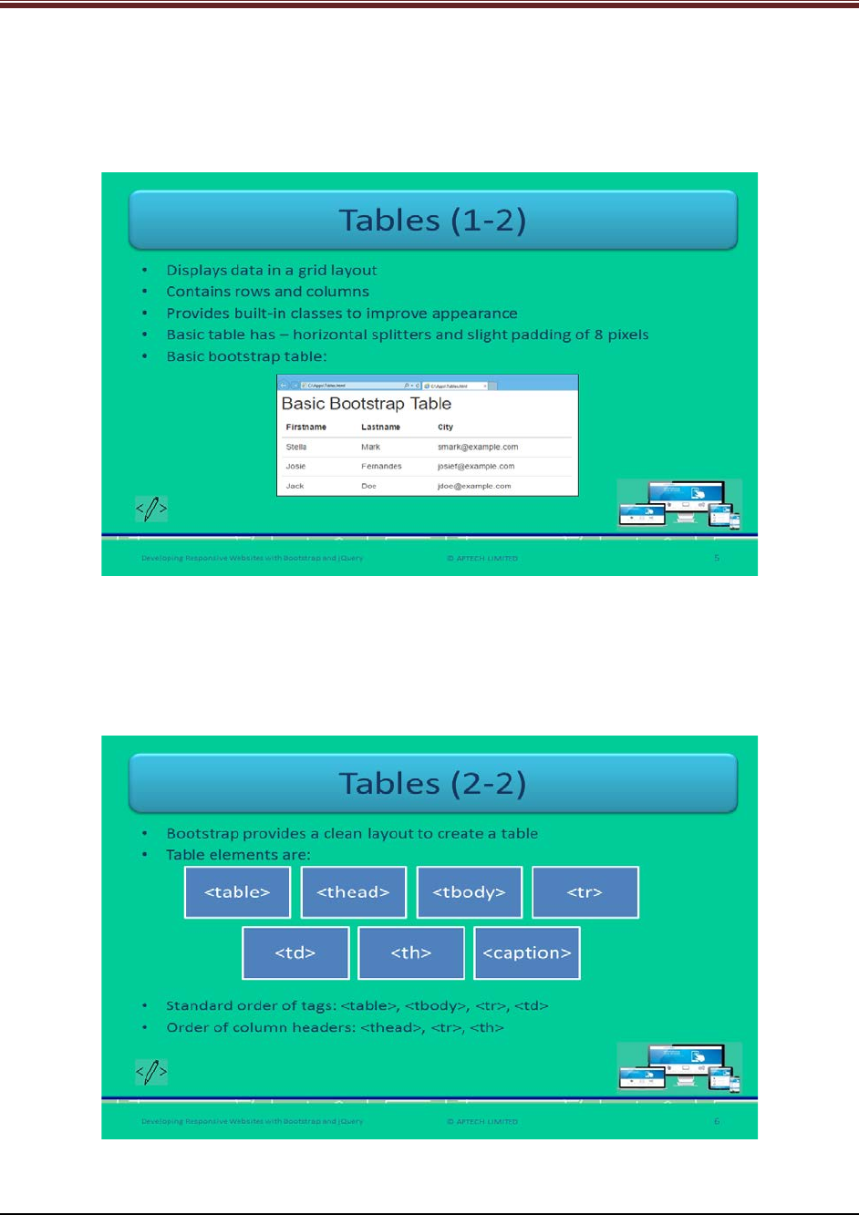
Developing Responsive Websites with Bootstrap and jQuery
This code is showing the implementation of media queries in Bootstrap.
Tell students that a Web developer can insert several breakpoints as per the requirements.
Slides 5 and 6
Let us understand tables in Bootstrap.
Explain students about tables in Bootstrap using slide 5.
1. Tables in Bootstrap are used to display data in a grid layout of rows and columns.
2. Bootstrap provides built-in classes for improving appearance.
3. A basic table contains horizontal splitters and slight padding of 8 pixels.
© APTECH LIMITED
For Aptech Centre Use Only
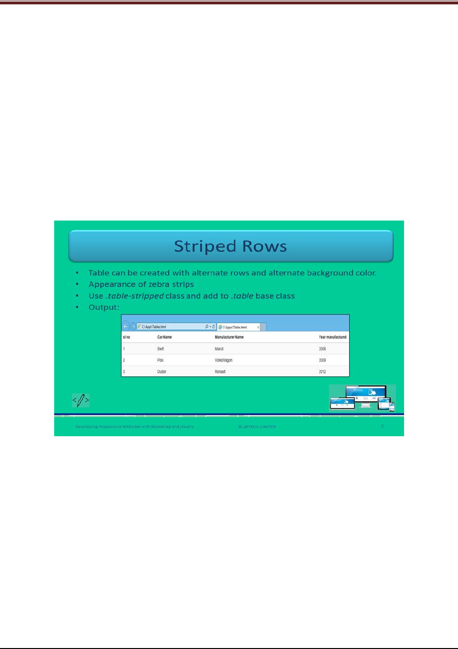
Developing Responsive Websites with Bootstrap and jQuery
Using slide 6 explain that Bootstrap provides a clear layout for creating a table with elements:
<table>, <thead>, <tbody>, <tr>, <th>, <td>, and <caption>.
The standard order of table tags are:
1. <table>
2. <tbody>
3. <tr>
4. <td>
In case of column headers, the order is:
1. <thead>
2. <tr>
3. <th>
Slide 7
Let us understand striped rows.
Explain students about striped rows in a Bootstrap table using slide 7.
1. In Bootstrap, Web developer can create a table with alternate rows having background
color different from previous one.
2. Web developer should use .table-stripped class and add to .table base class.
Show output to students for clear understanding.
© APTECH LIMITED
For Aptech Centre Use Only
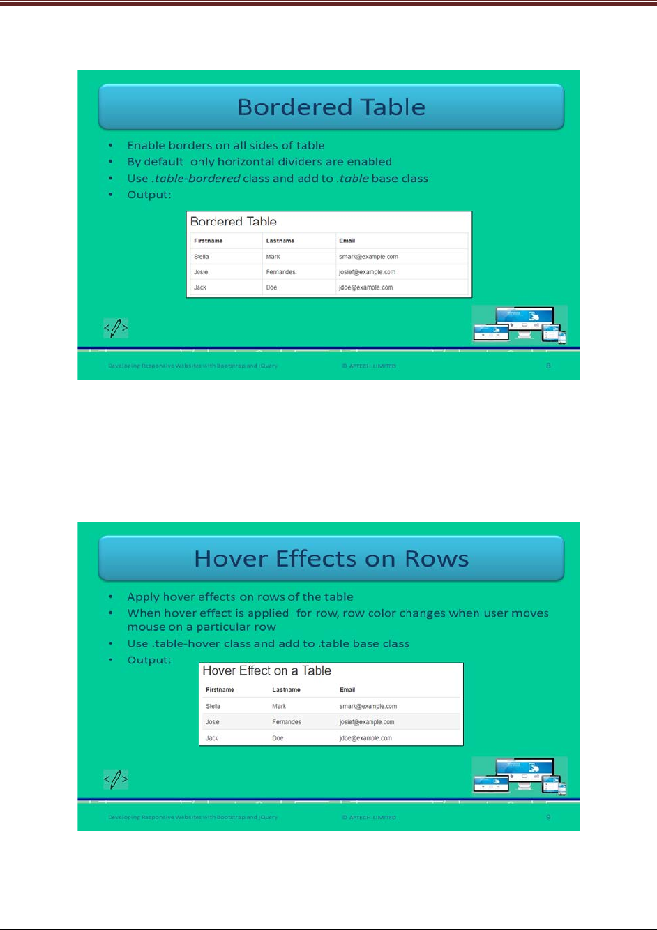
Developing Responsive Websites with Bootstrap and jQuery
Slide 8
Let us understand bordered table.
Explain students about bordered tables in Bootstrap using slide 8.
In Bootstrap, Web developers can enable bordered table which is a border on all sides of the
table.
Show output to students for good understanding.
Slide 9
Let us understand hover effects on table rows.
Explain students about hover effects on table rows using slide 9.
© APTECH LIMITED
For Aptech Centre Use Only
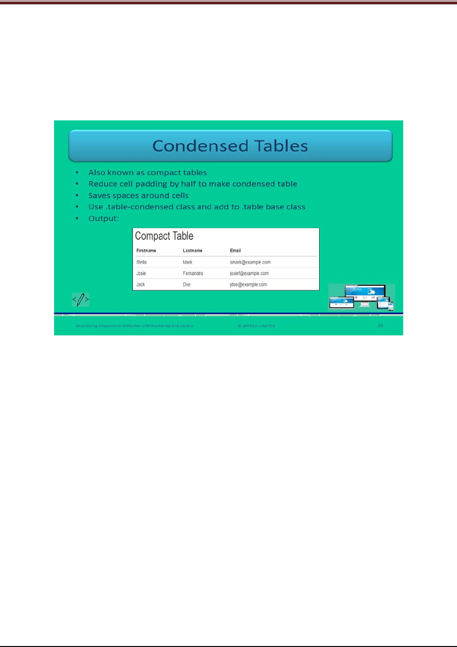
Developing Responsive Websites with Bootstrap and jQuery
When a user moves a mouse on a row it means mouse hover on a table row, it gets in gray
background. Bootstrap allows hover effects on table rows. Web developer should use .table-
hover class to .table base class.
Show output to students for good understanding.
Slide 10
Let us understand condensed tables.
Explain students about condensed tables or compact tables in Bootstrap using slide 10.
Bootstrap allows utility of condensed tables which helps in reducing cells padding by half. It
saves spaces around the cells. Web developers should use .table-condensed class to .table base
class.
Show output to students for better understanding.
© APTECH LIMITED
For Aptech Centre Use Only
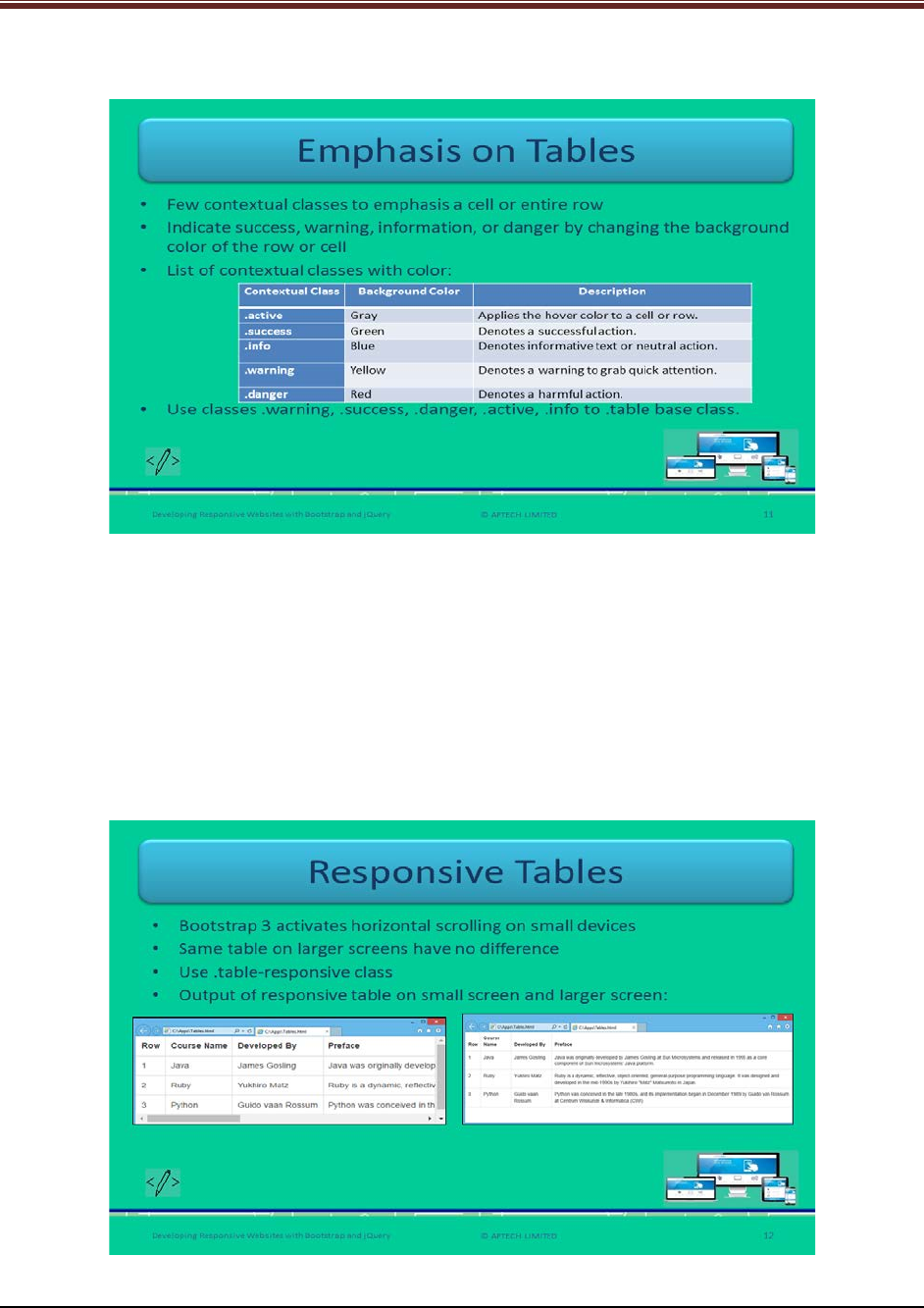
Developing Responsive Websites with Bootstrap and jQuery
Slide 11
Let us understand emphasis on tables.
Explain students about emphasis on tables using slide 11.
In Bootstrap there are few contextual classes that are used for emphasizing a cell or an entire
row of a table. It indicates success, warning, info, or danger by changing row or cell background
color.
The contextual classes in Bootstrap are: .active, .success, .info, .warning, and .danger changes
to gray, green, blue, yellow, and red respectively.
These classes are added to .table base class.
Slide 12
Let us understand responsive tables.
© APTECH LIMITED
For Aptech Centre Use Only
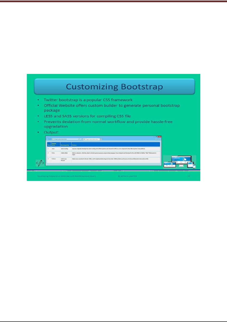
Developing Responsive Websites with Bootstrap and jQuery
Explain students about responsive tables using slide 12.
In Bootstrap 3, Web developers can create responsive tables which activate horizontal scrolling
on small screen. Its screen width is not more than 768 pixels. The same responsive table on
large screen will not show any difference. Web developers should use .table-responsive class.
Show the outputs of responsive tables on small screen and large screen for good
understanding.
Slide 13
Let us understand customizing Bootstrap.
Explain students about customizing Bootstrap using slide 13.
Twitter Bootstrap is now a popular CSS framework to develop Web applications because it
helps in saving much time for developers. The official Website of Bootstrap offers custom
builder for generating personal Bootstrap package.
It is efficient to override CSS file to code the desired styles. This mechanism prevents deviation
from normal workflow and provides hassle-free upgradation.
Show output to students for better understanding.
© APTECH LIMITED
For Aptech Centre Use Only
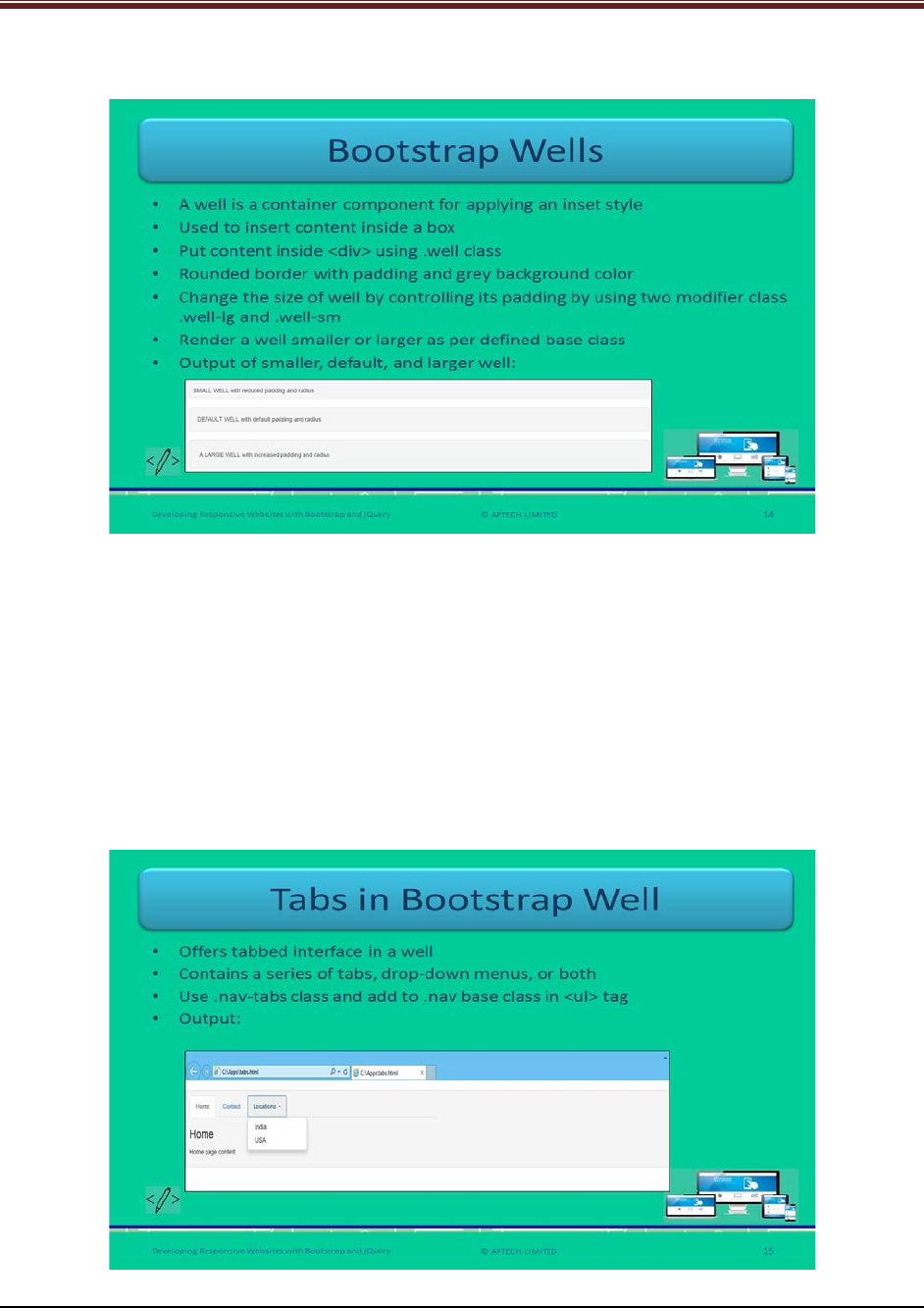
Developing Responsive Websites with Bootstrap and jQuery
Slide 14
Let us understand about Bootstrap wells.
Explain students about Bootstrap wells using slide 14.
Bootstrap well is a container component to apply inset style. It is used to insert content inside a
box. Web developers wrap content inside <div> element using .well class. It changes the well’s
size by controlling its padding.
These render smaller or larger well depending on the base class that developer specifies.
Show output of smaller, default, and larger well to students for quick understanding.
Tell students that to avoid a collapsing parent while having floated content inside a well, add
.clearfix and .well classes.
Slide 15
Let us understand about tabs in bootstrap wells.
© APTECH LIMITED
For Aptech Centre Use Only
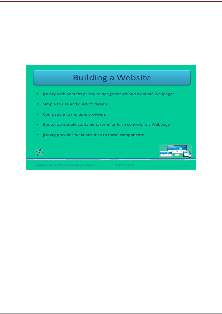
Developing Responsive Websites with Bootstrap and jQuery
Explain students about tabs in Bootstrap well using slide 15.
Bootstrap offers tabbed interface within a well. Tabs contain series of tabs, drop-down menus,
or combination of both. Web developers should use .nav-tabs class to .nav base class with <ul>
tag.
Show output to students for better understanding.
Slide 16
Let us understand how to build a Website.
Explain students about building a Website using jQuery and Bootstrap using slide 16.
Using jQuery with Bootstrap used to design robust and dynamic Webpages.
It is simple to use and quick to design Website which is compatible to multiple browsers.
Bootstrap includes containers, form, or form controls in a Webpage and jQuery provides the
functionalities to all these components.
© APTECH LIMITED
For Aptech Centre Use Only
Developing Responsive Websites with Bootstrap and jQuery
Slides 17 to 19
Let us summarize the session.
© APTECH LIMITED
For Aptech Centre Use Only
Developing Responsive Websites with Bootstrap and jQuery
Using slides 17 to 19 summarize the important topics learnt at the end of this session. Use
these pointers to reinforce some essential concepts and provide a quick recap.
Next, let us check your understanding of the topics covered so far in this session.
© APTECH LIMITED
For Aptech Centre Use Only
