ESW Guide
User Manual:
Open the PDF directly: View PDF ![]() .
.
Page Count: 29

ESW National
Branding Guide

“Design is the application of intent —
the opposite of happenstance,
and an antidote to accident.”
Robert L. Peters,
notable graphic designer and conservationist

Dearest Reader:
You might be wondering why this guide even
exists. A!er all, all this branding stuff is a lot of
work and it would be easier if we just all agreed to
use the default styles in Microso! Word and called
it a day.
But ESW has never settled for the default.
We fight to create something better than the
default. This isn’t easy. Creating something better
than the status quo takes inspiration, research,
consideration, resolve, and trust in the outcome,
but we do it. We do it because it’s something we
believe in, because it’s why we exist as an
organization, and maybe even why we exist as
individuals. I believe it is vital that this ideology
pervades our communications efforts as much as
it does everything else we do if we are to be taken
seriously as an organization.
In the case of branding and communications, we
should all seek to produce documents, articles,
posters, merchandise, and websites that are are
distinct, intentional, user-friendly, and consistent.
Lucky for you, dear reader, much thought has
already been put into how to do these things, and
this guide is the culmination of that thought. I
encourage you to use this guide both for the
advice contained in it, and as an example itself of
that advice applied to a real document.
When you need help, the Branding Committee
and Branding Director are there to help you— do
not hesitate to contact them. By doing so, you’ll
improve not only whatever it is you’re working on,
but also future iterations of this guide and thus
future things created by ESW.
Thanks for reading this and taking it seriously.
Now, read up and spread the ESW brand far and
wide!
2

Quick Reference
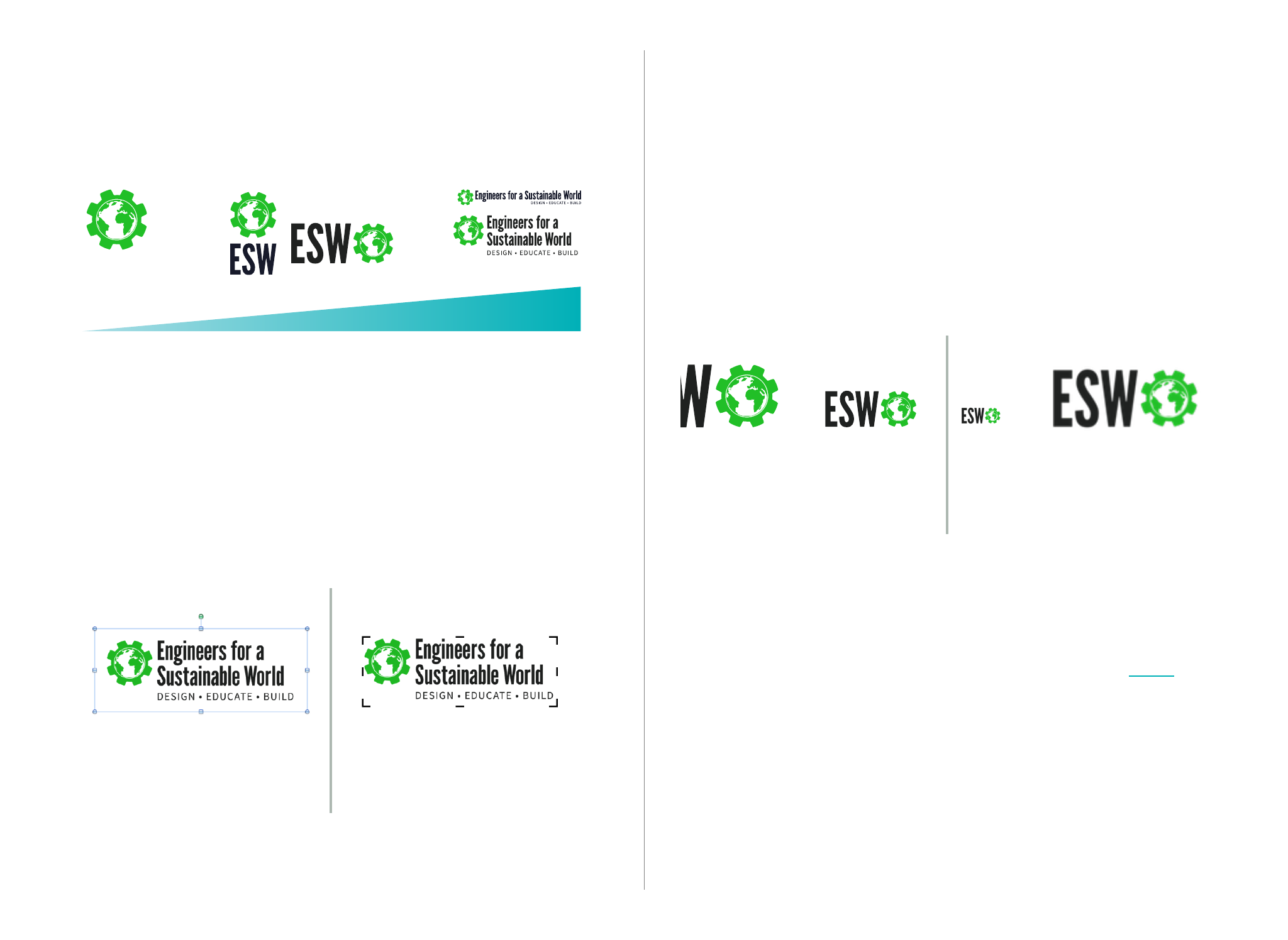
Logos
Information Conveyed/”Googlability”
There are multiple variations on our logo. Choose the sim-
plest one you can that conveys the information you need it
to for your use case.
Make sure to give the logo adequate space in your de-
signs— don’t crop down the whitespace included in the
logo files.
Opt to use vector formats (.ai, .pdf, .svg) over bitmap ones
(.jpg, .png, .gif) when possible. If you’re using bitmap for-
mats, choose the highest resolution file that makes sense
and scale it down, rather than scaling it up.
“Remixes” of the logo are permitted for special events, col-
laborations, and individual chapters. Read more here.
4
Diagram 1.2 Resizing logo images
Diagram 1.1 Logo spacing
The space around logos is there for a reason— don’t crop it out!
Typography
Use the font selection flowchart to
determine which fonts you should use in
your design.
All fonts are available for free download at
eswusa.org/drupal/brand and are quick to install.
If you’re working on a Google Drive document, Source
Sans is the only member of our font family currently avail-
able. If additional fonts are needed, we recommend finish-
ing formatting for your document in Microso! Word, Apple
Pages, or Adobe InDesign.
For external documents, use the PDF format to ensure
consistent formatting across all computers.
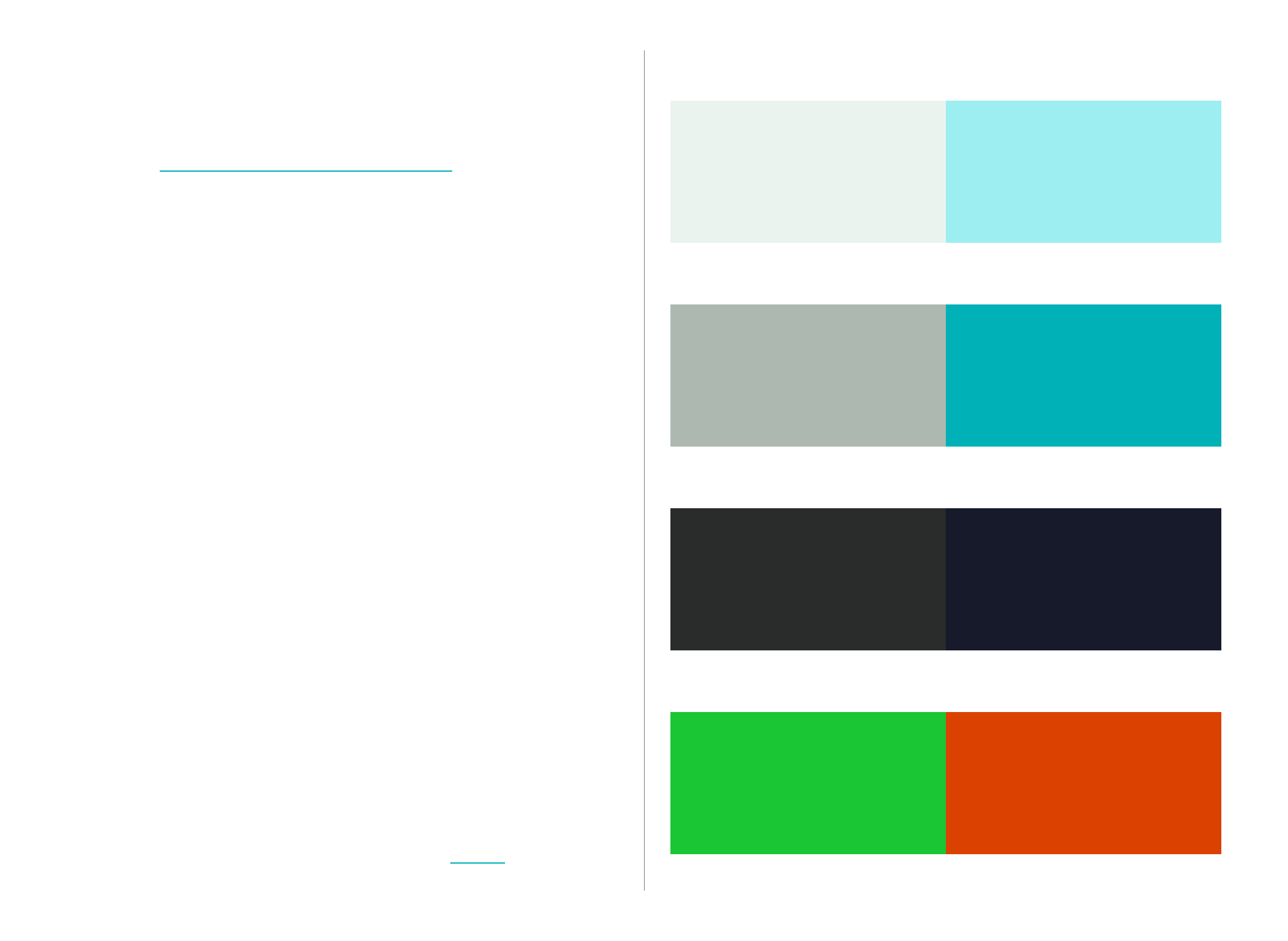
Color
The ESW color palette contains 8 colors which should
cover the vast majority of use cases.
See rules of thumb on color use here.
Tints
Pale Gray
230,240,235
#e6f0eb
Pale Blue
159,244,245
#9ff4f5
Midtones
Gray
173,184,177
#adb8b1
Turquoise
0,177,184
#00bec4
Shades
Dark Gray
31,33,32
#1f2120
Midnight
23,26,43
#171a2b
Accents
ESW Green
33,191,39
#21bf27
Orange Red
208,44,6
#d02c06
5

Brand DNA
How do we want to portray ourselves as
an organization?
How do we make decisions about
our brand?

purposeful
Our work is constructive and impactful. Being part of
ESW means contributing to society.
empowering
We inspire, excite, and engage everyone who touches our
organization.
dynamic
We are an agile and creative group that tries new
things and provides our members with new, eye-
opening experiences.
responsible
We are an organized and dependable group that acts
conscientiously in all our endeavors.
optimistic
We are ever hopeful that our vision of a sustainable
world can be attained.
community
We work, have fun, and bring people together in our
chapters and beyond.
7
Brand DNA
How do we describe ESW?
Our vision is the future we want to create
as an organization.
Our mission is how we’re going to achieve
that future.
Our brand DNA is how being a part of ESW
(whether as a member, leader, alumni, or
sponsor) should make you feel. It’s how
you would describe the ESW experience to
someone who has never heard of us be-
fore.
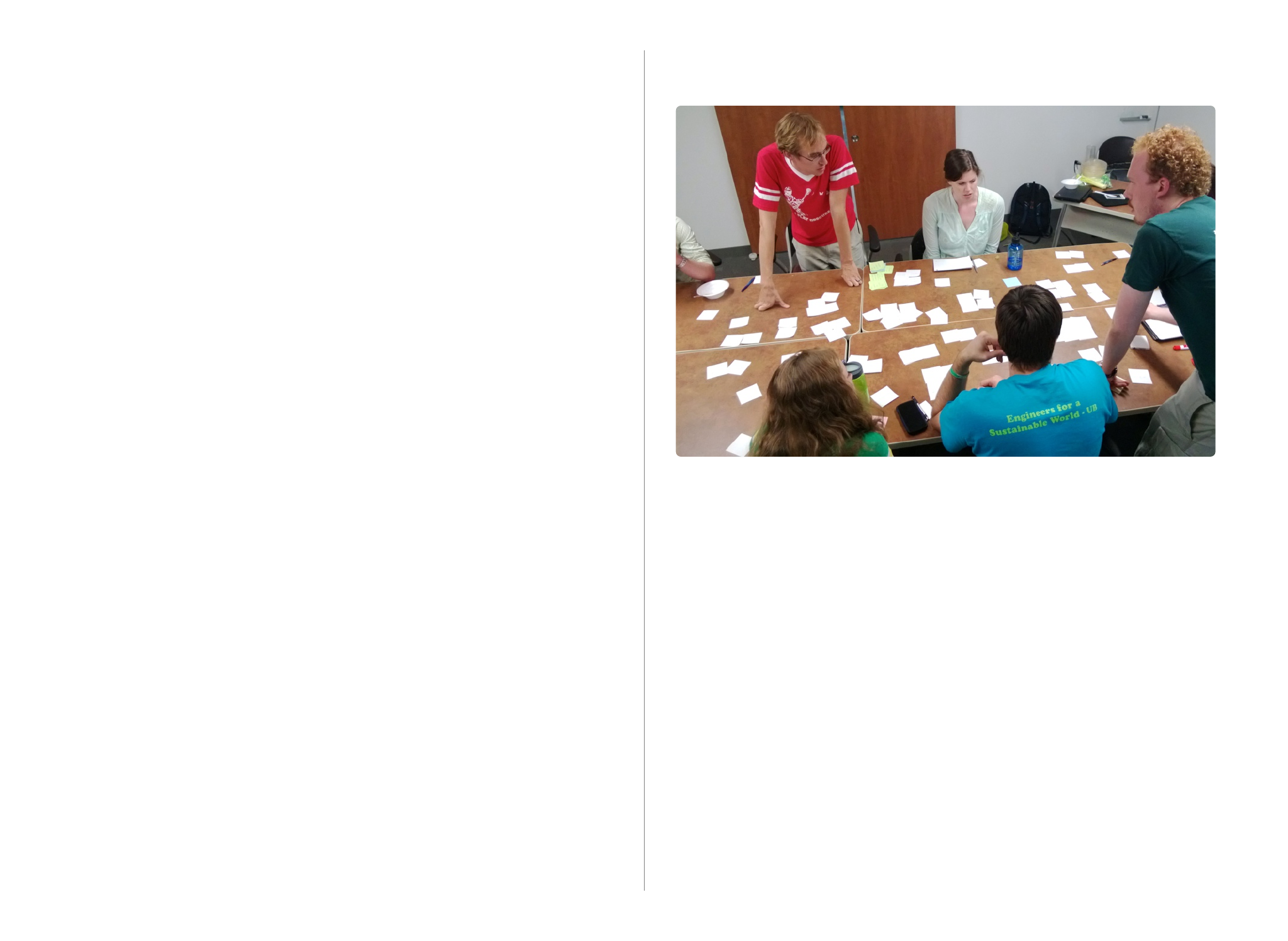
At the 2013 ESW National Team retreat,
members of the ESW National Team
worked together to define this DNA. They
managed to compact it down to 6 simple
ideas, in no particular order:
Fitting the fabric of an organization into 6 words
is near impossible, but these can serve as useful
ideals when making decisions.
Does the newsletter you’re making promote
a spirit of community?
Does the sponsorship packet you’re putting
together feel dull and corporate, or dynamic
and empowering?
Is the blog post you’re writing done in a
purposeful, responsible manner, or is it
disorganized and unresearched?
Is the picture you’re posting on our Face-
book page depressing and inflammatory, or
optimistic and empowering?
Remember, if you’re having trouble making
your branded materials live up to these ideals,
ask the ESW National Team Branding Director
for help— that’s what they’re there for!
8
The ESW National Team, brainstorming brand DNA at the
2013 NT Retreat.
The creation of our Brand DNA

Logos
How do we symbolize ESW?
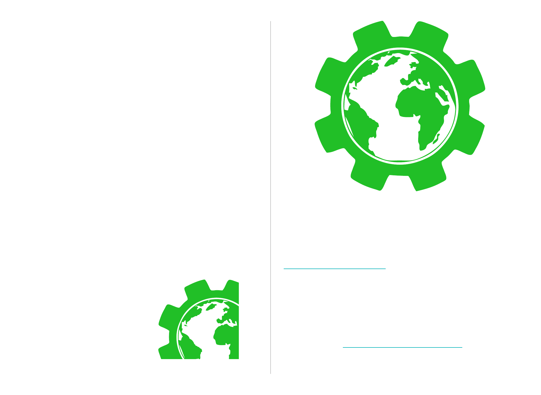
Circular and compact, this logo can be used
decoratively and for applications where simplic-
ity is key, but keep in mind this version of the
logo isn’t “Googlable”, so its best suited for appli-
cations where people either already know who
we are or don’t need to. Fun fact: it also looks
really cool when blown up to preposterous size
and set off the corner of a page.
The gear should be all one color (green, dark
gray, or white) unless you’re making a logo re-
mix for an event, chapter, or collaboration (See
the “Remixes” page in this section for details)
Note that using the logo with a transparent cen-
ter over a background color is fine— in fact, it
looks quite handsome on dark colors. Read
more about do’s and don’ts of color in the
Color section.
10
The Gear Symbol
The future of our planet is at the
center of everything we build.
Figure 3.1 The blow-up and offset technique
Whoa.
Look at that gear. Sweet.
TM
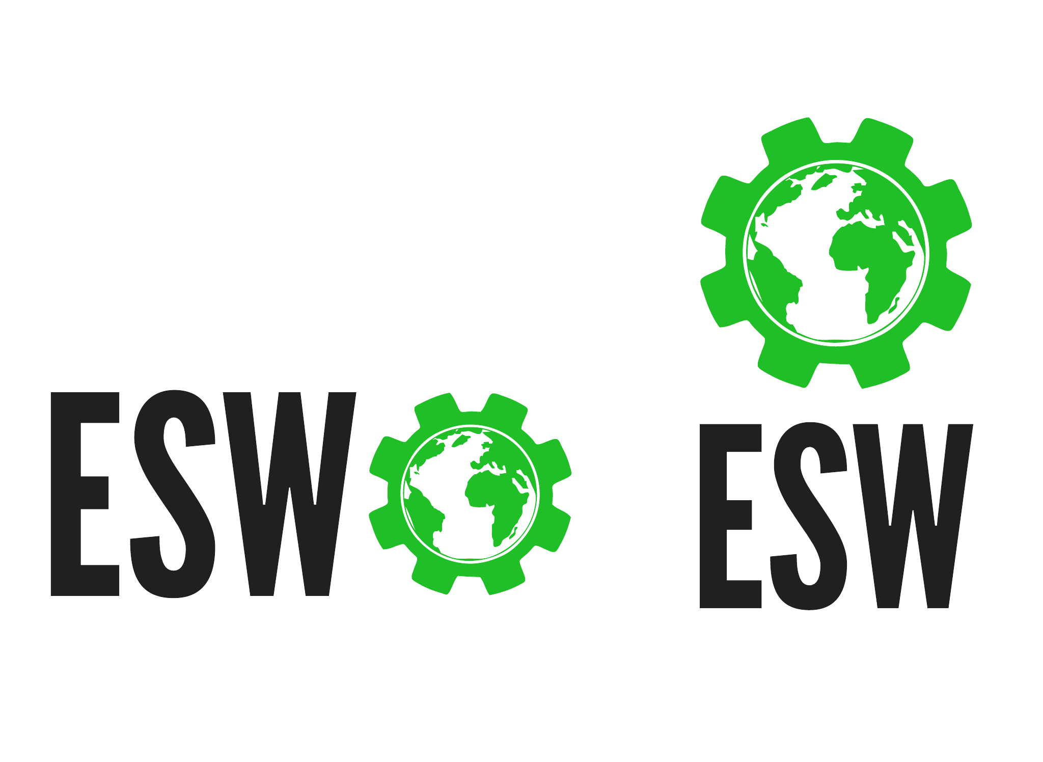
This version of the logo comes in two orienta-
tions and is great when you need something
that’s compact and simple but also allows peo-
ple to at least have a name to ask about or
search for online. Ideal for merchandise, and as
a base to build chapter or event logos off of.
11
Compact Logos
The Goldilocks versions
TM
TM
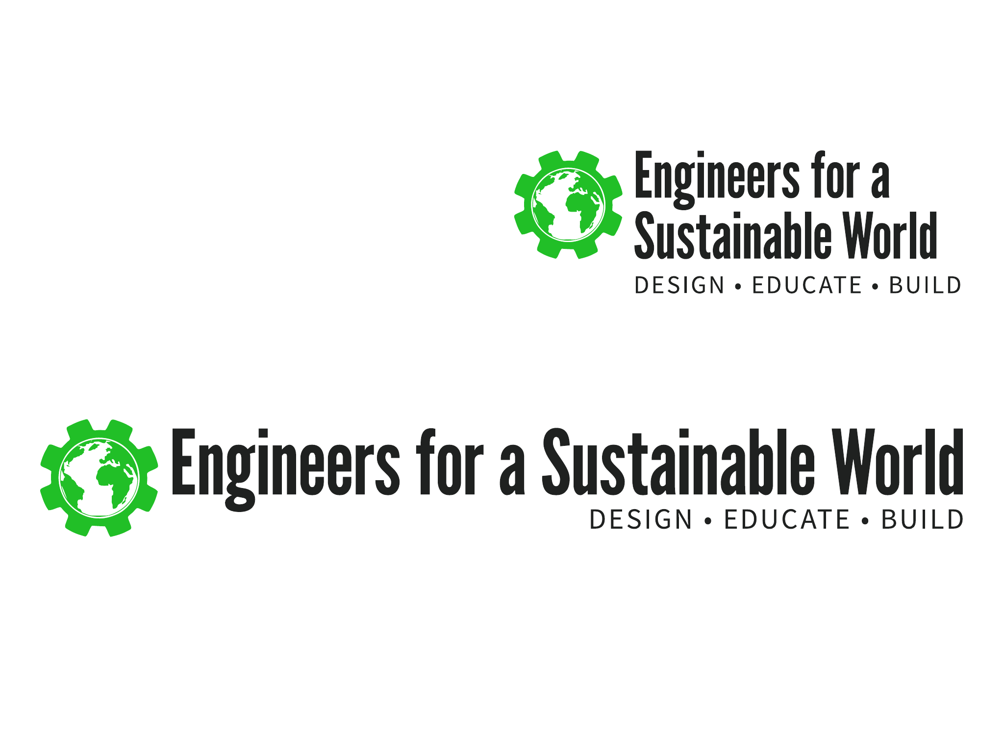
This is the full monty— our logo, name and ta-
gline elegantly balanced to tell people who we
are and what we do. Good for letterhead, web-
sites, and anywhere where the logo needs to say
it all. It comes in a 1-line and 2-line version—
choose the one which fits in your design better.
12
Full Logo
The whole kit and caboodle
TM
TM

The existing logos should cover most use cases,
but you may want a specialized logo for your
chapter, or a special collaboration or event.
That’s totally cool, make it! Here are some pieces
of advice to ensure what you make jives well
with the ESW brand:
•Don’t reinvent the wheel. Or more
specifically, the Gear. For consistency’s
sake, try to build off of the existing Gear
Symbol rather than drawing a new one
from scratch. #If you do decide to draw
your own, remember; the ESW Gear
always has 8 teeth!
•Consider using the type and color
guidelines from this guide. They’re there
for a reason— the fonts and colors work
well together and can make your life
easier.
•Don’t struggle in silence. If you want
help or approval from the National Team,
reach out to the Branding director; it’s
their job to help you!
13
Remixes
Put your our own spin on it
The ESW-RPI chapter logo is a great example of a
successful logo remix.
Figure 3.2 The ESW-RPI Logo

Color
How do we use color in our designs?
Using color aptly requires practice and a trained
eye. If you know what you’re doing, by all means
break the rules. If not, this section is a good
place to start.
Opposites Attract
wow! look at
they sure are
these color pairs!
sharp aren’t they?
Tints/white and shades go together— using one for a back-
ground and the other for your text is a safe bet.
You Don’t Need Both
There’s o!en no need to use both colors from a color class
(e.g. don’t mix midnight and dark gray, pick one or the
other). This is less true for accents, but don’t put them
right up against each other.
Green Hates Midtones
barf. please, just don’t
Avoid putting our green right up against the midtones. Red
can also be tricky with them, but it’s doable— just use cau-
tion.
15
Using Color
for fun and profit!
Accents Are Potent
Sustainability
by Brian Lange
Lorem ipsum dolor sit amet, consectetur adipiscing
elit. Suspendisse placerat vestibulum elit, sed
tempor justo hendrerit eu. Curabitur turpis erat,
semper eget sodales vitae, varius id lorem. Sed
dolor risus, pellentesque at aliquam et, tincidunt et
ipsum. Sed vel lorem risus. Nullam urna nulla,
commodo eu aliquam aliquet, placerat eu sem.
Phasellus semper laoreet neque, sit amet auctor mi
rhoncus a. Vivamus dictum tempor adipiscing.
Suspendisse ac sem lectus. Donec neque diam,
scelerisque sed iaculis a, lobortis sit amet turpis.
Pellentesque habitant morbi tristique senectus et
netus et malesuada fames ac turpis egestas.
In sem risus, lobortis in eleifend quis, porttitor ac
erat. Vestibulum ante ipsum primis in faucibus orci
luctus et ultrices posuere cubilia Curae; Nulla
Accents can add pop to a design, but they shouldn’t make
up the majority of it.
Bulk Up When Contrast Is
Low
kinda hard to read easier to read
needs some oomph now we’re talkin’
doesn’t really pop hey, that works
When contrast isn’t particularly high (red on dark colors,
green on light ones, midtones on anything), compensate
by using heavier font weights, larger font sizes, or a combi-
nation of the two.
Shades Are The New Black
Black is generally unneeded (and not part of our palette).
Opt for dark gray or midnight instead. Shadows? Go gray.
Text on slides? Try out midnight. These dark colors provide
the necessary contrast without being as harsh as black,
and can provide your designs with more character. Not
convinced? Read more here.
Don’t Overdo It
In general, show restraint when it comes to color. A little
color goes a long way, and things won’t look “boring” if
they’re not blanketed in it, as long as you’re also following
our other guidelines on typography and layout.
Up next: More about the ESW Palette...
16
Our tints are for when you need or want a color that isn’t white, but still
provides nice contrast with darker shades.
Suggested Use
Sustainability
by Brian Lange
Sustainability
by Brian Lange
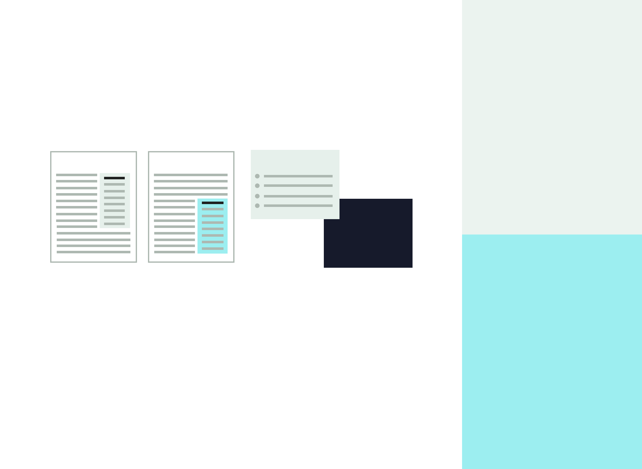
Callout boxes/sidebars Slide backgrounds/text
54% of all emissions
Wicked Problems
Both can act as backgrounds for black or one of our dark shade colors,
and both can act as text colors on those colors as well.
17
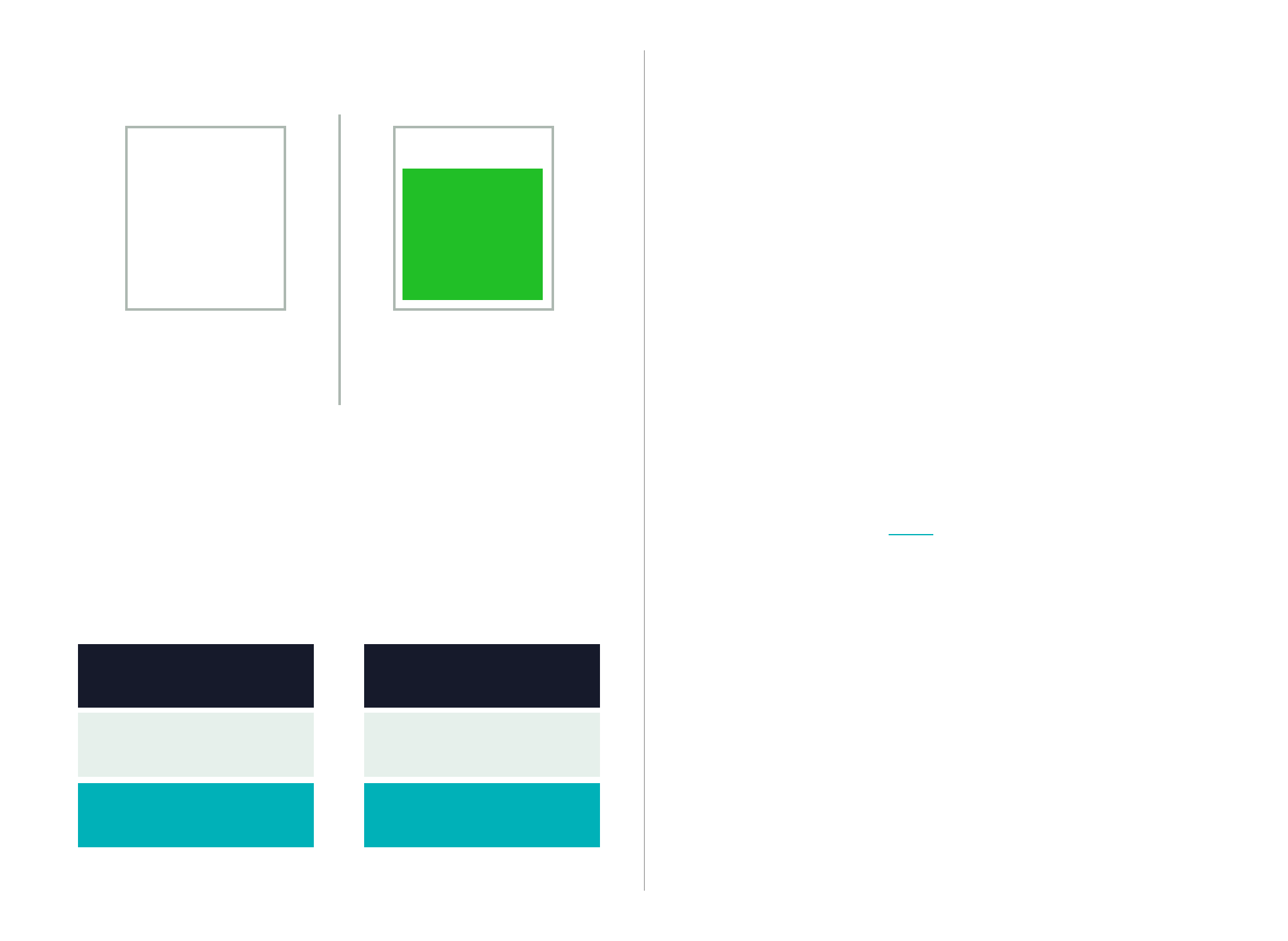
Tints
Pale Gray
rgb: 230, 240, 235
hex: #e6f0eb
Pale Blue
rgb: 159, 244, 245
hex: #9ff4f5
Fun midtone facts: our turquoise is derived from photos of Earth taken from deep
space, while the gray contains some green and blue to jive with the rest of our colors.
Suggested Use
Cancel
Disclaimer: The
information contained
in this email message
is intended only for the
personal and confiden-
tial use of the
recipient(s) named
Fine print
Back/cancel
navigation
Hyperlinks
Buttons Submit
Interested in
helping out? Click
here for more
information.
Presentation
by Alex Dale
Backgrounds
Category
Merchandise
Donations
Membership
Sponsorship
Events
Bitcoin Mining
Income
$4993.00
$18030.00
$9472.00
$30000.00
$7632.00
$23.00
Use the turquoise for things like buttons and links to draw some attention to them
without resorting to bright green or red. Use the the gray on white to de-emphasize
elements in a design. Both colors also work as background colors for slides or table
headers.
Remember to avoid green with these colors and increase font size or weight when
things are hard to read.
18
Midtones
Gray
rgb: 173, 184, 177
hex: #adb8b1
Turquoise
rgb: 0, 177, 184
hex: #00bec4
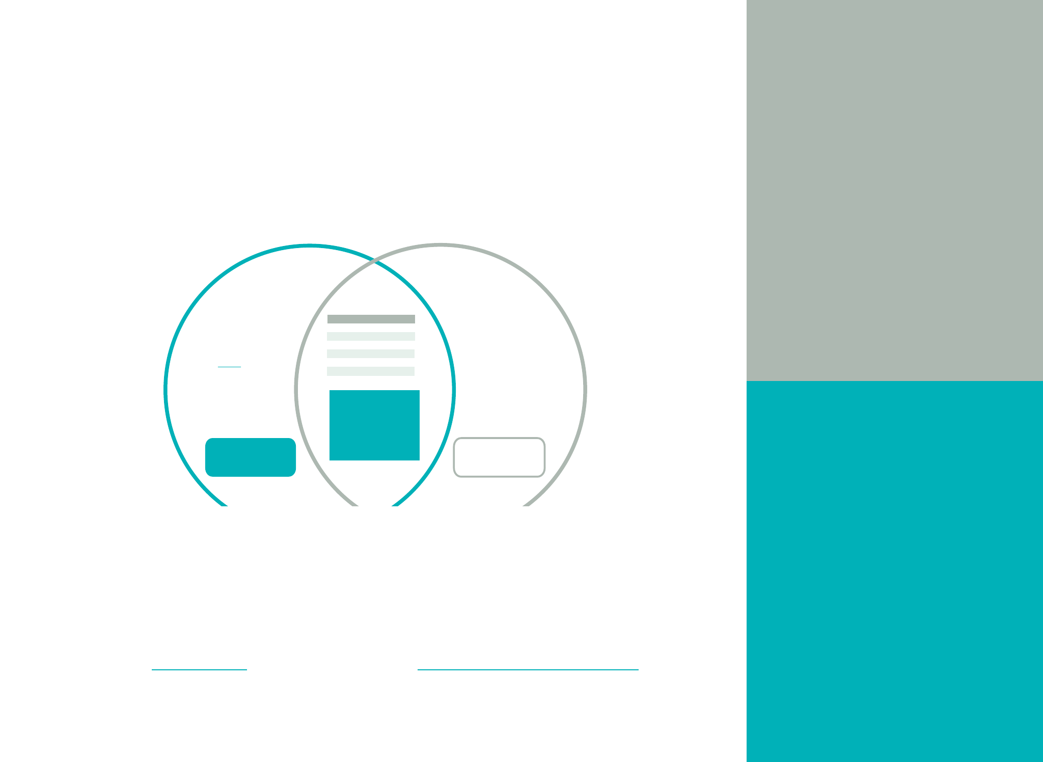
Suggested Use
Slide backgrounds/text
54% of all emissions
Wicked Problems
Body text
Lorem ipsum dolor sit amet, consectetur
adipiscing elit. Suspendisse placerat
vestibulum elit, sed tempor justo hendrerit
eu. Curabitur turpis erat, semper eget
sodales vitae, varius id lorem. Sed dolor
risus, pellentesque at aliquam et, tincidunt
et ipsum. Sed vel lorem risus. Nullam urna
nulla, commodo eu aliquam aliquet, plac-
erat eu sem. Phasellus semper laoreet
neque, sit amet auctor mi rhoncus a. Viva-
mus dictum tempor adipiscing. Suspendisse
ac sem lectus. Donec neque diam, sceleris-
que sed iaculis a, lobortis sit amet turpis.
Pellentesque habitant morbi tristique
Both as text colors (with white or tint backgrounds), or as backgrounds (with white or
tint text colors). For short bits of text or graphic designs, midnight also goes wonderfully
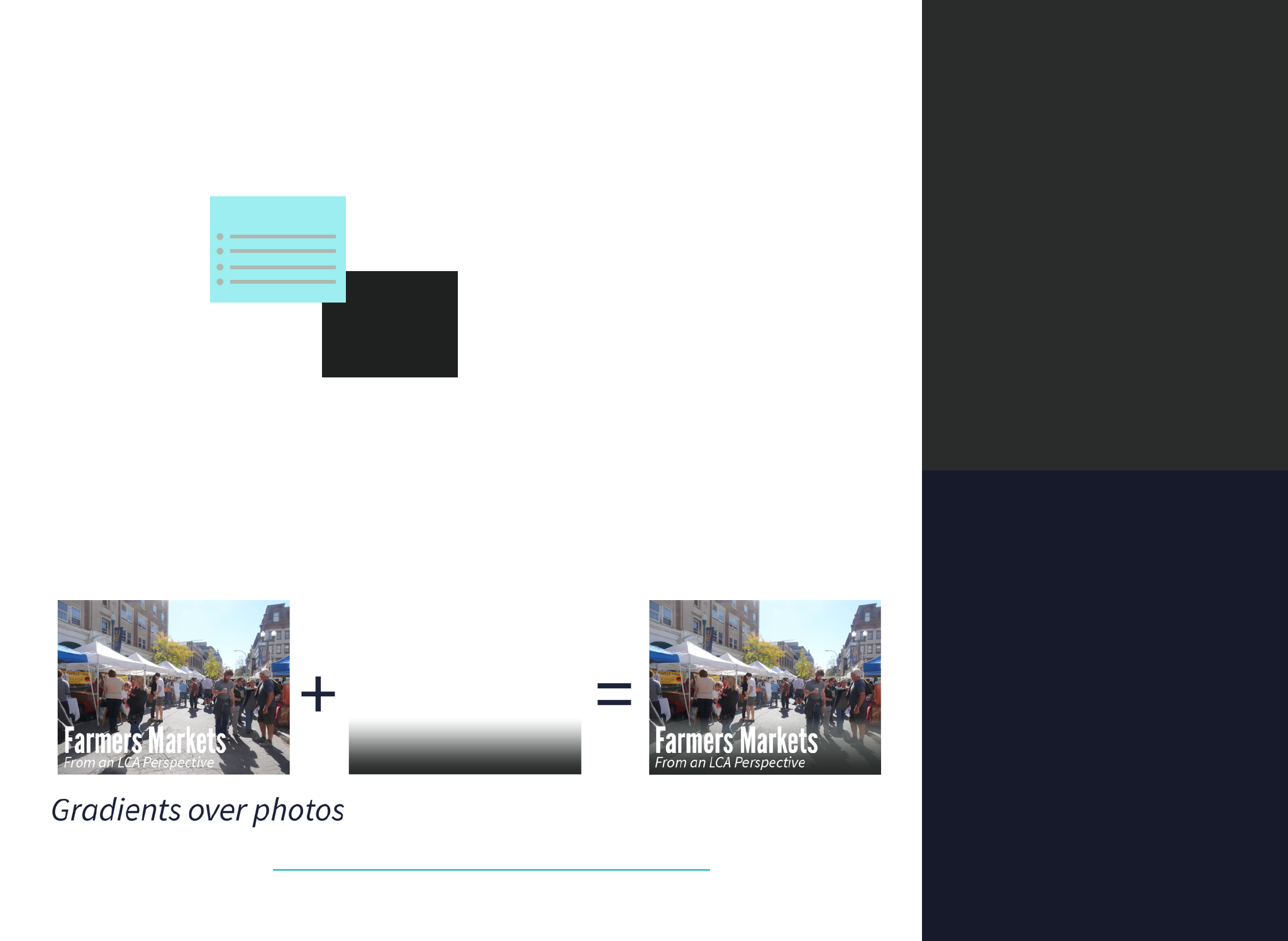
with our accent colors. The gray can also be used in gradients over photographs to make
light text more readable.
Beyond that, use them almost anywhere you’d ordinarily use black.
19
Shades
Dark Gray
rgb: 31,33,32
hex: #1f2120
Midnight
rgb: 23,26,43
hex: #171a2b
Our accents are bold and bright. Like cayenne pepper or 5 Hour Energy,
a little bit makes things awesome, but too much can make you want to
puke, so use responsibly.
Suggested Use
Logos Buttons Accent Text
Color
whoa, meta
Register now!
TM
TM
Continue
Icons/Errors
Uh-oh! Looks like your information is incorrect.
Small graphic elements, buttons or links you want to draw attention to.
The green is more optimistic and looks good as part of the logo, or set
on dark shade backgrounds. The red is more urgent and works well for
buttons and error messages.
20
Accents
ESW Green
rgb: 33,191,39
hex: #21bf27
Orange Red
rgb: 208,44,6
hex: #d02c06

Typography & Layout
How do we organize our designs?
What fonts do we use and how?
The foremost purpose of typography and layout
in a design is to make it easy for people to extract
the information they need. It can also communi-
cate strength, order, and our brand DNA, but
more important than any of that is readability.
Layout
Visual layout makes a big difference in the im-
pression a design makes and the efficiency with
which it conveys information. We highly recom-
mend you check out the guide at
http://www.visualmess.com/ to pick up the ba-
sics, and run things by the Branding Director if
you feel you need help or feedback.
Our Fonts
ESW has a few nice fonts we go to for different
purposes. By using these instead of system de-
faults like Times New Roman or Calibri, we can
have a distinct look to our communications.
The following sections will go into more details
on the fonts we use as an organization, and the
flowchart above can help you decide which one
to employ.
Further reading
If this section happens to spark an insatiable
thirst for typographic knowledge, we recom-
mend these online supplements:
•Butterick’s Practical Typography
• Thinking with Type by Ellen Lupton
22
Typography & Layout
“Endowing human language with a
durable visual form.”
-Robert Bringhurst, The Elements of Typographic Style

What font should I pick?
A helpful flowchart

Source Sans Pro is ESW’s primary typeface. It’s
professionally designed, highly legible, and avail-
able for use on your computer, on the web and in
Google Drive documents.
Background
Source Sans Pro was released by Paul Hunt in
2012 as Adobe’s first open source typeface. It
was originally designed to be used in user inter-
faces, meaning it was optimized for clear read-
ability on screen at small sizes and low resolu-
tions. To achieve this, Hunt drew inspiration
from classic Morris Fuller Benton “grotesque”1
sans-serifs like News Gothic and Franklin Gothic.
The result is a typeface that looks great at a vari-
ety of sizes and even in print.
Use it for:
•Body text, especially web or short-form print
like articles, press releases, 1-pagers, etc.
•Document headers, titles, subtitles
•Labels and captions for charts, figures, and pic-
tures
•Presentations
•UI text for websites, apps, etc.
24
Source Sans Pro
Our workhorse typeface
with you through thick and thin
precise
friendly
flexible
functional
digital
unique
legible
professional
new
distinct
available
open-source
modern
tactful human
1 “Grotesque”/“Grotesk” (sometimes also called Realist) is a classification of sans-
serif typefaces. Grotesques fall in the middle of the spectrum between humanist
sans-serifs which take cues from calligraphy (example: Gill Sans) and geometric
sans-serifs which favor symmetry and geometry (example: Futura).
Grotesques tend to be neutral, legible from distance, and communicate stability.
Examples you may know include Helvetica, Arial, and Highway Gothic (used on US
traffic signs). #

League Gothic is our headline typeface. It’s
heavy and attention getting while being horizon-
tally compact thanks to it’s tall, condensed
shape. It can look good in all caps, but this also
makes the font appear heavier and less read-
able, so exercise restrain when using it this way.
Background
League Gothic is an open source revival of Morris
Fuller Benton’s 1903 sans-serif Alternative
Gothic, created by The League of Movable Type.
It pairs well with Source Sans Pro thanks to their
shared heritage— both are modernizations in-
spired by turn-of-the-century grotesques by Mor-
ris Fuller Benton.
Use it for:
•Headlines/titles
•Striking statistics
•Other large text
25
League Gothic
The attention getter
HI. I’M LEAGUE GOTHIC.
What’s your name?
Source Sans Pro is great, but when you’re
working on long-form or highly formal docu-
ments intended for print, you’ll want to use
our serif font, Charter. Charter is modern and
distinct while being comfortable to read at
length.
Background
Charter, sometimes also called Bitstream Char-
ter, was designed in 1987 by Matthew Carter,
a respected digital type designer who later
went on to design Georgia, Tahoma, and Ver-
dana. It was designed to maintain legibility
when being used by fax machines and low
resolution printers, and as a result, it also per-
forms well when used on screen (which tends
to be lower-resolution than print).
Use it for:
Body text, sparingly. Most times Source Sans
Pro works superbly and suits our brand bet-
ter, but for very long reports, legal docu-
ments, books, or other situations where
Source Sans Pro seems inappropriate, default
to Charter.
26
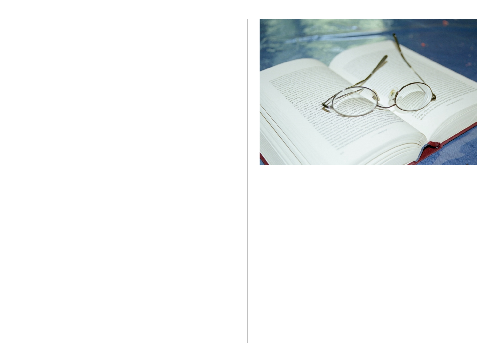
Charter
Our serif font for long print documents
The ESW Branding Director who picked Charter as our serif
once read all of Brothers Karamazov set in it, so he can per-
sonally vouch for its superior performance in long reading
sessions.

Scriber Bold Stencil
If you need a stencil font for painting or chalking,
or are looking for an industrial/technical display
font, check out Scriber Bold Stencil. The Scriber
family is inspired by text in early CAD programs
and speaks to our roots as an engineering group.
It should go without saying, but don’t ever set
body text in this.
Permanent Marker
If you’re looking to impart a more guerrilla or
activist aesthetic, check out Permanent Marker.
Frequently used by 350.org, it screams
grassroots/call-to-action. It technically has
lowercase and uppercase letterforms, but the
only difference is size— anything you type will
look all caps. Again, don’t ever use this for
extended strings of text.
27
Accent Fonts
Spice up your designs
Fully automated
100% off-grid
Stick it to
the man, man!

Initial version created by Brian Lange, ESW
Branding and Technology Director
First released: January 2014
Most recent revision: February 2014
Full edit history available on Github.
This guide would not have been possible with
the the assistance of the ESW National Team and
Branding Committee, Doria Nathanson, and Yale
Unbound Press’s version of Albers’ Interaction of
Color. Many thanks to all who assisted.
28
Credits
