Landing Page Conversion Guide
User Manual:
Open the PDF directly: View PDF ![]() .
.
Page Count: 109 [warning: Documents this large are best viewed by clicking the View PDF Link!]
- Introduction
- Step 1
- Set your landing page goals, objectives and key performance indicators (KPIs)
- Keeping your landing pages focused on customer needs
- The difference between goals, objectives and KPIs
- Defining how landing pages will deliver against goals and objectives
- Setting KPIs for landing pages
- Creating a management dashboard for landing pages
- Create conversion models to assess potential of landing pages
- Set branding objectives for landing page
- How strong is your brand personality?
- Define minimum contact information to maximise conversion
- Set your landing page goals, objectives and key performance indicators (KPIs)
- Step 2
- Step 3
- Step 4
- Step 5
- Step 6
- Step 7
- Improve results
- Why do you need to improve results?
- Importance of clearly defined KPIs
- Making sure you’re getting value from your landing pages
- Tracking landing page efficiency
- Tracking form errors
- Analysing visitor flow for existing landing pages
- Actions on landing pages
- Testing alternative page versions
- Testing different page elements?
- Testing tools
- Using Voice-of-Customer (VoC) data for insight
- Improve results
Creating high-converting landing pages
Seven Steps to Success Guide
Authors: Dr Dave Chaffey and James Gurd

1. SET OBJECTIVES 6. INCREASING
BRAND TRUST
7. IMPROVING
RESULTS
5. COMPELLING
CONTENT
4. CREATING THE
BEST PAGE LAYOUT
3. ENGAGING YOUR
VISITOR
2. UNDERSTAND
VISITOR NEEDS
© Smart Insights (Marketing Intelligence) Limited. Please go to www.smartinsights.com to feedback or access our other guides.
Creating high-converting landing pages
!
Creating high-converting landing pages
Seven Steps to Success Guide
Contents
Introduction .............................................................................................1
The 10-minute guide to effective landing pages ...................................................................1
What you will learn from this guide ......................................................................................6
Common aims of landing pages ...........................................................................................8
Factors inuencing landing page creation and optimisation .................................................9
Factors you control to improve landing page performance ................................................. 11
Using your home page as a landing page ...........................................................................12
Tailoring landing pages to suit device capabilities ..............................................................13
Facebook landing pages ..................................................................................................... 14
The Smart Insights Digital Experience Toolkit ..................................16
Step 1: Set your landing page goals, objectives and key
performance indicators (KPIs) ............................................................ 17
Keeping your landing pages focused on customer needs ................................................. 17
The difference between goals, objectives and KPIs ...........................................................19
Dening how landing pages will deliver against goals and objectives ................................21
Setting KPIs for landing pages ............................................................................................22
Creating a management dashboard for landing pages .......................................................23
Create conversion models to assess potential of landing pages ........................................24
Set branding objectives for landing page ...........................................................................25
How strong is your brand personality?................................................................................27
Dene minimum contact information to maximise conversion ............................................29
Step 2: Understand your visitor needs............................................... 31
Outline your main audiences ..............................................................................................32
Dene main user scenarios or tasks ................................................................................... 35
Techniques to surface deeper content ................................................................................ 37
Explain the service or category clearly ...............................................................................39
Review relevance of ofine contact options ........................................................................40
Review devices that visitors use ......................................................................................... 41
1. SET OBJECTIVES 6. INCREASING
BRAND TRUST
7. IMPROVING
RESULTS
5. COMPELLING
CONTENT
4. CREATING THE
BEST PAGE LAYOUT
3. ENGAGING YOUR
VISITOR
2. UNDERSTAND
VISITOR NEEDS
© Smart Insights (Marketing Intelligence) Limited. Please go to www.smartinsights.com to feedback or access our other guides.
Creating high-converting landing pages
!
Step 3: Engage your visitors ............................................................... 44
Measuring engagement for landing pages .......................................................................... 44
Audience recap ...................................................................................................................45
Engagement techniques .....................................................................................................46
Step 4: Design the optimal page layout ............................................. 59
Getting the right page layout ...............................................................................................59
Layering information ...........................................................................................................62
Consider offering distinct, segmented landing pages .........................................................64
Make the page work above the fold ....................................................................................65
Understanding where to place the call to action .................................................................67
Page layout questions to ask yourself ................................................................................. 69
Creating mobiletouch and mobile -friendly landing pages ..................................................72
The importance of testing ...................................................................................................73
Step 5: Create compelling content and creative ............................... 76
Good practice techniques for copywriting ........................................................................... 76
Content to engage the visitor ..............................................................................................77
Persuasive messaging hierarchy ........................................................................................78
Brand and strapline ............................................................................................................. 79
Effective copywriting ...........................................................................................................80
Step 6: Increase brand credibility and trust....................................... 84
1. Logo ................................................................................................................................84
2. Strapline ..........................................................................................................................85
3. History/About Us .............................................................................................................85
4. Testimonials/Reviews ......................................................................................................87
5. Accreditation ...................................................................................................................88
6. Security messages .........................................................................................................89
7. Customer service support ...............................................................................................89
8. Guarantees/warranties ....................................................................................................90
9. Awards ............................................................................................................................91
Step 7: Improve results ........................................................................92
Why do you need to improve results? .................................................................................92
Importance of clearly dened KPIs .....................................................................................92
Making sure you’re getting value from your landing pages .................................................93
Tracking landing page efciency .........................................................................................94
Tracking form errors .......................................................................................................... 101
Analysing visitor ow for existing landing pages ............................................................... 101
Actions on landing pages ..................................................................................................101
Testing alternative page versions ......................................................................................102
Testing different page elements? ......................................................................................103
Testing tools ......................................................................................................................104
1. SET OBJECTIVES 6. INCREASING
BRAND TRUST
7. IMPROVING
RESULTS
5. COMPELLING
CONTENT
4. CREATING THE
BEST PAGE LAYOUT
3. ENGAGING YOUR
VISITOR
2. UNDERSTAND
VISITOR NEEDS
© Smart Insights (Marketing Intelligence) Limited. Please go to www.smartinsights.com to feedback or access our other guides.
Creating high-converting landing pages
!
1
Introduction
This guide explains all the steps you need to take to create effective landing pages.
We’re often asked by members for succinct summaries, so the introduction to our Landing
Page guide summarises all the main factors that affect effectiveness.
The 10-minute guide to effective landing pages
You can simply think of a landing page as any “entrance page” where visitors enter a site.
Typically landing pages are simplied pages designed to get the highest conversion when a
visitor arrives from specic media like paid search, afliate marketing or an ofine campaign.
What is it? Landing page
An entrance page to a site where a visitor arrives on a site when they click on an ad or
other form of link from a referring site or an ofine campaign. It can be a home page, but
more typically and desirably a landing page is a page with the messaging focused on an
offer featured in an ad or another site.
There are two main types of landing pages:
1. Standard pages such as category, product and home pages
For some marketing campaigns you may already have good quality landing pages on your
website that can be used to avoid having to spend time and money creating new pages. For
example, an ecommerce retailer that sells well-known consumer brands might choose to
use their brand landing pages for brand-centric paid search campaigns. With the number of
different types of different products it’s not practical to create specic landing pages.
Take a look at the example below of beauty retailer Escentual.
The marketing team is using the Clarins brand page from its brand directory as the paid
search landing page for brand-related search queries (the top ad in this example is triggered
by searches on ‘clarins’).
1. SET OBJECTIVES 6. INCREASING
BRAND TRUST
7. IMPROVING
RESULTS
5. COMPELLING
CONTENT
4. CREATING THE
BEST PAGE LAYOUT
3. ENGAGING YOUR
VISITOR
2. UNDERSTAND
VISITOR NEEDS
© Smart Insights (Marketing Intelligence) Limited. Please go to www.smartinsights.com to feedback or access our other guides.
Creating high-converting landing pages
!
2
Note that a landing page can be any existing URL that is accessible via the website so
it’s important to see how to boost conversion for visits through SEO as arriving on landing
pages. Some web teams create custom URLs specically for marketing campaigns, for
example curated product list pages that cater for high priority paid search terms. This
includes URLs that are generated by the use of search/attribute lters; many search tools
allow you to create custom search lists and assign a unique search identier that creates a
unique URL for use in campaigns.
The example below shows Boden using a ppc landing page for the search term ‘womens
polo shirts’ that is actually a search results page hosted on its search sub-domain (powered
by SLi Systems), generated by using multiple search lters.
Let’s have a look at our rst tip
Best Practice Tip 1 Show the specic value you offer straightaway
For a retailer typically this is the pricing, delivery and returns policy, often shown in a ribbon
below the main navigation or in the right sidebar as a “Why choose Us?” box. In the Clarins
example from Escentual, the focus is on telling the brand story and promoting the new
products.
2. Creating a bespoke landing page for a specic trafc source
This type of campaign landing page is often what companies refer to when they discuss
landing pages.
Often, digital marketers don’t have an existing web page that satises the unique requirements
of a marketing campaign. For example, they may be targeting an audience segment for which
additional content and different calls to action are required. In this case, they will design and build
a bespoke landing page to give them a better chance of converting visitors.
1. SET OBJECTIVES 6. INCREASING
BRAND TRUST
7. IMPROVING
RESULTS
5. COMPELLING
CONTENT
4. CREATING THE
BEST PAGE LAYOUT
3. ENGAGING YOUR
VISITOR
2. UNDERSTAND
VISITOR NEEDS
© Smart Insights (Marketing Intelligence) Limited. Please go to www.smartinsights.com to feedback or access our other guides.
Creating high-converting landing pages
!
3
Bespoke landing pages are really useful when existing web pages aren’t performing as well
as you would like (e.g. high bounce rate, low conversion rate, low per visit value, etc.) to
justify sending lots of campaign trafc to them. Why spend time and money creating great
marketing campaigns only to send people to a web page that won’t convert their interest?
The goal of a landing page will vary depending on the business and market you operate
within. Typically landing pages fall into one or more of the following types:
þ1. Sales conversion. The goal is to generate revenue via an online purchase via the
website. This is the most common form of landing page for ecommerce websites.
þ2. Lead generation. The goal is to capture visitor interest in a product or service and get
them to submit contact information for follow-up sales activity. This is most common in
B2B marketing.
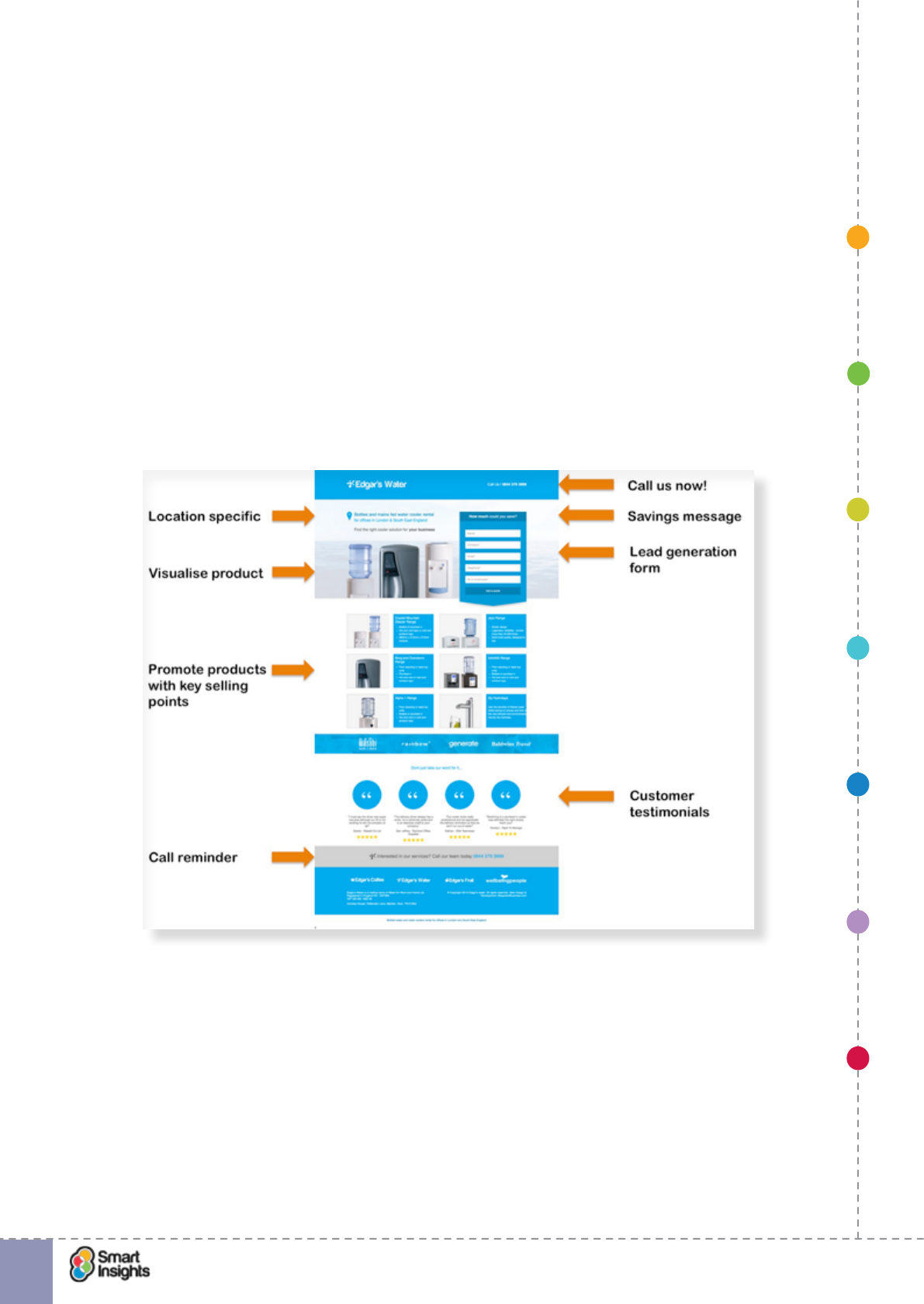
See the example below from Edgar’s Water, a supplier of rental bottled water and water
coolers for ofces, where this is again a destination page for an AdWords campaign, for
search queries including “ofce water cooler”. You can see that a range of messages are
used to encourage direct response via a lead generation form.
þ3. Data capture/sign up. Here the goal is similar, it’s to get information from the visitor
that will enable the business to include them in future marketing campaigns or improve
the relevancy of future marketing campaigns by supporting a customer relationship
management (CRM) program.
An interesting application of this is in the insurance industry where users are asked to
submit lots of personal information to get a free quote. The quote can be stored and
retrieved later, or the user can commit to purchase immediately. Even though many users
won’t buy once the quote is complete, it generates a lot of data for future marketing and
customer analysis.
1. SET OBJECTIVES 6. INCREASING
BRAND TRUST
7. IMPROVING
RESULTS
5. COMPELLING
CONTENT
4. CREATING THE
BEST PAGE LAYOUT
3. ENGAGING YOUR
VISITOR
2. UNDERSTAND
VISITOR NEEDS
© Smart Insights (Marketing Intelligence) Limited. Please go to www.smartinsights.com to feedback or access our other guides.
Creating high-converting landing pages
!
4
Best Practice Tip 2 Capture email at the start of the process and follow-up
It’s expected that many people won’t actually complete their quote or make a direct
purchase but this process gives the insurance company data that can be used to
convert prospects into customers, as open quotes can be saved for future reference.
Follow-up occurs via a triggered email.
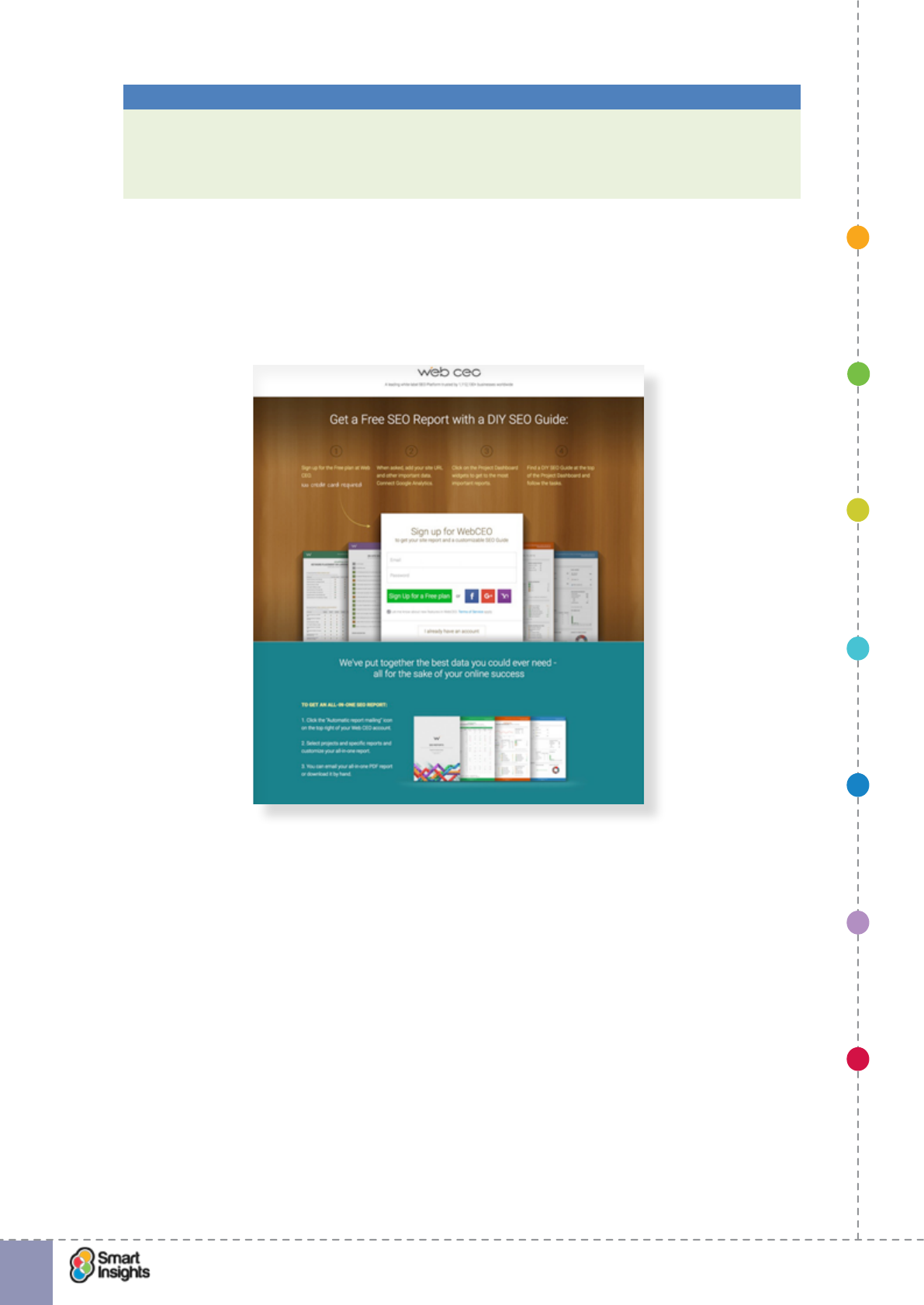
Some B2B software websites use simple signup forms to get new users subscribed to a
free service, creating a database of users that can be harvested to upsell paid services,
such as an upgrade to a premium version. This is common amongst SaaS vendors.
The example below is from Webceo.com, showing the ppc landing page from a Google
search for “seo guide”. The actual landing page is much longer, the screenshot only
shows the signup form.
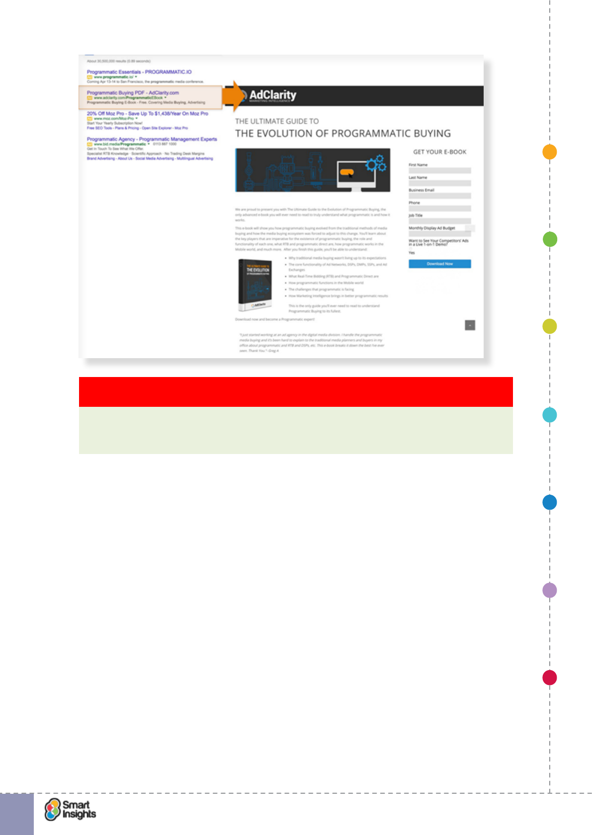
þ4. Download. The goal is to get visitors to download content, usually with the exchange
of contact data in return for the content.
A good example is from email marketing where B2B companies regularly promote free
content to harvest contacts. To access the content online or download, you need to
provide basic contact information (name, company, job title, contact phone and email).
The screenshot below shows the user journey from a paid search ad from AdClarity to
download a free B2B ebook on programmatic buying.
1. SET OBJECTIVES 6. INCREASING
BRAND TRUST
7. IMPROVING
RESULTS
5. COMPELLING
CONTENT
4. CREATING THE
BEST PAGE LAYOUT
3. ENGAGING YOUR
VISITOR
2. UNDERSTAND
VISITOR NEEDS
© Smart Insights (Marketing Intelligence) Limited. Please go to www.smartinsights.com to feedback or access our other guides.
Creating high-converting landing pages
!
5
Key Strategy Recommendation 1 Dene the primary marketing aim of your landing
pages
We nd it helps to categorise your landing pages to help you focus on a primary goal
for each page. This will ensure that your landing page strategy targets outcomes rather
than being undirected.
Why are landing pages important?
Generally speaking, there are two challenges for digital marketers: rst, they need to devise
compelling content and marketing campaigns that will inspire customers to respond; second,
they need to provide a destination where the customer can easily achieve their goals and nd
all the information they need to make a decision.
The second requirement is often the most overlooked – it’s far more exciting to launch a cool
marketing campaign with stunning creative and unbeatable offers than to carefully plan out the
onwards user journey and ensure all angles are covered to make the most of the response.
However, it’s this requirement that determines how successful a marketing campaign will
be. For campaigns with an online response mechanism, your landing page plays a vital
role in matching the needs of visitors with relevant calls to action and conversion paths. A
well-designed landing page removes the barriers to conversion – the difference between
failure and success. For example, a landing page that uses creative assets (e.g. banners)
consistent with the marketing campaign reassures visitors that they are in the right place.
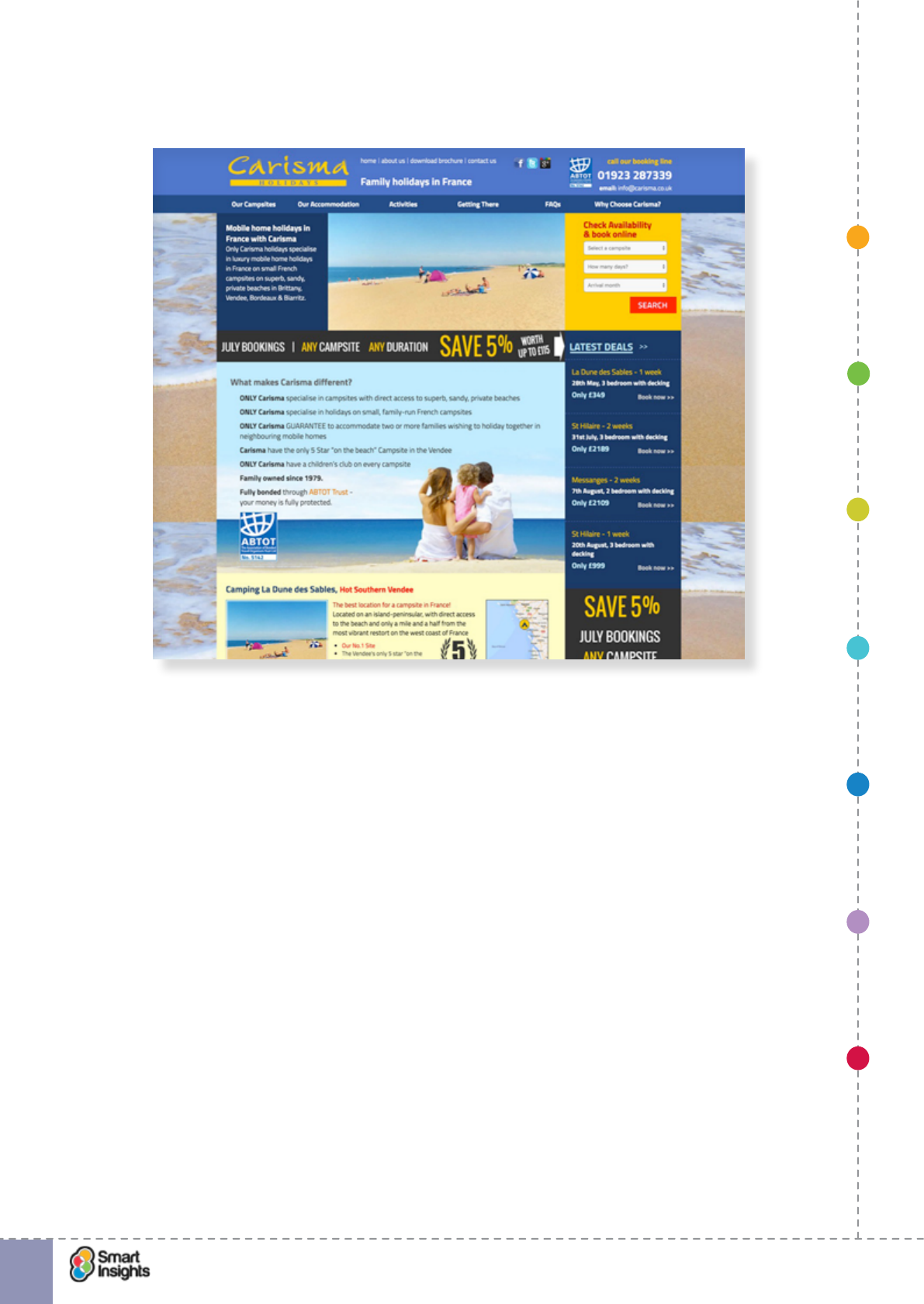
The example below from a holiday company is from a Google search for “holidays in
Bordeaux”. When clicking on the paid search ad from Carisma Holidays, you’re dropped on
a busy landing page with no mention of ‘Bordeaux’ anywhere. The page spends focuses
on trying to persuade you the website is quality instead of thinking about the most relevant
content based on the user journey. If you don’t know the region well, would you think that La
1. SET OBJECTIVES 6. INCREASING
BRAND TRUST
7. IMPROVING
RESULTS
5. COMPELLING
CONTENT
4. CREATING THE
BEST PAGE LAYOUT
3. ENGAGING YOUR
VISITOR
2. UNDERSTAND
VISITOR NEEDS
© Smart Insights (Marketing Intelligence) Limited. Please go to www.smartinsights.com to feedback or access our other guides.
Creating high-converting landing pages
!
6
Dune des Sables and St Hilaire are in Bordeaux? They’re not, although they are relatively
near by.
What you will learn from this guide
Our advice in this guide is about improving pages specically created to increase conversion
to lead where you either convert visitors to making a purchase online or collect visitors’
details through a form for follow-up marketing activity to convert to sale. The latter is typical
for B2B companies where often the online channel is used to generate leads and feed the
sales funnel.
Examples of where landing pages work well include:
þLeads for business-to-business services like SaaS software
þHigh-value consumer services like holidays, mortgage applications or laser eye treatment
þSearches for complex products/services where lots of information needs to be presented,
in an easy to understand format.
It’s most common to create these types of landing pages when you’re paying for site visitors
by running a Google AdWords or banner campaign. Alternatively, if you’re running a print ad,
direct mail or TV campaign, you may want to have a call-to-action to visit an online landing
page. It makes sense to do all you can to get the best returns when you invest to drive
visitors to your site. You want to give visitors a focused experience to encourage conversion
without all the clutter of a home page.
The page can be part of the site architecture which visitors reach by searching or browsing,
or a page specically designed for links from paid ad campaigns. The aim of the landing
page is to maximise conversion rates plus help brand familiarity and favourability.
1. SET OBJECTIVES 6. INCREASING
BRAND TRUST
7. IMPROVING
RESULTS
5. COMPELLING
CONTENT
4. CREATING THE
BEST PAGE LAYOUT
3. ENGAGING YOUR
VISITOR
2. UNDERSTAND
VISITOR NEEDS
© Smart Insights (Marketing Intelligence) Limited. Please go to www.smartinsights.com to feedback or access our other guides.
Creating high-converting landing pages
!
7
Key Strategy Recommendation 2 Create bespoke landing pages for lead generation
Landing pages will maximise conversion since you can create a simpler page focused on
your goals and making it easier for site visitors to engage.
Even if you don’t have these types of pages on your site now, this guide will give you lots of
ideas about how you can make different types of pages more effective. The recommenda-
tions we give in this guide apply to both types of landing pages. First, those integrated into
the site’s structure with standard page templates and navigation for the site. Second, landing
pages specically created for getting new leads and customers with a different look and feel.
Remember also that the home page can effectively be a landing page, so similar approaches
often work.
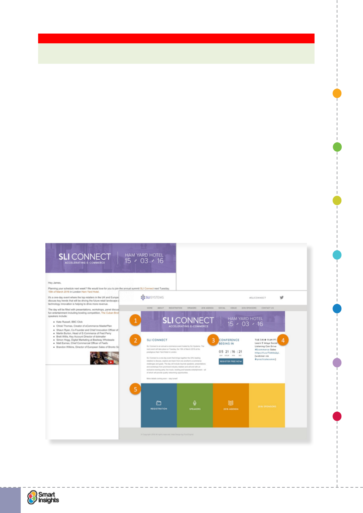
Here’s an example of what we think is a good landing page from SLi Systems, promoting an
industry event. It illustrates many good practices such as replicating the campaign creative
to provide visual consistency. We’ve marked up what we see as good about this format. It’s
maybe not perfect, but better than most!
1. Consistent creative from email to landing page
2. Simple positioning copy promoting the event
3. Countdown timer with clear CTA
4. Latest social content
5. Links for people who want more information.
1. SET OBJECTIVES 6. INCREASING
BRAND TRUST
7. IMPROVING
RESULTS
5. COMPELLING
CONTENT
4. CREATING THE
BEST PAGE LAYOUT
3. ENGAGING YOUR
VISITOR
2. UNDERSTAND
VISITOR NEEDS
© Smart Insights (Marketing Intelligence) Limited. Please go to www.smartinsights.com to feedback or access our other guides.
Creating high-converting landing pages
!
8
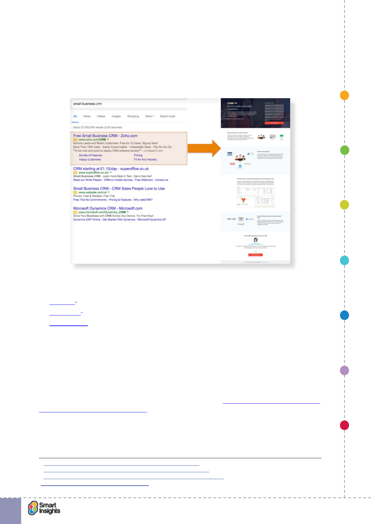
Another example is the landing page from Zoho.com promoting a CRM software solution for
small business. We can see the power of these pages in generating awareness and leads if
we take a look at the Google AdWords ad that encouraged visitors to this landing page.
Zoho.com has the top sponsored position in Google AdWords which supports sitelinks: this
will give it many more visitors than its natural listing which isn’t even on the rst page of
SERPs in Google because terms related to ‘CRM’ are highly competitive.
In this guide we have curated lot’s of examples of good (and sometimes poor) practice, but
if you’re looking for more examples of landing pages to inspire you, see these compilations
from:
þHubspot1
þUnbounce2
þCreativebloq3
There’s also an interesting case study available on the Smart Insights website looking at
how Saleforce.com used landing pages to promote its CRM solutions4. Please note that this
landing page has subsequently changed but the good practice learning is still relevant.
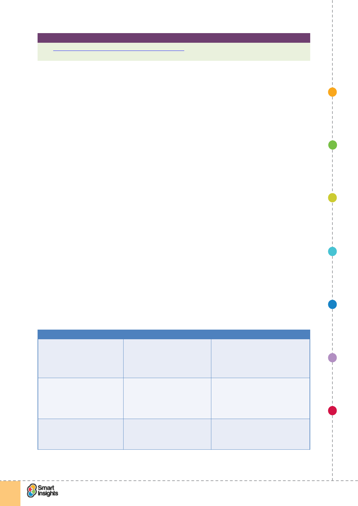
Common aims of landing pages
It’s important to consider the aims for your landing pages, specically what you want them to
achieve. This ensures that you match content with the needs of visitors and business aims.
We will go into this in more detail in Step 1 where we look at Dening how landing pages will
deliver against goals and objectives, but to give an indication of aims, we like to split our aims
or purpose of landing pages into four streams as shown in the next table.
When thinking about aims, remember that only a percentage of your total audience will be
ready to commit to a conversion. Many people respond to marketing campaigns to nd out
more information as part of the research phase of the decision making process. Therefore,
1 http://blog.hubspot.com/marketing/landing-page-examples-list
2 http://unbounce.com/landing-page-examples-built-with-unbounce/
3 http://www.creativebloq.com/web-design/landing-page-design-6133358
4 Smart Insights: The Perfect Landing Page.
1. SET OBJECTIVES 6. INCREASING
BRAND TRUST
7. IMPROVING
RESULTS
5. COMPELLING
CONTENT
4. CREATING THE
BEST PAGE LAYOUT
3. ENGAGING YOUR
VISITOR
2. UNDERSTAND
VISITOR NEEDS
© Smart Insights (Marketing Intelligence) Limited. Please go to www.smartinsights.com to feedback or access our other guides.
Creating high-converting landing pages
!
9
don’t obsess over the conversion rate at the expense of everything else, although it is an
important key performance indicator (KPI) to measure and monitor.
Conversion Information and
onward journey
Lead generation Brand awareness
Where the visitor can
complete an action on
the landing page itself.
Here the conversion
occurs online.
Examples:
þ Paid search ad
links direct to a
product page
with “Buy now” as
primary CTA
þ Email campaign
directing people to
a landing page for
subscription to a
service.
Where the landing page
acts as a conduit to
a more complex user
journey, or to provide
specic information to
engage visitors.
Here, conversion occurs
on another web page or
via a different channel.
Examples:
þ B2B purchase cycle
for IT solutions
with landing page
to promote key
benets with links
to specic products/
services.
Where the landing
page is used to
capture interest
in a product or
service using a
contact form.
Here the online
channel is often
used to generate
leads for ofine
channels like
telesales.
Examples:
þ Digital
Marketing
company using
an online form
to enable
visitors to
request a free
site audit.
Where you are providing information
designed to raise awareness of what
your brand represents, to encourage
future visits.
Examples:
þ Banner ad taking people to a
landing page where they can
download a White Paper written
by the company.
It’s common for landing pages to have a primary conversion call to action (CTA) followed by
several secondary calls to action, such as signing up to a newsletter and requesting a sales
call. We discuss this in more detail in Step 7 – Improving results.
It’s also important to think about the onward journey. Landing pages need to be clear and
easy to use. If you have a complex message to communicate, consider using a landing
page as the central hook to capture attention and then provide clear links to more detailed
information on individual elements of your proposition.
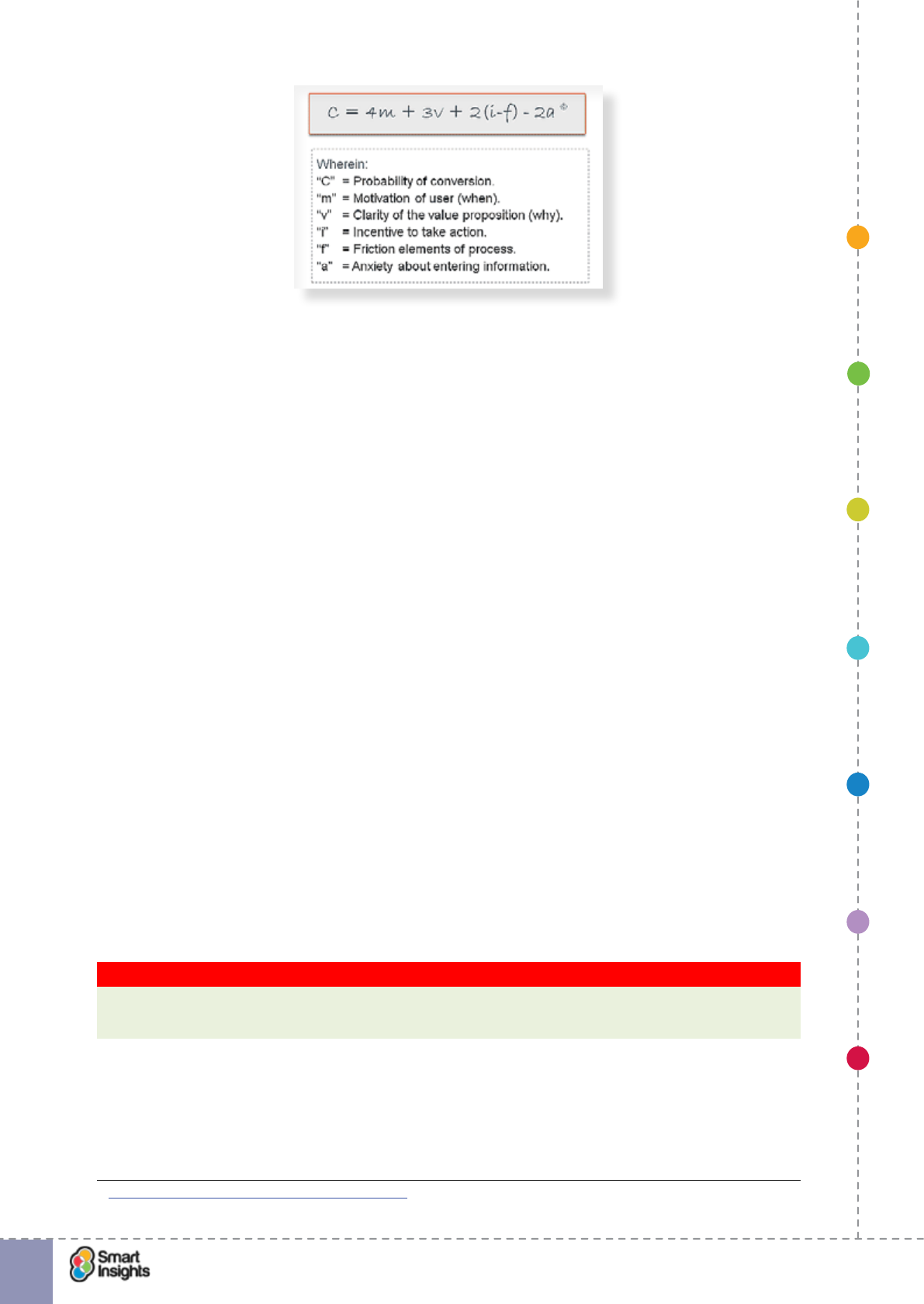
Factors inuencing landing page creation and optimisation
There are many factors that inuence the effectiveness of a landing page. In a moment we
will recommend some practical steps you can take to change and improve landing pages.
But rst, consider the broad factors that affect conversion rates; these are nicely summarised
by this formula:
1. SET OBJECTIVES 6. INCREASING
BRAND TRUST
7. IMPROVING
RESULTS
5. COMPELLING
CONTENT
4. CREATING THE
BEST PAGE LAYOUT
3. ENGAGING YOUR
VISITOR
2. UNDERSTAND
VISITOR NEEDS
© Smart Insights (Marketing Intelligence) Limited. Please go to www.smartinsights.com to feedback or access our other guides.
Creating high-converting landing pages
!
10
This formula was developed by Flint McGloughlin and team at Marketing Experiments5. We
really like the way it simplies the whole interplay between what the landing page needs to
achieve for the business and what the visitor is seeking.
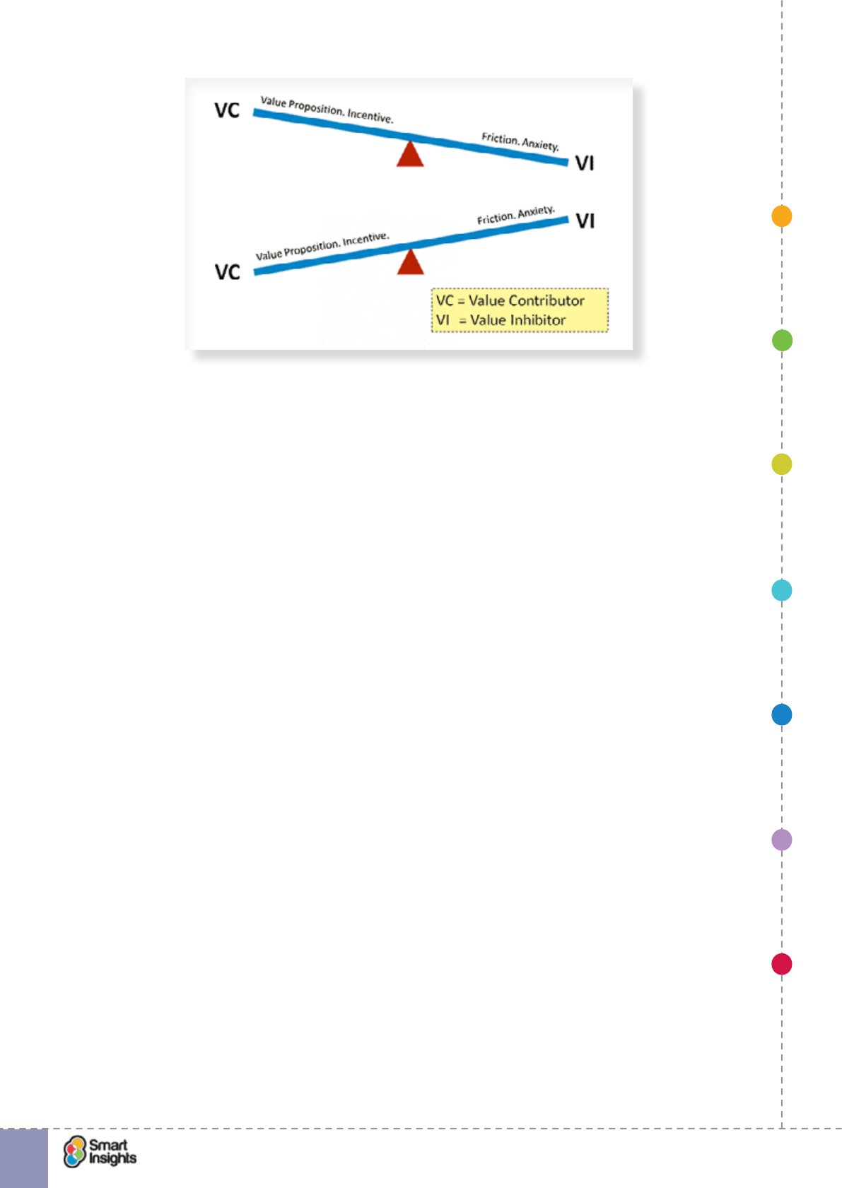
It’s worth thinking about how you can control these elements of the equation. As Flint says:
“Optimization is not simply changing offer page elements, but doing so to better engage with
your prospect’s thought process”.
þConversion probability (C). What you want to increase, the conversion rate!
þMotivation of visitor (4m). This is given a high weighting - it’s the job of the landing page
to increase motivation. The more motivation already available when the visitor arrives on
the page, the easier your job will be...
þValue proposition clarity (3v). Simply put “Why should I hit that button - What’s in it for
me?”. So, emphasising what this value is to different types of visitors is a key planning
decision before you can build the landing page.
þIncentive to take action (i). These are offers additional to the core value proposition
such as a time-limited offer or bonus if the action is taken.
þFriction elements of process (f). There are many friction elements centered around
the effort needed from the user i.e. time or hassle. The number of elds, or if a multi-step
process, pages required to sign-up are the obvious friction components. Notice how, in
the equation a more powerful incentive (i) will overcome the friction elements.
þAnxiety about entering information (a). Straightforward, this is the fear of privacy and
security for personal data. It’s important to reassure about these. For example, ensuring
form pages using HTTPs.
Of course the strength of each element will vary for different types of visitors and how well
your page is already performing.
Key Strategy Recommendation 3 Review the balance of value for your current pages
This formula is a great high-level tool to help you review the strengths of your current
pages.
So, improving landing pages is fundamentally about getting the balance right and this is
nicely shown in this diagram.
5 Marketing Experiments: Optimizing Offer Pages
1. SET OBJECTIVES 6. INCREASING
BRAND TRUST
7. IMPROVING
RESULTS
5. COMPELLING
CONTENT
4. CREATING THE
BEST PAGE LAYOUT
3. ENGAGING YOUR
VISITOR
2. UNDERSTAND
VISITOR NEEDS
© Smart Insights (Marketing Intelligence) Limited. Please go to www.smartinsights.com to feedback or access our other guides.
Creating high-converting landing pages
!
11
When you are working to improving landing pages the two main levers are:
þ1. Improving and emphasising your Value proposition and Incentive.
þ2. Minimising and reducing Friction and Anxiety.
Simple! But which tools do you have to achieve this? Many! They are all the different design
elements including visuals, copy and how they are laid out. These are some of the decisions
on what you can improve.
And don’t forget that you can turn to independent voices to help tackle friction and anxiety, for
example customer testimonials that demonstrate that you have happy customers.
Factors you control to improve landing page performance
Here are some of the main characteristics of the page you control, that we will drill down into
later in the guide:
þ1. Relevance of the page. In the rst few seconds of a visit this is affected by the
relevance of the header of the page (images and copy) to the context of the user’s visit -
why and where have they arrived from?
þ2. Length of the landing page. There is a popular myth that short-form landing pages
are ‘best practice’, with key content and call to action above the fold. However, there is
sufcient evidence to counter this view and demonstrate that the length of a landing page
should be determined by a mix of factors, including the needs of the audience for detailed
information.
We discuss this in more detail in Step 4 – Create the optimal page layout.
þ3. Placement of call to action. All calls to action must be above the fold right? Wrong.
Yep, surprising isn’t it. In truth, there is no hard and fast rule. Whilst it’s true that in most
cases a strong call to action above the fold increases conversion, there are cases where
this isn’t true and actually putting the call to action in front of the customer before they are
ready to take action can actually put them off.
We also discuss this in more detail in Step 4 – Create the optimal page layout.
1. SET OBJECTIVES 6. INCREASING
BRAND TRUST
7. IMPROVING
RESULTS
5. COMPELLING
CONTENT
4. CREATING THE
BEST PAGE LAYOUT
3. ENGAGING YOUR
VISITOR
2. UNDERSTAND
VISITOR NEEDS
© Smart Insights (Marketing Intelligence) Limited. Please go to www.smartinsights.com to feedback or access our other guides.
Creating high-converting landing pages
!
12
þ4. Matching content to marketing creative. This is marketing good practice 101 – make
sure that your landing page is consistent with the source marketing campaigns that
generated the visit. Often referred to as the ‘scent trail’, this ensures visitors know they
have landed on the right page because they can recognise the creative treatment.
We discuss this in more detail in Step 5 – Compelling content and creative.
þ5. Consistency of messaging. This is closely related to marketing creative. It’s important
that you replicate the headline copy from your marketing campaigns on the landing
pages. This is especially important for paid search where search engines like Google
will look to see if the keywords used in ad copy match content on the destination page –
failure to do this can adversely affect ad Quality Score.
We also discuss this in more detail in Step 5 – Compelling content and creative.
þ6. Form validation. Forms are typically used by B2B marketers on landing pages, for
a variety of reasons including capturing contact information from people downloading
free content. The biggest barrier to goal completion is poor user experience, where the
landing page makes it hard for the visitors to quickly and easily complete and submit the
form.
We discuss this in more detail in Step 3 – Engaging your visitor.
þ7. Optimal blend of content. Let’s be realistic – if you have a large audience, it’s almost
impossible to design a landing page that is perfect for everyone (we’re yet to see that so
please do share if you have one!).
This is where landing page optimisation comes in to play – testing different variations of
the landing page to nd out which one drives the best results (based on the KPIs you are
measuring performance against). We discuss this in more detail in Step 7 – Improving
results.
Using your home page as a landing page
Landing page thinking is increasingly applied to home pages since a simpler experience and
clearer messages can be offered to the site visitor. This is particularly the case where there is
a simple proposition without a large choice of products.
Autoglass is a great example as shown in the next screenshot below and we reviewed a
previous version in our article on Home Page as Landing Page6. In this version they are
promoting the core service of repairing chipped or cracked windscreens with a simple CTA,
using content to provide reassurance and quality validation e.g. “What our customers are
saying”.
6 Smart Insights: Home page as landing page

1. SET OBJECTIVES 6. INCREASING
BRAND TRUST
7. IMPROVING
RESULTS
5. COMPELLING
CONTENT
4. CREATING THE
BEST PAGE LAYOUT
3. ENGAGING YOUR
VISITOR
2. UNDERSTAND
VISITOR NEEDS
© Smart Insights (Marketing Intelligence) Limited. Please go to www.smartinsights.com to feedback or access our other guides.
Creating high-converting landing pages
!
13
Tailoring landing pages to suit device capabilities
Hopefully you’re aware that mobile trafc for many websites has now surpassed desktop
trafc, although there are exceptions. What’s interesting is how people are using mobile
to access information and make purchases, from reading emails to clicking on social ads.
Research from Litmus shows that mobile dominates for email opens:
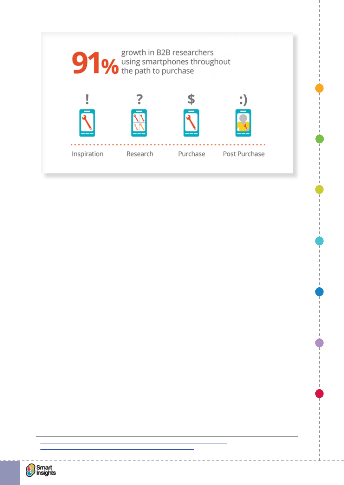
And it may (or may not) surprise you to know that in B2B mobile is a popular device for
decision makers to nd information, including accessing emails. Google and Millward Brown
surveyed the research and purchase habits of 3,000 B2B professionals and found that 42%
use mobile devices during their B2B purchase process and purchase rates have increased.
1. SET OBJECTIVES 6. INCREASING
BRAND TRUST
7. IMPROVING
RESULTS
5. COMPELLING
CONTENT
4. CREATING THE
BEST PAGE LAYOUT
3. ENGAGING YOUR
VISITOR
2. UNDERSTAND
VISITOR NEEDS
© Smart Insights (Marketing Intelligence) Limited. Please go to www.smartinsights.com to feedback or access our other guides.
Creating high-converting landing pages
!
14
Image credit: Thinkwithgoogle.com7
With the importance of mobile increasing as a trafc source, web teams need to ensure
that landing pages are optimised to suit the mobile audience. This requires core UX design
skills to ensure the design is mobile friendly, such as using native gestures, but also an
understanding of how user needs and journeys differ when browsing via a mobile device.
rQ. Do you have a long, detailed landing page?
If yes, how do you make this usable on smaller devices? You shouldn’t expect users to scroll
endlessly to access key information, so what UI design techniques can you use to make the
page user-friendly?
It also means you need to stay on top of the latest industry development that impact mobile
browsing. A great example is Google’s recent launch of Accelerated Mobile Pages (AMP),
designed for content landing pages to provide super fast loading on mobile due to lightweight
code. We recommend watching Distilled’s helpful video explaining what an AMP8 is.
Facebook landing pages
Company Facebook pages encouraging visitors to ‘Like’ a brand are similar in many ways to
landing pages since they have clear, direct response goals – to get the ‘Like’ and to have to
communicate benets to achieve this.
So, many of the tips you nd in this guide may also be useful for Facebook company pages.
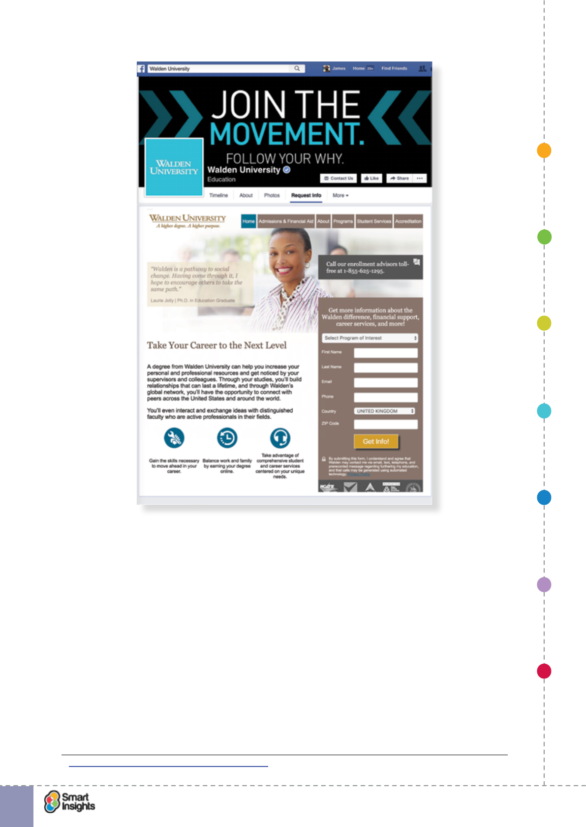
Educational organisations make good use of social media to promote key products and
services via landing pages. An example of a US organisation using a landing page on its
Facebook prole is Walden University. It includes links to provide useful information and has
a lead generation form.
7 https://www.thinkwithgoogle.com/articles/the-changing-face-b2b-marketing.html
8 https://moz.com/blog/accelerated-mobile-pages-whiteboard-friday
1. SET OBJECTIVES 6. INCREASING
BRAND TRUST
7. IMPROVING
RESULTS
5. COMPELLING
CONTENT
4. CREATING THE
BEST PAGE LAYOUT
3. ENGAGING YOUR
VISITOR
2. UNDERSTAND
VISITOR NEEDS
© Smart Insights (Marketing Intelligence) Limited. Please go to www.smartinsights.com to feedback or access our other guides.
Creating high-converting landing pages
!
15
Some brands also use Facebook landing pages as a gateway to collect customer information
in return for entry into prize draws and competitions. This is similar to using a data capture
landing page on your main website.
You can read about a similar Facebook competition on our blog9.
So let’s move on to Step 1 and look at setting goals for your landing pages.
9 Smart Insights: Facebook Sweepstake promotions
1. SET OBJECTIVES 6. INCREASING
BRAND TRUST
7. IMPROVING
RESULTS
5. COMPELLING
CONTENT
4. CREATING THE
BEST PAGE LAYOUT
3. ENGAGING YOUR
VISITOR
2. UNDERSTAND
VISITOR NEEDS
© Smart Insights (Marketing Intelligence) Limited. Please go to www.smartinsights.com to feedback or access our other guides.
Creating high-converting landing pages
!
16
The Smart Insights Digital Experience Toolkit
This 7 Steps Mobile Marketing guide will teach you how to develop an overall mobile
strategy. Smart Insights Expert members can consult the other resources in our Digital
Experience Toolkit in our members area to drive the performance of both their mobile and
desktop marketing efforts by specic recommendations on site design. We recommend:
þInbound Marketing Quick Wins template, fully updated to cover the latest inbound
marketing techniques across the full customer lifecycle structured around the Smart
Insights RACE planning approach, this guide lets you apply a consultant’s approach
yourself by following the questions you need to ask.
þCustomer persona toolkit, aimed at helping agencies and consultants improve their use
of design personas and also to develop customer journey maps including mobile.
þLanding Page Conversion and Improving website results guides, detailed best
practice tips for desktop and mobile sites with over 50 examples of best practice to inspire
improvements to your landing pages covering a range of sectors from retail, nancial
services, travel, business-to-business and not-for-prot.
We also recommend these closely-related guides to develop your Mobile strategy:
þEcommerce Design pattern Bible in our Ecommerce toolkit features many mobile
examples of mobile optimised page layout and design best practices
þOnline Marketing Benchmarks statistics compilation to save you time in searching for the
latest, most reliable online marketing benchmarks, this guide gives you a single source of
the latest and most reliable sources.
1. SET OBJECTIVES 6. INCREASING
BRAND TRUST
7. IMPROVING
RESULTS
5. COMPELLING
CONTENT
4. CREATING THE
BEST PAGE LAYOUT
3. ENGAGING YOUR
VISITOR
2. UNDERSTAND
VISITOR NEEDS
© Smart Insights (Marketing Intelligence) Limited. Please go to www.smartinsights.com to feedback or access our other guides.
Creating high-converting landing pages
!
17
1
Step 1
Set your landing page goals, objectives and key
performance indicators (KPIs)
rQ. Have we dened a full range of landing page goals and objectives?
Setting goals and objectives helps you and your external agency partners to focus planning
around achieving tangible targets. Goals and objectives represent success criteria for your
landing pages; if achieved, or exceeded, the campaign can be considered a success. For
this reason they are essential because every penny invested must be analysed to determine
whether it represents value for money and this can only be decided if there are clear success
criteria that can be validated.
Key performance indicators add an essential level of detail, providing a set of metrics
against which landing page performance can be measured. By analysing KPI data, you can
determine the level of success of your digital marketing, using something concrete against
which to benchmark outcomes over time.
Before we look at the difference between goals, objectives and KPIs, let’s remind ourselves
through an example that success in achieving our objectives will be based on creating a
customer-centered landing page and that relies on understanding customer needs.
Keeping your landing pages focused on customer needs
Although the marketing principles are the same for B2C and B2B (i.e. give people what they
need and make it easy for them to take actions), the application of landing page strategy
varies signicantly in B2B marketing where the purchase cycle is often more complex,
involving multiple decision makers and inuencers.
Here are some of the things to think about when planning landing pages for B2B marketing
campaigns:
rPrimary audience
Who is the main decision maker you want to inuence? What calls to action or “scent
trails” specic to them will grab their attention? What questions might they have that need
answering? What business challenges do they need solving?
rSecondary audience(s)
Who are the other decision makers and inuencers in the project team who need to be
catered for? How can you make it obvious there is content for them without disrupting the
user experience for your primary audience?
For example, if the IT Director is an inuencer, simple headlines like “Robust and proven API
for low-cost implementation” can help get people onside.
rStage of buying cycle
What stage of the buying cycle is the audience at and what information do they need now
to help them progress their decision? How can you help them make a good decision, for
example through buying guides?
rContent surfacing
What content is required to satisfy all audiences? What is the most important content that
must be visible without visitors having to take any further action? What additional content do
1. SET OBJECTIVES 6. INCREASING
BRAND TRUST
7. IMPROVING
RESULTS
5. COMPELLING
CONTENT
4. CREATING THE
BEST PAGE LAYOUT
3. ENGAGING YOUR
VISITOR
2. UNDERSTAND
VISITOR NEEDS
© Smart Insights (Marketing Intelligence) Limited. Please go to www.smartinsights.com to feedback or access our other guides.
Creating high-converting landing pages
!
18
1
you want to provide and how do you signpost this (e.g. text links to additional information that
display lightboxes).
The aim should be to keep the content light and focus people on taking further action, but no
so light that it doesn’t give people enough detail to make a decision.
rTake away content
Do you have relevant content that you can provide for visitors to take away and either digest
in detail later or share with colleagues and business partners? What is the best mechanism
for distributing this content e.g. online video/downloadable white paper.
rLead harvesting
What techniques can you use to capture more information about your target audience(s)?
Where can you integrate this into the landing page without disrupting the user experience?
What are you going to do with this data when you capture it? Are the benets of sharing data
clear to the visitor?
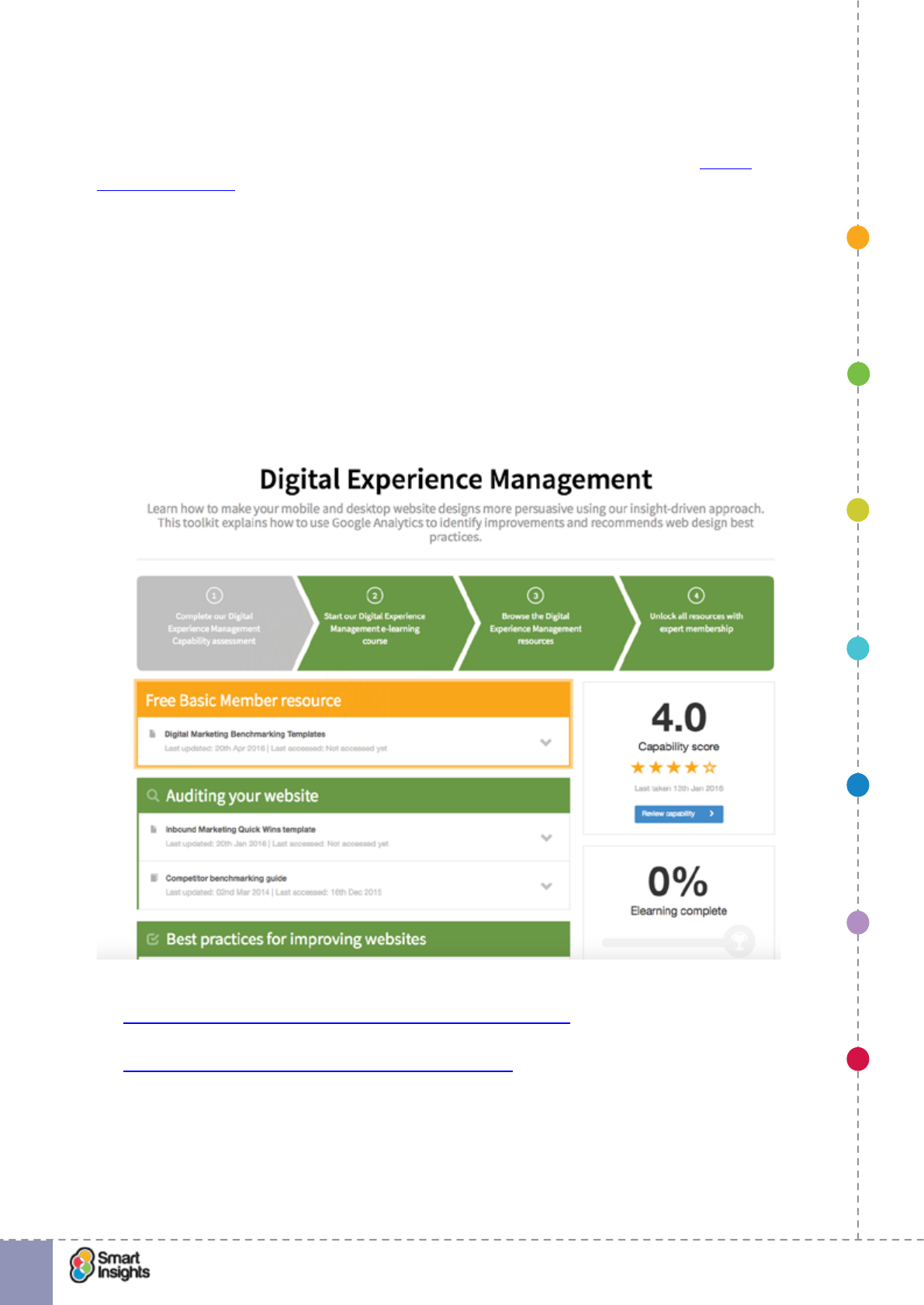
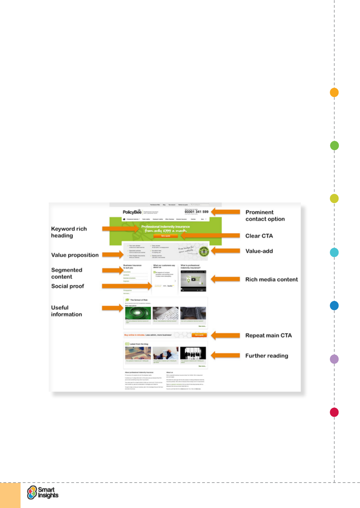
The screenshot below provides an example B2B landing page by Policy Bee from a paid
search ad for the keyphrase ‘business indemnity insurance’. We have marked up the key
landing page techniques being used.
You may think there is too much information on this page and it’s true that testing a simplied
version may increase conversion. However it provides a great checklist of the main features
you should consider for a B2B landing page. Also compare this to one of it’s key paid search
competitors:
1. SET OBJECTIVES 6. INCREASING
BRAND TRUST
7. IMPROVING
RESULTS
5. COMPELLING
CONTENT
4. CREATING THE
BEST PAGE LAYOUT
3. ENGAGING YOUR
VISITOR
2. UNDERSTAND
VISITOR NEEDS
© Smart Insights (Marketing Intelligence) Limited. Please go to www.smartinsights.com to feedback or access our other guides.
Creating high-converting landing pages
!
19
1
Although there are some good landing page techniques here, including the display of the
business award, the page isn’t focused on the search query, it’s a more generic business
insurance landing page. Great for people not sure what ins8rance they want, unnecessary
effort for someone specically searching for indemnity insurance.
The difference between goals, objectives and KPIs
rQ. Is there a difference between a goal and an objective?
YES! Different people in different companies use these two terms differently, even in-
terchangeably, so this can get confusing. What’s important is that you agree a working
measurement framework that suits your business and has specic SMART metrics10.
Key Strategy Recommendation 4 Dene a measurement framework linking goals,
objectives and KPIs
You need to create a dashboard to clearly show the value you are getting from landing
pages and promotion of these that link broader goals with specic objectives and KPIs.
no foot-
note
1. SET OBJECTIVES 6. INCREASING
BRAND TRUST
7. IMPROVING
RESULTS
5. COMPELLING
CONTENT
4. CREATING THE
BEST PAGE LAYOUT
3. ENGAGING YOUR
VISITOR
2. UNDERSTAND
VISITOR NEEDS
© Smart Insights (Marketing Intelligence) Limited. Please go to www.smartinsights.com to feedback or access our other guides.
Creating high-converting landing pages
!
20
1
Recommended resource? 7 Steps Guide to Improving Digital Marketing Results
The 7 Steps Guide to Improving Digital Marketing explains how to build measurement
frameworks for a business in more detail.
We like to use a simple test to determine if something is a goal or objective: if there isn’t a
clear target it’s a goal not an objective. Goals and objectives need to be aligned: goals set
out top-level aims and objectives give specic targets. Key Performance Indicators (KPIs) are
used to assess progress towards these targets.
Goals
A goal is a broad target that denes general intentions. Goals are abstract and not easy to
measure or validate.
NB. Although in management, broad goals inform specic objectives, Google Analytics uses
the term “Goal” to refer to specic measures of outcomes.
For example, a goal for a landing page could be to increase brand awareness.
Objectives
Objectives translate goals into realistic targets that can be measured. Objectives should
be concrete and measurable. For example, an objective for a landing page with the goal of
increased brand awareness would be to increase the number of social shares of the page by
100 per cent in two months.
Key Performance Indicators (KPIs)
Key Performance or Success Indicators (KPIs) are specic measures that are used to
check you’re on course to hit your specic objectives. They are sometimes referred to as
performance drivers since, if you can improve these metrics, you are more likely to hit or
exceed your objectives. You can also set targets for improving these too, for example to
reduce the bounce rate across your landing pages by 5%.
The next table takes a look at different goal for landing pages and provides examples
of objectives that can be aligned with this goal and KPIs that help review progress and
performance.
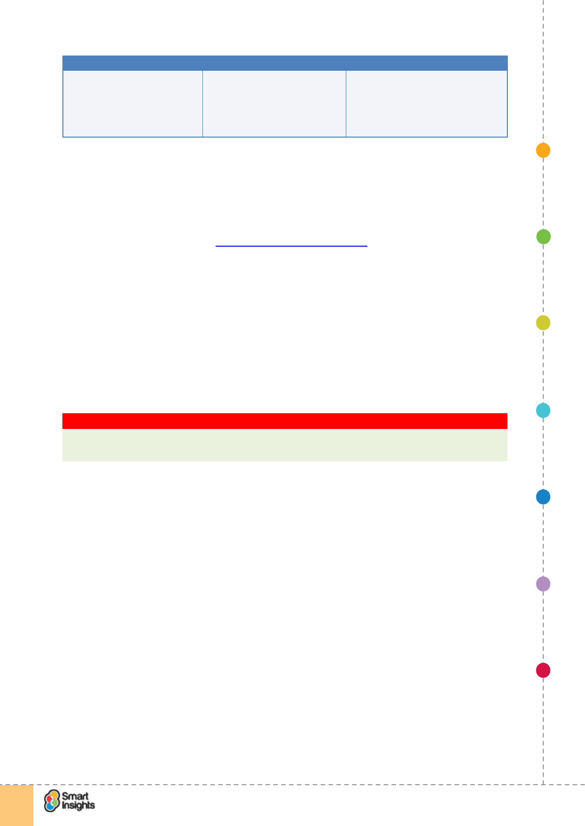
Goal Objective KPIs
Increase brand awareness Increase social network followers
by 10% within 90 days.
Examples:
þ Conversion rates to social sharing
þ Comments and shares of content
within social networks
Increase conversion rate to lead Increase conversion rate by 5%
within 6 months
Examples:
þ Bounce rate
þ Dwell time
þ Page value
Increase visitor quality Increase revenue by 10% within 6
months
Examples:
þ Revenue per visit
þ Goal value per visit
1. SET OBJECTIVES 6. INCREASING
BRAND TRUST
7. IMPROVING
RESULTS
5. COMPELLING
CONTENT
4. CREATING THE
BEST PAGE LAYOUT
3. ENGAGING YOUR
VISITOR
2. UNDERSTAND
VISITOR NEEDS
© Smart Insights (Marketing Intelligence) Limited. Please go to www.smartinsights.com to feedback or access our other guides.
Creating high-converting landing pages
!
21
1
Goal Objective KPIs
Reduce campaign costs Reduce cost per acquisition by
10% within 6 months.
Examples:
þ Revenue per visit
þ Goal value per visit
þ Conversion rate
Dening how landing pages will deliver against goals and
objectives
rQ. Are we clear on how landing pages support our goals and objectives
In the Introduction we looked at Common aims of landing pages, let’s now look at this in
more detail. The aims for a landing page are simpler than most types of page. Put simply, the
aim is get a response! When a form on a landing page is lled in and the ‘submit’ or ‘enter’
button pressed, the contact details are added to a database and then added to a workow
within a customer relationship management system for a manual or automated follow-up. In
the simplest case an email will be sent to a dened address giving the details entered on the
form.
Depending on the type of business, this response could be:
þGet a named lead through an email address.
þGet a trial subscriber to a publication or a software service.
þGet interest in a high value product to follow-up by phone.
Key Strategy Recommendation 5 Set broader goals for landing pages
Goals for landing pages often just include response, but if you think about the wider range
of goals your pages will be more effective since the majority won’t convert straightaway!
So far, so obvious, but there should be other communication goals too. Here’s a checklist of
what a good landing page should deliver.
r1. Achieve registration to generate a lead. For example, a quote for insurance, which
leads ultimately to sale.
r2. Prole and qualify the site visitor. We need to design the landing page to identify
higher quality prospects so we can deliver more relevant follow-up marketing
communications by email or phone (essential for B2B).
r3. Value proposition. Explain about your products and services, even if you’re not
immediately planning conversion. You need to carefully explain the value proposition
offered by the company to differentiate from other sites the visitor may visit during the
buying process.
r4. Branding. Communicate the brand values of the organisation running the campaign.
Generally speaking, you’re looking to increase the brand audience’s familiarity and
favourability for the brand. If you take a look back at Policy Bee it differentiates through
the Bee ident and strapline in the site header.
r5. Sharing. Often, more than one person will be involved with deciding on purchase of
a product or service, so it’s worth thinking about making it easier for them to share this
through email or sharing more widely through social media.
1. SET OBJECTIVES 6. INCREASING
BRAND TRUST
7. IMPROVING
RESULTS
5. COMPELLING
CONTENT
4. CREATING THE
BEST PAGE LAYOUT
3. ENGAGING YOUR
VISITOR
2. UNDERSTAND
VISITOR NEEDS
© Smart Insights (Marketing Intelligence) Limited. Please go to www.smartinsights.com to feedback or access our other guides.
Creating high-converting landing pages
!
22
1
r6. Answer visitors’ questions. Make a list of the top questions or objections the visitor has
about your product, offer or brand. More on this below.
r7. Give ofine contacts. If the visitor doesn’t want to disclose their details right now,
provide contact details for traditional sales channels such as a phone number, or give
the visitor reasons to return to the site or engage them through other relevant content or
offers.
rQ. How do our existing landing pages compare to this checklist?
You have to prioritise. It’s not always possible to satisfy all these requirements on one landing
page. We recommend listing the main goals or responses for your landing page to help you
focus:
Goal 1.
______________________________________
Goal 2.
______________________________________
Goal 3.
______________________________________
See Step 7 on improving results to check you’re able to track these goals.
It is important to run through these objectives since sometimes it’s just the two primary
objectives related to data capture that mainly determine landing page design and not the
secondary objectives, which are equally important. The majority of the visitors to the landing
page won’t actually convert, so it is important to give them a favourable experience also. You
want them to think of you when they’re ready to convert – a great landing page will help bring
them back when the time is right.
Setting KPIs for landing pages
Key performance indicators are used to measure performance against objectives. Key
performance indicators are essential because they provide the evidence that demonstrates
whether your landing pages are achieving targets.
To measure KPIs properly you will need to turn to your web analytics tools, like Google
Analytics. Please take a look at our guide on Google Analytics to check you are using these
key techniques related to landing pages:
Recommended resource? 7 Steps Guide to Google Analytics
The 7 Steps Guide to Google Analytics explains goal set up and advanced segments.
1. SET OBJECTIVES 6. INCREASING
BRAND TRUST
7. IMPROVING
RESULTS
5. COMPELLING
CONTENT
4. CREATING THE
BEST PAGE LAYOUT
3. ENGAGING YOUR
VISITOR
2. UNDERSTAND
VISITOR NEEDS
© Smart Insights (Marketing Intelligence) Limited. Please go to www.smartinsights.com to feedback or access our other guides.
Creating high-converting landing pages
!
23
1
Best Practice Tip 3 Use customisation to make landing page analysis more effective
Recommended techniques for customization, which we explain relevance and setup for in
our Google Analytics guide, are:
þ1. Goals. Where landing pages have forms with “thank you” conrmation pages goals
should be setup for each.
þ2. Funnels. These help dene the effectiveness of form conversion rates. The funnels
are the previous steps in the funnel such as the URL of the form or previous pages.
þ3. Event tracking. Event tracking enables interactions to be recorded such as a video
play on the landing page, button or promotion clicks or even clicks on specic elds of
the form. You may also want to record PDF downloads. Event tracking can also be used
for assessing attribute renement lters on a Christmas landing page being used by an
ecommerce retailer. The Event tracks which renements are used the most to help the
web team prioritise the order of the renements on the landing page.
þ4. Event Goals. These enable you to relate events such as video plays to specic
goals. This post on Smart Insights gives examples of how to setup Event Goals.
þ5. Custom variables. Visitors who complete forms can be tracked when they return
via cookies that can also store information about their prole information or lead quality
based on information entered.
þ6. Advanced segments. These can be used to lter the behaviour of visits related to
landing pages. For example, show related pages for people who visited or completed a
landing page.
þ7. Custom reports. Enable a report on landing pages only, for example if they have
common URL elements.
We will look into more detail on how to use analytics to optimise your landing pages Step 7
Improving results.
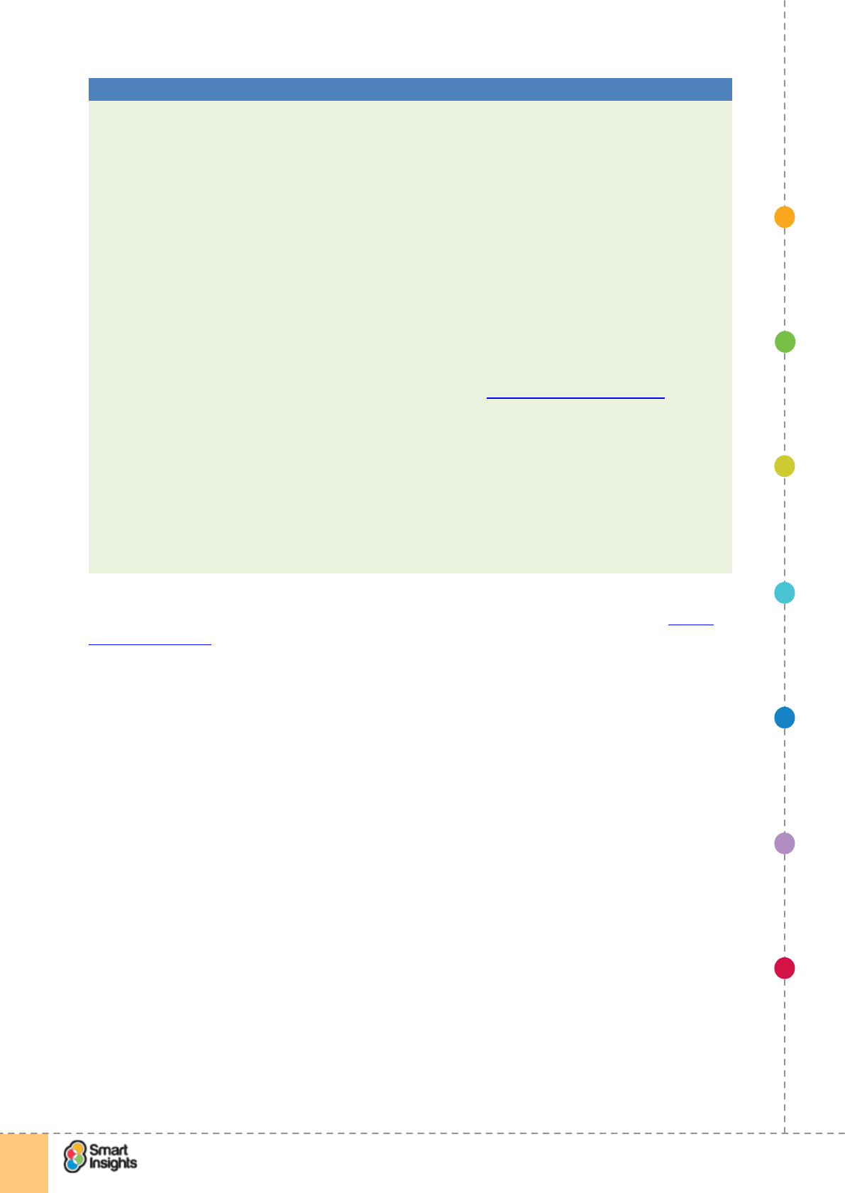
Creating a management dashboard for landing pages
More generally, for reporting on Google Analytics at a management reporting level in a
dashboard, we advise classifying the types of KPI data you need to review into three areas:
1. Volume
The trafc that is being driven to the landing page, monitoring visitor activity.
2. Quality
This involves measuring the level of engagement your visitors have with the website based
on bounce rate, interaction with the page and conversion rates.
3. Value
This relates to the nancial value that the trafc is driving in terms of ecommerce KPIs such
as revenue, Goal Value per Visit, Revenue per Visit.
For each area, focus on the KPIs that help you interpret what impact your landing page is
having on the goals and objectives. This table gives examples.
1. SET OBJECTIVES 6. INCREASING
BRAND TRUST
7. IMPROVING
RESULTS
5. COMPELLING
CONTENT
4. CREATING THE
BEST PAGE LAYOUT
3. ENGAGING YOUR
VISITOR
2. UNDERSTAND
VISITOR NEEDS
© Smart Insights (Marketing Intelligence) Limited. Please go to www.smartinsights.com to feedback or access our other guides.
Creating high-converting landing pages
!
24
1
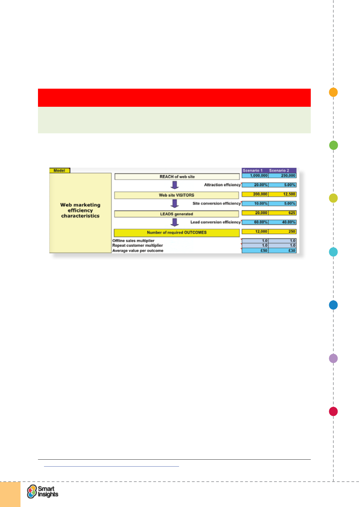
Create conversion models to assess potential of landing pages
rQ. Have we created conversion models to review the potential from landing pages?
To set expectations of what the landing pages can deliver, which will help set budget for
their creation, you need to create conversion models. We have some examples available on
Smart Insights for you to download here.11
Key Strategy Recommendation 6 Create conversion models to assess landing page
potential
Conversion models can help set expectations and set budgets. Use a worst and a best
case scenario to see what you can afford to pay to drive visitors to your website – this is
your affordable cost-per-lead.
Here’s an example showing how you can model how many you will add to the top of the
funnel and how this will translate to leads and sales.
Conversion models are really useful in helping you determine the number of impressions and
visits you need from a marketing campaign to your landing page to achieve the goals set.
Let’s take paid search as the example. You want to create a new landing page for an ad on
Google but you’re not sure if you can justify the investment. You use a conversion model to
plug in revenue and cost data from three key sources:
1. AdWords data (impressions, click-through rate, cost per click, etc.)
2. Google Analytics data (sessions, conversion rate, average order value, transactions,
revenue etc.)
3. Product margins.
From this you calculate the forecast net margin for the campaign. You can then reow the
conversion model to include a projection for conversion increases as a result of having a
bespoke landing page and deduct the cost of building the landing page to determine if the
investment is justied. See below for an outline of this type of return on investment model
that can be used to make the business case for landing page optimisation.
Please note that some marketers will invest in a landing page even if it doesn’t add to the
net margin of the campaign. Why? They may perceive the uplift in conversion (new customer
acquisition) to be more important as they then have more customers to target via their
retention programs. Again, this all depends on what goals you set for your landing page.
11 Smart Insights: Download conversion calculator models
1. SET OBJECTIVES 6. INCREASING
BRAND TRUST
7. IMPROVING
RESULTS
5. COMPELLING
CONTENT
4. CREATING THE
BEST PAGE LAYOUT
3. ENGAGING YOUR
VISITOR
2. UNDERSTAND
VISITOR NEEDS
© Smart Insights (Marketing Intelligence) Limited. Please go to www.smartinsights.com to feedback or access our other guides.
Creating high-converting landing pages
!
25
1
Set branding objectives for landing page
rQ. Have we dened the branding goals for our landing page?
Be aware that many of the people visiting your landing page won’t have heard of your brand
before, or may not know much about who you are and what you offer. For this audience,
there needs to be an element of reassurance to convince them that you are reputable and
reliable.
For example, on retail e-commerceecommerce landing pages, it’s common for the company
to display its unique selling points (USPs), such as free delivery and returns, as well as
security messages to emphasise that shopping online with them is safe and secure.
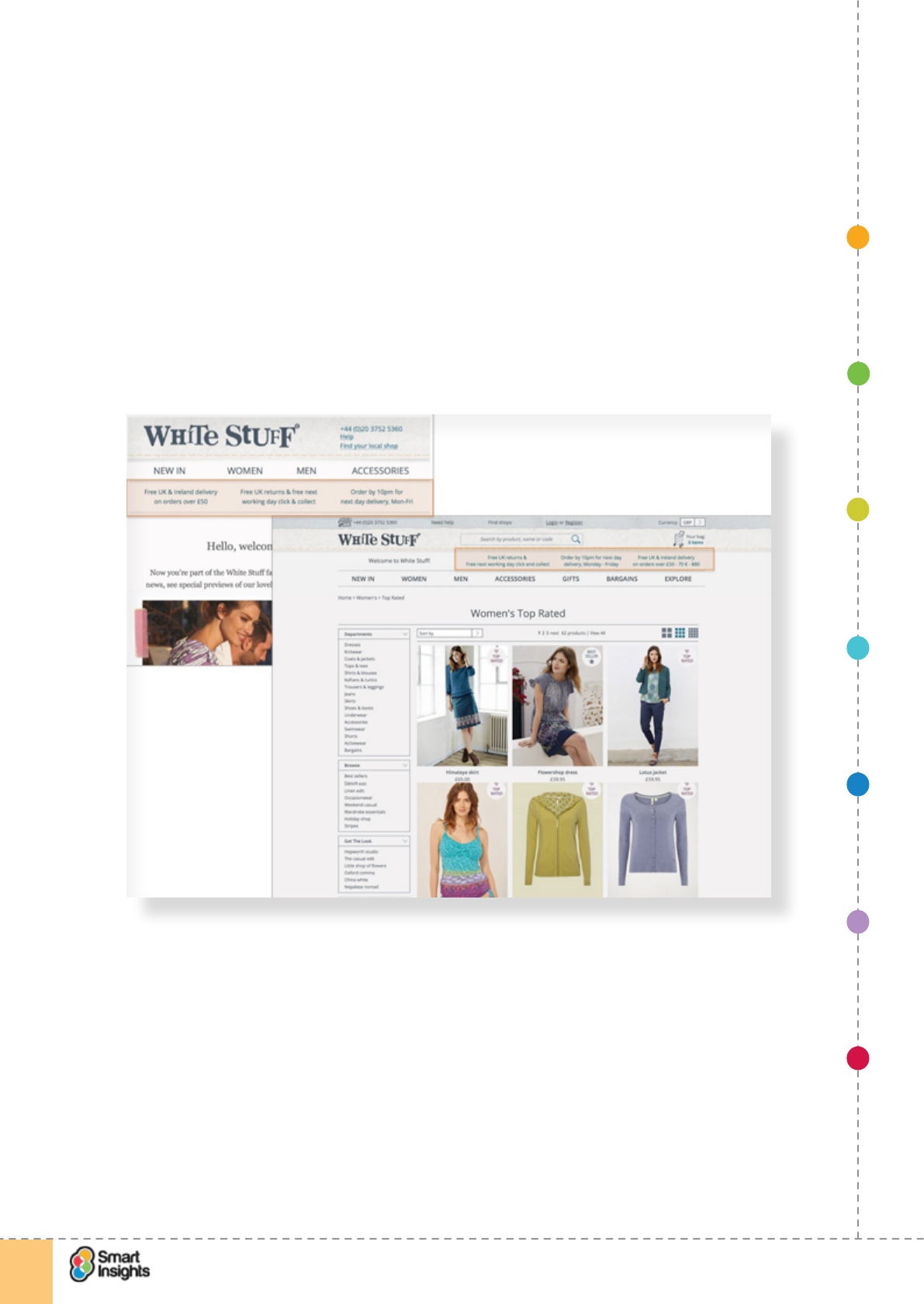
Take a look back at theat this example John Lewis example from the introductionfrom White
Stuff. They display a prominent guarantee delivery and returns messaginge to reassure
visitors that they are in safe hands, and the creative is consistent from email to landing page.
Conversion doesn’t usually occur in one step, so another goal is to get across the values of
your brand – make it memorable! You should communicate:
þYour brand identity, what you stand for, what makes you different.
þYour customers – who values you? Testimonials and social followers work well here.
þIndependent accreditation – who rates you? Display well known trust marks.
Ways to implement this include an ‘About Us’ tab or a sidebar explaining what makes you
different, or testimonials. The Salesforce.com example illustrates this well.
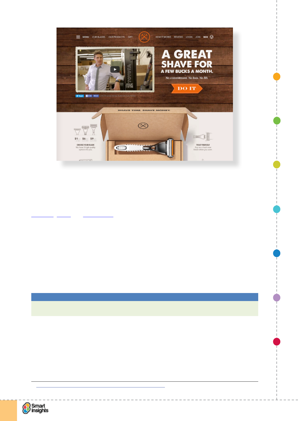
Ways to implement this include an ‘About Us’ tab or a sidebar explaining what makes you
different, or including customer testimonials and social proof. The Salesforce.comDollar
Shave Club example illustrates this with the number of Facebook likes shown beneath the
video and a prominent link in the main menu for ‘Reviews’.well.
1. SET OBJECTIVES 6. INCREASING
BRAND TRUST
7. IMPROVING
RESULTS
5. COMPELLING
CONTENT
4. CREATING THE
BEST PAGE LAYOUT
3. ENGAGING YOUR
VISITOR
2. UNDERSTAND
VISITOR NEEDS
© Smart Insights (Marketing Intelligence) Limited. Please go to www.smartinsights.com to feedback or access our other guides.
Creating high-converting landing pages
!
26
1
Landing pages often fail here since they are only thinking about the response.
Don’t underestimate the power of quality testimonials or stories of how your product or
service has helped. Social proof is really important online – you can provide this by adding
testimonials or by using a ratings and reviews service to display actual customer feedback on
products and services. There are many options for adding ratings to your website, including
using your web platform’s review module – the most popular third-party solutions are
Trustpilot, Feefo and Bazaarvoice.
If you’re considering adding ratings and reviews, we recommend using a solution that is
compatible with paid search so that your seller ratings can display in paid search ads as well
to help increase click-through rate. You can nd a list of supported partners here12.
Using remarketing to follow-up on Landing Page visits
rQ. Remarketing considered?
It’s possible to track each visitor to a landing page and to follow-up on them to remind
them about your offer. This could be for all landing page visitors or just those that showed
additional intent, for example through completing a form.
Best Practice Tip 4 Use remarketing to follow-up on landing page visits
Remarketing provides a way to encourage your customers about your offer as they browse
other sites that offer advertising.
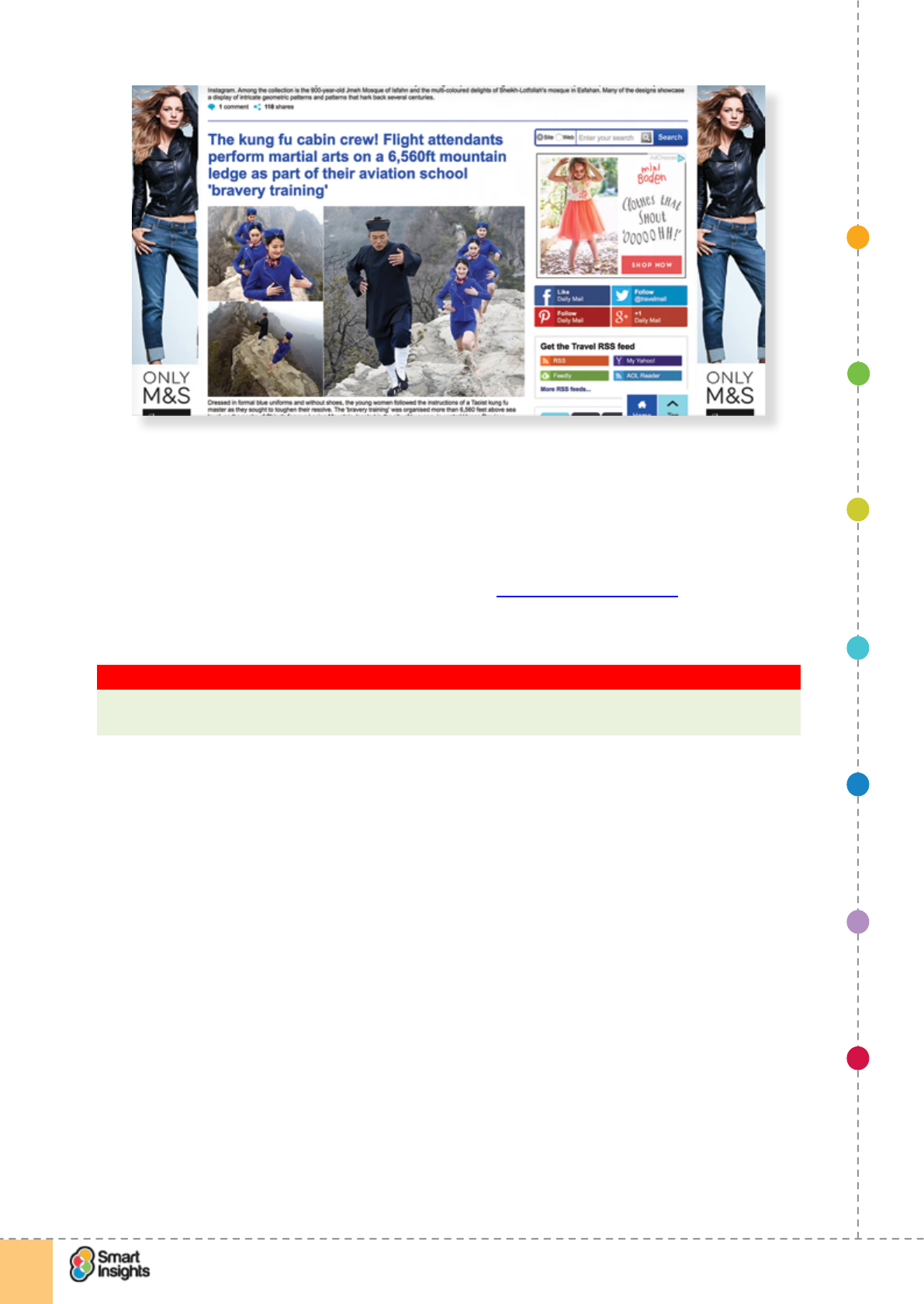
This example of Remarketing using Google AdWords is for the Policy Beefor the Boden
example we looked at earlier. You can see the display ad in the right sidebar. Note that in
this example the ad isn’t targetinged to a relevant siteshoppers of kids clothing, one of the
categories we visited on the website.to increase the reach of the ad.
12 https://support.google.com/adwords/answer/2375474?hl=en-GB
1. SET OBJECTIVES 6. INCREASING
BRAND TRUST
7. IMPROVING
RESULTS
5. COMPELLING
CONTENT
4. CREATING THE
BEST PAGE LAYOUT
3. ENGAGING YOUR
VISITOR
2. UNDERSTAND
VISITOR NEEDS
© Smart Insights (Marketing Intelligence) Limited. Please go to www.smartinsights.com to feedback or access our other guides.
Creating high-converting landing pages
!
27
1
How strong is your brand personality?
rQ. Have we reviewed how we communicate our brand personality online?
Rohit Bhargava, a Vice President at Ogilvy New York and author of Personality Not
Included stresses the importance of developing a brand that is sufciently distinctive and
energetic to encourage interaction and discussion that will amplify brand messages through
word-of-mouth. We recommend Rohit’s book or site (www.rohitbhargava.com) to learn
more. For us, this is one of the most important marketing books of the last few years, this
millennium even!
Key Strategy Recommendation 7 Review and rene brand personality
Is your brand personality distinct and energetic enough to encourage engagement and
sharing? If not, you will nd getting cut-through increasingly difcult.
Rohit nails it when he describes personality as:
‘the unique, authentic, and talkable soul of your brand that people can get passionate about’.
He goes on to say:
‘Personality is not just about what you stand for, but how you choose to communicate it. It is
also the way to reconnect your customers, partners, employees, and inuencers to the soul
of your brand in the new social media era.’
A great example is the UK company Wish, which provides experience days. They haveIt
has developed a unique tone of voice to theirso that copy that conveys the personality of the
brand brilliantly. So brilliant in fact that it attracts one of twosome negative reactions because
you can’t please everyone!
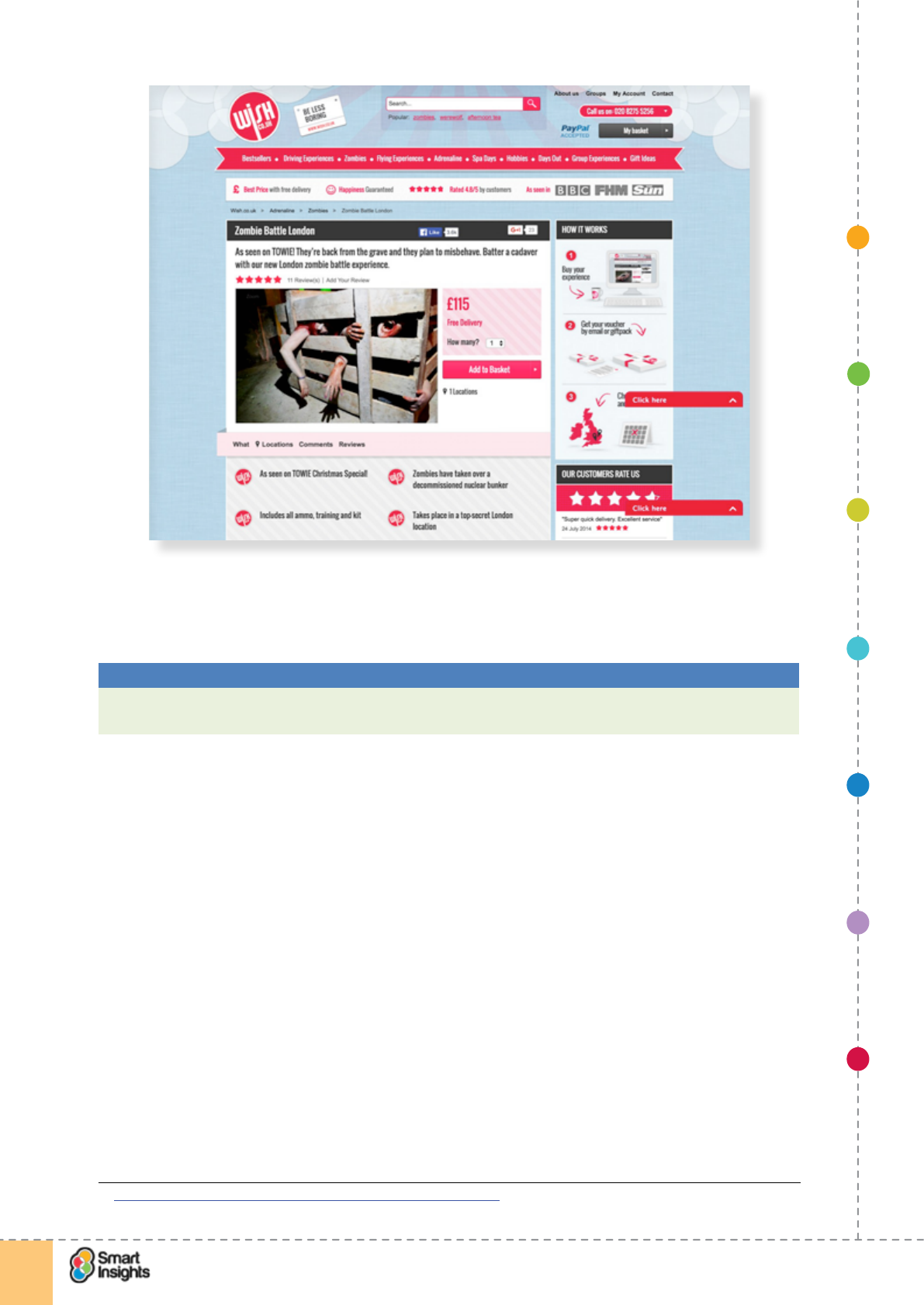
The screenshot below is the landing page for their Zombie Battle London experience
days – as well as the distinct voice of the copy, you’ll see other good practice landing page
techniques to establish brand credibility, such as the USP bar at the top of the page and
customer ratings..
1. SET OBJECTIVES 6. INCREASING
BRAND TRUST
7. IMPROVING
RESULTS
5. COMPELLING
CONTENT
4. CREATING THE
BEST PAGE LAYOUT
3. ENGAGING YOUR
VISITOR
2. UNDERSTAND
VISITOR NEEDS
© Smart Insights (Marketing Intelligence) Limited. Please go to www.smartinsights.com to feedback or access our other guides.
Creating high-converting landing pages
!
28
1
Rohit and others, like Jay Baer of ‘Convince and Convert’, recommend that you combine
your brand personality with your ‘one big thing’. Online, this has become particularly
important to communicate since interactions can be so eeting.
Best Practice Tip 5 Communicate your ‘one big thing’
Particularly true for start-ups, but valuable for other companies, communicating your main
point of difference is key.
Entrepreneur Jason Goldberg13 recommends that online start-ups should answer these
questions:
r1. What’s the one thing your product will do?
_________________________________________________________________
r2. What’s the one thing that your start-up will do and do better than everyone else?
_________________________________________________________________
r3. What’s the one thing your brand will represent?
_________________________________________________________________
r4. What’s the one thing you will do day-in and day-out, to the exclusion of all other
things?
_________________________________________________________________
Goldberg says ‘The answer to all 4 of those questions should be exactly the same. And
that’s your one thing.’ He gives these examples:
þTwitter: Share short updates.
þFoursquare: Check-in.
13 Jason Goldberg: What I learned creating 4 startup companies
1. SET OBJECTIVES 6. INCREASING
BRAND TRUST
7. IMPROVING
RESULTS
5. COMPELLING
CONTENT
4. CREATING THE
BEST PAGE LAYOUT
3. ENGAGING YOUR
VISITOR
2. UNDERSTAND
VISITOR NEEDS
© Smart Insights (Marketing Intelligence) Limited. Please go to www.smartinsights.com to feedback or access our other guides.
Creating high-converting landing pages
!
29
1
þInstagram: Share pretty photos.
þDropbox: Easy cloud storage.
þYouTube: Upload a video.
þGroupon: One great local deal per day.
þThe original Google: Algorithmic search.
þLinkedIn: Professional networking.
Key Strategy Recommendation 8 Take away thought
Every page on your website can be a landing page – make sure you have clear goals for
each page and think it through from the customer perspective to provide the best possible
user experience.
Dene minimum contact information to maximise conversion
Your key challenge is to decide what information is required to follow up leads. This is usually
determined by a combination of the marketing medium being used (e.g. paid search, ofine
advertising) and the action that you are trying to persuade visitors to take.
There is often a trade-off – your sales and marketing team may want to get as much data as
possible to help prole leads but generally speaking, the more elds a visitor has to ll out to
complete a form, the greater the chance they will abandon.
So, we recommend starting by dening the goals for your data capture, then design the form
accordingly. And think carefully about form usability on mobile devices.
rQ. Have we dened our goals for collecting proling information?
Less is denitely more when collecting information, but you do need sufcient information to
understand the characteristics, needs and values of the person who has lled in the form. In
most cases you need more than an email address!
Best Practice Tip 6 Collect the minimum prole information to qualify and personalise
If you try to collect too much information, then your conversion rates will fall, so cut out
every eld that isn’t essential. What are your minimum prole elds that you will actually
use to qualify leads for follow-up or personalised email? Ask which are essential not just
‘nice-to-have’.
These are the main types of information to consider:
1. Contact information
______________________________________
2. Prole information
______________________________________
3. Signals of buying readiness
______________________________________
The example forms below areis from Hubspot, an Inbound Marketing Software vendor based
in the US. They have used different versions lengths of the form, to suit the different lead
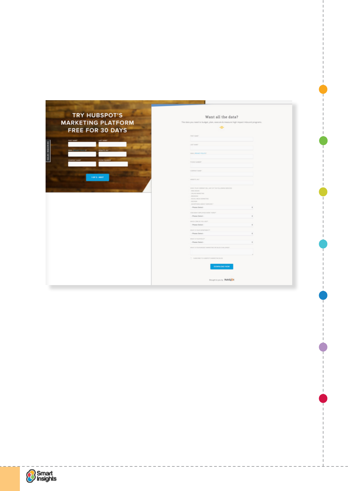
1. SET OBJECTIVES 6. INCREASING
BRAND TRUST
7. IMPROVING
RESULTS
5. COMPELLING
CONTENT
4. CREATING THE
BEST PAGE LAYOUT
3. ENGAGING YOUR
VISITOR
2. UNDERSTAND
VISITOR NEEDS
© Smart Insights (Marketing Intelligence) Limited. Please go to www.smartinsights.com to feedback or access our other guides.
Creating high-converting landing pages
!
30
1
generation needs and probably to also test the impact on conversion of form length. This is
good practice at work. The shorter form is for the free software trial sign-up and the longer
form for downloads of the State of Inbound 2015 market report.
Surprisingly, theThe forms isn’t usingalso use intelligent validation, displaying error message
in-line as the user progresses through the form. as it’s possible to submit the form with an
invalid phone number. We discuss form validation in more detail in Step 3 – Engaging your
visitor.
1. SET OBJECTIVES 6. INCREASING
BRAND TRUST
7. IMPROVING
RESULTS
5. COMPELLING
CONTENT
4. CREATING THE
BEST PAGE LAYOUT
3. ENGAGING YOUR
VISITOR
2. UNDERSTAND
VISITOR NEEDS
© Smart Insights (Marketing Intelligence) Limited. Please go to www.smartinsights.com to feedback or access our other guides.
Creating high-converting landing pages
!
31
2
Step 2
Understand your visitor needs
rQ. Have we reviewed our audience information needs?
It’s not all about the incentive for the visitor. It’s also about explaining the basics. You have
to cater for online novices as well as web savvy customers. If you make your landing page
content too complicated, you risk alienating some of the visitors. There’s a great article
from Unbounce explaining the need to build trust with landing pages, using a human and
personable language14. We like this quote:
Why Should I Do Business With You?
Right answer: ‘Because we care about what you need and want to help you make the most
out of what you have to succeed.’
Wrong answer: ‘Our semantic targeting features yield the highest ROI in the entire industry.’
We recommend reading the full article:
Remember the three familiarities – your brand, your services and your site. Obvious, but not
all landing or home pages get these basic messages across.
It’s really important to evaluate these in the context of the user journey – what are people
expecting when they reach your landing page, and what type of content is most relevant and
useful? Take the example below from a search for “business VAT”; the HMRC landing page is
focused on answering the key questions business owners are likely to have about paying VAT.
14 Unbounce: Why Should I do business with you?
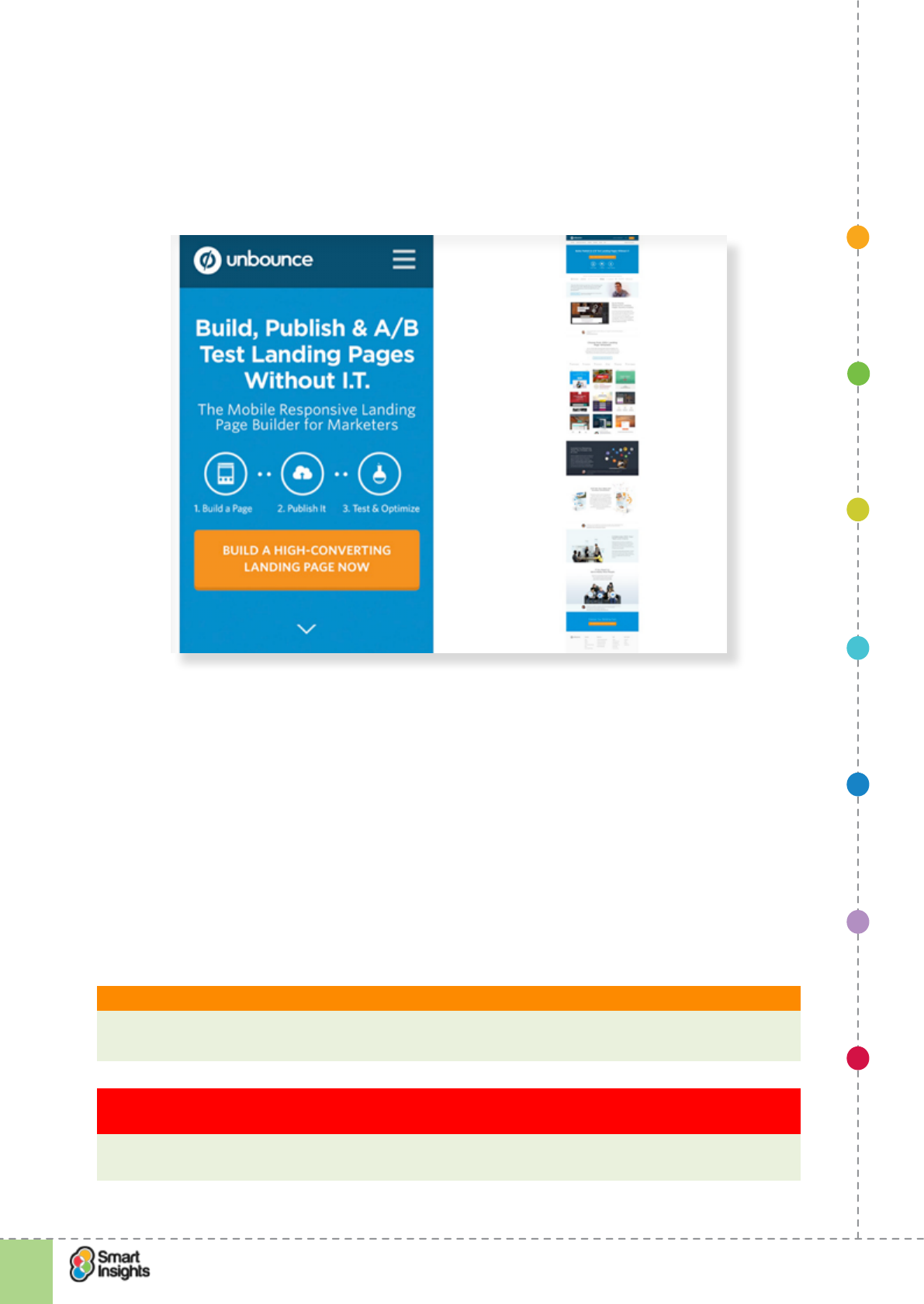
1. SET OBJECTIVES 6. INCREASING
BRAND TRUST
7. IMPROVING
RESULTS
5. COMPELLING
CONTENT
4. CREATING THE
BEST PAGE LAYOUT
3. ENGAGING YOUR
VISITOR
2. UNDERSTAND
VISITOR NEEDS
© Smart Insights (Marketing Intelligence) Limited. Please go to www.smartinsights.com to feedback or access our other guides.
Creating high-converting landing pages
!
32
2
We think Unbounce also achieves this well through its home page (which is usually the most
visited landing page for a website). Note on mobile the menu switches to the hamburger
icon, and there key value proposition and CTA display in the visible pane. The mobile landing
page also makes use of native features like the swipe gesture to reduce vertical scrolling.
We’ve included a screenshot of the full desktop page to show you how much content is on
the landing page.
You may also need to explain the service or category; not everyone will get it as clearly as
you do.
We’ll talk more about this in Step 5 – Compelling content and creative.
Outline your main audiences
rQ. Have we dened our main audiences?
Every site or landing page will have a range of audiences, so think about who you prioritise
content for. We recommend you use personas for clarity in dening the audience. Before
you start the design, write down the audiences in order of priority. Identify audiences by
buying needs, lifestyle or demographics (age, gender, company size or position in the buying
chain).
What is it? Web design personas
A thumbnail summary of the characteristics, needs, motivations and environment of typical
site users.
Key Strategy Recommendation 9 Be clear on your audience and create personas to help
dene them
Personas can help improve the page so it’s based on the psychology and needs of the
visitor. In short, it makes pages more customer-centric.
1. SET OBJECTIVES 6. INCREASING
BRAND TRUST
7. IMPROVING
RESULTS
5. COMPELLING
CONTENT
4. CREATING THE
BEST PAGE LAYOUT
3. ENGAGING YOUR
VISITOR
2. UNDERSTAND
VISITOR NEEDS
© Smart Insights (Marketing Intelligence) Limited. Please go to www.smartinsights.com to feedback or access our other guides.
Creating high-converting landing pages
!
33
2
Recommended resource? Personas toolkit
See our Personas toolkit showing key issues to consider when creating personas and with
examples of different styles of personas.
List audiences in order of priority:
1. ____________________________________
2. ____________________________________
3. ____________________________________
4. ______________________________________
5. ______________________________________
6. _______________________________________
You may nd it worthwhile to consider scent trails for different audience members.
What is it? Scent trails and audience-specic content
An interface element such as a link, heading or image which users assess as being
relevant for their situation or need, so they “self-select” or “self-segment. Examples
include type of person, size of business. The destination pages can then be tailored for the
audience needs
Take a look at the landing page from Livingston International below. For the scent trail,
they use four tabs to provide tailored messaging for different audience types. Each content
snippet links off to a dedicated landing page for that audience. This is a useful way of helping
segment content and user journeys based on visitor type. There is no ‘right way’ to cater for
different audience segments on your landing page but it’s important you provide clear links to
enable people to access information that is most relevant to them.
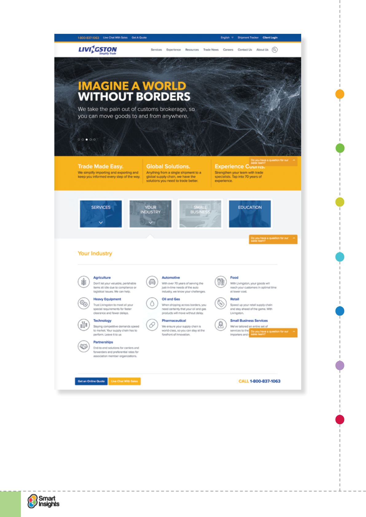
1. SET OBJECTIVES 6. INCREASING
BRAND TRUST
7. IMPROVING
RESULTS
5. COMPELLING
CONTENT
4. CREATING THE
BEST PAGE LAYOUT
3. ENGAGING YOUR
VISITOR
2. UNDERSTAND
VISITOR NEEDS
© Smart Insights (Marketing Intelligence) Limited. Please go to www.smartinsights.com to feedback or access our other guides.
Creating high-converting landing pages
!
34
2
Another example is from the US, where Internships.com segments its homepage into three
distinct service areas for students, employers and educators. In this case the Employers tab
gives a landing page specic for the audience clearly explaining their proposition.
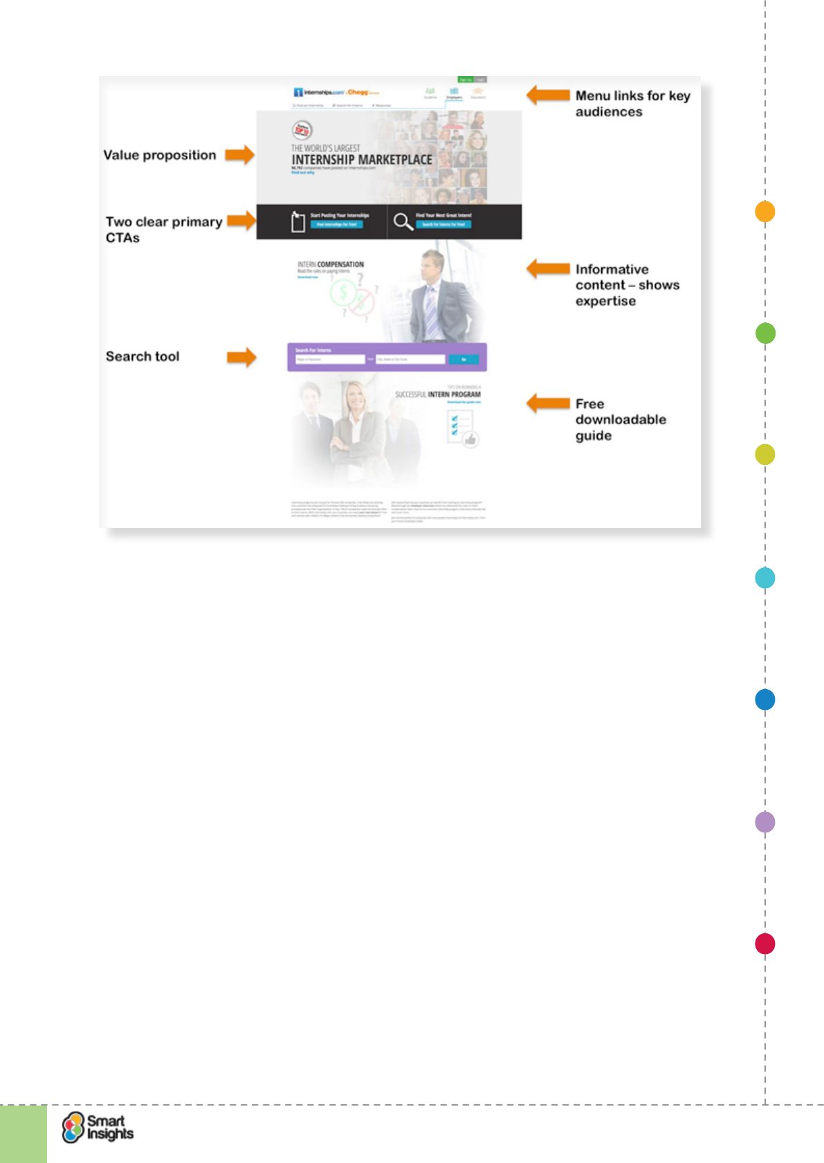
1. SET OBJECTIVES 6. INCREASING
BRAND TRUST
7. IMPROVING
RESULTS
5. COMPELLING
CONTENT
4. CREATING THE
BEST PAGE LAYOUT
3. ENGAGING YOUR
VISITOR
2. UNDERSTAND
VISITOR NEEDS
© Smart Insights (Marketing Intelligence) Limited. Please go to www.smartinsights.com to feedback or access our other guides.
Creating high-converting landing pages
!
35
2
Dene main user scenarios or tasks
rQ. Have we dened the audience scenarios?
Personas are in different situations when they arrive on your site. Are they just browsing or
do they have an immediate need? So you need to consider the scenario that has triggered
the visit.
1. ______________________________________________________________________.
2. ________________________________________________________________________
3.________________________________________________________________________
Another way to use content segmentation is to split the product offering into its constituent
parts, enabling visitors to pick and choose which components to read about.
This is particularly important for landing pages where there will often only be a single
choice, but paths should be available for visitors who don’t want to respond right now. The
automotive industry is a good example for translating a complex product and purchase path
into a well-structured product landing page, using layered data to let users explore and learn,
without bombarding them with too much information. The example below is for the Mercedes
GLS, showing the landing page on an iPhone 5s and laptop. Note how for mobile users,
the page is streamlined and the menu links adapted to suit mobile interaction. Unfortunately
some essential data is missing from the mobile page, for example the ‘On the road price’ –
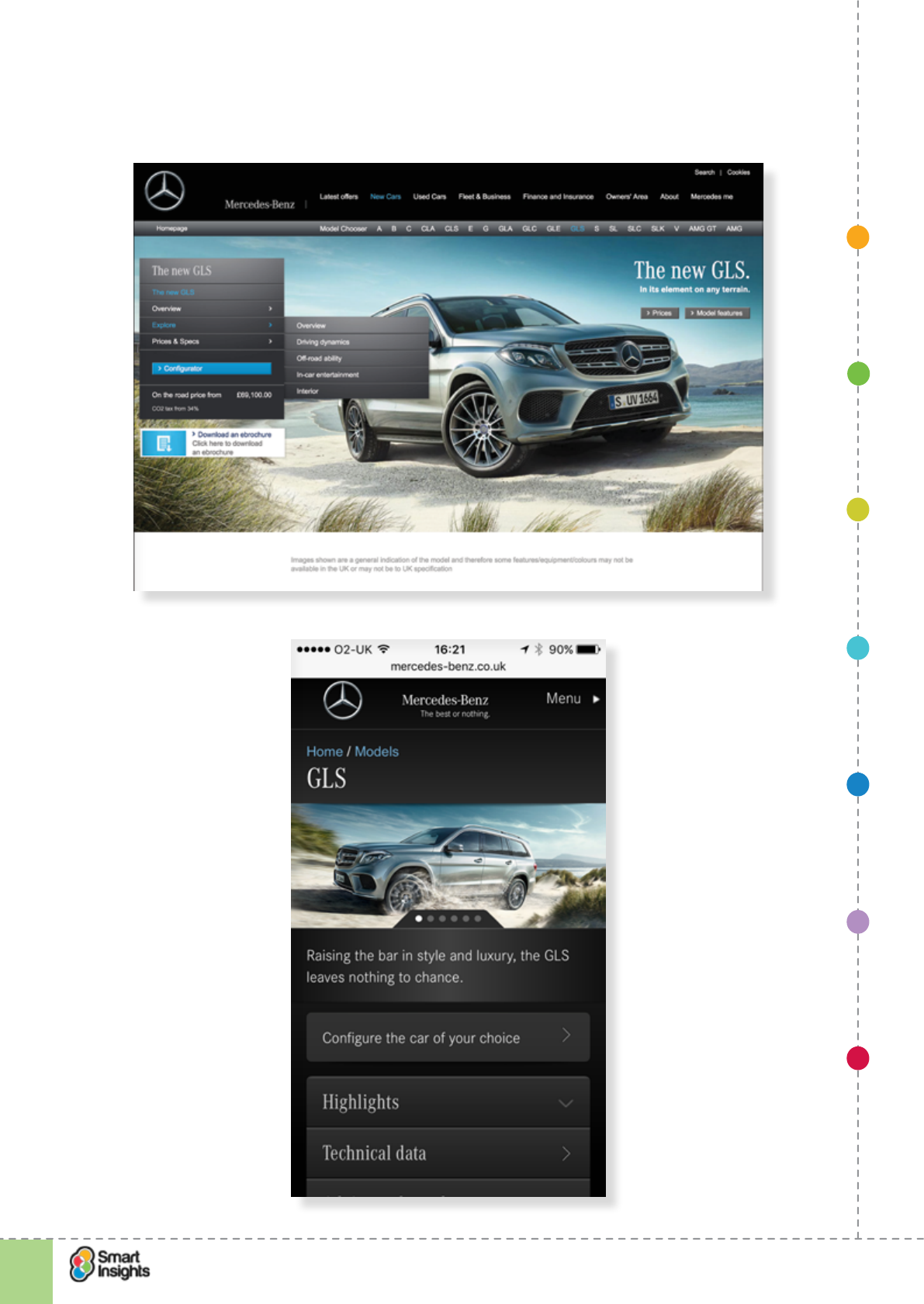
1. SET OBJECTIVES 6. INCREASING
BRAND TRUST
7. IMPROVING
RESULTS
5. COMPELLING
CONTENT
4. CREATING THE
BEST PAGE LAYOUT
3. ENGAGING YOUR
VISITOR
2. UNDERSTAND
VISITOR NEEDS
© Smart Insights (Marketing Intelligence) Limited. Please go to www.smartinsights.com to feedback or access our other guides.
Creating high-converting landing pages
!
36
2
you can only nd pricing info by clicking on Highlights > Prices, and then the UI design isn’t
intuitive.
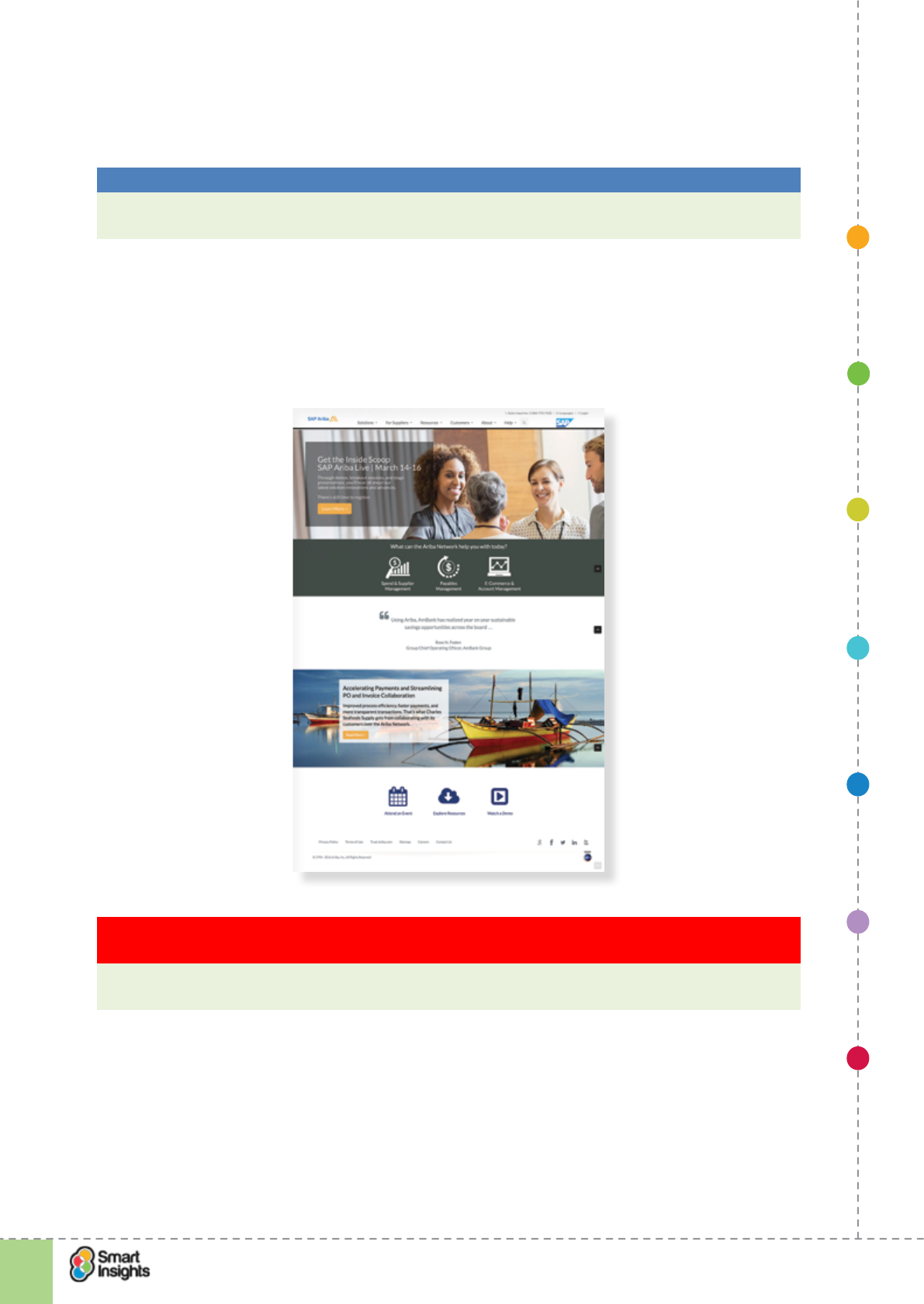
1. SET OBJECTIVES 6. INCREASING
BRAND TRUST
7. IMPROVING
RESULTS
5. COMPELLING
CONTENT
4. CREATING THE
BEST PAGE LAYOUT
3. ENGAGING YOUR
VISITOR
2. UNDERSTAND
VISITOR NEEDS
© Smart Insights (Marketing Intelligence) Limited. Please go to www.smartinsights.com to feedback or access our other guides.
Creating high-converting landing pages
!
37
2
This approach is used well in B2B Software marketing where solutions often comprise
multiple software tools and landing pages are used to promote capabilities in each area, or to
appeal to unique audience segments whose needs are quite different.
Best Practice Tip 7 Identify the primary paths of customer journeys
Offering too much undifferentiated choice to website visitors without visual emphasis can
be a mistake, so keep it focused on the primary paths.
So you need to decide on the main action(s) you want a visitor to take and then emphasise
those through the design. Take the homepage example of SAP Ariba, an eprocurement
specialist, where the content is segmented based on the three service needs: spend &
supplier management, payables management and ecommerce & account management. Also
note the inclusion of customer testimonials.
Key Strategy Recommendation 10 Test different ways to provide segment specic content
clear on your audience and create personas to help dene them
A/B and multivariate (MVT) testing can help you nd the optimal way to signpost content for
different audience segments.
Techniques to surface deeper content
rQ. Are we making it easy for visitors to access more information?
It’s a challenge to nd the right blend of content depth to cater for the needs of visitors –
some will pack light and want a clear call to action, others will want to read on and learn more
before making a decision. How do you provide the right information for all of them?
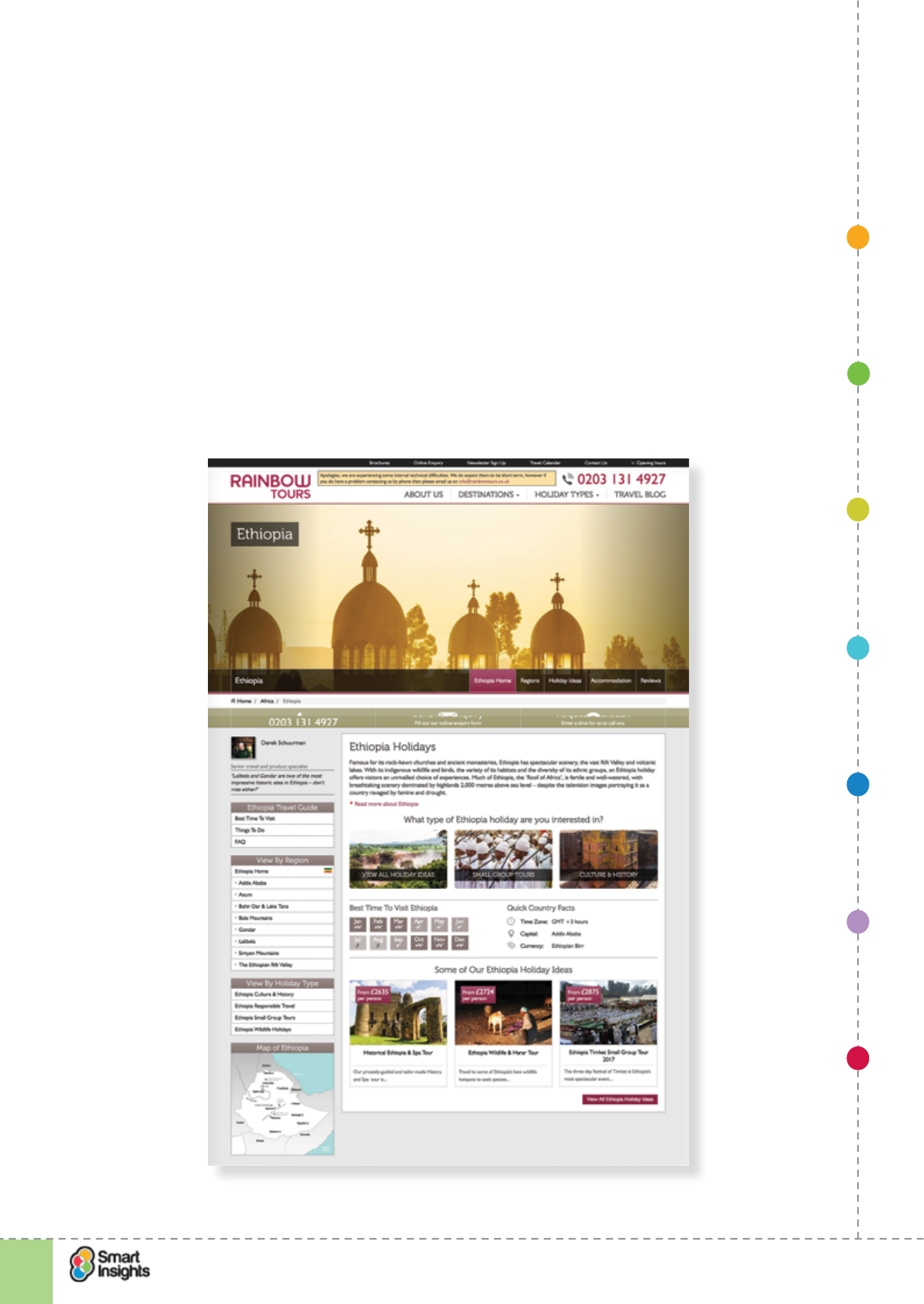
1. SET OBJECTIVES 6. INCREASING
BRAND TRUST
7. IMPROVING
RESULTS
5. COMPELLING
CONTENT
4. CREATING THE
BEST PAGE LAYOUT
3. ENGAGING YOUR
VISITOR
2. UNDERSTAND
VISITOR NEEDS
© Smart Insights (Marketing Intelligence) Limited. Please go to www.smartinsights.com to feedback or access our other guides.
Creating high-converting landing pages
!
38
2
Our experience tells us that the focus of the landing page should be top down. By this we
mean providing the key information that will encourage visitors to convert, then providing
access to more detailed information if required. By adopting this approach, you’ll ensure the
most important call to action is prominent and there is sufcient information to tackle barriers
to conversion.
Here’s a list of methods to surface additional content:
rHTML quick link. This is where you provide a list of links as a navigation menu that can
be clicked to deep link people to relevant content sections within the landing page.
rExpandable (or accordion) link. This is where a text link, when clicked, expands to
reveal additional content. When doing this, make sure that the rest of the page re-aligns
automatically and you don’t break the page design. Accordion links are popular on
mobile, where the content expands vertically for the user.
In the example below from Rainbow Tours, the landing page has a left hand menu of links
that when clicked direct users to more content explaining the range of services available.
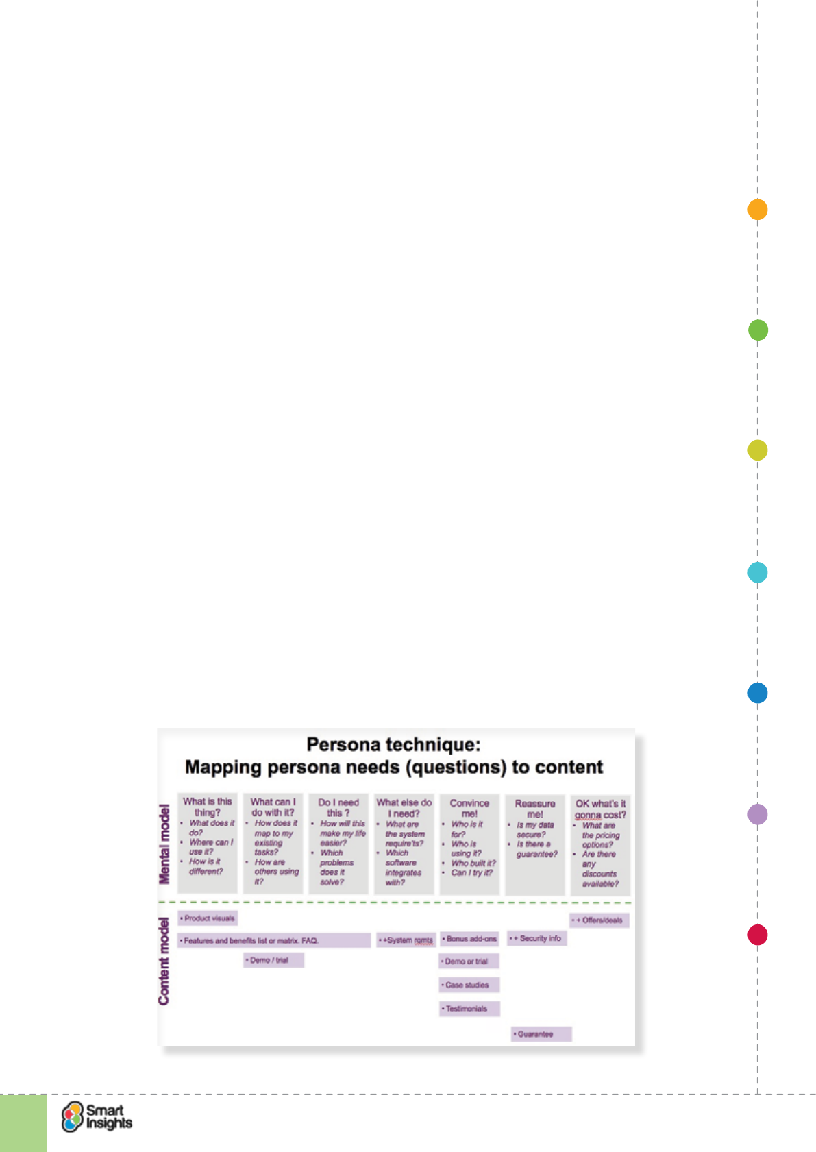
1. SET OBJECTIVES 6. INCREASING
BRAND TRUST
7. IMPROVING
RESULTS
5. COMPELLING
CONTENT
4. CREATING THE
BEST PAGE LAYOUT
3. ENGAGING YOUR
VISITOR
2. UNDERSTAND
VISITOR NEEDS
© Smart Insights (Marketing Intelligence) Limited. Please go to www.smartinsights.com to feedback or access our other guides.
Creating high-converting landing pages
!
39
2
rLightbox. When the link is clicked, or moused-over, an overlay appears within which content
is displayed. The overlay can be closed at any time. This is preferable to redirecting people
away from the landing page as they can return to the landing page easily. We’ve seen some
mobile sites use a slide-out navigation pane to achieve this, where the user is taken ‘off page’
to view content, then returned back to the page when nished. Brands like House of Fraser
use this UX pattern for their main catalogue navigation on mobile devices.
We generally advise against redirecting visitors to another web page to access additional
information, unless you have to redirect to take people to the conversion page. For example,
a landing page from an email campaign to promote a new range of clothes will usually
include links to individual product pages where the ‘buy now’ action takes place.
Why?
Loading a new URL requires an additional server request, which adds time to the user
journey. If the user is on a mobile connection with poor signal, this can be really frustrating.
Wherever possible, load the content that the user requires when the landing page is
requested, then let the front-end do the work in surfacing additional content.
We discuss the pros and cons of short and long landing pages in Step 4 – Create the optimal
page layout.
Explain the service or category clearly
rQ. Have we clearly explained the services or product category?
Many visitors may not be as familiar with your range of products or services as you are, or
even the type of ‘thing’ you’re offering them! This is particularly true if you’re offering a new or
non-mainstream service, like indemnity insurance for example.
Here’s a REALLY useful technique for answering visitors questions that involves mapping the
questions that a site visitor nding out about the project will be asking (mental model) against
different types of features and content on the site to help answer these questions (content
model). We like the technique because it’s a simple yet powerful way of brainstorming or
reviewing content effectiveness.
Here is a generic service launch example we have created to show how the method can be used:
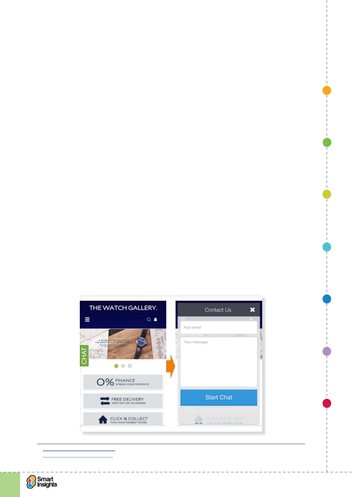
1. SET OBJECTIVES 6. INCREASING
BRAND TRUST
7. IMPROVING
RESULTS
5. COMPELLING
CONTENT
4. CREATING THE
BEST PAGE LAYOUT
3. ENGAGING YOUR
VISITOR
2. UNDERSTAND
VISITOR NEEDS
© Smart Insights (Marketing Intelligence) Limited. Please go to www.smartinsights.com to feedback or access our other guides.
Creating high-converting landing pages
!
40
2
How will you explain the service or category you are providing. Check these ideas:
r1. Block of text about the service.
r2. Tab (‘About choosing X’).
r3. Bulleted list of service features AND benets.
r4. ‘Our services’ link in footer.
r5. ‘Why choose us?’ message.
r6. ‘How to choose “X” guide’.
r7. Customer testimonial endorsement.
Review relevance of ofine contact options
rQ. Are there any relevant options for ofine contact?
You’ll denitely know this piece of advice. We all get annoyed when the phone number isn’t
prominent. That’s easy to x, but it helps if the phone number is also tracked through a
unique number. It’s also worth offering a callback and live chat. There are call tracking tools
available, such as ResponseTap15 and Mediahawk16.
‘Different strokes for different folks.’
Have you included any of the following?
r1. Prominent phone number.
r2. Phone number tracked through unique number.
r3. Callback option.
r4. Live chat option.
Take a look at the live chat option available on Thewatchgallery.co.uk mobile site. Given the
premium price point of the product, live chat is a useful tool to support landing pages as it
enables the Customer Service team to respond to customer queries in real time.
15 https://www.responsetap.com/
16 http://www.mediahawk.co.uk/
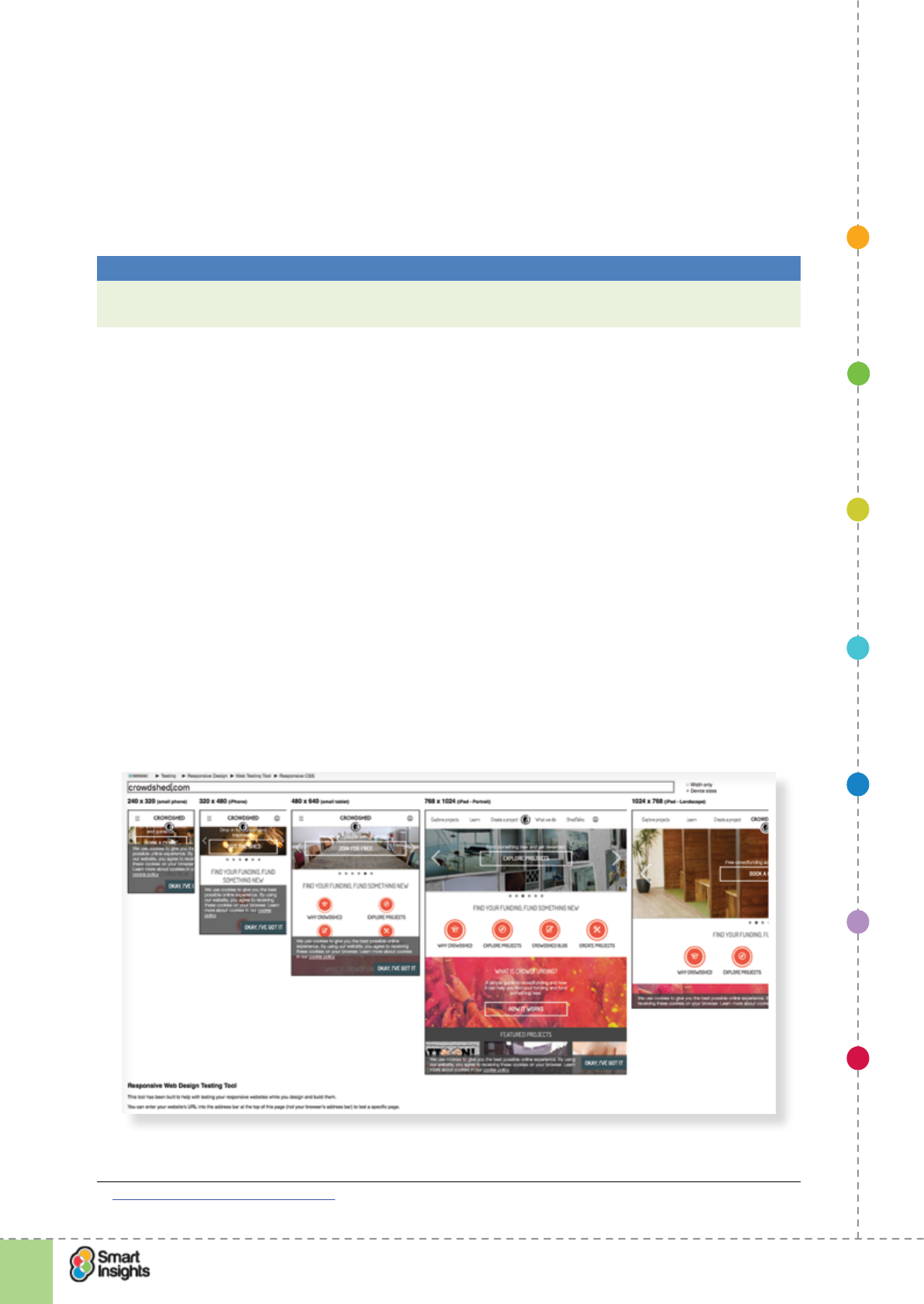
1. SET OBJECTIVES 6. INCREASING
BRAND TRUST
7. IMPROVING
RESULTS
5. COMPELLING
CONTENT
4. CREATING THE
BEST PAGE LAYOUT
3. ENGAGING YOUR
VISITOR
2. UNDERSTAND
VISITOR NEEDS
© Smart Insights (Marketing Intelligence) Limited. Please go to www.smartinsights.com to feedback or access our other guides.
Creating high-converting landing pages
!
41
2
Review devices that visitors use
rQ. Have we reviewed the technology platforms used by visitors?
Use your analytics system to check which platform your average users use
If you use Google Analytics these will be within the Visitors’ section where you can record the
browser capabilities and the proportion of visitors using mobile devices.
Best Practice Tip 8 Check current screen resolutions before you start designing
Use your analytics system to set a realistic minimum target screen resolutions before you
start designing.
You need to know what type of device is going to be used to access your landing page, then
you need to test how the landing page looks on each device. This is especially important
with mobile optimisation – a landing page optimised for desktop resolutions may not render
effectively on a smartphone, or be usable based on device specic capabilities and user
behaviours. For example, are you supporting standard touch gestures on touch-enabled
devices?
It’s important to split tablet from mobile – tablet resolutions (at least the larger tablets –
the advent of mini tablets adds a layer of complexity) are more similar to desktop than
smartphone and we know some retailers who have seen better conversion by directing tablet
users to their desktop landing pages.
We really like Matt Kersley’s free online Responsive Web Design Testing Tool.17 Use this to
test your landing page to see how it renders on different screen resolutions.
Below are examples of two different landing pages run through Matt’s testing tool, showing
how landing pages can be broken if they’re not considered across device types.
The rst is an example of a responsive website from CrowdShed, where the homepage
layout changes depending on the device resolution.
17 Matt Kersley responsive design test
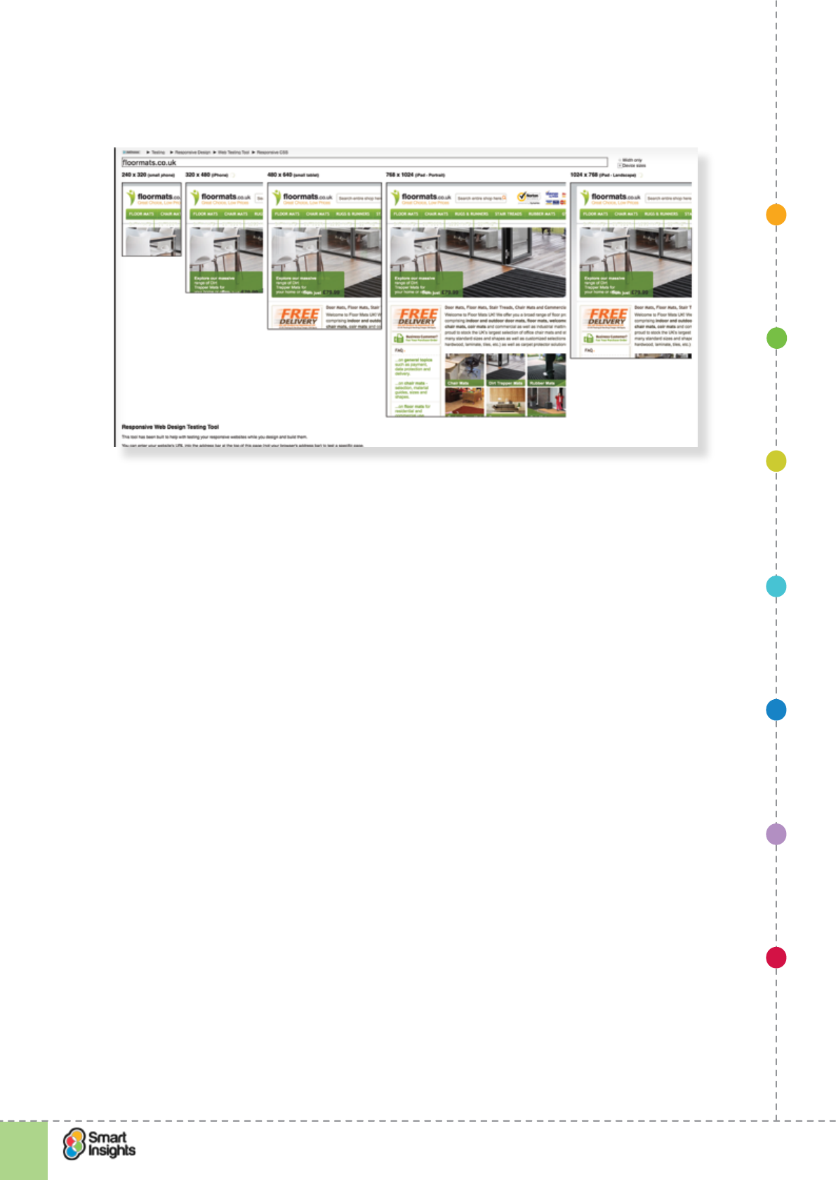
1. SET OBJECTIVES 6. INCREASING
BRAND TRUST
7. IMPROVING
RESULTS
5. COMPELLING
CONTENT
4. CREATING THE
BEST PAGE LAYOUT
3. ENGAGING YOUR
VISITOR
2. UNDERSTAND
VISITOR NEEDS
© Smart Insights (Marketing Intelligence) Limited. Please go to www.smartinsights.com to feedback or access our other guides.
Creating high-converting landing pages
!
42
2
The second is an example of a website from Floormats.co.uk that isn’t optimised for mobile,
where the homepage simply ‘squashes’ to t a mobile browser:
Reasons for creating unique landing pages for mobile
rQ. Is a unique mobile landing page appropriate?
Even if you are using responsive design to reow the page content based on the device type,
that doesn’t guarantee a mobile-optimised experience.
The reality is that the browsing experience on a mobile is vastly different to that on a desktop.
This means that not all features and functions of a desktop landing page are relevant to
a mobile visitor. A good example in retail ecommerce is the product zoom feature – on a
smartphone people are used to double tapping images to zoom, rather than pressing a
‘zoom’ button.
It’s therefore common for people to create custom landing pages for mobile visitors, with a
stripped down version of the content and features.
The top reasons for a mobile optimised landing page are:
rThe desktop landing page has too much content for a mobile visitor to digest easily.
rSome of the features on the desktop site won’t work effectively on a mobile device.
rThe calls to action aren’t easy to click and need to be re-positioned.
rYou want to provide a different call to action to mobile visitors (e.g. download the mobile
app).
r
Checklist for landing page technology compatibility
1. Minimum screen resolution
____________________________________
1. SET OBJECTIVES 6. INCREASING
BRAND TRUST
7. IMPROVING
RESULTS
5. COMPELLING
CONTENT
4. CREATING THE
BEST PAGE LAYOUT
3. ENGAGING YOUR
VISITOR
2. UNDERSTAND
VISITOR NEEDS
© Smart Insights (Marketing Intelligence) Limited. Please go to www.smartinsights.com to feedback or access our other guides.
Creating high-converting landing pages
!
43
2
2. Web browsers to support
____________________________________
3. Mobile devices to support
____________________________________
Learning from your visitors
rQ. Do you use voice-of-customer techniques to get landing page feedback?
Voice-of-customer data (qualitative and quantitative) is really useful in helping you
understand why a page is or is not performing well, helping you learn what customers really
want. See the selection of feedback tools we recommend18.
Companies using these feedback tools often factor the data into their weekly reports. With
tools like Foresee you can capture customer ratings of different aspects of the website and
chart these over time. This is great for trend analysis, especially when making major changes
to the website (major release, relaunch etc). You can analyse the trend line before, during
and after the change to see what impact it is having on individual measures of success. For
example, if you have just redesigned your landing page, how does this rating change over
time? Does it affect the overall website satisfaction?
Persistent online surveys (Qualaroo, Kampyle, etc.) are great low cost tools to keep pumping
customer feedback into the data pool. Qualaroo (previously KissInsights) supports page-level
data capture. You can use a simple qualitative question to nd out what people like and
dislike about your landing pages. This is a great way to provide your marketing team with
feedback direct from the customer, helping inform your landing page optimisation program.
Best Practice Tip 9 Gain audience feedback from landing pages
You can only learn so much from web analytics tools. Often it’s best to ask about specic
needs or offer support.
18 Smart Insights: Feedback tools

1. SET OBJECTIVES 6. INCREASING
BRAND TRUST
7. IMPROVING
RESULTS
5. COMPELLING
CONTENT
4. CREATING THE
BEST PAGE LAYOUT
3. ENGAGING YOUR
VISITOR
2. UNDERSTAND
VISITOR NEEDS
© Smart Insights (Marketing Intelligence) Limited. Please go to www.smartinsights.com to feedback or access our other guides.
Creating high-converting landing pages
!
44
3
Step 3
Engage your visitors
rQ. What does ‘engagement’ really mean?
Engaging visitors as they rst arrive on a landing page is a challenge, they’re in a mode of
quickly scanning different alternatives. So it’s really important to provide a relevant engaging
page. To help you do this, in this section we will provide 9 key issues to consider as you
review your landing page showing examples of good practice for each.
The word ‘engagement’ is much maligned, often because it is used without context. It’s
important to dene what we mean by engagement in the context of landing pages. For the
purpose of this guide, we’ll be using the following denition:
‘Engagement is the process of gaining customer participation in your landing pages by
providing relevant and useful information, or giving them a compelling reasons to take action
e.g. an unbeatable offer.’
Let’s break that down into its key components.
þ‘gaining customer participation’
This means getting a reaction from the customer. This reaction could simply be clicking on an
ad and visiting a web page. However, reactions become more meaningful when they lead to
conversions such as making a purchase or submitting an enquiry form.
þ‘providing relevant and useful information’
This applies both to the marketing campaign and the landing page. Relevant and useful
information is information that helps a visitor make a decision and/or achieve the goal for
their visit. This can be simple information like a clear call to action, or more complex content
that helps answer questions.
þ‘give them a compelling reason to take action’
Sometimes it’s not about the content or the overall design, it’s about the quality and
uniqueness of offer. If you have a product that people need/want and an offer that beats
all other retailers, and is time constrained to create urgency, then you’re likely to persuade
people to act.
Measuring engagement for landing pages
rQ. Are we measuring engagement?
So we have dened what engagement means. Now let’s look at how it can measured.
Remember Step 7 has more detailed information on measuring the performance of landing
pages.
Below are a few metrics you can use to measure engagement.
þ1. Bounce rate. How many people when they visit your landing page, leave immediately
without taking any further action? If your landing page is a conversion page (e.g. the
primary goal is to secure a transaction or lead), then a high bounce rate isn’t a good
sign, unless people are coming back in subsequent visits to convert. Please use this
metric in context; a low price everyday purchase is unlikely to need multiple visits but for
a high ticket complex purchase, such as a home cinema kit, it’s more likely that users
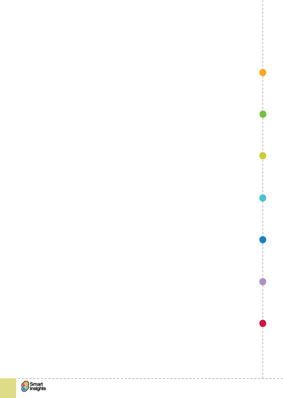
1. SET OBJECTIVES 6. INCREASING
BRAND TRUST
7. IMPROVING
RESULTS
5. COMPELLING
CONTENT
4. CREATING THE
BEST PAGE LAYOUT
3. ENGAGING YOUR
VISITOR
2. UNDERSTAND
VISITOR NEEDS
© Smart Insights (Marketing Intelligence) Limited. Please go to www.smartinsights.com to feedback or access our other guides.
Creating high-converting landing pages
!
45
3
will want to do some more research and explore the product options before committing
to purchase, so a higher bounce rate isn’t necessarily a sign of a poor-performing page.
Context is everything.
þ2. Time on page. If you have a lot of information to digest, are people taking the time
to read this? Or, if your landing page is basic with a simple call to action, if people are
spending a long time on this page, is there something wrong with the landing page?
þ3. Scroll depth. Do people scroll down the page and access content below the fold?
Using Google Analytics you can get basic in-page analytics reports (showing click rate
on each link) but it’s advisable to invest in a dedicated tool like Inspectlet, CrazyEgg or
Clicktale for more advanced scroll analysis.
þ4. Page depth. Does the landing page contribute to the onward journey? Is the
signposting clear enough that visitors are following visual signs to access other web
pages? If your landing page is a gateway to a more complex online conversion path, then
the page depth for visitors to the landing page should be greater than 1.
þ5. Use of social sharing buttons. Are visitors nding the content valuable/useful enough
to share socially with their networks? If not, is this because the social sharing buttons are
in the wrong place, or because people don’t think the content is worth sharing?
þ6. Feedback loops. If you provide feedback options like Live chat or ask a question,
usage is an indication that people are engaged with the landing page, even if that
engagement results in a frustrated enquiry because they couldn’t nd what they needed.
Audience recap
rQ. Which audience am I targeting with my landing page?
Before mapping out the engagement techniques you will use on your landing page, refresh
your mind about the target audience.
The persuasion techniques you need to use must be considered in light of the people you
want to inuence. Audience type affects:
þTone of voice.
þChoice of headline.
þCall to action.
þDepth of information.
þUse of creative.
For example, when targeting the 55+ audience it’s unlikely you’ll want to use lifestyle imagery
that has been tailored for the 18-25 audience.
Let’s use the example of ASOS to show this in action. See the subtle difference in tone of
voice between the Men’s version (top left) and Women’s version (bottom right). The call to
action for women plays on the emotional element of shopping far more than the men’s, which
is more matter-of-fact.
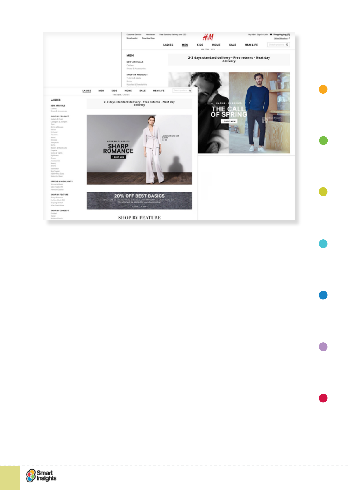
1. SET OBJECTIVES 6. INCREASING
BRAND TRUST
7. IMPROVING
RESULTS
5. COMPELLING
CONTENT
4. CREATING THE
BEST PAGE LAYOUT
3. ENGAGING YOUR
VISITOR
2. UNDERSTAND
VISITOR NEEDS
© Smart Insights (Marketing Intelligence) Limited. Please go to www.smartinsights.com to feedback or access our other guides.
Creating high-converting landing pages
!
46
3
Engagement techniques
In this guide we will cover the core techniques that will help you create a high quality landing
page. These techniques are:
þ1. Create a relevant headline (and sub-heading if relevant).
þ2. Provide a clear call to action.
þ3. Create engaging visuals.
þ4. Ensure colour schemes are consistent (and accessible e.g. colour contrast).
þ5. Make benets and features clear.
þ6. Ensure content/copy work for different decision-making styles.
þ7. Provide a functional, concise form.
þ8. Provide relevant trust indicators.
þ9. Enable social sharing.
þ10. Use visual techniques to make copy easy to read e.g. bullets, highlights, tabs etc.
Please note that this is good practice guidance based on years of learning. However, good
practice doesn’t mean it applies in all situations – there are always exceptions. Therefore, we
strongly advise testing your landing page design to learn what works best for your business
and your customers.
Whichtestwon.com is a mine of useful information and practical examples where ‘gut feeling’
based on good practice doesn’t always pick out the right solution.

1. SET OBJECTIVES 6. INCREASING
BRAND TRUST
7. IMPROVING
RESULTS
5. COMPELLING
CONTENT
4. CREATING THE
BEST PAGE LAYOUT
3. ENGAGING YOUR
VISITOR
2. UNDERSTAND
VISITOR NEEDS
© Smart Insights (Marketing Intelligence) Limited. Please go to www.smartinsights.com to feedback or access our other guides.
Creating high-converting landing pages
!
47
3
1. Create a super-relevant, super-engaging headline
rQ. Have we reviewed the suitability of our heading?
The headline is often the rst thing that visitors notice when they hit a landing page. So make
sure it’s clear and engaging. Headlines lose their impact if the visitor has to spend too long
translating what it means to them. Therefore, headlines should be:
þClear
þConcise
þUnambiguous
þRelevant
þCompelling
We like this quote from Michael Aargaard on Unbouce:
‘In my experience super creative or cryptic headlines are dangerous as they can backre in a
major way. I always recommend going the safe route with a clear relevant headline that gives
your potential customers a really good reason to invest their time in reading on.’
Some landing pages also use a sub-heading, where there is more than one key message, or
multiple parts to the message, and designers don’t want to use a long heading, as this can
be harder for readers to digest. It’s ne to use a sub-heading but make sure it compliments
the main heading and provides additional information, don’t simply use it because your main
heading isn’t concise enough.
If you’re using paid search, then the headline should match the keywords used to trigger your
ad and the key phrases or search terms typed in by users. In AdWords, if there is a better
match this will give you a better Quality Score and so your cost per click will be lowered. It’s
also a key SEO ranking factor.
We recommend reading Michael Aagaard’s post ‘The Flexible Framework for Writing High-
Converting Landing Page Copy’ on the Unbounce blog.19 It’s not new but the thinking still
applies.
Here he gives the example of a headline test on the DCFinder website that resulted in
a 68 per cent increase in conversion on the landing page. The example illustrates how
subtle differences in the tone and appeal of the headline can have dramatic effects on the
conversion rate.
19 Unbounce: High-converting landing pages copy
1. SET OBJECTIVES 6. INCREASING
BRAND TRUST
7. IMPROVING
RESULTS
5. COMPELLING
CONTENT
4. CREATING THE
BEST PAGE LAYOUT
3. ENGAGING YOUR
VISITOR
2. UNDERSTAND
VISITOR NEEDS
© Smart Insights (Marketing Intelligence) Limited. Please go to www.smartinsights.com to feedback or access our other guides.
Creating high-converting landing pages
!
48
3
2. Provide a clear call to action
rQ. Is there a clear primary call to action?
A well-designed landing page will use a clear single call to action as the primary response
mechanism. So, you need think carefully about what you want visitors to do when they land.
The more CTAs you provide, the harder it becomes for the visitor to decide what they most
want to do next. If you confuse them, you risk losing them.
The example below is from a test run on the Medecin Sans Frontiers landing page designed
to generate online donations.
Which version do you think got 2688 per cent more visitors to click on the donate button?
It was Version A with the higher contrast, more prominent call-to-action that drove the higher
conversion rate. Did you guess right?
A slight variation is where your landing page caters for multiple audiences, so the call to
action will be slightly different for each audience. This can be seen in the Internships.com
example in Step 2 above, where there are two different buttons based on different user
needs.
Of course, you can have other calls to action but the challenge is to ensure these don’t
detract from the primary call to action.
Best Practice Tip 10 Consider secondary calls-to-action carefully
Secondary calls-to-action may decrease clicks on the primary call-to-action, but they may
increase the overall success of the campaign by providing more information.
1. SET OBJECTIVES 6. INCREASING
BRAND TRUST
7. IMPROVING
RESULTS
5. COMPELLING
CONTENT
4. CREATING THE
BEST PAGE LAYOUT
3. ENGAGING YOUR
VISITOR
2. UNDERSTAND
VISITOR NEEDS
© Smart Insights (Marketing Intelligence) Limited. Please go to www.smartinsights.com to feedback or access our other guides.
Creating high-converting landing pages
!
49
3
In Step 4 we will discuss the myth of the fold. You may have heard of the fold, the line
beyond which content is no longer visible. Popular thinking is that the primary call to action
has to be above the fold to ensure it gets maximum visibility. However, some research shows
that in specic circumstances, a call to action above the fold can actually depress conversion
because visitors don’t yet have sufcient information to commit to a conversion.
Confused? Don’t be! In most cases, a prominent call to action above the fold will drive the
highest conversion. However, you just need to be aware that this isn’t a hard fact and that’s
why we advocate testing all the time to learn what works best for each landing page.
3. Create super-relevant, super-engaging visuals
rQ. Have we created suitable visuals?
After, or even before scanning the headline, visitors to a landing page will often check out
images. Again relevance is important, but quality is more important. You don’t want to use
boring stock photos, which are all too common on landing pages, instead a video testimonial
or example of the products in action will be more effective.
Net-a-Porter has a visually engaging landing page for its magazine subscription. It uses
images of the magazine in all its formats, from the print version to the digital version on tablet
and smartphone, as well as providing a scrollable version of some of the current magazine to
provide context. We think it’s a great way to demonstrate the product.
The mobile site has a landing page for the content apps, of which the magazine is one. The
landing page also showcases the native shopping app, Edit weekly magazine and Net Set
social shopping network.

1. SET OBJECTIVES 6. INCREASING
BRAND TRUST
7. IMPROVING
RESULTS
5. COMPELLING
CONTENT
4. CREATING THE
BEST PAGE LAYOUT
3. ENGAGING YOUR
VISITOR
2. UNDERSTAND
VISITOR NEEDS
© Smart Insights (Marketing Intelligence) Limited. Please go to www.smartinsights.com to feedback or access our other guides.
Creating high-converting landing pages
!
50
3
For B2B situations, if you’re offering a download, make sure there is a clear image of the
document that will be received. This helps set expectation and provides clear context.
We recommend reading Oli Gardner’sEric Sloan’s article20 for some insightful commentary
on how to use visual techniques to drive conversion. He doesn’t gives examples of actual
pages, but instead and discusses techniques to create emphasis and draw the eye down the
page. He recommends these techniques for emphasis and to encourage ow:
Directional cues:
þ1. Whitespace.
þ2. Colour.
þ3. Contrast.Colour contrast
þ2. Using pictures of real people
þ3. Show visitors where to look
þ4. The suggestive power of the eye.Use visual clues.
þ5. Match designs.Interruptions.
þ6. Encapsulation Select colours carefully.
þ7. Use strong visuals.
þ8. Make key content larger.
þ9. Use whitespace.
4. Ensure colour schemes are consistent/compatible
rQ. Do our colour schemes make it easy to navigate the page?
Colour coordination is often overlooked as an important element of landing page design.
However, colour schemes can be used by visitors to identify different types of content e.g.
if the rst heading a customer sees is in bold blue, then other content in bold blue should
naturally be a heading.
Colour contrast also has a signicant impact on accessibility. For visitors with visual
impairment (and there are as many as 2 million people in the UK), low contrasts between
background and content can make it very hard for them to read the content. A classic
example is black background with white text – colleagues of ours with less than perfect sight
struggle to read this type of copy.
Here’s a simple example of consistency from Travelocity. All headings User selections use
the same bold blue colour for the type face to make the page scannable and to highlight the
offerselections made. Primary calls to action use a green colour.
20 Unbounce: 8 Visual techniques to focus attention on your landing pages
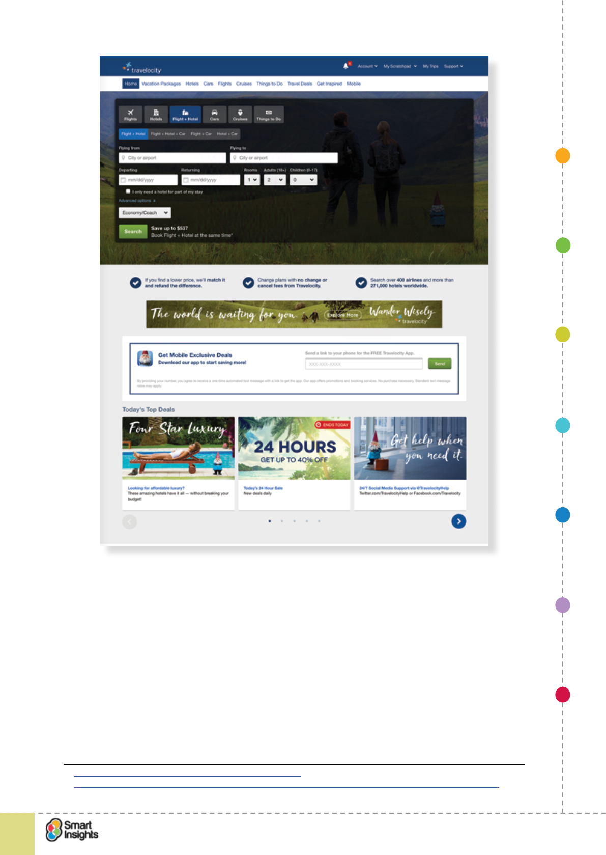
1. SET OBJECTIVES 6. INCREASING
BRAND TRUST
7. IMPROVING
RESULTS
5. COMPELLING
CONTENT
4. CREATING THE
BEST PAGE LAYOUT
3. ENGAGING YOUR
VISITOR
2. UNDERSTAND
VISITOR NEEDS
© Smart Insights (Marketing Intelligence) Limited. Please go to www.smartinsights.com to feedback or access our other guides.
Creating high-converting landing pages
!
51
3
We recommend viewing this video from Marketing Experiments that demonstrates how
changes in colour design can have a positive impact on conversion.21 Neil Patel has also
written a useful blog giving examples of colour use on landing pages22.
5. Make the combination of features and benets clear
rQ. Are the features and benets clear?
If visitors like what they see in the rst two seconds, then they will move on to think about the
value of what’s on offer, how will it help them and what’s in it for them?
Avoid long blocks of copy, instead use crisp, chunked paragraphs, each of no more than two
sentences. Better still, use a bulleted list to explain the features and benets.
þFeature 1 meaning that benet 1.
þFeature 2 meaning that benet 2.
21 Marketing Experiments video: changes in colour design
22 http://neilpatel.com/2015/05/14/the-psychology-of-color-how-to-use-colors-to-increase-conversion-rate/
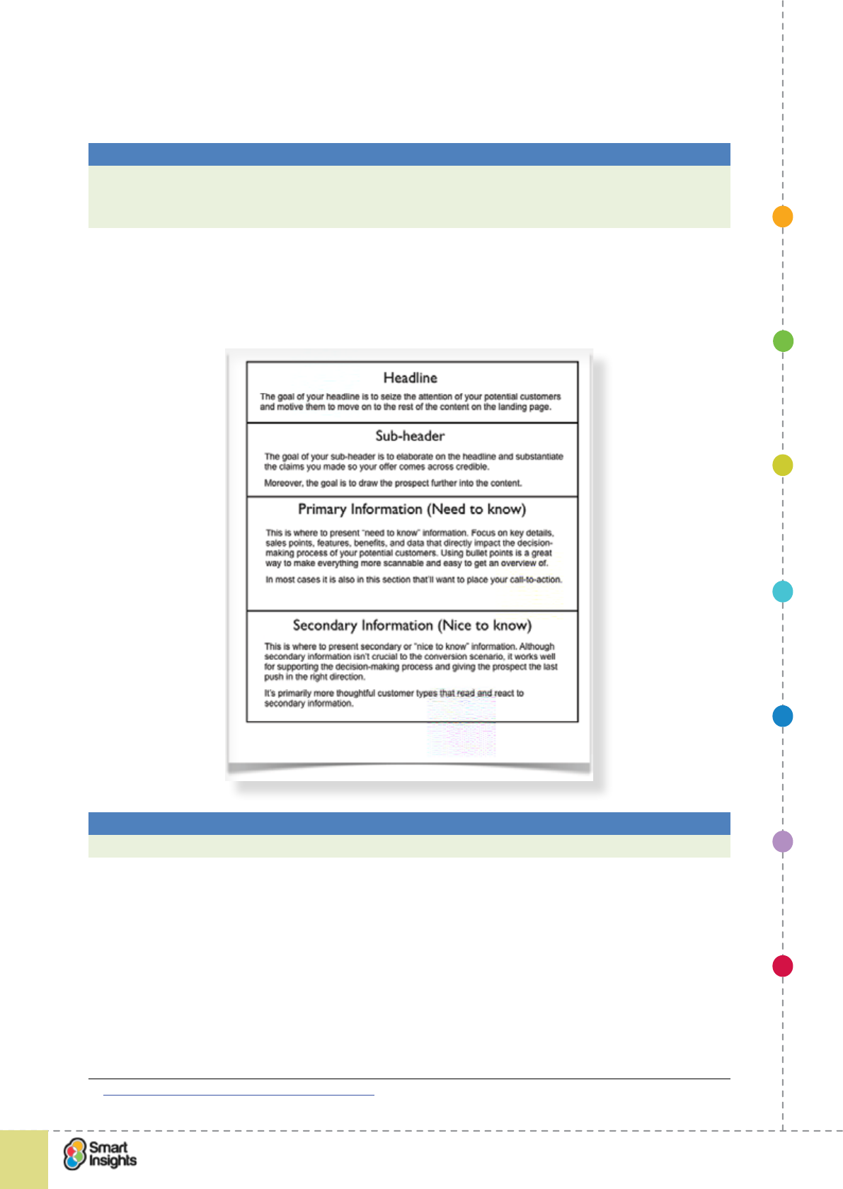
1. SET OBJECTIVES 6. INCREASING
BRAND TRUST
7. IMPROVING
RESULTS
5. COMPELLING
CONTENT
4. CREATING THE
BEST PAGE LAYOUT
3. ENGAGING YOUR
VISITOR
2. UNDERSTAND
VISITOR NEEDS
© Smart Insights (Marketing Intelligence) Limited. Please go to www.smartinsights.com to feedback or access our other guides.
Creating high-converting landing pages
!
52
3
An alternative to bullets is the use of icons – this can work really well when the same content
is repeated in other places on the website, so the icons can be used to provide consistent
visual signposts.
Best Practice Tip 11 Combine features and benets in copywriting
When you’re thinking about writing copy for products, service or white papers, then the
temptation is often just to write about those features. Instead, it’s much better to combine
features and benets. Combine the two so that the feature is followed by the benet.
Returning to Michael Aagaard’s advice23, he recommends a really useful way of considering
messaging hierarchy which layers on more detail down the page, with each piece of
guidance owing from, and adding to the headline.
Best Practice Tip 12 Create a clear message hierarchy on each landing page
The messaging hierarchy should add-more depth down the landing page.
Here’s an example of this principle in action from Freshbooks, cloud accounting business.
You can see it works best for long-form landing pages, where a story can be told and the
primary CTA is repeated at regular intervals, or is pinned so it follows the user down the
page.
23 Unbounce: High-converting landing pages copy
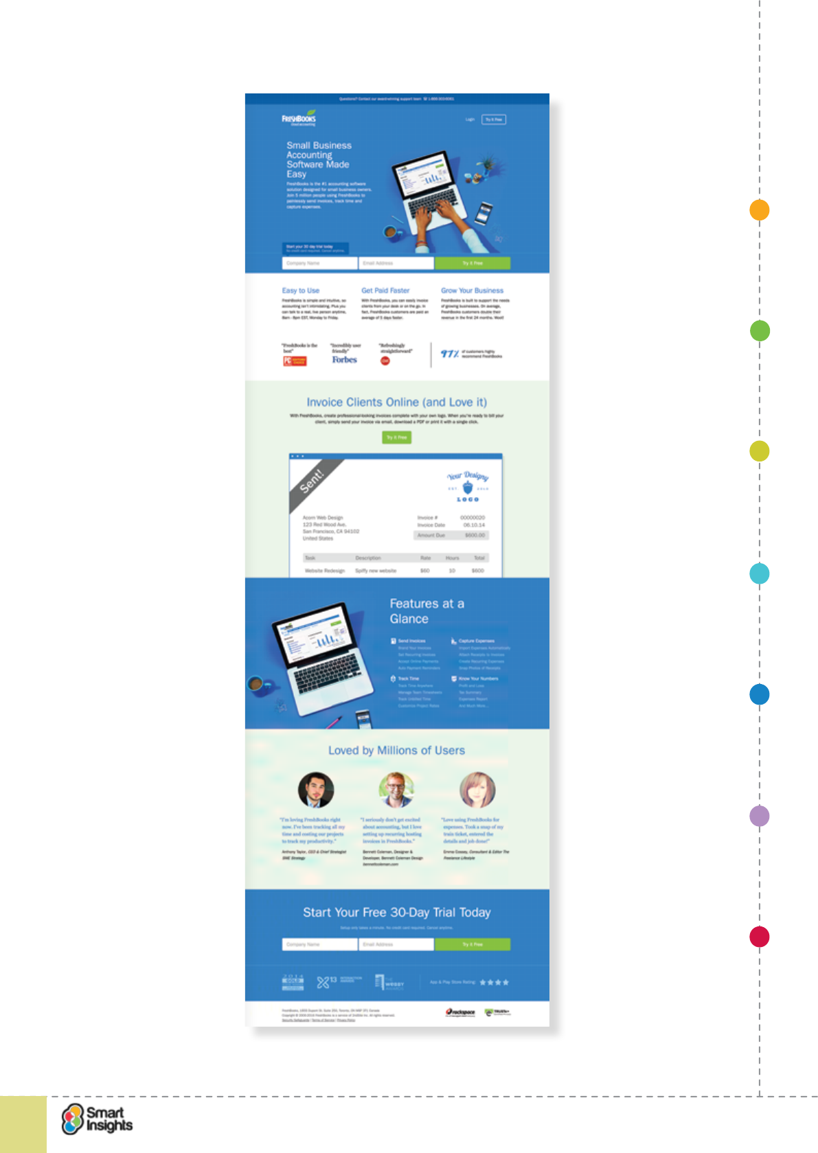
1. SET OBJECTIVES 6. INCREASING
BRAND TRUST
7. IMPROVING
RESULTS
5. COMPELLING
CONTENT
4. CREATING THE
BEST PAGE LAYOUT
3. ENGAGING YOUR
VISITOR
2. UNDERSTAND
VISITOR NEEDS
© Smart Insights (Marketing Intelligence) Limited. Please go to www.smartinsights.com to feedback or access our other guides.
Creating high-converting landing pages
!
53
3
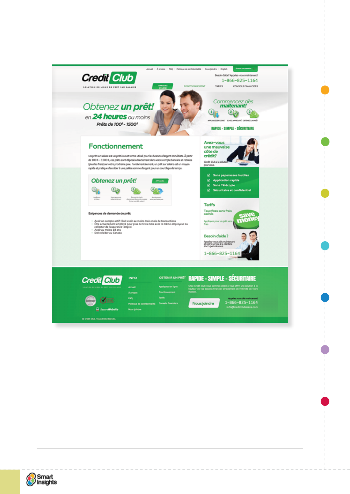
1. SET OBJECTIVES 6. INCREASING
BRAND TRUST
7. IMPROVING
RESULTS
5. COMPELLING
CONTENT
4. CREATING THE
BEST PAGE LAYOUT
3. ENGAGING YOUR
VISITOR
2. UNDERSTAND
VISITOR NEEDS
© Smart Insights (Marketing Intelligence) Limited. Please go to www.smartinsights.com to feedback or access our other guides.
Creating high-converting landing pages
!
54
3
The example below is from the French market, for a payday loans (pret sur salaire) company
called Credit Club. This landing page for CondisThe landing page uses a clear feature/
benet list on the right hand side.e (red shading is ours).
6. Review copy and content work for different decision-making styles
rQ. Has the suitability of the page for decision-making styles been reviewed?
US conversion optimisation specialist Brian Eisenberg has developed a useful framework24 to
help us think through the different decision-making styles of different folk. How well does your
landing page support this range of styles?
24 Persona styles
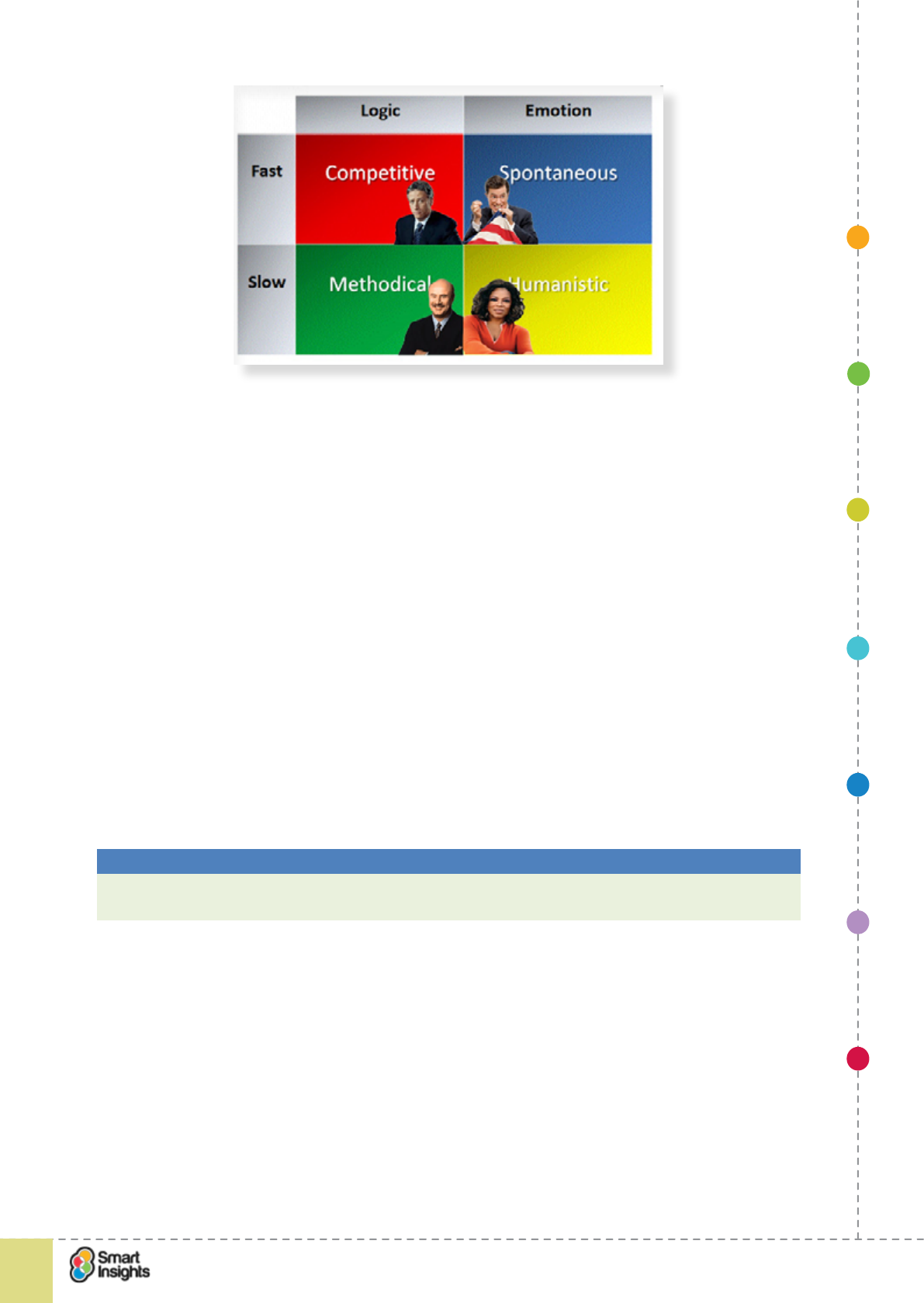
1. SET OBJECTIVES 6. INCREASING
BRAND TRUST
7. IMPROVING
RESULTS
5. COMPELLING
CONTENT
4. CREATING THE
BEST PAGE LAYOUT
3. ENGAGING YOUR
VISITOR
2. UNDERSTAND
VISITOR NEEDS
© Smart Insights (Marketing Intelligence) Limited. Please go to www.smartinsights.com to feedback or access our other guides.
Creating high-converting landing pages
!
55
3
The Methodical focuses on HOW-type questions:
þWhat are the details?
þWhat’s the ne print?
þHow does this work?
The Humanistic focuses on WHO-type questions:
þHow will your product or service make me feel?
þWho uses your products/service?
þWho are you? Tell me who is on your staff, and let me see bios.
The Spontaneous focuses on WHY- and sometimes WHEN-type questions:
þHow can you get me to what I need quickly?
þDo you offer superior service?
þCan I customise your product or service?
The Competitive focuses on WHAT-type questions:
þWhat are your competitive advantages?
þWhat makes you the superior choice?
þWhat makes you a credible company?
Best Practice Tip 13 Make sure you cater for different browsing styles
Before you sign-off your landing page creative, make sure you have tried to navigate the page
from the perspective of different types of online visitor. If you nd barriers, address these.
7. Provide a functional, concise form
rQ. Is our form easy to complete and submit?
The ease of completion of a form goes a long way to determining how many people will click
on the submit button.
The following are useful pointers:
þLess is more.
þCheck boxes and picklists help visitors.
þClearly mark required elds.
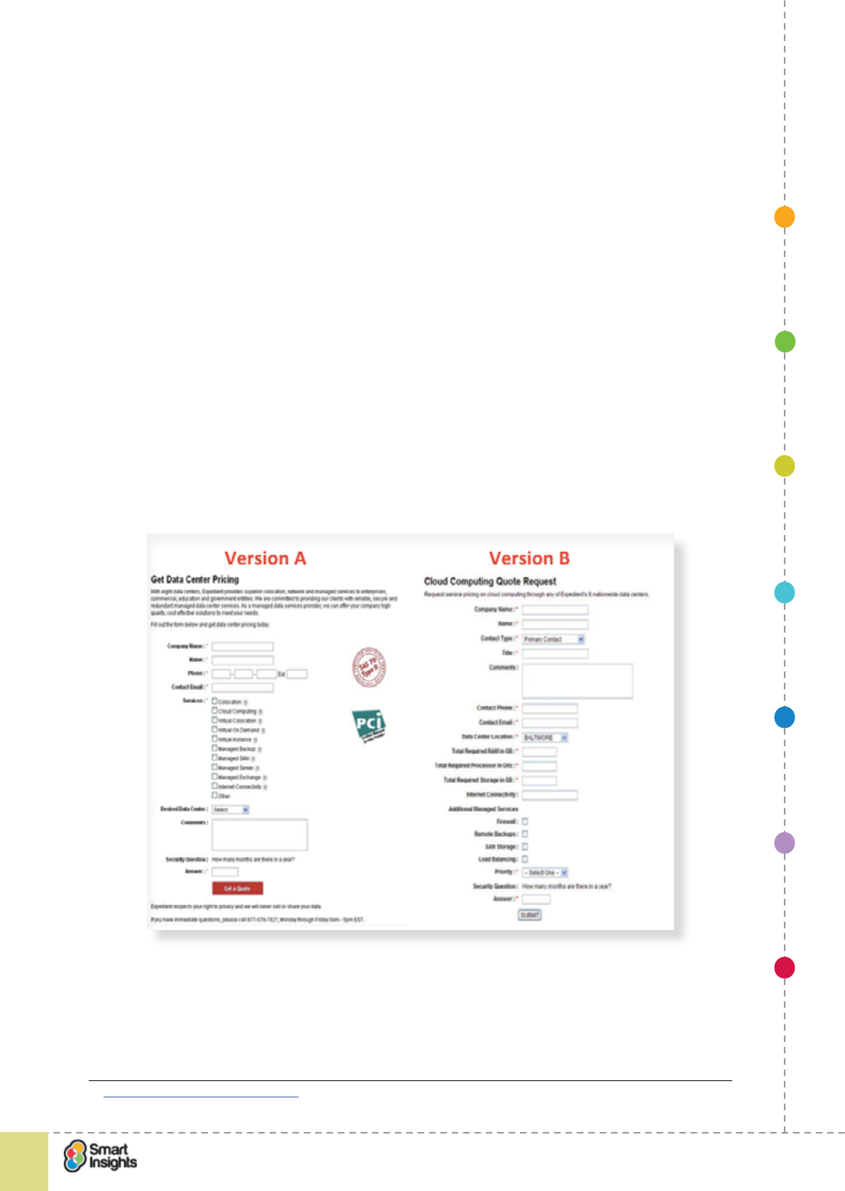
1. SET OBJECTIVES 6. INCREASING
BRAND TRUST
7. IMPROVING
RESULTS
5. COMPELLING
CONTENT
4. CREATING THE
BEST PAGE LAYOUT
3. ENGAGING YOUR
VISITOR
2. UNDERSTAND
VISITOR NEEDS
© Smart Insights (Marketing Intelligence) Limited. Please go to www.smartinsights.com to feedback or access our other guides.
Creating high-converting landing pages
!
56
3
þClearly label each eld (labels above elds have been shown in studies to help users)
þMake the submit button clear.
þEnsure you use inline validation to ag errors as they occur
þUse tool tips to give people advice on how to complete key elds e.g. password
requirements.
þProvide support options if customers have problems.
Provide support options if customers have problems.
Before you launch a landing page that incorporates a form, make sure you have tested
the form validation in detail. Check every possible way the form can be lled out, including
missing our data for both mandatory and non-mandatory elds. Do the correct error
messages appear? Are these in-line (e.g. they appear next to the eld they refer to).
In-line error messages are essential as they pinpoint where the visitor has to make a change.
Ensure these messages are in a different font colour/style to the main form, making it easy
for visitors to see them. Don’t group errors and display in a large box as this can seem
onerous.
Peter O’Neill of L3 Analytics has written a handy blog post on how to track form errors using
Google Analytics25
The screenshot below shows a B2B landing page test for a lead generation form.
Which version do you think increased leads by 368.5 per cent?
It was Version A that drove the higher conversion rate. Did you guess right? This shows the
value of testing forms and simplication of elds. Note that more background research on
why and how to complete the form helped improve response in this case too.
25 Peter O’Neill: Tracking form errors
1. SET OBJECTIVES 6. INCREASING
BRAND TRUST
7. IMPROVING
RESULTS
5. COMPELLING
CONTENT
4. CREATING THE
BEST PAGE LAYOUT
3. ENGAGING YOUR
VISITOR
2. UNDERSTAND
VISITOR NEEDS
© Smart Insights (Marketing Intelligence) Limited. Please go to www.smartinsights.com to feedback or access our other guides.
Creating high-converting landing pages
!
57
3
8. Provide relevant trust indicators
rQ. Have we provided relevant trust indicators?
A trust indicator is a piece of content that validates your quality of service. Trust indicators
have the greatest inuence when they are independent, i.e. not written by you or your
company!
Examples include:
þCustomer testimonials.
þProduct ratings and reviews.
þIndustry accreditations e.g. Google Certied Shops.
þIndustry awards.
þExpert reviews from independent commentators, e.g. respected bloggers.
For some industries, there will be an industry-specic standard that customers would expect
to see (e.g. ABTA if you are in the travel business), or evidence that you offer protection and
security and that shopping online with you is safe (e.g. online payment security via Veried
by Visa).
Best Practice Tip 14 Validate your credentials with trust indicators
Where relevant use independent trust markers such as customer reviews and industry
accreditations to validate the quality of your company and reassure visitors that transacting
with you is safe and secure.
The example from Crowdcube, a UK investment crowdfunding company, demonstrates the
inclusion of multiple trust marks at the bottom of the home page. Each logo clicks through to
a dedicated awards landing page.
9. Enable social sharing
rQ. Can visitors share our content socially?
Make sure you give yourself the greatest chance of reaching the largest possible audience,
particularly where more than one person is involved in taking the decision. Social sharing
isn’t the main form of response, but it should be offered in a non-distracting way.
Social sharing is prevalent in both B2C and B2B, and provides the perfect way to allow your
landing page content to have a wider reach than just the people you are attracting via your
marketing campaigns. Since landing pages aren’t shared so widely it’s conventional just to
offer generic sharing buttons, the options for sharing services are covered at the end of this
post26.
26 Smart Insights: Social sharing buttons
1. SET OBJECTIVES 6. INCREASING
BRAND TRUST
7. IMPROVING
RESULTS
5. COMPELLING
CONTENT
4. CREATING THE
BEST PAGE LAYOUT
3. ENGAGING YOUR
VISITOR
2. UNDERSTAND
VISITOR NEEDS
© Smart Insights (Marketing Intelligence) Limited. Please go to www.smartinsights.com to feedback or access our other guides.
Creating high-converting landing pages
!
58
3
Be sure to optimise the content that is shared, based on what each network supports. You
can ensure that your organisation name as well as the URL is posted. The example below
from Digital Marketing Depot, whilst not a beautiful design, uses social sharing options for
networks relevant to the audience.
10. Use visual techniques to make copy easy to read e.g. bullets, highlights, tabs etc
rQ. Do we break up copy to make it easy to read?
For landing pages with a lot of information to communicate, it’s important that you don’t
simply throw long paragraphs of copy in front of visitors, as it can be hard for them to pick out
the relevant parts, or to focus on the most important message.
Instead, use simple visual techniques to break-up the content and provide bite size chunks
that are easy to digest. Techniques include:
þBullet points
þCheck/tick boxes to illustrate key selling points
þHighlighting important copy
þUsing sections with sub-headings for each section
þInserting visual content amongst the written content
þUsing interactive page elements like carousels or accordions.
1. SET OBJECTIVES 6. INCREASING
BRAND TRUST
7. IMPROVING
RESULTS
5. COMPELLING
CONTENT
4. CREATING THE
BEST PAGE LAYOUT
3. ENGAGING YOUR
VISITOR
2. UNDERSTAND
VISITOR NEEDS
© Smart Insights (Marketing Intelligence) Limited. Please go to www.smartinsights.com to feedback or access our other guides.
Creating high-converting landing pages
!
59
4
Step 4
Design the optimal page layout
rQ. Have we reviewed optimal page layouts?
In our experience (and that of everyone else we know in e-commerceecommerce), there is
no such thing as a perfect landing page. We’ve yet to come across a landing page with 100
per cent conversion – if you know of one, then please share the secret! Why is this?
Usually a landing page will attract a large number of visitors. Each visitor will have a unique
prole – no matter how effective audience segmentation is, we’ are all individuals at the end
of the day. This means that one 25-year-old male may respond differently to another, even
if the call to action is geared towards them both. For example, one may be visually led, the
other copy led. This is why blanket statement like “We’re targeting millenials” always amuse
us – that’s a pretty large audience to treat homogenously!
Therefore, a key challenge for web owners is to learn what the best combination of landing
page content components is to elicit the highest possible response.
In this guide we use the term ‘optimal’ to refer to the landing page design that drives the best
conversion for your business based upon which call to action is your primary conversion
driver.
Getting the right page layout
rQ. Have we reviewed page layout options?
Getting the right visual balance for a page is crucial. So it’s essential to discuss layout options
before any design happens. Whilst existing page layouts should be considered, make sure you
also think about whether a new layout is required to satisfy the goals of this landing page. And
think touch and mobile rst – how will mobile users interact with the page? What are the most
important content elements for this type of visitor? You can then scale up to larger devices.
Key Strategy Recommendation 11 Use effective layouts
Effective layouts depend on the browser and screen resolution of the user. So, ensure that
the main messages and call to action are ‘above the fold’ for most users and that the right
balance of screen elements is used to encourage conversion.
Where content ows below the visible pane, consider a visual technique to show people
they should scroll for more information.
Designers are likely talented at visual or web design, but they don’t necessarily know the
principles of persuasion and effective marketing communications that you do.
Best Practice Tip 15 Always create high-delity wireframes
Creating more detailed wireframes can help brief your designer or agency to get the
outcomes you need.
Create a wireframe like the one below with two or three options to design the most
appropriate design.
If you don’t have a tool for creating wireframes, we recommend Balsamiq as a simple,
simple, low cost tool.
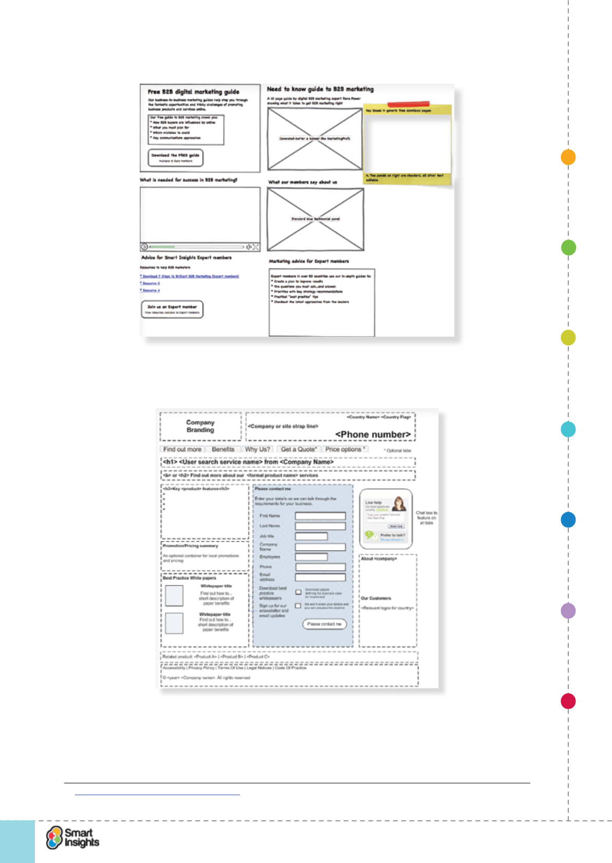
1. SET OBJECTIVES 6. INCREASING
BRAND TRUST
7. IMPROVING
RESULTS
5. COMPELLING
CONTENT
4. CREATING THE
BEST PAGE LAYOUT
3. ENGAGING YOUR
VISITOR
2. UNDERSTAND
VISITOR NEEDS
© Smart Insights (Marketing Intelligence) Limited. Please go to www.smartinsights.com to feedback or access our other guides.
Creating high-converting landing pages
!
60
4
Here is an example of output from Balsamiq for a Smart Insights landing page:
For clients on consulting projects we may use a higher delity version using the Mac Drawing
tool Omnigrafe27. This example is a model layout for a tabbed B2B landing page.
Retailers often use different page layouts based on product type. This is important because
different products have different information sets and it’s often hard for a large catalogue
retailer to make a single page layout work for every product type. Why try and t something
into a page that doesn’t provide the best customer experience?
27 https://www.omnigroup.com/omnigrafe
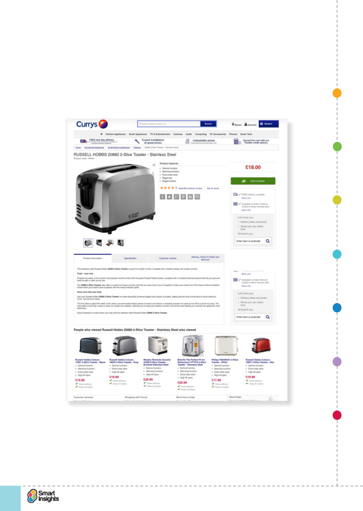
1. SET OBJECTIVES 6. INCREASING
BRAND TRUST
7. IMPROVING
RESULTS
5. COMPELLING
CONTENT
4. CREATING THE
BEST PAGE LAYOUT
3. ENGAGING YOUR
VISITOR
2. UNDERSTAND
VISITOR NEEDS
© Smart Insights (Marketing Intelligence) Limited. Please go to www.smartinsights.com to feedback or access our other guides.
Creating high-converting landing pages
!
61
4
Please note that this doesn’t mean a different page template. Typically retailers will build a
exible template that can cater for different product scenarios, where additional content can
be displayed as required, or components on the page can be prioritised differently.
The example below is from DIY.com (B&Q) whichCurrys, which shows different product page
layouts for small, low cost items (taps) and high- ticket items (integrated washing machines).
Note the change in emphasis on call to action and service.
Landing page for high ticket item
Also note the “Why buy from us?” message which is important for when visitors deep link into
a product page.
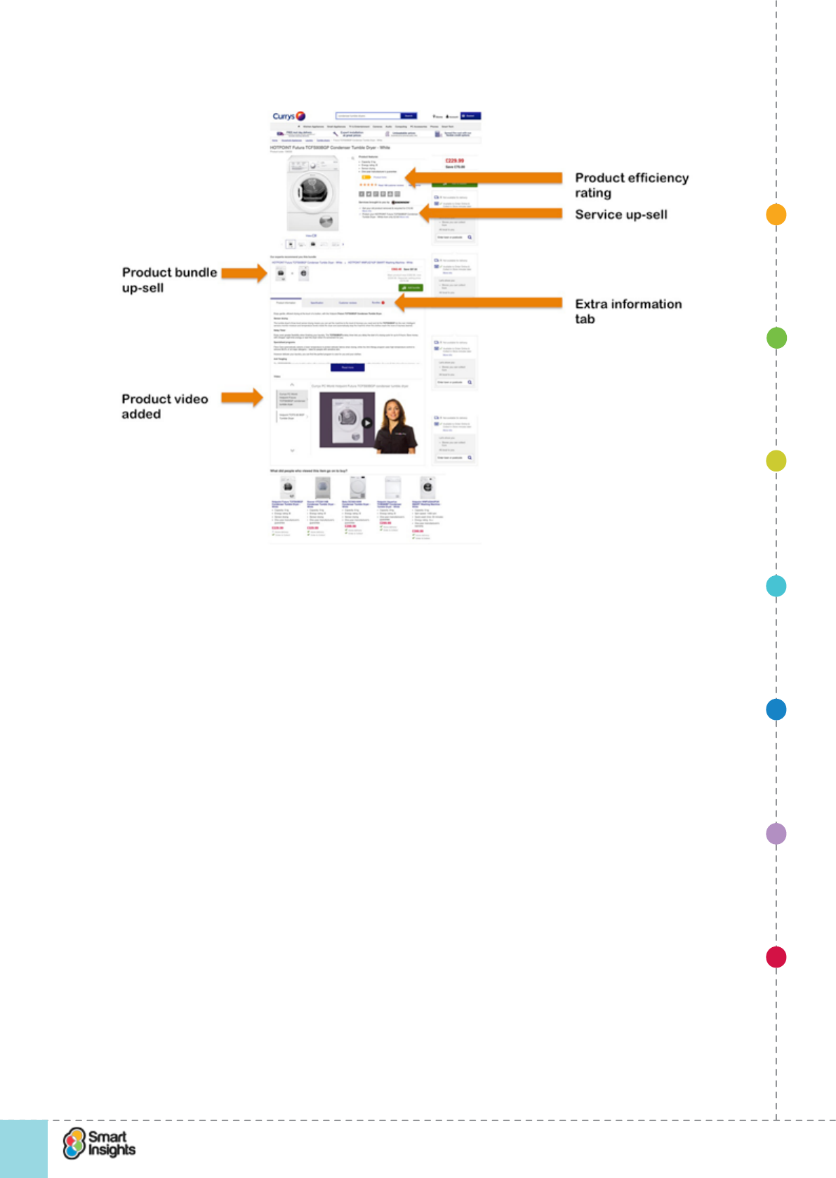
1. SET OBJECTIVES 6. INCREASING
BRAND TRUST
7. IMPROVING
RESULTS
5. COMPELLING
CONTENT
4. CREATING THE
BEST PAGE LAYOUT
3. ENGAGING YOUR
VISITOR
2. UNDERSTAND
VISITOR NEEDS
© Smart Insights (Marketing Intelligence) Limited. Please go to www.smartinsights.com to feedback or access our other guides.
Creating high-converting landing pages
!
62
4
Landing page for low-cost item
Layering information
rQ. Is it easy for visitors to access more information?
For some products and services, you may need to provide a lot of information to ensure you
have covered the needs of all types of visitor. For example, a B2B sSoftware sSolutions
company may need to provide different information depending on the decision maker, e.g.
business case content for the Finance Director, detailed technical specications for the IT
Director.
To ensure you don’t make the landing page overly complex, you should think about how to
layer this information. By layering, we mean ensuring that the most important content and
calls to action are clearly visible and there are links to enable visitors to expand this content
and view more.
There are multiple ways of enabling visitors to access more information:
þText/image links.
þExpanding content sections.
þQuick links.
þLightboxes on mouse-over.
What to avoid:
ýContent overkill – making it hard for people to know what to do.
ýToo many links – forcing visitors to work hard to nd the relevant ones.
ýNo visual differentiation – making it hard to know what to read, where to click, etc.
ýToo many competing calls to action
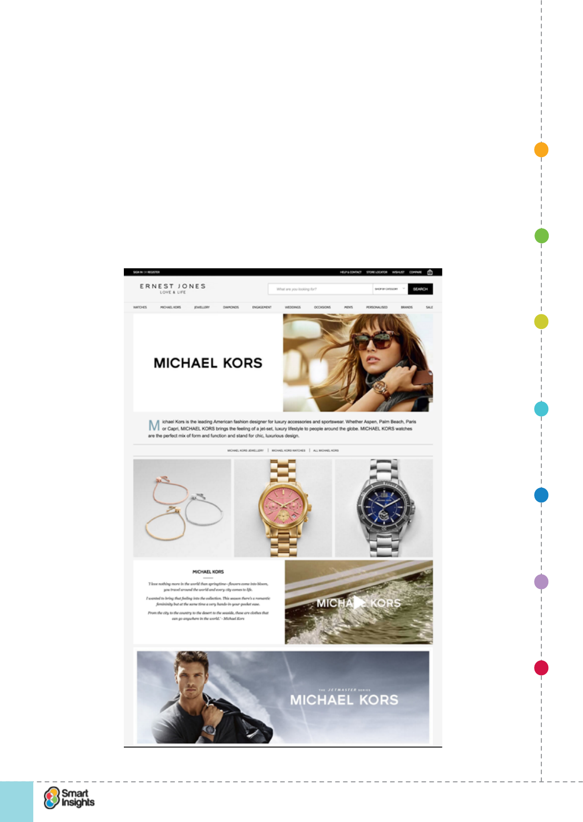
1. SET OBJECTIVES 6. INCREASING
BRAND TRUST
7. IMPROVING
RESULTS
5. COMPELLING
CONTENT
4. CREATING THE
BEST PAGE LAYOUT
3. ENGAGING YOUR
VISITOR
2. UNDERSTAND
VISITOR NEEDS
© Smart Insights (Marketing Intelligence) Limited. Please go to www.smartinsights.com to feedback or access our other guides.
Creating high-converting landing pages
!
63
4
The example below is from Ernest Jones. We think it’s a poorn average main brand landing
page because there is no clear call to action and the deluge of content spots makes there is
no context to the content spots, making it hard to know where to look and what to click on.
The site does use mouse-over visual changes to add CTAs for the three product shots, and
on mobile these CTAs are automatically displayed, which is good.
It’s dangerous to assume people will know what content refers to without clear signposting.
For example, the nal content spot uses a lifestyle image and simply copy, “The Jetmaster
series Michael Kors”. But what is the Jetmaster Series? Is this a click to content or product
(it’s actually a product list page for watches)? Perhaps they’re thinking the intrigue will
encourage people to click but some users may well decide it’s irrelevant as there is no
incentive to act.
There are even more competing offers at higher resolutions...Of course, we don’t have
access to their data to know just how this page layout is affecting their clickthrough rate
(although we’d love to know!).
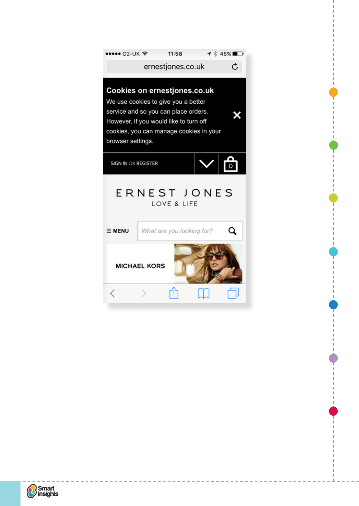
1. SET OBJECTIVES 6. INCREASING
BRAND TRUST
7. IMPROVING
RESULTS
5. COMPELLING
CONTENT
4. CREATING THE
BEST PAGE LAYOUT
3. ENGAGING YOUR
VISITOR
2. UNDERSTAND
VISITOR NEEDS
© Smart Insights (Marketing Intelligence) Limited. Please go to www.smartinsights.com to feedback or access our other guides.
Creating high-converting landing pages
!
64
4
On mobile, the obtrusive cookie message pushes content down the page unnecessarily:
Consider offering distinct, segmented landing pages
rQ. Should we use segmented landing pages?
We have seen that pages will have different audiences that you should try to meet the needs
of. We also know that landing pages need to be simple to be effective. The layout of the
landing page will be important to achieve both goals.
In some cases, if you are unsure of your audience, you may need to develop tabs or a longer
conversion pathway.
The example from Sage below is a landing page for its Sage 1000 ERP solution. Note the
use of tabs to let visitors access more detailed information without forcing them to scroll
to nd it. We don’t think that the technical implementation is great, as you need to request
new URLs to load each tab, but we’ve included this to illustrate the use of tabs for layering
information.
1. SET OBJECTIVES 6. INCREASING
BRAND TRUST
7. IMPROVING
RESULTS
5. COMPELLING
CONTENT
4. CREATING THE
BEST PAGE LAYOUT
3. ENGAGING YOUR
VISITOR
2. UNDERSTAND
VISITOR NEEDS
© Smart Insights (Marketing Intelligence) Limited. Please go to www.smartinsights.com to feedback or access our other guides.
Creating high-converting landing pages
!
65
4
Make the page work above the fold
r Q. Are the key content, visuals and call to action above the fold?
There is a myth about web design that persists which states that the whole of the home page
or landing page should t ‘above the fold’ for the average user. In fact visitors do scroll if the
page is designed to scroll. There’s a useful old case study from CXPartners28 that dives into
this in more detail. The screenshot below demonstrates how changing the type of content
above the fold can have a signicant impact on browsing below the fold:
28 CX Partners: Myth of the page fold
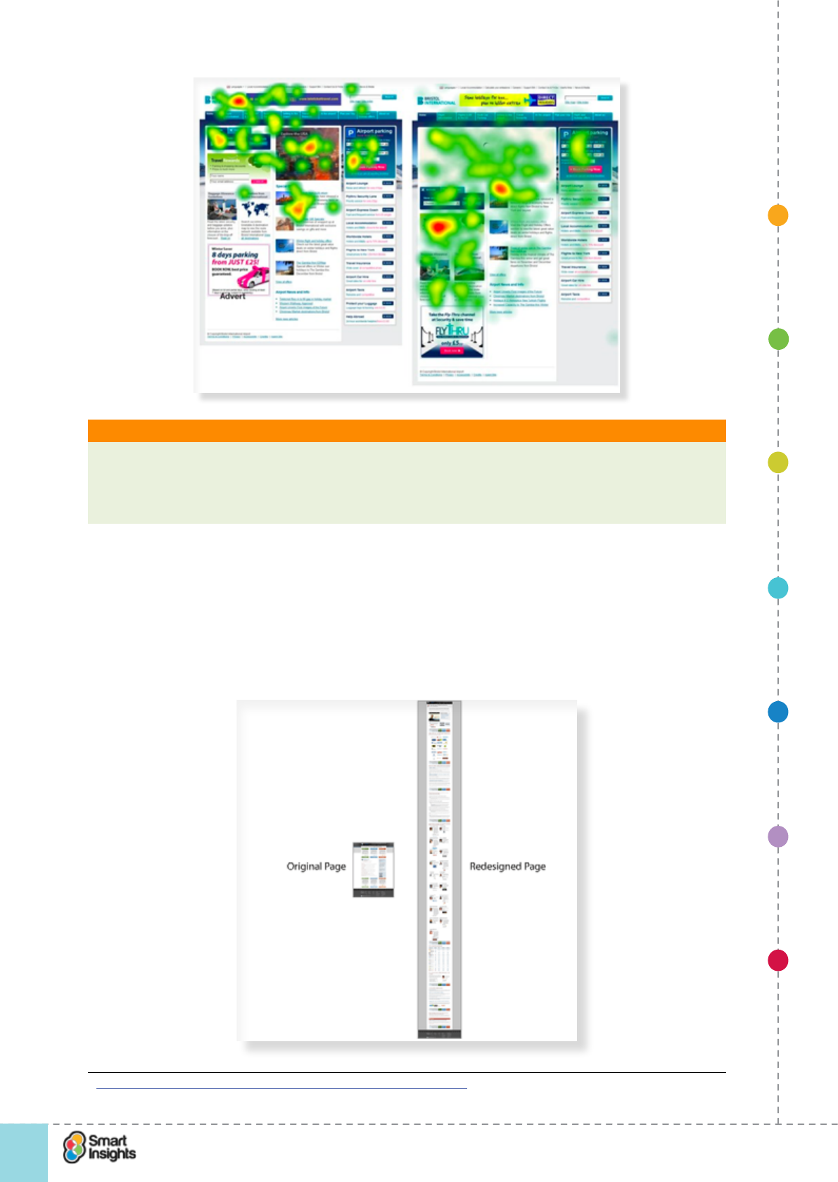
1. SET OBJECTIVES 6. INCREASING
BRAND TRUST
7. IMPROVING
RESULTS
5. COMPELLING
CONTENT
4. CREATING THE
BEST PAGE LAYOUT
3. ENGAGING YOUR
VISITOR
2. UNDERSTAND
VISITOR NEEDS
© Smart Insights (Marketing Intelligence) Limited. Please go to www.smartinsights.com to feedback or access our other guides.
Creating high-converting landing pages
!
66
4
What is it? Above the fold/Below the fold
This term originates in direct mail from when copy was above or below the fold in a letter.
On screen it refers to content in the window that can be viewed without scrolling. Of
course, this will vary according to screen resolution, so you have to review this for the most
common resolutions.
For a home page we would argue that a longer scrolling page which scrolls is more effective
in communicating more messages to different audiences, as long as the scrolling positions
are clearly visible. However in most cases landing pages will perform better if they are
simpler and shorter. There are exceptions to this rule though – longer landing pages known
as ‘squeeze pages’ are often used by ‘get rich quick scammers’ because they work...
Perfectly legitimate companies have also used them successfully as this example shows:29
29 How we made $1 million for SEOmoz - Conversion Rate Experts
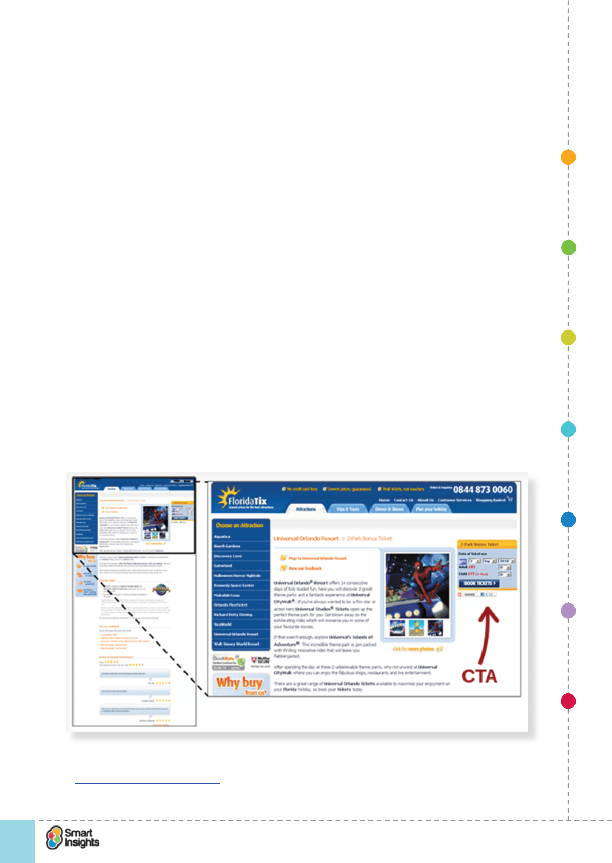
1. SET OBJECTIVES 6. INCREASING
BRAND TRUST
7. IMPROVING
RESULTS
5. COMPELLING
CONTENT
4. CREATING THE
BEST PAGE LAYOUT
3. ENGAGING YOUR
VISITOR
2. UNDERSTAND
VISITOR NEEDS
© Smart Insights (Marketing Intelligence) Limited. Please go to www.smartinsights.com to feedback or access our other guides.
Creating high-converting landing pages
!
67
4
Note that a shorter there is a much shorter design is currently in use, which may reect the
greater awareness of the brand as Moz is a well established company now.
Despite the ongoing popularity of squeeze pages, many tests show that what’s ‘above the
fold’ is critical, so ensure the right content is above the fold or test the length of pages as
explained in Step 7.
Understanding where to place the call to action
rQ. Is the call to action in the best place to encourage visitors to act?
We have discussed the fact that the need to have everything above the fold is actually a
myth but good practice is to ensure the landing page is effective above the fold, i.e. it works
to signpost important content and encourage visitors to scroll if there is more content.
But how do you know where to put your primary call to action amongst all of this content?
It must be above the fold, right?
Well, not always. Here’s the thing – a call to action is best placed at the point on the landing
page where the visitor has enough information to make a decision.
If you place the call to action too soon, you can come across as too eager and actually put
people off because they’re not ready to commit.
Put it too late and people might have lost interest because they can’t nd where to click.
We recommend reading Bnonn Tennant’s this excellent blog post on KISSmetrics, ‘Why
The Fold is a Myth’30. The screenshots below are taken from his blog post and refer to a
Marketing Experiments test31 that revealed that placing the call to action below the fold
increased conversion in this particular case.
This version with the call-to-action at the top wasn’t most effective...
30 Kissmetrics: Why the fold is a myth
31 Marketing Experiments: Call-to-action tests
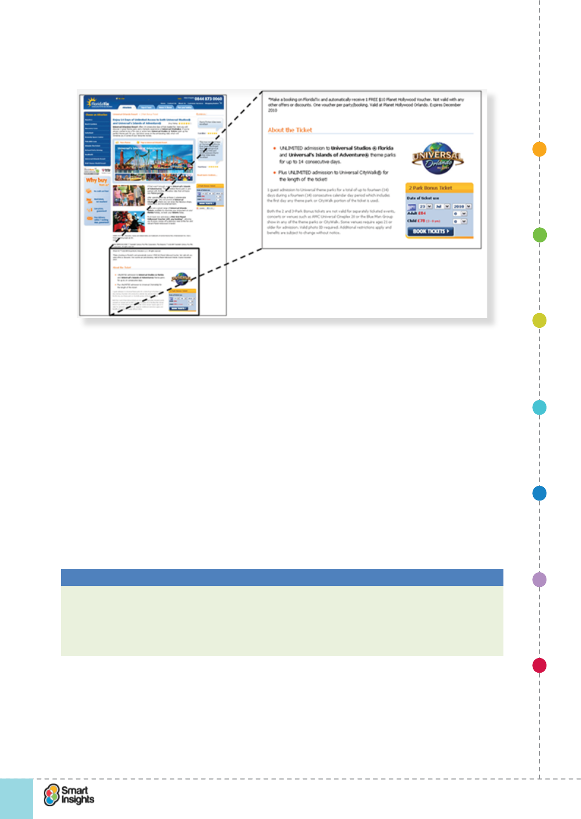
1. SET OBJECTIVES 6. INCREASING
BRAND TRUST
7. IMPROVING
RESULTS
5. COMPELLING
CONTENT
4. CREATING THE
BEST PAGE LAYOUT
3. ENGAGING YOUR
VISITOR
2. UNDERSTAND
VISITOR NEEDS
© Smart Insights (Marketing Intelligence) Limited. Please go to www.smartinsights.com to feedback or access our other guides.
Creating high-converting landing pages
!
68
4
Instead, this was...
We can speculate that the second variant raises anticipation by encouraging visits to engage
more with the content.
However, we’re not suggesting that this is denitive proof that moving the CTA to the bottom
drives the greatest conversion.
Why?
Because more extensive testing is required to determine whether a different visual design
and copy for the CTA in the header could actually work better. We need to prove that the
reason for the poor conversion is because the CTA is above the fold, not because the design
isn’t great.
The key take away is this: Don’t obsess over the fold. Make sure that the content that is
visible when people arrive at your landing page makes it easy for them to navigate that page
and take appropriate actions. And be rigorous in testing landing page design and content.
Best Practice Tip 16 Make sure your site is effective ‘above the fold’
Start by assessing your minimum screen resolution you are targeting and then think
what must be above the fold, for example, the main engagement offer. Use the ‘In-page
Analytics’ feature in Google Analytics to assess the number of clicks that occur above/
below the fold. You may be surprised how few people scroll and this will encourage you to
think about what is above the fold. We’re not advocating pages that don’t scroll though.
1. SET OBJECTIVES 6. INCREASING
BRAND TRUST
7. IMPROVING
RESULTS
5. COMPELLING
CONTENT
4. CREATING THE
BEST PAGE LAYOUT
3. ENGAGING YOUR
VISITOR
2. UNDERSTAND
VISITOR NEEDS
© Smart Insights (Marketing Intelligence) Limited. Please go to www.smartinsights.com to feedback or access our other guides.
Creating high-converting landing pages
!
69
4
Page layout questions to ask yourself
Here are the nal, detailed questions to ask about your landing page:
Q. Should we remove navigation?
This is a common approach in landing pages.
Best Practice Tip 17 Simplify navigation
Removing navigation is fundamental to most landing pages, so reduce navigation choice if
possible through your pages.
Where tested, landing pages without navigation almost always work better.
Compare the two landing pages below, from a Google search for “CRM software for SME”.
Both have different approaches, and there are good points in each but you’ll notice that
Freshdesk has an enclosed landing page that removes the site wide navigation to focus on
the core message.
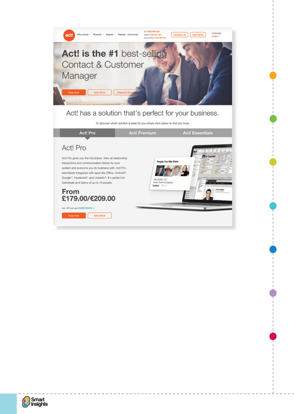
1. SET OBJECTIVES 6. INCREASING
BRAND TRUST
7. IMPROVING
RESULTS
5. COMPELLING
CONTENT
4. CREATING THE
BEST PAGE LAYOUT
3. ENGAGING YOUR
VISITOR
2. UNDERSTAND
VISITOR NEEDS
© Smart Insights (Marketing Intelligence) Limited. Please go to www.smartinsights.com to feedback or access our other guides.
Creating high-converting landing pages
!
70
4
rQ. Main navigation removed? or...
rQ. Main navigation reduced?
Q. Does the main offer and response form have clear visual emphasis?
rQ. Form and offer have distinct visual emphasis?
To draw your visitors’ attention to the landing page a border or background tint and clear
heading can help encourage action.
Q. How many offers should we have?
rQ. Single offer used?
Common thinking and AB testing suggests you must strip the landing page right down. But
longer formats can be more effective as the ongoing success of long landing pages shows.
Q. Are the main sign-up elds on the subscription page evident on the main landing page?
rQ. Main sign-up form on the landing page?
If the form is one or more click away, will this reduce response?
Q. Is the main call-to-action clear?
rQ. Main call-to-action clear?
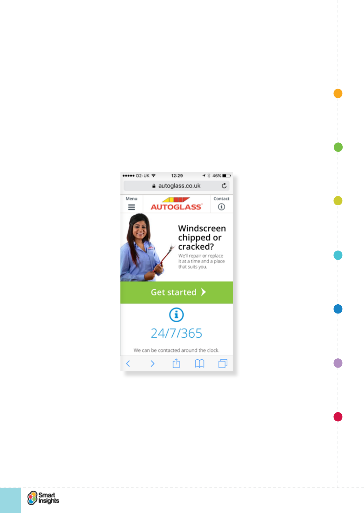
1. SET OBJECTIVES 6. INCREASING
BRAND TRUST
7. IMPROVING
RESULTS
5. COMPELLING
CONTENT
4. CREATING THE
BEST PAGE LAYOUT
3. ENGAGING YOUR
VISITOR
2. UNDERSTAND
VISITOR NEEDS
© Smart Insights (Marketing Intelligence) Limited. Please go to www.smartinsights.com to feedback or access our other guides.
Creating high-converting landing pages
!
71
4
rQ. Is it button-like (so it suits touch screens)?
rQ. Is the colour right? High contrast works well as does green = green for go!
rQ. Is it repeated? In a longer form or page it’s good to repeat at the top and the bottom?
Q. Is the main call-to-action persuasive?
rQ. Persuasive call to action? Shows value to be obtained by clicking (not ‘click here’ but
‘Download now’ or ‘Learn more’)?
rQ. Point-of-action reassurance? i.e. further information is provided to support the decision
The Autoglass mobile site has a separate page to answer additional questions to
reassure those who are uncertain about committing.uses simple copy to reassure visitors
that it provides a high quality service. Users can also click through to nd additional
information for key messages like “Any glass, any vehicle” (not visible in this screenshot).
Autoglass brand-related messages accessed via the About page
Q. Should we use multiple tabs?
We have seen that tabs can enable us to offer a range of choice to a visitor but without clicking off
to a separate page and with the emphasis remaining on conversion for the home page.
Tabs to consider include:
rAbout the category (What is X?).
rAbout the company (What makes us different?).
1. SET OBJECTIVES 6. INCREASING
BRAND TRUST
7. IMPROVING
RESULTS
5. COMPELLING
CONTENT
4. CREATING THE
BEST PAGE LAYOUT
3. ENGAGING YOUR
VISITOR
2. UNDERSTAND
VISITOR NEEDS
© Smart Insights (Marketing Intelligence) Limited. Please go to www.smartinsights.com to feedback or access our other guides.
Creating high-converting landing pages
!
72
4
rOur other products/services.
rAdditional resources (Help me decide).
rCustomer testimonials (social proof).
Creating mobiletouch and mobile -friendly landing pages
rQ. Are our landing pages user friendly for touch and mobile visitors?
First, check that you get a signicant percentage of your visits from touch and mobile
devices. Whilst it’s unlikely that you won’t have mobile visitors, there is no point investing
time and money creating mobile-optimised pages if the visitor numbers are so small you’re
unlikely to see a return. We nd for most websites, trafc from touch screens dominates, and
there is an increasing number of desktop/laptop computers using touch screen technology.
Usability on a mobile device is clearly different to a desktop. For example, long complex
forms become a nightmare to complete unless they are well structured. Also, some features
that work on a desktop site might not work well on mobile, so when (e.g. product zoom for
retail e-commerce). So when planning a mobile landing page think carefully about how easy
it is to interact with the content and follow the call to actions.
A few pointers:
þClick-to-call is a popular call to action for mobile landing pages.
þMobile pages need to load fast, therefore need to be lightweight (less than 20Kb).
þAccessibility is key – things like Flash aren’t usable natively supported on most mobile devices.
þDesign needs to be optimised for smartphones – 1 column layout works best so there is
only vertical scrolling, not horizontal scrolling.
The example below shows a twosimple mobile landing pages with athat use touch-friendly
prominent click-to-call calls to action, one using the geo-location capabilities in the browser:
1. SET OBJECTIVES 6. INCREASING
BRAND TRUST
7. IMPROVING
RESULTS
5. COMPELLING
CONTENT
4. CREATING THE
BEST PAGE LAYOUT
3. ENGAGING YOUR
VISITOR
2. UNDERSTAND
VISITOR NEEDS
© Smart Insights (Marketing Intelligence) Limited. Please go to www.smartinsights.com to feedback or access our other guides.
Creating high-converting landing pages
!
73
4
If you are building landing pages for mobile visitors, then we recommend reading this
insightful blog post by Angie SchottmullerAndrew Miliwauki32.
The importance of testing
rQ. Are we using testing techniques to improve landing page performance?
How do you know what the ‘optimal’ page layout is?
There is only one sensible approach to discover this – testing. By testing we mean using
AB and Multivariate testing tools to compare different page layouts against each other in
real-time and then reviewing the data to determine which version has driven the highest
response rate. We cover this technique in Step 7.
Testing provides the following benets:
þRemoves subjectivity from decision- making. Good practice learning can help us
devise hypotheses for improving landing pages. However, what we might decide needs
improving on your landing page could be different to your opinion. So, who is ‘right’?
Potentially we all are, to a certain degree, and a combination of our views is the best
option.
With testing, you can remove the subjectivity and test multiple versions of a page against
each other and then use the data to prove which one works best.
This can be really useful in large organisations where there are multiple people/teams
involved in e-commerce and it’s often hard to get a consensus of opinion (especially
when internal politics obscure decision making).
þProvides like-for-like comparison. How do you know that a change you make to your
landing page is what causes a change in KPI performance? There are external factors
that inuence landing page performance that can bias results. For example, a competitor
runs a killer discount at the same time you change your product landing page. Your
conversion rate drops sharply and you attribute that to the landing page tweak. However,
the real cause of the drop is the competitor’s price position, which means you have
interpreted the data incorrectly.
Testing enables you to run multiple versions of the page concurrently. This means that
each version is subject to the same external inuences, so any variations you get in KPIs
can be attributed with greater condence to the landing page variations.
þCan be continuous. Rome wasn’t built in a day. And neither is an optimal landing page.
The reality is that the visitor mix changes over time, so customer demand will. What
works today on your landing page might not work in X months’ time.
Testing can and should be a continuous activity, seeking to gradually improve
performance over time and then maintain that level of improved performance. In
some cases you will get the ‘big bang’, where you skyrocket conversion having made
changes to the landing page. However, often it’s an iterative nteractive process, making
incremental improvements each time you test.
32 Searchenginewatch.com: ‘Mobile Landing Page Optimization: 10 Best Practices for Success.
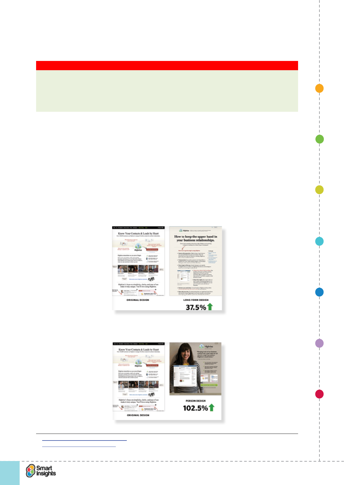
1. SET OBJECTIVES 6. INCREASING
BRAND TRUST
7. IMPROVING
RESULTS
5. COMPELLING
CONTENT
4. CREATING THE
BEST PAGE LAYOUT
3. ENGAGING YOUR
VISITOR
2. UNDERSTAND
VISITOR NEEDS
© Smart Insights (Marketing Intelligence) Limited. Please go to www.smartinsights.com to feedback or access our other guides.
Creating high-converting landing pages
!
74
4
þCan show what doesn’t work. Not all tests provide positive results! But a negative result
(i.e. conversion decreases) isn’t necessarily a bad thing. It actually teaches you what
doesn’t work on the landing page, helping you to understand what to avoid in future.
Key Strategy Recommendation 12 Don’t be dispirited by negative test results
Learn from the good and the bad. If a test decreases conversion, even if you thought it
would work brilliantly, use that as a learning experience and improve the next test.
Perhaps you are guilty of what Conversion Rate Experts call “Meek Tweaking” where you’re
making minor changes to copy without trying entirely new designs.
For further reading on layout testing, you might like to read KISSmetrics’s blog on ‘The
Blueprint for a Perfectly Testable Landing Page’ that provides a walk-through of using a
wireframe approach33.
We discuss testing techniques in more detail in Step 7 – Improving results, but for now lets’
take a look at an example which shows the value of testing layout.
The example relates to business-to-business service High Rise34.
First we have the original pag, e which was compared to a longer form design; then a shorter
person-based design was added which improved performance. Then a longer-form person-based
design, which was a backward step. It shows the value in making major layout changes.
1. Original page which compared to a longer form design.
2. Shorter person-based design.
33 Kissmetrics: Landing Page Blueprint
34 37 Signals: AB Testing example
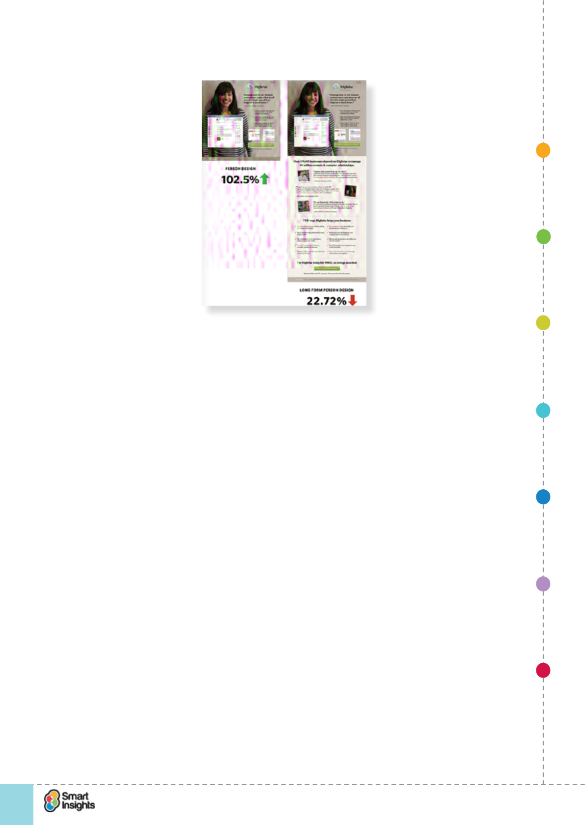
1. SET OBJECTIVES 6. INCREASING
BRAND TRUST
7. IMPROVING
RESULTS
5. COMPELLING
CONTENT
4. CREATING THE
BEST PAGE LAYOUT
3. ENGAGING YOUR
VISITOR
2. UNDERSTAND
VISITOR NEEDS
© Smart Insights (Marketing Intelligence) Limited. Please go to www.smartinsights.com to feedback or access our other guides.
Creating high-converting landing pages
!
75
4
3. Then a longer-form person-based design.
1. SET OBJECTIVES 6. INCREASING
BRAND TRUST
7. IMPROVING
RESULTS
5. COMPELLING
CONTENT
4. CREATING THE
BEST PAGE LAYOUT
3. ENGAGING YOUR
VISITOR
2. UNDERSTAND
VISITOR NEEDS
© Smart Insights (Marketing Intelligence) Limited. Please go to www.smartinsights.com to feedback or access our other guides.
Creating high-converting landing pages
!
76
5
Step 5
Create compelling content and creative
By now you know the goals for your landing page, who your visitors are and have worked out
the optimal page layout. So, what content do you need to make the page y?
To help you make this decision, you need to understand guidelines for writing online copy.
Good practice techniques for copywriting
rQ. Does our copy follow good practice recommendations?
You will nd a lot has been written about online copywriting. There is much hyperbole. And
there is some confusion with search engine optimisation (SEO). So let’s clarify our take on
copywriting based on years of experience.
Copywriting is not SEO. Copywriting is about producing relevant content that provides
clear and concise messages to visitors to help you achieve the goals for your landing page.
Search engine optimisation can support good copywriting by ensuring the copy is optimised
for relevant search queries. However, content should always be written for the end-user rst
to ensure it reads well. In fact, this is the approach that search engines like Google espouse.
Below are some useful guidelines:
þ1. Write for people not search engines. A paragraph of keywords does not persuasive
copy make! Write copy that appeals to real people and speaks to them in a tone of voice
that will appeal.
þ2. Make the headline impactful. A good headline encourages people to read it – it
provides relevance, reassuring them that this page is worth spending more time on. Good
headlines are useful feature and/or benet led.
þ3. Get the rst sentence read. So important! If people don’t read the rst sentence,
they’re unlikely to read the second and you want them to read on, right?
þ4. Tailor content based on audience type. Make your copy speak to the customer. If
you’re talking to teenagers, write in a tone of voice that resonates with them, use their
language , etc. It often pays to employ specialist copywriters when targeting specic
audiences.
þ5. Be succinct. Don’t take three paragraphs to say what you could in one. Boil it down to
the essentials but make sure you’re not sacricing quality. The copy still has to be legible
and make sense! This is critical on mobile where attention spans are typically shorter
(unless someone has come to read a detailed guide!).
þ6. Be persuasive. Entice people. Encourage people. Even seduce people.
Look at the example of the Hotel Chocolat Caramel ChocolateGift Collections landing page
below. It uses sensual emotive language relating to the indulgence of luxury chocolate to
entice people.
þ7. Know your personality. It’s important that you use a consistent voice across your
website. This helps visitors get to know your brand personality and provides an important
signal that this is your landing page. A good example of this is Wish.co.ukJ Peterman
whose tone of voice is consistent across their product pages.
We recommend reading Brian Clark’s article series ‘10 Steps to Effective Copywriting’ on
Copyblogger35.
35 10 Steps to Effective Copywriting’ on Copyblogger
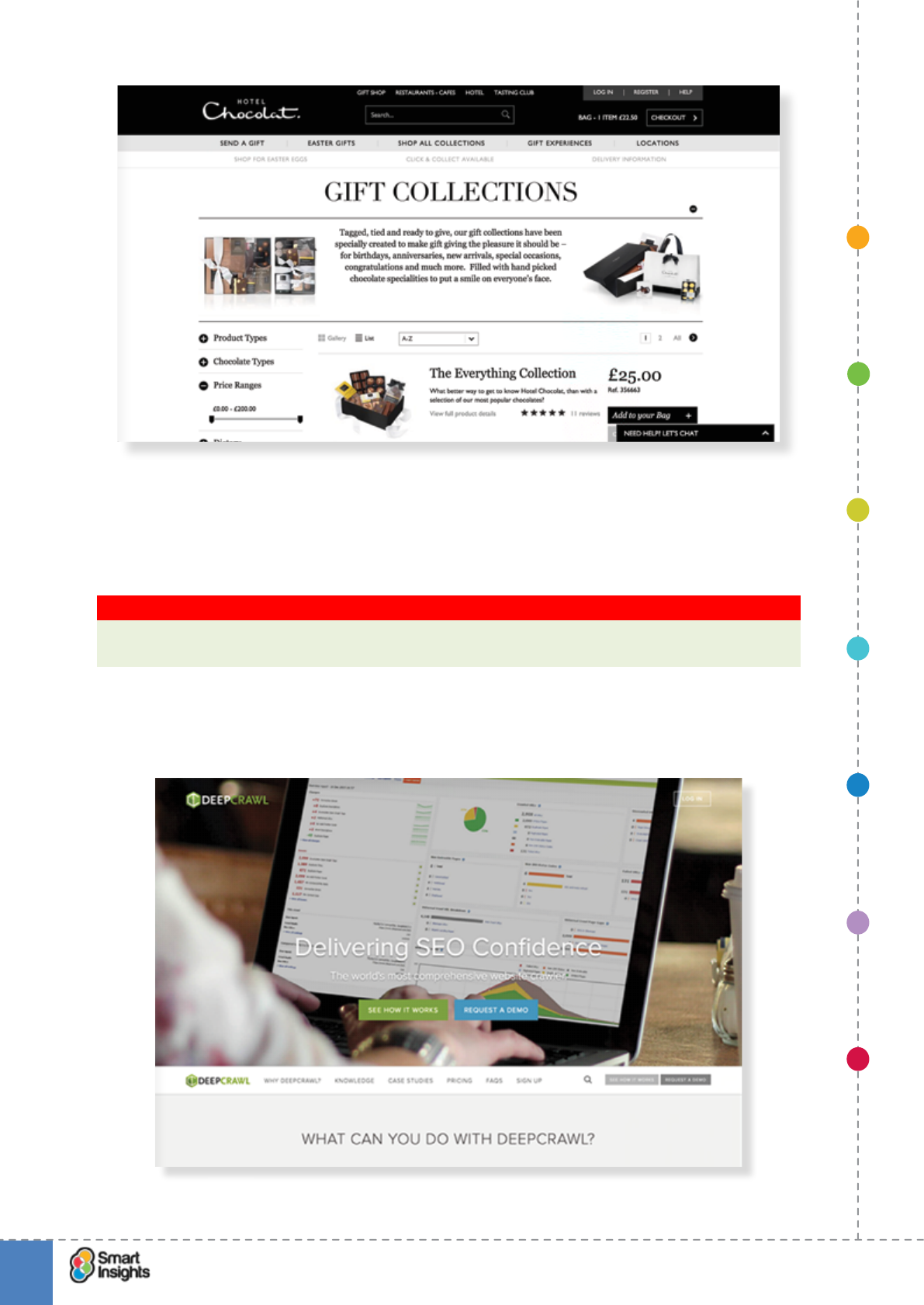
1. SET OBJECTIVES 6. INCREASING
BRAND TRUST
7. IMPROVING
RESULTS
5. COMPELLING
CONTENT
4. CREATING THE
BEST PAGE LAYOUT
3. ENGAGING YOUR
VISITOR
2. UNDERSTAND
VISITOR NEEDS
© Smart Insights (Marketing Intelligence) Limited. Please go to www.smartinsights.com to feedback or access our other guides.
Creating high-converting landing pages
!
77
5
Content to engage the visitor
We’ve said that you need a relevant headline, but what really grabs the attention? Often it’s
a video or a strong image, such as an image of a customer using the product that will help
conversion.
Key Strategy Recommendation 13 Invest in effective engagement devices
Although layout and design is important, ultimately it’s your offer and engagement devices
that will help conversion.
Here’s a landing page example that proves the point we think. The offer is for Deep Crawl,
an SEO software solution, but the big image of screenshot from the actual software makes it
more appealing than text or generic images. The screenshot contextualises the product offer.
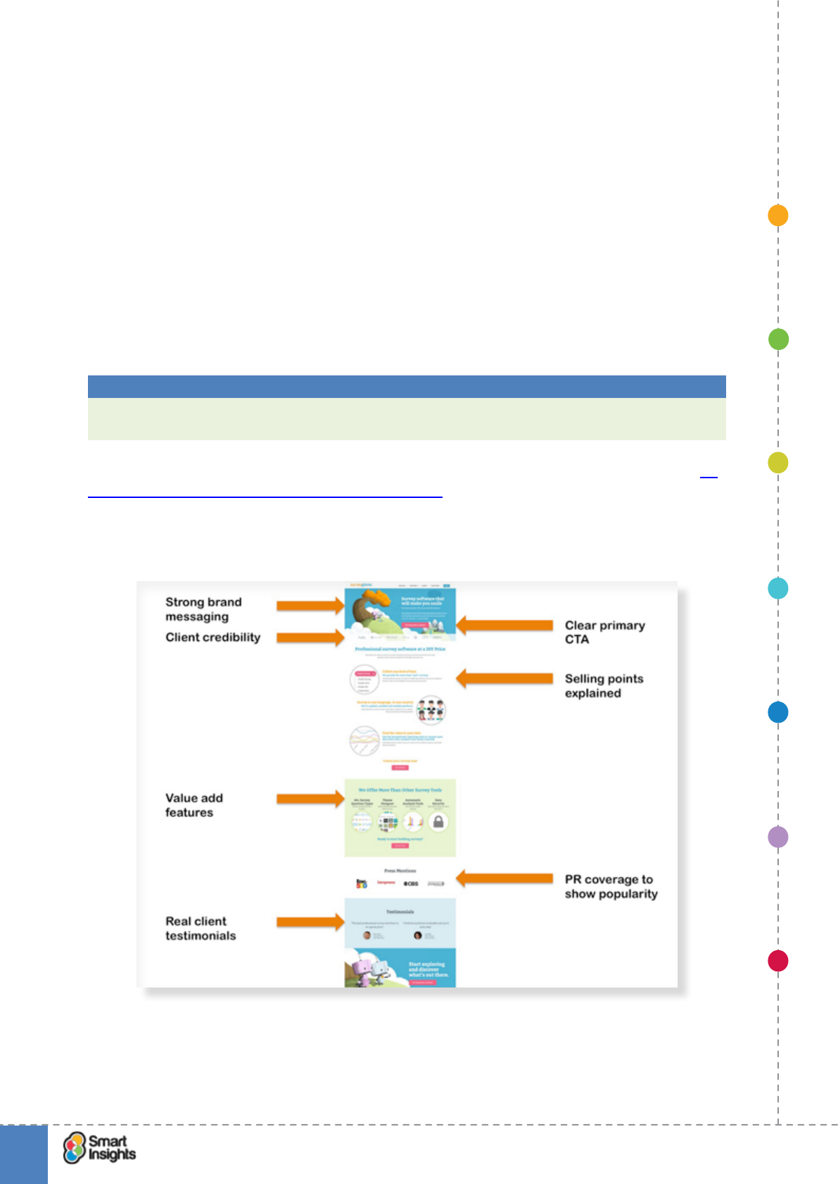
1. SET OBJECTIVES 6. INCREASING
BRAND TRUST
7. IMPROVING
RESULTS
5. COMPELLING
CONTENT
4. CREATING THE
BEST PAGE LAYOUT
3. ENGAGING YOUR
VISITOR
2. UNDERSTAND
VISITOR NEEDS
© Smart Insights (Marketing Intelligence) Limited. Please go to www.smartinsights.com to feedback or access our other guides.
Creating high-converting landing pages
!
78
5
Less is often more with landing pages, but this means selecting the right content and then
using copywriting skills to make that content engaging, relevant and actionable.
rQ. What types of content do you have that can bring your copy to life?
þQuality, engaging images?
þVideos?
þExamples of product or download?
þCustomer testimonials?
Persuasive messaging hierarchy
rQ. Do we have a clear persuasive messaging hierarchy?
You have a story to tell and few words to tell it. The messages in your headings are
particularly important and they need to be prioritised. This is what we mean by hierarchy.
Best Practice Tip 18 Effective messaging hierarchy dened
Position your brand carefully through the messaging on the landing page and ensure this
positioning is consistent with other landing pages.
If you remember, we looked at a framework for explaining this in Step 3 in the section on 5.
Make the combination of features and benets clear. Let’s take the example below of the
main landing page for Survey Gizmo, an online survey software provider. It focuses the brand
messaging on providing an easy to use tool that has brilliant support behind it, using the
logos of well-known clients to reinforce its credentials.
Note how it uses a personal tone of voice to communicate the company’s message, not
writing in the third person. As illustrated by the example above, your headlines and the
related copy should:
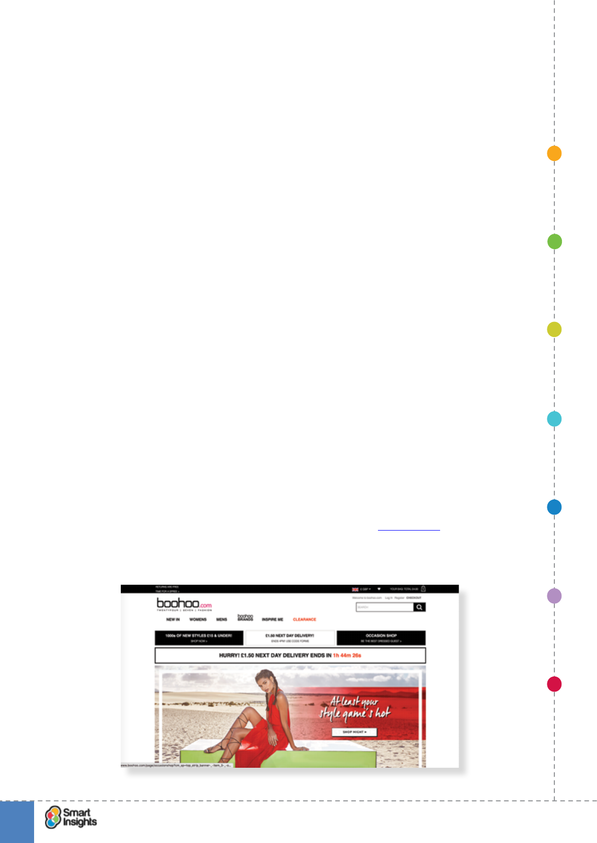
1. SET OBJECTIVES 6. INCREASING
BRAND TRUST
7. IMPROVING
RESULTS
5. COMPELLING
CONTENT
4. CREATING THE
BEST PAGE LAYOUT
3. ENGAGING YOUR
VISITOR
2. UNDERSTAND
VISITOR NEEDS
© Smart Insights (Marketing Intelligence) Limited. Please go to www.smartinsights.com to feedback or access our other guides.
Creating high-converting landing pages
!
79
5
þ1. Engage with relevance but intrigue also
‘You have questions. We can provide the answers…’
þ2. Offer a benet straight away
‘Priced so everyone has access to answers – on any budget’
þ3. Link the features with the benets
‘Collect any kind of data’
þ4. Encourage action
‘Try building a survey’
Alternatively, you can try the tried and trusted AIDA framework, your landing page has to
encourage Attention, Interest, Desire and Action.
Brand and strapline
rQ. Is our brand and strapline reassuring?
It’s important that what your brand represents is clear from the landing page. This is
inuenced by the strength of your brand reputation and how easily recognised brand symbols
like the logo are.
This is straightforward for a relatively well-known brand like Argos, but for companies where
many visitors will not know them well, a strapline explaining more about their services could
help.
Brand identity on landing pages has a signicant effect on new visitors, those who are likely
to know very little about you or your website. If the brand is not well presented and what you
represent unclear, it could put people off.
A strapline can help give context to the brand logo. Think of well-known straplines such as:
þJohn Lewis – ‘Never knowingly undersold.’
þStella Artois – ‘Reassuringly expensive.’
þMcDonalds – ‘I’m lovin’ it.
Let’s use the example of a pureplay ecommerce fashion retailer, Boohoo.com. It features the
strapline ‘Twentyfour Seven Fashion’ beneath the logo so that it appears on every web page.
This gives the new visitor a clear visual signal as to the positioning/purpose of the brand.
1. SET OBJECTIVES 6. INCREASING
BRAND TRUST
7. IMPROVING
RESULTS
5. COMPELLING
CONTENT
4. CREATING THE
BEST PAGE LAYOUT
3. ENGAGING YOUR
VISITOR
2. UNDERSTAND
VISITOR NEEDS
© Smart Insights (Marketing Intelligence) Limited. Please go to www.smartinsights.com to feedback or access our other guides.
Creating high-converting landing pages
!
80
5
Use this checklist to see if you have your bases covered:
rDo you have a quality brand identity in the top left navigation?
rDo you use a supporting strapline (if necessary)?
rAre the basic parts of your company or services highlighted?
Effective copywriting
rQ. Is our copy effective in conveying the key messages?
A classic piece of research by Jakob Nielsen, one of the leading authorities on web usability,
showed that:
þWe read 25 per cent more slowly online.
þWe scan (79 per cent) rather than read (16 per cent).
Dave Chaffey and PR Smith devised a checklist for online copywriting in their book
Emarketing Excellence, with the salubrious mnemonic CRABS:
þChunking. Chunking means that paragraphs must be shorter than in paper copy. Think
one or two sentences only. This helps scannability.
þ Relevance. With limited space, we have no room for llers. Stick with what matters – the
details of the offer and how to get it.
þ Accuracy. Don’t get carried away with your copy; don’t set expectations so high that you
overpromise and can’t deliver something you offer.
þBrevity. Brevity goes with chunking and scannability. Write your copy, reduce the word
count and then reduce it again. Give yourself targets and beat them without sacricing
good English and understanding. Where necessary you can hyperlink to more details
proving what you say, although this will often break the ow.
þScannability. This is reading without reading every word, just picking up the sense of
each paragraph from the keywords. The eye tends to pick out words in headers, at the
start of paragraphs and those emphasised in bold.
The success factors in the CRABS copywriting mnemonic are functional, but it’s also worth
remembering the human dynamic as we’ll see in the next section on trust and reassurance.
Think carefully about tone of voice.
Tone of voice
þQ. Is our tone of voice appropriate?
The tone of voice is a key element of the landing page. This is the mood or attitude of the writing,
which needs to be appropriate to your target audience and your own brand values. Dene who
you are writing for, so that you can think about what might make them interested in the product.
Best Practice Tip 19 Get the tone of voice right
The tone of voice should t your brand and audience, but if you can push the boundaries to
make it more accessible, then this can work well on landing pages.
Palace Skateboards is a great example of a brand using distinct, and polarising, copy on
its product landing pages. The copy is clearly tailored to appeal to a specic audience that
will enjoy edgy, provocative content that’s uses street slang. We’d imagine that quite a few
people, who don’t t this demographic, would nd it rude and crude!
1. SET OBJECTIVES 6. INCREASING
BRAND TRUST
7. IMPROVING
RESULTS
5. COMPELLING
CONTENT
4. CREATING THE
BEST PAGE LAYOUT
3. ENGAGING YOUR
VISITOR
2. UNDERSTAND
VISITOR NEEDS
© Smart Insights (Marketing Intelligence) Limited. Please go to www.smartinsights.com to feedback or access our other guides.
Creating high-converting landing pages
!
81
5
Please note that at the time of writing, the web shop is closed and due to re-open but no date
is provided.
Consistency with marketing campaign creative/content
rQ. Is our copy consistent with marketing campaign content?
As we have highlighted previously in this guide, it’s important that you align your landing
page copy with the content used in your marketing campaigns
Why? To provide a consistent scent trail for visitors. This is really important when you are
promoting an offer or discount via the marketing campaign, either using a banner or via text.
When the customer arrives at the landing page, they will be reassured if the same banner/
text is repeated, conrming that the offer is available.
Take the two examples below from email marketing campaigns. You’ll notice that All Saints
uses a consistent creative treatment but WHSmith has no replication of the email offer
anywhere visible, which is poor practice.
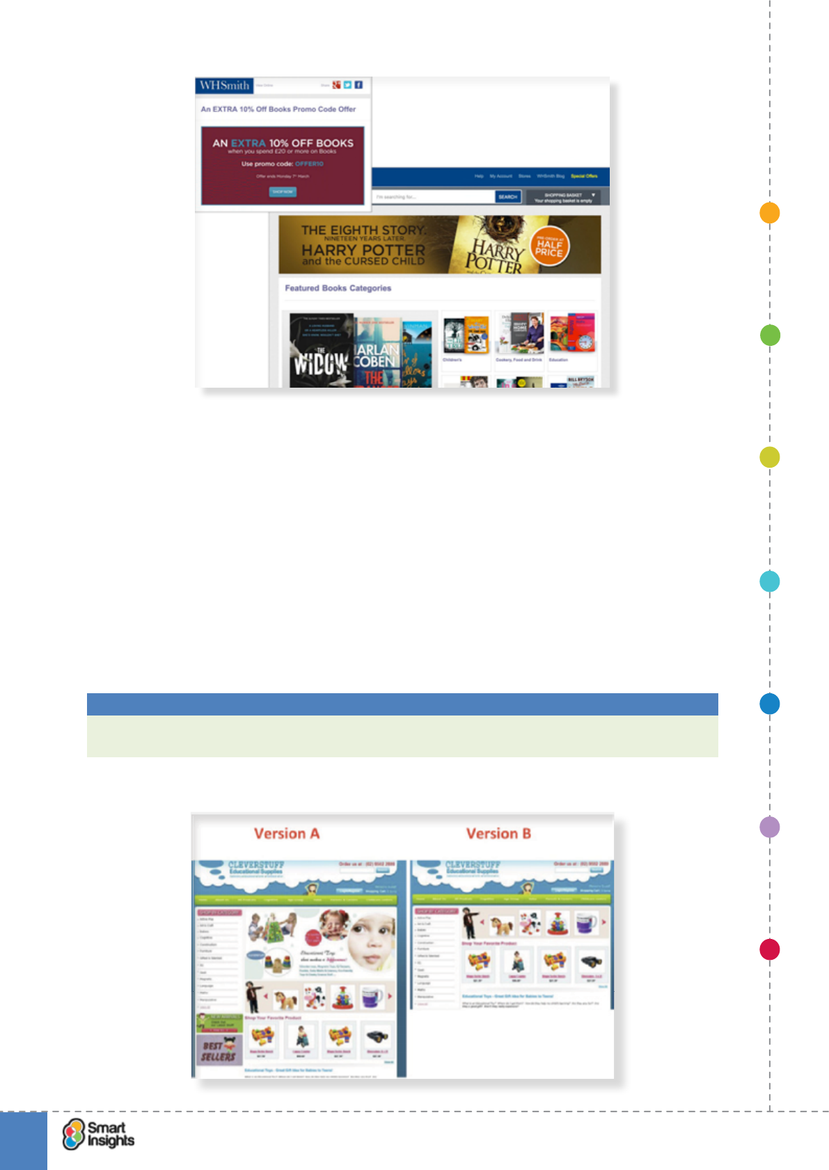
1. SET OBJECTIVES 6. INCREASING
BRAND TRUST
7. IMPROVING
RESULTS
5. COMPELLING
CONTENT
4. CREATING THE
BEST PAGE LAYOUT
3. ENGAGING YOUR
VISITOR
2. UNDERSTAND
VISITOR NEEDS
© Smart Insights (Marketing Intelligence) Limited. Please go to www.smartinsights.com to feedback or access our other guides.
Creating high-converting landing pages
!
82
5
Don’t assume your content is right
rQ. Have we tested our landing page?
Even if you follow our good practice guidelines, you still need to test your landing page to work
out what the best combination of content and copy is. When you take a look around the web,
you’ll see such a wide variety of landing page designs. Whilst many of them are following good
practice guidelines, they’re nding their own way to implement these based on their audience.
No matter what industry you work in, the homepage design always struggles between
presenting offers and explaining the ‘who we are’.
And there are some surprising results. For every test that conrms your ‘gut feel’ there will be
one that confounds it! Take the example below from Whichtestwon.com showing two landing
page treatments for the homepage of Cleverstuff, an online retailer of educational supplies.
Best Practice Tip 20 Test and test again
Every component of a landing page can be tested, including the copy and brand elements
like logo positioning and use of straplines.
Set objectives Increasing brand
trust and credibility
Improving
results
Compelling content
and creative
Creating the best
page layout
Engaging your
visitor
Understand
visitor needs
© Smart Insights (Marketing Intelligence) Limited. Please go to www.smartinsights.com to feedback or access our other guides.
7 Steps Guide to creating high-converting landing pages
!
5

1. SET OBJECTIVES 6. INCREASING
BRAND TRUST
7. IMPROVING
RESULTS
5. COMPELLING
CONTENT
4. CREATING THE
BEST PAGE LAYOUT
3. ENGAGING YOUR
VISITOR
2. UNDERSTAND
VISITOR NEEDS
© Smart Insights (Marketing Intelligence) Limited. Please go to www.smartinsights.com to feedback or access our other guides.
Creating high-converting landing pages
!
83
5
Our ‘gut feel’ would be that Version A with its strong brand positioning section would
encourage better performance. However, it was actually Version B that increased paid orders
by 13.7 per cent!
1. SET OBJECTIVES 6. INCREASING
BRAND TRUST
7. IMPROVING
RESULTS
5. COMPELLING
CONTENT
4. CREATING THE
BEST PAGE LAYOUT
3. ENGAGING YOUR
VISITOR
2. UNDERSTAND
VISITOR NEEDS
© Smart Insights (Marketing Intelligence) Limited. Please go to www.smartinsights.com to feedback or access our other guides.
Creating high-converting landing pages
!
6
84
Step 6
Increase brand credibility and trust
rQ. How can we increase the credibility and trust of our page to boost conversion?
Think about how you react to information when you land on a web page. If you don’t know
the brand, what do you look for? What signals help you feel reassured that this website is
trustworthy?
For returning customers this isn’t as important – they have already seen your website and
trust it enough to come back. However, for a new visitor, this may be the rst time they have
ever come across your company.
Generally speaking, there are nine techniques for displaying brand signals to reassure visitors:
þ1. Logo
þ2. Strapline
þ3. History/About Us
þ4. Testimonials/Reviews
þ5. Independent accreditation (from well known sources)
þ6. Security messages
þ7. Customer Service support
þ8. Guarantees/Warranties
þ9. Awards.
We’ll look at each of these in more detail below. First, start by asking yourself the following
question:
rQ. Have we clearly communicated our brand credibility and trust?
Although you’ll likely want to keep the page short, review these different methods of
increasing credibility and so increasing conversion.
Key Strategy Recommendation 14 Understand your consumer trust factors
Think carefully about what the barriers to conversion are. How can you reassure customers
that you can be trusted both to generate a response and in a longer-term relationship?
Don’t over play trust – if you seem too desperate to convince people, they might think
you’re trying to hide something.
1. Logo
rQ. Is our logo of sufcient quality for credibility?
This doesn’t need much explanation!
Your logo is the primary brand identity mechanism for your landing page. Online shoppers
are used to nding this in the top left of the page, though some brands feature it in the centre,
or to the right. This is happening more as responsive web design takes hold and designers
base designs on smartphone screen resolutions, where headers often have the logo in the
middle and icons either side.
When featuring logos on your website, make sure the imagery is optimised for web to reduce
le size but is of the highest possible quality – a blurred or obscured logo doesn’t reect well
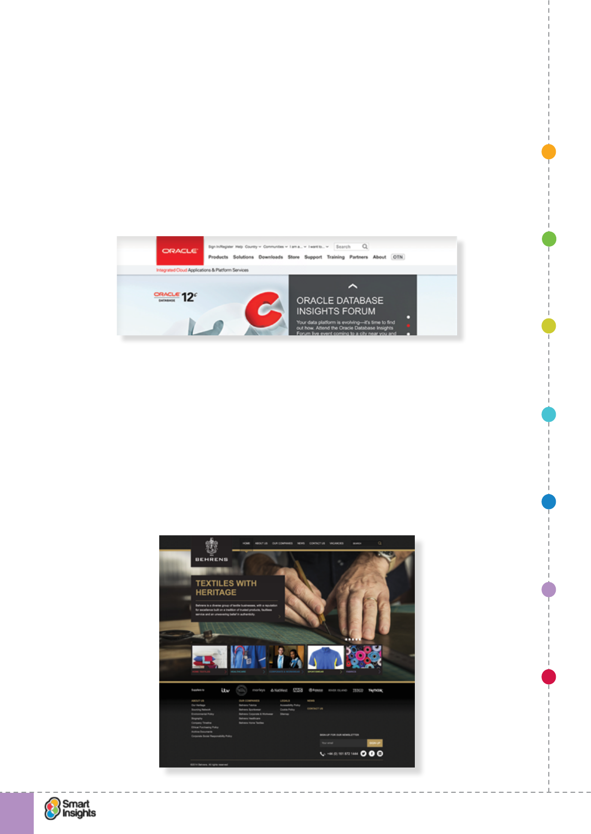
1. SET OBJECTIVES 6. INCREASING
BRAND TRUST
7. IMPROVING
RESULTS
5. COMPELLING
CONTENT
4. CREATING THE
BEST PAGE LAYOUT
3. ENGAGING YOUR
VISITOR
2. UNDERSTAND
VISITOR NEEDS
© Smart Insights (Marketing Intelligence) Limited. Please go to www.smartinsights.com to feedback or access our other guides.
Creating high-converting landing pages
!
6
85
on your brand quality. Many designers recommend scalable vector graphics (SVG), so the
quality of the image is based on device capability.
2. Strapline
rQ. Is our strapline effective?
Not all websites used straplines. It’s not essential but a strapline can help reinforce your core
brand values or position your products and services.
Take a look at Oracle’s strapline in the image below: ‘Integrated Cloud Applications &
Platform Services’. It is deliberately positioning the brand as a serious and practical business
partner with a joined up product suite.
3. History/About Us
rQ. Is the about us page or content on page effective?
For some brands, heritage is key. A good example is family run businesses where brand
awareness can be high in local markets, but less so further aeld which can hinder online
expansion. However, the brand heritage and back story can help persuade people that it’s a
reputable company with a track record of delivering great quality service.
The example below is from the Behrens Groups, a business that started in 1834 and is still
run by the family. There is a lot of rich content about the heritage available online, and the
homepage plays on the theme with ‘Textile with heritage’.
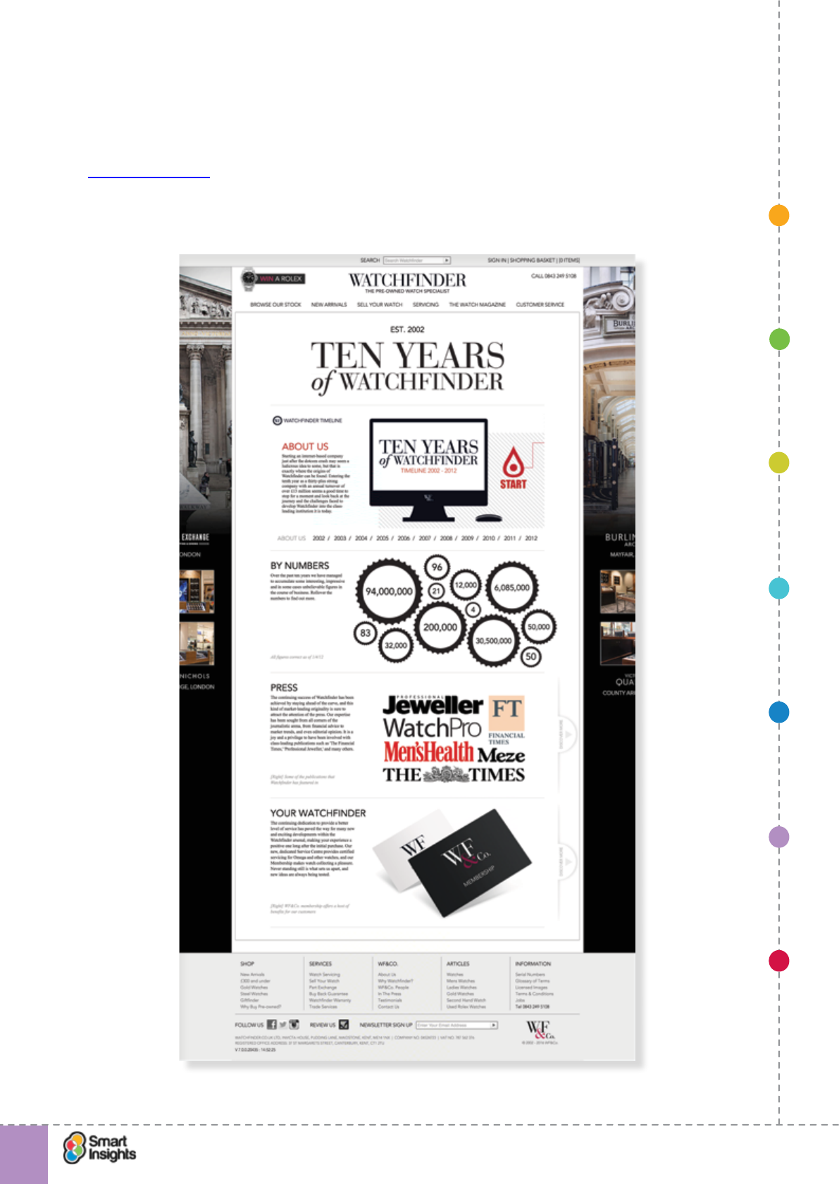
1. SET OBJECTIVES 6. INCREASING
BRAND TRUST
7. IMPROVING
RESULTS
5. COMPELLING
CONTENT
4. CREATING THE
BEST PAGE LAYOUT
3. ENGAGING YOUR
VISITOR
2. UNDERSTAND
VISITOR NEEDS
© Smart Insights (Marketing Intelligence) Limited. Please go to www.smartinsights.com to feedback or access our other guides.
Creating high-converting landing pages
!
6
86
About Us is usually a simple text link in the site-wide header. The destination page will
contain useful information about the history of the company and what it represents. It’s the
perfect opportunity to reinforce brand values and persuade visitors that you are reputable
and trustworthy.
Watchnder.co.uk uses a novel approach with a landing page titled ‘10 years of Watchnder’.
This conveys credibility as it clearly shows the brand has a heritage. The page uses
interactive techniques to encourage the visitors to learn more about the brand.
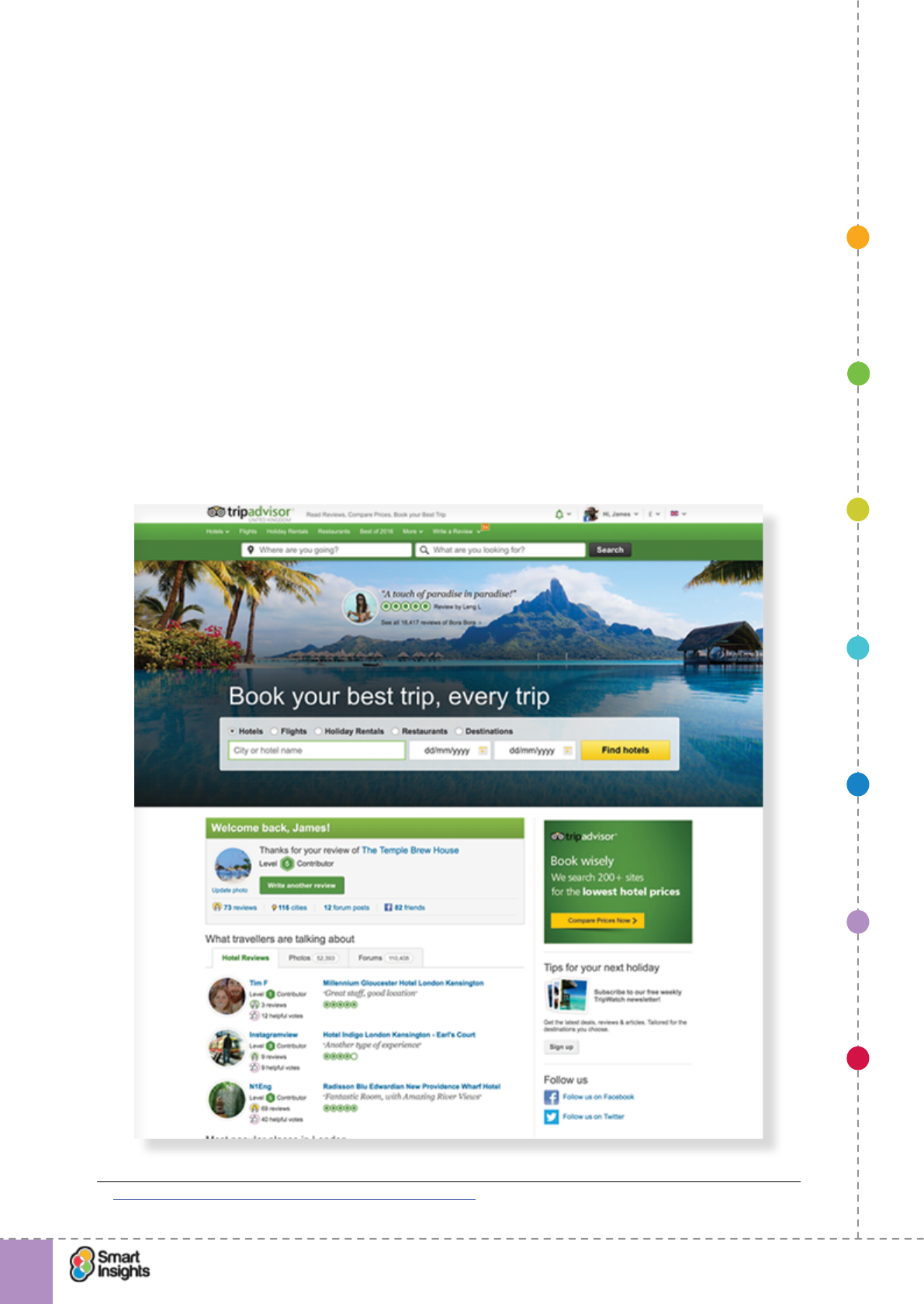
1. SET OBJECTIVES 6. INCREASING
BRAND TRUST
7. IMPROVING
RESULTS
5. COMPELLING
CONTENT
4. CREATING THE
BEST PAGE LAYOUT
3. ENGAGING YOUR
VISITOR
2. UNDERSTAND
VISITOR NEEDS
© Smart Insights (Marketing Intelligence) Limited. Please go to www.smartinsights.com to feedback or access our other guides.
Creating high-converting landing pages
!
6
87
4. Testimonials/Reviews
rQ. Are our testimonials and reviews of sufcient quality?
These fall into two categories:
þExpert reviews. Where an industry expert, publisher or well-known person provides an
authoritative review of a product or service.
þCustomer reviews. Where customer feedback is displayed on the landing page. For
retail ecommerce this is usually done via an online ratings system such as Feefo,
Trustpilot or Reevo. However, it’s also common for quotes from happy customers to be
displayed prominently, a tactic more readily associated with B2B.
Both can have a strong impact on a visitor’s perception of quality but, in general, it’s the
customer ratings and reviews that inuence trust the most.
Quotes or videos showing customers using the product or describing the benets of using the
services are also really helpful for visitors.
The landing page36 below shows content from the main landing page for Tripadvisor, which
uses customer quotes to validate popularity of the website and show that it’s an active travel
community – ‘See all 16,417 reviews for Bora Bora’.
36 Smart Insights: An in-depth home page optimisation study
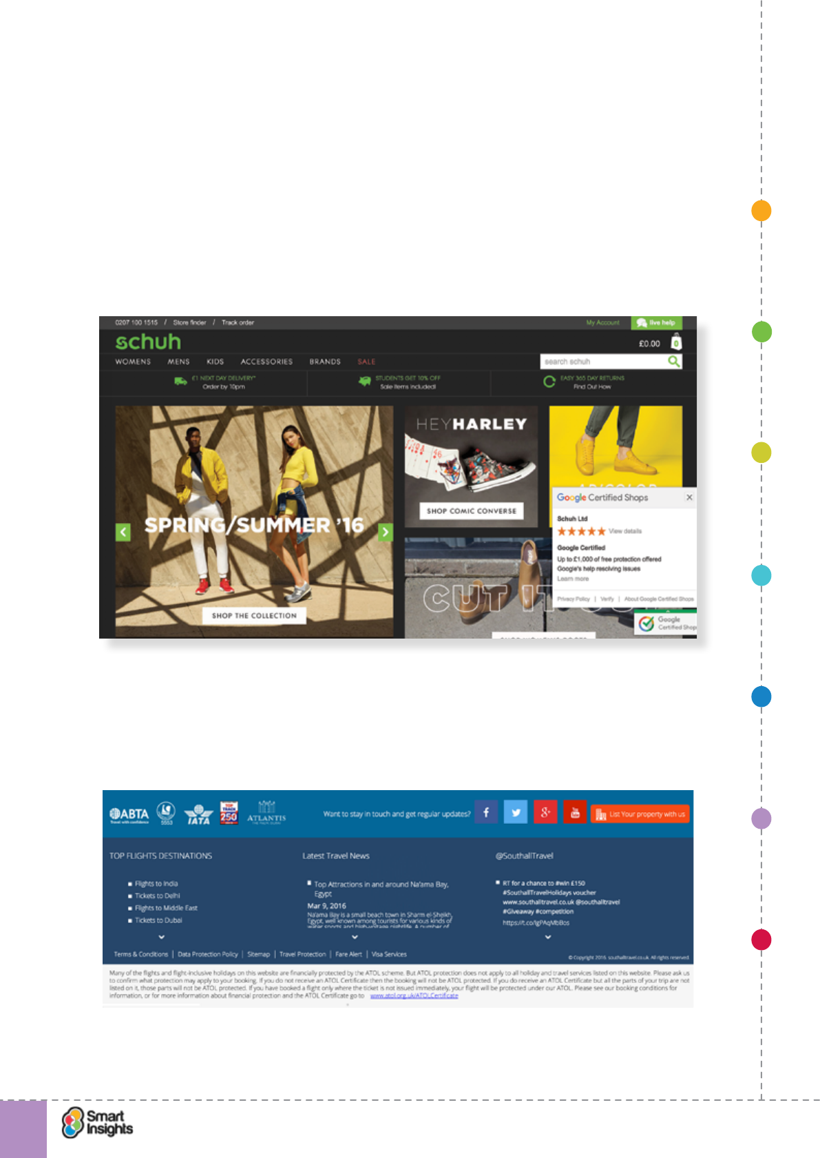
1. SET OBJECTIVES 6. INCREASING
BRAND TRUST
7. IMPROVING
RESULTS
5. COMPELLING
CONTENT
4. CREATING THE
BEST PAGE LAYOUT
3. ENGAGING YOUR
VISITOR
2. UNDERSTAND
VISITOR NEEDS
© Smart Insights (Marketing Intelligence) Limited. Please go to www.smartinsights.com to feedback or access our other guides.
Creating high-converting landing pages
!
6
88
5. Accreditation
rQ. Relevant industry accreditation in place?
This relates to independent organisations and schemes that you are a member of and that
are widely recognised by customers in your industry. The more well known the accreditation
body, the greater the impact on your visitors.
When using accreditation signals, it’s important to link logos/images through to the
accreditation body’s website or online proof of your membership.
The screenshot below is taken from the site-wide footer for Schuh, a specialist footware
retailer, which displays the Google Certied Shop accreditation logo, which opens up the
brand’s prole in the directory when clicked.
In some industries, accreditation is a legal requirement. For example, all travel companies
selling air holiday packages and ights in the UK are required by law to hold an ATOL, which
is granted after the company has met the CAA’s licensing requirements. The example below
shows the footer area for Southall Travel, which includes an ATOL logo (though the legibility
could be improved).
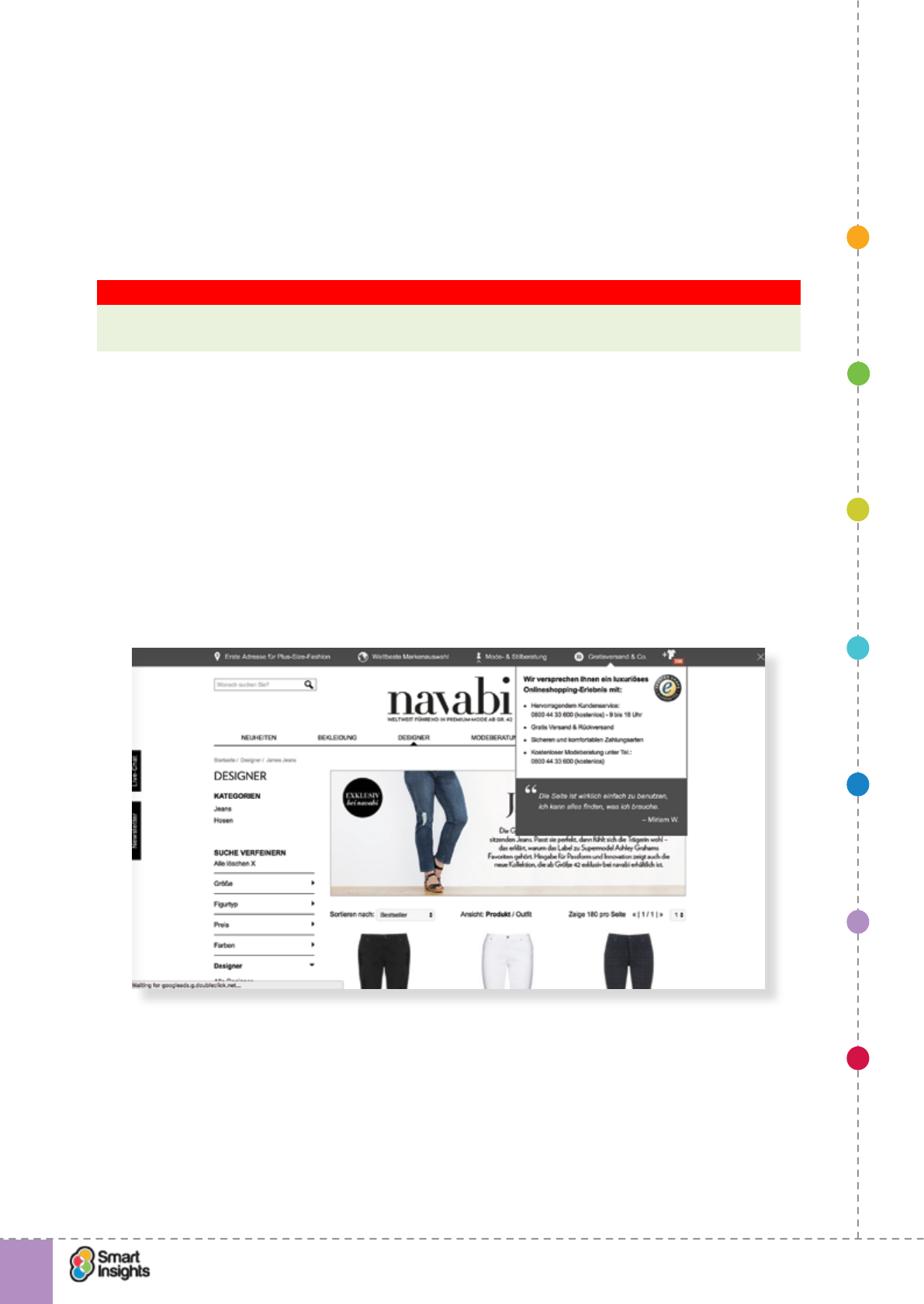
1. SET OBJECTIVES 6. INCREASING
BRAND TRUST
7. IMPROVING
RESULTS
5. COMPELLING
CONTENT
4. CREATING THE
BEST PAGE LAYOUT
3. ENGAGING YOUR
VISITOR
2. UNDERSTAND
VISITOR NEEDS
© Smart Insights (Marketing Intelligence) Limited. Please go to www.smartinsights.com to feedback or access our other guides.
Creating high-converting landing pages
!
6
89
6. Security messages
rQ. Security messages and logos sufcient to reassure?
These are message that highlight how safe and secure it is to shop with you online. For
ecommerce websites, these include SSL certicates (e.g. VeriSign logo) and 3D Secure (e.g.
Veried by Visa).
This is particularly helpful for inexperienced Internet shoppers who may not fully trust
handing over their card details to a website.
Key Strategy Recommendation 15 Make it clear that shopping online is safe and secure
If your landing page is designed to generate transactions, ensure it has a clear message
that shopping with you is safe and secure.
7. Customer service support
rQ. Customer service prompts in place to support?
It’s nice to know there is a human presence behind the website. Even if people don’t actually
make contact, providing clear contact options provides reassurance. It says that help is there
if needed.
The example below shows a brand landing page for Navabi, a german plus size clothing
retailer, which provides a persistent Live Chat pull out and a text link for free shipping
(Gratisversand), which on mouse over on the desktop site displays extended customer
service information including a Freephone number and free fashion consulting phone line.
There are multiple ways to communicate support. The most common on landing pages are:
rContact phone number
rContact Us landing page
rRequest callback form
rLive chat.
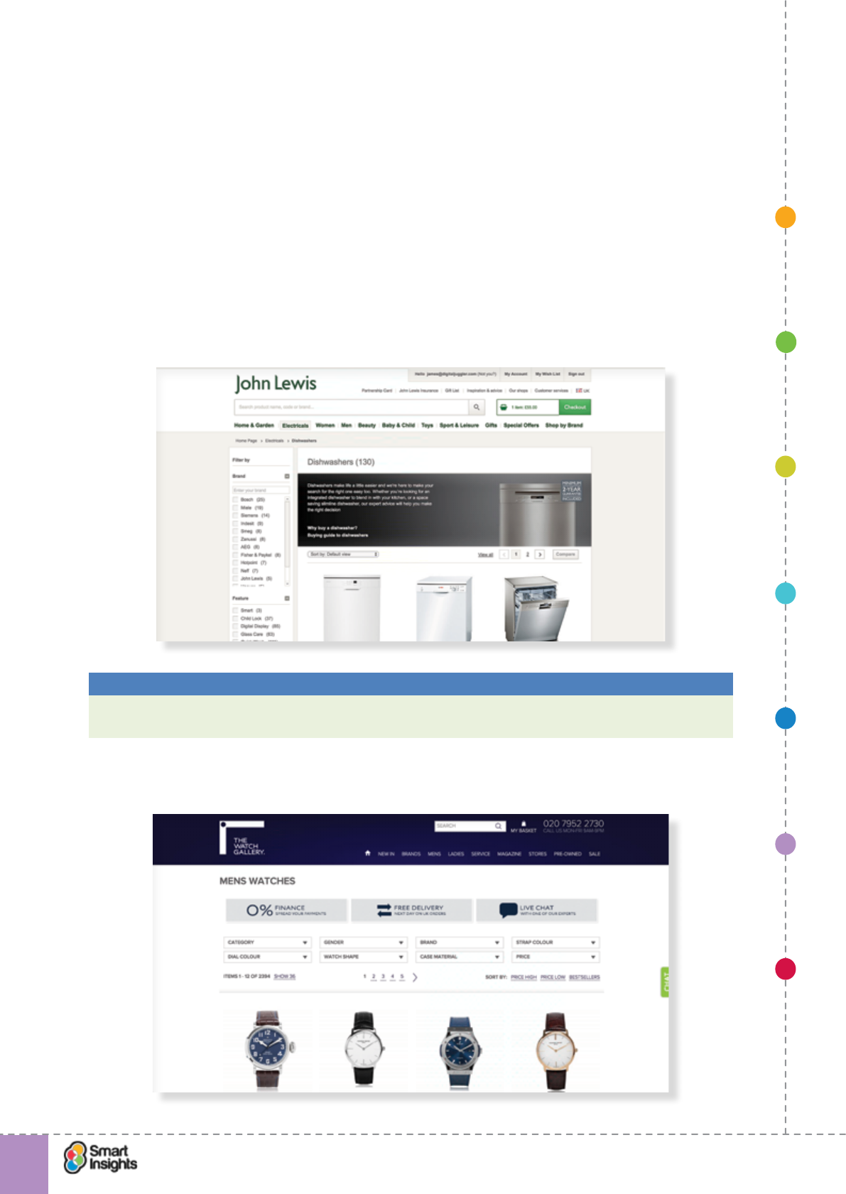
1. SET OBJECTIVES 6. INCREASING
BRAND TRUST
7. IMPROVING
RESULTS
5. COMPELLING
CONTENT
4. CREATING THE
BEST PAGE LAYOUT
3. ENGAGING YOUR
VISITOR
2. UNDERSTAND
VISITOR NEEDS
© Smart Insights (Marketing Intelligence) Limited. Please go to www.smartinsights.com to feedback or access our other guides.
Creating high-converting landing pages
!
6
90
8. Guarantees/warranties
rQ. Effective guarantees and warranties in place?
What if the customer doesn’t like the product or service? Can they return it within a period?
Will they receive a refund?
If the manufacturer provides a standard warranty, make this clear and show how long the
warranty lasts for.
If you provide an extended warranty (either for free or for an additional payment) also make
this clear and promote the benets, e.g. peace of mind with full coverage of any repairs for
an extra 12 months.
The screenshot below shows a guarantee message being displayed prominently on the
dishwashers landing page of John Lewis.
Best Practice Tip 21 Reassure across every page with a site-wide feature
Use a strip below the masthead or a feature in the right sidebar to reassure or offer
guarantees.
The example below shows how Thewatchgallery.com does this for its 0% nance offer.
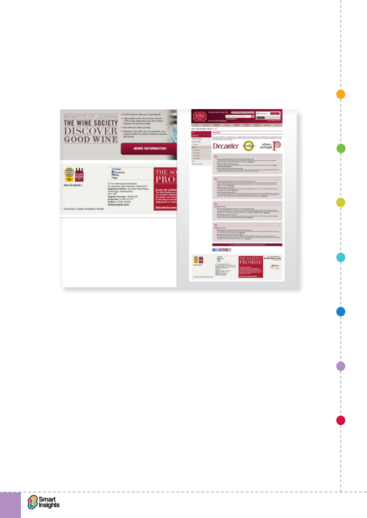
1. SET OBJECTIVES 6. INCREASING
BRAND TRUST
7. IMPROVING
RESULTS
5. COMPELLING
CONTENT
4. CREATING THE
BEST PAGE LAYOUT
3. ENGAGING YOUR
VISITOR
2. UNDERSTAND
VISITOR NEEDS
© Smart Insights (Marketing Intelligence) Limited. Please go to www.smartinsights.com to feedback or access our other guides.
Creating high-converting landing pages
!
6
91
9. Awards
rQ. Relevant awards in place?
Independent awards achieved by a brand, its products or services are particularly effective in
differentiating a company and encouraging action through reassurance.
The screenshot below shows the footer of the main landing page for The Wine Society, which
features logos of key awards that link through to a dedicated awards page.
In summary, these are the questions to ask to persuade people to invest time in a form or
money in a purchase:
rQ. Have we proved the credibility of our brand?
You have just one page to prove to the visitor that you’re credible enough to respond and
share their details with you. Do they trust you to form a relationship where they know you
may be in touch? So you have to efciently use trust devices and messages to achieve this.
rQ. Do we have a point of action assurance next to our calls to action?
A point of action assurance is text or imagery next to a button to increase trust from the
visitor so they will more happily click the submit button. Examples are:
þPadlock or independent trust body logo showing the transaction will be secured.
þText explaining the users’ privacy will be maintained.
1. SET OBJECTIVES 6. INCREASING
BRAND TRUST
7. IMPROVING
RESULTS
5. COMPELLING
CONTENT
4. CREATING THE
BEST PAGE LAYOUT
3. ENGAGING YOUR
VISITOR
2. UNDERSTAND
VISITOR NEEDS
© Smart Insights (Marketing Intelligence) Limited. Please go to www.smartinsights.com to feedback or access our other guides.
Creating high-converting landing pages
!
92
7
Step 7
Improve results
rQ. How can we further improve the results from our landing pages?
Why do you need to improve results?
Rome wasn’t built in a day!
There are many reasons why a one-off landing page design won’t necessarily give you the
best possible conversion. For example:
rType of visitor changes over time.
rNeeds of visitors change.
rExternal competition changes.
It’s also very hard to know what blend of content and calls to action will deliver the best
results. That’s why we always advise that you use an optimisation program to test, learn and
improve. In this section we discuss some of the key techniques that will help you achieve
this.
However, some marketing campaigns are one-offs with a short life cycle. For example, a
weekend special promotion delivered by email, afliate and paid search. For this type of
campaign, ongoing optimisation isn’t feasible – by the time you have learned what works/
doesn’t work, the campaign will have expired.
Therefore, when planning which campaigns and landing pages to include in an optimisation
program think about which ones would have the greatest impact if performance improved.
Short-term landing pages can be optimised but only if there’s sufcient volume of visits to
enable rapid iteration.
Key Strategy Recommendation 16 Focus improvement on key landing pages
With nite resource it’s important to identify landing pages where improvements in
performance can have a signicant impact on your KPIs.
Importance of clearly dened KPIs
Cast your mind back to Step 1 – we explained the importance of KPIs and looked at the four
key types of KPI that we mention in our strategy and measurement guides. Let’s remind
ourselves in this table.
1. SET OBJECTIVES 6. INCREASING
BRAND TRUST
7. IMPROVING
RESULTS
5. COMPELLING
CONTENT
4. CREATING THE
BEST PAGE LAYOUT
3. ENGAGING YOUR
VISITOR
2. UNDERSTAND
VISITOR NEEDS
© Smart Insights (Marketing Intelligence) Limited. Please go to www.smartinsights.com to feedback or access our other guides.
Creating high-converting landing pages
!
93
7
Volume KPIs Quality KPIs Value KPIs Cost KPIs
þnVisits
þnNewsletter
signups
þnContent
shares
þn new and
returning
visitors
þn mobile and
desktop visitors
þBounce rate
þTime on site
þAverage page
views
þ% visitors sharing
content
þConversion rate
(visits to order)
þConversion rate
(baskets to order)
þConversion rate
(bounces ltered)
þConversion rate to
ofine sales
þTotal revenue
þAverage order
value
þRevenue per visits
þValue from
non-ecommerce
goals, e.g.
Newsletter signup,
Leads
þMargin % for
ecommerce site
þCost per click,
cost per sales,
e.g. from
AdWords
þCost per send
e.g. email.
When planning an optimisation program for your landing page, make sure you have agreed
the KPIs from this list that you are measuring performance against. This ensures there is a
consistent evaluation of performance, which will help you make decisions.
In the example below for a retailer, the top eight KPIs for a landing page were benchmarked
prior to the start of the optimisation program. The data was based on weekly reports from
Google Analytics.
Strategy recommendation 17 Benchmark KPIs before doing any optimisation
Once you have agreed your landing page KPIs, make sure you benchmark data. This
means taking a snapshot of each KPI before you start making changes to the landing
page. For example, Per Visit Value is now £0.45. This gives you a number against which to
compare future performance.
Making sure you’re getting value from your landing pages
The starting point to getting the most from your landing pages is making sure you can assess
you’re getting the value from them through analytics.
Within analytics, landing pages completions need to be identied as a special class of goals.
See how in our Guide to Analytics set-up: http://bit.ly/smartgoogleanalytics.
1. SET OBJECTIVES 6. INCREASING
BRAND TRUST
7. IMPROVING
RESULTS
5. COMPELLING
CONTENT
4. CREATING THE
BEST PAGE LAYOUT
3. ENGAGING YOUR
VISITOR
2. UNDERSTAND
VISITOR NEEDS
© Smart Insights (Marketing Intelligence) Limited. Please go to www.smartinsights.com to feedback or access our other guides.
Creating high-converting landing pages
!
94
7
If you can determine the amount of value from each page, this will allow you to compare the
effectiveness of different landing pages in generating value and work back from these to see
the effectiveness of different media or search terms in generating landing page value from
landing pages.
Questions to ask whoever is responsible for your analytics are:
r1. Is our conrmation page after the landing page set up as a goal page?
r2. Have we attached a value to this goal?
r3. Can we check goals and their value for other outcomes e.g. live chat, callback or
phone calls?
r4. Can we segment landing pages as an advanced segment? This will report only on
landing page trafc to compare its effectiveness through time. To do this the landing
pages should all be placed in a unique folder or contain a similar string which can be
matched against e.g. www.mysite.com/catalogue/articles/.
r5. Can we create a custom variable to track returning visitors and whether they buy or
sign up to our service at a later point?
r6. Can we track and measure the contribution of the landing page to assisted conversions
i.e. a user visits the page, then comes back and converts without revisiting the page?
The latter is often forgotten. The value of a landing page, like the value of a marketing
campaign, isn’t just measured by direct clicks/conversion. There is usually a tail for
conversion whereby initial non-converters come back and convert in a subsequent visit.
Tracking landing page efciency
Page efciency shows how well your page is engaging visitors before they complete the
action. They are useful for comparing pages and performance for different trafc sources like
AdWords against afliate trafc.
Here’s what you should check.
r1. Bounce rate? Should be signicantly less than 50 per cent for an effective page.
r2. Average time on page? Another measure allowing you to compare pages.
r3. Conversion rate? The percentage of visitors who complete the form, or make a
purchase from the product catalogue. Set up a conversion funnel to check this. This can
be more than 10 per cent for an effective landing page. Even over 50 per cent if there is a
great offer and reassurance about privacy.
On the next pages is a useful set of standard reports in Google Analytics that will help you
measure this.
1. SET OBJECTIVES 6. INCREASING
BRAND TRUST
7. IMPROVING
RESULTS
5. COMPELLING
CONTENT
4. CREATING THE
BEST PAGE LAYOUT
3. ENGAGING YOUR
VISITOR
2. UNDERSTAND
VISITOR NEEDS
© Smart Insights (Marketing Intelligence) Limited. Please go to www.smartinsights.com to feedback or access our other guides.
Creating high-converting landing pages
!
95
7
Report 1. Landing page or entry pages (Behaviour > Site Content > Landing Pages)
This gives you a top-level view of visits where the landing page is the entrance point to the
website.
If you are an ecommerce website, click on the ‘Ecommerce’ tab at the top to switch data
views and show the transactions and revenue that have been generated by visits where this
web page was the landing page.
If you have set up Goals, as outlined above, you can also click on the Goal tabs to show goal
completion data for the landing page.
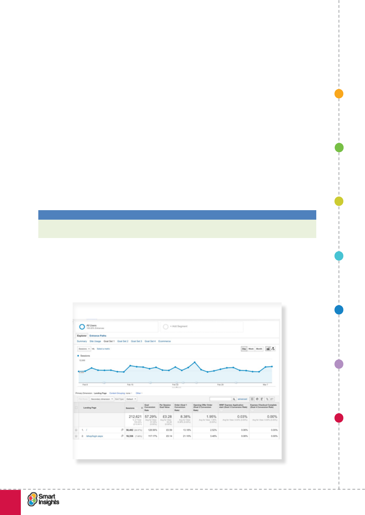
1. SET OBJECTIVES 6. INCREASING
BRAND TRUST
7. IMPROVING
RESULTS
5. COMPELLING
CONTENT
4. CREATING THE
BEST PAGE LAYOUT
3. ENGAGING YOUR
VISITOR
2. UNDERSTAND
VISITOR NEEDS
© Smart Insights (Marketing Intelligence) Limited. Please go to www.smartinsights.com to feedback or access our other guides.
Creating high-converting landing pages
!
96
7
Report 2. Top pages (Content > Site Content > All Pages)
This is useful for showing the total number of page views that the landing page gets from
visitors to the site and their effectiveness in engagement. There are 4 key measures to watch
for:
þ1. Average time on page. This is a measure of engagement, so if your landing page isn’t
effective this will be relatively low.
þ2. Bounce rate. Also a measure of engagement, so if your landing page isn’t effective
this will be relatively high.
þ3. % Exit. This gure includes those who visit the page having started their journey
elsewhere on the site, so it’s useful to compare against the number of entrance.
þ4. Page value. As we mentioned in the section on goal setting this is based on your goal
value or ecommerce sales. For less effective pages this will be relatively low.
You will likely need to use lters to make the most of this page, for example, choose the
most important pages above a certain threshold using the “Advanced” lter box to narrow
your analysis to these pages. Or setup an Advanced segment to limit the analysis to visitors
arriving on particular types of landing pages, or rst time visitors.
Best Practice Tip 22 Use Filters and Advanced segments to limit your analysis
Focus on higher volume pages or particular visitor types e.g. Google AdWords visitors with
these pages.
Remember that context is everything when interpreting data. If you have a landing page
where the goal is to get the customer to access and read the information on that page but
take no further action (e.g. it is part of a lengthy sales cycle, acting as an interim stage to
maintain prospect interest), then a high bounce rate isn’t anything to worry about.
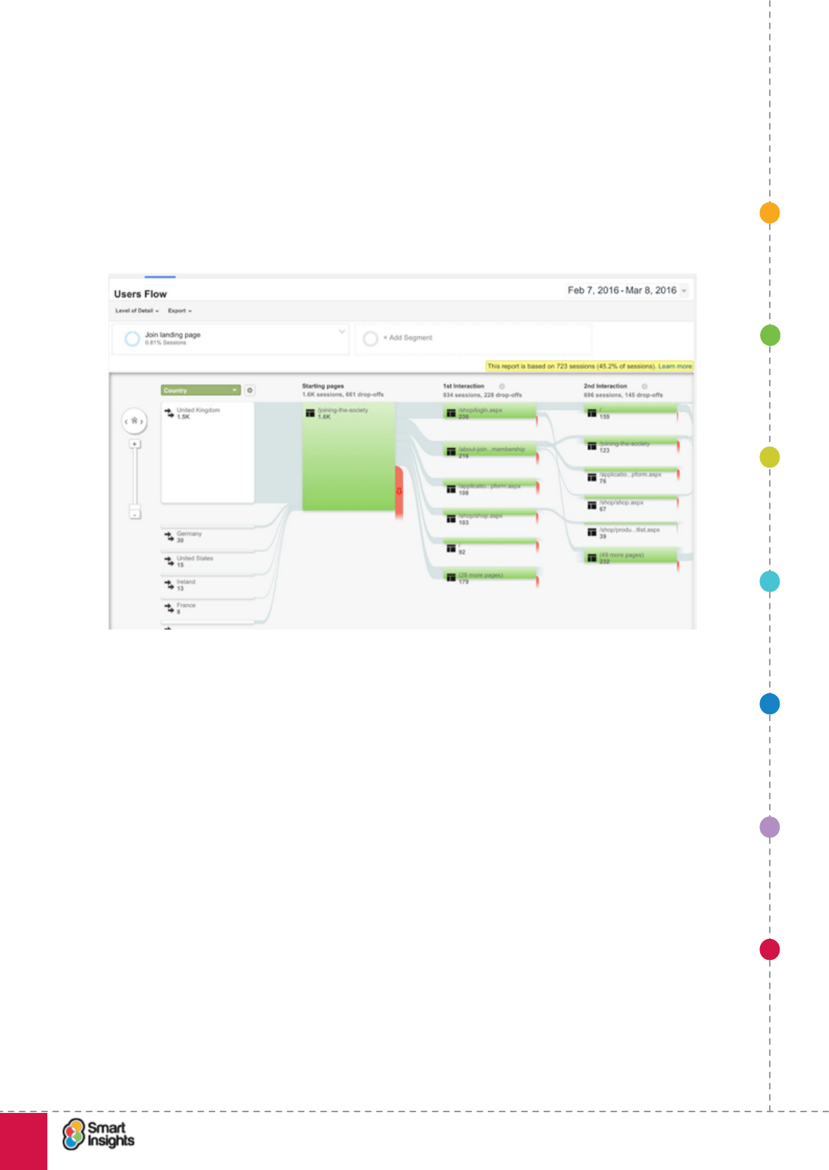
1. SET OBJECTIVES 6. INCREASING
BRAND TRUST
7. IMPROVING
RESULTS
5. COMPELLING
CONTENT
4. CREATING THE
BEST PAGE LAYOUT
3. ENGAGING YOUR
VISITOR
2. UNDERSTAND
VISITOR NEEDS
© Smart Insights (Marketing Intelligence) Limited. Please go to www.smartinsights.com to feedback or access our other guides.
Creating high-converting landing pages
!
97
7
Report 3. Visitor Flow (Audience > Visitors Flow)
Before using this report, be sure to have set up an Advanced Segment for the landing page
you wish to evaluate (do this by using the Conditions tab and specifying the landing page).
This will ensure that when you open the report, the data is focused on this landing page.
The screenshot below shows data from the Users Flow report for a membership sign-up
landing page. By following the data ows you can see how people navigate the site after
visiting this landing page, as well as the number of exits direct from this page.
1. SET OBJECTIVES 6. INCREASING
BRAND TRUST
7. IMPROVING
RESULTS
5. COMPELLING
CONTENT
4. CREATING THE
BEST PAGE LAYOUT
3. ENGAGING YOUR
VISITOR
2. UNDERSTAND
VISITOR NEEDS
© Smart Insights (Marketing Intelligence) Limited. Please go to www.smartinsights.com to feedback or access our other guides.
Creating high-converting landing pages
!
98
7
Report 4. Navigation Summary (Top Pages > Select Page > Navigation summary)
This is a great report for reviewing the effectiveness of an individual page. In fact we prefer
it to the fancy Users Flow page and the “In Page” click mapping feature that doesn’t work for
many sites.
Best Practice Tip 23 Use the Navigation Summary and In Page analytics to review the
paths forward from and reverse from a page.
These two reports both show which of your calls-to-action are effective.
We nd many people don’t know of it, likely because it’s hidden amongst the All Pages
report. You have to click on an individual page and select “Navigation Summary” to access
it. Then you can easily see the percentage of entrances, Previous Page Path and most
importantly the Next Page Path.
1. SET OBJECTIVES 6. INCREASING
BRAND TRUST
7. IMPROVING
RESULTS
5. COMPELLING
CONTENT
4. CREATING THE
BEST PAGE LAYOUT
3. ENGAGING YOUR
VISITOR
2. UNDERSTAND
VISITOR NEEDS
© Smart Insights (Marketing Intelligence) Limited. Please go to www.smartinsights.com to feedback or access our other guides.
Creating high-converting landing pages
!
99
7
Report 5. In Page Analytics (Behaviour > All Pages > Select Page > In-Page)
This report is a companion to the Navigation summary. It enables the analyst to see which
calls-to-action are effective, and is useful for showing to clients too. This example shows the
effectiveness of inline links on a blog post.
Note that if one or more links has the same destination URL then Google Analytics can’t
distinguish between these unless you are using Advanced Link Attribution37.
37 Google Analytics: Advanced Link Attribution setup
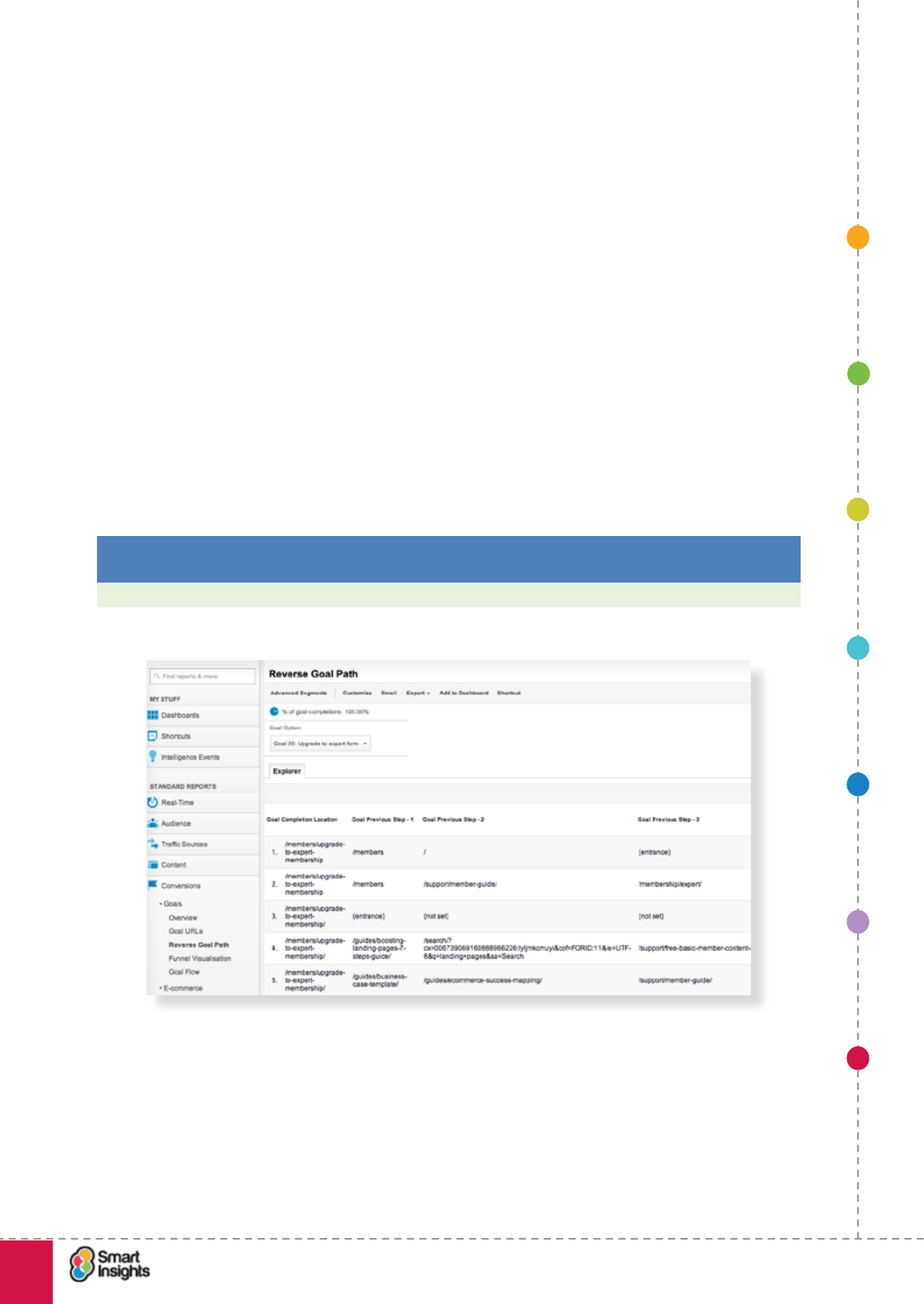
1. SET OBJECTIVES 6. INCREASING
BRAND TRUST
7. IMPROVING
RESULTS
5. COMPELLING
CONTENT
4. CREATING THE
BEST PAGE LAYOUT
3. ENGAGING YOUR
VISITOR
2. UNDERSTAND
VISITOR NEEDS
© Smart Insights (Marketing Intelligence) Limited. Please go to www.smartinsights.com to feedback or access our other guides.
Creating high-converting landing pages
!
100
7
Report 6. Exit Pages (Behaviour > Site Content > Exit Pages)
This report is perhaps less useful than some of the others, but can be useful if you want to
compare several exit pages. This report shows a list of all the web pages that visitors leave
the site through. This report can help you pick out pages that aren’t encouraging an onward
journey, or might be blocking conversion paths.
Again, remember context. Just because a page has a high percentage share of total exits
doesn’t mean it’s ‘performing badly’. Take the example of a large catalogue retailer – we’ve
seen high exits on top-level category pages (e.g. Home and Kitchen department landing
page). However, this is to be expected because a lot of the trafc that comes here is from
online shoppers who are in the research phase of the buying cycle – they’re not yet ready to
commit to a purchase, so it’s unsurprising that many browse this page then leave to continue
their research.
Report 7. Reverse Goal Path (Conversions > Goals > Reverse Goal Path>
If you have goals set up this is really useful since it will show you which landing pages are
generating the most leads. You can choose different types of goals for this. This example is
showing which pages are encouraging people to visit the Smart Insights upgrade to Expert
form.
Best Practice Tip 24 Use the Reverse Goal Path and In Page analytics to review the
content driving visits to a page.
You can see which landing pages are driving the most leads using these reports.
Note that you can use the Navigation summary (Step 4) to perform this type of analysis using
a more interactive form.
1. SET OBJECTIVES 6. INCREASING
BRAND TRUST
7. IMPROVING
RESULTS
5. COMPELLING
CONTENT
4. CREATING THE
BEST PAGE LAYOUT
3. ENGAGING YOUR
VISITOR
2. UNDERSTAND
VISITOR NEEDS
© Smart Insights (Marketing Intelligence) Limited. Please go to www.smartinsights.com to feedback or access our other guides.
Creating high-converting landing pages
!
101
7
Tracking form errors
If you are using a form on your landing page, it really helps to know what errors visitors are
experiencing when completing the form.
Why?
What if your form submit button is the primary call to action on the landing page and you only
get a ve per cent completion rate? Is that good or bad? What is preventing more people
from completing the form?
An essential source of information is knowing which data elds return the most errors, as this
indicates a usability issue with that eld.
What can you learn from this analysis?
If you know which data elds returns the most errors, you can look at options to improve
this. Perhaps you’re not providing enough guidance to help people complete the form, e.g.
password data eld has no information to explain how many characters and what type of
character is permitted.
Knowing that there are errors will prompt you to review the landing page form and think about
what might be putting visitors off.
We recommend reading Huge Gage’s insightful post on the eMarketeers blog, Tracking User
Errors With Google Analytics Event Tracking38.
Analysing visitor ow for existing landing pages
rQ. Do you know what happens to visitors when they arrive on your landing pages?
When setting goals and objectives for landing pages, it’s really useful to take a peek behind
the scenes and see how visitors are using your existing landing pages. This will help you
determine what type of landing page is best suited to the goals being set, as well as helping
you decide which goals to set.
Ask yourself the following questions:
þWhat actions are people taking on the landing page?
þWhat is the next page ow?
þIs there a high bounce rate?
þIs this a good or bad thing (in the context of the page)?
þWhere are the key exit pages?
The good news is that all of this data is readily available in web analytics tools. Let’s use
Google Analytics as an example. Below are some pointers on how to access this data.
Actions on landing pages
You can use Events to track click activity on specic elements of the page, such as video
views. If you’re new to Event tracking, Google provides an online developer’s guide.39
Next page ow
How effective is your landing page at moving people to the next stage of the conversion
funnel?
38 L3 Analytics: Visitors from existing landing pages
39 Google Analytics: Event tracking.
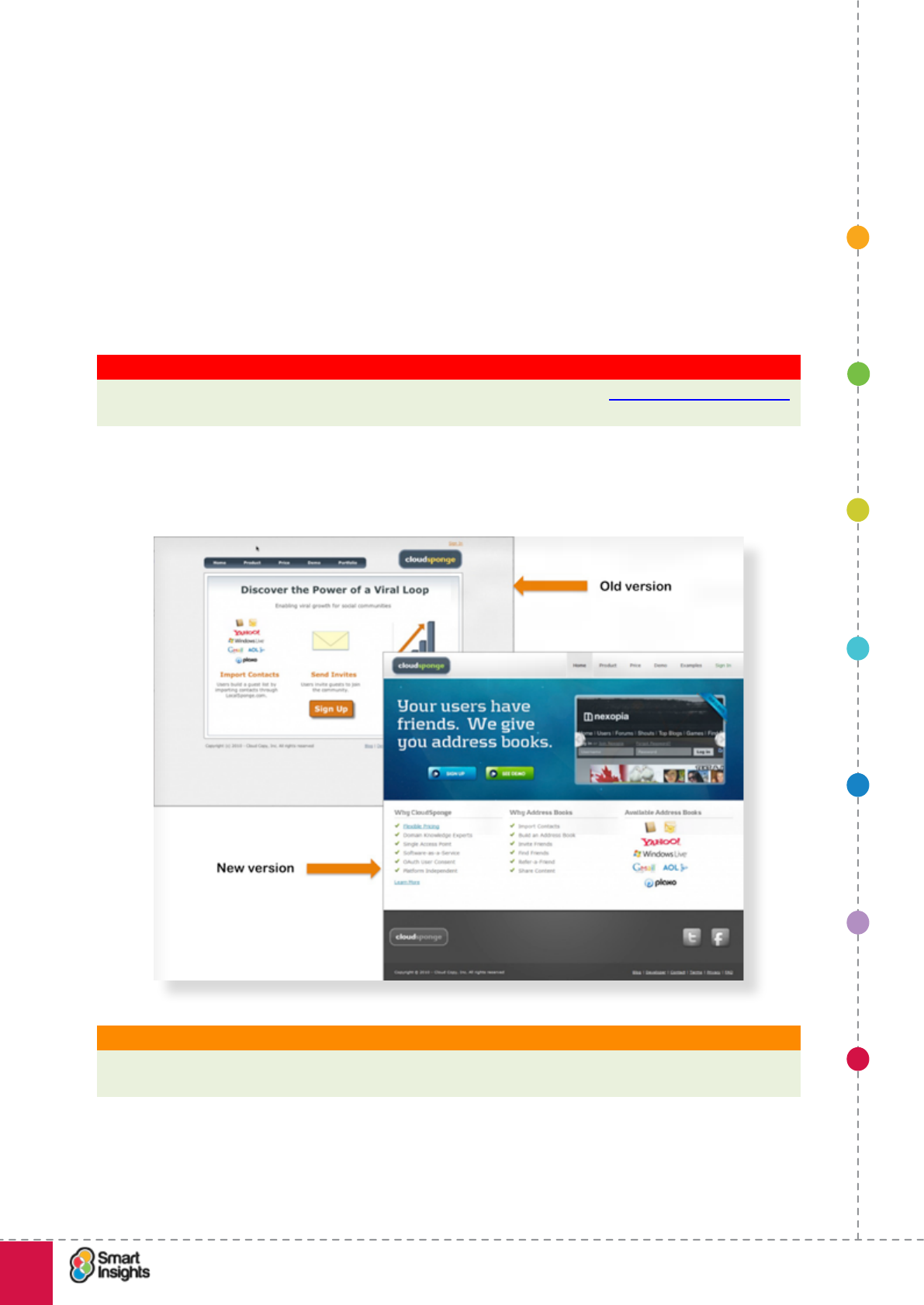
1. SET OBJECTIVES 6. INCREASING
BRAND TRUST
7. IMPROVING
RESULTS
5. COMPELLING
CONTENT
4. CREATING THE
BEST PAGE LAYOUT
3. ENGAGING YOUR
VISITOR
2. UNDERSTAND
VISITOR NEEDS
© Smart Insights (Marketing Intelligence) Limited. Please go to www.smartinsights.com to feedback or access our other guides.
Creating high-converting landing pages
!
102
7
As outlined earlier, the Users Flow report (Audience > Users Flow) is a brilliant way to
visualise how visitors move through your site from the landing page. First, you’ll need to set
an advanced segment for the landing page to ensure the data in the report is focused on that
particular page.
Testing alternative page versions
Many tools are available to assist with AB Testing with Google Content Experiments
(previously known as Google Website Optimiser (GWO) one of the best known. Although the
tools are often free or low-cost compared with the benets, they take time to set up and use,
so this needs a management commitment to encourage their usage.
Key Strategy Recommendation 18 Encourage usage of testing tools
It’s often difcult to judge what works best for users as the tests on www.whichtestwon.com
show, so ensure resource is available for testing
Here is an example from Kissmetrics of the benets of this form of testing where landing
page conversion rate improved by 33 per cent as a result of updating the design.
What is it? AB testing
AB testing refers to testing two (or more) different versions of a page that contain different page
elements such as a heading, images or button against a control which is the original page.
The alternatives are served alternately with the visitors to the page randomly split between
the two pages. Hence it is sometimes called ‘live split testing’.
It may be best to select a landing page creation tool that includes landing page features.
1. SET OBJECTIVES 6. INCREASING
BRAND TRUST
7. IMPROVING
RESULTS
5. COMPELLING
CONTENT
4. CREATING THE
BEST PAGE LAYOUT
3. ENGAGING YOUR
VISITOR
2. UNDERSTAND
VISITOR NEEDS
© Smart Insights (Marketing Intelligence) Limited. Please go to www.smartinsights.com to feedback or access our other guides.
Creating high-converting landing pages
!
103
7
Best Practice Tip 25 AB and multivariate testing tools
Tools like Content Experiments enable you to modify existing pages while others such as
ION Interactive and Unbounce manage the creation of landing pages also. www.whichmvt.
com provides a great summary.
Testing different page elements?
Multivariate testing (MVT) is more sophisticated than AB testing since all the different pages
can be assessed simultaneously. Individual contributions from different content assets to
conversion increase can be assessed,
What is it? Multivariate testing
Multivariate testing enables simultaneous testing pages for all combinations and variations
of page elements that are being tested. This enables selection of the most effective
combination of design elements to achieve the desired goal.
It’s interesting to note that there has been a shift in emphasis away from MVT towards A/B
testing. That’s not to say MVT testing is obsolete, far from it, but A/B testing simplies the
evaluation of test results because you’re comparing different versions of the same thing.
MVT adds complexity because you’re testing multiple variations of multiple elements at the
same time, so how do you know what has really led to the winning version being the best
performer?
Let’s take an example. You’re testing the homepage against 4 different elements to determine
which combination reduces bounce rate the most and leads to deeper page depth:
1. Brand value proposition bar – removing it vs. including it, showing 1 vs. 2 vs. 3
messages etc.
2. Main image – showing one hero image with a CTA vs. showing multiple images on a
slider with more copy
3. Social proof – versions with and without ratings, as well as testing inclusion of a
customer quote
4. Recommendations – different types of merchandising including bestsellers vs. top
rated vs. new-in.
After lengthy testing you discover that the optimal blend to reduce bounce rate is 3 brand
value messages, one hero image, no social proof and top rated product recommendations.
But why?
Was it all 4 of these elements working together? Or did the focus on one hero image have
the biggest impact?
There are ways to answer these questions within a structured MVT framework but it’s harder
to piece together than when you’re running continuous A/B tests. The best advice is to follow
a structured process so that you know what you’re doing, when and why. A/B tests are great
for incremental improvements to a webpage or user journey.
rQ. How do I know when the investment in testing is justied?
This is an important question. Before you plough into investing in testing tools and resources,
make sure you understand the potential benets of doing this.
We like to use basic models to project the expected uplift on KPIs that testing will provide.
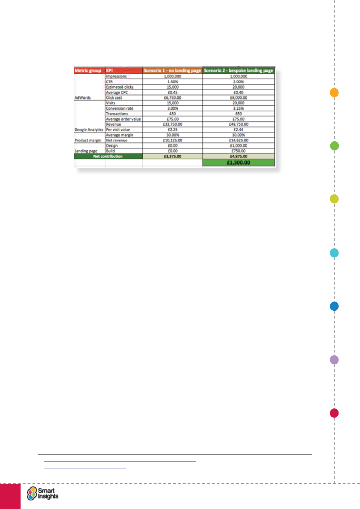
1. SET OBJECTIVES 6. INCREASING
BRAND TRUST
7. IMPROVING
RESULTS
5. COMPELLING
CONTENT
4. CREATING THE
BEST PAGE LAYOUT
3. ENGAGING YOUR
VISITOR
2. UNDERSTAND
VISITOR NEEDS
© Smart Insights (Marketing Intelligence) Limited. Please go to www.smartinsights.com to feedback or access our other guides.
Creating high-converting landing pages
!
104
7
Cast your mind back to the section in Step 1 on creating conversion models. If you
remember, we provided a simple spreadsheet format for evaluating the impact of investing in
a bespoke landing page:
You can adapt this framework to project the impact of doing different tests based on which
KPIs the test is targeting. If you plug in the cost of testing (cost of the tool + internal resource
+ external resource), you can look at the net contribution to the business of running the test.
It really is a numbers game – as a rule of thumb, the lower the number of visits to a
landing page, the harder it is to drive signicant gains as any improvement in conversion
will generate a small number of leads/transactions. That’s why we advocate picking and
choosing which landing pages to include in your optimisation program.
There is always an exception to the rule though – for some brands, the average transaction
value is very high, so even with a low number of visits, marginal improvements in conversion
can drive a lot of value. So when making a decision, always add your business context to the
numbers.
Testing tools
rQ. Range of testing tools reviewed?
It’s the thinking behind setting up the tests that is most important, but there are a range of
enterprise and lower-cost online alternative to help.
Conversion Rate Experts has a really helpful conversion rate optimisation software
comparison table40 and there’s a Forrester report summarising the main enterprise class
tools. The illustration below is from the 2013 report but there is a more recent version that
can be purchased41.
40 http://www.conversion-rate-experts.com/split-testing-software/
41 Forrester Wave for Online Testing
1. SET OBJECTIVES 6. INCREASING
BRAND TRUST
7. IMPROVING
RESULTS
5. COMPELLING
CONTENT
4. CREATING THE
BEST PAGE LAYOUT
3. ENGAGING YOUR
VISITOR
2. UNDERSTAND
VISITOR NEEDS
© Smart Insights (Marketing Intelligence) Limited. Please go to www.smartinsights.com to feedback or access our other guides.
Creating high-converting landing pages
!
105
7
For free and lower cost tools we recommend:
þGoogle Content Experiments (formerly Google Website Optimizer)
þUnbounce
þSite Tuners
þOther tools listed on WhichMVT.com
Using Voice-of-Customer (VoC) data for insight
Web analytics data is great at telling you what is happening on your landing page. However,
you also need the ‘why’ to help you make intelligent decisions.
This is where VoC data comes in to play and is an invaluable source of information. Use your
web analytics data to identify potential issues (e.g. landing page X has a really high bounce
rate), then overlay VoC data to provide the context to why.
The following are proven techniques for using VoC data to help improve performance:
rOn-site surveys
The most common form on data capture used by web managers. These can be delivered by
a variety of means including pop-up, pop-under and persistent survey. It is recommended
to keep these as short as possible – as a general rule of thumb, the more data you try to
capture, the fewer visitors will stay around to complete the survey.
The screenshot below shows the use of a persistent on-page survey using Qualaroo
(previously KissInsights). The benet of using a solution like Qualaroo is that you can set up
a Google Analytics Event to track on which landing pages the survey is interacted with.

1. SET OBJECTIVES 6. INCREASING
BRAND TRUST
7. IMPROVING
RESULTS
5. COMPELLING
CONTENT
4. CREATING THE
BEST PAGE LAYOUT
3. ENGAGING YOUR
VISITOR
2. UNDERSTAND
VISITOR NEEDS
© Smart Insights (Marketing Intelligence) Limited. Please go to www.smartinsights.com to feedback or access our other guides.
Creating high-converting landing pages
!
106
7
One technique that isn’t often used is to place persistent surveys in the My Account section
of the website. This enables registered customers to access the survey at any time and can
help increase overall response.
rOff-site surveys
This involves inviting customers to complete an online survey that is not launched from your
website. For example, you include a link to a survey set up using Survey Gizmo in your email
newsletter.
The downside is that they are harder to tailor to specic landing pages and better suited to
general feedback about the website and your products/services.
rUser testing
We absolutely love online user testing! It is perhaps the most insightful type of VoC data that
we have worked with.
You can use online services to invite real people to test landing pages and give you video
feedback of their experience. You can set the scenario you want the testers to follow and set
the demographics of the responders (e.g. age, location, income level).
The two most popular services that we have used are Usertesting.com and Whatusersdo.
com.
rCustomer Service insight
An untapped goldmine, potentially. Every day your Customer Service team handles inbound
enquiries, by phone, email and web. Amongst these enquiries are some useful nuggets of
feedback on the quality and usability of the website.
A word of caution – learn to interpret the importance of customer feedback. It’s likely you’ll
get a few extremes, those customers who are 100 per cent happy or 100 per cent enraged
by your service!
This is the exception, not the norm. So learn to identify trends and react when there are
several customers making the same point. For example, if you get lots of emails saying an
online form isn’t working, react quickly.
This also means working closely with your Customer Service team – encourage them to keep
an eye out for issues and opportunities and alert you when something important happens.
And make sure you regularly review customer feedback with them – at least every month.
We have a listing of all feedback tools we recommend here42. We hope you nd these tools
and the techniques we have described in this guide effective. Happy Testing!
42 Smart Insights: Customer Feedback Tools
