OM Digital Guide
OM_Digital_Guide
OM_Digital_Guide
User Manual:
Open the PDF directly: View PDF  .
.
Page Count: 78

OLD MUTUAL
DIGITAL BRAND
GUIDELINES
FEBRUARY 2015
VERSION 2

01 INTRODUCTION
Overview of what to expect in
this document 05
Other partnering documents 05
02 OUR BRAND
Our brand promise 07
03 USER EXPERIENCE
Overview 09
04 DIGITAL
COMMUNICATION
Digital communication
strategy 12
Creating engaging web
content 13
Copy tone 14
Videos 15
Common information 16
Search engine optimisation 17
What is accessibility 18
05 ONLINE
MARKETING
Banner advertising 20
Social media 21
Paid search 22
06 DESIGN.
OLD MUTUAL
LOGO
Horizontal logo 24
Stacked logo 25
The Old Mutual brand icon 26
Examples of using the logo in a
digital space 27
Our sub-brands 28
Incorrect usage 29
07 DESIGN.
BRAND ELEMENTS
Colours for digital application 31
The difference between RGB &
CMYK 33
Incorrect colour usage 34
Digital fonts 35
Heading styles 36
Paragraph styles 37
Underlined headings &
lists styles 38
Typography signature style 39
Brand device - the line 40
Image usage 41
The grid 42
Tables 43
Icon styles 44
Web page examples 45
CONTENTS
CONTENTS
08 DESIGN.
FUNCTIONAL
ELEMENTS
Button & text link styles 47
Navigation 49
Site search 51
Links to our businesses
globally 52
Forms 53
Carousel banners 54
Promotional elements 55
Information / call to action
elements 56
Login facility for transactional
pages 57
09 DEVELOPMENT
Cross-browser testing &
compatibility 59
CSS naming conventions 60
JavaScript integration 62
Doc type and validation
requirements 63
Accessibility standards 64
Front-end testing 66
Version control 66
Directory structure 66
SEO coding good practice 67
10 ONLINE
ANALYTICS
Core measures 70
Best practice 71
Examples 72
11 CONTACT
INFORMATION
Group Head Office 74
Emerging Markets 75
Old Mutual Wealth 76
(CONTINUED)

01.1 Overview of what to expect in this document
01.2 Other partnering documents
INTRODUCTION
05
05
01
5OLD MUTUAL GROUP DIGITAL GUIDELINES
UPDATED
10/12/13
QUARTER FOUR 2013
OLD MUTUAL BRAND GUIDELINES
DNARB
GUIDELINES
WHAT’S IN THIS
DOCUMENT
This document defines
the brand assets which
make up Old Mutual’s
digital presence.
It goes on to show them in
action, as well as serve as
a guide to their correct use.
The document itself is
not exhaustive, however
it does detail the core
capability and design
elements that should be
considered should you be
embarking on a new online
proposition or a change to
your existing space.
OTHER PARTNERING
DOCUMENTS
These digital
guidelines should be
read in partnership
with the brand
guidelines and the two
documents together
should drive your
online proposition.
Download the
brand guidelines
on the Old Mutual
Group Intranet
01.1
01.2

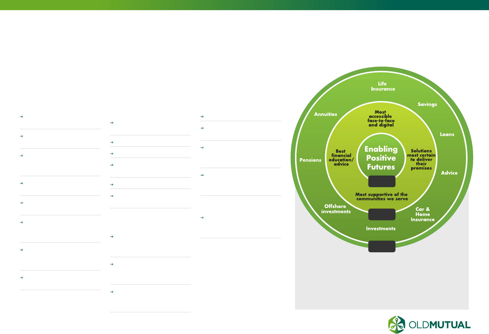
02.1 Our brand promise
OUR
BRAND
02
07
7OLD MUTUAL GROUP DIGITAL GUIDELINES
OUR BRAND PROMISE
MOST ACCESSIBLE
Own “financial advice’
on search engines
One stop shop for
consolidation
Only ask once for
information (pull through
data)
Available on the web,
mobile and tablet
Consistent online and
offline integration
Digital means 100%
digital (ie. digital
signatures)
Customer experience on
line that is easy, valued,
peace of mind*
Plain english and visual
clarity
BEST FINANCIAL
ADVICE
Best web content on
financial planning
Best online tools
Find an advisory network
Advisor integrated with
self service offering
Peer to peer forums
Best online financial
planning process
SOLUTIONS THAT
DELIVERS
Clear, outcome based,
financial planning and
illustrations
Most reliable digital
services (secure, up to
date, 24/7)
Easy access to funds /
claims through digital
channels
ADVISOR
Best integrated platform
Integrated web-presence
capability for advisors
Online training /
accreditation for
advisors
Access to client
information online and
in one place
COMMUNITY
Link to Foundation,
community and
sponsorship micro sites
What
How
Why
EASY
Convenient,
fast and simple
registration and
interface
VALUED
Tailored
and relevant
information
PEACE
OF MIND
Internet data
security
Our brand promise is core to everything we do, and our
websites need to reflect:
02.1

03.1 Overview
USER EXPERIENCE
09
03
9OLD MUTUAL GROUP DIGITAL GUIDELINES
OVERVIEW
WHAT IS USER
EXPERIENCE (UX)?
User experience is the
process of enhancing
customer satisfaction and
loyalty by improving the
usability, ease of use, and
pleasure provided in the
interaction between the
customer and the product.
UX is part of the customer
experience, and both are
part of the company’s
overall brand experience.
03.1
UX
OUR BRAND
CX
WHY IS UX
IMPORTANT TO US?
INCREASED CUSTOMER
SATISFACTION.
The better experience you
create for our customers,
the happier they will
be. And the opposite
is also true: the worse
experience we provide
to our customers they will
become more and more
frustrated with what we
are providing them.
REDUCED COST OF
OWNERSHIP AND
SUPPORT.
If we produce a product
that has an easy-to-learn
(and easy-to-use) design,
you will have to support
that product less. Good
design also reduces your
total “cost of ownership”,
in that you will need less
documentation, a smaller
support staff, and less
salespeople.
INCREASED SALES.
Happy users share their
happiness with their circle
of friends and family. They
also review your offering
online. Providing a good
experience helps build
positive word of mouth,
and increases sales. It also
often results in increased
customer loyalty and
therefore repeat business.
WHAT IS A GOOD
USER EXPERIENCE?
A good user experience
meets the exact needs
of the customer, without
fuss or bother, simply
giving customers what
they want. UX is the what,
when, where, why, how,
and who of a product or
service. It is practically
everything that affects a
customer’s interaction with
our organisation.
At the core of UX is
ensuring that users find
value in what you are
providing to them.
USEFUL Your content
should be original and
fulfil a need.
USABLE Your site or app
must be easy to use.
DESIRABLE Image,
identity, brand, and other
design elements are used
to evoke emotion and
appreciation.
FINDABLE Content needs
to be easy to navigate,
both onsite and offsite.
ACCESSIBLE Our content
needs to be accessible to
people with disabilities.
CREDIBLE Customers must
trust and believe what
we tell them.
WHAT ROLE DOES UX
PLAY?
Customers do not only
buy products because
of the features but also
because of the experience
delivered.
Products are seen as
vehicles to construct and
deliver an experience for
the user, making it one of
the most important factors
in a product’s success.
The purpose of a UX
vision, or strategy, is also
its primary benefit: a
human-centered approach,
or roadmap, to a product
or service that an entire
enterprise can rally around
and work to achieve.
This includes marketing,
development, sales, and
executives.
UX design means taking
your users’ needs into
account at every stage of
your product lifecycle. This
10 OLD MUTUAL GROUP DIGITAL GUIDELINES
OVERVIEW
03.1
(CONTINUED)
would be from usability of
your website’s home page,
to buying an investment
product and receiving
email correspondence.
WHEN DOES UX
COME IN TO PLAY?
UX comes into play at the
beginning of the launch of
a new platform, campaign
or online service, just
after the idea has been
conceived. This is where
UX can start influencing
the direction of the
delivery in a positive way,
leading to project cost
savings and ultimately a
better outcome for Old
Mutual and our customers.
UX BASICS
Start with needs.
Use research to identify
real user needs and design
around those.
DESIGN WITH DATA.
Use real world behaviour
and user testing to aid the
development process.
DO THE HARD WORK TO
MAKE IT SIMPLE.
With great power comes
great responsibility - very
often people have no
choice but to use our
services.
ITERATE.
Then iterate again. The
best way to build effective
services is to start small
and iterate.
BUILD FOR INCLUSION.
Accessible design is good
design. We should build a
product that’s as inclusive,
legible and readable as
possible.
UNDERSTAND CONTEXT.
We need to think hard
about the context in which
they’re using our services.
Are they in a library? Are
they on a phone? Are they
only really familiar with
Facebook?
MAKE THINGS OPEN: IT
MAKES THINGS BETTER.
We should share what
we’re doing whenever we
can, with colleagues, with
users, with the world.
BE CONSISTENT, NOT
UNIFORM.
Wherever possible use the
same language and the
same design patterns - this
helps people get familiar
with the services.
UX GUIDELINES
We are preparing a full UX guidelines
document, which will also be used to
update content in this section. In the
interim, please contact Robert Hermanie
(rhermanie@oldmutual.com) or Susan
Clements (susan.clements@skandia.co.uk)
for more information on UX at Old Mutual.
SIDENOTE

04.1 Digital communication strategy
04.2 Creating engaging web content
04.3 Copy tone
04.4 Videos
04.5 Common information
04.6 Search engine optimisation
04.7 What is accessibility?
12
13
14
15
16
17
18
04
DIGITAL
COMMUNICATION
12 OLD MUTUAL GROUP DIGITAL GUIDELINES
DIGITAL COMMUNICATION
STRATEGY
A digital
communications
strategy formalises your
communications across
all digital platforms.
By examining what your
goals are with your
communications, you can
best determine who your
audience is, and what the
best way of communicating
with them is. It documents
which channels will
be used and who is
responsible for maintaining
those channels.
A strategy helps you
communicate as effectively
as possible. If you haven’t
thought about what the
purpose of each of your
communications is, you
won’t be communicating
as well as you could be.
Having a digital
communications strategy in
place makes sure that your
efforts are co-ordinated,
that the correct channels
are used and that your
audience can be assured
that they are dealing with
an official channel rather
than a rogue member who
has decided to simply
start something up without
consulting the board.
HOW DO YOU CREATE
A COMMUNICATIONS
STRATEGY?
1. SET GOALS
First of all, determine
what you hope to
achieve through your
communications. What is
the tangible outcome that
you are aiming for?
Are you trying to:
source new members?
increase attendance at
events?
attract donations?
find potential applicants
for a program?
source more volunteers
to help with a local
project?
find partners for an
international project?
2. DEFINE YOUR
TARGET AUDIENCE
Once you know what your
goals are, then you can
determine who exactly are
the people that you want
to reach to achieve them.
You should consider:
How does your target
audience like to
communicate?
Are they from a specific
country or culture?
What is the best way of
reaching them?
What motivates them?
What’s in it for them?
3. DETERMINE WHICH
TOOLS TO USE
When you know who you
want to communicate with
and where to find them,
then you can determine
which is the best tool, or
set of tools, to use to reach
them.
For example, if your goal
is to increase attendance
an an event, your tools
may include:
your website (which has
detailed information
about the event)
a Facebook event (to
keep in touch with
attendees)
your Facebook page (for
periodic reminders about
why the event will be
worth attending)
Twitter, for brief
reminders in the lead
up, with regular updates
during the event
sporadic opt-in email
updates for those that
don’t use Facebook or
Twitter, which refer to the
web page for full details
4. ASSIGN
RESPONSIBILITY
After you have selected
the platforms you will use,
then you can determine
who is responsible for the
communications on each of
those platforms.
04.1

13 OLD MUTUAL GROUP DIGITAL GUIDELINES
CREATING ENGAGING WEB CONTENT
1. KNOW YOUR
AUDIENCE
Before you create any
kind of content you need
to think of who you are
writing it for. Do you have
a broad target audience or
one that’s more specific?
It’s very important that
your content can be
understood by users of all
abilities within your target
audience.
2. KEEP IT CONCISE
Users are impatient and
will often skim read
content. If your page is
a solid block of text you
can expect a user to click
back straight away. Due
to several factors such as
screen glare, small text,
and varying contrast with
displays, reading content
on a screen is not as
comfortable as print. Be
sure to break things up
with headings, shorter
sentences, paragraphs,
and bulleted lists.
3. INTERESTING TITLES
This is the first thing your
users will read, and often
may be a deciding factor
for whether they read on.
It also might be what users
see in their RSS feeds, a
catchy title may just be the
factor to direct people to
your page.
4. CLEAR LANGUAGE
It’s called the World Wide
Web for a reason. You
need to bear in mind that
users could be visiting
your site from anywhere
in the world. Make
sure you write with the
correct grammar and
spelling. International
users may not understand
your local slang or
abbreviations
5. CHECK YOUR FACTS
Most users of the internet
are very sceptical about
what they read. If
you display any facts,
figures or statistics be
prepared to back them
up with references or
links. Make sure you are
knowledgeable on your
subject and that everything
you say is correct before
you publish.
6. KEY WORDS
AND SEO
Be sure to include
keywords relating to your
topic to improve search
engine results for your
content. Bear in mind that
you are writing for people,
and not exclusively for
search engines. Ensure
you find the right balance
so that your content is
still clear, concise and
engaging.
7. IMAGES
Inserting images relating to
your content can improve
the look and feel straight
away. Users are more
likely to remain on your
page if the content is
visually appealing and it
will assist in getting your
message across.
8. LINKS
If any of your content
relates to other areas of
your site, then link it! It
will help the user discover
more of your site. Your
links should be named
appropriately. Just linking
the words “click here”
really doesn’t mean much
when you look at it and it’s
also not very accessible for
screen readers. Let the user
know where they are going
before they click a link and
don’t make it a guessing
game.
9. REVIEW
You may have spent a
while creating your page,
but don’t be in too much of
a hurry to publish it. Proof
read, and have it checked
through
by somebody else who
also has editing privileges
on your site. They may
pick up mistakes that you
missed!
10.UPDATE
When you have published
your page, don’t forget
about it. Some of the links
on the page may become
broken over time, and facts
or information may also
change. Occasionally
reviewing your content
keeps it tidy and will
minimize inaccuracies.
04.2
14 OLD MUTUAL GROUP DIGITAL GUIDELINES
All copy should be written in
line with our brand promise,
and our websites need to
reflect:
Individualism, talk to
me as an individual and
recognise that my needs
are unique.
Connect with me in
the channels that I want
and build Trust, deliver
on your promises, do
what you say, become
somebody I can rely on.
Social responsibility,
I want to see that you are
a good corporate citizen.
Our style needs to reflect
our values. So the way we
write needs to be honest
and transparent, using
clear crisp sentences and
avoiding jargon where
possible.
The first requirement of good
writing is that is should be
readily understandable: clar-
ity of writing follows clarity of
thought.
OUR STYLE SHOULD
ALSO BE
Bold but not arrogant.
Adult (treating the
audience as intelligent)
but simple.
Accessible but not
patronising.
In the first person rather
than the third person
where possible (ie
use „we”, „our” and
„us” rather than „the
Company”, „its” and
„their”) but avoiding too
much use of „I”.
Crisp and uncluttered
– using short sentences
and short, simple words.
Active, not passive (eg
„we decided” rather
than „it was decided” –
it’s more dynamic, and
indicates clearly who
was responsible).
Engaged, not remote
(eg „we delivered sales
growth of X” rather than
„sales grew by X” – it
didn’t just happen, we
made it happen).
Positive, aspirational
language and imagery
– celebrating the best
of who we are without
being boastful.
IT SHOULD AVOID
Unnecessary words (eg
„regularly” rather than
„on a regular basis”, „we
see no need at present”
rather than „we do not
think there is a need at
the present time”).
Excessive use of
acronyms, which can
make text look dense
and unapproachable –
avoid them unless you’re
sure your audience
knows what they stand
for.
Jargon wherever possible
(if essential then define).
Formality in naming our
people: we want to be
seen as accessible, so
use “Julian Roberts”, not
“Mr J Roberts”.
COPY TONE
OUR LOGO IS
MORE THAN A
TRADEMARK
It is a trustmark. Every
piece of communication
we produce needs to be
responsible for enhanc-
ing the trust our custom-
ers and stakeholders
have in us.
AND ALWAYS
Write out Old Mutual
in full (do not write
OM) and do not split
over two lines. It is our
company name and we
need to be proud of it.
SIDENOTE
04.3
15 OLD MUTUAL GROUP DIGITAL GUIDELINES
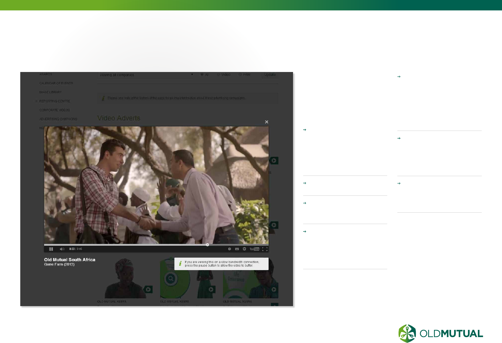
VIDEOS
Video is gaining popularity
with the improvements of
bandwidth availability. Use
video on your site to create a
real, personable impression of
your business.
QUALITY IS KEY
Ensure your video is high
resolution with a clear
audio track but optimise
for your audiences
bandwith limitations.
Shoot video with
professional equipment
KEEP IT SHORT
Keep video length under
2min30seconds.
BE PROFESSIONAL
If using video of staff,
ensure they are dressed
professionally and speak
clearly.
NO ADVERTS
If you use YouTube to
deliver your video online,
do not allow YouTube to
display adverts over your
video (do not monetise
your content).
ACCESSIBILITY
When selecting video
platform, consider if
it is available to staff
internally
YOUTUBE
We recommend using
the Youtube channel to
embed your videos from.
04.4
16 OLD MUTUAL GROUP DIGITAL GUIDELINES
COMMON
INFORMATION
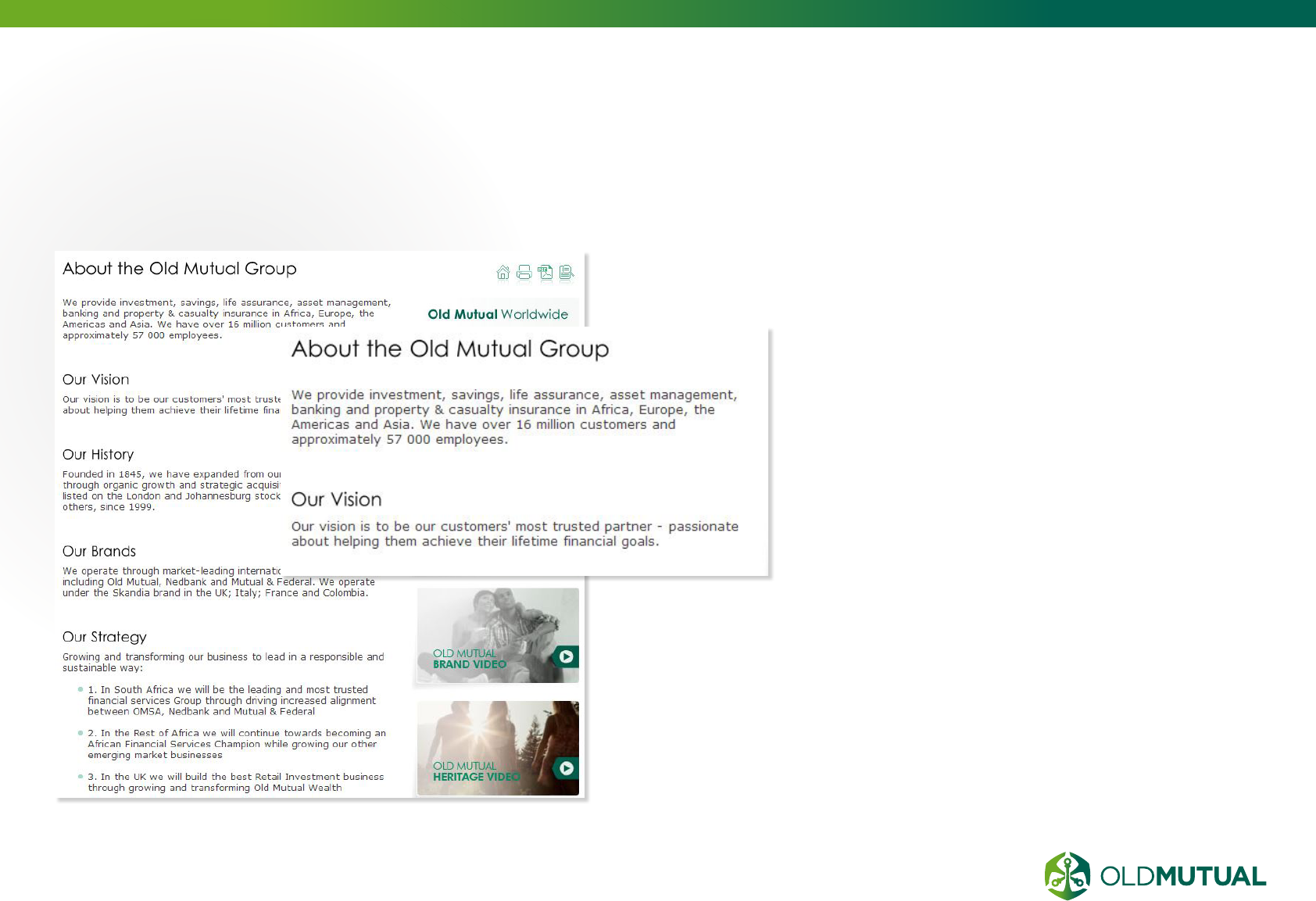
It is important that our businesses identify
themselves as part of the larger Old Mutual
Group, and to achieve this common Old
Mutual information needs to be installed on all
websites in the About section.
For the latest copy of the common information contact
Graham Beverley at graham.beverley@omg.co.uk
04.5
17 OLD MUTUAL GROUP DIGITAL GUIDELINES
SEARCH ENGINE
OPTIMISATION
By using the correct
keywords within your
content, you can
channel more users
to your page through
search engines.
Ensure H1, H2,
H3 follows correct
HIERARCHY (reference
page 41).
Pages should have
CORRECT META
DATA (keywords and
description) for search
engine indexing.
Ensure your site contains
a ROBOTS.TXT file.
Consider using a
reputable consultant
to assist with
SEARCH ENGINE
OPTIMISATION on
your site.
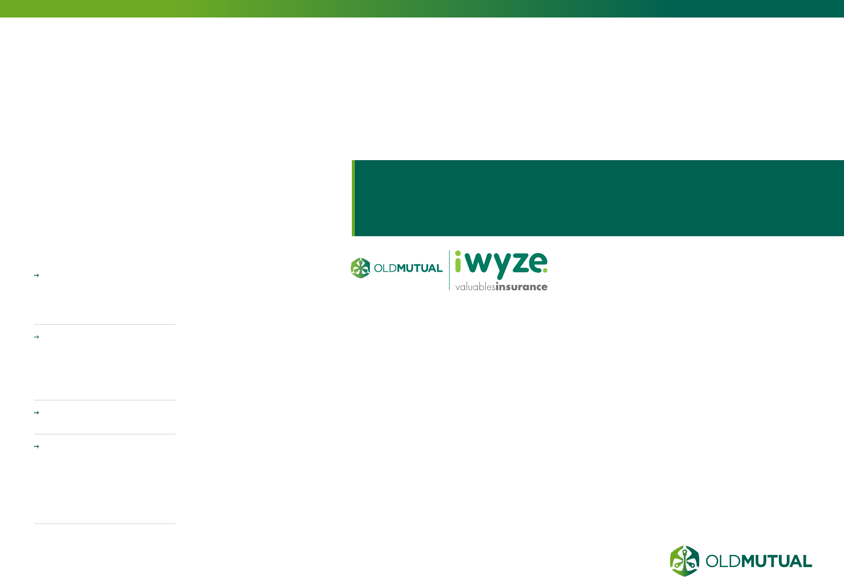
CASE STUDY
iWYZE, the South African
short-term insurance
business, uses up to
25 keywords per page
on their website. These
keywords are based
on research into what
customers are searching
for using search engines,
such as Google. The
SEO challenge is writing
content so that it makes
sense after you include
all the relevant keywords
in the body copy. Adding
these keywords into your
content improves your
page ranking on search
engines which in turn gives
you more volume/ traffic
coming to your page.
Adding these keywords into your content improves your
page ranking on search engines which in turn gives you
more volume/traffic coming to your page.
04.6
18 OLD MUTUAL GROUP DIGITAL GUIDELINES
WHAT IS
ACCESSIBILITY
Online accessibility
means that people
with disabilities can
perceive, understand,
navigate, and interact
with our online
spaces.
Web accessibility also
benefits others, including
older people with
changing abilities, such as
eyesight, due to aging.
We are committed to
being inclusive and are, in
some countries, required
by law to be accessible.
Old Mutual websites
should adhere to a
minimum of Level A
accessibility compliance
as defined by the W3C.
Businesses must also
ensure they comply to
local territory accessibility
regulations, e.g. in the UK
all websites must be at
least Level A accessible.
For more in depth
information about
accessibility, see the
different sections:
COLOUR - page 36
TEXT USAGE - page 40
NAVIGATION - page
54
Basic CODING
accessibility standards
- page 69
04.7

05.1 Banner advertising
05.2 Social media
05.3 Paid search
ONLINE
MARKETING
05
20
21
22
20 OLD MUTUAL GROUP DIGITAL GUIDELINES
BANNER
ADVERTISING
Banner advertising can be created
and placed on various websites,
such as news websites or financial
advice websites (e.g.
www.moneyweb.co.za or
www.fin24.com)
Use Google’s advertising service to deliver
your banner and advertising content.
Ensure a strong call to action in your display
advertising
05.1
300x600
300x250
728x90
216x36
168x28
120x20
21 OLD MUTUAL GROUP DIGITAL GUIDELINES
SOCIAL MEDIA
Social media marketing refers to
the process of gaining website
traffic and engaging with customers
through social media sites.
PRO-ACTIVELY LISTEN – this allows
you to understand what people say about
you, your competitors and the wider
landscape.
ALLOW NEGATIVE COMMENTS –
this improves your reputation by being
transparent
HAVE A PROCESS IN PLACE TO
RESPOND TO SOCIAL MEDIA
QUERIES – this needs to be fast and
professional.
ENSURE YOUR ORGANISATION
HAS A SOCIAL MEDIA POLICY
IN PLACE – only official, trained,
representatives should be speaking for
the company.
05.2

22 OLD MUTUAL GROUP DIGITAL GUIDELINES
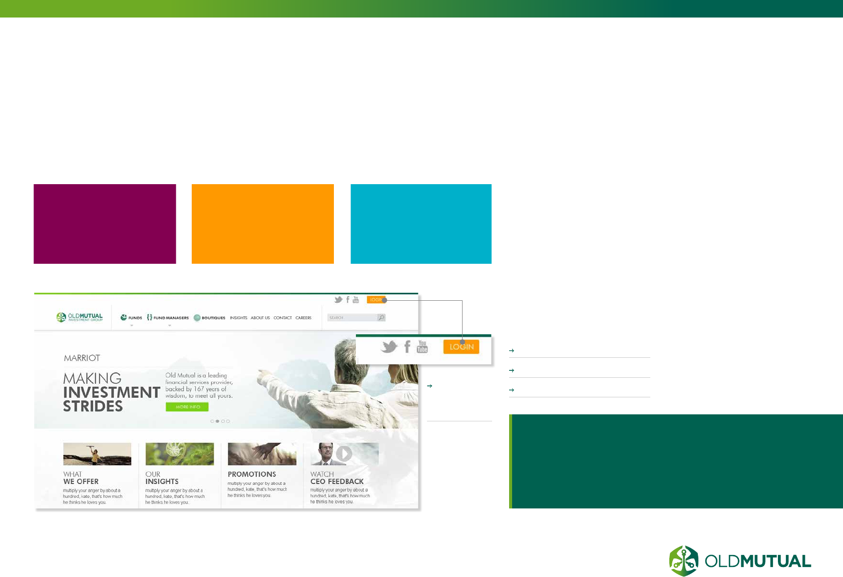
PAID SEARCH
Paid Search looks at
search advertising
programs and how
to most effectively use
them.
CPC (cost-per-click)
advertising involves selecting
a set of keywords and
writing an ad to appear
when someone searches
for that keyword in the
major search engines. CPC
advertising requires you
to set a cost that you are
prepared to pay for a click.
Here are a few guidelines
to make your paid search
campaigns worth while:
SHOW WHEN IT
COUNTS
Adjust your campaign to
consider user peak times.
If your target audience is
primarily searching for your
products between 7 a.m.
and 7 p.m. on weekdays,
then only show your ads
during these times.
CHOOSE KEYWORDS
CAREFULLY
Various tools will help
find specific keywords or
phrases that are being used
by your audience. You can
pay to use tools such as
Keyword Discovery, but
a free and easy way to
find out is to use Google’s
Keyword Tool.
SELECT LONGER TAIL
TERMS
Longer Tail terms are
ones that appeal to users
searching for very niche or
specific items.
GO NEGATIVE TO BE
POSITIVE
Adding negative keywords
is an ideal way to exclude
your campaigns from areas
that are not relevant to you
and enquiries you cannot
fulfill.
THINK SEASONAL
Some products/websites
are going to be more or
less popular depending on
certain times of the year
due to holidays, weather,
or major events. It may be
worth upping your spend
in the months leading up to
high-demand times to reap
the extra traffic.
AD COPY IS KEY
To help improve your copy,
try Google’s Dynamic
Keyword Insertion Tool.
Try to use distinctive, even
quirky, verbiage to catch
your prospect’s eye. Include
a major call to action; if
you have a unique selling
proposition or new offer,
say so.
BACK IT UP
Don’t think of your other
promotions, be they offline
or online, as separate
entities. If they typed your
latest marketing slogan into
a search engine, would
a recognisable CPC ad
appear for your company
taking them to your site
for more information?
Make sure your ads are
appearing when someone
is searching for you by name.
GO VERTICAL
Another option for reaching
a more focused, relevant
audience is vertical search
engine advertising. Because
of their more segmented
nature, vertical search
engines reach a very
targeted audience, and
often produce far better
quality traffic at the same
or smaller spend levels than
you’ll find with their general
search engine counterparts.
GO LOCAL VERSUS
INTERNATIONAL
Is your business local
or international? If it’s
international, you may need
to set up campaigns on a
country by country basis
and tailor your keywords
and ads to the various
languages, time-zones,
product variations, specific
landing pages, etc.
USE CPC
MANAGEMENT TOOLS
(GOOGLE ADWORDS)
In addition to Google’s
keyword tool, there are two
others that are particularly
helpful. The first is AdWords
Editor. It’s a free tool that
offers you great control
over multiple and/or large
campaigns. The second tool
is Google’s Search Query
Performance Reports. These
reports show you what
people are searching for
to trigger your ads, which
you can then use to adapt
both your CPC words and
the content on your site for
SEO.
05.3
06.1 Horizontal logo
06.2 Stacked logo
06.3 The Old Mutual brand icon
06.4 Examples of using the logo in a digital space
06.5 Sub-brands
06.6 Incorrect usage
DESIGN.
OLD MUTUAL LOGO
06
24
25
26
27
28
29

24 OLD MUTUAL GROUP DIGITAL GUIDELINES
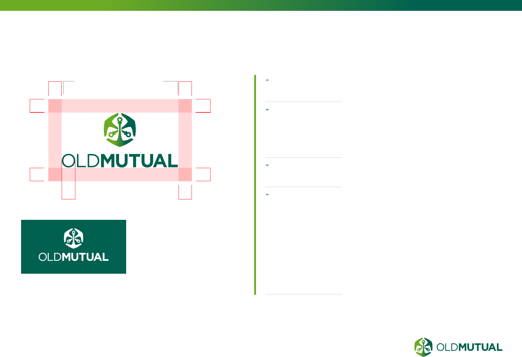
HORIZONTAL LOGO
The preferred logo
layout is horizontal
with clearly defined
spacing.
Sub brands are
accommodated with clear
spacing. Reference the
Brand guidelines for more
logo rules.
THE REVERSED
OUT WHITE
LOGO should be
used in exceptional
circumstances where
the full colour format
isn’t applicable,
for example use
the white logo on
applications using a
dark background.
The logo is always
surrounded with
CLEAR SPACING,
taking reference from
the width of the ‘O‘
of ‘OLD MUTUAL‘.
DIGITAL
APPLICATIONS
INCLUDE
Television
Monitor
Projector
Tablet
Smart phone
PDF files created to be
read on screen
or any other display
technology
Digital values also refer
to the greens for the
vignette and all greens
and colours used on
your intended digital
application.
SIDENOTE
Source digital versions
of the logo from
Graham Beverley
Ensure that for all digital applications
the correct digital (RGB) version of the
logo and our colours are used.
With of ‘O’ = y y
yy
yy
y
y
y
Always use the digital version of the logo online (RGB) – the colours for digital and
print logos are different.
Minimum size on all digital applications: 198 pixels wide
minimum size - 198pxls
ON SCREEN
06.1
25 OLD MUTUAL GROUP DIGITAL GUIDELINES
STACKED LOGO
The stacked logo is the secondary
version of the Old Mutual brand. This
is used as an alternative, where the
application requires it.
This logo should only be used when the
primary version can’t be used. For example,
on extreme formats such as narrow banner
adverts or other vertical layouts.
Minimum size on all
digital applications:
112 PIXELS wide
The logo is always
surrounded with
CLEAR SPACING,
taking reference from
the width of the ‘O‘
of ‘OLD MUTUAL‘.
Logo mark is always
HORIZONTALLY
CENTRED
The reversed
out white logo
should be used in
EXCEPTIONAL
CIRCUMSTANCES
where the full
colour format
isn’t applicable,
for example use
the white logo on
applications using a
dark background.
y
y
y
With of ‘O’ = y
y
y
y y
minimum size - 198pxls
06.2
26 OLD MUTUAL GROUP DIGITAL GUIDELINES
THE OLD MUTUAL
BRAND ICON
The Old Mutual brand
icon is the visual
representation of the
Old Mutual brand.
This is used as the
brand persona in
social media and on
small places where
icons are used.
This logo should only
be used when the
application requires small
spaces. For example, on
extreme formats such as
browser favicons or on
small square spaces ie.
Facebook profile area.
Minimum size for
standard Old Mutual
icon: 36 PIXELS
wide.
An ADDITIONAL
ICON must be used
for smaller sizes, for
example the website
favicon which uses a
16 x 16 pixel size.
The brand icon is
always surrounded
with CLEAR
SPACING, using
1/5 of the width of
the Old Mutual icon.
The Old Mutual
brand icon is NEVER
used reversed out
white on a dark
background.
x 1/5 of x
1/5 of x1/5 of x
1/5 of x1/5 of x
1/5 of x
1/5 of x
1/5 of x
Minimum size
for standard Old Mutual
icon: 36 pixels wide
16 x 16 pixels icon: for
website favicons and small
icons. This favicon has no
white space included in
the .ICO file.
06.3
27 OLD MUTUAL GROUP DIGITAL GUIDELINES
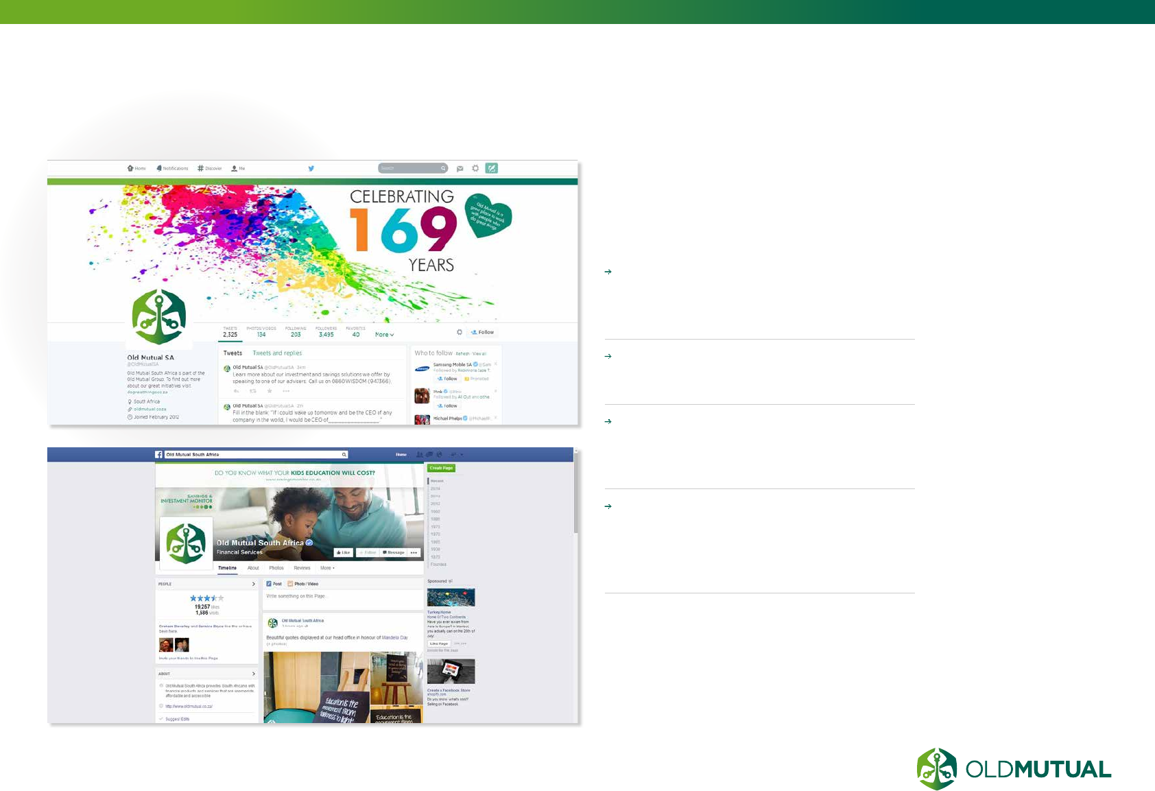
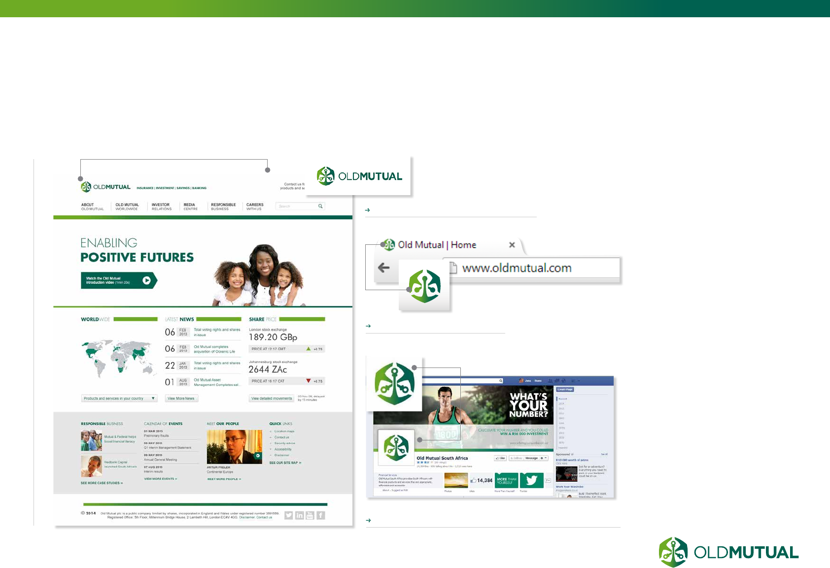
EXAMPLES OF USING THE LOGO
IN A DIGITAL SPACE
Old Mutual logo on website
Old Mutual brand icon in Social media
Browser favicon
06.4
28 OLD MUTUAL GROUP DIGITAL GUIDELINES
OUR
SUB-BRANDS
These are the new sub
brand logos. There
are two arrangements
of these logos, but
these are the primary,
preferred versions.
Always try to use these
versions on all of our
collateral.
This logo should only
be used when the
application requires small
spaces. For example, on
extreme formats such as
browser favicons or on
small square spaces ie.
Facebook profile area.
DO NOT ADJUST
our logos, always use
the artwork supplied
and never create your
own version.
Always use the
RGB version
for all DIGITAL
APPLICATIONS.
Logotype and sub
brand lock-up
is VERTICALLY
CENTRED against
the logo mark.
xy
3/5 of y
1/5 of x
Sub brand name is left aligned underneath the logotype
These rules apply across all three sub brand logos.
06.5
29 OLD MUTUAL GROUP DIGITAL GUIDELINES
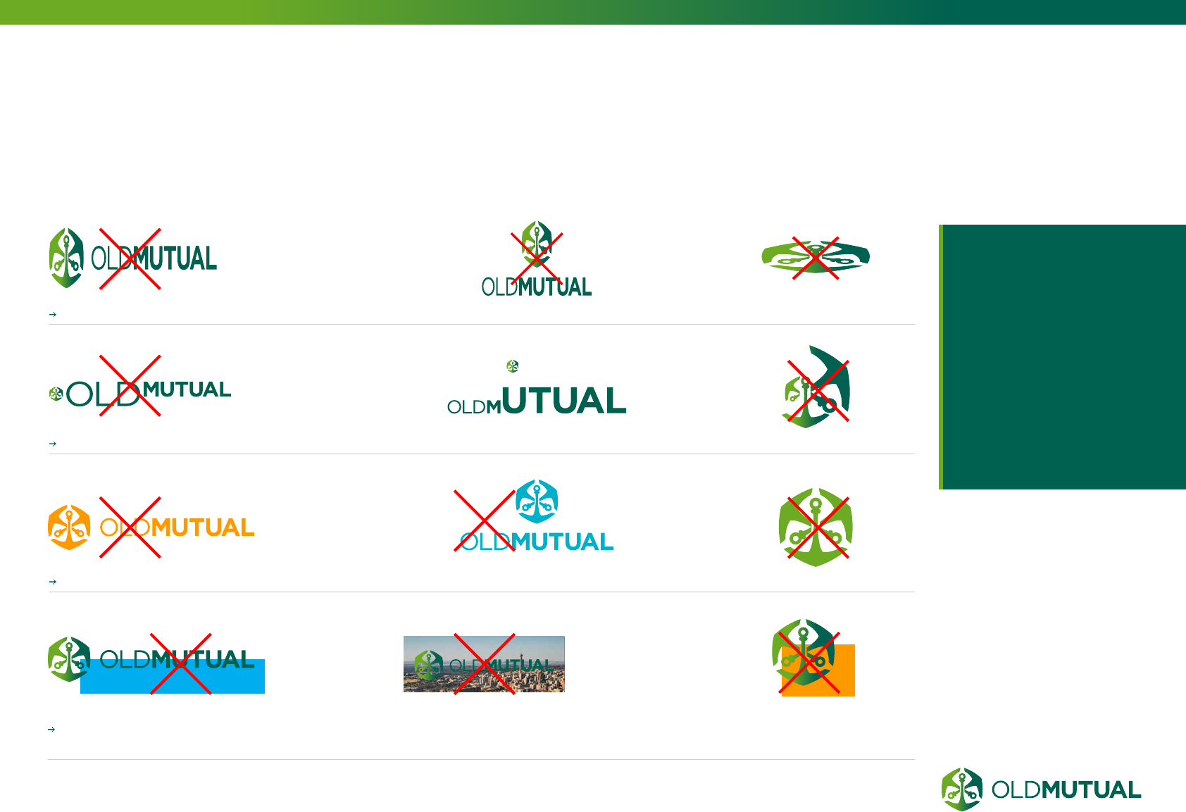
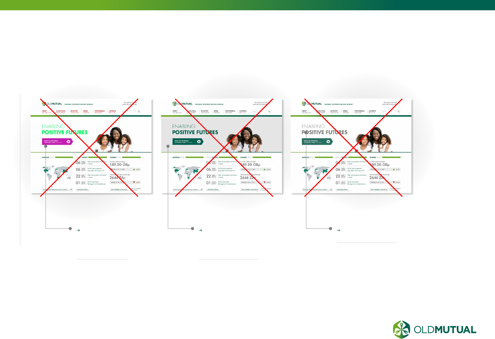
INCORRECT
USAGE
Do not distort the logo
Do not alter the proportions of the logo
Do not change the colour of the logo
DO NOT obscure the logo and do not place the Old Mutual logo on busy backgrounds, images or colours other
than our primary palette
Do not use the print
logo in any digital
application. Ensure
that for all digital
applications the
correct digital (RGB)
version of the logo
and our colours are
used.
06.6
07.1 Colours for digital application
The difference between RGB & CMYK
Incorrect colour usage
07.2 Digital fonts
07.3 Heading styles
Paragraph styles
Underlined headings & list styles
07.4 Typography signature style
07.5 Brand device – the line
07.6 Image usage
07.7 The grid
DESIGN.
BRAND ELEMENTS
07
31
33
34
35
36
37
38
39
40
41
42
07.8 Tables
07.9 Icon styles
07.10 Web page examples
43
44
45
31 OLD MUTUAL GROUP DIGITAL GUIDELINES
COLOURS FOR
DIGITAL APPLICATION
HERITAGE GREEN AND
FUTURE GREEN are used to
create impact, complemented by
the crispness and clarity of white
space.
VERY DARK GREY (#333333)
is used for body copy only.
MID AND LIGHT GREYS can
be used in backgrounds to create
definition and bring attention
to specific detail on a page.
It is important that this is used
minimally and subtly, and should
never be used for text
Hyperlink in body copy -
#027864
Please ensure that for all digital applications the digital (RGB) version of
the logo and our colours are used.
DIGITAL
APPLICATIONS
INCLUDE
Television
Monitor
Projector
Tablet
Mobile
PDF files created to be
read on screen
or any other display
technology
Digital values also refer
to the greens for the
vignette and all greens
and colours used on
your intended digital
application.
SIDENOTE
PRIMARY COLOUR PALETTE
HERITAGE GREEN
#006150
R 0, G 97, B 80
WHITE
#FFFFFF
R 0, G 0, B 0
OLD MUTUAL DARK GREY | #333333 | R 51, G 51, B 51
FUTURE GREEN
#6EAB24
R 110, G 171, B 36
07.1
32 OLD MUTUAL GROUP DIGITAL GUIDELINES
COLOURS FOR
DIGITAL APPLICATION
Our secondary
colour palette has
been modified to
complement the
greens and white
within our primary
palette. Our
secondary palette
consists of:
DEEP RED
FRESH ORANGE
VIBRANT BLUE
DEEP RED
#830051
R 131, G 0, B 81
FRESH ORANGE
#FF9900
R 255, G 153, B 0
VIBRANT BLUE
#00A7CA
R 0, G 167, B 202
SECONDARY COLOUR PALETTE
Minimal
usage
example
The secondary colours are only used in
applications such as graphs, bar-charts, pie-
charts or login buttons. Use of these should be
kept to an absolute minimum.
(CONTINUED)
33 OLD MUTUAL GROUP DIGITAL GUIDELINES
THE DIFFERENCE BETWEEN
RGB & CMYK
HERITAGE GREEN
RGB
0, 97, 80
#006150
HERITAGE GREEN
CMYK
100, 30, 70, 0
FUTURE GREEN
RGB
110, 171, 36
#6EAB24
FUTURE GREEN
CMYK
50, 0, 100, 0
RGB IS BASED ON LIGHT
Red (R) light plus Green (G) light plus Blue (B)
light all projected together create white. Black is
encoded as the absence of any color. Colours
made out of light is used for digital screens only.
CMYK IS BASED ON INK
Superimpose Cyan (C) ink plus Magenta (M) ink
plus Yellow (Y)ink, and you get black, although
this format also encodes Black (K) directly.
White is encoded by the absence of any color.
Ink is used for printing purposees only.
ACCESSIBILITY
In line with your brand promise of “Most
accessible, face-to-face and digital”, we
always make sure that visitors with vision
challenges are not limited by the colours
we use. See page 52 for an expanded
description.
Consideration should be given to the use of
colour in any online space.
Colours that are very light in contrast
should be AVOIDED for text as they can
be difficult to see on a device screen,
even without any visual impairment of the
user.
NEVER reference colour as interactive
visual cues on account of visually
impaired users.
Ensure the contrast of your text colour
to its background is high to ensure
LEGIBILITY.
SIDENOTE
Always use the RGB colour versions
of our logo and colours for the
digital applications.
34 OLD MUTUAL GROUP DIGITAL GUIDELINES
INCORRECT
COLOUR USAGE
Do not stray
from the Old
Mutual Brand
colours
Do not use
excessive grey
on backgrounds.
Always use white
Do not use grey
headlines
35 OLD MUTUAL GROUP DIGITAL GUIDELINES
INTRODUCTION TO
OLD MUTUAL DIGITAL FONTS
Aa
Aa
Aa
Aa
ABCDEFGHIJKLMNOPQRSTUVWXYZ
abcdefghijklmnopqrstuvwxyz
(.,:;?!$&@*) 0123456789
ABCDEFGHIJKLMNOPQRSTUVWXYZ
abcdefghijklmnopqrstuvwxyz
(.,:;?!$&@*) 0123456789
ABCDEFGHIJKLMNOPQRSTUVWXYZ
abcdefghijklmnopqrstuvwxyz
(.,:;?!$&@*) 0123456789
ABCDEFGHIJKLMNOPQRSTUVWXYZ
abcdefghijklmnopqrstuvwxyz
(.,:;?!$&@*) 0123456789
Old Mutual’s logo
has a distinctive
typographic style in
the wordmark, using
a combination of light
and bold weights of
the same font.
This typographic style is an
ownable and unique visual
asset for our brand, and
has been applied to our
visual identity, and digital
applications.
FUTURA LIGHT,
HEADLINES
17 - 40PX
ARIAL REGULAR,
HEADLINES & BODY 14 -
27PX
FUTURA BOLD, HEADLINES
17 - 40PX
ARIAL BOLD,
HEADLINES & BODY 14
- 27PX
Old Mutual’s PRIMARY
FONT is Futura. We use two
primary weights, light and
bold to maintain a consistent
approach that is visually
linked to our logo. The
Futura font is mainly used for
heading styles in the
Old Mutual signature
Heritage Green #006150
or Future Green #6eab24
colours.
Old Mutual’s WEB SAFE
FONT is Arial, and is used
as a secondary font on
digital applications. It is
used with a minimum height
of 14px, using hex colour
#333333 to ensure clear
legibility.
07.2
36 OLD MUTUAL GROUP DIGITAL GUIDELINES
HEADING STYLES
HEADING ONE FUTURA BOLD
(H1 27PX)
Heading two Arial regular 27px (H2)
Heading three Arial regular 24px (H3)
Heading four Arial regular 20px (H4)
Heading ve Arial regular 17px (H5)
Heading six Arial regular 14 px (H6)
HEADING SEVEN ARIAL BOLD 14PX (H7)
ACCESSIBILITY
In line with your brand promise of “Most accessible,
face-to-face and digital”, we always make sure that
visitors with visual challenges are not limited by the
typography we use. See page 52 for an expanded
description.
Whilst we design our digital spaces to a set text
size, the user should have the option of adjusting this
either via an on-page tool or through their browser
settings directly.
In doing so we need to consider this within our page
designs, particularly around reducing the amount
of important text that we place within an image, as
image text will not re-size.
SIDENOTE
07.3

37 OLD MUTUAL GROUP DIGITAL GUIDELINES
This is an illustration of the
maximum allowed size for use in
paragraph text. (24px)
Over here we have the medium allowed size for
use in paragraph text. (18px)
Body style (14 px) most commonly used text for general
reading text. Please note that any of the text sizes may
be linked, italicised, bolded or underlined. Other special
characters are allowed. Footnotes look like this² (14 px)
Text at this size is only to be used in secondary text or link groupings
and ne print. (12px)
PARAGRAPH STYLES
Block quote
“Block quotes are used to highlight
a signicant piece of copy . It
can also be used to pull quotes
from individuals who can then be
referenced in the nefrint at the
base of the quote. Thjis text does
not have to be in italics. However,
italics do work well for people
quotes”
— sub descriptor for a person’s Name
38 OLD MUTUAL GROUP DIGITAL GUIDELINES
Lists
Unordered
● Lorem ipsum dolor sit amet
● Consectetur adipiscing elit
● Integer molestie lorem at massa
○ Facilisis in pretium nisl aliquet
○ Nulla volutpat aliquam velit
● Phasellus iaculis neque
Ordered
1. Lorem ipsum dolor sit amet
2. Consectetur adipiscing elit
3. Integer molestie lorem at massa
4. Facilisis in pretium nisl aliquet
5. Nulla volutpat aliquam velit
6. Consectetur adipiscing elit
Underlined heading (can be applied to all headings)
UNDERLINED HEADINGS
& LISTS STYLES
The underlined heading style can
be used to emphasise important
information.
39 OLD MUTUAL GROUP DIGITAL GUIDELINES
TYPOGRAPHY
SIGNATURE STYLE
YOUR VISION
OUR FUTURE
YOUR VISION
OUR FUTURE
YOUR VISION
OUR FUTURE
Old Mutual’s distinctive typographic
style derived from the wordmark, is
used mainly on web banners, main
headings, or advert banners.
Our new logo has a distrinctive typographic
style that is ownable and unique for Old
Mutual. This is our typogrpahic ‘signature
style’ that complements our modern and
contemporary look and feel.
YOUR FUTURE
OUR INSIGHT
YOUR VISION
OUR FUTURE
TODAY TOMORROW
DON’T MIX colours and weights in
the same heading.
KEEP THE SAME COLOUR for
the whole line, and only change the
weight. Different colour can be used
but be consistent.
Always make the KEY WORDS
BOLD
07.4
40 OLD MUTUAL GROUP DIGITAL GUIDELINES
BRAND DEVICE –
THE LINE
20% of overall length 20% of overall length
v
1/3 of v
PRIMARY VIGNETTE LINE
It can be used in a VARIETY OF WAYS, for
example to frame web banners or seperate copy
to add clarity and focus to layouts.
When using two lines, use DIFFERENT DEPTHS
with the deepest positioned at the top of the layout.
When setting the line depth make sure its NOT
TOO HEAVY within the overall layout.
The primary vignette line should always have
20% FUTURE GREEN AND 20% HERITAGE
GREEN of the overall lenght at the end before
the vignette is applied.
When using the vignette lines to frame images or
text, the bottom line height is ONE THIRD of the
top line’s height.
Our brand device, the line, has been created
to add a distictive element to the visual identity
that is ownable to Old Mutual.
07.5
41 OLD MUTUAL GROUP DIGITAL GUIDELINES
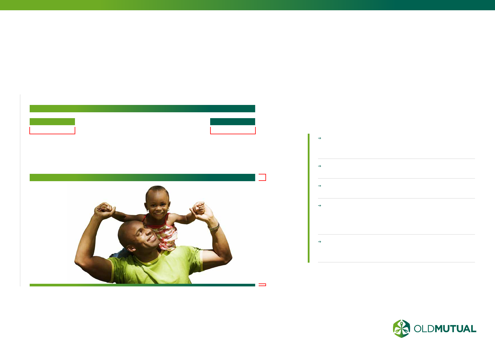
IMAGE USAGE
We have two image categories: ‘People’ and ‘Life’ to support
our brand positioning. The images reflect our brand promise
of ‘Enabling positive futures’ and express our personality
‘Genuine Guiding Growing’.Our photography style is fresh
and modern with content that reflects the brand.
For more guidance, see the Old Mutual Brand Guidelines and your
business unit guidelines.
OUR STYLE IS
Future positive
Contemporary and vibrant
Guiding and uplifting
Human and genuine
Bold and dynamic
Fresh and crisp white backgrounds.
Desaturated warm natural tones with a
crisp focal point
OUR STYLE IS NOT
Old fashioned and
dull
Dreamy
Cluttered
Staged
Bright and showy
Nostalgic
Overtly colourful
THE IMAGES SHOULD
enable positive futures, achieving lifetime goals
have a sense of contentment, security and confidence
portray our customers and our partnerships
Cut-out / deep etch where
possible (white background)
Details
Context
Human touch
PEOPLE
LIFE
07.6
42 OLD MUTUAL GROUP DIGITAL GUIDELINES
THE GRID
The grid is utilised as a
structural foundation for
a website. It takes the
guess work out of deciding
where to place elements
on a page. It also creates
standard proportions
which become the
underlying visual language
of any Old Mutual
website.
The grid can be a useful tool
when finding solutions to visual
and organizational problems.
They help in the following ways:
CLARITY/ORDER
Grids bring order to a layout
making it easier for visitors
to find and navigate through
information.
EFFICIENCY
Grids allow designers to quickly
add elements to a layout
because many layout decisions
are addressed while building
the grid structure.
ECONOMY
Grids make it easier for
other designers to work and
collaborate on the design as
they provide a plan for where to
place elements.
CONSISTENCY/HARMONY
Grids lead to consistency in
the layout of pages across a
single site or even several sites
creating a structural harmony in
the design.
07.7
43 OLD MUTUAL GROUP DIGITAL GUIDELINES
TABLES
Tables should be used for
tabular data only.
The first row of the table
should contain the COLUMN
HEADINGS for the data in
the table. Use the <TH> tag to
indicate header cells.
Use ALTERNATING
BACKGROUND COLOURS
when necessary to create a
visual hierarchy and group
information within a table.
07.8
44 OLD MUTUAL GROUP DIGITAL GUIDELINES
ICON STYLES
Clearly
illustrate ICON
PURPOSE.
Use a
CONTRAST
of green and
white
AVOID
complicated
shapes or using
a multitude of
colour shades.
Icons need to
be BOLD AND
STRIKING.
Icons can be
COLOURED
with reference
to our colour
guide.
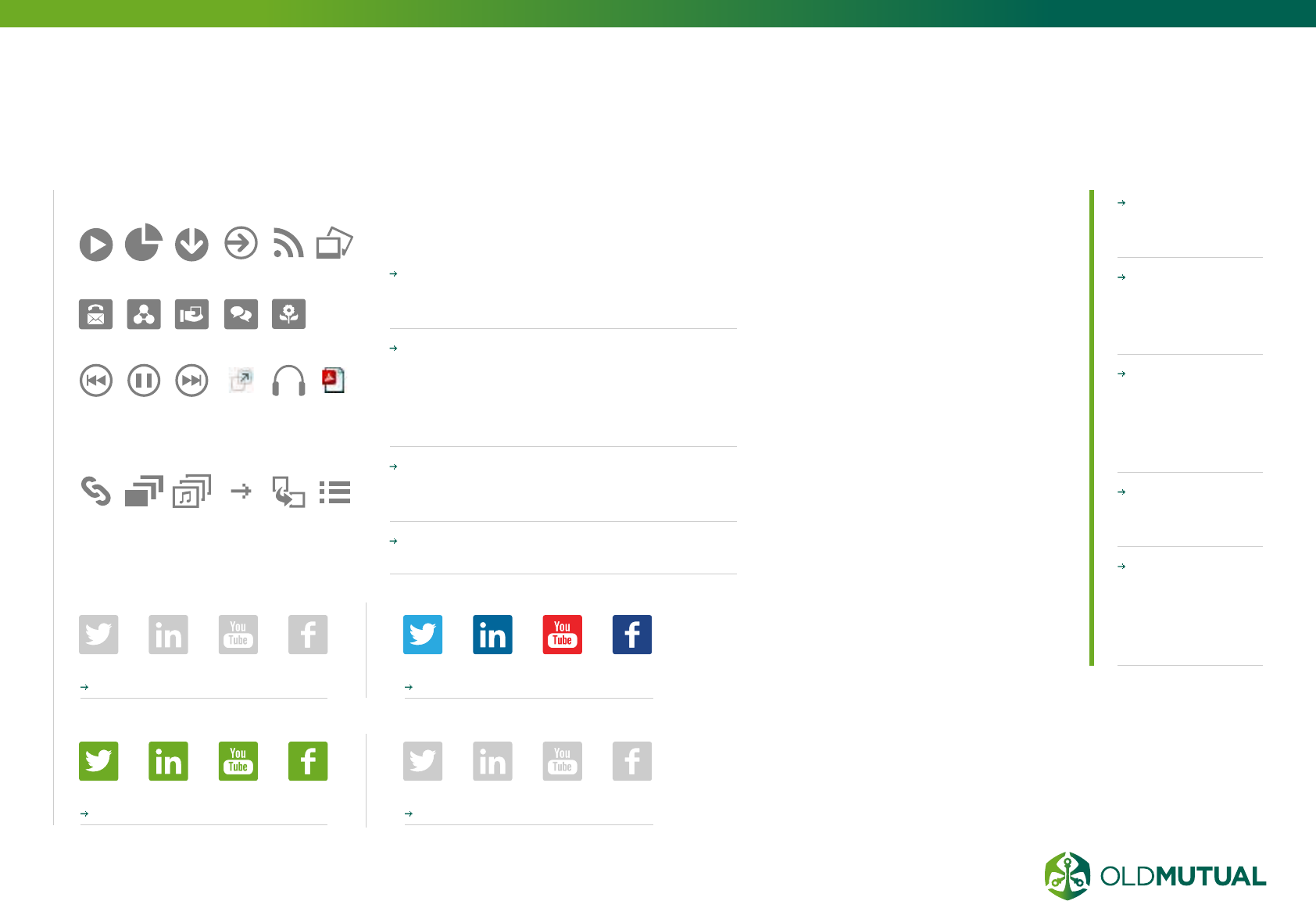
ACTION ICONS
HEADING ICONS
The share icons should appear
UNDERNEATH other information
components on the page
Before starting a social media activity,
ensure your business has a SOCIAL
MEDIA POLICY with allocated
resources to ensure the presence is
properly managed.
All navigational buttons and links must
have clearly contrasted NORM AND
OVER STATES.
Icons can be COLOURED with
reference to our colour guide.
SOCIAL MEDIA ICONS
Active state example Active state example
OR
Hover state example Hover state example
Social media elements are for
sharing the main content of the page.
ICONS COMMUNICATES THE
CONTENT ESSENCE
With icons you can quickly sum up
what your text is about. Sometimes,
icons can even be enough to
communicate content, which
makes reading additional text
unnecessary. A great approach to
relevant icons are metaphors. One
of the most important things about
icons is that you choose metaphors
people can relate to, like a cart or
an old fashioned letter.
ICONS CAN DRAW
ATTENTION
Pictures are worth a thousand
words. So are icons. Websites
without icons and pictures can
be boring. Imagine a newspaper
without any images. Besides
catchy headlines, images draw our
attention to certain content, which
is why we tend to read articles
showing an appealing image first.
Icons can draw attention, but at
the same time they can help you
structure content and separate
different functions or services.
07.9
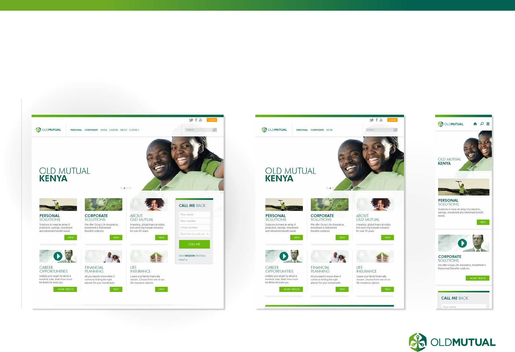
45 OLD MUTUAL GROUP DIGITAL GUIDELINES
WEB PAGE
EXAMPLES
07.10
DESKTOP
TABLET (PORTRAIT)
MOBILE
08.1 Button & text link styles
08.2 Navigation
08.3 Site search
08.4 Links to our businesses globally
08.5 Forms
08.6 Carousel banners
08.7 Promotional elements
08.8 Information / call to action elements
08.9 Login facility for transactional pages
DESIGN.
FUNCTIONAL ELEMENTS
08
47
49
51
52
53
54
55
56
57
47 OLD MUTUAL GROUP DIGITAL GUIDELINES
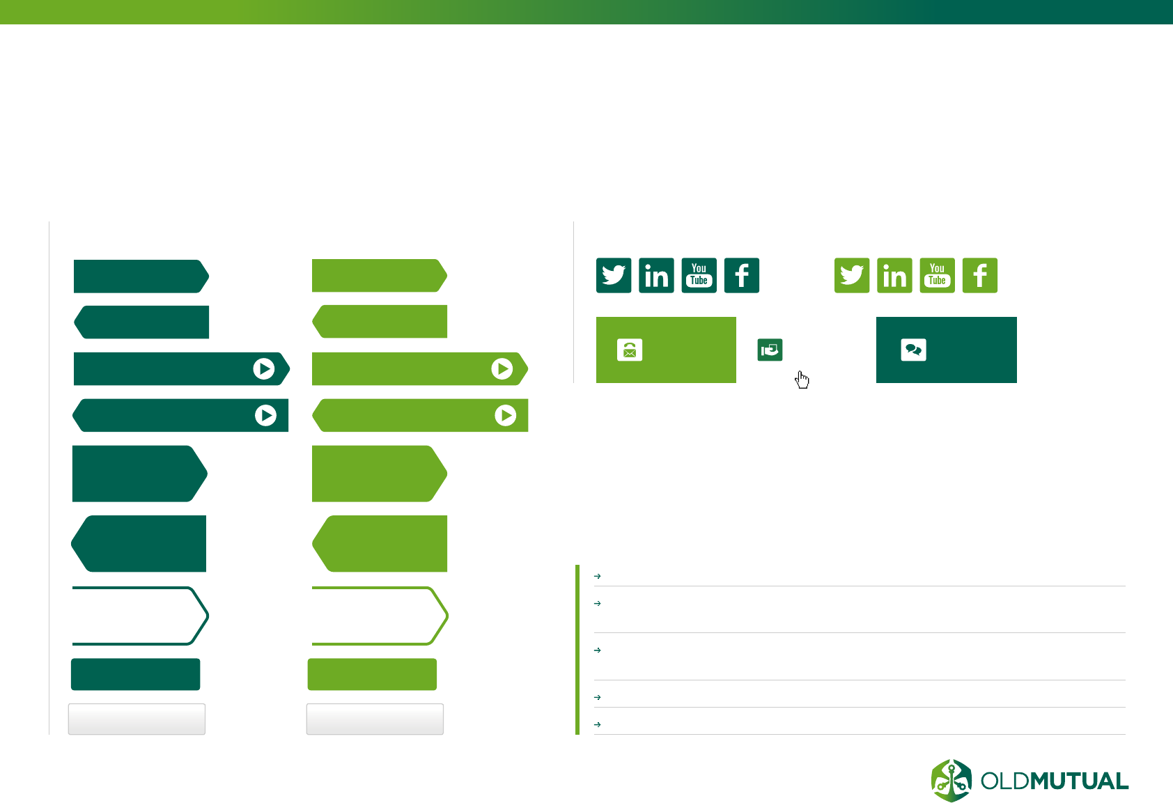
BUTTON &
TEXT LINK STYLES
Use HERITAGE OR FUTURE GREEN for static or hover states.
ARROW BUTTONS bring attention to the core call to action on a
web page.
All navigational buttons and links must have clearly contrasted NORM
AND OVER STATES.
INFO BUTTONS can be used for additional information requests.
BREADCRUMBS have links to the previous level.
BUTTON STYLES
Arrow button Arrow button
Bigger arrow
button
Bigger arrow
button
Bigger arrow
button
Bigger arrow
button
Arrow button Arrow button
Arrow button with icon
Arrow button with icon
Info button Info button
CUSTOMER
QUERIES INVESTOR
RELATIONS MEDIA
CONTACTS
The arrow button style’s are strong call to actions. The dark
green draws the eye of the user to primary function on a page.
Because these buttons are so imposing, they must be used
sparingly. No more than two of these should be used on a page.
View more news View more news
08.1
Arrow button with icon
Arrow button with icon
Bigger arrow
button
Bigger arrow
button
BUTTON STYLES

48 OLD MUTUAL GROUP DIGITAL GUIDELINES
TEXT LINK STYLE EXAMPLES BREADCRUMS STYLE EXAMPLES
In content links
Normal state - text colour #027864; line
colour #dadada
In content links
Hover state - #6eab24; line colour #dadada
> Promotion Text link – Sub promotions
Normal state
> Text links – Sub promotions
Hover state
Bread crumb / Bread crumb (Normal) 10px
Normal state
Home / Media Centre / Group prole / What we do
Normal state
Bread crumb / Bread crumb (Mouse Over)
Hover state
A new link colour (#027864)
is incorporated to make the link
stand out from the rest of the dark
grey text.
ACCESSIBILITY
In line with our brand promise of “Most
accessible, face-to-face and digital”, we
always make sure that visually chal-
lenged visitors are not limited by the
interactive elements we use. See page
52 for an expanded description.
Hyperlinks need to be contextual
and indicate to the user what their
action will return. E.g. use “View
our contact information” rather than
“click here”.
Never use “click here” as an action.
SIDENOTE
BUTTON &
TEXT LINK STYLES (CONTINUED)
49 OLD MUTUAL GROUP DIGITAL GUIDELINES
NAVIGATION
MAIN NAVIGATION
SECONDARY NAVIGATION
MAIN, HORIZONTAL
NAVIGATION should be in
Arial and have a text size of at
least 14px / 0.875em
SECONDARY, SECTION-
SPECIFIC LEFT-HAND
NAVIGATION should be in
Arial and have a text size of at
least 12px / 0.75em
USE + AND – SIGNS to
indicate expanding navigation
items
08.2
50 OLD MUTUAL GROUP DIGITAL GUIDELINES
ACCORDIANS
Although developing concise body copy is recommended, if
there is a large amount of copy on one page, an accordion
structure can be used.
Content can be EXPANDED OR COLLAPSED depending on what
the customer is interested in reading.
The title for each section must CLEARLY DESCRIBE the content that
will be revealed when it is expanded.
A section is COLLAPSED either by clicking the section title or by
clicking on a different section title.
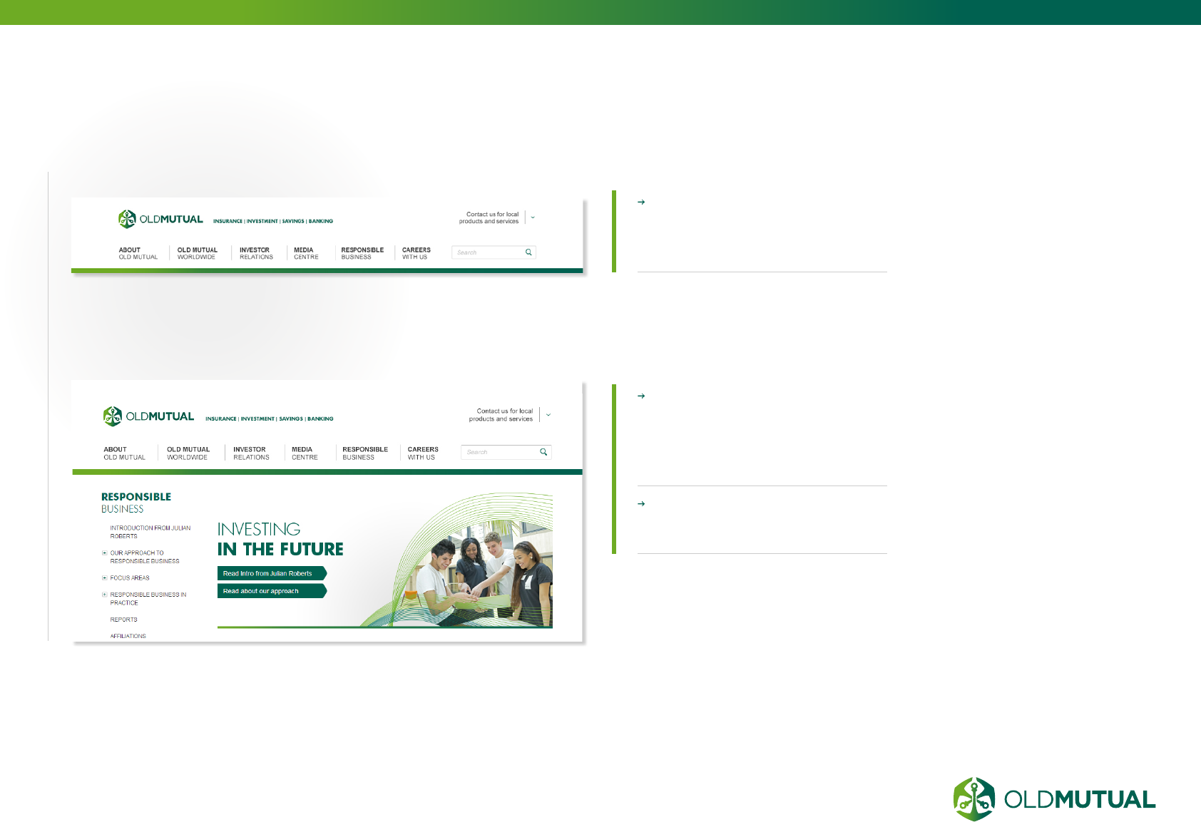
NAVIGATION
MEGA MENUS
SECONDARY MEGAMENU NAVIGATION should be in Arial
and have a text size of at least 12px / 0.75em.
The mega menu helps users ACCESS SPECIFIC PAGES FASTER
by minimising the amount of interactions required.
(CONTINUED)
51 OLD MUTUAL GROUP DIGITAL GUIDELINES
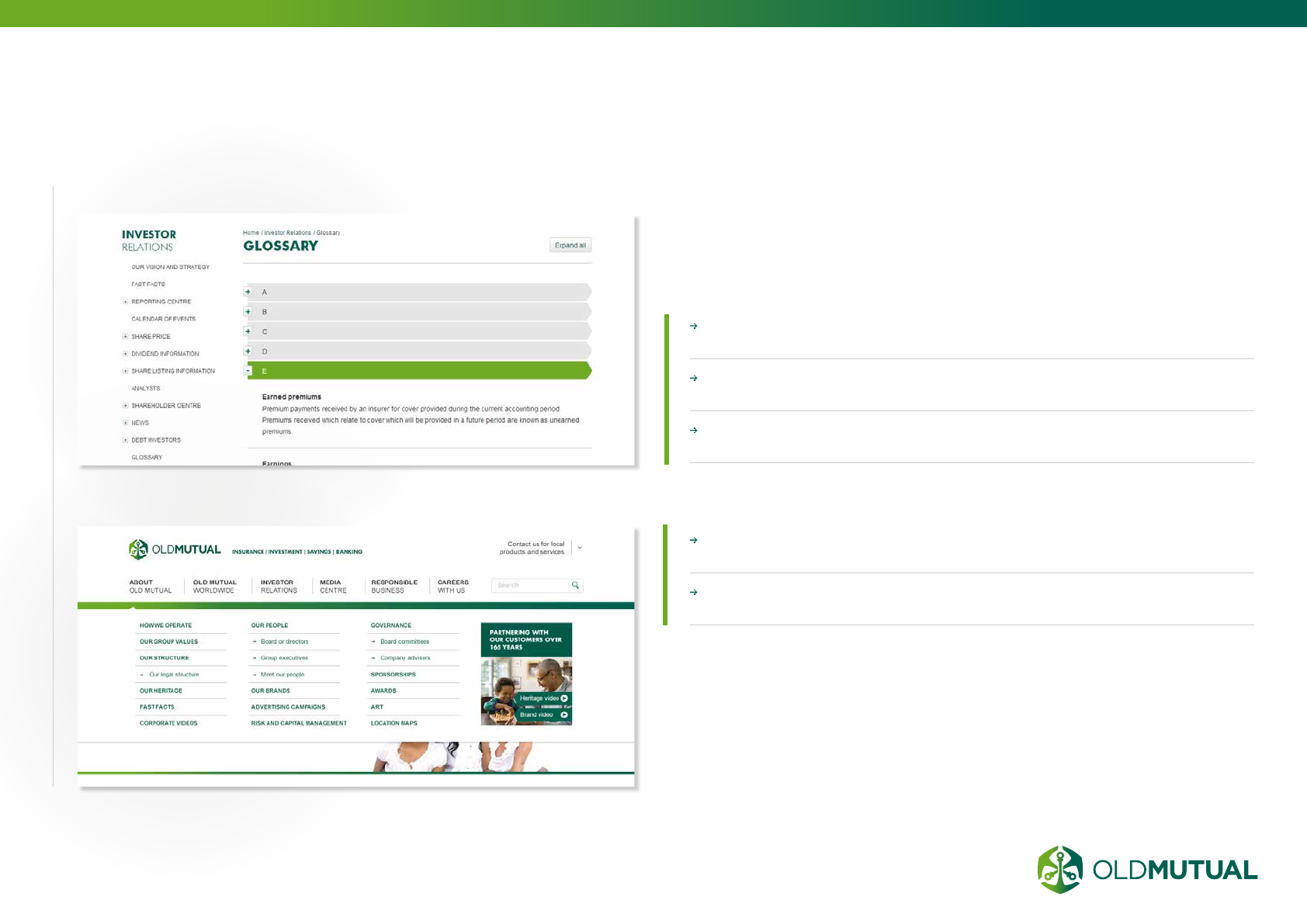
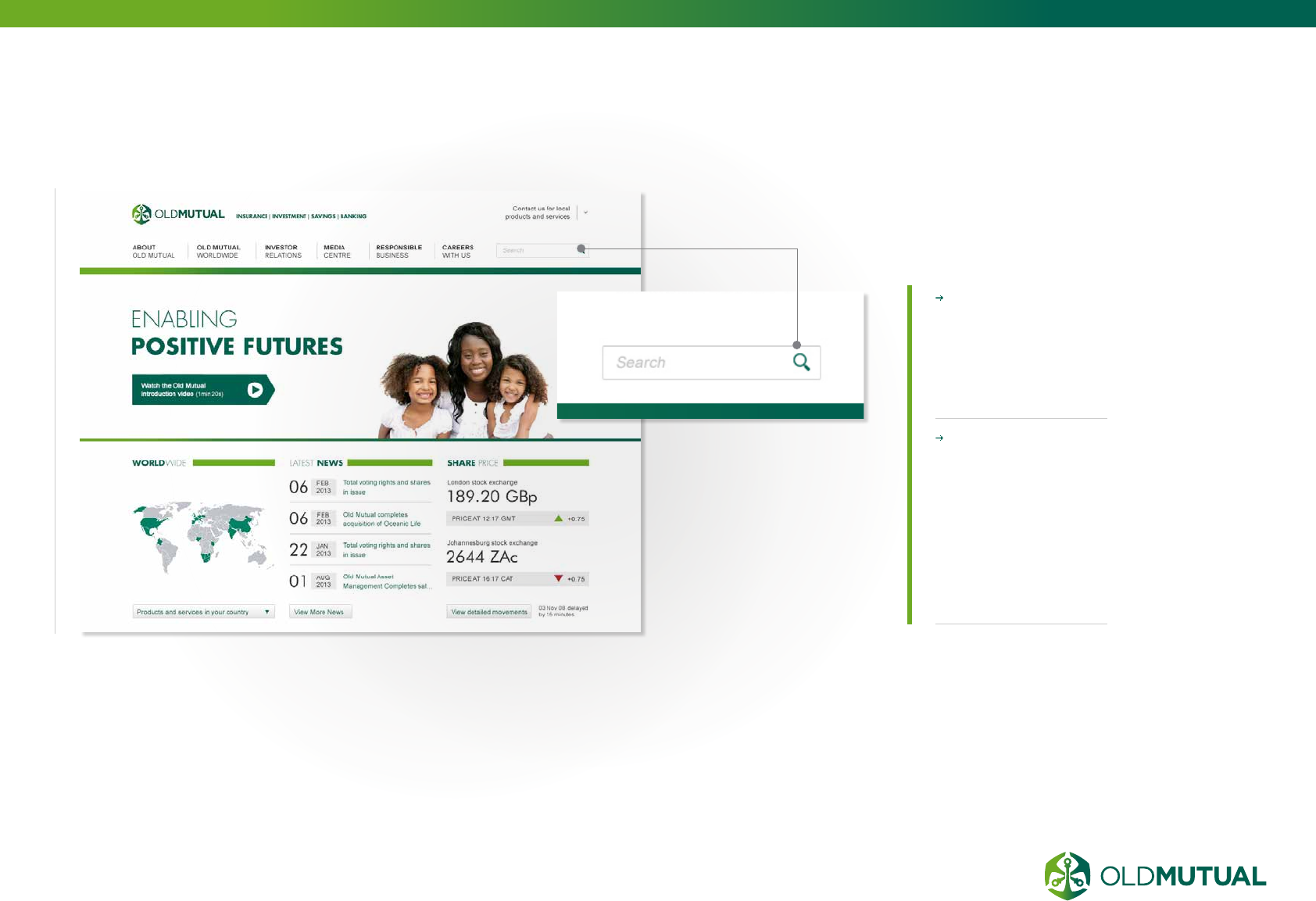
SITE SEARCH
The search component on a website
should be globally available in a
predictable location.
For heavy content
or documentation
sites you should
incorporate
a SEARCH
FACILITY.
Search facility
consists of a
INPUT FIELD
AND SEARCH
BUTTON (in
the shape of a
magnifying glass)
to commence
search.
08.3
52 OLD MUTUAL GROUP DIGITAL GUIDELINES
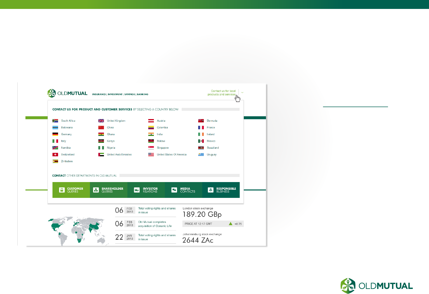
LINKS TO OUR
BUSINESSES GLOBALLY
Include links to other global group
websites in the header section of your
website – see www.oldmutual.com for
an example and the full list of businesses
worldwide.
08.4
53 OLD MUTUAL GROUP DIGITAL GUIDELINES
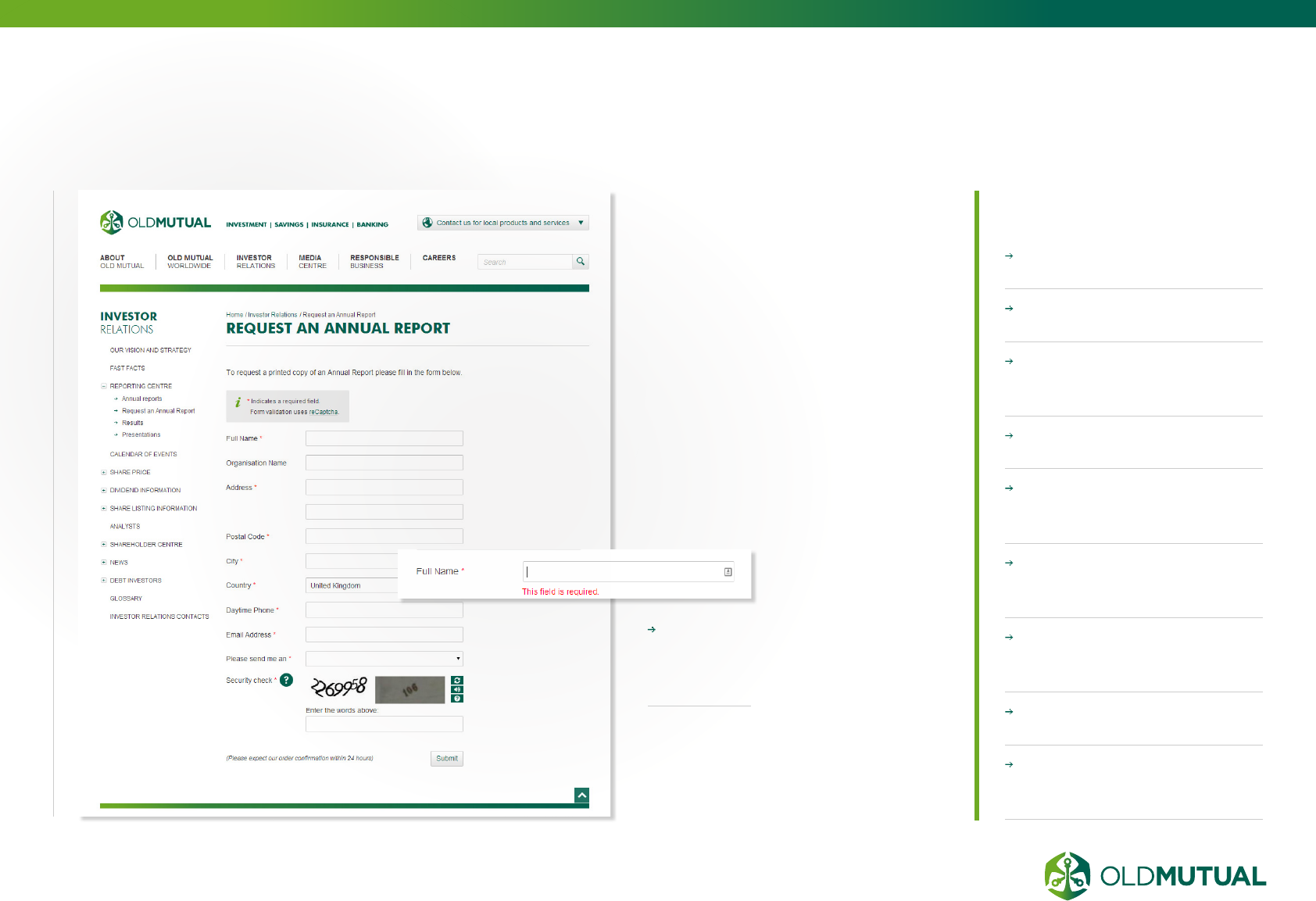
FORMS
Here are a few guides to
create well functioned forms:
Clearly HIGHLIGHT
required fields.
Provide IN-LINE
VALIDATION messages.
Provide USER-FRIENDLY
AND DESCRIPTIVE
validation messages.
DON’T CLEAR existing
fields after validation fails.
POINT OUT LABEL FIELDS
where possible so that they
are clearly understandable.
Show users the PROPER
INPUT FORMAT. ie. Date:
dd/mm/yyyy.
AVOID too many required
fields and keep the form short
and simple.
Provide LINKS AND HINTS
to fill fields where necessary.
OPTIMISE FORMS for
mobile and ensure auto
suggest is disabled.
In-line
validation
message
example
Used for gathering data online,
web forms offer convenience
and speed for both the user
and the form owner.
Web forms can be used to:
Capture data (visitors’ information),
communicate with website visitors,
conduct surveys, respond to user
questions, generate online sales and
receive online feedback.
08.5
54 OLD MUTUAL GROUP DIGITAL GUIDELINES
CAROUSEL
BANNERS
Use carousel
banners to
showcase your
current key
campaign or
messages. These
should change at
least once a month.
PROMINENCY
Generally, this
component is the
largest element of the
homepage and should
be static content.
USE VARIETY
Up to 3 revolving
messages should be
used.
GIVE TIME TO
OBSERVE
5 second time delay
to each transition.
GET THE MESSAGE
ACCROSS
The headline
messages should be
clear, with minimal
text .
CALL TO ACTION
A prominent call to
action button must be
used to direct visitors
to further information.
08.6
55 OLD MUTUAL GROUP DIGITAL GUIDELINES
PROMOTIONAL
ELEMENTS
Promotional elements are secondary, smaller
banners or pieces of information.
On the home page, promotional components
are used to MESSAGE OTHER PRODUCTS
that are not featured in the main carousel
promotion area.
Promotions are normally related to products,
but if there are not enough products to fill the
space, then INFORMATIONAL CONTENT
can be used instead.
This component can be populated with a
STATIC image and text.
A SMALL AMOUNT OF COPY can be used
to elaborate on the headline.
A CALL TO ACTION BUTTON can be used
or a secondary text link, depending on the
page of placement.
08.7
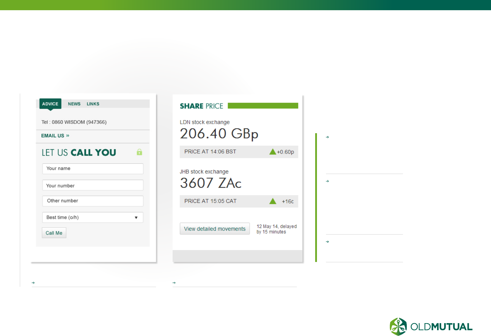
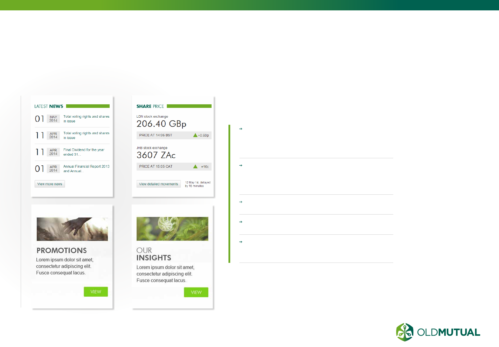
56 OLD MUTUAL GROUP DIGITAL GUIDELINES
INFORMATION /
CALL TO ACTION ELEMENTS
Information components provide useful
information that is often not necessarily
product-related.
These components
appear in the RIGHT
COLUMN and can
appear throughout the
site.
The headline of the
element should be a
CLEAR SIGNPOST of
what it contains. E.g.
“Advice” clearly offers
the user a form to get
advice.
The form must be
EASY TO USE with a
clear point to submit.
Call to action Information element
08.8
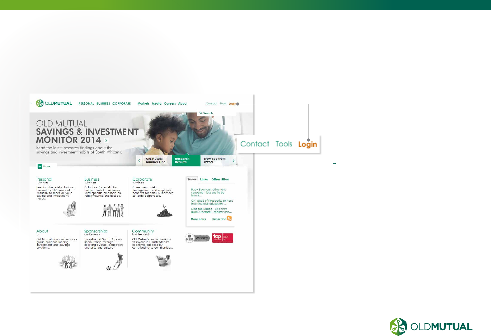
57 OLD MUTUAL GROUP DIGITAL GUIDELINES
LOGIN FACILITY FOR
TRANSACTIONAL PAGES
For transactional websites, ensure the
login facility is positioned near the top
right of your website’s home page.
This should at all times be clear, large
and visible.
Refer to page 37 for COLOUR SPECIFIC
GUIDELINES
08.9
09.1 Cross-browser testing & compatibility
09.2 CSS naming conventions
09.3 JavaScript integration
09.4 Doc type and validation requirements
09.5 Accessibility standards
09.6 Front-end testing
09.7 Version control
09.8 Directory structure
09.9 SEO coding good practice
DEVELOPMENT
09
59
60
62
63
64
66
66
66
67
59 OLD MUTUAL GROUP DIGITAL GUIDELINES
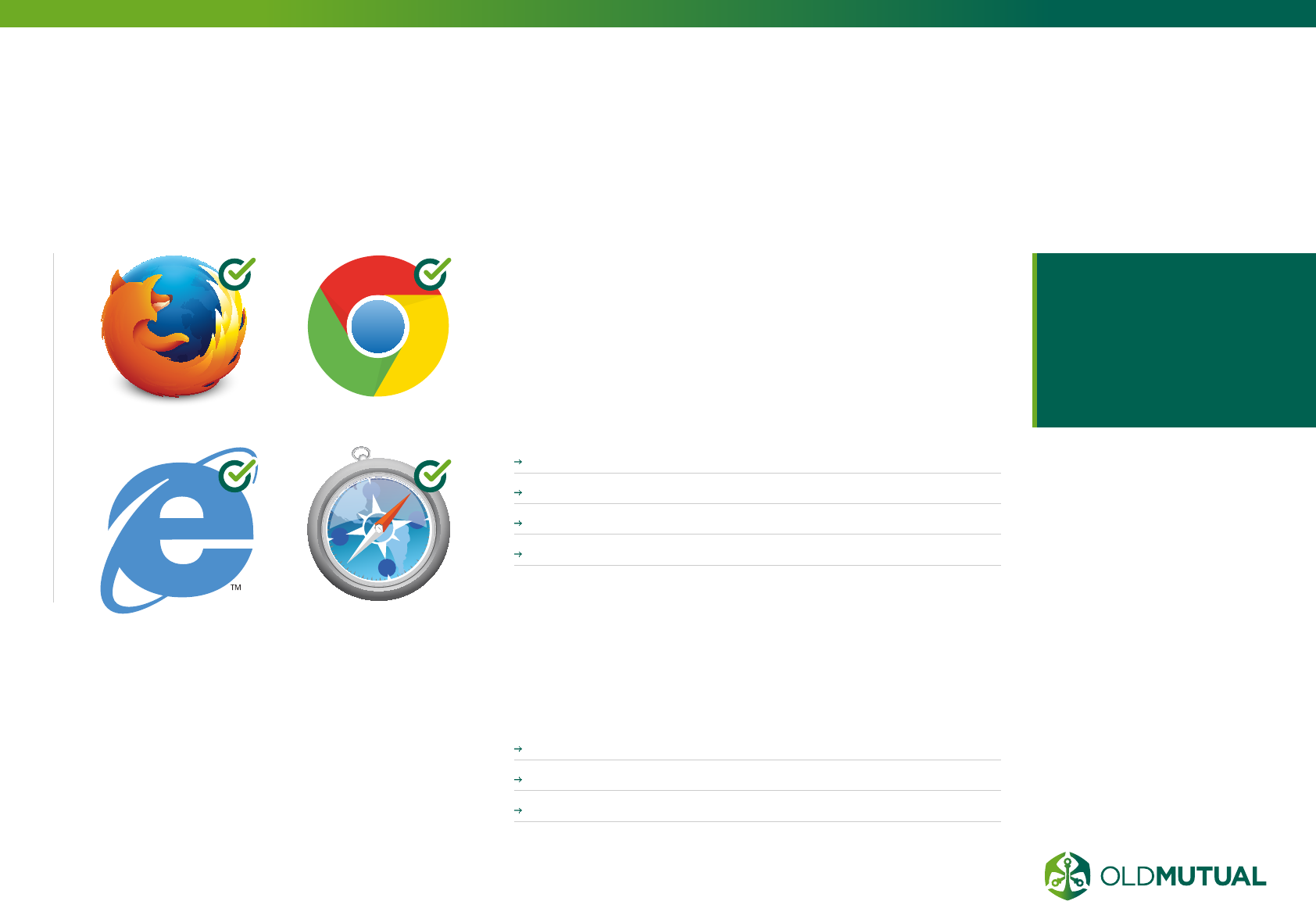
CROSS-BROWSER
TESTING & COMPATIBILITY
Internet users have wider choice of browsers
when it comes to surfing the net. It is our
responsibility to ensure that websites we’ve
created are compatible for most of the commonly
used browsers these days.
Taking your usage statistics into account, ensure your
website supports the latest 3 browser versions for:
FIREFOX
CHROME
SAFARI
INTERNET EXPLORER 8 AND UP
It’s almost impossible to install all different browsers in
one machine. But thanks to some tools and web services
out there, finding out how your website looks like in other
browsers is possible.
Use one of the following cross-browser testing tools:
Browser Shots (free)
BrowserStack (subscription)
Virtual Box (best for extensive Internet Explorer testing)
N
W
S
E
NW
SW
SE
NE
Taking your usage
statistics into account,
ensure your website
supports the latest 3
browser versions
09.1

60 OLD MUTUAL GROUP DIGITAL GUIDELINES
CSS NAMING
CONVENTIONS
NAMES
Name CSS Class selectors and ID selectors in
lowercase and use dashes to separate words
.social-header {…}
When choosing a name don’t describe the values
that the selector will apply (color, position etc) as
these may change in a future redesign.
When writing CSS rules, it is good for performance
to minimise the number of selectors (at most 3
selectors in each rule). To facilitate this you may
wish to add additional; more specific; Classes or
IDs to the HTML markup:
/* Bad */
header nav ul li a {…}
/* Good */
.social-link {…}
Place any vendor-prefixed properties before the
non-prefixed property in the style sheet. This ensures
that when a browser starts to support the official
W3C property then the W3C property will take
precedence. (the last style definition wins).
PUNCTUATION
Include one space before the opening brace of
declaration blocks
my-style {width: 3000em;}
Include one space after the colon in each property
width: 3000em
End all declarations with a semi-colon
width: 3000em;
(semicolons are in fact only required between
declarations, but using one everywhere will reduce
errors when editing the stylesheet.)
Comma-separated values should include a space
after each comma
{font-family: Helvetica, Arial, Sans-
Serif;}
but don’t include spaces after commas in RGB
colors, and don’t prefix with a leading zero
{color: rgb(255,12,5);}
Lowercase hex values
Cascading Style Sheets
is a style sheet language
used for describing the
presentation semantics of
a document written in a
markup language.
When writing CSS it is a
good idea to follow a naming
convention right from the start.
This will involve a little thought
in the early design stages but
can save significant time when
maintaining the finished code.
It’s less important which exact
conventions you choose to
follow - but this page has a few
suggestions.
09.2
61 OLD MUTUAL GROUP DIGITAL GUIDELINES
CSS NAMING
CONVENTIONS (CONTINUED)
color: #ff00aa
Quote attribute values in selectors
(quotes are in fact only required if the value contains whitespace, but using them
everywhere will reduce errors when editing the stylesheet.)
e.g. Match SPAN elements with a “class” attribute having the value “example”:
span[class=”example”] {…}
Don’t specify units
(px, pt etc) for a zero value margin: 0;
MULTI-LINE CSS
Each declaration should appear on its own line (i.e. don’t randomly mix multi-line
and single line CSS declarations)
indent multi-line CSS with 2 spaces (soft tabs)
Indent any vendor prefixed properties, so that they line up with the equivalent
non-prefixed property.
Place the closing brace on a new line
}
List all CSS properties in alphabetic order. This makes it easy to spot any
duplicate or conflicting definitions.

62 OLD MUTUAL GROUP DIGITAL GUIDELINES
JAVASCRIPT
INTEGRATION
jQuery is the
preferred choice when
adding interactive
functionality due to its
large global use.
This ensures continual
improvement on the
core engine and offers
a countless number of
components and support
found across the internet.
Whichever scripting
engine is used it should
be loaded via an online
hosted code repository to
minimise load times.
All JavavScipt code
should be loaded in
external files, except on
specific cases such as
Google Analytics and
per component specific
needs. All jQuery files and
other script files should be
added to the footer of the
HTML document to ensure
that the content loads
first and that the larger
script files do not clog
up the website’s loading.
Before deploying run the
completed JavaScript code
through JSLint to insure
code integrity.
CODE CONVENTIONS
This is a set of coding
conventions and rules
for use in JavaScript
programming. It is inspired
by the Sun document Code
Conventions for the Java
Programming Language.
It is heavily modified of
course because JavaScript
is not Java.
The long-term value
of software to an
organisation is in direct
proportion to the quality
of the codebase. Over its
lifetime, a program will
be handled by many pairs
of hands and eyes. If a
program is able to clearly
communicate its structure
and characteristics, it is
less likely that it will break
when modified in the
never-too-distant future.
Code conventions can help
in reducing the brittleness
of programs.
All of our JavaScript code
is sent directly to the
public. It should always
be of publication quality.
Neatness counts.
09.3

63 OLD MUTUAL GROUP DIGITAL GUIDELINES
DOC TYPE AND
VALIDATION REQUIREMENTS
A strict doctype
should be used, with
an HTML5 doctype
(recommended), and
the HTML written
following XHTML
standards.
This ensures compatibilty
across browsers and
devices by having well-
formed HTML, whilst
following a forward-
thinking approach wide
range of applications and
future devices. Custom
attributes are allowed
for jQuery components
in specific cases but
should be avoided
where possible. The
HTML and CSS should
validate with no errors
and only browser-specfic
CSS property/attributes
warnings are permissible.
WHY VALIDATE?
If it looks OK in the
browser, why bother
validating? is a common
response to validation.
Remember that a website
isn’t all about how it looks.
A HTML page is made to
present data, not visual
graphics, so this data
should be written correctly
to ensure it’s readable
by a wide spectrum of
people who use the web.
These people might not be
browsing the same as you,
instead of seeing the visual
website you’ve designed in
a browser, they might be
hearing the site through a
screen reader.
An error free HTML page
is much more likely to be
rendered correctly by a
range of browsers, and
maintain compatibility
with future versions. Not to
mention the search engine
bots for all you SEO
people – You wouldn’t
want to put obstacles in
their way, a clean and
valid page is going to be
much easier for the bots to
read and scan.
There’s also the aspect of
professionalism. We see
invalid HTML a little like
spelling mistakes, although
the client probably won’t
see a mistake in your
code, the idea is still the
same. You wouldn’t want
to supply a design full of
typos or spelling errors, so
you shouldn’t really settle
for a HTML page full of
little validation issues.
09.4

64 OLD MUTUAL GROUP DIGITAL GUIDELINES
ACCESSIBILITY
STANDARDS
12 COMMON HTML
MISTAKES
Below are some common
HTML mistakes that affect
accessibility of web
content. Review these
carefully and be sure to
validate your page for
proper HTML.
1. MISSING OR
INCORRECT DOCTYPE.
The DOCTYPE tells Web
browsers what version of
HTML your page is using.
Technically, it refers to a
Document Type Definition
(DTD) that basically
specifies the rules for that
version of HTML.
2. MISSING CHARACTER
ENCODING
All Web pages should
define the character set
that they are currently
using. Though character
sets are rather technical,
they simply tell the Web
browser what set of
characters are used in the
page.
3. UNSUPPORTED TAGS
OR ATTRIBUTES
Use of code that is not part
of the HTML standards is
not appropriate. These
include the <BLINK> and
<MARQUEE> tags, among
others. There are also
many attributes of HTML
tags that many browser
will recognise, but that
are not part of the HTML
standard. Commonly used
attributes that are improper
are attributes in the
<body> tags that modify
margin size, such as
<body marginwidth=”0”>.
These tags and attributes
vary based on the
version of HTML that
you are developing in.
For accessibility and
compatibility reasons, we
should all be using AT
LEAST HTML version 4.01.
To find out if your page
contains unsupported
HTML tags or attributes,
validate it at the W3C’s
HTML Validator. If you
don’t have a DOCTYPE,
then it won’t know which
version of HTML to
validate your page with.
4. IMPROPERLY
FORMATTED HTML
The most common mistakes
in HTML are usually human
mistakes.
5. IMPROPER TABLES
Tables are a common
culprit of improper HTML.
It is easy to incorrectly
code tables and most
browsers will let you get
away with it. Assistive
technologies are very
strict about proper table
structure. Common table
mistakes are:
6. MISSING ALT TEXT
All images must
have the alt attribute:
<img src=”image.
gif” alt=”image
description”>. As of
HTML version 4.01, this is
required.
7. HEAD CONTENT MUST
BE WITHIN THE <head>
<title>, <meta>, and
<style> tags must be
within the <head> and </
head> tags.
09.5

65 OLD MUTUAL GROUP DIGITAL GUIDELINES
ACCESSIBILITY
STANDARDS
(CONTINUED)
8. MISSING </body> or
</html> tags
9. IMPROPER USE OF
FORM TAGS
The form tag is a block-
level tag, meaning that it
starts a new section of your
page (much like <h1> and
<p> do). It is a common
mistake to use the form tags
to surround smaller sections
of your page. To avoid
having the form insert a
blank line when it begins.
This is especially common
within tables.
10. ALIGN=ABSMIDDLE
This commonly used
HTML extension is not
proper HTML for the
img tag (i.e., <img
src=”image.gif”
align=”absmiddle”>).
This attribute IS supported
by the major browsers,
but if you want your code
to be correct, use either
align=middle or CSS to
align text to the middle of
images.
11. MISSING SCRIPT TYPE
Scripting languages such
as JavaScript and VBScript
are becoming very
popular. HTML standards
require that you identify
the type of scripting
language that is being
used.
12. MISSING
<noscript>
Any JavaScript that
performs a function or
outputs information must
have a <noscript> tag that
provides an alternative or
explanation for what the
JavaScript does.

66 OLD MUTUAL GROUP DIGITAL GUIDELINES
FRONT-END
TESTING
It is advisable to have both
a production and a staging
site in order to ensure a
reliable remote testing
phase, on a server that
has the same characteriscs
of the live site, and a
method of quality control
throughout the life cycle of
the website.
Testing should be done on all
major browers and devices,
and on outdated browsers if
the user stats indicate their
use. This should be done
whenever new designs,
interactive elements and HTML
changes are made or added
to the website.
VERSION
CONTROL
DIRECTORY
STRUCTURE
The use of Subversions (SVN) control is
advisable to ensure faster and quicker
work in a team environment.
The integrity of the website development files are
also increased due to backups and the ability to
revert back to older files.
All related files should be stored
in appropriately named folders,
ie. css, image, js, etc., with the
HTML files stored in the root of
website.
Sub-folders can be created inside the
main folders for specifically catergorised
elements, ie. interface, uploads, banners,
under the images folder. Naming of files
must be in lowercase with underscores
used instead of spaces and dashes used
to indicate sub pages or sub elements of a
main element type.
09.6
09.7
09.8
67 OLD MUTUAL GROUP DIGITAL GUIDELINES
SEO CODING
GOOD PRACTICE
For a successful
Search Engine
Optimisation strategy,
take into consideration
that search engines
look at content and
also at the structure of
the markup.
They emphasise the
importance of text content,
page titles, keywords rich
text, meta descriptions and
information architecture.
A website where quality
of content and code
prevails will rank higher
in the major search
engines. Here is some
basic information about
improving your SEO:
AVOID CLASSICAL 404
ERROR PAGES
You can greatly improve
the user friendliness of
your website by creating a
custom 404 page:
Present a message
of apology for the
inconvenience;
Try to ease the user’s
way back to your site.
Introduce error messages
and include evident
links to the home page,
sitemap, and contact
page;
Offer assistance and
encourage the user to
continue to search for the
information he needs on
your site. You could even
include a search box
right on the error page;
Keep the same design for
the error page as for the
rest of the website.
The best strategy for a 404
error page is to prevent it
from coming up altogether.
KEEP AWAY FROM
ORPHAN PAGES
An orphan page is a page
that is not linked to another
one an thus cannot be
found by spiders. To avoid
having orphan pages
on your website, check
regularly that all your
pages are linked to each
other.
USE 301 REDIRECT
PAGES
To avoid displaying a
404 error page, set up a
301 redirect page. The
code 301 means “moved
permanently” and it’s the
easiest way to preserve
your search engine
rankings for that page.
CREATE A SITEMAP
A sitemap is a web page
that lists all the pages
on your website. They
are intended both for
users - to find easier the
information they need ,
and for search engines to
index pages. Your sitemap
link should be right on
your home page.
DON’T OVERUSE
DYNAMIC PAGES
Dynamic web pages
include dynamic content
- images, text, etc - which
changes without the
page being reloaded.
Client-side languages like
JavaScript and ActiveX
are usually used to create
these types of web pages.
Search engines don’t rank
09.9

68 OLD MUTUAL GROUP DIGITAL GUIDELINES
SEO CODING
GOOD PRACTICE (CONTINUED)
well dynamic pages with
many parameters.
PUT .CSS AND
JAVASCRIPT INTO
EXTERNAL FILES
For a search engine,
improperly formatted
code will have a negative
impact on your rankings.
Since search engines read
only a certain amount
of information on a web
page, you should try to
increase the text content
to HTML tag ratio. If you
have too much HTML
code, the text content
won’t be seen entirely.
For reducing HTML code,
utilize hand coding using
external .css files and
Javascript.
MAKE SURE
YOU HAVE WELL
FORMATTED [X]HTML
Try to fix as many of
the HTML errors as
possible. Although the
search engines don’t rank
better websites that have
standard compliant code
they tend to “read” them
easier. Use the W3C
HTML Validator to check
the validity of your code.

10.1 Core measures
10.2 Online analytics best practices
10.3 Examples of online analytics tools
ONLINE
ANALYTICS
10
70
71
72
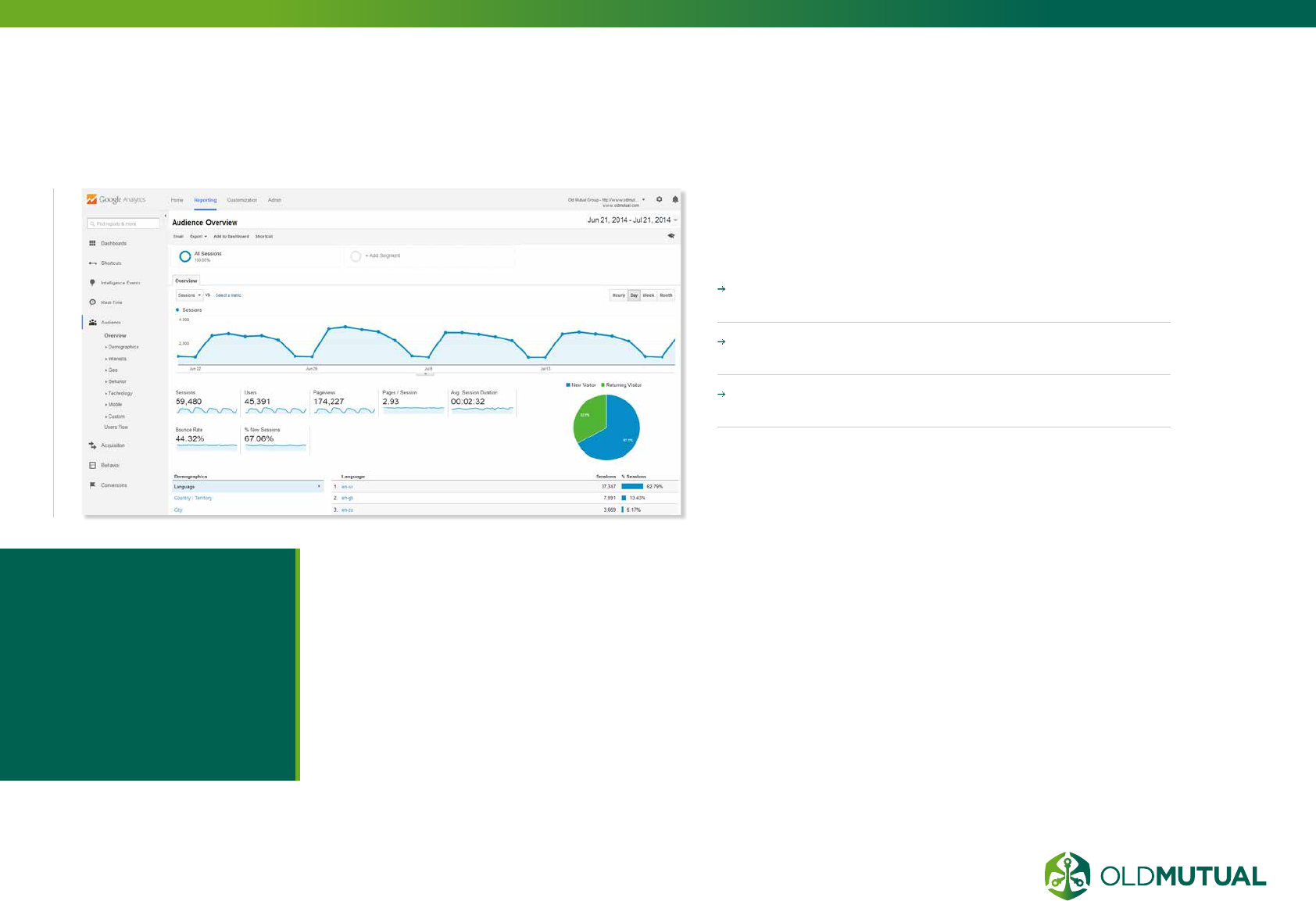
70 OLD MUTUAL GROUP DIGITAL GUIDELINES
A well embedded, aligned analytics and
online marketing approach will provide
a view of:
Which pages are not performing and adjust the page
to IMPROVE PERFORMANCE.
THE ‘STICKINESS’ OF PAGES. Is the information
and experience we provide online engaging?
Whether your marketing activities are SUCCESSFUL
IN DRIVING GOALS.
Online analytics have varying forms of capability from
an overview of visitor journeys to detailed single view
of visitor interactions. Therefore solutions need to be
carefully matched to requirements.
CORE MEASURES
Online analytics
have varying forms
of capability from an
overview of visitor
journeys to detailed
single view of visitor
interactions.
10.1

71 OLD MUTUAL GROUP DIGITAL GUIDELINES
ONLINE ANALYTICS
BEST PRACTICES
What does it take
to produce great
analytics? Some would
say it’s all about the
right data, tools and
techniques. But let’s
assume that you have
all that. What do you
do then?
The answer is to follow best
practices—in people and
processes:
ALIGNMENT
This starts with the need
to fully understand
the business issue or
opportunity at hand and
then selecting the data
and techniques most
appropriate.
BUSINESS IMPACT
Stakeholders must be
guided through often
detailed deliverables to
help them focus on those
results relevant to the
financial bottom-line.
EASE OF APPLICATION
For analytics to have
maximum impact, analytics
personnel must go beyond
simply producing a model
or analysis. They have to
work closely with sponsors
to ensure that their work
is correctly and easily
interpreted.
ANALYTICS PROCESS
AND METHODOLOGY
A well laid out and
consistently followed
process for analytics can
go a long way towards
ensuring that good work is
consistently produced.
DATA PREPARATION
Some of the least
glamorous (but most
important) work in the
process quickly follows:
Auditing and appropriately
transforming the data
so that it is as complete
as possible and ready
for application of the
appropriate techniques. All
other things being equal,
finding the right data and
appropriately preparing it
is ultimately more important
that your selection of
analytic technique.
MODELING AND
EVALUATION
Choose a few techniques
that consistently produce
reliable results. The most
obvious example is logistic
regression—the tried and
trusted technique which has
proven to be a mainstay in
marketing and other areas.
DEPLOYMENT
Towards the tail end of the
process, the focus should
be on communication,
deployment and,
if appropriate,
“operationalisation” of the
output.
PEOPLE
The best analytics people
possess a hard to find
skills mix. It combines the
advanced technical skills
they need to do good
work, combined with
curiosity, business savvy
and a consulting mind-set.
PROACTIVITY AND
PARTNERSHIP
Good analytics people
will try to influence the
broader learning agenda
by proactively shaping the
processes and decisions
that give rise both to
requests for analytics work
as well as governing how
that work is used on an
ongoing basis.
10.2
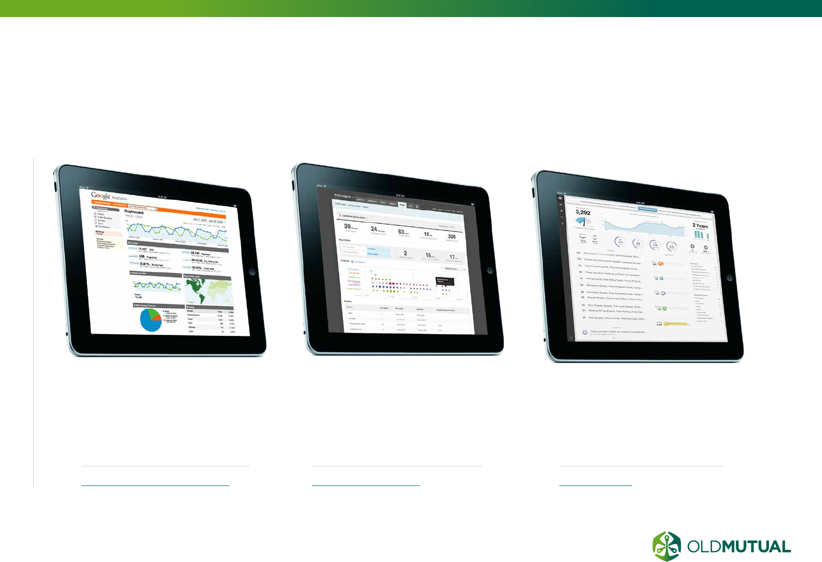
72 OLD MUTUAL GROUP DIGITAL GUIDELINES
EXAMPLES OF
ONLINE ANALYTICS TOOLS
KISSMETRICS
This is a great tool for tracking
what users do once they land on
your website, and helps you to
identify your website conversion
weak points.
www.kissmetrics.com
CHARTBEAT
This tool has an emphasis on
tracking realtime events on your
website and notifying you via a
mobile app when events such as
traffic spikes occur.
chartbeat.com
GOOGLE ANALYTICS
Our preferred and the biggest
leading online analytics tool.
This tool from Google is
completely free and tracks most
things you will need.
www.google.com/analytics/
10.3

11.1 Group Head Office
11.2 Emerging markets
11.3 Old Mutual Wealth
CONTACT
INFORMATION
11
74
75
76
74 OLD MUTUAL GROUP DIGITAL GUIDELINES
GROUP
HEAD OFFICE
HELEN CASEY
Head of Marketing
+44 (0)20 7002 7292
helen.casey@omg.co.uk
GRAHAM BEVERLEY
Head of Group Web
+27 (0)21 509 6457
graham.beverley@omg.co.uk
For more information about these guides,
or if you have any questions, please do not
hesitate to contact one of our trusted team
members.
11.1
75 OLD MUTUAL GROUP DIGITAL GUIDELINES
EMERGING
MARKETS
ROBERT
HERMANIE
UX & Creative Manager
27 (0)21 504 8774
rhermanie@oldmutual.com
HELEN VAN DER
REDE
Content Editorial
+27 (0)21 509 7440
hvanderrede@oldmutual.com
AMANDA
LAMBE
Social Media
+27 (0)21 509 3347
alambe@oldmutual.com
DAVID RUSSEL-
ROCKLIFF
Web Development Manager
+27 (0) 21 509 6023
drussel-rockliff@oldmutual.com
AHMED
KAJEE
Head of Digital
+27 (0) 21 509 2536
akajee@oldmutual.com
11.2

76 OLD MUTUAL GROUP DIGITAL GUIDELINES
OLD MUTUAL
WEALTH
STEVEN REDDING
Head of Digital Marketing
+44 (23) 80729839
steven.redding@skandia.co.uk
11.3

77 OLD MUTUAL GROUP DIGITAL GUIDELINES
REFERENCES
http://rosnf.net/2012/10/communications-strategy/
http://searchengineland.com/10-tips-for-a-more-effective-paid-search-
campaign-13543
http://www.graphpad.com/support/faqid/1282/
http://www.graphpad.com/support/faqid/1282/
http://ss64.com/css/syntax-naming.html
http://javascript.crockford.com/code.html
http://line25.com/articles/10-common-validation-errors-and-how-to-fix-them
http://www.csulb.edu/divisions/students/dss/accessibility/web/
http://www.avangate.com/avangate-resources/article/Effective-SEO-through-
good-code-structure.htm
http://www.chiefmarketer.com/database-marketing/loyalty-crm/from-good-to-
great-best-practices-in-analytics-14062006
http://askbrisx.com/analytics/top-5-online-analytics-tools-track-website-visitors/
http://blog.statuspage.io/user-experience-means-more-than-a-good-product
http://www.usability.gov/index.html
http://usabilitygeek.com/official-usability-user-experience-user-interface-
guidelines-from-companies/
https://support.google.com/webmasters/answer/35769#1
file:///C:/Users/om00048/Downloads/Microsoft%20Surface%20User%20
Experience%20Guidelines.pdf
http://www.smashingmagazine.com/2010/10/05/what-is-user-experience-
design-overview-tools-and-resources/
http://uxmas.com/2013/ux-vs-cx
THANK YOU
FOR LIVE EXAMPLES PLEASE VISIT
THE FOLLOWING WEBSITES
www.oldmutual.com
www.oldmutual.co.za
www.oldmutualwealth.co.uk
