U.S. Department Of Veterans Affairs: Graphic Standards: Tier 1 VA 508 Standards Guide 013113
User Manual:
Open the PDF directly: View PDF ![]() .
.
Page Count: 71
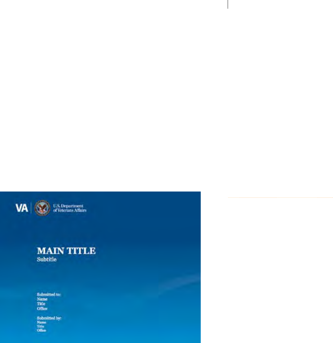
Tier 1
Graphic Standards:
Foundation for Brand Maintenance and Evolution
Version 1.0 August 2012

Contents 3 Introduction
4 Absolutes: Essential and Unchangeable
Elements of the VA Brand
5 Organizational Identiers
6 VA Parent Signature
7 VA Parent Signature: Color Options
8 VA Administration & Oce Identiers
10 VA Seals: New Scalable Vector Rendering
11 VA Seal: Approved Seal Source File Review
12 VA Seal: Retired Seals
13 VA Seal: Minimum Size Usage
14 VA Seal/Parent Signature: Minimum Clear Space
15 VA Seal/Parent Signature: Incorrect Usage
17 Color
18 Color: VA Primary Brand Colors
19 Color: VA Secondary Brand Colors
20 Color: VA Extended Palettes
21 Color: Screens & Tints
22 Color: Two-Color Printing
23 Typography
24 Typography: General Body Text
25 Typography: Title/Accent Text
28 Typography: Non-Graphics Professionals
29 Typography: Appropriate Color Usage
32 Typography: Incorrect Applications
34 Design
35 Design: Incorrect Applications
37 Imagery: Philosophy and Guidance
38 Imagery: Incorrect Photography Applications
41 Imagery: Monotone Photography Usage
42 Imagery: Appropriate Illustration Techniques
43 Design Inspirations
44 The VA Thread
45 VA Sub-Identiers: Transition to Unison
46 VA Sub-Identiers: Administration Oce Identifying Motif Option
47 VA Sub-Identiers: Design Tactics for Special Situations
48 VA Sub-Identiers: Design Tactics for Special Programs and Events
49 Special VA Internal Sub-Identier: I CARE
51 General Design Applications
52 Stationery: Example Letterhead
53 Stationery: Example Envelopes
54 Stationery: Example Business Cards
55 PowerPoint®: Primary Template
57 PowerPoint®: Alternate Design Inspiration
58 Example Fact Sheets
61 Example Award Certicates
62 Design Inspirations: Hypothetical Applications
70 Preight Checklist

Introduction The U.S. Department of Veterans Affairs (VA) Tier 1 Graphic Standards showcases major
elements of the VA brand identity system and provides guidelines for their correct use in
creating new components of the VA brand identity. The purpose of establishing a brand identity
is to create more accessible communication products which are well designed and consistently
provide clear and accurate information to Veterans about VA benets and services.
As outreach and communications efforts continue to grow, VA must project a strong,
consistent identity to further shape the way Veterans, their families, and other constituents view
VA. This authoritative resource has been formed accordingly, organizing the presentation of core
brand attributes to improve overall condence in VA and better assert its value in the marketplace.
Careful observance and compliance with these guidelines is critical in conveying VA progress and
relevance, and contributes to distinguishing VA as the primary and essential organization serving
Veterans in the U.S. Employing this guidance ensures that approval processes for ongoing creative
for communications and outreach are more efcient, and the output more effective.
Within this document are both set requirements which cannot be altered, as well as inspirational
guidelines providing creative exibility for more original interpretations. For design ease and
brand consistency, key elements such as the VA Signature are provided as accompaniments to this
document as ready-to-use images in various electronic formats, (EPS, JPG, etc.) eliminating the
need for font matching, color selection and Identier construction.
This document is the solely-approved standard graphic identity guide for VA, authorized by the
Ofce of the Secretary. It is to be used to mark all programs, projects, initiatives, campaigns,
activities, and public communications that require Department identication. Always use the
provided les, and never attempt to recreate or modify the xed VA Seal or VA Signature options.

Absolutes:
Essential and
Unchangeable
Elements of
the VA Brand
This document is intended to illustrate not only the basic brand tenets of the VA
identity, but to inspire a wide range of creative design options that t within a cohesive family.
With this in mind, there are some elements that are not to be modied.
Pages six through 42 delineate core brand attributes which may not be altered or rearranged
(with the exception of specic name/contact information needed on stationery items).
Primarily, these refer to the VA Seal and Signatures, which are provided in a number of ready-
to-use electronic formats, and within pre-designed templates.
Neither the VA Seal, Signature, nor Administration and Ofce Level Identier arrangements
should ever be recreated manually (using only the provided templates), or altered in any way.
On page seven, you will see the approved template options—including horizontal and stacked,
as well as an array of full-color and one-color options—which represent the only approved
versions of this key brand component.

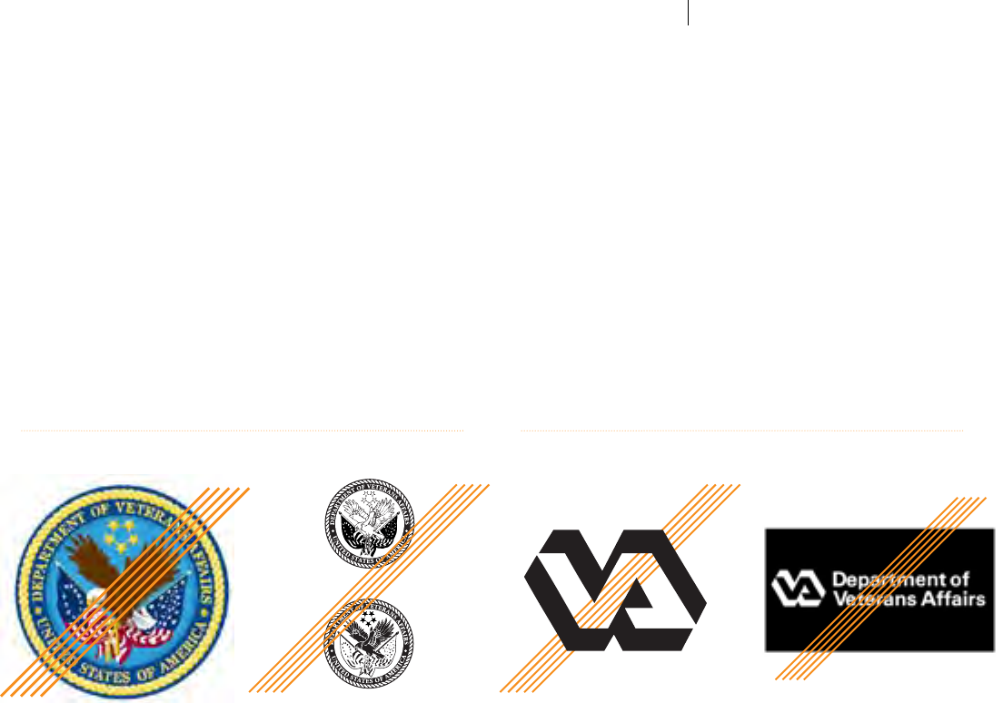
Organizational
Identiers
The most crucial element of the VA Tier 1 Graphic Standards is the system by which VA
identies itself and its organizational components to public and Veteran audiences. This
document therefore establishes required combinations of the VA Seal and accompanying
naming text—called “Signatures”—in order to ensure clear communication of the VA
brand across the entire Department. The following section illustrates approved Signature
arrangements for use in all creative for materials where the Department seal is used.
Also addressed is the important issue of legacy VA Identiers. The stylized, illustrated
VA “logo”—competing with the VA Seal for brand relevance—should no longer appear
in general VA communications and should only be used for challenging sizes and surfaces
such as in signage, small giveaways, etc. The newly established VA Parent Signature—which
also incorporates a newly illustrated VA Seal, shown on page 10—must be the dominant
Identier of the U.S. Department of Veterans Affairs both to minimize confusion and
emphasize the fact that VA is a U.S. Federal Government Cabinet-level agency.
The VA Parent Signature must appear in an approved prescribed form on all VA materials.
Each approved VA Parent Signature is provided in a number of ready-to-use electronic
formats, and within pre-designed templates. Ofcial Signature options are provided in the
VA Brand Graphics Repository and must never be recreated manually, or altered in any way.
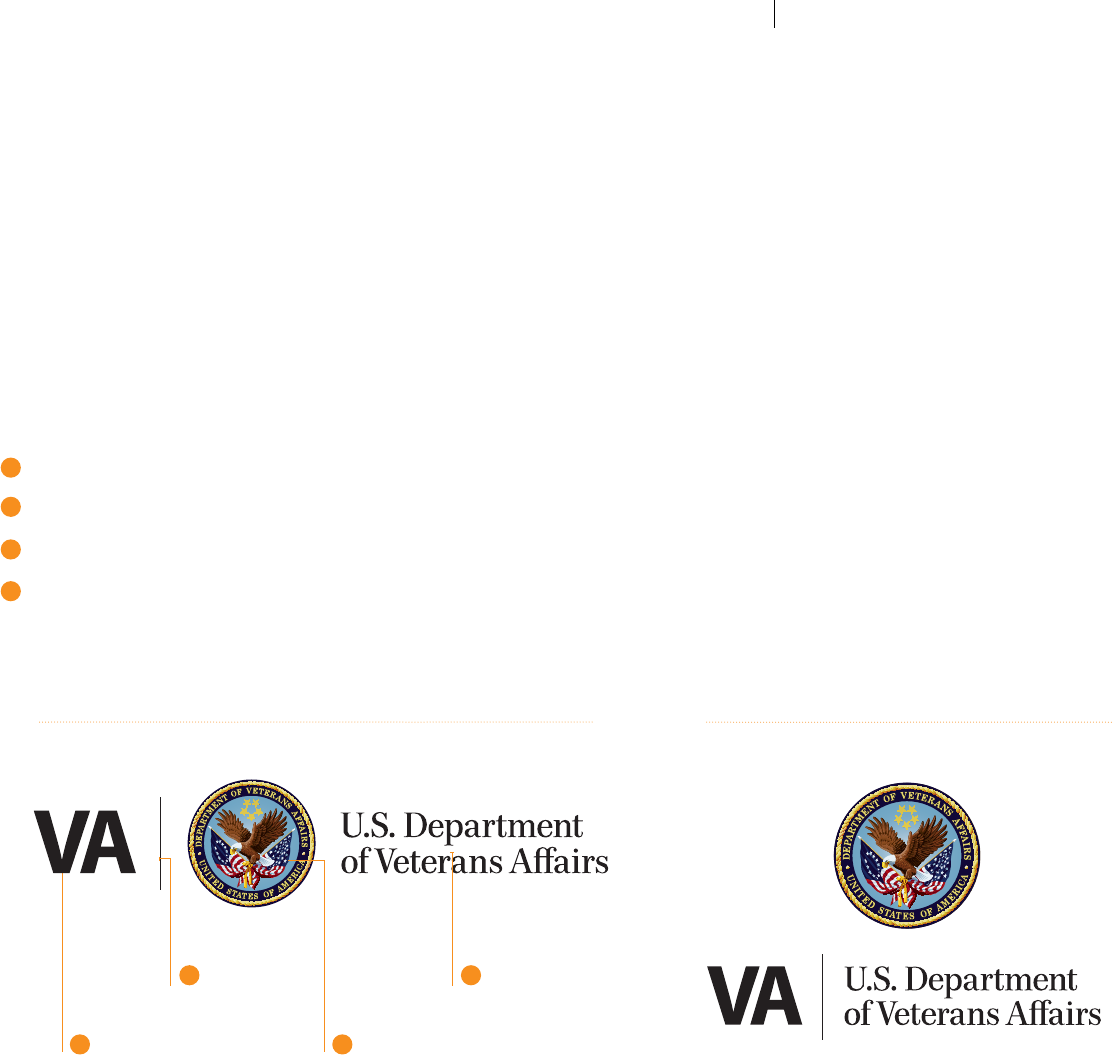
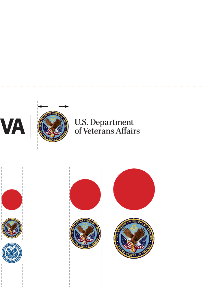
The VA Parent
Signature
In order to facilitate progress in the way VA presents itself, build
public condence, and assure its relevance to both public and Veteran
audiences, The Oce of the Secretary has commissioned the new VA
Parent Signature to return focus to the core VA brand, with the VA Seal
featured as the primary element and naming text for optimal readability.
More than just a "logo," the VA Parent Signature is a combination
of elements comprising the essence of the VA brand identity.
The VA Signature is comprised of four elements:
"VA" lettering, rapidly identifying VA by its well-known acronym
Vertical divider rule
The timeless, uncompromised VA Seal
“U.S. Department of Veterans Aairs” title typography for optimal
readability at smaller sizes
The VA Signature is the core design element around which
the brand is created. It focuses exclusively on the VA Seal,
and introduces title text which appears in a timelessly
elegant but warm and approachable serif font.
The horizontal VA Signature shown below is the primary version and
should be used whenever possible. However, in some instances a
vertically-stacked VA Parent Signature option may be necessary for
more narrow, vertical brochures, ads, banners, etc. As with all VA Parent
Identiers, this arrangement is provided in a variety of electronic le
formats (EPS, JPG, etc.) and should not be recreated, rearranged or
distorted in any way.
Ready-to-use VA Signatures are available in the VA Brand Graphics
Repository.
Important:
The designs shown at right are
set layouts which are not to be
rearranged or re-proportioned.
They are provided as ready-to-
use, indivisible graphics in various
electronic formats, (EPS, JPG,
etc.) eliminating the need for
font matching and component
arrangement. Always use the
provided les, and never attempt to
recreate the VA Seal or Signature.
1
Anatomy of the VA Parent Signature
"VA" TYPOGRAPHY
2VERTICAL
DIVIDER RULE
4TITLE TYPOGRAPHY
3NEW VECTOR
VA SEAL
(SEE PAGE 8)
1
2
3
4
Stacked VA Parent Signature
THE VA PARENT SIGNATURE
6
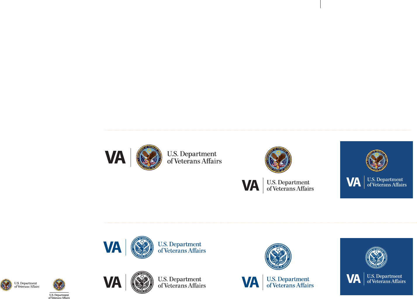
VA Parent
Signature:
Color Options
The options on this page show approved color applications and
arrangements for both full-color and one-color versions of the VA
Parent Signature. The one-color version is mostly to be used for one-
or two-color printing. In such scenarios, the one-color VA Parent
Signature must be printed in either all VA Navy (see page 18) or all black.
In such cases where black is the only color being applied,
the 100% black version of the VA Signature should be used.
The approved full-color VA Parent Signature (horizontal or stacked)
is to be printed in all full-color printing applications, and must be
placed on an appropriate background color or suitably solid area of a
given image or appropriate imagery. For consistent presentation—a
critical component of maintaining brand integrity—do not alter these
prescribed options in any way, including color density (tints or gradients),
arrangements, etc.
Full-Color Printing
Special vector PDF options are supplied
for one- or two-color printing, which
provide sucient Seal contrast. For such
projects, the VA Signature should only be
printed in black or VA Navy on white—or
very light—backgrounds; or reversed as
shown on this page.
One- or Two-Color Printing
In certain situations, it may be
determined that inclusion of “VA” next to
the Seal as shown right is not optimal for
a given layout, and that an abbreviated
Signature (shown below) would be more
appropriate for the overall design.
VA PARENT SIGNATURE: COLOR OPTIONSVA TIER 1 GRAPHIC STANDARDS
7
VA Administration
& Ofce Identiers:
Distractions from
Brand Clarity
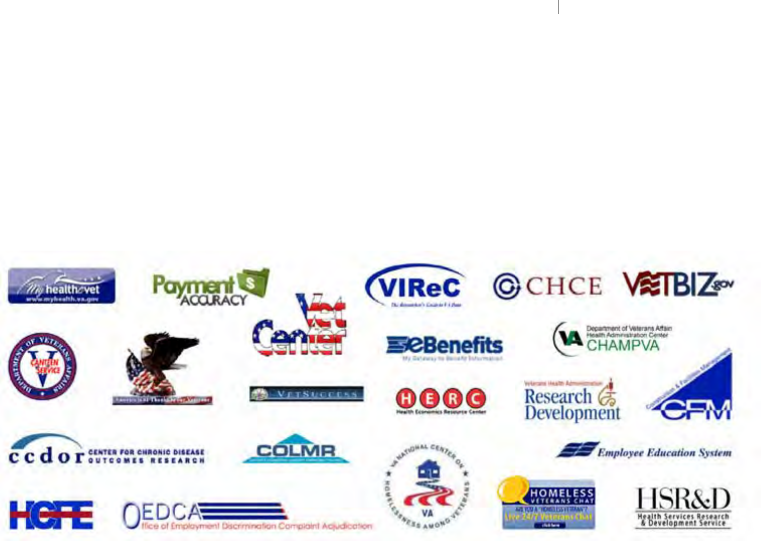
This page shows an array of past VA Sub-Identiers that appear as
individualized identities or initiatives, each with an unclear connection
to VA. Although the design quality and executions exhibited in many
such marks are strong, the collective visual presence of such branding
diversity does little to convey aliation with VA. This condition creates
unnecessary obstacles for communicating VA involvement, unity, and
relevance—leaving viewers to wonder how and where each ts with
VA and how much each is relevant to their future. This illustration
demonstrates the certain need for VA communicators and participating
creative professionals to support VA in establishing standards for
basic brand appropriateness. It is of utmost importance to clearly and
immediately identify VA aliation in all components of Administration
and Oce level outreach and communications. Programs, initiatives,
services, and resource groups should clearly establish VA authority
in the minds of Veterans and their families seeking earned benets
and services, as well as public, legislative and media constituents for
ecient navigation of the VA organization and greater understanding
of its strengths and accomplishments.
VA TIER 1 GRAPHIC STANDARDS VA ADMINISTRATION & OFFICE IDENTIFIERS
8
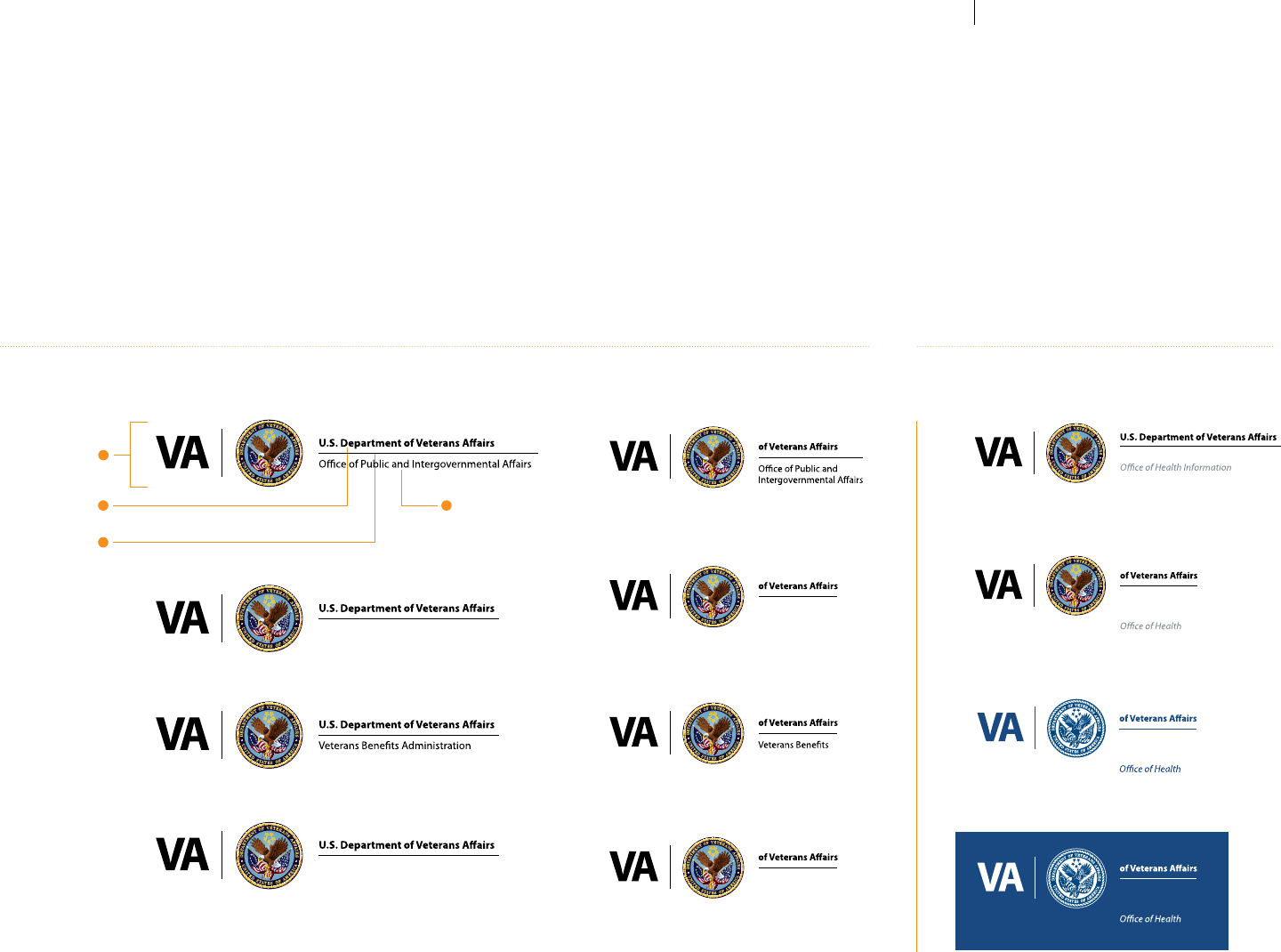
VA Administration
& Ofce-Level
Identiers:
Format Solutions
for Unison
The following format solutions—appropriate alternatives to creating
unnecessary departmental “logos” or “sub-brands”—show how all
divisions of VA are to be identied using a single unied formula.
Below are the sole approved template-based treatments for
both Administration and inter-oce identication. These format
settings are required for use in identifying all segments of VA in
order to eliminate undue Veteran confusion from "logo clutter" in
communications and outreach vehicles. This solution provides clear
and exact information on which Administration and Oce is providing
a given message, eliminating the distraction brought on by visually
randomly devised organizational Identiers.
Administration Level Signatures: Horizontal and Stacked Versions
1
VA SEAL
2
AGENCY NAME
FONT: MYRIAD PRO BOLD
COLOR: BLACK
3
HORIZONTAL RULE
COLOR: BLACK
2ADMINISTRATION NAME
FONT: MYRIAD PRO REGULAR
COLOR: BLACK
National Cemetery Administration
Veterans Health Administration
U.S. Department
Veterans Health
Administration
U.S. Department
U.S. Department
Administration
U.S. Department
National Cemetery
Administration
Example Inter-oce or Program Signatures
U.S. Department
Veterans Health
Administration
Information
Veterans Health Administration
U.S. Department
Veterans Health
Administration
Information
U.S. Department
Veterans Health
Administration
Information
See pages 46-49 on best practices for creating Sub-Identiers for special programs, events, etc.
VA TIER 1 GRAPHIC STANDARDS VA ADMINISTRATION & OFFICELEVEL IDENTIFIERS
9
VA Seal:
New Scalable
Vector Rendering
The original Ocial VA Seal was created in 1989 to represent the
newly established Department of Veterans Aairs, converted in 1988
from the Veterans Administration. Its regally distinguished rendering
respectfully reects the VA mission and esteemed Cabinet-level status
within the U.S. Federal Government. This symbol purely and eectively
represents the core essence of the VA brand with timeless and stately
illustration and colorization techniques. In maintaining a proper VA
brand image, consistent quality and appearance in all reproductions of
the VA Seal is paramount.
Bitmap-formatted les (.JPG, .TIF, .GIF, etc.) present inherent challenges
in both enlargement, with signicant image degradation, and
placement in certain publishing formats with surrounding white
boxes without proper masking. Therefore, vector-formatted les
(.AI, .EPS and vector .PDFs) are used ubiquitously for identier les
in most major brands. Given that, a vector illustration was created in
the past to address this need and has been commonly used for some
time. However, the colorization and rendering style are not deemed
adequately similar to the ocial original Seal, and a new vector
rendering has been created to replace it.
This new, accurately-depicted version of the VA Seal provides all of the
image quality, visual consistency, scalability, and exibility needed by
creative and communications professionals in achieving the highest
visual quality standards. It replaces the previously used version and
is recommended for use in all print applications of the VA Seal. Use of
a bitmap (i.e., JPG) version of this new Seal illustration is encouraged
for use in presentation formats, such as Microsoft™ Oce® products,
for smaller document les sizes (the complex nature of this vector
illustration adds approximately 2MB for each appearance).
Absolutely NO changes to the new vector Seal are permitted.
Ocial Primary Bitmap VA Seal
ZOOM IN FOR
COMPARISON
Newly Rendered Primar y Vector VA Seal
ZOOM IN FOR
COMPARISON
Retired Vector VA Seal
stars & disk
Bird & Flags
text
VA SEAL: NEW SCALABLE VECTOR RENDERING
10
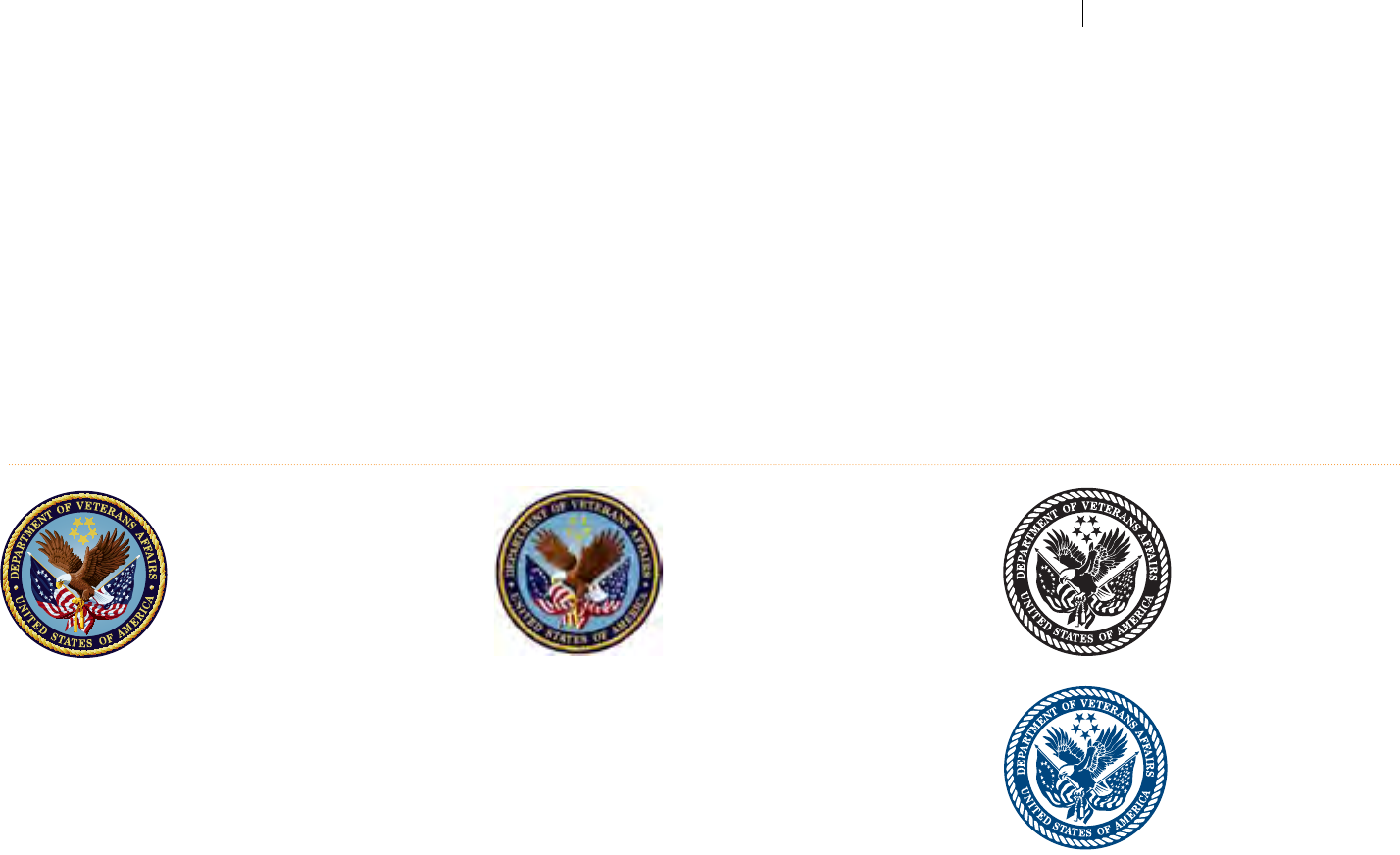
VA Seal:
Approved Seal
Source File
Review
The les below are the ocial electronic versions of the VA Seal.
These les are provided as the principle component of the complete VA
Signature (with “U.S. Department of Veterans Aairs” naming text) in
a variety of formats and rendering styles so one can select the version
that best ts the many varied reproduction situations that must be met
with appropriate branding source les. Carefully note the dierences
between each available format option shown below.
Use these source les to incorporate into your artwork, scaling them
as necessary. The Seal designated by asterisks below should always
be the rst options considered for common print and web uses
respectively. The other designs are provided for specic situations as
described for each.
Primary VA Seal: Full-Color VA Seal: One-Color
*Newly rendered version of Seal in
scalable vector le format.
This Seal (almost indistinguishable from
the ocial original version as shown on
the previous page) is to be used for all
forms of full-color printing.
Vector-formatted les are innitely
scalable without image degradation or
inconsistent output and are ideal for all
forms of printed materials, display panels,
banners, motor vehicles, etc. on surfaces
which do not detract from image quality
and consistency at the size to be printed.
In order to achieve minimum le sizes
when using Signatures with the full-color
vector Seal (i.e., for online or email
dissemination of PDF or Microsoft®
Oce® les), it is recommended that
the ocially-prepared, optimized PDF
versions be used.
*Bitmap version of new Seal illustration.
A bitmap (pixel-based) version of the new
Seal illustration is also available in the VA
brand graphics repository for use when le
size, rather than scalability, is an issue.
Although this format has very limited
enlargement capabilities, it is ideal
for use in web/screen uses, in internal
communications programs such as
Microsoft™ Oce®.
NOTE: Each time you re-scale a le that
is in bitmap format, you lose detail and
image quality in the artwork. Always start
with the highest resolution source le to
create newly-sized bitmap les—preferably
convert the new vector Seal illustration
slightly larger than the size needed.
Image quality varies with bitmap imagery
due to the amount of compression and
optimization applied in order to reduce le
size (the Seal shown above left was heavily
optimized in the creation of this PDF).
Use ONLY for printing the Seal in
one solid ink color—VA Navy, black
or knocked out white only, see
page eight— on a high contrast
background color.
The vector format allows for
unlimited scaling without any image
deterioration, and is intended for
use primarily in one-color printed
materials, or in full-color materials
which are ooded with color to the
point where the presence and/or
readability of the full-color Seal would
be diminished.
This Seal version is well suited for use
on items such as signage, banners,
ad specialties, screen printing, etc.
or in one- or two-color printing. It is
not intended for use or as any sort of
background or "watermark."
Given the small le size of these one-
color versions of the Seal, there should
be no need to convert from vector to
bitmap for le size reduction.
VA TIER 1 GRAPHIC STANDARDS VA SEAL: APPROVED SEAL SOURCE FILES
11
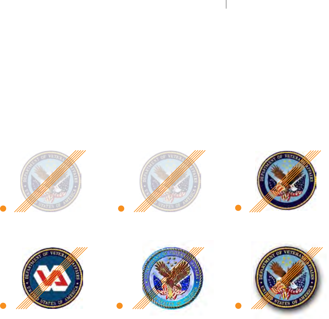
VA Seal:
Retired Seals
& Logo
No further use of the Legacy
Identiers shown on this
page is permitted.
The Ocial VA Seal—regal, honorable and exuding strong authority—is
deemed the core of the VA visual brand. It is lasting, well-known and
unchangeable. It adequately and appropriately conveys VA’s status as a
Cabinet-level agency. Proper use of the new VA Parent Signature will lay
a strong foundation for a timeless visual identity that more accurately
represents a modern and unied U.S. Department of Veterans Aairs.
Appropriate, consistent reproduction of the Ocial VA Seal (in both
full- and one-color) is critical for instant recognition, and any renderings
appearing noticeably dierent or unbalanced must be retired. Below
are example Seal renderings, and Legacy Logotype, in circulation which
are no longer approved for any sort of use. If you have these les on
your computer, it is advised that you delete them and obtain the newly
updated and approved les for optimal brand consistency.
Retired VA Seals:
Legacy "Vector" (scalable)
Full-color Seal
The colorization and rendering style
in this legacy vector version of the VA
Seal is no longer deemed adequately
similar to the ocial Seal. A new
vector rendering has been created to
replace it for more consistent color
and composition. Please use the newly
developed vector version of the Ocial
VA Seal shown on page 10.
Legacy "Vector" (scalable)
One-color Seal Options
The above one-color variations of
the VA Seal have been replaced with
a single, re-colorized version which
has been updated to reproduce more
cleanly and visually balanced at all
sizes. The approved new one-color
vector VA Seal required for use is
shown on the previous page.
Retired VA Logotype:
Legacy One-color
VA “Logotype”
The illustrated legacy VA “Logotype” shown above should no longer be used in any
circumstances (except limited applications to signage, per the VA signage standards
manual). Its stylized design does not incorporate the VA Seal, the core of the VA
visual brand. Widely used throughout VA branding and communication design in
lieu of the VA Seal, the VA “Logotype” was originally designed for use when VA was
an Administration-level agency several decades ago. Its heavily distinct and dated
illustration style evokes a bygone time when this graphic look was popular and
ubiquitous, and it is reminiscent of an era prior to many signicant advancements in
VA technology, operations, status, and public perception.
VA TIER 1 GRAPHIC STANDARDS VA SEAL: RETIRED VERSIONS
12
VA Seal:
Minimum
Size Usage
Preferred Minimum VA Signature Size in General Usage
To retain the visual integrity of the VA Parent
Signature, the VA Seal should never be reduced
to smaller than 0.75" x 0.75", with
the title typography no smaller in relative
proportion.
The illustration at left shows the preferred
minimum size for the VA Parent Signature
and how it is measured.
The VA Parent Signature should be reduced
to its minimum size only when absolutely
necessary when used in the smallest
applications or formats. Detail in the VA Seal
becomes lost when the Signature is greatly
reduced, particularly the lettering.
The Signature is provided in various electronic
formats (EPS, JPG, etc.) and should not be
recreated or distorted in any way. It has
been designed to accommodate standard
applications and page sizes, and is included
in the corresponding templates for your
convenience.
0.75"
PREFERRED
ABSOLUTE
MINIMUM
SIZE
1/2"
MINIMUM SIZE
IN ALL
STANDARD USAGE
3/4 "
OPTIMUM
SIZE
1"
VA SEAL: MINIMUM SIZE USAGE
13
VA Seal/Parent
Signature:
Minimum
Clear Space
A specied clear space ensures the integrity
and impact of the VA Seal and Signatures. It
is important that enough space is maintained
around the logo to clearly convey the identity
without competition.
A space equal to half of the height of the
VA Seal should be maintained around the
entire VA Parent Signature.
"X" illustrates the minimum amount of clear
space that should be used around the Seal
and typography at all times.
x
x
x
x
x x
x
VA SEAL/PARENT SIGNATURE: MINIMUM CLEAR SPACE
14
VA Seal/Parent
Signature:
Incorrect Usage
The following restrictions are in accordance with those originally provided for the VA Seal at http://vaww4.va.gov/6102/seals.asp.
In addition, the only correct congurations of the New VA Parent Signature are as shown on pages seven, eight and ten—horizontal or stacked
formats, either in full-color or one-color solid VA Navy or black (see these colors on page 18). No other color combination is allowed for the
reproduction of the New VA Parent Signature under any circumstances, nor is the omission of any Parent Signature element. A few typical
incorrect examples are shown below.
1 Never use the VA Seal/Parent Signature
at an opacity less than 100% or use it as
a faint “watermark” behind text.
2 Never overlay any graphic/element/type
onto the VA Seal/Parent Signature.
3 Never alter or replace the text in the
VA Seal/Parent Signature.
4 Never alter any element of the
VA Seal/Parent Signature, such
as substituting logos.
5 Never apply eects to the VA Seal/Parent
Signature, such as simulated embossing
or altering colors.
6 Never add drop shadows to the
VA Seal/Parent Signature.
12
4 5
Text Overlay
3
6
15
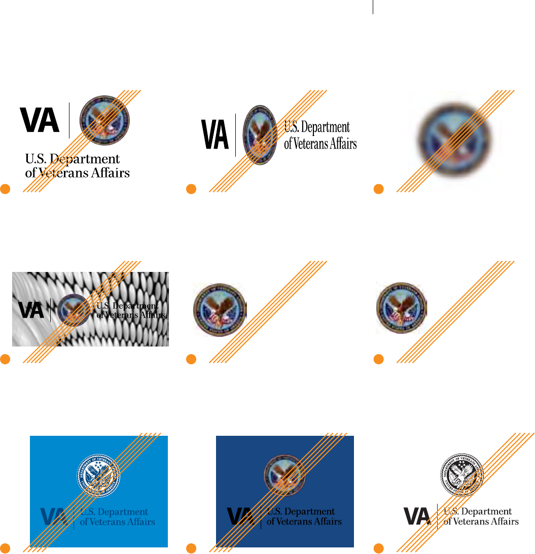
VA Seal/PARENT SIGNATURE: INCORRECT USAGE
VA Seal/Parent
Signature:
Incorrect Usage
CONTINUED
7 Never reposition or re-proportion
elements of the VA Signature.
8 Never skew, rotate, distort, or
otherwise alter elements.
9 Never blur or ghost VA Signature
elements, or apply any type of
digital eects.
10 Never place the VA Signature over
a distracting photographic image.
11 Never omit elements/words from
the VA Signature.
12 Never alter or substitute
VA Signature fonts.
13 Never use the one-color VA Signature
on a dark background without converting
the type and rule to white.
14 Never use the full-color VA Signature
on a dark background without converting
the type and rule to white.
15 Never reverse/invert the one-color
VA Signature.
7 8
10
13 14 15
11 12
9
Veteans Affairs U.S. Department
of Veterans Affairs
16
VA SEAL/PARENT SIGNATURE: INCORRECT USAGE

Color Appropriate use of color is key in establishing brand identity. The established primary
colors on page 18 set the tone, while a family of secondary accent colors on pages 19–20
can be applied as to divide and code information, punctuate layouts, and provide adequate
diversity in the look of VA corporate communication vehicles. Used discretely and
consistently, these top-level color sets will complement an array of other xed corporate
brand elements and suitable photography, provide contrast in layouts and create visual
patterns necessary for VA brand recognition and unity.
In all color usage for corporate-level communications, screens/tints of both blues should
be used very sparingly, and reds should only be used at full saturation to avoid appearing
pink. Effects such as gradients and tints should be applied sparingly, as not to overpower the
layout or draw attention from the VA brand.
Within VA there is substantial variation in the audiences and objectives pursued by
individual stakeholders, and additional considerations have been given to facilitate creative
expression which would otherwise be inappropriate for corporate-level communications.
Therefore, color usage in Sub-Divisional campaigns and initiatives provides more exibility
through a broader selection of color ranges. These are for qualied creative professionals to
use as a design element that allows greater individuality. When in doubt though, following
the Primary and Secondary corporate-level colors is always a brand-safe option.
For guidelines on appropriate color with typography, see pages 29 through 31, photography
on page 38 and general design on pages 51 through 69.

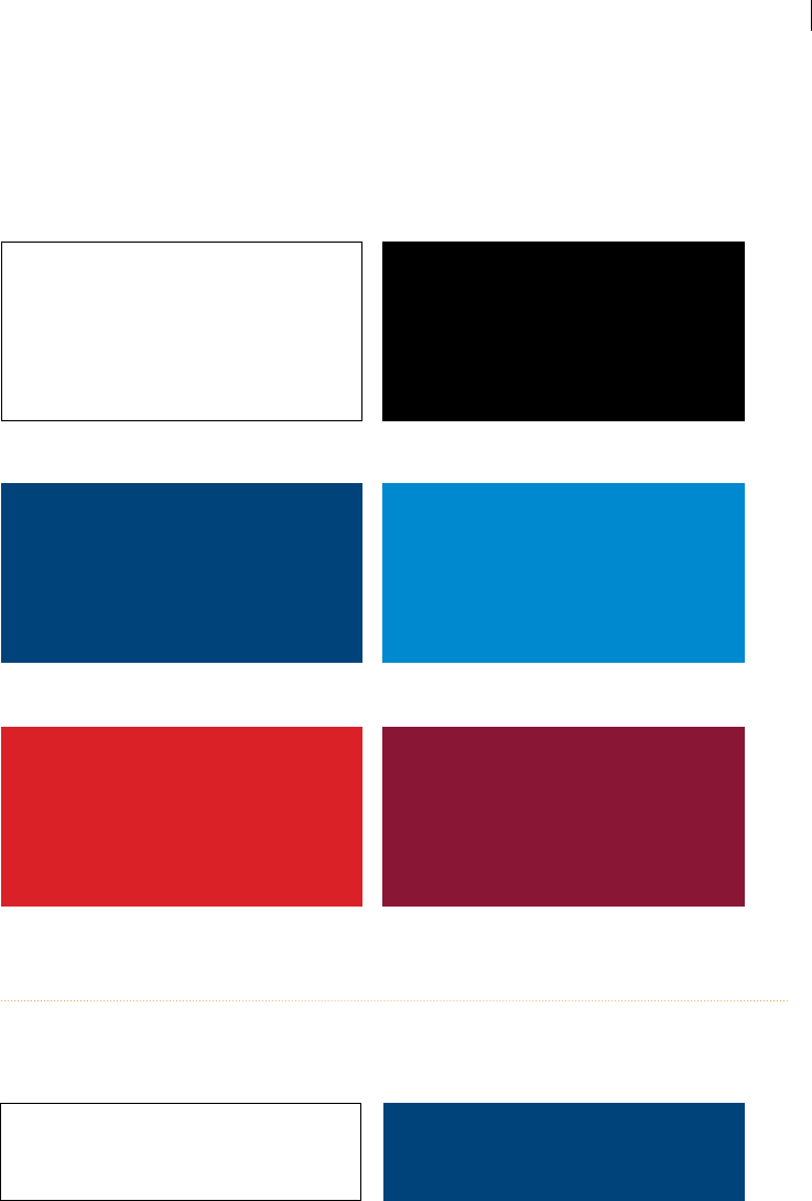
Color:
VA Primary
Brand Colors
The following Primary Brand Colors have been established to aide in
maintaining a consistent VA brand identity. They reect the colors used
in the New VA Signature, provide ample contrast on the page, and
engage the viewer with positivity and patriotism.
These colors can be eectively used as type and/or solid elds of color—
see pages 29 through 31 for guidelines on appropriate color typography
usage. The main VA Brand color is VA Navy. Reds should be used leanly as
accent and trim—too much red can be overly distracting.
Using the Primary Brand Color
palette helps to establish
and strengthen the VA brand.
Don't forget to bring them
into your designs.
NAVY
SPOT COLOR
PMS 541 C
PMS 541 U
4-COLOR PROCESS
DS 206-1 C
C = 100
M = 60
Y = 0
K = 40
DS 209-1 U
C = 100
M = 50
Y = 0
K = 20
ON SCREEN
R = 0
G = 63
B = 114
WEB
Hex
003F72
LIGHT BLUE
SPOT COLOR
PMS 7461 C
PMS 2995 U
4-COLOR PROCESS
DS 221-2 C
C = 100
M = 30
Y = 0
K = 0
DS 225-3 U
C = 100
M = 10
Y = 0
K = 0
ON SCREEN
R = 0
G = 131
B = 190
WEB
Hex
0083BE
RED
SPOT COLOR
PMS 1797 C
PMS 1797 U
4-COLOR PROCESS
DS 77-1 C
C = 10
M = 100
Y = 100
K = 0
DS 90-1 U
C = 100
M = 80
Y = 0
K = 0
ON SCREEN
R = 198
G = 38
B = 46
WEB
Hex
C4262E
DARK RED
SPOT COLOR
PMS 188 C
PMS188 U
4-COLOR PROCESS
DS 106-1 C
C = 30
M = 100
Y = 70
K = 30
DS 93-1 U
C = 0
M = 100
Y = 80
K = 40
ON SCREEN
R = 119
G = 36
B = 50
WEB
Hex
772432
C=Coated U=Uncoated
COLOR: VA PRIMARY BRAND COLORS
18

Color:
VA Secondary
Brand Colors
In addition to the VA Primary Brand Colors illustrated on page 18, the following VA Secondary Brand Colors may be used sparingly for accents
and tones, and are ideal in more creative applications. For an even wider range of creative colors, see page 20.
GREEN
SPOT COLOR
PMS 575 C
PMS 575 U
4-COLOR PROCESS
DS 297-1 C
C = 50
M = 0
Y = 100
K = 40
DS 305-3 U
C = 25
M = 0
Y = 95
K = 35
ON SCREEN
R = 89
G = 133
B = 39
WEB
Hex
598527
GOLD
SPOT COLOR
PMS 129 C
PMS 128 U
4-COLOR PROCESS
DS 5-4 C
C = 0
M = 10
Y = 100
K = 0
DS 5-4 U
C = 0
M = 10
Y = 100
K = 0
ON SCREEN
R = 243
G = 207
B = 69
WEB
Hex
f3cf45
ORANGE
SPOT COLOR
PMS 1575 C
PMS 1585 U
4-COLOR PROCESS
DS 49-3 C
C = 0
M = 50
Y = 70
K = 0
DS 49-3 U
C = 0
M = 50
Y = 70
K = 0
ON SCREEN
R = 247
G = 149
B = 91
WEB
Hex
f7955b
BLUE GRAY
SPOT COLOR
PMS 7544 C
PMS 7545 U
4-COLOR PROCESS
DS 327-6 C
C = 10
M = 0
Y = 0
K = 50
DS 327-4 U
C = 20
M = 0
Y = 0
K = 70
ON SCREEN
R = 131
G = 144
B = 151
WEB
Hex
839097
LIGHT GRAY
SPOT COLOR
PMS Cool Gray 3 C
PMS Cool Gray 3 U
4-COLOR PROCESS
DS 325-8 C
C = 0
M = 0
Y = 0
K = 15
DS 326-8 U
C = 20
M = 10
Y = 15
K = 0
ON SCREEN
R = 220
G = 221
B = 222
WEB
Hex
dcddde
SAND
SPOT COLOR
PMS 4525 C
PMS 4525 U
4-COLOR PROCESS
DS 26-8 C
C = 10
M = 15
Y = 35
K = 0
DS 49-3 U
C = 0
M = 7
Y = 39
K = 17
ON SCREEN
R = 194
G = 180
B = 143
WEB
Hex
cccc99
OLIVE
SPOT COLOR
PMS 5777 C
PMS 453 U
4-COLOR PROCESS
DS 312-6 C
C = 5
M = 0
Y = 50
K = 25
DS 312-6 U
C = 5
M = 0
Y = 50
K = 25
ON SCREEN
R = 163
G = 168
B = 107
WEB
Hex
bec292
C=Coated U=Uncoated
VA TIER 1 GRAPHIC STANDARDS COLOR: VA SECONDARY BRAND COLORS
19
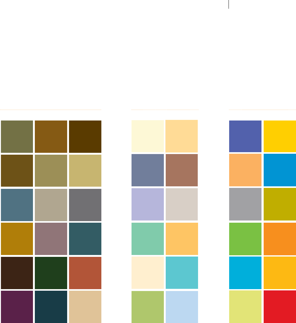
Color:
VA Extended
Palettes
Given that VA communications reach many dierent audiences for a
variety of purposes, this Extended Palette is provided for use in Sub-
Divisional campaigns and initiatives. Qualied creative professionals
can utilize the colors below to evoke a certain mood or distinguishing
colors for multiple-piece products. As well, the Primary and Secondary
Palettes shown on the previous two pages are always good to use
when in doubt. Please note the characteristic for each grouping of
colors, and try to use them within a single piece. In other words, stay
within the same color grouping. For hypothetical design examples, see
pages 65 through 69.
Don't forget to build the
Primary Brand Colors into
your design of corporate-level
publications.
The Extended Palettes help to
create dierent moods within
VA-branded pieces.
VA Deep Tones
PMS 392 C
PMS 1265 C
PMS 132 C PMS 1405 C
PMS 5835 C PMS 453 C
PMS 3435 C
PMS 476 C
PMS 549 C PMS 7535 C PMS Cool Gray
11 C
PMS 550 C
PMS 117 C PMS 5205 C PMS 5473 C
PMS 471 C
PMS 532 C
PMS 518 C PMS 466 C
CHARACTERISTICS: earthy, neutral, rich, solid, robust, quiet,
experienced, grounded, historic, muted
VA Light Tones
PMS 607 C PMS 150 C
PMS 570 C PMS 134 C
PMS 7525 C
PMS 310 C
PMS 2716 C PMS Warm Gray
3 C
PMS 366 C PMS 657 C
PMS 645 C
PMS 7499 C
PMS 1345 C
CHARACTERISTICS: cool, engaging, youthful,
feminine, light, airy, soft, muted, cheerful
VA Vibrant Tones
CHARACTERISTICS: dynamic, bright, energetic,
warm, fresh, strong, youthful, focused
PMS 2725 C PMS 7406 C
PMS 715 C PMS 7461 C
PMS Cool Gray
8 C
PMS 104 C
PMS 368 C PMS Orange
021 C
PMS 312 C PMS 130 C
PMS 585 C PMS 1797 C
COLOR: VA EXTENDED PALETTESVA TIER 1 GRAPHIC STANDARDS
20
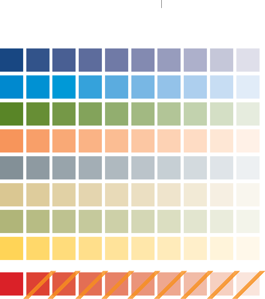
Color:
Screens & Tints
Colors with sucient density may
occasionally be used at lighter
percentages to achieve a softer eect.
This is known as screening. Darker
colors oer a wider range of screens.
Similarly, darkening a color is known
as tinting. In some instances, you may
desire to have type and/or design
elements appear just a few shades
darker than your background color.
This eect can be achieved by using
a lighter background percentage.
While many colors in the VA Palette can
be screened, reds—particularly Red and
Dark Red within the VA Primary Brand
Colors—should always be used at full
saturation to avoid appearing as pink.
The swatches at right illustrate various
screens of some of the more common
colors in the VA Palette.
100% 90% 80% 70% 60% 40%50% 30% 20% 10%
100% 60%80% 40% 20%90% 50%70% 30% 10%
100% 60%80% 40% 20%90% 50%70% 30% 10%
100%
100%
60%
60%
80%
80%
40%
40%
20%
20%
90%
90%
50%
50%
70%
70%
30%
30%
10%
10%
100%
100%
60%
60%
80%
80%
40%
40%
20%
20%
90%
90%
50%
50%
70%
70%
30%
30%
10%
10%
100% 60%80% 40% 20%90% 50%70% 30% 10%
100% 60%80% 40% 20%90% 50%70% 30% 10%
NAVY
LIGHT BLUE
GREEN
ORANGE
BLUE GRAY
SAND
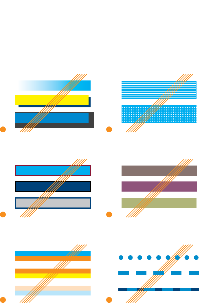
OLIVE
GOLD
RED
should only be used
at 100% to avoid
appearing as pink.
VA TIER 1 GRAPHIC STANDARDS COLOR: SCREENS & TINTS
21
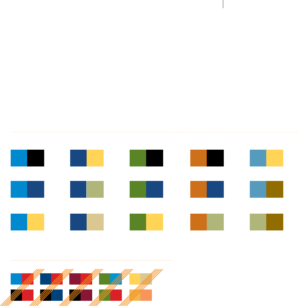
Color:
Two-Color
Printing
Certain projects may require two-color printing only. Or, perhaps the
tone of the project simply warrants a two-color treatment. Ensure that
a harmonious pairing of colors is used that allows for sucient contrast
and a range of screen/tint options.
Avoid using red in two-color applications, unless it is used at full
density (100%) throughout. Below are some examples of acceptable
two-color combinations, as well as some to avoid.
This is just a small example of
acceptable two-color combinations.
Explore the possibilities and nd
a set that suits your project.
See page 20 for an expanded palette
that includes VA Deep Tones and
VA Light Tones for even more variations.
Approved Two-Color Printing Combinations
LIGHT BLUE + BLACK PMS 471 + BLACKNAVY + GOLD PMS 549 + GOLDGREEN + BLACK
LIGHT BLUE + NAVY PMS 471 + NAVYNAVY + OLIVE PMS 549 + PMS 1265GREEN + NAVY
LIGHT BLUE + GOLD PMS 471 + OLIVENAVY + SAND OLIVE + PMS 1265GREEN + GOLD
Avoid combinations that lack
adequate or appropriate contrast.
Incorrect Two-Color Printing Combinations
VA TIER 1 GRAPHIC STANDARDS COLOR: TWO-COLOR PRINTING
22

Typography
The typography of the VA brand identity can be broken down into two basic categories: general
body text and title/accent text. In most instances, general body text should be set
in Myriad Pro, as shown in pages 24 through 25. This typeface includes a number of different
weights, including condensed fonts which will ensure clean, legible text in your documents.
Title/Accent text is to be set in Georgia, as shown in pages 26 through 27. This elegant serif
font provides contrast to the general sans serif body text, and conveys a modern yet traditional
look and feel.
Occasionally, a layout may require a serif font for body text. In these cases, Georgia
can be used instead of Myriad Pro without compromising the brand. Similarly, Myriad Pro
can be used occasionally for title/accent text when a more progressive tone is required.
See pages 52 through 69 for example design with proper typographical applications.
It is understood that many users (particularly non-creatives) may not have access to Myriad Pro.
In these cases an alternate sans serif font, Calibri, (commonly available on PCs) may be used
instead—or, Georgia may be used throughout. See page 28 for full information on typography
for non-graphics professionals, as well as important notes on use in Microsoft® Ofce®.
The goal of branded fonts is to maintain simple, straightforward layouts. Pages 32 through 33
provide examples of ways not to use type. Never rotate, skew, manipulate, or add dropshadows
or outlines. For more layout options using color, see pages 29 through 31. For grid versatility
see the Design Inspirations section, beginning on page 43.

Typography:
General Body Text
Myriad Pro Regular
ABCDEFGHIJKLMNOPQRSTUVWXYZ
abcdefghijklmnopqrstuvwxyz
1234567890 (~!@#$%^&*}
Myriad Pro Italic
ABCDEFGHIJKLMNOPQRSTUVWXYZ
abcdefghijklmnopqrstuvwxyz
1234567890 (~!@#$%^&*}
Myriad Pro Bold
ABCDEFGHIJKLMNOPQRSTUVWXYZ
abcdefghijklmnopqrstuvwxyz
1234567890 (~!@#$%^&*}
Proper and consistent application
of typography to all VA vehicles of
communication is paramount in conveying
both legible and clear messaging
and providing brand recognition. The
typographical personality inherent in the
approved fonts, in their pure and unaltered
forms, must be continually repeated
across a span of pieces in order to preserve
their contribution as identiable brand
characteristics.
Myriad Pro is the typeface for use in all
communications from VA. Examples of
these fonts are shown at left. The Myriad Pro
family is very versatile and provides excellent
legibility in both print and digital media, and
is readily available for both PCs and Macs.
Myriad Pro Regular—with Myriad Pro Bold
and Myriad Pro Italic for emphasis within
text—should be used for all general body text
in both print and on-screen communications
in most situations. It can also be used
occasionally for headlines and/or display copy
when a sans serif font is more desirable than
Georgia, seen on page 26. Several examples
of suggested Myriad Pro headline treatments
appear on pages 65 through 69.
All fonts used by personnel creating communication vehicles for VA must be properly licensed. The Myriad Pro font
family is bundled with Adobe® creative products but licensing limitations apply. All users are required to reference their
respective Adobe licensing agreement to ensure proper usage. Any illegal or unauthorized usage of any fonts or other
such intellectual property is strictly prohibited.
TYPOGRAPHY: GENERAL BODY TEXT
24

Typography:
General Body Text
CONTINUED
Myriad Pro Condensed
ABCDEFGHIJKLMNOPQRSTUVWXYZ
abcdefghijklmnopqrstuvwxyz
1234567890 (~!@#$%^&*}
Myriad Pro Condensed Italic
ABCDEFGHIJKLMNOPQRSTUVWXYZ
abcdefghijklmnopqrstuvwxyz
1234567890 (~!@#$%^&*}
Myriad Pro Bold Condensed
ABCDEFGHIJKLMNOPQRSTUVWXYZ
abcdefghijklmnopqrstuvwxyz
1234567890 (~!@#$%^&*}
Myriad Pro Bold Condensed Italic
ABCDEFGHIJKLMNOPQRSTUVWXYZ
abcdefghijklmnopqrstuvwxyz
1234567890 (~!@#$%^&*}
In some instances, a condensed font is
necessary due to limited space, excess copy,
and/or narrow column width. The Myriad Pro
Condensed font family can be used in these
cases, but should not be the rst option.
Whenever possible, use the standard non-
condensed fonts.
Although the specic weights and
thicknesses shown on these two pages are
generally preferred, the entire Myriad Pro
font family is approved for use as well.
All fonts used by personnel creating
communication vehicles for VA must be properly
licensed. The Myriad Pro font family is bundled with
Adobe® creative products but licensing limitations
apply. All users are required to reference their respective
Adobe licensing agreement to ensure proper usage. Any
illegal or unauthorized usage of any fonts or other such
intellectual property is strictly prohibited.
TYPOGRAPHY: GENERAL BODY TEXT
25

Typography:
Title/Accent Text
Georgia Regular
ABCDEFGHIJKLM
NOPQRSTUVWXYZ
abcdefghijklmnopqrstuvwxyz
1234567890 (~!@#$%^&*}
Georgia Italic
ABCDEFGHIJKLM
NOPQRSTUVWXYZ
abcdefghijklmnopqrstuvwxyz
1234567890 (~!@#$%^&*}
Georgia
Georgia should typically be used for titles
and accent text. This serif font includes
Regular, Italic, Bold, and Bold Italic. Georgia
Regular and Italic will likely be most used.
In most instances, the lighter weights
(Georgia Regular and Georgia Italic) should
be used.
While body copy is ideally to be set in Myriad
Pro (see pages 24 through 25), there may be
some instances when a serif font is simply
more appropriate for certain sections of
body copy. When necessary, Georgia may be
used as well.
TYPOGRAPHY: TITLE/ACCENT TEXT
26

Typography:
Title/Accent Text
CONTINUED
Georgia Bold
ABCDEFGHIJKLM
NOPQRSTUVWXYZ
abcdefghijklmnopqrstuvwxyz
1234567890 (~!@#$%^&*}
Georgia Bold Italic
ABCDEFGHIJKLM
NOPQRSTUVWXYZ
abcdefghijklmnopqrstuvwxyz
1234567890 (~!@#$%^&*}
Georgia Bold & Bold Italic
Use Georgia Bold and Bold Italic sparingly
for additional emphasis. In most instances,
use the lighter weights shown on page 26.
VA TIER 1 GRAPHIC STANDARDS TYPOGRAPHY: TITLE/ACCENT TEXT
27
Typography:
Non-Graphics
Professionals &
Microsoft®
Product Usage
Myriad Pro fonts are stipulated for use by all creative and graphics
professionals in creating all oset-printed and publicly-distributed
communication vehicles (pages 23 through 24). However, in light of
the fact that most business professionals will not have ready access to
Myriad Pro fonts—which are more ubiquitous in the creative industry—
VA will require all future internal and presentation materials (i.e.,
Microsoft® Word® and PowerPoint® documents created by non-graphics
professionals) to be created using the more universally available PC font
family, Calibri, wherever sans serif font usage is desired.
Calibri, like Georgia, is a font family actually built into most PC operating
systems which provides the ability for document authors to create
typographical contrasts for accent purposes such as captions, subheads,
call-outs, and so on. However, please note that in such communications
Georgia remains the preferred primary font for use in main titles and
headlines (as it appears more formal and stately at larger sizes). Body text
may be rendered in either Georgia or Calibri per the document creator’s
discretion—sans serifs convey a more modern or technical feel, while
serifs connote a more conservative and ocial feel.
These requirements both help to ensure that most everyone has
immediate access to needed fonts, and facilitates consistent viewing
of a given piece by all recipients (i.e., text is less likely to re-ow, distort
or disappear). For these reasons, Myriad Pro is NOT to be used for
any presentations or internal communications which are intended
to be distributed, viewed and/or edited in Microsoft® Word® and
PowerPoint®, even if the original author has a licensed copy of Myriad
Pro on their work station.
Georgia Bold and Regular
(as well as an all-caps
title option) are shown in
the approved new main
PowerPoint® intro slide
template (right).
Calibri Font Family
ABCDEFGHIJKLM
NOPQRSTUVWXYZ
abcdefghijklmnopqrstuvwxyz
1234567890 (~!@#$%^&*}
Note: Myriad Pro fonts have been replaced in
Microsoft®-based templates because they are not part
of the fonts that come with the PC Operating System.
Please use Calibri instead so that viewing/editing does
not require the download of Myriad Pro.
TYPOGRAPHY: NONGRAPHICS PROFESSIONALSVA TIER 1 GRAPHIC STANDARDS
28
Typography:
Appropriate
Color Usage Approved colors for title/headline/call-out text on white background:
Navy Light Blue Red Dark Red Black
Secondary colors should be used sparingly.
Whenever possible, Navy, Light Blue, Red
and Dark Red should be your rst option.
OrangeGreen Blue Gray
Title Title Title Title Title
Title Title Title
Approved colors for title/headline/call-out text on dark background/photo:
Light Blue Light GrayRed Gold White
Title Title Title Title Title
Approved colors for title/headline/call-out text on gray background/photo:
Dark Blue Gold White
Title Title Title
White type should be used on backgrounds of dark VA colors:
Title Title Title TitleTitle Title Title
This page shows preferred colors for special
sections or headlines in a number of dierent
situations. Colors should be high-contrast to
ensure readability, and should always utilize
the VA color palette.
Consistent, appropriate use of color in
typography is integral to maintaining
a recognizable brand across a body of
communication vehicles.
See page 20 for an expanded palette of
approved colors, including Deep Tones and
Light Tones, which may be used sparingly.
Follow the same basic guidelines that
are illustrated here for optimal contrast:
dark colors should only appear on light
backgrounds, and light colors should only
appear on dark backgrounds.
TYPOGRAPHY: APPROPRIATE COLOR USAGE
29
Typography:
Appropriate
Color Usage
CONTINUED
This page displays approved color
applications for type used as general
body text on various background colors
in the VA palette. Body text should typically
appear in either 100% Black or Navy, or
reversed to White.
Because body text typically appears between
10pt. and 12pt. weights, thin strokes may not
reproduce properly if the type color lacks
contrast. For this reason, only Black, Navy or
White type should be used for general body
text to provide adequate contrast—in both
hue and density—against the background
on which it appears.
If the background color is suciently dark,
(see examples at left) body text should be
reversed to white. On lighter backgrounds,
use Black or Navy body text.
Body text should be no smaller than 10pt.,
particularly if reversed to White, which
typically makes the type appear smaller.
POSITIVE TEXT NONREVERSED:
One- to two-color body text color(s)
should be Black or Navy.
FULLCOLOR PRINTING:
Body text color should be Black
or reversed to White.
Examples of general body text:
Black on White (positive) White on Black (reversed)
White on Navy
White on Red
White on Light Blue
White on Dark Red
One- or Two-Color Printing
Lorem ipsum dolar sit amet, consect-
etuer adipiscing elit, sed diam nonummy
nibh euismod tincidunt ut laoreet dolore
magna aliquam erat volupat. Ut wisi enim
ad minim veniam, quis adipiscing elit, sed
diam nonummy euisolutpat.
Lorem ipsum dolar sit amet, consect-
etuer adipiscing elit, sed diam nonummy
nibh euismod tincidunt ut laoreet dolore
magna aliquam erat volupat. Ut wisi enim
ad minim veniam, quis adipiscing elit, sed
diam nonummy euisolutpat.
Lorem ipsum dolar sit amet, consect-
etuer adipiscing elit, sed diam nonummy
nibh euismod tincidunt ut laoreet dolore
magna aliquam erat volupat. Ut wisi enim
ad minim veniam, quis adipiscing elit, sed
diam nonummy euisolutpat.
Lorem ipsum dolar sit amet, consect-
etuer adipiscing elit, sed diam nonummy
nibh euismod tincidunt ut laoreet dolore
magna aliquam erat volupat. Ut wisi enim
ad minim veniam, quis adipiscing elit, sed
diam nonummy euisolutpat.
Lorem ipsum dolar sit amet, consect-
etuer adipiscing elit, sed diam nonummy
nibh euismod tincidunt ut laoreet dolore
magna aliquam erat volupat. Ut wisi enim
ad minim veniam, quis adipiscing elit, sed
diam nonummy euisolutpat.
Lorem ipsum dolar sit amet, consect-
etuer adipiscing elit, sed diam nonummy
nibh euismod tincidunt ut laoreet dolore
magna aliquam erat volupat. Ut wisi enim
ad minim veniam, quis adipiscing elit, sed
diam nonummy euisolutpat.
Certain print projects may require one- or two-color printing only. In these cases, general body
text color must be either Black or Navy, or reversed to white.
Navy on White (positive) White on Navy (reversed)
Lorem ipsum dolar sit amet, consect-
etuer adipiscing elit, sed diam nonummy
nibh euismod tincidunt ut laoreet dolore.
Lorem ipsum dolar sit amet, consect-
etuer adipiscing elit, sed diam nonummy
nibh euismod tincidunt ut laoreet dolore.
Body text that is not on a color
background should appear in
100% black or Navy.
TYPOGRAPHY: APPROPRIATE COLOR USAGE
30

Typography:
Appropriate
Color Usage
CONTINUED
Examples of call-out text:
Lorem ipsum dolor sit amet, consectetur adipisicing
elit, sed do eiusmod tempor incididunt ut labore et
dolore magna aliqua. Ut enim ad minim veniam, quis
nostrud exercitation ullamco laboris nisi ut aliquip ex
ea commodo consequat duis aute irure dolor.
Lorem ipsum dolor sit amet, consectetur adipisicing
elit, sed do eiusmod tempor incididunt ut labore et
dolore magna aliqua. Ut enim ad minim veniam, quis
nostrud exercitation ullamco laboris nisi ut aliquip ex
ea commodo consequat duis aute irure dolor.
Lorem ipsum dolor sit amet, consectetur adipisicing
elit, sed do eiusmod tempor incididunt ut labore et
dolore magna aliqua. Ut enim ad minim veniam, quis
nostrud exercitation ullamco laboris nisi ut aliquip ex
ea commodo consequat duis aute irure dolor.
Call-out text may often dictate additional
colors from the extended VA Palette. Because
call-outs inherently consist of larger, bolder
letterforms, lighter colors can safely be
used. The examples at right show call-out
text in Blue Gray, Light Blue, and Olive,
respectively.
See pages 17 through 22 for a complete
range of color options and guidance.
VA TIER 1 GRAPHIC STANDARDS TYPOGRAPHY: APPROPRIATE COLOR USAGE
31
Typography:
Incorrect
Applications
1 Never set type to overlap a color/photo edge
12
43
65
all typesetting situations
all typesetting situations
AlL tYpEsEtTiNg SiTuAtion
all typesetting situations
all typesetting situations
all typesetting situations
all typesetting
all typesetting situations all typesetting
ALL TYPESETTING
all typesetting situations
all typesetting situations
all typesetting situations
ALL TYPESETTING
ALL TYPESETTING SITUATIONS ALL TYPESETTING SITUAT
ALL TYPESETTING SITUATIONS
all typesetting situations
all typesetting situations
or on top of a distracting texture.
2 Never vary character weights or styles.
3 Never expand or contract character spacing
in body text. Sparingly, smaller heads or
subheads may be set in all caps (non-bold,
non-italic) and tracked open to a max of 30.
4 Never apply any sort of garish eect to type,
such as outlines, dropshadows, or gradients.
5 Never expand or contract character width or
height, and never slant/skew type.
6 Never use any unapproved typefaces.
Avoid over-designing. Maintain simplicity
in designs and allow the interaction between
consistent typography and photography
usage to convey the recognizable “feel” of VA
materials. The visual personality of VA is clean,
graphic lines supported by strong imagery.
Keep pages and spreads clean of needlessly
distracting devices. "Less is more."
Typography must be set without such
inappropriate treatments as dropshadowing,
outlining, etc., which would both disrupt
brand harmony and diminish legibility.
Neither height nor width may ever be
expanded, condensed or skewed in any way.
Applied colors and color tints to typography
must remain solid—without gradation, line
patterns, lls, highlights, glow, color/style
jumbles, rule borders, edge eects or other
interfering motifs. Character spacing (space
between characters) for all body text must
always be set to zero. Only smaller heads and
subheads, set in all caps only, may be tracked
open to a maximum of 30—a technique to be
used very sparingly.
Use only the approved typefaces: Myriad
Pro, Georgia and Calibri. Only the approved
colors and fonts in this Graphic Standards
Guide are permitted.
TYPOGRAPHY: INCORRECT APPLICATIONS
32

Typography:
Incorrect
Applications
CONTINUED
7 Never apply colors to type that don't
provide enough contrast between
the font and paper.
8 Never apply colors to type that don't
provide enough contrast between
the font and background color.
9 Headlines must only be set in
approved colors (see page 28) at
100%—never apply shades or tints.
10 Always set type horizontally. Avoid
rotating words.
11 Do not overlap type in ways that
hinder readability.
12 Never ll characters with imagery,
texture, highlights, etc.
7
9
11
10
8
all typesetting situations
all typesetting situations
all typesetting situations
all typesetting situations
all typesetting situations
all typesetting situations
all typesetting situations
all typesetting situations
all type
setting
situations
all
TYPE all
TYPE
12
Proper font and color usage, as well as
artful employment of basic elements of
typographical design, such as color/size/
weight/style contrasts and layout composition
will ensure that the VA brand is always clear
and concise.
Type may never be overlapped or connected
to form an element of design for basic text
and headlines—the exception to this rule is
in creating Special Signatures for programs
and initiatives (must be used sparingly,
cautiously and under authoritative guidance).
See the example below for an appropriate
use of typography as such a rare and subtly-
incorporated design conguration in a
national communications initiative (suitable
for such treatment).
Do not overlap, rotate or ll any text with
a texture or photo. Ensure legibility with
appropriate hue/density contrast. See page 64
for an approved example of rotating type.
TYPOGRAPHY: INCORRECT APPLICATIONS
33

Design Design elements consist of photos, color blocks, typography, and linear devices. The VA Graphic
Standards system includes a number of ready-to-use elements that allow designers to create
products that are visually appealing, strategically balanced, and brand-approved.
Using unapproved design elements—such as fonts, colors, or techniques—weakens the VA
brand and undermines audience perception. It is important that designers and VA staff
understand these guidelines and adhere to them at all times.
Conventional brand guidelines have long been proven to be highly-effective in founding
organizational brand recognition and fostering public trust. VA depends on every creative and
non-creative communications professional to help convey a unied VA identity and strengthen
respect, condence, and relevance among the Veteran and public audiences. The VA goals of
quality and consistency will be met if all stakeholders earnestly adhere to basic standards.
Design:
Incorrect Applications
1 Do not apply prominent gradients
or dropshadows to color shapes.
Gradients can be subtly applied to
graphics, but not occupy more than
25% of the page. See page 46 and 66
for more information.
2 Do not apply graphic patterns or
textures.
3 Do not add borders or lines around
color blocks or photos.
4 Do not add tinted varnishes to
printed pieces.
5 Contrasting colors should be next
to each other, and they should be
visually appealing.
6 Do not use decorative rules or
borders.
1
3
5 6
4
2
Designs should not include gradients,
dropshadows, illustrated textures or patterns,
use overly decorative borders or outlines, odd
shapes or die-cuts, feathered photo edges,
silhouettes, photo or illustration collages,
unapproved colors or typography.
Photography and illustration should not be
skewed, compressed, disproportionately
sized, overlapped with typography or other
photos, blended, etc.
Only approved colors should be applied to
layouts, and colors should mostly remain
solid, with sparing use of tints for subtle
eect, and used in conjunction with each
other appropriately. Elements of design
such as typography, photography and
illustration must always be set without such
inappropriate and distracting treatments as
skewing, condensing, overlapping, blending,
feathering, etc. which visually degrade the
respectability and credibility of the materials.
DESIGN: INCORRECT APPLICATIONS
35
Design:
Incorrect Applications
CONTINUED
7 Never apply diagonal, rotated,
stretched, condensed, or ipped
design elements.
8 Only sparingly apply themed or
oddly-shaped graphics, die-cuts to
Imagery (subtle curves or clean
straight edges are generally
preferred). Never use severe zigzags
or other overbearing edges.
9 Do not use decorative lines or
borders.
10 Although certain high-quality
royalty-free illustration is approved
(sparingly, see page 42), never apply
whimsical ornamentation such as clip
art or decorative fonts which only
serve to diminish the importance and
credibility of VA materials.
7
9
8
10
Common design applications should never
include such unsuitable motifs and eects
as patterns, jagged or curved rules, or oddly-
shaped (non-rectangular or non-circular)
graphics/die-cuts/ photos.
Spend time and creativity on nding excellent
imagery and/or illustration. Do not use
decorative borders, curved type, rotated
type, special eects or commonly used
stock illustration as seen to the left. Focus on
imagery of real people, VA employees and of
course, Veterans.
Stock illustration and photography should
be high-quality, and high resolution. At full
size—without being enlarged or reduced
in size—the le should be at 300dpi. Select
images that are sharp, well-composed, and
relevant to the piece.
DESIGN: INCORRECT APPLICATIONS
36

Imagery:
Philosophy
and Guidance
Photography is one of the single most important devices available to the U.S. Department
of Veterans Affairs to convey the humanistic and patriotic nature of our efforts. An
image portrays a moment in time that is representative of VA’s work within the Veteran
community, which is why it is one of the most important design elements.
Emotions generated by each image should include feelings of respectful observance, quiet
urgency, deep importance, exalting dedication, and ceaseless progress.
Applied photography and illustration should be the highest quality obtainable within the
limits of available resources, and produced by a qualied professional. Imagery should
reect quality, resolution, sharpness, contrast, brightness, composition, and relevance to
the content. Imagery should be representative of the audience, show diversity, and show the
scope of VA’s work.
Use of photography is for education and inspiration. Applying unnecessary techniques only
detracts from sincerity and authenticity. Beyond color correcting and minor Photoshop
work, please limit unnecessary techniques and lters as they needlessly detract from the
authenticity of photographs.
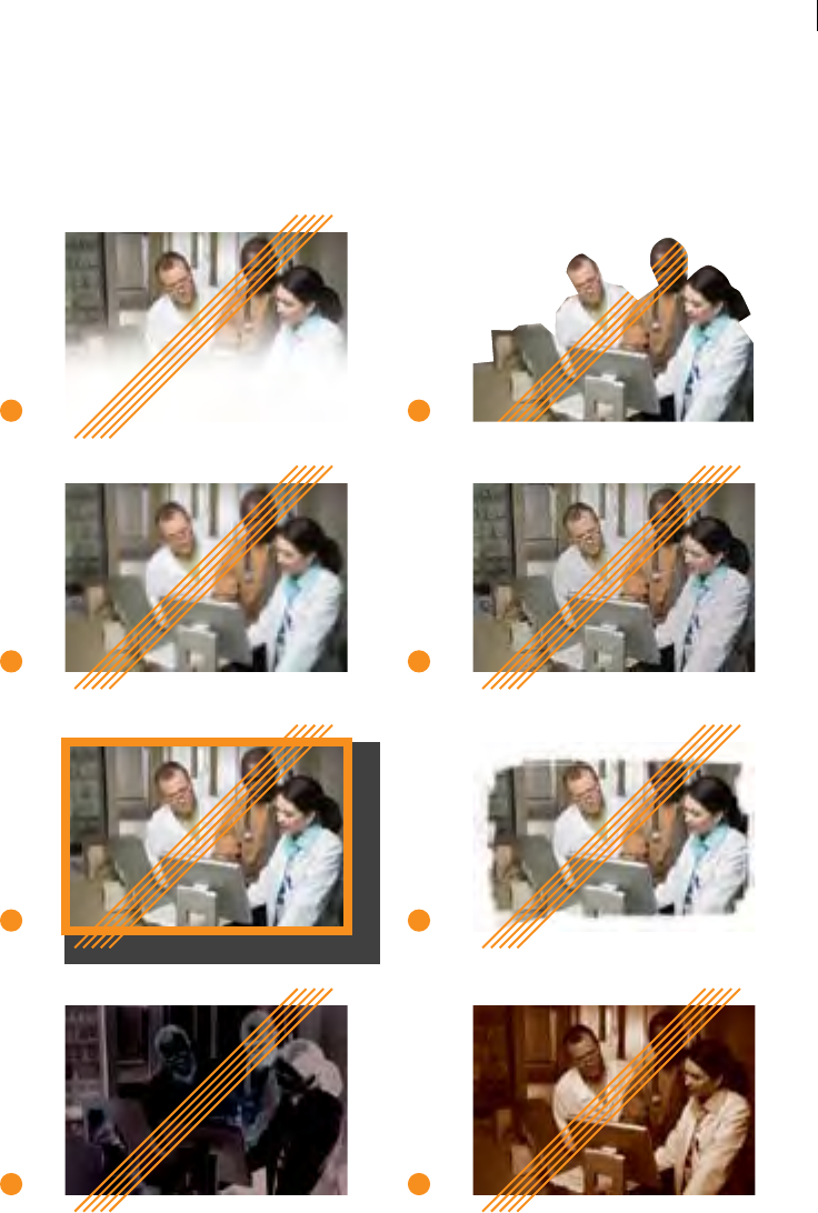
Imagery:
Incorrect
Photography
Applications
1 Do not use imagery that is poorly
scanned or too light (“blown-out”).
2 Do not use imagery that is too dark
or oers insucient contrast.
3 Never incorporate or overlay graphic
patterns or textures on imagery.
4 Never apply any sort of lter eect
to imagery.
5 Never apply any sort of blurring to
any part of an image.
6 Never apply contrast or posterization
lters.
7 Never blend images into collages
with other images in an unnatural
manner.
8 Never distort, skew, condense, or
expand the original proportions of
an image.
1
3
5
7
2
4
6
8
Real is beautiful. Imagery must be as
realistic as possible, with a minimal amount of
retouching. Do not add heavy dropshadows,
glows, fades, outline borders, overlapping
images, or edge treatments that are feathered,
wavy, jagged, etc.
Do not rotate or skew images, or place in
unusual shapes—use square, rectangular, or
circular shapes only.
Imagery should always be used at its original
proportions—do not squeeze or stretch the
image to t within a certain size. Scaling an
image need to be done proportionally.
Be aware of the brightness, sharpness,
and contrast of an image. The image
needs to "read" as clearly as possible, and
without lters, blurs, textures, inverting or
posterization. Blended collages should be use
sparingly, and in as natural a way as possible
Visual eects often visually compete with the
rest of the layout, and appears unnatural.
PHOTOGRAPHY: INCORRECT APPLICATIONS
38
Imagery:
Incorrect Photography
Applications
CONTINUED
9 Apply gradients to imagery sparingly.
10 Silhouettes must have clean, natural
edges, and not appear hastily rendered
or cut out with scissors.
11 Do not use images that are of insucient
(low) resolution at the desired size.
12 Do not use images that appear grainy,
dirty, dust-speckled, or low-quality.
13 Never apply colored borders,
dropshadows, or background
glow to images.
14 Never apply feathered, jagged, or
ornamental edges to imagery.
15 Don't signicantly alter image quality,
invert, posterize, or distort color prole.
With the exception of minor retouching
and color correction, image quality and
content need to be maintained.
16 Never apply duotone or tritone lters
to imagery. Only full-color or monotone
images are permitted.*
*In two-color printing situations, monotone images
may be overlaid on a solid eld (or solid area of tint)
of another color, provided there is enough contrast
for the image to be fully distinguishable.
Images should always be used at sucient
resolution in both printed materials and
on-screen. Images at 72dpi are only usable
for online purposes, and should never be
enlarged. Printed images must be 300dpi at
full size.
Wherever possible, crop images to show
as much as possible—unless intentionally
cropping in on a specic element within the
composition. Cropping an image should
enhance the photo, not reduce readability. Do
not use distracting borders, feathered edges,
jagged or wavy edges, gradients, textures,
dropshadow or glow, unusual shapes or
silhouettes, overlapping images, inverting,
duotoning, or unapproved duotones.
Silhouettes are permitted, but must be
executed by a professional graphic designer
to ensure the edges are smooth and not
choppy.
Needless ornamentation creates distraction,
dilutes brand presence, and errantly promotes
showy designer tricks, rather than VA integrity,
maturity, and global importance.
9
11
13
15
10
12
14
16
PHOTOGRAPHY: INCORRECT APPLICATIONS
39
Imagery:
Incorrect
Photography
Applications
CONTINUED
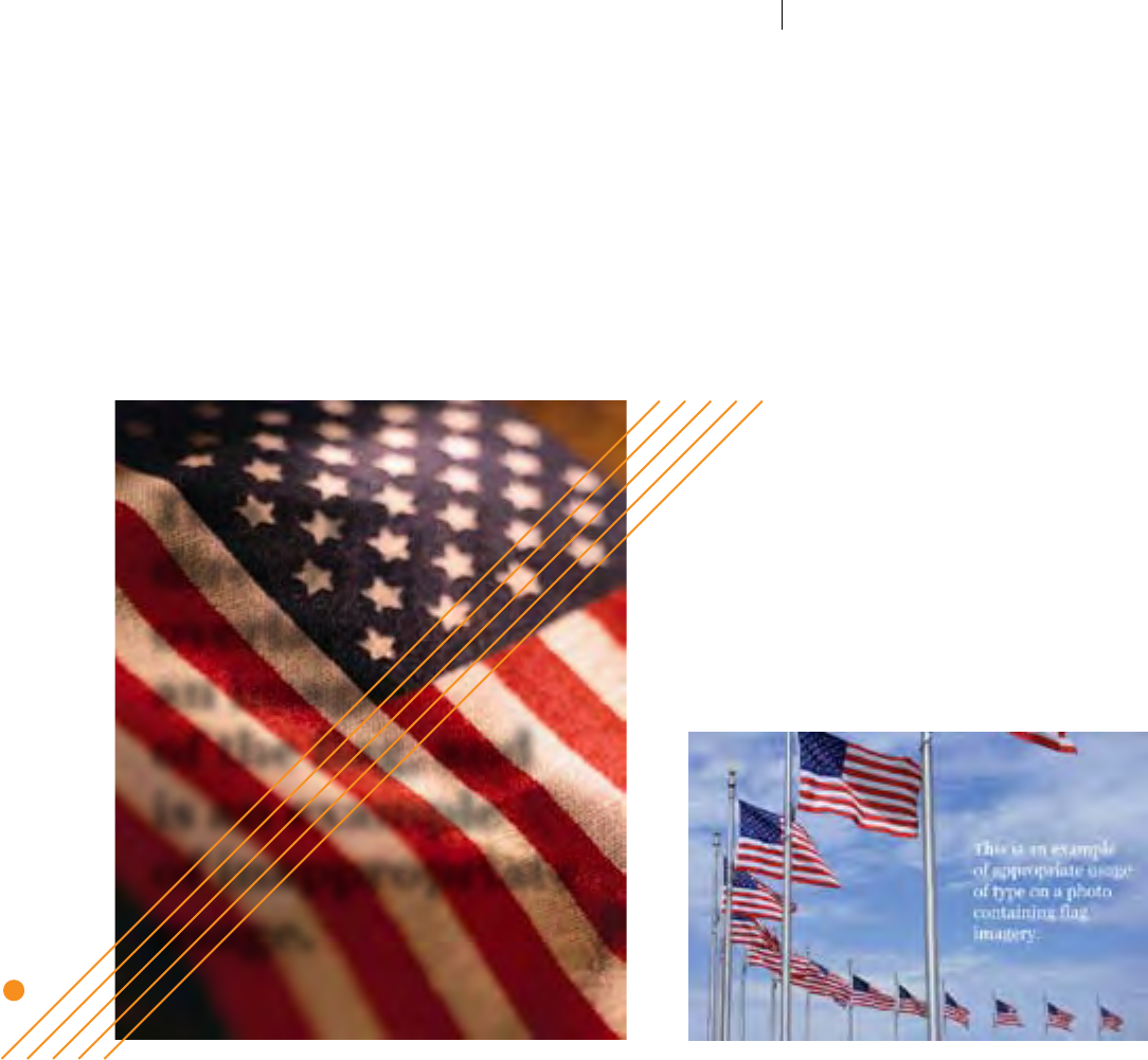
Respect our ag.
American ag imagery will surely often be used in layouts. It is important to remember how the American
ag should be represented. Avoid placing text or any other design elements over a photo of the American
ag. Instead, allow the full beauty and reverence of our ag to show through in the photo itself.
17
This type
directly
overlays
an image
of the ag, and
is an example
of inappropriate
usage.
17 Avoid placing type or design
elements over images of the
American ag. The example below illustrates how type
can be eectively and respectfully used in the
open sky area, without covering the ag.
VA TIER 1 GRAPHIC STANDARDS PHOTOGRAPHY: INCORRECT APPLICATIONS
40

Imagery:
Monotone
Photography
Usage
Full-color photography is preferred in all
pieces produced for uses online or in full-color
printing. Monotone imagery is required in all
other (one- and two-color) printing scenarios.
Duotones, tritones and color-ltering for
eect are prohibited.
Monotone images should be used sparingly,
and use to provide visual contrast for special
graphic call-outs, such as sidebars, proles, etc.
Monotone imagery may also be sparingly
used as backgrounds behind text for special
pages, announcements, and collateral.
Backgrounds can be darkened or lightened
("ghosted") providing there is sucient
contrast to ensure that the type is legible.
Ghosting of monotone imagery (without any
gradation or feathering) is permitted for use
sparingly in sidebars, call-out boxes, etc. Only
images which oer sucient contrast, texture
and composition may be employed for
such techniques.
Correct uses of
monotone imagery:
When applied tastefully and sparingly,
monotone imagery can provide a subtle,
elegant and respectful contrasting
accent to layouts.
See pages 18 through 20 for a complete
range of color options.
Monotone photo in Navy with White background Monotone photo in Navy with 50% Navy background,
for overlaying text elements.
Composition of monotone photo sections in
Navy, Light Blue, and Red (optionally use this
technique for charts and graphs).
Lorem ipsum dolor sit amet, consectetur
adipisicing elit, sed do eiusmod tempor
incididunt ut labore et dolore magna aliqua.
Ut enim ad minim veniam, quis nostrud
exercitation ullamco laboris nisi ut aliquip ex
ea commodo consequat. Duis aute irure dolor
in reprehenderit in voluptate velit esse cillum
dolore eu fugiat nulla pariatur. Excepteur sint
occaecat cupidatat non proident, sunt in culpa
qui ocia deserunt mollit est laborum.
Lorem Ipsum Dolar Sit
Amet Title Text Overlay
40%
25%
35%
IMAGERY: MONOTONE PHOTOGRAPHY USAGE
41
Imagery:
Appropriate
Illustration
Techniques
Illustration can help to communicate complex concepts or emotion
more quickly than photography in certain situations. When using
illustration, each image must be high-quality stock or original artwork
produced by a qualied professional illustrator. As well, illustration
should be used only when absolutely necessary to best communicate
an idea and where photography cannot capture the desired feel.
Selected illustrations should be carefully scrutinized for quality,
sharpness, contrast, brightness, composition, and relevance to
the communication. The style should be respectful and dignied,
and avoid overly technical, dramatic, whimsical, or otherwise
inappropriate.
Example Suitable Illustration Techniques
Example Prohibited Illustration Techniques
Never apply whimsical ornamentation
such as clip art or decorative fonts which
only serve to diminish the importance
and credibility of VA materials.
VA TIER 1 GRAPHIC STANDARDS IMAGERY: APPROPRIATE ILLUSTRATION TECHNIQUES
42

Design
Inspirations
A Collection of Both
Hypothetical Designs
and Approved Templates
to Help Get You Started
Design needs to emphasize the VA brand , as well as convey organizational sophistication and
harmony. Clean, elegant compositions are encouraged for all VA communications materials.
Make use of empty of negative space as it is a distinctive part of the VA identity system.
Intrinsic design methods employed across various media must remain consistent in order
to convey a cohesive visual identity. Layouts should be simple, clean, elegant, and free from
needless ornamentation, effects and shapes which detract from the essence of the brand and
purity of its presentation and message.
Designs can be enhanced by artful use of approved typography, color and New VA Parent
Signature as well as other basic elements of design such as proportion, contrast and
compositional arrangement. Although the graphic standards are fairly specic, there is still
ample room for creativity and exploration.
The layouts on the following pages show applications the approved palette, typography and
imagery characteristics detailed throughout this guide. Many of the designs shown are
hypothetical examples simply for inspiration, but others are actual templates provided in the
VA Brand Graphics Repository online, which are available as approved, ready-to-use digital
design les. Use them as the starting point for any new project, as they contain the correct
design elements and typography, or follow the guidelines to create new brand appropriate
design solutions.

The VA Thread Designed and applied to subtly symbolize the weaving inuence VA has in the lives
of U.S. Veterans, their families, communities and key areas of federal government
innovation, this imagery quietly adds depth and identiable texture to layouts whenever
deemed appropriate. Not always visibly present, never loud or boastful, the VA Thread is
always there when VA communicators need it, reminding them that they, too, are part of the
collective fabric of responsibility that covers, comforts and rewards our nest citizens.

Sub-Identiers:
Transition to
Unison
From the three main Administrations to a legion of Sub-Divisions, Ofces and Programs, there
is currently an overwhelming number of individualized Sub-Identiers—or “sub-brands”—
being used across VA to represent and differentiate its various parts. Having to distinguish one
VA sub-brand from another, gure out why they appear independent, or where they t in the
organization, creates undue confusion and frustration for Veterans. Given that the majority of
these existing identiers needlessly detract from the VA brand, the majority must be replaced
with clear, brand-appropriate and template-based solutions (see pages eight and nine).
Sub-Identiers require standards compliance as much as any other VA brand component as
they represent VA to their respective audience. Each will need to be updated to appropriately
convey VA brand allegiance. The rst phase of corporate-level VA brand refresh has been
outlined in this Version 1.0 document, however, Leadership will devote signicant attention
to the existing VA Sub-Identiers and creating new ones. There will always be special, or
short-term Identiers, and creation of those elements should be crafted by experienced
branding professionals to ensure clarity and adherence to brand standards.
This guide attempts to lay the groundwork for a larger review of Sub-Identiers. Typical
for large-scale brand metamorphosis, this guide is a “living document” that will evolve
over time to incorporate ongoing discoveries. The key takeaway should be basic rules and
recommendations for how to best communicate with the Veteran population, and groups
associated with them.
VA Sub-Identiers:
Administration
Ofce Identifying
Motif Option
The use of “logos” or “sub-brands” is not necessary for distinguishing
one department, group, or program from another within an
organization. Unique methods applied in layout, color, typography
and composition techniques alone can visually separate a given entity.
An appropriately customized motif—as shown below—can provide
distinction without detracting from instant VA brand recognition. Note
the careful and subtle application of gradients and support shapes
(recommended for sparing use only), which provide just enough
texture to give the design a touch of dimension and dynamism without
overpowering the other more important branding elements.
This type of “masthead” solution could
be be provided to those responsible
for producing a given Oce's creative
products as a ready-to-use image in
various electronic formats such as PDF,
EPS, JPG, etc.
As with Identiers, users are instructed
to always use the provided graphics
les to eliminate the continual need for
font matching, color selection, and logo
alignment—there should be no need to
recreate or alter such motif for every use.
Example of Appropriate VA Sub-Divisional Identication Support Motif
"VHA/OHI WAVE" OFFICE-SPECIFIC
GRAPHIC MOTIF
1 2
VA OFFICE-LEVEL
SIGNATURE
VA TIER 1 GRAPHIC STANDARDS VA SUB-IDENTIFIERS: OFFICE-SPECIFIC MOTIF
46
VA Sub-Identiers:
Design Tactics for
Special Situations
Under certain circumstances, some special programs may call for
more visual distinction and recognizable visual characteristics than is
provided for in the standardized VA Sub-Identier template shown on
page nine. In these situations, brand-safe executions for such VA Sub-
Identiers can be achieved without creating unnecessarily distracting
“logos” or “sub-brands”. The example below shows how new or existing
Sub-Identiers could be created to adequately convey allegiance to VA.
Simply applying approved typography and colorization techniques,
as well as apt juxtaposition and proportion in relation to the VA
Seal provides a solid connection. Respectful, sparing application of
illustrative motif as shown may also acceptable.
It is required that all such VA Sub-Identiers be created or updated
according to the techniques shown. Any designs currently in review
must be scrutinized against these standards and updated accordingly
prior to appearance in any new communication vehicles.
Although it is recommended that all existing VA Sub-Identiers (and
the materials on which they appear) be updated, it is understood that
VA is a vast organization and this evolution will take place over time
governed by scheduling and budgetary constraints. Ongoing study,
patience and collaboration will be required in order to eect positive
changes VA-wide in this area.
Note how appropriate color,
typography and juxtaposition with
VA Seal all work together to create
brand clarity and consistency.
Artful type arrangements in
these such rare Sub-Identiers
are recommended, rather than
indulgent extraneous icons that
needlessly conict and compete
with the VA Seal.
See page nine for standardized
templates required for most VA
Oce Identiers.
Example Sub-Identier Evolved for Brand Appropriateness:
ARTFUL COMPOSITION OF APPROVED
COLORS/FONTS; CLEVER MOTIF WORKED IN
FOR SUBTLE DISTINCTION
VA SEAL MUST APPEAR TO
THE LEFT OR ABOVE ALL
SUB-ID'S UNLESS IN LAYOUT
21
GIVEN THAT THE VA
SIGNATURE APPEARS
AT BOTTOM, THERE IS
NO NEED TO REPEAT
THE VA SEAL NEXT TO
THE SUB-IDENTIFIER
VA AFFILIATION
AND AUTHORITY
MUST ALWAYS BE
PROMINENTLY
VISIBLE IN EVERY
APPEARANCE OF VA
SUB-IDENTIFIERS
Ever-preferred Option: Standardized VA Sub-Identier Format
Human Resources and Administration
VA Learning University
VA TIER 1 GRAPHIC STANDARDS VA SUB-IDENTIFIERS: SPECIAL DESIGN TACTICS
47
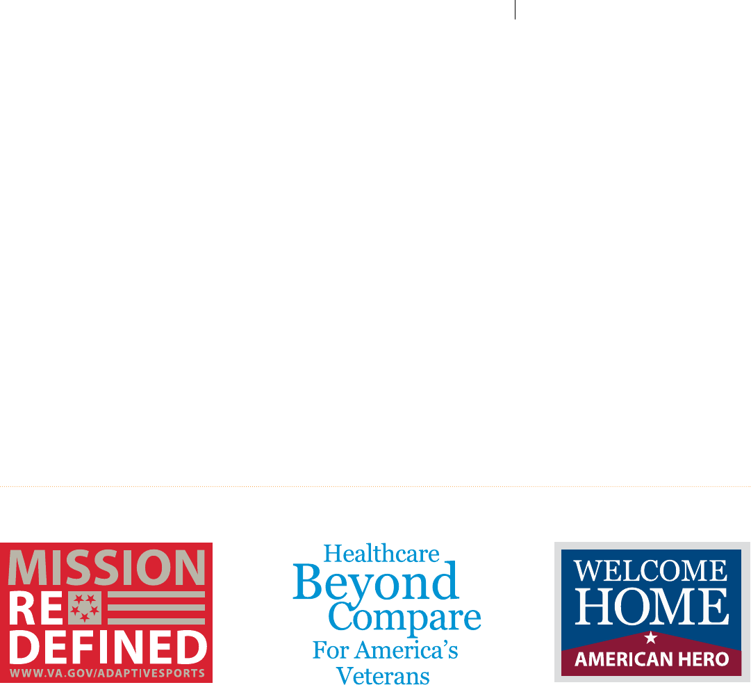
VA Sub-Identiers:
Design Tactics for
Campaigns, Events,
Programs and
Initiatives
Campaigns, events, programs, and initiatives identied to public
and Veteran audiences also often call for more visual distinction
and recognizable visual characteristics than is provided for in the
standardized VA Sub-Identier template shown on page nine. In
producing such Identiers, the same overall branding principles
and elements (proper colors and typography, quality execution, and
alignment with the VA brand) must be observed. Such specially
arranged, repeatable graphic arrangements must all be visually
consistent with VA brand standards. Each situation will be dierent,
but each should be simple in composition, not over-designed and free
from any overt eects, textures, icons, overly-ornamental illustrations
or elements incompatible with VA brand character.
As with any other VA Identiers, these mostly typographical designs
must be created by qualied branding specialists, as not every
participant working on VA creative products has the necessary
experience or ability to meet VA brand development requirements.
However, ideas and comments on concepts and executions from
governing participants are always welcome and observed.
As with any VA Sub-Identier, such special marks must be produced
only by highly-skilled and experienced logo design specialists.
Example Appropriate Design Tactics for Campaigns, Event, Program and Initiative Identiers:
VA TIER 1 GRAPHIC STANDARDS VA SUB-IDENTIFIERS: SPECIAL DESIGN TACTICS
48
Special VA Internal
Initiative Identier:
I CARE
On June 20, 2011 the Secretary of Veterans Aairs approved a set of
Core Values and Characteristics which apply universally across all of VA.
The Core Values are collectively the foundation of how we go about
our work, dene “who we are,” and form the underlying principles we
use in our daily service to Veterans. The Core Characteristics dene
“what we stand for” and what we strive to be as an organization.
In recognition of the principles stated in The Core Values, the Oce
of the Secretary is enlisting VA communicators for continued support
in the eort to clarify the VA brand and provide outreach vehicles
which always stand together through Integrity in creative purpose,
Commitment to participation, Advocacy for visual harmony, Respect
for the VA brand, and Excellence in the execution of duties.
VA Core Values and Characteristics Quick Reference
Created prior to the establishment of
this document, the “I CARE” acronym
and legacy Program Identier design
shown above was developed to express
VA Core Values and Characteristics.
These unique typographic and color
techniques remain exclusive to the
I CARE Identier, and cannot be used
in any other VA Identiers.
Integrity:
Commitment:
Advocacy:
Respect:
Excellence:
Because I CARE, I will...
Act with high moral principle. Adhere
to the highest professional standards.
Maintain the trust and condence of all
with whom I engage.
Work diligently to serve Veterans and
other beneciaries. Be driven by an
earnest belief in VA’s mission. Fulll my
individual responsibilities and organiza-
tional responsibilities.
Be truly Veteran-centric by identifying,
fully considering, and appropriately
advancing the interests of Veterans and
other beneciaries.
Treat all those I serve and with whom
I work with dignity and respect. Show
respect to earn it.
Strive for the highest quality and con-
tinuous improvement. Be thoughtful and
decisive in leadership, accountable for
my actions, willing to admit mistakes,
and rigorous in correcting them.
Trustworthy:
Accessible:
Quality:
Innovative:
Agile:
Integrated:
VA Core Characteristics:
VA earns the trust of those it serves—every day—through the
actions of all employees. They provide care, benets, and services
with compassion, dependability, eectiveness, and transparency.
VA engages and welcomes Veterans and other beneciaries, facili-
tating their use of the entire array of its services. Each interaction
will be positive and productive.
VA provides the highest standard of care and services to Veterans
and beneciaries while managing the cost of its programs and
being ecient stewards of all resources entrusted to it by the
American people. VA is a model of unrivalled excellence due to
employees who are empowered, trusted by their leaders, and
respected for their competence and dedication.
VA prizes curiosity and initiative, encourages creative contribu-
tions from all employees, seeks continuous improvement, and
adapts to remain at the forefront in knowledge, prociency, and
capability to deliver the highest standard of care and services to all
of the people it serves.
VA anticipates and adapts quickly to current challenges and new
requirements by continuously assessing the environment in which
it operates and devising solutions to better serve Veterans, other
beneciaries, and Service members.
VA links care and services across the Department; other fed-
eral, state, and local agencies; partners; and Veterans Services
Organizations to provide useful and understandable programs to
Veterans and other beneciaries. VA’s relationship with the Depart-
ment of Defense is unique, and VA will nurture it for the benet of
Veterans and Service members..
VA TIER 1 GRAPHIC STANDARDS SPECIAL VA INTERNAL IDENTIFIER: I CARE
49
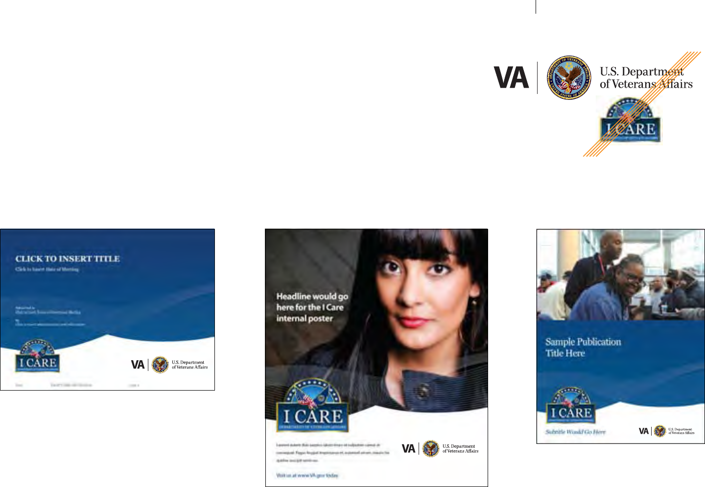
Special VA Internal
Initiative Identier:
I CARE
CONTINUED
Below are hypothetical examples of how the I CARE Sub-Identier could
be applied to various internal communication vehicles. Given the visual
weight and level of detail in the I CARE Sub-Identier, it should not be closely
juxtaposed with the VA Seal or Parent Signature, allowing ample white space.
The I CARE logo should be separated from the VA Signature and featured
somewhat larger in pieces promoting the initiative. Avoid using the I CARE
Sub-Identier in close proximity to the VA Signature (shown right).
PowerPoint® Poster Brochure
VA TIER 1 GRAPHIC STANDARDS I CARE APPLICATIONS
50

SIGNATURE: AN INTRODUCTIONVA TIER 1 GRAPHIC STANDARDS
General Design
Applications
The following sample layouts are representative of the approved palette, typography, design,
and imagery detailed throughout this guide.
Many of the examples shown are available as ready-to-use Adobe® InDesign® templates,
complete with correctly applied design elements, color, and typography. Use them as a
starting point, but do not feel limited by them—they are intended to help set the tone for
future design expansion.
Other purely hypothetical layouts are provided for further inspiration and guidance on how
simplicity, discipline and careful observance of standards can maintain brand quality.
As well, there are layouts that are purely hypothetical that are intended to provide
inspiration and guidance for creating brand quality through artful simplicity, discipline, and
observance of standards.
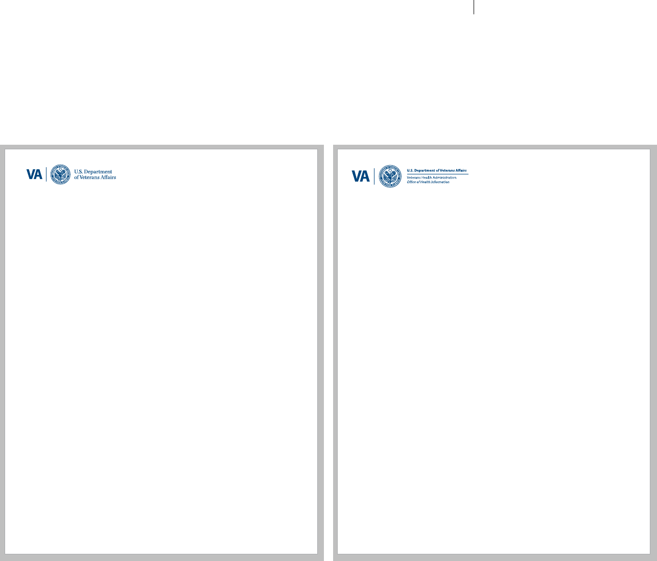
Stationery:
Example
Letterhead
Clearly identied and cohesively designed corporate and divisional
stationery is vital for communicating the VA brand in all correspondence.
Each component should present the appropriate VA corporate or
divisional Signature, as well as key address and contact information.
Avoid adding any other elements, such as imagery, motif, watermarks, or
unnecessary information. Since this is the ocial look for VA letterhead,
all VA oces must follow this template. The following pages will show
more examples of the VA stationary suite.
Assistant Secretary for Public and Intergovernmental Aairs
810 Vermont Ave NW Ste 905
Washington DC 20420
www.va.gov
In Reply Refer To:
810 Vermont Ave NW Ste 905
Washington DC 20420
www.va.gov
In Reply Refer To:
Note:
Per federal regulations,
pre-printed second
sheets are not
allowed—only the
front page of any given
correspondence letter
is allowed to display a
pre-printed masthead.
VA TIER 1 GRAPHIC STANDARDS STATIONERY: LETTERHEAD
52
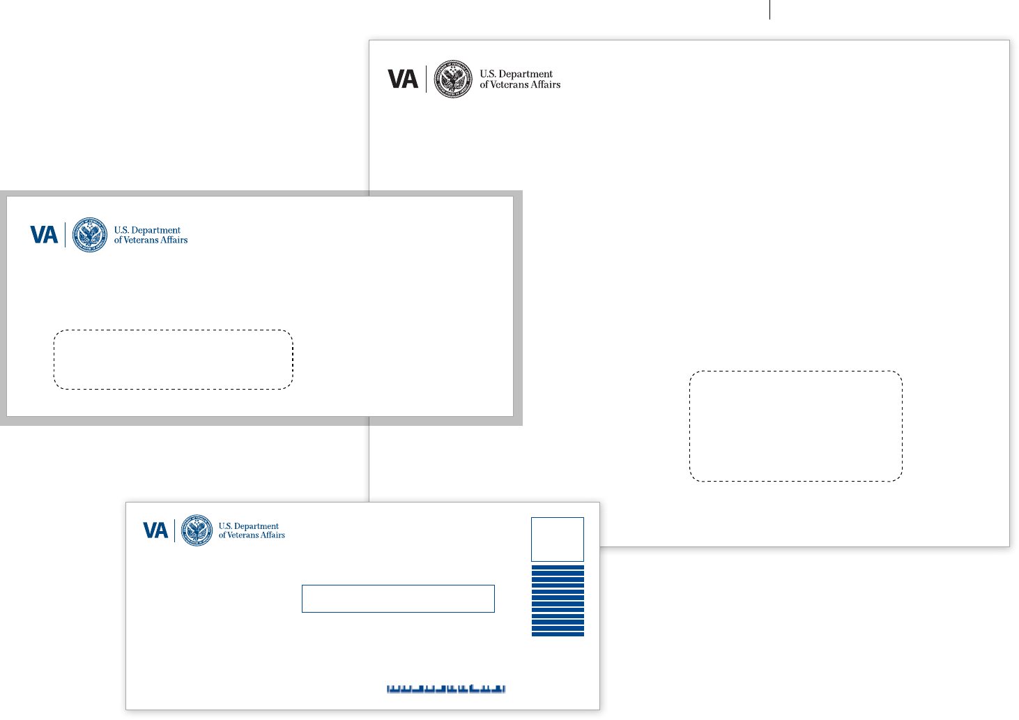
Stationery:
Example Envelopes Medical Center/Vancouver Division
3710 SW US Veterans Hospital Road
PO Box 1035
Portland OR 97207-1035
OFFICIAL BUSINESS
NO POSTAGE
NECESSARY
IF MAILED
IN THE
(Use Standard Left Window
This is Illustration only)
9.5” x 12” Brown Kraft Envelope
(Must be printed in 100% black)
#9 Business Reply Envelope (BRE)
(Can be printed in either 100% PMS 541u or 100% black)
Department of Veterans Aairs
Louis Stokes Cleveland
Medical Center
10000 Brecksville Road
Brecksville OH 44141-9905
VA Northern Indiana Health Care System
2600 W White River Blvd Ste 1
Muncie IN 47303-9906
OFFICIAL BUSINESS
UNITED STATES
POSTAGE WILL BE PAID BY DEPARTMENT OF VETERANS AFFAIRS
BUSINESS REPLY MAIL
FIRST-CLASS MAIL PERMIT NO. 1456 DENVER CO
4.125" x 9.5" #10 Window Envelope
(Must be printed in 100% PMS 541u)
Medical Center
Hampton VA 23667
OFFICIAL BUSINESS
Use Standard Left Window
This is Illustration only
VA TIER 1 GRAPHIC STANDARDS STATIONERY: ENVELOPES
53
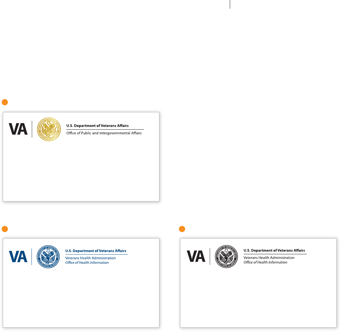
Stationery:
Example
Business Card
Options
Dierent levels within VA are eligible to obtain corresponding business
card varieties shown below. GS levels one through seven may only
receive the one-color black version. GS levels eight through 12 may
obtain either the one-color black, PMS 541u or 2-color options. GS levels
13 and higher may obtain either of those, as well as the highest level of
business card displaying the VA Seal in gold foil stamp (recommended).
100lb. plain white 25% cotton cover
stock must be used for all business
cards to convey the appropriate
quality and formality.
1
2 3
LEVELS 13+: SEAL IN GOLD FOIL STAMP, BLACK TEXT
<Address One>
<Address Two>
<City, State Zip>
Telephone: <Number>
Fax: <Number>
Cell: <Number>
Email: <email>@va.gov
<Name>
<Title>
LEVELS 8-12: 2-COLOR SIGNATURE, BLACK TEXT
<Address One>
<Address Two>
<City, State Zip>
Telephone: <Number>
Fax: <Number>
Cell: <Number>
Email: <email>@va.gov
<Name>
<Title>
LEVELS 1-7: ONE COLOR SEAL AND TEXT (ALL NAVY OR ALL BLACK)
<Address One>
<Address Two>
<City, State Zip>
Telephone: <Number>
Fax: <Number>
Cell: <Number>
Email: <email>@va.gov
<Name>
<Title>
VA TIER 1 GRAPHIC STANDARDS STATIONERY: BUSINESS CARDS
54
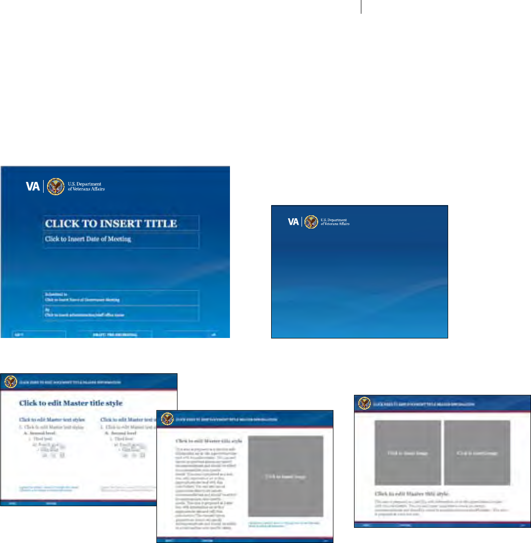
PowerPoint®:
Primary
Template
When developing PowerPoint® presentations, follow the format
and layout formula shown, applying similar photo usage, typography
styles and simple layout technique as indicated. Always apply
the full-color New VA Parent Signature and only use colors from the
VA Color Palette.
All type should be set in Georgia and Calibri fonts as these
are more commonly installed on most computers. Myriad Pro is
NOT to be used for any presentations and internal communications
which are intended to be distributed, viewed and/or edited in
Microsoft® Word® and PowerPoint®, even if the original author has a
licensed copy of Myriad Pro on their work station.
Use the templates
to your advantage
The examples shown at right and on
the following pages are available as
ready-to-use electronic templates.
Use them as the starting point for any
project, as they contain the correct
design elements and typography.
See page 44 for information on the
VA Thread graphic illustrated here.
Sample title page
Other sample interior slide options
Sample interior transition slide
(Not actual size)
POWERPOINT®: PRIMARY TEMPLATE
55
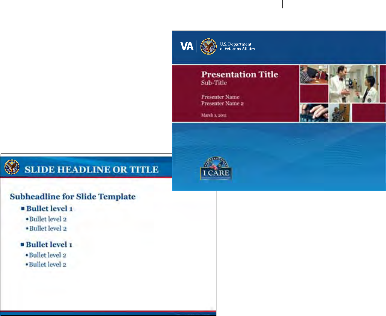
PowerPoint®
CONTINUED
Alternate layout options
The modular layout illustrated on this page shows how multiple images can
be incorporated into a clean presentation that enhances the VA brand. The
position and proportion of elements can be varied while maintaining a cohesive
look. Images on the cover page are changeable and the grid provides additional
versatility. Experiment with photo usage and vary the mosaic as needed, utilizing
the recommended space. Photos should not break out of the designated grid,
or crowd the title area.
VA TIER 1 GRAPHIC STANDARDS POWERPOINT®: ALTERNATE DESIGN INSPIRATION
56
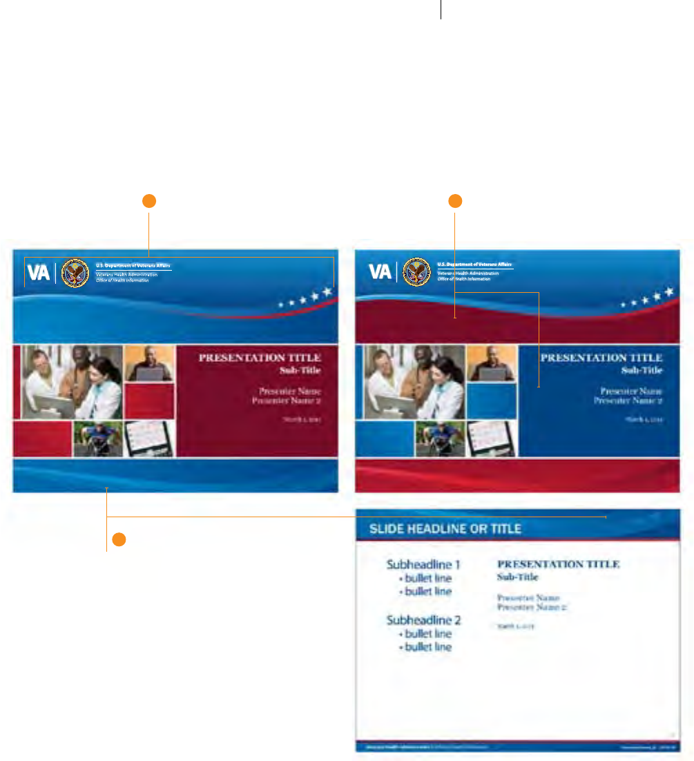
Example PowerPoint®:
Sub-Divisional Applications
Administration Oce Examples
Shown here are actual examples of PowerPoint®
templates developed for an Administration Oce
utilizing the design principles outlined in their
own innovative Design Guidelines. Note that
the Wave motif—a key graphic element used to
distinguish their Oce within the Administration
(see page 46)—is unique to that oce. Specic
Sub-Identication strategies such as this must
be vetted by appropriate authorities before
being implemented, but the example clearly
illustrates how dierent oces can aect their
Sub-Identities within the VA brand using special
techniques such as gradients and unconventional
shapes. Reserving special visual devices for
specic, carefully/universally-applied purposes—
and prohibiting them for all other common
design purposes uses—they become useful in
creating usefully distinctive Sub-Identities rather
than distracting indulgences.
1 2
3
THE "VHA/OHI WAVE"
This identifying element is used exclusively
by this Administration Oce
COLOR ALTERNATIVES
Designers may opt for dierent background
and panel colors within the VA Color Palette
REPEATED ELEMENTS OF VHA/OHI WAVE
Elements from the VHA/OHI Wave are repeated—
in some cases enlarged and/or screened—to
continue the motif throughout the design.
VA TIER 1 GRAPHIC STANDARDS POWERPOINT®: ALTERNATE DESIGN INSPIRATION
57
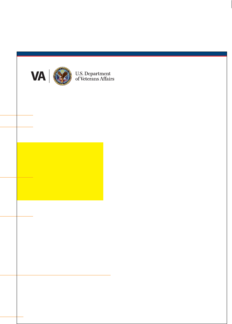
Example
Fact Sheets:
Small Photos A simple, yet eective graphic element for any
8.5" x 11" fact sheet (or similar document) is a
combination color bar utilizing the VA Color
Palette and New VA Parent Signature. Beneath
it, the layout options are versatile.
In this example, a small photo is used in the
narrow left column, which allows greater
emphasis on the headline—particularly useful
with lengthier titles and subheads.
Always be sure to include the “Created/
Revised” date, along with the stocking/catalog
number in a lower corner.
FACT SHEETS—SMALL PHOTOS
Georgia Regular, 35 pt.
Georgia Regular, 26/32 pt.
small photo
Georgia Italic, 18/28 pt.
Myriad Pro Regular, 10/14 pt.
Myriad Pro Regular, 7 pt.
Lorem ipsum dolor sit amet, consectetur adipiscing elit. Donec lacinia,
justo eu sodales ultrices, urna lectus elementum lectus, sed scelerisque
nibh elit semper purus. Nullam ac tortor ac risus sollicitudin aliquam quis
ut lacus. In eu ligula eget velit pulvinar lacinia. Vestibulum iaculis tincid-
unt nunc, consequat elementum odio posuere tincidunt. Ut eget arcu
felis. Sed aliquet, sapien sed elementum luctus, dui sapien faucibus turpis,
et semper odio enim a arcu. Nunc iaculis tristique libero nec vestibulum.
Class aptent taciti sociosqu ad litora torquent per conubia nostra, per
inceptos himenaeos. Nunc convallis mauris et dolor molestie consequat.
Etiam tincidunt, ipsum non mollis aliquam, nisl tortor aliquam neque,
eget mollis sem ipsum eu elit.
Integer quis neque vitae enim ultrices dictum at sit amet nisl. Pellen-
tesque pellentesque varius libero, vitae luctus lacus lacinia nec. Proin
imperdiet fermentum purus, sit amet luctus risus rutrum ac. Curabitur et
mi ac nisl adipiscing dictum. Mauris luctus imperdiet nunc. Cras augue
est, luctus lobortis accumsan ac, laoreet sit amet ipsum. Donec tincidunt
dapibus ipsum, quis porttitor dui fringilla at. Suspendisse interdum
magna et metus suscipit ac adipiscing metus porta. Maecenas metus tel-
lus, luctus eu mattis non, iaculis ac lacus. Ut sollicitudin placerat sem, quis
cursus neque porttitor id. Donec sollicitudin condimentum justo sit amet
imperdiet. Donec eleifend eros sed tellus pulvinar consequat. Maecenas
turpis enim, mattis non convallis at, vestibulum eu lectus. Aliquam et
mattis nulla. Phasellus commodo orci eget lorem gravida commodo. Ut
eget nibh magna, quis feugiat mauris.
Duis malesuada massa eget ipsum convallis condimentum. Aenean
tristique arcu aliquam felis lacinia et rutrum neque faucibus. Aliquam
bibendum nulla non ipsum pretium nec tincidunt quam mattis. Vivamus
felis turpis, placerat tincidunt lobortis eu, luctus vitae leo. Sed elementum
mi et enim facilisis placerat. Nunc id libero ante, eget convallis purus. Sed
eget est tortor. Etiam at leo eget neque lobortis vulputate sit amet in sem.
Vivamus ultrices porttitor lacus. Nullam adipiscing fringilla ligula nec sem-
per. In hac habitasse platea dictumst. Mauris tellus orci, consequat sed
varius in, euismod nec velit. Proin lacinia dolor eu nulla dapibuslacinia.
Lorem Ipsum Georgia Headline
Subhead Option Lorem ipsum Sit Amet Dolar
Created 1/11
Callout text and quotes are
given prominent placement
and ample white space.
Lorem ipsum sit amet dolar
tempor incididunt ut labore.
VA TIER 1 GRAPHIC STANDARDS
58
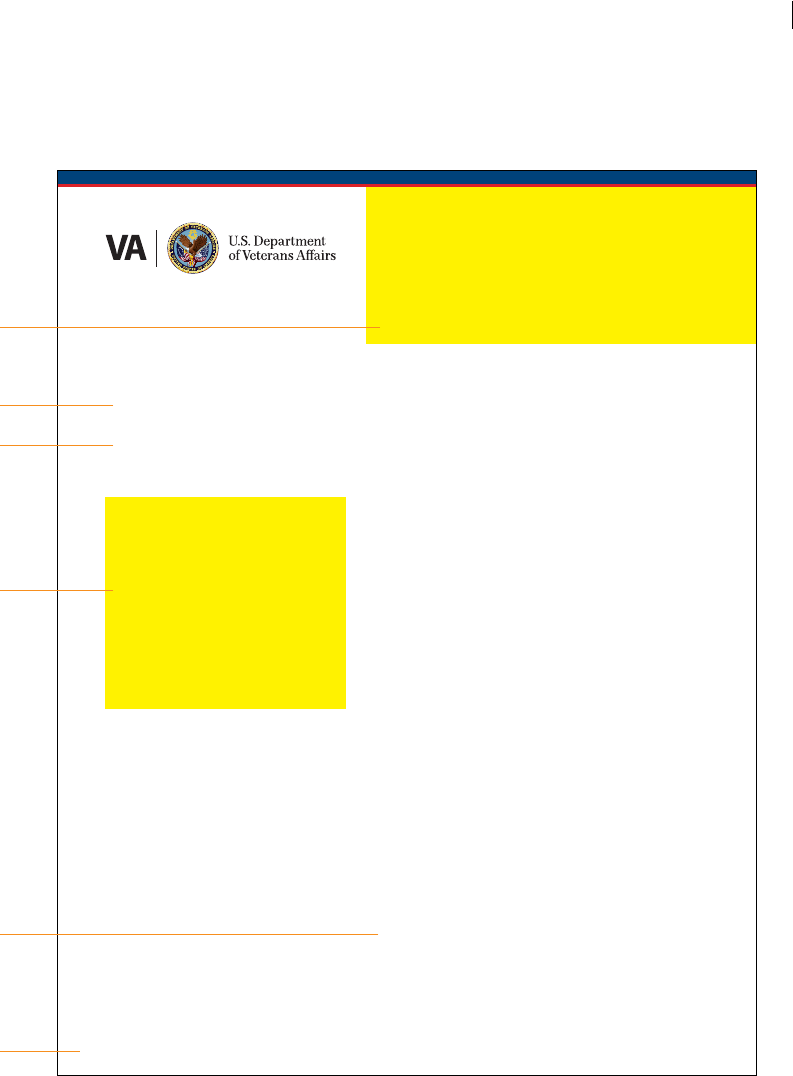
Example
Fact Sheets:
Multiple Photos
Lorem ipsum dolor sit amet, consectetur adipiscing elit. Donec lacinia,
justo eu sodales ultrices, urna lectus elementum lectus, sed scelerisque
nibh elit semper purus. Nullam ac tortor ac risus sollicitudin aliquam quis
ut lacus. In eu ligula eget velit pulvinar lacinia. Vestibulum iaculis tincid-
unt nunc, consequat elementum odio posuere tincidunt. Ut eget arcu
felis. Sed aliquet, sapien sed elementum luctus, dui sapien faucibus turpis,
et semper odio enim a arcu. Nunc iaculis tristique libero nec vestibulum.
Class aptent taciti sociosqu ad litora torquent per conubia nostra, per
inceptos himenaeos. Nunc convallis mauris et dolor molestie consequat.
Etiam tincidunt, ipsum non mollis aliquam, nisl tortor aliquam neque,
eget mollis sem ipsum eu elit.
Integer quis neque vitae enim ultrices dictum at sit amet nisl. Pellen-
tesque pellentesque varius libero, vitae luctus lacus lacinia nec. Proin
imperdiet fermentum purus, sit amet luctus risus rutrum ac. Curabitur et
mi ac nisl adipiscing dictum. Mauris luctus imperdiet nunc. Cras augue
est, luctus lobortis accumsan ac, laoreet sit amet ipsum. Donec tincidunt
dapibus ipsum, quis porttitor dui fringilla at. Suspendisse interdum
magna et metus suscipit ac adipiscing metus porta. Maecenas metus tel-
lus, luctus eu mattis non, iaculis ac lacus. Ut sollicitudin placerat sem, quis
cursus neque porttitor id. Donec sollicitudin condimentum justo sit amet
imperdiet. Donec eleifend eros sed tellus pulvinar consequat. Maecenas
turpis enim, mattis non convallis at, vestibulum eu lectus. Aliquam et
mattis nulla. Phasellus commodo orci eget lorem gravida commodo. Ut
eget nibh magna, quis feugiat mauris.
Duis malesuada massa eget ipsum convallis condimentum. Aenean
tristique arcu aliquam felis lacinia et rutrum neque faucibus. Aliquam
bibendum nulla non ipsum pretium nec tincidunt quam mattis. Vivamus
felis turpis, placerat tincidunt lobortis eu, luctus vitae leo. Sed elementum
mi et enim facilisis placerat. Nunc id libero ante, eget convallis purus. Sed
eget est tortor. Etiam at leo eget neque lobortis vulputate sit amet in sem.
Vivamus ultrices porttitor lacus.
Lorem Ipsum Georgia Headline
Subhead Option Lorem ipsum Sit Amet Dolar
Created 1/11
photo
Georgia Regular, 35 pt.
Georgia Regular, 26/32 pt.
photo
Callout text and quotes
are given prominent
placement and ample
white space. Lorem ipsum
sit amet dolar labore.
Myriad Pro Regular, 10/14 pt.
Myriad Pro Regular, 7 pt.
FACT SHEETS—MULTIPLE PHOTOS
59
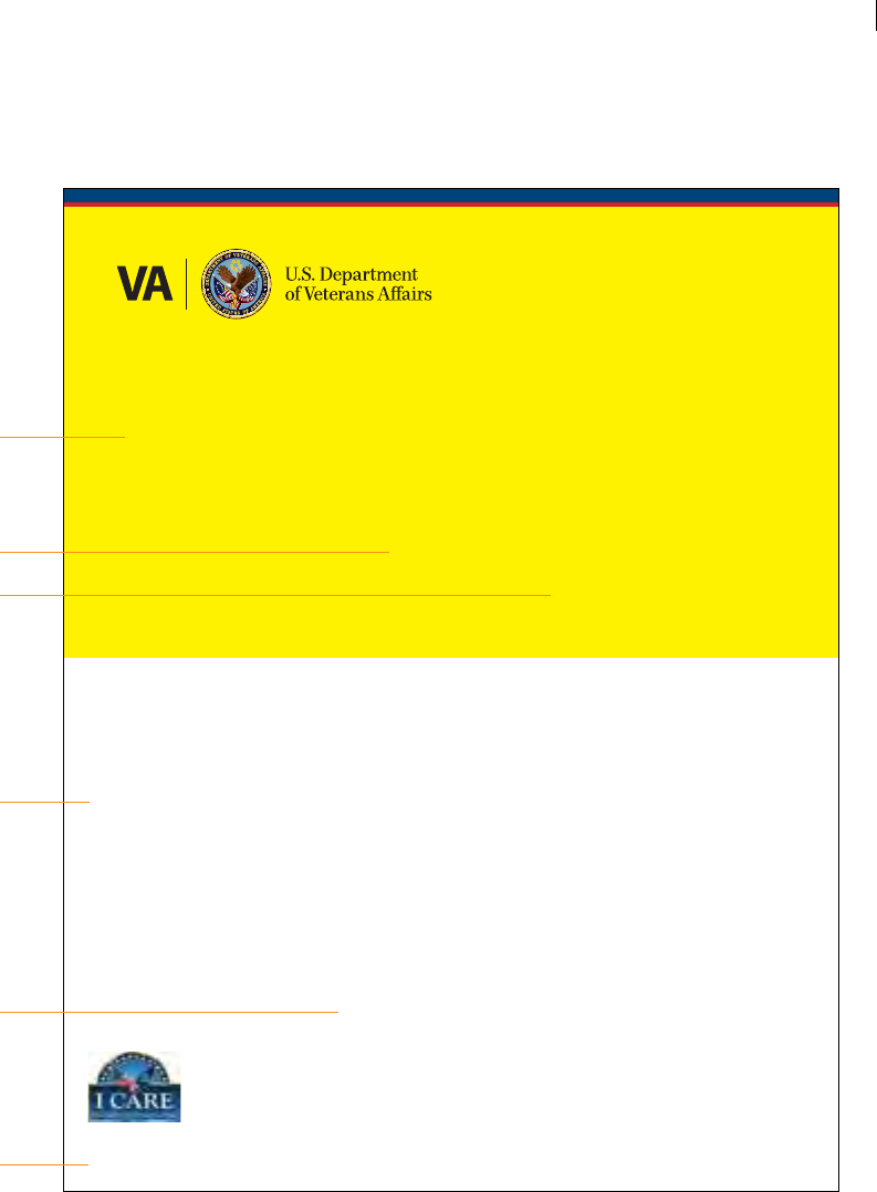
Example
Fact Sheets:
Large Photos
Georgia Bold, 35 pt.
Georgia Regular, 18/30 pt.
large photo
Georgia Italic, 14/24 pt.
Myriad Pro Regular, 10/14 pt.
Myriad Pro Regular, 7 pt.
Lorem ipsum dolor sit amet, consectetur adipiscing elit. Donec lacinia, justo eu sodales
ultrices, urna lectus elementum lectus, sed scelerisque nibh elit semper purus. Nullam
ac tortor ac risus sollicitudin aliquam quis ut lacus. In eu ligula eget velit pulvinar lacinia.
Vestibulum iaculis tincidunt nunc, consequat elementum odio posuere tincidunt. Ut
eget arcu felis. Sed aliquet, sapien sed elementum luctus, dui sapien faucibus turpis, et
semper odio enim a arcu. Nunc iaculis tristique libero nec vestibulum. Class aptent taciti
sociosqu ad litora torquent per conubia nostra, per inceptos himenaeos. Nunc convallis
mauris et dolor molestie consequat. Etiam tincidunt, ipsum non mollis aliquam, nisl
tortor aliquam neque, eget mollis sem ipsum eu elit.
Integer quis neque vitae enim ultrices dictum at sit amet nisl. Pellentesque pellentesque
varius libero, vitae luctus lacus lacinia nec. Proin imperdiet fermentum purus, sit amet
luctus risus rutrum ac. Curabitur et mi ac nisl adipiscing dictum. Mauris luctus imperdiet
nunc. Cras augue est, luctus lobortis accumsan ac, laoreet sit amet ipsum. Donec
tincidunt dapibus ipsum, quis porttitor dui fringilla at. Suspendisse interdum magna et
metus suscipit ac adipiscing metus porta. Maecenas metus tellus, luctus eu mattis non,
iaculis ac lacus. Ut sollicitudin placerat sem, quis cursus neque porttitor id. Donec sol-
licitudin condimentum justo sit amet imperdiet. Donec eleifend eros sed tellus pulvinar
consequat. Maecenas turpis enim, mattis non convallis at, vestibulum eu lectus. Aliquam
et mattis nulla. Phasellus commodo orci eget lorem gravida commodo. Ut eget nibh
magna, quis feugiat mauris.
Duis malesuada massa eget ipsum convallis condimentum. Aenean tristique arcu
aliquam felis lacinia et rutrum neque faucibus. Aliquam bibendum nulla non ipsum
pretium nec tincidunt quam mattis. Vivamus felis turpis, placerat tincidunt lobortis eu.
Lorem Ipsum Headline
Subhead Blue Lorem Ipsum
Created 11/09
Callout text and quotes
are given prominent
placement and ample
white space. Lorem ipsum
sit amet dolar ut labore.
For a visually bolder fact sheet, you may
wish to feature a large photo. Images can
be used at full-width bleed directly below
the masthead color bars.
When choosing a photo, care should be taken
to ensure that critical elements within the
photo aren’t covered by the Thread or by the
VA Parent Signature, and that ample clear
space exists for your headline title.
The title can also be used outside (below)
the photo if the image is too busy for text.
For certain internal pieces, the I CARE logo
may be used in a manner which provides
adequate distance from the VA Signature.
Always be sure to include the “Created/
Revised” date, along with the stocking/
catalogue number in a lower corner.
VA TIER 1 GRAPHIC STANDARDS FACT SHEETS—LARGE PHOTOS
60
Example
Award
Certicate
The example at right illustrates
a potential visual treatment for
award certicates.
Lorem Ipsum Certificate Title Goes Here
Sample Name Lorem Ipsum
Lorem ipsum dolor sit amet, consectetur adipiscing elit. Donec condimentum eros neque.
Nullam elementum tellus vel sapien pretium eget venenatis dui pulvinar. Sed eu dolor
mauris. Vestibulum ante ipsum primis in faucibus orci luctus et ultrices posuere cubilia Curae;
Ut nulla urna, vestibulum sed consectetur eget, ultricies et augue. Suspendisse ornare consectetur
erat vitae venenatis.
Firstname Lastname, Employee Title, U.S. Department of Veterans Aairs
VA TIER 1 GRAPHIC STANDARDS EXAMPLE AWARD CERTIFICATES
61
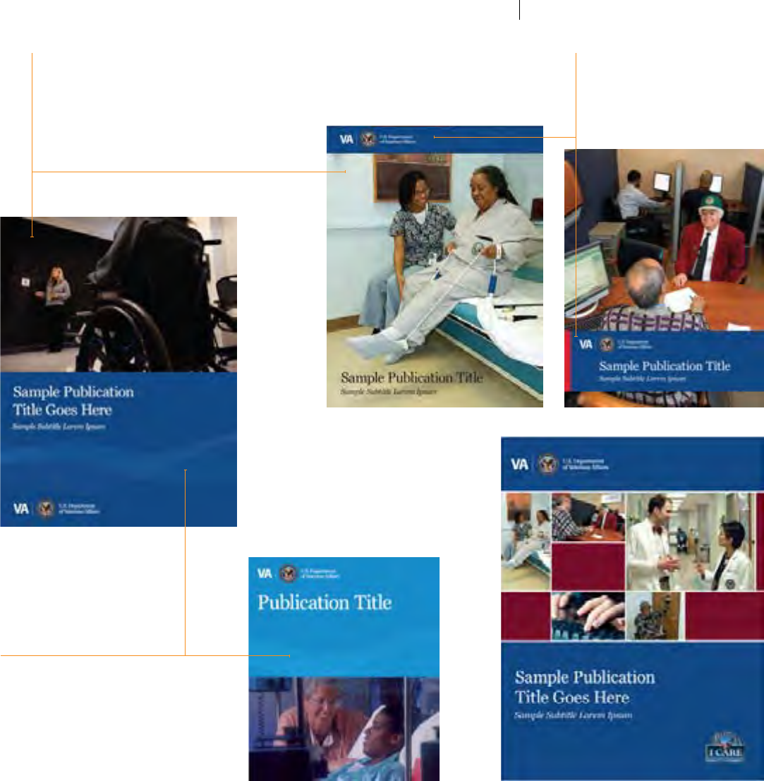
Hypothetical
Applications
At right is a variety of possible design
solutions for hypothetical applications.
These can be adapted to suite
everything from a publication to a
large exhibition display panel.
Using color, typography, and other
basic principles outlined in this
document can help guide designers
as they explore alternate layouts that
support the overall brand.
THE VA THREAD GRAPHIC
An abstract wave graphic designed specically
for VA use can be a strong visual element that
links color elds to photos, or holds its own as
a linear texture.
COLOR BANDS
Use bands of color from the VA Palette in
various positions over photos. This device
works well as a top anchor (left). Additional
swatches of contrasting color can be used, such
as this vertical stripe of red along the edge of
the blue band (below).
PHOTOS
Photos can be cropped to split layouts with
color elds (below) and can be placed at either
top or bottom. You can also use large, single
images full frame (right), or feature multiple
images in a modular grid (lower right).
VA TIER 1 GRAPHIC STANDARDS DESIGN INSPIRATIONS: HYPOTHETICAL APPLICATIONS
62
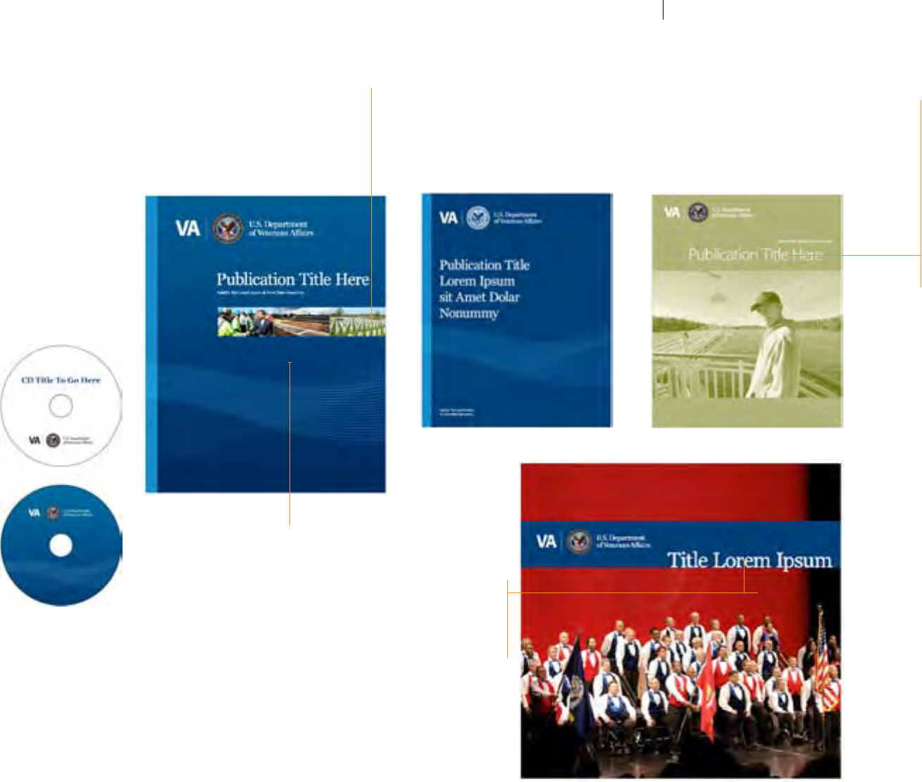
Hypothetical
Applications
CONTINUED
SCALE CONTRAST
Not all photos have to be large. Sometimes a
small band of images contrasted against a rich
background color provides a nice alternative.
SANS SERIF
While not recommended for
frequent use, Myriad Pro can
occasionally be used as a title font
when the subject matter warrants.
SUBTLE GRADIENTS
Color elds can be given a subtle gradient to
create depth—a device particularly eective
when overlaying additional elements.
MONOTONES, DUOTONES, ETC.
Some projects may require less than full-color printing (below left). Or, the tone of a
piece may suggest a softer, warmer color scheme than that of the primary VA Palette
(below right). Layouts can be clean and dynamic without going full-color, and in some
instances, you may opt to use duotone photography in your full-color piece to set a
particular mood and consistency.
TYPE ON THE EDGE
Some layouts may benet from a slightly more
progressive type treatment. Instead of centering
the title in your color band, place the baseline of
the text on the edge for an alternative approach.
VA TIER 1 GRAPHIC STANDARDS DESIGN INSPIRATIONS: HYPOTHETICAL APPLICATIONS
63
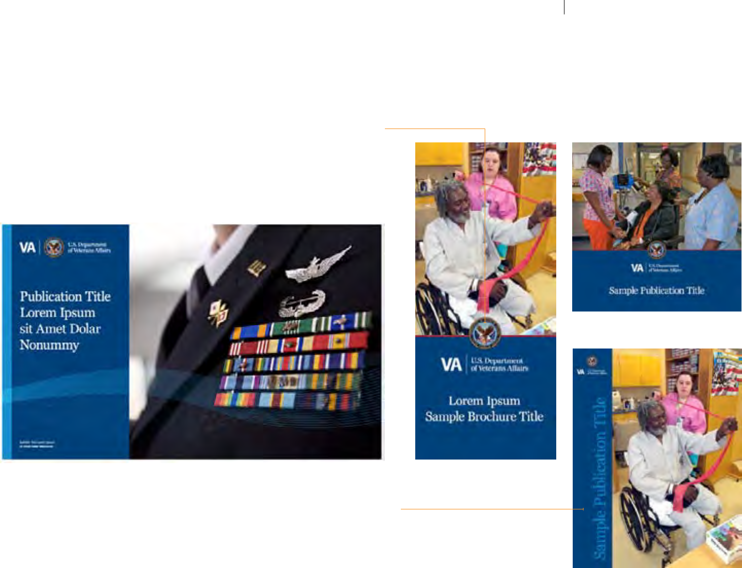
Hypothetical
Applications
CONTINUED
OVERLAPPING THE SEAL
Another visual technique to consider is allowing the
VA Seal to overlap a photo (below right) or color bar
(below left). This can be done without compromising
the integrity of the Seal, and can be an eective way
of adding dimension to your layouts.
VERTICAL TITLES
Some layouts may require vertical titles. A simple way
to maximize your space without aecting the photo is
to position the text vertically in a color band.
VA TIER 1 GRAPHIC STANDARDS DESIGN INSPIRATIONS: HYPOTHETICAL APPLICATIONS
64
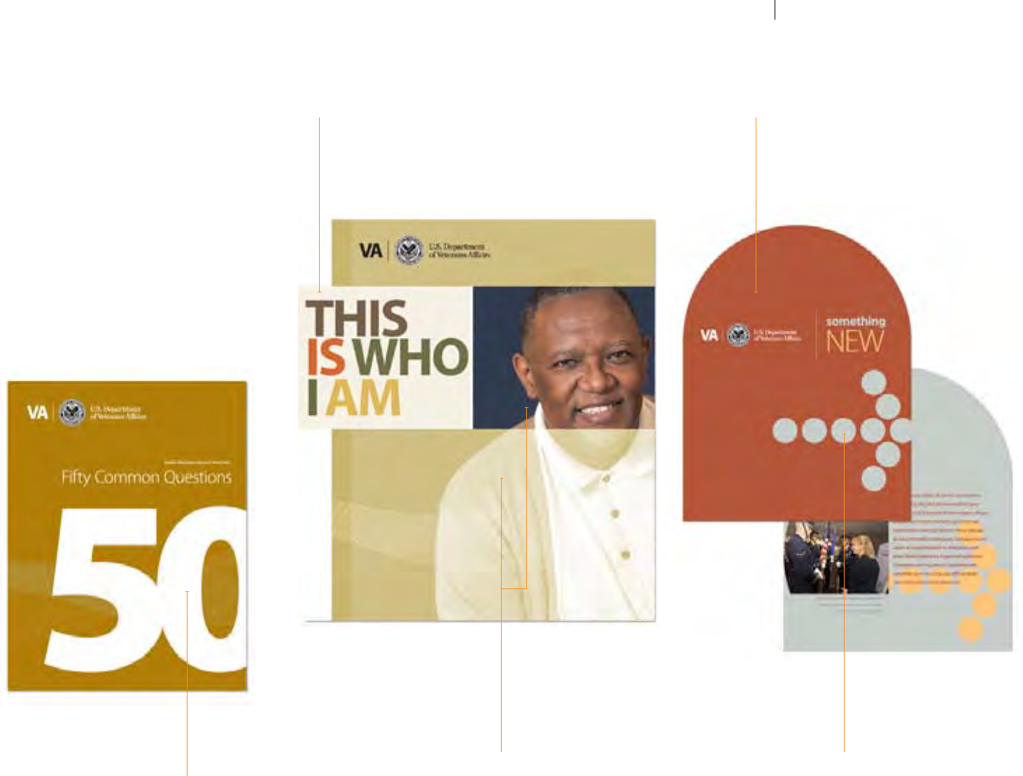
Hypothetical
Applications
CONTINUED
The examples here and on the following
pages show less conservative layouts—
designs which employ the extended
color palette and more progressive use
of typography, but remain safely within
brand guidelines.
LARGE TYPE
Consider using type as image, by using
scale contrast. Here, a large "50", artistically
kerned and cropped, becomes the primary
design element on this cover.
COMBINE DUOTONES & FULL-COLOR
This cropped full-color image adds focus
and depth to the larger duotone, creating a
unique mood for this piece.
ADDITIONAL MOTIFS
Simple design motifs such as this arrow (a character in the
Meta Plus Black font) can be used when appropriate. Other
geometrical elements such as squares (see page 66) can be
used as subtle design elements throughout.
MULTICOLORED TYPE
Using the Extended VA Palette,
each word features a dierent color.
NON-TRADITIONAL SHAPES
Not everything has to be a rectangle,
square, or 8.5" x 11". When appropriate, try
an interesting new size or format.
VA TIER 1 GRAPHIC STANDARDS DESIGN INSPIRATIONS: HYPOTHETICAL APPLICATIONS
65
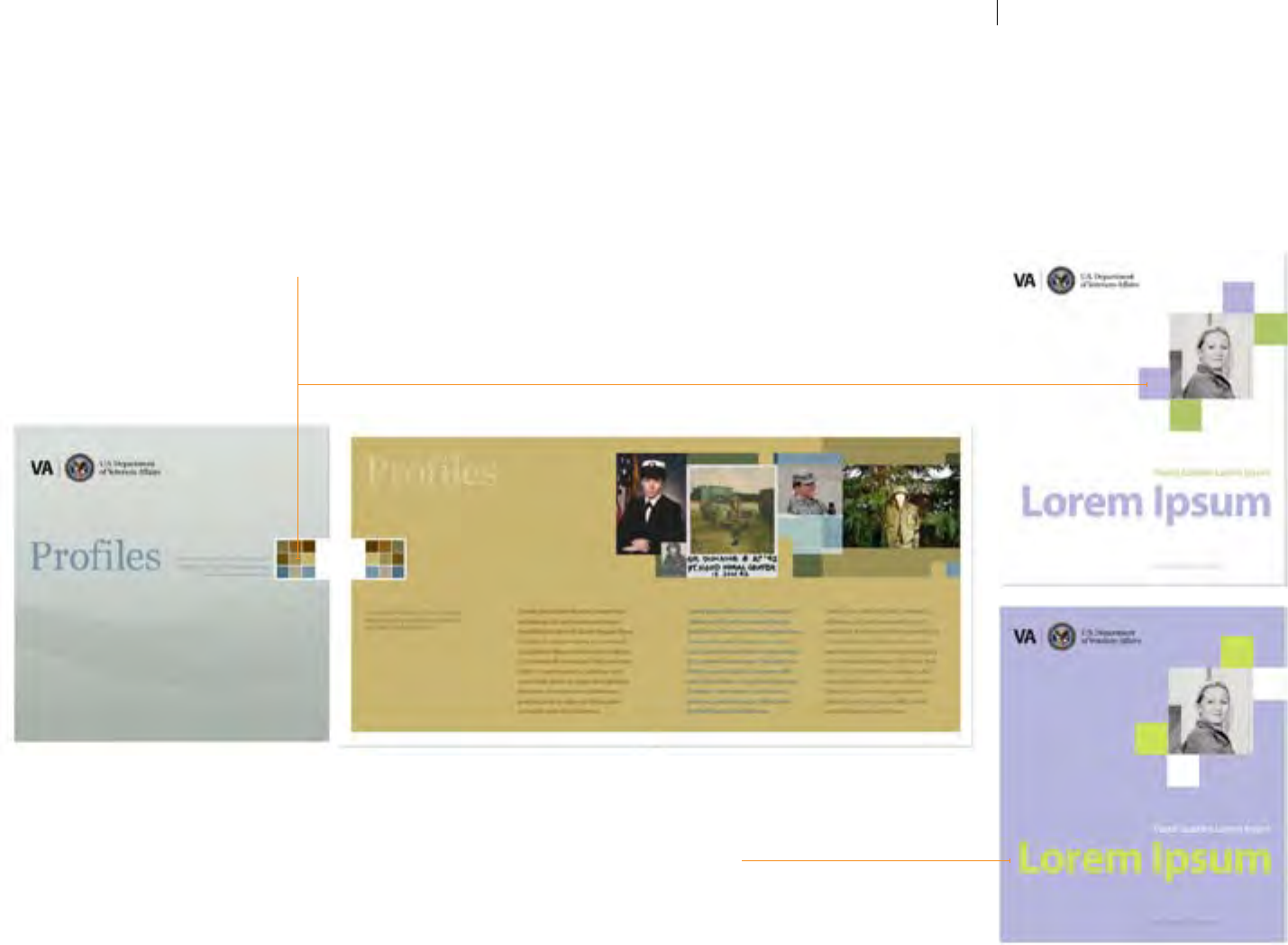
Hypothetical
Applications
CONTINUED
SOFT TONES
In some instances, a softer palette may be
required. For this purpose, a set of pastel
colors has been developed.
See the VA Light Tones on page 20.
GEOMETRICAL MOTIF
A grouping of colored squares (below) is used
here as a subtle design motif, which can be carried
throughout a publication. At right, squares are
used to “frame” a cover photo.
VA TIER 1 GRAPHIC STANDARDS DESIGN INSPIRATIONS: HYPOTHETICAL APPLICATIONS
66
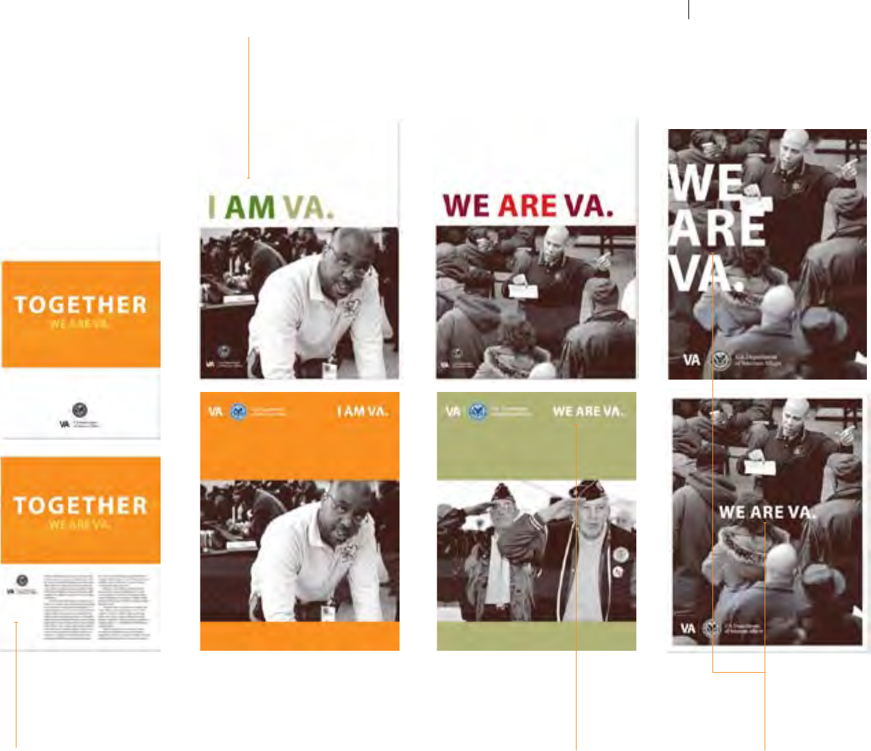
Hypothetical
Applications
CONTINUED
COLOR TYPE / BLACK & WHITE IMAGERY
Below is a sample campaign featuring
strong black and white photos paired with
large title typography set in all caps and
various tints/screens of colors.
COLOR FIELDS / BLACK & WHITE IMAGERY
An alternate solution that still makes use
of strong black and white photography is
shown above, as large elds of color serve
as backgrounds for the photo, with the title
text smaller and reversed out to white.
COLOR FIELDS / THE VA THREAD GRAPHIC
Focusing on a singular message can
be achieved by using a strong
background color.
STARK BLACK & WHITE
Above, a black and white image is used full
frame, (and with a white border) and paired
with simple, white typography. In some
cases, large, dramatic type may be appropri-
ate, while in others, a more subtle, centered
approach can be successful.
VA TIER 1 GRAPHIC STANDARDS DESIGN INSPIRATIONS: HYPOTHETICAL APPLICATIONS
67
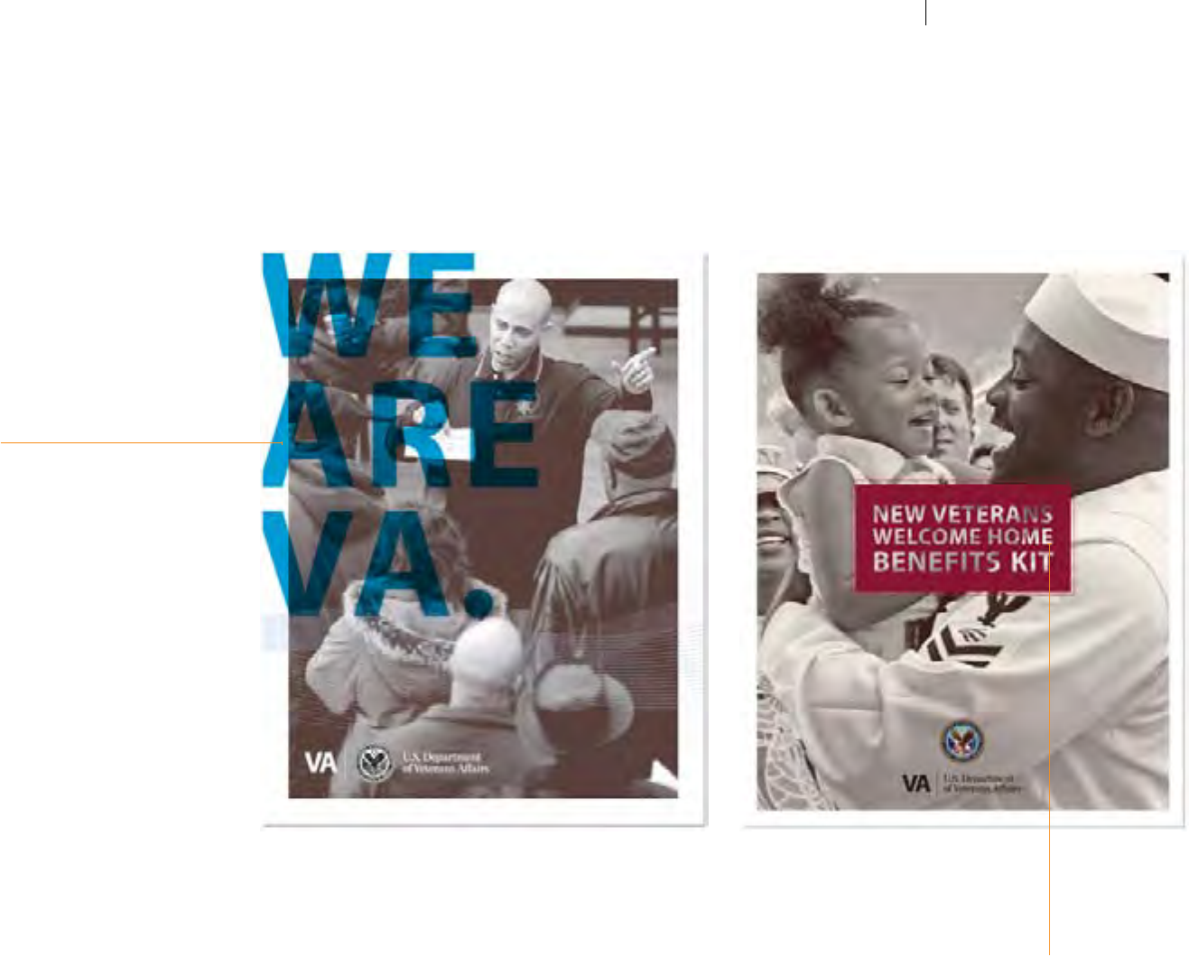
Hypothetical
Applications
CONTINUED
Introduction
The VHA Signature
Signature: Minimum Size Usage
Signature: Minimum Clear Space
Signature: Colors: Full + 2-color
Signature: Colors: 1-color
Signature: Colors: Other Usage
Signature: VHA Seal Usage
Signature: Incorrect Usage
Signature: Incorrect Usage, cont’d
Color: Palettes
Color: Approved 2-color combinations
Color: Incorrect 2-color combinations
Typography: General/Body Text
Typography: Title/Accent Text
Typography: Appropriate Color Usage
Typography: Appropriate Color, cont’d
Typography: Incorrect Usage
Typography: Incorrect Usage, cont’d
Design: Incorrect Applications
Design: Incorrect Applications, cont’d
Photography: Appropriate Usage
Photography: Appropriate Usage, cont’d
Photography: Incorrect Applications
Photography: Incorrect Applications, cont’d
TRANSPARENCY / TYPE OVERLAY
Oversized type can be used eectively as
a transparent overlay in some instances,
creating a bold eect.
GRAPHIC LABELS / BADGES
A simple rectangle of color becomes a clean
setting for a title treatment. Centered on the
design, this label eect is a strong graphic
device that works successfully.
VA TIER 1 GRAPHIC STANDARDS DESIGN INSPIRATIONS: HYPOTHETICAL APPLICATIONS
68
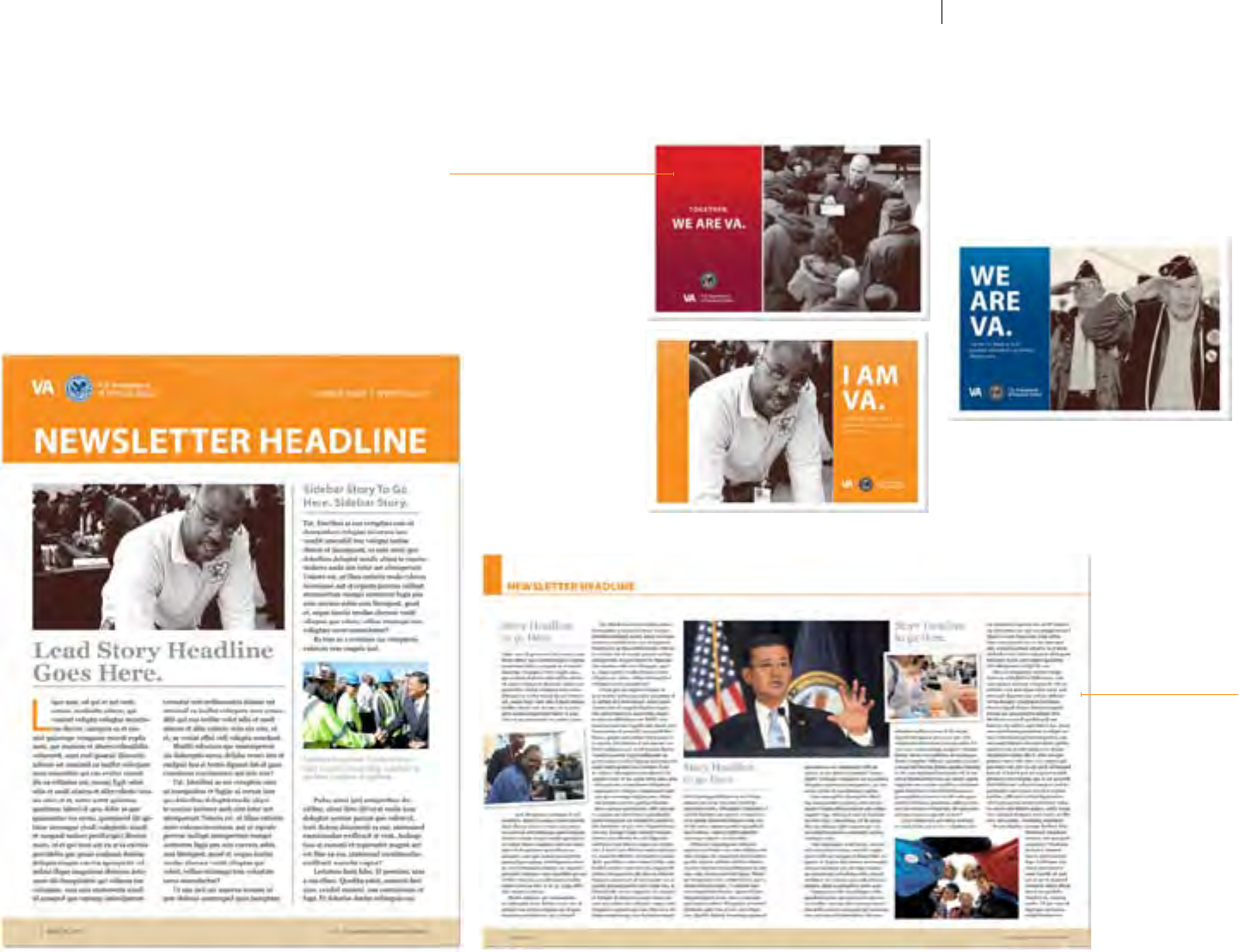
Hypothetical
Applications
CONTINUED
SAMPLE POSTCARDS / MAILERS
These horizontal pieces show how
small elds of color (with a subtle
gradient applied) can be used to
create a bold campaign.
Color eld width can be adjusted as
necessary—use your discretion.
SAMPLE NEWSLETTER
This sample newsletter
shows a simple grid and
photo usage.
VA TIER 1 GRAPHIC STANDARDS DESIGN INSPIRATIONS: HYPOTHETICAL APPLICATIONS
69

Print Preight
Checklist
Before sending les to a printer, always be sure to carefully review the following production
guidelines—not only to ensure printing quality, but also to ensure that specic VA criteria has
been met (i.e., internet/intranet URLs, creation/revision dates, etc.).
Design Element Checklist
o Are you using the correct New VA Parent Signature and/or Seal?
o Are all of the colors and typography used in the design approved by these guidelines?
o Are all of the images properly treated/styled, cropped, and arranged in the layout?
o Is the VA internet URL “www.va.gov” (required on any material to be used for external audiences).
o Is there a creation/revision date (i.e. "Created 6/12" or Revised 6/12) included and formatted
according to standards (see page 58)? Type should be 7pt. Myriad Pro Regular, bottom left
or right corner (back panel for brochures and double-sided fact sheets).
Production Checklist
o Has the design been approved by the author and/or supervisor?
o Are all high-resolution (300 dpi) images included, and non-300 dpi images identied?
o Are all font les (screen and printer) included?
o Have the latest PDFs of your project been included?
o Has text been checked to ensure against overow?
o Is there is a 1/8" bleed on the outside edge of bleed areas?
o Have crop and registration marks been included?
o Are the correct CMYK or PMS colors being used?
PRINT PREFLIGHT CHECKLIST
70