Design Style Guide
User Manual:
Open the PDF directly: View PDF ![]() .
.
Page Count: 35
Style Guide (24.07.2015)
Building and delivering the PGS message

02
Introduction
A Company’s Identity
is More Than its Logo
Our company identity creates the basis
for the way in which we present ourselves
visually. Our identity expresses a unified
design through conscious choices of form
and content that are consistent with our
goals and strategies.
We aim to build the PGS brand consistently.
This style guide is the toolbox for achieving
that ambition and therefore plays a vital
role in the communication of our presence.
This style guide provides our rules for the
core design elements – logo, strapline,
colours, and fonts.
Ready for use templates can be found in
MarketBase.
PGS STYLE GUIDE
INTRODUCTION
Content
Introduction 02
LOGO 03
Our Logo 04
Logo Protection 05
Logo Formats 06
Logo Do’s and Don’t’s 07
Negative Logo 08
COLOURS 09
Primary Colours 10
Secondary Colours 11
Tertiary Colours 12
Gradient Colours 13
Colour Wave 14
TYPOGRAPHY 15
Typography 16
Strapline 17
LAYOUT 18
Layout Grid 19
STATIONERY 20
Overview 21
Business card 22
Letterhead 23
US Letterhead 24
Envelopes 25
US Envelopes 26
DIGITAL 27
PowerPoint Landscape 28
PowerPoint Portrait 29
Email Signature 30
MARKETING MATERIAL 31
Posters 32
Adverts 33
Flyers 34
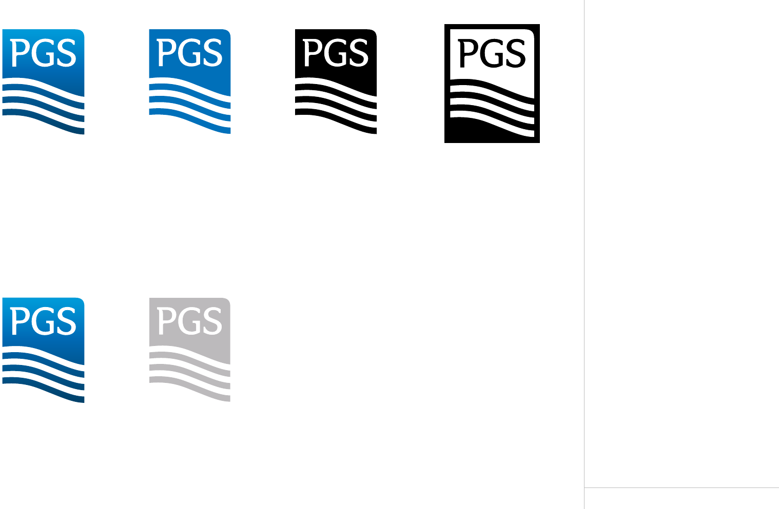
Logo
04
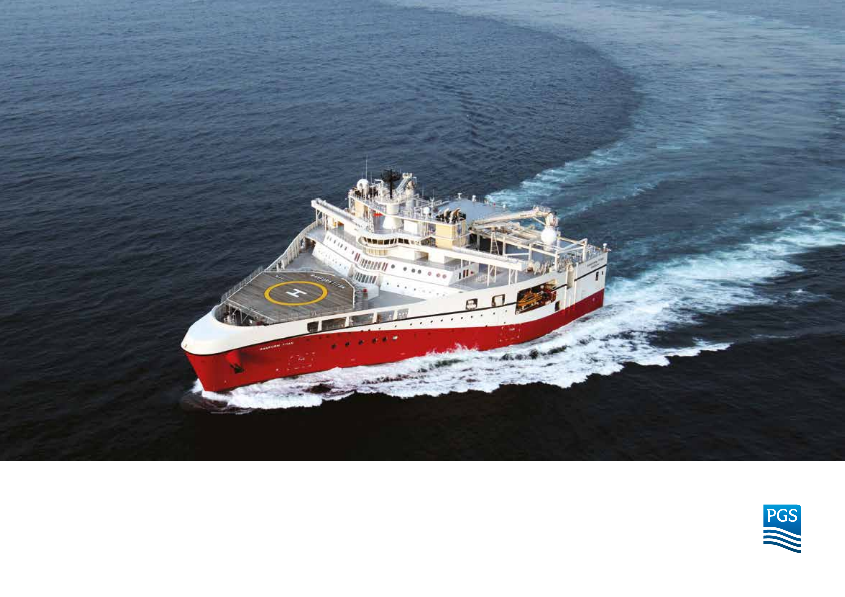
Our Logo
Our Logo is Our Signature
The logo is based upon our values,
it is relevant for the times and in line
with current business objectives and
future goals.
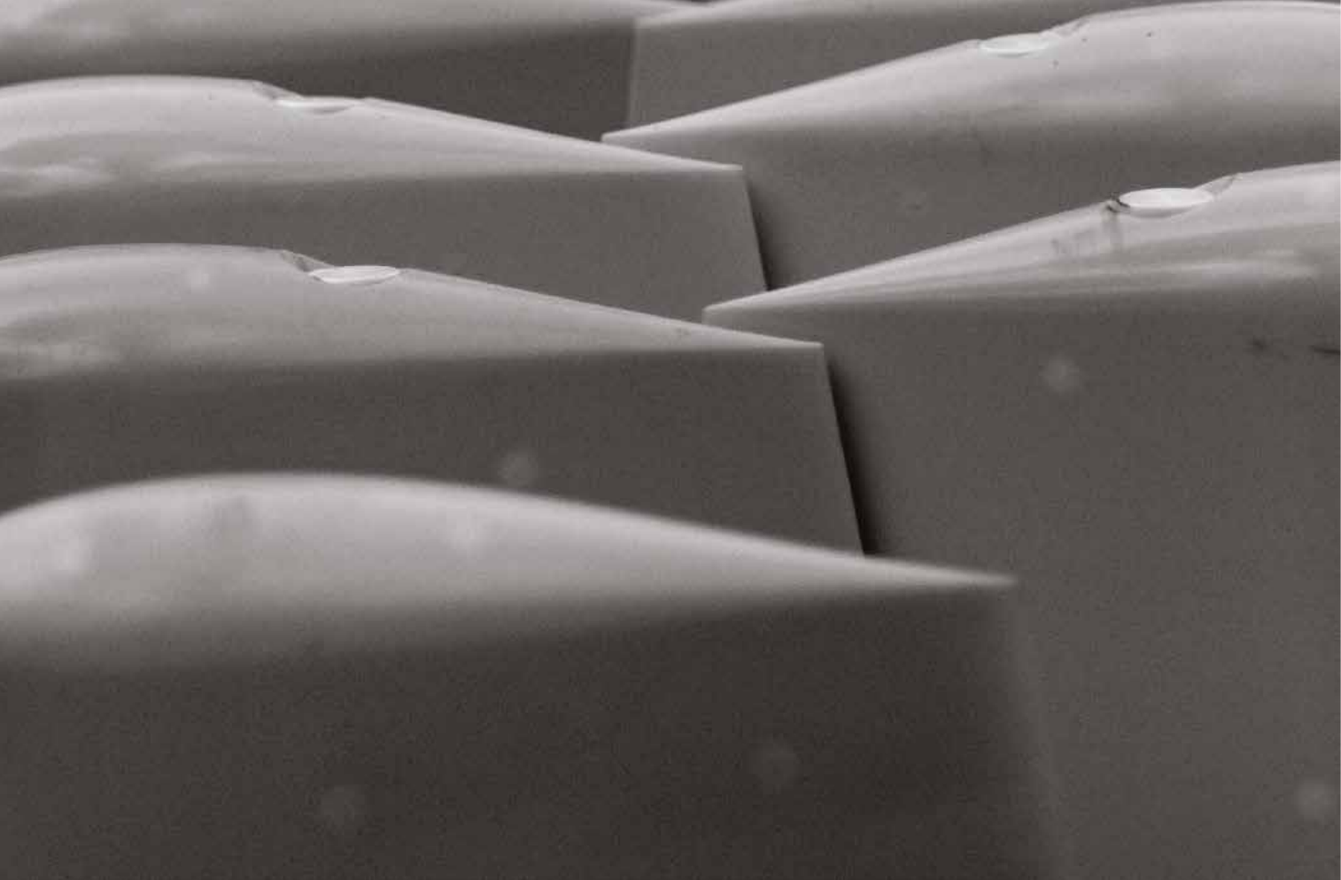
The logo communicates solidity and
reliability. The waves are inspired by the
shape of the Ramform, re-inforcing the
idea of us exploring deep waters, layer by
layer. This is also emphasized by a slight
gradient through the logo. The blue colour
is strongly associated with water and
maintains the values of Dedicated and
Reliable. The eye reads naturally from left
to right and lands at the bottom right,
therefore the weighting of the waves to
the bottom right enforces solidity.
PGS STYLE GUIDE
OUR LOGO
05
PGS STYLE GUIDE
LOGO PROTECTION
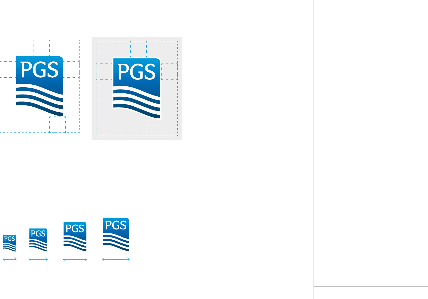
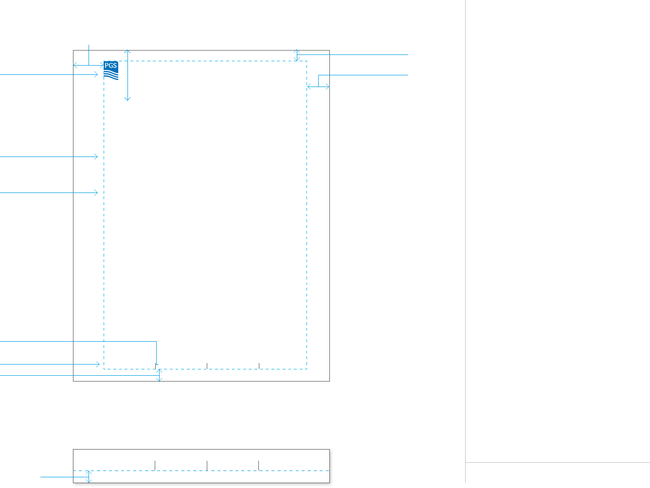
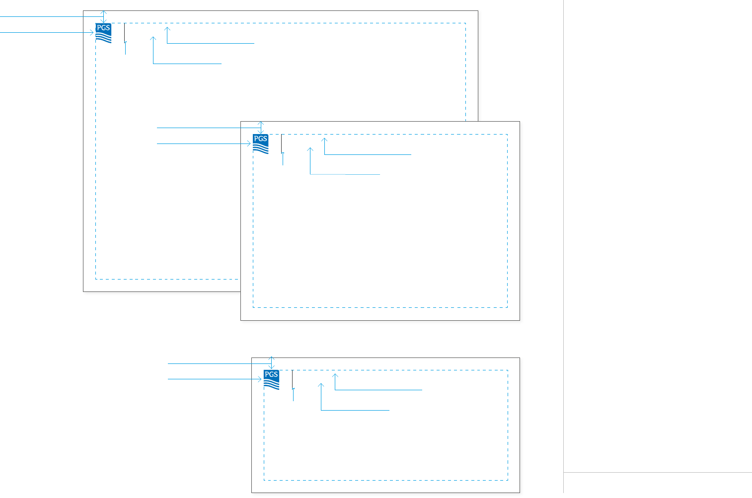
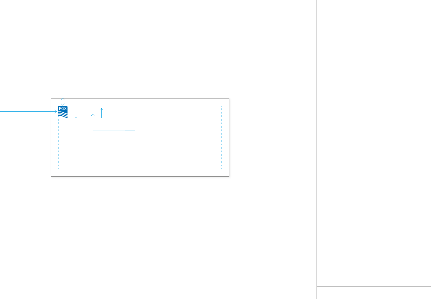
Logo Protection
Our logo should always appear clear and
visible and must never compete with other
elements. The protection zone indicates
the minimum space required around the logo.
To maintain legibility, the logo should never
be produced smaller than 8 mm measured
across the width of the logo mark.
Document Size Logo Width P=
A6 8 mm 3 mm
A5 11 mm 4 mm
A4 / US Letter 14 mm 5 mm
A3 20 mm 6.5 mm
650 x 950 mm 45 mm 16 mm
750 x 1000 mm 50 mm 18 mm
Document Size Logo Width P=
A6 0.32 in 0.12 in
A5 0.43 in 0.16 in
A4 / US Letter 0.55 in 0.2 in
A3 0.79 in 0.26 in
25.5 x 37.5in 1.77 in 0.58 in
29.5 x 39.5in 1.97 in 0.64 in
PP
PP
P
P
P
P
Protection Zone
Minimum and Recommended Sizes
In extreme cases, the absolute minimum size of the logo is 8mm.
The protection zone, P, is based upon the
height of the PGS letters and prevents
other design elements from being placed
too close to the logo.
11 mm 14 mm 16 mm8 mm
06
Logo Formats
Downloads
Our logo can be downloaded in many
formats depending on usage.
The information under each format will
give guidance on which format to use.
FILE TYPES EXPLANATION
Vector: The format EPS (Encapsulated
postscript) is a vector format. An EPS
format can be resized to any size without
losing its quality.
Raster: The formats JPG, GIF and PNG
are bitmap graphics. They are rasterized
images with a specific pixel size that
cannot be enlarged without losing their
quality.
PGS STYLE GUIDE
LOGO FORMATS
CMYK
For use on standard
printing material by
combining the 4 print
colours C-M-Y-K.
Download:
PGS_LOGO_CMYK.eps
PANTONE
Flat logo for use on all printed
material when it is of critical
importance to reproduce the
exact PGS blue Pantone 300.
Download:
PGS_LOGO_FLAT_PMS300.eps
BLACK
For use on black and white
print or telefax.
Download:
PGS_LOGO_BLACK.eps
Print
METALLIC/STEEL/REFLECTIVE
For use in special applications e.g.
signage and reflective clothing.
Download:
PGS_LOGO_PMS877.eps
Special Applications
RGB
For digital use/screens e.g.
Powerpoint, Word, Web.
Download:
PGS_LOGO_RGB.png
PGS_LOGO_HIGHRES_RGB.jpg
PGS_LOGO_LOWRES_RGB.jpg
PGS_LOGO_RGB.gif
Digital
NEGATIVE
For use in materials
designed by professional
designers only.
Download:
PGS_LOGO_NEGATIVE.eps
PGS_LOGO_NEGATIVE.png
Print & Digital
07
DON’T extract elements
from the logo
PGS STYLE GUIDE
LOGO DO’S AND DON’T’S
Logo Do’s
and Dont’s
Correct and Consistent
Our logo is our visual signature and master
brand. It is therefore of utmost importance
to follow the rules and guidelines, as
shown on these pages, concerning the use
of the logo.
Do not manipulate the colours, the
thickness of the waves, the typeface or any
other aspects of the logo. The proportions
(height and width) must always remain
the same. The value of recognition and
consistency in the use of our logo are the
key to brand building.
The logo has a white key line around it and
the preferred background is white. When
put on a coloured background the key line
will show. Do not change the thickness of
the white key line.
The logo should always be placed on a calm
background. Vivid coloured backgrounds or
patterns of any kind must be avoided.
The names of business divisions are not
part of the logo and should not be placed
beside it.
DON’T change the
proportions of the logo
DON’T change the
proportions of the logo
SOLID BACKGROUND
The white key line around
the logo will be visible on
solid backgrounds.
CALM, LIGHT PHOTO
BACKGROUND
The logo can be placed on
areas of the photo where
the colour appears solid
and calm.
CALM, DARK PHOTO
BACKGROUND
The logo can be placed on
areas of the photo where
the colour appears solid
and calm.
WHITE BACKGROUND
This is the preferred logo
background.
DON’T change the colour
of the logo
DON’T change the outline
size of the logo
DON’T place the logo on
a vivid background
Dont’s
Do’s
Marine
DON’T put other elements
too close to the logo
DON’T change the outline
colour of the logo
DON’T place text or other
elements within the
protection zone
08
Negative Logo
Professionals Only
The negative logo can only be used in
Highlight materials made by professional
designers.
It is important that the negative logo is
placed on the correct type of background
to maintain our corporate image.
The logo should always be placed on calm
backgrounds both if it is a solid colour
background or a photo background.
If in doubt – use the main logo.
PGS STYLE GUIDE
NEGATIVE LOGO
Dont’s
CALM, LIGHT PHOTO
BACKGROUND
CALM, DARK PHOTO
BACKGROUND
DON’T place the logo on
a vivid background
SOLID BACKGROUND
Do’s
Example of Use
We have through our history launched step
changing innovations, among these are the
Ramform Series - benchmarks of marine
seismic operations.
Our competent and interdisciplinary teams
are constantly pushing the limits through
technology development, gaining operational
experience and indisputable results from
challenging environments worldwide.
We take great pride in our achievements,
knowing that the strong will and ability that
made us the company we are today will keep
us continuously focused and competitive
in the future.
And most importantly; we always work
tirelessly to be your first choice.
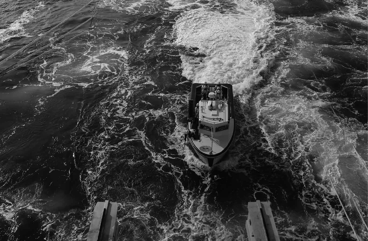
PGS - Unrivaled Performance
DELIVERING RESULTS.
TYPICAL USE OF LOGO WITHOUT KEY LINE
Signage for the Headquarters in Oslo

Colours
10
Primary Colors
Our Color Palette
The primary color for PGS is blue
PMS 300. A clear and solid colour to
be trusted. This is also the logo color.
Blue is the color of water. It is also
associated with the intellectual:
intelligence, communication, eciency,
logic, coolness and calm.
Blue, white and the grayscale constitute
the main colours of our image.
The metallic colour is for signage use only.
PGS STYLE GUIDE
PRIMARY COLOURS
Primary Color
Pantone 300
CMYK 100/50/0/0
RGB 0/94/184
HTML 005EB8
RAL 5005
White
Pantone -
CMYK 0/0/0/0
RGB 255/255/255
HTML FFFFFF
RAL 9003
Metallic
Pantone 877
RAL 110-M
Grayscale
Pantone Process Black
CMYK 20/20/20/100
(rich black)
CMYK 0/0/0/85 (text)
RGB 0/0/0
HTML 000000
RAL 9005
100%
80%
60%
40%
20%
100%
80%
60%
40%
20%
11
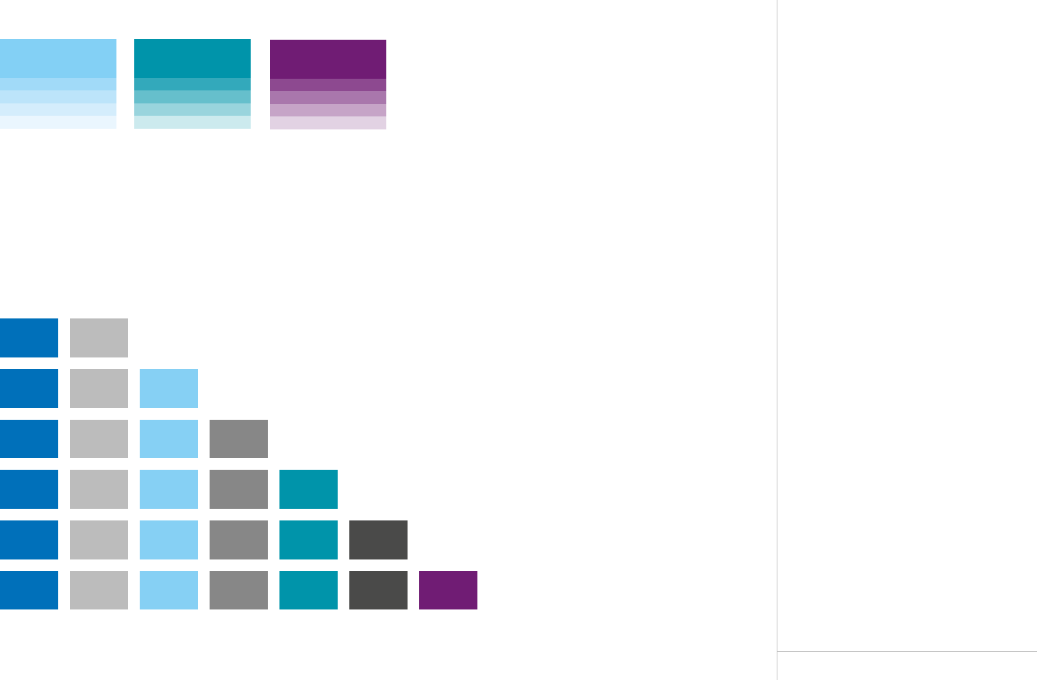
Secondary Colors
Our Color Palette
The use of color should be done conservatively.
Secondary colors should be used sparingly
and introduced in the correct order.
All designs should maintain a clean, neat
and airy appearance.
PGS STYLE GUIDE
SECONDARY COLOURS
Pantone 297
CMYK 50/0/0/0
RGB 113/197/232
HTML 71C5E8
RAL 2407030
Pantone 320
CMYK 96/0/31/0
RGB 0/156/166
HTML C4D600
RAL 5021
100%
80%
60%
40%
20%
100%
80%
60%
40%
20%
Secondary Colors
Pantone 300, Black 35%, Pantone 297, Black 60%, Pantone 320, Black 85%, Pantone 2613
Color Introduction Order
Here is a guide for order of color introduction when using more than the primary color:
Pantone 2613
CMYK 79/100/0/11
RGB 85/38/132
HTML 552684
RAL 324040
100%
80%
60%
40%
20%
12
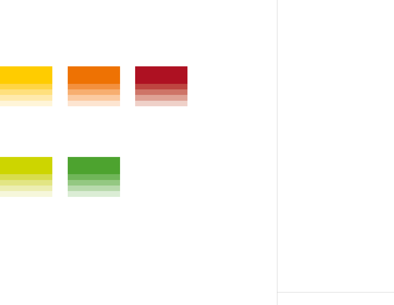
Tertiary Colors
Our Color Palette
The tertiary colors are for use by professional
designers in extreme circumstances where
additional colors are required. These should
be used sparingly.
PGS STYLE GUIDE
TERTIARY COLOURS
Pantone 187
CMYK 7/100/82/26
RGB 166/25/46
HTML A6192E
RAL 3031
100%
80%
60%
40%
20%
Pantone 362
CMYK 78/0/100/2
RGB 80/158/47
HTML 509E2F
RAL 6018
100%
80%
60%
40%
20%
Pantone 021
CMYK 0/65/100/0
RGB 254/80/0
HTML FE5000
RAL 2004
100%
80%
60%
40%
20%
Pantone 382
CMYK 28/0/100/0
RGB 196/214/0
HTML C4D600
RAL 1008080
100%
80%
60%
40%
20%
Pantone 7406
CMYK 0/20/100/2
RGB 241/196/0
HTML F1C400
RAL 1021
100%
80%
60%
40%
20%
Tertiary Colors
13
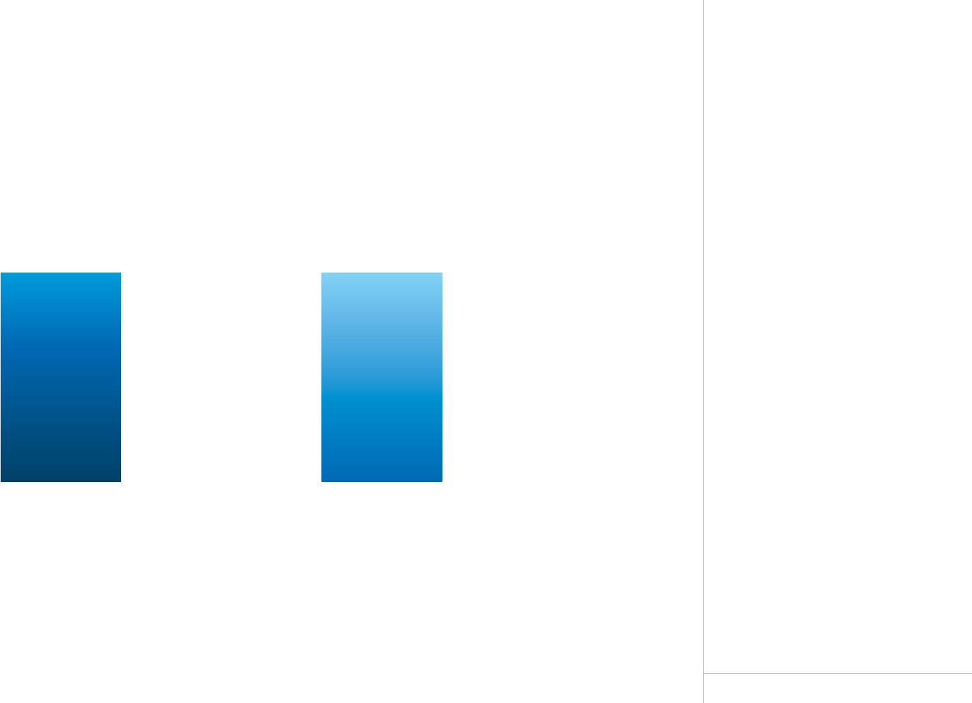
Gradients
Our Gradient Color Palette
The gradients are used to express depth
and add gravity to our identity. Gradients
are for use in brochures, reports and other
professionally designed material.
Gradients should always be used with
the darkest color at the bottom and the
lightest at the top.
PGS STYLE GUIDE
GRADIENT COLOURS
Dark Blue Gradient Light Blue Gradient
Location 0%
CMYK 80/20/0/0
RGB 77/153/214
Anchor 51%
Location 35%
CMYK 100/50/0/0
RGB 18/105/176
Anchor 50%
Location 100%
CMYK 100/60/20/40
RGB 27/67/103
Location 0%
CMYK 50/0/0/0
RGB 156/207/243
Anchor 51%
Location 100%
CMYK 100/50/0/0
RGB 18/105/176
14
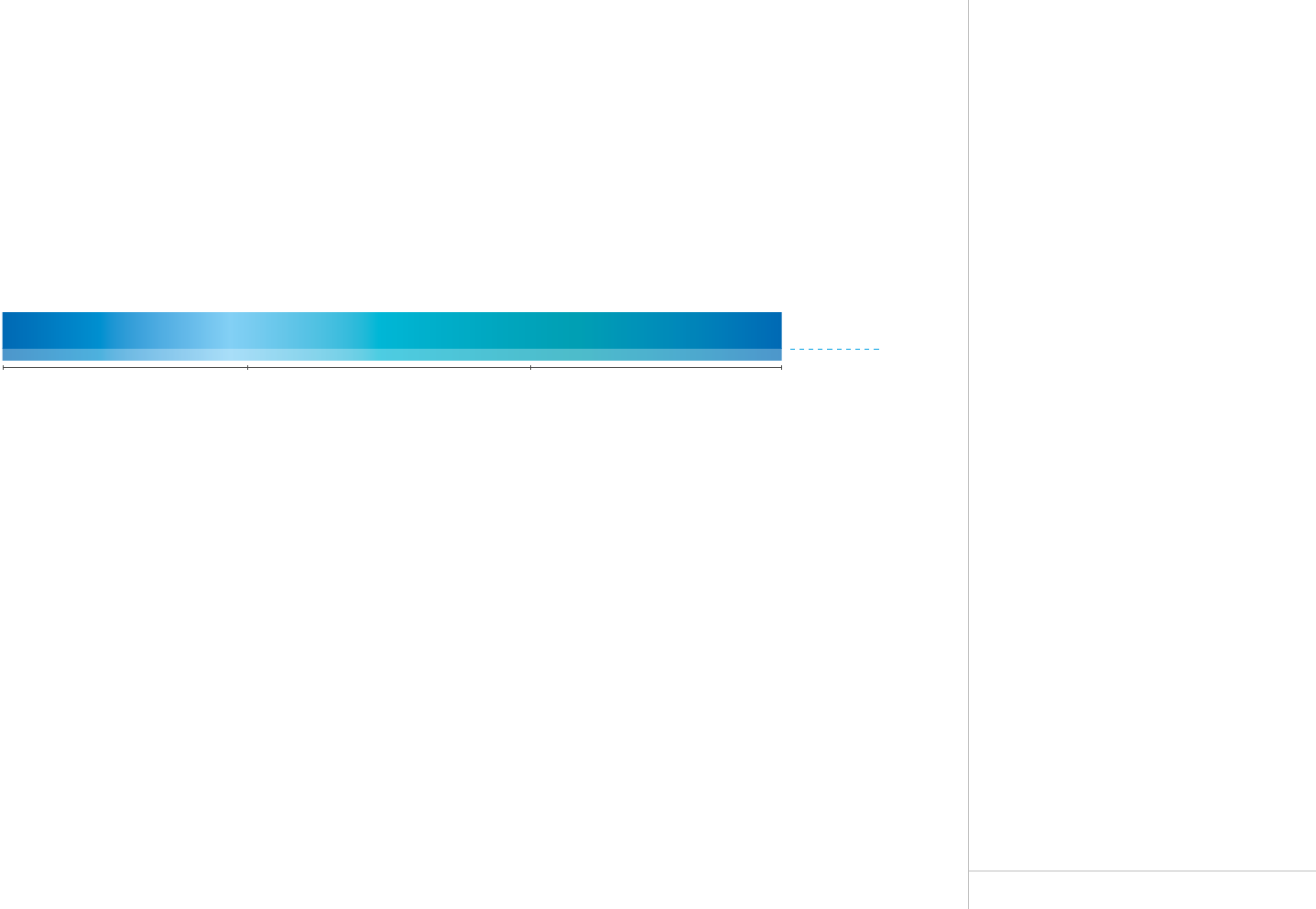
Colour Wave
Graphic Element
The colour wave is for use in many
dierent design documents including:
adverts, posters, flyers and brochures.
The colour wave should always stretch
the full width of the page. In professional
printing; full bleed and inhouse printing;
from margin to margin.
The height is equivalent to 4x.
3x with 100% gradient colour.
1x with 70% gradient colour.
The colour wave is only available
in CMYK colours.
The colour wave can be made manually
following these guidelines or downloaded
as an Indesign document from MarketBase.
Fixed colour wave heights:
Document Size Height
A6 3.5 mm/1.4 in
A5 5 mm/0.2 in
A4 / US Letter 7 mm/0.27 in
A3 10 mm/0.4 in
650 x 950mm/25.5 x 37.5in 17 mm/0.67 in
750 x 1000mm/29.5 x 39.5in 19 mm/0.75 in
PGS STYLE GUIDE
COLOUR WAVE
X
X
X
X
Height 3 x 100%
Height 1 x 70%
CMYK 100/50/0/0 CMYK 50/0/0/0 CMYK 96/0/31/0 CMYK 100/50/0/0
Blue
Typography

16
Typography
Three Typefaces
Klavika is the primary typeface and will
be used on the website and all marketing
material.
Arial is used for internal document templates,
Powerpoint, digital platforms and any other
situation where Klavika is not available.
This is a standard typeface worldwide.
Calibri is the default typeface in Microsoft
Oce applications.
Tips:
The default typeface in Microsoft Oce
applications can be set to Klavika but it
requires installation of the Klavika font.
For licenses: www.luth.no
Klavika
Klavika was designed by Eric Olson and released
by the Process Type Foundry in 2004. Klavika is a
modern, flexible and solid typeface with a wide range
of typographic features.
Crisp and open shapes keep the it legible in small sizes
while the straight-sided characters anchor headlines
and display work solidly in place. The dierent fonts will
add character to printed as well as digital applications.
Klavika is a licensed typeface and is available for print
and web.
PGS STYLE GUIDE
TYPOGRAPHY
Primary Typeface – Klavika and Klavika Condensed
Secondary Typeface – Arial
ABCDEFGHIJKLMNOPQRSTUVWXYZ123456789
abcdefghijklmnopqrstuvwxyz123456789
ABCDEFGHIJKLMNOPQRSTUVWXYZ123456789
abcdefghijklmnopqrstuvwxyz123456789
ABCDEFGHIJKLMNOPQRSTUVWXYZ123456789
abcdefghijklmnopqrstuvwxyz
ABCDEFGHIJKLMNOPQRSTUVWXYZ123456789
abcdefghijklmnopqrstuvwxyz
ABCDEFGHIJKLMNOPQRSTUVWXYZ
abcdefghijklmnopqrstuvwxyz
ABCDEFGHIJKLMNOPQRSTUVWXYZ123456789
abcdefghijklmnopqrstuvwxyz123456789
ABCDEFGHIJKLMNOPQRSTUVWXYZ123456789
abcdefghijklmnopqrstuvwxyz123456789
ABCDEFGHIJKLMNOPQRSTUVWXYZ123456789
abcdefghijklmnopqrstuvwxyz123456789
ABCDEFGHIJKLMNOPQRSTUVWXYZ123456789
abcdefghijklmnopqrstuvwxyz123456789
ABCDEFGHIJKLMNOPQRSTUVWXYZ123456789
abcdefghijklmnopqrstuvwxyz123456789
ABCDEFGHIJKLMNOPQRSTUVWXYZ123456789
abcdefghijklmnopqrstuvwxyz123456789
ABCDEFGHIJKLMNOPQRSTUVWXYZ123456789
abcdefghijklmnopqrstuvwxyz123456789
ABCDEFGHIJKLMNOPQRSTUVWXYZ123456789
abcdefghijklmnopqrstuvwxyz123456789
ABCDEFGHIJKLMNOPQRSTUVWXYZ123456789
abcdefghijklmnopqrstuvwxyz123456789
ABCDEFGHIJKLMNOPQRSTUVWXYZ123456789
abcdefghijklmnopqrstuvwxyz123456789
ABCDEFGHIJKLMNOPQRSTUVWXYZ123456789
abcdefghijklmnopqrstuvwxyz123456789
ABCDEFGHIJKLMNOPQRSTUVWXYZ123456789
abcdefghijklmnopqrstuvwxyz123456789
ABCDEFGHIJKLMNOPQRSTUVWXYZ123456789
abcdefghijklmnopqrstuvwxyz123456789
ABCDEFGHIJKLMNOPQRSTUVWXYZ123456789
abcdefghijklmnopqrstuvwxyz123456789
ABCDEFGHIJKLMNOPQRSTUVWXYZ123456789
abcdefghijklmnopqrstuvwxyz123456789
ABCDEFGHIJKLMNOPQRSTUVWXYZ123456789
abcdefghijklmnopqrstuvwxyz123456789
Tertiary Typeface – Calibri
ABCDEFGHIJKLMNOPQRSTUVWXYZ123456789
abcdefghijklmnopqrstuvwxyz123456789
ABCDEFGHIJKLMNOPQRSTUVWXYZ123456789
abcdefghijklmnopqrstuvwxyz123456789
ABCDEFGHIJKLMNOPQRSTUVWXYZ123456789
abcdefghijklmnopqrstuvwxyz123456789
ABCDEFGHIJKLMNOPQRSTUVWXYZ123456789
abcdefghijklmnopqrstuvwxyz123456789
17
Strapline
A Clearer Image
The strapline, A Clearer Image, will
always stand next to the url address;
www.pgs.com.
The strapline can be used in PGS blue,
85% black or negative as appropriate.
The strapline can be downloaded as an
Indesign document from MarketBase.
Fixed point sizes:
Document Size Type size
A6: 8pt
A5: 10pt
A4 / US Letter: 10pt
A3: 16pt
650 x 950mm / 25.5 x 37.5in 40pt
750 x 1000mm / 29.5 x 39.5in 45pt
PGS STYLE GUIDE
STRAPLINE
A Clearer Image | www.pgs.com
Klavika Medium 10pt
Colour PMS 300
Klavika Light 10pt
Colour PMS 300
A Clearer Image | www.pgs.com
Klavika Medium 10pt
Colour 85% Black
Klavika Light 10pt
Colour 85% Black
Example, A5 & A4 Formats – 10pt
Layout
19
A Clearer Image | www.pgs.com
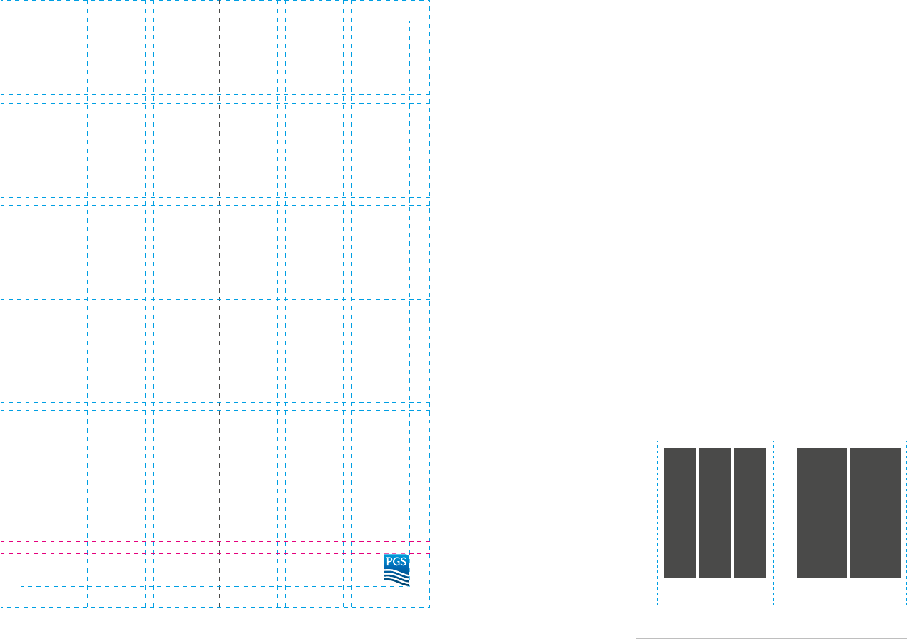
Layout Grid
Six Grid System
All marketing materials will use
a six-grid system.
The majority of the marketing materials
will use three columns. If materials are text
heavy, two columns can be used. Examples
are Annual Report and Quarterly Reports.
No elements of design should reach into
the logo and strapline zone below the
magenta lines.
The grid can be adjusted to fit any size as
long as the proportions remain the same.
The margins can be adjusted to fit the
various types of marketing materials.
The grid can be used upside down when
the logo and strapline is on top.
Three columns Two columns
PGS STYLE GUIDE
LAYOUT GRID
Flexible Layout Grid
A4 Gutters 4mm
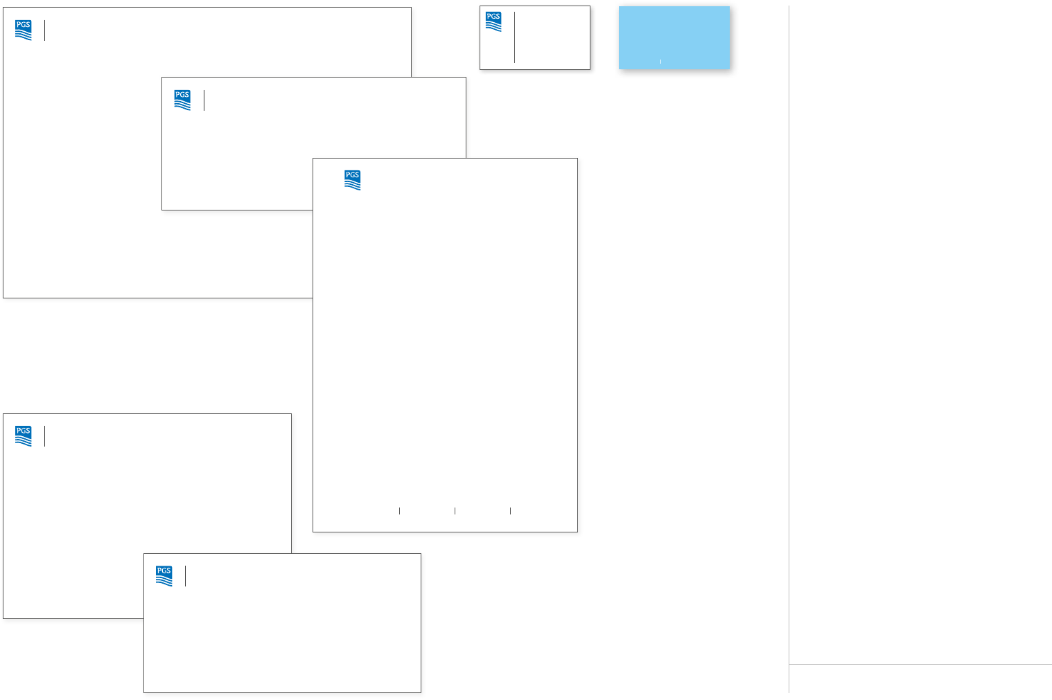
Stationery
21
Envelope C4 (324 x 229mm)
Envelope US No10 (241 x 105mm)
Envelope C5 (229 x 162mm)
Envelope DL (220 x 110 mm)
Business Cards (89 x 51mm)
Petroleum Geo-Services ASA Strand veien 4, P.O. Box 290
N-1366 Lysake r, Norway
Tel: +47 6752 6 400
Fax: +47 6752 6 883
F.nr/Reg.no: 9162 3529
www.pgs.com
Letterhead A4 (210 x 297mm)
www.pgs.com
JOE BL OGGS
Area Manager
Department
Tel : +47 6 7 52 64 00
Fax: +47 6 7 51 43 41
Direct: + 47 67 51 40 7 0
Mobile: +47 91 53 7 0 46
Email: joe.bloggs@pgs.com
Petroleum Geo-Services
Lilleakerveien 4C
P.O. Box 25 1 Lilleaker
0216 O slo
Norway
www.pgs.com
Petroleum Geo-Services ASA
Lilleakerveien 4C
P.O.BOX 251 Lilleaker
N-0216 Oslo
Norway
Petroleum Geo-Services ASA
Lilleakerveien 4C
P.O.BOX 251 Lilleaker
N-0216 Oslo
Norway
Petroleum Geo-Services ASA
Lilleakerveien 4C
P.O.BOX 251 Lilleaker
N-0216 Oslo
Norway
Petroleum Geo-Services ASA
Lilleakerveien 4C
P.O.BOX 251 Lilleaker
N-0216 Oslo
Norway
Mr. Smith
ABC Company
1234 Pine Drive
Anywhere, AB 12345 10 February 2013
RE: Electronic Leerhead
Dear Mr. Smith,
This is the preferred layout style for PGS leers. Calibri Regular size 10 or 12pt is our company
typeface for all body text in leers, faxes, and all documents. Word templates have been set up for
documents and are available in the Style Guide, found in the gateways of ONLiNE.
Thank you for your co-operaon in maintaining a consistent corporate style.
Best regards,
John Walsh
Vice President Markeng
PGS
A Clearer Image www.pgs.com
PGS STYLE GUIDE
OVERVIEW
Stationery
Overview
Business cards and envelopes use the
Klavika font.
The letterhead uses standard fonts,
Arial and Calibri.
22
JOE BLOGGS
Area Manager
Department
Tel: +47 67 52 64 00
Fax: +47 67 51 43 41
Direct: +47 67 51 40 70
Mobile: +47 91 53 70 46
Email: joe.bloggs@pgs.com
Petroleum Geo-Services
Lilleakerveien 4C
P.O. Box 251 Lilleaker
0216 Oslo
Norway
www.pgs.com
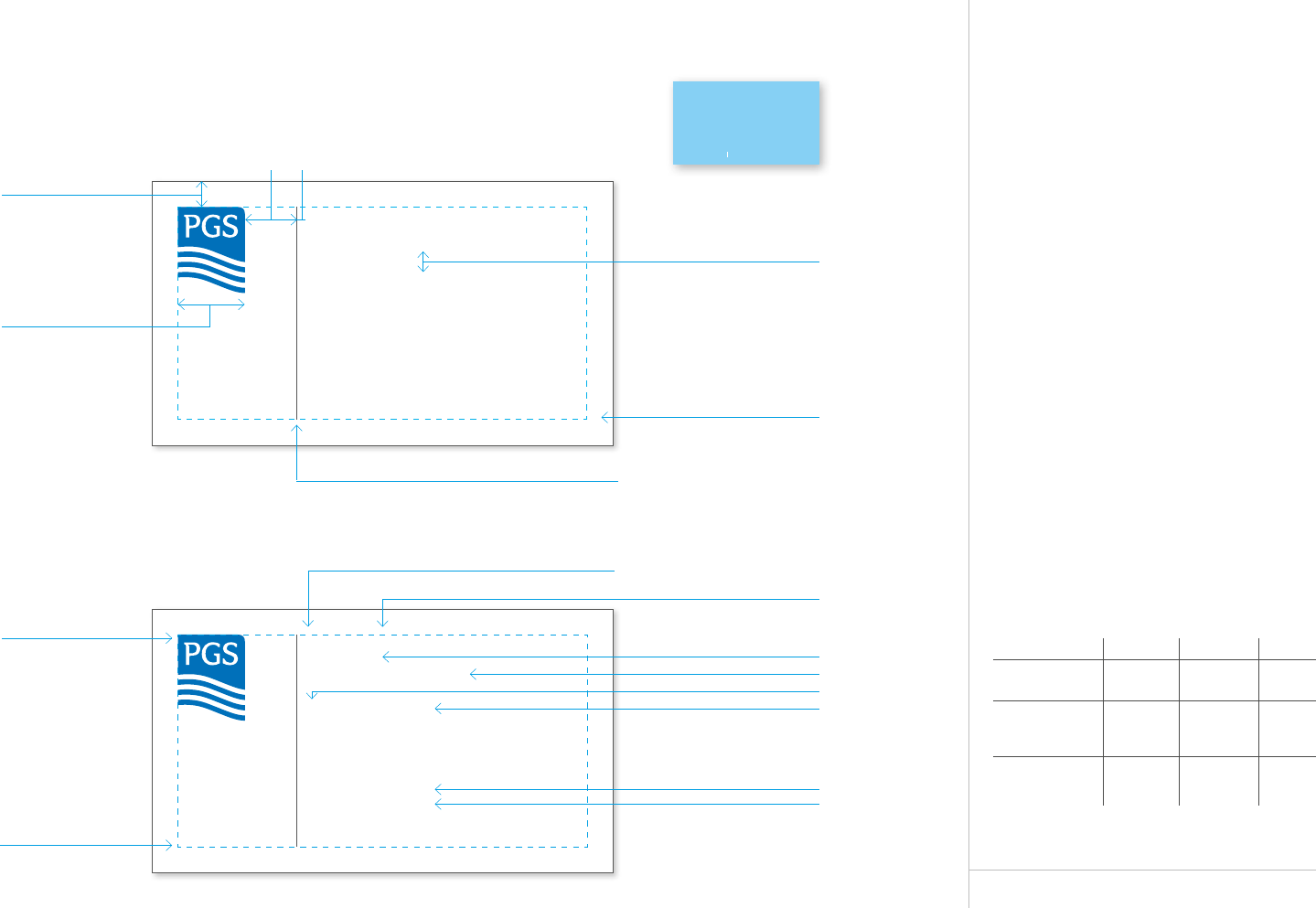
Business Card
Front
The cards are generally printed on one side
with an added option to print a back.
Paper: Cards should be printed on bright
white woven card stock 250g.
The dimensions of the card are 3.5“x 2“
(89 x 51 mm).
The PGS logo and typography should be
printed using PMS colours for a matt
finish, as specified in this example.
Templates are available on PGS
MarketBase.
Text Capitals Font Size
Employee´s name
Employee´s title
(Additional info
if required)
Division
(Sub-division
if required
All
uppercase
Upper/
lowercase
Upper/
lowercase
Klavika
Medium
Klavika
Light
Klavika
Light italic
8.5/9pt
6.5/9pt
6.5/7.5pt
Business Card Front
This area can vary according
to amount of text lines
1,5mm10mm
Margins all sides 5mm
Keep text aligned to bottom
Klavika Medium 8,5/9pt
Klavika Medium 6,5/7,5pt
Klavika Light 6,5/9pt
Klavika Light Italic 6,5/7.5pt
Klavika Light 6,5/7,5pt
Stroke weight 0,25pt, colour PMS Process black 80%
Text colour PMS Process black 80%
Logo colour PMS 300
Klavika Medium 6,5pt
Colour PMS 300
Klavika Light 6,5/7,5pt
Logo width 12,3mm
Klavika Medium 6,5/7,5pt
JOE BLOGGS
Area Manager
Department
Tel: +47 67 52 64 00
Fax: +47 67 51 43 41
Direct: +47 67 51 40 70
Mobile: +47 91 53 70 46
Email: joe.bloggs@pgs.com
Petroleum Geo-Services
Lilleakerveien 4C
P.O. Box 251 Lilleaker
0216 Oslo
Norway
www.pgs.com
www.pgs.com
PGS STYLE GUIDE
BUSINESS CARD
Optional back design
A Clearer Image www.pgs.com
23
Petroleum Geo-Services ASA Strandveien 4, P.O. Box 290
N-1366 Lysaker, Norway
Tel: +47 6752 6400
Fax: +47 6752 6883
F.nr/Reg.no: 91623529
www.pgs.com
Mr. Smith
ABC Company
1234 Pine Drive
Anywhere, AB 12345 10 February 2013
RE: Electronic Leerhead
Dear Mr. Smith,
This is the preferred layout style for PGS leers. Calibri Regular size 10 or 12pt is our company
typeface for all body text in leers, faxes, and all documents. Word templates have been set up for
documents and are available in the Style Guide, found in the gateways of ONLiNE.
Thank you for your co-operaon in maintaining a consistent corporate style.
Best regards,
John Walsh
Vice President Markeng
PGS
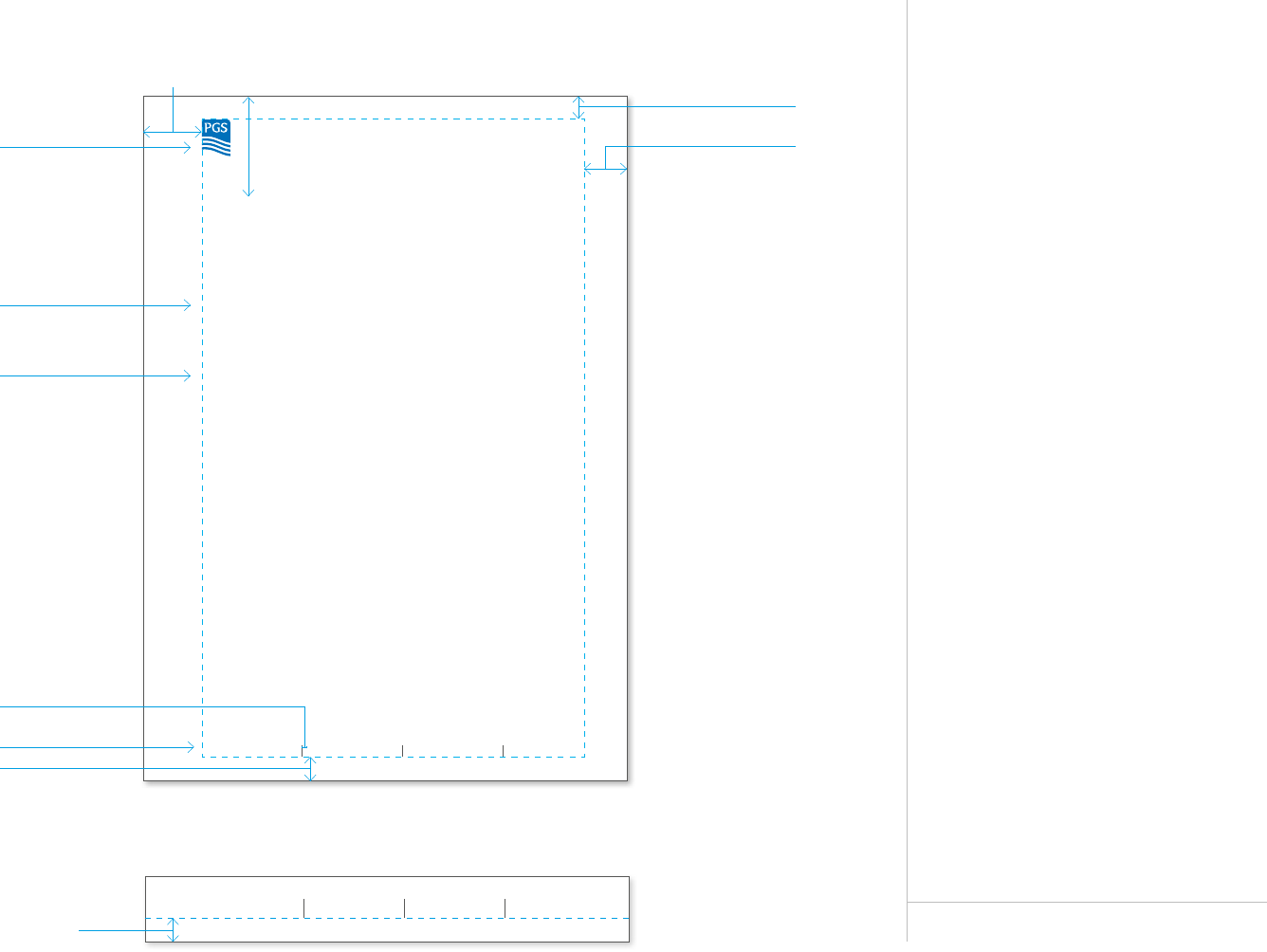
Letterhead
Standard A4
There are two types of A4 letterheads.
One with a contact area containing
two lines and one with a contact area
containing three lines.
The font is Calibri size 10pt/12pt
or 12pt/14pt
Paper: Bright white woven 80g paper.
Templates can be downloaded
from Sharepoint.
Contact Area – Two Lines
Contact Area – Threes to Five Lines
Petroleum Geo-Services ASA Text line 1
Text line 2
Text line 3
Text line 1
Text line 2
Text line 3
Text line 1
Text line 2
www.pgs.com
43mm25mm
20mm
10mm
10mm
Arial Regular 7,5/9pt
10mm
Calibri Bold 10pt
Calibri Regular 10/12pt
2mm
Logo width 12,3mm
PGS STYLE GUIDE
LETTERHEAD
24
US Letterhead
Letter 8.5 x 11”
There are two types of US letterheads.
One with a contact area containing
two lines and one with a contact area
containing three lines.
The font is Calibri size 10pt/12pt
or 12pt/14pt
Paper: Bright white woven 80g paper.
Templates can be downloaded
from Sharepoint.
Contact Area – Two Lines
Mr. Smith
ABC Company
1234 Pine Drive
Anywhere, AB 12345 10 February 2013
RE: Electronic Leerhead
Dear Mr. Smith,
This is the preferred layout style for PGS leers. Calibri Regular size 10 or 12pt is our company
typeface for all body text in leers, faxes, and all documents. Word templates have been set up for
documents and are available in the Style Guide, found in the gateways of ONLiNE.
Thank you for your co-operaon in maintaining a consistent corporate style.
Best regards,
John Walsh
Vice President Markeng
PGS
43mm25mm
Petroleum Geo-Services ASA Strandveien 4, P.O. Box 290
N-1366 Lysaker, Norway
Tel: +47 6752 6400
Fax: +47 6752 6883
F.nr/Reg.no: 91623529
www.pgs.com
2mm
Petroleum Geo-Services ASA Text line 1
Text line 2
Text line 3
Text line 1
Text line 2
Text line 3
Text line 1
Text line 2
www.pgs.com
10mm
Calibri Bold 10pt
Calibri Regular 10/12pt
Logo width 12,3mm 20mm
10mm
10mm
Arial Regular 7,5/9pt
Contact Area – Threes to Five Lines
PGS STYLE GUIDE
US LETTERHEAD
25
Standard
Envelopes
Three Sizes
We use three standard envelope sizes:
C4 (229 x 324mm)
C5 (229 x 162mm)
DL (220 x 110mm)
Paper: Bright white woven 80g paper.
Templates can be downloaded
from Sharepoint.
Envelope C4 (324 x 229mm)
Envelope DL (220 x 110mm)
Envelope C5 (229 x 162mm)
Arial Light 7,5/9.9pt
Petroleum Geo-Services ASA
Lilleakerveien 4C
P.O.BOX 251 Lilleaker
N-0216 Oslo
Norway
2mm
Arial Medium 7,5/9,9pt
Margin 10mm
Logo width 12.3mm
Arial Light 7,5/9.9pt
Petroleum Geo-Services ASA
Lilleakerveien 4C
P.O.BOX 251 Lilleaker
N-0216 Oslo
Norway
2mm
Arial Medium 7,5/9,9pt
Margin 10mm
Logo width 12.3mm
Arial Light 7,5/9.9pt
Petroleum Geo-Services ASA
Lilleakerveien 4C
P.O.BOX 251 Lilleaker
N-0216 Oslo
Norway
2mm
Arial Medium 7,5/9,9pt
Margin 10mm
Logo width 12.3mm
PGS STYLE GUIDE
ENVELOPES
26
US Envelope
One Size
We use one US envelope size:
U5 (241 x 105mm)
Paper: Bright white woven 80g paper.
The template can be downloaded
from Sharepoint.
Petroleum Geo-Services ASA Strandveien 4, P.O. Box 290
N-1366 Lysaker, Norway
Envelope US No10 (241 x 105mm)
Arial Light 7,5/9.9pt
Petroleum Geo-Services ASA
Lilleakerveien 4C
P.O.BOX 251 Lilleaker
N-0216 Oslo
Norway
2mm
Arial Medium 7,5/9,9pt
Margin 10mm
Logo width 12.3mm
PGS STYLE GUIDE
US ENVELOPES
Digital
28
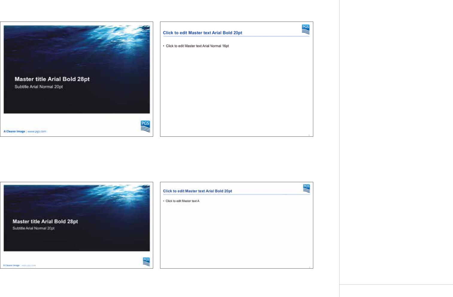
Powerpoint
Two Landscape Versions
The PGS corporate Powerpoint template
is available in two landscape oriented
versions: standard (4:3) and widescreen
(16:9).
All PGS presentations should use this
template. The Powerpoint template relies
on the logo to brand the document, so
there is no template element to include
division names. Division names can be
included in the title of the presentation.
The font used in the Powerpoint template
is the standard font Arial.
Templates can be found in PowerPoint –
click “File” then “New” then double click on
the folder entitled “PGS”.
Powerpoint Standard
Powerpoint Widescreen
PGS STYLE GUIDE
POWERPOINT LANDSCAPE
29
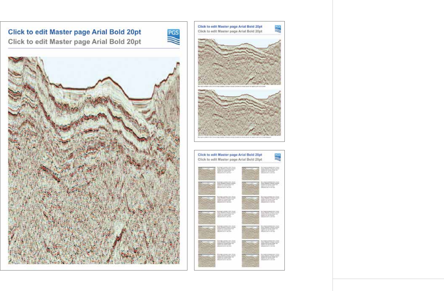
Powerpoint
Two Portrait Versions
The PGS corporate Powerpoint template is
available in two portrait oriented versions:
standard (4:3) and poster size 90x126cm.
All PGS presentations should use this
template. The Powerpoint template relies
on the logo to brand the document, so
there is no template element to include
division names. Division names can be
included in the title of the presentation.
The font used in the Powerpoint template
is the standard font Arial.
Template can be downloaded
from Sharepoint.
Powerpoint Portrait and Poster
Examples of layouts with various amounts and size of images.
PGS STYLE GUIDE
POWERPOINT PORTRAIT
30
Email Signature
A Representation of You
In adition to various browsers, emails are
now increasingly viewed on smart phones
and tablets with varying page aspect-ratios.
To ensure we cater for all eventualities,
email signatures are automated. This
provides an important consistancy
throughout the company. In adition to
an improved layout, this new function
will bring us the posibility to feature
promotional banners relating to products,
services and events.
Automated Email Signature – Internal
PGS STYLE GUIDE
EMAIL SIGNATURE
Automated Email Signature – External
Promotional banner (220x140px)
Name Name
Title
Department
Telephone: +XX XX XX XX XX
Mobile: +XX XX XX XX XX
Email: Name.Name@pgs.com
Name Name
Title
Department
Telephone: +XX XX XX XX XX
VOIP: XXXXXXXX
Mobile: +XX XX XX XX XX
Email: Name.Name@pgs.com
Marketing Material
32
PGS STYLE GUIDE
POSTERS
Posters
Large and Small.
Global and Technical.
There are two types of poster, one for
general marketing and one for technical
marketing – where there is a need to
display several images eg seismic,
with text.
More layout variations can be requested
from Marketing Services.
The poster is also available in two formats:
small (650 x 950 mm) and large
(750 x 1 000 mm).
Templates are available on PGS
MarketBase.
A Clearer Image | www.pgs.com/Extension
Heading
Subheading
Body heading
Bodycopy
Body heading
Bullet
A Clearer Image | www.pgs.com/Extension
Heading
Subheading
Body heading
Bodycopy
Body heading
Bullet
A Clearer Image | www.pgs.com/Extension
Heading
Subheading
Author
Caption
Caption
A Clearer Image | www.pgs.com/Extension
Heading
Subheading
Author
Caption
Caption
Caption
A Clearer Image | www.pgs.com/Extension
Heading
Subheading
Author
Caption
Caption
Caption
Caption
Global
Technical
33
PGS STYLE GUIDE
ADVERTS
Adverts
Global, MultiClient and
Recruitment Adverts
There are three types of advert: Global
Marketing, MultiClient (product/survey)
and Recruitment.
Templates are available on PGS
MarketBase in a range of sizes. Additional
sizes can be requested from Marketing
Services.
A Clearer Image | www.pgs.com/Careers
Job Title
Location
Job Description
Text
Main Tasks
Task 1
Qualifications
Qual 1
We Can Oer
Oer 1
Contact us or visit our website for more information about this position.
HR Area: HR.area@pgs.com | (+00) 00 00 00 00
This is PGS
Petroleum Geo-Services (PGS) is
a leading, worldwide geophysical
company providing an extensive range
of seismic services and products for the
petroleum industry including seismic
data acquisition, processing, reservoir
monitoring and analysis, interpretation
and electromagnetic studies. The company
also possesses the worlds most
extensive 3D MultiClient data library.
With its headquarters in Oslo, Norway,
the company has over 34 oces worldwide
in 25 dierent countries with larger regional
oces in London, Houston and Singapore.
The company is listed on the Oslo stock
exchange (OSE: PGS).
A Clearer Image | www.pgs.com/Extension
Heading
Subheading
Bodycopy
Call to action
A Clearer Image | www.pgs.com/DataLibrary
SURVEY NAME
Heading
Survey summary
Bodycopy
Call to action
A Clearer Image | www.pgs.com/Extension
Heading
Subheading.
Bodycopy.
Global Advert (full page magazine) MultiClient Advert (full page magazine)
Recruitment Advert (full page magazine)
Global Advert (banner newspaper)
34
PGS STYLE GUIDE
FLYERS
Flyers
Global, MultiClient and
Recruitment Flyers
There are dierent types of flyers: Global
Marketing, MultiClient (product/survey)
and Recruitment.
Templates are available on PGS
MarketBase. Additional layouts can be
requested from Marketing Services.
A Clearer Image | www.pgs.com/DataLibrary
(Basin/Geologcal Hub)-(Country)-(Year)
Albacora-Roncador 3D
GeoStreamer
(One line summary) max 100 chrctrs Solendant eum in pre voloria
aliquam a quatet ex excerro eaquia doluptatus dicta.
(Objectives / rationale/ target:) Apis dit landi aut exerati dis et periat vidundusda
pore cumquaeprat liquod molupta tectur seque la nonsequi dem et plam, conet
volo cullacest aut licilic tempore sequae. Ut enimpor epudantio bea nimus.
(Prospectivity description) Apis dit landi aut exerati dis et periat vidundusda pore
cumquaeprat liquod molupta tectur seque la nonsequi dem et plam, conet volo
cullacest aut licilic tempore sequae. Ut enimpor epudantio bea nimus etur.
(Technology description) Apis dit landi aut exerati dis et periat vidundusda pore
cumquaeprat liquod molupta tectur seque la nonsequi dem et plam, conet volo
cullacest aut licilic tempore sequae. Ut enimpor epudantio bea nimus etur mo.
PGS DataLibrary (Basin/Geological Hub)
(Name(WebSite)) – (SurveyType) – (GeoStreamer)
MAY-13 2015
For all enquires please contact
Oslo Tel: (+47) 67 52 64 00, Email: mceurope@pgs.com
Caption
SURVEY SUMMARY
Size (km / sq. km): 2913
Acquisition Year: 2010/2011
Processing Completed
Year: 2014
Vessel: Ramform Viking,
Ramform Valiant
Bathymetry (m): 60-70
Shooting Direction (°): 60/240
Geometry: Standard
DELIVERABLES
Available Time Products:
3D Kirchho PSDM & TTI
Anisotropic Beam Migration
3D Kirchho PSDM & TTI
Anisotropic Beam Migration
3D Kirchho PSDM & TTI
Anisotropic Beam Migration
3D Kirchho PSDM & TTI
Anisotropic Beam Migration
3D Kirchho PSDM & TTI
Anisotropic Beam Migration
3D Kirchho PSDM & TTI
Anisotropic Beam Migration
Available Depth Products:
3D TTI anistropic Kirchho
depth migration
3D TTI anistropic Kirchho
depth migration
3D TTI anistropic Kirchho
depth migration
3D TTI anistropic Kirchho
depth migration
3D TTI anistropic Kirchho
depth migration
3D TTI anistropic Kirchho
depth migration
Additional Products:
Gravity
Magnetics
Interpretation
ACQUISITION PARAMETERS
Streamer:
Type: GeoStreamer
Number: 12
Length (m): 7 050
Separation (m): 75
Energy Source:
Depth (m): 7
Shot interval (m): 18.75 flip/flop
Data Recording:
Length (m): 7 168 m
Sample rate (ms): 2.0
Bin Dimensions:
Acquisition (m): 6.25 x 18.75
Processing (m): 12.5 x 12.5
Fold: 80
PROCESSING
Simple Processing Flow:
GeoStreamer wavefield
separation
Optimal multiple attenuation
Bandwidth enhancing
post-stack processing
GeoStreamer wavefield
separation
Optimal multiple attenuation
Bandwidth enhancing
post-stack processing
GeoStreamer wavefield
separation
Optimal multiple attenuation
Bandwidth enhancing
post-stack processing
Front Back
MultiClient (single survey) flyers

