Uxpin Guide To Usability Ing
uxpin_guide_to_usability_ing
User Manual:
Open the PDF directly: View PDF ![]() .
.
Page Count: 102 [warning: Documents this large are best viewed by clicking the View PDF Link!]

1


INDEX
. INTRODUCTION - THE IMPORTANCE OF RESEARCH AND TESTING
. USABILITY TESTING GOALS
Defining Your Usability Goals
Usability Metrics
Takeaway
. CHOOSING YOUR TEST AND PARTICIPANTS
Types of Test
Finding Your Target Test Audience
Usability Test Plan
Takeaway
. SCRIPTED TESTS
Moderated vs. Unmoderated Tests
Tree Testing
Usability Benchmark Testing
Hallway Usability Testing
Takeaway
....DECONTEXTUALIZED TESTS & HEURISTIC REVIEWS
Card Sorting
User Interviews
Heuristics Evaluations
Takeaway
....NATURAL & NEAR-NATURAL TESTS
A/B Testing
First Click Testing
Field and Diary Studies
Eye Tracking Test


6
The biggest challenge designers and product managers face isn’t how
the market or dierent technologies work — it’s how humans work.
What users say versus what users do are two completely dierent things,
and the only way to verify is to test. Usability testing is more than a just a
checkbox on a list of product requirements — it is the most convincing sup-
port for your design decisions.
Test early and test oen. Every company and product is dierent, so there is
no magical usability test that will tell you everything you need to know. Dene
your hypothesis, pick several quantitative and qualitative methods, and get
ready to go out of your comfort zone.
In this book, we’ll share a wide breadth of expert commentary, theories,
practices, and real-life examples of usability testing. We’ll discuss basic concepts
like how to plan your usability test. For more experienced readers, we cover
scripted testing methods, hybrid testing methods, and the dierences between
web versus mobile usability tests. Our hope is that it helps you see usability
testing as more than just asking people for their opinions on your app or website.
Usability testing helps you see the bottom line of whether your design works or
doesn’t. We’ll look at how highly successful companies like Apple, MailChimp,
Yahoo, DirecTV, Microso, Buer, among others, used dierent usability
testing tactics that all suited their own unique needs. We’ve also included our
own preferences, and outlined how UXPin conducts usability testing.
We’d love your thoughts on what we’ve written. And feel free to include anyone
else in the discussion by sharing this e-book.
For the love of users,
Chris Bank
(co-written by Jerry Cao)

7
Chris Bank is the growth lead @UXPin. He also
led growth @Lettuce (acquired by Intuit),@MyFit
(acquired by Naviance), and his own startup
@Epostmarks (USPS strategic partner), and launched
@Kaggle in the B2B tech vertical. In his downtime, he
rock climbs, motorcycles, designs apps, travels, and
reads. Visit my website and Follow me on Twitter.
Jerry Cao is a content strategist at UXPin where he gets
to put his overly active imagination to paper every day.
In a past life, he developed content strategies for clients
at Braon and worked in traditional advertising at
DDB San Francisco. In his spare time he enjoys playing
electric guitar, watching foreign horror lms, and
expanding his knowledge of random facts.
Follow me on Twitter.

9
Like all signicant undertakings, you need to go into usability testing with a
plan. As you’ll see, a little extra time planning at the beginning can pay o
in the end. By following a few simple guidelines, you’ll know what to expect,
what to look for, and what to take away from your usability testing.
Photo Credit: „User Testing Notes”. Andy Bardill. Creative Commons.
Obviously you’d like to optimize the results of your usability testing, and in
order to do that, you must rst know what you’re testing for. We’ll explain how
to dene your testing objectives and set your usability metrics.
Defining Your Usability Goals
ere’s no question about what Waldo looks like before you open the book, but
all too oen companies jump the gun with their usability tests and don’t know
what they’re looking for, or even why. For this, the rst step in usability research
should always be knowing what you want to get out of it — but that’s not as easy
as it sounds. You need to categorize your testing goals and know what type of
data is most appropriate.

10
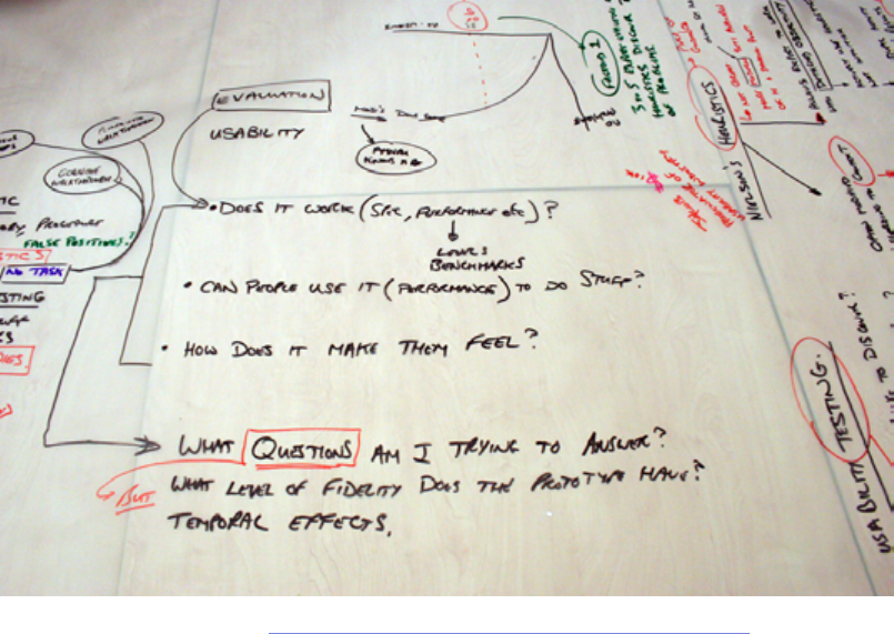
I. CATEGORIZING YOUR GOALS
Sometimes it helps to break out your dierent objectives into categories.
Michael Margolis, a UX Researcher at Google Ventures Design Studio,
believes the rst step to determining objectives is knowing the right questions
to ask (he lists them in categories). It helps to rst hold a preliminary meeting
with stakeholders to gauge how much they know about the product (features,
users, competitors, etc) as well as constraints (schedule, resourcing, etc). Once
you know that, you can ask the below questions to help focus the team on
research questions (“Why do people enter the website and not watch the demo
video?”) versus just dictating methods (“We need to do focus groups now!).
• Relevant Product Information — Do you know the history of your
product? Do you know what’s in store for the future? Now would be a good
time to nd out.
• Users — Who uses your product? Who do you want to use your product?
Be as specic as possible: demographics, location, usage patterns —
whatever you can nd out.
• Success — What is your idea of success for this product? Make sure the
entire team is on the same page.
• Competitors — Who will be your biggest competition? How do you
compare? What will your users be expecting based on your competition?
• Research — is might seems like a no-brainer when planning your
research, but what do you want to know? What data would help your team
best? Is that research already available to you so that you’re not wasting
your time?

11
• Timing and Scope — What time frame are you working with for collecting
your data? When is it due?
Once you’ve nished your benchmark questions, you can reverse the roles and
have your team write down their questions (that way you’ll have identied what
they know, and what they’d like to know). Becky White of Mutual Mobile talks
about a sample exercise to help you narrow down your goals. Gather your team
together and pass out sticky notes. en, have everyone write down questions
they have about their users and the UX. Collect all the questions and stick them
to a board. Finally, try to organize all the questions based on similarity. You’ll
see that certain categories will have more questions than others — these will
likely become your testing objectives.
It also helps to make sure your testing objectives are as simple as possible. Your
objectives should be simple like “Can visitors nd the information they need?”
instead of complex objectives like “Can visitors easily nd our products and make
an informed purchase decision?”
Photo credits: „Calendar”. Daphne Cholet. Creative Commons.

12
If you think using usability testing questions as a means to set your goals,
Userium oers this helpful website usability checklist. If you notice you’re
lacking in one or more categories, those are where collecting data would be
most helpful (and are good talking points if your team gets stuck during the
initial Q&A).
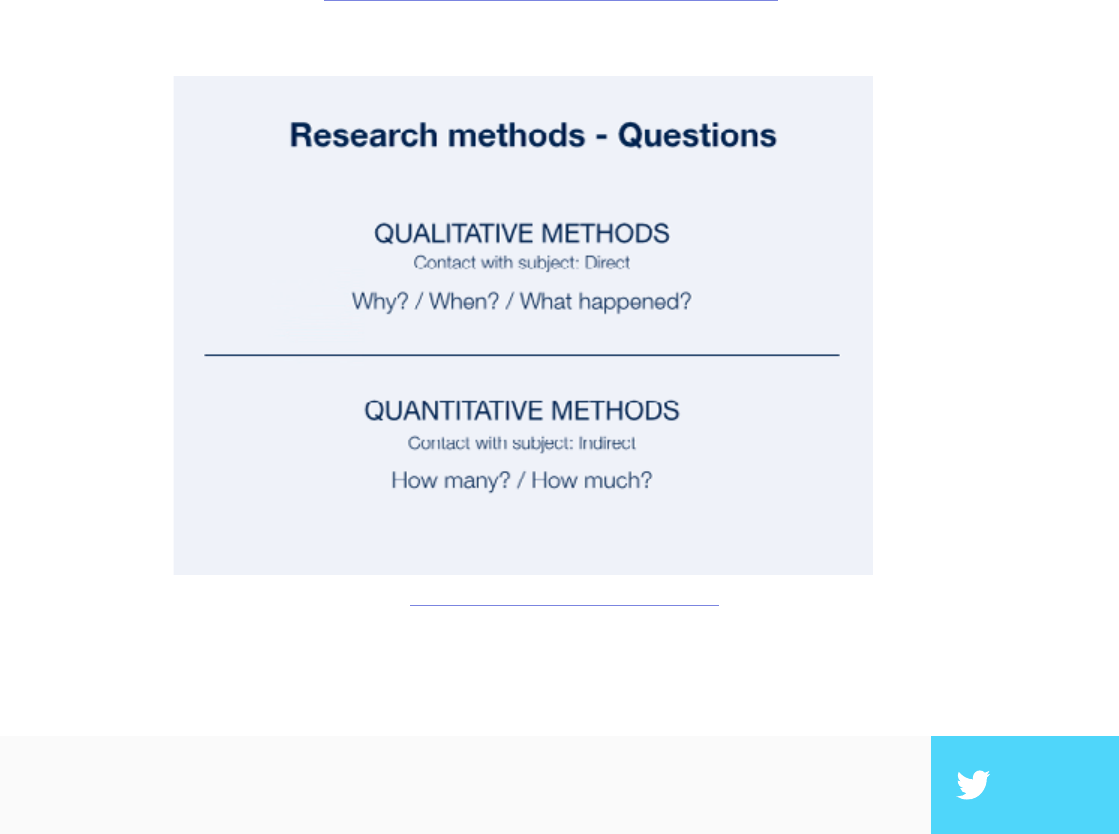
II. KNOWING WHAT TO MEASURE
Now that you know your goals, it’s time to gure out how to apply usability
testing to accomplish them. Essentially, you’re clarifying the greater scope of
your testing.
e UserTesting e-book about user testing suggests that you must rst
understand what type of feedback would be most helpful for your results. Does
your team need a graph or a rating scale? Personal user accounts or numbers?
Written responses or sound bites? e people who will read the data can impact
the best type to collect: skeptical stakeholders might be convinced by the cold,
hard numbers of a graphed quantitative rating scale, while the CEO might be
made to understand a problem if he saw a video clip of users failing at a certain
task.
is is why knowing your usability goals rst is so important. If you don’t know
the overall goals and objectives, then you certainly don’t know what type of
feedback and data you need. is chart below should help give you an example
of how the type of data aects the type of testing.
”The simplest usability testing objectives lead to the deepest design insights.” TWEET THIS

14
Usability Metrics
Metrics are the quantitative data surrounding usability, as opposed to more
qualitative research like the verbal responses and written responses we
described above. When you combine qualitative with quantitative data
gathering, you get an idea of why and how to x problems, as well as how many
usability issues need to be resolved. You can see how this plays out in the below
diagram from a piece on quantitative versus qualitative data.
In a nutshell, usability metrics are the statistics measuring a user’s performance
on a given set of tasks. Usability.gov lists some of the most helpful focuses for
quantitative data gathering:
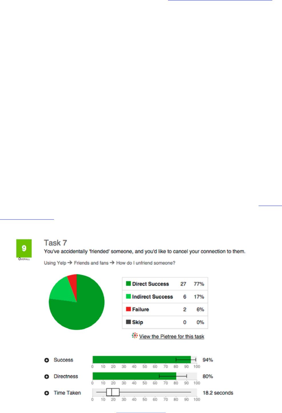
• Success Rate — In a given scenario, was the user able to complete the
Based on: Which UX Method by Christian Rohrer
”Qualitative & quantitative data help you understand what to fix & why, and how many
problems exist.” TWEET THIS
15
assigned task? When we tested 35 users for a redesign of the Yelp website,
this was one of the most important bottom-line metrics.
• Error Rate — Which errors tripped up users most? ese can be divided
into two types: critical and noncritical. Critical errors will prevent a user
from completing a task, while noncritical errors will simply lower the
eciency with which they complete it.
• Time to Completion — How much time did it take the user to complete
the task? is can be particularly useful when determining how your
product compares with your competitors (if you’re testing both).
• Subjective Measures — Numerically rank a user’s self-determined
satisfaction, ease-of-use, availability of information, etc. Surprisingly, you
can actually quantify qualitative feedback by boiling this down to the Single
Ease Question.
source: User Testing & Design

16
In a general overview of metrics, Jakob Nielsen, co-founder of the Nielsen
Norman Group and usability expert, states plainly, “It is easy to specify
usability metrics, but hard to collect them.” Because gathering usability metrics
can be dicult, time-consuming, and/or expensive, a lot of small-budget
companies shy away from them even though they could prove useful. So are
metrics a worthwhile investment for you? Nielsen lists several situations in
particular where metrics are the most useful:
• Tracking progress between releases — Did your newest update hit the
mark? e metrics will show you if you’ve solved your past problems or
still need to tweak your design.
• Assessing competitive position — Metrics are an ideal way to determine
precisely how you stack up next to your competition. e numbers don’t
lie.
• Stop/Go decision before launch — Is your product ready for launch?
Having a numeric goal in mind will let you know exactly when you’re ready
to release.
Usability metrics are always helpful, but can be a costly investment since you
need to test more people for statistical signicance. If you plan on gathering
quantitative data, make sure you collect qualitative data so you have a system of
checks-and-balances, otherwise you run the risk of numbers fetishism. You can
actually see how this risk could play out in the real world in a clever explanation
of margarine causing divorce by Hannah Alvarez of UserTesting.
”There’s a fine line between quant analysis and numbers fetishism. Qualitative data is
your reality check.” TWEET THIS

17
Takeaway
In some ways, the planning phase is the most important in usability research.
When it’s done correctly, with patience and thought, you data will be accurate
and most benecial. However, if the initial planning is glossed over — or even
ignored — your data will suer and call into question the value of the whole
endeavor. Take to heart the items discussed in this chapter, and don’t move
forward until you’re completely condent in your objectives and how to achieve
them.
In the next chapter, we’ll start to get into the specics of the actual test
planning, namely what kind of test will work and whom to choose to
participate. As both the type of test and the type of user can dier greatly, it’s
vital to take the time in deciding.
For more information about the planning process in particular concerning
user testing, download our ee e-book, e Guide to UX Design Process and
Documentation. e Research chapter will help esh out and reiterate the points
covered here.


19
In this chapter we’re going to discuss two of essential factors in a user test:
the users and the tests. Now that you know what your goals are, you’re ready
to hone your test planning to meet those specic goals. ere are many tests to
choose from, and many types of people to recruit, so narrowing your focus will
get you closer to the results you want.
Types of Test
Deciding which style of test to administer is a pivotal decision in the entire
process of usability testing, so don’t take it lightly. On the bright side, the more
concrete your usability goals are, the more smoothly the selection process will
go.
But no matter what type of test you choose, you should always start with a pilot
test. Many people like to gloss over this, but sacricing a little extra time for a
pilot test almost always pays o.
I. PILOT TEST
Pilot testing is like a test run of your greater user test. In A Practical Guide to
Usability Testing, Joseph S. Dumas and Janice C. Redish call pilot tests a “dress
rehearsal for the usability test to follow.” You will conduct the test and collect
the data in the same way you would a real test, but the dierence is that you
don’t analyze or include the data. You are, quite literally, testing your test.
at may seem like a waste of time — and you will likely be tempted to just
jump directly into the actual tests — but pilot tests are highly recommended.
”Before you test your users, test your test. Always run a pilot test.” TWEET THIS

20
e reason is that, in most cases, something will go wrong with your rst test.
Whether technical problems, human error, or a situational occurrence, it’s rare
that a rst test session goes well, or even adequately.
e idea is that these tests should be as scientic and precise as possible. If you
want the most reliable data, run a pilot test or two until you feel you understand
the process and have removed all the kinks.
II. THE TYPES OF TESTS
In the following four chapters, we’ll be going over the specics of each type of
user testing method. But for now we’ll give you an overview so you know what to
expect.
Christian Rohrer, Chief Design Ocer in the Consumer Division at McAfee,
Inc., explains in an article for the Nielsen Norman Group the distinctions
between the types of tests. While he uses a complex three-dimensional
framework to explain the intricacies of the dierent tests, for simplicity’s sake
we’re going to focus on his division among how the product is used.
1. Scripted use of the product — ese tests focus on specic usage aspects.
e degree of scripting varies, with more scripting generating more
controlled data.
2. Decontextualized use the product — Tests that don’t use the product — at
least in the actual testing phase — are designed for broader topics like UX
or generating ideas.
3. Natural (and near-natural) use of the product — ese tests seek to
analyze common usage behaviors and trends with the product, doing well

21
with data authenticity at the cost of control.
4. Hybrid — Hybrid tests are creative and non-traditional tests. Geared
towards understanding the users’ mentality, these tests vary in what they
can accomplish.
Each of these types of tests — and their most common examples — will be
discussed at length in the rest of the e-book. For now, though, let’s get back to
creating a plan.
III. THE TYPES OF TASKS
Each type of test is divided into tasks, the execution of which will aect the
validity and overall usefulness of the data collected. While each test will have
its own properties for the type of tasks, Tingting Zhao, Usability Specialist for
Ubuntu, shows us some distinctions to keep in mind when designing tasks.
Zhao outlines two main choices to make for each task. e rst choice is
whether to phrase your tasks directly or with a scenario.
• Direct Task — A direct task is “purely instructional.” ese are instructions
such as “Find a turkey recipe on the Food Network,” or “Learn about
wiener dogs on the blog.” Direct tasks are more technical in nature, and
could detract from the user’s experience of the product as a whole.
• Scenario Tasks — Scenario tasks phrase the instructions in a real-life
example: “You’re going to a high school reunion this weekend. You want to
nd a nice outt on the Macy’s website”. Scenario tasks are more common
than direct tasks because they help the user forget that they’re taking a
test; however, care should be put into making the scenarios as realistic as
possible.

22
e second distinction to make when creating tasks is between closed and
open-ended tasks.
• Closed — A closed task is one with clearly dened success or failure. ese
are used for testing specic factors like success rate or time. For example, in
our Yelp redesign exercise, we gave participants the following task: “Your
friend is having a birthday this weekend. Find a fun venue that can seat up
to 15 people.”
• Open-ended — An open-ended task is one where the user can complete
it several ways. ese are more subjective and most useful when trying
to determine how your user behaves spontaneously, or how they prefer
to interact with your product. For example: “You heard your coworkers
talking about UXPin. You’re interested in learning what it is and how it
works.”
We’ll talk more about tasks in the following chapters, but for now keep these
important distinctions in mind as you come to understand what you want out of
your usability testing.
Finding Your Target Test Audience
With all this talk of data and research, it’s easy to forget that the core
component of these tests are actual people. To think of your participants
as merely test subjects is a mistake; they are all individuals with their own
personalities and their own way of doing things. Deciding the type of people
you want to provide you data is a major factor — even if ultimately you decide
you want them to be random.
23
I. YOUR TARGET USERS
Unless you’re designing the Beatles of products where everyone can enjoy it, it’s
best to narrow down your target audience to the users most likely to use your
product.
Knowing your target audience is not really a topic for usability testing; in
theory, this is something you should have already decided in the Product
Denition phase (as discussed in e Guide to UX Design Process &
Documentation).
”It’s a mistake to think of participants as test subjects. They are all individuals with per-
sonalities and built-in habits.” TWEET THIS
source: UserTesting Dashboard

24
However, depending on the complexity of your tasks, you may need more
than one user group. For example, when conducting user testing for our
Yelp redesign, we realized we needed two groups of people: those with Yelp
accounts, and those who did not. Once we knew the overall groups, we then
decided that both groups needed to have users who were located in the US,
used Yelp at most 1-2x a week, and browsed mostly on their desktops.
When focusing in on your test group, it’s also important not to obsess over
demographics. e biggest dierentiator will likely be whether users have prior
experience or are knowledgeable about their domain or industry — not gender,
age, or geography. Once you know whom you’re looking for, it’s time to get
out there and nd them. If you nd you have more than one target group, that’s
okay; just remember to test each group independently of each other — that will
make your data more telling.
II. RECRUITING USERS
Knowing who you want for the test is only half the battle; you still need to get
them to come (or agree to let you come to them). Luckily, Je Sauro, founder
of Measuring Usability LLC, lists seven of the most eective methods and
usability tools for recruiting people for usability tests. Below, we’ll briey
describe each method (we’re big fans of UserTesting and hallway testing).
1. Existing Users — By denition, these are your target users. Try self-
promoting on your website, or work with your customer service
department to locate interested users. Even if you’re researching a new
product or if your company has produced similar products in the past,
there’s a chance they both target the same type of person.
”Don’t obsess over demographics. Users’ prior experience and knowledge will likely matter
more.” TWEET THIS

25
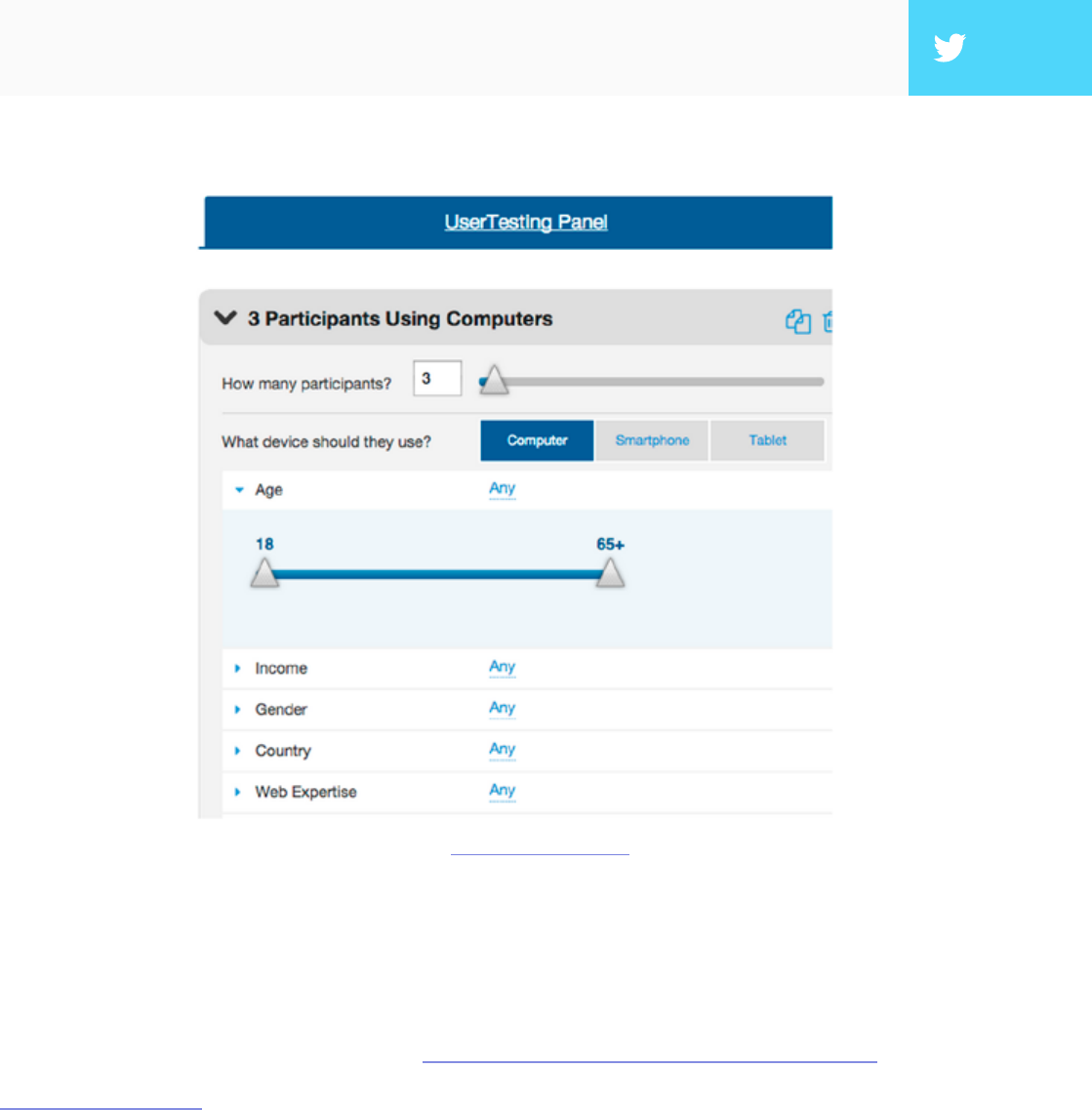
2. UserTesting — A website designed specically for this, UserTesting lets
you select users by age, gender, location, and even more customizable
options. e site delivers audio and video of users actually testing your site
or app.
3. Mechanical Turk — Amazon’s crowdsurng network is the cheaper
version of UserTesting— but just keep in mind that you get what you pay
for. e upside, of course, is that if your testing is simple, you can recruit a
ton of people for low cost.
4. Craigslist — While somewhat random, Craigslist has long been a reliable
option for getting people together. Keep in mind that if you’re looking for
high-income users or users with highly specialized skills, you likely won’t
reach them here.
5. Panel Agencies — If you’re looking for numbers for an unmoderated test,
a panel agency might be the way to go. With vast databases organized
by demographics, you can reach your targets for between $15 - $55 per
response. Try Op4G, Toluna, or Research Now.
6. Market Research Recruiter — is is the option if you’re looking for
professionals with specic skills like hardware engineers, CFOs, etc.
However, these can also be expensive, costing hundreds per participant. If
you’re still interested, try Plaza Research (don’t let the outdated site fool
you).
7. Hallway Testing — “Hallway” testing is a term that means random, as in
whoever if walking by the hallway in the moment you’re conducting the
test. ese are co-workers, friends, family, or people on the street. While
these may be the easiest to recruit, remember that the farther you get from
your target audience, the less helpful the data. DigitalGov provides a live
example and a list of tips.
26
Like all other factors, how you choose to nd your participants will depend
on your specic needs. Keep in mind the who and why you’re looking for, but
don’t neglect the how much. Qualitative tests can be run with as few as 5 people,
quantitative tests require at least 20 people for statistical signicance. For a full
list of user recruiting tips, check out Jakob Nielsen’s list of 234 tips and tricks to
recruiting people for usability tests.
If you’re conducting later-stage beta testing, you can recruit beta testers from
within your existing user base, as long as it’s large enough. If, however, you need
to recruit them elsewhere, Udemy explains the best ways to nd them.
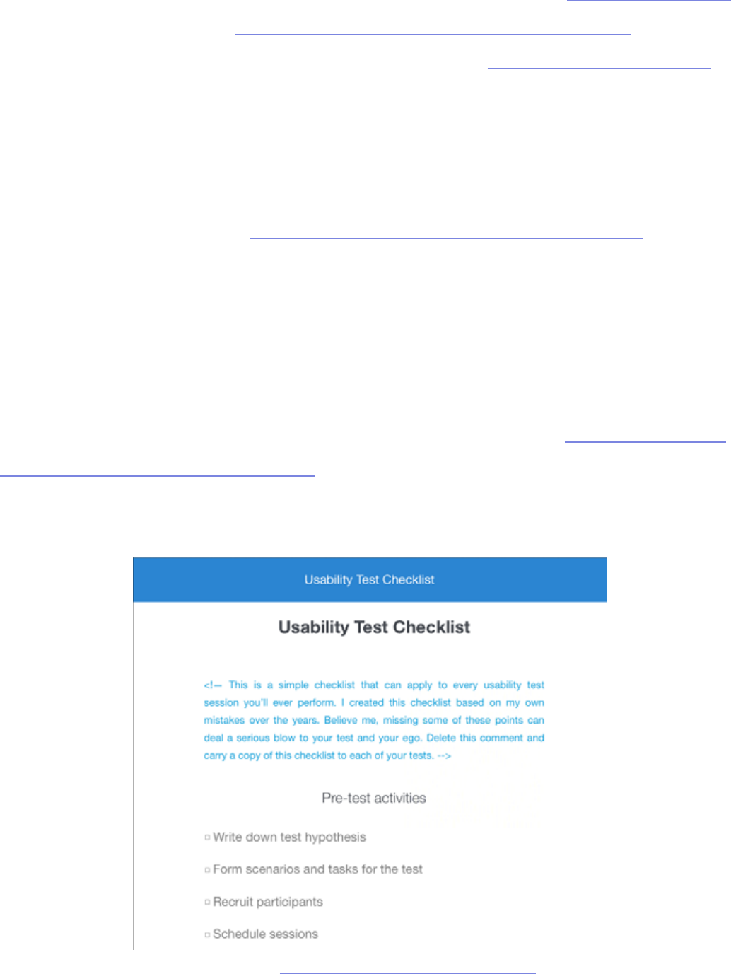
Usability Test Plan
You’re almost ready to dive into your testing, but before you do, there’s just
one last thing: a one-page usability checklist. As discussed in e Guide to UX
Design Process & Documentation, this succinct outline will tell stakeholders
everything they need to know about the test, but without boring them with all
the details.
Photo credit: http://www.uxpin.com/usability-test-kit.html

27
Tomer Sharon, Author and UX Researcher at Google Search, provides a
simple outline for your synopsis:
1. Title — What you’re studying and the type of test.
2. Author and Stakeholders — Everyone involved in conducting the test.
3. Date — Don’t forget to update this every time.
4. Background — A brief history of the study, under ve lines.
5. Goals — Try to sum it up with one sentence, but if you have multiple goals,
use a short bulleted list.
6. Research Questions — Make it clear these are the questions you hope to
answer with the study, not the questions you’ll be asking the participants.
7. Methodology — Since we’re outside of an academic environment, a simple
what, where, and for how long will suce.
8. Participants — e specic characteristics of the people you’re looking
for, and why.
9. Schedule — Include the three important dates: when recruitment starts,
when the study takes place, and when the results will be ready.
10. Script Placeholder — Until the full-study script is available, a simple
“TBD” is ne.
With the usability checklist in hand, all the key players will be on the same page,
so to speak. We’ve provided a free usability testing kit (which includes a testing
report) so that you can incorporate these points.
28
Takeaway
We can’t stress enough the importance of the pre-planning phases. e type
of test and users you go with will have the biggest impact on your results, and
going with the wrong choices will greatly reduce the accuracy. Having a solid
plan can make all the dierence, and ensure that you meet your own personal
needs.
In the next chapter we’re going to start getting into the types of tests,
specically scripted tests. With your usability goals ready, keep an eye out for
the tests that will help accomplish your plan to the fullest.

30
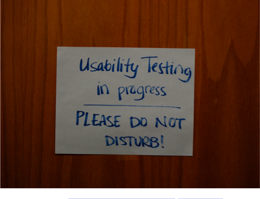
A
scripted test is the most controlled of the test types, and is recommended
for testing specic usage aspects, like whether or not the user can nd/
access a certain feature (or how long it takes to do so). Scripted tests tend to
produce more quantitative data, benecial for usability metrics, but can also
generate qualitative data as well, depending on the how tight or controlling the
script is.
Before we get into the specic types of scripted tests (tree testing, benchmark
tests, and hallway testing), we’ll rst discuss a crucial decision in how you
conduct your test: whether to moderate it or not.
Photo credit: „Usability testing in progress.” Aaron Fulkerson. Creative Commons.

31
Moderated vs. Unmoderated Tests
Physicists understand well the observer eect — the idea that the presence of
an observer changes the behavior of what’s being observed, negating the whole
point of observing it. is may apply to photons, but what about people?
Whether or not you choose to moderate your test depends on your specic
goals and what you need to accomplish. In some instances a moderator will help
facilitate the process and aid it in going smoothly, while in other instances they
will only interrupt, not to mention the extra costs of an on-site sta. Below we’ll
talk about the pros and cons of each, so you can decide which will work best for
your user test.
I. MODERATED TESTS
Luke Bahl and Bryan Andrew, Moderated Testing Manager and UX
Researcher (respectively) at UserTesting, believe that the payo can be
signicant if you have the time available for a moderated study. A moderator can
help probe the participant to delve deeper, creating data that is fuller and more
complete, plus keep users on track and clarify any confusion. Not only that, but
user reactions and even body language can provide useful data as well, but only
if there’s someone present to document and interpret them.
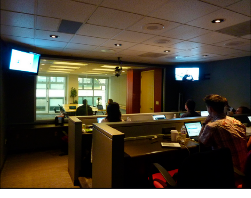
32
As you can guess, moderated testing is not recommended for all tests. e
experts at UserTesting recommend it for the following situations:
• Early stages in the development process — Specically in the prototyping
phase, where features may be incomplete or not even work, a moderator
can help answer questions and explain the unclear parts.
• An advanced, complicated, or high-level product — As with a prototype,
if there is a great chance for confusion or misinterpretation, a moderator
will help keep things on course.
• Products with strict security concerns — In these cases, a moderator can
keep the user where they’re supposed to be and keep them from accessing
sensitive information.
Photo credit: „Wikimedia labs testing”. Blue Oxen Associates. Creative Commons.
33
But even the moderation proponents admit that moderated tests have their
drawbacks, specically convenience. Moderated tests require a knowledgeable
moderator, their time, and usually a specied location, as opposed to remote
usability testing. Coordinating the schedules of moderated tests can be
problematic, and only one can be done at a time, unless more moderators are
hired. More importantly, moderated tests can take participants out of their
comfort zone, so special care must be taken to avoid the various kinds of biases.
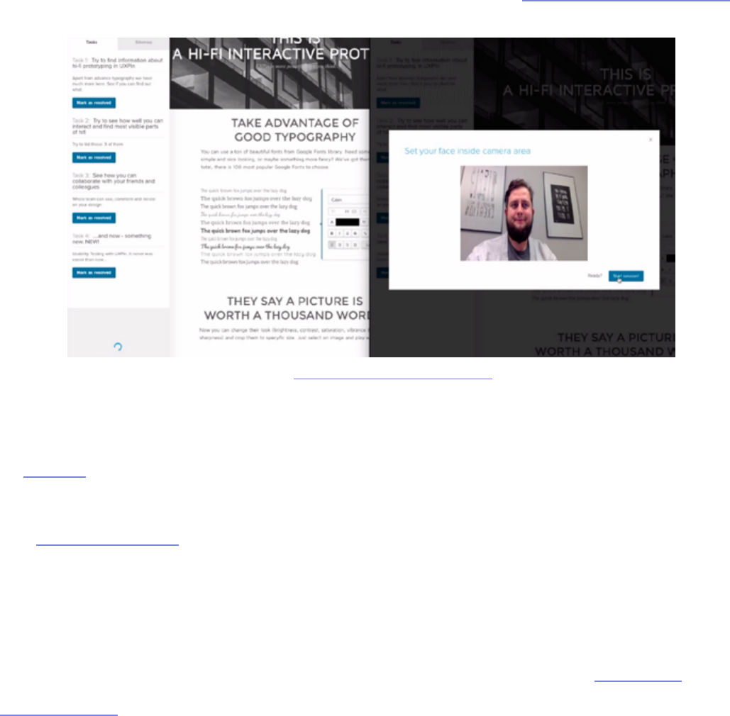
In UXPin, you can actually run a remote moderated usability tests quite easily.
Download the Chrome plugin, set up your tasks, and start testing. As you can see in
our testing overview, UXPin generates video clips that let you see every click, hear
user’s thoughts, and see their screens and faces.
For a moderated test, you could also let your testers participate from the
comfort of their own home. For example, Evernote actually ran a remote
usability test that was moderated in which the testers were in dierent
locations, but the moderators were all in the oce. is oers the benets
of moderation at lower cost (since you don’t have to worry as much about
equipment setup), but it may not be suitable if you need a controlled lab
environment due to information sensitivity. Nonetheless, this tactic is eective
source: UXPin Moderated Usability Testing

34
and Evernote gained insights that helped them improve user retention by 15%.
If you have any of the special needs listed above, moderation may be the right
choice. If you do choose this route, make sure you follow these 12 tips for being
a perfect moderator to minimize the likelihood of bias.
II. UNMODERATED TESTS
While moderated testing allows for instantaneous give-and-take feedback,
there is still no substitute for letting users interact with a product in its natural
environment. Kyle Soucy, Founder of Usable Interface, explains in an article
for UX Matters that unmoderated tests provide tons of benets that greatly
outweigh the drawbacks — namely that they make remote usability testing a lot
easier. Unmoderated testing benets include:
• Time savings — Simultaneously testing hundreds of participants. You can
also test multiple products at once, including competitors.
• More natural product usage — Because remote usability testing allows
participants to remain in their natural environment, their use of the
product will more closely resemble real-world scenarios. If you’re testing a
tablet, it’s hard to replicate someone kicking their feet up on a couch aer a
tough day at work to watch movies for 2 hours.
• Cost savings — Costs are usually quite low since you don’t need to
pay for moderators or equipment setup. With usability testing tools
like UserTesting and Userlytics, tests can run as low as $49 per user.
Unmoderated tests are also scalable depending on the testing tool used.
• Simpler coordination — With unmoderated tests, you really only need to
think about cost of testing, cost of reimbursement, and user schedules.
35
As you’ll see in the above video from our User Testing & Design e-book, you
can get maximum value for minimum cost when the tasks are written as clearly
as possible. Users are encouraged to think out loud, and you record their on-
screen interactions. When the test is done, you can then use the video clips that
are most insightful and present them to your team for design changes.
ere are downsides, however. e lack of a moderator means less control, less
personal observation, and a higher risk of confusion. Additionally, conducting
high volume, unmoderated tests using an online tool opens you to the risk of
attracting participants looking only for the incentive without putting eort into
the tasks. On the bright side, such participants can be ltered, especially by
looking at their time-to-completion or open-ended feedback.
Nonetheless, if you choose unmoderated testing, make sure you know the
criteria for picking the best usability tool. As the Nielsen Norman Group
advises, you’ll want something that oers same-day results, audiovisual
recording, and oers a broad demographic for recruiting testers.
source: User Testing & Design
36
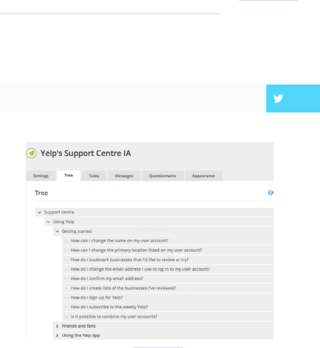
Tree Testing
Tree testing allows you to test the information architecture by stripping out
the visual elements. With a tree test, you examine only the labelling and
hierarchy of your content. Martin Rosenmejer of Webcredible names it as one
of the most important steps early in the web design process. And we all know
the importance of information architecture — if the content isn’t structured
logically with a simple ow, it might as well not exist. at’s why an early tree
test can help identify and solve the problems before they actually become
problems.
”Tree tests help solve IA problems before they become problems.” TWEET THIS
source: User Testing & Design

37
In a nutshell, a tree test tasks participants with nding dierent information on
a clickable sitemap (or “tree”). Using a usability testing tool like Treejack, you
then record task success (clicking to the correct destination) and task directness
(certainty of users that they found what was needed). is shows you the
eectiveness and clarity of your information architecture.
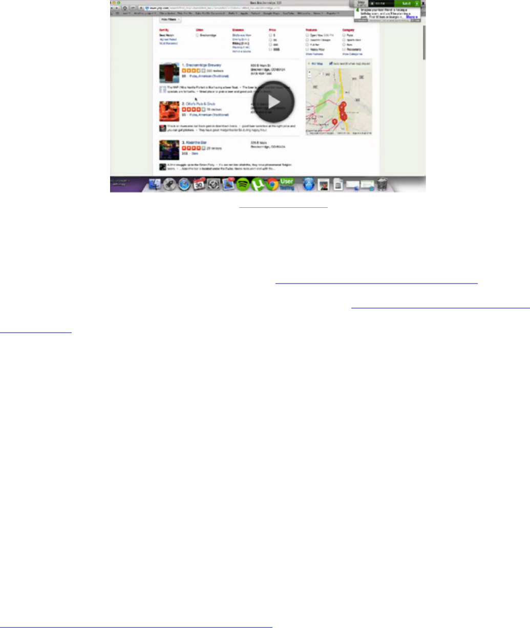
For example, in our Yelp redesign exercise, we provided a tree representing
the support site and then gave users 10 tasks (such as nding information on
what to do with bad reviews). Because the overall task success rate was 53%
and directness was 46%, we knew that the IA needed changing — luckily, our
soware showed us exactly where people were confused.
Because the overall task success rate was 53% and directness was 46%, we knew
that the IA needed changing — luckily, our soware showed us exactly where
people were confused.
e importance of tree testing (and especially information architecture) is
uncovered by Raluca Budiu, Senior Researcher at the Nielsen Norman
Group. Simply put, a site search bar (or a three-line hamburger menu) is just
not enough if the navigation is poor because users won’t know what is available
to search. Search also requires users to recall from memory, which increases
cognitive strain and can kill the experience.
”If your site content doesn’t flow with a nice logical structure, it might as well not exist.” TWEET THIS
”Site search is not a substitute for poor navigation.” TWEET THIS

38
If tree testing seems like something that could benet your project, Je Sauro,
Founding Principal of MeasuringU, goes into details about how to properly
run them. He explains that tree testing is used primarily for two reasons:
1. Determine a product’s searchability — How well can users navigate the
site, and what areas cause the most problems with navigation?
2. Validating a change — Did a recent update correctly x the problem, or are
further revisions necessary?
Because tree testing examines the success rate of a specic task, more
participants will give you more accurate results. Check the this article from
MeasuringU to nd the smallest margin of error within your means (we
recommend aiming for 5% error or better).
If you’re concerned with navigational problems, see our section on card sorting
in the next chapter and compare which, if not both, would benet you more.
One distinct benet of tree testing is that you can also test hundreds of items (if
your site is even larger, just prioritize the most used navigation items).

39
Usability Benchmark Testing
Usability benchmark testing is the only test covered in this e-book that
measures the overall usability of a product. As its name suggests, a usability
benchmark test is a high-level report of the overall ease and success rate of
completing tasks. You can check out this benchmark report from UserFocus
and follow the discussion below.
In an essay on his website, bestselling author and speaker Scott Berkun points
out that, while other usability tests focus on specic aspects, the usability
benchmark test measures only user performance without regard to the why. In
fact, participants should even be discouraged from explaining their thoughts,
as explanations would impact the time and focus spent interacting with the
product.
Because benchmarks require more time and eort, Berkun outlines the optimal
times in which to run the test:
• e product is stable — To get the most out of the benchmark, make sure
the product is stable, i.e., all the errors you already know about are xed
and it’s running at peak eciency.
• Aer a major release or update — At this time, a benchmark can test how
eective the changes were, or if unforeseen problems arose in the process.
• Preceding a major release or update — In order to understand how the
next change impacts usability, it’s best to have a measure from which to
compare. Additionally, you may notice some areas that should be improved
before the next round begins.

40
Publicize your benchmarks as much as possible so that everyone involved in the
product is able to evaluate their work. In particular, he suggests holding a large
presentation two weeks before the test, explaining what exactly is happening.
When conducting this type of test, there are a few factors to consider. Nadyne
Richmond, Researcher at VM Press, gives 5 tips for planning out your
benchmark test:
1. Select the most important tasks to the product overall — While it’s
tempting to select tasks related to the newest or experimental features, this
is not the correct test for that. A benchmark measures usability as a whole,
not in a specic area.
2. Use standard metrics — e most reliable data comes from success rates,
time-to-completion, error rates, and satisfaction rating.
3. Do not disturb the user — Little to no moderation should be involved
in a good benchmark test. Any distraction will bias the results, so avoid
asking for feedback or explanations of their behavior — or at least wait until
they’re completely nished.
4. Using your target audience is essential — is is especially important for
usability benchmark testing since this is a broad assessment of how your
target users perform with your product.
”Usability benchmark tests are a dashboard for your product’s usability.” TWEET THIS

41
5. Use a large number of participants — Due to the quantitative nature of
this test, using a large number of participants will reduce the margin of
errors and give you feedback that’s more accurate, and therefore more
useful.
e important thing to remember about usability benchmark tests is that they
are dierent than other usability tests. ink of them as a dashboard of your
product’s usability. If you’re looking to workshop a specic feature or area, you
should look elsewhere.
Hallway Usability Testing
Hallway usability tests are the bare minimum for worthwhile usability testing,
so if you’re on a tight budget or don’t want to invest a lot in usability, this one is
for you. Joel Spolsky, CEO of Stack Exchange, describes it like this:
Of course you don’t need to literally grab people from the hallway, but the idea
is that any small number of random users (from within your target audience)
will give you a sucient amount of data for your usability goals.
“A hallway usability test is where you grab the next person that passes by
in the hallway and force them to try to use the code you just wrote. If you
do this to ve people, you will learn 95% of what there is to learn about
usability problems in your code.”
”Hallway testing is the bare minimum for usability testing. Grab 5 coworkers and get to
work.” TWEET THIS

42
e test itself doesn’t have to be that complex. Corinna Baldauf, Web
Developer and UX Blogger, elaborated on Spolsky’s theories. She suggests
setting up a station with your product in a public venue — she used an
oce break room, while others suggest Starbucks. When someone comes
by, ask them to test the system, perhaps even adding some incentive (don’t
underestimate the power of chocolate). Give them instructions, then step
back and watch. Don’t forget to take notes, particularly on what is not going as
expected.
If you do this with ve people, that should give you data that’s accurate enough.
Why ve? Jakob Nielson, co-founder of the Nielson Norman Group, created a
formula for the amount of usability problems found in a usability test:
N (1-(1- L ) n )
… where N is the number of users and L is the proportions of usability problems
found by a single user, typically 31%. You can see the point of diminishing
returns in this graph.
Photo credit: „Paper prototyping”. Samuel Mann. Creative Commons.

43
You can see clearly that ve people gives you all the data you need, while
anything more seems superuous.
Hallway usability testing is one of the most popular forms due to its simplicity,
low cost, low resources, and high output. If you’re interested in conducting
your own hallway usability test, the USAJOBS Team gives these tips:
• Choose the right time and place — choose a location with a lot of foot
trac, at a time when you’re not inconveniencing people.
• Come prepared — make sure you outline your plan ahead of time, and set
up 30 minutes before you’d like to start.
• Good greeters — use greeters who are outgoing and charismatic, and who
can identify your target audience.
• Reward your participants — it doesn’t need to be much, something like a
free coee, or chocolate — just to show you appreciate their help.
• Look for ways to improve — learn from your experience and keep an eye
out for ways to improve your testing process.
While not recommended to solve specic or complicated problems, hallway
usability testing is the perfect way to go for if you’re looking for something
simple and easy.
”When observing your user test, make sure you also write down what’s not going as
expected.” TWEET THIS

44
At UXPin, we’re big fans of hallway testing. When we were nishing up our
integration with Photoshop and Sketch, our product team was visiting our
California oce so hallway testing happened every day. A developer or designer
would set up his computer and ask us to import a static design le and turn it into a
fully layered prototype. e product manager would then take notes and revise the
weekly sprint based on the insights.
Takeaway
Aer reading this chapter, you are now more aware of the main scripted tests:
tree testing, usability benchmark testing, and hallway usability testing. You
know that tree testing focuses specically on navigation, usability benchmark
testing determines a product’s overall usability, and hallway usability testing is
great for a simple and low-cost usability test. You also learned the dierence
between moderated and unmoderated tests, and why unmoderated tests may
be more appropriate, except when you have incomplete or otherwise confusing
setbacks to your product.
In the next chapter, we’ll talk about decontextualized tests, or tests that don’t
directly use the product.


46
Sometimes the best way to test a product doesn’t involve the product at all.
Decontextualized tests, or tests that don’t involve the product, are generally
geared to testing users’ attitudes on the product, or in generating ideas. But just
because they may be more conceptual doesn’t mean they’re any less valuable as
a source of data.
In this piece, we’ll focus on card sorting and interviews as two popular and
cost-eective decontextualized testing methods. On a related noted, we’ll also
discuss heuristic reviews. We’ve included it in this discussion because while
someone is interacting with the product, it’s not the end-user — instead, a
group of experts reviews the features based on established best practices.
Card Sorting
e idea is so simple yet so meaningful. You write the dierent elements of your
product on note cards or Post-It notes, then have your participants organize
them in a way that makes the most sense to them. If you’d like to go paperless,
you can also choose usability testing tool like OptimalSort for quick analysis of
common groupings. Regardless of analog or digital, the result gives you a solid
understanding on your product’s information architecture (IA), a big term than
means simply how you organize the elements of your product.
Card sorting mostly deals with issues of navigation, organization, labelling,
and grouping. is test is similar to tree testing that we learned about in the
last chapter; the main dierence is that card sorting helps you understand how
users categorize content while tree testing shows you how they directly interact
with an existing IA to complete tasks.
”Sometimes the best way to test a product doesn’t involve the product at all.” TWEET THIS

47
I. CARD SORTING VARIATIONS
ere’s more to card sorting than it seems. Donna Spencer, card sorting expert
and Founder of Maadmob, believes that while card sorting might not provide
a nal structure, it does provide a rare glimpse into users’ mental models. For
such a simple activity, there’s plenty of variation and controls that will aect the
kind, and validity, of data you receive. For starters, there are two dierent styles
of how you can conduct it:
• Open Sorting — Users are provided only with the elements, and are le
to group them however they see t. Once grouped, users are asked to give
names to the groups themselves. is is recommended for generating new
ideas since you can work backwards from users’ natural thought processes.
Photo credit: „CS003: Figure 1.3”. Rosenfeld Media. Creative Commons.
48
• Closed Sorting — As with open sorting, users are given the elements;
however, they are asked to categorize them into predened groups. is
is recommended if you’re working within the restrictions of pre-existing
categories, for example, when updating an already developed website
structure.
e above image is an example of a closed card sort. In this case, you can see the
four categories in blue and the cards below. Users are then asked to place the
cards under whatever category seems best to them. If this were an open card
sort, you’d simply remove the blue categories and ask users to create their own.
Aside from open and closed, other variations include groups or individuals, and
remote or on-location. Groups allow users to work collaboratively, for better
or worse, and can help you learn about multiple users at once; however, group
dynamics might aect your results. Remote location testing — for example,
using an online soware tool — allows you to test more users in a faster time,
yet you’re unable to directly observe their decision-making processes. On-
location gives you a fuller understanding of how your users came to their
decisions, but requires more planning and scheduling.
Photo credit: uxpin.com

49
II. CARD SORTING GUIDELINES
While every card sort is dierent depending on the cards, William Hudson, UX
Strategist and Consultant, suggests some general benchmarks for card sorting.
Specically, he lists the approximate times it will take people to sort a given
number of elements:
• ~20 minutes for 30 elements
• ~30 minutes for 50 elements
• ~60 minutes for 100 elements
Using this time structure, you can plan out in advance how long the tests will
take to administer, once the cards are written or the soware established. From
our experience, these guidelines can be quite generous — one of our closed
card sorts involved 47 cards and four categories, but only required an average of
three minutes to complete.
When naming the cards, simpler is better. Avoid big words (many syllables)
and technical jargon. While this is good advice in general for the language
usage of a product, it’s essential for card sorting since overly complex labeling
will disrupt the natural thought processes. Pierre Cro, IA and UX expert
for Decibel Digital believes that card sorting can help deect the bad ideas of
HIPPOS (highest paid people in the room) who might not know how to build a
good website. Card sorting is cheap, useful, and quick, so we’ve included a few
pointers:
• Don’t mix parent and child categories — In other words, use categories
from the same level, or else you will confuse your participants.
• Provide some blank cards and pens — While this is standard procedure
for open card sorting, it’s also quite useful for closed card sorting. Aer
the formal testing is done, you can provide a couple blank cards for

50
participants to write down additional categories. While the information
might be “o-the-record,” it could bring to light some useful insights.
• Don’t intervene — Aer giving the instructions, try your best to sit back
and observe the participants (unless they ask for help). Intervention will
obscure the data.
• Accept that sometimes users don’t group everything — A lack of
grouping can be just as telling as a structured sorting. If this happens,
make sure you ask the user why. If you’re running a closed sort and not
everything is sorted, you can also provide blank cards to see why the
existing categories weren’t chosen.
• Set time limits — is makes scheduling easier in general, and gives the
participants an idea of how much time to spend on their tasks.
If your website has hundreds or even thousands of pages, you can choose only
rst and second-level pages to keep things manageable. For example, “Contact
Us,” “Terms of Agreement,” and other utility pages can be omitted since they
can be found on almost all websites out there (so you wouldn’t really be testing
anything unique to your site).
User Interviews
If you want to know what users think, sometimes all you have to do is ask.
Interviews directly connect you with your target audience and give you a high
degree of control over what data you collect; however, your research is mostly
qualitative and limited by the participant’s self-awareness and articulation.
”For card sorting, simpler is better. Avoid unnecessarily complex words and jargon.” TWEET THIS

51
e nuances of interviews lie in what to say and how you say it. Kate Lawrence,
UX Researcher at EBSCO Publishing, oers some great insights into these
areas. When asking questions, it’s best to center around the participant’s
perspective of the environment in which your product will exist. Here are a few
great interview questions that apply to any product:
• What are ve websites/apps/products that you use on a daily or weekly
basis? — Knowing what similar products people are using will help you
understand their motivations behind using them, and generally what
they’re looking for.
• What is your usual process for searching/shopping/evaluating products
like ours? — It’s helpful to know how users interact with other similar
products so you can design yours to meet or exceed their expectations.
• What do you like or dislike about the Internet/apps/products in
general? — e answer to this question can be incredibly revealing, but
you may need to read between the lines.
Photo credit: „2014-04-30 17.09.22.jpg” Nicholas Wang. Creative Commons.

52
• How would you describe your ideal experience with our product? — A
little on the nose, but the answers will tell you exactly what your users like.
While you may not want to follow their responses word-for-word, try to
notice any commonalities with the answers from other interviews.
With the right questions and the right atmosphere,you can mine a lot of usable
data from interviewees. But you also need to know how to behave in a way that
won’t bias the results while putting interviewees at ease. Michael Margolis,
UX Research Partner for Google Ventures, gives 16 practical tips for running
a usability interview. For example, make sure you also write down interviewee
body language and always ask follow up questions.
When it comes to usability interviews, the same people skills you would use at
a party still apply, just with laser-focused purpose. With the right mood and the
right questions, the interview will be productive and maybe even fun.
”Everything the participant says should be fascinating, because even if it might seem
boring, it’s still valuable research.” TWEET THIS

53
Heuristics Evaluations
ink of heuristic evaluations as a scorecard for your product’s usability.
Heuristics breaks down the broad category of “usability” into manageable
sections so that you can rate each individual section and see where to improve
and where to stay the course.
Once you have a working prototype, a heuristic evaluation (or usability review)
can be a low-cost method of checking against usability best practices. Heuristic
evaluations are also helpful for competitive benchmarking since you can
compare competitors against the same criteria (as you’ll see in this image).
Heuristic reviews can even be carried out by people who aren’t UX experts,
as long as you’ve reviewed and walked through the usability scenarios. While
they’re cheap and usually only require a day or two, they don’t actually tell
you the usability of a system (since you’re not testing with real users) and may
suer from inconsistency and subjectivity (since they’re carried out by dierent
people). at being said, they are a still a great reality check since you’ll be able
to catch glaring UX violations.
While heuristics evaluations can be conducted by anyone, you could also
hire a team of heuristics experts to evaluate your product thoroughly and
professionally. As Foolproof Labs suggests, make sure you follow a thorough
process of completing a heuristic evaluation:
”Heuristic reviews don’t reveal if the product is actually usable - only that it should be
usable.” TWEET THIS

54
1. Plan the evaluation — Establish your usability goals so that you can
communicate them to the evaluators. If you want to know specically
about the dialogue windows on your website, don’t be afraid to mention
that.
2. Choose your evaluators — If you’re on a limited budget, even
inexperienced evaluators will nd 22-29% of your usability problems — so
a novice evaluator is better than none. Five experienced evaluators, on the
other hand, can uncover up to 75% of usability issues.
3. Brief the evaluators — If you choose not to go with experts, make sure you
brief your evaluators on Nielsen’s ten heuristic checkpoints so that they
know what they’re looking for. If you’re reviewing a website, you can start
with a more concrete 45-point website usability checklist.
4. Conduct the evaluation — While it’s recommended that each evaluator
conduct their examination individually so that they can fully explore the
product on their own terms, sometimes group evaluations are better for
time since they can all happen at once. Whether it’s performed individually
or together, it’s best to have 3-5 people.
(Note: Jakob Nielson suggests that each evaluation session should last between one and two hours. If your product
is especially complex and requires more time, it’s best to break up the evaluation into multiple sessions.)
5. Analyze the results — Unless you’re going with a professional rm, you
may need to compile and analyze your own responses. Remember that a
high score doesn’t mean your product is actually usable, only that it should
be usable.

55
To give you a better idea of how this works in real life, we’ll explain a few
examples. Oracle uses a streamlined 10-point list of heuristics gauging
everything from application complexity to frequency and helpfulness of
error messages. Usability issues are categorized as either “low,” “medium,”
or “high” severity with supporting notes. e team then isolates the top ten
most important issues for immediate xing. If you’re curious about what a full
heuristic report may look like, check out this full heuristic evaluation of Apple
iTunes.
Takeaway
In this chapter, you learned about user tests that examine your product without
actually using it. Decontextualized tests tend to focus more on abstract and
conceptual areas, so if those are what you’re looking for, one of these tests may
be what you’re looking for.
For analyzing a site’s navigation from a design perspective, card sorting is
the best usability method (tree testing works better for testing existing IA).
Some people prefer a more human connection with their users, and for this,
interviewing has been the standard in user research since long before the digital
era. Dierent but related are heuristic evaluations, which puts your product’s
usability evaluation in the hands of others.
In the next chapter, we’ll learn about a more direct testing method: testing the
product as the user would use it naturally.

57
Tests in which people use the product naturally (without a script) are the
closest you will get to seeing how your product might perform “in the
wild.” Natural and near-natural tests minimize the amount of interference from
the observer, who is more interested in what the user does of their own will.
ese tests are great for broad data, especially ethnographic, but sacrice con-
trol in exchange for greater data validity.
Because the goal is to minimize interference from the study, natural tests are
usually conducted remotely and without a moderator. e most common
natural tests — A/B testing, rst click testing, eld/diary studies, and eye-
tracking — are intended to understand user behavior and attitudes as close as
possible to reality.
A/B Testing
In an A/B test, dierent groups of participants are presented with two choices
or variations of an element. It is generally a scientic test, where only one
variable diers, while the rest are controlled. Mostly conducted with websites to
source: UserTesting
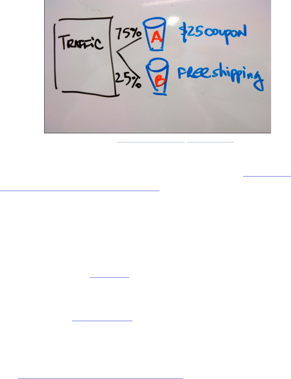
58
test if a certain layout, placement, or messaging will result in better conversions,
A/B testing is considered a natural test because users are not notied nor
provided a set of tasks.
Paras Chopra, Founder of Visual Website Optimizer, wrote an in-depth
article covering the basics of A/B testing. e main benets include measuring
actual behaviors of users, being cheap and highly scaleable, and measuring
small performance dierences with high statistical signicance. While virtually
anything is testable, here is an overview of commonly tested website elements
— with some unexpected and useful real-life samples:
• Call to actions — Read here about how Friendbuy more than doubled their
response rate to their CTAs using A/B tests.
• Headlines — In this A/B test, it was discovered that a single line of text for
headlines increased signups by 38% compared to longer headlines.
• Forms — A unique style of form eld input, the “Mad Libs” style, has been
proven to increase conversions by 25-40%.
Photo credit: „bucket testing”. Mark Levin. Creative Commons.
59
• Pricing and promotional oers — Another A/B case study shows
explicitly stating “it’s free” increased sign-up conversions by 28%.
• Images on landing and product pages — A specic study involving A/B
tests shows the surprising impact of using a human photo on conversion
rates.
• Amount of text/pages — Tests conducted for the Ocial Vancouver 2010
Olympic Store show that users prefered a single-page checkout by 21.8%
ere are also other usability testing tools like Optimizely (great for everything)
and Unbounce (more landing page focused) that make it extremely easy to
get started with A/B testing. ese usability tools handle the distribution and
collection of data for you, so all you have to do is wait for the results. If you’re
interested in a comprehensive list of website elements to test, you can also
check out this detailed explanation of 71 things to A/B test.
source: WhichTestWon

60
Regardless of what you choose to test, make sure you follow these ve
guidelines:
1. Run both variations at the same time — Time is a control, so doing
version A rst and then version B later may skew the results. Running both
tests simultaneously and evenly will ensure the most accurate results.
2. Test with enough people for statistical signicance — As shown with this
sample size calculator, you should test each variation with enough people
for a 95% signicance rate.
3. Test new users — Regular users will be confused if they see a new
variation, especially if you ultimately choose not to use it. Plus, there’s the
mere-exposure eect, in which people prefer what they’re used to.
4. Be consistent with variations on all pages — For example, if you are
testing the placement of a call to action that appears on multiple pages, a
visitor should see the same variation everywhere. Inconsistency will detract
from accurate results, so don’t show variation A on page 1 and variation B
on page 2.
5. Tailor your test length to statistical signicance — Cancelling the test too
early will reduce accuracy. Decide your statistical signicance, then you can
use this test duration calculator to get a rough timeline. Many paid online
usability tools (especially Optimizely) also have a feature for calculating
optimum time based on the goals.
To see some of these best practices put to use, check out this site containing
hundreds of free A/B test case studies. Hubspot also provides a highly visual
and easily digestible 27-page guide to A/B testing.
61
First Click Testing
In the late 2000s, Dr. Bob Bailey, UX Designer and Researcher, conducted
a series of studies around what he called the “rst click” concept. e results
of the studies were surprising, and very advantageous to anyone looking to
improve their website. As it turns out, for any given task, a user’s success rate is
87% as long as their rst click is correct. If their rst click was not correct, the
chances for success fell to below 50%.
is type of usability testing is even more relevant if your site gets a large
volume of search trac — because your homepage probably won’t be the rst
page users nd, rst click testing should ideally be done across your entire site.
We would consider this a “near-natural” test because users are still assigned
tasks (instead of just using the site for whatever purpose they please), but these
tests are usually unmoderated and ran remotely in the comfort of the user’s
home.
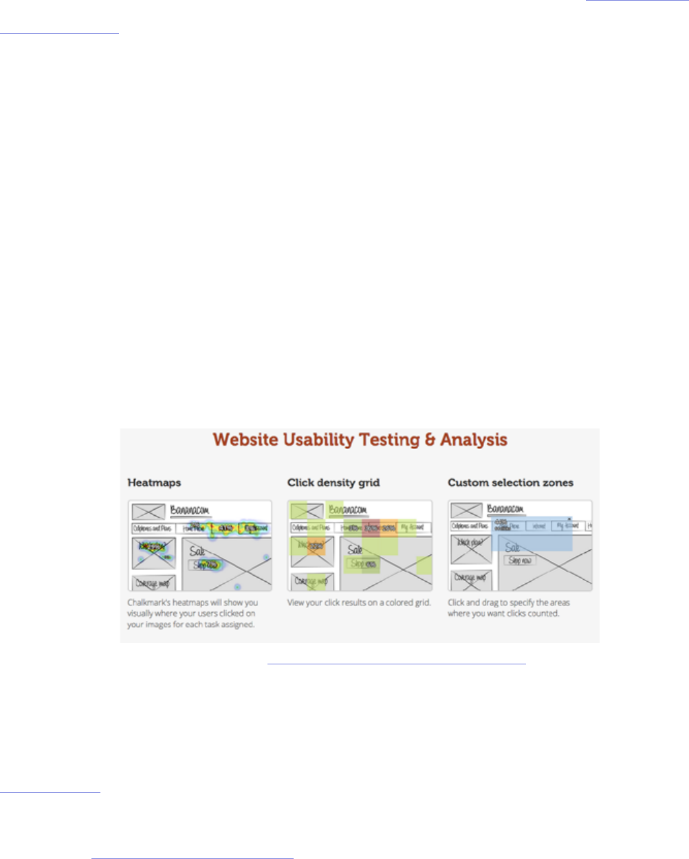
e test itself is simple, and can be conducted with online testing tools like
Chalkmark by Optimal Workshop. e soware presents the user with a
screenshot and a task, and then records their rst click. For example, as we
discuss in User Testing & Design, we asked users to nd a local mechanic on
Yelp and found that 24% of them rst clicked on the Search bar (suggesting that
the existing information architecture may not be clear enough).
Photo credit: https://www.optimalworkshop.com/chalkmark

62
First-click testing can be done on a nished website, functional prototype,
or even a wireframe. Je Sauro, Founding Principal of MeasuringU,
recommends conducting rst-click testing aer each major iteration. Here are
some guidelines to follow:
1. Write clear task scenarios — Just like you would for a scripted usability
test, make sure the participant is thinking about how to solve a problem
instead of just where to click. Detail isn’ required, but clarity is.
2. Dene the best paths to success — Start from the homepage and plot all
possible paths that will correctly accomplish each task.
3. Time each task — A 90% rst click rate on the correct label might
deceptively indicate that your navigation is eective, unless you timed the
test and saw it took an average of three minutes to make that rst click.
4. Measure user condence — Aer each task, you can ask participants to
rate on a scale of 1 to 7 regarding their condence of task completion. Any
3s and 4s will indicate navigation problems.
When running a rst click test, it also helps to ask some open-ended questions
aerward about what users liked and didn’t like about the site. We did this for
our Yelp redesign exercise and it gave us great insights, such as learning that
30% of users felt the navigation was confusing with comments like, “it’s a bit
cluttered...a lot of it quite useful, but can feel overwhelming the rst time.”
For more information on how a rst click test might help, the customer
experience newsletter Neo Insight wrote about the three biggest usability
problems that rst click testing can help solve.
”When it comes to the web, first impressions are oftentimes final impressions.” TWEET THIS

63
Field and Diary Studies
It doesn’t get more “natural” than eld and diary studies. Both are designed to
observe a user as they behave naturally, without the interference of a testing
process. e beauty of these tests is that the user never leaves their natural
environment and are encouraged to act normally. e dierence between the
two is that eld studies involve an observer going on location, and diary studies
involve the participant recording their own thoughts, feelings, and opinions.
I. FIELD STUDY
A eld study provides data you can’t nd anywhere else by letting you observe
users in their own environment. Jared M. Spool, Founder of User Interface
Engineering, believes that while standard usability tests can lead to valuable
insights, the most powerful tool in the toolbox is the eld study.
Field studies provide three main benets:
1. Terminology and processes — In an interview setting, a user may not
be aware of how they behave or how they would talk about a product in a
natural setting. However, in the eld study, these behaviors are witnessed
without a need for explanation.
2. Context — Users aren’t always aware of how external factors, like timing
for example, aect their decisions. Field studies mark the times and
environments of the user, and their impact can be seen during the analysis
of the data, even if the user themselves doesn’t know.
3. Similarities and Dierences — By observing how the user interacts with
64
dierent products, you can start to notice similarities and dierences,
which will esh out your data to enormous degrees.
e biggest downside is primarily the cost of organization and time required
(they can last anywhere from a few weeks to several months). Workers have to
leave the oce for large periods of time, plus scheduling these studies can be
troublesome.
However, if you still think eld studies could help with your usability goals, take
a look at this helpful list of tips, and you can also follow this process for eld
research that helped companies like Apple, Yahoo, DirecTV, and others.
II. DIARY STUDY
A less-involved study of a user in their natural environment is the diary
study. In this study, participants are asked to keep a diary and account for
their experiences with a type of product or system. As Carine Lallemand,
Researching Engineer and UX Scientist, explains in her piece for User
Experience Magazine, the diary study is similar to surveys and interviews, yet is
distinguished by its length and depth of user-generated research.
A diary study captures the expectations, mindsets, moods, and social contexts
that aect the user experience. A diary study might reveal that a bad mood
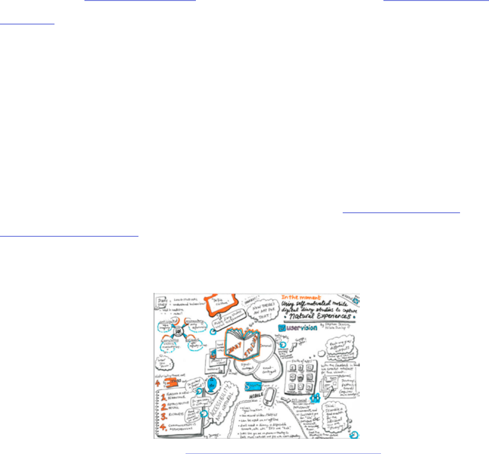
Photo credit: „In the moment”. Jenny Cham. Creative Commons.

65
or criticism read on the web impacted the user’s assessment of the product
experience, independent of the product itself.
Let’s say that you’re asked to improve a web application that helps product
managers track progress. You could provide tape recorders and/or journals to
ve product managers and ask them to document anything odd or frustrating
they experienced when using the application. Aer a few weeks, you would
analyze the data and make specic recommendations.
While these may make the diary study seem like the perfect usability test, like
all others, it too has drawbacks:
• Signicance of participant — e quality of results will depend on the
quality of the participant. Because this takes a good deal of eort on their
part, the participant’s commitment to the project inuences the outcome
whether positively or negatively. On top of that, the participant’s self-
awareness, self-expression, and writing skill can all sway the results.
• Training sessions — While it may sound like the participant acts
independently, the truth is that a thorough training session is necessary to
ensure the participant understands exactly what is expected before starting.
• Analysis — e analysis of an entire diary is time-consuming, especially if
it is hand-written.
Photo credit: „Pen, Diary, Glasses”. Generation Bass. Creative Commons.

66
Ruth Stalker Firth, HCI Researcher and Lecturer, believes that diary studies
are best used as a means of cultural probing and go beyond the “nd out what’s
wrong” mentality that can be prevalent in usability testing. To help counter the
downsides, you can follow a few best practices:
1. Provide contextual and open-ended questions — Contextual questions
like, “What prompted you to use the app?” give you direct insight, but
open-ended questions like, “What would you have done dierently in this
situation?” can uncover new solutions.
2. Let users decide how to record themselves — Text, online photo
galleries, voice recording, even Twitter can all work. It also helps the
process feel more natural and makes participants less self-conscious.
3. Keep size in mind — e diary (whatever form) can be as small or large
as needed. On paper, space for forty entries can be overwhelming, while
ten might be more encouraging. at’s also why digital methods might be
better since users can use as much space as they want.
For a more detailed explanation, complete with hypothetical examples, check
out this extensive post by UserTesting and this list of Dos and Don’ts.
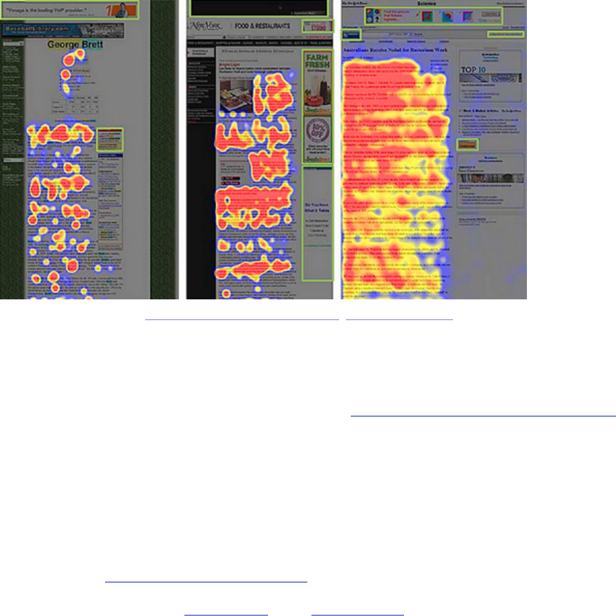
Eye Tracking Test
While diary and eld studies let you see the context for how and why products
are used in everyday life, an eye tracking test goes into almost microscopic
detail. An eye tracking test is just as it sounds, tracking a user’s eye movement,
and more to the point where specically they are looking.Already, eye tracking
”Diary studies are a means of cultural probing that go beyond the ‚find out what’s wrong’
mentality.” TWEET THIS
67
tests have given us some general rules that apply across all products, not just
yours. Ritika Puri, co-founder of StoryHackers, writes in a post for Crazy Egg
about the ve most important lessons eye tracking has taught us so far:
1. Users are predictable — As we can see by the eye tracking patterns above,
people’s sight follows similar trends, allowing us to plan our visual layouts
for the masses. In Web UI Best Practices, we explain how to lay out a site in
accordance to the popular F pattern and Z patterns.
2. Users search pages dierently depending on goals — A user’s eye pattern
will dier depending on why they are searching a screen; for example,
browsing and searching for something in particular have two dierent
modes.
3. Users are drawn to visuals — Visuals like thumbnails or vibrant colors will
attract a user’s attention more than plain text, so use this accordingly.
4. People ignore ads — In a phenomenon that Jakob Nielson calls “banner
blindness,” people will neglect ads habitually, so online advertisers will
have to work harder.
Photo credit: „Banner blindness tests”. Ed Kohler. Creative Commons.

68
5. Unconventional products cause confusion — Being creative with the
color of a link or the placement of your menu may set you apart from other
sites, but it will also take the user longer to gure out how to use your
product, which can be risky.
If you’re interested in using eye tracking to help your website, it’s a lot more
achievable than it might seem. is instructive guide will explain how you can
make eye tracking work for you.

69
Beta Testing (User Acceptance Testing)
Your product is in the later stages of development, and you’re ready for some
feedback (and bug reports) before the grand public launch. Now’s the time for
beta testing, which is a type of user acceptance testing (UAT). e beta test is
when you allow access to your product to a few beta testers and collect their
feedback so that you can smooth out all remaining wrinkles before launch.
If your product is intended for a large audience, Joel Spolsky, co-founder of
Trello, oers 11 tips for improving user acceptance tests for high-exposure
products. Here’s a few tips that we think apply to any test regardless of size:
1. Filter your testers — Select your own beta testers. In open beta tests, too
many testers will ood you with unnecessary data or not enough data.
Take the time to select your own beta testers, and Udemy outlines the best
procedures for doing so.
2. Recruit ve times as many people as you need feedback — Even if you
follow the “commitment” advice above, your numbers will still be low. Plan
accordingly.
3. e ratio for committed beta testers to beta reviewers should be 100:1
— One beta manager can nd conclusive data in 100 beta testers, but those
with more resources or teams of beta managers can handle more. at
means you should recruit 500 people to get 100 qualied testers for each
beta manager.
4. Set apart 8-10 weeks — Don’t try to rush through the beta cycle, keep it
thorough if you want the best results.
5. Release new builds to testers around every two weeks — Any sooner

70
would be too much strain on your end, but you still want them to continue
reviewing the most updated versions of the product.
6. Adding a new features resets the beta cycle — It may seem harmless to
add some new tricks during the end of the beta cycle, but these oen have
unforeseen consequences. If a new feature is necessary, accept that you’ll
need eight more weeks to fully test it.
7. Understand the dierence between technical beta and marketing
beta — Finding and xing bugs is technical beta. Prereleases to preferred
customers or press are marketing beta. e feedback from technical data is
what helps you make a better product; marketing beta is mostly for sales/
exposure.
Keep in mind that beta testing should be the last usability test conducted
in the development process. Make sure you’re at the right stage before you
proceed; otherwise, there will be a lot of wasted eort. To learn more about
beta testing, you can check out Chapter 7 in e Guide to UX Design Process &
Documentation and the many free e-books in Centercode’s library.
71
Takeaway
Tests that observe the users in their natural (or near-natural) environments
provide a specic type of data that other, more controlled tests can’t access.
An A/B test lets you make decisions that are informed by more thorough and
statistically signicant results (since you have a huge sample size). A hallway
usability test, meanwhile, is just a quick and dirty method but not very
„scientic.”
Similarly, eld and diary studies can provide you with unique information about
your target users — namely external factors such as timing, environment, mood,
etc. — that more direct card sorting or tree testing cannot. As for rst click and
eye tracking tests, they literally let you see your website as your users do, but
make sure you run other types of tests for the right context. While each of the
dierent test types has its own advantages and disadvantages, sometimes its
best to mix-and-match them to achieve results more specic to you.


73
Tests that incorporate elements from one or more of the previous catego-
ries (scripted, decontextualized, natural tests) fall under the label of hy-
brid tests. ese tests tend to lean towards capturing attitudinal and conceptual
feedback, but nonetheless reveal insights that have very specic impact on the
usability of the nal design.
Hybrid tests present the user with creative methods for discerning what kind
of experience or features they would want in a product, sometimes even
allowing users to provide direct input for the design. While they may not be
very practical for some of the later stages of product development, the testing
we’ll discuss here can make a big dierence in the earlier phases by helping you
understand the minds of your target users. Specically, we’ll cover desirability
testing, concept testing, and participatory design.
Photo credit: „Brain picture”. Allan Ajifo. Creative Commons.

74
Desirability Testing
Desirability tests are similar to interviews (covered in Chapter 4) in that the
tester and the participant sit down together and discuss the conceptual aspects
of a product. e dierence — and its a notable dierence — is in the approach.
e idea is that asking participants directly what they want can bring misleading
results. e approaches in desirability testing seek to circumvent factors
like poor articulation, lack of self-awareness, or the apathy that comes from
answering similar questions one aer another.
In his slide-show on the topic, Paul Doncaster, Senior UX Designer at
omson-Reuters, explains that desirability testing is a quick and cost-ecient
way to separate what users actually desire versus what they say they desire.
Considering that it only takes users y milliseconds to form an opinion about
your website, we’ll cover four desirability testing methods to help you make the
right rst impression.
I. TRIADING
In a roundabout way of gauging your participants’ emotions, the tester presents
the test-taker with three dierent but related concepts or ideas — for example,
McDonalds, Burger King, and Wendy’s — and asks them to explain how one is
dierent from the others and explain why. is line of questioning drives harder
than simply asking “which do you prefer,” and challenges the participant to
think critically. It also engages participants more by encouraging open-ended
thinking.
”What users say they want can be completely dierent from what will actually help
them.” TWEET THIS

75
Triading is quite helpful for evaluating the competitive landscape and assessing
dierent options from an interaction design perspective. Make sure you follow
an iterative process where you encourage participants to continue vocalizing
features that they feel distinguish two concepts from the third until they run
out of ideas. en, repeat the process with multiple participants (5-6 is a good
sample) and you’ll be able to see trends that dene segments and personas.
II. QUALITATIVE QUESTIONNAIRES
ese are broad, experience-based surveys that, like other desirability tests,
focus more on the emotions of the participant rather than the statistics.
Participants are presented with statements, and then answer based on the
degree to which they agree or disagree. is format also delves deeper than
simply, “do you like our product or not.”
Photo credit: „Question!” Stefan Baudy. Creative Commons.

76
As discussed in the Guide to UX Design Process & Documentation, using
qualitative questionnaires during your design process and feedback surveys
for iteration will also help create a customer feedback loop. While qualitative
questionnaires are fairly free-form, they can be found in three standardized
forms:
1. System Usability Scale (SUS) — Consisting of ten statements (such as
“I felt very condent using this system) and responses ranging from 1-5
in terms of agreeability, this test is technology agnostic and can be tested
with as few as two people. e SUS measures usability and learnability
and should be administered aer a product usability test. To learn how to
interpret the scores, check out this comprehensive SUS guide.
2. Questionnaire for User Interaction Satisfaction (QUIS) — Applicable to
websites and soware, this 12-part test gauges user satisfaction on elements
ranging from ease of learning to quality of photos. It’s a heavyweight testing
method and should be treated as a more technical user test to complement
other methods. For more detail, you can nd the most recent version of the
test in Word and PDF.
3. Website Analysis and Measurement Inventory (WAMMI) — A
standardized website ease-of-use questionnaire, this test focuses on user
emotions with twenty basic statements such as, “this website has some
annoying features,” and a scale of 1-5 based on agreeability. is test is
more lightweight than the QUIS, and you can nd the basic questionnaire
here and recommended additional questions.
e questionnaires can be treated as starting points for your own questionnaire,
so feel free to adapt as needed.
77
III. QUICK EXPOSURE MEMORY TEST
Unusual but eective, the quick exposure memory test shows the participant a
user interface for only a moment before it is removed. e user is then asked to
recall what stood out the most in that brief amount of time, and why.
Similar to rst click testing, this test works well for pinpointing initial
impressions on layout design, information architecture, and content. But
because this test focuses on the user’s memory of particular elements instead of
emotional impact, it’s best used as a supplementary method. You could run this
test cheaply and manually by showing screenshots and then asking questions, or
use a scaleable online service like FiveSecondTest.
IV. ADJECTIVE CARDS
Not all desirability tests require deep and probing methods of getting into the
user’s psyche. Popularized by Microso, adjective cards (also known as product
source: FiveSecondTest

78
reaction cards) are an extremely simple way to capture emotional responses to
designs and products. Simply show the design or have the user interact with
the product, then ask them to pick 3-5 cards that best capture their feelings and
explain their reasoning.
Michael Hawley, Chief Design Ocer at Mad*Pow, writes about his success
with the adjective card. In his test, he gave participants a card with 118 carefully
selected adjectives, both positive and negative. He would then show the
participant a user interface and ask them to describe it with 3-5 words on the
card. is format allowed the test-taker to better articulate their emotions, and
also allowed the opportunity for the tester to follow up on why they felt as they
did.
Dr. David Travis, Managing Director of UserFocus, has also experienced
success with adjective cards. For him, this method stood out by giving
participants permission to criticize the system. In fact, not only did users select
negative and positive adjectives, they could also reveal negative connotations of
otherwise positive adjectives. For example, a user might select “sophisticated,”
but then explain that the interface was “too sophisticated for my tastes.”
Photo credit: „RA Adjectives”. Alan Levine. Creative Commons.

79
You can run this test manually by printing out and cutting out the full list of 118
cards, or use an online service like MojoLeaf to administer the test remotely to
many participants at once.
Concept Testing
In the spirit of looking before you leap, concept testing allows you to discover
your users’ reactions to your concepts before you spend the time and resources
on development. ese tests follow the same formats as the other usability tests
except they substitute concepts in place of the real product.
I. OVERVIEW
As we discussed in the Guide to Minimum Viable Products, a concept test can
be considered a bare-bones MVP since you’re only testing for the viability of
an idea. A concept test could be as simple as a survey sent out to your target
audience or a landing page in which you gauge the concept based on signups
(similar to what Buer did in the image below).
Scott Smith, Founder of Qualtrics explains the main benets of concept testing
include nding the target users of the product, nding out what features they
care about, and determining how you might promote and price the product.
Simply put, concept tests provide the feedback to turn a “deliberately sketchy
idea for a product or service” into something that users might actually want.
Because testing an idea with an actual product can be tricky, concept testing
methods gravitate towards surveys, interviews, and landing pages. However, it
is the focus of these methods that set them apart from more traditional usability
tests. ere are three main types of concept tests depending on the maturity of
the product:
”Concept tests provide the necessary feedback to turn sketchy ideas into desirable pro-
ducts.” TWEET THIS

80
• New Product Concept Tests — ese identify the benets that resonate
most with customers, and the features to create these benets. Successful
tests let you to prioritize your design elements and better schedule the
development process, plus allow you to plan ahead for aer the release.
• Product Usability and Serviceability Tests — How can you improve
the experience with an existing product or service? is test helps you
understand what direction might make the most sense for updates to
existing products (whether it’s ease of use, simpler navigation, etc).
• Price and Incentives Tests — ese will give you a head-start on
marketing and promoting your product since you’ll have a better idea of
what people will pay and how you might bundle the conceptual product
with existing products. If you’re testing your concept with a landing page,
Photo credit: „Lightbulb”. Johannes Svensson. Creative Commons.

81
you can create pricing options and gauge the clickthrough rate on each
option (like Buer’s tactic).
If you’re interested in low-cost methods of concept testing, SurveyMonkey
oers tips for concept testing with surveys and landing pages.
II. CONCEPT TESTING QUESTIONNAIRE LAYOUT
When it comes to surveys and questionnaires for concept testing, each
questionnaire should lead with a description of the conceptual product,
including a headline, overview of benets and uses, and a picture. Dr. Bruce
Isaacson and Debbie Lesnick, President and Senior Vice President/Head of
Research for MMR Strategy Group (respectively), wrote a paper on how to
improve concept and product tests. While their advice was written for products
in general, we’ve adapted the advice for web, mobile devices, and soware.
Concept test questionnaires usually ask the participant to rate hypothetical
products in the following categories:
• Interest — How likely they are to buy the product (or use it, if it’s free).
• Frequency — How oen they would use the product.
• Value — How they perceive the product’s benets (compared to its price).
• Uniqueness — How dierent the product is from its competition.
• Likability — How much, overall, they are satised by the product.
• Believability — How realistic the conceptual product is.
82
• Confusion — Any uncertainty around the product features.
• Brand Fit — How closely the product ts in their existing idea of the brand.
III. VERIFYING CONCEPT TESTS
If you’re looking for a more concrete way to test a product, the designers at
ZURB created a concept-testing app called Verify. Similar to prototyping,
Verify combines concept testing and the quick exposure memory test we
discussed above in the desirability tests section.
e app allows you to create sample screen presentations to test on your
prospective target audience through quick exposure. As the participant marks
what stood out for them, you can get an idea of what to keep or x — all before
designing the actual product.
If you’re looking for a cheaper method, you could do a “hallway concept test” in
which you draw a few sketches, grab a colleague not associated with the project,
show the sketch for ve seconds and then ask for what stood out. You could just
as easily replicate this process with ve users or customers for quick feedback
on your concept.
source: Concept Testing
83
Participatory Design
Sometimes if you want to design a product your users will like, it’s best to
involve them directly in the design process. Participatory design is a usability
testing method that falls right within the discipline of user centered design and
can be a great complement to the collaborative design methods we discussed
in Web UI Best Practices. It’s become quite a popular methodology with
companies like Pinterest, who incorporate it into their design process.
Photo credit: „Many Passionate Teams in Collaboration”. Gaurav Mishra. Creative Commons.

84
Erin Muntzert and David Sherwin, UX Consultants for Frog Design, point
out how to get the most use out of participatory design. In terms of general
guidelines, it helps to treat the session as a conversation (instead of a classroom
exercise), be crystal clear about the problem space and scenario, and record the
session (or take detailed notes). We’ll explain below how to prepare, narrate,
and conduct participatory design sessions.
I. PREPARING FOR PARTICIPATORY DESIGN
e rst phase — framing — is kind of like the pre-planning phase, where you
gure out what you want to get out of the test. is phase handles your abstract
usability goals, and helps you narrow down the specics of what will help.
is kind of pre-planning is what we outlined in the rst two chapters, but
we’ll review its application to participatory design. ere are four steps to the
framing phase:
1. Select your user(s) — Consider your target users’ demographics,
psychographics (personality, lifestyle, values, interests), and behaviors. To
better reect real people, follow the persona process outlined in e Guide
to UX Design Process & Documentation.
2. Create your goals — Ask your team questions (follow the 5W & 1H
guideline) and prioritize them based on which ones you want answered
most. Your usability goals will be to answer the questions that are top
priority.
3. Dene what you think you know — Create hypotheses to answer your
goal questions and jumpstart your research — but don’t get too attached,
because they might be proven wrong. If your goal is to understand what
”For the best results, treat participatory design sessions as conversations - not classroom
exercises.” TWEET THIS

85
young, tech-centric out-of-towners use to nd the “best kept secrets” in
Los Angeles, one hypothesis could be that “users will rst reach out in
social networks to nd what to do.”.
4. Identify methods to use — Categorize your hypotheses as“Understanding
Needs,” “Creating Designs,” or “Rening Until Right.” You’ll have a better
idea of methodology once you see where most of the hypotheses lie.
In thirty minutes, you can complete the rst three steps above, generating
around 10-15 hypotheses. en as we discussed in step four, spend ve minutes
categorizing hypotheses. Once you’ve nished that, here’s three areas to
consider to run a successful session:
1. Group Size — Large groups, small groups, and individuals all have their
advantages and disadvantages. Involving more people at once allows for
faster data collection, but less people may lead to more detailed results.
Because this is a qualitative method, make sure you test at least ve users.
2. Location — Where will you conduct your test? Typically group size and
ease of access will determine whether you hold your test in a professional
facility, in the test-taker’s own environment, or out in the world (on the
street, coee shop, etc.).
3. Data Capture Tools. Collecting user sketches, writing notes,
photographing, and recording video are all important to ensure nothing
slips through the cracks.
Now let’s discuss the actual methods of participatory design. An important
thing to note is that these activities can be strung together in a single session, as
they are oen brief and complement each other. e methods are broken down
into four categories: narration, creation, prioritization, and contextualization
activities.
86
II. NARRATION ACTIVITIES
Collect anecdotal data by documenting how users narrate their stories.
ese activities utilize structured stimuli in order to help them recall specic
memories or feelings — in other words, to “jog their memory.” Additionally,
these activities make great introductory activities by urging the user to access
their emotions, and can segway well into the other categories of participatory
design.
ere are several common ways to do this, each with its own specialty:
• Journey Mapping — Also known as experience mapping, test-takers
ll out a worksheet with a timeline and are encouraged to explain the
emotional impact of dierent stages during a part of their life (such as
overcoming a disease from diagnosis to aermath). ese help people
access their emotions more freely than just conversation, and can be
augmented with the adjective cards we described earlier.
Photo credit: „Plutchik Wheel.” Wikimedia. Creative Commons CC BY-SA 3.0.

87
• Love or Breakup Letter — Great for groups as an icebreaker, this exercise
lets users write a personal letter to a product or brand about what they
love, want, hate, or expect. is helps you see both ends of the emotional
spectrum in plain language.
• Topical Collage — Especially useful in overcoming language barriers,
asking your participants to make a collage regarding how they feel about a
product allows for a visual interpretation of their thoughts. is is similar to
the mood board exercise discussed in Web UI Best Practices.
Photo credit: „I loved you.” Joel Chavez. Creative Commons.
Photo credit: „college & art journal ideas zine.” Katie. Creative Commons.
88
III. CREATION ACTIVITIES
Once you have the emotional context, it’s time to let users create elements for
the product in question. Seeing the kinds of things your participants come up
with of their own free can validate or disprove your hypothesis, not to mention
inspire new theories. When planning creation activities, the key component to
keep in mind is the balance between structure and interpretation.
• Interface Toolkit — Using a tool like UXPin, give participants various pre-
made elements and ask them to “build” their perfect interface. Not only is
this fun, but it’s also ideal for seeing how your users prioritize features.
• Fill-in-the-Blanks — A less-involved and less costly version of the
interface toolkit, you prime users with a narration activity, then provide a
blank set of UI elements (Post-It notes work well) and a canvas (such as a
whiteboard). en ask them to place and label elements however they
see t.
source: UXPin
89
• Ideal Workow — Participants are presented with dierent circumstances
and then explain their ideal workow for each. If you’re designing a
complex system, such as e-trading platforms, this will reveal where and
what your users prioritize.
IV. PRIORITIZATION ACTIVITIES
Using mainly text, images, and iconography, prioritization activities will help
you understand the ways in which your users value the product’s individual
features. ese methods deal with trade-os, connections, and hierarchy to
determine not necessarily what the user wants, but what the user wants most.
• Channel Surng — Similar to card sorting, ask participants to prioritize
functionalities across dierent devices (i.e., PC, mobile, or tablet), or
dierent people/services (phone support, retail branch, etc). is is highly
recommended for testing usability across dierent channels since you’ll see
what features people are willing to trade o. You can do this activity right
aer an interview and follow it up with a creation activity we described
before.
”Prioritization activities help you determine not what the user wants, but what the user
wants most.” TWEET THIS
Photo credit: „CS 032 Figure 901”. Rosenfeld Media. Creative Commons.
90
• Concept Ranking — Participants are given several options and asked to
rank them. For example, if you’re making tablet devices, you can provide
paper mock-ups of dierent dimensions and ask users to rank their size
preferences. is works best for culling down multiple concepts when
users can tweak existing prototypes.
• Value Ranking — Participants assign value attributes that dene a product.
An example might be to present the users with a list of words and have
them rank which words would most likely describe the product. is works
best towards the end of your session when users already understand the
products and concepts.
V. CONTEXTUAL ACTIVITIES
By simulating the experience of using the product, users will be better able to
describe their opinions about it. Contextual activities try as best they can to
immerse the participant into what the concept or product might be.
• Customizing Scenarios — rough the use of text, storyboards, or comic
strips, the participants are presented with scenarios and asked to give
feedback at each step, and even customize the scenario along their own
personal experiences. is helps bridge the gap between product concepts
and how they t in the users’ real life.
Photo credit: „Customer journey UI sketch”. visualpun.ch. Creative Commons.
91
• Simulating Experience — e next best thing to an actual product test, a
simulating experience creates a virtual experience of what it would be like
to use the product. For example, you can simulate a new in-car feature by
presenting the interface on an iPad and add a mock steering wheel.
Takeaway
Hybrid tests are a great way to think outside the box and collect insight that
more traditional tests can’t reach. Desirability tests go above and beyond in
understanding the target user’s psyche. Conceptual tests can save you a lot of
time by solidifying your plan before you begin development. More than any
other test, participatory design gives the target user a hands-on approach in
designing towards their needs.
We’ve just examined the most common and most useful usability tests available
today.In the next chapter, we’ll close by discussing the dierences between web
and mobile usability testing.

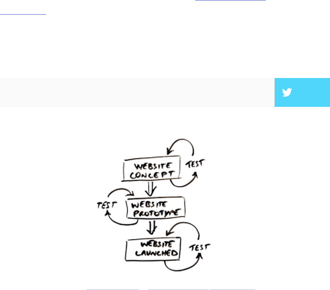
93
We’ve spent the bulk of this e-book outlining the dierent types of usabil-
ity tests and the strategies to use them most eectively. However, the
scope of these tests is vast and can be used on any product from cloud payment
systems to next-generation gaming consoles. In this chapter we want to narrow
our focus a little so you can best understand how usability evaluation works in-
dividually for websites and mobile devices.
Website Usability Testing
User tests are mandatory for website success since Murphy’s Laws of
Technology always seem to strike at the worst times. While many of the
usability testing methods we discussed can adapt to web usability, we thought
it best to showcase a few pointers specic to website protocols and testing
criteria.
Photo credit: Interaction Design.org via blog.templatemonster.com Creative Commons.
”The web is more than just your website. Test your competitors.” TWEET THIS

94
e principles for web usability are the same as with other products, except
they are even more important considering that there are over a billion websites
as of September 2014. e bottom line is that there are so many similar websites
that visitors will simply move onto the next site if the rst one they visit isn’t
usable.
I. PROCEDURE FOR RUNNING WEBSITE USABILITY TESTS
Damian Rees, Co-founder of Experience Solutions, helps explain how he
adapted website usability testing for the most optimized experience. Because
anyone can use the Internet, one of his core principles is setting criteria and
expectations up front so that your tests proceed with the right level of technical
prociency. Here are four tips to keep in mind:
1. Encourage users to behave naturally. Websites must support multiple
modes of use and edge cases, and those might only surface when users feel
comfortable. By starting with open-ended tasks, you’ll get a sneak peek
into how they use the web outside of a testing environment. For example,
if you’re testing an e-commerce site, rst ask users to nd a gi under $50,
then get out of the way and observe them directly or remotely.
2. Let users complete the task how they want. If you feel your user has
misunderstood the task or is going o track, just wait. e goal is to learn
how a user interacts with your website, period. In the real world, you won’t
be there to reign them back in, so observe why they got sidetracked —
those may be your best insights.
”While your website might be your baby, visitors will just move to the next one if it’s ugly
and unusable.” TWEET THIS

95
3. Test competitors or peer websites. Only testing your own site robs you
of context. Including other websites will help you see “the forests and the
trees”. Try asking the participant to show you a site they use on their own,
and have them show you how they use it. It’s not just about how users
interact with your website — it’s about tailoring your website based on how
they use the web.
4. Hide which site you’re testing. Users tend to be less honest when they
know they’re talking to an employee of the company under scrutiny. Do
your best to not reveal you’re testing your site. e user may gure it out by
the end of the session, but the longer you delay it, the more accurate your
rst impressions. Try asking them to assess competitor or peer websites
rst — this puts them in the right critical mindset.
As a guiding principle, try not being too rigid. Keeping an open mind and a
loose attitude will put your test-taker at ease and yield better, more natural
results.
”It’s not just about how users interact with your website. It’s about tailoring your website
based on how they use the web.” TWEET THIS
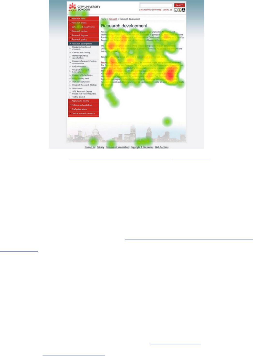
96
II. CRITERIA FOR RUNNING WEBSITE USABILITY TESTS
When conducting a usability test for a website, there are specic criteria you
should check for that might not be relevant to other products. Jacob Gube,
founder of Six Revisions, believes that qualitative feedback alone is not enough
for websites — especially considering how simple technical tweaks to things like
site speed can drastically aect the experience. ere are six criteria that must
be tested for all websites, whether it’s a personal blog or a corporate site:
• Task Success — One of the most important measures of usability is how
easily a user can complete a target task, such as nding an older post or
creating an account. You’ll want to examine learnability, intuitiveness,
eciency, recovery from errors, and memorability for future use. You can
assign direct and open tasks to analyze the task success rate, then follow up
with the single ease question.
Photo credit: „Heatmap of City University Website”. cinteractionlab. Creative Commons.
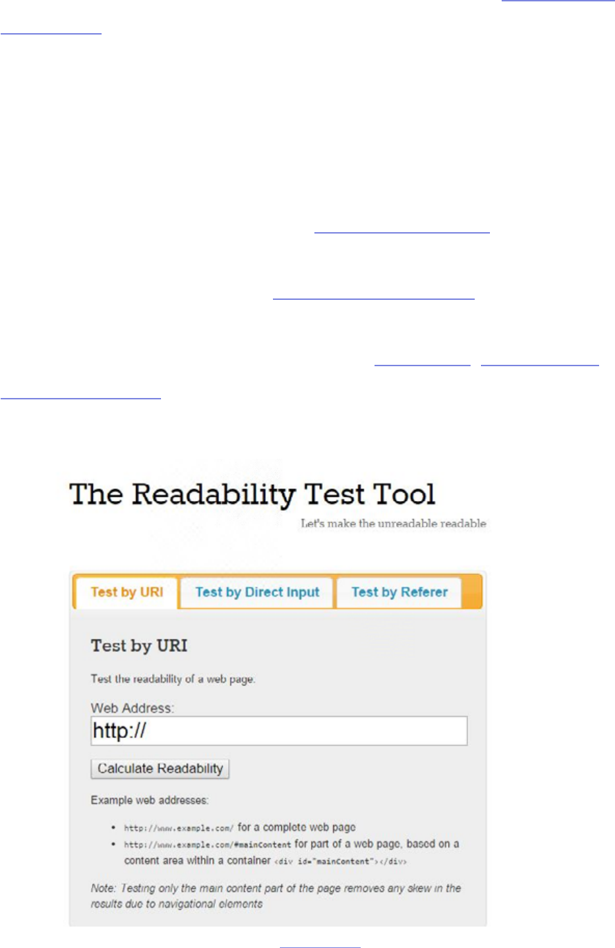
97
• Navigability — Site search is never a crutch for bad navigation. Do you
have enough site features (like calls to action, links, etc.)? How fast and in
how many clicks does it take users to get where they want? Card sorting
and tree testing are perfect for answering these questions.
• UX Design — User satisfaction can get lost in the mix when focusing
on more quantitative factors, but it’s just as important (if not more).
Interviews, eld studies, diary studies, and the tests listed in the previous
hybrid chapter all get feedback on the user’s emotional responses.
Remember: being usable isn’t enough, aim to be delightful.
• Readability — As we discussed in Web UI Best Practices, content is the
heart of any website. Pay attention to your site’s legibility, comprehension,
language, and the enjoyability of the content. Read-Able, WordsCount,
and CheckMyColours are great usability tools for assessing your site’s
readability.
Photo credit: read-able.com

98
• Accessibility — Is your site experience consistent across every major
browser? Is your HTML compatible for various assistance tools for users
with disabilities? Here’s a great list of accessibility testing tools to show you
how accessible your site is.
• Speed — No one likes to wait. A website’s speed will impact the UX,
functionality, and even SEO performance. Check your le sizes and code
quality to reduce unnecessary lag. Follow these best practices, then test
your site speed with a tool like Pingdom or Google PageSpeed
With a few simple tweaks, you can adapt any of the previous usability tests to
better analyze the usability of a website. Find out where your site’s lacking,
then view the tests through the sharp lens of web usability. To see a live example
of dierent ways of evaluating some of these criteria, check out the e-book User
Testing & Design.
Mobile Usability Testing
Mobile devices may seem to exist in another world compared to websites
and computer soware — gesture controls, specialized screens, and device
compatibility are all factors unique to mobile devices. So when it comes to
testing your app or website for mobile usability, it’s important to know what
you’re getting into. We’ll provide some tips that usability professionals learned
aer years of experience, then show how these can be applied.
”For websites, usability is just the bare minimum. Delight is the new standard.” TWEET THIS
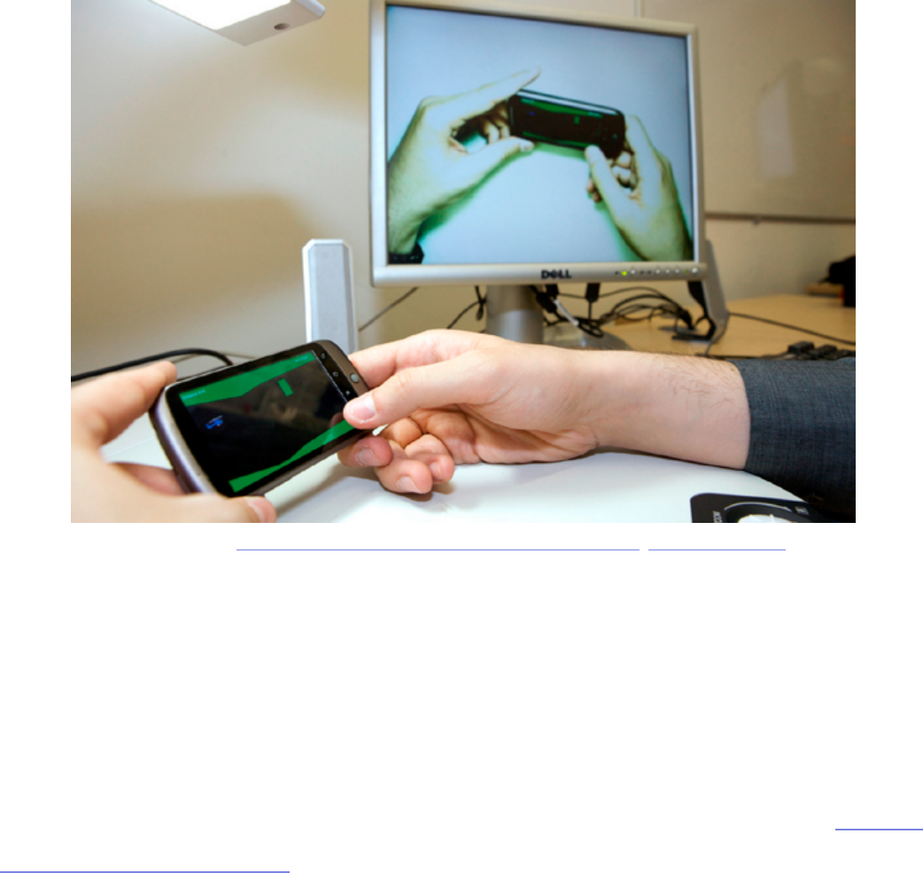
99
I. ADVICE FOR ADAPTING TO MOBILE USABILITY
Designing for mobile is dierent than designing for the web, and those same
subtleties apply to usability testing. Dr. David Travis, Founder of UserFocus,
believes the fundamentals of usability testing still apply — provided you make a
couple important tweaks. ere are a few important changes to keep in mind:
• Recruiting participants — For mobile devices, your participants must be
regular users of the testing platform. For example, don’t hire iPhone users
if you’re testing an Android app. e user will be confused about the new
platform’s UI conventions, biasing the test. Make sure users have spent at
least three months on their device.
• Cater to user customization — People customize their settings for mobile
devices far more than computers or other products. Asking them to use
settings outside of their comfort zone may bias responses. e way to
sidestep this is to get your app on their customized phone. You could
Photo credit: „Mobile Usability Testing Demonstration”. cinteractionlab. Creative Commons.

100
export a prototype as a clickable PDF, use POP (Prototyping on Paper)
for iPhones, use toolkits with app-simulating widgets, or an all-delity
prototyping app like our UXPin.
• Testing Apparatuses — Mirroring the test-taker’s screen is always harder
for mobile devices than PC. For iPhones, you can use Airplay to link the
device to a TV screen, but other devices might require special cords and
jacks. e standard solution is a small, craned camera like Mr. Tappy that
lms the screen and the nger movement, although the view and the
quality are not as good as a direct connection. Make sure you prepare your
tools before the test — nobody wants you staring over their shoulder.
Je Sauro, Founder of MeasuringU, adds some tips of his own that are
exclusive to mobile usability testing. If you are new to mobile testing, pay
attention — Sauro is a usability veteran, and his experience will save you
time and possibly embarrassment.
1. Have chargers ready — is really isn’t an issue with desktop tests, but
nothing ends a mobile usability test faster than a dead battery.
2. Encourage users to pick up their phone — It’s true that some people
prefer using mobile devices on a stationary surface, but there’s always a
chance they’re just doing it due to the testing environment.
3. Record ngers, screens, and bodies — Unlike stationary desktop users,
mobile devices involve three dimensions of data. Pay attention to how the
participant uses gesture controls, mistakes and successes altogether. While
recording the body isn’t necessary, capturing facial expressions and body
language provides insight into the user’s emotional state.
4. Test on dierent platforms — Related to the tip about recruiting
participants who use your mobile platform, if you’re testing an app (or

101
website) designed across multiple platforms, test each one separately. A
great experience on an iPhone may not port over perfectly to the Android
version.
While mobile testing used to be only done in a lab setting, unmoderated remote
testing (which we mentioned before) has also adapted quite well to the mobile
space. While you won’t be able to record ngers and body movements, tools
like UserZoom and UserTesting make it easier to recruit users based on very
specic usage criteria and can quickly gather much larger sample sizes. If you’d
like to conduct remote mobile testing on your own, you can follow the process
used by MailChimp to test seven people in two days.
Takeaway
Web usability and mobile usability may be under the single umbrella of
usability, but the approaches can seem like night and day when you think
about all the subtleties. When planning your goals, keep in mind the usability
functions special to whichever one you’re designing for, its distinct functionality
criteria, and the tests best used to study it.
Now it’s time to get started. Take your time at each step of the way and don’t
proceed if you don’t understand something. To help standardize the process,
feel free to check out the free usability testing kit created by UXPin CEO
Marcin Treder. As you’re testing, remember to always focus on your goals.
Because if you don’t know why you’re testing, then the methods are irrelevant.
”If you don’t know why you’re testing, then the methods are irrelevant.” TWEET THIS

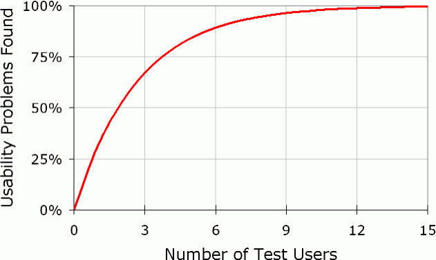
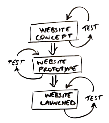
