HomeScenario HSC000000A1 Advanced Scenario Hub/Music Server User Manual HSC 300
HomeScenario, Inc Advanced Scenario Hub/Music Server HSC 300
user manual
HSC-300
HSC-200
HSC-100
HMP-100
HMS-100
Server
User Manual
2009
YC Wang
Home Scenario Inc
2008/7/31
HSC-300
HSC-200
HSC-100
HMP-100
HMS-100;HSC-50
Advanced Scenario Hub/Music Server
HomeScenario
User Manual
Chapter 1 What you can do
With HSC-200, you can
z Distribute audio to the whole house(HSC-200 only).
z Control the lights, power adaptor or other devices according to the pre-defined
schedule or from PC, PDA, Microsoft Mobile phone, iPhone or any devices with
flash-lite player.
z Create scenarios which will control your lights, power switches or IRDA
compatible devices according to the user-defined rules. Users can change the
rules from the built-in web interface.
z Create user interface for the LCD panel, TV or other devices.
All of these are included in the HSC-200. No extra software or equipment is required
to build your own home automation project.
Chapter 2 Getting Started
The HSC-200 can be accessed by using any flash-enabled devices, such as touch
screen or your personal computer. Many smart phones, such as iPhone/HTC
dream/magic/hero, provide enough capability to access the HSC-200. Please refer
to our website for all tested equipments. If your device is not in the list, it can be still
supported if it has flash-lite player or browser. It is welcome to post your experience in
our custom forum so that we can put it into the supported list.
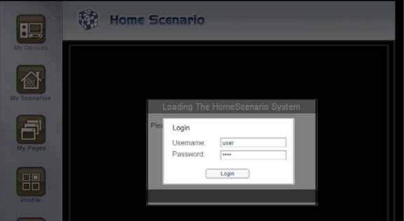
If you are using personal computer, PDA or smart phone to access the HSC-200, you
need to input the ID and password that is usually printed in the bottom of the device
by the installer.
The HSC-200 can be served as audio transmitter out of the box. It will broadcast the
audio from the input 1 and USB to the network if the input is available. The HSC-200
will not send any data unless it detects audio data in the input. Therefore, it will stop
sending data if the input is muted.
In order to enable the light and home theater control, we must enter the web interface
to configure the system. The HSC-200 will use DHCP to acquire the IP address. If
there is no DHCP server available in the network, the default IP address is
192.168.10.100.
Usually, under the environment with DHCP, the HSC-200 will broadcast itself by using
UPnP protocol. The DHCP Host in the XP or Vista can detect it and display it in the
network controller. Double click the icon will enter the configuration page. The
configuration system of the HSC-200 use flash. Therefore, we must install the flash
player in the PC. If the flash player is not available, it will ask users to install one
automatically.
After we enter the configuration page, we can include lights, AV equipments, power
adaptors and other devices in your house. Please refer to the scenario definition for
the details.
In addition, you can create your own home automation user interface by using the
page composer, which is part of the HSC-200 UI. The page composer can help you to
create pages that are used to control and show the status of your devices. Please
refer to the page composer chapter for the details.
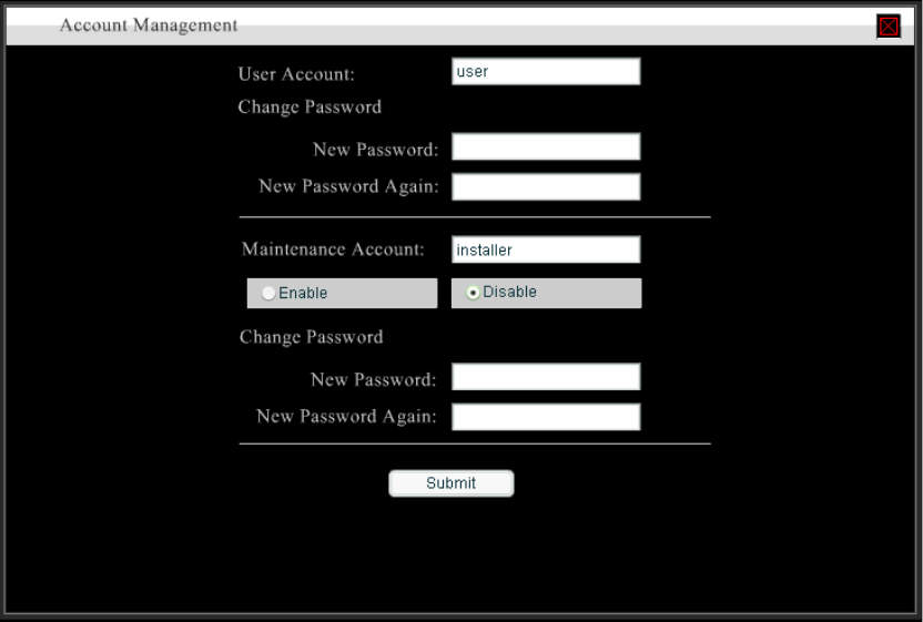
2.1 Enable installer account
Usually, the installer account is disabled for safety issue. If we want to allow install to
check the condition of the HSC-200 temporarily, please follow the below procedure to
enable the installer account. Please remember to follow the same procedure to
disable the installer account.
The default Username and Password are both installer. Installer should change it to
the value which is only known by the installer.
1. Touch the setup button.
2. Touch the button 1.
3. Touch the button 2.
4. Touch the button 3.
5. You will hear the beep once.
Chapter 3 Device management
HSC-200/300 can support variant types of devices. Each device has different setup
procedure and options. It will be tremendous job for users to understand the details of
them individually. Fortunate, the device manager plays an important role here to help
users to understand each device in the user-friendly interface.
No matter we use Z-wave/O-net/Zigbee/RS232/three wire/four wire devices. The
setup procedure is roughly the same. The device wizard will remind users to do the
right job step by step.
3.1 Device association procedure
Device manager divide the association procedure into three steps.
z Select device profile
z Activate the device into learning mode
z Notify HSC200 the device has been learned.
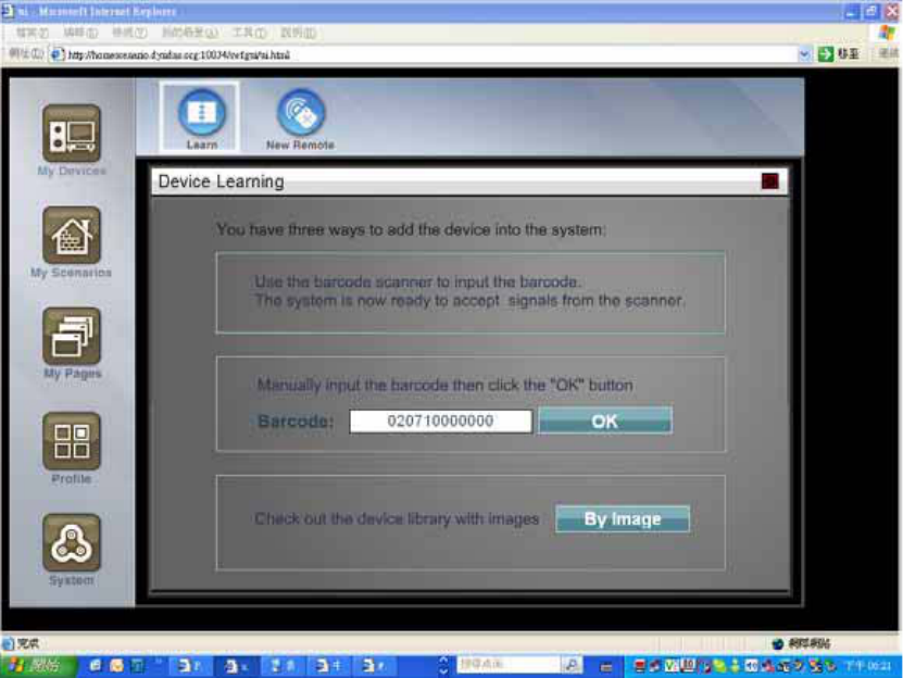
For the first step, HSC-200 uses the barcode in the devices to recognize the model of
the device. It will look up the internal database to decide if we can support this device
or not. If the barcode can not be supported, an UI will be used to remind users.
Once the barcode is input correctly, the HSC-200 will show setup pages for each
device. Users can follow the instruction in this page to figure out how to make the
device into the learning mode.
For bi-directional devices, such as Z-wave or ZigBee, the third steps will be done
automatically. For others, the UI will explain to the users how to verify the device has
been learned or not.
3.2 Add new device
Except the built-in audio transmitter, all devices need to be added before they can be
controlled by the HSC-200. For the security reason, we need to press a physical
button in the devices in order to put them into the association mode. Devices under
the association mode will allow the HSC-200 to build association. In this way, we will
not learn the device in your neighborhood by accident.
In order to associate a node, we need to follow the below steps.
1. Enter the node viewer
2. Select the ‘Learn’ icon
3. Enter the barcode of the device
4. Press the association button in the device.
5. Confirm the association.
Please note that the step 4 must be done in the device. After the step 3, the UI will tell
us the look and feel of the device and mark the location of the association button
according to the barcode entered in step 3.
3.2.1 Press to enter the device panel
3.2.2 Select the icon
3.2.3 Enter the barcode of the device
All devices have a barcode in the physical unit. We can use the barcode scanner to
input the barcode to the HSC-200. In the step 3, the following UI will be displayed,
The barcode scanner will fill the barcode field and then enter the step 4 automatically
if the barcode is correct. Without the HSS-100, we can input the barcode manually.
The human-readable barcode is located in the bottom the barcode stick. It includes 11
digits. Please input all of them into the barcode field. If the input is correct, the ‘Start
association’ button will be enabled. Please click it to start the association procedure.
The barcode number can be input manually if the barcode scanner is not available.
In addition, we can select the type of devices to add. Please click the ‘By Image’
button. The photo and model name of each device will be listed as the below picture.
3.2.4 Press association button in the device
According to the barcode input in step 3, the UI will display the look and feel of the
physical device and mark the location of the association button. Please follow the
instruction in the screen to associate the devices.
If your device does not match the graphic in the UI, please check if you input the right
barcode. Please contact your local technology support or the official support forum to
verify it. HSC-200 may not support devices from other vendors. Please make sure
your devices are supported.
3.2.5 Confirm the association
Most devices will blink their LED when it is associated with HSC-200 successfully. For
uni-directional devices, we need to press the confirm button in the screen to notify the
HSC-200 that device has been added successfully so that the HSC-200 will leave the
learning mode.
For bi-directional devices, such as Z-wave, this step is done automatically since it can
acquire the status of the devices via RF-link. Please refer to the setup screen of the
devices to know if we need to do this step or not.
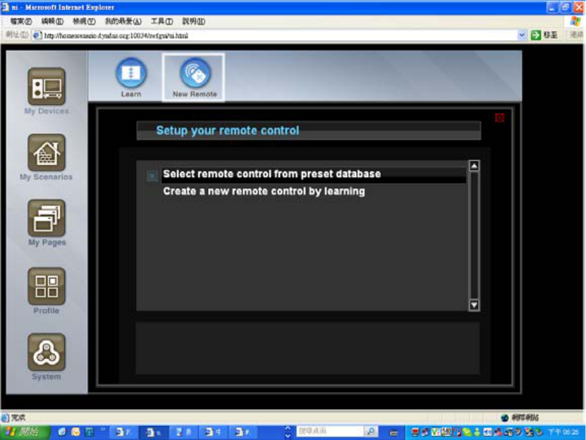
3.3 Add IR device
In order to add a IR transmitter device, we need to choice the “new remote” icon in the
top of the screen. An IRDA wizard will be used to help us to configure an IR device.
3.3.1 Select
ಮ
New Remote
ಯ
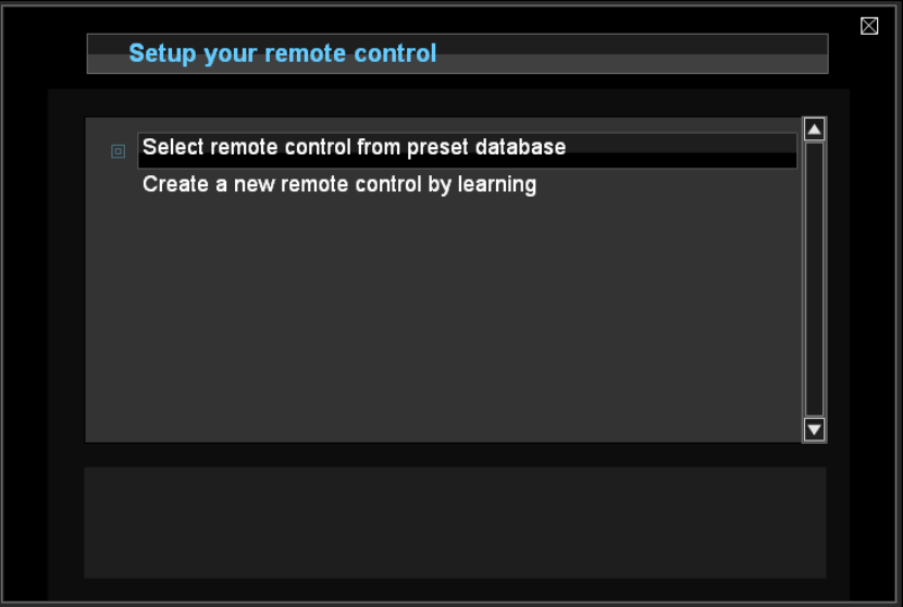
3.3.2 Add IR device from the built-in database
The HSC has built-in database, which allows us to select a IR device by using device
type, vendor or model name.
3.3.3 Add IR device by using IR learning
HSC can built-in an IR device by IR recording. The built-in IR recorder can capture the
IR signal of the original IR transmitter.
The HSC provides the capability to mix the builtin database with a couple of learned
keys. We can choice one remote from the internal database and change some of keys
with IR learning. Typically, there are a couple of keys in the builtin database, which
does not match the real device since the model name is not 100% match. For
example, when we choice a TV, the built-in database is for old models so that most
keys works fine except the PVR function which is available in the new model only. In
this case, we can use IR learning to add these extra keys.
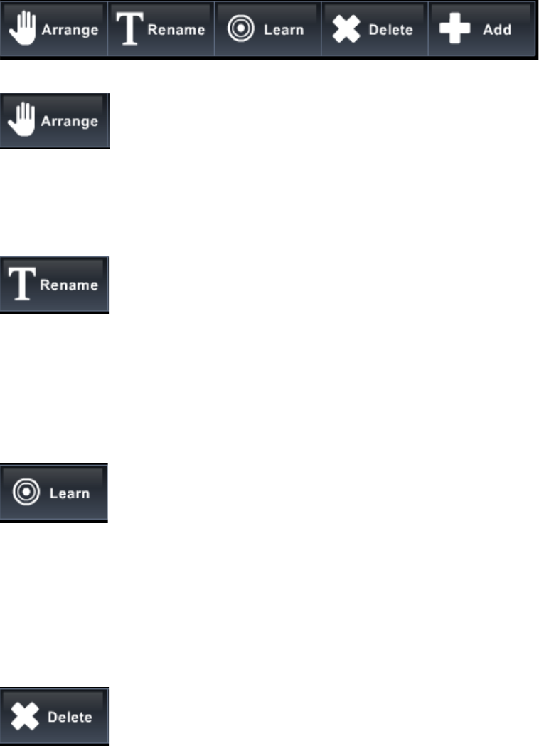
3.3.4 IR customization
Move the location of the keys. The location is only for presentation only. It won’t
chanfge the key at all.
Change the name of the key. Please click this icon and then the cursor will change to
rename mode. We can click any key and then the key will become edit mode.
This is used to change a key to be learning mode. Please notice that this action can
not be reversed. Once it become learning key, it can not be recovered to be key in the
database any more. If we still want to use the database key, we need to create a new
remote from scratch again.
Delete an IR key.
Add a new key. Initially, the key is not associated to any IR signal. We need to use
“Learn” function to associate an IR signal to a new key.
Use the IR remote wizard to select another remote. Please be warned that all setting
will be dropped after we change the remote.
3.4 Browse device
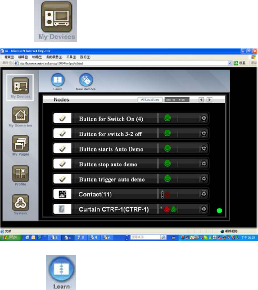
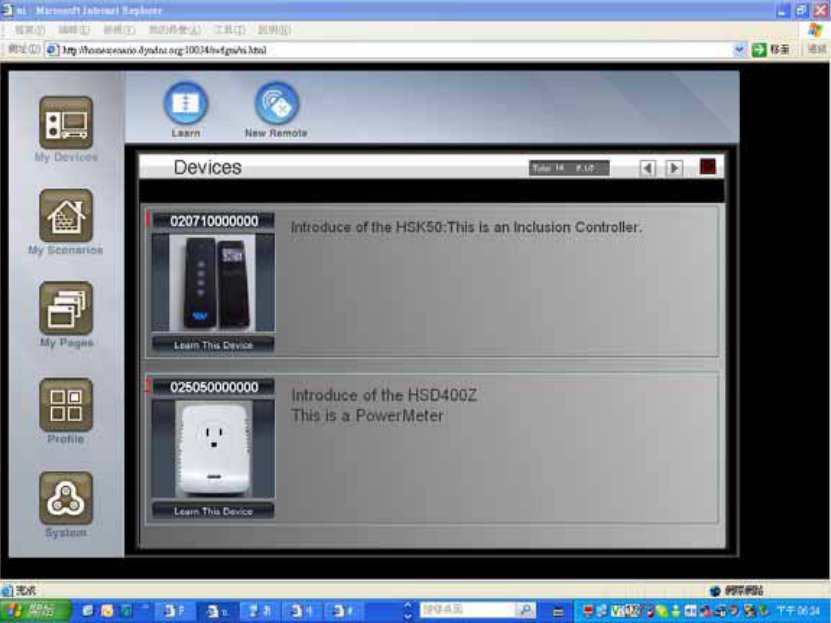
After the device is added, it will be listed in the node viewer. The node viewer is
available under the ‘My Devices’ section.
Each device is listed as a single line. Please look at the picture. There is an icon in the
right side to invoke the preview and setting view of the device.
3.4.1 Setting mode
Some devices, such as light and power switch, have online widget which can operate
it from the device panel directly. Most devices can not be controlled without entering
the setting view.
3.4.2 UI device
In addition to the physical devices, the device panel will list the UI devices as well. The
UI device is created to call actions of the scenarios so that we can execute multiple
operations among all devices. For example, we can turn on a group of lights by click
the UI button. Please refer to the scenario chapter for the details of the UI devices.
Since the UI device is listed in the device manual, users can execute scenario actions
by clicking the UI widget in the device panel. For example, the following UI switch is
named as ‘master room light control’ and it can be used to turn on/off all lights in the
master room.
The device panel provide very primitive user interface to control the devices. In order
to build a more user friendly environment, the HSC-200 provides two functions
z We can use the scenario editor to create very complex scenario to execute
actions in certain time or conditions. The Scenario Editor provides a user friendly
CAD-like interface to group devices and create complex logic without writing any
program.
z We can use the page composer to create final user page which is more user
friendly than the device panel. The page composer can create as many pages as
possible by using built-in widgets to collect information from the devices and send
control command to them. It can work with the scenario editor to build very
powerful scenarios or macros to control all devices.
Before we introduction the scenario editor and the page composer, let’s take a tour of
all functions provided in the HSC-200. If you are eager to understand the most decent
building system of the Home Scenario Builder, please skip the following chapters and
go to chapter xxx for it.
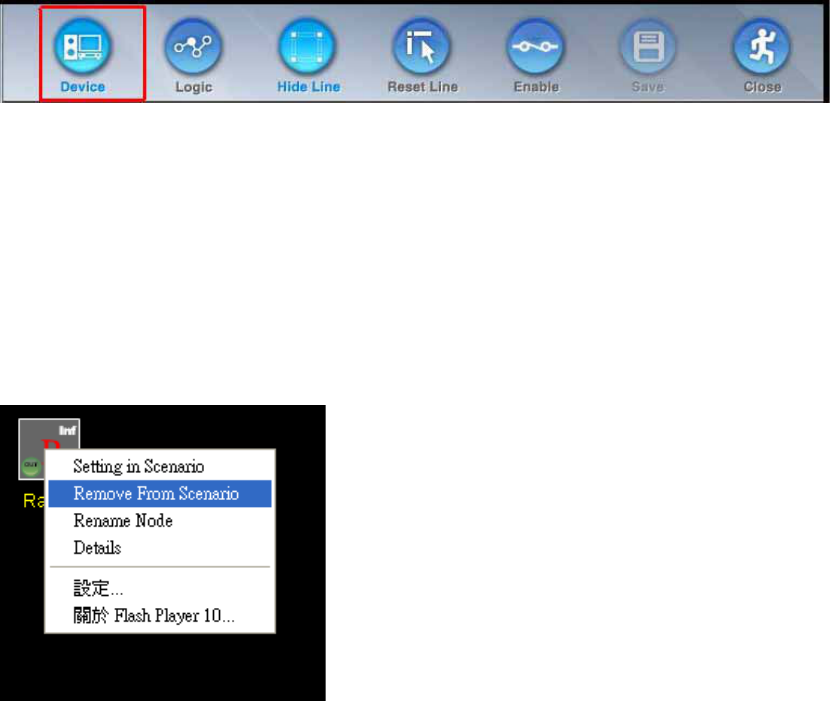
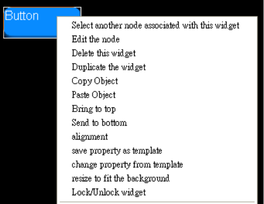
3.5 Context menu
In the node viewer, each device has context menu with the following items.
z Rename Node
z Refresh state
z Delete Node
z Change Location
z Swap Node
3.5.1 Rename Node
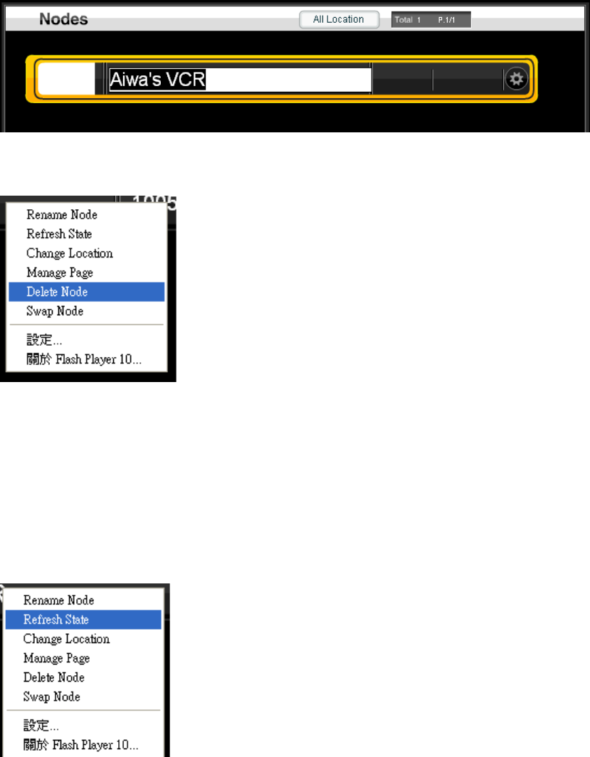
This function will show an inline text editor to change the name of the device. Since
the node viewer will sort the device by name, change the name of the device will
invoke a screen refresh and you may not be on top of the original node after the
rename.
In the end of text editing, press an enter will close the inline text editor and show the
original node viewer again.
3.5.2 Delete Node
This function will delete the current node form the node viewer. Please notice that it
may not delete the setting in the underline network in the same time. Please refer to
the chapter of devices to find how to delete device from their network.
3.5.3 Refresh state
This function will try to get the latest state of the selected device. If we suspect that
the display status is not up-to-date, we can use this function to fetch the current status
of it.
This is useful for some devices which will not report its status when it is change
manually. For example, the Z-wave switch will not report its state change when we
use the button on the device to change it from on to off or from off to on.
This feature works for bi-directional devices, such as IP or Z-wave devices only. For
the Z-wave device, it must be always-on devices or FLIRS.
3.5.4 Change Location
Each node has a location property. This property can be used to filter devices from
the location button.
This function will invoke a inline text editor. Please press ‘Enter’ in the end of editing to
confirm the input.
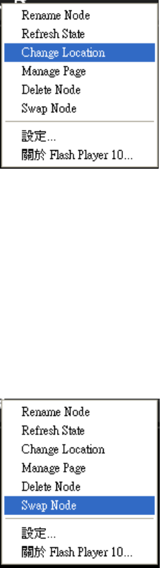
3.5.5 Swap Node
If a device is broken, we may want to add a new device to replace it. However, it will
be very inconvenient if we need to replace each node in all scenarios. Therefore, the
node viewer provides the Swap Node function, which can help users to replace the
node in all scenarios at once.
Select this function will be a list box as
This function will search all scenarios and replace the original device with the new
one.
Please remember to delete the old node.
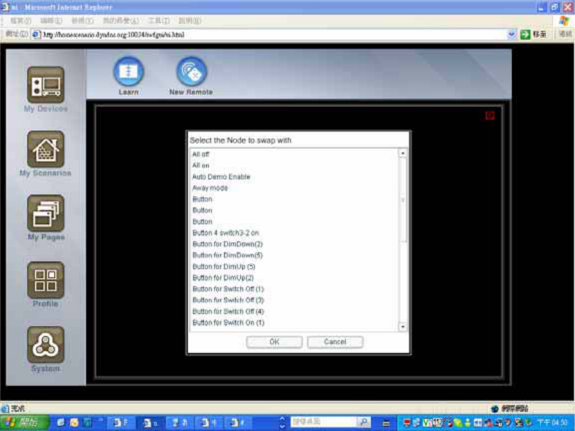
3.6 Battery
If the battery status of the battery-power device is too low, a log will be added with the
device name. In addition, we will show an icon in front of the device in the device
manager.
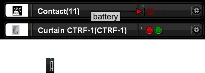
In the battery icon . The ‘?’ means that the device has not reported its battery
status yet. The device will report battery status every 30 minutes. When its battery
level is low, HSC-200 will generate a message which need to be confirmed by the
users.
Chapter 4 Scenario Editor
The scenario editor is the most powerful feature of the HSC-200. It provides a much
advanced replacement of the macro definition of other systems. Although HSC-200
provides python-based framework which allow users to download new plug-ins to
extend the functionalities, the scenario editor should be the preferable solution most
of the time. The system building by scenario editor is easier to maintain and extended.
The scenario editor is the most power home automation CAD so far and the function
is continuous to grow.
4.1 What is scenario?
A scenario is a set of rules which defines how the system responses for input events.
For each input events, such as motion events or human input events, we can define it
to trigger one or more actions. For example, we can define a rule which call the action
on of the light switch when the motion sensor is triggered.
Signal Action
Motion is triggered Light switch turns on
In addition to simple connections between physical devices, we can insert logical
devices between them to perform more complex functions. In the scenario editor, we
provides the following logical devices
z Loop device
Sequencer
z Timer devices
24x7 timer
real-time timer
countdown timer
z Logic devices
XOR
AND
OR
z Value comparator
Max
Min
Range
The scenario editor is a complete visual programmer environment, which enable us to
compose program to control the equipments without a line of code. The scenario
editor will enable non-programmer to implement the function they want.
4.2 Visual programming
Traditionally, a sophisticated home automation system is composed by a
programming language. Typically, it is a scripting language. Therefore, a programmer
is required for the home automation project.
It might not be problem to hire a programmer to write the program. However, it’s hard
to hire a programmer which understands the home automation system. The HSC
provides the visual programming environment, called scenario editor, to allow
non-programmer to setup the system. Under this environment, HSC provides a CAD
to help installers to write the program. Like the traditional CAD, HSC represent all
devices as a block and then allow installers to build connections between pins of the
block. The function of a connection is actually decided by both ends of the connection
as well as the mapping of signals and actions.
Each connections contains the following parameters
z Origin signal or state
z target action
z Mapping from the signal or states to the actions.
The scenario editor provides visual representation of the all connections and editor to
change these parameters.
A programming language need to provide the following entitles
z Value calculation
z Condition
z Loop
z Variables
z Functions
4.2.1 Condition
The condition devices, such as MIN/MAX/RANGE/AND/OR/XOR provides the
condition statement of the usual programming language.
if (a>10)
light.position = ‘on’;
else
light.position = ‘off’;
on
RANGE
>10
aLight
off
4.2.2 Variables
The state of a node provides the variable storage. The variable node can be used to
keep the state permanently. This node can be used to convert a signal to a state.
variable
a
4.2.3 loop
While(stop) {
Light.toogle();
}
toggle
sequencer
light
variable
stop
4.2.4 Function
Each node provides several actions which can be called by connected to any signals.
In addition, a scenario can be treated as the function in the traditional language as
well. Each scenario can be enabled or disabled by its enable action.
[FIXME: Add an example here]
4.3 Scenario list
In order to make the scenarios more readable, we can separate rules into different
scenarios. In the Scenario viewer, all scenarios are listed. We can
add/delete/enable/disable them individually.
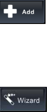
4.3.1 Add a new scenario
We can add a new scenario by clicking the “Add” icon in the top of the screen.
[screenshot of the scenario viewer]
4.3.2 Edit existing scenario
Click the scenario will enter the scenario editor.
4.4 Scenario editor
The scenario editor is used to change the settings of the node and build connections
between the nodes.
4.4.1 Add node
The device icon will list all nodes in the node viewer. Or we can select the Logic icon
to create virtual nodes.
4.4.2 Delete node
We can use the context menu to delete a node from the scenario. However, this node
will not be deleted from the node viewer. It is only deleted from the current scenario.
4.4.3 Add connection
In order to build a connection between nodes, we need to do the following steps.
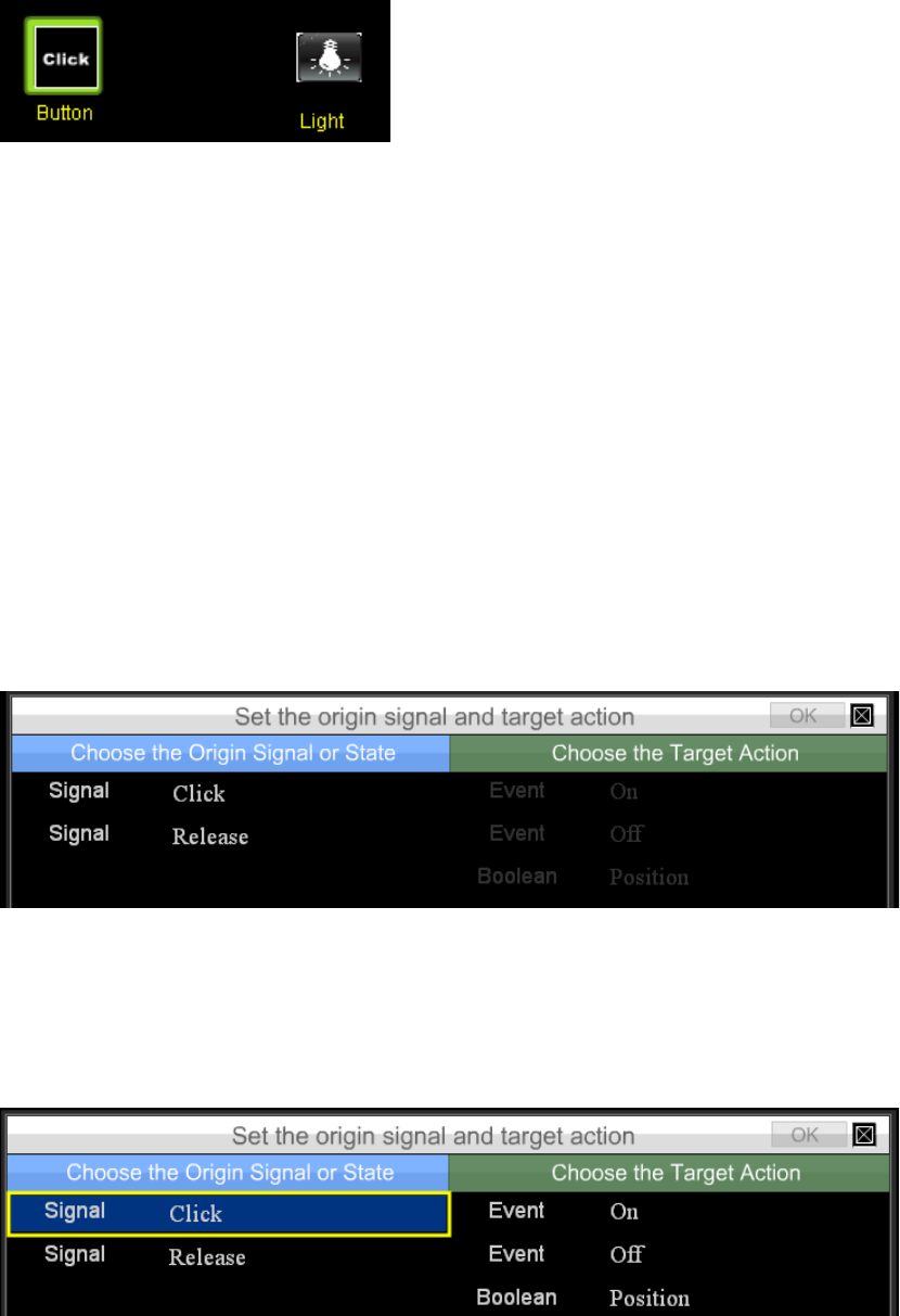
Firstly, we need to highlight the origin node by single click on it. A select frame will be
displayed
Secondly, select the target node. A wizard will guide you to input the parameters
required by a connection. We need to provide the following information
z The signal of the origin node
z The action of the target node
z The mapping table from the signal to the action.
After we click the second node, the wizard will be displayed.
The left side list all signals and the left side will list all action. Initially, all actions are
disabled. When we click the signal at the left side, all actions which can be connected
to the select signal will be enabled.
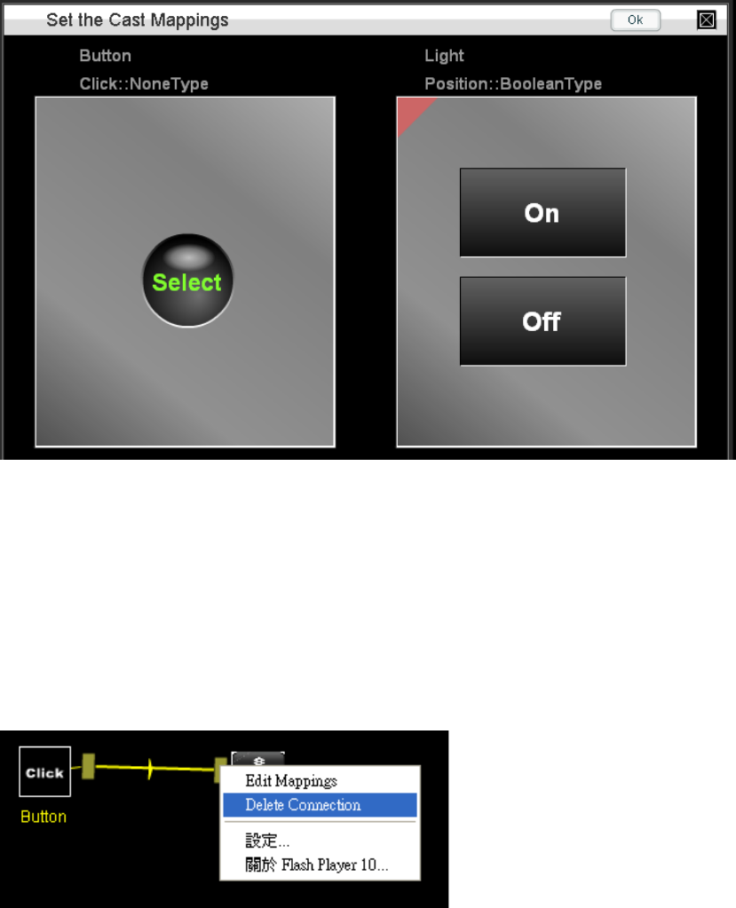
In the above screen shot, the click signal is selected so that all three actions are
enabled. When we select one of the target action and then select the OK, the
mapping table will be displayed.
We can check the mapping from the left to the right and then click OK to finish the
connection.
4.4.4 Delete connection
We can right click the square box in the connection to get the context menu for the
connection. The “Delete Connection” is used to delete the connection.
We can click the “Edit mapping” to change the mapping. However, we can not change
the signal or action of a connection. Instead, we need to delete the old one and create
a new one from scratch.
4.5 Annotation box
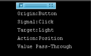
The annotation box is used to display the detailed information of nodes and
connections. When the mouse is over the node, the details information of a node will
be displayed in the annotation box.
When the mouse is over the dragbox or connection line of a connection, the
information of the connection will be displayed in the annotation box.
4.6 Virtual Devices
The scenario editor allows us to forward signal from one device to the action of the
other one. We can connect a motion sensor to a switch to turn on the light when the
motion is detected. However, this is almost all we can do traditionally. In order to
support more advanced control, HSC-200 introduce the virtual devices which can
provide advanced scenario control.
The virtual devices are used to control the behavior of devices according to the
definition of the user scenario. For example, a countdown timer device is used to
delay a signal for certain timers and relay it to other devices.
The following virtual devices are provided in the current version of firmware. We will
continue to develop more virtual devices which can simplify the design of the scenario.
Please check the website for more details.
z Countdown timer
z AND/OR/XOR logic device
z Real time timer
z 24x7 time scheduler
z Range
z min/Max
z Data logger
4.7 Timers
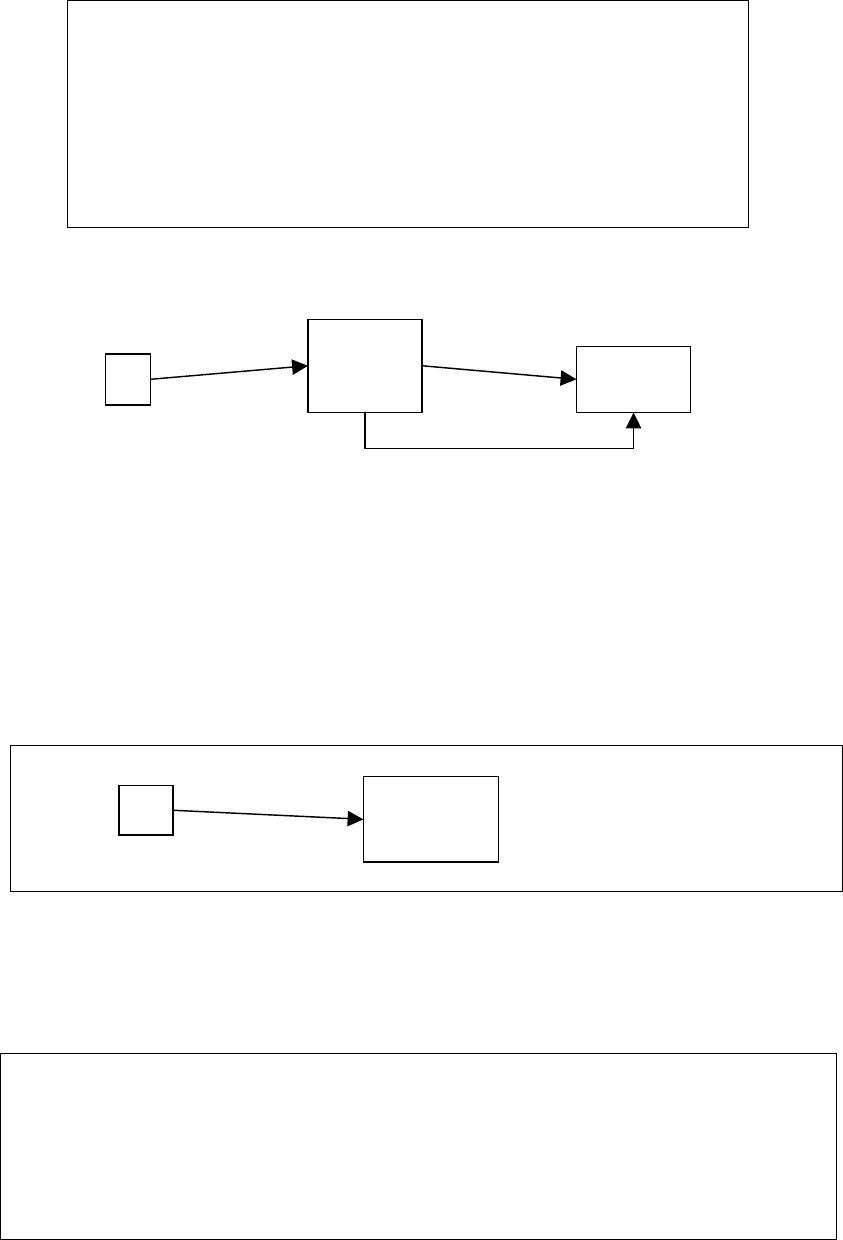
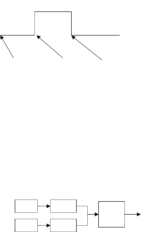
4.7.1 Count down timer
The count down timer can be used to queue an event for pre-define time and then
send out a signal. The counting is started by the start action. After it is started, it will
wait for duration seconds and set the state Position to be true. The signal on will be
emitted as well. The Position will remain in the true state for alarm seconds and
become false. In this timer, the off signal is sent as well.
The duration and alarm can be configured in the setting mode of the count down
timer device in the scenario editor. Please look at the picture below for the details.
alarm
duration
start on off
Position
The alarm is usually used in two ways. When the duration is zero, we call it sustain
mode. After the timer is started, it will maintain in the true position for alarm seconds.
We can use it to enable some logic or position for alarm seconds. For example, we
can use it to detect if two motion sensors are both triggered in 10 seconds by connect
two count down timer to the motion detector and then use a AND logic device to
combine the Position of two count down timers.
PIR1 timer 1 AND
PIR2 timer 2
We can set the duration to be 0 and alarm to be 5 for both timers. Therefore, the
Position of the timer will be true for 5 seconds after the motion is triggered. By AND
both Position together, the output of the AND device will be true only if both motion
sensors are triggered within 5 seconds.
If the duration is not zero, we call it as delay mode. Under this mode, the input signal
will be delayed for duration seconds and reemitted as the on signal. For example, we
can use it to add sleep function for any devices. After we press a button, it will be
connected to the start of a count down timer. The timer will wait for duration seconds
and then send the signal out. We can connect the on signal to any device which need
to be turned off.
Sleep
button timer
Power
Switch
States
z Position
z Phase
This state is a string that represent the status of the countdown timer.
Signals
z On: The on signal will be sent when the counter become zero.
z Off: The off signal will be sent after the on signal is sent for alarm seconds.
Actions
z Start: Start the timer.
z Stop: Stop the timer. The counter will be reset.
z Pause: Pause the timer. The counter will not be reset so that the resume can be
used to continue the counting.
z Resume: Restart the countdown procedure from the last paused position.
Properties
z duration: The initial value of the timer.
z alarm: The period that the value of the position state will remain in on.
4.7.2 7x24 timer
[Ask iap provide description]
4.7.3 real-time timer
[Ask iap provide description]
4.7.4 daily timer
[Ask iap provide description]
4.8 Comparator
The comparator device is used to compare the value of two inputs.
[Ask iap provide description]
4.8.1 Min/Max
[Ask iap provide description]
4.8.2 Range
[Ask iap provide description]
4.9 Logic devices
Logic device provides LogicJoin action that we be connected to several states. It will
emit state and signal change when the result of logic operation of the devices
changes. For example, an AND device will perform logic AND operation for its input
and generate signals when the result is changed from True to False or from Fase to
the True.
Currently, we support the following virtual logic devices.
z AND
z XOR
z OR
4.9.1 State
z Position: The value of the logic operation.
4.9.2 Signal
z On: This signal is sent when the state Position change from off to on.
z Off: This signal is sent when the state Position change from on to off.
4.9.3 Action
z LogicJoin: This is used to connect the input of the logic operation. We can
connect to this action for multiple times to defined multiple inputs.
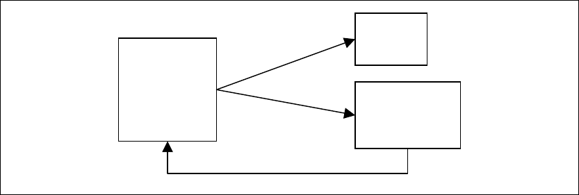
4.10 Boolean sequencer
The Boolean sequencer is used to switch a group of devices between two states. It is
very useful to serve as a single point to control a group of devices. As its name, the
Boolean sequencer can be controlled by using Position, On or Off actions. When it
transits from one state to the other, it will send signals all devices connected to
sequencer in the pre-defined order and interval.
Chapter 5 Profile editor
The profile editor is used to define how the scenario is enabled and disabled. The
HSC can use any button to enable or disable a scenario or use 7x24 scheduler to
enable/disable the scenarios.
Chapter 6 Page composer
The page composer can define user interface for the end-users. It provides
WYSIWYG screen editor to draw and drop widgets in the screen. Every widget can be
fully customized. If it is not enough, the page composer can include any SWF files into
it as well.
When the pages are defined, they can be accessed as flash file or HTML files. If at
least one page is defined, we will show the first page in flash format. The following
links are used to invoke flash,HTML and setup menu.
z Configurator
http://192.168.0.100:2080/ui.html
z Flash Page Viewer
http://192.168.0.100:2080/vp?s=userpages&n=1
z HTML Page Viewer
http://192.168.0.100:2080/swfgui/mypage.html?s=userpages&n=1
z iPOD-style page viewer
http://192.168.0.100:2080/swfgui/ipod.html
If user input an error link, we will show a menu with the above links to let users select
one of them.
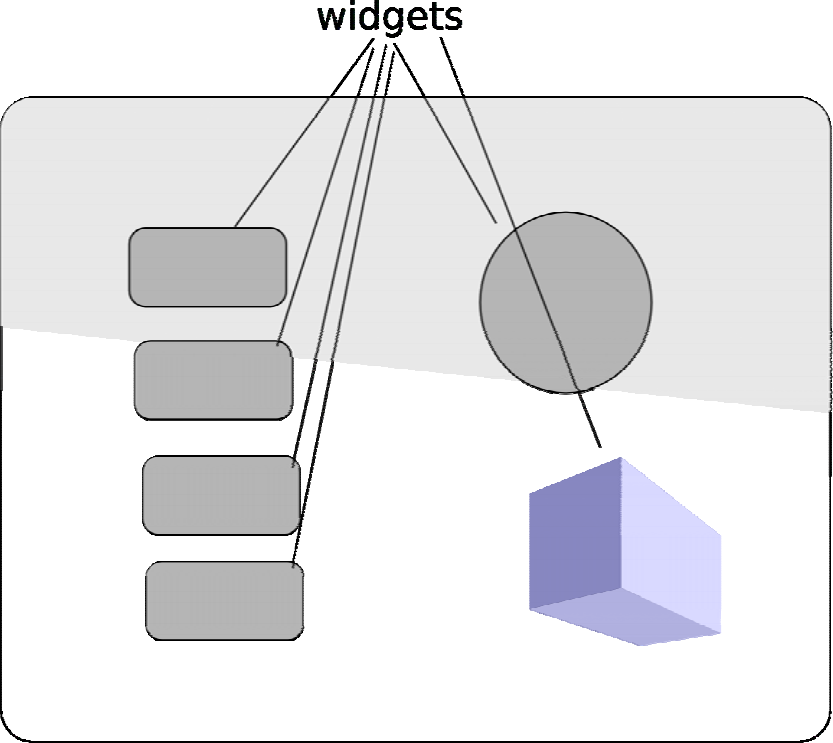
The page composer is a widget-based graphics editor for the HMI device, such as
touch screen or iPOD. The content of the HMI is defined by a set of pages. Each page
is composed of one background and a number of widgets.
Each widget can be move and resize individually. The looks and feel of each widgets
can be altered by modifying their properties. For example, a button widget has the
following properties.
z Title
z Font style
z Text color
z Text position
z Background image for normal state
z Background image displayed when the widget is clicked.
The page composer provides a lot of tools which is available in standard graphic tools,
such as copy/paste/duplicate/delete or alignment. In addition, all image property can
be set as an SWF file so that the full flash capability can be used to improve the
quality of the screen.
In the rest of this chapter, we will introduce each tools and widgets in the page
composer. However, we will use an tutorial to illustrate the capability of the page
composer. If you want to know the tools and widgets quickly, you can skip the next
section and jump to the sections for tools and widgets.
6.1 Tutorial
The page composer is available in the My Pages section
6.1.1 Mother page
When you enter the page composer, it will load the first page. If the first page is not
available, the Mother page will be loaded.
The Mother page contains background and widgets that will be duplicated in every
page. A common usage is to put all page buttons in the Mother page so that we can
switch to any page from any page.
In addition to the widgets, we can put the background in the Mother page as well. If
any page is not defined a background, we will use the background of Mother page.
In this tutorial, please place two page buttons in the Mother page and load the
background on it.
[Put the screen shot here]
Since there is no page yet, the page button will be empty. Don’t worry. We can assign
the page to it latter.
6.1.2 Add/delete/edit user pages
The goal of the page composer is to create UI for the HSC-200. It can create multiple
pages and link those pages by using the page button widget. A page button looks like
a normal button on the UI. It can show the name of the page inside it. When user click
it, the UI will load the page associated with the button as the current page.
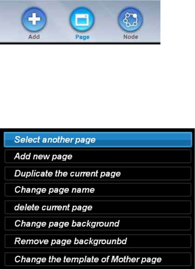
All page related functions are grouped in the page tool button.
[Put the screenshot of the page tool button here]
Initially, we have only one Mother page only. We need to create a new page by
selecting the ‘Add new page’ inside the page tool. Once a page is created, we can
place widgets inside it.
Please create two pages.
6.1.3 Associate page button with page
Now, we can associate the page button to the newly-created page. Please jump to the
Mother page. We can switch to another page by press the page tool button and select
the ‘Select another page’. Please select the ‘Mother page’ now.
Please select the page button and press the page tool button again. The following
menu will be shown.
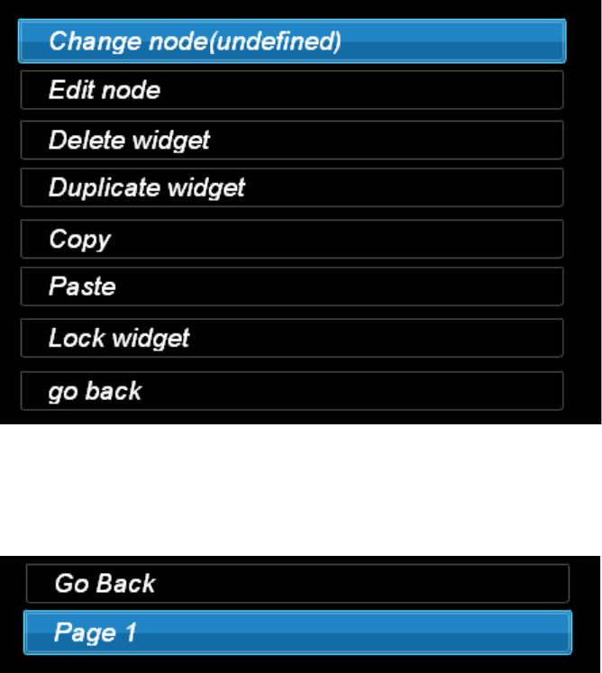
Please select the ‘Change node’. We will see the following screen. Please select
‘Page 1’ from it.
Repeat this to the other page button. We have composed a page set with two pages.
Of course, those two pages looks exactly the same now. In order to differentiate two
pages, we will change the background of the page 2.
6.1.4 Change the background
Now, we will explain how to change the background. By default, we will show the
background of the mother page. However, we can use different background for each
page. In the HSC-200, we have several built-in background images for selection.
However, it’s free for users to download their own image.
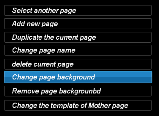
In order to change the background, press the ‘page tool’ and then select the ‘Change
page background’.
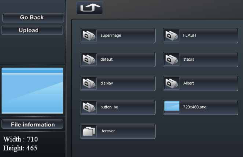
A file manager will be shown on the screen. If you move the cursor to over the file,
we will show the preview in the left bottom corner. When you double click on it, we will
select it as the background. You are free to load either image or SWF files to be the
background. However, you must be very careful to select a SWF file as background
because it may make the whole UI very confused.
Now, the page 1 and page 2 has different background. We can try to test our work
now.
6.1.5 Test the user page
The page composer allows us to preview the user page in the editor directly. We can
press the test tool button any time to generate and show the page in the screen. It will
be exactly the same as the final UI except the leave icon in the top right corner.
By default, the current page will be shown on the screen. We can press the page
button to switch between page 1 and page 2.
Till now, we have introduced how to create pages and test the generated pages. In
the rest of the tutorial, we will introduce how to add widgets and customize them.
6.1.6 Add Switch widget to control the light
6.1.7 Add UISwitch to control the scenario
6.1.8 Copy and paste
6.2 Widget
Currently, we support 10 widgets in the page composer. The number of the widgets
might be changed from version to version. A page is defined by the widgets. Each
widget may be connected to one of the physical or logical devices in the scenario
editor. Once the connection is built, the page composer will update the content of the
widget according to the status of the devices in real-time. When the state of the
devices changes, the system will notify all widgets in different output devices to
refresh its display.
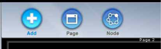
6.2.1 Add widget
The ‘Add’ icon is used to add a new widget into the page. We can select one of the
widget from three categories.
Once a widget is selected, we need to select an associated device. Each widget will
define a filter so that only compatible devices will be displayed. For example, if the
button widget is selected, only button devices will be listed. If no button device is
available, we can select no associated device to create a widget without associated
device.
6.2.2 Move and resize widget
Once the widget is added into the page, we can use mouse to drag it to any place in
the same page. In addition, we can use the resize point in the right bottom corner of
the selected frame.
The behavior of the resize is defined by the widget. Most widget will scale its content
to fit the new size. However, some content, such as text, will not scale its content.
Usually, all text will not be scaled. If we want to scale the font, please use the style
property to adjust the size of the font.
6.2.3 Edit widget
Each widget will define a couple of properties. This function will show a content menu
for each widget. We can double-click the widget to display this menu as well.
Please refer to the next chapter for the definition of the properties of every widgets.
6.2.4 Change the associate node
Each widget may be associated with one node or device in the node viewer. The
renderer of the widget can show different UI according to the status of the associated
node. For example, the number widget will change the number according to the
associated node, such as the temperature of the temperature node.
Please choice Node->Change node to access this function.
When this function is chosen, all eligible nodes will be listed. Each widgets can define
their criteria to filter eligible nodes.
6.2.5 Edit widget properties
This function will display a widget property menu. The content and layout of this
screen is different for different widgets. Please refer to the individual widget document
for the details.
6.2.6 Delete widget
Delete the current selected widget or widgets.
6.2.7 Duplicate widget
Duplicate the current selected widget or widgets.
6.2.8 Copy the widget
Copy the current selected widget or widgets into the widgets pool.
6.2.9 Paste the widget
Paste the widget or widgets in the widget pool into the current page.
6.3 Page
The page menu allows us to change the page properties and manage the page set as
well. It is available in the page section.
6.3.1 Switch to another page
Press this option will bring a menu to list all available pages in the current page set.
We can choice one of them and then the select page will be displayed in the
workspace.
6.3.2 Add new page
Add a new page from the template.
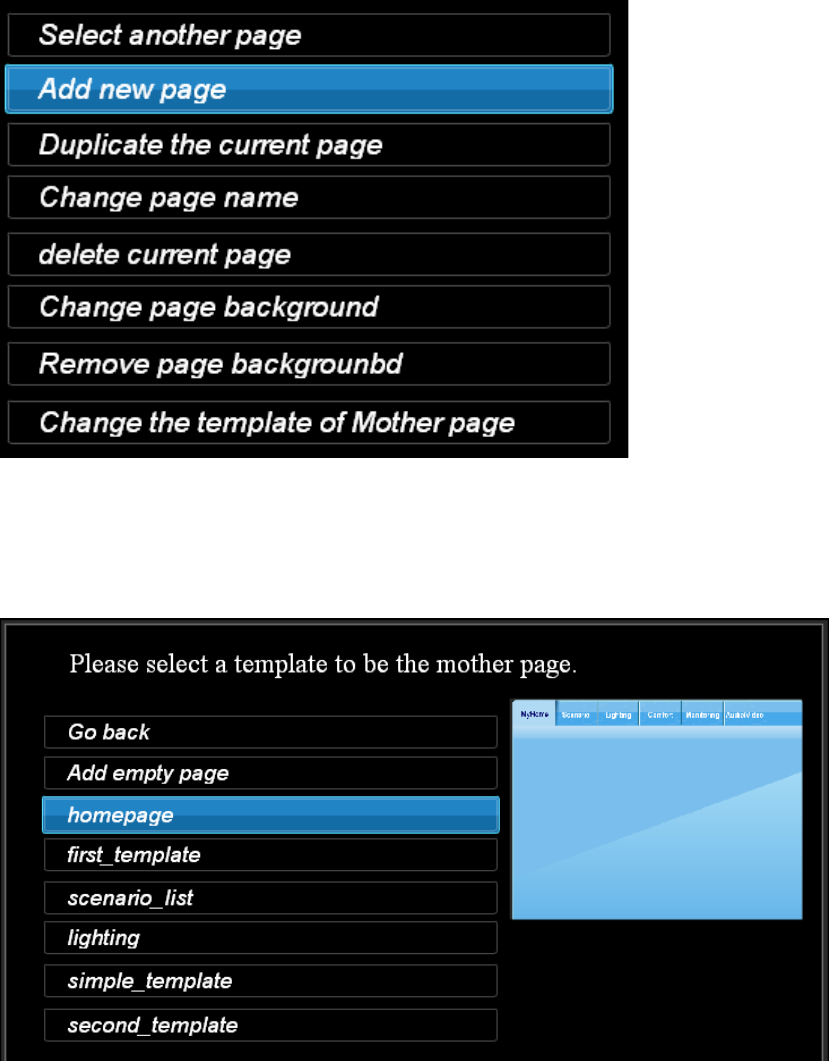
A list of page template will be listed.
We can create new template by using the “Save as page template”. However, we can
not assign the page preview as the builtin ones yet. This future will be implemented in
the future version of the page composer.
After you select a template, a new page will be created according to the template.
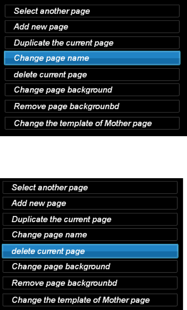
6.3.3 Change page name
Change the title of the current page.
6.3.4 Delete current page
Delete the current page.
6.3.5 Change page background
Change the background of the current page.
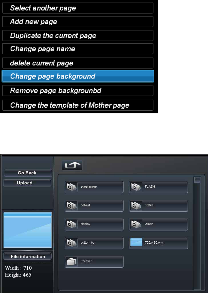
In this function, a file manager is used to select a new background image.
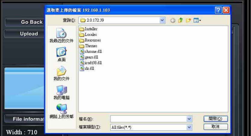
If we want to upload a new image, the ‘Upload’ button will allow us to upload a new
image from the computer to the HSC-200.
6.3.6 Change the template of the mother page
Select a template for the mother page. This function may remove/add some widgets
in the mother page. It will delete all widgets added from the previous template.
6.3.7 Save as page template
Save the current page as a page template. This is useful for installer to design their
own template so that they can reuse it in the future projects.
6.3.8 Manage Page Set
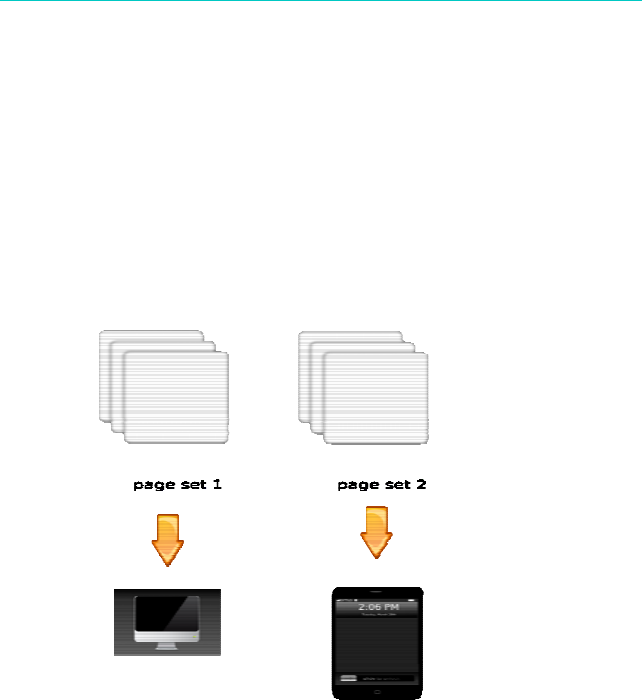
HSC-200 can define multiple page set for different users or HMI devices. For example,
we can define a simple interface with common features for your father and mother and
define another pageee set with full function for yourself.
Change page set
Change the current page set.
New page set
Create a new page set.
Please remember to save the page set after it is created.
Delete page set
Delete the current page set.
Rename page set
Rename the current page set.
The name of each page set must be unique. Otherwise, the old one will be deleted
without notification.
Export page set
We can export the designed page set so that it can be reused in other project in the
future.
Import page set
We can import some existing page designs. This is very useful for the installer to
design a couple of page template.
6.3.9 Show/Hide Mother page
Hide/Show the mother page for the current page. This is used in page we don’t want
to show the content of the mother page. If we still need some contents from the
mother page, we should copy and paste them from the mother page.
6.4 Save project
Save the current page set. Since the page compose is executing in the browser, it is a
good idea to save the editing result periodically.
6.5 Context menu
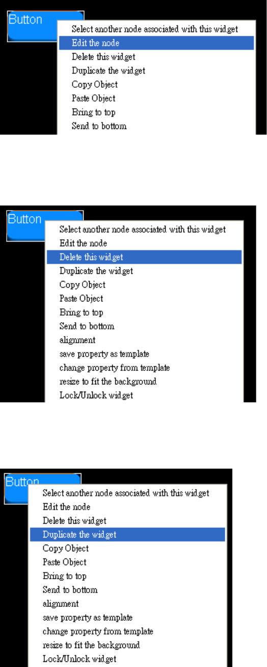
6.5.1 Select another node associated with widget
Change the associated scenario node of the widget.
6.5.2 Edit the node
Edit the property of the selected widget.
6.5.3 Delete widget
Delete all selected widget.
6.5.4 Duplicate widget
Duplicate all selected widget.
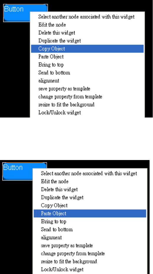
6.5.5 Copy Obejct
Copy all selected widget.
6.5.6 Paste Object
Paste all widgets in the copy buffer to the workspace.
6.5.7 Bring to top
Bring all selected widgets to the top of other widgets.
6.5.8 Send to bottom
Put all selected widgets to be lower than other widgets.
6.5.9 Alignment
This function will show the alignment menu in the top of the screen.
6.5.10 Save property as template
Save the property of the current widgets as template. This is useful to change the
property of other widgets latter.
6.5.11 Change property from template
This function will apply the previous saved widget template to any widget. Please
remember that each widget may reject some properties since it does not make sense
to copy it usually. For example, the title is not copied in most widgets. In general, the
background, text color, text position and font style will be applied in all widgets.
6.6 Status bar
The status bar provides convenient tools to adjust the location of size of widgets. It
can help us to input precise number of coordinate and size of widgets. The status bar
can be minimized if it blocks any widgets.

6.6.1 Adjust widget
When we change the value of the x,y,w,h in the status bar, it will be used to change
the location and size of the selected widgets. These parameters will be applied
immediately.
6.7 Test the pages
This function will simulate the page viewer to look at the current page set. In this
function, we can send the real signal out to trigger the scenarios or devices.
6.8 HTML Viewer
For devices without flash support, we can use the HTML viewer instead. The HTML
viewer is implemented according to the Flash widgets. However, it will not 100% the
same as the Flash widgets because of some limitation.
They should looks similar enough for most application. Please use the following URL
to access the HTML viewer of the pages.
http://xxx.xxx.xxx.xxx/swfgui/mypage.html?pageno=1
6.8.1 Vieweing pages in the iPod touch or iPhone
In the iPod touch or iPhone, we can use the following procedure to generate an
application icon for it.
1. Open Safari
2. Input the above URL or we can use the portal URL
http://portal.homescenario.com/IPOD. This page will require to input an account
and password. And use this user to get the real URL of the HTML page.
3. Click the ‘+’ icon to enter the bookmark screen.
4. Select the ‘Add to Home Screen’.
5. Change the name of the icon to be ‘My Pages’.
Chapter 7 Widgets for the page
composer
7.1 Introduction
Widget is the basic drawing unit of the page composer. A page contain one
background and a couple of widgets. Each widget has a few properties, such as text
color, text position, title, font style and etc.
The widgets can be divided into three categories. The button widget is a clickable unit
which has one or two buttons inside it. We can click any button to send a signal out so
that the CORE can react according to the defined scenarios. We have four different
button widgets.
z The Page button is used to switch to different pages.
z The remote button is used to control a IRDA remote controller node.
z The switch has two buttons for on and off inside it.
z The button is a generic button which can be attached to any scene key pad or
UIButton.
The display category is used to display the status of the widgets,
z The status widget can display different images and titles for different states.
z The alarm widget is a bi-state status widget, which can display image and title for
Boolean-type state of a node.
z The digital number display can display an Int-Type state up to three digitals.
Graphics is a static widget which does not attached to any node.
z Text widget is used to display a static text.
z Current clock time widget is used to display the current time.
z Image display widget is used to display a built-in image or an image from an
internet URL.
z HTML widget is used to display an HTML page. This widget can be used to
display the generic web page. It is typically useful for the IPCAM or DVR
integration.
In the rest of this chapter, we will explain every widget in details.
7.2 Background image
Most widgets allow us to define background images for different states. We can show
one image when the Position of the node is ‘on’ and show another one when it is in
‘off’ state. These images can be static image as GIF.JPG or PNG. In addition, we can
use the SWF file as background image as well.
The SWF can provide animated background. Actually, it can be another full-featured
flash application, such as weather or news widgets. The SWF can access the
information of the widget by using the _parent to refer the widget. The _parent.Node
can be used to access the associated node as well. For example, we can use
‘_parent.Node.States.Position’ to get the Position state variable of the associated
node. We can different images according to the state of the node.
7.3 Page switch button
The page switch button is used to switch between different pages generated by the
page composer. When users click on the page button, the screen will load the new
page.
In the node property menu, we can change the associated page by clicking the ‘Select
another page’ item. All pages will be listed.
The page switch button is composed of
z One normal background image
z One click background image
z One title: The name of the associated page.
We can hide background or the title in the setting page.
The page switch button is often used at the mother page so that users can click them
to switch between all pages. However, we can use them to switch back and forth
between two pages as well.
7.3.1 Add a page switch button
7.3.2 Setting page of the page switch
In the setting page, we have the following options.
z Change the normal background
z Change the click background
z Hide background or title
z Change text color
z Change font
z Change text position
Change the background
[snapshot here]
This option allows us to change the background of the page switch. You can use the
file manager to pick the image. The page switch widget will scale the image to fit the
defined size. However, it’s better to keep the original size for the performance and
quality issue.
Please refer to the file manager section for the usage of the file manager.
Hide background or title
The page switch allow us to disable title or background individually. If both are
disabled, this widget will become invisible. However, it will still capture the mouse
events. This is useful to define a click area around the buttons in the background.
Change text colot
[snapshot here]
The color of the title can be changed here.
Change font
The font used to show the title can be changed here.
Change text position
This option can change the location of the title in the widget. You can set the location
manually or select the align left/right/up/down/center for both vertically and
horizontally.
7.3.3 Use SWF file as background
The page switch widget can accept the SWF file as the background. Under this mode,
the SWF will be loaded as MovieClip bg in the page switch widget. Therefore, you can
access all variables and functions defined in the widget. The following is a list which
you may be interesting. The complete list is available in the page widget authoring
guide.
z _parent.Node
z _parent.Click()
Call this function will switch to the page defined by the page composer.
7.4 Text widget
The text widget will display a text string. We can change its color, size, font family,
bold, italic and underline.
The text widget can be connected to a Node with text state. In this case, the content
will become the value of the state variable.
7.5 Remote widget
The remote widget is used to send a IRDA signal out when it is clicked. The
background of the widget can be changed.
7.5.1 Change background image
Change the background of the remote button.
7.5.2 Remove background image
Remove the background image.
7.5.3 Change text color
Change the color of the text.
7.5.4 Change text position
Change the location of the text.
7.5.5 Change text style
Change the text font.
7.6 Current clock widget
The current clock widget will display the current time. We will display the value of the
onboard RTC. Please adjust the time in the system setting.
7.6.1 Change the time zone
We can change the current time zone here.
7.6.2 Change the clock style
7.7 Image widget
The image widget will display an image. The image can be from the built-in storage or
from an internet URL. The widget can reload the image according to the ‘reload
interval’ setting. Therefore, we can use it to display real-time JPEG image generated
by the webcam or IPCam.
7.7.1 Setup Image Path
7.7.2 Setup reload interval
7.8 Alarm widget
The alarm widget is used by the contact or motion sensor. It is actually a status widget.
However, it will list only the sensor nodes. In addition, this widget will blink the
background image while it is in active mode. If you don’t want this feature, please use
the status widget instead.
7.9 Switch widget
The switch widget will display three images, the on image, the off image and the
background image. Both on image and the off image have two states. Therefore, we
can define up to five different images for the switch widget.
Each switch widget is composed of two buttons. The button in the top is called on
button and the button in the bottom is called off button.
Each button has two associated images for normal and click state as the usual button
widget. There is totally four images.
7.9.1 Change normal background for on
Select an image which will be displayed in the on button while it is in normal state.
7.9.2 Change click background for on
Select an image which will be displayed in the on button while it is in click state.
7.9.3 Change normal background for off
Select an image which will be displayed in the off button while it is in normal state.
7.9.4 Change click background for off
Select an image which will be displayed in the off button while it is in click state.
7.9.5 Hide/Show the title
Show/hide the title of the switch.
7.9.6 Change the text color
Change the color of the title.
7.9.7 Change the text color and position
Change the text position of the title. The location is realted to the origin of the top
button.
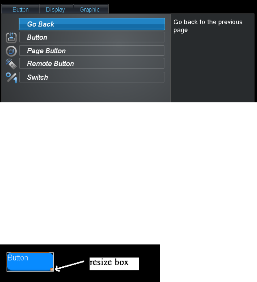
7.10 Button widget
The button widget will display image, title and send actions when it is pressed and
released. It does not have on and off state like the switch image. It is usually used with
the scene button or the virtual button node.
Normal background This image is displayed when the button is not pressed by
the user.
Click background This is image is displayed when the button is clicked by
the users.
Title This title is display by using the font define by the below
properties.
Font style The font family/size/style.
Text color and position The color and position of the title related to the origin of
the background image.
7.10.1 Change normal/click background
This property can change the normal or click image of the button.
7.10.2 Show/Hide the title
This property can control if the title is displayed or not.
7.10.3 Show/Hide the background
This property can control if the background is displayed or not.
7.10.4 Change the text color
This property can control the color of the text.
7.10.5 Change text position
This property can control the location of the title in the button.
7.11 HTML widget
The HTML widget can display any HTML page inside a the area occupied by the
widget. This widget can accept a block of HTML codes or an URL started by http://.
If an URL is specified, the entire page is put inside an iframe tag. The width and height
of the iframe is set to be the width and height of the widget.
If a code block is input, it means that the setting is not started by ‘http://’, the HTML
code block will be put inside a div tag. This is useful for the widget from internet sites,
such as Google or Yahoo.
7.11.1 Change the URL

The Edit URL option can be used to input an URL or HTML code block. Please
remember that the URL must start by ‘http://’. The RTSP or other URL will not be
supported.
7.11.2 Support IPCAM
Most IPCAM has a special link which display the video inside a small window so that
users can put multiple IPCAM in a single page easily. Please try to figure it out from
the user manual or local support staff. Once you have the link, input it in the Edit URL
and the IPCAM is integrated into the user’s page easily.
Please remember that the widget can not scale the image. When you resize the
widget, it change the visible area only. If the size of the widget is larger than the image
size, it will show empty area. If the widget size is smaller, it will short portion of the
image only.
Currently, there is no way to define offset for the image. You must do it in the HTML
layer.
7.11.3 Support Motion JPEG video in iPhone/iPod
The browser in the iPhone/iPod/Andriod can support Motion JPEG video under
progressive download mode. Therefore, we can use the following code block in the
HTML widget.
<img src=”http://192.168.0.139:8080/?action=stream”>
For D-link DCS-3410, you can use the following code block

<img src=”http://http://192.168.0.139/video/mjpg.cgi?profileid=3”>
7.11.4 Support Yahoo widgets
7.11.5 Support Google widgets
7.12 Write a new custom widget
The page composer allows users to upload their own widgets. This section will explain
the design and implementation of the page composer widget in details.
7.12.1 Structure of the widgets
Each widgets need to put declaration script in the first frame.
The following variables must be defined in this section.
tag:
Description: The details multiline description.
Title: The title of the widget which will be used as title of the widget list.
videourl: The video URL of the video which explain this widget. Users can
access it via the video button below the description of the widget.

Argument: It is an object that contains parameters specific to this widget. It
will be serialized as in the page XML. The widget can use it to store any
data. Currently, only simple type, such as string, integer, boolean’ are
supported.
Each widget need to support Four modes.
z icon mode: It should be an 40x30 icon.
z inactive mode: This mode is used in the editor mode. It should not handle any
events at all. All user function must be disabled. However, the outlook should be
as close to the ui mode as possible.
z ui mode: This is used in the viewer. It must provide all user facility and call
HSCORE if it is necessary.
z setting mode: This is the property editor for the widgets. It is usually used to
change the look and feel of the widgets.
Every widget needs to implement the setMode to switch between the above modes.
7.12.2 The size of the widget
A widget can be resized to any size to fit the screen design. The widget must define its
original size in the first frame. The page composer will use the _width and _height to
get the size of the widget and then draw the select frame of it if it is necessary.
Therefore, the widget must define its original size in the first frame.
This may not an issue for static widgets. However, if widgets needs to load extra stuff
into the stage dynamically, please scale it into the range defined by the original size.
Otherwise, the select frame will become incorrect.
Usually, Each widget will define a original size and then create an pseudo content of
the defined size. For example, the following codes will create a widget whose original
size is (100,50).
var stagte = this.createEmptyMovieClip(‘stage’, 0);
stage.beginFill(0);
stage.lineTo(100,0);stage.lineTo(100,50);stage.lineTo(0,50);stage.lineTo(0,0);
If we load an background dynamically, we must be very carefully to make sure it will
not exceed the (0,0) to (100,50).
bg = this.createEmptyMovieClip(‘bg’,1);
lis = new Object();
lis.onLoadInit=function(target) {
target._width=100;
target._height=50;
}
loader.addListener(lis);
var o = bg.createEmptyMovieClip(‘pic’,0);
load.loadClip(‘xxxxxx’, o);
In the above example, when we load an image file, we will resize it to (100,50) so that
it will fit into the nature size.
Chapter 8 System utilities
The system section provides functions to check the current status of the controller
itself.
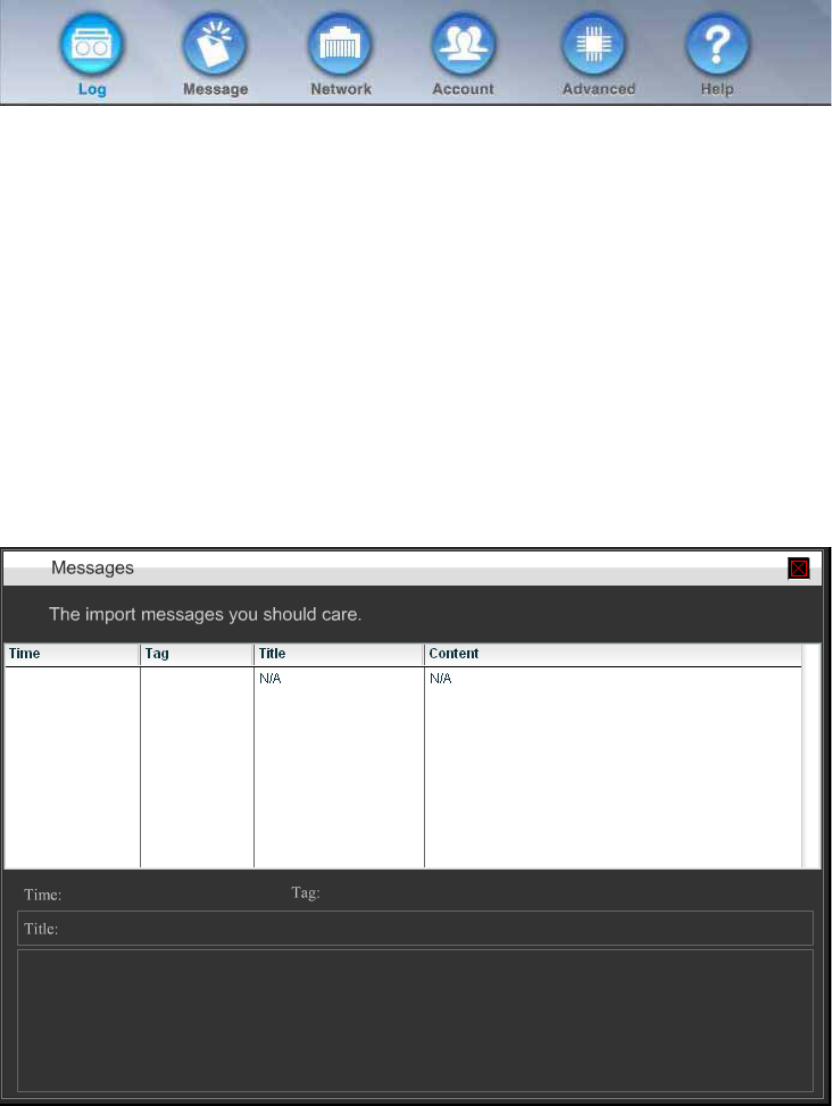
8.1 Log
The HSC will log some important system status and notification here. If we suspect
there is something happen, we can check the log to see more details.
8.2 Message
The message contains some important events, which need user attentation. When we
enter the setup screen, a message box will be shown if there is any unread
messages.
Installer can put a special virtual system node which will has message state. We can
use this state to display some UI or send SMS in the scenario.
8.3 Network
In this page, the network information will be displayed.
8.4 Account
In the account section, we can configure the password of user and installer account.
The installer account is disabled by default. When we want to let installer check our
system, we can enable the installer account here. In addition, for customers which
does not know how to use browser to enter setup mode. We can ask them to press
the maintainse button and then press the pin code on the touch button panel in the top
of the device to enable the installer account.
8.5 Advanced
In the advanced section, we put some rare to use functions for the end users here. In
this section, we can
z Change the system time
z Reboot the system
z Shutdown the system
z Download the current settings
z Restore the previous saved settings
z Reset to the factory default value.
z Z-wave maintainse function.
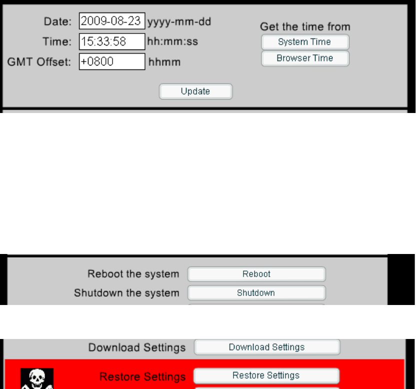
8.5.1 System time
The HSC-200 has builtin RTC. The time can be adjusted from the Advanced menu
within the system section.
We can input the time manually or get the time from the browser or HSC-200. The
update button will save this time to the RTC.
8.5.2 Reboot and shutdown the system
8.5.3 backup/restore setting
This function can save the all of the current settings including
z Nodes
z Scenarios
z Profiles
z User Pages
z Upload Images
z Zwave node information
z IR learning data
to a local file, which can be restored latter.
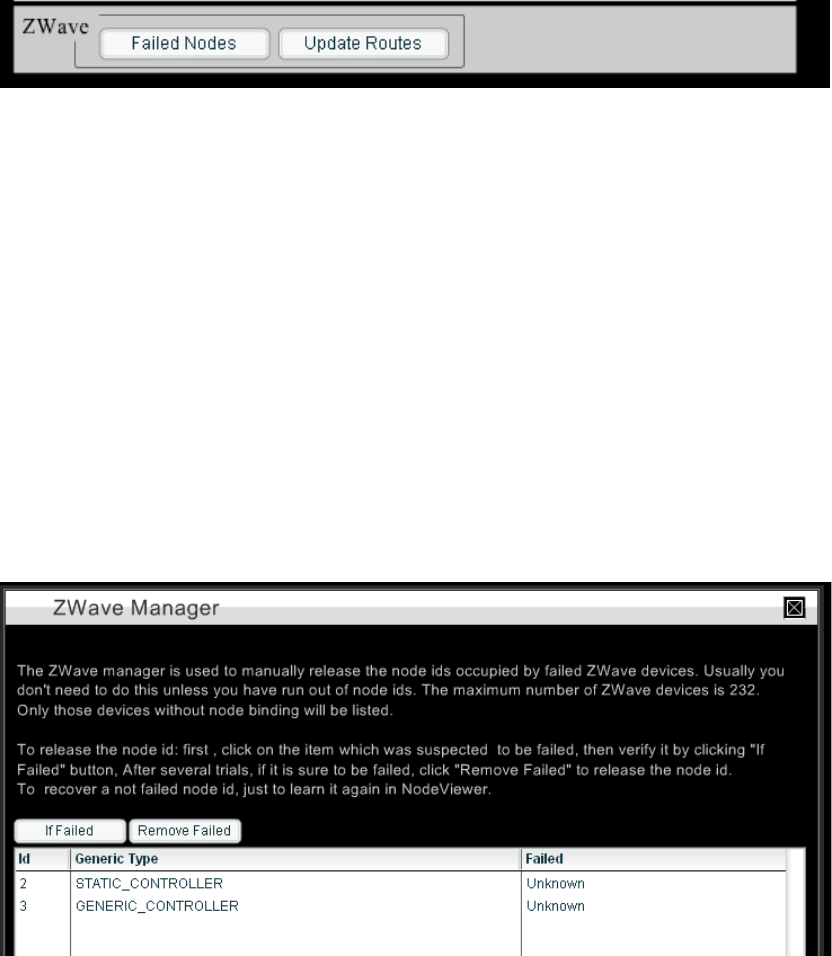
8.5.4 Delete failed nodes
The failed node button is used to manage unused Z-wave nodes. When we delete a
node from the node viewer, it will not delete the node from Z-wave network
automatically since delete a Z-wave node need to touch the physical button on the
Z-wave devices.
We can delete a node from Z-wave network from any Z-wave device learning page.
However, it the device is broken or missing, there is no way to delete it. The failed
nodes button can help us to delete it from the Z-wave directly.
After we click this button, we will see
We can select any device and then click the “If Failed” button. The Failed field of the
device will become Failed if it is not available in the Z-wave network. In this situation,
we can use “Remove Failed” button to delete it. If the device is available, the Z-wave
controller will not allow us to delete the device here. We need to go through the
normal “remove from the network” function to delete the Z-wave devices.
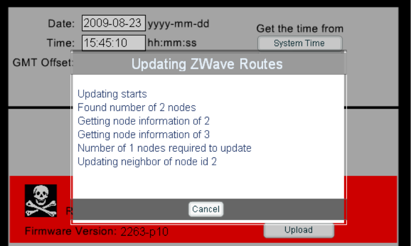
The Update Routes is used to update the routing table of all devices in the Z-wave
network according to the current situation. It will flood the Z-wave network so that the
Z-wave network will not work for a while. Please use it with cation.
We can cancel the operation by click the Cancel button at any time. In the end of the
process, a report will tell us the situation.
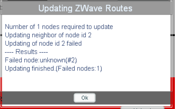
In the case, there is one failed node, which can not be access from any node.

Chapter 9 Access from the internet
HSC-200 can allow users to access it from the internet. For security reason, the
internet access is disabled by default. It can be enabled from the preference menu.
The internet access wizard inside the preference menu will guide us to setup internet
access account to access this device.
9.1 Enable the internet access
The internet access can be enabled by the ‘internet access wizard’. This wizard will do
the following job for us.
z Detect the internet gateway.
z Setup the port forwarding rule.
z Detect the existence of internet access.
z Ask users to pick a name for your HSC-200.
After this procedure, we should be able to access the HSC-200 via an URL, such as
http://portal.casaiq.com/myhome.
The myhome is the name of your HSC-200. Usually, the HSC-200 will update its IP
address to the portal every minute. If the information in not updated, the above link will
report an error page instead.
9.2 Internet access wizard
9.2.1 Detect the internet gateway
The HSC-200 will get its IP from the DHCP server. If this is impossible for you, please
contact the professional installer to setup the IP for you.
If HSC-200 can not contact the portal site www.casaiq.com, it will report this error to
you. Please check your internet configuration and click the retry button.

9.2.2 Setup the forwarding rule
If you have UPnP compatible router, this step will be done automatically. Otherwise,
a manual setup screen will help you to setup the router. If you are not familiar with this
procedure, please contact the professional installer to do this job for you. The UI will
give you all information about the forwarding rule.
For professional installer, you need to either enable the UPnP service in the router or
setup a forwarding rule for the HSC-200. The external port is 2280 and the internal
port is 2280 as well. Please remember to setup your router to assign the same IP to
the HSC-200 every if you choice to setup a static port forwarding rule since it won’t
work if the IP of the HSC-200 changed.
If the port forwarding rule is not setup properly, you will see different error message
when you access it from http://portal.casaiq.com/myhome. Please refer to the
appendix for the complete list of error message.
9.2.3 Check the existence of internet
In this step, the HSC-200 will contact the portal site and determine the status of the
internet access. If the port forwarding is not setup properly, it will warn you to change
it.
9.2.4 Setup an account
Till now, your HSC-200 can be accessed from the internet directly. Setup an account
in the portal can help you to access the HSC-200 more easily. The wizard will ask you
to input an account name and a password. The portal will help you to access solve
many routing issue of HSC-200.
9.2.5 Generate access USB drive
In this step, we can optionally create an USB drive which can access the HSC-200.
When you insert the USB into a PC, it will execute the browser to connect to the
HSC-200 automatically. If you disable the autorun for security issue. Please execute
the starthsc icon in the USB drive.

This equipment has been tested and found to comply with the limits for a class
B digital device, pursuant to part 15 of the FCC rules. These limits are
designed to provide to provide reasonable protection against harmful
interference in a residential installation. This equipment generates, uses and
can radiate radio frequency energy and, if not installed and used in
accordance with the installation. , May cause harmful interference to radio
communication. However, there is no guarantee that interference
Will not occur in a particular installation. if this equipment does cause harmful
interference to radio or television reception, which can be determined by
turning the equipment off and on, the user is encouraged to try to correct the
interference by one or more of the following measures:
-Reorient or relocate the receiving antenna
-Increase the separation between the equipment and receiver
-Connect the equipment into an outlet on a circuit different from that to which
the receiver is connected
-Consult the dealer or an experienced radio / TV technician for help
You are cautioned that changes or modifications not expressly approved by
the party responsible for compliance could void your authority to operate the
equipment.
FCC RF radiation exposure statement:
This device complies with part 15 of the FCC rules. Operation is subject to the following two conditions
(1)This device may not cause harmful interference and
(2)This device must accept any interference received, including interference that may cause undesired
operation
1.this transmitter must not be co-located or operating in conjunction with any other antenna or transmitter .
2.this equipment complies with FCC RF radiation exposure limits ser forth for an uncontrolled environment. This
equipment should be installed and operated with a minimum distance of 20 centimeters between the radiator and
your body .