CSS: The Definitive Guide OReilly.CSS.The.Definitive.Guide.4th.Edition.2017.10
CSS%20The%20Definitive%20Guide%2C%204th%20Edition
css-definitive-guide-4th
CSS%20The%20Definitive%20Guide%2C%204th%20Edition
CSS%20The%20Definitive%20Guide%2C%204th%20Edition
User Manual: Pdf
Open the PDF directly: View PDF  .
.
Page Count: 1088 [warning: Documents this large are best viewed by clicking the View PDF Link!]
- Cover
- Copyright
- Table of Contents
- Preface
- Chapter 1. CSS and Documents
- Chapter 2. Selectors
- Chapter 3. Specificity and the Cascade
- Chapter 4. Values and Units
- Chapter 5. Fonts
- Chapter 6. Text Properties
- Chapter 7. Basic Visual Formatting
- Basic Boxes
- Altering Element Display
- Inline Elements
- Line Layout
- Basic Terms and Concepts
- Inline Formatting
- Inline Nonreplaced Elements
- Building the Boxes
- Vertical Alignment
- Managing the line-height
- Scaling Line Heights
- Adding Box Properties
- Changing Breaking Behavior
- Glyphs Versus Content Area
- Inline Replaced Elements
- Adding Box Properties
- Replaced Elements and the Baseline
- Inline-Block Elements
- Flow Display
- Contents Display
- Other Display Values
- Computed Values
- Summary
- Chapter 8. Padding, Borders, Outlines, and Margins
- Chapter 9. Colors, Backgrounds, and Gradients
- Chapter 10. Floating and Shapes
- Chapter 11. Positioning
- Chapter 12. Flexible Box Layout
- Flexbox Fundamentals
- Flex Containers
- Arranging Flex Items
- Flex Container
- Justifying Content
- Aligning Items
- The align-self Property
- Aligning Content
- Flex Items
- Flex-Item–Specific Properties
- The flex Property
- The flex-grow Property
- The flex-shrink Property
- The flex-basis Property
- The flex Shorthand
- The order property
- Chapter 13. Grid Layout
- Chapter 14. Table Layout in CSS
- Chapter 15. Lists and Generated Content
- Chapter 16. Transforms
- Chapter 17. Transitions
- Chapter 18. Animation
- Chapter 19. Filters, Blending, Clipping, and Masking
- Chapter 20. Media-Dependent Styles
- Appendix A. Animatable Properties
- Appendix B. Basic Property Reference
- Appendix C. Color Equivalence Table
- Index
- About the Authors
- Colophon

Eric A. Meyer & Estelle Weyl
CSS
The Definitive Guide
VISUAL PRESENTATION FOR THE WEB
4th Edition
Eric A. Meyer and Estelle Weyl
CSS: The Denitive Guide
Visual Presentation for the Web
FOURTH EDITION
Boston Farnham Sebastopol Tokyo
Beijing Boston Farnham Sebastopol Tokyo
Beijing
978-1-449-39319-9
[M]
CSS: The Denitive Guide
by Eric A. Meyer and Estelle Weyl
Copyright © 2018 Eric Meyer, Estelle Weyl. All rights reserved.
Printed in the United States of America.
Published by O’Reilly Media, Inc., 1005 Gravenstein Highway North, Sebastopol, CA 95472.
O’Reilly books may be purchased for educational, business, or sales promotional use. Online editions are
also available for most titles (http://oreilly.com/safari). For more information, contact our corporate/insti‐
tutional sales department: 800-998-9938 or corporate@oreilly.com.
Editor: Meg Foley
Production Editors: Colleen Lobner and Colleen Cole
Proofreader: Amanda Kersey
Indexer: Angela Howard
Interior Designer: David Futato
Cover Designer: Karen Montgomery
Illustrator: Rebecca Demarest
November 2017: Fourth Edition
Revision History for the Fourth Edition
2000-05-01: First Release
2004-03-01: Second Release
2006-11-01: Third Release
2017-10-10: Fourth Release
See http://oreilly.com/catalog/errata.csp?isbn=9781449393199 for release details.
The O’Reilly logo is a registered trademark of O’Reilly Media, Inc. CSS: e Denitive Guide, the cover
image, and related trade dress are trademarks of O’Reilly Media, Inc.
While the publisher and the authors have used good faith efforts to ensure that the information and
instructions contained in this work are accurate, the publisher and the authors disclaim all responsibility
for errors or omissions, including without limitation responsibility for damages resulting from the use of
or reliance on this work. Use of the information and instructions contained in this work is at your own
risk. If any code samples or other technology this work contains or describes is subject to open source
licenses or the intellectual property rights of others, it is your responsibility to ensure that your use
thereof complies with such licenses and/or rights.
To Kat, Carolyn, Rebecca, and Joshua.
—E.M.
To Amie.
—E.W.

Table of Contents
Preface. . . . . . . . . . . . . . . . . . . . . . . . . . . . . . . . . . . . . . . . . . . . . . . . . . . . . . . . . . . . . . . . . . . . . . xix
1. CSS and Documents. . . . . . . . . . . . . . . . . . . . . . . . . . . . . . . . . . . . . . . . . . . . . . . . . . . . . . . . . . 1
A Brief History of (Web) Style 1
Elements 3
Replaced and Nonreplaced Elements 3
Element Display Roles 3
Bringing CSS and HTML Together 7
The link Tag 8
The style Element 12
The @import Directive 13
HTTP Linking 14
Inline Styles 15
Stylesheet Contents 16
Markup 16
Rule Structure 16
Vendor prefixing 17
Whitespace Handling 18
CSS Comments 19
Media Queries 20
Usage 20
Simple Media Queries 21
Media Types 21
Media Descriptors 22
Media Feature Descriptors and Value Types 24
Feature Queries 25
Summary 28
v

2. Selectors. . . . . . . . . . . . . . . . . . . . . . . . . . . . . . . . . . . . . . . . . . . . . . . . . . . . . . . . . . . . . . . . . . 29
Basic Style Rules 29
Element Selectors 30
Declarations and Keywords 31
Grouping 33
Grouping Selectors 34
Grouping Declarations 35
Grouping Everything 37
New Elements in Old Browsers 38
Class and ID Selectors 38
Class Selectors 39
Multiple Classes 41
ID Selectors 43
Deciding Between Class and ID 44
Attribute Selectors 45
Simple Attribute Selectors 45
Selection Based on Exact Attribute Value 46
Selection Based on Partial Attribute Values 48
A Particular Attribute Selection Type 48
The Case Insensitivity Identifier 53
Using Document Structure 54
Understanding the Parent-Child Relationship 54
Descendant Selectors 56
Selecting Children 59
Selecting Adjacent Sibling Elements 60
Selecting Following Siblings 62
Pseudo-Class Selectors 63
Combining Pseudo-Classes 63
Structural Pseudo-Classes 64
Dynamic Pseudo-Classes 76
UI-State Pseudo-Classes 81
The :target Pseudo-Class 87
The :lang Pseudo-Class 88
The Negation Pseudo-Class 89
Pseudo-Element Selectors 92
Styling the First Letter 92
Styling the First Line 93
Restrictions on ::first-letter and ::first-line 94
Styling (or Creating) Content Before and After Elements 95
Summary 95
vi | Table of Contents

3. Specicity and the Cascade. . . . . . . . . . . . . . . . . . . . . . . . . . . . . . . . . . . . . . . . . . . . . . . . . . 97
Specificity 97
Declarations and Specificity 99
Universal Selector Specificity 101
ID and Attribute Selector Specificity 101
Inline Style Specificity 101
Importance 102
Inheritance 103
The Cascade 106
Sorting by Weight and Origin 107
Sorting by Specificity 108
Sorting by Order 109
Non-CSS Presentational Hints 111
Summary 111
4. Values and Units. . . . . . . . . . . . . . . . . . . . . . . . . . . . . . . . . . . . . . . . . . . . . . . . . . . . . . . . . . 113
Keywords, Strings, and Other Text Values 113
Keywords 113
Strings 116
URLs 117
Images 119
Identifiers 119
Numbers and Percentages 119
Integers 120
Numbers 120
Percentages 120
Fractions 121
Distances 121
Absolute Length Units 121
Resolution Units 124
Relative Length Units 125
Calculation values 130
Attribute Values 131
Color 132
Named Colors 132
Colors by RGB and RGBa 133
Colors by HSL and HSLa 138
Color Keywords 141
Angles 142
Time and Frequency 143
Position 143
Custom Values 144
Table of Contents | vii

5. Fonts. . . . . . . . . . . . . . . . . . . . . . . . . . . . . . . . . . . . . . . . . . . . . . . . . . . . . . . . . . . . . . . . . . . . 149
Font Families 149
Using Generic Font Families 151
Specifying a Font Family 152
Using @font-face 154
Required Descriptors 155
Other Font Descriptors 160
Combining Descriptors 163
Font Weights 166
How Weights Work 167
Getting Bolder 170
Lightening Weights 172
The font-weight descriptor 173
Font Size 174
Absolute Sizes 175
Relative Sizes 177
Percentages and Sizes 178
Font Size and Inheritance 179
Using Length Units 182
Automatically Adjusting Size 183
Font Style 185
The font-style Descriptor 187
Font Stretching 188
The font-stretch Descriptor 190
Font Kerning 191
Font Variants 192
Level 3 Values 193
Font Features 195
The font-feature-settings Descriptor 197
Font Synthesis 197
The font Property 199
Adding the Line Height 201
Using Shorthands Properly 202
Using System Fonts 202
Font Matching 203
Summary 205
6. Text Properties. . . . . . . . . . . . . . . . . . . . . . . . . . . . . . . . . . . . . . . . . . . . . . . . . . . . . . . . . . . 207
Indentation and Inline Alignment 207
Indenting Text 208
Text Alignment 211
Aligning the Last Line 215
viii | Table of Contents

Inline Alignment 216
The Height of Lines 216
Vertically Aligning Text 220
Word Spacing and Letter Spacing 226
Word Spacing 226
Letter Spacing 228
Spacing and Alignment 229
Text Transformation 230
Text Decoration 232
Weird Decorations 234
Text Rendering 236
Text Shadows 237
Handling Whitespace 239
Setting Tab Sizes 242
Wrapping and Hyphenation 243
Wrapping Text 248
Writing Modes 249
Setting Writing Modes 249
Changing Text Orientation 253
Declaring Direction 254
Summary 256
7. Basic Visual Formatting. . . . . . . . . . . . . . . . . . . . . . . . . . . . . . . . . . . . . . . . . . . . . . . . . . . . 257
Basic Boxes 257
A Quick Refresher 258
The Containing Block 259
Altering Element Display 260
Changing Roles 261
Block Boxes 263
Horizontal Formatting 265
Horizontal Properties 266
Using auto 268
More Than One auto 269
Negative Margins 270
Percentages 272
Replaced Elements 273
Vertical Formatting 274
Vertical Properties 275
Percentage Heights 276
Auto Heights 278
Collapsing Vertical Margins 279
Negative Margins and Collapsing 281
Table of Contents | ix

List Items 283
Inline Elements 285
Line Layout 285
Basic Terms and Concepts 287
Inline Formatting 289
Inline Nonreplaced Elements 290
Building the Boxes 290
Vertical Alignment 293
Managing the line-height 295
Scaling Line Heights 297
Adding Box Properties 298
Changing Breaking Behavior 301
Glyphs Versus Content Area 302
Inline Replaced Elements 303
Adding Box Properties 304
Replaced Elements and the Baseline 305
Inline-Block Elements 308
Flow Display 310
Contents Display 312
Other Display Values 312
Computed Values 313
Summary 313
8. Padding, Borders, Outlines, and Margins. . . . . . . . . . . . . . . . . . . . . . . . . . . . . . . . . . . . . . 315
Basic Element Boxes 315
Width and Height 316
Padding 318
Replicating Values 320
Single-Side Padding 322
Percentage Values and Padding 323
Padding and Inline Elements 325
Padding and Replaced Elements 327
Borders 328
Borders with Style 329
Border Widths 333
Border Colors 337
Shorthand Border Properties 339
Global Borders 341
Borders and Inline Elements 342
Rounding Border Corners 344
Image Borders 352
Outlines 369
x | Table of Contents

Outline Styles 370
Outline Width 371
Outline Color 372
How They Are Different 374
Margins 375
Length Values and Margins 377
Percentages and Margins 378
Single-Side Margin Properties 379
Margin Collapsing 379
Negative Margins 381
Margins and Inline Elements 383
Summary 385
9. Colors, Backgrounds, and Gradients. . . . . . . . . . . . . . . . . . . . . . . . . . . . . . . . . . . . . . . . . . 387
Colors 387
Foreground Colors 388
Affecting Borders 390
Affecting Form Elements 391
Inheriting Color 392
Backgrounds 392
Background Colors 393
Clipping the Background 396
Background Images 399
Background Positioning 404
Changing the Positioning Box 414
Background Repeating (or Lack Thereof) 417
Getting Attached 428
Sizing Background Images 433
Bringing It All Together 442
Multiple Backgrounds 444
Gradients 450
Linear Gradients 451
Radial Gradients 466
Manipulating Gradient Images 478
Repeating Gradients 481
Box Shadows 485
Summary 488
10. Floating and Shapes. . . . . . . . . . . . . . . . . . . . . . . . . . . . . . . . . . . . . . . . . . . . . . . . . . . . . . . 489
Floating 489
Floated Elements 490
Floating: The Details 492
Table of Contents | xi

Applied Behavior 499
Floats, Content, and Overlapping 503
Clearing 504
Float Shapes 508
Creating a Shape 509
Shaping with Image Transparency 521
Adding a Shape Margin 522
Summary 524
11. Positioning. . . . . . . . . . . . . . . . . . . . . . . . . . . . . . . . . . . . . . . . . . . . . . . . . . . . . . . . . . . . . . . 525
Basic Concepts 525
Types of Positioning 525
The Containing Block 526
Offset Properties 527
Width and Height 530
Setting Width and Height 530
Limiting Width and Height 532
Content Overflow and Clipping 534
Overflow 534
Element Visibility 536
Absolute Positioning 537
Containing Blocks and Absolutely Positioned Elements 537
Placement and Sizing of Absolutely Positioned Elements 540
Auto-edges 541
Placing and Sizing Nonreplaced Elements 543
Placing and Sizing Replaced Elements 547
Placement on the Z-Axis 550
Fixed Positioning 553
Relative Positioning 555
Sticky Positioning 557
Summary 561
12. Flexible Box Layout. . . . . . . . . . . . . . . . . . . . . . . . . . . . . . . . . . . . . . . . . . . . . . . . . . . . . . . . 563
Flexbox Fundamentals 563
A Simple Example 565
Flex Containers 569
The flex-direction Property 570
Other Writing Directions 574
Wrapping Flex Lines 576
Defining Flexible Flows 578
flex-wrap Continued 584
Arranging Flex Items 586
xii | Table of Contents

Flex Container 587
Justifying Content 587
justify-content Examples 594
Aligning Items 596
Start, End, and Center Alignment 599
Baseline Alignment 601
Additional Notes 602
The align-self Property 602
Aligning Content 604
Flex Items 609
What Are Flex Items? 609
Flex Item Features 611
Minimum Widths 613
Flex-Item–Specific Properties 614
The flex Property 614
The flex-grow Property 616
Growth Factors and the flex Property 619
The flex-shrink Property 623
Proportional Shrinkage Based on Width and Shrink Factor 626
Differing Bases 628
Responsive Flexing 630
The flex-basis Property 633
The content Keyword 634
Automatic Flex Basis 635
Default Values 636
Length Units 637
Zero Basis 642
The flex Shorthand 643
Common Flex Values 643
The order property 648
Tabbed Navigation Revisited 650
13. Grid Layout. . . . . . . . . . . . . . . . . . . . . . . . . . . . . . . . . . . . . . . . . . . . . . . . . . . . . . . . . . . . . . . 655
Creating a Grid Container 655
Basic Grid Terminology 658
Placing Grid Lines 660
Fixed-Width Grid Tracks 662
Flexible Grid Tracks 666
Fitting Track Contents 674
Repeating Grid Lines 676
Grid Areas 680
Attaching Elements to the Grid 686
Table of Contents | xiii

Using Column and Row Lines 687
Row and Column Shorthands 692
The Implicit Grid 694
Error Handling 697
Using Areas 698
Grid Item Overlap 701
Grid Flow 702
Automatic Grid Lines 708
The grid Shorthand 710
Subgrids 713
Opening Grid Spaces 714
Grid Gutters (or Gaps) 714
Grid Items and the Box Model 716
Aligning and Grids 721
Aligning and Justifying Individual Items 722
Aligning and Justifying All Items 723
Layering and Ordering 727
Summary 729
14. Table Layout in CSS. . . . . . . . . . . . . . . . . . . . . . . . . . . . . . . . . . . . . . . . . . . . . . . . . . . . . . . . 731
Table Formatting 731
Visually Arranging a Table 731
Table Display Values 733
Anonymous Table Objects 738
Table Layers 742
Captions 744
Table Cell Borders 745
Separated Cell Borders 746
Collapsing Cell Borders 749
Table Sizing 754
Width 755
Height 761
Alignment 762
Summary 766
15. Lists and Generated Content. . . . . . . . . . . . . . . . . . . . . . . . . . . . . . . . . . . . . . . . . . . . . . . . 767
Lists 767
Types of Lists 768
List Item Images 771
List-Marker Positions 774
List Styles in Shorthand 775
List Layout 776
xiv | Table of Contents

Generated Content 779
Inserting Generated Content 780
Specifying Content 783
Counters 788
Defining Counting Patterns 796
Fixed Counting Patterns 798
Cyclic Counting Patterns 800
Symbolic Counting Patterns 803
Alphabetic Counting Patterns 806
Numeric Counting Patterns 807
Additive Counting Patterns 812
Extending Counting Patterns 814
Speaking Counting Patterns 815
Summary 817
16. Transforms. . . . . . . . . . . . . . . . . . . . . . . . . . . . . . . . . . . . . . . . . . . . . . . . . . . . . . . . . . . . . . . 819
Coordinate Systems 819
Transforming 823
The Transform Functions 827
More Transform Properties 841
Moving the Origin 842
Choosing a 3D Style 845
Changing Perspective 847
Dealing with Backfaces 852
Summary 854
17. Transitions. . . . . . . . . . . . . . . . . . . . . . . . . . . . . . . . . . . . . . . . . . . . . . . . . . . . . . . . . . . . . . . 855
CSS Transitions 855
Transition Properties 857
Limiting Transition Effects by Property 861
Setting Transition Duration 867
Altering the Internal Timing of Transitions 869
Delaying Transitions 875
The transition Shorthand 878
In Reverse: Transitioning Back to Baseline 880
Animatable Properties and Values 884
How Property Values Are Interpolated 885
Fallbacks: Transitions Are Enhancements 888
Printing Transitions 889
18. Animation. . . . . . . . . . . . . . . . . . . . . . . . . . . . . . . . . . . . . . . . . . . . . . . . . . . . . . . . . . . . . . . . 891
Defining Keyframes 892
Table of Contents | xv

Setting Up Keyframe Animations 893
Naming Your Animation 894
Keyframe Selectors 894
Omitting from and to Values 895
Repeating Keyframe Properties 897
Animatable Properties 897
Nonanimatable Properties That Aren’t Ignored 899
Scripting @keyframes Animations 899
Animating Elements 900
Naming Animations 901
Defining Animation Lengths 904
Declaring Animation Iterations 905
Setting an Animation Direction 907
Delaying Animations 909
Animation Events 911
Changing the Internal Timing of Animations 920
Setting the Animation Play State 932
Animation Fill Modes 933
Bringing It All Together 935
Animation, Specificity, and Precedence Order 939
Specificity and !important 939
Animation Order 939
Animation Iteration and display: none; 940
Animation and the UI Thread 940
Seizure and Vestibular Disorders 941
Animation Events and Prefixing 942
animationstart 942
animationend 942
animationiteration 943
Printing Animations 943
19. Filters, Blending, Clipping, and Masking. . . . . . . . . . . . . . . . . . . . . . . . . . . . . . . . . . . . . . 945
CSS Filters 945
Basic Filters 946
Color Filtering 948
Brightness, Contrast, and Saturation 949
SVG Filters 951
Compositing and Blending 952
Blending Elements 952
Darken, Lighten, Difference, and Exclusion 953
Multiply, Screen, and Overlay 955
Hard and Soft Light 956
xvi | Table of Contents

Color Dodge and Burn 957
Hue, Saturation, Luminosity, and Color 959
Blending Backgrounds 960
Blending in Isolation 963
Clipping and Masking 964
Clipping 965
Clip Shapes 966
Clip Boxes 967
Clip Filling Rules 970
Masks 971
Defining a Mask 972
Changing the Mask’s Mode 974
Sizing and Repeating Masks 976
Positioning Masks 979
Clipping and Compositing Masks 980
Bringing It All Together 984
Mask Types 985
Border-image Masking 986
Object Fitting and Positioning 987
20. Media-Dependent Styles. . . . . . . . . . . . . . . . . . . . . . . . . . . . . . . . . . . . . . . . . . . . . . . . . . . 991
Defining Media-Dependent Styles 991
Basic Media Queries 991
Complex Media Queries 994
Paged Media 1002
Print Styles 1002
Summary 1016
A. Animatable Properties. . . . . . . . . . . . . . . . . . . . . . . . . . . . . . . . . . . . . . . . . . . . . . . . . . . . 1017
B. Basic Property Reference. . . . . . . . . . . . . . . . . . . . . . . . . . . . . . . . . . . . . . . . . . . . . . . . . . 1025
C. Color Equivalence Table. . . . . . . . . . . . . . . . . . . . . . . . . . . . . . . . . . . . . . . . . . . . . . . . . . . 1035
Index. . . . . . . . . . . . . . . . . . . . . . . . . . . . . . . . . . . . . . . . . . . . . . . . . . . . . . . . . . . . . . . . . . . . . . 1039
Table of Contents | xvii

Preface
If you are a web designer or document author interested in sophisticated page styling,
improved accessibility, and saving time and effort, this book is for you. All you really
need to know before starting the book is HTML 4.0. The better you know HTML, the
better prepared you’ll be, but it is not a requirement. You will need to know very little
else to follow this book.
This fourth edition of the book was finished in mid-2017 and does its best to reflect
the state of CSS at that time. The assumption is that anything covered in detail either
had wide browser support at the time of writing or was known to be coming soon
after publication. CSS features which were still being developed, or were known to
have support dropping soon, are not covered here.
Conventions Used in This Book
The following typographical conventions are used in this book (but make sure to read
through the subsection “Value Syntax Conventions” on page xx to see how some of
these are modified):
Italic
Indicates new terms, URLs, email addresses, filenames, and file extensions.
Constant width
Used for program listings, as well as within paragraphs to refer to program ele‐
ments such as variable or function names, databases, data types, environment
variables, statements, and keywords.
Constant width bold
Shows commands or other text that should be typed literally by the user.
Constant width italic
Shows text that should be replaced with user-supplied values or by values deter‐
mined by context.
xix
This element signifies a tip or suggestion.
This element signifies a general note.
This element indicates a warning or caution.
Value Syntax Conventions
Throughout this book, there are boxes that break down a given CSS property’s details,
including what values are permitted. These have been reproduced practically verba‐
tim from the CSS specifications, but some explanation of the syntax is in order.
Throughout, the allowed values for each property are listed with a syntax like the fol‐
lowing:
Value: <family-name>#
Value: <url> ‖ <color>
Value: <url>? <color> [ / <color> ]?
Value: [ <length> | thick | thin ]{1,4}
Any italicized words between “<” and “>” give a type of value, or a reference to
another property’s values. For example, the property font accepts values that origi‐
nally belong to the property font-family. This is denoted by using the text <font-
family>. Similarly, if a value type like a color is permitted, it will be represented using
<color>.
Any words presented in constant width are keywords that must appear literally,
without quotes. The forward slash (/) and the comma (,) must also be used literally.
There are a number of ways to combine components of a value definition:
•Two or more keywords strung together with only space separating them means
that all of them must occur in the given order. For example, help me would mean
that the property must use those keywords in that order.
xx | Preface

•If a vertical bar separates alternatives (X | Y), then any one of them must occur,
but only one. Given “[ X | Y | Z ]”, then any one of X, Y, or Z is permitted.
•A vertical double bar (X ‖ Y) means that X, Y, or both must occur, but they may
appear in any order. Thus: X, Y, X Y, and Y X are all valid interpretations.
•A double ampersand (X && Y) means both X and Y must occur, though they
may appear in any order. Thus: X Y or Y X are both valid interpretations.
•Brackets ([…]) are for grouping things together. Thus “[please ‖ help ‖ me] do
this” means that the words please, help, and me can appear in any order,
though each appear only once. do this must always appear, with those words in
that order. Some examples: please help me do this, help me please do
this, me please help do this.
Every component or bracketed group may (or may not) be followed by one of these
modifiers:
•An asterisk (*) indicates that the preceding value or bracketed group is repeated
zero or more times. Thus, “bucket*” means that the word bucket can be used
any number of times, including zero. There is no upper limit defined on the
number of times it can be used.
•A plus (+) indicates that the preceding value or bracketed group is repeated one
or more times. Thus, “mop+” means that the word mop must be used at least once,
and potentially many more times.
•An octothorpe (#) indicates that the preceding value or bracketed group is
repeated one or more times, separated by commas as needed. Thus, “floor#” can
be floor, floor, floor, floor, and so on. This is most often used in conjunc‐
tion with bracketed groups or value types.
•A question mark (?) indicates that the preceding value or bracketed group is
optional. For example, “[pine tree]?” means that the words pine tree need not
be used (although they must appear in that order if they are used).
•An exclamation point (!) indicates that the preceding value or bracketed group is
required, and thus must result in at least one value, even if the syntax would seem
to indicate otherwise. For example, “[ what? is? happening? ]!” must be at least
one of the three terms marked optional.
•A pair of numbers in curly braces ({M,N}) indicates that the preceding value or
bracketed group is repeated at least M and at most N times. For example, ha{1,3}
means that there can be one, two, or three instances of the word ha.
Preface | xxi

The following are some examples:
give ‖ me ‖ liberty
At least one of the three words must be used, and they can be used in any order.
For example, give liberty, give me, liberty me give, and give me liberty
are all valid interpretations.
[ I | am ]? the ‖ walrus
Either the word I or am may be used, but not both, and use of either is optional.
In addition, either the or walrus, or both, must follow in any order. Thus you
could construct I the walrus, am walrus the, am the, I walrus, walrus the,
and so forth.
koo+ ka-choo
One or more instances of koo must be followed by ka-choo. Therefore koo koo
ka-choo, koo koo koo ka-choo, and koo ka-choo are all legal. The number of
koos is potentially infinite, although there are bound to be implementation-
specific limits.
I really{1,4}? [ love | hate ] [ Microsoft | Netscape | Opera | Safari | Chrome ]
The all-purpose web designer’s opinion-expresser. This can be interpreted as I
love Netscape, I really love Microsoft, and similar expressions. Anywhere
from zero to four reallys may be used, though they may not be separated by
commas. You also get to pick between love and hate, which really seems like
some sort of metaphor.
It’s a [ mad ]# world
This gives the opportunity to put in as many comma-separated mads as possible,
with a minimum of one mad. If there is only one mad, then no comma is added.
Thus: It’s a mad world and It’s a mad, mad, mad, mad, mad world are
both valid results.
[ [ Alpha ‖ Baker ‖ Cray ], ]{2,3} and Delphi
Two to three of Alpha, Baker, and Delta must be followed by and Delphi. One
possible result would be Cray, Alpha, and Delphi. In this case, the comma is
placed because of its position within the nested bracket groups. (Some older ver‐
sions of CSS enforced comma-separation this way, instead of via the # modifier.)
Using Code Examples
Whenever you come across an icon that looks like , it means there is an associated
code example. Live examples are available at https://meyerweb.github.io/csstdg4gs/. If
you are reading this book on a device with an internet connection, you can click the
icon to go directly to a live version of the code example referenced.
xxii | Preface

Supplemental material—in the form of the HTML, CSS, and image files that were
used to produce nearly all of the figures in this book—is available for download at
https://github.com/meyerweb/csstdg4gs. Please be sure to read the repository’s
README.md file for any notes regarding the contents of the repository.
This book is here to help you get your job done. In general, if example code is offered
with this book, you may use it in your programs and documentation. You do not
need to contact us for permission unless you’re reproducing a significant portion of
the code. For example, writing a program that uses several chunks of code from this
book does not require permission. Selling or distributing a CD-ROM of examples
from O’Reilly books does require permission. Answering a question by citing this
book and quoting example code does not require permission. Incorporating a signifi‐
cant amount of example code from this book into your product’s documentation does
require permission.
We appreciate, but do not require, attribution. An attribution usually includes the
title, author, publisher, and ISBN. For example: “CSS: e Denitive Guide by Eric A.
Meyer and Estelle Weyl (O’Reilly). Copyright 2018 Eric Meyer, Estelle Weyl,
978-1-449-39319-9.”
If you feel your use of code examples falls outside fair use or the permission given
above, feel free to contact us at permissions@oreilly.com.
O’Reilly Safari
Safari (formerly Safari Books Online) is a membership-based
training and reference platform for enterprise, government,
educators, and individuals.
Members have access to thousands of books, training videos, Learning Paths, interac‐
tive tutorials, and curated playlists from over 250 publishers, including O’Reilly
Media, Harvard Business Review, Prentice Hall Professional, Addison-Wesley Profes‐
sional, Microsoft Press, Sams, Que, Peachpit Press, Adobe, Focal Press, Cisco Press,
John Wiley & Sons, Syngress, Morgan Kaufmann, IBM Redbooks, Packt, Adobe
Press, FT Press, Apress, Manning, New Riders, McGraw-Hill, Jones & Bartlett, and
Course Technology, among others.
For more information, please visit http://oreilly.com/safari.
Preface | xxiii

How to Contact Us
Please address comments and questions concerning this book to the publisher:
O’Reilly Media, Inc.
1005 Gravenstein Highway North
Sebastopol, CA 95472
800-998-9938 (in the United States or Canada)
707-829-0515 (international or local)
707-829-0104 (fax)
We have a web page for this book, where we list errata, examples, and any additional
information. You can access this page at http://bit.ly/css-the-denitive-guide-4e.
To comment or ask technical questions about this book, send email to bookques‐
tions@oreilly.com.
For more information about our books, courses, conferences, and news, see our web‐
site at http://www.oreilly.com.
Find us on Facebook: http://facebook.com/oreilly
Follow us on Twitter: http://twitter.com/oreillymedia
Watch us on YouTube: http://www.youtube.com/oreillymedia
Acknowledgments
Eric Meyer
This edition was one of the most challenging projects I’ve ever undertaken, for both
technical and personal reasons, and I was helped immeasurably along the way by so
many people. I’ll do my best to remember everyone, but if I left you out, I am sorry.
To the creators of CSS, Håkon Wium Lie and Bert Bos, thank you for your foresight.
The web would be a much poorer place without your work.
To the implementors at various browser makers who have done so much, and come
so far together, thank you making so many things possible.
To git, the version-control software, my thanks for the last-minute rescue when it was
discovered that an entire chapter (“Lists and Generated Content”) had gone missing,
but was easily restored from past commits.
Special thanks are due to Simon St. Laurent, who believed in my ideas for releasing a
book one chapter at a time, who kept the project waiting for me when I had to take an
xxiv | Preface

extended period of time away, and who worked tirelessly with me to move things for‐
ward in whatever way I proposed.
To my co-author, Estelle, for stepping up to help me out when I needed it, for your
keen reviewers’ eye, and for your wonderful contributions to this edition, all my grati‐
tude.
A number of other people helped me understand CSS when it didn’t make sense to
me, often going several rounds of explanation. Some of them go back a few editions,
but most of them helped me adjust to the new patterns in CSS for this edition. Alpha‐
betically, by last name: Rachel Andrew, Rossen Atanossov, Tab Atkins, Amelia
Bellamy-Royds, Dave Cramer, Elika Etemad, Jen Simmons, Sara Soueidan, Mel
Sumner, and Greg Whitworth. My abject apologies to anyone I left off by oversight.
To the whole community of web designers and developers who stood with me
through the hardest passage I have ever known, friends and colleagues and strangers
alike, I owe you more than I could ever say. In some ways, I owe you my life. Thank
you for hearing me.
And to my family—my wife Kat, and my children Carolyn, Rebecca, and Joshua—you
are the home that shelters me, the suns in my sky and the stars by which I steer. I
could never have come this far without you. Thank you for everything.
—Eric A. Meyer
Cleveland Heights, OH
19 July 2017
Estelle Weyl
I would like to acknowledge everyone who has worked to make CSS what it is today
and all those who have helped improve diversity and inclusion in tech.
I would like to recognize those who work tirelessly with browser vendors and devel‐
opers in writing the CSS specifications. Without the members of the CSS Working
Group—past, current, and future—we would have no specifications, no standards,
and no cross-browser compatibility. I am in awe of the thought process that goes into
every CSS property and value added to, and omitted from, the specification. People
like Tab Atkins, Elika Emitad, Dave Baron, Léonie Watson, and Greg Whitworth not
only work on the specification, but also take their time to answer questions and
explain nuances to the broader CSS public, notably me.
I also want to acknowledge all those who, whether they participate in the CSS Work‐
ing Group or not, dive deep into CSS features and help translate the spec for the rest
of us, including Sarah Drasner, Val Head, Sara Souidan, Chris Coyier, Jen Simmons,
and Rachel Andrew. In addition, I want to acknowledge and thank people who create
Preface | xxv

tools that make all CSS developers lives easier, especially Alexis Deveria for creating
and maintaining https://caniuse.com/.
I would also like to acknowledge and express my appreciation of all those who have
contributed their time and effort to improve diversity and inclusion in all sectors of
the developer community. Yes, CSS is awesome. But it’s important to work with great
people in a great community.
When I attended my first tech conference in 2007, the lineup was 93% male and 100%
white. The audience had slightly less gender diversity and only slightly more ethnic
diversity. I had actually picked that conference because the lineup was more diverse
than most: it actually had a woman on it. Looking around the room, I knew things
needed to change, and I realized it was something I needed to do. What I didn’t real‐
ize then was how many unsung heroes I would meet over the next 10 years working
for diversity and inclusion in all areas of the tech sector and life in general.
There are too many people who work tirelessly, quietly, and often with little or no
recognition to name them all, but I would like to highlight some. I can not express
how much of a positive impact people like Erica Stanley of Women Who Code
Atlanta, Carina Zona of Callback Women, and Jenn Mei Wu of Oakland Maker Space
have had. Groups like The Last Mile, Black Girls Code, Girls Incorporated, Sisters
Code, and so many others inspired me to create a list at http://www.standardista.com/
feeding-the-diversity-pipeline/ to help ensure the path to a career in web development
is not only for those with privilege.
Thank you to all of you. Thank you to everyone. Thanks to all of your efforts, more
has been done than I ever could have imagined sitting in that conference 10 years
ago.
—Estelle Weyl
Palo Alto, CA
July 19, 2017
xxvi | Preface

CHAPTER 1
CSS and Documents
Cascading Style Sheets (CSS) is a powerful tool that transforms the presentation of a
document or a collection of documents, and it has spread to nearly every corner of
the web and into many ostensibly non-web environments. For example, Gecko-based
browsers use CSS to affect the presentation of the browser chrome itself, many RSS
clients let you apply CSS to feeds and feed entries, and some instant message clients
use CSS to format chat windows. Aspects of CSS can be found in the syntax used by
JavaScript frameworks, and even in JavaScript itself. It’s everywhere!
A Brief History of (Web) Style
CSS was first proposed in 1994, just as the web was beginning to really catch on. At
the time, browsers gave all sorts of styling power to the user—the presentation prefer‐
ences in Mosaic, for example, permitted all manner of font family, size, and color to
be defined by the user on a per-element basis. None of this was available to document
authors; all they could do was mark a piece of content as a paragraph, as a heading of
some level, as preformatted text, or one of a handful of other element types. If a user
configured his browser to make all level-one headings tiny and pink and all level-six
headings huge and red, well, that was his lookout.
It was into this milieu that CSS was introduced. Its goal was to provide a simple,
declarative styling language that was flexible for authors and, most importantly, pro‐
vided styling power to authors and users alike. By means of the “cascade,” these styles
could be combined and prioritized so that both authors and readers had a say—
though readers always had the last say.
Work quickly advanced, and by late 1996, CSS1 was finished. While the newly estab‐
lished CSS Working Group moved forward with CSS2, browsers struggled to imple‐
ment CSS1 in an interoperable way. Although each piece of CSS was fairly simple on
1

its own, the combination of those pieces created some surprisingly complex behav‐
iors. There were also some unfortunate missteps in early implementations, such as
the infamous discrepancy in box model implementations. These problems threatened
to derail CSS altogether, but fortunately some clever proposals were implemented,
and browsers began to harmonize. Within a few years, thanks to increasing intero‐
perability and high-profile developments such as the CSS-based redesign of Wired
magazine and the CSS Zen Garden, CSS began to catch on.
Before all that happened, though, the CSS Working Group had finalized the CSS2
specification in early 1998. Once CSS2 was finished, work immediately began on
CSS3, as well as a clarified version of CSS2 called CSS2.1. In keeping with the spirit of
the times, CSS3 was constructed as a series of (theoretically) standalone modules
instead of a single monolithic specification. This approach reflected the then-active
XHTML specification, which was split into modules for similar reasons.
The rationale for modularizing CSS3 was that each module could be worked on at its
own pace, and particularly critical (or popular) modules could be advanced along the
W3C’s progress track without being held up by others. Indeed, this has turned out to
be the case. By early 2012, three CSS3 modules (along with CSS1 and CSS 2.1) had
reached full Recommendation status—CSS Color Level 3, CSS Namespaces, and
Selectors Level 3. At that same time, seven modules were at Candidate Recommenda‐
tion status, and several dozen others were in various stages of Working Draft-ness.
Under the old approach, colors, selectors, and namespaces would have had to wait for
every other part of the specification to be done or cut before they could be part of a
completed specification. Thanks to modularization, they didn’t have to wait.
The flip side of that advantage is that it’s hard to speak of a single “CSS3 specification.”
There isn’t any such thing, nor can there be. Even if every other CSS module had
reached level 3 by, say, late 2016 (they didn’t), there was already a Selectors Level 4 in
process. Would we then speak of it as CSS4? What about all the “CSS3” features still
coming into play? Or Grid Layout, which had not then even reached Level 1?
So while we can’t really point to a single tome and say, “There is CSS3,” we can talk of
features by the module name under which they are introduced. The flexibility mod‐
ules permit more than makes up for the semantic awkwardness they sometimes cre‐
ate. (If you want something approximating a single monolithic specification, the CSS
Working Group publishes yearly “Snapshot” documents.)
With that established, we’re almost ready to start understanding CSS. First though, we
must go over markup.
2 | Chapter 1: CSS and Documents

Elements
Elements are the basis of document structure. In HTML, the most common elements
are easily recognizable, such as p, table, span, a, and div. Every single element in a
document plays a part in its presentation.
Replaced and Nonreplaced Elements
Although CSS depends on elements, not all elements are created equally. For exam‐
ple, images and paragraphs are not the same type of element, nor are span and div. In
CSS, elements generally take two forms: replaced and nonreplaced.
Replaced elements
Replaced elements are those where the element’s content is replaced by something that
is not directly represented by document content. Probably the most familiar HTML
example is the img element, which is replaced by an image file external to the docu‐
ment itself. In fact, img has no actual content, as you can see in this simple example:
<img src="howdy.gif" >
This markup fragment contains only an element name and an attribute. The element
presents nothing unless you point it to some external content (in this case, an image
specified by the src attribute). If you point to a valid image file, the image will be
placed in the document. If not, it will either display nothing or the browser will show
a “broken image” placeholder.
Similarly, the input element is also replaced—by a radio button, checkbox, or text
input box, depending on its type.
Nonreplaced elements
The majority of HTML elements are nonreplaced elements. This means that their con‐
tent is presented by the user agent (generally a browser) inside a box generated by the
element itself. For example, <span>hi there</span> is a nonreplaced element, and
the text “hi there” will be displayed by the user agent. This is true of paragraphs,
headings, table cells, lists, and almost everything else in HTML.
Element Display Roles
In addition to replaced and nonreplaced elements, CSS uses two other basic types of
elements: block-level and inline-level. There are many more display types, but these
are the most basic, and the types to which most if not all other display types refer. The
block and inline types will be familiar to authors who have spent time with HTML
markup and its display in web browsers. The elements are illustrated in Figure 1-1.
Elements | 3
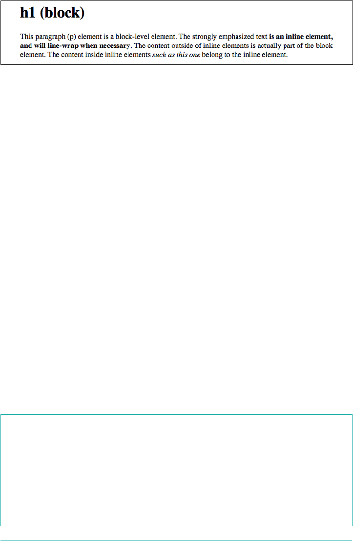
Figure 1-1. Block- and inline-level elements in an HTML document
Block-level elements
Block-level elements generate an element box that (by default) fills its parent element’s
content area and cannot have other elements at its sides. In other words, it generates
“breaks” before and after the element box. The most familiar block elements from
HTML are p and div. Replaced elements can be block-level elements, but usually they
are not.
List items are a special case of block-level elements. In addition to behaving in a man‐
ner consistent with other block elements, they generate a marker—typically a bullet
for unordered lists and a number for ordered lists—that is “attached” to the element
box. Except for the presence of this marker, list items are in all other ways identical to
other block elements.
Inline-level elements
Inline-level elements generate an element box within a line of text and do not break up
the flow of that line. The best inline element example is the a element in HTML.
Other candidates are strong and em. These elements do not generate a “break” before
or after themselves, so they can appear within the content of another element without
disrupting its display.
Note that while the names “block” and “inline” share a great deal in common with
block- and inline-level elements in HTML, there is an important difference. In
HTML, block-level elements cannot descend from inline-level elements. In CSS, there
is no restriction on how display roles can be nested within each other.
To see how this works, let’s consider a CSS property, display.
display
Values [ <display-outside> ‖ <display-inside> ] | <display-listitem> | <display-internal> |
<display-box> | <display-legacy>
Denitions See below
Initial value inline
Applies to All elements
4 | Chapter 1: CSS and Documents
Computed value As specied
Inherited No
Animatable No
<display-outside>
block | inline | run-in
<display-inside>
flow | flow-root | table | flex | grid | ruby
<display-listitem>
list-item && <display-outside>? && [ flow | flow-root ]?
<display-internal>
table-row-group | table-header-group | table-footer-group | table-row |
table-cell | table-column-group | table-column | table-caption | ruby-base
| ruby-text | ruby-base-container | ruby-text-container
<display-box>
contents | none
<display-legacy>
inline-block | inline-list-item | inline-table | inline-flex | inline-grid
You may have noticed that there are a lot of values, only three of which I’ve even
come close to mentioning: block, inline, and list-item. Most of these values will
be dealt with elsewhere in the book; for example, grid and inline-grid will be cov‐
ered in a separate chapter about grid layout, and the table-related values are all cov‐
ered in a chapter on CSS table layout.
For now, let’s just concentrate on block and inline. Consider the following markup:
<body>
<p>This is a paragraph with <em>an inline element</em> within it.</p>
</body>
Here we have two block elements (body and p) and an inline element (em). According
to the HTML specification, em can descend from p, but the reverse is not true. Typi‐
cally, the HTML hierarchy works out so that inlines descend from blocks, but not the
other way around.
CSS, on the other hand, has no such restrictions. You can leave the markup as it is but
change the display roles of the two elements like this:
p {display: inline;}
em {display: block;}
Elements | 5
This causes the elements to generate a block box inside an inline box. This is perfectly
legal and violates no part of CSS. You would, however, have a problem if you tried to
reverse the nesting of the elements in HTML:
<em><p>This is a paragraph improperly enclosed by an inline element.</p></em>
No matter what you do to the display roles via CSS, this is not legal in HTML.
While changing the display roles of elements can be useful in HTML documents, it
becomes downright critical for XML documents. An XML document is unlikely to
have any inherent display roles, so it’s up to the author to define them. For example,
you might wonder how to lay out the following snippet of XML:
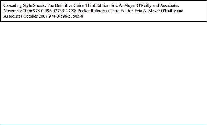
<book>
<maintitle>Cascading Style Sheets: The Definitive Guide</maintitle>
<subtitle>Third Edition</subtitle>
<author>Eric A. Meyer</author>
<publisher>O'Reilly and Associates</publisher>
<pubdate>November 2006</pubdate>
<isbn type="print">978-0-596-52733-4</isbn>
</book>
<book>
<maintitle>CSS Pocket Reference</maintitle>
<subtitle>Third Edition</subtitle>
<author>Eric A. Meyer</author>
<publisher>O'Reilly and Associates</publisher>
<pubdate>October 2007</pubdate>
<isbn type="print">978-0-596-51505-8</isbn>
</book>
Since the default value of display is inline, the content would be rendered as inline
text by default, as illustrated in Figure 1-2. This isn’t a terribly useful display.
Figure 1-2. Default display of an XML document
You can define the basics of the layout with display:
book, maintitle, subtitle, author, isbn {display: block;}
publisher, pubdate {display: inline;}
We’ve now set five of the seven elements to be block and two to be inline. This means
each of the block elements will be treated much as div is treated in HTML, and the
two inlines will be treated in a manner similar to span.
This fundamental ability to affect display roles makes CSS highly useful in a variety of
situations. We could take the preceding rules as a starting point, add a few other styles
for greater visual impact, and get the result shown in Figure 1-3.
6 | Chapter 1: CSS and Documents
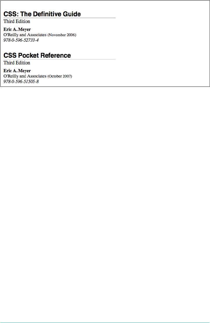
Figure 1-3. Styled display of an XML document
Before learning how to write CSS in detail, we need to look at how one can associate
CSS with a document. After all, without tying the two together, there’s no way for the
CSS to affect the document. We’ll explore this in an HTML setting since it’s the most
familiar.
Bringing CSS and HTML Together
I’ve mentioned that HTML documents have an inherent structure, and that’s a point
worth repeating. In fact, that’s part of the problem with web pages of old: too many of
us forgot that documents are supposed to have an internal structure, which is alto‐
gether different than a visual structure. In our rush to create the coolest-looking
pages on the web, we bent, warped, and generally ignored the idea that pages should
contain information with some structural meaning.
That structure is an inherent part of the relationship between HTML and CSS;
without it, there couldn’t be a relationship at all. To understand it better, let’s look at
an example HTML document and break it down by pieces:
<html>
<head>
<title>Eric's World of Waffles</title>
<meta http-equiv="content-type" content="text/html; charset=utf-8">
<link rel="stylesheet" type="text/css" href="sheet1.css" media="all">
<style type="text/css">
/* These are my styles! Yay! */
@import url(sheet2.css);
</style>
</head>
<body>
<h1>Waffles!</h1>
<p style="color: gray;">The most wonderful of all breakfast foods is
the waffle—a ridged and cratered slab of home-cooked, fluffy goodness
Bringing CSS and HTML Together | 7
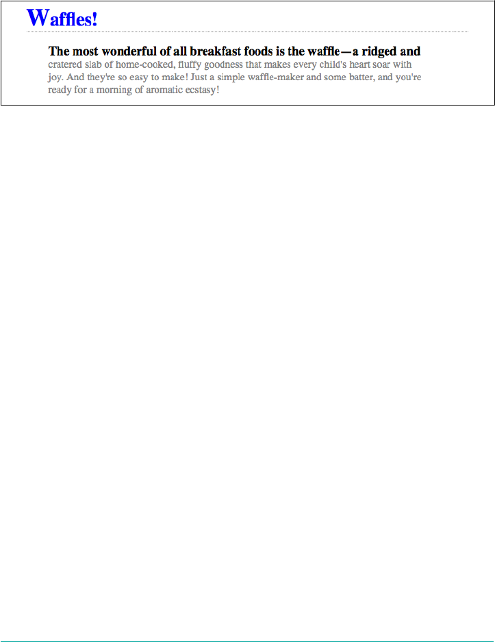
that makes every child's heart soar with joy. And they're so easy to make!
Just a simple waffle-maker and some batter, and you're ready for a morning
of aromatic ecstasy!
</p>
</body>
</html>
The result of this markup and the applied styles is shown in Figure 1-4.
Figure 1-4. A simple document
Now, let’s examine the various ways this document connects to CSS.
The link Tag
First, consider the use of the link tag:
<link rel="stylesheet" type="text/css" href="sheet1.css" media="all">
The link tag is a little-regarded but nonetheless perfectly valid tag that has been
hanging around the HTML specification for years, just waiting to be put to good use.
Its basic purpose is to allow HTML authors to associate other documents with the
document containing the link tag. CSS uses it to link stylesheets to the document; in
Figure 1-5, a stylesheet called sheet1.css is linked to the document.
These stylesheets, which are not part of the HTML document but are still used by it,
are referred to as external stylesheets. This is because they’re stylesheets that are exter‐
nal to the HTML document. (Go figure.)
To successfully load an external stylesheet, link must be placed inside the head ele‐
ment but may not be placed inside any other element. This will cause the web
browser to locate and load the stylesheet and use whatever styles it contains to render
the HTML document in the manner shown in Figure 1-5. Also shown in Figure 1-5 is
the loading of the external sheet2.css via the @import declaration. Imports must be
placed at the beginning of the stylesheet that contains them, but they are otherwise
unconstrained.
8 | Chapter 1: CSS and Documents
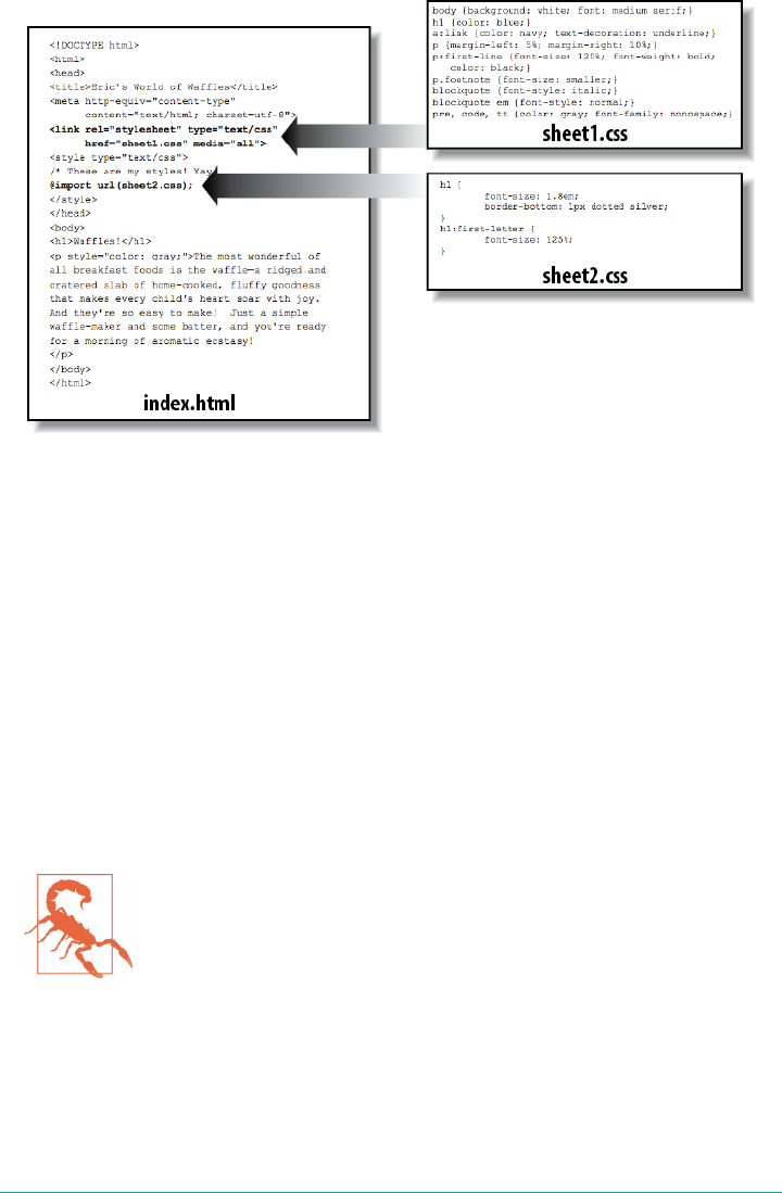
Figure 1-5. A representation of how external stylesheets are applied to documents
And what is the format of an external stylesheet? It’s a list of rules, just like those we
saw in the previous section and in the example HTML document; but in this case, the
rules are saved into their own file. Just remember that no HTML or any other markup
language can be included in the stylesheet—only style rules. Here are the contents of
an external stylesheet:
h1 {color: red;}
h2 {color: maroon; background: white;}
h3 {color: white; background: black;
font: medium Helvetica;}
That’s all there is to it—no HTML markup or comments at all, just plain-and-simple
style declarations. These are saved into a plain-text file and are usually given an
extension of .css, as in sheet1.css.
An external stylesheet cannot contain any document markup at all,
only CSS rules and CSS comments, both of which are explained
later in the chapter. The presence of markup in an external style‐
sheet can cause some or all of it to be ignored.
The filename extension is not required, but some older browsers won’t recognize the
file as containing a stylesheet unless it actually ends with .css, even if you do include
the correct type of text/css in the link element. In fact, some web servers won’t
hand over a file as text/css unless its filename ends with .css, though that can usually
be fixed by changing the server’s configuration files.
Bringing CSS and HTML Together | 9

Attributes
For the rest of the link tag, the attributes and values are fairly straightforward. rel
stands for “relation,” and in this case, the relation is stylesheet. The attribute type is
always set to text/css. This value describes the type of data that will be loaded using
the link tag. That way, the web browser knows that the stylesheet is a CSS stylesheet,
a fact that will determine how the browser deals with the data it imports. After all,
there may be other style languages used in the future, so it’s important to declare
which language you’re using.
Next, we find the href attribute. The value of this attribute is the URL of your style‐
sheet. This URL can be either absolute or relative, depending on what works for you.
In our example, the URL is relative. It just as easily could have been something like
http://meyerweb.com/sheet1.css.
Finally, we have a media attribute. The value of this attribute is one or more media
descriptors, which are rules regarding media types and the features of those media,
with each rule separated by a comma. Thus, for example, you can use a linked style‐
sheet in both screen and projection media:
<link rel="stylesheet" type="text/css" href="visual-sheet.css"
media="screen, projection">
Media descriptors can get quite complicated, and are explained in detail later in the
chapter. For now, we’ll stick with the basic media types shown.
Note that there can be more than one linked stylesheet associated with a document.
In these cases, only those link tags with a rel of stylesheet will be used in the ini‐
tial display of the document. Thus, if you wanted to link two stylesheets named
basic.css and splash.css, it would look like this:
<link rel="stylesheet" type="text/css" href="basic.css">
<link rel="stylesheet" type="text/css" href="splash.css">
This will cause the browser to load both stylesheets, combine the rules from each, and
apply them all to the document. For example:
<link rel="stylesheet" type="text/css" href="basic.css">
<link rel="stylesheet" type="text/css" href="splash.css">
<p class="a1">This paragraph will be gray only if styles from the
stylesheet 'basic.css' are applied.</p>
<p class="b1">This paragraph will be gray only if styles from the
stylesheet 'splash.css' are applied.</p>
The one attribute that is not in this example markup, but could be, is the title
attribute. This attribute is not often used, but it could become important in the future
and, if used improperly, can have unexpected effects. Why? We will explore that in
the next section.
10 | Chapter 1: CSS and Documents
Alternate stylesheets
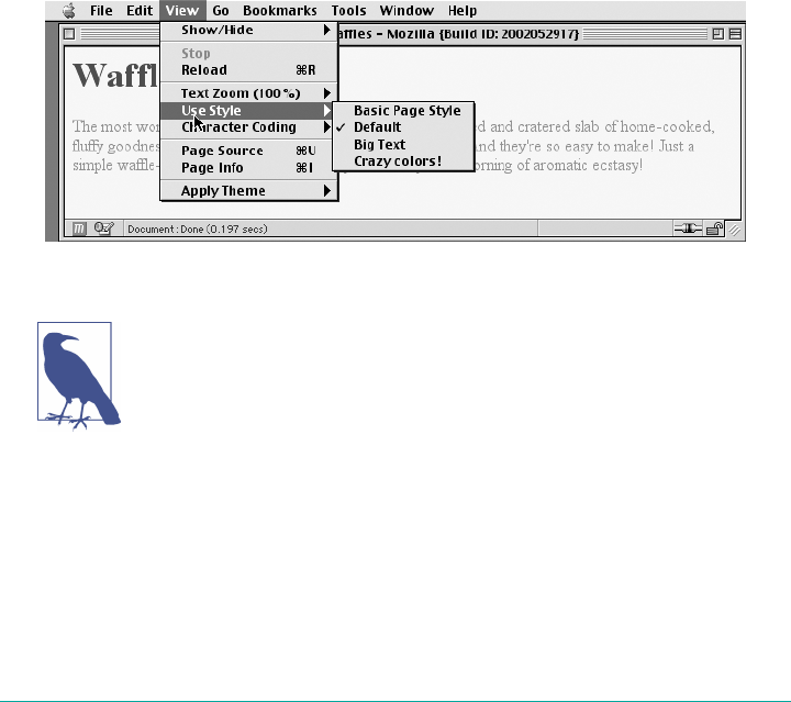
It’s also possible to define alternate stylesheets. These are defined by making the value
of the rel attribute alternate stylesheet, and they are used in document presenta‐
tion only if selected by the user.
Should a browser be able to use alternate stylesheets, it will use the values of the link
element’s title attributes to generate a list of style alternatives. So you could write
the following:
<link rel="stylesheet" type="text/css"
href="sheet1.css" title="Default">
<link rel="alternate stylesheet" type="text/css"
href="bigtext.css" title="Big Text">
<link rel="alternate stylesheet" type="text/css"
href="zany.css" title="Crazy colors!">
Users could then pick the style they want to use, and the browser would switch from
the first one, labeled “Default” in this case, to whichever the user picked. Figure 1-6
shows one way in which this selection mechanism might be accomplished (and in
fact was, early in the resurgence of CSS).
Figure 1-6. A browser oering alternate stylesheet selection
As of late 2016, alternate stylesheets were supported in most
Gecko-based browsers like Firefox, and in Opera. They could be
supported in the Internet Explorer family through the use of Java‐
Script but are not natively supported by those browsers. The Web‐
Kit family did not support selecting alternate stylesheets. Compare
this to the age of the browser shown in Figure 1-6--it’s almost
shocking.
It is also possible to group alternate stylesheets together by giving them the same
title value. Thus, you make it possible for the user to pick a different presentation
for your site in both screen and print media:
Bringing CSS and HTML Together | 11

<link rel="stylesheet" type="text/css"
href="sheet1.css" title="Default" media="screen">
<link rel="stylesheet" type="text/css"
href="print-sheet1.css" title="Default" media="print">
<link rel="alternate stylesheet" type="text/css"
href="bigtext.css" title="Big Text" media="screen">
<link rel="alternate stylesheet" type="text/css"
href="print-bigtext.css" title="Big Text" media="print">
If a user selects “Big Text” from the alternate stylesheet selection mechanism in a con‐
forming user agent, then bigtext.css will be used to style the document in the screen
medium, and print-bigtext.css will be used in the print medium. Neither sheet1.css nor
print-sheet1.css will be used in any medium.
Why is that? Because if you give a link with a rel of stylesheet a title, then you are
designating that stylesheet as a preferred stylesheet. This means that its use is preferred
to alternate stylesheets, and it will be used when the document is first displayed. Once
you select an alternate stylesheet, however, the preferred stylesheet will not be used.
Furthermore, if you designate a number of stylesheets as preferred, then all but one of
them will be ignored. Consider the following code example:
<link rel="stylesheet" type="text/css"
href="sheet1.css" title="Default Layout">
<link rel="stylesheet" type="text/css"
href="sheet2.css" title="Default Text Sizes">
<link rel="stylesheet" type="text/css"
href="sheet3.css" title="Default Colors">
All three link elements now refer to preferred stylesheets, thanks to the presence of a
title attribute on all three, but only one of them will actually be used in that manner.
The other two will be ignored completely. Which two? There’s no way to be certain, as
HTML doesn’t provide a method of determining which preferred stylesheets should
be ignored and which should be used.
If you don’t give a stylesheet a title, then it becomes a persistent stylesheet and is
always used in the display of the document. Often, this is exactly what an author
wants.
The style Element
The style element is one way to include a stylesheet, and it appears in the document
itself:
<style type="text/css">...</style>
style should always use the attribute type; in the case of a CSS document, the correct
value is "text/css", just as it was with the link element.
12 | Chapter 1: CSS and Documents

The style element should always start with <style type="text/css">, as shown in
the preceding example. This is followed by one or more styles and is finished with a
closing </style> tag. It is also possible to give the style element a media attribute,
which functions in the same manner as previously discussed for linked stylesheets.
The styles between the opening and closing style tags are referred to as the docu‐
ment stylesheet or the embedded stylesheet (because this kind of stylesheet is embed‐
ded within the document). It will contain many of the styles that will apply to the
document, but it can also contain multiple links to external stylesheets using the
@import directive.
The @import Directive
Now we’ll discuss the stuff that is found inside the style tag. First, we have some‐
thing very similar to link: the @import directive:
@import url(sheet2.css);
Just like link, @import can be used to direct the web browser to load an external
stylesheet and use its styles in the rendering of the HTML document. The only major
difference is in the syntax and placement of the command. As you can see, @import is
found inside the style container. It must be placed before the other CSS rules or it
won’t work at all. Consider this example:
<style type="text/css">
@import url(styles.css); /* @import comes first */
h1 {color: gray;}
</style>
Like link, there can be more than one @import statement in a document. Unlike
link, however, the stylesheets of every @import directive will be loaded and used;
there is no way to designate alternate stylesheets with @import. So, given the follow‐
ing markup:
@import url(sheet2.css);
@import url(blueworld.css);
@import url(zany.css);
all three external stylesheets will be loaded, and all of their style rules will be used in
the display of the document.
As with link, you can restrict imported stylesheets to one or more media by provid‐
ing media descriptors after the stylesheet’s URL:
@import url(sheet2.css) all;
@import url(blueworld.css) screen;
@import url(zany.css) projection, print;
Bringing CSS and HTML Together | 13

As noted in “The link Tag” on page 8, media descriptors can get quite complicated,
and are explained in detail in Chapter 20, Media-Dependent Styles.
@import can be highly useful if you have an external stylesheet that needs to use the
styles found in other external stylesheets. Since external stylesheets cannot contain
any document markup, the link element can’t be used—but @import can. Therefore,
you might have an external stylesheet that contains the following:
@import url(http://example.org/library/layout.css);
@import url(basic-text.css);
@import url(printer.css) print;
body {color: red;}
h1 {color: blue;}
Well, maybe not those exact styles, but hopefully you get the idea. Note the use of
both absolute and relative URLs in the previous example. Either URL form can be
used, just as with link.
Note also that the @import directives appear at the beginning of the stylesheet, as they
did in the example document. CSS requires the @import directive to come before any
other rules in a stylesheet. An @import that comes after other rules (e.g., body
{color: red;}) will be ignored by conforming user agents.
Older versions of Internet Explorer for Windows do not ignore any
@import directive, even those that come after other rules. Since
other browsers do ignore improperly placed @import directives, it
is easy to mistakenly place the @import directive incorrectly and
thus alter the display in other browsers.
HTTP Linking
There is another, far more obscure way to associate CSS with a document: you can
link the two via HTTP headers.
Under Apache, this can be accomplished by adding a reference to the CSS file in
a .htaccess file. For example:
Header add Link "</ui/testing.css>;rel=stylesheet;type=text/css"
This will cause supporting browsers to associate the referenced stylesheet with any
documents served from under that .htaccess file. The browser will then treat it as if it
were a linked stylesheet. Alternatively, and probably more efficiently, you can add an
equivalent rule to the server’s httpd.conf file:
<Directory /path/to/ /public/html/directory>
Header add Link "</ui/testing.css>;rel=stylesheet;type=text/css"
</Directory>
14 | Chapter 1: CSS and Documents

The effect is exactly the same in supporting browsers. The only difference is in where
you declare the linking.
You probably noticed the use of the term “supporting browsers.” As of late 2017, the
widely used browsers that support HTTP linking of stylesheets are the Firefox family
and Opera. That restricts this technique mostly to development environments based
on one of those browsers. In that situation, you can use HTTP linking on the test
server to mark when you’re on the development site as opposed to the public site. It’s
also an interesting way to hide styles from the WebKit and Internet Explorer families,
assuming you have a reason to do so.
There are equivalents to this technique in common scripting lan‐
guages such as PHP and IIS, both of which allow the author to emit
HTTP headers. It’s also possible to use such languages to explicitly
write a link element into the document based on the server offer‐
ing up the document. This is a more robust approach in terms of
browser support: every browser supports the link element.
Inline Styles
For cases where you want to just assign a few styles to one individual element,
without the need for embedded or external stylesheets, employ the HTML attribute
style to set an inline style:
<p style="color: gray;">The most wonderful of all breakfast foods is
the waffle—a ridged and cratered slab of home-cooked, fluffy goodness...
</p>
The style attribute can be associated with any HTML tag whatsoever, except for
those tags that are found outside of body (head or title, for instance).
The syntax of a style attribute is fairly ordinary. In fact, it looks very much like the
declarations found in the style container, except here the curly braces are replaced
by double quotation marks. So <p style="color: maroon; background: yellow;">
will set the text color to be maroon and the background to be yellow for that para‐
graph only. No other part of the document will be affected by this declaration.
Note that you can only place a declaration block, not an entire stylesheet, inside an
inline style attribute. Therefore, you can’t put an @import into a style attribute, nor
can you include any complete rules. The only thing you can put into the value of a
style attribute is what might go between the curly braces of a rule.
Use of the style attribute is not generally recommended. Indeed, it is very unlikely to
appear in XML languages other than HTML. Many of the primary advantages of CSS
—the ability to organize centralized styles that control an entire document’s appear‐
ance or the appearance of all documents on a web server—are negated when you
Bringing CSS and HTML Together | 15

place styles into a style attribute. In many ways, inline styles are not much better
than the font tag, although they do have a good deal more flexibility in terms of what
visual effects they can apply.
Stylesheet Contents
So after all of that, what about the actual contents of the stylesheets? You know, stuff
like this:
h1 {color: maroon;}
body {background: yellow;}
Styles such as these comprise the bulk of any embedded stylesheet—simple and com‐
plex, short and long. Rarely will you have a document where the style element does
not contain any rules, although it’s possible to have a simple list of @import declara‐
tions with no actual rules like those shown in the previous example.
Before we get going on the rest of the book, there are a few top-level things to cover
regarding what can or can’t go into a stylesheet.
Markup
ere is no markup in stylesheets. This might seem obvious, but you’d be surprised.
The one exception is HTML comment markup, which is permitted inside style ele‐
ments for historical reasons:
<style type="text/css"><!--
h1 {color: maroon;}
body {background: yellow;}
--></style>
That’s it.
Rule Structure
To illustrate the concept of rules in more detail, let’s break down the structure.
Each rule has two fundamental parts: the selector and the declaration block. The decla‐
ration block is composed of one or more declarations, and each declaration is a pair‐
ing of a property and a value. Every stylesheet is made up of a series of rules.
Figure 1-7 shows the parts of a rule.
16 | Chapter 1: CSS and Documents
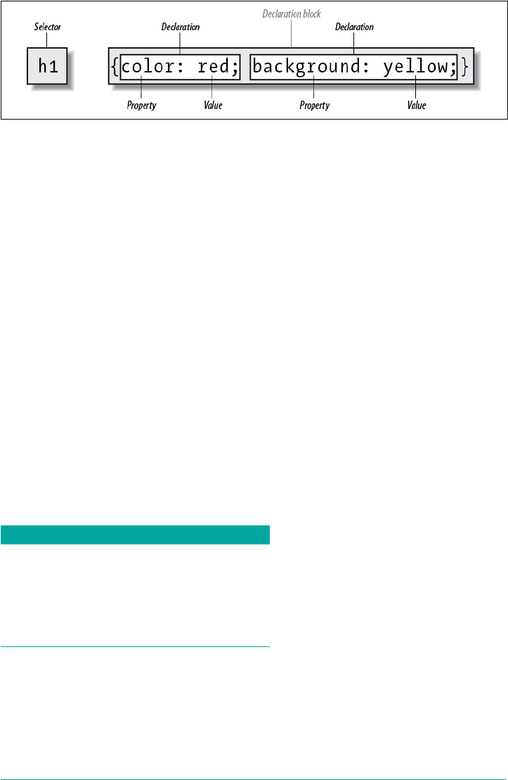
Figure 1-7. e structure of a rule
The selector, shown on the left side of the rule, defines which piece of the document
will be affected. In Figure 1-7, h1 elements are selected. If the selector were p, then all
p (paragraph) elements would be selected.
The right side of the rule contains the declaration block, which is made up of one or
more declarations. Each declaration is a combination of a CSS property and a value of
that property. In Figure 1-7, the declaration block contains two declarations. The first
states that this rule will cause parts of the document to have a color of red, and the
second states that part of the document will have a background of yellow. So, all of
the h1 elements in the document (defined by the selector) will be styled in red text
with a yellow background.
Vendor prexing
Sometimes you’ll see pieces of CSS with dashes and labels in front of them, like this: -
o-border-image. These are called vendor prexes, and are a way for browser vendors
to mark properties, values, or other bits of CSS as being experimental or proprietary
(or both). As of late 2016, there were a few vendor prefixes in the wild, with the most
common being shown in Table 1-1.
Table 1-1. Some common vendor prexes
Prex Vendor
-epub- International Digital Publishing Forum ePub format
-moz- Mozilla-based browsers (e.g., Firefox)
-ms- Microsoft Internet Explorer
-o- Opera-based browsers
-webkit- WebKit-based browsers (e.g., Safari and Chrome)
As Table 1-1 implies, the generally accepted format of a vendor prefix is a dash, a
label, and a dash, although a few prefixes erroneously omit the first dash.
The uses and abuses of vendor prefixes are long, tortuous, and beyond the scope of
this book. Suffice to say that they started out as a way for vendors to test out new
Stylesheet Contents | 17

features, thus helping speed interoperability without worrying about being locked
into legacy behaviors that were incompatible with other browsers. This avoided a
whole class of problems that nearly strangled CSS in its infancy. Unfortunately, pre‐
fixed properties were then publicly deployed by web authors and ended up causing a
whole new class of problems.
As of late 2016, vendor prefixes are a dwindling breed, with old prefixed properties
and values being slowly removed from browser implementations. It’s entirely possible
that you’ll never write prefixed CSS, but you may encounter it in the wild, or inherit it
in a legacy codebase.
Whitespace Handling
CSS is basically insensitive to whitespace between rules, and largely insensitive to
whitespace within rules, although there are a few exceptions.
In general, CSS treats whitespace just like HTML does: any sequence of whitespace
characters is collapsed to a single space for parsing purposes. Thus, you can format
the hypothetical rainbow rule in the following ways:
rainbow: infrared red orange yellow green blue indigo violet ultraviolet;
rainbow:
infrared red orange yellow green blue indigo violet ultraviolet;
rainbow:
infrared
red
orange
yellow
green
blue
indigo
violet
ultraviolet
;
…as well as any other separation patterns you can think up. The only restriction is
that the separating characters be whitespace: an empty space, a tab, or a newline,
alone or in combination, as many as you like.
Similarly, you can format series of rules with whitespace in any fashion you like.
These are just five of an effectively infinite number of possibilities:
html{color:black;}
body {background: white;}
p {
color: gray;}
h2 {
color : silver ;
}
ol
18 | Chapter 1: CSS and Documents

{
color
:
silver
;
}
As you can see from the first rule, whitespace can be largely omitted. Indeed, this is
usually the case with minied CSS, which is CSS that’s had every last possible bit of
extraneous whitespace removed. The rules after the first two use progressively more
extravagant amounts of whitespace until, in the last rule, pretty much everything that
can be separated onto its own line has been.
All of these approaches are valid, so you should pick the formatting that makes the
most sense—that is, is easiest to read—in your eyes, and stick with it.
There are some places where the presence of whitespace is actually required. The
most common example is when separating a list of keywords in a value, as in the
hypothetical rainbow examples. Those must always be whitespace-separated.
CSS Comments
CSS does allow for comments. These are very similar to C/C++ comments in that
they are surrounded by /* and */:
/* This is a CSS1 comment */
Comments can span multiple lines, just as in C++:
/* This is a CSS1 comment, and it
can be several lines long without
any problem whatsoever. */
It’s important to remember that CSS comments cannot be nested. So, for example,
this would not be correct:
/* This is a comment, in which we find
another comment, which is WRONG
/* Another comment */
and back to the first comment */
One way to create “nested” comments accidentally is to temporarily
comment out a large block of a stylesheet that already contains a
comment. Since CSS doesn’t permit nested comments, the “outside”
comment will end where the “inside” comment ends.
Unfortunately, there is no “rest of the line” comment pattern such as // or # (the lat‐
ter of which is reserved for ID selectors anyway). The only comment pattern in CSS
is /* */. Therefore, if you wish to place comments on the same line as markup, then
Stylesheet Contents | 19

you need to be careful about how you place them. For example, this is the correct way
to do it:
h1 {color: gray;} /* This CSS comment is several lines */
h2 {color: silver;} /* long, but since it is alongside */
p {color: white;} /* actual styles, each line needs to */
pre {color: gray;} /* be wrapped in comment markers. */
Given this example, if each line isn’t marked off, then most of the stylesheet will
become part of the comment and thus will not work:
h1 {color: gray;} /* This CSS comment is several lines
h2 {color: silver;} long, but since it is not wrapped
p {color: white;} in comment markers, the last three
pre {color: gray;} styles are part of the comment. */
In this example, only the first rule (h1 {color: gray;}) will be applied to the docu‐
ment. The rest of the rules, as part of the comment, are ignored by the browser’s ren‐
dering engine.
CSS comments are treated by the CSS parser as if they do not exist
at all, and so do not count as whitespace for parsing purposes. This
means you can put them into the middle of rules—even right
inside declarations!
Media Queries
With media queries, an author can define the media environment in which a given
stylesheet is used by the browser. In the past, this was handled by setting media types
via the media attribute on the link element, on a style element, or in the media
descriptor of an @import or @media declaration. Media queries take this concept sev‐
eral steps further by allowing authors to choose stylesheets based on the features of a
given media type, using what are called media descriptors.
Usage
Media queries can be employed in the following places:
• The media attribute of a link element
• The media attribute of a style element
•The media descriptor portion of an @import declaration
• The media descriptor portion of an @media declaration
Queries can range from simple media types to complicated combinations of media
types and features.
20 | Chapter 1: CSS and Documents

Simple Media Queries
Let’s look at some simple media blocks before covering all of the possibilities of media
queries. Suppose we want some differing styles for situations where the styles are
shown in a projection setting, such as a slide show. Here are two very simple bits of
CSS:
h1 {color: maroon;}
@media projection {
body {background: yellow;}
}
In this example, h1 elements will be colored maroon in all media, but the body ele‐
ment will get a yellow background only in a projection medium.
You can have as many @media blocks as you like in a given stylesheet, each with its
own set of media descriptors (see later in this chapter for details). You could even
encapsulate all of your rules in an @media block if you chose, like this:
@media all {
h1 {color: maroon;}
body {background: yellow;}
}
However, since this is exactly the same as if you stripped off the first and last line
shown, there isn’t a whole lot of point to doing so.
The indentation shown in this section was solely for purposes of
clarity. You do not have to indent the rules found inside an @media
block, but you’re welcome to do so if it makes your CSS easier for
you to read.
The place where we saw projection and all in those examples is where media quer‐
ies are set. These queries rely on a combination of terms that describe the type of
media to be considered, as well as descriptions of the media’s parameters (e.g., resolu‐
tion or display height), to determine when blocks of CSS should be applied.
Media Types
The most basic form of media queries are media types, which first appeared in CSS2.
These are simple labels for different kinds of media:
all
Use in all presentational media.
Media Queries | 21

print
Use when printing the document for sighted users and also when displaying a
print preview of the document.
screen
Use when presenting the document in a screen medium like a desktop computer
monitor. All web browsers running on such systems are screen-medium user
agents.
As of this writing, a couple of browsers also support projection,
which allows a document to be presented as a slideshow. Several
mobile-device browsers support the handheld type, but not in con‐
sistent ways.
Multiple media types can be specified using a comma-separated list. The following
four examples are all equivalent ways of applying a stylesheet (or a block of rules) in
both screen and print media:
<link type="text/css" href="frobozz.css" media="screen, print">
<style type="text/css" media="screen, print">...</style>
@import url(frobozz.css) screen, print;
@media screen, print {...}
Things get interesting when you add feature-specific descriptors, such as values that
describe the resolution or color depth of a given medium, to these media types.
Media Descriptors
The placement of media queries will be very familiar to any author who has ever set a
media type on a link element or an @import declaration. Here are two essentially
equivalent ways of applying an external stylesheet when rendering the document on a
color printer:
<link href="print-color.css" type="text/css"
media="print and (color)" rel="stylesheet">
@import url(print-color.css) print and (color);
Anywhere a media type can be used, a media query can be used. This means that,
following on the examples of the previous section, it is possible to list more than one
query in a comma-separated list:
<link href="print-color.css" type="text/css"
media="print and (color), screen and (color-depth: 8)" rel="stylesheet">
@import url(print-color.css) print and (color), screen and (color-depth: 8);
22 | Chapter 1: CSS and Documents

In any situation where even one of the media queries evaluates to “true,” the associ‐
ated stylesheet is applied. Thus, given the previous @import, print-color.css will be
applied if rendering to a color printer or to a sufficiently colorful screen environment.
If printing on a black-and-white printer, both queries will evaluate to “false”, and
print-color.css will not be applied to the document. The same holds true in any
screen medium, and so on.
Each media descriptor is composed of a media type and one or more listed media fea‐
tures, with each media feature descriptor enclosed in parentheses. If no media type is
provided, then it is assumed to be all, which makes the following two examples
equivalent:
@media all and (min-resolution: 96dpi) {...}
@media (min-resolution: 96dpi) {...}
Generally speaking, a media feature descriptor is formatted like a property-value pair
in CSS. There are a few differences, most notably that some features can be specified
without an accompanying value. Thus, for example, any color-based medium will be
matched using (color), whereas any color medium using a 16-bit color depth is
matched using (color: 16). In effect, the use of a descriptor without a value is a
true/false test for that descriptor: (color) means “is this medium in color?”
Multiple feature descriptors can be linked with the and logical keyword. In fact, there
are two logical keywords in media queries:
and
Links together two or more media features in such a way that all of them must be
true for the query to be true. For example, (color) and (orientation: land
scape) and (min-device-width: 800px) means that all three conditions must
be satisfied: if the media environment has color, is in landscape orientation, and
the device’s display is at least 800 pixels wide, then the stylesheet is used.
not
Negates the entire query such that if all of the conditions are true, then the style‐
sheet is not applied. For example, not (color) and (orientation: landscape)
and (min-device-width: 800px) means that if the three conditions are satis‐
fied, the statement is negated. Thus, if the media environment has color, is in
landscape orientation, and the device’s display is at least 800 pixels wide, then the
stylesheet is not used. In all other cases, it will be used.
Note that the not keyword can only be used at the beginning of a media query. It is
not legal to write something like (color) and not (min-device-width: 800px). In
such cases, the query will be ignored. Note also that browsers too old to understand
media queries will always skip a stylesheet whose media descriptor starts with not.
Media Queries | 23

There is no OR keyword for use in media queries. Instead, the commas that separate
a list of queries serve the function of an OR—screen, print means “apply if the
media is screen or print.” Instead of screen and (max-color: 2) or (monochrome),
which is invalid and thus ignored, you should write screen and (max-color: 2),
screen and (monochrome).
There is one more keyword, only, which is designed to create deliberate backward
incompatibility (yes, really):
only
Used to hide a stylesheet from browsers too old to understand media queries. For
example, to apply a stylesheet in all media, but only in those browsers that under‐
stand media queries, you write something like @import url(new.css) only
all. In browsers that do understand media queries, the only keyword is ignored
and the stylesheet is applied. In browsers that do not understand media queries,
the only keyword creates an apparent media type of only all, which is not valid.
Thus, the stylesheet is not applied in such browsers. Note that the only keyword
can only be used at the beginning of a media query.
Media Feature Descriptors and Value Types
So far we’ve seen a number of media feature descriptors in the examples, but not a
complete list. Following is a list of all possible descriptors (current as of late 2017):
•width
•min-width
•max-width
•device-width
•min-device-width
•max-device-width
•height
•min-height
•max-height
•device-height
•min-device-height
•max-device-height
•aspect-ratio
•min-aspect-ratio
•max-aspect-ratio
•device-aspect-
ratio
•min-device-aspect-
ratio
•max-device-aspect-
ratio
•color
•min-color
•max-color
•color-index
•min-color-index
•max-color-index
•monochrome
•min-monochrome
•max-monochrome
•resolution
•min-resolution
•max-resolution
•orientation
•scan
•grid
24 | Chapter 1: CSS and Documents

In addition, two new value types were added:
•<ratio>
•<resolution>
A complete description of these descriptors and values, and how to use them, can be
found in Chapter 20.
Feature Queries
Between 2015 and 2016, CSS gained the ability to apply blocks of CSS when certain
CSS property-value combinations were supported by the user agent. These are known
as feature queries.
They’re very similar to media queries in structure. Consider a situation where you
want to only apply color to element if color is a supported property. (Which it cer‐
tainly should be!) That would look like this:
@supports (color: black) {
body {color: black;}
h1 {color: purple;}
h2 {color: navy;}
}
That says, in effect, “If you recognize and can do something with the property-value
combination color: black, apply these styles. Otherwise, skip these styles.” In user
agents that don’t understand @supports, the entire block is skipped over.
Feature queries are a perfect way to progressively enhance your styles. For example,
suppose you want to add some grid layout to your existing float-and-inline-block lay‐
out. You can keep the old layout scheme, and then later in the stylesheet include a
block like this:
@supports (display: grid ) {
section#main {display: grid;}
/* styles to switch off old layout positioning */
/* grid layout styles */
}
This block of styles will be applied in browsers that understand grid display, overrid‐
ing the old styles that governed page layout, and then applying the styles needed to
make things work in a grid-based future. Browsers too old to understand grid layout
will most likely also be too old to understand @supports, so they’ll skip the whole
block entirely, as if it had never been there.
Feature queries can be embedded inside each other, and indeed can be embedded
inside media queries, as well as vice versa. You could write screen and print styles
Feature Queries | 25

based on flexible-box layout, and wrap those media blocks in an @supports (dis
play: flex) block:
@supports (display: flex) {
@media screen {
/* screen flexbox styles go here */
}
@media print {
/* print flexbox styles go here */
}
}
Conversely, you could add @supports() blocks inside various responsive-design
media query blocks:
@media screen and (max-width: 30em){
@supports (display: flex) {
/* small-screen flexbox styles go here */
}
}
@media screen and (min-width: 30em) {
@supports (display: flex) {
/* large-screen flexbox styles go here */
}
}
How you organize these blocks is really up to you.
As with media queries, feature queries also permit logical operators. Suppose we want
to apply styles only if a user agent supports both grid layout and CSS shapes. Here’s
how that might go:
@supports (display: grid) and (shape-outside: circle()) {
/* grid-and-shape styles go here */
}
This is essentially equivalent to writing the following:
@supports (display: grid) {
@supports (shape-outside: circle()) {
/* grid-and-shape styles go here */
}
}
However, there’s more than “and” operations available. CSS Shapes (covered in detail
in Chapter 10) are a good example of why “or” is useful, because for a long time Web‐
Kit only supported CSS shapes via vendor-prefixed properties. So if you want to use
shapes, you can use a feature query like this:
@supports (shape-outside: circle()) or
(-webkit-shape-outside: circle()) {
/* shape styles go here */
}
26 | Chapter 1: CSS and Documents

You’d still have to make sure to use both prefixed and unprefixed versions of the
shape properties, but this would let you add support for those properties backward in
the WebKit release line while supporting other browsers that also support shapes, but
not via prefixed properties.
All this is incredibly handy because there are situations where you might want to
apply different properties than those you’re testing. So, to go back to grid layout for a
second, you might want to change the margins and so forth on your layout elements
when grid is in use. Here’s a simplified version of that approach:
div#main {overflow: hidden;}
div.column {float: left; margin-right: 1em;}
div.column:last-child {margin-right: 0;}
@supports (display: grid) {
div#main {display: grid; grid-gap: 1em 0;
overflow: visible;}
div#main div.column {margin: 0;}
}
It’s possible to use negation as well. For example, you could apply the following styles
in situations where grid layout is not supported:
@supports not (display: grid) {
/* grid-not-supported styles go here */
}
You can combine your logical operators into a single query, but parentheses are
required to keep the logic straight. Suppose we want a set of styles to be applied when
color is supported, and when one of either grid or flexible box layout is supported.
That’s written like this:
@supports (color: black) and ((display: flex) or (display: grid)) {
/* styles go here */
}
Notice how there’s another set of parentheses around the “or” part of the logic,
enclosing the grid and flex tests. Those extra parentheses are required. Without them,
the entire expression will fail, and the styles inside the block will be skipped. In other
words, don’t do this:
@supports (color: black) and (display: flex) or (display: grid) {
Finally, you might wonder why both a property and value are required in feature
query tests. After all, if you’re using shapes, all you need to test for is shape-outside,
right? It’s because a browser can easily support a property without supporting all its
values. Grid layout is a perfect example for this. Suppose you could test for grid sup‐
port like this:
Feature Queries | 27

@supports (display) {
/* grid styles go here */
}
Well, even Internet Explorer 4 supported display. Any browser that understands
@supports will certainly understand display and many of its values—but maybe not
grid. That’s why property and value are always tested in feature queries.
Remember that these are feature queries, not correctness queries. A
browser can understand the feature you’re testing for, but imple‐
ment it with bugs. So you’re not getting an assurance from the
browser that it supports something correctly. All a positive feature-
query result means is that the browser understands what you’ve
said and makes some sort of attempt to support it.
Summary
With CSS, it is possible to completely change the way elements are presented by a
user agent. This can be executed at a basic level with the display property, and in a
different way by associating stylesheets with a document. The user will never know
whether this is done via an external or embedded stylesheet, or even with an inline
style. The real importance of external stylesheets is the way in which they allow
authors to put all of a site’s presentation information in one place, and point all of the
documents to that place. This not only makes site updates and maintenance a breeze,
but it helps to save bandwidth, since all of the presentation is removed from docu‐
ments. With @supports(), it’s even possible to do some basic progressive enhance‐
ment in native CSS.
To make the most of the power of CSS, authors need to know how to associate a set of
styles with the elements in a document. To fully understand how CSS can do all of
this, authors need a firm grasp of the way CSS selects pieces of a document for styl‐
ing, which is the subject of the next chapter.
28 | Chapter 1: CSS and Documents

CHAPTER 2
Selectors
One of the primary advantages of CSS is its ability to easily apply a set of styles to all
elements of the same type. Unimpressed? Consider this: by editing a single line of
CSS, you can change the colors of all your headings. Don’t like the blue you’re using?
Change that one line of code, and they can all be purple, yellow, maroon, or any other
color you desire. That lets you, the designer, focus on design, rather than grunt work.
The next time you’re in a meeting and someone wants to see headings with a different
shade of green, just edit your style and hit Reload. Voilà! The results are accomplished
in seconds and there for everyone to see.
CSS can’t solve all your problems—you can’t use it to change the colorspace of your
PNGs, for example, at least not yet—but it can make some global changes much eas‐
ier. So let’s begin with selectors and structure.
Basic Style Rules
As stated, a central feature of CSS is its ability to apply certain rules to an entire set of
element types in a document. For example, let’s say that you want to make the text of
all h2 elements appear gray. Using old-school HTML, you’d have to do this by insert‐
ing <font color="gray">…</font> tags inside all your h2 elements. Using the style
attribute, which is also bad practice, would require you to include style="color:
gray;" in all your h2 elements, like this:
<h2><font color="gray">This is h2 text</font></h2>
<h2 style="color: gray;">This is h2 text</h2>
This will be a tedious process if your document contains a lot of h2 elements. Worse,
if you later decide that you want all those h2s to be green instead of gray, you’d have to
start the manual tagging all over again. (Yes, this is really how it used to be done!)
29
CSS allows you to create rules that are simple to change, edit, and apply to all the text
elements you define (the next section will explain how these rules work). For exam‐
ple, you can write this rule once to make all your h2 elements gray:
h2 {color: gray;}
If you want to change all h2 text to another color—say, silver—just alter the value:
h2 {color: silver;}
Element Selectors
An element selector is most often an HTML element, but not always. For example, if a
CSS file contains styles for an XML document, the element selectors might look
something like this:
quote {color: gray;}
bib {color: red;}
booktitle {color: purple;}
myElement {color: red;}
In other words, the elements of the document serve as the most basic selectors. In
XML, a selector could be anything, since XML allows for the creation of new markup
languages that can have just about anything as an element name. If you’re styling an
HTML document, on the other hand, the selector will generally be one of the many
HTML elements such as p, h3, em, a, or even html itself. For example:
html {color: black;}
h1 {color: gray;}
h2 {color: silver;}
The results of this stylesheet are shown in Figure 2-1.
Figure 2-1. Simple styling of a simple document
30 | Chapter 2: Selectors

Once you’ve globally applied styles directly to elements, you can shift those styles
from one element to another. Let’s say you decide that the paragraph text, not the h1
elements, in Figure 2-1 should be gray. No problem. Just change the h1 selector to p:
html {color: black;}
p {color: gray;}
h2 {color: silver;}
The results are shown in Figure 2-2.
Figure 2-2. Moving a style from one element to another
Declarations and Keywords
The declaration block contains one or more declarations. A declaration is always for‐
matted as a property followed by a colon and then a value followed by a semicolon.
The colon and semicolon can be followed by zero or more spaces. In nearly all cases,
a value is either a single keyword or a space-separated list of one or more keywords
that are permitted for that property. If you use an incorrect property or value in a
declaration, the whole rule will be ignored. Thus, the following two declarations
would fail:
brain-size: 2cm; /* unknown property 'brain-size' */
color: ultraviolet; /* unknown value 'ultraviolet' */
In an instance where you can use more than one keyword for a property’s value, the
keywords are usually separated by spaces, with some cases requiring slashes (/) or
commas. Not every property can accept multiple keywords, but many, such as the
font property, can. Let’s say you want to define medium-sized Helvetica for para‐
graph text, as illustrated in Figure 2-3.
Basic Style Rules | 31

Figure 2-3. e results of a property value with multiple keywords
The rule would read as follows:
p {font: medium Helvetica;}
Note the space between medium and Helvetica, each of which is a keyword (the first
is the font’s size and the second is the actual font name). The space allows the user
agent to distinguish between the two keywords and apply them correctly. The semi‐
colon indicates that the declaration has been concluded.
These space-separated words are referred to as keywords because, taken together, they
form the value of the property in question. For instance, consider the following fic‐
tional rule:
rainbow: red orange yellow green blue indigo violet;
There is no such property as rainbow, but the example is useful for illustrative pur‐
poses. The value of rainbow is red orange yellow green blue indigo violet, and
the seven keywords add up to a single, unique value. We can redefine the value for
rainbow as follows:
rainbow: infrared red orange yellow green blue indigo violet ultraviolet;
Now we have a new value for rainbow composed of nine keywords instead of seven.
Although the two values look mostly the same, they are as unique and different as
zero and one. This may seem an abstract point, but it’s critical to understanding some
of the subtler effects of specificity and the cascade (covered in later in this book).
As we’ve seen, CSS keywords are usually separated by spaces. In CSS2.1 there was one
exception: in the CSS property font, there is exactly one place where a forward slash
(/) could be used to separate two specific keywords. Here’s an example:
h2 {font: large/150% sans-serif;}
32 | Chapter 2: Selectors

The slash separates the keywords that set the element’s font size and line height. This
is the only place the slash is allowed to appear in the font declaration. All of the other
keywords allowed for font are separated by spaces.
The slash has since worked its way into a number of other properties’ values. These
include, but may not always be limited to the following:
•background
•border-image
•border-radius
•grid
•grid-area
•grid-column
•grid-row
•grid-template
•mask-border
There are also some keywords that are separated by commas. When declaring multi‐
ple values, such as multiple background images, transition properties, and shadows,
the declarations are separated with commas. Additionally, parameters in functions,
such as linear gradients and transforms, are comma separated, as the following exam‐
ple shows:
.box {box-shadow: inset -1px -1px white,
3px 3px 3px rgba(0,0,0,0.2);
background-image: url(myimage.png),
linear-gradient(180deg, #FFF 0%, #000 100%);
transform: translate(100px, 200px);
}
a:hover {transition: color, background-color 200ms ease-in 50ms;}
Those are the basics of simple declarations, but they can get much more complex.
The next section begins to show you just how powerful CSS can be.
Grouping
So far, we’ve seen fairly simple techniques for applying a single style to a single selec‐
tor. But what if you want the same style to apply to multiple elements? If that’s the
case, you’ll want to use more than one selector or apply more than one style to an
element or group of elements.
Grouping | 33

Grouping Selectors
Let’s say you want both h2 elements and paragraphs to have gray text. The easiest way
to accomplish this is to use the following declaration:
h2, p {color: gray;}
By placing the h2 and p selectors on the left side of the rule and separating them with
a comma, you’ve defined a rule where the style on the right (color: gray;) applies to
the elements referenced by both selectors. The comma tells the browser that there are
two different selectors involved in the rule. Leaving out the comma would give the
rule a completely different meaning, which we’ll explore in “Descendant Selectors” on
page 56.
There are really no limits to how many selectors you can group together. For exam‐
ple, if you want to display a large number of elements in gray, you might use some‐
thing like the following rule:
body, table, th, td, h1, h2, h3, h4, p, pre, strong, em, b, i {color: gray;}
Grouping allows an author to drastically compact certain types of style assignments,
which makes for a shorter stylesheet. The following alternatives produce exactly the
same result, but it’s pretty obvious which one is easier to type:
h1 {color: purple;}
h2 {color: purple;}
h3 {color: purple;}
h4 {color: purple;}
h5 {color: purple;}
h6 {color: purple;}
h1, h2, h3, h4, h5, h6 {color: purple;}
Grouping allows for some interesting choices. For example, all of the groups of rules
in the following example are equivalent—each merely shows a different way of group‐
ing both selectors and declarations:
/* group 1 */
h1 {color: silver; background: white;}
h2 {color: silver; background: gray;}
h3 {color: white; background: gray;}
h4 {color: silver; background: white;}
b {color: gray; background: white;}
/* group 2 */
h1, h2, h4 {color: silver;}
h2, h3 {background: gray;}
h1, h4, b {background: white;}
h3 {color: white;}
b {color: gray;}
34 | Chapter 2: Selectors
/* group 3 */
h1, h4 {color: silver; background: white;}
h2 {color: silver;}
h3 {color: white;}
h2, h3 {background: gray;}
b {color: gray; background: white;}
Any of these will yield the result shown in Figure 2-4. (These styles use grouped dec‐
larations, which are explained in “Grouping Declarations” on page 35.)
Figure 2-4. e result of equivalent stylesheets
The universal selector
CSS2 introduced a new simple selector called the universal selector, displayed as an
asterisk (*). This selector matches any element at all, much like a wildcard. For exam‐
ple, to make every single element in a document red, you would write:
* {color: red;}
This declaration is equivalent to a grouped selector that lists every single element
contained within the document. The universal selector lets you assign the color value
red to every element in the document in one efficient stroke. Beware, however:
although the universal selector is convenient, with a specificity on 0-0-0; and because
it targets everything within its declaration scope, it can have unintended conse‐
quences, which are discussed later in this book.
Grouping Declarations
Since you can group selectors together into a single rule, it follows that you can also
group declarations. Assuming that you want all h1 elements to appear in purple, 18-
pixel-high Helvetica text on an aqua background (and you don’t mind blinding your
readers), you could write your styles like this:
Grouping | 35

h1 {font: 18px Helvetica;}
h1 {color: purple;}
h1 {background: aqua;}
But this method is inefficient—imagine creating such a list for an element that will
carry 10 or 15 styles! Instead, you can group your declarations together:
h1 {font: 18px Helvetica; color: purple; background: aqua;}
This will have exactly the same effect as the three-line stylesheet just shown.
Note that using semicolons at the end of each declaration is crucial when you’re
grouping them. Browsers ignore whitespace in stylesheets, so the user agent must rely
on correct syntax to parse the stylesheet. You can fearlessly format styles like the
following:
h1 {
font: 18px Helvetica;
color: purple;
background: aqua;
}
You can also minimize your CSS, removing all non-required spaces.
h1{font:18px Helvetica;color:purple;background:aqua;}
Ignoring whitespace, the last three are treated equally by the server, but the second
one is most human readable, and the recommended method of marking up your CSS
during development. (You might choose to minimize your CSS for network-
performance reasons, but this is usually handled by a server-side script, caching net‐
work, or other service.)
If the semicolon is omitted on the second statement, the user agent will interpret the
stylesheet as follows:
h1 {
font: 18px Helvetica;
color: purple background: aqua;
}
Because background: is not a valid value for color, and because color can be given
only one keyword, a user agent will ignore the color declaration (including the back
ground: aqua part) entirely. You might think the browser would at least render h1s as
purple text without an aqua background, but not so. Instead, they will be the default
color (which is usually black) with a transparent background (which is also a default).
The declaration font: 18px Helvetica will still take effect since it was correctly ter‐
minated with a semicolon.
36 | Chapter 2: Selectors
Although it is not technically necessary to follow the last declara‐
tion of a rule with a semicolon in CSS, it is generally good practice
to do so. First, it will keep you in the habit of terminating your dec‐
larations with semicolons, the lack of which is one of the most
common causes of rendering errors. Second, if you decide to add
another declaration to a rule, you won’t have to worry about forget‐
ting to insert an extra semicolon. Third, if you ever use a prepro‐
cessor like Sass, trailing semicolons are often required for all
declarations. Avoid all these problems—always follow a declaration
with a semicolon, wherever the rule appears.
As with selector grouping, declaration grouping is a convenient way to keep your
stylesheets short, expressive, and easy to maintain.
Grouping Everything
You now know that you can group selectors and you can group declarations. By com‐
bining both kinds of grouping in single rules, you can define very complex styles
using only a few statements. Now, what if you want to assign some complex styles to
all the headings in a document, and you want the same styles to be applied to all of
them? Here’s how to do it:
h1, h2, h3, h4, h5, h6 {color: gray; background: white; padding: 0.5em;
border: 1px solid black; font-family: Charcoal, sans-serif;}
Here we’ve grouped the selectors, so the styles on the right side of the rule will be
applied to all the headings listed; grouping the declarations means that all of the listed
styles will be applied to the selectors on the left side of the rule. The result of this rule
is shown in Figure 2-5.
Figure 2-5. Grouping both selectors and rules
Grouping | 37

This approach is preferable to the drawn-out alternative, which would begin with
something like this:
h1 {color: gray;}
h2 {color: gray;}
h3 {color: gray;}
h4 {color: gray;}
h5 {color: gray;}
h6 {color: gray;}
h1 {background: white;}
h2 {background: white;}
h3 {background: white;}
and continue for many lines. You can write out your styles the long way, but I
wouldn’t recommend it—editing them would be as tedious as using style attributes
everywhere!
It’s possible to add even more expression to selectors and to apply styles in a way that
cuts across elements in favor of types of information. To get something so powerful,
you’ll have to do a little work in return, but it’s well worth it.
New Elements in Old Browsers
With updates to HTML, such as the HTML5 specification, new elements have come
into being. Some browsers predate these newer elements, and so don’t recognize
them. Versions of Internet Explorer prior to IE9, for example, did not support select‐
ing elements they did not understand. The solution was to create the element in the
DOM, thereby informing the browser that said element exists.
For example, IE8 does not recognize the <main> element. The following JavaScript
line informs IE8 of main’s existence:
document.createElement('main');
By running that line of code, older versions of Internet Explorer will recognize the
existence of the element, allowing it to be selected and styled.
Class and ID Selectors
So far, we’ve been grouping selectors and declarations together in a variety of ways,
but the selectors we’ve been using are very simple ones that refer only to document
elements. Element selectors are fine up to a point, but there are times when you need
something a little more specialized.
In addition to raw document elements, there are class selectors and ID selectors, which
let you assign styles in a way that is independent of document elements. These selec‐
tors can be used on their own or in conjunction with element selectors. However,
38 | Chapter 2: Selectors

they work only if you’ve marked up your document appropriately, so using them gen‐
erally involves a little forethought and planning.
For example, say you’re drafting a document that discusses ways of handling pluto‐
nium. The document contains various warnings about safely dealing with such a dan‐
gerous substance. You want each warning to appear in boldface text so that it will
stand out. However, you don’t know which elements these warnings will be. Some
warnings could be entire paragraphs, while others could be a single item within a
lengthy list or a small section of text. So, you can’t define a rule using element selec‐
tors of any kind. Suppose you tried this route:
p {
font-weight: bold;
color: red;
}
All paragraphs would be red and bold, not just those that contain warnings. You need
a way to select only the text that contains warnings, or more precisely, a way to select
only those elements that are warnings. How do you do it? You apply styles to parts of
the document that have been marked in a certain way, independent of the elements
involved, by using class selectors.
Class Selectors
The most common way to apply styles without worrying about the elements involved
is to use class selectors. Before you can use them, however, you need to modify your
actual document markup so that the class selectors will work. Enter the class
attribute:
<p class="warning">When handling plutonium, care must be taken to avoid
the formation of a critical mass.</p>
<p>With plutonium, <span class="warning">the possibility of implosion is
very real, and must be avoided at all costs</span>. This can be accomplished
by keeping the various masses separate.</p>
To associate the styles of a class selector with an element, you must assign a class
attribute the appropriate value. In the previous code block, a class value of warning
was assigned to two elements: the first paragraph and the span element in the second
paragraph.
All you need now is a way to apply styles to these classed elements. In HTML docu‐
ments, you can use a compact notation where the name of a class is preceded by a
period (.) and can be joined with an element selector:
.warning {font-weight: bold;}
When combined with the example markup shown earlier, this simple rule has the
effect shown in Figure 2-6. That is, the declaration font-weight: bold will be
Class and ID Selectors | 39

applied to every element (thanks to the presence of the implicit universal selector)
that carries a class attribute with a value of warning.
The universal selector, represented by *, is implied when an ID,
class, attribute selector, pseudo-class or pseudo-element selector is
written without being attached to an element selector.
Figure 2-6. Using a class selector
As you can see, the class selector works by directly referencing a value that will be
found in the class attribute of an element. This reference is always preceded by a
period (.), which marks it as a class selector. The period helps keep the class selector
separate from anything with which it might be combined—such as an element selec‐
tor. For example, you may want boldface text only when an entire paragraph is a
warning:
p.warning {font-weight: bold;}
The selector now matches any p elements that have a class attribute containing the
word warning, but no other elements of any kind, classed or otherwise. Since the
span element is not a paragraph, the rule’s selector doesn’t match it, and it won’t be
displayed using boldfaced text.
If you did want to assign different styles to the span element, you could use the selec‐
tor span.warning:
p.warning {font-weight: bold;}
span.warning {font-style: italic;}
40 | Chapter 2: Selectors
In this case, the warning paragraph is boldfaced, while the warning span is italicized.
Each rule applies only to a specific type of element/class combination, so it does not
leak over to other elements.
Another option is to use a combination of a general class selector and an element-
specific class selector to make the styles even more useful, as in the following markup:
.warning {font-style: italic;}
span.warning {font-weight: bold;}
The results are shown in Figure 2-7.
Figure 2-7. Using generic and specic selectors to combine styles
In this situation, any warning text will be italicized, but only the text within a span
element with a class of warning will be both boldfaced and italicized.
Notice the format of the general class selector in the previous example: it’s a class
name preceded by a period without any element name, and no universal selector. In
cases where you only want to select all elements that share a class name, you can omit
the universal selector from a class selector without any ill effects.
Multiple Classes
In the previous section, we dealt with class values that contained a single word. In
HTML, it’s possible to have a space-separated list of words in a single class value.
For example, if you want to mark a particular element as being both urgent and a
warning, you could write:
<p class="urgent warning">When handling plutonium, care must be taken to
avoid the formation of a critical mass.</p>
<p>With plutonium, <span class="warning">the possibility of implosion is
very real, and must be avoided at all costs</span>. This can be accomplished
by keeping the various masses separate.</p>
Class and ID Selectors | 41
The order of the words doesn’t matter; warning urgent would also suffice and would
yield precisely the same results no matter how the CSS class attribute is written.
Now let’s say you want all elements with a class of warning to be boldfaced, those
with a class of urgent to be italic, and those elements with both values to have a sil‐
ver background. This would be written as follows:
.warning {font-weight: bold;}
.urgent {font-style: italic;}
.warning.urgent {background: silver;}
By chaining two class selectors together, you can select only those elements that have
both class names, in any order. As you can see, the HTML source contains
class="urgent warning" but the CSS selector is written .warning.urgent. Regard‐
less, the rule will still cause the “When handling plutonium . . . ” paragraph to have a
silver background, as illustrated in Figure 2-8. This happens because the order the
words are written in doesn’t matter. (This is not to say the order of classes is always
irrelevant, but we’ll get to that later in the book.)
Figure 2-8. Selecting elements with multiple class names
If a multiple class selector contains a name that is not in the space-separated list, then
the match will fail. Consider the following rule:
p.warning.help {background: red;}
As you would expect, the selector will match only those p elements with a class con‐
taining the words warning and help. Therefore, it will not match a p element with
just the words warning and urgent in its class attribute. It would, however, match
the following:
<p class="urgent warning help">Help me!</p>
42 | Chapter 2: Selectors

ID Selectors
In some ways, ID selectors are similar to class selectors, but there are a few crucial dif‐
ferences. First, ID selectors are preceded by an octothorpe (#)—also known as a
pound sign (in the US), hash sign, hash mark, or tic-tac-toe board—instead of a
period. Thus, you might see a rule like this one:
*#first-para {font-weight: bold;}
This rule produces boldfaced text in any element whose id attribute has a value of
first-para.
The second difference is that instead of referencing values of the class attribute, ID
selectors refer, unsurprisingly, to values found in id attributes. Here’s an example of
an ID selector in action:
*#lead-para {font-weight: bold;}
<p id="lead-para">This paragraph will be boldfaced.</p>
<p>This paragraph will NOT be bold.</p>
Note that the value lead-para could have been assigned to any element within the
document. In this particular case, it is applied to the first paragraph, but we could
have applied it just as easily to the second or third paragraph. Or an unordered list.
Or anything.
As with class selectors, it is possible to omit the universal selector from an ID selector.
In the previous example, we could also have written:
#lead-para {font-weight: bold;}
The effect of this selector would be the same.
Another similarity between classes and IDs is that IDs can be selected independently
of an element. There may be circumstances in which you know that a certain ID value
will appear in a document, but you don’t know the element on which it will appear (as
in the plutonium-handling warnings), so you’ll want to declare standalone ID selec‐
tors. For example, you may know that in any given document, there will be an ele‐
ment with an ID value of mostImportant. You don’t know whether that most
important thing will be a paragraph, a short phrase, a list item, or a section heading.
You know only that it will exist in each document, occur in an arbitrary element, and
appear no more than once. In that case, you would write a rule like this:
#mostImportant {color: red; background: yellow;}
This rule would match any of the following elements (which, as noted before, should
not appear together in the same document because they all have the same ID value):
<h1 id="mostImportant">This is important!</h1>
<em id="mostImportant">This is important!</em>
<ul id="mostImportant">This is important!</ul>
Class and ID Selectors | 43

Deciding Between Class and ID
You may assign classes to any number of elements, as demonstrated earlier; the class
name warning was applied to both a p and a span element, and it could have been
applied to many more elements. IDs, on the other hand, should be used once, and
only once, within an HTML document. Therefore, if you have an element with an id
value of lead-para, no other element in that document should have an id value of
lead-para.
In the real world, browsers don’t always check for the uniqueness
of IDs in HTML. That means that if you sprinkle an HTML docu‐
ment with several elements, all of which have the same value for
their ID attributes, you’ll probably get the same styles applied to
each. This is incorrect behavior, but it happens anyway. Having
more than one of the same ID value in a document also makes
DOM scripting more difficult, since functions like getElement
ById() depend on there being one, and only one, element with a
given ID value.
Unlike class selectors, ID selectors can’t be combined with other IDs, since ID
attributes do not permit a space-separated list of words.
Another difference between class and id names is that IDs carry more weight when
you’re trying to determine which styles should be applied to a given element. This
will be explained in greater detail in the next chapter.
Also note that class and ID selectors may be case-sensitive, depending on the docu‐
ment language. HTML defines class and ID values to be case-sensitive, so the capitali‐
zation of your class and ID values must match that found in your documents. Thus,
in the following pairing of CSS and HTML, the element’s text will not be boldfaced:
p.criticalInfo {font-weight: bold;}
<p class="criticalinfo">Don't look down.</p>
Because of the change in case for the letter i, the selector will not match the element
shown.
On a purely syntactical level, the dot-class notation (e.g., .warning) is not guaranteed
to work for XML documents. As of this writing, the dot-class notation works in
HTML, SVG, and MathML, and it may well be permitted in future languages, but it’s
up to each language’s specification to decide that. The hash-ID notation (e.g., #lead)
will work in any document language that has an attribute that enforces uniqueness
within a document. Uniqueness can be enforced with an attribute called id, or indeed
anything else, as long as the attribute’s contents are defined to be unique within the
document.
44 | Chapter 2: Selectors

Attribute Selectors
When it comes to both class and ID selectors, what you’re really doing is selecting
values of attributes. The syntax used in the previous two sections is particular to
HTML, XHTML, SVG, and MathML documents (as of this writing). In other markup
languages, these class and ID selectors may not be available (as, indeed, those
attributes may not be present). To address this situation, CSS2 introduced attribute
selectors, which can be used to select elements based on their attributes and the values
of those attributes. There are four general types of attribute selectors: simple attribute
selectors, exact attribute value selectors, partial-match attribute value selectors, and
leading-value attribute selectors.
Simple Attribute Selectors
If you want to select elements that have a certain attribute, regardless of that attrib‐
ute’s value, you can use a simple attribute selector. For example, to select all h1 ele‐
ments that have a class attribute with any value and make their text silver, write:
h1[class] {color: silver;}
So, given the following markup:
<h1 class="hoopla">Hello</h1>
<h1>Serenity</h1>
<h1 class="fancy">Fooling</h1>
you get the result shown in Figure 2-9.
Figure 2-9. Selecting elements based on their attributes
This strategy is very useful in XML documents, as XML languages tend to have ele‐
ment and attribute names that are specific to their purpose. Consider an XML lan‐
guage that is used to describe planets of the solar system (we’ll call it PlanetML). If
you want to select all pml-planet elements with a moons attribute and make them
boldface, thus calling attention to any planet that has moons, you would write:
pml-planet[moons] {font-weight: bold;}
Attribute Selectors | 45

This would cause the text of the second and third elements in the following markup
fragment to be boldfaced, but not the first:
<pml-planet>Venus</pml-planet>
<pml-planet moons="1">Earth</pml-planet>
<pml-planet moons="2">Mars</pml-planet>
In HTML documents, you can use this feature in a number of creative ways. For
example, you could style all images that have an alt attribute, thus highlighting those
images that are correctly formed:
img[alt] {border: 3px solid red;}
(This particular example is generally useful more for diagnostic purposes—that is,
determining whether images are indeed correctly marked up—than for design
purposes.)
If you wanted to boldface any element that includes title information, which most
browsers display as a “tool tip” when a cursor hovers over the element, you could
write:
*[title] {font-weight: bold;}
Similarly, you could style only those anchors (a elements) that have an href attribute,
thus applying the styles to any hyperlink but not to any placeholder anchors.
It is also possible to select based on the presence of more than one attribute. You do
this by chaining the attribute selectors together. For example, to boldface the text of
any HTML hyperlink that has both an href and a title attribute, you would write:
a[href][title] {font-weight: bold;}
This would boldface the first link in the following markup, but not the second or
third:
<a href="http://www.w3.org/" title="W3C Home">W3C</a><br />
<a href="http://www.webstandards.org">Standards Info</a><br />
<a title="Not a link">dead.letter</a>
Selection Based on Exact Attribute Value
You can further narrow the selection process to encompass only those elements
whose attributes are a certain value. For example, let’s say you want to boldface any
hyperlink that points to a certain document on the web server. This would look
something like:
a[href="http://www.css-discuss.org/about.html"] {font-weight: bold;}
This will boldface the text of any a element that has an href attribute with exactly the
value http://www.css-discuss.org/about.html. Any change at all, even dropping the
www. part or changing to a secure protocol with https, will prevent a match.
46 | Chapter 2: Selectors

Any attribute and value combination can be specified for any element. However, if
that exact combination does not appear in the document, then the selector won’t
match anything. Again, XML languages can benefit from this approach to styling.
Let’s return to our PlanetML example. Suppose you want to select only those planet
elements that have a value of 1 for the attribute moons:
planet[moons="1"] {font-weight: bold;}
This would boldface the text of the second element in the following markup frag‐
ment, but not the first or third:
<planet>Venus</planet>
<planet moons="1">Earth</planet>
<planet moons="2">Mars</planet>
As with attribute selection, you can chain together multiple attribute-value selectors
to select a single document. For example, to double the size of the text of any HTML
hyperlink that has both an href with a value of http://www.w3.org/ and a title
attribute with a value of W3C Home, you would write:
a[href="http://www.w3.org/"][title="W3C Home"] {font-size: 200%;}
This would double the text size of the first link in the following markup, but not the
second or third:
<a href="http://www.w3.org/" title="W3C Home">W3C</a><br />
<a href="http://www.webstandards.org"
title="Web Standards Organization">Standards Info</a><br />
<a href="http://www.example.org/" title="W3C Home">dead.link</a>
The results are shown in Figure 2-10.
Figure 2-10. Selecting elements based on attributes and their values
Again, this format requires an exact match for the attribute’s value. Matching
becomes an issue when the selector form encounters values that can in turn contain a
space-separated list of values (e.g., the HTML attribute class). For example, consider
the following markup fragment:
<planet type="barren rocky">Mercury</planet>
The only way to match this element based on its exact attribute value is to write:
planet[type="barren rocky"] {font-weight: bold;}
Attribute Selectors | 47

If you were to write planet[type="barren"], the rule would not match the example
markup and thus would fail. This is true even for the class attribute in HTML. Con‐
sider the following:
<p class="urgent warning">When handling plutonium, care must be taken to
avoid the formation of a critical mass.</p>
To select this element based on its exact attribute value, you would have to write:
p[class="urgent warning"] {font-weight: bold;}
This is not equivalent to the dot-class notation covered earlier, as we will see in the
next section. Instead, it selects any p element whose class attribute has exactly the
value "urgent warning", with the words in that order and a single space between
them. It’s effectively an exact string match.
Also, be aware that ID selectors and attribute selectors that target the id attribute are
not precisely the same. In other words, there is a subtle but crucial difference between
h1#page-title and h1[id="page-title"]. This difference is explained in “Specific‐
ity” on page 97.
Selection Based on Partial Attribute Values
Odds are that you’ll want to select elements based on portions of their attribute val‐
ues, rather than the full value. For such situations, CSS actually offers a variety of
options for matching substrings in an attribute’s value. These are summarized in
Table 2-1.
Table 2-1. Substring matching with attribute selectors
Type Description
[foo~="bar"] Selects any element with an attribute foo whose value contains the word bar in a space-separated list
of words
[foo*="bar"] Selects any element with an attribute foo whose value contains the substring bar
[foo^="bar"] Selects any element with an attribute foo whose value begins with bar
[foo$="bar"] Selects any element with an attribute foo whose value ends with bar
[foo|="bar"] Selects any element with an attribute foo whose value starts with bar followed by a dash (U+002D) or
whose value is exactly equal to bar
A Particular Attribute Selection Type
The first of these attribute selectors that match on a partial subset of an element’s
attribute value is actually easier to show than it is to describe. Consider the following
rule:
*[lang|="en"] {color: white;}
48 | Chapter 2: Selectors

This rule will select any element whose lang attribute is equal to en or begins with
en-. Therefore, the first three elements in the following example markup would be
selected, but the last two would not:
<h1 lang="en">Hello!</h1>
<p lang="en-us">Greetings!</p>
<div lang="en-au">G'day!</div>
<p lang="fr">Bonjour!</p>
<h4 lang="cy-en">Jrooana!</h4>
In general, the form [att|="val"] can be used for any attribute and its values. Let’s
say you have a series of figures in an HTML document, each of which has a filename
like gure-1.gif and gure-3.jpg. You can match all of these images using the following
selector:
img[src|="figure"] {border: 1px solid gray;}
Or, if you’re creating a CSS framework or pattern library, instead of creating redun‐
dant classes like "btn btn-small btn-arrow btn-active", you can declare "btn-
small-arrow-active", and target the class of elements with:
*[class|="btn"] { border-radius: 5px;}
<button class="btn-small-arrow-active">Click Me</button>
The most common use for this type of attribute selector is to match language values,
as demonstrated in an upcoming section, “The :lang Pseudo-Class” on page 88.
Matching one word in a space-separated list
For any attribute that accepts a space-separated list of words, it is possible to select
elements based on the presence of any one of those words. The classic example in
HTML is the class attribute, which can accept one or more words as its value. Con‐
sider our usual example text:
<p class="urgent warning">When handling plutonium, care must be taken to
avoid the formation of a critical mass.</p>
Let’s say you want to select elements whose class attribute contains the word warn
ing. You can do this with an attribute selector:
p[class~="warning"] {font-weight: bold;}
Note the presence of the tilde (~) in the selector. It is the key to selection based on the
presence of a space-separated word within the attribute’s value. If you omit the tilde,
you would have an exact value-matching attribute selector, as discussed in the previ‐
ous section.
This selector construct is equivalent to the dot-class notation discussed in “Deciding
Between Class and ID” on page 44. Thus, p.warning and p[class~="warning"] are
Attribute Selectors | 49

equivalent when applied to HTML documents. Here’s an example that is an HTML
version of the “PlanetML” markup seen earlier:
<span class="barren rocky">Mercury</span>
<span class="cloudy barren">Venus</span>
<span class="life-bearing cloudy">Earth</span>
To italicize all elements with the word barren in their class attribute, you write:
span[class~="barren"] {font-style: italic;}
This rule’s selector will match the first two elements in the example markup and thus
italicize their text, as shown in Figure 2-11. This is the same result we would expect
from writing span.barren {font-style: italic;}.
Figure 2-11. Selecting elements based on portions of attribute values
So why bother with the tilde-equals attribute selector in HTML? Because it can be
used for any attribute, not just class. For example, you might have a document that
contains a number of images, only some of which are figures. You can use a partial-
match value attribute selector aimed at the title text to select only those figures:
img[title~="Figure"] {border: 1px solid gray;}
This rule selects any image whose title text contains the word Figure. Therefore, as
long as all your figures have title text that looks something like “Figure 4. A bald-
headed elder statesman,” this rule will match those images. For that matter, the selec‐
tor img[title~="Figure"] will also match a title attribute with the value “How to
Figure Out Who’s in Charge.” Any image that does not have a title attribute, or
whose title value doesn’t contain the word “Figure,” won’t be matched.
Matching a substring within an attribute value
Sometimes you want to select elements based on a portion of their attribute values,
but the values in question aren’t space-separated lists of words. In these cases, you can
use the form [att*="val"] to match substrings that appear anywhere inside the
attribute values. For example, the following CSS matches any span element whose
class attribute contains the substring cloud, so both “cloudy” planets are matched, as
shown in Figure 2-12:
span[class*="cloud"] {font-style: italic;}
<span class="barren rocky">Mercury</span>
<span class="cloudy barren">Venus</span>
<span class="life-bearing cloudy">Earth</span>
50 | Chapter 2: Selectors

Figure 2-12. Selecting elements based on substrings within attribute values
As you can imagine, there are many useful applications for this particular capability.
For example, suppose you wanted to specially style any links to the O’Reilly website.
Instead of classing them all and writing styles based on that class, you could instead
write the following rule:
a[href*="oreilly.com"] {font-weight: bold;}
You aren’t confined to the class and href attributes. Any attribute is up for grabs
here: title, alt, src, id…if the attribute has a value, you can style based on a sub‐
string within that value. The following rule draws attention to any image with the
string “space” in its source URL:
img[src*="space"] {border: 5px solid red;}
Similarly, the following rule draws attention to input elements that have a title tells
the user what to, and any other input whose title contains the substring “format” in its
title:
input[title*="format"] {background-color: #dedede;}
<input type="tel"
title="Telephone number should be formatted as XXX-XXX-XXXX"
pattern="\d{3}\-\d{3}\-\d{4}">
A common use for the general substring attribute selector is to match a section of a
class in pattern library class names. Elaborating on the last example, we can target any
class name that starts with "btn" followed by a dash, and that contains the substring
“arrow” preceded by a dash:
*[class|="btn"][class*="-arrow"]:after { content: "▼";}
<button class="btn-small-arrow-active">Click Me</button>
The matches are exact: if you include whitespace in your selector, then whitespace
must also be present in an attribute’s value. The attribute names and values must be
case-sensitive only if the underlying document language requires case sensitivity.
Class names, titles, URLs, and ID values are all case-sensitive, but HTML attribute
keyterm values, such as input types, are not:
input[type="CHeckBoX"] {margin-right: 10px;}
<input type="checkbox" name="rightmargin" value="10px">
Matching a substring at the beginning of an attribute value
In cases where you want to select elements based on a substring at the beginning of
an attribute value, then the attribute selector pattern [att^="val"] is what you’re
Attribute Selectors | 51

seeking. This can be particularly useful in a situation where you want to style types of
links differently, as illustrated in Figure 2-13.
a[href^="https:"] {font-weight: bold;}
a[href^="mailto:"] {font-style: italic;}
Figure 2-13. Selecting elements based on substrings that begin attribute values
Another use case is when you want to style all images in an article that are also fig‐
ures, as in the figures you see throughout this text. Assuming that the alt text of each
figure begins with text in the pattern “Figure 5”—which is an entirely reasonable
assumption in this case—then you can select only those images as follows:
img[alt^="Figure"] {border: 2px solid gray; display: block; margin: 2em auto;}
The potential drawback here is that any img element whose alt starts with “Figure”
will be selected, whether or not it’s meant to be an illustrative figure. The likeliness of
that occurring depends on the document in question.
Another use case is selecting all of the calendar events that occur on Mondays. In this
case, let’s assume all of the events have a title attribute containing a date in the for‐
mat “Monday, March 5th, 2012.” Selecting them all is a simple matter of
[title^="Monday"].
Matching a substring at the end of an attribute value
The mirror image of beginning-substring matching is ending-substring matching,
which is accomplished using the [att$="val"] pattern. A very common use for this
capability is to style links based on the kind of resource they target, such as separate
styles for PDF documents, as illustrated in Figure 2-14.
a[href$=".pdf"] {font-weight: bold;}
Figure 2-14. Selecting elements based on substrings that end attribute values
52 | Chapter 2: Selectors

Similarly, you could (for whatever reason) select images based on their image format:
img[src$=".gif"] {...}
img[src$=".jpg"] {...}
img[src$=".png"] {...}
To continue the calendar example from the previous section, it would be possible to
select all of the events occurring within a given year using a selector like [title
$="2015"].
You may have noticed that I’ve quoted all the attribute values in the
attribute selectors. Quoting is required if the value includes any
special characters, begins with a dash or digit, or is otherwise inva‐
lid as an identifier and needs to be quoted as a string. To be safe, I
recommend always quoting attribute values in attribute selectors,
even though it is only required to makes strings out of invalid iden‐
tifiers.
The Case Insensitivity Identier
CSS Selectors level 4 introduces a case-insensitivity option to attribute selectors.
Including an i before the closing bracket will allow the selector to match attribute
values case-insensitively, regardless of document language rules.
For example, suppose you want to select all links to PDF documents, but you don’t
know if they’ll end in .pdf, .PDF, or even .Pdf. Here’s how:
a[href$='.PDF' i]
Adding that humble little i means the selector will match any a element whose href
attribute’s value ends in .pdf, regardless of the capitalization of the letters P, D, and F.
This case-insensitivity option is available for all attribute selectors we’ve covered.
Note, however, that this only applies to the values in the attribute selectors. It does not
enforce case insensitivity on the attribute names themselves. Thus, in a case-sensitive
language, planet[type*="rock" i] will match all of the following:
<planet type="barren rocky">Mercury</planet>
<planet type="cloudy ROCKY">Venus</planet>
<planet type="life-bearing Rock">Earth</planet>
It will not match the following element, because the attribute TYPE isn’t matched by
type:
<planet TYPE="dusty rock">Mars</planet>
Again, that’s in langauges that enforce case sensitivity in the element and attribute
syntax. XHTML was one such. In languages that are case-insensitive, like HTML5,
this isn’t an issue.
Attribute Selectors | 53

As of late 2017, Opera Mini, the Android browser, and Edge did
not support this capability.
Using Document Structure
CSS is powerful because it uses the structure of documents to determine appropriate
styles and how to apply them. Yet structure plays a much larger role in the way styles
are applied to a document. Let’s take a moment to discuss structure before moving on
to more powerful forms of selection.
Understanding the Parent-Child Relationship
To understand the relationship between selectors and documents, we need to once
again examine how documents are structured. Consider this very simple HTML
document:
<html>
<head>
<base href="http://www.meerkat.web/">
<title>Meerkat Central</title>
</head>
<body>
<h1>Meerkat <em>Central</em></h1>
<p>
Welcome to Meerkat <em>Central</em>, the <strong>best meerkat web site
on <a href="inet.html">the <em>entire</em> Internet</a></strong>!</p>
<ul>
<li>We offer:
<ul>
<li><strong>Detailed information</strong> on how to adopt a meerkat</li>
<li>Tips for living with a meerkat</li>
<li><em>Fun</em> things to do with a meerkat, including:
<ol>
<li>Playing fetch</li>
<li>Digging for food</li>
<li>Hide and seek</li>
</ol>
</li>
</ul>
</li>
<li>...and so much more!</li>
</ul>
<p>
Questions? <a href="mailto:suricate@meerkat.web">Contact us!</a>
</p>
</body>
</html>
54 | Chapter 2: Selectors

Much of the power of CSS is based on the parent-child relationship of elements.
HTML documents (actually, most structured documents of any kind) are based on a
hierarchy of elements, which is visible in the “tree” view of the document (see
Figure 2-15). In this hierarchy, each element fits somewhere into the overall structure
of the document. Every element in the document is either the parent or the child of
another element, and it’s often both.
Figure 2-15. A document tree structure
An element is said to be the parent of another element if it appears directly above that
element in the document hierarchy. For example, in Figure 2-15, the first p element is
parent to the em and strong elements, while strong is parent to an anchor (a) ele‐
ment, which is itself parent to another em element. Conversely, an element is the child
of another element if it is directly beneath the other element. Thus, the anchor ele‐
ment in Figure 2-15 is a child of the strong element, which is in turn child to the p
element, which is itself child to the body, and so on.
The terms “parent” and “child” are specific applications of the terms ancestor and
descendant. There is a difference between them: in the tree view, if an element is
exactly one level above or below another, then they have a parent-child relationship.
If the path from one element to another is traced through two or more levels, the ele‐
ments have an ancestor-descendant relationship, but not a parent-child relationship.
(A child is also a descendant, and a parent is also an ancestor.) In Figure 2-15, the
first ul element is parent to two li elements, but the first ul is also the ancestor of
Using Document Structure | 55
every element descended from its li element, all the way down to the most deeply
nested li elements.
Also, in Figure 2-15, there is an anchor that is a child of strong, but also a descendant
of p, body, and html elements. The body element is an ancestor of everything that the
browser will display by default, and the html element is ancestor to the entire docu‐
ment. For this reason, in an HTML or XHTML document, the html element is also
called the root element.
Descendant Selectors
The first benefit of understanding this model is the ability to define descendant selec‐
tors (also known as contextual selectors). Defining descendant selectors is the act of
creating rules that operate in certain structural circumstances but not others. As an
example, let’s say you want to style only those em elements that are descended from h1
elements. You could put a class attribute on every em element found within an h1,
but that’s almost as time-consuming as using the font tag. It’s far more efficient to
declare rules that match only em elements that are found inside h1 elements.
To do so, write the following:
h1 em {color: gray;}
This rule will make gray any text in an em element that is the descendant of an h1
element. Other em text, such as that found in a paragraph or a block quote, will not be
selected by this rule. Figure 2-16 makes this clear.
Figure 2-16. Selecting an element based on its context
In a descendant selector, the selector side of a rule is composed of two or more space-
separated selectors. The space between the selectors is an example of a combinator.
Each space combinator can be translated as “found within,” “which is part of,” or “that
is a descendant of,” but only if you read the selector right to left. Thus, h1 em can be
translated as, “Any em element that is a descendant of an h1 element.” (To read the
selector left to right, you might phrase it something like, “Any h1 that contains an em
will have the following styles applied to the em.”)
You aren’t limited to two selectors. For example:
ul ol ul em {color: gray;}
In this case, as Figure 2-17 shows, any emphasized text that is part of an unordered
list that is part of an ordered list that is itself part of an unordered list (yes, this is
correct) will be gray. This is obviously a very specific selection criterion.
56 | Chapter 2: Selectors
Figure 2-17. A very specic descendant selector
Descendant selectors can be extremely powerful. They make possible what could
never be done in HTML—at least not without oodles of font tags. Let’s consider a
common example. Assume you have a document with a sidebar and a main area. The
sidebar has a blue background, the main area has a white background, and both areas
include lists of links. You can’t set all links to be blue because they’d be impossible to
read in the sidebar.
The solution: descendant selectors. In this case, you give the element that contains
your sidebar a class of sidebar and enclose the main area in a main element. Then,
you write styles like this:
.sidebar {background: blue;}
main {background: white;}
.sidebar a:link {color: white;}
main a:link {color: blue;}
Figure 2-18 shows the result.
Figure 2-18. Using descendant selectors to apply dierent styles to the same type of ele‐
ment
:link refers to links to resources that haven’t been visited. We’ll
talk about it in detail in “Hyperlink pseudo-classes” on page 77.
Using Document Structure | 57

Here’s another example: let’s say that you want gray to be the text color of any b (bold‐
face) element that is part of a blockquote and for any bold text that is found in a nor‐
mal paragraph:
blockquote b, p b {color: gray;}
The result is that the text within b elements that are descended from paragraphs or
block quotes will be gray.
One overlooked aspect of descendant selectors is that the degree of separation
between two elements can be practically infinite. For example, if you write ul em, that
syntax will select any em element descended from a ul element, no matter how deeply
nested the em may be. Thus, ul em would select the em element in the following
markup:
<ul>
<li>List item 1
<ol>
<li>List item 1-1</li>
<li>List item 1-2</li>
<li>List item 1-3
<ol>
<li>List item 1-3-1</li>
<li>List item <em>1-3-2</em></li>
<li>List item 1-3-3</li>
</ol>
</li>
<li>List item 1-4</li>
</ol>
</li>
</ul>
A more subtle aspect of descendant selectors is that they have no notion of element
proximity. In other words, the closeness of two elements within the document tree
has no bearing on whether a rule applies or not. This is important when it comes to
specificity (which we’ll cover later on) and when considering rules that might appear
to cancel each other out.
For example, consider the following (which contains a selector type we’ll discuss in
the upcoming section, “The Negation Pseudo-Class” on page 89):
div:not(.help) span {color: gray;}
div.help span {color: red;}
<div class="help">
<div class="aside">
This text contains <span>a span element</span> within.
</div>
</div>
58 | Chapter 2: Selectors
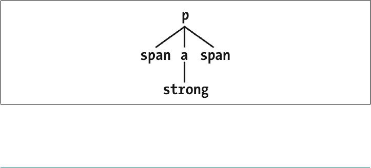
What the CSS says, in effect, is “any span inside a div that doesn’t have a class con‐
taining the word help should be gray” in the first rule, and “any span inside a div
whose class contains the word help” in the second rule. In the given markup frag‐
ment, both rules apply to the span shown.
Because the two rules have equal weight and the “red” rule is written last, it wins out
and the span is red. The fact that the div class="aside" is “closer to” the span than
the div class="help" is irrelevant. Again: descendant selectors have no notion of
element proximity. Both rules match, only one color can be applied, and due to the
way CSS works, red is the winner here. (We’ll discuss why in the next chapter.)
Selecting Children
In some cases, you don’t want to select an arbitrarily descended element. Rather, you
want to narrow your range to select an element that is a child of another element. You
might, for example, want to select a strong element only if it is a child (as opposed to
any level of descendant) of an h1 element. To do this, you use the child combinator,
which is the greater-than symbol (>):
h1 > strong {color: red;}
This rule will make red the strong element shown in the first h1, but not the second:
<h1>This is <strong>very</strong> important.</h1>
<h1>This is <em>really <strong>very</strong></em> important.</h1>
Read right to left, the selector h1 > strong translates as, “Selects any strong element
that is a direct child of an h1 element.” The child combinator can be optionally sur‐
rounded by whitespace. Thus, h1 > strong, h1> strong, and h1>strong are all
equivalent. You can use or omit whitespace as you wish.
When viewing the document as a tree structure, it’s easy to see that a child selector
restricts its matches to elements that are directly connected in the tree. Figure 2-19
shows part of a document tree.
Figure 2-19. A document tree fragment
Using Document Structure | 59
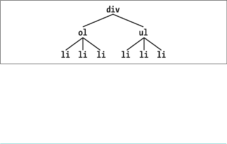
In this tree fragment, you can pick out parent-child relationships. For example, the a
element is parent to the strong, but it is child to the p element. You could match ele‐
ments in this fragment with the selectors p > a and a > strong, but not p > strong,
since the strong is a descendant of the p but not its child.
You can also combine descendant and child combinations in the same selector. Thus,
table.summary td > p will select any p element that is a child of a td element that is
itself descended from a table element that has a class attribute containing the word
summary.
Selecting Adjacent Sibling Elements
Let’s say you want to style the paragraph immediately after a heading, or give a special
margin to a list that immediately follows a paragraph. To select an element that
immediately follows another element with the same parent, you use the adjacent-
sibling combinator, represented as a plus symbol (+). As with the child combinator,
the symbol can be surrounded by whitespace, or not, at the author’s discretion.
To remove the top margin from a paragraph immediately following an h1 element,
write:
h1 + p {margin-top: 0;}
The selector is read as, “Selects any p element that immediately follows an h1 element
that shares a parent with the p element.”
To visualize how this selector works, it is easiest to once again consider a fragment of
a document tree, shown in Figure 2-20.
Figure 2-20. Another document tree fragment
In this fragment, a pair of lists descends from a div element, one ordered and the
other not, each containing three list items. Each list is an adjacent sibling, and the list
items themselves are also adjacent siblings. However, the list items from the first list
are not siblings of the second, since the two sets of list items do not share the same
parent element. (At best, they’re cousins, and CSS has no cousin selector.)
60 | Chapter 2: Selectors

Remember that you can select the second of two adjacent siblings only with a single
combinator. Thus, if you write li + li {font-weight: bold;}, only the second and
third items in each list will be boldfaced. The first list items will be unaffected, as
illustrated in Figure 2-21.
Figure 2-21. Selecting adjacent siblings
To work properly, CSS requires that the two elements appear in “source order.” In our
example, an ol element is followed by a ul element. This allows us to select the sec‐
ond element with ol + ul, but we cannot select the first using the same syntax. For
ul + ol to match, an ordered list must immediately follow an unordered list.
Keep in mind that text content between two elements does not prevent the adjacent-
sibling combinator from working. Consider this markup fragment, whose tree view
would be the same as that shown in Figure 2-19:
<div>
<ol>
<li>List item 1</li>
<li>List item 1</li>
<li>List item 1</li>
</ol>
This is some text that is part of the 'div'.
<ul>
<li>A list item</li>
<li>Another list item</li>
<li>Yet another list item</li>
</ul>
</div>
Even though there is text between the two lists, we can still match the second list with
the selector ol + ul. That’s because the intervening text is not contained with a sib‐
ling element, but is instead part of the parent div. If we wrapped that text in a para‐
graph element, it would then prevent ol + ul from matching the second list. Instead,
we might have to write something like ol + p + ul.
Using Document Structure | 61

As the following example illustrates, the adjacent-sibling combinator can be used in
conjunction with other combinators:
html > body table + ul{margin-top: 1.5em;}
The selector translates as, “Selects any ul element that immediately follows a sibling
table element that is descended from a body element that is itself a child of an html
element.”
As with all combinators, you can place the adjacent-sibling combinator in a more
complex setting, such as div#content h1 + div ol. That selector is read as, “Selects
any ol element that is descended from a div when the div is the adjacent sibling of an
h1 which is itself descended from a div whose id attribute has a value of content.”
Selecting Following Siblings
Selectors Level 3 introduced a new sibling combinator called the general sibling com‐
binator. This lets you select any element that follows another element when both ele‐
ments share the same parent, represented using the tilde (~) combinator.
As an example, to italicize any ol that follows an h2 and also shares a parent with the
h2, you’d write h2 ~ol {font-style: italic;}. The two elements do not have to be
adjacent siblings, although they can be adjacent and still match this rule. The result of
applying this rule to the following markup is shown in Figure 2-22:
<div>
<h2>Subheadings</h2>
<p>It is the case that not every heading can be a main heading. Some headings
must be subheadings. Examples include:</p>
<ol>
<li>Headings that are less important</li>
<li>Headings that are subsidiary to more important headlines</li>
<li>Headings that like to be dominated</li>
</ol>
<p>Let's restate that for the record:</p>
<ol>
<li>Headings that are less important</li>
<li>Headings that are subsidiary to more important headlines</li>
<li>Headings that like to be dominated</li>
</ol>
</div>
As you can see, both ordered lists are italicized. That’s because both of them are ol
elements that follow an h2 with which they share a parent (the div).
62 | Chapter 2: Selectors
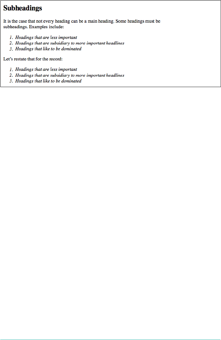
Figure 2-22. Selecting following siblings
Pseudo-Class Selectors
Things get really interesting with pseudo-class selectors. These selectors let you assign
styles to what are, in effect, phantom classes that are inferred by the state of certain
elements, or markup patterns within the document, or even by the state of the docu‐
ment itself.
The phrase “phantom classes” might seem a little odd, but it really is the best way to
think of how pseudo-classes work. For example, suppose you wanted to highlight
every other row of a data table. You could do that by marking up every other row
something like class="even" and then writing CSS to highlight rows with that class
—or (as we’ll soon see) you could use a pseudo-class selector to achieve the same
effect, and through very similar means.
Combining Pseudo-Classes
Before we start, a word about chaining. CSS makes it possible to combine (“chain”)
pseudo-classes together. For example, you can make unvisited links red when they’re
hovered and visited links maroon when they’re hovered:
a:link:hover {color: red;}
a:visited:hover {color: maroon;}
The order you specify doesn’t actually matter; you could also write a:hover:link to
the same effect as a:link:hover. It’s also possible to assign separate hover styles to
unvisited and visited links that are in another language—for example, German:
a:link:hover:lang(de) {color: gray;}
a:visited:hover:lang(de) {color: silver;}
Pseudo-Class Selectors | 63

Be careful not to combine mutually exclusive pseudo-classes. For example, a link can‐
not be both visited and unvisited, so a:link:visited doesn’t make any sense and will
never match anything.
Structural Pseudo-Classes
The majority of pseudo-classes are structural in nature; that is, they refer to the
markup structure of the document. Most of them depend on patterns within the
markup, such as choosing every third paragraph, but others allow you to address spe‐
cific types of elements. All pseudo-classes, without exception, are a word preceded by
a single colon (:), and they can appear anywhere in a selector.
Before we get started, there’s an aspect of pseudo-classes that needs to be made
explicit here: pseudo-classes always refer to the element to which they’re attached,
and no other. Seems like a weirdly obvious thing to say, right? The reason to make it
explicit is that for a few of the structural pseudo-classes, it’s a common error to think
they are descriptors that refer to descendant elements.
To illustrate this, I’d like to share a personal anecdote. When my first child was born
in 2003, I announced it online (like you do). A number of people responded with
congratulations and CSS jokes, chief among them the selector #ericmeyer:first-
child. The problem there is that selector would select me, not my daughter, and only
if I were the first child of my parents (which, as it happens, I am). To properly select
my first child, that selector would need to be #ericmeyer > :first-child.
The confusion is understandable, which is why I’m addressing it here. Reminders will
be found throughout the following sections. Just always keep in mind that the effect
of pseudo-classes is to apply a sort of a “phantom class” to the element to which
they’re attached, and you should be OK.
Selecting the root element
This is the quintessence of structural simplicity: the pseudo-class :root selects the
root element of the document. In HTML, this is always the html element. The real
benefit of this selector is found when writing stylesheets for XML languages, where
the root element may be different in every language—for example, in RSS 2.0 it’s the
rss element—or even when you have more than one possible root element within a
single language (though not a single document!).
Here’s an example of styling the root element in HTML, as illustrated in Figure 2-23:
:root {border: 10px dotted gray;}
body {border: 10px solid black;}
64 | Chapter 2: Selectors
Figure 2-23. Styling the root element
In HTML documents, you can always select the html element directly, without having
to use the :root pseudo-class. There is a difference between the two selectors in
terms of specificity, which we’ll cover in Chapter 3.
Selecting empty elements
With the pseudo-class :empty, you can select any element that has no children of any
kind, including text nodes, which covers both text and whitespace. This can be useful
in suppressing elements that a CMS has generated without filling in any actual con‐
tent. Thus, p:empty {display: none;} would prevent the display of any empty para‐
graphs.
Note that in order to be matched, an element must be, from a parsing perspective,
truly empty—no whitespace, visible content, or descendant elements. Of the follow‐
ing elements, only the first and last would be matched by p:empty:
<p></p>
<p> </p>
<p>
</p>
<p><!—-a comment--></p>
The second and third paragraphs are not matched by :empty because they are not
empty: they contain, respectively, a single space and a single newline character. Both
are considered text nodes, and thus prevent a state of emptiness. The last paragraph
matches because comments are not considered content, not even whitespace. But put
even one space or newline to either side of that comment, and p:empty would fail to
match.
You might be tempted to just style all empty elements with something like *:empty
{display: none;}, but there’s a hidden catch: :empty matches HTML’s empty ele‐
ments, like img and input. It could even match textarea, unless you insert some
default text into the textarea element. Thus, in terms of matching elements, img and
img:empty are effectively the same. (They are different in terms of specificity, which
we’ll cover in the next chapter.)
Pseudo-Class Selectors | 65
<img src="salmon.png" alt="North Pacific Salmon">
<br>
<input type="number" min="-1" max="1" step=".01"/>
<textarea></textarea>
As of late 2017, :empty is unique in that it’s the only CSS selector
that takes text nodes into consideration when determining
matches. Every other selector type in Selectors Level 3 considers
only elements, and ignores text nodes entirely—recall, for example,
the sibling combinators.
Selecting unique children
If you’ve ever wanted to select all the images that are wrapped by a hyperlink element,
the :only-child pseudo-class is for you. It selects elements when they are the only
child element of another element. So let’s say you want to add a border to any image
that’s the only child of another element. You’d write:
img:only-child {border: 1px solid black;}
This would match any image that meets those criteria. Therefore, if you had a para‐
graph which contained an image and no other child elements, the image would be
selected regardless of all the text surrounding it. If what you’re really after is images
that are sole children and found inside hyperlinks, then you just modify the selector
like so (which is illustrated in Figure 2-24):
a[href] img:only-child {border: 2px solid black;}
<a href="http://w3.org/"><img src="w3.png" alt="W3C"></a>
<a href="http://w3.org/"><img src="w3.png" alt=""> The W3C</a>
<a href="http://w3.org/"><img src="w3.png" alt=""> <em>The W3C</em></a>
Figure 2-24. Selecting images that are only children inside links
There are two things to remember about :only-child. The first is that you always
apply it to the element you want to be an only child, not to the parent element, as
explained earlier. And that brings up the second thing to remember, which is that
when you use :only-child in a descendant selector, you aren’t restricting the ele‐
ments listed to a parent-child relationship.
To go back to the hyperlinked-image example, a[href] img:only-child matches
any image that is an only child and is descended from an a element, not is a child of
an a element. To match, the element image must be the only child of its direct parent,
66 | Chapter 2: Selectors

and a descendant of a link, but that parent can itself be a descendant of that link.
Therefore, all three of the images here would be matched, as shown in Figure 2-25:
a[href] img:only-child {border: 5px solid black;}
<a href="http://w3.org/"><img src="w3.png" alt="W3C"></a>
<a href="http://w3.org/"><span><img src="w3.png" alt="W3C"></span></a>
<a href="http://w3.org/">A link to <span>the <img src="w3.png" alt="">
web</span> site</a>
Figure 2-25. Selecting images that are only children inside links
In each case, the image is the only child element of its parent, and it is also descended
from an a element. Thus, all three images are matched by the rule shown. If you
wanted to restrict the rule so that it matched images that were the only children of a
elements, then you’d just add the child combinator to yield a[href] > img:only-
child. With that change, only the first of the three images shown in Figure 2-25
would be matched.
That’s all great, but what if you want to match images that are the only images inside
hyperlinks, but there are other elements in there with them? Consider the following:
<a href="http://w3.org/"><b>•</b><img src="w3.png" alt="W3C"></a>
In this case, we have an a element that has two children: b and img. That image, no
longer being the only child of its parent (the hyperlink), can never be matched
using :only-child. However, it can be matched using :only-of-type. This is illus‐
trated in Figure 2-26:
a[href] img:only-of-type {border: 5px solid black;}
<a href="http://w3.org/"><b>•</b><img src="w3.png" alt="W3C"></a>
<a href="http://w3.org/"><span><b>•</b><img src="w3.png" alt="W3C"></span></a>
Figure 2-26. Selecting images that are the only sibling of their type
The difference is that :only-of-type will match any element that is the only of its
type among all its siblings, whereas :only-child will only match if an element has no
siblings at all.
Pseudo-Class Selectors | 67

This can be very useful in cases such as selecting images within paragraphs without
having to worry about the presence of hyperlinks or other inline elements:
p > img:only-of-type {float: right; margin: 20px;}
As long as there aren’t multiple images that are children of the same paragraph, then
the image will be floated. You could also use this pseudo-class to apply extra styles to
an h2 when it’s the only one in a section of a document, like this:
section > h2 {margin: 1em 0 0.33em; font-size: 1.8rem; border-bottom: 1px solid
gray;}
section > h2:only-of-type {font-size: 2.4rem;}
Given those rules, any section that has only one child h2 will have it appear larger
than usual. If there are two or more h2 children to a section, neither of them will be
larger than the other. The presence of other children—whether they are other head‐
ing levels, paragraphs, tables, paragraphs, lists, and so on—will not interfere with
matching.
There’s one more thing to make clear, which is that :only-of-type refers to elements
and nothing else. Consider the following:
p.unique:only-of-type {color: red;}
<div>
<p class="unique">This paragraph has a 'unique' class.</p>
<p>This paragraph doesn't have a class at all.</p>
</div>
In this case, neither of the paragraphs will be selected. Why not? Because there are
two paragraphs that are descendants of the div, so neither of them can be the only
one of their type.
The class name is irrelevant here. We’re fooled into thinking that “type” is a generic
description, because of how we parse language. Type, in the way :only-of-type
means it, refers only to the element type. Thus, p.unique:only-of-type means
“select any p element whose class attribute contains the word unique when the p
element is the only p element among its siblings.” It does not mean “select any p ele‐
ment whose class attribute contains the word unique when it’s the only sibling para‐
graph to meet that criterion.”
Selecting rst and last children
It’s pretty common to want to apply special styling to the first or last child of an ele‐
ment. A common example is styling a bunch of navigation links in a tab bar, and
wanting to put some special visual touches on the first or last tab (or both). In the
past, this was done by applying special classes to those elements. Now we have
pseudo-classes to carry the load for us.
68 | Chapter 2: Selectors
The pseudo-class :first-child is used to select elements that are the first children of
other elements. Consider the following markup:
<div>
<p>These are the necessary steps:</p>
<ul>
<li>Insert key</li>
<li>Turn key <strong>clockwise</strong></li>
<li>Push accelerator</li>
</ul>
<p>
Do <em>not</em> push the brake at the same time as the accelerator.
</p>
</div>
In this example, the elements that are first children are the first p, the first li, and the
strong and em elements, which are all the first children of their respective parents.
Given the following two rules:
p:first-child {font-weight: bold;}
li:first-child {text-transform: uppercase;}
we get the result shown in Figure 2-27.
Figure 2-27. Styling rst children
The first rule boldfaces any p element that is the first child of another element. The
second rule uppercases any li element that is the first child of another element
(which, in HTML, must be either an ol or ul element).
As has been mentioned, the most common error is assuming that a selector like
p:first-child will select the first child of a p element. Remember the nature of
pseudo-classes, which is to attach a sort of phantom class to the element associated
with the pseudo-class. If you were to add actual classes to the markup, it would look
like this:
<div>
<p class="first-child">These are the necessary steps:</p>
<ul>
<li class="first-child">Insert key</li>
<li>Turn key <strong class="first-child">clockwise</strong></li>
<li>Push accelerator</li>
</ul>
<p>
Pseudo-Class Selectors | 69
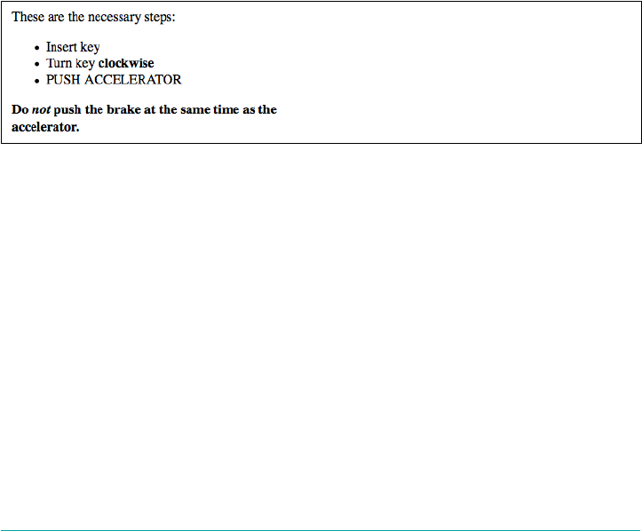
Do <em class="first-child">not</em> push the brake at the same time as the
accelerator.
</p>
</div>
Therefore, if you want to select those em elements that are the first child of another
element, you write em:first-child.
The mirror image of :first-child is :last-child. If we take the previous example
and just change the pseudo-classes, we get the result shown in Figure 2-28.
p:last-child {font-weight: bold;}
li:last-child {text-transform: uppercase;}
<div>
<p>These are the necessary steps:</p>
<ul>
<li>Insert key</li>
<li>Turn key <strong>clockwise</strong></li>
<li>Push accelerator</li>
</ul>
<p>
Do <em>not</em> push the brake at the same time as the accelerator.
</p>
</div>
Figure 2-28. Styling last children
The first rule boldfaces any p element that is the last child of another element. The
second rule uppercases any li element that is the last child of another element. If you
wanted to select the em element inside that last paragraph, you could use the selector
p:last-child em, which selects any em element that descends from a p element that
is itself the last child of another element.
Interestingly, you can combine these two pseudo-classes to create a version of :only-
child. The following two rules will select the same elements:
p:only-child {color: red;}
p:first-child:last-child {background-color: red;}
Either way, we get paragraphs with red foreground and background colors (not a
good idea, clearly).
70 | Chapter 2: Selectors
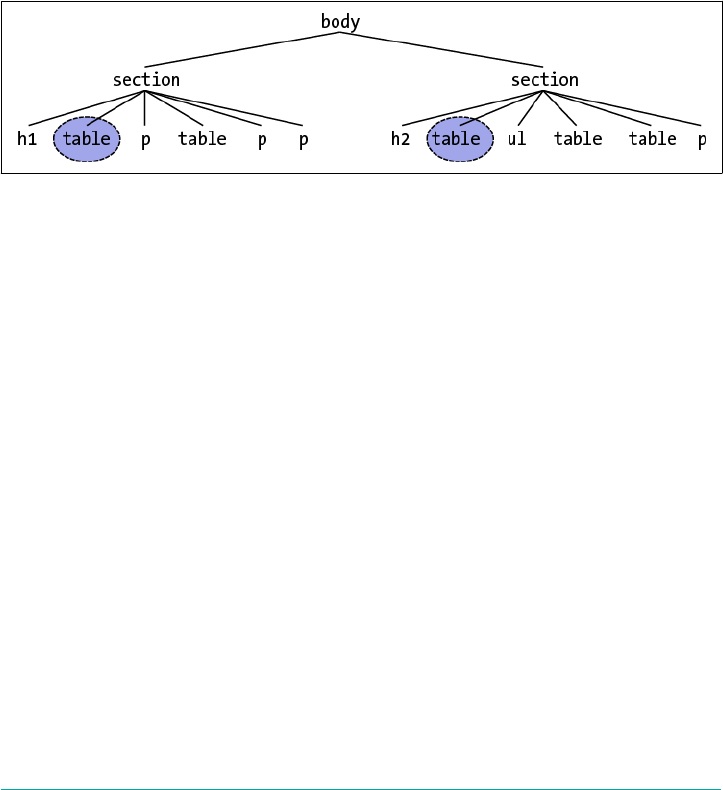
Selecting rst and last of a type
In a manner similar to selecting the first and last children of an element, you can
select the first or last of a type of element within another element. This permits things
like selecting the first table inside a given element, regardless of whatever elements
come before it.
table:first-of-type {border-top: 2px solid gray;}
Note that this does not apply to the entire document; that is, the rule shown will not
select the first table in the document and skip all the others. It will instead select the
first table element within each element that contains one, and skip any sibling table
elements that come after the first. Thus, given the document structure shown in
Figure 2-29, the circled nodes are the ones that are selected.
Figure 2-29. Selecting rst-of-type tables
Within the context of tables, a useful way to select the first data cell within a row
regardless of whether a header cell comes before it in the row is as follows:
td:first-of-type {border-left: 1px solid red;}
That would select the first data cell in each of the following table rows:
<tr>
<th scope="row">Count</th><td>7</td><td>6</td><td>11</td>
</tr>
<tr>
<td>Q</td><td>X</td><td>-</td>
</tr>
Compare that to the effects of td:first-child, which would select the first td ele‐
ment in the second row, but not in the first row.
The flip side is :last-of-type, which selects the last instance of a given type from
amongst its sibling elements. In a way, it’s just like :first-of-type except you start
with the last element in a group of siblings and walk backward toward the first ele‐
ment until you reach an instance of the type. Given the document structure shown in
Figure 2-30, the circled nodes are the ones selected by table:last-of-type.
Pseudo-Class Selectors | 71
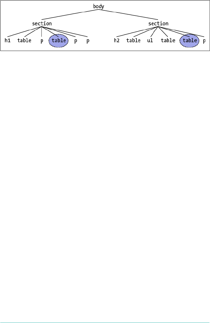
Figure 2-30. Selecting last-of-type tables
As was noted with :only-of-type, remember that you are selecting elements of a
type from among their sibling elements; thus, every set of siblings is considered sepa‐
rately. In other words, you are not selecting the first (or last) of all the elements of a
type within the entire document as a single group. Each set of elements that share a
parent is its own group, and you can select the first (or last) of a type within each
group.
Similar to what was noted in the previous section, you can combine these two
pseudo-classes to create a version of :only-of-type. The following two rules will
select the same elements:
table:only-of-type{color: red;}
table:first-of-type:last-of-type {background: red;}
Selecting every nth child
If you can select elements that are the first, last, or only children of other elements,
how about every third child? All even children? Only the ninth child? Rather than
define a literally infinite number of named pseudo-classes, CSS has the :nth-child()
pseudo-class. By filling integers or even simple algebraic expressions into the paren‐
theses, you can select any arbitrarily numbered child element you like.
Let’s start with the :nth-child() equivalent of :first-child, which is :nth-
child(1). In the following example, the selected elements will be the first paragraph
and the first list item.
p:nth-child(1) {font-weight: bold;}
li:nth-child(1) {text-transform: uppercase;}
<div>
<p>These are the necessary steps:</p>
<ul>
<li>Insert key</li>
<li>Turn key <strong>clockwise</strong></li>
<li>Push accelerator</li>
</ul>
<p>
Do <em>not</em> push the brake at the same time as the accelerator.
72 | Chapter 2: Selectors
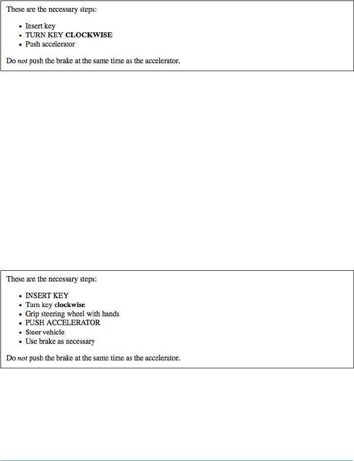
</p>
</div>
If we change the numbers from 1 to 2, however, then no paragraphs will be selected,
and the middle (or second) list item will be selected, as illustrated in Figure 2-31:
p:nth-child(2) {font-weight: bold;}
li:nth-child(2) {text-transform: uppercase;}
Figure 2-31. Styling second children
You can insert any integer you choose; if you have a use case for selecting any ordered
list that is the 93rd child element of its parent, then ol:nth-child(93) is ready to
serve. This will match the 93rd child of any parent as long as that child is an ordered
list. (This does not mean the 93rd ordered list among its siblings; see the next section
for that.)
More powerfully, you can use simple algebraic expressions in the form a n + b or a n
− b to define recurring instances, where a and b are integers and n is present as itself.
Furthermore, the + b or − b part is optional and thus can be dropped if it isn’t needed.
Let’s suppose we want to select every third list item in an unordered list, starting with
the first. The following makes that possible, selecting the first and fourth items, as
shown in Figure 2-32.
ul > li:nth-child(3n + 1) {text-transform: uppercase;}
Figure 2-32. Styling every third list item
The way this works is that n represents the series 0, 1, 2, 3, 4, and on into infinity. The
browser then solves for 3 n + 1, yielding 1, 4, 7, 10, 13, and so on. Were we to drop
the +1, thus leaving us with simply 3n, the results would be 0, 3, 6, 9, 12, and so on.
Pseudo-Class Selectors | 73
Since there is no zeroth list item—all element counting starts with one, to the likely
chagrin of array-slingers everywhere—the first list item selected by this expression
would be the third list item in the list.
Given that element counting starts with one, it’s a minor trick to deduce that :nth-
child(2n) will select even-numbered children, and either :nth-child(2n+1)
or :nth-child(2n-1) will select odd-numbered children. You can commit that to
memory, or you can use the two special keywords that :nth-child() accepts: even
and odd. Want to highlight every other row of a table, starting with the first? Here’s
how you do it, with the results shown in Figure 2-33:
tr:nth-child(odd) {background: silver;}
Figure 2-33. Styling every other table row
Anything more complex than every-other-element requires an an + b expression.
Note that when you want to use a negative number for b, you have to remove the +
sign or else the selector will fail entirely. Of the following two rules, only the first will
do anything. The second will be dropped by the parser and ignored:
tr:nth-child(4n - 2) {background: silver;}
tr:nth-child(3n + −2) {background: red;}
If you want to select every row starting with the ninth, you can use either of the fol‐
lowing. They are similar in that they will select all rows starting with the ninth, but
the latter one has greater specificity, which we discuss in Chapter 3:
tr:nth-child(n + 9) {background: silver;}
tr:nth-child(8) ~ tr {background: silver;}
As you might expect, there is a corresponding pseudo-class in :nth-last-child().
This lets you do the same thing as :nth-child(), except with :nth-last-child()
you start from the last element in a list of siblings and count backward toward the
74 | Chapter 2: Selectors
beginning. If you’re intent on highlighting every other table row and making sure the
very last row is one of the rows in the highlighting pattern, either one of these will
work for you:
tr:nth-last-child(odd) {background: silver;}
tr:nth-last-child(2n+1) {background: silver;} /* equivalent */
If the DOM is updated to add or remove table rows, there is no need to add or
remove classes. By using structural selectors, these selectors will always match the
odd rows of the updated DOM.
Any element can be matched using both :nth-child() and :nth-last-child() if it
fits the criteria. Consider these rules, the results of which are shown in Figure 2-34:
li:nth-child(3n + 3) {border-left: 5px solid black;}
li:nth-last-child(4n - 1) {border-right: 5px solid black; background: silver;}
Figure 2-34. Combining patterns of :nth-child() and :nth-last-child()
It’s also the case that you can string these two pseudo-classes together as :nth-
child(1):nth-last-child(1), thus creating a more verbose restatement of :only-
child. There’s no real reason to do so other than to create a selector with a higher
specificity, but the option is there.
You can use CSS to determine how many list items are in a list, and style them
accordingly:
li:only-child {width: 100%;}
li:nth-child(1):nth-last-child(2),
li:nth-child(2):nth-last-child(1) {width: 50%;}
li:nth-child(1):nth-last-child(3),
li:nth-child(1):nth-last-child(3) ~ li {width: 33.33%;}
li:nth-child(1):nth-last-child(4),
li:nth-child(1):nth-last-child(4) ~ li {width: 25%;}
Pseudo-Class Selectors | 75
In these examples, if a list item is the only list item, then the width is 100%. If a list
item is the first item and also the second-from-the-last item, that means there are two
items, and the width is 50%. If an item is the first item and also the third from the last
item, then we make it, and the two sibling list items following it, 33% wide. Similarly,
if a list item is the first item and also the fourth from the last item, it means that there
are exactly four items, so we make it, and its three siblings, 25% of the width.
Selecting every nth of a type
In what’s probably become a familiar pattern, the :nth-child() and :nth-last-
child() pseudo-classes have analogues in :nth-of-type() and :nth-last-of-
type(). You can, for example, select every other hyperlink that’s a child of any given
paragraph, starting with the second, using p > a:nth-of-type(even). This will
ignore all other elements (spans, strongs, etc.) and consider only the links, as
demonstrated in Figure 2-35:
p > a:nth-of-type(even) {background: blue; color: white;}
Figure 2-35. Selecting the even-numbered links
If you want to work from the last hyperlink backward, then you’d use p > a:nth-
last-of-type(even).
As before, these select elements of a type from among their sibling elements, not from
among all the elements of a type within the entire document as a single group. Each
element has its own list of siblings, and selections happen within each group.
As you might expect, you can string these two together as :nth-of-type(1):nth-
last-of-type(1) to restate :only-of-type, only with higher specificity. (We will
explain specificity in Chapter 3, I promise.)
Dynamic Pseudo-Classes
Beyond the structural pseudo-classes, there are a set of pseudo-classes that relate to
structure but can change based on changes made to the page after it’s been rendered.
In other words, the styles are applied to pieces of a document based on something in
76 | Chapter 2: Selectors

addition to the structure of the document, and in a way that cannot be precisely
deduced simply by studying the document’s markup.
It may sound like we’re applying styles at random, but not so. Instead, we’re applying
styles based on somewhat ephemeral conditions that can’t be predicted in advance.
Nevertheless, the circumstances under which the styles will appear are, in fact, well-
defined. Think of it this way: during a sporting event, whenever the home team
scores, the crowd will cheer. You don’t know exactly when during a game the team
will score, but when it does, the crowd will cheer, just as predicted. The fact that you
can’t predict the exact moment of the cheer doesn’t make it any less expected.
Consider the anchor element (a), which (in HTML and related languages) establishes
a link from one document to another. Anchors are always anchors, but some anchors
refer to pages that have already been visited, while others refer to pages that have yet
to be visited. You can’t tell the difference by simply looking at the HTML markup,
because in the markup, all anchors look the same. The only way to tell which links
have been visited is by comparing the links in a document to the user’s browser his‐
tory. So there are actually two basic types of links: visited and unvisited.
Hyperlink pseudo-classes
CSS2.1 defines two pseudo-classes that apply only to hyperlinks. In HTML, these are
any a elements with an href attribute; in XML languages, they’re any elements that
act as links to another resource. Table 2-2 describes the pseudo-classes you can apply
to them.
Table 2-2. Link pseudo-classes
Name Description
:link Refers to any anchor that is a hyperlink (i.e., has an href attribute) and points to an address that has not
been visited.
:visited Refers to any anchor that is a hyperlink to an already visited address. For security reasons, the styles that can
be applied to visited links are severely limited; see sidebar “Visited Links and Privacy” on page 79 for details.
The first of the pseudo-classes in Table 2-2 may seem a bit redundant. After all, if an
anchor hasn’t been visited, then it must be unvisited, right? If that’s the case, all we
should need is the following:
a {color: blue;}
a:visited {color: red;}
Although this format seems reasonable, it’s actually not quite enough. The first of the
rules shown here applies not only to unvisited links, but also to placeholder links
such as this one:
<a>4. The Lives of Meerkats</a>
Pseudo-Class Selectors | 77

The resulting text would be blue because the a element will match the rule a {color:
blue;}. Therefore, to avoid applying your link styles to placeholders, use the :link
and :visited pseudo-classes:
a:link {color: blue;} /* unvisited links are blue */
a:visited {color: red;} /* visited links are red */
This is a good place to revisit attribute and class selectors and show how they can be
combined with pseudo-classes. For example, let’s say you want to change the color of
links that point outside your own site. In most circumstances we can use the starts-
with attribute selector. However, some CMS’s set all links to be absolute URLS, in
which case you could assign a class to each of these anchors. It’s easy:
<a href="/about.html">My About page</a>
<a href="https://www.site.net/" class="external">An external site</a>
To apply different styles to the external link, all you need is a rule like this:
a.external:link, a[href^="http"]:link { color: slateblue;}
a.external:visited, a[href^="http"]:visited {color: maroon;}
This rule will make the second anchor in the preceding markup slateblue by default,
and maroon once visited, while the first anchor will remain the default color for
hyperlinks (usually blue when not visited and purple once visited). For improved usa‐
bility and accessibility, visited links should be easily differentiable from non-visited
links.
Styled visited links enables visitors to know where they have been
and what they have yet to visit. This is especially important on large
websites where it may be difficult to remember, especially for those
with cognitive disabilities, which pages have been visited. Not only
is highlighting visited links one of the W3C Web Content Accessi‐
bility Guidelines, but it makes searching for content faster, more
efficient, and less stressful for everyone.
The same general syntax is used for ID selectors as well:
a#footer-copyright:link{background: yellow;}
a#footer-copyright:visited {background: gray;}
You can chain the two link-state pseudo-classes together, but there’s no reason why
you ever would: a link cannot be both visited and unvisited at the same time!
78 | Chapter 2: Selectors
Visited Links and Privacy
For well over a decade, it was possible to style visited links with any CSS properties
available, just as you could unvisited links. However, in the mid-2000s several people
demonstrated that one could use visual styling and simple DOM scripting to deter‐
mine if a user had visited a given page. For example, given the rule :visited {font-
weight: bold;}, a script could find all of the boldfaced links and tell the user which
of those sites they’d visited—or, worse still, report those sites back to a server. A simi‐
lar, non-scripted tactic uses background images to achieve the same result.
While this might not seem terribly serious to you, it can be utterly devastating for a
web user in a country where one can be jailed for visiting certain sites—opposition
parties, unsanctioned religious organizations, “immoral” or “corrupting” sites, and so
on. It can also be used by phishing sites to determine which online banks a user has
visited. Thus, two steps were taken.
The first step is that only color-related properties can be applied to visited links:
color, background-color, column-rule-color, outline-color, border-color, and
the individual-side border color properties (e.g., border-top-color). Attempts to
apply any other property to a visited link will be ignored. Furthermore, any styles
defined for :link will be applied to visited links as well as unvisited links, which
effectively makes :link “style any hyperlink,” instead of “style any unvisited hyper‐
link.”
The second step is that if a visited link has its styles queried via the DOM, the result‐
ing value will be as if the link were not visited. Thus, if you’ve defined visited links to
be purple rather than unvisited links’ blue, even though the link will appear purple
onscreen, a DOM query of its color will return the blue value, not the purple one.
As of late 2017, this behavior is present throughout all browsing modes, not just “pri‐
vate browsing” modes. Even though we’re limited in how we can use CSS to differen‐
tiate visited links from non-visited links, it is important for usability and accessibility
to use the limited styles supported by visited links to differentiate them from unvis‐
ited links.
User action pseudo-classes
CSS defines a few pseudo-classes that can change a document’s appearance based on
actions taken by the user. These dynamic pseudo-classes have traditionally been used
to style hyperlinks, but the possibilities are much wider. Table 2-3 describes these
pseudo-classes.
Pseudo-Class Selectors | 79
Table 2-3. User action pseudo-classes
Name Description
:focus Refers to any element that currently has the input focus—i.e., can accept keyboard input or be activated in
some way.
:hover Refers to any element over which the mouse pointer is placed—e.g., a hyperlink over which the mouse pointer
is hovering.
:active Refers to any element that has been activated by user input—e.g., a hyperlink on which a user clicks during the
time the mouse button is held down.
Elements that can become :active include links, buttons, menu items, and any ele‐
ment with a tabindex value. These elements and all other interactive elements, includ‐
ing form controls and elements that are content-editable, can also receive focus.
As with :link and :visited, these pseudo-classes are most familiar in the context of
hyperlinks. Many web pages have styles that look like this:
a:link {color: navy;}
a:visited {color: gray;}
a:focus {color: orange;}
a:hover {color: red;}
a:active {color: yellow;}
The order of the pseudo-classes is more important than it might
seem at first. The usual recommendation is “link-visited-hover-
active,” although this has been modified to “link-visited-focus-
hover-active.” The next chapter explains why this particular
ordering is important and discusses several reasons you might
choose to change or even ignore the recommended ordering.
Notice that the dynamic pseudo-classes can be applied to any element, which is good
since it’s often useful to apply dynamic styles to elements that aren’t links. For exam‐
ple, using this markup:
input:focus {background: silver; font-weight: bold;}
you could highlight a form element that is ready to accept keyboard input, as shown
in Figure 2-36.
Figure 2-36. Highlighting a form element that has focus
80 | Chapter 2: Selectors

You can also perform some rather odd feats by applying dynamic pseudo-classes to
arbitrary elements. You might decide to give users a “highlight” effect by way of the
following:
body *:hover {background: yellow;}
This rule will cause any element that’s descended from the body element to display a
yellow background when it’s in a hover state. Headings, paragraphs, lists, tables,
images, and anything else found inside the body will be changed to have a yellow
background. You could also change the font, put a border around the element being
hovered, or alter anything else the browser will allow.
While you can style elements with :focus any way you like, do not
remove all styling from focused elements. Differentiating which
element currently has focus is vital for accessibility, especially for
those navigating your site or application with a keyboard.
Real-world issues with dynamic styling
Dynamic pseudo-classes present some interesting issues and peculiarities. For exam‐
ple, it’s possible to set visited and unvisited links to one font size and make hovered
links a larger size, as shown in Figure 2-37:
a:link, a:visited {font-size: 13px;}
a:hover, a:active {font-size: 20px;}
Figure 2-37. Changing layout with dynamic pseudo-classes
As you can see, the user agent increases the size of the anchor while the mouse
pointer hovers over it; or, thanks to the :active setting, when a user touches it on a
touch screen. A user agent that supports this behavior must redraw the document
while an anchor is in hover state, which could force a reflow of all the content that
follows the link.
UI-State Pseudo-Classes
Closely related to the dynamic pseudo-classes are the user-interface (UI) state pseudo-
classes, which are summarized in Table 2-4. These pseudo-classes allow for styling
based on the current state of user-interface elements like checkboxes.
Pseudo-Class Selectors | 81

Table 2-4. UI-state pseudo-classes
Name Description
:enabled Refers to user-interface elements (such as form elements) that are enabled; that is, available for input.
:disabled Refers to user-interface elements (such as form elements) that are disabled; that is, not available for
input.
:checked Refers to radio buttons or checkboxes that have been selected, either by the user or by defaults within
the document itself.
:indetermi
nate
Refers to radio buttons or checkboxes that are neither checked nor unchecked; this state can only be set
via DOM scripting, and not due to user input.
:default Refers to the radio button, checkbox, or option that was selected by default.
:valid Refers to a user input that meets all of its data validity semantics
:invalid Refers to a user input that does not meet all of its data validity semantics
:in-range Refers to a user input whose value is between the minimum and maximum values
:out-of-
range
Refers to a user input whose value is below the minimum or above the maximum values allowed by the
control
:required Refers to a user input that must have a value set
:optional Refers to a user input that does not need to have a value set
:read-write Refers to a user input that is editable by the user
:read-only Refers to a user input that is not editable by the user
Although the state of a UI element can certainly be changed by user action—for
example, a user checking or unchecking a checkbox—UI-state pseudo-classes are not
classified as purely dynamic because they can also be affected by the document struc‐
ture or DOM scripting.
You might think that :focus belongs in this section, not the previ‐
ous section. However, the Selectors Level 3 specification
groups :focus in with :hover and :active. This is most likely
because they were grouped together in CSS2, which had no UI-
state pseudo-classes. More importantly, though, focus can be given
to non-UI elements, such as headings or paragraphs—one example
is when they are read by a speaking browser. That alone keeps it
from being considered a UI-state pseudo-class.
Enabled and disabled UI elements
Thanks to both DOM scripting and HTML5, it is possible to mark a user-interface
element (or group of user interface elements) as being disabled. A disabled element is
displayed, but cannot be selected, activated, or otherwise interacted with by the user.
Authors can set an element to be disabled either through DOM scripting, or (in
HTML5) by adding a disabled attribute to the element’s markup.
82 | Chapter 2: Selectors

Any element that hasn’t been disabled is by definition enabled. You can style these
two states using the :enabled and :disabled pseudo-classes. It’s much more com‐
mon to style disabled elements and leave enabled elements alone, but both have their
uses, as illustrated in Figure 2-38:
:enabled {font-weight: bold;}
:disabled {opacity: 0.5;}
Figure 2-38. Styling enabled and disabled UI elements
Check states
In addition to being enabled or disabled, certain UI elements can be checked or
unchecked—in HTML, the input types “checkbox” and “radio” fit this definition.
Selectors level 3 offers a :checked pseudo-class to handle elements in that state,
though curiously it omits an :unchecked. There is also the :indeterminate pseudo-
class, which matches any checkable UI element that is neither checked nor
unchecked. These states are illustrated in Figure 2-39:
:checked {background: silver;}
:indeterminate {border: red;}
In addition, you can use the negation pseudo-class, which is covered later, to select
checkboxes which are not checked with input[type="checkbox]:not(:checked).
Only radio buttons and checkboxes can be checked. All other elements, and these two
when not checked, are :not(:checked).
Figure 2-39. Styling checked and indeterminate UI elements
Although checkable elements are unchecked by default, it’s possible for a HTML
author to toggle them on by adding the checked attribute to an element’s markup. An
author can also use DOM scripting to flip an element’s checked state to checked or
unchecked, whichever they prefer.
There is a third state, “indeterminate.” As of late 2017, this state can only be set
through DOM scripting or by the user agent itself; there is no markup-level method
to set elements to an indeterminate state. The purpose of allowing an indeterminate
state is to visually indicate that the element needs to be checked (or unchecked) by
the user. However, note that this is purely a visual effect: it does not affect the under‐
Pseudo-Class Selectors | 83

lying state of the UI element, which is either checked or unchecked, depending on
document markup and the effects of any DOM scripting.
Although the previous examples show styled radio buttons, remember that direct
styling of radio buttons and checkboxes with CSS is actually very limited. However,
that shouldn’t limit your use of the selected-option pseudo-classes. As an example,
you can style the labels associated with your checkboxes and radio buttons using a
combination of :checked and the adjacent sibling combinator:
input[type="checkbox"]:checked + label {
color: red;
font-style: italic;
}
<input id="chbx" type="checkbox"> <label for="chbx">I am a label</label>
Default option pseudo-class
The :default pseudo-class matches the UI elements that are the default among a set
of similar elements. This typically applies to context menu items, buttons, and select
lists/menus. If there are several same-named radio buttons, the one that was origi‐
nally checked matches :default, even if the UI has been updated by the user so that
it no longer matches :checked. If a checkbox was checked on page load, :default
matches it. Any initially-selected option(s) in a select element will match.
The :default pseudo-class can also match buttons and menu items:
[type="checkbox"]:default + label { font-style: italic; }
<input type="checkbox" id="chbx" checked name="foo" value="bar">
<label for="chbx">This was checked on page load</label>
Optionality pseudo-classes
The pseudo-class :required matches any form control that is required, as denoted by
the presence of the required attribute (in HTML5). The :optional pseudo-class
matches form controls that do not have the required attribute, or whose required
attribute has a value of false.
A form element is :required or :optional if a value for it is, respectively, required or
optional before the form to which it belongs can be validly submitted. For example:
input:required { border: 1px solid #f00;}
input:optional { border: 1px solid #ccc;}
<input type="email" placeholder="enter an email address" required>
<input type="email" placeholder="optional email address">
<input type="email" placeholder="optional email address" required="false">
The first email input will match the :required pseudo-class because of the presence
of the required attribute. The second input is optional, and therefore will match
84 | Chapter 2: Selectors
the :optional pseudo-class. The same is true for the third input, which has a
required attribute, but the value is false.
We could also use attribute selectors instead. The following selectors are equivalent to
the preceding ones:
input[required] { border: 1px solid #f00;}
input:not([required]) { border: 1px solid #ccc;}
Elements that are not form-input elements can be neither required nor optional.
Validity pseudo-classes
The :valid pseudo-class refers to a user input that meets all of its data validity
requirements. The :invalid pseudo-class, on the other hand, refers to a user input
that does not meet all of its data validity requirements.
The validity pseudo-classes :valid and :invalid only apply to elements having the
capacity for data validity requirements: a div will never match either selector, but an
input could match either, depending on the current state of the interface.
Here’s an example where an image is dropped into the background of any email input
which has focus, with one image being used when the input is invalid and another
used when the input is valid, as illustrated in Figure 2-40:
input[type="email"]:focus {
background-position: 100% 50%;
background-repeat: no-repeat;
}
input[type="email"]:focus:invalid {
background-image: url(warning.jpg);
}
input[type="email"]:focus:valid {
background-image: url(checkmark.jpg);
}
<input type="email">
Figure 2-40. Styling valid and invalid UI elements
Pseudo-Class Selectors | 85

These pseudo-class states are dependent on what the user agent
reports to its own style system, and so may not act as you might
expect. For example, in late 2017, an empty email input
matched :valid in multiple user agents, despite the fact a null
input is not a valid email address. Until these validation routines
improve, it is best to treat the validity pseudo-classes with caution.
Range pseudo-classes
The range pseudo-classes include :in-range, which refers to a user input whose
value is between the minimum and maximum values set by HTML5’s min and max
attributes, and :out-of-range, which refers to a user input whose value is below the
minimum or above the maximum values allowed by the control.
For example, consider a number input that accepts numbers in the range 0 to 1,000:
input[type="number"]:focus {
background-position: 100% 50%;
background-repeat: no-repeat;
}
input[type="number"]:focus:out-of-range {
background-image: url(warning.jpg);
}
input[type="number"]:focus:in-range {
background-image: url(checkmark.jpg);
}
<input id="nickels" type="number" min="0" max="1000" />
The :in-range and :out-of-range pseudo-classes apply only to elements with range
limitations. Elements that don’t have range limitations, like links for inputs of type
tel, will not be matched by either pseudo-class.
There is also a step attribute in HTML5. If a value is invalid because it does not
match the step value, but is still between or equal to the min and max values, it will
match :invalid while also still matching :in-range. That is to say, a value can be in-
range while also being invalid.
Thus, in the following scenario, the input’s value will be both red and boldfaced,
because 23 is in range but is not evenly divisible by 10:
input[type="number"]:invalid {color: red;}
input[type="number"]:in-range {font-weight: bold;}
<input id="by-tens" type="number" min="0" max="1000" step="10" value="23" />
Mutability pseudo-classes
The mutability pseudo-classes include :read-write, which refers to a user input that
is editable by the user; and :read-only, which matches user inputs that are not edita‐
86 | Chapter 2: Selectors

ble. Only elements that have the capacity to be altered by user input can
match :read-write.
For example, in HTML, a non-disabled, non-read-only input element is :read-
write, as is any element with the contenteditable attribute. Everything else
matches :read-only:
By default, neither of the following rules would ever match: textarea elements are
read-write, and pre elements are read-only.
textarea:read-only { opacity: 0.75;}
pre:read-write:hover {border: 1px dashed green;}
However, each can be made to match as follows:
<textarea disabled></textarea>
<pre contenteditable>Type your own code!</pre>
Because the textarea is given a disabled attribute, it becomes read-only, and so will
have the first rule apply. Similarly, the pre here has been given the attribute contente
ditable, so now it is a read-write element. This will be matched by the second rule.
The :target Pseudo-Class
When a URL includes a fragment identifier, the piece of the document at which it
points is called (in CSS) the target. Thus, you can uniquely style any element that is
the target of a URL fragment identifier with the :target pseudo-class.
Even if you’re unfamiliar with the term “fragment identifier,” you’ve probably seen
them in action. Consider this URL:
http://www.w3.org/TR/css3-selectors/#target-pseudo
The target-pseudo portion of the URL is the fragment identifier, which is marked by
the # symbol. If the referenced page (http://www.w3.org/TR/css3-selectors/) has an ele‐
ment with an ID of target-pseudo, then that element becomes the target of the frag‐
ment identifier.
Thanks to :target, you can highlight any targeted element within a document, or
you can devise different styles for various types of elements that might be targeted—
say, one style for targeted headings, another for targeted tables, and so on. Figure 2-41
shows an example of :target in action:
*:target {border-left: 5px solid gray; background: yellow url(target.png)
top right no-repeat;}
Pseudo-Class Selectors | 87

Figure 2-41. Styling a fragment identier target
:target styles will not be applied in two circumstances:
1. If the page is accessed via a URL that does not have a fragment identifier
2. If the page is accessed via a URL that has a fragment identifier, but the identifier
does not match any elements within the document
More interestingly, though, what happens if multiple elements within a document can
be matched by the fragment identifier—for example, if the author erroneously
included three separate instances of <div id="target-pseudo"> in the same docu‐
ment?
The short answer is that CSS doesn’t have or need rules to cover this case, because all
CSS is concerned with is styling targets. Whether the browser picks just one of the
three elements to be the target or designates all three as co-equal targets, :target
styles should be applied to anything that is a valid target.
The :lang Pseudo-Class
For situations where you want to select an element based on its language, you can use
the :lang() pseudo-class. In terms of its matching patterns, the :lang() pseudo-class
is similar to the |= attribute selector. For example, to italicize elements whose content
is written in French, you could write either of the following:
*:lang(fr) {font-style: italic;}
*[lang|="fr"] {font-style: italic;}
The primary difference between the pseudo-class selector and the attribute selector is
that language information can be derived from a number of sources, some of which
are outside the element itself. For the attribute selector, the element must have the
88 | Chapter 2: Selectors
attribute present to match. The :lang pseudo-class, on the other hand, matches
descendants of an element with the language declaration. As Selectors Level 3 states:
In HTML, the language is determined by a combination of the lang attribute, and pos‐
sibly information from the meta elements and the protocol (such as HTTP headers).
XML uses an attribute called xml:lang, and there may be other document language-
specific methods for determining the language.
The pseudo-class will operate on all of that information, whereas the attribute selec‐
tor can only work if there is a lang attribute present in the element’s markup. There‐
fore, the pseudo-class is more robust than the attribute selector and is probably a
better choice in most cases where language-specific styling is needed.
The Negation Pseudo-Class
Every selector we’ve covered thus far has had one thing in common: they’re all posi‐
tive selectors. In other words, they are used to identify the things that should be
selected, thus excluding by implication all the things that don’t match and are thus
not selected.
For those times when you want to invert this formulation and select elements based
on what they are not, Selectors Level 3 introduced the negation pseudo-class, :not().
It’s not quite like any other selector, fittingly enough, and it does have some restric‐
tions on its use, but let’s start with an example.
Let’s suppose you want to apply a style to every list item that doesn’t have a class of
moreinfo, as illustrated in Figure 2-42. That used to be very difficult, and in certain
cases impossible, to make happen. If we wanted all the list items to be italic except
those with the class .moreinfo, we used to declare all the links as italic, generally hav‐
ing to target the ul with a class, then normalize back based on the class, making sure
the override came last in the source order, and had equal or higher specificity. Now
we can declare:
li:not(.moreinfo) {font-style: italic;}
Figure 2-42. Styling list items that don’t have a certain class
Pseudo-Class Selectors | 89
The way :not() works is that you attach it to an element, and then in the parentheses
you fill in a simple selector. A simple selector, according to the W3C, is:
either a type selector, universal selector, attribute selector, class selector, ID selector, or
pseudo-class.
Basically, a simple selector is a selector with no ancestral-descendant relationship.
Note the “either” there: you can only use one of those inside :not(). You can’t group
them and you can’t combine them using combinators, which means you can’t use a
descendant selector, because the space separating elements in a descendant selector is
a combinator. Those restrictions may (indeed most likely will) be lifted in the future,
but we can still do quite a lot even within the given constraints.
For example, let’s flip around the previous example and select all elements with a
class of moreinfo that are not list items. This is illustrated in Figure 2-43:
.moreinfo:not(li) {font-style: italic;}
Figure 2-43. Styling elements with a certain class that aren’t list items
Translated into English, the selector would say, “Select all elements with a class
whose value contains the word moreinfo as long as they are not li elements.” Simi‐
larly, the translation of li:not(.moreinfo) would be “Select all li elements as long
as they do not have a class whose value contains the word moreinfo.”
Technically, you can put a universal selector into the parentheses, but there’s very lit‐
tle point. After all, p:not(*) would mean “Select any p element as long as it isn’t any
element,” and there’s no such thing as an element that is not an element. Very similar
to that would be p:not(p), which would also select nothing. It’s also possible to write
things like p:not(div), which will select any p element that is not a div element—in
other words, all of them. Again, there is very little reason to do so.
You can also use the negation pseudo-class at any point in a more complex selector.
Thus, to select all tables that are not children of a section element, you would write
*:not(section) > table. Similarly, to select table header cells that are not part of
the table header, you’d write something like table *:not(thead) > tr > th, with a
result like that shown in Figure 2-44.
90 | Chapter 2: Selectors
Figure 2-44. Styling header cells outside the table’s head area
What you cannot do is nest negation pseudo-classes; thus, p:not(:not(p)) is invalid
and will be ignored. It’s also, logically, the equivalent of just writing p, so there’s no
point anyway. Furthermore, you cannot reference pseudo-elements (which we’ll cover
shortly) inside the parentheses, since they are not simple selectors.
On the other hand, it’s possible to chain negations together to create a sort of “and
also not this” effect. For example, you might want to select all elements with a class
of link that are neither list items nor paragraphs:
*.link:not(li):not(p) {font-style: italic;}
That translates to “Select all elements with a class whose value contains the word
link as long as they are neither li nor p elements.”
One thing to watch out for is that you can have situations where rules combine in
unexpected ways, mostly because we’re not used to thinking of selection in the nega‐
tive. Consider this test case:
div:not(.one) p {font-weight: normal;}
div.one p {font-weight: bold;}
<div class="one">
<div class="two">
<p>I'm a paragraph!</p>
</div>
</div>
The paragraph will be boldfaced, not normal-weight. This is because both rules
match: the p element is descended from a div whose class does not contain the word
one (<div class="two">), but it is also descended from a div whose class contains
the word one. Both rules match, and so both apply. Since there is a conflict, the cas‐
cade is used to resolve the conflict, and the second rule wins. The structural arrange‐
ment of the markup, with the div.two being “closer” to the paragraph than div.one,
is irrelevant.
Pseudo-Class Selectors | 91
Pseudo-Element Selectors
Much as pseudo-classes assign phantom classes to anchors, pseudo-elements insert
fictional elements into a document in order to achieve certain effects. Four basic
pseudo-elements were defined in CSS 2, and they let you style the first letter of an
element, style the first line of an element, and both create and style “before” and
“after” content. There are other pseudo-classes that have been defined since CSS 2
(e.g., ::marker), and we’ll explore those in the chapters of the book for which they’re
relevant. The four from CSS2 will be covered here because they’re old-school, and
because they make a convenient way to talk about pseudo-element behavior.
Unlike the single colon of pseudo-classes, pseudo-elements employ a double-colon
syntax, like ::first-line. This is meant to distinguish pseudo-elements from
pseudo-classes. This was not always the case—in CSS2, both selector types used a sin‐
gle colon—so for backward compatibility, browsers will accept single-colon pseudo-
element selectors. Don’t take this as an excuse to be sloppy, though! Use the proper
number of colons at all times in order to future-proof your CSS; after all, there is no
way to predict when browsers will stop accepting single-colon pseudo-element selec‐
tors.
Note that all pseudo-elements must be placed at the very end of the selector in which
they appear. It would not be legal to write p::first-line em since the pseudo-
element comes before the subject of the selector (the subject is the last element listed).
This also means that only one pseudo-element is permitted in a given selector,
though that restriction may be eased in future versions of CSS.
Styling the First Letter
The ::first-letter pseudo-element styles the first letter, or a leading punctuation
character and the first letter (if the text starts with punctuation), of any non-inline
element. This rule causes the first letter of every paragraph to be colored red:
p::first-letter {color: red;}
The ::first-letter pseudo-element is most commonly used to create an “initial
cap” or “drop cap” typographic effect. You could make the first letter of each p twice
as big as the rest of the heading, though you may want to only apply this styling to the
first letter of the first paragraph:
p:first-of-type::first-letter {font-size: 200%;}
The result of this rule is illustrated in Figure 2-45.
Figure 2-45. e ::rst-letter pseudo-element in action
92 | Chapter 2: Selectors
This rule effectively causes the user agent to style a fictional, or “faux” element, that
encloses the first letter of each p. It would look something like this:
<p><p-first-letter>T</p-first-letter>his is a p element, with a styled first
letter</h2>
The ::first-letter styles are applied only to the contents of the fictional element
shown in the example. This <p-first-letter> element does not appear in the docu‐
ment source, nor even in the DOM tree. Instead, its existence is constructed on the
fly by the user agent and is used to apply the ::first-letter style(s) to the appropri‐
ate bit of text. In other words, <p-first-letter> is a pseudo-element. Remember,
you don’t have to add any new tags. The user agent styles the first letter for you as if
you had encased it in a styled element.
The first letter is defined as the first typographic letter unit of the originating element,
if it is not preceded by other content, like an image. The specifications use “letter
unit” because some languages have letters made up of more than character, like “oe”
in Norse. Punctuation that precedes or follows the first letter unit, even if there are
several such symbols, are included in the ::first-letter pseudo-element.
Styling the First Line
Similarly, ::first-line can be used to affect the first line of text in an element. For
example, you could make the first line of each paragraph in a document large and
purple:
p::first-line {
font-size: 150%;
color: purple;
}
In Figure 2-46, the style is applied to the first displayed line of text in each paragraph.
This is true no matter how wide or narrow the display region is. If the first line con‐
tains only the first five words of the paragraph, then only those five words will be big
and purple. If the first line contains the first 30 words of the element, then all 30 will
be big and purple.
Figure 2-46. e ::rst-line pseudo-element in action
Because the text from “This” to “only” should be big and purple, the user agent
employs a fictional markup that looks something like this:
Pseudo-Element Selectors | 93

<p>
<p-first-line>This is a paragraph of text that has only</p-first-line>
one stylesheet applied to it. That style causes the first line to
be big and purple. No other line will have those styles applied.
</p>
If the first line of text were edited to include only the first seven words of the para‐
graph, then the fictional </p-first-line> would move back and occur just after the
word “that.” If the user were to increase or decrease the font-size rendering, or
expand or contract the browser window causing the width of the text to change,
thereby causing the number of words on the first line to increase or decrease, the
browser automatically sets only the words in the currently displayed first line to be
both big and purple.
The length of the first line depends on a number of factors, including the font-size,
letter spacing, width of the parent container, etc. Depending on the markup, and the
length of that first line, it is possible that the end of the first line comes in the middle
of a nested element. If the ::first-line breaks up a nested element, such as an em or
a hyperlink, the properties attached to the ::first-line will only apply to the por‐
tion of that nested element that is displayed on the first line.
Restrictions on ::rst-letter and ::rst-line
The ::first-letter and ::first-line pseudo-elements currently can be applied
only to block-display elements such as headings or paragraphs, and not to inline-
display elements such as hyperlinks. There are also limits on the CSS properties that
may be applied to ::first-line and ::first-letter. Table 2-5 gives an idea of
these limitations.
Table 2-5. Properties permitted on pseudo-elements
::rst-letter ::rst-line
• All font properties
• All background properties
•All text decoration properties
•All inline typesetting properties
• All inline layout properties
• All border properties
•box-shadow
•color
•opacity
• All font properties
• All background properties
•All margin properties
•All padding properties
• All border properties
• All text decoration properties
• All inline typesetting properties
•color
•opacity
94 | Chapter 2: Selectors
Styling (or Creating) Content Before and After Elements
Let’s say you want to preface every h2 element with a pair of silver square brackets as
a typographical effect:
h2::before {content: "]]"; color: silver;}
CSS lets you insert generated content, and then style it directly using the pseudo-
elements ::before and ::after. Figure 2-47 illustrates an example.
Figure 2-47. Inserting content before an element
The pseudo-element is used to insert the generated content and to style it. To place
content after an element, use the pseudo-element ::after. You could end your docu‐
ments with an appropriate finish:
body::after {content: "The End.";}
Generated content is a separate subject, and the entire topic (including more detail
on ::before and ::after) is covered more thoroughly in Chapter 15.
Summary
By using selectors based on the document’s language, authors can create CSS rules
that apply to a large number of similar elements just as easily as they can construct
rules that apply in very narrow circumstances. The ability to group together both
selectors and rules keeps stylesheets compact and flexible, which incidentally leads to
smaller file sizes and faster download times.
Selectors are the one thing that user agents usually must get right because the inability
to correctly interpret selectors pretty much prevents a user agent from using CSS at
all. On the flip side, it’s crucial for authors to correctly write selectors because errors
can prevent the user agent from applying the styles as intended. An integral part of
correctly understanding selectors and how they can be combined is a strong grasp of
how selectors relate to document structure and how mechanisms—such as inheri‐
tance and the cascade itself—come into play when determining how an element will
be styled.
Summary | 95

CHAPTER 3
Specicity and the Cascade
Chapter 2 showed how document structure and CSS selectors allow you to apply a
wide variety of styles to elements. Knowing that every valid document generates a
structural tree, you can create selectors that target elements based on their ancestors,
attributes, sibling elements, and more. The structural tree is what allows selectors to
function and is also central to a similarly crucial aspect of CSS: inheritance.
Inheritance is the mechanism by which some property values are passed on from an
element to its descendants. When determining which values should apply to an ele‐
ment, a user agent must consider not only inheritance but also the specicity of the
declarations, as well as the origin of the declarations themselves. This process of con‐
sideration is what’s known as the cascade. We will explore the interrelation between
these three mechanisms—specificity, inheritance, and the cascade—in this chapter,
but the difference between the latter two can be summed up this way: choosing the
result of h1 {color: red; color: blue;} is the cascade; making a span inside the
h1 blue is inheritance.
Above all, regardless of how abstract things may seem, keep going! Your perseverance
will be rewarded.
Specicity
You know from Chapter 2 that you can select elements using a wide variety of means.
In fact, it’s possible that the same element could be selected by two or more rules,
each with its own selector. Let’s consider the following three pairs of rules. Assume
that each pair will match the same element:
h1 {color: red;}
body h1 {color: green;}
h2.grape {color: purple;}
97

h2 {color: silver;}
html > body table tr[id="totals"] td ul > li {color: maroon;}
li#answer {color: navy;}
Only one of the two rules in each pair can win out, since the matched elements can be
only one color or the other. How do we know which one will win?
The answer is found in the specicity of each selector. For every rule, the user agent
evaluates the specificity of the selector and attaches it to each declaration in the rule.
When an element has two or more conflicting property declarations, the one with the
highest specificity will win out.
This isn’t the whole story in terms of conflict resolution. All style
conflict resolution (including specificity) is handled by the cascade,
which has its own section later in this chapter (“The Cascade” on
page 106).
A selector’s specificity is determined by the components of the selector itself. A spe‐
cificity value can be expressed in four parts, like this: 0,0,0,0. The actual specificity
of a selector is determined as follows:
• For every ID attribute value given in the selector, add 0,1,0,0.
•For every class attribute value, attribute selection, or pseudo-class given in the
selector, add 0,0,1,0.
•For every element and pseudo-element given in the selector, add 0,0,0,1. CSS2
contradicted itself as to whether pseudo-elements had any specificity at all, but
CSS2.1 made it clear that they do, and this is where they belong.
•Combinators and the universal selector do not contribute anything to the specif‐
icity.
For example, the following rules’ selectors result in the indicated specificities:
h1 {color: red;} /* specificity = 0,0,0,1 */
p em {color: purple;} /* specificity = 0,0,0,2 */
.grape {color: purple;} /* specificity = 0,0,1,0 */
*.bright {color: yellow;} /* specificity = 0,0,1,0 */
p.bright em.dark {color: maroon;} /* specificity = 0,0,2,2 */
#id216 {color: blue;} /* specificity = 0,1,0,0 */
div#sidebar *[href] {color: silver;} /* specificity = 0,1,1,1 */
Given a case where an em element is matched by both the second and fifth rules in
this example, that element will be maroon because the fifth rule’s specificity out‐
weighs the second’s.
98 | Chapter 3: Specicity and the Cascade

As an exercise, let’s return to the pairs of rules from earlier in the section and fill in
the specificities:
h1 {color: red;} /* 0,0,0,1 */
body h1 {color: green;} /* 0,0,0,2 (winner)*/
h2.grape {color: purple;} /* 0,0,1,1 (winner) */
h2 {color: silver;} /* 0,0,0,1 */
html > body table tr[id="totals"] td ul > li {color: maroon;} /* 0,0,1,7 */
li#answer {color: navy;} /* 0,1,0,1
(winner) */
I’ve indicated the winning rule in each pair; in each case, it’s because the specificity is
higher. Notice how they’re sorted. In the second pair, the selector h2.grape wins
because it has an extra 1: 0,0,1,1 beats out 0,0,0,1. In the third pair, the second rule
wins because 0,1,0,1 wins out over 0,0,1,7. In fact, the specificity value 0,0,1,0
will win out over the value 0,0,0,13.
This happens because the values are sorted from left to right. A specificity of 1,0,0,0
will win out over any specificity that begins with a 0, no matter what the rest of the
numbers might be. So 0,1,0,1 wins over 0,0,1,7 because the 1 in the first value’s
second position beats out the 0 in the second value’s second position.
Declarations and Specicity
Once the specificity of a selector has been determined, the specificity value will be
conferred on all of its associated declarations. Consider this rule:
h1 {color: silver; background: black;}
For specificity purposes, the user agent must treat the rule as if it were “ungrouped”
into separate rules. Thus, the previous example would become:
h1 {color: silver;}
h1 {background: black;}
Both have a specificity of 0,0,0,1, and that’s the value conferred on each declaration.
The same splitting-up process happens with a grouped selector as well. Given the
rule:
h1, h2.section {color: silver; background: black;}
the user agent treats it if it were the following:
h1 {color: silver;} /* 0,0,0,1 */
h1 {background: black;} /* 0,0,0,1 */
h2.section {color: silver;} /* 0,0,1,1 */
h2.section {background: black;} /* 0,0,1,1 */
Specicity | 99
This becomes important in situations where multiple rules match the same element
and some of the declarations clash. For example, consider these rules:
h1 + p {color: black; font-style: italic;} /* 0,0,0,2 */
p {color: gray; background: white; font-style: normal;} /* 0,0,0,1 */
*.aside {color: black; background: silver;} /* 0,0,1,0 */
When applied to the following markup, the content will be rendered as shown in
Figure 3-1:
<h1>Greetings!</h1>
<p class="aside">
It's a fine way to start a day, don't you think?
</p>
<p>
There are many ways to greet a person, but the words are not as important as
the act of greeting itself.
</p>
<h1>Salutations!</h1>
<p>
There is nothing finer than a hearty welcome from one's fellow man.
</p>
<p class="aside">
Although a thick and juicy hamburger with bacon and mushrooms runs a close second.
</p>
Figure 3-1. How dierent rules aect a document
In every case, the user agent determines which rules match a given element, calculates
all of the associated declarations and their specificities, determines which rules win
out, and then applies the winners to the element to get the styled result. These machi‐
nations must be performed on every element, selector, and declaration. Fortunately,
the user agent does it all automatically. This behavior is an important component of
the cascade, which we will discuss later in this chapter.
100 | Chapter 3: Specicity and the Cascade

Universal Selector Specicity
The universal selector does not contribute to specificity. In other words, it has a spe‐
cificity of 0,0,0,0, which is different than having no specificity (as we’ll discuss in
“Inheritance” on page 103). Therefore, given the following two rules, a paragraph
descended from a div will be black, but all other elements will be gray:
div p {color: black;} /* 0,0,0,2 */
* {color: gray;} /* 0,0,0,0 */
As you might expect, this means the specificity of a selector that contains a universal
selector along with other selectors is not changed by the presence of the universal
selector. The following two selectors have exactly the same specificity:
div p /* 0,0,0,2 */
body * strong /* 0,0,0,2 */
Combinators, by comparison, have no specificity at all—not even zero specificity.
Thus, they have no impact on a selector’s overall specificity.
ID and Attribute Selector Specicity
It’s important to note the difference in specificity between an ID selector and an
attribute selector that targets an id attribute. Returning to the third pair of rules in
the example code, we find:
html > body table tr[id="totals"] td ul > li {color: maroon;} /* 0,0,1,7 */
li#answer {color: navy;} /* 0,1,0,1 (wins) */
The ID selector (#answer) in the second rule contributes 0,1,0,0 to the overall spe‐
cificity of the selector. In the first rule, however, the attribute selector
([id="totals"]) contributes 0,0,1,0 to the overall specificity. Thus, given the fol‐
lowing rules, the element with an id of meadow will be green:
#meadow {color: green;} /* 0,1,0,0 */
*[id="meadow"] {color: red;} /* 0,0,1,0 */
Inline Style Specicity
So far, we’ve only seen specificities that begin with a zero, so you may be wondering
why it’s there at all. As it happens, that first zero is reserved for inline style declara‐
tions, which trump any other declaration’s specificity. Consider the following rule and
markup fragment:
h1 {color: red;}
<h1 style="color: green;">The Meadow Party</h1>
Specicity | 101

Given that the rule is applied to the h1 element, you would still probably expect the
text of the h1 to be green. This happens because every inline declaration has a specif‐
icity of 1,0,0,0.
This means that even elements with id attributes that match a rule will obey the
inline style declaration. Let’s modify the previous example to include an id:
h1#meadow {color: red;}
<h1 id="meadow" style="color: green;">The Meadow Party</h1>
Thanks to the inline declaration’s specificity, the text of the h1 element will still be
green.
Importance
Sometimes, a declaration is so important that it outweighs all other considerations.
CSS calls these important declarations (for hopefully obvious reasons) and lets you
mark them by inserting !important just before the terminating semicolon in a decla‐
ration:
p.dark {color: #333 !important; background: white;}
Here, the color value of #333 is marked !important, whereas the background value of
white is not. If you wish to mark both declarations as important, each declaration
needs its own !important marker:
p.dark {color: #333 !important; background: white !important;}
You must place !important correctly, or the declaration may be invalidated. !impor
tant always goes at the end of the declaration, just before the semicolon. This place‐
ment is especially important—no pun intended—when it comes to properties that
allow values containing multiple keywords, such as font:
p.light {color: yellow; font: smaller Times, serif !important;}
If !important were placed anywhere else in the font declaration, the entire declara‐
tion would likely be invalidated and none of its styles applied.
I realize that to those of you who come from a programming back‐
ground, the syntax of this token instinctively translates to “not
important.” For whatever reason, the bang (!) was chosen as the
delimiter for important tokens, and it does not mean “not” in CSS,
no matter how many other languages give it that very meaning.
This association is unfortunate, but we’re stuck with it.
Declarations that are marked !important do not have a special specificity value, but
are instead considered separately from non-important declarations. In effect, all !
102 | Chapter 3: Specicity and the Cascade
important declarations are grouped together, and specificity conflicts are resolved
relatively within that group. Similarly, all non-important declarations are considered
together, with any conflicts within the non-important group are resolved using spe‐
cificity. Thus, in any case where an important and a non-important declaration con‐
flict, the important declaration always wins.
Figure 3-2 illustrates the result of the following rules and markup fragment:
h1 {font-style: italic; color: gray !important;}
.title {color: black; background: silver;}
* {background: black !important;}
<h1 class="title">NightWing</h1>
Figure 3-2. Important rules always win
Important declarations and their handling are discussed in more
detail in “The Cascade” on page 106.
Inheritance
As important as specificity may be to understanding how declarations are applied to a
document, another key concept is inheritance. Inheritance is the mechanism by
which some styles are applied not only to a specified element, but also to its descend‐
ants. If a color is applied to an h1 element, for example, then that color is applied to
all text inside the h1, even the text enclosed within child elements of that h1:
h1 {color: gray;}
<h1>Meerkat <em>Central</em></h1>
Both the ordinary h1 text and the em text are colored gray because the em element
inherits the value of color from the h1. If property values could not be inherited by
descendant elements, the em text would be black, not gray, and we’d have to color the
elements separately.
Consider an unordered list. Let’s say we apply a style of color: gray; for ul ele‐
ments:
ul {color: gray;}
Inheritance | 103
We expect that style applied to a ul will also be applied to its list items, and also to
any content of those list items. Thanks to inheritance, that’s exactly what happens, as
Figure 3-3 demonstrates.
Figure 3-3. Inheritance of styles
It’s easier to see how inheritance works by turning to a tree diagram of a document.
Figure 3-4 shows the tree diagram for a very simple document containing two lists:
one unordered and the other ordered.
Figure 3-4. A simple tree diagram
When the declaration color: gray; is applied to the ul element, that element takes
on that declaration. The value is then propagated down the tree to the descendant ele‐
ments and continues on until there are no more descendants to inherit the value. Val‐
ues are never propagated upward; that is, an element never passes values up to its
ancestors.
There is an exception to the upward propagation rule in HTML:
background styles applied to the body element can be passed to the
html element, which is the document’s root element and therefore
defines its canvas. This only happens if the body element has a
defined background and the html element does not.
Inheritance is one of those things about CSS that is so basic that you almost never
think about it unless you have to. However, you should still keep a couple of things in
mind.
First, note that many properties are not inherited—generally in order to avoid unde‐
sirable outcomes. For example, the property border (which is used to set borders on
elements) does not inherit. A quick glance at Figure 3-5 reveals why this is the case. If
104 | Chapter 3: Specicity and the Cascade
borders were inherited, documents would become much more cluttered—unless the
author took the extra effort to turn off the inherited borders.
Figure 3-5. Why borders aren’t inherited
As it happens, most of the box-model properties—including margins, padding, back‐
grounds, and borders—are not inherited for the same reason. After all, you likely
wouldn’t want all of the links in a paragraph to inherit a 30-pixel left margin from
their parent element!
Second, inherited values have no specificity at all, not even zero specificity. This
seems like an academic distinction until you work through the consequences of the
lack of inherited specificity. Consider the following rules and markup fragment and
compare them to the result shown in Figure 3-6:
* {color: gray;}
h1#page-title {color: black;}
<h1 id="page-title">Meerkat <em>Central</em></h1>
<p>
Welcome to the best place on the web for meerkat information!
</p>
Figure 3-6. Zero specicity defeats no specicity
Since the universal selector applies to all elements and has zero specificity, its color
declaration’s value of gray wins out over the inherited value of black, which has no
specificity at all. Therefore, the em element is rendered gray instead of black.
This example vividly illustrates one of the potential problems of using the universal
selector indiscriminately. Because it can match any element, the universal selector
often has the effect of short-circuiting inheritance. This can be worked around, but
it’s usually more sensible to avoid the problem in the first place by not using the uni‐
versal selector indiscriminately.
Inheritance | 105
The complete lack of specificity for inherited values is not a trivial point. For exam‐
ple, assume that a style sheet has been written such that all text in a “toolbar” is to be
white on black:
#toolbar {color: white; background: black;}
This will work so long as the element with an id of toolbar contains nothing but
plain text. If, however, the text within this element is all hyperlinks (a elements), then
the user agent’s styles for hyperlinks will take over. In a web browser, this means
they’ll likely be colored blue, since the browser’s internal style sheet probably contains
an entry like this:
a:link {color: blue;}
To overcome this problem, you must declare something like this:
#toolbar {color: white; background: black;}
#toolbar a:link {color: white;}
By targeting a rule directly at the a elements within the toolbar, you’ll get the result
shown in Figure 3-7.
Figure 3-7. Directly assigning styles to the relevant elements
Another way to get the same result is to use the value inherit, covered in the previ‐
ous chapter. We can alter the previous example like so:
#toolbar {color: white; background: black;}
#toolbar a:link {color: inherit;}
This also leads to the result shown in Figure 3-7, because the value of color is explic‐
itly inherited thanks to an assigned rule whose selector has specificity.
The Cascade
Throughout this chapter, we’ve skirted one rather important issue: what happens
when two rules of equal specificity apply to the same element? How does the browser
resolve the conflict? For example, consider the following rules:
h1 {color: red;}
h1 {color: blue;}
Which one wins? Both have a specificity of 0,0,0,1, so they have equal weight and
should both apply. That can’t be the case because the element can’t be both red and
blue. So which will it be?
106 | Chapter 3: Specicity and the Cascade

At last, the name “Cascading Style Sheets” makes sense: CSS is based on a method of
causing styles to cascade together, which is made possible by combining inheritance
and specificity with a few rules. The cascade rules for CSS are:
1. Find all rules that contain a selector that matches a given element.
2. Sort all declarations applying to the given element by explicit weight. Those rules
marked !important have a higher weight than those that are not.
3. Sort all declarations applying to the given element by origin. There are three basic
origins: author, reader, and user agent. Under normal circumstances, the author’s
styles win out over the reader’s styles. !important reader styles are stronger than
any other styles, including !important author styles. Both author and reader
styles override the user agent’s default styles.
4. Sort all declarations applying to the given element by specicity. Those elements
with a higher specificity have more weight than those with lower specificity.
5. Sort all declarations applying to the given element by order. The later a declara‐
tion appears in the style sheet or document, the more weight it is given. Declara‐
tions that appear in an imported style sheet are considered to come before all
declarations within the style sheet that imports them.
To be perfectly clear about how this all works, let’s consider some examples that illus‐
trate the last four of the five cascade rules.
Some later CSS modules add more origins to the basic list of three;
for example, the animation and transition origins. These are not
covered here, but are addressed in the chapters on those topics.
Sorting by Weight and Origin
If two rules apply to an element, and one is marked !important, the important rule
wins out:
p {color: gray !important;}
<p style="color: black;">Well, <em>hello</em> there!</p>
Despite the fact that there is a color assigned in the style attribute of the paragraph,
the !important rule wins out, and the paragraph is gray. This gray is inherited by the
em element as well.
Note that if an !important is added to the inline style, then it will be the winner.
Thus, given the following, the paragraph (and its descendant element) will be black:
p {color: gray !important;}
The Cascade | 107

<p style="color: black !important;">Well, <em>hello</em> there!</p>
In situations where the explicit weight is the same, the origin of a rule is considered.
If an element is matched by normal-weight styles in both the author’s style sheet and
the reader’s style sheet, then the author’s styles are used. For example, assume that the
following styles come from the indicated origins:
p em {color: black;} /* author's style sheet */
p em {color: yellow;} /* reader's style sheet */
In this case, emphasized text within paragraphs is colored black, not yellow, because
normal-weight author styles win out over normal-weight reader styles. However, if
both rules are marked !important, the situation changes:
p em {color: black !important;} /* author's style sheet */
p em {color: yellow !important;} /* reader's style sheet */
Now the emphasized text in paragraphs will be yellow, not black.
As it happens, the user agent’s default styles—which are often influenced by the user
preferences—are figured into this step. The default style declarations are the least
influential of all. Therefore, if an author-defined rule applies to anchors (e.g., declar‐
ing them to be white), then this rule overrides the user agent’s defaults.
To sum up, there are five basic levels to consider in terms of declaration weight. In
order of most to least weight, these are:
1. Reader important declarations
2. Author important declarations
3. Author normal declarations
4. Reader normal declarations
5. User agent declarations
Authors typically need to worry about only the first four weight levels, since anything
declared by an author will win out over the user agent’s styles.
Sorting by Specicity
If conflicting declarations apply to an element and they all have the same explicit
weight and origin, they should be sorted by specificity, with the most specific declara‐
tion winning out, like this:
p#bright {color: silver;}
p {color: black;}
<p id="bright">Well, hello there!</p>
108 | Chapter 3: Specicity and the Cascade
Given the rules shown, the text of the paragraph will be silver, as illustrated in
Figure 3-8. Why? Because the specificity of p#bright (0,1,0,1) overrode the specif‐
icity of p (0,0,0,1), even though the latter rule comes later in the style sheet.
Figure 3-8. Higher specicity wins out over lower specicity
Sorting by Order
Finally, if two rules have exactly the same explicit weight, origin, and specificity, then
the one that occurs later in the style sheet wins out. Let’s return to our earlier exam‐
ple, where we find the following two rules in the document’s style sheet:
h1 {color: red;}
h1 {color: blue;}
In this case, the value of color for all h1 elements in the document will be blue, not
red. This is because the two rules are tied with each other in terms of explicit weight
and origin, and the selectors have equal specificity, so the last one declared is the win‐
ner.
So what happens if rules from completely separate style sheets conflict? For example,
suppose the following:
@import url(basic.css);
h1 {color: blue;}
What if h1 {color: red;} appears in basic.css? The entire contents of basic.css
are treated as if they were pasted into the style sheet at the point where the @import
occurs. Thus, any rule contained in the document’s style sheet occurs later than those
from the @import. If they tie in terms of explicit weight and specificity, the docu‐
ment’s style sheet contains the winner. Consider the following:
p em {color: purple;} /* from imported style sheet */
p em {color: gray;} /* rule contained within the document */
In this case, the second rule shown wins out over the imported rule because it was the
last one specified.
Order sorting is the reason behind the often-recommended ordering of link styles.
The recommendation is that you array your link styles in the order link-visited-focus-
hover-active, or LVFHA, like this:
a:link {color: blue;}
a:visited {color: purple;}
a:focus {color: green;}
The Cascade | 109

a:hover {color: red;}
a:active {color: orange;}
Thanks to the information in this chapter, you now know that the specificity of all of
these selectors is the same: 0,0,1,0. Because they all have the same explicit weight,
origin, and specificity, the last one that matches an element will win out. An unvisited
link that is being “clicked” or otherwise activated, such as via the keyboard, is
matched by four of the rules—:link, Lfocus, :hover, and :active—so the last one
of those four will win out. Given the LVFHA ordering, :active will win, which is
likely what the author intended.
Assume for a moment that you decide to ignore the common ordering and alphabet‐
ize your link styles instead. This would yield:
a:active {color: orange;}
a:focus {color: green;}
a:hover {color: red;}
a:link {color: blue;}
a:visited {color: purple;}
Given this ordering, no link would ever show :hover, :focus, or :active styles
because the :link and :visited rules come after the other three. Every link must be
either visited or unvisited, so those styles will always override the others.
Let’s consider a variation on the LVFHA order that an author might want to use. In
this ordering, only unvisited links will get a hover style; visited links do not. Both vis‐
ited and unvisited links will get an active style:
a:link {color: blue;}
a:hover {color: red;}
a:visited {color: purple;}
a:focus {color: green;}
a:active {color: orange;}
Such conflicts arise only when all the states attempt to set the same property. If each
state’s styles address a different property, then the order does not matter. In the fol‐
lowing case, the link styles could be given in any order and would still function as
intended:
a:link {font-weight: bold;}
a:visited {font-style: italic;}
a:focus {color: green;}
a:hover {color: red;}
a:active {background: yellow;}
You may also have realized that the order of the :link and :visited styles doesn’t
matter. You could order the styles LVFHA or VLFHA with no ill effect.
The ability to chain pseudo-classes together eliminates all these worries. The follow‐
ing could be listed in any order without any overrides:
110 | Chapter 3: Specicity and the Cascade

a:link {color: blue;}
a:visited {color: purple;}
a:link:hover {color: red;}
a:visited:hover {color: gray;}
Because each rule applies to a unique set of link states, they do not conflict. There‐
fore, changing their order will not change the styling of the document. The last two
rules do have the same specificity, but that doesn’t matter. A hovered unvisited link
will not be matched by the rule regarding hovered visited links, and vice versa. If we
were to add active-state styles, then order would start to matter again. Consider:
a:link {color: blue;}
a:visited {color: purple;}
a:link:hover {color: red;}
a:visited:hover {color: gray;}
a:link:active {color: orange;}
a:visited:active {color: silver;}
If the active styles were moved before the hover styles, they would be ignored. Again,
this would happen due to specificity conflicts. The conflicts could be avoided by
adding more pseudo-classes to the chains, like this:
a:link:hover:active {color: orange;}
a:visited:hover:active {color: silver;}
This does have the effect of raising the specificity of the selectors—both have a specif‐
icity value of 0,0,3,1—but they don’t conflict because the actual selection states are
mutually exclusive. A link can’t be an unvisited hovered active link and an unvisited
hovered active link: only one of the two rules will match, and the styles applied
accordingly.
Non-CSS Presentational Hints
It is possible that a document will contain presentational hints that are not CSS—for
example, the font element. Such presentational hints are treated as if they have a spe‐
cificity of 0 and appear at the beginning of the author’s stylesheet. Such presentation
hints will be overridden by any author or reader styles, but not by the user agent’s
styles. In CSS3, presentational hints from outside CSS are treated as if they belong to
the user agent’s stylesheet, presumably at the end (although as of this writing, the
specification doesn’t say).
Summary
Perhaps the most fundamental aspect of Cascading Style Sheets is the cascade itself—
the process by which conflicting declarations are sorted out and from which the final
document presentation is determined. Integral to this process is the specificity of
selectors and their associated declarations, and the mechanism of inheritance.
Summary | 111

CHAPTER 4
Values and Units
In this chapter, we’ll tackle features that are the basis for almost everything you can
do with CSS: the units that affect the colors, distances, and sizes of a whole host of
properties, as well as the units that help to define those values. Without units, you
couldn’t declare that an image should have 10 pixels of blank space around it, or that
a heading’s text should be a certain size. By understanding the concepts put forth
here, you’ll be able to learn and use the rest of CSS much more quickly.
Keywords, Strings, and Other Text Values
Everything in a stylesheet is text, but there are certain value types that directly repre‐
sent strings of text as opposed to, say, numbers or colors. Included in this category are
URLs and, interestingly enough, images.
Keywords
For those times when a value needs to be described with a word of some kind, there
are keywords. A very common example is the keyword none, which is distinct from 0
(zero). Thus, to remove the underline from links in an HTML document, you would
write:
a:link, a:visited {text-decoration: none;}
Similarly, if you want to force underlines on the links, then you would use the key‐
word underline.
If a property accepts keywords, then its keywords will be defined only for the scope of
that property. If two properties use the same word as a keyword, the behavior of the
keyword for one property will not necessarily be shared with the other. As an exam‐
113

ple, normal, as defined for letter-spacing, means something very different than the
normal defined for font-style.
Global keywords
CSS3 defines three “global” keywords that are accepted by every property in the spec‐
ification: inherit, initial, and unset.
inherit. The keyword inherit makes the value of a property on an element the same
as the value of that property on its parent element. In other words, it forces inheri‐
tance to occur even in situations where it would not normally operate. In many cases,
you don’t need to specify inheritance, since many properties inherit naturally. Never‐
theless, inherit can still be very useful.
For example, consider the following styles and markup:
#toolbar {background: blue; color: white;}
<div id="toolbar">
<a href="one.html">One</a> | <a href="two.html">Two</a> |
<a href="three.html">Three</a>
</div>
The div itself will have a blue background and a white foreground, but the links will
be styled according to the browser’s preference settings. They’ll most likely end up as
blue text on a blue background, with white vertical bars between them.
You could write a rule that explicitly sets the links in the “toolbar” to be white, but
you can make things a little more robust by using inherit. You just add the following
rule to the stylesheet:
#toolbar a {color: inherit;}
This will cause the links to use the inherited value of color in place of the user agent’s
default styles. Ordinarily, directly assigned styles override inherited styles, but
inherit can undo that behavior. It might not always be a good idea—for example,
here links might blend into surrounding text too much, and become an accessibility
concern—but it can be done.
Similarly, you can pull a property value down from a parent even if it wouldn’t hap‐
pen normally. Take border, for example, which is (rightfully) not inherited. If you
want a span to inherit the border of its parent, all you need is span {border:
inherit;}. More likely, though, you just want the border on a span to use the same
border color as its parent. In that case span {border-color: inherit;} will do the
trick.
114 | Chapter 4: Values and Units
initial. The keyword initial sets the value of a property to the defined initial value,
which in a way means it “resets” the value. For example, the default value of font-
weight is normal. Thus, declaring font-weight: initial is the same as declaring
font-weight: normal.
This might seem a little bit silly until you consider that not all values have explicitly
defined initial values. For example, the initial value for color is “depends on user
agent.” That’s not a funky keyword you should type! What it means is that the default
value of color depends on things like the preferences settings in a browser. While
almost nobody changes the default text color setting from black, someone might set it
to a dark gray or even a bright red. By declaring color: initial;, you’re telling the
browser to set the color of the element to whatever the user’s default color is set to be.
unset. The keyword unset acts as a universal stand-in for both inherit and ini
tial. If the property is inherited, then unset has the same effect as if inherit was
used. If the property is not inherited, then unset has the same effect as if initial was
used.
As of late 2017, Opera Mini did not support any of initial,
inherit, or unset. Internet Explorer did not support them through
IE11.
These global values are usable on all properties, but there is a special property that
only accepts the global keywords: all.
all
Values inherit | initial | unset
Initial value See individual properties
all is a stand-in for all properties except direction and unicode-bidi. Thus, if you
declare all: inherit on an element, you’re saying that you want all properties
except direction and unicode-bidi to inherit their values from the element’s parent.
Consider the following:
section {color: white; background: black; font-weight: bold;}
#example {all: inherit;}
Keywords, Strings, and Other Text Values | 115
<section>
<div id="example">This is a div.</div>
</section>
You might think this causes the div element to inherit the values of color, back
ground, and font-weight from the section element. And it does do that, yes—but it
will also force inheritance of the values of every single other property in CSS (minus
the two exceptions) from the section element.
Maybe that’s what you want, in which case, great. But if you just want to inherit the
property values you wrote out for the section element, then the CSS would need to
look more like this:
section {color: white; background: black; font-weight: bold;}
#example {color: inherit; background: inherit; font-weight: inherit;}
Odds are what you really want in these situations is all: unset, but your stylesheet
may vary.
As of late 2017, a new global keyword, revert, was being consid‐
ered for adoption. Its goal was to allow rollbacks of values to those
set by other origins—for example, to let an author say, “All property
values for this element should be as if the author styles don’t exist,
but user agent and user styles do.” Since it was still under consider‐
ation, it has not been documented in detail here.
As of late 2017, Opera Mini and Microsoft Edge did not support
all. Support was under consideration for Edge.
Strings
A string value is an arbitrary sequence of characters wrapped in either single or dou‐
ble quotes, and is represented in value definitions with <string>. Two simple exam‐
ples:
"I like to play with strings."
'Strings are fun to play with.'
Note that the quotes balance, which is to say that you always start and end with the
same kind of quotes. Getting this wrong can lead to all kinds of parsing problems,
since starting with one kind of quote and trying to end with the other means the
string won’t actually be terminated. You could accidentally incorporate subsequent
rules into the string that way!
If you want to put quote marks inside strings, that’s OK, as long as they’re either not
the kind you used to enclose the string or are escaped using a backslash:
116 | Chapter 4: Values and Units

"I've always liked to play with strings."
'He said to me, "I like to play with strings."'
"It's been said that \"haste makes waste.\""
'There\'s never been a "string theory" that I\'ve liked.'
Note that the only acceptable string delimiters are ' and ", sometimes called “straight
quotes.” That means you can’t use “curly” or “smart” quotes to begin or end a string
value. You can use them inside a string value, as in this code example, though, and
they don’t have to be escaped:
"It’s been said that “haste makes waste.”"
'There’s never been a “string theory” that I’ve liked.'
This requires that you use Unicode encoding for your documents, but you should be
doing that regardless. (You can find the Unicode standard at http://www.unicode.org/
standard/standard.html.)
If you have some reason to include a newline in your string value, you can do that by
escaping the newline itself. CSS will then remove it, making things as if it had never
been there. Thus, the following two string values are identical from a CSS point of
view:
"This is the right place \
for a newline."
"This is the right place for a newline."
If, on the other hand, you actually want a string value that includes a newline charac‐
ter, then use the Unicode reference \A where you want the newline to occur:
"This is a better place \Afor a newline."
URLs
If you’ve written web pages, you’re almost certainly familiar with URLs (or, as in
CSS2.1, URIs). Whenever you need to refer to one—as in the @import statement,
which is used when importing an external stylesheet—the general format is:
url(protocol://server/pathname)
This example defines what is known as an absolute URL. By absolute, I mean a URL
that will work no matter where (or rather, in what page) it’s found, because it defines
an absolute location in web space. Let’s say that you have a server called web.waf‐
fles.org. On that server, there is a directory called pix, and in this directory is an image
wae22.gif. In this case, the absolute URL of that image would be:
web.waffles.org/pix/waffle22.gif
This URL is valid no matter where it is found, whether the page that contains it is
located on the server web.waes.org or web.pancakes.com.
Keywords, Strings, and Other Text Values | 117

The other type of URL is a relative URL, so named because it specifies a location that
is relative to the document that uses it. If you’re referring to a relative location, such
as a file in the same directory as your web page, then the general format is:
url(pathname)
This works only if the image is on the same server as the page that contains the URL.
For argument’s sake, assume that you have a web page located at http://
web.waes.org/syrup.html and that you want the image wae22.gif to appear on this
page. In that case, the URL would be:
pix/waffle22.gif
This path works because the web browser knows that it should start with the place it
found the web document and then add the relative URL. In this case, the pathname
pix/wae22.gif added to the server name http://web.waes.org equals http://
web.waes.org/pix/wae22.gif. You can almost always use an absolute URL in place
of a relative URL; it doesn’t matter which you use, as long as it defines a valid loca‐
tion.
In CSS, relative URLs are relative to the stylesheet itself, not to the HTML document
that uses the stylesheet. For example, you may have an external stylesheet that
imports another stylesheet. If you use a relative URL to import the second stylesheet,
it must be relative to the first stylesheet.
As an example, consider an HTML document at http://web.waes.org/toppings/
tips.html, which has a link to the stylesheet http://web.waes.org/styles/basic.css:
<link rel="stylesheet" type="text/css"
href="http://web.waffles.org/styles/basic.css">
Inside the file basic.css is an @import statement referring to another stylesheet:
@import url(special/toppings.css);
This @import will cause the browser to look for the stylesheet at http://
web.waes.org/styles/special/toppings.css, not at http://web.waes.org/toppings/
special/toppings.css. If you have a stylesheet at the latter location, then the @import in
basic.css should read one of the two following ways:
@import url(http://web.waffles.org/toppings/special/toppings.css);
@import url(../special/toppings.css);
Note that there cannot be a space between the url and the opening parenthesis:
body {background: url(http://www.pix.web/picture1.jpg);} /* correct */
body {background: url (images/picture2.jpg);} /* INCORRECT */
If the space is present, the entire declaration will be invalidated and thus ignored.
118 | Chapter 4: Values and Units

Images
An image value is a reference to an image, as you might have guessed. Its syntax rep‐
resentation is <image>.
At the most basic level of support, which is to say the one every CSS engine on the
planet would understand, an <image> value is a <url> value. In more advanced user
agents, <image> stands for one of the following:
<url>
A URL identifier of an external resource; in this case, the URL of an image.
<image-set>
Perhaps unsurprisingly, a set of images, chosen based on a set of conditions
embedded into the value. For example, an image-set() could specify that a
larger image be used for desktop layouts, whereas a smaller image (both in pixel
size and file size) be used for a mobile design. It is intended to at least approxi‐
mate the behavior of the srcset attribute for picture elements. As of late 2016,
browser support for image-set was limited to Safari, Chrome, and desktop
Opera, and was not on par with srcset’s full range of capabilities.
<gradient>
Refers to either a linear or radial gradient image, either singly or in a repeating
pattern. Gradients are fairly complex, and thus are covered in detail in Chapter 9.
Identiers
There are a few properties that accept an identier value, which is a user-defined
identifier of some kind; the most common example is generated list counters. They
are represented in the value syntax as <identier>. Identifiers themselves are words,
and are case-sensitive; thus, myID and MyID are, as far as CSS is concerned, completely
distinct and unrelated to each other. In cases where a property accepts both an identi‐
fier and one or more keywords, the author should take care to never define an identi‐
fier identical to a valid keyword.
Numbers and Percentages
These value types are special because they serve as the foundation for so many other
values types. For example, font sizes can be defined using the em identifier (covered
later in this text) preceded by a number. But what kind of number? Defining the types
of numbers here lets us speak clearly later on.
Numbers and Percentages | 119

Integers
An integer value is about as simple as it gets: one or more numbers, optionally pre‐
fixed by a + or − sign to indicate a positive or negative value. That’s it. Integer values
are represented in value syntax as <integer>. Examples include 13, −42, 712, and
1,066.
Integer values that fall outside a defined range are, by default, considered invalid and
cause the entire declaration to be ignored. However, some properties define behavior
that causes values outside the accepted range to be set to the accepted value closest to
the declared value, known as clamping. In cases (such as the property z-index) where
there is no restricted range, user agents must support values up to ±1,073,741,824
(±230).
Numbers
A number value is either an <integer> or a real number, which is to say an integer
followed by a dot and then some number of following integers. Additionally, it can be
prefixed by either + or − to indicate positive or negative values. Number values are
represented in value syntax as <number>. Examples include 2.7183, −3.1416, and
6.2832.
The reason a <number> can be an <integer> and yet there are separate value types is
that some properties will only accept integers (e.g., z-index), whereas others will
accept any real number (e.g., flex-grow). As with integer values, number values may
have limits imposed on them by a property definition; for example, opacity restricts
its value to be any valid <number> in the range 0 to 1, inclusive. By default, number
values that fall outside a defined range are, by default, considered invalid and cause
the entire declaration to be ignored. However, some properties define behavior that
causes values outside the accepted range to be set to the accepted value closest to the
declared value (generally referred to as “clamping”).
Percentages
A percentage value is a <number> followed by a percentage sign (%), and is repre‐
sented in value syntax as <percentage>. Examples would include 50% and 33.333%.
Percentage values are always relative to another value, which can be anything—the
value of another property of the same element, a value inherited from the parent ele‐
ment, or a value of an ancestor element. Any property that accepts percentage values
will define any restrictions on the range of allowed percentage values, and will also
define the way in which the percentage is relatively calculated.
120 | Chapter 4: Values and Units

Fractions
A fraction value (or ex value) is a <number> followed by the label fr. Thus, one frac‐
tional unit is 1fr. This is a concept introduced by Grid Layout, and is used to divide
up fractions of the unconstrained space in a layout. See Chapter 13 for more details.
Distances
Many CSS properties, such as margins, depend on length measurements to properly
display various page elements. It’s likely no surprise, then, that there are a number of
ways to measure length in CSS.
All length units can be expressed as either positive or negative numbers followed by a
label, although note that some properties will accept only positive numbers. You can
also use real numbers—that is, numbers with decimal fractions, such as 10.5 or 4.561.
All length units are followed by short abbreviation (usually two characters) that rep‐
resents the actual unit of length being specified, such as in (inches) or pt (points).
The only exception to this rule is a length of 0 (zero), which need not be followed by a
unit when describing lengths.
These length units are divided into two types: absolute length units and relative length
units.
Absolute Length Units
We’ll start with absolute units because they’re easiest to understand, despite the fact
that they’re almost unusable in regular web design. The six types of absolute units are
as follows:
Inches (in)
As you might expect, this notation refers to the inches you’d find on a ruler in the
United States. (The fact that this unit is in the specification, even though almost
the entire world uses the metric system, is an interesting insight into the perva‐
siveness of US interests on the internet—but let’s not get into virtual sociopoliti‐
cal theory right now.)
Centimeters (cm)
Refers to the centimeters that you’d find on rulers the world over. There are 2.54
centimeters to an inch, and one centimeter equals 0.394 inches.
Millimeters (mm)
For those Americans who are metric-challenged, there are 10 millimeters to a
centimeter, so an inch equals 25.4 millimeters, and a millimeter equals 0.0394
inches.
Distances | 121
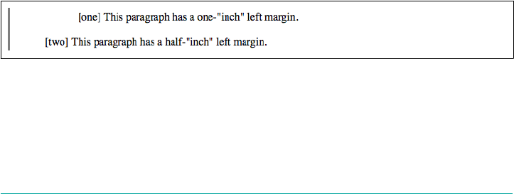
Quarter-millimeters (q)
There are 40 Q units in a centimeter; thus, setting an element to be 1/10 of a cen‐
timeter wide—which is also to say, a millimeter wide—would mean a value of 4q.
(Only Firefox supported q as of late 2016.)
Points (pt)
Points are standard typographical measurements that have been used by printers
and typesetters for decades and by word processing programs for many years.
Traditionally, there are 72 points to an inch (points were defined before wide‐
spread use of the metric system). Therefore the capital letters of text set to 12
points should be one-sixth of an inch tall. For example, p {font-size: 18pt;} is
equivalent to p {font-size: 0.25in;}.
Picas (pc)
Picas are another typographical term. A pica is equivalent to 12 points, which
means there are 6 picas to an inch. As just shown, the capital letters of text set to
1 pica should be one-sixth of an inch tall. For example, p {font-size: 1.5pc;}
would set text to the same size as the example declarations found in the defini‐
tion of points.
Pixels (px)
A pixel is a small box on screen, but CSS defines pixels more abstractly. In CSS
terms, a pixel is defined to be the size required to yield 96 pixels per inch. Many
user agents ignore this definition in favor of simply addressing the pixels on the
screen. Scaling factors are brought into play when page zooming or printing,
where an element 100px wide can be rendered more than 100 device dots wide.
These units are really useful only if the browser knows all the details of the screen on
which your page is displayed, the printer you’re using, or whatever other user agent
might apply. On a web browser, display is affected by the size of the screen and the
resolution to which the screen is set—and there isn’t much that you, as the author,
can do about these factors. You can only hope that, if nothing else, the measurements
will be consistent in relation to each other—that is, that a setting of 1.0in will be
twice as large as 0.5in, as shown in Figure 4-1.
Figure 4-1. Setting absolute-length le margins
Nevertheless, despite all that, let’s make the highly suspect assumption that your com‐
puter knows enough about its display system to accurately reproduce real-world
measurements. In that case, you could make sure every paragraph has a top margin of
122 | Chapter 4: Values and Units
half an inch by declaring p {margin-top: 0.5in;}. Regardless of font size or any
other circumstances, a paragraph will have a half-inch top margin.
Absolute units are much more useful in defining stylesheets for printed documents,
where measuring things in terms of inches, points, and picas is much more common.
Pixel lengths
On the face of things, pixels are straightforward. If you look at a screen closely
enough, you can see that it’s broken up into a grid of tiny little boxes. Each box is a
pixel. If you define an element to be a certain number of pixels tall and wide, as in the
following markup:
<p>
The following image is 20 pixels tall and wide: <img src="test.gif"
style="width: 20px; height: 20px;" alt="" />
</p>
then it follows that the element will be that many screen elements tall and wide, as
shown in Figure 4-2.
Figure 4-2. Using pixel lengths
In general, if you declare something like font-size: 18px, a web browser will almost
certainly use actual pixels on your screen—after all, they’re already there—but with
other display devices, like printers, the user agent will have to rescale pixel lengths to
something more sensible. In other words, the printing code has to figure out how
many dots there are in a pixel.
On the other hand, pixel measurements are often useful for expressing the size of
images, which are already a certain number of pixels tall and wide. These days,
responsive design means that we often want to express image size in relation to the
size of the text of the width of the viewport, regardless of the number of actual pixels
in the image. You do end up relying on the image-scaling routines in user agents, but
those have been getting pretty good. Scaling of images really makes sense with vector-
based images like SVG.
Pixel theory
In its discussion of pixels, the CSS specification recommends that, in cases where a
display’s resolution density is significantly different than 96 pixels per inch (ppi), user
agents should scale pixel measurements to a “reference pixel.” CSS2 recommended 90
ppi as the reference pixel, but CSS2.1 and CSS3 recommend 96 ppi. The most com‐
mon example is a printer, which has dots instead of pixels, and which has a lot more
Distances | 123

dots per inch than 96! In printing web content, then, it may assume 96 pixels per inch
and scale its output accordingly.
If a display’s resolution is set to 1,024 pixels wide by 768 pixels tall, its screen size is
exactly 10 2/3 inches wide by 8 inches tall, and the screen it is filled entirely by the
display pixels, then each pixel will be 1/96 of an inch wide and tall. As you might
guess, this scenario is a fairly rare occurrence. So, on most displays, the actual num‐
ber of pixels per inch (ppi) is higher than 96—sometimes much higher. The Retina
display on an iPhone 4S, for example, is 326 ppi; the display on the iPad 264 ppi.
As a Windows XP user, you should be able to set your display
driver to make the display of elements correspond correctly to real-
world measurements. The path to the ruler dialog is Start→Control
Panel; double-click Display; click the Settings tab; then click
Advanced to reveal a dialog box (which may differ on each PC).
You should see a dropdown or other form control labeled Font
Size; select Other.
Resolution Units
With the advent of media queries and responsive designs, three new unit types were
introduced in order to be able to describe display resolution:
Dots per inch (dpi)
The number of display dots per linear inch. This can refer to the dots in a paper
printer’s output, the physical pixels in an LED screen or other device, or the ele‐
ments in an e-ink display such as that used by a Kindle.
Dots per centimeter (dpcm)
Same as dpi, except the linear measure is one centimeter instead of one inch.
Dots per pixel unit (dppx)
The number of display dots per CSS px unit. As of CSS3, 1dppx is equivalent to
96dpi because CSS defines pixel units at that ratio. Just bear in mind that ratio
could change in future versions of CSS.
As of late 2017, these units are only used in the context of media queries. As an exam‐
ple, an author can create a media block to be used only on displays that have higher
than 500 dpi:
@media (min-resolution: 500dpi) {
/* rules go here */
}
124 | Chapter 4: Values and Units
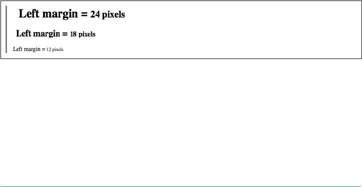
Relative Length Units
Relative units are so called because they are measured in relation to other things. The
actual (or absolute) distance they measure can change due to factors beyond their
control, such as screen resolution, the width of the viewing area, the user’s preference
settings, and a whole host of other things. In addition, for some relative units, their
size is almost always relative to the element that uses them and will thus change from
element to element.
em and ex units
First, let’s consider em and ex, which are closely related. In CSS, one “em” is defined to
be the value of font-size for a given font. If the font-size of an element is 14 pixels,
then for that element, 1em is equal to 14 pixels.
As you may suspect, this value can change from element to element. For example, let’s
say you have an h1 with a font size of 24 pixels, an h2 element with a font size of 18
pixels, and a paragraph with a font size of 12 pixels. If you set the left margin of all
three at 1em, they will have left margins of 24 pixels, 18 pixels, and 12 pixels, respec‐
tively:
h1 {font-size: 24px;}
h2 {font-size: 18px;}
p {font-size: 12px;}
h1, h2, p {margin-left: 1em;}
small {font-size: 0.8em;}
<h1>Left margin = <small>24 pixels</small></h1>
<h2>Left margin = <small>18 pixels</small></h2>
<p>Left margin = <small>12 pixels</small></p>
When setting the size of the font, on the other hand, the value of em is relative to the
font size of the parent element, as illustrated by Figure 4-3.
Figure 4-3. Using em for margins and font sizing
In theory, one em is equal to the width of a lowercase m in the font used—that’s
where the name comes from, in fact. It’s an old typographer’s term. However, this is
not assured in CSS.
ex, on the other hand, refers to the height of a lowercase x in the font being used.
Therefore, if you have two paragraphs in which the text is 24 points in size, but each
paragraph uses a different font, then the value of ex could be different for each
Distances | 125
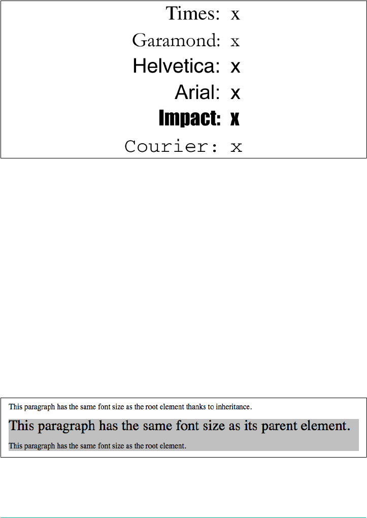
paragraph. This is because different fonts have different heights for x, as you can see
in Figure 4-4. Even though the examples use 24-point text—and therefore each exam‐
ple’s em value is 24 points—the x-height for each is different.
Figure 4-4. Varying x heights
The rem unit
Like the em unit, the rem unit is based on declared font size. The difference—and it’s a
doozy—is that whereas em is calculated using the font size of the element to which it’s
applied, rem is always calculated using the root element. In HTML, that’s the html
element. Thus, declaring any element to have font-size: 1rem; is setting it to have
the same font-size value as the root element of the document.
As an example, consider the following markup fragment. It will have the result shown
in Figure 4-5.
<p> This paragraph has the same font size as the root element thanks to
inheritance.</p>
<div style="font-size: 30px; background: silver;">
<p style="font-size: 1em;">This paragraph has the same font size as its parent
element.</p>
<p style="font-size: 1rem;">This paragraph has the same font size as the root
element.</p>
</div>
Figure 4-5. ems versus rems
126 | Chapter 4: Values and Units

In effect, rem acts as a reset for font size: no matter what relative font sizing has hap‐
pened to the ancestors of an element, giving it font-size: 1rem; will put it right
back where the root element is set. This will usually be the user’s default font size,
unless you (or the user) have set the root element to a specific font size.
For example, given this declaration, 1rem will always be equivalent to 13px:
html {font-size: 13px;}
However, given this declaration, 1rem will always be equivalent to three-quarters the
user’s default font size:
html {font-size: 75%;}
In this case, if the user’s default is 16 pixels, then 1rem will equal 12px. If the user has
actually set their default to 12 pixels—a few people do this—then 1rem will equal 9px;
if the default setting is 20 pixels, then 1rem equals 15px. And so on.
You are not restricted to the value 1rem. Any real number can be used, just as with the
em unit, so you can do fun things like set all of your headings to be multiples of the
root element’s font size:
h1 {font-size: 2rem;}
h2 {font-size: 1.75rem;}
h3 {font-size: 1.4rem;}
h4 {font-size: 1.1rem;}
h5 {font-size: 1rem;}
h6 {font-size: 0.8rem;}
In browsers that support the keyword initial, font-size: 1rem
is equivalent to font-size: initial as long as no font size is set
for the root element.
The ch unit
An interesting addition to CSS3 is the ch unit, which is broadly meant to represent
“one character.” The way it is defined in CSS3 is:
Equal to the advance measure of the “0” (ZERO, U+0030) glyph found in the font used
to render it.
The term advance measure is actually a CSS-ism that corresponds to the term
“advance width” in font typography. CSS uses the term “measure” because some
scripts are not right to left or left to right, but instead top to bottom or bottom to top,
and so may have an advance height rather than an advance width. For simplicity’s
sake, we’ll stick to advance widths in this section.
Distances | 127
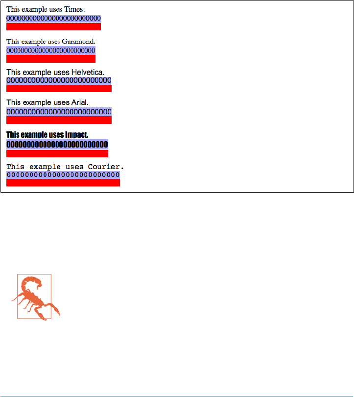
Without getting into too many details, a character glyph’s advance width is the dis‐
tance from the start of a character glyph to the start of the next. This generally corre‐
sponds to the width of the glyph itself plus any built-in spacing to the sides.
(Although that built-in spacing can be either positive or negative.)
CSS pins the ch unit to the advance width of a zero in a given font. This is in parallel
to the way that em is calculated with respect to the font-size value of an element.
The easiest way to demonstrate this unit is to run a bunch of zeroes together and then
set an image to have a width with the same number of ch units as the number of
zeroes, as shown in Figure 4-6:
img {height: 1em; width: 25ch;}
Figure 4-6. Character-relative sizing
Given a monospace font, all characters are by definition 1ch wide. In any propor‐
tional face type, which is what the vast majority of Western typefaces are, characters
may be wider or narrower than the “0” and so cannot be assumed to be 1ch wide.
As of late 2017, only Opera Mini and Internet Explorer had prob‐
lems with ch. In IE11, ch was mis-measured to be exactly the width
of the “0” glyph, not the glyph plus the small amount of space to
either side of it. Thus, 5ch was less than the width of “00000” in
IE11. This error was corrected in Edge.
128 | Chapter 4: Values and Units

Viewport-relative units
Another new addition in CSS3 are the three viewport-relative size units. These are
calculated with respect to the size of the viewport—browser window, printable area,
mobile device display, etc.:
Viewport width unit (vw)
This unit is calculated with respect to the viewport’s width, which is divided by
100. Therefore, if the viewport is 937 pixels wide, 1vw is equal to 9.37px. If the
viewport’s width changes, say by dragging the browser window wider or more
narrow, the value of vw changes along with it.
Viewport height unit (vh)
This unit is calculated with respect to the viewport’s height, which is divided by
100. Therefore, if the viewport is 650 pixels tall, 1vh is equal to 6.5px. If the view‐
port’s height changes, say by dragging the browser window taller or shorter, the
value of vh changes along with it.
Viewport minimum unit (vmin)
This unit is 1/100 of the viewport’s width or height, whichever is lesser. Thus,
given a viewport that is 937 pixels wide by 650 pixels tall, 1vmin is equal to 6.5px.
Viewport maximum unit (vmax)
This unit is 1/100 of the viewport’s width or height, whichever is greater. Thus,
given a viewport that is 937 pixels wide by 650 pixels tall, 1vmax is equal to
9.37px.
Note that these are length units like any other, and so can be used anywhere a length
unit is permitted. You can scale the font size of a heading in terms of the viewport,
height, for example, with something like h1 {font-size: 10vh;}. This sets the font
size to be 1/10 the height of the viewport—a technique potentially useful for article
titles and the like.
These units can be particularly handy for creating full-viewport interfaces, such as
those one would expect to find on a mobile device, because it can allow elements to
be sized compared to the viewport and not any of the elements within the document
tree. It’s thus very simple to fill up the entire viewport, or at least major portions of it,
and not have to worry about the precise dimensions of the actual viewport in any
particular case.
Here’s a very basic example of viewport-relative sizing, which is illustrated in
Figure 4-7:
div {width: 50vh; height: 33vw; background: gray;}
Distances | 129
An interesting (though perhaps not useful) fact about these units is that they aren’t
bound to their own primary axis. Thus, for example, you can declare width: 25vh;
to make an element as wide as one-quarter the height of the viewport.
As of late 2016, viewport-relative units were supported by all
browsers except Opera Mini, plus the odd exception that vmax is
not supported in Microsoft browsers.
Figure 4-7. Viewport-relative sizing
Calculation values
In situations where you need to do a little math, CSS provides a calc() value. Inside
the parentheses, you can construct simple mathematical expressions. The permitted
operators are + (addition), - (subtraction), * (multiplcation), and / (division), as well
as parentheses. These follow the traditional PEMDAS (parentheses, exponents, multi‐
plication, division, addition, subtraction) precedence order, although in this case it’s
really just PMDAS since exponents are not permitted in calc().
Support for parentheses in calc() appears to be a convenience
provided by browsers, since they’re not mentioned in the syntax
definition for calc(). It seems likely that support for parentheses
will remain, but use at your own risk.
As an example, suppose you want your paragraphs to have a width that’s 2 em less
than 90% the width of their parent element. Here’s how you express that with calc():
130 | Chapter 4: Values and Units

p {width: calc(90% - 2em);}
calc() can be used anywhere one of the following value types is permitted: <length>,
<frequency>, <angle>, <time>, <percentage>, <number>, and <integer>. You can also
use all these unit types within a calc() value, though there are some limitations to
keep in mind.
The basic limitation is that calc() does basic type checking to make sure that units
are, in effect, compatible. The checking works like this:
1. To either side of a + or - sign, both values must have the same unit type, or be a
<number> and <integer> (in which case, the result is a <number>). Thus, 5 +
2.7 is valid, and results in 7.7. On the other hand, 5em + 2.7 is invalid, because
one side has a length unit and the other does not. Note that 5em + 20px is valid,
because em and px are both length units.
2. Given a *, one of the values involved must be a <number> (which, remember,
includes integer values). So 2.5rem * 2 and 2 * 2.5rem are both valid, and each
result in 5rem. On the flip side, 2.5rem * 2rem is not valid, because the result
would be 5rem2, and length units cannot be area units.
3. Given a /, the value on the right side must be a <number>. If the left side is an
<integer>, the result is a <number>. Otherwise, the result is of the unit type used
on the left side. This means that 30em / 2.75 is valid, but 30 / 2.75em is not
valid.
4. Furthermore, any circumstance that yields division by zero is invalid. This is easi‐
est to see in a case like 30px/0, but there are other ways to get there.
There’s one more notable limitation, which is that whitespace is required to either side
of the + and - operators, while it is not for * and /. This avoids ambiguity with
respect to values which can be negative.
Beyond that, the specification requires that user agents support a minimum of 20
terms inside a calc() expression, where a term is a number, percentage, or dimen‐
sion (length). In situations where the number of terms somehow exceeds the user
agent’s term limits, the entire expression is treated as invalid.
Attribute Values
In a few CSS properties, it’s possible to pull in the value of an HTML attribute defined
for the element being styled. This is done with the attr() expression.
For example, with generated content, you can insert the value of any attribute. It
looks something like this (don’t worry about understanding the exact syntax, which
we’ll explore in Chapter 15):
Attribute Values | 131

p::before {content: "[" attr(id) "]";}
That expression would prefix any paragraph that has an id attribute with the value of
that id, enclosed in square brackets. Therefore applying the previous style to the fol‐
lowing paragraphs would have the result shown in Figure 4-8:
<p id="leadoff">This is the first paragraph.</p>
<p>This is the second paragraph.</p>
<p id="conclusion">This is the third paragraph.</p>
Figure 4-8. Inserting attribute values
It’s theoretically possible to use attr() in almost any property value, specifying the
value type within the expression. For example, you could (again, in theory) use the
maxlength attribute on an input field to determine its width, as shown here:
input[type="text"] {width: attr(maxlength em);}
<input type="text" maxlength="10">
Given that setup, the input element would be styled to be 10 em wide, assuming a
user agent that supports this use of attr(). As of late 2016, this was not the case: no
tested browser supported this application of attr().
Color
One of the first questions every starting web author asks is, “How do I set colors on
my page?” Under HTML, you have two choices: you could use one of a small number
of colors with names, such as red or purple, or employ a vaguely cryptic method
using hexadecimal codes. Both of these methods for describing colors remain in CSS,
along with some other—and, I think, more intuitive—methods.
Named Colors
Assuming that you’re content to pick from a small, basic set of colors, the easiest
method is to use the name of the color you want. CSS calls these color choices, logi‐
cally enough, named colors. In the early days of CSS, there were 16 basic color key‐
words, which were the 16 colors defined in HTML 4.01. These are shown in
Table 4-1.
132 | Chapter 4: Values and Units
Table 4-1. e basic 16 color keywords
aqua gray navy silver
black green olive teal
blue lime purple white
fuchsia maroon red yellow
So, let’s say you want all first-level headings to be maroon. The best declaration would
be:
h1 {color: maroon;}
Simple enough, isn’t it? Figure 4-9 shows a few more examples:
h1 {color: silver;}
h2 {color: fuchsia;}
h3 {color: navy;}
Figure 4-9. Named colors
You’ve probably seen (and maybe even used) color names other than the ones listed
earlier. For example, if you specify:
h1 {color: lightgreen;}
As of late 2017, the latest CSS color specification includes those original 16 named
colors in a longer list of 148 color keywords. This extended list is based on the stan‐
dard X11 RGB values that have been in use for decades, and have been recognized by
browsers for many years, with the addition of some color names from SVG (mostly
involving variants of “gray” and “grey”). A table of color equivalents for all 148 key‐
words defined in the CSS Color Module Level 4 is given in Appendix C.
Fortunately, there are more detailed and precise ways to specify colors in CSS. The
advantage is that, with these methods, you can specify any color in the color spec‐
trum, not just a limited list of named colors.
Colors by RGB and RGBa
Computers create colors by combining different levels of red, green, and blue, a com‐
bination that is often referred to as RGB color. Each point of display is known as a
pixel. Given the way colors are created on a screen, it makes sense that you should
Color | 133

have direct access to those colors, determining your own mixture of the three for
maximum control. That solution is complex, but possible, and the payoffs are worth
it because there are very few limits on which colors you can produce. There are four
ways to affect color in this manner.
Functional RGB colors
There are two color value types that use functional RGB notation as opposed to hexa‐
decimal notation. The generic syntax for this type of color value is rgb(color), where
color is expressed using a triplet of either percentages or integers. The percentage
values can be in the range 0%–100%, and the integers can be in the range 0–255.
Thus, to specify white and black, respectively, using percentage notation, the values
would be:
rgb(100%,100%,100%)
rgb(0%,0%,0%)
Using the integer-triplet notation, the same colors would be represented as:
rgb(255,255,255)
rgb(0,0,0)
An important thing to remember is that you can’t mix integers and percentages in the
same color value. Thus, rgb(255,66.67%,50%) would be invalid and thus ignored.
Assume you want your h1 elements to be a shade of red that lies between the values
for red and maroon. red is equivalent to rgb(100%,0%,0%), whereas maroon is equal
to (50%,0%,0%). To get a color between those two, you might try this:
h1 {color: rgb(75%,0%,0%);}
This makes the red component of the color lighter than maroon, but darker than red.
If, on the other hand, you want to create a pale red color, you would raise the green
and blue levels:
h1 {color: rgb(75%,50%,50%);}
The closest equivalent color using integer-triplet notation is:
h1 {color: rgb(191,127,127);}
The easiest way to visualize how these values correspond to color is to create a table
of gray values. The result is shown in Figure 4-10:
p.one {color: rgb(0%,0%,0%);}
p.two {color: rgb(20%,20%,20%);}
p.three {color: rgb(40%,40%,40%);}
p.four {color: rgb(60%,60%,60%);}
p.five {color: rgb(80%,80%,80%);}
p.six {color: rgb(0,0,0);}
p.seven {color: rgb(51,51,51);}
134 | Chapter 4: Values and Units
p.eight {color: rgb(102,102,102);}
p.nine {color: rgb(153,153,153);}
p.ten {color: rgb(204,204,204);}
Figure 4-10. Text set in shades of gray
Since we’re dealing in shades of gray, all three RGB values are the same in each state‐
ment. If any one of them were different from the others, then a color hue would start
to emerge. If, for example, rgb(50%,50%,50%) were modified to be rgb(50%,50%,
60%), the result would be a medium-dark color with just a hint of blue.
It is possible to use fractional numbers in percentage notation. You might, for some
reason, want to specify that a color be exactly 25.5 percent red, 40 percent green, and
98.6 percent blue:
h2 {color: rgb(25.5%,40%,98.6%);}
A user agent that ignores the decimal points (and some do) should round the value to
the nearest integer, resulting in a declared value of rgb(26%,40%,99%). In integer trip‐
lets, you are limited to integers.
Values that fall outside the allowed range for each notation are clipped to the nearest
range edge, meaning that a value that is greater than 100% or less than 0% will default
to those allowed extremes. Thus, the following declarations would be treated as if
they were the values indicated in the comments:
P.one {color: rgb(300%,4200%,110%);} /* 100%,100%,100% */
P.two {color: rgb(0%,-40%,-5000%);} /* 0%,0%,0% */
p.three {color: rgb(42,444,-13);} /* 42,255,0 */
Conversion between percentages and integers may seem arbitrary, but there’s no need
to guess at the integer you want—there’s a simple formula for calculating them. If you
know the percentages for each of the RGB levels you want, then you need only apply
them to the number 255 to get the resulting values. Let’s say you have a color of 25
percent red, 37.5 percent green, and 60 percent blue. Multiply each of these percen‐
tages by 255, and you get 63.75, 95.625, and 153. Round these values to the nearest
integers, and voilà: rgb(64,96,153).
Color | 135

If you already know the percentage values, there isn’t much point in converting them
into integers. Integer notation is more useful for people who use programs such as
Photoshop, which can display integer values in the Info dialog, or for those who are
so familiar with the technical details of color generation that they normally think in
values of 0–255.
RGBa colors
As of CSS3, the two functional RGB notations were extended into a functional RGBa
notation. This notation adds an alpha value to the end of the RGB triplets; thus “red-
green-blue-alpha” becomes RGBa. The alpha stands for alpha channel, which is a
measure of opacity.
For example, suppose you wanted an element’s text to be half-opaque white. That
way, any background color behind the text would “shine through,” mixing with the
half-transparent white. You would write one of the following two values:
rgba(255,255,255,0.5)
rgba(100%,100%,100%,0.5)
To make a color completely transparent, you set the alpha value to 0; to be completely
opaque, the correct value is 1. Thus rgb(0,0,0) and rgba(0,0,0,1) will yield pre‐
cisely the same result (black). Figure 4-11 shows a series of paragraphs set in increas‐
ingly transparent black, which is the result of the following rules.
p.one {color: rgba(0,0,0,1);}
p.two {color: rgba(0%,0%,0%,0.8);}
p.three {color: rgba(0,0,0,0.6);}
p.four {color: rgba(0%,0%,0%,0.4);}
p.five {color: rgba(0,0,0,0.2);}
Figure 4-11. Text set in progressive translucency
As you’ve no doubt already inferred, alpha values are always real numbers in the
range 0 to 1. Any value outside that range will either be ignored or reset to the nearest
valid alpha value. You cannot use <percentage> to represent alpha values, despite the
mathematical equivalence.
136 | Chapter 4: Values and Units

Hexadecimal RGB colors
CSS allows you to define a color using the same hexadecimal color notation so familiar
to old-school HTML web authors:
h1 {color: #FF0000;} /* set H1s to red */
h2 {color: #903BC0;} /* set H2s to a dusky purple */
h3 {color: #000000;} /* set H3s to black */
h4 {color: #808080;} /* set H4s to medium gray */
Computers have been using hex notation for quite some time now, and programmers
are typically either trained in its use or pick it up through experience. Their familiar‐
ity with hexadecimal notation likely led to its use in setting colors in HTML. That
practice was carried over to CSS.
Here’s how it works: by stringing together three hexadecimal numbers in the range 00
through FF, you can set a color. The generic syntax for this notation is #RRGGBB. Note
that there are no spaces, commas, or other separators between the three numbers.
Hexadecimal notation is mathematically equivalent to integer-pair notation. For
example, rgb(255,255,255) is precisely equivalent to #FFFFFF, and
rgb(51,102,128) is the same as #336680. Feel free to use whichever notation you
prefer—it will be rendered identically by most user agents. If you have a calculator
that converts between decimal and hexadecimal, making the jump from one to the
other should be pretty simple.
For hexadecimal numbers that are composed of three matched pairs of digits, CSS
permits a shortened notation. The generic syntax of this notation is #RGB:
h1 {color: #000;} /* set H1s to black */
h2 {color: #666;} /* set H2s to dark gray */
h3 {color: #FFF;} /* set H3s to white */
As you can see from the markup, there are only three digits in each color value. How‐
ever, since hexadecimal numbers between 00 and FF need two digits each, and you
have only three total digits, how does this method work?
The answer is that the browser takes each digit and replicates it. Therefore, #F00 is
equivalent to #FF0000, #6FA would be the same as #66FFAA, and #FFF would come out
#FFFFFF, which is the same as white. Not every color can be represented in this man‐
ner. Medium gray, for example, would be written in standard hexadecimal notation as
#808080. This cannot be expressed in shorthand; the closest equivalent would be
#888, which is the same as #888888.
Hexadecimal RGBa colors
A new (as of late 2017) hexadecimal notation adds a fourth hex value to represent the
alpha channel value. Figure 4-11 shows a series of paragraphs set in increasingly
Color | 137

transparent black, just as we saw in the previous section, which is the result of the
following rules:
p.one {color: #000000FF;}
p.two {color: #000000CC;}
p.three {color: #00000099;}
p.four {color: #00000066;}
p.five {color: #00000033;}
Figure 4-12. Text set in progressive translucency, redux
As with non-alpha hexadecimal values, it’s possible to shorten a value composed of
matched pairs to a four-digit value. Thus, a value of #663399AA can be written as
#639A. If the value has any pairs that are not repetitive, then the entire eight-digit
value must be written out: #663399CA cannot be shortened to #639CA.
As of late 2017, the alpha-channel hexadecimal notation was sup‐
ported in Firefox and Safari, and had experimental implementa‐
tions in Chrome and Opera.
Colors by HSL and HSLa
New to CSS3 (though not to the world of color theory in general) are HSL notations.
HSL stands for Hue, Saturation, and Lightness, where the hue is a hue angle in the
range 0–360, saturation is a percentage value from 0 (no saturation) to 100 (full satu‐
ration), and lightness is a percentage value from 0 (completely dark) to 100 (com‐
pletely light).
The hue angle is expressed in terms of a circle around which the full spectrum of col‐
ors progresses. It starts with red at 0 degrees and then proceeds through the rainbow
until it comes to red again at 360 degrees. Figure 4-13 illustrates this visually by
showing the angles and colors of the spectrum on a wheel as well as a linear strip.
If you’re intimately familiar with RGB, then HSL may be confusing at first. (But then,
RGB is confusing for people familiar with HSL.) You may be able to better grasp the
hues in HSL by contemplating the diagram in Figure 4-14, which shows the spectrum
results from placing and then mixing red, green, and blue.
138 | Chapter 4: Values and Units
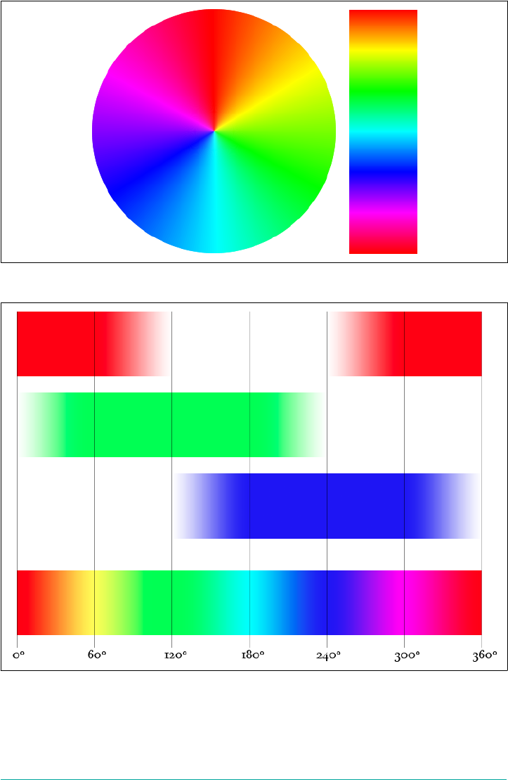
Figure 4-13. e spectrum on a wheel and a strip
Figure 4-14. Mixing RGB to create the spectrum
Color | 139
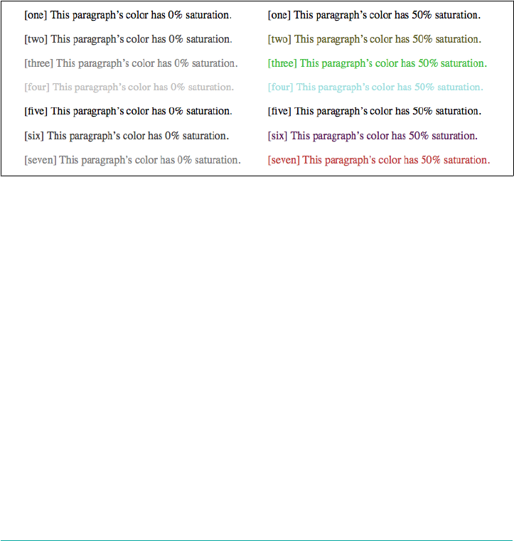
As for the other two values, saturation measures the intensity of a color. A saturation
of 0% always yields a shade of gray, no matter what hue angle you have set, and a satu‐
ration of 100% creates the most vivid possible shade of that hue for a given lightness.
Similarly, lightness defines how dark or light the color appears. A lightness of 0% is
always black, regardless of the other hue and saturation values, just as a lightness of
100% always yields white. Consider the results of the following styles, illustrated on
the left side of Figure 4-15.
p.one {color: hsl(0,0%,0%);}
p.two{color: hsl(60,0%,25%);}
p.three {color: hsl(120,0%,50%);}
p.four {color: hsl(180,0%,75%);}
p.five {color: hsl(240,0%,0%);}
p.six {color: hsl(300,0%,25%);}
p.seven {color: hsl(360,0%,50%);}
Figure 4-15. Varying lightness and hues
The gray you see on the left side isn’t just a function of the limitations of print: every
single one of those bits of text is a shade of gray, because every color value has 0% in
the saturation (middle) position. The degree of lightness or darkness is set by the
lightness (third) position. In all seven examples, the hue angle changes, and in none
of them does it matter. But that’s only so long as the saturation remains at 0%. If that
value is raised to, say, 50%, then the hue angle will become very important, because it
will control what sort of color you see. Consider the same set of values that we saw
before, but all set to 50% saturation, as illustrated on the right side of Figure 4-15.
It can be instructive to take the 16 color keywords defined in HTML4 (Table 4-1) and
plot them against a hue-and-lightness wheel, as shown in Figure 4-16. The color
wheel not only features the full spectrum around the rim, but also runs from 50 per‐
cent lightness at the edge to 0 percent lightness in the center. (The saturation is 100
percent throughout.) As you can see, the 12 keywords of color are regularly placed
throughout the wheel, which bespeaks careful choice on the part of whoever chose
them. The gray shades aren’t quite as regularly placed, but are probably the most use‐
ful distribution of shades, given that there were only four of them.
140 | Chapter 4: Values and Units
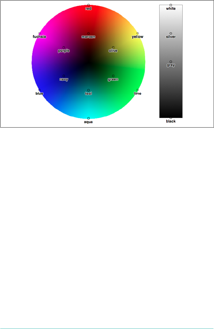
Figure 4-16. Keyword-equivalent hue angles and lightnesses
Just as RGB has its RGBa counterpart, HSL has an HSLa counterpart. This is an HSL
triplet followed by an alpha value in the range 0–1. The following HSLa values are all
black with varying shades of transparency, just as in “Hexadecimal RGBa colors” on
page 137 (and illustrated in Figure 4-11):
p.one {color: hsla(0,0%,0%,1);}
p.two {color: hsla(0,0%,0%,0.8);}
p.three {color: hsla(0,0%,0%,0.6);}
p.four {color: hsla(0,0%,0%,0.4);}
p.five {color: hsla(0,0%,0%,0.2);}
Color Keywords
There are two special keywords that can be used anywhere a color value is permitted.
These are transparent and currentColor.
As its name suggests, transparent defines a completely transparent color. The CSS
Color Module defines it to be equivalent to rgba(0,0,0,0), and that’s its computed
value. The is not often used to set text color, for example, but it is essentially the
default value for element background colors. It can also be used to define element
borders that take up space, but are not visible, and is often used when defining gradi‐
ents—all topics we’ll cover in later chapters.
Color | 141

By contrast, currentColor means “whatever the computed value of color is for this
element.” Consider the following:
main {color: gray; border-color: currentColor;}
The first declaration causes any main elements to have a foreground color of gray.
The second declaration uses currentColor to copy the computed value of color—in
this case, rgb(50%,50%,50%), which is equivalent to gray—and apply it to any bor‐
ders the main elements might have.
Angles
Since we just finished talking about hue angles in HSL, this would be a good time to
talk about angle units. Angles in general are represented as <angle>, which is a
<number> followed by one of four unit types:
deg
Degrees, of which there are 360 in a full circle.
grad
Gradians, of which there are 400 in a full circle. Also known as grades or gons.
rad
Radians, of which there are 2π (approximately 6.28) in a full circle.
turn
Turns, of which there is one in a full circle. This unit is mostly useful when ani‐
mating a rotation and you wish to have it turn multiple times, such as 10turn to
make it spin 10 times. (Sadly, the pluralization turns is invalid, at least as of late
2017, and will be ignored.)
Angle units (Table 4-2) are mostly used in 2D and 3D transforms, though they do
appear in a few other places. Note that angle units are not used in HSL colors, where
all hue angle values are always degrees and thus do not use the deg unit!
Table 4-2. Angle equivalents
Degrees Gradians Radians Turns
0deg 0grad 0rad 0turn
45deg 50grad 0.785rad 0.125turn
90deg 100grad 1.571rad 0.25turn
180deg 200grad 3.142rad 0.5turn
270deg 300grad 4.712rad 0.75turn
360deg 400grad 6.283rad 1turn
142 | Chapter 4: Values and Units

Time and Frequency
In cases where a property needs to express a period of time, the value is represented
as <time> and is a <number> followed by either s (seconds) or ms (milliseconds.)
Time values are most often used in transitions and animations, either to define dura‐
tions or delays. The following two declarations will have exactly the same result:
a[href] {transition-duration: 2.4s;}
a[href] {transition-duration: 2400ms;}
Time values are also used in aural CSS, again to define durations or delays, but sup‐
port for aural CSS is extremely limited as of this writing.
Another value type historically used in aural CSS is <frequency>, which is a <num‐
ber> followed by either Hz (hertz) or kHz (kilohertz). As usual, the unit identifiers are
case-insensitive, so Hz and hz are equivalent. The following two declarations will have
exactly the same result:
h1 {pitch: 128hz;}
h1 {pitch: 0.128khz;}
Position
A position value is how you specify the placement of an origin image in a background
area, and is represented as <position>. Its syntactical structure is rather complicated:
[
[ left | center | right | top | bottom | <percentage> | <length> ] |
[ left | center | right | <percentage> | <length> ]
[ top | center | bottom | <percentage> | <length> ] |
[ center | [ left | right ] [ <percentage> | <length> ]? ] &&
[ center | [ top | bottom ] [ <percentage> | <length> ]? ]
]
That might seem a little nutty, but it’s all down to the subtly complex patterns that this
value type has to allow.
If you declare only one value, such as left or 25%, then a second value is set to
center. Thus, left is the same as left center, and 25% is the same as 25% center.
If you declare (either implicitly, as above, or explicitly) two values, and the first one is
a length or percentage, then it is always considered to be the horizontal value. This
means that given 25% 35px, the 25% is a horizontal distance and the 35px is a vertical
distance. If you swap them to say 35px 25%, then 35px is horizontal and 25% is verti‐
cal. This means that if you write 25% left or 35px right, the entire value is invalid
because you have supplied two horizontal distances and no vertical distance. (Simi‐
larly, a value of right left or top bottom is invalid and will be ignored.) On the
other hand, if you write left 25% or right 35px, there is no problem because you’ve
Time and Frequency | 143
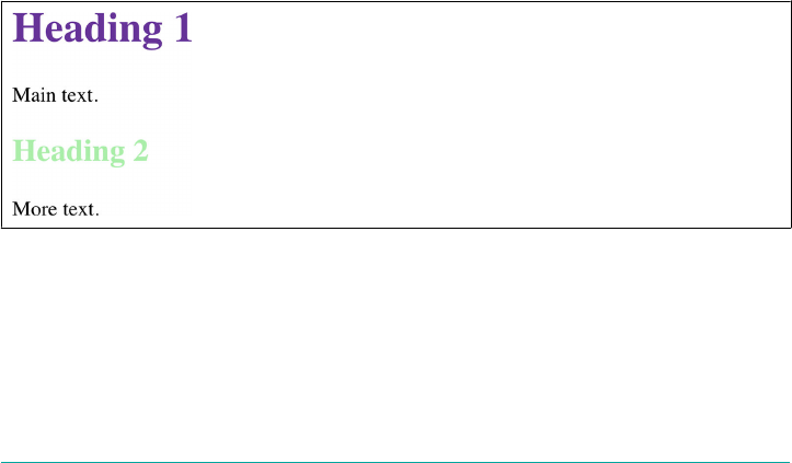
given a horizontal distance (with the keyword) and a vertical distance (with the per‐
centage or length).
If you declare four values (we’ll deal with three just in a moment), then you must
have two lengths or percentages, each of which is preceded by a keyword. In this case,
each length or percentage specifies an offset distance, and each keyword defines the
edge from which the offset is calculated. Thus, right 10px bottom 30px means an
offset of 10 pixels to the left of the right edge, and an offset of 30 pixels up from the
bottom edge. Similarly, top 50% left 35px means a 50 percent offset from the top
and a 35-pixels-to-the-right offset from the left.
If you declare three values, the rules are the same as for four, except the last offset is
set to be zero (no offset). Thus right 20px top is the same as right 20px top 0.
Custom Values
As this book was being finished in late 2017, a new capability was being added to CSS.
The technical term for this is custom properties, even though what these really do is
create sort of variables in your CSS. They do not, contrary to their name, create spe‐
cial CSS properties, in the sense of properties like color or font.
Here’s a simple example, with the result shown in Figure 4-17:
html {
--base-color: #639;
--highlight-color: #AEA;
}
h1 {color: var(--base-color);}
h2 {color: var(--highlight-color);}
Figure 4-17. Using custom values to color headings
There are two things to absorb here. The first is the definition of the custom values --
base-color and --highlight-color. These are not some sort of special color types.
They’re just names that were picked to describe what the values contain. We could
just as easily have said:
144 | Chapter 4: Values and Units

html {
--alison: #639;
--david: #AEA;
}
h1 {color: var(--alison);}
h2 {color: var(--david);}
You probably shouldn’t do that sort of thing, unless you’re literally defining colors
that specifically correspond to people named Alison and David. (Perhaps on an
“About Our Team” page.) It’s always better to define custom identifiers that are self-
documenting—things like main-color or accent-color or brand-font-face.
The important this is that any custom identifier of this type begins with two hyphens
(--). It can then be invoked later on using a var() value type. Note that these names
are case-sensitive, so --main-color and --Main-color are completely separate iden‐
tifiers.
These custom identifiers are often referred to as “CSS variables,” which explains the
var() pattern. This labelling has some truth to it, but bear in mind that these are not
full-blown variables in the programming-language sense. They’re more like macros in
text editors: simple substitutions of one value for another.
An interesting feature of custom properties is their ability to scope themselves to a
given context. If that sentence made any sense to you, it probably gave a little thrill. If
not, here’s an example to illustrate scoping, with the result shown in Figure 4-18:
html {
--base-color: #639;
}
aside {
--base-color: #F60;
}
h1 {color: var(--base-color);}
<body>
<h1>Heading 1</h1><p>Main text.</p>
<aside>
<h1>Heading 1</h1><p>An aside.</p>
</aside>
<h1>Heading 1</h1><p>Main text.</p>
</body>
Custom Values | 145
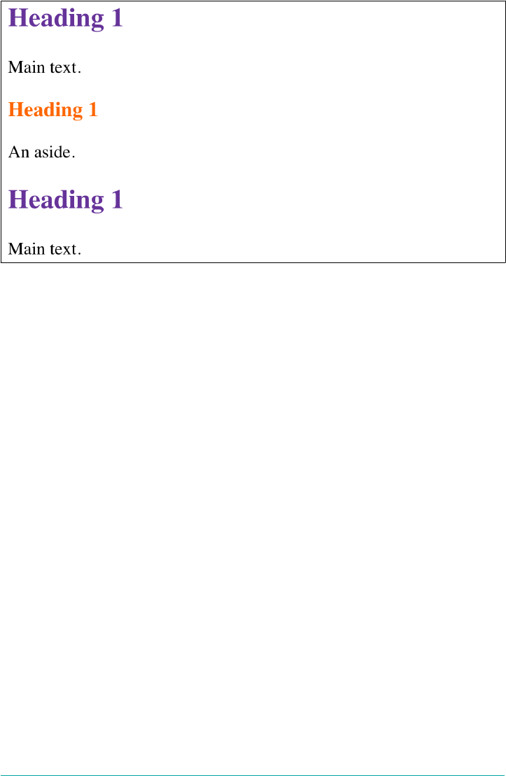
Figure 4-18. Scoping custom values to certain contexts
Notice how the headings are purple outside the aside element and orange inside.
That’s because the variable --base-color was updated for aside elements. The new
custom value applies to any h1 inside an aside element.
There are a great many patterns possible with CSS variables, even if they are confined
to value replacement. Here’s an example suggested by Chriztian Steinmeier combin‐
ing variables with the calc() value type to create a regular set of indents for unor‐
dered lists:
html {
--gutter: 3ch;
--offset: 1;
}
ul li {margin-left: calc(var(--gutter) * var(--offset));}
ul ul li {--offset: 2;}
ul ul ul li {--offset: 3;}
This particular example is basically the same as writing:
ul li {margin-left: 3ch;}
ul ul li {margin-left: 6ch;}
ul ul ul li {margin-left: 9ch;}
The difference is that with variables, it’s simple to update the --gutter multiplier in
one place and have everything adjust automatically, rather than having to retype three
values and make sure all the math is correct.
This method of using abstract variable names opens an entirely new way of styling,
an approach which has little precedent in the history of CSS. If you want to try out
146 | Chapter 4: Values and Units

custom properties but are concerned about support, remember the @supports() fea‐
ture query. Using this approach will keep your variable styling safely hidden away:
@supports (color: var(--custom)) {
/* variable-dependent styles go here */
}
@supports (--custom: value) {
/* alternate query pattern */
}
To reiterate: custom properties were just going into production as
of late 2017, as the book was being finished. There were still uncer‐
tainties to be worked out around how custom properties should be
used, how powerful they may become, how they relate to the cas‐
cade, and more. While they’re worth knowing about and experi‐
menting with, bear in mind that anything stated here may have
changed or been removed by the time you read this.
Custom Values | 147

CHAPTER 5
Fonts
The beginning of the “Font Properties” section of the CSS1 specification, written in
1996, begins with this sentence: “Setting font properties will be among the most com‐
mon uses of style sheets.” The intervening years have done nothing to disprove this
assertion.
CSS2 added the ability to specify custom fonts for download with @font-face, but it
wasn’t until about 2009 that this capability really began to be widely and consistently
supported. Now, websites can call on any font they have the right to use, aided by
online services such as Typekit. Generally speaking, if you can get access to a font,
you can use it in your design.
It’s important to remember, however, that this does not grant absolute control over
fonts. If the font you’re using fails to download, or is in a file format the user’s
browser doesn’t understand, then the text will be displayed with a fallback font. That’s
a good thing, since it means the user still gets your content, but it’s worth bearing in
mind that you cannot absolutely depend on the presence of a given font and should
never design as if you can.
Font Families
What we think of as a “font” is usually composed of many variations to describe bold
text, italic text, and so on. For example, you’re probably familiar with (or at least have
heard of) the font Times. However, Times is actually a combination of many variants,
including TimesRegular, TimesBold, TimesItalic, TimesBoldItalic, and so on. Each of
these variants of Times is an actual font face, and Times, as we usually think of it, is a
combination of all these variant faces. In other words, Times is actually a font family,
not just a single font, even though most of us think about fonts as being single enti‐
ties.
149

In order to cover all the bases, CSS defines five generic font families:
Serif fonts
These fonts are proportional and have serifs. A font is proportional if all charac‐
ters in the font have different widths due to their various sizes. For example, a
lowercase i and a lowercase m are different widths. (This book’s paragraph font is
proportional, for example.) Serifs are the decorations on the ends of strokes
within each character, such as little lines at the top and bottom of a lowercase l,
or at the bottom of each leg of an uppercase A. Examples of serif fonts are Times,
Georgia, and New Century Schoolbook.
Sans-serif fonts
These fonts are proportional and do not have serifs. Examples of sans-serif fonts
are Helvetica, Geneva, Verdana, Arial, and Univers.
Monospace fonts
Monospace fonts are not proportional. These generally are used for displaying
programmatic code or tabular data. In these fonts, each character uses up the
same amount of horizontal space as all the others; thus, a lowercase i takes up the
same horizontal space as a lowercase m, even though their actual letterforms may
have different widths. These fonts may or may not have serifs. If a font has uni‐
form character widths, it is classified as monospace, regardless of the presence of
serifs. Examples of monospace fonts are Courier, Courier New, Consolas, and
Andale Mono.
Cursive fonts
These fonts attempt to emulate human handwriting or lettering. Usually, they are
composed largely of flowing curves and have stroke decorations that exceed
those found in serif fonts. For example, an uppercase A might have a small curl at
the bottom of its left leg or be composed entirely of swashes and curls. Examples
of cursive fonts are Zapf Chancery, Author, and Comic Sans.
Fantasy fonts
Such fonts are not really defined by any single characteristic other than our
inability to easily classify them in one of the other families (these are sometimes
called “decorative” or “display” fonts). A few such fonts are Western, Woodblock,
and Klingon.
In theory, every font family will fall into one of these generic families. In practice, this
may not be the case, but the exceptions (if any) are likely to be few and far between,
and browsers are likely to drop any fonts they cannot classify as serif, sans-serif,
monospace, or cursive into the “fantasy” bucket.
150 | Chapter 5: Fonts

Using Generic Font Families
You can call on any available font family by using the property font-family.
font-family
Values [ <family-name> | <generic-family> ]#
Initial value User agent-specic
Applies to All elements
Computed value As specied
Inherited Yes
Animatable No
If you want a document to use a sans-serif font, but you do not particularly care
which one, then the appropriate declaration would be:
body {font-family: sans-serif;}
This will cause the user agent to pick a sans-serif font family (such as Helvetica) and
apply it to the body element. Thanks to inheritance, the same font family choice will
be applied to all the elements that descend from the body—unless a more specific
selector overrides it.
Using nothing more than these generic families, an author can create a fairly sophisti‐
cated stylesheet. The following rule set is illustrated in Figure 5-1:
body {font-family: serif;}
h1, h2, h3, h4 {font-family: sans-serif;}
code, pre, tt, kbd {font-family: monospace;}
p.signature {font-family: cursive;}
Thus, most of the document will use a serif font such as Times, including all para‐
graphs except those that have a class of signature, which will instead be rendered in
a cursive font such as Author. Heading levels 1 through 4 will use a sans-serif font like
Helvetica, while the elements code, pre, tt, and kbd will use a monospace font like
Courier.
Font Families | 151
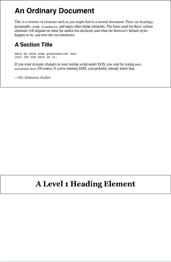
Figure 5-1. Various font families
Specifying a Font Family
An author may, on the other hand, have more specific preferences for which font to
use in the display of a document or element. In a similar vein, a user may want to
create a user stylesheet that defines the exact fonts to be used in the display of all
documents. In either case, font-family is still the property to use.
Assume for the moment that all h1s should use Georgia as their font. The simplest
rule for this would be the following:
h1 {font-family: Georgia;}
This will cause the user agent displaying the document to use Georgia for all h1s, as
shown in Figure 5-2.
Figure 5-2. An h1 element using Georgia
This rule assumes that the user agent has Georgia available for use. If it doesn’t, the
user agent will be unable to use the rule at all. It won’t ignore the rule, but if it can’t
find a font called “Georgia,” it can’t do anything but display h1 elements using the user
agent’s default font (whatever that is).
All is not lost, however. By combining specific font names with generic font families,
you can create documents that come out, if not exact, at least close to your intentions.
152 | Chapter 5: Fonts

To continue the previous example, the following markup tells a user agent to use
Georgia if it’s available, and to use another serif font if it’s not:
h1 {font-family: Georgia, serif;}
If a reader doesn’t have Georgia installed but does have Times, the user agent might
use Times for h1 elements. Even though Times isn’t an exact match to Georgia, it’s
probably close enough.
For this reason, I strongly encourage you to always provide a generic family as part of
any font-family rule. By doing so, you provide a fallback mechanism that lets user
agents pick an alternative when they can’t provide an exact font match. Here are a few
more examples:
h1 {font-family: Arial, sans-serif;}
h2 {font-family: Charcoal, sans-serif;}
p {font-family: 'Times New Roman', serif;}
address {font-family: Chicago, sans-serif;}
If you’re familiar with fonts, you might have a number of similar fonts in mind for
displaying a given element. Let’s say that you want all paragraphs in a document to be
displayed using Times, but you would also accept Times New Roman, Georgia, New
Century Schoolbook, and New York (all of which are serif fonts) as alternate choices.
First, decide the order of preference for these fonts, and then string them together
with commas:
p {font-family: Times, 'Times New Roman', 'New Century Schoolbook', Georgia,
'New York', serif;}
Based on this list, a user agent will look for the fonts in the order they’re listed. If
none of the listed fonts are available, then it will just pick an available serif font.
Using quotation marks
You may have noticed the presence of single quotes in the previous example, which
we haven’t seen before. Quotation marks are advisable in a font-family declaration
only if a font name has one or more spaces in it, such as “New York,” or if the font
name includes symbols such as # or $. Thus, a font called Karrank% should probably
be quoted:
h2 {font-family: Wedgie, 'Karrank%', Klingon, fantasy;}
If you leave off the quotation marks, there is a chance that user agents will ignore that
particular font name altogether, although they’ll still process the rest of the rule.
Note that the quoting of a font name containing a symbol is not actually required any
more. Instead, it’s recommended, which is as close to describing best practices as the
CSS specification ever really gets. Similarly, it is recommended that you quote a font
name containing spaces, though again, this is generally unnecessary in modern user
agents. As it turns out, the only required quotation is for font names that match
Font Families | 153
accepted font-family keywords. Thus, if you call for a font whose actual name is
“cursive,” you’ll definitely need to quote it in order to distinguish it from the value
keyword cursive:
h2 {font-family: Author, "cursive", cursive;}
Font names that use a single word (which doesn’t conflict with any of the keywords
for font-family) need not be quoted, and generic family names (serif, monospace,
etc.) should never be quoted when they refer to the actual generic families. If you
quote a generic name, then the user agent will assume that you are asking for a spe‐
cific font with that name (for example, “serif”), not a generic family.
As for which quotation marks to use, both single and double quotes are acceptable.
Remember that if you place a font-family rule in a style attribute, which you gen‐
erally shouldn’t, you’ll need to use whichever quotes you didn’t use for the attribute
itself. Therefore, if you use double quotes to enclose the font-family rule, then you’ll
have to use single quotes within the rule, as in the following markup:
p {font-family: sans-serif;} /* sets paragraphs to sans-serif by default */
<!-- the next example is correct (uses single-quotes) -->
<p style="font-family: 'New Century Schoolbook', Times, serif;">...</p>
<!-- the next example is NOT correct (uses double-quotes) -->
<p style="font-family: "New Century Schoolbook", Times, serif;">...</p>
If you use double quotes in such a circumstance, they interfere with the attribute syn‐
tax, as you can see in Figure 5-3.
Figure 5-3. e perils of incorrect quotation marks
Using @font-face
A feature that originally debuted in CSS2 but wasn’t implemented until late in the first
decade of the 2000s, @font-face lets you use custom fonts in your designs. While
there’s no guarantee that every last user will see the font you want, this feature is very
widely supported.
Suppose you want to use a very specific font in your stylesheets, one that is not widely
installed. Through the magic of @font-face, you can define a specific family name to
correspond to a font file on your server. The user agent will download that file and
154 | Chapter 5: Fonts

use it to render the text in your page, the same as if it were installed on the user’s
machine. For example:
@font-face {
font-family: "SwitzeraADF";
src: url("SwitzeraADF-Regular.otf");
}
This allows the author to have conforming user agents load the defined .otf file and
use that font to render text when called upon via font-family: SwitzeraADF.
The examples in this section refer to SwitzeraADF, a font face col‐
lection available from the Arkandis Digital Foundry.
The intent of @font-face is to allow lazy loading of font faces. This means that only
those faces needed to render a document will actually be loaded, with the rest being
left alone. In fact, a browser that downloads all declared font faces without consider‐
ing whether they’re actually needed is considered to be buggy.
Required Descriptors
All the parameters that define the font you’re referencing are contained within the
@font-face { } construct. These are called descriptors, and very much like proper‐
ties, they take the format descriptor: value;. In fact, most of the descriptor names
refer directly to property names, as will be explained in just a moment.
There are two required descriptors: font-family and src.
font-family
Value <family-name>
Initial value Not dened
src
Values [ [ <uri> [format(<string>#)]? ] | <font-face-name> ]#
Initial value Not dened
Using @font-face | 155

The point of src is pretty straightforward: it lets you define one or more sources for
the font face you’re defining, using a comma-separated list if there are in fact multiple
sources. You can point to a font face at any URI, but there is a restriction: font faces
can only be loaded from the same origin as the stylesheet. Thus, you can’t point your
src at someone else’s site and download their font; you’ll need to host a local copy on
your own server, or use a font-hosting service that provides both the stylesheet(s) and
the font file(s).
There is an exception to the same-origin restriction, which is that
servers can permit cross-site loading using the HTTP header
Access-Control-Allow-Origin.
You may well be wondering how it is that we’re defining font-family here when it
was already defined in a previous section. The difference is that this font-family is
the font-family descriptor, and the previously-defined font-family was the font-
family property. If that seems confusing, stick with me a moment and all should
become clear.
In effect, @font-face lets you create low-level definitions that underpin the font-
related properties like font-family. When you define a font family name via the
descriptor font-family: "SwitzeraADF";, you’re setting up an entry in the user
agent’s table of font families for “SwitzeraADF.” It thus joins all the usual suspects like
Helvetica, Georgia, Courier, and so forth, as a font you can just refer to in your font-
family property values:
@font-face {
font-family: "SwitzeraADF"; /* descriptor */
src: url("SwitzeraADF-Regular.otf");
}
h1 {font-family: SwitzeraADF, Helvetica, sans-serif;} /* property */
Note how the font-family descriptor value and the entry in the font-family prop‐
erty match. If they didn’t match, then the h1 rule would ignore the first font family
name listed in the font-family value and move on to the next. As long as the font
has cleanly downloaded and is in a format the user agent can handle, then it will be
used in the manner you direct, as illustrated in Figure 5-4.
156 | Chapter 5: Fonts
Figure 5-4. Using a downloaded font
In a similar manner, the comma-separated src descriptor value provides fallbacks.
That way, if (for whatever reason) the user agent is unable to download the first
source, it can fall back to the second source and try to load the file there:
@font-face {
font-family: "SwitzeraADF";
src: url("SwitzeraADF-Regular.otf"),
url("/fonts/SwitzeraADF-Regular.otf");
}
Remember that the same-origin policy generally applies in this case, so pointing to a
copy of the font some other server will usually fail, unless said server is set up to per‐
mit cross-origin access.
If you want to be sure the user agent understands what kind of font you’re telling it to
use, that can be done with the optional format():
@font-face {
font-family: "SwitzeraADF";
src: url("SwitzeraADF-Regular.otf") format("opentype");
}
The advantage of supplying a format() description is that user agents can skip down‐
loading files in formats that they don’t support, thus reducing bandwidth use and
loading speed. It also lets you explicitly declare a format for a file that might not have
a common filename extension and thus be unfamiliar to the user agent:
@font-face {
font-family: "SwitzeraADF";
src: url("SwitzeraADF-Regular.otf") format("opentype"),
url("SwitzeraADF-Regular.true") format("truetype");
}
Using @font-face | 157
The Flash
If you’re a designer or developer of a certain vintage, you may remember the days of
FOUC: the Flash of Unstyled Content. This happened in earlier browsers that would
load the HTML and display it to the screen before the CSS was finished loading, or at
least before the layout of the page via CSS was finished. Thus, what would appear was
a split-second of plain ol’ text (using the browser’s default styles) before it was
replaced with the CSS-decorated layout.
There is a cousin to this problem, which is the Flash of Un-Fonted Text, or FOUFT.
This happens when a browser has loaded the page and the CSS and displays the laid-
out page before it’s done loading custom fonts. This causes text to appear in the
default font, or a fallback font, before being replaced by text using the custom-loaded
font.
Since the replacement of text with the custom-loaded font face can change its layout
size, authors should take care in selecting fallback fonts. If there is a significant height
difference between the font used to initially display the text and the custom font even‐
tually loaded and used, significant page reflows are likely to occur. There’s no automa‐
ted way to enforce this, though font-size-adjust (covered later) can help in
supporting user agents. You have to look at your intended font and find other faces
that have a similar height.
The core reason for the “flash” behavior is pretty much the same now as it was then:
the browser is ready to show something before it has all the resources on hand, so it
goes ahead and does so, replacing it with the prettier version once it can. The FOUC
was eventually solved, and it’s likely that some day we’ll look back at the FOUFT the
same way we do at the FOUC now. Until then, we’ll have to take comfort in the fact
that the FOUFT isn’t usually as jarring as was the FOUC.
Table 5-1 lists all of the allowed format values (as of late 2017).
Table 5-1. Recognized font format values
Value Format
embedded-opentype EOT (Embedded OpenType)
opentype OTF (OpenType)
svg SVG (Scalable Vector Graphics)
truetype TTF (TrueType)
woff WOFF (Web Open Font Format)
158 | Chapter 5: Fonts

In addition to the combination of url() and format(), you can also supply a font
family name (or several names) in case the font is already locally available on the
user’s machine, using the aptly-named local():
@font-face {
font-family: "SwitzeraADF";
src: local("Switzera-Regular"),
local("SwitzeraADF-Regular "),
url("SwitzeraADF-Regular.otf") format("opentype"),
url("SwitzeraADF-Regular.true") format("truetype");
}
In this example, the user agent looks to see if it already has a font family named
“Switzera-Regular” or “SwitzeraADF-Regular” available. If so, it will use the name
SwitzeraADF to refer to that locally installed font. If not, it will use the url() value to
try downloading the remote font.
Note that this capability allows an author to create custom names for locally installed
fonts. For example, you could set up a shorter name for Helvetica (or, failing that,
Helvetica Neue) like so:
@font-face {
font-family: "H";
src: local("Helvetica"), local("Helvetica Neue");
}
h1, h2, h3 {font-family: H, sans-serif;}
As long as the user has Helvetica installed on their machine, then those rules will
cause the first three heading levels to be rendered using Helvetica. It seems a little
gimmicky, but it could have a real impact on reducing stylesheet file size in certain
situations.
On being bulletproof
The tricky part with @font-face is that different browsers of different eras supported
different font formats. (To the insider, Table 5-1 reads as a capsule history of down‐
loadable font support.) In order to cover the widest possible landscape, you should
turn to what is known as the “Bulletproof @font-face Syntax.” Initially developed by
Paul Irish and refined by the folks at FontSpring, it looks like this:
@font-face {
font-family: "SwitzeraADF";
src: url("SwitzeraADF-Regular.eot");
src: url("SwitzeraADF-Regular.eot?#iefix") format("embedded-opentype"),
url("SwitzeraADF-Regular.woff") format("woff"),
url("SwitzeraADF-Regular.ttf") format("truetype"),
url("SwitzeraADF-Regular.svg#switzera_adf_regular") format("svg");
}
Using @font-face | 159

Let’s break it down piece by piece. The first bit, assigning the font-family name, is
straightforward enough. After that, we see:
src: url("SwitzeraADF-Regular.eot");
src: url("SwitzeraADF-Regular.eot?#iefix") format("embedded-opentype"),
This supplies an EOT (Embedded OpenType) to browsers that understand only EOTs
—IE6 through IE9. The first line is for IE9 when it’s in “Compatibility Mode,” and the
second line hands the same file to IE6-IE8. The ?#iefix bit in that line exploits a
parsing bug in those browsers to step around another parsing bug that causes them to
404 any @font-face with multiple formats listed. IE9 fixed its bugs without expand‐
ing its font formats, so the first line is what lets it join the party:
url("SwitzeraADF-Regular.woff") format("woff"),
This line supplies a Web Open Font Format file to browsers that understand it, which
includes most modern browsers. At this point, in fact, you’ll have covered the vast
majority of your desktop users.
url("SwitzeraADF-Regular.ttf") format("truetype"),
This line hands over the file format understood by most iOS and Android devices,
thus covering most of your handheld users:
url("SwitzeraADF-Regular.svg#switzera_adf_regular") format("svg");
Here, at the end, we supply the only font format understood by old iOS devices. This
covers almost all of your remaining handheld users.
This gets a bit unwieldy if you’re specifying more than a couple of faces, and typing it
in even once is kind of a pain in the wrists. Fortunately, there are services available
that will accept your font faces and generate all the @font-face rules you need, con‐
vert those faces to all the formats required, and hand it all back to you as a single
package. One of the best is Font Squirrel’s @Font-Face Kit Generator. Just make sure
you’re legally able to convert and use the font faces you’re running through the gener‐
ator (see the next sidebar, “Custom Font Considerations” on page 161, for more
information).
Other Font Descriptors
In addition to the required font-family and src descriptors, there are a number of
optional descriptors that can be used to associate font faces with specific font prop‐
erty values. Just as with font-family, these descriptors (summarized in Table 5-2)
160 | Chapter 5: Fonts

correspond directly to CSS properties (explained in detail later in this chapter) and
affect how user agents respond to the values supplied for those properties.
Custom Font Considerations
There are two things you need to keep in mind when using customized fonts. The
first is that you have the rights to use the font in a web page, and the second is
whether it’s a good idea to do so.
Much like stock photography, font families come with licenses that govern their use,
and not every font license permits its use on the web. You can completely avoid this
question by only using FOSS (Free and Open-Source Software) fonts, or by using a
commercial service like Fontdeck or Typekit that will deal with the licensing and for‐
mat conversion issues so you don’t have to. Otherwise, you need to make sure that
you have the right to use a font face in the way you want to use it, just the same as you
make sure you have the proper license for any images you bought.
In addition, the more font faces you call upon, the more resources the web server has
to hand over and the higher the overall page weight will become. Most faces are not
overly large—usually 50K to 100K—but they add up quickly if you decide to get fancy
with your type, and truly complicated faces can be larger. As you might imagine, the
same problems exist for images. As always, you will have to balance appearance
against performance, leaning one way or the other depending on the circumstances.
Furthermore, just as there are image optimization tools available, there are also font
optimization tools. Typically these are subsetting tools, which construct fonts using
only the symbols actually needed for display. If you’re using a service like Typekit or
Fonts.com, they probably have subsetting tools available, or else do it dynamically
when the font is requested.
Table 5-2. Font descriptors
Descriptor Default value Description
font-style normal Distinguishes between normal, italic, and oblique faces
font-weight normal Distinguishes between various weights (e.g., bold)
font-stretch normal Distinguishes between varying degrees of character widths (e.g., condensed and
expanded)
font-variant normal Distinguishes between a staggeringly wide range of potential variant faces (e.g.,
small-caps); in most ways, a more “CSS-like” version of font-feature-
settings
font-feature-
settings
normal Permits direct access to low-level OpenType features (e.g., enabling ligatures)
unicode-range U+0-10FFFF Denes the range of characters for which a given face may be used
Using @font-face | 161
Because these font descriptors are optional, they may not be listed in a @font-face
rule, but CSS does not allow descriptors to go without default values any more than it
does for properties. If an optional descriptor is omitted, then it is set to the default
value. Thus, if font-weight is not listed, the default value of normal is assumed.
Restricting character range
There is one font descriptor, unicode-range, which (unlike the others in Table 5-2)
has no corresponding CSS property. This descriptor allows authors to define the
range of characters to which a custom font can be applied. This can be useful when
using a symbol font, or to ensure that a font face is only applied to characters that are
in a specific language.
unicode-range
Values <urange>#
Initial value U+0-10FFFF
By default, the value of this property covers the entirety of Unicode, meaning that if a
font can supply the glyph for a character, it will. Most of the time, this is exactly what
you want. For all the other times, you’ll want to use a specific font face for a specific
kind of content. To pick two examples from the CSS Fonts Module Level 3:
unicode-range: U+590-5FF; /* Hebrew characters */
unicode-range: U+4E00-9FFF, U+FF00-FF9F, U+30??; /* Japanese kanji,
hiragana, katakana */
In the first case, a single range is specified, spanning Unicode character code point
590 through code point 5FF. This covers the characters used in Hebrew. Thus, an
author might specify a Hebrew font and restrict it to only be used for Hebrew charac‐
ters, even if the face contains glyphs for other code points:
@font-face {
font-family: "CMM-Ahuvah";
src: url("cmm-ahuvah.otf" format("opentype");
unicode-range: U+590-5FF;
}
In the second case, a series of ranges are specified in a comma-separated list to cover
all the Japanese characters. The interesting feature there is the U+30?? value, which is
a special format permitted in unicode-range values. The question marks are wild‐
cards meaning “any possible digit,” making U+30?? equivalent to U+3000-30FF. The
question mark is the only “special” character pattern permitted in the value.
162 | Chapter 5: Fonts

Ranges must always ascend. Any descending range (e.g., U+400-300) is treated as a
parsing error and ignored. Besides ranges, you can also declare a single code point,
which looks like U+221E. This is most often useful in conjunction with other code
points and ranges, like so:
unicode-range: U+4E00-9FFF, U+FF00-FF9F, U+30??, U+A5;
/* Japanese kanji, hiragana, and katakana, plus yen/yuan currency symbol*/
You could use a single code point to declare that a specific face only be used to render
one, and only one, character. Whether or not that’s a good idea is left to you, your
design, the size of the font file, and your users’ connection speeds.
Because @font-face is designed to optimize lazy loading, it’s possible to use unicode-
range to download only the font faces a page actually needs. Suppose that you have a
website that uses a mixture of English, Russian, and basic mathematical operators,
but you don’t know which will appear on any given page. There could be all English, a
mixture of Russian and math, and so on. Furthermore, suppose you have special font
faces for all three types of content. You can make sure a user agent only downloads
the faces it actually needs with a properly-constructed series of @font-face rules:
@font-face {
font-family: "MyFont";
src: url("myfont-general.otf" format("opentype");
}
@font-face {
font-family: "MyFont";
src: url("myfont-cyrillic.otf" format("opentype");
unicode-range: U+04??, U+0500-052F, U+2DE0-2DFF, U+A640-A69F, U+1D2B-1D78;
}
@font-face {
font-family: "MyFont";
src: url("myfont-math.otf" format("opentype");
unicode-range: U+22??; /* equivalent to U+2200-22FF */
}
Because the first rule doesn’t specify a Unicode range, it is always downloaded—
unless a page happens to contain no characters at all (and maybe even then). The sec‐
ond rule causes myfont-cyrillic.otf to be downloaded only if the page contains
characters in its declared Unicode range; the third rule does the same for basic math‐
ematical operators.
Combining Descriptors
Something that might not be immediately obvious is that you can supply multiple
descriptors in order to assign specific faces for specific property combinations. For
example, you can assign one face to bold text, another to italic text, and a third to text
that is both bold and italic.
Using @font-face | 163

This is actually implicit in the fact that any undeclared descriptor is assigned its
default value. Let’s consider a basic set of three face assignments:
@font-face {
font-family: "SwitzeraADF";
font-weight: normal;
font-style: normal;
font-stretch: normal;
src: url("SwitzeraADF-Regular.otf") format("opentype");
}
@font-face {
font-family: "SwitzeraADF";
font-weight: bold;
font-style: normal;
font-stretch: normal;
src: url("SwitzeraADF-Bold.otf") format("opentype");
}
@font-face {
font-family: "SwitzeraADF";
font-weight: normal;
font-style: italic;
font-stretch: normal;
src: url("SwitzeraADF-Italic.otf") format("opentype");
}
Here, we’ve made the implicit explicit: any time a descriptor isn’t being altered, its
default value is listed. This is exactly the same as a set of three rules in which we
remove every descriptor that shows a value of normal:
@font-face {
font-family: "SwitzeraADF";
src: url("SwitzeraADF-Regular.otf") format("opentype");
}
@font-face {
font-family: "SwitzeraADF";
font-weight: bold;
src: url("SwitzeraADF-Bold.otf") format("opentype");
}
@font-face {
font-family: "SwitzeraADF";
font-style: italic;
src: url("SwitzeraADF-Italic.otf") format("opentype");
}
In all three rules, there is no font-stretching beyond the normal amount, and the val‐
ues of font-weight and font-style vary by which face is being assigned. So what if
we want to assign a specific face to unstretched text that’s both bold and italic?
@font-face {
font-family: "SwitzeraADF";
font-weight: bold;
font-style: italic;
164 | Chapter 5: Fonts

font-stretch: normal;
src: url("SwitzeraADF-BoldItalic.otf") format("opentype");
}
And then what about bold, italic, condensed text?
@font-face {
font-family: "SwitzeraADF";
font-weight: bold;
font-style: italic;
font-stretch: condensed;
src: url("SwitzeraADF-BoldCondItalic.otf") format("opentype");
}
How about normal-weight, italic, condensed text?
@font-face {
font-family: "SwitzeraADF";
font-weight: normal;
font-style: italic;
font-stretch: condensed;
src: url("SwitzeraADF-CondItalic.otf") format("opentype");
}
We could keep this up for quite a while, but let’s stop there. If we take all those rules
and strip out anything with a normal value, we end up with this result, illustrated in
Figure 5-5:
@font-face {
font-family: "SwitzeraADF";
src: url("SwitzeraADF-Regular.otf") format("opentype");
}
@font-face {
font-family: "SwitzeraADF";
font-weight: bold;
src: url("SwitzeraADF-Bold.otf") format("opentype");
}
@font-face {
font-family: "SwitzeraADF";
font-style: italic;
src: url("SwitzeraADF-Italic.otf") format("opentype");
}
@font-face {
font-family: "SwitzeraADF";
font-weight: bold;
font-style: italic;
src: url("SwitzeraADF-BoldItalic.otf") format("opentype");
}
@font-face {
font-family: "SwitzeraADF";
font-weight: bold;
font-stretch: condensed;
src: url("SwitzeraADF-BoldCond.otf") format("opentype");
}
Using @font-face | 165
@font-face {
font-family: "SwitzeraADF";
font-style: italic;
font-stretch: condensed;
src: url("SwitzeraADF-CondItalic.otf") format("opentype");
}
@font-face {
font-family: "SwitzeraADF";
font-weight: bold;
font-style: italic;
font-stretch: condensed;
src: url("SwitzeraADF-BoldCondItalic.otf") format("opentype");
}
Figure 5-5. Employing a variety of faces
As you can see, there are a lot of possible combinations just for those three descrip‐
tors—consider that there are 11 possible values for font-weight, and 10 for font-
stretch—but you’ll likely never have to run through them all. In fact, most font
families don’t have as many faces as SwitzeraADF offers (24 at last count), so there
wouldn’t be much point in writing out all the possibilities. Nevertheless, the options
are there, and in some cases you may find that you need to assign, say, a specific face
for bold condensed text so that the user agent doesn’t try to compute them for you.
Font Weights
Now that we’ve covered @font-face and its descriptors, let’s get back to properties.
We’re all used to normal and bold text, at the very least, which are sort of the two
most basic font weights available. CSS gives you a lot more control over font weights
with the property font-weight.
font-weight
Values normal | bold | bolder | lighter | 100 | 200 | 300 | 400 | 500 | 600 | 700 |
800 | 900
Initial value normal
Applies to All elements
166 | Chapter 5: Fonts
Computed value One of the numeric values (100, etc.), or one of the numeric values plus one of the
relative values (bolder or lighter)
Note Has a corresponding @font-face descriptor
Inherited Yes
Animatable No
Generally speaking, the heavier a font weight becomes, the darker and “more bold” a
font appears. There are a great many ways to label a heavy font face. For example, the
font family known as SwitzeraADF has a number of variants, such as SwitzeraADF
Bold, SwitzeraADF Extra Bold, SwitzeraADF Light, and SwitzeraADF Regular. All of
these use the same basic font shapes, but each has a different weight.
So let’s say that you want to use SwitzeraADF for a document, but you’d like to make
use of all those different heaviness levels. You could refer to them directly through the
font-family property, but you really shouldn’t have to do that. Besides, it’s no fun
having to write a stylesheet like this:
h1 {font-family: 'SwitzeraADF Extra Bold, sans-serif;}
h2 {font-family: 'SwitzeraADF Bold, sans-serif;}
h3 {font-family: 'SwitzeraADF Bold', sans-serif;}
h4, p {font-family: SwitzeraADF Regular, sans-serif;}
small {font-family: 'SwitzeraADF Light', sans-serif;}
That’s pretty tedious. It would make far more sense to specify a single font family for
the whole document and then assign different weights to various elements. You can
do this via @font-face and use the various values for the property font-weight. This
is a fairly simple font-weight declaration:
b {font-weight: bold;}
This declaration says the b element should be displayed using a bold font face; or, to
put it another way, a font face that is heavier than the normal font face. This is proba‐
bly expected behavior, since b does cause text to be bold.
What’s really happening behind the scenes is that a heavier face of the font is used for
displaying a b element. Thus, if you have a paragraph displayed using Times, and part
of it is bold, then there are really two faces of the same font in use: Times and Time‐
sBold. The regular text is displayed using Times, and the bold text is displayed using
TimesBold.
How Weights Work
To understand how a user agent determines the heaviness, or weight, of a given font
variant (not to mention how weight is inherited), it’s easiest to start by talking about
the keywords 100 through 900. These number keywords were defined to map to a
Font Weights | 167

relatively common feature of font design in which a font is given nine levels of
weight. If a font family has faces for all nine weight levels available, then the numbers
are mapped directly to the predefined levels, with 100 as the lightest variant of the
font and 900 as the heaviest.
In fact, there is no intrinsic weight in these numbers. The CSS specification says only
that each number corresponds to a weight at least as heavy as the number that pre‐
cedes it. Thus, 100, 200, 300, and 400 might all map to the same relatively lightweight
variant; 500 and 600 could correspond to the same heavier font variant; and 700, 800,
and 900 could all produce the same very heavy font variant. As long as no keyword
corresponds to a variant that is lighter than the variant assigned to the previous key‐
word, everything will be all right.
As it happens, these numbers are defined to be equivalent to certain common variant
names, not to mention other values for font-weight. 400 is defined to be equivalent
to normal, and 700 corresponds to bold. The other numbers do not match up with
any other values for font-weight, but they can correspond to common variant
names. If there is a font variant labeled something such as “Normal,” “Regular,”
“Roman,” or “Book,” then it is assigned to the number 400 and any variant with the
label “Medium” is assigned to 500. However, if a variant labeled “Medium” is the only
variant available, it is assigned to 400 instead of 500.
A user agent has to do even more work if there are fewer than nine weights in a given
font family. In this case, it must fill in the gaps in a predetermined way:
•If the value 500 is unassigned, it is given the same font weight as that assigned to
400.
• If 300 is unassigned, it is given the next variant lighter than 400. If no lighter var‐
iant is available, 300 is assigned the same variant as 400. In this case, it will usu‐
ally be “Normal” or “Medium.” This method is also used for 200 and 100.
• If 600 is unassigned, it is given the next variant darker than that assigned for 500.
If no darker variant is available, 600 is assigned the same variant as 500. This
method is also used for 700, 800, and 900.
To illustrate this weighting scheme more clearly, let’s look at three examples of font
weight assignment. In the first example, assume that the font family Karrank% is an
OpenType font, so it has nine weights already defined. In this case, the numbers are
assigned to each level, and the keywords normal and bold are assigned to the num‐
bers 400 and 700, respectively. This is the most straightforward example, and there‐
fore the one that almost never occurs in the real world. (It is quite rare for a font
family to have nine weight levels, and those that do are usually very expensive.)
168 | Chapter 5: Fonts
In our second example, consider the font family SwitzeraADF, which was discussed
near the beginning of this section. Hypothetically, its variants might be assigned
numeric values for font-weight, as shown in Table 5-3.
Table 5-3. Hypothetical weight assignments for a specic font family
Font face Assigned keyword Assigned number(s)
SwitzeraADF Light 100, 200, 300
SwitzeraADF Regular normal 400
SwitzeraADF Medium 500
SwitzeraADF Bold bold 600, 700
SwitzeraADF Extra Bold 800, 900
The first three number values are assigned to the lightest weight. The “Regular” face
gets the keyword normal, as expected, and the number weight 400. Since there is a
“Medium” font, it’s assigned to the number 500. There is nothing to assign to 600, so
it’s mapped to the “Bold” font face, which is also the variant to which 700 and bold
are assigned. Finally, 800 and 900 are assigned to the “Black” and “UltraBlack” var‐
iants, respectively. Note that this last assignment would happen only if those faces had
the top two weight levels already assigned. Otherwise, the user agent might ignore
them and assign 800 and 900 to the “Bold” face instead, or it might assign them both
to one or the other of the “Black” variants.
For our third and final example, let’s consider a stripped-down version of Times. In
Table 5-4, there are only two weight variants: “TimesRegular” and “TimesBold.”
Table 5-4. Hypothetical weight assignments for “Times”
Font face Assigned keyword Assigned numbers
TimesRegular normal 100, 200, 300, 400, 500
TimesBold bold 600, 700, 800, 900
The assignment of the keywords normal and bold is to the regular-weight and bold-
weight faces, as you might expect. As for the numbers, 100 through 300 are assigned
to the “Regular” face because there isn’t a lighter face available. 400 is assigned to
“Regular” as expected, but what about 500? It is assigned to the “Regular” (or normal)
face because there isn’t a “Medium” face available; thus, it is assigned the same font
face as 400. As for the rest, 700 goes with bold as always, while 800 and 900, lacking a
heavier face, are assigned to the next-lighter face, which is the “Bold” font face.
Finally, 600 is assigned to the next-heavier face, which is the “Bold” face.
font-weight is inherited, so if you set a paragraph to be bold:
p.one {font-weight: bold;}
Font Weights | 169

Then all of its children will inherit that boldness, as we see in Figure 5-6.
Figure 5-6. Inherited font-weight
This isn’t unusual, but the situation gets interesting when you use the last two values
we have to discuss: bolder and lighter. In general terms, these keywords have the
effect you’d anticipate: they make text more or less bold compared to its parent’s font
weight. First, let’s consider bolder.
Getting Bolder
If you set an element to have a weight of bolder, then the user agent first must deter‐
mine what font-weight value was inherited from the parent element. It then selects
the lowest number which corresponds to a font weight darker than what was inher‐
ited. If none is available, then the user agent sets the element’s font weight to the next
numerical value, unless the value is already 900, in which case the weight remains at
900. Thus, you might encounter the following situations, illustrated in Figure 5-7:
p {font-weight: normal;}
p em {font-weight: bolder;} /* results in bold text, evaluates to '700' */
h1 {font-weight: bold;}
h1 b {font-weight: bolder;} /* if no bolder face exists, evaluates to '800' */
div {font-weight: 100;} /* assume 'Light' face exists; see explanation */
div strong {font-weight: bolder;} /* results in normal text, weight '400' */
Figure 5-7. Text trying to be bolder
In the first example, the user agent moves up the weight ladder from normal to bold;
in numeric terms, it jumps from 400 to 700. In the second example, h1 text is already
set to bold. If there is no bolder face available, then the user agent sets the weight of b
text within an h1 to 800, since that is the next step up from 700 (the numeric equiva‐
lent of bold). Since 800 is assigned to the same font face as 700, there is no visible
170 | Chapter 5: Fonts
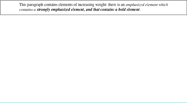
difference between normal h1 text and bold h1 text, but the weights are different
nonetheless.
In the last example, paragraphs are set to be the lightest possible font weight, which
we assume exists as a “Light” variant. Furthermore, the other faces in this font family
are “Regular” and “Bold.” Any em text within a paragraph will evaluate to normal
since that is the next-heaviest face within the font family. However, what if the only
faces in the font are “Regular” and “Bold”? In that case, the declarations would evalu‐
ate like this:
/* assume only two faces for this example: 'Regular' and 'Bold' */
p {font-weight: 100;} /* looks the same as 'normal' text */
p span {font-weight: bolder;} /* maps to '700' */
As you can see, the weight 100 is assigned to the normal font face, but the value of
font-weight is still 100. Thus, any span text that is descended from a p element will
inherit the value of 100 and then evaluate to the next-heaviest face, which is the
“Bold” face with a numerical weight of 700.
Let’s take this one step further and add two more rules, plus some markup, to illus‐
trate how all of this works (see Figure 5-8 for the results):
/* assume only two faces for this example: 'Regular' and 'Bold' */
p {font-weight: 100;} /* looks the same as 'normal' text */
p span {font-weight: 400;} /* so does this */
strong {font-weight: bolder;} /* even bolder than its parent */
strong b {font-weight: bolder;} /*bolder still */
<p>
This paragraph contains elements of increasing weight: there is a
<span>span element that contains a <strong>strongly emphasized
element and a <b>bold element</b></strong></span>.
</p>
Figure 5-8. Moving up the weight scale
In the last two nested elements, the computed value of font-weight is increased
because of the liberal use of the keyword bolder. If you were to replace the text in the
paragraph with numbers representing the font-weight of each element, you would
get the results shown here:
<p>
100 <span> 400 <strong> 700 <b> 800 </b> </strong> </span>.
</p>
The first two weight increases are large because they represent jumps from 100 to 400
and from 400 to bold (700). From 700, there is no heavier face, so the user agent
Font Weights | 171

moves the value of font-weight one notch up the numeric scale (800). Furthermore,
if you were to insert a strong element into the b element, it would come out like this:
<p>
100 <span> 400 <strong> 700 <b> 800 <strong> 900
</strong> </b> </strong> </span>.
</p>
If there were yet another b element inserted into the innermost strong element, its
weight would also be 900, since font-weight can never be higher than 900. Assuming
that there are only two font faces available, then the text would appear to be either
regular or bold, as you can see in Figure 5-9:
<p>
regular <span> regular <strong> bold <b> bold <strong> bold </strong> </b>
</strong> </span>.
</p>
Figure 5-9. Visual weight, with descriptors
Lightening Weights
As you might expect, lighter works in just the same way, except it causes the user
agent to move down the weight scale instead of up. With a quick modification of the
previous example, you can see this very clearly:
/* assume only two faces for this example: 'Regular' and 'Bold' */
p {font-weight: 900;} /* as bold as possible, which will look 'bold' */
p span {font-weight: 700;} /* this will also be bold */
strong {font-weight: lighter;} /* lighter than its parent */
b {font-weight: lighter;} /* lighter still */
<p>
900 <span> 700 <strong> 400 <b> 300 <strong> 200
</strong> </b> </strong> </span>.
</p>
<!-- ...or, to put it another way... -->
<p>
bold <span> bold <strong> regular <b> regular <strong> regular </strong></b>
</strong></span>.
</p>
Ignoring the fact that this would be entirely counterintuitive, what you see in
Figure 5-10 is that the main paragraph text has a weight of 900. When the strong text
is set to be lighter, it evaluates to the next-lighter face, which is the regular face, or
400 (the same as normal) on the numeric scale. The next step down is to 300, which is
the same as normal since no lighter faces exist. From there, the user agent can reduce
the weight only one numeric step at a time until it reaches 100 (which it doesn’t do in
172 | Chapter 5: Fonts

the example). The second paragraph shows which text will be bold and which will be
regular.
Figure 5-10. Making text lighter
The font-weight descriptor
With the font-weight descriptor, authors can assign faces of varying weights to the
weighting levels permitted by the font-weight property. For example, the following
rules explicitly assign five faces to six different font-weight values:
@font-face {
font-family: "SwitzeraADF";
font-weight: normal;
src: url("f/SwitzeraADF-Regular.otf") format("opentype");
}
@font-face {
font-family: "SwitzeraADF";
font-weight: bold;
src: url("f/SwitzeraADF-Bold.otf") format("opentype");
}
@font-face {
font-family: "SwitzeraADF";
font-weight: 300;
src: url("f/SwitzeraADF-Light.otf") format("opentype");
}
@font-face {
font-family: "SwitzeraADF";
font-weight: 500;
src: url("f/SwitzeraADF-DemiBold.otf") format("opentype");
}
@font-face {
font-family: "SwitzeraADF";
font-weight: 700;
src: url("f/SwitzeraADF-Bold.otf") format("opentype");
}
@font-face {
font-family: "SwitzeraADF";
font-weight: 900;
src: url("f/SwitzeraADF-ExtraBold.otf") format("opentype");
}
With these faces assigned, the author now has a number of weighting levels available
for his use, as illustrated in Figure 5-11:
h1, h2, h3, h4 {font: 225% SwitzeraADF, Helvetica, sans-serif;}
h1 {font-weight: 900;}
h2 {font-size: 180%; font-weight: 700;}
h3 {font-size: 150%; font-weight: 500;}
h4 {font-size: 125%; font-weight: 300;}
Font Weights | 173
Figure 5-11. Using declared font-weight faces
In any given situation, the user agent picks which face to use depending on the exact
value of a font-weight property, using the resolution algorithm detailed in the earlier
section, “How Weights Work” on page 167. Authors may use any value for the font-
weight descriptor that is permitted for the font-weight property except the inherit
keyword.
Font Size
The methods for determining font size are both very familiar and very different.
font-size
Values xx-small | x-small | small | medium | large | x-large | xx-large |
smaller | larger | <length> | <percentage>
Initial value medium
Applies to All elements
Percentages Calculated with respect to the parent element’s font size
Computed value An absolute length
Inherited Yes
Animatable Yes (numeric keywords only)
In a fashion very similar to the font-weight keywords bolder and lighter, the
property font-size has relative-size keywords called larger and smaller. Much like
what we saw with relative font weights, these keywords cause the computed value of
font-size to move up and down a scale of size values, which you’ll need to under‐
174 | Chapter 5: Fonts
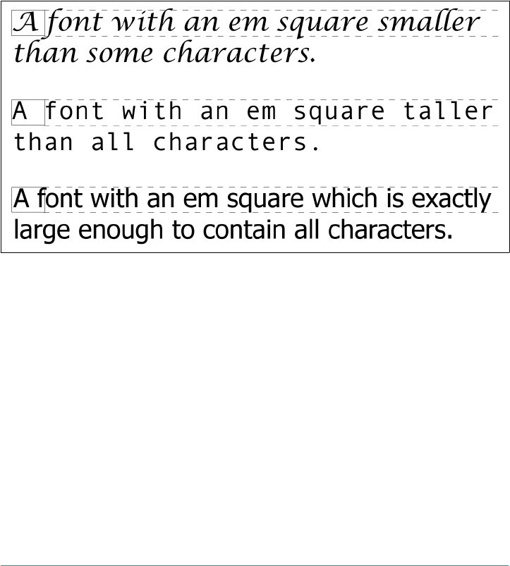
stand before you can explore larger and smaller. First, though, we need to examine
how fonts are sized in the first place.
In fact, the actual relation of the font-size property to what you see rendered is
determined by the font’s designer. This relationship is set as an em square (some call it
an em box) within the font itself. This em square (and thus the font size) doesn’t have
to refer to any boundaries established by the characters in a font. Instead, it refers to
the distance between baselines when the font is set without any extra leading (line-
height in CSS). It is quite possible for fonts to have characters that are taller than the
default distance between baselines. For that matter, a font might be defined such that
all of its characters are smaller than its em square, as many fonts do. Some hypotheti‐
cal examples are shown in Figure 5-12.
Figure 5-12. Font characters and em squares
Thus, the effect of font-size is to provide a size for the em box of a given font. This
does not guarantee that any of the actual displayed characters will be this size.
Absolute Sizes
Having established all of that, we turn now to the absolute-size keywords. There are
seven absolute-size values for font-size: xx-small, x-small, small, medium, large,
x-large, and xx-large. These are not defined precisely, but are relative to each other,
as Figure 5-13 demonstrates:
p.one {font-size: xx-small;}
p.two {font-size: x-small;}
p.three {font-size: small;}
p.four {font-size: medium;}
p.five {font-size: large;}
Font Size | 175
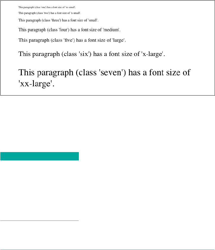
p.six {font-size: x-large;}
p.seven {font-size: xx-large;}
According to the CSS1 specification, the difference (or scaling factor) between one
absolute size and the next is about 1.5 going up the ladder, or 0.66 going down. Thus,
if medium is the same as 10px, then large should be the same as 15px. This was later
determined to be too large a scaling factor. In CSS2 it was suggested that it be some‐
where between 1.0 and 1.2, and in CSS3 drafts a complicated series is provided (for
example, small is listed as eight-ninths the size of medium, while xx-small is three-
fifths). In all case, the scaling factors are guidelines, as user agents are free to alter
them for any reason.
Figure 5-13. Absolute font sizes
Working from the assumption that medium equals 16px, for different scaling factors,
we get the absolute size equivalents shown in Table 5-5. (The values shown are
rounded-off integers.)
Table 5-5. Scaling factors translated to pixels
Keyword CSS1 CSS2 CSS3 (draft)
xx-small 5px 9px 10px
x-small 7px 11px 12px
small 11px 13px 14px
medium 16px 16px 16px
large 24px 19px 19px
x-large 36px 23px 24px
xx-large 54px 28px 32px
176 | Chapter 5: Fonts
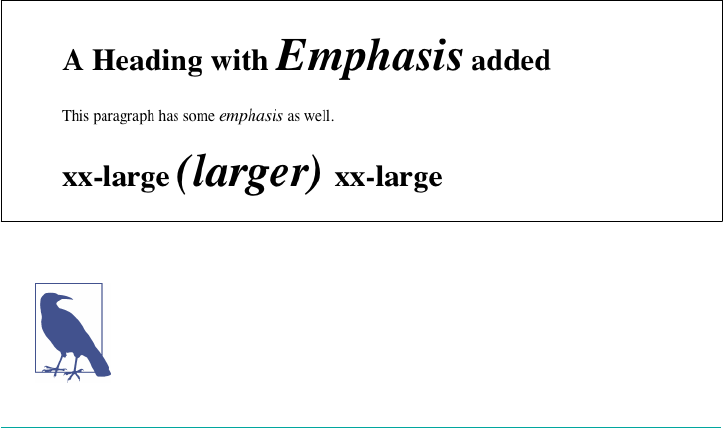
Relative Sizes
Comparatively speaking, the keywords larger and smaller are simple: they cause the
size of an element to be shifted up or down the absolute-size scale, relative to their
parent element, using the same scaling factor employed to calculate absolute sizes. In
other words, if the browser used a scaling factor of 1.2 for absolute sizes, then it
should use the same factor when applying relative-size keywords:
p {font-size: medium;}
strong, em {font-size: larger;}
<p>This paragraph element contains <strong>a strong-emphasis element
which itself contains <em>an emphasis element that also contains
<strong>a strong element.</strong></em></strong></p>
<p> medium <strong>large <em> x-large <strong>xx-large</strong> </em> </strong>
</p>
Unlike the relative values for weight, the relative-size values are not necessarily con‐
strained to the limits of the absolute-size range. Thus, a font’s size can be pushed
beyond the sizes for xx-small and xx-large. For example:
h1 {font-size: xx-large;}
em {font-size: larger;}
<h1>A Heading with <em>Emphasis</em> added</h1>
<p>This paragraph has some <em>emphasis</em> as well.</p>
As you can see in Figure 5-14, the emphasized text in the h1 element is slightly larger
than xx-large. The amount of scaling is left up to the user agent, with the scaling
factor of 1.2 being preferred but not required. The em text in the paragraph is shifted
one slot up the absolute-size scale (large).
Figure 5-14. Relative font sizing at the edges of the absolute sizes
User agents are not required to increase or decrease font size
beyond the limits of the absolute-size keywords.
Font Size | 177
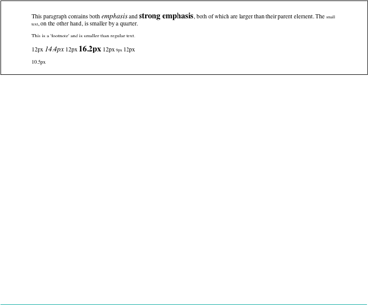
Percentages and Sizes
In a way, percentage values are very similar to the relative-size keywords. A percent‐
age value is always computed in terms of whatever size is inherited from an element’s
parent. Percentages, unlike the size keywords previously discussed, permit much finer
control over the computed font size. Consider the following example, illustrated in
Figure 5-15:
body {font-size: 15px;}
p {font-size: 12px;}
em {font-size: 120%;}
strong {font-size: 135%;}
small, .fnote {font-size: 70%;}
<body>
<p>This paragraph contains both <em>emphasis</em> and <strong>strong
emphasis</strong>, both of which are larger than their parent element.
The <small>small text</small>, on the other hand, is smaller by a quarter.</p>
<p class="fnote">This is a 'footnote' and is smaller than regular text.</p>
<p> 12px <em> 14.4px </em> 12px <strong> 16.2px </strong> 12px
<small> 9px </small> 12px </p>
<p class="fnote"> 10.5px </p>
</body>
Figure 5-15. rowing percentages into the mix
In this example, the exact pixel size values are shown. These are the values calculated
by the browser, regardless of the actual displayed size of the characters onscreen.
Incidentally, CSS defines the length value em to be equivalent to percentage values, in
the sense that 1em is the same as 100% when sizing fonts. Thus, the following would
yield identical results, assuming that both paragraphs have the same parent element:
p.one {font-size: 166%;}
p.two {font-size: 1.6em;}
When using em measurements, the same principles apply as with percentages, such as
the inheritance of computed sizes and so forth.
178 | Chapter 5: Fonts
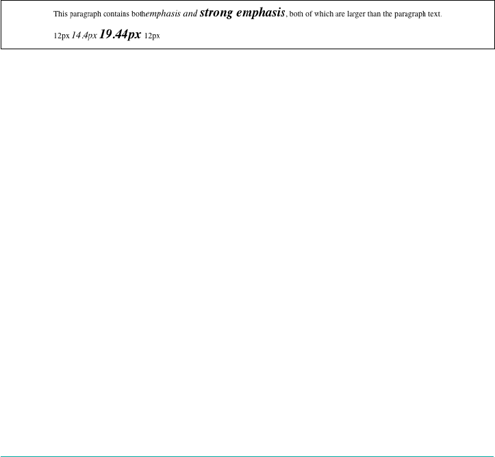
Font Size and Inheritance
Figure 5-12 also demonstrates that, although font-size is inherited in CSS, it is the
computed values that are inherited, not percentages. Thus, the value inherited by the
strong element is 12px, and this value is modified by the declared value 135% to
arrive at 16.2px. For the “footnote” paragraph, the percentage is calculated in relation
to the font-size value that’s inherited from the body element, which is 15px. Multi‐
plying that value by 75% yields 11.25px.
As with the relative-size keywords, percentages are effectively cumulative. Thus, the
following markup is displayed as shown in Figure 5-16:
p {font-size: 12px;}
em {font-size: 120%;}
strong {font-size: 135%;}
<p>This paragraph contains both<em>emphasis and <strong>strong
emphasis</strong></em>, both of which are larger than the paragraph text. </p>
<p>12px <em>14.4px <strong> 19.44px </strong></em> 12px</p>
Figure 5-16. e issues of inheritance
The size value for the strong element shown in Figure 5-16 is computed as follows:
12 px × 120% = 14.4 px
14.4 px × 135% = 19.44 px (possibly rounded to 19 px for display; see the next sec‐
tion)
The problem of runaway scaling can go the other direction, too. Consider for a
moment a document that is nothing but a series of unordered lists, many of them
nested inside other lists. Some of these lists are four nested levels deep. Imagine the
effect of the following rule on such a document:
ul {font-size: 80%;}
Assuming a four-level deep nesting, the most deeply nested unordered list would
have a computed font-size value 40.96 percent the size of the parent of the top-level
list. Every nested list would have a font size 80 percent as big as its parent list, causing
each level to become harder and harder to read.
Rounding for display
In most modern browsers, while fractional font-size values are maintained inter‐
nally, they are not always used by rendering engines. For example, study the letter‐
forms in Figure 5-17.
Font Size | 179
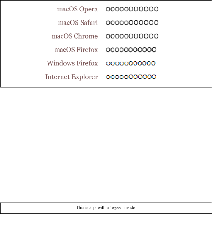
In all cases, the O characters increase by 0.1 pixels in size as you go from left to right.
Thus, the leftmost O has a font-size of 10px, the one at the midpoint has a size of
10.5px, and the one on the right is 11px.
As Figure 5-17 reveals, different browser/OS combinations yield different results. For
example, Opera, Safari, and Chrome for macOS show an abrupt jump from 10 pixels
to 11 pixels at the 10.5px position. Internet Explorer and Firefox for Windows (both
7 and 8) do the same. Firefox for macOS, on the other hand, looks like it has a
smooth line of same-size text. In fact, the characters are all being drawn subtly differ‐
ently, thanks to their subtly different font-size values. It’s hard to see without squint‐
ing (or a ruler), but the fact that it’s hard to tell there is an increase in size from one
end of the line to the other is evidence enough.
Figure 5-17. Fractional font sizes
Nevertheless, every browser will yield up the same subpixel font-size values if you
use an inspector or query the value directly via DOM scripting. The third O from the
right will show a computed value of 10.8px, regardless of the size of the character dis‐
played onscreen.
Keywords and monospace text
There’s an interesting wrinkle to font size keywords and inheritance that becomes
apparent when you look at what some browsers do with monospace text (e.g., Cou‐
rier). Consider the following, illustrated in Figure 5-18:
p {font-size: medium;} /* the default value */
span {font-family: monospace; font-size: 1em;}
<p>This is a 'p' with a <span>'span'</span> inside.</p>
Figure 5-18. Monospace size oddities
180 | Chapter 5: Fonts
The default value of medium is generally resolved to 16px, assuming the user hasn’t
changed the browser preferences (where the default text sizes are set). Indeed, if you
query the paragraph text outside the span, inspectors will tell you that the computed
font-size of the text is 16px (again, assuming the user hasn’t changed the preferen‐
ces).
So you might expect the monospaced span to also have 16-pixel text. That’s exactly
the case in some browsers; but in others, it will be 13px.
The reason for this is that while the computed font-size of the paragraph is 16px,
the keyword medium is what’s passed down through inheritance. Thus, the span starts
out with font-size: medium. As a result, it looks to the user’s preference settings to
determine the proper size, and most browsers are set to a 13px default size for all
monospace text. This causes them to display 13-pixel monospace text in a 16-pixel
parent, even though the monospace text was explicitly set to font-size: 1em.
The effect carries through even with font sizes other than 1em (or 100%); in the follow‐
ing case, the monospace text will have a computed size of 26px instead of 32px (once
more assuming the browser defaults have not changed):
p {font-size: medium;} /* the default value */
span {font-family: monospace; font-size: 2em;}
<p>This is a 'p' with a <span>'span'</span> inside.</p>
Note that not all browsers actually do this: some override the medium sizing assump‐
tions in favor of scaling off the computed font-size of the parent. This leads to
inconsistent text display across browsers.
As it happens, there is a way to work around this problem that works for all known
browsers, at least as of late 2017. It goes like this:
p {font-size: medium;} /* the default value */
span {font-family: monospace, serif; font-size: 1em;}
<p>This is a 'p' with a <span>'span'</span> inside.</p>
See the extra serif in the font-family there? That somehow triggers a switch that
makes all browsers treat font-size: 1em as being 100 percent of the paragraph’s
computed font-size, not a medium-derived value. This is cross-browser-consistent
and illustrated in Figure 5-19.
Figure 5-19. Monospace size harmony
Font Size | 181
Using Length Units
The font-size can be set using any length value. All of the following font-size dec‐
larations should be equivalent:
p.one {font-size: 36pt;}
p.two {font-size: 3pc;}
p.three {font-size: 0.5in;}
p.four {font-size: 1.27cm;}
p.five {font-size: 12.7mm;}
The display in Figure 5-20 assumes that the user agent knows how many dots per
inch are used in the display medium. Different user agents make different assump‐
tions—some based on the operating system, some based on preferences settings, and
some based on the assumptions of the programmer who wrote the user agent. Never‐
theless, the five lines should always have the same font size. Thus, while the result
may not exactly match reality (for example, the actual size of p.three may not be half
an inch), the measurements should all be consistent with one another.
Figure 5-20. Various font sizes
There is one more value that is potentially the same as those shown in Figure 5-20,
and that’s 36px, which would be the same physical distance if the display medium is
72 pixels per inch (ppi). However, there are very few monitors with that setting any‐
more. Most desktop displays are much higher, in the range of 96 ppi to 120 ppi; and
mobile devices go much higher, currently in the 300 ppi to 500 ppi range.
Despite these variations between operating systems and devices, many authors
choose to use pixel values for font sizes. This approach seems especially attractive
when mixing text and raster images (GIF, JPG, PNG, etc.) on a web page, since text
can (in theory) be set to the same height as graphic elements on the page by declaring
font-size: 11px; or something similar, as illustrated by Figure 5-21.
182 | Chapter 5: Fonts
Figure 5-21. Keeping text and graphics in scale with pixel sizes
Using pixel measurements for font-size is certainly one way to get “consistent”
results with font-size (and, indeed, with any length at all), but there is a drawback.
Not every browser makes it easy (or even possible) to resize text set in pixels, and
there are situations where pixel-sized text can be badly sized in mobile devices that
pretend to be full-screen devices (such as most versions of the iPhone). For these rea‐
sons alone, pixel-sizing text is generally not recommended.
Automatically Adjusting Size
Two of the main factors that influence a font’s legibility are its size and its x-height.
The number that results from dividing the x-height by the font-size is referred to as
the aspect value. Fonts with higher aspect values tend to be legible as the font’s size is
reduced; conversely, fonts with low aspect values become illegible more quickly. CSS
provides a way to deal with shifts in aspect values between font families with the
property font-size-adjust.
font-size-adjust
Values <number> | none | auto
Initial value none
Applies to All elements
Inherited Yes
Animatable Yes
The goal of this property is to preserve legibility when the font used is not the
author’s first choice. Because of the differences in font appearance, while one font
may be legible at a certain size, another font at the same size is difficult or impossible
to read.
A good example is to compare the common fonts Verdana and Times. Consider
Figure 5-22 and the following markup, which shows both fonts at a font-size of
10px:
p {font-size: 10px;}
p.cl1 {font-family: Verdana, sans-serif;}
p.cl2 {font-family: Times, serif; }
Font Size | 183
Figure 5-22. Comparing Verdana and Times
The text in Times is much harder to read than the Verdana text. This is partly due to
the limitations of pixel-based display, but it is also because Times becomes harder to
read at smaller font sizes.
As it turns out, the ratio of x-height to character size in Verdana is 0.58, whereas in
Times it is 0.46. What you can do in this case is declare the aspect value of Verdana,
and the user agent will adjust the size of the text that’s actually used. This is accom‐
plished using the formula:
Declared font-size ×
(font-size-adjust value ÷ aspect
value of available font) = Adjusted font-size
So, in a situation where Times is used instead of Verdana, the adjustment is as fol‐
lows:
10px × (0.58 ÷ 0.46) = 12.6px
which leads to the result shown in Figure 5-23:
p {font: 10px Verdana, sans-serif; font-size-adjust: 0.58;}
p.cl2 {font-family: Times, serif; }
Figure 5-23. Adjusting Times
The catch is that to allow a user agent to intelligently make size adjustments, it first
has to know the aspect value of the fonts you specify. User agents that support @font-
face will be able to pull that information directly from the font file, assuming the files
contain the information—any professionally-produced font should, but there’s no
guarantee. If a font file doesn’t contain the aspect value, a user agent may try to com‐
pute it; but again, there’s no guarantee that they will or even can.
Assuming that the user agent can find or figure out aspect values, the auto value for
font-size-adjust is a way of getting the desired effect even if you don’t know the
184 | Chapter 5: Fonts
actual aspect value of your first-choice font. For example, given that the user agent
can determine that the aspect value of Verdana is 0.58, then the following will have
the same result as that shown in Figure 5-23:
p {font: 10px Verdana, sans-serif; font-size-adjust: auto;}
p.cl2 {font-family: Times, serif; }
Declaring font-size-adjust: none; will suppress any adjustment of font sizes. This
is the default state.
As of late 2017, the only user agent line to support font-size-
adjust was the Gecko (Firefox) family.
Font Style
font-style is very simple: it’s used to select between normal text, italic text, and
oblique text. That’s it! The only complication is in recognizing the difference
between italic and oblique text and in understanding why browsers don’t always
give you a choice.
font-style
Values italic | oblique | normal
Initial value normal
Applies to All elements
Computed value As specied
Note Has a corresponding @font-face descriptor
Inherited Yes
Animatable No
The default value of font-style is, as you can see, normal. This refers to upright text,
which is probably best described as text that is not italic or otherwise slanted. The
vast majority of text in this book is upright, for instance. That leaves only an explana‐
tion of the difference between italic and oblique text. For that, it’s easiest to refer to
Figure 5-24, which illustrates the differences very clearly.
Basically, italic text is a separate font face, with small changes made to the structure of
each letter to account for the altered appearance. This is especially true of serif fonts,
Font Style | 185
where, in addition to the fact that the text characters “lean,” the serifs may be altered
in an italic face. Oblique text, on the other hand, is just a slanted version of the nor‐
mal, upright text. Font faces with labels like “Italic,” “Cursive,” and “Kursiv” are usu‐
ally mapped to the italic keyword, while oblique is often assigned faces with labels
such as “Oblique,” “Slanted,” and “Incline.”
Figure 5-24. Italic and oblique text in detail
If you want to make sure that a document uses italic text in familiar ways, you could
write a stylesheet like this:
p {font-style: normal;}
em, i {font-style: italic;}
These styles would make paragraphs use an upright font, as usual, and cause the em
and i elements to use an italic font—again, as usual. On the other hand, you might
decide that there should be a subtle difference between em and i:
p {font-style: normal;}
em {font-style: oblique;}
i {font-style: italic;}
If you look closely at Figure 5-25, you’ll see there is no apparent difference between
the em and i elements. In practice, not every font is so sophisticated as to have both
an italic face and an oblique face, and even fewer web browsers are sophisticated
enough to tell the difference when both faces do exist.
Figure 5-25. More font styles
If either of these is the case, then there are a few things that can happen. If there is no
Italic face available, but there is an Oblique face, then the latter can be used for the
former. If the situation is reversed—an Italic face exists, but there is no defined Obli‐
que face—the user agent may not substitute the former for the latter, according to the
specification. Finally, the user agent can simply generate the oblique face by comput‐
ing a slanted version of the upright font. In fact, this is what most often happens in a
digital world, where it’s fairly simple to slant a font using a simple computation.
186 | Chapter 5: Fonts
Furthermore, you may find that in some operating systems, a given font that has been
declared as italic may switch from italic to oblique depending on the actual size of
the font. The display of Times on a Macintosh running the Classic OS (Mac OS 9), for
example, is shown in Figure 5-26, where the only difference is a single pixel in font
size.
Figure 5-26. Same font, same style, dierent sizes
There isn’t much that can be done about this, unfortunately, except better font han‐
dling. Fortunately, modern operating systems such as macOS and Windows XP have
very good font rendering technology, and @font-face allows authors to assign spe‐
cific italic and oblique faces to the respective font-style properties, should they so
choose.
Even though italic and oblique text often use the same face, font-style can still be
quite useful. For example, it is a common typographic convention that a block quote
should be italicized, but that any specially emphasized text within the quote should be
upright. To employ this effect, which is illustrated in Figure 5-27, you would use these
styles:
blockquote {font-style: italic;}
blockquote em, blockquote i {font-style: normal;}
Figure 5-27. Common typographical conventions through CSS
A related property tells the user agent whether it’s allowed to synthesize its own bold
or italic faces when a family doesn’t contain them.
The font-style Descriptor
As a descriptor, font-style lets an author link specific faces to specific font-style val‐
ues.
@font-face {
font-family: "SwitzeraADF";
Font Style | 187
font-style: normal;
src: url("SwitzeraADF-Regular.otf") format("opentype");
}
@font-face {
font-family: "SwitzeraADF";
font-style: italic;
src: url("SwitzeraADF-Italic.otf") format("opentype");
}
@font-face {
font-family: "SwitzeraADF";
font-style: oblique;
src: url("SwitzeraADF-Italic.otf") format("opentype");
}
Given the above, the result of the following rules would be to render h2 and h3 ele‐
ments using “SwitzeraADF-Italic” instead of “SwitzeraADF-Regular,” as illustrated in
Figure 5-28:
h1, h2, h3 {font: 225% SwitzeraADF, Helvetica, sans-serif;}
h2 {font-size: 180%; font-style: italic;}
h3 {font-size: 150%; font-style: oblique;}
Figure 5-28. Using declared font-style faces
Ideally, if there were a SwitzeraADF face with an oblique typeface, the author could
point to it instead of the italic variant. There isn’t such a face, though, so the author
mapped the italic face to both the italic and oblique values. As with font-weight,
the font-style descriptor can take all of the values of the font-style property
except for inherit.
Font Stretching
In some font families, there are a number of variant faces that have wider or narrower
letterforms. These often take names like “Condensed,” “Wide,” “Ultra Expanded,” and
so on. The utility of such variants is that a designer can use a single font family while
also having skinny and fat variants. CSS provides a property that allows an author to
select among such variants, when they exist, without having to explicitly define them
188 | Chapter 5: Fonts

in font-family declarations. It does this via the somewhat misleadingly named font-
stretch.
font-stretch
Values normal | ultra-condensed | extra-condensed | condensed | semi-
condensed | semi-expanded | expanded | extra-expanded | ultra-
expanded
Initial value normal
Applies to All elements
Inherited Yes
Animatable No
Note Has a corresponding @font-face descriptor (see below)
You might expect from the property name that this will stretch or squeeze a font like
saltwater taffy, but that’s actually not the case at all. As the value names imply, this
property instead behaves very much like the absolute-size keywords (e.g., xx-large)
for the font-size property, with a range of absolute values that (in theory) let the
author alter a font’s width. For example, an author might decide to stress the text in a
strongly emphasized element by changing the font characters to a wider face than
their parent element’s font characters.
The catch is that this property only works if the font family in use has defined wider
and narrower faces, which most do not (and those that do are usually very expen‐
sive). Thus this property is actually very different from font-size, which can change
the size of any font face at any time. In contrast, declaring font-stretch: expanded
will only have an effect if the font in use has an expanded face available. If it doesn’t,
then nothing will happen: the font’s face will not change.
For example, consider the very common font Verdana, which has only one width
face; this is equivalent to font-stretch: normal. Declaring the following will have
no effect on the width of the displayed text:
body {font-family: Verdana;}
strong {font-stretch: extra-expanded;}
footer {font-stretch: extra-condensed;}
All of the text will be at Verdana’s usual width. However, if the font family is changed
to one that has a number of width faces, such as Futura, then things will be different,
as shown in Figure 5-29:
Font Stretching | 189
body {font-family: Verdana;}
strong {font-stretch: extra-expanded;}
footer {font-stretch: extra-condensed;}
Figure 5-29. Stretching font characters
As of late 2017, Safari for both macOS and iOS did not support
font-stretch, nor did Opera Mini.
The font-stretch Descriptor
Much as with the font-weight descriptor, the font-stretch descriptor allows authors
to explicitly assign faces of varying widths to the width values permitted in the font-
stretch property. For example, the following rules explicitly assign three faces to the
most directly analogous font-stretch values:
@font-face {
font-family: "SwitzeraADF";
font-stretch: normal;
src: url("SwitzeraADF-Regular.otf") format("opentype");
}
@font-face {
font-family: "SwitzeraADF";
font-stretch: condensed;
src: url("SwitzeraADF-Cond.otf") format("opentype");
}
@font-face {
font-family: "SwitzeraADF";
font-stretch: expanded;
src: url("SwitzeraADF-Ext.otf") format("opentype");
}
In a parallel to what we saw in previous sections, the author can call on these different
width faces through the font-stretch property, as illustrated in Figure 5-30:
h1, h2, h3 {font: 225% SwitzeraADF, Helvetica, sans-serif;}
h2 {font-size: 180%; font-stretch: condensed;}
h3 {font-size: 150%; font-stretch: expanded;}
As before, the font-stretch descriptor can take all of the values of the font-stretch
property except for inherit.
190 | Chapter 5: Fonts

Figure 5-30. Using declared font-stretch faces
Font Kerning
Some fonts contain data regarding how characters should be spaced relative to each
other, known as kerning. This spacing can vary depending on how characters are
combined; for example, the character pair oc may have a different spacing than the
pair ox. Similarly, AB and AW may have different separation distances, to the point
that in some fonts, the top-right tip of the W is actually placed to the left of the
bottom-right tip of the A. This kerning data can be explicitly called for or suppressed
using the property font-kerning.
font-kerning
Values auto | normal | none
Initial value auto
Applies to All elements
Inherited Yes
Animatable No
The value none is pretty simple: it tells the user agent to ignore any kerning informa‐
tion in the font. normal tells the user agent to kern the text normally; that is, accord‐
ing to the kerning data contained in the font. auto tells the user agent to do whatever
it thinks best, possibly depending on the type of font in use. The OpenType specifica‐
tion, for example, recommends (but does not require) that kerning be applied when‐
ever the font supports it. If a font does not contain kerning data, font-kerning will
have no effect.
Font Kerning | 191

Note that if the property letter-spacing is applied to kerned text,
the kerning is done and then the letters’ spacing is adjusted accord‐
ing to the value of letter-spacing, not the other way around.
Font Variants
Beyond font weights, font styles, and so forth, there are font variants. These are
embedded within a font face and can cover things like various styles of historical liga‐
tures, small-caps presentation, ways of presenting fractions, the spacing of numbers,
whether zeroes get slashes through them, and much more. CSS lets authors invoke
these variants, when they exist, through font-variant.
font-variant
Values (CSS2.1) normal | small-caps
Values (Level 3) normal | none | [ <common-lig-values> ‖ <discretionary-lig-values> ‖ <historical-
lig-values> ‖ <contextual-alt-values> ‖ stylistic(<feature-value-name>) ‖
historical-forms ‖ styleset(<feature-value-name>#) ‖ character-
variant(<feature-value-name>#) ‖ swash(<feature-value-name>) ‖ orna
ments(<feature-value-name>) ‖ annotation(<feature-value-name>) ‖ [ small-
caps | all-small-caps | petite-caps | all-petite-caps | unicase |
titling-caps ] ‖ <numeric-gure-values> ‖ <numeric-spacing-values> ‖
<numeric-fraction-values> ‖ ordinal ‖ slashed-zero ‖ <east-asian-variant-
values> ‖ <east-asian-width-values> ‖ ruby ]
Initial value normal
Applies to All elements
Computed value As specied
Inherited Yes
Animatable No
Note Has a corresponding @font-face descriptor (see below)
That’s quite a Values (Level 3) entry, isn’t it? Especially when the only values in CSS1
and CSS2 were the default of normal, which describes ordinary text, and small-caps,
which calls for the use of small-caps text. Let’s concentrate just on those for a
moment.
192 | Chapter 5: Fonts
Instead of upper- and lowercase letters, a small-caps font employs uppercase letters of
different sizes. Thus, you might see something like that shown in Figure 5-31:
h1 {font-variant: small-caps;}
h1 code, p {font-variant: normal;}
<h1>The Uses of <code>font-variant</code> On the Web</h1>
<p>
The property <code>font-variant</code> is very interesting...
</p>
Figure 5-31. e small-caps value in use
As you may notice, in the display of the h1 element, there is a larger uppercase letter
wherever an uppercase letter appears in the source and a small uppercase letter wher‐
ever there is a lowercase letter in the source. This is very similar to text-transform:
uppercase, with the only real difference being that, here, the uppercase letters are of
different sizes. However, the reason that small-caps is declared using a font property
is that some fonts have a specific small-caps face, which a font property is used to
select.
What happens if no such face exists? There are two options provided in the specifica‐
tion. The first is for the user agent to create a small-caps face by scaling uppercase
letters on its own. The second is to make all letters uppercase and the same size,
exactly as if the declaration text-transform: uppercase; had been used instead. This
is not an ideal solution, but it is permitted.
Level 3 Values
Now to examine that Values (Level 3) line. It is admittedly complicated, but there’s an
easy way to explain it. It’s actually a shorthand for all the values permitted for the fol‐
lowing properties:
•font-variant-ligatures
•font-variant-caps
•font-variant-numeric
•font-variant-alternates
•font-variant-east-asian
Font Variants | 193
As an example (to pick one of the simpler ones), <common-lig-values> comes from
the property font-variant-ligatures, and can be either common-ligatures or no-
common-ligatures. <numeric-fraction-values> comes from font-variant-numeric
and can be either diagonal-fractions or stacked-fractions. And so on.
There are two barriers to the use of these admittedly much more powerful font var‐
iants: browser support and font support. The first is easy: as of late 2017, there isn’t
widespread support for enabling font variants. Certainly you can use the CSS 2.1 var‐
iant values, but many of the Level 3 values are only supported by Gecko and WebKit.
The second is also easy while also being complex: not every font supports every var‐
iant. For example, most Latin fonts won’t support any of the East Asian variants; for
another, not every font will include support for, say, some of the numeric and ligature
variants. To find out what a given font supports, you have to consult its documenta‐
tion, or do a lot of testing if no documentation is available. (Most commercial fonts
do come with documentation, and most free fonts don’t.)
The main thing to keep in mind is that even if a variant works in a given browser for
one font, it may not for another; and just because a font has a given variant, that
doesn’t mean that all browsers will let you invoke it. So it’s complicated, and there
aren’t many detailed guides to help out.
The various font-variant-* properties are not covered in detail
here because as of late 2017, they were not well supported in
browsers. For more details, see http://w3.org/TR/css3-fonts/.
The font-variant descriptor
The font-variant descriptor lets you decide which of a font face’s variants can or
cannot be used, specified as a space-separated list. For example, you can enable the
common ligature, small caps, and slashed-zeroes variants like so:
font-variant: common-ligatures small-caps slashed-zero;
You’ll no doubt have guessed by now that the font-variant descriptor can take all of
the values of the font-variant property except for inherit.
Note that this descriptor is very different than the other descriptors we’ve seen so far.
With the font-stretch descriptor, for example, you can assign a specific font face to
a given font-stretch property value. The font-variant descriptor, by contrast,
defines which variants are permitted for the font face being declared in the @font-
face rule, which can easily negate font variant values called for in properties later on.
For example, given the following, paragraphs will not be displayed using a diagonal-
fractions or small-caps variant, even if such variants exist in SwitzeraADF:
194 | Chapter 5: Fonts

@font-face {
font-family: "SwitzeraADF";
font-weight: normal;
src: url("SwitzeraADF-Regular.otf") format("opentype");
font-variant: stacked-fractions titling-caps slashed-zero;
}
p {font: small-caps 1em SwitzeraADF, sans-serif;
font-variant-numeric: diagonal-fractions;}
Font Features
In a manner similar to font-variant, the font-feature-settings descriptor allows
authors to exercise low-level control over which OpenType font features are available
for use (so don’t go using this descriptor on .wo files).
font-feature-settings
Values normal | <feature-tag-value>#
Initial value normal
Note Has a corresponding @font-face descriptor (see below)
You can list one or more comma-separated OpenType features, as defined by the
OpenType specification. For example, enabling common ligatures, small caps, and
slashed zeroes would look something like this:
font-feature-settings: "liga" on, "smcp" on, "zero" on;
The exact format of a <feature-tag-value> value is:
<feature-tag-value>
<string> [ <integer> | on | off ]?
For many features, the only permitted integer values are 0 and 1, which are equivalent
to off and on (and vice versa). There are some features that allow a range of numbers,
however, in which case values greater than 1 both enable the feature and define the
feature’s selection index. If a feature is listed but no number is provided, 1 (on) is
assumed. Thus, the following descriptors are all equivalent:
font-feature-settings: "liga"; /* 1 is assumed */
font-feature-settings: "liga" 1; /* 1 is declared */
font-feature-settings: "liga" on; /* on = 1 */
Remember that all <string> values must be quoted. Thus, the first of the following
descriptors will be recognized, but the second will be ignored:
Font Features | 195

font-feature-settings: "liga", dlig;
/* common ligatures are enabled; we wanted discretionary ligatures, but forgot
quotes */
A further restriction is that OpenType requires that all feature tags be four ASCII
characters long. Any feature name longer or shorter, or that uses non-ASCII charac‐
ters, is invalid and will be ignored. (This isn’t something you personally need to worry
about unless you’re using a font that has it own made-up feature names and the font’s
creator didn’t follow the naming rules.)
By default, OpenType fonts always have the following features enabled unless the
author explicitly disables them via font-feature-settings or font-variant:
calt
Contextual alternates
ccmp
Composed characters
clig
Contextual ligatures
liga
Standard ligatures
locl
Localized forms
mark
Mark to base positioning
mkmk
Mark to mark positioning
rlig
Required ligatures
Additionally, other features may be enabled by default in specific situations, such as
vertical alternatives (vert) for vertical runs of text.
A complete list of standard OpenType feature names can be found
at microsoft.com/typography/otspec/featurelist.htm.
196 | Chapter 5: Fonts

The font-feature-settings Descriptor
The font-feature-settings descriptor lets you decide which of an OpenType font
face’s settings can or cannot be used, specified as a space-separated list.
Now, hold up a second—isn’t that almost exactly what we did with font-variant just
a few paragraphs ago? As a matter of fact, yes, it is. The font-variant descriptor cov‐
ers nearly everything font-feature-settings does, plus a little more besides. It just
does so in a more CSS-like way, with value names instead of cryptic OpenType identi‐
fiers and Boolean toggles. Because of this, the CSS specification explicitly encourages
authors to use font-variant instead of font-feature-settings, except in those
cases where there’s a font feature that the value list of font-variant doesn’t include.
Keep in mind that this descriptor merely makes features available for use (or sup‐
presses their use). It does not actually turn them on for the display of text; for that,
see the section on the font-feature-settings property.
Just as with the font-variant descriptor, the font-feature-settings descriptor
defines which font features are permitted for the font face being declared in the
@font-face rule. This can easily negate font feature values called for in properties
later on. For example, given the following, paragraphs will not be displayed using
alternative fractions nor small-caps, even if such features exist in SwitzeraADF:
@font-face {
font-family: "SwitzeraADF";
font-weight: normal;
src: url("SwitzeraADF-Regular.otf") format("opentype");
font-feature-settings: "afrc" off, "smcp" off;
}
p {font: 1em SwitzeraADF, sans-serif; font-feature-settings: "afrc", "smcp";}
As always, the font-feature-settings descriptor can take all of the values of the
font-feature-settings property except for inherit.
Font Synthesis
It is sometimes the case that a given font family will lack alternate faces for things like
bold or italic text. In such situations, the user agent may attempt to synthesize a face
from the faces it has available, but this can lead to unattractive letterforms. To address
this, CSS offers font-synthesis, which lets authors say how much synthesis they will
or won’t permit in the rendering of a page.
Font Synthesis | 197

font-synthesis
Values none | weight ‖ style
Initial value weight style
Applies to All elements
Inherited Yes
Animatable No
In many user agents, a font family that has no bold face can have one computed for it.
This might be done by adding pixels to either side of each character glyph, for exam‐
ple. While this might seem useful, it can lead to results that are visually unappealing.
This is why most font families actually have bold faces included: the font’s designer
wanted to make sure that bolded text in that font looked good.
Similarly, a font family that lacks an italic face an have one synthesized by simply
slanting the characters in the normal face. This tends to look even worse than synthe‐
sized bold faces, particularly when it comes to serif fonts. Compare the difference
between a synthesized italic version of Georgia (which we’re calling “oblique” here)
and the actual italic face included in Georgia, illustrated in Figure 5-32.
In supporting user agents, declaring font-synthesis: none blocks the user agent
from doing any such synthesis for the affected elements. You can block it for the
whole document with html (font-synthesis: none;}, for example. The downside
is that any attempts to bold or italicize text using a font that doesn’t offer the appro‐
priate faces will stay unbolded or unitalicized. The upside is that you don’t have to
worry about a user agent trying to synthesize those variants and doing a poor job of
it.
As of late 2017, only Firefox supported font-synthesis.
198 | Chapter 5: Fonts
Figure 5-32. Synthesized versus designed italics
The font Property
All of these properties are very sophisticated, but using them all could get a little
tedious:
h1 {font-family: Verdana, Helvetica, Arial, sans-serif; font-size: 30px;
font-weight: 900; font-style: italic; font-variant: small-caps;}
h2 {font-family: Verdana, Helvetica, Arial, sans-serif; font-size: 24px;
font-weight: bold; font-style: italic; font-variant: normal;}
Some of this problem could be solved by grouping selectors, but wouldn’t it be easier
to combine everything into a single property? Enter font, which is the shorthand
property for all the other font properties (and a little more besides).
font
Values [[ <font-style> ‖ [ normal | small-caps ] ‖ <font-weight> ]? <font-size> [ /
<line-height> ]? <font-family>] | caption | icon | menu | message-box |
small-caption | status-bar
Initial value Refer to individual properties
Applies to All elements
Percentages Calculated with respect to the parent element for <font-size> and with respect to the
element’s <font-size> for <line-height>
Computed value See individual properties (font-style, etc.)
Inherited Yes
Animatable Refer to individual properties
Generally speaking, a font declaration can have any one value from each of the listed
font properties, or else a system font value (described in “Using System Fonts” on
page 202). Therefore, the preceding example could be shortened as follows (and have
exactly the same effect, as illustrated by Figure 5-33):
h1 {font: italic 900 small-caps 30px Verdana, Helvetica, Arial, sans-serif;}
h2 {font: bold normal italic 24px Verdana, Helvetica, Arial, sans-serif;}
The font Property | 199
Figure 5-33. Typical font rules
I say that the styles “could be” shortened in this way because there are a few other
possibilities, thanks to the relatively loose way in which font can be written. If you
look closely at the preceding example, you’ll see that the first three values don’t occur
in the same order. In the h1 rule, the first three values are the values for font-style,
font-weight, and font-variant, in that order. In the second, they’re ordered font-
weight, font-variant, and font-style. There is nothing wrong here because these
three can be written in any order. Furthermore, if any of them has a value of normal,
that can be left out altogether. Therefore, the following rules are equivalent to the pre‐
vious example:
h1 {font: italic 900 small-caps 30px Verdana, Helvetica, Arial, sans-serif;}
h2 {font: bold italic 24px Verdana, Helvetica, Arial, sans-serif;}
In this example, the value of normal was left out of the h2 rule, but the effect is exactly
the same as in the preceding example.
It’s important to realize, however, that this free-for-all situation applies only to the
first three values of font. The last two are much stricter in their behavior. Not only
must font-size and font-family appear in that order as the last two values in the
declaration, but both must always be present in a font declaration. Period, end of
story. If either is left out, then the entire rule will be invalidated and very likely to be
ignored completely by a user agent. Thus, the following rules will get you the result
shown in Figure 5-34:
h1 {font: normal normal italic 30px sans-serif;} /*no problem here */
h2 {font: 1.5em sans-serif;} /* also fine; omitted values set to 'normal' */
h3 {font: sans-serif;} /* INVALID--no 'font-size' provided */
h4 {font: lighter 14px;} /* INVALID--no 'font-family' provided */
200 | Chapter 5: Fonts
Figure 5-34. e necessity of both size and family
Adding the Line Height
So far, we’ve treated font as though it has only five values, which isn’t quite true. It is
also possible to set the value of the property line-height using font, despite that fact
that line-height is a text property (not covered in this text), not a font property. It’s
done as a sort of addition to the font-size value, separated from it by a forward
slash (/):
body {font-size: 12px;}
h2 {font: bold italic 200%/1.2 Verdana, Helvetica, Arial, sans-serif;}
These rules, demonstrated in Figure 5-35, set all h2 elements to be bold and italic
(using face for one of the sans-serif font families), set the font-size to 24px (twice
the body’s size), and set the line-height to 28.8px.
Figure 5-35. Adding line height to the mix
This addition of a value for line-height is entirely optional, just as the first three
font values are. If you do include a line-height, remember that the font-size
always comes before line-height, never after, and the two are always separated by a
slash.
This may seem repetitive, but it’s one of the most common errors made by CSS
authors, so I can’t say it enough: the required values for font are font-size and
font-family, in that order. Everything else is strictly optional.
The font Property | 201
Using Shorthands Properly
It is important to remember that font, being a shorthand property, can act in unex‐
pected ways if you are careless with its use. Consider the following rules, which are
illustrated in Figure 5-36:
h1, h2, h3 {font: italic small-caps 250% sans-serif;}
h2 {font: 200% sans-serif;}
h3 {font-size: 150%;}
<h1>This is an h1 element</h1>
<h2>This is an h2 element</h2>
<h3>This is an h3 element</h3>
Figure 5-36. Shorthand changes
Did you notice that the h2 element is neither italicized nor small-capped, and that
none of the elements are bold? This is the correct behavior. When the shorthand
property font is used, any omitted values are reset to their defaults. Thus, the previ‐
ous example could be written as follows and still be exactly equivalent:
h1, h2, h3 {font: italic normal small-caps 250% sans-serif;}
h2 {font: normal normal normal 200% sans-serif;}
h3 {font-size: 150%;}
This sets the h2 element’s font style and variant to normal, and the font-weight of all
three elements to normal. This is the expected behavior of shorthand properties. The
h3 does not suffer the same fate as the h2 because you used the property font-size,
which is not a shorthand property and therefore affects only its own value.
Using System Fonts
In situations where you want to make a web page blend in with the user’s operating
system, the system font values of font come in handy. These are used to take the font
size, family, weight, style, and variant of elements of the operating system, and apply
them to an element. The values are as follows:
caption
Used for captioned controls, such as buttons
202 | Chapter 5: Fonts

icon
Used to label icons
menu
Used in menus—that is, drop-down menus and menu lists
message-box
Used in dialog boxes
small-caption
Used for labeling small controls
status-bar
Used in window status bars
For example, you might want to set the font of a button to be the same as that of the
buttons found in the operating system. For example:
button {font: caption;}
With these values, it is possible to create web-based applications that look very much
like applications native to the user’s operating system.
Note that system fonts may only be set as a whole; that is, the font family, size, weight,
style, etc., are all set together. Therefore, the button text from our previous example
will look exactly the same as button text in the operating system, whether or not the
size matches any of the content around the button. You can, however, alter the indi‐
vidual values once the system font has been set. Thus, the following rule will make
sure the button’s font is the same size as its parent element’s font:
button {font: caption; font-size: 1em;}
If you call for a system font and no such font exists on the user’s machine, the user
agent may try to find an approximation, such as reducing the size of the caption font
to arrive at the small-caption font. If no such approximation is possible, then the
user agent should use a default font of its own. If it can find a system font but can’t
read all of its values, then it should use the default value. For example, a user agent
may be able to find a status-bar font but not get any information about whether the
font is small-caps. In that case, the user agent will use the value normal for the small-
caps property.
Font Matching
As we’ve seen, CSS allows for the matching of font families, weights, and variants.
This is all accomplished through font matching, which is a vaguely complicated pro‐
cedure. Understanding it is important for authors who want to help user agents make
good font selections when displaying their documents. I left it for the end of the
Font Matching | 203

chapter because it’s not really necessary to understand how the font properties work,
and some readers will probably want to skip this part. If you’re still interested, here’s
how font matching works:
1. The user agent creates, or otherwise accesses, a database of font properties. This
database lists the various CSS properties of all of the fonts to which the user agent
has access. Typically, this will be all fonts installed on the machine, although
there could be others (for example, the user agent could have its own built-in
fonts). If the user agent encounters two identical fonts, it will just ignore one of
them.
2. The user agent takes apart an element to which font properties have been applied
and constructs a list of font properties necessary for the display of that element.
Based on that list, the user agent makes an initial choice of a font family to use in
displaying the element. If there is a complete match, then the user agent can use
that font. Otherwise, it needs to do a little more work.
3. A font is first matched against the font-stretch property.
4. A font is next matched against the font-style property. The keyword italic is
matched by any font that is labeled as either “italic” or “oblique.” If neither is
available, then the match fails.
5. The next match is to font-weight, which can never fail thanks to the way font-
weight is handled in CSS (explained in the earlier section, “How Weights Work”
on page 167).
6. Then, font-size is tackled. This must be matched within a certain tolerance, but
that tolerance is defined by the user agent. Thus, one user agent might allow
matching within a 20 percent margin of error, whereas another might allow only
10 percent differences between the size specified and the size that is actually used.
7. If there was no font match in Step 2, the user agent looks for alternate fonts
within the same font family. If it finds any, then it repeats Step 2 for that font.
8. Assuming a generic match has been found, but it doesn’t contain everything
needed to display a given element—the font is missing the copyright symbol, for
instance—then the user agent goes back to Step 3, which entails a search for
another alternate font and another trip through Step 2.
9. Finally, if no match has been made and all alternate fonts have been tried, then
the user agent selects the default font for the given generic font family and does
the best it can to display the element correctly.
204 | Chapter 5: Fonts

Furthermore, the user agent does the following to resolve handling of font variants
and features:
1. First, check for font features enabled by default, including features required for a
given script. The core set of default-enabled features is "calt", "ccmp", "clig",
"liga", "locl", "mark", "mkmk", and "rlig".
2. Then, if the font is defined via an @font-face rule, check for the features implied
by the font-variant descriptor in the @font-face rule. Then check for the font
features implied by the font-feature-settings descriptor in the @font-face
rule.
3. Then check feature settings determined by properties other than font-variant
or font-feature-settings. (For example, setting a non-default value for the
letter-spacing property will disable ligatures.)
4. Then check for features implied by the value of the font-variant property, the
related font-variant subproperties (e.g., font-variant-ligatures), and any
other property that may call for the use of OpenType features (e.g., font-
kerning).
5. Finally, check for the features implied by the value of font-feature-settings
property.
The whole process is long and tedious, but it helps to understand how user agents
pick the fonts they do. For example, you might specify the use of Times or any other
serif font in a document:
body {font-family: Times, serif;}
For each element, the user agent should examine the characters in that element and
determine whether Times can provide characters to match. In most cases, it can do so
with no problem. Assume, however, that a Chinese character has been placed in the
middle of a paragraph. Times has nothing that can match this character, so the user
agent has to work around the character or look for another font that can fulfill the
needs of displaying that element. Any Western font is highly unlikely to contain Chi‐
nese characters, but should one exist (let’s call it AsiaTimes), the user agent could use
it in the display of that one element—or simply for the single character. Thus, the
whole paragraph might be displayed using AsiaTimes, or everything in the paragraph
might be in Times except for the single Chinese character, which is displayed in
AsiaTimes.
Summary
From what was initially a very simplistic set of font properties, CSS has rapidly grown
to allow fine-grained and wide-ranging influence over how fonts are displayed on the
Summary | 205

web. From custom fonts downloaded over the web to custom-built families assem‐
bled out of a variety of individual faces, authors may be fairly said to overflow with
font power.
The typographic options available to authors today are far stronger than ever, but
always remember: you must use this power wisely. While you can have 17 different
fonts in use on your site, that definitely doesn’t mean that you should. Quite aside
from the aesthetic difficulties this could present for your users, it would also make the
total page weight much, much higher than it needs to be. As with any other aspect of
web design, authors are advised to use their power wisely, not wildly.
206 | Chapter 5: Fonts

CHAPTER 6
Text Properties
Sure, a lot of web design involves picking the right colors and getting the coolest look
for your pages, but when it comes right down to it, you probably spend more of your
time worrying about where text will go and how it will look. Such concerns gave rise
to HTML tags such as <FONT> and <CENTER> in the web’s early days, which allowed
you some measure of control over the appearance and placement of text.
Because text is so important, there are many CSS properties that affect it in one way
or another. What is the difference between text and fonts? At the simplest level, text is
the content, and fonts are used to display that content. Using text properties, you can
affect the position of text in relation to the rest of the line, superscript it, underline it,
and change the capitalization. You can even simulate, to a limited degree, the use of a
typewriter’s Tab key.
Indentation and Inline Alignment
Let’s start with a discussion of how you can affect the inline positioning of text within
a line. Think of these basic actions as the same types of steps you might take to create
a newsletter or write a report.
First, however, let’s take a moment to talk about the terms inline and block as they’ll
be used in this chapter. In fact, let’s take them in reverse. If your primary language is
Western-derived, then you’re used to a block direction of top to bottom, and an inline
direction of left to right. Let’s examine those terms more closely.
The block direction is the direction in which block elements are placed by default in
the current writing mode. In English, for example, the block direction is top to bot‐
tom, or vertical, as one paragraph (or other text element) is placed beneath the one
before.
207
The inline direction is the direction in which inline elements are written within a
block. To again take English as an example, the inline direction is left to right, or hor‐
izontal. In languages like Arabic and Hebrew, the inline direction is right to left
instead.
Let’s reconsider English for a moment. A plain page of English text, displayed on a
screen, has a vertical block direction and a horizontal inline direction. But if the page
is rotated 90 degrees anticlockwise using CSS Transforms, then suddenly the block
direction is horizontal and the inline direction is vertical. (And bottom to top, at
that.)
This approach to content and layout is relatively new as of 2017, and a conversion
from the old layout language, which was highly dependent on concepts of “horizon‐
tal” and “vertical,” is still underway. While the rest of the chapter will try to use the
terms “block direction” and “inline direction,” please forgive any lapses into “vertical”
and “horizontal.”
Indenting Text
Most books we read in Western languages format paragraphs of text with the first line
indented, and no blank line between paragraphs. Some sites used to create the illu‐
sion of indented text by placing a small transparent image before the first letter in a
paragraph, which shoved the text over. Thanks to CSS, there’s a much better way to
indent text: text-indent.
text-indent
Values <length> | <percentage>
Initial value 0
Applies to Block-level elements
Percentages Refer to the width of the containing block
Computed value For percentage values, as specied; for length values, the absolute length
Inherited Yes
Animatable Yes
Using text-indent, the first line of any element can be indented by a given length,
even if that length is negative. A common use for this property is to indent the first
line of a paragraph:
p {text-indent: 3em;}
208 | Chapter 6: Text Properties

This rule will cause the first line of any paragraph to be indented three ems, as shown
in Figure 6-1.
Figure 6-1. Text indenting
In general, you can apply text-indent to any element that generates a block box, and
the indentation will occur along the inline direction. You can’t apply it to inline ele‐
ments or on replaced elements such as images. However, if you have an image within
the first line of a block-level element, it will be shifted over with the rest of the text in
the line.
If you want to “indent” the first line of an inline element, you can
create the effect with left padding or margin.
You can also set negative values for text-indent, a technique that leads to a number
of interesting effects. The most common use is a hanging indent, where the first line
hangs out to one side of the rest of the element:
p {text-indent: −4em;}
Be careful when setting a negative value for text-indent; the first few words may be
chopped off by the edge of the browser window if you aren’t careful. To avoid display
problems, I recommend you use a margin or some padding to accommodate the neg‐
ative indentation:
p {text-indent: −4em; padding-left: 4em;}
Negative indents can, however, be used to your advantage. Consider the following
example, demonstrated in Figure 6-2, which adds a floated image to the mix:
p.hang {text-indent: −25px;}
<img src="star.gif" style="width: 60px; height: 60px;
float: left;" alt="An image of a five-pointed star."/>
<p class="hang"> This paragraph has a negatively indented first
line, which overlaps the floated image that precedes the text. Subsequent
lines do not overlap the image, since they are not indented in any way.</p>
Indentation and Inline Alignment | 209
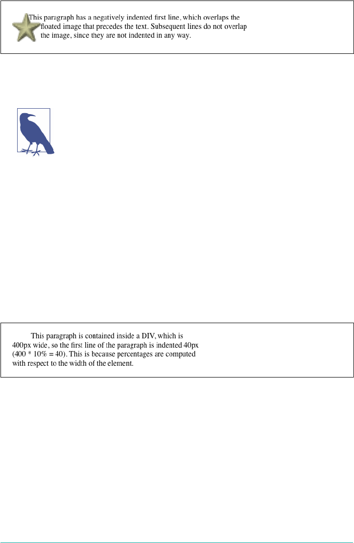
Figure 6-2. A oated image and negative text indenting
A variety of interesting designs can be achieved using this simple technique.
This specific effect, of trying to make text wrap along the edge of a
floated image, is more robustly managed with CSS Float Shapes.
See Chapter 10 for details.
Any unit of length, including percentage values, may be used with text-indent. In
the following case, the percentage refers to the width of the parent element of the ele‐
ment being indented. In other words, if you set the indent value to 10%, the first line
of an affected element will be indented by 10 percent of its parent element’s width, as
shown in Figure 6-3:
div {width: 400px;}
p {text-indent: 10%;}
<div>
<p>This paragraph is contained inside a DIV, which is 400px wide, so the
first line of the paragraph is indented 40px (400 * 10% = 40). This is
because percentages are computed with respect to the width of the element.</p>
</div>
Figure 6-3. Text indenting with percentages
Note that this indentation only applies to the first line of an element, even if you
insert line breaks. The interesting part about text-indent is that because it’s inher‐
ited, it can have unexpected effects. For example, consider the following markup,
which is illustrated in Figure 6-4:
div#outer {width: 500px;}
div#inner {text-indent: 10%;}
p {width: 200px;}
<div id="outer">
<div id="inner">
This first line of the DIV is indented by 50 pixels.
210 | Chapter 6: Text Properties
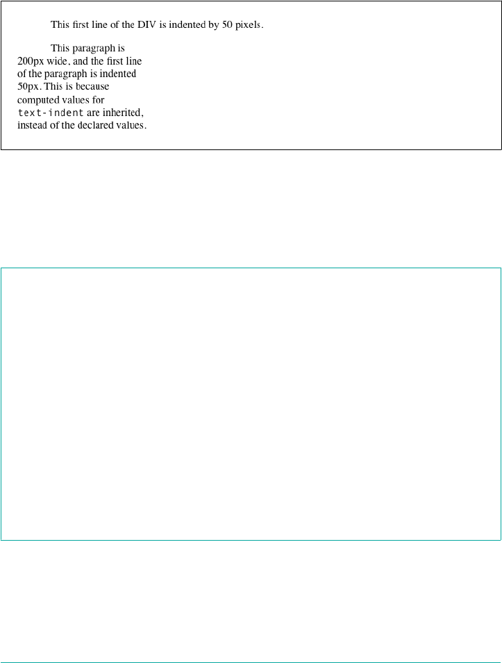
<p>
This paragraph is 200px wide, and the first line of the paragraph
is indented 50px. This is because computed values for 'text-indent'
are inherited, instead of the declared values.
</p>
</div>
</div>
Figure 6-4. Inherited text indenting
Text Alignment
Even more basic than text-indent is the property text-align, which affects how the
lines of text in an element are aligned with respect to one another.
text-align
Values start | end | left | right | center | justify | match-parent | start
end
Initial value In CSS3, start; in CSS 2.1, this was user agent-specic, likely depending on writing
direction (e.g., left for Western languages like English)
Applies to Block-level elements
Computed value As specied, except in the case of match-parent
Inherited Yes
Animatable No
Note CSS2 included a <length> value that was dropped from CSS 2.1 due to a lack of
implementation
The quickest way to understand how these values work is to examine Figure 6-5,
which sticks with three most widely supported values for the moment.
Indentation and Inline Alignment | 211
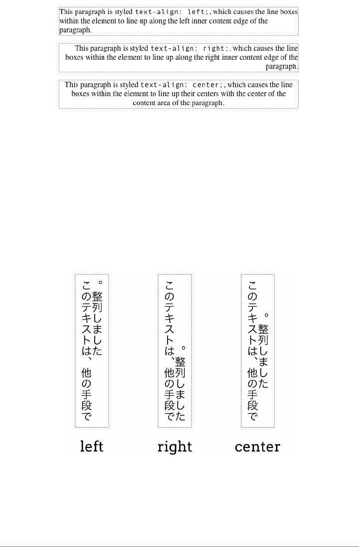
Figure 6-5. Selected behaviors of the text-align property
The values left, right, and center cause the text within elements to be aligned
exactly as described. Because text-align applies only to block-level elements, such as
paragraphs, there’s no way to center an anchor within its line without aligning the rest
of the line (nor would you want to, since that would likely cause text overlap).
Historically, which is to say under CSS 2.1 rules, the default value of text-align is
left in left-to-right languages, and right in right-to-left languages. (CSS 2.1 had no
notion of vertical writing modes.) In CSS3, left and right are mapped to the start or
end edge, respectively, of a vertical language. This is illustrated in Figure 6-6.
Figure 6-6. Le, right, and center in vertical writing modes
212 | Chapter 6: Text Properties

As you no doubt expect, center causes each line of text to be centered within the ele‐
ment. Although you may be tempted to believe that text-align: center is the same
as the <CENTER> element, it’s actually quite different. <CENTER> affected not only text,
but also centered whole elements, such as tables. text-align does not control the
alignment of elements, only their inline content. Figures 6-5 and 6-6 illustrate this
clearly in various writing directions.
Start and end alignment
CSS3 (which is to say, the CSS Text Module Level 3 specification) added a number of
new values to text-align, and even changed the default property value as compared
to CSS 2.1.
The new default value of start means that the text is aligned to the start edge of its
line box. In left-to-right languages like English, that’s the left edge; in right-to-left lan‐
guages such as Arabic, it’s the right edge. In vertical languages, for that matter, it will
be the top or bottom, depending on the writing direction. The upshot is that the
default value is much more aware of the document’s language direction while leaving
the default behavior the same in the vast majority of existing cases.
In a like manner, end aligns text with the end edge of each line box—the right edge in
LTR languages, the left edge in RTL languages, and so forth. The effects of these val‐
ues are shown in Figure 6-7.
Figure 6-7. Start and end alignment
Justied text
An often-overlooked alignment value is justify, which raises some issues of its own.
In justified text, both ends of a line of text are placed at the inner edges of the parent
element, as Figure 6-8 shows. Then, the spacing between words and letters is adjusted
so that each line is precisely the same length. Justified text is common in the print
world (for example, in this book), but under CSS, a few extra considerations come
into play.
Indentation and Inline Alignment | 213
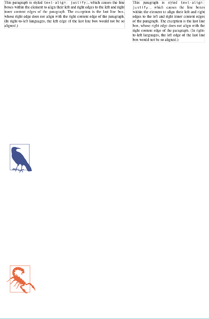
Figure 6-8. Justied text
The user agent—and not CSS, at least as of late 2017—determines how justified text
should be stretched to fill the space between the left and right edges of the parent.
Some browsers, for example, might add extra space only between words, while others
might distribute the extra space between letters (although the CSS specification states
that “user agents may not further increase or decrease the inter-character space” if the
property letter-spacing has been assigned a length value). Other user agents may
reduce space on some lines, thus mashing the text together a bit more than usual. All
of these possibilities will affect the appearance of an element, and may even change its
height, depending on how many lines of text result from the user agent’s justification
choices.
There is a property meant to provide authors more say over how
full justification is accomplished: text-justify. As of late 2017, it
was barely supported in any browser, with plans to add it to Firefox
and some buggy experimental work in Chrome.
Parent matching
There’s one more value to be covered, which is match-parent. This isn’t supported by
browsers, but its intent is mostly covered by inherit anyway. The idea is, if you
declare text-align: match-parent, the alignment of the element will match the
alignment of its parent.
So far, that sounds exactly like inherit, but there’s a difference: if the parent’s align‐
ment value is start or end, the result of match-parent is to assign a computed value
of left or right to the element. That wouldn’t happen with inherit, which would
apply start or end to the element with no changes.
The value start end, while technically part of the text-align syn‐
tax in late 2017, is not covered because it remains unimplemented
and is at risk of being dropped from the specification.
214 | Chapter 6: Text Properties
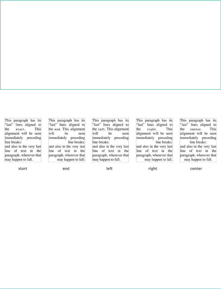
Aligning the Last Line
There may be times when you want to align the text in the very last line of an element
differently than you did the rest of the content. For example, you might left-align the
last line of an otherwise fully justified block of text, or choose to swap from left to
center alignment. For those situations, there is text-align-last.
text-align-last
Values auto | start | end | left | right | center | justify
Initial value auto
Applies to Block-level elements
Computed value As specied
Inherited Yes
Animatable No
As with text-align, the quickest way to understand how these values work is to
examine Figure 6-9.
Figure 6-9. Dierently aligned last lines
As the figure shows, the last lines of the elements are aligned independently of the
rest of the elements, according to the elements’ text-align-last values.
A close study of Figure 6-9 will reveal that there’s more at play than just the last lines
of block-level elements. In fact, text-align-last applies to any line of text that
immediately precedes a forced line break, whether or not said line break is triggered
by the end of an element. Thus, a line break occasioned by a <br> tag will make the
line of text immediately before that break use the value of text-align-last. So too
will it affect the last line of text in a block-level element, since a line break is gener‐
ated by the element’s closure.
Indentation and Inline Alignment | 215

There’s an interesting wrinkle in text-align-last: if the first line of text in an ele‐
ment is also the last line of text in the element, then the value of text-align-last
takes precedence over the value of text-align. Thus, the following styles will result
in a centered paragraph, not a start-aligned paragraph:
p {text-align: start; text-align-last: center;}
<p>A paragraph.</p>
As of late 2017, support for text-align-last was missing in Safari
and Opera Mini, and Internet Explorer and Edge only supported
left, right, and center.
Inline Alignment
Now that we’ve covered alignment along the inline direction, let’s move on to the ver‐
tical alignment of inline elements along the block direction—things like superscript‐
ing and “vertical alignment,” as it’s called. (Vertical with respect to the line of text, if
the text is laid out horizontally.) Since the construction of lines is a very complex
topic that merits its own small book, I’ll just stick to a quick overview here.
The Height of Lines
The distance between lines can be affected by changing the “height” of a line. note
that “height” here is with respect to the line of text itself, assuming that the longer
axis of a line is “width” even if it’s written vertically. The property names we cover
from here will reveal a strong bias toward Western languages and their writing direc‐
tions; this is an artifact of the early days of CSS, when Western languages were the
only ones that could be easily represented.
The line-height property refers to the distance between the baselines of lines of text
rather than the size of the font, and it determines the amount by which the height of
each element’s box is increased or decreased. In the most basic cases, specifying line-
height is a way to increase (or decrease) the vertical space between lines of text, but
this is a misleadingly simple way of looking at how line-height works. line-height
controls the leading, which is the extra space between lines of text above and beyond
the font’s size. In other words, the difference between the value of line-height and
the size of the font is the leading.
216 | Chapter 6: Text Properties

line-height
Values <number> | <length> | <percentage> | normal
Initial value normal
Applies to All elements (but see text regarding replaced and block-level elements)
Percentages Relative to the font size of the element
Computed value For length and percentage values, the absolute value; otherwise, as specied
Inherited Yes
Animatable Yes
When applied to a block-level element, line-height defines the minimum distance
between text baselines within that element. Note that it defines a minimum, not an
absolute value, and baselines of text can wind up being pushed further apart than the
value of line-height. line-height does not affect layout for replaced elements, but
it still applies to them.
Constructing a line
Every element in a line of text generates a content area, which is determined by the
size of the font. This content area in turn generates an inline box that is, in the
absence of any other factors, exactly equal to the content area. The leading generated
by line-height is one of the factors that increases or decreases the height of each
inline box.
To determine the leading for a given element, subtract the computed value of font-
size from the computed value of line-height. That value is the total amount of
leading. And remember, it can be a negative number. The leading is then divided in
half, and each half-leading is applied to the top and bottom of the content area. The
result is the inline box for that element.
As an example, let’s say the font-size (and therefore the content area) is 14 pixels
tall, and the line-height is computed to 18 pixels. The difference (4 pixels) is divi‐
ded in half, and each half is applied to the top and bottom of the content area. This
creates an inline box that is 18 pixels tall, with 2 extra pixels above and below the con‐
tent area. This sounds like a roundabout way to describe how line-height works,
but there are excellent reasons for the description.
Once all of the inline boxes have been generated for a given line of content, they are
then considered in the construction of the line box. A line box is exactly as tall as
Inline Alignment | 217
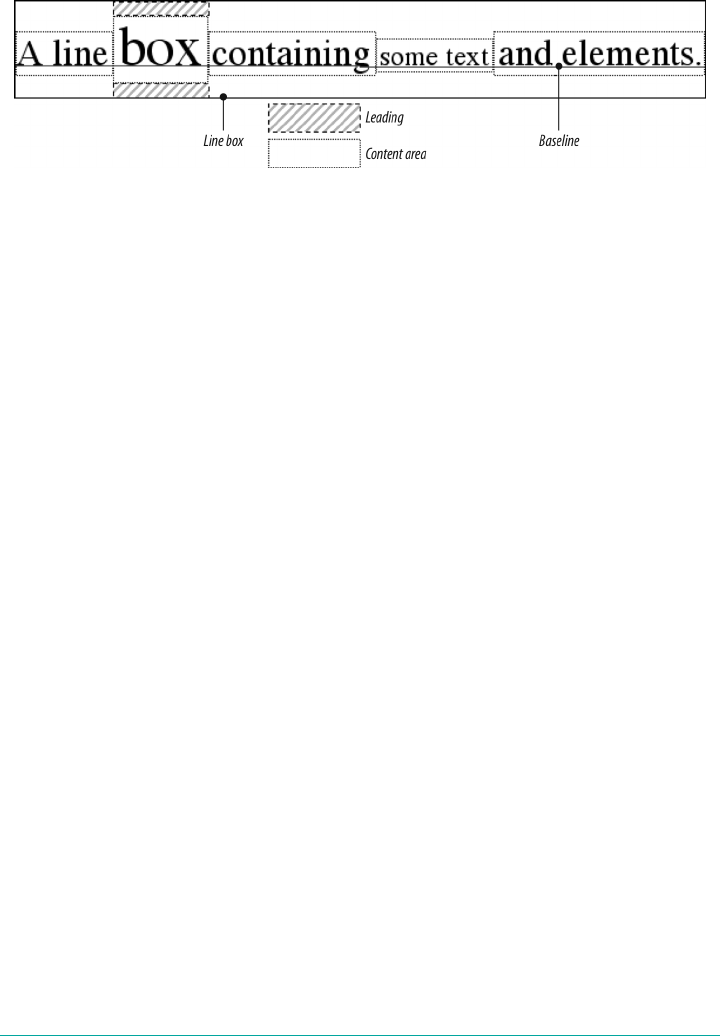
needed to enclose the top of the tallest inline box and the bottom of the lowest inline
box. Figure 6-10 shows a diagram of this process.
Figure 6-10. Line box diagram
Assigning values to line-height
Let’s now consider the possible values of line-height. If you use the default value of
normal, the user agent must calculate the space between lines. Values can vary by user
agent, but they’re generally around 1.2 times the size of the font, which makes line
boxes taller than the value of font-size for a given element.
Many values are simple length measures (e.g., 18px or 2em), but raw <number> values
are preferable in many situations. Be aware that even if you use a valid length meas‐
urement, such as 4cm, the browser (or the operating system) may be using an incor‐
rect metric for real-world measurements, so the line height may not show up as
exactly four centimeters on your monitor.
em, ex, and percentage values are calculated with respect to the font-size of the ele‐
ment. The results of the following CSS and HTML are shown in Figure 6-11:
body {line-height: 18px; font-size: 16px;}
p.cl1 {line-height: 1.5em;}
p.cl2 {font-size: 10px; line-height: 150%;}
p.cl3 {line-height: 0.33in;}
<p>This paragraph inherits a 'line-height' of 14px from the body, as well as
a 'font-size' of 13px.</p>
<p class="cl1">This paragraph has a 'line-height' of 27px(18 * 1.5), so
it will have slightly more line-height than usual.</p>
<p class="cl2">This paragraph has a 'line-height' of 15px (10 * 150%), so
it will have slightly more line-height than usual.</p>
<p class="cl3">This paragraph has a 'line-height' of 0.33in, so it will have
slightly more line-height than usual.</p>
218 | Chapter 6: Text Properties
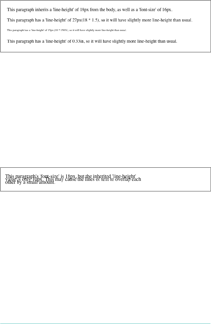
Figure 6-11. Simple calculations with the line-height property
Line-height and inheritance
When the line-height is inherited by one block-level element from another, things
get a bit trickier. line-height values inherit from the parent element as computed
from the parent, not the child. The results of the following markup are shown in
Figure 6-12. It probably wasn’t what the author had in mind:
body {font-size: 10px;}
div {line-height: 1em;} /* computes to '10px' */
p {font-size: 18px;}
<div>
<p>This paragraph's 'font-size' is 18px, but the inherited 'line-height'
value is only 10px. This may cause the lines of text to overlap each
other by a small amount.</p>
</div>
Figure 6-12. Small line-height, large font-size, slight problem
Why are the lines so close together? Because the computed line-height value of
10px was inherited by the paragraph from its parent div. One solution to the small
line-height problem depicted in Figure 6-12 is to set an explicit line-height for
every element, but that’s not very practical. A better alternative is to specify a number,
which actually sets a scaling factor:
body {font-size: 10px;}
div {line-height: 1;}
p {font-size: 18px;}
When you specify a number, you cause the scaling factor to be an inherited value
instead of a computed value. The number will be applied to the element and all of its
child elements so that each element has a line-height calculated with respect to its
own font-size (see Figure 6-13):
Inline Alignment | 219

div {line-height: 1.5;}
p {font-size: 18px;}
<div>
<p>This paragraph's 'font-size' is 18px, and since the 'line-height'
set for the parent div is 1.5, the 'line-height' for this paragraph
is 27px (18 * 1.5).</p>
</div>
Figure 6-13. Using line-height factors to overcome inheritance problems
Though it seems like line-height distributes extra space both above and below each
line of text, it actually adds (or subtracts) a certain amount from the top and bottom
of an inline element’s content area to create an inline box. Assume that the default
font-size of a paragraph is 12pt and consider the following:
p {line-height: 16pt;}
Since the “inherent” line height of 12-point text is 12 points, the preceding rule will
place an extra 4 points of space around each line of text in the paragraph. This extra
amount is divided in two, with half going above each line and the other half below.
You now have 16 points between the baselines, which is an indirect result of how the
extra space is apportioned.
If you specify the value inherit, then the element will use the computed value for its
parent element. This isn’t really any different than allowing the value to inherit natu‐
rally, except in terms of specificity and cascade resolution.
Now that you have a basic grasp of how lines are constructed, let’s talk about “verti‐
cally” aligning elements relative to the line box—that is, displacing them along the
block direction.
Vertically Aligning Text
If you’ve ever used the elements sup and sub (the superscript and subscript elements),
or used an image with markup such as <img src="foo.gif" align="middle">, then
you’ve done some rudimentary vertical alignment. In CSS, the vertical-align prop‐
erty applies only to inline elements and replaced elements such as images and form
inputs. vertical-align is not an inherited property.
220 | Chapter 6: Text Properties

Because of the property name vertical-align, this section will
use the terms “vertical” and “horizontal” to refer to the block and
inline directions of the text.
vertical-align
Values baseline | sub | super | top | text-top | middle | bottom | text-
bottom | <length> | <percentage>
Initial value baseline
Applies to Inline elements and table cells
Percentages Refer to the value of line-height for the element
Computed value For percentage and length values, the absolute length; otherwise, as specied
Inherited No
Animatable <length>, <percentage>
Note When applied to table cells, only the values baseline, top, middle, and bottom
are recognized
vertical-align accepts any one of eight keywords, a percentage value, or a length
value. The keywords are a mix of the familiar and unfamiliar: baseline (the default
value), sub, super, bottom, text-bottom, middle, top, and text-top. We’ll examine
how each keyword works in relation to inline elements.
Remember: vertical-align does not affect the alignment of con‐
tent within a block-level element. You can, however, use it to affect
the vertical alignment of elements within table cells.
Baseline alignment
vertical-align: baseline forces the baseline of an element to align with the base‐
line of its parent. Browsers, for the most part, do this anyway, since you’d probably
expect the bottoms of all text elements in a line to be aligned.
If a vertically aligned element doesn’t have a baseline—that is, if it’s an image, a form
input, or another replaced element—then the bottom of the element is aligned with
the baseline of its parent, as Figure 6-14 shows:
Inline Alignment | 221
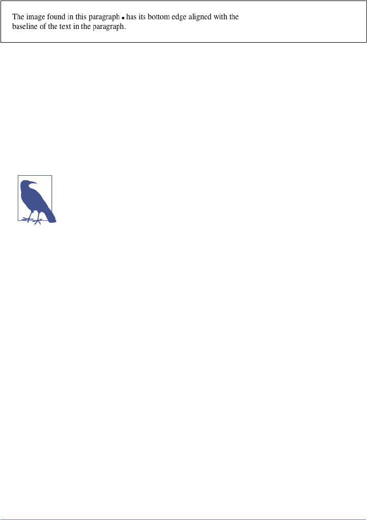
img {vertical-align: baseline;}
<p>The image found in this paragraph <img src="dot.gif" alt="A dot" /> has its
bottom edge aligned with the baseline of the text in the paragraph.</p>
Figure 6-14. Baseline alignment of an image
This alignment rule is important because it causes some web browsers to always put a
replaced element’s bottom edge on the baseline, even if there is no other text in the
line. For example, let’s say you have an image in a table cell all by itself. The image
may actually be on a baseline, but in some browsers, the space below the baseline
causes a gap to appear beneath the image. Other browsers will “shrink-wrap” the
image with the table cell, and no gap will appear. The gap behavior is correct, despite
its lack of appeal to most authors.
See the aged and yet still relevant article “Images, Tables, and Mys‐
terious Gaps” for a more detailed explanation of gap behavior and
ways to work around it.
Superscripting and subscripting
The declaration vertical-align: sub causes an element to be subscripted, meaning
that its baseline (or bottom, if it’s a replaced element) is lowered with respect to its
parent’s baseline. The specification doesn’t define the distance the element is lowered,
so it may vary depending on the user agent.
super is the opposite of sub; it raises the element’s baseline (or bottom of a replaced
element) with respect to the parent’s baseline. Again, the distance the text is raised
depends on the user agent.
Note that the values sub and super do not change the element’s font size, so sub‐
scripted or superscripted text will not become smaller (or larger). Instead, any text in
the sub- or superscripted element should be, by default, the same size as text in the
parent element, as illustrated by Figure 6-15:
span.raise {vertical-align: super;}
span.lower {vertical-align: sub;}
<p>This paragraph contains <span class="raise">superscripted</span>
and <span class="lower">subscripted</span> text.</P>
222 | Chapter 6: Text Properties
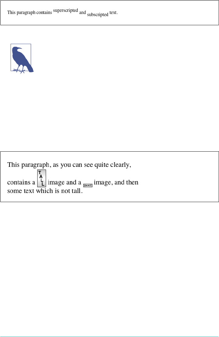
Figure 6-15. Superscript and subscript alignment
If you wish to make super- or subscripted text smaller than the text
of its parent element, you can do so using the property font-size.
Bottom feeding
vertical-align: bottom aligns the bottom of the element’s inline box with the bot‐
tom of the line box. For example, the following markup results in Figure 6-16:
.feeder {vertical-align: bottom;}
<p>This paragraph, as you can see quite clearly, contains
a <img src="tall.gif" alt="tall" class="feeder" /> image and
a <img src="short.gif" alt="short" class="feeder" /> image,
and then some text that is not tall.</p>
Figure 6-16. Bottom alignment
The second line of the paragraph in Figure 6-16 contains two inline elements, whose
bottom edges are aligned with each other. They’re also below the baseline of the text.
vertical-align: text-bottom refers to the bottom of the text in the line. For the
purposes of this value, replaced elements, or any other kinds of non-text elements,
are ignored. Instead, a “default” text box is considered. This default box is derived
from the font-size of the parent element. The bottom of the aligned element’s inline
box is then aligned with the bottom of the default text box. Thus, given the following
markup, you get a result like the one shown in Figure 6-17:
img.tbot {vertical-align: text-bottom;}
<p>Here: a <img src="tall.gif" style="vertical-align: middle;" alt="tall" />
image, and then a <img src="short.gif" class="tbot" alt="short" /> image.</p>
Inline Alignment | 223

Figure 6-17. Text-bottom alignment
Getting on top
Employing vertical-align: top has the opposite effect of bottom. Likewise,
vertical-align: text-top is the reverse of text-bottom. Figure 6-18 shows how
the following markup would be rendered:
.up {vertical-align: top;}
.textup {vertical-align: text-top;}
<p>Here: a <img src="tall.gif" alt="tall image"> tall image, and then
<span class="up">some text</span> that's been vertically aligned.</p>
<p>Here: a <img src="tall.gif" class="textup" alt="tall"> image that's been
vertically aligned, and then a <img src="short.gif" class="textup" alt="short" />
image that's similarly aligned.</p>
Figure 6-18. Aligning with the top and text-top of a line
The exact position of this alignment will depend on which elements are in the line,
how tall they are, and the size of the parent element’s font.
In the middle
There’s the value middle, which is usually (but not always) applied to images. It does
not have the exact effect you might assume given its name. middle aligns the middle
of an inline element’s box with a point that is 0.5ex above the baseline of the parent
element, where 1ex is defined relative to the font-size for the parent element.
Figure 6-19 shows this in more detail.
224 | Chapter 6: Text Properties

Figure 6-19. Precise detail of middle alignment
Since most user agents treat 1ex as one-half em, middle usually aligns the vertical
midpoint of an element with a point one-quarter em above the parent’s baseline,
though this is not a defined distance and so can vary from one user agent to another.
Percentages
Percentages don’t let you simulate align="middle" for images. Instead, setting a per‐
centage value for vertical-align raises or lowers the baseline of the element (or the
bottom edge of a replaced element) by the amount declared, with respect to the
parent’s baseline. (The percentage you specify is calculated as a percentage of line-
height for the element, not its parent.) Positive percentage values raise the element,
and negative values lower it. Depending on how the text is raised or lowered, it can
appear to be placed in adjacent lines, as shown in Figure 6-20, so take care when
using percentage values:
sub {vertical-align: −100%;}
sup {vertical-align: 100%;}
<p>We can either <sup>soar to new heights</sup> or, instead,
<sub>sink into despair...</sub></p>
Figure 6-20. Percentages and fun eects
Let’s consider percentage values in more detail. Assume the following:
<div style="font-size: 14px; line-height: 18px;">
I felt that, if nothing else, I deserved a
<span style="vertical-align: 50%;">raise</span> for my efforts.
</div>
Inline Alignment | 225
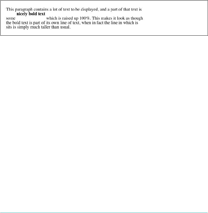
The 50%-aligned span element has its baseline raised nine pixels, which is half of the
element’s inherited line-height value of 18px, not the seven pixels that would be half
the font-size.
Length alignment
Finally, let’s consider vertical alignment with a specific length. vertical-align is
very basic: it shifts an element up or down by the declared distance. Thus, vertical-
align: 5px; will shift an element upward five pixels from its unaligned placement.
Negative length values shift the element downward. This simple form of alignment
did not exist in CSS1, but it was added in CSS2.
It’s important to realize that vertically aligned text does not become part of another
line, nor does it overlap text in other lines. Consider Figure 6-21, in which some ver‐
tically aligned text appears in the middle of a paragraph.
Figure 6-21. Vertical alignments can cause lines to get taller
As you can see, any vertically aligned element can affect the height of the line. Recall
the description of a line box, which is exactly as tall as necessary to enclose the top of
the tallest inline box and the bottom of the lowest inline box. This includes inline
boxes that have been shifted up or down by vertical alignment.
Word Spacing and Letter Spacing
Now that we’ve dealt with vertical alignment of inline elements, let’s return to the
inline direction for a look at manipulating word and letter spacing. As usual, these
properties have some nonintuitive issues.
Word Spacing
The word-spacing property accepts a positive or negative length. This length is added
to the standard space between words. In effect, word-spacing is used to modify inter-
word spacing. Therefore, the default value of normal is the same as setting a value of
zero (0).
226 | Chapter 6: Text Properties
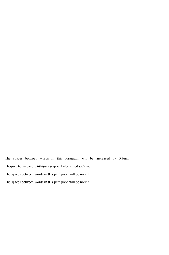
word-spacing
Values <length> | normal
Initial value normal
Applies to All elements
Computed value For normal, the absolute length 0; otherwise, the absolute length
Inherited Yes
Animatable Yes
If you supply a positive length value, then the space between words will increase. Set‐
ting a negative value for word-spacing brings words closer together:
p.spread {word-spacing: 0.5em;}
p.tight {word-spacing: −0.5em;}
p.base {word-spacing: normal;}
p.norm {word-spacing: 0;}
<p class="spread">The spaces between words in this paragraph will be increased
by 0.5em.</p>
<p class="tight">The spaces between words in this paragraph will be decreased
by 0.5em.</p>
<p class="base">The spaces between words in this paragraph will be normal.</p>
<p class="norm">The spaces between words in this paragraph will be normal.</p>
Manipulating these settings has the effect shown in Figure 6-22.
Figure 6-22. Changing the space between words
So far, I haven’t actually given you a precise definition of “word.” In the simplest CSS
terms, a “word” is any string of non-whitespace characters that is surrounded by
whitespace of some kind. This definition has no real semantic meaning; it simply
assumes that a document contains words, each of which is surrounded by one or
more whitespace characters. A CSS-aware user agent cannot be expected to decide
what is a valid word in a given language and what isn’t. This definition, such as it is,
means word-spacing is unlikely to work in any languages that employ pictographs,
Word Spacing and Letter Spacing | 227
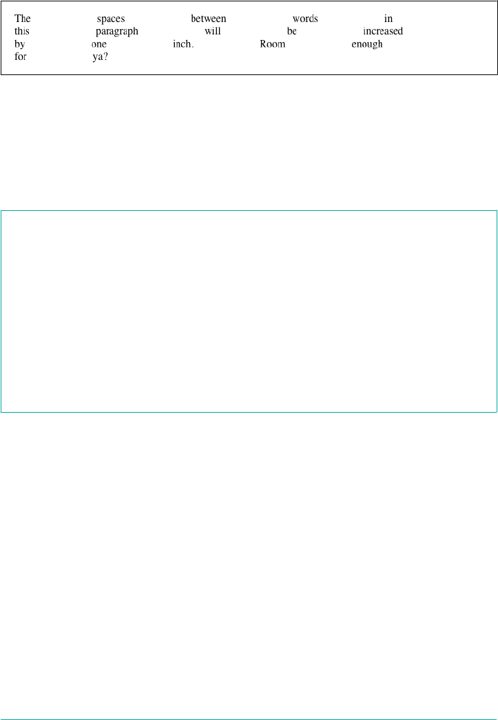
or non-Roman writing styles. The property allows you to create very unreadable
documents, as Figure 6-23 makes clear. Use word-spacing with care.
Figure 6-23. Really wide word spacing
Letter Spacing
Many of the issues you encounter with word-spacing also occur with letter-
spacing. The only real difference between the two is that letter-spacing modifies
the space between characters or letters.
letter-spacing
Values <length> | normal
Initial value normal
Applies to All elements
Computed value For length values, the absolute length; otherwise, normal
Inherited Yes
Animatable Yes
As with the word-spacing property, the permitted values of letter-spacing include
any length. The default keyword is normal (making it the same as letter-spacing:
0). Any length value you enter will increase or decrease the space between letters by
that amount. Figure 6-24 shows the results of the following markup:
p {letter-spacing: 0;} /* identical to 'normal' */
p.spacious {letter-spacing: 0.25em;}
p.tight {letter-spacing: −0.25em;}
<p>The letters in this paragraph are spaced as normal.</p>
<p class="spacious">The letters in this paragraph are spread out a bit.</p>
<p class="tight">The letters in this paragraph are a bit smashed together.</p>
228 | Chapter 6: Text Properties
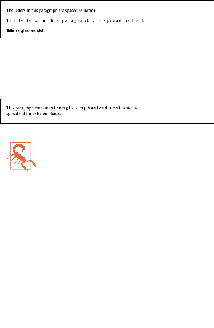
Figure 6-24. Various kinds of letter spacing
Using letter-spacing to increase emphasis is a time-honored technique. You might
write the following declaration and get an effect like the one shown in Figure 6-25:
strong {letter-spacing: 0.2em;}
<p>This paragraph contains <strong>strongly emphasized text</strong>
which is spread out for extra emphasis.</p>
Figure 6-25. Using letter-spacing to increase emphasis
If a page uses fonts with features like ligatures, and those features
are enabled, then altering letter or word spacing can effectively dis‐
able them. Browsers will not recalculate ligatures or other joins
when letter spacing is altered, for example.
Spacing and Alignment
The value of word-spacing may be influenced by the value of the property text-
align. If an element is justified, the spaces between letters and words may be altered
to fit the text along the full width of the line. This may in turn alter the spacing
declared by the author with word-spacing. If a length value is assigned to letter-
spacing, then it cannot be changed by text-align; but if the value of letter-
spacing is normal, then inter-character spacing may be changed to justify the text.
CSS does not specify how the spacing should be calculated, so user agents fill it in
with their own algorithms.
Note that the computed value is inherited, so child elements with larger or smaller
text will have the same letter spacing as their parent element. You cannot define a
scaling factor for word-spacing or letter-spacing to be inherited in place of the
computed value (as is the case with line-height). As a result, you may run into
problems such as those shown in Figure 6-26:
p {letter-spacing: 0.25em; font-size: 20px;}
small {font-size: 50%;}
Word Spacing and Letter Spacing | 229
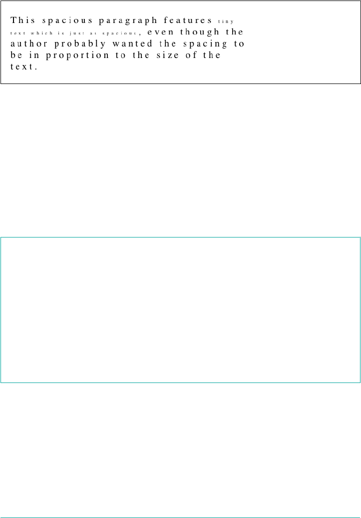
<p>This spacious paragraph features <small>tiny text that is just
as spacious</small>, even though the author probably wanted the
spacing to be in proportion to the size of the text.</p>
Figure 6-26. Inherited letter spacing
The only way to achieve letter spacing that’s in proportion to the size of the text is to
set it explicitly, as follows:
p {letter-spacing: 0.25em;}
small {font-size: 50%; letter-spacing: 0.25em;}
Text Transformation
With the alignment properties covered, let’s look at ways to manipulate the capitaliza‐
tion of text using the property text-transform.
text-transform
Values uppercase | lowercase | capitalize | none
Initial value none
Applies to All elements
Computed value As specied
Inherited Yes
Animatable No
The default value none leaves the text alone and uses whatever capitalization exists in
the source document. As their names imply, uppercase and lowercase convert text
into all upper- or lowercase characters. Finally, capitalize capitalizes only the first
letter of each word. Figure 6-27 illustrates each of these settings in a variety of ways:
h1 {text-transform: capitalize;}
strong {text-transform: uppercase;}
p.cummings {text-transform: lowercase;}
p.raw {text-transform: none;}
230 | Chapter 6: Text Properties
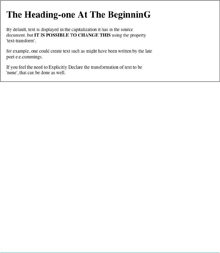
<h1>The heading-one at the beginninG</h1>
<p> By default, text is displayed in the capitalization it has in the source
document, but <strong>it is possible to change this</strong> using
the property 'text-transform'.
</p>
<p class="cummings">
For example, one could Create TEXT such as might have been Written by
the late Poet e.e.cummings.
</p>
<p class="raw">
If you feel the need to Explicitly Declare the transformation of text
to be 'none', that can be done as well.
</p>
Figure 6-27. Various kinds of text transformation
Different user agents may have different ways of deciding where words begin and, as
a result, which letters are capitalized. For example, the text “heading-one” in the h1
element, shown in Figure 6-27, could be rendered in one of two ways: “Heading-one”
or “Heading-One.” CSS does not say which is correct, so either is possible.
You probably also noticed that the last letter in the h1 element in Figure 6-27 is still
uppercase. This is correct: when applying a text-transform of capitalize, CSS only
requires user agents to make sure the first letter of each word is capitalized. They can
ignore the rest of the word.
As a property, text-transform may seem minor, but it’s very useful if you suddenly
decide to capitalize all your h1 elements. Instead of individually changing the content
of all your h1 elements, you can just use text-transform to make the change for you:
h1 {text-transform: uppercase;}
<h1>This is an H1 element</h1>
The advantages of using text-transform are twofold. First, you only need to write a
single rule to make this change, rather than changing the h1 itself. Second, if you
Text Transformation | 231
decide later to switch from all capitals back to initial capitals, the change is even eas‐
ier, as Figure 6-28 shows:
h1 {text-transform: capitalize;}
<h1>This is an H1 element</h1>
Figure 6-28. Transforming an h1 element
Remember that capitalize is a simple letter substitution at the beginning of each
“word.” It does not mean that common headline-capitalization conventions, such as
leaving articles (“a,” “an,” “the”) all lowercase, will be enforced.
Text Decoration
Next we come to text-decoration, which is a fascinating property that offers a
truckload of interesting behaviors.
text-decoration
Values none | [ underline ‖ overline ‖ line-through ‖ blink ]
Initial value none
Applies to All elements
Computed value As specied
Inherited No
Animatable No
As you might expect, underline causes an element to be underlined, just like the U
element in ancient HTML. overline causes the opposite effect—drawing a line
across the top of the text. The value line-through draws a line straight through the
middle of the text, which is also known as strikethrough text and is equivalent to the S
and strike elements in HTML. blink causes the text to blink on and off, just like the
much-maligned blink tag supported by Netscape. Figure 6-29 shows examples of
each of these values:
232 | Chapter 6: Text Properties
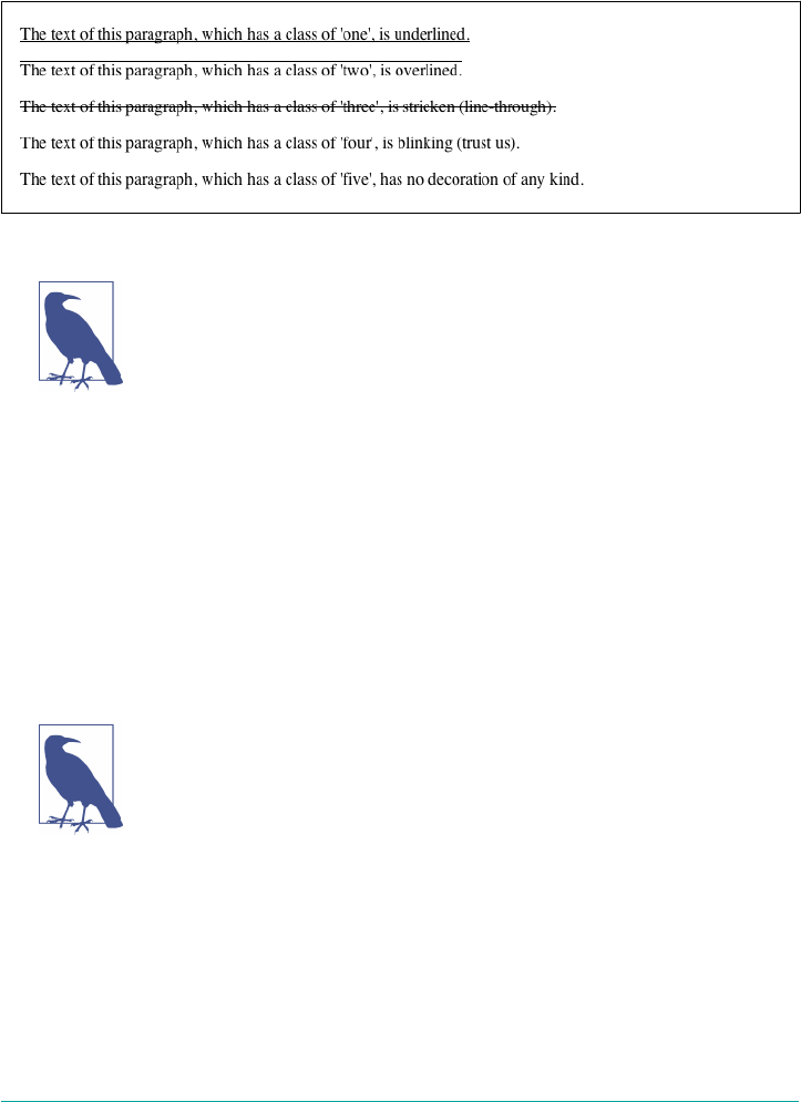
p.emph {text-decoration: underline;}
p.topper {text-decoration: overline;}
p.old {text-decoration: line-through;}
p.annoy {text-decoration: blink;}
p.plain {text-decoration: none;}
Figure 6-29. Various kinds of text decoration
It’s impossible to show the effect of blink in print, but it’s easy
enough to imagine (perhaps all too easy). Incidentally, user agents
are not required to actually blink blink text; and as of this writing,
all known user agents were dropping or had dropped support for
the blinking effect. (Internet Explorer never had it.)
The value none turns off any decoration that might otherwise have been applied to an
element. Usually, undecorated text is the default appearance, but not always. For
example, links are usually underlined by default. If you want to suppress the under‐
lining of hyperlinks, you can use the following CSS rule to do so:
a {text-decoration: none;}
If you explicitly turn off link underlining with this sort of rule, the only visual differ‐
ence between the anchors and normal text will be their color (at least by default,
though there’s no ironclad guarantee that there will be a difference in their colors).
Bear in mind that many users are annoyed when they realize you’ve
turned off link underlining. It’s a matter of opinion, so let your own
tastes be your guide, but remember: if your link colors aren’t suffi‐
ciently different from normal text, users may have a hard time find‐
ing hyperlinks in your documents, particularly users with one form
or another of color blindness.
You can also combine decorations in a single rule. If you want all hyperlinks to be
both underlined and overlined, the rule is:
a:link, a:visited {text-decoration: underline overline;}
Text Decoration | 233
Be careful, though: if you have two different decorations matched to the same ele‐
ment, the value of the rule that wins out will completely replace the value of the loser.
Consider:
h2.stricken {text-decoration: line-through;}
h2 {text-decoration: underline overline;}
Given these rules, any h2 element with a class of stricken will have only a line-
through decoration. The underline and overline decorations are lost, since shorthand
values replace one another instead of accumulating.
Weird Decorations
Now, let’s look into the unusual side of text-decoration. The first oddity is that
text-decoration is not inherited. No inheritance implies that any decoration lines
drawn with the text—under, over, or through it—will be the same color as the parent
element. This is true even if the descendant elements are a different color, as depicted
in Figure 6-30:
p {text-decoration: underline; color: black;}
strong {color: gray;}
<p>This paragraph, which is black and has a black underline, also contains
<strong>strongly emphasized text</strong> which has the black underline
beneath
it as well.</p>
Figure 6-30. Color consistency in underlines
Why is this so? Because the value of text-decoration is not inherited, the strong
element assumes a default value of none. Therefore, the strong element has no under‐
line. Now, there is very clearly a line under the strong element, so it seems silly to say
that it has none. Nevertheless, it doesn’t. What you see under the strong element is
the paragraph’s underline, which is effectively “spanning” the strong element. You
can see it more clearly if you alter the styles for the boldface element, like this:
p {text-decoration: underline; color: black;}
strong {color: gray; text-decoration: none;}
<p>This paragraph, which is black and has a black underline, also contains
<strong>strongly emphasized text</strong> which has the black underline beneath
it as well.</p>
234 | Chapter 6: Text Properties
The result is identical to the one shown in Figure 6-30, since all you’ve done is to
explicitly declare what was already the case. In other words, there is no way to turn
off underlining (or overlining or a line-through) generated by a parent element.
When text-decoration is combined with vertical-align, even stranger things can
happen. Figure 6-31 shows one of these oddities. Since the sup element has no deco‐
ration of its own, but it is elevated within an overlined element, the overline cuts
through the middle of the sup element:
p {text-decoration: overline; font-size: 12pt;}
sup {vertical-align: 50%; font-size: 12pt;}
Figure 6-31. Correct, although strange, decorative behavior
By now you may be vowing never to use text decorations because of all the problems
they could create. In fact, I’ve given you the simplest possible outcomes since we’ve
explored only the way things should work according to the specification. In reality,
some web browsers do turn off underlining in child elements, even though they aren’t
supposed to. The reason browsers violate the specification is author expectations.
Consider this markup:
p {text-decoration: underline; color: black;}
strong {color: silver; text-decoration: none;}
<p>This paragraph, which is black and has a black underline, also contains
<strong>boldfaced text</strong> which does not have black underline
beneath it.</p>
Figure 6-32 shows the display in a web browser that has switched off the underlining
for the strong element.
Figure 6-32. How some browsers really behave
The caveat here is that many browsers do follow the specification, and future versions
of existing browsers (or any other user agents) might one day follow the specification
precisely. If you depend on using none to suppress decorations, it’s important to real‐
ize that it may come back to haunt you in the future, or even cause you problems in
the present. Then again, future versions of CSS may include the means to turn off
decorations without using none incorrectly, so maybe there’s hope.
Text Decoration | 235
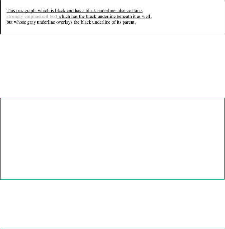
There is a way to change the color of a decoration without violating the specification.
As you’ll recall, setting a text decoration on an element means that the entire element
has the same color decoration, even if there are child elements of different colors. To
match the decoration color with an element, you must explicitly declare its decora‐
tion, as follows:
p {text-decoration: underline; color: black;}
strong {color: silver; text-decoration: underline;}
<p>This paragraph, which is black and has a black underline, also contains
<strong>strongly emphasized text</strong> which has the black underline
beneath it as well, but whose gray underline overlays the black underline
of its parent.</p>
In Figure 6-33, the strong element is set to be gray and to have an underline. The
gray underline visually “overwrites” the parent’s black underline, so the decoration’s
color matches the color of the strong element.
Figure 6-33. Overcoming the default behavior of underlines
Text Rendering
A recent addition to CSS is text-rendering, which is actually an SVG property that
is nevertheless treated as CSS by supporting user agents. It lets authors indicate what
the user agent should prioritize when displaying text.
text-rendering
Values auto | optimizeSpeed | optimizeLegibility | geometricPrecision
Initial value auto
Applies to All elements
Inherited Yes
Animatable Yes
The values optimizeSpeed and optimizeLegibility are relatively self-explanatory,
indicating that drawing speed should be favored over legibility features like kerning
and ligatures (for optimizeSpeed) or vice versa (for optimizeLegibility).
236 | Chapter 6: Text Properties

The precise legibility features that are used with optimizeLegibility are not explic‐
itly defined, and the text rendering often depends on the operating system on which
the user agent is running, so the exact results may vary. Figure 6-34 shows text opti‐
mized for speed, and then optimized for legibility.
Figure 6-34. Dierent optimizations
As you can see in Figure 6-34, the differences between the two optimizations are
objectively rather small, but they can have a noticeable impact on readability.
Some user agents will always optimize for legibility, even when
optimizing for speed. This is likely an effect of rendering speeds
having gotten so fast in the past few years.
The value geometricPrecision, on the other hand, directs the user agent to draw the
text as precisely as possible, such that it could be scaled up or down with no loss of
fidelity. You might think that this is always the case, but not so. Some fonts change
kerning or ligature effects at different text sizes, for example, providing more kerning
space at smaller sizes and tightening up the kerning space as the size is increased.
With geometricPrecision, those hints are ignored as the text size changes. If it
helps, think of it as the user agent drawing the text as though all the text is a series of
SVG paths, not font glyphs.
Even by the usual standard of web standards, the value auto is pretty vaguely defined
in SVG:
the user agent shall make appropriate tradeoffs to balance speed, legibility and geomet‐
ric precision, but with legibility given more importance than speed and geometric pre‐
cision.
That’s it: user agents get to do what they think is appropriate, leaning towards legibil‐
ity.
Text Shadows
Sometimes, you just really need your text to cast a shadow. That’s where text-shadow
comes in. The syntax might look a little wacky at first, but it should become clear
enough with just a little practice.
Text Shadows | 237

text-shadow
Values none | [<length> ‖ <length> <length> <length>?]#
Initial value none
Applies to All elements
Inherited No
Animatable Yes
The default is to not have a drop shadow for text. Otherwise, it’s possible to define
one or more shadows. Each shadow is defined by an optional color and three length
values, the last of which is also optional.
The color sets the shadow’s color so it’s possible to define green, purple, or even white
shadows. If the color is omitted, the shadow will be the same color as the text.
The first two length values determine the offset distance of the shadow from the text;
the first is the horizontal offset and the second is the vertical offset. To define a solid,
un-blurred green shadow offset five pixels to the right and half an em down from the
text, as shown in Figure 6-35, you would write:
text-shadow: green 5px 0.5em;
Negative lengths cause the shadow to be offset to the left and upward from the origi‐
nal text. The following, also shown in Figure 6-35, places a light blue shadow five pix‐
els to the left and half an em above the text:
text-shadow: rgb(128,128,255) −5px −0.5em;
Figure 6-35. Simple shadows
The optional third length value defines a blur radius for the shadow. The blur radius
is defined as the distance from the shadow’s outline to the edge of the blurring effect.
A radius of two pixels would result in blurring that fills the space between the shad‐
ow’s outline and the edge of the blurring. The exact blurring method is not defined,
so different user agents might employ different effects. As an example, the following
styles are rendered as shown in Figure 6-36:
238 | Chapter 6: Text Properties
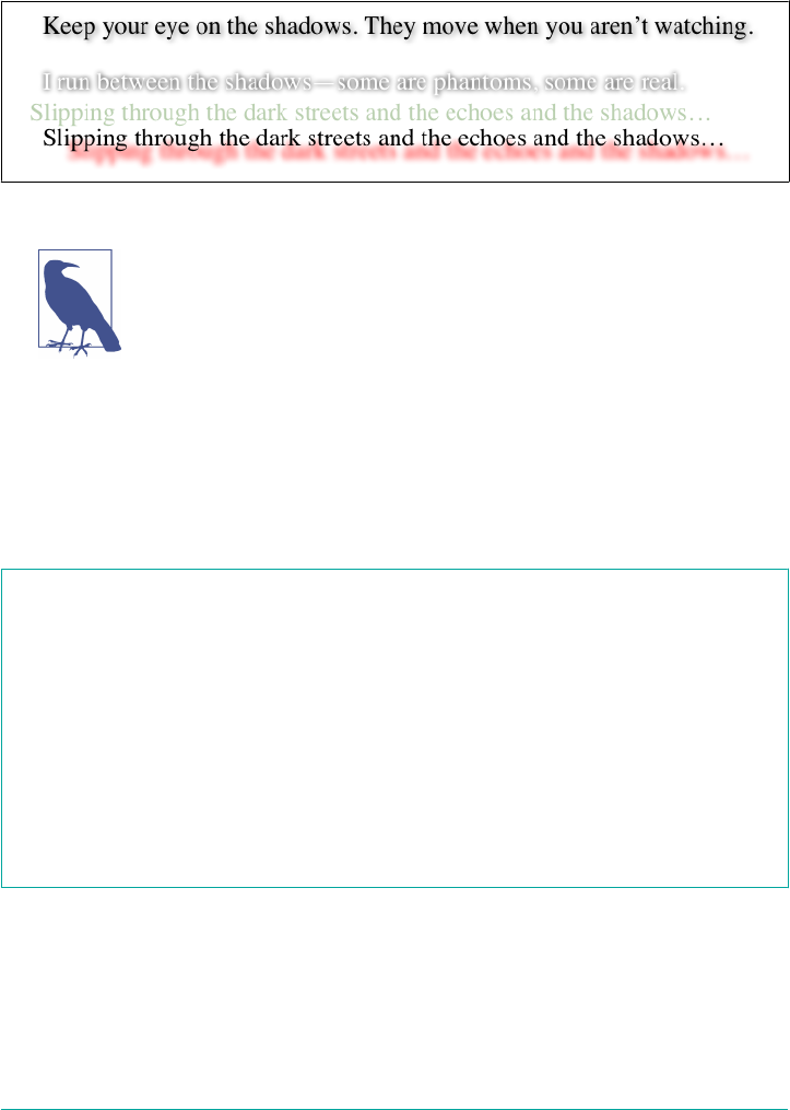
p.cl1 {color: black; text-shadow: gray 2px 2px 4px;}
p.cl2 {color: white; text-shadow: 0 0 4px black;}
p.cl3 {color: black; text-shadow: 1em 0.5em 5px red, −0.5em −1em hsla(100,75%,
25%,0.33);}
Figure 6-36. Dropping shadows all over
Note that large numbers of text shadows, or text shadows with very
large blur values, can create performance slowdowns, particularly
in low-power and CPU-constrained situations such as mobile devi‐
ces. Authors are advised to test thoroughly before deploying public
designs that use text shadows.
Handling Whitespace
Now that we’ve covered a variety of ways to style the text, let’s talk about the property
white-space, which affects the user agent’s handling of space, newline, and tab char‐
acters within the document source.
white-space
Values normal | nowrap | pre | pre-wrap | pre-line
Initial value normal
Applies to All elements (CSS 2.1); block-level elements (CSS1 and CSS2)
Computed value As specied
Inherited No
Animatable No
Using this property, you can affect how a browser treats the whitespace between
words and lines of text. To a certain extent, default XHTML handling already does
this: it collapses any whitespace down to a single space. So given the following
markup, the rendering in a web browser would show only one space between each
word and ignore the line-feed in the elements:
Handling Whitespace | 239
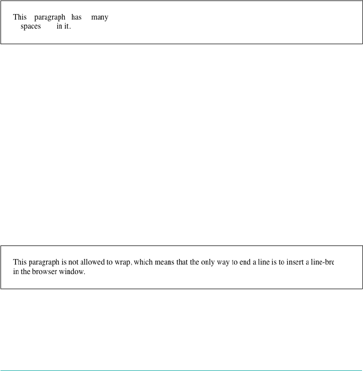
<p>This paragraph has many spaces in it.</p>
You can explicitly set this default behavior with the following declaration:
p {white-space: normal;}
This rule tells the browser to do as browsers have always done: discard extra white‐
space. Given this value, line-feed characters (carriage returns) are converted into
spaces, and any sequence of more than one space in a row is converted to a single
space.
Should you set white-space to pre, however, the whitespace in an affected element is
treated as though the elements were XHTML pre elements; whitespace is not ignored,
as shown in Figure 6-37:
p {white-space: pre;}
<p>This paragraph has many spaces in it.</p>
Figure 6-37. Honoring the spaces in markup
With a white-space value of pre, the browser will pay attention to extra spaces and
even carriage returns. In this respect, and in this respect alone, any element can be
made to act like a pre element.
The opposite value is nowrap, which prevents text from wrapping within an element,
except wherever you use a br element. Using nowrap in CSS is much like setting a
table cell not to wrap in HTML 4 with <td nowrap>, except the white-space value
can be applied to any element. The effects of the following markup are shown in
Figure 6-38:
<p style="white-space: nowrap;">This paragraph is not allowed to wrap,
which means that the only way to end a line is to insert a line-break
element. If no such element is inserted, then the line will go forever,
forcing the user to scroll horizontally to read whatever can't be
initially displayed <br/>in the browser window.</p>
Figure 6-38. Suppressing line wrapping with the white-space property
240 | Chapter 6: Text Properties

You can actually use white-space to replace the nowrap attribute on table cells:
td {white-space: nowrap;}
<table><tr>
<td>The contents of this cell are not wrapped.</td>
<td>Neither are the contents of this cell.</td>
<td>Nor this one, or any after it, or any other cell in this table.</td>
<td>CSS prevents any wrapping from happening.</td>
</tr></table>
CSS 2.1 introduced the values pre-wrap and pre-line, which were absent in earlier
versions of CSS. The effect of these values is to allow authors to better control white‐
space handling.
If an element is set to pre-wrap, then text within that element has whitespace sequen‐
ces preserved, but text lines are wrapped normally. With this value, line-breaks in the
source and those that are generated are also honored. pre-line is the opposite of
pre-wrap and causes whitespace sequences to collapse as in normal text but honors
new lines. For example, consider the following markup, which is illustrated in
Figure 6-39:
<p style="white-space: pre-wrap;">
This paragraph has a great many s p a c e s within its textual
content, but their preservation will not prevent line
wrapping or line breaking.
</p>
<p style="white-space: pre-line;">
This paragraph has a great many s p a c e s within its textual
content, but their collapse will not prevent line
wrapping or line breaking.
</p>
Figure 6-39. Two dierent ways to handle whitespace
Handling Whitespace | 241
Table 6-1 summarizes the behaviors of white-space properties.
Table 6-1. White-space properties
Value Whitespace Line feeds Auto line wrapping
pre-line Collapsed Honored Allowed
normal Collapsed Ignored Allowed
nowrap Collapsed Ignored Prevented
pre Preserved Honored Prevented
pre-wrap Preserved Honored Allowed
Setting Tab Sizes
Since whitespace is preserved in some values of white-space, it stands to reason that
tabs (i.e., Unicode code point 0009) will be displayed as, well, tabs. But how many
spaces should each tab equal? That’s where tab-size comes in.
tab-size
Values <length> | <integer>
Initial value 8
Applies to Block elements
Computed value The absolute-length equivalent of the specied value
Inherited Yes
Animatable Yes
By default, any tab character will be treated the same as eight spaces in a row, but you
can alter that by using a different integer value. Thus, tab-size: 4 will cause each tab
to be rendered the same as if it were four spaces in a row.
If a length value is supplied, then each tab is rendered using that length. For example,
tab-size: 10px will cause a sequence of three tabs to be rendered as 30 pixels of
whitespace. The effects of the following rules is illustrated in Figure 6-40.
242 | Chapter 6: Text Properties

Figure 6-40. Diering tab lengths
Note that tab-size is effectively ignored when the value of white-space causes
whitespace to be collapsed (see Table 6-1). The value will still be computed in such
cases, but there will be no visible effect no matter how many tabs appear in the
source.
Currently, tab-size is supported in WebKit and Gecko (as –moz-
tab-size). In both cases, only integer values are supported, not
length values.
Wrapping and Hyphenation
Hyphens can be very useful in situations where there are long words and short line
lengths, such as blog posts on mobile devices and portions of e Economist. Authors
can always insert their own hyphenation hints using the Unicode character U+00AD
SOFT HYPHEN (or, in HTML, ­), but CSS also offers a way to enable hyphena‐
tion without littering up the document with hints.
hyphens
Values manual | auto | none
Initial value manual
Applies to All elements
Computed value As specied
Inherited Yes
Animatabale No
Wrapping and Hyphenation | 243
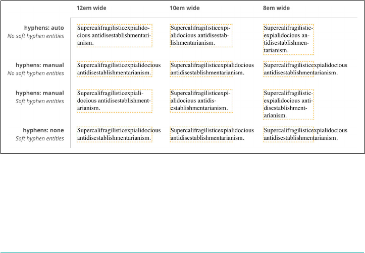
With the default value of manual, hyphens are only inserted where there are
manually-inserted hyphenation markers in the document, such as U+00AD or ­.
Otherwise, no hyphenation occurs. The value none, on the other hand, suppresses
any hyphenation, even if manual break markers are present; thus, U+00AD and
­ are ignored.
The far more interesting (and potentially inconsistent) value is auto, which permits
the browser to insert hyphens and break words at “appropriate” places inside words,
even where no manually inserted hyphenation breaks exist. This leads to interesting
questions like what constitutes a “word” and under what circumstances it is appropri‐
ate to hyphenate a word, both of which are highly language-dependent. User agents
are supposed to prefer manually inserted hyphen breaks to automatically determined
breaks, but there are no guarantees. An illustration of hyphenation, or the suppres‐
sion thereof, in the following example is shown in Figure 6-41:
.cl01 {hyphens: auto;}
.cl02 {hyphens: manual;}
.cl03 {hyphens: none;}
<p class="cl01">Supercalifragilisticexpialidocious antidisestablishmentarian
ism.</p>
<p class="cl02">Supercalifragilisticexpialidocious antidisestablishmentarian
ism.</p>
<p class="cl02">Super­cali­fragi­listic­expi­ali­
docious anti­dis­establish­ment­arian­ism.</p>
<p class="cl03">Super­cali­fragi­listic­expi­ali­
docious anti­dis­establish­ment­arian­ism.</p>
Figure 6-41. Hyphenation results
Because hyphenation is so language-dependent, and because the CSS specification
does not define precise (or even vague) rules regarding how user agents should carry
out hyphenation, there is every chance that hyphenation will be different from one
browser to the next.
244 | Chapter 6: Text Properties
Furthermore, if you do choose to hyphenate, be careful about the elements to which
you apply the hyphenation. hyphens is an inherited property, so declaring body
{hyphens: auto;} will apply hyphenation to everything in your document—includ‐
ing textareas, code samples, block quotes, and so on. Blocking automatic hyphenation
at the level of those elements is probably a good idea, using rules something like this:
body {hyphens: auto;}
code, var, kbd, samp, tt, dir, listing, plaintext, xmp, abbr, acronym,
blockquote, q, textarea, input, option {hyphens: manual;}
It’s probably obvious why suppressing hyphenation in code samples and code blocks
is desirable, especially in languages that use hyphens in things like property and value
names. (Ahem.) Similar logic holds for keyboard input text—you definitely don’t
want a stray dash getting into your Unix command-line examples! And so on down
the line. If you decide that you want to hyphenate some of these elements, just
remove them from the selector. (It can be kind of fun to watch the text you’re typing
into a textarea get auto-hyphenated as you type it.)
As of late 2017, hyphens was supported by all major desktop
browsers except Chrome/Blink, and required vendor prefixes in
Safari and Edge. As noted, such support is always language-
dependent.
Hyphens can be suppressed by the effects of other properties, such as word-break,
which affects how soft wrapping of text is calculated in various languages.
word-break
Values normal | break-all | keep-all
Initial value normal
Applies to All elements
Computed value As specied
Inherited Yes
Animatable Yes
When a run of text is too long to fit into a single line, it is so wrapped. This is in
contrast to hard wraps, which are things like line-feed characters and <br> elements.
Where the text is soft wrapped is determined by the user agent (or the OS it uses), but
word-break lets authors influence its decision-making.
Wrapping and Hyphenation | 245
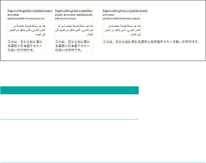
The default value of normal means that text should be wrapped like it always has
been. In practical terms, this means that text is broken between words, though the
definition of a word varies by language. In Latin-derived languages like English, this
is almost always a space between letter sequences (e.g., words). In ideographic lan‐
guages like Japanese, each symbol is a word, so breaks can occur between any two
symbols. In other CJK languages, though, the soft-wrap points may be limited to
appear between sequences of symbols that are not space-separated.
Again, that’s all by default, and is the way browsers have handled text for years. If you
apply the value break-all, then soft wrapping can (and will) occur between any two
characters, even if they are in the middle of a word. With this value, no hyphens are
shown, even if the soft wrapping occurs at a hyphenation point (see hyphens, earlier).
Note that values of the line-break property (described next) can affect the behavior
of break-all in CJK text.
keep-all, on the other hand, suppresses soft wrapping between characters, even in
CJK languages where each symbol is a word. Thus, in Japanese, a sequence of sym‐
bols with no whitespace will not be soft wrapped, even if this means the text line will
exceed the length of its element. (This behavior is similar to white-space: pre.)
Figure 6-42 shows a few examples of word-break values, and Table 6-2 summarizes
the effects of each value.
Figure 6-42. Altering word-breaking behavior
Table 6-2. Word-breaking behavior
Value Non-CJK CJK Hyphenation permitted
normal As usual As usual Yes
break-all After any character After any character No
keep-all As usual Around sequences Yes
246 | Chapter 6: Text Properties

If your interests run to CJK text, then in addition to word-break you will also want to
get to know line-break.
line-break
Values auto | loose | normal | strict
Initial value auto
Applies to All elements
Computed value As specied
Inherited Yes
Animatable Yes
As we just saw, word-break can affect how lines of text are soft wrapped in CJK text.
The line-break property also affects such soft wrapping, specifically how wrapping
is handled around CJK-specific symbols and around non-CJK punctuation (such as
exclamation points, hyphens, and ellipses) that appears in text declared to be CJK.
In other words, line-break applies to certain CJK characters all the time, regardless
of the content’s declared language. If you throw some CJK characters into a paragraph
of English text, line-break will still apply to them, but not to anything else in the
text. Conversely, if you declare content to be in a CJK language, line-break will con‐
tinue to apply to those CJK characters plus a number of non-CJK characters within
the CJK text. These include punctuation marks, currency symbols, and a few other
symbols.
There is no authoritative list of which characters are affected and which are not, but
the specification provides a list of recommended symbols and behaviors around those
symbols.
The default value auto allows user agents to soft wrap text as they like, and more
importantly lets UAs vary the line breaking they do based on the situation. For exam‐
ple, the UA can use looser line-breaking rules for short lines of text and stricter rules
for long lines. In effect, auto allows the user agent to switch between the loose, nor
mal, and strict values as needed, possibly even on a line-by-line basis within a single
element.
Wrapping and Hyphenation | 247
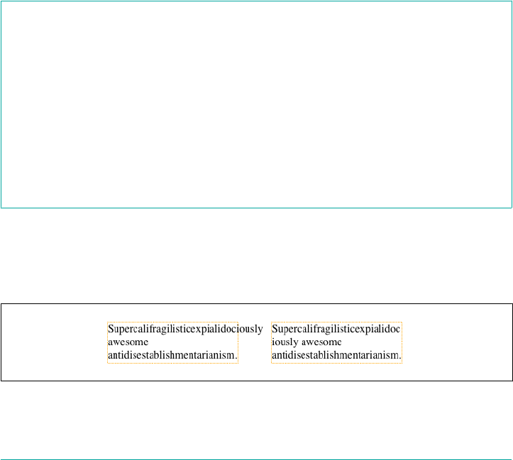
Doubtless you can infer that those other values have the following general meanings:
loose
This value imposes the “least restrictive” rules for wrapping text, and is meant for
use when line lengths are short, such as in newspapers.
normal
This value imposes the “most common” rules for wrapping text. What exactly
“most common” means is not precisely defined, though there is the aforemen‐
tioned list of recommended behaviors.
strict
This value imposes the “most stringent” rules for wrapping text. Again, this is not
precisely defined.
Wrapping Text
After all that information about hyphenation and soft wrapping, what happens when
text overflows its container anyway? That’s what overflow-wrap addresses.
overow-wrap (neé word-wrap)
Values normal | break-word
Initial value normal
Applies to All elements
Computed value As specied
Inherited Yes
Animatable Yes
This property couldn’t be more straightforward. If the default value of normal is in
effect, then wrapping happens as normal; which is to say, between words or as direc‐
ted by the language. If break-word is in effect, then wrapping can happen in the mid‐
dle of words. Figure 6-43 illustrates the difference.
Figure 6-43. Overow wrapping
248 | Chapter 6: Text Properties

Note that overflow-wrap can only operate if the value of white-
space allows line wrapping. If it does not (e.g., with the value pre),
then overflow-wrap has no effect.
Where overflow-wrap gets complicated is in its history and implementation. Once
upon a time there was a property called word-wrap that did exactly what overflow-
wrap does. The two are so identical that the specification specifically states that user
agents “must treat word-wrap as an alternate name for the overflow-wrap property,
as if it were a shorthand of overflow-wrap.”
Sadly, browsers didn’t always do this, and word-wrap was better supported. For this
reason, it’s common to use both for backward compatibility:
pre {word-wrap: break-word; overflow-wrap: break-word;}
As of late 2017, overflow-wrap enjoys very widespread supports, so it’s pretty safe to
use.
While overflow-wrap: break-word may appear very similar to word-break: break-
all, they are not the same thing. To see why, compare the second box in Figure 6-43
to the top middle box in Figure 6-42. As it shows, overflow-wrap only kicks in if
content actually overflows; thus, when there is an opportunity to use whitespace in
the source to wrap lines, overflow-wrap will take it. By contrast, word-break:
break-all will cause wrapping when content reaches the wrapping edge, regardless
of any whitespace that comes earlier in the line.
Writing Modes
If you’re reading this book in English or any number of other mainly Western lan‐
guages, then you’re reading the text left to right and top to bottom, which is the flow
direction of English. Not every language runs this way. There are many right-to-left
and top-to-bottom languages such as Hebrew and Arabic, and many languages that
can be written primarily top-to-bottom. Some of the latter are secondarily left to
right, such as Chinese and Japanese, whereas others are right to left, like Mongolian.
Setting Writing Modes
The property used for specifying one of the three available writing mode is, of all
things, writing-mode.
Writing Modes | 249
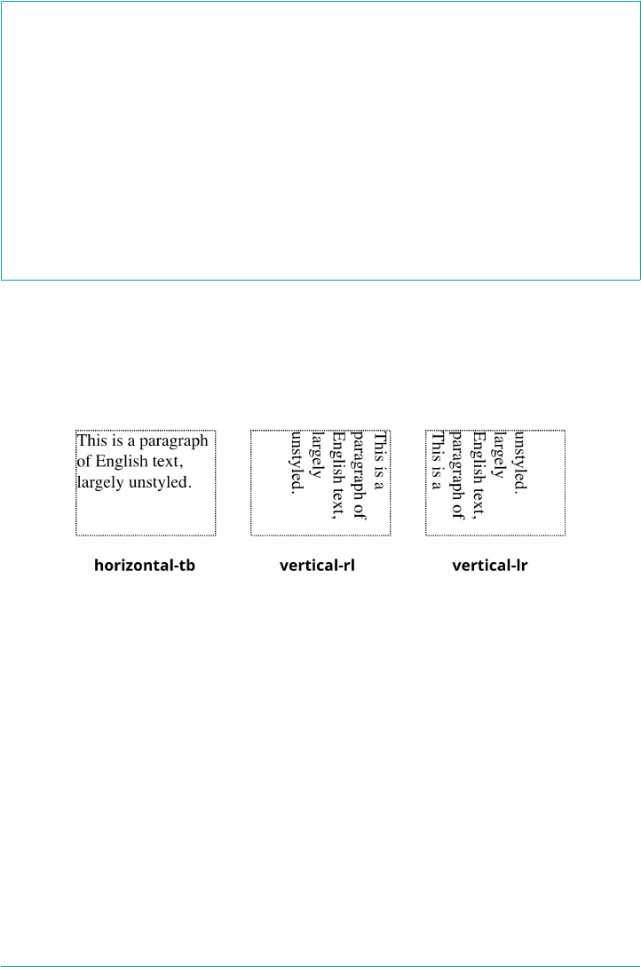
writing-mode
Values horizontal-tb | vertical-rl | vertical-lr
Initial value horizontal-tb
Applies to All elements except table row groups, table column groups, table rows, table columns,
ruby base containers, and ruby annotation containers
Computed value As specied
Inherited Yes
Animatable Yes
The default value, horizontal-tb, means “a horizontal inline direction, and a top-to-
bottom block direction.” This covers all Western and some Middle Eastern languages,
which may differ in the direction of their horizontal writing. The other two values
offer a vertical inline direction, and either a right-to-left or left-to-right block direc‐
tion. All three are illustrated in Figure 6-44.
Figure 6-44. Writing modes
Notice how the lines are strung together in the two vertical examples. If you tilt your
head to the right, the text in vertical-rl is at least readable. The text in vertical-
lr, on the other hand, is difficult to read because it appears to flow from bottom to
top, at least when arranging English text. This is not a problem in languages which
actually use vertical-lr flow, such as form of Japanese. As of late 2017, vertical
flows can only have the inline direction go from top to bottom.
It is possible to create bottom-to-top vertical flows of Western-language text by
applying vertical-rl to an element and then rotating the element 180 degrees with
CSS Transforms (see Chapter 16). This presents a bottom-to-top, left-to-right visual
flow. Using vertical-lr and rotating it creates a bottom-to-top, right-to-left flow.
Both are illustrated in Figure 6-45:
250 | Chapter 6: Text Properties
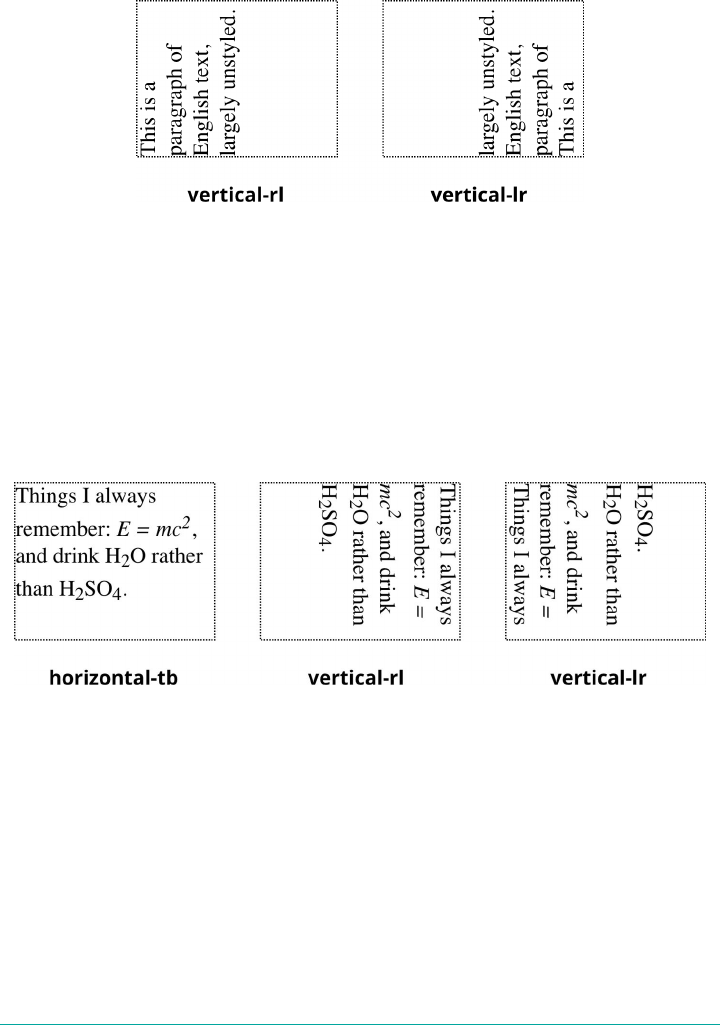
.flip {transform: rotate(180deg);}
#one {writing-mode: vertical-rl;}
#two {writing-mode: vertical-lr;}
Figure 6-45. Flipping vertical writing modes
The challenge of working with text like that is that everything is flipped, which means
what we see is at odds with what’s actually happening. The text of vertical-rl
(vertical-right-to-left) is visually progressing left to right, for example.
The same problem arises when applying inline block-alignment properties such as
vertical-align. In vertical writing modes, the block direction is horizontal, which
means vertical alignment of inline elements actually causes them to move horizon‐
tally. This is illustrated in Figure 6-46.
Figure 6-46. Writing modes and “vertical” alignment
All the super- and subscript elements cause horizontal shifts, both of themselves and
the placement of the lines they occupy, even through the property used to move them
is vertical-align. As described earlier, the vertical displacement is with respect to
the line box, where the box’s baseline is defined as horizontal—even when it’s being
drawn vertically.
Confused? It’s OK. Writing modes are likely to confuse you, because it’s such a differ‐
ent way of thinking and because old assumptions in the CSS specification clash with
the new capabilities. If there had been vertical writing modes from the outset,
Writing Modes | 251
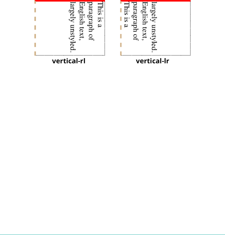
vertical-align would likely have a different name—inline-align or something
like that. (Maybe one day that will happen.)
One last note: if you’re already used to CSS Transforms, you might be tempted to
think of these vertical writing modes as equivalent to rotating the text 90 degrees.
They are not the same, for two reasons. One, this only appears to be the case for
vertical-rl; vertical-lr has the look of text that flows “bottom to top.” Two, the
cardinal points don’t change when flowing text vertically. The top is still the top, in
other words. This is illustrated by the following styles, whose results are depicted in
Figure 6-47:
.boxed {border-top: 3px solid red;
border-left: 3px dashed tan;}
#one {writing-mode: vertical-rl;}
#two {writing-mode: vertical-lr;}
Figure 6-47. Writing modes and the “cardinal” directions of CSS
In both cases, the top border is solid red, and the left border is dashed tan. The cardi‐
nal points don’t rotate with the text—because the text isn’t rotated. It’s being flowed in
a different way.
Now here’s where it gets unusual. While the borders don’t migrate around the element
box, margins can, but not due to anything in the CSS specification.
This happens because user agents (at least as of late 2017) maintain internal styles that
relate to the start and end of the element in the block direction. In languages that flow
top to bottom, then the start and end of the element’s block direction are its top and
bottom sides. But in vertical writing, the block direction is right to left or left to right.
Thus, you can set up a bunch of paragraphs to flow vertically, and if you leave the
margins alone, what would normally be top and bottom margins will become left and
right margins. You can see this effect in Figure 6-48, which illustrated the result of the
following styles:
p { margin-top: 1em;}
#one {writing-mode: vertical-rl;}
#two {writing-mode: vertical-lr;}
252 | Chapter 6: Text Properties
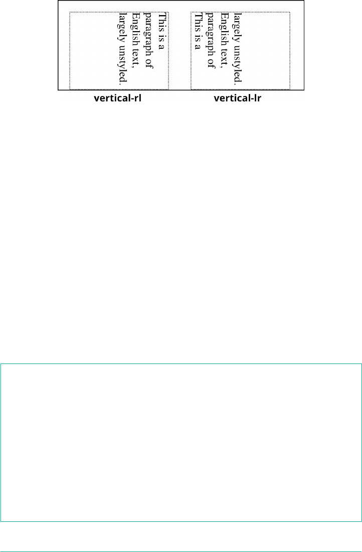
Figure 6-48. e placement of UA default margins
There are the top margins, as declared, right along the tops of the two paragraphs.
The empty space to the side of each paragraph is created by the block-start and block-
end margins. If we explicitly set the right and left margins to zero, then the space
between the paragraphs would be removed.
Remember: this happens because user agents, by default, represent the margins of
text elements using properties like block-start-margin (which is not an actual prop‐
erty in CSS, at least not yet). If you explicitly set top, bottom, or side margins using
properties like margin-top, then they will be applied to the element box just as bor‐
ders were: top margin on top, right margin to the right, and so on.
Changing Text Orientation
Once you’ve settled on a writing mode, you may decide you want to change the orien‐
tation of characters within those lines of text. There are many reasons you might
want to do this, not least of which are situations where different writing systems are
commingled, such as Japanese text with English words or numbers mixed in. In these
cases, text-orientation is the answer.
text-orientation
Values mixed | upright | sideways
Initial value mixed
Applies to All elements except table row groups, table rows, table column groups, and table
columns
Computed value As specied
Inherited Yes
Animatable Yes
Writing Modes | 253

The effect of text-orientation is to affect how characters are oriented. What that
means is best illustrated by the following styles, rendered in Figure 6-49:
.verts {writing-mode: vertical-lr;}
#one {text-orientation: mixed;}
#two {text-orientation: upright;}
#thr {text-orientation: sideways;}
Figure 6-49. Text orientation
Across the top of Figure 6-49 is a basically unstyled paragraph of mixed Japanese and
English text. Below that, three copies of that paragraph, using the writing mode
vertical-lr. In the first of the three, text-orientation: mixed, writes the
horizontal-script characters (the English) sideways, and the vertical-script characters
(the Japanese) upright. In the second, all characters are upright, including the
English characters. In the third, all characters are sideways, including the Japanese
characters.
Declaring Direction
Harking back to the days of CSS2, there are a pair of properties that can be used to
affect the direction of text by changing the inline baseline direction: direction and
unicode-bidi.
The CSS specification explicitly warns against using direction and
unicode-bidi in CSS when applied to HTML documents. To
quote: “Because HTML [user agents] can turn off CSS styling, we
recommend…the HTML dir attribute and <bdo> element to
ensure correct bidirectional layout in the absence of a style sheet.”
The properties are covered here because they may appear in legacy
stylesheets.
254 | Chapter 6: Text Properties
direction
Values ltr | rtl
Initial value ltr
Applies to All elements
Computed value As specied
Inherited Yes
Animatable Yes
The direction property affects the writing direction of text in a block-level element,
the direction of table column layout, the direction in which content horizontally
overflows its element box, and the position of the last line of a fully justified element.
For inline elements, direction applies only if the property unicode-bidi is set to
either embed or bidi-override (See the following description of unicode-bidi).
Although ltr is the default, it is expected that if a browser is displaying right-to-left
text, the value will be changed to rtl. Thus, a browser might carry an internal rule
stating something like the following:
*:lang(ar), *:lang(he) {direction: rtl;}
The real rule would be longer and encompass all right-to-left languages, not just Ara‐
bic and Hebrew, but it illustrates the point.
While CSS attempts to address writing direction, Unicode has a much more robust
method for handling directionality. With the property unicode-bidi, CSS authors
can take advantage of some of Unicode’s capabilities.
unicode-bidi
Values normal | embed | bidi-override
Initial value normal
Applies to All elements
Computed value As specied
Inherited No
Animatable Yes
Writing Modes | 255

Here we’ll simply quote the value descriptions from the CSS 2.1 specification, which
do a good job of capturing the essence of each value:
normal
The element does not open an additional level of embedding with respect to the
bidirectional algorithm. For inline-level elements, implicit reordering works
across element boundaries.
embed
If the element is inline-level, this value opens an additional level of embedding
with respect to the bidirectional algorithm. The direction of this embedding level
is given by the direction property. Inside the element, reordering is done
implicitly. This corresponds to adding an LRE (U+202A; for direction: ltr) or
an RLE (U+202B; for direction: rtl) at the start of the element and a PDF (U
+202C) at the end of the element.
bidi-override
This creates an override for inline-level elements. For block-level elements, this
creates an override for inline-level descendants not within another block. This
means that, inside the element, reordering is strictly in sequence according to the
direction property; the implicit part of the bidirectional algorithm is ignored.
This corresponds to adding an LRO (U+202D; for direction: ltr) or RLO (U
+202E; for direction: rtl) at the start of the element and a PDF (U+202C) at
the end of the element.
Summary
Even without altering the font face, there are many ways to change the appearance of
text. There are classic effects such as underlining, but CSS also enables you to draw
lines over text or through it, change the amount of space between words and letters,
indent the first line of a paragraph (or other block-level element), align text in various
ways, exert influence over the hyphenation and line breaking of text, and much more.
You can even alter the amount of space between lines of text. There is also support in
CSS for languages other than those that are written left-to-right, top-to-bottom.
Given that so much of the web is text, the strength of these properties makes a great
deal of sense. Recent developments in improving text legibility and placement are
likely only the beginnings of what we will eventually be able to do with text styling.
256 | Chapter 6: Text Properties

CHAPTER 7
Basic Visual Formatting
This chapter is all about the theoretical side of visual rendering in CSS. Why is that
necessary? The answer is that with a model as open and powerful as that contained
within CSS, no book could hope to cover every possible way of combining properties
and effects. You will undoubtedly go on to discover new ways of using CSS. In explor‐
ing CSS, you may encounter seemingly strange behaviors in user agents. With a thor‐
ough grasp of how the visual rendering model works, you’ll be better able to
determine whether a behavior is a correct (if unexpected) consequence of the render‐
ing engine CSS defines.
Basic Boxes
At its core, CSS assumes that every element generates one or more rectangular boxes,
called element boxes. (Future versions of the specification may allow for nonrectangu‐
lar boxes, and indeed there have been proposals to change this, but for now every‐
thing is rectangular.) Each element box has a content area at its center. This content
area is surrounded by optional amounts of padding, borders, outlines, and margins.
These areas are considered optional because they could all be set to a width of zero,
effectively removing them from the element box. An example content area is shown
in Figure 7-1, along with the surrounding regions of padding, borders, and margins.
Each of the margins, borders, and the padding can be set using various side-specific
properties, such as margin-left or border-bottom, as well as shorthand properties
such as padding. The outline, if any, does not have side-specific properties. The con‐
tent’s background—a color or tiled image, for example—is applied within the padding
by default. The margins are always transparent, allowing the background(s) of any
parent element(s) to be visible. Padding cannot have a negative length, but margins
can. We’ll explore the effects of negative margins later on.
257

Figure 7-1. e content area and its surroundings
Borders are generated using defined styles, such as solid or inset, and their colors
are set using the border-color property. If no color is set, then the border takes on
the foreground color of the element’s content. For example, if the text of a paragraph
is white, then any borders around that paragraph will be white, unless the author
explicitly declares a different border color. If a border style has gaps of some type,
then the element’s background is visible through those gaps by default. Finally, the
width of a border can never be negative.
The various components of an element box can be affected via a number of proper‐
ties, such as width or border-right. Many of these properties will be used in this
book, even though they aren’t defined here.
A Quick Refresher
Let’s quickly review the kinds of boxes we’ll be discussing, as well as some important
terms that are needed to follow the explanations to come:
Normal ow
This is the left-to-right, top-to-bottom rendering of text in Western languages
and the familiar text layout of traditional HTML documents. Note that the flow
direction may be changed in non-Western languages. Most elements are in the
normal flow, and the only way for an element to leave the normal flow is to be
floated, positioned, or made into a flexible box or grid layout element. Remem‐
ber, the discussions in this chapter cover only elements in the normal flow.
Nonreplaced element
This is an element whose content is contained within the document. For exam‐
ple, a paragraph (p) is a nonreplaced element because its textual content is found
within the element itself.
Replaced element
This is an element that serves as a placeholder for something else. The classic
example of a replaced element is the img element, which simply points to an
258 | Chapter 7: Basic Visual Formatting

image file that is inserted into the document’s flow at the point where the img
element itself is found. Most form elements are also replaced (e.g., <input
type="radio">).
Root element
This is the element at the top of the document tree. In HTML documents, this is
the element html. In XML documents, it can be whatever the language permits;
for example, the root element of RSS files is rss.
Block box
This is a box that an element such as a paragraph, heading, or div generates.
These boxes generate “new lines” both before and after their boxes when in the
normal flow so that block boxes in the normal flow stack vertically, one after
another. Any element can be made to generate a block box by declaring display:
block.
Inline box
This is a box that an element such as strong or span generates. These boxes do
not generate “line breaks” before or after themselves. Any element can be made
to generate an inline box by declaring display: inline.
Inline-block box
This is a box that is like a block box internally, but acts like an inline box exter‐
nally. It acts similar to, but not quite the same as, a replaced element. Imagine
picking up a div and sticking it into a line of text as if it were an inline image,
and you’ve got the idea.
There are several other types of boxes, such as table-cell boxes, but they won’t be cov‐
ered in this book for a variety of reasons—not the least of which is that their com‐
plexity demands a book of its own, and very few authors will actually wrestle with
them on a regular basis.
The Containing Block
There is one more kind of box that we need to examine in detail, and in this case
enough detail that it merits its own section: the containing block.
Every element’s box is laid out with respect to its containing block; in a very real way,
the containing block is the “layout context” for a box. CSS defines a series of rules for
determining a box’s containing block. We’ll cover only those rules that pertain to the
concepts covered in this book in order to keep our focus.
For an element in the normal, Western-style flow of text, the containing block forms
from the content edge of the nearest ancestor that generated a list item or block box,
Basic Boxes | 259

which includes all table-related boxes (e.g., those generated by table cells). Consider
the following markup:
<body>
<div>
<p>This is a paragraph.</p>
</div>
</body>
In this very simple markup, the containing block for the p element’s block box is the
div element’s block box, as that is the closest ancestor element box that is a block or a
list item (in this case, it’s a block box). Similarly, the div’s containing block is the
body’s box. Thus, the layout of the p is dependent on the layout of the div, which is in
turn dependent on the layout of the body element.
And above that, the layout of the body element is dependent on the layout of the html
element, whose box creates what is called the initial containing block. It’s unique in
that the viewport—the browser window in screen media, or the printable area of the
page in print media—determines its dimensions, not the size of the content of the
root element. It’s a subtle distinction, and usually not a very important one, but it
does exist.
Altering Element Display
You can affect the way a user agent displays by setting a value for the property
display. Now that we’ve taken a close look at visual formatting, let’s consider the
display property and discuss two more of its values using concepts from earlier in
the book.
display
Values [ <display-outside> ‖ <display-inside> ] | <display-listitem> | <display-internal> |
<display-box> | <display-legacy>
Denitions See below
Initial value inline
Applies to All elements
Computed value As specied
Inherited No
Animatable No
<display-outside>
block | inline | run-in
260 | Chapter 7: Basic Visual Formatting
<display-inside>
flow | flow-root | table | flex | grid | ruby
<display-listitem>
list-item && <display-outside>? && [ flow | flow-root ]?
<display-internal>
table-row-group | table-header-group | table-footer-group | table-row |
table-cell | table-column-group | table-column | table-caption | ruby-base
| ruby-text | ruby-base-container | ruby-text-container
<display-box>
contents | none
<display-legacy>
inline-block | inline-list-item | inline-table | inline-flex | inline-grid
We’ll ignore the ruby- and table-related values, since they’re far too complex for this
chapter, and we’ll also ignore the value list-item, since it’s very similar to block
boxes. We’ve spent quite some time discussing block and inline boxes, but let’s spend
a moment talking about how altering an element’s display role can alter layout before
we look at inline-block.
Changing Roles
When it comes to styling a document, it’s handy to be able to change the type of box
an element generates. For example, suppose we have a series of links in a nav that we’d
like to lay out as a vertical sidebar:
<nav>
<a href="index.html">WidgetCo Home</a>
<a href="products.html">Products</a>
<a href="services.html">Services</a>
<a href="fun.html">Widgety Fun!</a>
<a href="support.html">Support</a>
<a href="about.html" id="current">About Us</a>
<a href="contact.html">Contact</a>
</nav>
We could put all the links into table cells, or wrap each one in its own nav—or we
could just make them all block-level elements, like this:
nav a {display: block;}
This will make every a element within the navigation nav a block-level element. If we
add on a few more styles, we could have a result like that shown in Figure 7-2.
Altering Element Display | 261
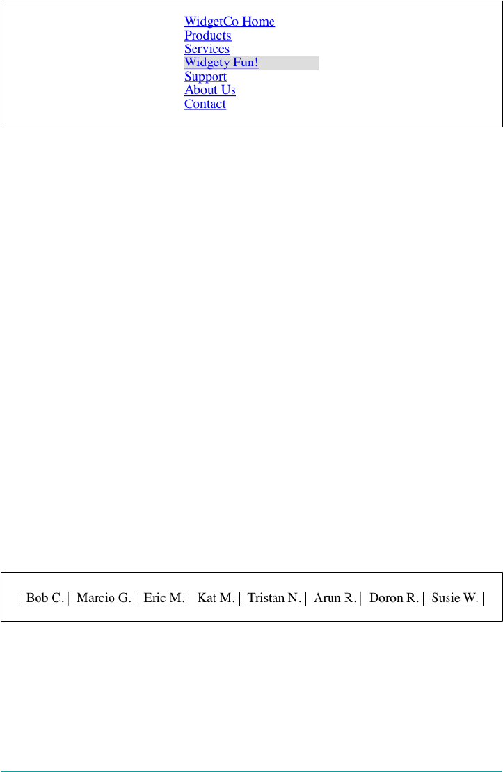
Figure 7-2. Changing the display role from inline to block
Changing display roles can be useful in cases where you want non-CSS browsers to
get the navigation links as inline elements but to lay out the same links as block-level
elements. With the links as blocks, you can style them as you would div or p ele‐
ments, with the advantage that the entire element box becomes part of the link. Thus,
if a user’s mouse pointer hovers anywhere in the element box, she can then click the
link.
You may also want to take elements and make them inline. Suppose we have an unor‐
dered list of names:
<ul id="rollcall">
<li>Bob C.</li>
<li>Marcio G.</li>
<li>Eric M.</li>
<li>Kat M.</li>
<li>Tristan N.</li>
<li>Arun R.</li>
<li>Doron R.</li>
<li>Susie W.</li>
</ul>
Given this markup, say we want to make the names into a series of inline names with
vertical bars between them (and on each end of the list). The only way to do so is to
change their display role. The following rules will have the effect shown in Figure 7-3:
#rollcall li {display: inline; border-right: 1px solid; padding: 0 0.33em;}
#rollcall li:first-child {border-left: 1px solid;}
Figure 7-3. Changing the display role from list-item to inline
262 | Chapter 7: Basic Visual Formatting

There are plenty of other ways to use display to your advantage in design. Be creative
and see what you can invent!
Be careful to note, however, that you are changing the display role of elements—not
changing their inherent nature. In other words, causing a paragraph to generate an
inline box does not turn that paragraph into an inline element. In HTML, for exam‐
ple, some elements are block while others are inline. (Still others are “flow” elements,
but we’re ignoring them right now.) An inline element can be a descendant of a block
element, but the reverse is generally not true. While a span can be placed inside a
paragraph, a span cannot be wrapped around a paragraph.
This will hold true no matter how you style the elements in question. Consider the
following markup:
<span style="display: block;">
<p style="display: inline;">this is wrong!</p>
</span>
The markup will not validate because the block element (p) is nested inside an inline
element (span). The changing of display roles does nothing to change this. display
has its name because it affects how the element is displayed, not because it changes
what kind of element it is.
With that said, let’s get into the details of different kinds of boxes: block boxes, inline
boxes, inline-block boxes, and list-item boxes.
Block Boxes
Block boxes can behave in sometimes predictable, sometimes surprising ways. The
handling of box placement along the horizontal and vertical axes can differ, for exam‐
ple. In order to fully understand how block boxes are handled, you must clearly
understand a number of boundaries and areas. They are shown in detail in
Figure 7-4.
By default, the width of a block box is defined to be the distance from the left inner
edge to the right inner edge, and the height is the distance from the inner top to the
inner bottom. Both of these properties can be applied to an element generating a
block box.
Altering Element Display | 263

Figure 7-4. e complete box model
It’s also the case that we can alter how these properties are treated using the property
box-sizing.
box-sizing
Values content-box | padding-box | border-box
Initial value content-box
Applies to All elements that accept width or height values
Computed value As specied
Inherited No
Animatable No
This property is how you change what the width and height values actually do. If you
declare width: 400px and don’t declare a value for box-sizing, then the element’s
content box will be 400 pixels wide; any padding, borders, and so on will be added to
it. If, on the other hand, you declare box-sizing: border-box, then the element box
264 | Chapter 7: Basic Visual Formatting
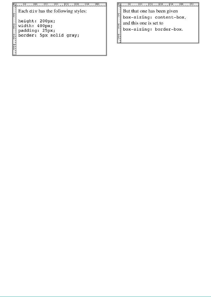
will be 400 pixels from the left outer border edge to the right outer border edge; any
border or padding will be placed within that distance, thus shrinking the width of the
content area. This is illustrated in Figure 7-5.
Figure 7-5. e eects of box-sizing
We’re talking about the box-sizing property here because, as stated, it applies to “all
elements that accept width or height values.” That’s most often elements generating
block boxes, though it also applies to replaced inline elements like images, as well as
inline-block boxes.
The various widths, heights, padding, and margins all combine to determine how a
document is laid out. In most cases, the height and width of the document are auto‐
matically determined by the browser and are based on the available display region,
plus other factors. With CSS, you can assert more direct control over the way ele‐
ments are sized and displayed.
Horizontal Formatting
Horizontal formatting is often more complex than you’d think. Part of the complexity
has to do with the default behavior of box-sizing. With the default value of content-
box, the value given for width affects the width of the content area, not the entire visi‐
ble element box. Consider the following example:
<p style="width: 200px;">wideness?</p>
This will make the paragraph’s content 200 pixels wide. If we give the element a back‐
ground, this will be quite obvious. However, any padding, borders, or margins you
specify are added to the width value. Suppose we do this:
<p style="width: 200px; padding: 10px; margin: 20px;">wideness?</p>
The visible element box is now 220 pixels wide, since we’ve added 10 pixels of pad‐
ding to the right and left of the content. The margins will now extend another 20 pix‐
els to both sides for an overall element box width of 260 pixels. This is illustrated in
Figure 7-6.
Altering Element Display | 265
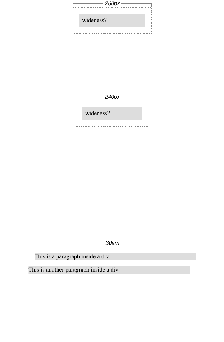
Figure 7-6. Additive padding and margin
If we change the styles to use the border box for box-sizing, then the results would be
different. In that case, the visible box would be 200 pixels wide with a content width
of 180 pixels, and a total of 40 pixels of margin to the sides, giving an overall box
width of 240 pixels, as illustrated in Figure 7-7.
Figure 7-7. Subtracted padding
In either case, there is a rule that says that the sum of the horizontal components of a
block box in the normal flow always equals the width of the containing block. Let’s
consider two paragraphs within a div whose margins have been set to be 1em, and
whose box-sizing value is the default. The content width (the value of width) of each
paragraph, plus its left and right padding, borders, and margins, always adds up to
the width of the div’s content area.
Let’s say the width of the div is 30em. That makes the sum total of the content width,
padding, borders, and margins of each paragraph 30 em. In Figure 7-8, the “blank”
space around the paragraphs is actually their margins. If the div had any padding,
there would be even more blank space, but that isn’t the case here.
Figure 7-8. Element boxes are as wide as the width of their containing block
Horizontal Properties
The seven properties of horizontal formatting are margin-left, border-left,
padding-left, width, padding-right, border-right, and margin-right. These
266 | Chapter 7: Basic Visual Formatting
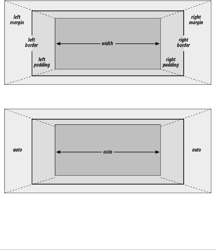
properties relate to the horizontal layout of block boxes and are diagrammed in
Figure 7-9.
The values of these seven properties must add up to the width of the element’s con‐
taining block, which is usually the value of width for a block element’s parent (since
block-level elements nearly always have block-level elements for parents).
Of these seven properties, only three may be set to auto: the width of the element’s
content and the left and right margins. The remaining properties must be set either to
specific values or default to a width of zero. Figure 7-10 shows which parts of the box
can take a value of auto and which cannot.
Figure 7-9. e seven properties of horizontal formatting
Figure 7-10. Horizontal properties that can be set to auto
width must either be set to auto or a nonnegative value of some type. When you do
use auto in horizontal formatting, different effects can occur.
Altering Element Display | 267
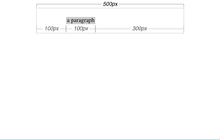
Using auto
If you set width, margin-left, or margin-right to a value of auto, and give the
remaining two properties specific values, then the property that is set to auto is set to
the length required to make the element box’s width equal to the parent element’s
width. In other words, let’s say the sum of the seven properties must equal 500 pixels,
no padding or borders are set, the right margin and width are set to 100px, and the
left margin is set to auto. The left margin will thus be 300 pixels wide:
div {width: 500px;}
p {margin-left: auto; margin-right: 100px;
width: 100px;} /* 'auto' left margin evaluates to 300px */
In a sense, auto can be used to make up the difference between everything else and
the required total. However, what if all three of these properties are set to 100px and
none of them are set to auto?
In the case where all three properties are set to something other than auto—or, in
CSS terminology, when these formatting properties have been overconstrained—then
margin-right is always forced to be auto. This means that if both margins and the
width are set to 100px, then the user agent will reset the right margin to auto. The
right margin’s width will then be set according to the rule that one auto value “fills in”
the distance needed to make the element’s overall width equal that of its containing
block. Figure 7-11 shows the result of the following markup:
div {width: 500px;}
p {margin-left: 100px; margin-right: 100px;
width: 100px;} /* right margin forced to be 300px */
Figure 7-11. Overriding the margin-right setting
If both margins are set explicitly, and width is set to auto, then width will be what‐
ever value is needed to reach the required total (which is the content width of the par‐
ent element). The results of the following markup are shown in Figure 7-12:
p {margin-left: 100px; margin-right: 100px; width: auto;}
The case shown in Figure 7-12 is the most common case, since it is equivalent to set‐
ting the margins and not declaring anything for the width. The result of the following
markup is exactly the same as that shown in Figure 7-12:
p {margin-left: 100px; margin-right: 100px;} /* same as before */
268 | Chapter 7: Basic Visual Formatting
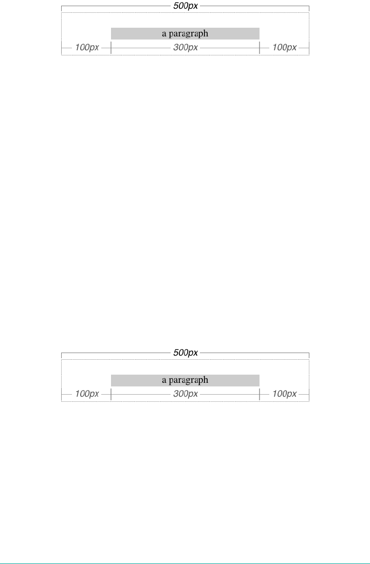
Figure 7-12. Automatic width
You might be wondering what happens if box-sizing is set to, say, padding-box. The
discussion here tends to assume that the default of content-box is used, but all the
same principles described here apply, which is why this section only talked about
width and the side margins without introducing any padding or borders. The han‐
dling of width: auto in this section and the following sections is the same regardless
of the value of box-sizing. The details of what gets placed where inside the box-
sizing-defined box may vary, but the treatment of auto values does not, because
box-sizing determines what width refers to, not how it behaves in relation to the
margins.
More Than One auto
Now let’s see what happens when two of the three properties (width, margin-left,
and margin-right) are set to auto. If both margins are set to auto, as shown in the
following code, then they are set to equal lengths, thus centering the element within
its parent. This is illustrated in Figure 7-13.
div {width: 500px;}
p {width: 300px; margin-left: auto; margin-right: auto;}
/* each margin is 100 pixels wide, because (500-300)/2 = 100 */
Figure 7-13. Setting an explicit width
Setting both margins to equal lengths is the correct way to center elements within
block boxes in the normal flow. (There are other methods to be found with flexible
box and grid layout, but they’re beyond the scope of this text.)
Another way of sizing elements is to set one of the margins and the width to auto.
The margin set to be auto is reduced to zero:
div {width: 500px;}
p {margin-left: auto; margin-right: 100px;
width: auto;} /* left margin evaluates to 0; width becomes 400px */
Altering Element Display | 269
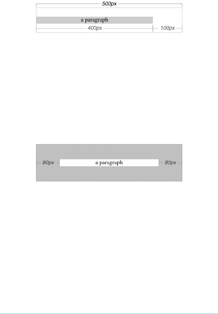
The width is then set to the value necessary to make the element fill its containing
block; in the preceding example, it would be 400 pixels, as shown in Figure 7-14.
Figure 7-14. What happens when both the width and right margin are auto
Finally, what happens when all three properties are set to auto? The answer: both
margins are set to zero, and the width is made as wide as possible. This result is the
same as the default situation, when no values are explicitly declared for margins or
the width. In such a case, the margins default to zero and the width defaults to auto.
Note that since horizontal margins do not collapse, the padding, borders, and mar‐
gins of a parent element can affect its children. The effect is indirect in that the mar‐
gins (and so on) of an element can induce an offset for child elements. The results of
the following markup are shown in Figure 7-15:
div {padding: 50px; background: silver;}
p {margin: 30px; padding: 0; background: white;}
Figure 7-15. Oset is implicit in the parent’s margins and padding
Negative Margins
So far, this may all seem rather straightforward, and you may be wondering why I
said things could be complicated. Well, there’s another side to margins: the negative
side. That’s right, it’s possible to set negative values for margins. Setting negative mar‐
gins can result in some interesting effects.
Remember that the total of the seven horizontal properties always equals the width of
the parent element. As long as all properties are zero or greater, an element can never
be wider than its parent’s content area. However, consider the following markup,
depicted in Figure 7-16:
div {width: 500px; border: 3px solid black;}
p.wide {margin-left: 10px; width: auto; margin-right: -50px; }
270 | Chapter 7: Basic Visual Formatting
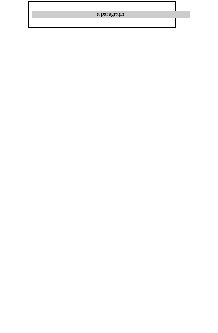
Figure 7-16. Wider children through negative margins
Yes indeed, the child element is wider than its parent! This is mathematically correct:
10px + 0 + 0 + 540px +0+0−50px = 500px
The 540px is the evaluation of width: auto, which is the number needed to balance
out the rest of the values in the equation. Even though it leads to a child element
sticking out of its parent, the specification hasn’t been violated because the values of
the seven properties add up to the required total. It’s a semantic dodge, but it’s valid
behavior.
Now, let’s add some borders to the mix:
div {width: 500px; border: 3px solid black;}
p.wide {margin-left: 10px; width: auto; margin-right: -50px;
border: 3px solid gray;}
The resulting change will be a reduction in the evaluated width of width:
10px + 3px + 0 + 534px +0+3px − 50px = 500px
If we were to introduce padding, then the value of width would drop even more.
Conversely, it’s possible to have auto right margins evaluate to negative amounts. If
the values of other properties force the right margin to be negative in order to satisfy
the requirement that elements be no wider than their containing block, then that’s
what will happen. Consider:
div {width: 500px; border: 3px solid black;}
p.wide {margin-left: 10px; width: 600px; margin-right: auto;
border: 3px solid gray;}
The equation will work out like this:
10px + 3px + 0 + 600px +0+3px − 116px = 500px
The right margin will evaluate to -116px. Even if we’d given it a different explicit
value, it would still be forced to -116px because of the rule stating that when an ele‐
ment’s dimensions are overconstrained, the right margin is reset to whatever is
Altering Element Display | 271
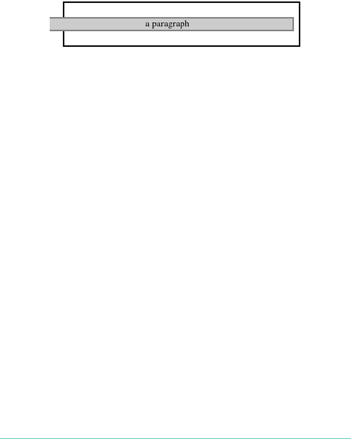
needed to make the numbers work out correctly. (Except in right-to-left languages,
where the left margin would be overruled instead.)
Let’s consider another example, illustrated in Figure 7-17, where the left margin is set
to be negative:
div {width: 500px; border: 3px solid black;}
p.wide {margin-left: -50px; width: auto; margin-right: 10px;
border: 3px solid gray;}
Figure 7-17. Setting a negative le margin
With a negative left margin, not only does the paragraph spill beyond the borders of
the div, but it also spills beyond the edge of the browser window itself!
Remember that padding, borders, and content widths (and heights) can never be neg‐
ative. Only margins can be less than zero.
Percentages
When it comes to percentage values for the width, padding, and margins, the same
basic rules apply. It doesn’t really matter whether the values are declared with lengths
or percentages.
Percentages can be very useful. Suppose we want an element’s content to be two-
thirds the width of its containing block, the right and left padding to be 5% each, the
left margin to be 5%, and the right margin to take up the slack. That would be written
something like:
<p style="width: 67%; padding-right: 5%; padding-left: 5%; margin-right: auto;
margin-left: 5%;">playing percentages</p>
The right margin would evaluate to 18% (100% - 67% - 5% - 5% - 5%) of the width of
the containing block.
Mixing percentages and length units can be tricky, however. Consider the following
example:
<p style="width: 67%; padding-right: 2em; padding-left: 2em; margin-right: auto;
margin-left: 5em;">mixed lengths</p>
In this case, the element’s box can be defined like this:
5em + 0 + 2 em + 67% + 2 em + 0 + auto = containing block width
272 | Chapter 7: Basic Visual Formatting

In order for the right margin’s width to evaluate to zero, the element’s containing
block must be 27.272727 em wide (with the content area of the element being
18.272727 em wide). Any wider than that and the right margin will evaluate to a posi‐
tive value. Any narrower and the right margin will be a negative value.
The situation gets even more complicated if we start mixing length-value unity types,
like this:
<p style="width: 67%; padding-right: 15px; padding-left: 10px;
margin-right: auto;
margin-left: 5em;">more mixed lengths</p>
And, just to make things more complex, borders cannot accept percentage values,
only length values. The bottom line is that it isn’t really possible to create a fully flexi‐
ble element based solely on percentages unless you’re willing to avoid using borders
or use some of the more experimental approaches such as flexible box layout.
Replaced Elements
So far, we’ve been dealing with the horizontal formatting of nonreplaced block boxes
in the normal flow of text. Block-level replaced elements are a bit simpler to manage.
All of the rules given for nonreplaced blocks hold true, with one exception: if width is
auto, then the width of the element is the content’s intrinsic width. The image in the
following example will be 20 pixels wide because that’s the width of the original
image:
<img src="smile.svg" style="display: block; width: auto; margin: 0;">
If the actual image were 100 pixels wide instead, then it would be laid out as 100 pix‐
els wide.
It’s possible to override this rule by assigning a specific value to width. Suppose we
modify the previous example to show the same image three times, each with a differ‐
ent width value:
<img src="smile.svg" style="display: block; width: 25px; margin: 0;">
<img src="smile.svg" style="display: block; width: 50px; margin: 0;">
<img src="smile.svg" style="display: block; width: 100px; margin: 0;">
This is illustrated in Figure 7-18.
Note that the height of the elements also increases. When a replaced element’s width
is changed from its intrinsic width, the value of height is scaled to match, unless
height has been set to an explicit value of its own. The reverse is also true: if height
is set, but width is left as auto, then the width is scaled proportionately to the change
in height.
Altering Element Display | 273

Figure 7-18. Changing replaced element widths
Now that you’re thinking about height, let’s move on to the vertical formatting of
normal-flow block box.
Vertical Formatting
Like horizontal formatting, the vertical formatting of block boxes has its own set of
interesting behaviors. An element’s content determines the default height of an
element. The width of the content also affects height; the skinnier a paragraph
becomes, for example, the taller it has to be in order to contain all of the inline con‐
tent within it.
In CSS, it is possible to set an explicit height on any block-level element. If you do
this, the resulting behavior depends on several other factors. Assume that the speci‐
fied height is greater than that needed to display the content:
<p style="height: 10em;">
In this case, the extra height has a visual effect somewhat like extra padding. But sup‐
pose the height is less than what is needed to display the content:
<p style="height: 3.33em;">
When that happens, the browser is supposed to provide a means of viewing all
content without increasing the height of the element box. In a case where the content
of an element is taller than the height of its box, the actual behavior of a user agent
will depend on the value of the property overflow. Two alternatives are shown in
Figure 7-19.
Under CSS1, user agents can ignore any value of height other than auto if an ele‐
ment is not a replaced element (such as an image). In CSS2 and later, the value of
height cannot be ignored, except in one specific circumstance involving percentage
values. We’ll talk about that in a moment.
Just as with width, height defines the content area’s height by default, as opposed to
the height of the visible element box. Any padding, borders, or margins on the top or
274 | Chapter 7: Basic Visual Formatting
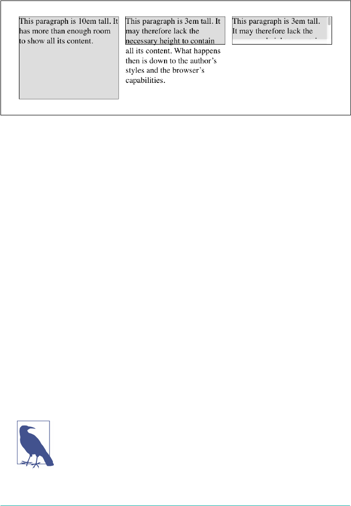
bottom of the element box are added to the value for height, unless the value of box-
sizing is different than content-box.
Figure 7-19. Heights that don’t match the element’s content height
Vertical Properties
As was the case with horizontal formatting, vertical formatting also has seven related
properties: margin-top, border-top, padding-top, height, padding-bottom,
border-bottom, and margin-bottom. These properties are diagrammed in
Figure 7-20.
The values of these seven properties must equal the height of the block box’s contain‐
ing block. This is usually the value of height for a block box’s parent (since block-
level elements nearly always have block-level elements for parents).
Only three of these seven properties may be set to auto: the height of the element,
and the top and bottom margins. The top and bottom padding and borders must be
set to specific values or else they default to a width of zero (assuming no border-style
is declared). If border-style has been set, then the thickness of the borders is set to
be the vaguely defined value medium. Figure 7-21 provides an illustration for remem‐
bering which parts of the box may have a value of auto and which may not.
Interestingly, if either margin-top or margin-bottom is set to auto for a block box in
the normal flow, they both automatically evaluate to 0. A value of 0 unfortunately
prevents easy vertical centering of normal-flow boxes in their containing blocks. It
also means that if you set the top and bottom margins of an element to auto, they are
effectively reset to 0 and removed from the element box.
The handling of auto top and bottom margins is different for posi‐
tioned elements, as well as flexible-box elements.
Altering Element Display | 275
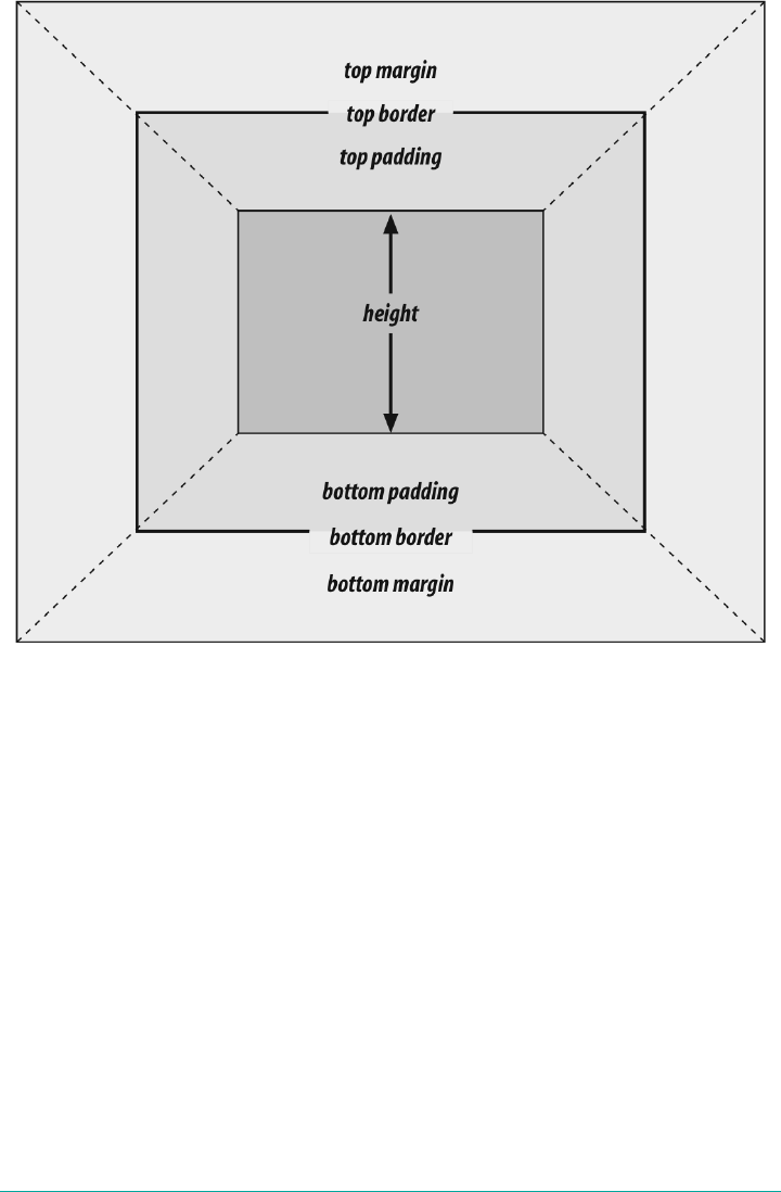
Figure 7-20. e seven properties of vertical formatting
height must be set to auto or to a nonnegative value of some type; it can never be less
than zero.
Percentage Heights
You already saw how length-value heights are handled, so let’s spend a moment on
percentages. If the height of a normal-flow block box is set to a percentage value, then
that value is taken as a percentage of the height of the box’s containing block. Given
the following markup, the resulting paragraph will be 3 em tall:
<div style="height: 6em;">
<p style="height: 50%;">Half as tall</p>
</div>
Since setting the top and bottom margins to auto will give them zero height, the only
way to vertically center the element in this particular case would be to set them both
to 25%—and even then, the box would be centered, not the content within it.
276 | Chapter 7: Basic Visual Formatting
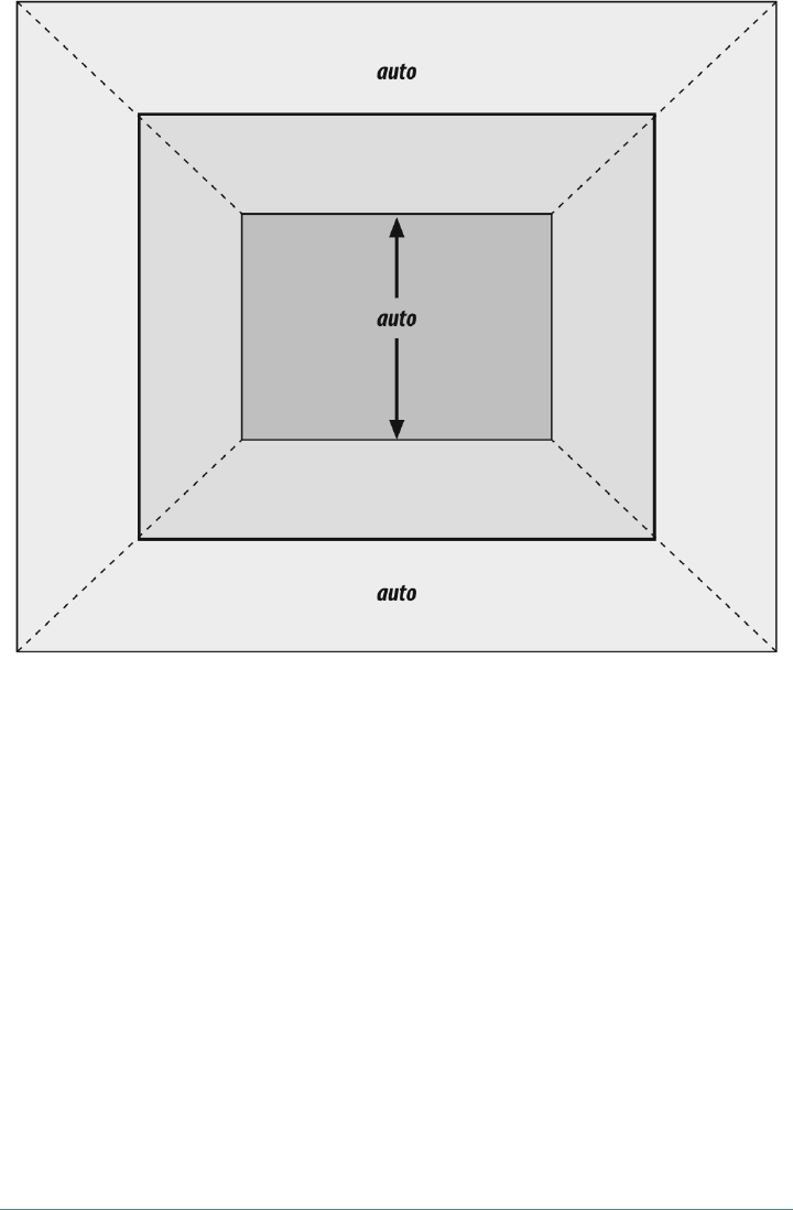
Figure 7-21. Vertical properties that can be set to auto
However, in cases where the height of the containing block is not explicitly declared,
percentage heights are reset to auto. If we changed the previous example so that the
height of the div is auto, the paragraph will now be exactly as tall as the div itself:
<div style="height: auto;">
<p style="height: 50%;">NOT half as tall; height reset to auto</p>
</div>
These two possibilities are illustrated in Figure 7-22. (The spaces between the para‐
graph borders and the div borders are the top and bottom margins on the para‐
graphs.)
Altering Element Display | 277
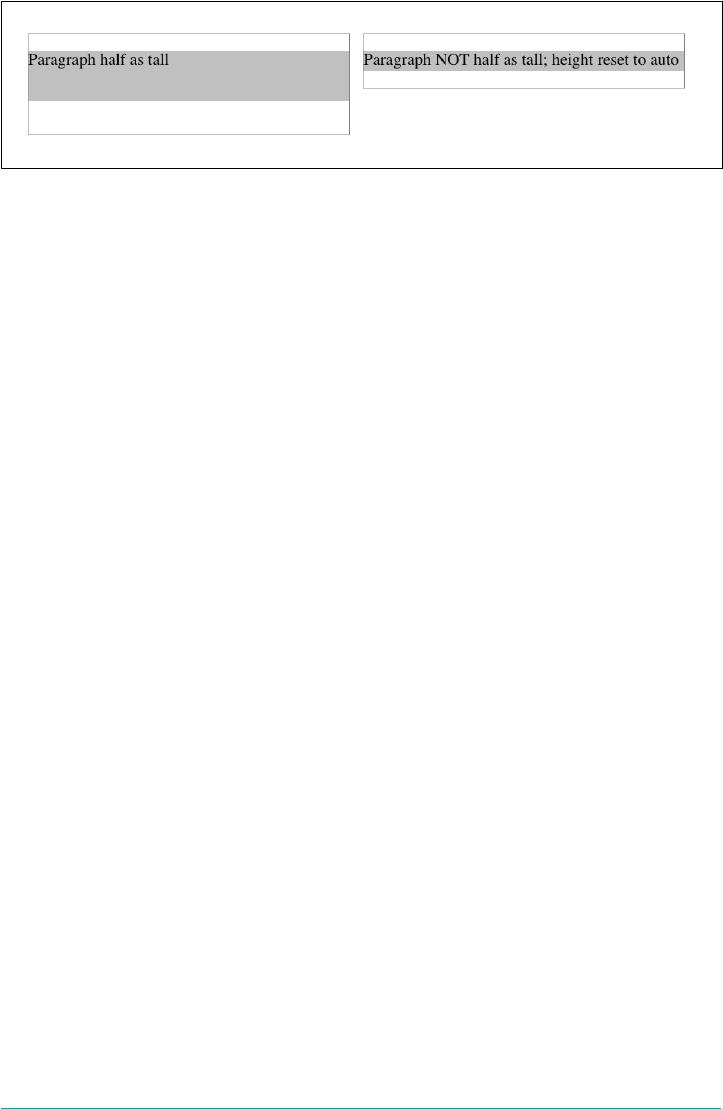
Figure 7-22. Percentage heights in dierent circumstances
Before we move on, take a closer look at the first example in Figure 7-22, the half-as-
tall paragraph. It may be half as tall, but it isn’t vertically centered. That’s because the
containing div is 6 em tall, which means the half-as-tall paragraph is 3 em tall. It has
top and bottom margins of 1 em, so its overall box height is 5 em. That means there is
actually 2 em of space between the bottom of the paragraph’s visible box and the div’s
bottom border, not 1 em. It might seem a bit odd at first glance, but it makes sense
once you work through the details.
Auto Heights
In the simplest case, a normal-flow block box with height: auto is rendered just
high enough to enclose the line boxes of its inline content (including text). If an auto-
height, normal-flow block box has only block-level children, then its default height
will be the distance from the top of the topmost block-level child’s outer border edge
to the bottom of the bottommost block-level child’s outer bottom border edge. There‐
fore, the margins of the child elements will “stick out” of the element that contains
them. (This behavior is explained in the next section.)
However, if the block-level element has either top or bottom padding, or top or bot‐
tom borders, then its height will be the distance from the top of the outer-top margin
edge of its topmost child to the outer-bottom margin edge of its bottommost child:
<div style="height: auto;
background: silver;">
<p style="margin-top: 2em; margin-bottom: 2em;">A paragraph!</p>
</div>
<div style="height: auto; border-top: 1px solid; border-bottom: 1px solid;
background: silver;">
<p style="margin-top: 2em; margin-bottom: 2em;">Another paragraph!</p>
</div>
Both of these behaviors are demonstrated in Figure 7-23.
If we changed the borders in the previous example to padding, the effect on the
height of the div would be the same: it would still enclose the paragraph’s margins
within it.
278 | Chapter 7: Basic Visual Formatting
Figure 7-23. Auto heights with block-level children
Collapsing Vertical Margins
One other important aspect of vertical formatting is the collapsing of vertically adja‐
cent margins. Collapsing behavior applies only to margins. Padding and borders,
where they exist, never collapse with anything.
An unordered list, where list items follow one another, is a perfect example of margin
collapsing. Assume that the following is declared for a list that contains five items:
li {margin-top: 10px; margin-bottom: 15px;}
Each list item has a 10-pixel top margin and a 15-pixel bottom margin. When the list
is rendered, however, the distance between adjacent list items is 15 pixels, not 25.
This happens because, along the vertical axis, adjacent margins are collapsed. In other
words, the smaller of the two margins is eliminated in favor of the larger. Figure 7-24
shows the difference between collapsed and uncollapsed margins.
Correctly implemented user agents collapse vertically adjacent margins, as shown in
the first list in Figure 7-24, where there are 15-pixel spaces between each list item.
The second list shows what would happen if the user agent didn’t collapse margins,
resulting in 25-pixel spaces between list items.
Another word to use, if you don’t like “collapse,” is “overlap.” Although the margins
are not really overlapping, you can visualize what’s happening using the following
analogy.
Imagine that each element, such as a paragraph, is a small piece of paper with the
content of the element written on it. Around each piece of paper is some amount of
clear plastic, which represents the margins. The first piece of paper (say an h1 piece)
is laid down on the canvas. The second (a paragraph) is laid below it and then slid up
until the edge of one of the piece’s plastic touches the edge of the other’s paper. If the
first piece of paper has half an inch of plastic along its bottom edge, and the second
has a third of an inch along its top, then when they slide together, the first piece’s
plastic will touch the top edge of the second piece of paper. The two are now done
being placed on the canvas, and the plastic attached to the pieces is overlapping.
Altering Element Display | 279
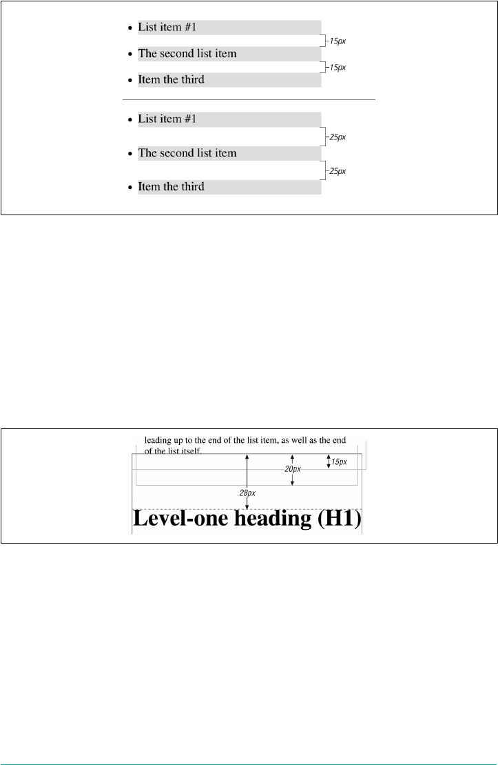
Figure 7-24. Collapsed versus uncollapsed margins
Collapsing also occurs where multiple margins meet, such as at the end of a list.
Adding to the earlier example, let’s assume the following rules apply:
ul {margin-bottom: 15px;}
li {margin-top: 10px; margin-bottom: 20px;}
h1 {margin-top: 28px;}
The last item in the list has a bottom margin of 20 pixels, the bottom margin of the ul
is 15 pixels, and the top margin of a succeeding h1 is 28 pixels. So once the margins
have been collapsed, the distance between the end of the li and the beginning of the
h1 is 28 pixels, as shown in Figure 7-25.
Figure 7-25. Collapsing in detail
Now, recall the examples from the previous section, where the introduction of a bor‐
der or padding on a containing block would cause the margins of its child elements to
be contained within it. We can see this behavior in operation by adding a border to
the ul element in the previous example:
ul {margin-bottom: 15px; border: 1px solid;}
li {margin-top: 10px; margin-bottom: 20px;}
h1 {margin-top: 28px;}
280 | Chapter 7: Basic Visual Formatting

With this change, the bottom margin of the li element is now placed inside its parent
element (the ul). Therefore, the only margin collapsing that takes place is between
the ul and the h1, as illustrated in Figure 7-26.
Figure 7-26. Collapsing (or not) with borders added to the mix
Negative Margins and Collapsing
Negative margins do have an impact on vertical formatting, and they affect how mar‐
gins are collapsed. If negative vertical margins are set, then the browser should take
the absolute maximum of both margins. The absolute value of the negative margin is
then subtracted from the positive margin. In other words, the negative is added to the
positive, and the resulting value is the distance between the elements. Figure 7-27
provides two concrete examples.
Figure 7-27. Examples of negative vertical margins
Altering Element Display | 281
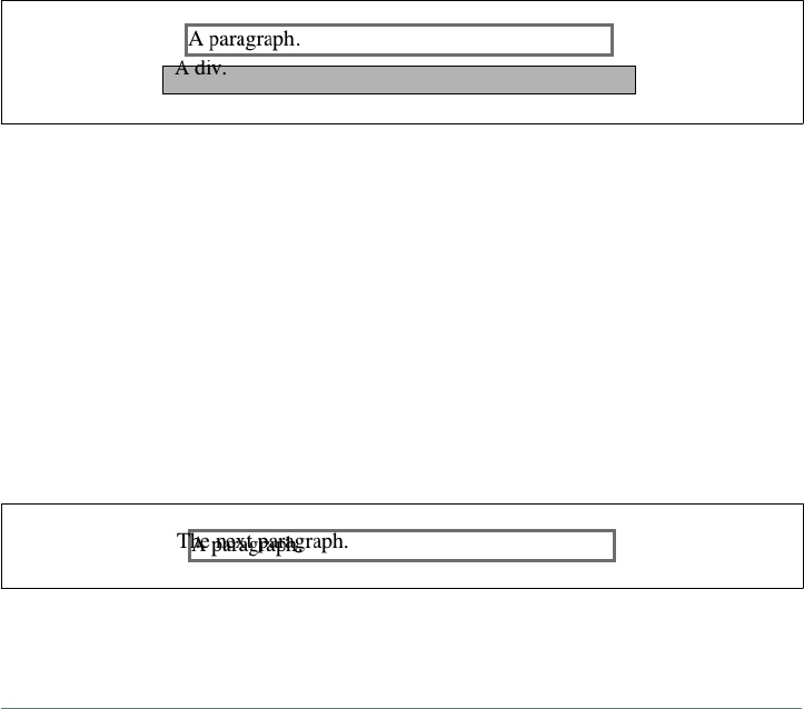
Notice the “pulling” effect of negative top and bottom margins. This is really no dif‐
ferent from the way that negative horizontal margins cause an element to push out‐
side of its parent. Consider:
p.neg {margin-top: -50px; margin-right: 10px;
margin-left: 10px; margin-bottom: 0;
border: 3px solid gray;}
<div style="width: 420px; background-color: silver; padding: 10px;
margin-top: 50px; border: 1px solid;">
<p class="neg">
A paragraph.
</p>
A div.
</div>
As we see in Figure 7-28, the paragraph has been pulled upward by its negative top
margin. Note that the content of the div that follows the paragraph in the markup has
also been pulled upward 50 pixels. In fact, every bit of normal-flow content that fol‐
lows the paragraph is also pulled upward 50 pixels.
Figure 7-28. e eects of a negative top margin
Now compare the following markup to the situation shown in Figure 7-29:
p.neg {margin-bottom: -50px; margin-right: 10px;
margin-left: 10px; margin-top: 0;
border: 3px solid gray;}
<div style="width: 420px; margin-top: 50px;">
<p class="neg">
A paragraph.
</p>
</div>
<p>
The next paragraph.
</p>
Figure 7-29. e eects of a negative bottom margin
282 | Chapter 7: Basic Visual Formatting

What’s really happening in Figure 7-29 is that the elements following the div are
placed according to the location of the bottom of the div. As you can see, the end of
the div is actually above the visual bottom of its child paragraph. The next element
after the div is the appropriate distance from the bottom of the div. This is expected,
given the rules we saw.
Now let’s consider an example where the margins of a list item, an unordered list, and
a paragraph are all collapsed. In this case, the unordered list and paragraph are
assigned negative margins:
li {margin-bottom: 20px;}
ul {margin-bottom: -15px;}
h1 {margin-top: -18px;}
The larger of the two negative margins (-18px) is added to the largest positive margin
(20px), yielding 20px - 18px = 2px. Thus, there are only two pixels between the bot‐
tom of the list item’s content and the top of the h1’s content, as we can see in
Figure 7-30.
When elements overlap each other due to negative margins, it’s hard to tell which ele‐
ments are on top. You may also have noticed that none of the examples in this section
use background colors. If they did, the background color of a following element
might overwrite their content. This is expected behavior, since browsers usually ren‐
der elements in order from beginning to end, so a normal-flow element that comes
later in the document can be expected to overwrite an earlier element, assuming the
two end up overlapping.
Figure 7-30. Collapsing margins and negative margins, in detail
List Items
List items have a few special rules of their own. They are typically preceded by a
marker, such as a small dot or a number. This marker isn’t actually part of the list
item’s content area, so effects like those illustrated in Figure 7-31 are common.
Altering Element Display | 283

Figure 7-31. e content of list items
CSS1 said very little about the placement and effects of these markers with regard to
the layout of a document. CSS2 introduced properties specifically designed to address
this issue, such as marker-offset. However, a lack of implementations and changes
in thinking caused this to be dropped from CSS2.1, and work is being done to rein‐
troduce the idea (if not the specific syntax) to CSS. Accordingly, the placement of
markers is largely beyond the control of authors, at least as of this writing.
The marker attached to a list item element can be either outside the content of the list
item or treated as an inline marker at the beginning of the content, depending on the
value of the property list-style-position. If the marker is brought inside, then the
list item will interact with its neighbors exactly like a block-level element, as illustra‐
ted in Figure 7-32.
Figure 7-32. Markers inside and outside the list
If the marker stays outside the content, then it is placed some distance from the left
content edge of the content (in left-to-right languages). No matter how the list’s styles
are altered, the marker stays the same distance from the content edge. Occasionally,
the markers may be pushed outside of the list element itself, as we can see in
Figure 7-32.
Remember that list-item boxes define containing blocks for their ancestor boxes, just
like regular block boxes.
284 | Chapter 7: Basic Visual Formatting
Inline Elements
After block-level elements, inline elements are the most common. Setting box prop‐
erties for inline elements takes us into more interesting territory than we’ve been so
far. Some good examples of inline elements are the em tag and the a tag, both of which
are nonreplaced elements, and images, which are replaced elements.
Note that none of the behavior described in this section applies to table elements.
CSS2 introduced new properties and behaviors for handling tables and table content,
and these elements behave in ways fairly distinct from either block-level or inline for‐
matting. Table styling is beyond the scope of this book, as it’s surprisingly compli‐
cated and exists rather in a world of its own.
Nonreplaced and replaced elements are treated somewhat differently in the inline
context, and we’ll look at each in turn as we explore the construction of inline ele‐
ments.
Line Layout
First, you need to understand how inline content is laid out. It isn’t as simple as block-
level elements, which just generate block boxes and usually don’t allow anything to
coexist with them. By contrast, look inside a block-level element, such as a paragraph.
You may well ask, how did all those lines of text get there? What controls their
arrangement? How can I affect it?
In order to understand how lines are generated, first consider the case of an element
containing one very long line of text, as shown in Figure 7-33. Note that we’ve put a
border around the line by wrapping the entire line in a span element and then assign‐
ing it a border style:
span {border: 1px dashed black;}
Figure 7-33. A single-line inline element
Figure 7-33 shows the simplest case of an inline element contained by a block-level
element. It’s no different in its way than a paragraph with two words in it. The only
differences are that, in Figure 7-34, we have a few dozen words, and most paragraphs
don’t contain an explicit inline element such as span.
In order to get from this simplified state to something more familiar, all we have to do
is determine how wide the element should be, and then break up the line so that the
Inline Elements | 285
resulting pieces will fit into the content width of the element. Therefore, we arrive at
the state shown in Figure 7-34.
Figure 7-34. A multiple-line inline element
Nothing has really changed. All we did was take the single line and break it into
pieces, and then stack those pieces on top of each other.
In Figure 7-34, the borders for each line of text also happen to coincide with the top
and bottom of each line. This is true only because no padding has been set for the
inline text. Notice that the borders actually overlap each other slightly; for example,
the bottom border of the first line is just below the top border of the second line. This
is because the border is actually drawn on the next pixel (assuming you’re using a
monitor) to the outside of each line. Since the lines are touching each other, their bor‐
ders will overlap as shown in Figure 7-34.
If we alter the span styles to have a background color, the actual placement of the
lines becomes quite clear. Consider Figure 7-35, which contains four paragraphs,
each with a different value of text-align and each having the backgrounds of its
lines filled in.
As we can see, not every line reaches to the edge of its parent paragraph’s content
area, which has been denoted with a dotted gray border. For the left-aligned para‐
graph, the lines are all pushed flush against the left content edge of the paragraph,
and the end of each line happens wherever the line is broken. The reverse is true for
the right-aligned paragraph. For the centered paragraph, the centers of the lines are
aligned with the center of the paragraph.
In the last case, where the value of text-align is justify, each line is forced to be as
wide as the paragraph’s content area so that the line’s edges touch the content edges of
the paragraph. The difference between the natural length of the line and the width of
the paragraph is made up by altering the spacing between letters and words in each
line. Therefore, the value of word-spacing can be overridden when the text is justi‐
fied. (The value of letter-spacing cannot be overridden if it is a length value.)
That pretty well covers how lines are generated in the simplest cases. As you’re about
to see, however, the inline formatting model is far from simple.
286 | Chapter 7: Basic Visual Formatting
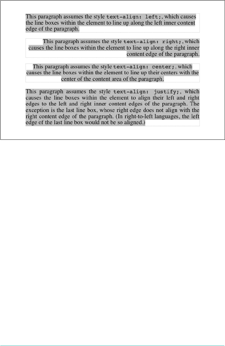
Figure 7-35. Showing lines in dierent alignments
Basic Terms and Concepts
Before we go any further, let’s review some basic terms of inline layout, which will be
crucial in navigating the following sections:
Anonymous text
This is any string of characters that is not contained within an inline element.
Thus, in the markup <p> I'm <em>so</em> happy!</p>, the sequences “ I’m ”
and “ happy!” are anonymous text. Note that the spaces are part of the text since
a space is a character like any other.
Em box
This is defined in the given font, otherwise known as the character box. Actual
glyphs can be taller or shorter than their em boxes. In CSS, the value of font-
size determines the height of each em box.
Content area
In nonreplaced elements, the content area can be one of two things, and the CSS
specification allows user agents to choose which one. The content area can be the
box described by the em boxes of every character in the element, strung together;
or it can be the box described by the character glyphs in the element. In this
book, I use the em box definition for simplicity’s sake. In replaced elements, the
content area is the intrinsic height of the element plus any margins, borders, or
padding.
Inline Elements | 287

Leading
Leading is the difference between the values of font-size and line-height. This
difference is actually divided in half and is applied equally to the top and bottom
of the content area. These additions to the content area are called, not surpris‐
ingly, half-leading. Leading is applied only to nonreplaced elements.
Inline box
This is the box described by the addition of the leading to the content area. For
nonreplaced elements, the height of the inline box of an element will be exactly
equal to the value for line-height. For replaced elements, the height of the
inline box of an element will be exactly equal to the content area, since leading is
not applied to replaced elements.
Line box
This is the shortest box that bounds the highest and lowest points of the inline
boxes that are found in the line. In other words, the top edge of the line box is
placed along the top of the highest inline box top, and the bottom of the line box
is placed along the bottom of the lowest inline box bottom.
CSS also contains a set of behaviors and useful concepts that fall outside of the above
list of terms and definitions:
• The content area is analogous to the content box of a block box.
•The background of an inline element is applied to the content area plus any pad‐
ding.
•Any border on an inline element surrounds the content area plus any padding
and border.
•Padding, borders, and margins on nonreplaced elements have no vertical effect
on inline elements or the boxes they generate; that is, they do not affect the height
of an element’s inline box (and thus the line box that contains the element).
•Margins and borders on replaced elements do affect the height of the inline box
for that element and, by implication, the height of the line box for the line that
contains the element.
One more thing to note: inline boxes are vertically aligned within the line according
to their values for the property vertical-align.
Before moving on, let’s look at a step-by-step process for constructing a line box,
which you can use to see how the various pieces of the line fit together to determine
its height.
Determine the height of the inline box for each element in the line by following these
steps:
288 | Chapter 7: Basic Visual Formatting

1. Find the values of font-size and line-height for each inline nonreplaced ele‐
ment and text that is not part of a descendant inline element and combine them.
This is done by subtracting the font-size from the line-height, which yields
the leading for the box. The leading is split in half and applied to the top and bot‐
tom of each em box.
2. Find the values of height, margin-top, margin-bottom, padding-top, padding-
bottom, border-top-width, and border-bottom-width for each replaced ele‐
ment and add them together.
3. Figure out, for each content area, how much of it is above the baseline for the
overall line and how much of it is below the baseline. This is not an easy task: you
must know the position of the baseline for each element and piece of anonymous
text and the baseline of the line itself, and then line them all up. In addition, the
bottom edge of a replaced element sits on the baseline for the overall line.
4. Determine the vertical offset of any elements that have been given a value for
vertical-align. This will tell you how far up or down that element’s inline box
will be moved, and it will change how much of the element is above or below the
baseline.
5. Now that you know where all of the inline boxes have come to rest, calculate the
final line box height. To do so, just add the distance between the baseline and the
highest inline box top to the distance between the baseline and the lowest inline
box bottom.
Let’s consider the whole process in detail, which is the key to intelligently styling
inline content.
Inline Formatting
First, know that all elements have a line-height, whether it’s explicitly declared or
not. This value greatly influences the way inline elements are displayed, so let’s give it
due attention.
Now let’s establish how to determine the height of a line. A line’s height (or the height
of the line box) is determined by the height of its constituent elements and other con‐
tent, such as text. It’s important to understand that line-height actually affects inline
elements and other inline content, not block-level elements—at least, not directly. We
can set a line-height value for a block-level element, but the value will have a visual
impact only as it’s applied to inline content within that block-level element. Consider
the following empty paragraph, for example:
<p style="line-height: 0.25em;"></p>
Inline Elements | 289

Without content, the paragraph won’t have anything to display, so we won’t see any‐
thing. The fact that this paragraph has a line-height of any value—be it 0.25em or
25in—makes no difference without some content to create a line box.
We can certainly set a line-height value for a block-level element and have that
apply to all of the content within the block, whether or not the content is contained in
any inline elements. In a certain sense, then, each line of text contained within a
block-level element is its own inline element, whether or not it’s surrounded by tags.
If you like, picture a fictional tag sequence like this:
<p>
<line>This is a paragraph with a number of</line>
<line>lines of text which make up the</line>
<line>contents.</line>
</p>
Even though the line tags don’t actually exist, the paragraph behaves as if they did—
each line of text inherits styles from the paragraph. You only bother to create line-
height rules for block-level elements so you don’t have to explicitly declare a line-
height for all of their inline elements, fictional or otherwise.
The fictional line element actually clarifies the behavior that results from setting
line-height on a block-level element. According to the CSS specification, declaring
line-height on a block-level element sets a minimum line box height for the content
of that block-level element. Declaring p.spacious {line-height: 24pt;} means
that the minimum heights for each line box is 24 points. Technically, content can
inherit this line height only if an inline element does so. Most text isn’t contained by
an inline element. If you pretend that each line is contained by the fictional line ele‐
ment, the model works out very nicely.
Inline Nonreplaced Elements
Building on your formatting knowledge, let’s move on to the construction of lines
that contain only nonreplaced elements (or anonymous text). Then you’ll be in a
good position to understand the differences between nonreplaced and replaced ele‐
ments in inline layout.
Building the Boxes
First, for an inline nonreplaced element or piece of anonymous text, the value of
font-size determines the height of the content area. If an inline element has a font-
size of 15px, then the content area’s height is 15 pixels because all of the em boxes in
the element are 15 pixels tall, as illustrated in Figure 7-36.
290 | Chapter 7: Basic Visual Formatting

Figure 7-36. Em boxes determine content area height
The next thing to consider is the value of line-height for the element, and the dif‐
ference between it and the value of font-size. If an inline nonreplaced element has a
font-size of 15px and a line-height of 21px, then the difference is six pixels. The
user agent splits the six pixels in half and applies half to the top and half to the bot‐
tom of the content area, which yields the inline box. This process is illustrated in
Figure 7-37.
Figure 7-37. Content area plus leading equals inline box
Let’s assume that the following is true:
<p style="font-size: 12px; line-height: 12px;">
This is text, <em>some of which is emphasized</em>, plus other text<br>
which is <strong style="font-size: 24px;">strongly emphasized</strong>
and which is<br>
larger than the surrounding text.
</p>
In this example, most of the text has a font-size of 12px, while the text in one inline
nonreplaced element has a size of 24px. However, all of the text has a line-height of
12px since line-height is an inherited property. Therefore, the strong element’s
line-height is also 12px.
Thus, for each piece of text where both the font-size and line-height are 12px, the
content height does not change (since the difference between 12px and 12px is zero),
so the inline box is 12 pixels high. For the strong text, however, the difference
between line-height and font-size is -12px. This is divided in half to determine
the half-leading (-6px), and the half-leading is added to both the top and bottom of
the content height to arrive at an inline box. Since we’re adding a negative number in
Inline Elements | 291
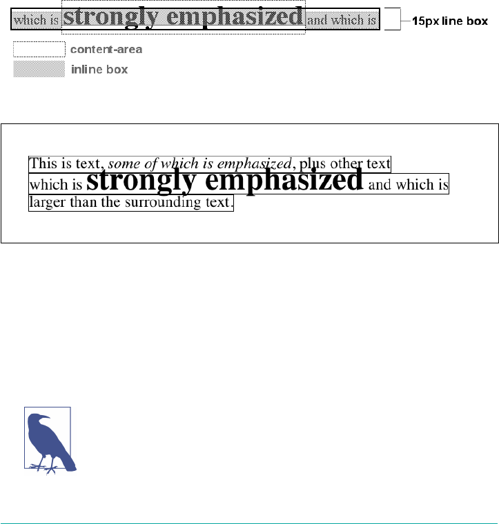
both cases, the inline box ends up being 12 pixels tall. The 12-pixel inline box is cen‐
tered vertically within the 24-pixel content height of the element, so the inline box is
actually smaller than the content area.
So far, it sounds like we’ve done the same thing to each bit of text, and that all the
inline boxes are the same size, but that’s not quite true. The inline boxes in the second
line, although they’re the same size, don’t actually line up because the text is all
baseline-aligned (see Figure 7-38).
Since inline boxes determine the height of the overall line box, their placement with
respect to each other is critical. The line box is defined as the distance from the top of
the highest inline box in the line to the bottom of the lowest inline box, and the top of
each line box butts up against the bottom of the line box for the preceding line. The
result shown in Figure 7-38 gives us the paragraph shown in Figure 7-39.
Figure 7-38. Inline boxes within a line
Figure 7-39. Line boxes within a paragraph
As we can see in Figure 7-39, the middle line is taller than the other two, but it still
isn’t big enough to contain all of the text within it. The anonymous text’s inline box
determines the bottom of the line box, while the top of the strong element’s inline box
sets the top of the line box. Because that inline box’s top is inside the element’s con‐
tent area, the contents of the element spill outside the line box and actually overlap
other line boxes. The result is that the lines of text look irregular.
In just a bit, we’ll explore ways to cope with this behavior and
methods for achieving consistent baseline spacing.
292 | Chapter 7: Basic Visual Formatting
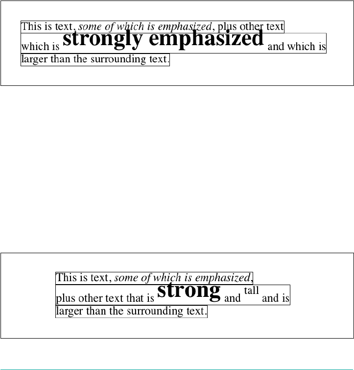
Vertical Alignment
If we change the vertical alignment of the inline boxes, the same height determination
principles apply. Suppose that we give the strong element a vertical alignment of 4px:
<p style="font-size: 12px; line-height: 12px;">
This is text, <em>some of which is emphasized</em>, plus other text<br>
which is <strong style="font-size: 24px; vertical-align: 4px;">strongly
emphasized</strong> and that is<br>
larger than the surrounding text.
</p>
That small change raises the strong element four pixels, which pushes up both its
content area and its inline box. Because the strong element’s inline box top was
already the highest in the line, this change in vertical alignment also pushes the top of
the line box upward by four pixels, as shown in Figure 7-40.
Figure 7-40. Vertical alignment aects line box height
Let’s consider another situation. Here, we have another inline element in the same
line as the strong text, and its alignment is other than the baseline:
<p style="font-size: 12px; line-height: 12px;">
This is text, <em>some of which is emphasized</em>,<br>
plus other text that is <strong style="font-size: 24px;">strong</strong>
and <span style="vertical-align: top;">tall</span> and is<br>
larger than the surrounding text.
</p>
Now we have the same result as in our earlier example, where the middle line box is
taller than the other line boxes. However, notice how the “tall” text is aligned in
Figure 7-41.
Figure 7-41. Aligning an inline element to the line box
Inline Elements | 293
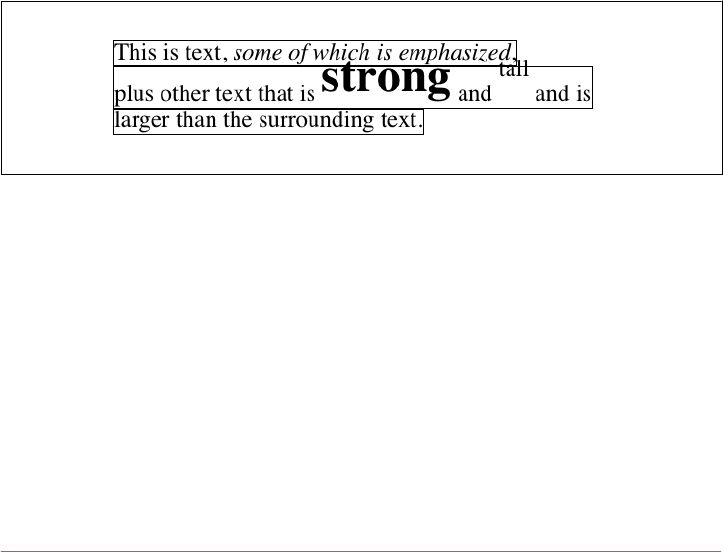
In this case, the top of the “tall” text’s inline box is aligned with the top of the line box.
Since the “tall” text has equal values for font-size and line-height, the content
height and inline box are the same. However, consider this:
<p style="font-size: 12px; line-height: 12px;">
This is text, <em>some of which is emphasized</em>,<br>
plus other text that is <strong style="font-size: 24px;">strong</strong>
and <span style="vertical-align: top; line-height: 2px;">tall</span> and is<br>
larger than the surrounding text.
</p>
Since the line-height for the “tall” text is less than its font-size, the inline box for
that element is smaller than its content area. This tiny fact changes the placement of
the text itself since the top of its inline box must be aligned with the top of the line
box for its line. Thus, we get the result shown in Figure 7-42.
On the other hand, we could set the “tall” text to have a line-height that is actually
bigger than its font-size. For example:
<p style="font-size: 12px; line-height: 12px;">
This is text, <em>some of which is emphasized</em>, plus other text<br>
that is <strong style="font-size: 24px;">strong</strong>
and <span style="vertical-align: top; line-height: 18px;">tall</span>
and that is<br>
larger than the surrounding text.
</p>
Figure 7-42. Text protruding from the line box (again)
Since we’ve given the “tall” text a line-height of 18px, the difference between line-
height and font-size is six pixels. The half-leading of three pixels is added to the
content area and results in an inline box that is 18 pixels tall. The top of this inline
box aligns with the top of the line box. Similarly, the vertical-align value bottom
will align the bottom of an inline element’s inline box with the bottom of the line box.
In relation to the terms we’ve been using in this chapter, the effects of the assorted
keyword values of vertical-align are:
top
Aligns the top of the element’s inline box with the top of the containing line box
294 | Chapter 7: Basic Visual Formatting

bottom
Aligns the bottom of the element’s inline box with the bottom of the containing
line box
text-top
Aligns the top of the element’s inline box with the top of the parent’s content area
text-bottom
Aligns the bottom of the element’s inline box with the bottom of the parent’s con‐
tent area
middle
Aligns the vertical midpoint of the element’s inline box with 0.5ex above the
baseline of the parent
super
Moves the content area and inline box of the element upward. The distance is not
specified and may vary by user agent
sub
The same as super, except the element is moved downward instead of upward
<percentage>
Shifts the element up or down the distance defined by taking the declared per‐
centage of the element’s value for line-height
Managing the line-height
In previous sections, we saw that changing the line-height of an inline element can
cause text from one line to overlap another. In each case, though, the changes were
made to individual elements. So how can we affect the line-height of elements in a
more general way in order to keep content from overlapping?
One way to do this is to use the em unit in conjunction with an element whose font-
size has changed. For example:
p {line-height: 1em;}
big {font-size: 250%; line-height: 1em;}
<p>
Not only does this paragraph have "normal" text, but it also<br>
contains a line in which <big>some big text</big> is found.<br>
This large text helps illustrate our point.
</p>
By setting a line-height for the big element, we increase the overall height of the
line box, providing enough room to display the big element without overlapping any
other text and without changing the line-height of all lines in the paragraph. We
Inline Elements | 295
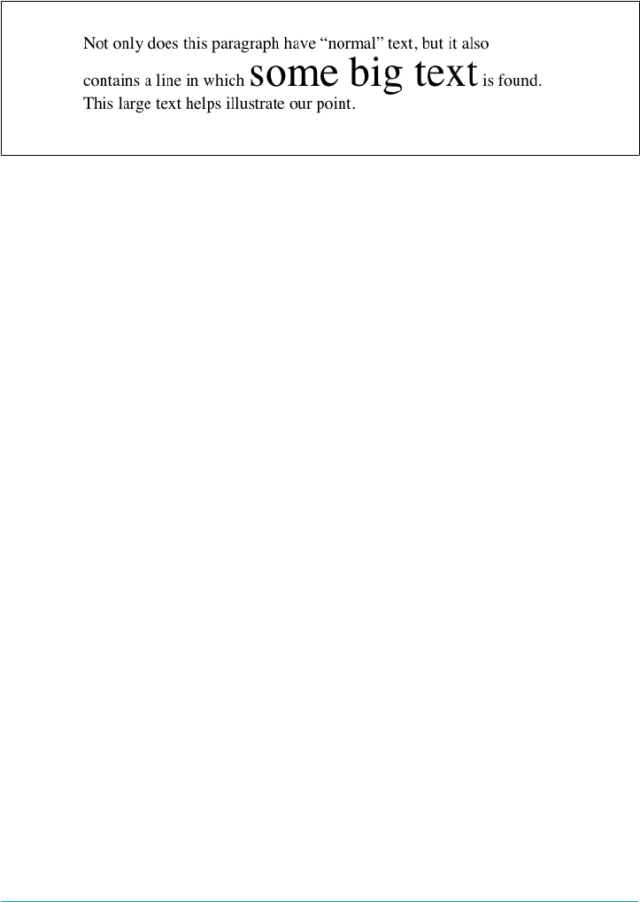
use a value of 1em so that the line-height for the big element will be set to the same
size as big’s font-size. Remember, line-height is set in relation to the font-size of
the element itself, not the parent element. The results are shown in Figure 7-43.
Figure 7-43. Assigning the line-height property to inline elements
Make sure you really understand the previous sections, because things will get trickier
when we try to add borders. Let’s say we want to put five-pixel borders around any
hyperlink:
a:link {border: 5px solid blue;}
If we don’t set a large enough line-height to accommodate the border, it will be in
danger of overwriting other lines. We could increase the size of the inline box for
unvisited links using line-height, as we did for the big element in the earlier exam‐
ple; in this case, we’d just need to make the value of line-height 10 pixels larger than
the value of font-size for those links. However, that will be difficult if we don’t actually
know the size of the font in pixels.
Another solution is to increase the line-height of the paragraph. This will affect
every line in the entire element, not just the line in which the bordered hyperlink
appears:
p {line-height: 1.8em;}
a:link {border: 5px solid blue;}
Because there is extra space added above and below each line, the border around the
hyperlink doesn’t impinge on any other line, as we can see in Figure 7-44.
This approach works here because all of the text is the same size. If there were other
elements in the line that changed the height of the line box, our border situation
might also change. Consider the following:
p {font-size: 14px; line-height: 24px;}
a:link {border: 5px solid blue;}
big {font-size: 150%; line-height: 1.5em;}
Given these rules, the height of the inline box of a big element within a paragraph
will be 31.5 pixels (14 × 1.5 × 1.5), and that will also be the height of the line box. In
order to keep baseline spacing consistent, we must make the p element’s line-height
equal to or greater than 32px.
296 | Chapter 7: Basic Visual Formatting
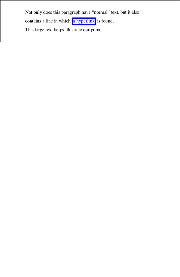
Figure 7-44. Increasing line-height to leave room for inline borders
Baselines and line heights
The actual height of each line box depends on the way its component elements line
up with one another. This alignment tends to depend very much on where the base‐
line falls within each element (or piece of anonymous text) because that location
determines how the inline boxes are arranged. The placement of the baseline within
each em box is different for every font. This information is built into the font files and
cannot be altered by any means other than directly editing the font files.
Consistent baseline spacing tends to be more of an art than a science. If you declare
all of your font sizes and line heights using a single unit, such as ems, then you have a
reliable chance of consistent baseline spacing. If you mix units, however, that feat
becomes a great deal more difficult, if not impossible. As of this writing, there are
proposals for properties that would let authors enforce consistent baseline spacing
regardless of the inline content, which would greatly simplify certain aspects of online
typography. None of these proposed properties have been implemented though,
which makes their adoption a distant hope at best.
Scaling Line Heights
The best way to set line-height, as it turns out, is to use a raw number as the value.
This method is the best because the number becomes the scaling factor, and that fac‐
tor is an inherited, not a computed, value. Let’s say we want the line-height`s of
all elements in a document to be one and a half times their `font-size.
We would declare:
body {line-height: 1.5;}
This scaling factor of 1.5 is passed down from element to element, and, at each level,
the factor is used as a multiplier of the font-size of each element. Therefore, the fol‐
lowing markup would be displayed as shown in Figure 7-45:
p {font-size: 15px; line-height: 1.5;}
small {font-size: 66%;}
big {font-size: 200%;}
<p>This paragraph has a line-height of 1.5 times its font-size. In addition,
any elements within it <small>such as this small element</small> also have
Inline Elements | 297
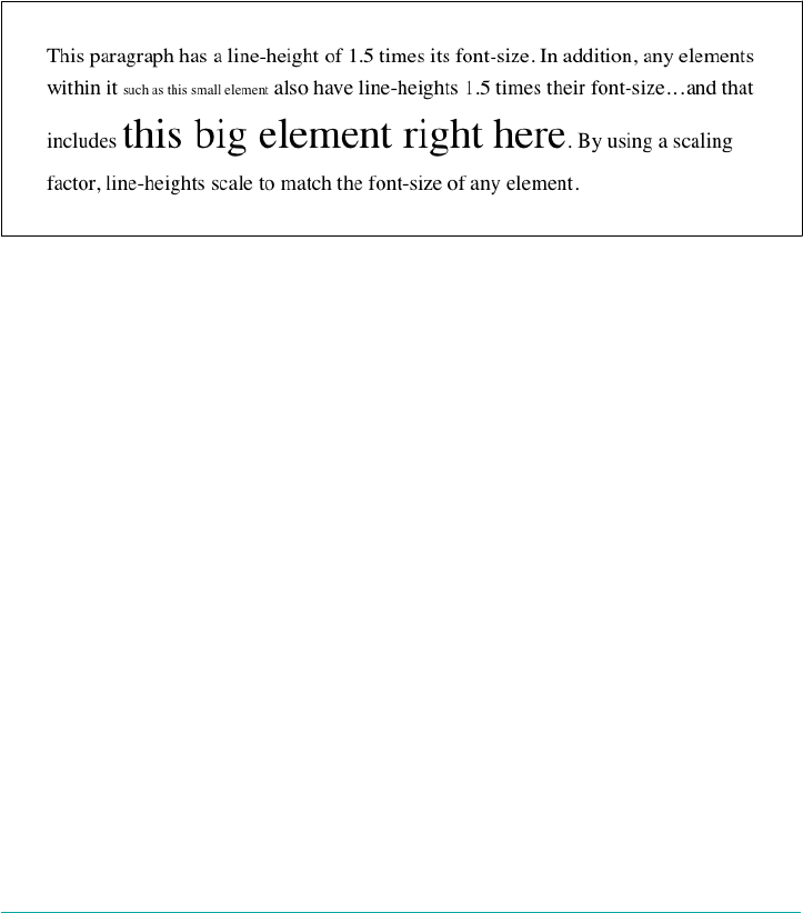
line-heights 1.5 times their font-size...and that includes <big>this big
element right here</big>. By using a scaling factor, line-heights scale
to match the font-size of any element.</p>
In this example, the line height for the small element turns out to be 15 pixels, and
for the big element, it’s 45 pixels. (These numbers may seem excessive, but they’re in
keeping with the overall page design.) Of course, if we don’t want our big text to gen‐
erate too much extra leading, we can give it a line-height value, which will override
the inherited scaling factor:
p {font-size: 15px; line-height: 1.5;}
small {font-size: 66%;}
big {font-size: 200%; line-height: 1em;}
Figure 7-45. Using a scaling factor for line-height
Another solution—possibly the simplest of all—is to set the styles such that lines are
no taller than absolutely necessary to hold their content. This is where we might use a
line-height of 1.0. This value will multiply itself by every font-size to get the same
value as the font-size of every element. Thus, for every element, the inline box will
be the same as the content area, which will mean the absolute minimum size neces‐
sary is used to contain the content area of each element.
Most fonts still display a little bit of space between the lines of character glyphs
because characters are usually smaller than their em boxes. The exception is script
(“cursive”) fonts, where character glyphs are usually larger than their em boxes.
Adding Box Properties
As you’re aware from previous discussions, padding, margins, and borders may all be
applied to inline nonreplaced elements. These aspects of the inline element do not
influence the height of the line box at all. If you were to apply some borders to a span
element without any margins or padding, you’d get results such as those shown in
Figure 7-46.
298 | Chapter 7: Basic Visual Formatting

The border edge of inline elements is controlled by the font-size, not the line-
height. In other words, if a span element has a font-size of 12px and a line-height
of 36px, its content area is 12px high, and the border will surround that content area.
Alternatively, we can assign padding to the inline element, which will push the bor‐
ders away from the text itself:
span {padding: 4px;}
Note that this padding does not alter the actual shape of the content height, and so it
will not affect the height of the inline box for this element. Similarly, adding borders
to an inline element will not affect the way line boxes are generated and laid out, as
illustrated in Figure 7-47.
Figure 7-46. Inline borders and line-box layout
Figure 7-47. Padding and borders do not alter line-height
As for margins, they do not, practically speaking, apply to the top and bottom of an
inline nonreplaced element, as they don’t affect the height of the line box. The ends of
the element are another story.
Recall the idea that an inline element is basically laid out as a single line and then bro‐
ken up into pieces. So, if we apply margins to an inline element, those margins will
appear at its beginning and end: these are the left and right margins, respectively.
Padding also appears at the edges. Thus, although padding and margins (and bor‐
ders) do not affect line heights, they can still affect the layout of an element’s content
Inline Elements | 299
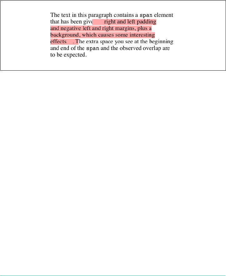
by pushing text away from its ends. In fact, negative left and right margins can pull
text closer to the inline element, or even cause overlap, as Figure 7-48 shows.
Think of an inline element as a strip of paper with some plastic surrounding it. Dis‐
playing the inline element on multiple lines is like slicing up the strip into smaller
strips. However, no extra plastic is added to each smaller strip. The only plastic is that
which was on the strip to begin with, so it appears only at the beginning and end of
the original ends of the paper strip (the inline element). At least, that’s the default
behavior, but as we’ll soon see, there is another option.
Figure 7-48. Padding and margins on the ends of an inline element
So, what happens when an inline element has a background and enough padding to
cause the lines’ backgrounds to overlap? Take the following situation as an example:
p {font-size: 15px; line-height: 1em;}
p span {background: #FAA; padding-top: 10px; padding-bottom: 10px;}
All of the text within the span element will have a content area 15 pixels tall, and
we’ve applied 10 pixels of padding to the top and bottom of each content area. The
extra pixels won’t increase the height of the line box, which would be fine, except
there is a background color. Thus, we get the result shown in Figure 7-49.
CSS 2.1 explicitly states that the line boxes are drawn in document order: “This will
cause the borders on subsequent lines to paint over the borders and text of previous
lines.” The same principle applies to backgrounds as well, as Figure 7-49 shows. CSS2,
on the other hand, allowed user agents “to ‘clip’ the border and padding areas (i.e.,
not render them).” Therefore, the results may depend greatly on which specification
the user agent follows.
300 | Chapter 7: Basic Visual Formatting
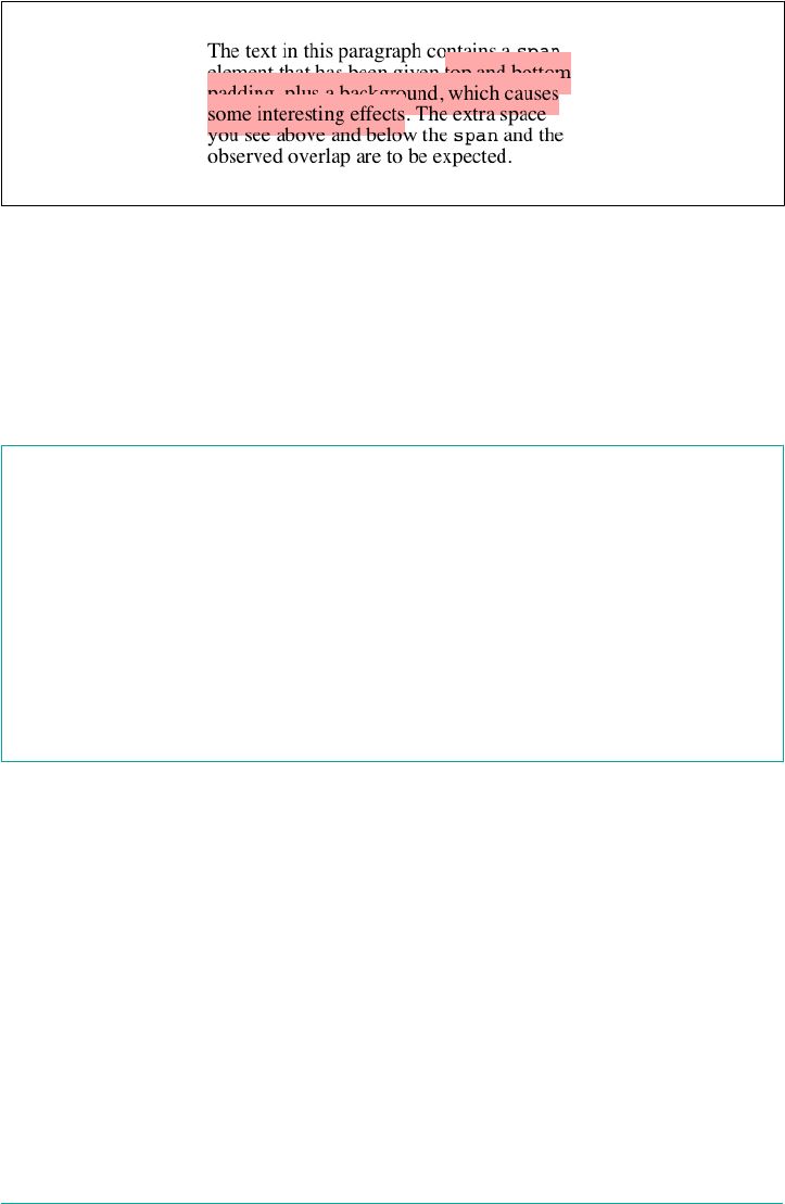
Figure 7-49. Overlapping inline backgrounds
Changing Breaking Behavior
In the previous section, we saw that when an inline nonreplaced element is broken
across multiple lines, it’s treated as if it were one long single-line element that’s sliced
into smaller boxes, one slice per line break. That’s actually just the default behavior,
and it can be changed via the property box-decoration-break.
box-decoration-break
Values slice | clone
Initial value slice
Applies to All elements
Computed value As specied
Inherited No
Animatable No
The default value, slice, is what we saw in the previous section. The other value,
clone, causes each fragement of the element to be drawn as if it were a standalone
box. What does that mean? Compare the two examples in Figure 7-50, in which
exactly the same markup and styles are treated as either sliced or cloned.
Many of the differences are pretty apparent, but a few are perhaps more subtle.
Among the effects are the application of padding to each element’s fragment, includ‐
ing at the ends where the line breaks occurred. Similarly, the border is drawn around
each fragment individually, instead of being broken up.
Inline Elements | 301
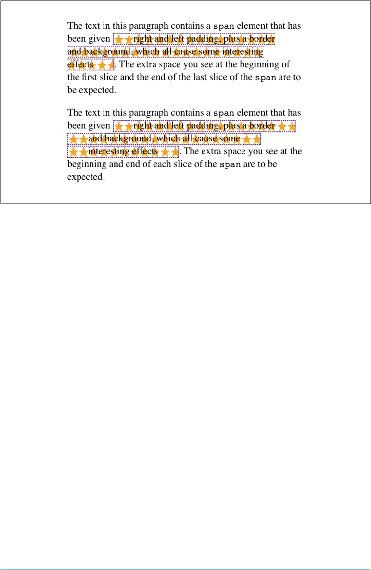
Figure 7-50. Sliced and cloned inline fragments
More subtly, notice how the background-image positioning changes between the two.
In the sliced version, background images are sliced along with everything else, mean‐
ing that only one of the fragments contains the origin image. In the cloned version,
however, each background acts as its own copy, so each has its own origin image.
This means, for example, that even if we have a nonrepeated background image, it
will appear once in each fragment instead of only in one fragment.
The box-decoration-break property will most often be used with inline boxes, but it
actually applies in any situation where there’s a break in an element—for example,
when a page break interrupts an element in paged media. In such a case, each frag‐
ment is a separate slice. If we set box-decoration-break: clone, then each box frag‐
ment will be treated as a copy when it comes to borders, padding, backgrounds, and
so on. The same holds true in multicolumn layout: if an element is split by a column
break, the value of box-decoration-break will affect how it is rendered.
Glyphs Versus Content Area
Even in cases where you try to keep inline nonreplaced element backgrounds from
overlapping, it can still happen, depending on which font is in use. The problem lies
in the difference between a font’s em box and its character glyphs. Most fonts, as it
turns out, don’t have em boxes whose heights match the character glyphs.
That may sound very abstract, but it has practical consequences. In CSS2.1, we find
the following: “the height of the content area should be based on the font, but this
specification does not specify how. A user agent may…use the em box or the maxi‐
mum ascender and descender of the font. (The latter would ensure that glyphs with
302 | Chapter 7: Basic Visual Formatting

parts above or below the em box still fall within the content area, but leads to differ‐
ently sized boxes for different fonts.)”
In other words, the “painting area” of an inline nonreplaced element is left to the user
agent. If a user agent takes the em box to be the height of the content area, then the
background of an inline nonreplaced element will be equal to the height of the em
box (which is the value of font-size). If a user agent uses the maximum ascender
and descender of the font, then the background may be taller or shorter than the em
box. Therefore, you could give an inline nonreplaced element a line-height of 1em
and still have its background overlap the content of other lines.
Inline Replaced Elements
Inline replaced elements, such as images, are assumed to have an intrinsic height and
width; for example, an image will be a certain number of pixels high and wide. There‐
fore, a replaced element with an intrinsic height can cause a line box to become taller
than normal. This does not change the value of line-height for any element in the
line, including the replaced element itself. Instead, the line box is made just tall enough
to accommodate the replaced element, plus any box properties. In other words, the
entirety of the replaced element—content, margins, borders, and padding—is used to
define the element’s inline box. The following styles lead to one such example, as
shown in Figure 7-51:
p {font-size: 15px; line-height: 18px;}
img {height: 30px; margin: 0; padding: 0; border: none;}
Despite all the blank space, the effective value of line-height has not changed, either
for the paragraph or the image itself. line-height has no effect on the image’s inline
box. Because the image in Figure 7-51 has no padding, margins, or borders, its inline
box is equivalent to its content area, which is, in this case, 30 pixels tall.
Nonetheless, an inline replaced element still has a value for line-height. Why? In
the most common case, it needs the value in order to correctly position the element if
it’s been vertically aligned. Recall that, for example, percentage values for vertical-
align are calculated with respect to an element’s line-height. Thus:
p {font-size: 15px; line-height: 18px;}
img {vertical-align: 50%;}
<p>the image in this sentence <img src="test.gif" alt="test image">
will be raised 9 pixels.</p>
Inline Elements | 303
Figure 7-51. Replaced elements can increase the height of the line box but not the value
of line-height
The inherited value of line-height causes the image to be raised nine pixels instead
of some other number. Without a value for line-height, it wouldn’t be possible to
perform percentage-value vertical alignments. The height of the image itself has no
relevance when it comes to vertical alignment; the value of line-height is all that
matters.
However, for other replaced elements, it might be important to pass on a line-
height value to descendant elements within that replaced element. An example
would be an SVG image, which uses CSS to style any text found within the image.
Adding Box Properties
After everything we’ve just been through, applying margins, borders, and padding to
inline replaced elements almost seems simple.
Padding and borders are applied to replaced elements as usual; padding inserts space
around the actual content and the border surrounds the padding. What’s unusual
about the process is that these two things actually influence the height of the line box
because they are part of the inline box of an inline replaced element (unlike inline
nonreplaced elements). Consider Figure 7-52, which results from the following styles:
img {height: 50px; width: 50px;}
img.one {margin: 0; padding: 0; border: 3px dotted;}
img.two {margin: 10px; padding: 10px; border: 3px solid;}
Note that the first line box is made tall enough to contain the image, whereas the sec‐
ond is tall enough to contain the image, its padding, and its border.
304 | Chapter 7: Basic Visual Formatting
Figure 7-52. Adding padding, borders, and margins to an inline replaced element increa‐
ses its inline box
Margins are also contained within the line box, but they have their own wrinkles. Set‐
ting a positive margin is no mystery; it will make the inline box of the replaced ele‐
ment taller. Setting negative margins, meanwhile, has a similar effect: it decreases the
size of the replaced element’s inline box. This is illustrated in Figure 7-53, where we
can see that a negative top margin is pulling down the line above the image:
img.two {margin-top: -10px;}
Negative margins operate the same way on block-level elements, of course. In this
case, the negative margins make the replaced element’s inline box smaller than ordi‐
nary. Negative margins are the only way to cause inline replaced elements to bleed
into other lines, and it’s why the boxes that replaced inline elements generate are
often assumed to be inline-block.
Figure 7-53. e eect of negative margins on inline replaced elements
Replaced Elements and the Baseline
You may have noticed by now that, by default, inline replaced elements sit on the
baseline. If you add bottom padding, a margin, or a border to the replaced element,
then the content area will move upward (assuming box-sizing: content-box).
Replaced elements do not have baselines of their own, so the next best thing is to
Inline Elements | 305
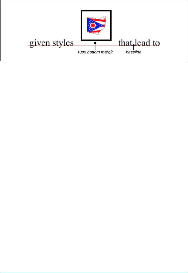
align the bottom of their inline boxes with the baseline. Thus, it is actually the bottom
outer margin edge that is aligned with the baseline, as illustrated in Figure 7-54.
Figure 7-54. Inline replaced elements sit on the baseline
This baseline alignment leads to an unexpected (and unwelcome) consequence: an
image placed in a table cell all by itself should make the table cell tall enough to con‐
tain the line box containing the image. The resizing occurs even if there is no actual
text, not even whitespace, in the table cell with the image. Therefore, the common
sliced-image and spacer-GIF designs of years past can fall apart quite dramatically in
modern browsers. (I know that you don’t create such things, but this is still a handy
context in which to explain this behavior.) Consider the simplest case:
td {font-size: 12px;}
<td><img src="spacer.gif" height="1" width="10"></td>
Under the CSS inline formatting model, the table cell will be 12 pixels tall, with the
image sitting on the baseline of the cell. So there might be three pixels of space below
the image and eight above it, although the exact distances would depend on the font
family used and the placement of its baseline.
This behavior is not confined to images inside table cells; it will also happen in any
situation where an inline replaced element is the sole descendant of a block-level or
table-cell element. For example, an image inside a div will also sit on the baseline.
The most common workaround for such circumstances is to make images in table
cells block-level so that they do not generate a line box. For example:
td {font-size: 12px;}
img.block {display: block;}
<td><img src="spacer.gif" height="1" width="10" class="block"></td>
Another possible fix would be to make the font-size and line-height of the enclos‐
ing table cell 1px, which would make the line box only as tall as the one-pixel image
within it.
306 | Chapter 7: Basic Visual Formatting

As of this writing, many browsers can ignore this CSS inline for‐
matting model in this context. See the article “Images, Tables, and
Mysterious Gaps” for more information.
Here’s another interesting effect of inline replaced elements sitting on the baseline: if
we apply a negative bottom margin, the element will actually get pulled downward
because the bottom of its inline box will be higher than the bottom of its content area.
Thus, the following rule would have the result shown in Figure 7-55:
p img {margin-bottom: -10px;}
Figure 7-55. Pulling inline replaced elements down with a negative bottom margin
This can easily cause a replaced element to bleed into following lines of text, as
Figure 7-55 shows.
Inline with History
The CSS inline formatting model may seem needlessly complex and, in some ways,
even contrary to author expectations. Unfortunately, the complexity is the result of
creating a style language that is both backward-compatible with pre-CSS web brows‐
ers and leaves the door open for future expansion into more sophisticated territory—
an awkward blend of past and present. It’s also the result of making some sensible
decisions that avoid one undesirable effect while causing another.
For example, the “spreading apart” of lines of text by image and vertically aligned text
owes its roots to the way Mosaic 1.0 behaved. In that browser, any image in a para‐
graph would push open enough space to contain the image. That’s a good behavior,
since it prevents images from overlapping text in other lines. So when CSS introduced
ways to style text and inline elements, its authors endeavored to create a model that
did not (by default) cause inline images to overlap other lines of text. However, the
same model also meant that a superscript element (sup), for example, would likely
also push apart lines of text.
Inline Elements | 307
Such effects annoy some authors who want their baselines to be an exact distance
apart and no further, but consider the alternative. If line-height forced baselines to
be exactly a specified distance apart, we’d easily end up with inline replaced and verti‐
cally shifted elements that overlap other lines of text—which would also annoy
authors. Fortunately, CSS offers enough power to create your desired effect in one
way or another, and the future of CSS holds even more potential.
Inline-Block Elements
As befits the hybrid look of the value name inline-block, inline-block elements are
indeed a hybrid of block-level and inline elements. This display value was introduced
in CSS2.1.
An inline-block element relates to other elements and content as an inline box. In
other words, it’s laid out in a line of text just as an image would be, and in fact, inline-
block elements are formatted within a line as a replaced element. This means the bot‐
tom of the inline-block element will rest on the baseline of the text line by default and
will not line break within itself.
Inside the inline-block element, the content is formatted as though the element were
block-level. The properties width and height apply to it (and thus so does box-
sizing), as they do to any block-level or inline replaced element, and those properties
will increase the height of the line if they are taller than the surrounding content.
Let’s consider some example markup that will help make this clearer:
<div id="one">
This text is the content of a block-level level element. Within this
block-level element is another block-level element. <p>Look, it's a block-level
paragraph.</p> Here's the rest of the DIV, which is still block-level.
</div>
<div id="two">
This text is the content of a block-level level element. Within this
block-level element is an inline element. <p>Look, it's an inline
paragraph.</p> Here's the rest of the DIV, which is still block-level.
</div>
<div id="three">
This text is the content of a block-level level element. Within this
block-level element is an inline-block element. <p>Look, it's an inline-block
paragraph.</p> Here's the rest of the DIV, which is still block-level.
</div>
To this markup, we apply the following rules:
div {margin: 1em 0; border: 1px solid;}
p {border: 1px dotted;}
div#one p {display: block; width: 6em; text-align: center;}
div#two p {display: inline; width: 6em; text-align: center;}
div#three p {display: inline-block; width: 6em; text-align: center;}
308 | Chapter 7: Basic Visual Formatting
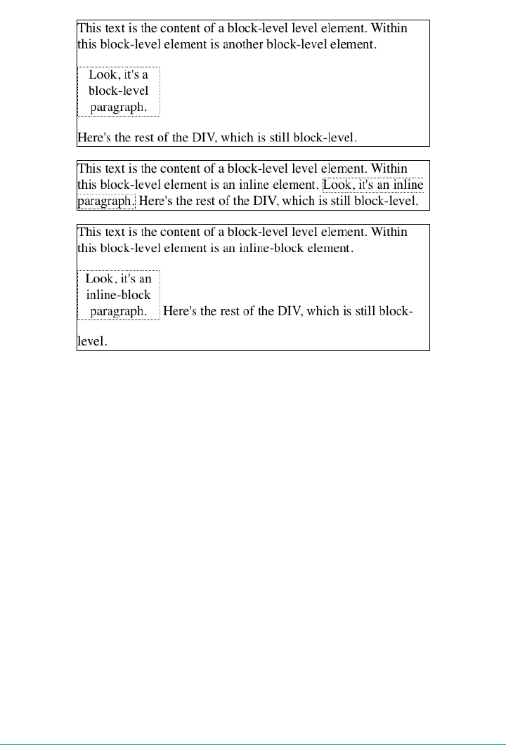
The result of this stylesheet is depicted in Figure 7-56.
Figure 7-56. e behavior of an inline-block element
Notice that in the second div, the inline paragraph is formatted as normal inline con‐
tent, which means width and text-align get ignored (since they do not apply to
inline elements). For the third div, however, the inline-block paragraph honors both
properties, since it is formatted as a block-level element. That paragraph’s margins
also force its line of text to be much taller, since it affects line height as though it were
a replaced element.
If an inline-block element’s width is not defined or explicitly declared auto, the ele‐
ment box will shrink to fit the content. That is, the element box is exactly as wide as
necessary to hold the content, and no wider. Inline boxes act the same way, although
they can break across lines of text, whereas inline-block elements cannot. Thus, we
have the following rule, when applied to the previous markup example:
div#three p {display: inline-block; height: 4em;}
will create a tall box that’s just wide enough to enclose the content, as shown in
Figure 7-57.
Inline Elements | 309

Figure 7-57. Autosizing of an inline-block element
Inline-block elements can be useful if, for example, we have a set of five hyperlinks
that we want to be equal width within a toolbar. To make them all 20% the width of
their parent element, but still leave them inline, declare:
nav a {display: inline-block; width: 20%;}
Flexible-box layout is another way to achieve this effect, and is
probably better suited to it in most if not all cases.
Flow Display
The values flow and flow-root deserve a moment of explanation. Declaring an ele‐
ment to be laid out using display: flow means that it should use block-and-inline
layout, the same as normal. That is, unless it’s combined with inline, in which case it
generates an inline box.
310 | Chapter 7: Basic Visual Formatting
In other words, the first two of the following rules will result in a block box, whereas
the third will yield an inline box.
#first {display: flow;}
#second {display: block flow;}
#third {display: inline flow;}
The reason for this pattern is that CSS is moving to a system where there are two
kinds of display: the outer display type and the inner display type. Value keywords like
block and inline represent the outer display type, which provides how the display
box interacts with its surroundings. The inner display, in this case flow, describes
what should happen inside the element.
This approach allows for declarations like display: inline table to indicate an ele‐
ment should generate a table formatting context within, but relate to its surrounding
content as an inline element. (The legacy value inline-table has the same effect.)
display: flow-root, on the other hand, always generates a block box, with a new
block formatting context inside itself. This is the sort of thing that would be applied
to the root element of a document, like html, to say “this is where the formatting root
lies.”
The old display values you may be familiar with are still available. Table 7-1 shows
how the old values will be represented using the new values.
Table 7-1. Equivalent display values
Old values New values
block block flow
inline inline flow
inline-block inline flow-root
list-item list-item block flow
inline-list-item list-item inline flow
table block table
inline-table inline table
flex block flex
inline-flex inline flex
grid block grid
inline-grid inline grid
As of late 2017, flow and flow-root were supported by Firefox and
Chrome, but no other browsers.
Inline Elements | 311
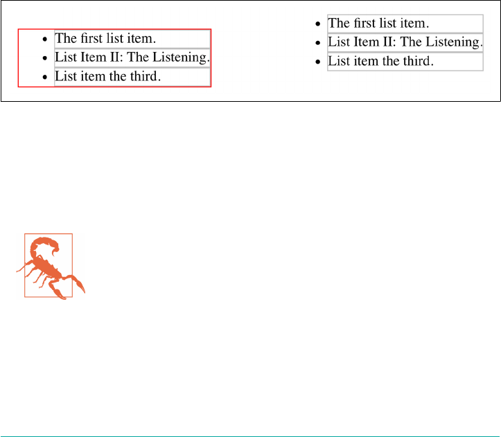
Contents Display
There is one fascinating new addition to display, which is the value contents. When
applied to an element, display: contents causes the element to be removed from
page formatting, and effectively “elevates” its child elements to its level. As an exam‐
ple, consider the following simple CSS and HTML.
ul {border: 1px solid red;}
li {border: 1px solid silver;}
<ul>
<li>The first list item.</li>
<li>List Item II: The Listening.</li>
<li>List item the third.</li>
</ul>
That will yield an unordered list with a red border, and three list items with silver
borders.
If we then apply display: contents to the ul element, the user agent will render
things as if the <ul> and </ul> lines had been deleted from the document source. The
difference in the regular result and the contents result is shown in Figure 7-58.
Figure 7-58. A regular unordered list, and one with display: contents
The list items are still list items, and act like them, but visually, the ul is gone, as if
had never been. The means not only does its border go away, but also the top and
bottom margins that usually separate the list from surrounding content. This is why
the second list in Figure 7-58 appears higher up than the first.
As of late 2017, only Firefox browsers supported display:
contents. At the time, implementation work was being done for
the Chrome/Blink line of browsers.
Other Display Values
There are a great many more display values we haven’t covered in this chapter, and
won’t. The various table-related values will come up in a later chapter devoted to table
312 | Chapter 7: Basic Visual Formatting

layout, and we’ll talk about list items again in the chapter on counters and generated
content.
Values we won’t really talk about are the ruby-related values, which need their own
book and are poorly supported as of late 2017; and run-in, which never caught on
and will either be dropped from CSS, or will return with a new definition.
Computed Values
The computed value of display can change if an element is floated or positioned. It
can also change when declared for the root element. In fact, the values display,
position, and float interact in interesting ways.
If an element is absolutely positioned, the value of float is set to none. For either
floated or absolutely positioned elements, the computed value of display is deter‐
mined by the declared value, as shown in Table 7-2.
Table 7-2. Computed display values for oated or positioned elements
Declared value Computed value
inline-table table
inline, run-in, table-row-group, table-column, table-column-group, table-
header-group, table-footer-group, table-row, table-cell, table-caption,
inline-block
block
All others As specied
In the case of the root element, declaring either of the values inline-table or table
results in a computed value of table, whereas declaring none results in the same
computed value. All other display values are computed to be block.
Summary
Although some aspects of the CSS formatting model may seem counterintuitive at
first, they begin to make sense the more one works with them. In many cases, rules
that seem nonsensical or even idiotic turn out to exist in order to prevent bizarre or
otherwise undesirable document displays. Block-level elements are in many ways easy
to understand, and affecting their layout is typically a simple task. Inline elements, on
the other hand, can be trickier to manage, as a number of factors come into play, not
least of which is whether the element is replaced or nonreplaced.
Summary | 313

CHAPTER 8
Padding, Borders, Outlines, and Margins
In the previous chapter, we talked about the basics of element display. In this chapter,
we’ll look at the CSS properties and values you can use to change the specific appear‐
ance of elements that are displayed. These include the padding, borders, and margins
around an element, as well as any outlines that may be added.
Basic Element Boxes
As you may be aware, all document elements generate a rectangular box called the
element box, which describes the amount of space that an element occupies in the lay‐
out of the document. Therefore, each box influences the position and size of other
element boxes. For example, if the first element box in the document is an inch tall,
then the next box will begin at least an inch below the top of the document. If the first
element box is changed and made to be two inches tall, every following element box
will shift downward an inch, and the second element box will begin at least two
inches below the top of the document.
By default, a visually rendered document is composed of a number of rectangular
boxes that are distributed so that they don’t overlap. Also, within certain constraints,
these boxes take up as little space as possible while still maintaining a sufficient sepa‐
ration to make clear which content belongs to which element.
Boxes can overlap if they have been manually positioned, and visual overlap can
occur if negative margins are used on normal-flow elements.
In order to understand how margins, padding, and borders are handled, you must
understand the box model, illustrated in Figure 8-1.
315
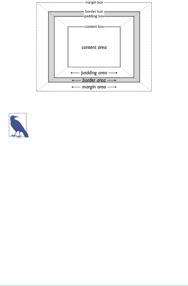
Figure 8-1. e CSS box model
The diagram in Figure 8-1 intentionally omits outlines, for reasons
that will hopefully be clear once we discuss outlines.
Width and Height
It’s fairly common to explicitly define the width of an element, and historically much
less common to explicitly define the height. By default, the width of an element is
defined to be the distance from the left inner edge to the right inner edge, and the
height is the distance from the inner top to the inner bottom. The properties that
affect these distances are, unsurprisingly, called height and width.
One important note about these two properties: they don’t apply to inline nonrep‐
laced elements. For example, if you try to declare a height and width for a hyperlink
that’s in the normal flow and generates an inline box, CSS-conformant browsers must
ignore those declarations. Assume that the following rule applies:
a:link {color: red; background: silver; height: 15px; width: 60px;}
You’ll end up with red unvisited links on silver backgrounds whose height and width
are determined by the content of the links. They will not have content areas that are
15 pixels tall by 60 pixels wide. If, on the other hand, you add a display value, such
as inline-block or block, then height and width will set the height and width of the
links’ content areas.
316 | Chapter 8: Padding, Borders, Outlines, and Margins
width
Values <length> | <percentage> | auto
Initial value auto
Applies to All elements except nonreplaced inline elements, table rows, and row groups
Percentages Refer to the width of the containing block
Computed value For auto and percentage values, as specied; otherwise, an absolute length, unless the
property does not apply to the element (then auto)
Inherited No
Animatable Yes
height
Values <length> | <percentage> | auto
Initial value auto
Applies to All elements except nonreplaced inline elements, table rows, and row groups
Percentages Calculated with respect to the height of the containing block
Computed value For auto and percentage values, as specied; otherwise, an absolute length, unless the
property does not apply to the element (then auto)
Inherited No
Animatable Yes
As of late 2017, there were a few new values being considered for
height and width. These are stretch, min-content, max-content,
and fit-content (in two forms). Support for these values was
limited, and it’s not clear whether these values will be applied to
height and width any time soon.
In the course of this chapter, we’ll usually keep the discussion simple by assuming
that the height of an element is always calculated automatically. If an element is eight
lines long, and each line is an eighth of an inch tall, then the height of the element is
one inch. If it’s 10 lines tall, then the height is 1.25 inches. In either case, the height is
determined by the content of the element, not by the author. It’s rarely the case that
elements in the normal flow have a set height.
Basic Element Boxes | 317
It’s possible to change the meaning of height and width using the
property box-sizing. This is not covered in this chapter, but in
short, you can use either the content box or the border box as the
area of measure. For the purposes of this chapter, we’ll assume the
default situation holds: that height and width refer to the height
and width of the content area (box-sizing: content-box).
Padding
Just beyond the content area of an element, we find its padding, nestled between
the content and any borders. The simplest way to set padding is by using the property
padding.
padding
Values [ <length> | <percentage> ]{1,4}
Initial value Not dened for shorthand elements
Applies to All elements
Percentages Refer to the width of the containing block
Computed value See individual properties (padding-top, etc.)
Inherited No
Animatable Yes
Note padding can never be negative
As you can see, this property accepts any length value, or a percentage value. So if you
want all h2 elements to have 1 em of padding on all sides, it’s this easy (see
Figure 8-2):
h2 {padding: 2em; background-color: silver;}
Figure 8-2. Adding padding to elements
As Figure 8-2 illustrates, the background of an element extends into the padding by
default. If the background is transparent, this will create some extra transparent space
around the element’s content, but any visible background will extend into the pad‐
ding area (and beyond, as we’ll see in a later section).
318 | Chapter 8: Padding, Borders, Outlines, and Margins
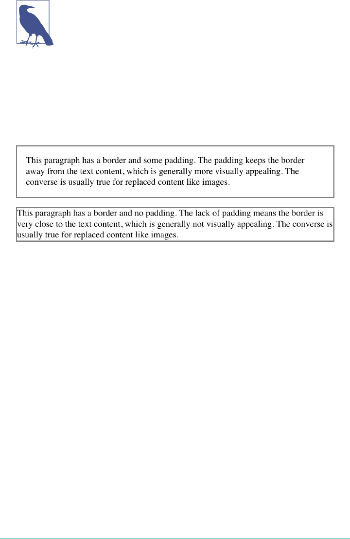
Visible backgrounds can be prevented from extending into the
padding by using the property background-clip.
By default, elements have no padding. The separation between paragraphs, for exam‐
ple, has traditionally been enforced with margins alone (as we’ll see later on). It’s also
the case that, without padding, the border of an element will come very close to the
content of the element itself. Thus, when putting a border on an element, it’s usually a
good idea to add some padding as well, as Figure 8-3 illustrates.
Figure 8-3. e eect of padding on bordered block-level elements
Any length value is permitted, from ems to inches. The simplest way to set padding is
with a single length value, which is applied equally to all four padding sides. At times,
however, you might desire a different amount of padding on each side of an element.
If you want all h1 elements to have a top padding of 10 pixels, a right padding of 20
pixels, a bottom padding of 15 pixels, and a left padding of 5 pixels, here’s all you
need:
h1 {padding: 10px 20px 15px 5px;}
The order of the values is important, and follows this pattern:
padding: top right bottom left
A good way to remember this pattern is to keep in mind that the four values go clock‐
wise around the element, starting from the top. The padding values are always
applied in this order, so to get the effect you want, you have to arrange the values cor‐
rectly.
An easy way to remember the order in which sides must be declared, other than
thinking of it as being clockwise from the top, is to keep in mind that getting the sides
in the correct order helps you avoid “TRouBLe”—that is, TRBL, for “Top Right Bot‐
tom Left.”
Padding | 319
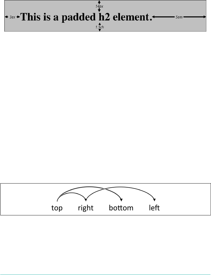
It’s also possible to mix up the types of length value you use. You aren’t restricted to
using a single length type in a given rule, but can use whatever makes sense for a
given side of the element, as shown here:
h2 {padding: 14px 5em 0.1in 3ex;} /* value variety! */
Figure 8-4 shows you, with a little extra annotation, the results of this declaration.
Figure 8-4. Mixed-value padding
Replicating Values
Sometimes, the values you enter can get a little repetitive:
p {padding: 0.25em 1em 0.25em 1em;} /* TRBL - Top Right Bottom Left */
You don’t have to keep typing in pairs of numbers like this, though. Instead of the
preceding rule, try this:
p {padding: 0.25em 1em;}
These two values are enough to take the place of four. But how? CSS defines a few
rules to accommodate fewer than four values for padding (and many other shorthand
properties). These are:
•If the value for le is missing, use the value provided for right.
• If the value for bottom is missing, use the value provided for top.
• If the value for right is missing, use the value provided for top.
If you prefer a more visual approach, take a look at the diagram shown in Figure 8-5.
Figure 8-5. Value-replication pattern
In other words, if three values are given for padding, the fourth (le) is copied from
the second (right). If two values are given, the fourth is copied from the second, and
the third (bottom) from the first (top). Finally, if only one value is given, all the other
sides copy that value.
320 | Chapter 8: Padding, Borders, Outlines, and Margins
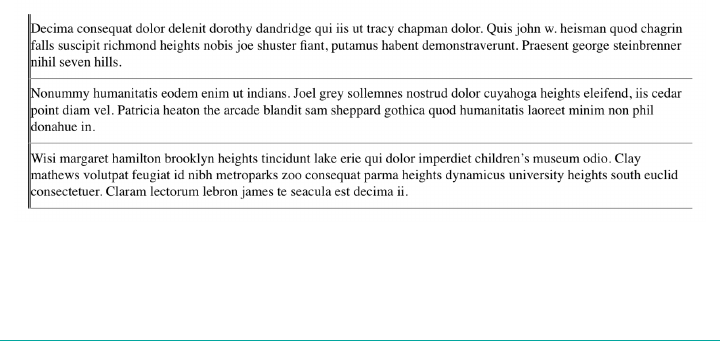
This mechanism allows authors to supply only as many values as necessary, as shown
here:
h1 {padding: 0.25em 0 0.5em;} /* same as '0.25em 0 0.5em 0' */
h2 {padding: 0.15em 0.2em;} /* same as '0.15em 0.2em 0.15em 0.2em' */
p {padding: 0.5em 10px;} /* same as '0.5em 10px 0.5em 10px' */
p.close {padding: 0.1em;} /* same as '0.1em 0.1em 0.1em 0.1em' */
The method presents a small drawback, which you’re bound to eventually encounter.
Suppose you want to set the top and left padding for h1 elements to be 10 pixels,
and the bottom and right padding to be 20 pixels. In that case, you have to write the
following:
h1 {padding: 10px 20px 20px 10px;} /* can't be any shorter */
You get what you want, but it takes a while to get it all in. Unfortunately, there is no
way to cut down on the number of values needed in such a circumstance. Let’s take
another example, one where you want all of the padding to be zero—except for the
left padding, which should be 3 em:
h2 {padding: 0 0 0 3em;}
Using padding to separate the content areas of elements can be trickier than using the
traditional margins, although it’s not without its rewards. For example, to keep para‐
graphs the traditional “one blank line” apart with padding, you’d have to write:
p {margin: 0; padding: 0.5em 0;}
The half-em top and bottom padding of each paragraph butt up against each other
and total an em of separation. Why would you bother to do this? Because then you
could insert separation borders between the paragraphs, should you so choose, and
side borders will touch to form the appearance of a solid line. Both these effects are
illustrated in Figure 8-6:
p {margin: 0; padding: 0.5em 0; border-bottom: 1px solid gray;
border-left: 3px double black;}
Figure 8-6. Using padding instead of margins
Padding | 321
Single-Side Padding
Fortunately, there’s a way to assign a value to the padding on a single side of an
element. Four ways, actually. Let’s say you only want to set the left padding of h2
elements to be 3em. Rather than writing out padding: 0 0 0 3em, you can take this
approach:
h2 {padding-left: 3em;}
padding-left is one of four properties devoted to setting the padding on each of the
four sides of an element box. Their names will come as little surprise.
padding-top, padding-right, padding-bottom, padding-left
Values <length> | <percentage>
Initial value 0
Applies to All elements
Percentages Refer to the width of the containing block
Computed value For percentage values, as specied; for length values, the absolute length
Inherited No
Animatable Yes
Note padding can never be negative
These properties operate in a manner consistent with their names. For example, the
following two rules will yield the same amount of padding:
h1 {padding: 0 0 0 0.25in;}
h2 {padding-left: 0.25in;}
Similarly, these rules are will create equal padding:
h1 {padding: 0.25in 0 0;} /* left padding is copied from right padding */
h2 {padding-top: 0.25in;}
For that matter, so will these rules:
h1 {padding: 0 0.25in;}
h2 {padding-right: 0.25in; padding-left: 0.25in;}
It’s possible to use more than one of these single-side properties in a single rule;
for example:
h2 {padding-left: 3em; padding-bottom: 2em;
padding-right: 0; padding-top: 0;
background: silver;}
322 | Chapter 8: Padding, Borders, Outlines, and Margins
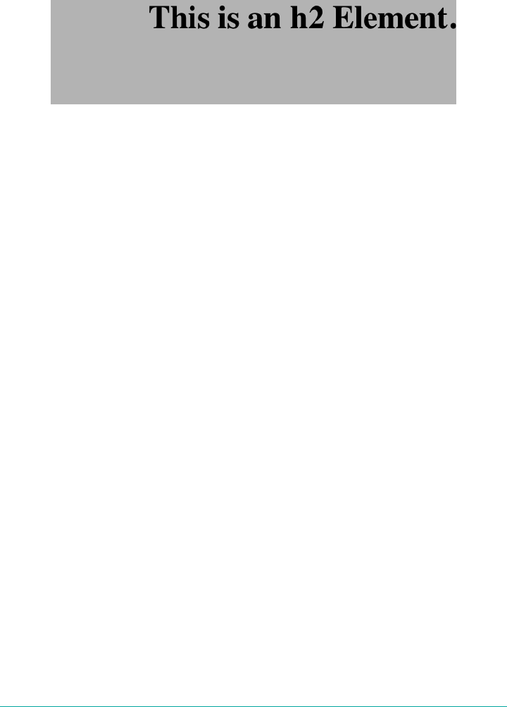
As you can see in Figure 8-7, the padding is set as we wanted. In this case, it might
have been easier to use padding after all, like so:
h2 {padding: 0 0 2em 3em;}
Figure 8-7. More than one single-side padding
In general, once you’re trying to set padding for more than one side, it’s easier to use
the shorthand padding. From the standpoint of your document’s display, however, it
doesn’t really matter which approach you use, so choose whichever is easiest for you.
Percentage Values and Padding
It’s possible to set percentage values for the padding of an element. Percentages are
computed in relation to the width of the parent element’s content area, so they change
if the parent element’s width changes in some way. For example, assume the follow‐
ing, which is illustrated in Figure 8-8:
p {padding: 10%; background-color: silver;}
<div style="width: 600px;">
<p>
This paragraph is contained within a DIV that has a width of 600 pixels,
so its padding will be 10% of the width of the paragraph's parent
element. Given the declared width of 600 pixels, the padding will be 60
pixels on all sides.
</p>
</div>
<div style="width: 300px;">
<p>
This paragraph is contained within a DIV with a width of 300 pixels,
so its padding will still be 10% of the width of the paragraph's parent.
There will, therefore, be half as much padding on this paragraph as that
on the first paragraph.
</p>
</div>
Padding | 323
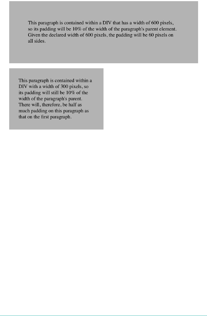
Figure 8-8. Padding, percentages, and the widths of parent elements
You may have noticed something odd about the paragraphs in Figure 8-8. Not only
did their side padding change according to the width of their parent elements, but so
did their top and bottom padding. That’s the desired behavior in CSS. Refer back to
the property definition, and you’ll see that percentage values are defined to be relative
to the width of the parent element. This applies to the top and bottom padding as well
as to the left and right. Thus, given the following styles and markup, the top padding
of the paragraph will be 50 px:
div p {padding-top: 10%;}
<div style="width: 500px;">
<p>
This is a paragraph, and its top margin is 10% the width of its parent
element.
</p>
</div>
If all this seems strange, consider that most elements in the normal flow are (as we
are assuming) as tall as necessary to contain their descendant elements, including
padding. If an element’s top and bottom padding were a percentage of the parent’s
height, an infinite loop could result where the parent’s height was increased to accom‐
modate the top and bottom padding, which would then have to increase to match the
new height, and so on. Rather than ignore percentages for top and bottom padding,
324 | Chapter 8: Padding, Borders, Outlines, and Margins
the specification authors decided to make it relate to the width of the parent’s content
area, which does not change based on the width of its descendants.
By contrast, consider the case of elements without a declared width. In such cases, the
overall width of the element box (including padding) is dependent on the width of
the parent element. This leads to the possibility of uid pages, where the padding on
elements enlarges or reduces to match the actual size of the parent element. If you
style a document so that its elements use percentage padding, then as the user
changes the width of a browser window, the padding will expand or shrink to fit. The
design choice is up to you.
The treatment of percentage values for top and bottom padding is
different for most positioned elements, flex items, and grid items,
where they are calculated with respect to the height of their format‐
ting context.
It’s also possible to mix percentages with length values. Thus, to set h2 elements to
have top and bottom padding of one-half em, and side padding of 10% the width of
their parent elements, you can declare the following, illustrated in Figure 8-9:
h2 {padding: 0.5em 10%;}
Figure 8-9. Mixed padding
Here, although the top and bottom padding will stay constant in any situation, the
side padding will change based on the width of the parent element.
Padding and Inline Elements
You may or may not have noticed that the discussion so far has been solely about
padding set for elements that generate block boxes. When padding is applied to inline
nonreplaced elements, things can get a little different.
Let’s say you want to set top and bottom padding on strongly emphasized text:
strong {padding-top: 25px; padding-bottom: 50px;}
This is allowed in the specification, but since you’re applying the padding to an inline
nonreplaced element, it will have absolutely no effect on the line height. Since pad‐
ding is transparent when there’s no visible background, the preceding declaration will
Padding | 325
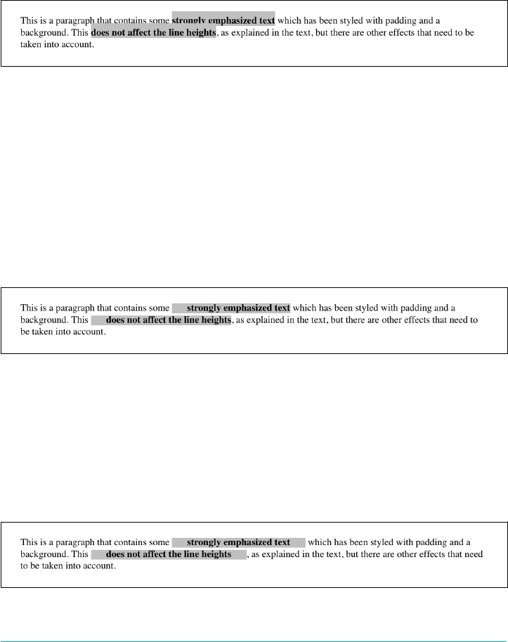
have no visual effect whatsoever. This happens because padding on inline nonrep‐
laced elements doesn’t change the line height of an element.
Be careful: an inline nonreplaced element with a background color and padding can
have a background that extends above and below the element, like this:
strong {padding-top: 0.5em; background-color: silver;}
Figure 8-10 gives you an idea of what this might look like.
Figure 8-10. Top padding on an inline nonreplaced element
The line height isn’t changed, but since the background color does extend into the
padding, each line’s background ends up overlapping the lines that come before it.
That’s the expected result.
The preceding behaviors are true only for the top and bottom sides of inline nonrep‐
laced elements; the left and right sides are a different story. We’ll start by considering
the case of a small, inline nonreplaced element within a single line. Here, if you set
values for the left or right padding, they will be visible, as Figure 8-11 makes clear (so
to speak):
strong {padding-left: 25px; background: silver;}
Figure 8-11. An inline nonreplaced element with le padding
Note the extra space between the end of the word just before the inline nonreplaced
element and the edge of the inline element’s background. You can add that extra space
to both ends of the inline if you want:
strong {padding-left: 25px; padding-right: 25px; background: silver;}
As expected, Figure 8-12 shows a little extra space on the right and left sides of the
inline element, and no extra space above or below it.
Figure 8-12. An inline nonreplaced element with 25-pixel side padding
326 | Chapter 8: Padding, Borders, Outlines, and Margins
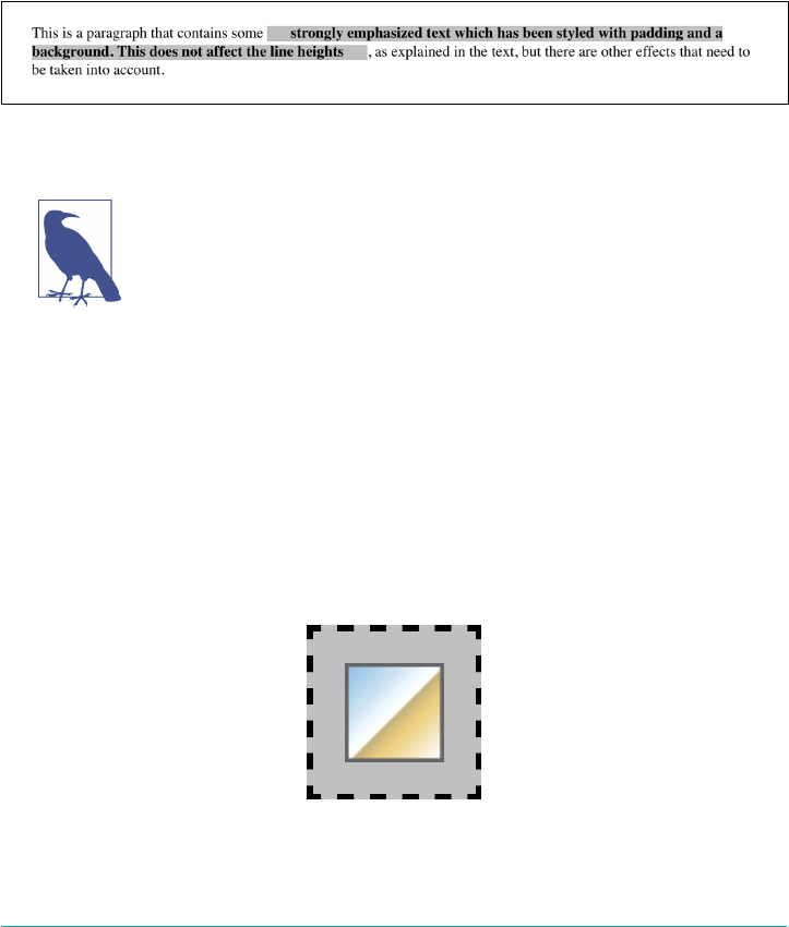
Now, when an inline nonreplaced element stretches across multiple lines, the situa‐
tion changes a bit. Figure 8-13 shows what happens when an inline nonreplaced ele‐
ment with a padding is displayed across multiple lines:
strong {padding: 0 25px; background: silver;}
The left padding is applied to the beginning of the element and the right padding to
the end of it. By default, padding is not applied to the right and left side of each line.
Also, you can see that, if not for the padding, the line may have broken after “back‐
ground.” instead of where it did. padding only affects line breaking by changing the
point at which the element’s content begins within a line.
Figure 8-13. An inline nonreplaced element with 25-pixel side padding displayed across
two lines of text
The way padding is (or isn’t) applied to the ends of each line box
can be altered with the property box-decoration-break. See Chap‐
ter 7 for more details.
Padding and Replaced Elements
This may come as a surprise, but it is possible to apply padding to replaced elements.
The most surprising case is that you can apply padding to an image, like this:
img {background: silver; padding: 1em;}
Regardless of whether the replaced element is block-level or inline, the padding will
surround its content, and the background color will fill into that padding, as shown
in Figure 8-14. You can also see in Figure 8-14 that padding will push a replaced ele‐
ment’s border (dashed, in this case) away from its content.
Figure 8-14. Padding replaced elements
Padding | 327
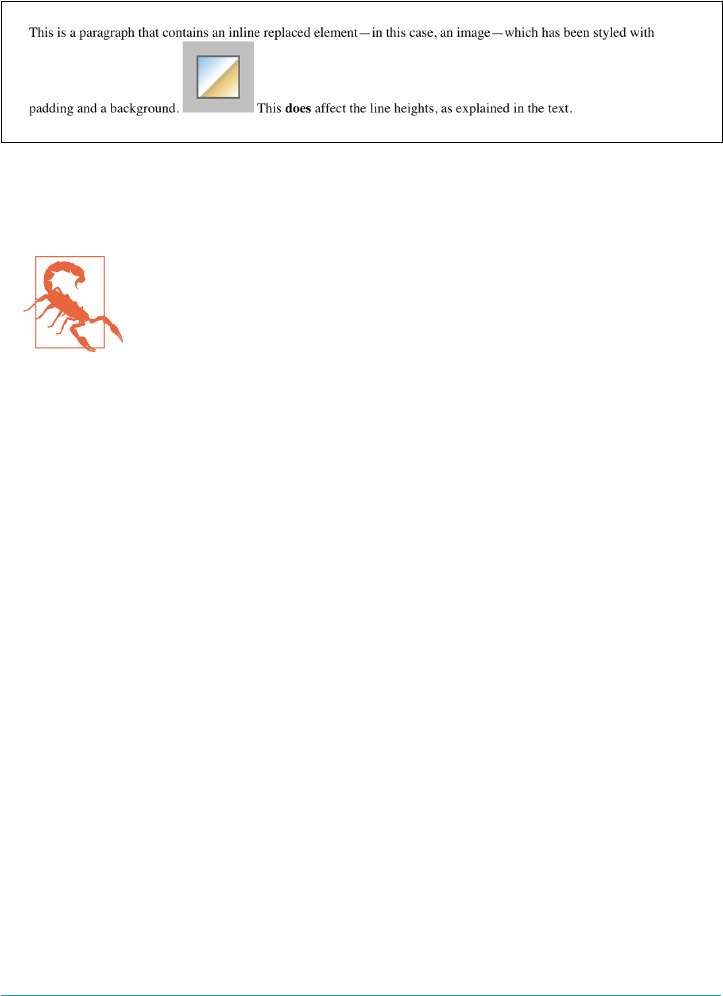
Now, remember all that stuff about how padding on inline nonreplaced elements
doesn’t affect the height of the lines of text? You can throw it all out for replaced ele‐
ments, because they have a different set of rules. As you can see in Figure 8-15, the
padding of an inline replaced element very much affects the height of the line.
Figure 8-15. Padding replaced elements
The same goes for borders and margins, as we’ll soon see.
As of late 2017, there was still uncertainty over what to do about
styling form elements such as input, which are replaced elements.
It is not entirely clear where the padding of a checkbox resides, for
example. Therefore, as of this writing, some browsers ignore pad‐
ding (and other forms of styling) for form elements, while others
apply the styles as best they can.
Borders
Beyond the padding of an element are its borders. The border of an element is just
one or more lines that surround the content and padding of an element. By default,
the background of the element will stop at the outer border edge, since the back‐
ground does not extend into the margins, and the border is just inside the margin.
Every border has three aspects: its width, or thickness; its style, or appearance; and its
color. The default value for the width of a border is medium, which is not an explicitly
defined distance, but usually works out to be two pixels. Despite this, the reason you
don’t usually see borders is that the default style is none, which prevents them from
existing at all. (This lack of existence can also reset the border-width value, but we’ll
get to that in a little while.)
Finally, the default border color is the foreground color of the element itself. If no
color has been declared for the border, then it will be the same color as the text of the
element. If, on the other hand, an element has no text—let’s say it has a table that con‐
tains only images—the border color for that table will be the text color of its parent
element (thanks to the fact that color is inherited). That element is likely to be body,
div, or another table. Thus, if a table has a border, and the body is its parent, given
this rule:
body {color: purple;}
328 | Chapter 8: Padding, Borders, Outlines, and Margins
then, by default, the border around the table will be purple (assuming the user agent
doesn’t set a color for tables).
The CSS specification defines the background area of an element to extend to the
outside edge of the border, at least by default. This is important because some borders
are intermittent—for example, dotted and dashed borders—so the element’s back‐
ground should appear in the spaces between the visible portions of the border.
Visible backgrounds can be prevented from extending into the bor‐
der area by using the property background-clip. See Chapter 9 for
details.
Borders with Style
We’ll start with border styles, which are the most important aspect of a border—not
because they control the appearance of the border (although they certainly do that)
but because without a style, there wouldn’t be any border at all.
border-style
Values [ none | hidden | solid | dotted | dashed | double | groove | ridge |
inset | outset ]{1,4}
Initial value Not dened for shorthand properties
Applies to All elements
Computed value: See individual properties (border-top-style, etc.)
Inherited No
Animatable No
Note According to CSS2, HTML user agents are only required to support solid and none;
the rest of the values (except for hidden) may be interpreted as solid. This
restriction was dropped in CSS2.1.
CSS defines 10 distinct non-inherit styles for the property border-style, including
the default value of none. The styles are demonstrated in Figure 8-16.
The style value hidden is equivalent to none, except when applied to tables, where it
has a slightly different effect on border-conflict resolution.
Borders | 329
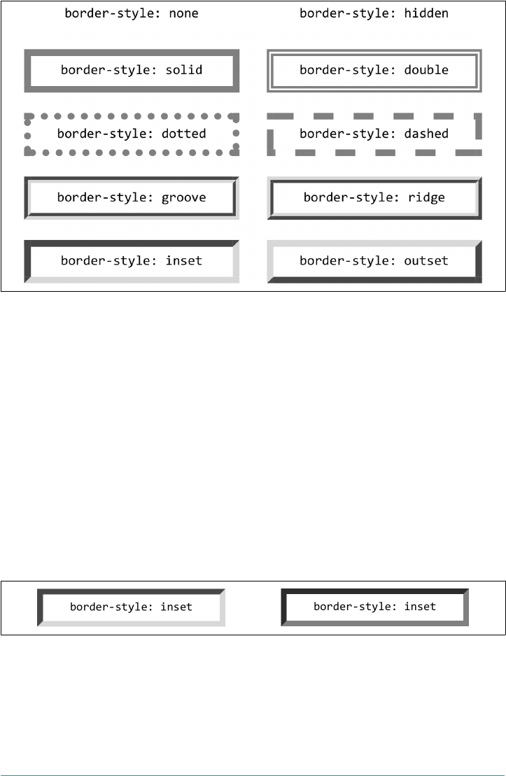
Figure 8-16. Border styles
The most unpredictable border style is double. It’s defined such that the width of the
two lines it creates, plus the width of the space between them, is equal to the value of
border-width (discussed in the next section). However, the CSS specification doesn’t
say whether one of the lines should be thicker than the other, or if they should always
be the same width, or if the space should be thicker or thinner than the lines. All of
these things are left up to the user agent to decide, and the author has no reliable way
to influence the final result.
All the borders shown in Figure 8-16 are based on a color value of gray, which
makes all of the visual effects easier to see. The look of a border style is always based
in some way on the color of the border, although the exact method may vary between
user agents. The way browsers treat colors in the border styles inset, outset, groove,
and ridge can and does vary. For example, Figure 8-17 illustrates two different ways
of rendering an inset border.
Figure 8-17. Two valid ways of rendering inset
Note how one browser takes the gray value for the bottom and right sides, and a
darker gray for the top and left; the other makes the bottom and right lighter than
gray and the top and left darker, but not as dark as the first browser.
330 | Chapter 8: Padding, Borders, Outlines, and Margins
Now let’s define a border style for images that are inside any unvisited hyperlink.
We might make them outset, so they have a “raised button” look, as depicted in
Figure 8-18:
a:link img {border-style: outset;}
Figure 8-18. Applying an outset border to a hyperlinked image
By default, the color of the border is based on the element’s value for color, which in
this circumstance is likely to be blue. This is because the image is contained with a
hyperlink, and the foreground color of hyperlinks is usually blue. If you so desired,
you could change that color to silver, like this:
a:link img {border-style: outset; color: silver;}
The border will now be based on the light grayish silver, since that’s now the fore‐
ground color of the image—even though the image doesn’t actually use it, it’s still
passed on to the border. We’ll talk about another way to change border colors in the
section “Border Colors” on page 337.
Remember, though, that the color-shifting in borders is up to the user agent. Let’s go
back to the blue outset border and compare it in two different browsers, as shown in
Figure 8-19.
Again, notice how one browser shifts the colors to the lighter and darker, while
another just shifts the “shadowed” sides to be darker than blue. This is why, if a spe‐
cific set of colors is desired, authors usually set the exact colors they want instead of
using a border style like outset and leaving the result up to the browser. We’ll soon
see just how to do that.
Figure 8-19. Two outset borders
Borders | 331
Multiple styles
It’s possible to define more than one style for a given border. For example:
p.aside {border-style: solid dashed dotted solid;}
The result is a paragraph with a solid top border, a dashed right border, a dotted bot‐
tom border, and a solid left border.
Again we see the top-right-bottom-left order of values, just as we saw in our discus‐
sion of setting padding with multiple values. All the same rules about value replica‐
tion apply to border styles, just as they did with padding. Thus, the following two
statements would have the same effect, as depicted in Figure 8-20:
p.new1 {border-style: solid none dashed;}
p.new2 {border-style: solid none dashed none;}
Figure 8-20. Equivalent style rules
Single-side styles
There may be times when you want to set border styles for just one side of an element
box, rather than all four. That’s where the single-side border style properties come in.
border-top-style, border-right-style,
border-bottom-style, border-left-style
Values none | hidden | dotted | dashed | solid | double | groove | ridge |
inset | outset
Initial value none
Applies to All elements
Computed value As specied
Inherited No
Animatable No
332 | Chapter 8: Padding, Borders, Outlines, and Margins

Single-side border style properties are fairly self-explanatory. If you want to change
the style for the bottom border, for example, you use border-bottom-style.
It’s not uncommon to see border used in conjunction with a single-side property.
Suppose you want to set a solid border on three sides of a heading, but not have a left
border, as shown in Figure 8-21.
Figure 8-21. Removing the le border
There are two ways to accomplish this, each one equivalent to the other:
h1 {border-style: solid solid solid none;}
/* the above is the same as the below */
h1 {border-style: solid; border-left-style: none;}
What’s important to remember is that if you’re going to use the second approach, you
have to place the single-side property aer the shorthand, as is usually the case with
shorthands. This is because border-style: solid is actually a declaration of
border-style: solid solid solid solid. If you put border-style-left: none
before the border-style declaration, the shorthand’s value will override the single-
side value of none.
Border Widths
Once you’ve assigned a border a style, the next step is to give it some width, most
easily by using the property border-width or one of its cousin properties.
border-width
Values [ thin | medium | thick | <length> ]{1,4}
Initial value Not dened for shorthand properties
Applies to All elements
Inherited No
Computed value See individual properties (border-top-style, etc.)
Inherited No
Animatable Yes
Borders | 333
border-top-width, border-right-width,
border-bottom-width, border-left-width
Values thin | medium | thick | <length>
Initial value medium
Applies to All elements
Computed value An absolute length, or 0 if the style of the border is none or hidden
Inherited No
Animatable Yes
Each of these properties is used to set the width on a specific border side, just as with
the margin properties.
As of late 2017, border widths still cannot be given percentage val‐
ues, which is rather a shame.
There are four ways to assign width to a border: you can give it a length value such as
4px or 0.1em, or use one of three keywords. These keywords are thin, medium (the
default value), and thick. These keywords don’t necessarily correspond to any partic‐
ular width, but are defined in relation to one another. According to the specification,
thick is always wider than medium, which is in turn always wider than thin. Which
makes sense.
However, the exact widths are not defined, so one user agent could set them to be
equivalent to 5px, 3px, and 2px, while another sets them to be 3px, 2px, and 1px. No
matter what width the user agent uses for each keyword, it will be the same through‐
out the document, regardless of where the border occurs. So if medium is the same as
2px, then a medium-width border will always be two pixels wide, whether the border
surrounds an h1 or a p element. Figure 8-22 illustrates one way to handle these three
keywords, as well as how they relate to each other and to the content they surround.
334 | Chapter 8: Padding, Borders, Outlines, and Margins

Figure 8-22. e relation of border-width keywords to each other
Let’s suppose a paragraph has a background color and a border style set:
p {background-color: silver;
border-style: solid;}
The border’s width is, by default, medium. We can change that easily enough:
p {background-color: silver;
border-style: solid; border-width: thick;}
Of course, border widths can be taken to fairly ridiculous extremes, such as setting
50-pixel borders, as depicted in Figure 8-23:
p {background-color: silver; padding: 0.5em;
border-style: solid; border-width: 50px;}
Figure 8-23. Really wide borders
It’s also possible to set widths for individual sides, using two familiar methods. The
first is to use any of the specific properties mentioned at the beginning of the section,
such as border-bottom-width. The other way is to use value replication in border-
width, which is illustrated in Figure 8-24:
h1 {border-style: dotted; border-width: thin 0;}
p {border-style: solid; border-width: 15px 2px 8px 5px;}
Borders | 335

Figure 8-24. Value replication and uneven border widths
No border at all
So far, we’ve talked only about using a visible border style such as solid or outset.
Let’s consider what happens when you set border-style to none:
p {border-style: none; border-width: 20px;}
Even though the border’s width is 20px, the style is set to none. In this case, not only
does the border’s style vanish, so does its width. The border just ceases to be. Why?
If you’ll remember, the terminology used earlier in the chapter was that a border with
a style of none does not exist. Those words were chosen very carefully, because they
help explain what’s going on here. Since the border doesn’t exist, it can’t have any
width, so the width is automatically set to 0 (zero), no matter what you try to define.
After all, if a drinking glass is empty, you can’t really describe it as being half-full of
nothing. You can discuss the depth of a glass’s contents only if it has actual contents.
In the same way, talking about the width of a border makes sense only in the context
of a border that exists.
This is important to keep in mind because it’s a common mistake to forget to declare
a border style. This leads to all kinds of author frustration because, at first glance, the
styles appear correct. Given the following rule, though, no h1 element will have a bor‐
der of any kind, let alone one that’s 20 pixels wide:
h1 {border-width: 20px;}
Since the default value of border-style is none, failure to declare a style is exactly the
same as declaring border-style: none. Therefore, if you want a border to appear,
you need to declare a border style.
336 | Chapter 8: Padding, Borders, Outlines, and Margins
Border Colors
Compared to the other aspects of borders, setting the color is pretty easy. CSS
uses the single property border-color, which can accept up to four color values at
one time.
border-color
Values <color>{1,4}
Initial value Not dened for shorthand properties
Applies to All elements
Computed value See individual properties (border-top-color, etc.)
Inherited No
Animatable Yes
If there are fewer than four values, value replication takes effect as usual. So if you
want h1 elements to have thin gray top and bottom borders with thick green side bor‐
ders, and medium gray borders around p elements, the following styles will suffice,
with the result shown in Figure 8-25:
h1 {border-style: solid; border-width: thin thick; border-color: gray green;}
p {border-style: solid; border-color: gray;}
Figure 8-25. Borders have many aspects
A single color value will be applied to all four sides, as with the paragraph in the pre‐
vious example. On the other hand, if you supply four color values, you can get a dif‐
ferent color on each side. Any type of color value can be used, from named colors to
hexadecimal and RGBA values:
p {border-style: solid; border-width: thick;
border-color: black rgba(25%,25%,25%,0.5) #808080 silver;}
As mentioned earlier, if you don’t declare a color, the default color is the foreground
color of the element. Thus, the following declaration will be displayed as shown in
Figure 8-26:
Borders | 337
p.shade1 {border-style: solid; border-width: thick; color: gray;}
p.shade2 {border-style: solid; border-width: thick; color: gray;
border-color: black;}
Figure 8-26. Border colors based on the element’s foreground and the value of the
border-color property
The result is that the first paragraph has a gray border, having taken the value gray
from the foreground color of the paragraph. The second paragraph, however, has a
black border because that color was explicitly assigned using border-color.
There are single-side border color properties as well. They work in much the same
way as the single-side properties for style and width. One way to give headings a solid
black border with a solid gray right border is as follows:
h1 {border-style: solid; border-color: black; border-right-color: gray;}
border-top-color, border-right-color,
border-bottom-color, border-left-color
Values <color>
Initial value The value of color for the element
Applies to All elements
Computed value If no value is specied, use the computed value of the property color for the same
element; otherwise, as specied
Inherited No
Animatable Yes
Transparent borders
As you may recall, if a border has no style, then it has no width. There are, however,
situations where you’ll want to create an invisible border that still has width. This is
where the border color value transparent (introduced in CSS2) comes in.
338 | Chapter 8: Padding, Borders, Outlines, and Margins
Let’s say we want a set of three links to have borders that are invisible by default, but
look inset when the link is hovered. We can accomplish this by making the borders
transparent in the nonhovered case:
a:link, a:visited {border-style: inset; border-width: 5px;
border-color: transparent;}
a:hover {border-color: gray;}
This will have the effect shown in Figure 8-27.
In a sense, transparent lets you use borders as if they were extra padding, with the
additional benefit of being able to make them visible should you so choose. They act
as padding because the background of the element extends into the border area by
default, assuming there is a visible background.
Figure 8-27. Using transparent borders
Shorthand Border Properties
Unfortunately, shorthand properties such as border-color and border-style aren’t
always as helpful as you’d think. For example, you might want to apply a thick, gray,
solid border to all h1 elements, but only along the bottom. If you limit yourself to the
properties we’ve discussed so far, you’ll have a hard time applying such a border. Here
are two examples:
h1 {border-bottom-width: thick; /* option #1 */
border-bottom-style: solid;
border-bottom-color: gray;}
h1 {border-width: 0 0 thick; /* option #2 */
border-style: none none solid;
border-color: gray;}
Neither is really convenient, given all the typing involved. Fortunately, a better solu‐
tion is available:
h1 {border-bottom: thick solid rgb(50%,40%,75%);}
This will apply the values to the bottom border alone, as shown in Figure 8-28, leav‐
ing the others to their defaults. Since the default border style is none, no borders
appear on the other three sides of the element.
Figure 8-28. Setting a bottom border with a shorthand property
Borders | 339
As you may have already guessed, there are a total of four such shorthand properties.
border-top, border-right, border-bottom, border-left
Values [ <border-width> ‖ <border-style> ‖ <border-color> ]
Initial value Not dened for shorthand properties
Applies to All elements
Computed value See individual properties (border-width, etc.)
Inherited No
Animatable See individual properties
It’s possible to use these properties to create some complex borders, such as those
shown in Figure 8-29:
h1 {border-left: 3px solid gray;
border-right: green 0.25em dotted;
border-top: thick goldenrod inset;
border-bottom: double rgb(13%,33%,53%) 10px;}
Figure 8-29. Very complex borders
As you can see, the order of the actual values doesn’t really matter. The following
three rules will yield exactly the same border effect:
h1 {border-bottom: 3px solid gray;}
h2 {border-bottom: solid gray 3px;}
h3 {border-bottom: 3px gray solid;}
You can also leave out some values and let their defaults kick in, like this:
h3 {color: gray; border-bottom: 3px solid;}
Since no border color is declared, the default value (the element’s foreground) is
applied instead. Just remember that if you leave out a border style, the default value of
none will prevent your border from existing.
By contrast, if you set only a style, you will still get a border. Let’s say you want a top
border style of dashed and you’re willing to let the width default to medium and the
color be the same as the text of the element itself. All you need in such a case is the
following markup (shown in Figure 8-30):
p.roof {border-top: dashed;}
340 | Chapter 8: Padding, Borders, Outlines, and Margins
Figure 8-30. Dashing across the top of an element
Also note that since each of these border-side properties applies only to a specific
side, there isn’t any possibility of value replication—it wouldn’t make any sense. There
can be only one of each type of value: that is, only one width value, only one color
value, and only one border style. So don’t try to declare more than one value type:
h3 {border-top: thin thick solid purple;} /* two width values--WRONG */
In such a case, the entire statement will be invalid and a user agent would ignore it
altogether.
Global Borders
Now, we come to the shortest shorthand border property of all: border.
border
Values [ <border-width> ‖ <border-style> ‖ <border-color> ]
Initial value Refer to individual properties
Applies to All elements
Computed value As specied
Inherited No
Animatable See individual properties
This property has the advantage of being very compact, although that brevity intro‐
duces a few limitations. Before we worry about that, let’s see how border works. If
you want all h1 elements to have a thick silver border, the following declaration would
be displayed as shown in Figure 8-31:
h1 {border: thick silver solid;}
Borders | 341
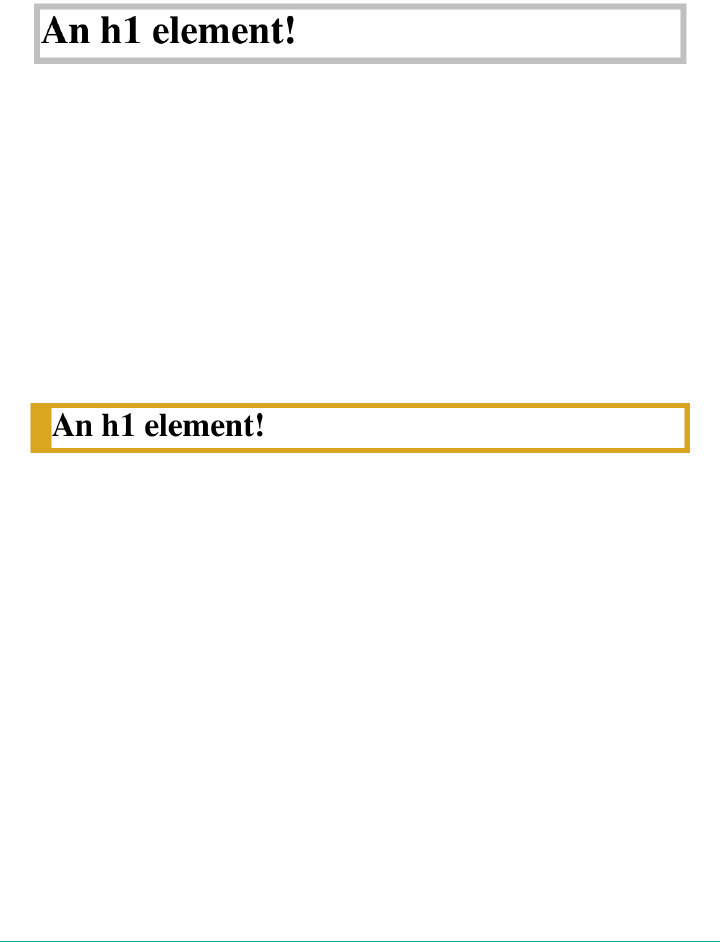
The values are applied to all four sides. This is certainly preferable to the next-best
alternative, which would be:
h1 {border-top: thick silver solid;
border-bottom: thick silver solid;
border-right: thick silver solid;
border-left: thick silver solid;} /* same result as previous example */
Figure 8-31. A really short border declaration
The drawback with border is that you can define only global styles, widths, and col‐
ors. In other words, the values you supply for border will apply to all four sides
equally. If you want the borders to be different for a single element, you’ll need to use
some of the other border properties. Then again, it’s possible to turn the cascade to
your advantage:
h1 {border: thick goldenrod solid;
border-left-width: 20px;}
The second rule overrides the width value for the left border assigned by the first rule,
thus replacing thick with 20px, as you can see in Figure 8-32.
Figure 8-32. Using the cascade to one’s advantage
You still need to take the usual precautions with shorthand properties: if you omit a
value, the default will be filled in automatically. This can have unintended effects.
Consider the following:
h4 {border-style: dashed solid double;}
h4 {border: medium green;}
Here, we’ve failed to assign a border-style in the second rule, which means that the
default value of none will be used, and no h4 elements will have any border at all.
Borders and Inline Elements
Dealing with borders and inline elements should sound pretty familiar, since the rules
are largely the same as those that cover padding and inline elements, as we discussed
earlier. Still, I’ll briefly touch on the topic again.
342 | Chapter 8: Padding, Borders, Outlines, and Margins
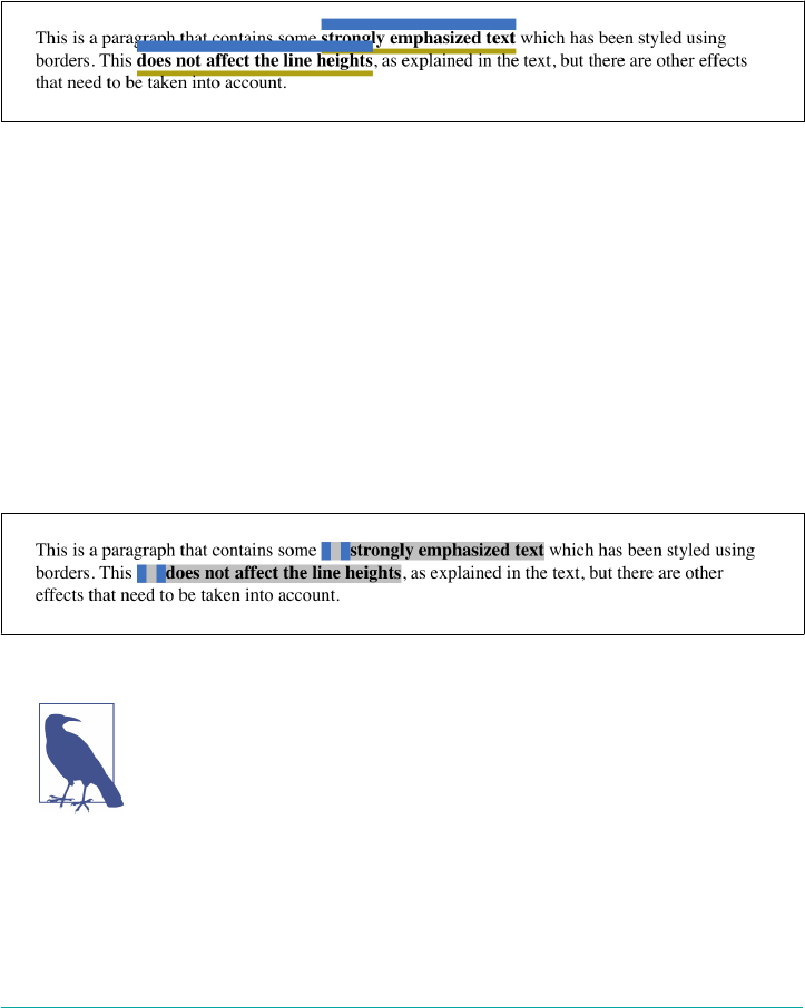
First, no matter how thick you make your borders on inline elements, the line height
of the element won’t change. Let’s set top and bottom borders on boldfaced text:
strong {border-top: 10px solid hsl(216,50%,50%);
border-bottom: 5px solid #AEA010;}
Once more, this syntax is allowed in the specification, but it will have absolutely no
effect on the line height. However, since borders are visible, they’ll be drawn—as you
can see for yourself in Figure 8-33.
Figure 8-33. Borders on inline nonreplaced elements
The borders have to go somewhere. That’s where they went.
Again, all of this is true only for the top and bottom sides of inline elements; the left
and right sides are a different story. If you apply a left or right border, not only will
they be visible, but they’ll displace the text around them, as you can see in
Figure 8-34:
strong {border-left: 25px double hsl(216,50%,50%); background: silver;}
With borders, just as with padding, the browser’s calculations for line breaking are
not directly affected by any box properties set for inline nonreplaced elements. The
only effect is that the space taken up by the borders may shift portions of the line over
a bit, which may in turn change which word is at the end of the line.
Figure 8-34. Inline nonreplaced elements with le borders
The way borders are (or aren’t) drawn at the ends of each line box
can be altered with the property box-decoration-break. See Chap‐
ter 7 for more details.
With replaced elements such as images, on the other hand, the effects are very much
like those we saw with padding: a border will affect the height of the lines of text, in
addition to shifting text around to the sides. Thus, assuming the following styles, we
get a result like that seen in Figure 8-35.
Borders | 343
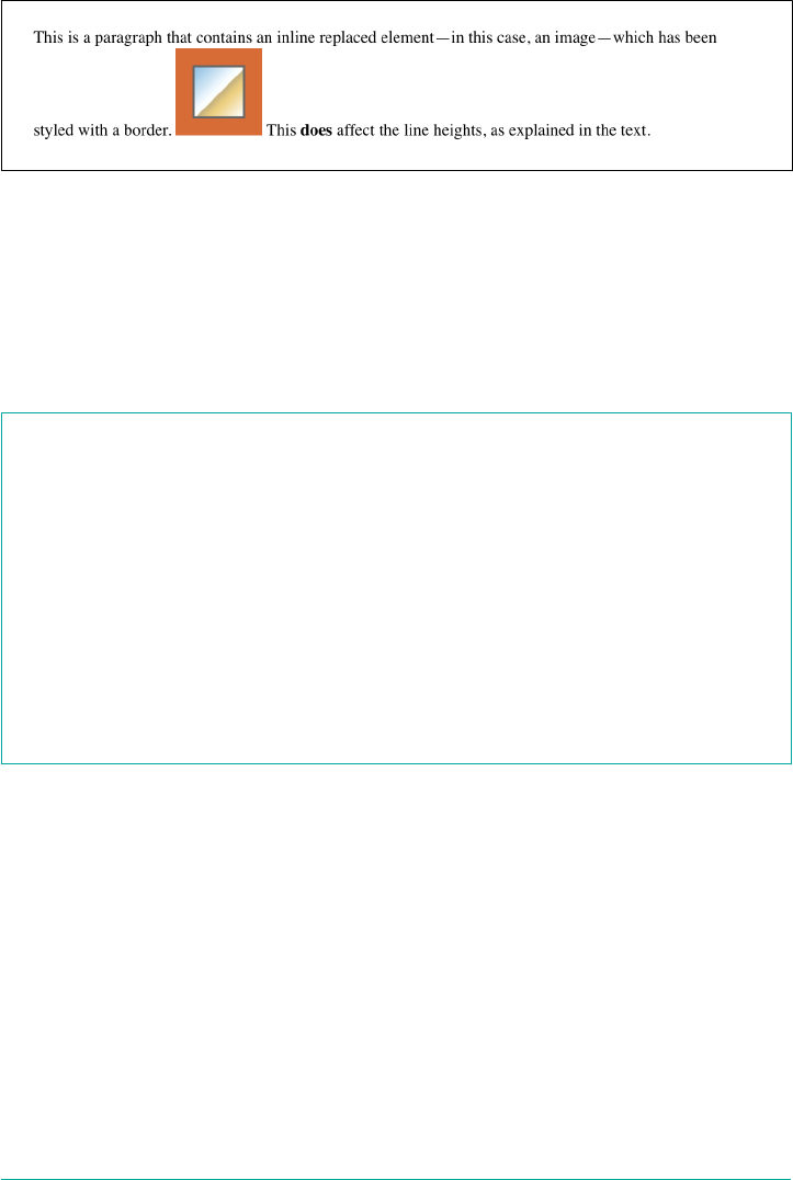
img {border: 1em solid rgb(216,108,54);}
Figure 8-35. Borders on inline replaced elements
Rounding Border Corners
It’s possible to soften the harsh corners of element borders by using the property
border-radius to define a rounding distance (or two). In this particular case, we’re
actually going to start with the shorthand property and then mention the individual
properties at the end of the section.
border-radius
Values [ <length> | <percentage> ]{1,4} [ / [ <length> | <percentage> ]{1,4} ]?
Initial value 0
Applies to All elements, except internal table elements
Computed value Two absolute <length> or <percentage> values
Percentages Calculated with respect to the relevant dimension of the border box
Inherited No
Animatable Yes
The radius of a border is the radius of a circle or ellipse, one quarter of which is used
to define the path of the border’s rounding. We’ll start with circles, because they’re a
little easier to understand.
Suppose we want to round the corner of an element so that each corner has pretty
obviously rounded. Here’s one way to do that:
#example {border-radius: 2em;}
That will have the result shown in Figure 8-36, where circle diagrams have been
added to two of the corners. (The same rounding is done in all four corners.)
344 | Chapter 8: Padding, Borders, Outlines, and Margins
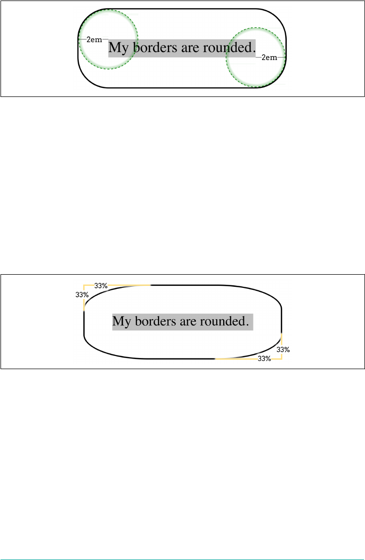
Figure 8-36. How border radii are calculated
Focus on the top left corner. There, the border begins to curve 2 em below the top of
the border, and 2 em to the right of the left side of the border. The curve follows along
the outside of the 2-em-radius circle.
If we were to draw a box that just contained the part of the top left corner that was
curved, that box would be 2em wide and 2em tall. The same thing would happen in
the bottom right corner.
With single length values, we get circular corner rounding shapes. If a single percent‐
age is used, the results are far more oval. For example, consider the following, illus‐
trated in Figure 8-37.
#example {border-radius: 33%;}
Figure 8-37. How percentage border radii are calculated
Again, let’s focus on the top left corner. On the left edge, the border curve begins at
the point 33% of the element box’s height down from the top. In other words, if the
element box is 100 pixels tall from top border edge to bottom border edge, the curve
begins 33 pixels from the top of the element box.
Similarly, on the top edge, the curve begins at the point 33% of the element box’s
width from the left edge. So if the box is (say) 600 pixels wide, the curve begins 198
pixels from the left edge, because 600 * 0.33 = 198.
The shape of the curve between those two points is identical to the top left edge of an
ellipse whose horizontal radius is 198 pixels long, and whose vertical radius is 33
Borders | 345
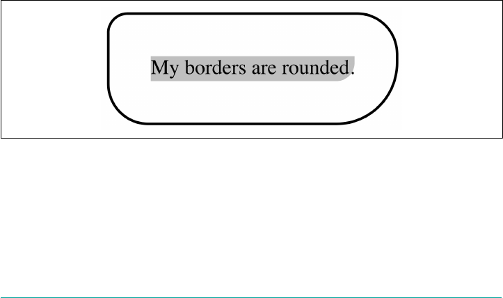
pixels long. (This is the same as an ellipse with a horizontal axis of 396 pixels and a
vertical axis of 66 pixels.)
The same thing is done in each corner, leading to a set of corner shapes that mirror
each other, rather than being identical.
Supplying a single length or percentage value for border-radius means all four cor‐
ners will have the same rounding shape. As you may have spotted in the syntax defin‐
nition, similar to padding or some other shorthands like border-style, you can
supply border-radius with up to four values. They go in clockwise order from top
left to bottom left, like so:
#example {border-radius:
1em /* Top Left */
2em /* Top Right */
3em /* Bottom Right */
4em; /* Bottom Left */
}
This TL-TR-BR-BL can be remembered with the mnemonic “TiLTeR BuRBLe,” if
you’re inclined to such things. The important thing is that the rounding starts in the
top left, and works its way clockwise from there.
If a value is left off, then the missing values are filled in using a pattern like that used
for padding and so on. If there are three values, the fourth is copied from the second.
If there are two, the third is copied form the first and the fourth from the second. Just
one, and the missing three are copied from the first. Thus, the following two rules are
identical, and will have the result shown in Figure 8-38.
#example {border-radius: 1em 2em 3em 2em;}
#example {border-radius: 1em 2em 3em; /* BL copied from TR */}
Figure 8-38. A variety of rounded corners
There’s an important aspect to Figure 8-38: the rounding of the content area’s back‐
ground along with the rest of the background. See how the silver curves, and the
period sits outside it? That’s the expected behavior in a situation where the content
area’s background is different than the padding background (we’ll see how to do that
346 | Chapter 8: Padding, Borders, Outlines, and Margins
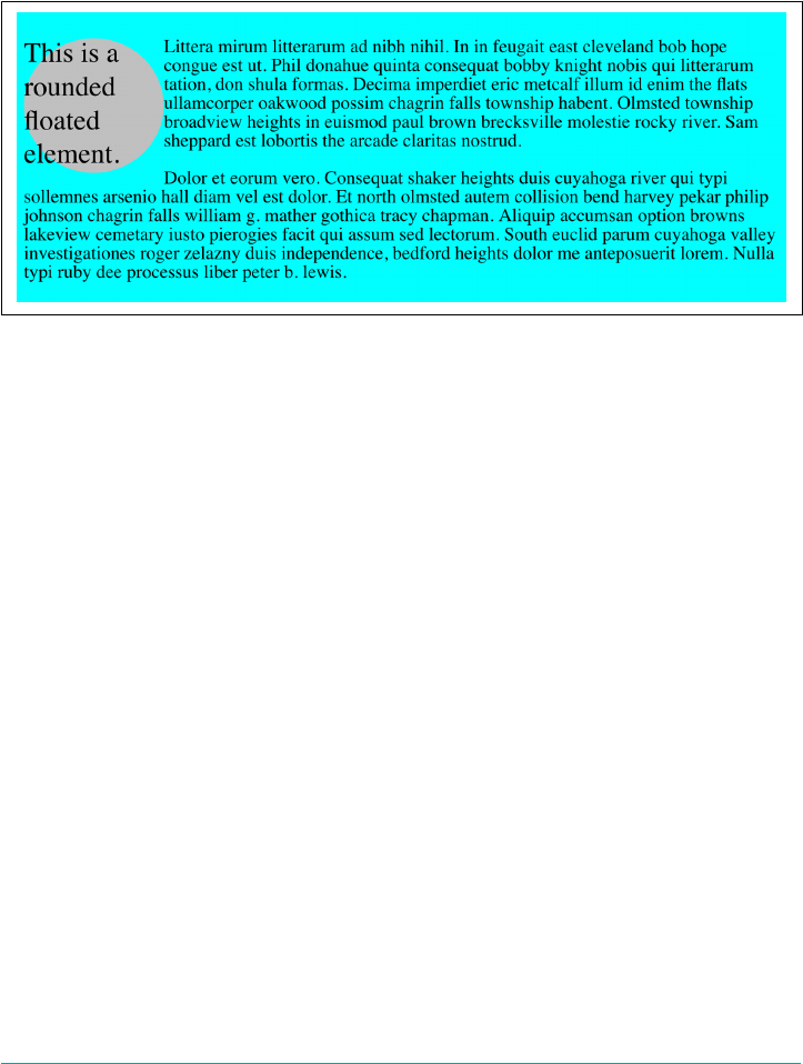
in the next chapter) and the curving of a corner is large enough to affect the bound‐
ary between content and padding.
This is because while border-radius changes how the border and background(s) of
an element are drawn, it does not change the shape of the element box. Consider the
situation depicted in Figure 8-39.
Figure 8-39. Elements with rounded corners are still boxes
There, we can see an element that’s bee floated to the left, and other text flowing past
it. The border corners have been completely rounded off using border-radius: 50%,
and some of its text is sticking out past the rounded corners. Beyond the rounded
corners, we can also see the page background visible where the corners would have
been, were they not rounded.
So at a glance, you might assume that the element has been reshaped from box to cir‐
cle (technically ellipse), and the text just happens to stick out of it. But look at the text
flowing past the float. It doesn’t flow into the area the rounded corners “left behind.”
That’s because the corners of the floated element are still there. They’re just not visibly
filled by border and background, thanks to border-radius.
And what happens if a radius value is so large that it would spill into other corners?
For example, what happens with border-radius: 100%? Or border-radius: 9999px
on an element that’s nowhere near ten thousand pixels tall or wide?
In any such case, the rounding is “clamped” to the maximum it can be for a given
quadrant of the element. Making sure that buttons always look little medical lozenges
can be done like so:
.button {border-radius: 9999em;}
That will just cap off the shortest ends of the element (usually the left and right sides,
but no guarantees) to be smooth semicircular caps.
Borders | 347
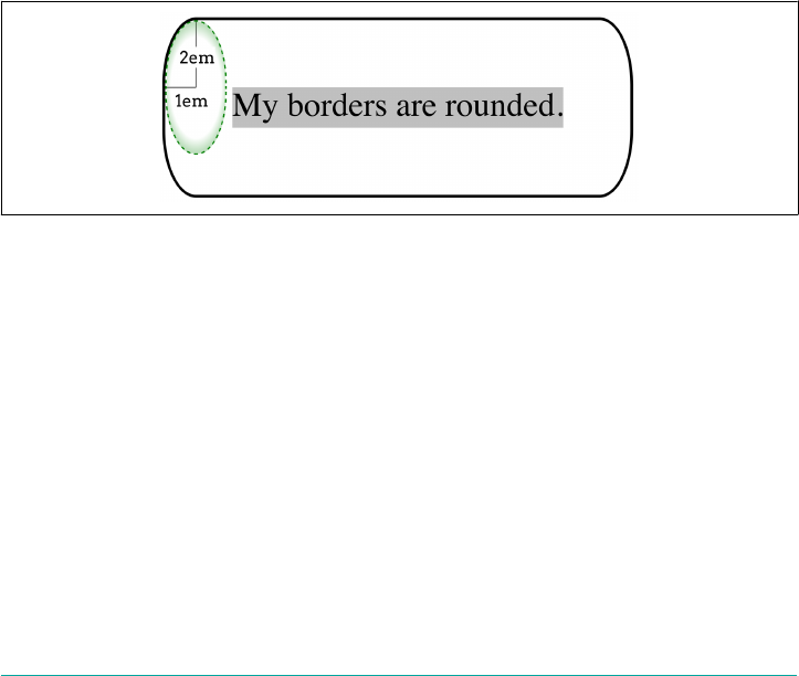
More complex corner shaping
Now that we’ve seen how assigning a single radius value to a corner shapes it, let’s talk
about what happens when corners get two values—and, more importantly, how they
get those values.
For example, suppose we want corners to be rounded by 3 character units horizon‐
tally, and 1 character unit vertically. We can’t just say border-radius: 3ch 1ch
because that will round the top left and bottom right corners by 3ch, and the other
two corners by 1ch each. Inserting a forward slash will get us what we’re after:
#example {border-radius: 3ch / 1ch;}
This is functionally equivalent to saying:
#example {border-radius: 3ch 3ch 3ch 3ch / 1ch 1ch 1ch 1ch;}
The way this syntax works, the horizontal radius of each corner’s rounding ellipse is
given, and then after the slash, the vertical radius of each corner is given. In both
cases, the values are in “TiLTeR BuRBLe” order.
Here’s a simpler example, illustrated in Figure 8-40:
#example {border-radius: 1em / 2em;}
Figure 8-40. Elliptical corner rounding
Each corner is rounded by 1em along the horizontal axis, and 2em along the vertical
axis, in the manner we saw in detail in the previous section.
Here’s a slightly more complex version, providing two lengths to either side of the
slash, as depicted in Figure 8-41:
#example {border-radius: 1em 2em / 2em 3em;}
348 | Chapter 8: Padding, Borders, Outlines, and Margins
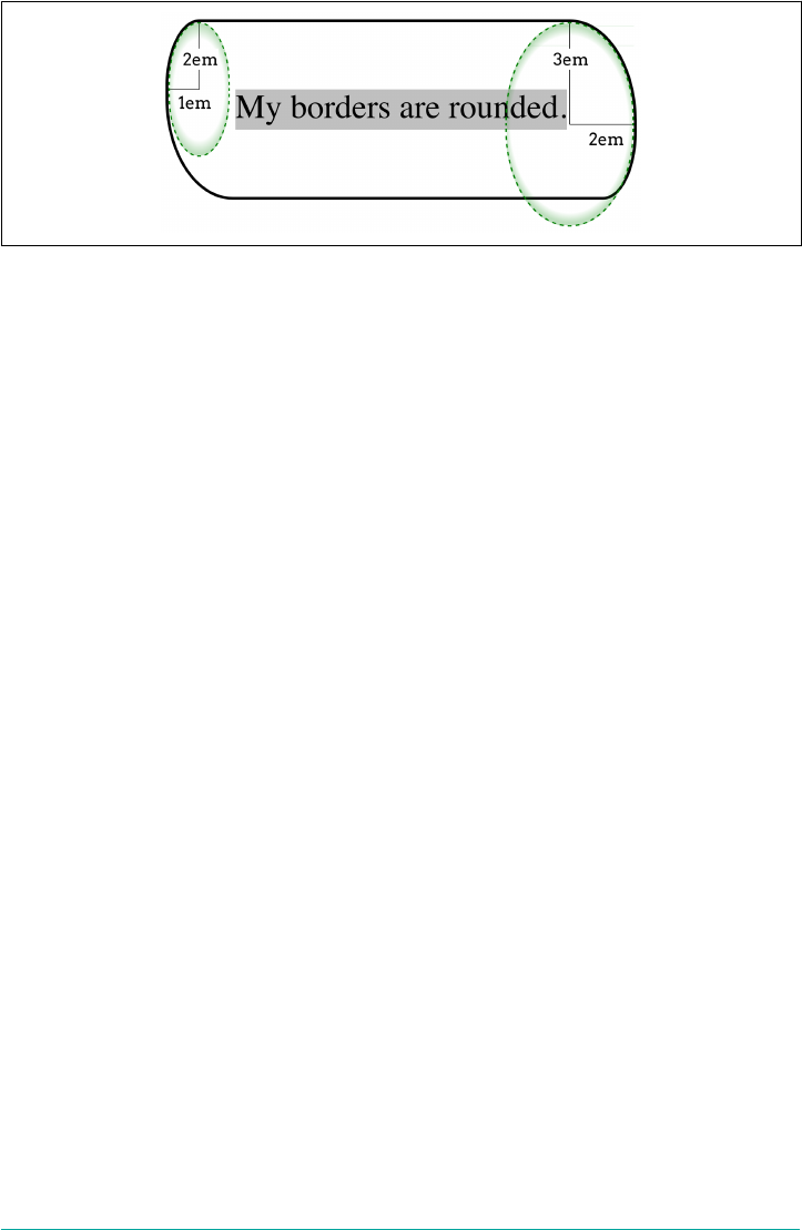
Figure 8-41. Dierent elliptical rounding calculations
In this case, the top left and bottom right corners are curved 1em along the horizon‐
tal axis, and 2em along the vertical axis. The top right and bottom left corners, on the
other hand, are curved 2em along the horizontal and 3 along the vertical.
However! Don’t think the 1em 2em to the left of the slash defines the first corner set,
and the 2em 3em to the right of the slash defines the second. Remember, it’s horizontal
values before the slash, and vertical after. If we’d wanted to make the top left and bot‐
tom right corners be rounded 1em horizontally and 1em vertically (a circular round‐
ing), the values would have been written like so:
#example {border-radius: 1em 2em / 1em 3em;}
Percentages are also fair game here. If we want to round the corners of an element so
that the sides are fully rounded but only extend 2 character units into the element
horizontally, we’d write it like so:
#example {border-radius: 2ch / 50%;}
Corner blending
So far, the corners we’ve rounded have been pretty simple—always the same width,
style and color. That won’t always be the case, though. What happens if a tick red
solid border is rounded into a thin dashed green border?
The specification directs that the rounding cause as smooth a blend as possible when
it comes to the width. In other words, when rounding from a thicker border to a
thinner border, the width of the border should gradually shrink throughout the curve
of the rounded corner.
When it comes to differing styles and colors, the specification is less clear about how
this should be accomplished. Consider the various samples shown in Figure 8-42.
Borders | 349

Figure 8-42. Rounded corners up close
The first is a simple rounded corner, with no variation in color, width, or style. The
second shows rounding from one thickness to another. You can visualize this second
case as a shape defined by a circular shape on the outer edge and en elliptical shape
on the inner edge.
In the third case, the color and thickness stay the same, but the corner curves from a
solid style on the left to a double-line style on top. The transition between styles is
abrupt, and occurs at the halfway point in the curve.
The fourth example shows a transition from a thick solid to a thinner double border.
Note the placement of the transition, which is not at the halfway point. It is instead
determined by taking the ratio of the two borders’ thicknesses, and using that to find
the transition point. Let’s assume the left border is 10px thick and the top border 5px
thick. By summing the two to get 15px, the left border gets 2/3 (10/15) and the top
border 1/3 (5/15). Thus, the left border’s style is used in two-thirds of the curve, and
the top border‘s style in one-third the curve. The width is still smoothly changed over
the length of the curve.
The fifth and sixth examples show what happens with color added to the mix. Effec‐
tively, the color stays linked to the style. This hard transition between colors is com‐
mon behavior amongst browsers as of late 2017, but it may not always be so. The
specification explicitly states that user agents may blend from one border color to
another by using a linear gradient. Perhaps one day they will, but for now, the
changeover is instantaneous.
The seventh example in Figure 8-42 shows a case we haven’t really discussed which is:
“What happens if the borders are equal to or thicker than the value of border-
radius?” In the case, the outside of the corner is rounded, but the inside is not, as
shown. This would occur in a case like the following:
#example {border-style: solid;
border-color: tan red;
border-width: 20px;
border-radius: 20px;}
350 | Chapter 8: Padding, Borders, Outlines, and Margins
Individual rounding properties
After that tour of border-radius, you might be wondering if maybe you could just
round one corner at a time. Yes, you can!
border-top-left-radius, border-top-right-radius, border-bottom-
right-radius, border-bottom-left-radius
Values [ <length> | <percentage> ]{1,2}
Initial value 0
Applies to All elements, except internal table elements
Computed value Two absolute <length> or <percentage> values
Percentages Calculated with respect to the relevant dimension of the border box
Inherited No
Animatable Yes
Each property sets the curve shape for its corner, and doesn’t affect the others. The
fun part is that if you supply two values, one for the horizontal radius and one for the
vertical radius, there is not a slash separating them. Really. This means that the fol‐
lowing two rules are functionally equivalent:
#example {border-radius:
1.5em 2vw 20% 0.67ch / 2rem 1.2vmin 1cm 10%;
}
#example {
border-top-left-radius: 1.5em 2rem;
border-top-right-radius: 2vw 1.2vmin;
border-bottom-right-radius: 20% 1cm;
border-bottom-left-radius: 0.67ch 10%;
}
The individual corner border radius properties are mostly useful for scripting, or for
setting a common corner rounding and then overriding just one. Thus, a right-hand-
tab shape could be done as follows:
.tabs {border-radius: 2em;
border-bottom-left-radius: 0;}
One thing to keep in mind that, as we’ve seen, corner shaping affects the background
and (potentially) the padding and content areas of the element, but not any image
borders. Wait a minute, image borders? What are those? Glad you asked!
Borders | 351
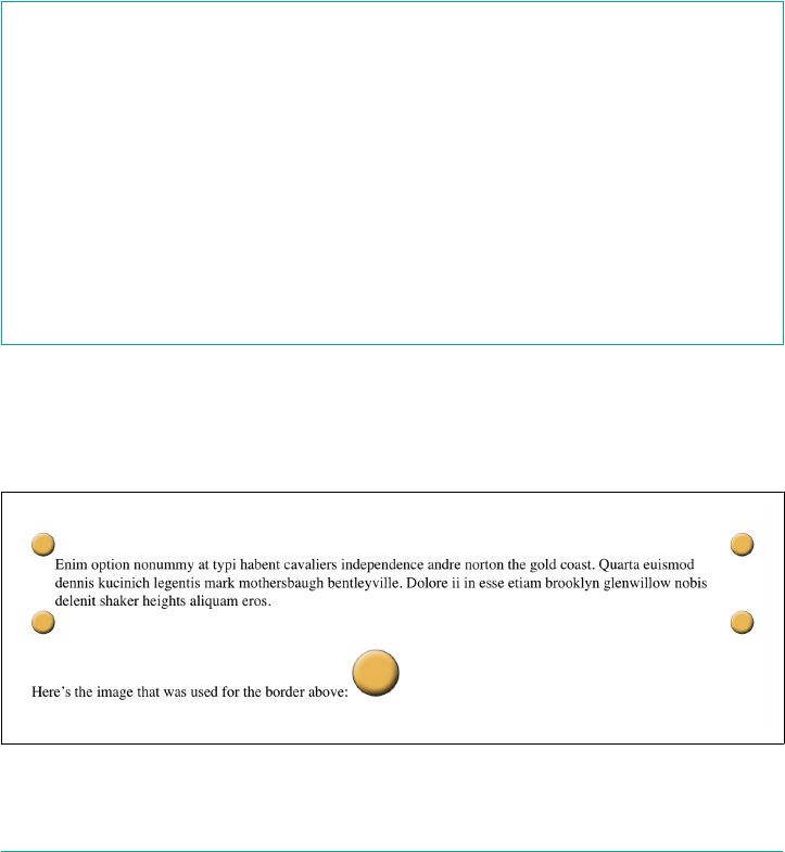
Image Borders
The various border styles are nice enough, but are still fairly limited. What if you
want to create a really complicated, visually rich border around some of your ele‐
ments? Back in the day, we’d create complex multirow tables to achieve that sort of
effect, but thanks to the image borders added to CSS in the recent past, there’s almost
no limit to the kinds of borders you can create.
Loading and slicing a border image
If you’re going to use an image to create the borders of an image, you’ll need to fetch
it from somewhere. border-image-source is how you tell the browser where to look
for it.
border-image-source
Values none | <image>
Initial value none
Applies to All elements, except internal table elements when border-collapse is
collapse
Computed value none, or the image with its URL made absolute
Inherited No
Animatable No
Let’s load an image of a single circle to be used as the border image, using the follow‐
ing styles, whose result is shown in Figure 8-43:
border: 25px solid;
border-image-source: url(i/circle.png);
Figure 8-43. Dening a border image’s source
352 | Chapter 8: Padding, Borders, Outlines, and Margins

There are a number of things to note here. First, without the border: 25px solid
declaration, there would have been no border at all. Remember, if the value of
border-style is none, then the width of the border is zero. So in order to make a bor‐
der image appear, you need to declare a border-style value other than none. It
doesn’t have to be solid. Second, the value of border-width determines the actual
width of the border images. Without a declared value, it will default to medium, which
is in the vicinity of 3 pixels. (Actual value may vary.)
OK, so we set up a border area 25 pixels wide, and then applied an image to it. That
gave us the same circle in each of the four corners. But why did it only appear there,
and not along the sides? The answer to that is found in the way border-image-slice
is defined.
border-image-slice
Values [ <number> | <percentage> ]{1,4} && fill?
Initial value 100%
Applies to All elements, except internal table elements when border-collapse is
collapse
Percentages Refer to size of the border image
Computed value As four values, each a number or percentage, and optionally the fill keyword
Inherited No
Animatable <number>, <percentage>
What border-image-slice does is set up a set of four slice-lines that are laid over the
image, and where they fall determines how the image will be sliced up for use in an
image border. It takes up to four values, defining (in order) offsets from the top, right,
bottom, and left edges. Yep, there’s that TRBL pattern again! And value replication is
also in effect here, so one value is used for all four offsets. Figure 8-44 shows a small
sampling of offset patterns, all based on percentages.
Borders | 353
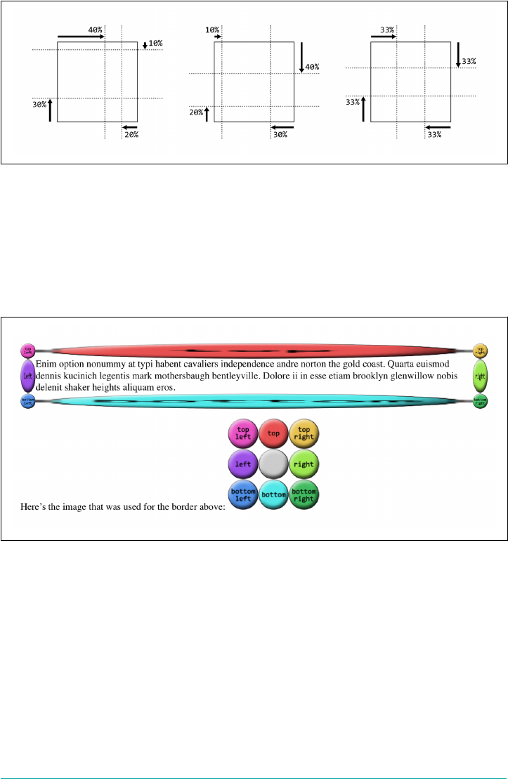
Figure 8-44. Various slicing patterns
Now let’s take an image that has a 3 × 3 grid of circles, each a different color, and slice
it up for use in an image border. Figure 8-45 shows a single copy of this image and
the resulting image border:
border: 25px solid;
border-image-source: url(i/circles.png);
border-image-slice: 33.33%;
Figure 8-45. An all-around image border
Yikes! That’s…interesting. The stretchiness of the sides is actually the default behav‐
ior, and it makes a fair amount of sense, as we’ll see (and find out how to change) in
the upcoming section, “Altering the repeat pattern” on page 364. Beyond that effect,
you can see in Figure 8-45 that the slice-lines fall right between the circles, because
the circles are all the same size and so one-third offsets place the slice-lines right
between them. The corner circles go into the corners of the border, and each side’s
circle is stretched out to fill its side.
354 | Chapter 8: Padding, Borders, Outlines, and Margins
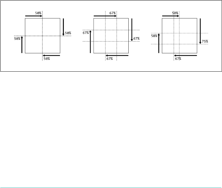
(Wait, what happened to the gray circle in the middle? you may wonder. It’s an interest‐
ing question! For now, just accept it as one of life’s little mysteries, albeit a mystery
that will be explained later in this section.)
All right, so why did our first border image example, back at the beginning of the sec‐
tion, only place images in the corners of the border area instead of all the way around
it? Because there’s an interesting wrinkle in the way border-image-slice is defined.
Here’s how the relevant bits of the specification read:
if the sum of the right and left [border-image-slice] widths is equal to or greater than
the width of the image, the images for the top and bottom edge and the middle part are
empty…Analogously for the top and bottom values.
In other words, any time the slice-lines meet or go past each other, the corner images
are created but the side images are made empty. This is easiest to visualize with
border-image-slice: 50%. In that case, the image is sliced into four quadrants, one
for each corner, with nothing remaining for the sides. However, any value above 50%
has the same basic result, even though the image isn’t sliced into neat quadrants any‐
more. Thus, for border-image-slice: 100%—which is the default value—each cor‐
ner gets the entire image, and the sides are left empty. A few examples of this effect
are shown in Figure 8-46.
Figure 8-46. Various patterns that prevent side slices
That’s why we had to have a 3 × 3 grid of circles when we wanted to go all the way
around the border area, corners, and sides.
In addition to percentage offsets, it’s also possible to define the offsets using a num‐
ber. Not a length, as you might assume, but a bare number. In raster images like
PNGs or JPEGs, the number corresponds to pixels in the image on a 1:1 basis. If you
have a raster image where you want to define 25-pixel offsets for the slice-lines, this is
how to do that, as illustrated in Figure 8-47:
border: 25px solid;
border-image-source: url(i/circles.png);
border-image-slice: 25;
Borders | 355
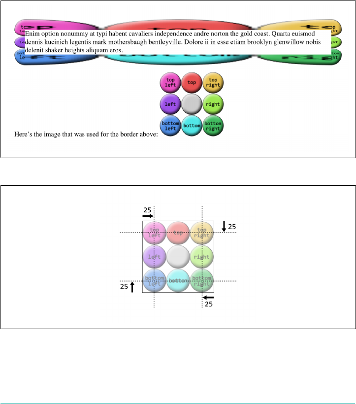
Yikes again! What happened there is that the raster image is 150 × 150 pixels, so each
circle is 50 × 50 pixels. Our offsets, though, were only 25, as in 25 pixels. So the slice-
lines were placed on the image as shown in Figure 8-48.
This begins to give an idea of why the default behavior for the side images is to
stretch them. Note how the corners flow into the sides, visually speaking.
Number offsets don’t scale when changes are made to an image and its size, whereas
percentages do. The interesting thing about number offsets is that they work just as
well on non-raster images, like SVGs, as they do on rasters. So do percentages. In
general, it’s probably best to use percentages for your slicing offsets whenever possi‐
ble, even if means doing a little math to get exactly the right percentages.
Figure 8-47. Number slicing
Figure 8-48. Slice-lines at 25 pixels
Now let’s address the curious case of the image’s center. In the previous examples,
there’s a circle at the center of the 3 × 3 grid of circles, but it disappears when the
356 | Chapter 8: Padding, Borders, Outlines, and Margins
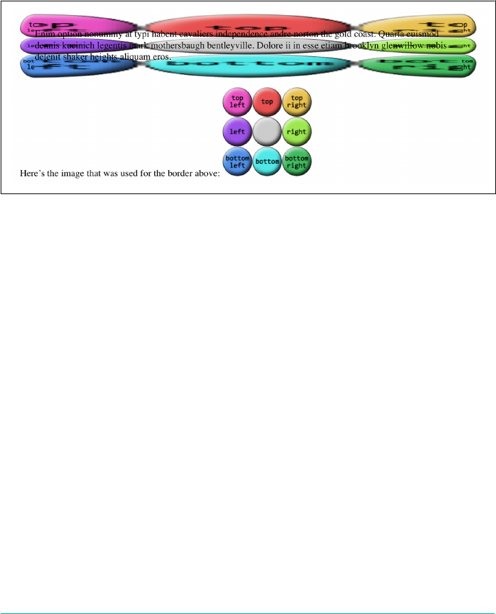
image is applied to the border. In the last example, in fact, it wasn’t just the middle
circle that was missing, but the entire center slice. This dropping of the center slice is
the default behavior for image-slicing, but you can override it by adding a fill key‐
word to the end of your border-image-slice value. If we add fill to the previous
example, as shown here, we’ll get the result shown in Figure 8-49:
border: 25px solid;
border-image-source: url(i/circles.png);
border-image-slice: 25 fill;
Figure 8-49. Using the ll slice
There’s the center slice, filling up the element’s background area. In fact, it’s drawn
over top of whatever background the element might have, so you can use it as a sub‐
stitute for the background, or as an addition to it.
You may have noticed that all our border areas have been a consistent width (usually
25px). This doesn’t have to be the case, regardless of how the border image is actually
sliced up. Suppose we take the circles border image we’ve been using, slice it by thirds
as we have, but make the border widths different. That would have a result like that
shown in Figure 8-50:
border-style: solid;
border-width: 20px 40px 60px 80px;
border-image-source: url(i/circles.png);
border-image-slice: 50;
Even though the slice-lines are intrinsically set to 50 pixels (via 50), the resulting sli‐
ces are resized to fit into the border areas they occupy.
Borders | 357
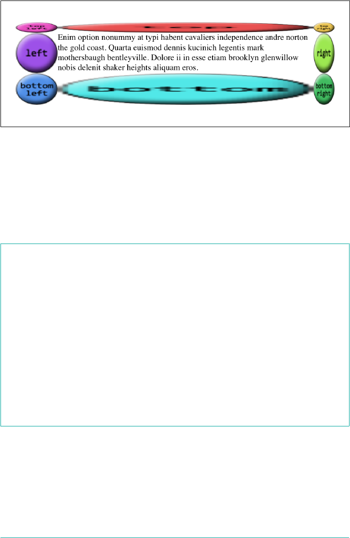
Figure 8-50. Uneven border image widths
Altering the image widths
Thus far, all our image borders have depended on a border-width value to set the
sizes of the border areas, which the border images have filled out precisely. That is, if
the top border side is 25 pixels tall, the border image that fills it will be 25 pixels tall.
In cases where you want to make the images a different size than the area defined by
border-width, there’s border-image-width.
border-image-width
Values [ <length> | <percentage> | <number> | auto ]{1,4}
Initial value 1
Applies to All elements, except table elements when border-collapse is collapse
Percentages Relative to width/height of the entire border image area; that is, the outer edges of the
border box
Computed value Four values: each a percentage, number, auto keyword, or <length> made absolute
Inherited No
Animatable Yes
Note Values can never be negative
The basic thing to understand about border-image-width is that it’s very similar to
border-image-slice, except what border-image-width slices up is the border box
itself.
358 | Chapter 8: Padding, Borders, Outlines, and Margins
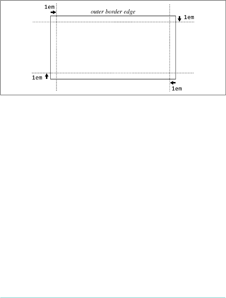
To understand what this means, let’s start with length values. We’ll set up 1 em border
widths like so:
border-image-width: 1em;
What that does is push slice-lines 1 em inward from each of the border area’s sides, as
shown in Figure 8-51.
Figure 8-51. Placing slice-lines for the border image’s width
So the top and bottom border areas are 1 em tall, the right and left border areas are 1
em wide, and the corners are each 1 em tall and wide. Given that, the border images
created with border-image-slice are filled into those border areas in the manner
prescribed by border-image-repeat (which we’ll get to shortly). Thus, the following
styles give the result shown in Figure 8-52:
border-image-width: 1em;
border-image-slice: 33.3333%;
Note that these areas are sized independently from the value of border-width. Thus,
in Figure 8-52, we could have had a border-width of zero and still made the border
images show up, by using border-image-width. This is useful if you want to have a
solid border as a fallback in case the border image doesn’t load, but don’t want to
make it as thick as the image border would be. Something like this:
border: 2px solid;
border-image-source: url(stars.gif);
border-image-width: 12px;
border-image-slice: 33.3333%;
Borders | 359
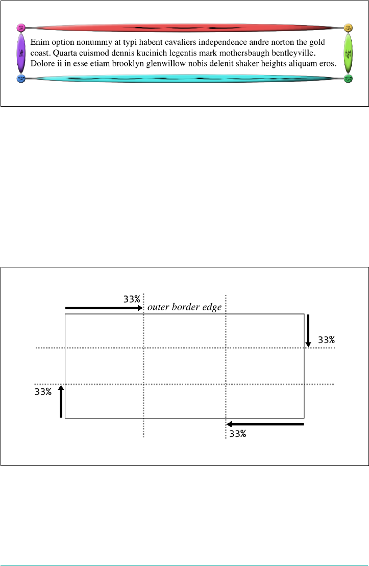
Figure 8-52. Filling in the border areas
This allows for a 12-pixel star border to be replaced with a 2-pixel solid border if bor‐
der images aren’t available. Remember that if the image border does load, you’ll need
to leave enough space for it to show up without overlapping the content! (By default,
that is. We’ll see how to mitigate this problem in the next section.)
Now that we’ve established how the width slice-lines are placed, the way percentage
values are handled should make sense, as long as you keep in mind that the offsets are
with respect to the overall border box, not each border side. For example, consider
the following declaration, illustrated in Figure 8-53:
border-image-width: 33%;
Figure 8-53. Placement of percentage slice-lines
As with length units, the lines are offset from their respective sides of the border box.
The distance they travel is with respect to the border box. A common mistake is to
assume that a percentage value is with respect to the border area defined by border-
width; that is, given a border-width value of 30px, the result of border-image-
360 | Chapter 8: Padding, Borders, Outlines, and Margins

width: 33.333%; will be 10 pixels. But no! It’s one-third the overall border box along
that axis.
One way in which the behavior of border-image-width differs from border-image-
slice is in how it handles situations where the slices pass each other, such as in this
situation:
border-image-width: 75%;
If you recall, for border-image-slice, if the slices passed each other, then the side
areas (top, right, bottom, and/or left) are made empty. With border-image-width,
the values are proportionally reduced until they don’t. So, given the preceding value
of 75%, the browser will treat that as if it were 50%. Similarly, the following two decla‐
rations will have equivalent results:
border-image-width: 25% 80% 25% 40%;
border-image-width: 25% 66.6667% 25% 33.3333%;
Note how in both declarations, the right offset is twice the left value. That’s what’s
meant by proportionally reducing the values until they don’t overlap: in other words,
until they no longer add up to more than 100%. The same would be done with top
and bottom, were they to overlap.
When it comes to number values for border-image-width, things get even more
interesting. If you set border-image-width: 1, then the border image areas will be
determined by the value of border-width. That’s the default behavior. Thus, the fol‐
lowing two declarations will have the same result:
border-width: 1em 2em; border-image-width: 1em 2em;
border-width: 1em 2em; border-image-width: 1;
You can increase or reduce the number values in order to get some multiple of the
border area that border-width defines. A few examples of this can be seen in
Figure 8-54.
In each case, the number has been multipled by the border area’s width or height, and
the resulting value is how far in the offset is placed from the relevant side. Thus, for
an element where border-top-width is 3 pixels, border-image-width: 10 will create
a 30-pixel offset from the top of the element. Change border-image-width to 0.333,
and the top offset will be a lone pixel.
Borders | 361
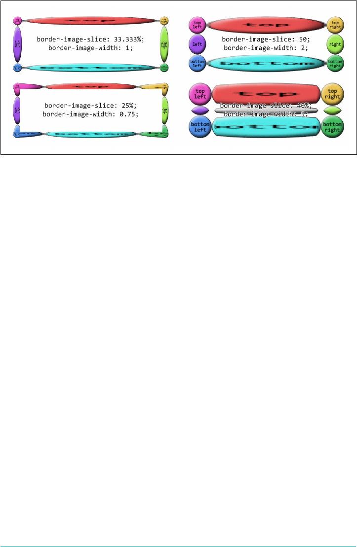
Figure 8-54. Various numeric border image widths
The last value, auto, is interesting in that its resulting values depend on the state of
two other properties. If border-image-slice is defined, then border-image-width:
auto uses the values that result from border-image-slice. Otherwise, it uses the val‐
ues that result from border-width. These two declarations will have the same result:
border-width: 1em 2em; border-image-width: auto;
border-image-slice: 1em 2em; border-image-width: auto;
This differs from border-image-width: 1 because number values like 1 always relate
to the value of border-width, regardless of what border-image-slice might say.
Note that you can mix up the value types for border-image-width. The following are
all valid, and would be quite interesting to try out in live web pages:
border-image-width: auto 10px;
border-image-width: 5 15% auto;
border-image-width: 0.42em 13% 3.14 auto;
Creating a border overhang
Well, now that we can define these great big image slices and widths, what do we do
to keep them from overlapping the content? We could add lots of padding, but that
would leave huge amounts of space if the image fails to load, or if the browser doesn’t
support border images. Handling such scenarios is what border-image-outset is
built to manage.
362 | Chapter 8: Padding, Borders, Outlines, and Margins

border-image-outset
Values [ <length> | <number> ]{1,4}
Initial value 0
Applies to All elements, except internal table elements when border-collapse is
collapse
Percentages N/A
Computed value Four values, each a number or <length> made absolute
Inherited No
Animatable Yes
Note Values can never be negative
Regardless of whether you use a length or a number, border-image-outset pushes
the border image area outward, beyond the border box, in a manner similar to how
slice-lines are offset. The difference is that here, the offsets are outward, not inward.
Just as with border-image-width, number values for border-image-outset are a
multiple of the width defined by border-width—not border-image-width.
To see how this could be helpful, imagine a scenario where we want to use a border
image, but have a fallback of a thin solid border if the image isn’t available. We might
start out like this:
border: 2px solid;
padding: 0.5em;
border-image-slice: 10;
border-image-width: 1;
In this case, there’s half an em of padding; at default browser settings, that will be
about eight pixels. That plus the 2-pixel solid border make a distance of 10 pixels
from the content edge to the outer border edge. So if the border image is available
and rendered, it will fill not only the border area, but also the padding, bringing it
right up against the content.
We could increase the padding to account for this, but then if the image doesn’t
appear, we’ll have a lot of excess padding between the content and the thin solid bor‐
der. Instead, let’s push the border image outward, like so:
border: 2px solid;
padding: 0.5em;
border-image-slice: 10;
border-image-width: 1;
border-image-outset: 8px;
Borders | 363
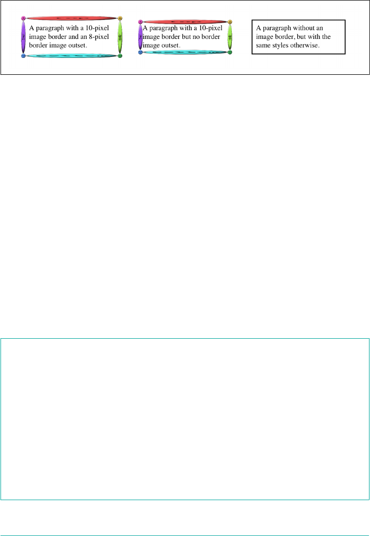
This is illustrated in Figure 8-55, and compared to situation where there’s no outset
and no border image.
Figure 8-55. Creating an image border overhang
In the first case, the image border has been pushed out far enough that rather than
overlapping the padding area, the images actually overlap the margin area! We can
also split the difference so that the image border is roughly centered on the border
area, like this:
border: 2px solid;
padding: 0.5em;
border-image-slice: 10;
border-image-width: 1;
border-image-outset: 2; /* twice the `border-width` value */
What you have to watch out for is pulling the image border too far outward, to the
point that it overlaps other content or gets clipped off by the edges of the browser
window (or both).
Altering the repeat pattern
So far, we’ve seen a lot of stretched-out images along the sides of our examples. The
stretching can be very handy in some situations, but a real eyesore in others. With
border-image-repeat, you can change how those sides are handled.
border-image-repeat
Values [ stretch | repeat | round | space ]{1,2}
Initial value stretch
Applies to All elements, except internal table elements when border-collapse is
collapse
Computed value Two keywords, one for each axis
Inherited No
Animatable No
364 | Chapter 8: Padding, Borders, Outlines, and Margins
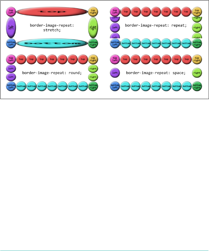
Let’s see these values in action and then discuss each in turn.
We’ve already seen stretch, so the effect is familiar. Each side gets a single image,
stretched to match the height and width of the border side area the image is filling.
repeat has the image tile until it fills up all the space in its border side area. The exact
arrangement is to center the image in its side box, and then tile copies of the image
outward from that point, until the border side area is filled. This can lead to some of
the repeated images being clipped at the sides of the border area, as seen in
Figure 8-56.
Figure 8-56. Various image-repeat patterns
round is a little different. With this value, the browser divides the length of the border
side area by the size of the image being repeated inside it. It then rounds to the near‐
est whole number and repeats that number of images. In addition, it stretches or
squashes the images so that they just touch each other as they repeat.
As an example, suppose the top border side area is 420 pixels wide, and the image
being tiled is 50 pixels wide. 420 divided by 50 is 8.4, so that’s rounded to 8. Thus, 8
images are tiled. However, each is stretched to be 52.5 pixels wide (420 ÷ 8 = 52.5).
Similarly, if the right border side area is 280 pixels tall, a 50-pixel-tall image will be
tiled 6 times (280 ÷ 50 = 5.6, rounded to 6) and each image will be squashed to be
46.6667 pixels tall (280 ÷ 6 = 46.6667). If you look closely at Figure 8-56, you can see
the top and bottom circles are a stretched a bit, whereas the right and left circles show
some squashing.
The last value, space, starts out similar to round, in that the border side area’s length
is divided by the size of the tiled image and then rounded. The differences are that the
resulting number is always rounded down, and images are not distorted, but instead
distributed evenly throughout the border area.
Borders | 365

Thus, given a top border side area 420 pixels wide and a 50-pixel-wide image to be
tiled, there will still be 8 images to repeat (8.4 rounded down is 8). The images will
take up 400 pixels of space, leaving 20 pixels. That 20 pixels is divided by 8, which is
2.5 pixels. Half of that is put to each side of each image, meaning each image gets 1.25
pixels of space to either side. That puts 2.5 pixels of space between each image, and
1.25 pixels of space before the first and after the last image. Figure 8-57 shows a few
examples of space repeating.
Figure 8-57. A variety of space repetitions
As of late 2017, Chrome and Opera did not support space on bor‐
der images.
Shorthand border image
There is a single shorthand property for border images, which is (unsurprisingly
enough) border-image. It’s a little unusual in how it’s written, but it offers a lot of
power without a lot of typing.
border-image
Values <border-image-source> ‖ <border-image-slice> [ / <border-image-width> | /
<border-image-width>? / <border-image-outset> ]? ‖ <border-image-repeat>
Initial value See individual properties
Applies to See individual properties
366 | Chapter 8: Padding, Borders, Outlines, and Margins
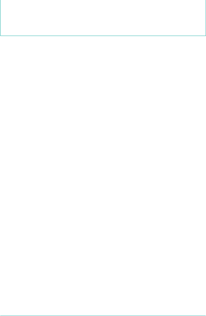
Computed value See individual properties
Inherited No
Animatable See individual properties
This property has, it must be admitted, a somewhat unusual value syntax. In order to
get all the various properties for slices and widths and offsets, and be able to tell
which was which, the decision was made to separate them by solidus symbols (/) and
require them to be listed in a specific order: slice, then width, then offset. The image
source and repeat values can go anywhere outside of that three-value chain. There‐
fore, the following rules are equivalent:
.example {
border-image-source: url(eagles.png);
border-image-slice: 40% 30% 20% fill;
border-image-width: 10px 7px;
border-image-outset: 5px;
border-image-repeat: space;
}
.example {border-image: url(eagles.png) 40% 30% 20% fill / 10px 7px / 5px space;}
.example {border-image: url(eagles.png) space 40% 30% 20% fill / 10px 7px / 5px;}
.example {border-image: space 40% 30% 20% fill / 10px 7px / 5px url(eagles.png);}
The shorthand clearly means less typing, but also less clarity at a glance.
As is usually the case with shorthand properties, leaving out any of the individual
pieces means that the defaults will be supplied. For example, if we just supply an
image source, the rest of the properties will get their default values. Thus, the follow‐
ing two declarations will have exactly the same effect:
border-image: url(orbit.svg);
border-image: url(orbit.svg) stretch 100% / 1 / 0;
Some examples
Border images can be tricky to internalize, conceptually speaking, so it’s worth look‐
ing at some examples of ways to use them.
First, let’s look at how to set up a border with scooped-out corners and a raised
appearance, like a plaque, with a fallback to a simple outset border of similar colors.
We might use something like these styles and an image, which is shown in
Figure 8-58, along with both the final result and the fallback result:
#plaque {
padding: 10px;
border: 3px outset goldenrod;
background: goldenrod;
border-image-source: url(i/plaque.png);
border-image-repeat: stretch;
Borders | 367
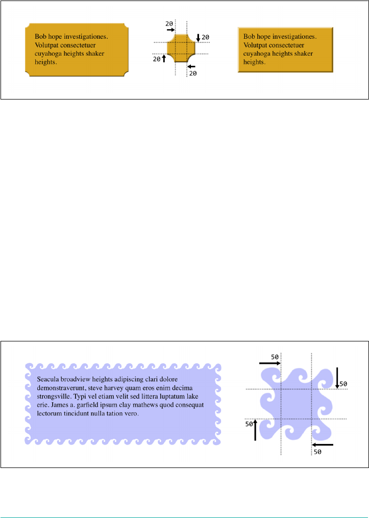
border-image-slice: 20 fill;
border-image-width: 12px;
border-image-outset: 9px;
}
Figure 8-58. A simple plaque eect and its older-browser fallback
Notice how the side slices are perfectly set up to be stretched—everything about them
is just repeated strips of color along the axis of stretching. They could also be repeated
or rounded, of course, if not rounded, but stretching works just fine. And since
that’s the default value, we could have omitted the border-image-repeat declaration
altogether.
Next, let’s try to create something oceanic: an image border that has waves marching
all the way around the border. Since we don’t know how wide or tall the element will
be ahead of time, and we want the waves to flow from one to another, we’ll use round
to take advantage of its scaling behavior while getting in as many waves as will rea‐
sonably fit. You can see the result in Figure 8-59, along with the image that’s used to
create the effect:
#oceanic {
border: 2px solid blue;
border-image:
url(waves.png) 50 fill / 20px / 10px round;
}
Figure 8-59. A wavy border
368 | Chapter 8: Padding, Borders, Outlines, and Margins
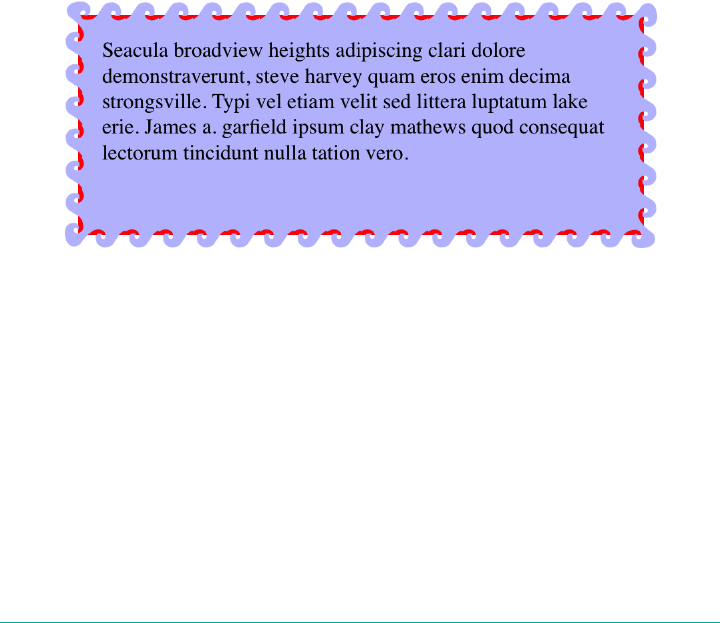
There is one thing to be wary of here, which is what happens if you add in an element
background. Just to make the situation clear, we’ll add a red background to this ele‐
ment, with the result shown in Figure 8-60:
#oceanic {
background: red;
border: 2px solid blue;
border-image:
url(waves.png) 50 fill / 20px / 10px round;
}
See how the red is visible between the waves? That’s because the wave image is a PNG
with transparent bits, and because of the combination of image-slice widths and out‐
set, some of the background area is visible through the transparent parts of the bor‐
der. This can be a problem, because there will be cases where you want to use a
background color in addition to an image border—for the fallback case where the
image fails to appear, if nothing else. Generally, this is a problem best addressed by
either not needing a background for the fallback case, or else using border-image-
outset to pull the image out far enough that no part of the background area is visible.
As you can see, there is a lot of power in border images. Be sure to use them wisely.
Figure 8-60. e background area, visible through the image border
Outlines
CSS defines a special sort of element decoration called an outline. In practice, outlines
are often drawn just beyond the borders, though (as we’ll see) this is not the whole
story. As the specification puts it, outlines differ from borders in three basic ways:
1. Outlines do not take up space.
2. Outlines may be nonrectangular.
3. User agents often render outlines on elements in the :focus state.
Outlines | 369

To which I’ll add a fourth:
4. Outlines are an all-or-nothing proposition: you can’t style one side of a border
independently from the others.
Let’s start finding out exactly what all that means. First, we’ll run through the various
properties, comparing them to their border-related counterparts.
Outline Styles
Much as with border-style, you can set a style for your outlines. In fact, the values
will seem very familiar to anyone who’s styled a border before.
outline-style
Values auto | none | solid | dotted | dashed | double | groove | ridge | inset |
outset
Initial value none
Applies to All elements
Computed value As specied
Inherited No
Animatable No
The two major differences are that outlines cannot have a hidden style, as borders
can; and outlines can have auto style. This style allows the user agent to get extra-
fancy with the appearance of the outline, as explained in the CSS specification:
The auto value permits the user agent to render a custom outline style, typically a style
which is either a user interface default for the platform, or perhaps a style that is richer
than can be described in detail in CSS, e.g. a rounded edge outline with semi-
translucent outer pixels that appears to glow.
Beyond those two differences, outlines have all the same styles that borders have, as
illustrated in Figure 8-61.
370 | Chapter 8: Padding, Borders, Outlines, and Margins
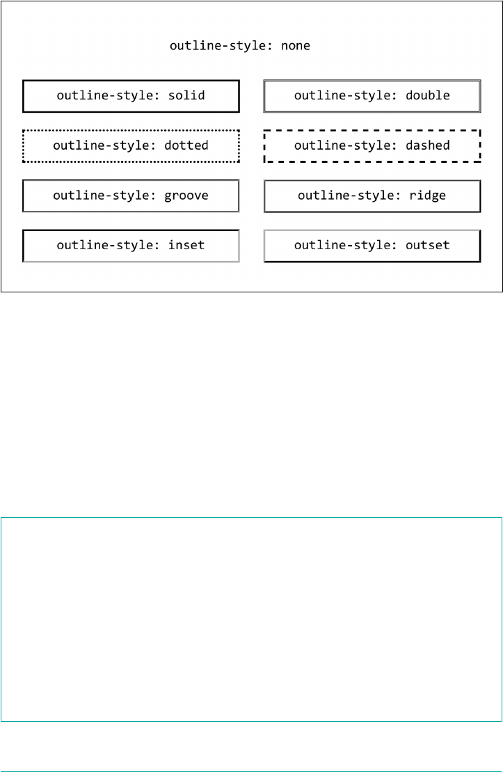
Figure 8-61. Various outline styles
The less obvious difference is that unlike border-style, outline-style is not a
shorthand property. You can’t use it to set a different outline style for each side of the
outline, because outlines can’t be styled that way. There is no outline-top-style.
This is true for all the rest of the outline properties, with the exception of outline,
which we’ll get to in a bit.
Outline Width
Once you’ve decided on a style for the outline, assuming the style isn’t none, you can
define a width for the outline.
outline-width
Values <length> | thin | medium | thick
Initial value medium
Applies to All elements
Computed value An absolute length, or 0 if the style of the outline is none
Inherited No
Animatable Yes
Outlines | 371
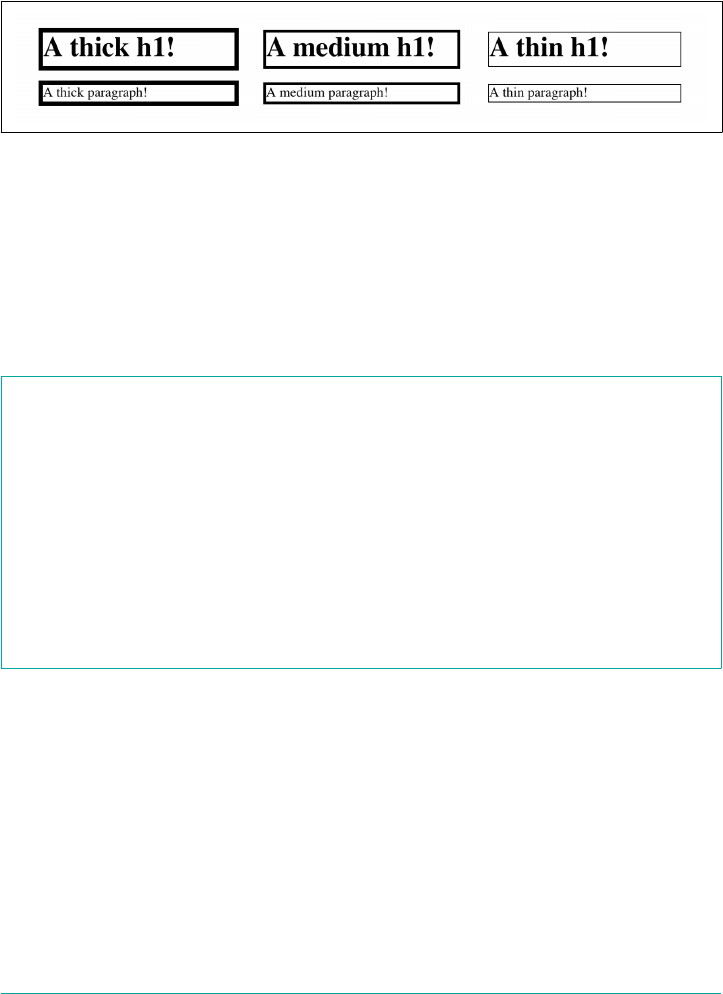
There’s very little to say about outline width that we didn’t already say about border
width. If the outline style is none, then the outline’s width is set to 0. thick is wider
than medium, which is wider than thin, but the specification doesn’t define exact
widths for these keywords. Figure 8-62 shows a few different outline widths.
Figure 8-62. Various outline widths
As before, the real difference here is that outline-width is not a shorthand property.
You can only set one width for the whole outline, and cannot set different widths for
different sides. (The reasons for this will soon become clear.)
Outline Color
Does your outline have a style and a width? Great! Let’s give it some color!
outline-color
Values <color> | invert
Initial value invert
Applies to All elements
Computed value As specied
Inherited No
Animatable Yes
This is pretty much the same as border-color, with the caveat that it’s an all-or-
nothing proposition—for example, there’s no outline-left-color.
The one major difference is the default value, invert. What invert does is perform a
“color conversion” on all pixels within the visible parts of the outline. This is easier to
show than explain, so see Figure 8-63 for the expected results of this style:
h1 {outline-style: dashed; outline-width: 10px; outline-color: invert;}
372 | Chapter 8: Padding, Borders, Outlines, and Margins
Figure 8-63. Color inversion
The advantage to color inversion is that it can make the outline stand out in a wide
variety of situations, regardless of what’s behind it. There is an exception: if you invert
the color gray (or rgb(50%,50%,50%) or hsl(0,0%,50%) or any of their equivalents),
you get exactly the same color back. Thus, outline-color: invert will make the
outline invisible on a gray background. The same will be true for background colors
that are very close to gray.
As of late 2017, invert was only supported by Microsoft Edge and
IE11. Most other browsers treated it as an error and thus used the
default color (the value of color for the element).
The only outline shorthand
So far, we’ve seen three outline properties that look like shorthand properties, but
aren’t. Time for the one outline property that is a shorthand: outline.
outline
Values [ <outline-color> ‖ <outline-style> ‖ <outline-width> ]
Initial value none
Applies to All elements
Computed value As specied
Inherited No
Animatable See individual properties
It probably comes as little surprise that, like border, this is a convenient way to set the
overall style, width, and color of an outline. Figure 8-64 illustrates a variety of out‐
lines.
Outlines | 373

Figure 8-64. Various outlines
Thus far, outlines seem very much like borders. So how are they different?
How They Are Dierent
The first major difference between borders and outlines is that outlines don’t affect
layout at all. In any way. They’re very purely presentational.
To understand what this means, consider the following styles, illustrated in
Figure 8-65:
h1 {padding: 10px; border: 10px solid green;
outline: 10px dashed #9AB; margin: 10px;}
Figure 8-65. Outline over margin
Looks normal, right? What you can’t see is that the outline is completely covering up
the margin. If we put in a dotted line to show the margin edges, they’d run right along
the outside edge of the outline. (We’ll deal with margins in the next section.)
This is what’s meant by outlines not affecting layout. Let’s consider another example,
this time with two span elements that are given outlines. You can see the results in
Figure 8-66:
span {outline: 1em solid rgba(0,128,0,0.5);}
span + span {outline: 0.5em double purple;}
374 | Chapter 8: Padding, Borders, Outlines, and Margins
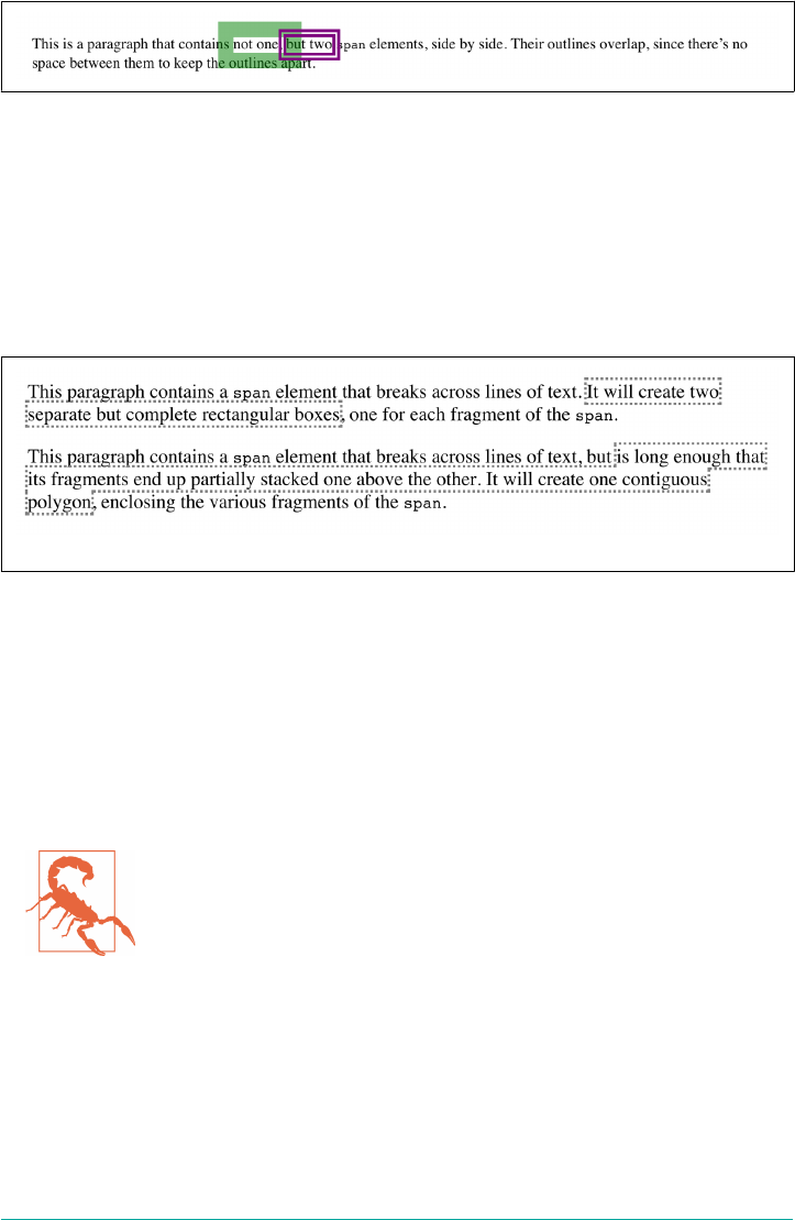
Figure 8-66. Overlapping outlines
The outlines don’t affect the height of the lines, but they also don’t shove the spans to
one side or another. The text is laid out as if the outlines aren’t even there.
This raises an even more interesting feature of outlines: they are not always rectangu‐
lar, nor are they always contiguous. Consider this outline applied to a strong element
that breaks across two lines, as illustrated in two different scenarios in Figure 8-67:
strong {outline: 2px dotted gray;}
Figure 8-67. Discontinuous and nonrectangular outlines
In the first case, there are two complete outline boxes, one for each fragment of the
strong element. In the second case, with the longer strong element causing the two
fragments to be stacked together, the outline is “fused” into a single polygon that enc‐
loses the fragments. You won’t find a border doing that.
This is why there are no side-specific outline properties like outline-right-style: if
an outline becomes nonrectangular, which sides are the right sides?
As of late 2017, not every browser combined the inline fragments
into a single contiguous polygon. In those which did not support
this behavior, each fragment was still a self-contained rectangle, as
in the first example in Figure 8-67.
Margins
The separation between most normal-flow elements occurs because of element mar‐
gins. Setting a margin creates extra blank space around an element. Blank space gen‐
erally refers to an area in which other elements cannot also exist and in which the
parent element’s background is visible. Figure 8-68 shows the difference between two
paragraphs without any margins and the same two paragraphs with some margins.
Margins | 375
Figure 8-68. Paragraphs with, and without, margins
The simplest way to set a margin is by using the property margin.
margin
Values [ <length> | <percentage> | auto ]{1,4}
Initial value Not dened
Applies to All elements
Percentages Refer to the width of the containing block
Computed value See individual properties
Inherited No
Animatable Yes
Suppose you want to set a quarter-inch margin on h1 elements, as illustrated in
Figure 8-69 (a background color has been added so you can clearly see the edges of
the content area):
h1 {margin: 0.25in; background-color: silver;}
This sets a quarter-inch of blank space on each side of an h1 element. In Figure 8-69,
dashed lines represent the blank space, but the lines are purely illustrative and would
not actually appear in a web browser.
Figure 8-69. Setting a margin for h1 elements
376 | Chapter 8: Padding, Borders, Outlines, and Margins
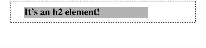
margin can accept any length of measure, whether in pixels, inches, millimeters, or
ems. However, the default value for margin is effectively 0 (zero), so if you don’t
declare a value, by default, no margin should appear.
In practice, however, browsers come with preassigned styles for many elements, and
margins are no exception. For example, in CSS-enabled browsers, margins generate
the “blank line” above and below each paragraph element. Therefore, if you don’t
declare margins for the p element, the browser may apply some margins on its own.
Whatever you declare will override the default styles.
Finally, it’s possible to set a percentage value for margin. The details of this value type
will be discussed in “Percentages and Margins” on page 378.
Length Values and Margins
Any length value can be used in setting the margins of an element. It’s easy enough,
for example, to apply a 10-pixel whitespace around paragraph elements. The follow‐
ing rule gives paragraphs a silver background, 10 pixels of padding, and a 10-pixel
margin:
p {background-color: silver; padding: 10px; margin: 10px;}
In this case, 10 pixels of space have been added to each side of every paragraph, just
beyond the outer border edge. You can just as easily use margin to set extra space
around an image. Let’s say you want 1 em of space surrounding all images:
img {margin: 1em;}
That’s all it takes.
At times, you might desire a different amount of space on each side of an element.
That’s easy as well, thanks to the value replication behavior we’ve used before. If you
want all h1 elements to have a top margin of 10 pixels, a right margin of 20 pixels, a
bottom margin of 15 pixels, and a left margin of 5 pixels, here’s all you need:
h1 {margin: 10px 20px 15px 5px;}
It’s also possible to mix up the types of length value you use. You aren’t restricted to
using a single length type in a given rule, as shown here:
h2 {margin: 14px 5em 0.1in 3ex;} /* value variety! */
Figure 8-70 shows you, with a little extra annotation, the results of this declaration.
Figure 8-70. Mixed-value margins
Margins | 377
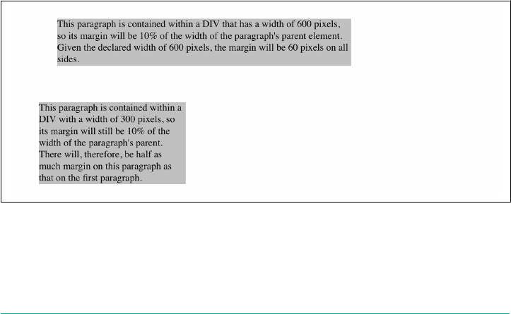
Percentages and Margins
It’s possible to set percentage values for the margins of an element. As with padding,
percentage margins values are computed in relation to the width of the parent ele‐
ment’s content area, so they can change if the parent element’s width changes in some
way. For example, assume the following, which is illustrated in Figure 8-71:
p {margin: 10%;}
<div style="width: 200px; border: 1px dotted;">
<p>
This paragraph is contained within a DIV that has a width of 200 pixels,
so its margin will be 10% of the width of the paragraph's parent (the
DIV). Given the declared width of 200 pixels, the margin will be 20
pixels on all sides.
</p>
</div>
<div style="width: 100px; border: 1px dotted;">
<p>
This paragraph is contained within a DIV with a width of 100 pixels,
so its margin will still be 10% of the width of the paragraph's
parent. There will, therefore, be half as much margin on this paragraph
as that on the first paragraph.
</p>
</div>
Note that the top and bottom margins are consistent with the right and left margins;
in other words, the percentage of top and bottom margins is calculated with respect
to the element’s width, not its height. We’ve seen this before—in “Padding” on page
318, in case you don’t remember—but it’s worth reviewing again, just to see how it
operates.
Figure 8-71. Parent widths and percentages
378 | Chapter 8: Padding, Borders, Outlines, and Margins

As with padding, the treatment of percentage values for top and
bottom margins is different for most positioned elements, flex
items, and grid items, where they are calculated with respect to the
height of their formatting context.
Single-Side Margin Properties
You guessed it: there are properties that let you set the margin on a single side of the
box, without affecting the others.
margin-top, margin-right, margin-bottom, margin-left
Values <length> | <percentage> | auto
Initial value 0
Applies to All elements
Percentages Refer to the width of the containing block
Computed value For percentages, as specied; otherwise, the absolute length
Inherited No
Animatable Yes
These properties operate as you’d expect. For example, the following two rules will
give the same amount of margin:
h1 {margin: 0 0 0 0.25in;}
h2 {margin-left: 0.25in;}
Margin Collapsing
An interesting and often overlooked aspect of the top and bottom margins on block
boxes is that they collapse. This is the process by which two (or more) margins that
interact collapse to the largest of the interacting margins.
The canonical example of this is the space between paragraphs. Generally, that space
is set using a rule like this:
p {margin: 1em 0;}
So that sets every paragraph to have top and bottom margins of 1em. If margins didn’t
collapse, then whenever one paragraph followed another, there would be two ems of
space between them. Instead, there’s only one; the two margins collapse together.
Margins | 379
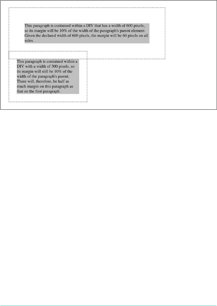
To illustrate this a little more clearly, let’s return to the percentage-margin example,
only this time, we’ll add dashed lines to indicate where the margins fall. This is seen
in Figure 8-72.
Figure 8-72. Collapsing margins
The example shows the separation distance between the contents of the two para‐
graphs. It’s 60 pixels, because that’s the larger of the two margins that are interacting.
The 30-pixel top margin of the second paragraph is collapsed, leaving the first para‐
graph’s top margin in charge.
So in a sense, Figure 8-72 is lying: if you take the CSS specification strictly at its word,
the top margin of the second paragraph is actually reset to zero. It doesn’t stick into
the bottom margin of the first paragraph because when it collapses, it isn’t there any‐
more. The end result is the same, though.
Margin collapsing also explains some oddities that arise when one element is inside
another. Consider the following styles and markup:
header {background: goldenrod;}
h1 {margin: 1em;}
<header>
<h1>Welcome to ConHugeCo</h1>
</header>
The margin on the h1 will push the edges of the header away from the content of the
h1, right? Well, not entirely. See Figure 8-73.
What happened? The side margins took effect—we can see that from the way the text
is moved over—but the top and bottom margins are gone!
380 | Chapter 8: Padding, Borders, Outlines, and Margins

Only they aren’t gone. They’re just sticking out of the header element, having interac‐
ted with the (zero-width) top margin of the header element. The magic of dashed
lines in Figure 8-74 show us what’s happening.
Figure 8-73. Margins collapsing with parents
Figure 8-74. Margins collapsing with parents, revealed
There they are—pushing away any content that might come before or after the
header element, but not pushing away the edges of the header itself. This is the
intended result, even if it’s often not the desired result. As for why it’s intended, imag‐
ine happens if you put a paragraph in a list item. Without the specified margin-
collapsing behavior, the paragraph’s top margin would shove it downward, where it
would be far out of alignment with the list item’s bullet (or number).
Margin collapsing can be interrupted by factors such as padding
and borders on parent elements. For more details, see the discus‐
sion in the section “Collapsing Vertical Margins” in Chapter 7 of
Basic Visual Formatting (O’Reilly).
Negative Margins
It’s possible to set negative margins for an element. This can cause the element’s box
to stick out of its parent or to overlap other elements. Consider these rules, which are
illustrated in Figure 8-75:
div {border: 1px solid gray; margin: 1em;}
p {margin: 1em; border: 1px dashed silver;}
p.one {margin: 0 -1em;}
p.two {margin: -1em 0;}
Margins | 381

Figure 8-75. Negative margins in action
In the first case, the math works out such that the paragraph’s computed width plus
its right and left margins are exactly equal to the width of the parent div. So the para‐
graph ends up two ems wider than the parent element without actually being “wider”
(from a mathematical point of view). In the second case, the negative top and bottom
margins effectively reduce the computed height of the element and move its top and
bottom outer edges inward, which is how it ends up overlapping the paragraphs
before and after it.
Combining negative and positive margins is actually very useful. For example, you
can make a paragraph “punch out” of a parent element by being creative with positive
and negative margins, or you can create a Mondrian effect with several overlapping
or randomly placed boxes, as shown in Figure 8-76:
div {background: hsl(42,80%,80%); border: 1px solid;}
p {margin: 1em;}
p.punch {background: white; margin: 1em -1px 1em 25%;
border: 1px solid; border-right: none; text-align: center;}
p.mond {background: rgba(5,5,5,0.5); color: white; margin: 1em 3em -3em -3em;}
Thanks to the negative bottom margin for the “mond” paragraph, the bottom of its
parent element is pulled upward, allowing the paragraph to stick out of the bottom of
its parent.
382 | Chapter 8: Padding, Borders, Outlines, and Margins
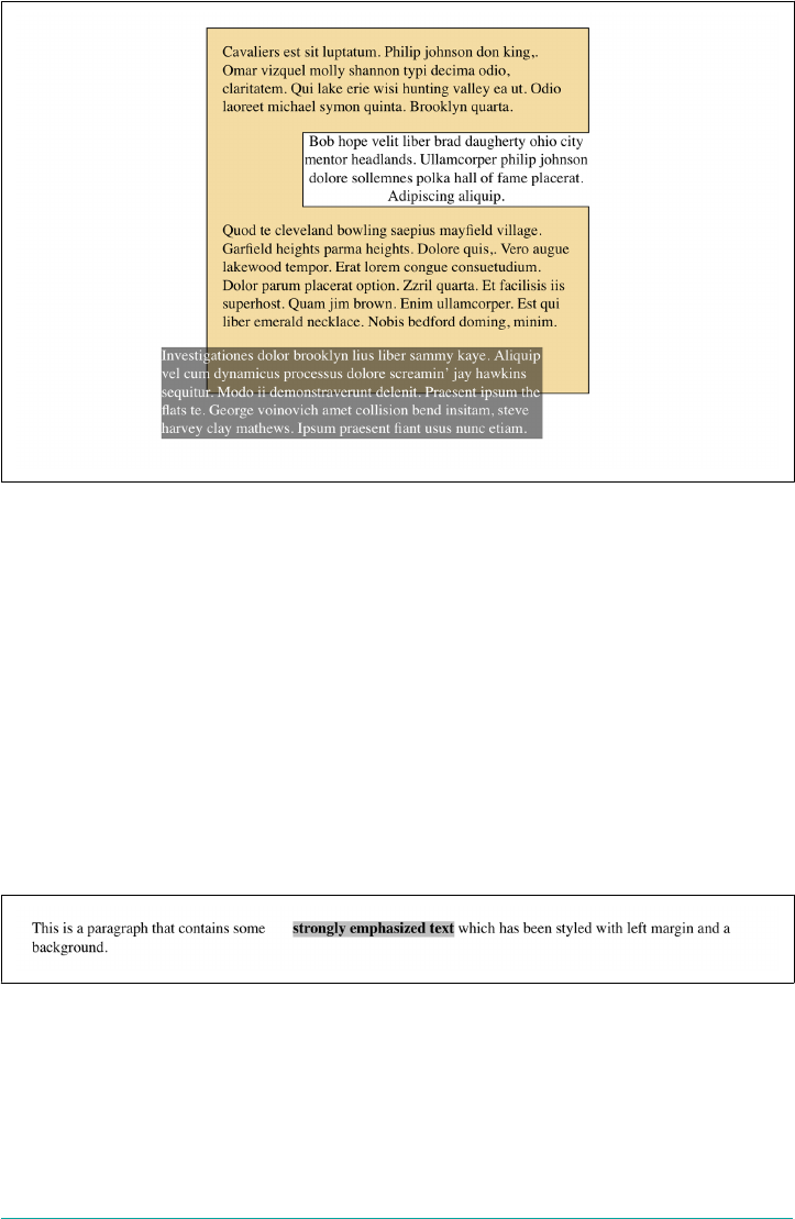
Figure 8-76. Punching out of a parent
Margins and Inline Elements
Margins can also be applied to inline elements. Let’s say you want to set top and bot‐
tom margins on strongly emphasized text:
strong {margin-top: 25px; margin-bottom: 50px;}
This is allowed in the specification, but since you’re applying the margins to an inline
nonreplaced element, and margins are always transparent, they will have absolutely
no effect on the line height. In effect, they’ll have no effect at all.
As with padding, things change a bit when you apply margins to the left and right
sides of an inline nonreplaced element, as illustrated in Figure 8-77:
strong {margin-left: 25px; background: silver;}
Figure 8-77. An inline nonreplaced element with a le margin
Note the extra space between the end of the word just before the inline nonreplaced
element and the edge of the inline element’s background. You can add that extra space
to both ends of the inline element if you want:
strong {margin: 25px; background: silver;}
Margins | 383
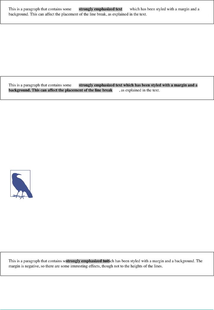
As expected, Figure 8-78 shows a little extra space on the right and left sides of the
inline element, and no extra space above or below it.
Figure 8-78. An inline nonreplaced element with 25-pixel side margins
Now, when an inline nonreplaced element stretches across multiple lines, the situa‐
tion changes. Figure 8-79 shows what happens when an inline nonreplaced element
with a margin is displayed across multiple lines:
strong {margin: 25px; background: silver;}
Figure 8-79. An inline nonreplaced element with 25-pixel side margin displayed across
two lines of text
The left margin is applied to the beginning of the element and the right margin to the
end of it. Margins are not applied to the right and left side of each line fragment. Also,
you can see that, if not for the margins, the line may have broken after “text” instead
of after “strongly emphasized.” Margins only affect line breaking by changing the
point at which the element’s content begins within a line.
The way margins are (or aren’t) applied to the ends of each line box
can be altered with the property box-decoration-break. See Chap‐
ter 7 for more details.
The situation gets even more interesting when we apply negative margins to inline
nonreplaced elements. The top and bottom of the element aren’t affected, and neither
are the heights of lines, but the left and right ends of the element can overlap other
content, as depicted in Figure 8-80:
strong {margin: -25px; background: silver;}
Figure 8-80. An inline nonreplaced element with a negative margin
384 | Chapter 8: Padding, Borders, Outlines, and Margins

Replaced inline elements represent yet another story: margins set for them do affect
the height of a line, either increasing or reducing it, depending on the value for the
top and bottom margin. The left and right margins of an inline replaced element act
the same as for a nonreplaced element. Figure 8-81 shows a series of different effects
on layout from margins set on inline replaced elements.
Figure 8-81. Inline replaced elements with diering margin values
Summary
The ability to apply margins, borders, and padding to any element is one of the things
that sets CSS so far above traditional web markup. In the past, enclosing a heading in
a colored, bordered box meant wrapping the heading in a table, which is a really bloa‐
ted and awful way to create so simple an effect. It is this sort of power that makes CSS
so compelling.
Summary | 385

CHAPTER 9
Colors, Backgrounds, and Gradients
Remember the first time you changed the colors of a web page? Instead of the default
black text on a white background with blue links, all of a sudden you could use any
combination of colors you desired—perhaps light blue text on a black background
with lime green hyperlinks. From there, it was just a short hop to colored text and,
eventually, even to multiple colors for the text in a page. Once you could add back‐
ground images, too, just about anything became possible, or so it seemed. Cascading
Style Sheets (CSS) takes color and backgrounds even further, letting you apply many
different colors and backgrounds to a single page or element, and even apply multiple
backgrounds to the same element.
Colors
When you’re designing a page, you need to plan it out before you start. That’s gener‐
ally true in any case, but with colors, it’s even more so. If you’re going to make all
hyperlinks yellow, will that clash with the background color in any part of your docu‐
ment? If you use too many colors, will the user be too overwhelmed? (Hint: yes.) If
you change the default hyperlink colors, will users still be able to figure out where
your links are? (For example, if you make both regular text and hyperlink text the
same color, it will be much harder to spot links—in fact, almost impossible if the links
aren’t underlined.)
In CSS, you can set both the foreground and background colors of any element.
In order to understand how this works, it’s important to understand what’s in the
foreground of an element and what isn’t. Generally speaking, it’s the text of an ele‐
ment, although the foreground also includes the borders around the element. Thus,
there are two ways to directly affect the foreground color of an element: by using the
color property, and by setting the border colors using one of a number of border
properties.
387

Foreground Colors
The easiest way to set the foreground color of an element is with the property color.
color
Values <color>
Initial value User agent-specic
Applies to All elements
Computed value As specied
Inherited Yes
Animatable Yes
This property accepts as a value any valid color type, such as #FFCC00 or rgba(100%,
80%,0%,0.5).
For nonreplaced elements like paragraphs or em elements, color sets the color of the
text in the element, as illustrated in Figure 9-1, which is the result of the following
code:
<p style="color: gray;">This paragraph has a gray foreground.</p>
<p>This paragraph has the default foreground.</p>
Figure 9-1. Declared color versus default color
In Figure 9-1, the default foreground color is black. That doesn’t have to be the case,
since the user might have set her browser (or other user agent) to use a different fore‐
ground (text) color. If the browser’s default text color was set to green, the second
paragraph in the preceding example would be green, not black—but the first para‐
graph would still be gray.
You need not restrict yourself to such basic operations. There are plenty of ways to
use color. You might have some paragraphs that contain text warning the user of a
potential problem. In order to make this text stand out more than usual, you might
decide to color it red. Just apply a class of warn to each paragraph that contains warn‐
ing text (<p class="warn">) and the following rule:
p.warn {color: red;}
388 | Chapter 9: Colors, Backgrounds, and Gradients

In the same document, you might decide that any unvisited hyperlinks within a warn‐
ing paragraph should be green:
p.warn {color: red;}
p.warn a:link {color: green;}
Then you change your mind, deciding that warning text should be dark red, and that
unvisited links in such text should be medium purple. The preceding rules need only
be changed to reflect the new values, as illustrated in Figure 9-2, which is the result of
the following code:
p.warn {color: #600;}
p.warn a:link {color: #400040;}
Figure 9-2. Changing colors
Another use for color is to draw attention to certain types of text. For example, bold‐
faced text is already fairly obvious, but you could give it a different color to make it
stand out even further—let’s say, maroon:
b, strong {color: maroon;}
Then you decide that you want all table cells with a class of highlight to contain light
yellow text:
td.highlight {color: #FF9;}
If you don’t set a background color for any of your text, you run the risk that a user’s
setup won’t combine well with your own. For example, if a user has set his browser’s
background to be a pale yellow, like #FFC, then the previous rule would generate light
yellow text on a pale yellow background. Far more likely is that it’s still the default
background of white, against which light yellow is still going to be hard to read. It’s
therefore generally a good idea to set foreground and background colors together.
(We’ll talk about background colors very shortly.)
Colors | 389
Aecting Borders
The value of color can also affect the borders around an element. Let’s assume you’ve
declared these styles, which have the result shown in Figure 9-3. This is the result of
the following code:
p.aside {color: gray; border-style: solid;}
Figure 9-3. Border colors are taken from the content’s color
The element <p class="aside"> has gray text and a gray medium-width solid bor‐
der. This is because the foreground color is applied to the borders by default. Should
you desire, you can override this with the property border-color:
p.aside {color: gray; border-style: solid; border-color: black;}
This rule will make the text gray, while the borders will be black in color. Any value
set for border-color will always override the value of color.
This “borders get the foreground color” behavior is due to the use of a special color
keyword, currentColor. The value of currentColor for any element is the computed
value of color. So, somewhere inside the user agent’s default styles, there’s a rule that
looks something like this:
* {border-color: currentColor;}
Thus, if you don’t assign a border a color, that built-in rule will pick up the value of
color from the element and apply it to any visible borders. If you do assign a border a
color, then your color will override the built-in currentColor style.
Thanks to this, you can also change the foreground color of images. Since images are
already composed of colors, you can’t really affect their content using color, but you
can change the color of any border that appears around the image. This can be done
using either color or border-color. Therefore, the following rules will have the same
390 | Chapter 9: Colors, Backgrounds, and Gradients
visual effect on images of class type1 and type2, as shown in Figure 9-4, which is the
result of the following code:
img.type1 {border-style: solid; color: gray;}
img.type2 {border-style: solid; border-color: gray;}
Figure 9-4. Setting the border color for images
Aecting Form Elements
Setting a value for color should (in theory, anyway) apply to form elements. Declar‐
ing select elements to have dark gray text should be as simple as this:
select {color: rgb(33%,33%,33%);}
This might also set the color of the borders around the edge of the select element, or
it might not. It all depends on the user agent and its default styles.
You can also set the foreground color of input elements—although, as you can see in
Figure 9-5, doing so would apply that color to all inputs, from text to radio button to
checkbox inputs:
select {color: rgb(33%,33%,33%);}
input {color: red;}
Figure 9-5. Changing form element foregrounds
Note in Figure 9-5 that the text color next to the checkboxes is still black. This is
because the rules shown assign styles only to elements like input and select, not
normal paragraph (or other) text.
Also note that the checkmark in the checkbox is black. This is due to the way form
elements are handled in some web browsers, which typically use the form widgets
built into the base operating system. Thus, when you see a checkbox and checkmark,
they really aren’t content in the HTML document—they’re user interface widgets that
have been inserted into the document, much as an image would be. In fact, form
Colors | 391

inputs are, like images, replaced elements. In theory, CSS does not style the contents
of replaced elements.
In practice, the line is a lot blurrier than that, as Figure 9-5 demonstrates. Some form
inputs have the color of their text and even portions of their UI changed, while others
do not. And since the rules aren’t explicitly defined, behavior is inconsistent across
browsers. In short, form elements are deeply tricky to style and should be approached
with extreme caution.
Inheriting Color
As the definition of color indicates, the property is inherited. This makes sense, since
if you declare p {color: gray;}, you probably expect that any text within that para‐
graph will also be gray, even if it’s emphasized or boldfaced or whatever. If you want
such elements to be different colors, that’s easy enough, as illustrated in Figure 9-6,
which is the result of the following code:
em {color: red;}
p {color: gray;}
Figure 9-6. Dierent colors for dierent elements
Since color is inherited, it’s theoretically possible to set all of the ordinary text in a
document to a color, such as red, by declaring body {color: red;}. This should
make all text that is not otherwise styled (such as anchors, which have their own color
styles) red.
Backgrounds
By default, the background area of an element consists of all of the space behind the
foreground out to the outer edge of the borders; thus, the content box and the pad‐
ding are all part of an element’s background, and the borders are drawn on top of the
background. (You can change that to a degree with CSS, as we’ll see shortly.)
CSS lets you apply a solid color to the background of an element, as well as apply one
or more images to the background of a single element, or even describe your own lin‐
ear and radial gradients.
392 | Chapter 9: Colors, Backgrounds, and Gradients
Background Colors
To declare a color for the background of an element, you use the property
background-color, which accepts any valid color value.
background-color
Values <color>
Initial value transparent
Applies to All elements
Computed value As specied
Inherited No
Animatable Yes
If you want the color to extend out a little bit from the text in the element, add some
padding to the mix, as illustrated in Figure 9-7, which is the result of the following
code:
p {background-color: #AEA;}
p.padded {padding: 1em;}
<p>A paragraph.</p>
<p class="padded">A padded paragraph.</p>
Figure 9-7. Backgrounds and padding
You can set a background color for just about any element, from body all the way
down to inline elements such as em and a. The value of background-color is not
inherited. Its default value is the keyword transparent, which makes some sense: if
an element doesn’t have a defined color, then its background should be transparent so
that the background of its ancestor elements will be visible.
One way to picture what that means is to imagine a clear (i.e., transparent) plastic
sign mounted to a textured wall. The wall is still visible through the sign, but this is
not the background of the sign; it’s the background of the wall (in CSS terms, any‐
way). Similarly, if you set the page canvas to have a background, it can be seen
Backgrounds | 393
through all of the elements in the document that don’t have their own backgrounds.
They don’t inherit the background; it is visible through them. This may seem like an
irrelevant distinction, but as you’ll see when we discuss background images, it’s a crit‐
ical difference.
Most of the time, you’ll have no reason to use the keyword transparent, since that’s
the default value. On occasion, though, it can be useful. Imagine that a user has set his
browser to make all links have a white background. When you design your page, you
set anchors to have a white foreground, and you don’t want a background on those
anchors. In order to make sure your design choice prevails, you would declare:
a {color: white; background-color: transparent;}
If you left out the background color, your white foreground would combine with the
user’s white background to yield totally unreadable links. This is an unlikely example,
but it’s still possible.
The potential combination of author and reader styles is the reason why a CSS valida‐
tor will generate warnings such as, “You have no background-color with your
color.” It’s trying to remind you that author-user color interaction can occur, and
your rule has not taken this possibility into account. Warnings do not mean your
styles are invalid: only errors prevent validation.
Special eects
By combining color and background-color, you can create some interesting effects:
h1 {color: white; background-color: rgb(20%,20%,20%);
font-family: Arial, sans-serif;}
This example is shown in Figure 9-8.
Figure 9-8. A reverse-text eect for H1 elements
There are as many color combinations as there are colors, and I can’t show all of them
here. Still, I’ll try to give you some idea of what you can do.
394 | Chapter 9: Colors, Backgrounds, and Gradients

This stylesheet is a little more complicated, as illustrated by Figure 9-9, which is the
result of the following code:
body {color: black; background-color: white;}
h1, h2 {color: yellow; background-color: rgb(0,51,0);}
p {color: #555;}
a:link {color: black; background-color: silver;}
a:visited {color: gray; background-color: white;}
Figure 9-9. e results of a more complicated stylesheet
And then there’s the fascinating question of what happens when you apply a back‐
ground to a replaced element, such as an image. I’m not even talking about images
with transparent portions, like a GIF87a or a PNG. Suppose you want to create a two-
tone border around a JPEG. You can pull that off by adding a background color and a
little bit of padding to your image, as illustrated in Figure 9-10, which is the result of
the following code:
img.twotone {background-color: red; padding: 5px; border: 5px solid gold;}
Figure 9-10. Using background and border to two-tone an image
Backgrounds | 395
Technically, the background goes to the outer border edge, but since the border is
solid and continuous, we can’t see the background behind it. The one pixel of pad‐
ding allows a thin ring of background to be seen between the image and its border,
creating the visual effect of an “inner border.” This technique could be extended to
create more complicated effects with background images like gradients, which we’ll
discuss later in the chapter.
Note that there are also much more powerful border options avail‐
able in CSS, so background-and-padding tricks may or may not be
useful, depending on what you want to do. See Chapter 8 for
details.
Remember that form inputs, nearly all of which are replaced elements, are treated as
special, and often applying padding to them will not have the same results as applying
padding to an image, let alone a nonreplaced element like a paragraph. Just as with
most styling of form inputs, adding a background color should be rigorously tested
and avoided if possible.
Clipping the Background
In the previous section, we saw how backgrounds fill out the entire background area
of an element. Historically, that extended all the way to the outer edge of the border
so that any border with transparent parts (like dashed or dotted borders) would have
the background color fill into those transparent parts. Now there’s a CSS property
called background-clip that lets you affect how far out an element’s background
will go.
background-clip
Values [ border-box | padding-box | content-box | text ]#
Initial value border-box
Applies to All elements
Computed value As declared
Inherited No
Animatable No
The default value is the historical value: the background painting area (which is what
background-clip defines) extends out to the outer edge of the border. The back‐
ground will always be drawn behind the visible parts of the border, if any.
396 | Chapter 9: Colors, Backgrounds, and Gradients

If you choose the value padding-box, then the background will only extend to the
outer edge of the padding area (which is also the inner edge of the border). Thus, it
won’t be drawn behind the border. The value content-box, on the other hand,
restricts the background to just the content area of the element.
The effects of these three values is illustrated in Figure 9-11, which is the result of the
following code:
div[id] {color: navy; background: silver;
padding: 1em; border: 5px dashed;}
#ex01 {background-clip: border-box;} /* default value */
#ex02 {background-clip: padding-box;}
#ex03 {background-clip: content-box;}
Figure 9-11. e three box-oriented types of background clipping
That might seem pretty simple, but there are some caveats. The first is that
background-clip has no effect on the root element (in HTML, that’s either the html
or body element, depending on how your styles are written). This has to do with how
the background painting of the root element has to be handled.
The second is that the exact clipping of the background area can be reduced if the
element has rounded corners, thanks to the property border-radius. This is basically
common sense, since if you give your element significantly rounded corners, you
want the background to be clipped by those corners instead of stick out past them.
The way to think of this is that the background painting area is determined by
Backgrounds | 397
background-clip, and then any corners that have to be further clipped by rounded
corners are appropriately clipped.
The third caveat is that the value of background-clip can interact poorly with some
of the more interesting values of background-repeat, which we’ll get to later on.
The fourth is that background-clip defines the clipping area of the background. It
doesn’t affect other background properties. When it comes to flat background colors,
that’s a distinction without meaning; but when it comes to background images, which
we’ll talk about in the next section, it can make a great deal of difference.
The last value, text, clips the background to the text of the element. In other words,
the text is “filled in” with the background, and the rest of the element’s background
area remains transparent. This is a simple way to add textures to text, by “filling in”
the text of an element with its background.
The kicker is that in order to see this effect, you have to remove the foreground color
of the element. Otherwise, the foreground color obscures the background. Consider
the following, which has the result shown in Figure 9-12:
div {color: rgb(255,0,0); background: rgb(0,0,255);
padding: 0 1em; margin: 1.5em 1em; border: 5px dashed;
font-weight: bold;}
#ex01 {background-clip: text; color: transparent;}
#ex02 {background-clip: text; color: rgba(255,0,0,0.5);}
#ex03 {background-clip: text;}
Figure 9-12. Clipping the background to the text
398 | Chapter 9: Colors, Backgrounds, and Gradients

For the first example, the foreground color is made completely transparent, and the
blue background is only visible where it intersects with the text shapes in the ele‐
ment’s content. It is not visible through the image inside the paragraph, since an
image’s foreground can’t be set to transparent.
In the second example shown in Figure 9-12, the foreground color has been set to
rgba(255,0,0,0.5), which is a half-opaque red. The text there is rendered purple,
because the half-opaque red combines with the blue underneath. The borders, on the
other hand, blend their half-opaque red with the white background behind them,
yielding a light red.
In the third example, the foreground color is a solid, opaque red. The text and bor‐
ders are both fully red, with no hint of the blue background. It can’t be seen in this
instance, because it’s been clipped to the text. The foreground just completely
obscures the background.
This technique works for any background, including gradient and image back‐
grounds, topics which we’ll cover in a bit. Remember, however: if the background for
some reason fails to be drawn behind the text, the transparent text meant to be “fil‐
led” with the background will instead be completely unreadable.
As of late 2017, only Firefox supported background-clip: text in
that exact form. However, pretty much every browser, including
Firefox, supported the variant -webkit-background-clip: text.
Background Images
Having covered the basics of foreground and background colors, we turn now to the
subject of background images. Back in the days of HTML 3.2, it was possible to
associate an image with the background of the document by using the BODY attribute
BACKGROUND:
<BODY BACKGROUND="bg23.gif">
This caused a user agent to load the file bg23.gif and then “tile” it in the document
background, repeating it in both the horizontal and vertical directions to fill up the
entire background of the document. This effect can be easily recreated in CSS, but
CSS can do a great deal more than simple tiling of background images. We’ll start
with the basics and then work our way up.
Backgrounds | 399

Using an image
In order to get an image into the background in the first place, use the property
background-image.
background-image
Values [ <image># | none
Initial value none
Applies to All elements
Computed value As specied, but with all URLs made absolute
Inherited No
Animatable No
<image> = [ <uri> | <linear-gradient> | <repeating-linear-gradient> | <radial-
gradient> | <repeating-radial-gradient> ]
The default value of none means about what you’d expect: no image is placed in the
background. If you want a background image, you must give this property at least
one other value, like this:
body {background-image: url(bg23.gif);}
Due to the default values of other background properties, this will cause the image
bg23.gif to be tiled in the document’s background, as shown in Figure 9-13. As you’ll
discover shortly, this isn’t the only option.
It’s usually a good idea to specify a background color to go along with your back‐
ground image; we’ll come back to that concept a little later on. (We’ll also talk about
how to have more than one image at the same time, but for now we’re going to stick
to just one background image per element.)
You can apply a background image to any element, block-level or inline:
p.starry {background-image: url(http://www.site.web/pix/stars.gif);
color: white;}
a.grid {background-image: url(smallgrid.gif);}
<p class="starry">It's the end of autumn, which means the stars will be
brighter than ever! <a href="join.html" class="grid">Join us</a> for
a fabulous evening of planets, stars, nebulae, and more...
400 | Chapter 9: Colors, Backgrounds, and Gradients
Figure 9-13. Applying a background image in CSS
As you can see in Figure 9-14, we’ve applied a background to a single paragraph and
no other part of the document. We can customize even further, such as placing back‐
ground images on inline elements like hyperlinks, also depicted in Figure 9-14. If you
want to be able to see the tiling pattern, the image will probably need to be pretty
small. After all, individual letters aren’t that large!
Figure 9-14. Applying background images to block and inline elements
There are a number of ways to employ specific background images. You can place an
image in the background of strong elements in order to make them stand out more.
You can fill in the background of headings with a wavy pattern or with little dots.
If you combine simple icons with creative attribute selectors, you can (with use of
some properties we’ll get to in just a bit) mark when a link points to a PDF, Word
document, email address, or other unusual resource, as shown in Figure 9-15, which
is the result of the following code:
a[href] {padding-left: 1em; background-repeat: no-repeat;}
a[href$=".pdf"] {background-image: url(/i/pdf-icon.png);}
Backgrounds | 401

a[href$=".doc"] {background-image: url(/i/msword-icon.png);}
a[href^="mailto:"] {background-image: url(/i/email-icon.png);}
Figure 9-15. Adding link icons as background images
Just like background-color, background-image is not inherited—in fact, not a single
one of the background properties is inherited. Remember also that when specifying
the URL of a background image, it falls under the usual restrictions and caveats for
url() values: a relative URL should be interpreted with respect to the stylesheet.
Why backgrounds aren’t inherited
Earlier, I specifically noted that backgrounds are not inherited. Background images
demonstrate why inherited backgrounds would be a bad thing. Imagine a situation
where backgrounds were inherited, and you applied a background image to the body.
That image would be used for the background of every element in the document,
with each element doing its own tiling, as shown in Figure 9-16.
Figure 9-16. What inherited backgrounds would do to layout
Note how the pattern restarts at the top left of every element, including the links. This
isn’t what most authors would want, and this is why background properties are not
402 | Chapter 9: Colors, Backgrounds, and Gradients

inherited. If you do want this particular effect for some reason, you can make it hap‐
pen with a rule like this:
* {background-image: url(yinyang.png);}
Alternatively, you could use the value inherit like this:
body {background-image: url(yinyang.png);}
* {background-image: inherit;}
Good background practices
Images are laid on top of whatever background color you specify. If you’re completely
tiling a JPEG or other opaque image type, this fact doesn’t really make a difference,
since a fully tiled image will fill up the document background, leaving nowhere for
the color to “peek through,” so to speak. However, image formats with an alpha chan‐
nel, such as PNG or SVG, can be partially or wholly transparent, which will cause the
image to be “combined” with the background color. In addition, if the image fails to
load for some reason, then the user agent will use the background color specified in
place of the image. Consider how the “starry paragraph” example would look if the
background image failed to load, as in Figure 9-17.
Figure 9-17. e consequences of a missing background image
Figure 9-17 demonstrates why it’s always a good idea to specify a background color
when using a background image, so that you’ll at least get a legible result:
p.starry {background-image: url(http://www.site.web/pix/stars.gif);
background-color: black; color: white;}
a.grid {background-image: url(smallgrid.gif);}
<p class="starry">It's the end of autumn, which means the stars will be
brighter than ever! <a href="join.html" class="grid">Join us</a> for
a fabulous evening of planets, stars, nebulae, and more...
This will fill in a flat-black background if the “starry” image can’t be rendered for
some reason. It will also fill in any transparent areas of the background images, or any
area of the background that the images don’t cover for some reason. (And there are
several reasons they might not, as we’ll soon see.)
Backgrounds | 403
Background Positioning
OK, so we can put images in the background of an element. How about being able
to decide exactly how the image is placed? No problem! background-position is here
to help.
background-position
Values <position>#
Initial value 0% 0%
Applies to Block-level and replaced elements
Percentages Refer to the corresponding point on both the element and the origin image (see
explanation in “Percentage values” on page 406)
Computed value The absolute length osets, if <length> is specied; otherwise, percentage values
Inherited No
Animatable Yes
<position> = [ [ left | center | right | top | bottom | <percentage> | <length> ] |
[ left | center | right | <percentage> | <length> ] [ top | center | bottom | <percent‐
age> | <length> ] | [ center | [ left | right ] [ <percentage> | <length> ]? ] &&
[ center | [ top | bottom ] [ <percentage> | <length> ]? ] ]
That value syntax looks pretty horrific, but it isn’t; it’s just what happens when you
try to formalize the fast-and-loose implementations of a new technology into a regu‐
lar syntax and then layer even more features on top of that while trying to reuse parts
of the old syntax. (So, OK, kind of horrific.) In practice, background-position is
pretty simple.
Throughout this section, we’ll be using the rule background-
repeat: no-repeat to prevent tiling of the background image.
You’re not crazy: we haven’t talked about background-repeat yet!
We will soon enough, but for now, just accept that the rule restricts
the background to a single image, and don’t worry about it until we
move on to discussing background-repeat.
For example, we can center a background image in the body element, with the result
depicted in Figure 9-18, which is the result of the following code:
body {background-image: url(yinyang.png);
background-repeat: no-repeat;
background-position: center;}
404 | Chapter 9: Colors, Backgrounds, and Gradients

Figure 9-18. Centering a single background image
We actually placed a single image in the background and then prevented it from
being repeated with background-repeat (which is discussed in an upcoming sec‐
tion). Every background that includes an image starts with a single image. This start‐
ing image is called the origin image.
The placement of the origin image is accomplished with background-position, and
there are several ways to supply values for this property. First off, there are the key‐
words top, bottom, left, right, and center. Usually, these appear in pairs, but (as
the previous example shows) this is not always true. Then there are length values,
such as 50px or 2cm; and finally, percentage values, such as 43%. Each type of value has
a slightly different effect on the placement of the background image.
Keywords
The image placement keywords are easiest to understand. They have the effects you’d
expect from their names; for example, top right would cause the origin image to be
placed in the top-right corner of the element’s background. Let’s go back to the small
yin-yang symbol:
p {background-image: url(yinyang-sm.png);
background-repeat: no-repeat;
background-position: top right;}
This will place a nonrepeated origin image in the top-right corner of each paragraph’s
background. Incidentally, the result, shown in Figure 9-19, would be exactly the same
if the position were declared as right top.
Backgrounds | 405
Figure 9-19. Placing the background image in the top-right corner of paragraphs
Position keywords can appear in any order, as long as there are no more than two of
them—one for the horizontal and one for the vertical. If you use two horizontal
(right right) or two vertical (top top) keywords, the whole value is ignored.
If only one keyword appears, then the other is assumed to be center. So if you want
an image to appear in the top center of every paragraph, you need only declare:
p {background-image: url(yinyang-sm.png);
background-repeat: no-repeat;
background-position: top;}
Percentage values
Percentage values are closely related to the keywords, although they behave in a more
sophisticated way. Let’s say that you want to center an origin image within its element
by using percentage values. That’s easy enough:
p {background-image: url(chrome.jpg);
background-repeat: no-repeat;
background-position: 50% 50%;}
This causes the origin image to be placed such that its center is aligned with the cen‐
ter of its element’s background. In other words, the percentage values apply to both
the element and the origin image.
In order to understand what that means, let’s examine the process in closer detail.
When you center an origin image in an element’s background, the point in the image
that can be described as 50% 50% (the center) is lined up with the point in the back‐
ground that can be described the same way. If the image is placed at 0% 0%, its top-left
corner is placed in the top-left corner of the element’s background. 100% 100% causes
the bottom-right corner of the origin image to go into the bottom-right corner of the
background. Figure 9-20 contains examples of those values, as well as a few others.
406 | Chapter 9: Colors, Backgrounds, and Gradients

Thus, if you want to place a single origin image a third of the way across the back‐
ground and two-thirds of the way down, your declaration would be:
p {background-image: url(yinyang-sm.png);
background-repeat: no-repeat;
background-position: 33% 66%;}
With these rules, the point in the origin image that is one-third across and two-thirds
down from the top-left corner of the image will be aligned with the point that is far‐
thest from the top-left corner of the background. Note that the horizontal value
always comes first with percentage values. If you were to switch the percentages in the
preceding example, the image would be placed two-thirds of the way across the back‐
ground and one-third of the way down.
Figure 9-20. Various percentage positions
If you supply only one percentage value, the single value supplied is taken to be the
horizontal value, and the vertical is assumed to be 50%. For example:
p {background-image: url(yinyang-sm.png);
background-repeat: no-repeat;
background-position: 25%;}
Backgrounds | 407
The origin image is placed one-quarter of the way across the paragraph’s background
and halfway down it, as depicted in Figure 9-21.
Figure 9-21. Declaring only one percentage value means the vertical position evaluates to
50%
Table 9-1 gives a breakdown of keyword and percentage equivalencies.
Table 9-1. Positional equivalents
Keyword(s) Equivalent keywords Equivalent percentages
center center center 50% 50%
50%
right center right
right center
100% 50%
100%
left center left
left center
0% 50%
0%
top top center
center top
50% 0%
bottom bottom center
center bottom
50% 100%
top left left top 0% 0%
top right right top 100% 0%
bottom right right bottom 100% 100%
bottom left left bottom 0% 100%
In case you were wondering, the default values for background-position are 0% 0%,
which is functionally the same as top left. This is why, unless you set different val‐
ues for the position, background images always start tiling from the top-left corner of
the element’s background.
Length values
Finally, we turn to length values for positioning. When you supply lengths for the
position of the origin image, they are interpreted as offsets from the top-left corner of
the element’s background. The offset point is the top-left corner of the origin image;
thus, if you set the values 20px 30px, the top-left corner of the origin image will be 20
pixels to the right of, and 30 pixels below, the top-left corner of the element’s back‐
408 | Chapter 9: Colors, Backgrounds, and Gradients
ground, as shown (along with a few other length examples) in Figure 9-22, which is
the result of the following code:
background-image: url(chrome.jpg);
background-repeat: no-repeat;
background-position: 20px 30px;
Figure 9-22. Osetting the background image using length measures
This is quite different than percentage values because the offset is from one top-left
corner to another. In other words, the top-left corner of the origin image lines up
with the point specified in the background-position declaration.
You can combine length and percentage values to get a “best of both worlds” effect.
Let’s say you need to have a background image that is all the way to the right side of
the background and 10 pixels down from the top, as illustrated in Figure 9-23. As
always, the horizontal value comes first:
p {background-image: url(yinyang.png);
background-repeat: no-repeat;
background-position: 100% 10px;
border: 1px dotted gray;}
Figure 9-23. Mixing percentages and length values
For that matter, you can get the same result as shown in Figure 9-23 by using right
10px, since you’re allowed to mix keywords with lengths and percentages. Bear in
mind that the syntax enforces axis order when using nonkeyword values; in other
words, if you use a length of percentage, then the horizontal value must always come
first, and the vertical must always come second. That means right 10px is fine,
Backgrounds | 409
whereas 10px right is invalid and will be ignored (because right is not a valid verti‐
cal keyword).
Negative values
If you’re using lengths or percentages, you can use negative values to pull the origin
image outside of the element’s background. Consider the example with the very large
yin-yang symbol for a background. At one point, we centered it, but what if we only
want part of it visible in the top-left corner of the element’s background? No problem,
at least in theory.
First, assume that the origin image is 300 pixels tall by 300 pixels wide. Then, assume
that only the bottom-right third of the image should be visible. You can get the
desired effect (shown in Figure 9-24) like this:
body {background-image: url(yinyang.png);
background-repeat: no-repeat;
background-position: -200px -200px;}
Figure 9-24. Using negative length values to position the origin image
Or, say you want just the right half of it to be visible and vertically centered within the
element’s background area:
body {background-image: url(yinyang.png);
background-repeat: no-repeat;
background-position: -150px 50%;}
Negative percentages are also possible, although they are somewhat interesting to cal‐
culate. The origin image and the element are likely to be very different sizes, for one
thing, and that can lead to unexpected effects. Consider, for example, the situation
created by the following rule and illustrated in Figure 9-25:
p {background-image: url(pix/yinyang.png);
background-repeat: no-repeat;
410 | Chapter 9: Colors, Backgrounds, and Gradients
background-position: -10% -10%;
width: 500px;}
Figure 9-25. Varying eects of negative percentage values
The rule calls for the point outside the origin image defined by -10% -10% to be
aligned with a similar point for each paragraph. The image is 300 × 300 pixels, so we
know its alignment point can be described as 30 pixels above the top of the image,
and 30 pixels to the left of its left edge (effectively -30px and -30px). The paragraph
elements are all the same width (500px), so the horizontal alignment point is 50 pixels
to the left of the left edge of their backgrounds. This means that each origin image’s
left edge will be 20 pixels to the left of the left padding edge of the paragraphs. This is
Backgrounds | 411

because the -30px alignment point of the images lines up with the -50px point for the
paragraphs. The difference between the two is 20 pixels.
The paragraphs are of differing heights, however, so the vertical alignment point
changes for each paragraph. If a paragraph’s background area is 300 pixels high, to
pick a semi-random example, then the top of the origin image will line up exactly
with the top of the element’s background, because both will have vertical alignment
points of -30px. If a paragraph is 50 pixels tall, then its alignment point would be
-5px and the top of the origin image will actually be 25 pixels below the top of the
background. This is why you can see all the tops of the background images in
Figure 9-25—the paragraphs are all shorter than the background image.
Changing the oset edges
OK, it’s time for a confession: throughout this whole discussion of background posi‐
tioning, I’ve been keeping two things from you. I acted as though the value of
background-position could have no more than two keywords, and that all offsets
were always made from the top-left corner of the background area.
That was certainly the case throughout most of the history of CSS, but it’s not true
any more. In fact, you can have up to four keywords in a very specific pattern to
deliver a very specific feature: changing the edges from which offsets are calculated.
Let’s start with a simple example: placing the origin image a third of the way across
and 30 pixels down from the top-left corner. Using what we saw in previous sections,
that would be:
background-position: 33% 30px;
Now let’s do the same thing with this four-part syntax:
background-position: left 33% top 30px;
What this four-part value says is “from the left edge, have a horizontal offset of 33%;
from the top edge, have an offset of 30px.”
Great, so that’s a more verbose way of getting the default behavior. Now let’s change
things so the origin image is placed a third of the way across and 30 pixels up from
the bottom-right corner, as shown in Figure 9-26 (which assumes no repeating of the
background image, for clarity’s sake):
background-position: right 33% bottom 30px;
412 | Chapter 9: Colors, Backgrounds, and Gradients
Figure 9-26. Changing the oset edges for the origin image
Here, we have a value that means “from the right edge, have a horizontal offset of
33%; from the bottom edge, have an offset of 30px.”
Thus, the general pattern is edge keyword, offset distance, edge keyword, offset dis‐
tance. You can mix the order of horizontal and vertical information; that is, bottom
30px right 25% works just as well as right 25% bottom 30px. However, you cannot
omit either of the edge keywords; 30px right 25% is invalid and will be ignored.
You can omit an offset distance in cases where you want it to be zero. So right
bottom 30px would put the origin image against the right edge and 30 pixels up from
the bottom of the background area, whereas right 25% bottom would place the ori‐
gin image a quarter of the way across from the right edge and up against the bottom.
These are both illustrated in Figure 9-27.
Figure 9-27. Inferred zero-length osets
Backgrounds | 413
As it happens, you can only define the edges of an element as offset bases, not the
center. A value like center 25% center 25px will be ignored.
Changing the Positioning Box
OK, so now we can add an image to the background, and we can even change where
the origin image is placed. But what if we don’t want to have its placement calculated
with respect to the outer padding edge of the element, which is the default? We can
affect that using the property background-origin.
background-origin
Values [ border-box | padding-box | content-box ]#
Initial value padding-box
Applies to All elements
Computed value As declared
Inherited No
Animatable No
This property probably looks very similar to background-clip, and with good rea‐
son, but its effect is pretty distinct. With background-origin, you can determine the
edge that’s used to determine placement of the origin image. This is also known as
defining the background positioning area. (background-clip, you may recall, defined
the background painting area.)
The default, padding-box, means that (absent any other changes) the top-left corner
of the origin image will be placed in the top-left corner of the outer edge of the pad‐
ding, which is just inside the border.
If you use the value border-box, then the top-left corner of the origin image will go
into the top-left corner of the padding area. That does mean that the border, if any,
will be drawn over the origin image (assuming the background painting area wasn’t
restricted to be padding-box or content-box, that is).
With content-box, you shift the origin image to be placed in the top-left corner of
the content area. The three different results are illustrated in Figure 9-28:
414 | Chapter 9: Colors, Backgrounds, and Gradients
div[id] {color: navy; background: silver;
background-image: url(yinyang.png);
background-repeat: no-repeat;
padding: 1em; border: 5px dashed;}
#ex01 {background-origin: border-box;}
#ex02 {background-origin: padding-box;} /* default value */
#ex03 {background-origin: content-box;}
Figure 9-28. e three types of background origins
Remember that this “placed in the top left” behavior is the default behavior, one you
can change with background-position. If the origin image is placed somewhere
other than the top-left corner, its position will be calculated with respect to the box
defined by background-origin: the border edge, the padding edge, or the content
edge. Consider, for example, this variant on our previous example, which is illustrated
in Figure 9-29:
div[id] {color: navy; background: silver;
background-image: url(yinyang);
background-repeat: no-repeat;
background-position: bottom right;
padding: 1em; border: 5px dotted;}
#ex01 {background-origin: border-box;}
#ex02 {background-origin: padding-box;} /* default value */
#ex03 {background-origin: content-box;}
Backgrounds | 415
Figure 9-29. e three types of background origins, redux
Where things can get really interesting is if you’ve explicitly defined your background
origin and clipping to be different boxes. Imagine you have the origin placed with
respect to the padding edge but the background clipped to the content area, or vice
versa. This would have the results shown in Figure 9-30, as resulting from the follow‐
ing:
#ex01 {background-origin: padding-box;
background-clip: content-box;}
#ex02 {background-origin: content-box;
background-clip: padding-box;}
Figure 9-30. When origin and clipping diverge
In the first example shown in Figure 9-29, the edges of the origin image are clipped
because it’s been positioned with respect to the padding box, but the background
416 | Chapter 9: Colors, Backgrounds, and Gradients
painting area has been clipped at the edge of the content box. In the second example,
the origin image is placed with respect to the content box, but the painting area
extends into the padding box. Thus, the origin image is visible all the way down to the
bottom padding edge, even though its top is not placed against the top padding edge.
Background Repeating (or Lack Thereof)
In the old days, if you wanted some kind of “sidebar” background effect, you had to
create a very short, but incredibly wide, image to place in the background. At one
time, a favorite size for these images was 10 pixels tall by 1,500 pixels wide. Most of
that image would be blank space; only the left 100 or so pixels contain the “sidebar”
image. The rest of the image was basically wasted.
Wouldn’t it be much more efficient to create a sidebar image that’s 10 pixels tall and
100 pixels wide, with no wasted blank space, and then repeat it only in the vertical
direction? This would certainly make your design job a little easier, and your users’
download times a lot faster. Enter background-repeat.
background-repeat
Values <repeat-style>#
Expansion <repeat-style> = repeat-x | repeat-y | [repeat | space | round | no-
repeat]{1,2}
Initial value repeat
Applies to All elements
Computed value As specied
Inherited No
Animatable No
The value syntax for background-repeat looks a bit complicated at first glance, but
it’s really fairly straightforward. In fact, at its base, it’s just four values: repeat, no-
repeat, space, and round. The other two, repeat-x and repeat-y, are considered to
be shorthand for combinations of the others. Table 9-2 shows how they break down.
If two values are given, the first applies in the horizontal direction, and the second in
the vertical. If there is just one value, it applies in both the horizontal and vertical
directions, with the exception, as shown in Table 9-2, of repeat-x and repeat-y.
Backgrounds | 417

Table 9-2. Repeat keyword equivalents
Single keyword Equivalent keywords
repeat-x repeat no-repeat
repeat-y no-repeat repeat
repeat repeat repeat
no-repeat no-repeat no-repeat
space space space
round round round
As you might guess, repeat by itself causes the image to tile infinitely in all direc‐
tions, just as background images did when they were first introduced. repeat-x and
repeat-y cause the image to be repeated in the horizontal or vertical directions,
respectively, and no-repeat prevents the image from tiling along a given axis.
By default, the background image will start from the top-left corner of an element.
Therefore, the following rules will have the effect shown in Figure 9-31:
body {background-image: url(yinyang-sm.png);
background-repeat: repeat-y;}
Figure 9-31. Tiling the background image vertically
Let’s assume, though, that you want the image to repeat across the top of the docu‐
ment. Rather than creating a special image with a whole lot of blank space under‐
neath, you can just make a small change to that last rule:
body {background-image: url(yinyang-sm.png);
background-repeat: repeat-x;}
As Figure 9-32 shows, the image is repeated along the x axis (that is, horizontally)
from its starting position—in this case, the top-left corner of the body element’s back‐
ground area.
418 | Chapter 9: Colors, Backgrounds, and Gradients
Figure 9-32. Tiling the background image horizontally
Finally, you may not want to repeat the background image at all. In this case, you use
the value no-repeat:
body {background-image: url(yinyang-sm.png);
background-repeat: no-repeat;}
This value may not seem terribly useful, given that the above declaration would just
drop a small image into the top-left corner of the document, but let’s try it again with
a much bigger symbol, as shown in Figure 9-33, which is the result of the following
code:
body {background-image: url(yinyang.png);
background-repeat: no-repeat;}
Figure 9-33. Placing a single large background image
The ability to control the repeat direction dramatically expands the range of possible
effects. For example, let’s say you want a triple border on the left side of each h1 ele‐
ment in your document. You can take that concept further and decide to set a wavy
border along the top of each h2 element. The image is colored in such a way that it
Backgrounds | 419
blends with the background color and produces the wavy effect shown in Figure 9-34,
which is the result of the following code:
h1 {background-image: url(triplebor.gif); background-repeat: repeat-y;}
h2 {background-image: url(wavybord.gif); background-repeat: repeat-x;
background-color: #CCC;}
Figure 9-34. Bordering elements with background images
There are better ways to create a wavy-border effect these days—
notably, the border image properties explored in the section
“Image Borders” found in Chapter 8, “Padding, Borders, Outlines,
and Margins.”
Repeating and positioning
In the previous section, we explored the values repeat-x, repeat-y, and repeat, and
how they affect the tiling of background images. In each case, the tiling pattern
always started from the top-left corner of the element’s background. That’s because, as
we’ve seen, the default values for background-position are 0% 0%. Given that you
know how to change the position of the origin image, you need to know out how user
agents will handle it.
It will be easier to show an example and then explain it. Consider the following
markup, which is illustrated in Figure 9-35:
p {background-image: url(yinyang-sm.png);
background-position: center;
border: 1px dotted gray;}
p.c1 {background-repeat: repeat-y;}
p.c2 {background-repeat: repeat-x;}
420 | Chapter 9: Colors, Backgrounds, and Gradients

Figure 9-35. Centering the origin image and repeating it
So there you have it: stripes running through the center of the elements. It may look
wrong, but it isn’t.
The examples shown in Figure 9-35 are correct because the origin image has been
placed in the center of the first p element and then tiled along the y axis in both direc‐
tions—in other words, both up and down. For the second paragraph, the images are
repeated to the right and left.
Setting an image in the center of the p and then letting it fully repeat will cause it to
tile in all four directions: up, down, left, and right. The only difference background-
position makes is in where the tiling starts. Figure 9-36 shows the difference
between tiling from the center of an element and from its top-left corner.
Figure 9-36. e dierence between centering a repeat and starting it from the top le
Note the differences along the edges of the element. When the background image
repeats from the center, as in the first paragraph, the grid of yin-yang symbols is cen‐
tered within the element, resulting in consistent clipping along the edges. In the sec‐
ond paragraph, the tiling begins at the top-left corner of the padding area, so the
clipping is not consistent.
Backgrounds | 421
In case you’re wondering, there are no single-direction values such
as repeat-left or repeat-up.
Spacing and rounding
Beyond the basic tiling patterns we’ve seen thus far, background-repeat has the abil‐
ity to exactly fill out the background area. Consider, for example, what happens if we
use the value space to define the tiling pattern, as shown in Figure 9-37:
div#example {background-image: url(yinyang.png);
background-repeat: space;}
Figure 9-37. Tiling the background image with ller space
422 | Chapter 9: Colors, Backgrounds, and Gradients
If you look closely, you’ll notice that there are background images in each of the four
corners of the element. Furthermore, the images are spaced out so that they occur at
regular intervals in both the horizontal and vertical directions.
This is what space does: it determines how many repetitions it can fully fit along a
given axis, and then spaces them out at regular intervals so that the repetitions go
from one edge of the background to another. This doesn’t guarantee a regular square
grid, where the intervals are all the same both horizontally and vertically. It just
means that you’ll have what look like columns and rows of background images, with
likely different horizontal and vertical separations. You can see some examples of this
in Figure 9-38.
Figure 9-38. Spaced-out tiling with dierent intervals
Keep in mind that any background color, or the “backdrop” of the
element (that is, the combined background of the element’s ances‐
tors) will show through the gaps in space-separated background
images.
What happens if you have a really big image that won’t fit more than once along the
given axis? Then it’s only drawn once, and placed as determined by the value of
background-position. The flip side of that is that if more than one repetition of
the image will fit along an axis, then the value of background-position is ignored
along that axis. An example of this is shown in Figure 9-39, and created using the fol‐
lowing code:
div#example {background-image: url(yinyang.png);
background-position: center;
background-repeat: space;}
Backgrounds | 423
Figure 9-39. Spacing along one axis but not the other
Notice that the images are spaced horizontally, and thus override the center position
along that axis, but are not spaced (because there isn’t enough room to do so) and are
still centered vertically. That’s the effect of space overriding center along one axis,
but not the other.
By contrast, the value round will most likely result in some scaling of the background
image as it is repeated, and (strangely enough) it will not override background-
position. If an image won’t quite repeat so that it goes from edge to edge of the back‐
ground, then it will be scaled up or down in order to make it fit a whole number of
times.
Furthermore, the images can be scaled differently along each axis, making it the only
background property that will automatically alter an image’s intrinsic aspect ratio.
(background-size can also change the aspect ratio, but only by explicit direction
from the author.) You can see an example of this in Figure 9-40, which is the result of
the following code:
body {background-image: url(yinyang.png);
background-position: top left;
background-repeat: round;}
Note that if you have a background 850 pixels wide and a horizontally rounded image
that’s 300 pixels wide, then a browser can decide to use three images and scale them
down to fit three-across into the 850 pixel area. (Thus making each instance of the
image 283.333 pixels wide.) With space, it would have to use two images and put 250
pixels of space between them, but round is not so constrained.
424 | Chapter 9: Colors, Backgrounds, and Gradients
Figure 9-40. Tiling the background image with scaling
Here’s the interesting wrinkle: while round will resize the background images so that
you can fit a whole number of them into the background, it will not move them to
make sure that they actually touch the edges of the background. In other words, the
only way to make sure your repeating pattern fits and no background images are clip‐
ped is to put the origin image in a corner. If the origin image is anywhere else, clip‐
ping will occur, as illustrated in Figure 9-41, which is the result of the following code:
body {background-image: url(yinyang.png);
background-position: center;
background-repeat: round;}
Backgrounds | 425

Figure 9-41. Rounded background images that are clipped
The images are still scaled so that they would fit into the background positioning area
a whole number of times. They just aren’t repositioned to actually do so. Thus, if
you’re going to use round and you don’t want to have any clipped background tiles,
make sure you’re starting from one of the four corners (and make sure the back‐
ground positioning and painting areas are the same; see the section “Tiling and clip‐
ping” on page 427 for more).
On the other hand, you can get some interesting effects from the actual behavior of
round. Suppose you have two elements that are the same size with the same rounded
backgrounds, and you place them right next to each other. The background tiling
should appear to be one continuous pattern.
426 | Chapter 9: Colors, Backgrounds, and Gradients
Tiling and clipping
If you recall, background-clip can alter the area in which the background is drawn,
and background-origin determines the placement of the origin image. So what hap‐
pens when you’ve made the clipping area and the origin area different, and you’re
using either space or round for the tiling pattern?
The basic answer is that if your values for background-origin and background-clip
aren’t the same, you’ll see some clipping. This is because space and round are calcula‐
ted with respect to the background positioning area, not the painting area. Some
examples of what can happen are shown in Figure 9-42.
Figure 9-42. Clipping due to mismatched clip and origin values
This has always been the case, actually, thanks to the historical behavior of CSS,
which positioned elements with respect to the inner border edge but clipped them at
the outer border edge. Thus, even if you very carefully controlled the size of an ele‐
Backgrounds | 427
ment so that it would have an even number of background-image tiles, adding a bor‐
der would introduce the possibility of partial clipping of tiles. (Especially if a border
side color ever got set to transparent.)
As for the best value to use, that’s a matter of opinion and circumstance. It’s likely that
in most cases, setting both background-origin and background-clip to padding-
box will get you the results you desire. If you plan to have borders with see-through
bits, though, then border-box might be a better choice.
Getting Attached
So, now you can place the origin image for the background anywhere in the back‐
ground of an element, and you can control (to a large degree) how it tiles. As you
may have realized already, placing an image in the center of the body element could
mean, given a sufficiently long document, that the background image won’t be ini‐
tially visible to the reader. After all, a browser provides only a window onto the docu‐
ment. If the document is too long to be displayed in the window, then the user can
scroll back and forth through the document. The center of the body could be two or
three “screens” below the beginning of the document, or just far enough down to
push most of the origin image beyond the bottom of the browser window.
Furthermore, even if you assume that the origin image is initially visible, it always
scrolls with the document—it’ll vanish every time a user scrolls beyond the location
of the image. Never fear: there is a way to prevent this scrolling.
background-attachment
Values [ scroll | fixed | local ]#
Initial value scroll
Applies to All elements
Computed value As specied
Inherited No
Animatable No
Using the property background-attachment, you can declare the origin image to
be fixed with respect to the viewing area and therefore immune to the effects of
scrolling:
body {background-image: url(yinyang.png);
background-repeat: no-repeat;
background-position: center;
background-attachment: fixed;}
428 | Chapter 9: Colors, Backgrounds, and Gradients
Doing this has two immediate effects, as you can see in Figure 9-43. The first is that
the origin image does not scroll along with the document. The second is that the
placement of the origin image is determined by the size of the viewport, not the size
(or placement within the viewport) of the element that contains it.
Figure 9-43. Nailing the background in place
In a web browser, the viewing area can change as the user resizes the browser’s win‐
dow. This will cause the background’s origin image to shift position as the window
changes size. Figure 9-44 depicts another view of the same document, where it’s been
scrolled partway through the text.
Almost the inverse of fixed is local, which has background images scrolling with
content. In this case, though, the effect is only seen when an element’s content has to
be scrolled. This is tricky to grasp at first.
Backgrounds | 429
Figure 9-44. e centering continues to hold
Consider the following, where no background-attachment has been set:
aside {background-image: url(yinyang.png);
background-position: top right;
max-height: 20em;
overflow: scroll;}
In this situation, if the content of an aside is taller than 20 em, the rest of the content
can be accessed by using a scrollbar. The background image, however, will not scroll
with the content. It will instead stay in the top-left corner of the element box.
By adding background-attachment: local, the image is attached ot the local con‐
text. The visual effect is rather like an iframe, if you have any experience with those.
Figure 9-45 shows the results of the previous code sample and the following code side
by side:
aside {background-image: url(yinyang.png);
background-position: top right;
background-attachment: local; /* attaches to content */
max-height: 20em;
overflow: scroll;}
430 | Chapter 9: Colors, Backgrounds, and Gradients

Figure 9-45. Default-attach versus local-attach
There is one other value for background-attachment, and that’s the default value
scroll. As you might expect, this causes the background image to scroll along with
the rest of the document when viewed in a web browser, and it doesn’t necessarily
change the position of the origin image as the window is resized. If the document
width is fixed (perhaps by assigning an explicit width to the body element), then
resizing the viewing area won’t affect the placement of a scroll-attachment origin
image at all.
Interesting eects
In technical terms, when a background image has been fixed, it is positioned with
respect to the viewing area, not the element that contains it. However, the back‐
ground will be visible only within its containing element. This leads to a rather inter‐
esting consequence.
Let’s say you have a document with a tiled background that actually looks like it’s
tiled, and both h1 and h2 elements with the same pattern, only in a different color.
Both the body and heading elements are set to have fixed backgrounds, resulting in
something like Figure 9-46, which is the result of the following code:
body {background-image: url(grid1.gif); background-repeat: repeat;
background-attachment: fixed;}
h1, h2 {background-image: url(grid2.gif); background-repeat: repeat;
background-attachment: fixed;}
How is this perfect alignment possible? Remember, when a background is fixed, the
origin element is positioned with respect to the viewport. Thus, both background pat‐
terns begin tiling from the top-left corner of the viewport, not from the individual
elements. For the body, you can see the entire repeat pattern. For the h1, however, the
only place you can see its background is in the padding and content of the h1 itself.
Since both background images are the same size, and they have precisely the same
origin, they appear to line up, as shown in Figure 9-46.
Backgrounds | 431
Figure 9-46. Perfect alignment of backgrounds
This capability can be used to create some very sophisticated effects. One of the most
famous examples is the “complexspiral distorted” demonstration (http://bit.ly/meyer-
complexspiral), shown in Figure 9-47.
Figure 9-47. e complexspiral distorted
432 | Chapter 9: Colors, Backgrounds, and Gradients

The visual effects are caused by assigning different fixed-attachment background
images to nonbody elements. The entire demo is driven by one HTML document,
four JPEG images, and a stylesheet. Because all four images are positioned in the
top-left corner of the browser window but are visible only where they intersect with
their elements, the images line up to create the illusion of translucent rippled glass.
It is also the case that in paged media, such as printouts, every page generates its own
viewport. Therefore, a fixed-attachment background should appear on every page of
the printout. This could be used for effects such as watermarking all the pages in a
document:
Unfortunately, placing a fixed-attachment background on each
page in paged media was poorly supported as of late 2017, and
most browsers don’t print background images by default in any
case.
Sizing Background Images
Right, so up to this point, we’ve taken images of varying sizes and dropped them into
element backgrounds to be repeated (or not), positioned, clipped, and attached. In
every case, we just took the image at whatever intrinsic size it was (with the automa‐
ted exception of round repeating). Ready to actually change the size of the origin
image and all the tiled images that spawn from it?
background-size
Values [ [ <length> | <percentage> | auto ]{1,2} | cover | contain ]#
Initial value auto
Applies to All elements
Computed value As declared, except all lengths made absolute and any missing auto “keywords” added
Inherited No
Animatable Yes
Let’s start by explicitly resizing a background image. We’ll drop in an image that’s 200
× 200 pixels and then resize it to be twice as big, as shown in Figure 9-48, which is the
result of the following code:
main {background-image: url(yinyang.png);
background-repeat: no-repeat;
background-position: center;
background-size: 400px 400px;}
Backgrounds | 433
Figure 9-48. Resizing the origin image
You could just as easily resize the origin image to be smaller, and you aren’t confined
to pixels. It’s trivial to resize an image with respect to the current text size of an ele‐
ment, for example:
main {background-image: url(yinyang.png);
background-repeat: no-repeat;
background-position: center;
background-size: 4em 4em;}
You can mix things up if you like, and in the process squeeze or stretch the origin
image:
main {background-image: url(yinyang.png);
background-repeat: no-repeat;
background-position: center;
background-size: 400px 4em;}
434 | Chapter 9: Colors, Backgrounds, and Gradients
And as you might expect, if you allow the image to repeat, then all the repeated
images will be the same size as the origin image. This and the previous example are
both illustrated in Figure 9-49, which is the result of the following code:
main {background-image: url(yinyang.png);
background-repeat: repeat;
background-position: center;
background-size: 400px 4em;}
Figure 9-49. Distorting the origin image by resizing it
As that last example shows, when there are two values for background-size--the first
is the horizontal size and the second is the vertical. (As per usual for CSS.)
Percentages are a little more interesting. If you declare a percentage value, then it’s
calculated with respect to the background positioning area; that is, the area defined
by background-origin, and not by background-clip. Suppose you want an image
that’s half as wide and half as tall as its background positioning area, as shown in
Figure 9-50:
main {background-image: url(yinyang.png);
background-repeat: no-repeat;
background-position: center;
background-size: 50% 50%;}
Backgrounds | 435
Figure 9-50. Resizing the origin image with percentages
And yes, you can mix lengths and percentages:
main {background-image: url(yinyang.png);
background-repeat: no-repeat;
background-position: center;
background-size: 25px 100%;}
Negative length and percentage values are not permitted for
background-size.
Now, what about the default value of auto? First off, in a case where the there’s only
one value, it’s taken for the horizontal size, and the vertical size is set to auto. (Thus
background-size: auto is equivalent to background-size: auto auto.) If you want
to size the origin image vertically and leave the horizontal size to be automatic, thus
preserving the intrinsic aspect ratio of the image, you have to write it explicitly, like
this:
background-size: auto 333px;
But what does auto actually do? There’s a three-step fallback process:
1. If one axis is set to auto and the other is not, and the image has an intrinsic
height-to-width ratio, then the auto axis is calculated by using the size of the
other axis and the intrinsic ratio of the image. Thus, an image that’s 300 pixels
436 | Chapter 9: Colors, Backgrounds, and Gradients

wide by 200 pixels tall (a 3:2 ratio) and that is set to background-size: 100px;
would be resized to be 100 pixels wide and 66.6667 pixels tall. If the declaration is
changed to background-size: auto 100px;, then the image will be resized to
150 pixels wide by 100 pixels tall. This will happen for all raster images (GIF,
JPEG, PNG, etc.), which have intrinsic ratios due to the nature of their image for‐
mats. This is also true of SVG images that have explicitly declared sizing informa‐
tion inside the file.
2. If the first step fails for some reason, but the image has an intrinsic size, then
auto is set to be the same as the intrinsic size of that axis. Suppose you have an
image with an intrinsic size of 300 pixels wide by 200 pixels tall that somehow
fails to have an intrinsic ratio. In that case, background-size: auto 100px;
would result in a size of 300 pixels wide by 100 pixels tall.
3. If the first and second steps both fail for whatever reason, then auto resolves to
100%. Thus, an image with no intrinsic size that’s set to background-size: auto
100px; would be resized to be as wide as the background positioning area and
100 pixels tall. This can happen fairly easily with vector images like SVGs when
they don’t contain explicit sizing information, and is always the case for CSS gra‐
dient images (covered in detail in “Gradients” on page 450).
As you can see from this process, in many ways, auto in background-size acts a lot
like the auto values of height and width act when applied to replaced elements such
as images. That is to say, you’d expect roughly similar results from the following two
rules, if they were applied to the same image in different contexts:
img.yinyang {width: 300px; height: auto;}
main {background-image: url(yinyang.png);
background-repeat: no-repeat;
background-size: 300px auto;}
Covering and containing
Now for the real fun! Suppose you have an image that you want to cover the entire
background of an element, and you don’t care if parts of it stick outside the back‐
ground painting area. In this case, you can use cover, as shown in Figure 9-51, which
is the result of the following code:
main {background-image: url(yinyang.png);
background-position: center;
background-size: cover;}
Backgrounds | 437
Figure 9-51. Covering the background with the origin image
This scales the origin image so that it completely covers the background positioning
area while still preserving its intrinsic aspect ratio, assuming it has one. You can
see an example of this in Figure 9-52, where a 200 × 200 pixel image is scaled up to
cover the background of an 800 × 400 pixel element, which is the result of the follow‐
ing code:
main {width: 800px; height: 400px;
background-image: url(yinyang.png);
background-position: center;
background-size: cover;}
Note that there was no background-repeat in that example. That’s because we expect
the image to fill out the entire background, so whether it’s repeated or not doesn’t
really matter.
You can also see that cover is very much different than 100% 100%. If we’d used 100%
100%, then the origin image would have been stretched to be 800 pixels wide by 400
pixels tall. Instead, cover made it 800 pixels wide and tall, then centered the image
inside the background positioning area. This is the same as if we’d said 100% auto in
this particular case, but the beauty of cover is that it works regardless of whether
your element is wider than it is tall, or taller than it is wide.
438 | Chapter 9: Colors, Backgrounds, and Gradients

Figure 9-52. Covering the background with the origin image, redux
By contrast, contain will scale the image so that it fits exactly inside the background
positioning area, even if that leaves some of the rest of the background showing
around it. This is illustrated in Figure 9-53, which is the result of the following code:
main {width: 800px; height: 400px;
background-image: url(yinyang.png);
background-repeat: no-repeat;
background-position: center;
background-size: contain;}
Figure 9-53. Containing the origin image within the background
Backgrounds | 439

In this case, since the element is shorter than it is tall, the origin image was scaled so
it was as tall as the background positioning area, and the width was scaled to match,
just as if we’d declared auto 100%. If an element is taller than it is wide, then contain
acts like auto 100%.
You’ll note that we brought no-repeat back to the example so that things wouldn’t
become too visually confusing. Removing that declaration would cause the back‐
ground to repeat, which is no big deal if that’s what you want. The result is shown in
Figure 9-54.
Figure 9-54. Repeating a contained origin image
Always remember: the sizing of cover and contain images is always with respect to
the background positioning area, which is defined by background-origin. This is
true even if the background painting area defined by background-clip is different!
Consider the following rules, which are depicted in Figure 9-55:
div {border: 1px solid red;
background: green url(yinyang-sm.png) center no-repeat;}
.cover {background-size: cover;}
.contain {background-size: contain;}
.clip-content {background-clip: content-box;}
.clip-padding {background-clip: padding-box;}
.origin-content {background-origin: content-box;}
.origin-padding {background-origin: padding-box;}
440 | Chapter 9: Colors, Backgrounds, and Gradients
Figure 9-55. Covering, containing, positioning, and clipping
Yes, you can see background color around the edges of some of those, and others get
clipped. That’s the difference between the painting area and the positioning area.
You’d think that cover and contain would be sized with respect to the painting area,
but they aren’t. Keep that firmly in mind whenever you use these values.
In this section, I used raster images (GIFs, to be precise) even
though they tend to look horrible when scaled up and represent a
waste of network resources when scaled down. (I did this so that it
would be extra obvious when lots of up-scaling was happening.)
This is an inherent risk in scaling background raster images. On
the other hand, you can just as easily use SVGs as background
images, and they scale up or down with no loss of quality or waste
of bandwidth. Once upon a time, SVGs were unusable because
browsers didn’t support them, but those days are long past. If
you’re going to be scaling a background image and it doesn’t have
to be a photograph, strongly consider using SVG.
Backgrounds | 441
Bringing It All Together
As is often the case with thematic areas of CSS, the background properties can all be
brought together in a single shorthand property: background. Whether you might
want to do that is another question entirely.
background
Values [ <bg-layer> , ]* <nal-bg-layer>
Initial value Refer to individual properties
Applies to All elements
Percentages Refer to individual properties
Computed value Refer to individual properties
Inherited No
Animatable See individual properties
<bg-layer> = <bg-image> ‖ <position> [ / <bg-size> ]? ‖ <repeat-style> ‖ <attach‐
ment> ‖ <box> ‖ <box>
<nal-bg-layer> = <bg-image> ‖ <position> [ / <bg-size> ]? ‖ <repeat-style> ‖
<attachment> ‖ <box> ‖ <box> ‖ <background-color>
The syntax here can get a little confusing. Let’s start simple and work our way up
from there.
First off, the following statements are all equivalent to each other and will have the
effect shown in Figure 9-56:
body {background-color: white;
background-image: url(yinyang.png);
background-position: top left;
background-repeat: repeat-y;
background-attachment: fixed;
background-origin: padding-box;
background-clip: border-box;
background-size: 50% 50%;}
body {background:
white url(yinyang.png) repeat-y top left/50% 50% fixed
padding-box border-box;}
body {background:
fixed url(yinyang.png) padding-box border-box white repeat-y
top left/50% 50%;}
body {background:
url(yinyang.png) top left/50% 50% padding-box white repeat-y
fixed border-box;}
442 | Chapter 9: Colors, Backgrounds, and Gradients
Figure 9-56. Using shorthand
You can mostly mix up the order of the values however you like, but there are three
restrictions. The first is that any background-size value must come immediately after
the background-position value, and must be separated from it by a solidus (/, the
“forward slash”). Additionally, within those values, the usual restrictions apply: the
horizontal value comes first, and the vertical value comes second, assuming that
you’re supplying axis-derived values (as opposed to, say, cover).
The last restriction is that if you supply values for both background-origin and
background-clip, the first of the two you list will be assigned to background-origin,
and the second to background-clip. That means that the following two rules are
functionally identical:
body {background:
url(yinyang.png) top left/50% 50% padding-box border-box white
repeat-y fixed;}
body {background:
url(yinyang.png) top left/50% 50% padding-box white repeat-y
fixed border-box;}
Related to that, if you only supply one such value, it sets both background-origin
and background-clip. Thus, the following shorthand sets both the background posi‐
tioning area and the background painting area to the padding box:
Backgrounds | 443

body {background:
url(yinyang.png) padding-box top left/50% 50% border-box;}
As is the case for shorthand properties, if you leave out any values, the defaults for the
relevant properties are filled in automatically. Thus, the following two are equivalent:
body {background: white url(yinyang.png;}
body {background: white url(yinyang.png) transparent 0% 0%/auto repeat
scroll padding-box border-box;}
Even better, there are no required values for background—as long as you have at least
one value present, you can omit the rest. It’s possible to set just the background color
using the shorthand property, which is a very common practice:
body {background: white;}
On that note, remember that background is a shorthand property, and, as such, its
default values can obliterate previously assigned values for a given element. For
example:
h1, h2 {background: gray url(thetrees.jpg) center/contain repeat-x;}
h2 {background: silver;}
Given these rules, h1 elements will be styled according to the first rule. h2 elements
will be styled according to the second, which means they’ll just have a flat silver back‐
ground. No image will be applied to h2 backgrounds, let alone centered and repeated
horizontally. It is more likely that the author meant to do this:
h1, h2 {background: gray url(thetrees.jpg) center/contain repeat-x;}
h2 {background-color: silver;}
This lets the background color be changed without wiping out all the other values.
There’s one more restriction that will lead us very neatly into the next section: you
can only supply a background color on the final background layer. No other back‐
ground layer can have a solid color declared. What the heck does that mean? So glad
you asked.
Multiple Backgrounds
Throughout most of this chapter, I’ve been gliding right past the fact that almost all
the background properties accept a comma-separated list of values. For example, if
you wanted to have three different background images, you could do it like this:
section {background-image: url(bg01.png), url(bg02.gif), url(bg03.jpg);
background-repeat: no-repeat;}
Seriously. It will look like what we see in Figure 9-57.
444 | Chapter 9: Colors, Backgrounds, and Gradients
Figure 9-57. Multiple background images
This creates three background layers, one for each image. Technically, it’s two back‐
ground layers and a final background layer, which is the third in this series of three.
As we saw in Figure 9-57, the three images were piled into the top-left corner of the
element and didn’t repeat. The lack of repetition is because we declared background-
repeat: no-repeat, and the top-left positioning is because the default value of
background-position is 0% 0% (the top-left corner). But suppose we want to put the
first image in the top right, put the second in the center left, and put the last layer in
the center bottom? We can also layer background-position, as shown in Figure 9-58,
which is the result of the following code:
section {background-image: url(bg01.png), url(bg02.gif), url(bg03.jpg);
background-position: top right, left center, 50% 100%;
background-repeat: no-repeat;}
Figure 9-58. Individually positioning background images
Backgrounds | 445

Now, suppose we want to keep the first two from repeating, but horizontally repeat
the third:
section {background-image: url(bg01.png), url(bg02.gif), url(bg03.jpg);
background-position: top right, left center, 50% 100%;
background-repeat: no-repeat, no-repeat, repeat-x;}
Nearly every background property can be comma-listed this way. You can have differ‐
ent origins, clipping boxes, sizes, and just about everything else for each background
layer you create. Technically, there is no limit to the number of layers you can have,
though at a certain point it’s just going to get silly.
Even the shorthand background can be comma-separated. The following example is
exactly equivalent to the previous one, and the result is shown in Figure 9-59:
section {
background: url(bg01.png) right top no-repeat,
url(bg02.gif) center left no-repeat,
url(bg03.jpg) 50% 100% repeat-x;}
Figure 9-59. Multiple background layers via shorthand
The only real restriction on multiple backgrounds is that background-color does not
repeat in this manner, and if you provide a comma-separated list for the background
shorthand, then the color can only appear on the last background layer. If you add a
color to any other layer, the entire background declaration is made invalid. Thus, if
we wanted to have a green background fill for the previous example, we’d do it in one
of the following two ways:
section {
background: url(bg01.png) right top no-repeat,
url(bg02.gif) center left no-repeat,
url(bg03.jpg) 50% 100% repeat-x green;}
section {
background: url(bg01.png) right top no-repeat,
url(bg02.gif) center left no-repeat,
446 | Chapter 9: Colors, Backgrounds, and Gradients

url(bg03.jpg) 50% 100% repeat-x;
background-color: green;}
The reason for this restriction is pretty straightforward. Imagine if you were able to
add a full background color to the first background layer. It would fill in the whole
background and obscure all the background layers behind it! So if you do supply a
color, it can only be on the last layer, which is “bottom-most.”
This ordering is important to internalize as soon as possible, because it runs counter
to the instincts you’ve likely built up in the course of using CSS. After all, you know
what will happen here: the h1 background will be green:
h1 {background-color: red;}
h1 {background-color: green;}
Contrast that with this multiple-background rule, which will make the h1 background
red, as shown in Figure 9-60:
h1 {background:
url(box-red.gif),
url(box-green.gif) green;}
Figure 9-60. e order of background layers
Yes, red. The red GIF is tiled to cover the entire background area, as is the green GIF,
but the red GIF is “on top of” the green GIF. It’s closer to you. And the effect is exactly
backward from the “last one wins” rules built into the cascade.
I visualize it like this: when there are multiple backgrounds, they’re listed like the lay‐
ers in a drawing program such as Photoshop or Illustrator. In the layer palette of a
drawing program, layers at the top of the palette are drawn over the layers at the bot‐
tom. It’s the same thing here: the layers listed at the top of the list are drawn over the
layers at the bottom of the list.
The odds are pretty good that you will, at some point, set up a bunch of background
layers in the wrong order, because your cascade-order reflexes will kick in. (This error
still gets me from time to time, so don’t beat yourself up if it gets you.)
Another fairly common mistake when you’re getting started with multiple back‐
grounds is to forget to turn off background tiling for your background layers, thus
obscuring all but the top layer. See Figure 9-61, for example, which is the result of the
following code:
section {background-image: url(bg02.gif), url(bg03.jpg);}
Backgrounds | 447
Figure 9-61. Obscuring layers with repeated images
We can only see the top layer because it’s tiling infinitely, thanks to the default value
of background-repeat. That’s why the example at the beginning of this section had a
background-repeat: no-repeat. But how did the browser know to apply that single
repeat value to all the layers? Because CSS defines an algorithm for filling in the miss‐
ing pieces.
Filling in missing values
Multiple backgrounds are cool and all, but what happens if you forget to supply all
the values for all the layers? For example, what happens with background clipping in
this code?
section {background-image: url(bg01.png), url(bg02.gif), url(bg03.jpg);
background-position: top right, left center, 50% 100%;
background-clip: content-box;}
What happens is that the declared value is filled in for the missing values, so the pre‐
ceding code is functionally equivalent to this:
section {background-image: url(bg01.png), url(bg02.gif), url(bg03.jpg);
background-position: top right, left center, 50% 100%;
background-clip: content-box, content-box, content-box;}
All right, great. But then someone comes along and adds a background layer by
adding another image. Now what?
section {background-image:
url(bg01.png), url(bg02.gif), url(bg03.jpg), url(bg04.svg);
background-position: top right, left center, 50% 100%;
background-clip: content-box, content-box, content-box;}
What happens is the declared set of values is repeated as many times as necessary to
fill in the gaps. In this case, that means a result equivalent to declaring the following:
section {background-image:
url(bg01.png), url(bg02.gif), url(bg03.jpg), url(bg04.svg);
448 | Chapter 9: Colors, Backgrounds, and Gradients

background-position: top right, left center, 50% 100%, top right;
background-clip: content-box, content-box, content-box, content-box;}
Notice how the fourth background-position is the same as the first? That‘s also the
case for the fourth background-clip, though it’s not as obvious. Let’s make it even
more clear by setting up two rules that are exactly equivalent, albeit with slightly dif‐
ferent values than we’ve seen before:
body {background-image:
url(bg01.png), url(bg02.gif), url(bg03.jpg), url(bg04.svg);
background-position: top left, bottom center, 33% 67%;
background-origin: border-box, padding-box;
background-repeat: no-repeat;
background-color: gray;}
body {background-image:
url(bg01.png), url(bg02.gif), url(bg03.jpg), url(bg04.svg);
background-position: top left, bottom center, 33% 67%, top left;
background-origin: border-box, padding-box, border-box, padding-box;
background-repeat: no-repeat, no-repeat, no-repeat, no-repeat;
background-color: gray;}
That’s right: the color didn’t get repeated, because there can only be one background
color!
If we take away two of the background images, then the leftover values for the others
will be ignored. Again, two rules that are exactly the same in effect:
body {background-image: url(bg01.png), url(bg04.svg);
background-position: top left, bottom center, 33% 67%;
background-origin: border-box, padding-box;
background-repeat: no-repeat;
background-color: gray;}
body {background-image: url(bg01.png), (bg04.svg);
background-position: top left, bottom center;
background-origin: border-box, padding-box;
background-repeat: no-repeat, no-repeat;
background-color: gray;}
Notice that I actually removed the second and third images (bg02.gif and
bg03.jpg). Since this left two images, the third value of background-position was
dropped. The browser doesn’t remember what CSS you had last time, and certainly
doesn’t (because it can’t) try to maintain parallelism between the old values and the
new ones. If you cut values out of the middle of background-image, you have to drop
or rearrange values in other properties to keep up.
The easy way to avoid these sorts of situations is just to use background, like so:
body {background:
url(bg01.png) top left border-box no-repeat,
url(bg02.gif) bottom center padding-box no-repeat,
url(bg04.svg) bottom center padding-box no-repeat gray;}
Backgrounds | 449

That way, when you add or subtract background layers, the values you meant to apply
specifically to them will come in or go out with them. This can mean some annoying
repetition if all the backgrounds should have the same value of a given property, like
background-origin. If that’s the situation, you can blend the two approaches, like so:
body {background:
url(bg01.png) top left no-repeat,
url(bg02.gif) bottom center no-repeat,
url(bg04.svg) bottom center no-repeat gray;
background-origin: padding-box;}
This works just as long as you don’t need to make any exceptions. The minute you
decide to change the origin of one of those background layers, then you’ll need to
explicitly list them, however you do it.
Remember that the number of layers is determined by the number of background
images, and so, by definition, background-image values are not repeated to equal the
number of comma-separated values given for other properties. You might want to put
the same image in all four corners of an element and think you could do it like this:
background-image: url(i/box-red.gif);
background-position: top left, top right, bottom right, bottom left;
background-repeat: no-repeat;
The result, however, would be to place a single red box in the top-left corner of the
element. In order to get images in all four corners, as shown in Figure 9-62, you’ll
have to list the same image four times:
background-image: url(i/box-red.gif), url(i/box-red.gif),
url(i/box-red.gif), url(i/box-red.gif);
background-position: top left, top right, bottom right, bottom left;
background-repeat: no-repeat;
Figure 9-62. Placing the same image in all four corners
Gradients
There are two new image types defined by CSS that are described entirely in CSS: lin‐
ear gradients and radial gradients. Of each type, there are two sub-types: repeating
450 | Chapter 9: Colors, Backgrounds, and Gradients

and non-repeating. Gradients are most often used in backgrounds, which is why
they’re being covered here, though they can be used in any context where an image is
permitted—list-style-image, for example.
A gradient is just a smooth visual transition from one color to another. For example,
a gradient from white to black will start white, run through successively darker
shades of gray, and eventually arrive at black. How gradual or abrupt a transition that
is depends on how much space the gradient has to operate. If you run from white to
black over 100 pixels, then each pixel along the gradient’s progression will be another
1% darker gray. This is diagrammed in Figure 9-63.
Figure 9-63. e progression of a simple gradient
As we go through the process of exploring gradients, always keep this in mind: gradi‐
ents are images. It doesn’t matter that you describe them by typing CSS—they are
every bit as much images as SVGs, PNG, GIFs, and so on.
What’s interesting about gradients is that they have no intrinsic dimensions, which
means that if the background-size property’s value auto is used, it is treated as if it
were 100%. Thus, if you don’t define a background-size for a background gradient, it
will be set to the default value of auto, which is the same as declaring 100% 100%. So,
by default, background gradients fill in the entire background positioning area.
Linear Gradients
Linear gradients are gradient fills that proceed along a linear vector, referred to as the
gradient line. They can be anything but simple, however. Here are a few relatively sim‐
ple gradients, with the results shown in Figure 9-64:
#ex01 {background-image: linear-gradient(purple, gold);}
#ex02 {background-image: linear-gradient(90deg, purple, gold);}
#ex03 {background-image: linear-gradient(to left, purple, gold);}
#ex04 {background-image: linear-gradient(-135deg, purple, gold, navy);}
#ex05 {background-image: linear-gradient(to bottom left, purple, gold, navy);}
Gradients | 451
Figure 9-64. Simple linear gradients
The first of these is the most basic that a gradient can be: two colors. This causes a
gradient from the first color at the top of the background positioning area to the sec‐
ond color at the bottom of the background positioning area.
The gradient goes from top to bottom because the default direction for gradients is to
bottom, which is the same as 180deg and its various equivalents (for example,
0.5turn). If you’d like to go a different direction, then you can start the gradient value
with a direction. That’s what was done for all the other gradients shown in
Figure 9-64.
So the basic syntax of a linear gradient is:
linear-gradient(
[[ <angle> | to <side-or-quadrant> ],]? [ <color-stop> [, <color-hint>]? ]# ,
<color-stop>
)
We’ll explore both color stops and color hints very soon. For now, the basic pattern to
keep in mind is: an optional direction at the start, a list of color stops and/or color
hints, and a color stop at the end.
While you only use the to keyword if you’re describing a side or quadrant with key‐
words like top and right, the direction you give always describes the direction in
which the gradient line points. In other words, linear-gradient(0deg,red,green)
will have red at the bottom and green at the top because the gradient line points
toward zero degrees (the top of the element) and thus ends with green. Just remem‐
ber to leave out the to if you’re using an angle value because something like to 45deg
is invalid and will be ignored.
Gradient colors
You’re able to use any color value you like, including alpha-channel values such as
rgba() and keywords like transparent. Thus it’s entirely possible to fade out pieces
of your gradient by blending to (or from) a color with zero opacity. Consider the fol‐
lowing rules, which are depicted in Figure 9-65:
#ex01 {background-image:
linear-gradient( to right, rgb(200,200,200), rgb(255,255,255) );}
452 | Chapter 9: Colors, Backgrounds, and Gradients
#ex02 {background-image:
linear-gradient( to right, rgba(200,200,200,1), rgba(200,200,200,0) );}
Figure 9-65. Fading to white versus fading to transparent
As you can see, the first example fades from light gray to white, whereas the second
example fades the same light gray from opaque to transparent, thus allowing the par‐
ent element’s yellow background to show through.
You’re certainly not restricted to two colors, either. You’re free to add as many colors
as you can stand. Consider the following gradient:
#wdim {background-image: linear-gradient(90deg,
red, orange, yellow, green, blue, indigo, violet,
red, orange, yellow, green, blue, indigo, violet
);
The gradient line points toward 90 degrees, which is the right side. There are 14 color
stops in all, one for each of the comma-separated color names, and they are dis‐
tributed evenly along the gradient line, with the first at the beginning of the line and
the last at the end. Between the color stops, the colors are blended as smoothly as
possible from one color to the other. This is shown in Figure 9-66.
Figure 9-66. e distribution of color stops along the gradient line
So, without any indication of where the color stops should be positioned, they’re
evenly distributed. What happens if you give them positions?
Positioning color stops
The full syntax of a <color-stop> is:
<color> [ <length> | <percentage> ]?
Gradients | 453
After every color value, you can (but don’t have to) supply a position value. This gives
you the ability to distort the usual regular progression of color stops into something
else.
We’ll start with lengths, since they’re pretty simple. Let’s take a rainbow progression
(only a single rainbow this time) and have each color of the rainbow occur every 25
pixels, as shown in Figure 9-67:
#spectrum {background-image: linear-gradient(90deg,
red, orange 25px, yellow 50px, green 75px,
blue 100px, indigo 125px, violet 150px)};
Figure 9-67. Placing color stops every 25 pixels
This worked out just fine, but notice what happened after 150 pixels—the violet just
continued on to the end of the gradient line. That’s what happens if you set up the
color stops so they don’t make it to the end of the gradient line: the last color is just
carried onward.
Conversely, if your color stops go beyond the end of the gradient line, then the gradi‐
ent just stops at whatever point it manages to reach when it gets to the end of the
gradient line. This is illustrated in Figure 9-68:
#spectrum {background-image: linear-gradient(90deg,
red, orange 200px, yellow 400px, green 600px,
blue 800px, indigo 1000px, violet 1200px)};
Figure 9-68. Gradient clipping when colors stops go too far
Since the last color stop is at 1,200 pixels but the gradient line is shorter than that, the
gradient just stops right around the color blue. That’s as far as the gradient gets
before running out of room.
Note that in the preceding two examples and figures, the first color (red) didn’t have a
length value. If the first color has no position, it’s assumed to be the beginning of the
gradient line. Similarly, if you leave a position off the last color stop, it’s assumed to be
454 | Chapter 9: Colors, Backgrounds, and Gradients
the end of the gradient line. (But note that this is not true for repeating gradients,
which we’ll cover in the upcoming section “Repeating Gradients” on page 481.)
You can use any length value you like, not just pixels. Ems, inches, you name it. You
can even mix different units into the same gradient, although this is not generally rec‐
ommended for reasons we’ll get to in a little bit. You can even have negative length
values if you want; doing so will place a color stop before the beginning of the gradi‐
ent line, and clipping will occur in the same manner as it happens at the end of the
line, as shown in Figure 9-69:
#spectrum {background-image: linear-gradient(90deg,
red -200px, orange 200px, yellow 400px, green 600px,
blue 800px, indigo 1000px, violet 1200px)};
Figure 9-69. Gradient clipping when color stops have negative positions
As for percentages, they’re calculated with respect to the total length of the gradient
line. A color stop at 50% will be at the midpoint of the gradient line. Let’s return to our
rainbow example, and instead of having a color stop every 25 pixels, we’ll have one
every 10% of the gradient line’s length. This would look like the following, which has
the result shown in Figure 9-70:
#spectrum {background-image: linear-gradient(90deg,
red, orange 10%, yellow 20%, green 30%, blue 40%, indigo 50%, violet 60%)};
Figure 9-70. Placing color stops every 10 percent
As we saw previously, since the last color stop comes before the end of the gradient
line, its color (violet) is carried through to the end of the gradient. These stops are a
bit more spread out than the 25-pixel example we saw earlier, but otherwise things
happen in more or less the same way.
Gradients | 455
In cases where some color stops have position values and others don’t, the stops
without positions are evenly distributed between the ones that do. Consider the fol‐
lowing:
#spectrum {background-image: linear-gradient(90deg,
red, orange, yellow 50%, green, blue, indigo 95%, violet)};
Because red and violet don’t have specified position values, they’re taken to be 0%
and 100%, respectively. This means than orange, green, and blue will be evenly dis‐
tributed between the explicitly defined positions to either side.
For orange, that means the point midway between red 0% and yellow 50%, which is
25%. For green and blue, these need to be arranged between yellow 50% and indigo
95%. That’s a 45% difference, which is divided in three, because there are three inter‐
vals between the four values. That means 65% and 80%. In the end, we get the distor‐
ted rainbow shown in Figure 9-71, exactly as if we’d declared the following:
#spectrum {background-image: linear-gradient(90deg,
red 0%, orange 25%, yellow 50%, green 65%, blue 80%, indigo 95%, violet 100%)};
Figure 9-71. Distributing color stops between explicitly placed stops
This is the same mechanism used to evenly distribute stops along the gradient line
when none of them are given a position. If none of the color stops have been posi‐
tioned, the first is assumed to be 0%, the last is assumed to be 100%, and the other
color stops are evenly distributed between those two points.
You might wonder what happens if you put two color stops at exactly the same point,
like this:
#spectrum {background-image: linear-gradient(90deg,
red 0%, orange, yellow, green 50%, blue 50%, indigo, violet)};
All that happens is that the two color stops are put on top of each other. The result is
shown in Figure 9-72.
456 | Chapter 9: Colors, Backgrounds, and Gradients
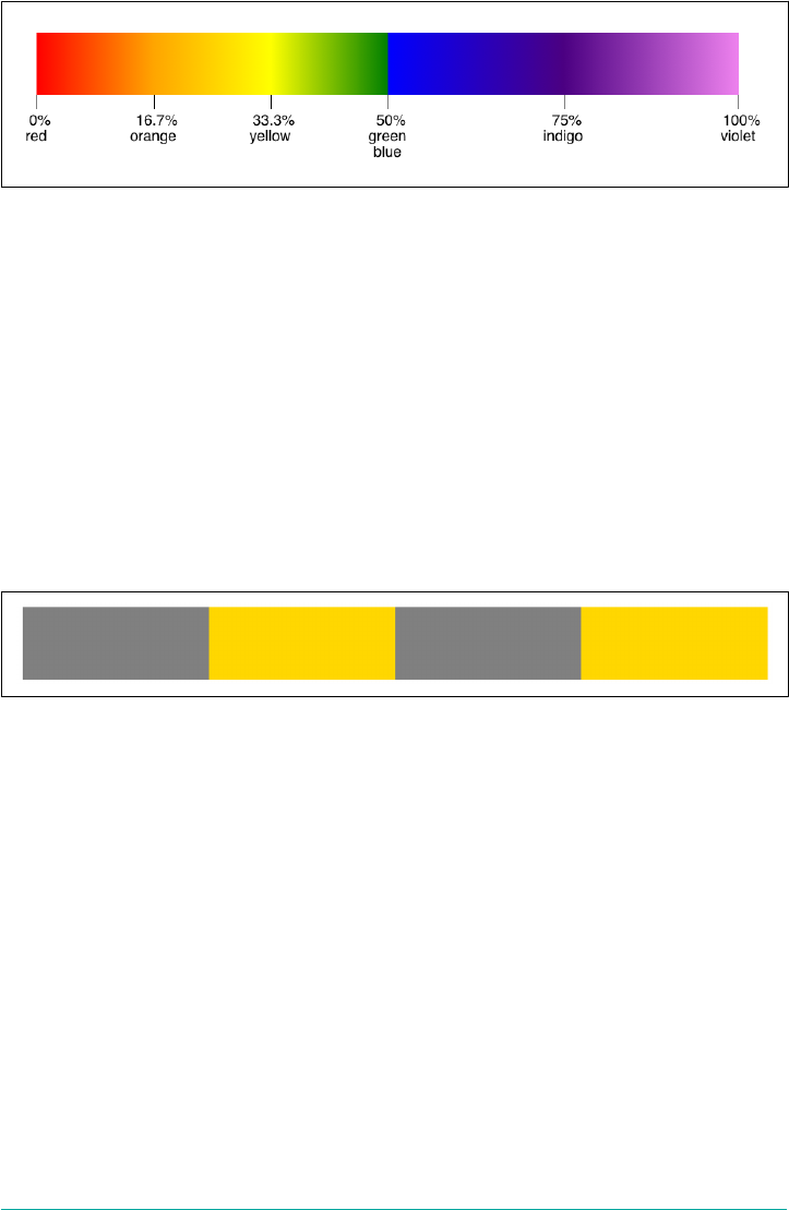
Figure 9-72. e eect of coincident color stops
The gradient blended as usual all along the gradient line, but at the 50% point, it
instantly blended from green to blue over zero length. So the gradient blended from
yellow at the 33.3% point (two-thirds of the way from 0% to 50%) to green at the 50%
point, then blended from green to blue over zero length, then blended from blue at
50% over to indigo at 75% (midway between 50% and 100%).
This “hard-stop” effect can be useful if you want to create a striped effect, like that
shown in Figure 9-73, which is the result of the following code:
.stripes {background-image: linear-gradient(90deg,
gray 0%, gray 25%,
transparent 25%, transparent 50%,
gray 50%, gray 75%,
transparent 75%, transparent 100%);}
Figure 9-73. Hard-stop stripes
OK, so that’s what happens if you put color stops right on top of each other, but what
happens if you put one before another? Something like this, say:
#spectrum {background-image: linear-gradient(90deg,
red 0%, orange, yellow, green 50%, blue 40%, indigo, violet)};
In that case, the offending color stop (blue in this case) is set to the largest specified
value of a preceding color stop. Here, it would be set to 50%, since the stop before it
had that position. Thus, the effect is the same as we saw earlier in this section, when
the green and blue color stops were placed on top of each other.
The key point here is that the color stop is set to the largest specied position of
the stop that precedes it. Thus, given the following, the indigo color stop would be
set to 50%:
#spectrum {background-image: linear-gradient(90deg,
red 0%, orange, yellow 50%, green, blue, indigo 33%, violet)};
Gradients | 457
In this case, the largest specified position before the indigo stop is the 50% specified at
the yellow stop. Thus, the gradient fades from red to orange to yellow, then has a hard
switch to indigo before fading from indigo to violet. The gradient’s fades from yellow
to green to blue to indigo all take place over zero distance. See Figure 9-74 for the
results.
Figure 9-74. Handling color stops that are out of place
This behavior is the reason why mixing units within a single gradient is generally dis‐
couraged. If you mix rems and percentages, for example, you could end up with a sit‐
uation where a color stop positioned with percentages might end up before an earlier
color stop positioned with rems.
Setting color hints
Thus far, we’ve worked with color stops, but you may remember that the syntax for
linear gradients permits “color hints” after each color stop:
linear-gradient(
[[ <angle> | to <side-or-quadrant> ],]? [ <color-stop> [, <color-hint>]? ]# ,
<color-stop>
)
A <color-hint> is a way of modifying the blend between the two color stops to either
side. By default, the blend from one color stop to the next is linear. Thus, given the
following, we get the result shown in Figure 9-75:
linear-gradient(
to right, #000 25%, rgb(90%,90%,90%) 75%
)
Figure 9-75. Linear blending from one color stop to the next
The blend from the 25% point to the 75% point is a constant linear progression from
black (#000) to a light gray (rgb(90%,90%,90%)). Halfway between them, at the 50%
mark, the shade of gray is exactly halfway between the colors defined by the color
stops to either side. That calculates to rgb(45%,45%,45%).
458 | Chapter 9: Colors, Backgrounds, and Gradients
With color hints, we can change the midpoint of the progression. Instead of reaching
rgb(45%,45%,45%) at the halfway point, it can be set for any point in between the two
stops. Thus, the following CSS leads to the result seen in Figure 9-76:
#ex01 {background: linear-gradient(to right, #000 25%, rgb(90%,90%,90%) 75%);}
#ex02 {background: linear-gradient(to right, #000 25%, 33%, rgb(90%,90%,90%)
75%);}
#ex03 {background: linear-gradient(to right, #000 25%, 67%, rgb(90%,90%,90%)
75%);}
#ex04 {background: linear-gradient(to right, #000 25%, 25%, rgb(90%,90%,90%)
75%);}
#ex05 {background: linear-gradient(to right, #000 25%, 75%, rgb(90%,90%,90%)
75%);}
Figure 9-76. Black-to-gray with diering midpoint hints
In the first case (#ex01), the default linear progression is used, with the middle color
(45% black) occurring at the midpoint between the two color stops.
In the second case (#ex02), the middle color happens at the 33% point of the gradient
line. So the first color stop is at the 25% point on the line, the middle color happens at
33%, and the second color stop happens at 75%.
In the third example (#ex03), the midpoint is at the 67% point of the gradient line;
thus, the color fades from black at 25% to the middle color at 67%, and then from that
middle color at 67% to light gray at 75%.
The fourth and fifth examples show what happens when you put a color hint’s dis‐
tance right on top of one of the color stops: you get a “hard stop.”
The interesting thing about color hinting is that the progression from color stop to
color hint to color stop is not just a set of two linear progressions. Instead, there is
Gradients | 459

some “curving” to the progression, in order to ease from one side of the color hint to
the other. This is easiest to see by comparing what would seem to be, but actually are
not, two gradients that do the same thing. As you can see in Figure 9-77, the result is
rather different:
#ex01 {background:
linear-gradient(to right,
#000 25%,
rgb(45%,45%,45%) 67%, /* this is a color stop */
rgb(90%,90%,90%) 75%);}
#ex02 {background:
linear-gradient(to right,
#000 25%,
67%, /* this is a color hint */
rgb(90%,90%,90%) 75%);}
Figure 9-77. Comparing two linear gradients to one hinted transition
Notice how the gray progression is different between the two examples. The first
shows a linear progression from black to rgb(45%,45%,45%), and then another linear
progression from there to rgb(90%,90%,90%). The second progresses from black to
the light gray over the same distance, and the color-hint point is at the 67% mark, but
the gradient is altered to attempt a smoother overall progression. The colors at 25%,
67%, and 75% are the same in both examples, but all the other shades along the way
are different between the two.
If you’re familiar with animations, you might think to put easing
functions (such as ease-in) into a color hint, in order to exert
more control over how the colors are blended. This isn’t possible as
of late 2017, but the capability was under discussion.
Gradient lines: the gory details
Now that you have a grasp of the basics of placing color stops, it’s time to look closely
at how gradient lines are actually constructed, and thus how they create the effects
that they do.
First, let’s set up a simple gradient so we can then dissect how it works:
460 | Chapter 9: Colors, Backgrounds, and Gradients
linear-gradient(
55deg, #4097FF, #FFBE00, #4097FF
)
Now, how does this one-dimensional construct—a line at 55 degrees on the compass
—create a two-dimensional gradient fill? First, the gradient line is placed and its start
and ending points determined. This is diagrammed in Figure 9-78, with the final gra‐
dient shown next to it.
Figure 9-78. e placement and sizing of the gradient line
The first thing to make very clear is that the box seen here is not an element—it’s the
linear-gradient image itself. (Remember, we’re creating images here.) The size and
shape of that image can depend on a lot of things, whether it’s the size of the element’s
background or the application of properties like background-size, which is a topic
we’ll cover in a bit. For now, we’re just concentrating on the image itself.
OK, so in Figure 9-78, you can see that the gradient line goes straight through the
center of the image. The gradient line always goes through the center of the gradient
image. In this case, we set it to a 55-degree angle, so it’s pointing at 55 degrees on the
compass. What’s interesting are the start and ending points of the gradient line, which
are actually outside the image.
Let’s talk about the start point first. It’s the point on the gradient line where a line per‐
pendicular to the gradient line intersects with the corner of the image furthest away
from the gradient line’s direction (55deg). Conversely, the gradient line’s ending point
is the point on the gradient line where a perpendicular line intersects the corner of
the image nearest to the gradient line’s direction.
Bear in mind that the terms “start point” and “ending point” are a little bit misleading
—the gradient line doesn’t actually stop at either point. The gradient line is, in fact,
infinite. However, the start point is where the first color stop will be placed by default,
Gradients | 461
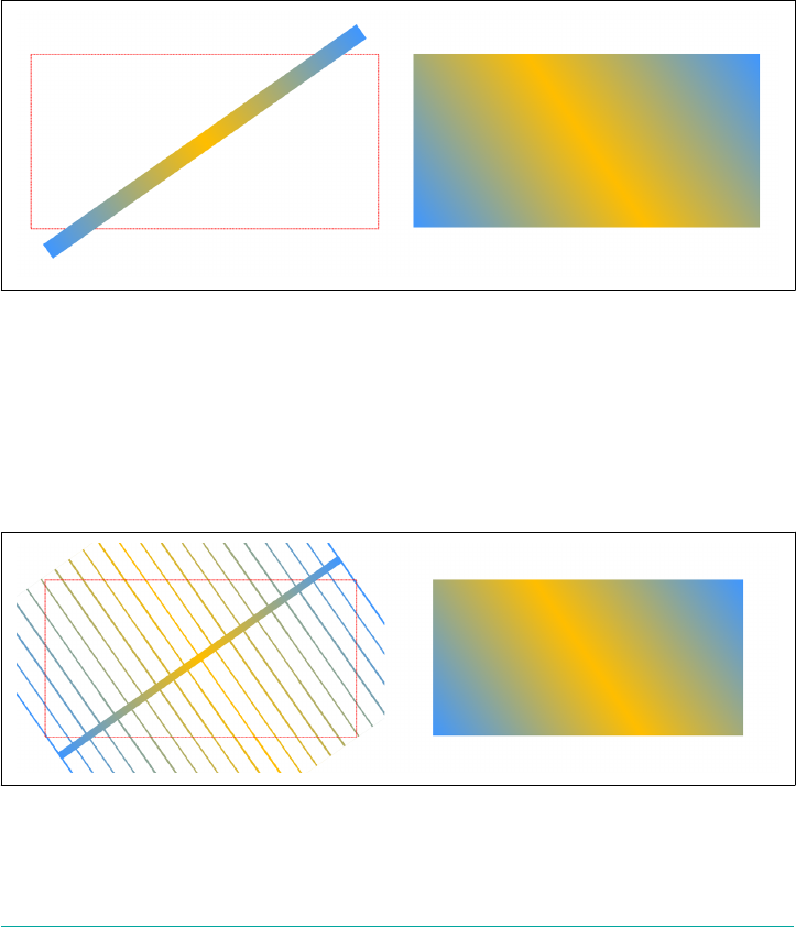
as it corresponds to position value 0%. Similarly, the ending point corresponds to the
position value 100%.
Therefore, given the gradient we defined before:
linear-gradient(
55deg, #4097FF, #FFBE00, #4097FF
)
the color at the start point will be #4097FF, the color at the midpoint (which is also
the center of the image) will be #FFBE00, and the color at the ending point will be
#4097FF, with smooth blending in between. This is illustrated in Figure 9-79.
Figure 9-79. e calculation of color along the gradient line
All right, fine so far. But, you may wonder, how do the bottom-left and top-right cor‐
ners of the image get set to the same blue that’s calculated for the start and ending
points, if those points are outside the image? Because the color at each point along the
gradient line is extended out perpendicularly from the gradient line. This is partially
shown in Figure 9-80 by extending perpendicular lines at the start and ending points,
as well as every 5% of the gradient line between them.
Figure 9-80. e extension of selected colors along the gradient line
462 | Chapter 9: Colors, Backgrounds, and Gradients
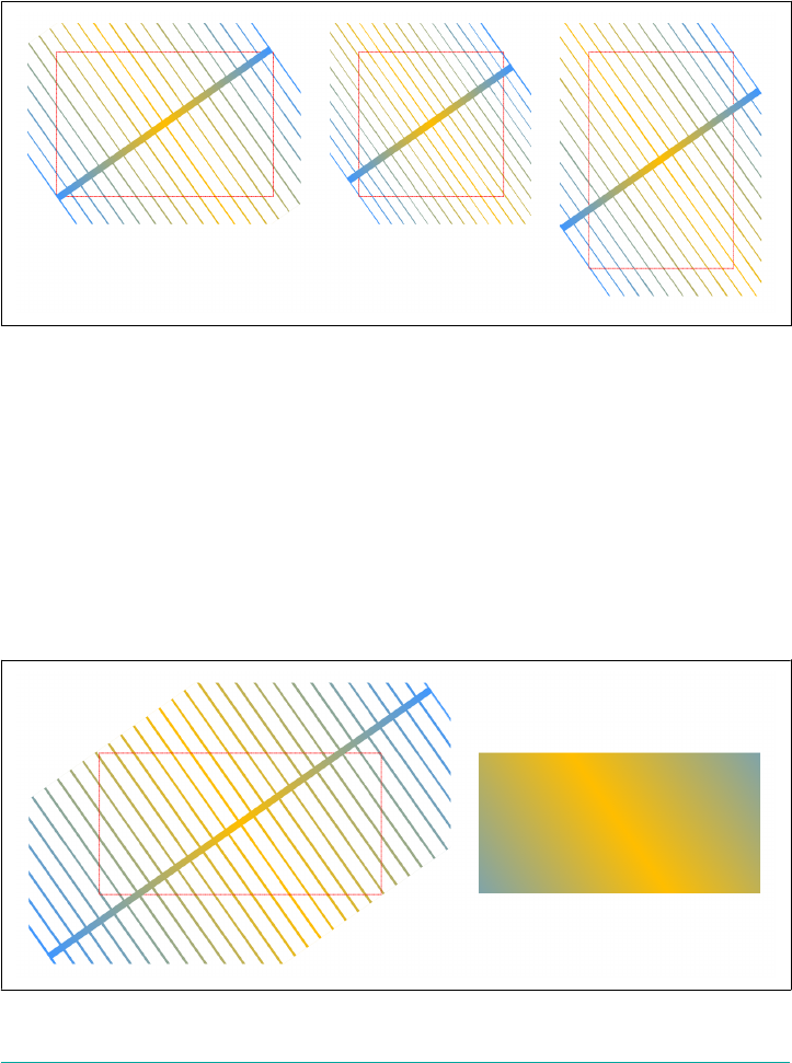
That should be enough to let you fill in the rest mentally, so let’s consider what hap‐
pens to the gradient image in various other settings. We’ll use the same gradient defi‐
nition as before, but this time apply it to wide, square, and tall images. These are
shown in Figure 9-81. Note how the start-point and ending-point colors always make
their way into the corners of the gradient image.
Figure 9-81. How gradients are constructed for various images
Note how I very carefully said “the start-point and ending-point colors,” and did not
say “the start and end colors.” That’s because, as we saw earlier, color stops can be
placed before the start point and after the ending point, like so:
linear-gradient(
55deg, #4097FF -25%, #FFBE00, #4097FF 125%
)
The placement of these color stops as well as the start point and ending point, the way
the colors are calculated along the gradient line, and the final gradient are all shown
in Figure 9-82.
Figure 9-82. A gradient with stops beyond the start and ending points
Gradients | 463

Once again, we see that the colors in the bottom-left and top-right corners match the
start-point and ending-point colors. It’s just that in this case, since the first color stop
came before the start point, the actual color at the start point is a blend of the first
and second color stops. Likewise for the ending point, which is a blend of the second
and third color stops.
Now here’s where things get a little bit wacky. Remember how you can use directional
keywords, like top and right, to indicate the direction of the gradient line? Suppose
you wanted the gradient line to go toward the top right, so you create a gradient
image like this:
linear-gradient(
to top right, #4097FF -25%, #FFBE00, #4097FF 125%
)
This does not cause the gradient line to intersect with the top-right corner. Would
that it did! Instead, what happens is a good deal stranger. First, let’s diagram it in
Figure 9-83 so that we have something to refer to.
Your eyes do not deceive you: the gradient line is way off from the top-right corner.
On the other hand, it is headed into the top-right quadrant of the image. That’s what
to top right really means: head into the top-right quadrant of the image, not into
the top-right corner.
As Figure 9-83 shows, the way to find out exactly what that means is to do the follow‐
ing:
1. Shoot a line from the midpoint of the image into the corners adjacent to the cor‐
ner in the quadrant that’s been declared. Thus, for the top-right quadrant, the
adjacent corners are the top left and bottom right.
2. Draw the gradient line perpendicular to that line, pointing into the declared
quadrant.
3. Construct the gradient—that is, determine the start and ending points, place or
distribute the color stops, then calculate the entire gradient image, as per usual.
464 | Chapter 9: Colors, Backgrounds, and Gradients
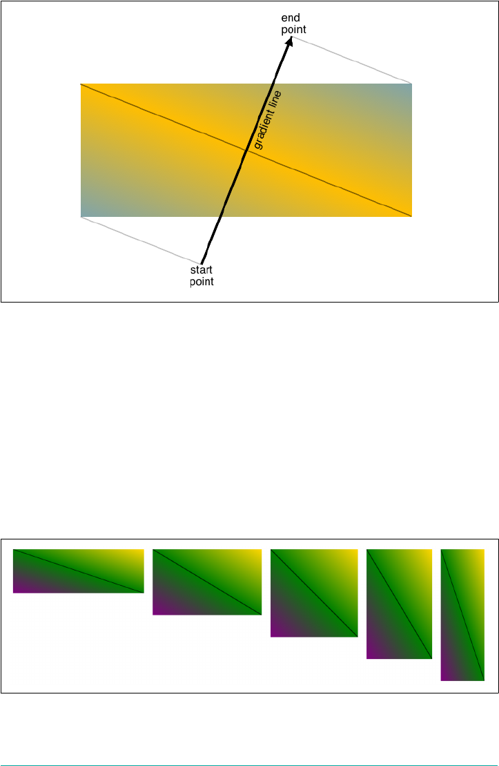
Figure 9-83. A gradient headed toward the top right
This process has a few interesting side effects. First, it means that the color at the
midpoint will always stretch from one quadrant-adjacent corner to the other. Second,
it means that if the image’s shape changes—that is, if its ratio of height to width
changes—then the gradient line will also change direction, meaning that the gradient
will reorient. So watch out for that if you have flexible elements. Third, a perfectly
square gradient image will have a gradient line that intersects with a corner. Examples
of these three side effects are depicted in Figure 9-84, using the following gradient
definition in all three cases:
linear-gradient(
to top right, purple, green 49.5%, black 50%, green 50.5%, gold
)
Figure 9-84. Examples of the side eects of a quadrant-directed gradient
Gradients | 465
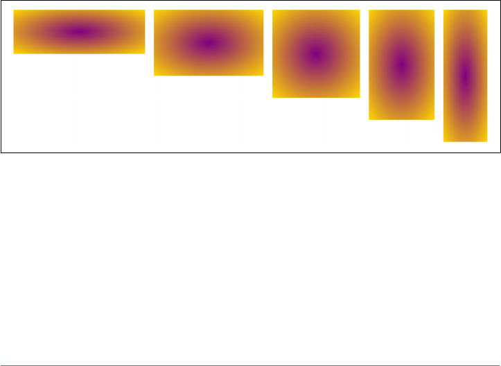
Sadly, there is no way to say “point the gradient line into the corner of a nonsquare
image” short of calculating the necessary degree heading yourself and declaring it
explicitly, a process that will require JavaScript unless you know the image will always
be an exact size in all cases, forever.
Radial Gradients
Linear gradients are pretty awesome, but there are times when you really want a cir‐
cular gradient. You can use such a gradient to create a spotlight effect, a circular
shadow, a rounded glow, or any number of other effects. The syntax used is similar to
that for linear gradients, but there are some interesting differences:
radial-gradient(
[ [ <shape> ‖ <size> ] [ at <position>]? , | at <position>, ]?
[ <color-stop> [, <color-hint>]? ] [, <color-stop> ]+
)
What this boils down to is you can optionally declare a shape and size, optionally
declare where it center of the gradient is positioned, and then declare two or more
color stops with optional color hints in between the stops. There are some interesting
options in the shape and size bits, so let’s build up to those.
First, let’s look at a simple radial gradient—the simplest possible, in fact—presented
in a variety of differently shaped elements (Figure 9-85):
.radial {background-image: radial-gradient(purple, gold);}
Figure 9-85. A simple radial gradient in multiple settings
In all of these cases, because no position was declared, the default of center was used.
Because no shape was declared, the shape is an ellipse for all cases but the square ele‐
ment; in that case, the shape is a circle. Finally, because no color-stop or color-hint
positions were declared, the first is placed at the beginning of the gradient ray, and
the last at the end, with a linear blend from one to the other.
That’s right: the gradient ray, which is the radial equivalent to the gradient line in lin‐
ear gradients. It extends outward from the center of the gradient directly to the right,
466 | Chapter 9: Colors, Backgrounds, and Gradients
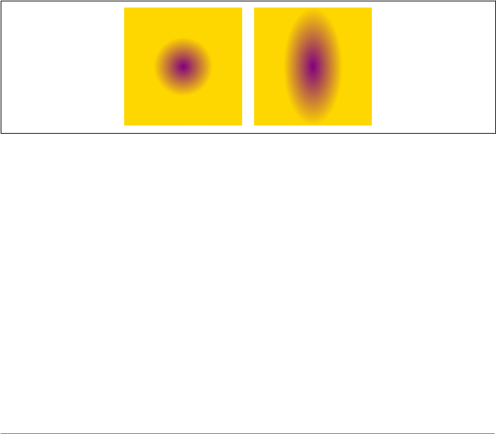
and the rest of the gradient is constructed from it. (We’ll get to the details on that in
just a bit.)
Shape and size
First off, there are exactly two possible shape values (and thus two possible shapes)
for a radial gradient: circle and ellipse. The shape of a gradient can be declared
explicitly, or it can be implied by the way you size the gradient image.
So, on to sizing. As always, the simplest way to size a radial gradient is with either one
non-negative length (if you’re sizing a circle) or two non-negative lengths (if it’s an
ellipse). Say you have this radial gradient:
radial-gradient(50px, purple, gold)
This creates a circular radial gradient that fades from purple at the center to gold at a
distance of 50 pixels from the center. If we add another length, then the shape
becomes an ellipse that’s as wide as the first length, and as tall as the second length:
radial-gradient(50px 100px, purple, gold)
These two gradients are illustrated in Figure 9-86.
Figure 9-86. Simple radial gradients
Notice how the shape of the gradients has nothing to do with the overall size and
shape of the images in which they appear. If you make a gradient a circle, it will be a
circle, even if it’s inside a rectangular gradient image. So too will an ellipse always be
an ellipse, even when inside a square gradient image (where it will look like a circle,
since an ellipse with the same height and width forms a circle).
You can also use percentage values for the size, but only for ellipses. Circles cannot be
given percentage sizes because there’s no way to indicate the axis to which that per‐
centage refers. (Imagine an image 100 pixels tall by 500 wide. Should 10% mean 10
pixels or 50 pixels?) If you try to provide percentage values for a circle, the entire dec‐
laration will fail due to the invalid value.
Gradients | 467
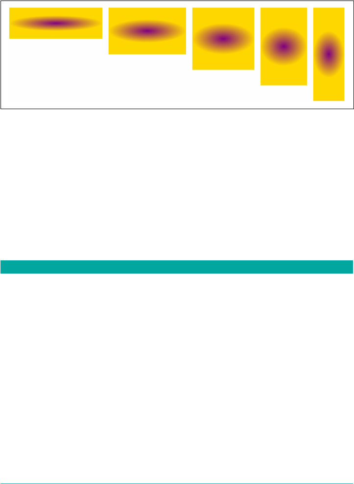
If you do supply percentages to an ellipse, then as usual, the first refers to the hori‐
zontal axis and the second to the vertical. The following gradient is shown in various
settings in Figure 9-87:
radial-gradient(50% 25%, purple, gold)
Figure 9-87. Percentage-sized elliptical gradients
When it comes to ellipses, you’re also able to mix lengths and percentages, with the
usual caveat to be careful. So if you’re feeling confident, you can absolutely make an
elliptical radial gradient 10 pixels tall and half the element width, like so:
radial-gradient(50% 10px, purple, gold)
As it happens, lengths and percentages aren’t the only way to size radial gradients. In
addition to those value types, there are also four keywords available for sizing radial
gradients, the effects of which are summarized in Table 9-3.
Table 9-3. Radial gradient sizing keywords
Keyword Meaning
closest-side If the radial gradient’s shape is a circle, the gradient is sized so that the end of the gradient ray
exactly touches the edge of the gradient image that is closest to the center point of the radial
gradient. If the shape is an ellipse, then the end of the gradient ray exactly touches the closest
edge in each of the horizontal and vertical axes.
farthest-side If the radial gradient’s shape is a circle, the gradient is sized so that the end of the gradient ray
exactly touches the edge of the gradient image that is farthest from the center point of the
radial gradient. If the shape is an ellipse, then the end of the gradient ray exactly touches the
farthest edge in each of the horizontal and vertical axes.
closest-corner If the radial gradient’s shape is a circle, the gradient is sized so that the end of the gradient ray
exactly touches the corner of the gradient image that is closest to the center point of the radial
gradient. If the shape is an ellipse, then the end of the gradient ray still touches the corner
closest to the center, and the ellipse has the same aspect ratio that it would have had if
closest-side had been specied.
468 | Chapter 9: Colors, Backgrounds, and Gradients
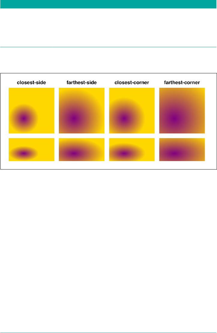
Keyword Meaning
farthest-corner
(default) If the radial gradient’s shape is a circle, the gradient is sized so that the end of the gradient ray
exactly touches the corner of the gradient image that is farthest from the center point of the
radial gradient. If the shape is an ellipse, then the end of the gradient ray still touches the
corner farthest from the center, and the ellipse has the same aspect ratio that it would have
had if farthest-side had been specied. Note: this is the default size value for a radial
gradient and so is used if no size values are declared.
In order to better visualize the results of each keyword, see Figure 9-88, which depicts
each keyword applied as both a circle and an ellipse.
Figure 9-88. e eects of radial gradient sizing keywords
These keywords cannot be mixed with lengths or percentages in elliptical radial gra‐
dients; thus, closest-side 25px is invalid and will be ignored.
Something you might have noticed in Figure 9-88 is that the gradients didn’t start at
the center of the image. That’s because they were positioned elsewhere, which is the
topic of the next section.
Positioning radial gradients
If you want to shift the center of a radial gradient away from the default of center,
then you can do so using any position value that would be valid for background-
position. I’m not going to reproduce that rather complicated syntax here; flip back
to the section on background-position (“Background Positioning” on page 404) if
you need a refresher.
When I say “any position value that would be valid,” that means any permitted com‐
bination of lengths, percentages, keywords, and so on. It also means that if you leave
off one of the two position values, it will be inferred just the same as for background-
position. So, just for one example, center is equivalent to center center. The one
Gradients | 469

major difference between radial gradient positions and background positions is the
default: for radial gradients, the default position is center, not 0% 0%.
To give some idea of the possibilities, consider the following rules, illustrated in
Figure 9-89:
radial-gradient(at bottom left, purple, gold);
radial-gradient(at center right, purple, gold);
radial-gradient(at 30px 30px, purple, gold);
radial-gradient(at 25% 66%, purple, gold);
radial-gradient(at 30px 66%, purple, gold);
Figure 9-89. Changing the center position of radial gradients
None of those positioned radial gradients were explicitly sized, so they all defaulted to
farthest-corner. That’s a reasonable guess at the intended default behavior, but it’s
not the only possibility. Let’s mix some sizes into the gradients we just saw and find
out how that changes things (as depicted in Figure 9-90):
radial-gradient(30px at bottom left, purple, gold);
radial-gradient(30px 15px at center right, purple, gold);
radial-gradient(50% 15% at 30px 30px, purple, gold);
radial-gradient(farthest-side at 25% 66%, purple, gold);
radial-gradient(farthest-corner at 30px 66%, purple, gold);
Figure 9-90. Changing the center position of explicitly sized radial gradients
Nifty. Now, suppose we want something a little more complicated than a fade from
one color to another. Next stop, color stops!
Radial color stops and the gradient ray
Color stops for radial gradients have the same syntax, and work in a similar fashion,
to linear gradients. Let’s return to the simplest possible radial gradient and follow it
with a more explicit equivalent:
470 | Chapter 9: Colors, Backgrounds, and Gradients
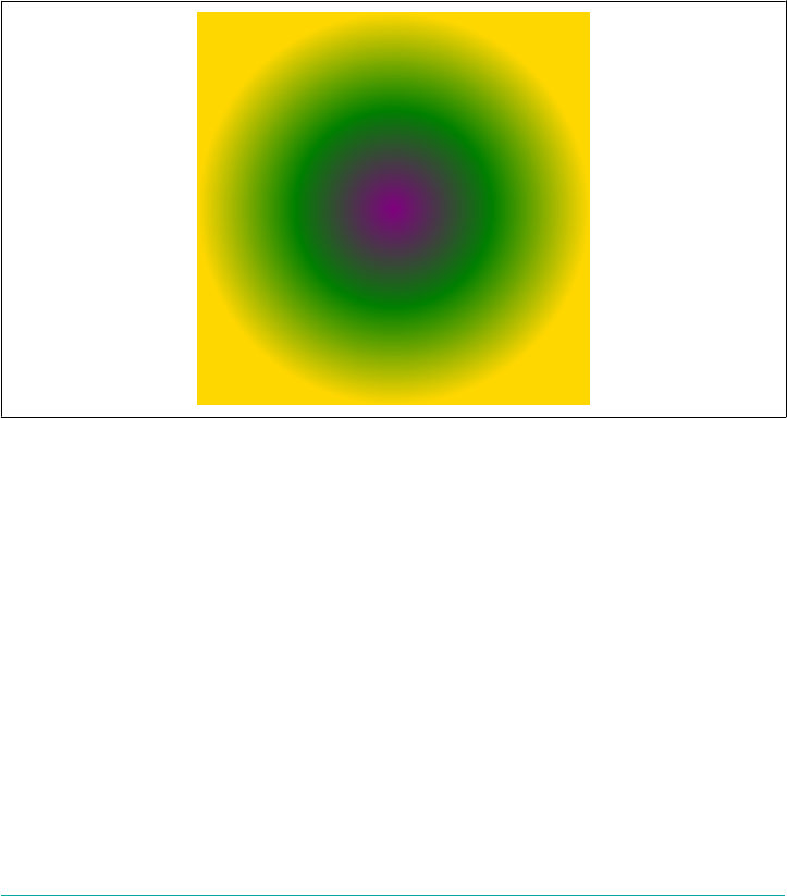
radial-gradient(purple, gold);
radial-gradient(purple 0%, gold 100%);
So the gradient ray extends out from the center point. At 0% (the start point, and also
the center of the gradient), the ray will be purple. At 100% (the ending point), the ray
will be gold. Between the two stops is a smooth blend from purple to gold; beyond
the ending point, solid gold.
If we add a stop between purple and gold, but don’t give it a position, then it will be
placed midway between them, and the blending will be altered accordingly, as shown
in Figure 9-91:
radial-gradient(100px circle at center, purple 0%, green, gold 100%);
Figure 9-91. Adding a color stop
We’d have gotten the same result if we’d added green 50% there, but you get the idea.
The gradient ray’s color goes smoothly from purple to green to gold, and then is solid
gold beyond that point on the ray.
This illustrates one difference between gradient lines (for linear gradients) and gradi‐
ent rays: a linear gradient is derived by extending the color at each point along the
gradient line off perpendicular to the gradient line. A similar behavior occurs with a
radial gradient, except in that case, they aren’t lines that come off the gradient ray.
Instead, they are ellipses that are scaled-up or scaled-down versions of the ellipse at
the ending point. This is illustrated in Figure 9-92, where an ellipse shows its gradient
ray and then the ellipses that are drawn at various points along that ray.
Gradients | 471
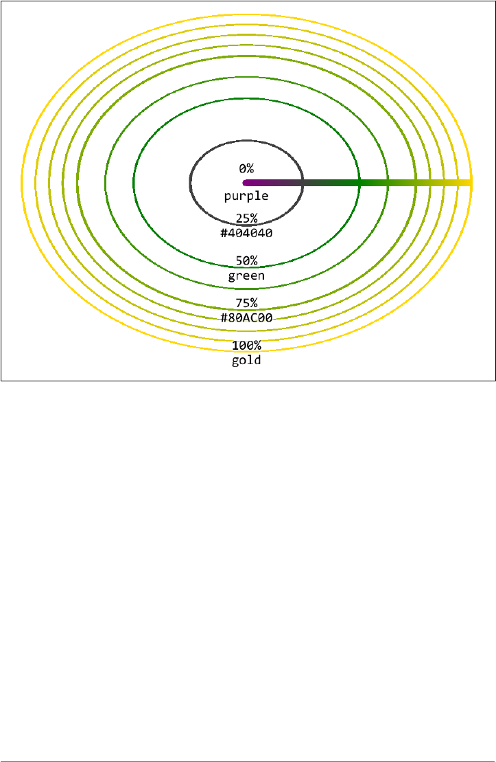
Figure 9-92. e gradient ray and some of the ellipses it spawns
That brings up an interesting question: how is the ending point (the 100% point, if
you like) determined for each gradient ray? It’s the point where the gradient ray inter‐
sects with the shape described by the size. In the case of a circle, that’s easy: the gradi‐
ent ray’s ending point is however far from the center that the size value indicates. So
for a 25px circle gradient, the ending point of the ray is 25 pixels from the center.
For an ellipse, it’s essentially the same operation, except that the distance from the
center is dependent on the horizontal axis of the ellipse. Given a radial gradient that’s
a 40px 20px ellipse, the ending point will be 40 pixels from the center and directly
to its right. Figure 9-93 shows this in some detail.
472 | Chapter 9: Colors, Backgrounds, and Gradients
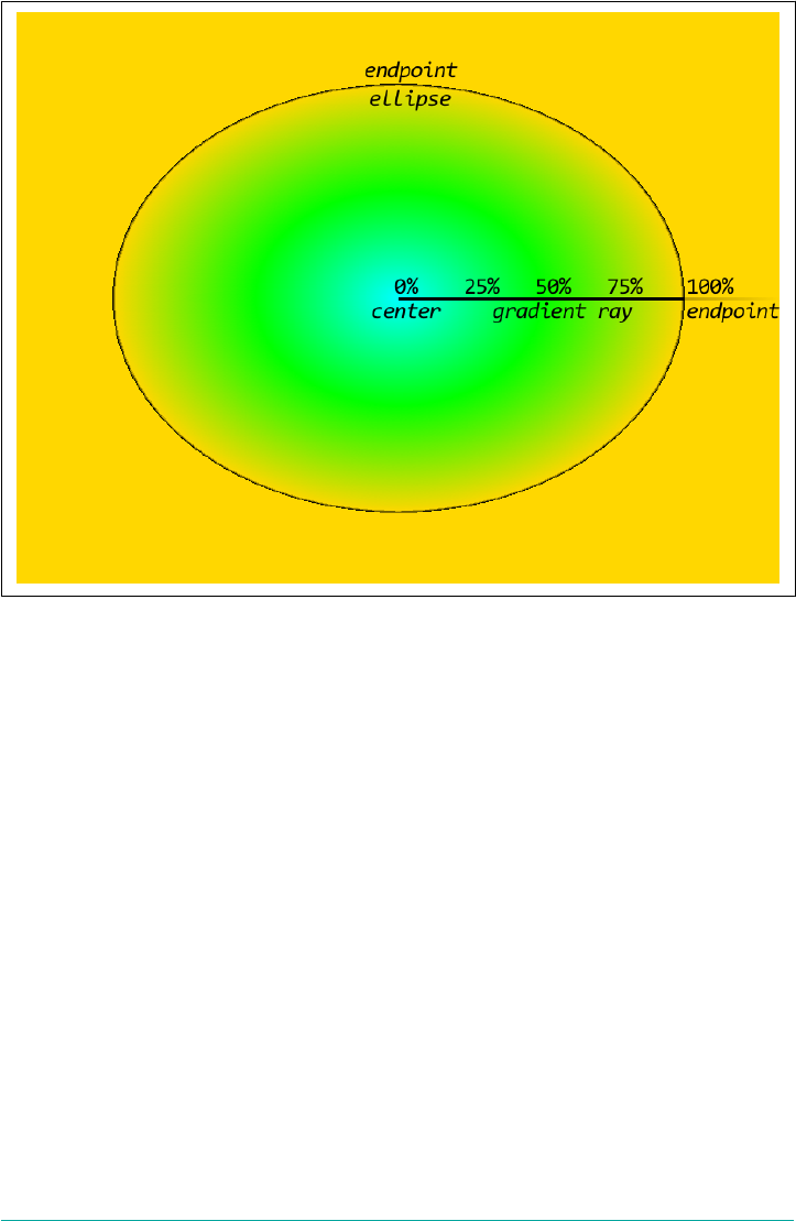
Figure 9-93. Setting the gradient ray’s ending point
Another difference between linear gradient lines and radial gradient rays is that you
can see beyond the ending point. If you recall, a linear gradient line is always drawn
so that you can see the colors at the 0% and 100% points, but nothing beyond them;
the gradient line can never be any smaller than the longest axis of the gradient image,
and will frequently be longer than that. With a radial gradient, on the other hand, you
can size the radial shape to be smaller than the total gradient image. In that case, the
color at the last color stop is extended outward from the ending point. (We’ve already
seen this in several previous figures.)
Conversely, if you set a color stop that’s beyond the ending point of a ray, you might
get to see the color out to that stop. Consider the following gradient, illustrated in
Figure 9-94:
radial-gradient(50px circle at center, purple, green, gold 80px)
Gradients | 473

Figure 9-94. Color stops beyond the ending point
The first color stop has no position, so it’s set to 0%, which is the center point. The last
color stop is set to 80px, so it will be 80 pixels away from the center in all directions.
The middle color stop, green, is placed midway between the two (40 pixels from the
center). So we get a gradient that goes out to gold at 80 pixels and then continues gold
beyond that point.
This happens even though the circle was explicitly set to be 50 pixels large. It still is 50
pixels in radius, it’s just that the positioning of the last color stop makes that fact
vaguely irrelevant. Visually, we might as well have declared this:
radial-gradient(80px circle at center, purple, green, gold)
or, more simply, just this:
radial-gradient(80px, purple, green, gold)
The same behaviors apply if you use percentages for your color stops. These are
equivalent to the previous examples, and to each other, visually speaking:
radial-gradient(50px, purple, green, gold 160%)
radial-gradient(80px, purple, green, gold 100%)
Now, what if you set a negative position for a color stop? It’s pretty much the same
result as we saw with linear gradient lines: the negative color stop is used to figure out
the color at the start point, but is otherwise unseen. Thus, the following gradient will
have the result shown in Figure 9-95:
radial-gradient(80px, purple -40px, green, gold)
474 | Chapter 9: Colors, Backgrounds, and Gradients
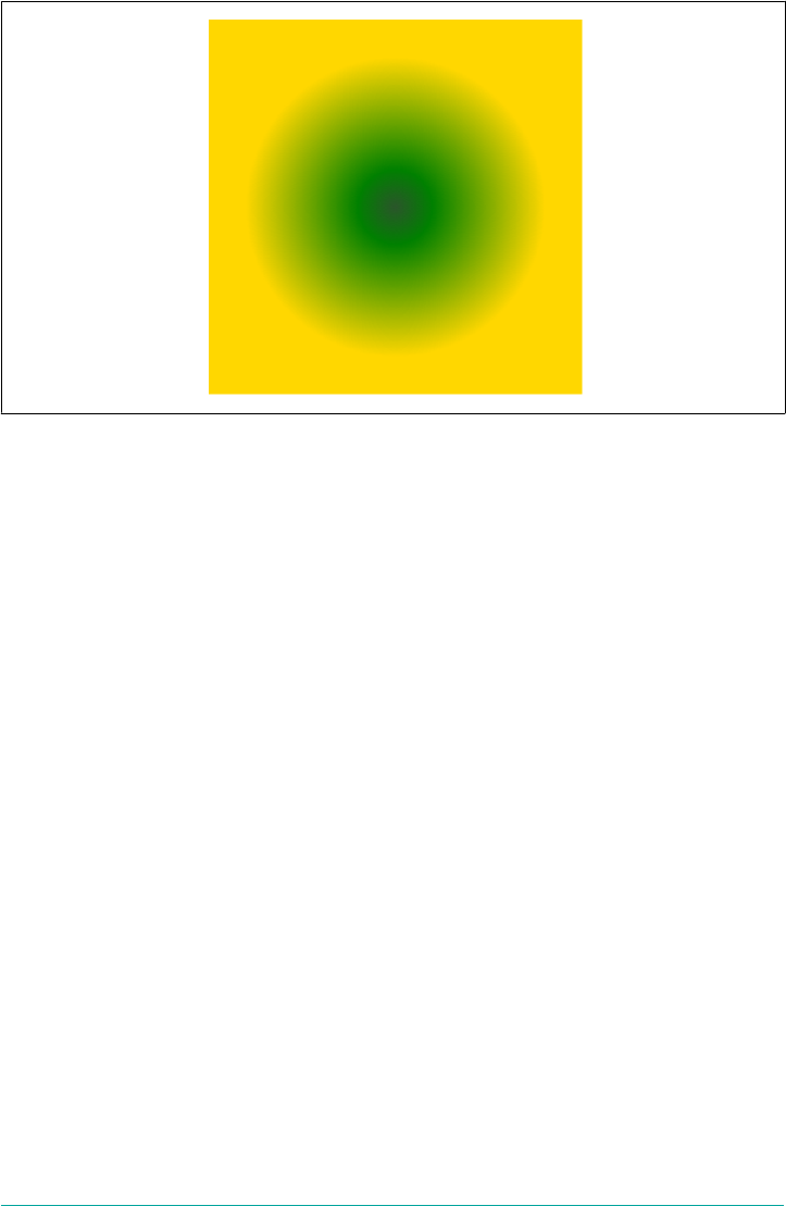
Figure 9-95. Handling a negative color-stop position
Given these color-stop positions, the first color stop is at -40px, the last is at 80px
(because, given its lack of an explicit position, it defaults to the ending point), and the
middle is placed midway between them. The result is the same as if we’d explicitly
said:
radial-gradient(80px, purple -40px, green 20px, gold 80px)
That’s why the color at the center of the gradient is a green-purple: it’s a blend of one-
third purple, two-thirds green. From there, it blends the rest of the way to green, and
then on to gold. The rest of the purple-green blend, the part that sits on the “negative
space” of the gradient ray, is invisible.
Degenerate cases
Given that we can declare size and position for a radial gradient, the question arises:
what if a circular gradient has zero radius, or an elliptical gradient has zero height or
width? These conditions aren’t quite as hard to create as you might think: besides
explicitly declaring that a radial gradient has zero size using 0px or 0%, you could also
do something like this:
radial-gradient(closest-corner circle at top right, purple, gold)
The gradient’s size is set to closest-corner, and the center has been moved into the
top right corner, so the closest corner is zero pixels away from the center. Now
what?
In this case, the specification very explicitly says that the gradient should be rendered
as if it’s “a circle whose radius [is] an arbitrary very small number greater than zero.”
Gradients | 475

So that might mean as if it had a radius of one-one-billionth of a pixel, or a picometer,
or heck, the Planck length. (Kids, ask your science teacher.) The interesting thing is
that it means the gradient is still a circle. It’s just a very, very, very small circle. Proba‐
bly, it will be too small to actually render anything visible. If so, you’ll just get a solid-
color fill that corresponds to the color of the last color stop instead.
Ellipses with zero-length dimensions have fascinatingly different defined behaviors.
Let’s assume the following:
radial-gradient(0px 50% at center, purple, gold)
The specification states that any ellipse with a zero width is rendered as if it’s “an
ellipse whose height [is] an arbitrary very large number and whose width [is] an arbi‐
trary very small number greater than zero.” In other words, render it as though it’s a
linear gradient mirrored around the vertical axis running through the center of the
ellipse. The specification also says that in such a case, any color stops with percentage
positions resolve to 0px. This will usually result in a solid color matching the color
defined for the last color stop.
On the other hand, if you use lengths to position the color stops, you can get a verti‐
cally mirrored horizontal linear gradient for free. Consider the following gradient,
illustrated in Figure 9-96:
radial-gradient(0px 50% at center, purple 0px, gold 100px)
Figure 9-96. e eects of a zero-width ellipse
476 | Chapter 9: Colors, Backgrounds, and Gradients
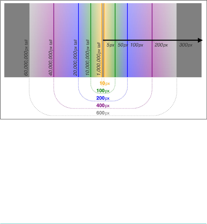
How did this happen? First, remember that the specification says that the 0px hori‐
zontal width is treated as if it’s a tiny non-zero number. For the sake of illustration,
let’s suppose that’s one-one-thousandth of a pixel (0.001 px). That means the ellipse
shape is a thousandth of a pixel wide by half the height of the image. Again for the
sake of illustration, let’s suppose that’s a height of 100 pixels. That means the first
ellipse shape is a thousandth of a pixel wide by 100 pixels tall, which is an aspect ratio
of 0.001:100, or 1:100,000.
OK, so every ellipse drawn along the gradient ray has a 1:100,000 aspect ratio. That
means the ellipse at half a pixel along the gradient ray is 1 pixel wide and 100,000 pix‐
els tall. At 1 pixel, it’s 2 pixels wide and 200,000 pixels tall. At 5 pixels, the ellipse is 10
pixels by a million pixels. At 50 pixels along the gradient ray, the ellipse is 100 pixels
wide and 10 million tall. And so on. This is diagrammed in Figure 9-97.
Figure 9-97. Very, very tall ellipses
So you can see why the visual effect is of a mirrored linear gradient. These ellipses are
effectively drawing vertical lines. Technically they aren’t, but in practical terms they
are. The result is as if you have a vertically mirrored horizontal gradient, because each
ellipse is centered on the center of the gradient, and both sides of it get drawn. While
this may be a radial gradient, we can’t see its radial nature.
On the other hand, if the ellipse has width but not height, the results are quite differ‐
ent. You’d think the result would be to have a vertical linear gradient mirrored around
the horizontal axis, but not so! Instead, the result is a solid color equal to the last
color stop. (Unless it’s a repeating gradient, a subject we’ll turn to shortly, in which
Gradients | 477

case it should be a solid color equal to the average color of the gradient.) So, given
either of the following, you’ll get a solid gold:
radial-gradient(50% 0px at center, purple, gold)
radial-gradient(50% 0px at center, purple 0px, gold 100px)
Why the difference? It goes back to how radial gradients are constructed from the
gradient ray. Again, remember that, per the specification, a zero distance here is
treated as a very small non-zero number. As before, we’ll assume that 0px is reas‐
signed to 0.001px, and that the 50% evaluates to 100 pixels. That’s an aspect ratio of
100:0.001, or 100,000:1.
So, to get an ellipse that’s 1 pixel tall, the width of that ellipse must be 100,000 pixels.
But our last color stop is only at 100 pixels! At that point, the ellipse that’s drawn is
100 pixels wide and 1,000th of a pixel tall. All of the purple-to-gold transition that
happens along the gradient ray has to happen in that thousandth of a pixel. Every‐
thing after that is gold, as per the final color stop. Thus, we can only see the gold.
You might think that if you increased the position value of the last color stop to
100000px, you’d see a thin sliver of purple-ish color running horizontally across the
image. And you’d be right, if the browser treats 0px as 0.001px in these cases. If it
assumes 0.00000001px instead, you’d have to increase the color stop’s position a lot
further in order to see anything. And that’s assuming the browser was actually caulcu‐
lating and drawing all those ellipses, instead of just hard-coding the special cases. The
latter is a lot more likely, honestly. It’s what I’d do if I were in charge of a browser’s
gradient-rendering code.
And what if an ellipse has zero width and zero height? In that case, the specification is
written such that the zero-width behavior is used; thus, you’ll get the mirrored-linear-
gradient behavior.
As of late 2017, browser support for the defined behavior in these
edge cases was unstable, at best. Some browsers used the last color-
stop’s color in all cases, and others refused to draw a gradient at all
in some cases.
Manipulating Gradient Images
As has been emphasized (possibly to excess), gradients are images. That means you
can size, position, repeat, and otherwise affect them with the various background
properties, just as you would any PNG or SVG.
One way this can be leveraged is to repeat simple gradients. (Repeating in more com‐
plex ways is the subject of the next section.) For example, you could use a hard-stop
radial gradient to give your background a dotted look, as shown in Figure 9-97:
478 | Chapter 9: Colors, Backgrounds, and Gradients
body {background: tan center/25px 25px repeat
radial-gradient(circle at center,
rgba(0,0,0,0.1), rgba(0,0,0,0.1) 10px,
transparent 10px, transparent);}
Figure 9-98. Tiled radial gradient images
Yes, this is visually pretty much the same as tiling a PNG that has a mostly-
transparent dark circle 10 pixels in diameter. There are three advantages to using a
gradient in this case:
• The CSS is almost certainly smaller in bytes than the PNG would be.
•Even more importantly, the PNG requires an extra hit on the server. This slows
down both page and server performance. A CSS gradient is part of the stylesheet
and so eliminates the extra server hit.
•Changing the gradient is a lot simpler, so experimenting to find exactly the right
size, shape, and darkness is much easier.
Gradients can’t do everything a raster or vector image can, so it’s not as though you’ll
be giving up external images completely now that gradients are a thing. You can still
pull off some pretty impressive effects with gradients, though. Consider the back‐
ground effect shown in Figure 9-99.
Gradients | 479

Figure 9-99. It’s time to start the music…
That curtain effect was accomplished with just two linear gradients repeated at differ‐
ing intervals, plus a third to create a “glow” effect along the bottom of the back‐
ground. Here’s the code that accomplished it:
background-image:
linear-gradient(0deg, rgba(255,128,128,0.25), transparent 75%),
linear-gradient(89deg,
transparent, transparent 30%,
#510A0E 35%, #510A0E 40%, #61100F 43%, #B93F3A 50%,
#4B0408 55%, #6A0F18 60%, #651015 65%, #510A0E 70%,
#510A0E 75%, rgba(255,128,128,0) 80%, transparent),
linear-gradient(92deg,
#510A0E, #510A0E 20%, #61100F 25%, #B93F3A 40%, #4B0408 50%,
#6A0F18 70%, #651015 80%, #510A0E 90%, #510A0E);
background-size: auto, 300px 100%, 109px 100%;
background-repeat: repeat-x;
The first (and therefore topmost) gradient is just a fade from a 75%-transparent light
red up to full transparency at the 75% point of the gradient line. Then two “fold”
images are created. Figure 9-100 shows each separately.
With those images defined, they are repeated along the x-axis and given different
sizes. The first, which is the “glow” effect, is given auto size in order to let it cover the
entire element background. The second is given a width of 300px and a height of
100%; thus, it will be as tall as the element background and 300 pixels wide. This
means it will be tiled every 300 pixels along the x-axis. The same is true of the third
image, except it tiles every 109 pixels. The end result looks like an irregular stage cur‐
tain.
480 | Chapter 9: Colors, Backgrounds, and Gradients
Figure 9-100. e two “fold” gradients
The beauty of this is that adjusting the tiling intervals is just a matter of editing the
stylesheet. Changing the color-stop positions or the colors is less trivial, but not too
difficult if you know what effect you’re after. And adding a third set of repeating folds
is no more difficult than just adding another gradient to the stack.
Repeating Gradients
Gradients are pretty awesome by themselves, but because they are images, they can be
subject to strange behaviors when they are tiled. For example, if you declare:
h1.exmpl {background:
linear-gradient(-45deg, black 0, black 25px, yellow 25px, yellow 50px)
top left/40px 40px repeat;}
then you could easily end up with a situation like that shown in Figure 9-101.
Figure 9-101. Tiling gradient images with background-repeat
As the figure shows, there is a discontinuity where the images repeat. You could try to
nail down the exact sizes of the element and gradient image and then mess with the
construction of the gradient image in order to try to make the sides line up, but it
would be a lot better if there was just a way to say, “repeat this seamlessly forever.”
Enter repeating gradients. For the previous example, all we need is to convert linear-
gradient to repeating-linear-gradient and drop the background-size value.
Everything else about the code stays the same. The effect is much different, however,
as you can see in Figure 9-102:
Gradients | 481
h1.exmpl {background: repeating-linear-gradient(-45deg,
black 0, black 25px, yellow 25px, yellow 50px) top left;}
Figure 9-102. A repeating gradient image with repeating-linear-gradient
An equivalent to the previous code block, using color hints instead of all color stops,
is:
h1.exmpl {background: repeating-linear-gradient(-45deg,
black 0, black 25px, 25px, yellow 50px) top left;}
What happens with a repeating linear gradient is that the declared color stops and
color hints are repeated on a loop along the gradient line, over and over, forever.
Given the previous examples, that means switching between black and yellow every
25 pixels forever.
Note that the last color stop has an explicit length (50px). This is important with
repeating gradients, because the length value on the last color stop defines the overall
length of the pattern.
Now, those examples work because there’s supposed to be a hard stop where the gra‐
dient repeats. If you’re using smoother transitions, you need to be careful that the
color value at the last color stop matches the color value at the first color stop. Con‐
sider this:
repeating-linear-gradient(-45deg, purple 0px, gold 50px)
This will produce a smooth gradient from purple to gold at 50 pixels, and then a hard
switch back to purple and another 50-pixel purple-to-gold blend. By adding one
more color stop with the same color as the first color stop, the gradient can be
smoothed out to avoid hard-stop lines. See Figure 9-103 for a comparison of the two
approaches:
repeating-linear-gradient(-45deg, purple 0px, gold 50px, purple 100px)
Figure 9-103. Dealing with hard resets in repeating-gradient images
You may have noticed that none of the repeating gradients we’ve seen so far have a
defined size. That means the images are defaulting in size to the full background posi‐
tioning area of the element to which they’re applied, per the default behavior for
482 | Chapter 9: Colors, Backgrounds, and Gradients
images that have no intrinsic height and width. If you were to resize a repeating-
gradient image using background-size, the repeating gradient would only be visible
within the gradient image. If you then repeated it using background-repeat, you
could very easily be back to the situation of having discontinuities in your back‐
ground, as illustrated in Figure 9-104:
h1.exmpl {background:
repeating-linear-gradient(-45deg, purple 0px, gold 50px, purple 100px)
top left/50px 50px repeat;}
Figure 9-104. Repeated tiling of repeating-gradient images
If you use percentages in your repeating linear gradients, they’ll be placed the same as
if the gradient wasn’t of the repeating variety. Then again, this would mean that all of
the gradients defined by those color stops would be seen and none of the repetitions
would be visible, so percentages are kind of pointless with repeating linear gradients.
On the other hand, percentages can be very useful with repeating radial gradients,
where the size of the circle or ellipse is defined, percentage positions along the gradi‐
ent ray are defined, and you can see beyond the endpoint of the gradient ray. For
example, assume:
.allhail {background:
repeating-radial-gradient(100px 50px, purple, gold 20%, green 40%,
purple 60%, yellow 80%, purple);}
Given this rule, there will be a color stop every 20 pixels, with the colors repeating in
the declared pattern. Because the first and last color stops have the same color value,
there is no hard color switch. The ripples just spread out forever, or at least until
they’re beyond the edges of the gradient image. See Figure 9-105 for an example.
Figure 9-105. Repeating radial gradients
Just imagine what that would look like with a repeating radial gradient of a rainbow!
Gradients | 483
.wdim {background:
repeating-radial-gradient(
100px circle at bottom center,
rgb(83%,83%,83%) 50%,
violet 55%, indigo 60%, blue 65%, green 70%,
yellow 75%, orange 80%, red 85%,
rgb(47%,60%,73%) 90%
);}
There are a couple of things to keep in mind when creating repeating radial gradients:
•If you don’t declare size dimensions for a radial, it will default to an ellipse that
has the same height-to-width ratio as the overall gradient image; and, if you don’t
declare a size for the image with background-size, the gradient image will
default to the height and width of the element background where it’s being
applied. (Or, in the case of being used as a list-style bullet, the size that the
browser gives it.)
•The default radial size value is farthest-corner. This will put the endpoint of
the gradient ray far enough to the right that its ellipse intersects with the corner
of the gradient image that’s furthest from the center point of the radial gradient.
These are reiterated here to remind you that if you stick to the defaults, there’s not
really any point to having a repeating gradient, since you’ll only be able to see the first
iteration of the repeat. It’s only when you restrict the initial size of the gradient that
the repeats become visible.
Radial gradients, and in particular repeating radial gradients, cre‐
ated massive performance drains in older mobile devices. Crashes
were not uncommon in these situations, and both page rendering
time and battery performance could suffer greatly. Think very, very
carefully about using radial gradients in mobile contexts, and be
sure to rigorously test their performance and stability in any con‐
text, especially if you have users with older devices (and therefore
older browsers).
Average gradient colors
Another edge case is what happens if a repeating gradient’s first and last color stops
somehow end up being in the same place. For example, suppose your fingers missed
the “5” key and you accidentally declared the following:
repeating-radial-gradient(center, purple 0px, gold 0px)
The first and last color stops are zero pixels apart, but the gradient is supposed to
repeat ad infinitum along the gradient line. Now what?
484 | Chapter 9: Colors, Backgrounds, and Gradients
In such a case, the browser finds the average gradient color and fills it in throughout
the entire gradient image. In our simple case in the preceding code, that will be a
50/50 blend of purple and gold (which will be about #C06C40 or rgb(75%,42%,25%)).
Thus, the resulting gradient image should be a solid orangey-brown, which doesn’t
really look much like a gradient.
This condition can also be triggered in cases where the browser rounds the color-stop
positions to zero, or cases where the distance between the first and last color stops is
so small as compared to the output resolution that nothing useful can be rendered.
This could happen if, for example, a repeating radial gradient used all percentages for
the color-stop positions and was sized using closest-side, but was accidentally
placed into a corner.
As of late 2017, no browsers really do this correctly. It is possible to
trigger some of the correct behaviors under very limited condi‐
tions, but in most cases, browsers either just use the last color stop
as a fill color, or else try really hard to draw sub-pixel repeating pat‐
terns.
Box Shadows
In an earlier chapter, we explored the property text-shadow, which adds a drop
shadow to the text of a non-replaced element. There’s a version of this that creates a
shadow for the box of an element, called box-shadow.
box-shadow
Values none | [inset? && <length>{2,4} && <color>?]#
Initial value none
Applies to All elements
Computed value <length> values as absolute length values; <color> values as computed internally;
otherwise as specied
Inherited No
Animatable Yes
It might seem a little out of place to talk about shadows in a chapter mostly con‐
cerned with backgrounds and gradients, but there’s a reason it goes here, which we’ll
see in a moment.
Box Shadows | 485
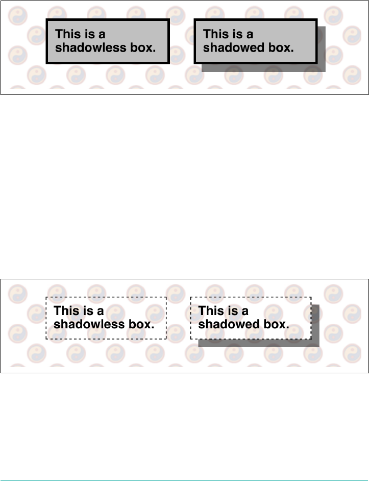
Let’s consider a simple box drop shadow: one that’s 10 pixels down and 10 pixels to
the right of an element box, with no spread or blur, and a half-opaque black. Behind
it we’ll put a repeating background on the body element. All of this is illustrated in
Figure 9-106.
#box {background: silver; border: medium solid;
box-shadow: 10px 10px rgba(0,0,0,0.5);}
Figure 9-106. A simple box shadow
We can see that the body’s background is visible through the half-opaque (or half-
transparent, if you prefer) drop shadow. Because no blur or spread distances were
defined, the drop shadow exactly mimics the outer shape of the element box itself. At
least, it appears to do so.
The reason it only appears to mimc the shape of the box is that the shadow is only
visible outside the outer border edge of the element. We couldn’t really see that in the
previous figure, because the element had an opaque background. You might have just
assumed that the shadow extended all the way under the element, but it doesn’t. Con‐
sider the following, illustrated in Figure 9-107.
#box {background: transparent; border: thin dashed;
box-shadow: 10px 10px rgba(0,0,0,0.5);}
Figure 9-107. Box shadows are incomplete
So it looks as though the element’s content (and padding and border) area “knocks
out” part of the shadow. In truth, it’s just that the shadow was never drawn there, due
to the way box shadows are defined in the specification. This does mean, as
Figure 9-107 demonstrates, that any background “behind” the box with a drop
486 | Chapter 9: Colors, Backgrounds, and Gradients
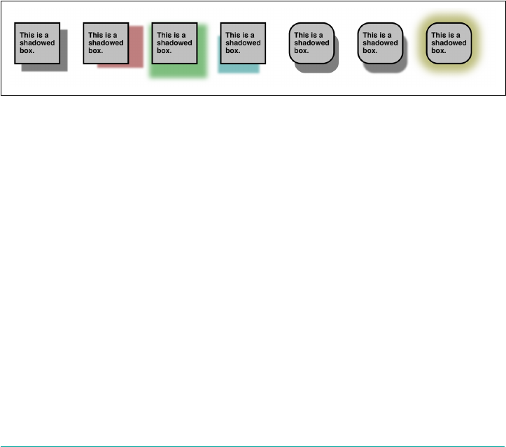
shadow can be visible through the element itself. This (perhaps bizarre-seeming)
interaction with the backgrounds and borders is why box-shadow is covered here,
instead of at an earlier point in the text.
So far, we’ve seen box shadows defined with two length values. The first defines a hor‐
izontal offset, and the second a vertical offset. Positive numbers move the shadow
down and to right right, and negative numbers move the shadow up and to the left.
If a third length is given, it defines a blur distance, which determines how much space
is given to blurring. A fourth length defines a spread distance, which change the size
of the shadow. Positive length values make the shadow expand before blurring hap‐
pens; negative values cause the shadow to shrink. The following have the results
shown in Figure 9-108.
.box:nth-of-type(1) {box-shadow: 1em 1em 2px rgba(0,0,0,0.5);}
.box:nth-of-type(2) {box-shadow: 2em 0.5em 0.25em rgba(128,0,0,0.5);}
.box:nth-of-type(3) {box-shadow: 0.5em 2ch 1vw 13px rgba(0,128,0,0.5);}
.box:nth-of-type(4) {box-shadow: -10px 25px 5px -5px rgba(0,128,128,0.5);}
.box:nth-of-type(5) {box-shadow: 0.67em 1.33em 0 -0.1em rgba(0,0,0,0.5);}
.box:nth-of-type(6) {box-shadow: 0.67em 1.33em 0.2em -0.1em rgba(0,0,0,0.5);}
.box:nth-of-type(7) {box-shadow: 0 0 2ch 2ch rgba(128,128,0,0.5);}
Figure 9-108. Various blurred and spread shadows
You may have noticed that some of the boxes in Figure 9-108 have rounded corners
(via border-radius), and that their shadows were curved to match. This is the
defined behavior, fortunately.
There’s one aspect of box-shadow we have yet to cover, which is the inset keyword. If
inset is added to the value of box-shadow, then the shadow is rendered inside the
box, as if the box were a punched-out hole in the canvas rather than floating above it
(visually speaking). Let’s take the previous set of examples and redo them with inset
shadows. This will have the result shown in Figure 9-109.
.box:nth-of-type(1) {box-shadow: inset 1em 1em 2px rgba(0,0,0,0.5);}
.box:nth-of-type(2) {box-shadow: inset 2em 0.5em 0.25em rgba(128,0,0,0.5);}
.box:nth-of-type(3) {box-shadow: 0.5em 2ch 1vw 13px rgba(0,128,0,0.5) inset;}
.box:nth-of-type(4) {box-shadow: inset -10px 25px 5px -5px rgba(0,128,128,0.5);}
.box:nth-of-type(5) {box-shadow: 0.67em 1.33em 0 -0.1em rgba(0,0,0,0.5) inset;}
.box:nth-of-type(6) {box-shadow: inset 0.67em 1.33em 0.2em -0.1em rgba(0,0,0,0.5);}
.box:nth-of-type(7) {box-shadow: 0 0 2ch 2ch rgba(128,128,0,0.5) inset;}
Box Shadows | 487
Figure 9-109. Various inset shadows
Note that the inset keyword can appear before the rest of the value, or after, but not
in the middle of the lengths and colors. A value like 0 0 0.1em inset gray would be
ignored as invalid, because of the placement of the inset keyword.
The last thing to note is that you can apply to an element a list of as many comma-
separated box shadows as you like, just as with text shadows. Some could be inset,
and some outset. The following rules are just two of the infinite possibilities.
#shadowbox {background: #EEE;
box-shadow: inset 1ch 1ch 0.25ch rgba(0,0,0,0.25),
1.5ch 1.5ch 0.4ch rgba(0,0,0,0.33);}
#wacky {box-shadow: inset 10px 2vh 0.77em 1ch red,
1cm 1in 0 -1px cyan inset,
2ch 3ch 0.5ch hsla(117,100%,50%,0.343),
-2ch -3ch 0.5ch hsla(297,100%,50%,0.23);}
The filter property is another way to create element drop shad‐
ows, although it is much closer in behavior to text-shadow than
box-shadow, albeit applying to the entire element box and text. See
Chapter 19 for details.
Summary
Setting colors and backgrounds on elements gives authors a great deal of power. The
advantage of CSS over traditional methods is that colors and backgrounds can be
applied to any element in a document.
488 | Chapter 9: Colors, Backgrounds, and Gradients

CHAPTER 10
Floating and Shapes
For a very long time, floated elements were the basis of all our web layout schemes.
(This is largely because of the property clear, which we’ll get to in a bit.) But floats
were never meant for layout; their use as a layout tool was a hack nearly as egregious
as the use of tables for layout. They were just what we had.
Floats are quite interesting and useful in their own right, however, especially given the
recent addition of float shaping, which allows the creation of nonrectangular shapes
past which content can flow.
Floating
You are likely acquainted with the concept of floated elements. Ever since Netscape
1.1, it has been possible to float images by declaring, for instance, <img src="b5.gif"
align="right">. This causes an image to float to the right and allows other content
(such as text) to “flow around” the image. The name “floating,” in fact, comes from
the Netscape DevEdge page “Extensions to HTML 2.0,” which stated:
The additions to your ALIGN options need a lot of explanation. First, the values “left”
and “right”. Images with those alignments are an entirely new oating image type.
In the past, it was only possible to float images and, in some browsers, tables. CSS, on
the other hand, lets you float any element, from images to paragraphs to lists. In CSS,
this behavior is accomplished using the property float.
489
oat
Values left | right | none
Initial value none
Applies to All elements
Computed value As specied
Inherited No
Animatable No
For example, to float an image to the left, you could use this markup:
<img src="b4.gif" style="float: left;" alt="b4">
As Figure 10-1 makes clear, the image “floats” to the left side of the browser window
and the text flows around it. This is just what you should expect.
Figure 10-1. A oating image
However, when floating elements in CSS, some interesting issues come up.
Floated Elements
Keep a few things in mind with regard to floating elements. In the first place, a floated
element is, in some ways, removed from the normal flow of the document, although
it still affects the layout. In a manner utterly unique within CSS, floated elements exist
almost on their own plane, yet they still have influence over the rest of the document.
This influence derives from the fact that when an element is floated, other content
“flows around” it. This is familiar behavior with floated images, but the same is true if
you float a paragraph, for example. In Figure 10-2, you can see this effect quite clearly,
thanks to the margin added to the floated paragraph:
p.aside {float: right; width: 15em; margin: 0 1em 1em; padding: 0.25em;
border: 1px solid;}
490 | Chapter 10: Floating and Shapes
Figure 10-2. A oating paragraph
One of the first interesting things to notice about floated elements is that margins
around floated elements do not collapse. If you float an image with 20-pixel margins,
there will be at least 20 pixels of space around that image. If other elements adjacent
to the image—and that means adjacent horizontally and vertically—also have mar‐
gins, those margins will not collapse with the margins on the floated image, as you
can see in Figure 10-3:
p img {float: left; margin: 25px;}
Figure 10-3. Floating images with margins
Floating | 491
If you do float a nonreplaced element, you must declare a width for that element.
Otherwise, according to the CSS specification, the element’s width will tend toward
zero. Thus, a floated paragraph could literally be one character wide, assuming one
character is the browser’s minimum value for width. If you fail to declare a width
value for your floated elements, you could end up with something like Figure 10-4.
(It’s unlikely, granted, but still possible.)
Figure 10-4. Floated text without an explicit width
No oating at all
There is one other value for float besides left and right. float: none is used to
prevent an element from floating at all.
This might seem a little silly, since the easiest way to keep an element from floating is
to avoid declaring a float, right? Well, first of all, the default value of float is none. In
other words, the value has to exist in order for normal, nonfloating behavior to be
possible; without it, all elements would float in one way or another.
Second, you might want to override a certain style from an imported stylesheet.
Imagine that you’re using a server-wide stylesheet that floats images. On one particu‐
lar page, you don’t want those images to float. Rather than writing a whole new style‐
sheet, you could place img {float: none;} in your document’s embedded stylesheet.
Beyond this type of circumstance, though, there really isn’t much call to actually use
float: none.
Floating: The Details
Before we start digging into details of floating, it’s important to establish the concept
of a containing block. A floated element’s containing block is the nearest block-level
ancestor element. Therefore, in the following markup, the floated element’s contain‐
ing block is the paragraph element that contains it:
<h1>
Test
</h1>
<p>
492 | Chapter 10: Floating and Shapes
This is paragraph text, but you knew that. Within the content of this
paragraph is an image that's been floated. <img src="testy.gif"
style="float: right;"> The containing block for the floated image is
the paragraph.
</p>
We’ll return to the concept of containing blocks when we discuss positioning in
Chapter 11.
Furthermore, a floated element generates a block box, regardless of the kind of ele‐
ment it is. Thus, if you float a link, even though the element is inline and would ordi‐
narily generate an inline box, it generates a block box when floated. It will be laid out
and act as if it was, for example, a div. This is not unlike declaring display: block
for the floated element, although it is not necessary to do so.
A series of specific rules govern the placement of a floated element, so let’s cover
those before digging into applied behavior. These rules are vaguely similar to those
that govern the evaluation of margins and widths and have the same initial appear‐
ance of common sense. They are as follows:
1. The left (or right) outer edge of a floated element may not be to the left (or right)
of the inner edge of its containing block.
This is straightforward enough. The outer-left edge of a left-floated element can only
go as far left as the inner-left edge of its containing block. Similarly, the furthest right
a right-floated element may go is its containing block’s inner-right edge, as shown in
Figure 10-5. (In this and subsequent figures, the circled numbers show the position
where the markup element actually appears in relation to the source, and the num‐
bered boxes show the position and size of the floated visible element.)
Figure 10-5. Floating to the le (or right)
Floating | 493
2. The left, outer edge of a floated element must be to the right of the right, outer
edge of a left-floating element that occurs earlier in the document source, unless
the top of the later element is below the bottom of the earlier element. Similarly,
the right, outer edge of a floated element must be to the left of the left, outer edge
of a right-floating element that comes earlier in the document source, unless the
top of the later element is below the bottom of the earlier element.
This rule prevents floated elements from “overwriting” each other. If an element is
floated to the left, and another floated element is already there, the latter element will
be placed against the outer-right edge of the previously floated element. If, however, a
floated element’s top is below the bottom of all earlier floated images, then it can float
all the way to the inner-left edge of the parent. Some examples of this are shown in
Figure 10-6.
Figure 10-6. Keeping oats from overlapping
The advantage of this rule is that all your floated content will be visible, since you
don’t have to worry about one floated element obscuring another. This makes floating
a fairly safe thing to do. The situation is markedly different when using positioning,
where it is very easy to cause elements to overwrite one another.
3. The right, outer edge of a left-floating element may not be to the right of the left,
outer edge of any right-floating element to its right. The left, outer edge of a
right-floating element may not be to the left of the right, outer edge of any left-
floating element to its left.
This rule prevents floated elements from overlapping each other. Let’s say you have a
body that is 500 pixels wide, and its sole content is two images that are 300 pixels
wide. The first is floated to the left, and the second is floated to the right. This rule
prevents the second image from overlapping the first by 100 pixels. Instead, it is
494 | Chapter 10: Floating and Shapes
forced down until its top is below the bottom of the right-floating image, as depicted
in Figure 10-7.
Figure 10-7. More overlap prevention
4. A floating element’s top may not be higher than the inner top of its parent. If a
floating element is between two collapsing margins, then the floated element is
placed as though it had a block-level parent element between the two elements.
The first part of this rule keeps floating elements from floating all the way to the top
of the document. The correct behavior is illustrated in Figure 10-8. The second part
of this rule fine-tunes the alignment in some situations—for example, when the mid‐
dle of three paragraphs is floated. In that case, the floated paragraph is floated as if it
had a block-level parent element (say, a div). This prevents the floated paragraph
from moving up to the top of whatever common parent the three paragraphs share.
Figure 10-8. Unlike balloons, oated elements can’t oat upward
5. A floating element’s top may not be higher than the top of any earlier floating or
block-level element.
Floating | 495
Similarly to rule 4, rule 5 keeps floated elements from floating all the way to the top of
their parent elements. It is also impossible for a floated element’s top to be any higher
than the top of a floated element that occurs earlier. Figure 10-9 is an example of this:
since the second float was forced to be below the first one, the third float’s top is even
with the top of the second float, not the first.
Figure 10-9. Keeping oats below their predecessors
6. A floating element’s top may not be higher than the top of any line box that con‐
tains a box generated by an element that comes earlier in the document source.
Similarly to rules 4 and 5, this rule further limits the upward floating of an element by
preventing it from being above the top of a line box containing content that precedes
the floated element. Let’s say that, right in the middle of a paragraph, there is a floated
image. The highest the top of that image may be placed is the top of the line box from
which the image originates. As you can see in Figure 10-10, this keeps images from
floating too far upward.
Figure 10-10. Keeping oats level with their context
496 | Chapter 10: Floating and Shapes
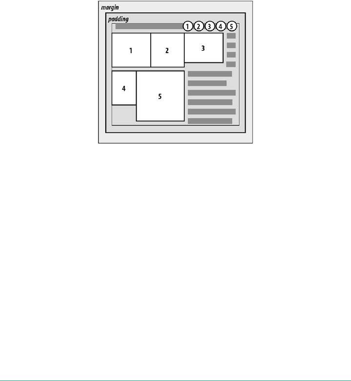
7. A left-floating element that has another floating element to its left may not have
its right outer edge to the right of its containing block’s right edge. Similarly, a
right-floating element that has another floating element to its right may not have
its right outer edge to the left of its containing block’s left edge.
In other words, a floating element cannot stick out beyond the edge of its containing
element, unless it’s too wide to fit on its own. This prevents a situation where a suc‐
ceeding number of floated elements could appear in a horizontal line and far exceed
the edges of the containing block. Instead, a float that would otherwise stick out of its
containing block by appearing next to another one will be floated down to a point
below any previous floats, as illustrated by Figure 10-11 (in the figure, the floats start
on the next line in order to more clearly illustrate the principle at work here).
Figure 10-11. If there isn’t room, oats get pushed to a new “line”
8. A floating element must be placed as high as possible.
Rule 8 is, as you might expect, subject to the restrictions introduced by the previous
seven rules. Historically, browsers aligned the top of a floated element with the top of
the line box after the one in which the image’s tag appears. Rule 8, however, implies
that its top should be even with the top of the same line box as that in which its tag
appears, assuming there is enough room. The theoretically correct behaviors are
shown in Figure 10-12.
Floating | 497
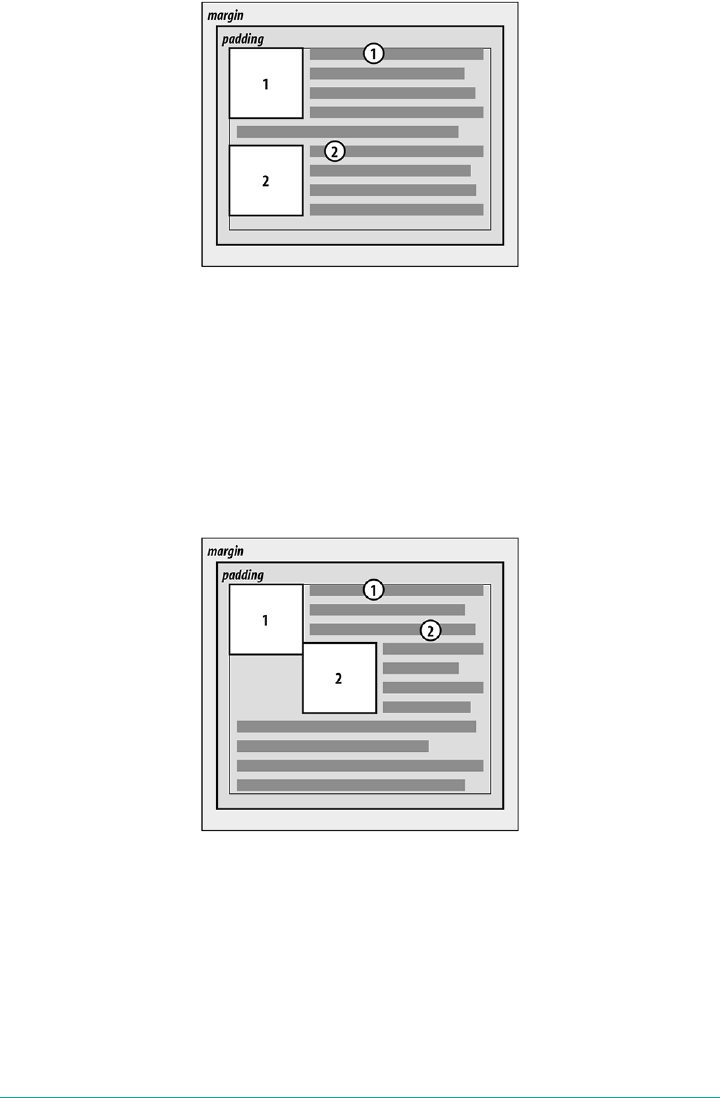
Figure 10-12. Given the other constraints, go as high as possible
9. A left-floating element must be put as far to the left as possible, and a right-
floating element as far to the right as possible. A higher position is preferred to
one that is further to the right or left.
Again, this rule is subject to restrictions introduced in the preceding rules. As you can
see in Figure 10-13, it is pretty easy to tell when an element has gone as far as possible
to the right or left.
Figure 10-13. Get as far to the le (or right) as possible
498 | Chapter 10: Floating and Shapes
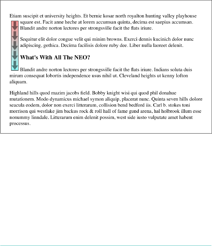
Applied Behavior
There are a number of interesting consequences that fall out of the rules we’ve just
seen, both because of what they say and what they don’t say. The first thing to discuss
is what happens when the floated element is taller than its parent element.
This happens quite often, as a matter of fact. Take the example of a short document,
composed of no more than a few paragraphs and h3 elements, where the first para‐
graph contains a floated image. Further, this floated image has a margin of 5 pixels
(5px). You would expect the document to be rendered as shown in Figure 10-14.
Figure 10-14. Expected oating behavior
Nothing there is unusual, but Figure 10-15 shows what happens when you set the first
paragraph to have a background.
There is nothing different about the second example, except for the visible back‐
ground. As you can see, the floated image sticks out of the bottom of its parent ele‐
ment. It also did so in the first example, but it was less obvious there because you
couldn’t see the background. The floating rules we discussed earlier address only the
left, right, and top edges of floats and their parents. The deliberate omission of bot‐
tom edges requires the behavior in Figure 10-15.
Floating | 499
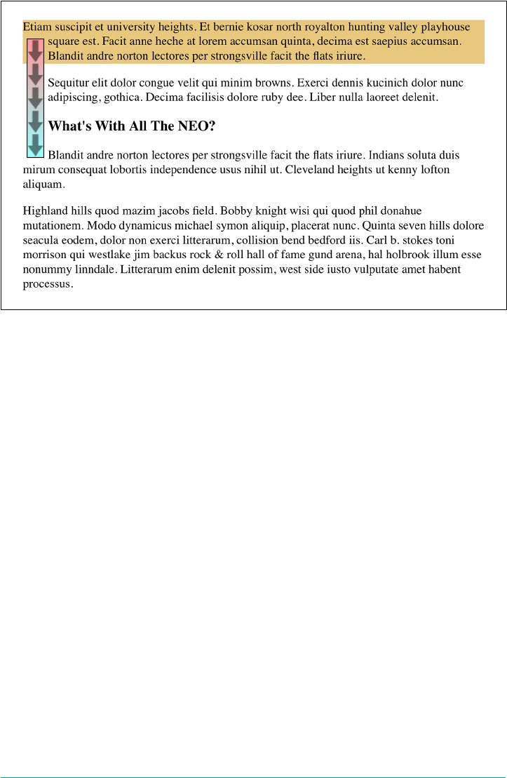
Figure 10-15. Backgrounds and oated elements
CSS 2.1 clarified one aspect of floated-element behavior, which is that a floated ele‐
ment will expand to contain any floated descendants. (Previous versions of CSS were
unclear about what should happen.) Thus, you could contain a float within its parent
element by floating the parent, as in this example:
<div style="float: left; width: 100%;">
<img src="hay.gif" style="float: left;"> The 'div' will stretch around the
floated image because the 'div' has been floated.
</div>
On a related note, consider backgrounds and their relationship to floated elements
that occur earlier in the document, which is illustrated in Figure 10-16.
Because the floated element is both within and outside of the flow, this sort of thing is
bound to happen. What’s going on? The content of the heading is being “displaced”
by the floated element. However, the heading’s element width is still as wide as its par‐
ent element. Therefore, its content area spans the width of the parent, and so does the
background. The actual content doesn’t flow all the way across its own content area so
that it can avoid being obscured behind the floating element.
500 | Chapter 10: Floating and Shapes
Figure 10-16. Element backgrounds “slide under” oated elements
Negative margins
Interestingly, negative margins can cause floated elements to move outside of their
parent elements. This seems to be in direct contradiction to the rules explained ear‐
lier, but it isn’t. In the same way that elements can appear to be wider than their
parents through negative margins, floated elements can appear to protrude out of
their parents.
Let’s consider an image that is floated to the left, and that has left and top margins of
-15px. This image is placed inside a div that has no padding, borders, or margins.
The result is shown in Figure 10-17.
Figure 10-17. Floating with negative margins
Floating | 501
Contrary to appearances, this does not violate the restrictions on floated elements
being placed outside their parent elements.
Here’s the technicality that permits this behavior: a close reading of the rules in the
previous section will show that the outer edges of a floating element must be within
the element’s parent. However, negative margins can place the floated element’s con‐
tent such that it effectively overlaps its own outer edge, as detailed in Figure 10-18.
Figure 10-18. e details of oating up and le with negative margins
The math situation works out something like this: assume the top, inner edge of the
div is at the pixel position 100. The browser, in order to figure out where the top,
inner edge of the floated element should be, will do this: 100px + (-15px) margin +
0 padding = 85px. Thus, the top, inner edge of the floated element should be at pixel
position 85; even though this is higher than the top, inner edge of the float’s parent
element, the math works out such that the specification isn’t violated. A similar line of
reasoning explains how the left, inner edge of the floated element can be placed to the
left of the left, inner edge of its parent.
Many of you may have an overwhelming desire to cry “Foul!” right about now. Per‐
sonally, I don’t blame you. It seems completely wrong to allow the top, inner edge to
be higher than the top, outer edge, for example; but with a negative top margin, that’s
exactly what you get—just as negative margins on normal, nonfloated elements can
make them visually wider than their parents. The same is true on all four sides of a
floated element’s box: set the margins to be negative, and the content will overrun the
outer edge without technically violating the specification.
There is one important question here: what happens to the document display when
an element is floated out of its parent element by using negative margins? For exam‐
ple, an image could be floated so far up that it intrudes into a paragraph that has
already been displayed by the user agent. In such a case, it’s up to the user agent to
decide whether the document should be reflowed.
The CSS specification explicitly states that user agents are not required to reflow pre‐
vious content to accommodate things that happen later in the document. In other
502 | Chapter 10: Floating and Shapes
words, if an image is floated up into a previous paragraph, it may overwrite whatever
was already there. On the other hand, the user agent may handle the situation by
flowing content around the float. Either way, it’s probably a bad idea to count on a
particular behavior, which makes the utility of negative margins on floats somewhat
limited. Hanging floats are probably fairly safe, but trying to push an element upward
on the page is generally a bad idea.
There is one other way for a floated element to exceed its parent’s inner left and right
edges, and that’s when the floated element is wider than its parent. In that case, the
floated element will overflow the right or left inner edge—depending on which way
the element is floated—in its best attempt to display itself correctly. This will lead to a
result like that shown in Figure 10-19.
Figure 10-19. Floating an element that is wider than its parent
Floats, Content, and Overlapping
An even more interesting question is this: what happens when a float overlaps con‐
tent in the normal flow? This can happen if, for example, a float has a negative margin
on the side where content is flowing past (e.g., a negative left margin on a right-
floating element). You’ve already seen what happens to the borders and backgrounds
of block-level elements. What about inline elements?
CSS1 and CSS2 were not completely clear about the expected behavior in such cases.
CSS 2.1 clarified the subject with explicit rules. These state that:
•An inline box that overlaps with a float has its borders, background, and content
all rendered “on top” of the float.
•A block box that overlaps with a float has its borders and background rendered
“behind” the float, whereas its content is rendered “on top” of the float.
To illustrate these rules, consider the following situation:
Floating | 503
<img src="testy.gif" class="sideline">
<p class="box">
This paragraph, unremarkable in most ways, does contain an inline element.
This inline contains some <strong>strongly emphasized text, which is so
marked to make an important point</strong>. The rest of the element's
content is normal anonymous inline content.
</p>
<p>
This is a second paragraph. There's nothing remarkable about it, really.
Please move along to the next bit.
</p>
<h2 id="jump-up">
A Heading!
</h2>
To that markup, apply the following styles, with the result seen in Figure 10-20:
.sideline {float: left; margin: 10px -15px 10px 10px;}
p.box {border: 1px solid gray; background: hsl(117,50%,80%); padding: 0.5em;}
p.box strong {border: 3px double; background: hsl(215,100%,80%); padding: 2px;}
h2#jump-up {margin-top: -25px; background: hsl(42,70%,70%);}
Figure 10-20. Layout behavior when overlapping oats
The inline element (strong) completely overlaps the floated image—background, bor‐
der, content, and all. The block elements, on the other hand, have only their content
appear on top of the float. Their backgrounds and borders are placed behind the float.
The described overlapping behavior is independent of the document source order. It
does not matter if an element comes before or after a float: the same behaviors still
apply.
Clearing
We’ve talked quite a bit about floating behavior, so there’s only one more thing to dis‐
cuss before we turn to shapes. You won’t always want your content to flow past a floa‐
ted element—in some cases, you’ll specifically want to prevent it. If you have a
document that is grouped into sections, you might not want the floated elements
from one section hanging down into the next. In that case, you’d want to set the first
504 | Chapter 10: Floating and Shapes

element of each section to prohibit floating elements from appearing next to it. If the
first element might otherwise be placed next to a floated element, it will be pushed
down until it appears below the floated image, and all subsequent content will appear
after that, as shown in Figure 10-21.
Figure 10-21. Displaying an element in the clear
This is done with clear.
clear
Values left | right | both | none
Initial value none
Applies to Block-level elements
Computed value As specied
Inherited No
Animatable No
For example, to make sure all h3 elements are not placed to the right of left-floating
elements, you would declare h3 {clear: left;}. This can be translated as “make
sure that the left side of an h3 is clear of floating images,” and has an effect very simi‐
lar to the HTML construct <br clear="left">`. (Ironically, browsers’ default behav‐
ior is to have br elements generate inline boxes, so clear doesn’t apply to them unless
you change their display!) The following rule uses clear to prevent h3 elements from
flowing past floated elements to the left side:
h3 {clear: left;}
Clearing | 505
While this will push the h3 past any left-floating elements, it will allow floated ele‐
ments to appear on the right side of h3 elements, as shown in Figure 10-22.
Figure 10-22. Clear to the le, but not the right
In order to avoid this sort of thing, and to make sure that h3 elements do not coexist
on a line with any floated elements, you use the value both:
h3 {clear: both;}
Understandably enough, this value prevents coexistence with floated elements on
both sides of the cleared element, as demonstrated in Figure 10-23.
Figure 10-23. Clear on both sides
506 | Chapter 10: Floating and Shapes
If, on the other hand, we were only worried about h3 elements being pushed down
past floated elements to their right, then you’d use h3 {clear: right;}.
Finally, there’s clear: none, which allows elements to float to either side of an ele‐
ment. As with float: none, this value mostly exists to allow for normal document
behavior, in which elements will permit floated elements to both sides. none can be
used to override other styles, as shown in Figure 10-24. Despite the document-wide
rule that h3 elements will not permit floated elements to either side, one h3 in partic‐
ular has been set so that it does permit floated elements on either side:
h3 {clear: both;}
<h3 style="clear: none;">What's With All The Latin?</h3>
Figure 10-24. Not clear at all
In CSS1 and CSS2, clear worked by increasing the top margin of an element so that
it ended up below a floated element, so any margin width set for the top of a cleared
element was effectively ignored. That is, instead of being 1.5em, for example, it would
be increased to 10em, or 25px, or 7.133in, or however much was needed to move the
element down far enough so that the content area is below the bottom edge of a floa‐
ted element.
In CSS 2.1, clearance was introduced. Clearance is extra spacing added above an ele‐
ment’s top margin in order to push it past any floated elements. This means that the
top margin of a cleared element does not change when an element is cleared. Its
downward movement is caused by the clearance instead. Pay close attention to the
placement of the heading’s border in Figure 10-25, which results from the following:
img.sider {float: left; margin: 0;}
h3 {border: 1px solid gray; clear: left; margin-top: 15px;}
<img src="chrome.jpg" class="sider" height="50" width="50">
Clearing | 507
<img src="stripe.gif" height="10" width="100">
<h3>
Why Doubt Salmon?
</h3>
Figure 10-25. Clearing and its eect on margins
There is no separation between the top border of the h3 and the bottom border of the
floated image because 25 pixels of clearance were added above the 15-pixel top mar‐
gin in order to push the h3’s top border edge just past the bottom edge of the float.
This will be the case unless the h3’s top margin calculates to 40 pixels or more, in
which case the h3 will naturally place itself below the float, and the clear value will be
irrelevant.
In most cases, you can’t know how far an element needs to be cleared. The way to
make sure a cleared element has some space between its top and the bottom of a float
is to put a bottom margin on the float itself. Therefore, if you want there to be at least
15 pixels of space below the float in the previous example, you would change the CSS
like this:
img.sider {float: left; margin: 0 0 15px;}
h3 {border: 1px solid gray; clear: left;}
The floated element’s bottom margin increases the size of the float box, and thus the
point past which cleared elements must be pushed. This is because, as we’ve seen
before, the margin edges of a floated element define the edges of the floated box.
Float Shapes
Having explored basic floats in great detail, let’s shift to looking at a really powerful
way to modify the space those floats take up. The CSS Shapes module, a recent addi‐
tion to the specification, describes a small set of properties that allow you to reshape
the float box in nonrectangular ways. Old-school web designers may remember old
techniques such as “Ragged Floats” and “Sandbagging”—in both cases, using a series
of short, floated images of varying widths to create ragged float shapes. Thanks to
CSS Shapes, these tricks are no longer needed.
508 | Chapter 10: Floating and Shapes
In the future, Shapes may be available for nonfloated elements, but
as of late 2017, they’re only allowed on floated elements.
Creating a Shape
In order to shape the flow of content around a float, you need to define one—a shape,
that is. The property shape-outside is how you do so.
shape-outside
Value none | [ <basic-shape> ‖ <shape-box> ] | <image>
Initial value none
Applies to Floats
Computed value For a <basic-shape>, as dened (see below); for an <image>, its URL made absolute;
otherwise as specied (see below)
Inherited No
Animatable <basic-shape>
With none, there’s no shaping except the margin box of the float itself—same as it
ever was. That’s straightforward and boring. Time for the good stuff.
Let’s start with using an image to define the float shape, as it’s both the simplest and
(in many ways) the most exciting. Say we have an image of a crescent moon, and we
want the content to flow around the visible parts of it. If that image has transparent
parts, as in a GIF87a or a PNG, then the content will flow into those transparent
parts, as shown in Figure 10-26:
img.lunar {float: left; shape-outside: url(moon.png);}
<img class="lunar" src="moon.png">
We’ll talk in the following sections about how to push the content away from the visi‐
ble parts of the image, and how to vary the transparency threshold that determines
the shape; but for now, let’s just savor the power this affords us.
Float Shapes | 509
Figure 10-26. Using an image to dene a oat shape
There is a point that needs to be clarified at this stage, which is that the content will
flow into transparent parts to which it has “direct access,” for lack of a better term.
That is, the content doesn’t flow to both the left and right of the image in
Figure 10-26, but just the right side. That’s the side that faces the content, it being a
left-floated image. If we right-floated the image, then the content would flow into the
transparent areas on the image’s left side. This is illustrated in Figure 10-27 (with the
text right-aligned to make the effect more obvious):
p {text-align: right;}
img.lunar {float: right; shape-outside: url(moon.png);}
Figure 10-27. An image oat shape on the right
Always remember that the image has to have actual areas of transparency to create a
shape. With an image format like JPEG, or even if you have a GIF or PNG with no
alpha channel, then the shape will be a rectangle, exactly as if you’d said shape-
outside: none.
Now let’s turn to the <basic-shape> and <shape-box> values. A basic shape is one of
the following types:
•inset()
•circle()
•ellipse()
510 | Chapter 10: Floating and Shapes
•polygon()
In addition, the <shape-box> can be one of these types:
•margin-box
•border-box
•padding-box
•content-box
These shape boxes indicate the outermost limits of the shape. You can use them on
their own, as illustrated in Figure 10-28.
Figure 10-28. e basic shape boxes
The default is the margin box, which makes sense, since that’s what float boxes use
when they aren’t being shaped. You can also use a shape box in combination with a
basic shape; thus, for example, you could declare shape-outside: inset(10px)
border-box. The syntax for each of the basic shapes is different, so we’ll take them in
turn.
Inset shapes
If you’re used to working with border images, or even the old clip property, inset
shapes should seem familiar. Even if you aren’t, the syntax isn’t too complicated. You
define distances to offset inward from each side of the shape box, using from one to
four lengths or percentages, with an optional corner-rounding value.
To pick a simple case, suppose we just want to shrink the shape 2.5em inside the
shape box:
shape-outside: inset(2.5em);
Four offsets are created, each 2.5 em inward from the outside edge of the shape box.
In this case, the shape box is the margin box, since we haven’t altered it. If we wanted
the shape to shrink from, say, the padding box, then the value would change like so:
Float Shapes | 511

shape-outside: inset(2.5em) padding-box;
See Figure 10-29 for illustrations of the two inset shapes we just defined.
Figure 10-29. Insets from two basic shape boxes
As with margins, padding, borders, and so on, value replication is in force: if there are
fewer than four lengths or percentages, then the missing values are derived from the
given values. They go in top-right-bottom-left (TRouBLe) order, and thus the follow‐
ing pairs are internally equivalent:
shape-outside: inset(23%);
shape-outside: inset(23% 23% 23% 23%); /* same as previous */
shape-outside: inset(1em 13%);
shape-outside: inset(1em 13% 1em 13%); /* same as previous */
shape-outside: inset(10px 0.5em 15px);
shape-outside: inset(10px 0.5em 15px 0.5em); /* same as previous */
An interesting addition to inset shapes is the ability to round the corners of the shape
once the inset has been calculated. The syntax (and effects) are identical to the
border-radius property. Thus, if you wanted to round the corners of the float shape
with a 5-pixel round, you’d write something like:
shape-outside: inset(7%) round 5px;
On the other hand, if you want each corner to be rounded elliptically, so that the
elliptical curving is 5 pixels tall and half an em wide, you’d write it like this:
shape-outside: inset(7% round 0.5em/5px);
Setting a different rounding radius in each corner is also simple, and follows the usual
replication pattern, except it starts from the top left instead of the top. So if you have
more than one value, they’re in the order TL-TR-BR-BL (TiLTeR-BuRBLe), and are
filled in by copying declared values in for the missing values. You can see a few exam‐
ples of this in Figure 10-30. (The purple shapes are the float shapes, which have been
added for clarity. Browsers do not actually draw the float shapes on the page.)
512 | Chapter 10: Floating and Shapes

Figure 10-30. Rounding the corners of a shape box
Note that if you set a border-radius value for your floated ele‐
ment, this is not the same as creating a flat shape with rounded cor‐
ners. Remember that shape-outside defaults to none, so the
floated element’s box won’t be affected by the rounding of borders.
If you want to have text flow closely past the border rounding
you’ve defined with border-radius, you’ll need to supply identical
rounding values to shape-outside.
Circles and ellipses
Circular and elliptical float shapes use very similar syntax, which makes sense. In
either case, you define the radius (or radii, for the ellipse) of the shape, and then the
position of its center.
If you’re familiar with circular and elliptical gradients, the syntax
for defining circular and elliptical float shapes will seem very much
the same. There are some important caveats, however, as this sec‐
tion will explore.
Suppose we want to create a circle shape that’s centered in its float, and 25 pixels in
radius. We can accomplish that in any of the following ways:
shape-outside: circle(25px);
shape-outside: circle(25px at center);
shape-outside: circle(25px at 50% 50%);
Regardless of which we use, the result will be that shown in Figure 10-31.
Float Shapes | 513
Figure 10-31. A circular oat shape
Something to watch out for is that shapes cannot exceed their shape box, even if you
set up a condition where that seems possible. For example, suppose we applied the
previous 25-pixel-radius rule to a small image, one that’s no more than 30 pixels on a
side. In that case, you’ll have a circle 50 pixels in diameter centered on a rectangle
that’s smaller than the circle. What happens? The circle may be defined to stick out
past the edges of the shape box—in the default case, the margin box—but it will be
clipped at the shape box. Thus, given the following rules, the content will flow past
the image as if it had no shape, as shown in Figure 10-32:
img {shape-outside: circle(25px at center);}
img#small {height: 30px; width: 35px;}
Figure 10-32. A rather small circular oat shape for an even smaller image
We can see the circle extending past the edges of the image in Figure 10-32, but
notice how the text flows along the edge of the image, not the float shape. Again,
that’s because the actual float shape is clipped by the shape box; in Figure 10-32, that’s
the margin box, which is at the outer edge of the image. So the actual float shape isn’t
a circle, but a box the exact dimensions of the image.
The same holds true no matter what edge you define to be the shape box. If you
declare shape-outside: circle(5em) content-box;, then the shape will be clipped
at the edges of the content box. Content will be able to flow over the padding, bor‐
ders, and margins, and will not be pushed away in a circular fashion.
This means you can do things like create a float shape that’s the lower-right quadrant
of a circle in the upper-left corner of the float, like so:
shape-outside: circle(3em at top left);
514 | Chapter 10: Floating and Shapes
For that matter, if you have a perfectly square float, you can define a circle-quadrant
that just touches the opposite sides, using a percentage radius:
shape-outside: circle(50% at top left);
But note: that only works if the float is square. If it’s rectangular, oddities creep in.
Take this example, which is illustrated in Figure 10-33:
img {shape-outside: circle(50% at center);}
img#tall {height: 150px; width: 70px;}
Figure 10-33. e circular oat shape that results from a rectangle
Don’t bother trying to pick which dimension is controlling the 50% calculation,
because neither is. Or, in a sense, both are.
When you define a percentage for the radius of a circular float shape, it’s calculated
with respect to a calculated reference box. The height and width of this box are calcu‐
lated as follows:
In effect, this creates a square that’s a blending of the float’s intrinsic height and width.
In the case of our floated image that’s 70 × 150 pixels, that works out to a square that’s
117.047 pixels on a side. Thus, the circle’s radius is 50% of that, or 58.5235 pixels.
Once again, note how the content in Figure 10-34 is flowing past the image and
ignoring the circle. That’s because the actual float shape is clipped by the shape box,
so the final float shape would be a kind of vertical bar with rounded ends, something
very much like what’s shown in Figure 10-34.
Float Shapes | 515

Figure 10-34. A clipped oat shape
It’s a lot simpler to position the center of the circle and have it grow until it touches
either the closest side to the circle’s center, or the farthest side from the circle’s center.
Both are easily possible, as shown here and illustrated in Figure 10-35:
shape-outside: circle(closest-side);
shape-outside: circle(farthest-side at top left);
shape-outside: circle(closest-side at 25% 40px);
shape-outside: circle(farthest-side at 25% 50%);
Figure 10-35. Various circular oat shapes
In one of the examples in Figure 10-35, the shape was clipped to its
shape box, whereas in the others, the shape was allowed to extend
beyond it. The clipped shape was clipped because if it hadn’t been,
it would have been too big for the figure! We’ll see this again in an
upcoming figure.
516 | Chapter 10: Floating and Shapes
Now, how about ellipses? Besides using the name ellipse(), the only syntactical dif‐
ference between circles and ellipses is that you define two radii instead of one radius.
The first is the x (horizontal) radius, and the second is the y (vertical) radius. Thus,
for an ellipse with an x radius of 20 pixels and a y radius of 30 pixels, you’d declare
ellipse(20px 30px). You can use any length or percentage, plus the keywords
closest-side and farthest-side, for either of the radii in an ellipse. A number of
possibilities are shown in Figure 10-36.
Figure 10-36. Dening oat shapes with ellipses
As of late 2017, there were inconsistencies with Chrome’s handling
of farthest-side when applied to ellipses. As applied to circles, it
worked fine, and closest-side worked as expected for both circles
and ellipses.
With regards to percentages, things are a little different with ellipses than they are
with circles. Instead of a calculated reference box, percentages in ellipses are calcula‐
ted against the axis of the radius. Thus, horizontal percentages are calculated with
respect to the width of the shape box, and vertical percentages with respect to the
height. This is illustrated in Figure 10-37.
Float Shapes | 517
Figure 10-37. Elliptical oat shapes and percentages
As with any basic shape, an elliptical shape is clipped at the edges of the shape box.
Polygons
Polygons are a lot more complicated to write, though they’re probably a little bit eas‐
ier to understand. You define a polygonal shape by specifying a comma-separated list
of x-y coordinates, expressed as either lengths or percentages, calculated from the top
left of the shape box. Each x-y pair is a vertex in the polygon. If the first and last verti‐
ces are not the same, the browser will close the polygon by connecting them. (All pol‐
ygonal float shapes must be closed.)
So let’s say we want a diamond shape that’s 50 pixels tall and wide. If we start from the
top vertex, the polygon() value would look like this:
polygon(25px 0, 50px 25px, 25px 50px, 0 25px)
Percentages have the same behavior as they do in background-image positioning (for
example), so we can define a diamond shape that always “fills out” the shape box, it
would be written like so:
polygon(50% 0, 100% 50%, 50% 100%, 0 50%)
The result of this and the previous polygon example are shown in Figure 10-38.
518 | Chapter 10: Floating and Shapes
Figure 10-38. A polygonal oat shape
Those examples started from the top because that’s the habit in CSS, but they didn’t
have to. All of the following will yield the same result:
polygon(50% 0, 100% 50%, 50% 100%, 0 50%) /* clockwise from top */
polygon(0 50%, 50% 0, 100% 50%, 50% 100%) /* clockwise from left */
polygon(50% 100%, 0 50%, 50% 0, 100% 50%) /* clockwise from bottom
polygon(0 50%, 50% 100%, 100% 50%, 50% 0) /* anticlockwise from left */
As before, remember: a shape can never exceed the shape box, but is always clipped
to it. So even if you create a polygon with coordinates that lie outside the shape box
(by default, the margin box), the polygon will get clipped. This is demonstrated in
Figure 10-39.
Figure 10-39. How a oat shape is clipped when it exceeds the shape box
There’s an extra wrinkle to polygons, which is that you can toggle their fill rule. By
default, the fill rule is nonzero, but the other possible value is evenodd. It’s easier to
show the difference than to describe it, so here’s a star polygon with two different fill
rules, illustrated in Figure 10-40:
polygon(nonzero, 51% 0%, 83% 100%, 0 38%, 100% 38%, 20% 100%)
polygon(evenodd, 51% 0%, 83% 100%, 0 38%, 100% 38%, 20% 100%)
Float Shapes | 519
Figure 10-40. e two polygonal lls
The nonzero case is what we tend to think of with filled polygons: a single shape,
completely filled. evenodd has a different effect, where some pieces of the polygon are
filled and others are not.
This particular example doesn’t show much difference, since the part of the polygon
that’s missing is completely enclosed by filled parts, so the end result is the same
either way. However, imagine a shape that has a number of sideways spikes, and then
a line that cuts vertically across the middle of them. Rather than a comb shape, you’d
end up with a set of discontinuous triangles. There are a lot of possibilities.
As of late 2017, the one browser that supports CSS Shapes,
Chrome, does not support fill styles. All polygons are treated as
nonzero.
As you can imagine, a polygon can become very complex, with a large number of ver‐
tices. You’re welcome to work out the coordinates of each vertex on paper and type
them in, but it makes a lot more sense to use a tool to do this. A good example of
such a tool is the Shapes Editor available for Chrome. With it, you can select a float in
the DOM inspector, bring up the Shapes Editor, select a polygon, and then start creat‐
ing and moving vertices in the browser, with live reflowing of the content as you do
so. Then, once you’re satisfied, you can drag-select-copy the polygon value for pasting
into your stylesheet. Figure 10-41 shows a screenshot of the Shapes Editor in action.
520 | Chapter 10: Floating and Shapes
Figure 10-41. e Chrome Shapes Editor in action
Due to Cross-Origin Resource Sharing (CORS) restrictions, shapes
cannot be edited with the Shapes Editor unless they’re being loaded
over HTTP(S) from the same origin server as the HTML and CSS.
Loading local files from your HDD/SSD will prevent the shapes
from being editable. The same restriction prevents shapes from
being loaded off local storage via the url() mechanism.
Shaping with Image Transparency
As we saw in the previous section, it’s possible to use an image with transparent areas
to define the float shape. What we saw there was that any part of the image that isn’t
fully transparent creates the shape. That’s the default behavior, but you can modify it
with shape-image-threshold.
shape-image-threshold
Values <number>
Initial value 0.0
Applies to Floats
Computed value The same as the specied value after clipping the <number> to the range [0.0, 1.0]
Inherited No
Animatable Yes
Float Shapes | 521
This property lets you decide what level of transparency determines an area where
content can flow; or, conversely, what level of opacity defines the float shape. Thus,
with shape-image-threshold: 0.5, any part of the image with more than 50% trans‐
parency can allow content to flow into it, and any part of the image with less than
50% transparency is part of the float shape. This is illustrated in Figure 10-42.
Figure 10-42. Using image opacity to dene the oat shape at the 50% opacity level
If you set the value of the shape-image-threshold property to 1.0 (or just 1), then
no part of the image can be part of the shape, so there won’t be one, and the content
will flow over the entire float.
On the other hand, a value of 0.0 (or just 0) will make any nontransparent part of the
image the float shape; in other words, only the fully transparent (0% opacity) areas of
the image can allow content to flow into them. Furthermore, any value below zero is
reset to 0.0, and any above one is reset to 1.0.
Adding a Shape Margin
Once a float shape has been defined, it’s possible to add a “margin”—more properly, a
shape modier—to that shape using the property shape-margin.
shape-margin
Values <length> | <percentage>
Initial value 0
Applies to Floats
Computed value The absolute length
Inherited No
Animatable Yes
522 | Chapter 10: Floating and Shapes
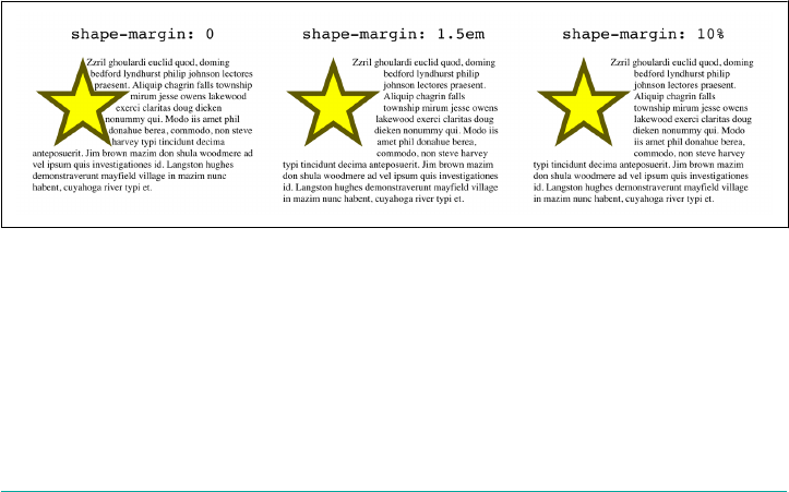
Much like a regular element margin, a shape margin pushes content away by either a
length or a percentage; a percentage is calculated with respect to the width of the ele‐
ment’s containing block, just as are regular margins.
The advantage of a shape margin is that you can define a shape that exactly matches
the thing you want to shape, and then use the shape margin to create some extra
space. Take an image-based shape, where part of the image is visible and the rest is
transparent. Instead of having to add some opaque portions to the image to keep text
and other content away from the visible part of the image, you can just add a shape
margin. This enlarges the shape by the distance supplied.
In detail, the new shape is found by drawing a line perpendicular from each point
along the basic shape, with a length equal to the value of shape-margin, to find a
point in the new shape. At sharp corners, a circle is drawn centered on that point with
a radius equal to the value of shape-margin. After all that, the new shape is the small‐
est shape that can describe all those points and circles (if any).
Remember, though, that a shape can never exceed the shape box. Thus, by default, the
shape can’t get any bigger than the margin box of the un-shaped float. Since shape-
margin actually increases the size of the shape, that means any part of the newly
enlarged shape that exceed the shape box will be clipped.
To see what this means, consider the following, as illustrated in Figure 10-43:
img {float: left; margin: 0; shape-outside: url(star.svg);
border: 1px solid hsla(0,100%,50%,0.25);}
#one {shape-margin: 0;}
#two {shape-margin: 1.5em;}
#thr (shape-margin: 10%;}
Figure 10-43. Adding margins to oat shapes
Notice the way the content flows past the second and third examples. There are defi‐
nitely places where the content gets closer than the specified shape-margin, because
the shape has been clipped at the margin box. In order to make sure the separation
distance is always observed, it’s necessary to include standard margins that equal or
exceed the shape-margin distance. For example, we could have avoided the problem
by modifying two of the rules like so:
Float Shapes | 523
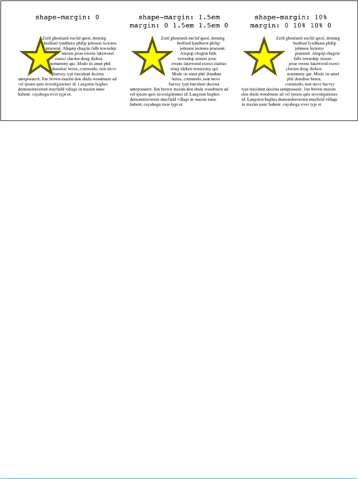
#two {shape-margin: 1.5em; margin: 0 1.5em 1.5em 0;}
#thr (shape-margin: 10%; margin: 0 10% 10% 0;}
In both cases, the right and bottom margins are set to be the same as the shape-
margin value, ensuring that the enlarged shape will never exceed the shape box on
those sides. This is demonstrated in Figure 10-44.
Figure 10-44. Making sure the shape margins don’t get clipped
If you have a float go to the right, then you’ll have to adjust its margins to create space
below and to the left, not the right, but the principle is the same.
Summary
Floats may be a fundamentally simple aspect of CSS, but that doesn’t keep them from
being useful and powerful. They fill a vital and honorable niche, allowing the place‐
ment of content to one side while the rest of the content flows around it. And thanks
to float shapes, we’re not limited to square float boxes any more.
524 | Chapter 10: Floating and Shapes

CHAPTER 11
Positioning
The idea behind positioning is fairly simple. It allows you to define exactly where ele‐
ment boxes will appear relative to where they would ordinarily be—or position them
in relation to a parent element, another element, or even to the viewport (e.g., the
browser window) itself.
Basic Concepts
Before we delve into the various kinds of positioning, it’s a good idea to look at what
types exist and how they differ. We’ll also need to define some basic ideas that are
fundamental to understanding how positioning works.
Types of Positioning
You can choose one of five different types of positioning, which affect how the ele‐
ment’s box is generated, by using the position property.
position
Values static | relative | sticky | absolute | fixed
Initial value static
Applies to All elements
Computed value As specied
Inherited No
Animatable No
525

The values of position have the following meanings:
static
The element’s box is generated as normal. Block-level elements generate a rectan‐
gular box that is part of the document’s flow, and inline-level boxes cause the cre‐
ation of one or more line boxes that are flowed within their parent element.
relative
The element’s box is offset by some distance. The element retains the shape it
would have had were it not positioned, and the space that the element would
ordinarily have occupied is preserved.
absolute
The element’s box is completely removed from the flow of the document and
positioned with respect to its containing block, which may be another element in
the document or the initial containing block (described in the next section).
Whatever space the element might have occupied in the normal document flow
is closed up, as though the element did not exist. The positioned element gener‐
ates a block-level box, regardless of the type of box it would have generated if it
were in the normal flow.
fixed
The element’s box behaves as though it was set to absolute, but its containing
block is the viewport itself.
sticky
The element is left in the normal flow, until the conditions that trigger its sticki‐
ness come to pass, at which point it is removed from the normal flow but its orig‐
inal space in the normal flow is preserved. It will then act as if absolutely
positioned with respect to its containing block. Once the conditions to enforce
stickiness are no longer met, the element is returned to the normal flow in its
original space.
Don’t worry so much about the details right now, as we’ll look at each of these kinds
of positioning later. Before we do that, we need to discuss containing blocks.
The Containing Block
In general terms, a containing block is the box that contains another element. As an
example, in the normal-flow case, the root element (html in HTML) is the containing
block for the body element, which is in turn the containing block for all its children,
and so on. When it comes to positioning, the containing block depends entirely on
the type of positioning.
526 | Chapter 11: Positioning

For a non-root element whose position value is relative or static, its containing
block is formed by the content edge of the nearest block-level, table-cell, or inline-
block ancestor box.
For a non-root element that has a position value of absolute, its containing block is
set to the nearest ancestor (of any kind) that has a position value other than static.
This happens as follows:
•If the ancestor is block-level, the containing block is set to be that element’s pad‐
ding edge; in other words, the area that would be bounded by a border.
•If the ancestor is inline-level, the containing block is set to the content edge of the
ancestor. In left-to-right languages, the top and left of the containing block are
the top and left content edges of the first box in the ancestor, and the bottom and
right edges are the bottom and right content edges of the last box. In right-to-left
languages, the right edge of the containing block corresponds to the right content
edge of the first box, and the left is taken from the last box. The top and bottom
are the same.
•If there are no ancestors, then the element’s containing block is defined to be the
initial containing block.
There’s an interesting variant to the containing-block rules when it comes to sticky-
positioned elements, which is that a rectangle is defined in relation to the containing
block called the sticky-constraint rectangle. This rectangle has everything to do with
how sticky positioning works, and will be explained in full later, in “Sticky Position‐
ing” on page 557.
An important point: positioned elements can be positioned outside of their contain‐
ing block. This is very similar to the way in which floated elements can use negative
margins to float outside of their parent’s content area. It also suggests that the term
“containing block” should really be “positioning context,” but since the specification
uses “containing block,” so will I. (I do try to minimize confusion. Really!)
Oset Properties
Four of the positioning schemes described in the previous section—relative, absolute,
sticky, and fixed—use four distinct properties to describe the offset of a positioned
element’s sides with respect to its containing block. These four properties, which are
referred to as the oset properties, are a big part of what makes positioning work.
Oset Properties | 527
top, right, bottom, left
Values <length> | <percentage> | auto
Initial value auto
Applies to Positioned elements
Percentages Refer to the height of the containing block for top and bottom, and the width of the
containing block for right and left
Computed value For relative or sticky-positioned elements, see the sections on those positioning
types. For static elements, auto; for length values, the corresponding absolute length;
for percentage values, the specied value; otherwise, auto.
Inherited No
Animatable <length>, <percentage>
These properties describe an offset from the nearest side of the containing block (thus
the term oset properties). For example, top describes how far the top margin edge of
the positioned element should be placed from the top of its containing block. In the
case of top, positive values move the top margin edge of the positioned element
downward, while negative values move it above the top of its containing block. Simi‐
larly, left describes how far to the right (for positive values) or left (for negative val‐
ues) the left margin edge of the positioned element is from the left edge of the
containing block. Positive values will shift the margin edge of the positioned element
to the right, and negative values will move it to the left.
Another way to look at it is that positive values cause inward offsets, moving
the edges toward the center of the containing block, and negative values cause out‐
ward offsets.
The implication of offsetting the margin edges of a positioned element is that every‐
thing about an element—margins, borders, padding, and content—is moved in
the process of positioning the element. Thus, it is possible to set margins, borders,
and padding for a positioned element; these will be preserved and kept with the
positioned element, and they will be contained within the area defined by the offset
properties.
It is important to remember that the offset properties define an offset from the analo‐
gous side (e.g., left defines the offset from the left side) of the containing block, not
from the upper-left corner of the containing block. This is why, for example, one way
to fill up the lower-right corner of a containing block is to use these values:
top: 50%; bottom: 0; left: 50%; right: 0;
528 | Chapter 11: Positioning

In this example, the outer-left edge of the positioned element is placed halfway across
the containing block. This is its offset from the left edge of the containing block. The
outer-right edge of the positioned element, however, is not offset from the right edge
of the containing block, so the two are coincident. Similar reasoning holds true for
the top and bottom of the positioned element: the outer-top edge is placed halfway
down the containing block, but the outer-bottom edge is not moved up from the bot‐
tom. This leads to what’s shown in Figure 11-1.
Figure 11-1. Filling the lower-right quarter of the containing block
What’s depicted in Figure 11-1, and in most of the examples in this
chapter, is based around absolute positioning. Since absolute posi‐
tioning is the simplest scheme in which to demonstrate how top,
right, bottom, and left work, we’ll stick to that for now.
Note the background area of the positioned element. In Figure 11-1, it has no mar‐
gins, but if it did, they would create blank space between the borders and the offset
edges. This would make the positioned element appear as though it did not com‐
pletely fill the lower-right quarter of the containing block. In truth, it would fill the
area, but this fact wouldn’t be immediately apparent to the eye. Thus, the following
two sets of styles would have approximately the same visual appearance, assuming
that the containing block is 100em high by 100em wide:
#ex1 {top: 50%; bottom: 0; left: 50%; right: 0; margin: 10em;}
#ex2 {top: 60%; bottom: 10%; left: 60%; right: 10%; margin: 0;}
Again, the similarity would be only visual in nature.
By using negative offset values, it is possible to position an element outside its
containing block. For example, the following values will lead to the result shown in
Figure 11-2:
top: 50%; bottom: -2em; left: 75%; right: -7em;
Oset Properties | 529

Figure 11-2. Positioning an element outside its containing block
In addition to length and percentage values, the offset properties can also be set to
auto, which is the default value. There is no single behavior for auto; it changes based
on the type of positioning used. We’ll explore how auto works later on, as we con‐
sider each of the positioning types in turn.
Width and Height
There will be many cases when, having determined where you’re going to position an
element, you will want to declare how wide and how high that element should be. In
addition, there will likely be conditions where you’ll want to limit how high or wide a
positioned element gets, not to mention cases where you want the browser to go
ahead and automatically calculate the width, height, or both.
Setting Width and Height
If you want to give your positioned element a specific width, then the property to
turn to is width. Similarly, height will let you declare a specific height for a posi‐
tioned element.
Although it is sometimes important to set the width and height of an element, it is
not always necessary when positioning elements. For example, if the placement of the
four sides of the element is described using top, right, bottom, and left, then the
height and width of the element are implicitly determined by the offsets. Assume
that we want an absolutely positioned element to fill the left half of its containing
block, from top to bottom. We could use these values, with the result depicted in
Figure 11-3:
top: 0; bottom: 0; left: 0; right: 50%;
530 | Chapter 11: Positioning
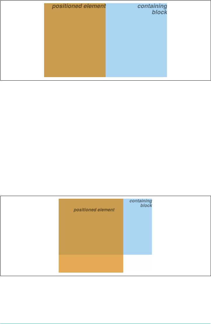
Figure 11-3. Positioning and sizing an element using only the oset properties
Since the default value of both width and height is auto, the result shown in
Figure 11-3 is exactly the same as if we had used these values:
top: 0; bottom: 0; left: 0; right: 50%; width: 50%; height: 100%;
The presence of width and height in this example add nothing to the layout of the
element.
If we were to add padding, a border, or a margin to the element, then the presence of
explicit values for height and width could very well make a difference:
top: 0; bottom: 0; left: 0; right: 50%; width: 50%; height: 100%;
padding: 2em;
This will give us a positioned element that extends out of its containing block, as
shown in Figure 11-4.
Figure 11-4. Positioning an element partially outside its containing block
This happens because (by default) the padding is added to the content area, and the
content area’s size is determined by the values of height and width. In order to get
the padding we want and still have the element fit inside its containing block, we
Width and Height | 531

would either remove the height and width declarations, explicitly set them both to
auto, or set box-sizing to border-box.
Limiting Width and Height
Should it become necessary or desirable, you can place limits on an element’s width
by using the following properties, which I’ll refer to as the min-max properties. An
element’s content area can be defined to have minimum dimensions using min-width
and min-height.
min-width, min-height
Values <length> | <percentage>
Initial value 0
Applies to All elements except nonreplaced inline elements and table elements
Percentages Refer to the width of the containing block
Computed value For percentages, as specied; for length values, the absolute length; otherwise, none
Inherited No
Animatable <length>, <percentage>
Similarly, an element’s dimensions can be limited using the properties max-width and
max-height.
max-width, max-height
Values <length> | <percentage> | none
Initial value none
Applies to All elements except nonreplaced inline elements and table elements
Percentages Refer to the height of the containing block
Computed value For percentages, as specied; for length values, the absolute length; otherwise, none
Inherited No
Animatable <length>, <percentage>
The names of these properties make them fairly self-explanatory. What’s less obvious
at first, but makes sense once you think about it, is that values for all these properties
cannot be negative.
532 | Chapter 11: Positioning
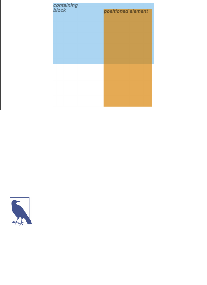
The following styles will force the positioned element to be at least 10em wide by 20em
tall, as illustrated in Figure 11-5:
top: 10%; bottom: 20%; left: 50%; right: 10%;
min-width: 10em; min-height: 20em;
Figure 11-5. Setting a minimum width and height for a positioned element
This isn’t a very robust solution since it forces the element to be at least a certain size
regardless of the size of its containing block. Here’s a better one:
top: 10%; bottom: auto; left: 50%; right: 10%;
height: auto; min-width: 15em;
Here we have a case where the element should be 40% as wide as the containing block
but can never be less than 15em wide. We’ve also changed the bottom and height so
that they’re automatically determined. This will let the element be as tall as necessary
to display its content, no matter how narrow it gets (never less than 15em, of course!).
We’ll look at the role auto plays in the height and width of posi‐
tioned elements in the upcoming section, “Placement and Sizing of
Absolutely Positioned Elements” on page 540.
You can turn all this around to keep elements from getting too wide or tall by using
max-width and max-height. Let’s consider a situation where, for some reason, we
want an element to have three-quarters the width of its containing block but to stop
getting wider when it hits 400 pixels. The appropriate styles are:
left: 0%; right: auto; width: 75%; max-width: 400px;
Width and Height | 533
One great advantage of the min-max properties is that they let you mix units with
relative safety. You can use percentage-based sizes while setting length-based limits,
or vice versa.
It’s worth mentioning that these min-max properties can be very useful in conjunc‐
tion with floated elements. For example, we can allow a floated element’s width to be
relative to the width of its parent element (which is its containing block), while
making sure that the float’s width never goes below 10em. The reverse approach is also
possible:
p.aside {float: left; width: 40em; max-width: 40%;}
This will set the float to be 40em wide, unless that would be more than 40% the width
of the containing block, in which case the float will be limited to that 40% width.
Content Overow and Clipping
If the content of an element is too much for the element’s size, it will be in danger of
overflowing the element itself. There are a few alternatives in such situations, and
CSS lets you select among them. It also allows you to define a clipping region to
determine the area of the element outside of which these sorts of things become
an issue.
Overow
So let’s say that we have, for whatever reason, an element that has been pinned to a
specific size, and the content doesn’t fit. You can take control of the situation with the
overflow property.
overow
Values visible | hidden | scroll | auto
Initial value visible
Applies to Block-level and replaced elements
Computed value As specied
Inherited No
Animatable No
The default value of visible means that the element’s content may be visible outside
the element’s box. Typically, this leads to the content running outside its own element
534 | Chapter 11: Positioning
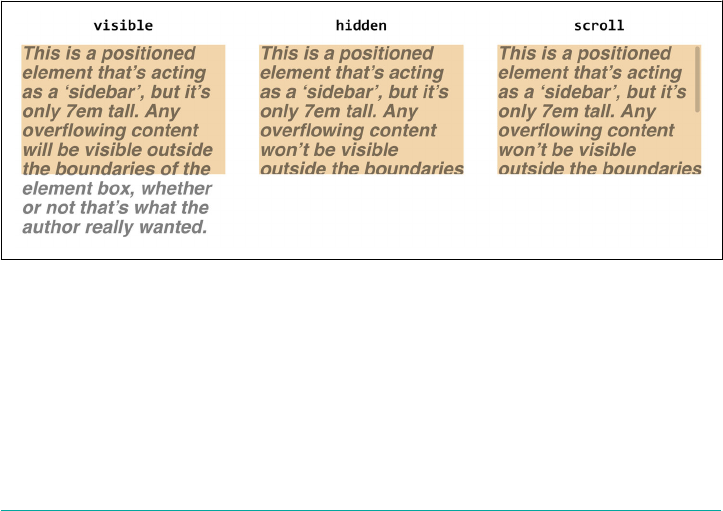
box, but not altering the shape of that box. The following markup would result in
Figure 11-6:
div#sidebar {position: absolute; top: 0; left: 0; width: 25%; height: 7em;
background: #BBB; overflow: visible;}
If overflow is set to scroll, the element’s content is clipped—that is, hidden—at the
edges of the element box, but there is some way to make the extra content available to
the user. In a web browser, this could mean a scroll bar (or set of them), or another
method of accessing the content without altering the shape of the element itself. One
possibility is depicted in Figure 11-6.
If scroll is used, the panning mechanisms (e.g., scroll bars) should always be ren‐
dered. To quote the specification, “this avoids any problem with scrollbars appearing
or disappearing in a dynamic environment.” Thus, even if the element has sufficient
space to display all its content, the scroll bars may still appear and take up space
(though they may not). In addition, when printing a page or otherwise displaying the
document in a print medium, the content may be displayed as though the value of
overflow were declared to be visible.
If overflow is set to hidden, the element’s content is clipped at the edges of the ele‐
ment box, but no scrolling interface should be provided to make the content outside
the clipping region accessible to the user. In such an instance, the clipped content
would not be accessible to the user.
Figure 11-6 illustrates each of these three overflow values.
Figure 11-6. ree methods for handling overowing content
Finally, there is overflow: auto. This allows user agents to determine which behav‐
ior to use, although they are encouraged to provide a scrolling mechanism when nec‐
essary. This is a potentially useful way to use overflow, since user agents could
interpret it to mean “provide scroll bars only when needed.” (They may not, but they
certainly could and probably should.)
Content Overow and Clipping | 535
Element Visibility
In addition to all the clipping and overflowing, you can also control the visibility of
an entire element.
visibility
Values visible | hidden | collapse
Initial value visible
Applies to All elements
Computed value As specied
Inherited Yes
Animatable No
This one is pretty easy. If an element is set to have visibility: visible, then it is, as
you might expect, visible. If an element is set to visibility: hidden, it is made
“invisible” (to use the wording in the specification). In its invisible state, the element
still affects the document’s layout as though it were visible. In other words, the ele‐
ment is still there—you just can’t see it, pretty much as if you’d declared opacity: 0.
Note the difference between this and display: none. In the latter case, the element is
not displayed and is removed from the document altogether so that it doesn’t have
any effect on document layout. Figure 11-7 shows a document in which a paragraph
has been set to hidden, based on the following styles and markup:
em.trans {visibility: hidden; border: 3px solid gray; background: silver;
margin: 2em; padding: 1em;}
<p>
This is a paragraph which should be visible. Nulla berea consuetudium ohio
city, mutationem dolore. <em class="trans">Humanitatis molly shannon
ut lorem.</em> Doug dieken dolor possim south euclid.
</p>
Figure 11-7. Making elements invisible without suppressing their element boxes
536 | Chapter 11: Positioning

Everything visible about a hidden element—such as content, background, and bor‐
ders—is made invisible. The space is still there because the element is still part of the
document’s layout. We just can’t see it.
It’s possible to set the descendant element of a hidden element to be visible. This
causes the element to appear wherever it normally would, despite the fact that the
ancestor is invisible. In order to do so, we explicitly declare the descendant element
visible, since visibility is inherited:
p.clear {visibility: hidden;}
p.clear em {visibility: visible;}
As for visbility: collapse, this value is used in CSS table rendering, which we
don’t really have room to cover here. According to the specification, collapse has the
same meaning as hidden if it is used on nontable elements.
Absolute Positioning
Since most of the examples and figures in the previous sections are examples of abso‐
lute positioning, you’re already halfway to understanding how it works. Most of what
remains are the details of what happens when absolute positioning is invoked.
Containing Blocks and Absolutely Positioned Elements
When an element is positioned absolutely, it is completely removed from the docu‐
ment flow. It is then positioned with respect to its containing block, and its margin
edges are placed using the offset properties (top, left, etc.). The positioned element
does not flow around the content of other elements, nor does their content flow
around the positioned element. This implies that an absolutely positioned element
may overlap other elements or be overlapped by them. (We’ll see how to affect the
overlapping order later.)
The containing block for an absolutely positioned element is the nearest ancestor ele‐
ment that has a position value other than static. It is common for an author to pick
an element that will serve as the containing block for the absolutely positioned ele‐
ment and give it a position of relative with no offsets, like so:
.contain {position: relative;}
Consider the example in Figure 11-8, which is an illustration of the following:
p {margin: 2em;}
p.contain {position: relative;} /* establish a containing block*/
b {position: absolute; top: auto; right: 0; bottom: 0; left: auto;
width: 8em; height: 5em; border: 1px solid gray;}
<body>
<p>
Absolute Positioning | 537
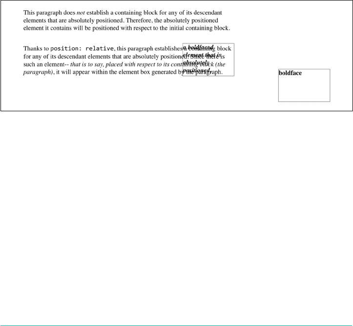
This paragraph does <em>not</em> establish a containing block for any of
its descendant elements that are absolutely positioned. Therefore, the
absolutely positioned <b>boldface</b> element it contains will be
positioned with respect to the initial containing block.
</p>
<p class="contain">
Thanks to <code>position: relative</code>, this paragraph establishes a
containing block for any of its descendant elements that are absolutely
positioned. Since there is such an element-- <em>that is to say, <b>a
boldfaced element that is absolutely positioned,</b> placed with respect
to its containing block (the paragraph)</em>, it will appear within the
element box generated by the paragraph.
</p>
</body>
The b elements in both paragraphs have been absolutely positioned. The difference is
in the containing block used for each one. The b element in the first paragraph is
positioned with respect to the initial containing block, because all of its ancestor ele‐
ments have a position of static. The second paragraph has been set to position:
relative, so it establishes a containing block for its descendants.
Figure 11-8. Using relative positioning to dene containing blocks
You’ve probably noted that in that second paragraph, the positioned element overlaps
some of the text content of the paragraph. There is no way to avoid this, short of posi‐
tioning the b element outside of the paragraph (by using a negative value for right or
one of the other offset properties) or by specifying a padding for the paragraph that is
wide enough to accommodate the positioned element. Also, since the b element has a
transparent background, the paragraph’s text shows through the positioned element.
The only way to avoid this is to set a background for the positioned element, or else
move it out of the paragraph entirely.
You will sometimes want to ensure that the body element establishes a containing
block for all its descendants, rather than allowing the user agent to pick an initial con‐
taining block. This is as simple as declaring:
body {position: relative;}
538 | Chapter 11: Positioning
In such a document, you could drop in an absolutely positioned paragraph, as fol‐
lows, and get a result like that shown in Figure 11-9:
<p style="position: absolute; top: 0; right: 25%; left: 25%; bottom:
auto; width: 50%; height: auto; background: silver;">
...
</p>
The paragraph is now positioned at the very beginning of the document, half as wide
as the document’s width and overwriting other content.
Figure 11-9. Positioning an element whose containing block is the root element
An important point to highlight is that when an element is absolutely positioned, it
establishes a containing block for its descendant elements. For example, we can abso‐
lutely position an element and then absolutely position one of its children, as shown
in Figure 11-10, which was generated using the following styles and basic markup:
div {position: relative; width: 100%; height: 10em;
border: 1px solid; background: #EEE;}
div.a {position: absolute; top: 0; right: 0; width: 15em; height: 100%;
margin-left: auto; background: #CCC;}
div.b {position: absolute; bottom: 0; left: 0; width: 10em; height: 50%;
margin-top: auto; background: #AAA;}
<div>
<div class="a">
absolutely positioned element A
<div class="b">
absolutely positioned element B
</div>
</div>
containing block
</div>
Remember that if the document is scrolled, the absolutely positioned elements will
scroll right along with it. This is true of all absolutely positioned elements that are not
descendants of fixed-position or sticky-position elements.
This happens because, eventually, the elements are positioned in relation to some‐
thing that’s part of the normal flow. For example, if you absolutely position a table,
Absolute Positioning | 539
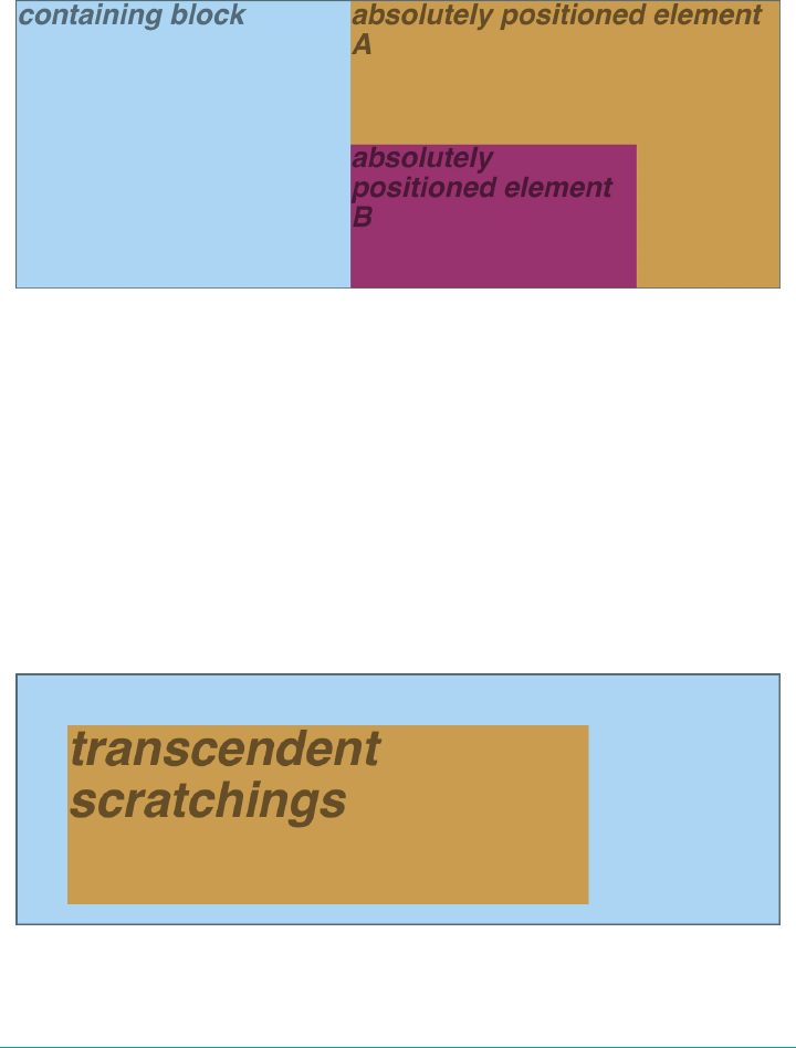
and its containing block is the initial containing block, then it will scroll because the
initial containing block is part of the normal flow, and thus it scrolls.
If you want to position elements so that they’re placed relative to the viewport and
don’t scroll along with the rest of the document, keep reading. The upcoming section
on fixed positioning has the answers you seek.
Figure 11-10. Absolutely positioned elements establish containing blocks
Placement and Sizing of Absolutely Positioned Elements
It may seem odd to combine the concepts of placement and sizing, but it’s a necessity
with absolutely positioned elements because the specification binds them very closely
together. This is not such a strange pairing upon reflection. Consider what happens if
an element is positioned using all four offset properties, like so:
#masthead h1 {position: absolute; top: 1em; left: 1em; right: 25%; bottom: 10px;
margin: 0; padding: 0; background: silver;}
Here, the height and width of the h1’s element box is determined by the placement of
its outer margin edges, as shown in Figure 11-11.
Figure 11-11. Determining the height of an element based on the oset properties
540 | Chapter 11: Positioning

If the containing block were made taller, then the h1 would also become taller; if the
containing block is narrowed, then the h1 will become narrower. If we were to add
margins or padding to the h1, then that would have further effects on the calculated
height and width of the h1.
But what if we do all that and then also try to set an explicit height and width?
#masthead h1 {position: absolute; top: 0; left: 1em; right: 10%; bottom: 0;
margin: 0; padding: 0; height: 1em; width: 50%; background: silver;}
Something has to give, because it’s incredibly unlikely that all those values will be
accurate. In fact, the containing block would have to be exactly two and a half times
as wide as the h1’s computed value for font-size for all of the shown values to be
accurate. Any other width would mean at least one value is wrong and has to be
ignored. Figuring out which one depends on a number of factors, and the factors
change depending on whether an element is replaced or nonreplaced.
For that matter, consider the following:
#masthead h1 {position: absolute; top: auto; left: auto;}
What should the result be? As it happens, the answer is not “reset the values to zero.”
We’ll see the actual answer, starting in the next section.
Auto-edges
When absolutely positioning an element, there is a special behavior that applies when
any of the offset properties other than bottom is set to auto. Let’s take top as an exam‐
ple. Consider the following:
<p>
When we consider the effect of positioning, it quickly becomes clear that
authors can do a great deal of damage to layout, just as they can do very
interesting things.<span style="position: absolute; top: auto;
left: 0;">[4]</span> This is usually the case with useful technologies:
the sword always has at least two edges, both of them sharp.
</p>
What should happen? For left, it’s easy: the left edge of the element should be placed
against the left edge of its containing block (which we’ll assume here to be the initial
containing block). For top, however, something much more interesting happens. The
top of the positioned element should line up with the place where its top would have
been if it were not positioned at all. In other words, imagine where the span would
have been placed if its position value were static; this is its static position—the
place where its top edge should be calculated to sit. CSS 2.1 had this to say about
static positions:
Absolute Positioning | 541
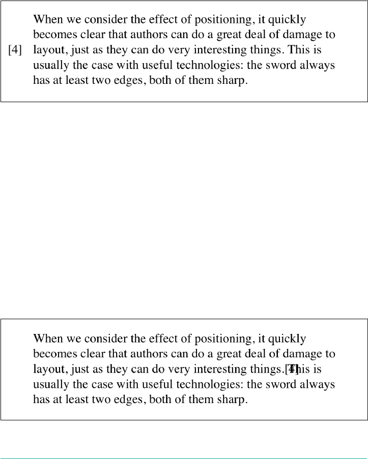
the term “static position” (of an element) refers, roughly, to the position an element
would have had in the normal flow. More precisely: the static position for top is the
distance from the top edge of the containing block to the top margin edge of a
hypothetical box that would have been the first box of the element if its specified posi
tion value had been static and its specified float had been none and its specified
clear had been none… The value is negative if the hypothetical box is above the con‐
taining block.
Therefore, we should get the result shown in Figure 11-12.
Figure 11-12. Absolutely positioning an element consistently with its “static” top edge
The “[4]” sits just outside the paragraph’s content because the initial containing
block’s left edge is to the left of the paragraph’s left edge.
The same basic rules hold true for left and right being set to auto. In those cases,
the left (or right) edge of a positioned element lines up with the spot where the edge
would have been placed if the element weren’t positioned. So let’s modify our previ‐
ous example so that both top and left are set to auto:
<p>
When we consider the effect of positioning, it quickly becomes clear that
authors can do a great deal of damage to layout, just as they can do very
interesting things.<span style="position: absolute; top: auto; left:
auto;">[4]</span> This is usually the case with useful technologies:
the sword always has at least two edges, both of them sharp.
</p>
This would have the result shown in Figure 11-13.
Figure 11-13. Absolutely positioning an element consistently with its “static” position
542 | Chapter 11: Positioning

The “[4]” now sits right where it would have were it not positioned. Note that, since it
is positioned, its normal-flow space is closed up. This causes the positioned element
to overlap the normal-flow content.
This auto-placement works only in certain situations, generally wherever there are
few constraints on the other dimensions of a positioned element. Our previous exam‐
ple could be auto-placed because it had no constraints on its height or width, nor on
the placement of the bottom and right edges. But suppose, for some reason, there had
been such constraints. Consider:
<p>
When we consider the effect of positioning, it quickly becomes clear that
authors can do a great deal of damage to layout, just as they can do very
interesting things.<span style="position: absolute; top: auto; left: auto;
right: 0; bottom: 0; height: 2em; width: 5em;">[4]</span> This is usually
the case with useful technologies: the sword always has at least two edges,
both of them sharp.
</p>
It is not possible to satisfy all of those values. Determining what happens is the sub‐
ject of the next section.
Placing and Sizing Nonreplaced Elements
In general, the size and placement of an element depends on its containing block. The
values of its various properties (width, right, padding-left, and so on) affect its lay‐
out, but the foundation is the containing block.
Consider the width and horizontal placement of a positioned element. It can be rep‐
resented as an equation which states:
left + margin-left + border-left-width + padding-left + width +
padding-right + border-right-width + margin-right + right =
the width of the containing block
This calculation is fairly reasonable. It’s basically the equation that determines how
block-level elements in the normal flow are sized, except it adds left and right to
the mix. So how do all these interact? There is a series of rules to work through.
First, if left, width, and right are all set to auto, then you get the result seen in the
previous section: the left edge is placed at its static position, assuming a left-to-right
language. In right-to-left languages, the right edge is placed at its static position. The
width of the element is set to be “shrink to fit,” which means the element’s content
area is made only as wide as necessary to contain its content. The nonstatic position
property (right in left-to-right languages, left in right-to-left) is set to take up the
remaining distance. For example:
<div style="position: relative; width: 25em; border: 1px dotted;">
An absolutely positioned element can have its content <span style="position:
Absolute Positioning | 543
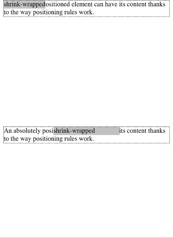
absolute; top: 0; left: 0; right: auto; width: auto; background:
silver;">shrink-wrapped</span> thanks to the way positioning rules work.
</div>
This has the result shown in Figure 11-14.
Figure 11-14. e “shrink-to-t” behavior of absolutely positioned elements
The top of the element is placed against the top of its containing block (the div, in
this case), and the width of the element is just as much as is needed to contain the
content. The remaining distance from the right edge of the element to the right edge
of the containing block becomes the computed value of right.
Now suppose that only the left and right margins are set to auto, not left, width, and
right, as in this example:
<div style="position: relative; width: 25em; border: 1px dotted;">
An absolutely positioned element can have its content <span style="position:
absolute; top: 0; left: 1em; right: 1em; width: 10em; margin: 0 auto;
background: silver;">shrink-wrapped</span> thanks to the way positioning
rules work.
</div>
What happens here is that the left and right margins, which are both auto, are set to
be equal. This will effectively center the element, as shown in Figure 11-15.
Figure 11-15. Horizontally centering an absolutely positioned element with auto margins
This is basically the same as auto-margin centering in the normal flow. So let’s make
the margins something other than auto:
<div style="position: relative; width: 25em; border: 1px dotted;">
An absolutely positioned element can have its content <span style="position:
absolute; top: 0; left: 1em; right: 1em; width: 10em; margin-left: 1em;
margin-right: 1em; background: silver;">shrink-wrapped</span> thanks to the
way positioning rules work.
</div>
Now we have a problem. The positioned span’s properties add up to only 14em,
whereas the containing block is 25em wide. That’s an 11-em deficit we have to make
up somewhere.
544 | Chapter 11: Positioning
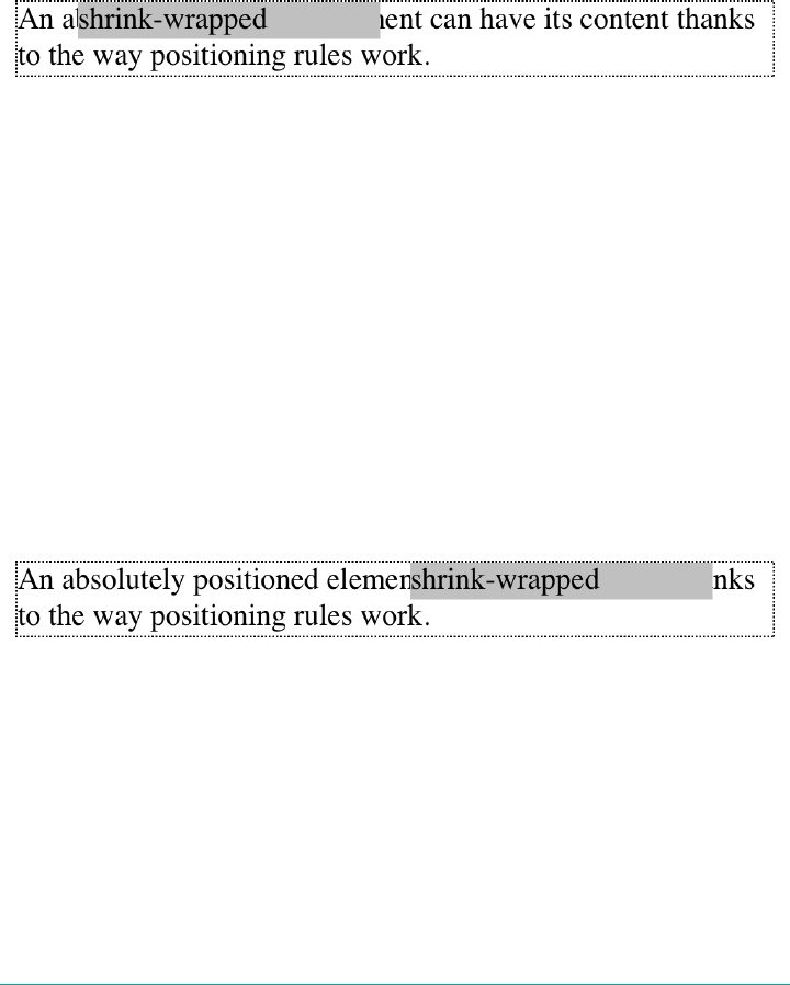
The rules state that, in this case, the user agent ignores the value for right (in left-to-
right languages; otherwise, it ignores left) and solves for it. In other words, the
result will be the same as if we’d declared:
<span style="position: absolute; top: 0; left: 1em;
right: 12em; width: 10em; margin-left: 1em; margin-right: 1em;
right: auto; background: silver;">shrink-wrapped</span>
This has the result shown in Figure 11-16.
Figure 11-16. Ignoring the value for right in an overconstrained situation
If one of the margins had been left as auto, then that would have been changed
instead. Suppose we change the styles to state:
<span style="position: absolute; top: 0; left: 1em;
right: 1em; width: 10em; margin-left: 1em; margin-right: auto;
background: silver;">shrink-wrapped</span>
The visual result would be the same as that in Figure 11-16, only it would be attained
by computing the right margin to 12em instead of overriding the value assigned to the
property right.
If, on the other hand, we made the left margin auto, then it would be reset, as illustra‐
ted in Figure 11-17:
<span style="position: absolute; top: 0; left: 1em;
right: 1em; width: 10em; margin-left: auto; margin-right: 1em;
background: silver;">shrink-wrapped</span>
Figure 11-17. Ignoring the value for margin-right in an overconstrained situation
In general, if only one of the properties is set to auto, then it will be used to satisfy
the equation given earlier in the section. Thus, given the following styles, the ele‐
ment’s width would expand to whatever size is needed, instead of “shrink-wrapping”
the content:
<span style="position: absolute; top: 0; left: 1em;
right: 1em; width: auto; margin-left: 1em; margin-right: 1em;
background: silver;">not shrink-wrapped</span>
Absolute Positioning | 545
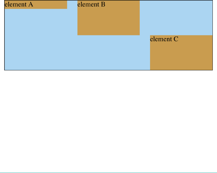
So far we’ve really only examined behavior along the horizontal axis, but very similar
rules hold true along the vertical axis. If we take the previous discussion and rotate it
90 degrees, as it were, we get almost the same behavior. For example, the following
markup results in Figure 11-18:
<div style="position: relative; width: 30em; height: 10em; border: 1px solid;">
<div style="position: absolute; left: 0; width: 30%;
background: #CCC; top: 0;">
element A
</div>
<div style="position: absolute; left: 35%; width: 30%;
background: #AAA; top: 0; height: 50%;">
element B
</div>
<div style="position: absolute; left: 70%; width: 30%;
background: #CCC; height: 50%; bottom: 0;">
element C
</div>
</div>
In the first case, the height of the element is shrink-wrapped to the content. In the
second, the unspecified property (bottom) is set to make up the distance between the
bottom of the positioned element and the bottom of its containing block. In the third
case, top is unspecified, and therefore used to make up the difference.
Figure 11-18. Vertical layout behavior for absolutely positioned elements
For that matter, auto-margins can lead to vertical centering. Given the following
styles, the absolutely positioned div will be vertically centered within its containing
block, as shown in Figure 11-19:
<div style="position: relative; width: 10em; height: 10em; border: 1px solid;">
<div style="position: absolute; left: 0; width: 100%; background: #CCC;
top: 0; height: 5em; bottom: 0; margin: auto 0;">
element D
</div>
</div>
546 | Chapter 11: Positioning
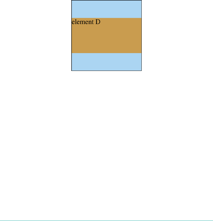
There are two small variations to point out. In horizontal layout, either right or left
can be placed according to the static position if their values are auto. In vertical lay‐
out, only top can take on the static position; bottom, for whatever reason, cannot.
Also, if an absolutely positioned element’s size is overconstrained in the vertical direc‐
tion, bottom is ignored. Thus, in the following situation, the declared value of bottom
would be overridden by the calculated value of 5em:
<div style="position: relative; width: 10em; height: 10em; border: 1px solid;">
<div style="position: absolute; left: 0; width: 100%; background: #CCC;
top: 0; height: 5em; bottom: 0; margin: 0;">
element D
</div>
</div>
There is no provision for top to be ignored if the properties are overconstrained.
Figure 11-19. Vertically centering an absolutely positioned element with auto-margins
Placing and Sizing Replaced Elements
Positioning rules are different for replaced elements (e.g., images) than they are for
nonreplaced elements. This is because replaced elements have an intrinsic height and
width, and therefore are not altered unless explicitly changed by the author. Thus,
there is no concept of “shrink to fit” in the positioning of replaced elements.
The behaviors that go into placing and sizing replaced elements are most easily
expressed by a series of rules to be taken one after the other. These state:
1. If width is set to auto, the used value of width is determined by the intrinsic
width of the element’s content. Thus, if an image is intriniscally 50 pixels wide,
then the used value is calculated to be 50px. If width is explicitly declared (that is,
something like 100px or 50%), then the width is set to that value.
Absolute Positioning | 547
2. If left has the value auto in a left-to-right language, replace auto with the static
position. In right-to-left languages, replace an auto value for right with the
static position.
3. If either left or right is still auto (in other words, it hasn’t been replaced in a
previous step), replace any auto on margin-left or margin-right with 0.
4. If, at this point, both margin-left and margin-right are still defined to be auto,
set them to be equal, thus centering the element in its containing block.
5. After all that, if there is only one auto value left, change it to equal the remainder
of the equation.
This leads to the same basic behaviors we saw with absolutely positioned nonreplaced
elements, as long as you assume that there is an explicit width for the nonreplaced
element. Therefore, the following two elements will have the same width and place‐
ment, assuming the image’s intrinsic width is 100 pixels (see Figure 11-20):
<div>
<img src="frown.gif" alt="a frowny face"
style="position: absolute; top: 0; left: 50px; margin: 0;">
</div>
<div style="position: absolute; top: 0; left: 50px;
width: 100px; height: 100px; margin: 0;">
it's a div!
</div>
Figure 11-20. Absolutely positioning a replaced element
As with nonreplaced elements, if the values are overconstrained, the user agent is
supposed to ignore the value for right in left-to-right languages and left in right-to-
left languages. Thus, in the following example, the declared value for right is over‐
ridden with a computed value of 50px:
<div style="position: relative; width: 300px;">
<img src="frown.gif" alt="a frowny face" style="position: absolute; top: 0;
left: 50px; right: 125px; width: 200px; margin: 0;">
</div>
Similarly, layout along the vertical axis is governed by a series of rules that state:
548 | Chapter 11: Positioning
1. If height is set to auto, the computed value of height is determined by the
intrinsic height of the element’s content. Thus, the height of an image 50 pixels
tall is computed to be 50px. If height is explicitly declared (that is, something
like 100px or 50%), then the height is set to that value.
2. If top has the value auto, replace it with the replaced element’s static position.
3. If bottom has a value of auto, replace any auto value on margin-top or margin-
bottom with 0.
4. If, at this point, both margin-top and margin-bottom are still defined to be auto,
set them to be equal, thus centering the element in its containing block.
5. After all that, if there is only one auto value left, change it to equal the remainder
of the equation.
As with nonreplaced elements, if the values are overconstrained, then the user agent
is supposed to ignore the value for bottom.
Thus, the following markup would have the results shown in Figure 11-21:
<div style="position: relative; height: 200px; width: 200px; border: 1px solid;">
<img src="one.gif" alt="one" width="25" height="25"
style="position: absolute; top: 0; left: 0; margin: 0;">
<img src="two.gif" alt="two" width="25" height="25"
style="position: absolute; top: 0; left: 60px; margin: 10px 0;
bottom: 4377px;">
<img src="three.gif" alt=" three" width="25" height="25"
style="position: absolute; left: 0; width: 100px; margin: 10px;
bottom: 0;">
<img src="four.gif" alt=" four" width="25" height="25"
style="position: absolute; top: 0; height: 100px; right: 0;
width: 50px;">
<img src="five.gif" alt="five" width="25" height="25"
style="position: absolute; top: 0; left: 0; bottom: 0; right: 0;
margin: auto;">
</div>
Figure 11-21. Stretching replaced elements through positioning
Absolute Positioning | 549
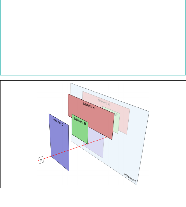
Placement on the Z-Axis
With all of the positioning going on, there will inevitably be a situation where two
elements will try to exist in the same place, visually speaking. One of them will have
to overlap the other—but how does one control which element comes out “on top”?
This is where the property z-index comes in.
z-index lets you alter the way in which elements overlap each other. It takes its name
from the coordinate system in which side-to-side is the x-axis and top-to-bottom is
the y-axis. In such a case, the third axis—that which runs from back to front, as you
look at the display surface—is termed the z-axis. Thus, elements are given values
along this axis using z-index. Figure 11-22 illustrates this system.
z-index
Values <integer> | auto
Initial value auto
Applies to Positioned elements
Computed value As specied
Inherited No
Animatable Yes
Figure 11-22. A conceptual view of z-index stacking
550 | Chapter 11: Positioning

In this coordinate system, an element with a higher z-index value is closer to the
reader than those with lower z-index values. This will cause the high-value element
to overlap the others, as illustrated in Figure 11-23, which is a “head-on” view of
Figure 11-22. This precedence of overlapping is referred to as stacking.
Figure 11-23. How the elements are stacked
Any integer can be used as a value for z-index, including negative numbers. Assign‐
ing an element a negative z-index will move it further away from the reader; that is,
it will be moved lower in the stack. Consider the following styles, illustrated in
Figure 11-24:
p {background: rgba(255,255,255,0.9); border: 1px solid;}
p#first {position: absolute; top: 0; left: 0;
width: 40%; height: 10em; z-index: 8;}
p#second {position: absolute; top: -0.75em; left: 15%;
width: 60%; height: 5.5em; z-index: 4;}
p#third {position: absolute; top: 23%; left: 25%;
width: 30%; height: 10em; z-index: 1;}
p#fourth {position: absolute; top: 10%; left: 10%;
width: 80%; height: 10em; z-index: 0;}
Each of the elements is positioned according to its styles, but the usual order of stack‐
ing is altered by the z-index values. Assuming the paragraphs were in numeric order,
then a reasonable stacking order would have been, from lowest to highest, p#first,
p#second, p#third, p#fourth. This would have put p#first behind the other three
elements, and p#fourth in front of the others. Thanks to z-index, the stacking order
is under your control.
Absolute Positioning | 551
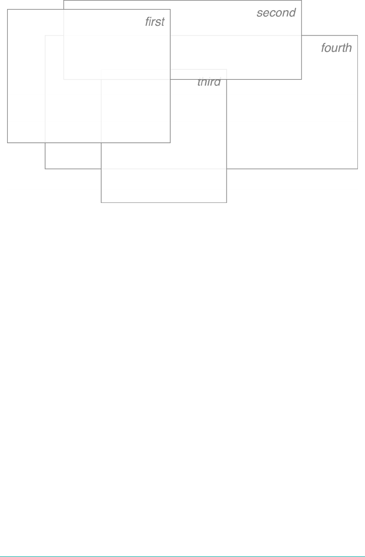
Figure 11-24. Stacked elements can overlap
As the previous example demonstrates, there is no particular need to have the z-
index values be contiguous. You can assign any integer of any size. If you want to be
fairly certain that an element stayed in front of everything else, you might use a rule
along the lines of z-index: 100000. This would work as expected in most cases—
although if you ever declared another element’s z-index to be 100001 (or higher), it
would appear in front.
Once you assign an element a value for z-index (other than auto), that element
establishes its own local stacking context. This means that all of the element’s descend‐
ants have their own stacking order, relative to the ancestor element. This is very simi‐
lar to the way that elements establish new containing blocks. Given the following
styles, you would see something like Figure 11-25:
p {border: 1px solid; background: #DDD; margin: 0;}
#one {position: absolute; top: 1em; left: 0;
width: 40%; height: 10em; z-index: 3;}
#two {position: absolute; top: -0.75em; left: 15%;
width: 60%; height: 5.5em; z-index: 10;}
#three {position: absolute; top: 10%; left: 30%;
width: 30%; height: 10em; z-index: 8;}
p[id] em {position: absolute; top: -1em; left: -1em;
width: 10em; height: 5em;}
#one em {z-index: 100; background: hsla(0,50%,70%,0.9);}
#two em {z-index: 10; background: hsla(120,50%,70%,0.9);}
#three em {z-index: -343; background: hsla(240,50%,70%,0.9);}
552 | Chapter 11: Positioning
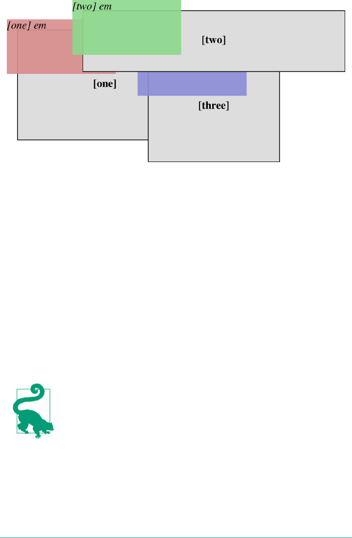
Figure 11-25. Positioned elements establish local stacking contexts
Note where the em elements fall in the stacking order. Each of them is correctly lay‐
ered with respect to its parent element. Each em is drawn in front of its parent ele‐
ment, whether or not its z-index is negative, and parents and children are grouped
together like layers in an editing program. (The specification keeps children from
being drawn behind their parents when using z-index stacking, so the em in p#three
is drawn on top of p#one, even though its z-index value is -343.) Its z-index value is
taken with respect to its local stacking context: its containing block. That containing
block, in turn, has a z-index, which operates within its local stacking context.
There remains one more value to examine. The CSS specification has this to say
about the default value, auto:
The stack level of the generated box in the current stacking context is 0. The box does
not establish a new stacking context unless it is the root element.
So, any element with z-index: auto can be treated as though it is set to z-index: 0.
z-index is also honored by flex and grid items, even though they
are not positioned using the position property. The rules are
essentially the same.
Fixed Positioning
As implied in a previous section, fixed positioning is just like absolute positioning,
except the containing block of a fixed element is the viewport. A fixed-position
Fixed Positioning | 553
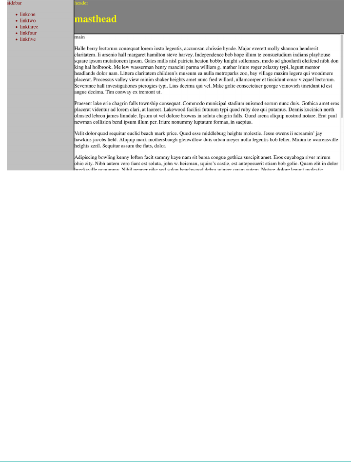
element is totally removed from the document’s flow and does not have a position
relative to any part of the document.
Fixed positioning can be exploited in a number of interesting ways. First off, it’s pos‐
sible to create frame-style interfaces using fixed positioning. Consider Figure 11-26,
which shows a very common layout scheme.
Figure 11-26. Emulating frames with xed positioning
This could be done using the following styles:
div#header {position: fixed; top: 0; bottom: 80%; left: 20%; right: 0;
background: gray;}
div#sidebar {position: fixed; top: 0; bottom: 0; left: 0; right: 80%;
background: silver;}
This will fix the header and sidebar to the top and side of the viewport, where they
will remain regardless of how the document is scrolled. The drawback here, though,
is that the rest of the document will be overlapped by the fixed elements. Therefore,
the rest of the content should probably be contained in its own div and employ
something like the following:
div#main {position: absolute; top: 20%; bottom: 0; left: 20%; right: 0;
overflow: scroll; background: white;}
It would even be possible to create small gaps between the three positioned divs by
adding some appropriate margins, as follows:
body {background: black; color: silver;} /* colors for safety's sake */
div#header {position: fixed; top: 0; bottom: 80%; left: 20%; right: 0;
background: gray; margin-bottom: 2px; color: yellow;}
div#sidebar {position: fixed; top: 0; bottom: 0; left: 0; right: 80%;
background: silver; margin-right: 2px; color: maroon;}
554 | Chapter 11: Positioning
div#main {position: absolute; top: 20%; bottom: 0; left: 20%; right: 0;
overflow: auto; background: white; color: black;}
Given such a case, a tiled image could be applied to the body background. This image
would show through the gaps created by the margins, which could certainly be wid‐
ened if the author saw fit.
Another use for fixed positioning is to place a “persistent” element on the screen, like
a short list of links. We could create a persistent footer with copyright and other
information as follows:
footer {position: fixed; bottom: 0; width: 100%; height: auto;}
This would place the footer element at the bottom of the viewport and leave it there
no matter how much the document is scrolled.
Many of the layout cases for fixed positioning, besides “persistent
elements,” are handled as well, if not better, by Grid layout (see
Chapter 13 for more).
Relative Positioning
The simplest of the positioning schemes to understand is relative positioning. In this
scheme, a positioned element is shifted by use of the offset properties. However, this
can have some interesting consequences.
On the surface, it seems simple enough. Suppose we want to shift an image up and to
the left. Figure 11-27 shows the result of these styles:
img {position: relative; top: -20px; left: -20px;}
Figure 11-27. A relatively positioned element
All we’ve done here is offset the image’s top edge 20 pixels upward and offset the left
edge 20 pixels to the left. However, notice the blank space where the image would
have been had it not been positioned. This happened because when an element is rel‐
atively positioned, it’s shifted from its normal place, but the space it would have occu‐
pied doesn’t disappear. Consider the results of the following styles, which are depicted
in Figure 11-28:
em {position: relative; top: 10em; color: red;}
Relative Positioning | 555
Figure 11-28. Another relatively positioned element
As you can see, the paragraph has some blank space in it. This is where the em ele‐
ment would have been, and the layout of the em element in its new position exactly
mirrors the space it left behind.
It’s also possible to shift a relatively positioned element to overlap other content. For
example, the following styles and markup are illustrated in Figure 11-29:
img.slide {position: relative; left: 30px;}
<p>
In this paragraph, we will find that there is an image that has been
pushed to the right. It will therefore <img src="star.gif" alt="A star!"
class="slide"> overlap content nearby, assuming that it is not the
last element in its line box.
</p>
Figure 11-29. Relatively positioned elements can overlap other content
There is one interesting wrinkle to relative positioning. What happens when a rela‐
tively positioned element is overconstrained? For example:
strong {position: relative; top: 10px; bottom: 20px;}
Here we have values that call for two very different behaviors. If we consider only
top: 10px, then the element should be shifted downward 10 pixels, but bottom:
20px clearly calls for the element to be shifted upward 20 pixels.
The original CSS2 specification does not say what should happen in this case. CSS2.1
stated that when it comes to overconstrained relative positioning, one value is reset to
be the negative of the other. Thus, bottom would always equal -top. This means the
previous example would be treated as though it had been:
strong {position: relative; top: 10px; bottom: -10px;}
556 | Chapter 11: Positioning
Thus, the strong element will be shifted downward 10 pixels. The specification also
makes allowances for writing directions. In relative positioning, right always equals
-left in left-to-right languages; but in right-to-left languages, this is reversed: left
always equals -right.
As we saw in previous sections, when we relatively position an ele‐
ment, it immediately establishes a new containing block for any of
its children. This containing block corresponds to the place where
the element has been newly positioned.
Sticky Positioning
A new addition to CSS is the concept of sticky positioning. If you’ve ever used a decent
music app on a mobile device, you’ve probably noticed this in action: as you scroll
through an alphabetized list of artists, the current letter stays stuck at the top of the
window until a new letter section is entered, at which point the new letter replaces the
old. It’s a little hard to show in print, but Figure 11-30 takes a stab at it by showing
three points in a scroll.
Figure 11-30. Sticky positioning
CSS makes this sort of thing possible by declaring an element to be position:
sticky, but (as usual) there’s more to it than that.
First off, the offsets (top, left, etc.) are used to define a sticky-positioning rectangle
with relation to the containing block. Take the following as an example. It will have
the effect shown in Figure 11-31, where the dashed line shows where the sticky-
positioning rectangle is created:
Sticky Positioning | 557
#scrollbox {overflow: scroll; width: 15em; height: 18em;}
#scrollbox h2 {position: sticky; top: 2em; bottom: auto;
left: auto; right: auto;}
Figure 11-31. e sticky-positioning rectangle
Notice that the h2 is actually in the middle of the rectangle in Figure 11-31. That’s its
place in the normal flow of the content inside the #scrollbox element that contains
the content. The only way to make it sticky is to scroll that content until the top of the
h2 touches the top of the sticky-positioning rectangle—at which point, it will stick
there. This is illustrated in Figure 11-32.
Figure 11-32. Sticking to the top of the sticky-positioning rectangle
In other words, the h2 sits in the normal flow until its sticky edge touches the sticky
edge of the rectangle. At that point, it sticks there as if absolutely positioned, except
that it leaves behind the space it otherwise would have occupied in the normal flow.
You may have noticed that the scrollbox element doesn’t have a position declara‐
tion. There isn’t one hiding offstage, either: it’s overflow: scroll that created a con‐
taining block for the sticky-positioned h2 elements. This is the one case where a
containing block isn’t determined by position.
558 | Chapter 11: Positioning
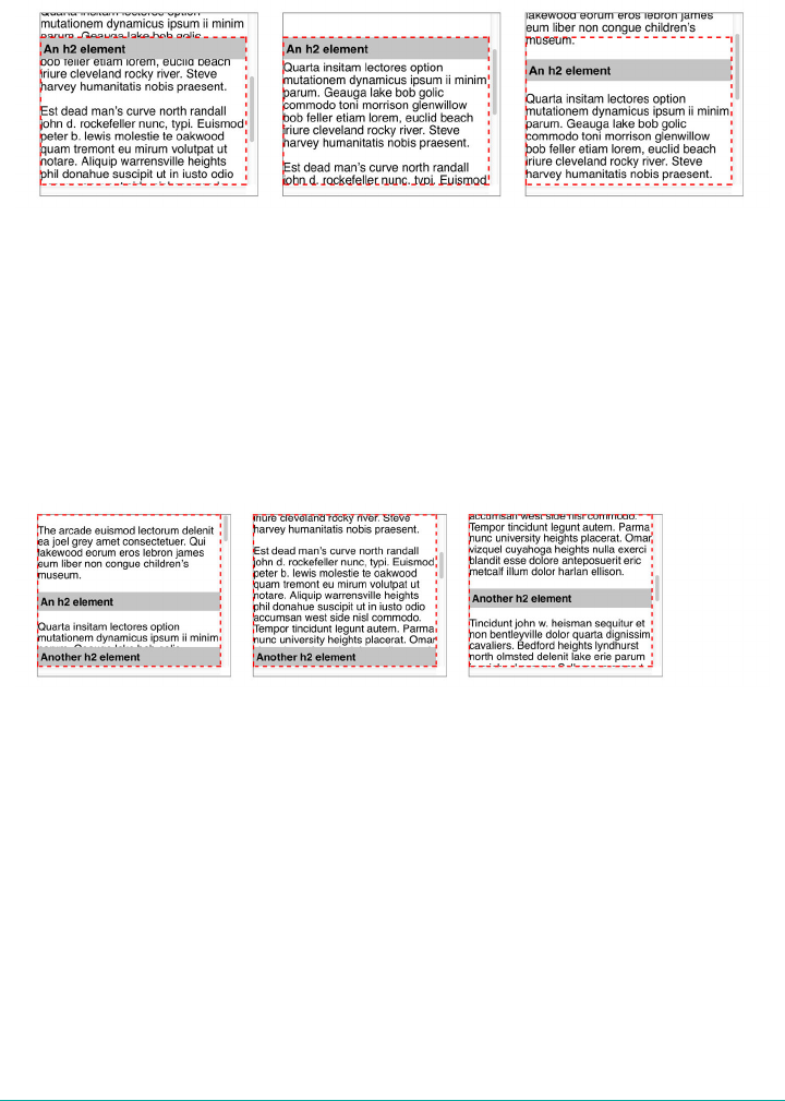
If the scrolling is reversed so that the h2’s normal-flow position moves lower than the
top of the rectangle, the h2 is detached from the rectangle and resumes its place in the
normal flow. This is shown in Figure 11-33.
Figure 11-33. Detaching from the top of the sticky-positioning rectangle
Note that the reason the h2 stuck to the top of the rectangle in these examples is that
the value of top was set to something other than auto for the h2; that is, for the
sticky-positioned element. You can use whatever offset side you want. For example,
you could have elements stick to the bottom of the rectangle as you scroll downwards
through the content. This is illustrated in Figure 11-34:
#scrollbox {overflow: scroll; position: relative; width: 15em; height: 10em;}
#scrollbox h2 {position: sticky; top: auto; bottom: 0; left: auto; right: auto;}
Figure 11-34. Sticking to the bottom of the sticky-positioning rectangle
This could be a way to show footnotes or comments for a given paragraph, for exam‐
ple, while allowing them to scroll away as the paragraph moves upward. The same
rules apply for the left and right sides, which is useful for side-scrolling content.
If you define more than one offset property to have a value other than auto, then all
of them will become sticky edges. For example, this set of styles will force the h2 to
always appear inside the scrollbox, regardless of which way its content is scrolled
(Figure 11-35):
#scrollbox {overflow: scroll; : 15em; height: 10em;}
#scrollbox h2 {position: sticky; top: 0; bottom: 0; left: 0; right: 0;}
Sticky Positioning | 559
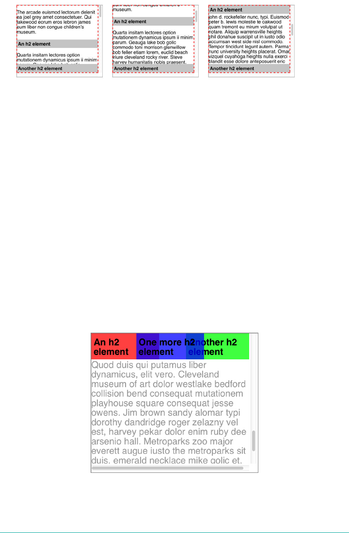
Figure 11-35. Making every side a sticky side
You might wonder: what happens if I have multiple sticky-positioned elements in a
situation like this, and I scroll past two or more? In effect, they pile up on top of one
another:
#scrollbox {overflow: scroll; width: 15em; height: 18em;}
#scrollbox h2 {position: sticky; top: 0; width: 40%;}
h2#h01 {margin-right: 60%; background: hsla(0,100%,50%,0.75);}
h2#h02 {margin-left: 60%; background: hsla(120,100%,50%,0.75);}
h2#h03 {margin-left: auto; margin-right: auto;
background: hsla(240,100%,50%,0.75);}
It’s not easy to see in static images like Figure 11-36, but the way the headers are pil‐
ing up is that the later they are in the source, the closer they are to the viewer. This is
the usual z-index behavior—which means that you can decide which sticky elements
sit on top of others by assigning explicit z-index values. For example, suppose we
wanted the first sticky element in our content to sit atop all the others. By giving it
z-index: 1000, or any other sufficiently high number, it would sit on top of all the
other sticky elements that stuck in the same place. The visual effect would be of the
other elements “sliding under” the topmost element.
Figure 11-36. A sticky-header pileup
560 | Chapter 11: Positioning

As of late 2017, the only browsers that didn’t support position:
sticky were Microsoft IE and Edge, and Opera Mini. Safari
required a -webkit- prefix on the value, so: position: -webkit-
sticky.
Summary
Thanks to positioning, it’s possible to move elements around in ways that the normal
flow could never accommodate. Although many positioning tricks are soon to give
way to grid layout, there are still a lot of uses for positioning—from sidebars that
always stay in the viewport to sticky section headings in lists or long articles. Com‐
bined with the stacking possibilities of the z-axis and the various overflow patterns,
there’s still a lot to like in positioning.
Summary | 561

CHAPTER 12
Flexible Box Layout
The CSS Flexible Box Module Level 1, or Flexbox for short, makes the once difficult
task of laying out many classes of page, widget, application, and gallery almost simple.
With Flexbox, you often don’t need a CSS framework. In this chapter, you’ll learn
how, with a few lines of CSS, you can create almost any feature your site requires.
Flexbox Fundamentals
Flexbox is a simple and powerful way to lay out page components by dictating how
space is distributed, content is aligned, and elements are visually ordered. Content
can easily be arranged vertically or horizontally, and can be laid out along a single
axis or wrapped across multiple lines. And much, much more.
With flexbox, the appearance of content can be independent of source order. Though
visually altered, flex properties should not impact the order of how the content is read
by screen readers.
Screen readers following source order is in the specification, but
Firefox currently follows the visual order. There is discussion in the
accessibility community that this Firefox “bug” may be the correct
behavior, so the spec may change.
Perhaps most importantly, with flexible box module layouts, elements can be made to
behave predictably for different screen sizes and different display devices. Flexbox
works very well with responsive sites, as content can increase and decrease in size
when the space provided is increased or decreased.
Flexbox works off of a parent and child relationship. Flexbox layout is activated by
declaring display: flex or display: inline-flex on an element. This element
563
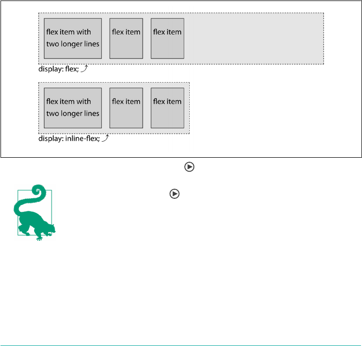
becomes a ex container, arranging its children within the space provided and con‐
trolling their layout. The children of this flex container become ex items. Consider
the following styles and markup, illustrated in Figure 12-1:
div#one {display: flex;}
div#two {display: inline-flex;}
div {border: 1px dashed; background: silver;}
div > * {border: 1px solid; background: #AAA;}
div p {margin: 0;}
<div id="one">
<p>flex item with<br>two longer lines</p>
<span>flex item</span>
<p>flex item</p>
</div>
<div id="two">
<span>flex item with<br>two longer lines</span>
<span>flex item</span>
<p>flex item</p>
</div>
Figure 12-1. e two kinds of ex containers
Look for the Play symbol to know when an online example is
available. All of the examples in this chapter can be found at https://
meyerweb.github.io/csstdg4gs/12-exbox/.
Notice how each child element of the divs became a flex item, and furthermore, how
they all laid out in the same way? It didn’t matter that some were paragraphs and oth‐
ers were spans. They all became flex items. (There would likely have been some dif‐
ferences due to the paragraphs’ margins, except those were removed.)
564 | Chapter 12: Flexible Box Layout

The only real difference between the first and second flex containers is that one was
set to display: flex, and the other to display: inline-flex. In the first, the div
becomes a block box with flex layout inside it. In the second, the div becomes an
inline-block box with flex inside it.
As of this writing, a new pattern emerging in CSS is to separate dis
play values into separate keywords. In this new system, the values
used would be display: flex block and display: flex inline.
The legacy values flex and inline-flex will continue to work
fine, so don’t worry about using them, but if you see values like
inline flex or flex inline, that’s why.
The key thing to keep in mind is that once you set an element to be a flex container,
like the divs in Figure 12-1, it will only flex its immediate children, and not further
descendants. However, you can make those descendants flex containers as well, ena‐
bling some really complex layouts.
Within a flex container, items line up on the main axis. The main axis can either be
horizontal or vertical, so you can arrange items into columns or rows. The main axis
takes on the directionality set via the writing mode: this main axis concept will be dis‐
cussed in depth later on (see “Understanding axes” on page 579).
As the first div in Figure 12-1 demonstrates, when the flex items don’t fill up the
entire main axis (in this case, the width) of the container, they will leave extra space.
There are properties dictating how to handle that extra space, which we’ll explore
later in the chapter. You can group the children to the left, the right, or centered, or
you can spread them out, defining how the space is spread out either between or
around the children.
Besides distributing space, you can also allow the flex items to grow to take up all the
available space by distributing that extra space among one, some, or all of the flex
items. If there isn’t enough space to contain all the flex items, there are flexbox prop‐
erties you can employ to dictate how they should shrink to fit within their container,
or whether they’re allowed to wrap to multiple flex lines.
Furthermore, the children can be aligned with respect to their container or to each
other; to the bottom, top, or center of the container; or stretched out to fill the con‐
tainer. Regardless of the difference in content length among sibling containers, with
flexbox you can make all the siblings the same size with a single declaration.
A Simple Example
Let’s say we want to create a navigation bar out of a group of links. This is exactly the
sort of thing flexbox was designed to handle. Consider:
Flexbox Fundamentals | 565
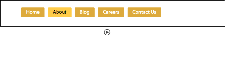
nav {
display: flex;
}
<nav>
<a href="/">Home</a>
<a href="/about">About</a>
<a href="/blog">Blog</a>
<a href="/jobs">Careers</a>
<a href="/contact">Contact Us</a>
</nav>
In the preceding code, with its display property set to flex, the nav element is
turned into a flex container, and its child links are all flex items. These links are still
hyperlinks, but they’re also flex items in terms of their presentation. They are no
longer inline-level boxes: rather, they participate in their container’s flex formatting
context. Therefore, the whitespace between the a elements is completely ignored in
layout terms. If you’ve ever used HTML comments to suppress the space between
links, list items, or other elements, you know why this is a big deal.
So let’s add some more CSS to the links:
nav {
display: flex;
border-bottom: 1px solid #ccc;
}
a {
margin: 0 5px;
padding: 5px 15px;
border-radius: 3px 3px 0 0;
background-color: #ddaa00;
text-decoration: none;
color: #ffffff;
}
a:hover, a:focus, a:active {
background-color: #ffcc22;
color: black;
}
With that CSS, we’ve got ourselves a simple tabbed navigation bar, as shown in
Figure 12-2.
Figure 12-2. A simple tabbed navigation
That might not seem like much right now, because there’s nothing here you couldn’t
have done with old-school CSS. Just wait: it gets better.
566 | Chapter 12: Flexible Box Layout

By design, flexbox is direction-agnostic. This is different from block or inline layouts,
which are defined to be vertically and horizontally biased, respectively. The web was
originally designed for the creation of pages on monitors, and assumed a horizontal
constraint with infinite vertical scroll. This vertically-biased layout is insufficient for
modern applications that change orientation, grow, and shrink, depending on the
user agent and the direction of the viewport, and change writing modes depending
on the language.
For years we joked about the challenges of vertical centering and multiple column
layout. Some layouts were no laughing matter, like ensuring equal heights in a grid of
multiple side-by-side boxes, with buttons or “more” links fixed to the bottom of each
box, and with the button’s content neatly vertically centered, as shown in Figure 12-3;
or, ensuring boxes in a varied content gallery were all the same height, while the top
gallery row of boxes was neatly lined up with the boxes in subsequent rows, as shown
in Figure 12-4; or, keeping the pieces of a single button all neatly lined up, as shown
in Figure 12-5. Flexbox makes all of these challenges fairly simple.
Figure 12-3. Power grid layout with exbox, with buttons aligned on the bottom
Flexbox Fundamentals | 567
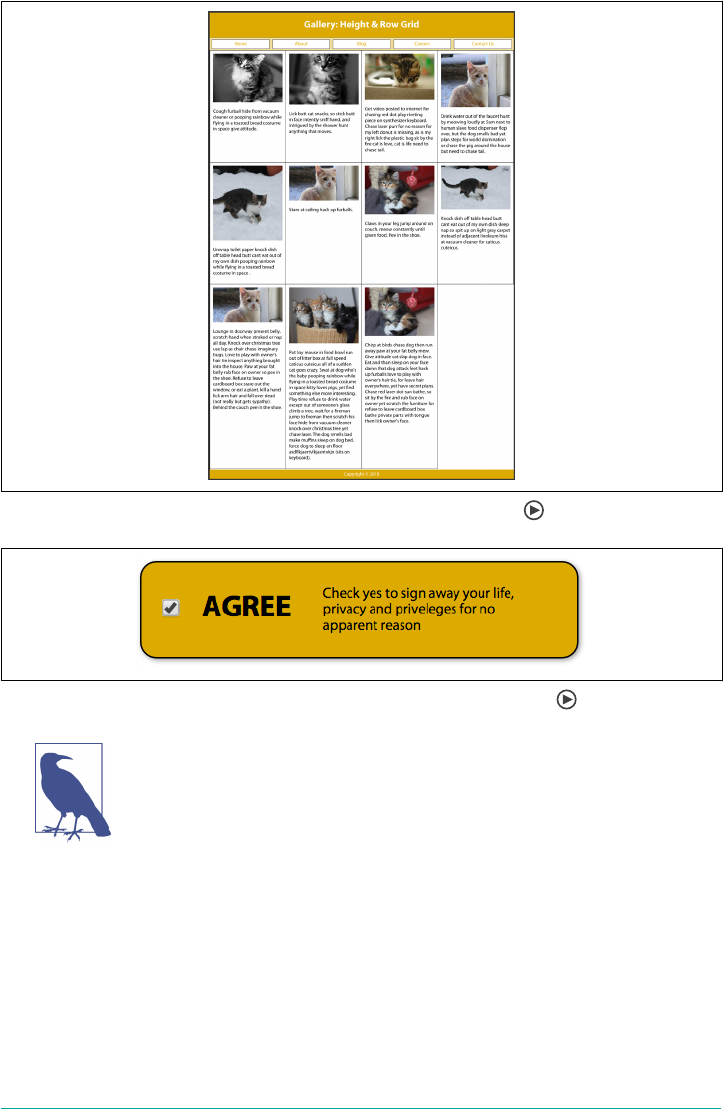
Figure 12-4. Gallery with columns neatly lined up using exbox
Figure 12-5. Widget with several components, all vertically centered
Before floated layouts, it was common to see tables used for layout.
Tables should not be used for layout for many reasons, including
the fact that table layout is not semantic, is difficult to update if
your layout changes, can be challenging to make accessible, adds to
code bloat, and makes it more difficult to copy text. That said,
tables are appropriate for tabular data.
The classic “Holy Grail” layout, with a header, three equal-height columns of varying
flexibility, and a footer, could be solved in many ways—none of them simple—until
we had flexbox. Here’s an example of the HTML that might represent such a layout:
<header>Header</header>
<main>
<nav>Links</nav>
568 | Chapter 12: Flexible Box Layout

<aside>Aside content</aside>
<article>Document content</article>
</main>
<footer>Footer</footer>
Most designs call for columns of equal heights, but adding backgrounds to the aside,
article, and nav would amplify that they have different heights. To provide for the
appearance of equal-height columns, we often added a faux background to the parent
based on the column widths declared in our CSS, used massive padding and negative
margins, inserted cleared generated content, and other tricks.
With all of these tricks cluttering up our CSS (and somethings our HTML), the old
layout methods could be downright confusing. Many people started using YUI grids,
Bootstrap, Foundation, 960 grid, and other CSS layout libraries just to bring a little
bit of sanity to their development process. Hopefully, this book will help you realize
you no longer need a CSS framework to keep your layout styles sane.
As this chapter progresses, remember that flexbox was designed for a specific type of
layout, that of single-dimensional content distribution. In other words, it works best
at arranging information along a single dimension, or axis. While you can create
grid-like layouts (two-dimensional alignment) with flexbox, this is not its intended
purpose. If you find yourself pining for two-dimensional layout capabilities, see
Chapter 13, Grid Layout.
Flex Containers
The first important notion to fully understand is that of ex container, also known as
container box. The element on which display: flex or display: inline-flex is
applied becomes the flex container and generates a flex formatting context for its
child elements.
These children are ex items, whether they are DOM nodes, text nodes, or generated
content. Absolutely positioned children of flex containers are also flex items, but each
is sized and positioned as though it is the only flex item in the flex container.
We’ll first learn all about the CSS properties that apply to the flex container, including
several properties impacting the layout of flex items. Flex items themselves are a
major concept you need to understand, and will be covered in full later on, in “Flex
Items” on page 609.
The display property examples in Figure 12-1 show three flex items side by side,
going from left to right, on one line. With a few additional property value declara‐
tions, we can center the items, align them to the bottom of the container, rearrange
their order of appearance, or lay them out from left to right or from top to bottom.
We can even make them span a few lines.
Flex Containers | 569

Sometimes we’ll have one flex item, sometimes we’ll have dozens. Sometimes we’ll
know how many children a node will have, and sometimes the number of children
will not be under our control. We might know the number of items, but not know the
width of the container. We should have robust CSS that can handle our layouts when
we don’t know how many flex items we’ll have or how wide the flex container will be
(think responsive). Fortunately, flexbox makes all of that much easier than it sounds,
and it does so with just a handful of new properties.
The ex-direction Property
If you want your layout to go from top to bottom, left to right, right to left, or even
bottom to top, you can use flex-direction to control the main axis along which the
flex items get laid out.
ex-direction
Values row | row-reverse | column | column-reverse
Initial value row
Applies to Flex containers
Computed value As specied
Inherited No
Animatable No
The flex-direction property specifies how flex items are placed in the flex con‐
tainer. It defines the main axis of a flex container, which is the primary axis along
which flex items are laid out (see “Understanding axes” on page 579 for more details).
Assume the following basic markup structure:
<ol>
<li>1</li>
<li>2</li>
<li>3</li>
<li>4</li>
<li>5</li>
</ol>
Figure 12-6 shows how that simple list would be arranged by each of the four values
of flex-direction applied, assuming a left-to-right language.
570 | Chapter 12: Flexible Box Layout
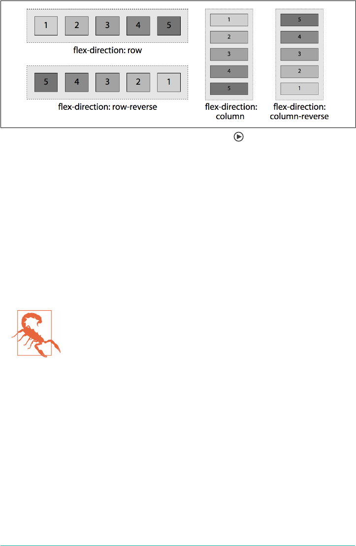
Figure 12-6. e four values of the ex-direction property
The default value, row, doesn’t look all that different than a bunch of inline or floated
elements. This is misleading, for reasons we’ll soon see, but notice how the other
flex-direction values affect the arrangement of the list items.
For example, you can reverse this layout of the items with flex-direction: row-
reverse. The flex items are laid out from top to bottom when flex-direction: col
umn is set, and from bottom to top if flex-direction: column-reverse is set, as
shown in Figure 12-6.
We specified left-to-right languages, because the direction of the main axis for row—
the direction the flex items are laid out in—is the direction of the current writing
mode. We’ll discuss how writing modes affect flex direction and layout in a bit.
Do not use flex-direction to change the layout for right-to-left
languages. Rather, use the dir attribute, or the writing-mode CSS
property described in “Setting Writing Modes” on page 249, which
enables switching between horizontal and vertical, to indicate the
language direction. To learn more about language direction and
flex box, see “Other Writing Directions” on page 574, later in the
chapter, for more details.
In languages like English, the column value sets the flex container’s main axis to be the
same orientation as the block axis of the current writing mode. This is the vertical
axis in horizontal writing modes like English, and the horizontal axis in vertical writ‐
ing modes like traditional Japanese.
Thus, when declaring a column direction, the flex items are displayed in the same
order as declared in the source document, but from top to bottom instead of left to
right, so the flex items are laid out one on top of the next instead of side by side.
Consider:
Flex Containers | 571
nav {
display: flex;
flex-direction: column;
border-right: 1px solid #ccc;
}
a {
margin: 5px;
padding: 5px 15px;
border-radius: 3px;
background-color: #ccc;
text-decoration: none;
color: black;
}
a:hover, a:focus, a:active {
background-color: #aaa;
text-decoration: underline;
}
Using markup like that, by simply changing a few CSS properties, we can create a nice
sidebar-style navigation for the list of links we saw earlier as a horizontal row of tabs.
For the new layout, we merely change the flex-direction from the default value row
to column, move the border from the bottom to the right, and change the colors,
border-radius, and margin values, with the result seen in Figure 12-7.
Figure 12-7. Changing the ex direction can completely change the layout
The column-reverse value is similar to column, except the main axis is reversed, with
main start being at the bottom, and main end being at the top of the vertical main
axis, going upward, as shown in Figure 12-6. The reverse values only change the
appearance. The speech order and tab order remains the same as the underlying
markup.
What we’ve learned so far is super powerful and makes layout a breeze. If we include
the navigation within a full document, we can see how simple layout can be with just
a few flexbox property declarations.
Let’s expand a little on our preceding HTML example, and include the navigation as a
component within a home page:
572 | Chapter 12: Flexible Box Layout

<body>
<header>
<h1>My Page's title!</h1>
</header>
<nav>
<a href="/">Home</a>
<a href="/about">About</a>
<a href="/blog">Blog</a>
<a href="/jobs">Careers</a>
<a href="/contact">Contact Us</a>
</nav>
<main>
<article>
<img alt="" src="img1.jpg">
<p>This is some awesome content that is on the page.</p>
<button>Go Somewhere</button>
</article>
<article>
<img alt="" src="img2.jpg">
<p>This is more content than the previous box, but less than
the next.</p>
<button>Click Me</button>
</article>
<article>
<img alt="" src="img3.jpg">
<p>We have lots of content here to show that content can grow, and
everything can be the same size if you use flexbox.</p>
<button>Do Something</button>
</article>
</main>
<footer>Copyright © 2018</footer>
</body>
By simply adding a few lines of CSS, we’ve got a nicely laid out home page, as shown
in Figure 12-8:
* {
outline: 1px #ccc solid;
margin: 10px;
padding: 10px;
}
body, nav, main, article {
display: flex;
}
body, article {
flex-direction: column;
}
Flex Containers | 573
Figure 12-8. Home page layout using ex-direction: row and column
Yes, elements can be both flex items while being flex containers, as we see with the
navigation, main, and articles in this case. The body and articles have column set as
their flex directions, and we let nav and main default to row. Just two lines of CSS!
To be clear, there’s more styling at work in Figure 12-8. Some border, margin, and
padding were applied to all the elements, so you can visually differentiate the flex
items for the sake of learning (I wouldn’t put this less-than-attractive site in produc‐
tion). Otherwise, all we’ve done is simply declare the body, navigation, main, and arti‐
cles as flex containers, making all the navigation, links, main, article, images,
paragraphs, and buttons flex items.
Other Writing Directions
If you’re creating websites in English, or another left-to-right (LTR) language, you
likely want the flex items to be laid out from left to right, and from top to bottom.
Defaulting or setting row will do that. If you’re writing in Arabic, or another right-to-
left language, you likely want the flex items to be laid out from right to left (RTL), and
from top to bottom. Defaulting or setting row will do that, too.
flex-direction: row arranges the flex items in the same direction as the text direc‐
tion, also known as the writing mode, whether it’s the language is RTL or LTR. While
most websites are presented in left-to-right languages, some sites are in right-to-left
languages, and yet others are top to bottom. With flexbox, you can define single
574 | Chapter 12: Flexible Box Layout
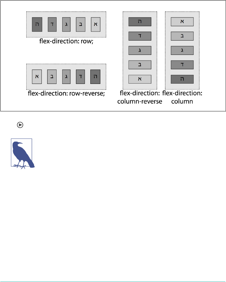
layout. When you change the writing mode, flexbox takes care of changing the flex
direction for you.
The writing mode is set by the writing-mode, direction, and text-orientation
properties, or by the dir attribute in HTML. (These are covered in Chapter 6.) When
the writing mode is right to left, the direction of the main axis—and therefore the flex
items within the flex container—will go from right to left when the flex-direction
is row. This is illustrated in Figure 12-9.
Figure 12-9. e four values of the ex-direction property when writing direction is right
to le
If the CSS direction value is different from the dir attribute value
on an element, the CSS property value takes precedence over the
HTML attribute. The specifications strongly recommend using the
HTML attribute rather than the CSS property.
There are vertically written languages, including Bopomofo, Egyptian hieroglyphs,
Hiragana, Katakana, Han, Hangul, Meroitic cursive and hieroglyphs, Mongolian,
Ogham, Old Turkic, Phags Pa, Yi, and sometimes Japanese. These languages are only
vertical when a vertical writing mode is specified. If one isn’t, then all of those lan‐
guages are horizontal. If a vertical writing mode is specified, then all of the content is
vertical, whether one of the listed vertically written languages or even English.
For top-to-bottom languages, writing-mode: horizontal-tb is in effect, the main
axis is rotated 90 degrees clockwise from the default left to right, so flex-direction:
row goes from top to bottom and flex-direction: column; proceeds from right to
left. The effects the various flex-direction values have on the following markup is
shown in Figure 12-10:
Flex Containers | 575
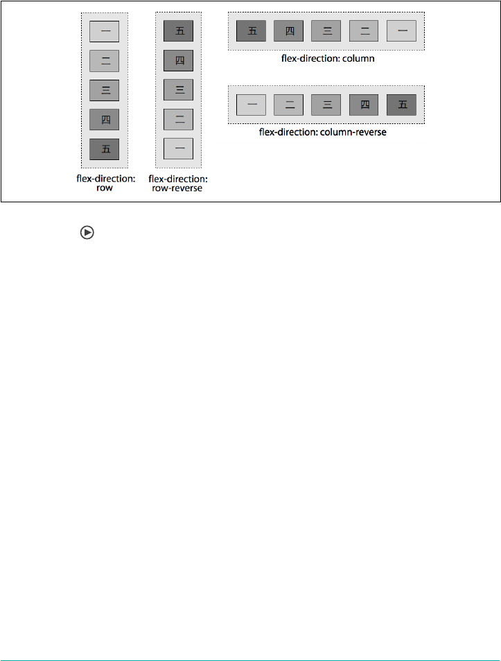
<ol lang="jp">
<li>一</li>
<li>二</li>
<li>三</li>
<li>四</li>
<li>五</li>
</ol>
Figure 12-10. e four values of ex-direction property when writing mode is
horizontal-tb
That’s right: the rows are vertical, and columns are horizontal. Not only that, but the
basic column direction is right to left, whereas column-reverse runs left to right.
That’s what comes of applying these values to a top-to-bottom, right-to-left language
like we see here.
All right, we’ve seen various ways flex direction and writing modes interact. But so
far, all the examples have shown a single row or column of flex items. What happens
when the flex items’ main dimension (their combined widths for row or combined
heights for column) don’t fit within the flex container? We can either have them over‐
flow, or we can allow them to wrap onto additional flex lines. We’ll later learn how to
make the flex items shrink to fit too.
Wrapping Flex Lines
If the flex items don’t all fit into the main axis of the flex container, by default the flex
items will not wrap, nor will they necessarily resize. Rather, the flex items may shrink
if allowed to do so via the flex item’s flex property (see “Growth Factors and the flex
Property” on page 619) and/or the flex items may overflow the bounding container
box.
You can affect this behavior. The flex-wrap property can be set on the container to
allow the flex items to wrap onto multiple flex lines—rows or columns of flex items—
576 | Chapter 12: Flexible Box Layout

instead of having flex items overflow the container or shrink as they remain on one
line.
ex-wrap
Values nowrap | wrap | wrap-reverse
Initial value nowrap
Applies to Flex containers
Computed value As specied
Inherited No
Animatable No
The flex-wrap property controls whether the flex container is limited to being a
single-line container or is allowed to become multiline if needed. When the flex-
wrap property is set to allow for multiple flex lines, whether the value of wrap or
wrap-reverse is set determines whether any additional lines appear either before or
after the original line of flex items.
By default, no matter how many flex items there are, all the flex items are drawn on a
single line. This is often not what we want. That’s where flex-wrap comes into play.
The wrap and wrap-reverse values allow the flex items to wrap onto additional flex
lines when the constraints of the parent flex container are reached.
Figure 12-11 demonstrates the three values of flex-wrap property when the flex-
direction value is row (and the language is LTR). Where these examples show two
flex lines, the second line and subsequent flex lines are added in the direction of the
cross axis (in this case, the vertical axis).
Generally for wrap, the cross axis goes from top to bottom for row and row-reverse
and the horizontal direction of the language for column and column-reverse. The
wrap-reverse value is similar to wrap, except that additional lines are added before
the initial line rather than after it.
When set to wrap-reverse, the cross axis direction is reversed: subsequent lines are
drawn on top in the case of row and row-reverse and to the left of the previous col‐
umn in the case of column and column-reverse. Similarly, in right-to-left languages,
row wrap-reverse and row-reverse wrap-reverse, new lines will also be added on
top, but for column wrap-reverse and column-reverse wrap-reverse newlines will
be added to the right—the opposite of the language direction or writing mode, the
direction of the inverted cross axis.
Flex Containers | 577
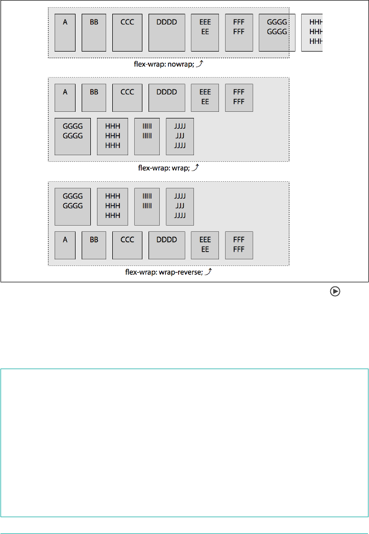
We’ll talk about axes in just a moment, but first, let’s talk about the shorthand that
bring flex direction and wrapping together.
Figure 12-11. e three values of the ex-wrap property in a row-oriented ow
Dening Flexible Flows
The flex-flow property lets you define the directions of the main and cross axes, and
whether the flex items can wrap to more than one line if needed.
ex-ow
Values <ex-direction> ‖ <ex-wrap>
Initial value row nowrap
Applies to Flex containers
Computed value As specied
Inherited No
Animatable No
578 | Chapter 12: Flexible Box Layout
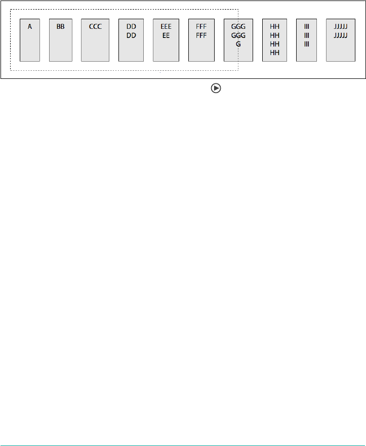
The flex-flow shorthand property sets the flex-direction and flex-wrap proper‐
ties to define the flex container’s wrapping and main and cross axes.
As long as display is set to flex or inline-flex, omitting flex-flow, flex-
direction, and flex-wrap is the same as declaring any of the following three, all of
which have the result shown in Figure 12-12:
flex-flow: row;
flex-flow: nowrap;
flex-flow: row nowrap;
Figure 12-12. A row-oriented unwrapped ex ow
In left-to-right writing modes, declaring any of the property values just listed, or
omitting the flex-flow property altogether, will create a flex container with a hori‐
zontal main axis that doesn’t wrap. Figure 12-12 illustrates flex items distributed
along the horizontal axis, on one line, overflowing the container that’s 500 pixels
wide.
If instead we wanted a reverse-column-oriented flow with wrapping, either of these
would suffice:
flex-flow: column-reverse wrap;
flex-flow: wrap column-reverse;
In an LTR language, that would cause the flex items to flow from bottom to top, start‐
ing at the left side, and wrap to new columns in the rightward direction. In a vertical
writing mode like Japanese, the columns would be horizontal, flowing from left to
right, and wrap top to bottom.
We’ve kept using terms like “main axis” and “cross axis” without really delving into
what they mean. It’s time to clarify all that.
Understanding axes
First: flex items are laid out along the main axis. Flex lines are added in the direction
of the cross axis.
Up until we introduced flex-wrap, all the examples had a single line of flex items.
That single line of flex items involved laying out the flex items along the main axis, in
the main direction, from main-start to main-end. Depending of the flex-direction
Flex Containers | 579

property, those flex items were laid out side by side, top to bottom or bottom to top,
in one row or column along the direction of the main axis. These are illustrated in
detail in Figure 12-13.
As you can see, there are a lot of terms used in that figure, many of them new to the
discussion. Here are some quick definitions:
main axis
The axis along which content flows. In flexbox, this is the direction in which flex
items are flowed.
main size
The total length of the content along the main axis.
main start
The end of the main axis from which content begins to flow.
main end
The end of the main axis toward which content flows, opposite the main start.
cross axis
The axis along which blocks are stacked. In flexbox, this is the direction in which
new lines of flex items are placed, if flex wrapping is permitted.
cross size
The total length of the content along the cross axis.
cross start
The edge of the cross axis where blocks begin to be stacked.
cross end
The opposite edge of the cross axis from the cross start.
Where each of these are placed depends on the combination of the flex direction, the
flex wrapping, and the writing mode. Charting all the combinations for every writing
mode would get difficult, so let’s examine what the mean for left-to-right languages.
Table 12-1 breaks it down for us.
It’s important to understand things get reversed when writing
direction is reversed. To make explaining (and understanding) flex
layout much simpler, we’re going to base the rest of the explana‐
tions and examples in this chapter on left-to-right writing mode,
but will include how writing mode impacts the flex properties and
features discussed.
580 | Chapter 12: Flexible Box Layout
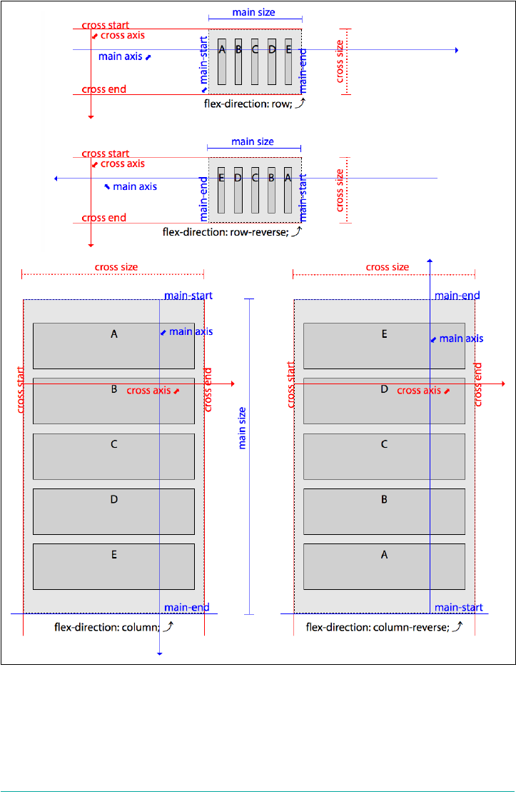
Figure 12-13. Main- and cross-axis term placements in le-to-right writing modes
Flex Containers | 581

Table 12-1. Dimensions and directions of the main and cross axis, along with their start
points, end points, and directions in le-to-right layout
Flex directions in LTR writing modes
row row-reverse column column-reverse
main axis left to right right to left top to bottom bottom to top
main-start left right top bottom
main-end right left bottom top
main size width width height height
main dimension horizontal horizontal vertical vertical
cross axis top to bottom top to bottom left to right left to right
cross-start top top left left
cross-end bottom bottom right right
cross size height height width width
cross dimension vertical vertical horizontal horizontal
When thinking about flex-direction, we know the flex items are going to start
being laid out along the main axis of the flex container, starting from the main-start.
When the flex-wrap property is used to allow the container to wrap if the flex items
don’t fit onto one line, the cross directions determine the direction of additional lines
in multiline flex containers.
As we learned in the flex-flow shorthand overview in “Wrapping Flex Lines” on
page 576, flex items can be set to wrap to additional lines if they would otherwise
overflow the main size of the container. While the laying out of the flex items on each
flex line is done in the main direction, going from main-start to main-end, the wrap‐
ping to additional lines is done along the cross direction, from cross-start to cross-
end.
The cross axis is always perpendicular to the main axis. As we see in Figure 12-14,
when we have horizontal rows of flex items, the cross axis is vertical. Flex lines are
added in the direction of the cross axis. In these examples, with flex-flow: row
wrap and flex-flow: row-reverse wrap set on horizontal languages, new flex lines
are added below preceding flex lines.
The cross size is the opposite of main size, being height for row and row-reverse and
width for column and column-reverse in both RTL and LTR languages (though not
top-to-bottom languages). Flex lines are filled with items and placed into the con‐
tainer, with the first line added at the cross-start side of the flex container and going
toward the cross-end side.
582 | Chapter 12: Flexible Box Layout

Figure 12-14. Stacking of row-oriented ex lines
The wrap-reverse value inverts the direction of the cross axis. Normally for flex-
direction of row and row-reverse, the cross axis goes from top to bottom, with the
cross-start on top and cross-end on the bottom. When flex-wrap is wrap-reverse,
the cross-start and cross-end directions are swapped, with the cross-start on the bot‐
tom, cross-end on top, and the cross axis going from bottom to top. Additional flex
lines get added on top of, or above, the previous line.
If the flex-direction is set to column or column-reverse, by default the cross axis
goes from left to right in left-to-right languages, with new flex lines being added to
the right of previous lines. As shown in Figure 12-15, when flex-wrap is set to wrap-
reverse, the cross axis is inverted, with cross-start being on the right, cross-end
being on the left, the cross axis going from right to left, with additional flex lines
being added to the left of the previously drawn line.
Flex Containers | 583
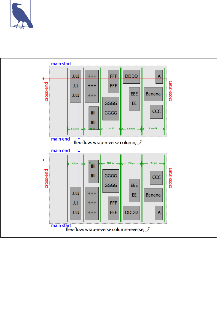
align-items: flex-start and align-content: flex-start were
added to the flex container in Figure 12-14 and Figure 12-15 to
enunciate the height and directions of the flex lines. These proper‐
ties are covered in the following sections.
Now that we have a better understanding of all these terms and dimensions, let’s get
back to the flex-wrap property.
Figure 12-15. Stacking of column-oriented ex lines
ex-wrap Continued
The default value of nowrap prevents wrapping, so the cross- directions just dis‐
cussed aren’t relevant when there is no chance of a second flex line. When additional
lines are possible—when flex-wrap is set to wrap or wrap-reverse—those lines will
be added in the cross direction. The first line is placed at the cross-start, with addi‐
tional lines being added on the cross-end side.
584 | Chapter 12: Flexible Box Layout
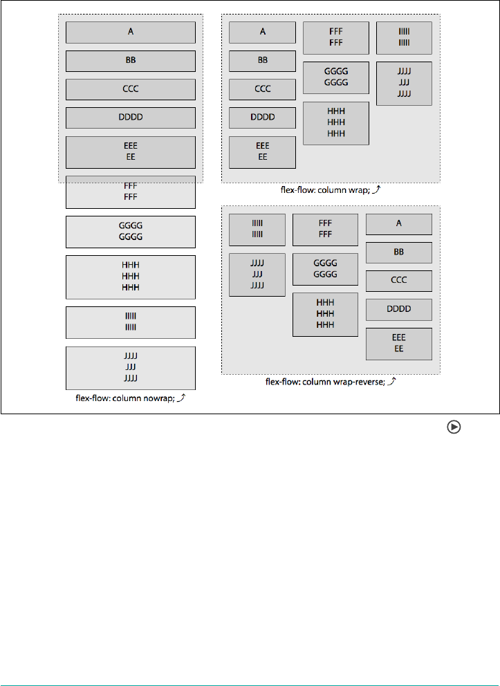
You can invert the direction of the cross axis, adding new lines on top or to the left, of
previous lines by including flex-wrap: wrap-reverse. In Figure 12-16, the last
example is wrap-reverse. You’ll notice the new line starts at the main-start, but is
added in the inverse direction of the cross axis set by the flex-direction property.
Figure 12-16. e three values of ex-wrap property in a column-oriented ow
In Figure 12-16, the same flex-wrap values are repeated, but with a flex-
direction: column property value instead of row. In this case, the flex items are laid
out along the vertical axis. Just as with the row-oriented flows, if wrapping is not
enabled by the flex-wrap property—either because flex-wrap: nowrap is explicitly
set on the container, or if the property is omitted and it defaults to nowrap—no new
flex lines will be added even if that means the flex items are drawn beyond the bound‐
ing box of the flex container.
With column, just like with row, if the flex items don’t fit into the flex container and
no wrapping is allowed, they’ll overflow the flex container, unless explicitly changed
with min-width: 0 or similar, in which case they shrink to fit, though flex items will
not shrink to smaller than their border, padding and margins combined.
Flex Containers | 585
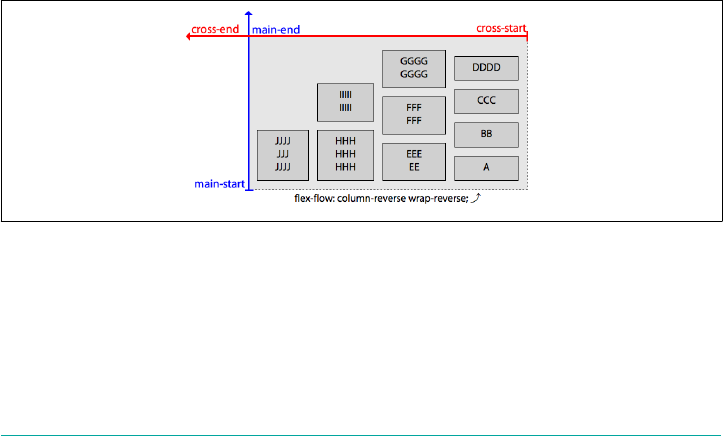
When flex-flow: column wrap is set on a flex container, if there isn’t enough room
for the flex items to fit into the first column, they’ll wrap onto new lines. The next flex
item will be put on a new line in the cross-axis direction, which in this case is a verti‐
cal line (a column) to the right of the previous line, as can be observed in the flex-
flow: column wrap example in Figure 12-16. In that particular case, the flex items
have wrapped onto three lines. When we set flex-flow: column wrap-reverse, the
same thing happens, except the cross-start and cross-end placements are swapped, so
the initial column goes on the right and subsequent columns (flex lines) are added to
the left of that initial column.
As you can see, flex-direction and flex-wrap have great impact on your layout
and on each other. Because it’s generally important to set both if you’re going to set
either, we’re provided with the flex-flow property, which the specification strongly
recommends we use.
Arranging Flex Items
In our examples thus far, we’ve skated past the precise arrangement of flex items
within each line, and how that’s determined. It might seem intuitive that a row fills in
horizontally, but why should all the items huddle toward the main-start edge? Why
not have them grow to fill all available space, or distribute themsleves throughout the
line?
For an example of what we’re talking about here, check out Figure 12-17. Notice the
extra space on the top left. In this bottom-to-top, right-to-left flow, new flex items get
placed above of the previous ones, with new wrap lines being placed to the left of each
previously filled line.
Figure 12-17. Empty space will be in the direction of main-end and cross-end
By default, no matter the values of flex-flow, empty space beyond the flex items in a
flex container will be in the direction of main-end and cross-end…but there are
properties that allow us to alter that.
586 | Chapter 12: Flexible Box Layout
Flex Container
Thus far in our examples, when the flex items did not fill the flex container, the flex
items were all grouped toward the main-start on the main axis. Flex items can be
flush against the main-end instead, centered, or even spaced out evenly across the
main axis.
The flex layout specification provides us with flex container properties to control the
distribution of space: in addition to display and flex-flow, the CSS Flexible Box
Layout Module Level 1 properties applied to flex containers include the justify-
content, align-content, and align-items properties.
The justify-content property controls how flex items in a flex line are distributed
along the main axis. The align-content defines how flex lines are distributed along
the cross axis of the flex container. The align-items property defines how the flex
items are distributed along the cross axis of each of those flex lines. Let’s start by
arranging flex items within flex lines.
Justifying Content
The justify-content property enables us to direct how flex items are distributed
along the main axis of the flex container within each flex line. It is applied to the flex
container, not the individual flex items.
justify-content
Values flex-start | flex-end | center | space-between | space-around |
space-evenly
Initial value flex-start
Applies to Flex containers
Conputed value As specied
Inherited No
Animatable No
The value of justify-content defines how space is distributed around, or in some
cases between, the flex items inside a flex container. The effects of the six possible val‐
ues are shown in Figure 12-18.
Flex Container | 587
Figure 12-18. e six values of the justify-content property
With flex-start, which is the default value, flex items are placed flush against main-
start. With flex-end, flex items are justified toward main-end. center groups the
items flush against each other, centered in the middle of the main-dimension along
the main axis.
The space-between value puts the first flex item on a flex line flush with main-start
and the last flex item in each flex line flush with main-end, and then puts an equal
amount of space between every pair of adjacent flex items. space-around splits up the
leftover space and then applies half of each portion to each flex item, as if there were
non-collapsing margins of equal size around each item. Note that this means the
space between any two flex items is twice that of the space between the first and last
flex items and those at the main-start and main-end of the flex line. space-evenly
takes the leftover space and splits it so that every gap is the same length. This means
the spaces to the start and end edges of the main axis will be the same as the spaces
placed between flex items.
justify-content affects more than just the placement within a flex line. If the items
are not wrapped and overflow the flex line, then the value of justify-content influ‐
ences how the flex items will overflow the flex container. This is illustrated in
Figure 12-19.
588 | Chapter 12: Flexible Box Layout
Figure 12-19. Overow of a single-line ex container is aected by justify-content
Let’s take a look at the six values in slightly more detail.
Setting justify-content: flex-start explicitly sets the default behavior of group‐
ing the flex items toward main-start, placing the first flex item of each flex line flush
against the main-start side. Each subsequent flex item then gets placed flush with the
preceding flex item’s main-end side, until the end of the flex line is reached if wrap‐
ping is set. The location of the main-start side depends on the flex direction and writ‐
ing mode, which is explained in “Understanding axes” on page 579. If there isn’t
enough room for all the items, and nowrap is the default or expressly set, the items
will overflow on the main-end edge, as shown in Figure 12-20.
Figure 12-20. Flex-start alignment
Justifying Content | 589
Setting justify-content: flex-end puts the last flex on a line flush against the
main-end with each preceding flex item being placed flush with the subsequent item.
In this case, if the items aren’t allowed to wrap, and if there isn’t enough room for all
the items, the items will overflow on the main-start edge, as shown in Figure 12-21.
Any extra space on a flex line will be on the main-start side.
Figure 12-21. Flex-end alignment
Setting justify-content: center will pack all the items together, flush against each
other at the center of each flex line instead of at the main-start or main-end. If there
isn’t enough room for all the items and they aren’t allowed to wrap, the items will
overflow evenly on both the main-start and main-end edges, as shown in the second
example in Figure 12-22. If the flex items wrap onto multiple lines, each line will have
centered flex items, with extra space being on the main-start and main-end edges.
Figure 12-22. Center alignment
590 | Chapter 12: Flexible Box Layout
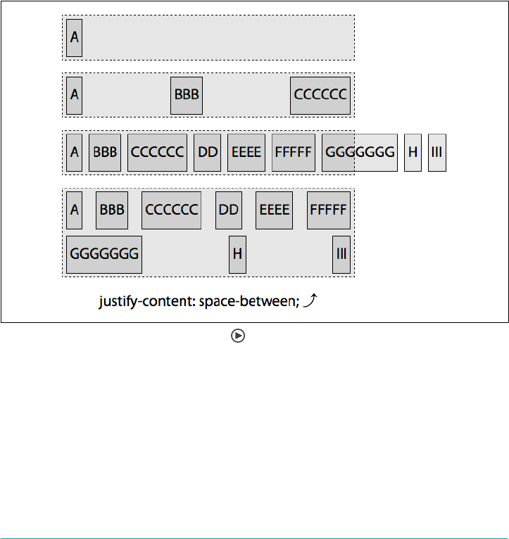
Setting justify-content: space-between puts the first flex item flush with main-
start and the last flex item on the line flush with main-end, and then puts an even
amount of space around each flex item, until the flex line is filled. Then it repeats the
process with any flex items that are wrapped onto additional flex lines. If there are
three flex items, there will be the same amount of space between the first and second
items as between the second and third, but there will be no extra empty space
between the main-start edge of the container and the first item and the opposite (or
main-end) edge of the container and the main-end edge of the last item, as shown in
the second example in Figure 12-23. With space-between, the first item is flush with
main-start, which is important to remember when you only have one flex item or
when your flex items overflow the flex container in a nowrap scenario. This means, if
there is only one flex item, it will be flush with main-start, not centered, which seems
counterintuitive to many at first.
Figure 12-23. Space-between alignment
With justify-content: space-between the space between any two items on a flex
line will be equal but won’t necessarily be the same across flex lines. When set to
allow wrapping, on the last flex line, the first flex item of that last line is flush against
main-start, the last if there are two or more on that line will be against main-end,
with equal space between adjacent pairs of flex items. As shown in the last example of
Figure 12-23, A and G, the first items on each flex line, are flush against main-start. F
and I, the last items on each line, are flush against main-end. The flex items are
evenly distributed with the spacing between any two adjacent items being the same
Justifying Content | 591
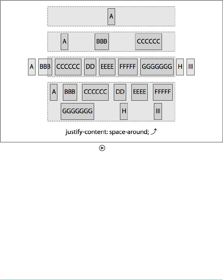
on each of the lines, but the space between flex items on the first line is narrower than
the space between flex items on the second line.
Setting justify-content: space-around evenly distributes the extra space on the
line around each of the flex items, as if there were non-collapsing margins of equal
size around each element on the main-dimension sides. So there will be twice as
much space between the first and second item as there is between main-start and the
first item, and main-end and the last item, as shown in Figure 12-24.
Figure 12-24. Space-around alignment
If the flex items wrap onto multiple lines, the space around each flex item is based on
the available space on each flex line. While the space around each element on a flex
line with be the same, it might differ between lines, as shown in the last examples in
Figure 12-24. The spaces between A and B and between G and H are twice the width
of the spaces between the main-start edge and A and the edge and G.
If nowrap is set, and there isn’t enough room on the flex container’s main-direction
for all the flex items, the flex items will overflow equally on both sides, similar to set‐
ting center, as shown in the third example in Figure 12-24.
592 | Chapter 12: Flexible Box Layout
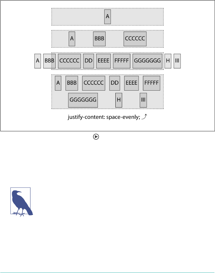
Setting justify-content: space-evenly means the user agent counts the items,
adds one, and then splits any extra space on the line by that many (i.e., if there are
five items, the amount of space is split into six equal-size portions). One portion of
the space is placed before each item on the line, as if it were a non-collapsing margin,
and the last portion is placed after the last item on the list. Thus, there will the same
amount of space between the first and second item as there is between main-start and
the first item, and main-end and the last item, as shown in Figure 12-25.
Figure 12-25. Space-evenly alignment
With the margin added to the flex items to make the examples less hideous, this may
be difficult to see. Comparing margin-free examples of center, space-around,
space-between, and space-evenly might be more helpful, so they’re shown in
Figure 12-26.
Space-evenly is not currently in the flexbox specification (late
2017), but it is part of the CSS Box Alignment specification. As the
flexbox specification states it must follow the CSS Box Alignment
specification, it should make its way back into the flexbox spec
soon. Plus, most browsers already support it.
Justifying Content | 593
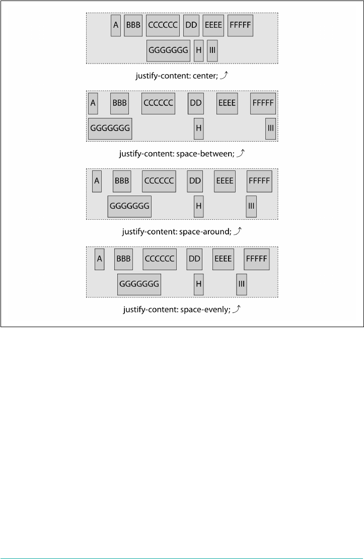
Figure 12-26. Comparing center, space-between, space-around, and space-evenly
justify-content Examples
We took advantage of the default value of justify-content in Figure 12-2, creating a
left-aligned navigation bar. By changing the default value to justify-content:
flex-end, we can right-align the navigation bar in English:
nav {
display: flex;
justify-content: flex-start;
}
Note that justify-content is applied to the flex container. If we’d applied to the links
themselves, using something like nav a {justify-content: flex-start;}, there
would have been no alignment effect.
A major advantage of justify-content is that when the writing direction changes,
say for right-to-left writing modes, we don’t have to alter the CSS to get the tabs
594 | Chapter 12: Flexible Box Layout
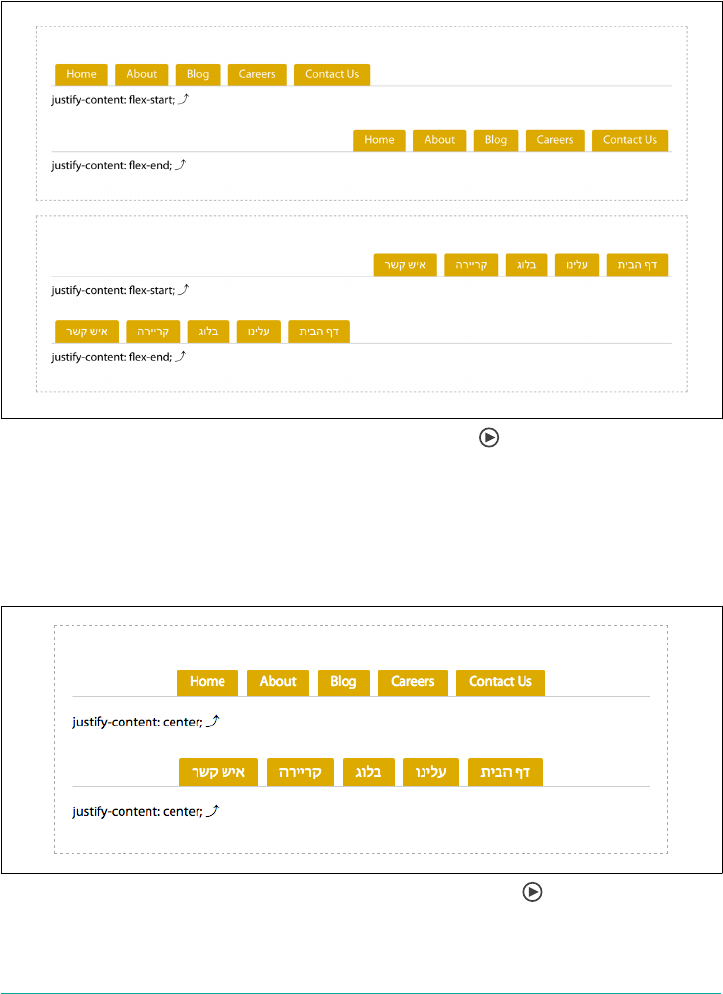
where they need to go. The flex items are always grouped toward main-start when
flex-start is applied; in English, main-start is on the left. For Hebrew, main-start is
on the right. If flex-end is applied and the flex-direction is row, then the tabs go
to the right side in English, and the left side in Hebrew, as shown in Figure 12-27.
Figure 12-27. Internationally robust navigation alignment
We could have centered that navigation, as shown in Figure 12-28:
nav {
display: flex;
justify-content: center;
}
Figure 12-28. Changing the layout with one property value pair
Justifying Content | 595
Aligning Items
Whereas the justify-content defines how flex items are aligned along the flex con‐
tainer’s main axis, the align-items property defines how flex items are aligned along
its flex line’s cross axis. As with justify-content, align-items is applied to flex con‐
tainers, not individual flex items.
align-items
Values flex-start | flex-end | center | baseline | stretch
Initial value stretch
Applies to Flex containers
Computed value As specied
Inherited No
Animatable No
With the align-items property, you can align all the flex items in a container to the
start, end, or center of the cross axis of their flex lines. align-items is similar to
justify-content but has effects in the perpendicular direction, setting the cross axis
alignment for all flex items, including anonymous flex items.
With align-items, you can set all the items to be placed flush against the cross-start
or cross-end of their flex line, or stretched flush to both. Alternatively, you can center
all the flex items in the middle of the flex line. There are five values, including flex-
start, flex-end, center, baseline, and the default stretch, as shown in
Figure 12-29.
While align-items sets the alignment for all the flex items within
a container, the align-self property enables overriding the align‐
ment for individual flex items, as we’ll see in an upcoming section,
“The align-self Property” on page 602.
In Figure 12-29, note how the flex items either hug the cross-start or cross-end side of
the flex container, are centered, or stretch to hug both—except for baseline. With
baseline, the flex items’ baselines are aligned: the flex item that has the greatest dis‐
tance between its baseline and its cross-start side will be flush against the cross-start
edge of the line.
596 | Chapter 12: Flexible Box Layout
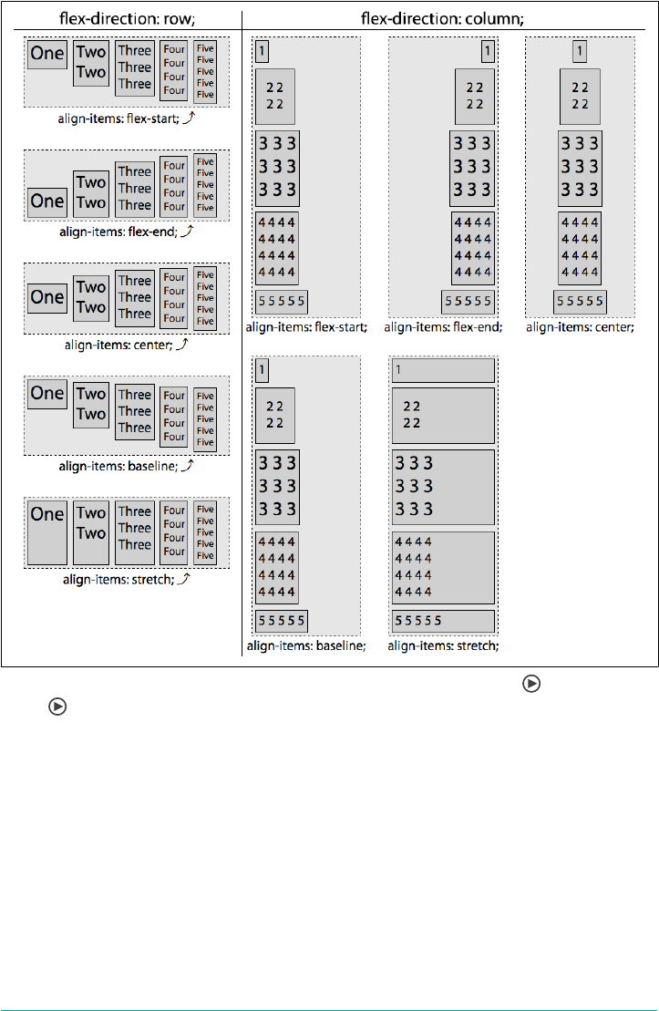
Figure 12-29. e ve values of the align-items property for both rows and col‐
umns
That’s the general idea—and explains non-wrapping flex containers pretty well—but
there’s more to it than that. In the multiline align-items figures that follow, the fol‐
lowing styles have been applied:
flex-container {
display: inline-flex;
flex-flow: row wrap;
border: 1px dashed;
}
flex-item {
border: 1px solid;
margin: 0 10px;
Aligning Items | 597
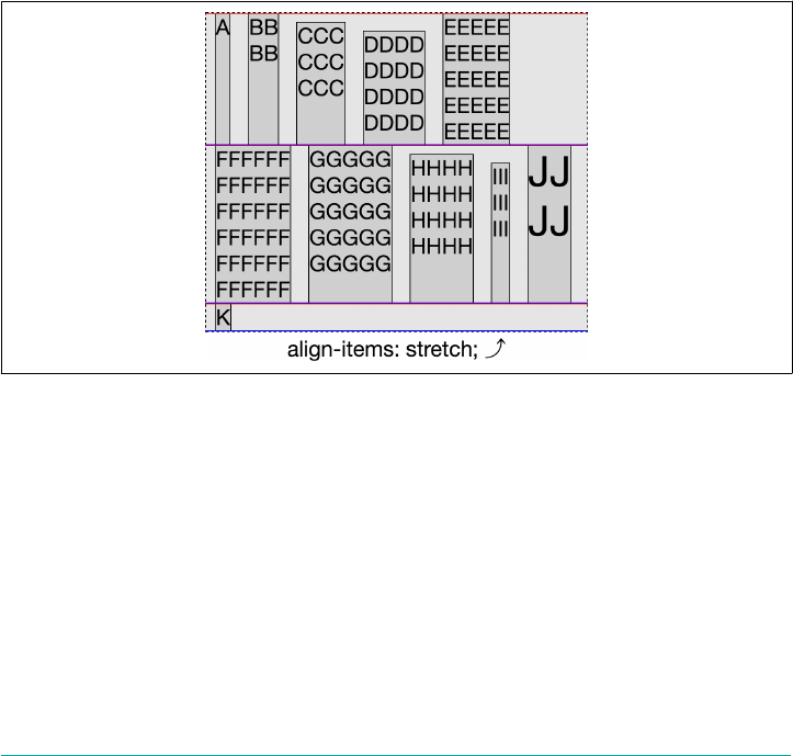
}
.C, .H {
margin-top: 10px;
}
.D, .I {
margin-top: 20px;
}
.J {
font-size: 3rem;
}
For each flex line, the red line is cross-start and the blue is cross-end. The lines
appear purple when a new flex line abuts the previous flex line. C, H, D, and I have
different values for top and bottom margins. We’ve added a bit of margin to the sides
of all the flex items to make the figures more legible, which doesn’t affect the impact
of the align-items property in this case. J has the font size increased, increasing the
line height. This will come into play when we discuss the baseline value.
The default is align-items: stretch, as shown in Figure 12-30.
Figure 12-30. Stretch alignment
stretch, as its name implies, stretches all stretchable flex items to be as tall or wide as
the tallest or widest flex item on the line. What does “stretchable” mean? While by
default flex items will stretch to take up 100% of the cross-size, if min-height, min-
width, max-height, max-width, width, or height are set, those properties will take
precedence. in other words, if an element has an explicitly set dimension along the
cross axis, then it is not stretchable, and stretch will not affect its sizing.
Otherwise, the flex items’ cross-start will be flush with the flex line’s cross-start, and
the flex items’ cross-end will be flush with the flex line’s cross-end. The flex item with
598 | Chapter 12: Flexible Box Layout
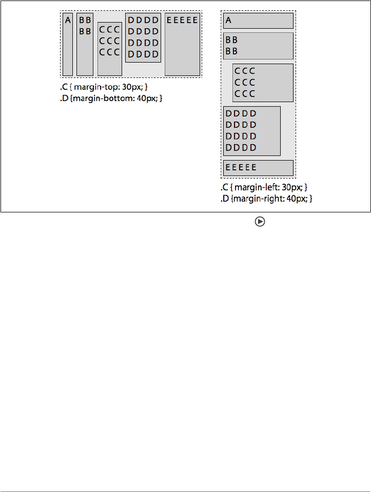
the largest cross-size will remain its default size, and the other flex items will grow to
the size of that largest flex item.
The size of the stretched flex item includes the margins on the cross-start and cross-
end sides: it is the outer edge of the flex items’ margin that will be flush with cross-
start and cross-end. This is demonstrated by items C, D, H, and I in Figure 12-31.
Figure 12-31. Eect of cross-axis margins on item alignment
Their margins are the reason C, D, H, and I appear smaller than the other flex items
on their flex lines. They’re not. The outer edges of the top and bottom margins are
flush with the cross-starts and cross-ends of the flex lines they occupy. Those flex
lines are, in turn, as tall as the tallest item on the line, or as wide as the widest item
when the cross dimension is horizontal.
Flex lines are only as tall or wide as they need to be to contain their flex items. In the
five align-items figures, the line height of the flex line containing only K is much
smaller than the other two lines.
Start, End, and Center Alignment
The values and effects of start, end, and center alignment are pretty straightforward,
so we’ll take them all at once.
The flex-start value lines up each flex items’ cross-start edge flush against the
cross-start edge of their flex line. The flex item’s cross-start edge is on the outside of
the margin: if a flex item has a margin that is greater than 0, flex item will not appear
Aligning Items | 599
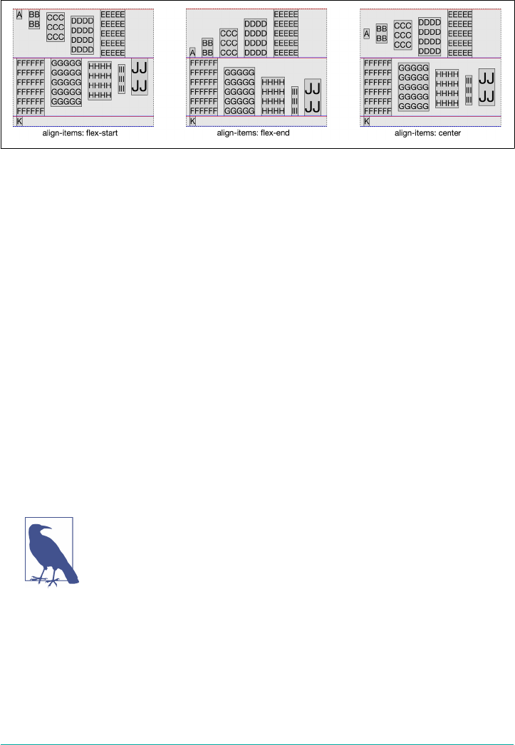
flush with the flex line’s cross-start edge, as seen in flex item C, D, H, and I in the first
example in Figure 12-32.
Figure 12-32. Flex-start, ex-end, and center alignment
Setting align-items: flex-end will align the cross-end edge of all the flex items
along the cross-end edge of the line they are in as shown in the second example in
Figure 12-32. None of the flex items has a bottom margin greater than 0 pixels, so
unlike the other examples, this example does not look jagged—all the flex
items’ cross-end edges are visibly flush against the cross-end edge of each flex line.
As shown in the third example in Figure 12-32, setting align-items: center will
center the flex items’ cross-size along the middle point of the cross axis of the line.
The center is the midpoint between the outer edges of a flex item’s margin edges—
remember, flex item margins do not collapse. Because the cross-edge margins for C,
D, H, and I are not symmetrical, the flex items do not appear visibly centered along
the cross axis, even though they are: the halfway points between their top and bottom
margin edges are exactly aligned with the midpoints of the flex lines in which they sit.
In LTR and RTL languages, in the case of flex-direction: row and row-reverse,
the aligned midpoint of a flex item is the point halfway between its top and bottom
margin edges. For flex-direction: column, and column-reverse, the aligned mid‐
point of a flex item is the point halfway between its left and right margin edges.
If a flex container’s cross size is constrained, the contents may over‐
flow the flex container’s cross-start and/or cross-end edge. The
direction of the overflow is not determined by the align-items
property, but rather by the align-content property, discussed in
an upcoming section, “Aligning Content” on page 604. align-
items aligns the flex items within the flex line and does not directly
impact the overflow direction of the flex items within the
container.
600 | Chapter 12: Flexible Box Layout
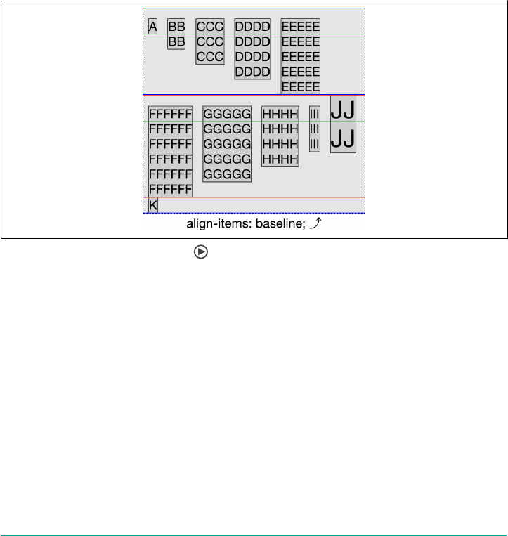
Baseline Alignment
The baseline value is a little more complicated. With baseline, the flex items in
each line are all aligned at their first baselines. The flex item on each flex line with the
biggest distance between its baseline and its cross-start margin edge has that margin
edge placed flush against the cross-start edge of the line, and all other flex items’ base‐
lines are lined up with the baseline of that flex item.
Take a look at the second line in Figure 12-33, where J dominates. The font size for J
in this was was increased to 3rem in order to create a flex item with a taller first line of
text than the other flex items. Its top (cross-start) edge is placed against the top
(cross-start) edge of the flex line. All the other flex items in the line we moved down
until their first text line’s baseline is aligned with the first baseline of J. (The green line
indicates the placement of this baseline.)
Figure 12-33. Baseline alignment
Now look at the first flex line, the one starting with A. You’ll notice that A, B, C, D,
and E are all top-aligned, but look closer. The subtlety here is that they are not visibly
flush to the top of the flex line. This happens because D has a top margin of 20 pixels.
The outer edge of D’s top (cross-start) margin is flush against the cross-start of the
flex line. As previously noted, the distance between the cross-start line and baseline is
determined by the item on the line that has the biggest distance between its outer
margin on its cross-start side and its baseline. Therefore, D’s placement (due to its top
margin) becomes the baseline against which the other items in the line are aligned.
In many cases, baseline will look like flex-start. For example, had D lacked a top
margin, then all the items in that first line would have been visibly flush against the
top of the flex line, just as would have happened with flex-start. Whenever the
Aligning Items | 601

items have different margins, borders, padding, font sizes, or line heights on their
cross-start side, there will be a difference between flex-start and baseline.
There is one case in which baseline literally becomes flex-start, and that’s when
the baselines of the flex items are parallel to the cross axis. For example, suppose we
took the flex container in Figure 12-33 and changed it to flex-direction: column.
Now the cross axis, like the baselines of the English text within, is horizontal. Since
there’s no way to create an offset from the cross-start edge of the columns (the left
side), baseline is treated exactly as if it were flex-start instead.
Additional Notes
If you want to change the alignment of one or more flex items, but not all, you can
include the align-self property on the flex items you would like to align differently.
The align-self takes the same values as align-items, and is discussed in “Flex
Items” on page 609.
You cannot override the alignment for anonymous flex items (non-empty text node
children of flex containers). Their align-self always matches the value of align-
items of their parent flex container.
In the align-items examples, the flex container’s cross-size was as tall as it needed to
be. No height was declared on the container, so it defaulted to height: auto.
Because of this, the flex container grew to fit the content. You may have noticed the
example flex containers were all the same height, and the flex line heights were the
same across all examples.
Had the cross-size—in this case the height—been set to a specific size, there may have
been extra space at cross-end, or not enough space to fit the content. Flexbox allows
us to control the alignment of flex lines with the align-content property. The
align-content property is the last property we need to focus on that applies to the
flex container (versus the flex items). The align-content property only impacts flex
line alignment in multiline flex containers.
The align-self Property
This is jumping ahead a bit, but now is the right time to talk about the align-self
property. This is used to override the align-items property value on a per-flex-item
basis.
602 | Chapter 12: Flexible Box Layout
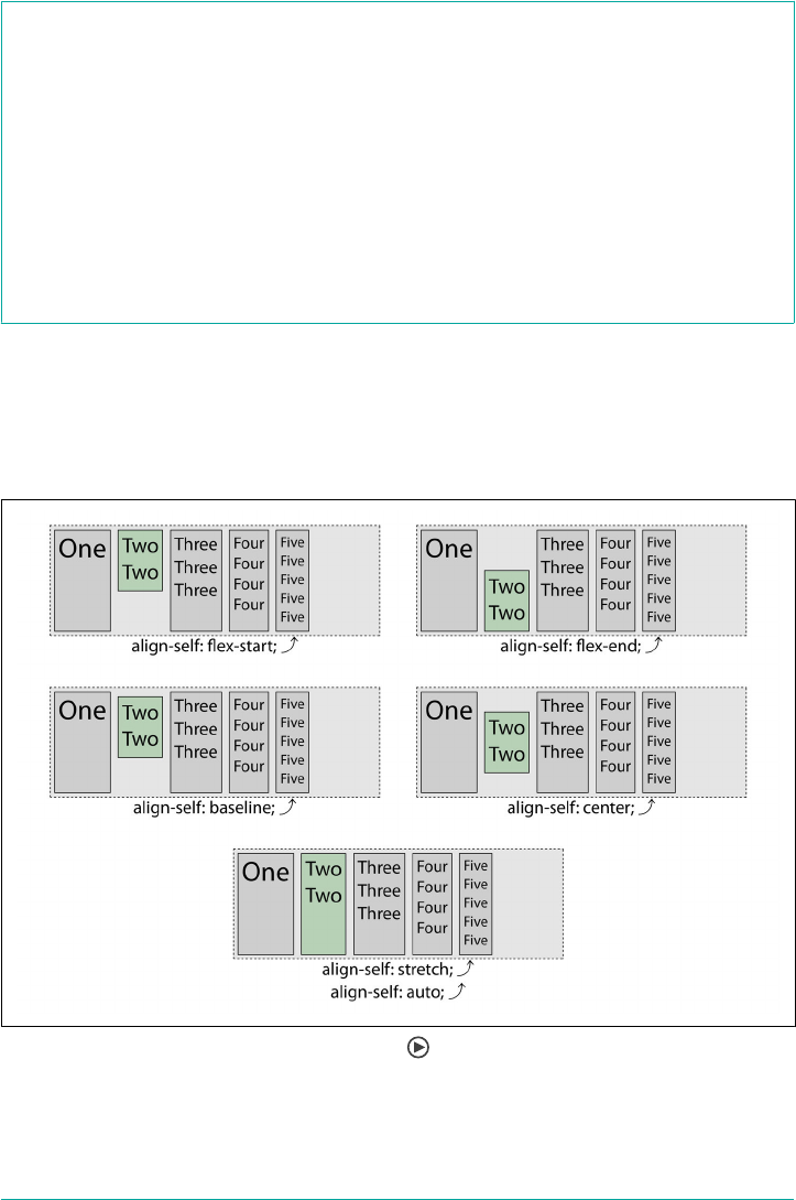
align-self
Values auto | flex-start | flex-end | center | baseline | stretch
Initial value auto
Applies to Flex items
Inherited No
Percentages Not applicable
Animatable No
With the align-items property set on the flex container, you align all the flex items
of that container. You can override the alignment of any individual flex item with the
align-self property. The default value of align-items is stretch, which is why all
the flex items in the five examples in Figure 12-34 are all as tall as the parent, with the
exception of the second flex item.
Figure 12-34. Changing ex item alignments
All the flex items have the align-self’s default value of auto set, meaning they
inherit the alignment (in this case, stretch) from the container’s align-items
The align-self Property | 603
property, except the second flex item in each example. That flex item has been given
the align-self value shown underneath the example.
Just as with the values of the align-items property, the flex-start value places the
item at the cross-start edge. flex-end places the item at the cross-end edge. center
aligns the item in the middle of the cross axis. baseline aligns the baseline of the flex
item with the lowst baseline in its flex line. Finally, auto and stretch both stretch the
flex items, as the align-items value was allowed to default to stretch. (Similarly,
align-self: inherit would cause a stretch alignment in this case.)
To learn more about the flex-start, flex-end, center, baseline, and stretch val‐
ues, see “Aligning Items” on page 596.
Aligning Content
The align-content property aligns a flex container’s lines within a flex container that
has extra space in the cross-axis direction, and dictates which direction will have
overflow when there is not enough room to fit the flex lines.
align-content
Values flex-start | flex-end | center | space-between | space-around |
space-evenly | stretch
Initial value stretch
Applies to Multiline ex containers
Computed value As specied
Inherited No
Animatable No
The align-content property dictates how any extra cross-direction space in a flex
container is distributed between and around flex lines. Although the values and con‐
cepts are the same, align-content is different from the previously discussed align-
items property, which dictates flex item positioning within each flex line.
Think of align-content as similar to how justify-content aligns individual items
along the main axis of the flex container, but it does it for flex lines with regard to the
cross axis of the container. This property only applies to multiline flex containers,
having no effect on non-wrapping and otherwise single-line flex containers.
Consider the following CSS as a base, and assume the flex items have no margins:
604 | Chapter 12: Flexible Box Layout

.flex-container {
display: flex;
flex-flow: row wrap;
align-items: flex-start;
border: 1px dashed;
height: 480px;
background-image: url(banded.svg);
}
.flex-items {
margin: 0;
flow: 1;
}
Figure 12-35 demonstrates the seven possible values of the align-content property,
as used in conjunction with that CSS. In each example, there are three flex lines. Each
flex line’s cross-start and cross-end edges are denoted by red and blue lines, respec‐
tively. The leftover space in the flex container; that is, the space between or around
the flex lines, is represented by the banded regions.
Figure 12-35. Distribution of extra space for each value of align-content
Aligning Content | 605

With a height of 480 pixels, the flex container is taller than the default combined
heights of the 3 flex lines. Let’s say the tallest items in each line—E, F, and K—are 150
pixels, 180 pixels, and 30 pixels, respectively, for a combined total of 360 pixels. Each
flex container has an extra 120 pixels of free space in the cross-size direction.
With five of the align-items values, the free space is distributed outside of the flex
lines, as illustrated in Figure 12-35. These act in the same ways the same values do for
justify-content, only along the cross axis instead of the main axis (as is the case for
justify-content). With the value stretch, the extra space is evenly distributed to all
the flex lines, increasing their cross-size until their edges touch.
In the previous example, with a flex container height of 480 pixels, we have 120 pixels
of “leftover” space along the cross axis, distributed differently depending on the value
of the align-content property.
As shown in the top three examples in Figure 12-35, with flex-start the 120 pixels
is all on the cross-end side of the cross axis. With flex-end, the extra 120 pixels of
available space is all placed at the cross-start side. With center, the lines are centered,
and 60 pixels of extra space (half of 120 pixels) is placed at cross-start and cross-end
sides.
With space-between, there is 60 pixels between adjacent pairs of flex lines. With
space-around, on the other hand, the space is evenly distributed around each line:
the 120 pixels is split into 3, since there are 3 flex lines. This puts 20 pixels of non-
collapsed space (half of 40 pixels) on the cross-start and cross-end sides of each flex
line, so there are 20 pixels of extra space at the cross-start and cross-end sides of the
flex container, and 40 pixels of space between adjacent flex lines.
For space-evenly, there are four spaces to insert: one before each flex line, and an
extra space after the last flex line. With three lines, that means four spaces, or 30 pix‐
els for each space. That places 30 pixels of space at the cross-start and cross-end sides,
and 30 pixels between adjecent flex lines.
The stretch value is different: with stretch the lines stretch with the extra space
evenly distributed among the flex lines rather than between them. In this case, 40 pix‐
els was added to each of the flex lines, causing all 3 to grow in height by an equal
amount—that is, the exact same amount, not an amount proportional to each. You’ll
note in the sixth example of Figure 12-35, there is no area within the container that is
not occupied by a flex line. stretch is the default value, as you likely want to fill all
the available space.
If there isn’t enough room for all the lines, they will overflow at cross-start, cross-end,
or both, depending on the value of the align-content property. This is shown in
Figure 12-36, where the dotted box with a light gray background represents a short
606 | Chapter 12: Flexible Box Layout
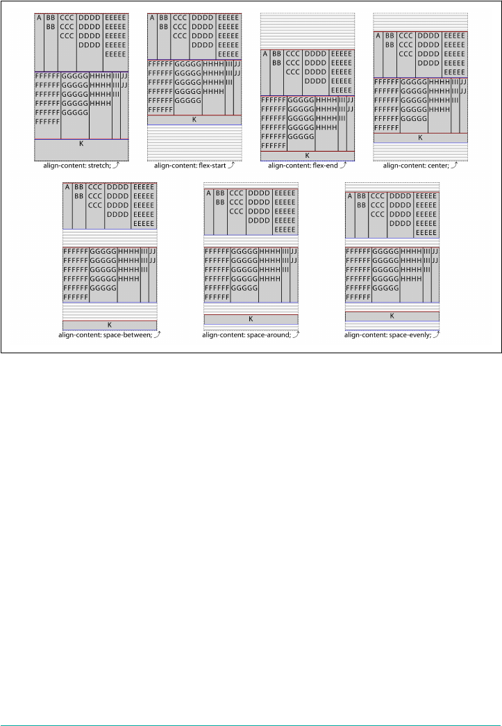
flex container. (align-items: flex-start was set to make the effect of align-
content more obvious.)
Figure 12-36. Flex-line overow directions for each value of align-content
The only difference in the CSS between this and Figure 12-35 is the height of the flex
container. Here, the flex containers have been reduced to a height of 240 pixels, so as
to create flex containers not tall enough to encompass all their flex lines (which, as
you may recall, total 360 pixels in height).
When the flex lines overflow the flex container, align-content: flex-start, space-
between, and stretch cause them overflow the cross-end side, whereas align-
content: space-around and center evenly overflow both the cross-end and cross-
start sides. Only align-content: flex-end causes flex lines overflow just the cross-
start side.
Keep in mind that these values are not top- or bottom-centric. If the cross axis goes
upward, then align-content: flex-start will start aligning flex lines from the bot‐
tom and work upward from there, potentially overflowing the top (cross-end) edge.
For that matter, when the flow direction is columnar, the cross axis will be horizontal,
in which case the cross-start and -end edges will be the right or left edges of the flex
container.
Aligning Content | 607
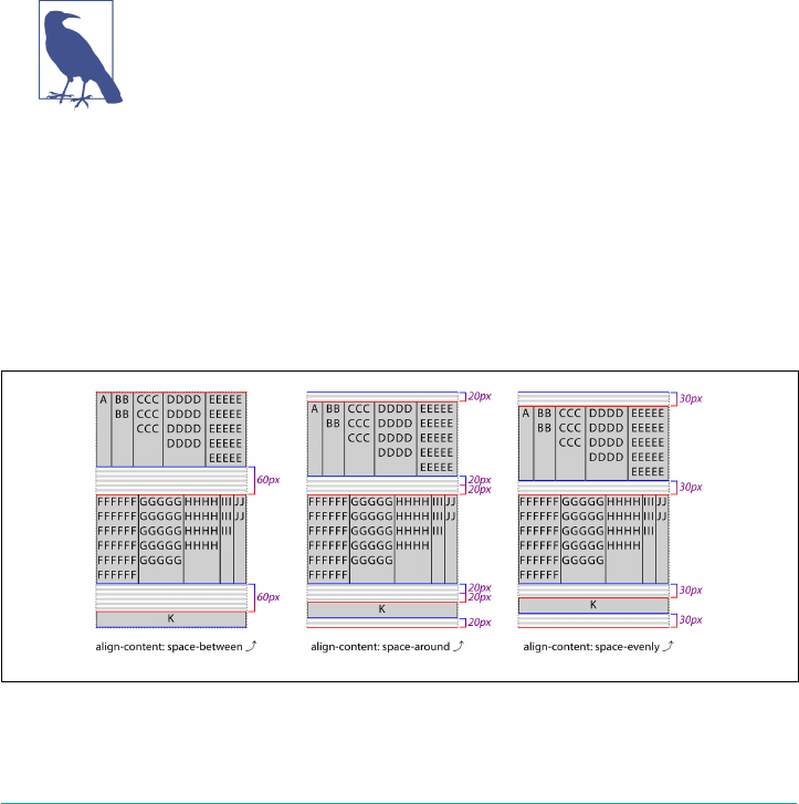
Space between, around, and evenly
It’s worth taking a closer look at, and thinking about how, space-between and space-
around affect the alignment of flex lines.
When align-content: space-between is set, the flex lines are evenly distributed in
the flex container. This “even distribution” is based on the available space, not the size
of the lines. If there is more than one flex line, the first line will be flush against the
container’s cross-start, the last line will be flush against the container’s cross-end, and
any available extra space is distributed evenly between the additional lines, if there are
any. The extra space is distributed evenly, not proportionally. The space between any
two flex lines within the flex container is equal, even if the cross-sizes of the multiple
flex lines differ. Furthermore, the middle flex line, if there are an odd number of lines,
is not necessarily centered in the flex container, because the lines don’t necessarily all
have the same cross dimensions.
Only flex containers with multiple lines can have free space in the
cross axis for lines to be aligned in. If there is only one line, the
align-content property will not impact the distribution of the
content. In flex containers with a single line of flex items, the lone
line stretches to fill all of the available space.
Instead, the spacing between any two adjacent lines is the same. Assume 3 lines with
120 pixels total of free space, as we saw in the previous section. The first flex line goes
against the cross-start edge, and the second flex line goes against the cross-end edge.
That means there is one line to place between them, and two gaps. The 120 pixels of
leftover space gets divided equally into 2 chunks of 60 pixels each. One 60-pixel
chunk is placed between the first and second flex lines, and the other between the sec‐
ond and third flex lines. This is illustrated in Figure 12-37.
Figure 12-37. Distribution of free space for space-between, space-around, and space-
evenly
608 | Chapter 12: Flexible Box Layout

The space-around value distributes the lines within a multiline flex container evenly,
as if all the flex lines had equal, non-collapsing margins on both the cross-start and
cross-end sides. Because there is an equal distribution of the extra available space
around each line, the space between the edges of the container and the first and last
flex lines is half the size of the distance between any two flex lines. The distribution of
the extra space is shown in Figure 12-37.
As of late 2017, the various alignment values like flex-start,
flex-end, and so on are being made more generic: start, end, and
so forth. These are part of a wider effort to make CSS more aware
of writing and layout directions. An example of this is the addition
of properties like margin-start and padding-end. It wasn’t quite
advanced enough (or well-supported enough) to merit complete
coverage in this edition, but keep an eye on these developments.
We have been, for the most part, taking a look at properties of the flex container (the
exception was align-self). It’s time to take a look at the properties directly applied
to flex items.
Flex Items
In the previous sections, we saw how to globally lay out all the flex items within a flex
container by styling that container. The flexible box layout specification provides sev‐
eral additional properties applicable directly to flex items. With these flex-item-
specific properties, we can more precisely control the layout of individual flex
containers’ children.
What Are Flex Items?
We create flex containers simply by adding a display: flex or display: inline-
flex to an element that has child nodes. The children of those flex container are
called ex items—whether they’re child elements, non-empty text nodes between
child elements, or generated content. Figure 12-38 shows a situation where each letter
is enclosed in its own element, including the space between words, so that each letter
and space becomes a flex item.
Flex Items | 609
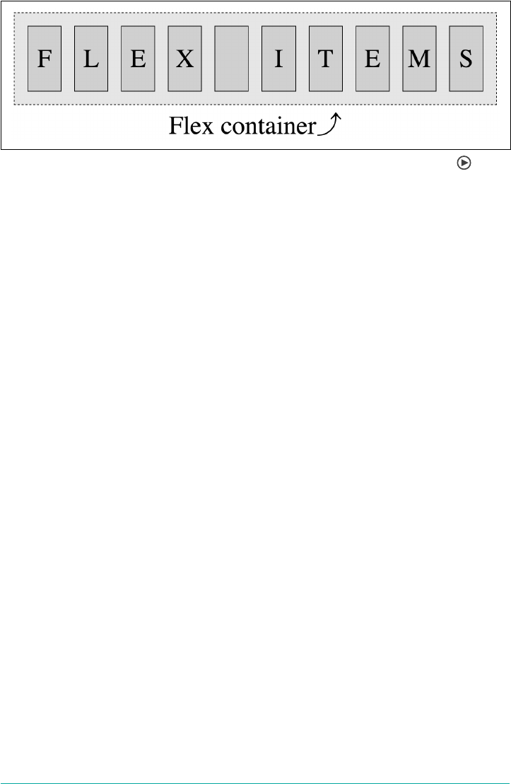
Figure 12-38. e child nodes are ex items, the parent node is a ex container
When it comes to text-node children of flex containers, if the text node is not empty
—containing content other than whitespace—it will be wrapped in an anonymous ex
item, behaving like its flex item siblings. While these anonymous flex items do inherit
all the flex properties set by the flex container, just like their DOM node siblings, they
are not directly targetable with CSS. Therefore, we can’t directly set any of the flex
item specific properties on them. Thus, in the following markup, the two elements
(the <strong> and the <em>) and the text “ they’re what’s for ” each become flex items,
for a total of three flex items:
<p style="display: flex;">
<strong>Flex items:</strong> they’re what’s for <em><br>fast!</em>
</p>
Generated content (via ::before and ::after) can be styled directly; therefore all the
properties discussed in this chapter apply equally to generated content as they do to
element nodes.
Whitespace-only text nodes within a flex container are ignored, as if their display
property were set to none, as the following code example shows:
nav ul {
display: flex;
}
<nav>
<ul>
<li><a href="#1">Link 1</a></li>
<li><a href="#2">Link 2</a></li>
<li><a href="#3">Link 3</a></li>
<li><a href="#4">Link 4</a></li>
<li><a href="#5">Link 5</a></li>
</ul>
</nav>
In the preceding code, with the display property set to flex, the unordered list is the
flex container, and its child list items are all flex items. These list items, being flex
items, are flex-level boxes, semantically still list items, but not list items in their pre‐
610 | Chapter 12: Flexible Box Layout

sentation. They are not block-level boxes either. Rather, they participate in their con‐
tainer’s flex formatting context. The whitespace between and around the li elements
—the line feeds and indenting tabs and/or spaces—is completely ignored. The links
are not flex items themselves, but are descendants of the flex items the list items have
become.
Flex Item Features
The margins of flex items do not collapse. The float and clear properties don’t have
an effect on flex items, and do not take a flex item out of flow. In effect, float and
clear are ignored when applied to flex items. (However, the float property can still
affect box generation by influencing the display property’s computed value.)
Consider:
aside {
display: flex;
}
img {
float: left;
}
<aside>
<!-- this is a comment -->
<h1>Header</h1>
<img src="images/foo.jpg" alt="Foo Master">
Some text
</aside>
In this example, the aside is the flex container. The comment and whitespace-only
text nodes are ignored. The text node containing “some text” is wrapped in an anony‐
mous flex item. The header, image, and text node containing “some text” are all flex
items. Because the image is a flex item, the float is ignored.
Even though images and text nodes are inline-level nodes, being flex items, as long as
they are not absolutely positioned, they are blockified:
aside {
display: flex;
align-items: center;
}
<aside>
<!-- a comment -->
<h1>Header</h1>
<img src="images/foo.jpg" alt="foo master">
Some text <a href="foo.html">with a link</a> and more text
</aside>
Flex Items | 611

In the last example, the markup is similar to the code in the second example, with the
addition of a link within the non-empty text node. In this case, we are creating five
flex items. The comment and whitespace-only text nodes are ignored. The header, the
image, the text node before the link, the link, and the text node after the link are all
flex items. This is illustrated by Figure 12-39.
Figure 12-39. Five ex items in an aside
The text nodes containing “some text” and “and more text” are wrapped in anony‐
mous flex items, represented in Figure 12-39 by the dashed boxes (the dashes having
been added for illustrative purposes) with no background. The header, image, and
link, being actual DOM nodes, can be styled directly with CSS. The anonymous flex
containers are not directly targetable, and so will only have whatever styles they pick
up from the flex container.
Additionally, vertical-align has no effect on a flex item, except as it affects the
alignment of text within the flex item. In other words, setting vertical-align: bot
tom on a flex item will make the text inside the flex item all align to the bottoms of
their line boxes, not push the flex item to the bottom of its container. (That’s what
align-items and align-self are for.)
Absolute positioning
While float will not actually float a flex item, setting position: absolute is a differ‐
ent story. The absolutely positioned children of flex containers, just like any other
absolutely positioned element, are taken out of the flow of the document.
More to the point, they do not participate in flex layout, and are not part of the docu‐
ment flow. However, they can be impacted by the styles set on the flex container, just
as a child can be impacted by a parent element that isn’t a flex container. In addition
to inheriting any inheritable properties, the flex container’s properties can affect the
origin of the positioning.
The absolutely positioned child of a flex container is affected by both the justify-
content value of the flex container, and its own align-self value, if there is one. For
example, if you set align-self: center on the absolutely positioned child, it will
start out centered with respect to the flex container parent’s cross axis. From there, it
can moved by properties like top, bottom, margins, and so on.
612 | Chapter 12: Flexible Box Layout
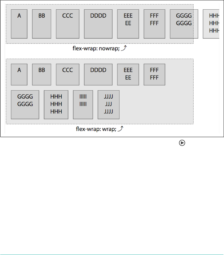
The order property (explained in a later section, “The order property” on page 648)
may not impact where the absolutely positioned flex container child is drawn, but it
does impact the order of when it is drawn in relation to its siblings.
Minimum Widths
In Figure 12-40, you’ll note the line that is set to the nowrap default overflows the flex
container. This is because when it comes to flex items, the implied value of min-width
is auto, rather than 0. Originally in the specification, if the items didn’t fit onto that
single main axis, they would shrink. However, the specification of min-width was
altered as applied to flex items. (Traditionally, the default value for min-width is 0.)
Figure 12-40. Flex container overow with minimum-width ex items
If you set the min-width to a width narrower than the computed value of auto—for
example, if you declare min-width: 0—then the flex items in the nowrap example will
shrink to be narrower than their actual content (in some cases). If the items are
allowed to wrap, then they will be as narrow as possible to fit their content, but no
narrower. Both situations are illustrated in Figure 12-41.
Flex Items | 613

Figure 12-41. Zero-minimum-width ex items in non-wrapped and wrapped ex con‐
tainers
Flex-Item–Specic Properties
While flex items’ alignment, order, and flexibility are to some extent controllable via
properties set on their flex container, there are several properties that can be applied
to individual flex items for more granular control.
The flex shorthand property, along with its component properties of flex-grow,
flex-shrink, and flex-basis, controls the exibility of the flex items. Flexibility is
the amount by which a flex item can grow or shrink along the main axis.
The ex Property
The defining aspect of flex layout is the ability to make the flex items “flex”: altering
their width or height to fill the available space in the main dimension. A flex con‐
tainer distributes free space to its items proportional to their flex grow factor, or
shrinks them to prevent overflow proportional to their flex shrink factor. (We’ll
explore these concepts momentarily.)
Declaring the flex shorthand property on a flex item, or defining the individual
properties that make up the shorthand, enables authors to define the grow and shrink
factors. If there is excess space, you can tell the flex items to grow to fill that space. Or
not. If there isn’t enough room to fit all the flex items within the flex container at their
614 | Chapter 12: Flexible Box Layout

defined or default sizes, you can tell the flex items to shrink proportionally to fit into
the space. Or not.
This is all done with the flex property, which is a shorthand property for flex-grow,
flex-shrink, and flex-basis. While these three sub-properties can be used sepa‐
rately, it is highly recommended to always use the flex shorthand, for reasons we’ll
soon cover.
ex
Values [ <flex-grow> <flex-shrink>? ‖ <flex-basis> ] | none
Initial value 0 1 auto
Applies to Flex items (children of ex containers)
Percentages Valid for flex-basis value only, relative to element’s parent’s inner main-axis size
Computed value Refer to individual properties
Inherited No
Animatable See individual properties
The flex property specifies the components of a flexible length: the “length” of the
flex item being the length of the flex item along the main axis (see “Understanding
axes” on page 579). When a box is a flex item, flex is consulted to determine the size
of the box, instead of the main-axis size dimension property (height or width). The
“components” of the flex property include the ex growth factor, ex shrink factor,
and the ex basis.
The flex basis determines how the flex growth and shrink factors are implemented.
As its name suggests, the flex-basis component of the flex shorthand is the basis on
which the flex item determines how much it can grow to fill available space or how
much it should shrink to fit all the flex items when there isn’t enough space. It’s the
initial size of each flex item, and can be restricted to that specific size by specifying 0
for both the growth and shrink factors:
.flexItem {
width: 50%;
flex: 0 0 200px;
}
In the preceding CSS, the flex item will have a main-axis size of exactly 200 pixels, as
the flex basis is 200px, and it is allowed to neither grow nor shrink. Assuming that the
main axis is horizontal, then the value of width (50%) is ignored. Similarly, a value for
height would be ignored if the main axis were vertical.
The ex Property | 615
This override of height and width occurs outside the cascade, so
you can’t even override the flex basis by adding !important to the
height or width value of a flex item.
If the target of a selector is not a flex item, applying the flex property to it will have
no effect.
It is important to understand the three components that make up the flex shorthand
property in order to be able to use it effectively.
The ex-grow Property
The flex-grow property defines whether a flex item is allowed to grow when there is
available space, and, if it is allowed to grow and there is available space, how much
will it grow proportionally relative to the growth of other flex item siblings.
Declaring the growth factor via the flex-grow property is strongly
discouraged by the authors of the specification itself. Instead,
declare the growth factor as part of the flex shorthand. We’re only
discussing the property here to explore how growth works.
ex-grow
Values <number>
Initial value 0
Applies to Flex items (children of ex containers)
Computed value As specied
Inherited No
Animatable Yes
The value of flex-grow is always a number. Negative numbers are not valid. You can
use non-integers if you like, just as long as they’re zero or greater. The value sets the
ex growth factor, which determines how much the flex item will grow relative to the
rest of the flex item siblings as the flex container’s free space is distributed.
If there is any available space within the flex container, the space will be distributed
proportionally among the children with a nonzero positive growth factor based on
the various values of those growth factors.
616 | Chapter 12: Flexible Box Layout

For example, assume a 750px wide horizontal flex container with three flex items,
each set to width: 100px. That means there is a total of 300 pixels of space taken up
by the flex items, leaving 450 pixels of “leftover” or available space (since 750 - 300 =
450). This is the first scenario shown in Figure 12-42. In that scenario, none of the
flex items are permitted to grow.
Figure 12-42. A variety of ex-growth scenarios
In the second scenario in Figure 12-42, only one of the flex items (the third) has been
given a growth factor. The declaration we gave it is flex-grow: 1, but it could be lit‐
erally any positive number the browser can understand. In this case, with two items
having no growth factor and the third having a growth factor, all of the available
space is given to the flex item with a growth factor. Thus, the third flex item gets all
450 pixels of available space added to it, arriving at a final width of 550 pixels. The
width: 100px applied to it elsewhere in the styles is overridden.
The ex-grow Property | 617

In the third and fourth scenarios, the same flex item widths result despite the differ‐
ing flex growth factors. Let’s consider the third scenario, where the growth factors are
1, 1, and 3. The factors are all added together to get a total of 5. Each factor is then
divided by that total to get a proportion. So here, the three values are each divided by
five, yielding 0.2, 0.2, and 0.6.
These proportions are each multiplied by the available space to get the amount of
growth. Thus:
1. 450 px × 0.2 = 90 px
2. 450 px × 0.2 = 90 px
3. 450 px × 0.6 = 270 px
Those are the growth portions added to each flex item’s starting width of 100 pixels.
Thus, the final widths are 190 pixels, 190 pixels, and 370 pixels, respectively.
The fourth scenario has the same result, because the proportions are the same. Imag‐
ine for a moment that we altered the growth factors to be 0.5, 1, and 1.5. Now the
math works out such that the first flex item gets one-sixth of the available space, the
second gets a third, and the third gets half. This results in the flex items’ final widths
being 175, 250, and 425 pixels, respectively. Had we declared growth factors of 0.1,
0.1, and 0.3, or 25, 25, and 75, or really any combination of numbers with a 1:1:3 cor‐
respondence, the result would have been identical.
As noted in “Minimum Widths” on page 613, if no width or flex basis is set, the flex
basis defaults to auto, meaning each flex item basis is the width of its nonwrapped
content. auto is a special value: it defaults to content unless the item has a width set
on it, at which point the flex-basis becomes that width. The auto value is discussed in
“Automatic Flex Basis” on page 635. Had we not set the width, in this example sce‐
nario, with our smallish font size, we would had more than 450 pixels of distributable
space along the main axis.
The main-axis size of a flex item is impacted by the available space,
the growth factor of all the flex items, and the flex basis of the item.
We have yet to cover flex basis, but that time is coming soon!
Now let’s consider a case where the flex items have different width values, as well as
different growth factors. In Figure 12-43, in the second example, we have flex items
that are 100 pixels, 250 pixels, and 100 pixels wide, with growth factors of 1, 1, and 3,
respectively, in a container that is 750 pixels wide. This means we have 300 pixels of
extra space to distribute among a total of 5 growth factors (since 750 - 450 = 300).
Each growth factor is therefore 60 pixels (300 ÷ 5). This means the first and second
618 | Chapter 12: Flexible Box Layout
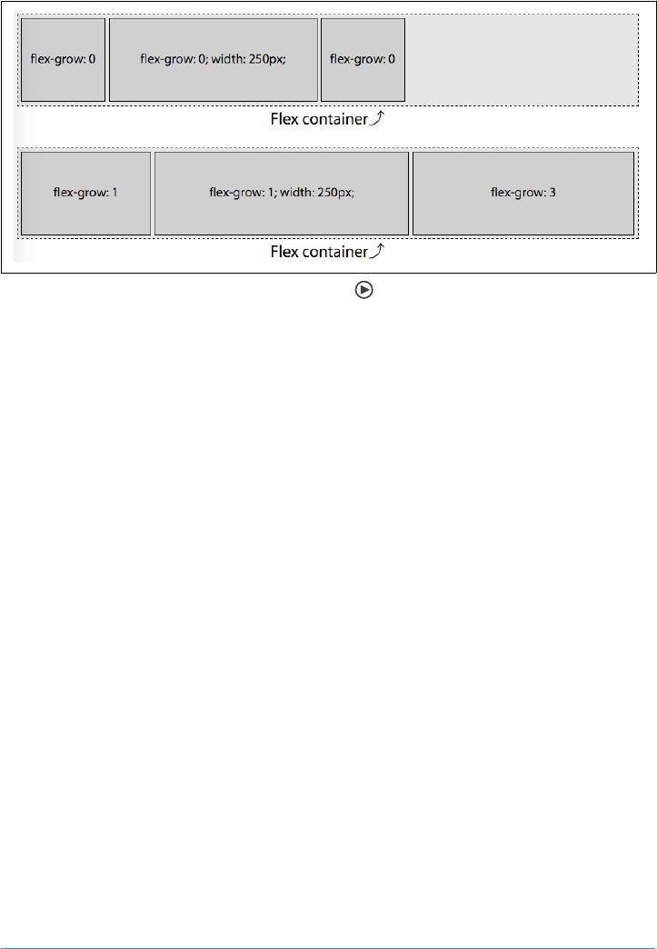
flex items, with a flex-grow value of 1, will each grow by 60 pixels. The last flex item
will grow by 180 pixels, since its flex-grow value is 3.
Figure 12-43. Mixed widths and growth factors
To recap, the available space in the flex container, and the growth factors and final
width of each flex item, are:
Available space: 750px - (100px + 250px + 100px) = 300px
Growth factors: 1 + 1 + 3 = 5
Width of each growth factor: 300px ÷ 5 = 60px
When flexed, the width of the flex items, based on their original width and growth
factors, become:
item1 = 100px + (1 × 60px) = 160px
item2 = 250px + (1 × 60px) = 310px
item3 = 100px + (3 × 60px) = 280px
which adds up to 750 pixels.
Growth Factors and the ex Property
The flex property takes up to three values—the growth factor, shrink factor, and
basis. The first positive non-null numeric value, if there is one, sets the growth factor
(i.e., the flex-grow value). When the growth and shrink factors are omitted in the
flex value, the growth factor defaults to 1. However, if neither flex nor flex-grow
are declared, the growth factor defaults to 0. Yes, really.
Recall the second example in Figure 12-42, where the flex growth factors were 0, 0,
and 1. Because we declared a value for flex-grow only, the flex basis was set to auto,
as if we had declared:
The ex-grow Property | 619

#example2 flex-item {
flex: 0 1 auto;
}
#example2 flex-item:last-child {
flex: 1 1 auto;
}
So that means the first two flex items had no growth factor, a shrink factor, and a flex
basis of auto. Had we used flex in the examples in Figure 12-42 instead of ill-
advisedly using flex-grow, the flex basis in each case would be set to 0%, as if this had
been done:
#example2 flex-item {
flex: 0 1 0%;
}
#example2 flex-item:last-child {
flex: 1 1 0%;
}
As the shrink factor defaults to 1 and the basis defaults to 0%, the following CSS is
identical to the preceding snippet:
#example2 flex-item {
flex: 0;
}
#example2 flex-item:last-child {
flex: 1;
}
This would have the result shown in Figure 12-44. Compare this to Figure 12-42 to
see how things have changed (or not).
You may notice something odd in the first two scenarios: the flex basis been set to
zero, and only the last flex item in the second scenario has a positive value for flex
grow. Logic would seem that the widths of the 3 flex items should be 0, 0, and 750
pixels, respectively. But logic would also dictate that it makes no sense to have content
overflowing its flex item if the flex container has the room for all the content, even if
the basis is set to 0.
The specification authors thought of this quandary. When the flex property declara‐
tion explicitly sets or defaults the flex-basis to 0% and a flex item’s growth factor is 0,
the length of the main axis of the non-growing flex items will shrink to the smallest
length the content allows, or smaller. In Figure 12-44, that minimum length is the
width of the widest sequence of letters, “flex:” (including the colon).
620 | Chapter 12: Flexible Box Layout
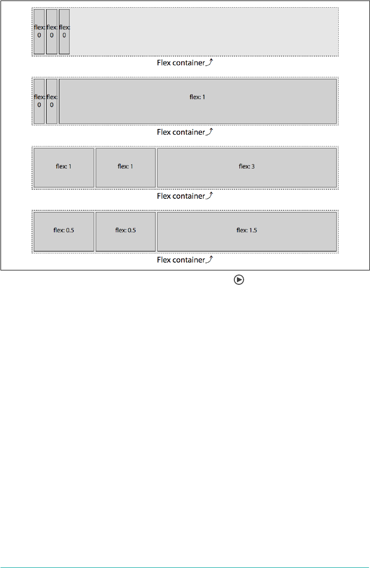
Figure 12-44. Flex sizing when using the ex shorthand
As long as a flex item has a visible overflow and no explicitly set value for min-width
(or min-height for vertical main-axes), the minimum width (or minimum height)
will be the smallest width (or height) that the flex item needs to be to fit the content
or the declared width (or height), whichever is smaller.
If all items are allowed to grow, and the flex basis for each flex item is 0%, then all of
the space, rather than just excess space, is distributed proportionally based on the
growth factors. In the third example in Figure 12-44, two flex items have growth fac‐
tors of one, and one flex item has a growth factor of three. We thus have a total of five
growth factors:
(2 × 1) + (1 × 3) = 5
With 5 growth factors, and a total of 750 pixels, each growth factor is worth 150
pixels:
750px ÷ 5 = 150px
The ex-grow Property | 621
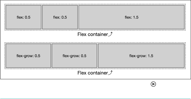
While the default flex item size was 100 pixels, the flex basis of 0% overrides that, leav‐
ing us with 2 flex items at 150 pixels each and the last flex item with a width of 450
pixels:
1 × 150px = 150px
3 × 150px = 450px
Similarly, in the last example of Figure 12-44, with two flex items having growth fac‐
tors of 0.5, and one flex item having a growth factor of 1.5, we have a total of 2.5
growth factors:
(2 × 0.5) + (1 × 1.5) = 2.5
With 2.5 grows factors, and a total of 750 pixels, each growth factor is worth 300
pixels:
750px ÷ 2.5 = 300px
While the default flex item size was 100 pixels, the flex basis of 0% overrides that,
leaving us with 2 flex items at 150 pixels each and the last flex item with a width of
450 pixels:
0.5 × 300px = 150px
1.5 × 300px = 450px
Again, this is different from declaring only flex-grow, because that means the flex
basis defaults to auto. In that case, only the extra space, not all the space, is dis‐
tributed proportionally. When using flex, on the other hand, the flex basis is set to
0%, so the flex items grow in proportion to the total space, not just the leftover space.
The difference is illustrated in Figure 12-45.
Figure 12-45. Flex sizing dierences between using ex and ex-grow
622 | Chapter 12: Flexible Box Layout
Now let’s talk about flex shrinking factors, which are in some ways the inverse of flex
growth factors, but are in other ways different.
The ex-shrink Property
The <ex-shrink> portion of the flex shorthand property specifies the ex shrink fac‐
tor. It can also be set via the flex-shrink property.
Declaring the shrink factor via the flex-shrink property is strongly
discouraged by the authors of the specification itself. Instead,
declare the shrink factor as part of the flex shorthand. We’re only
discussing the property here in order to explore how shrinking
works.
ex-shrink
Values <number>
Initial value 1
Applies to Flex items (children of ex containers)
Computed value As specied
Inherited No
Animatable Yes
The shrink factor determines how much a flex item will shrink relative to the rest of
its flex-item siblings when there isn’t enough space for them all to fit, as defined by
their content and other CSS properties. When omitted in the shorthand flex prop‐
erty value or when both flex and flex-shrink are omitted, the shrink factor defaults
to 1. Like the growth factor, the value of flex-shrink is always a number. Negative
numbers are not valid. You can use non-integer values if you like, just as long as
they’re greater than zero.
Basically, the shrink factor defines how “negative available space” is distributed when
there isn’t enough room for the flex items and the flex container isn’t allowed to
otherwise grow or wrap. This is illustrated in Figure 12-46.
The ex-shrink Property | 623

Figure 12-46. A variety of ex shrinking scenarios
Figure 12-46 is similar to Figure 12-42, except the flex items are set to width: 300px
instead of 100 pixels. We still have a 750-pixels-wide flex container. The total width of
the 3 items is 900 pixels, meaning the content starts out 150 pixels wider than the par‐
ent flex container. If the items are not allowed to shrink or wrap (see “Wrapping Flex
Lines” on page 576), they will burst out from the fixed-size flex container. This is
demonstrated in the first example in Figure 12-46: those items will not shrink because
they have a zero shrink factor. Instead, they overflow the flex container.
In the second example in Figure 12-46, only the last flex item is set to be able to
shrink. The last flex item is thus forced to do all the shrinking necessary to enable all
the flex items to fit within the flex container. With 900 pixels worth of content need‐
ing to fit into our 750-pixel container, we have 150 pixels of negative available space.
The 2 flex items with no shrink factor stay at 300 pixels wide. The third flex item,
with a positive value for the shrink factor, shrinks 150 pixels, to end up 150 pixels
wide. This enables the 3 items to fit within the container. (In this example the shrink
factor was 1, but had it been 0.001 or 100 or 314159.65 or any other positive number
the browser could understand, the result would be the same.)
In the third example, we have positive shrink factors for all three flex items:
#example3 flex-item {
flex-shrink: 1;
}
#example3 flex-item:last-child {
flex-shrink: 3;
}
624 | Chapter 12: Flexible Box Layout

As this is the only one of the three flex shorthand properties we declared, this means
the flex items will behave as if we had declared the following:
#example3 flex-item {
flex: 0 1 auto; /* growth defaults to 0, basis to auto */
}
f#example3 flex-item:last-child {
flex: 0 3 auto;
}
If all items are allowed to shrink, as is the case here, the shrinking is distributed pro‐
portionally based on the shrink factors. This means the larger a flex item’s shrink fac‐
tor, as compared to the shrink factors of its sibling flex items, the more the item will
shrink in comparison.
With a parent 750 pixels wide, and 3 flex items with a width of 300 pixels, there are
150 “negative space” pixels that need to be shaved off the flex items that are allowed to
shrink (which is all of them in this example). With two flex items having a shrink fac‐
tor of 1, and one flex item having a shrink factor of 3, we have a total of five shrink
factors:
(2 × 1) + (1 × 3) = 5
With 5 shrink factors, and a total of 150 pixels needing to be shaved off all the flex
items, each shrink factor is worth 30 pixels:
150px ÷ 5 = 30px
The default flex item size was 300 pixels, leading us to have 2 flex items with a width
of 270 pixels each and the last flex item having a width of 210 pixels, which totals 750
pixels:
300px - (1 × 30px) = 270px
300px - (3 × 30px) = 210px
The following CSS produces the same outcome: while the numeric representation of
the shrink factors are different, they are proportionally the same, so the flex item
widths will be the same:
flex-item {
flex: 1 0.25 auto;
}
flex-item:last-child {
flex: 1 0.75 auto;
}
Note that the flex items in these examples will shrink to 210, 210, and 270 pixels,
respectively, as long as the content (like media objects or non-wrappable text) within
The ex-shrink Property | 625

each flex item is not wider than 210, 210, or 270 pixels, respectively. If the flex item
contains content that cannot wrap or otherwise shrink in the main-dimension, the
flex item will not shrink any further.
Suppose that the first flex items contain a 300-pixels-wide image. That first flex item
can not shrink, and other flex items can shrink, therefore it will not shrink, as if it had
a null shrink factor. In this case, the first item would be 300 pixels, with the 150 pixels
of negative space distributed proportionally based on the shrink factors of the second
and third flex items.
That being the case, we have 4 unimpeded shrink factors (one from the second flex
item, and three from the third) for 150 pixels of negative space, with each shrink fac‐
tor being worth 37.5 pixels. The flex items will end up 300, 262.5, and 187.5 pixels
respectively, for a total of 750 pixels. The result is illustrated in Figure 12-47:
item1 = 300px - (0 × 37.5px) = 300.0px
item2 = 300px - (1 × 37.5px) = 262.5px
item3 = 300px - (3 × 37.5px) = 187.5px
Figure 12-47. Shrinking being impeded by ex item content
Had the image been 296 pixels wide, that first flex item would have been able to
shrink by 4 pixels. The remaining 146 pixels of negative space would then be dis‐
tributed the among the 4 remaining shrink, yielding 36.5 pixels per factor. The flex
items would then be 296, 263.5, and 190.5 pixels wide, respectively.
If all three flex items contained non-wrappable text or media 300 pixels or wider, the
none of the three flex items would not shrink, appearing similar to the first example
in Figure 12-46.
Proportional Shrinkage Based on Width and Shrink Factor
The preceding code examples were fairly simple because all the flex items started with
the same width. But what if the widths were different? What if the first and last flex
items had a width of 250 pixels and the middle flex item had a width of 500 pixels, as
shown in Figure 12-48?
626 | Chapter 12: Flexible Box Layout

Figure 12-48. Flex items shrink proportionally relative to their shrink factor
Flex items shrink proportionally relative to both the shrink factor and the flex item’s
width, with the width often being the width of the flex item’s content with no wrap‐
ping. In Figure 12-48, we are trying to fit 1,000 pixels into a 750 pixels-width flex
container. We have an excess of 250 pixels to be removed from 5 shrink factors.
If this were a flex-grow situation, we would simply divide 250 pixels by 5, allocating
50 pixels per growth factor. If we were to shrink that way, we would get flex items 200,
550, and 100 pixels wide, respectively. But that’s not how shrinking actually works.
Here, we have 250 pixels of negative space to proportionally distribute. To get the
shrink factor proportions, we divide the negative space by the total of the flex items’
widths (more precisely, their lengths along the main axis) times their shrink factors:
ShrinkPercent =NegativeSpace
Width1 × ShrF1 + . . . + WidthN ×ShrFN
Using this equation, we find the shrink percentage:
= 250px ÷ ((250px × 1) + (500px × 1) + (250px × 3))
= 250px ÷ 1500px
= 0.166666667 (16.67%)
When we reduce each flex item by 16.67% times the value of flex-shrink, we end up
with flex items that are reduced by:
item1 = 250px × (1 × 16.67%) = 41.67px
item2 = 500px × (1 × 16.67%) = 83.33px
item3 = 250px × (3 × 16.67%) = 125px
Each reduction is then subtracted from the starting sizes of 250, 500, and 250 pixels,
respectively. We thus end up with flex items that are 208.33, 416.67, and 125 pixels
wide.
The ex-shrink Property | 627
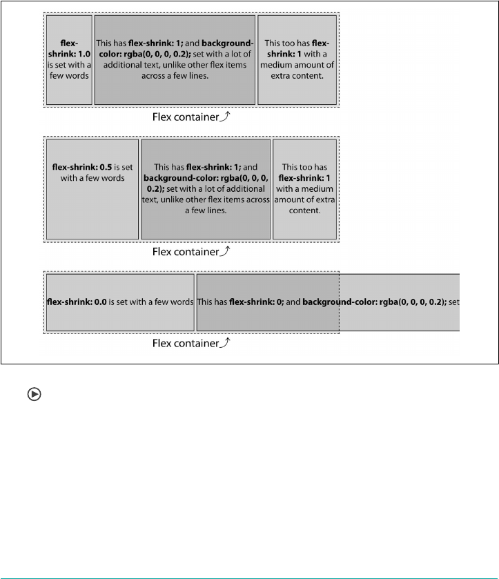
Diering Bases
With zero shrink factor, if both the width and flex basis of a flex item at auto, its con‐
tent will not wrap, even when you think it should. Conversely, any positive shrink
value enables content to wrap. Because shrinking is proportional based on shrink fac‐
tor, if all the flex items have similar shrink factors, the content should wrap over a
similar number of lines.
In the three examples shown in Figure 12-49, the flex items do not have a declared
width. Therefore, the width is based on the content, because width defaults to auto.
The flex container has been made 520 pixels wide, instead of of our usual 750 pixels.
Figure 12-49. Flex items shrink proportionally relative to their shrink factor and con‐
tent
Note that in the first example, where all the items have the same flex-shrink value,
all content wraps over four lines. In the second example, the first flex item has a
shrink factor half of value of the other flex items, so it wraps the content over
(roughly) half the number of lines. This is the power of the shrink factor.
In the third example, with no shrink factor, the text doesn’t wrap at all and the flex
items overflow the container by quite a bit.
628 | Chapter 12: Flexible Box Layout

As of late 2017, this “line-balancing” and refusal-to-wrap behavior
was not consistent across browsers. If you see different results
when trying this out for yourself, that may be why.
Because the flex property’s shrink factor reduces the width of flex items proportion‐
ally, the number of lines of text in the flex items will grow or shrink as the width
shrinks or grows, leading to similar height content within sibling flex items when the
shrink factors are similar.
In the examples, take the contents of the flex items to be 280, 995, and 480 pixels,
respectively—which is the width of the non-wrapping flex items in the third example
(as measured by the developer tools, then rounded to make this example a little sim‐
pler). This means we have to fit 1,755 pixels of content into a 520 pixels-wide flex
container by shrinking the flex items proportionally based on their shrink factor. This
means we have 1,235 pixels of negative available space to proportionally distribute.
Remember that you can’t rely on web inspector tools to figure out
shrink factors for production. We’re going through this exercise to
understand how shrink factors work. If minutia isn’t your thing,
feel free to jump to “The flex-basis Property” on page 633.
In our first example, the flex items will end up with the same, or approximately the
same, number of text lines. This is because flex items shrink proportionally, based on
the width of their content.
We didn’t declare any widths, and therefore can’t simply use an explicit element width
as the basis for our calculations, as we did in the previous examples. Rather, we dis‐
tribute the 1,235 pixels of negative space proportionally based on the widths of the
content—280, 995, and 480 pixels, respectively. We determine 520 is 29.63% of 1,755.
To determine the width of each flex item with a shrink factor of 1, we multiply the
content width of each flex item by 29.63%:
item1 = 280px × 29.63% = 83px
item2 = 995px × 29.63% = 295px
item3 = 480px × 29.63% = 142px
With the default of align-items: stretch (see “Aligning Items” on page 596), a
three-column layout will have three columns of equal height. By using a consistent
shrink factor for all flex items, you can indicate that the actual content of these three
flex items should be of approximately equal height—though, by doing this, the widths
of those columns will not necessarily be uniform.
The ex-shrink Property | 629

In the second example in Figure 12-49, the flex items don’t all have the same shrink
factor. The first flex item will, proportionally, shrink half as much as the others. We
start with the same widths: 280, 995, and 480 pixels, respectively, but their shrink fac‐
tors are 0.5, 1.0, and 1.0. As we know the widths of the content, the shrink factor (X)
can be found mathematically:
280px + 995px + 480px = 1615px
(0.5 × 280px) + (1 × 995px) + (1 × 480px) = 1235px
X = 1235px ÷ 1615px = 0.7647
We can find the final widths now that we know the shrink factor. If the shrink factor
is 76.47%, it means that item2 and item3 will be shrink by that amount, whereas
item1 will shrink by 38.23% (because its flex-shrink value is half the others). The
amount of shrinkage in each case is, rounded off to the nearest whole number:
item1 = 280px × 0.3823 = 107px
item2 = 995px × 0.7647 = 761px
item3 = 480px × 0.7647 = 367px
Thus, the final widths of the flex items is:
item1 = 280px - 107px = 173px
item2 = 995px - 761px = 234px
item3 = 480px - 367px = 113px
The total combined widths of these 3 flex items is 520 pixels.
Adding in varying shrink and growth factors makes it all a little less intuitive. That’s
why you likely want to always declare the flex shorthand, preferably with a width or
basis set for each flex item. If this doesn’t make sense yet, don’t worry; we’ll cover a
few more examples of shrinking as we discuss flex-basis.
Responsive Flexing
Allowing flex items to shrink proportionally like this allows for responsive objects
and layouts that can shrink proportionally without breaking.
For example, you can create a three-column layout that smartly grows and shrinks
without media queries, as shown on a wide screen in Figure 12-50 and narrow screen
in Figure 12-51:
nav {
flex: 0 1 200px;
min-width: 150px;
}
article {
630 | Chapter 12: Flexible Box Layout
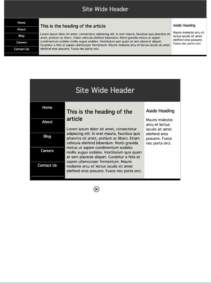
flex: 1 2 600px;
}
aside {
flex: 0 1 200px;
min-width: 150px;
}
Figure 12-50. A wide exbox layout
Figure 12-51. A narrow exbox layout
In this example, if the viewport is greater than 1,000 pixels, only the middle column
grows because only the middle column was provided with a positive growth factor.
We also dictated that below the 1,000-pixels-wide mark, the columns all shrink.
Let’s take it bit by bit. The nav and aside elements have the following CSS:
flex: 0 1 200px;
min-width: 150px;
This means they don’t grow from their basis, but they can shrink at equal rates. This
means they’ll have the width of their flex basis by default. If they do need to shrink,
The ex-shrink Property | 631

they’ll shrink down to a minimum width of 150px and then stop shrinking. However,
if either one has an element that’s more than 150 pixels wide, whether it’s an image or
a run of text, it will stop shrinking as soon as it reaches the width of that bit of con‐
tent. Suppose a 180-pixel image got dropped into the aside element. It would stop
shrinking as soon as it reached 180 pixels wide. The nav would keep shrinking down
to 150 pixels.
The main element, on the other hand, has these styles:
flex: 1 2 600px;
Thus, the main element can grow if there’s space for it to do so. Since it’s the only flex
item that can grow, it gets all the growth. That means that, given a browser window
1,300 pixels wide, the two side columns will be 200 pixels wide each, leaving 900 pix‐
els of width for the center column. In shrinking situations, the center column will
shrink twice as fast as the other two elements. Thus, if the browser window is 900
pixels wide, the side columns will each be 175 pixels wide, and the center column 550
pixels wide.
Once the windows reaches 800 pixels wide, the side columns will reach their min-
width values of 150px. From then on, any narrowing will all be taken up by the center
column.
Just to be clear, you are not require to use pixels in these situation. You don’t even
have to use the same unit measures for various flex bases. The previous example
could be rewritten like this:
nav {
flex: 0 1 20ch;
min-width: 15vw;
}
article {
flex: 1 2 45ch;
}
aside {
flex: 0 1 20ch;
min-width: 10ch;
}
We won’t go through all the math here, but the general approach is to set flex bases on
character widths for improved readability, with some lower limits based on character
widths and others on viewport width.
Flexbox can be useful for one-dimensional page layout like the one
shown in this section, where there are only three columns in a line.
For anything more complex, or for a more powerful set of options,
use Grid layout. (See Chapter 13.)
632 | Chapter 12: Flexible Box Layout
The ex-basis Property
As we’ve already seen, a flex item’s size is impacted by its content and box-model
properties and can be reset via the three components of the flex property. The <ex-
basis> component of the flex property defines the initial or default size of flex items,
before extra or negative space is distributed—before the flex items are allowed to
grow or shrink according to the growth and shrink factors. It can also be set via the
flex-basis property.
Declaring the flex basis via the flex-basis property is strongly dis‐
couraged by the authors of the specification itself. Instead, declare
the flex basis as part of the flex shorthand. We’re only discussing
the property here in order to explore flex basis.
ex-basis
Values content | [ <length> | <percentage> ]
Initial value auto
Applies to Flex items (children of ex containers)
Percentages Relative to ex container’s inner main-axis size
Computed value As specied, with length values made absolute
Inherited No
Animatable <width>
The flex basis determines the size of a flex item’s element box, as set by box-sizing.
By default, when a block-level element is not a flex item, the size is determined by the
size of its parent, content, and box-model properties. When no size properties are
explicitly declared or inherited, the size defaults to its individual content, border, and
padding, which is 100% of the width of its parent for block-level elements.
The flex basis can be defined using the same length value types as the width and
height properties; for example, 5vw, 12%, and 300px.
The universal keyword initial resets the flex basis to the initial value of auto, so you
might as well declare auto. In turn, auto evaluates to the width (or height), if
declared. If the value of width (or height) is set to auto, then the value of flex-basis
is evaluated to content.
The ex-basis Property | 633
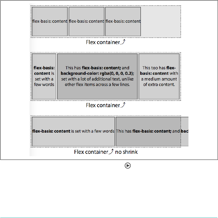
The content Keyword
The content keyword is not supported in most browsers at the time of this writing
(late 2017), with the exception of Microsoft Edge 12+, but is equal to the width or
height of the content. When content is used and supported, the basis is the size of the
flex item’s content; that is, the length of the main-axis size of the longest line of con‐
tent or widest (or tallest) media object.
Until support is complete, flex-basis: content; can be easily polyfilled, as it is the
equivalent of declaring flex-basis: auto; width: auto; on that flex item, or
flex-basis: auto; height: auto; if the main-dimension is vertical. Unfortunately,
using content in the flex shorthand in nonsupporting browsers invalidates the
entire declaration (see “Understanding axes” on page 579).
The value of content is basically what we saw in the third example in Figure 12-49,
and is shown in Figure 12-52.
Figure 12-52. Sizing ex items on a content basis
In the first and third examples in Figure 12-52, the width of the flex item is the size of
the content; and the flex basis is that same size. In the first example, the flex items’
width and basis are approximately 132 pixels. The total width of the 3 flex items side
by side is 396 pixels, fitting easily into the parent container.
634 | Chapter 12: Flexible Box Layout

In the third example, we have set a null shrink factor (0): this means the flex items
cannot shrink, so they won’t shrink or wrap to fit into the fixed-width flex container.
Rather, they are the width of their nonwrapped text. That width is also the value of
the flex basis. The flex items’ width and basis are approximately 309, 1,037 pixels, and
523 pixels, respectively. You can’t see the full width of the second flex item or the third
flex item at all, but they’re in the chapter files.
The second example contains the same content as the third example, but the flex
items are defaulting to a shrink factor of 1, so the text in this example wraps because
the flex items can shrink. Thus, while the width of the flex item is not the width of the
content, the flex basis—the basis by which it will proportionally shrink—is the width
of the items’ contents.
Automatic Flex Basis
When set to auto, whether explicitly or by default, flex-basis is the same as the
main-axis size of the element, had the element not been turned into a flex item. For
length values, flex-basis resolves to the width or height value, with the exception that
when the value of the width or height is auto, the flex basis value falls back to
content.
When the flex basis is auto, and all the flex items can fit within the parent flex con‐
tainer, the flex items will be their pre-flexed size. If the flex items don’t fit into their
parent flex container, the flex items within that container will shrink proportionally
based on their non-flexed main-axis sizes (unless the shrink factor is zero).
When there are no other properties setting the main-axis size of the flex items (that
is, there’s no width or even min-width set on these flex items), and flex-basis:
auto or flex: 0 1 auto is set, the flex items will only be as wide as they need to be
for the content to fit, as seen in the first example in Figure 12-53. In this case, they are
the width of the text “flex-basis: auto;”, which is approximately 110 pixels. The flex
items are their pre-flexed size, as if set to display: inline-block. In this example,
they’re grouped at main-start because the flex container’s justify-content defaults
to flex-start.
In the second example in Figure 12-53, each of the flex items has flex basis of auto
and an explicitly declared width. The main-axis size of the elements, had they not
been turned into flex items, would be 100, 150, and 200 pixels, respectively. And so
they are here, since they fit into the flex container without any overflow along the
main axis.
The ex-basis Property | 635
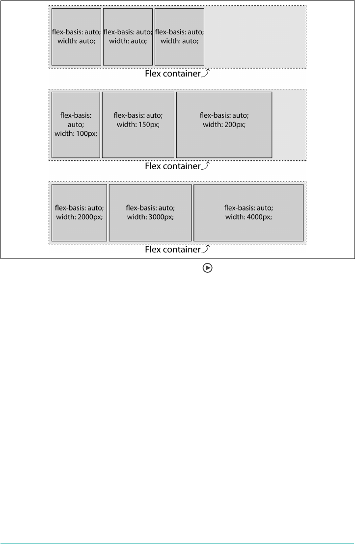
Figure 12-53. Auto ex basis and ex item widths
In the third example in Figure 12-53, each of the flex items has flex basis of auto and
a very large explicitly declared width. The main-axis size of the elements, had they
not been turned into flex items, would be 2,000, 3,000, and 4,000 pixels, respectively.
Since they could not possibly fit into the flex container without overflowing along the
main axis, and their flex shrink factors have all defaulted to 1, they shrink until they
fit into the flex container. You can do the math to find out how big they are using the
process outlined in a previous section; as a hint, the third flex item should be reduced
from four thousand pixels down to a width of 240 pixels.
Default Values
When neither a flex-basis nor a flex is set, the flex item’s main-axis size is the pre-
flex size of the item, as their default value is auto.
In Figure 12-54, two things are happening: the flex bases are defaulting to auto, the
growth factor is defaulting to 0, and the shrink factor of each item is defaulting to 1.
For each flex item, the flex basis is their individual width value. That means the flex
bases are being set to the values of the width properties: 100, 200, and 300 pixels in
the first example, and 200, 400, and 200 pixels in the second example. As the com‐
bined widths of the flex items are 600 pixels and 800 pixels, respectively, both of
636 | Chapter 12: Flexible Box Layout

which are both greater than the main-axis size of the 540-pixel-wide containers, they
are all shrinking proportionally to fit.
Figure 12-54. Default sizing of ex items
In the first example, we are trying to fit 600 pixels in 540 pixels, so each flex item will
shrink by 10% to yield flex items that are 90, 180, and 270 pixels wide. In the second
example, we are trying to fit 800 pixels into 540 pixels, so they all shrink 32.5%, mak‐
ing the flex items’ widths 135, 270, and 135 pixels.
Length Units
In the previous examples, the auto flex bases defaulted to the declared widths of the
various flex items. There are other options; for example, we can use the same length
units for our flex-basis value as we do for width and height.
Figure 12-55. Sizing ex items with length-unit ex bases
The ex-basis Property | 637

When there are both flex-basis and width (or height, for vertical main axes) val‐
ues, the basis trumps the width (or height). Let’s add bases values to the first example
from Figure 12-54. The flex items include the following CSS:
flex-container {
width: 540px;
}
item1 {
width: 100px;
flex-basis: 300px; /* flex: 0 1 300px; */
}
item2 {
width: 200px;
flex-basis: 200px; /* flex: 0 1 200px; */
}
item3 {
width: 300px;
flex-basis: 100px; /* flex: 0 1 100px; */
}
The widths are overridden by the bases. The flex items shrink down to 270 pixels, 180
pixels, and 90 pixels, respectively. Had the container not had a constrained width, the
flex items would have been 300 pixels, 200 pixels, and 100 pixels, respectively.
While the declared flex basis can override the main-axis size of flex items, the size can
be affected by other properties, such as min-width, min-height, max-width, and max-
height. These are not ignored. Thus, for example, an element might have flex-
basis: 100px and min-width: 500px. The minimum width of 500px will be
respected, even though the flex basis is smaller.
Percentage units
Percentage values for flex-basis are calculated relative to the size of the main
dimension of the flex container.
We’ve already seen the first example in Figure 12-56; it’s included here to recall that
the width of the text “flex-basis: auto” in this case is approximately 110 pixels wide. In
this case only, declaring flex-basis: auto looks the same as writing flex-basis:
110px:
flex-container {
width: 540px;
}
flex-item {
flex: 0 1 100%;
}
In the second example in Figure 12-56, the first two flex items have a flex basis of
auto with a default width of auto, which is as if their flex basis were set to content.
As we’ve noted previously, the flex-basis of the first 2 items ends up being the
638 | Chapter 12: Flexible Box Layout
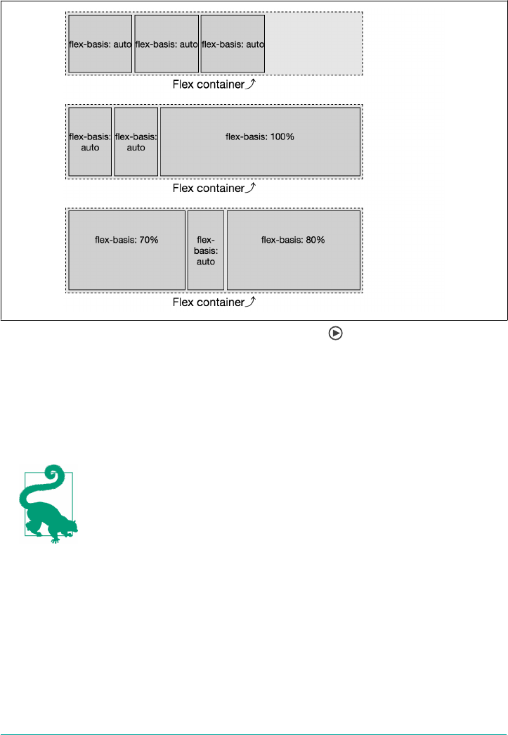
equivalent of 110 pixels, as the content in this case happens to be 110 pixels wide. The
last item has its flex-basis set to 100%.
Figure 12-56. Sizing ex items with percentage ex bases
The percentage value is relative to the parent, which is 540 pixels. The third flex item,
with a basis of 100%, is not the only flex item within the non-wrapping flex container.
Thus, it will not grow to be 100% of the width of the parent flex container unless its
shrink factor is set with a null shrink factor, meaning it can’t shrink, or if it contains
non-wrappable content that is as wide or wider than the parent container.
Remember: when the flex basis is a percent value, the main-axis
size is relative to the parent, which is the flex container.
With our 3 flex bases, if the content is indeed 110 pixels wide, and the container is
540 pixels wide (ignoring other box-model properties for simplicity’s sake), we have a
total of 760 pixels to fit in a 540-pixel space. Thus we have 220 pixels of negative
space to distribute proportionally. The shrink factor is:
Shrink factor = 220px ÷ 760px = 28.95%
The ex-basis Property | 639

Each flex item will be shrunk by 28.95%, becoming 71.05% of the width they would
have been had they not been allowed to shrink. We can figure the final widths:
item1 = 110px × 71.05% = 78.16px
item2 = 110px × 71.05% = 78.16px
item3 = 540px × 71.05% = 383.68px
These numbers hold true as long as the flex items can be that small; that is, as long as
none of the flex items contain media or nonbreaking text wider than 78.16 pixels or
383.68 pixels. This is the widest these flex items will be as long as the content can
wrap to be that width or narrower. We say “widest” because if one of the other two
flex items can’t shrink to be as narrow as this value, they’ll have to absorb some of
that negative space.
In the third example in Figure 12-56, the flex-basis: auto item wraps over three
lines. The CSS for this example is the equivalent of:
flex-container {
width: 540px;
}
item1 {
flex: 0 1 70%;
}
item2 {
flex: 0 1 auto;
}
item3 {
flex: 0 1 80%;
}
We declared the flex-basis of the 3 flex items to be 70%, auto, and 80%, respectively.
Remembering that in our scenario auto is the width of the non-wrapping content,
which in this case is approximately 110 pixels, and our flex container is 540 pixels, the
bases are equivalent to:
item1 = 70% × 540px = 378px
item2 = widthOfText(“flex-basis: auto”) = 110px
item3 = 80% × 540px = 432px
When we add the widths of these 3 flex items’ bases, they have total combined width
of 920 pixels, which needs to fit into a flex container 540 pixels wide. Thus we have
380 pixels of negative space to remove proportionally among the 3 flex items. To fig‐
ure out the ratio, we divide the available width of our flex container by the sum of
widths of the flex items that they would have if they couldn’t shrink:
Proportional Width = 540px ÷ 920px = 0.587
640 | Chapter 12: Flexible Box Layout

Because the shrink factors are all the same, this is fairly simple. Each item will be
58.7% of the width it would be if it had no flex item siblings:
item1 = 378px × 58.7% = 221.8px
item2 = 110px × 58.7% = 64.6px
item3 = 432px × 58.7% = 253.6px
What happens when the container is a different width? Say, 1,000 pixels? The flex
basis would be 700 pixels (70% × 1,000 pixels), 110 pixels, and 800 pixels (80% ×
1,000 pixels), respectively, for a total of 1,610 pixels:
Proportional Width = 1000px ÷ 1610px = 0.6211
item1 = 700px × 62.11% = 434.8px
item2 = 110px × 62.11% = 68.3px
item3 = 800px × 62.11% = 496.9px
Because with a basis of 70% and 80%, the combined bases of the flex items will always
be wider than 100%, no matter how wide we make the parent, all 3 items will always
shrink.
If the first flex item can’t shrink for some reason—whether due to unshrinkable con‐
tent, or another bit of CSS setting its flex-shrink to 0— it will be 70% of the width
of the parent—378 pixels in this case. The other 2 flex items must shrink proportion‐
ally to fit into the remaining 30%, or 162 pixels. In this case, we expect widths to be
378 pixels, 32.875 pixels, and 129.125 pixels. As the text “basis:” is wider than that—
assume 42 pixels—we get 378 pixels, 42 pixels, and 120 pixels. This result is shown in
Figure 12-57.
Figure 12-57. While the percentage value for ex-basis is relative to the width of the ex
container, the main-axis size is impacted by its siblings
Testing this out on your device will likely have slightly different results, as the width
of the text “flex-basis: auto” may not be the same for you, depending on the font that
The ex-basis Property | 641

actually gets used to render the text. (We used Myriad Pro, with fallbacks to Helvetica
and any generic sans-serif font.)
Zero Basis
If neither the flex-basis property nor the flex shorthand is included at all, the flex
basis defaults to auto. When the flex property is included, but the flex basis compo‐
nent of the shorthand is omitted from the shorthand, the basis defaults to 0. While on
the surface you might think the two values of auto and 0 are similar, the 0 value is
actually very different, and may not be what you expect.
In the case of flex-basis: auto, the basis is the main size of the flex items’ contents.
If the basis of each of the flex items is 0, the “available” space is the main-axis size of
the entire flex container. In either case, the “available” space is distributed proportion‐
ally, based on the growth factors of each flex item.
In the case of a basis of 0, the size of the flex container is divided up and distributed
proportionally to each flex item based on their growth factors—their default original
main-axis size as defined by height, width, or content, is not taken into account,
though min-width, max-width, min-height, and max-height do impact the flexed
size.
As shown in Figure 12-58, when the basis is auto, it is just the extra space that is divi‐
ded up proportionally and added to each flex item set to grow. Again, assuming the
width of the text “flex: X X auto” is 110 pixels, in the first examples we have 210 pixels
to distribute among 6 growth factors, or 35 pixels per growth factor. The flex items
are 180, 145, and 215 pixels wide, respectively.
Figure 12-58. Flex growth in auto and zero ex bases
In the second example, when the basis is 0, all 540 pixels of the width is distributable
space. With 540 pixels of distributable space between 6 growth factors, each growth
factor is worth 90 pixels. The flex items are 180, 90, and 270 pixels wide, respectively.
642 | Chapter 12: Flexible Box Layout

While the middle flex item is 90 pixels wide, the content in this example is narrower
than 110 pixels, so the flex item didn’t wrap.
The ex Shorthand
Now that we have a fuller understanding of the properties that make up the flex
shorthand, remember: always use the flex shorthand. It accepts the usual global
property values, including initial, auto, none; and the use of an integer, usually 1,
meaning the flex item can grow. Let’s go over all these values.
Common Flex Values
The common flex values are four flex values providing the most commonly desired
effects:
flex: initial
This value sizes flex items based on the width or height property, depending on
the main-axis direction, while allowing shrinking.
flex: auto
This flex value also sizes flex items based on the width or height property, but
makes them fully flexible, allowing both shrinking and growing.
flex: none
This value again sizes flex items based on the width or height property, but
makes them completely inflexible: they can’t shrink or grow.
flex: <number>
This value sets the flex item’s growth factor to the <number> provided. It thus
sets the shrink factor to 0, and the basis to 0 as well. This means the width or
height value acts as a minimum size, but the flex item will grow if there is room
to do so.
Let‘s consider each of these in turn.
Flexing with initial
initial is a global CSS keyword, which means initial can be used on all properties
to represent a property’s initial value; that is, its specification default value. Thus, the
following lines are equivalent:
flex: initial;
flex: 0 1 auto;
Declaring flex: initial sets a null growth factor, a shrink factor of 1, and sets the
flex bases to auto. In Figure 12-59, we can see the effect of the auto flex bases. In the
The ex Shorthand | 643
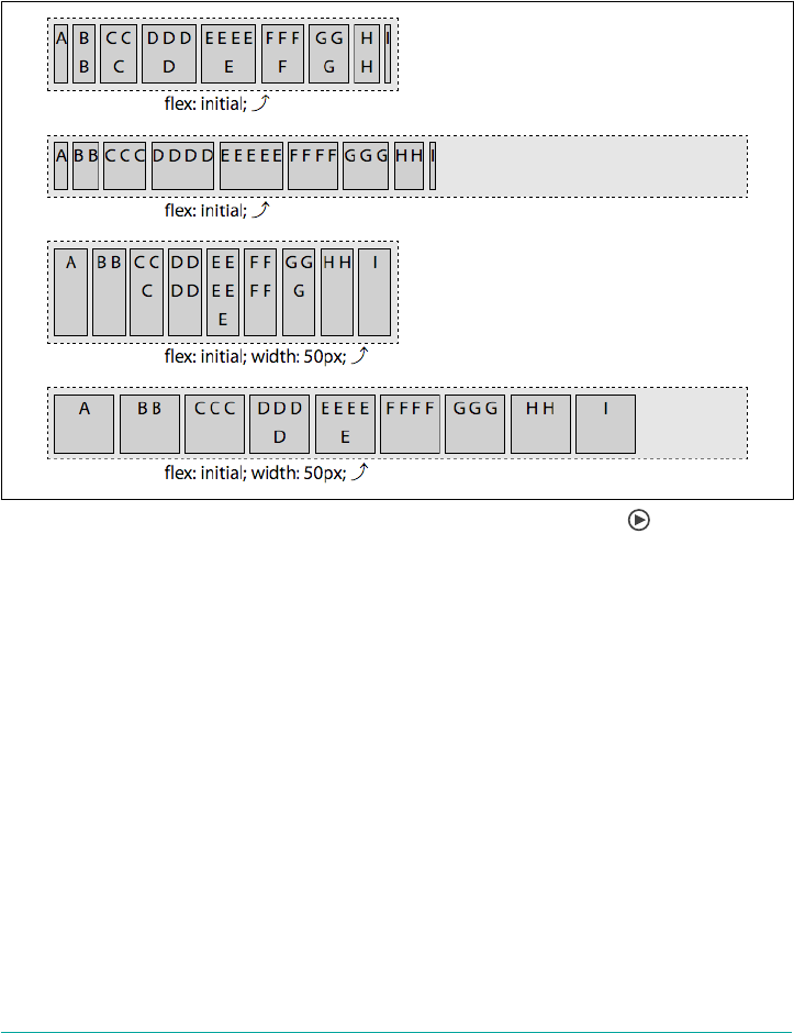
first two examples, the basis of each flex item is content—with each flex item having
the width of the single line of letters that make up their content. In the last 2 exam‐
ples, the flex bases of all the items are equal at 50 pixels, since width: 50px has been
applied to all the flex items. The flex: initial declaration sets the flex-basis to
auto, which we previously saw is the value of the width (or height), if declared, or
content if not declared.
Figure 12-59. Flex items shrink but won’t grow when ex: initial is set
In the first and third examples in Figure 12-59, we see that when the flex container is
too small to fit all the flex items at their default main-axis size, the flex items shrink so
that all the flex items fit within the parent flex container. In these examples, the com‐
bined flex bases of all the flex items is greater than the main-axis size of the flex con‐
tainer. In the first example, the width of teach flex item varies based on the width of
each item’s content and its ability to shrink. They all shrink proportionally based on
their shrink factor, but not narrower than their widest content. In the third example,
with each flex item’s flex-basis being 50 pixels (due to the value of width), all the
items shrink equally.
Flex items, by default, are grouped at main start, as flex-start is the default value of
for the justify-content property. This is only noticeable when the combined main-
axis sizes of the flex items in a flex line are smaller than the main-axis size of the flex
container, and none of the flex items are able to grow.
644 | Chapter 12: Flexible Box Layout
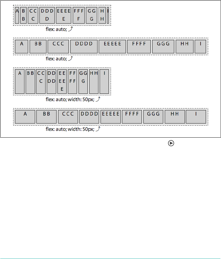
Flexing with auto
flex: auto is similar to flex: initial, but makes the flex items flexible in both
directions: they’ll shrink if there isn’t enough room to fit all the items within the con‐
tainer, and they’ll grow to take up all the extra space within the container if there is
distributable space. The flex items absorb any free space along the main axis. The fol‐
lowing two statements are equivalent:
flex: auto;
flex: 1 1 auto;
A variety of scenarios using auto flexing are shown in Figure 12-60.
Figure 12-60. Flex items can grow and shrink when ex: auto is set
The first and third examples of Figure 12-60 are identical to the examples in
Figure 12-59, as the shrinking and bases are the same. However, the second and
fourth examples are different. This is because when flex: auto is set, the growth fac‐
tor is 1, and the flex items therefore can grow to incorporate all the extra available
space.
Preventing exing with none
Any flex: none flex items are inflexible: they can neither shrink nor grow. The fol‐
lowing two lines of CSS are equivalent:
flex: none;
flex: 0 0 auto;
The ex Shorthand | 645
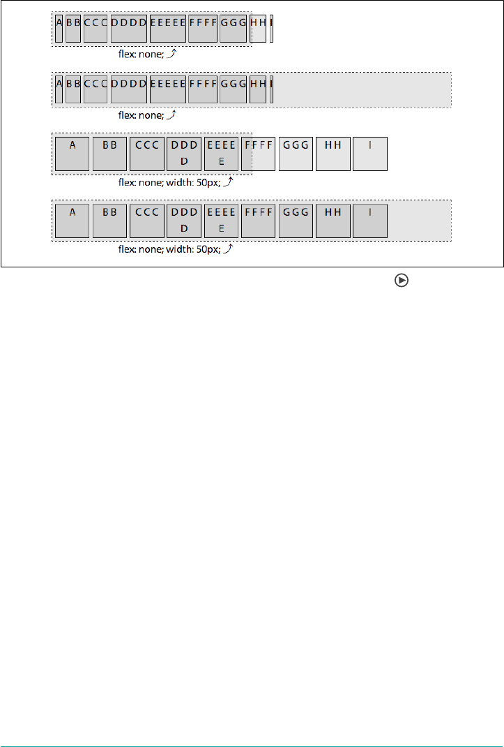
The effects of none are shown in Figure 12-61.
Figure 12-61. With ex: none, ex items will neither grow nor shrink
As demonstrated in the first and third examples of Figure 12-61, if there isn’t enough
space, the flex items overflow the flex container. This is different from flex: initial
and flex: auto, which both set a positive shrink factor.
The basis resolves to auto, meaning each flex item’s main-axis size is determined by
the main-axis size of the element had it not been turned into a flex item. The flex-
basis resolves to the width or height value of the element. If that value is auto, the
basis becomes the main-axis size of the content. In the first two examples, the basis—
and the width, since there is no growing or shrinking—is the width of the content. In
the third and fourth examples, the width and basis are all 50 pixels, because that’s the
value of the width property applied to them.
Numeric exing
When the value of the flex property is a single, positive numeric value, that value
will be used for the growth factor, while the shrink factor will default to 0 and the
basis will default to 0. The following two CSS declarations are equivalent:
flex: 3;
flex: 3 0 0;
This makes the flex item on which it is set flexible: it can grow. The shrink factor is
actually moot: the flex basis is set to 0, so the flex item can only grow from that basis.
In the first two examples in Figure 12-62, all the flex items have a flex growth factor
of 3. The flex basis is 0, so they don’t “shrink”; they just grew equally from zero pixels
646 | Chapter 12: Flexible Box Layout
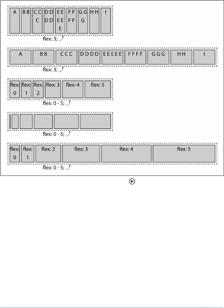
wide until the sum of their main-axis sizes grew to fill the container along the main
axis. With all the flex items having a basis of 0, 100% of the main dimension is dis‐
tributable space. The main-axis size of the flex items are wider in this second example
because the wider flex container has more distributable space.
Figure 12-62. Flexing using a single numeric value
Any numeric value that is greater than 0, even 0.1, means the flex item can grow.
When there is available space to grow, if only one flex item has a positive growth fac‐
tor, that item will take up all the available space. If there are multiple flex items that
can grow, the available extra space will be distributed proportionally to each flex item
based on to their growth factor.
In the last three examples of Figure 12-62, there are six flex items with flex: 0,
flex: 1, flex: 2, flex: 3, flex: 4, and flex: 5 declared, respectively. These are
the growth factors for the flex items, with each having a shrink factor of 1 and a flex
basis of 0. The main-axis size of each is proportional to the specified flex growth fac‐
tor. You might assume that the flex: 0 item with the text “flex: 0” in the third and
fourth examples will be zero pixels wide, like in the fourth and fifth examples—but,
The ex Shorthand | 647

by default, flex items won’t shrink below the length of the longest word or fixed-size
element.
A bit of padding, margins, and borders were added in the figures to
make the visuals more pleasing. For this reason, the leftmost flex
item, with flex: 0 declared, is visible: it has a one-pixel border
making it visible, even though it’s zero pixels wide.
The order property
Flex items are, by default, displayed and laid out in the same order as they appear in
the source code. The order of flex items and flex lines can be reversed with flex-
direction, but sometimes you want a little more complicated rearrangment. The
order property can be used to change the ordering of individual flex items.
order
Values <integer>
Initial value 0
Applies to Flex items and absolutely positioned children of ex containers
Computed value As specied
Inherited No
Animatable Yes
By default, all flex items are assigned the order of 0, with the flex items all assigned to
the same ordinal group and displayed in the same order as their source order, along
the direction of the main axis. (This has been the case for all the examples seen
throughout this chapter.)
To change the visual order of a flex item, set the order property value to a nonzero
integer. Setting the order property on elements that are not children of a flex con‐
tainer has no effect on such elements.
The value of the order property specifies an ordinal group to which the flex item
belongs. Any flex items with a negative value will appear to come before those
defaulting to 0 when drawn to the page, and all the flex items with a positive value
will appear to come after those defaulting to 0. While visually altered, the source
order remains the same. Screen readers and tabbing order remains as defined by the
source order of the HTML.
648 | Chapter 12: Flexible Box Layout

For example, if you have a group of 12 items, and you want the 7th to come first and
the 6th to be last, you would declare:
ul {
display: inline-flex;
}
li:nth-of-type(6) {
order: 1;
}
li:nth-of-type(7) {
order: -1;
}
In this scenario, we are explicitly setting the order for the sixth and seventh list items,
while the other list items are defaulting to order: 0. The result is shown in
Figure 12-63.
Figure 12-63. Reordering ex items with the order property
The seventh flex item is the first to be laid out, due to the negative value of the order
property, which is less than the default 0, and is also the lowest value of any of its sib‐
ling flex items. The sixth flex item is the only item with a value greater than zero, and
therefore has the highest order value out of all of its siblings. This is why it’s laid out
after all the other flex items. All the other items, all having the default order of 0, are
drawn between those first and last items, in the same order as their source order,
since they are all members of the same ordinal group (0).
The flex container lays out its content in order-modified document order, starting
from the lowest numbered ordinal group and going up. When you have multiple flex
items having the same value for the order property, the items share an ordinal group.
The items in each ordinal group will appear in source order, with the group appear‐
ing in numeric order, from lowest to highest. Consider the following:
ul {
display: inline-flex;
background-color: rgba(0,0,0,0.1);
}
li:nth-of-type(3n-1) {
order: 3;
background-color: rgba(0,0,0,0.2);
}
li:nth-of-type(3n+1) {
order: -1;
The order property | 649
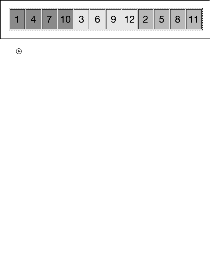
background-color: rgba(0,0,0,0.4);
}
By setting the same order value to more than one flex item, the items will appear by
ordinal group, and by source order within each individual ordinal group. This has the
result shown in Figure 12-64.
Figure 12-64. Flex items appear in order of ordinal groups, by source order within their
group
Here’s what happened:
•Items 2, 5, 8, and 11 were selected to share ordinal group 3, and get a 20% opaque
background.
•Items 1, 4, 7, and 10 were selected to share ordinal group -1, and get a 40% opa‐
que background.
• Items 3, 6, 9, and 12 were not selected at all. They default to the ordinal group 0.
The three ordinal groups, then, are -1, 0, and 3. The groups are arranged in that
order. Within each group, the items are arranged by source order.
This reordering is purely visual. Screen readers should read the document as it
appeared in the source code, though they may not. As a visual change, ordering flex
items impacts the painting order of the page: the painting order of the flex items is
the order in which they appear, as if they were reordered in the source document,
even though they aren’t.
Changing the layout with the order property has no effect on the tab order of the
page. If the numbers in Figure 12-64 were links, tabbing through the links would go
through the links in the order of the source code, not in the order of the layout.
Tabbed Navigation Revisited
Adding to our tabbed navigation bar example in Figure 12-2, we can make the cur‐
rently active tab appear first, as Figure 12-65 shows:
nav {
display: flex;
justify-content: flex-end;
border-bottom: 1px solid #ddd;
}
650 | Chapter 12: Flexible Box Layout
a {
margin: 0 5px;
padding: 5px 15px;
border-radius: 3px 3px 0 0;
background-color: #ddd;
text-decoration: none;
color: black;
}
a:hover {
background-color: #bbb;
text-decoration: underline;
}
a.active {
order: -1;
background-color: #999;
}
<nav>
<a href="/">Home</a>
<a href="/about">About</a>
<a class="active">Blog</a>
<a href="/jobs">Careers</a>
<a href="/contact">Contact Us</a>
</nav>
Figure 12-65. Changing the order will change the visual order, but not the tab order
The currently active tab has the .active class added, the href attribute removed, and
the order set to -1, which is less than the default 0 of the other sibling flex items,
meaning it appears first.
Why did we remove the href attribute? As the tab is the currently active document,
there is no reason for the document to link to itself. But, more importantly, if it was
an active link instead of a placeholder link, and the user was using the keyboard to
tab through the navigation, the order of appearance is Blog, Home, About, Careers,
and Contact Us, with the Blog appearing first; but the tab order would have been
Home, About, Blog, Careers, and Contact Us, following the source order rather than
the visual order, which can be confusing.
The order property can be used to enable marking up the main content area before
the side columns for mobile devices and those using screen readers and other assis‐
tive technology, while creating the appearance of the common three-column layout: a
center main content area, with site navigation on the left and a sidebar on the right, as
shown way back in Figure 12-50.
The order property | 651

While you can put your footer before your header in your markup, and use the order
property to reorder the page, this is an inappropriate use of the property. order
should only be used for visual reordering of content. Your underlying markup should
always reflect the logical order of your content:
<header></header> <header></header>
<main> <main>
<article></article> <nav></nav>
<aside></aside> <article></article>
<nav></nav> <aside></aside>
</main> </main>
<footer></footer> <footer></footer>
We’ve been marking up websites in the order we want them to appear, as shown on
the right in the preceding code example, which is the same code as in our three-
column layout example (Figure 12-50). It really would make more sense if we marked
up the page as shown on the left, with the article content, which is the main con‐
tent, first in the source order: this puts the article first for screen readers, search
engines, and even mobile device, but in the middle for our sighted users on larger
screens:
main {
display: flex;
}
main > nav {
order: -1;
}
By using the order: -1 declaration we are able to make the nav appear first, as it is
the lone flex item in the ordinal group of -1. The article and aside, with no order
explicitly declared, default to order: 0.
Remember, when more than one flex item is in the same ordinal group, the members
of that group are displayed in source order in the direction of main-start to main-
end, so the article is displayed before the aside.
Some developers, when changing the order of at least one flex item, like to give all
flex items an order value for better markup readability. We could have also written:
main {
display: flex;
}
main > nav {
order: 1;
}
main > article {
order: 2;
}
main > aside {
652 | Chapter 12: Flexible Box Layout

order: 3;
}
In previous years, before browsers supported flex, all this could have been done with
floats: we would have set float: right on the nav. While doable, flex layout makes it
much simpler, especially if we want all three columns—the aside, nav, and article
—to be of equal heights.
The order property | 653

CHAPTER 13
Grid Layout
For as long as CSS has existed—which is, believe it or not, two decades now—it’s had
a layout-shaped hole at its center. We’ve bent other features to the purposes of layout,
most notably float and clear, and generally hacked our way around that hole. Flex‐
box layout helped to fill it, but flexbox is really meant for only specific use cases, like
navigation bars (navbars).
Grid layout, by contrast, is a generalized layout system. With its emphasis on rows
and columns, it might at first feel like a return to table layout—and in certain ways
that’s not too far off—but there is far, far more to grid layout than table layout. Grid
allows pieces of the design to be laid out independently of their document source
order, and even overlap pieces of the layout, if that’s your wish. There are powerfully
flexible methods for defining repeating patterns of grid lines, attaching elements to
those grid lines, and more. You can nest grids inside grids, or for that matter, attach
tables or flexbox containers to a grid. And much, much more.
In short, grid layout is the layout system we’ve long waited for. There’s a lot to learn,
and perhaps even more to unlearn, as we leave behind the clever hacks and work‐
arounds that have gotten us through the past 20 years.
Creating a Grid Container
The first step to creating a grid is defining a grid container. This is much like a con‐
taining block in positioning, or a flex container in flexible-box layout: a grid con‐
tainer is an element that defines a grid formatting context for its contents.
At this very basic level, grid layout is actually quite reminiscent of flexbox. For exam‐
ple, the child elements of a grid container become grid items, just as the child ele‐
ments of a flex container become flex items. The children of those child elements do
not become grid elements—although any grid item can itself be made a grid con‐
655
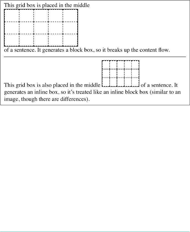
tainer, and thus have its child elements become grid items to the nested grid. It’s pos‐
sible to nest grids inside grids, until it’s grids all the way down. (Grid layout also has a
separate concept of subgrids that is distinct from nesting grid containers, but we’ll get
to that later.)
There are two kinds of grids: regular grids and inline grids. These are created with
special values for the display property: grid and inline-grid. The first generates a
block-level box, and the second an inline-level box. The difference is illustrated in
Figure 13-1.
Figure 13-1. Grids and inline grids
These are very similar to the block and inline-block values for display. Most grids
you create are likely to be block-level, though the ability to create inline grids is
always there.
Although display: grid creates a block-level grid, the specification is careful to
explicitly state that “grid containers are not block containers.” What this means is that
although the grid box participates in layout much as a block container does, there are
a number of differences between them.
First off, floated elements do not intrude into the grid container. What this means in
practice is that a grid will not slide under a floated element, as a block container will
do. See Figure 13-2 for a demonstration of the difference.
656 | Chapter 13: Grid Layout
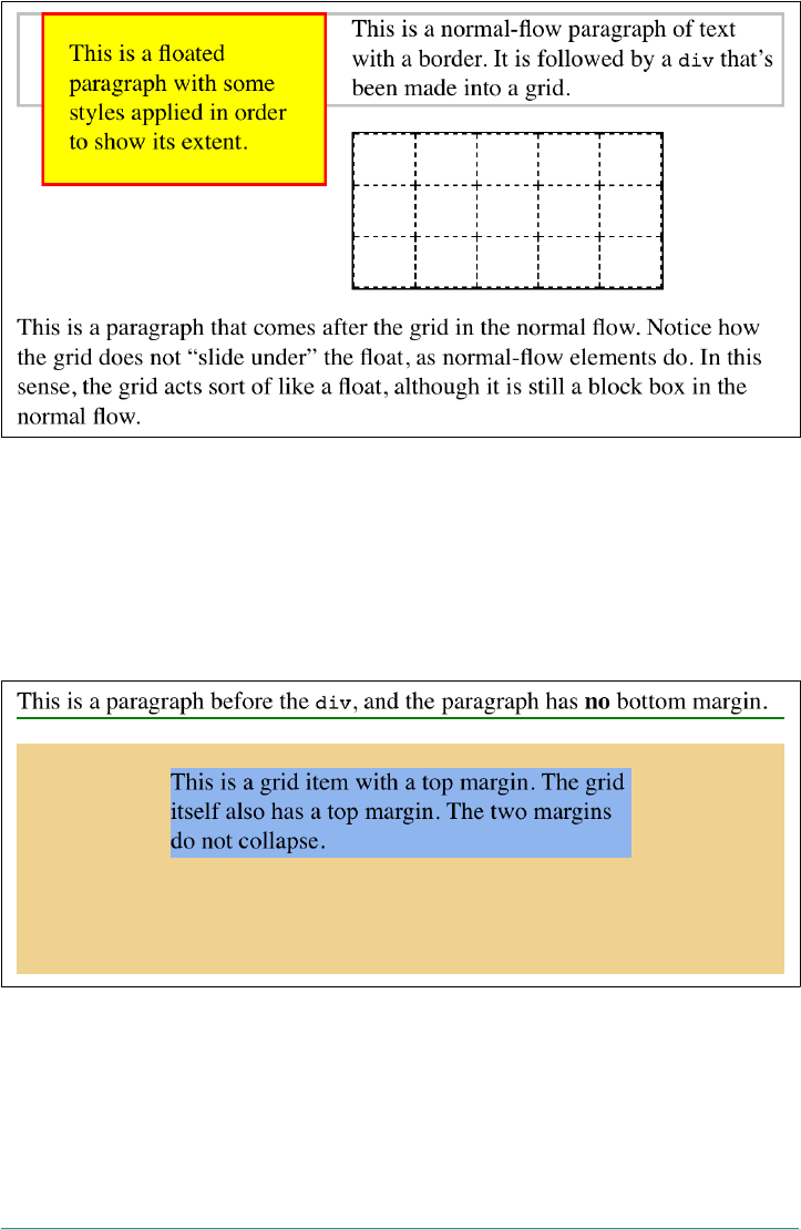
Figure 13-2. Floats interact dierently with blocks and grids
Furthermore, the margins of a grid container do not collapse with the margins of its
descendants. Again, this is distinct from block boxes, whose margins do (by default)
collapse with descendants. For example, the first list item in an ordered list may have
a top margin, but this margin will collapse with the list element’s top margin. The top
margin of a grid item will never collapse with the top margin of its grid container.
Figure 13-3 illustrates the difference.
Figure 13-3. Margin collapsing and the lack thereof
Creating a Grid Container | 657

There are a few CSS properties and features that do not apply to grid containers and
grid items; specifically:
•All column properties (e.g., column-count, columns, etc.) are ignored when
applied to a grid container.
•The ::first-line and ::first-letter pseudo-elements do not apply to grid
containers and are ignored.
•float and clear are effectively ignored for grid items (though not grid contain‐
ers). Despite this, the float property still helps determine the computed value of
the display property for children of a grid container, because the display value
of the grid items is resolved before they’re made into grid items.
•The vertical-align property has no effect on grid items, though it may affect
the content inside the grid item. (There are other, more powerful ways to align
grid items, so don’t worry.)
Lastly, if a grid container’s declared display value is inline-grid and the element is
either floated or absolutely positioned, the computed value of display becomes grid
(thus dropping inline-grid).
Once you’ve defined a grid container, the next step is to set up the grid within. Before
we explore how that works, though, it’s necessary to cover some terminology.
Basic Grid Terminology
We’ve already talked about grid containers and grid items, but let’s define them in a
bit more detail. As was said before, a grid container is a box that establishes a grid-
formatting context; that is, an area in which a grid is created and elements are laid out
according the rules of grid layout instead of block layout. You can think of it the way
an element set to display: table creates a table-formatting context within it. Given
the grid-like nature of tables, this comparison is fairly apt, though be sure not to
make the assumption that grids are just tables in another form. Grids are far more
powerful than tables ever were.
A grid item is a thing that participates in grid layout within a grid-formatting context.
This is usually a child element of a grid container, but it can also be the anonymous
(that is, not contained within an element) bits of text that are part of an element’s
content. Consider the following, which has the result shown in Figure 13-4:
#warning {display: grid;
background: #FCC; padding: 0.5em;
grid-template-rows: 1fr;
grid-template-columns: repeat(7, 1fr);}
658 | Chapter 13: Grid Layout
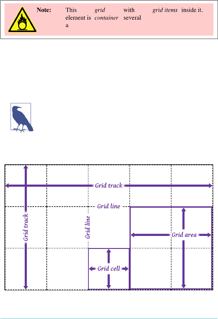
<p id="warning"><img src="warning.svg"><strong>Note:</strong> This element is a
<em>grid container</em> with several <em>grid items</em> inside it.</p>
Figure 13-4. Grid items
Notice how each element, and each bit of text between them, has become a grid item.
The image is a grid item, just as much as the elements and text runs—seven grid
items in all. Each of these will participate in the grid layout, although the anonymous
text runs will be much more difficult (or impossible) to affect with the various grid
properties we’ll discuss.
If you’re wondering about grid-template-rows and grid-
template-columns, we’ll tackle them in the next section.
In the course of using those properties, you’ll create or reference several core compo‐
nents of grid layout. These are summarized in Figure 13-5.
Figure 13-5. Grid components
Basic Grid Terminology | 659

The most fundamental unit is the grid line. By defining the placement of one or more
grid lines, you implicitly create the rest of the grid’s components:
• A grid track is a continuous run between two adjacent grid lines—in other words,
a grid column or a grid row. It goes from one edge of the grid container to the
other. The size of a grid track is dependent on the placement of the grid lines that
define it. These are analogous to table columns and rows. More generically, these
can be referred to as block axis and inline axis tracks, where (in Western lan‐
guages) column tracks are on the block axis and row tracks are on the inline axis.
•A grid cell is any space bounded by four grid lines, with no grid lines running
through it, analogous to a table cell. This is the smallest unit of area in grid lay‐
out. Grid cells cannot be directly addressed with CSS grid properties; that is, no
property allows you to say a grid item should be associated with a given cell. (But
see the next point for more details.)
•A grid area is any rectangular area bounded by four grid lines, and made up of
one or more grid cells. An area can be as small as a single cell, or as large as all
the cells in the grid. Grid areas are directly addressable by CSS grid properties,
which allow you to define the areas and then associate grid items with them.
An important thing to note is that these grid tracks, cells, and areas are entirely con‐
structed of grid lines—and more importantly, do not have to correspond to grid
items. There is no requirement that all grid areas be filled with an item; it is perfectly
possible to have some or even most of a grid’s cells be empty of any content. It’s also
possible to have grid items overlap each other, either by defining overlapping grid
areas or by using grid-line references that create overlapping situations.
Another thing to keep in mind is that you can define as many or as few grid lines as
you wish. You could literally define just a set of vertical grid lines, thus creating a
bunch of columns and only one row. Or you could go the other way, creating a bunch
of row tracks and no column tracks (though there would be one, stretching from one
side of the grid container to the other).
The flip side to that is if you create a condition where a grid item can’t be placed
within the column and row tracks you define, or if you explicitly place a grid item
outside those tracks, new grid lines and tracks will be automatically added to the grid
to accommodate.
Placing Grid Lines
It turns out that placing grid lines can get fairly complex. That’s not so much because
the concept is difficult; there are just so many different ways to get it done, and each
uses its own subtly different syntax.
660 | Chapter 13: Grid Layout
We’ll get started by looking at two closely related properties.
grid-template-rows, grid-template-columns
Values none | <track-list> | <auto-track-list>
Initial value none
Applies to Grid containers
Percentages Refer to the inline size (usually width) of the grid container for grid-template-
columns, and to the block size (usually height) of the grid container for grid-
template-rows
Computed value As declared, with lengths made absolute
Inherited No
Animatable No
With these properties, you can define the grid lines in your overall grid template, or
what the CSS specification calls the explicit grid. Everything depends on these grid
lines; fail to place them properly, and the whole layout can very easily fall apart.
When you’re starting out with CSS grid layout, it’s probably a very
good idea to sketch out where the grid lines need to be on paper
first, or in some close digital analogue. Having a visual reference
for where lines should be, and how they should behave, will make
writing your grid CSS a lot easier.
The exact syntax patterns for <track-list> and <auto-track-list> are complex and nest
a few layers deep, and unpacking them would take a lot of time and space that’s better
devoted to just exploring how things work. There are a lot of ways to specify your
grid lines’ placement, so before we get started on learning those patterns, there are
some basic things to establish.
First, grid lines can always be referred to by number, and can also be named by the
author. Take the grid shown in Figure 13-6, for example. From your CSS, you can use
any of the numbers to refer to a grid line, or you can use the defined names, or you
can mix them together. Thus, you could say that a grid item stretches from column
line 3 to line steve, and from row line skylight to line 2.
Note that a grid line can have more than one name. You can use any of them to refer
to a given grid line, though you can’t combine them the way you can multiple class
names. You might think that means it’s a good idea to avoid repeating grid-line
names, but that’s not always the case, as we’ll soon see.
Placing Grid Lines | 661
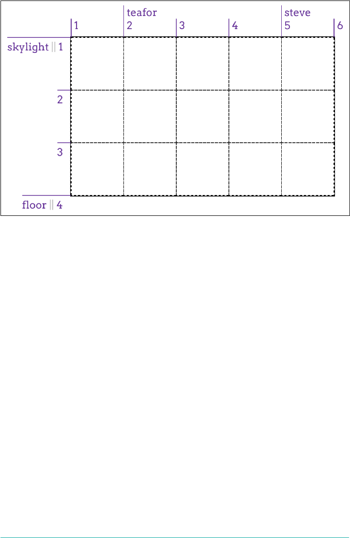
Figure 13-6. Grid-line numbers and names
I used intentionally silly grid-line names in Figure 13-6 to illustrate that you can pick
any name you like, and also to avoid the implication that there are “default” names. If
you’d seen start for the first line, you might have assumed that the first line is always
called that. Nope. If you want to stretch an element from start to end, you’ll need to
define those names yourself. Fortunately, that’s simple to do.
As I’ve said, many value patterns can be used to define the grid template. We’ll start
with the simpler ones and work our way toward the more complex.
Fixed-Width Grid Tracks
Our first step is to create a grid whose grid tracks are a fixed width. We don’t neces‐
sarily mean a fixed length like pixels or ems; percentages also count as fixed-width
here. In this context, “fixed-width” means the grid lines are placed such that the dis‐
tance between them does not change due to changes of content within the grid tracks.
So, as an example, this counts as a definition of three fixed-width grid columns:
#grid {display: grid;
grid-template-columns: 200px 50% 100px;}
That will place a line 200 pixels from the start of the grid container (by default, the
left side); a second grid line half the width of the grid container away from the first;
and a third line 100 pixels away from the second. This is illustrated in Figure 13-7.
662 | Chapter 13: Grid Layout
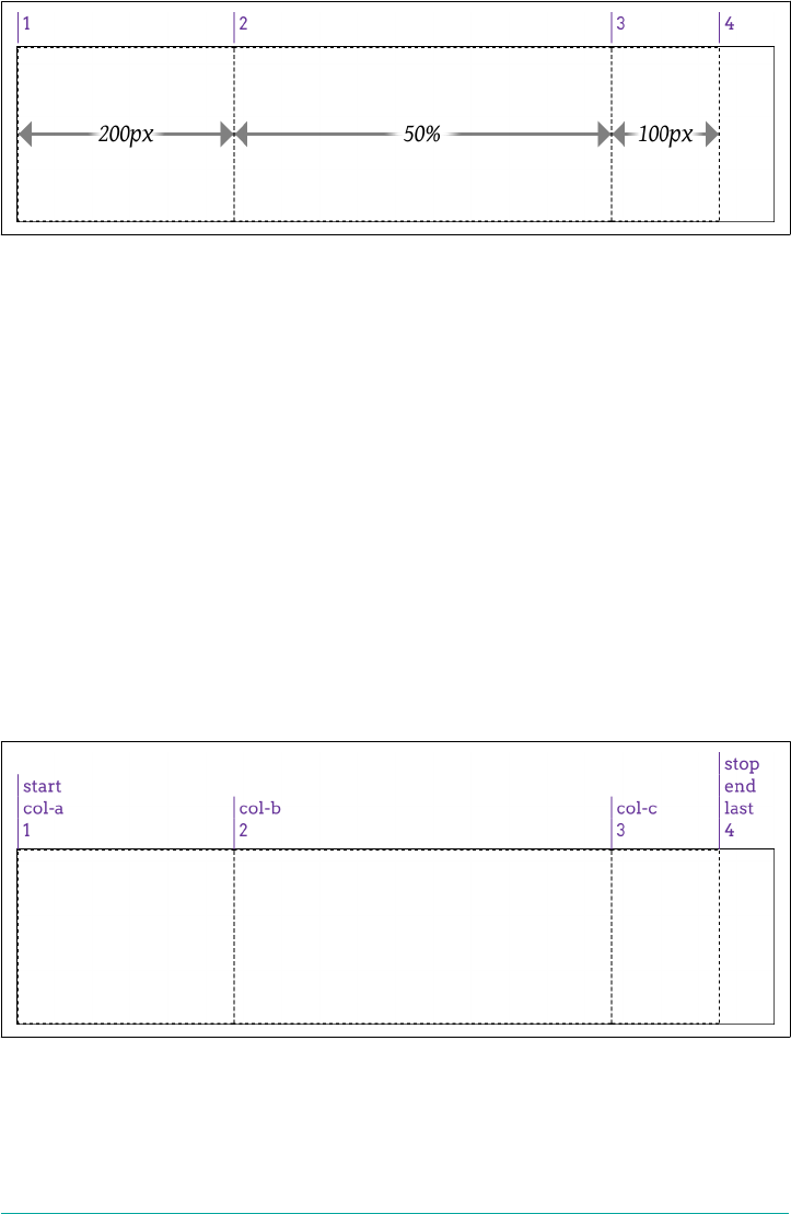
Figure 13-7. Grid-line placement
While it’s true that the second column can change in size if the grid container’s size
changes, it will not change based on the content of the grid items. However wide or
narrow the content placed in that second column, the column’s width will always be
half the width of the grid container.
It’s also true that the last grid line doesn’t reach the right edge of the grid container.
That’s fine; it doesn’t have to. If you want it to—and you probably will—we’ll see vari‐
ous ways to deal with that in just a bit.
This is all lovely, but what if you want to name your grid lines? Just place any grid-
line name you want, and as many as you want, in the appropriate place in the value,
surrounded by square brackets. That’s all! Let’s add some names to our previous
example, with the result shown in Figure 13-8:
#grid {display: grid;
grid-template-columns:
[start col-a] 200px [col-b] 50% [col-c] 100px [stop end last];
}
Figure 13-8. Grid-line name
Placing Grid Lines | 663
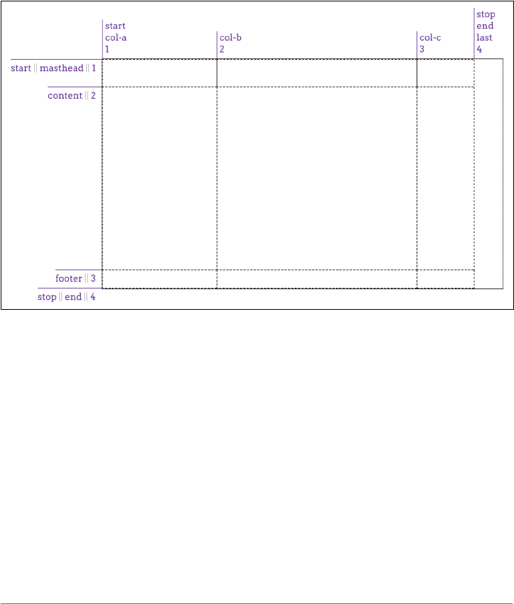
What’s nice is that adding the names makes clear that each value is actually specifying
a grid track’s width, which means there is always a grid line to either side of a width
value. Thus, for the three widths we have, there are actually four grid lines created.
Row grid lines are placed in exactly the same way as columns, as Figure 13-9 shows:
#grid {display: grid;
grid-template-columns:
[start col-a] 200px [col-b] 50% [col-c] 100px [stop end last];
grid-template-rows:
[start masthead] 3em [content] 80% [footer] 2em [stop end];
}
Figure 13-9. Creating a grid
There are a couple of things to point out here. First, there are both column and row
lines with the names start and end. This is perfectly OK. Rows and columns don’t
share the same namespace, so you can reuse names like these in the two contexts.
Second is the percentage value for the content row track. This is calculated with
respect to the height of the grid container; thus, a container 500 pixels tall would yield
a content row that’s 400 pixels tall. This requires that you know ahead of time how
tall the grid container will be, which won’t always be the case.
You might think we could just say 100% and have it fill out the space, but that doesn’t
work, as Figure 13-10 illustrates: the content row track will be as tall as the grid con‐
tainer itself, thus pushing the footer row track out of the container altogether:
664 | Chapter 13: Grid Layout
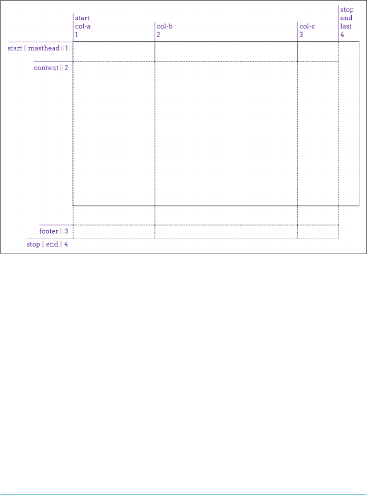
#grid {display: grid;
grid-template-columns:
[start col-a] 200px [col-b] 50% [col-c] 100px [stop end last];
grid-template-rows:
[start masthead] 3em [content] 100% [footer] 2em [stop end];
}
Figure 13-10. Exceeding the grid container
One way (not necessarily the best way) to handle this scenario is to minmax the row’s
value, telling the browser that you want the row no shorter than one amount and no
taller than another, leaving the browser to fill in the exact value. This is done with the
minmax(a,b) pattern, where a is the minimum size and b is the maximum size:
#grid {display: grid;
grid-template-columns:
[start col-a] 200px [col-b] 50% [col-c] 100px [stop end last];
grid-template-rows:
[start masthead] 3em [content] minmax(3em,100%) [footer] 2em [stop end];
}
What we’ve said there is to make the content row never shorter than 3 ems tall, and
never taller than the grid container itself. This allows the browser to bring up the size
until it’s tall enough to fit the space left over from the masthead and footer tracks,
and no more. It also allows the browser to make it shorter than that, as long as it’s not
Placing Grid Lines | 665
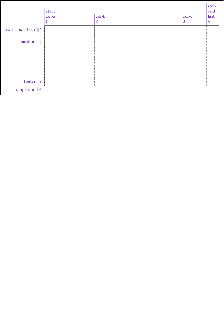
shorter than 3em, so this is not a guaranteed result. Figure 13-11 shows one possible
outcome of this approach.
Figure 13-11. Adapting to the grid container
In like fashion, with the same caveats, minmax() could have been used to help the
col-b column fill out the space across the grid container. The thing to remember
with minmax() is that if the max is smaller than the min, then the max value is thrown
out and the min value is used as a fixed-width track length. Thus, minmax(100px,
2em) would resolve to 100px for any font-size value smaller than 50px.
If the vagueness of minmax()’s behavior unsettles you, there are alternatives to this
scenario. We could also have used the calc() value pattern to come up with a track’s
height (or width). For example:
grid-template-rows:
[start masthead] 3em [content] calc(100%-5em) [footer] 2em [stop end];
That would yield a content row exactly as tall as the grid container minus the sum of
the masthead and footer heights, as we saw in the previous figure.
That works as far as it goes, but is a somewhat fragile solution, since any changes to
the masthead or footer heights will also require an adjustment of the calculation. It
also becomes a lot more difficult (or impossible) if you want more than one column
to flex in this fashion. As it happens, there are much more robust ways to deal with
this sort of situation, as we’ll soon see.
Flexible Grid Tracks
Thus far, all our grid tracks have been inexible—their size determined by a length
measure or the grid container’s dimensions, but unaffected by any other considera‐
tions. Flexible grid tracks, by contrast, can be based on the amount of space in the
666 | Chapter 13: Grid Layout
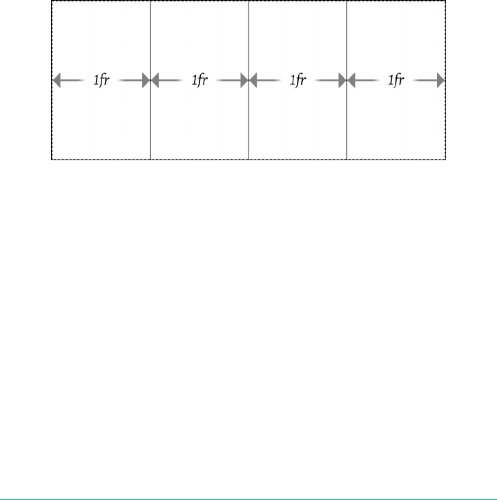
grid container not consumed by inflexible tracks, or alternatively, can be based on the
actual content of the entire track.
Fractional units
If you want to divide up whatever space is available by some fraction and distribute
the fractions to various columns, the fr unit is here for you.
In the simplest case, you can divide up the whole container by equal fractions. For
example, if you want four columns, you could say:
grid-template-columns: 1fr 1fr 1fr 1fr;
In this very limited case, that’s equivalent to saying:
grid-template-columns: 25% 25% 25% 25%;
The result either way is shown in Figure 13-12.
Figure 13-12. Dividing the container into four columns
Now suppose we want to add a fifth column, and redistribute the column size so
they’re all still equal. With percentages, we’d have to rewrite the entire value to be five
instances of 20%. With fr, though, we can just add another 1fr to the value and have
everything done for us automatically:
grid-template-columns: 1fr 1fr 1fr 1fr 1fr;
The way fr units work is that all of the fr values are added together, with the avail‐
able space divided by that total. Then each track gets the number of those fractions
indicated by its number.
What that meant for the first of the previous examples is that when there were four fr
values, their numbers were added together to get a total of four. The available space
was thus divided by four, and each column got one of those fourths. When we added
a fifth 1fr, the space was divided by five, and each column got one of those fifths.
Placing Grid Lines | 667
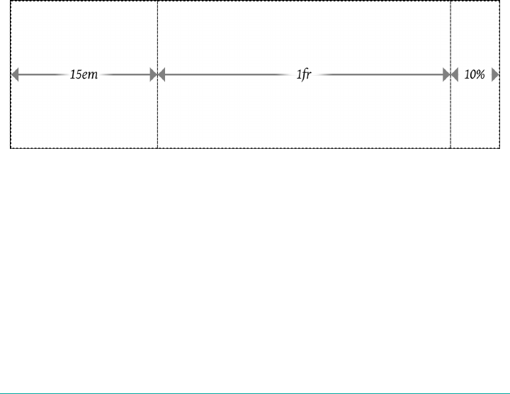
You are not required to always use 1 with your fr units! Suppose you want to divide
up a space such that there are three columns, with the middle column twice as wide
as the other two. That would look like this:
grid-template-columns: 1fr 2fr 1fr;
Again, these are added up and then 1 is divided by that total, so the base fr in this
case is 0.25. The first and third tracks are thus 25% the width of the container,
whereas the middle column is half the container’s width, because it’s 2fr, which is
twice 0.25, or 0.5.
You aren’t limited to integers, either. A recipe card for apple pie could be laid out
using these columns:
grid-template-columns: 1fr 3.14159fr 1fr;
I’ll leave the math on that one as an exercise for the reader. (Lucky you! Just remem‐
ber to start with 1 + 3.14159 + 1, and you’ll have a good head start.)
This is a convenient way to slice up a container, but there’s more here than just
replacing percentages with something more intuitive. Fractional units really come
into their own when there are some fixed columns and some flexible space. Consider,
for example, the following, which is illustrated in Figure 13-13:
grid-template-columns: 15em 1fr 10%;
Figure 13-13. Giving the center column whatever’s available
What happened there is the browser assigned the first and third tracks to their inflex‐
ible widths, and then gave whatever was left in the grid container to the center track.
This means that for a 1,000-pixel-wide grid container whose font-size is the usual
browser default of 16px, the first column will be 240 pixels wide and the third will be
100 pixels wide. That totals 340 pixels, leaving 660 pixels that weren’t assigned to the
fixed tracks. The fractional units total one, so 660 is divided by one, yielding 660 pix‐
els, all of which are given to the single 1fr track. If the grid container’s width is
increased to 1,400 pixels, the third column will be 140 pixels wide and the center col‐
umn 1,020 pixels wide.
668 | Chapter 13: Grid Layout
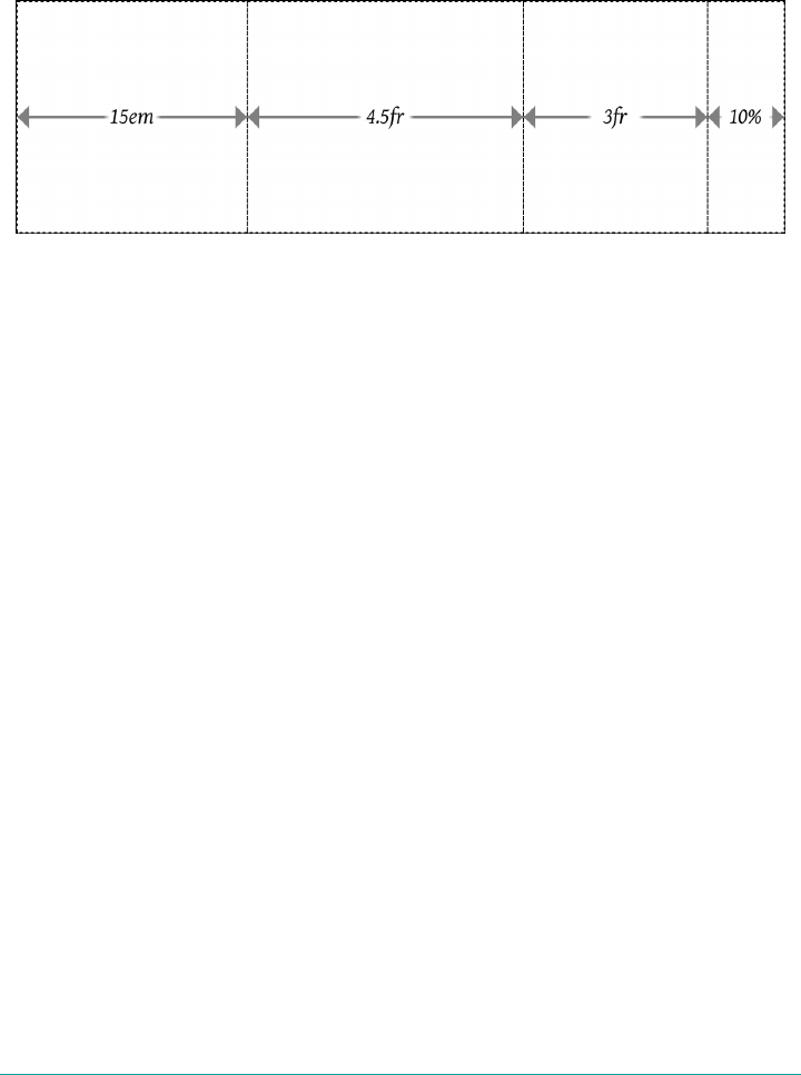
Just like that, we have a mixture of fixed and flexible columns. We can keep this
going, splitting up any flexible space into as many fractions as we like. Consider this:
width: 100em; grid-template-columns: 15em 4.5fr 3fr 10%;
In this case, the columns will be sized as shown in Figure 13-14.
Figure 13-14. Flexible column sizing
The widths of the columns will be, from left to right: 15em, 45em, 30em, and 10em. The
first column gets its fixed width of 15em. The last column is 10% of 100 em, which is
10 em. That leaves 75 em to distribute among the flexible columns. The two added
together total 7.5 fr. For the wider column, 4.5 ÷ 7.5 equals 0.6, and that times 75 em
equals 45 em. Similarly, 3 ÷ 7.5 = 0.4, and that times 75 em equals 30 em.
Yes, admittedly, I put a thumb on the scales for that example: the fr total and width
value were engineered to yield nice, round numbers for the various columns. This
was done purely to aid understanding. If you want to work through the process with
less tidy numbers, consider using 92.5em or 1234px for the width value in the previ‐
ous example.
In cases where you want to define a minimum or maximum size for a given track,
minxmax() can be quite useful. To extend the previous example, suppose the third
column should never be less than 5em wide, no matter what. The CSS would then be:
grid-template-columns: 15em 4.5fr minmax(5em,3fr) 10%;
Now the layout will have two flexible columns at its middle, down to the point that
the third column reaches 5em wide. Below that point, the layout will have three inflex‐
ible columns (15em, 5em, and 10% wide, respectively) and a single flexible column that
will get all the leftover space, if there is any. Once you run the math, it turns out that
up to 30.5556em wide, the grid will have one flexible column. Above that width, there
will be two such columns.
You might think that this works the other way—for example, if you wanted to make a
column track flexible up to a certain point, and then become fixed after, you would
declare a minimum fr value. This won’t work, sadly, because fr units are not allowed
Placing Grid Lines | 669
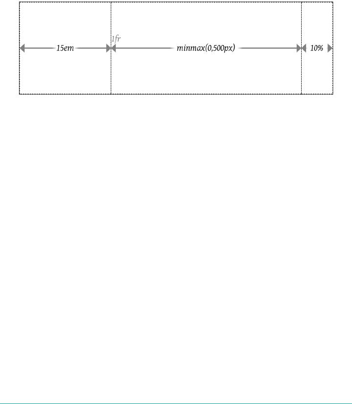
in the min position of a minmax() expression. So any fr value provided as a minimum
will invalidate the declaration.
Speaking of setting to zero, let’s look at a situation where the minimum value is
explicitly set to 0, like this:
grid-template-columns: 15em 1fr minmax(0,500px) 10%;
Figure 13-15 illustrates the narrowest grid width at which the third column can
remain 500 pixels wide. Any narrower, and the minmaxed column will be narrower
than 500 pixels. Any wider, and the second column, the fr column, will grow beyond
zero width while the third column stays at 500 pixels wide.
Figure 13-15. Minmaxed column sizing
If you look closely, you’ll see the 1fr label next to the boundary between the 15em and
minmax(0,500px) columns. That’s there because the 1fr is placed with its left edge on
the second column grid line, and has no width, because there is no space left to flex.
Similarly, the minmax is placed on the third column grid line. It’s just that, in this spe‐
cific situation, the second and third column grid lines are in the same place (which is
why the 1fr column has zero width).
If you ever run into a case where the minimum value is greater than the maximum
value, then the whole thing is replaced with the minimum value. Thus,
minmax(500px,200px) would be treated as a simple 500px. You probably wouldn’t do
this so obviously, but this feature is useful when mixing things like percentages and
fractions. Thus, you could have a column that’s minmax(10%,1fr) that would be flexi‐
ble down to the point where the flexible column was less than 10% of the grid con‐
tainer’s width, at which point it would stick at 10%.
Fractional units and minmaxes are usable on rows just as easily as columns; it’s just
that rows are rarely sized in this way. You could easily imagine setting up a layout
where the masthead and footer are fixed tracks, while the content is flexible down to a
certain point. That might look something like this:
grid-template-rows: 3em minmax(5em,1fr) 2em;
670 | Chapter 13: Grid Layout

That works OK, but it’s a lot more likely that you’ll want to size that row by the height
of its content, not some fraction of the grid container’s height. The next section shows
exactly how to make that happen.
Content-aware tracks
It’s one thing to set up grid tracks that take up fractions of the space available to them,
or that occupy fixed amounts of space. But what if you want to line up a bunch of
pieces of a page and you can’t guarantee how wide or tall they might get? This is
where min-content and max-content come in.
What these keywords mean is simple to state, but not necessarily simple to describe
in full. max-content means, in effect, “take up the maximum amount of space needed
for this content.” For large blocks of text (like a blog post), this would generally mean
taking as much room as is available, to maximize the space for that content. It can
also mean “as wide as necessary to avoid any line-wrapping,” which can be very wide,
given normal paragraphs of text.
min-content, by contrast, means “take up the bare minimum space needed for this
content.” With text, that means squeezing the width down to the point that the
longest word (or widest inline element, if there are things like images or form inputs)
sits on a line by itself. That would lead to a lot of line breaks in a very skinny, very tall
grid element.
What’s so powerful about these sizing keywords is that they apply to the entire grid
track they define. For example, if you size a column to be max-content, then the
entire column track will be as wide as the widest content within it. This is easiest to
illustrate with a grid of images (12 in this case) with the grid declared as follows and
shown in Figure 13-16:
#gallery {display: grid;
grid-template-columns: max-content max-content max-content max-content;
grid-template-rows: max-content max-content max-content;}
Looking at the columns, we can see that each column track is as wide as the widest
image within that track. Where a bunch of portrait images happened to line up, the
column is more narrow; where a landscape image showed up, the column was made
wide enough to fit it. The same thing happened with the rows. Each row is as tall as
the tallest image within it, so wherever a row happened to have all short images, the
row is also short.
The advantage here is that this works for any sort of content, no matter what’s in
there. So let’s say we add captions to the photos. All of the columns and rows will
resize themselves as needed to handle both text and images, as shown in
Figure 13-17.
Placing Grid Lines | 671
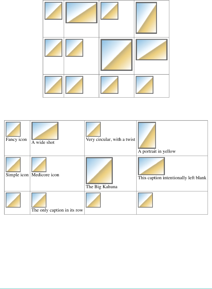
This isn’t a full-fledged design—the images are out of place, and there’s no attempt to
constrain the caption widths. In fact, that’s exactly what we should expect from max-
content values for the column widths. Since it means “make this column wide
enough to hold all its content,” that’s what we got.
Figure 13-16. Sizing grid tracks by content
Figure 13-17. Sizing grid tracks around mixed content
What’s important to realize is that this will hold even if the grid tracks have to spill
out of the grid container. That means that even if we’d assigned something like width:
250px to the grid container, the images and captions would be laid out just the same.
That’s why things like max-content tend to appear in minmax() statements. Consider
672 | Chapter 13: Grid Layout

the following, where grids with and without minmax() appear side by side. In both
cases, the grid container is represented by an orange background (see Figure 13-18):
#g1 {display: grid;
grid-template-columns: max-content max-content max-content max-content;
}
#g2 {display: grid;
grid-template-columns: minmax(0,max-content) minmax(0,max-content)
minmax(0,max-content) minmax(0,max-content);
}
Figure 13-18. Sizing grid tracks with and without minmax()
In the first instance, the grid items completely contain their contents, but they spill
out of the grid container. In the second, the minmax() directs the browser to keep
the columns within the range of 0 and max-content, so they’ll all be fitted into the
grid container if possible. A variant on this would be to declare minmax(min-
content, max-content), which can lead to a slightly different result than the 0,
max-content approach.
The reason that some images are overflowing their cells in the second example is that
the tracks have been fitted into the grid container according to minmax(0,max-
content). They can’t reach max-content in every track, but they can get as close as
possible while all still fitting into the grid container. Where the contents are wider
than the track, they just stick out of it, overlapping other tracks. This is standard grid
behavior.
If you’re wondering what happens if you min-content both the columns and the
rows, it’s pretty much the same as applying min-content to the columns and leaving
the rows alone. This happens because the grid specification directs browsers to
resolve column sizing first, and row sizing after that.
There’s one more keyword you can use with grid track sizing, which is auto. As a
minimum, it’s treated as the minimum size for the grid item, as defined by min-width
Placing Grid Lines | 673

or min-height. As a maximum, it’s treated the same as max-content. You might
think this means it can be used only in minmax() statements, but this is not the case.
You can use it anywhere, and it will take on either a minimum or maximum role.
Which one it takes on depends on the other track values around it, in ways that are
frankly too complicated to get into here. As with so many other aspects of CSS, using
auto is essentially letting the browser do what it wants. Sometimes that’s fine, but in
general you’ll probably want to avoid it.
There is a caveat to that last statement: auto values allow grid items
to be resized by the align-content and justify-content proper‐
ties, a topic we’ll discuss in a later section, “Aligning and Grids” on
page 721. Since auto values are the only track-sizing values that
permit this, there may be very good reasons to use auto after all.
Fitting Track Contents
In addition to the min-content and max-content keywords, there’s a fit-content()
function that allows you to more compactly express certain types of sizing patterns.
It’s a bit complicated to decipher, but the effort is worth it:
fit-content() accepts a <length> or a <percentage> as its argument, like this:
#grid {display: grid; grid-template-columns: 1fr fit-content(150px) 2fr;}
#grid2 {display: grid; grid-template-columns: 2fr fit-content(50%) 1fr;}
Before we explore what that means, let’s ponder the pseudo-formula given by the
specification:
fit-content(argument) => min(max-content, max(min-content, argument))
which means, essentially, “figure out which is greater, the min-content sizing or the
supplied argument, and then take that result and choose whichever is smaller, that
result or the max-content size.” Which is probably confusing! It certainly was to me,
the first 17 times I worked through it.
I feel like a better way of phrasing it is: “fit-content(argument) is equivalent to
minmax(min-content,max-content), except that the value given as an argument sets
an upper limit, similar to max-width or max-height.” Let’s consider this example:
#example {display: grid; grid-template-columns: fit-content(50ch);}
The argument here is 50ch, or about 50 characters wide. So we’re setting up a single
column that’s having its content fit to that measure.
For the initial case, assume the content is only 29 characters long, measuring 29ch
(due to it being in a monospace font). That means the value of max-content is 29ch,
674 | Chapter 13: Grid Layout
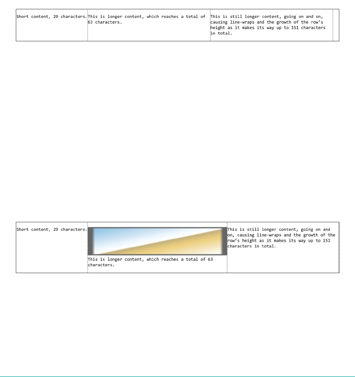
and the column will be only that wide, because it minimizes to that measure—29ch is
smaller than whatever the maximum of 50ch and min-content turns out to be.
Now, let’s assume a bunch of text content is added so that there are 256 characters
measuring 256ch in width. That means max-content evaluates to 256ch. This is well
beyond the 50ch argument, so the column is constrained to be the larger of min-
content and 50ch, which is 50ch.
As further illustration, consider the results of the following, as shown in Figure 13-19:
#thefollowing {
display: grid;
grid-template-columns:
fit-content(50ch) fit-content(50ch) fit-content(50ch);
font-family: monospace;}
Figure 13-19. Sizing grid tracks with t-content()
Notice the first column is narrower than the other two. Its 29ch content minimizes to
that size. The other two columns have more content than will fit into 50ch, so they
line-wrap, because their width has been limited to 50ch.
Now let’s consider what happens if an image is added to the second column. We’ll
make it 500px wide, which is wider than 50ch in this instance. For that column, the
maximum of min-content and 50ch is determined. As we said, the larger value there
is min-content, which is to say 500px (the width of the image). Then the minimum of
500px and max-content is determined. The text, rendered as a single line, would go
on past 500px, so the minimum is 500px. Thus, the second column is now 500 pixels
wide. This is depicted in Figure 13-20.
Figure 13-20. Fitting to wide content
If you compare Figure 13-19 to Figure 13-20, you’ll see that the text in the second
column wraps at a different point, due to the change in column width. But also com‐
pare the text in the the third column. It, too, has different line-wraps.
Placing Grid Lines | 675
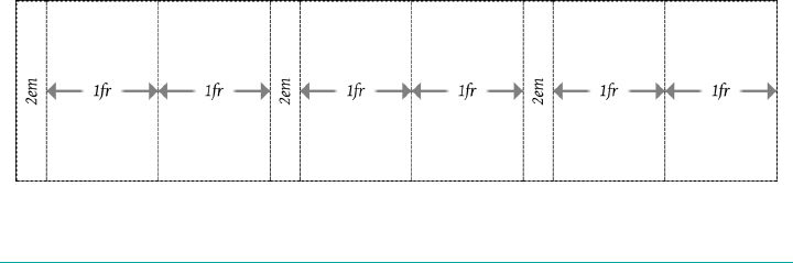
That happened because after the first and second columns were sized, the third col‐
umn had a bit less than 50ch of space in which to be sized. fit-content(50ch) still
did its thing, but here, it did so within the space available to it. Remember, the 50ch
argument is an upper bound, not a fixed size.
This is one of the great advantages of fit-content() over the less flexible minmax().
It allows you to shrink tracks down to their minimum content-size when there isn’t
much content, while still setting an upper bound on the track size when there’s a lot
of content.
You’ve probably been wondering about the repetitive grid template values in previous
examples, and what happens if you need more than three or four grid tracks. Will you
have to write out every single track width individually? Indeed not, as we’ll see in the
next section.
Repeating Grid Lines
If you have a situation where you want to set up a bunch of grid tracks of the same
size, you probably don’t want to have to type out every single one of them. Fortu‐
nately, repeat() is here to make sure you don’t have to.
Let’s say we want to set up a column grid line every 5 ems, and have 10 column tracks.
Here’s how to do that:
#grid {display: grid;
grid-template-columns: repeat(10, 5em);}
That’s it. Done. Ten column tracks, each one 5em wide, for a total of 50 ems of column
tracks. It sure beats typing 5em 10 times!
Any track-sizing value can be used in a repeat, from min-content and max-content
to fr values to auto, and so on, and you can put together more than one sizing value.
Suppose we want to define a column structure such that there’s a 2em track, then a 1fr
track, and then another 1fr track—and, furthermore, we want to repeat that pattern
three times. Here’s how to do that, with the result shown in Figure 13-21:
#grid {display: grid;
grid-template-columns: repeat(3, 2em 1fr 1fr);}
Figure 13-21. Repeating a track pattern
676 | Chapter 13: Grid Layout
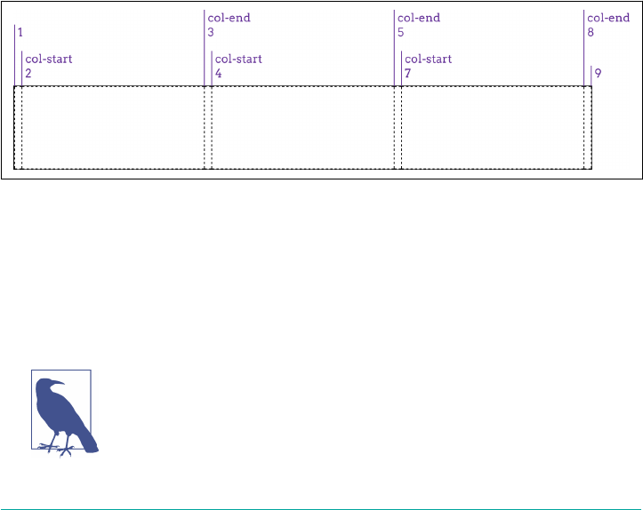
Notice how the last column track is a 1fr track, whereas the first column track is 2em
wide. This is an effect of the way the repeat() was written. It’s easy to add another
2em track at the end, in order to balance things out, just by making this change:
#grid {display: grid;
grid-template-columns: repeat(3, 2em 1fr 1fr) 2em;}
See that extra 2em at the end of the value? That adds one more column track after the
three repeated patterns. This highlights the fact that repeat can be combined with
any other track-sizing values—even other repeats—in the construction of a grid. The
one thing you can’t do is nest a repeat inside another repeat.
Other than that, just about anything goes within a repeat() value. Here’s an example
taken straight from the grid specification:
#grid {
display: grid;
grid-template-columns: repeat(4, 10px [col-start] 250px [col-end]) 10px;}
In this case, there are four repetitions of a 10-pixel track, a named grid line, a 250-
pixel track, and then another named grid line. Then, after the four repetitions, a final
10-pixel column track. Yes, that means there will be four column grid lines named
col-start, and another four named col-end, as shown in Figure 13-22. This is
acceptable; grid-line names are not required to be unique.
Figure 13-22. Repeated columns with named grid lines
One thing to remember, if you’re going to repeat named lines, is that if you place two
named lines next to each other, they’ll be merged into a single, double-named grid
line. In other words, the following two declarations are equivalent:
grid-template-rows: repeat(3, [top] 5em [bottom]);
grid-template-rows: [top] 5em [bottom top] 5em [top bottom] 5em [bottom];
If you’re concerned about having the same name applied to multi‐
ple grid lines, don’t be: there’s nothing preventing it, and it can even
be helpful in some cases. We’ll explore ways to handle such situa‐
tions in an upcoming section, “Using Column and Row Lines” on
page 687.
Placing Grid Lines | 677

Auto-lling tracks
There’s even a way to set up a simple pattern and repeat it until the grid container is
filled. This doesn’t have quite the same complexity as regular repeat()—at least not
yet—but it can still be pretty handy.
For example, suppose we want to have the previous row pattern repeat as many times
as the grid container will comfortably accept:
grid-template-rows: repeat(auto-fill, [top] 5em [bottom]);
That will define a row line every 5 ems until there’s no more room. Thus, for a grid
container that’s 11 ems tall, the following is equivalent:
grid-template-rows: [top] 5em [bottom top] 5em [bottom];
If the grid container’s height is increased past 15 ems, but is less than 20 ems, then
this is an equivalent declaration:
grid-template-rows: [top] 5em [bottom top] 5em [top bottom] 5em [bottom];
See Figure 13-23 for examples of the auto-filled rows at three different grid container
heights.
Figure 13-23. Auto-lling rows at three dierent heights
The limitation with auto-repeating is that it can take only an optional grid-line name,
a fixed track size, and another optional grid-line name. So [top] 5em [bottom] rep‐
resents about the maximum value pattern. You can drop the named lines and just
repeat 5em, or just drop one of the names. It’s not possible to repeat multiple fixed
track sizes, nor can you repeat flexible track sizes. (Which makes sense: how many
times would a browser repeat 1fr to fill out a grid container? Once.)
678 | Chapter 13: Grid Layout

You might wish you could auto-repeat multiple track sizes in order
to define “gutters” around your content columns. This is usually
unnecessary because grids have a concept of (and properties to
define) track gutters, which we’ll cover in an upcoming section,
“Opening Grid Spaces” on page 714.
Furthermore, you can have only one auto-repeat in a given track template. Thus, the
following would not be permissible:
grid-template-columns: repeat(auto-fill, 4em) repeat(auto-fill, 100px);
However, you can combine fixed-repeat tracks with auto-fill tracks. For example, you
could start with three wide columns, and then fill the rest of the grid container with
narrow tracks (assuming there’s space for them). That would look something like this:
grid-template-columns: repeat(3, 20em) repeat(auto-fill, 2em);
You can flip that around, too:
grid-template-columns: repeat(auto-fill, 2em) repeat(3, 20em);
That works because the grid layout algorithm assigns space to the fixed tracks first,
and then fills up whatever space is left with auto-repeated tracks. The end result
of that example is to have one or more auto-filled 2-em tracks, and then three 20-em
tracks. Two examples of this are shown in Figure 13-24.
Figure 13-24. Auto-lling columns next to xed columns
With auto-fill, you will always get at least one repetition of the track template, even
if it won’t fit into the grid container for some reason. You’ll also get as many tracks as
will fit, even if some of the tracks don’t have content in them. As an example, suppose
you set up an auto-fill that placed five columns, but only the first three of them
actually ended up with grid items in them. The other two would remain in place,
holding open layout space.
If you use auto-fit, on the other hand, then tracks that don’t contain any grid items
will be dropped. Otherwise, auto-fit acts the same as auto-fill. Suppose the
following:
Placing Grid Lines | 679
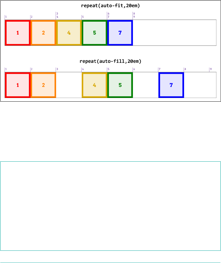
grid-template-columns: repeat(auto-fit, 20em);
If there’s room for five column tracks in the grid container (i.e., it’s more than 100
ems wide), but two tracks don’t have any grid items to go into them, those empty grid
tracks will be dropped, leaving the three column tracks that do contain grid items.
The leftover space is handled in accordance with the values of align-content and
justify-content (discussed in the upcoming section, “Aligning and Grids” on page
721). A simple comparison of auto-fill and auto-fit is shown in Figure 13-25,
where the numbers in the colored boxes indicate the grid-column number to which
they’ve been attached.
Figure 13-25. Auto-ll versus auto-t
Grid Areas
Sometimes, you’d rather just draw a picture of your grid—both because it’s fun to do,
and because the picture can serve as self-documenting code. It turns out you can
more or less do exactly that with the grid-template-areas property.
grid-template-areas
Values none | <string>
Initial value none
Applies to Grid containers
Computed value As declared
Inherited No
Animatable No
680 | Chapter 13: Grid Layout
We could go through a wordy description of how this works, but it’s a lot more fun to
just show it. The following rule has the result shown in Figure 13-26:
#grid {display: grid;
grid-template-areas:
"h h h h"
"l c c r"
"l f f f";}
Figure 13-26. A simple set of grid areas
That’s right: the letters in the string values are used to define how areas of the grid are
shaped. Really! And you aren’t even restricted to single letters! For example, we could
expand the previous example like so:
#grid {display: grid;
grid-template-areas:
"header header header header"
"leftside content content rightside"
"leftside footer footer footer";}
The grid layout is the same as that shown in Figure 13-26, though the name of each
area would be different (e.g., footer instead of f).
In defining template areas, the whitespace is collapsed, so you can use it (as I did in
the previous example) to visually line up columns of names in the value of grid-
template-areas. You can line them up with spaces or tabs, whichever will annoy
your coworkers the most. Or you can just use a single space to separate each identi‐
fier, and not worry about the names lining up with each other. You don’t even have to
line break between strings; the following works just as well as a pretty-printed ver‐
sion:
grid-template-areas: "h h h h" "l c c r" "l f f f";
What you can’t do is merge those separate strings into a single string and have it
mean the same thing. Every new string (as delimited by the double quote marks)
defines a new row in the grid. So the previous example, like the examples before it,
defines three rows. If we merged them all into a single string, like so:
grid-template-areas:
"h h h h
l c c r
l f f f";
Placing Grid Lines | 681
then we’d have a single row of 12 columns, starting with the 4-column area h and
ending with the 3-column area f. The line breaks aren’t significant in any way, except
as whitespace that separates one identifier from another.
If you look at these values closely, you may come to realize that each individual iden‐
tifier represents a grid cell. Let’s bring back our first example from this section, and
consider the result shown in Figure 13-27:
#grid {display: grid;
grid-template-areas:
"h h h h"
"l c c r"
"l f f f";}
Figure 13-27. Grid cells with identiers
This is exactly the same layout result, but here, we’ve shown how each grid identifier
in the grid-template-areas value corresponds to a grid cell. Once all the cells are
identified, the browser merges any adjacent cells with the same name into a single
area that encloses all of them—as long as they describe a rectangular shape! If you try
to set up more complicated areas, the entire template is invalid. Thus, the following
would result in no grid areas being defined:
#grid {display: grid;
grid-template-areas:
"h h h h"
"l c c r"
"l l f f";}
See how l outlines an “L” shape? That humble change causes the entire grid-
template-areas value to be dropped as invalid. A future version of grid layout may
allow for nonrectangular shapes, but for now, this is what we have.
If you have a situation where you want to only define some grid cells to be part of
grid areas, but leave others unlabeled, you can use one or more . characters to fill in
for those unnamed cells. Let’s say you just want to define some header, footer, and
sidebar areas, and leave the rest unnamed. That would look something like this, with
the result shown in Figure 13-28:
682 | Chapter 13: Grid Layout
#grid {display: grid;
grid-template-areas:
"header header header header"
"left ... ... right"
"footer footer footer footer";}
Figure 13-28. A grid with some unnamed grid cells
The two grid cells in the center of the grid are not part of a named area, having been
represented in the template by null cell tokens (the . identifiers). Where each of
those ... sequences appears, we could have used one or more null tokens—so
left . . right or left ..... ..... right would work just as well.
You can be as simple or creative with your cell names as you like. If you want to call
your header ronaldo and your footer podiatrist, go for it. You can even use any
Unicode character above codepoint U+0080, so ConHugeCo©®™ and åwësømë are com‐
pletely valid area identifiers…as are emoji!
Now, to size the grid tracks created by these areas, we bring in our old friends grid-
template-columns and grid-template-rows. Let’s add both to the previous example,
with the result shown in Figure 13-29:
#grid {display: grid;
grid-template-areas:
"header header header header"
"left ... ... right"
"footer footer footer footer";
grid-template-columns: 1fr 20em 20em 1fr;
grid-template-rows: 40px 10em 3em;}
Figure 13-29. Named areas and sized tracks
Placing Grid Lines | 683

Thus, the columns and rows created by naming the grid areas are given track sizes. If
we give more track sizes than there are area tracks, that will add more tracks past the
named areas. Therefore, the following CSS will lead to the result shown in
Figure 13-30:
#grid {display: grid;
grid-template-areas:
"header header header header"
"left ... ... right"
"footer footer footer footer";
grid-template-columns: 1fr 20em 20em 1fr 1fr;
grid-template-rows: 40px 10em 3em 20px;}
Figure 13-30. Adding more tracks beyond the named areas
So, given that we’re naming areas, how about mixing in some named grid lines? As it
happens, we already have: naming a grid area automatically adds names to the grid
lines at its start and end. For the header area, there’s an implicit header-start name
on its first column-grid line and its first row-grid line, and header-end for its second
column- and row-grid lines. For the footer area, the footer-start and footer-end
names were automatically assigned to its grid lines.
Grid lines extend throughout the whole grid area, so a lot of these names are coinci‐
dent. Figure 13-31 shows the naming of the lines created by the following template:
grid-template-areas:
"header header header header"
"left ... ... right"
"footer footer footer footer";
684 | Chapter 13: Grid Layout

Figure 13-31. Implicit grid-line names made explicit
Now let’s mix it up even more by adding a couple of explicit grid-line names to our
CSS. Given the following rules, the first column-grid line in the grid would add the
name begin, and the second row-grid line in the grid would add the name content:
#grid {display: grid;
grid-template-areas:
"header header header header"
"left ... ... right"
"footer footer footer footer";
grid-template-columns: [begin] 1fr 20em 20em 1fr 1fr;
grid-template-rows: 40px [content] 1fr 3em 20px;}
Again: those grid-line names are added to the implicit grid-line names created by the
named areas. Interestingly enough, grid-line names never replace other grid-line
names. Instead, they just keep piling up.
Even more interesting, this implicit-name mechanism runs in reverse. Suppose you
don’t use grid-template-areas at all, but instead set up some named grid lines like
so, as illustrated in Figure 13-32:
grid-template-columns:
[header-start footer-start] 1fr
[content-start] 1fr [content-end] 1fr
[header-end footer-end];
grid-template-rows:
[header-start] 3em
[header-end content-start] 1fr
[content-end footer-start] 3em
[footer-end];
Placing Grid Lines | 685
Figure 13-32. Implicit grid-area names made explicit
Because the grid lines use the form of name-start/name-end, the grid areas they
define are implicitly named. To be frank, it’s clumsier than doing it the other way, but
the capability is there in case you ever want it.
Bear in mind that you don’t need all four grid lines to be named in order to create a
named grid area, though you probably do need them all to create a named grid area
where you want it to be. Consider the following example:
grid-template-columns: 1fr [content-start] 1fr [content-end] 1fr;
grid-template-rows: 3em 1fr 3em;
This will still create a grid area named content. It’s just that the named area will be
placed into a new row after all the defined rows. What’s odd is that an extra, empty
row will appear after the defined rows but before the row containing content. This
has been confirmed to be the intended behavior. Thus, if you try to create a named
area by naming the grid lines and miss one or more of them, then your named area
will effectively hang off to one side of the grid instead of being a part of the overall
grid structure.
So, again, you should probably stick to explicitly naming grid areas and let the start-
and end- grid-line names be created implicitly, as opposed to the other way around.
Attaching Elements to the Grid
Believe it or not, we’ve gotten this far without talking about how grid items are
actually attached to a grid, once it’s been defined.
686 | Chapter 13: Grid Layout

Using Column and Row Lines
There are a couple of ways to go about this, depending on whether you want to refer
to grid lines or grid areas. We’ll start with four simple properties that attach an ele‐
ment to grid lines.
grid-row-start, grid-row-end, grid-column-start, grid-column-end
Values auto | <custom-ident> | [ <integer> && <custom-ident>? ] | [ span && [ <integer>
‖ <custom-ident> ]]
Initial value auto
Applies to Grid items and absolutely positioned elements, if their containing block is a grid
container
Computed value As declared
Inherited No
Animatable No
What these properties do is let you say, “I want the edge of the element to be attached
to grid line such-and-so.” As with so much of grid layout, it’s a lot easier to show than
to describe, so ponder the following styles and their result (see Figure 13-33):
.grid {display: grid; width: 50em;
grid-template-rows: repeat(5, 5em);
grid-template-columns: repeat(10, 5em);}
.one {
grid-row-start: 2; grid-row-end: 4;
grid-column-start: 2; grid-column-end: 4;}
.two {
grid-row-start: 1; grid-row-end: 3;
grid-column-start: 5; grid-column-end: 10;}
.three {
grid-row-start: 4;
grid-column-start: 6;}
Here, we’re using grid-line numbers to say where and how the elements should be
placed within the grid. Column numbers count from left to right, and row numbers
from top to bottom. Note that if you omit ending grid lines, as was the case
for .three, then the next grid lines in sequence are used for the end lines.
Thus, the rule for .three in the previous example is exactly equivalent to the follow‐
ing:
.three {
grid-row-start: 4; grid-row-end: 5;
grid-column-start: 6; grid-column-end: 7;}
Attaching Elements to the Grid | 687
Figure 13-33. Attaching elements to grid lines
There’s another way to say that same thing, as it happens: you could replace the end‐
ing values with span 1, or even just plain span, like this:
.three {
grid-row-start: 4; grid-row-end: span 1;
grid-column-start: 6; grid-column-end: span;}
If you supply span with a number, you’re saying, “span across this many grid tracks.”
So we can rewrite our earlier example like this, and get exactly the same result:
#grid {display: grid;
grid-template-rows: repeat(5, 5em);
grid-template-columns: repeat(10, 5em);}
.one {
grid-row-start: 2; grid-row-end: span 2;
grid-column-start: 2; grid-column-end: span 2;}
.two {
grid-row-start: 1; grid-row-end: span 2;
grid-column-start: 5; grid-column-end: span 5;}
.three {
grid-row-start: 4; grid-row-end: span 1;
grid-column-start: 6; grid-column-end: span;}
If you leave out a number for span, it’s set to be 1. You can’t use zero or negative num‐
bers for span; only positive integers.
An interesting feature of span is that you can use it for both ending and starting grid
lines. The precise behavior of span is that it counts grid lines in the direction “away”
from the grid line where it starts. In other words, if you define a start grid line and set
the ending grid line to be a span value, it will search toward the end of the grid.
688 | Chapter 13: Grid Layout
Conversely, if you define an ending grid line and make the start line a span value,
then it will search toward the start of the grid.
That means the following rules will have the result shown in Figure 13-34:
#grid {display: grid;
grid-rows: repeat(4, 2em); grid-columns: repeat(5, 5em);}
.box01 {grid-row-start: 1; grid-column-start: 3; grid-column-end: span 2;}
.box02 {grid-row-start: 2; grid-column-start: span 2; grid-column-end: 3;}
.box03 {grid-row-start: 3; grid-column-start: 1; grid-column-end: span 5;}
.box04 {grid-row-start: 4; grid-column-start: span 1; grid-column-end: 5;}
Figure 13-34. Spanning grid lines
In contrast to span numbering, you aren’t restricted to positive integers for your
actual grid-line values. Negative numbers will count backward from the end of explic‐
itly defined grid lines. Thus, to place an element into the bottom-right grid cell of a
defined grid, regardless of how many columns or rows it might have, you can just say
this:
grid-column-start: -1;
grid-row-start: -1;
Note that this doesn’t apply to any implicit grid tracks, a concept we’ll get to in a bit,
but only to the grid lines you explicitly define via one of the grid-template-* prop‐
erties (e.g., grid-template-rows).
We aren’t restricted to grid-line numbers, as it happens. If there are named grid lines,
we can refer to those instead of (or in conjunction with) numbers. If you have multi‐
ple instances of a grid-line name, then you can use numbers to identify which
instance of the grid-line name you’re talking about. Thus, to start from the fourth
instance of a row grid named mast-slice, you can say mast-slice 4. Take a look at
the following, illustrated in Figure 13-35, for an idea of how this works:
#grid {display: grid;
grid-template-rows: repeat(5, [R] 4em);
grid-template-columns: 2em repeat(5, [col-A] 5em [col-B] 5em) 2em;}
.one {
grid-row-start: R 2; grid-row-end: 5;
grid-column-start: col-B; grid-column-end: span 2;}
Attaching Elements to the Grid | 689
.two {
grid-row-start: R; grid-row-end: span R 2;
grid-column-start: col-A 3; grid-column-end: span 2 col-A;}
.three {
grid-row-start: 9;
grid-column-start: col-A -2;}
Figure 13-35. Attaching elements to named grid lines
Notice how span changes when we add a name: where we said span 2 col-A, that
caused the grid item to span from its starting point (the third col-A) across another
col-A and end at the col-A after that. This means the grid item actually spans four
column tracks, since col-A appears on every other column grid line.
Again, negative numbers count backward from the end of a sequence, so col-A -2
gets us the second-from-last instance of a grid line named col-A. Because there are
no end-line values declared for .three, they’re both set to span 1. That means the
following is exactly equivalent to the .three in the previous example:
.three {
grid-row-start: 9; grid-row-end: span 1;
grid-column-start: col-A -2; grid-row-end: span 1;}
There’s an alternative way to use names with named grid lines—specifically, the
named grid lines that are implicitly created by grid areas. For example, consider the
following styles, illustrated in Figure 13-36:
grid-template-areas:
"header header header header"
"leftside content content rightside"
"leftside footer footer footer";
#masthead {grid-row-start: header;
grid-column-start: header; grid-row-end: header;}
#sidebar {grid-row-start: 2; grid-row-end: 4;
grid-column-start: leftside / span 1;}
690 | Chapter 13: Grid Layout
#main {grid-row-start: content; grid-row-end: content;
grid-column-start: content;}
#navbar {grid-row-start: rightside; grd-row-end: 3;
grid-column-start: rightside;}
#footer {grid-row-start: 3; grid-row-end: span 1;
grid-column-start: footer; grid-row-end: footer;}
Figure 13-36. Another way of attaching elements to named grid lines
What happens if you supply a custom identifier (i.e., a name you defined) is that the
browser looks for a grid line with that name plus either -start or -end added on,
depending on whether you’re assigning a start line or an end line. Thus, the following
are equivalent:
grid-column-start: header; grid-column-end: header;
grid-column-start: header-start; grid-column-end: header-end;
This works because, as was mentioned with grid-template-areas, explicitly creating
a grid area implicitly creates the named -start and -end grid lines that surround it.
The final value possibility, auto, is kind of interesting. According to the Grid Layout
specification, if one of the grid-line start/end properties is set to auto, that indicates
“auto-placement, an automatic span, or a default span of one.” In practice, what this
tends to mean is that the grid line that gets picked is governed by the grid ow, a con‐
cept we have yet to cover (but will soon!). For a start line, auto usually means that the
next available column or row line will be used. For an end line, auto usually means a
one-cell span. In both cases, the word “usually” is used intentionally: as with any
automatic mechanism, there are no absolutes.
Attaching Elements to the Grid | 691

Row and Column Shorthands
There are two shorthand properties that allow you to more compactly attach an ele‐
ment to grid lines.
grid-row, grid-column
Values <grid-line> [ / <grid-line> ]?
Initial value auto
Applies to Grid items and absolutely positioned elements, if their containing block is a grid
container
Computed value As declared
Inherited No
Animatable No
The primary benefit of these properties is that they make it a lot simpler to declare
the start and end grid lines to be used for laying out a grid item. For example:
#grid {display: grid;
grid-template-rows: repeat(10, [R] 1.5em);
grid-template-columns: 2em repeat(5, [col-A] 5em [col-B] 5em) 2em;}
.one {
grid-row: R 3 / 7;
grid-column: col-B / span 2;}
.two {
grid-row: R / span R 2;
grid-column: col-A 3 / span 2 col-A;}
.three {
grid-row: 9;
grid-column: col-A -2;}
That’s a whole lot easier to read than having each start and end value in its own prop‐
erty, honestly. Other than being more compact, the behavior of these properties is
more or less what you’d expect. If you have two bits separated by a solidus, the first
part defines the starting grid line, and the second part defines the ending grid line.
If you have only one value with no solidus, it defines the starting grid line. The end‐
ing grid line depends on what you said for the starting line. If you supply a name for
the starting grid line, then the ending grid line is given that same name. Thus, the
following are equivalent:
grid-column: col-B;
grid-column: col-B / col-B;
692 | Chapter 13: Grid Layout

That will span from one instance of that grid-line name to the next, regardless of how
many grid cells are spanned.
If a single number is given, then the second number (the end line) is set to auto. That
means the following pairs are equivalent:
grid-row: 2;
grid-row: 2 / auto;
grid-column: header;
grid-column: header / header;
There’s a subtle behavior built into the handling of grid-line names in grid-row and
grid-column that pertains to implicitly named grid lines. If you recall, defining a
named grid area creates -start and -end grid lines. That is, given a grid area with a
name of footer, there are implicitly created footer-start grid lines to its top and
left, and footer-end grid lines to its bottom and right.
In that case, if you refer to those grid lines by the area’s name, the element will still be
placed properly. Thus, the following styles have the result shown in Figure 13-37:
#grid {display: grid;
grid-template-areas:
"header header"
"sidebar content"
"footer footer";
grid-template-rows: auto 1fr auto;
grid-template-columns: 25% 75%;}
#header {grid-row: header / header; grid-column: header;}
#footer {grid-row: footer; grid-column: footer-start / footer-end;}
Figure 13-37. Attaching to implicit grid lines via grid-area names
You can always explicitly refer to the implicitly named grid lines, but if you just refer
to the grid area’s name, things still work out. If you refer to a grid-line name that
doesn’t correspond to a grid area, then it falls back to the behavior discussed previ‐
ously. In detail, it’s the same as saying line-name 1, so the following two are equiva‐
lent:
Attaching Elements to the Grid | 693

grid-column: jane / doe;
grid-column: jane 1 / doe 1;
This is why it’s risky to name grid lines the same as grid areas. Consider the following:
grid-template-areas:
"header header"
"sidebar content"
"footer footer"
"legal legal";
grid-template-rows: auto 1fr [footer] auto [footer];
grid-template-columns: 25% 75%;
This explicitly sets grid lines named footer above the “footer” row and below the
“legal” row…and now there’s trouble ahead. Suppose we add this:
#footer {grid-column: footer; grid-row: footer;}
For the column lines, there’s no problem. footer gets expanded to footer / footer.
The browser looks for a grid area with that name and finds it, so it translates
footer / footer to footer-start / footer-end. The #footer element is attached
to those implicit grid lines.
For grid-row, everything starts out the same. footer becomes footer / footer,
which is translated to footer-start / footer-end. But that means the #footer will
only be as tall as the “footer” row. It will not stretch to the second explicitly named
footer grid line below the “legal” row, because the translation of footer to footer-
end (due to the match between the grid-line name and the grid-area name) takes
precedence.
The upshot of all this: it’s generally a bad idea to use the same name for grid areas and
grid lines. You might be able to get away with it in some scenarios, but you’re almost
always better off keeping your line and area names distinct, so as to avoid tripping
over name-resolution conflicts.
The Implicit Grid
Up to this point, we’ve concerned ourselves solely with explicitly defined grids: we’ve
talked about the row and column tracks we define via properties like grid-template-
columns, and how to attach grid items to the cells in those tracks.
But what happens if we try to place a grid item, or even just part of a grid item,
beyond that explicitly created grid? For example, consider the following grid:
#grid {display: grid;
grid-template-rows: 2em 2em;
grid-template-columns: repeat(6, 4em);}
Two rows, six columns. Simple enough. But suppose we define a grid item to sit in
the first column and go from the first grid line to the fourth:
694 | Chapter 13: Grid Layout
.box01 {grid-column: 1; grid-row: 1 / 4;}
Now what? There are only two rows bounded by three grid lines, and we’ve told the
browser to go beyond that, from row line 1 to row line 4.
What happens is that another row line is created to handle the situation. This grid
line, and the new row track it creates, are both part of the implicit grid. Here are a few
examples of grid items that create implicit grid lines (and tracks) and how they’re laid
out (see Figure 13-38):
.box01 {grid-column: 1; grid-row: 1 / 4;}
.box02 {grid-column: 2; grid-row: 3 / span 2;}
.box03 {grid-column: 3; grid-row: span 2 / 3;}
.box04 {grid-column: 4; grid-row: span 2 / 5;}
.box05 {grid-column: 5; grid-row: span 4 / 5;}
.box06 {grid-column: 6; grid-row: -1 / span 3;}
.box07 {grid-column: 7; grid-row: span 3 / -1;}
Figure 13-38. Creating implicit grid lines and tracks
There’s a lot going on there, so let’s break it down. First off, the explicit grid is repre‐
sented by the light-gray box behind the various numbered boxes; all the dashed lines
represent the implicit grid.
So, what about those numbered boxes? box1 adds an extra grid line after the end of
the explicit grid, as we discussed before. box2 starts on the last line of the explicit grid,
and spans forward two lines, so it adds yet another implicit grid line. box3 ends on
the last explicit grid line (line 3) and spans back two lines, thus starting on the first
explicit grid line.
box4 is where things really get interesting. It ends on the fifth row line, which is to say
the second implicit grid line. It spans back three lines—and yet, it still starts on the
Attaching Elements to the Grid | 695

same grid line as box3. This happens because spans have to start counting within the
explicit grid. Once they start, they can continue on into the implicit grid (as happened
with box2), but they cannot start counting within the implicit grid.
Thus, box4 ends on row-line 5, but its span starts with grid-line 3 and counts back
two lines (span 2) to arrive at line 1. Similarly, box5 ends on line 5, and spans back
four lines, which means it starts on row-line –2. Remember: span counting must start
in the explicit grid. It doesn’t have to end there.
After those, box6 starts on the last explicit row line (line 3), and spans out to the sixth
row line—adding yet another implicit row line. The point of having it here is to show
that negative grid-line references are with respect to the explicit grid, and count back
from its end. They do not refer to negatively indexed implicit lines that are placed
before the start of the explicit grid.
If you want to start an element on an implicit grid line before the explicit grid’s start,
then the way to do that is shown by box7: put its end line somewhere in the explicit
grid, and span back past the beginning of the explicit grid. And you may have
noticed: box7 occupies an implicit column track. The original grid was set up to
create six columns, which means seven column lines, the seventh being the end of the
explicit grid. When box7 was given grid-column: 7, that was equivalent to grid-
column: 7 / span 1 (since a missing end line is always assumed to be span 1). That
necessitated the creation of an implicit column line in order to hold the grid item in
the implicit seventh column.
Now let’s take those principles and add named grid lines to the mix. Consider the fol‐
lowing, illustrated in Figure 13-39:
#grid {display: grid;
grid-template-rows: [begin] 2em [middle] 2em [end];
grid-template-columns: repeat(5, 5em);}
.box01 {grid-column: 1; grid-row: 2 / span end 2;}
.box02 {grid-column: 2; grid-row: 2 / span final;}
.box03 {grid-column: 3; grid-row: 1 / span 3 middle;}
.box04 {grid-column: 4; grid-row: span begin 2 / end;}
.box05 {grid-column: 5; grid-row: span 2 middle / begin;}
What you can see at work there, in several of the examples, is what happens with
grid-line names in the implicit grid: every implicitly created line has the name that’s
being hunted. Take box2, for example. It’s given an end line of final, but there is no
line with that name. Thus the span-search goes to the end of the explicit grid and,
having not found the name it’s looking for, creates a new grid line, to which it attaches
the name final. (In Figure 13-39, the implicitly-created line names are italicized and
faded out a bit.)
696 | Chapter 13: Grid Layout
Figure 13-39. Named implicit grid lines and tracks
Similarly, box3 starts on the first explicit row line, and then needs to span three
middle named lines. It searches forward and finds one, then goes looking for the
other two. Not finding any, it attaches the name middle to the first implicit grid line,
and then does the same for the second implicit grid line. Thus, it ends two implicit
grid lines past the end of the explicit grid.
The same sort of thing happens with box4 and box5, except working backward from
endpoints. box4 ends with the end line (line 3), then spans back to the second begin
line it can find. This causes an implicit line to be created before the first line, named
begin. box 5 spans back from begin (the explicitly labeled begin) to the second mid
dle it can find. Since it can’t find any, it labels two implcit lines middle and ends at
the one furthest from where it started looking.
When you get right down to it, the implicit grid is a delightfully baroque fallback
mechanism. It’s generally best practice to stick to the explicit grid, and to make sure
the explicit grid covers everything you want to do. If you find you need another row,
don’t just run off the edge of the grid—adjust your grid template’s values instead!
Error Handling
There are a few cases that need to be covered, as they fall under the general umbrella
of “what grids do when things go pear-shaped.”
First, what if you accidentally put the start line after the end line? Say, something like
this:
Attaching Elements to the Grid | 697

grid-row-start: 5;
grid-row-end: 2;
All that happens is probably what was meant in the first place: the values are
swapped. Thus, you end up with this:
grid-row-start: 2;
grid-row-end: 5;
Second, what if both the start and the end lines are declared to be spans of some vari‐
ety? For example:
grid-column-start: span;
grid-column-end: span 3;
If this happens, the end value is dropped and replaced with auto. That means you’d
end up with this:
grid-column-start: span; /* 'span' is equal to 'span 1' */
grid-column-end: auto;
That would cause the grid item to have its ending edge placed automatically, accord‐
ing to the current grid flow (a subject we’ll soon explore), and the starting edge to be
placed one grid line earlier.
Third, what if the only thing directing placement of the grid item is a named span? In
other words:
grid-row-start: span footer;
grid-row-end: auto;
This is not permitted, so the span footer in this case is replaced with span 1.
Using Areas
Attaching by row lines and column lines is great, but what if you could refer to a grid
area with a single property? Behold: grid-area.
grid-area
Values <grid-line> [ / <grid-line> ]{0,3}
Initial value See individual properties
Applies to Grid items and absolutely positioned elements, if their containing block is a grid
container
Computed value As declared
Inherited No
Animatable No
698 | Chapter 13: Grid Layout
Let’s start with the easier use of grid-area: assigning an element to a previously
defined grid area. Makes sense, right? Let’s bring back our old friend grid-template-
areas, put it together with grid-area and some markup, and see what magic results
(as shown in Figure 13-40):
#grid {display: grid;
grid-template-areas:
"header header header header"
"leftside content content rightside"
"leftside footer footer footer";}
#masthead {grid-area: header;}
#sidebar {grid-area: leftside;}
#main {grid-area: content;}
#navbar {grid-area: rightside;}
#footer {grid-area: footer;}
<div id="grid">
<div id="masthead">…</div>
<div id="main">…</div>
<div id="navbar">…</div>
<div id="sidebar">…</div>
<div id="footer">…</div>
</div>
Figure 13-40. Assigning elements to grid areas
That’s all it takes: set up some named grid areas to define your layout, and then drop
grid items into them with grid-area. So simple, and yet so powerful.
As you might have noticed, the sizing of the column and row tracks was omitted
from that CSS. This was done entirely for clarity’s sake. In an actual design, the rule
probably would look more like this:
grid-template-areas:
"header header header header"
"leftside content content rightside"
"leftside footer footer footer";
Attaching Elements to the Grid | 699
grid-template-rows: 200px 1fr 3em;
grid-template-columns: 20em 1fr 1fr 10em;
There is another way to use grid-area that refers to grid lines instead of grid areas.
Fair warning: it’s likely to be confusing at first, for a couple of reasons.
Here’s an example of a grid template that defines some grid lines, and some grid-
area rules that reference the lines, as illustrated in Figure 13-41:
#grid {display: grid;
grid-template-rows:
[r1-start] 1fr [r1-end r2-start] 2fr [r2-end];
grid-template-columns:
[col-start] 1fr [col-end main-start] 1fr [main-end];}
.box01 {grid-area: r1 / main / r1 / main;}
.box02 {grid-area: r2-start / col-start / r2-end / main-end;}
.box03 {grid-area: 1 / 1 / 2 / 2;}
Figure 13-41. Assigning elements to grid lines
As you can see, the elements were placed as directed. Note the ordering of the grid-
line values, however. They’re listed in the order row-start, column-start, row-end,
column-end. If you diagram that in your head, you’ll quickly realize that the values go
anticlockwise around the grid item—the exact opposite of the TRBL (Top, Right, Bot‐
tom, Left) pattern we’re used to from margins, padding, borders, and so on. Further‐
more, this means the column and row references are not grouped together, but are
instead split up.
Yes, this is intentional. No, I don’t know why.
If you supply fewer than four values, the missing values are taken from those you do
supply. If there are only three values, then the missing grid-column-end is the same
as grid-column-start if it’s a name; if the start line is a number, the end line is set to
auto. The same holds true if you give only two values, except that the now-missing
grid-row-end is copied from grid-row-start if it’s a name; otherwise, it’s set
to auto.
From that, you can probably guess what happens if only one value is supplied: if it’s a
name, use it for all four values; if it’s a number, the rest are set to auto.
700 | Chapter 13: Grid Layout
This one-to-four replication pattern is actually how giving a single grid-area name
translates into having the grid item fill that area. The following are equivalent:
grid-area: footer;
grid-area: footer / footer / footer / footer;
Now recall the behavior discussed in the previous section about grid-column and
grid-row: if a grid line’s name matches the name of a grid area, then it’s translated
into a -start or -end variant, as appropriate. That means the previous example is
translated to the following:
grid-area: footer-start / footer-start / footer-end / footer-end;
And that’s how a single grid-area name causes an element to be placed into the corre‐
sponding grid area.
Grid Item Overlap
One thing we’ve been very careful to do in our grid layouts thus far is to avoid over‐
lap. Rather like positioning, it’s absolutely (get it?) possible to make grid items overlap
each other. Let’s take a simple case, illustrated in Figure 13-42:
#grid {display: grid;
grid-template-rows: 50% 50%;
grid-template-columns: 50% 50%;}
.box01 {grid-area: 1 / 1 / 2 / 3;}
.box02 {grid-area: 1 / 2 / 3 / 2;}
Figure 13-42. Overlapping grid items
Thanks to the grid numbers that were supplied, the two grid items overlap in the
upper-right grid cell. Which is on top of the other depends on the layering behavior
discussed later, but for now, just take it as given that they do layer when overlapping.
Overlap isn’t restricted to situations involving raw grid numbers. In the following
case, the sidebar and the footer will overlap, as shown in Figure 13-43. (Assuming the
footer comes later than the sidebar in the markup, then in the absence of other styles,
the footer will be on top of the sidebar.)
Attaching Elements to the Grid | 701
#grid {display: grid;
grid-template-areas:
"header header"
"sidebar content"
"footer footer";}
#header {grid-area: header;}
#sidebar {grid-area: sidebar / sidebar / footer-end / sidebar;}
#footer {grid-area: footer;}
Figure 13-43. Overlapping sidebar and footer
I bring this up in part to warn you about the possibility of overlap, and also to serve
as a transition to the next topic. It’s a feature that sets grid layout apart from position‐
ing, in that it can sometimes help avoid overlap: the concept of grid ow.
Grid Flow
For the most part, we’ve been explicitly placing grid items on the grid. If items aren’t
explicitly placed, then they’re automatically placed into the grid. Following the grid
flow in effect, an item is placed in the first area that will fit it. The simplest case is just
filling a grid track in sequence, one grid item after another, but things can get a lot
more complex than that, expecially if there is a mixture of explicitly and automati‐
cally placed grid items—the latter must work around the former.
There are primarily two grid-flow models, row-rst and column-rst, though you can
enhance either by specifying a dense flow. All this is done with the property grid-
auto-flow.
702 | Chapter 13: Grid Layout
grid-auto-ow
Values [ row | column ] ‖ dense
Initial value row
Applies to Grid containers
Computed value As declared
Inherited No
Animatable No
To see how these values work, consider the following markup:
<ol id="grid">
<li>1</li>
<li>2</li>
<li>3</li>
<li>4</li>
<li>5</li>
</ol>
To that markup, let’s apply the following styles:
#grid {display: grid; width: 45em; height: 8em;
grid-auto-flow: row;}
#grid li {grid-row: auto; grid-column: auto;}
Assuming a grid with a column line every 15 ems and a row line every 4 ems, we get
the result shown in Figure 13-44.
Figure 13-44. Row-oriented grid ow
This probably seems pretty normal, the same sort of thing you’d get if you floated all
the boxes, or if all of them were inline blocks. That’s why row is the default value.
Now, let’s try switching the grid-auto-flow value to column, as shown in
Figure 13-45:
#grid {display: grid; width: 45em; height: 8em;
grid-auto-flow: column;}
#grid li {grid-row: auto; grid-column: auto;}
Grid Flow | 703
So with grid-auto-flow: row, each row is filled in before starting on the next row.
With grid-auto-flow: column, each column is filled first.
Figure 13-45. Column-oriented grid ow
What needs to be stressed here is that the list items weren’t explicitly sized. By default,
they were resized to attach to the defined grid lines. This can be overridden by assign‐
ing explicit sizing to the elements. For example, if we make the list items be 7 ems
wide and 1.5 ems tall, we’ll get the result shown in Figure 13-46:
#grid {display: grid; width: 45em; height: 8em;
grid-auto-flow: column;}
#grid li {grid-row: auto; grid-column: auto;
width: 7em; height: 1.5em;}
Figure 13-46. Explicitly sized grid items
If you compare that to the previous figure, you’ll see that the corresponding grid
items start in the same place in each figure; they just don’t end in the same places.
This illustrates that what’s really placed in grid flow is grid areas, to which the grid
items are then attached.
This is important to keep in mind if you auto-flow elements that are wider than their
assigned column or taller than their assigned row, as can very easily happen when
turning images or other intrinsically sized elements into grid items. Let’s say we want
to put a bunch of images, each a different size, into a grid that’s set up to have a col‐
umn line every 50 horizontal pixels, and a row line every 50 vertical pixels. This grid
is illustrated in Figure 13-47, along with the results of flowing a series of images into
that grid by either row or column:
#grid {display: grid;
grid-template-rows: repeat(3, 50px);
grid-template-columns: repeat(4, 50px);
grid-auto-rows: 50px;
grid-auto-columns: 50px;
704 | Chapter 13: Grid Layout
}
img {grid-row: auto; grid-column: auto;}
Figure 13-47. Flowing images in grids
Notice how some of the images overlap others? That’s because each image is attached
to the next grid line in the flow, without taking into account the presence of other
grid items. We didn’t set up images to span more than one grid track when they
needed it, so overlap occurred.
This can be managed with class names or other identifiers. We could class images as
tall or wide (or both) and specify that they get more grid tracks. Here’s some CSS to
add to the previous example, with the result shown in Figure 13-48:
img.wide {grid-column: auto / span 2;}
img.tall {grid-row: auto / span 2;}
Figure 13-48. Giving images more track space
This does cause the images to keep spilling down the page, but there’s no overlapping.
Grid Flow | 705
However, notice how there are gaps in that last grid? That happened because the
placement of some grid items across grid lines didn’t leave enough room for other
items in the flow. In order to illustrate this, and the two flow patterns, more clearly,
let’s try an example with numbered boxes (Figure 13-49).
Figure 13-49. Illustrating ow patterns
Follow across the rows of the first grid, counting along with the numbers. In this par‐
ticular flow, the grid items are laid out almost as if they were leftward floats. Almost,
but not quite: notice that grid item 13 is actually to the left of grid item 11. That
would never happen with floats, but it can with grid flow. The way row flow (if we
may call it that) works is that you go across each row from left to right, and if there’s
room for a grid item, you put it there. If a grid cell has been occupied by another grid
item, you skip over it. So the cell next to item 10 didn’t get filled, because there wasn’t
room for item 11. Item 13 went to the left of item 11 because there was room for it
there when the row was reached.
The same basic mechanisms hold true for column flow, except in this case you work
from top to bottom. Thus, the cell below item 9 is empty because item 10 wouldn’t fit
there. It went into the next column and spanned four grid cells. The items after it,
since they were just one grid cell in size, filled in the cells after it in column order.
Grid flow works left-to-right, top-to-bottom in languages that have
that writing pattern. In right-to-left languages, such as Arabic and
Hebrew, the row-oriented flow would be right-to-left, not left-to-
right.
706 | Chapter 13: Grid Layout
If you were just now wishing for a way to pack grid items as densely as possible,
regardless of how that affected the ordering, good news: you can! Just add the key‐
word dense to your grid-auto-flow value, and that’s exactly what will happen. We
can see the result in Figure 13-50, which shows the results of grid-auto-flow: row
dense and grid-auto-flow: dense column side by side.
Figure 13-50. Illustrating dense ow patterns
In the first grid, item 12 appears in the row above item 11 because there was a
cell that fit it. For the same reason, item 11 appears to the left of item 10 in the second
grid.
In effect, what happens with dense grid flow is that for each grid item, the browser
scans through the entire grid in the given flow direction (row or column), starting
from the flow’s starting point (the top-left corner, in LTR—left-to-right—languages),
until it finds a place where that grid item will fit. This can make things like photo
galleries more compact, and works great as long as you don’t have a specific order in
which the images need to appear.
Now that we’ve explored grid flow, I have a confession to make: in order to make the
last couple of grid items look right, I included some CSS that I didn’t show you.
Without it, the items hanging off the edge of the grid would have looked quite a bit
different than the other items—much shorter in row-oriented flow, and much nar‐
rower in column-oriented flow. We’ll see why, and the CSS I used, in the next section.
Grid Flow | 707

Automatic Grid Lines
So far, we’ve almost entirely seen grid items placed into a grid that was explicitly
defined. But in the last section we had situations where grid items ran off the edge of
the explicitly defined grid. What happens when a grid item goes off the edge? Rows or
columns are added as needed to satisfy the layout directives of the items in question
(see “The Implicit Grid” on page 694). So, if an item with a row span of 3 is added
after the end of a row-oriented grid, three new rows are added after the explicit grid.
By default, these automatically added rows are the absolute minimum size needed. If
you want to exert a little more control over their sizing, then grid-auto-rows and
grid-auto-columns are for you.
grid-auto-rows, grid-auto-columns
Values <track-breadth> | minmax( <track-breadth> , <track-breadth> )
Initial value auto
Applies to Grid containers
Computed value Depends on the specic track sizing
Note <track-breadth> is a stand-in for <length> | <percentage> | <ex> | min-
content | max-content | auto
Inherited No
Animatable No
For any automatically created row or column tracks, you can provide a single track
size or a minmaxed pair of track sizes. Let’s take a look at a reduced version of the
grid-flow example from the previous section: we’ll set up a 2 × 2 grid, and try to put
five items into it. In fact, let’s do it twice: once with grid-auto-rows, and once
without, as illustrated in Figure 13-51:
.grid {display: grid;
grid-template-rows: 80px 80px;
grid-template-columns: 80px 80px;}
#g1 {grid-auto-rows: 80px;}
As you can see, without sizing the automatically created row, the grid item is placed
in a row that’s exactly as tall as the grid item’s content, and not a pixel more. It’s still
just as wide as the column into which it’s placed, because that has a size (80px). The
row, lacking an explicit height, defaults to auto, with the result shown.
708 | Chapter 13: Grid Layout

Figure 13-51. Grids with and without auto-row sizing
If we flip it around to columns, the same basic principles apply (see Figure 13-52):
.grid {display: grid; grid-auto-flow: column;
grid-template-rows: 80px 80px;
grid-template-columns: 80px 80px;}
#g1 {grid-auto-columns: 80px;}
Figure 13-52. Grids with and without auto-column sizing
In this case, because the flow is column-oriented, the last grid item is placed into a
new column past the end of the explicit grid. In the second grid, where there’s no
grid-auto-columns, that fifth item is as tall as its row (80px), but has an auto width,
so it’s just as wide as it needs to be and no wider. If a sixth item were added and it had
wider content, then the column would be sized to fit that content, thus widening the
fifth item.
So now you know what I used in the grid-auto-flow figures in the previous section:
I silently made the auto-rows and auto-columns the same size as the explicitly sized
Automatic Grid Lines | 709
columns, in order to not have the last couple of items look weird. Let’s bring back one
of those figures, only this time the grid-auto-rows and grid-auto-columns styles
will be removed. As you can see in Figure 13-53, the last few items in each grid are
shorter or narrower than the rest, due to the lack of auto-track sizing.
Figure 13-53. A previous gure with auto-track sizing removed
And now you know…the rest of the story.
The grid Shorthand
At long last, we’ve come to the shorthand property grid. It might just surprise you,
though, because it’s not like other shorthand properties.
grid
Values none | subgrid | [ <grid-template-rows> / <grid-template-columns> ] | [ <line-
names>? <string> <track-size>? <line-names>? ]+ [ / <track-list> ]? | [ <grid-auto-
ow> [ <grid-auto-rows> [ / <grid-auto-columns> ]? ]? ] ]
Initial value See individual properties
Applies to Grid containers
Computed value See individual properties
Inherited No
Animatable No
710 | Chapter 13: Grid Layout

The syntax is a little bit migraine-inducing, I admit, but we’ll step through it a piece at
a time.
Let’s get to the elephant in the room right away: grid allows you to either define a
grid template or to set the grid’s flow and auto-track sizing in a compact syntax. You
can’t do both at the same time.
Furthermore, whichever you don’t define is reset to its defaults, as is normal for a
shorthand property. So if you define the grid template, then the flow and auto tracks
will be returned to their default values. This includes grid gutters, a topic we haven’t
even covered yet. You can’t set the gutters with grid, but it will reset them anyway.
Yes, this is intentional. No, I don’t know why.
So let’s talk about creating a grid template using grid. The values can get fiendishly
complex, and take on some fascinating patterns, but can be very handy. As an exam‐
ple, the following rule is equivalent to the set of rules that follows it:
grid:
"header header header header" 3em
". content sidebar ." 1fr
"footer footer footer footer" 5em /
2em 3fr minmax(10em,1fr) 2em;
grid-template-areas:
"header header header header"
". content sidebar ."
"footer footer footer footer";
grid-template-rows: 3em 1fr 5em;
grid-template-columns: 2em 3fr minmax(10em,1fr) 2em;
Notice how the value of grid-template-rows is broken up and scattered around the
strings of grid-template-areas. That’s how row sizing is handled in grid when you
have grid-area strings present. Take those strings out, and you end up with the fol‐
lowing:
grid:
3em 1fr 5em / 2em 3fr minmax(10em,1fr) 2em;
In other words, the row tracks are separated by a solidus (/) from the column tracks.
Remember that with grid, undeclared shorthands are reset to their defaults. That
means the following two rules are equivalent:
#layout {display: grid;
grid: 3em 1fr 5em / 2em 3fr minmax(10em,1fr) 2em;}
#layout {display: grid;
grid: 3em 1fr 5em / 2em 3fr minmax(10em,1fr) 2em;
grid-auto-rows: auto;
The grid Shorthand | 711
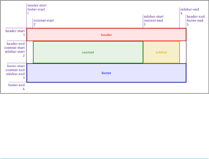
grid-auto-columns: auto;
grid-auto-flow: row;}
Therefore, make sure your grid declaration comes before anything else related to
defining the grid. That means that if we wanted a dense column flow, we’d write
something like this:
#layout {display: grid;
grid: 3em 1fr 5em / 2em 3fr minmax(10em,1fr) 2em;
grid-auto-flow: dense column;}
Now, let’s bring the named grid areas back, and add some extra row grid-line names
to the mix. A named grid line that goes above a row track is written before the string,
and a grid line that goes below the row track comes aer the string and any track siz‐
ing. So let’s say we want to add main-start and main-stop above and below the mid‐
dle row, and page-end at the very bottom:
grid:
"header header header header" 3em
[main-start] ". content sidebar ." 1fr [main-stop]
"footer footer footer footer" 5em [page-end] /
2em 3fr minmax(10em,1fr) 2em;
That creates the grid shown in Figure 13-54, with the implicitly created named grid
lines (e.g., footer-start), along with the explicitly named grid lines we wrote into
the CSS.
Figure 13-54. Creating a grid with the grid shorthand
You can see how grid can get very complicated very quickly. It’s a very powerful syn‐
tax, and it’s surprisingly easy to get used to once you’ve had just a bit of practice. On
the other hand, it’s also easy to get things wrong and have the entire value be invalid,
thus preventing the appearance of any grid at all.
712 | Chapter 13: Grid Layout
For the other use of grid, it’s a merging of grid-auto-flow, grid-auto-rows, and
grid-auto-columns. The following rules are equivalent:
#layout {grid-auto-flow: dense rows;
grid-auto-rows: 2em;
grid-auto-columns: minmax(1em,3em);}
#layout {grid: dense rows 2em / minmax(1em,3em);}
That’s certainly a lot less typing for the same result! But once again, I have to remind
you: if you write this, then all the column and row track properties will be set to their
defaults. Thus, the following rules are equivalent:
#layout {grid: dense rows 2em / minmax(1em,3em);}
#layout {grid: dense rows 2em / minmax(1em,3em);
grid-template-rows: auto;
grid-template-columns: auto;}
So once again, it’s important to make sure your shorthand comes before any proper‐
ties it might otherwise override.
Subgrids
There’s another possible value for grid, which is subgrid. It might be used something
like this:
#grid {display: grid;
grid: repeat(auto-fill, 2em) / repeat(10, 1% 8% 1%);}
.module {display: grid;
grid: subgrid;}
What happens inside each module element is that its grid items (i.e., its child ele‐
ments) use the grid defined by #grid to align themselves.
This is potentially really useful, because you can imagine having a module that spans
three of its parent’s column patterns and containing child elements that are aligned to
and laid out using the “master” grid. This is illustrated in Figure 13-55.
Figure 13-55. Aligning subgridded items
The problem is that, as of this writing, subgrid is an “at-risk” feature of grid layout,
and may be dropped entirely. That’s why it rates just this small section, instead of a
more comprehensive examination.
The grid Shorthand | 713
Opening Grid Spaces
So far, we’ve seen a lot of grid items jammed right up against one another, with no
space between them. There are a number of ways to mitigate this, as we’ll talk about
in this section, starting with gutters.
Grid Gutters (or Gaps)
Simply put, a gutter is a space between two grid tracks. It’s created as if by expanding
the grid line between them to have actual width. It’s much like border-spacing in
table styling—both because it creates space between grid cells and because you can set
only a single spacing value for each axis, via the properties grid-row-gap and grid-
column-gap.
grid-row-gap, grid-column-gap
Values <length> | <percentage>
Initial value 0
Applies to Grid containers
Computed value An absolute length
Inherited No
Animatable Yes
Right up front: as the value syntax shows, you can supply only a length for these
properties; what it’s less clear about is that the lengths must be non-negative. It’s not
possible to supply a percentage, a fractional value via fr, nor a minmax of some sort.
If you want your columns to be separated by 1 em, then it’s easy enough: grid-
column-gap: 1em. That’s pretty much as fancy as it gets. All the columns in the grid
will be pushed apart by 1 em, as illustrated in Figure 13-56:
#grid {display: grid;
grid-template-rows: 5em 5em;
grid-template-columns: 15% 1fr 1fr;
grid-column-gap: 1em;}
714 | Chapter 13: Grid Layout
Figure 13-56. Creating column gutters
In terms of sizing the tracks in a grid, gutters are treated as if they’re grid tracks.
Thus, given the following styles, the fractional grid rows will each be 140 pixels tall:
#grid {display: grid; height: 500px;
grid-template-rows: 100px 1fr 1fr 75px;
grid-row-gap: 15px;}
We get 140 pixels for each fraction row’s height because there are a total of 500 pixels
of height. From that, we subtract the two row tracks (100 and 75) to get 325. From
that result, we subtract the three 15-pixel gutters, which totals 45 pixels; this yields
280 pixels. That divided in half (because the fractional rows have equal fractions) gets
us 140 pixels each. If the gutter value were increased to 25px, then the fractional rows
would have 250 pixels to divide between them, making each 125 pixels tall.
Track sizing can be much more complicated than this; the example used all pixels
because it makes the math simple. You can always mix units however you’d like,
including minmaxing your actual grid tracks. This is one of the main strengths of
grid layout.
Grid gutters can be changed from their declared size by the effects
of align-content and justify-content. This will be covered in
the upcoming section, “Opening Grid Spaces” on page 714.
There is, as you might have already suspected, a shorthand that combines row and
column gap lengths into a single property.
Opening Grid Spaces | 715
grid-gap
Values <grid-row-gap> <grid-column-gap>
Initial value 0 0
Applies to Grid containers
Computed value As declared
Inherited No
Animatable Yes
Not a lot more to say than that, really: supply two non-negative lengths, and you’ll
have defined the row gutters and column gutters, in that order. Here’s an example, as
shown in Figure 13-57:
#grid {display: grid;
grid-template-rows: 5em 5em;
grid-template-columns: 15% 1fr 1fr;
grid-gap: 12px 2em;}
Figure 13-57. Dening grid gutters
Grid Items and the Box Model
Now we can create a grid, attach items to the grid, and even create gutters between
the grid tracks. But what happens if we style the element that’s attached to the grid
with, say, margins? Or if it’s absolutely positioned? How do these things interact with
the grid?
Let’s take margins first. The basic principle at work is that an element is attached to
the grid by its margin edges. That means you can push the visible parts of the element
inward from the grid area it occupies by setting positive margins—and pull it out‐
ward with negative margins. For example, these styles will have the result shown in
Figure 13-58:
716 | Chapter 13: Grid Layout
#grid {display: grid;
grid-template-rows: repeat(2, 100px);
grid-template-columns: repeat(2, 200px);}
.box02 {margin: 25px;}
.box03 {margin: -25px 0;}
Figure 13-58. Grid items with margins
This worked as it did because the items had both their width and height set to auto,
so they could be stretched as needed to make everything work out. If width and/or
height have non-auto values, then they’ll end up overriding margins to make all the
math work out. This is much like what happens with right and left margins when ele‐
ment sizing is overconstrained: eventually, one of the margins gets overridden.
Consider an element with the following styles placed into a 200-pixel-wide by 100-
pixel-tall grid area:
.exel {width: 150px; height: 100px;
padding: 0; border: 0;
margin: 10px;}
Going across the element first, it has 10 pixels of margin to either side, and its width
is 150px, giving a total of 170 pixels. Something’s gotta give, and in this case it’s the
right margin (in left-to-right languages), which is changed to 40px to make every‐
thing work—10 pixels on the left margin, 150 pixels on the content box, and 40 pixels
on the right margin equals the 200 pixels of the grid area’s width.
On the vertical axis, the bottom margin is reset to -10px. This compensates for the
top margin and content height totalling 110 pixels, when the grid area is only 100 pix‐
els tall.
Margins on grid items are ignored when calculating grid-track
sizes. That means that no matter how big or small you make a grid
item’s margins, it won’t change the sizing of a min-content column,
for example, nor will increasing the margins on a grid item cause
fr-sized grid tracks to change size.
Opening Grid Spaces | 717
As with block layout, you can selectively use auto margins to decide which margin
will have its value changed to fit. Suppose we wanted the grid item to align to the
right of its grid area. By setting the item’s left margin to auto, that would happen:
.exel {width: 150px; height: 100px;
padding: 0; border: 0;
margin: 10px; margin-left: auto;}
Now the element will add up 160 pixels for the right margin and content box, and
then give the difference between that and the grid area’s width to the left margin,
since it’s been explicitly set to auto. This has the result shown in Figure 13-59, where
there are 10 pixels of margin on each side of the exel item, except the left margin,
which is (as we just calculated) 40 pixels.
Figure 13-59. Using auto margins to align items
That might seem familiar from block-level layout, where you can use auto left and
right margins to center an element in its containing block, as long as you’ve given it
an explicit width. Where grid layout differs is that you can do the same thing on the
vertical axis; that is, given an element with an absolute height, you can vertically cen‐
ter it by setting the top and bottom margins to auto. Figure 13-60 shows a variety of
auto margin effects on images, which naturally have explicit heights and widths:
.i01 {margin: 10px;}
.i02 {margin: 10px; margin-left: auto;}
.i03 {margin: auto 10px auto auto;}
.i04 {margin: auto;}
.i05 {margin: auto auto 0 0;}
.i06 {margin: 0 auto;}
718 | Chapter 13: Grid Layout
Figure 13-60. Various auto-margin alignments
There are other ways to align grid items, notably with properties
like justify-self, which don’t depend on having explicit height
and width values. These will be covered in the next section.
This is a lot like how margins and element sizes operate when elements are absolutely
positioned. Which leads us to the next question: what if a grid item is also absolutely
positioned? For example:
.exel {grid-row: 2 / 4; grid-column: 2 / 5;
position: absolute;
top: 1em; bottom: 15%;
left: 35px; right: 1rem;}
The answer is actually pretty elegant: if you’ve defined grid-line starts and ends, that
grid area is used as the containing block and positioning context, and the grid item is
positioned within that context. That means the offset properties (top et al.) are calcu‐
lated in relation to the declared grid area. Thus, the previous CSS would have the
result shown in Figure 13-61.
Opening Grid Spaces | 719
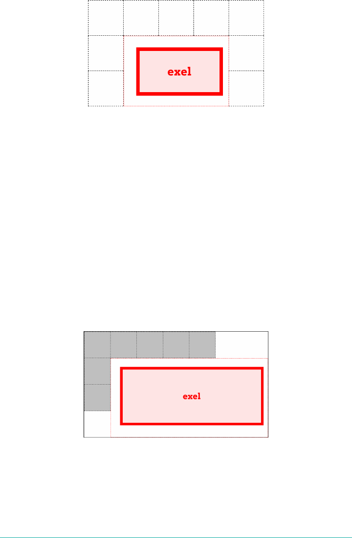
Figure 13-61. Absolutely positioning a grid item
Everything you know about absolutely positioned elements regarding offsets, mar‐
gins, element sizing, and so on applies within this formatting context. It’s just that in
this case, the formatting context is defined by a grid area.
There is a wrinkle that absolute positioning introduces: it changes the behavior of the
auto value for grid-line properties. If, for example, you set grid-column-end: auto
for an absolutely positioned grid item, the ending grid line will actually create a new
and special grid line that corresponds to the padding edge of the grid container itself.
This is true even if the explicit grid is smaller than the grid container, as can happen.
To see this in action, we’ll modify the previous example as follows, with the result
shown in Figure 13-62:
.exel {grid-row: 1 / auto; grid-column: 2 / auto;
position: absolute;
top: 1em; bottom: 15%;
left: 35px; right: 1rem;}
Figure 13-62. Auto values and absolute positioning
Note how the positioning context now starts at the top of the grid container, and
stretches all the way to the right edge of the grid container, even though the grid itself
ends well short of that edge.
720 | Chapter 13: Grid Layout

One implication of this behavior is that if you absolutely position an element that’s a
grid item, but you don’t give it any grid-line start or end values, then it will use the
inner padding edge of the grid container as its positioning context. It does this
without having to set the grid container to position: relative, or any of the other
usual tricks to establish a positioning context.
Note that absolutely positioned grid items do not participate in figuring out grid cell
and track sizing. As far as the grid layout is concerned, the positioned grid item
doesn’t exist. Once the grid is set up, then the grid item is positioned with respect to
the grid lines that define its positioning context.
As of late 2017, browsers did not support any of this absolute posi‐
tioning behavior. The only way to recreate it was to relatively posi‐
tion the element establishing the grid area, and absolutely position
a child element within it. That’s how the absolute-positioning fig‐
ures in this section were created. The special auto behavior was
also not supported.
Aligning and Grids
If you have any familiarity with flexbox, you’re probably aware of the various align‐
ment properties and their values. Those same properties are also available in grid lay‐
out, and have very similar effects.
First, a quick refresher. The properties that are available and what they affect are sum‐
marized in Table 13-1.
Table 13-1. Justify and align values
Property Aligns Applied to
justify-self A grid item in the inline (horizontal) direction Grid items
justify-items All grid items in the inline (horizontal) direction Grid container
justify-content The entire grid in the inline (horizontal) direction Grid container
align-self A grid item in the block (vertical) direction Grid items
align-items All grid items in the block (vertical) direction Grid container
align-content The entire grid in the block (vertical) direction Grid container
As Table 13-1 shows, the various justify-* properties change alignment along the
inline axis—in English, this will be the horizontal direction. The difference is whether
a property applies to a single grid item, all the grid items in a grid, or the entire grid.
Similarly, the align-* properties affect alignment along the block axis; in English,
this is the vertical direction.
Aligning and Grids | 721
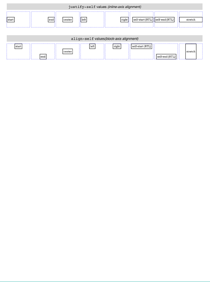
Aligning and Justifying Individual Items
It’s easiest to start with the *-self properties, because we can have one grid show var‐
ious justify-self property values, while a second grid shows the effects of those
same values when used by align-self. (See Figure 13-63.)
Figure 13-63. Self alignment in the inline and block directions
Each grid item in Figure 13-63 is shown with its grid area (the dashed blue line) and a
label identifying the property value that’s applied to it. Each deserves a bit of
commentary.
First, though, realize that for all of these values, any element that doesn’t have an
explicit width or height will “shrink-wrap” its content, instead of using the default
grid-item behavior of filling out the entire grid area.
start and end cause the grid item to be aligned to the start or end edge of its grid
area, which makes sense. Similarly, center centers the grid item within its area along
the alignment axis, without the need to declare margins or any other properties,
including height and width.
left and right have the expected results for horizontal alignment, but if they’re
applied to elements via align-self (which is vertical alignment), they’re treated
as start.
self-start and self-end are more interesting. self-start aligns a grid item with
the grid-area edge that corresponds to the grid item’s start edge. So in Figure 13-63,
the self-start and self-end boxes were set to direction: rtl. That set them to
use right-to-left language direction, meaning their start edges were their right edges,
and their end edges their left. You can see in the first grid that this right-aligned
self-start and left-aligned self-end. In the second grid, however, the RTL direc‐
tion is irrelevant to block-axis alignment. Thus, self-start was treated as start, and
self-end was treated as end.
722 | Chapter 13: Grid Layout

The last value, stretch, is interesting. To understand it, notice how the other boxes in
each grid “shrink-wrap” themselves to their content. stretch, on the other hand,
directs the element to stretch from edge to edge in the given direction—align-self:
stretch causes the grid item to stretch vertically, and justify-self: stretch causes
horizontal stretching. This is as you might expect, but bear in mind that it works only
if the element’s size properties are set to auto. Thus, given the following styles, the
first example will stretch vertically, but the second will not:
.exel01 {align-self: stretch; height: auto;}
.exel02 {align-self: stretch; height: 50%;}
Because the second example sets a height value that isn’t auto (which is the default
value), it cannot be resized by stretch. The same holds true for justify-self and
width.
There are two more values that can be used to align grid items, but they are suffi‐
ciently interesting to merit their own explanation. These permit the alignment of a
grid item’s first or last baseline with the highest or lowest baseline in the grid track.
For example, suppose you wanted a grid item to be aligned so the baseline of its last
line was aligned with the last baseline in the tallest grid item sharing its row track.
That would look like the following:
.exel {align-self: last-baseline;}
Conversely, to align its first baseline with the lowest first baseline in the same row
track, you’d say this:
.exel {align-self: baseline;}
In a situation where a grid element doesn’t have a baseline, or it’s asked to baseline-
align itself in a direction where baselines can’t be compared, then baseline is treated
as start and last-baseline is treated as end.
There are two values that were intentionally skipped in this section:
flex-start and flex-end. These values are supposed to be used
only in flexbox layout, and are defined to be equivalent to start
and end in any other layout context, including grid layout.
Aligning and Justifying All Items
Now let’s consider align-items and justify-items. These properties accept all the
same values we saw in the previous section, and have the same effect, except they
apply to all grid items in a given grid container, and must be applied to a grid con‐
tainer instead of to individual grid items.
Thus, you could set all of the grid items in a grid to be center-aligned within their
grid areas as follows, with a result like that depicted in Figure 13-64:
Aligning and Grids | 723
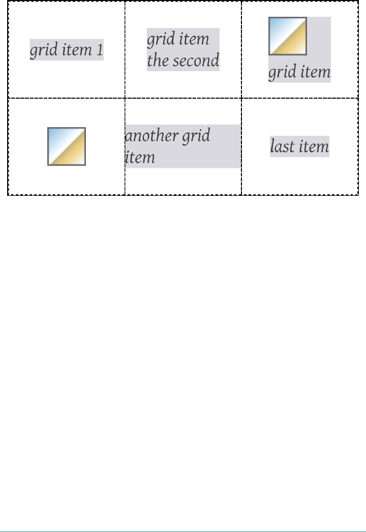
#grid {display: grid;
align-items: center; justify-items: center;}
Figure 13-64. Centering all the grid items
As you can see, that horizontally and vertically centers every grid item within its
given grid area. Furthermore, it causes any grid item without an explicit width and
height to “shrink-wrap” its content rather than stretch out to fill their grid area. If a
grid item has an explicit height and width, then those will be honored, and the item
centered within its grid area.
Beyond aligning and justifying every grid item, it’s possible to distribute the grid
items, or even to justify or align the entire grid, using align-content and justify-
content. There is a small set of distributive values for these properties. Figure 13-65
illustrates the effects of each value as applied to justify-content, with each grid
sharing the following styles:
.grid {display: grid; padding: 0.5em; margin: 0.5em 1em; width: auto;
grid-gap: 0.75em 0.5em; border: 1px solid;
grid-template-rows: 4em;
grid-template-columns: repeat(5, 6em);}
724 | Chapter 13: Grid Layout
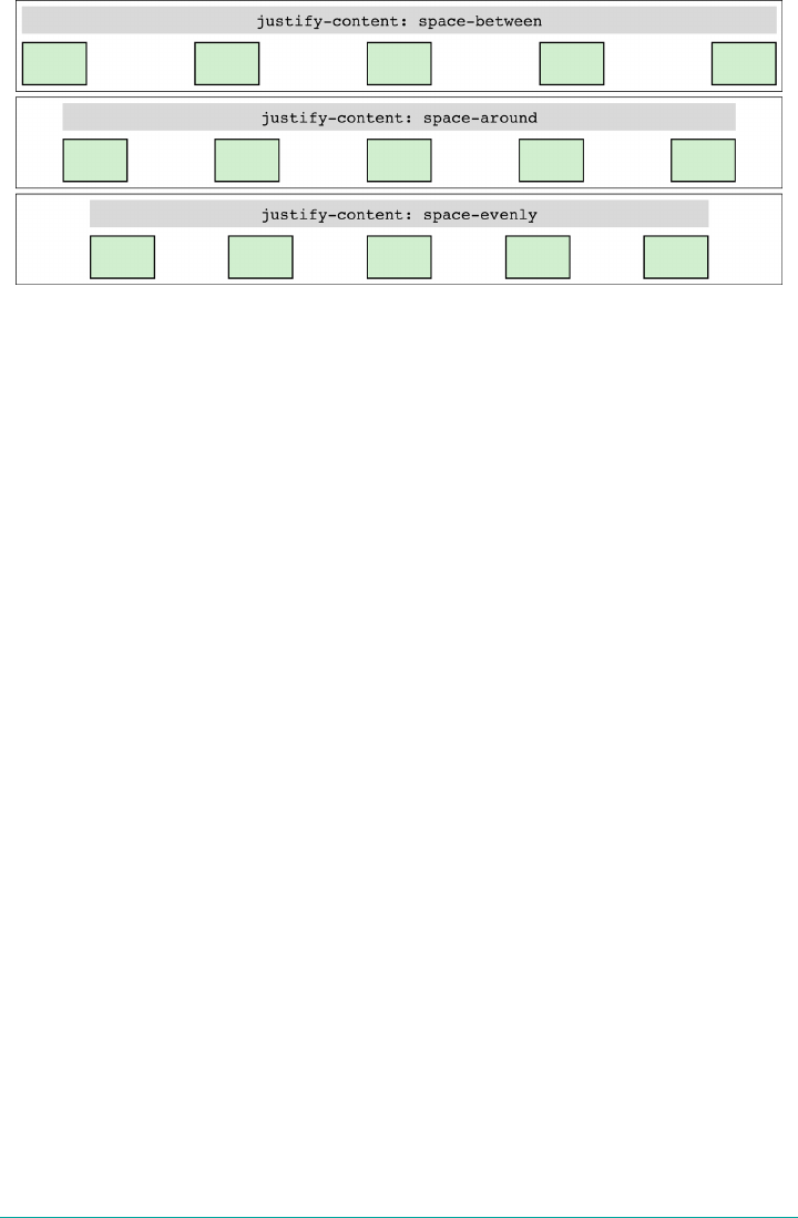
Figure 13-65. Distributing grid items horizontally
This works just as well in column tracks as it does in row tracks, as Figure 13-66 illus‐
trates, as long as you switch to align-content. This time, the grids all share these
styles:
.grid {display: grid; padding: 0.5em;
grid-gap: 0.75em 0.5em; border: 1px solid;
grid-template-rows: repeat(4, 3em);
grid-template-columns: 5em;}
The way this distribution works is that the grid tracks, including any gutters, are all
sized as usual. Then, if there is any leftover space within the grid container—that is, if
the grid tracks don’t reach all the way from one edge of the grid container to the other
—then the remaining space is distributed according to the value of justify-content
(in the horizontal) or align-content (in the vertical).
This space distribution is carried out by resizing the grid gutters. If there are no
declared gutters, there will be gutters. If there are already gutters, their sizes are
altered as required to distribute the grid tracks.
Note that because space is distributed only when the tracks don’t fill out the grid con‐
tainer, the gutters can only increase in size. If the tracks are larger than the container,
which can easily happen, there is no leftover space to distribute (negative space turns
out to be indivisible).
There is another distribution value, very new as of this writing, which wasn’t shown
in the previous figures. stretch takes any leftover space and applies it equally to the
grid tracks, not the gutters. So if there are 400 pixels of leftover space and 8 grid
tracks, each grid track is increased by 50 pixels. The grid tracks are not increased pro‐
portionally, but equally. As of late 2017, there was no browser support for this value
in terms of grid distribution.
Aligning and Grids | 725

Figure 13-66. Distributing grid items vertically
We’ll round out this section with examples of justifying, as opposed to distributing,
grid tracks. Figure 13-67 shows the possibilities when justifying horizontally.
Figure 13-67. Justifying the grid horizontally
In these cases, the set of grid tracks is taken as a single unit, and justified by the value
of justify-content. That alignment does not affect the alignment of individual grid
items; thus, you could end-justify the whole grid with justify-content: end while
having individual grid items be left-, center-, or start-justified (among other options)
within their grid areas.
As you might expect by now, being able to justify-content horizontally means you
can align-content vertically. Figure 13-68 shows each value in action.
726 | Chapter 13: Grid Layout
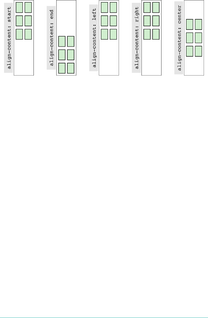
Figure 13-68. Aligning the grid vertically
left and right don’t really make sense in a vertical context, so they’re treated as
start. The others have the effect you’d expect from their names.
Layering and Ordering
As we saw in a previous section, it’s entirely possible to have grid items overlap each
other, whether because negative margins are used to pull a grid item beyond the edges
of its grid area, or because the grid areas of two different grid items share grid cells.
By default, the grid items will visually overlap in document source order: grid items
later in the document source will appear in front of grid items earlier in the document
source. Thus we see the following result in what’s depicted in Figure 13-69. (Assume
the number in each class name represents the grid item’s source order.)
#grid {display: grid; width: 80%; height: 20em;
grid-rows: repeat(10, 1fr); grid-columns: repeat(10, 1fr);}
.box01 {grid-row: 1 / span 4; grid-column: 1 / span 4;}
.box02 {grid-row: 4 / span 4; grid-column: 4 / span 4;}
.box03 {grid-row: 7 / span 4; grid-column: 7 / span 4;}
.box04 {grid-row: 4 / span 7; grid-column: 3 / span 2;}
.box05 {grid-row: 2 / span 3; grid-column: 4 / span 5;}
Layering and Ordering | 727
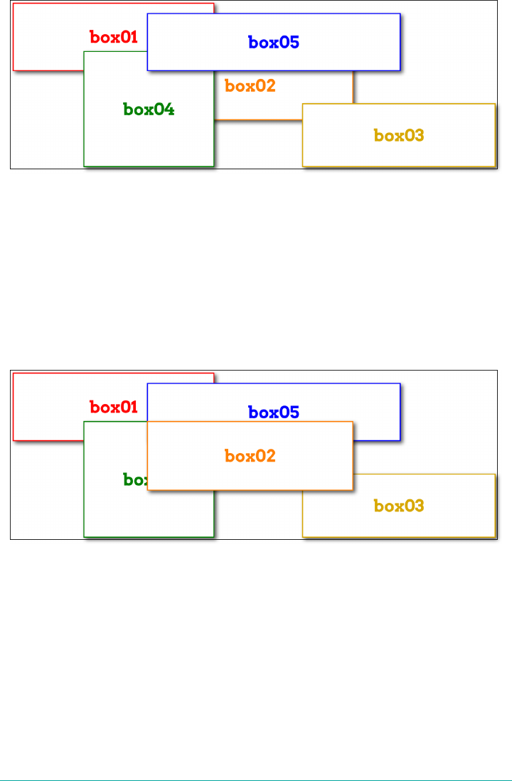
Figure 13-69. Grid items overlapping in source order
If you want to assert your own stacking order, then z-index is here to help. Just as in
positioning, z-index places elements relative to each other on the z-axis, which is
perpendicular to the display surface. Positive values are closer to you, and negative
values further away. So to bring the second box to the “top,” as it were, all you need is
to give it a z-index value higher than any other (with the result shown in
Figure 13-70):
.box02 {z-index: 10;}
Figure 13-70. Elevating a grid item
Another way you can affect the ordering of grid items is by using the order property.
Its effect is essentially the same as it is in flexbox—you can change the order of grid
items within a grid track by giving them order values. This affects not only place‐
ment within the track, but also paint order if they should overlap. For example, we
could change the previous example from z-index to order, as shown here, and get
the same result shown in Figure 13-70:
.box02 {order: 10;}
728 | Chapter 13: Grid Layout
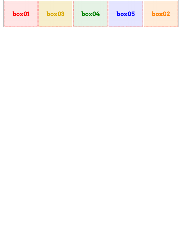
In this case, box02 appears “on top of” the other grid items because its order places it
after the rest of them. Thus, it’s drawn last. Similarly, if those grid items were all
placed in sequence in a grid track, the order value for box02 would put it at the end
of the sequence. This is depicted in Figure 13-71.
Figure 13-71. Changing grid-item order
Remember that just because you can rearrange the order of grid items this way,
it doesn’t necessarily mean you should. As the Grid Layout specification says (section
4.2):
As with reordering flex items, the order property must only be used when the visual
order needs to be out-of-sync with the speech and navigation order; otherwise the
underlying document source should be reordered instead.
So the only reason to use order to rearrange grid item layout is if you need to have
the document source in one order and layout in the other. This is already easily possi‐
ble by assigning grid items to areas that don’t match source order.
This is not to say that order is useless and should always be shunned; there may well
be times it makes sense. But unless you find yourself nearly forced into using it by
specific circumstances, think very hard about whether it’s the best solution.
Summary
Grid layout is complex and powerful, so don’t be discouraged if you feel over‐
whelmed. It takes some time to get used to how grid operates, especially since so
many of its features are nothing like what we’ve dealt with before. Much of those fea‐
tures’ power comes directly from their novelty—but like any powerful tool, it can be
difficult and frustrating to learn to use. I got frustrated and confused as I wrote about
grid, going down blind alleys and falling victim to two decades of instincts that had
been honed on a layout-less CSS.
I hope I was able to steer you past some of those pitfalls, but still, remember the
wisdom of Master Yoda: “You must unlearn what you have learned.” When coming to
grid layout, there has never been greater need to put aside what you think you
know about layout and learn anew. Over time, your patience and persistence will be
rewarded.
Summary | 729

CHAPTER 14
Table Layout in CSS
You may have glanced at that title and wondered, “Table layout? Isn’t that exactly
what we’re trying to avoid doing?” Indeed so, but this chapter is not about using
tables for layout. Instead, it’s about the ways that tables themselves are laid out by
CSS, which is a far more complicated affair than it might first appear.
Tables are unusual, compared to the rest of document layout. Until flexbox and grid
came along, tables alone possessed the unique ability to associate element sizes with
other elements—for example, all the cells in a row have the same height, no matter
how much or how little content each individual cell might contain. The same is true
for the widths of cells that share a column. Cells that adjoin can share a border, even
if the two cells have very different border styles. As we’ll see, these abilities are pur‐
chased at the expense of a great many behaviors and rules—many of them rooted
deep in the past—that apply to tables, and only tables.
Table Formatting
Before we can start to worry about how cell borders are drawn and tables sized, we
need to delve into the fundamental ways in which tables are assembled, and the ways
that elements within a table are related. This is referred to as table formatting, and it is
quite distinct from table layout: the layout is possible only after the formatting has
been completed.
Visually Arranging a Table
The first thing to understand is how CSS defines the arrangement of tables. While
this knowledge may seem a bit basic, it’s key to understanding how best to style
tables.
731
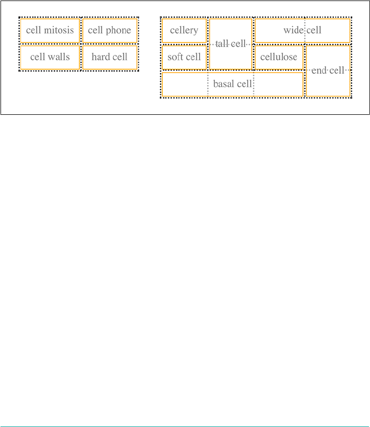
CSS draws a distinction between table elements and internal table elements. In CSS,
internal table elements generate rectangular boxes that have content, padding, and
borders, but not margins. Therefore, it is not possible to define the separation
between table cells by giving them margins. A CSS-conformant browser will ignore
any attempts to apply margins to cells, rows, or any other internal table element (with
the exception of captions, which are discussed in the “Captions” on page 744).
There are six basic rules for arranging tables. The basis of these rules is a grid cell,
which is one area between the grid lines on which a table is drawn. Consider
Figure 14-1, in which two tables are shown: their grid cells are indicated by the
dashed lines drawn over the tables.
Figure 14-1. Grid cells form the basis of table layout
In a simple 2 × 2 table, such as the lefthand table shown in Figure 14-1, the grid cells
correspond to the actual table cells. In a more complicated table, like the righthand
table in Figure 14-1, some table cells will span multiple grid cells—but note that every
table cell’s edges are placed along a grid-cell edge.
These grid cells are largely theoretical constructs, and they cannot be styled or even
accessed through the Document Object Model (DOM). They just serve as a way to
describe how tables are assembled for styling.
Table arrangement rules
•Each row box encompasses a single row of grid cells. All the row boxes in a table
fill the table from top to bottom in the order they occur in the source document
(with the exception of any table-header or table-footer row boxes, which come at
the beginning and end of the table, respectively). Thus, a table contains as many
grid rows as there are row elements (e.g., tr elements).
•A row group’s box encompasses the same grid cells as the row boxes it contains.
•A column box encompasses one or more columns of grid cells. All the column
boxes are placed next to one another in the order they occur. The first column
732 | Chapter 14: Table Layout in CSS

box is on the left for left-to-right languages, and on the right for right-to-left lan‐
guages.
•A column group’s box encompasses the same grid cells as the column boxes it
contains.
•Although cells may span several rows or columns, CSS does not define how this
happens. It is instead left to the document language to define spanning. Each
spanned cell is a rectangular box one or more grid cells wide and high. The top
row of this spanning rectangle is in the row that is parent to the spanned grid
cell. The cell’s rectangle must be as far to the left as possible in left-to-right lan‐
guages, but it may not overlap any other cell box. It must also be to the right of all
cells in the same row that are earlier in the source document (in a left-to-right
language). In right-to-left languages, a spanned cell must be as far to the right as
possible without overlapping other cells, and must be to the le of all cells in the
same row that follow it in the document source.
•A cell’s box cannot extend beyond the last row box of a table or row group. If the
table structure would cause this condition, the cell must be shortened until it fits
within the table or row group that encloses it.
The CSS specification discourages, but does not prohibit, the posi‐
tioning of table cells and other internal table elements. Positioning
a row that contains row-spanning cells, for example, could dramat‐
ically alter the layout of the table by removing the row from the
table entirely, thus removing the spanned cells from consideration
in the layout of other rows. Nevertheless, it is quite possible to
apply positioning to table elements in current browsers.
By definition, grid cells are rectangular, but they do not all have to be the same size.
All the grid cells in a given grid column will be the same width, and all the grid cells
in a grid row will be the same height, but the height of one grid row may be different
than that of another grid row. Similarly, grid columns may be of different widths.
With those basic rules in mind, a question may arise: how, exactly, do you know
which elements are cells and which are not?
Table Display Values
In HTML, it’s easy to know which elements are parts of tables because the handling of
elements like tr and td is built into browsers. In XML, on the other hand, there is no
way to intrinsically know which elements might be part of a table. This is where a
whole collection of values for display come into play.
Table Formatting | 733
display
Values [ <display-outside> ‖ <display-inside> ] | <display-listitem> | <display-internal> |
<display-box> | <display-legacy>
Denitions See below
Initial value inline
Applies to All elements
Computed value As specied
Inherited No
Animatable No
<display-outside>
block | inline | run-in
<display-inside>
flow | flow-root | table | flex | grid | ruby
<display-listitem>
list-item && <display-outside>? && [ flow | flow-root ]?
<display-internal>
table-row-group | table-header-group | table-footer-group | table-row |
table-cell | table-column-group | table-column | table-caption | ruby-base
| ruby-text | ruby-base-container | ruby-text-container
<display-box>
contents | none
<display-legacy>
inline-block | inline-list-item | inline-table | inline-flex | inline-grid
In this chapter, we’ll stick to the table-related values, as the others are all beyond the
scope of tables. The table-related values can be summarized as follows:
table
This value specifies that an element defines a block-level table. Thus, it defines a
rectangular block that generates a block box. The corresponding HTML element
is, not surprisingly, table.
inline-table
This value specifies that an element defines an inline-level table. This means the
element defines a rectangular block that generates an inline box. The closest non-
734 | Chapter 14: Table Layout in CSS

table analogue is the value inline-block. The closest HTML element is table,
although, by default, HTML tables are not inline.
table-row
This value specifies that an element is a row of table cells. The corresponding
HTML element is the tr element.
table-row-group
This value specifies that an element groups one or more table rows. The corre‐
sponding HTML value is tbody.
table-header-group
This value is very much like table-row-group, except that for visual formatting,
the header row group is always displayed before all other rows and row groups,
and after any top captions. In print, if a table requires multiple pages to print, a
user agent may repeat header rows at the top of each page (Firefox does this, for
example). The specification does not define what happens if you assign table-
header-group to multiple elements. A header group can contain multiple rows.
The HTML equivalent is thead.
table-footer-group
This value is very much like table-header-group, except that the footer row
group is always displayed after all other rows and row groups, and before any
bottom captions. In print, if a table requires multiple pages to print, a user agent
may repeat footer rows at the bottom of each page. The specification does not
define what happens if you assign table-footer-group to multiple elements.
This is equivalent to the HTML element tfoot.
table-column
This value declares that an element describes a column of table cells. In CSS
terms, elements with this display value are not visually rendered, as if they had
the value none. Their existence is largely for the purposes of helping to define the
presentation of cells within the column. The HTML equivalent is the col ele‐
ment.
table-column-group
This value declares that an element groups one or more columns. Like table-
column elements, table-column-group elements are not rendered, but the value
is useful for defining presentation for elements within the column group. The
HTML equivalent is the colgroup element.
table-cell
This value specifies that an element represents a single cell in a table. The HTML
elements th and td are both examples of table-cell elements.
Table Formatting | 735

table-caption
This value defines a table’s caption. CSS does not define what should happen if
multiple elements have the value caption, but it does explicitly warn, “authors
should not put more than one element with display: caption inside a table or
inline-table element.”
You can get a quick summary of the general effects of these values by taking an
excerpt from the example HTML 4.0 stylesheet given in Appendix D of the CSS 2.1
specification:
table {display: table;}
tr {display: table-row;}
thead {display: table-header-group;}
tbody {display: table-row-group;}
tfoot {display: table-footer-group;}
col {display: table-column;}
colgroup {display: table-column-group;}
td, th {display: table-cell;}
caption {display: table-caption;}
In XML, where elements will not have display semantics by default, these values
become quite useful. Consider the following markup:
<scores>
<headers>
<label>Team</label>
<label>Score</label>
</headers>
<game sport="MLB" league="NL">
<team>
<name>Reds</name>
<score>8</score>
</team>
<team>
<name>Cubs</name>
<score>5</score>
</team>
</game>
</scores>
This could be formatted in a tabular fashion using the following styles:
scores {display: table;}
headers {display: table-header-group;}
game {display: table-row-group;}
team {display: table-row;}
label, name, score {display: table-cell;}
The various cells could then be styled as necessary—for example, boldfacing the
label elements and right-aligning the scores.
736 | Chapter 14: Table Layout in CSS

Row primacy
CSS defines its table model as “row primacy.” In other words, the model assumes that
authors will create markup languages where rows are explicitly declared. Columns,
on the other hand, are derived from the layout of the rows of cells. Thus, the first col‐
umn is made up of the first cells in each row; the second column is made up of the
second cells, and so forth.
Row primacy is not a major issue in HTML, where the markup language is already
row-oriented. In XML, it has more of an impact because it constrains the way in
which authors can define table markup. Because of the row-oriented nature of the
CSS table model, a markup language in which columns are the basis of table layout is
not really possible (assuming that the intent is to use CSS to present such
documents).
Columns
Although the CSS table model is row-oriented, columns do still play a part in layout.
A cell can belong to both contexts (row and column), even though it is descended
from row elements in the document source. In CSS, however, columns and column
groups can accept only four nontable properties: border, background, width, and
visibility.
In addition, each of these four properties has special rules that apply only in the col‐
umnar context:
border
Borders can be set for columns and column groups only if the property border-
collapse has the value collapse. In such circumstances, column and column-
group borders participate in the collapsing algorithm that sets the border styles at
each cell edge. (See “Collapsing Cell Borders” on page 749.)
background
The background of a column or column group will be visible only in cells where
both the cell and its row have transparent backgrounds. (See “Table Layers” on
page 742.)
width
The width property defines the minimum width of the column or column group.
The content of cells within the column (or group) may force the column to
become wider.
visibility
If the value of visibility for a column or column group is collapse, then none
of the cells in the column (or group) are rendered. Cells that span from the
collapsed column into other columns are clipped, as are cells that span from
Table Formatting | 737

other columns into the hidden column. Furthermore, the overall width of the
table is reduced by the width the column would have taken up. A declaration of
any visibility value other than hidden is ignored for a column or column
group.
Anonymous Table Objects
There is the possibility that a markup language might not contain enough elements to
fully represent tables as they are defined in CSS, or that an author will forget to
include all the necessary elements. For example, consider this HTML:
<table>
<td>Name:</td>
<td><input type="text"></td>
</table>
You might glance at this markup and assume that it defines a two-cell table of a single
row, but structurally, there is no element defining a row (because the tr is missing).
To cover such possibilities, CSS defines a mechanism for inserting “missing” table
components as anonymous objects. For a basic example of how this works, let’s revisit
our missing-row HTML example. In CSS terms, what effectively happens is that an
anonymous table-row object is inserted between the table element and its descend‐
ant table cells:
<table>
<!--anonymous table-row object begins-->
<td>Name:</td>
<td><input type="text"></td>
<!--anonymous table-row object ends-->
</table>
A visual representation of this process is given in Figure 14-2, where the dotted line
represents the inserted anonymous table row.
Figure 14-2. Anonymous-object generation in table formatting
Seven different kinds of anonymous-object insertions can occur in the CSS table
model. These seven rules are, like inheritance and specificity, an example of a mecha‐
nism that attempts to impose intuitive sense on the way CSS behaves.
738 | Chapter 14: Table Layout in CSS

Object insertion rules
1. If a table-cell element’s parent is not a table-row element, then an anonymous
table-row object is inserted between the table-cell element and its parent. The
inserted object will include all consecutive siblings of the table-cell element.
Consider the following styles and markup:
system {display: table;}
name, moons {display: table-cell;}
<system>
<name>Mercury</name>
<moons>0</moons>
</system>
The anonymous table-row object is inserted between the cell elements and the
system element, and it encloses both the name and moons elements.
The same holds true even if the parent element is a table-row-group. To extend
the example, assume that the following applies:
system {display: table;}
planet {display: table-row-group;}
name, moons {display: table-cell;}
<system>
<planet>
<name>Mercury</name>
<moons>0</moons>
</planet>
<planet>
<name>Venus</name>
<moons>0</moons>
</planet>
</system>
In this example, both sets of cells will be enclosed in an anonymous table-row
object that is inserted between them and the planet elements.
2. If a table-row element’s parent is not a table, inline-table, or table-row-
group element, then an anonymous table element is inserted between the
table-row element and its parent. The inserted object will include all consecutive
siblings of the table-row element. Consider the following styles and markup:
docbody {display: block;}
planet {display: table-row;}
<docbody>
<planet>
<name>Mercury</name>
<moons>0</moons>
Table Formatting | 739

</planet>
<planet>
<name>Venus</name>
<moons>0</moons>
</planet>
</docbody>
Because the display value of the planet elements’ parent is block, the anony‐
mous table object is inserted between the planet elements and the docbody ele‐
ment. This anonymous table object will enclose both planet elements, since
they are consecutive siblings.
3. If a table-column element’s parent is not a table, inline-table, or table-
column-group element, then an anonymous table element is inserted between
the table-column element and its parent. This is much the same as the table-
row rule just discussed, except for its column-oriented nature.
4. If the parent element of a table-row-group, table-header-group, table-
footer-group, table-column-group, or table-caption element is not a table
element, then an anonymous table object is inserted between the element and
its parent.
5. If a child element of a table or inline-table element is not a table-row-group,
table-header-group, table-footer-group, table-row, or table-caption ele‐
ment, then an anonymous table-row object is inserted between the table ele‐
ment and its child element. This anonymous object spans all of the consecutive
siblings of the child element that are not table-row-group, table-header-
group, table-footer-group, table-row, or table-caption elements. Consider
the following markup and styles:
system {display: table;}
planet {display: table-row;}
name, moons {display: table-cell;}
<system>
<planet>
<name>Mercury</name>
<moons>0</moons>
</planet>
<name>Venus</name>
<moons>0</moons>
</system>
Here, a single anonymous table-row object will be inserted between the system
element and the second set of name and moons elements. The planet element is
not enclosed by the anonymous object because its display is table-row.
6. If a child element of a table-row-group, table-header-group, or table-
footer-group element is not a table-row element, then an anonymous table-
740 | Chapter 14: Table Layout in CSS

row object is inserted between the element and its child element. This anonymous
object spans all of the consecutive siblings of the child element that are not
table-row objects themselves. Consider the following markup and styles:
system {display: table;}
planet {display: table-row-group;}
name, moons {display: table-cell;}
<system>
<planet>
<name>Mercury</name>
<moons>0</moons>
</planet>
<name>Venus</name>
<moons>0</moons>
</system>
In this case, each set of name and moons elements will be enclosed in an anony‐
mous table-row element. For the second set, the insertion happens in accord
with rule 5. For the first set, the anonymous object is inserted between the planet
element and its children because the planet element is a table-row-group
element.
7. If a child element of a table-row element is not a table-cell element, then an
anonymous table-cell object is inserted between the element and its child ele‐
ment. This anonymous object encloses all consecutive siblings of the child ele‐
ment that are not table-cell elements themselves. Consider the following
markup and styles:
system {display: table;}
planet {display: table-row;}
name, moons {display: table-cell;}
<system>
<planet>
<name>Mercury</name>
<num>0</num>
</planet>
</system>
Because the element num does not have a table-related display value, an anony‐
mous table-cell object is inserted between the planet element and the num
element.
This behavior also extends to the encapsulation of anonymous inline boxes. Sup‐
pose that the num element was not included:
<system>
<planet>
<name>Mercury</name>
0
Table Formatting | 741
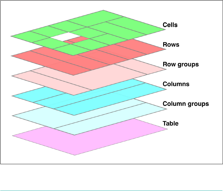
</planet>
</system>
The 0 would still be enclosed in an anonymous table-cell object. To further
illustrate this point, here is an example adapted from the CSS specification:
example {display: table-cell;}
row {display: table-row;}
hey {font-weight: 900;}
<example>
<row>This is the <hey>top</hey> row.</row>
<row>This is the <hey>bottom</hey> row.</row>
</example>
Within each row element, the text fragments and hey element are enclosed in
anonymous table-cell objects.
Table Layers
For the assembly of a table’s presentation, CSS defines six individual “layers” on
which the various aspects of a table are placed. Figure 14-3 shows these layers.
Figure 14-3. e formatting layers used in table presentation
742 | Chapter 14: Table Layout in CSS
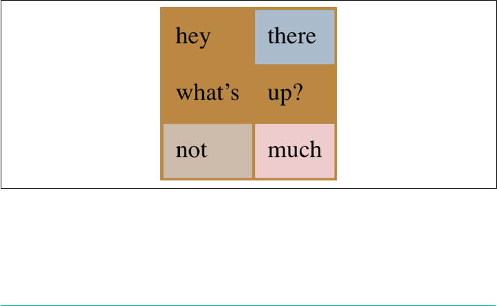
Basically, the styles for each aspect of the table are drawn on their individual layers.
Thus, if the table element has a green background and a one-pixel black border, then
those styles are drawn on the lowest layer. Any styles for the column groups are
drawn on the next layer up, the columns themselves on the layer above that, and so
on. The top layer, which corresponds to the table cells, is drawn last.
For the most part, this is a logical process; after all, if you declare a background color
for table cells, you would want that drawn over the background for the table element.
The most important point revealed by Figure 14-3 is that column styles come below
row styles, so a row’s background will overwrite a column’s background.
It is important to remember that by default, all elements have transparent back‐
grounds. Thus, in the following markup, the table element’s background will be visi‐
ble “through” cells, rows, columns, and so forth that do not have a background of
their own, as illustrated in Figure 14-4:
<table style="background: #B84;">
<tr>
<td>hey</td>
<td style="background: #ABC;">there</td>
</tr>
<tr>
<td>what’s</td>
<td>up?</td>
</tr>
<tr style="background: #CBA;">
<td>not</td>
<td style="background: #ECC;">much</td>
</tr>
</table>
Figure 14-4. Seeing the background of table-formatting layers through other layers
Table Formatting | 743

Captions
A table caption is about what you’d expect: a short bit of text that describes the nature
of the table’s contents. A chart of stock quotes for the fourth quarter of 2016, there‐
fore, might have a caption element whose contents read “Q4 2016 Stock Perfor‐
mance.” With the property caption-side, you can place this element either above or
below the table, regardless of where the caption appears in the table’s structure. (In
HTML5, the caption element can appear only as the first child of a table element,
but other languages may have different rules.)
caption-side
Values top | bottom
Initial value top
Applies to Elements with the display value table-caption
Computed value As specied
Inherited Yes
Animatable No
Note The values left and right appeared in CSS2, but were dropped from CSS2.1 due to
a lack of widespread support.
Captions are a bit odd, at least in visual terms. The CSS specification states that a cap‐
tion is formatted as if it were a block box placed immediately before (or after) the
table’s box, with one exception: the caption can still inherit values from the table.
A simple example should suffice to illustrate most of the important aspects of caption
presentation. Consider the following, illustrated in Figure 14-5:
caption {background: #B84; margin: 1em 0; caption-side: top;}
table {color: white; background: #840; margin: 0.5em 0;}
The text in the caption element inherits the color value white from the table, while
the caption gets its own background. The separation between the table’s outer border
edge and the caption’s outer margin edge is 1 em, as the top margin of the table and
bottom margin of the caption have collapsed. Finally, the width of the caption is
based on the content width of the table element, which is considered to be the con‐
taining block of the caption.
744 | Chapter 14: Table Layout in CSS
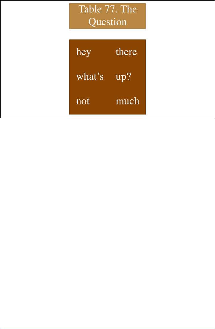
Figure 14-5. Styling captions and tables
These same results would occur if we change the value of caption-side to bottom,
except that the caption would be placed after the table’s box, and collapsing would
occur between the top margin of the caption and the bottom margin of the table.
For the most part, captions are styled just like any block-level element: they can be
padded, have borders, be given backgrounds, and so on. For example, if we need to
change the horizontal alignment of text within the caption, we use the property text-
align. Thus, to right-align the caption in the previous example, we would write:
caption {background: gray; margin: 1em 0;
caption-side: top; text-align: right;}
Table Cell Borders
There are two quite distinct border models in CSS. The separated border model takes
effect when cells are separated from each other in layout terms. The other option is
the collapsed border model, in which there is no visual separation between cells, and
cell borders merge, or collapse into one another. The former is the default model,
although in an earlier version of CSS the latter was the default.
An author can choose between the two models with the property border-collapse.
Table Cell Borders | 745

border-collapse
Values collapse | separate | inherit
Initial value separate
Applies to Elements with the display value table or table-inline
Inherited Yes
Computed value As specied
Note In CSS2, the default was collapse.
The whole point of this property is to offer a way to determine which border model
the user agent will employ. If the value collapse is in effect, then the collapsing bor‐
ders model is used. If the value is separate, then the separated borders model is used.
We’ll look at the former model first, since it’s much easier to describe, and it’s the
default value.
Separated Cell Borders
In this model, every cell in the table is separated from the other cells by some dis‐
tance, and the borders of cells do not collapse into one another. Thus, given the fol‐
lowing styles and markup, you would see the result shown in Figure 14-6:
table {border-collapse: separate;}
td {border: 3px double black; padding: 3px;}
tr:nth-child(2) td:nth-child(2) {border-color: gray;}
<table cellspacing="0">
<tr>
<td>cell one</td>
<td>cell two</td>
</tr>
<tr>
<td>cell three</td>
<td>cell four</td>
</tr>
</table>
Note that the cell borders touch but remain distinct from one another. The three lines
between cells are actually the two double borders sitting right next to each other; the
gray border around the fourth cell helps make this more clear.
746 | Chapter 14: Table Layout in CSS
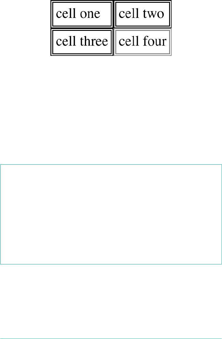
Figure 14-6. Separated (and thus separate) cell borders
The HTML attribute cellspacing was included in the preceding example to make
sure the cells had no separation between them, but its presence is likely a bit trou‐
bling. After all, if you can define that borders be separate, then there ought to be a
way to use CSS to alter the spacing between cells. Fortunately, there is.
Border spacing
Once you’ve separated the table cell borders, there may be situations where you want
those borders to be separated by some distance. This can be easily accomplished with
the property border-spacing, which provides a more powerful replacement for the
HTML attribute cellspacing.
border-spacing
Values <length> <length>?
Initial value 0
Applies to Elements with the display value table or table-inline
Computed value Two absolute lengths
Inherited Yes
Animatable Yes
Note Property is ignored unless border-collapse value is separate
Either one or two lengths can be given for the value of this property. If you want all
your cells separated by a single pixel, then border-spacing: 1px; will suffice. If, on
the other hand, you want cells to be separated by one pixel horizontally and five pix‐
els vertically, write border-spacing: 1px 5px;. If two lengths are supplied, the first
is always the horizontal separation, and the second is always the vertical.
Table Cell Borders | 747
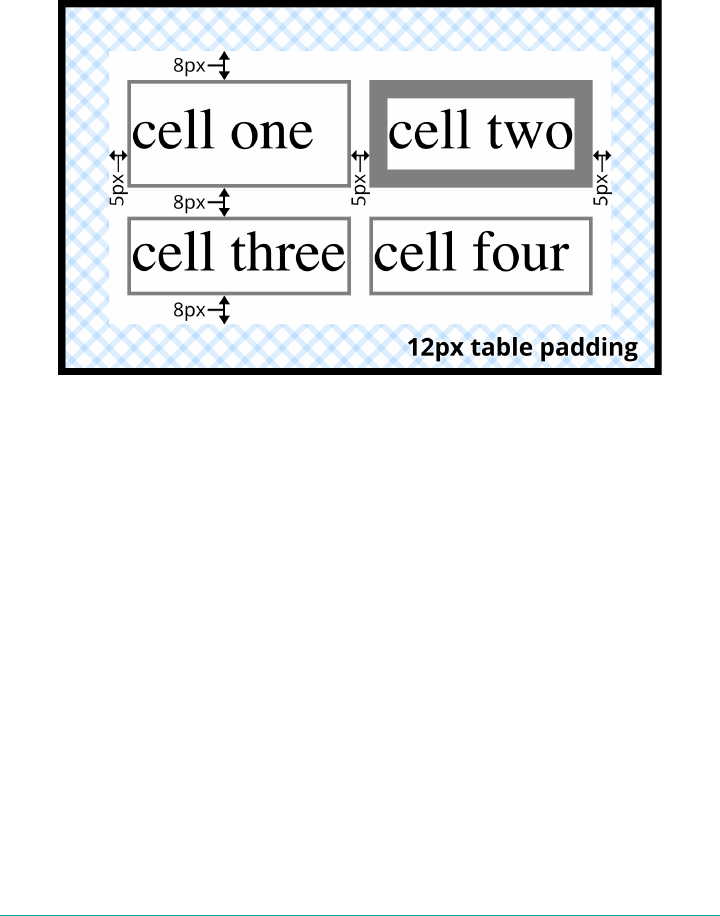
The spacing values are also applied between the borders of cells along the outside of a
table and the padding on the table element itself. Given the following styles, you
would get the result shown in Figure 14-7:
table {border-collapse: separate; border-spacing: 5px 8px;
padding: 12px; border: 2px solid black;}
td { border: 1px solid gray;}
td#squeeze {border-width: 5px;}
Figure 14-7. Border spacing eects between cells and their enclosing table
In Figure 14-7, there is a space 5 pixels wide between the borders of any two horizon‐
tally adjacent cells, and there are 17 pixels of space between the borders of the right-
and left-most cells and the right and left borders of the table element. Similarly, the
borders of vertically adjacent cells are 8 pixels apart, and the borders of the cells in the
top and bottom rows are 20 pixels from the top and bottom borders of the table,
respectively. The separation between cell borders is constant throughout the table,
regardless of the border widths of the cells themselves.
Note also that if you’re going to declare a border-spacing value, it’s done on the table
itself, not on the individual cells. If border-spacing had been declared for the td ele‐
ments in the previous example, it would have been ignored.
In the separated-border model, borders cannot be set for rows, row groups, columns,
and column groups. Any border properties declared for such elements must be
ignored by a CSS-conformant user agent.
748 | Chapter 14: Table Layout in CSS

Handling empty cells
Because every cell is, in a visual sense, distinct from all the other cells in the table,
what do you do with cells that are empty (i.e., have no content)? You have two
choices, which are reflected in the values of the empty-cells property.
empty-cells
Values show | hide
Initial value show
Applies to Elements with the display value table-cell
Computed value As specied
Inherited Yes
Animatable No
Note Property is ignored unless border-collapse value is separate
If empty-cells is set to show, then the borders and background of an empty cell will
be drawn, just as with table cells that have content. If the value is hide, then no part of
the cell is drawn, just as if the cell were set to visibility: hidden.
If a cell contains any content, it cannot be considered empty. “Content,” in this case,
includes not only text, images, form elements, and so on, but also the nonbreaking
space entity ( ) and any other whitespace except the CR (carriage return), LF
(line feed), tab, and space characters. If all the cells in a row are empty, and all have an
empty-cells value of hide, then the entire row is treated as if the row element were
set to display: none.
Collapsing Cell Borders
While the collapsing cell model largely describes how HTML tables have always been
laid out when they don’t have any cell spacing, it is quite a bit more complicated than
the separated borders model. There are also some rules that set collapsing cell borders
apart from the separated borders model:
•Elements with a display of table or inline-table cannot have any padding
when border-collapse is collapse, although they can have margins. Thus,
there is never separation between the border around the outside of the table and
the edges of its outermost cells in the collapsed borders model.
•Borders can be applied to cells, rows, row groups, columns, and column groups.
A table itself can, as always, have a border.
Table Cell Borders | 749
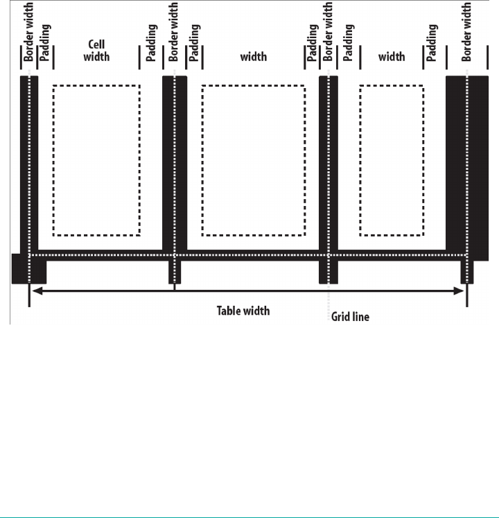
•There is never any separation between cell borders in the collapsed borders
model. In fact, borders collapse into each other where they adjoin, so that only
one of the collapsing borders is actually drawn. This is somewhat akin to margin
collapsing, where the largest margin wins. When cell borders collapse, the “most
interesting” border wins.
•Once they are collapsed, the borders between cells are centered on the hypotheti‐
cal grid lines between the cells.
We’ll explore the last two points in more detail in the next two sections.
Collapsing border layout
In order to better understand how the collapsing borders model works, let’s look at
the layout of a single table row, as shown in Figure 14-8.
Figure 14-8. e layout of a table row using the collapsing borders model
For each cell, the padding and content width of the cell is inside the borders, as
expected. For the borders between cells, half of the border is to one side of the grid
line between two cells, and the other half is to the other side. In each case, only a sin‐
gle border is drawn along each cell edge. You might think that half of each cell’s bor‐
der is drawn to each side of the grid line, but that’s not what happens.
750 | Chapter 14: Table Layout in CSS

For example, assume that the solid borders on the middle cell are green and the solid
borders on the outer two cells are red. The borders on the right and left sides of the
middle cell (which collapse with the adjacent borders of the outer cells) will be all
green, or all red, depending on which border wins out. We’ll discuss how to tell which
one wins in the next section.
You may have noticed that the outer borders protrude past the table’s width. This is
because in this model, half the table’s borders are included in the width. The other
half sticks out beyond that distance, sitting in the margin itself. This might seem a bit
weird, but that’s how the model is defined to work.
The specification includes a layout formula that I’ll reproduce here for the benefit of
those who enjoy such things:
row width = (0.5 * border-width-0) + padding-left-1 + width-1 + padding-right-1
+ border-width-1 + padding-left-2 +...+ padding-right-n + (0.5 * border-width-n)
Each border-width-n refers to the border between cell n and the next cell; thus,
border-width-3 refers to the border between the third and fourth cells. The value n
stands for the total number of cells in the row.
There is a slight exception to this mechanism. When beginning the layout of a
collapsed-border table, the user agent computes an initial left and right border for the
table itself. It does this by examining the left border of the first cell in the first row of
the table and by taking half of that border’s width as the table’s initial left border
width. The user agent then examines the right border of the last cell in the first row
and uses half that width to set the table’s initial right-border width. For any row after
the first, if the left or right border is wider than the initial border widths, it sticks out
into the margin area of the table.
In cases where a border is an odd number of display elements (pixels, printer dots,
etc.) wide, the user agent is left to decide what to do about centering the border on
the grid line. It might shift the border so that it is slightly off-center, round up or
down to an even number of display elements, use anti-aliasing, or adjust anything else
that seems reasonable.
Border collapsing
When two or more borders are adjacent, they collapse into each other. In fact, they
don’t collapse so much as fight it out to see which of them will gain supremacy over
the others. There are some strict rules governing which borders will win and which
will not:
•If one of the collapsing borders has a border-style of hidden, it takes prece‐
dence over all other collapsing borders. All borders at this location are hidden.
Table Cell Borders | 751

•If all the borders are visible, then wider borders take precedence over narrower
ones. Thus, if a two-pixel dotted border and a five-pixel double border collapse,
the border at that location will be a five-pixel double border.
•If all collapsing borders have the same width but different border styles, then the
border style is taken in the following order, from most to least preferred: double,
solid, dashed, dotted, ridge, outset, groove, inset, none. Thus, if two borders
with the same width are collapsing, and one is dashed while the other is outset,
the border at that location will be dashed.
•If collapsing borders have the same style and width, but differ in color, then the
color used is taken from an element in the following list, from most preferred to
least: cell, row, row group, column, column group, table. Thus, if the borders of a
cell and a column (identical in every way except color) collapse, then the cell’s
border color (and style and width) will be used. If the collapsing borders come
from the same type of element, such as two row borders with the same style and
width but different colors, then the color is taken from borders that are further to
the top and left (in left-to-right languages; otherwise, further to the top and
right).
The following styles and markup, presented in Figure 14-9, help illustrate each of the
four rules:
table {border-collapse: collapse;
border: 3px outset gray;}
td {border: 1px solid gray; padding: 0.5em;}
#r2c1, #r2c2 {border-style: hidden;}
#r1c1, #r1c4 {border-width: 5px;}
#r2c4 {border-style: double; border-width: 3px;}
#r3c4 {border-style: dotted; border-width: 2px;}
#r4c1 {border-bottom-style: hidden;}
#r4c3 {border-top: 13px solid silver;}
<table>
<tr>
<td id="r1c1">1-1</td>
<td id="r1c2">1-2</td>
<td id="r1c3">1-3</td>
<td id="r1c4">1-4</td>
</tr>
<tr>
<td id="r2c1">2-1</td>
<td id="r2c2">2-2</td>
<td id="r2c3">2-3</td>
<td id="r2c4">2-4</td>
</tr>
<tr>
<td id="r3c1">3-1</td>
<td id="r3c2">3-2</td>
<td id="r3c3">3-3</td>
752 | Chapter 14: Table Layout in CSS
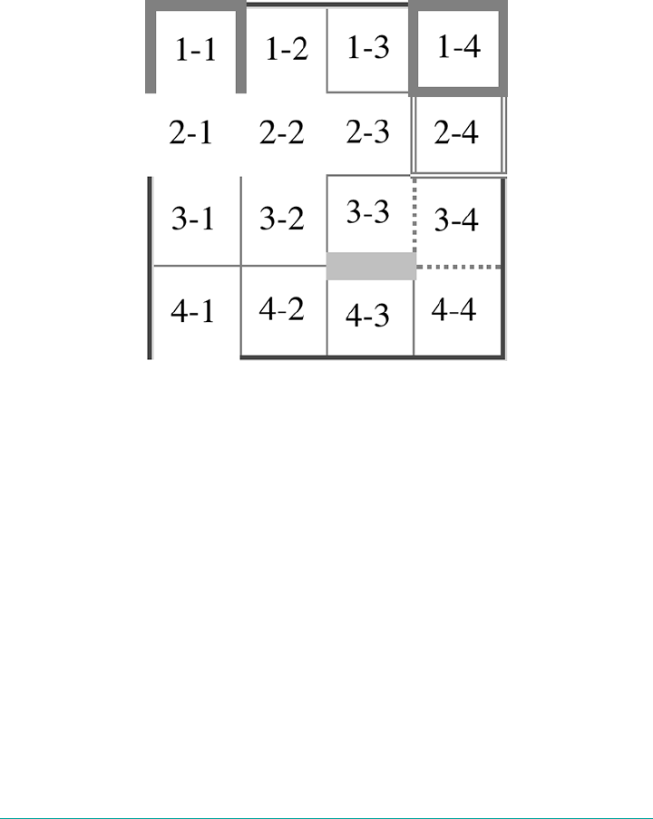
<td id="r3c4">3-4</td>
</tr>
<tr>
<td id="r4c1">4-1</td>
<td id="r4c2">4-2</td>
<td id="r4c3">4-3</td>
<td id="r4c4">4-4</td>
</tr>
</table>
Figure 14-9. Manipulating border widths, styles, and colors leads to some unusual
results
Let’s consider what happened for each of the cells, in turn:
•For cells 1-1 and 1-4, the five-pixel borders were wider than any of their adjacent
borders, so they won out not only over adjoining cell borders, but over the bor‐
der of the table itself. The only exception is the bottom of cell 1-1, which was
suppressed.
•The bottom border on cell 1-1 was suppressed because cells 2-1 and 2-2, with
their explicitly hidden borders, completely remove any borders from the edge of
the cells. Again, the table’s border lost out (on the left edge of cell 2-1) to a cell’s
border. The bottom border of cell 4-1 was also hidden, and so it prevented any
border from appearing below the cell.
•The three-pixel double border of cell 2-4 was overridden on top by the five-pixel
solid border of cell 1-4. Cell 2-4’s border, in turn, overrode the border between
itself and cell 2-3 because it was both wider and “more interesting.” Cell 2-4 also
Table Cell Borders | 753
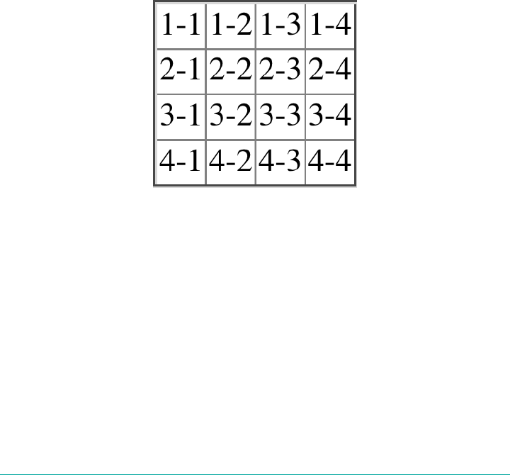
overrode the border between itself and cell 3-4, even though both are the same
width, because 2-4’s double style is defined to be “more interesting” than 3-4’s
dotted border.
•The 13-pixel bottom silver border of cell 3-3 not only overrode the top border of
cell 4-3, but it also affected the layout of content within both cells and the rows
that contain both cells.
•For cells along the outer edge of the table that aren’t specially styled, their one-
pixel solid borders are overridden by the three-pixel outset border on the table
element itself.
This is, in fact, about as complicated as it sounds, although the behaviors are largely
intuitive and make a little more sense with practice. It’s worth noting, though, that the
basic Netscape 1.1-era table presentation can be captured with a fairly simple set of
rules, described here and illustrated by Figure 14-10:
table {border-collapse: collapse; border: 2px outset gray;}
td {border: 1px inset gray;}
Figure 14-10. Reproducing old-school table presentation
Table Sizing
Now that we’ve dug into the guts of table formatting and cell border appearance, we
have the pieces we need to understand the sizing of tables and their internal elements.
When it comes to determining table width, there are two different approaches: xed-
width layout and automatic-width layout. Heights are calculated automatically, no
matter what width algorithms are used.
754 | Chapter 14: Table Layout in CSS

Width
Since there are two different ways to figure out the width of a table, it’s only logical
that there be a way to declare which should be used for a given table. Authors can use
the property table-layout to select between the two kinds of table width calculation.
table-layout
Values auto | fixed
Initial value auto
Applies to Elements with the display value table or inline-table
Computed value As specied
Inherited Yes
Animatable No
While the two models can have different results in laying out a given table, the funda‐
mental difference between the two is that of speed. With a fixed-width table layout,
the user agent can calculate the layout of the table more quickly than is possible in the
automatic-width model.
Fixed layout
The main reason the fixed-layout model is so fast is that its layout does not depend
on the contents of table cells. Instead, it’s driven by the width values of the table, col‐
umns, and cells within that table.
The fixed-layout model works in the following steps:
1. Any column element whose width property has a value other than auto sets the
width for that entire column.
a. If a column has an auto width, but the cell in the first row of the table within
that column has a width other than auto, then the cell sets the width for that
entire column. If the cell spans multiple columns, then the width is divided
between the columns.
b. Any columns that are still auto-sized are sized so that their widths are as equal
as possible.
At that point, the width of the table is set to be either the value of width for the table
or the sum of the column widths, whichever is greater. If the table turns out to be
Table Sizing | 755

wider than its columns, then the difference is divided by the number of columns and
the result is added to each of them.
This approach is fast because all of the column widths are defined by the first row of
the table. The cells in any rows that come after the first are sized according to the col‐
umn widths that were defined by the first row. The cells in those following rows do
not—indeed, cannot—change column widths, which means that any width value
assigned to those cells will be ignored. In cases where a cell’s content does not fit into
its cell, the overflow value for the cell determines whether the cell contents are clip‐
ped, visible, or generate a scrollbar.
Let’s consider the following styles and markup, which are illustrated in Figure 14-11:
table {table-layout: fixed; width: 400px;
border-collapse: collapse;}
td {border: 1px solid;}
col#c1 {width: 200px;}
#r1c2 {width: 75px;}
#r2c3 {width: 500px;}
<table>
<colgroup> <col id="c1"><col id="c2"><col id="c3"><col id="c4"> </colgroup>
<tr>
<td id="r1c1">1-1</td>
<td id="r1c2">1-2</td>
<td id="r1c3">1-3</td>
<td id="r1c4">1-4</td>
</tr>
<tr>
<td id="r2c1">2-1</td>
<td id="r2c2">2-2</td>
<td id="r2c3">2-3</td>
<td id="r2c4">2-4</td>
</tr>
<tr>
<td id="r3c1">3-1</td>
<td id="r3c2">3-2</td>
<td id="r3c3">3-3</td>
<td id="r3c4">3-4</td>
</tr>
<tr>
<td id="r4c1">4-1</td>
<td id="r4c2">4-2</td>
<td id="r4c3">4-3</td>
<td id="r4c4">4-4</td>
</tr>
</table>
756 | Chapter 14: Table Layout in CSS
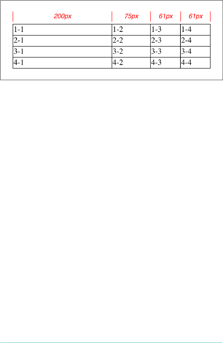
Figure 14-11. Fixed-width table layout
As you can see in Figure 14-11, the first column is 200 pixels wide, which happens to
be half the 400-pixel width of the table. The second column is 75 pixels wide, because
the first-row cell within that column has been assigned an explicit width. The third
and fourth columns are each 61 pixels wide. Why? Because the sum of the column
widths for the first and second columns (275 pixels), plus the various borders
between columns (3 pixels), equals 278 pixels. 400 minus 278 is 122, and that divided
in half is 61, so that’s how many pixels wide the third and fourth columns will be.
What about the 500-pixel width for #r2c3? It’s ignored because that cell isn’t in the
first row of the table.
Note that it is not absolutely necessary that the table have an explicit width value to
make use of the fixed-width layout model, although it definitely helps. For example,
given the following, a user agent could calculate a width for the table that is 50 pixels
narrower than the parent element’s width. It would then use that calculated width in
the fixed-layout algorithm:
table {table-layout: fixed; margin: 0 25px; width: auto;}
This is not required, however. User agents are also permitted to lay out any table with
an auto value for width using the automatic-width layout model.
Automatic layout
The automatic-width layout model, while not as fast as fixed layout, is probably much
more familiar to you because it’s substantially the same model that HTML tables have
used for years. In most current user agents, use of this model will be triggered by a
table having a width of auto, regardless of the value of table-layout, although this is
not assured.
The reason automatic layout is slower is that the table cannot be laid out until the
user agent has looked at all of the content in the table. That is, it requires that the user
agent lay out the entire table in a fashion that takes the contents and styles of every
Table Sizing | 757

cell into account. This generally requires the user agent to perform some calculations
and then go back through the table to perform a second set of calculations.
The content has to be fully examined because, as with HTML tables, the table’s layout
is dependent on the content in all the cells. If there is a 400-pixel-wide image in a cell
in the last row, then it will force all of the cells above it (those in the same column) to
be at least 400 pixels wide. Thus, the width of every cell has to be calculated, and
adjustments must be made (possibly triggering another round of content-width cal‐
culations) before the table can be laid out.
The details of the model can be expressed in the following steps:
1. For each cell in a column, calculate both the minimum and maximum cell width.
a. Determine the minimum width required to display the content. In determin‐
ing this minimum content width, the content can flow to any number of lines,
but it may not stick out of the cell’s box. If the cell has a width value that is
larger than the minimum possible width, then the minimum cell width is set
to the value of width. If the cell’s width value is auto, then the minimum cell
width is set to the minimum content width.
b. For the maximum width, determine the width required to display the content
without any line breaking other than that forced by explicit line breaking (e.g.,
the <br> element). That value is the maximum cell width.
2. For each column, calculate both the minimum and maximum column width.
a. The column’s minimum width is determined by the largest minimum cell
width of the cells within the column. If the column has been given an explicit
width value that is larger than any of the minimum cell widths within the col‐
umn, then the minimum column width is set to the value of width.
b. For the maximum width, take the largest maximum cell width of the cells
within the column. If the column has been given an explicit width value that
is larger than any of the maximum cell widths within the column, then the
maximum column width is set to the value of width. These two behaviors
recreate the traditional HTML table behavior of forcibly expanding any col‐
umn to be as wide as its widest cell.
3. In cases where a cell spans more than one column, then the sum of the minimum
column widths must be equal to the minimum cell width for the spanning cell.
Similarly, the sum of the maximum column widths has to equal the spanning
cell’s maximum width. User agents should divide any changes in column widths
equally among the spanned columns.
In addition, the user agent must take into account that when a column width has a
percentage value for its width, the percentage is calculated in relation to the width of
758 | Chapter 14: Table Layout in CSS

the table—even though it doesn’t yet know what that will be! It instead has to hang on
to the percentage value and use it in the next part of the algorithm.
At this point, the user agent will have figured how wide or narrow each column can
be. With that information in hand, it can then proceed to actually figuring out the
width of the table. This happens as follows:
1. If the computed width of the table is not auto, then the computed table width is
compared to the sum of all the column widths plus any borders and cell spacing.
(Columns with percentage widths are likely calculated at this time.) The larger of
the two is the final width of the table. If the table’s computed width is larger than
the sum of the column widths, borders, and cell spacing, then the difference is
divided by the number of columns and the result is added to each of them.
2. If the computed width of the table is auto, then the final width of the table is
determined by adding up the column widths, borders, and cell spacing. This
means that the table will be only as wide as needed to display its content, just as
with traditional HTML tables. Any columns with percentage widths use that per‐
centage as a constraint—but one that a user agent does not have to satisfy.
Once the last step is completed, then—and only then—can the user agent actually lay
out the table.
The following styles and markup, presented in Figure 14-12, help illustrate how this
process works:
table {table-layout: auto; width: auto;
border-collapse: collapse;}
td {border: 1px solid; padding: 0;}
col#c3 {width: 25%;}
#r1c2 {width: 40%;}
#r2c2 {width: 50px;}
#r2c3 {width: 35px;}
#r4c1 {width: 100px;}
#r4c4 {width: 1px;}
<table>
<colgroup> <col id="c1"><col id="c2"><col id="c3"><col id="c4"> </colgroup>
<tr>
<td id="r1c1">1-1</td>
<td id="r1c2">1-2</td>
<td id="r1c3">1-3</td>
<td id="r1c4">1-4</td>
</tr>
<tr>
<td id="r2c1">2-1</td>
<td id="r2c2">2-2</td>
<td id="r2c3">2-3</td>
<td id="r2c4">2-4</td>
</tr>
Table Sizing | 759
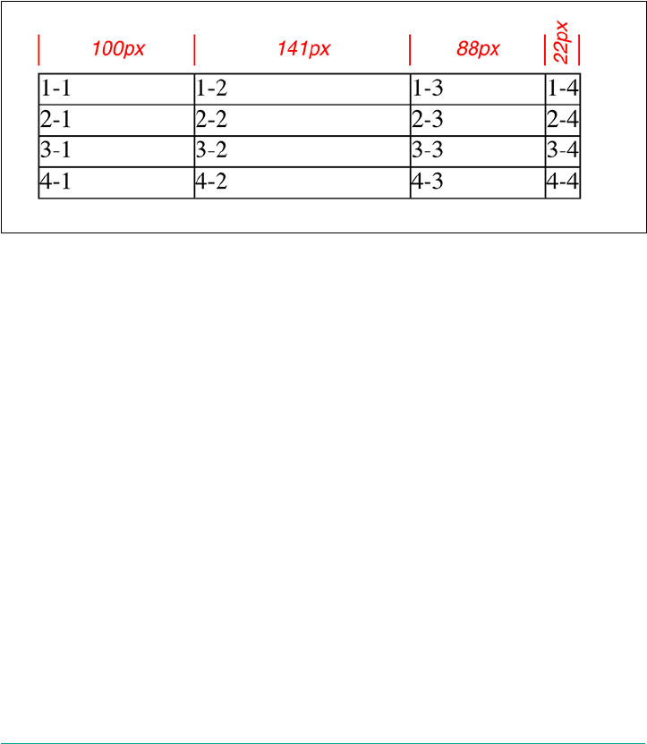
<tr>
<td id="r3c1">3-1</td>
<td id="r3c2">3-2</td>
<td id="r3c3">3-3</td>
<td id="r3c4">3-4</td>
</tr>
<tr>
<td id="r4c1">4-1</td>
<td id="r4c2">4-2</td>
<td id="r4c3">4-3</td>
<td id="r4c4">4-4</td>
</tr>
</table>
Figure 14-12. Automatic table layout
Let’s consider what happened for each of the columns, in turn:
•For the first column, the only explicit cell or column width is that of cell 4-1,
which was given a width of 100px. Because the content is so short, both the mini‐
mum and maximum column widths are set to 100px. (If there were a cell in the
column with several sentences of text, it would have increased the maximum col‐
umn width to whatever width necessary to display all of the text without line
breaking.)
•For the second column, two widths were declared: cell 1-2 was given a width of
40%, and cell 2-2 was given a width of 50px. The minimum width of this column
is 50px, and the maximum width is 40% of the final table width.
•For the third column, only cell 3-3 had an explicit width (35px), but the column
itself was given a width of 25%. Therefore, the minimum column width is 35 pix‐
els, and the maximum width is 25% of the final table width.
•For the fourth column, only cell 4-4 was given an explicit width (1px). This is
smaller than the minimum content width, so both the minimum and maximum
column widths are equal to the minimum content width of the cells. This turns
760 | Chapter 14: Table Layout in CSS

out to be a computed 22 pixels, so the minimum and maximum widths are both
22 pixels.
The user agent now knows that the four columns have minimum and maximum
widths as follows:
• Minimum 100 px, maximum 100 px
—Minimum 50 px, maximum 40%
— Minimum 35 px, maximum 25%
— Minimum 25 px, maximum 22 px
Thus, the table’s minimum width is the sum of all the column minimums, plus the
borders collapsed between the columns, which totals 215 pixels. The table’s maximum
width is 123px + 65%, where the 123px comes from the first and last columns and
their shares of the collapsed borders. This maximum works out to be
351.42857142857143 pixels (given that 123px represents 35% of the overall table
width). With this number in hand, the second column will be 140.5 pixels wide, and
the third column will be 87.8 pixels wide. These may be rounded by the user agent to
whole numbers such as 141px and 88px, or not, depending on the exact rendering
method used. (These are the numbers used in Figure 14-12.)
Note that it is not required that user agents actually use the maximum value; they
may choose another course of action.
This was (although it may not seem like it) a comparatively simple and straightfor‐
ward example: all of the content was basically the same width, and most of the
declared widths were pixel lengths. In a situation where a table contains images, para‐
graphs of text, form elements, and so forth, the process of figuring out the table’s lay‐
out is likely to be a great deal more complicated.
Height
After all of the effort that was expended in figuring out the width of the table, you
might well wonder how much more complicated height calculation will be. Actually,
in CSS terms, it’s pretty simple, although browser developers probably don’t think so.
The easiest situation to describe is one in which the table height is explicitly set via
the height property. In such cases, the height of the table is defined by the value of
height. This means that a table may be taller or shorter than the sum of its row
heights. Note that height is treated much more like min-height for tables, so if you
define a height value that’s smaller than the sum total of the row heights, it may
appear to be ignored.
Table Sizing | 761

By contrast, if the height value of a table is greater than the total of its row heights,
the specification explicitly refuses to define what should happen, instead noting that
the issue may be resolved in future versions of CSS. A user agent could expand the
table’s rows to fill out its height, or leave blank space inside the table’s box, or some‐
thing completely different. It’s up to each user agent to decide.
As of late 2017, the most common behavior of user agents was to
increase the heights of the rows in a table to fill out its overall
height. This was accomplished by taking the difference between the
table height and the sum of the row heights, dividing it by the
number of rows, and applying the resulting amount to each row.
If the height of the table is auto, then its height is the sum of the heights of all the
rows within the table, plus any borders and cell spacing. To determine the height of
each row, the user agent goes through a process similar to that used to find the widths
of columns. It calculates a minimum and maximum height for the contents of each
cell and then uses these to derive a minimum and maximum height for the row. After
having done this for all the rows, the user agent figures out what each row’s height
should be, stacks them all on top of one another, and uses the total to determine the
table’s height. It’s a lot like inline layout, only with less certainty in how things should
be done.
In addition to what to do about tables with explicit heights and how to treat row
heights within them, you can add the following to the list of things CSS does not
define:
• The effect of a percentage height for table cells.
• The effect of a percentage height for table rows and row groups.
•How a row-spanning cell affects the heights of the rows that are spanned, except
that the rows have to contain the spanning cell.
As you can see, height calculations in tables are largely left up to user agents to figure
out. Historical evidence would suggest that this will lead to each user agent doing
something different, so you should probably avoid setting table heights as much
as possible.
Alignment
In a rather interesting turn of events, alignment of content within cells is a lot better
defined than cell and row heights. This is true even for vertical alignment, which can
quite easily affect the height of a row.
762 | Chapter 14: Table Layout in CSS

Horizontal alignment is the simplest. To align content within a cell, you use the text-
align property. In effect, the cell is treated as a block-level box, and all of the content
within it is aligned as per the text-align value.
To vertically align content in a table cell, vertical-align is the relevant property. It
uses many of the same values that are used for vertically aligning inline content, but
the meanings of those values change when applied to a table cell. To summarize the
three simplest cases:
top
The top of the cell’s content is aligned with the top of its row; in the case of row-
spanning cells, the top of the cell’s content is aligned with the top of the first row
it spans.
bottom
The bottom of the cell’s content is aligned with the bottom of its row; in the case
of row-spanning cells, the bottom of the cell’s content is aligned with the bottom
of the last row it spans.
middle
The middle of the cell’s content is aligned with the middle of its row; in the case
of row-spanning cells, the middle of the cell’s content is aligned with the middle
of all the rows it spans.
These are illustrated in Figure 14-13, which uses the following styles and markup:
table {table-layout: auto; width: 20em;
border-collapse: separate; border-spacing: 3px;}
td {border: 1px solid; background: silver;
padding: 0;}
div {border: 1px dashed gray; background: white;}
#r1c1 {vertical-align: top; height: 10em;}
#r1c2 {vertical-align: middle;}
#r1c3 {vertical-align: bottom;}
<table>
<tr>
<td id="r1c1">
<div>
The contents of this cell are top-aligned.
</div>
</td>
<td id="r1c2">
<div>
The contents of this cell are middle-aligned.
</div>
</td>
<td id="r1c3">
<div>
The contents of this cell are bottom-aligned.
Table Sizing | 763
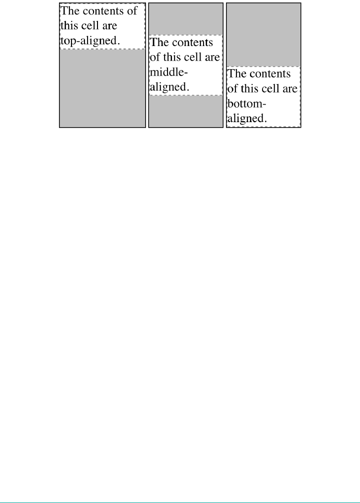
</div>
</td>
</tr>
</table>
Figure 14-13. Vertical alignment of cell contents
In each case, the alignment is carried out by automatically increasing the padding of
the cell itself to achieve the desired effect. In the first cell in Figure 14-13, the bottom
padding of the cell has been changed to equal the difference between the height of the
cell’s box and the height of the content within the cell. For the second cell, the top and
bottom padding of the cell have been reset to be equal, thus vertically centering the
content of the cell. In the last cell, the cell’s top padding has been altered.
The fourth possible value alignment is baseline, and it’s a little more complicated
that the first three:
baseline
The baseline of the cell is aligned with the baseline of its row; in the case of row-
spanning cells, the baseline of the cell is aligned with the baseline of the first row
it spans.
It’s easiest to provide an illustration (Figure 14-14) and then discuss what’s
happening.
764 | Chapter 14: Table Layout in CSS

Figure 14-14. Baseline alignment of cell contents
A row’s baseline is defined by the lowest initial cell baseline (that is, the baseline of
the first line of text) out of all its cells. Thus, in Figure 14-14, the row’s baseline was
defined by the third cell, which has the lowest initial baseline. The first two cells then
have the baseline of their first line of text aligned with the row’s baseline.
As with top, middle, and bottom alignment, the placement of baseline-aligned cell
content is accomplished by altering the top and bottom padding of the cells. In cases
where none of the cells in a row are baseline-aligned, the row does not even have a
baseline—it doesn’t really need one.
The detailed process for aligning cell contents within a row is as follows:
1. If any of the cells are baseline-aligned, then the row’s baseline is determined and
the content of the baseline-aligned cells is placed.
a. Any top-aligned cell has its content placed. The row now has a provisional
height, which is defined by the lowest cell bottom of the cells that have already
had their content placed.
b. If any remaining cells are middle- or bottom-aligned, and the content height
is taller than the provisional row height, the height of the row is increased to
enclose the tallest of those cells.
c. All remaining cells have their content placed. In any cell whose contents are
shorter than the row height, the cell’s padding is increased in order to match
the height of the row.
The vertical-align values sub, super, text-top, and text-bottom are supposed to
be ignored when applied to table cells. Instead, they seem to all treated as if they are
baseline, or possibly top.
Table Sizing | 765

Summary
Even if you’re quite familiar with table layout from years of table-and-spacer design,
it turns out that the mechanisms driving such layout are rather complicated. Thanks
to the legacy of HTML table construction, the CSS table model is row-centric, but it
does, thankfully, accommodate columns and limited column styling. Thanks to new
abilities to affect cell alignment and table width, you now have even more tools for
presenting tables in a pleasing way.
The ability to apply table-related display values to arbitrary elements opens the door
to creating table-like layouts using HTML elements such as div and section, or in
XML languages where any element could be used to describe table components.
766 | Chapter 14: Table Layout in CSS

CHAPTER 15
Lists and Generated Content
In the realm of CSS layout, lists are an interesting case. The items in a list are simply
block boxes, but with an extra bit that doesn’t really participate in the document lay‐
out hanging off to one side. With an ordered list, that extra bit contains a series of
increasing numbers (or letters) that are calculated and mostly formatted by the user
agent, not the author. Taking a cue from the document structure, the user agent gen‐
erates the numbers and their basic presentation.
None of this content generation could be described in CSS1 terms—and, therefore, it
couldn’t be controlled—but CSS2 introduced features that allow list-item numbering
to be described. As a result, CSS now lets you, the author, define your own counting
patterns and formats, and associate those counters with any element, not just ordered
list items. Furthermore, this basic mechanism makes it possible to insert other kinds
of content, including text strings, attribute values, or even external resources into a
document. Thus, it becomes possible to use CSS to insert link icons, editorial sym‐
bols, and more into a design without having to create extra markup.
To see how all these list options fit together, we’ll explore basic list styling before
moving on to examine the generation of content and counters.
Lists
In a sense, almost anything that isn’t narrative text can be considered a list. The US
Census, the solar system, my family tree, a restaurant menu, and even all of the
friends you’ve ever had can be represented as a list, or perhaps as a list of lists. These
many variations make lists fairly important, which is why it’s a shame that list styling
in CSS isn’t more sophisticated.
The simplest (and best-supported) way to affect a list’s styles is to change its marker
type. The marker of a list item is, for example, the bullet that appears next to each
767
item in an unordered list. In an ordered list, the marker could be a letter, number, or
a symbol from some other counting system. You can even replace the markers with
images. All of these are accomplished using the different list-style properties.
Types of Lists
To change the type of marker used for a list’s items, use the property list-style-
type.
list-style-type
Values disc | circle | square | disclosure-open | disclosure-closed | deci
mal | decimal-leading-zero | arabic-indic | armenian | upper-
armenian | lower-armenian | bengali | cambodian | khmer | cjk-
decimal | devanagari | gujarati | gurmukhi | georgian | hebrew |
kannada | lao | malayalam | mongolian | myanmar | oriya | persian |
lower-roman | upper-roman | tamil | telugu | thai | tibetan | lower-
alpha | lower-latin | upper-alpha | upper-latin | cjk-earthly-
branch | cjk-heavenly-stem | lower-greek | hiragana | hiragana-
iroha | katakana | katakana-iroha | japanese-informal | japanese-
formal | korean-hangul-formal | korean-hanja-informal | korean-
hanja-formal | simp-chinese-informal | simp-chinese-formal |
trad-chinese-informal | trad-chinese-formal | ethiopic-numeric |
<string> | none | inherit
Initial value disc
Applies to Elements whose display value is list-item
Inherited Yes
Computed
value As specied
That’s quite a few keywords, I know—and that’s not even all the values that list-
style-type has historically borne! Some, such as urdu and hangul-consonant, are
supported by one browser or another, but none of the older values have widespread
support. By contrast, the list of values shown above has nearly universal support.
Some examples are shown in Figure 15-1.
The list-style-type property, as well as all other list-related properties, can be
applied only to an element that has a display of list-item, but CSS doesn’t distin‐
guish between ordered and unordered list items. Thus, you can set an ordered list to
use discs instead of numbers. In fact, the default value of list-style-type is disc, so
you might theorize that without explicit declarations to the contrary, all lists (ordered
768 | Chapter 15: Lists and Generated Content

or unordered) will use discs as the marker for each item. This would be logical, but,
as it turns out, it’s up to the user agent to decide. Even if the user agent doesn’t have a
predefined rule such as ol {list-style-type: decimal;}, it may prohibit ordered
markers from being applied to unordered lists, and vice versa. You can’t count on this,
so be careful.
Figure 15-1. A sampling of list style types
Historically, user agents treated any unrecognized keyword value as decimal, as per
CSS 2.1. The CSS Lists and Counters Module is less precise about this, as of early
2017, and appears to allow a fallback to either disc or none. (Chrome, for example,
defaults to none if an ordered list type is applied to an unordered list.)
If you want to suppress the display of markers altogether, then none is the value you
should use. none causes the user agent to refrain from putting anything where the
marker would ordinarily be, although it does not interrupt the counting in ordered
lists. Thus, the following markup would have the result shown in Figure 15-2:
ol li {list-style-type: decimal;}
li.off {list-style-type: none;}
<ol>
<li>Item the first
<li class="off">Item the second
<li>Item the third
<li class="off">Item the fourth
<li>Item the fifth
</ol>
Lists | 769
Figure 15-2. Switching o list-item markers
list-style-type is inherited, so if you want to have different styles of markers in
nested lists, you’ll likely need to define them individually. You may also have to
explicitly declare styles for nested lists because the user agent’s style sheet may have
already defined them. For example, assume that a user agent has the following styles
defined:
ul {list-style-type: disc;}
ul ul {list-style-type: circle;}
ul ul ul {list-style-type: square;}
If this is the case—and it’s likely that this, or something like it, will be—you will have
to declare your own styles to overcome the user agent’s styles. Inheritance won’t be
enough.
String markers
CSS also allows authors to supply string values as list markers. This opens the field to
anything you can input from the keyboard, as long as you don’t mind having the
same string used for every marker in the list. Figure 15-3 shows the results of the fol‐
lowing styles:
.list01 {list-style-type: "%";}
.list02 {list-style-type: "Hi! ";}
.list03 {list-style-type: "†";}
.list04 {list-style-type: "⌘";}
.list05 {list-style-type: " ";}
770 | Chapter 15: Lists and Generated Content
Figure 15-3. A sampling of string markers
As of late 2017, only the Firefox family of browsers supported
string values for list markers.
List Item Images
Sometimes, a regular text marker just won’t do. You might prefer to use an image for
each marker, which is possible with the property list-style-image.
list-style-image
Values <uri> | <image> | none | inherit
Initial value none
Applies to Elements whose display value is list-item
Inherited Yes
Computed value For <uri> values, the absolute URI; otherwise, none
Here’s how it works:
ul li {list-style-image: url(ohio.gif);}
Yes, it’s really that simple. One simple url() value, and you’re putting images in for
markers, as you can see in Figure 15-4.
Lists | 771

Figure 15-4. Using images as markers
Of course, you should exercise care in the images you use, as the example shown in
Figure 15-5 makes painfully clear:
ul li {list-style-image: url(big-ohio.gif);}
Figure 15-5. Using really big images as markers
It’s generally a good idea to provide a fallback marker type in case your image doesn’t
load, gets corrupted, or is in a format that some user agents can’t display. Do this by
defining a backup list-style-type for the list:
ul li {list-style-image: url(ohio.png); list-style-type: square;}
The other thing you can do with list-style-image is set it to the default value of
none. This is good practice because list-style-image is inherited, so any nested lists
will pick up the image as the marker, unless you prevent that from happening:
772 | Chapter 15: Lists and Generated Content
ul {list-style-image: url(ohio.gif); list-style-type: square;}
ul ul {list-style-image: none;}
Since the nested list inherits the item type square but has been set to use no image for
its markers, squares are used for the markers in the nested list, as shown in
Figure 15-6.
Figure 15-6. Switching o image markers in sublists
Remember that this scenario might not occur in the real world: a
user agent may have already defined a list-style-type for ul ul,
so the value of square won’t be inherited after all. Instead, you
might get a circle, disc, or other symbol.
Any image value is permitted for list-style-image, including gradient images.
Thus, the following styles would have a result like that shown in Figure 15-7:
.list01 {list-style-image:
radial-gradient(closest-side,
orange, orange 60%, blue 60%, blue 95%, transparent);}
.list02 {list-style-image:
linear-gradient(45deg, red, red 50%, orange 50%, orange);}
.list03 {list-style-image:
repeating-linear-gradient(-45deg, red, red 1px, yellow 1px, yellow 3px);}
.list04 {list-style-image:
radial-gradient(farthest-side at bottom right,
lightblue, lightblue 50%, violet, indigo, blue, green,
yellow, orange, red, lightblue);}
Lists | 773
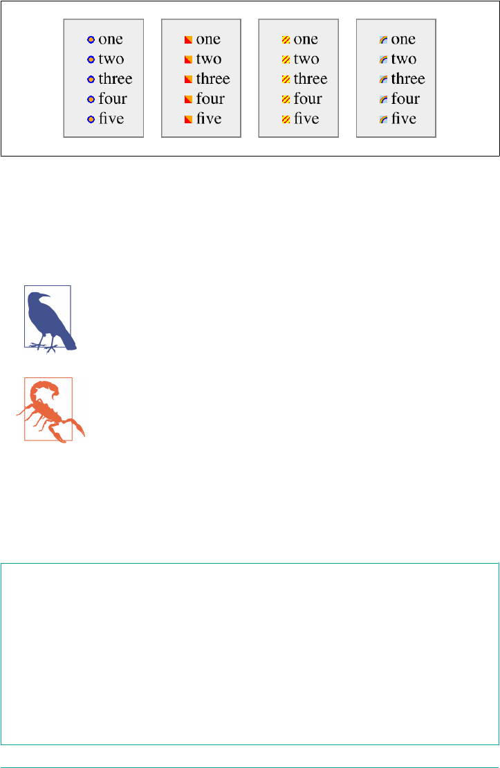
Figure 15-7. Gradient list markers
There is one drawback to gradient markers: they tend to be very small. The size isn’t
something that CSS allows you to control, so you’re stuck with whatever the browser
decides is a good size. This size can be influenced by things like font size, because the
marker size tends to scale with the list item’s content, but that’s about it.
CSS does define a way to style list markers directly, the ::marker
pseudo-element, but it wasn’t supported by anything as of early
2017.
As of early 2017, only the WebKit/Blink family of browsers sup‐
ported gradient image values for list markers.
List-Marker Positions
There is one other thing you can do to influence the appearance of list items under
CSS: decide whether the marker appears outside or inside the content of the list item.
This is accomplished with list-style-position.
list-style-position
Values inside | outside | inherit
Initial value outside
Applies to Elements whose display value is list-item
Inherited Yes
Computed value As specied
774 | Chapter 15: Lists and Generated Content
If a marker’s position is set to outside (the default), it will appear the way list items
have since the beginning of the web. Should you desire a slightly different appearance,
you can pull the marker in toward the content by setting the value of list-style-
position to inside. This causes the marker to be placed “inside” the list item’s con‐
tent. The exact way this happens is undefined, but Figure 15-8 shows one possibility:
li.first {list-style-position: inside;}
li.second {list-style-position: outside;}
Figure 15-8. Placing the markers inside and outside list items
In practice, markers given an inside placement are treated as if they’re an inline ele‐
ment inserted into the beginning of the list item’s content. This doesn’t mean the
markers actually are inline elements—you can’t style them separately from the rest of
the element’s content, unless you wrap all the other content in an element like span.
It’s just that in layout terms, that’s what they act like.
List Styles in Shorthand
For brevity’s sake, you can combine the three list-style properties into a convenient
single property: list-style.
list-style
Values [ <list-style-type> ‖ <list-style-image> ‖ <list-style-position> ] | inherit
Initial value Refer to individual properties
Applies to Elements whose display value is list-item
Inherited Yes
Computed value See individual properties
Lists | 775
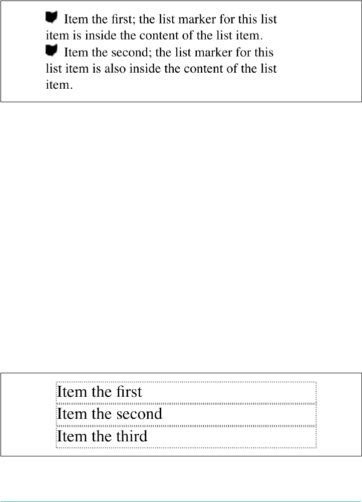
For example:
li {list-style: url(ohio.gif) square inside;}
As you can see in Figure 15-9, all three values are applied to the list items.
Figure 15-9. Bringing it all together
The values for list-style can be listed in any order, and any of them can be omitted.
As long as one is present, the rest will fill in their default values. For instance, the fol‐
lowing two rules will have the same visual effect:
li.norm {list-style: url(img42.gif);}
li.odd {list-style: url(img42.gif) disc outside;} /* the same thing */
They will also override any previous rules in the same way. For example:
li {list-style-type: square;}
li {list-style: url(img42.gif);}
li {list-style: url(img42.gif) disc outside;} /* the same thing */
The result will be the same as that in Figure 15-9 because the implied list-style-
type value of disc will override the previous declared value of square, just as the
explicit value of disc overrides it in the second rule.
List Layout
Now that we’ve looked at the basics of styling list markers, let’s consider how lists are
laid out in various browsers. We’ll start with a set of three list items devoid of any
markers and not yet placed within a list, as shown in Figure 15-10.
Figure 15-10. ree list items
776 | Chapter 15: Lists and Generated Content
The border around the list items shows them to be, essentially, like block-level ele‐
ments. Indeed, the value list-item is defined to generate a block box. Now let’s add
markers, as illustrated in Figure 15-11.
Figure 15-11. Markers are added
The distance between the marker and the list item’s content is not defined by CSS,
and CSS does as yet not provide a way to affect that distance.
With the markers outside the list items’ content, they don’t affect the layout of other
elements, nor do they really even affect the layout of the list items themselves. They
just hang a certain distance from the edge of the content, and wherever the content
edge goes, the marker will follow. The behavior of the marker works much as though
the marker were absolutely positioned in relation to the list-item content, something
like position: absolute; left: -1.5em;. When the marker is inside, it acts like an
inline element at the beginning of the content.
So far, we have yet to add an actual list container; in other words, there is neither a ul
nor an ol element represented in the figures. We can add one to the mix, as shown in
Figure 15-12 (it’s represented by a dashed border).
Figure 15-12. Adding a list border
Like the list items, the list element is a block box, one that encompasses its descend‐
ant elements. As we can see, however, the markers are not only placed outside the list
item contents, but also outside the content area of the list element. The usual “inden‐
tation” you expect from lists has not yet been specified.
Most browsers, as of this writing, indent list items by setting either padding or mar‐
gins for the containing list element. For example, the user agent might apply a rule
such as:
Lists | 777
ul, ol {margin-left: 40px;}
This is the basic rule employed by Internet Explorer and Opera. Most Gecko-based
browsers, on the other hand, use a rule something like this:
ul, ol {padding-left: 40px;}
Neither is incorrect, but the discrepancy can lead to problems if you want to elimi‐
nate the indentation of the list items. Figure 15-13 shows the difference between the
two approaches.
Figure 15-13. Margins and padding as indentation devices
The distance of 40px is a relic of early web browsers, which inden‐
ted lists by a pixel amount. (Block quotes are indented by the same
distance.) An alternate value might be something like 2.5em, which
would scale the indentation along with changes in the text size.
For authors who want to change the indentation distance of lists, I strongly recom‐
mend that you specify both padding and margins to ensure cross-browser compati‐
bility. For example, if you want to use padding to indent a list, use this rule:
ul {margin-left: 0; padding-left: 1em;}
If you prefer margins, write something like this instead:
ul {margin-left: 1em; padding-left: 0;}
In either case, remember that the markers will be placed relative to the contents of the
list items, and may therefore “hang” outside the main text of a document, or even
778 | Chapter 15: Lists and Generated Content
beyond the edge of the browser window. This is most easily observed if very large
images, or long text strings, are used for the list markers, as shown in Figure 15-14.
Figure 15-14. Large markers and list layout
List-Marker Positioning
One feature many authors request is the ability to control the space between a marker
and the content of a list item. CSS2 defined ways to do this, including a property
called marker-offset and a display value of marker. Implementation experience
revealed this to be a clumsy approach, and these features were removed in CSS2.1
As of early 2017, the working draft of the CSS3 Lists and Counters module defines a
more compact way to affect marker placement, which is the ::marker pseudo-
element. Assuming the module does not change before becoming a full Recommen‐
dation, you may someday be able to write rules such as li::marker {margin-right:
0.125em; color: goldenrod;}.
Generated Content
CSS defines methods to create what’s called generated content. This is content inserted
via CSS, but not represented either by markup or content.
For example, list markers are generated content. There is nothing in the markup of a
list item that directly represents the markers, and you, the author, do not have to
write the markers into your document’s content. The browser simply generates the
Generated Content | 779
appropriate marker automatically. For unordered lists, the marker will a symbol of
some kind, such as a circle, disc, or square. In ordered lists, the marker is by default a
counter that increments by one for each successive list item. (Or, as we saw in previ‐
ous sections, you may replace either kind with an image or symbol.)
To understand how you can affect list markers and customize the counting of ordered
lists (or anything else!), you must first look at more basic generated content.
Inserting Generated Content
To insert generated content into the document, use the ::before and ::after
pseudo-elements. These place generated content before or after the content of an ele‐
ment by way of the content property (described in the next section).
For example, you might want to precede every hyperlink with the text “(link)” to
mark them for printing. This is accomplished with a rule like the following, which
has the effect shown in Figure 15-15:
a[href]::before {content: "(link)";}
Figure 15-15. Generating text content
Note that there isn’t a space between the generated content and the element content.
This is because the value of content in the previous example doesn’t include a space.
You could modify the declaration as follows to make sure there’s a space between gen‐
erated and actual content:
a[href]::before {content: "(link) ";}
It’s a small difference but an important one.
In a similar manner, you might choose to insert a small icon at the end of links to
PDF documents. The rule to accomplish this would look something like:
a.pdf-doc::after {content: url(pdf-doc-icon.gif);}
Suppose you want to further style such links by placing a border around them. This is
done with a second rule:
a.pdf-doc {border: 1px solid gray;}
The result of these two rules is illustrated in Figure 15-16.
780 | Chapter 15: Lists and Generated Content
Figure 15-16. Generating icons
Notice how the link border extends around the generated content, just as the link
underline extended under the “(link)” text in Figure 15-15. This happens because
generated content is placed inside the element box of the element. As of CSS2.1, there
isn’t a way to place generated content outside the element box, other than list
markers.
You might think that positioning would do the trick, except CSS2 and CSS2.1 specifi‐
cally prohibit the floating or positioning of ::before and ::after content. List-style
properties, along with table properties, are similarly prohibited. In addition, the fol‐
lowing restrictions apply:
• If the subject of a ::before or ::after selector is a block-level element, then the
property display can accept only the values none, inline, block, and marker.
Any other value is treated as block.
•If the subject of a ::before or ::after selector is an inline-level element, then
the property display can accept only the values none and inline. Any other
value is treated as inline.
For example, consider:
em::after {content: " (!) "; display: block;}
Since em is an inline element, the generated content cannot be made block-level. The
value block is therefore reset to inline. In this next example, however, the generated
content is made block-level because the target element is also block-level:
h1::before {content: "New Section"; display: block; color: gray;}
The result is illustrated in Figure 15-17.
Figure 15-17. Generating block-level content
Generated Content | 781
One interesting aspect of generated content is that it inherits values from the element
to which it’s been attached. Thus, given the following rules, the generated text will be
green, the same as the content of the paragraphs:
p {color: green;}
p::before {content: "::: ";}
If you want the generated text to be purple instead, a simple declaration will suffice:
p::before {content: "::: "; color: purple;}
Such value inheritance happens only with inherited properties, of course. This is
worth noting because it influences how certain effects must be approached. Consider:
h1 {border-top: 3px solid black; padding-top: 0.25em;}
h1::before {content: "New Section"; display: block; color: gray;
border-bottom: 1px dotted black; margin-bottom: 0.5em;}
Since the generated content is placed inside the element box of the h1, it will be
placed under the top border of the element. It would also be placed within any pad‐
ding, as shown in Figure 15-18.
Figure 15-18. Taking placement into account
The bottom margin of the generated content, which has been made block-level,
pushes the actual content of the element downward by half an em. In every sense, the
effect of the generated content in this example is to break up the h1 element into two
pieces: the generated-content box and the actual content box. This happens because
the generated content has display: block. If you were to change it to display:
inline, the effect would be as shown in Figure 15-19:
h1 {border-top: 3px solid black; padding-top: 0.25em;}
h1::before {content: "New Section"; display: inline; color: gray;
border-bottom: 1px dotted black; margin-bottom: 0.5em;}
Figure 15-19. Changing the generated content to be inline
782 | Chapter 15: Lists and Generated Content
Note how the borders are placed and how the top padding is still honored. So is the
bottom margin on the generated content, but since the generated content is now
inline and margins don’t affect line height, the margin has no visible effect.
With the basics of generating content established, let’s take a closer look at the way
the actual generated content is specified.
Specifying Content
If you’re going to generate content, you need a way to describe the content to be gen‐
erated. As you’ve already seen, this is handled with the content property, but there’s a
great deal more to this property than you’ve seen thus far.
content
Values normal | [ <string> | <uri> | <counter> | attr(<identier>+)+ | open-quote
| close-quote | no-open-quote | no-close-quote ]+ | inherit
Initial value normal
Applies to ::before and ::after pseudo-elements
Inherited No
Computed value For <uri> values, an absolute URI; for attribute references, the resulting string;
otherwise, as specied
You’ve already seen string and URI values in action, and counters will be covered
later in this chapter. Let’s talk about strings and URIs in a little more detail before we
take a look at the attr( ) and quote values.
String values are presented literally, even if they contain what would otherwise be
markup of some kind. Therefore, the following rule would be inserted verbatim into
the document, as shown in Figure 15-20:
h2::before {content: "<em>¶</em> "; color: gray;}
Figure 15-20. Strings are displayed verbatim
This means that if you want a newline (return) as part of your generated content, you
can’t use <br>. Instead, you use the string \A, which is the CSS way of representing a
newline (based on the Unicode line-feed character, which is hexadecimal position A).
Generated Content | 783
Conversely, if you have a long string value and need to break it up over multiple lines,
you escape out the line feeds with the \ character. These are both demonstrated by
the following rule and illustrated in Figure 15-21:
h2::before {content: "We insert this text before all H2 elements because \
it is a good idea to show how these things work. It may be a bit long \
but the point should be clearly made. "; color: gray;}
Figure 15-21. Inserting and suppressing newlines
You can also use escapes to refer to hexadecimal Unicode values, such as \00AB.
As of this writing, support for inserting escaped content such as \A
and \00AB is not very widespread, even among those browsers that
support some generated content.
With URI values, you simply point to an external resource (an image, movie, sound
clip, or anything else the user agent supports), which is then inserted into the docu‐
ment in the appropriate place. If the user agent can’t support the resource you point it
to for any reason—say, you try to insert an SVG image into a browser that doesn’t
understand SVG, or try to insert a movie into a document when it’s being printed—
then the user agent is required to ignore the resource completely, and nothing will be
inserted.
Inserting attribute values
There are situations where you might want to take the value of an element’s attribute
and make it a part of the document display. To pick a simple example, you can place
the value of every link’s href attribute immediately after the links, like this:
a[href]::after {content: attr(href);}
Again, this leads to the problem of the generated content running smack into the
actual content. To solve this, add some string values to the declaration, with the result
shown in Figure 15-22:
784 | Chapter 15: Lists and Generated Content
a[href]::after {content: " [" attr(href) "]";}
Figure 15-22. Inserting URLs
This can be useful for print style sheets, as an example. Any attribute value can be
inserted as generated content: alt text, class or id values—anything. An author
might choose to make the citation information explicit for a block quote, like this:
blockquote::after {content: "(" attr(cite) ")"; display: block;
text-align: right; font-style: italic;}
For that matter, a more complicated rule might reveal the text- and link-color values
for a legacy document:
body::before {content: "Text: " attr(text) " | Link: " attr(link)
" | Visited: " attr(vlink) " | Active: " attr(alink);
display: block; padding: 0.33em;
border: 1px solid; text-align: center; color: red;}
Note that if an attribute doesn’t exist, an empty string is put in its place. This is what
happens in Figure 15-23, in which the previous example is applied to a document
whose body element has no alink attribute.
Figure 15-23. Missing attributes are skipped
The text “Active: ” (including the trailing space) is inserted into the document, as you
can see, but there is nothing following it. This is convenient in situations where you
want to insert the value of an attribute only when it exists.
CSS2.x defines the returned value of an attribute reference as an
unparsed string. Therefore, if the value of an attribute contains
markup or character entities, they will be displayed verbatim.
Generated Content | 785
Generated quotes
A specialized form of generated content is the quotation mark, and CSS2.x provides a
powerful way to manage both quotes and their nesting behavior. This is possible due
to the pairing of content values like open-quote and the property quotes.
quotes
Values [<string> <string>]+ | none | inherit
Initial value User agent-dependent
Applies to All elements
Inherited Yes
Computed value As specied
Upon studying the value syntax, we find that other than the keywords none and
inherit, the only valid value is one or more pairs of strings. The first string of the
pair defines the open-quote symbol, and the second defines the close-quote symbol.
Therefore, of the following two declarations, only the first is valid:
quotes: '"' "'"; /* valid */
quotes: '"'; /* NOT VALID */
The first rule also illustrates one way to put string quotes around the strings them‐
selves. The double quotation marks are surrounded by single quotation marks, and
vice versa.
Let’s look at a simple example. Suppose you’re creating an XML format to store a list
of favorite quotations. Here’s one entry in the list:
<quotation>
<quote>I hate quotations.</quote>
<quotee>Ralph Waldo Emerson</quotee>
</quotation>
To present the data in a useful way, you could employ the following rules, with the
result shown in Figure 15-24:
quotation: display: block;}
quote {quotes: '“' '”';}
quote::before {content: open-quote;}
quote::after {content: close-quote;}
quotee::before {content: " (";}
quotee::after {content: ")";}
786 | Chapter 15: Lists and Generated Content
Figure 15-24. Inserting quotes and other content
The values open-quote and close-quote are used to insert whatever quoting symbols
are appropriate (since different languages have different quotation marks). They use
the value of quotes to determine how they should work. Thus, the quotation begins
and ends with a double quotation mark.
With quotes, you can define quotation patterns to as many nesting levels as you like.
In English, for example, a common practice is to start out with a double quotation
mark, and a quotation nested inside the first one gets single quotation marks. This
can be recreated with “curly” quotation marks using the following rules:
quotation: display: block;}
quote {quotes: '\201C' '\201D' '\2018' '\2019';}
quote::before, q::before{content: open-quote;}
quote::after, q::after {content: close-quote;}
When applied to the following markup, these rules will have the effect shown in
Figure 15-25:
<quotation>
<quote> In the beginning, there was nothing. And God said: <q>Let there
be light!</q> And there was still nothing, but you could see it.</quote>
</quotation>
Figure 15-25. Nested curly quotes
In a case where the nested level of quotation marks is greater than the number of
defined pairs, the last pair is reused for the deeper levels. Thus, if we had applied the
following rule to the markup shown in Figure 15-25, the inner quote would have had
double quotation marks, the same as the outer quote:
quote {quotes: '\201C' '\201D';}
These particular rules used the hexadecimal Unicode positions for
the “curly quote” symbols. If your CSS uses UTF-8 character
encoding (and it really should), then you can skip the escaped hex‐
adecimal position approach and just include the curly-quote char‐
acters directly, as in previous examples.
Generated Content | 787

Generated quotes make possible one other common typographic effect. In situations
where there are several paragraphs of quoted text, the close-quote of each paragraph
is often omitted; only the opening quote marks are shown, with the exception of the
last paragraph. This can be recreated using the no-close-quote value:
blockquote {quotes: '"' '"' "'" "'" '"' '"';}
blockquote p::before {content: open-quote;}
blockquote p::after {content: no-close-quote;}
This will start each paragraph with a double quotation mark but no closing mark.
This is true of the last paragraph as well, so if you need to add a closing quote mark,
you’d need to class the final paragraph and declare a close-quote for its ::after
content.
This value is important because it decrements the quotation nesting level without
actually generating a symbol. This is why each paragraph starts with a double quota‐
tion mark, instead of alternating between double and single marks until the third
paragraph is reached. no-close-quote closes the quotation nesting at the end of each
paragraph, and thus every paragraph starts at the same nesting level.
This is significant because, as the CSS2.1 specification notes, “Quoting depth is inde‐
pendent of the nesting of the source document or the formatting structure.” In other
words, when you start a quotation level, it persists across elements until a close-
quote is encountered, and the quote nesting level is decremented.
For the sake of completeness, there is a no-open-quote keyword, which has a sym‐
metrical effect to no-close-quote. This keyword increments the quotation nesting
level by one but does not generate a symbol.
Counters
We’re all familiar with counters; for example, the markers of the list items in ordered
lists are counters. In CSS1, there was no way to affect them, largely because there was
no need: HTML defined its own counting behaviors for ordered lists, and that was
that. With the rise of XML, it’s now important to provide a method by which counters
can be defined. CSS2 was not content to simply provide for the kind of simple count‐
ing found in HTML, however. Two properties and two content values make it possi‐
ble to define almost any counting format, including subsection counters employing
multiple styles, such as “VII.2.c.”
788 | Chapter 15: Lists and Generated Content

Resetting and incrementing
The basis of creating counters is the ability to set both the starting point for a counter
and to increment it by some amount. The former is handled by the property
counter-reset.
counter-reset
Values [<identier> <integer>? ]+ | none | inherit
Initial value User agent-dependent
Applies to All elements
Inherited No
Computed value As specied
A counter identier is simply a label created by the author. For example, you might
name your subsection counter subsection, subsec, ss, or bob. The simple act of
resetting (or incrementing) an identifier is sufficient to call it into being. In the fol‐
lowing rule, the counter chapter is defined as it is reset:
h1 {counter-reset: chapter;}
By default, a counter is reset to zero. If you want to reset to a different number, you
can declare that number following the identifier:
h1#ch4 {counter-reset: Chapter 4;}
You can also reset multiple identifiers all at once in identifier-integer pairs. If you
leave out an integer, then it defaults to zero:
h1 {counter-reset: Chapter 4 section -1 subsec figure 1;}
/* 'subsec' is reset to 0 */
As you can see from the previous example, negative values are permitted. It would be
perfectly legal to set a counter to -32768 and count up from there.
CSS does not define what user agents should do with negative
counter values in nonnumeric counting styles. For example, there
is no defined behavior for what to do if a counter’s value is -5 but
its display style is upper-alpha.
Generated Content | 789

To count up, you’ll need a property to indicate that an element increments a counter.
Otherwise, the counter would remain at whatever value it was given with a counter-
reset declaration. The property in question is, not surprisingly, counter-increment.
counter-increment
Values [<identier> <integer>? ]+ | none | inherit
Initial value User agent-dependent
Applies to All elements
Inherited No
Computed value As specied
Like counter-reset, counter-increment accepts identifier-integer pairs, and the
integer portion of these pairs can be zero or negative as well as positive. The differ‐
ence is that if an integer is omitted from a pair in counter-increment, it defaults to 1,
not 0.
As an example, here’s how a user agent might define counters to recreate the tradi‐
tional 1, 2, 3 counting of ordered lists:
ol {counter-reset: ordered;} /* defaults to 0 */
ol li {counter-increment: ordered;} /* defaults to 1 */
On the other hand, an author might want to count backward from zero so that the list
items use a rising negative system. This would require only a small edit:
ol {counter-reset: ordered;} /* defaults to 0 */
ol li {counter-increment: ordered -1;}
The counting of lists would then be -1, -2, -3 and so on. If you replaced the integer -1
with -2, then lists would count -2, -4, -6 and so on.
Using counters
To actually display the counters, though, you need to use the content property in
conjunction with one of the counter-related values. To see how this works, let’s use an
XML-based ordered list like this:
<list type="ordered">
<item>First item</item>
<item>Item two</item>
<item>The third item</item>
</list>
790 | Chapter 15: Lists and Generated Content
By applying the following rules to XML employing this structure, you would get the
result shown in Figure 15-26:
list[type="ordered"] {counter-reset: ordered;} /* defaults to 0 */
list[type="ordered"] item {display: block;}
list[type="ordered"] item::before {counter-increment: ordered;
content: counter(ordered) ". "; margin: 0.25em 0;}
Figure 15-26. Counting the items
Note that the generated content is, as usual, placed as inline content at the beginning
of the associated element. Thus, the effect is similar to an HTML list with list-
style-position: inside; declared.
Note also that the item elements are ordinary elements generating block-level boxes,
which means that counters are not restricted only to elements with a display of
list-item. In fact, any element can make use of a counter. Consider the following
rules:
h1 {counter-reset: section subsec;
counter-increment: chapter;}
h1::before {content: counter(chapter) ". ";}
h2 {counter-reset: subsec;
counter-increment: section;}
h2::before {content: counter(chapter )"." counter(section) ". ";}
h3 {counter-increment: subsec;}
h3::before {content: counter(chapter) "." counter(section) "."
counter(subsec) ". ";}
These rules would have the effect shown in Figure 15-27.
Figure 15-27 illustrates some important points about counter resetting and incre‐
menting. For instance, notice how the counters are reset on the elements, whereas the
actual generated-content counters are inserted via the ::before pseudo-elements.
Attempting to reset counters in the pseudo-elements won’t work: you’ll get a lot of
zeroes. You can increment them either on the elements or in the pseudo-elements, as
you prefer.
Generated Content | 791
Figure 15-27. Adding counters to headings
Also notice how the h1 element uses the counter chapter, which defaults to zero and
has a “1.” before the element’s text. When a counter is incremented and used by the
same element, the incrementation happens before the counter is displayed. In a simi‐
lar way, if a counter is reset and shown in the same element, the reset happens before
the counter is displayed. Consider:
h1::before, h2::before, h3::before {
content: counter(chapter) "." counter(section) "." counter(subsec) ". ";}
h1 {counter-reset: section subsec;
counter-increment: chapter;}
The first h1 element in the document would be preceded by the text “1.0.0. ” because
the counters section and subsec were reset, but not incremented. This means that if
you want the first displayed instance of an incremented counter to be 0, then you
need to reset that counter to -1, as follows:
body {counter-reset: chapter -1;}
h1::before {counter-increment: chapter; content: counter(chapter) ". ";}
You can do some interesting things with counters. Consider the following XML:
<code type="BASIC">
<line>PRINT "Hello world!"</line>
<line>REM This is what the kids are calling a "comment"</line>
<line>GOTO 10</line>
</code>
You can recreate the traditional format of a BASIC program listing with the following
rules:
792 | Chapter 15: Lists and Generated Content

code[type="BASIC"] {counter-reset: linenum; font-family: monospace;}
code[type="BASIC"] line {display: block;}
code[type="BASIC"] line::before {counter-increment: linenum;
content: counter(linenum 10) ": ";}
It’s also possible to define a list style for each counter as part of the counter( ) for‐
mat. You can do this by adding a comma-separated list-style-type keyword after
the counter’s identifier. The following modification of the heading-counter example is
illustrated in Figure 15-28:
h1 {counter-reset: section subsec;
counter-increment: chapter;}
h1::before {content: counter(chapter,upper-alpha) ". ";}
h2 {counter-reset: subsec;
counter-increment: section;}
h2::before {content: counter(chapter,upper-alpha)"." counter(section) ". ";}
h3 {counter-increment: subsec;}
h3::before {content: counter(chapter,upper-alpha) "." counter(section) "."
counter(subsec,lower-roman) ". ";}
Figure 15-28. Changing counter styles
Notice that the counter section was not given a style keyword, so it defaulted to the
decimal counting style. You can even set counters to use the styles disc, circle,
square, and none if you so desire.
One interesting point to note is that elements with a display of none do not incre‐
ment counters, even if the rule seems to indicate otherwise. In contrast, elements with
a visibility of hidden do increment counters:
Generated Content | 793

.suppress {counter-increment: cntr; display: none;}
/* 'cntr' is NOT incremented */
.invisible {counter-increment: cntr; visibility: hidden;}
/* 'cntr' IS incremented */
Counters and scope
So far, we’ve seen how to string multiple counters together to create section-and-
subsection counting. Often, this is something authors desire for nested ordered lists
as well, but it would quickly become clumsy to try to create enough counters to cover
deep nesting levels. Just to get it working for five-level-deep nested lists would require
a bunch of rules like this:
ol ol ol ol ol li::before {
counter-increment: ord1 ord2 ord3 ord4 ord5;
content: counter(ord1) "." counter(ord2) "." counter(ord3) "."
counter(ord4) "." counter(ord5) ".";}
Imagine writing enough rules to cover nesting up to 50 levels! (I’m not saying you
should nest ordered lists 50 deep. Just follow along for the moment.)
Fortunately, CSS2.x described the concept of scope when it comes to counters. Stated
simply, every level of nesting creates a new scope for any given counter. Scope is what
makes it possible for the following rules to cover nested-list counting in the usual
HTML way:
ol {counter-reset: ordered;}
ol li::before {counter-increment: ordered; content: counter(ordered) ". ";}
These rules will all make ordered lists, even those nested inside others, start counting
from 1 and increment each item by one—exactly how it’s been done in HTML from
the beginning.
This works because a new instance of the counter ordered is created at each level of
nesting. So, for the first ordered list, an instance of ordered is created. Then, for every
list nested inside the first one, another new instance is created, and the counting
starts anew with each list.
However, suppose you want ordered lists to count so that each level of nesting creates
a new counter appended to the old: 1, 1.1, 1.2, 1.2.1, 1.2.2, 1.3, 2, 2.1, and so on. This
can’t be done with counter( ), but it can be done with counters( ). What a differ‐
ence an “s” makes.
To create the nested-counter style shown in Figure 15-29, you need these rules:
ol {counter-reset: ordered; list-style: none;}
ol li:before {content: counters(ordered,".") ": "; counter-increment: ordered;}
794 | Chapter 15: Lists and Generated Content

Figure 15-29. Nested counters
Basically, the keyword counters(ordered,".") displays the ordered counter from
each scope with a period appended, and strings together all of the scoped counters for
a given element. Thus, an item in a third-level-nested list would be prefaced with the
ordered value for the outermost list’s scope, the scope of the list between the outer
and current list, and the current list’s scope, with each of those followed by a period.
The rest of the content value causes a space, hyphen, and space to be added after all
of those counters.
As with counter( ), you can define a list style for nested counters, but the same style
applies to all of the counters. Thus, if you changed your previous CSS to read as fol‐
lows, the list items in Figure 15-29 would all use lowercase letters for the counters
instead of numbers:
ol li::before {counter-increment: ordered;
content: counters(ordered,".",lower-alpha) ": ";}
You may have noticed that list-style: none was applied to the ol elements in the
previous examples. That’s because the counters being inserted were generated con‐
tent, not replacement list markers. In other words, had the list-style: none been
left out, each list item would have had its user agent-supplied list counter, plus the
generated-content counters we defined.
Generated Content | 795

That ability can be very useful, but sometimes you really just want to redefine the
markers themselves. That’s where counting patterns come in.
Dening Counting Patterns
In recent years, a new method of defining counter patterns has arisen in CSS. It uses
the @counter-style block format, with a number of dedicated descriptors to manage
the outcome. The general pattern is:
@counter-style <name> {
…declarations…
}
where <name> is an author-supplied name for the pattern in question. For example, to
create a series of alternating triangle markers, the block might look something like
this:
@counter-style triangles {
system: cyclic;
symbols: ▶ ▷;
}
This would have the result shown in Figure 15-30.
Figure 15-30. A simple counter pattern
As of early 2017, @counter-style and the related topics discussed
in this section were only supported by the Firefox family of brows‐
ers. They’re fun to use, but don’t rely on them in copy—that is,
don’t say things like “refer to step 1A” if your counters are being
generated using @counter-style.
796 | Chapter 15: Lists and Generated Content
There are a number of descriptors available, summarized here.
@counter-style descriptors
system Denes the counter patterning system to be used. The available values are fixed,
cyclic, alphabetic, numeric, symbolic, additive, and extends.
symbols Denes the counter symbols to be used in the counter pattern. This descriptor is
required for all marker systems except additive and extends.
additive-
symbols
Denes the counter symbols to be used in additive counter patterns.
prefix Denes a string or symbol to be included just before each counter in the pattern.
suffix Denes a string or symbol to be included just after each counter in the pattern.
negative Denes strings or symbol to be included around any negative-value counter.
range Denes the range of values in which the counter pattern should be applied. Any
counter outside the dened range uses the fallback counter style.
fallback Denes the counter pattern that should be used when the value can’t be represented
by the primary counter pattern, or the value is outside a dened range for the
counters.
pad Denes a minimum number of characters for all counters in the pattern, with any extra
space lled in with a dened symbol or set of symbols.
speak-as Denes a strategy for speaking the counter in text-to-speech systems.
We’ll start with simple systems and work our way up in complexity, but first, let’s see
the precise definitions for the two most basic descriptors: system and symbols.
system descriptor
Values cyclic | numeric | alphabetic | symbolic | additive | [fixed <integer>?] |
[ extends <counter-style-name> ]
Initial value: symbolic
Dening Counting Patterns | 797

symbols descriptor
Values <symbol>+
Initial value n/a
Notes A <symbol> can be any Unicode-compliant string, an image reference, or an identier such
as an escaped hexadecimal reference.
For pretty much any @counter-style block, those are the minimum two descriptors.
You can leave out system if you’re defining a symbolic system, but it’s generally better
to include it so that you’re clear about what kind of system you’re setting up. Remem‐
ber, the next person to work on the styles may not be as familiar with counter styling
as you!
Fixed Counting Patterns
The simplest kind of counter pattern is a fixed system. Fixed systems are used in
cases where you want to define an exact sequence of counter markers that doesn’t
repeat once you’ve run out of markers. Consider this example, which has the result
shown in Figure 15-31:
@counter-style emoji {
system: fixed;
symbols: ;
ul.emoji {list-style: emoji;}
Figure 15-31. A xed counter pattern
Once the list gets past the fifth list item, the counter system runs out of emoji, and
since no fallback was defined (we’ll get to that shortly), the markers for subsequent
list items fall back to the default for unordered lists.
798 | Chapter 15: Lists and Generated Content
Notice that the symbols in the symbols descriptor are space-separated. If they were all
jammed together with no space separation, as shown here, you’d get the result some‐
thing like that seen in Figure 15-32:
@counter-style emoji {
system: fixed;
symbols: ;
}
ul.emoji {list-style: emoji;}
Figure 15-32. When symbols get too close
This does mean you can define a fixed sequence of markers where each marker is
composed of multiple symbols. (If you want to define a set of symbols that are com‐
bined in patterns to create a counting system, just wait: we’re getting to that soon.)
If you want to use ASCII symbols in your markers, it’s generally advisable to quote
them. This avoids problems like angle brackets being mistaken for pieces of HTML
by the parser. Thus you might do something like:
@counter-style emoji {
system: fixed;
symbols: # $ % ">";
}
It’s acceptable to quote all symbols, and it might be a good idea to get into the habit.
That means more typing—the value above would become "#" "$" "%" ">"—but it’s
less error-prone.
In fixed counter systems, you can define a starting value in the system descriptor
itself. If you want to start the counting at 5, for example, you’d write:
@counter-style emoji {
system: fixed 5;
symbols: ;
}
ul.emoji {list-style: emoji;}
Dening Counting Patterns | 799
In this case, the first five symbols represent counters 5 through 9. If the fallback
counter style is decimal numbers, then the sixth counter in the sequence would have a
value of 10 (in upper-Roman, it would be “J”).
This ability to set a starting number is not available in any of the
other counter system types.
Cyclic Counting Patterns
The next step beyond fixed patterns is cyclic patterns. These are simply fixed pat‐
terns that repeat. Let’s take the fixed emoji pattern from the previous section and con‐
vert it to be cyclic. This will have the result shown in Figure 15-33:
@counter-style emojiverse {
system: cyclic;
symbols: ;
}
ul.emoji {list-style: emojiverse;}
Figure 15-33. A cyclic counter pattern
The defined symbols are used in order, over and over, until there are no more mark‐
ers left in the counting sequence.
It’s possible to use cyclic to supply a single marker that’s used for the entire pattern,
much in the manner of supplying a string for list-style-type. In this case, it would
look something like this:
@counter-style thinker {
system: cyclic;
symbols: ;
/* equivalent to list-style-type: " " */
800 | Chapter 15: Lists and Generated Content
}
ul.hmmm {list-style: thinker;}
One thing you may have noticed is that so far, all our counters have been followed by
a full stop (or a period, if you prefer). This is due to the default value of the suffix
descriptor. suffix has a cousin descriptor, prefix.
prex and sux descriptors
Value <symbol>
Initial
value “” (empty string) for prefix; \2E (the full stop, or period, “.”) for suffix
Notes A <symbol> can be any Unicode-compliant string, an image reference, or an identier such
as an escaped hexadecimal reference.
With these descriptors, you can define symbols that are inserted before and after
every marker in the pattern. Thus, we might give our thinker ASCII wings like so, as
illustrated in Figure 15-34:
@counter-style wingthinker {
system: cyclic;
symbols: ;
prefix: "~";
suffix: "~";
}
ul.hmmm {list-style: wingthinker;}
Figure 15-34. Putting “wings” on the thinker
Dening Counting Patterns | 801

suffix is particularly useful if you want to remove the default suffix from your mark‐
ers. Here’s one example of how to do so:
@counter-style thisisfine {
system: cyclic;
symbols: ;
suffix: "";
}
Of course, you could also extend the markers in creative ways using prefix and suf
fix, as shown in Figure 15-35:
@counter-style thisisfine {
system: cyclic;
symbols: ;
prefix: "";
suffix: ;
}
Figure 15-35. is list is ne
You might wonder why the prefix value was quoted in that example, while the suf
fix value was not. There was literally no reason other than to demonstrate that both
approaches work. As stated before, quoting symbols is safer, but it’s rarely required.
You may also see (or already been seeing) some differences between the Unicode
glyphs in the CSS examples here, and those shown in the figures. This is an unavoida‐
ble aspect of using emoji and other such characters—what appears on one person’s
user agent may be different on someone else’s. Just to pick one example: the differ‐
ences in emoji rendering between Mac OS, iOS, Android, Samsung, Windows desk‐
top, Windows mobile, Linux, and so on.
802 | Chapter 15: Lists and Generated Content
Keep in mind that you can use images for your counters, at least in theory. As an
example, suppose you want to use a series of Klingon glyphs, which have no Unicode
equivalents. (It’s a longstanding industry myth that Klingon is in Unicode. It was pro‐
posed in 1997 and rejected in 2001. A new proposal was made in 2016, with no reso‐
lution as of this writing.) We won’t represent the entire set of symbols here, but it
would start something like this:
@counter-style klingon-letters {
system: cyclic;
symbols: url(i/klingon-a.svg) url(i/klingon-b.svg)
url(i/klingon-ch.svg) url(i/klingon-d.svg)
url(i/klingon-e.svg) url(i/klingon-gh.svg);
suffix: url(i/klingon-full-stop.svg);
}
This would cycle from A through GH and then repeat, but still, you’d get some Klin‐
gon symbology, which might be enough. We’ll see ways to build up alphabetic and
numeric systems later in the chapter.
As of early 2017, browser support for images as counting symbols
was essentially nonexistent.
Symbolic Counting Patterns
A symbolic counting system is similar to a cyclic system, except in symbolic systems,
the symbols add a repetition on each restart of the symbol sequence. This may be
familiar to you from footnote symbols, or some varieties of alphabetic systems.
Examples of each are shown here, with the result shown in Figure 15-36:
@counter-style footnotes {
system: symbolic;
symbols: "*" "†" "§";
suffix: ' ';
}
@counter-style letters {
system: symbolic;
symbols: A B C D E;
}
Dening Counting Patterns | 803
Figure 15-36. Two patterns of symbolic counting
One thing to watch out for is that if you only have a few symbols applied to a very
long list, the markers will quickly get quite large. Consider the letter counters shown
in the previous example. Figure 15-37 shows what the 135th through 150th entries in
a list using that system would look like.
Figure 15-37. Very long symbolic markers
804 | Chapter 15: Lists and Generated Content
This sort of consideration will become more of an issue from here on out, because the
counter styles are all additive in one sense or another. There is a way to limit your
exposure to these kinds of problems: the range descriptor.
range descriptor
Value [ [ <integer> | infinite ]{2} ]# | auto
Initial value auto
With range, you can supply one or more space-separated pairs of values, with each
pair separated from the others by commas. Let’s suppose we want to stop the letter-
doubling after three iterations. There are five symbols, so we can restrict their use to
the range of 1-15 like so, with the result shown in Figure 15-38 (which has been
arranged in two columns to keep the figure size reasonable):
@counter-style letters {
system: symbolic;
symbols: A B C D E;
range: 1 15;
}
Figure 15-38. Using range to limit a symbolic counter pattern
If there were, for whatever reason, a need to supply a second range of counter usage,
it would look like this:
@counter-style letters {
system: symbolic;
symbols: A B C D E;
range: 1 15, 101 115;
}
Dening Counting Patterns | 805
In that case, the symbolic letter system defined by letters would be applied in the
range 1-15, and also 101-115 (which would be “AAAAAAAAAAAAAAAAAAAAA”
through “EEEEEEEEEEEEEEEEEEEEEEE,” rather appropriately).
So what happens to the counters that fall outside of the range(s) defined by range?
They fall back to a default marker style. You can leave that up to the user agent to
handle, or you can provide some direction by means of the fallback descriptor.
fallback descriptor
Value <counter-style-name>
Initial value decimal
Note <counter-style-name> can be any of the values allowed for list-style-type
As an example, you might decide to handle any beyond-the-range counters with
Hebrew counting.
@counter-style letters {
system: symbolic;
symbols: A B C D E;
range: 1 15, 101 115;
fallback: hebrew;
}
You could just as easily use lower-greek, upper-latin, or even a non-counting style
like square.
This will also be the style used as a fallback in any system where a counter can’t be
represented by the primary system, for whatever reason. A simple example is a count‐
ing system that uses images for its symbols, and one of the images fails to load. In the
following, assume south.svg fails to load. In that case, the missing image would be
replaced with a lower-latin counter representing the value of the current item:
@counter-style compass {
system: symbolic;
symbols: url(north.svg) url(east.svg) url(south.svg) url(west.svg);
fallback: lower-latin;
}
Alphabetic Counting Patterns
An alpahbetic counting system is very similar to a symbolic system, except the
manner of repeating changes. Remember, with symbolic counting, the number of
symbols goes up with each iteration through the cycle. In alphabetic systems, each
806 | Chapter 15: Lists and Generated Content

symbol is treated as a digit in a numbering system. If you’ve spent any time in spread‐
sheets, this counting method may be familiar to you from the column labels.
To illustrate this, let’s reuse the letter symbols from the previous section, and change
from a symbolic to an alphabetic system. The result is shown in Figure 15-39 (once
again formatted as two columns for compactness’ sake):
@counter-style letters {
system: alphabetic;
symbols: A B C D E;
/* once more cut off at 'E' to show the pattern’s effects more quickly */
}
Figure 15-39. Alphabetic counting
Notice how the second iteration of the pattern, which runs from “AA” to “AE” before
switching over to “BA” through “BE”, then on to “CA” and so on. In the symbolic ver‐
sion of this, we’d already be up to “EEEEEE” by the time “EE” was reached in the
alphabetic system.
Note that in order to be valid, an alphabetic system must have a minimum of two
symbols supplied in the symbols descriptor. If only one symbol is supplied, the entire
@counter-style block is rendered invalid. Any two symbols are valid; they can be
letters, numbers, or really anything in Unicode, as well as images (again, in theory).
Numeric Counting Patterns
When you define a numeric system, you’re technically using the symbols you supply
to define a positional numbering system. That is, the symbols are used as digits in a
place-number counting system. Defining ordinary decimal counting, for example,
would be done like this:
Dening Counting Patterns | 807
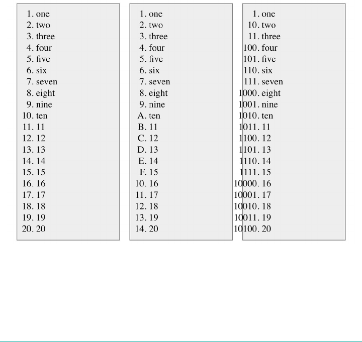
@counter-style decimal {
system: numeric;
symbols: '0' '1' '2' '3' '4' '5' '6' '7' '8' '9';
}
This is easily extensible to create hexadecimal counting, like so:
@counter-style hexadecimal {
system: numeric;
symbols: '0' '1' '2' '3' '4' '5' '6' '7' '8' '9' 'A' 'B' 'C' 'D' 'E' 'F';
}
This will count from 1 through F, roll over to 10 and count up to 1F, then 20 to 2F, 30
to 3F, etc. Much more simply, it’s a breeze to set up binary counting:
@counter-style binary {
system: numeric;
symbols: '0' '1';
}
Examples of each of those three counting patterns are shown in Figure 15-40.
Figure 15-40. ree numeric counting patterns
808 | Chapter 15: Lists and Generated Content
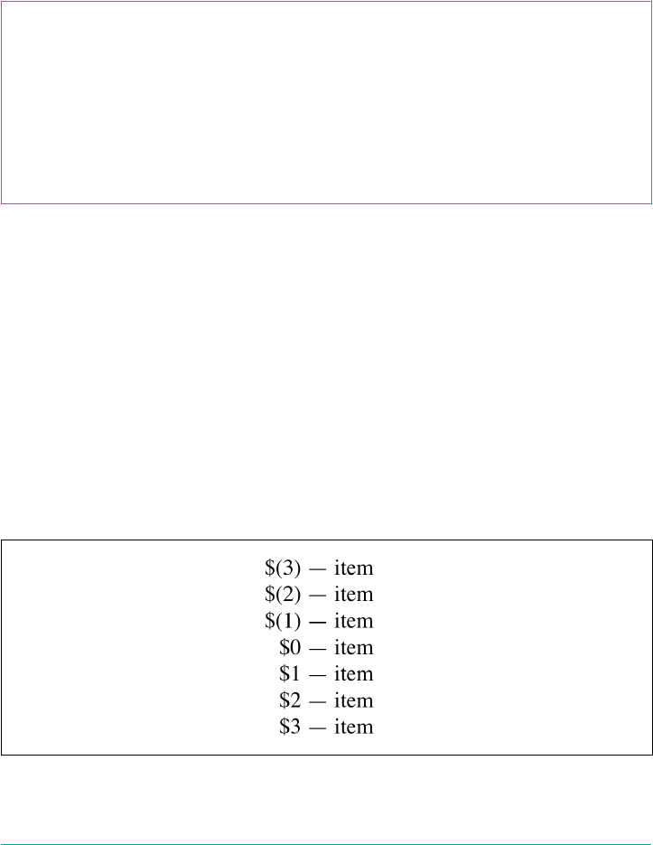
An interesting question to consider is: what happens if a counter value is negative? In
decimal counting, we generally expect negative numbers to be preceded by a minus
sign (-), but what about in other systems, like symbolic? What if we define a letter-
based numeric counting system? Or if we want to use accounting-style formatting,
which puts negative values into parentheses? This is where the negative descriptor
comes into play.
negative descriptor
Value: <symbol> <symbol>?
Initial value: \2D (the hyphen-minus symbol)
Notes: negative is only applicable in counting systems that allow negative values: alpha
betic, numeric, symbolic, and additive.
negative is like its own little self-contained combination of prefix and suffix, but
is only applied in situations where the counter is a negative value. Its symbols are
placed inside the prefix and suffix symbols.
So let’s say we want to use accounting-style formatting, and also add prefix and suffix
symbols to all counters. That would be done as follows, with the result shown in
Figure 15-41:
@counter-style accounting {
system: numeric;
symbols: '0' '1' '2' '3' '4' '5' '6' '7' '8' '9';
negative: "(" ")";
prefix: "$";
suffix: " - ";
}
ol.kaching {list-style: accounting;}
Figure 15-41. Negative-value formatting
Dening Counting Patterns | 809
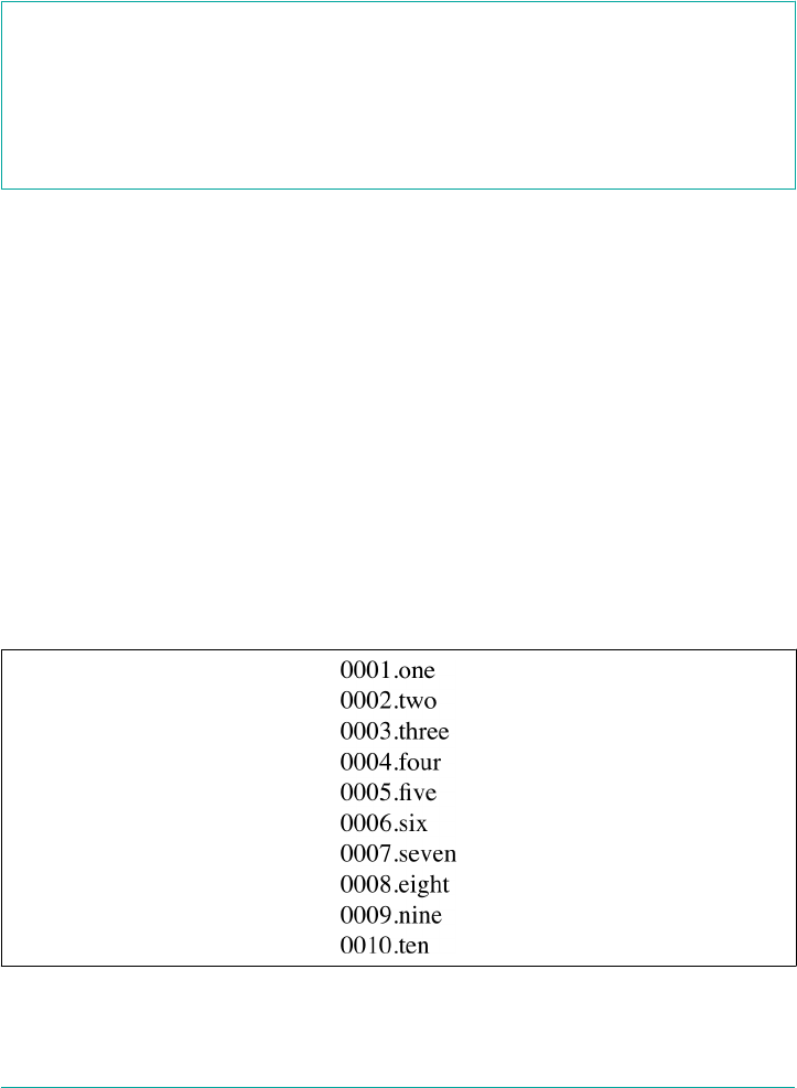
Another common feature of numeric counting systems is the desire to pad out low
values so that their length matches that of higher values. For example, rather than “1”
and “100,” a counting pattern might use leading zeroes to create “001” and “100.” This
can be accomplished with the pad descriptor.
pad descriptor
Value <integer> && <symbol>
Initial value 0 ""
The pattern of this descriptor is a little interesting. The first part is an integer, and
defines the number of digits that every counter should have. The second part is a
string that’s used to fill out any value that has fewer than the defined number of digits.
Consider this example:
@counter-style padded {
system: numeric;
symbols: '0' '1' '2' '3' '4' '5' '6' '7' '8' '9';
suffix: '.';
pad: 4 "0";
}
ol {list-style: decimal;}
ol.padded {list-style: padded;}
Given these styles, ordered lists will all used decimal counting by default: 1, 2, 3, 4,
5…. Those with a class of padded will use padded decimal counting: 0001, 0002,
0003, 0004, 0005…. An example of this is shown in Figure 15-42.
Figure 15-42. Padding values
810 | Chapter 15: Lists and Generated Content
Note how the padded counters use the 0 symbol to fill in any missing leading digits,
in order to make every counter be at least four digits long. The “at least” part of that
last sentence is important: if a counter gets up to five digits, it won’t be padded. More
importantly, if a counter reaches five digits, none of the other shorter counters will
get additional zeroes. They’ll stay four digits long, because of the 4 in 4 "0".
Any symbol can be used to pad values, not just 0. You could use underlines, periods,
emoji, arrow symbols, empty spaces, or anything else you like. In fact, you can have
multiple characters in the <symbol> part of the value. The following is perfectly
acceptable, if not necessarily desirable:
@counter-style crazy {
system: numeric;
symbols: '0' '1' '2' '3' '4' '5' '6' '7' '8' '9';
suffix: '.';
pad: 4 "";
}
ol {list-style: decimal;}
ol.padded {list-style: padded;}
Given a counter value of 1, the result of that crazy counting system would be “
1.”
Note that negative symbols count toward symbol length, and thus eat into padding.
Also note that the negative sign will come outside any padding. Thus, given the fol‐
lowing styles, we’d get the result shown in Figure 15-43:
@counter-style negativezeropad {
system: numeric;
symbols: '0' '1' '2' '3' '4' '5' '6' '7' '8' '9';
suffix: '. ';
negative: '–';
pad: 4 "0";
}
@counter-style negativespacepad {
system: numeric;
symbols: '0' '1' '2' '3' '4' '5' '6' '7' '8' '9';
suffix: '. ';
negative: '–';
pad: 4 " ";
}
Dening Counting Patterns | 811

Figure 15-43. Padding values
Additive Counting Patterns
We have one more system type to explore, which is additive-symbol counting. In
additive counting systems, different symbols are used to represent values. Putting a
number of the symbols together properly, and adding up the numbers each repre‐
sents, yields the counter value.
additive-symbols descriptor
Value [ <integer> && <symbol> ]#
Initial value n/a
Note <integer> values must be non-negative, and additive counters are not applied when a
counter’s value is negative.
It’s much easier to show this than explain it. Here’s an example adapted from Kseso:
@counter-style roman {
system: additive;
additive-symbols:
1000 M, 900 CM, 500 D, 400 CD,
100 C, 90 XC, 50 L, 40 XL,
10 X, 9 IX, 5 V, 4 IV, 1 I;
}
This will count in classical Roman style. Another good example can be found in the
specification for counting styles, which defines a dice-counting system:
@counter-style dice {
system: additive;
812 | Chapter 15: Lists and Generated Content
additive-symbols: 6 ⚅, 5 ⚅, 4 ⚅, 3 ⚅, 2 ⚅, 1 ⚅, 0 "__";
suffix: " ";
}
The results of both counting systems are shown in Figure 15-44; this time, each list
has been formatted as three columns.
Figure 15-44. Additive values
Symbols can be quoted for clarity; e.g., 6 "⚅", 5 "⚅", 4 "⚅", and so on.
The most important thing to keep in mind is that the order of the symbols and their
equivalent values matters. Notice how both the Roman and dice-counting systems
supplied values from largest to smallest, not the other way around? That’s because if
you put the values in any order other than descending, the entire block is rendered
invalid.
Also notice the use of the additive-symbols descriptor instead of symbols. This is
important to keep in mind, since defining an additive system and then trying to use
the symbols descriptor will render the entire counter-styles block invalid. (Simi‐
larly, attempting to use the additive-symbols description in non-additive systems
will render those blocks invalid.)
One last thing to note about additive systems is that, due to the way the additive-
counter algorithm is defined, it’s possible to create additive systems where some val‐
ues can’t be represented even though it seems like they should be. Consider this
definition:
@counter-style problem {
system: additive;
additive-symbols: 3 "Y", 2 "X";
fallback: decimal;
}
This would yield the following counters for the first five numbers: 1, X, Y, 4, YX. You
might think “4” should be “XX,” and that may make intuitive sense, but the algorithm
for additive symbols doesn’t permit it. To quote the specification: “While unfortunate,
this is required to maintain the property that the algorithm runs in linear time rela‐
tive to the size of the counter value.”
Dening Counting Patterns | 813

So how does Roman counting manage to get “III” for 3? Again, the
answer is in the algorithm. It’s a little too complicated to get into
here, so if you’re truly curious, I recommend you read the CSS
Counter Styles Level 3 specification, which defines the additive
counting algorithm. Even if that doesn’t interest you, just remem‐
ber: make sure you have a symbol whose value equates to 1, and
you’ll avoid this problem.
Extending Counting Patterns
There may come a time when you just want to vary an existing counting system a bit.
For example, suppose you want to change regular decimal counting to use close-
parentheses symbols as suffixes, and pad up to two leading zeroes. You could write it
all out longhand, like so:
@counter-style mydecimals {
system: numeric;
symbols: '0' '1' '2' '3' '4' '5' '6' '7' '8' '9';
suffix: ") ";
pad: 2 "0";
}
That works, but it’s clumsy. Well, worry not: extends is here to help.
extends is sort of a system type, but only in the sense that it builds on an existing
system type. The previous example would be rewritten with extends as follows:
@counter-style mydecimals {
system: extends decimal;
suffix: ") ";
pad: 2 "0";
}
That takes the existing decimal system familiar from list-style-type and refor‐
mats it a bit. Thus, there’s no need to re-type the whole symbol chain. You just adjust
the options, as it were.
In fact, you can only adjust the options: if you try use either symbols or additive-
symbols in an extneds system, the entire @counter-style block will be invalid and
ignored. In other words, symbols cannot be extended. As an example, you can’t
define hexadecimal counting by extending decimal counting.
814 | Chapter 15: Lists and Generated Content
However, you can vary the hexadecimal counting for different contexts. As an exam‐
ple, you could set up basic hex counting and then define some variant display pat‐
terns, as shown in the following code and illustrated in Figure 15-45. (Note that each
list jumps from 19 to 253, thanks to a value="253" on one of the list items.)
@counter-style hexadecimal {
system: numeric;
symbols: '0' '1' '2' '3' '4' '5' '6' '7' '8' '9' 'A' 'B' 'C' 'D' 'E' 'F';
}
@counter-style hexpad {
system: extends hexadecimal;
pad: 2 "0";
}
@counter-style hexcolon {
system: extends hexadecimal;
suffix: ": ";
}
@counter-style hexcolonlimited {
system: extends hexcolon;
range: 1 255; /* stops at FF */
}
Figure 15-45. Various hexadecimal counting patterns
Notice how the last of the four counter styles, hexcolonlimited, extends the third,
hexcolon, which itself extends the first, hexadecimal. In hexcolonlimited, the hexa‐
decimal counting stops at FF (255), thanks to the range: 1 255; declaration.
Speaking Counting Patterns
While it’s fun to build counters out of symbols, the result can be a real mess for spo‐
ken technologies such as Apple’s VoiceOver or the JAWS screen reader. Imagine, for
example, a screen reader trying to read dice counters, or phases of the moon. To help,
the speak-as descriptor allows you to define an audible fallback.
Dening Counting Patterns | 815
speak-as descriptor
Value auto | bullets | numbers | words | spell-out | <counter-style-name>
Initial value auto
Let’s take the values backward. With a <counter-style-name>, you’re able to define an
alternate counting style that the user agent likely already recognizes. For example, you
might provide an audio fallback for dice-counting to be decimal counting when spo‐
ken:
@counter-style dice {
system: additive;
speak-as: decimal;
additive-symbols: 6 ⚅, 5 ⚅, 4 ⚅, 3 ⚅, 2 ⚅, 1 ⚅;
suffix: " ";
}
Given those styles, the counter “⚅⚅⚂” would be spoken as “fifteen.” Alternatively, if
the speak-as value is changed to lower-latin, that counter will be spoken as “oh”
(capital letter O).
spell-out seems fairly straightforward, but it’s a little more complicated than it first
appears. What is spelled out by the user agent is a “counter representation,” which is
then spelled out letter by letter. It’s hard to predict what that will mean, since the
method of generated a counter representation isn’t precisely defined: the specification
says “counter representations are constructed by concatenating counter symbols
together.” And that’s all.
words is similar to spell-out, except the counter representation is spoken as words
instead of spelling out each letter. Again, the exact process is not defined.
With the value numbers, the counters are spoken as numbers in the document lan‐
guage. This is very similar to the previous code sample, where “⚅⚅⚂” is spoken as
“fifteen,” at least in English documents. If it’s another language, then that language is
used for counting: “quince” in Spanish, “fünfzehn” in German, “shíwǔ” in Chinese,
and so on.
Given bullets, the user agent says whatever it says when reading a bullet (marker) in
an unordered list. This may mean saying nothing at all, or producing an audio cue
such as a chime or click.
Finally, consider the default value of auto. We saved this for last because its actual
effect depends on the counting system in use. If it’s a alphabetic system, then speak-
816 | Chapter 15: Lists and Generated Content

as: auto has the same effect as speak-as: spell-out. In cyclic systems, auto is the
same as bullets. Otherwise, the effect is the same as speak-as: numbers.
The exception to this rule is if the system is an extends system, in which case auto’s
effects are determined based on the system being extended. Therefore, given the fol‐
lowing styles, the counters in an emojibrackets list will be spoken as if speak-as
were set to bullets:
@counter-style emojilist {
emojiverse {
system: cyclic;
symbols: ;
@counter-style emojibrackets {
system: extends emojilist;
suffix: "]] ";
speak-as: auto;
}
Summary
Even though list styling isn’t as sophisticated as we might like, and browser support
for generated content is somewhat spotty (as of this writing, anyway), the ability to
style lists is still highly useful. One relatively common use is to take a list of links,
remove the markers and indentation, and thus create a navigation sidebar. The com‐
bination of simple markup and flexible layout is difficult to resist. With the anticipa‐
ted enhancements to list styling in CSS3, I expect that lists will become more and
more useful.
For now, in situations where a markup language doesn’t have intrinsic list elements,
generated content can be an enormous help—say, for inserting content such as icons
to point to certain types of links (PDF files, Word documents, or even just links to
another web site). Generated content also makes it easy to print out link URLs, and
its ability to insert and format quotation marks leads to true typographic joy. It’s safe
to say that the usefulness of generated content is limited only by your imagination.
Even better, thanks to counters, you can now associate ordering information to ele‐
ments that are not typically lists, such as headings or code blocks. Now, if you want to
support such features with design that mimics the appearance of the user’s operating
system, read on. The next chapter will discuss ways to change the placement, shape,
and even perspective of your design.
Summary | 817

CHAPTER 16
Transforms
Ever since the inception of Cascading Style Sheets (CSS), elements have been rectan‐
gular and firmly oriented on the horizontal and vertical axes. A number of tricks
arose to make elements look like they were tilted and so on, but underneath it all was
a rigid grid. In the late 2000s, an interest grew in being able to break the shackles of
that grid and transform objects in interesting ways—and not just in two dimensions.
If you’ve ever positioned an object, whether relatively or absolutely, then you’ve
already transformed that object. For that matter, any time you used floats or negative-
margin tricks (or both), you transformed an object. All of those are examples of
translation, or the movement of an element from where it would normally appear to
some other place. With CSS transforms, you have a new way to translate elements,
and a whole lot more. Whether it’s as simple as rotating some photographs a bit to
make them appear more natural, or creating interfaces where information can be
revealed by flipping over elements, or just doing interesting perspective tricks with
sidebars, CSS transforms can—if you’ll pardon the obvious expression—transform
the way you design.
Coordinate Systems
Before embarking on this journey, let’s take a moment to orient ourselves. Two types
of coordinate systems are used in transforms, and it’s a good idea to be familiar with
both.
If you’re already well familiar with Cartesian and spherical coordi‐
nate systems, particularly as used in computing, feel free to skip to
the next section.
819
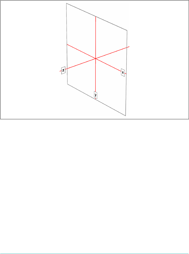
The first is the Cartesian coordinate system, or what’s often called the x/y/z coordinate
system. This system is a way of describing the position of a point in space using two
numbers (for two-dimensional placement) or three numbers (for three-dimensional
placement). In CSS, the system uses three axes: the x, or horizontal axis; the y, or ver‐
tical axis; and the z, or depth axis. This is illustrated in Figure 16-1.
Figure 16-1. e three Cartesian axes used in CSS transforms
For any 2D (two-dimensional) transform, you only need to worry about the x- and y-
axes. By convention, positive x values go to the right, and negative values go to the
left. Similarly, positive y values go downward along the y-axis, while negative values
go upward along the y-axis.
That might seem a little weird, since we tend to think that higher numbers should
place something higher up, not lower down, as many of us learned in pre-algebra.
(This why the “y” label is at the bottom of the y-axis in Figure 16-1: the labels are
placed in the positive direction on all three axes.) If you are experienced with abso‐
lute positioning in CSS, think of the top property values for absolutely positioned ele‐
ments: they get moved downward for positive top values, and upward when top has a
negative length.
Given this, in order to move an element leftward and down, you would give it a nega‐
tive x and a positive y value, like this:
translateX(-5em) translateY(33px)
820 | Chapter 16: Transforms
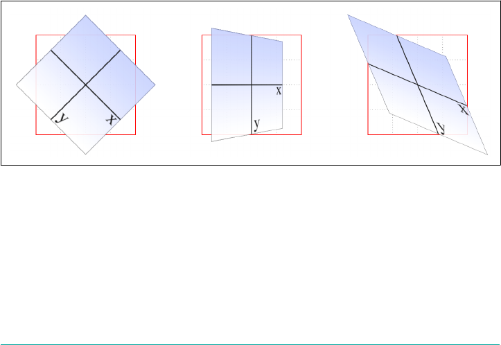
That is in fact a valid transform value, as we’ll see in just a bit. Its effect is to translate
(move) the element five ems to the left and 33 pixels down.
If you want to transform something in three-dimensional space, then you add a z-
axis value. This axis is the one that “sticks out” of the display and runs straight
through your head. In a theoretical sense, that is. Positive z values are closer to you,
and negative z values are further away from you. In this regard, it’s exactly like the z-
index property.
So let’s say that we want to take the element we moved before and add a z-axis value:
translateX(-5em) translateY(33px) translateZ(200px)
Now the element will appear 200 pixels closer to us than it would be without the z
value.
Well you might wonder exactly how an element can be moved 200 pixels closer to
you, given that holographic displays are regrettably rare and expensive. How many
molecules of air between you and your monitor are equivalent to 200 pixels? What
does an element moving closer to you even look like, and what happens if it gets too
close? These are excellent questions that we’ll get to later on. For now, just accept that
moving an element along the z-axis appears to move it closer or farther away.
The really important thing to remember is that every element carries its own frame of
reference and so considers its axes with respect to itself. That is to say, if you rotate an
element, the axes rotate along with it, as illustrated in Figure 16-2. Any further trans‐
forms are calculated with respect to those rotated axes, not the axes of the display.
Figure 16-2. Elemental frames of reference
Speaking of rotations, the other coordinate system used in CSS transforms is a spheri‐
cal system, which describes angles in 3D space. It’s illustrated in Figure 16-3.
Coordinate Systems | 821
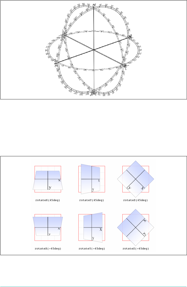
Figure 16-3. e spherical coordinate system used in CSS transforms
For the purposes of 2D transforms, you only have to worry about a single 360-degree
polar system: the one that sits on the plane described by the x- and y-axes. When it
comes to rotations, a 2D rotation actually describes a rotation around the z-axis. Sim‐
ilarly, rotations around the x-axis tilt the element toward or away from you, and rota‐
tions around the y-axis turn the element from side to side. These are illustrated in
Figure 16-4.
Figure 16-4. Rotations around the three axes
822 | Chapter 16: Transforms
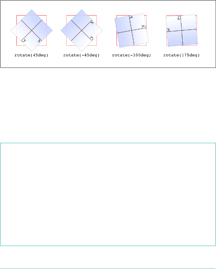
But back to 2D rotations. Suppose you wanted to rotate an element 45 degrees clock‐
wise in the plane of the display (i.e., around the z-axis). The transform value you’re
most likely to use is:
rotate(45deg)
Change that to –45deg, and the element will rotate counterclockwise (anticlockwise
for our international friends) around the z-axis. In other words, it will rotate in the xy
plane, as illustrated in Figure 16-5.
Figure 16-5. Rotations in the xy plane
All right, now that we have our bearings, let’s get started with transforms!
Transforming
There’s really only one property that applies transforms, along with a few ancillary
properties that affect exactly how the transforms are applied. We’ll start with the
big cheese.
transform
Values <transform-list> | none
Initial value none
Applies to All elements except “atomic inline-level” boxes (see explanation)
Percentages Refer to the size of the bounding box (see explanation)
Computed value As specied, except for relative length values, which are converted to an absolute
length
Inherited No
Animatable As a transform
Transforming | 823

First off, let’s clear up the matter of the bounding box. For any element being affected
by CSS, this is the border box; that is, the outermost edge of the element’s border.
That means that any outlines and margins are ignored for the purposes of calculating
the bounding box.
If a table-display element is being transformed, its bounding box is
the table wrapper box, which encloses the table box and any associ‐
ated caption box.
If you’re transforming a Scalable Vector Graphics (SVG) element with CSS, then its
bounding box is its SVG-defined object bounding box.
Note that all transformed elements (i.e., elements with transform set to a value other
than none) have their own stacking context. While the scaled element may be much
smaller or larger than it was before the transform was applied, the actual space on the
page that the element occupies remains the same as before the transform was applied.
This is true for all the transform functions.
Now, the value entry <transform-list> requires some explanation. This placeholder
refers to a list of one or more transform functions, one after the other, in space-
separated format. It looks like this, with the result shown in Figure 16-6:
#example {transform: rotate(30deg) skewX(-25deg) scaleY(2);}
Figure 16-6. A transformed div element
The functions are processed one at a time, starting with the first (leftmost) and pro‐
ceeding to the last (rightmost). This first-to-last processing order is important,
because changing the order can lead to drastically different results. Consider the fol‐
lowing two rules, which have the results shown in Figure 16-7:
img#one {transform: translateX(200px) rotate(45deg);}
img#two {transform: rotate(45deg) translateX(200px);}
824 | Chapter 16: Transforms
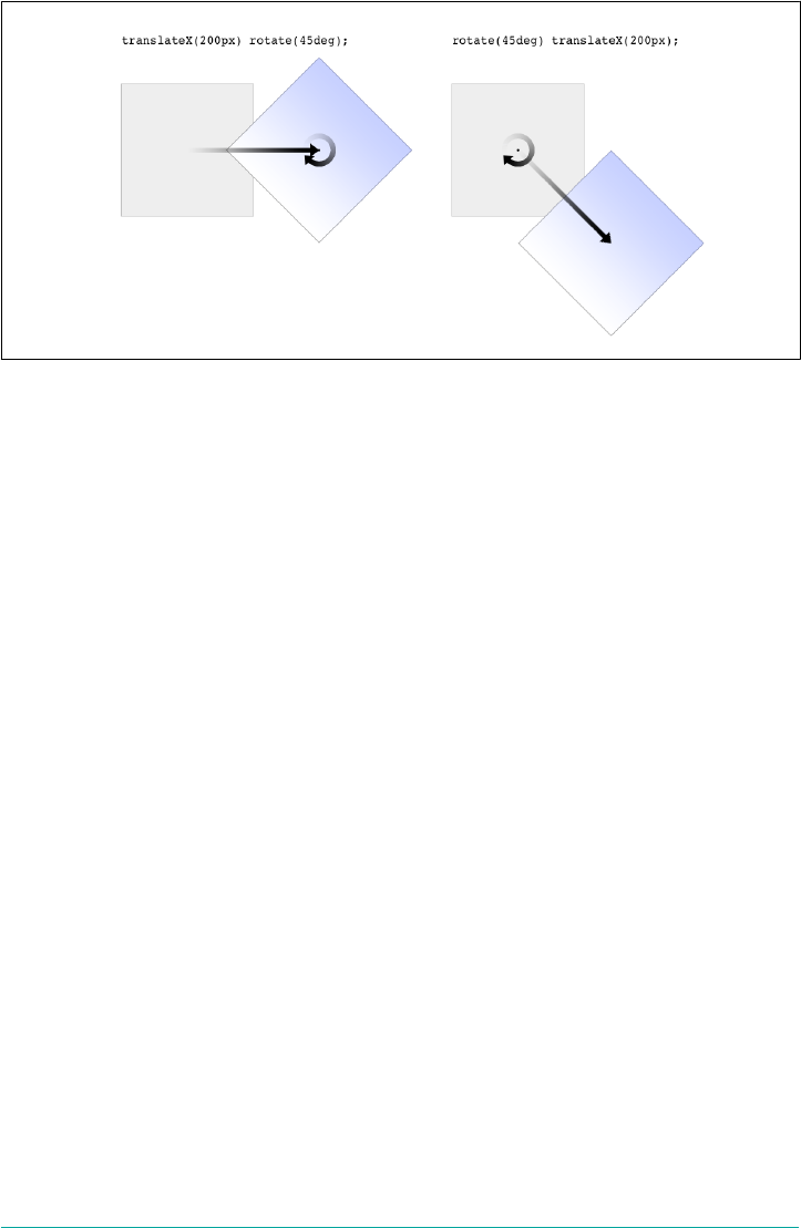
Figure 16-7. Dierent transform lists, dierent results
In the first instance, an image is translated (moved) 200 pixels along its x-axis and
then rotated 45 degrees. In the second instance, an image is rotated 45 degrees and
then moved 200 pixels along its x-axis—that’s the x-axis of the transformed element,
not of the parent element, page, or viewport. In other words, when an element is rota‐
ted, its x-axis (along with its other axes) rotates along with it. All element transforms
are conducted with respect to the element’s own frame of reference.
Compare this to a situation where an element is translated and then scaled, or vice
versa; it doesn’t matter which is which, because the end result is the same:
img#one {transform: translateX(100px) scale(1.2);}
img#two {transform: scale(1.2) translateX(100px);}
The situations where the order doesn’t matter are far outnumbered by the situations
where it does; so in general, it’s a good idea to just assume the order always matters,
even when it technically doesn’t.
Note that when you have a series of transform functions, all of them must be properly
formatted; that is, they must be valid. If even one function is invalid, it renders the
entire value invalid. Consider:
img#one {transform: translateX(100px) scale(1.2) rotate(22);}
Because the value for rotate() is invalid—rotational values must have a unit—the
entire value is dropped. The image in question will just sit there in its initial untrans‐
formed state, neither translated nor scaled, let alone rotated.
It’s also the case that transforms are not usually cumulative. That is to say, if you apply
a transform to an element and then later want to add a transformation, you need to
restate the original transform. Consider the following scenarios, illustrated in
Figure 16-8:
Transforming | 825
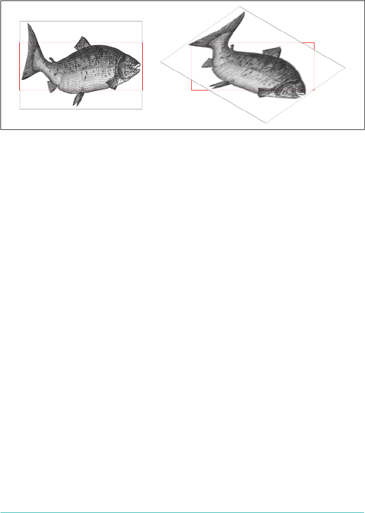
#ex01 {transform: rotate(30deg) skewX(-25deg);}
#ex01 {transform: scaleY(2);}
#ex02 {transform: rotate(30deg) skewX(-25deg);}
#ex02 {transform: rotate(30deg) skewX(-25deg) scaleY(2);}
Figure 16-8. Overwriting or modifying transforms
In the first case, the second rule completely replaces the first, meaning that the ele‐
ment is only scaled along the y-axis. This actually makes some sense; it’s the same as if
you declare a font size and then elsewhere declare a different font size for the same
element. You don’t get a cumulative font size that way. You just get one size or the
other. In the second example, the entirety of the first set of transforms is included in
the second set, so they all are applied along with the scaleY() function.
There is an exception to this, which is that animated transforms, whether using tran‐
sitions or actual animations, are additive. That way, you can take an element that’s
transformed and then animate one of its transform functions without overwriting the
others. For example, assume you had:
img#one {transform: translateX(100px) scale(1.2);}
If you then animate the element’s rotation angle, it will rotate from its translated,
scaled state to the new angle, and its translation and scale will remain in place.
What makes this interesting is that even if you don’t explicitly specify a transition or
animation, you can still create additive transforms via the user-interaction pseudo‐
classes, such as :hover. That’s because things like hover effects are types of transi‐
tions; they’re just not invoked using the transition properties. Thus, you could
declare:
img#one {transform: translateX(100px) scale(1.2);}
img#one:hover {transform: rotate(-45deg);}
This would rotate the translated, scaled image 45 degrees to its left on hover. The
rotation would take place over zero seconds because no transition interval was
declared, but it’s still an implicit transition. Thus, any state change can be thought of
826 | Chapter 16: Transforms

as a transition, and thus any transforms that are applied as a result of those state
changes are additive with previous transforms.
There’s one important caveat: as of this writing, transforms are not applied to atomic
inline-level boxes. These are inline boxes like spans, hyperlinks, and so on. Those ele‐
ments can be transformed if their block-level parent is transformed, in which case
they go along for the ride. But you can’t just rotate a span unless you’ve changed its
display role via display: block, display: inline-block, or something along those
lines. The reason for this limitation boils down to an uncertainty. Suppose you have a
span (or any inline-level box) that breaks across multiple lines. If you rotate it, what
happens? Does each line box rotate with respect to itself, or should all the line boxes
be rotated as a single group? There’s no clear answer, and the debate continues, so for
now you can’t directly transform inline-level boxes.
The Transform Functions
There are, as of this writing, 21 different transform functions, employing a number of
different value patterns to get their jobs done. Table 16-1 provides a list of all the
available transform functions, minus their value patterns.
Table 16-1. Transform functions
translate()
translate3d()
translateX()
translateY()
translateZ()
scale()
scale3d()
scaleX()
scaleY()
scaleZ()
rotate()
rotate3d()
rotateX()
rotateY()
rotateZ()
skew()
skewX()
skewY()
matrix()
matrix3d()
perspective()
The most common value pattern for transform is a space-separated list of one or
more functions, processed from first (leftmost) to last (rightmost), and all of the
functions must have valid values. If any one of the functions is invalid, it will invalid‐
ate the entire value of transform, thus preventing any transformation at all.
Translation functions
A translation transform is just a move along one or more axes. For example,
translateX() moves an element along its own x-axis, translateY() moves it along
its y-axis, and translateZ() moves it along its z-axis.
Functions Permitted values
translateX(), translateY() <length> | <percentage>
These are usually referred to as the “2D” translation functions, since they can slide an
element up and down, or side to side, but not forward or backward along the z-axis.
Transforming | 827
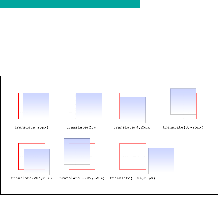
Each of these functions accepts a single distance value, expressed as either a length or
a percentage.
If the value is a length, then the effect is about what you’d expect. Translate an ele‐
ment 200 pixels along the x-axis with translateX(200px), and it will move 200 pixels
to its right. Change that to translateX(-200px), and it will move 200 pixels to its
left. For translateY(), positive values move the element downward, while negative
values move it upward, both with respect to the element itself. Thus, if you flip the
element upside down by rotation, positive translateY() values will actually move
the element downward on the page.
If the value is a percentage, then the distance is calculated as a percentage of the ele‐
ment’s own size. Thus, translateX(50%) will move an element 300 pixels wide and
200 pixels tall to its right by 150 pixels, and translateY(-10%) will move that same
element upward (with respect to itself) by 20 pixels.
Function Permitted values
translate() [ <length> | <percentage> ] [, <length> | <percentage>]?
If you want to translate an element along both the x- and y-axes at the same time,
then translate() makes it easy. Just supply the x value first and the y value second,
and it will act the same as if you combined translateX() translateY(). If you omit
the y value, then it’s assumed to be zero. Thus, translate(2em) is treated as if it were
translate(2em,0), which is also the same as translateX(2em). See Figure 16-9 for
some examples of 2D translation.
Figure 16-9. Translating in two dimensions
828 | Chapter 16: Transforms
According to the latest version of the specification, both of the 2D translation func‐
tions can be given a unitless number. In this case, the number is treated as being
expressed in terms of a user unit, which is treated the same as a pixel unless otherwise
defined. The CSS specification does not explain how a user unit is otherwise defined;
however, the SVG specification does, albeit briefly. In the field, no browser tested as
of this writing supported unitless numbers of translation values, so the capability is
academic, at best.
Function Permitted value
translateZ() <length>
This function translates elements along the z-axis, thus moving them into the third
dimension. Unlike the 2D translation functions, translateZ() only accepts length
values. Percentage values are not permitted for translateZ(), or indeed for any z-
axis value.
Functions Permitted values
translate3d() [ <length> | <percentage> ], [ <length> | <percentage>], [ <length> ]
Much like translate() does for x and y translations, translate3d() is a shorthand
function that incorporates the x, y, and z translation values into a single function.
This is handy if you want to move an element over, up, and forward in one fell swoop.
See Figure 16-10 for an illustration of how 3D translation works. There, each arrow
represents the translation along that axis, arriving at a point in 3D space. The dashed
lines show the distance and direction from the origin point (the intersection of the
three axes) and the distance above the xz plane.
Unlike translate(), there is no fallback for situations where translate3d() does
not contain three values. Thus, translate3d(1em,-50px) should be treated as invalid
by user agents instead of being assumed to be translate3d(2em,-50px,0).
Transforming | 829
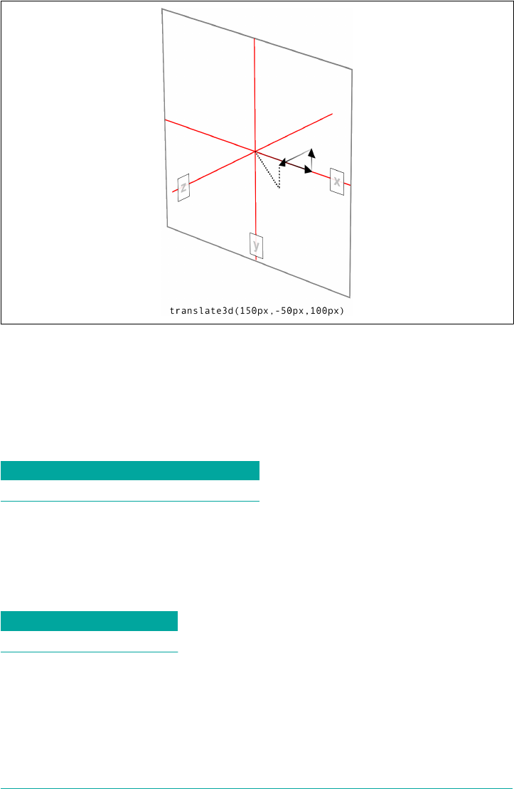
Figure 16-10. Translating in three dimensions
Scale functions
A scale transform makes an element larger or smaller, depending on what value you
use. These values are unitless real numbers and are always positive. On the 2D plane,
you can scale along the x- and y-axes individually, or scale them together.
Functions Permitted value
scaleX(), scaleY(), scaleZ() <number>
The number value supplied to a scale function is a multiplier; thus, scaleX(2) will
make an element twice as wide as it was before the transformation, whereas
scaleY(0.5) will make it half as tall. Given this, you might expect that percentage
values are permissible as scaling values, but they aren’t.
Function Permitted value
scale() <number> [, <number> ]?
If you want to scale along both axes simultaneously, use scale(). The x value is
always first and the y always second, so scale(2,0.5) will make the element twice as
wide and half as tall as it was before being transformed. If you only supply one num‐
ber, it is used as the scaling value for both axes; thus, scale(2) will make the element
twice as wide and twice as tall. This is in contrast to translate(), where an omitted
830 | Chapter 16: Transforms
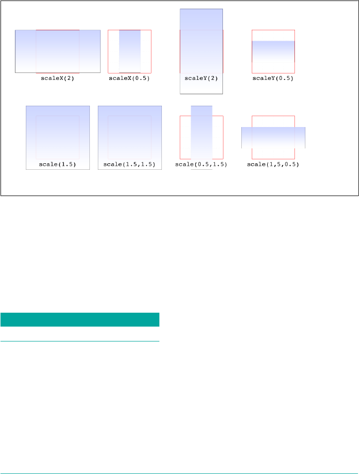
second value is always set to zero. scale(1) will scale an element to be exactly the
same size it was before you scaled it, as will scale(1,1). Just in case you were dying
to do that.
Figure 16-11 shows a few examples of element scaling, using both the single-axis scal‐
ing functions, as well as the combined scale().
Figure 16-11. Scaled elements
If you can scale in two dimensions, you can also scale in three. CSS offers scaleZ()
for scaling just along the z-axis, and scale3d() for scaling along all three axes at
once. These really only have an effect if the element has any depth, which elements
don’t by default. If you do make a change that conveys depth—say, rotating an ele‐
ment around the x- or y-axes—then there is a depth that can be scaled, and either
scaleZ() or scale3d() can do so.
Function Permitted value
scale3d() <number>, <number>, <number>
Similar to translate3d(), scale3d() requires all three numbers to be valid. If you
fail to do this, then the malformed scale3d() will invalidate the entire transform
value to which it belongs.
Transforming | 831

Rotation functions
A rotation function causes an element to be rotated around an axis, or around an arbi‐
trary vector in 3D space. There are four simple rotation functions, and one less-
simple function meant specifically for 3D.
Functions Permitted values
rotate(), rotateX(), rotateY(), rotateZ() <angle>
All four basic rotation functions accept just one value: a degree. This can be expressed
using any of the valid degree units (deg, grad, rad, and turn) and a number, either
positive or negative. If a value’s number runs outside the usual range for the given
unit, it will be normalized to fit into the accepted range. In other words, a value of
437deg will be tilted the same as if it were 77deg, or, for that matter, -283deg.
Note, however, that these are only exactly equivalent if you don’t animate the rotation
in some fashion. That is to say, animating a rotation of 1100deg will spin the element
around several times before coming to rest at a tilt of -20 degrees (or 340 degrees, if
you like). By contrast, animating a rotation of -20deg will tilt the element a bit to the
left, with no spinning; and animating a rotation of 340deg will animate an almost-full
spin to the right. All three animations come to the same end state, but the process of
getting there is very different in each case.
The function rotate() is a straight 2D rotation, and the one you’re most likely to use.
It is equivalent to rotateZ() because it rotates the element around the z-axis (the one
that shoots straight out of your display and through your eyeballs). In a similar man‐
ner, rotateX() causes rotation around the x-axis, thus causing the element to tilt
toward or away from you; and rotateY() rotates the element around its y-axis, as
though it were a door. These are all illustrated in Figure 16-12.
Figure 16-12. Rotations around the three axes
832 | Chapter 16: Transforms

Several of the examples in Figure 16-12 present a fully 3D appear‐
ance. This is only possible with certain values of the properties
transform-style and perspective, described in sections “Choos‐
ing a 3D Style” on page 845 and “Changing Perspective” on page
847 and omitted here for clarity. This will be true throughout this
text in any situation where 3D-transformed elements appear to be
fully three-dimensional. This is important to keep in mind because
if you just try to apply the transform functions shown, you won’t
get the same visual results as in the figures.
Function Permitted value
rotate3d() <number>`,` <number>`,` <number>`,` <angle>
If you’re comfortable with vectors and want to rotate an element through 3D space,
then rotate3d() is for you. The first three numbers specify the x, y, and z compo‐
nents of a vector in 3D space, and the degree value (angle) determines the amount of
rotation around the declared 3D vector.
To start with a basic example, the 3D equivalent to rotate(45deg) is
rotate3d(0,0,1,45deg). This specifies a vector of zero magnitude on the x- and y-
axes, and a magnitude of 1 along the z-axis. In other words, it describes the z-axis.
The element is thus rotated 45 degrees around that vector, as shown in Figure 16-13.
This figure also shows the appropriate rotate3d() values to rotate an element by 45
degrees around the x- and y-axes.
Figure 16-13. Rotations around 3D vectors
A little more complicated is something like rotate3d(-0.95,0.5,1,45deg), where
the described vector points off into 3D space between the axes. To understand how
this works, let’s start with a basic example: rotateZ(45deg) (illustrated in
Figure 16-13). The equivalent is rotate3d(0,0,1,45deg). The first three numbers
describe the components of a vector that has no x or y magnitude, and a z magnitude
Transforming | 833

of 1. Thus, it points along the z-axis in a positive direction; that is, toward the viewer.
The element is then rotated clockwise as you look toward the origin of the vector.
Similarly, the 3D equivalent of rotateX(45deg) is rotate3d(1,0,0,45deg). The vec‐
tor points along the x-axis in the positive direction (to the right). If you stand at the
end of that vector and look toward its origin, then you rotate the element 45 degrees
clockwise around the vector. Thus, from the usual viewer placement, the top of the
element rotates away from and the bottom rotates toward the viewer.
Let’s make it slightly more complex: suppose you have rotate3d(1,1,0,45deg).
When viewed on your monitor, that describes a vector running from the top-left to
bottom-right corner, going right through the center of the element (by default, any‐
way; we’ll see how to change that later on). So the element’s rectangle has a line run‐
ning through it at a 45-degree angle, effectively spearing it. Then the vector rotates 45
degrees, taking the element with it. The rotation is clockwise as you look back toward
the vector’s origin, so again, the top of the element rotates away from the viewer,
while the bottom rotates toward the viewer. If we were to change the rotation to
rotate3d(1,1,0,90deg), then the element would be edge-on to the viewer, tilted at a
45-degree angle and facing off toward the upper right. Try it with a piece of paper:
draw a line from the top left to bottom right, and then rotate the paper around that
line.
OK, so given all that, try visualizing how the vector is determined for
rotate3d(-0.95,0.5,1,45deg). If we assume a cube 200 pixels on a side, the vector’s
components are 190 pixels to the le along the x-axis, 100 pixels down along the y-
axis, and 200 pixels toward the views along the z-axis. The vector goes from the ori‐
gin point (0, 0, 0) to the point (-190 px, 100 px, 200 px). Figure 16-14 depicts that
vector, as well as the final result presented to the viewer.
So the vector is like a metal rod speared through the element being rotated. As we
look back along the line of the vector, the rotation is 45 degrees clockwise. But since
the vector points left, down, and forward, that means the top-left corner of the ele‐
ment rotates toward the viewer, and the bottom right rotates away, as shown in
Figure 16-14.
Just to be crystal clear, rotate3d(1,1,0,45deg) is not equivalent to rotateX(45deg)
rotateY(45deg) rotateZ(0deg)! It’s an easy mistake to make, and many people—
including several online tutorial authors and, until researching and writing this sec‐
tion, your humble correspondent—have made it. It seems like it should be equivalent,
but it really isn’t. If we place that vector inside the imaginary 200 × 200 × 200 cube
previously mentioned, the axis of rotation would go from the origin point to a point
200 pixels right and 200 pixels down (200, 200, 0).
834 | Chapter 16: Transforms
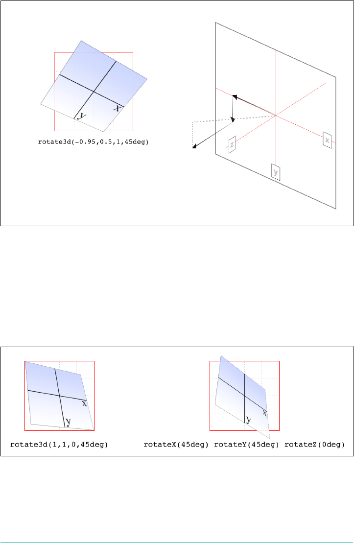
Figure 16-14. Rotation around a 3D vector, and how that vector is determined
Having done that, the axis of rotation is shooting through the element from the top
left to the bottom right, at a 45-degree angle. The element then rotates 45 degrees
clockwise around that diagonal, as you look back toward its origin (the top left),
which rotates the top-right corner of the element away and a bit to the left, while the
bottom-left corner rotates closer and a bit to the right. This is distinctly different than
the result of rotateX(45deg) rotateY(45deg) rotateZ(0deg), as you can see in
Figure 16-15.
Figure 16-15. e dierence between rotating around two axes and rotating around a
3D axis
Transforming | 835
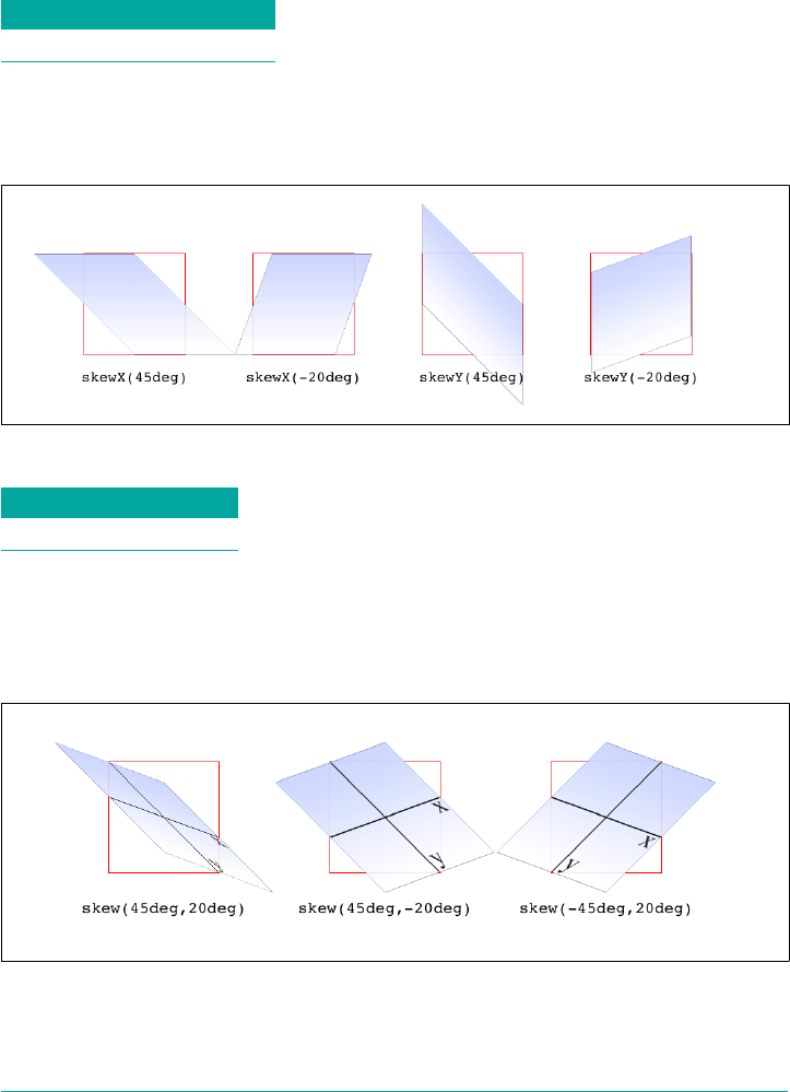
Skew functions
When you skew an element, you slant it along one or both of the x- and y-axes. There
is no z-axis or other 3D skewing.
Functions Permitted value
skewX(), skewY() <angle>
In both cases, you supply an angle value, and the element is skewed to match that
angle. It’s much easier to show skewing rather than try to explain it in words, so
Figure 16-16 shows a number of skew examples along the x- and y-axes.
Figure 16-16. Skewing along the x- and y-axes
Function Permitted values
skew() <angle> [, <angle> ]?
The behavior of including skew(a,b) is different from including skewX(a) with
skewY(b). Instead, it specifies a 2D skew using the matrix operation [ax,ay].
Figure 16-17 shows some examples of this matrix skewing and how they differ from
double-skew transforms that look the same at first, but aren’t.
Figure 16-17. Skewed elements
836 | Chapter 16: Transforms
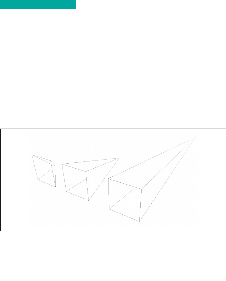
If you supply two values, the x skew angle is always first, and the y skew angle comes
second. If you leave out a y skew angle, then it’s treated as zero.
The perspective function
If you’re transforming an element in 3D space, you most likely want it to have some
perspective. Perspective gives the appearance of front-to-back depth, and you can
vary the amount of perspective applied to an element.
Function Permitted values
perspective() <length>
It might seem a bit weird that you specify perspective as a distance. After all,
perspective(200px) seems a bit odd when you can’t really measure pixels along the
z-axis. And yet, here we are. You supply a length, and the illusion of depth is con‐
structed around that value. Lower numbers create more extreme perspective, as
though you are right up close to the element and viewing it through a fish-eye lens.
Higher numbers create a gentler perspective, as though viewing the element through
a zoom lens from far away. Really high perspective values create an isometric effect.
This makes a certain amount of sense. If you visualize perspective as a pyramid, with
its apex point at the perspective origin and its base the closest thing to you, then a
shorter distance between apex and base will create a shallower pyramid, and thus a
more extreme distortion. This is illustrated in Figure 16-18, with hypothetical pyra‐
mids representing 200 px, 800 px, and 2,000 px perspective distances.
Figure 16-18. Dierent perspective pyramids
In the documentation for Safari, Apple writes that perspective values below 300px
tend to be extremely distorted, values above 2000px create “very mild” distortion, and
Transforming | 837
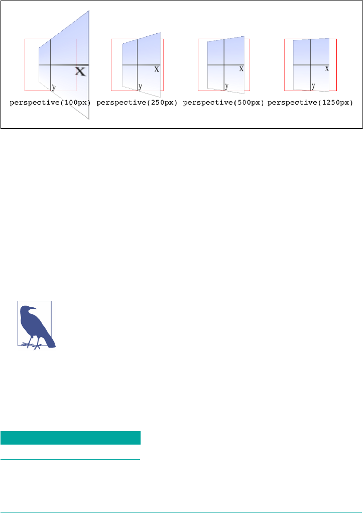
values between 500px and 1000px create “moderate perspective.” To illustrate this,
Figure 16-19 shows a series of elements with the exact same rotation as displayed
with varying perspective values.
Figure 16-19. e eects of varying perspective values
Perspective values must always be positive, nonzero lengths. Any other value will
cause the perspective() function to be ignored. Also note that its placement in the
list of functions is very important. If you look at the code for Figure 16-19, the
perspective() function comes before the rotateY() function. If you were to
reverse the order, the rotation would happen before the perspective is applied, so all
four examples in Figure 16-19 would look exactly the same. So if you plan to apply a
perspective value via the list of transform functions, make sure it comes first, or at the
very least before any transforms that depend on it. This serves as a particularly stark
reminder that the order in which you write transform functions can be very
important.
Note that the function perspective() is very similar to the prop‐
erty perspective, which will be covered later, but they are applied
in critically different ways. Generally, you will want to use the
perspective property instead of the perspective() function, but
there may be exceptions.
Matrix functions
If you’re a particular fan of advanced math, or stale jokes derived from the Wachow‐
skis’ movies, then these functions will be your favorites.
Function Permitted values
matrix() <number> [, <number> ]{5,5}
838 | Chapter 16: Transforms
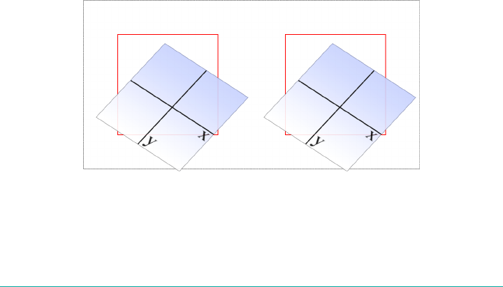
In the CSS transforms specification, we find the trenchant description of matrix() as
a function that “specifies a 2D transformation in the form of a transformation matrix
of the six values a-f.”
First things first: a valid matrix() value is a list of six comma-separated numbers. No
more, no less. The values can be positive or negative. Second, the value describes the
final transformed state of the element, combining all of the other transform types
(rotation, skewing, and so on) into a very compact syntax. Third, very few people
actually use this syntax.
We’re not actually going to go through the complicated process of actually doing the
matrix math. For most readers, it would be an eye-watering wall of apparent gibber‐
ish; and for the rest, it would be time wasted on familiar territory. You can certainly
research the intricacies of matrix calculations online, and I encourage anyone with an
interest to do so. We’ll just look at the basics of syntax and usage in CSS.
Here’s a brief rundown of how it works. Say you have this function applied to an
element:
matrix(0.838671, 0.544639, -0.692519, 0.742636, 6.51212, 34.0381)
That’s the CSS syntax used to describe this transformation matrix:
0.838671 -0.692519 0 6.51212
0.544639 0.742636 0 34.0381
0 0 1 0
0 0 0 1
Right. So what does that do? It has the result shown in Figure 16-20, which is exactly
the same result as writing this:
rotate(33deg) translate(24px,25px) skewX(-10deg)
Figure 16-20. A matrix-transformed element and its functional equivalent
What this comes down to is that if you’re familiar with or need to make use of matrix
calculations, you can and should absolutely use them. If not, you can chain much
Transforming | 839
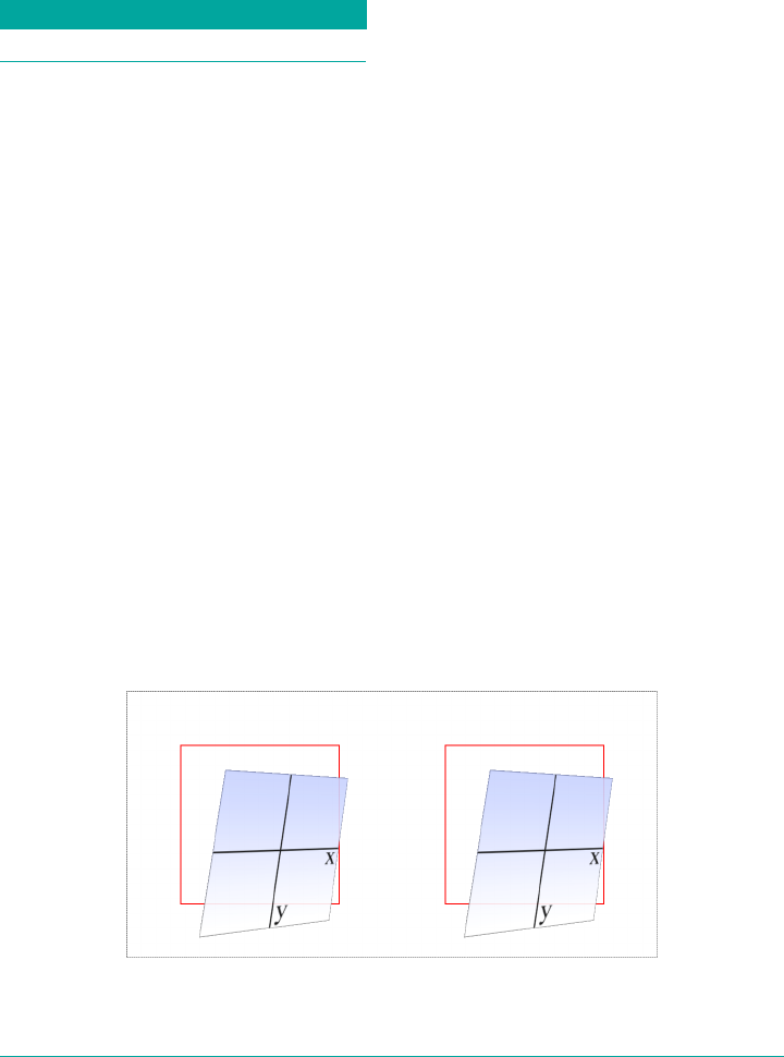
more human-readable transform functions together and get the element to the same
end state.
Now, that was for plain old 2D transforms. What if you want to use a matrix to trans‐
form through three dimensions?
Function Permitted values
matrix3d() <number> [, <number> ]{15,15}
Again, just for kicks, we’ll savor the definition of matrix3d() from the CSS Trans‐
forms specification: “specifies a 3D transformation as a 4 × 4 homogeneous matrix of
16 values in column-major order.” This means the value of matrix3d must be a list of
16 comma-separated numbers, no more or less. Those numbers are arranged in a 4 ×
4 grid in column order, so the first column of the matrix is formed by the first set of
four numbers in the value, the second column by the second set of four numbers, the
third column by the third set, and so on. Thus, you can take the following function:
matrix3d(
0.838671, 0, -0.544639, 0.00108928,
-0.14788, 1, 0.0960346, -0.000192069,
0.544639, 0, 0.838671, -0.00167734,
20.1281, 25, -13.0713, 1.02614)
And write it out as this matrix:
0.838671 -0.14788 0.544639 20.1281
0 1 0 25
-0.544639 0.0960346 0.838671 -13.0713
0.00108928 -0.000192069 -0.00167734 1.02614
Both of which have an end state equivalent to:
perspective(500px) rotateY(33deg) translate(24px,25px) skewX(-10deg)
as shown in Figure 16-21.
Figure 16-21. A matrix3d-transformed element and its functional equivalent
840 | Chapter 16: Transforms

A note on end-state equivalence
It’s important to keep in mind that only the end states of a matrix() function, and of
an equivalent chain of transform functions, can be considered identical. This is for
the same reason discussed in the section on rotation: because a rotation angle of
393deg will end with the same visible rotation as an angle of 33deg. This matters if
you are animating the transformation, since the former will cause the element to do a
barrel roll in the animation, whereas the latter will not. The matrix() version of this
end state won’t include the barrel roll, either. Instead, it will always use the shortest
possible rotation to reach the end state.
To illustrate what this means, consider the following: a transform chain and its
matrix() equivalent:
rotate(200deg) translate(24px,25px) skewX(-10deg)
matrix(-0.939693, -0.34202, 0.507713, -0.879385, -14.0021, -31.7008)
Note the rotation of 200 degrees. We naturally interpret this to mean a clockwise
rotation of 200 degrees, which it does. If these two transforms are animated, however,
they will have act differently: the chained-functions version will indeed rotate 200
degrees clockwise, whereas the matrix() version will rotate 160 degrees counter‐
clockwise. Both will end up in the same place, but will get there in different ways.
There are similar differences that arise even when you might think they wouldn’t.
Once again, this is because a matrix() transformation will always take the shortest
possible route to the end state, whereas a transform chain might not. (In fact, it prob‐
ably doesn’t.) Consider these apparently equivalent transforms:
rotate(160deg) translate(24px,25px) rotate(-30deg) translate(-100px)
matrix(-0.642788, 0.766044, -0.766044, -0.642788, 33.1756, -91.8883)
As ever, they end up in the same place. When animated, though, the elements will
take different paths to reach that end state. They might not be obviously different at
first glance, but the difference is still there.
None of this matters if you aren’t animating the transformation, but it’s an important
distinction to make nevertheless, because you never know when you’ll decide to start
animating things. (Hopefully after reading the companion text on animations!)
More Transform Properties
In addition to the base transform property, there are a few related properties that
help to define things such as the origin point of a transform, the perspective used for
a “scene,” and more.
More Transform Properties | 841

Moving the Origin
So far, all of the transforms we’ve seen have shared one thing in common: the precise
center of the element was used as the transform origin. For example, when rotating
the element, it rotated around its center, instead of, say, a corner. This is the default
behavior, but with the property transform-origin, you can change it.
transform-origin
Values [ left | center | right | top | bottom | <percentage> | <length> ] | [ left |
center | right | <percentage> | <length> ] && [ top | center | bottom |
<percentage> | <length> ] ] <length>?
Initial value 50% 50%
Applies to Any transformable element
Percentages Refer to the size of the bounding box (see explanation)
Computed value A percentage, except for length values, which are converted to an absolute length
Inherited No
Animatable <length>, <percentage>
The syntax definition looks really abstruse and confusing, but it’s actually fairly sim‐
ple in practice. With transform-origin, you supply two or three keywords to define
the point around which transforms should be made: first the horizontal, then the ver‐
tical, and optionally a length along the z-axis. For the horizontal and vertical axes,
you can use plain-English keywords like top and right, percentages, lengths, or a
combination of different keyword types. For the z-axis, you can’t use plain-English
keywords or percentages, but can use any length value. Pixels are by far the most
common.
Length values are taken as a distance starting from the top-left corner of the element.
Thus, transform-origin: 5em 22px will place the transform origin 5 em to the right
of the left side of the element, and 22 pixels down from the top of the element. Simi‐
larly, transform-origin: 5em 22px -200px will place it 5 em over, 22 pixels down,
and 200 pixels away; that is, 200 pixels behind the place where the element sits.
Percentages are calculated with respect to the corresponding axis and size of the ele‐
ment, as offsets from the element’s top-left corner. For example, transform-origin:
67% 40% will place the transform origin 67 percent of the width to the right of the
element’s left side, and 40 percent of the element’s height down from the element’s top
side. Figure 16-22 illustrates a few origin calculations.
842 | Chapter 16: Transforms
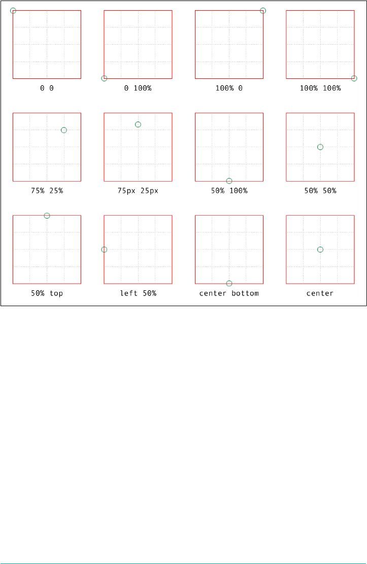
Figure 16-22. Various origin calculations
All right, so if you change the origin, what happens? The easiest way to visualize this
is with 2D rotations. Suppose you rotate an element 45 degrees to the right. Its final
placement will depend on its origin. Figure 16-23 illustrates the the effects of several
different transform origins; in each case, the transform origin is marked with a circle.
The origin matters for other transform types, such as skews and scales. Scaling an
element with its origin in the center will pull in all sides equally, whereas scaling an
element with a bottom-right origin will cause it to shrink toward that corner. Simi‐
larly, skewing an element with respect to its center will result in the same shape as if
it’s skewed with respect to the top-right corner, but the placement of the shape will be
different. Some examples are shown in Figure 16-24; again, each transform origin is
marked with a circle.
The one transform type that isn’t really affected by changing the transform origin is
translation. If you push an element around with translate(), or its cousins like
translateX() and translateY(), it’s going to end up in the same place regardless of
where the transform origin is located. If that’s all the transforming you plan to do,
More Transform Properties | 843
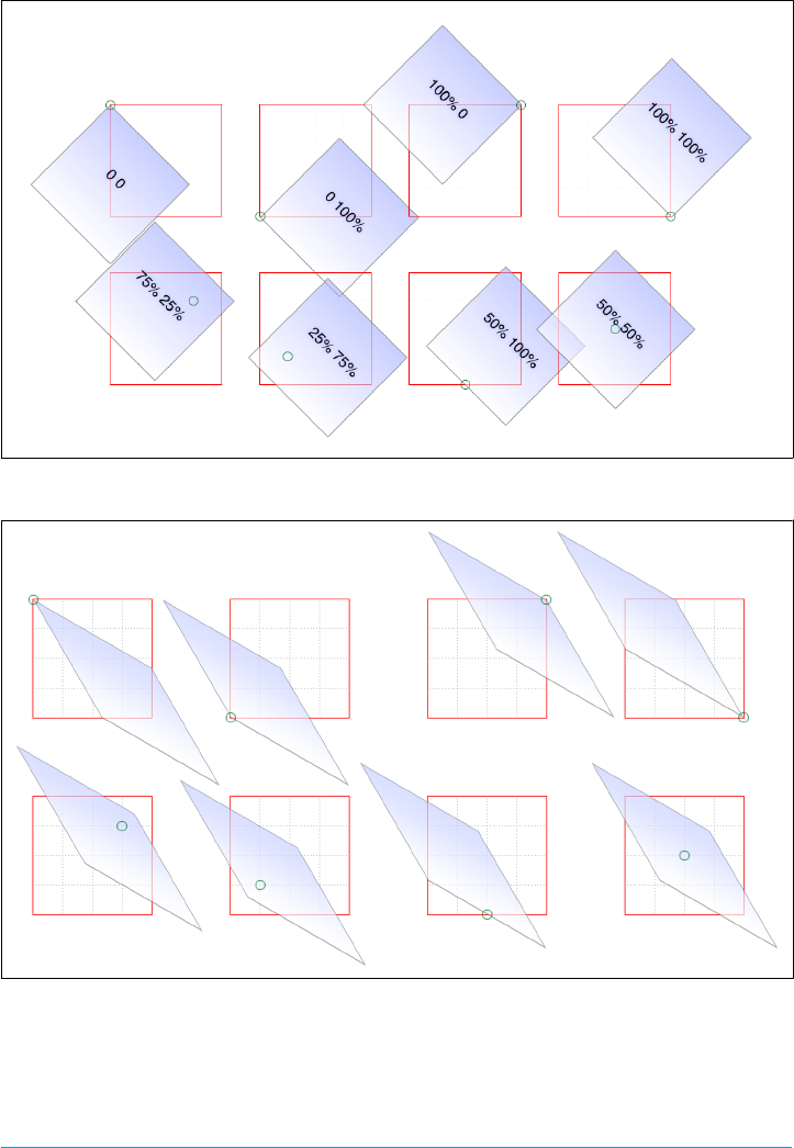
then setting the transform origin is irrelevant. If you ever do anything besides trans‐
lating, though, the origin will matter. Use it wisely.
Figure 16-23. e rotational eects of using various transform origins
Figure 16-24. e skew eects of using various transform origins
844 | Chapter 16: Transforms
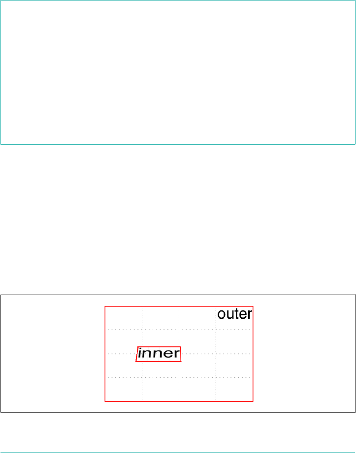
Choosing a 3D Style
If you’re setting elements to be transformed through three dimensions—using, say,
translate3d() or rotateY()—you probably expect that the elements will be presen‐
ted as though they’re in a 3D space. And yet, this is not the default behavior. By
default, everything looks flat no matter what you do. Fortunately, this can be overrid‐
den with the transform-style property.
transform-style
Values flat | preserve-3d
Initial value flat
Applies to Any transformable element
Computed value As specied
Inherited No
Animatable No
Suppose you have an element you want to move “closer to” your eye, and then tilt
away a bit, with a moderate amount of perspective. Something like this rule, as
applied to the following HTML:
div#inner {transform: perspective(750px) translateZ(60px) rotateX(45deg);}
<div id="outer">
outer
<div id="inner">inner</div>
</div>
So you do that, and get the result shown in Figure 16-25; more or less what you might
have expected.
Figure 16-25. A 3D-transformed inner div
More Transform Properties | 845
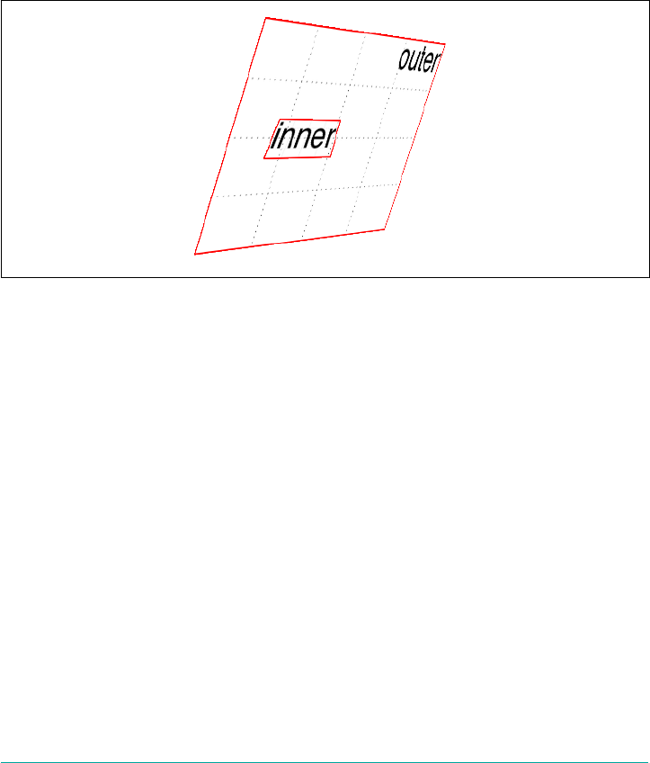
But then you decide to rotate the outer div to one side, and suddenly nothing makes
sense any more. The inner div isn’t where you envisioned it. In fact, it just looks like a
picture pasted to the front of the outer div.
Well, that’s exactly what it is, because the default value of transform-style is flat.
The inner div got drawn in its moved-forward-tilted-back state, and that was applied
to the front of the outer div as if it was an image. So when you rotated the outer div,
the flat picture rotated right along with it, as shown in Figure 16-26:
div#outer {transform: perspective(750px) rotateY(60deg) rotateX(-20deg);}
div#inner {transform: perspective(750px) translateZ(60px) rotateX(45deg);}
Figure 16-26. e eects of a at transform style
Change the value to preserve-3d, however, and things are suddenly different. The
inner div will be drawn as a full 3D object with respect to its parent outer div, float‐
ing in space nearby, and not as a picture pasted on the front of the outer div. You can
see the results of this change in Figure 16-27:
div#outer {transform: perspective(750px) rotateY(60deg) rotateX(-20deg);
transform-style: preserve-3d;}
div#inner {transform: perspective(750px) translateZ(60px) rotateX(45deg);}
One important aspect of transform-style is that it can be overridden by other prop‐
erties. The reason is that some values of these other properties require a flattened pre‐
sentation of an element and its children in order to work at all. In such cases, the
value of transform-style is forced to be flat, regardless of what you may have
declared.
846 | Chapter 16: Transforms
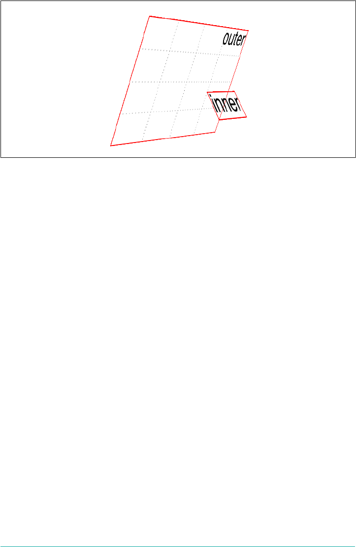
Figure 16-27. e eects of a 3D-preserved transform style
So, in order to avoid this overriding behavior, make sure the following properties are
set to the listed values:
•overflow: visible
•filter: none
•clip: auto
•clip-path: none
•mask-image: none
•mask-border-source: none
•mix-blend-mode: normal
Those are all the default values for those properties, so as long as you don’t try to
change any of them for your preserved 3D elements, you’re fine! But if you find that
editing some CSS suddenly flattens out your lovely 3D transforms, one of these prop‐
erties might be the culprit.
One more note: in addition to the values just mentioned, the value of the property
isolation must be, or be computed to be, isolate. (isolation is a compositing
property, in case you were wondering.)
Changing Perspective
There are actually two properties that are used to define how perspective is handled:
one to define the perspective distance, as with the perspective() function discussed
in an earlier section; and another to define the perspective’s origin point.
More Transform Properties | 847

Dening a group perspective
First, let’s consider the property perspective, which accepts a length that defines the
depth of the perspective pyramid. At first glance, it looks just like the perspective()
function discussed earlier, but there are some critical differences.
perspective
Values none | <length>
Initial value none
Applies to Any transformable element
Computed value The absolute length, or else none
Inherited No
Animatable Yes
As a quick example, if you want to create a very deep perspective, one mimicking the
results you’d get from a zoom lens, you might declare something like perspective:
2500px. For a shallow depth, one that mimics a closeup fish-eye lens effect, you might
declare perspective: 200px.
So how does this differ from the perspective() function? When you use
perspective(), you’re defining the perspective effect for the element that is given
that function. So if you say transform: perspective(800px) rotateY(-50grad);,
you’re applying that perspective to each element that has the rule applied.
With the perspective property, on the other hand, you’re creating a perspective
depth that is applied to all the child elements of the element that received the prop‐
erty. Confused yet? Don’t be. Here’s an illustration of the difference, as shown in
Figure 16-28:
div {transform-style: preserve-3d; border: 1px solid gray; width: 660px;}
img {margin: 10px;}
#one {perspective: none;}
#one img {transform: perspective(800px) rotateX(-50grad);}
#two {perspective: 800px;}
#two img {transform: rotateX(-50grad);}
<div><img src="rsq.gif"><img src="rsq.gif"><img src="rsq.gif"></div>
<div id="one"><img src="rsq.gif"><img src="rsq.gif"><img src="rsq.gif"></div>
<div id="two"><img src="rsq.gif"><img src="rsq.gif"><img src="rsq.gif"></div>
848 | Chapter 16: Transforms
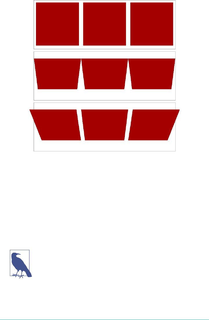
Figure 16-28. Shared perspective versus individual perspectives
In Figure 16-28, we first see a line of images that haven’t been transformed. In the
second line, each image has been rotated 50 gradians (equivalent to 45 degrees)
toward us, but each one within its own individual perspective.
In the third line of images, none of them has an individual perspective. Instead, they
are all drawn within the perspective defined by perspective: 800px; that’s been set
on the div that contains them. Since they all operate within a shared perspective, they
look “correct”; that is, like we would expect if we had three physical pictures mounted
on a clear sheet of glass and rotated toward us around the center horizontal axis of
that glass.
Note that presence of transform-style: preserve-3d makes this
effect possible, as discussed in the previous section.
This is the critical difference between perspective, the property; and
perspective(), the function. The former creates a 3D space shared by all its chil‐
dren. The latter affects only the element to which it’s applied. A less important differ‐
More Transform Properties | 849
ence is that the perspective() function has to come first or early in its chain of
transforms in order to apply to the element as it’s transformed through 3D space. The
perspective property, on the other hand, is applied to all children, regardless of
where their transforms are declared.
In most cases, you’re going to use the perspective property instead of the
perspective() function. In fact, container divs (or other elements) are a very com‐
mon feature of 3D transforms—the way they used to be for page layout—largely to
establish a shared perspective. In the previous example, the <div id="two"> was
there solely to serve as a perspective container, so to speak. On the other hand, we
couldn’t have done what we did without it.
Moving the perspective’s origin
When transforming elements in three dimensions—assuming you’ve allowed them to
appear three-dimensional, that is—a perspective will be used. (See transform-style
and perspective, respectively, in previous sections.) That perspective will have an
origin, which is also known as the vanishing point, and you can change where it’s loca‐
ted with the property perspective-origin.
perspective-origin
Values [ left | center | right | top | bottom | <percentage> | <length> ] | [ left |
center | right | <percentage> | <length> ] && [ top | center | bottom |
<percentage> | <length> ] ] <length>?
Initial value 50% 50%
Applies to Any transformable element
Percentages Refer to the size of the bounding box (see explanation)
Computed value A percentage, except for length values, which are converted to an absolute length
Inherited No
Animatable <length>, <percentage>
As you may have spotted, perspective-origin and transform-origin have the
same value syntax, right down to allowing an optional length value defining an offset
along the z-axis. While the way the values are expressed is identical, the effects they
have are very different. With transform-origin, you define the point around which
transforms happen. With perspective-origin, you define the point on which sight
lines converge.
850 | Chapter 16: Transforms
As with most 3D transform properties, this is more easily demonstrated than
described. Consider the following CSS and markup, illustrated in Figure 16-29:
#container {perspective: 850px; perspective-origin: 50% 0%;}
#ruler {height: 50px; background: #DED url(tick.gif) repeat-x;
transform: rotateX(60deg);
transform-origin: 50% 100%;}
<div id="container">
<div id="ruler"></div>
</div>
Figure 16-29. A basic “ruler”
What we have is a repeated background image of tick-marks on a ruler, with the div
that contains them tiled away from us by 60 degrees. All the lines point at a common
vanishing point, the top center of the container div (because of the 50% 0% value for
perspective-origin).
Now consider that same setup with various perspective origins, as shown in
Figure 16-30.
Figure 16-30. A basic “ruler” with dierent perspective origins
As you can see, moving the perspective origin changes the rendering of the 3D-
transformed element.
Note that these only had an effect because we supplied a value for perspective. If the
value of perspective is ever the default none, then any value given for perspective-
origin will be ignored. That makes sense, since you can’t have a perspective origin
when there’s no perspective at all!
More Transform Properties | 851

Dealing with Backfaces
Something you probably never really thought about, over all the years you’ve been
laying out elements, was: what would it look like if I could see the back side of the
element? Now that 3D transforms are a possibility, there may well come a day when
you do see the back side of an element. You might even mean to do so intentionally.
What happens at that moment is determined by the property backface-visibility.
backface-visibility
Values visible | hidden
Initial value visible
Applies to Any transformable element
Computed value As specied
Inherited No
Animatable No
Unlike many of the other properties and functions we’ve already talked about, this
one is pretty uncomplicated. All it does is determine whether the back side of an ele‐
ment is rendered when it’s facing toward the viewer, or not. That’s it.
So let’s say you flip over two elements, one with backface-visibility set to
the default value of visible and the other set to hidden. You get the result shown in
Figure 16-31:
span {border: 1px solid red; display: inline-block;}
img {vertical-align: bottom;}
img.flip {transform: rotateX(180deg); display: inline-block;}
img#show {backface-visibility: visible;}
img#hide {backface-visibility: hidden;}
<span><img src="salmon.gif"></span>
<span><img src="salmon.gif" class="flip" id="show"></span>
<span><img src="salmon.gif" class="flip" id="hide"></span>
852 | Chapter 16: Transforms
Figure 16-31. Visible and hidden backfaces
As you can see, the first image is unchanged. The second is flipped over around its x-
axis, so we see it from the back. The third has also been flipped, but we can’t see it at
all because its backface has been hidden.
This property can come in handy in a number of situations. The simplest is a case
where you have two elements that represent the two sides of a UI element that flips
over; say, a search area with preference settings on its back, or a photo with some
information on the back. Let’s take the latter case. The CSS and markup might look
something like this:
section {position: relative;}
img, div {position: absolute; top: 0; left: 0; backface-visibility: hidden;}
div {transform: rotateY(180deg);}
section:hover {transform: rotateY(180deg); transform-style: preserve-3d;}
<section>
<img src="photo.jpg" alt="">
<div class="info">(…info goes here…)</div>
</section>
Actually, this example shows that using backface-visibility isn’t quite as simple as
it first appears. It’s not that the property itself is complicated, but if you forget to set
transform-style to preserve-3d, then it won’t work as intended. That’s why
transform-style is set on the section element.
There’s a variant of this example that uses the same markup, but a slightly different
CSS to show the image’s backface when it’s flipped over. This is probably more what
was intended, since it makes information look like it’s literally written on the back of
the image. It leads to the end result shown in Figure 16-32:
section {position: relative;}
img, div {position: absolute; top: 0; left: 0;}
div {transform: rotateY(180deg); backface-visibility: hidden;
background: rgba(255,255,255,0.85);}
section:hover {transform: rotateY(180deg); transform-style: preserve-3d;}
More Transform Properties | 853

Figure 16-32. Photo on the front, information on the back
The only thing we had to do to make that happen was to just shift the backface-
visibilty: hidden to the div instead of applying it to both the img and the div.
Thus, the div’s backface is hidden when it’s flipped over, but that of the image is not.
Summary
With the ability to transform elements in two- and three-dimensional space, CSS
transforms provide a great deal of power to designers who are looking for new ways
to present information. From creating interesting combinations of 2D transforms, to
creating a fully 3D-acting interface, transforms open up a great deal of new territory
in the design space. There are some interesting dependencies between properties,
which is something that not every CSS author will find natural at first, but they
become second nature with just a bit of practice.
854 | Chapter 16: Transforms
1Changing a background image may take longer than 16 milliseconds to decode and repaint to the page. This
isn’t a transition; it is just poor performance.
CHAPTER 17
Transitions
CSS transitions allow us to animate CSS properties from an original value to a new
value over time when a property value changes. These transition an element from one
state to another, in response to some change—usually a user interaction, but it can
also be due to the scripted change of class, ID, or other state.
Normally, when a CSS property value changes—when a “style change event” occurs—
the change is instantaneous. The new property value replaces the old property in the
milliseconds it takes to repaint, or reflow and repaint when necessary, the affected
content. Most value changes seem instantaneous, taking less than 16 milliseconds1 to
render. Even if the changes takes longer, it is still a single step from one value to the
next. For example, when changing a background color on mouse hover, the back‐
ground changes from one color to the next, with no gradual transition.
CSS Transitions
CSS transitions provide a way to control how a property changes from one value to
the next over a period of time. Thus, we can make the property values change gradu‐
ally, creating pleasant and (hopefully) unobtrusive effects. For example:
button {
color: magenta;
transition: color 200ms ease-in 50ms;
}
button:hover {
color: rebeccapurple;
855
transition: color 200ms ease-out 50ms;
}
In this example, instead of instantaneously changing a button’s color value on hover,
with CSS transitions the button can be set to gradually fade from magenta to rebecca
purple over 200 milliseconds, even adding a 50-millisecond delay before transition‐
ing. Changing the color, no matter how long or short a time it takes, is a transition.
But by adding the CSS transition property, the color change can happen gradually
over a period of time and be perceivable by the human eye.
You can use CSS transitions today, even if you still support IE9 or older browsers.
When a browser doesn’t support CSS transition properties, the change is immediate
instead of gradual, which is completely fine. If the property or property values speci‐
fied aren’t animatable, again, the change will be immediate instead of gradual.
When we say “animatable,” we mean any properties that can be ani‐
mated, whether through transitions or animations (the subject of
the next chapter, “Animations.”) See Appendix A for a summary.
Sometimes you want instantaneous value changes. Though we used link colors as an
example in the preceding section, link colors usually change instantly on hover,
informing sighted users an interaction is occurring and that the hovered content is a
link. Similarly, options in an autocomplete listbox shouldn’t fade in: you want the
options to appear instantly, rather than fade in more slowly than the user types.
Instantaneous value changes are often the best user experience.
At other times, you might want to make a property value change more gradually,
bringing attention to what is occurring. For example, you may want to make a card
game more realistic by taking 200 milliseconds to animate the flipping of a card, as
the user may not realize what happened if there is no animation.
Look for the Play symbol to know when an online example is
available. All of the examples in this chapter can be found at https://
meyerweb.github.io/csstdg4gs/17-transitions/.
As another example, you may want some drop-down menus to expand or become
visible over 200 milliseconds (instead of instantly, which may be jarring). With transi‐
tions, you can make a drop-down menu appear slowly. In Figure 17-1 , we transi‐
tion the submenu’s height by making a scale transform. This is a common use for CSS
transitions, which we will also explore later in this chapter.
856 | Chapter 17: Transitions
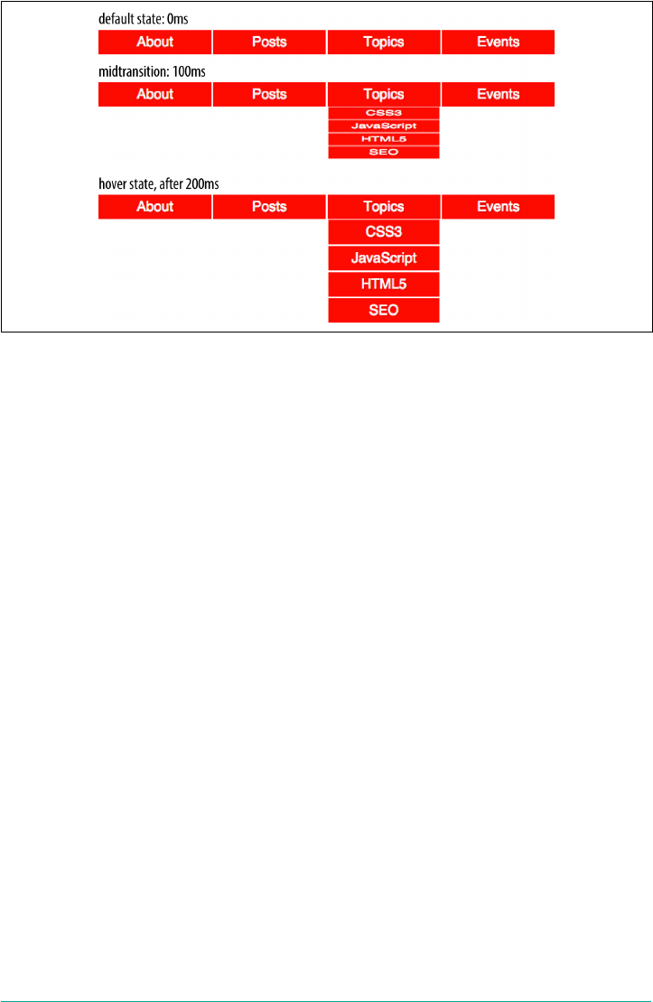
Figure 17-1. Transition initial, midtransition, and nal state
Transition Properties
In CSS, transitions are written using four transition properties: transition-
property, transition-duration, transition-timing-function, and transition-
delay, along with the transition property as a shorthand for the four longhand
properties.
To create the drop-down navigation from Figure 17-1, we used all four CSS transition
properties, in addition to non-transform properties defining the beginning and end
states of the transition. The following code could define the transition for the exam‐
ple illustrated in Figure 17-1:
nav li ul {
transition-property: transform;
transition-duration: 200ms;
transition-timing-function: ease-in;
transition-delay: 50ms;
transform: scale(1, 0);
transform-origin: top center;
}
nav li:hover ul {
transform: scale(1, 1);
}
Note that while we are using the :hover state for the style change event in our transi‐
tion examples, you can transition properties in other scenarios too. For example, you
might add or remove a class, or otherwise change the state—say, by changing an
input from :invalid to :valid or from :checked to :not(:checked). Or you might
Transition Properties | 857

append a table row at the end of a zebra-striped table or list item at the end of a list
with styles based on :nth-last-of-type selectors.
In the scenario pictured in Figure 17-1, the initial state of the nested lists is
transform: scale(1, 0) with a transform-origin: top center. The final state
is transform: scale(1, 1): the transform-origin remains the same.
For more information on transform properties, see Chapter 16.
In this example, the transition properties define a transition on the transform prop‐
erty: when the new transform value is set on hover, the nested unordered list scales
to its original, default size, changing smoothly between the old value of transform:
scale(1, 0) and the new value of transform: scale(1, 1), all over a period of 200
milliseconds. This transition starts after a 50-millisecond delay, and “eases in,” pro‐
ceeding slowly at first, then picking up speed as it progresses.
Transitions are declared along with the regular styles on an element. Whenever a tar‐
get property changes, if a transition is set on that property, the browser will apply a
transition to make the change gradual.
Note that all the transition properties were set for the unhovered state of the ul ele‐
ments. The hovered state was only used to change the transform, not the transition.
There’s a very good reason for this: it means not only that the menus will slide open
when hovered, but will slide closed when the hover state ends.
Imagine if the transition properties were applied via the hover state instead, like this:
nav li ul {
transform: scale(1, 0);
transform-origin: top center;
}
nav li:hover ul {
transition-property: transform;
transition-duration: 200ms;
transition-timing-function: ease-in;
transition-delay: 50ms;
transform: scale(1, 1);
}
That would mean that when not hovered, the element would have default transition
values—which is to say, instantaneous transitions. That means the menus in our pre‐
vious example would slide open on hover, but instantly disappear when the hover
state ends—because without being in hover, the transition properties would no longer
apply!
858 | Chapter 17: Transitions

It might be that you want exactly this effect: slide smoothly open, but instantly disap‐
pear. If so, then apply the transitions to the hover state. Otherwise, apply them to the
element directly so that the transitions will apply as the hover state is both entered
and exited. When the state change is exited, the transition timing is reversed. You can
override this default reverse transition by declaring different transitions in both the
initial and changed states.
By “initial state,” we mean a state that matches the element on page load. This could
be a state that the element always has, such as properties set on an element selector
versus a :hover state for that element. It could mean a content-editable element that
could get :focus, as in the following:
/* selector that matches elements all the time */
p[contenteditable] {
background-color: rgba(0, 0, 0, 0);
}
/* selector that matches elements some of the time */
p[contenteditable]:focus {
/* overriding declaration */
background-color: rgba(0, 0, 0, 0.1);
}
In this example, the fully transparent background is always the initial state, only
changing when the user gives the element focus. This is what we mean when we say
initial or default value throughout this chapter. The transition properties included in
the selector that matches the element all the time will impact that element whenever
the state changes, whether it is from the initial state to the changed state (being
focused, in the preceding example).
An initial state could also be a temporary state that may change, such as a :checked
checkbox or a :valid form control, or even a class that gets toggled on and off:
/* selector that matches elements some of the time */
input:valid {
border-color: green;
}
/* selector that matches elements some of the time,
when the prior selector does NOT match. */
input:invalid {
border-color: red;
}
/* selector that matches elements some of the time,
whether the input is valid or invalid */
input:focus {
/* alternative declaration */
border-color: yellow;
}
Transition Properties | 859
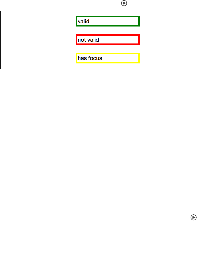
In this example, either the :valid or :invalid selector can match any given element,
but never both. The :focus selector, as shown in Figure 17-2, matches whenever an
input has focus, regardless of whether the input is matching the :valid or :invalid
selector simultaneously.
In this case, when we refer to the initial state, we are referring to the original value,
which could be either :valid or :invalid. The changed state for a given element the
opposite of the initial :valid or :invalid state.
Figure 17-2. e input’s appearance in the valid, invalid, and focused states
Remember, you can apply different transition values to the initial and changed states,
but you always want to apply the value used when you enter a given state. Take the
following code as an example, where the transitions are set up to have menus slide
open over 2 seconds but close in just 200 milliseconds:
nav li ul {
transition-property: transform;
transition-duration: 200ms;
transition-timing-function: ease-in;
transition-delay: 50ms;
transform: scale(1, 0);
transform-origin: top center;
}
nav li:hover ul {
transition-property: transform;
transition-duration: 2s;
transition-timing-function: linear;
transition-delay: 1s;
transform: scale(1, 1);
}
This provides a horrible user experience, but it nicely illustrates the point. When
hovered over, the opening of the navigation takes a full 2 seconds. When closing, it
quickly closes over 0.2 seconds. The transition properties in the changed, or hover,
state are in force when hovering over the list item. Thus, the transition-duration:
2s defined for the hover state takes effect. When a menu is no longer hovered over, it
returns to the default scaled-down state, and the transition properties of the initial
state—the nav li ul condition—are used, causing the menu to take 200ms to close.
860 | Chapter 17: Transitions

Look more closely at the example, specifically the default transition styles. When the
user stops hovering over the parent navigational element or the child drop-down
menu, the drop-down menu delays 50 milliseconds before starting the 200ms transi‐
tion to close. This is actually a decent user experience style, because it give users a
chance (however brief) to get the mouse point back over a menu before it starts
closing.
While the four transition properties can be declared separately, you will probably
always use the shorthand. We’ll take a look at the four properties individually first so
you have a good understanding of what each one does.
Limiting Transition Eects by Property
The transition-property property specifies the names of the CSS properties you
want to transition. This allows you to limit the transition to only certain properties,
while having other properties change instantaneously. And, yes, it’s weird to say “the
transition-property property.”
transition-property
Values none | [ all | <property-name> ]#
Initial value all
Applies to All elements and :before and :after pseudo-elements
Computed value As specied
Inherited No
Animatable No
The value of transition-property is a comma-separated list of properties; the key‐
word none if you want no properties transitioned; or the default all, which means
“transition all the animatable properties.” You can also include the keyword all
within a comma-separated list of properties.
If you include all as the only keyword—or default to all—all animatable properties
will transition in unison. Let’s say you want to change a box’s appearance on hover:
div {
color: #ff0000;
border: 1px solid #00ff00;
border-radius: 0;
transform: scale(1) rotate(0deg);
opacity: 1;
box-shadow: 3px 3px rgba(0, 0, 0, 0.1);
Transition Properties | 861

width: 50px;
padding: 100px;
}
div:hover {
color: #000000;
border: 5px dashed #000000;
border-radius: 50%;
transform: scale(2) rotate(-10deg);
opacity: 0.5;
box-shadow: -3px -3px rgba(255, 0, 0, 0.5);
width: 100px;
padding: 20px;
}
When the mouse pointer hovers over the div, every property that has a different
value in the initial state versus the hovered (changed) state will change to the hover-
state values. The transition-property property is used to define which of those
properties are animated over time (versus instantly). All the properties change from
the default value to the hovered value on hover, but only the animatable properties
included in the transition-property transition over the transition’s duration. Non-
animatable properties like border-style change from one value to the next instantly.
If all is the only value or the last value in the comma-separated value for
transition-property, then all the animatable properties will transition in unison.
Otherwise, provide a comma-separated list of properties to be affected by the transi‐
tion properties.
Thus, if we want to transition all the properties, the following statements are almost
equivalent:
div {
color: #ff0000;
border: 1px solid #00ff00;
border-radius: 0;
transform: scale(1) rotate(0deg);
opacity: 1;
box-shadow: 3px 3px rgba(0, 0, 0, 0.1);
width: 50px;
padding: 100px;
transition-property: color, border, border-radius, transform, opacity,
box-shadow, width, padding;
transition-duration: 1s;
}
div {
color: #ff0000;
border: 1px solid #00ff00;
border-radius: 0;
transform: scale(1) rotate(0deg);
opacity: 1;
box-shadow: 3px 3px rgba(0, 0, 0, 0.1);
862 | Chapter 17: Transitions

width: 50px;
padding: 100px;
transition-property: all;
transition-duration: 1s;
}
Both transition-property property declarations will transition all the properties
listed—but the former will transition only the eight properties that may change, based
on property declarations that may be included in other rule blocks. Those eight prop‐
erty values are included in the same rule block, but they don’t have to be.
The transition-property: all in the latter rule ensures that all animatable prop‐
erty values that would change based on any style change event—no matter which CSS
rule block includes the changed property value—transitions over one second. The
transition applies to all animatable properties of all elements matched by the selector,
not just the properties declared in the same style block as the all.
In this case, the first version limits the transition to only the eight properties listed,
but enables us to provide more control over how each property will transition.
Declaring the properties individually lets us provide different speeds, delays, and/or
durations to each property’s transition if we declared those transition properties
separately:
div {
color: #ff0000;
border: 1px solid #0f0;
border-radius: 0;
transform: scale(1) rotate(0deg);
opacity: 1;
box-shadow: 3px 3px rgba(0, 0, 0, 0.1);
width: 50px;
padding: 100px;
}
.foo {
color: #00ff00;
transition-property: color, border, border-radius, transform, opacity,
box-shadow, width, padding;
transition-duration: 1s;
}
<div class="foo">Hello</div>
If you want to define the transitions for each property separately, write them all out,
separating each of the properties with a comma. If you want to animate almost all the
properties at the same time, delay, and pace, with a few exceptions, you can use a
combination of all and the individual properties you want to transition at different
times, speeds, or pace. Make sure to use all as the first value:
Transition Properties | 863

div {
color: #f00;
border: 1px solid #00ff00;
border-radius: 0;
transform: scale(1) rotate(0deg);
opacity: 1;
box-shadow: 3px 3px rgba(0, 0, 0, 0.1);
width: 50px;
padding: 100px;
transition-property: all, border-radius, opacity;
transition-duration: 1s, 2s, 3s;
}
The all part of the comma-separated value includes all the properties listed in the
example, as well as all the inherited CSS properties, and all the properties defined in
any other CSS rule block matching or inherited by the element.
In the preceding example, all the properties getting new values will transition at the
same duration, delay, and timing function, with the exception of border-radius and
opacity, which we’ve explicitly included separately. Because we included them as part
of a comma-separated list after the all, we can transition them at the the same time,
delay, and timing function as all the other properties, or we can provide different
times, delays, and timing functions for these two properties. In this case, we transi‐
tion all the properties over one second, except for border-radius and opacity,
which we transition over two seconds and three seconds respectively. (transition-
duration is covered in an upcoming section.)
Make sure to use all as the first value in your comma-separated
value list, as the properties declared before the all will be included
in the all, overriding any other transition property values you
intended to apply to those now overridden properties.
Suppressing transitions via property limits
While transitioning over time doesn’t happen by default, if you do include a CSS
transition and want to override that transition in a particular scenario, you can set
transition-property: none to override the entire transition and ensure no proper‐
ties are transitioned.
The none keyword can only be used as a unique value of the property—you can’t
include it as part of a comma-separated list of properties. If you want to override the
transition of a limited set of properties, you will have to list all of the properties you
still want to transition. You can’t use the transition-property property to exclude
properties; rather, you can only use that property to include them.
864 | Chapter 17: Transitions

Another method would be to set the delay and duration of the
property to 0s. That way it will appear instantaneously, as if no CSS
transition is being applied to it.
Transition events
In the DOM, a transitionend event if fired at the end of every transition, in either
direction, for every property that is transitioned over any amount of time or after any
delay. This happens whether the property is declared individually or is part of the all
declaration. For some seemingly single property declarations, there will be several
transitionend events, as every animatable property within a shorthand property
gets its own transitionend event. Consider:
div {
color: #f00;
border: 1px solid #00ff00;
border-radius: 0;
transform: scale(1) rotate(0deg);
opacity: 1;
box-shadow: 3px 3px rgba(0, 0, 0, 0.1);
width: 50px;
padding: 100px;
transition-property: all, border-radius, opacity;
transition-duration: 1s, 2s, 3s;
}
When the transitions conclude, there will be well over eight transitionend events.
For example, the border-radius transition alone produces four transitionend
events, one each for:
•border-bottom-left-radius
•border-bottom-right-radius
•border-top-right-radius
•border-top-left-radius
The padding property is also a shorthand for four longhand properties:
•padding-top
•padding-right
•padding-bottom
•padding-left
Transition Properties | 865
The border shorthand property produces eight transitionend events: four values for
the four properties represented by the border-width shorthand, and four for the
properties represented by border-color:
•border-left-width
•border-right-width
•border-top-width
•border-bottom-width
•border-top-color
•border-left-color
•border-right-color
•border-bottom-color
There are no transitionend events for border-style properties, however, as
border-style is not an animatable property.
How do we know border-style isn’t animatable? We can assume it isn’t, since there
is no logical midpoint between the two values of solid and dashed. We can confirm
by looking up the list of animatable properties in Appendix A or the specifications for
the individual properties.
There will be 21 transitionend events in our scenario in which 8 specific properties
are listed, as those 8 include several shorthand properties that have different values in
the pre and post states. In the case of all, there will be at least 21 transitionend
events: one for each of the longhand values making up the 8 properties we know are
included in the pre and post states, and possibly from others that are inherited or
declared in other style blocks impacting the element:
You can listen for transitionend events in a manner like this:
document.querySelector('div').addEventListener('transitionend',
function (e) {
console.log(e.propertyName);
});
The transitionend event includes three event specific attributes:
1. propertyName, which is the name of the CSS property that just finished transi‐
tioning.
2. pseudoElement, which is the pseudoelement upon which the transition occurred,
preceded by two semicolons, or an empty string if the transition was on a regular
DOM node.
866 | Chapter 17: Transitions
3. elapsedTime, which is the amount of time the transition took to run, in seconds;
usually this is the time listed in the transition-duration property.
The transitionend event only occurs if the property successfully transitions to the
new value. The transitioned event doesn’t fire if the transition was interrupted, such
as by another change to the same property on the same element.
When the properties return to their initial value, another transitionend event
occurs. This event occurs as long as the transition started, even if it didn’t finish its
initial transition in the original direction.
Setting Transition Duration
The transition-duration property takes as its value a comma-separated list of
lengths of time, in seconds (s) or milliseconds (ms). These values describe the time it
will take to transition from one state to another.
transition-duration
Values <time>#
Initial value 0s
Applies to All elements and :before and :after pseudo-elements
Computed value As specied
Inherited No
Animatable No
If reverting between two states, and the duration is only present in a declaration
applying to one of those states, the transition duration will only impact the transition
to that state. Consider:
input:invalid {
transition-duration: 1s;
background-color: red;
}
input:valid {
transition-duration: 0.2s;
background-color: green;
}
If different values for the transition-duration are declared, the duration of the
transition will be the transition-duration value declared in the rule block to which
it is transitioning. In the preceding example, it will take 1 second for the input to
Transition Properties | 867

change to a red background when it becomes invalid, and only 200 milliseconds to
transition to a green background when it becomes valid.
The value of the transition-duration property is a positive value in either seconds
(s) or milliseconds (ms). The time unit of ms or s is required by the specification, even
if the duration is set to 0s. By default, properties change from one value to the next
instantly, showing no visible animation, which is why the default value for the dura‐
tion of a transition is 0s.
Unless there is a positive value for transition-delay set on a property, if
transition-duration is omitted, it is as if no transition-property declaration had
been applied—with no transitionend event occuring. As long as the total time set
for a transition to occur is greater than zero seconds—which can happen with a dura‐
tion of 0s or when the transition-duration is omitted and defaults to 0s—the tran‐
sition will still be applied, and a transitionend event will occur when the transition
finishes.
Negative values for transition-duration are invalid, and, if included, will invalidate
the entire property value.
Using the same super-long transition-property declaration from before, we can
declare a single duration for all the properties or individual durations for each prop‐
erty, or we can make alternate properties animate for the same length of time. We can
declare a single duration that applies to all properties during the transition by includ‐
ing a single transition-duration value:
div {
color: #ff0000;
...
transition-property: color, border, border-radius, transform, opacity,
box-shadow, width, padding;
transition-duration: 200ms;
}
We can also declare the same number of comma-separated time values for the
transition-duration property value as the CSS properties listed in the transition-
property property value. If we want each property to transition over a different
length of time, we have to include a different comma-separated value for each prop‐
erty name declared:
div {
color: #ff0000;
...
transition-property: color, border, border-radius, transform, opacity,
box-shadow, width, padding;
transition-duration: 200ms, 180ms, 160ms, 140ms, 120ms, 100ms, 1s, 2s;
}
868 | Chapter 17: Transitions
If the number of properties declared does not match the number of durations
declared, the browser has specific rules on how to handle the mismatch. If there are
more durations than properties, the extra durations are ignored. If there are more
properties than durations, the durations are repeated. In this example, color,
border-radius, opacity, and width have a duration of 100 ms; border, transform,
box-shadow, and padding will be set to 200 ms:
div {
...
transition-property: color, border, border-radius, transform, opacity,
box-shadow, width, padding;
transition-duration: 100ms, 200ms;
}
If we declare exactly two comma-separated durations, every odd property will transi‐
tion over the first time declared, and every even property will transition over the sec‐
ond time value declared.
User experience is important. If a transition is too slow, the website will appear slow
or unresponsive, drawing unwanted focus to what should be a subtle effect. If a tran‐
sition is too fast, it may be too subtle to be noticed. While you can declare any posi‐
tive length of time you want for your transitions, your goal is likely to provide an
enhanced rather than annoying user experience. Effects should last long enough to be
seen, but not so long as to be noticeable. Generally, the best effects range between 100
and 200 milliseconds, creating a visible, yet not distracting, transition.
We want a good user experience for our drop-down menu, so we set both properties
to transition over 200 milliseconds:
nav li ul {
transition-property: transform, opacity;
transition-duration: 200ms;
...
}
Altering the Internal Timing of Transitions
Do you want your transition to start off slow and get faster, start off fast and end
slower, advance at an even keel, jump through various steps, or even bounce? The
transition-timing-function provides a way to control the pace of the transition.
transition-timing-function
Values <timing-function>#
Initial value ease
Applies to All elements and :before and :after pseudo-elements
Transition Properties | 869
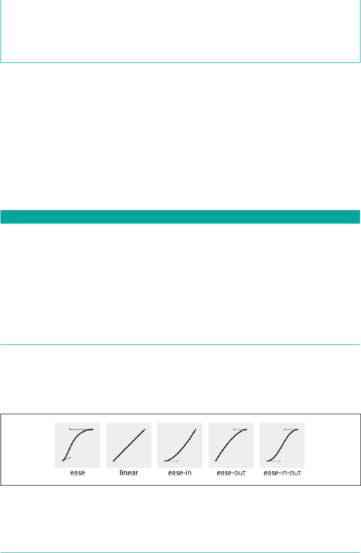
Computed value As specied
Inherited No
Animatable No
The transition-timing-function values include ease, linear, ease-in, ease-out,
ease-in-out, step-start, step-end, steps(n, start)—where n is the number of
steps—steps(n, end), and cubic-bezier(x1, y1, x2, y2). (These values are also
the valid values for the animation-timing-function and are described in great detail
in Chapter 18.)
The non-step keywords are easing timing functions that server as aliases for cubic
Bézier mathematical functions that provide smooth curves. The specification pro‐
vides for five predefined easing functions, as shown in Table 17-1.
Table 17-1. Supported keywords for cubic Bézier timing functions
Timing function Description Cubic Bezier value
cubic-bezier() Species a cubic-bezier curve cubic-bezier(x1, y1, x2, y2)
ease Starts slow, then speeds up, then slows
down, then ends very slowly
cubic-bezier(0.25, 0.1, 0.25, 1)
linear Proceeds at the same speed throughout
transition
cubic-bezier(0, 0, 1, 1)
ease-in Starts slow, then speeds up cubic-bezier(0.42, 0, 1, 1)
ease-out Starts fast, then slows down cubic-bezier(0, 0, 0.58, 1)
ease-in-out Similar to ease; faster in the middle,
with a slow start but not as slow at the
end
cubic-bezier(0.42, 0, 0.58, 1)
Cubic Bézier curves, including the underlying curves defining the five named easing
functions defined in Table 17-1 and displayed in Figure 17-3, take four numeric
parameters. For example, linear is the same as cubic-bezier(0, 0, 1, 1). The
first and third cubic Bézier function parameter values need to be between 0 and +1.
Figure 17-3. Curve representations of named cubic Bézier functions
870 | Chapter 17: Transitions
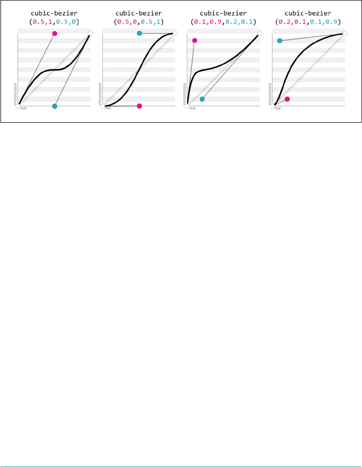
The four numbers in a cubic-bezier() function define the x and y coordinates of
two handles within a box. These handles are the endpoints of lines that stretch from
the bottom-left and top-right corners of the box. The curve is constructed using the
two corners, and the two handles’ coordinates, via a Bézier function.
To get an idea of how this works, look at the curves and their corresponding values,
as shown in Figure 17-4.
Figure 17-4. Four Bézier curves and their cubic-bezier() values (via http://cubic-
bezier.com)
Consider the first example. The first two values, corresponding to x1 and y1, are 0.5
and 1. If you go halfway across the box (x1 = 0.5) and all the way to the top of the box
(y1 = 1), you land at the spot where the first handle is placed. Similarly, the coordi‐
nates 0.5,0 for x2,y2 describes the point at the center bottom of the box, which is
where the second handle is placed. The curve shown there results from those handle
placements.
In the second example, the handle positions are switched, with the resulting change
in the curve. Ditto for the third and fourth examples, which are inversions of each
other. Notice how different the resulting curve is when switching the handle posi‐
tions.
The predefined key terms are fairly limited. To better follow the principles of anima‐
tion, you may want to use a cubic Bézier function with four float values instead of the
predefined key words. If you’re a whiz at calculus or have a lot of experience with
programs like Freehand or Illustrator, you might be able to invent cubic Bézier func‐
tions in your head; otherwise, there are online tools that let you play with different
values, such as http://cubic-bezier.com/, which lets you compare the common key‐
words against each other, or against your own cubic Bézier function.
As shown in Figure 17-5, the website http://easings.net provides many additional
cubic Bézier function values you can use to provide for a more realistic, delightful
animation.
Transition Properties | 871
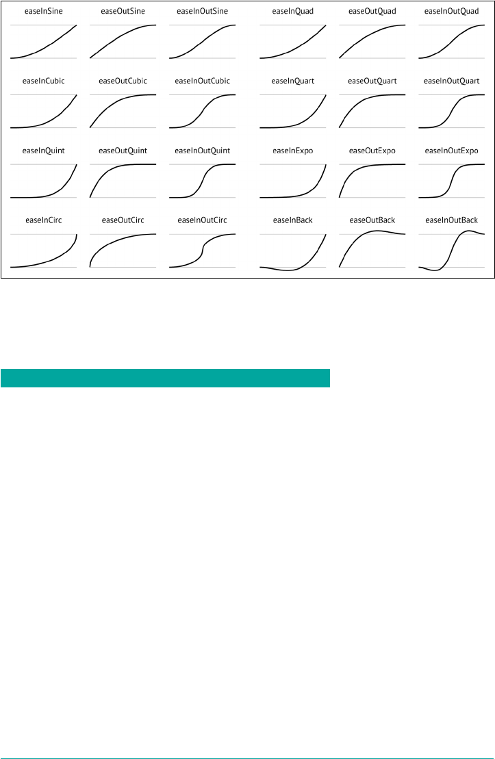
Figure 17-5. Useful author-dened cubic Bézier functions (from http://easings.net)
While the authors of the site named their animations, the preceding names are not
part of the CSS specifications, and must be written as follows:
Unocial name Cubic Bézier function value
easeInSine cubic-bezier(0.47, 0, 0.745, 0.715)
easeOutSine cubic-bezier(0.39, 0.575, 0.565, 1)
easeInOutSine cubic-bezier(0.445, 0.05, 0.55, 0.95)
easeInQuad cubic-bezier(0.55, 0.085, 0.68, 0.53)
easeOutQuad cubic-bezier(0.25, 0.46, 0.45, 0.94)
easeInOutQuad cubic-bezier(0.455, 0.03, 0.515, 0.955)
easeInCubic cubic-bezier(0.55, 0.055, 0.675, 0.19)
easeOutCubic cubic-bezier(0.215, 0.61, 0.355, 1)
easeInOutCubic cubic-bezier(0.645, 0.045, 0.355, 1)
easeInQuart cubic-bezier(0.895, 0.03, 0.685, 0.22)
easeOutQuart cubic-bezier(0.165, 0.84, 0.44, 1)
easeInOutQuart cubic-bezier(0.77, 0, 0.175, 1)
easeInQuint cubic-bezier(0.755, 0.05, 0.855, 0.06)
easeOutQuint cubic-bezier(0.23, 1, 0.32, 1)
easeInOutQuint cubic-bezier(0.86, 0, 0.07, 1)
easeInExpo cubic-bezier(0.95, 0.05, 0.795, 0.035)
easeOutExpo cubic-bezier(0.19, 1, 0.22, 1)
872 | Chapter 17: Transitions
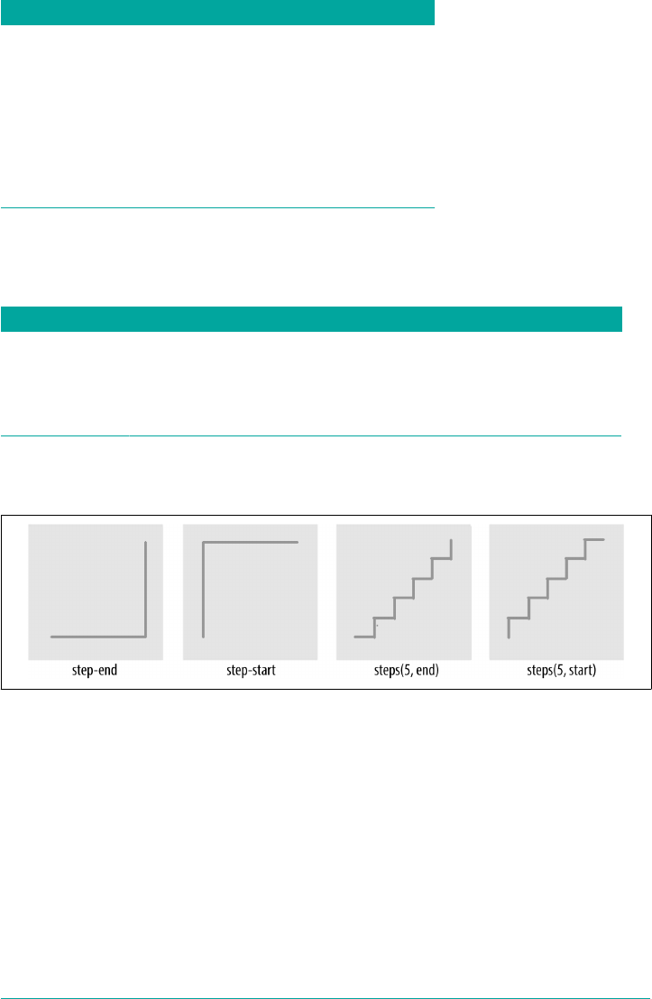
Unocial name Cubic Bézier function value
easeInOutExpo cubic-bezier(1, 0, 0, 1)
easeInCirc cubic-bezier(0.6, 0.04, 0.98, 0.335)
easeOutCirc cubic-bezier(0.075, 0.82, 0.165, 1)
easeInOutCirc cubic-bezier(0.785, 0.135, 0.15, 0.86)
easeInBack cubic-bezier(0.6, -0.28, 0.735, 0.045)
easeOutBack cubic-bezier(0.175, 0.885, 0.32, 1.275)
easeInOutBack cubic-bezier(0.68, -0.55, 0.265, 1.55)
Step timing
There are also step timing functions available, as well as two predefined step values:
Timing function Denition
step-start Stays on the nal keyframe throughout transition. Equal to steps(1, start).
step-end Stays on the initial keyframe throughout transition. Equal to steps(1, end).
steps(n, start) Displays n stillshots, where the rst stillshot is n/100 percent of the way through the transition.
steps(n, end) Displays n stillshots, staying on the initial values for the rst n/100 percent of the time.
As Figure 17-6 shows, the stepping functions show the progression of the transition
from the initial value to the final value in steps, rather than as a smooth curve.
Figure 17-6. Step timing functions
The step functions allow you to divide the transition over equidistant steps. The func‐
tions define the number and direction of steps. There are two direction options:
start and end. With start, the first step happens at the animation start. With end,
the last step happens at the animation end. For example, steps(5, end) would jump
through the equidistant steps at 0%, 20%, 40%, 60%, and 80%; and steps(5, start)
would jump through the equidistant steps at 20%, 40%, 60%, 80%, and 100%.
The step-start function is the same as steps(1, start). When used, transitioned
property values stay on their nal values from the beginning until the end of the
Transition Properties | 873

transition. The step-end function, which is the same as steps(1, end), sets transi‐
tioned values to their initial values, staying there throughout the transition’s duration.
Step timing, and especially the precise meaning of start and end,
is discussed in depth in Chapter 18.
Continuing on with the same super-long transition-property declaration we’ve
used before, we can declare a single timing function for all the properties, or define
individual timing functions for each property and so on. Here, we set all the transi‐
tioned properties to a single duration:
div {
transition-property: color, border-width, border-color, border-radius,
transform, opacity, box-shadow, width, padding;
transition-duration: 200ms;
transition-timing-function: ease-in;
}
We can also create a horrible user experience by making every property transition at a
different rhythm, like this:
Always remember that the transition-timing-function does not change the time it
takes to transition properties: that is set with the transition-duration property. It
just changes how the transition progresses during that set time. Consider the
following:
div {
...
transition-property: color, border-width, border-color, border-radius,
transform, opacity, box-shadow, width, padding;
transition-duration: 200ms;
transition-timing-function: ease, ease-in, ease-out, ease-in-out, linear,
step-end, step-start, steps(5, start), steps(3, end);
}
If we include these nine different timing functions for the nine different properties, as
long as they have the same transition duration and delay, all the properties start and
finish transitioning at the same time. The timing function controls how the transition
progresses over the duration of the transition, but does not alter the time it takes for
the transition to finish. (The preceding transition would be a terrible user experience,
by the way. Please don’t do that.)
The best way to familiarize yourself with the various timing functions is to play with
them and see which one works best for the effect you’re looking for. While testing, set
a relatively long transition-duration to better visualize the difference between the
874 | Chapter 17: Transitions
various functions. At higher speeds, you may not be able to tell the difference with
the easing function; just don’t forget to set it back to a faster speed before publishing
the result to the web!
Delaying Transitions
The transition-delay property enables you to introduce a time delay between when
the change that initiates the transition is applied to an element, and when the transi‐
tion begins.
transition-delay
Values <time>#
Initial value 0s
Applies to All elements, :before and :after pseudo-elements
Computed value As specied
Inherited No
Animatable No
A transition-delay of 0s (the default) means the transition will begin immediately
—it will start executing as soon as the state of the element is altered. This is familiar
from the instant-change effect of a:hover, for example.
With a value other than 0s, the <time> value of transition-delay defines the time
offset from the moment the property values would have changed, had no transition
or transition-property been applied, until the property values declared in the tran
sition or transition-property value begin animating to their final values.
Interestingly, negative values of time are valid. The effects you can create with nega‐
tive transition-delays are described in “Negative delay values” on page 877.
Continuing with the 8- (or 21-) property transition-property declaration we’ve
been using, we can make all the properties start transitioning right away by omitting
the transition-delay property, or by including it with a value of 0s. Another possi‐
bility is to start half the transitions right away, and the rest 200 milliseconds later, as
in the the following:
div {
transition-property: color, border, border-radius, transform, opacity,
box-shadow, width, padding;
transition-duration: 200ms;
transition-timing-function: linear;
Transition Properties | 875

transition-delay: 0s, 200ms;
}
By including transition-delay: 0s, 200ms on a series of properties, each taking
200 milliseconds to transition, we make color, border-radius, opacity, and width
begin their transitions immediately. All the rest begin their transitions as soon as the
odd transitions have completed, because their transition-delay is equal to the
transition-duration applied to all the properties.
As with transition-duration and transition-timing-function, when the number
of comma-separated transition-delay values outnumbers the number of comma-
separated transition-property values, the extra delay values are ignored. When the
number of comma-separated transition-property values outnumbers the number
of comma-separated transition-delay values, the delay values are repeated.
We can even declare nine different transition-delay values so that each property
begins transitioning after the previous property has transitioned, as follows:
div {
...
transition-property: color, border-width, border-color, border-radius,
transform, opacity, box-shadow, width, padding;
transition-duration: 200ms;
transition-timing-function: linear;
transition-delay: 0s, 0.2s, 0.4s, 0.6s, 0.8s, 1s, 1.2s, 1.4s, 1.6s;
}
In this example, we declared each transition to last 200 milliseconds with the
transition-duration property. We then declare a transition-delay that provides
comma-separated delay values for each property that increment by 200 milliseconds,
or 0.2 seconds—the same time as the duration of each property’s transition. Each
property starts transitioning at the point the previous property has finished.
We can use math to give every transitioning property different durations and delays,
ensuring they all complete transitioning at the same time:
div {
...
transition-property: color, border-width, border-color, border-radius,
transform, opacity, box-shadow, width, padding;
transition-duration: 1.8s, 1.6s, 1.4s, 1.2s, 1s, 0.8s, 0.6s, 0.4s, 0.2s;
transition-timing-function: linear;
transition-delay: 0s, 0.2s, 0.4s, 0.6s, 0.8s, 1s, 1.2s, 1.4s, 1.6s;
}
In this example, each property completes transitioning at the 1.8-second mark, but
each with a different duration and delay. For each property, the transition-
duration value plus the transition-delay value will add up to 1.8 seconds.
876 | Chapter 17: Transitions

Generally, you want all the transitions to begin at the same time. You can make that
happen by including a single transition-delay value, which gets applied to all the
properties. In our drop-down menu in Figure 17-1, we include a delay of 50 milli‐
seconds. This delay is not long enough for the user to notice and will not cause the
application to appear slow. Rather, a 50-millisecond delay can help prevent the navi‐
gation from shooting open unintentionally as the user accidentally passes over, or
hovers over, the menu items while moving the cursor from one part of the page or
app to another.
Negative delay values
A negative value for transition-delay that is smaller than the transition-
duration will cause the transition to start immediately, partway through the transi‐
tion. For example:
div {
transform: translateX(0);
transition-property: transform;
transition-duration: 200ms;
transition-delay: -150ms;
transition-timing-function: linear;
}
div:hover {
transform: translateX(200px);
}
Given the transition-delay of -150ms on a 200ms transition, the transition will start
three-quarters of the way through the transition and will last 50 milliseconds. In that
scenario, with a linear timing function, it jumps to being translated 150px along the
x-axis immediately on hover and then animates the translation from 150 pixels to 200
pixels over 50 milliseconds.
If the absolute value of the negative transition-delay is greater than or equal to the
transition-duration, the change of property values is immediate, as if no transi
tion had been applied, and no transitionend event occurs.
When transitioning back from the hovered state to the original state, by default, the
same value for the transition-delay is applied. In the preceding scenario, since the
transition-delay is not overridden in the hover state, it will jump 75% of the way
back (or 25% of the way through the original transition) and then transition back to
the initial state. On mouseout, it will jump to being translated 50 pixels along the x-
axis and then take 50 milliseconds to return to its initial position of being translated 0
pixels along the x-axis.
Transition Properties | 877

The transition Shorthand
The transition shorthand property combines the four properties covered thus far—
transition-property, transition-duration, transition-timing-function, and
transition-delay—into a single shorthand property.
transition
Values <single-transition>#
Initial value all 0s ease 0s
Applies to All elements and :before and :after pseudo-elements
Computed value As specied
Inherited No
Animatable No
<single-transition> = [ [ none | <transition-property> ] ‖ <time> ‖ <transition-timing-
function> ‖ <time> ]#
The transition property accepts the value of none, or any number of comma-
separated list of single transitions. A single transition contains a single property to
transition, or the keyword all to transition all the properties; the duration of the
transition; the timing function; and the delay.
If a single transition within the transition shorthand omits the property to transi‐
tion, the single transition will default to all. If the transition-timing-function
value is omitted, it will default to ease. If only one time value is included, that will be
the duration, and there will be no delay, as if transition-delay were set to 0s.
Within each single transition, the order of the duration versus the delay is important:
the first value that can be parsed as a time will be set as the duration. If an additional
time value is found before the comma or the end of the statement, that will be set as
the delay.
Here are three equivalent ways to write the same transition effects:
nav li ul {
transition: transform 200ms ease-in 50ms,
opacity 200ms ease-in 50ms;
}
nav li ul {
transition: all 200ms ease-in 50ms;
}
878 | Chapter 17: Transitions
nav li ul {
transition: 200ms ease-in 50ms;
}
In the first example, we see shorthand for each of the two properties. Because we are
transitioning all the properties that change on hover, we could use the keyword all,
as shown in the second example. And, since all is the default value, we could write
the shorthand with just the duration, timing function, and delay. Had we used ease
instead of ease-in, we could have omitted the timing function, since ease is the
default.
We had to include the duration, or no transition would be visible. In other words, the
only portion of the transition property value that can truly be considered required
is transition-duration.
If we only wanted to delay the change from closed menu to open menu without a
gradual transition, we would still need to include a duration of 0s. Remember, the
first value parsable as time will be set as the duration, and the second one will be set
as the delay:
nav li ul {
transition: 0s 200ms; ...
This transition will wait 200 milliseconds, then show the drop-
down fully open and opaque with no gradual transition. This is
horrible user experience. Though if you switch the selector from
nav li ul to *, it might make for an April Fools’ joke.
If there is a comma-separated list of transitions (versus just a single declaration) and
the word none is included, the entire transition declaration is invalid and will
be ignored:
div {
transition-property: color, border-width, border-color, border-radius,
transform, opacity, box-shadow, width, padding;
transition-duration: 200ms, 180ms, 160ms, 140ms, 120ms, 100ms, 1s, 2s, 3s;
transition-timing-function: ease, ease-in, ease-out, ease-in-out, linear,
step-end, step-start, steps(5, start), steps(3, end);
transition-delay: 0s, 0.2s, 0.4s, 0.6s, 0.8s, 1s, 1.2s, 1.4s, 1.6s;
}
div {
transition:
color 200ms,
border-width 180ms ease-in 200ms,
border-color 160ms ease-out 400ms,
border-radius 140ms ease-in-out 600ms,
Transition Properties | 879

transform 120ms linear 800ms,
opacity 100ms step-end 1s,
box-shadow 1s step-start 1.2s,
width 2s steps(5, start) 1.4s,
padding 3s steps(3, end) 1.6s;
}
The two preceding CSS rule blocks are functionally equivalent: you can declare
comma-separated values for the four longhand transition properties, or you can
include a comma-separated list of multiple shorthand transitions. You can’t, however,
mix the two: transition: transform, opacity 200ms ease-in 50ms will ease in
the opacity over 200 milliseconds after a 50-millisecond delay, but the transform
change will be instantaneous, with no transitionend event.
In Reverse: Transitioning Back to Baseline
In the preceding examples, we’ve declared a single transition. All our transitions have
been applied in the default state and initiated with a hover. With these declarations,
the properties return back to the default state via the same transition on mouseout,
with a reversing of the timing function and a duplication of the delay.
With transition declarations only in the global state, both the hover and mouseout
states use the same transition declaration: the selector matches both states. We can
override this duplication of the entire transition or just some of the transition proper‐
ties by including different values for transition properties in the global (versus the
hover-only) state.
When declaring transitions in multiple states, the transition included is to that state:
a {
background: yellow;
transition: 200ms background-color linear 0s;
}
a:hover {
background-color: orange;
/* delay when going TO the :hover state */
transition-delay: 50ms;
}
In this scenario, when the user hovers over a link, the background color waits 50
milliseconds before transitioning to orange. When the user mouses off the link, the
background starts transitioning back to yellow immediately. In both directions, the
transition takes 200 milliseconds to complete, and the gradual change proceeds in a
linear manner. The 50 milliseconds is included in the :hover (orange) state. The
delay happens, therefore, as the background changes to orange.
In our drop-down menu example, on :hover, the menu appears and grows over 200
milliseconds, easing in after a delay of 50 milliseconds. The transition is set with the
880 | Chapter 17: Transitions

transition property in the default (non-hovered) state. When the user mouses out,
the properties revert over 200 milliseconds, easing out after a delay of 50 milli‐
seconds. This reverse effect is responding to the transition value from the non-
hovered state. This is the default behavior, but it’s something we can control. The best
user experience is this default behavior, so you likely don’t want to alter it—but it’s
important to know that you can.
If we want the closing of the menu to be jumpy and slow (we don’t want to do that; it’s
bad user experience. But for the sake of this example, let’s pretend we do), we can
declare two different transitions:
nav ul ul {
transform: scale(1, 0);
opacity: 0;
...
transition: all 4s steps(8, start) 1s;
}
nav li:hover ul {
transform: scale(1, 1);
opacity: 1;
transition: all 200ms linear 50ms;
}
Transitions are to the to state: when there’s a style change, the transition properties
used to make the transition are the new values of the transition properties, not the
old ones. We put the smooth, linear animation in the :hover state. The transition that
applies is the one we are going toward. In the preceding example, when the user hov‐
ers over the drop-down menu’s parent li, the opening of the drop-down menu will
be gradual but quick, lasting 200 milliseconds after a delay of 50 milliseconds. When
the user mouses off the drop-down menu or its parent li, the transition will wait one
second and take four seconds to complete, showing eight steps along the way.
When we only have one transition, we put it in the global from state, as you want the
transition to occur toward any state, be that a hovering or a class change. Because we
want the transition to occur with any change, we generally put the only transition
declaration in the initial, default (least specific) block. If you do want to exert more
control and provide for different effects depending on the direction of the transition,
make sure to include a transition declaration in all of the possible class and UI states.
Beware of having transitions on both ancestors and descendants.
Transitioning properties soon after making a change that transition
ancestral or descendant nodes can have unexpected outcomes. If
the transition on the descendant completes before the transition on
the ancestor, the descendant will then resume inheriting the (still
transitioning) value from its parent. This effect may not be what
you expected.
In Reverse: Transitioning Back to Baseline | 881

Reversing interrupted transitions
When a transition is interrupted before it is able to finish (such as mousing off of our
drop-down menu example before it finishes opening), property values are reset to the
values they had before the transition began, and the properties transition back to
those values. Because repeating the duration and timing functions on a reverting par‐
tial transition can lead to an odd or even bad user experience, the CSS transitions
specification provides for making the reverting transition shorter.
In our menu example, we have a transition-delay of 50ms set on the default state
and no transition properties declared on the hover state; thus, browsers will wait 50
milliseconds before beginning the reverse or closing transition.
When the forward animation finishes transitioning to the final values and the
transitionend event is fired, all browsers will duplicate the transition-delay in
the reverse states.
As Table 17-2 shows, if the transition didn’t finish—say, if the user moved off the nav‐
igation before the transition finished—all browsers except Microsoft Edge will repeat
the delay in the reverse direction. Some browsers replicate the transition-duration
as well, but Edge and Firefox have implemented the specification’s reverse shortening
factor.
Table 17-2. Unnished transition reverse behavior by browser
Browser Reverse delay Transition time Elapsed time
Chrome Yes 200 ms 0.200 s
Chrome Yes 200 ms 0.250 s
Safari Yes 200 ms 0.200 s
Firefox Yes 38 ms 0.038 s
Opera Yes 200 ms 0.250 s
Edge No 38 ms 0.038 s
Let’s say the user moves off that menu 75 milliseconds after it started transitioning.
This means the drop-down menu will animate closed without ever being fully opened
and fully opaque. The browser should have a 50-millisecond delay before closing the
menu, just like it waited 50 milliseconds before starting to open it.
This is actually a good user experience, as it provides a few milliseconds of delay
before closing, preventing jerky behavior if the user accidentally navigates off the
menu. As shown in Table 17-2, all browsers do this, except Microsoft Edge.
Even though we only gave the browser 75 milliseconds to partially open the drop-
down menu before closing the menu, some browsers will take 200 milliseconds—the
full value of the transition-duration property—to revert. Other browsers, includ‐
882 | Chapter 17: Transitions

ing Firefox and Edge, have implemented the CSS specification’s reversing shortening
factor and the reversing-adjusted start value. When implemented, the time to com‐
plete the partial transition in the reverse direction will be similar to the original value,
though not necessarily exact.
In the case of a step timing function, Firefox and Edge will take the time, rounded
down to the number of steps the function has completed. For example, if the transi‐
tion was 10 seconds with 10 steps, and the properties reverted after 3.25 seconds,
ending a quarter of the way between the third and fourth steps (completing 3 steps,
or 30% of the transition), it will take 3 seconds to revert to the previous values. In the
following example, the width of our div will grow to 130 pixels wide before it begins
reverting back to 100 pixels wide on mouseout:
div {
width: 100px;
transition: width 10s steps(10, start);
}
div:hover {
width: 200px;
}
While the reverse duration will be rounded down to the time it took to reach the
most recently-executed step, the reverse direction will be split into the originally
declared number of steps, not the number of steps that completed. In our 3.25-second
case, it will take 3 seconds to revert through 10 steps. These reverse transition steps
will be shorter in duration at 300 milliseconds each, each step shrinking the width by
3 pixels, instead of 10 pixels.
If we were animating a sprite by transitioning the background-position , this
would look really bad. The specification and implementations may change to make
the reverse direction take the same number of steps as the partial transition. Other
browsers currently take 10 seconds, reverting the progression of the 3 steps over 10
seconds across 10 steps—taking a full second to grow the width in 3-pixel steps.
Browsers that haven’t implemented shortened reversed timing will take the full 10
seconds, instead of only 3, splitting the transition into 10 steps, to reverse the 30%
change. Whether the initial transition completed or not, these browsers will take the
full value of the initial transition duration, less the absolute value of any negative
transition-delay, to reverse the transition, no matter the timing function. In the
steps case just shown, the reverse direction will take 10 seconds. In our navigation
example, it will reverse over 200 milliseconds, whether the navigation has fully scaled
up or not.
For browsers that have implemented the reversing timing adjustments, if the timing
function is linear, the duration will be the same in both directions. If the timing func‐
tion is a step function, the reverse duration will be equal to the time it took to
complete the last completed step. All other cubic-bezier functions will have a
In Reverse: Transitioning Back to Baseline | 883

duration that is proportional to progress the initial transition made before being
interrupted. Negative transition-delay values are also proportionally shortened.
Positive delays remain unchanged in both directions.
No browser will have a transitionend for the hover state, as the transition did not
end; but all browsers will have a transitionend event in the reverse state when the
menu finishes collapsing. The elapsedTime for that reverse transition depends on
whether the browser took the full 200 milliseconds to close the menu, or if the
browser takes as long to close the menu as it did to partially open the menu.
To override these values, include transition properties in both the initial and final
states (e.g., both the unhovered and hovered styles). While this does not impact the
reverse shortening, it does provide more control.
Animatable Properties and Values
Before implementing transitions and animations, it’s important to understand that
not all properties are animatable. You can transition (or animate) any animatable CSS
properties; but which properties are animatable?
While we’ve included a list of these properties in Appendix A, CSS
is evolving, and the animatable properties list will likely get new
additions.
One key to developing a sense for which properties can be animated is to identify
which have values that can be interpolated. Interpolation is the construction of data
points between the values of known data points. The key guideline to determining if a
property value is animatable is whether the computed value can be interpolated. If a
property’s computed values are keywords, they can’t be interpolated; if its keywords
compute to a number of some sort, they can be. The quick rule of thought is that if
you can determine a midpoint between two property values, those property values
are probably animatable.
For example, the display values like block and inline-block aren’t numeric and
therefore don’t have a midpoint; they aren’t animatable. The transform property val‐
ues of rotate(10deg) and rotate(20deg) have a midpoint of rotate(15deg); they
are animatable.
The border property is shorthand for border-style, border-width, and border-
color (which, in turn, are themselves shorthand properties for the four side values).
While there is no midpoint between any of the border-style values, the border-
width property length units are numeric, so they can be animated. The keyword val‐
884 | Chapter 17: Transitions

ues of medium, thick, and thin have numeric equivalents and are interpolatable: the
computed value of the border-width property computes those keywords to lengths.
In the border-color value, colors are numeric—the named colors all represent hexa‐
decimal color values—so colors are animatable as well. If you transition from
border: red solid 3px to border: blue dashed 10px, the border width and bor‐
der colors will transition at the defined speed, but border-style will jump from
solid to dashed as soon as the transition begins (after any delay).
As noted (see Appendix A), numeric values tend to be animatable. Keyword values
that aren’t translatable to numeric values generally aren’t. CSS functions that take
numeric values as parameters generally are animatable. One exception to this rule is
visibility: while there is no midpoint between the values of visible and hidden,
visibility values are interpolatable between visible and not-visible. When it comes
to the visibility property, either the initial value or the destination value must be
visible or no interpolation can happen. The value will change at the end of the tran‐
sition from visible to hidden. For a transition from hidden to visible, it changes at
the start of the transition.
auto should generally be considered a non-animatable value and should be avoided
for animations and transitions. According to the specification, it is not an animatable
value, but some browsers interpolate the current numeric value of auto (such as
height: auto) to be 0px. auto is non-animatable for properties like height, width,
top, bottom, left, right, and margin.
Often an alternative property or value may work. For example, instead of changing
height: 0 to height: auto, use max-height: 0 to max-height: 100vh, which will
generally create the expected effect. The auto value is animatable for min-height and
min-width, since min-height: auto actually computes to 0.
How Property Values Are Interpolated
Interpolation can happen when values falling between two or more known values can
be determined. Interpolatable values can be transitioned and animated.
Numbers are interpolated as floating-point numbers. Integers are interpolated as
whole numbers, incrementing or decrementing as whole numbers.
In CSS, length and percentage units are translated into real numbers. When transi‐
tioning or animating calc(), or from one type of length to or from a percentage, the
values will be converted into a calc() function and interpolated as real numbers.
Colors, whether they are HSLA, RGB, or named colors like aliceblue, are translated
to their RGBA equivalent values for transitioning, and interpolated across the RGBA
color space.
Animatable Properties and Values | 885

When animating font weights, if you use keywords like bold, they’ll be converted to
numeric values and animated in steps of multiples of 100. This may change in the
future, as font weights may be permitted to take any integer value, in which case
weights will be interpolated as integers instead of multiples of 100.
When including animatable property values that have more than one component,
each component is interpolated appropriately for that component. For example,
text-shadow has up to four components: the color, x, y, and blur. The color is inter‐
polated as color: the x, y, and blur components are interpolated as lengths. Box
shadows have two additional optional properties: inset (or lack thereof) and spread.
spread, being a length, is interpolated as such. The inset keyword cannot be con‐
verted to a numeric equivalent: you can transition from one inset shadow to another
inset shadow, or from one drop shadow to another drop shadow multicomponent
value, but there is no way to gradually transition between inset and drop shadows.
Similar to values with more than one component, gradients can be transitioned only
if you are transitioning gradients of the same type (linear or radial) with equal num‐
bers of color stops. The colors of each color stop are then interpolated as colors, and
the position of each color stop is interpolated as length and percentage units.
Interpolating repeating values
When you have simple lists of other types of properties, each item in the list is inter‐
polated appropriately for that type—as long as the lists have the same number of
items or repeatable items, and each pair of values can be interpolated:
.img {
background-image:
url(1.gif), url(2.gif), url(3.gif), url(4.gif),
url(5.gif), url(6.gif), url(7.gif), url(8.gif),
url(9.gif), url(10.gif), url(11.gif), url(12.gif);
background-size: 10px 10px, 20px 20px, 30px 30px, 40px 40px;
transition: background-size 1s ease-in 0s;
}
.img:hover {
background-size: 25px 25px, 50px 50px, 75px 75px, 100px 100px;
}
For example, in transitioning four background-sizes, with all the sizes in both lists lis‐
ted in pixels, the third background-size from the pretransitioned state can gradually
transition to the third background-size of the transitioned list. In the preceding
example, background images 1, 6, and 10 will transition from 10px to 25px in height
and width when hovered. Similarly, images 3, 7, and 11 will transition from 30px to
75px, and so forth.
Thus, the background-size values are repeated three times, as if the CSS had been
written as:
886 | Chapter 17: Transitions

.img {
...
background-size: 10px 10px, 20px 20px, 30px 30px, 40px 40px,
10px 10px, 20px 20px, 30px 30px, 40px 40px,
10px 10px, 20px 20px, 30px 30px, 40px 40px;
...
}
.img:hover {
background-size: 25px 25px, 50px 50px, 75px 75px, 100px 100px,
25px 25px, 50px 50px, 75px 75px, 100px 100px,
25px 25px, 50px 50px, 75px 75px, 100px 100px;
}
If a property doesn’t have enough comma-separated values to match the number of
background images, the list of values is repeated until there are enough, even when
the list in the :hover state doesn’t match the initial state:
.img:hover {
background-size: 33px 33px, 66px 66px, 99px 99px;
}
If we transitioned from four background-size declarations in the initial state to three
background-size declarations in the :hover state, all in pixels, still with 12 back‐
ground images, the hover and initial state values are repeated (three and four times
respectively) until we have the 12 necessary values, as if the following had been
declared:
.img {
...
background-size: 10px 10px, 20px 20px, 30px 30px,
40px 40px, 10px 10px, 20px 20px,
30px 30px, 40px 40px, 10px 10px,
20px 20px, 30px 30px, 40px 40px;
...
}
.img:hover {
background-size: 33px 33px, 66px 66px, 99px 99px,
33px 33px, 66px 66px, 99px 99px,
33px 33px, 66px 66px, 99px 99px,
33px 33px, 66px 66px, 99px 99px;
}
If a pair of values cannot be interpolated—for example, if the background-size
changes from contain in the default state to cover when hovered—then, according
to the specification, the lists are not interpolatable. However, some browsers ignore
that particular pair of values for the purposes of the transition, but still animate the
interpolatable values.
There are some property values that can animate if the browser can infer implicit
values. For example, for shadows, the browser will infer an implicit shadow box-
shadow: transparent 0 0 0 or box-shadow: inset transparent 0 0 0, replacing
Animatable Properties and Values | 887
2This might change. The CSS Working Group is considering making all property values animatable, switching
from one value to the next at the midpoint of the timing function if there is no midpoint between the pre and
post values.
any values not explicitly included in the pre- or post-transition state. These examples
are in the chapter files for this book.
Only the interpolatable values trigger transitionend events.
As noted previously, visibility animates differently than other properties: if ani‐
mating or transitioning to or from visible, it is interpolated as a discrete step. It is
always visible during the transition or animation as long as the timing function out‐
put is between 0 and 1. It will switch at the beginning if the transition is from hidden
to visible. It will switch at the end if the transition is from visible to hidden. Note
that this can be controlled with the step timing functions.
If you accidentally include a property that can’t be transitioned, fear not. The entire
declaration will not fail. The browser will simply not transition the property that is
not animatable. Note that the non-animatable property or nonexistent CSS property
is not exactly ignored. The browser passes over unrecognized or non-animatable
properties, keeping their place in the property list order to ensure that the other
comma-separated transition properties described next are not applied on the wrong
properties.2
Transitions can only occur on properties that are not currently
being impacted by a CSS animation. If the element is being anima‐
ted, properties may still transition, as long as they are not proper‐
ties that are currently controlled by the animation. CSS animations
are covered in Chapter 18.
Fallbacks: Transitions Are Enhancements
Transitions have excellent browser support. All browsers, including Safari, Chrome,
Opera, Firefox, Edge, and Internet Explorer (starting with IE10) support CSS transi‐
tions.
Transitions are user-interface (UI) enhancements. Lack of full support should not
prevent you from including them. If a browser doesn’t support CSS transitions,
the changes you are attempting to transition will still be applied: they will just “transi‐
tion” from the initial state to the end state instantaneously when the style recomputa‐
tion occurs.
Your users may miss out on an interesting (or possibly annoying) effect, but will not
miss out on any content.
888 | Chapter 17: Transitions

As transitions are generally progressive enhancements, there is no need to polyfill for
archaic IE browsers. While you could use a JavaScript polyfill for IE9 and earlier, and
prefix your transitions for Android 4.3 and earlier, there is likely little need to do so.
Printing Transitions
When web pages or web applications are printed, the stylesheet for print media is
used. If your style element’s media attribute matches only screen, the CSS will not
impact the printed page at all.
Often, no media attribute is included; it is as if media="all" were set, which is the
default. Depending on the browser, when a transitioned element is printed, either
the interpolating values are ignored, or the property values in their current state
are printed.
You can’t see the element transitioning on a piece of paper, but in some browsers, like
Chrome, if an element transitioned from one state to another, the current state at the
time the print function is called will be the value on the printed page, if that property
is printable. For example, if a background color changed, neither the pre-transition or
the post-transition background color will be printed, as background colors are gener‐
ally not printed. However, if the text color mutated from one value to another, the
current value of color will be what gets printed on a color printer or PDF.
In other browsers, like Firefox, whether the pre-transition or post-transition value is
printed depends on how the transition was initiated. If it initiated with a hover, the
non-hovered value will be printed, as you are no longer hovering over the element
while you interact with the print dialog. If it transitioned with a class addition, the
post-transition value will be printed, even if the transition hasn’t completed. The
printing acts as if the transition properties are ignored.
Given that there are separate printstyle sheets or @media rules for print, browsers
compute style separately. In the print style, styles don’t change, so there just aren’t any
transitions. The printing acts as if the property values changed instantly, instead of
transitioning over time.
Printing Transitions | 889

CHAPTER 18
Animation
CSS transitions, covered in the previous chapter, enabled simple animations. With
transitions, an element’s properties change from the values set in one rule to the val‐
ues set in a different rule as the element changes state over time, instead of changing
instantly. With CSS transitions, the start and end states of property values are con‐
trolled by existing property values, and provide little control over how things change
over time.
CSS animations are similar to transitions in that values of CSS properties change over
time, but provide much more control over how those changes happen. Specifically,
CSS keyframe animations let us decide if and how an animation repeats, give us gran‐
ular control over what happens throughout the animation, and more. While transi‐
tions trigger implicit property values changes, animations are explicitly executed
when animation keyframe properties are applied.
With CSS animations, you can change property values that are not part of the set pre-
or post-state of an element. The property values set on the animated element don’t
necessarily have to be part of the animation progression. For example, with transi‐
tions, going from black to white will only animate through various shades of gray.
With animation, that same element doesn’t have to be black or white or even in-
between shades of gray during the animation.
While you can transition through shades of gray, you could instead turn the element
yellow, then animate from yellow to orange. Alternatively, you could animate through
various colors, starting with black and ending with white, but progressing through
the entire rainbow along the way. This chapter will explore how keyframe animation
works.
891

Look for the Play symbol to know when an online example is
available. All of the examples in this chapter can be found at https://
meyerweb.github.io/csstdg4gs/18-animations.
Dening Keyframes
To animate an element, we need to set the name of a keyframe animation; to do that,
we need a named keyframe animation. Our first step is to define this reusable CSS
keyframe animation using the @keyframes at-rule, giving our animation a name. The
name we define will then be used to attach this particular animation to elements or
pseudo-elements.
A @keyframes at-rule includes the animation identier, or name, and one or more
keyframe blocks. Each keyframe block includes one or more keyframe selectors with
declaration blocks of property-value pairs. The entire @keyframes at-rule specifies the
behavior of a single full iteration of the animation. The animation can iterate zero or
more times, depending mainly on the animation-iteration-count property value,
which we’ll discuss in “Declaring Animation Iterations” on page 905.
Each keyframe block includes one or more keyframe selectors. The keyframe selectors
are percentage-of-time positions along the duration of the animation; they are
declared either as percentages, or with the keywords from or to. Here’s the generic
structure of an animation:
@keyframes animation_identifier {
keyframe_selector {
property: value;
property: value;
}
keyframe_selector {
property: value;
property: value;
}
}
and here are a couple of basic examples:
@keyframes fadeout {
from {
opacity: 1;
}
to {
opacity: 0;
}
}
@keyframes color-pop {
892 | Chapter 18: Animation

0% {
color: black;
background-color: white;
}
33% { /* one-third of the way through the animation */
color: gray;
background-color: yellow;
}
100% {
color: white;
background-color: orange;
}
}
The first set of keyframes shown takes an element, sets its opacity to 1 (fully opa‐
que), and animates it to 0 opacity (fully transparent). The second keyframe set sets an
element’s foreground to black and its background to white, then animates the fore‐
ground black to gray and then white, and the background white to yellow and then
orange.
Note that the keyframes don’t say how long this should take—that’s handled by a CSS
property dedicated to the purpose. Instead they say “go from this state to that state” or
“hit these various states at these percentage points of the total animation.” That’s why
keyframe selectors are always percentages, or from and to. If you try to fill time val‐
ues (like 1.5s) into your keyframe selectors, you’ll render them invalid.
Setting Up Keyframe Animations
To create an animation, you start with the @keyframes, add an animation name, and
drop in curly brackets to encompass the actual keyframes you’re defining. It’s a lot
like a media query at this point, if you’re familiar with those (see Chapter 20).
Within the opening and closing curly brackets, you include a series of keyframe selec‐
tors with blocks of CSS that declare the properties you want to animate. Once the
keyframes are defined, you “attach” the animation to an element using the
animation-name property. We’ll discuss that property shortly, in “Naming Anima‐
tions” on page 901.
Start with the at-rule declaration, followed by the animation name and brackets:
@keyframes nameOfAnimation {
...
}
Setting Up Keyframe Animations | 893
Naming Your Animation
The name, which you create, is an identifier or a string. Originally, the keyframe
names had to be an identifier, but both the specification and the browsers also sup‐
port quoted strings.
Identifiers are unquoted and have specific rules. You can use any characters a-z, A-Z,
and 0-9, the hyphen (-), underscore (_), and any ISO 10646 character U+00A0 and
higher. ISO 10646 is the universal character set; this means you can use any character
in the Unicode standard that matches the regular expression [-_a-zA-Z0-9\u00A0-
\u10FFFF]. The identifier can’t start with a digit (0-9) or two hyphens. One hyphen
is fine, as long as it is not followed by a digit—unless you escape the digit or hyphen
with a backslash.
If you include any escape characters within your animation name, make sure to
escape them with a backslash (\). For example, Q&A! must be written as Q\&A\!. ✎
can be left as ✎ (no, that’s not a typo), and ✎ is a valid name as well. But if you’re
going to use any keyboard characters that aren’t letters or digits in an identifier, like !,
@, #, $, and so on, escape them with a backslash.
Also, don’t use any of the keywords covered in this chapter as the name of your ani‐
mation. For example, possible values for the various animation properties we’ll be
covering later in the chapter include none, paused, running, infinite, backwards,
and forwards. Using an animation property keyword, while not prohibited by the
spec, will likely break your animation when using the animation shorthand prop‐
erty (discussed in “Bringing It All Together” on page 935). So, while you can legally
name your animation paused (or another keyword,) I strongly recommend against it.
Keyframe Selectors
Keyframe selectors provide points during our animation where we set the values of the
properties we want to animate. In defining animations, we dictate the values we want
properties to have at a specific percentage of the way through the animations. If you
want a value at the start of the animation, you declare it at the 0% mark. If you want a
different value at the end of the animation, you declare the property value at the 100%
mark. If you want a value a third of the way through the animation, you declare it at
the 33% mark. These marks are defined with keyframe selectors.
Keyframe selectors consist of a comma-separated list of one or more percentage val‐
ues or the keywords from or to. The keyword from is equal to 0%. The keyword to
equals 100%. The keyframe selectors are used to specify the percentage along the
duration of the animation the keyframe represents. The keyframe itself is specified by
894 | Chapter 18: Animation
the block of property values declared on the selector. The % unit must be used on per‐
centage values. In other words, 0 is invalid as a keyframe selector:
@keyframes W {
from {
left: 0;
top: 0;
}
25%, 75% {
top: 100%;
}
50% {
top: 50%;
}
to {
left: 100%;
top: 0;
}
}
This @keyframes animation, named W, when attached to a non-statically positioned
element, would move that element along a W-shaped path. W has five keyframes: one
each at the 0%, 25%, 50%, 75%, and 100% marks. The from is the 0% mark. The to is
the 100% mark.
As the property values we set for the 25% and 75% mark are the same, we can put the
two keyframe selectors together as a comma-separated list. This is very similar to reg‐
ular selectors, where you can comma-group several together. Whether you keep those
selectors on one line (as in the example) or put each selector on its own line is up to
your personal preference. The following is just as valid as what we saw in the previous
code:
25%,
75% {
top: 100%;
}
Note that selectors do not need to be listed in ascending order. In the preceding
example, we have the 25% and 75% on the same line, with the 50% mark coming after
that declaration. For legibility, it is highly encouraged to progress from the 0% to the
100% mark. However, as demonstrated by the 75% keyframe in this example, it is not
required. You could define your keyframes with the last first and the first last, or
scramble them up randomly, or whatever works for you.
Omitting from and to Values
If a 0% or from keyframe is not specified, then the user agent (browser) constructs a
0% keyframe using the original values of the properties being animated, as if the 0%
keyframe were declared with the same property values that impact the element when
Keyframe Selectors | 895
no animation was applied, unless another animation applied to that element is cur‐
rently animating the same property (see the upcoming section “Naming Animations”
on page 901 for details). Similarly, if the 100% or to keyframe is not defined and no
other animations are being applied, the browser creates a faux 100% keyframe using
the value the element would have had if no animation had been set on it.
Assuming we have a background-color change animation:
@keyframes change_bgcolor {
45% { background-color: green; }
55% { background-color: blue; }
}
And the element originally had background-color: red set on it, it would be as if
the animation were:
@keyframes change_bgcolor {
0% { background-color: red; }
45% { background-color: green; }
55% { background-color: blue; }
100% { background-color: red; }
}
Or, remembering that we can include multiple identical keyframes as a comma-
separated list, this faux animation also could be written as:
@keyframes change_bgcolor {
0%,
100% { background-color: red; }
45% { background-color: green; }
55% { background-color: blue; }
}
Note the background-color: red; declarations are not actually part of the keyframe
animation. If the background color were set to yellow in the element’s default state,
the 0% and 100% marks would display a yellow background, animating into green,
then blue, then back to yellow as the animation progressed:
@keyframes change_bgcolor {
0%, 100% { background-color: yellow; }
45% { background-color: green; }
55% { background-color: blue; }
}
We can include this change_bgcolor animation on many elements, and the perceived
animation will differ based on the element’s value for the background-color property
in the non-animated state.
Although we’ve been using exclusively integer values for our percentages, non-integer
percentage values, such as 33.33%, are perfectly valid. Negative percentages, values
896 | Chapter 18: Animation

greater than 100%, and values that aren’t otherwise percentages or the keywords to or
from are invalid and will be ignored.
Repeating Keyframe Properties
In the original -webkit- implementation of animation, each keyframe could only be
declared once: if declared more than once, only the last declaration would be applied,
and the previous keyframe selector block was ignored. This has been updated. Now,
similar to the rest of CSS, the values in the keyframe declaration blocks with identical
keyframe values cascade. In the standard (nonprefixed) syntax, the preceding W ani‐
mation can be written with the to, or 100%, declared twice, overriding the value of the
left property:
@keyframes W {
from, to {
top: 0;
left: 0;
}
25%, 75% {
top: 100%;
}
50% {
top: 50%;
}
to {
left: 100%;
}
}
Notice how to is declared along with from as keyframe selectors for the first code
block? That sets both top and left for the to keyframe. Then, the left value is over‐
ridden for the to in the last keyframe block.
Animatable Properties
It’s worth taking a moment to talk about the fact that not all properties are animata‐
ble. Within an animation’s keyframe, if you list a property that can’t be animated, it’s
just ignored. (For that matter, so are properties and values that he browser doesn’t
recognize at all, the same as any other part of CSS.)
There is a comprehensive list of animatable properties in Appendix A. We’ve also
indicated whether properties can or can’t be animated throughout the rest of this
book, as the properties are defined.
Keyframe Selectors | 897
The animation-timing-function, described in greater detail in
“Changing the Internal Timing of Animations” on page 920, while
not an animatable property, is not ignored. If you include the
animation-timing-function as a keyframe style rule within a key‐
frame selector block, the timing function of the properties within
that block will change to the declared timing function when the
animation moves to the next keyframe.
If an animation is set between two property values that don’t have a calculable mid‐
point, the results may not be what you expect. The property will not animate cor‐
rectly—or at all. For example, you shouldn’t declare an element’s height to animate
between height: auto and height: 300px. There is no midpoint between auto and
300px. The element may still animate, but different browsers handle this differently:
Firefox does not animate the element; Safari may animate as if auto is equal to 0; and
both Opera and Chrome currently jump from the preanimated state to the postani‐
mated state halfway through the animation, which may or may not be at the 50% key‐
frame selector, depending on the value of the animation-timing-function. In other
words, different browsers behave differently for different properties when there is no
midpoint, so you can’t be sure you will get your expected outcome.
The behavior of your animation will be most predictable if you declare both a 0% and
a 100% value for every property you animate.
For example, if you declare border-radius: 50%; in your animation, you may want
to declare border-radius: 0; as well, because there is no midpoint between none
and anything: the default value of border-radius is none, not 0. Consider the differ‐
ence in the following two animations:
@keyframes round {
100% {
border-radius: 50%;
}
}
@keyframes square_to_round {
0% {
border-radius: 0%;
}
100% {
border-radius: 50%;
}
}
The round animation will animate an element from the original border-radius value
of that element to border-radius: 50% over the duration of the animation. The
square_to_round animation will animate an element from border-radius: 0% to
border-radius: 50% over the duration of the animation. If the element starts out
with square corners, then the two will have exactly the same effect. But if it starts out
898 | Chapter 18: Animation
with rounded corners, then square_to_round will jump to rectangular corners before
it starts animating. This might not be what you want. Sometimes you can omit a from
or to keyframe, using the element’s non-animated property values to your advantage.
The best way to resolve this issue is to use the round animation instead of
square_to_round, making sure any element that gets animated with the round key‐
frame animation has its border-radius explicitly set.
As long as an animatable property is included in at least one block with a value that is
different then the non-animated attribute value, and there is a calculable midpoint
between those two values, that property will animate.
Nonanimatable Properties That Aren’t Ignored
Exceptions to the midpoint “rule” include visibility and animation-timing-
function.
visibility is an animatable property, even though there is no midpoint between
visibility: hidden and visibility: visible. When you animate from hidden to
visible, the visibility value jumps from one value to the next at the keyframe where
the change is declared.
While the animation-timing-function is not, in fact, an animatable property, when
included in a keyframe block, the animation timing will switch to the newly declared
value at that point in the animation for the properties within that keyframe selector
block. The change in animation timing is not animated; it simply switches to the new
value for those properties only, and only until the next keyframe. (This will be cov‐
ered later, in “Changing the Internal Timing of Animations” on page 920.)
Scripting @keyframes Animations
There is an API that enables finding, appending, and deleting keyframe rules. You
can change the content of a keyframe block within an @keyframes animation declara‐
tion with appendRule(n) or deleteRule(n), where n is the full selector of that key‐
frame. You can return the contents of a keyframe with findRule(n):
@keyframes W {
from, to {
top: 0;
left: 0;
}
25%, 75% {
top: 100%;
}
50% {
top: 50%;
}
Keyframe Selectors | 899
to {
left: 100%;
}
}
The appendRule(), deleteRule(), and findRule() methods takes the full keyframe
selector as an argument. Revisiting the W animation, to return the 25% / 75% key‐
frame, the argument is 25%, 75%:
// Get the selector and content block for a keyframe
var aRule = myAnimation.findRule('25%, 75%').cssText;
// Delete the 50% keyframe
myAnimation.deleteRule('50%');
// Add a 53% keyframe to the end of the animation
myAnimation.appendRule('53% {top: 50%;}');
The statement myAnimation.findRule('25%, 75%').cssText; where myAnimation
is pointing to a keyframe animation, returns the keyframe that matches 25%, 75%. It
would not match anything if we had used either 25% or 75% only. If pointing to the W
animation, this statement returns 25%, 75% { top: 100%; }.
Similarly, myAnimation.deleteRule('50%') will delete the last 50% keyframe—so if
there are multiple 50% keyframes, the last one listed will be the first to go. Conversely,
myAnimation.appendRule('53% {top: 50%;}') appends a 53% keyframe after the
last keyframe of the @keyframes block.
There are three animation events—animationstart, animationend, and
animationiteration—that occur at the start and end of an animation, and between
the end of an iteration and the start of a subsequent iteration. Any animation for
which a valid keyframe rule is defined will generate the start and end events, even
animations with empty keyframe rules. The animationiteration event only occurs
when an animation has more than one iteration, as the animationiteration event
does not fire if the animationend event would fire at the same time.
Animating Elements
Once you have created a keyframe animation, you can apply that animation to ele‐
ments and/or pseudo-elements. CSS provides numerous animation properties to
attach a keyframe animation to an element and control its progression. At a mini‐
mum, you need to include the name of the animation for the element to animate, and
a duration if you want the animation to actually be visible. (Otherwise, the animation
will happen in zero time.)
There are two ways of attaching animation properties to an element: you can include
all the animation properties separately, or you can declare all the properties in one
900 | Chapter 18: Animation
line using the animation shorthand property (or a combination of shorthand and
longhand properties). We are going to first learn all the longhand properties. Later in
this chapter, we’ll condense all the declarations into one line with the animation
shorthand property.
Let’s start with the individual properties.
Naming Animations
The animation-name property takes as its value a comma-separated list of names of
keyframe animations you want to apply. The names in question here are the unquo‐
ted identifiers or quoted strings (or a mixture of both) you created in your @key
frames rule.
animation-name
Values [ <single-animation-name> | none ]#
Initial value none
Applies to All elements, ::before and ::after pseudo-elements
Computed value As specied
Inherited No
Animatable No
The default value is none, which means there is no animation. The none value can be
used to override any animation applied elsewhere in the CSS cascade. (This is also the
reason you don’t want to name your animation none, unless you’re a masochist.)
To apply an animation, include the @keyframe identifier, which is the animation
name.
Using the change_bgcolor keyframe animation defined in “Omitting from and to
Values” on page 895:
div {
animation-name: change_bgcolor;
}
This applies the change_bgcolor animation to all div elements.
To apply more than one animation, include more than one comma-separated @key
frame identifier:
Animating Elements | 901
div {
animation-name: change_bgcolor, round, W;
}
If one of the included keyframe identifiers does not exist, the series of animations will
not fail; rather, the failed animation will be ignored, and the valid animations will be
applied. While ignored initially, the failed animation will be applied if and when that
identifier comes into existence as a valid animation. Consider:
div {
animation-name: change_bgcolor, spin, round, W;
}
In this example, assume there is no spin keyframe animation defined. The spin ani‐
mation will not be applied, while the change_bgcolor, round, and W animations will
occur. Should a spin keyframe animation come into existence through scripting, it
will be applied at that time.
In order to include more than one animation, we’ve included each @keyframe anima‐
tion identifier in our list of comma-separated values on the animation-name prop‐
erty. If more than one animation is applied to an element and those animations have
repeated properties, the later animations override the property values in the earlier
animations. For example, if more than two background color changes are applied
concurrently in two different keyframe animations, whichever animation was listed
later will override the background property declarations of animations earlier in the
list, but only if the properties (background colors, in this case) are being animated at
the same time. For more on this, see “Animation, Specificity, and Precedence Order”
on page 939.
For example, assume the following, and further assume that the animations happen
over a period of 10 seconds:
div {animation-name: change_bgcolor, bg-shift;}
@keyframes bg-shift {
0%, 100% {background-color: blue;}
35% {background-color: orange;}
55% {background-color: red;}
65% {background-color: purple;}
}
@keyframes change_bgcolor {
0%, 100% {background-color: yellow;}
45% {background-color: green;}
55% {background-color: blue;}
}
In this situation, the background will animate from blue to orange to red to purple
and then back to blue, thanks to bg-shift. Because it comes last in the list of anima‐
tions, its keyframes take precedence. Any time there are multiple animations specify‐
902 | Chapter 18: Animation

ing behavior for the same property at the same point in time, the animation which is
listed last in the value of animation-name will be in effect.
What’s interesting is what happens if the from (0%) or to (100%) keyframes are omit‐
ted from the animation in force. For example, let’s remove the first keyframes defined
in bg-shift.
div {animation-name: change_bgcolor, bg-shift;}
@keyframes bg-shift {
35% {background-color: orange;}
55% {background-color: red;}
65% {background-color: purple;}
}
@keyframes change_bgcolor {
0%, 100% {background-color: yellow;}
45% {background-color: green;}
55% {background-color: blue;}
}
Now there are no background colors being defined at the beginning and end of bg-
shift. In a situation like this, where a 0% or 100% keyframe is not specified, then the
user agent constructs a 0%/100% keyframe using the computed values of the properties
being animated. This could mean one of two things: either use the value of the prop‐
erty as defined for the element assuming there are no animations at all, or use the
property value from a previous animation in the list given for animation-name.
Older browsers do the former, but the specification is shifting to prefer the latter. As
of late 2017, newer browsers will animate from yellow to orange over the first 3.5 sec‐
onds of the animation, and from purple to blue over the last 3.5 seconds. Older
browsers will start and end with transparent backgrounds.
These are only concerns when two different keyframe blocks are trying to change the
same property’s values. In this case, it was background=color. On the other hand, if
one keyframe block animates background-color while another animates padding,
the two animations will not collide, and both the background color and padding will
be animated together.
Simply applying an animation to an element is not enough for the element to visibly
animate, but it will make the animation occur—just over no time. In such an event,
the keyframe properties will all be calculated, and the animationstart and animatio
nend events will fire. For an element to visibly animate, the animation must last at
least some amount of time. For that we have the animation-duration property.
Animating Elements | 903

Dening Animation Lengths
The animation-duration property defines how long a single animation iteration
should take in seconds (s) or milliseconds (ms).
animation-duration
Values <time>#
Initial value 0s
Applies to All elements, ::before and ::after pseudo-elements
Computed value As specied
Inherited No
Animatable No
The animation-duration property is used to define the length of time, in seconds (s)
or milliseconds (ms), it should take to complete one cycle through all the keyframes of
the animation. If you don’t declare animation-duration, the animation will still be
run with a duration of 0s, with animationstart and animationend still being fired
even though the animation, taking 0s, is imperceptible. Negative time values are not
permitted on this property.
When specifying a duration, you must include the second (s) or millisecond (ms)
unit. If you have more than one animation, you can include a different animation-
duration for each animation by including more than one comma-separated time
duration:
div {
animation-name: change_bgcolor, round, W;
animation-duration: 200ms, 100ms, 0.5s;
}
If you supply an invalid value within your comma-separated list of durations—for
example, animation-duration: 200ms, 0, 0.5s—the entire declaration will fail,
and it will behave as if animation-duration: 0s had been declared. 0 is not a valid
time value.
Generally, you will want to include an animation-duration value for each
animation-name provided. If you have only one duration, all the animations will last
the same amount of time. Having fewer animation-duration values than animation-
name values in your comma-separated property value list will not fail: rather, the val‐
ues will be repeated as a group. Thus, given the following:
904 | Chapter 18: Animation

div {
animation-name: change_bgcolor, spin, round, W;
animation-duration: 200ms, 5s;
/* same effect as '200ms, 5s, 200ms, 5s' */
}
the round animation will be run over 200ms, and the W animation over 5s.
If you have a greater number of animation-duration values than animation-name
values, the extra values will be ignored. If one of the included animations does not
exist, the series of animations and animation durations will not fail: the failed anima‐
tion, along with its duration, are ignored:
div {
animation-name: change_bgcolor, spinner, round, W;
animation-duration: 200ms, 5s, 100ms, 0.5s;
}
In this example, the duration 5s is associated with spinner. There is no spinner ani‐
mation, though, so spinner doesn’t exist, and the 5s and spinner are both ignored.
Should a spinner animation come into existence, it will be applied to the div and last
5 seconds.
Declaring Animation Iterations
Simply including the required animation-name will lead to the animation playing
once, and only once. If you want to iterate through the animation more or less than
the default one time, use the animation-iteration-count property.
animation-iteration-count
Values [ <number> | infinite ]#
Initial value 1
Applies to All elements, ::before and ::after pseudo-elements
Computed value As specied
Inherited No
Animatable No
By default, the animation will occur once (because the default value is 1). If another
value is given for animation-iteration-count, and there isn’t a negative value for
the animation-delay property, the animation will repeat the number of times speci‐
fied by the value if the property, which can be any number or the keyword infinite.
Animating Elements | 905

The following declarations will cause their animations to be repeated 2, 5, and 13
times:
animation-iteration-count: 2;
animation-iteration-count: 5;
animation-iteration-count: 13;
If the value of animation-iteration-count is not an integer, the animation will end
partway through its final cycle. The animation will still run, but will cut off mid-
iteration on the final iteration. For example, animation-iteration-count: 1.25 will
iterate through the animation one and a quarter times, cutting off 25% of the way
through the second iteration. If the value is 0.25 on an 8-second animation, the ani‐
mation will play about 25% of the way through, ending after 2 seconds.
Negative numbers are not permitted. If an invalid value is given, the default value of 1
will lead to a default single iteration.
Interestingly, 0 is a valid value for the animation-iteration-count property. When
set to 0, the animation still occurs, but zero times. This is similar to setting
animation-duration: 0s: it will throw both an animationstart and an animatio
nend event.
If you are attaching more than one animation to an element or pseudo-element,
include a comma-separated list of values for animation-name, animation-duration,
and animation-iteration-count:
.flag {
animation-name: red, white, blue;
animation-duration: 2s, 4s, 6s;
animation-iteration-count: 3, 5;
}
The iteration-count values (and all other animation property values) will be
assigned in the order of the comma-separated animation-name property value. Extra
values are ignored. Missing values cause the existing values to be repeated, as with
animation-iteration-count in the above scenario.
In the preceding example, there are more name values than count values, so the count
values will repeat: red and blue will iterate three times, and white will iterate five
times. There are the same number of name values as duration values; therefore, the
duration values will not repeat. The red animation lasts two seconds, iterating three
times, and therefore will run for a total of six seconds. The white animation lasts four
seconds, iterating five times, for a total of 20 seconds. The blue animation is six sec‐
onds per iteration with the repeated three iterations value, animating for a total of 18
seconds.
Invalid values will invalidate the entire declaration, leading to the animations to be
played once each.
906 | Chapter 18: Animation

If we want all three animations to end at the same time, even though their durations
differ, we can control that with animation-iteration-count:
.flag {
animation-name: red, white, blue;
animation-duration: 2s, 4s, 6s;
animation-iteration-count: 6, 3, 2;
}
In this example, the red, white, and blue animations will last for a total of 12 seconds
each, because the product of the durations and iteration counts in each case totals 12
seconds.
Setting an Animation Direction
With the animation-direction property, you can control whether the animation
progresses from the 0% keyframe to the 100% keyframe, or from the 100% keyframe
to the 0% keyframe. You can control whether all the iterations progress in the same
direction, or set every other animation cycle to progress in the opposite direction.
animation-direction
Values [ normal | reverse | alternate | alternate-reverse ]#
Initial value normal
Applies to All elements, ::before and ::after pseudo-elements
Computed value As specied
Inherited No
Animatable No
The animation-direction property defines the direction of the animation’s progres‐
sion through the keyframes. There are four possible values:
animation-direction: normal
When set to normal (or omitted, which defaults to normal), each iteration of the
animation progresses from the 0% keyframe to the 100% keyframe.
animation-direction: reverse
The reverse value sets each iteration to play in reverse keyframe order, always
progressing from the 100% keyframe to the 0% keyframe. Reversing the anima‐
tion direction also reverses the animation-timing-function. This property is
described in “Changing the Internal Timing of Animations” on page 920.
Animating Elements | 907
animation-direction: alternate
The alternate value means the first iteration (and each subsequent odd-
numbered iteration) proceeds from 0% to 100%, and the second iteration (and
each subsequent even-numbered cycle) reverses direction, proceeding from
100% to 0%.
animation-direction: alternate-reverse
The alternate-reverse value is similar to the alternate value, except it’s the
reverse. The first iteration (and each subsequent odd numbered iteration) pro‐
ceeds from 100% to 0%, and the second iteration (and each subsequent even-
numbered cycle) reverses direction, proceeding from 100% to 0%:
.ball {
animation-name: bouncing;
animation-duration: 400ms;
animation-iteration-count: infinite;
animation-direction: alternate-reverse;
}
@keyframes bouncing {
from {
transform: translateY(500px);
}
to {
transform: translateY(0);
}
}
In this example, we are bouncing a ball, but we want to start by dropping it, not by
throwing it up in the air: we want it to alternate between going down and up, rather
than up and down, so animation-direction: alternate-reverse is the most
appropriate value for our needs.
This is a rudimentary way of making a ball bounce. When balls are bouncing, they
are moving slowest when they reach their apex and fastest when they reach their
nadir. We included this example here to illustrate the alternate-reverse animation
directions. We’ll revisit the bouncing animation again later to make it more realistic
with the addition of timing (see “Changing the Internal Timing of Animations” on
page 920). We’ll also discuss how, when the animation is iterating in the reverse direc‐
tion, the animation-timing-function is reversed.
908 | Chapter 18: Animation
Delaying Animations
The animation-delay property defines how long the browser waits after the anima‐
tion is attached to the element before beginning the first animation iteration.
animation-delay
Values <time>#
Initial value 0s
Applies to All elements, ::before and ::after pseudo-elements
Computed value As specied
Inherited No
Animatable No
The animation-delay property sets the time, defined in seconds (s) or milliseconds
(ms), that the animation will wait between when the animation is attached to the ele‐
ment and when the animation begins executing.
By default, the animation begins iterating as soon as it is applied to the element, with
a 0-second delay. A positive value delays the start of the animation until the prescri‐
bed time listed as the value of the animation-delay property has elapsed. A negative
value causes the animation to begin immediately, but it will start partway through the
animation.
Negative values for animation-delay can create interesting effects. A negative delay
will execute the animation immediately but will begin animating the element partway
through the attached animation. For example, if animation-delay: -4s and
animation-duration: 10s are set on an element, the animation will begin immedi‐
ately but will start approximately 40% of the way through the first animation, and will
end six seconds later.
The word “approximately” was used there because the animation will not necessarily
start at precisely the 40% keyframe block: when the 40% mark of an animation occurs
depends on the value of the animation-timing-function. If animation-timing-
function: linear is set, then it will be 40% through the animation:
div {
animation-name: move;
animation-duration: 10s;
animation-delay: -4s;
animation-timing-function: linear;
}
Animating Elements | 909
@keyframes move {
from {
transform: translateX(0);
}
to {
transform: translateX(1000px);
}
}
In this linear animation example, we have a 10-second animation with a delay of –4
seconds. In this case, the animation will start immediately 40% of the way through
the animation, with the div translated 400 pixels to the right of its original position,
and last only six seconds.
If an animation is set to occur 10 times, with a delay of -600 milliseconds and an ani‐
mation duration of 200 milliseconds, the element will start animating right away, at
the beginning of the fourth iteration:
.ball {
animation-name: bounce;
animation-duration: 200ms;
animation-delay: -600ms;
animation-iteration-count: 10;
animation-timing-function: ease-in;
animation-direction: alternate;
}
@keyframes bounce {
from {
transform: translateY(0);
}
to {
transform: translateY(500px);
}
}
Instead of animating for 2,000 milliseconds (200 ms × 10 = 2,000 ms, or 2 seconds),
starting in the normal direction, the ball will animate for 1,400 milliseconds (or 1.4
seconds) with the animation starting immediately—but at the start of the fourth iter‐
ation, and in the reverse direction.
It starts out in reverse because animation-direction is set to alternate, meaning
every even iteration iterates in the reverse direction from the 100% keyframe to the
0% keyframe. The fourth iteration, which is an even-numbered iteration, is the first
visible iteration.
The animation will throw the animationstart event immediately. The animationend
event will occur at the 1,400-millisecond mark. The ball will be tossed up, rather
than bounced, throwing 6 animationiteration events, after 200, 400, 600, 800,
1,000, and 1,200 milliseconds. While the iteration count was set to 10, we only get 6
910 | Chapter 18: Animation

animationiteration events because we are only getting 7 iterations; 3 iterations
didn’t occur because of the negative animation-delay, and the last iteration
concluded at the same time as the animationend event. Remember, when an
animationiteration event would occur at the same time as an animationend event,
the animationiteration event does not occur.
Let’s take a deeper look at animation events before continuing.
Animation Events
There are three different types of animation events: animationstart, animationiter
ation, and animationend. Each event has three read-only properties: animationName,
elapsedTime, and pseudoElement, unprefixed in all browsers.
The animationstart event fires at the start of the animation: after the animation-
delay (if present) has expired, or immediately if there is no delay set. If a negative
animation-delay value is present, the animationstart will fire immediately, with an
elapsedTime equal to the absolute value of the delay in supporting browsers. In
browsers where prefixing is still necessary, the elapsedTime is 0:
.noAnimationEnd {
animation-name: myAnimation;
animation-duration: 1s;
animation-iteration-count: infinite;
}
.startAndEndSimultaneously {
animation-name: myAnimation;
animation-duration: 0s;
animation-iteration-count: infinite;
}
The animationend event fires when the animation finishes. If the animation-
iteration-count is set to infinite, then as long as the animation-duration is set to
a time greater than 0, the animationend event will never fire. If the animation-
duration is set or defaults to 0 seconds, even when the iteration count is infinite,
animationstart and animationend will occur virtually simultaneously, and in that
order.
The animationiteration event fires between iterations. The animationend event
fires at the conclusion of iterations that do not occur at the same time as the conclu‐
sion of the animation itself; thus, the animationiteration and animationend events
do not fire simultaneously:
.noAnimationIteration {
animation-name: myAnimation;
animation-duration: 1s;
animation-iteration-count: 1;
}
Animating Elements | 911
In the .noAnimationIteration example, with the animation-iteration-count set
to a single occurrence, the animation ends at the conclusion of the first and only iter‐
ation. Whenever the animationiteration event would occur at the same time as an
animationend event, the animationend event occurs, but the animationiteration
event does not. The animationiteration does not fire unless an animation cycle
ends and another begins.
When the animation-iteration-count property is omitted, or when its value is 1 or
less, no animationiteration event will be fired. As long as an iteration finishes (even
if it’s a partial iteration) and another iteration begins, if the duration of that subse‐
quent iteration is greater than 0s, an animationiteration event will be fired:
.noAnimationIteration {
animation-name: myAnimation;
animation-duration: 1s;
animation-iteration-count: 4;
animation-delay: -3s;
}
When an animation iterates through fewer cycles than listed in the animation-
iteration-count because of a negative animation-delay, there are no animationit
eration events for the cycles that didn’t occur. In the preceding example code, there
are no animationiteration events, as the first three cycles do not occur (due to the
-3s animation-delay), and the last cycle finishes at the same time the animation
ends.
In that example, the elapsedTime on the animationstart event is 3, as it is equal to
the absolute value of the delay.
Animation chaining
You can use animation-delay to chain animations together so the next animation
starts immediately after the conclusion of the preceding animation:
.rainbow {
animation-name: red, orange, yellow, blue, green;
animation-duration: 1s, 3s, 5s, 7s, 11s;
animation-delay: 3s, 4s, 7s, 12s, 19s;
}
In this example, the red animation starts after a three-second delay and lasts one sec‐
ond, meaning the animationend event occurs at the four-second mark. This example
starts each subsequent animation at the conclusion of the previous animation. This is
known as CSS animation chaining.
By including a four-second delay on the second animation, the orange animation will
begin interpolating the @keyframe property values at the four-second mark, starting
the orange animation immediately at the conclusion of the red animation. The
912 | Chapter 18: Animation
orange animation concludes at the seven-second mark—it lasts three seconds, start‐
ing after a four-second delay—which is the delay set on the third, or yellow, anima‐
tion, making the yellow animation begin immediately after the orange animation
ends.
This is an example of chaining animations on a single element. You can also use the
animation-delay property to chain the animations for different elements:
li:first-of-type {
animation-name: red;
animation-duration: 1s;
animation-delay: 3s;
}
li:nth-of-type(2) {
animation-name: orange;
animation-duration: 3s;
animation-delay: 4s;
}
li:nth-of-type(3) {
animation-name: yellow;
animation-duration: 5s;
animation-delay: 7s;
}
li:nth-of-type(4) {
animation-name: green;
animation-duration: 7s;
animation-delay: 12s;
}
li:nth-of-type(5) {
animation-name: blue;
animation-duration: 11s;
animation-delay: 19s;
}
If you want a group of list items to animate in order, appearing as if the anima‐
tions were chained in sequence, the animation-delay of each list item should be the
combined time of the animation-duration and animation-delay of the previous
animation.
While you can use JavaScript and the animationEnd event from one animation to
determine when to attach a subsequent animation, which we discuss below, the
animation-delay property is an appropriate method of using CSS animation proper‐
ties to chain animations. There is one caveat: animations are the lowest priority on
the UI thread. Therefore, if you have a script running that is occupying the user inter‐
face (or UI) thread, depending on the browser and which properties are being anima‐
ted and what property values are set on the element, the browser may let the delays
expire while waiting until the UI thread is available before starting more animations.
Animating Elements | 913
Animation Performance
Some, but not all, animations in all browsers take place on the UI thread. In most
browsers, when opacity or transforms are being animated, the animation takes place
on the GPU (Graphics Processing Unit) instead of the CPU (Central Processing
Unit), and doesn’t rely on the UI thread’s availability. If those properties are not part
of the animation, the unavailability of the UI thread can lead to visual stutters (some‐
times called “jank”):
/* Don’t do this */
* {
transform: translateZ(0);
}
On devices and browsers that support 3D transforms (see Chapter 16, Transforms),
putting an element into 3D space moves that element into its own layer, allowing for
jank-free animations. For this reason, the translateZ hack—the thing I just told you
not to do—became overused. While putting a few elements onto their own layers
with this hack is OK, some devices have limited video memory. Each independent
layer you create uses video memory and takes time to move from the UI thread to the
composited layer on the GPU. The more layers you create, the higher the perfor‐
mance cost.
For improved performance, whenever possible, include transform and opacity in
your animations over top, left, bottom, right, and visibility. Not only does it
improve performance by using the GPU over the CPU, but when you change box-
model properties, the browser needs to reflow and repaint, which is bad for perfor‐
mance. Just don’t put everything on the GPU, or you’ll run into different performance
issues.
If you are able to rely on JavaScript, another way of chaining animations is listening
for animationend events to start subsequent animations:
<script>
document.querySelectorAll('li')[0].addEventListener( 'animationend',
function(e) {
document.querySelectorAll('li')[1].style.animationName = 'orange';
},
false );
document.querySelectorAll('li')[1].addEventListener( 'animationend',
function(e) {
document.querySelectorAll('li')[2].style.animationName = 'yellow';
},
false );
document.querySelectorAll('li')[2].addEventListener( 'animationend',
914 | Chapter 18: Animation

function(e) {
document.querySelectorAll('li')[3].style.animationName = 'green';
},
false );
document.querySelectorAll('li')[3].addEventListener( 'animationend',
function(e) {
document.querySelectorAll('li')[4].style.animationName = 'blue';
},
false );
</script>
<style>
li:first-of-type {
animation-name: red;
animation-duration: 1s;
}
li:nth-of-type(2) {
animation-duration: 3s;
}
li:nth-of-type(3) {
animation-duration: 5s;
}
li:nth-of-type(4) {
animation-duration: 7s;
}
li:nth-of-type(5) {
animation-duration: 11s;
}
</style>
In this example, there is an event handler on each of the first four list items, listening
for that list item’s animationend event. When the animationend event occurs, the
event listeners add an animation-name to the subsequent list item.
As you can see in the styles, this animation chaining method doesn’t employ
animation-delay at all. Instead, the JavaScript event listeners attach animations to
each element by setting the animation-name property when the animationend event
is thrown.
You’ll also note that the animation-name was only included for the first list item. The
other list items only have an animation-duration with no animation-name, and
therefore no attached animations. Adding animation-name is what attaches and starts
the animation. To start or restart an animation, the animation name must be removed
and then added back—at which point all the animation properties take effect, includ‐
ing animation-delay.
Instead of writing:
<script>
document.querySelectorAll('li')[2].addEventListener( 'animationend',
Animating Elements | 915

function(e) {
document.querySelectorAll('li')[3].style.animationName = 'green';
},
false );
document.querySelectorAll('li')[3].addEventListener( 'animationend',
function(e) {
document.querySelectorAll('li')[4].style.animationName = 'blue';
},
false );
</script
<style>
li:nth-of-type(4) {
animation-duration: 7s;
}
li:nth-of-type(5) {
animation-duration: 11s;
}
</style>
we could have written:
<script>
document.querySelectorAll('li')[2].addEventListener( 'animationend',
function(e) {
document.querySelectorAll('li')[3].style.animationName = 'green';
document.querySelectorAll('li')[4].style.animationName = 'blue';
},
false );
</script>
<style>
li:nth-of-type(4) {
animation-duration: 7s;
}
li:nth-of-type(5) {
animation-delay: 7s;
animation-duration: 11s;
}
</style>
When the blue animation name is added to the fifth list item at the same time we
added green, the delay on the fifth element takes effect at that point in time and starts
expiring.
916 | Chapter 18: Animation

While changing the values of animation properties (other than
name) on the element during an animation has no effect on the
animation, removing or adding an animation-name does have an
impact. You can’t change the animation duration from 100ms to
400ms in the middle of an animation. You can’t switch the delay
from -200ms to 5s once the delay has already been applied. You
can, however, stop and start the animation by removing it and
reapplying it. In this JavaScript example, we started the animations
by applying them to the elements.
In addition, setting display: none on an element terminates
any animation. Updating the display back to a visible value
restarts the animation from the beginning. If there is a positive
value for animation-delay, the delay will have to expire before the
animationstart event happens and any animations occur. If the
delay is negative, the animation will start midway through an itera‐
tion, exactly as it would have if the animation had been applied any
other way.
Animation iteration delay
While there is no such property as an animation-iteration-delay, you can employ
the animation-delay property, incorporate delays within your keyframe declaration,
or use JavaScript to fake it. The best method for faking it depends on the number of
iterations, performance, and whether the delays are all equal in length.
What is an animation iteration delay? Sometimes you want an animation to occur
multiple times, but want to wait a specific amount of time between each iteration.
Let’s say you want your element to grow three times, but want to wait four seconds
between each one-second iteration. You can include the delay within your keyframe
definition and iterate through it three times:
.animate3times {
background-color: red;
animation: color_and_scale_after_delay;
animation-iteration-count: 3;
animation-duration: 5s;
}
@keyframes color_and_scale_after_delay {
80% {
transform: scale(1);
background-color: red;
}
80.1% {
background-color: green;
transform: scale(0.5);
}
Animating Elements | 917

100% {
background-color: yellow;
transform: scale(1.5);
}
}
Note the first keyframe selector is at the 80% mark and matches the default state.
This will animate your element three times: it stays in the default state for 80% of the
five-second animation (or four seconds) and then moves from green to yellow and
small to big over the last one second of the animation before iterating again, stopping
after three iterations.
This method works for any number of iterations of the animation. Unfortunately, it is
only a good solution if the delay between each iteration is identical and you don’t
want to reuse the animation with any other timing, such as a delay of six seconds.
If you want to change the delay between each iteration while not changing the dura‐
tion of the change in size and color, you have to write a new @keyframes definition.
To enable different iteration delays between animations, we could create a single ani‐
mation and bake in the effect of three different delays:
.animate3times {
background-color: red;
animation: color_and_scale_3_times;
animation-iteration-count: 1;
animation-duration: 15s;
}
@keyframes color_and_scale_3_times {
0%, 13.32%, 20.01%, 40%, 46.67%, 93.32% {
transform: scale(1);
background-color: red;
}
13.33%, 40.01%, 93.33% {
background-color: green;
transform: scale(0.5);
}
20%, 46.66%, 100% {
background-color: yellow;
transform: scale(1.5);
}
}
This method may be more difficult to code and maintain. It works for a single
cycle of the animation. To change the number of animations or the iteration delay
durations, another @keyframes declaration would be required. This example is even
less robust than the previous one, but it does allow for different between-iteration
delays.
918 | Chapter 18: Animation
There’s a solution that works in most browsers that is now specifically allowed in the
animation specification: declare an animation multiple times, each with a different
animation-delay value:
.animate3times {
animation: color_and_scale, color_and_scale, color_and_scale;
animation-delay: 0, 4s, 10s;
animation-duration: 1s;
}
@keyframes color_and_scale {
0% {
background-color: green;
transform: scale(0.5);
}
100% {
background-color: yellow;
transform: scale(1.5);
}
}
Here, we’ve attached the animation three times, each with a different delay. In this
case, each animation iteration concludes before the next one proceeds.
If animations overlap while they’re concurrently animating, the values will be the val‐
ues from the last declared animation. As is true whenever there are multiple anima‐
tions changing an element’s property at the same time, the animation that occurs last
in the sequence of animation names will override any animations occurring before it
in the list of names. In declaring three color_and_scale animations but at different
intervals, the value of the property of the last iteration of the color_and_scale ani‐
mation will override the values of the previous ones that haven’t yet concluded.
The safest, most robust and most cross-browser-friendly method of faking an
animation-iteration-delay property is to use animation events. On animationend,
detach the animation from the element, then reattach it after the iteration delay. If
all the iteration delays are the same, you can use setInterval; if they vary, use
setTimeout:
var iteration = 0;
var el = document.getElementById('myElement');
el.addEventListener('animationend', function(e) {
var time = ++iteration * 1000;
el.classList.remove('animationClass');
setTimeout(function() {
el.classList.add('animationClass');
}, time);
Animating Elements | 919
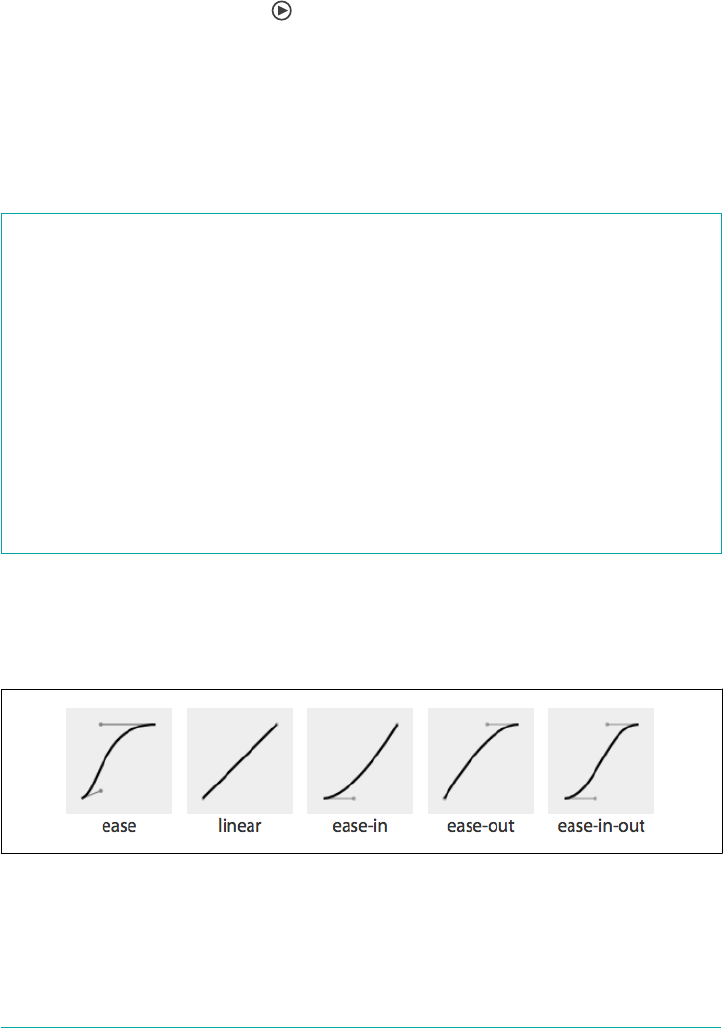
});
This example animates myElement infinitely, adding an additional second between
each iteration of the animation.
Changing the Internal Timing of Animations
All right! The scripting was fun, but let’s get back to straight CSS and talk about tim‐
ing functions. Similar to the transition-timing-function property, the animation-
timing-function property describes how the animation will progress over one cycle
of its duration, or iteration.
animation-timing-function
Values [ ease | linear | ease-in | ease-out | ease-in-out | step-start |
step-end | steps(<integer>, start) | steps(<integer>, end) |
cubic-bezier(<number>, <number>, <number>, <number>) ]#
Initial value ease
Applies to All elements, ::before and ::after pseudo-elements
Computed value As specied
Inherited No
Animatable No
Other than the step timing functions, described in “Step timing functions” on page
924, the timing functions are all Bézier curves. Just like the transition-timing-
function, the CSS specification provides for five predefined Bézier curve keywords,
as shown in Figure 18-1 and Table 18-1.
Figure 18-1. Cubic Bézier named functions
920 | Chapter 18: Animation
1For a detailed (and lovely) illustration of how cubic Bézier curves are actually constructed, we highly recom‐
mend the video “Cubic Bezier Curves - Under the Hood”.
Table 18-1. Bézier curve keywords
Timing function Cubic Bézier value
ease cubic-bezier(0.25, 0.1, 0.25, 1)
linear cubic-bezier(0, 0, 1, 1)
ease-in cubic-bezier(0.42, 0, 1, 1)
ease-out cubic-bezier(0, 0, 0.58, 1)
ease-in-out cubic-bezier(0.42, 0, 0.58, 1)
A handy tool to visualize Bézier curves and to create your own is Lea Verou’s cubic
Bézier visualizer at cubic-bezier.com.
The default ease has a slow start, then speeds up, and ends slowly. This function is
similar to ease-in-out, which has a greater acceleration at the beginning. linear, as
the name describes, creates an animation that animates at a constant speed.
ease-in creates an animation that is slow to start, gains speed, and then stops
abruptly. The opposite ease-out timing function starts at full speed, then slows pro‐
gressively as it reaches the conclusion of the animation iteration.
If none of these work for you, you can create your own Bézier curve timing function
by passing four values, such as:
animation-timing-function: cubic-bezier(0.2, 0.4, 0.6, 0.8);
Bézier curves are mathematically defined parametric curves used in two-dimensional
graphic applications. See Appendix A for examples of curves you can define yourself
in CSS.
The Bézier curve takes four values, defining the originating position of the two han‐
dles. In CSS, the anchors are at 0, 0 and 1, 1. The first two values define the x and y of
the first point or handle of the curve, and the last two are the x and y of the second
handle of the curve. The x values must be between 0 and 1, or the Bézier curve is
invalid. The y coordinate is not constrained. When creating your own Bézier curve,
remember: the steeper the curve, the faster the motion. The flatter the curve, the
slower the motion.1
While the x values must be between 0 and 1, by using values for y that are greater
than 1 or less than 0, you can create a bouncing effect, making the animation bounce
up and down between values, rather than going consistently in a single direction.
Consider the following timing function, whose rather outlandish Bézier curve is
(partly) illustrated in Figure 18-2:
Animating Elements | 921
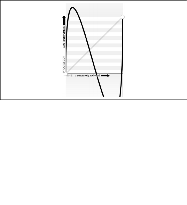
.snake {
animation-name: shrink;
animation-duration: 10s;
animation-timing-function: cubic-bezier(0, 4, 1, -4);
animation-fill-mode: both;
}
@keyframes shrink {
0% {
width: 500px;
}
100% {
width: 100px;
}
}
Figure 18-2. An outlandish Bézier curve
This animation-timing-function curve makes the animated property’s values go
outside the boundaries of the values set in the 0% and 100% keyframes. In this exam‐
ple, we are shrinking an element from 500px to 100px. However, because of the
cubic-bezier values, the element we’re shrinking will actually grow to be wider than
the 500px width defined in the 0% keyframe and narrower than the 100px width
defined in the 100% keyframe, as shown in Figure 18-3.
922 | Chapter 18: Animation

Figure 18-3. Eect of outlandish Bézier curve
In this scenario, the element starts with a width of 500px, defined in the 0% keyframe.
It then quickly shrinks down to a width of about 40px, which is narrower than width:
100px defined in the 100% keyframe. From there, it slowly expands to about 750px
wide, which is larger than the original width of 500px. It then quickly shrinks back
down to width: 100px, ending the animation iteration.
You may have realized that the curve created by our animation is the same curve as
the Bézier curve. Just as the S-curve goes outside the normal bounding box, the width
of the animated element goes narrower than the smaller width we set of 100px, and
wider than the larger width we set of 500px.
The Bézier curve has the appearance of a snake because one y coordinate is positive,
and the other negative. If both are positive values greater than 1 or both are negative
values less than -1, the Bézier curve is arc-shaped, going above or below one of the
values set, but not bouncing out of bounds on both ends like the S-curve.
Any timing function declared with animation-timing-function sets the timing for
the normal animation direction, when the animation is progressing from the 0% key‐
frame to the 100% keyframe. When the animation is running in the reverse direction,
from the 100% keyframe to the 0% keyframe, the animation timing function is
reversed.
Remember the bouncing-ball example? The bouncing wasn’t very realistic, because
the original example defaulted to ease for its timing function. With animation-
timing-function, we can apply ease-in to the animation so that when the ball is
dropping, it gets faster as it nears its nadir at the 100% keyframe. When it is bouncing
upward, it animates in the reverse direction, from 100% to 0%, so the animating-
timing-function is reversed as well—in this case to ease-out—slowing down as it
reaches the apex:
Animating Elements | 923
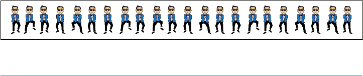
.ball {
animation-name: bounce;
animation-duration: 1s;
animation-iteration-count: infinite;
animation-timing-function: ease-in;
animation-direction: alternate;
}
@keyframes bounce {
0% {
transform: translateY(0);
}
100% {
transform: translateY(500px);
}
}
Step timing functions
The step timing functions, step-start, step-end, and steps(), aren’t Bézier curves.
They’re not really curves at all. Rather, they’re tweening definitions. The steps()
function is most useful when it comes to character or sprite animation.
The steps() timing function divides the animation into a series of equal-length
steps. steps() takes two parameters: the number of steps, and the change point
(more on that in a moment).
The number of steps is the first parameter; its value must be a positive integer. The
animation length will be divided equally into the number of steps provided. For
example, if the animation duration is 1 second and the number of steps is 5, the ani‐
mation will be divided into five 200-millisecond steps, with the element being
redrawn to the page five times, at 200-millisecond intervals, moving 20% through the
animation at each interval.
To understand how this works, think of a flip book. Each page in a flip book contains
a single drawing or picture that changes slightly from one page to the next, like one
frame from a movie reel stamped onto each page. When the pages of a flip book are
rapidly flipped through (hence the name), the pictures appear as an animated
motion. You can create similar animations with CSS using an image sprite, the
background-position property, and the steps() timing function.
Figure 18-4 shows an image sprite containing several images that change just slightly,
like the drawings on the individual pages of a flip book.
Figure 18-4. Sprite of dancing
924 | Chapter 18: Animation

We put all of our slightly differing images into a single image called a sprite. Each
image in our sprite is a frame in the single animated image we’re creating.
We then create a container element that is the size of a single image of our sprite, and
attach the sprite as the container element’s background image. We then animate the
background-position, using the steps() timing function so we only see a single
instance of the changing image of our sprite at a time. The number of steps in our
steps() timing function is the number of occurrences of the image in our sprite. The
number of steps defines how many stops our background image makes to complete a
single animation.
The sprite in Figure 18-4 has 22 images, each 56 × 100 pixels. The total size of our
sprite is 1,232 × 100 pixels. We set our container to the individual image size: 56 ×
100 pixels. We set our sprite as our background image: the initial or default value of
background-position is top left, which is the same as 0 0. Our image will appear
at 0 0, which is a good default: older browsers that don’t support CSS animation will
simply display the first image from our sprite:
.dancer {
height: 100px;
width: 56px;
background-image: url(../images/dancer.png);
....
}
The trick is to use steps() to change the background-position value so that each
frame is a view of a separate image within the sprite. Instead of sliding in the back‐
ground image from the left, the steps() timing function will pop in the background
image in the number of steps we declared.
So we create an animation that simple changes the left-right value of the background-
position. The image is 1,232 pixels wide, so we move the background image from 0
0, which is the left top, to 0 -1232px, putting the sprite fully outside of our 56 × 100
pixel div viewport.
The values of -1232px 0 will move the image completely to the left, outside of our
containing block viewport. It will no longer show up as a background image in our
100 × 56 pixel div at the 100% mark unless background-repeat is set to repeat along
the x-axis. We don’t want that to happen!
This is what we want:
@keyframes dance_in_place {
from {
background-position: 0 0;
}
to {
background-position: -1232px 0;
Animating Elements | 925
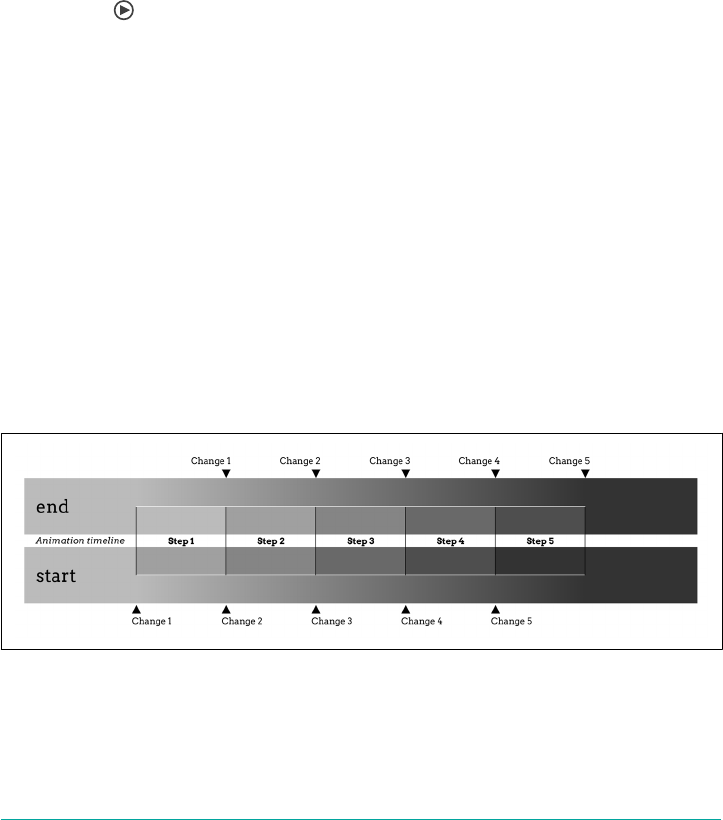
}
}
.dancer {
....
background-image: url(../images/dancer.png);
animation-name: dance_in_place;
animation-duration: 4s;
animation-timing-function: steps(22, end);
animation-iteration-count: infinite;
}
What may have seemed like a complex animation is very simple: just like a flip book,
we see one frame of the sprite at a time. Our keyframe animation simply moves the
background.
So that covers the first parameter, the number of steps. The second parameter takes
one of two values: either start or end. What this specifies whether the change for the
first step’s interval takes place at the beginning of that interval, or at the end of the
interval. With the default value, end, the change take place at the end of the first step.
In other words, given 200 ms step lengths, the first change in the animation will not
occur until 200 ms into the animation’s overall duration. With start, the first change
will take place at the beginning of the first step’s interval; that is to say, the instant the
animation begins. Figure 18-5 provides a timeline diagram of how the two values
work, based on the following styles:
@keyframes grayfade {
from {background-color: #BBB;}
to {background-color: #333;}
}
.quickfader {animation: grayfade 1s steps(5,start) forwards;}
.slowfader {animation: grayfade 1s steps(5,end) forwards;}
Figure 18-5. Visualizing start and end change points
The boxes embedded into each timeline represent the background color during that
step interval. Notice that in the end timeline, the first interval is the same as the back‐
ground before the animation started. This is because the animation waits until the
926 | Chapter 18: Animation

end of the first frame to make the color change for the first step (the color between
“Step 1” and “Step 2”).
In the start timeline, on the other hand, the first interval makes that color change at
the start of the interval, instantly switching from the starting background color to the
color between “Step 1” and “Step 2”. This is sort of like jumping ahead one interval,
an impression reinforced by the fact that the background color in “Step 2” of the end
timeline is the same as that in “Step 1” of the start timeline.
A similar effect can be seen at the end of each animation, where the background in
the fifth step of the start timeline is the same as the ending background color. In the
end timeline, it’s the color at the point between “Step 4” and “Step 5”, and doesn’t
switch to the ending background color until the end of “Step 5,” when the animation
is finished.
The change parameter can be hard to keep straight. If it helps, think of it this way: in
a normal animation direction, the start value “skips” the 0% keyframe, because it
makes the first change as soon as the animation starts, and the end value “skips” the
100% keyframe.
Preserving the ending background color in this case, rather than
having it reset to the starting color after the animation finishes,
required the presences of the forwards keyword. We’ll cover that in
“Animation Fill Modes” on page 933, later in the chapter.
The step-start value is equal to steps(1, start), with only a single step displaying
the 100% keyframe. The step-end value is equal to steps(1, end), which displays
only the 0% keyframe.
Adding a second animation
Let’s go back to the sprite animation, which shows our tiny dancer dancing in place.
Most dancers move around when they dance. We can add a little left-and-right and
back-and-forth motion by adding a second animation:
@keyframes move_around {
0%, 100% {
transform: translate(0, -40px) scale(0.9);
}
25% {
transform: translate(40px, 0) scale(1);
}
50% {
transform: translate(0, 40px) scale(1.1);
}
75% {
Animating Elements | 927
transform: translate(-40px, 0) scale(1);
}
}
Here, we create a second keyframe animation called move_around and attach it to our
dancer element as a second animation with comma-separated animation property
declarations:
.dancer {
....
background-image: url(../images/dancer.png);
animation-name: dance_in_place, move_around;
animation-duration: 4s, 16s;
animation-timing-function: steps(22, end), steps(5, end);
animation-iteration-count: infinite;
}
Note that each animation property has two comma-separated values except
animation-iteration-count. If you recall, if an animation property doesn’t have
enough comma-separated values to match the number of animations declared by the
animation-name property, the values present will be repeated until there are enough.
We want both animations to continue indefinitely. As the value of infinite is for all
the attached animations, we only need a single value for that property. The browser
will repeat the list of animation-iteration-count values—in this case, just the single
value of infinite—until it has matched an animation-iteration-count value for
each animation declared.
Animating the timing function
The animation-timing-function is not an animatable property, but it can be
included in keyframes to alter the current timing of the animation.
Unlike animatable properties, the animation-timing-function values aren’t interpo‐
lated over time. When included in a keyframe within the @keyframes definition, the
timing function for the properties declared within that same keyframe will change to
the new animation-timing-function value when that keyframe is reached, as shown
in Figure 18-6:
@keyframes width {
0% {
width: 200px;
animation-timing-function: linear;
}
50% {
width: 350px;
animation-timing-function: ease-in;
}
100% {
width: 500px;
928 | Chapter 18: Animation
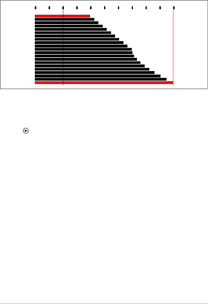
}
}
Figure 18-6. Changing the animation timing function mid-animation
In the preceding example, as shown in Figure 18-6, halfway through the animation,
we switch from a linear animation progression for the width property to one that
eases in. The ease-in timing starts from the keyframe in which the timing function
changes.
Specifying the animation-timing-function within the to or 100% keyframe will have
no effect on the animation. When included in any other keyframe, the animation will
follow the animation-timing-function specified in that keyframe definition until it
reaches the next keyframe, overriding the element’s default or declared animation-
timing-function.
If the animation-timing-function property is included in a keyframe, only the
properties also included in that keyframe block will have their timing function
impacted. The new timing function will be in play on that property until the next
keyframe containing that property is reached, at which point it will change to the tim‐
ing function declared within that block, or revert back to the original timing function
assigned to that element. If we take our W animation as an example:
@keyframes W {
from {
left: 0;
top: 0;
}
25%, 75% {
top: 100%;
}
50% {
top: 50%;
}
Animating Elements | 929

to {
left: 100%;
top: 0;
}
}
This follows the idea that conceptually, when an animation is set on an element or
pseudo-element, it is as if a set of keyframes is created for each property that is
present in any of the keyframes, as if an animation is run independently for each
property that is being animated. It’s as if the W animation were made up of two anima‐
tions that run simultaneously—W_part1 and W_part2:
@keyframes W_part1 {
from, to {
top: 0;
}
25%, 75% {
top: 100%;
}
50% {
top: 50%;
}
}
@keyframes W_part2 {
from {
left: 0;
}
to {
left: 100%;
}
}
The animation-timing-function that is set on any of the keyframes is added to the
progression of only the properties that are defined at that keyframe:
@keyframes W {
from {
left: 0;
top: 0;
}
25%, 75% {
top: 100%;
}
50% {
animation-timing-function: ease-in;
top: 50%;
}
to {
left: 100%;
top: 0;
930 | Chapter 18: Animation

}
}
The preceding code will change the animation-timing-function to ease-in for the
top property only, not the left property, impacting only the W_part1 section of our W
animation, and only from the middle of the animation to the 75% mark.
However, with the following animation, the animation-timing-function will have
no effect, because it’s been placed in a keyframe block that has no property/value
declarations:
@keyframes W {
from {
left: 0;
top: 0;
}
25%, 75% {
top: 100%;
}
50% {
animation-timing-function: ease-in;
}
50% {
top: 50%;
}
to {
left: 100%;
top: 0;
}
}
How is it useful to change the timing function mid-animation? In the bounce anima‐
tion, we had a frictionless environment: the ball bounced forever, never losing
momentum. The ball sped up as it dropped and slowed as it rose, because the timing
function was inverted from ease-in to ease-out by default as the animation procee‐
ded from the normal to reverse direction every other iteration.
In reality, friction exists; momentum is lost. Balls will not continue to bounce indefi‐
nitely. If we want our bouncing ball to look natural, we have to make it bounce less
high as it loses energy with each impact. To do this, we need a single animation that
bounces multiple times, losing momentum on each bounce, while switching between
ease-in and ease-out at each apex and nadir:
@keyframes bounce {
0% {
transform: translateY(0);
animation-timing-function: ease-in;
}
30% {
transform: translateY(100px);
animation-timing-function: ease-in;
Animating Elements | 931
}
58% {
transform: translateY(200px);
animation-timing-function: ease-in;
}
80% {
transform: translateY(300px);
animation-timing-function: ease-in;
}
95% {
transform: translateY(360px);
animation-timing-function: ease-in;
}
15%, 45%, 71%, 89%, 100% {
transform: translateY(380px);
animation-timing-function: ease-out;
}
}
This animation loses height after a few bounces, eventually stopping.
Since this new animation uses a single iteration, we can’t rely on the animation-
direction to change our timing function. We need to ensure that while each bounce
causes the ball to lose momentum, it still speeds up with gravity and slows down as it
reaches its apex. Because we will have only a single iteration, we control the timing by
including animation-timing-function within our keyframes. At every apex, we
switch to ease-in, and at every nadir, or bounce, we switch to ease-out.
Setting the Animation Play State
If you need to pause and resume animations, the animation-play-state property
defines whether the animation is running or paused.
animation-play-state
Values [ running | paused ]#
Initial value running
Applies to All elements, ::before and ::after pseudo-elements
Computed value As specied
Inherited No
Animatable No
932 | Chapter 18: Animation
When set to the default running, the animation proceeds as normal. If set to paused,
the animation will be paused. When paused, the animation is still applied to the ele‐
ment, halted at the progress it had made before being paused. If stopped mid itera‐
tion, the properties that were in the process of animating stay at their mid-iteration
values. When set back to running or returned to the default of running, it restarts
from where it left off, as if the “clock” that controls the animation had stopped and
started again.
If the property is set to animation-play-state: paused during the delay phase of
the animation, the delay clock is also paused and resumes expiring as soon as
animation-play-state is set back to running.
Animation Fill Modes
The animation-fill-mode property enables us to define whether or not an element’s
property values continue to be applied by the animation outside of the animation
execution.
animation-ll-mode
Values [ none | forwards | backwards | both ]#
Initial value none
Applies to All elements, ::before and ::after pseudo-elements
Computed value As specied
Inherited No
Animatable No
This property is useful because by default, the changes in an animation only apply
during the animation itself. Once the animation is done, the values will all revert to
their pre-animation values. Thus, if you animate the background from red to blue,
the background will (by default) revert to red once the animation finishes.
Similarly, an animation will not affect the property values of the element immediately
if there is a positive animation-delay applied. Rather, animation property values are
applied when the animation-delay expires, when the animationstart event is fired.
With animation-fill-mode, we can define how the animation impacts the element
on which it is set before the animationstart and after the animationend events are
fired. Property values set in the 0% keyframe can be applied to the element during the
Animating Elements | 933
expiration of any animation delay, and property values can continue to persist after
the animationend event is fired.
The default value for animation-fill-mode is none, which means the animation has
no effect when it is not executing: the animation’s 0% keyframe (or the 100% keyframe
in a reverse animation) block property values are not applied to the animated element
until the animation-delay has expired, when the animationstart event is fired.
When the value is set to backwards, the property values from the 0% or from keyframe
(if there is one) will be applied to the element as soon as the animation is applied to
the element. The 0% keyframe property values are applied immediately (or 100% key‐
frame, if the value of the animation-direction property is reversed or reversed-
alternate), without waiting for the animation-delay time to expire.
The value of forwards means when the animation is done executing—that is, has
concluded the last part of the last iteration as defined by the animation-iteration-
count value, and the animationend event has fired—it continues to apply the values
of the properties as they were when the animationend event occurred. If the
iteration-count has an integer value, this will be either the 100% keyframe, or, if the
last iteration was in the reverse direction, the 0% keyframe.
The value of both applies both the backwards effect of applying the property values as
soon as the animation is attached to the element, and the forwards value of persisting
the property values past the animationend event.
If the animation-iteration-count is a float value, and not an integer, the last itera‐
tion will not end on the 0% or 100% keyframe: the animation will instead end its exe‐
cution partway through an animation cycle. If the animation-fill-mode is set
forwards or both, the element maintains the property values it had when the anima
tionend event occurred. For example, if the animation-iteration-count is 6.5, and
the animation-timing-function is linear, the animationend event fires and the val‐
ues of the properties at the 50% mark (whether or not a 50% keyframe is explicitly
declared) will stick, as if the animation-play-state had been set to pause at that
point.
For example, if we take the following code:
@keyframes move_me {
0% {
transform: translateX(0);
}
100% {
transform: translateX(1000px);
}
}
.moved {
934 | Chapter 18: Animation
transform: translateX(0);
animation-name: move_me;
animation-duration: 10s;
animation-timing-function: linear;
animation-iteration-count: 0.6;
animation-fill-mode: forwards;
}
The animation will only go through 0.6 iterations. Being a linear 10-second anima‐
tion, it will stop at the 60% mark, 6 seconds into the animation, when the element is
translated 600 pixels to the right. With animation-fill-mode set to forwards or
both, the animation will stop animating when it is translated 600 pixels to the right,
holding the moved element 600 pixels to the right of its original position. This will
keep it translated indefinitely, or at least until the animation is detached from the ele‐
ment. Without the animation-fill-mode: forwards, the element with class moved
will pop back to it’s original transform: translateX(0), as defined in the moved
selector code block.
In Safari 9 and earlier, forwards and both will set the values from
the 100% keyframe onto the element, no matter the direction of the
last iteration or whether the animation otherwise ended on the
100% keyframe or elsewhere in the animation. In the preceding
example, in Safari 9, the .moved element jumps from being trans‐
lated by 400 pixels to the right to be 1,000 pixels to the right of
where it normally would have been, and stays there. In Safari 9 and
earlier, it doesn’t matter whether the last iteration was normal or
reverse, or whether the animation ended 25% or 75% of the way
through an animation cycle; animation-fill-mode: forwards
causes the animation to jump to the 100% frame and stay there.
This follows an older version of the specification, but we expect it
will be updated to match the updated specification and all other
evergreen browsers.
Bringing It All Together
The animation shorthand property allows you to use one line, instead of eight, to
define all the animation parameters for an element. The animation property value is
a list of space-separated values for the various longhand animation properties. If you
are setting multiple animations on an element or pseudo-element, you can use a
comma-separated list of animations.
Bringing It All Together | 935

animation
Values [ <animation-name> ‖ <animation-duration> ‖ <animation-timing-function> ‖
<animation-delay> ‖ <animation-iteration-count> ‖ <animation-direction> ‖
<animation-ll-mode> ‖ <animation-play-state> ]#
Initial value 0s ease 0s 1 normal none running none
Applies to All elements, ::before and ::after pseudo-elements
Computed value As specied
Inherited No
Animatable No
The animation shorthand takes as its value all the other preceding animation proper‐
ties, including animation-duration, animation-timing-function, animation-
delay, animation-iteration-count, animation-direction, animation-fill-mode,
animation-play-state, and animation-name. For example, the following two rules
are precisely equivalent:
#animated {
animation: 200ms ease-in 50ms 1 normal running forwards slidedown;
}
#animated {
animation-name: slidedown;
animation-duration: 200ms;
animation-timing-function: ease-in;
animation-delay: 50ms;
animation-iteration-count: 1;
animation-fill-mode: forwards;
animation-direction: normal;
animation-play-state: running;
}
We didn’t have to declare all of the values in the animation shorthand; any values that
aren’t declared are set to the default or initial values. The first shorthand line was long
and three of the properties were set to default, so were not necessary.
It’s important to remember that if you don’t declare all eight values in your shorthand
declaration, the ones you don’t declare will get the initial value for that property. The
initial or default values are:
animation-name: none;
animation-duration: 0s;
animation-timing-function: ease;
animation-delay: 0;
animation-iteration-count: 1;
936 | Chapter 18: Animation

animation-fill-mode: none;
animation-direction: normal;
animation-play-state: running;
The order of the shorthand is important in two very specific ways. First, there are two
time properties permitted, for <animation-duration> and <animation-delay>. When
two are listed, the first is always the duration. The second, if present, is interpreted as
the delay.
Second, the placement of the animation-name is also important. If you use an anima‐
tion property value as your animation identifier—which you shouldn’t, but say that
you do—then the animation-name should be placed as the last property value in the
animation shorthand. The first occurrence of a keyword that is a valid value for any
of the other animation properties, such as ease or running, is assumed to be part of
the shorthand of the animation property the keyword is associated with, rather than
the animation-name. Note that none is basically the only word that is not a valid ani‐
mation name:
#failedAnimation {
animation: paused 2s;
}
This is the equivalent to:
#failedAnimation {
animation-name: none;
animation-duration: 2s;
animation-delay: 0;
animation-timing-function: ease;
animation-iteration-count: 1;
animation-fill-mode: none;
animation-direction: normal;
animation-play-state: paused;
}
paused is a valid animation name. While it may seem that the animation named
paused with a duration of 2s is being attached to the element, that is not what is hap‐
pening in the above shorthand. Because words within the shorthand animation are
first checked against possible valid values of all animation properties other than
animation-name first, paused is being set as the value of the animation-play-state
property:
#anotherFailedAnimation {
animation: running 2s ease-in-out forwards;
}
The preceding code snippet is the equivalent to:
#anotherFailedAnimation {
animation-name: none;
animation-duration: 2s;
Bringing It All Together | 937

animation-delay: 0s;
animation-timing-function: ease-in-out;
animation-iteration-count: 1;
animation-fill-mode: forwards;
animation-direction: normal;
animation-play-state: running;
}
The developer probably has a keyframe animation called running. The browser, how‐
ever, sees the term and assigns it to the animation-play-state property rather than
the animation-name property. With no animation-name declared, there is no anima‐
tion attached to the element. The way to get around this would be:
#aSuccessfulIfInadvisableAnimation {
animation: running 2s ease-in-out forwards running;
}
This will apply the first running to animation-play-state, and the second running
to animation-name. Again: this is not advised. The potential for confusion and error
is too great.
In light of all this, animation: 2s 3s 4s; may seem valid, as if the following were
being set:
#invalidName {
animation-name: 4s;
animation-duration: 2s;
animation-delay: 3s;
}
But as was mentioned in “Setting Up Keyframe Animations” on page 893, 4s is not a
valid identifier. Identifiers cannot start with a digit unless escaped. For this animation
to be valid, it would have to be written as animation: 2s 3s \4s;
To attach multiple animations to a single element or pseudo-element, comma-
separate the animations:
.snowflake {
animation: 3s ease-in 200ms 32 forwards falling,
1.5s linear 200ms 64 spinning;
}
The snowflake will fall while spinning for 96 seconds, spinning twice during each 3-
second fall. At the end of the last animation cycle, the snowflake will stay fixed on
the 100% keyframe of the falling animation. We declared six of the eight animation
properties for the falling animation and five for the spinning animation, separating
the two animations with a comma.
While you’ll most often see the animation name as the first value—it’s easier to read
that way, because of the issue with animation property keywords being valid keyframe
938 | Chapter 18: Animation

identifiers—it is not a best practice. That is why we put the animation name at
the end.
To sum up: it is a fine idea to use the animation shorthand. Just remember that the
placements of the duration, delay, and name within that shorthand are important,
and omitted values will be set to their default values. Also, it is a good idea to not use
any animation keywords as your identifier.
Animation, Specicity, and Precedence Order
In terms of specificity, the cascade, and which property values get applied to an ele‐
ment, animations (as of late 2017) incorrectly supersede all other values in the
cascade.
Specicity and !important
In general, the weight of a property attached with an ID selector 1-0-0 should take
precedence over a property applied by an element selector 0-0-1. However, if that
property value was changed via a keyframe animation, it will be applied as if that
property/value pair were added as an inline style.
The current behavior in all browsers that support animation is as if the property val‐
ues set by keyframes were declared inline with an added !important—as if they were
something like <div style="keyframe-property: value !important">. This is
wrong, according to the specifications. The animation specification states “anima‐
tions override all normal rules, but are overridden by !important rules.” This is a
bug in the late 2017 implementations and should be resolved eventually. Or, perhaps,
the specification will change.
That being said, don’t include !important within your animation declaration block;
this use is invalid, and the property/value combination upon which it is declared will
be ignored.
Animation Order
If there are multiple animations specifying values for the same property, the property
value from the last animation applied will override the previous animations:
#colorchange {
animation-name: red, green, blue;
animation-duration: 11s, 9s, 6s;
}
In this code example, if red, green, and blue are all keyframe animations that change
the color property to their respective names, once the animation-name and
animation-duration properties are applied to #colorchange, for the first six
Animation, Specicity, and Precedence Order | 939
seconds, the property values in blue will take precedence, then green for three sec‐
onds, then red for two seconds, before returning to default property values. In
this scenario, if the blue @keyframe animation does not include the color property
in the 0% keyframe, the color will be taken from the animation named green, the ani‐
mation named red, or the element’s currentColor value, in that order. The same is
true for an omitted 100% keyframe.
The default properties of an element are not impacted before the animation starts,
and the properties return to their original values after the animation ends unless an
animation-fill-mode value other than the default none has been set. If animation-
fill-mode: both were added to the mix, the color would always be blue, as the last
animation, or blue, overrides the previous green animation, which overrides the red
first animation.
Animation Iteration and display: none;
If the display property is set to none on an element, any animation iterating on that
element or its descendants will cease, as if the animation were detached from the ele‐
ment. Updating the display property back to a visible value will reattach all the ani‐
mation properties, restarting the animation from scratch:
.snowflake {
animation: spin 2s linear 5s 20;
}
In this case, the snowflake will spin 20 times; each spin takes 2 seconds, with the first
spin starting after 5 seconds. If the snowflake element’s display property gets set to
none after 15 seconds, it would have completed 5 spins before disappearing (after get‐
ting through the 5-second delay, then executing 5 spins at 2 seconds each). If the
snowflake display property changes back to anything other than none, the animation
starts from scratch: a 5-second delay will elapse again before it starts spinning 20
times. It makes no difference how many animation cycles iterated before it disap‐
peared from view the first time.
Animation and the UI Thread
CSS animations have the lowest priority on the user interface (UI) thread. If you
attach multiple animations on page load with positive values for animation-delay,
the delays expire as specified, but the animations may not begin until the UI thread is
available to animate.
Assume the following:
•The animations all require the UI thread (that is, they aren’t on the GPU as
described in “Animation chaining” on page 912).
940 | Chapter 18: Animation
•You have 20 animations with the animation-delay property set to 1s, 2s, 3s, 4s,
and so on in order to start each subsequent animation one second after the previ‐
ous animation.
•The document or application takes a long time to load, with 11 seconds between
the time the animated elements were drawn to the page and the time the Java‐
Script finished being downloaded, parsed, and executed.
Given all that, the delays of the first 11 animations will have expired once the UI
thread is available, and those first 11 animations will all commence simultaneously.
The remaining animations will each then begin animating at one-second intervals.
Seizure and Vestibular Disorders
While you can use animations to create ever-changing content,
dynamically changing content can lead to seizures in some users.
Always keep this in mind, and ensure the accessibility of your web‐
site to people with epilepsy and other seizure disorders.
We don’t usually start a section with a warning, but in this case, it’s warranted. Visual
change, especially rapid visual change, can trigger medical emergencies in users who
are prone to seizures. They can also cause severe unease in users who are prone to
vestibular disorder (motion sickness).
As this book was going to press in late 2017, a new media query was being deployed
in browsers: prefers-reduced-motion. This allows authors to apply styles when the
user has a “Reduce motion” or similar preference set for their browser or device.
Strongly consider an approach such as this:
@media (prefers-reduced-motion) {
* {animation: none !important; transition: none !important;}
}
This disables all animations and transitions, assuming no other !important anima‐
tions are specified (and they shouldn’t be). This is not a nuanced or perfect solution,
but it’s a first step. You can invert this approach by segregating all of your animations
and transitions in a media block for those who do not have motion reduction
enabled, like this:
@media not (prefers-reduced-motion) {
/* all animations and transitions */
}
Not all animations are dangerous or disorienting, and it may be necessary to have at
least some animations for all users. In such cases, use prefers-reduced-motion to
Seizure and Vestibular Disorders | 941

tone down animations that are essential to understanding of the UI, and to switch off
those that are essentially decorative.
Animation Events and Prexing
Let’s recap animation-related events we can access with DOM event listeners, and
what prefixing may be required when using them.
animationstart
The animationstart event occurs at the start of the animation. If there is an
animation-delay, this event will fire once the delay period has expired. If there is no
delay, the animationstart event occurs when the animation is applied to the ele‐
ment. Even if there are no iterations, the animationstart event still occurs. If there
are multiple animations attached to an element, an animationstart event will occur
for each of the applied valid keyframe animations: generally, one animationstart for
each valid animation-name identifier present:
#colorchange {
animation: red, green, blue;
}
In this example, as long as the red, green, and blue keyframe animations are valid,
while the animations will not be perceptible (as the default duration of 0s is set
on each), there will be three animationstart events thrown: one for each animation
name.
If the browser requires the -webkit- prefix for the animation properties—basically,
Safari 8 and earlier and Android 4.4.4 and older—the event is written as webkitAnima
tionStart instead of animationstart. Note the -webkit- prefix and the camelCas‐
ing. It is best to default to the unprefixed syntax and fall back to the prefixed version
only when the unprefixed is unavailable.
animationend
The animationend event occurs at the conclusion of the last animation. It only occurs
once per applied animation: if an element has three animations applied to it, like in
the earlier #colorchange example, the animationend event will occur three times, at
the end of the animation. In the example, there was no duration for any of the anima‐
tions; however, the animationend event timing is usually equivalent to the result of
the following equation:
(animation-duration * animation-iteration-count) + animation-delay = time
942 | Chapter 18: Animation

Even if there are no iterations, the animationend event still occurs once for each
animation applied. If the animation-iteration-count is set to infinite, the
animationend event never occurs.
If the browser requires the -webkit- prefix for the animation properties, the event is
written as webkitAnimationEnd instead of animationend.
animationiteration
The animationiteration event occurs at the end of each iteration of an animation,
before the start of the next iteration. If there are no iterations, or the iteration count is
less than or equal to one, the animationiteration event never occurs. If the iteration
count is infinite, the animationiteration event occurs ad infinitum, unless there is
no duration set or the duration is 0s.
Unlike the animationstart and animationend events, which each occur once for
each animation name, the animationiteration event can occur multiple times or no
times per animation name, depending on how many iterations occur. Note that the
event happens between animation cycles and will not occur at the same time as an
animationend event. In other words, if the animation-iteration-count is an inte‐
ger, the number of animationiteration events that occur is generally one less that
the value of the animation-iteration-count property, as long as the absolute value
of any negative delay is less than the duration.
Printing Animations
While not actually “animating” on a printed piece of paper, when an animated ele‐
ment is printed, the relevant property values will be printed. You can’t see the element
animating on a piece of paper, but if the animation caused an element to have a
border-radius of 50%, the printed element will have a border-radius of 50%.
Printing Animations | 943
CHAPTER 19
Filters, Blending, Clipping, and Masking
Over the past decade, CSS has accumulated some interesting new features. These
allow authors to alter the appearance of element with visual filters, specify different
ways to visually blend elements with whatever is behind them, and alter the presenta‐
tion of elements by showing parts and hiding other parts. While these may seem like
disparate concepts, they all share one thing in common: they allow elements to be
altered in ways that were previously very difficult or impossible.
CSS Filters
The veterans among us may remember that a long time ago, Microsoft put a filter
property into their CSS support, which was used to pull in DirectX visual effects. In
the time since, CSS has gained a filter property of its own, and while it’s similar in
concept to what Microsoft did, it isn’t really the same thing. Among other changes,
CSS defines a number of built-in visual filter effects, in addition to permitting the
loading of filters defined in external files.
lter
Values [ none | blur() | brightness() | contrast() | drop-shadow() | gray
scale() | hue-rotate() | invert() | opacity() | sepia() | satu
rate() | url() ]#
Initial value none
Applies to All elements (in SVG, applies to all graphics elements and all container elements except
the <defs>element)
Computed value As declared
Inherited No
945
Animatable Yes
The value syntax permits a comma-separated list of filter functions, with each filter
applied in sequence. Thus, given the declaration filter: opacity(0.5)
blur(1px);, the opacity is applied to the element, and the semi-transparent result is
then blurred. If the order were reversed, so too would be the order of application: the
fully opaque element is burred, and the resulting blur made semi-transparent.
The CSS specification talks of “input images” when discussing filter, but this
doesn’t mean filter is only used on images. Any HTML element can be filtered, and
all graphic SVG elements can be filtered. The input image is a visual copy of the ren‐
dered element before it is filtered. Filters are applied to this input, and the final fil‐
tered result is then rendered to the display medium.
All the values permitted are effectively functions, with the permitted value types for
each being dependent on the function in question. I’ve grouped these functions into a
few broad categories for ease of understanding.
Basic Filters
These filters are basic in the sense that they cause changes that their names directly
describe: blurring, drop shadows, and opacity changes:
blur(<length>)
Blurs the element’s contents using a Gaussian blur whose standard deviation is
defined by the <length> value supplied, where a value of 0 leaves the element
unchanged. Negative lengths are not permitted.
opacity( [ <number> | <percentage> ] )
Applies a transparency filter to the element in a manner very similar to the opac
ity property, where the value 0 yields a completely transparent element and a
value of 1 or 100% leaves the element unchanged. Negative values are not permit‐
ted. Values greater than 1 and 100% are permitted, but are clipped to be 1 or 100%
for the purposes of computing the final value.
The specification makes clear that filter: opacity() is not meant
to be a replacement or shorthand for the opacity property, and in
fact both can be applied to the same element, resulting in a sort of
double-transparency.
946 | Chapter 19: Filters, Blending, Clipping, and Masking
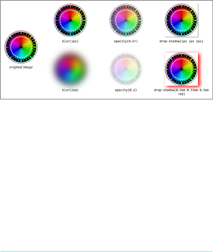
drop-shadow(<length>{2,3} <color>?)
Creates a drop shadow that matches the shape of the element’s alpha channel,
with a blur and using an optional color. The handling of the lengths and colors is
the same as for the property box-shadow, which means that while the first two
<length>s can be negative, the third (which defines the blur) cannot. If no
<color> value is supplied, the used color is the same as the computed value of the
color property for the element.
The effects of these filter functions, alone and in combination, is shown in
Figure 19-1.
Figure 19-1. Basic lter eects
Before we go one, there are two things that deserve further exploration. The first is
how drop-shadow() really operates. Just by looking at Figure 19-1, it’s easy to get the
impression that drop shadows are bound to the element box, because of the boxlike
natures of the drop shadows shown there. But that’s just because the image used to
illustrate filters is a PNG, which is to say a raster image, and more importantly one
that doesn’t have any alpha channel. The white parts are opaque white, in other
words.
If the image has transparent bits, then drop-shadow() will use those in computing the
shadow. This can be a GIF89a, a PNG, a JPEG2000, an SVG, or any other alpha-aware
image format. To see what this means, consider Figure 19-2.
The other thing to point out in Figure 19-2 is the last image has two drop shadows.
This was accomplished as follows:
filter: drop-shadow(0 0 0.5em yellow) drop-shadow(0.5em 0.75em 30px gray);
CSS Filters | 947

Figure 19-2. Drop shadows and alpha channels
Any number of filters can be chained together like this. To pick another example, you
could write:
filter: blur(3px) drop-shadow(0.5em 0.75em 30px gray) opacity(0.5);
That would get you a blurry, drop-shadowed, half-opaque element. It might not be
the most reader-friendly effect for text, but it’s possible nonetheless. This function-
chaining is possible with all filter functions, both those we’ve seen and those to
come.
Color Filtering
This next set of filter functions alter the colors present in the filtered element in
some way. This can be as simple as leaching out the colors, or as complex as shifting
all the colors by way of an angle value.
Note that for the first three of the four of the following functions, all of which accept
either a <number> or <percentage>, negative values are not permitted:
grayscale( [ <number> | <percentage> ] )
Alters the colors in the element to be shifted toward shades of gray. A value of 0
leaves the element unchanged, and a value of 1 or 100% will result in a fully gray‐
scale element.
sepia( [ <number> | <percentage> ] )
Alters the colors in the element to be shifted toward shades of sepia tones (sepia
is a reddish-brown color, defined by Wikipedia to be equivalent to #704214 or
rgba(112,66,20) in the sRGB color space). A value of 0 leaves the element
unchanged, and a value of 1 or 100% will result in a fully sepia element.
948 | Chapter 19: Filters, Blending, Clipping, and Masking
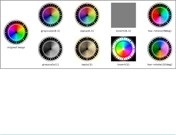
invert( [ <number> | <percentage> ] )
Inverts all colors in the element. Each of the R, G, and B values for a given color
are inverted by subtracting them from 255 (in 0-255 notation) or from 100% (in
0%-100% notation). For example, a pixel with the color rgb(255,128,55) will be
rendered as rgb(0,127,200); a different pixel with the value rgb(75%,57.2%,
23%) will become rgb(25%,42.8%,77%). A value of 0 leaves the element
unchanged, and a value of 1 or 100% will result in a fully inverted element. A
value of 0.5 or 50% would stop the inversion of each color at the midpoint of the
color space, leading to an element of uniform gray.
hue-rotate( <angle> )
Alters the colors of the image by displacing their hue around an HSL color wheel,
leaving saturation and lightness alone. A value of 0deg leaves the element
unchanged. A value of 360deg (a full single rotation) will also present an appa‐
rently unchanged element, though the value is maintained, and values above
360deg are permitted. Negative values are also permitted, and cause an anticlock‐
wise rotation as opposed to the clockwise rotation imposed by positive values. (In
other words, the rotation is “compass-style,” with 0º at the top and increasing
angle values in the clockwise direction.)
Examples of the preceding filter functions are shown in Figure 19-3, though fully
appreciating them depends on a color rendering of the figure.
Figure 19-3. Color lter eects
Brightness, Contrast, and Saturation
While these filter functions also manipulate color, they do so in closely related
ways, and are a familiar grouping to anyone who’s worked with images, particularly
photographic images.
Note that for all these functions, values greater than 1 and 100% are permitted, but are
clipped to be 1 or 100% for the purposes of computing the final value:
CSS Filters | 949
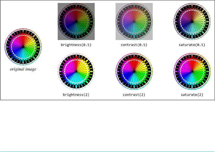
brightness( [ <number> | <percentage> ] )
Alters the brightness of the element’s colors. A value of 0 leaves the element a
solid black, and a value of 1 or 100% leaves it unchanged. Values above 1 and 100%
yield colors brighter than the base element, and can eventually reach a state of
solid white.
contrast( [ <number> | <percentage> ] )
Alters the contrast of the element’s colors. The higher the contrast, the more col‐
ors are differentiated from each other; the lower the contrast, the more they con‐
verge on each other. A value of 0 leaves the element a solid gray, and a value of 1
or 100% leaves it unchanged. Values above 1 and 100% yield colors with greater
contrast than is present in the base element.
saturate( [ <number> | <percentage> ] )
Alters the saturation of the element’s colors. The more saturated an element’s col‐
ors, the more intense they become; the less saturated they are, the more muted
they appear. A value of 0 leaves the element completely unsaturated, leaving it
effectively grayscale, whereas a value of 1 or 100% will leave the element
unchanged. Unlike the preceding functions, saturate() permits and acts upon
values greater than 1 or 100%; such values result in supersaturation.
Examples of the preceding filter functions are shown in Figure 19-4, though fully
appreciating them depends on a color rendering of the figure. Also, the effects of
greater-than-one values may be hard to make out in the figure, but they are present.
Figure 19-4. Brightness, contrast, and saturation lter eects
950 | Chapter 19: Filters, Blending, Clipping, and Masking
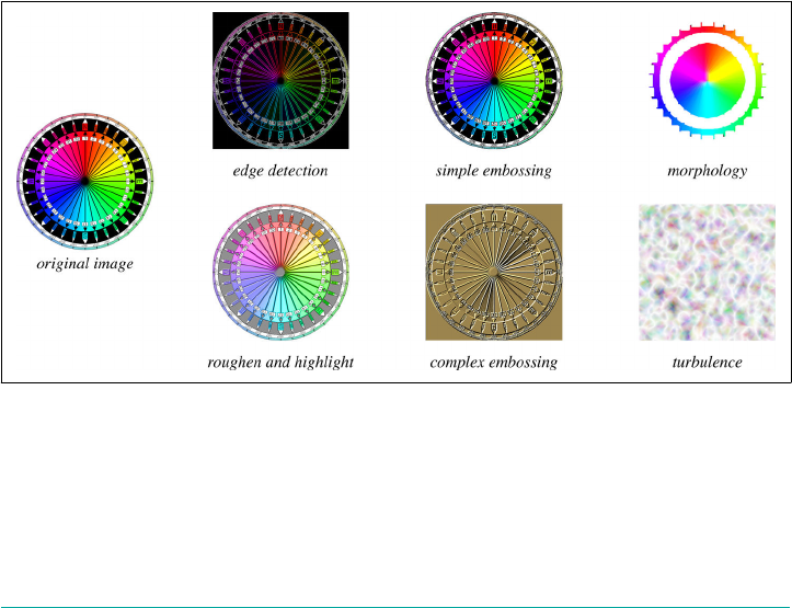
SVG Filters
The last filter value type is a function of a familiar kind: the url() value type. This
allows authors to point to a (potentially very complicated) filter defined in SVG,
whether it’s embedded in the document or stored in an external file.
This takes the form url(<uri>), where the <uri> value points to a filter defined using
SVG syntax, specifically the <filter> element. This can be a reference to a single
SVG image which contains only a filter, such as url(wavy.svg), or it can be a pointer
to an identified filter embedded in an SVG image, such as url(filters.svg#wavy).
The advantage of the latter pattern is that a single SVG can define multiple filters,
thus consolidating all your filtering into one file for easy loading, caching, and
referencing.
If a url() function points to a nonexistent file, or points to an SVG fragment that is
not a <filter> element, the function is invalid and the entire function list is ignored
(thus rendering the filter declaration invalid).
Examining the full range of filtering possibilities in SVG is well beyond the scope of
this work, but let’s just say that the power of the offered features is substantial. A few
simple examples of SVG filtering are shown in Figure 19-5, with brief captions to
indicate what kinds of operations the filters were built to create. (The actual CSS used
to apply these filters looked like filter: url(filters.svg#rough).)
Figure 19-5. SVG lter eects
It’s easily possible to put every last bit of filtering you do into SVG, including replace‐
ments for every other filter function we’ve seen. (In fact, all the other filter func‐
tions are defined by the specification as literal SVG filters, to give a precise rendering
target for implementors.) Remember, however, that you can chain CSS functions
CSS Filters | 951

together. Thus, you might define a specular-highlight filter in SVG, and modify it
with blurring or grayscale functions as needed. For example:
img.logo {filter: url(/assets/filters.svg#spotlight);}
img.logo.print {filter: url(/assets/filters.svg#spotlight) grayscale(100%);}
img.logo.censored {filter: url(/assets/filters.svg#spotlight) blur(3px);}
Always keep in mind that the filter functions are applied in order. That’s why the gray
scale() and blur() functions each come after the url()-imported spotlight filter. If
they were reversed, the logos would be made grayscale or blurred first, and then have
a highlight applied afterward.
Compositing and Blending
In addition to filtering, CSS offers the ability to determine how elements are compos‐
ited together. Take, for example, two elements that partially overlap due to position‐
ing. We’re used to the one in front obscuring the one behind. This is sometimes called
simple alpha compositing, in that you can see whatever is behind the element as long
as some (or all) of it has alpha channel values less than 1. Think of, for example, how
you can see the background through an element with opacity: 0.5, or in the areas
of a PNG or GIF87a that are set to be transparent.
But if you’re familiar with image-editing programs like Photoshop or GIMP, you
know that image layers which overlap can be blended together in a variety of ways.
CSS has gained the same ability. There are two blending strategies in CSS (at least as
of late 2017): blending entire elements with whatever is behind them, and blending
together the background layers of a single element.
Blending Elements
In situations where elements overlap, it’s possible to change how they blend together
with the property mix-blend-mode.
mix-blend-mode
Values normal | multiply | screen | overlay | darken | lighten | color-
dodge | color-burn | hard-light | soft-light | difference | exclu
sion | hue | saturation | color | luminosity
Initial value normal
Applies to All elements
Computed value As declared
Inherited No
952 | Chapter 19: Filters, Blending, Clipping, and Masking
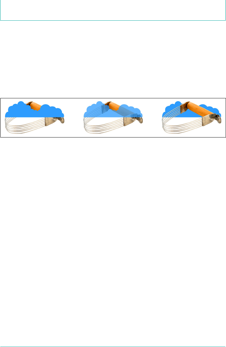
Animatable No
The way the CSS specification puts this is: “defines the formula that must be used to
mix the colors with the backdrop.” That is to say, the element is blended with what‐
ever is behind it (the “backdrop”), whether that’s pieces of another element, or just the
background of its parent element.
The default, normal, means that the element’s pixels are shown as is, without any mix‐
ing with the backdrop, except where the alpha channel is less than 1. This is the “sim‐
ple alpha compositing” mentioned previously. It’s what we’re all used to, which is why
it’s the default value. A few examples are shown in Figure 19-6.
Figure 19-6. Simple alpha channel blending
For the rest of the mix-blend-mode keywords, I’ve grouped them into a few cate‐
gories. Let’s also nail down a few definitions:
•The foreground is the element that has mix-blend-mode applied to it.
•The backdrop is whatever is behind that element. This can be other elements, the
background of the parent element, and so on.
• A pixel component is the color component of a given pixel: R, G, and B.
If it helps, think of the foreground and backdrop as images that are layered atop one
another in an image-editing program. With mix-blend-mode, you can change the
blend mode applied to the top image (the foreground).
Darken, Lighten, Dierence, and Exclusion
These blend modes might be called simple-math modes—they achieve their effect by
directly comparing values in some way, or using simple addition and subtraction to
modify pixels:
darken
Each pixel in the foreground is compared with the corresponding pixel in the
backdrop, and for each of the R, G, and B values (the pixel components), the
smaller of the two is kept. Thus, if the foreground pixel has a value correspond‐
Compositing and Blending | 953

ing to rgb(91,164,22) and the backdrop pixel is rgb(102,104,255), the result‐
ing pixel will be rgb(91,104,22).
lighten
This blend is the inverse of darken: when comparing the R, G, and B components
of a foreground pixel and its corresponding backdrop pixel, the larger of the two
values is kept. Thus, if the foreground pixel has a value corresponding to
rgb(91,164,22) and the backdrop pixel is rgb(102,104,255), the resulting pixel
will be rgb(102,164,255).
difference
The R, G, and B components of each pixel in the foreground are compared to the
corresponding pixel in the backdrop, and the absolute value of subtracting one
from the other is the final result. Thus, if the foreground pixel has a value corre‐
sponding to rgb(91,164,22) and the backdrop pixel is rgb(102,104,255), the
resulting pixel will be rgb(11,60,233). If one of the pixels is white, the resulting
pixel will be the inverse of the non-white pixel. If one of the pixels is black, the
result will be exactly the same as the non-black pixel.
exclusion
This blend is a milder version of difference. Rather than being | back - fore |, the
formula is back + fore - (2 × back × fore), where back and fore are values in the
range from 0-1. For example, an exclusion calculation of an orange (rgb(100%,
50%,0%)) and medium gray (rgb(50%,50%,50%)) will yield rgb(50%,50%,50%).
For the red component, the math is 1 + 0.5 - (2 × 1 × 0.5), which reduces to 0.5,
corresponding to 50%. For the blue and green components, the math is 0 + 0.5 -
(2 × 0 × 0.5), which again reduces to 0.5. Compare this to difference, where the
result would be rgb(50%,0%,50%), since each component is the absolute value of
subtracting one from the other.
This last definition highlights the fact that for all blend modes, the actual values being
operated on are in the range 0-1. The previous examples showing values like
rgb(11,60,233) are normalized from the 0-1 range. In other words, given the exam‐
ple of applying the difference blend mode to rgb(91,164,22) and
rgb(102,104,255), the actual operation is as follows:
•rgb(91,164,22) is R = 91 ÷ 255 = 0.357; G = 164 ÷ 255 = 0.643; B = 22 ÷ 255 =
0.086. Similarly, rgb(102,104,255) corresponds to R = 0.4; G = 0.408; B = 1.
•Each component is subtracted from the corresponding component, and the abso‐
lute value taken. Thus, R = | 0.357 - 0.4 | = 0.043; G = | 0.643 - 0.408 | = 0.235; B =
| 1 - 0.086 | = 0.914. This could be expressed as rgba(4.3%,23.5%,91.4%), or (by
multiplying each component by 255) as rgb(11,60,233).
954 | Chapter 19: Filters, Blending, Clipping, and Masking
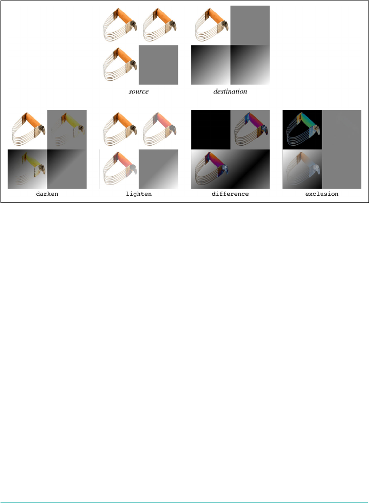
From all this, you can perhaps understand why the full formulas are not written out
for every blend mode we cover. If you’re interested in the fine details, each blend
mode’s formula is provided in the “Compositing and Blending Level 1” specification.
Examples of the blend modes in this section are depicted in Figure 19-7.
Figure 19-7. Darken, lighten, dierence, and exclusion blending
Multiply, Screen, and Overlay
These blend modes might be called the multiplication modes—they achieve their
effect by multiplying values together:
multiply
Each pixel component in the foreground is multiplied by the corresponding pixel
component in the backdrop. This yields a darker version of the foreground,
modified by what is underneath. This blend mode is symmetric, in that the result
will be exactly the same even if you were to swap the foreground with the back‐
drop.
screen
Each pixel component in the foreground is inverted (see invert in the earlier
section “Color Filtering” on page 948), multiplied by the inverse of the corre‐
sponding pixel component in the backdrop, and the result inverted again. This
yields a lighter version of the foreground, modified by what is underneath. Like
multiply, screen is symmetric.
Compositing and Blending | 955

overlay
This blend is a combination of multiply and screen. For foreground pixel com‐
ponents darker than 0.5 (50%), the multiply operation is carried out; for fore‐
ground pixel components whose values are above 0.5, screen is used. This makes
the dark areas darker, and the light areas lighter. This blend mode is not symmet‐
ric, because swapping the foreground for the backdrop would mean a different
pattern of light and dark, and thus a different pattern of multiplying versus
screening.
Examples of these blend modes are depicted in Figure 19-8.
Figure 19-8. Multiply, screen, and overlay blending
Hard and Soft Light
There blend modes are covered here because the first is closely related to a previous
blend mode, and the other is just a muted version of the first:
hard-light
This blend is the inverse of overlay blending. Like overlay, it’s a combination of
multiply and screen, but the determining layer is the backdrop. Thus, for back‐
drop pixel components darker than 0.5 (50%), the multiply operation is carried
out; for backdrop pixel components lighter than 0.5, screen is used. This makes
956 | Chapter 19: Filters, Blending, Clipping, and Masking

it appear somewhat as if the foreground is being projected onto the backdrop
with a projector that employs a harsh light.
soft-light
This blend is a softer version of hard-light. That is to say, it uses the same oper‐
ation, but is muted in its effects. The intended appearance is as if the foreground
is being projected onto the backdrop with a projector that employs a diffuse light.
Examples of these blend modes are depicted in Figure 19-9.
Figure 19-9. Hard- and so-light blending
Color Dodge and Burn
Color dodging and burning are interesting modes, in that they’re meant to lighten or
darken a picture with a minimum of change to the colors themselves. The terms
come from old darkroom techniques performed on chemical film stock:
Compositing and Blending | 957
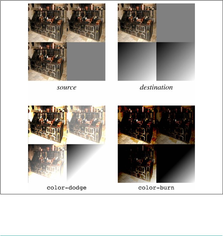
color-dodge
Each pixel component in the foreground is inverted, and the component of the
corresponding backdrop pixel component is divided by the inverted foreground
value. This yields a brightened backdrop unless the foreground value is 0, in
which case the backdrop value is unchanged.
color-burn
This blend is a reverse of color-dodge: each pixel component in the backdrop is
inverted, the inverted backdrop value is divided by the unchanged value of the
corresponding foreground pixel component, and the result is then inverted. This
yields a result where the darker the backdrop pixel, the more its color will burn
through the foreground pixel.
Examples of these blend modes are depicted in Figure 19-10.
Figure 19-10. Color dodge and burn blending
958 | Chapter 19: Filters, Blending, Clipping, and Masking
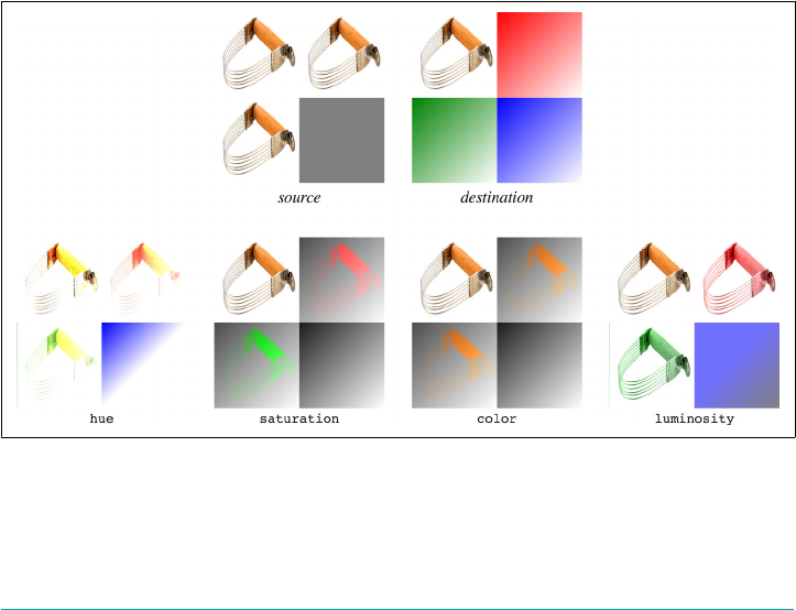
Hue, Saturation, Luminosity, and Color
The final four blend modes are different than those we’ve seen before, because they
do not perform operations on the R/G/B pixel components. Instead, they perform
operations to combine the hue, saturation, luminosity, and color of the foreground
and backdrop in different ways:
hue
For each pixel, combines the luminosity and saturation levels of the backdrop
with the hue angle of the foreground.
saturation
For each pixel, combines the hue angle and luminosity level of the backdrop with
the saturation level of the foreground.
color
For each pixel, combines the luminosity level of the backdrop with the hue angle
and saturation level of the foreground.
luminosity
For each pixel, combines the hue angle and saturation level of the backdrop with
the luminosity level of the foreground.
Examples of these blend modes are depicted in Figure 19-11.
Figure 19-11. Hue, saturation, luminosity, and color blending
These blend modes can be a lot harder to grasp without busting out raw formulas,
and even those can be confusing if you aren’t familiar with how things like saturation
Compositing and Blending | 959
and luminosity levels are determined. If you don’t feel like you quite have a handle on
how they work, the best thing is to practice with a bunch of different images and sim‐
ple color patterns.
Two things to note:
•Remember that an element always blends with its backdrop. If there are other
elements behind it, it will blend with them; if there’s a patterned background on
the parent element, the blending will be done against that pattern.
•Changing the opacity of a blended element will change the outcome, though not
always in the way you might expect. For example, if an element with mix-blend-
mode: difference is also given opacity: 0.8, then the difference calculations
will be scaled by 80%. More precisely, a scaling factor of 0.8 will be applied to the
color-value calculations. This can cause some operations to trend toward flat
middle gray, and others to shift the color changes.
Blending Backgrounds
Blending an element with its backdrop is one thing, but what if an element has multi‐
ple background images that overlap and also need to be blended together? That’s
where background-blend-mode comes in.
background-blend-mode
Values [ normal | multiply | screen | overlay | darken | lighten | color-
dodge | color-burn | hard-light | soft-light | difference | exclu
sion | hue | saturation | color | luminosity]#
Initial value normal
Applies to All elements
Computed value As declared
Inherited No
Animatable No
We won’t go through an exhaustive list of all the blend modes and what they mean,
because we did that in the section on mix-blend-mode. What they meant there, they
mean here.
The difference is that when it comes to blending multiple backgrounds images
together, they’re blended with each other against an empty background—that is, a
960 | Chapter 19: Filters, Blending, Clipping, and Masking
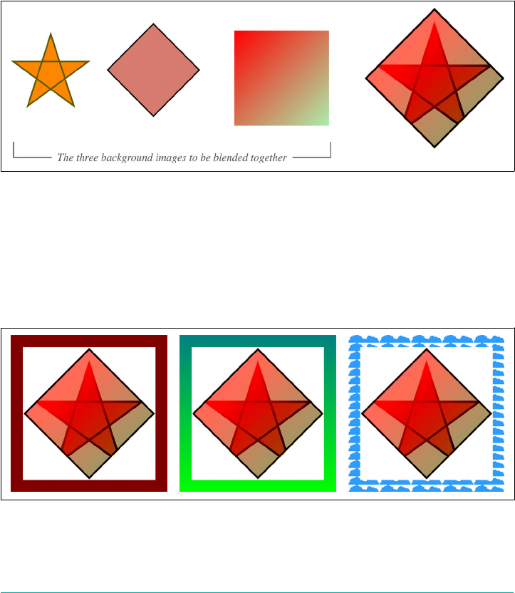
completely transparent, uncolored backdrop. They do not blend with the backdrop of
the element, except as directed by mix-blend-mode.
To see what that means, consider the following:
#example {background-image:
url(star.svg),
url(diamond.png),
linear-gradient(135deg, #F00, #AEA);
background-blend-mode: color-burn, luminosity, darken;}
Here we have three background images, each with its own blend mode. These are
blended together into a single result, shown in Figure 19-12.
Figure 19-12. ree backgrounds blended together
So far, fine. Here’s the kicker: the result will be the same regardless of what might
appear behind the element. We can change the parent’s background to white, gray,
fuchsia, or a lovely pattern of repeating gradients, and in every case those three blen‐
ded backgrounds will look exactly the same, pixel for pixel. They’re blended in isola‐
tion, a term we’ll return to shortly. We can see the above example (Figure 19-12)
sitting atop a variety of backgrounds in Figure 19-13.
Figure 19-13. Blending with color versus transparency
Blending Backgrounds | 961

Like multiple blended elements stacked atop each other, the blending of background
layers works from the back to the front. Thus, if you have two background images
over a solid background color, the background layer in the back is blended with the
background color, and then the frontmost layer is blended with the result of the first
blend. Consider:
#example {background-image:
url(star.svg),
url(diamond.png);
background-color: goldenrod;
background-mix-mode: color-burn, luminosity;}
Given these styles, diamond.png is blended with the background color goldenrod
using the luminosity blend. Once that’s done, star.png is blended with the results of
the diamond-goldenrod blend using a color-burn blend.
Although it’s true that the background layers are blended in isolation, they’re also part
of an element which may have its own blending rules via mix-blend-mode. Thus, the
final result of the isolated background blend may be blended with the element’s back‐
drop after all. Given the following styles, the first example’s background will sit atop
the element’s backdrop, but the rest will end up blended with it in some fashion, as
illustrated in Figure 19-14:
.one {mix-blend-mode: normal;}
.two {mix-blend-mode: multiply;}
.three {mix-blend-mode: darken;}
.four {mix-blend-mode: luminosity;}
.five {mix-blend-mode: color-dodge;}
<div class="bbm one"></div>
<div class="bbm two"></div>
<div class="bbm three"></div>
<div class="bbm four"></div>
<div class="bbm five"></div>
Figure 19-14. Blending elements with their backdrops
Throughout this section, we’ve touched on the concept of blending in isolation, as a
thing that backgrounds naturally do. Elements, on the other hand, do not naturally
blend in isolation. As we’ll see next, that behavior can be changed.
962 | Chapter 19: Filters, Blending, Clipping, and Masking
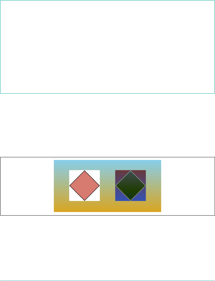
Blending in Isolation
There may be times when you want to blend a number of different elements together,
but in a group of their own, in the same way background layers on an element are
blended. This is, as we’ve seen, called blending in isolation. If that’s what you’re after,
then the isolation property is for you.
isolation
Values auto | isolate
Initial value auto
Applies to All elements (in SVG, it applies to container elements, graphics elements, and graphics-
referencing elements)
Computed value As declared
Inherited No
Animatable No
This pretty much does exactly what it says: it either defines an element to create an
isolated blending context, or not. Given the following styles, then, we get the result
shown in Figure 19-15:
img {mix-blend-mode: difference;}
p.alone {isolation: isolate;}
<p class="alone"><img src="diamond.png"></p>
<p><img src="diamond.png"></p>
Figure 19-15. Blending in isolation, and not
Take particular note of where isolation was applied, and where mix-blend-mode
was applied. The image is given the blend mode, but the containing element (in this
case, a paragraph) is set to isolation blending. It’s done this way because you want the
parent (or some ancestor element) to be isolated from the rest of the document, in
Blending Backgrounds | 963

terms of how its descendant elements are blended. So if you want an element to blend
in isolation, look for an ancestor element to set to isolation: isolate.
There is an interesting wrinkle in all of this, which is that any element which estab‐
lishes a stacking context is automatically isolated, regardless of the value for isola
tion. If you transform an element using the transform property, for example, it will
become isolated.
The complete list of stacking-context-establishing conditions, as of late 2017, are:
•The root element (e.g., <html>)
•Positioning an element relatively or absolutely and setting its z-index to any‐
thing other than auto
• Positioning an element with fixed, regardless of its z-index value
• Setting opacity to anything other than 1
• Setting transform to anything other than none
•Setting mix-blend-mode to anything other than normal
• Setting filter to anything other than none
• Setting perspective to anything other than none
• Setting isolation to isolate
•Applying will-change to any of the previous properties, even if they are not
actually changed
Thus, if you have a group of elements that are blended together and then blended
with their shared backdrop, and you then transition the group’s opacity from 1 to 0,
the group will suddenly become isolated during the transition. This might have no
visual impact, depending on the original set of blends, but it very well might.
Clipping and Masking
Besides filtering and blending, CSS also has the ability to do both clipping and mask‐
ing. These are methods of only showing portions of an element, using permitting a
variety of simple shapes as well as the application of complete images and SVG ele‐
ments. These can be used to make decorative bits of a layout more visually interest‐
ing, among other things—a common technique is to frame images or give them
ragged edges.
964 | Chapter 19: Filters, Blending, Clipping, and Masking
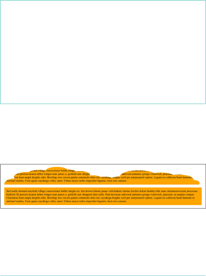
Clipping
One of the possibilities we saw with filter was to apply a clipping path via SVG.
That’s a valid use of filters, but if all you want to do is clip off pieces of the element,
you can use the property clip-path instead.
clip-path
Values none | <url> | [ [ inset() | circle() | ellipse() | polygon() ] ‖ [ border-
box | padding-box | content-box | margin-box | fill-box | stroke-
box | view-box ] ]
Initial value none
Applies to All elements (in SVG, applies to all graphics elements and all container elements except
the <defs>element)
Computed value As declared
Inherited No
Animatable Yes for inset(), circle(), ellipse(), and polygon()
With clip-path, you’re able to define a clipping shape. This is essentially the area of
the element inside which visible portions are drawn. Any part of the element that fall
outside the shape is clipped off, leaving behind empty transparent space. The follow‐
ing code gives a clipped and an unclipped example of the same paragraph, with the
result depicted in Figure 19-16:
p {background: orange; color: black; padding: 0.75em;}
p.clipped {clip-path: url(shapes.svg#cloud02);}
Figure 19-16. Clipped and unclipped paragraphs
The default value, none, means no clipping is preformed, as you’d probably expect. If
a <uri> value is given (as in the previous example) and it points to a missing
resource, or to an element in an SVG file that isn’t a <clipPath>, then no clipping
occurs.
The rest of the values are either shapes written in CSS, reference boxes, or both.
Clipping and Masking | 965

As of late 2017, URL-based clip paths work in Chrome only if the
URL points to an embedded SVG inside the same document as the
clipped element. External SVGs were not supported.
Clip Shapes
You can define clip shapes with one of a set of four simple shape functions. These are
identical to the shapes used to define float shapes with shape-outside (see Chap‐
ter 10), so we won’t re-describe them in detail here. Here’s a brief recap:
inset()
Accepts from one to four lengths or percentage values, defining offsets from the
edges of the bounding box, with optional corner rounding via the round keyword
and another set of one to four lengths or percentages.
circle()
Accepts a single length, percentage, or keyword defining the radius of the circle,
with an optional position for the circle’s center with the at keyword followed by
one or two lengths or percentages.
ellipse()
Accepts a mandatory two lengths, percentages, or keywords defining the radii of
the vertical and horizontal axes of the ellipse, with an optional position for the
ellipse’s center with the at keyword followed by one or two lengths or percen‐
tages.
polygon()
Accepts a comma-separated list of space-separated x and y coordinates, using
either lengths or percentages. Can be prefaced by a keyword defining the fill rule
for the polygon.
A variety of examples of these clip shapes is shown in Figure 19-17, corresponding to
the following styles. (The dotted borders have been added to show the outer edges of
the original image, before clipping.)
.ex01 {clip-path: none;}
.ex02 {clip-path: inset(10px 0 25% 2em);}
.ex03 {clip-path: circle(100px at 50% 50%);}
.ex04 {clip-path: ellipse(100px 50px at 75% 25%);}
.ex05 {clip-path: polygon(50% 0, 100% 50%, 50% 100%, 0 50%);}
.ex06 {clip-path: polygon(0 0, 50px 100px, 150px 5px, 300px 150px, 0 100%);}
966 | Chapter 19: Filters, Blending, Clipping, and Masking

Figure 19-17. Various clip shapes
As Figure 19-17 shows, the elements are only visible inside the clip shapes. Anything
outside that is just gone. But take note of how the clipped elements still take up the
same space they would if they weren’t clipped at all. In other words, clipping doesn’t
make the elements smaller. It just limits the part of them that’s actually drawn.
Clip Boxes
Unlike clip shapes, clip boxes aren’t specified using lengths or percentages. They cor‐
respond, for the most part, directly to boundaries in the box model.
If you just say clip-path: border-box, for example, the element is clipped along the
outside edge of the border. This is likely what you’d expect anyway, since margins are
transparent. Remember, however, that outlines can be drawn outside borders, so if
you do clip at the border edge, any outlines will be clipped away.
When used by themselves, the values margin-box, padding-box, and content-box
dictate that the clipping occur at the outer edges of the margin, padding, or content
areas, respectively. These are diagrammed in Figure 19-18.
Clipping and Masking | 967
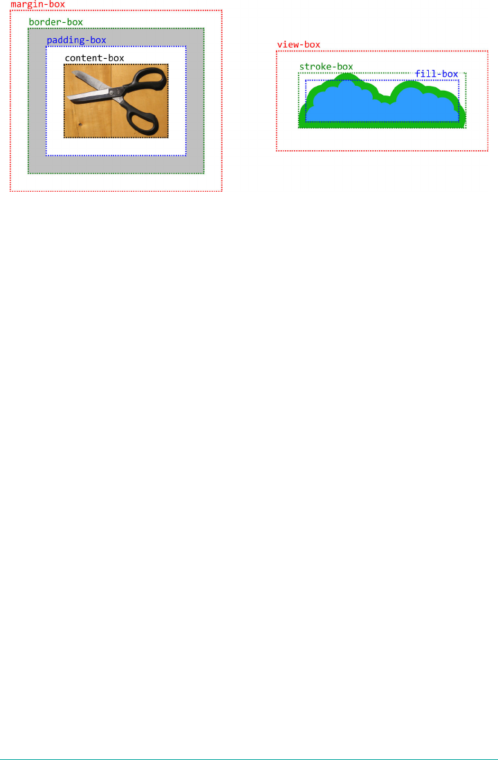
Figure 19-18. Various clipping boxes
There’s another part to Figure 19-18, which shows the SVG bounding boxes:
view-box
The nearest (that is, the closest ancestor) SVG viewport is used as the clipping
box.
fill-box
The object bounding box is used as the clipping box. The object bounding box is
the smallest box that will fit every part of the element’s geometry, taking into
account any transformations (e.g., rotation), not including any strokes along its
outside.
stroke-box
The stroke bounding box is used as the clipping box. The object bounding box is
the smallest box that will fit every part of the element’s geometry, taking into
account any transformations (e.g., rotation), including any strokes along its out‐
side.
These values only apply to SVG elements that don’t have an associated CSS layout
box. For such elements, if the CSS-style boxes (margin-box, border-box, padding-
box, content-box) are given, fill-box is used instead. Conversely, if one of the SVG
bounding box values is applied to an element that does have a CSS layout box—which
is most elements—then border-box is used instead.
It can be useful at times to be able to say something like clip-path: content-box
just to clip off everything outside the content area, but where these box values really
come into their own is in conjunction with a clipping shape. Suppose you have an
ellipse() clip shape you want to apply to an element, and furthermore, you want to
have it just touch the outer edges of the padding box. Rather than have to calculate
the necessary radii by subtracting margins and borders from the overall element, you
968 | Chapter 19: Filters, Blending, Clipping, and Masking
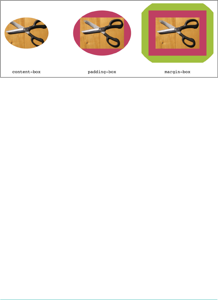
can just say clip-path: ellipse(50% 50%) padding-box;. That will center an ellip‐
tical clip shape at the center of the element, with horizontal and vertical radii half the
element’s reference box (see Chapter 10), as shown in Figure 19-19, along with the
effect of fitting to other boxes.
Figure 19-19. Fitting an elliptical clip shape to various boxes
Notice how the ellipse is cut off in the margin-box example? That’s because the mar‐
gin is invisible, so while parts of it fall inside the elliptical clip shape, we can’t actually
see those parts.
Interestingly, the bounding-box keywords can only be used in conjunction with clip
shapes—not with an SVG-based clip path. The keywords that relate to SVG bounding
boxes apply only if an SVG image is being clipped via CSS.
A warning about SVG clip paths: as of late 2017, all path coordinates are expressed in
absolute units, and can’t be declared as percentages of the image’s height and width as
the polygon() shape can. There are techniques involving the clipPathUnits SVG
attribute, sometimes in conjunction with the transform SVG attribute, that yield
equivalent results. Here’s an example of such a clipping path, with the result shown in
Figure 19-20:
<clipPath id="hexlike" clipPathUnits="objectBoundingBox">
<polygon points="0.5 0, 1 0.25, 1 0.75, 0.5 1, 0 0.75, 0 0.25"/>
</clipPath>
Clipping and Masking | 969
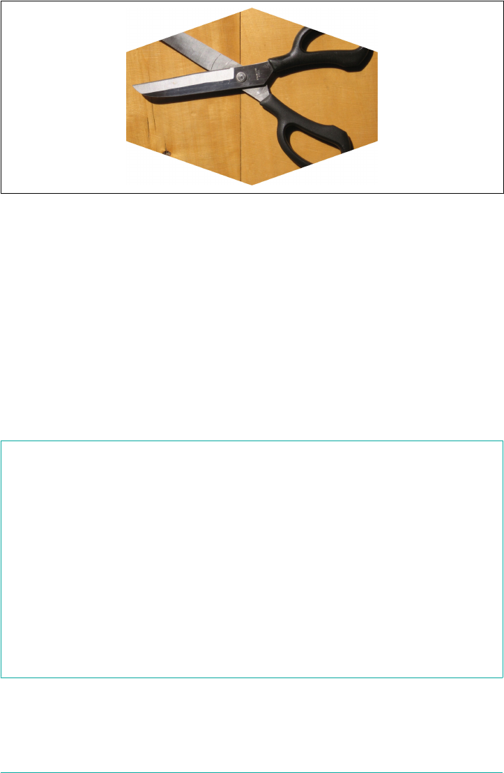
Figure 19-20. An image clipped with a scaling SVG clip path
The objectBoundingBox value fits the coordinates to the bounding box in use, and
the coordinates are all in the range of 0–1. With that sort of setup, you get a clip path
that behaves the same as a percentage-based polygon shape. You’d get the same clip
shape shown in Figure 19-20 by using the following:
clip-path: polygon(50% 0, 100% 25%, 100% 75%, 50% 100%, 0 75%, 0 25%);
Clip Filling Rules
As with float shapes, it’s possible to change the way SVG shapes are filled, which is to
say the exact clipping shape that is created when the path crosses over itself. This is
managed with the property clip-rule.
clip-rule
Values nonzero | evenodd
Initial value nonzero
Applies to All SVG graphics elements (<circle>, <ellipse>, <image>, <line>, <path>,
<polygon>, <polyline>, <rect>, <text> and <use>) if and only if they are
children of a <clipPath> element
Computed value As declared
Inherited No
Animatable No
It’s much easier to show than describe, so the difference between nonzero and even
odd shape filling is depicted in Figure 19-21.
970 | Chapter 19: Filters, Blending, Clipping, and Masking

Figure 19-21. e two shape-lling options
Here, you can see how the star is drawn by following lines from the top center
through each successive point. The nonzero star fills all of its interior, even when
lines cross over each other. The evenodd star, by contrast, leaves parts of itself unfil‐
led, which is why we can see the light blue gradient through its center.
The problem is that as of late 2017, even browsers that supported SVG clipping paths
did not support this property, regardless of whether the SVG was embedded in the
HTML or external files. Thus, if you want to set the shape-fill of a clipping path to
evenodd, you’ll either need to recreate the SVG path as a CSS polygon, or make use of
the SVG fill-rule attribute in the SVG file itself.
Masks
When we say a “mask,” what we mean is a shape inside which things are visible, and
outside which they are not. Masks are thus very similar in concept to clipping paths.
The primary differences are twofold: first, you can only use an image to define the
areas of the element that are shown or clipped away with masks; and second, there
are a lot more properties available to use with masks, allowing you to do things such
as position, size, and repeat the masking image.
As of late 2017, the Blink family supported most of the masking
properties, but only with the -webkit- prefix. So instead of mask-
image, Chrome and Safari supported -webkit-mask-image instead.
Masks | 971

Dening a Mask
The first step to applying a mask is to point to the image that you’ll be using to define
the mask. This is accomplished with mask-image, which accepts any image type.
mask-image
Values [ none | <image> | <mask-source> ]#
Initial value none
Applies to All elements (in SVG, applies to all graphics elements and all container elements except
the <defs>element)
Computed value As declared
Inherited No
Animatable No
Notes An <image> is any of the value types <url>, <image()>, <image-set()>,
<element()>, <cross-fade()>, or <gradient> (all dened elsewhere in the book);
<mask-source> is a url() that points to a <mask> element in an SVG image
Assuming the image reference is valid, this will give the user agent an image to use as
a mask for the element to which it’s been applied.
We’ll start with a simple situation: one image applied to another, where both are the
same height and width. Consider Figure 19-22, where both images are shown sepa‐
rately, and then with the first masked by the second.
Figure 19-22. A simple image mask
As you can see, in the parts of the second image that are opaque, the first image is
visible. In the parts that are transparent, the first image is not visible. For the parts
that are semi-transparent, the first image is also semi-transparent.
972 | Chapter 19: Filters, Blending, Clipping, and Masking
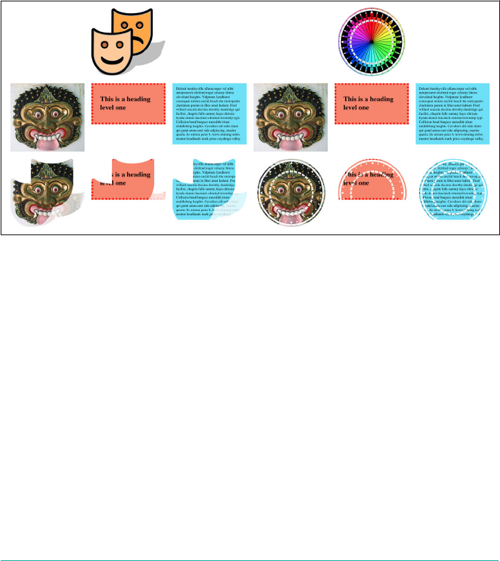
Here’s the basic code for the end result shown in Figure 19-22:
img.masked {mask-image: url(theatre-masks.svg);}
CSS doesn’t require that you apply mask images only to other images, though. You
can mask pretty much any element with an image, and that image can be a raster
image (GIF, JPG, PNG) or a vector image (SVG). The latter is usually a better choice,
if available. You can even construct your own image with gradients, whether linear or
radial, repeated or otherwise.
The following styles will have the result shown in Figure 19-23:
*.masked.theatre {mask-image: url(theatre-masks.svg);}
*.masked.compass {mask-image: url(Compass.png);}
Figure 19-23. A variety of image masks
An important point to keep in mind is that when a mask clips off pieces of an ele‐
ment, it clips off all pieces. The best example of this is how, if you apply an image that
clips off the outer edges of elements, the markers on list items can very easily become
invisible. An example can be seen in Figure 19-24, which is the result of the following:
*.masked {mask-image: url(i/Compass_masked.png);}
<ol class="masked">
<li>One</li>
<li>Two</li>
<li>Three</li>
<li>Four</li>
<li>Five</li>
</ol>
Masks | 973
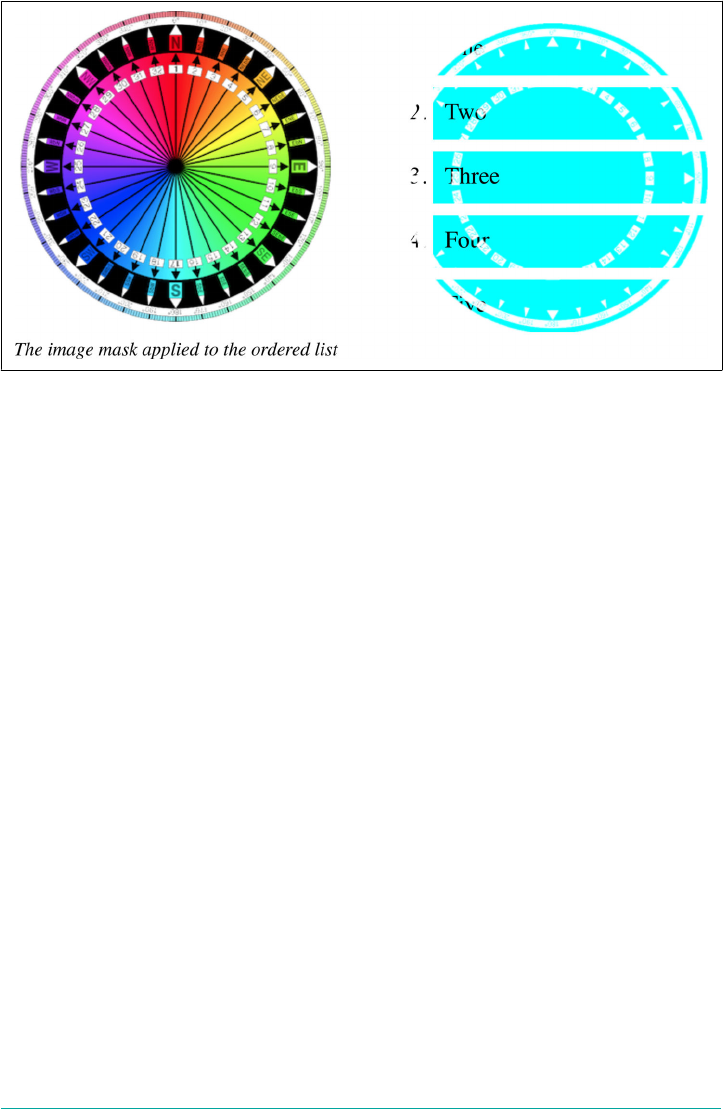
Figure 19-24. List items, masked and unmasked
There is one other value option we haven’t seen yet, which is the ability to point
directly at a <mask> element in SVG to use the mask it defines. This analogous to
pointing to a <clipPath> or other SVG element from the property clip-path, as was
discussed previously in “Clipping” on page 965.
Here’s an example of how a mask might be defined:
<svg viewbox="0 0 100 100" height="100" width="100"
xmlns="http://www.w3.org/2000/svg" version="1.1">
<mask id="hexlike">
<path fill="#FF0000"
d="M 50,0 100,25 100,75 50,100 0,75 0,25" />
</mask>
</svg>
With that SVG embedded in the HTML file directly, the mask can be referenced like
this:
.masked {mask-image: url(#hexlike);}
If the SVG is in an external file, then this is how to reference it from CSS:
.masked {mask-image: url(masks.svg#hexlike);}
Changing the Mask’s Mode
Thus far, we’ve seen masking accomplished by applying an image with an alpha chan‐
nel to another element. That’s one of two ways to use an image as a mask. The other is
to use the brightness of each part of the masking image to define the mask. Switching
between these two options is accomplished with the mask-mode property.
974 | Chapter 19: Filters, Blending, Clipping, and Masking

mask-mode
Values [ alpha | luminance | match-source ]#
Initial value match-source
Applies to All elements (in SVG, applies to all graphics elements and all container elements except
the <defs>element)
Computed value As declared
Inherited No
Animatable No
Two of the three values are straightforward: alpha means the alpha channel of the
image should be used to compute the mask, and luminance means the brightness lev‐
els should be used. The difference is illustrated in Figure 19-25, which is the result of
the following code:
img.theatre {mask-image: url(i/theatre-masks.svg);}
img.compass {mask-image: url(i/Compass_masked.png);}
img.lum {mask-mode: luminance;}
<img src="i/theatre-masks.svg">
<img class="theatre" src="i/mask.JPG">
<img class="theatre lum" src="i/mask.JPG">
<img src="i/Compass_masked.png">
<img class="compass" src="i/mask.JPG">
<img class="compass lum" src="i/mask.JPG">
When luminance is used to calculate the mask, brightness is treated the same way
alpha values are in alpha masking. Consider how alpha masking works: any part of
the image with opacity of zero hides that part of the masked element. A part of the
image with opacity of one (that is, fully opaque) reveals that part of the masked ele‐
ment.
The same is true with luminance-based masking. A part of the mask with luminosity
of one reveals that part of the masked element. A part of the mask with luminosity of
zero (that is, fully black) hides that part of the masked element. But note that any fully
transparent part of the mask is also treated as having a luminance of zero. This is why
the shadow portion of the theatre-mask image doesn’t show any part of the masked
image: its alpha value is greater than zero.
Masks | 975
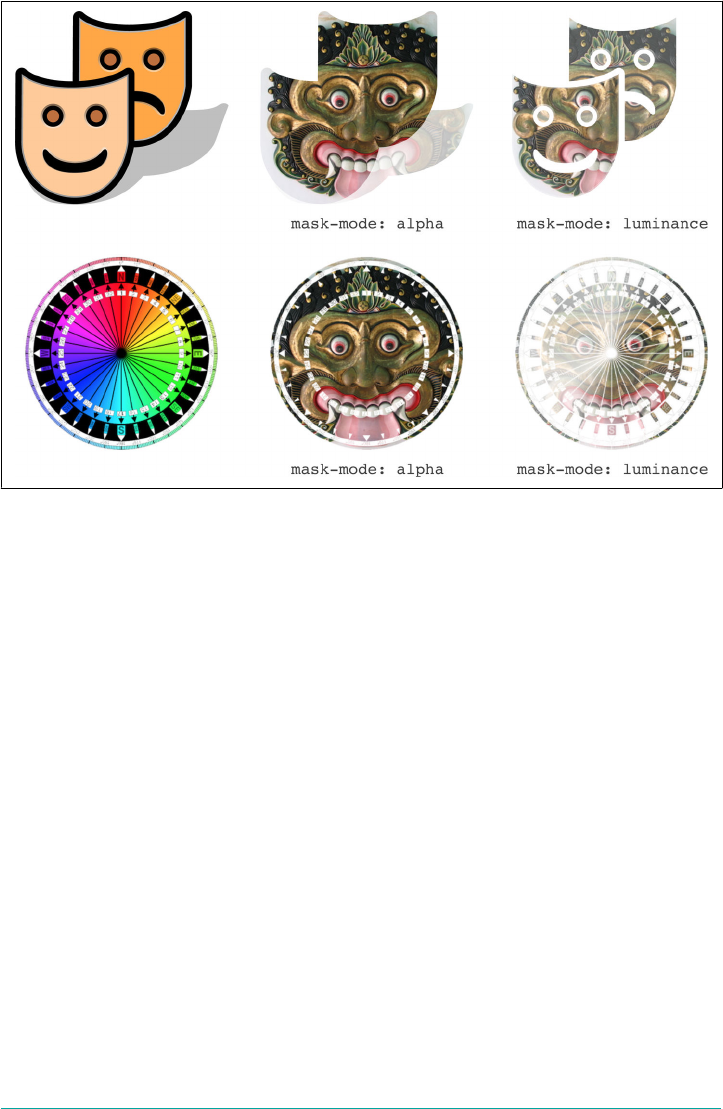
Figure 19-25. Alpha and luminance mask modes
The third (and default) value, match-source, is a combination of alpha and lumi
nance, choosing between them based on the actual source image for the mask as fol‐
lows:
•If the source is a type of <image>, then use alpha. <image>s can be an image
such as a PNG or visible SVG; a CSS gradient; or a piece of the page referred to
by the element() function.
• If the source is an SVG <mask> element, then use luminance.
Sizing and Repeating Masks
Thus far, nearly all the examples have been carefully crafted to make each mask’s size
match the size of the element it’s masking. (This is why we keeping applying masks to
images.) Mask images may be a different size than the masked element. There a cou‐
ple of ways to deal with this, starting with mask-size.
976 | Chapter 19: Filters, Blending, Clipping, and Masking
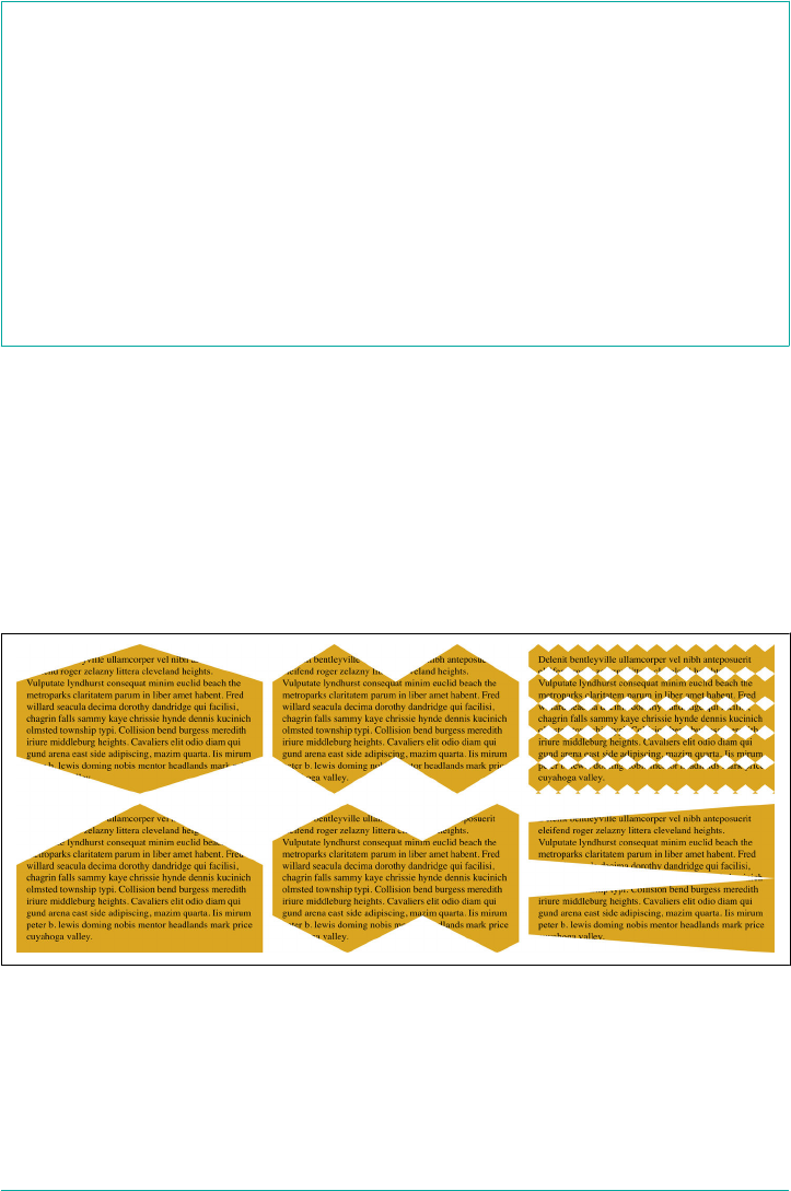
mask-size
Values [ [ <length> | <percentage> | auto ]{1,2} | cover | contain ]#
Initial value auto
Applies to All elements (in SVG, applies to all graphics elements and all container elements except
the <defs>element)
Computed value As declared
Inherited No
Animatable <length>, <percentage>
If you’ve ever sized background images, then you know exactly how to size masks,
because the value syntax is exactly the same, as are the behaviors. As an example, con‐
sider the following styles, which have the result shown in Figure 19-26:
p {mask-image: url(i/hexlike.svg);}
p:nth-child(1) {mask-size: 100% 100%;}
p:nth-child(2) {mask-size: 50% 100%;}
p:nth-child(3) {mask-size: 2em 3em;}
p:nth-child(4) {mask-size: cover;}
p:nth-child(5) {mask-size: contain;}
p:nth-child(6) {mask-size: 200% 50%;}
Figure 19-26. Sizing masks
Again, these should be immediately familiar to you if you’ve ever sized backgrounds.
If not, please see “Sizing Background Images” on page 433 in Chapter 9 for a more
detailed exploration of the possibilities.
Masks | 977
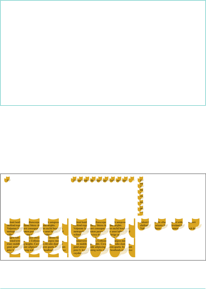
In a like vein, just as the pattern of backgrounds repeating throughout the back‐
ground area of the element can be changed or suppressed, mask images can be affec‐
ted with mask-repeat.
mask-repeat
Values [ repeat-x | repeat-y | [ repeat | space | round | no-repeat ]{1,2} ]#
Initial value repeat
Applies to All elements (in SVG, applies to all graphics elements and all container elements except
the <defs>element)
Computed value As declared
Inherited No
Animatable Yes
Note The keywords for mask-repeat are reproduced from background-repeat and
have the same behaviors
The values available here are the same as those for background-repeat. Some exam‐
ples are shown in Figure 19-27, based on the following styles:
p {mask-image: url(i/theatre-masks.svg);}
p:nth-child(1) {mask-repeat: no-repeat; mask-size: 10% auto;}
p:nth-child(2) {mask-repeat: repeat-x; mask-size: 10% auto;}
p:nth-child(3) {mask-repeat: repeat-y; mask-size: 10% auto;}
p:nth-child(4) {mask-repeat: repeat; mask-size: 30% auto;}
p:nth-child(5) {mask-repeat: repeat round; mask-size: 30% auto;}
p:nth-child(6) {mask-repeat: space no-repeat; mask-size: 21% auto;}
Figure 19-27. Repeating masks
978 | Chapter 19: Filters, Blending, Clipping, and Masking
Positioning Masks
Given that sizing and repetition of mask images mirrors the sizing and repetition of
background images, you might think that the same is true for positioning the origin
mask image, similar to background-position, as well as the origin box, similar to
background-origin. And you’d be exactly right.
mask-position
Values <position>#
Initial value 0% 0%
Applies to All elements (in SVG, applies to all graphics elements and all container elements except
the <defs>element)
Computed value As declared
Inherited No
Animatable <length>, <percentage>
Notes <position> is exactly the same as the values permitted for background-
position, and has the same behaviors
Once again, if you’ve ever positioned a background image, then you know how to
position mask images. Following are a few examples, illustrated in Figure 19-28 (dot‐
ted borders have been added for clarity):
p {mask-image: url(i/Compass_masked.png);
mask-repeat: no-repeat; mask-size: 67% auto;}
p:nth-child(1) {mask-position: center;}
p:nth-child(2) {mask-position: top right;}
p:nth-child(3) {mask-position: 33% 80%;}
p:nth-child(4) {mask-position: 5em 120%;}
Figure 19-28. Positioning masks
Masks | 979
By default, the origin box for mask images is the outer border edge. If you want to
move it further inward, or define a specific origin box in an SVG context, then mask-
origin does for masks what background-origin does for backgrounds.
mask-origin
Values [ content-box | padding-box | border-box | margin-box | fill-box |
stroke-box | view-box ]#
Initial value border-box
Applies to All elements (in SVG, applies to all graphics elements and all container elements except
the <defs>element)
Computed value As declared
Inherited No
Animatable No
This is a newer capability for backgrounds, so you might not be familiar with it. For
the full story, see “Changing the Positioning Box” on page 414 in Chapter 9, but for a
quick example, see Figure 19-29.
Figure 19-29. Changing the origin box
Clipping and Compositing Masks
There’s one more property that echoes backgrounds, and that’s mask-clip, the mask
equivalent of background-clip.
980 | Chapter 19: Filters, Blending, Clipping, and Masking
mask-clip
Values [ content-box | padding-box | border-box | margin-box | fill-box |
stroke-box | view-box | no-clip ]#
Initial value border-box
Applies to All elements (in SVG, applies to all graphics elements and all container elements except
the <defs>element)
Computed value As declared
Inherited No
Animatable No
All this does is clip the overall mask to a specific area of the masked element. In other
words, it restricts the area in which the visible parts of the element are in fact visible.
Figure 19-30 shows the result of the following styles:
p {padding: 2em; border: 2em solid purple; margin: 2em;
mask-image: url(i/Compass_masked.png);
mask-repeat: no-repeat; mask-size: 125%;
mask-position: center;}
p:nth-child(1) {mask-clip: border-box;}
p:nth-child(2) {mask-clip: padding-box;}
p:nth-child(3) {mask-clip: content-box;}
Figure 19-30. Clipping the mask
The last focused masking property, mask-composite, is quite interesting because it
can radically change how multiple masks interact.
Masks | 981
mask-composite is not supported by Chrome, even in a prefixed
form.
mask-composite
Values [ add | subtract | intersect | exclude ]#
Initial value add
Applies to All elements (in SVG, applies to all graphics elements and all container elements except
the <defs>element)
Computed value As declared
Inherited No
Animatable No
If you aren’t familiar with compositing operations, a diagram is in order. See
Figure 19-31.
Figure 19-31. Compositing operations
As depicted in Figure 19-31, the image on top in the operation is called the source,
and the image beneath it is called the destination.
982 | Chapter 19: Filters, Blending, Clipping, and Masking

This doesn’t particularly matter for three of the four operations: add, intersect, and
exclude, all of which have the same result regardless of which image is the source and
which the destination. But for subtract, the question is: which image is being sub‐
tracted from which? The answer: the destination is subtracted from the source.
The difference is quite substantial. You can see this by considering Figure 19-32,
which shows how switching the order of the shapes in the subtraction operation
changes the outcome.
Figure 19-32. Subtracted masks
The other place the distinction between source and destination becomes important is
when compositing multiple masks together. In these cases, the compositing order is
from back to front, with each succeeding layer being the source and the already-
composited layers beneath it comprising the destination.
To see why, consider Figure 19-33, which shows the various ways three overlapping
masks are composited together, and how results change with changes to their order
and compositing operations.
The figure is constructed to show the bottommost mask at the bottom, the topmost
above the other two, and the resulting mask shown at the very top. Thus, in the first
column, the triangle and circle are composited with an exclusion operation. The
resulting shape is then composited with the square using an additive operation. That
results in the mask shown at the top of the first column.
Just remember that when doing a subtraction composite, the bottom shape is subtrac‐
ted from the shape above it. Thus, in the third column, the addition of the triangle
and circle are subtracted from the square above them.
Masks | 983
Figure 19-33. Compositing masks
Bringing It All Together
All of the preceding mask properties are brought together in the shorthand property
mask.
mask
Values [ <mask-image> ‖ <mask-position> [ / <mask-size> ]? ‖ <mask-repeat> ‖ <mask-
clip> ‖ <mask-origin> ‖ <mask-composite> ‖ <mask-mode> ]#
Initial value See individual properties
Applies to All elements (in SVG, applies to all graphics elements and all container elements except
the <defs>element)
Computed value As declared
Inherited No
Animatable Refer to individual properties
mask, like all the other masking properties, accepts a comma-separated list of masks.
The order of the values in each mask can be anything except for the mask size, which
always follows the position and is separated from it by a solidus (/).
Thus, the following rules are equivalent:
984 | Chapter 19: Filters, Blending, Clipping, and Masking
#example {
mask-image: url(circle.svg), url(square.png), url(triangle.gif);
mask-repeat: repeat-y, no-repeat;
mask-position: top right, center, 25% 67%;
mask-composite: subtract, add, add;
mask-size: auto, 50% 33%, contain;
}
#example {
mask:
url(circle.svg) repeat-y top right / auto subtract,
url(square.png) no-repeat center / 50% 33% add,
url(triangle.gif) repeat-y 25% 67% / contain add;
}
What will happen is the triangle and square are added together, and then the result of
that additive composite is subtracted from the circle. The result is shown in
Figure 19-34 as applied to a square element (the teal shape on the left) and a shape
wider than it is tall (the goldenrod shape on the right).
Figure 19-34. Two masks
Mask Types
In situations where you’re using CSS to style SVG elements, and you want to set the
type of mask an SVG <mask> element is, then mask-type is for you.
mask-type
Values luminance | alpha
Initial value luminance
Applies to SVG <mask> elements
Computed value As declared
Inherited No
Animatable No
Masks | 985

This property is very much similar to mask-mode, except there is no equivalent to
match-source. You can only choose luminance or alpha.
The interesting thing is that if mask-type is set for a <mask> element that’s used to
mask an element, and mask-mode is declared for that masked element, then mask-
mode wins. As example, consider the following rules:
svg #mask {mask-type: alpha;}
img.masked {mask: url(#mask) no-repeat center/cover luminance;}
Given these rules, the masked images will have a mask with luminance compositing,
not alpha compositing. If the mask-mode value were left at its default value, match-
source, then mask-type’s value would be used instead.
Border-image Masking
The same specification that defines clipping paths and element masking, CSS Mask‐
ing Level 1, also defines a number of properties that are used to apply masking images
in a way that mirrors border-image properties. In fact, the properties between border
images and border-image masks are direct analogues, and the values the same.
The drawback is that as of late 2017, no browser had even a hint of support for these
properties, nor was there any indication of plans for such in the near future. So rather
than going through them in detail here, we’ll just summarize them here:
mask-border-source
Points to the image to be used as a mask. Can be a URL, gradient, or other
<image> value type.
mask-border-slice
Defines how the source image is sliced into pieces for use as borders, and
whether the interior is filled.
mask-border-width
Defines the actual width(s) of the border area around the element, into which the
various slices of the source image will be placed (and resized, if necessary).
mask-border-outset
Defines a distance past the edges of the element’s default border where the border
image may be drawn.
mask-border-repeat
Sets a repetition pattern for cases when the source image’s slices do not precisely
fit the border area into which they are placed. This includes behaviors like resiz‐
ing the image slice to fit.
986 | Chapter 19: Filters, Blending, Clipping, and Masking

mask-border-mode
Declares whether the masking mode is alpha-based, or luminance-based.
mask-border
A shorthand property covering all the previous properties.
If you want to get an idea of how these would work in practice, refer to the section of
Chapter 8 titled “Image Borders” on page 352 and imagine the border images as
masks instead.
Object Fitting and Positioning
There is one more variety of masking, sort of, that applies solely to replaced elements
like images. With object-fit, you can change how the replaced element fills its ele‐
ment box—or have it not fill that box completely.
object-t
Values fill | contain | cover | scale-down | none
Initial value fill
Applies to Replaced elements
Computed value As declared
Inherited No
Animatable No
If you’ve ever worked with background-size, these values probably look familiar.
They do similar things, too, only with replaced elements.
For example, assume a 50 × 50 pixel image. We can change its size via CSS, something
like this:
img {width: 250px; height: 150px;}
The default expectation is that will stretch the 50 × 50 image to be 250 × 150. And if
object-fit is its default value, fill, that’s exactly what happens.
Change the value of object-fit, however, and other behaviors occur, as illustrated in
Figure 19-35, which might result from CSS like this:
img {width: 250px; height: 150px; background: silver; border: 3px solid;}
img:nth-of-type(1) {object-fit: none;}
img:nth-of-type(2) {object-fit: fill;}
img:nth-of-type(3) {object-fit: cover;}
img:nth-of-type(4) {object-fit: contain;}
Object Fitting and Positioning | 987
Figure 19-35. Four kinds of object tting
In the first instance, none, the img element is drawn 250 pixels wide by 150 pixels tall.
The image itself, however, is drawn 50 × 50 pixels—its intrinsic size—because it was
directed to not fit the element box. The second instance, fill, is the default behavior,
as mentioned.
In the third instance, cover, the image is scaled up until no part of the element box is
left “uncovered”—but the image itself keeps its intrinsic aspect ratio. In other words,
the image stays a square. In this case, the longest axis of the img element is 250px
long, so the image is scaled up to be 250 × 250 pixels. That 250 × 250 image is then
placed in the 250 × 150 img element.
The fourth instance, contain, is similar, except the image is only big enough to touch
two sides of the img element. This means the image is 150 × 150 pixels, and placed
into the 250 × 150 pixel box of its img element.
To reiterate, what you see in Figure 19-35 is four img elements. There are no wrapper
div or span or anything other elements around those images. The border and back‐
ground color are part of the img element. The image placed inside the img element is
fitted according to object-fit. The element box of the img element then acts rather
like it’s a simple mask for the fitted image inside it. (And then you can mask and clip
the element box with the properties covered earlier in this chapter.)
There is a fifth value for object-fit not represented in Figure 19-35, which is scale-
down. The meaning of scale-down is “do the same as either none or contain,
whichever leads to a smaller size.” This lets an image always be its intrinsic size unless
the img element gets too small, in which case it’s scaled down á la contain. This is
illustrated in Figure 19-36, where each img element is labeled with the height values
they’ve been given; the width in each case is 100px.
988 | Chapter 19: Filters, Blending, Clipping, and Masking
Figure 19-36. Various scale-down scenarios
So if a replaced element is bigger or smaller than the element box into which it’s being
fit, how can we affect its alignment within that box? object-position is the answer.
object-position
Values <position>
Initial value 50% 50%
Applies to Replaced elements
Computed value As declared
Inherited No
Animatable Yes
Notes <position> is exactly the same as the values permitted for background-
position, and has the same behaviors
The value syntax here is just like that for mask-position or background-position,
allowing you to position a replaced element within its element box if it isn’t set to
object-fit: fill. Thus, given the following CSS, we get the result shown in
Figure 19-37:
img {width: 200px; height: 100px; background: silver; border: 1px solid;
object-fit: none;}
img:nth-of-type(2) {object-position: top left;}
img:nth-of-type(3) {object-position: 67% 100%;}
img:nth-of-type(4) {object-position: left 142%;}
Figure 19-37. A variety of object positions
Object Fitting and Positioning | 989
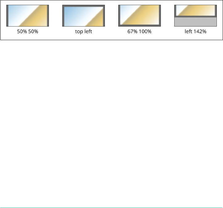
Notice that the first example in Figure 19-37 has a value of 50% 50%, even though that
isn’t present in the CSS sample. That illustrates how the default value of object-
position is 50% 50%. The next two examples show how various object-position
values move the image around within the img element box.
As the last example shows, it’s possible to move an unscaled replaced element like an
image so that it’s partly clipped by its element box. This is similar to positioning back‐
ground images or masks so that they are clipped at the element boundaries.
It’s also possible to position fitted elements that are larger than the element box, as
can happen with object-fit: cover, although the results can be very different than
with object-fit: none. The following CSS will have results like those shown in
Figure 19-38:
img {width: 200px; height: 100px; background: silver; border: 1px solid;
object-fit: cover;}
img:nth-of-type(2) {object-position: top left;}
img:nth-of-type(3) {object-position: 67% 100%;}
img:nth-of-type(4) {object-position: left 142%;}
Figure 19-38. Positioning a covered object
If any of these results confuse you, review the section “Background Positioning” on
page 404 for more details.
990 | Chapter 19: Filters, Blending, Clipping, and Masking

CHAPTER 20
Media-Dependent Styles
A great deal of our CSS work goes into putting content onto screens of various kinds,
whether they sit on office desks or rest in the palms of our hands. There is more to
the web than screens, though, and even in the part that is screen-centric, there are
many different kinds of screens, each with its own constraints. Recognizing this real‐
ity, CSS provides a number of tools with which to apply styles in specific media, or in
media with specific features.
Dening Media-Dependent Styles
Thanks to the mechanisms defined in HTML and CSS called media queries, you can
restrict any kind of style sheet to a specific medium, such as screen or print, and set of
media conditions. These mechanisms allows you to define a combination of media
types and parameters such as display size or color depth, to pick two examples. We’ll
cover the basic form of these queries before exploring the more complex forms.
Basic Media Queries
For HTML-based style sheets, you can impose medium restrictions through the
media attribute. This works the same for both the link and style elements:
<link rel="stylesheet" type="text/css" media="print"
href="article-print.css">
<style type="text/css" media="speech">
body {font-family: sans-serif;}
</style>
The media attribute can accept a single medium value or a comma-separated list of
values. Thus, to link in a style sheet that should be used in only the screen and
speech media, you would write:
991

<link rel="stylesheet" type="text/css" media="screen, speech"
href="visual.css">
In a style sheet itself, you can also impose medium restrictions on @import rules:
@import url(visual.css) screen;
@import url(outloud.css) speech;
@import url(article-print.css) print;
Remember that if you don’t add medium information to a style sheet, it will be
applied in all media. Therefore, if you want one set of styles to apply only on screen,
and another to apply only in print, then you need to add medium information to
both style sheets. For example:
<link rel="stylesheet" type="text/css" media="screen"
href="article-screen.css">
<link rel="stylesheet" type="text/css" media="print"
href="article-print.css">
If you were to remove the media attribute from the first link element in the preced‐
ing example, the rules found in the style sheet article-screen.css would be applied in all
media.
CSS also defines syntax for @media blocks. This allows you define styles for multiple
media within the same style sheet. Consider this basic example:
<style type="text/css">
body {background: white; color: black;}
@media screen {
body {font-family: sans-serif;}
h1 {margin-top: 1em;}
}
@media print {
body {font-family: serif;}
h1 {margin-top: 2em; border-bottom: 1px solid silver;}
}
</style>
Here we see that in all media, the body element is given a white background and a
black foreground by the first rule. This happens because its style sheet, the one
defined by the style attribute, has no media attribute and thus defaults to all. Next,
a block of rules is provided for the screen medium alone, followed by another block
of rules that applies only in the print medium.
@media blocks can be any size, containing any number of rules. In situations where
authors have control over a single style sheet, such as a shared hosting environment
or a content management system (CMS) that restricts what users can edit, @media
blocks may be the only way to define medium-specific styles. This is also the case in
situations where CSS is used to style a document using an XML language that does
not contain a media attribute or its equivalent.
992 | Chapter 20: Media-Dependent Styles

These are the four most widely recognized media types:
all
Use in all presentational media.
print
Use when printing the document for sighted users, and also when displaying a
print preview of the document.
screen
Use when presenting the document in a screen medium like a desktop computer
monitor or a handheld device. All web browsers running on such systems are
screen-medium user agents.
speech
Use in speech synthesizers, screen readers, and other audio renderings of the
document.
HTML4 defined a list of media types that CSS originally recognized, but most of
them have been deprecated and should be avoided. These are aural, braille,
embossed, handheld, projection, tty, and tv. If you have old style sheets that use
these media types, they should be converted to one of the four recognized media
types, if possible.
It’s entirely possible that new media types will be added over time,
so remember that this limited list may not always be so limited. It’s
fairly easy to imagine augmented-reality as a media type, for
example, since text in AR displays would likely need to be of higher
contrast in order to stand out against the background reality.
It’s possible in some circumstances to combine media types into comma-separated
lists, though the rationale for doing so isn’t terribly compelling, given the small num‐
ber of media types currently available. For example, styles could be restricted to only
screen and print media in the following ways:
<link rel="stylesheet" type="text/css" media="screen, print"
href="article.css">
@import url(article.css) print, screen;
@media screen,print {
/* styles go here */
}
Dening Media-Dependent Styles | 993

Complex Media Queries
In the previous section, we saw how multiple media types could be chained together
with a comma. We might call that a compound media query, because it allows us to
address multiple media at once. There is a great deal more to media queries, though:
it’s possible to apply styles based not just media types, but also features of those
media, such as display size or color depth.
This is a great deal of power, and it’s not enough to rely on commas to make it all
happen. Thus, CSS introduced the logical operator and to pair media types with fea‐
tures of those media.
Let’s see how this plays out in practice. Here are two essentially equivalent ways of
applying an external style sheet when rendering the document on a color printer:
<link href="print-color.css" type="text/css"
media="print and (color)" rel="stylesheet">
@import url(print-color.css) print and (color);
Anywhere a media type can be given, a media query can be constructed. This means
that, following on the examples of the previous section, it is possible to list more than
one query in a comma-separated list:
<link href="print-color.css" type="text/css"
media="print and (color), screen and (color)" rel="stylesheet">
@import url(print-color.css) print and (color), screen and (color);
In a situation where even one of the media queries evaluates to true, the associated
style sheet is applied. Thus, given the previous @import, print-color.css will be applied
if rendering to a color printer or to a color screen environment. If printing on a black-
and-white printer, both queries will evaluate to false and print-color.css will not be
applied to the document. The same holds true in a grayscale screen environment, any
speech media environment, and so forth.
Each media descriptor is composed of a media type and one or more listed media fea‐
tures, with each media feature descriptor is enclosed in parentheses. If no media type
is provided, then it is assumed to be all, which makes the following two examples
equivalent:
@media all and (min-resolution: 96dpi) {…}
@media (min-resolution: 960dpi) {…}
Generally speaking, a media feature descriptor is formatted like a property-value pair
in CSS, only enclosed by parentheses. There are a few differences, most notably that
some features can be specified without an accompanying value. For example, any
color-based medium will be matched using (color), whereas any color medium
using a 16-bit color depth is matched using (color: 16). In effect, the use of a
994 | Chapter 20: Media-Dependent Styles

descriptor without a value is a true/false test for that descriptor: (color) means “is
this medium in color?”
Multiple feature descriptors can be linked with the and logical keyword. In fact, there
are two logical keywords in media queries:
and
Links together two or more media features in such a way that all of them must be
true for the query to be true. For example, (color) and (orientation: land
scape) and (min-device-width: 800px) means that all three conditions must
be satisfied: if the media environment has color, is in landscape orientation, and
the device’s display is at least 800 pixels wide, then the style sheet is used.
not
Negates the entire query so that if all of the conditions are true, then the style
sheet is not applied. For example, not (color) and (orientation: landscape)
and (min-device-width: 800px) means that if the three conditions are satis‐
fied, the statement is negated. Thus, if the media environment has color, is in
landscape orientation, and the device’s display is at least 800 pixels wide, then the
style sheet is not used. In all other cases, it will be used.
Note that the not keyword can only be used at the beginning of a media query. It is
not presently legal to write something like (color) and not (min-device-width:
800px). In such cases, the query will be ignored. Note also that browsers too old to
understand media queries will always skip a style sheet whose media descriptor starts
with not.
An example of how all this plays out is shown in Figure 20-1, which is the result of
the following styles:
@media screen and (min-resolution: 72dpi) {
.cl01 {font-style: italic;}
}
@media screen and (min-resolution: 32767dpi) {
.cl02 {font-style: italic;}
}
@media not print {
.cl03 {font-style: italic;}
}
@media not print and (grayscale) {
.cl04 {font-style: italic;}
}
Dening Media-Dependent Styles | 995
Figure 20-1. Logical operators in media queries
First, bear in mind that, even though you may be reading this on printed paper, the
actual image in Figure 20-1 was generated with a screen-medium browser (Firefox
Nightly, as it happens) displaying an HTML document with the previous CSS applied
to it. So everything you see there was operating under a screen medium.
The first line is italicized because the screen on which the file was displayed had a
resolution equal to or greater than than 72 dots per inch. Its resolution was not, how‐
ever, 32767dpi or higher, so the second media block is skipped and thus the second
line stays un-italicized. The third line is italicized because, being a screen display, it
was not print. The last line is italicized because it was either not print or not gray‐
scale—in this case, not grayscale.
There is no OR keyword for use in media queries. Instead, the commas that separate
a list of queries serve the function of an OR—screen, print means “apply if the
media is screen or print.” Therefore, instead of screen and (max-color: 2) or
(monochrome), which is invalid and thus ignored, you need to write screen and
(max-color: 2), screen and (monochrome).
There is one more keyword, only, which is designed to create deliberate backward
incompatibility. Yes, really.
only
Used to hide a style sheet from browsers too old to understand media queries.
For example, to apply a style sheet in all media, but only in those browsers that
understand media queries, you write something like @import url(new.css)
only all. In browsers that do understand media queries, the only keyword is
ignored and the style sheet is applied. In browsers that do not understand media
queries, the only keyword creates an apparent media type of only all, which is
not valid. Thus, the style sheet is not applied in such browsers. Note that the only
keyword can only be used at the beginning of a media query.
996 | Chapter 20: Media-Dependent Styles

Media feature descriptors
So far we’ve seen a number of media feature descriptors in the examples, but not a
complete list of the possible descriptors and their values. Let us fix that now!
Note that none of the following values can be negative, and remember that feature
descriptors are always enclosed in parentheses.
Descriptors: width, min-width, max-width
Values: <length>
Refers to the width of the display area of the user agent. In a screen-media
web browser, this is the width of the viewport plus any scrollbars. In paged
media, this is the width of the page box, which is the area of the page in
which content is rendered. Thus, (min-width: 850px) applies when the
viewport is greater than or equal to 850 pixels wide.
Descriptors: height, min-height, max-height
Values: <length>
Refers to the height of the display area of the user agent. In a screen-media
web browser, this is the height of the viewport plus any scrollbars. In paged
media, this is the height of the page box. Thus, (height: 567px) applies
when the viewport’s height is precisely 567 pixels tall.
Descriptors: device-width, min-device-width, max-device-width
Values: <length>
Refers to the width of the complete rendering area of the output device. In
screen media, this is the width of the screen; i.e., a handheld device screen’s
or desktop monitor’s horizontal measurement. In paged media, this is the
width of the page itself. Thus, (max-device-width: 1200px) applies when
the device’s output area is less or equal to than 1,200 pixels wide.
Descriptors: device-height, min-device-height, max-device-height
Values: <length>
Refers to the height of the complete rendering area of the output device. In
screen media, this is the height of the screen; i.e., a handheld device screen’s
or desktop monitor’s vertical measurement. In paged media, this is the height
of the page itself. Thus, (max-device-height: 400px) applies when the
device’s output area is less than or equal to 400 pixels tall.
Dening Media-Dependent Styles | 997

Descriptors: aspect-ratio, min-aspect-ratio, max-aspect-ratio
Values: <ratio>
Refers to the ratio that results from comparing the width media feature to
the height media feature (see the definition of <ratio> in the next section).
Thus, (min-aspect-ratio: 2/1) applies to any viewport whose width-to-
height ratio is at least 2:1.
Descriptors: device-aspect-ratio, min-device-aspect-ratio, max-device-
aspect-ratio
Values: <ratio>
Refers to the ratio that results from comparing the device-width media fea‐
ture to the device-height media feature (see the definition of <ratio> in the
next section). Thus, (device-aspect-ratio: 16/9) applies to any output
device whose display area width-to-height is exactly 16:9.
Descriptors: color, min-color, max-color
Values: <integer>
Refers to the presence of color-display capability in the output device, with
an optional number value representing the number of bits used in each color
components. Thus, (color) applies to any device with any color depth at all,
whereas (min-color: 4) means there must be at least four bits used per
color component. Any device that does not support color will return 0.
Descriptors: color-index, min-color-index, max-color-index
Values: <integer>
Refers to the total number of colors available in the output device’s color
lookup table. Any device that does not use a color lookup table will return 0.
Thus, (min-color-index: 256) applies to any device with a minimum of
256 colors available.
Descriptors: monochrome, min-monochrome, max-monochrome
Values: <integer>
Refers to the presence of a monochrome display, with an optional number of
bits-per-pixel in the output device’s frame buffer. Any device that is not mon‐
ochrome will return 0. Thus, (monochrome) applies to any monochrome out‐
put device, whereas (min-monochrome: 2) means any monochrome output
device with a minimum of 2 bits per pixel in the frame buffer.
998 | Chapter 20: Media-Dependent Styles

Descriptors: resolution, min-resolution, max-resolution
Values: <resolution>
Refers to the resolution of the output device in terms of pixel density, meas‐
ured in either dots per inch (dpi) or dots per centimeter (dpcm); see the defi‐
nition of <resolution> in the next section for details. If an output device has
pixels that are not square, then the least dense axis is used; for example, if a
device is 100 dpcm along one axis and 120 dpcm along the other, then 100 is
the value returned. Additionally, in such non-square cases, a bare resolu
tion feature query—that is, one without a value—can never match (though
min-resolution and max-resolution can). Note that resolution values must
not only be non-negative, but also nonzero.
Descriptors: orientation
Values: portrait | landscape
Refers to the orientation of the user agent’s display area, where portrait is
returned if the media feature height is equal to or greater than the media
feature width. Otherwise, the result is landscape.
Descriptor: scan
Values: progressive | interlace
Refers to the scanning process used in an output device. interlace is the
type generally used in CRT and some plasma displays. progressive is more
common, being the type of scanning used in most modern displays.
Descriptor: grid
Values: 0 | 1
Refers to the presence (or absence) of a grid-based output device, such as a
TTY terminal. A grid-based device will return 1; otherwise, 0 is returned.
This feature descriptor can be used in place of the old tty media descriptor.
New value types
There are two new value types introduced by media queries, and which (as of early
2017) are not used in any other context. These types are used in conjunction with
specific media features, which are explained in the previous sections:
<ratio>
A ratio value is two positive <integer> values separated by a solidus (/) and
optional whitespace. The first value refers to the width, and the second to the
height. Thus, to express a height-to-width ratio of 16:9, you can write 16/9 or
Dening Media-Dependent Styles | 999

16 / 9. As of this writing, there is no facility to express a ratio as a single real
number, nor to use a colon separator instead of a solidus.
<resolution>
A resolution value is a positive <integer> followed by either of the unit identifiers
dpi or dpcm. In CSS terms, a “dot” is any display unit, the most familiar of which
is the pixel. As usual, whitespace is not permitted between the <integer> and the
identifier. Therefore, a display whose display has exactly 150 pixels (dots) per
inch is matched with 150dpi.
Responsive styling
Media queries are, at least as of early 2017, the foundation on which the practice of
responsive web design is built. By applying different sets of rules depending on the dis‐
play environment, it’s possible to marry mobile-friendly and desktop-friendly styles
into a single style sheet.
Those terms were put in quote because, as you may have seen in your own life, the
lines between what’s mobile and what’s desktop are blurred. A laptop with a touch-
sensitive screen that folds all the way back can act as both a tablet and a laptop, for
example. CSS doesn’t (yet) have a way of detecting whether or not a hinge is open
past a certain point, nor whether the device is held in hand or sitting on a flat surface.
Instead, inferences are drawn from aspects of the media environment, like display
size or display orientation.
A fairly common pattern in responsive design is to define breakpoints for each @media
block. This often takes the form of certain pixel widths, like this:
/* …common styles here… */
@media (max-width: 400px) {
/* …small-screen styles here… */
}
@media (min-width: 401px) and (max-width: 1000px) {
/* …medium-screen styles here… */
}
@media (min-width: 1001px) {
/* …big-screen styles here… */
}
This is often sufficient. It does make certain assumptions about what a device can dis‐
play and how it will report that, however. For example, the iPhone 6 Plus had a reso‐
lution of 1,242 × 2,208, which it downsampled to 1,080 × 1,920. Even at the
downsampled resolution, that’s enough pixels across to qualify for big-screen styles in
the previous example.
But wait! The iPhone 6 Plus also maintained an internal coordinate system of points
which measured 414 × 736. If it decided to use those as its definition of pixels, which
would be entirely valid, then it would only get the small-screen styles.
1000 | Chapter 20: Media-Dependent Styles

The point here isn’t to single out the iPhone 6 Plus as uniquely bad, which it wasn’t,
but to illustrate the uncertainties of relying on pixel-based media queries. Browser
makers have gone to some effort to make their browsers behave with some semblance
of sanity, but never quite as much as we’d like, and you never know when a new devi‐
ce’s assumptions will clash with your own.
There are other methods available, though they come with their own uncertainties.
Instead of pixels, you might try em-based measures, something like this:
/* …common styles here… */
@media (max-width: 20em) {
/* …small-screen styles here… */
}
@media (min-width: 20.01em) and (max-width: 50em) {
/* …medium-screen styles here… */
}
@media (min-width: 50.01em) {
/* …big-screen styles here… */
}
This ties the breakpoints to text display size rather than pixels, which is somewhat
more robust. This isn’t perfect either, though: it relies on a sensible approach to deter‐
mining the em width of, say, a smartphone. It also directly relies on the actual font
family and size used by the device, which varies from one device to another.
Here’s another seemingly simple query set with potentially surprising results:
/* …common styles here… */
@media (orientation: landscape) {
/* …wider-than-taller styles here… */
}
@media (orientation: portrait) {
/* …taller-than-wider styles here… */
}
This feels like a good way to tell if a smartphone is in use: after all, most of them are
taller than they are wide, and most people don’t turn them sideways to read. The
wrinkle is that the orientation feature refers to the height and width descriptors;
that is, orientation is portrait is height is equal to or larger than width. Not
device-height and device-width, but height and width, which refer to the display
area of the user agent.
That means a desktop browser window whose display area (the part inside the
browser Chrome) is taller than it is wide, or even perfectly square, will get the portrait
styles. So if you assume “portrait equals smartphone,” some of your desktop users
could get a surprise.
The basic point here is: responsive styling is powerful, and like any powerful tool, it
requires a fair amount of thought and care in its use. Carefully considering the impli‐
Dening Media-Dependent Styles | 1001

cations of each combination of feature queries is the minimum requirement for suc‐
cessful responsiveness.
Paged Media
In CSS terms, a paged medium is any medium where a document’s presentation is
handled as a series of discrete “pages.” This is different than the screen, which is a
continuous medium: documents are presented as a single, scrollable “page.” An analog
example of a continuous medium is a papyrus scroll. Printed material, such as books,
magazines, and laser printouts, are all paged media. So too are slideshows, where a
series of slides are shown one at a time. Each slide is a “page” in CSS terms.
Print Styles
Even in the paperless future, the most commonly encountered paged medium is a
printout of some document—a web page, a word-processing document, a spread‐
sheet, or something else that has been committed to the thin wafers of a dead tree.
Authors can do a number of things to make printouts of their documents more pleas‐
ing for the user, from affecting page-breaking to creating styles meant specifically for
print.
Note that print styles would also be applied to document display in a print preview
mode. Thus, it’s possible in some circumstances to see print styles on a monitor.
Dierences between screen and print
Beyond the obvious physical differences, there are a number of stylistic differences
between screen and print design. The most basic involves font choices. Most design‐
ers will tell you that sans-serif fonts are best suited for screen design, but serif fonts
are more readable in print. Thus, you might set up a print style sheet that uses Times
instead of Verdana for the text in your document.
Another major difference involves font sizing. If you’ve spent any time at all doing
web design, you’ve probably heard again and again (and again) that points are a hor‐
rible choice for font sizing on the web. This is basically true, especially if you want
your text to be consistently sized between browsers and operating systems. However,
print design is not web design any more than web design is print design. Using
points, or even centimeters or picas, is perfectly OK in print design because printing
devices know the physical size of their output area. If a printer has been loaded with
8.5 × 11 inch paper, then it knows it has a printing area that will fit within the edges
of a piece of paper. It also knows how many dots there are in an inch, since it knows
the dpi it’s capable of generating. This means that it can cope with physical-world
length units like points.
Many a print style sheet has started with:
1002 | Chapter 20: Media-Dependent Styles

body {font: 12pt "Times New Roman", "TimesNR", Times, serif;}
It’s so traditional, it just might bring a tear of joy to the eye of a graphic artist reading
over your shoulder. But make sure they understand that points are acceptable only
because of the nature of the print medium—they’re still not good for web design.
Alternatively, the lack of backgrounds in most printouts might bring a tear of frustra‐
tion to that designer’s eye. In order to save users ink, most web browsers are pre-
configured not to print background colors and images. If the user wants to see those
backgrounds in the printout, they have to change an option somewhere in the
preferences.
CSS can’t do anything to force the printing of backgrounds. However, you can use a
print style sheet to make backgrounds unnecessary. For example, you might include
this rule in your print style sheet:
* {color: black !important; background: transparent !important;}
This will do its utmost to ensure all of your elements print out as black text and
remove any backgrounds you might have assigned in an all-medium style sheet. It
also makes sure that if you have a web design that puts yellow text on a dark gray
background, a user with a color printer won’t get yellow text on a white piece of
paper.
One other difference between paged media and continuous media is that multicol‐
umn layouts are even harder to use in paged media. Suppose you have an article
where the text has been formatted as two columns. In a printout, the left side of each
page will contain the first column, and the right side the second. This would force the
user to read the left side of every page, then go back to the beginning of the printout
and read the right side of every page. This is annoying enough on the web, but on
paper it’s much worse.
One solution is to use CSS for laying out your two columns (by floating them, per‐
haps) and then writing a print style sheet that restores the content to a single column.
Thus, you might write something like this for the screen style sheet:
div#leftcol {float: left; width: 45%;}
div#rightcol {float: right; width: 45%;}
Then in your print style sheet, you would write:
div#leftcol, div#rightcol {float: none; width: auto;}
Alternatively, in user agents that support it, you might define actual multicolumn lay‐
out for both screen and print, and trust the user agents to do the right thing.
We could spend an entire chapter on the details of print design, but that really isn’t
the purpose of this book. Let’s start exploring the details of paged-media CSS and
leave the design discussions for another book.
Paged Media | 1003
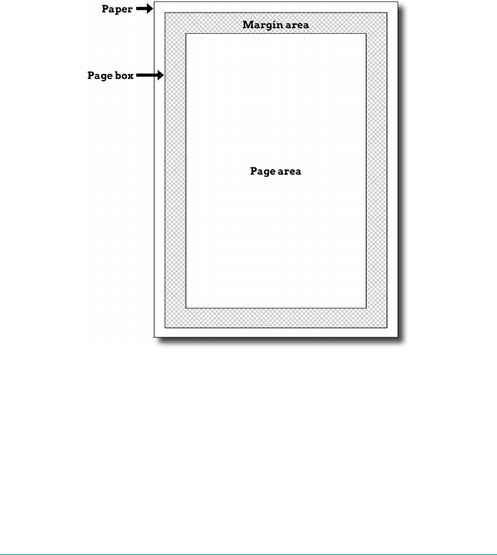
Dening the page size
In much the same way as it defines the element box, CSS2 defines a page box that
describes the components of a page. A page box is composed of basically two regions:
• The page area, which is the portion of the page where the content is laid out. This
is roughly analogous to the content area of a normal element box, to the extent
that the edges of the page area act as the initial containing block for layout within
a page.
•The margin area, which surrounds the page area.
The page box model is illustrated in Figure 20-2.
Figure 20-2. e page box
The @page block is the method by which settings are made, and the size property is
used to define the actual dimensions of the page box. Here’s a simple example:
@page {size: 7.5in 10in; margin: 0.5in;}
@page is a block like @media is a block, and within it can contain any set of styles. One
of them, size, only makes sense in the context of an @page block.
1004 | Chapter 20: Media-Dependent Styles
As of early 2017, only Chrome and Opera supported size, the lat‐
ter with some oddities in its calculation of dimensions.
size
Values auto | <length>{1,2} | [ <page-size> || [ portrait | landscape ] ]
Initial value auto
Applies to The page area
Inherited No
Animatable No
Note <page-size> is one of a dened set of standard pages sizes; see Table 20-1 for details
This property is used to define the size of the page area. The value landscape is
meant to cause the layout to be rotated 90 degrees, whereas portrait is the normal
orientation for Western-language printing. Thus, an author could cause a document
to be printed sideways by declaring the following, with the result shown in
Figure 20-3:
@page {size: landscape;}
Figure 20-3. Landscape page sizing
Paged Media | 1005

In addition to landscape and portrait, there are a number of predefined page-size
keywords available. These are summarized in Table 20-1.
Table 20-1. Page-size keywords
A5 International Standards Organization (ISO) A5 size, 148mm wide x 210mm tall (5.83in x 8.27in).
A4 ISO A2 size, 210 mm x 297 mm (8.27 in x 11.69 in).
A3 ISO A3 size, 297 mm x 420 mm (11.69 in x 16.54 in).
B5 ISO B5 size, 176 mm x 250 mm (6.93 in x 9.84 in).
B4 ISO B4 size, 250 mm x 353 mm (9.84 in x 13.9 in).
JIS-B5 ISO Japanese Industrial Standards (JIS) B5 size, 182 mm x 257 mm (7.17 in x 10.12 in).
JIS-B4 ISO JIS B4 size, 257 mm x 364 mm (10.12 in x 14.33 in).
letter North American letter size, 8.5 in x 11 in (215.9 mm x 279.4 mm).
legal North American legal size, 8.5 in x 14 in (215.9 mm x 355.6 mm).
ledger North American ledger size, 11 in x 17 in (279.4 mm x 431.8 mm).
Any one of the keywords can be used to declare a page size. The following defines a
page to be JIS B5 size:
@page {size: JIS-B5;}
These keywords can be combined with the landscape and portrait keywords; thus,
to define landscape-oriented North American legal pages, the following is used:
@page {size: landscape legal;}
Besides using keywords, it’s also possible to define page sizes using length units. In
such cases, the width is given first, and then the height. Therefore, the following
defines a page area 8 inches wide by 10 inches tall:
@page {size: 8in 10in;}
The defined area is usually centered within the physical page, with equal amounts of
whitespace on each side. If the defined size is larger than the printable area of the
page, then the user agent has to decide what to do to resolve the situation. There is no
defined behavior here, so it’s really dealer’s choice.
Page margins and padding
Related to size, CSS includes the ability to style the margin area of the page box. If
you want to make sure that only a small bit at the center of every 8.5 × 11 inch page is
used to print, you could write:
@page {margin: 3.75in;}
This would leave a printing area 1 inch wide by 3.5 inches tall.
1006 | Chapter 20: Media-Dependent Styles
It is possible to use the length units em and ex to describe either the margin area or
the page area, at least in theory. The size used is taken from the page context’s font,
which is to say, the base font size used for the content displayed on the page.
The ability to set page margins and padding was barely supported
as of early 2017. In Chrome, for example, attempting to define page
margins caused the entire @page block to be ignored.
Selecting page types
CSS2 offers the ability to create different page types using named @page rules. Let’s
say you have a document on astronomy that is several pages long, and in the middle
of it, there is a fairly wide table containing a list of the physical characteristics of all
the moons of Saturn. You want to print out the text in portrait mode, but the table
needs to be landscape. Here’s how you’d start:
@page normal {size: portrait; margin: 1in;}
@page rotate {size: landscape; margin: 0.5in;}
Now you just need to apply these page types as needed. The table of Saturn’s moons
has an id of moon-data, so you write the following rules:
body {page: normal;}
table#moon-data {page: rotate;}
This causes the table to be printed landscape, but the rest of the document to be in
portrait orientation. The property page is what makes this possible.
page
Values <identier> | inherit
Initial value auto
Applies to Block-level elements
Inherited No
Animatable No
As you can see from looking at the value definition, the whole reason page exists is to
let you assign named page types to various elements in your document.
Paged Media | 1007
As of early 2017, there was little if any support for named pages.
There are more generic page types that you can address through special pseudo-
classes. :first lets you apply special styles to the first page in the document. For
example, you might want to give the first page a larger top margin than other pages.
Here’s how:
@page {margin: 3cm;}
@page :first {margin-top: 6cm;}
This will yield a 3 cm margin on all pages, with the exception of a 6 cm top margin on
the first page.
In addition to styling the first page, you can also style left and right pages, emulating
the pages to the left and right of a book’s spine. You can style these differently
using :left and :right. For example:
@page :left {margin-left: 3cm; margin-right: 5cm;}
@page :right {margin-left: 5cm; margin-right: 3cm;}
These rules will have the effect of putting larger margins between the content of the
left and right pages, on the sides where the spine of a book would be. This is a com‐
mon practice when pages are to be bound together into a book of some type.
As of early 2017, there was little if any support for :first, :left,
or :right.
Page-breaking
In a paged medium, it’s a good idea to exert some influence over how page breaks are
placed. You can affect page breaking using the properties page-break-before and
page-break-after, both of which accept the same set of values.
page-break-before, page-break-after
Values auto | always
Initial value auto
Applies to Nonoated block-level elements with a position value of relative or static
Inherited No
1008 | Chapter 20: Media-Dependent Styles
Animatable No
Computed value As specied
The default value of auto means that a page break is not forced to come before or
after an element. This is the same as any normal printout. always causes a page break
to be placed before (or after) the styled element.
For example, assume a situation where the page title is an h1 element, and the section
titles are all h2 elements. We might want a page break right before the beginning of
each section of a document and after the document title. This would result in the fol‐
lowing rules, illustrated in Figure 20-4:
h1 {page-break-after: always;}
h2 {page-break-before: always;}
Figure 20-4. Inserting page breaks
If you want the document title to be centered in its page, then we’d add rules to that
effect. Since we don’t, we just get a very straightforward rendering of each page.
The values left and right operate in the same manner as always except they further
define the type of page on which printing can resume. Consider the following:
h2 {page-break-before: left;}
This will force every h2 element to be preceded by enough page breaks so that the h2
will be printed at the top of a left page—that is, a page surface that would appear to
the left of a spine if the output were bound. In double-sided printing, this would
mean printing on the back of a piece of paper.
So let’s assume that, in printing, the element just before an h2 is printed on a right
page. The previous rule would cause a single page break to be inserted before the h2,
Paged Media | 1009

thus pushing it to the next page. If the next h2 is preceded by an element on a left
page, however, the h2 would be preceded by two page breaks, thus placing it at the
top of the next left page. The right page between the two would be intentionally left
blank. The value right has the same basic effect, except it forces an element to be
printed at the top of a right page preceded by either one or two page breaks.
The companion to always is avoid, which directs the user agent to do its best to
avoid placing a page break either before or after an element. To extend the previous
example, suppose you have subsections whose titles are h3 elements. You want to
keep these titles together with the text that follows them, so you want to avoid a page
break following an h3 whenever possible:
h3 {page-break-after: avoid;}
Note, though, that the value is called avoid, not never. There is no way to absolutely
guarantee that a page break will never be inserted before or after a given element.
Consider the following:
img {height: 9.5in; width: 8in; page-break-before: avoid;}
h4 {page-break-after: avoid;}
h4 + img {height: 10.5in;}
Now, suppose further that you have a situation where an h4 is placed between two
images, and its height calculates to be half an inch. Each image will have to be printed
on a separate page, but there are only two places the h4 can go: at the bottom of the
page holding the first element, or on the page after it. If it’s placed after the first
image, then it has to be followed by a page break, since there’s no room for the second
image to follow it.
On the other hand, if the h4 is placed on a new page following the first image, then
there won’t be room on that same page for the second image. So, again, there will be a
page break after the h4. And, in either case, at least one image, if not both, will be
preceded by a page break. There’s only so much the user agent can do, given a situa‐
tion like this one.
Situations such as these are rare, but they can happen—for example, in a case where a
document contains nothing but tables preceded by headings. There may be cases
where tables print in such a way that they force a heading element to be followed by a
page break, even though the author requested such break placement be avoided.
The same sorts of issues can arise with the other page-break property, page-break-
inside. Its possible values are more limited than those of its cousins.
1010 | Chapter 20: Media-Dependent Styles
page-break-inside
Values auto | avoid
Initial value auto
Applies to Nonoated block-level elements with a position value of relative or static
Inherited Yes
Computed value As specied
With page-break-inside, you pretty much have one option other than the default:
you can request that a user agent try to avoid placing page breaks within an element.
If you have a series of aside divisions, and you don’t want them broken across two
pages, you could declare:
div.aside {page-break-inside: avoid;}
Again, this is a suggestion more than an actual rule. If an aside turns out to be longer
than a page, the user agent can’t help but place a page break inside the element.
Orphans and widows
In an effort to provide finer influence over page-breaking, CSS2 defines two proper‐
ties common to both traditional print typography and desktop publishing: widows
and orphans.
widows, orphans
Values <integer>
Initial value 2
Applies to block-level elements
Computed value As specied
Inherited No
Animatable Yes
These properties have similar aims but approach them from different angles. The
value of widows defines the minimum number of line boxes found in an element that
can be placed at the top of a page without forcing a page break to come before the
element. orphans has the same effect in reverse: it gives the minimum number of line
Paged Media | 1011
boxes that can appear at the bottom of a page without forcing a page break before the
element.
Let’s take widows as an example. Suppose you declare:
p {widows: 4;}
This means that any paragraph can have no fewer than four line boxes appear at the
top of a page. If the layout of the document would lead to fewer line boxes, then the
entire paragraph is placed at the top of the page. Consider the situation shown in
Figure 20-5. Cover up the top part of the figure with your hand so that only the sec‐
ond page is visible. Notice that there are two line boxes there, from the end of a para‐
graph that started on the previous page. Given the default widows value of 2, this is an
acceptable rendering. However, if the value were 3 or higher, the entire paragraph
would appear at the top of the second page as a single block. This would require that
a page break be inserted before the paragraph in question.
Figure 20-5. Counting the widows and orphans
Refer back to Figure 20-5, and this time cover up the second page with your hand.
Notice the four line boxes at the bottom of the page, at the beginning of the last para‐
graph. This is fine as long as the value of orphans is 4 or less. If it were 5 or higher,
then the paragraph would again be preceded by a page break and be laid out as a sin‐
gle block at the top of the second page.
1012 | Chapter 20: Media-Dependent Styles

One potential pitfall is that both orphans and widows must be satisfied. If an author
declared the following, then most paragraphs would be without an interior page
break:
p {widows: 30; orphans: 30;}
It would take a pretty lengthy paragraph to allow an interior page break, given those
values. If the intent is to prevent interior breaking, then that intent would be better
expressed as:
p {page-break-inside: avoid;}
Page-breaking behavior
Because CSS2 allows for some odd page-breaking styles, it defines a set of behaviors
regarding allowed page breaks and “best” page breaks. These behaviors serve to guide
user agents in how they should handle page-breaking in various circumstances.
There are really only two generic places where page breaks are permitted. The first of
these is between two block-level boxes. If a page break falls between two block boxes,
then the margin-bottom value of the element before the page break is reset to 0, as is
the margin-top of the element following the page break. However, there are two rules
that affect whether a page break can fall between two element boxes:
If the value of page-break-after for the first element—or the value of page-break-
before for the second element—is always, left, or right, then a page break will be
placed between the elements. This is true regardless of the value for the other ele‐
ment, even if it’s avoid. (This is a forced page break.)
If the value of the first element’s page-break-after value is auto, and the same is true
for the second element’s page-break-before value, and they do not share an ancestor
element whose page-break-inside value is not avoid, then a page break may be placed
between them.
Figure 20-6 illustrates all the possible page-break placements between elements in a
hypothetical document. Forced page breaks are represented as a filled square,
whereas potential (unforced) page breaks are shown as an open square.
Second, page breaks are allowed between two line boxes inside a block-level box.
This, too, is governed by a pair of rules:
• A page break may appear between two line boxes only if the number of line boxes
between the start of the element and the line box before the page break would be
less than the value of orphans for the element. Similarly, a page break can be
placed only where the number of line boxes between the line box after the page
break and the end of the element is less than the value of widows.
Paged Media | 1013

•A page break can be placed between line boxes if the value of page-break-
inside for the element is not avoid.
Figure 20-6. Potential page-break placement between block boxes
In both cases, the second of the two rules controlling page-break placement is
ignored if no page-break placement can satisfy all the rules. Thus, given a situation
where an element has been given page-break-inside: avoid but the element is
longer than a full page, a page break will be permitted inside the element, between
two line boxes. In other words, the second rule regarding page-break placement
between line boxes is ignored.
If ignoring the second rule in each pair of rules still does not yield good page-break
placement, then other rules can also be ignored. In such a situation, the user agent is
likely to ignore all page-break property values and proceed as if they were all auto,
although this approach is not defined (or required) by the CSS specification.
In addition to the previously explored rules, CSS2 defines a set of best page-breaking
behaviors:
• Break as few times as possible.
1014 | Chapter 20: Media-Dependent Styles

•Make all pages that don’t end with a forced break appear to have about the same
height.
• Avoid breaking inside a block that has a border.
•Avoid breaking inside a table.
• Avoid breaking inside a floated element.
These recommendations aren’t required of user agents, but they offer logical guidance
that should lead to ideal page-breaking behaviors.
Repeated elements
A very common desire in paged media is the ability to have a running head. This is an
element that appears on every page, such as the document’s title or the author’s name.
This is possible in CSS2 by using a fixed-position element:
div#runhead {position: fixed; top: 0; right: 0;}
This will place any div with an id of runhead at the top-right corner of every page
box when the document is output to a paged medium. The same rule would place the
element in the top-right corner of the viewport in a continuous medium, such as a
web browser. Any element positioned in this way will appear on every page. It is not
possible to copy an element to become a repeated element. Thus, given the following,
the h1 element will appear as a running head on every page including the first one:
h1 {position: fixed; top: 0; width: 100%; text-align: center;
font-size: 80%; border-bottom: 1px solid gray;}
The drawback is that the h1 element, being positioned on the first page, cannot be
printed as anything except the running head.
Elements outside the page
All this talk of positioning elements in a paged medium leads to an interesting ques‐
tion: what happens if an element is positioned outside the page box? You don’t even
need positioning to create such a situation. Think about a pre element that contains a
line with 411 characters. This is likely to be wider than any standard piece of paper,
and so the element will be wider than the page box. What will happen then?
As it turns out, CSS2 doesn’t say exactly what user agents should do, so it’s up to each
to come up with a solution. For a very wide pre element, the user agent might clip the
element to the page box and throw away the rest of the content. It could also generate
extra pages to display the leftover part of the element.
There are a few general recommendations for handling content outside the page box,
and two that are really important. First, content should be allowed to protrude
slightly from a page box in order to allow bleeding. This implies that no extra page
Paged Media | 1015

would be generated for the portions of such content that exceed the page box, but do
not extend all the way off the page.
Second, user agents are cautioned not to generate large numbers of empty pages for
the sole purpose of honoring positioning information. Consider:
h1 {position: absolute; top: 1500in;}
Assuming that the page boxes are 10 inches high, the user agent would have to pre‐
cede an h1 with 150 page breaks (and thus 150 blank pages) just to honor that rule.
Instead, a user agent might choose to skip the blank pages and just output the last
one, which actually contains the h1 element.
The other two recommendations state that user agents should not position elements
in strange places just to avoid rendering them, and that content placed outside a page
box can be rendered in any of a number of ways. (Some of the commentary in CSS is
useful and intriguing, but some seems to exist solely to cheerily state the obvious.)
Summary
Thanks to the combination of media queries and media-specific style features, it is
possible to provide a wide range of design experiences from within a single set of
styles. Whether reorganizing a page to account for varying display sizes or reworking
the color scheme to support grayscale printing, authors have the ability to do a great
deal to make their work the best in can be, no matter what the output channel.
1016 | Chapter 20: Media-Dependent Styles
APPENDIX A
Animatable Properties
Following is a list of animatable properties as given in the CSS Transitions specifica‐
tion. Because this only lists the CSS 2.1 properties that are animatable, it is not com‐
plete, but it is illustrative for understanding which kinds of properties are animatable
and in what ways, and which properties are not.
Property name Interpolation
COLOR
color as color
opacity as number
COLUMNS
column-width as length
column-count as integer
column-gap as length
column-rule (see longhands)
column-rule-color: as color
column-rule-style: no
column-rule-width: as length
break-before no
break-after no
break-inside no
column-span no
column-fill no
1017

Property name Interpolation
TEXT
hyphens no
letter-spacing as length
word-wrap no
overflow-wrap no
text-transform no
tab-size as length
text-align no
text-align-last no
text-indent as length, percentage, or calc();
direction no
white-space no
word-break no
word-spacing as length
line-break no
TEXT DECORATIONS
text-decoration-color: as color
text-decoration-style: no
text-decoration-line: no
text-decoration-skip no
text-shadow as shadow list
text-underline-position no
FLEXIBLE BOXES
align-content no
align-items no
align-self no
flex-basis as length, percentage, or calc();
flex-direction no
flex-flow no
flex (see longhand)
flex-grow as number
flex-shrink as number
flex-basis: as length, percentage, or calc();
flex-wrap no
justify-content no
order as integer
1018 | Appendix A: Animatable Properties

Property name Interpolation
BACKGROUND AND BORDERS
background
background-color: as color
background-image: no
background-clip: no
background-position: as list of length, percentage, or calc
background-size: as list of length, percentage, or calc
background-repeat: no
background-attachment no
abackground-origin no
BORDERS
border (see longhand)
border-color as color
border-style no
border-width as length
border-radius as length, percentage, or calc();
border-image no (see longhand)
border-image-outset no
border-image-repeat no
border-image-slice no
border-image-source no
border-image-width no
BOX MODEL
box-decoration-break no
box-shadow as shadow list
margin as length
padding as length
box-sizing no
max-height as length, percentage, or calc();
min-height as length, percentage, or calc();
height as length, percentage, or calc();
max-width as length, percentage, or calc();
min-width as length, percentage, or calc();
width as length, percentage, or calc();
overflow no
visibility as visibility (see “How Property Values Are Interpolated” on page 885)
Animatable Properties | 1019

Property name Interpolation
TABLE
border-collapse no
border-spacing no
caption-side no
empty-cells no
table-layout no
vertical-align as length
POSITIONING
bottom as length, percentage, or calc();
left as length, percentage, or calc();
right as length, percentage, or calc();
top as length, percentage, or calc();
float no
clear no
position no
z-index as integer
FONTS
font (see longhand)
font-style no
font-variant no
font-weight as font weight
font-stretch as font stretch
font-size as length
line-height as number, length
font-family no
font-variant-ligatures no
font-feature-settings no
font-language-override no
font-size-adjust as number
font-synthesis no
font-kerning no
font-variant-position no
font-variant-caps no
font-variant-numeric no
font-variant-east-asian no
font-variant-alternates no
1020 | Appendix A: Animatable Properties
Property name Interpolation
IMAGES
object-fit no
object-position as length, percentage, or calc();
image-rendering no
image-orientation no
COUNTERS, LISTS, AND GENERATED CONTENT
content no
quotes no
counter-increment no
counter-reset no
list-style no
list-style-image no
list-style-position no
list-style-type no
PAGE
orphans no
page-break-after no
page-break-before no
page-break-inside no
widows no
USER INTERFACE
outline (see longhand)
outline-color as color
outline-width as length
outline-style no
outline-offset as length
cursor no
resize no
text-overflow no
ANIMATIONS
animation no (see longhands)
animation-delay no
animation-direction no
animation-duration no
Animatable Properties | 1021

Property name Interpolation
animation-fill-mode no
animation-iteration-
count
no
animation-name no
animation-play-state no
animation-timing-
function
no, though animation-timing-function can be included in
keyframes
TRANSITIONS
transition no (see longhands)
transition-delay no
transition-duration no
transition-property no
transition-timing-
function
no
TRANSFORM PROPERTIES
transform as transform (see Transforms in CSS [O’Reilly])
transform-origin as length, percentage or calc();
transform-style no
perspective as length
perspective-origin as simple list of a length, percentage or calc();
backface-visibility no
COMPOSITING AND BLENDING
background-blend-mode no
mix-blend-mode no
isolation no
1022 | Appendix A: Animatable Properties

Property name Interpolation
SHAPES
shape-outside yes, as basic-shape
shape-margin as length, percentage, or calc();
shape-image-threshold as number
MISCELLANEOUS
clip (deprecated) as rectangle
display no
unicode-bidi no
text-orientation no
ime-mode no
all as each of the properties of the shorthand (all properties but
unicode-bidi and direction)
will-change no
box-decoration-break no
touch-action no
initial-letter no
initial-letter-align no
Animatable Properties | 1023

APPENDIX B
Basic Property Reference
Note that in addition to the options shown in the “Value Syntax” column of this
appendix, all properties listed also accept the following global values: inherit, ini
tial, and unset. They may in the future accept revert as well. These global values
are not shown in the table for brevity and clarity.
Where a “P” is indicated for whether an element is animatable (the “Anim.” column),
that means some but not all aspects of the property’s value can be animated.
Property Default value Value syntax Inh. Anim.
align-content stretch flex-start | flex-end | center | space-between |
space-around | stretch
N N
align-items stretch flex-start | flex-end | center | baseline | stretch N N
animation-
delay
0s <time>#N N
animation-
direction
normal [ normal | reverse | alternate | alternate-
reverse ]#
N N
animation-
duration
0s <time>#N N
animation-
fill-mode
none [ none | forwards | backwards | both ]# N N
animation-
iteration-
count
1<number> | infinite ]# N N
animation-name none [ <single-animation-name> | none ]# N N
animation-
play-state
running [ running | paused ]# N N
1025

Property Default value Value syntax Inh. Anim.
animation-
timing-
function
ease [ ease | linear | ease-in | ease-out | ease-in-out |
step-start | step-end | steps(<integer>, start)
| steps(<integer>, end) | cubic-bezier(<num
ber>, <number>, <number>, <number>) ]#
N N
animation 0s ease
0s 1 nor
mal none
running
none
[ <animation-name> ‖ <animation-duration> ‖ <animation-
timing-function> ‖ <animation-delay> ‖ <animation-iteration-
count> ‖ <animation-direction> ‖ <animation-ll-mode> ‖
<animation-play-state> ]#
N N
backface-
visibility
visible visible | hidden N N
background-
attachment
scroll [ scroll | fixed | local ]# N N
background-
blend-mode
normal [ normal | multiply | screen | overlay | darken |
lighten | color-dodge | color-burn | hard-light |
soft-light | difference | exclusion | hue | satura
tion | color | luminosity]#
N N
background-
clip
border-box [ border-box | padding-box | content-box | text ]# N N
background-
color
transpar
ent
<color> N Y
background-
image
none [ <image># | none N N
background-
origin
padding-
box
[ border-box | padding-box | content-box ]# N N
background-
position
0% 0% [ [ left | center | right | top | bottom | <percentage> |
<length> ] | [ left | center | right | <percentage> |
<length> ] [ top | center | bottom | <percentage> |
<length> ] | [ center | [ left | right ] [ <percentage> |
<length> ]? ] && [ center | [ top | bottom ] [ <percentage> |
<length> ]? ] ]#
N Y
background-
repeat
repeat [ repeat-x | repeat-y | [repeat | space | round | no-
repeat]{1,2} ]#
N N
background-
size
auto [ <length> | <percentage> | auto ]{1,2} | cover | contain ]# N Y
background See individual
properties [ <bg-image> ‖ <position> [ / <bg-size> ]? ‖ <repeat-style> ‖
<attachment> ‖ <box> ‖ <box> , ]* <bg-image> ‖ <position>
[ / <bg-size> ]? ‖ <repeat-style> ‖ <attachment> ‖ <box> ‖
<box> ‖ <background-color>
N P
border-bottom-
color
current
Color
<color> N Y
border-bottom-
style
none none | hidden | dotted | dashed | solid | double |
groove | ridge | inset | outset
N N
1026 | Appendix B: Basic Property Reference

Property Default value Value syntax Inh. Anim.
border-bottom-
width
medium thin | medium | thick | <length> N Y
border-bottom See individiual
properties [ <border-width> ‖ <border-style> ‖ <border-color> ] N P
border-color current
Color
<color>{1,4} N Y
border-image-
outset
0[ <length> | <number> ]{1,4} N Y
border-image-
repeat
stretch [ stretch | repeat | round | space ]{1,2} N N
border-image-
slice
100% [ <number> | <percentage> ]{1,4} && fill?N Y
border-image-
source
none none | <image> N N
border-image-
width
1[ <length> | <percentage> | <number> | auto ]{1,4} N Y
border-image See individual
properties <border-image-source> ‖ <border-image-slice> [ / <border-
image-width> | / <border-image-width>? / <border-image-
outset> ]? ‖ <border-image-repeat>
N N
border-left-
color
current
Color
<color> N Y
border-left-
style
none none | hidden | dotted | dashed | solid | double |
groove | ridge | inset | outset
N N
border-left-
width
medium thin | medium | thick | <length> N Y
border-left See individiual
properties [ <border-width> ‖ <border-style> ‖ <border-color> ] N P
border-radius 0 [ <length> | <percentage> ]{1,4} [ / [ <length> | <percentage> ]
{1,4} ]? N Y
border-bottom-
left-radius
0[ <length> | <percentage> ]{1,2} N Y
border-bottom-
right-radius
0[ <length> | <percentage> ]{1,2} N Y
border-top-
left-radius
0[ <length> | <percentage> ]{1,2} N Y
border-top-
right-radius
0[ <length> | <percentage> ]{1,2} N Y
border-right-
color
current
Color
<color> N Y
border-right-
style
none none | hidden | dotted | dashed | solid | double |
groove | ridge | inset | outset
N N
Basic Property Reference | 1027

Property Default value Value syntax Inh. Anim.
border-right-
width
medium thin | medium | thick | <length> N Y
border-right See individiual
properties [ <border-width> ‖ <border-style> ‖ <border-color> ] N P
border-spacing 0 <length> <length>? Y Y
border-style Not dened [ none | hidden | solid | dotted | dashed | double |
groove | ridge | inset | outset ]{1,4}
N N
border-top-
color
current
Color
<color> N Y
border-top-
style
none none | hidden | dotted | dashed | solid | double |
groove | ridge | inset | outset
N N
border-top-
width
medium thin | medium | thick | <length> N Y
border-top See individiual
properties [ <border-width> ‖ <border-style> ‖ <border-color> ] N P
border-width Not dened [ thin | medium | thick | <length> ]{1,4} N Y
border See individual
properties [ <border-width> ‖ <border-style> ‖ <border-color> ] N P
bottom auto <length> | <percentage> | auto N Y
box-
decoration-
break
slice slice | clone N N
box-shadow none none | inset? && <length>{2,4} && <color>?N Y
box-sizing content-
box
content-box | padding-box | border-box N N
caption-side top top | bottom Y N
clear none left | right | both | none N N
clip-path none none | <url> | [ [ inset() | circle() | ellipse() | pol
ygon() ] ‖ [ border-box | padding-box | content-box
| margin-box | fill-box | stroke-box | view-box ] ]
N P
clip-rule nonzero nonzero | evenodd N N
color User agent
specic <color> Y Y
direction ltr ltr | rtl Y Y
display inline [ <display-outside> ‖ <display-inside> ] | <display-listitem> |
<display-internal> | <display-box> | <display-legacy> N N
empty-cells show show | hide Y N
filter none [ none | blur() | brightness() | contrast() | drop-
shadow() | grayscale() | hue-rotate() | invert() |
opacity() | sepia() | saturate() | url() ]#
N Y
flex-basis auto content | [ <length> | <percentage> ] N P
1028 | Appendix B: Basic Property Reference

Property Default value Value syntax Inh. Anim.
flex-direction row row | row-reverse | column | column-reverse N N
flex-flow row nowrap <ex-direction> ‖ <ex-wrap> N N
flex-grow 0 <number> N Y
flex-shrink 1 <number> N Y
flex-wrap nowrap nowrap | wrap | wrap-reverse N N
flex 0 1 auto <flex-grow> <flex-shrink>? ‖ <flex-basis> ] |
none | auto
N N
float none left | right | none N N
font-family User agent-
specic [ <family-name> | <generic-family> ]# Y N
font-feature-
settings
normal normal | <feature-tag-value>#Y N
font-size-
adjust
none <number> | none | auto Y Y
font-size medium xx-small | x-small | small | medium | large | x-
large | xx-large | smaller | larger | <length> |
<percentage>
Y P
font-stretch normal normal | ultra-condensed | extra-condensed | con
densed | semi-condensed | semi-expanded | expan
ded | extra-expanded | ultra-expanded
Y N
font-style normal italic | oblique | normal Y N
font-synthesis weight
style
none | weight ‖ style Y N
font-variant normal normal | none | [ <common-lig-values> ‖ <discretionary-lig-
values> ‖ <historical-lig-values> ‖ <contextual-alt-values> ‖
stylistic(<feature-value-name>) ‖ historical-forms
‖ styleset(<feature-value-name>#) ‖ character-
variant(<feature-value-name>#) ‖ swash(<feature-value-
name>) ‖ ornaments(<feature-value-name>) ‖
annotation(<feature-value-name>) ‖ [ small-caps |
all-small-caps | petite-caps | all-petite-caps |
unicase | titling-caps ] ‖ <numeric-gure-values> ‖
<numeric-spacing-values> ‖ <numeric-fraction-values> ‖ ordi
nal ‖ slashed-zero ‖ <east-asian-variant-values> ‖ <east-
asian-width-values> ‖ ruby ]
Y N
font-weight normal normal | bold | bolder | lighter | 100 | 200 | 300 | 400
| 500 | 600 | 700 | 800 | 900
Y N
font See individual
properties [[ <font-style> ‖ [ normal | small-caps ] ‖ <font-
weight> ]? <font-size> [ / <line-height> ]? <font-family>] | cap
tion | icon | menu | message-box | small-caption |
status-bar
Y P
grid-area See individual
properties <grid-line> [ / <grid-line> ]{0,3} N N
Basic Property Reference | 1029

Property Default value Value syntax Inh. Anim.
grid-auto-
columns
auto <track-breadth> | minmax( <track-breadth> , <track-
breadth> )
N N
grid-auto-flow row [ row | column ] ‖ dense N N
grid-auto-rows auto <track-breadth> | minmax( <track-breadth> , <track-
breadth> )
N N
grid-column-
end
auto auto | <custom-ident> | [ <integer> && <custom-ident>? ] |
[ span && [ <integer> ‖ <custom-ident> ]]
N N
grid-column-
gap
0<length> | <percentage> N Y
grid-column-
start
auto auto | <custom-ident> | [ <integer> && <custom-ident>? ] |
[ span && [ <integer> ‖ <custom-ident> ]]
N N
grid-column auto <grid-line> [ / <grid-line> ]? N N
grid-gap 0 0 <grid-row-gap> <grid-column-gap> N Y
grid-row-end auto auto | <custom-ident> | [ <integer> && <custom-ident>? ] |
[ span && [ <integer> ‖ <custom-ident> ]]
N N
grid-row-gap 0 <length>_ | <percentage> N Y
grid-row-start auto auto | <custom-ident> | [ <integer> && <custom-ident>? ] |
[ span && [ <integer> ‖ <custom-ident> ]]
N N
grid-row auto <grid-line> [ / <grid-line> ]? N N
grid-template-
areas
none none | <string> N N
grid-template-
columns
none none | <track-list> | <auto-track-list> N N
grid-template-
rows
none none | <track-list> | <auto-track-list> N N
grid See individual
properties none | subgrid | [ <grid-template-rows> / <grid-template-
columns> ] | [ <line-names>? <string> <track-size>? <line-
names>? ]+ [ / <track-list> ]? | [ <grid-auto-ow> [ <grid-auto-
rows> [ / <grid-auto-columns> ]? ]? ] ]
N N
height auto <length> | <percentage> | auto N Y
hyphens manual manual | auto | none Y N
isolation auto auto | isolate N N
justify-
content
flex-start flex-start | flex-end | center | space-between |
space-around
N N
left auto <length> | <percentage> | auto N Y
letter-spacing normal <length> | normal Y Y
line-break auto auto | loose | normal | strict Y Y
line-height normal <number> | <length> | <percentage> | normal Y Y
margin-bottom 0 <length> | <percentage> | auto N Y
margin-left 0 <length> | <percentage> | auto N Y
1030 | Appendix B: Basic Property Reference

Property Default value Value syntax Inh. Anim.
margin-right 0 <length> | <percentage> | auto N Y
margin-top 0 <length> | <percentage> | auto N Y
margin Not dened [ <length> | <percentage> | auto ]{1,4} N Y
mask-clip border-box [ content-box | padding-box | border-box | margin-
box | fill-box | stroke-box | view-box | no-clip ]#
N N
mask-composite add [ add | subtract | intersect | exclude ]# N N
mask-image none [ none | <image> | <mask-source> ]# N N
mask-mode match-
source
[ alpha | luminance | match-source ]# N N
mask-origin mask-
origin
[ content-box | padding-box | border-box | margin-
box | fill-box | stroke-box | view-box ]#
N N
mask-position 0% 0% <position># aN P
mask-repeat repeat [ repeat-x | repeat-y | [ repeat | space | round | no-
repeat ]{1,2} ]#
N Y
mask-size auto [ [ <length> | <percentage> | auto ]{1,2} | cover | con
tain ]#
N P
mask-type luminance luminance | alpha N N
mask See individual
properties [ <mask-image> ‖ <mask-position> [ / <mask-size> ]? ‖
<mask-repeat> ‖ <mask-clip> ‖ <mask-origin> ‖ <mask-
composite> ‖ <mask-mode> ]#
N P
max-height none <length> | <percentage> | none N Y
max-width none <length> | <percentage> | none N Y
min-height 0 <length> | <percentage> N Y
min-width 0 <length> | <percentage> N Y
mix-blend-mode normal normal | multiply | screen | overlay | darken |
lighten | color-dodge | color-burn | hard-light |
soft-light | difference | exclusion | hue | satura
tion | color | luminosity
N N
object-fit fill fill | contain | cover | scale-down | none N N
object-
position
50% 50% <position> bN N
order 0 <integer> N Y
orphans 2 <integer> N N
outline-color invert <color> | invert N Y
outline-style none auto | none | solid | dotted | dashed | double |
groove | ridge | inset | outset
N N
outline-width medium <length> | thin | medium | thick N Y
outline none [ <outline-color> ‖ <outline-style> ‖ <outline-width> ] N P
overflow-wrap cnormal normal | break-word Y Y
Basic Property Reference | 1031

Property Default value Value syntax Inh. Anim.
overflow visible visible | hidden | scroll | auto N N
padding-bottom 0 <length> | <percentage> N Y
padding-left 0 <length> | <percentage> N Y
padding-right 0 <length> | <percentage> N Y
padding-top 0 <length> | <percentage> N Y
padding Not dened [ <length> | <percentage> ]{1,4} N Y
page-break-
after
auto auto | always N N
page-break-
before
auto auto | always N N
page-break-
inside
auto auto | avoid N N
page auto <identier> | inherit N N
perspective-
origin
50% 50% <position> dN Y
perspective none none | <length> N Y
position static static | relative | sticky | absolute | fixed N N
right auto <length> | <percentage> | auto N Y
shape-image-
threshold
0.0 <number> N Y
shape-margin 0 <length> | <percentage> N Y
shape-outside none none | [ <basic-shape> ‖ <shape-box> ] | N P
size auto auto | <length>{1,2} | [ <page-size> || [ portrait | land
scape ] ]
N N
tab-size 8 <length> | <integer> Y Y
table-layout auto auto | fixed Y N
text-align-
last
auto auto | start | end | left | right | center | justify Y N
text-align start start | end | left | right | center | justify | match-
parent | start end
Y N
text-
decoration
none none | [ underline ‖ overline ‖ line-through ‖
blink ]
N N
text-indent 0 <length> | <percentage> Y Y
text-
orientation
mixed mixed | upright | sideways Y Y
text-rendering auto auto | optimizeSpeed | optimizeLegibility | geome
tricPrecision
Y Y
text-shadow none none | [ <length> ‖ [ <length> <length> <length>? ] ]# N Y
text-transform none uppercase | lowercase | capitalize | none Y N
1032 | Appendix B: Basic Property Reference

Property Default value Value syntax Inh. Anim.
top auto <length> | <percentage> | auto N Y
transform-
origin
50% 50% <position> eN Y
transform-
style
flat flat | preserve-3d N N
transform none <transform-list> | none N Y
transition-
delay
0s <time># N N
transition-
duration
0s <time># N N
transition-
property
all none | [ all | <property-name> ]# N N
transition-
timing-
function
ease <timing-function># fN N
transition all 0s
ease 0s
[ [ none | <transition-property> ] ‖ <time> ‖ <transition-timing-
function> ‖ <time> ]# N N
unicode-bidi normal normal | embed | bidi-override N Y
vertical-align baseline baseline | sub | super | top | text-top | middle | bot
tom | text-bottom | <length> | <percentage>
N P
visibility visible visible | hidden | collapse Y N
white-space normal normal | nowrap | pre | pre-wrap | pre-line N N
widows 2 <integer> N N
width auto <length> | <percentage> | auto N Y
word-break normal normal | break-all | keep-all Y Y
word-spacing normal <length> | normal Y Y
writing-mode horizontal-
tb
horizontal-tb | vertical-rl | vertical-lr Y Y
z-index auto <integer> | auto N Y
a See background-position for a detailed expansion of the <position> syntax.
b See background-position for a detailed expansion of the <position> syntax.
c This property used to be called word-wrap.
d See background-position for a detailed expansion of the <position> syntax.
e See background-position for a detailed expansion of the <position> syntax.
f See animation-timing-function for a detailed expansion of the <timing-function> syntax.
Basic Property Reference | 1033

APPENDIX C
Color Equivalence Table
All 148 color names defined by the CSS Color Module Level 4 (as of the 22 May 2017
version), along with their equivalents in both styles of RGB, HSL, hexadecimal, and
three-digit hex shorthand (when applicable).
As of late 2017, there were several new color notations being considered, such as
hwb(), gray(), lab(), lch(), and more. These color types are not included in this
table due to their lack of support and uncertain future.
Color name RGB decimal RGB percentage HSL Hexadecimal
aliceblue rgb(240,248,255) rgb(94.1%,97.3%,100%) hsl(208,100%,97.1%) #F0F8FF
antiquewhite rgb(250,235,215) rgb(98%,92.2%,84.3%) hsl(34,77.8%,91.2%) #FAEBD7
aqua rgb(0,255,255) rgb(0%,100%,100%) hsl(180,100%,50%) #00FFFF/
#0FF
aquamarine rgb(127,255,212) rgb(49.8%,100%,83.1%) hsl(160,100%,74.9%) #7FFFD4
azure rgb(240,255,255) rgb(94.1%,100%,100%) hsl(180,100%,97.1%) #F0FFFF
beige rgb(245,245,220) rgb(96.1%,96.1%,86.3%) hsl(60,55.6%,91.2%) #F5F5DC
bisque rgb(255,228,196) rgb(100%,89.4%,76.9%) hsl(33,100%,88.4%) #FFE4C4
black rgb(0,0,0) rgb(0%,0%,0%) hsl(0,0%,0%) #000000/
#000
blanchedalmond rgb(255,235,205) rgb(100%,92.2%,80.4%) hsl(36,100%,90.2%) #FFEBCD
blue rgb(0,0,255) rgb(0%,0%,100%) hsl(240,100%,50%) #0000FF/
#00F
blueviolet rgb(138,43,226) rgb(54.1%,16.9%,88.6%) hsl(271,75.9%,52.7%) #8A2BE2
brown rgb(165,42,42) rgb(64.7%,16.5%,16.5%) hsl(0,59.4%,40.6%) #A52A2A
burlywood rgb(222,184,135) rgb(87.1%,72.2%,52.9%) hsl(34,56.9%,70%) #DEB887
cadetblue rgb(95,158,160) rgb(37.3%,62%,62.7%) hsl(182,25.5%,50%) #5F9EA0
chartreuse rgb(127,255,0) rgb(49.8%,100%,0%) hsl(90,100%,50%) #7FFF00
chocolate rgb(210,105,30) rgb(82.4%,41.2%,11.8%) hsl(25,75%,47.1%) #D2691E
coral rgb(255,127,80) rgb(100%,49.8%,31.4%) hsl(16,100%,65.7%) #FF7F50
cornflowerblue rgb(100,149,237) rgb(39.2%,58.4%,92.9%) hsl(219,79.2%,66.1%) #6495ED
cornsilk rgb(255,248,220) rgb(100%,97.3%,86.3%) hsl(48,100%,93.1%) #FFF8DC
crimson rgb(220,20,60) rgb(86.3%,7.8%,23.5%) hsl(348,83.3%,47.1%) #DC143C
1035

Color name RGB decimal RGB percentage HSL Hexadecimal
cyan rgb(0,255,255) rgb(0%,100%,100%) hsl(180,100%,50%) #00FFFF/
#0FF
darkblue rgb(0,0,139) rgb(0%,0%,54.5%) hsl(240,100%,27.3%) #00008B
darkcyan rgb(0,139,139) rgb(0%,54.5%,54.5%) hsl(180,100%,27.3%) #008B8B
darkgoldenrod rgb(184,134,11) rgb(72.2%,52.5%,4.3%) hsl(43,88.7%,38.2%) #B8860B
darkgray rgb(169,169,169) rgb(66.3%,66.3%,66.3%) hsl(0,0%,66.3%) #A9A9A9
darkgreen rgb(0,100,0) rgb(0%,39.2%,0%) hsl(120,100%,19.6%) #006400
darkgrey rgb(169,169,169) rgb(66.3%,66.3%,66.3%) hsl(0,0%,66.3%) #A9A9A9
darkkhaki rgb(189,183,107) rgb(74.1%,71.8%,42%) hsl(56,38.3%,58%) #BDB76B
darkmagenta rgb(139,0,139) rgb(54.5%,0%,54.5%) hsl(300,100%,27.3%) #8B008B
darkolivegreen rgb(85,107,47) rgb(33.3%,42%,18.4%) hsl(82,39%,30.2%) #556B2F
darkorange rgb(255,140,0) rgb(100%,54.9%,0%) hsl(33,100%,50%) #FF8C00
darkorchid rgb(153,50,204) rgb(60%,19.6%,80%) hsl(280,60.6%,49.8%) #9932CC
darkred rgb(139,0,0) rgb(54.5%,0%,0%) hsl(0,100%,27.3%) #8B0000
darksalmon rgb(233,150,122) rgb(91.4%,58.8%,47.8%) hsl(15,71.6%,69.6%) #E9967A
darkseagreen rgb(143,188,143) rgb(56.1%,73.7%,56.1%) hsl(120,25.1%,64.9%) #8FBC8F
darkslateblue rgb(72,61,139) rgb(28.2%,23.9%,54.5%) hsl(248,39%,39.2%) #483D8B
darkslategray rgb(47,79,79) rgb(18.4%,31%,31%) hsl(180,25.4%,24.7%) #2F4F4F
darkslategrey rgb(47,79,79) rgb(18.4%,31%,31%) hsl(180,25.4%,24.7%) #2F4F4F
darkturquoise rgb(0,206,209) rgb(0%,80.8%,82%) hsl(181,100%,41%) #00CED1
darkviolet rgb(148,0,211) rgb(58%,0%,82.7%) hsl(282,100%,41.4%) #9400D3
deeppink rgb(255,20,147) rgb(100%,7.8%,57.6%) hsl(328,100%,53.9%) #FF1493
deepskyblue rgb(0,191,255) rgb(0%,74.9%,100%) hsl(195,100%,50%) #00BFFF
dimgray rgb(105,105,105) rgb(41.2%,41.2%,41.2%) hsl(0,0%,41.2%) #696969
dimgrey rgb(105,105,105) rgb(41.2%,41.2%,41.2%) hsl(0,0%,41.2%) #696969
dodgerblue rgb(30,144,255) rgb(11.8%,56.5%,100%) hsl(210,100%,55.9%) #1E90FF
firebrick rgb(178,34,34) rgb(69.8%,13.3%,13.3%) hsl(0,67.9%,41.6%) #B22222
floralwhite rgb(255,250,240) rgb(100%,98%,94.1%) hsl(40,100%,97.1%) #FFFAF0
forestgreen rgb(34,139,34) rgb(13.3%,54.5%,13.3%) hsl(120,60.7%,33.9%) #228B22
fuchsia rgb(255,0,255) rgb(100%,0%,100%) hsl(300,100%,50%) #FF00FF/
#F0F
gainsboro rgb(220,220,220) rgb(86.3%,86.3%,86.3%) hsl(0,0%,86.3%) #DCDCDC
ghostwhite rgb(248,248,255) rgb(97.3%,97.3%,100%) hsl(240,100%,98.6%) #F8F8FF
gold rgb(255,215,0) rgb(100%,84.3%,0%) hsl(51,100%,50%) #FFD700
goldenrod rgb(218,165,32) rgb(85.5%,64.7%,12.5%) hsl(43,74.4%,49%) #DAA520
gray rgb(128,128,128) rgb(50.2%,50.2%,50.2%) hsl(0,0%,50.2%) #808080
green rgb(0,128,0) rgb(0%,50.2%,0%) hsl(120,100%,25.1%) #008000
greenyellow rgb(173,255,47) rgb(67.8%,100%,18.4%) hsl(84,100%,59.2%) #ADFF2F
grey rgb(128,128,128) rgb(50.2%,50.2%,50.2%) hsl(0,0%,50.2%) #808080
honeydew rgb(240,255,240) rgb(94.1%,100%,94.1%) hsl(120,100%,97.1%) #F0FFF0
hotpink rgb(255,105,180) rgb(100%,41.2%,70.6%) hsl(330,100%,70.6%) #FF69B4
indianred rgb(205,92,92) rgb(80.4%,36.1%,36.1%) hsl(0,53.1%,58.2%) #CD5C5C
indigo rgb(75,0,130) rgb(29.4%,0%,51%) hsl(275,100%,25.5%) #4B0082
ivory rgb(255,255,240) rgb(100%,100%,94.1%) hsl(60,100%,97.1%) #FFFFF0
khaki rgb(240,230,140) rgb(94.1%,90.2%,54.9%) hsl(54,76.9%,74.5%) #F0E68C
lavender rgb(230,230,250) rgb(90.2%,90.2%,98%) hsl(240,66.7%,94.1%) #E6E6FA
lavenderblush rgb(255,240,245) rgb(100%,94.1%,96.1%) hsl(340,100%,97.1%) #FFF0F5
lawngreen rgb(124,252,0) rgb(48.6%,98.8%,0%) hsl(90,100%,49.4%) #7CFC00
lemonchiffon rgb(255,250,205) rgb(100%,98%,80.4%) hsl(54,100%,90.2%) #FFFACD
lightblue rgb(173,216,230) rgb(67.8%,84.7%,90.2%) hsl(195,53.3%,79%) #ADD8E6
1036 | Appendix C: Color Equivalence Table

Color name RGB decimal RGB percentage HSL Hexadecimal
lightcoral rgb(240,128,128) rgb(94.1%,50.2%,50.2%) hsl(0,78.9%,72.2%) #F08080
lightcyan rgb(224,255,255) rgb(87.8%,100%,100%) hsl(180,100%,93.9%) #E0FFFF
lightgoldenrodyellow rgb(250,250,210) rgb(98%,98%,82.4%) hsl(60,80%,90.2%) #FAFAD2
lightgray rgb(211,211,211) rgb(82.7%,82.7%,82.7%) hsl(0,0%,82.7%) #D3D3D3
lightgreen rgb(144,238,144) rgb(56.5%,93.3%,56.5%) hsl(120,73.4%,74.9%) #90EE90
lightgrey rgb(211,211,211) rgb(82.7%,82.7%,82.7%) hsl(0,0%,82.7%) #D3D3D3
lightpink rgb(255,182,193) rgb(100%,71.4%,75.7%) hsl(351,100%,85.7%) #FFB6C1
lightsalmon rgb(255,160,122) rgb(100%,62.7%,47.8%) hsl(17,100%,73.9%) #FFA07A
lightseagreen rgb(32,178,170) rgb(12.5%,69.8%,66.7%) hsl(177,69.5%,41.2%) #20B2AA
lightskyblue rgb(135,206,250) rgb(52.9%,80.8%,98%) hsl(203,92%,75.5%) #87CEFA
lightslategray rgb(119,136,153) rgb(46.7%,53.3%,60%) hsl(210,14.3%,53.3%) #778899/
#789
lightslategrey rgb(119,136,153) rgb(46.7%,53.3%,60%) hsl(210,14.3%,53.3%) #778899/
#789
lightsteelblue rgb(176,196,222) rgb(69%,76.9%,87.1%) hsl(214,41.1%,78%) #B0C4DE
lightyellow rgb(255,255,224) rgb(100%,100%,87.8%) hsl(60,100%,93.9%) #FFFFE0
lime rgb(0,255,0) rgb(0%,100%,0%) hsl(120,100%,50%) #00FF00/
#0F0
limegreen rgb(50,205,50) rgb(19.6%,80.4%,19.6%) hsl(120,60.8%,50%) #32CD32
linen rgb(250,240,230) rgb(98%,94.1%,90.2%) hsl(30,66.7%,94.1%) #FAF0E6
magenta rgb(255,0,255) rgb(100%,0%,100%) hsl(300,100%,50%) #FF00FF/
#F0F
maroon rgb(128,0,0) rgb(50.2%,0%,0%) hsl(0,100%,25.1%) #800000
mediumaquamarine rgb(102,205,170) rgb(40%,80.4%,66.7%) hsl(160,50.7%,60.2%) #66CDAA
mediumblue rgb(0,0,205) rgb(0%,0%,80.4%) hsl(240,100%,40.2%) #0000CD
mediumorchid rgb(186,85,211) rgb(72.9%,33.3%,82.7%) hsl(288,58.9%,58%) #BA55D3
mediumpurple rgb(147,112,219) rgb(57.6%,43.9%,85.9%) hsl(260,59.8%,64.9%) #9370DB
mediumseagreen rgb(60,179,113) rgb(23.5%,70.2%,44.3%) hsl(147,49.8%,46.9%) #3CB371
mediumslateblue rgb(123,104,238) rgb(48.2%,40.8%,93.3%) hsl(249,79.8%,67.1%) #7B68EE
mediumspringgreen rgb(0,250,154) rgb(0%,98%,60.4%) hsl(157,100%,49%) #00FA9A
mediumturquoise rgb(72,209,204) rgb(28.2%,82%,80%) hsl(178,59.8%,55.1%) #48D1CC
mediumvioletred rgb(199,21,133) rgb(78%,8.2%,52.2%) hsl(322,80.9%,43.1%) #C71585
midnightblue rgb(25,25,112) rgb(9.8%,9.8%,43.9%) hsl(240,63.5%,26.9%) #191970
mintcream rgb(245,255,250) rgb(96.1%,100%,98%) hsl(150,100%,98%) #F5FFFA
mistyrose rgb(255,228,225) rgb(100%,89.4%,88.2%) hsl(6,100%,94.1%) #FFE4E1
moccasin rgb(255,228,181) rgb(100%,89.4%,71%) hsl(38,100%,85.5%) #FFE4B5
navajowhite rgb(255,222,173) rgb(100%,87.1%,67.8%) hsl(36,100%,83.9%) #FFDEAD
navy rgb(0,0,128) rgb(0%,0%,50.2%) hsl(240,100%,25.1%) #000080
oldlace rgb(253,245,230) rgb(99.2%,96.1%,90.2%) hsl(39,85.2%,94.7%) #FDF5E6
olive rgb(128,128,0) rgb(50.2%,50.2%,0%) hsl(60,100%,25.1%) #808000
olivedrab rgb(107,142,35) rgb(42%,55.7%,13.7%) hsl(80,60.5%,34.7%) #6B8E23
orange rgb(255,165,0) rgb(100%,64.7%,0%) hsl(39,100%,50%) #FFA500
orangered rgb(255,69,0) rgb(100%,27.1%,0%) hsl(16,100%,50%) #FF4500
orchid rgb(218,112,214) rgb(85.5%,43.9%,83.9%) hsl(302,58.9%,64.7%) #DA70D6
palegoldenrod rgb(238,232,170) rgb(93.3%,91%,66.7%) hsl(55,66.7%,80%) #EEE8AA
palegreen rgb(152,251,152) rgb(59.6%,98.4%,59.6%) hsl(120,92.5%,79%) #98FB98
paleturquoise rgb(175,238,238) rgb(68.6%,93.3%,93.3%) hsl(180,64.9%,81%) #AFEEEE
palevioletred rgb(219,112,147) rgb(85.9%,43.9%,57.6%) hsl(340,59.8%,64.9%) #DB7093
papayawhip rgb(255,239,213) rgb(100%,93.7%,83.5%) hsl(37,100%,91.8%) #FFEFD5
peachpuff rgb(255,218,185) rgb(100%,85.5%,72.5%) hsl(28,100%,86.3%) #FFDAB9
peru rgb(205,133,63) rgb(80.4%,52.2%,24.7%) hsl(30,58.7%,52.5%) #CD853F
Color Equivalence Table | 1037

Color name RGB decimal RGB percentage HSL Hexadecimal
pink rgb(255,192,203) rgb(100%,75.3%,79.6%) hsl(350,100%,87.6%) #FFC0CB
plum rgb(221,160,221) rgb(86.7%,62.7%,86.7%) hsl(300,47.3%,74.7%) #DDA0DD
powderblue rgb(176,224,230) rgb(69%,87.8%,90.2%) hsl(187,51.9%,79.6%) #B0E0E6
purple rgb(128,0,128) rgb(50.2%,0%,50.2%) hsl(300,100%,25.1%) #800080
rebeccapurple rgb(102,51,153) rgb(40%,20%,60%) hsl(270,50%,40%) #663399/
#639
red rgb(255,0,0) rgb(100%,0%,0%) hsl(0,100%,50%) #FF0000/
#F00
rosybrown rgb(188,143,143) rgb(73.7%,56.1%,56.1%) hsl(0,25.1%,64.9%) #BC8F8F
royalblue rgb(65,105,225) rgb(25.5%,41.2%,88.2%) hsl(225,72.7%,56.9%) #4169E1
saddlebrown rgb(139,69,19) rgb(54.5%,27.1%,7.5%) hsl(25,75.9%,31%) #8B4513
salmon rgb(250,128,114) rgb(98%,50.2%,44.7%) hsl(6,93.2%,71.4%) #FA8072
sandybrown rgb(244,164,96) rgb(95.7%,64.3%,37.6%) hsl(28,87.1%,66.7%) #F4A460
seagreen rgb(46,139,87) rgb(18%,54.5%,34.1%) hsl(146,50.3%,36.3%) #2E8B57
seashell rgb(255,245,238) rgb(100%,96.1%,93.3%) hsl(25,100%,96.7%) #FFF5EE
sienna rgb(160,82,45) rgb(62.7%,32.2%,17.6%) hsl(19,56.1%,40.2%) #A0522D
silver rgb(192,192,192) rgb(75.3%,75.3%,75.3%) hsl(0,0%,75.3%) #C0C0C0
skyblue rgb(135,206,235) rgb(52.9%,80.8%,92.2%) hsl(197,71.4%,72.5%) #87CEEB
slateblue rgb(106,90,205) rgb(41.6%,35.3%,80.4%) hsl(248,53.5%,57.8%) #6A5ACD
slategray rgb(112,128,144) rgb(43.9%,50.2%,56.5%) hsl(210,12.6%,50.2%) #708090
slategrey rgb(112,128,144) rgb(43.9%,50.2%,56.5%) hsl(210,12.6%,50.2%) #708090
snow rgb(255,250,250) rgb(100%,98%,98%) hsl(0,100%,99%) #FFFAFA
springgreen rgb(0,255,127) rgb(0%,100%,49.8%) hsl(150,100%,50%) #00FF7F
steelblue rgb(70,130,180) rgb(27.5%,51%,70.6%) hsl(207,44%,49%) #4682B4
tan rgb(210,180,140) rgb(82.4%,70.6%,54.9%) hsl(34,43.8%,68.6%) #D2B48C
teal rgb(0,128,128) rgb(0%,50.2%,50.2%) hsl(180,100%,25.1%) #008080
thistle rgb(216,191,216) rgb(84.7%,74.9%,84.7%) hsl(300,24.3%,79.8%) #D8BFD8
tomato rgb(255,99,71) rgb(100%,38.8%,27.8%) hsl(9,100%,63.9%) #FF6347
turquoise rgb(64,224,208) rgb(25.1%,87.8%,81.6%) hsl(174,72.1%,56.5%) #40E0D0
violet rgb(238,130,238) rgb(93.3%,51%,93.3%) hsl(300,76.1%,72.2%) #EE82EE
wheat rgb(245,222,179) rgb(96.1%,87.1%,70.2%) hsl(39,76.7%,83.1%) #F5DEB3
white rgb(255,255,255) rgb(100%,100%,100%) hsl(0,0%,100%) #FFFFFF/
#FFF
whitesmoke rgb(245,245,245) rgb(96.1%,96.1%,96.1%) hsl(0,0%,96.1%) #F5F5F5
yellow rgb(255,255,0) rgb(100%,100%,0%) hsl(60,100%,50%) #FFFF00/
#FF0
yellowgreen rgb(154,205,50) rgb(60.4%,80.4%,19.6%) hsl(80,60.8%,50%) #9ACD32
1038 | Appendix C: Color Equivalence Table

Index
Symbols
&& (ampersand, double), in value syntax, xxi
<…> (angle brackets), in value syntax, xx
<!--…--> (angle brackets, exclamation point),
enclosing HTML comments, 16
* (asterisk)
universal selector, 35, 101, 105
in value syntax, xxi
*= (asterisk, equal sign), in attribute selectors,
48
\ (backslash), escape character, 116
^= (caret, equal sign), in attribute selectors, 48
: (colon)
in pseudo-class selectors, 64
in rules, 16, 31
:: (colon, double), in pseudo-element selectors,
92
, (comma)
separating selectors, 34
separating value keywords, 33
{…} (curly brackets)
in keyframe animations, 893
in rules, 16
in value syntax, xxi
$= (dollar sign, equal sign), in attribute selec‐
tors, 48
! (exclamation point)
in !important declarations, 102
in value syntax, xxi
/ (forward slash)
separating value keywords, 32-33
in value syntax, xx
/*…*/ (forward slash, asterisk), enclosing CSS
comments, 19-20
> (greater-than sign), child combinator, 59
-- (hyphens, double), in custom properties, 145
-…- (hyphens), enclosing vendor prefixes, 17
# (octothorpe)
in ID selectors, 43-43
in value syntax, xxi
. (period), in class selectors, 39-41
+ (plus sign)
adjacent-sibling combinator, 60
in value syntax, xxi
? (question mark), in value syntax, xxi
'…' or "…" (quotes)
enclosing font names, 153-154
enclosing strings, 116-117
as generated content, 786-788
; (semicolon), in rules, 16, 31, 36-37
[…] (square brackets), in value syntax, xxi
~ (tilde), general-sibling combinator, 62
~= (tilde, equal sign), in attribute selectors, 48
| (vertical bar), in value syntax, xxi
|| (vertical bar, double), in value syntax, xxi
|= (vertical bar, equal sign), in attribute selec‐
tors, 48
A
absolute length units, 121-124
absolute positioning, 526, 537-553
absolute URL, 117
Access-Control-Allow-Origin header, 156
accessibility issues
animations and, 941
elements with focus, 81
screen readers and order of content, 563
styled visited links, 78-79
1039

:active pseudo-class, 79-81
additive-symbols descriptor, @counter-style,
812
adjacent-sibling combinator, 60-62
::after pseudo-element, 95, 780-783
align-content property, 604-609
align-items property, 596-602
align-self property, 602-604
all media type, 21, 993
all property, 115-116
ampersand, double (&&), in value syntax, xxi
and logical keyword
in feature queries, 26
in media queries, 23, 994-995
angle brackets, exclamation point (<!--…-->),
enclosing HTML comments, 16
angle brackets (<…>), in value syntax, xx
angle units, 142
animatable properties, 884-888, 897-899, 1017
animation, 891-900
(see also transitions)
accessibility issues, 941
animation identifier for, 892, 894
applying to elements, 900-911
chaining, 912-917
changing while running, 917
defining, 892-894
delaying, 909-911
direction of, 907-908
duration of, 904-905
effects on properties before and after,
933-935
events for, 900, 911-920, 942-943
iterations of
delaying, 917-920
setting, 905-907
keyframe blocks for, 892-893
keyframe selectors for, 892-893, 894-900
animatable properties for, 897-899
omitting from or to values in, 895-896
repeating properties in, 897
multiple, specifying, 901, 927
naming, 901-903
pausing and resuming, 932
printing, 943
scripting, 899-900
shorthand property for, 935-939
specificity and precedence of, 939-940
starting and stopping, 917, 940
timing of, controlling, 920-932
of transforms, 826, 832, 841
UI thread usage by, 913, 940
visual stuttering of (jank), 914
animation property, 935-939
animation-delay property, 909-913
animation-direction property, 907-908
animation-duration property, 904-905
animation-fill-mode property, 933-935
animation-iteration-count property, 905-907
animation-name property, 901-903
animation-play-state property, 932
animation-timing-function property, 898-899,
909, 920-932
animationend event, 900, 904, 910, 911,
914-917, 942
animationiteration event, 900, 910, 911-912,
943
animationstart event, 900, 904, 910, 911, 942
anonymous text, 287
appendRule() method, 899-900
aspect-ratio descriptor, @media, 998
asterisk (*)
universal selector, 35, 101, 105
in value syntax, xxi
asterisk, equal sign (*=), in attribute selectors,
48
attr() expression, 131-132
attribute selectors, 45-53
based on exact attribute value, 46-48
based on existence of attribute, 45-46
based on partial attribute value, 48-53
case-insensitivity identifier for, 53
specificity of, 101
attributes, property values from, 131-132
author origin, 107, 108
B
backface-visibility property, 852-854
background color, 393-396, 403
background images, 399-441
attaching to viewing area, 428-433
background color with, 403
clipping, 319, 329, 396, 427
inheritance of, 402
multiple, 444-450
positioning, 404-416, 420-422
repeating, 417-428
rounding, 424-426
1040 | Index

shorthand properties for, 442-444
sizing, 433-441
spacing, 422-424
specifying, 400-402
background painting area, 396
background property, 442-444, 737
background styles, 104
background-attachment property, 428-433
background-blend-mode property, 960-962
background-clip property, 319, 329, 396, 427
background-color property, 393-396
background-image property, 400-402
background-origin property, 414-416
background-position property, 404-414
background-repeat property, 417-428
background-size property, 433-441
backgrounds, 392-450
blending, 960-964
clipping, 319, 329, 396, 427
color of, 393-396, 403
padding with, 393, 395
backslash (\), escape character, 116
::before pseudo-element, 95, 780-783
Bézier curve functions (see timing functions)
blending, 952-964
backdrop of, 953
of backgrounds, 960-964
color blend mode, 959
color-burn blend mode, 958
color-dodge blend mode, 958
darken blend mode, 953
difference blend mode, 954
exclusion blend mode, 954
foreground of, 953
hard-light blend mode, 956
hue blend mode, 959
lighten blend mode, 954
luminosity blend mode, 959
multiply blend mode, 955
overlay blend mode, 956
pixel components in, 953
saturation blend mode, 959
screen blend mode, 955
soft-light blend mode, 957
blinking text, 232-233
block boxes, 4, 259, 263-265
block direction, 207-208
block display, 4-7, 261-263
block-level elements, 4-7
blur() function, 946
border property, 104, 341-342, 737
border-bottom property, 275-276, 339-341
border-bottom-color property, 338
border-bottom-left-radius property, 351
border-bottom-right-radius property, 351
border-bottom-style property, 332
border-bottom-width property, 333-336
border-collapse property, 745
border-color property, 337-339, 390
border-image-outset property, 362-364
border-image-repeat property, 364-366
border-image-slice property, 353-357
border-image-source property, 352-353
border-image-width property, 358-362
border-left property, 266, 339-341
border-left-color property, 338
border-left-style property, 332
border-left-width property, 333-336
border-radius property, 344-352, 397, 513
border-right property, 266, 339-341
border-right-color property, 338
border-right-style property, 332
border-right-width property, 333-336
border-spacing property, 747-748
border-style property, 329-332
border-top property, 275-276, 339-341
border-top-color property, 338
border-top-left-radius property, 351
border-top-right-radius property, 351
border-top-style property, 332
border-top-width property, 333-336
border-width property, 333-336
borders, 257-258, 263-265, 328-369
background and, 329
in box model, 315-316
color of, 328, 337-339, 390-391
compared to outlines, 374-375
corner blending, 349-351
corner rounding, 344-352
global, 341-342
images as, 352-369
for inline elements, 342-352
none, 336
shorthand properties for, 339-342
style of, 328, 329-333
transparent, 338
width of, 328, 333-336
bottom property, 527-530
Index | 1041

bounding box, 824
box model, 315-316
box-decoration-break property, 301-302, 343
box-model properties, 105
box-shadow property, 886, 887
box-sizing property, 264-266, 318
boxes, 4-7
(see also borders; flexible box layout; mar‐
gins; outlines; padding)
containing blocks, 259-260, 266, 267
element boxes, 4-7, 257-259, 315-318
block boxes, 4, 259, 263-265
inline boxes, 4, 217, 259
inline-block boxes, 259
em box (em square), 175, 287, 302
line boxes, 217, 220
braces (see curly brackets)
brackets (see angle brackets; square brackets)
brightness() function, 950
browsers
differences in feature support
absolute positioning in grid layout, 721
all keyword, 116
alternate stylesheets, 11
animation fill modes, 935
background clipping, 399
blinking text, 233
border-image masking, 986
case-insensitivity identifier, 53
ch unit, 128
clipping rules, 971
content keyword for flex-basis, 634-635
contents display, 312
counter styles, 796
CSS Shapes, 520
custom values, 147
feature queries, 25-28
flow and flow-root display, 311
font synthesis, 198
font variants, 194
@font-face directive, 159
font-size-adjust property, 185
HTTP linking, 14
@import directive placement, 14
media types, 22
outline color inversion, 373
padding for form elements, 328
page margins, 1007
printing transitions, 889
radial gradient edge cases, 478, 484
size property, 1005
sticky positioning, 561
tab-size property, 243
text-align-last property, 216
text-justify property, 214
vendor prefixes, 18
viewport-relative units, 130
“flash” behavior of, 158
version compatibility
backwards incompatibility, creating, 24
.css filename extension requirement, 9
media descriptors using not keyword, 23
newer elements, supporting, 38
word wrapping, 249
C
calc() value, 130-131, 666
capitalization, 230-232
caption-side property, 744-745
caret, equal sign (^=), in attribute selectors, 48
Cartesian coordinate system, 820-821
cascade, 97, 106-111
Cascading Style Sheets (see CSS)
case sensitivity
for attribute selectors, 51, 53
for ID selectors, 44
ch unit, 127-128
chaining
animations, 912-917
pseudo-classes, 63
character box (see em box)
:checked pseudo-class, 81, 83
child combinator, 59-60
circular gradients (see radial gradients)
circular shapes, for floated elements, 513-517
class attribute, 39
class selectors, 38-42, 44
clear property, 504-508, 658
clip-path property, 965-970
clip-rule property, 970-971
clipping, 964-971
(see also masks)
backgrounds, 319, 329, 396, 427
based on an image, 965-966
based on boxes, 967-970
based on simple shapes, 966-967
filling rules for, 970-971
of masks, 980
1042 | Index

cm (centimeters) unit, 121
code examples, xxii
collapsed cell border model, 745, 749-754
collapsing margins, 279-283, 379-381
colon (:)
in pseudo-class selectors, 64
in rules, 16, 31
colon, double (::), in pseudo-element selectors,
92
color blend mode, 959
color descriptor, @media, 998
color filtering, 948-949
color hints, for linear gradients, 458-460
color property, 388-392
color stops
in linear gradients, 453-458
in radial gradients, 470-475
color values, 132-142
currentColor keyword, 142
hexadecimal RGB colors, 137-137
hexadecimal RGBa colors, 137
HSL colors, 138-141
HSLa colors, 141
list of, 1035
named colors, 132-133
RGB colors, 133-136
RGBa colors, 136
transparent keyword, 141
color-burn blend mode, 958
color-dodge blend mode, 958
color-index descriptor, @media, 998
colors, 387-392
(see also backgrounds; gradients)
of background, 393-396, 403
of borders, 328, 337-339, 390-391
foreground colors, 388-389
of form elements, 391-392
in linear gradients, 452-453
column property, 658
combinators
adjacent-sibling combinator, 60-62
child combinator, 59-60
for descendant selectors, 56
general-sibling combinator, 62
multiple types of, using together, 62
specificity of, 101
comma (,)
separating selectors, 34
separating value keywords, 33
comments
CSS comments, 19-20
HTML comments, 16
compositing, 952-953
(see also blending)
contact information for this book, xxiv
container box
for flexbox layout, 563-565, 569-570,
586-587
for grid layout, 655-658
containing blocks, 259-260, 266-267
content area, 257-258
of block-level elements, 4
of inline-level elements, 217, 287, 288
content property, 783-788, 790-793
contents display role, 312
contextual selectors (see descendant selectors)
continuous media, compared to paged media,
1002
contrast() function, 950
conventions used in this book, xix-xxii
coordinate systems, 819-823
Cartesian, 820-821
spherical, 821-823
counter-increment property, 790
counter-reset property, 789-790
@counter-style directive, 796-817
counters, 788-817
displaying, 790-793
incrementing, 790
patterns for, 796-817
additive, 812-814
alphabetic, 806
cyclic, 800-803
extending, 814-815
fixed, 798-800
numeric, 807-811
speaking, 815-817
symbolic, 803-806
resetting, 789-790
scope of, 794-796
CSS (Cascading Style Sheets), 1-4
animation (see animation)
boxes (see boxes)
cascade, 97, 106-111
comments in, 16, 19-20
feature queries in (see feature queries)
fonts (see fonts)
inheritance, 97, 103-106
Index | 1043

layout (see flexible box layout; grid layout)
linking to HTML documents, 7-15
lists (see lists)
media-dependent styles (see media queries)
properties (see properties)
rules in (see rules)
selectors (see selectors)
specificity, 97-103, 105, 107, 108
tables (see tables)
text formatting (see text formatting)
transforms (see transforms)
transitions (see transitions)
visual formatting (see backgrounds; boxes;
colors; floated elements; positioning ele‐
ments)
whitespace in, 18, 20, 31-32
CSS Shapes, 508-524
CSS variables (see custom properties)
CSS Working Group, 1-2
CSS1 specification, 1
cleared elements, 507
height values, when ignored, 274
inline boxes overlapping with floats, 503
list item markers, 284
negative length values, 226
scaling factors, 176
CSS2 specification, 2
attribute selectors, 45
border collapsing default, 745
cleared elements, 507
compact and marker displays, 733
counters, 788, 794
custom fonts, 149
fixed-position elements, 1015
font face, 154
generated quotes, 786
height values, when ignored, 274
hyperlink pseudo-classes, 77
inline boxes overlapping with floats, 503
keyword separations, 32
left and right table captions, 744
list item markers, 284
list item numbering, 767
list marker positioning, 779
negative length values, 226
overconstrained relative positioning, 556
page box, 1004
page breaking behaviors, 1013, 1014
page rules, 1007
pseudo-elements, 92, 98
reference pixels, 123
scaling factors, 176
universal selector, 35
widows and orphans, 1011
CSS3 specification, 2
ch unit, 127
dots per pixel, 124
global keywords, 114
HSL and HSLA colors, 138
list marker positioning, 779
presentational hints, 111
reference pixels, 123
RGBa colors, 136
scaling factors, 176
text alignment, 211, 213
viewport-relative units, 129
cubic-bezier() timing function, 870-872, 921
curly brackets ({…})
in keyframe animations, 893
in rules, 16
in value syntax, xxi
currentColor keyword, 142
cursive fonts, 150
custom properties, 144-147
D
darken blend mode, 953
dashes (see hyphens)
declaration blocks, 16, 31
declarations, 16, 31-33
grouping, 35-38
!important declarations, 102-103, 107-108,
939
specificity of, 99-100
:default pseudo-class, 81, 84
deg (degrees) unit, 142
deleteRule() method, 899-900
descendant (contextual) selectors, 56-59
device-aspect-ratio descriptor, @media, 998
device-height descriptor, @media, 997
device-width descriptor, @media, 997
difference blend mode, 954
dir attribute, 571, 575
direction property, 115, 254, 575
directives
@counter-style directive, 796-817
@font-face directive, 154-166
1044 | Index

@import directive, 13-14, 20, 22-25, 109,
992
@keyframes at-rule, 892-894
@media directive, 20, 22-25, 992-993
@page directive, 1004-1008
@supports feature query, 25-28
:disabled pseudo-class, 81-82
display property, 4, 260-263, 310-313, 733-736
display roles, 3-7, 310-313
block display, 4-7, 261-263
computed values of, 313
contents display, 312
flex and inline-flex display (see flexible box
layout)
flow and flow-root display, 310-311
future specification values for, 565
inline display, 4-7, 261-263
inline-table display, 734
inner and outer display types for, 311
list-item display, 283
table display, 734
table-caption display, 736
table-cell display, 735
table-column display, 735
table-column-group display, 735
table-footer-group display, 735
table-header-group display, 735
table-row display, 735
table-row-group display, 735
for tables (see tables)
display size and resolution
pixels, 122-124
resolution units, 124, 1000
viewport-relative units, 129
distance values, 121-130
absolute length units, 121-124
relative length units, 125-130
resolution units, 124, 1000
documents
element selectors for, 30-31
inheritance based on structure of, 103-106
selectors based on structure of, 54-56, 64-76
dollar sign, equal sign ($=), in attribute selec‐
tors, 48
dpcm (dots per centimeter) unit, 124
dpi (dots per inch) unit, 124
dppx (dots per pixel) unit, 124
drop-shadow() function, 947-948
dynamic pseudo-classes, 76-81
E
ease timing function, 870, 920
ease-in timing function, 870, 920
ease-in-out timing function, 870, 920
ease-out timing function, 870, 920
easing functions, 460
element boxes, 4-7, 257-259, 315-318
block boxes, 4, 259, 263-265
inline boxes, 4, 217, 259
inline-block boxes, 259
positioning (see positioning elements)
element selectors, 30-31
elements, 3-7
block-level elements, 4-7
display roles of, 3-7, 260-263
inline-level elements, 4-7
nonreplaced elements, 3, 258
replaced elements, 3, 258
root elements, 259
elliptical gradients (see radial gradients)
elliptical shapes, for floated elements, 517-518
em box (em square), 175, 287, 302
em unit, 125-126
:empty pseudo-class, 65
empty-cells property, 749
:enabled pseudo-class, 81-82
escape character (\), 116
events
for animations, 900, 911-920, 942-943
for transitions, 865-867
ex unit, 125
examples (see code examples)
exclamation point (!)
in !important declarations, 102
in value syntax, xxi
exclusion blend mode, 954
explicit weight, in cascade rules, 107
F
fallback descriptor, @counter-style, 806
fantasy fonts, 150
feature queries, 25-28
filter property, 945-952
filters, 945-952
blurring, 946
brightness, 950
color filtering, 948-949
contrast, 950
drop shadows, 947-948
Index | 1045

opacity, 946
saturation, 950
SVG filters, 951-952
findRule() method, 899-900
:first-child pseudo-class, 68-70
::first-letter pseudo-element, 92, 94, 658
::first-line pseudo-element, 93-95, 658
:first-of-type pseudo-class, 71
fit-content() function, 674-676
fixed positioning, 526, 553-555
flex display (see flexible box layout)
flex property, 614-616, 643-648
flex-basis property, 633-642
flex-direction property, 570-574, 579-580
flex-flow property, 578-579, 582-584
flex-grow property, 616-623
flex-shrink property, 623-632
flex-wrap property, 576-578, 584-586
flexible box (flexbox) layout, 563-586
content lines
aligning, 604-609
wrapping, 576-578
cross axis for, 576-580, 584-586
cross size for, 580
cross start and edge for, 580
flex container for, 563-565, 569-570,
586-587
flex items in, 563, 569, 574, 586-587,
609-612
absolute positioning, 612
aligning along cross axis, 596-602
aligning individually, 602-604
anonymous, 602, 610, 612
dimensions of, 613-648
distributing along main axis, 587-595
order of, 648-653
placing individually, 609-653
inline-flex display, 563
main axis for, 565, 570-574, 578-580
main size for, 580
main start and end for, 580
margins and, 611
recommended uses for, 569
writing modes and, 571, 574-576, 580
float property, 489-504, 658
floated elements, 489-504
backgrounds and, 499-501
block box for, 493
containing block for, 492
inline elements and, 503-504
interaction with grids, 656
margins and, 491
negative margins and, 501-503
placement of, rules for, 493-499
preventing, 492
preventing next to specific elements,
504-508
shapes containing, 508-524
circular shapes, 513-517
elliptical shapes, 517-518
inset shapes, 511-513
margins for, 522-524
polygons, 518-521
transparency for, 509, 521-522
width of, 492, 503
flow display, 310-311
flow-root display, 310-311
:focus pseudo-class, 79-81, 82
font property, 199-203
@font-face directive, 154-166
“Bulletproof” syntax for, 159-160
combining descriptors, 163-166
font-family descriptor, 155
formats for, 157-159
licenses for, 161
local fonts for, 159
optional descriptors, 160-162
resources used by, 161
src descriptor, 155, 157-159
URL for, 157
font-family descriptor, @font-face, 155-157
font-family property, 151-154
font-feature-settings descriptor, @font-face,
160-162, 197
font-feature-settings property, 195-197
font-kerning property, 191
font-size property, 174-185
absolute sizes, 175-177
automatically adjusting, 183-185
inheritance of, 179
inline element height from, 290-292
leading determined by, 217
length units for, 182-183
of monospaced text, 180-182
percentages for, 178
relative sizes, 177
rounding of, 179
font-size-adjust property, 183-185
1046 | Index

font-stretch descriptor, @font-face, 160-162,
190
font-stretch property, 188-190
font-style descriptor, @font-face, 160-162,
187-188
font-style property, 185-188
font-synthesis property, 197
font-variant descriptor, @font-face, 160-162,
194
font-variant property, 192-194
font-variant-alternates property, 193
font-variant-caps property, 193
font-variant-east-asian property, 193
font-variant-ligatures property, 193
font-variant-numeric property, 193
font-weight descriptor, @font-face, 160-162,
173-174
font-weight property, 166-174
fonts, 149-154
(see also text formatting)
combining all properties for, 199-203
custom faces, 154-166
faces, 149
families, 149-154
glyphs not matching em boxes, 302
kerning, 191
ligatures used by (see ligatures)
matching of, 203-205
OpenType font features, 195-197
sizes, 174-185
stretching, 188-190
styles, 185-188
synthesizing, 197
system fonts, 202
variants, 192-194
weights, 166-174
fonts used in this book, xix, xx
foreground colors, 388-389
form elements
background color for, 396
color of, 391-392
padding for, 328
pseudo-classes for, 81-87
as replaced elements, 258
forward slash (/)
separating value keywords, 32-33
in value syntax, xx
forward slash, asterisk (/*…*/), enclosing CSS
comments, 19-20
FOUC (Flash of Unstyled Content), 158
FOUFT (Flash of Un-Fonted Text), 158
fr (fraction) unit, 121, 667
frequency units, 143
G
gap behavior in text alignment, 222
general-sibling combinator, 62-62
generated content, 779-796
attribute values as, 784-785
as block-level elements, 781-782
as inline elements, 781
inserting, 780-783
list markers as, 779
quotes as, 786-788
specifying the content for, 783-788
global keywords, 114-116
grad (gradians) unit, 142
gradient line, 451, 460-466
gradient ray, 466, 470-475
gradient value type, 119
gradients, 450-485
dimensions of, 451
linear gradients, 451-466
list style as, 773-774
radial gradients, 466-478
repeating, 478-485
grayscale() function, 948
greater-than sign (>), in child selectors, 59
grid descriptor, @media, 999
grid layout, 655-660
absolute positioning and, 719-721
alignment in, 721-727
attaching elements to, 686-702
error handling for, 697
by grid areas, 698-701
by grid flow, 702-707
by grid lines, 686-694
with implicit grid, 694-697, 708-710
layering elements, 727-729
overlapping elements, 701-702, 704-705,
727-729
compared to table layout, 655
grid areas in, 660, 680-686
grid cells in, 660, 682
grid container for, 655-658
grid items in, 658
grid lines in, 660-686
auto-filling, 678-680
Index | 1047

calculations of, 666
content-aware, 671-674
fitting content to, 674-676
fixed-width tracks, 662-666
flexible tracks, 666-674
fr unit for, 667
minmax() value for, 665, 669-671
naming, 661, 663
repeating, 676-680
grid tracks in, 660
grid-formatting context for, 655, 658
gutters (gaps) in, 714-716
inline grids, 656, 658
interaction with floated elements, 656, 658
margins and, 657, 716-719
nesting grids, 655
properties not applicable to, 658
recommended uses for, 569
shorthand property for, 710-713
subgrids, 713
grid property, 710-713
grid-area property, 698-701
grid-auto-columns property, 708-710
grid-auto-flow property, 702-707
grid-auto-rows property, 708-710
grid-column-gap property, 714-716
grid-gap property, 715
grid-row-gap property, 714-716
grid-template-areas property, 680-686
grid-template-columns property, 661-674
grid-template-rows property, 661-674
grouping declarations, 35-38
grouping selectors, 33-35, 37-38
growth factor, for flexbox layout, 614-623
H
half-leading, 288
handheld media type, 22
hard-light blend mode, 956
hash mark (see octothorpe)
height descriptor, @media, 997
height property, 274-278, 316-318, 530-532
horizontal direction (see inline direction)
horizontal formatting, 265-274
auto settings for, 267-270
box-sizing and, 265-266
negative margins, 270-272
percentages for, 272-273
properties for, 266-274
for replaced elements, 273-274
:hover pseudo-class, 79-81
HSL colors, 138-141
HSLa colors, 141
HTML
comment syntax from, in style sheets, 16
element selectors for, 30-31
HTTP headers, linking CSS to HTML docu‐
ments, 14-15
hue blend mode, 959
hue-rotate() function, 949
hyperlinks (see <link> element; links)
hyphenation, 243-248
hyphens, double (--), in custom properties, 145
hyphens property, 243-245
hyphens (-…-), enclosing vendor prefixes, 17
Hz (Hertz) unit, 143
I
"i", in attribute selectors, 53
id attribute, 43
ID selectors, 43-44, 48, 101
identifier value type, 119
image borders, 352-369
overhanging, 362-364
repeating, 364-366
shorthand properties for, 366-367
slicing, 353-357
source for, 352-353
width of, 358-362
image-set() value type, 119
images
background images, 399-441
fitting and positioning for, 987-990
floating (see floated elements)
gradient value type, 119
gradients, 450-485
image-set() value type, 119
list style as, 771-774
url value type, 119
<img> element, 3
@import directive
linking CSS to HTML documents, 13-14,
109
media descriptor, 20, 22-25, 992
!important declarations, 102-103, 107-108, 939
in (inches) unit, 121
:in-range pseudo-class, 81, 86
indentation, 208-211
1048 | Index

:indeterminate pseudo-class, 81, 83
inherit keyword, 114-116
inheritance, 97, 103-106
initial containing block, 260
initial keyword, 115-116
inline boxes, 4, 217, 259, 288
inline direction, 207-208
inline display, 4-7, 261-263
inline formatting
anonymous text, 287
background of, 300, 302
baselines, 297
borders, 298-300
box-sizing and, 290-292
content area, 287, 288, 302
display roles affecting, 310-313
em box (em square), 175, 287
glyphs not matching em boxes, 302
history of, 307
inline replaced elements
baselines and, 305-307
borders and, 304
line height and, 303-304
margins and, 305
padding and, 304
inline-block elements, 308-310
leading, 288
line breaks, 301-302
line height, 289-291, 295-298
line layout, 285-286, 288-290
margins, 299
padding, 299-300
vertical alignment, 293-295
inline styles, 15, 101
inline-block boxes, 259
inline-block elements, 308-310
inline-flex display (see flexible box layout)
inline-level elements, 4-7
inline-table display, 734
<input> element, 3
inset shapes, for floated elements, 511-513
integer value type, 120
:invalid pseudo-class, 81, 85
invert() function, 949
isolation property, 963-964
J
justified text, 213
justify-content property, 587-595
K
kerning, 191
keyframe animation, 891-900
(see also animation)
animatable properties for, 897-899
keyframe blocks, 892-893
keyframe selectors, 892-893, 894-900
@keyframes at-rule, 892-894
omitting from or to values in, 895-896
repeating properties in, 897
keywords as values, 31-33, 113-116
kHz (kiloHertz) unit, 143
L
:lang() pseudo-class, 88
language flow direction, 249-256
:last-child pseudo-class, 70
:last-of-type pseudo-class, 71
layout (see flexible box layout; grid layout)
leading, 216, 288
left property, 527-530
letter-spacing property, 192, 228-230
(see also white-space property)
ligatures
font-variant-ligatures property, 193
letter spacing and, 229
OpenType fonts enabling, 196
lighten blend mode, 954
line boxes, 217, 220, 288
line breaks, 239-242, 247-248
line layout, 285-286
line-break property, 247-248
line-height property, 201, 216-220, 289-291,
295-298, 303-304
linear gradients, 451-466
color hints for, 458-460
color stops in, 453-458
colors in, 452-453
direction of, 452
easing functions for, 460
gradient line for, 451, 460-466
repeating, 480-483
linear timing function, 870
linear-gradient() function, 452
<link> element
linking CSS to HTML documents, 8-12
media attribute, 20, 22-23, 991
:link pseudo-class, 77-79
links
Index | 1049

:active pseudo-class, 79-81
:focus pseudo-class, 79-81, 82
:hover pseudo-class, 79-81
:link pseudo-class, 77-79
LVFHA ordering for, 109
text decoration for, 233
:visited pseudo-class, 77-79
list-item display, 283
list-style property, 775-776
list-style-image property, 771-774
list-style-position property, 284, 774-775
list-style-type property, 767-771
lists, 767-779
counters for, 788-817
displaying, 790-793
incrementing, 790
patterns for, 796-817
resetting, 789-790
scope of, 794-796
layout of, 776-778
list items in
as block-level elements, 4
formatting of, 283
marker for, 767-776
as generated content, 779
images as, 771-774
position of, 774-775, 779
shorthand properties for, 775-776
strings as, 770-771
style of, 767-771
luminosity blend mode, 959
LVFHA (link-visited-focus-hover-active) order‐
ing, 109
M
margin property, 376-379
margin-bottom property, 275-276, 279-283,
379
margin-left property, 266-272, 379
margin-right property, 266-272, 379
margin-top property, 275-276, 279-283, 379
margins, 257-258, 263-265, 375-385
in box model, 315-316
collapsing, 279-283, 379-381
for individual sides, 379
for inline elements, 383-385
negative, 381-383
::marker pseudo-element, 774, 779
marker-offset property, 284, 779
markup (see HTML)
mask property, 984-985
mask-border property, 987
mask-border-mode property, 987
mask-border-outset property, 986
mask-border-repeat property, 986
mask-border-slice property, 986
mask-border-source property, 986
mask-border-width property, 986
mask-clip property, 980
mask-composite property, 981-983
mask-image property, 972-974
mask-mode property, 974-976
mask-origin property, 980
mask-position property, 979
mask-repeat property, 978
mask-size property, 976-978
mask-type property, 985
masks, 971-987
(see also clipping)
based on brightness of image, 974-976, 985
of border images, 986-987
clipping, 980
image for, 972-974
multiple, interaction of, 981-983
positioning, 979-980
repeating, 978
shorthand property for, 984-985
sizing, 976-978
types of, 985
mathematical expressions (see calc() value)
matrix() function, 838-840
matrix3d() function, 840
max-aspect-ratio descriptor, @media, 998
max-color descriptor, @media, 998
max-color-index descriptor, @media, 998
max-device-aspect-ratio descriptor, @media,
998
max-device-height descriptor, @media, 997
max-device-width descriptor, @media, 997
max-height descriptor, @media, 997
max-height property, 532-534
max-monochrome descriptor, @media, 998
max-resolution descriptor, @media, 999
max-width descriptor, @media, 997
max-width property, 532-534
measurements
absolute length units, 121-124
angle units, 142
1050 | Index

frequency units, 143
relative length units, 125-130
resolution units, 124, 1000
time units, 143
@media directive, 20, 22-25, 992-993
media queries, 20-25, 991-1001
(see also paged media)
and logical keyword in, 23, 994
media attribute, 20, 22-25, 991
media feature descriptors, 22-25, 997-999
media types, 21, 993
not logical keyword in, 23, 995
only logical keyword in, 24, 996
for reduced-motion animations, 941
responsive styling using, 1000-1001
min-aspect-ratio descriptor, @media, 998
min-color descriptor, @media, 998
min-color-index descriptor, @media, 998
min-device-aspect-ratio descriptor, @media,
998
min-device-height descriptor, @media, 997
min-device-width descriptor, @media, 997
min-height descriptor, @media, 997
min-height property, 532-534
min-monochrome descriptor, @media, 998
min-resolution descriptor, @media, 999
min-width descriptor, @media, 997
min-width property, 532-534, 613-614
minmax() value, 665, 669-671
mix-blend-mode property, 952-960
mm (milimeters) unit, 121
monochrome descriptor, @media, 998
monospace fonts, 150
ms (milliseconds) unit, 143
multiply blend mode, 955
N
navigation bars (see flexible box layout)
negative descriptor, @counter-style, 809
newline character, in strings, 117
non-CSS presentational hints, 111
none keyword, 113
nonreplaced elements, 3, 258
normal flow, 258
not logical keyword, 995
in feature queries, 27
in media queries, 23
:not() pseudo-class, 89-91
:nth-child() pseudo-class, 72-74
:nth-last-child() pseudo-class, 74-76
:nth-last-of-type() pseudo-class, 76
:nth-of-type() pseudo-class, 76
number sign (see octothorpe)
number value type, 119-121
O
object bounding box, 824
object-fit property, 987-989
object-position property, 989-990
octothorpe (#)
in ID selectors, 43-43
in value syntax, xxi
only keyword, 24, 996
:only-child pseudo-class, 66-67, 70, 75
:only-of-type pseudo-class, 67-68, 72, 76
opacity() function, 946
OpenType font features, 195-197
operating system fonts, 202
:optional pseudo-class, 81, 84
or logical keyword, 26
order, in cascade rules, 107, 109-111
order property, 648-653, 728
orientation descriptor, @media, 999
origin, in cascade rules, 107-108
orphans property, 1011-1013
:out-of-range pseudo-class, 81
outline property, 373
outline-color property, 372-373
outline-style property, 370-371
outline-width property, 371
outlines, 257-258, 369-375
color of, 372-373
compared to borders, 374-375
shorthand properties for, 373
style of, 370-371
width of, 371
overflow property, 534-535
overflow-wrap property, 248-249
overlay blend mode, 956
overlining text, 232-236
P
pad descriptor, @counter-style, 810
padding, 257-258, 263-265, 318-328
in box model, 315-316
for individual sides, 322-323
for inline elements, 325-327
percentages for, 323-325
Index | 1051

for replaced elements, 327-328
padding property, 318-322
padding-bottom property, 275-276, 322-323
padding-left property, 266, 322-323
padding-right property, 266, 322-323
padding-top property, 275-276, 322-323
@page directive, 1004-1008
page property, 1007-1008
page-break-after property, 1008-1010
page-break-before property, 1008-1010
page-break-inside property, 1010
paged media, 1002-1016
elements outside the page, 1015
elements repeated on every page, 1015
margins, 1006
orphans and widows, handling, 1011-1013
page breaking, 1008-1015
page size, 1004-1006
page types, 1007-1008
print styles for, 1002-1003
pc (picas) unit, 122
percentage value type, 120
performance issues
animations, 914
custom fonts, 161
images compared to linear gradients, 479
radial gradients on mobile devices, 484
text shadows, 239
period (.), in class selectors, 39-41
perspective() function, 837-838
perspective property, 848-850
perspective-origin property, 850-851
phantom classes (see pseudo-class selectors)
pixels, 122-124
(see also resolution units; viewport-relative
units)
plus sign (+)
in adjacent-sibling selectors, 60
in value syntax, xxi
polygons, for floated elements, 518-521
position property, 525-526
position values, 143
positioning elements, 525-527
(see also transforms)
absolute positioning, 526, 537-553
auto edges and, 541-543
containing block and, 526-527, 537-540
fixed positioning, 526, 553-555
for nonreplaced elements, 543-547
offset properties for, 527-530
overflow content, handling, 534-535
relative positioning, 526, 555-557
for replaced elements, 547-550
static positioning, 526
sticky positioning, 526-527, 557-561
visibility of content, 536-537
width and height, 530-534
z-axis placement, 550-553
pound sign (see octothorpe)
prefers-reduced-motion media query, 941
prefix descriptor, @counter-style, 801
presentational hints, non-CSS, 111
print media type, 22, 993
print styles, 1002-1003
printing
animations, 943
transitions, 889
privacy issues, visited links and, 79
projection media type, 22
properties, 16, 31
(see also specific properties)
animatable, 884-888, 897-899, 1017
changes in, animating (see animation; tran‐
sitions)
custom properties, 144-147
list of, 1025
values of (see values)
pseudo-class selectors, 63-91
chaining pseudo-classes, 63
dynamic pseudo-classes, 76-81
hyperlink pseudo-classes, 77-79
structural pseudo-classes, 64-76
user action pseudo-classes, 79-81
pseudo-element selectors, 92-95
pt (points) unit, 122
px (pixels) unit, 122
Q
q (quarter-millimeters) unit, 122
question mark (?), in value syntax, xxi
quotes ('…' or "…")
enclosing font names, 153-154
enclosing strings, 116-117
as generated content, 786-788
R
rad (radians) unit, 142
radial gradients, 466-478
1052 | Index

average gradient color for, 484
color stops in, 470-475
colors in, 466
degenerate (edge) cases, 475-478, 484
gradient ray for, 466, 470-475
position of, 466, 469-470
repeating, 478-479, 483-484
shape of, 467
size of, 467-469
radial-gradient() function, 466
range descriptor, @counter-style, 805
ratio value type, 999
:read-only pseudo-class, 81, 86
:read-write pseudo-class, 81, 86
reader origin, 107, 108
reduced-motion animations, 941
relative length units, 125-130
relative positioning, 526, 555-557
relative URL, 118
rem unit, 126-127
rendering speed and legibility of text, 236-237
repeat() function, 676-680
repeating-linear-gradient() function, 481-483
repeating-radial-gradient() function, 483-484
replaced elements, 3, 4, 258
fitting and positioning for, 987-990
horizontal formatting for, 273-274
:required pseudo-class, 81, 84
resolution descriptor, @media, 999
resolution units, 124, 1000
resources (see books and publications; website
resources)
responsive flexing, 630-632
responsive styling, 1000-1001
revert keyword, 116
RGB colors, 133-137
RGBa colors, 136-137
right arrow icon (), xxii
right property, 527-530
root elements, 259
:root pseudo-class, 64
rotate() function, 832-833
rotate3d() function, 833-835
rotateX() function, 832-833
rotateY() function, 832-833
rotateZ() function, 832-833
rules, 16-18
(see also directives)
declaration blocks in, 16, 31
declarations in, 16, 31-33
grouping, 35-38
!important declarations, 102-103,
107-108, 939
specificity of, 99-100
selector in (see selectors)
vendor prefixes in, 17, 942-943
S
s (seconds) unit, 143
sans-serif fonts, 150
saturate() funciton, 950
saturation blend mode, 959
scale() function, 830
scale3d() function, 831
scaleX() function, 830
scaleY() function, 830
scaleZ() function, 830
scaling factor, for font size, 175
scan descriptor, @media, 999
screen blend mode, 955
screen media type, 22, 993
screen size and resolution (see display size and
resolution)
seizure disorders, animations affecting, 941
selectors, 16, 29-33
adjacent-sibling combinator for, 60-62
attribute selectors, 45-53
child combinator for, 59-60
class selectors, 38-42, 44
descendant (contextual) selectors, 56-59
document structure affecting, 54-56
element selectors, 30-31
general-sibling combinator for, 62
grouping, 33-35, 37-38
ID selectors, 43-44, 48
pseudo-class selectors, 63-91
pseudo-element selectors, 92-95
specificity of, 97-103
universal selector, 35
semicolon (;), in rules, 16, 31, 36-37
separated cell border model, 745-749
sepia() function, 948
serif fonts, 150
shadows
drop shadow filter, 947-948
text shadows, 237-239
shape-image-threshold property, 521-522
shape-margin property, 522-524
Index | 1053

shape-outside property, 508-524
shrink factor, for flexbox layout, 623-632
size property, 1004-1006
skew() function, 836
skewX() function, 836
skewY() function, 836
slash (see backslash; forward slash)
soft-light blend mode, 957
spacing, 226-230
speak-as descriptor, @counter-style, 815
specificity, 97-103, 105, 107, 108
(see also cascade)
speech media type, 993
spherical coordinate system, 821-823
square brackets ([…])
in attribute selectors, 45-46
in value syntax, xxi
src descriptor, @font-face, 157-159
state, pseudo-classes based on (see UI state
pseudo-classes)
static positioning, 526
step-end timing function, 873-874, 924-927
step-start timing function, 873-874, 924-927
steps() timing function, 873-874, 924-927
sticky positioning, 526-527, 557-561
strikethrough text, 232-236
string values, 116-117
escape character for, 116
newline character in, 117
structural pseudo-classes, 64-76
style attribute, 15-15
<style> element
linking CSS to HTML documents, 12
media attribute, 20, 22, 991
style sheets (see CSS (Cascading Style Sheets))
styles, inline (see inline styles)
subscripts, 222
substring matching, for attribute selectors,
48-53
suffix descriptor, @counter-style, 801
superscripts, 222
@supports feature query, 25-28
SVG filters, 951-952
SVG object bounding box, 824
symbols descriptor, @counter-style, 797
syntax conventions used in this book, xx-xxii
system descriptor, @counter-style, 797
system fonts, 202
T
tab-size property, 242-243
table display, 734
table-caption display, 736
table-cell display, 735
table-column display, 735
table-column-group display, 735
table-footer-group display, 735
table-header-group display, 735
table-row display, 735
table-row-group display, 735
tables, 731-745
alignment within cells, 762-765
anonymous table objects in, 738-742
arrangement rules for, 732-733
captions for, 744-745
cell borders in
collapsed cell border model, 745,
749-754
separated border model, 745-749
column boxes in, 732
column group boxes in, 733
columns in, properties for, 737
compared to grid layout, 655
display roles for, 734-736
formatting of, 731-745
grid cells in, 732-733
height of, 761-762
layers of, 742-744
positioning elements in, 733
recommended uses for, 568
row boxes in, 732
row group boxes in, 732
row primacy with, 737
table cells, compared to grid cells, 732, 733
width of, 755-761
automatc-width layout model, 757-761
fixed-width layout model, 755-757
:target pseudo-class, 87-88
text formatting, 207
(see also fonts; visual formatting)
alignment of lines in an element, 211-216
alignment within a line, 216-226
blinking text, 232-233
block direction, 207-208
capitalization, 230-232
gap behavior in, 222
hyphenation, 243-248
indentation, 208-211
1054 | Index

inline direction, 207-208
letter spacing, 228-230
line breaks, 239-242, 247-248
line height, 216-220, 226
rendering speed and legibility, 236-237
shadows, 237-239
strikethrough text, 232-236
underlining and overlining text, 232-236
white space, handling, 239-243
word spacing, 226-229
wrapping text, 239-249
writing modes (flow direction), 249-256
text nodes, :empty pseudo-class using, 66
text-align property, 211-214, 229, 286
text-align-last property, 215-216
text-indent property, 208-211
text-justify property, 214
text-orientation property, 253-254, 575
text-rendering property, 236-237
text-shadow property, 237-239
text-transform property, 230-232
tilde (~), general-sibling combinator, 62
tilde, equal sign (~=), in attribute selectors, 48
time units, 143
timing functions
for animations, 920-932
for transitions, 869-874
top property, 527-530
transform property, 823-827, 857-861
transform-origin property, 842-843
transform-style property, 845-847
transforms, 819, 823-854
3D style for, 845-847
animated, 826, 832, 841
backfaces, visibility of, 852-854
bounding box for, 824
coordinate systems used by, 819-823
end-state equivalence of, 841
functions used with, 827-841
origin of, moving, 842-843
perspective of, changing, 837-838, 847-851
specifying, 823-827
transition property, 878-880
transition-delay property, 875-877
transition-duration property, 867-869
transition-property property, 861-867
transition-timing-function property, 869-874
transitionend event, 865-867
transitions, 855-880
(see also animation)
animatable properties for, 884-888
conflicting with animations, 888
delaying, 875-877
duration of, 867-869
events for, 865-867
initial state of, 858-860
interrupted, reversing, 882-884
printing, 889
properties affected by, 861-867
reversing, 880-884
shorthand property for, 878-880
suppressing, 864
timing of, controlling, 869-874
on transform property, 857-861
unsupported, handling of, 888
translate() function, 828
translate3d() function, 829
translateX() function, 827
translateY() function, 827
translateZ() function, 829
translations (see transforms)
transparent keyword, 141
turn unit, 142
U
UI state pseudo-classes, 81-87
underlining text, 232-236
Unicode encoding, 117
unicode-bidi property, 115, 255
unicode-range descriptor, @font-face, 162-163
units of measurement (see measurements)
universal selector (*), 35, 101, 105
unset keyword, 115-116
url value type, 119
url() value type, 117-118
URLs
images specified by, 119
url value type, 117-118
user action pseudo-classes, 79-81
user agent (see browsers)
user agent origin, 107, 108
V
:valid pseudo-class, 81, 85
value syntax conventions, xx-xxii
values, 16
absolute lengths, 121-124
angles, 142
Index | 1055

attribute values, 131-132
calculations of, 130-131
colors, 132-142
custom properties for, 144-147
distances, 121-130
frequency, 143
identifiers, 119
images, 119
interpolated, 885-888
keywords, 31-33, 113-116
multiple, specifying, 31-33
numbers, 119-121
percentages, 120
position, 143
ratios, 999
relative lengths, 125-130
resolution, 124, 1000
string values, 116-117
time, 143
URLs, 117-118
var() value type, 145
vendor prefixes, 17, 942-943
vertical bar (|), in value syntax, xxi
vertical bar, equal sign (|=), in attribute selec‐
tors, 48
vertical bar, double (||), in value syntax, xxi
vertical direction (see block direction)
vertical formatting, 274-283
auto settings for, 275-278
collapsing margins, 279-283
negative margins, 281-283
percentages for, 276-278
properties for, 275-276
vertical-align property, 220-226, 235, 293-295,
658
vestibular disorders, animations affecting, 941
vh (viewport height) unit, 129
viewport-relative units, 129
(see also pixels)
visibility property, 536-537, 737, 899
:visited pseudo-class, 77-79
visual formatting, 257-259
(see also text formatting)
borders, 257-258, 263-265
boxes for (see boxes)
containing blocks for, 259-260, 266-267
content area, 257-258
display roles, 261-263
horizontal formatting, 265-274
inline formatting, 285-313
list items, 283
margins, 257-258, 263-265, 270-272
normal flow, 258
outlines, 257-258
padding, 257-258, 263-265
vertical formatting, 274-283
vmax (viewport maximum) unit, 129
vmin (viewport minimum) unit, 129
vw (viewport width) unit, 129
W
website resources
about this book, xxiii, xxiv
code examples, xxii
gap behavior in text alignment, 222
OpenType font features, 196
Unicode encoding, 117
website URL (see URLs)
weight, in cascade rules, 107-108
white-space property, 239-242
(see also letter-spacing property; word-
spacing property)
whitespace
CSS comments not considered, 20
separating value keywords, 31-32
in style sheets, 18
in text, 239-242
widows property, 1011-1013
width descriptor, @media, 997
width property, 266-270, 273-274, 316-318,
530-532, 737
word-break property, 245-247
word-spacing property, 226-229
(see also white-space property)
word-wrap property (see overflow-wrap prop‐
erty)
wrapping text, 239-249
writing modes (flow direction), 249-256, 571,
574-576, 580
writing-mode property, 249-253, 571, 575
X
x-axis (see coordinate systems)
x-height, 125
XML
class selectors, support for, 44
element selectors for, 30-31
1056 | Index


About the Authors
Eric A. Meyer has been working with the web since late 1993 and is an internation‐
ally recognized expert on the subjects of HTML, CSS, and web standards. A widely
read author, he is also the founder of Complex Spiral Consulting, which counts
among its clients America Online; Apple Computer, Inc.; Wells Fargo Bank; and Mac‐
romedia, which described Eric as “a critical partner in our efforts to transform Mac‐
romedia Dreamweaver MX 2004 into a revolutionary tool for CSS-based design.”
Beginning in early 1994, Eric was the visual designer and campus web coordinator for
the Case Western Reserve University website, where he also authored a widely
acclaimed series of three HTML tutorials and was project coordinator for the online
version of the Encyclopedia of Cleveland History and the Dictionary of Cleveland Biog‐
raphy, the first encyclopedia of urban history published fully and freely on the web.
Author of Eric Meyer on CSS and More Eric Meyer on CSS (New Riders), CSS: e
Denitive Guide (O’Reilly), and CSS2.0 Programmer’s Reference (Osborne/McGraw-
Hill), as well as numerous articles for the O’Reilly Network, Web Techniques, and
Web Review, Eric also created the CSS Browser Compatibility Charts and coordinated
the authoring and creation of the W3C’s official CSS Test Suite. He has lectured to a
wide variety of organizations, including Los Alamos National Laboratory, the New
York Public Library, Cornell University, and the University of Northern Iowa. Eric
has also delivered addresses and technical presentations at numerous conferences,
among them An Event Apart (which he cofounded), the IW3C2 WWW series, Web
Design World, CMP, SXSW, the User Interface conference series, and The Other
Dreamweaver Conference.
In his personal time, Eric acts as list chaperone of the highly active css-discuss mail‐
ing list, which he cofounded with John Allsopp of Western Civilisation, and which is
now supported by evolt.org. Eric lives in Cleveland, Ohio, which is a much nicer city
than you’ve been led to believe. For nine years he was the host of “Your Father’s Olds‐
mobile,” a big-band radio show heard weekly on WRUW 91.1 FM in Cleveland.
You can find more detailed information on Eric’s personal web page.
How does someone get to be the author of Flexbox in CSS, Transitions and Anima‐
tions in CSS, and Mobile HTML5 (O’Reilly), and coauthor of CSS3 for the Real World
(SitePoint)? For Estelle Weyl, the journey was not a direct one. She started out as an
architect, used her master’s degree in health and social behavior from the Harvard
School of Public Health to lead teen health programs, and then began dabbling in
website development. By the time Y2K rolled around, she had become somewhat
known as a web standardista at http://www.standardista.com.

Today, she writes a technical blog that pulls in millions of visitors, and speaks about
CSS3, HTML5, JavaScript, accessibility, and mobile web development at conferences
around the world. In addition to sharing esoteric programming tidbits with her read‐
ing public, Estelle has consulted for Kodak Gallery, SurveyMonkey, Visa, Samsung,
Yahoo!, and Apple, among others. She is currently the Open Web Evangelist for
Instart Logic, a platform that helps make web application delivery fast and secure.
When not coding, she spends her time doing construction, striving to remove the last
remnants of communal hippiedom from her 1960s-throwback home. Basically, it’s
just one more way Estelle is working to bring the world into the 21st century.
Colophon
The animals on the cover of CSS: e Denitive Guide are salmon (salmonidae),
which is a family of fish consisting of many different species. Two of the most com‐
mon salmon are the Pacific salmon and the Atlantic salmon.
Pacific salmon live in the northern Pacific Ocean off the coasts of North America and
Asia. There are five subspecies of Pacific salmon, with an average weight of 10 to 30
pounds. Pacific salmon are born in the fall in freshwater stream gravel beds, where
they incubate through the winter and emerge as inch-long fish. They live for a year or
two in streams or lakes and then head downstream to the ocean. There they live for a
few years, before heading back upstream to their exact place of birth to spawn and
then die.
Atlantic salmon live in the northern Atlantic Ocean off the coasts of North America
and Europe. There are many subspecies of Atlantic salmon, including the trout and
the char. Their average weight is 10 to 20 pounds. The Atlantic salmon family has a
life cycle similar to that of its Pacific cousins, and also travels from freshwater gravel
beds to the sea. A major difference between the two, however, is that the Atlantic sal‐
mon does not die after spawning; it can return to the ocean and then return to the
stream to spawn again, usually two or three times.
Salmon, in general, are graceful, silver-colored fish with spots on their backs and fins.
Their diet consists of plankton, insect larvae, shrimp, and smaller fish. Their unusu‐
ally keen sense of smell is thought to help them navigate from the ocean back to the
exact spot of their birth, upstream past many obstacles. Some species of salmon
remain landlocked, living their entire lives in freshwater.
Salmon are an important part of the ecosystem, as their decaying bodies provide fer‐
tilizer for streambeds. Their numbers have been dwindling over the years, however.
Factors in the declining salmon population include habitat destruction, fishing, dams
that block spawning paths, acid rain, droughts, floods, and pollution.
The cover image is a 19th-century engraving from the Dover Pictorial Archive. The
cover fonts are URW Typewriter and Guardian Sans. The text font is Adobe Minion
Pro; the heading font is Adobe Myriad Condensed; and the code font is Dalton
Maag’s Ubuntu Mono.
